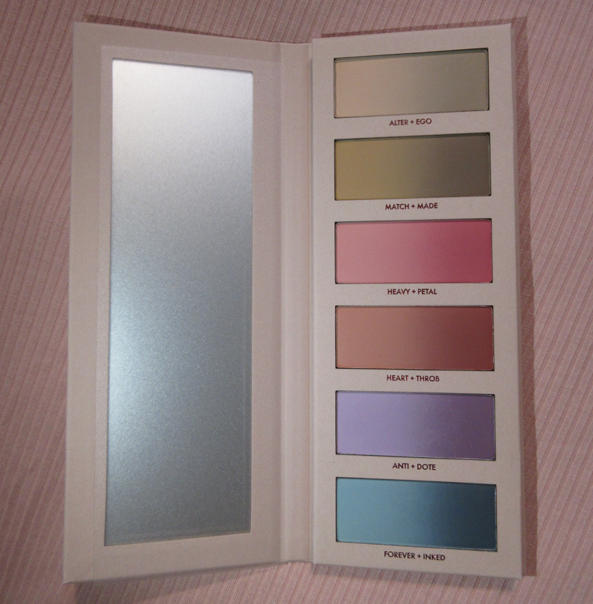
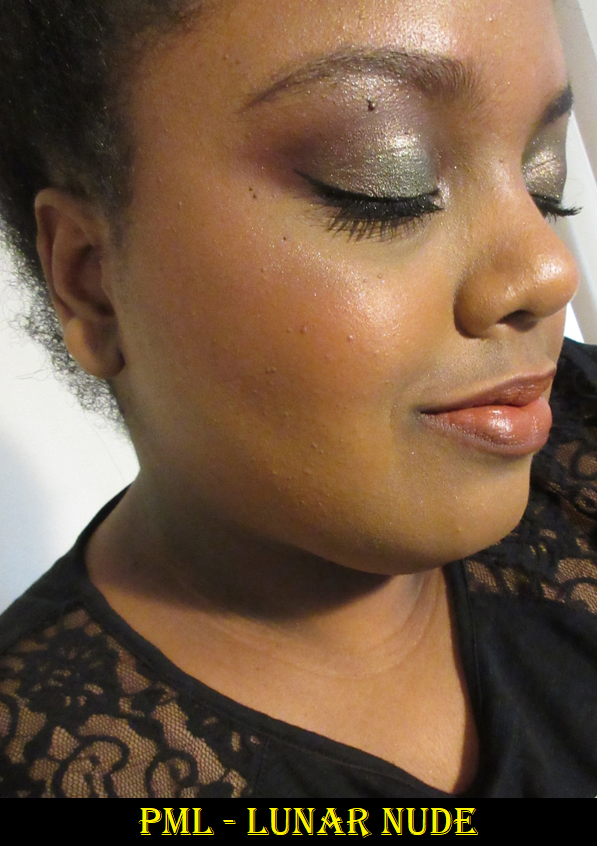
I referred to the Beautopsy Palette as my “Star Product of 2021” in my 2021 Favorites post. What made it so special wasn’t just the customization factor of being able to tailor the eyeshadows. I loved that it was essentially a full face palette that I could use for blush, setting powder, contouring, etc. For those looking for an in-depth review on Beautopsy, please click here.
Monochromance has big shoes to fill. Today, I will share all the different ways I’ve tried to utilize this palette to its full potential. There are other items in the full Monochromance Collection, but I just stuck with the palette. Also, I purchased mine from Beautylish as it is no longer a Hindash website exclusive.
Non-Eyeshadow Eye Use
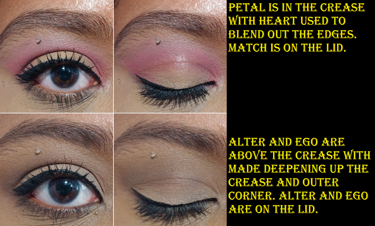
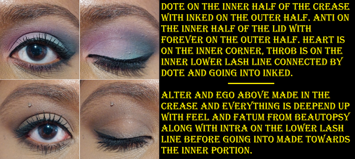
Shade-wise, I can use a mixture of Alter plus the middle spot between Match and Made to set my under eye concealer, but the effects don’t last as long or look as nice as a more traditional setting powder. This is quite the difference considering I get an almost blurred effect when I use Beautopsy’s Tan, Feel, and Paint for that purpose. I don’t have a natural brow shade in this, which I wouldn’t expect considering I only use dark-brown or nearly black shades for my brows. As for eyeliner, Made barely gives me enough depth to deepen the outer corner of my eyes so it would make for a poor eyeliner. My realistic liner options are Petal, Throb, Dote, and Inked.
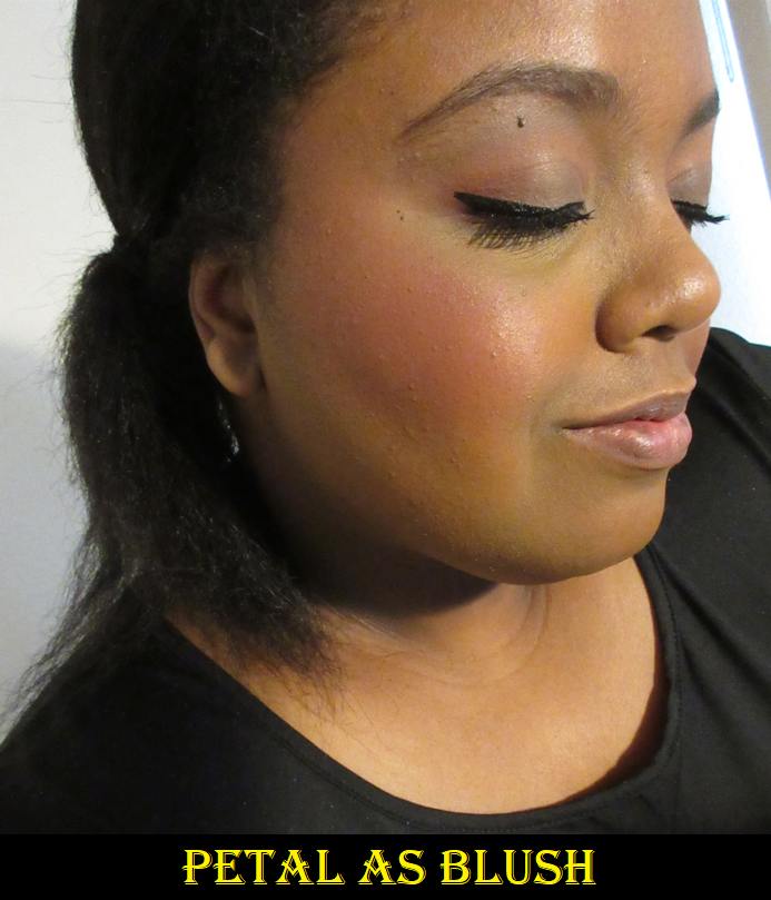
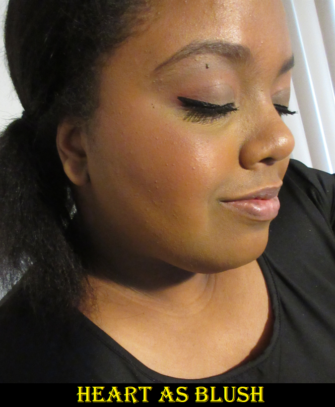
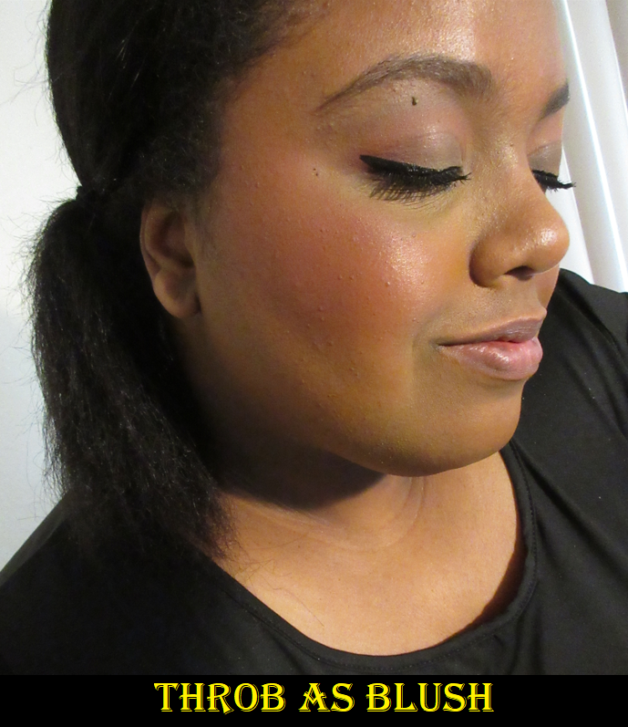
Blushes
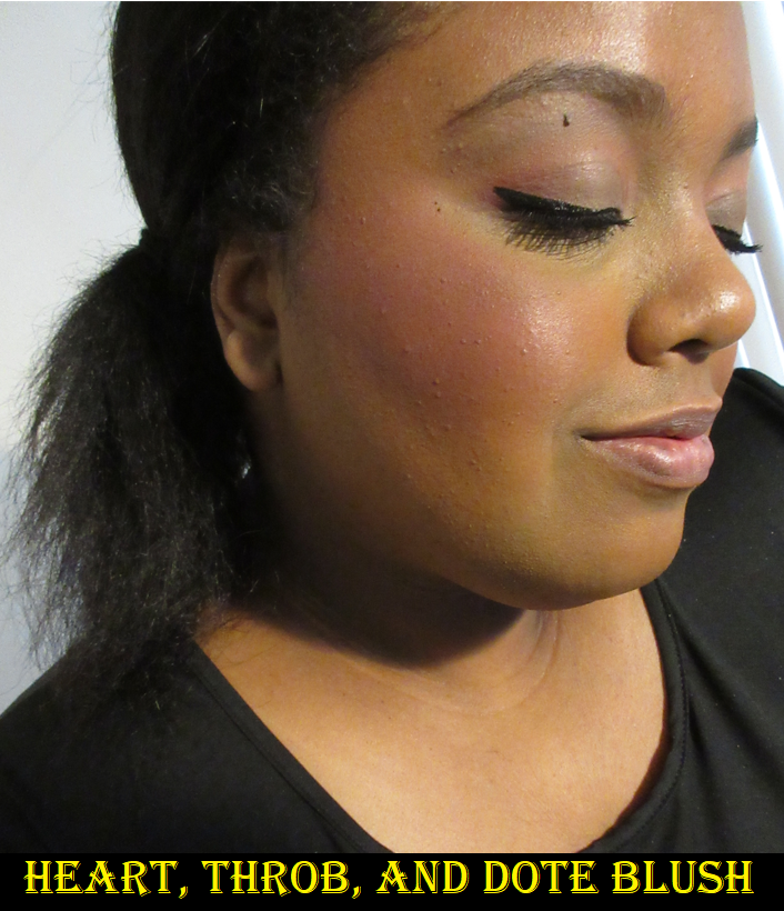
This is the main use I have for this palette. Petal and Throb are easily my favorites. I was surprised to see that Heavy still shows on my skin and doesn’t look ashy in my eyes. Heart is quite subtle but also pretty. I was the most curious to see how I could incorporate Anti, Dote, or some combination of those two with the other shades in order to create a slightly purple blush tone and even a mauve. Sometimes I’m successful at being able to pull off using a mix with the purple, but overall, I find that Dote is not easy to blend. In my experience, pigments using Manganese violet are difficult to formulate so that it blends well and smoothly on the skin. Dote has a tendency to stick in spots and look muddy when mixed with the other shades. It’s still prone to patchiness even when used alone. It’s a bit of a shame because it can look pretty sometimes, but it’s not a deal breaker regarding versatility of blush usage since I wouldn’t rock a purple cheek regularly anyway.
Contour and Bronzer
Hindash mentioned that Beautopsy wasn’t really created with bronzer purposes in mind, though I am able to get a nice reddish-bronze shade with it. When it comes to Monochromance, the overall color story leans cool, which means it’s not intended for bronzing either. I am able to use the shade Made for subtle contouring though. The middle ground between Match and Made actually creates the perfect contour color for me, even better than Feel and Real, but Match and Made aren’t as effortless to blend. They are fine on my eyes and under the cheekbones, but it sticks a bit on my nose which is the only place besides my eyelids that can get a little oily on my face. I wouldn’t even call it oil, rather dew, on my nose. So, if I have the time and patience to be willing to blend my contour, I reach for Monochromance, but most of the time I still dip back into Beautopsy.
Eyeshadows
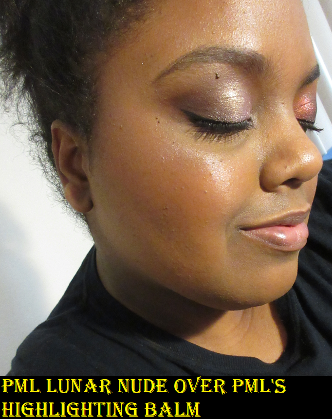
Using Monochromance on my face is at least decent, but it’s nice at best. It doesn’t quite have the wow-factor, but I do like it. For use on the eyes though, it was incredibly frustrating the first few weeks! I should preface that I thought eyeshadow usage with Beautopsy wasn’t particularly special, so I bought Monochromance with the full intent to use it as mainly a face palette too. However, the performance on my eyes is terrible unless I use a fully dry primer. Using the MAC foundation stick or some kind of face product as primer worked extremely well with Beautopsy. It didn’t blend as well with my tried and true MAC Paint Pot, so I was prepared for that with this new palette. However, with Monochromance, both MAC products gave me creasing issues, issues with the shadows not appearing true to the pan color, patching off, sticking in places, difficulty blending, etc. I have never had an issue of a matte shadow creasing until this palette! Disappearing, sure, but creasing?
These examples are not even the worst of them, just the worst of what was left on my camera by the time I thought to include them in this post.
After trying other primers as well, I realized that I could only get decent results if I used a primer that fully dried down with no tackiness left behind. This means using something like the Anastasia Beverly Hills primer. I can also get away with using the Gerard Cosmetics Clean Canvas. Using a dry primer is the first step, but to get the shadows to apply pigmented on my lids and blend smoothly I have to put a layer of setting powder on top of that eye primer before applying the shadows. The downside is that my eyelids unsurprisingly do look dry, but since I would normally throw a shimmer shade on my lid, it would hide those issues.
As I mentioned before, Dote is the most difficult to work with on the eyes. Other than the lightest shades not showing up very well and my inability to get much depth from Made on my eyes, I don’t have as much of an issue creating eye looks with this palette as long as I use a drying primer that has been powder-set. While it’s true that these palettes from Hindash contain shadows that are hard pressed, it’s not an issue of being unable to get product onto my brushes. My favorite brush to use with this is the Sonia G Builder Pro, and I essentially dig into the palettes as though that brush is a chisel. I see how much product gets on the bristles; it’s just not as pigmented. The shades are softer colors overall, with the exception of Inked.
All the issues I had with Monochromance may be a “me” thing. My lids are oily, so perhaps that doesn’t mesh well with the formulation of these shades. The left halves of the pans lean pastel, which I also am prone to having issues with depending on the formula. What I can say though is that despite the website having both palettes listed as the exact same ingredients, there has to be a reason why Beautopsy still does not perform the same way as Monochromance. In that last eye photo above, I literally used Feel to cover up a bald spot left in the crease an hour after using Made there, and with Feel on top, it then remained covered for the rest of the day. Something is clearly different.
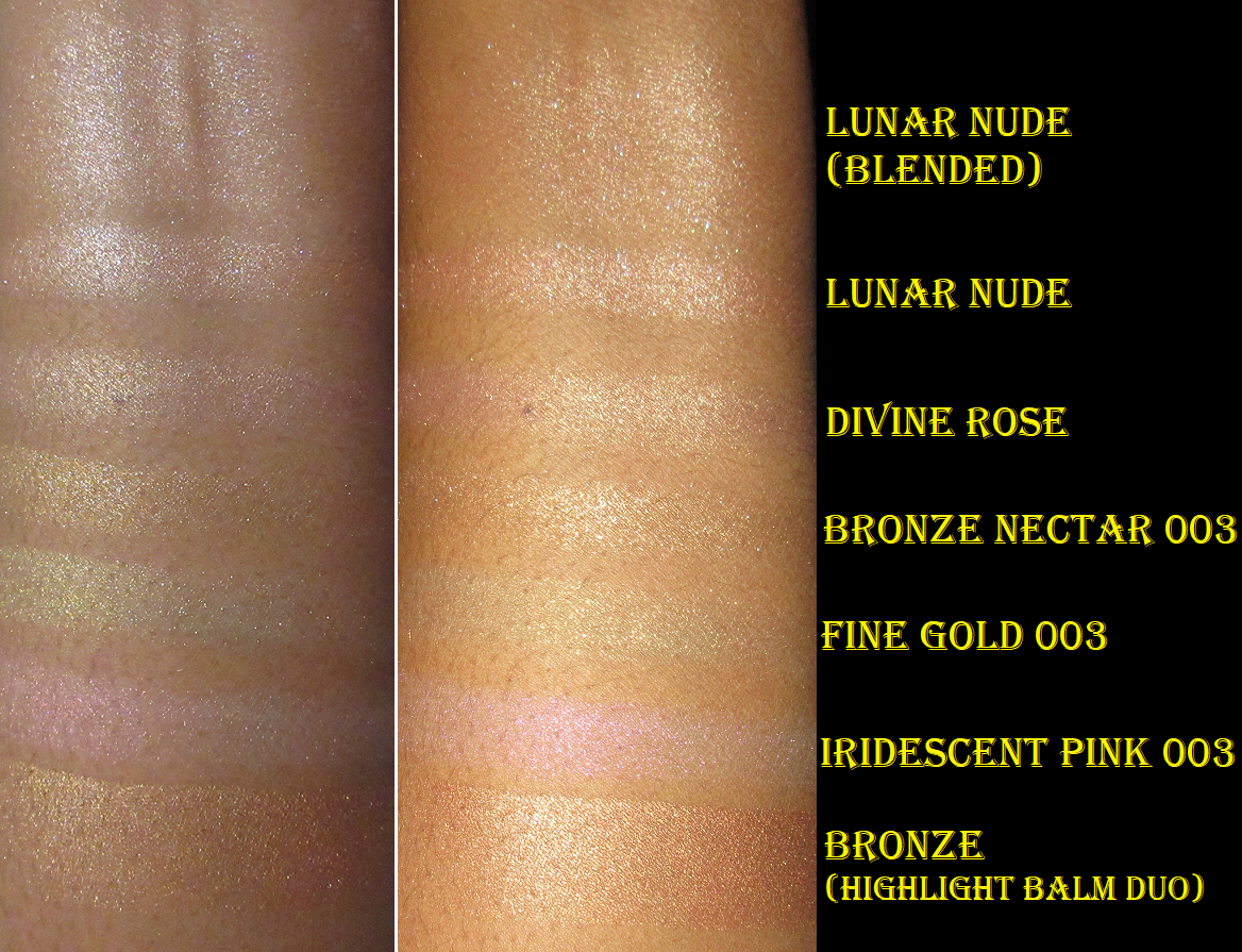
Beautopsy versus Monochromance Shade Comparisons
It’s obvious that Beautopsy has a more neutral color story and Monochromance is more colorful, but Tan Lines and Alter Ego essentially look the same on my eyes. Feel is neutral whereas Made is a more cool tone brown. The pinks in both palettes are essentially the same depth, but Beautopsy’s lean warmer than the Monochromance pinks.
I’ve been testing Monochromance for over a month, and I still can’t decide whether this palette is worth buying and/or worth the price. I like it, but if this left my collection today, I would only really miss the blushes. However, these wouldn’t even crack my top 20 favorite blushes and blush formulas, so it still wasn’t a necessary purchase other than to satisfy my curiosity on the quality and versatility this palette could provide.
If someone wants to know which one is worth getting, I would easily say Beautopsy. When it comes to recommending Monochromance though, I’m not quite sure.
Thank you for reading and I hope at the very least that my swatches, eye looks, and face application looks have been helpful.
I normally post reviews exclusively on Mondays, but this post is more of a show-and-tell. I consider it a bonus!
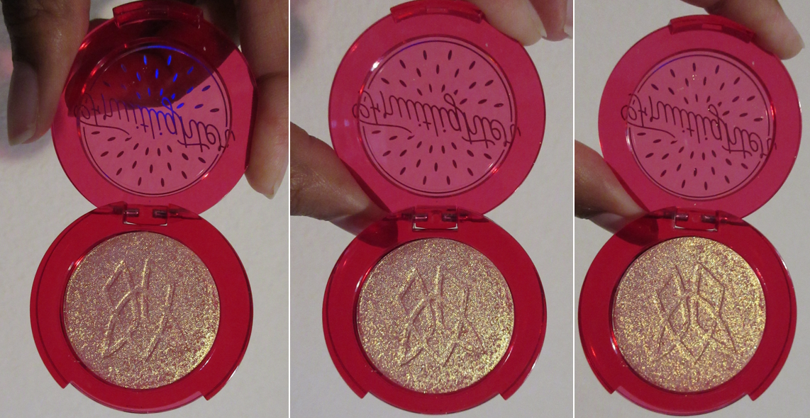
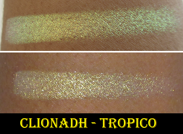
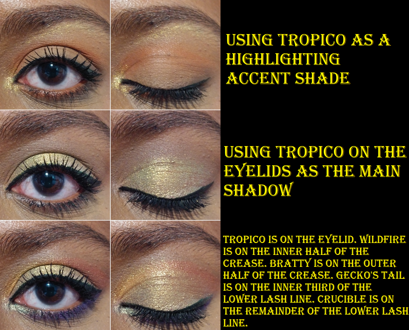
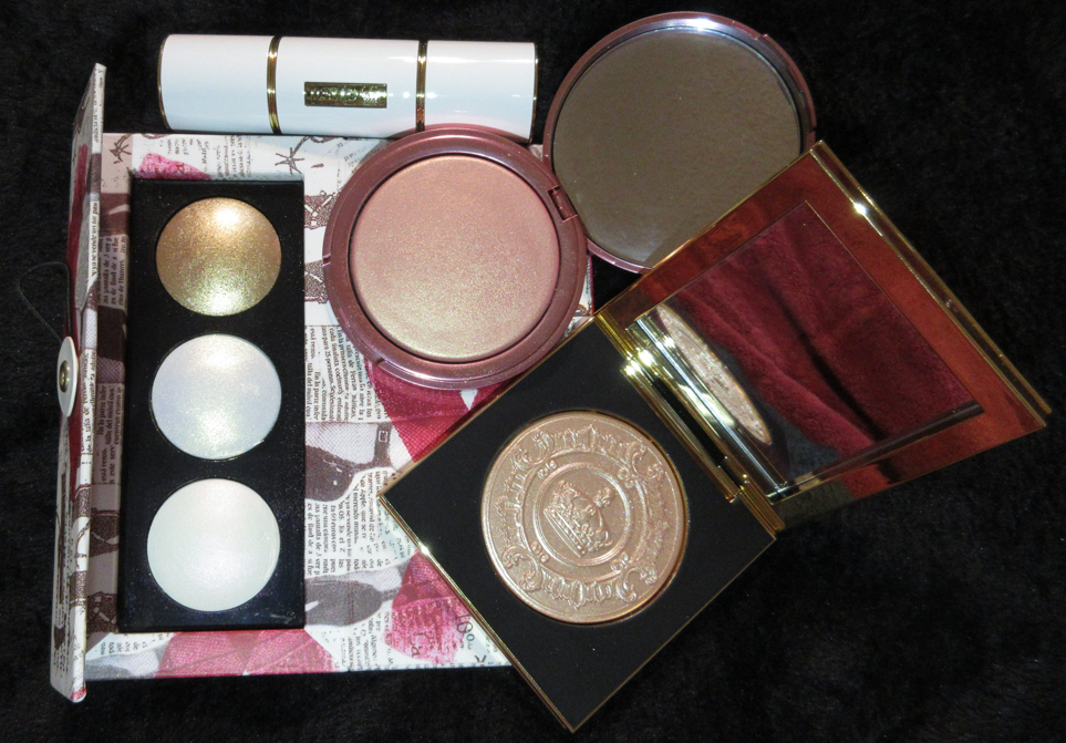
Clionadh Cosmetics Fruitlighter in Tropico
This highlighter, or fruitlighter as it is cutely called, is part of the collaboration Dragon Fruit Collection between Clionadh Cosmetics and Emily Violet Marie. Although I’m not following Emily on any social media, I have seen some of her videos discussing Clionadh products and I think it’s fantastic that the brand liked the concept she came up with long ago and decided to work with her. The entire collection is fun and summery, but I’m on a low-buy and a bit of a neutral phase, so I decided I would just get the two most unique items: the Fruitlighters. Unfortunately, the shade Pitaya sold out as I was checking out, but I still managed to get Tropico. I don’t think I can pull off duochrome and multichrome highlighters on my face, but I plan to use Tropico exclusively on my eyes.
I am very happy with this purchase and I know I will get some use out of it because I transferred it from the compact to my custom magnetic palette with my other Clionadh multichromes. When I was swatching Tropico, I observed the pan spin around and I figured out that it wasn’t glued in the compact, just stuck there via a magnetic bottom. So, I’m able to lift it out (gently with a thin object) and put it anywhere I want.
Tropico is in the palette on the bottom right.
In terms of longevity, I have no issues using Tropico on my eyes, nor the cheeks. It lasts all day wherever I put it. Clionadh highlighters in general are a bit glittery, which is why I prefer using them as eyeshadows, if it all. Part of why I was drawn to this shade, as can be seen in the swatch video, is that at a sharp angle you can get a partial rainbow colored shift of yellow, green, blue, and purple. I cannot recreate that effect indoors on my eyes, but it’s gorgeous all the same.
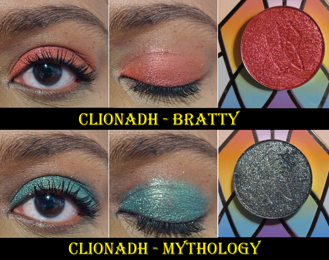
Clionadh Cosmetics Britt’s Birthday Trilogy Eyeshadow Trio Set
Leigh (aka Britt) and Maggie are the two Founders of Clionadh, and it was for Leigh’s birthday that this eyeshadow trio was created. I really wanted the green shade, and when I read that Nightmare was similar to Gum Tree (one of my favorite Clionadh shadows), I planned on purchasing the set whenever I had a bigger order to make. Somehow, I missed the part about Nightmare also having a similar vibe to BrittBritt, another shade that I also already own. So, the reason I haven’t swatched it with the others above is because I decided I won’t be keeping this shade.
The main differences between the three is that BrittBritt is a little more on the bronze and plummy side, Gum Tree is closer to a gunmetal dark-grey, and Nightmare is essentially just like Gum Tree but much darker in tone. So, I gave an example below of what Nightmare could potentially look like by combining the shadow Koala as a base, which is a dark grey-black, and putting Gum Tree on top. BrittBritt, Gum Tree, and Koala are all discontinued eyeshadows that were sold to contribute to various charities. If I did not already have all of those, I would have happily kept Nightmare. This Birthday Set is still limited edition, so it won’t be around forever!
It’s very important for me to not just keep makeup for the sake of keeping them. I really want to ensure I get more use out of my products, which is why I made the decision to just keep the Clionadh products I will actually use. I’ve barely made dents in my shadows despite how often I’ve used them because a little goes such a long way and I’ve calculated that even if I used a different shade every day, between the Stained Glass Collection and Clionadh’s standard shadows, I’d only be able to use them 5 times at most per year.
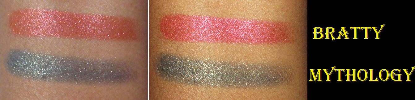
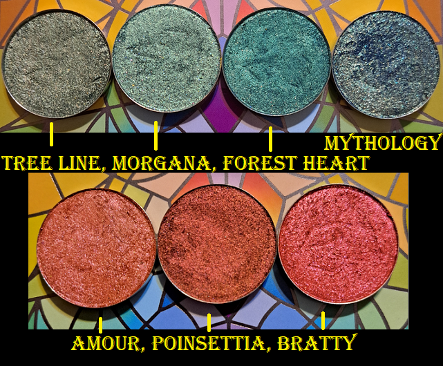
Below are the comparisons to the darkest greens and deepest reds in my collection with the new shades. One thing that really stands out with Mythology is that it has a lot more sparkle to it than the other greens. As for Bratty, it’s different enough from the others to want to keep, but between the reds and pinks I do have, it’s part of the reason I opted out of the Dragon Fruit palette. I do have a lot of those kinds of shades.
Per usual with Clionadh, these shadows remain opaque and pigmented on my eyes all day.
That’s everything! Thank you so much for reading! If you’d like to check out more of my Clionadh reviews and other indie brands, I have several of them categorized alphabetically here.
-Lili ❤
*DISCLOSURE: All products in this post were purchased by me with my own money.Non-highlighted links in bold blue font (Example) are non-affiliate links that will not generate commission. Links marked in bold black font with a light blue background (Example) are affiliate links. Affiliate links allow me to get a commission if purchases are made directly using my links.There are no affiliate links in this post.
I wish it was possible to have reviews for my February purchases up quicker, but two of the orders were from international brands, which took nearly a month to arrive. I then needed adequate time to test out the makeup, but I was away from home quite a lot in the month of April. So, here we are now!
Some of these items have already been reviewed by now, so in order to give the unreviewed products their time to shine and not be repetitive, I will just add links that open a new tab to the locations of the previously discussed products.
KVD Beauty Good Apple Lightweight Full-Coverage Concealer in 167
This feels like old news by now since so many reviews have been released about this super hyped up concealer, but I may as well give my take on it too. This product, in terms of performance, has surpassed the identically priced and beloved Tarte Shape Tape Concealer! I have to use it in specific ways though in order to get it to last all day.
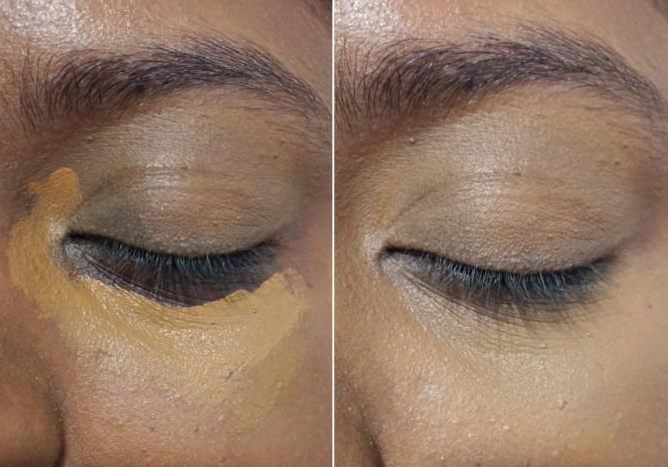
This product is full coverage but spreads very easily within the first half minute or so. The applicator feels lovely on the skin, but the amount it picks up is too much for my entire face, even when I scrape the excess product off the tip. With the scraped off amount, if I try to blend in the same spot, it still spreads outside of the brush zone, so I have to continue blending out the edges to get it to seamlessly fuse with my foundation, which can lead to it moving too far. How I minimize this is by applying a thin layer of concealer to the areas I need coverage, but I leave a little room on the edges and try to avoid my under eye lines. Then I wait at least 45 seconds to let it start to dry. Then I start blending and tap my brush onto the wettest parts that haven’t settled yet and use that to spread and cover all the blank spots. If I’ve lost some of the coverage by then, I dot the tiniest bit of extra product to those areas and smooth it out. This technique allows me to use the least amount of product, but prior to this, I learned it’s better to apply the concealer in two light layers rather than one heavy one. It also helps that I use the Sonia G Jumbo Concealer brush which doesn’t trap the product in its bristles or pick it back up off the face.
I don’t follow the inner and outer corner concealer application spots, the concealer triangle, or other shapes beauty gurus show because my dark circles and discoloration are unique and must be applied in the way that suits my face. I was in a bit of a rush when I took this picture, but that initial application doesn’t have to be perfect. The key is to cover most, but not all, of the undereye darkness and discoloration so that even less product will be able to settle into those lines later when I blend in the rest of the concealer. This is the method I use exclusively with the KVD Good Apple Concealer.
I’ve also been content with leaving my concealer as is and not setting it with powder, though without powder, I’d need a decent amount of product in order to keep it lasting all day. Denatured Alcohol is fairly high in this concealer, as the fifth ingredient. This probably helps with the quick dry down/partial self setting aspect, but it does concern me as someone with dry skin to have a drying ingredient in it. However, I decided I will continue using this concealer, at least until I’ve used it up because I like it so much. I love that it’s so lightweight but builds up to full coverage and looks a little more hydrating under my eyes than Shape Tape, even with the alcohol. It’s also longer lasting than Shape Tape. I think it’s important to prep my under eyes, but if I use a moisturizer (I don’t use eye creams anymore) with too many oils, it will break down my concealer quicker than usual. I’ve had better success using my primers/priming moisturizers like the Bobbi Brown Face Base, Tatcha Silk Canvas, Touch in Sol Pretty Filter Glassy Skin Balm, MILK Hydro Grip Eye Primer, etc. If I use something under my concealer, that’s when I make sure to set it with powder.
Regarding the color options, I recommend paying close attention to the swatches because some of the shades are randomly darker than the swatch above and below. Several shades are also essentially the same depth, but just have different undertones. When I was trying to figure out which one to get, it was quite confusing. If KVD created something between 173 and 177, that would be my ideal color provided it’s actually darker than 167 but lighter than 177. My current shade works under my eyes, but it’s too light for the hyperpigmentation around my mouth and gives a grey look when I cover it up. And for those who don’t know, I prefer having a concealer shade that matches my face, rather than being a few shades lighter. The dollops of product depicted for each shade are also much deeper than in reality, so I recommend going by the swatches or seeing these in store to be safe. My nearest Sephora never has anything new but both malls closest to me are closing, so I know that’s not possible for everyone to do.
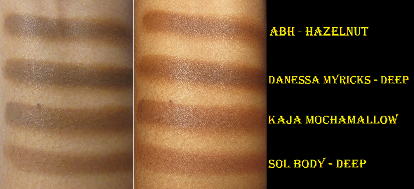
For those curious, here are some swatches and shade comparisons. I only have a mini of the Deep Shape Tape right now, which I suspect is lighter than the full size, so I would say take that with a grain of salt, along with the Pat Mcgrath concealers which are nearly used up and also changing in consistency and should probably be tossed out. I typically mix PML’s 22 and 24 to get a better match and Lancome’s 460 and 495 to get a better match as well.
One thing to watch out for though is that after using it for a month, the color seemed a little darker than when I first got it. I think it’s due to repeated exposure to air. I will continue to monitor what happens with this concealer as time goes on and update this post if necessary.
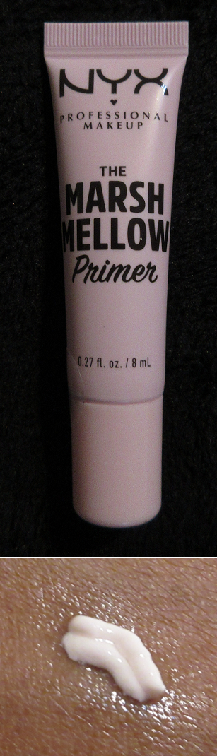
Nyx Marshmellow Smoothing Primer (Mini)
I was always intrigued by the idea of this primer, but I held off buying it until I tried a sample of it and loved how it gave me what I wanted out of the Touch in Sol Pretty Filter Glassy Skin Balm, but with more of a shine to my skin. The sample I got was perfectly blended and mixed, but in my $8 mini, the oil and rest of the product is partly separated so much that it leaks out of the tube every time I open it. I know this is common in some products, but it’s quite the annoyance trying to apply it evenly to my face and not get too much oil in one spot. Before every use, I rotate between shaking the tube and massaging the packaging a few times to try and get them to mix back together.
This has a light marshmallow scent to it. There are quite a few claims on Ulta’s website like, “This primer smooths, softens, extends makeup wear for 16 hours, hydrates, soothes, evens tone, minimizes texture, blurs lines, adds a soft focus finish AND keeps makeup fresh.” After several wear tests, the longest being ten hours, I can only confirm the skin softening, minuscule amount of line blurring, and keeping makeup fresh. I hoped that the initial shine I got on my skin when first applied would continue throughout the day, which it does sometimes, but at other times this primer actually partially mattifies my skin. I would not have noticed if I hadn’t done several wear tests using the NYX primer only on one side of the face. Sometimes it goes on perfectly clear and at other times it leaves a slight white cast, which at least is undetectable once foundation is on top, but still it’s quite the strange phenomenon. The only explanation I have is the separation of the formula and me being unable to consistently mix it back together in the tube. So, on those matte days, I don’t know if my skin is actually being hydrated. It at least feels hydrated, so that’s a good thing for me.
I don’t wear makeup for long enough to know if it would last 16 hours and I have no idea what a “soft focus finish” from makeup would look like in real life, so I can’t confirm or disprove those claims either. I still like this primer, but not enough to repurchase it unless I somehow start noticing the other supposed benefits like a more even tone, minimized texture, and an increase in the blurring power.
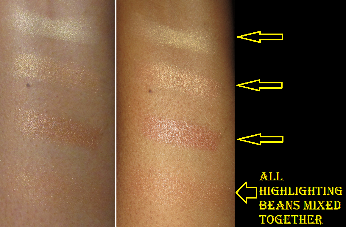
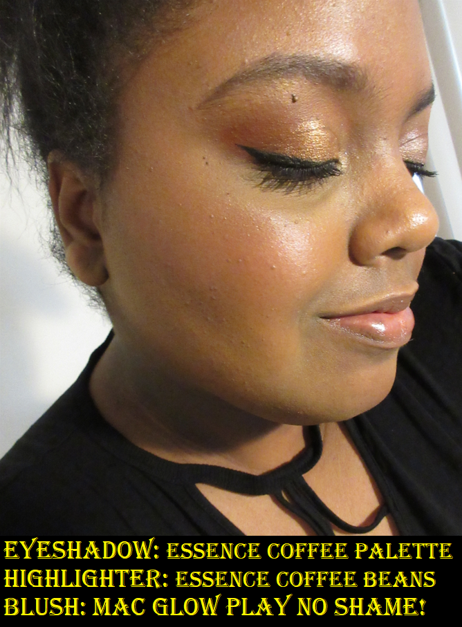
Essence Coffee to Glow Highlighter Beans
Calling this subtle wouldn’t be the right wording, but it gives more of a sheen or glow than a blinding reflect. It lasted a full eleven hours without fading during my longest wear test and with my best primer. The worst performance of it when combined with different base products left me with a very subtle sheen by the nine hour point. I’m quite shocked at how similar it actually is to the Guerlain meteorites in terms of performance, though it’s a little more toned down than those and the Guerlain is a little more friendly to texture.
It smelled like coffee when I first bought it, but a month later it smelled faintly like coffee but mostly like pencils. It’s the type of smell that is detectable when I put it on, but I can’t smell it after I finish blending it. According to Ulta and Essence’s websites though, these are somehow fragrance free. I skimmed several videos to see what others had to say about the beans, and theirs had a smell too, so I don’t know why this is the case if they aren’t supposed to be scented. Maybe it’s the foam or packaging itself that’s scented and not the makeup.
There are way less beans in the cup than I expected because there’s a foam layer that fills most of the space, as can be seen in my product photo far above. I don’t mind this since I’ve never gotten even a quarter of the way through a highlighter.
It is easier to get powder from the lid rather than trying to pick up product off the beans because I have occasionally gotten crumb size pieces between the bristles of the brush and when those fall to the floor it makes a mess. The beans stay mostly intact if I rub my brush over them, but they are not difficult to break. One shattered between my fingers when I tried to swatch each of the three colors against my arm and it got everywhere!
Considering I did not enjoy the Essence Pure Nude Highlighter Palette, I’m shocked how much better these are and how much more I like them. For those who like subtle highlighters and don’t mind scented makeup, I’d recommend trying these out if they’re still available. Also, those of a lighter skin tone can remove the darkest beans if there is a concern of this leaving a dark cast on the face. Conversely, those with a darker skin tone can remove the golden yellow beans if there is a concern of it being too stark, but I think it may be less of an issue for those on the deeper skin tone spectrum as can be seen here in this YouTuber’s video.
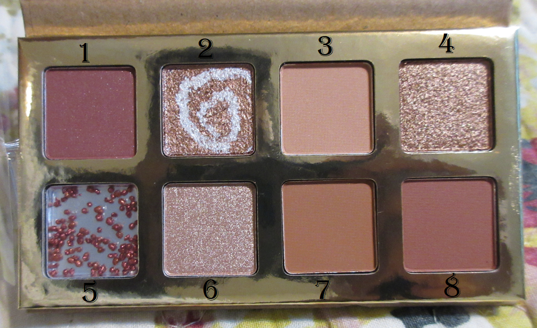
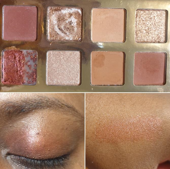
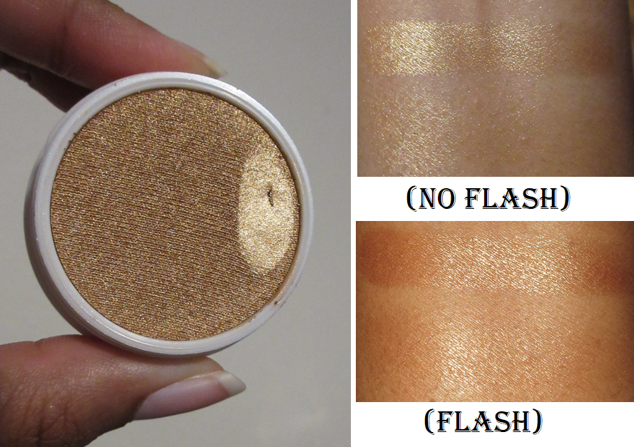
Essence Coffee to Glow Eyeshadow Palette
I should note that these two Essence products and the Nyx primer are all allowed in my low buy under the stipulation of “products that I intended to get last year but was prevented from doing so for one reason or another.” I tend to prefer colorful eyeshadow palettes, so the only reasons I wanted this palette were for the glossy and swirl shadows. I felt like it would somehow give me a taste of Huda Beauty’s Naughty Palette which has those types of shadows in it.
The #5 gloss shadow has a hard gel layer with all the pigment pearls at the very bottom, so I had to crush it down to the pan in order to get any color out of it. I expected it to just be a gimmick and it would certainly have been pointless wearing it on its own on my eyes if I hadn’t mixed it. It’s supposed to be a “universal eye shadow topper,” but that isn’t my makeup preference. Instead, I use this as a base primer and it greatly increases the longevity of the shimmers I apply on top, as I saw in an eleven hour wear test. I almost always get creasing on my eyes, and using the gel as a base does deepen the creases, but it also keeps my shimmers in place and prevents the transfer that I get from my lid to my crease when I use a regular eyeshadow primer.
With regular primers like the MAC Paint Pot and Gerard Cosmetics Clean Canvas, my eye looks using this palette are still fine past ten hours but the shimmers aren’t as intense. As for the mattes, I was impressed with the color payoff. They blend sufficiently. I just wish Essence included a deeper shade because I can’t get much depth out of shades #1 and #8 which are the two darkest colors in this palette.
I always use #3 to blend out the edges of the other mattes in the crease. For the inner corner, I use #2 or #6 but my favorite thing is to use them together for the inner corner highlight because #2 has the best reflect but it can be a bit dark depending on how much of the darker swirl is used, whereas #6 is lighter but not shinier. Those two shades don’t last as long on my eyes because I do touch my eyes frequently throughout the day and these are easily removed by touch, no matter what primer I use.
#4 is a nice metallic shade and both #4 and #6 feel like normal shimmers with some slip, but the #2 “bouncy swirl” shadow is quite creamy/wet feeling.
This palette is only $8 and is unscented. It was definitely worth me purchasing, even if it was purely for the fun of playing with some of these uncommon textures and formulas. The lightweight packaging feels like recycled cardboard and the palette is tiny and fits in the palm of my hand, but what it lacks in packaging quality, it makes up for with the eyeshadow formula.
Rephr Hydration Cream 1.0
I purchased this when rephr was offering a “set your own price” option where one could pay even as low as $0 to get it, plus the shipping cost. When I first used it, I applied way too much to my face and continued to get dewier throughout the day. In many subsequent uses, I learned that if I applied a smaller amount, it fully absorbs into my skin and is fully hydrated without leaving a trace of shine, which is fantastic for non-makeup days! I only like a little dew to my skin when I have a full face on; I don’t want to look shiny when I’m barefaced. I’m also impressed by this formulation because it meets the requirements of my dry skin as a powerful moisturizer that is also lightweight. Rich/Heavy products tend to clog my skin. It’s not the easiest to find something that lets my skin breathe while also lasting all day.
Some highlights about the benefits of this moisturizer are that it’s fragrance and essential oil free, it’s made in Korea, it’s made of recyclable lightweight aluminum packaging, and it contains:
Niacinamide (5%)
Dimethicone (3%)
Glycerin (3%)
Centella Asiatica Complex (2%)
Meadowfoam Seed Oil (1%)
Panthenol (0.5%)
Algae Complex (2.0%)
Soybean Complex (1.5%)
Other lightweight moisturizers for my face that can do the job are the Innisfree Jeju Cherry Blossom Jelly Cream ($25 for 50ml), Round Lab Birch Juice Moisturizing Cream ($15-36 for 80ml), Laneige Water Bank Hydro Gel ($38 for 50ml), Saturday Skin Waterfall Glacier Water Cream ($39 for 50ml), etc. So, rephr is offering quite the deal at $26 (listed price) for 100ml. The only one of those I mentioned that I like better than this one is from Round Lab, though I believe the rephr cream may be more occlusive.
I’m terrible about keeping to a consistent skincare routine, so I can’t say how this product performs on a regular daily basis, but I’ve used it enough these past few months to be able to say that it’s great and hasn’t caused me any issues.
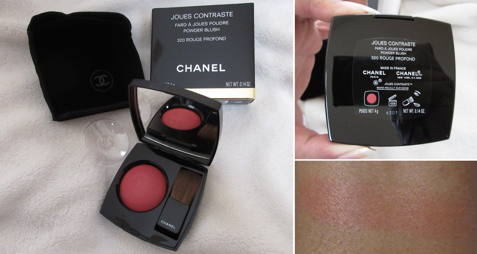
Colourpop Pressed Powder Blush in 4ever Yours – That review is here.
This is was the first official breech of my low buy this month. I’m not supposed to buy blushes unless it’s one of the brands on the exceptions list, which this is not. Considering how similar it is to the heart shaped blush I bought from Colourpop last year, I should have stuck to my guns and not gotten it.
Colourpop Super Shock Highlighter in Champagne BB
According to the rules of my low buy, I should not have gotten this either. It’s the classic case of wanting it because I like the formula, but I don’t need anymore, especially when I have them in shades I already like. My only defense was that I at least removed the other highlighter and three blushes I had out of my shopping cart, but I just ended up buying those anyway in March. Oops!
This shade looks a bit too dark for me in swatches, but when it’s diffused onto the skin, it looks like the perfect depth and still brightens the area due to the sparkle. It lasts on my cheeks all day and I can’t even regret this purchase because it’s great! Unfortunately, this particular Super Shock has already been discontinued.
Oden’s Eye x Angelica Hela Palette – The review is Here.
This fits in line with my two eye shadow palettes per month rule. I’m doing quite well with that so far!
Kaleidos Lip Clays (plus Smokey Nostalgia Tin Box) in Skinship, Cognac, and Bare – The review is Here for both the Lip Clays and Blush listed below.
I purchased the custom bundle which requires 4 lip products, but the fourth was a gift for a friend. So, I’m not counting that last one as part of my lip no-buy and my total is currently 3 lip products out of the allowed 5.
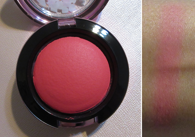
Kaleidos Smokey Nostalgia Blush in P03 Sanguine – The review is linked above.
This is another purchase that technically goes against my low-buy. Kaleidos isn’t on the exceptions list for blushes, but I have always wanted to try one from them and couldn’t due to the shades not being suited for my skin tone.
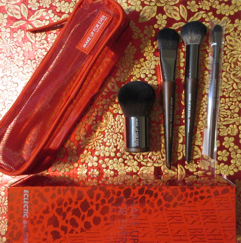
MAKE UP FOR EVER Electric Brushes Set
This set with tax came to $36 from Nordstrom. The original price was $69 and has a retail value of $150. It includes :
106 Foundation Brush: a brush for applying and blending all kinds of foundation for an even result.
124 Powder Kabuki Brush: a brush with a short and slender handle for ensuring smooth and even application of all powders to create a lightweight, flawless result.
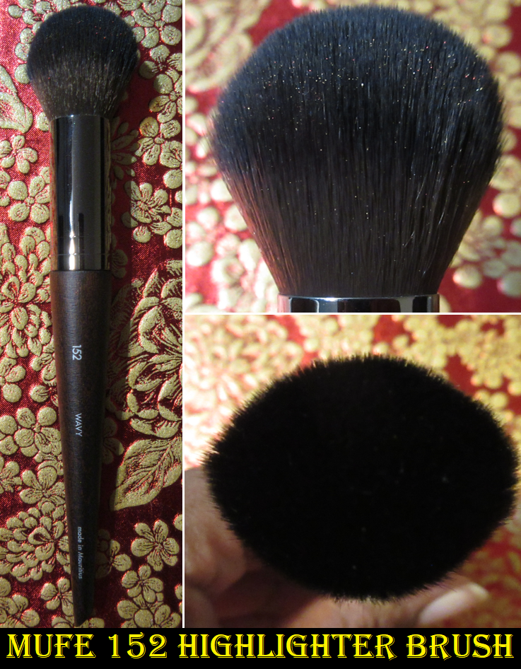
152 Highlighter Brush: a brush for easily and delicately highlighting your face and body with its soft fibers.
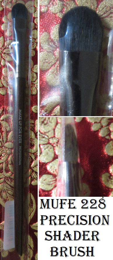
228 Precision Shader Brush: a paddle-shaped, flexible brush for applying, blending and smudging all types of eye products quickly.
Brush case
Today’s review will be about the foundation, powder, and highlighter brushes, but I’m going to give someone the shader brush. I rarely like synthetic eye brushes, so it would be a waste for me to even bother trying it. In general, I prefer natural hair brushes, but I’ve always wanted to try these, just not at full price. It was still very early in my exploration of makeup when MUFE decided to make their brushes fully synthetic. Regarding my no buy/low buy, I’m unofficially on a makeup tool low buy. However, I didn’t set any restrictions in writing.
The Foundation brush, I had seen in action during a Rouge event many years ago when a MUFE representative did my makeup and I wanted it ever since. I typically don’t like paddle style brushes, but this one works just as well as I remembered. I get zero streaks using this brush. I’m able to apply and spread foundation easily and get around edges and small corners with ease as well. I have a background with painting ceramics, and painting on canvas is an occasional hobby, so I can’t be sure if that plays into why this brush is so easy for me to use, but it is.
This brush can also apply a crisp line for cream sculpting products, though the shape of the tip isn’t the best for blending, but I can still do it with this brush. It costs $36 which ended up being the price I paid for the entire set. I personally think it’s worth $25 at most, but having this brush made the whole set worth it.
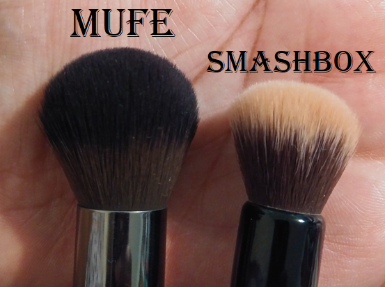
I find it so strange that this is listed as a Highlighter brush considering it’s bigger than my Smashbox Cream Cheek brush and many other blush brushes.
It applies far too much highlighter for my preference, so I consider this a blush brush instead. That being said, I’m not the biggest fan of this brush for that purpose either. There’s so much bristle for such a flimsy floppy splay that doesn’t feel like I have much control of the blend. It’s like it smears blush across the skin like a mop rather than buffing in the blush. When I use easy to blend and pigmented blushes, this brush works perfectly fine. However, with a sheerer blush or lower quality one, it takes forever since it’s lacking firmness and makes things look patchier. I figured if this is problematic with powders then maybe cream blushes will be better for this brush, but that’s not the case. It doesn’t allow me to fully work the cream products into my skin and it just sits on top of it. With even more emollient creams, it has the issue of spreading product too far out.
This retails for $37, which I don’t think it’s anywhere near worth that. If I had bought this #152 brush individually, I would have returned it. I don’t recommend this one.
The retail price for this one is $52! I can’t recall if I ever paid over $40 for a synthetic fiber brush, so it’s no surprise that I wouldn’t normally buy a brush like this. The handle on this one feels even sturdier than the others in the line.
It’s the most dense at the very center and looser packed around the edges. When I put this brush handle side up against my palm, it sinks in at like a centimeter before it forms what feels like a wall. It’s so solid that I can’t get the bristles to splay, it just stiffens. This does the same thing when I apply a powder to my face. If I grip the handle and use a normal amount of pressure to spread powder on my face, it feels incredibly firm to point that it offers very little movement and the bristles drag heavily across my skin.
The way I like to use it is holding it in a looser grip and just blending with the tips without applying pressure. This method still gives me a strong blend without feeling like I’m using the world’s densest brush or attempting to exfoliate my face. I’m not saying that these brushes are scratchy. The bristles on all of them are soft, just not the softest synthetic I’ve felt, especially when pressure is applied and it drags on the skin. These fibers actually remind me a bit of pony hair, but softer. Now that I know the trick to using this brush, I do like it and I’m happy it’s part of the set. It can’t compare to my natural hair powder brushes, but I use those for an airier and more blended finish. This brush is one that I’d use when I want to actually load on a thin solid layer, like with face powder, before blending it out.
Even though I’m not planning to use this brush, I wanted to show how it looks through the plastic. The retail price is $25.
I feel like I got an absolute steal on this brush set! Even though I don’t want to purchase anymore synthetic fiber brushes, I can’t regret buying these.
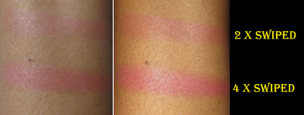
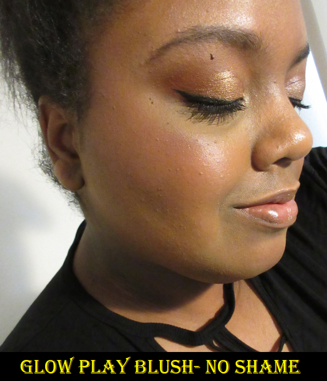
MAC Glow Play Cherry Blossom Blush in HD Cherry Tree – The review is Here.
Considering how many MAC blushes I own, this shouldn’t be on the exceptions list, but it is because I don’t have the willpower to cut off the brand that ranks number one with blushes for me. So this purchase is still allowed according to my Beauty Resolutions.
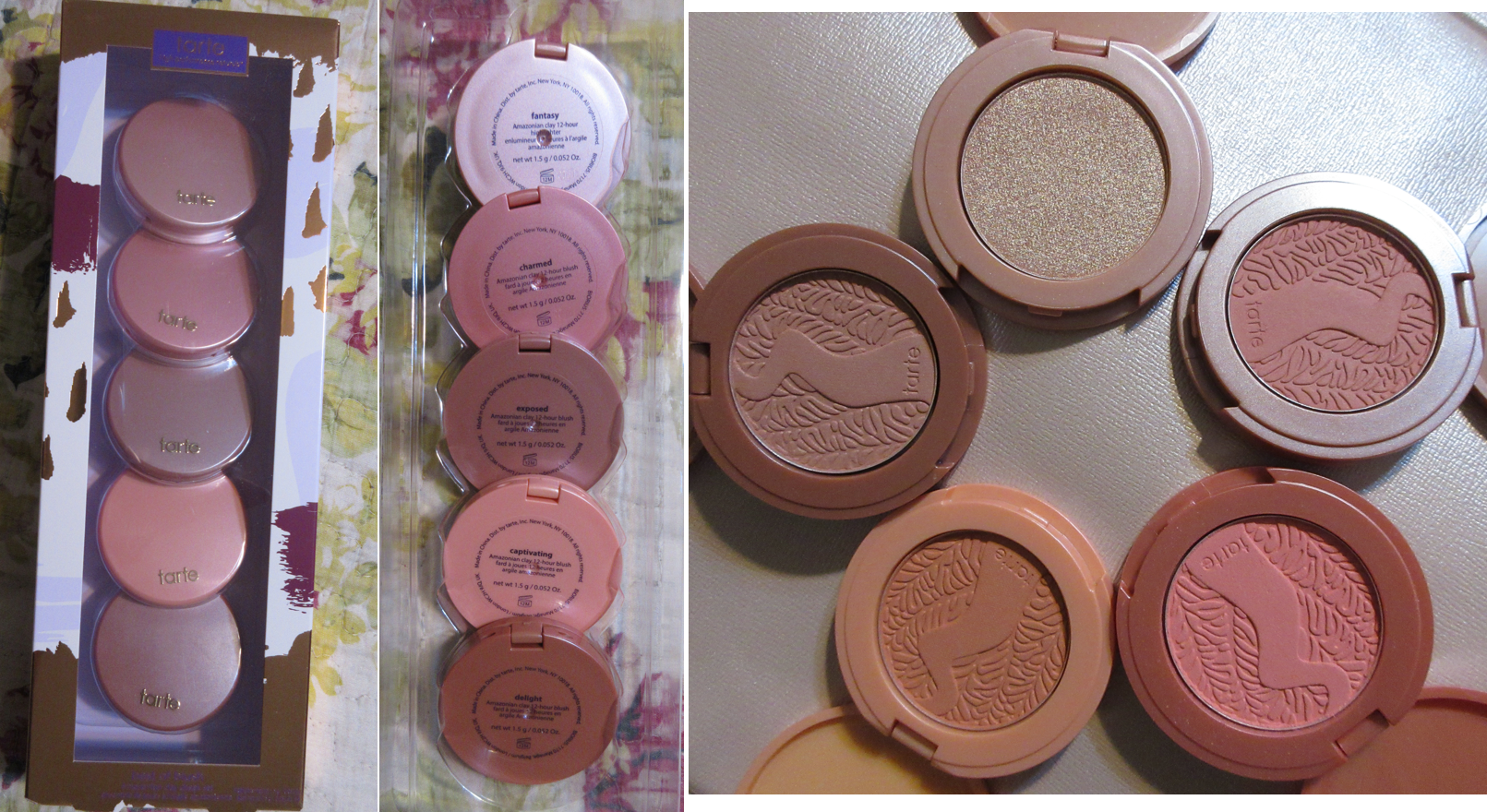
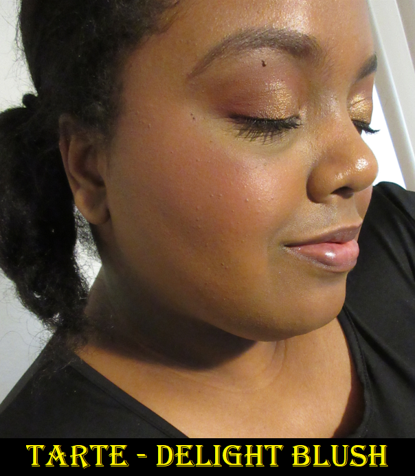
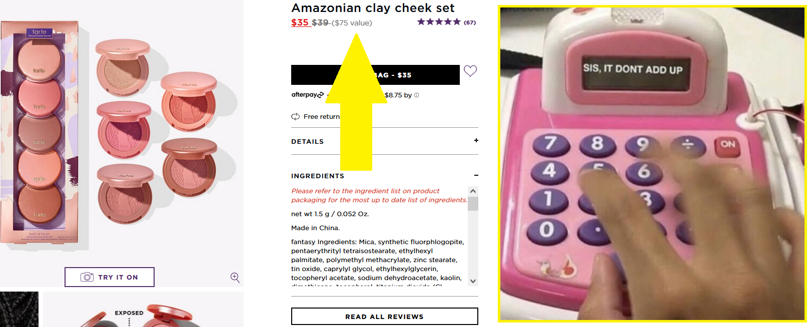
Tarte Amazonian Clay Best of Cheek Set (Holiday 2021)
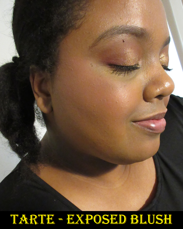
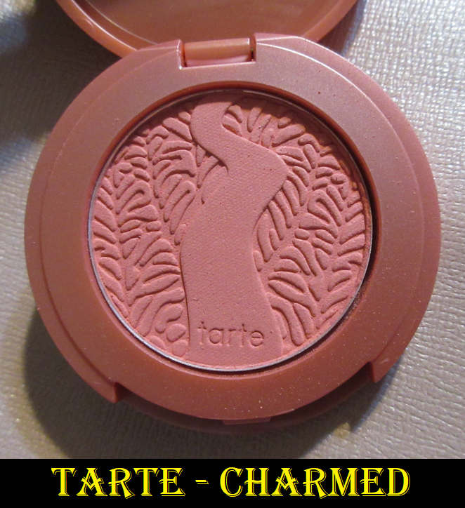
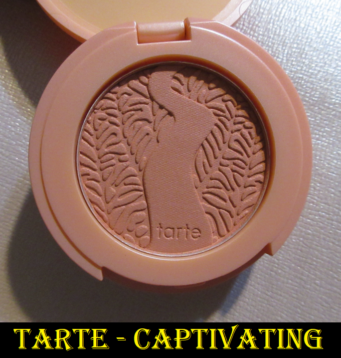
This set went on sale for $22 on 2/22/22, so with tax it came to just under $24. I always wanted to try this formula of Tarte blushes because people have been raving about them since I started getting into makeup and they always said that despite the holiday items being notoriously lower quality, this formula from Tarte was always great. After trying these minis out for myself, I can understand why these are such beloved blushes! The longevity is insane. I’ve done several wear tests with the longest being eleven hours and by that point the blush still looked freshly applied!
I used the maximum amount of Exposed, a moderate to heavy application of Charmed, a heavy application of Captivating, a moderate amount of Delight, and a light to moderate amount of Fantasy on the cheeks. Charmed and Delight had more room for building up.
I bought this expecting to only be able to wear the darkest blush in the set and just test out the formula of the highlighter, so I was pleasantly surprised to see everything show up on me! Exposed is described as a “nude pink” and admittedly barely shows because the brown tones blend into my skin. The pink is what makes it visible, though it’s on that cusp of being too light for me, so I will probably find a new home for that shade. Charmed is a limited edition “bright pink” that I consider a light-medium tone that works for me if I spend a little time really blending it into my skin. The one that I’m actually shocked that I can wear because it’s even lighter than Charmed is the “bright peach” shade called Captivating. It looks crazy at first, but it warms up as I blend it in. I love the look of peach blushes, but they are usually ashy on me, which is why I go for corals as my closest equivalent of peach. It excites me to no end to have found one of the rare peach shades that I can pull off! The last blush is another limited edition shade called Delight. It’s a “deep rose” that’s a cross between Exposed and Charmed, but darker. It’s the most natural looking of the shades on my cheeks and it’s the only one I don’t have to build up for depth of tone reasons and not pigmentation reasons. All of these blushes have a good amount of pigment. As for the highlighter, the limited edition “rose gold” shade Fantasy is too light for me. Beyond the shade match, the way it reflects in the light emphasizes texture in a way that other highlighters I’ve used that are even lighter than this one don’t do. I don’t have enough experience with Tarte Highlighters to be able to say if this is indicative of their formulas, but I have an upcoming review where I tried another one that I liked much better and did not have the reflect and textural problem. That one went on smoothly, whereas this one sticks in places and takes a bit of blending in, so I think it’s just an issue with this particular highlighter.
So, in this set of five travel size products, I intend to continue using three of them. That makes the usable items worth $8 each in my eyes based on what I paid, plus the knowledge I gained in learning that I really like the Amazonian Clay blush formula! Each compact contains 1.5 grams of product, so the three I’m keeping equals 4.5 grams that I paid $24 to have. A full size blush from tarte is 5.6 grams for $29. For these reasons, it made the set worth it, but I wouldn’t have felt the same way if I paid the $39 full price. Tarte lists this as being a $75 value, but there’s a combined product weight of 7.5 grams, which means the set should actually cost $38.84.
This is why I always recommend waiting for Tarte’s holiday items to go on sale. Then it has a chance of actually being worth buying if the products are not 100% suited for someone.
We’ve now reached the end of the post! I had so many products to review, which I expected would slow down my purchases for March, but it did not! It worked in the beginning of March but halfway through the month things got a bit crazy. I would estimate that post won’t be ready until August. I hope you’ll visit my blog again soon! And if you missed January’s purchases, they can be found here.
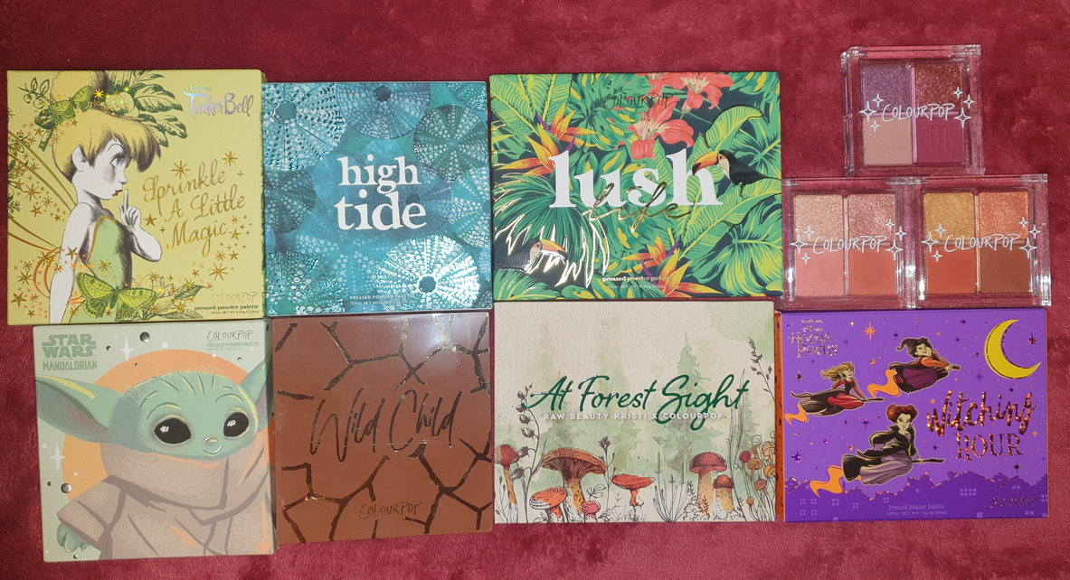
I originally drafted a post called, “Colourpop Update from Nov 2020 Til Now,” which was intended to finally catch up on all the Colourpop purchases I was making. The issue I ran into was that I kept waiting for my orders to arrive, but I was continuously buying Colourpop products monthly. Essentially I never caught up and that’s how we got here today. I have seven palettes and three quads that I bought from Colourpop that have just been sitting in my collection this whole time waiting to be used and reviewed.
It’s a bit fascinating how Colourpop’s marketing completely sucked me in. Here I was making monthly orders without even using and enjoying any of it, yet still unable to stop myself from continuing to buy the next “Must Have” thing that appealed to my sense of nostalgia or my love of particular color stories. Colourpop’s shipping went from a week to deliver (years ago) to a minimum of three weeks for delivery now. So, by the time I received my products, the hype was already gone and I felt very little motivation to post about it via social media and even less for my blog. It was like constantly chasing the excitement of what’s new, having it fade by the time it arrived, and then seeking something else to replace that feeling. The cycle was quite unhealthy and I knew that in the back of my head, yet they still got me regularly. The craziest part is that I actually did resist a ton of collections, yet I still ended up with all these unused eyeshadow palettes (plus everything else from other categories).
Colourpop x Raw Beauty Kristi At Forest Sight Collection Palette
Although this palette is no longer listed on the Colourpop website, so I cannot double-check the ingredients, Amanita has the symbol for what I’m guessing is a warning about potential eye staining due to the dye(s) used.
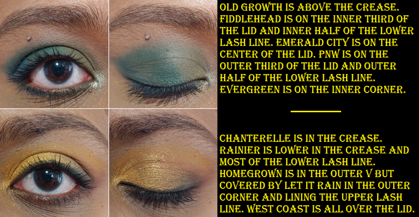
I only used this palette two or three times prior to reviewing it again now. This should be a color story I’m crazy for, but for some reason I don’t like how most of the shades look on my eyes and in combination with one another. The exceptions to this are Evergreen, Fiddlehead, and Homegrown. I love the shade Emerald City, but it’s a very patchy shadow. PNW at least fills the role. It’s blue, but leans closer to green than a standard blue shade. Other than my dislike of the tones, the patchiness of Emerald City, and the fact that Old Growth doesn’t show as pink on me, I think the other shades are okay despite them overall feeling dry and not the easiest to work with. I think this palette being a few years old by now is why the performance has declined from that first initial impression I had. It’s not bad, but it’s not as easy as my newer Colourpop palettes.
I always discuss my stance on an Influencer who is part of the collab, so in the case of Raw Beauty Kristi, I am still following her on YouTube though I don’t watch her anymore. She’s more into lifestyle content now, especially post having a baby. Congratulations to her, but I definitely don’t have the same attachment to her now as I did when I first bought this palette. Also, this is the only collab palette of hers that I have purchased. I did not buy her palette with PUR.
The packaging for this collab is cute. I love the theme. This collection was restocked quite a few times since Nov 2020, but I don’t believe it will be available anymore, which saves me from needing to say whether I recommend it or not. Other than Evergreen, Colourpop has these shades many times over among all their palettes, so most people could put this color story together on their own out of what they already have.
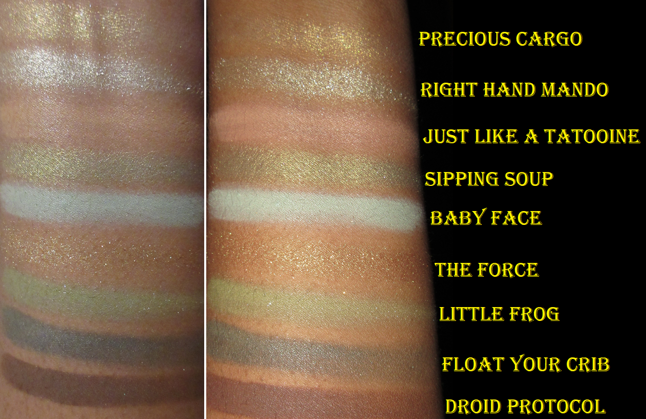
Colourpop x Star Wars the Mandalorian Child Pressed Powder Palette
There are no eye safety warnings for this palette. The Force arrived broken, but I was able to re-press it.
I haven’t watched the Mandalorian TV show yet, but everyone knows about “Baby Yoda” (Grogu) and he looks absolutely adorable! I tried for a while to resist the packaging, but eventually I got it during a sale.
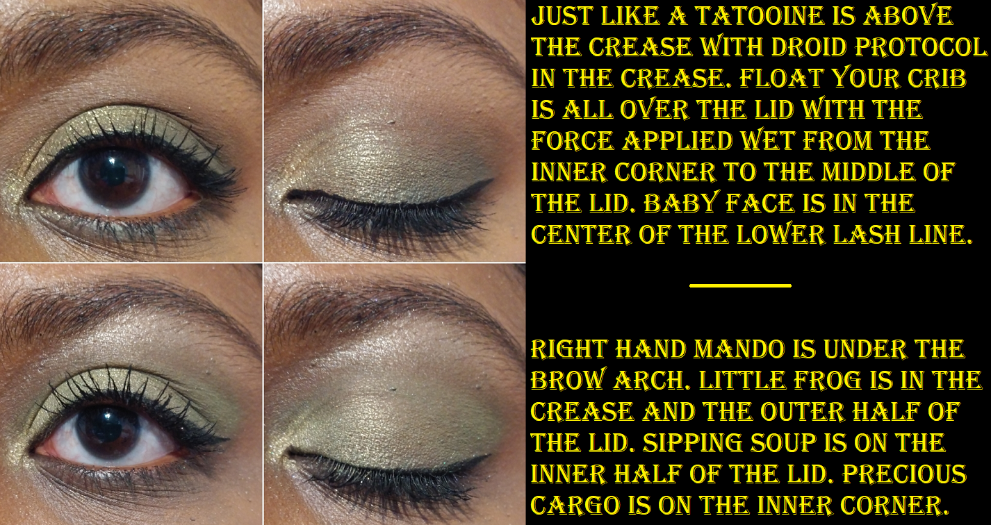
I love green eyeshadows and even though the depths of these greens are lighter than I typically go for, I really enjoyed the looks I’ve been able to create. However, the photos below show that I can make a similar look using entirely different eyeshadows from the palette. The matte shades aren’t redundant, but the swatches show two similar golds and two similar greens regardless of how they look in the pans.
The shadow quality is great. I think it is among Colourpop’s best in terms of performance. To those who like this color story, I could easily recommend this.
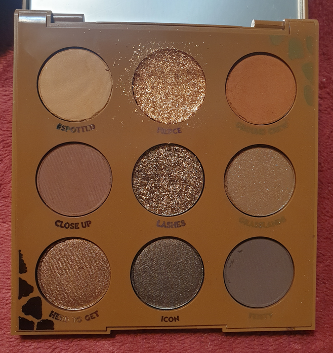
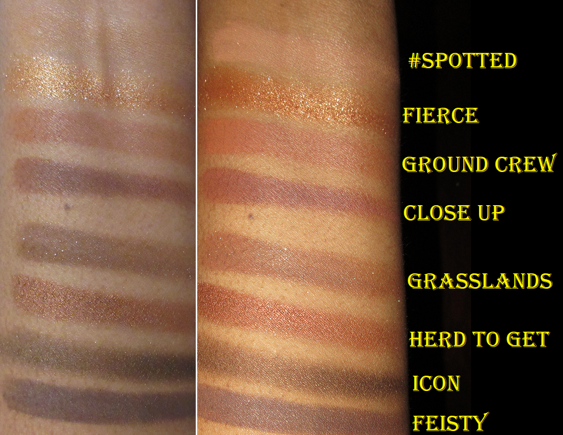
Colourpop Wild Child Palette
Sometimes Colourpop puts the warning asterisk next to the shade names on the inside of the palette, so I wrongly assumed this had no eye safety warnings. On the back of my palette, Grasslands was marked with the symbol of not being safe for use around the immediate eye area, but on Colourpop’s website it’s the shade Lashes that is listed as having PET glitter. More than that, it’s in an actual pressed glitter formula, so I will not be swatching or using that shade. This is quite unfortunate considering Lashes is the one that pretty much sold me on this palette. Since I cannot tell if my original packaging is correct and if Grasslands should also be considered not eye safe, I decided I won’t be using that shade on my eyes either. I dislike sequin/matte eyeshadows with shimmer in them anyway, and I don’t feel this particular color adds anything to the palette, so it’s an easy skip. I plan to depot them both after this review.
Fierce arrived shattered, so I pushed it back in, but it became a mess every time I used it. I somewhat resolved this by repressing it with some 90% isopropyl alcohol, but it still gives me fallout on the eyes if I don’t apply it wet.
The thought of getting rid of 2 out of 9 shades would normally make me question my decision to buy the palette, but the fact that I love all the other shades is why I don’t have regrets. If I’m reaching for a neutral shadow, I like a deep shimmery chocolate brown like Icon. I can build up enough depth to my liking with Feisty. Ground Crew makes for a nice transition shade and Close Up looks great in the crease. Herd to Get isn’t really my preference for the lid, but I do think it looks nice on me and it makes sense to have a shade like this in this palette. #Spotted I use for blending edges if needed since it doesn’t really show on me. Just like Herd to Get, I wouldn’t want to put Fierce all over my lids, but it’s a beautiful highlighting shade for the inner corner and center of the lid.
I like the looks I’ve created with this and I do want to continue using this palette. In the month of February, I made all the palettes listed in this post a part of my “shop my stash” and I repeatedly kept reaching for this one over the others. The quality is great and I easily recommend it. If there’s one thing Colourpop should nail, it’s a neutral palette considering how many of them they release and how chock full of neutrals most of their palettes are, including the more colorful ones.
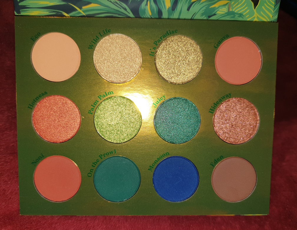
Colourpop Lush Life Palette
Speaking of a colorful palette with neutrals, we have Lush Life which is one of the most recent CP palettes in my collection. There are no eye safety warnings. I think the quality of the shadows in this palette is very good. It’s definitely among the best Colourpop has ever produced. The neutrals are pretty, though Eden is less of a plum brown than I expected from product photos online. It also gives me just barely enough depth for my liking.
It’s Paradise and Palm Palm are similar. This palette also has several matching matte and shimmer counterparts (On the Prowl and Juicy, Noni and Hotness, as well as Eco and Wild Life), which sometimes I can appreciate. In this instance, I find it limiting, but I plan on depotting some of these shades to create a custom palette anyway.
I have to give props to Colourpop for that stunningly vibrant Monsoon shade, and for it being so smooth and even as well. It’s probably the best vibrant blue I’ve seen Colourpop do. That shade paired with the greens, oranges, and yellow certainly capture the tropical vibe they were going for, and I like it a lot. This is another one I could easily recommend, even though it’s not something I’d be likely to use much if I kept them within just this color story in this palette.
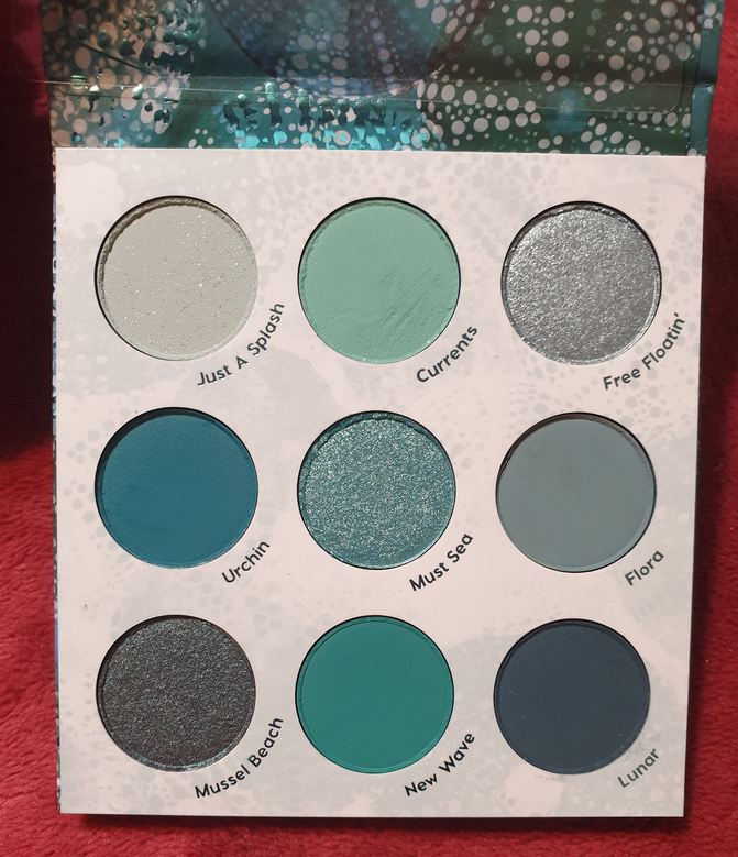
Colourpop High Tide Palette
There are no eye safety warnings for this palette. It was first released as an Ulta exclusive before arriving on the Colourpop website. It’s mind boggling how much I felt I needed this palette until I actually got it in my hands. I love the look of these colors, but these are not the kinds of shades I wear all together. I don’t like pale blues on me, which eliminates half the shades. As for dark teals, which always attract me, I actually got sick of by the time I got around to using this palette. It was the last of the ten I tried and I kept dragging my feet on using it because I dreaded having to come up with eye looks for it. A lot of these palettes contain a teal/greenish-blue/warm blue and I was tired of wearing them back to back each day. Then, on the flip side, the third column of the palette contains cool blues, which was a nice change of pace, but I’m not the biggest fan of cool shadows on me. So, it’s quite perplexing how I was so intensely drawn to this palette and then quickly flipped opinions. It revealed my tendency to buy palettes with shades I find alluring, without thinking of how I would actually wear the eyeshadows together to make a look. This wasn’t a very expensive lesson, but it was a lesson all the same.
Other than the colors, the actual quality of these shadows is nice enough. The mattes are a bit on the thinner side, but I can understand wanting to do this since shadows this saturated can be harder to blend and patchy depending on the ratio of pigment/dyes. Two dips with my finger in the pan (as seen in the swatch photo) show how evenly I can spread the color, but also how they’re not as opaque because of how thin the powder is. The mattes have to be built up a little. As for the shimmer formula, there’s a bit more slip in these than usual. While this can help with spreading the shadows, it’s so much that I can accidentally pick the shimmer back off my eye and either onto my finger or move it to gather on a different spot. It basically can create sparser areas devoid of shimmer that I have to build up and smooth over. This doesn’t happen in a large enough area to be a nuisance, but it noticeably adds time when creating a look. This may seem like bad quality, but it’s just a matter of someone’s preference because some people really like that dimethicone feel to shadows or like a shadow that takes little effort to blend, even if it does mean having to build it up though. I’m able to create very pigmented looks, so I applaud Colourpop for that. However, I’m planning on only keeping Mussel Beach, Must Sea, and Lunar, so I can’t really recommend this palette on the basis of this not adding much to the Colourpop line. I do love that Mussel Beach is a bit different for Colourpop as a brown-teal duochrome shadow. It’s a teal version of Clionadh’s Vortex, but without much shine. That’s the one aspect that would have been better with the Mussel Beach shade if the shimmer particles were brighter.
Colourpop x TinkerBell Palette
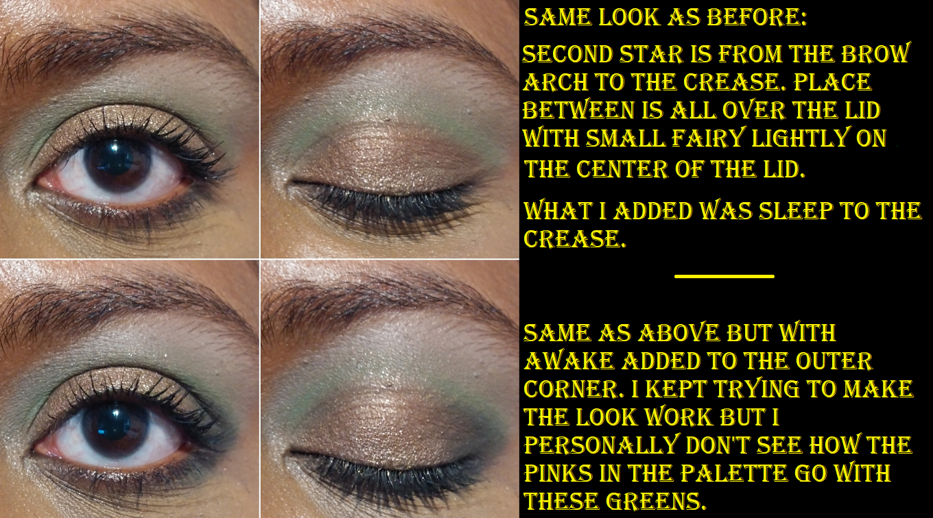
This palette is no longer listed on the Colourpop website, but there appears to be no eye safety warnings on my packaging. I’m slightly conflicted about my feelings on this palette because it always makes me think of the Child palette, but then I want to reach for that one instead of this because those two pale beige-pink eyeshadows are so off putting. It’s a pet peeve of mine to see redundant shades and multiple brow bone shades. This palette hits at both of those points with Second Star looking insanely ashy on me and Big Magic being less ashy, but also not showing up very much at all. Once again, we have a mattes with shimmer counterparts between Awake and Neverland as well as Sleep and Tink. And, again, I feel as though this limits my looks.
The upside to this palette is the really great quality. I had no issues blending the mattes. The shadows are pigmented. The shimmers are opaque and easy to apply. Place Between is sparkly and gorgeous on the lids. Neverland is this deep green-blue that I tend to like. The palette packaging is very cute, though I wish it didn’t have actual glitter on it. It’s the gritty kind that you can feel is raised when handling the palette, and the kind that will start sprinkling a few glitter particles here and there as time goes on.
The biggest struggle I had was trying to fit the brown-pink shade, Place Between, into my eye looks while trying to exclusively use this palette. It makes sense to use it with the pink mattes, except that those shades don’t give me any color. So, I am forced to pair it with greens and I’m not sure how much I like that. It’s certainly a different color combination for me, but I don’t know if it’s a “nice” kind of different.
Colourpop released another green palette with a pop of pink called Limelight. I’m curious to see the reviews and comparisons for that one.
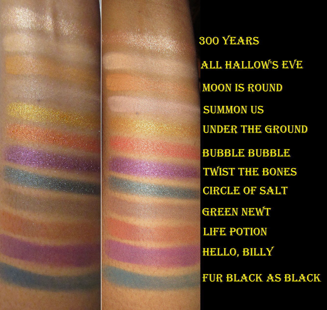
Colourpop x Hocus Pocus Witching Hour Palette
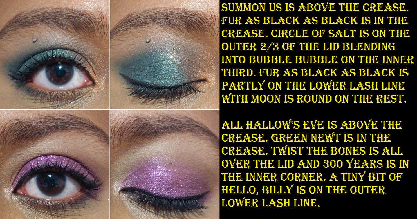
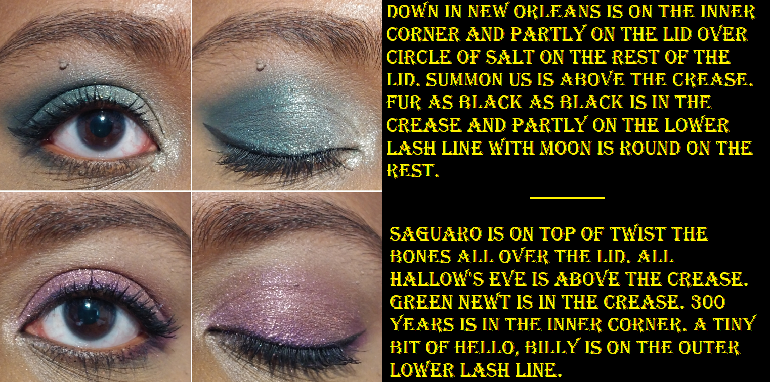
Hello Billy has an eye safety warning on the Colourpop website, which I believe is due to the dyes/staining. The palette arrived a bit messy around the edges of the pans, but nothing was broken.
Halloween is my favorite holiday, so I grew up watching and loving Hocus Pocus. I didn’t get anything from the first collection between the IP and Colourpop, but this palette had such a “me” color story that I had to buy it. I’ve complained about this aspect before, so I won’t harp on it, but I still need to point out the matte and shimmer counterpart thing as well as the similarity of Summon Us and All Hallow’s Eve on my skin tone.
As has been seen in many of the other palettes reviewed today, I tend to pull 5-6 shadows in my eye looks. With this palette, I’m satisfied with my looks when I stick to 2-4, which saves me time. I like that I don’t have to think too hard about what I want to do with this palette. All the eye shadows perform nicely. I recommend this for those who don’t already have one of Colourpop’s many palettes containing teal-ish blue and purples like It’s a Mood, Play it Jewel, or So Jaded.
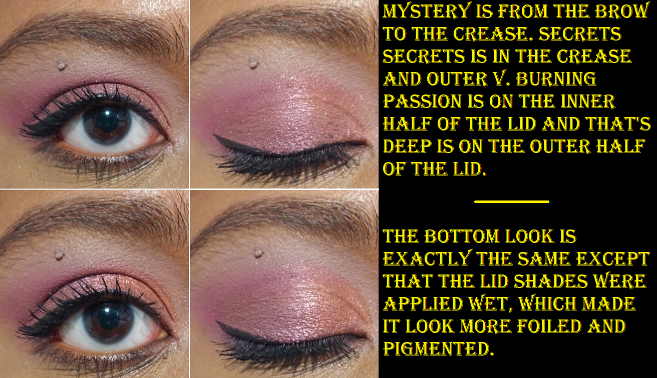
Colourpop Eyeshadow Quads in Creamsicle, Mocktail, and Secret Life of Scorpio
EYE SAFETY WARNINGS: For Creamsicle, Big Treat has PET glitter while On a Stick, I’m guessing, is dye/staining warnings. For Mocktail, Shaken has PET glitter. For Scorpio, Secrets Secrets might also have the warning for dye/staining. I should have been more careful and checked for PET before purchasing since I don’t like to use polyethylene terephthalate, even if it’s not in a pressed glitter formula. I am sad to say I will be decluttering Creamsicle and Mocktail from my collection since the pans in the quads are not removeable/replaceable. Plus, Iced from the Mocktail quad fell out of the pan on me already. I was able to press it back in, but I don’t want to have to worry about that happening again in the future.
Prior to working on this post, I only used Creamsicle and Mocktail twice each. The photo above showed the looks I created for Instagram. I was very much into these softer shades at the time that I bought them, which was when Colourpop first started making quads in this clear packaging. I love the concept of being able to have a curated look without needing to think about it, and having all the shades show up nice and pigmented on my eyes and not give me any issues to use. I also liked the level of sparkle, which I now know has the chance of being PET glitter, so I’m a bit unhappy about that. Before I knew this, I had already purchased the Scorpio quad because I knew the quality was going to at least be decent. This was also the first time anything Scorpio related (my astrological sign) had a color story I liked, as well as being the prettiest of the twelve released! Secrets Secrets is one of Colourpop’s most repeated type of reddish purple/burgundy colors they like to do, and the performance is always the same: very pigmented but slightly patchy. I always find this kind of shade appealing though. The shimmers are quite beautiful, but soft. They need to be applied wet or on glitter glue in order to make an impact.
Scorpio is a nice cohesive quad, but part of what always draws me to Colourpop is their packaging. Other than the outer cardboard that this comes in, there’s no design on the front of it to distinguish it from all the other quads, which makes it less special to me. No one is going to know this is a special Scorpio quad except me when that lightly imprinted Scorpio symbol is rubbed off the Secrets Secrets shade. If I’m buying makeup with basic packaging, the quality inside has to be worth it for me to reach for it. This quality is good, but I don’t intend to buy anymore. In fact, as much as I like the Colourpop palettes I have, I never reach for them. It’s always the packaging, rather than the eyeshadow formula that draws me in. So, unless they collaborate with an IP that would be nearly impossible for me to skip like Harry Potter, Doctor Who, a first actually good Marvel collab, etc. I’m going to try my hardest to stop buying Colourpop eyeshadow palettes.
BONUS REVIEWS
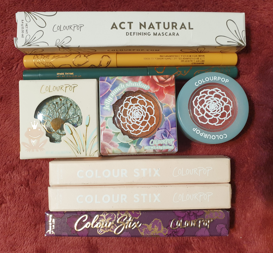
I decided to go ahead and also show the other eye products I also bought from the brand since November 2020 until now.
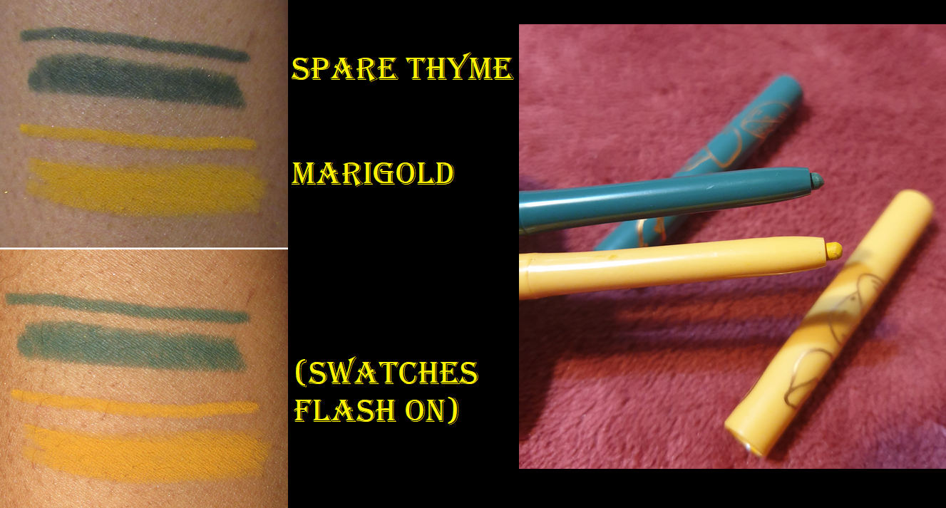
Colourpop x Raw Beauty Kristi At Forest Sight Liners in Marigold and Spare Thyme
Spare Thyme sold out in my cart during the initial RBK launch. I was able to snag Marigold. I don’t have many colorful liners, and something about Colourpop ones (perhaps how matte and dry looking they can be) don’t look great on my waterline unless I border them with an additional black liner as a frame between the color line and my lower lashes (for example the first look in the At Forest Sight section). The fact that it took three or four restocks before I could successfully buy Spare Thyme before it sold out is why I ignored this fact with Marigold and decided that somehow Spare Thyme would work better. In this case, it actually does look better, but it’s more to do with it being a darker color. All the previous Colourpop liners I used were light shades. Because of my personal preferences, I can’t be objective in saying whether they are worth purchasing or not.
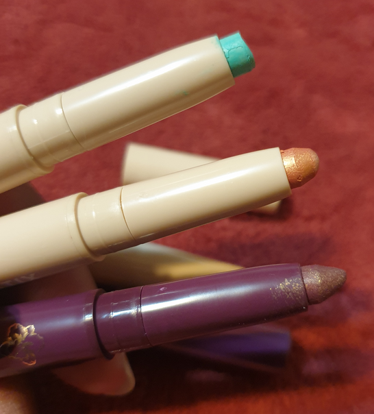
Colourpop Colour Stix in Free Time, Venus Slipper, and We’re Off
My issue with light shades of Colourpop liners are multiplied with the matte version of these Colour Stix. I don’t like the look of them on the lids from my experience with We’re Off and other videos I’ve seen online. Unlike this one, Free Time and Venus Slipper actually dry down and don’t rub away as easily. I’ve had Free Time for nearly a year longer than Venus Slipper, and that one is a bit stiffer. It’s not as easy to get smoothly onto the lid, so I’d keep that in mind for those wanting eye products to last longer than the recommended period after opening.
I’ve purchased a few of these for my sister, so I do like them (at least the shimmer/metallic formula), but shadow sticks generally aren’t my style, so I don’t think I’ll purchase more in the future.
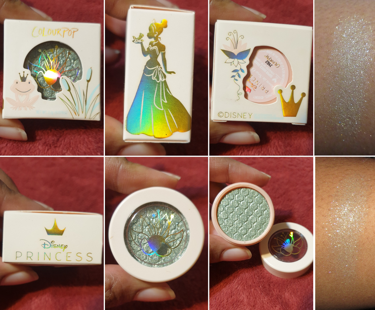
Colourpop x Disney Princess Down in New Orleans Super Shock Shadow
This SuperShock is more of a topper kind of shade, so I haven’t attempted to wear it alone on the lids. It took several rubs to get that swatch to even build up to that. I definitely did not buy this shade for the color. I bought it because I’m quite the fan of Tiana. Her personality reminds me of my sister in so many ways, so it’s only natural she’d be my favorite Disney Princess.
I could barely see the seafoam green base in the shade on my arm. When used as a topper, all I see is silvery white, so those with dark skin should keep that in mind. This shade is even less pigmented than my other Super Shock Eyeshadows, but if CP was aiming for a topper, they certainly nailed it. If it wasn’t for the Princess and the Frog theme, I would never have picked up a shadow like this, but it does have its uses as a highlighting shadow. I know myself though and I never reach for eyeshadow singles, so this is just a collector item for me.
Colourpop Garden Variety Jelly Much Eyeshadows in Saguaro and She Grown
If those shades look dried out, it’s because they are. Saguaro was my “new” shade that I bought a little over a year ago and never used. When I finally opened the jar, as can be seen by the crust around the edges, I discovered it was dried out. The lid was partially open, so there was no hope of me being able to avoid that. Every so often in my Colourpop orders, products with lids aren’t screwed on all the way. I try to remember to check for that, but in this case I completely forgot to and just left it in the original packaging until it was time for this review.
I could still rub the surface of these shades. I was surprised to see that She Grown, the shade I’ve shown before in one of my last Colourpop reviews, swatched more smoothly than Saguaro even though it’s four months older than Saguaro and had been opened and reopened several times.
I’m going to toss these out, but they certainly were shiny and gorgeous. It’s a shame they went to waste because of my same issue with reaching for single eyeshadows. Because these eventually dry out, I can’t recommend them.
Colourpop Act Natural Defining Mascara
I’m wearing this mascara in the sections demonstrating the Colour Stix on the eyes and the RBK eyeliners. I got this for free in one of my orders. The bristles keep the lashes from clumping and turning spidery, but as much as I like long lashes, I still want some volume. This mascara formula is on the wet side. I’m not satisfied with how it looks after one coat, so I have to apply and then wait for it to dry before I go for an additional 1-2 coats. I’ll keep using this mascara, but I prefer mascaras that give me length and volume in one built up coat. Because this doesn’t meet my preferences, I recommend checking out Essence, Maybelline, L’Oreal, etc for some affordable mascaras that I prefer.
Alas! We have reached the end. Thank you for reading!
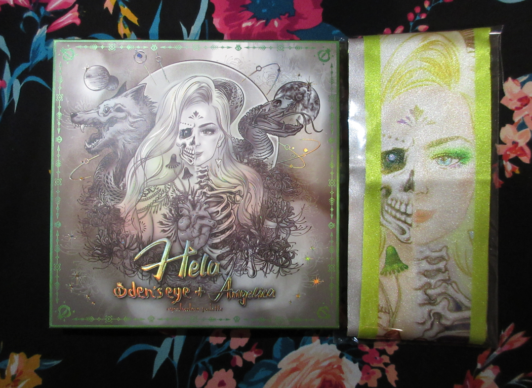
The collaboration palette between Angelica Nyqvist and Oden’s Eye is the newest addition to the Legendary Diversa Collection. Just like the previous release, all orders from this collection come in a box with the palette artwork printed on the inside. The free scarf idea was tweaked for this launch in the form of a reversible ribbon/Twilly, while supplies lasted.
This palette is currently sold out, but the restock is happening tomorrow: March 22nd 1:00 PM EST. I don’t know if the Hela box and/or Hela Twilly will be available again. Also, according to Angie, this may be the only restock.
The outer sleeve that’s around the palette has a different color scheme than the actual cover. For that reason, I plan on keeping the sleeve too.
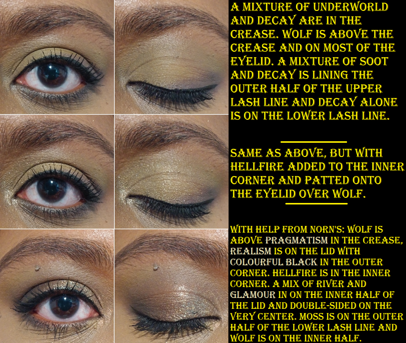
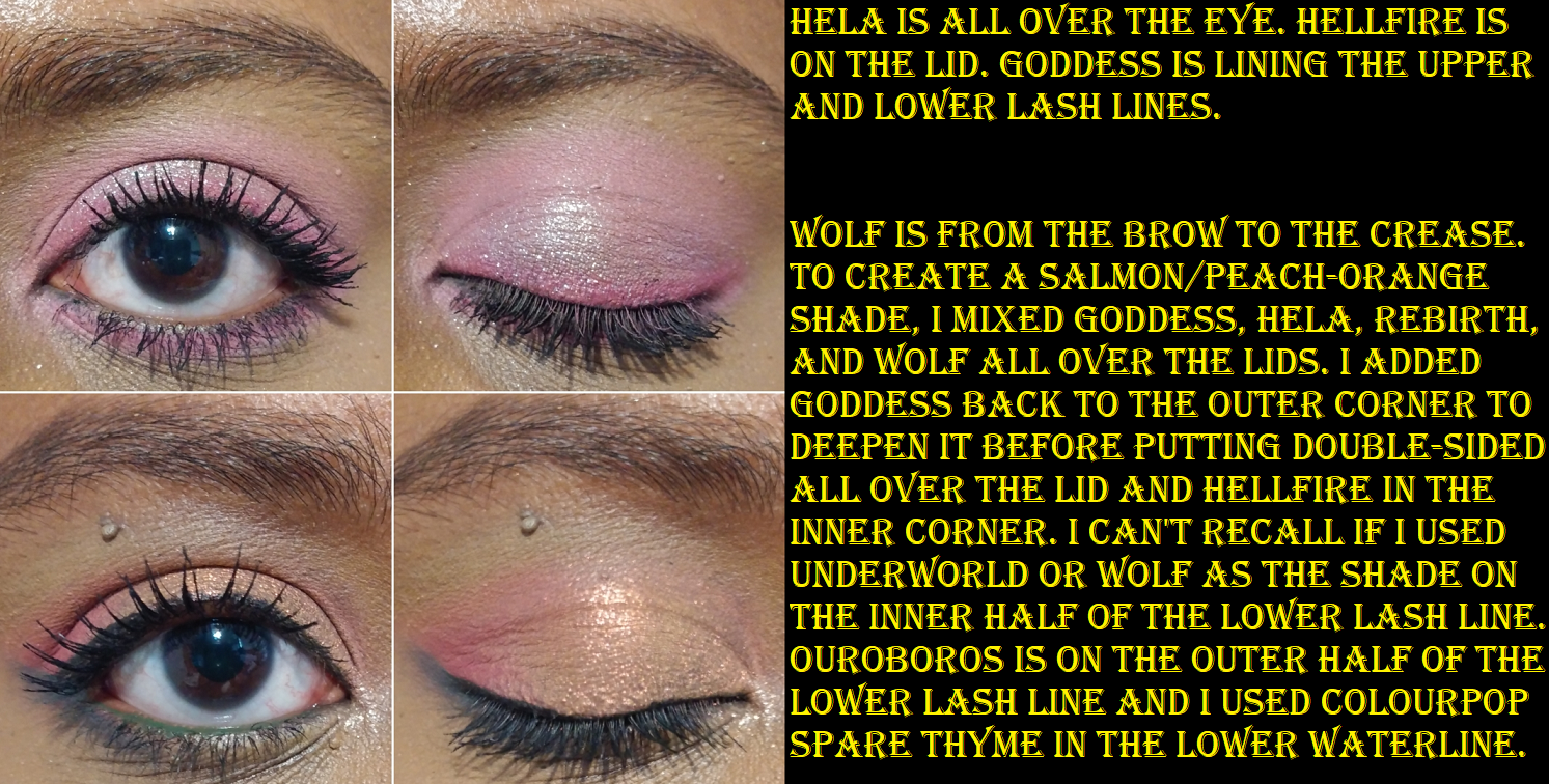
The eye shadows are the same Oden’s Eye quality I’m used to and enjoy. The mattes are very pigmented. Some are a little on the thin side, making them easier to blend and build up if needed. My issue with thinner matte formulas can be that they either dust away the longer I blend them, aren’t opaque and leave patches, or they practically disappear in areas where a wetter shimmer formula touches it. This wasn’t an issue for any shadow except the shade Underworld, which was fixed by just adding a bit more of the shadow back on top of the spot.
A lot of eyeshadow formulas either work better if applied in order working from lightest to darkest or darkest to lightest. With the Hela palette, it doesn’t matter which way I’ve used it. The lighter shades are pigmented enough that I can use them to blend out the edges of darker shadows, but not so pigmented as to ruin the depth I try to create. The darker shadows are also not so dark as to overpower the look.
I expected Soot to be my most used shade and go-to shadow for deepening up the outer corner, but on my eyes the purple tone is very strong. The purple goes well with quite a few shades in the palette, but from my viewpoint, not as much as it would if it was a bit more of a neutral color. My partial solution for this is that I can use Decay on top to counteract the purple tone, but then it turns the whole thing into a dark grey.
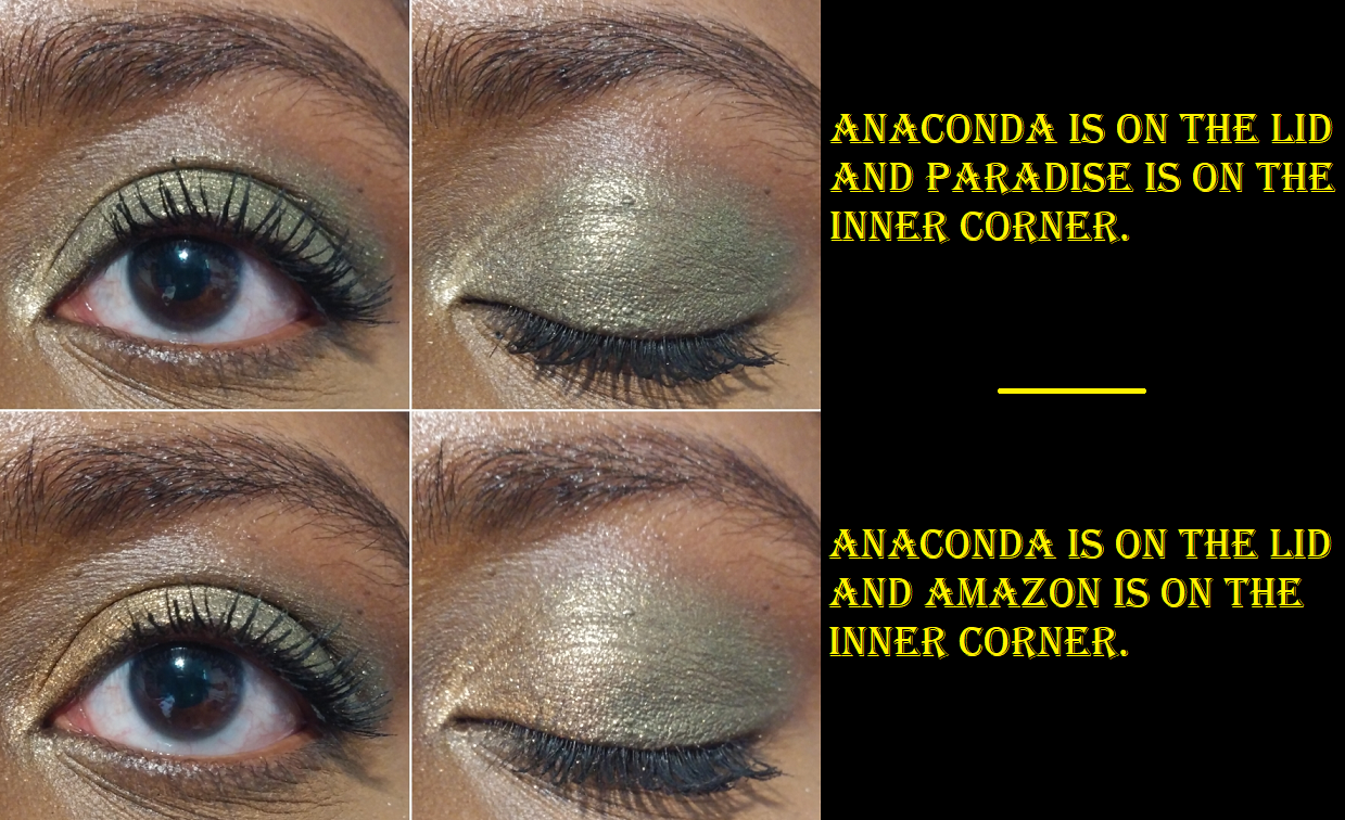
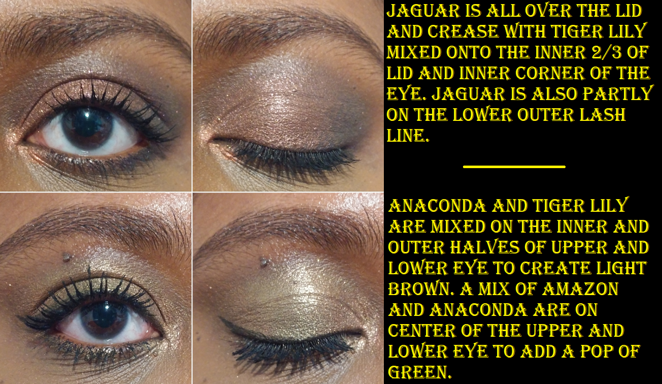
Hellfire and River are two topper-type of shadows in this palette. They both have bases, but those bases really don’t show through on their own and need to be applied on top of other shades to get the effect I’m looking for. For example, the gorgeous peachy look to Hellfire in the pan just looks like the palest pink, almost white eye shadow on me. So, I just use it now as an inner corner highlight shade. I also don’t get the purple tone out of River, as seen in the photo above in the pink/purple look where the only effect it had when patted on top of Hellfire and Soot was to darken them slightly and add some extra sparkle.
I don’t have the best luck with yellows, so I was shocked at how well these built up and lasted on my skin, especially Rebirth because using pastels on dark skin can often be unflattering. Rebirth isn’t the kind of shade I’d wear on its own, but it’s very complimentary to the other yellows and greens in this palette, so I’m surprised to say I like it! My two most frequently used mattes are Wolf as a transition shade and Ouroboros as a deepening shade for the yellow/greens/browns and as a colorful pop when used with the shadows in the bottom rows of the palette. Decay is intriguing because the first time I used it was on top of Wolf and that made the taupe/cool brown tone turn more of a dark grey color, which is not the kind of shade I like to wear. However, I noticed it should be deep enough to create depth for some lighter looks, so I decided to try it again. When Decay was applied on top of Underworld, that helped to bring more of the brown out of that shade. In Angelica’s launch video, she says she wanted a colorful palette that still had some neutral leaning options. I haven’t liked any of my attempts to get a neutral look out of this palette, so I always turn them into a more colorful look to salvage it. Perhaps this wouldn’t be the case for someone of a different complexion than me. This is not a complaint, as usually I have the reverse issue where partly neutral colorful shades (like reddish brown, grayish purple, etc) just look solidly neutral on me. So, it’s kind of refreshing, but also unfortunate that I’m going through a neutral loving phase at the moment. How ironic! The best neutral look I’ve been able to create, and I think is just an okay look, is below. The first two pictures are with this palette alone, but the third is what I’d want from neutrals and I was able to create by combining Hela with the Norn’s palette.
Of all the yellows and greens, the only one that didn’t stand out for me was Fluorescence. Other than being an eyeshadow highlighting shade, I never have a purpose for this kind of color, but to each their own.
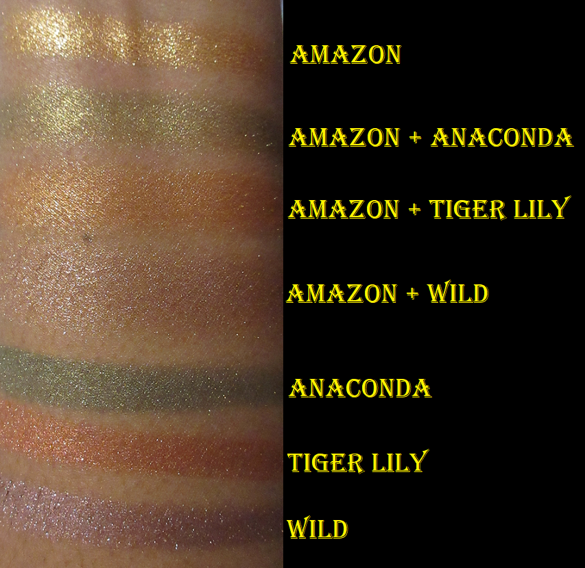
Golden Bridge is one of my favorite kinds of golden green shimmers. I actually tried not to use it too much in these eye looks because it’s such a go-to color for me. It’s the same with pairing Venom and Ouroboros together that is so instinctual for me. Because Venom is such a bright shade, I really wanted to use it on the center of the lower lash line, but it’s a bit thick and chunky for that spot and I had a difficult time smoothing it out. Perhaps I’ll need to apply it wet.
Moss is another really great shade. It’s a grungy green in the pan, but it’s a bit vibrant on my eyes, which I don’t mind. The way it looks is the tone I’m often drawn to as a transition color in my green eye looks.
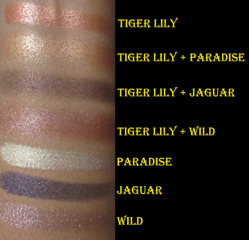
Double-Sided is like an orange-pink-green shifting shade, but the orange shift is strongest on my lids. It’s everything I wanted out of the shade Hellfire, but with the fun twist of being a multichrome. I discovered that if I mixed Goddess, Rebirth, and Wolf together, I could create a peachy-orange shade, which brings out more of the peach in Double-Sided when I apply that shadow on top of it. I add a bit of Hela too, just to soften up Goddess, but technically the color can be achieved without it.
Complete is another fascinating shadow. In the photo above, I had to include a picture with flash on to show the black tones accurately when paired with Ouroboros. For some reason, those two together throw my camera off and make Complete look very teal. As seen in other eye looks with Complete, it still veers a bit blue, but is still very much a dark gunmetal-esque black. Oden’s Eye impressed me with the shade Colourful Black in the Norn’s Palette, and once again, they’ve impressed me with this one too. I keep wanting to use that shade in every eye look I do with this palette!
I have my own preferences when it comes to color stories, so is this the perfect one for me? No. Do I still enjoy this palette? Yes. Does it inspire me? Very much so! Angelica’s palettes push me outside of my comfort zone to think of new color pairings and combinations. I went from being an eyeshadow fanatic for most of my life to actually being a little less interested in palettes over the past twelve months. So, whenever one can give me the drive to want to be creative and play with eyeshadows, that is worth every penny.
A comparison between Angie’s Oden’s Eye collab and her Kaleidos Club Nebula collab, for those wondering if they are different enough to purchase both (which the answer is yes)!
The Oden’s Eye palettes are part of my Shop My Stash for this month, so I’ve been enjoying combining shades from the Hela palette with each of the other Legendary Diversa palettes because they go so well together! I’m really happy to have made this purchase.
*UPDATE: Last minute eye looks! In the discussion with Nikki below, I realized my tendency to keep only using the top half or lower half of the palette, so here are two quick additional looks I created combining the two!
I believe that’s everything I wanted to discuss! I hope this has been helpful, especially for those considering purchasing the palette during tomorrow’s restock! Thank you for reading!
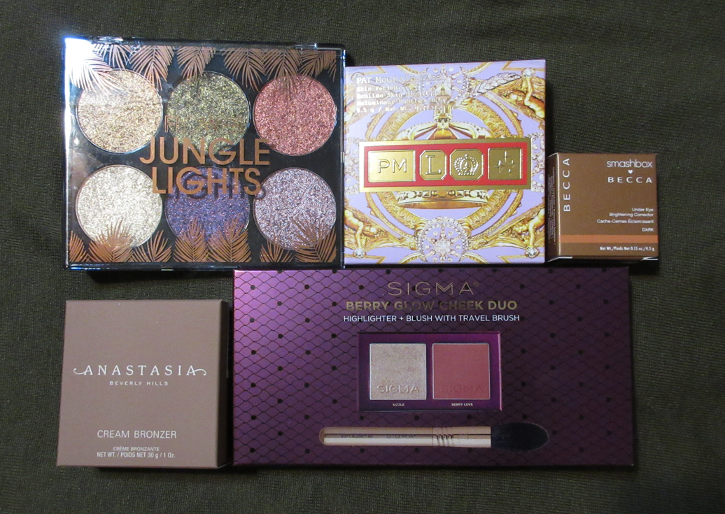
I’m still playing catch up on things I purchased in 2021 and wish to post about, but today is an update on all my beauty purchases from January 2022. I’d like to show how well (or not) I’ve been sticking to my Beauty Resolutions for the year.
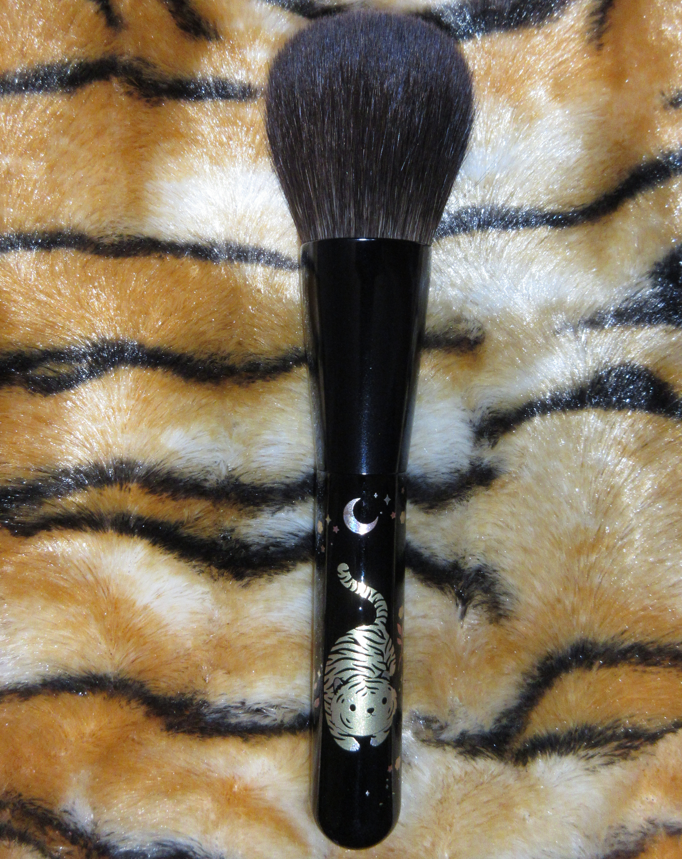
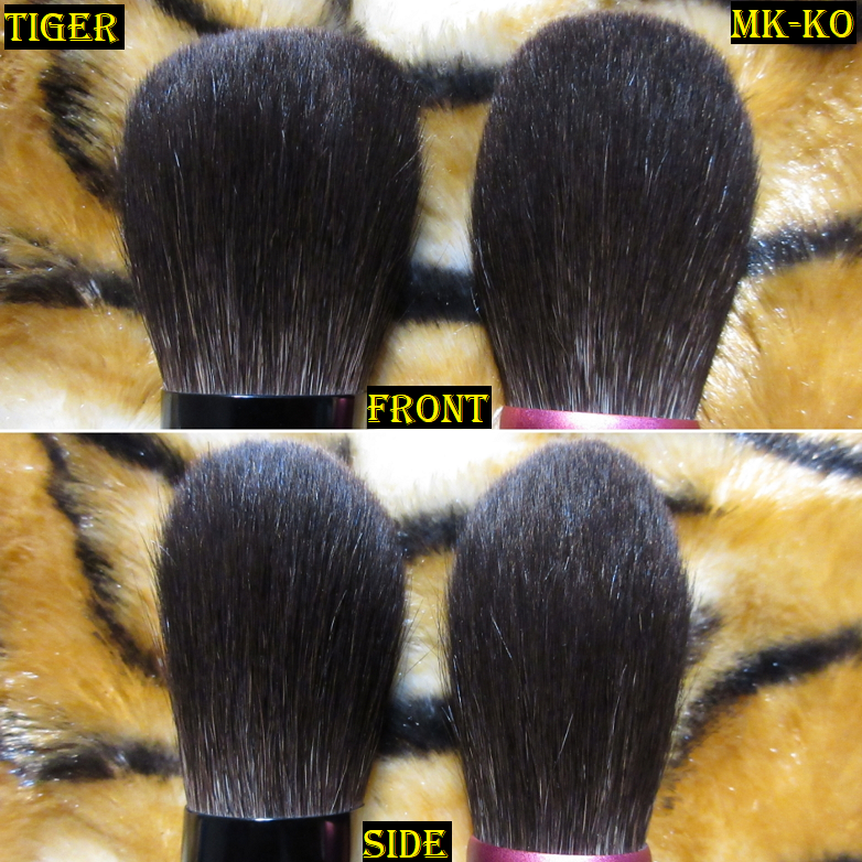
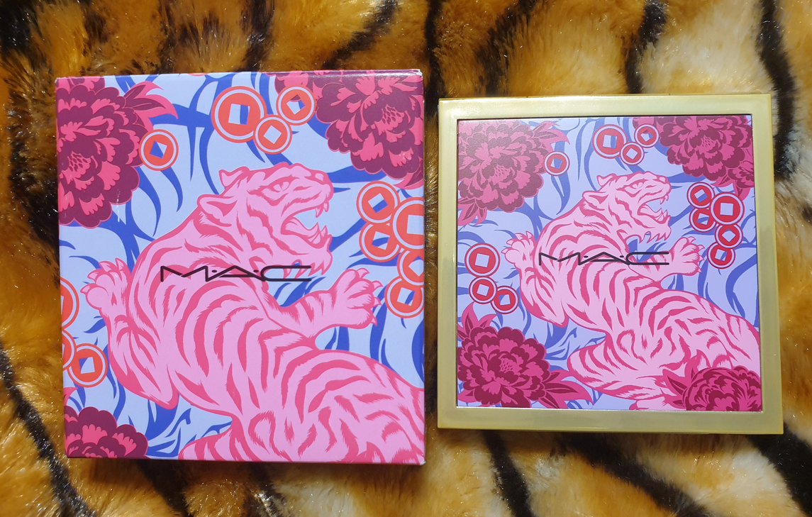
Beautylish Presents the Year of the Tiger Lunar New Year Powder Brush
Full Length: *170mm / 6.69 in
Hair Length: 47.6mm / 1.87 in
Hair Width: *40mm / 1.57 in
Bristle Type: Blue Squirrel
In my Beauty Resolutions post, I mentioned that I should only purchase Lunar New Year items that had personal significance to me (ex: Year of the Dragon). This brush depicts the most adorable chubby kitty with tiger stripes, which does make it significant to me in my interpretation of this design (it’s an inside joke). In addition, for half of my life the Tiger was my favorite animal. This is why I succumbed to the temptation and finally bought one of Beautylish’s collaborative Lunar New Year brushes. They did not announce which brush-maker created this year’s brush, but in the past is was Chikuhodo. Even if another Fude company created this brush, I’m still happy that it has the Chikuhodo aesthetic with the large round shiny handle similar to the Z-series. As long as the brush is high quality, which it is, it doesn’t matter to me which Japanese company created it. This brush is still hand bundled with an exquisitely detailed lacquered handle using the maki-e process.
This brush is unbelievably silky soft and of course perfect for those who want a very sheer application of powder. I can use this for highlighter (when applied just on the very tips), blush (when I use sweeping motions across the cheek), and bronzer, but in my eyes this is a dedicated all over face powder brush. Although it picks up a small amount of product, when that product is very pigmented it takes more effort than I like to buff it out because it’s not dense enough for that. If I use a squirrel hair brush for blush, I prefer one that’s thicker and more round like the Z-1. Anything looser packed than that, I consider to be more ideal for setting/finishing powders. Honestly, this is more of a collector item for me and not one I intend to use a lot. When I do use it, it’s heaven though. It’s so soft and light that I barely feel any pressure on my skin. This is a beautiful powder brush, but if you already own one with grey/blue/ash squirrel hair, you’re not missing out by not having it. For those who don’t and would like a light/medium density powder brush, this might be a good place to start since comparable brushes to this would be a little more expensive. I still recommend this for collectors, but for someone looking for a more functional or versatile brush, I would direct them to Chikuhodo’s Z series and FO series.
At launch, Beautylish also restocked the previous Lunar New Year brushes as well: Pig, Rat, and Ox. As cute as those designs are, those three have nearly identical brush heads which is already practically the same as the Tiger brush, so I didn’t feel any pressure to add those to my cart. Since I already have three close enough brushes as the Tiger, Koi/Carp, and the Z-1 (the Z-9 is a better dupe but I don’t own it), I don’t feel a need to get a backup brush. However, trying to steer clear of a Rabbit next year will be difficult, and I suspect trying to ignore the Dragon will be impossible.
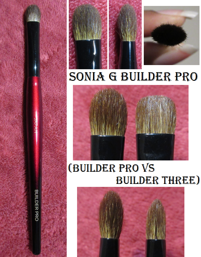
Sonia G Builder Pro Eye Shadow Brush
Full Length: 152mm / 5.98 in
Hair Length: 12mm / 0.47 in
Hair Width: *9mm / 0.35 in
Bristle Type: Dyed Saikoho Goat Hair
The Builder Pro and Builder Three are both brushes that lay product down well but can also be used for blending. I’ve discovered that the Builder Three leans better on the blending aspect because of the flatter top, so I prefer that one for crease work. The Builder Pro leans better on the lay down and building aspect because it’s perfect for applying shadows to the section of my eye between the eyelid and inner corner. I always struggled with that spot, but this brush gets in there easily. It’s also more precise for application to the outer V. I’ve actually been able to do entire eye looks using this brush alone. I’m very happy I decided to finally buy this! The tapered tip that makes the Builder Pro so great for applying shadows also prevents it from blending large areas as quickly as the Builder Three, so I will probably use that one more often when I’m in a rush. However, for when I have more time and want to create a detailed and more skillfully done eyeshadow look, I will definitely grab the Builder Pro instead. They perform differently enough that I feel justified having them both in my collection.
Before we move onto the next topic, I have to acknowledge that I bought a backup of the Builder Three at the same time that I ordered the Builder Pro, which is a breech of my beauty resolutions. Then Sonia G/Beautylish restocked many brushes I wanted, including the Cheek Pro which would have been yet another backup purchase, but I was able to stop myself.
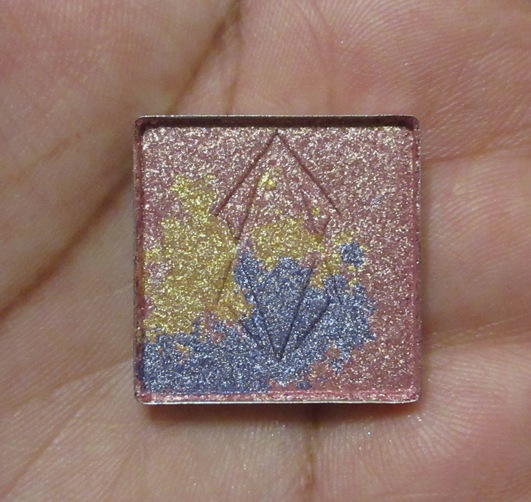
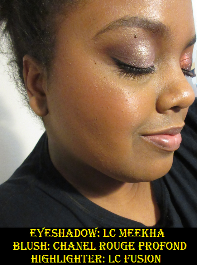
Lethal Cosmetics Charity Eyeshadow in Meekha
This is one of four limited edition charity eyeshadows released from Lethal Cosmetics. I mentioned liking tigers earlier in this post, but I am dog person and I have a soft spot for pitbulls. It was very lucky that the only eyeshadow that caught my attention happened to be the one named after the sweet rescue pitbull named Meekha. In addition to the animal charities being supported by the purchase, Lethal also committed to planting a tree for each January order. My sister had a pitbull named Radja, so that’s the name I chose for the planted tree in her memory.
This is the second indie brand that I’m aware of who has created limited edition shadows for charity, and I am here for it! For some reason, when larger brands do it, it feels like it’s just for press. Somehow, this kind of thing coming from a smaller brand seems more heartfelt. In any case, I like to see this.
The combination of the colors in the Meekha pan turn into an icy lavender shade on me. I’m not sure how often I will use this shadow, but I was able to create a look that I liked. It even makes for a nice bright inner corner highlight shade for other eyeshadow looks! The eyeshadow texture and performance feels just like other shimmers from the brand. The formula is a bit thick, but they smooth out nicely on the lids and fallout is about what one would expect from a shimmer shadow (present but not too bad especially if applied wet or on top of a glitter primer).
And as a follow-up to the charity aspect, post-January purchases will continue to go to charity. It’s just the tree part that is over now.
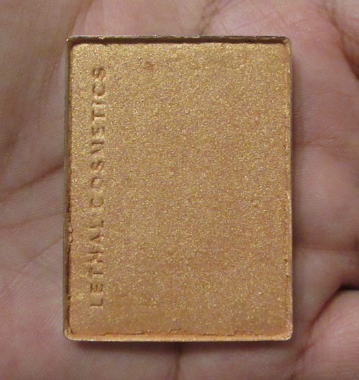
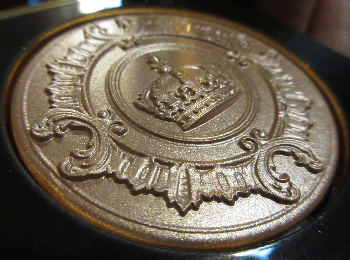
Lethal Cosmetics Highlighter in Fusion
I wanted this highlighter shade for a long time, but it was initially exclusive to the Equilux face palette, which I did not get because the blush and bronzer in the trio were too deep for my skin tone. Since it’s now available as an individual item, and I wasn’t completely satisfied with the highlighter selection I brought with me on my trip to Germany, I figured this was the best time to get it (especially with the lower shipping cost). I am supposed to be on a highlighter No-Buy, but this purchase was allowed as it falls under the category of something I would have bought last year if it was available to me, and in this case, available as a single product.
Unlike Gamma and Gravity, my two other Lethal Cosmetics highlighters, I find Fusion to be quite subtle. Fusion is close to my skin tone, and that could add to how subtle it is, but even the texture feels a bit different than the other two, and not just because of the lack of ridges. Fusion was difficult to show in swatches, even when built up. It feels a bit hard pressed*, and when the highlighter was delivered, it was messy around the pan edges as well as within the packaging. My brushes are able to grab product easily (despite the fact that it looks a bit hard-panned** now too) but perhaps the hard pressing is preventing more of the actual shimmer particles from being picked up. That would be ironic considering if I have an issue with a highlighter it’s usually that my brush is picking up too much of the shimmer.
*NOTE**: I have a few wonderful friends and family members who read my blog sometimes and may not be aware of some of the terms I’ve used. For anyone who needs clarification, the press of a product refers to the force in which a product is physically pressed into the pan (usually with a pressing machine). Makeup that is “Hard Pressed” has powder so compacted together that it becomes difficult to get the product out of the pan and onto the brush. “Hardpan” is when a powder product gets a hard or filmy top layer that also prevents someone from being able to pick up product onto a brush, but it is usually due to oils from the skin getting into the powder and creating that tough layer. Certain formulas of powder products are more prone to hardpanning than others.
Fusion has an orange tinge to it. Although the shine level is a bit low, when it hits the light, the golden-orange sheen is apparent at that point. It’s not what I was going for but mixing it with some of Gamma puts the look back in my comfort zone. I will likely declutter Gravity and Fusion at some point, but testing out these shades reminded how much I enjoyed wearing Gamma, and I will have to remember to use it more often. Anyone interested in seeing those shades on me can check out my previous Lethal Cosmetics post here.
Chanel JOUES CONTRASTE Powder Blush in 320 Rouge Profond
I considered buying a Chanel blush for a long time, although I always expected it to be from one of their limited edition collections. My interest in buying one re-sparked when Ulta started carrying Chanel Beauty products in January (although the brand will probably be excluded from all coupons including prestige). I also really wanted the Blush Lumiere Brun Roussi shade from the Spring 2022 collection, but I wasn’t willing to spend Hermes prices for it. So, when I was browsing the Duty Free section at the Frankfurt Airport, I had an impulsive moment to buy shade 320 Rouge Profond, a shade that is not available at Ulta and is part of their older blush formulation. Chanel changed to the new formula in March 2021, and according to reviews I’ve seen, the new formula is less smooth, less sheen-like, and less pigmented, so I decided to go ahead and get this one in the old formula while it was still available.
The Houkodou Nagi Powder N-F1 Brush fits perfectly around the dome of this blush and applies it perfectly as well. The blush swatch needed to be built up on my arm, but color goes onto the cheek nicely. The perfume scent is very noticeable. The color and performance reminds me of the MAC Mineralize Blush in the Flirting With Danger shade. In fact, as much as I like this blush, it didn’t “Wow” me more than the MAC blush and that one is significantly less expensive. My curiosity is satisfied knowing Chanel’s permanent blushes aren’t superior to products I already have, but there’s still that troublesome part of me wondering if Chanel’s even pricier blushes are better. Either way, at twice the price, I doubt it would be two times better, so it’s best I leave that topic alone.
That’s everything I bought in the month of January! I did not include products I ordered in December that arrived in January. Those items will show up in future posts.
Thank you for joining me today! I hope this has been helpful!
-Lili ❤
*UPDATE: For those on the email list, I apologize for the accidental early release of this post. I’ve been consistently posting at the same time for a reason, but I’m not sure how or when the scheduled time for this one was changed and it completely escaped my notice. Considering we just entered Daylight Savings time in the US, this could be especially early for some people. I plan to resume our regular schedule of Mondays at 11:30 am EST.
MAC Cosmetics is probably the most reviewed brand on my blog. They frequently release eye catching collections that manage to make me want even their repromoted shades, just to get the limited edition packaging. They often have sales, which plays on my deep love of getting a good deal. Their staple products are top notch and they’ve held onto their generally good reputation for decades. Unfortunately, MAC has made some questionable production decisions in the last few years to the point where I seriously considered taking a break from them. Today’s post is not about that, and is instead about sharing the newest additions to my MAC collection.
MAC Lunar Luck Eyeshadow x 9: Made My Fortune
This palette was a gift from one of my best friends, and for that reason I will cherish it. It’s one of those things I wanted for the packaging, but not the makeup inside, since I tend to not be the biggest fan of MAC’s eyeshadows. I can at least say the quality of this one is the best I’ve tried from them. The shimmers have pigmented bases, but are a bit tame in sparkle reflectivity, even when used wet. I appreciate that they were easy to apply smoothly to the lids and inner corner. The mattes were also more pigmented than I expected from MAC, and slightly easier to blend than the ones I’ve used in the past. Creating the two looks shown below was enjoyable enough that I may continue to use this palette from time to time, but not enough to make me want to purchase anymore MAC shadows. There isn’t a whole lot of versatility among the two light mattes that hardly show on me (Shell We Celebrate and Sunkissed Orange) and two shades that look nearly identical when used next to each other (Propitious Poppy and Plum What May). The shimmers (excluding Supreme Harmony) don’t look that far off from each other in the pan, but I was pleased to see they are distinctly different on the eyes. Wish Me Luck!, 15 Minutes of Flame, and Born to Rule (as a highlight shade only) are my favorite eyeshadows in the palette. I’ve really been into the brown shimmer eyelid look lately. I still feel $32 is a bit pricey for the quality, so for anyone wanting this palette, I hope you’ll be able to get it on sale!
MAC Glow Play Blush in No Shame!
I’m a big fan of MAC’s Glow Play blush formula, so I wasn’t satisfied with having just one from their collection. I got this for 50% off on Black Friday. These blushes tend to look more vibrant and pigmented than they actually look on the skin, which can be tricky in trying to figure out which shades would work for me. No Shame! takes a lot of building up to get it to show on my cheeks, but the end result is pretty. It has that familiar putty-like texture that sets to a natural finish, just like the others.
At the time that I’m writing this, I cannot find this shade on the website any longer. I think it’s safe to assume it has been discontinued, and I believe the reason is because of the release of HD Cherry Tree.
MAC Wild Cherry Collection Glow PlayBlush in HD Cherry Tree
HD Cherry Tree is like a deeper, slightly more berry version of No Shame!. Quite a few people managed to get their hands on this blush before the US launch, so I purchased mine from one of them (and for less than the retail price)! I was unlucky that as soon as I flipped it over to let the plastic protector naturally fall out, the entire blush popped out with it. However, since it’s a bouncy blush, I was able to squish it back in the compact. Good as new!
I’ve only purchased the Glow Play shades that I think would show up on me, and it’s a bit unfortunate that they look quite similar to each other.
My hope is for MAC to expand the range even further to fill in some gaps, like a medium-deep reddish brown, a terracotta, and a deep pink-mauve. Then again, I’m trying to buy fewer MAC products, so maybe it’s good that they don’t have those shade options!
The Wild Cherry collection is limited edition, but I wonder if MAC intends to make HD Cherry Tree a permanent shade in the future, but without the special packaging. There are two other Glow Play blushes in the Wild Cherry line, but I don’t plan on buying them. Between the Wild Cherry packaging and last year’s Black Cherry packaging, I prefer the look of this new one.
MAC x Lisa Blush in Melba
There isn’t much to say about this blush since I already reviewed it before, but I wanted it for the limited edition packaging since purple is my favorite color. I know Lisa is from the band BLACKPINK, but I don’t listen to their music, so the collab aspect didn’t entice nor deter me. Melba only works for me when I’m at my lightest (typically winter), so I gave my original blush to my sister. This color is still so difficult to get it to show on camera*, but it is visible in person. After wanting to repurchase it for so many months, I decided to go ahead and do it when it was 40% off on Veteran’s Day. Around that time or soon after, I saw the sneak peeks of the MAC x L collection, but I had no idea they would repromote yet another product and that it would be Melba! It worked out in the end since I gifted my new and unused standard packaging version of Melba to the friend who gave me the Lunar New Year Tiger palette.
*Another photo showing Melba is in the Illuminate Face Palette section demonstrating how GoldieLush looks on the cheeks.
I’d like to add that my last purchases directly from MAC’s website was last November and December and both of them were listed as delivered according to the tracking history on my account page (I didn’t get shipping confirmation for either one), but they never arrived. I had to contact customer service for reshipment. Prior to that, my eyeshadow palette from the Tempting Fate collection was lost in the mail (after already being delayed for a week before getting shipped). I would typically view the carriers as responsible for undelivered mail, but the lack of shipping confirmation in two of those instances makes me wonder if the fulfillment center nearest to me is having issues and if it’s fixed by now.
MAC Pro Face Palette: Illuminate
I was eligible for a free birthday gift in November, which was supposed to be an eyeshadow quad. Only three out of four shades were in stock, and it wouldn’t let me add them to my cart without choosing a non-existent fourth available shade. I asked customer service what I should do in this instance, since you can only redeem the gift with a purchase and I only had a few days left before the offer expired. The solution was to send me this palette, which I jumped on since I don’t really like MAC eyeshadows anyway.
This palette consists of cream highlighters that have an almost waxy texture. It reminds me of both edge gel and the Danessa Myricks Dew Wet Balms. I didn’t have high hopes because products in that consistency tend to remove my foundation underneath it, and this one did too, but it’s easy to apply a little concealer back on top without interfering with the shine level. Unlike the Dew Balm, this gave a perfectly smooth wet sheen without looking greasy. It doesn’t dry completely, but it’s not dewy enough for my hair to cling to it either. I was very happy with the results! It also makes a great base to intensify powder highlighters that are applied on top of it, although I don’t usually go for the super highlighted look. Powder highlighters are my preference, so I don’t know how often I’ll actually use this, but it certainly made a nice birthday gift!
Please ignore the slightly lingering indent on my skin from wearing a mask. I took 3 of the 4 photos on the same day, which is why GoldieLush doesn’t have that mark.
They look nearly identical in photos, but the slight pink tinge in Starry Opal, the light silvery tone of Malted Milk, the traditional medium gold in GoldieLush, and the orange tint to Peach Plush are identifiable in person.
MAC Mineralize Skinfinish Natural in Dark Tan
I wanted to try this powder for so long, but trying to figure out which shade I should choose out of Dark, Dark Tan, Dark Golden, Dark Deep, and Dark Deepest (which didn’t look all that deep in all the photos and videos I scoured the internet to find) was quite frustrating. It’s helpful when brands list their products by order of either lightest to darkest or darkest to lightest, but these didn’t seem to follow that order all the way, which added to my confusion. The biggest difference between multiples of them seem to be the undertone, but MAC doesn’t have any descriptions of these shades. It would be great if the brand created a chart pairing MAC foundation shades with the suggested powder matches.
This powder tends to look lighter on camera, so it took ages for me to get an accurate photo. I can understand now why the same shade looks so different in the photos and videos I’ve seen others take too.
Based on the broken up powder photos from MAC’s website, I thought Dark Tan and Dark Deep were my two best options, but I questioned whether Dark Deep was slightly too dark and possibly a bit orange. Since powders can sometimes deepen on my skin when I wear a dewy foundation, I decided to ultimately get Dark Tan. Dark Tan is admittedly a tad light, but it still works for me. The bigger issue I have is that it looks a little dry on my skin because I grew unaccustomed to having such a matte look to my face, plus it being a bit light. I have only used this a few times, so I will continue to experiment some more using different brushes. It’s possible I applied too much or that it looks better with other complexion products. Because I was so iffy about whether I’d like this powder or be able to select the right shade, I decided to wait as long as it took for this product to finally be on sale for higher than 30%. It took years, but I was thrilled when MAC added this to the 50% off deal for Black Friday. So, that made satisfying my curiosity less of a financial hit!
This is everything new I’ve added to my collection from MAC so far. I do intend to get the Magnificent Moon Extra Dimension x 4 highlighter quad palette when it gets released. Of course, I shouldn’t because I’m on a highlighter no-buy, but this falls in line with one of the exceptions listed in my Beauty Resolutions post. I love moons. It’s one of the central aspects of my one and only tattoo, so that kind of imagery is significant for me. Other than that, I’m going to continue trying to slow down on the frequency of my MAC purchases so I can enjoy what I already have!
I typically post once a week (Mondays) and if I ever have a bonus post it usually goes up on Thursday, however, posting on 2/22/22 at 2:22 EST was too poetic to skip.
This quick review is an update to my Devinah Cosmetics Collection. They have released plenty of new formulas of eyeshadows, but I held off on buying all the ones I wanted since I know Clionadh is expanding their Stained Glass Collection. I want to see what Clionadh releases first before snapping up some of the recent duochromes and multichromes that have launched from other indie brands.
The first of the three newest Devinah Shadows I bought is called Fairy Fire. It’s listed as a pressed pigment, but I’m not sure if it belongs to any particular collection of theirs. It looks yellow in the pan but on my eyes it’s this intense glowing green, or at certain angles it’s more of a blue or pink. There is nothing subtle about a shade like this! On camera, the pink and blue are easier to see. The intense green could only be captured when out of the direct light and partly dark.
The next two, Zombi and Seance, are from the Laveau Collection. There are four shadows in total in that collection, but Zombi and Seance looked the most duochromatic of the bunch. I am a little disappointed in Zombi because the base color is so dark that the deep aqua/green it’s supposed to have barely shows through and the cool deep purple just looks black on my eyes when used alone. I’m happier with Seance, although the blue and purple are prettier and pop more in person than in my photos.
One more thing to note is that I stopped using Glitter primer as often and lately I can’t be bothered to spray my brush before applying shimmers, but with these shadows you definitely want to use something to help them stick. There is so much fallout! Devinah has some shadows that are on the flakier and chunkier side, like the Xploders and Sugar Drops, that are obvious that they need something to keep them in place. I find these three new shadows (more specifically Zombi and Seance) to be much smoother than those, which led me to believe they didn’t need the extra help. I was wrong! Fallout gets worse throughout the day and with these particular colors it is extremely obvious that it’s not supposed to be all under the eyes and all over the cheeks. I looked crazy the two times I wore them and I will not use them again in the future without some kind of aid to keep the fallout to a minimum. I’ll leave the glitter under eyes look to Ed Sheeran.
Well, that’s it for the review! Short and sweet! Thank you for reading.
I purchased the Nars Climax Palette near the end of 2021 and this is what I will be reviewing. I didn’t want “Climax Palette” in my title, although what better day is there than Valentine’s Day to discuss such a cheekily named product!
This has a great selection of mattes: a brightening, transition, colorful, and deepening up shade. Since I love bright colorful greens, I wish Up In Smoke was a bit brighter and less muted, but I can appreciate that the olive hue in that eyeshadow pairs well with the olive shimmer called Hooked. It’s similar to the way that Public Eye is the matte counterpart to Next Level.
Open Wide adds brightness to my eye area and it is pigmented enough to even partially cover darker shadows. Private Show is a little light as a transition shade for me, but it still works.
I was always under the impression that Nars eyeshadows were lacking in pigmentation, but that is at least not the case with the ones in this palette. They blend and build easily over MAC Paint Pot. Passion Play, Next Level, and Night Rhythm are all more shimmery than I anticipated! Even though they aren’t vibrant shades, the sparkle level is the intensity that I like in my lid shades. Envious is my preferred shade for the inner corner though. The inner corner is the spot where I most easily get shimmer particles in my eye. Envious isn’t to the same sparkle level as the others, especially when I wet my brush. The smoother the formula, the less likely I am of accidentally getting some in my eye while trying to apply it evenly. Envious gives me a nice amount of shine while also being easier to get on the inner corner.
I don’t even have much to say about this palette except that I’m glad I decided to buy it before it sold out, since it’s Limited Edition (it did get restocked recently on the Nars website). If all Nars eyeshadows are this quality, I would want to purchase more in the future as long as the selection of shades match my preferences. I’ve been waiting for years to pick the right one for me, so it might be quite a while longer until I’m interested enough in the color story to buy the next one.
I admittedly have an excessive makeup collection for a single person. Though it may not seem like it considering all the newly released makeup I purchased in 2021, I actually made a bigger effort to talk myself out of getting makeup in categories I already had favorites of and didn’t need. Each product reviewed today were things I thought I successfully anti-hauled, but all it took was a sale for me to change my mind!
These purchases were all made in 2021, so my beauty resolutions for 2022 are still intact and going strong! If anything, this post is an example of why I had to come up with a better plan for this year.
Anastasia Beverly Hills Cream Bronzer in Hazelnut
This purchase I attribute to Angelica Nyqvist’s many videos talking about how fantastic this product is, including her end of 2021 favorites. I wish I could say I had the same experience, but I just find it to be okay at best. This cream is easy to blend out, to the point that I have to build it back up, but if I overblend while building it up, it starts to look patchy because it’s setting in spots at different times. On the opposite side of the issue, I try not to apply too much at once because the shade is a bit deep for me. The shade jump between Hazelnut and the next lighter shade, Caramel, is huge. Hazelnut was my only color option. So, perhaps if I had a better match that didn’t put me at risk of overblending, I might like it better. As it stands, I prefer the Danessa Myricks, Kaja, and Sol Body/Colourpop cream bronzer formulas above the one from ABH because those three all blend quickly and easily into a skin-like finish. They’re also just as deep, or in some cases deeper, than the ABH without the blending and building troubles.
I’ve used this about ten times, so it’s possible I could find another brush that works better with this bronzer other than the Sonia G Mini Base and Scott Barnes #65 Flawless Face Brush, but between using a sponge, brush, or finger, the end result looks similar for all of them. I’m cutting my losses and rather than figure out how to make this one work better, I can just use my no-fuss cream bronzers that I like instead.
Pat Mcgrath Labs Skin Fetish: Sublime Skin Highlighter in Lunar Nude
I couldn’t resist the gold packaging with that embossing, but I’m at least glad I waited for a sale. I told myself over and over that Lunar Nude would look too light for my skin tone, so I shouldn’t get it. I was half right. The shimmery reflective particles are light gold, but the base color is a copper color. It even looks copper or gold depending on the lighting of the room and the angle. The base tone helps it look a little more wearable on me, but it’s still lighter than I’d prefer in a highlighter.
I can see the shimmer particles on my face, which is also not my preference, but I also realized that certain brushes of mine pick up more of the sparkle than others. On the website, there was a note to pair this with the highlighting balm duo. When I used the balm and then applied Lunar Nude on top, it definitely helped to make the product melt into the skin and look super smooth and achieve that “wet look” that I enjoy. However, it really cranks up the intensity level and the fact that the highlighter is too light for me becomes way more obvious. Since I figured out how to use it to my preferences, I like the formula but not the actual shade. Ultimately though, I don’t think this is worth buying at full price except for collectors and luxury product lovers. For anyone looking for the best highlighter on the market for the best price, this isn’t it. Much better and more affordable options are out there. It’s “pretty good” at best. I personally prefer Pat Mcgrath’s Divine Rose highlighter. That one is listed as a “futuristic gel-powder formula” in the “Skin Fetish: Ultra Glow” line whereas Lunar Nude is a “luxe gel-powder formula” in the “Skin Fetish: Sublime Skin” line. It’s possible they are the same formula, but Lunar Nude leaves more sparkle on the skin, which is the biggest difference other than the color.
Pat Mcgrath LabsHighlighter Comparisons
Different lighting to reveal the color shift of the trio.
Of course, since making this purchase, Pat Mcgrath has released similar highlighters to Lunar Nude’s formula in the Bridgerton collection. I don’t believe either of those new colors would look nice on me. If PML releases a shade variation I like in this same formula with the same special packaging and same or similar embossing, I would most likely sell Lunar Nude and buy that one. As it stands, this one isn’t getting much use in my collection but I still don’t want to part with it without a superior replacement.
Smashbox Loves Becca Under Eye Brightener in Dark
Although Becca Cosmetics is no more, a few best selling products were resurrected through Smashbox. This decision is presumed to be made by their parent company Estee Lauder.
There were originally just two shades: light-medium (now called Fair/Light) and medium-deep. The Smashbox x Becca version has two more in the mix: Medium and Dark. It’s my understanding though, based on a YouTube video by All Beauty by Sarah, that the original medium-deep color is actually close in depth to the current Medium shade with the main difference being that the original had a stronger pink tone to it. The third darkest shade now is called Medium/Dark and is much darker than the original medium-deep. The final shade, and the one I picked up, is Dark. Based on the description and the shade in the pot, I expected Dark to be too dark for me. Technically, as this is supposed to brighten my under-eyes, I should have gotten Medium/Dark. However, I prefer for my under eyes to match the rest of my face rather than being brighter, so Dark works perfectly for that. It’s the best matching color-corrector type of product I have ever used because it has a slight orange tone to hide my dark circles, but there’s also enough brown to make it look natural. I try to avoid showing my skin discoloration as much as possible, but in this instance I felt it was necessary to show a demonstration photo below.
Cream products almost always move in my under-eye area, but what makes this one a little different is the very sticky texture. This product has gripping power similar to the Milk Hydro Grip Eye Primer, but stronger than that one. This makes it ideal for applying a concealer on top, even though based on the color match, I don’t find that to even be necessary. However, it will not set on its own, so I either have to apply a concealer that sets down like the Tarte Shape Tape or apply a setting powder to my under eyes (or both). If I apply the Smashbox x Becca corrector by itself, it will settle badly into creases. So, I need at least something on top to keep it from creasing and to continue looking smooth.
So, I have an answer to using this product to hide my dark circles and keep it looking as smooth as possible considering I have heavy lines under my eyes. This product would be perfect if it wasn’t for the transfer issue. No matter what products I apply on top of the corrector, it will lift off my under eyes if I accidentally touch it or if I try to wipe away shimmer eyeshadow fallout. So, despite being the perfect color match for me, this isn’t a holy grail product. I use it on days when I’m not planning to go anywhere and am just putting on makeup for Instagram and Blog photos. I am at least glad I’m still getting use out of it. This would work wonders for people who don’t touch their face or rub their eyes as much as I do, so I still recommend it, but I would be wary about potential issues. Also, I would use a dedicated brush specifically with this product because it’s a bit of a pain to use with my favorite concealer brushes the way it coats the hairs in its sticky texture.
Flower Beauty Jungle Lights Palette
The release of Flower Beauty’s Desert Lights palette didn’t take away the major hype surrounding the original Jungle Lights palette. That’s what ultimately caused me to finally want to try it out. I’ve also always been curious how it stacked up to the MAC Tempting Fate palette a lot of people were comparing it to.
In the photo above, in the “Flash Off” set of swatches, I put a yellow divider line to help show the differences between the Flower Beauty swatches on the left half and the MAC swatches on the right half. In the “Flash On” set of swatches, I did not put a divider in order to keep it from impeding on seeing how similar the two sets look next to each other in every shade except Amazon (which had no equivalent) and Jaguar.
The Flower Beauty Jungle Lights formula is as creamy as everyone says, except Paradise and Jaguar have less slip and feel a tad more gritty. I also like the sparkle and shine level of these shimmers, which clearly surpass that of the MAC Feast Your Eyes Palette from the Tempting Fate Collection.
They’re as nice as people say, and I appreciate the fact that they last fairly well on my eyes as long as I pack on enough color with my finger (which is the recommended application method) and am content with the colors fading a bit to a duller color by the end of the day.
I think it’s worth looking into, especially at the price point. $17.99 is great already, but between a sale and coupon codes at Ulta, I got this one for $8.68. I still would have thought it was worth it at full price.
One of the most fascinating aspects of this palette was when I came across a reddit post showing 47 different shade combinations that could be made using this palette depending on which shade was on the bottom layer and which one was on top. Of course, the differences aren’t as obvious on my skin tone, but there were enough combinations to leave me thoroughly impressed. I took photos of some of the most obvious color changes with comparisons to the individual shades on their own to make it easier to see the differences.
And then the photo below shows all the individual shades plus my favorite five new shade combinations.
Unfortunately, some of these shade mixtures don’t show as well on my eyes as they did in arm swatches. However, it’s still fun to play around with the combinations. It makes for a more versatile palette.
I wish there were some mattes included, but I could perhaps continue to get use out of this if I remember to pull it out in conjunction with some of my all or nearly all matte palettes.
Sigma Beauty Berry Glow Cheek Duo
I really thought this duo looked nice on my skin in person, but in photos, the blush looks very ashy. The fact that it’s cool toned does look a little off to my own eyes though. I’m torn.
I bought the duo for about 40% off during a Black Friday sale and thought it was an extra great price considering it came with a brush as well. The brush will be reviewed in an upcoming synthetic bristle brush post. Considering the ashy look of the blush on camera, I’m not sure if I’ll continue to use it. I guess as long as it still looks nice in person, and I could potentially mix it with a warmer blush, I still somewhat like it. However, considering I also had mixed feelings about the Cor-de-Rosa blush palette, I think this will be the last blush purchase I get from them. I do like the highlighter, as it’s quite smooth with a small shimmer particle size and it doesn’t look stark even though it’s such a pale highlighting shade. It comes off a little more champagne-gold in person even though it looks almost platinum on camera. I’m almost tempted to investigate Sigma’s Glowkissed Highlight Palette from last year, but I have a full highlighter palette already from Danessa Myricks that I just bought during Black Friday too. I certainly don’t need another.
Those who are fans of the Sigma blush and highlighter formula already will likely enjoy the quality of this duo as well. I will continue to give it a few more tries to solidify my own feelings on it, but it’s just “nice” in terms of quality in my opinion. It doesn’t quite reach the “great” territory.
That’s everything! Out of the five items, I wish I could have successfully anti-hauled the ABH Cream Bronzer, Sigma Duo, and this particular shade of PML highlighter, but I really expected to love them and wouldn’t have known otherwise without having bought them first to try out. I will certainly try harder to stick to my anti-hauls in the future. Thank you for reading!