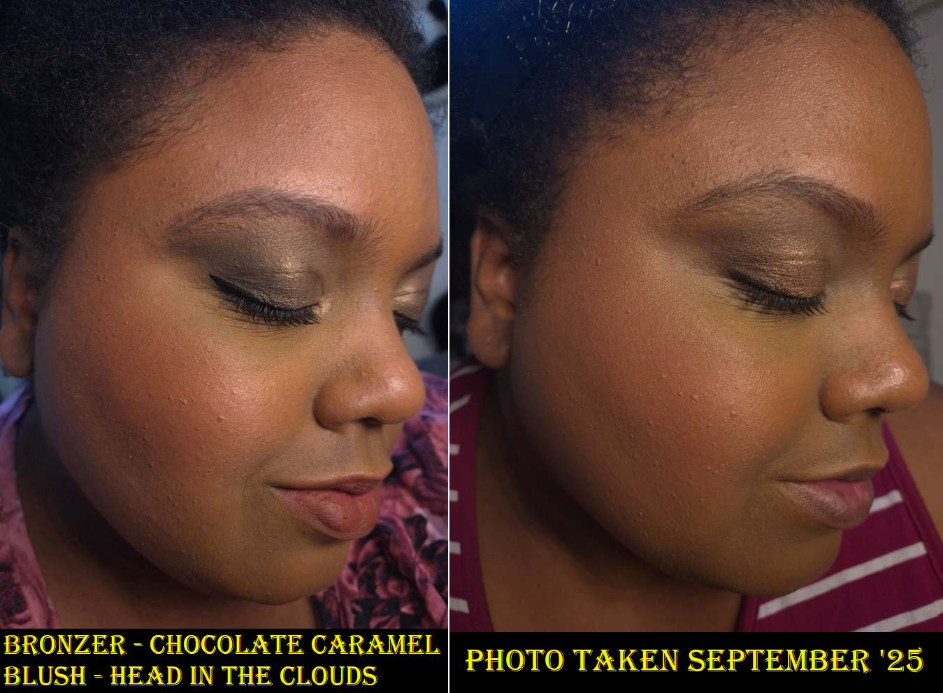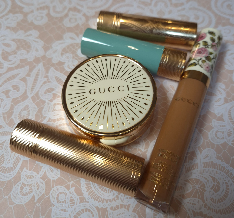
I began working on this post in September 2025, but the constant delays were due to my own inability to stop buying, “Just one more thing,” from Gucci. For instance, I started with a single lipstick, but then I wondered about the various formulas, finishes, and limited edition shades. I thought I could get over having the wrong shade of concealer, but apparently not. I thought I would be content enough with my Gucci Matte Blushes and could skip getting the Glow line, then figured I could suffice with just one, and then I felt compelled to get the remaining shade I wanted.
That is how I ended up reviewing all of these so late!
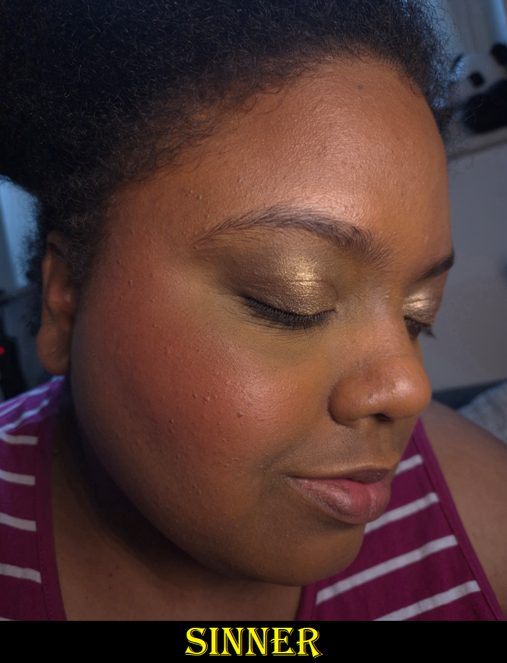
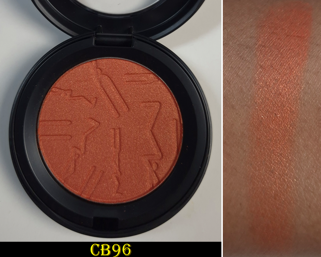
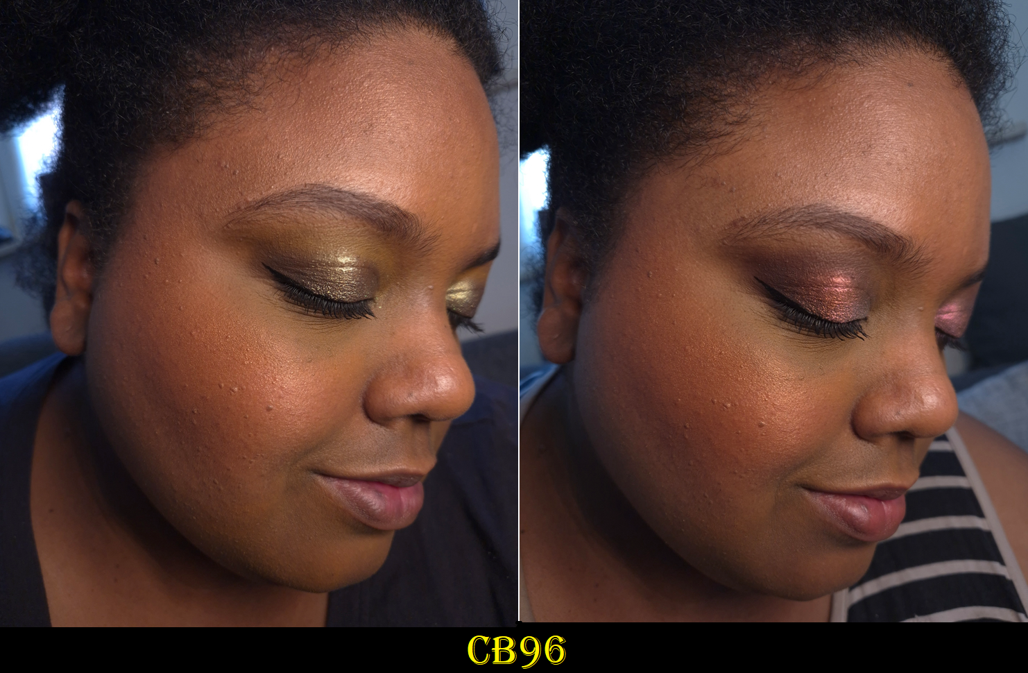
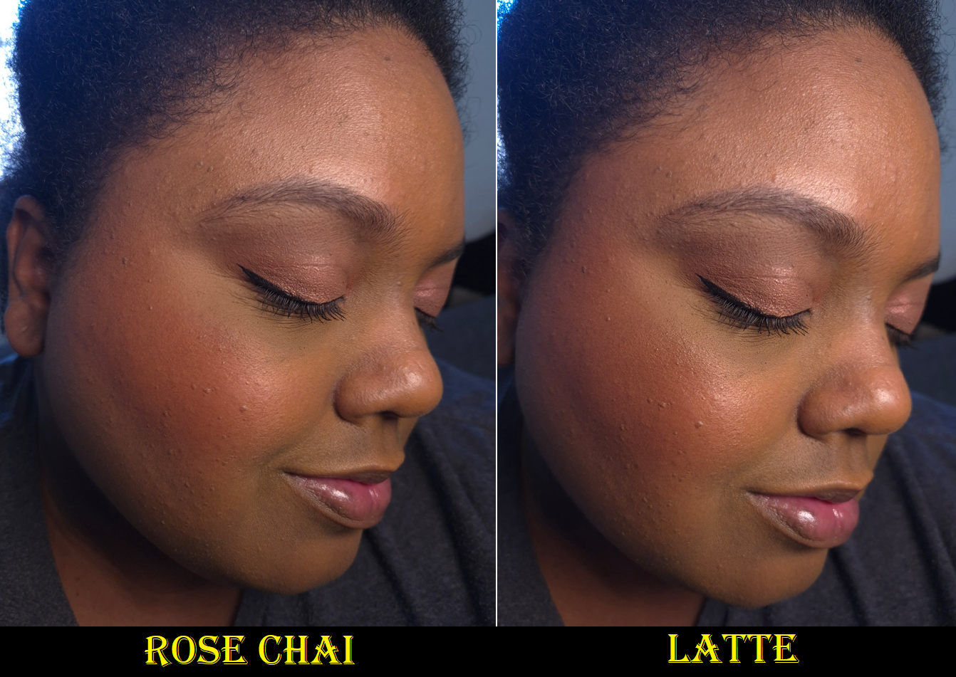
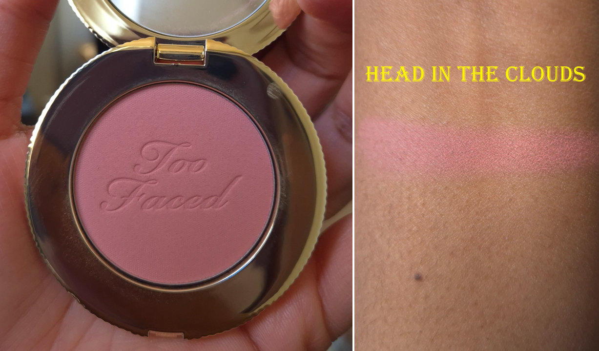
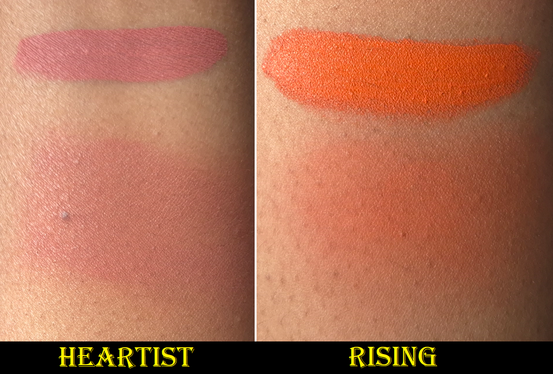
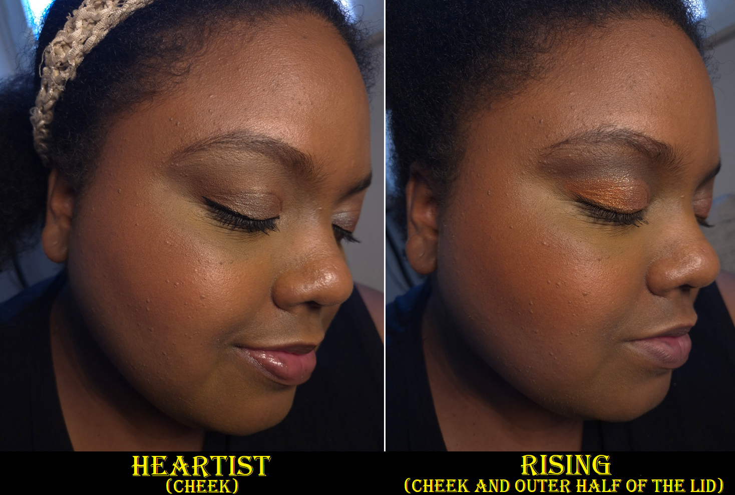
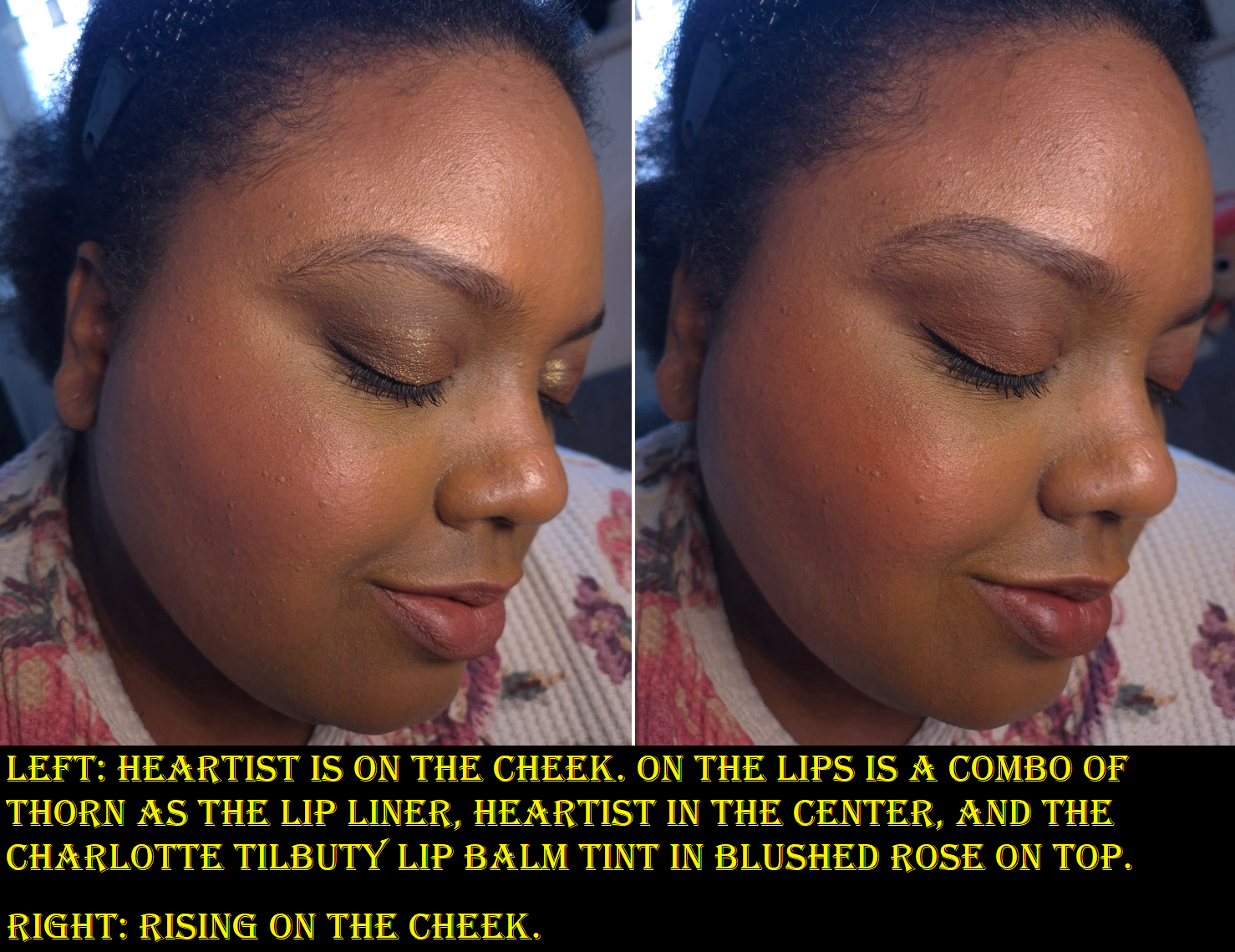
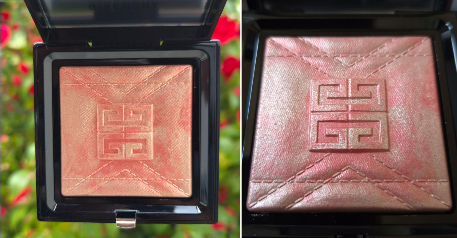
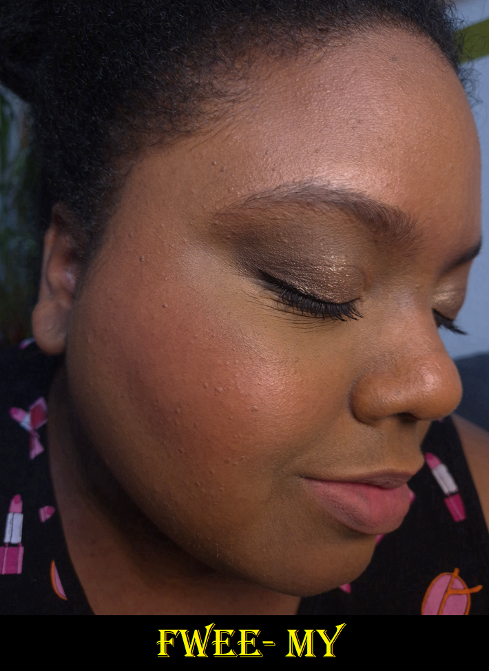
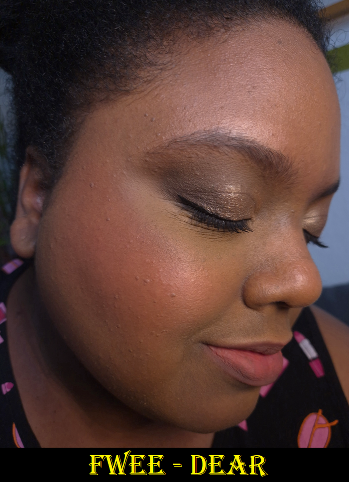
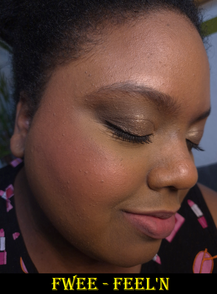
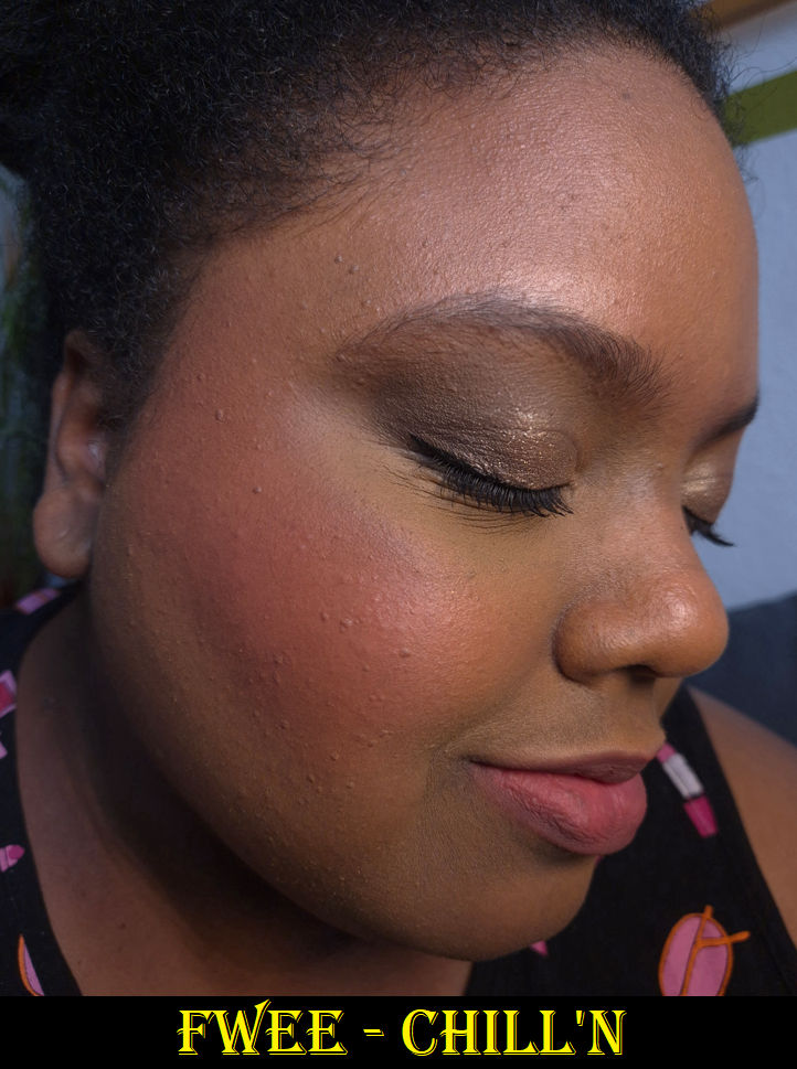
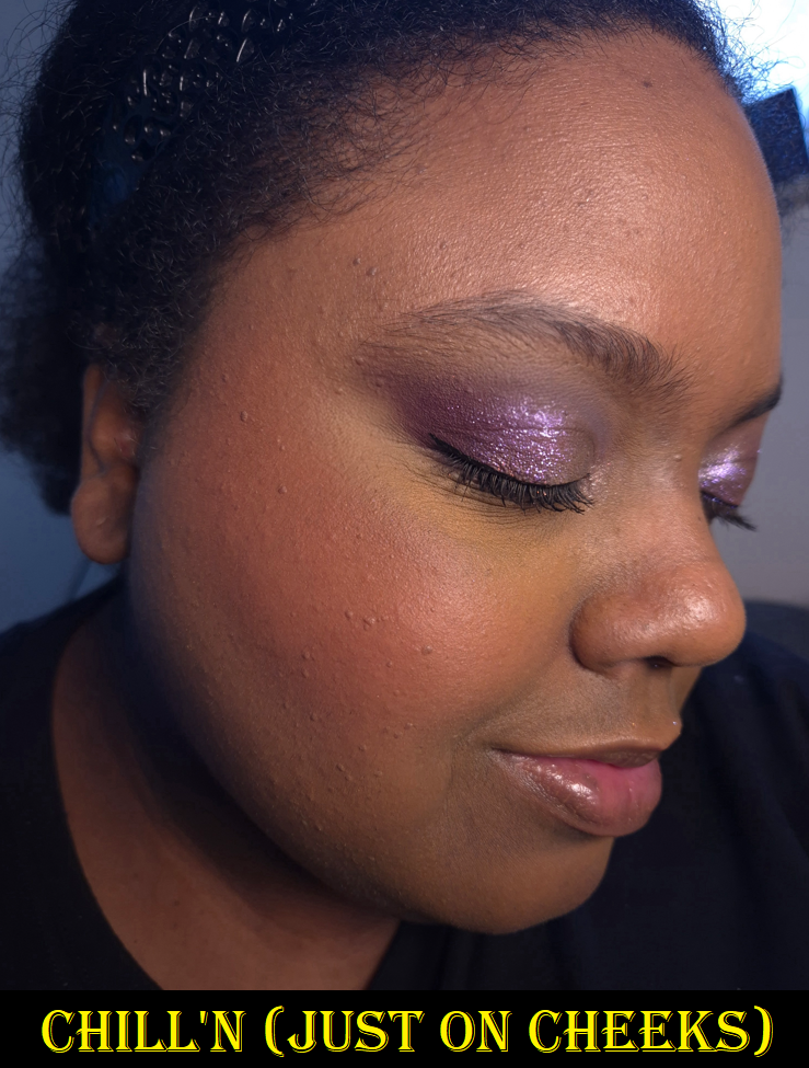
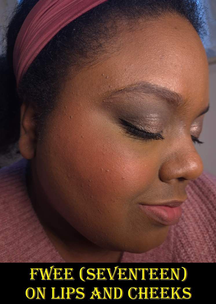
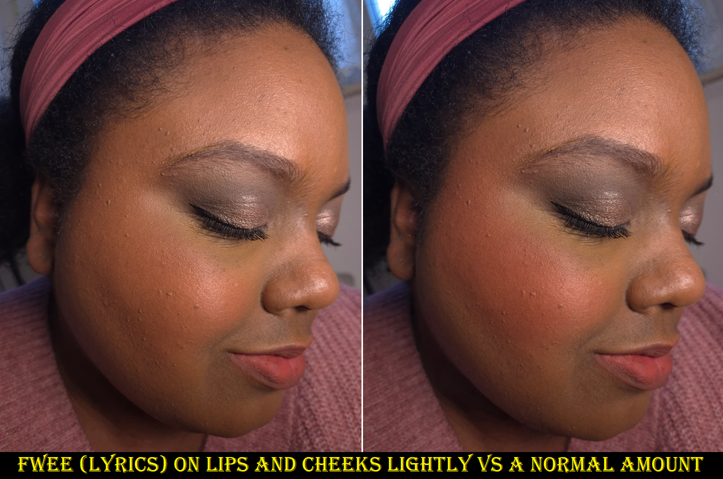
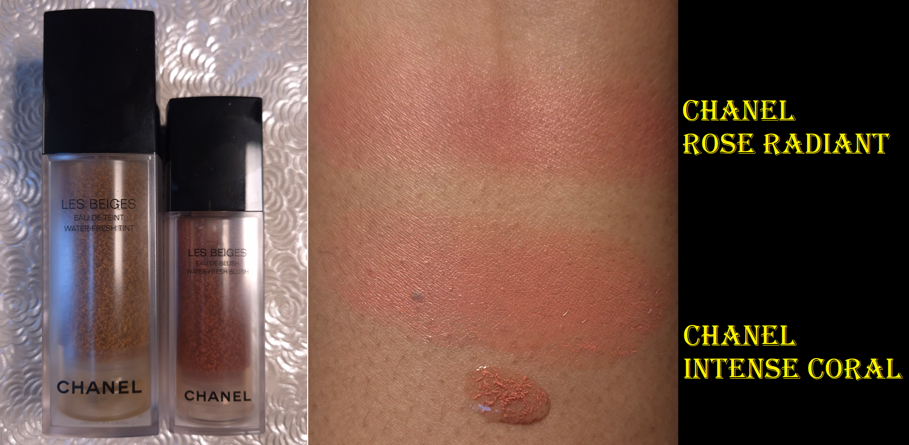
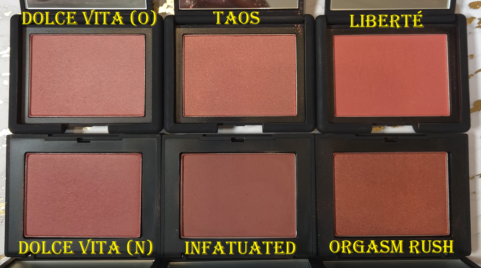
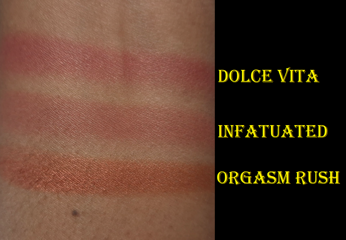
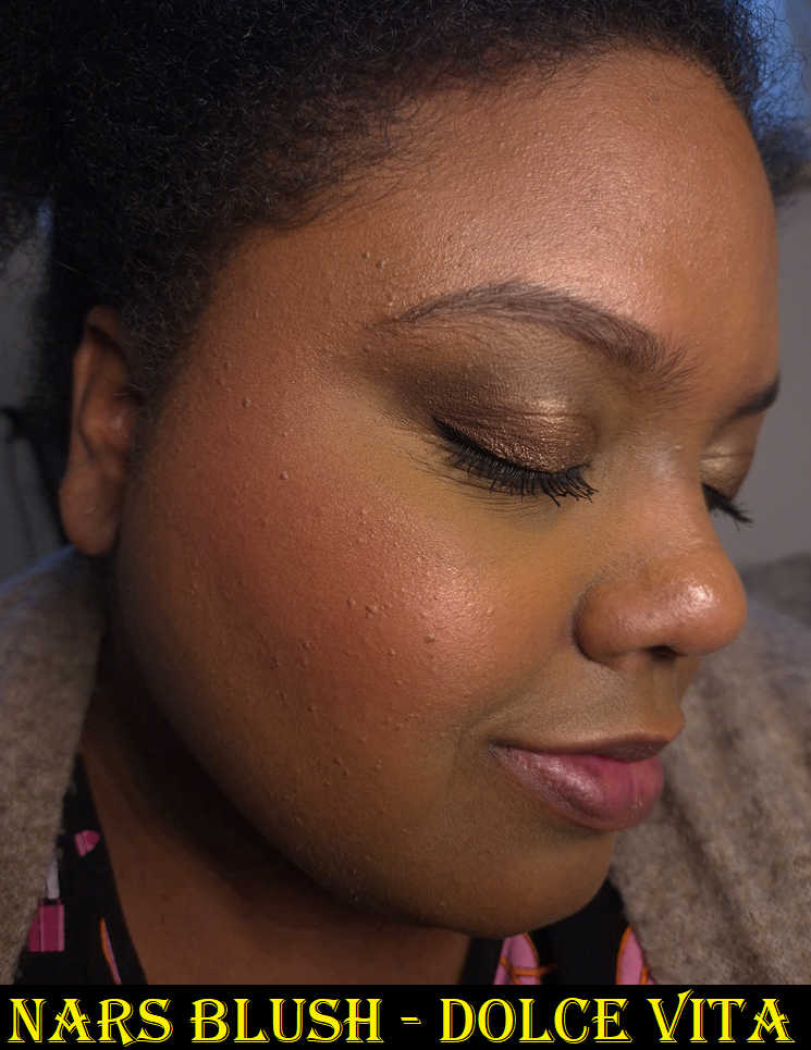
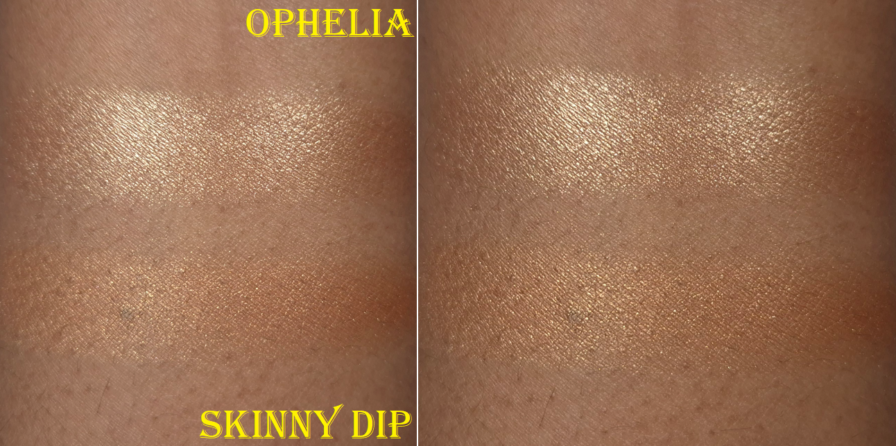
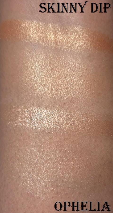
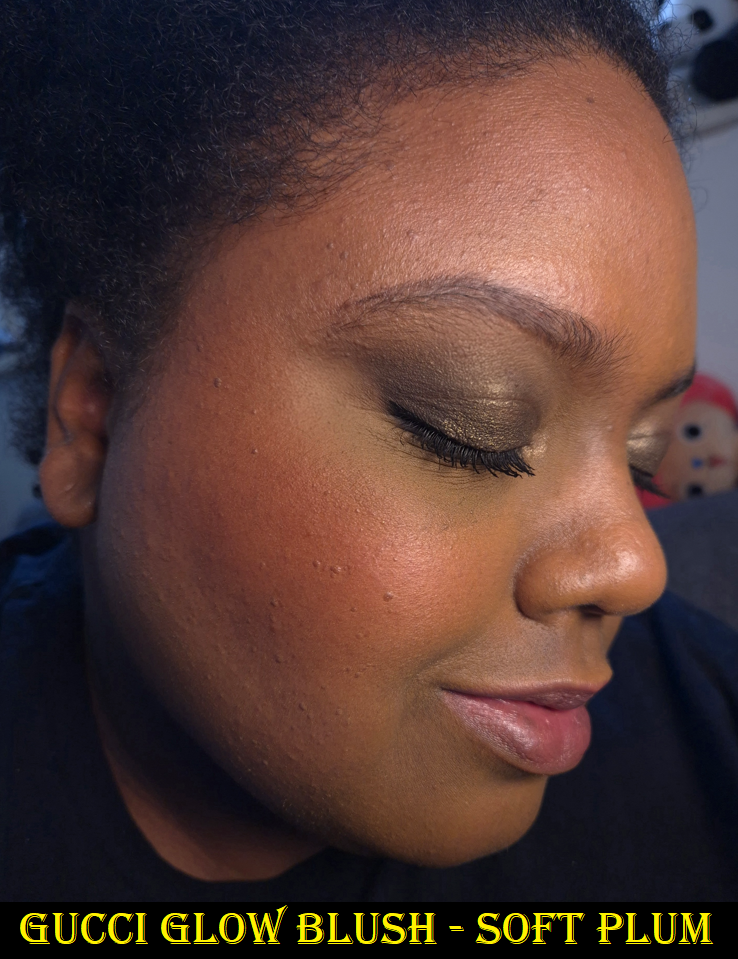
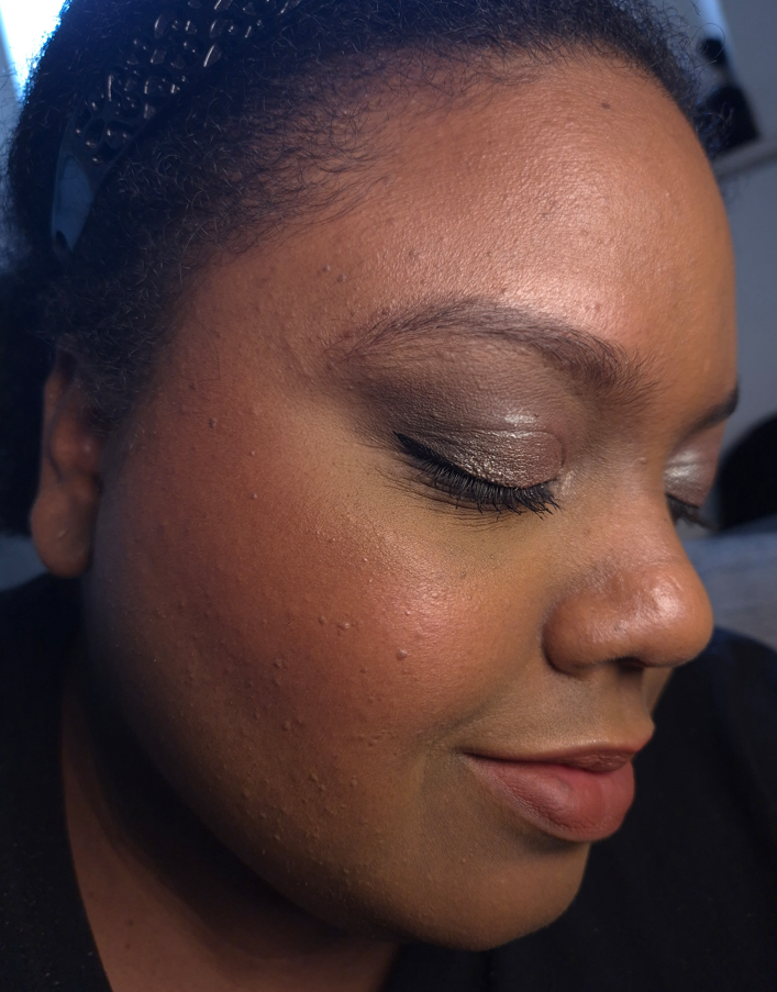
Gucci Glow Blush in 03 Warm Peach and 05 Soft Plum
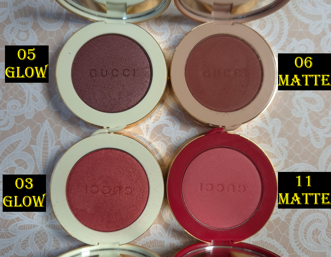
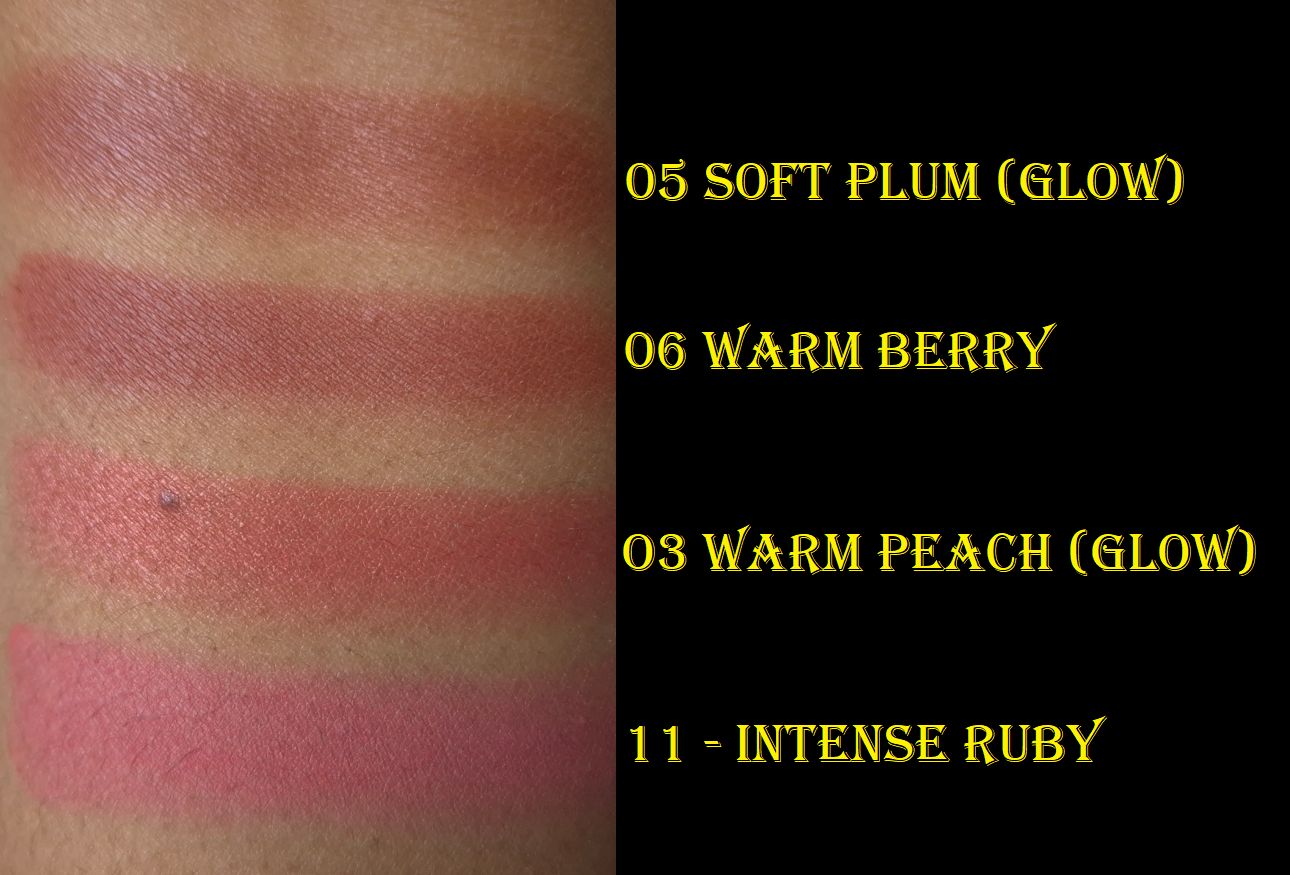
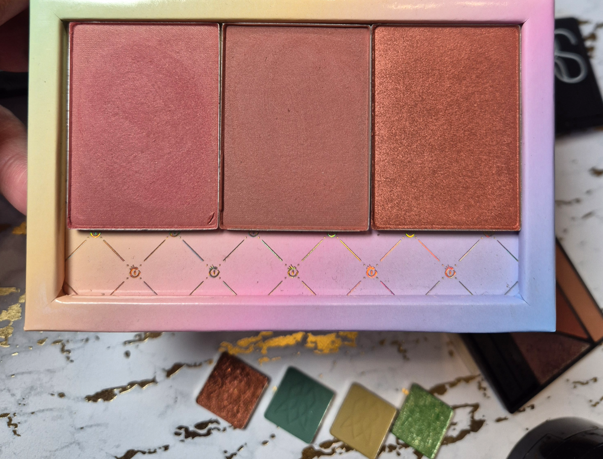
I reviewed Gucci’s Luminous Matte Blushes a few years ago, and since then I’ve sold or given away two of them, but I kept Warm Berry and Intense Ruby (the latter for the limited edition packaging). They have a soft matte, almost satin-like, finish. The reason I didn’t enjoy them as much is because I wish they lived up to their name and were actually luminous. So, I became super excited to check out the Glow Blushes.
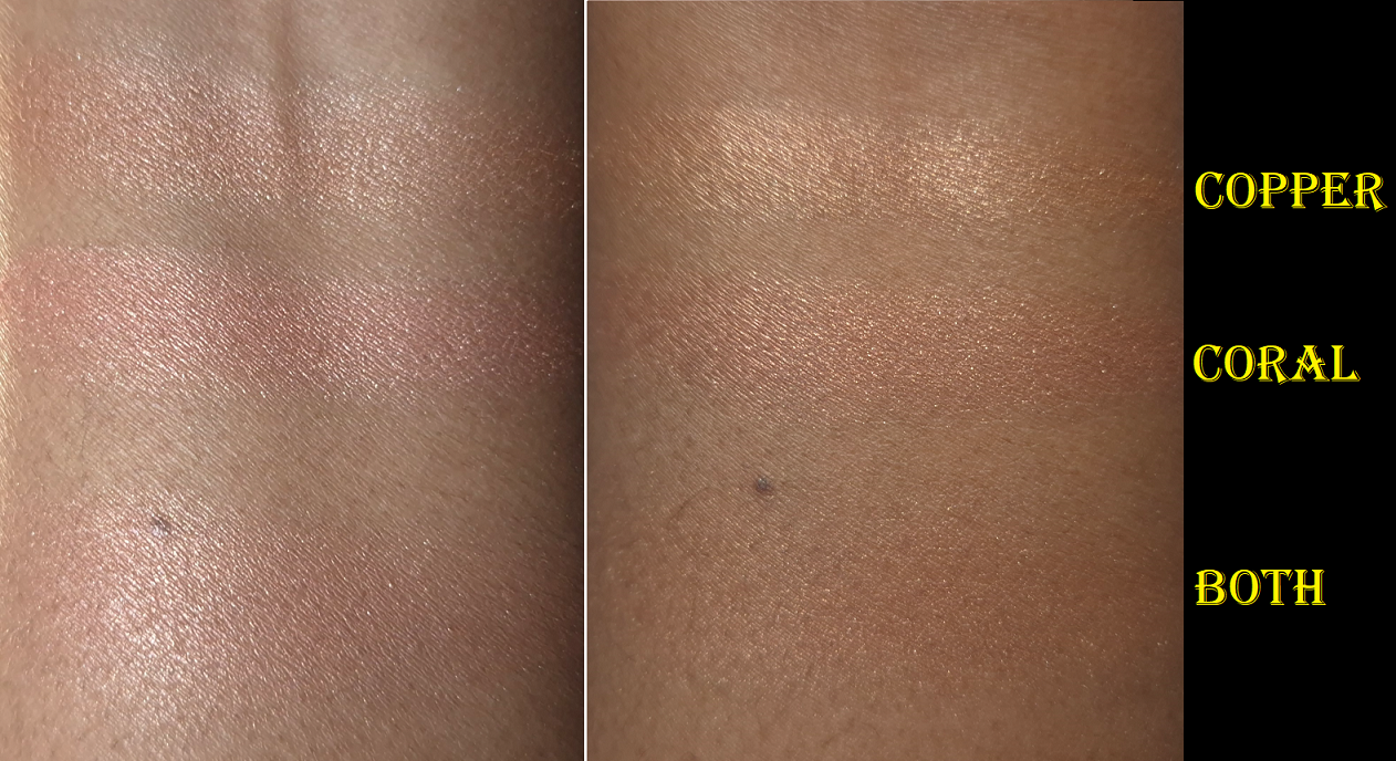
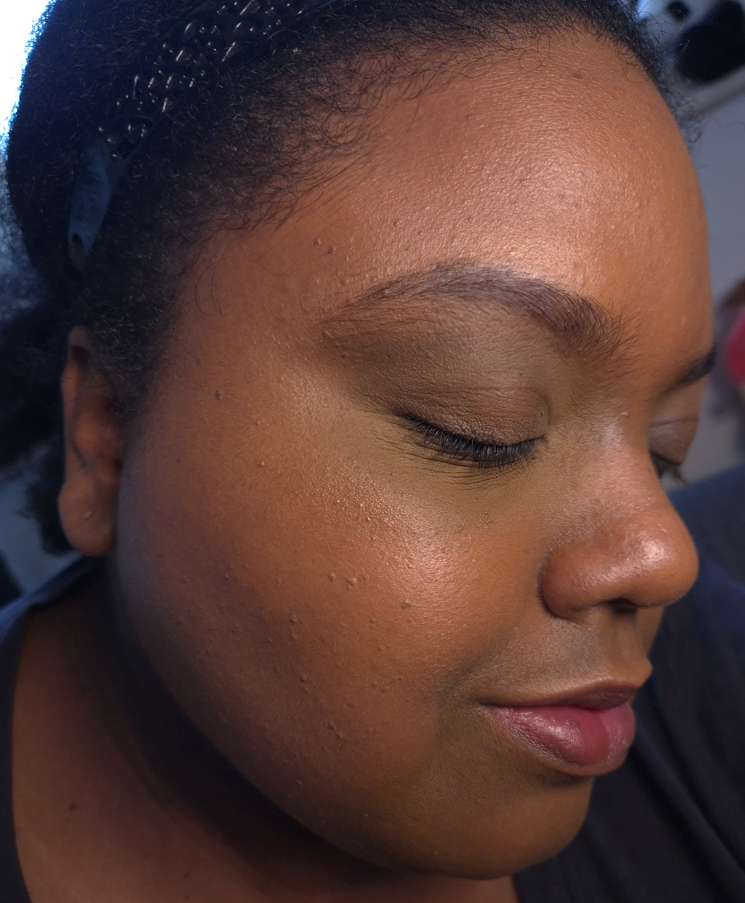
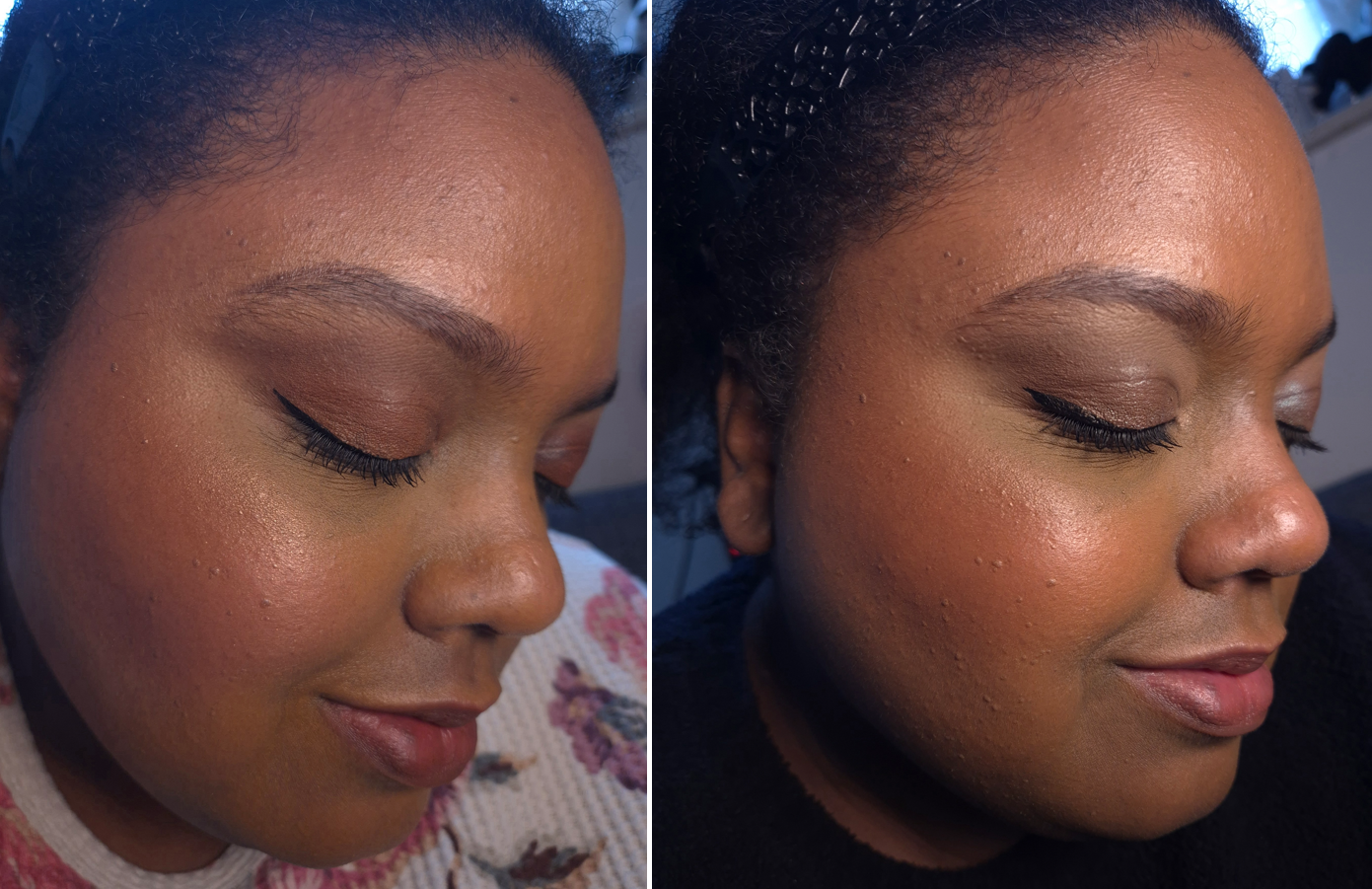
As seen in the swatches and blush demos, these “Glow” Blushes aren’t that glowy either. In low light, they look satin at best. In brighter settings, I can see some radiance, but the finish isn’t that satisfying to me as a luminous blush lover. What the Glow Blush line has going for it are the shade options and being able to build up the color. The Luminous Blushes are very pigmented and the darker colors are easy to go overboard. I believe the two shades I picked up among the Glow Blushes are the most popular colors and very easy to wear sheer or build up the opacity to full clown cheeks.
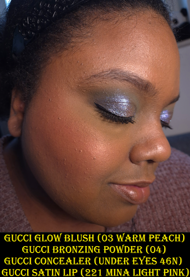
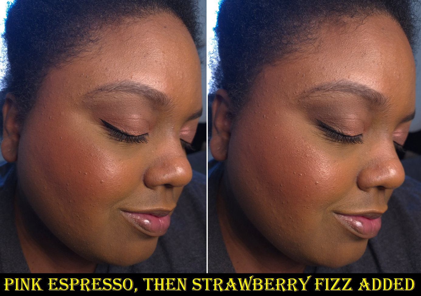
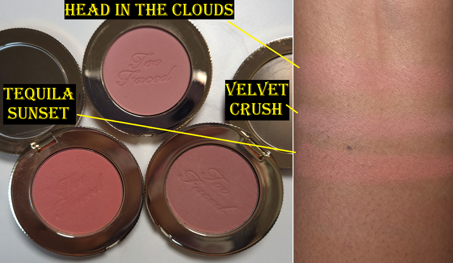
Although Soft Plum looks purple-red in the swatch, it is basically just red on my cheeks when I blend it in. I also see even less sheen on my skin from Soft Plum than Warm Peach.
Between Gucci’s two powder blush lines, unless there is a specific shade among the Glow Blushes that someone likes, I recommend the Luminous Blushes instead. For the amount of glow I get, in which texture is a little emphasized, I feel that I may as well go for the soft matte blush. It would at least look blurred. Regarding the longevity of the Glow Blushes, I haven’t noticed any problems. I get a very minimal amount of fading, but still plenty of blush on my cheeks by the end of the day.
If you’d like to see the shade Arctic Rose, I recommend checking out Olive Unicorn Beauty‘s review.
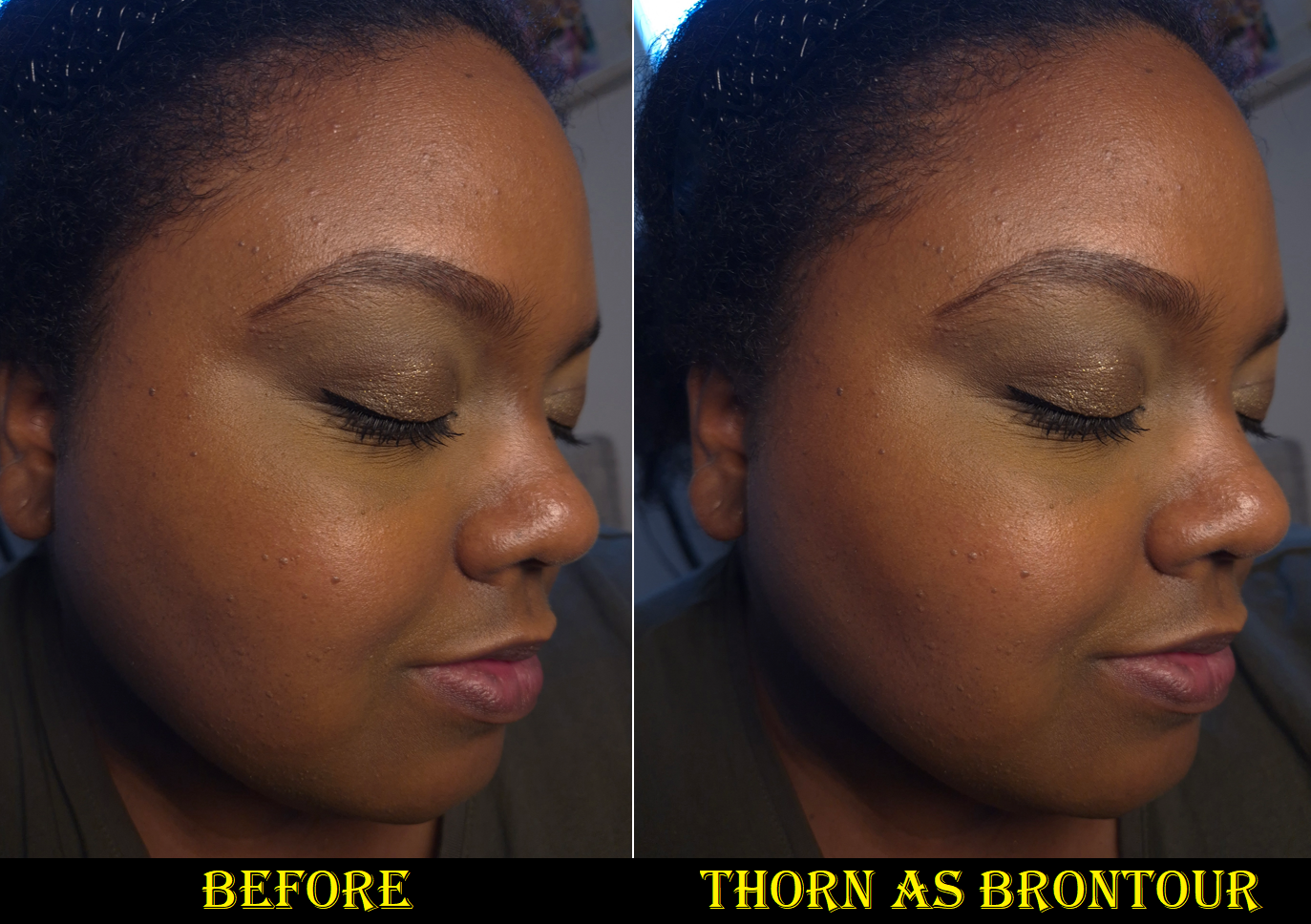
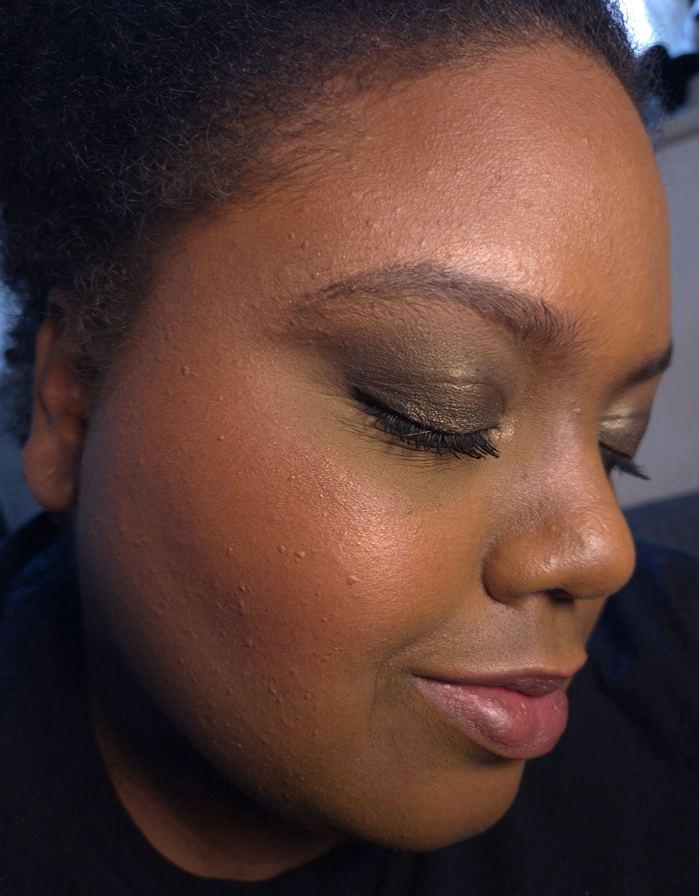
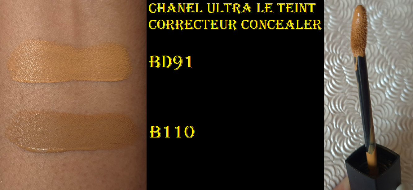
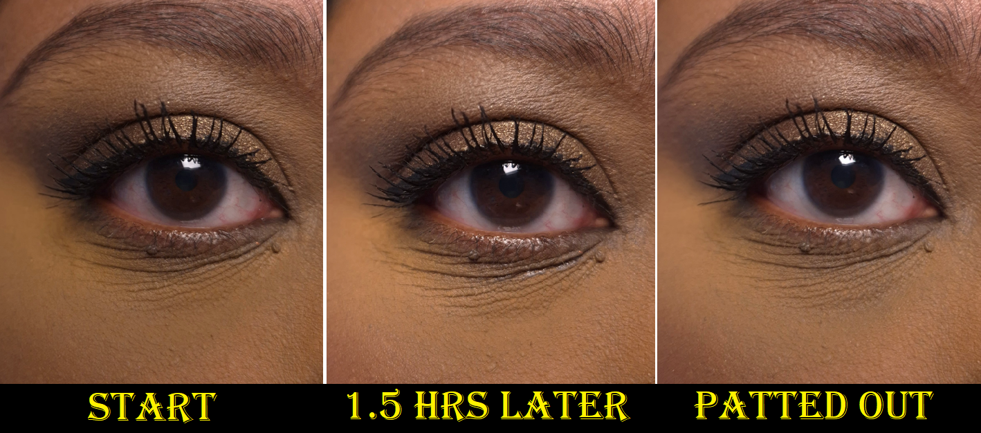
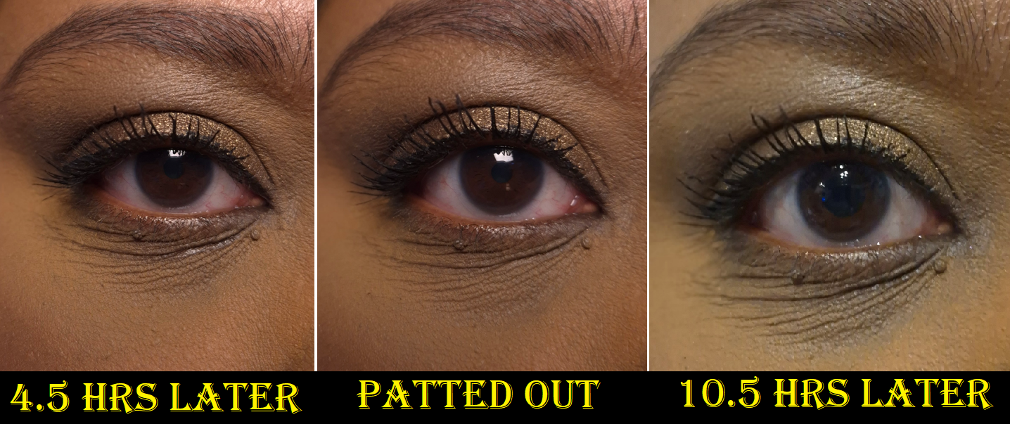
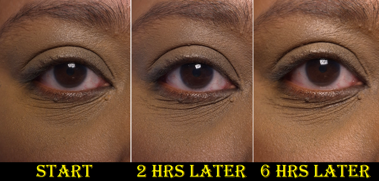
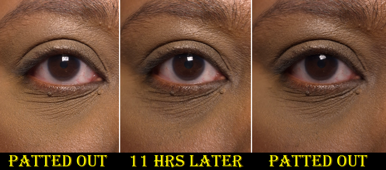
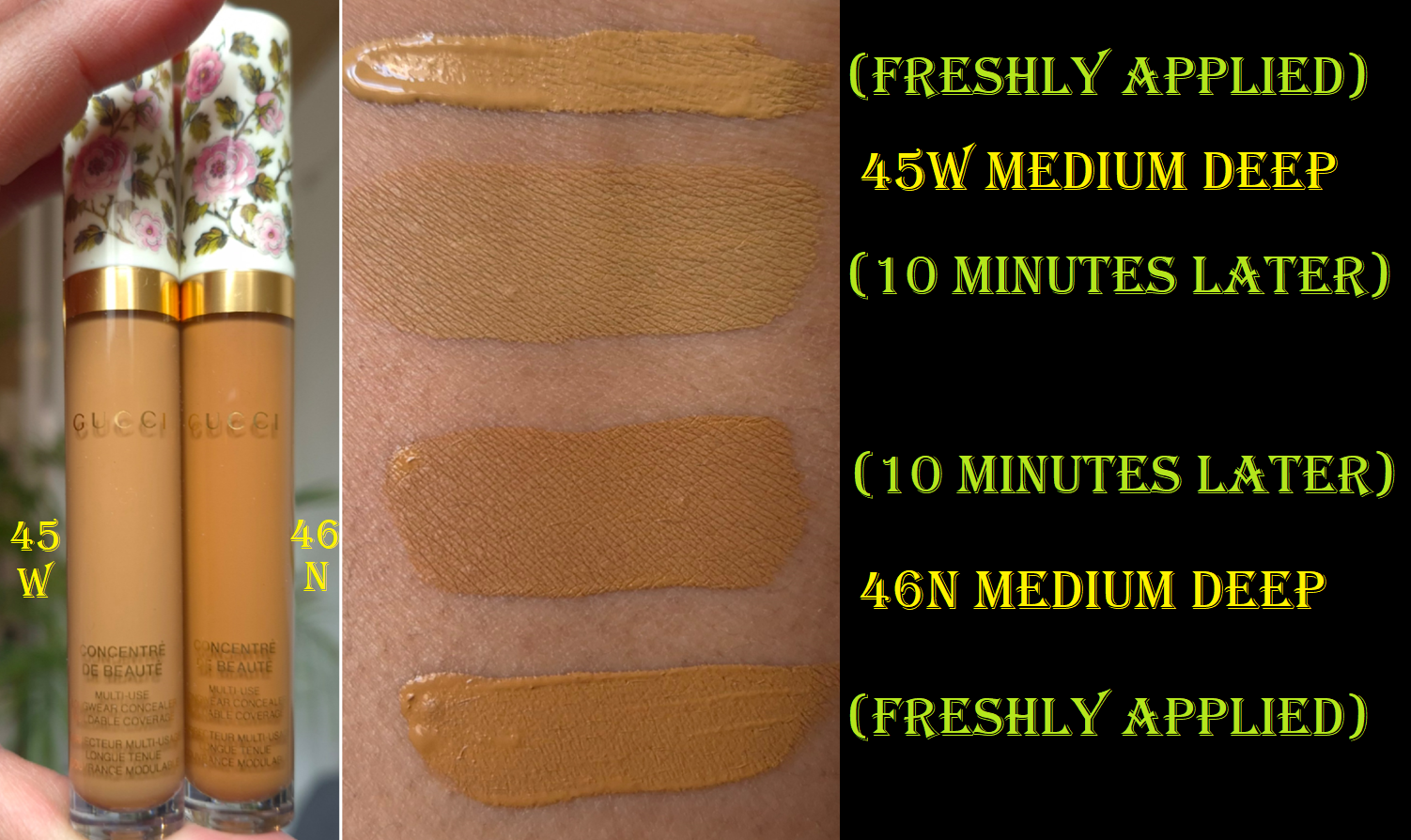
Gucci Concentré de Beauté Concealer in 45W Medium Deep and 46N Medium Deep
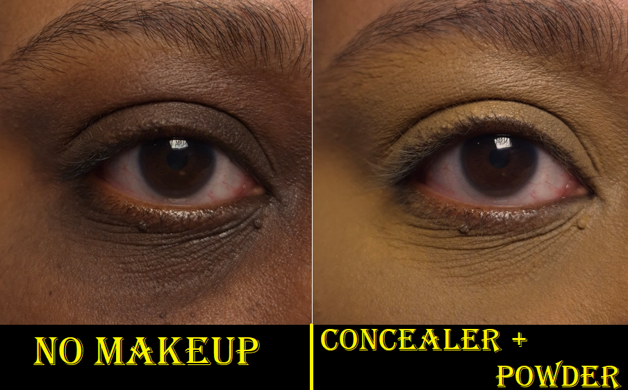
The feature most important to me about a concealer is that it needs to cover my intensely dark under eye circles for the entire day. With the amount of lines under my eyes, I expect some creasing, but less is of course better. I also expect the concealers that lock onto my skin to be and look dry, so if it manages to set down and still appear hydrated, that is a win for me. I prefer if a concealer plays well with my other skincare and base makeup products. It’s also a nice bonus if it works well with multiple different setting powders I own and not just one (or worse if it’s none).
And then of course I have to be able to find the right shade match for depth and undertone!
The consistency of Gucci’s concealer is on the thinner lightweight side and it has medium coverage. However, I think the coverage is still buildable and I can get closer to full if I apply a lot. This dries to a natural finish, but I need to set this with powder, which unsurprisingly immediately takes any shine away.
The concealer looks as flattering over my lines as is reasonably possible. For reference, Chanel’s Ultra Correcteur and Givenchy Prisme Libre concealers are more flattering over mature skin, but Chanel’s doesn’t last on me and Givenchy’s doesn’t have as much coverage.
The longevity is fantastic. Occasionally the oils that are sometimes produced in the lines under my eyes break through the concealer layer, but it mostly stays looking the same from the start of the day until I’m ready to remove it in the evening. That’s at least 10 hours.
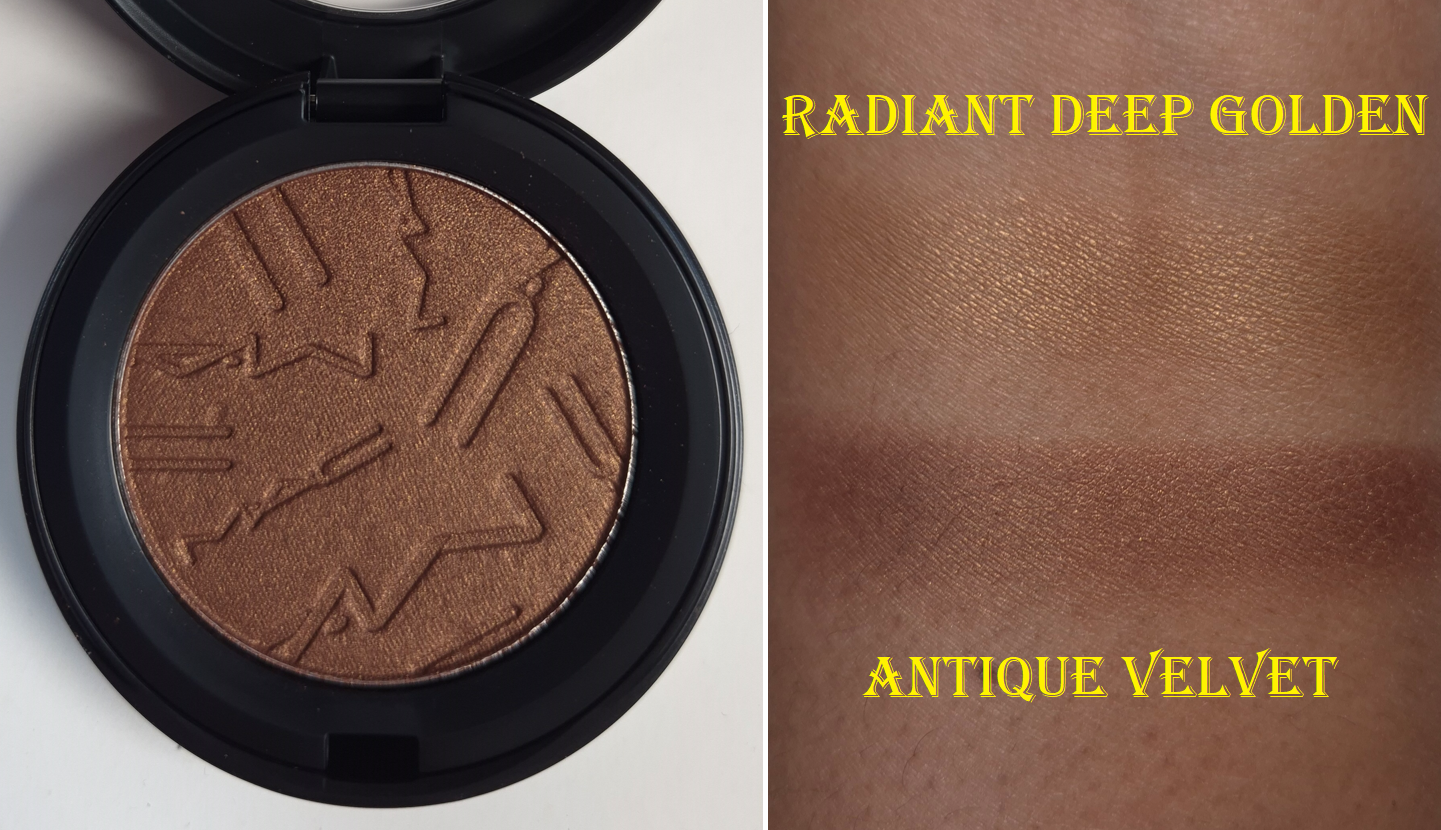
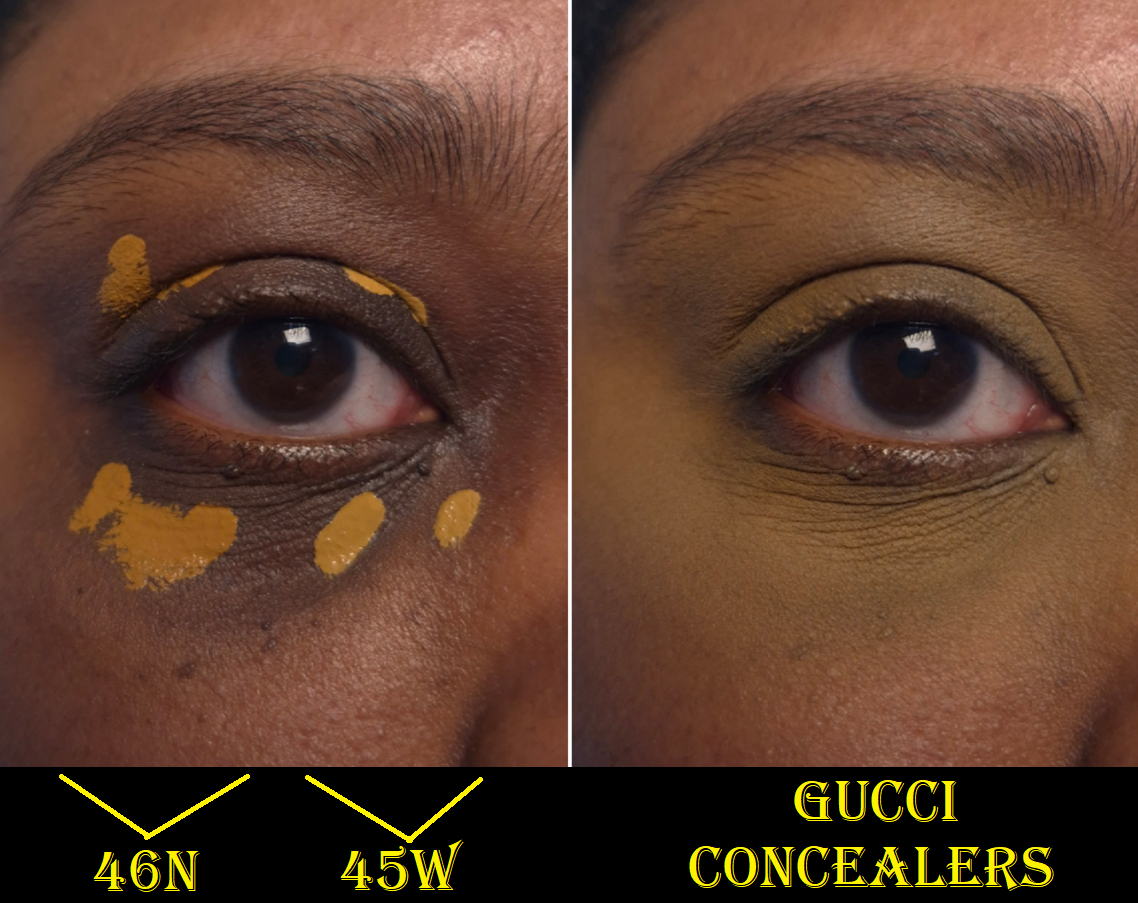
The reason I don’t like this concealer is purely due to the shades, which is disappointing considering how many options there are. I still should have expected this to happen because of the problems I’ve had with Gucci’s foundation ranges. Usually a shade like 46N has color correcting effects from the orange tone. So, I’ve been using it around my mouth and mixed with other concealers. It’s still a bit too dark for me to use as correcter under my eyes, and the color is so saturated of an orange in addition to darkening once it’s fully dry. I bought 45W this year, and it’s a brightening yellow shade that looks like it could work until it sets and then turns an ashy olive tone once it’s dry. It is difficult enough trying to choose the right color based on how the online models and swatches look, but then the concealers oxidize on top of that!
I know going a shade even lighter, 43W, won’t work for me because of how well it suits Mo Makeup Mo Beauty. Any makeup that matches her perfectly is guaranteed to be too light for me.
I’ve owned 46N since May 2025, so I have been giving this concealer a chance for a long time. It’s such a shame that I can’t find a better color because it’s a nice formula.
Even though I was able to get these concealers at a discount, I still view them as expensive mistakes. I think I’m ready to give up on Gucci base products for good. Now that I think about it, the face powder is the only Gucci product I’ve purchased that I got in the correct shade on the first try! The product photography always throws me off, and at least regarding foundations and concealers, I know that’s been one of the biggest complaints other purchasers have as well.
Lip Products
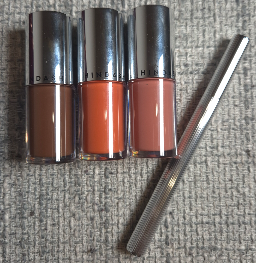
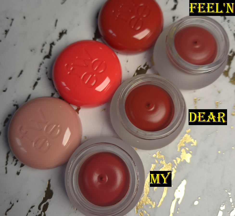
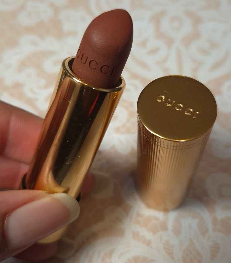
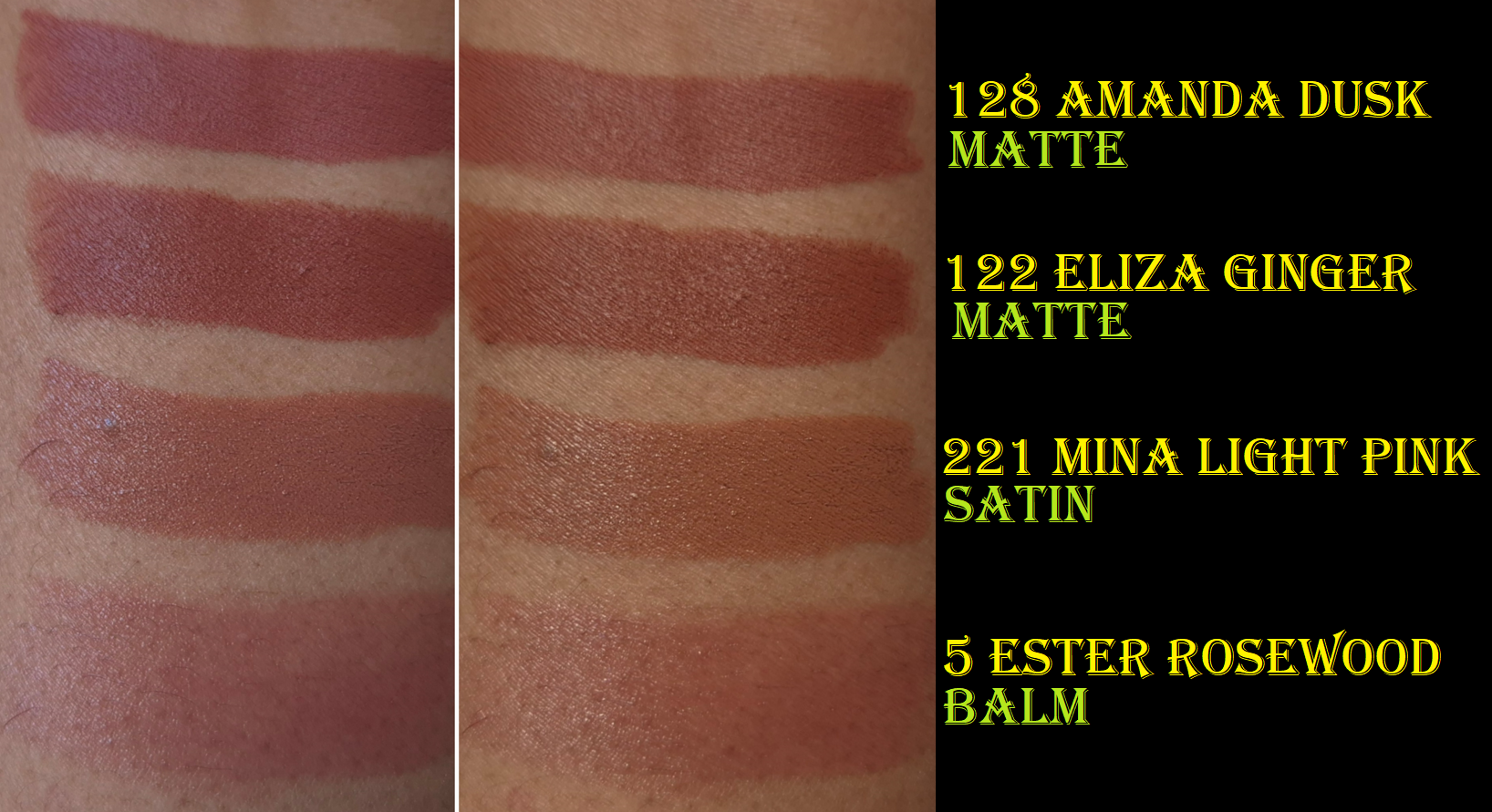
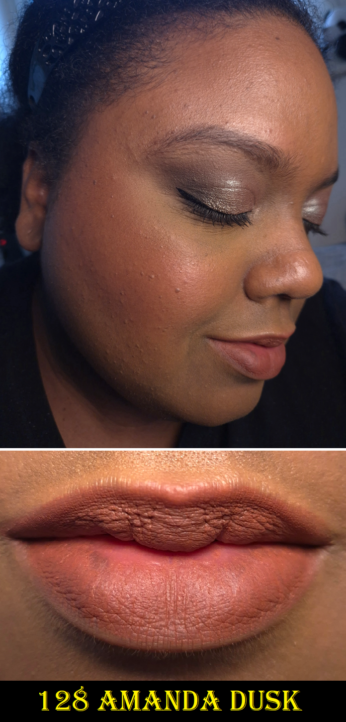
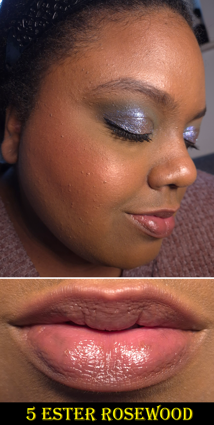
Gucci Lip Balm in 5 Ester Rosewood, Matte Lip Colour in 122 Eliza Ginger and 128 Amanda Dusk, and Satin Lip Colour in 221 Mina Light Pink
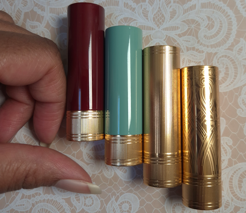
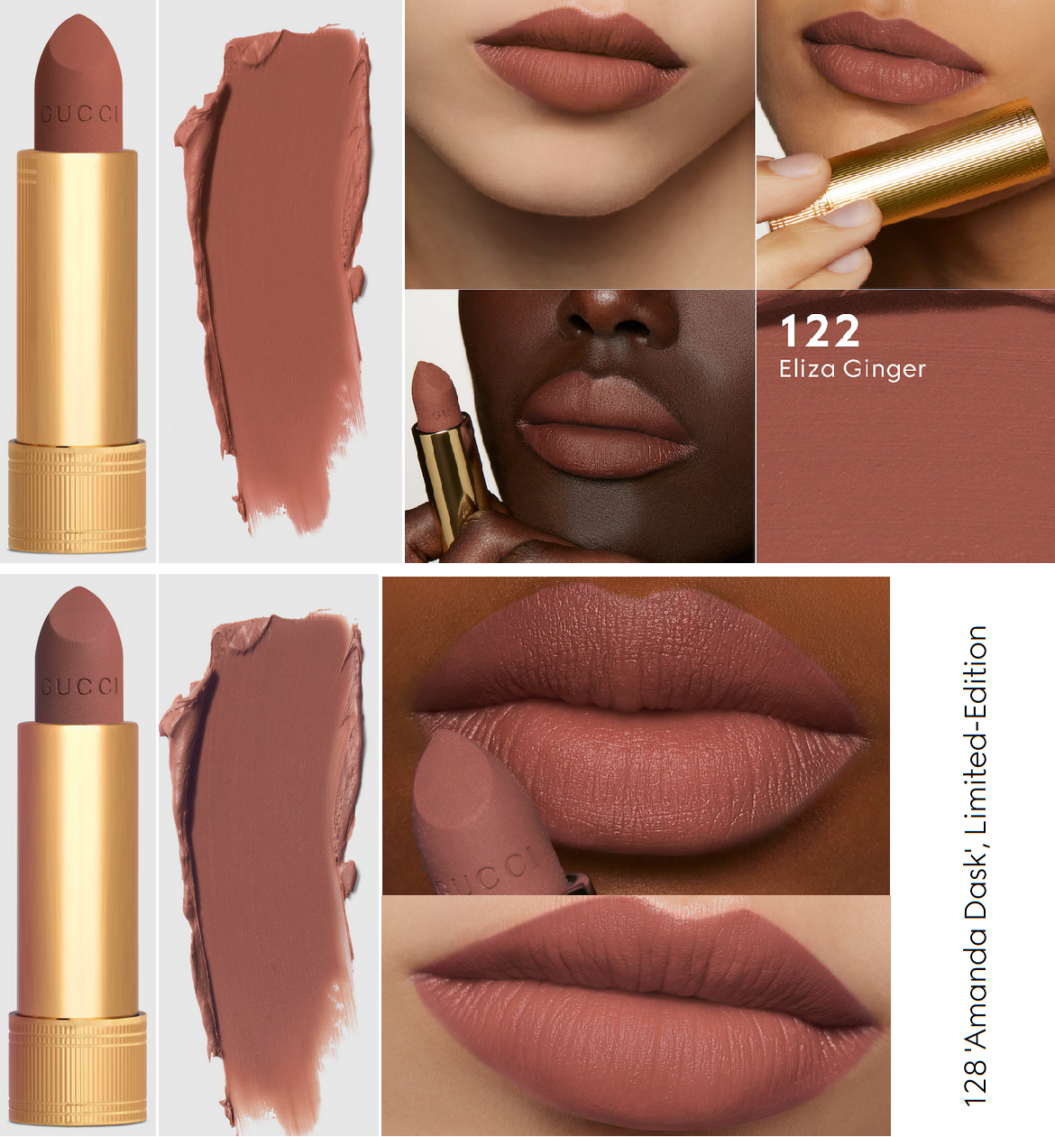
As a lover of pretty packaging, I’ve always wanted to buy Gucci lipsticks, but I couldn’t justify the price. In addition, over the last few years, I’ve been trying my best to limit the amount of lipsticks I buy since I wear them so infrequently. In October 2025, I finally noticed that the retailer Flaconi often sold Gucci lipsticks within the €35-40 range. I initially just wanted one matte and one satin lipstick. Then, I heard such good things about the lip balms that I purchased that next. Eliza Ginger and Mina Light Pink weren’t exactly as I expected, but I did love the balm, so from then on I scoured the internet to try and figure out if there was any other lipstick shade I would like more. From the time Amanda Dusk was released, I couldn’t get the color off of my mind and waited for the best sale to be able to buy it.
From left to right: Ester Rosewood and Mina Light Pink
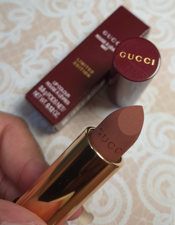
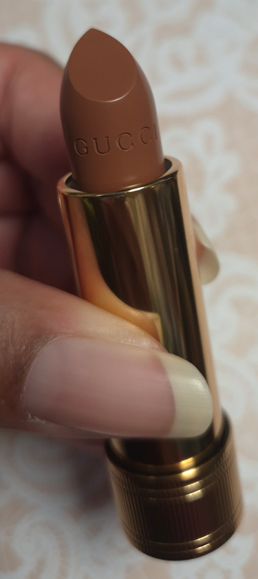
From left to right: Amanda Dusk and Eliza Ginger
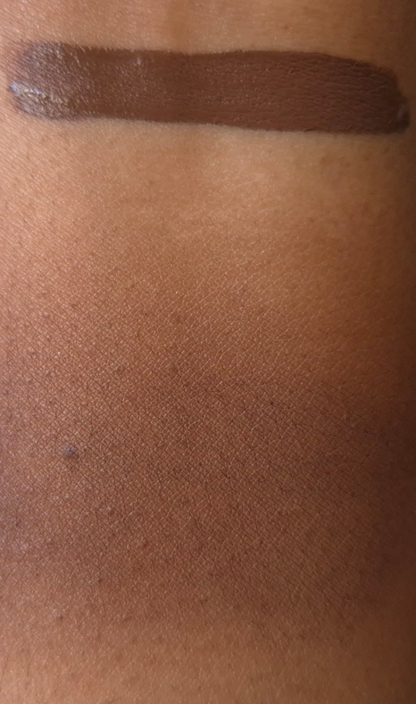
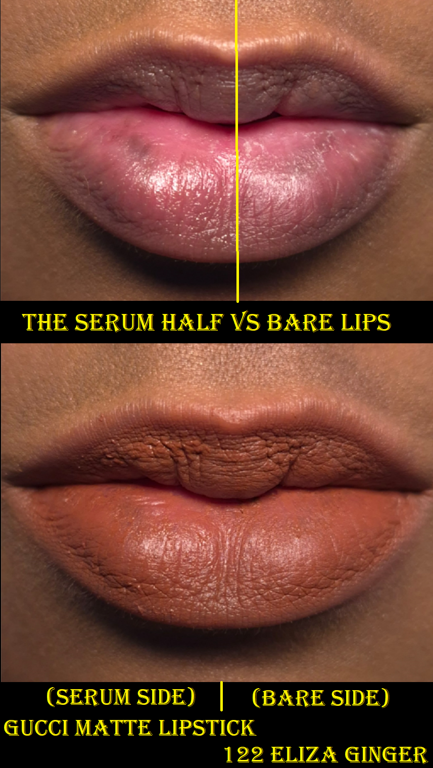
Unfortunately for me, I continue to have the same issue with Gucci’s lipsticks as I do with their complexion range. How the products appear in their model photos, swatches, or even the color of the bullet can’t help me to predict how the shade will look on my lips. Eliza Ginger and Amanda Dusk don’t look similar at all in their tubes, but on my skin, the only difference is that Amanda Dusk isn’t as warm of a red color.
Is there something wrong with my perception of color, which allowed me to think I would be getting medium toned nude brown shades instead of dark reds, when I look at what Gucci’s website photos?
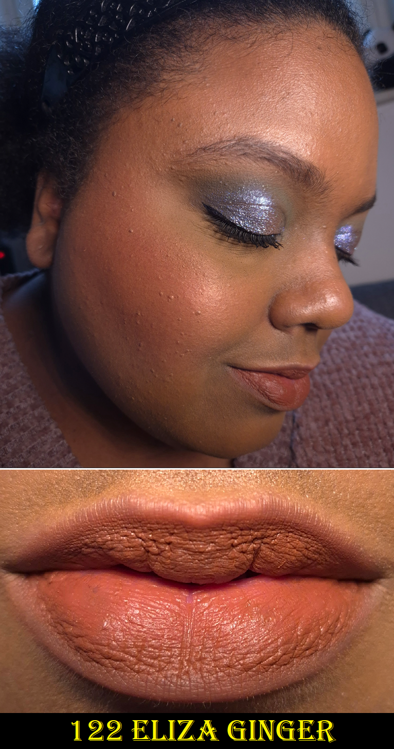
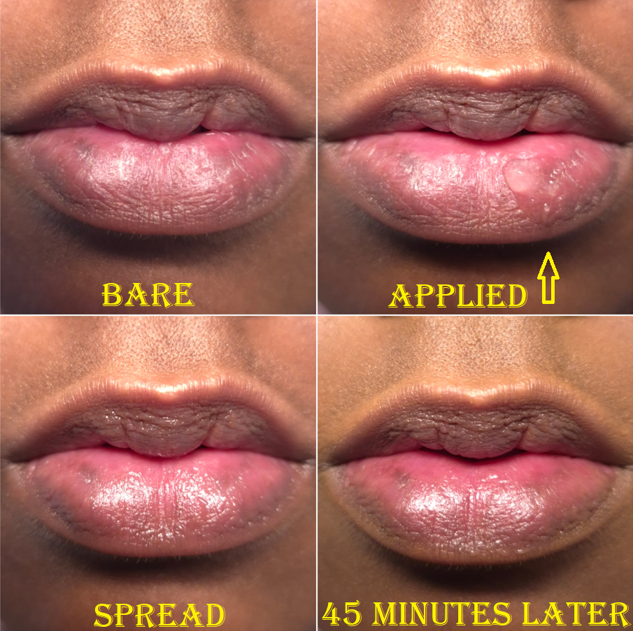
The effects of wearing the Gucci balm first (and then wiping it off) led to my lips looking pruney in this close-up of Eliza Ginger. The photo below is more accurate to how the matte finish looks on top of dry lips.
Putting the color issue aside, what is important to me about matte lipsticks is the comfort level while wearing it. Mattes have no shimmer and no or low sheen, and I expect some level of dryness due to the nature of the formulas lacking emollients. However, my super dry lips force me to be picky with matte lipsticks so that the more moisturizing it is, the better. If it doesn’t feel drying, but still looks bad over chapped skin or it’s not smooth over the lines of my lips, I won’t like it either.
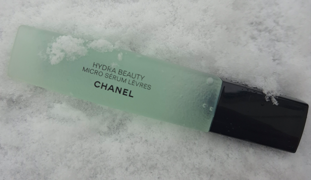
Gucci’s matte formula usually doesn’t feel dry when I wear it, but it is not conditioning or moisturizing either. When I rub my lips together, I can feel as though there’s a waxy layer that grips my lips and keeps the color locked on. If my lips are in a rough state, the lipstick has a minimal amount of smoothing, but still won’t look very flattering without some help. Using Chanel’s Hydra Micro Serum underneath completely transforms the Gucci lipstick into a much more flattering and smoother looking lipstick. It loses some of the matte look because of the sheen, but I actually prefer that.
Also, I tend to wear a thin layer of these lipsticks, but they are quite pigmented and build to full opacity easily.
The matte formula is unsurprisingly the longest lasting of the Gucci finishes I’ve tried. I can usually get away with a few hours post-eating before I need to touch up the lipstick. So, I consider this to have good staying power. I think this matte lipstick is pretty good, but it’s not suited well enough to me to be worth full price. If I were to buy more in the future, it would be for the packaging and only if the discount was high enough.
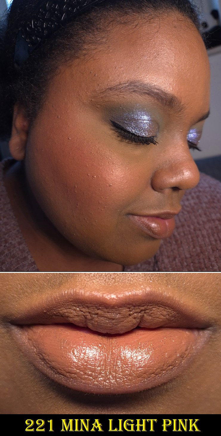
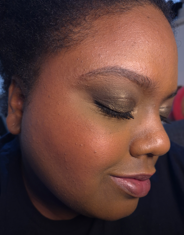
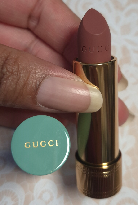
Mina Light Pink looks milky in the closeup, but how it appears in the full face photo is a more accurate depiction of the color (which pretty much matches the brand’s website photos).
When I rub my lips together, it feels like some of the wax was replaced by some emollients, giving this satin lipstick a creamier feel than the mattes.
The coverage is quite high. I can still faintly see the shadow of my lower lip’s darker pigmented spot.
The longevity is pretty good for a satin, but the amount of transfer combined with the moisture level aren’t good enough tradeoffs for me to want to buy another satin lipstick from Gucci. I feel like I’d rather just wear the Gucci lip balm for the increased moisture for my lips.
Gucci states that their balms can also be used on the cheeks, but there’s no way I’m trying that! I hate the feeling of wet cheeks. The texture of the balm feels like a combination of wax and oils as opposed to the creaminess of the satin formula. It reminds me a bit of the Rituel de Fille Color Nectar Balms, which were also multi-purpose.
According to Gucci, this balm isn’t sticky. I disagree. It has very low tack, but if I can still press something to my lips (such as a piece of paper, strand of hair, etc.) and it doesn’t detach when I move my lips around, I call that sticky!
The matte and satin lipsticks contain parfum and essential oils, but the balm does not according to the ingredient list on the box. It isn’t odorless though, as it has a raw ingredient scent (smells a bit waxy).
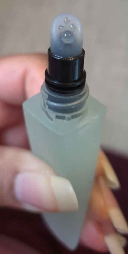
Ester Rosewood is currently the deepest option, which goes to show how sheer it is if such a dark color is essentially a medium purple-pink on me. For this reason, I haven’t dared to try any other shade out of fear they might just look clear on me. I know of just one other shade in this line that contains Red Lake 28, another “ph adjuster” like Red Lake 27. There’s also mica in the formula, which adds to the shine.
This has the worst wear time of the three finishes I bought, but it’s a normal length for a lip balm. I basically only need to reapply after meals, since most of the time it lasts through drinking.
Gucci’s lip balm is definitely moisturizing and smooths out the lines of my lips. It feels great while I’m wearing it, but once it’s off, my lips feel dry very fast. I still really enjoy this color, so my way around this is that once I’m done wearing this lip balm, I switch to my go-to nourishing lip balms/glosses/overnight treatments and that takes care of the issue.
The lip balm is surprisingly my favorite lip product (that I’ve tried) from Gucci, but I don’t think it’s worth full price either because of it not being super nourishing. I enjoy it more for its look as a makeup product, and I’m not willing to spend as much money on lip products that aren’t ultra conditioning.
So, even though I don’t regret buying the lipsticks and lip balm, I don’t intend to get anymore of them. Gucci’s limited edition packaging tempts me every time though!
That’s all for today! Thank you for reading!
-Lili ❤