This is Part 1 of my deep dive into some of the latest Chanel makeup releases from their permanent lines. Part 2 will be dedicated to Chanel’s foundations.
For the holidays, but starting in October 2025, Chanel gave customers the option of choosing special holiday gift packaging instead of their classic white with black-trim bags and boxes. The options were a smaller white bag, a larger deep blue bag, and then I’m not sure how many box varieties there were. The ribbons were dark blue with some glitter specks and the pattern design had a mix of gold, silver, and blue coloring. They were absolutely stunning!
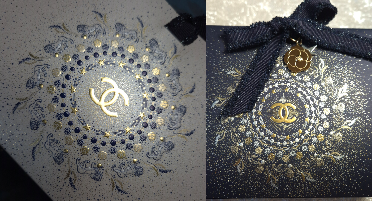
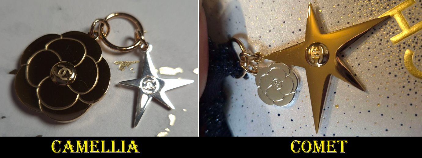
When opting for the holiday packaging, customers could only choose whether they would get the large gold camellia flower charm with a smaller silver comet/star or the large gold comet with the smaller silver camellia. Over the course of the winter season, I ended up getting both.
If you’re already familiar with me (and this blog), you know I love scoring a great deal. I’ve discussed how in Germany, there are several legitimate online retailers that sell newly launched Chanel makeup at a discount from 15-30%. So, for those wondering why I ended up ordering directly from Chanel’s website, it is because I wanted my better shade match in their foundations and unfortunately here my shade is exclusive to Chanel.
As for the concealers, although the website doesn’t have the “exclusive” marker posted next to any of the shades, I could not find any retailer in Germany that sold darker than B40. All of the retail websites had six shades available at most. Chanel has two actual color correctors that were released with these concealers called Peach and Amber. If a retailer had one, it was only Peach. So, I didn’t have the option of buying any of these anywhere else, except directly through Chanel.
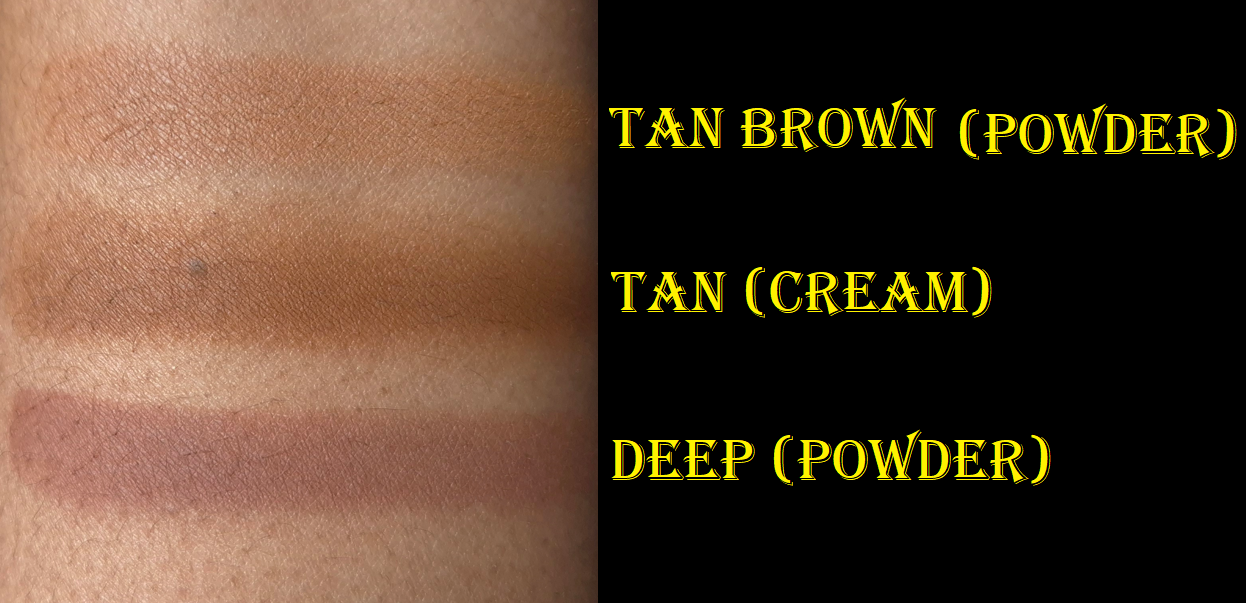
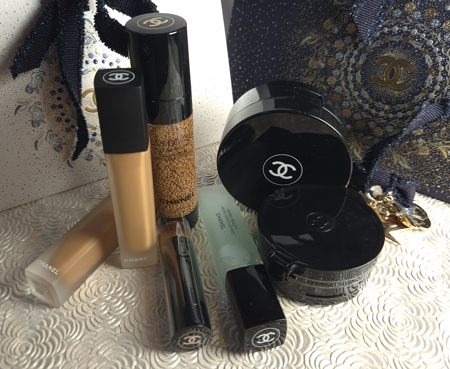
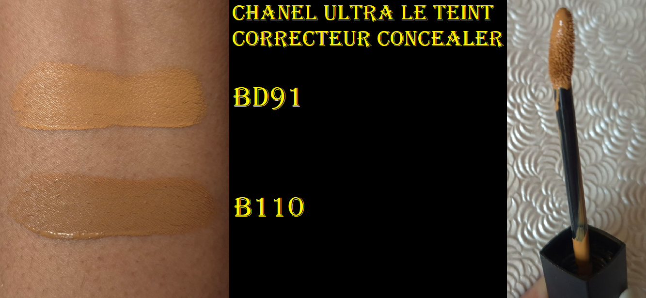
Chanel Ultra Le Teint Le Correcteur Concealer (Ultrawear All-Day Comfort Flawless Finish Concealer) in BD91 and B110
This concealer launched in Europe in September 2025, but I didn’t realize (until I saw the flood of videos in January 2026) that it hadn’t come to the US until this year. I bought mine in October last year, so I’ve had plenty of time to test this product.
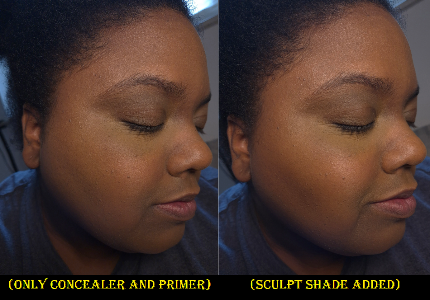
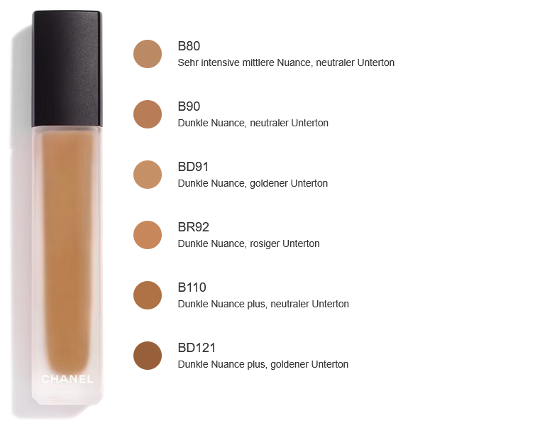
There is currently no BD101, which I assume would have been my closest shade. BD121 has always been a little dark for me and too warm. I figured having some orange color correcting effects from BD121 wouldn’t be so bad, but having a concealer that’s too dark is a problem. So, I chose BD91 as the next best option with a golden undertone.
I also wanted to see just how neutral B110 would be, and to figure out how deep it is (compared to my estimate of BD121), so I made the decision to get that shade as well.
This concealer became the instant holy grails and number 1 concealers of Charlotte Holdcroft, Han Beauty 101, and French For a Day, so I thought surely I would like it too!
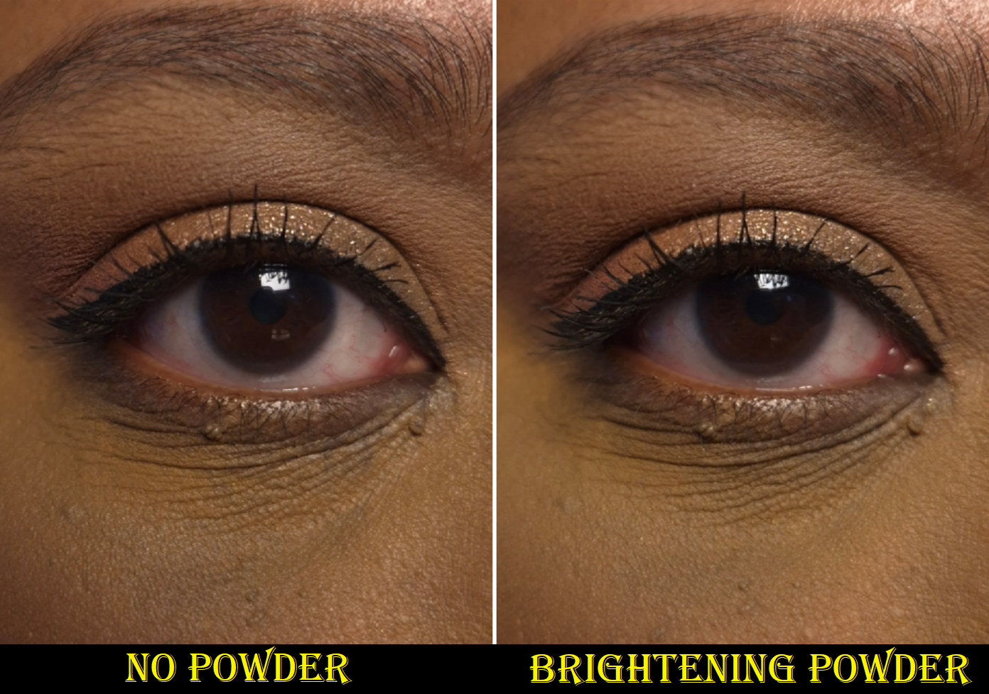
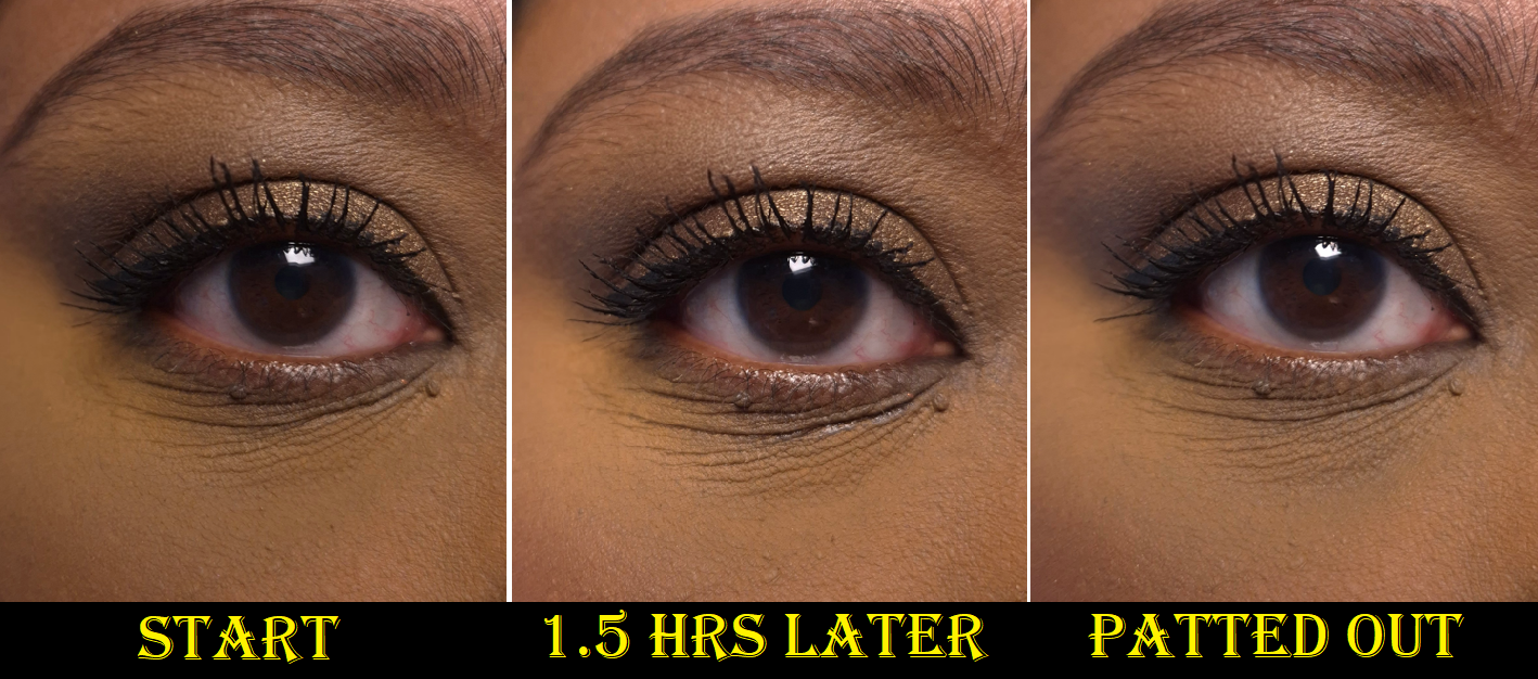
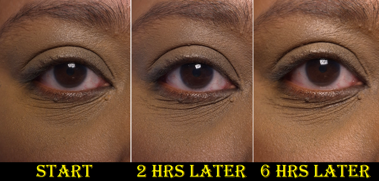
Every time I put on this perfume-free concealer, I have high hopes. My undereyes look so much smoother than any other concealer thus far has been able to achieve, and the coverage is great! When I pair it with the brand’s Universal Libre Powder, it looks like a match made in heaven! Unfortunately for me, it just doesn’t have the longevity I need.
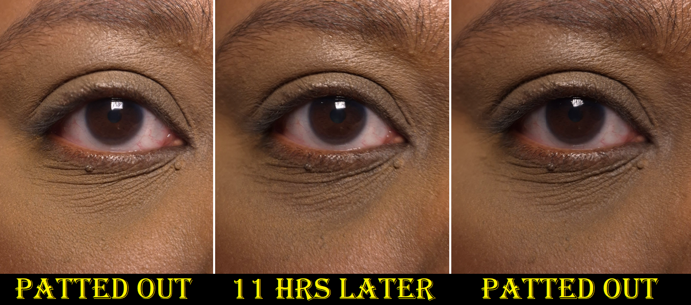
Six hours is the longest it can go before I see my dark circles underneath what remains of the concealer. In the worst circumstances, my natural oils fill the creases and breaks it down within fifteen minutes if I haven’t powdered it enough. In other circumstances with powders heavier than Chanel’s (such as my go-to Charlotte Tilbury or even the Huda Easy Bake Powder), the concealer gradually fades to the point that I can see my under eye darkness again within three or so hours.
Technically, if I continually touch up my under eyes (for example smoothing out the creases with the remnants of what is left on my concealer brush and then powdering it with the remnants of what is on my setting brush), it can look “passably” faded between 8-10 hours before it’s not salvageable anymore. However, I consider that very unrealistic. I don’t like to babysit my makeup.
I’ve tried pairing it with the Milk Hydro Grip Eye Primer (which I also use with my KVD Good Apple Concealer), tried using less concealer and less powder, using more concealer and more powder (better outcome), waiting a minute for it to settle before setting it with powder, setting the concealer with powder immediately after applying it (better outcome also), doing alternate layers of concealer > powder > more concealer > and more powder, and mixing it with a few other concealers. I’ve tried using setting spray, drying my undereyes, keeping my undereyes moisturized. Nothing I do can get me more than six hours of nice wear time.
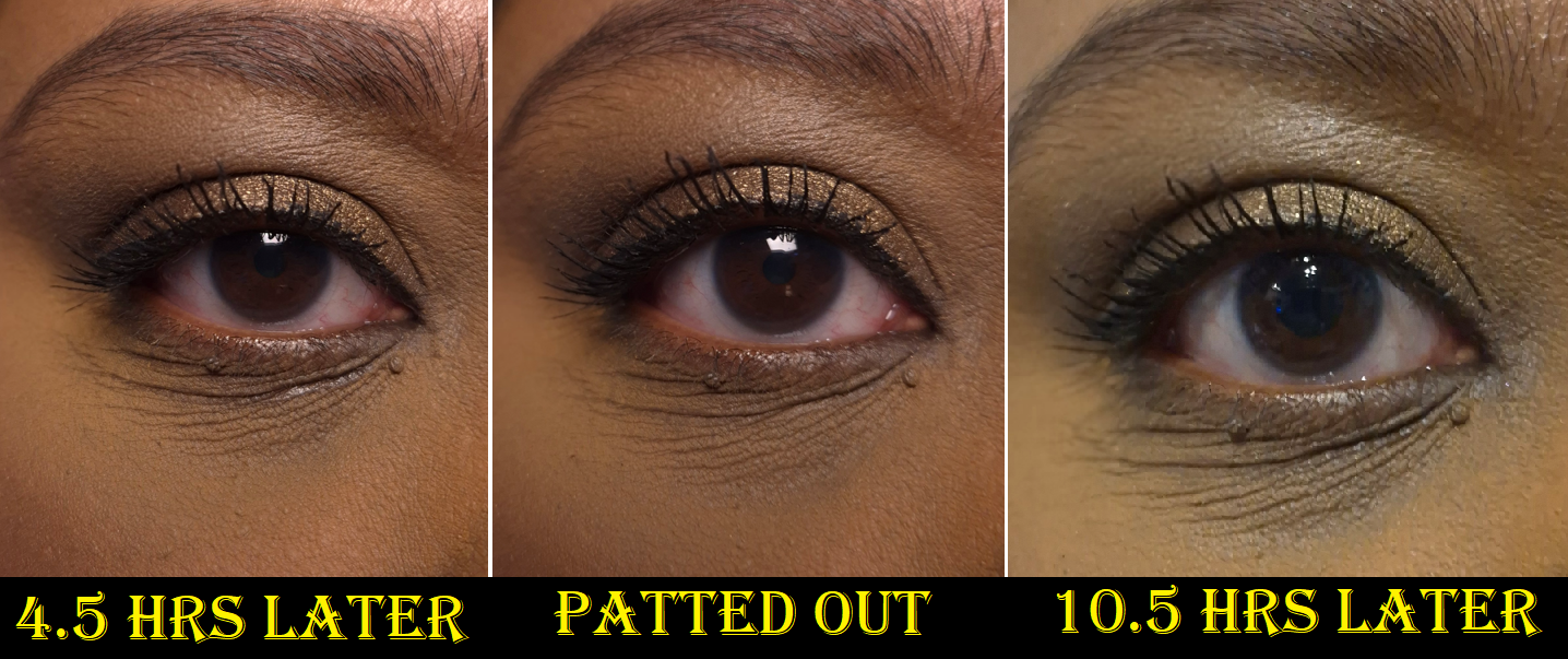
If I had to guess what’s affecting how the concealer wears, I would say it’s probably the combination of my natural oils breaking the concealer down (it’s supposed to be waterproof not oil-proof) and the hydrating skincare ingredients, such as glycerin and sodium hyaluronate, that my skin soaks up. Maybe there’s an ingredient that causes an increase in my oil production, since my undereye skin is usually not oily on a consecutive basis, yet it tends to be oily each time I wear this concealer. Maybe the consistency is too creamy and the concealer cannot stay put in the lines of my eyes.
The Ultra Le Teint Le Correcteur has film formers that are meant to flex with movement and increase the concealer’s adhesion to the skin, which I am prone to believe considering how easily the concealer smooths back into place with a brush instead of coming off even more after being disturbed on the skin. Perhaps it’s too creamy, since those kind of concealers have never worked for me (e.g. Nars Radiant Creamy Concealer and the Creamy version of Tarte Shape Tape).
Recently, I decided to try using the Les Beiges Water-Fresh Complexion Touch as an undereye primer for this concealer (since it’s supposed to be usable as a concealer too). This combination gave me six hours of wear before needing to be seriously touched up. However, if I use too much of the Complexion Touch or not enough Ultra Le Teint Le Correcteur and powder on top, it gives worse results. Essentially, finding the right balance time and again is difficult.
I love how this concealer looks in its best state, to the point that I am still using it. However, I just wear it on days I know I will not be leaving the house and when I’m less likely to have visitors.
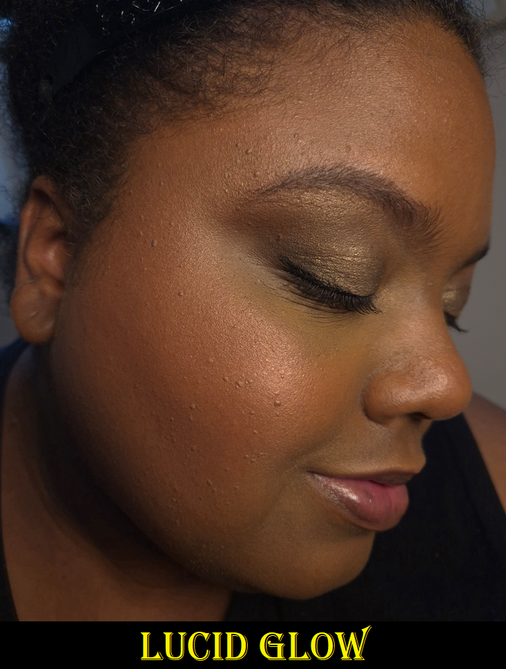
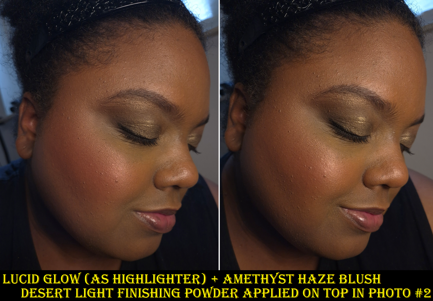
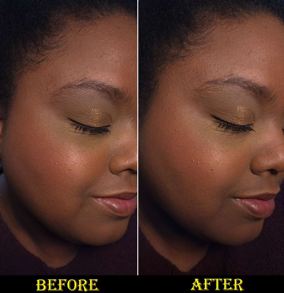
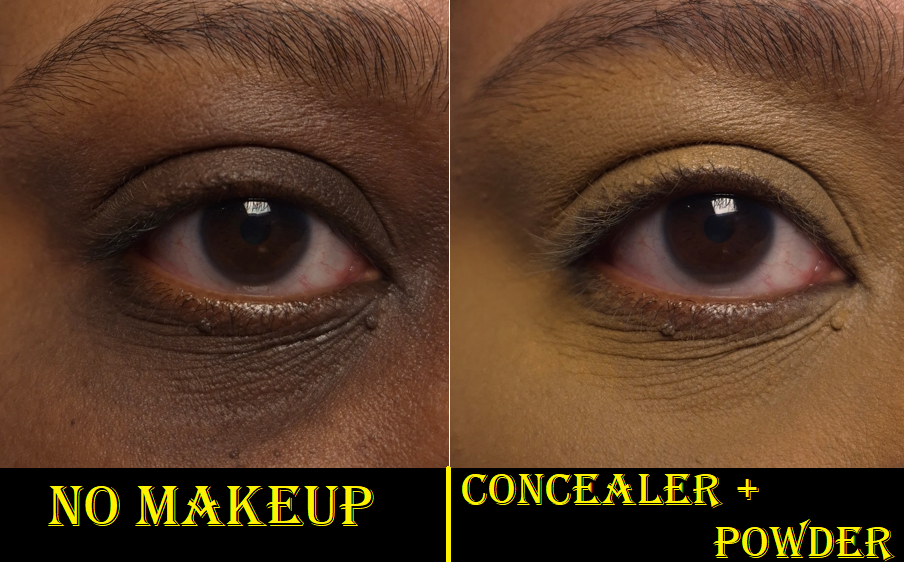
BD91 is a tad more yellow with not enough warmth to be a perfect shade match for me, but I never wear B110. It turns out that shade is still too dark and the neutral undertone looks even more unnatural on me. So, I at least confirmed for myself that B110 is not a shade option for me. I need to stick with the golden tones. Photos of this are in the powder section.
Based on my experience, I can’t really recommend this product. I don’t mind having to use a second product to prime my eye area, but to still need to do touch ups throughout the day is bothersome. I’m willing to buy expensive makeup if it’s going to make my life easier; this one did not.
I acknowledge that other people have not had the same problems with it that I do. If it was able to last at least 8 hours without needing a touch up, I’d have been over the moon about this concealer. Unfortunately, it just didn’t work out and I’ve gone above and beyond already in testing various methods.
Since this released and until February, the only reviewer I found who had a similar experience to me has been Sofia Sees Beauty. Ironically, she likes the Prada concealer more (though she doesn’t recommend that either) and in the majority of the Chanel vs Prada videos I watched, everyone preferred Chanel’s concealer. So, there seems to be certain skin types that this product just doesn’t work for.
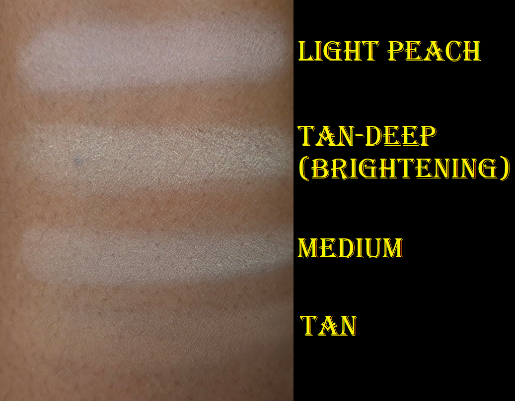
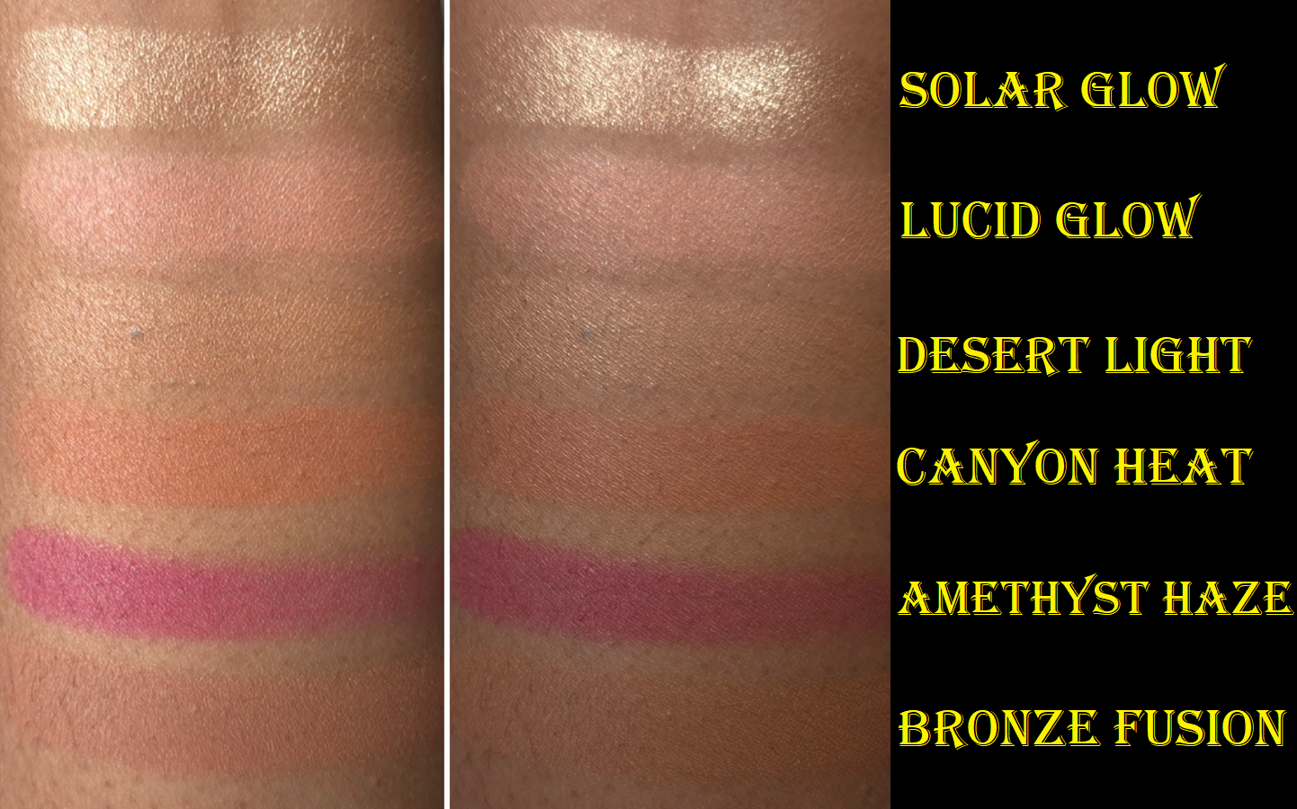
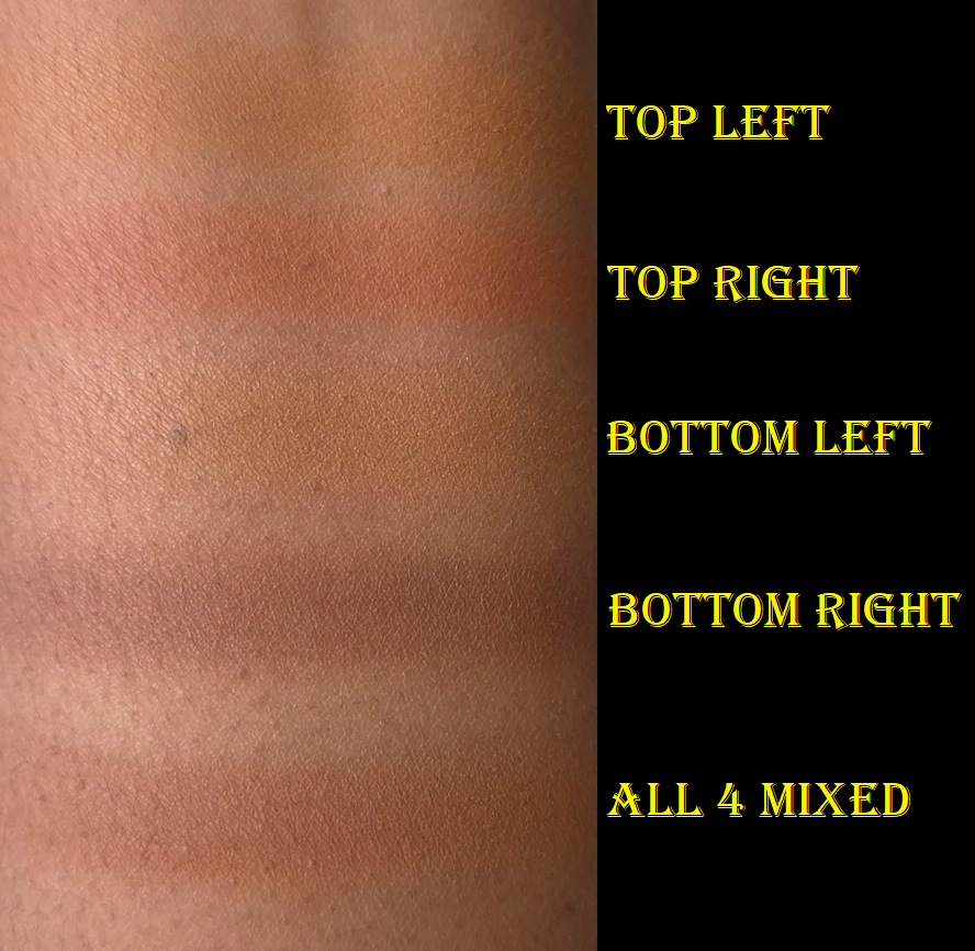
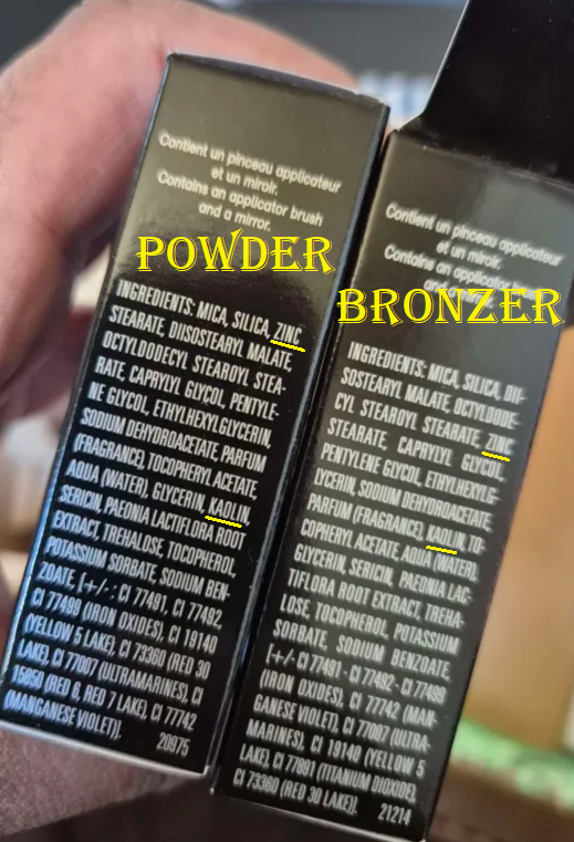
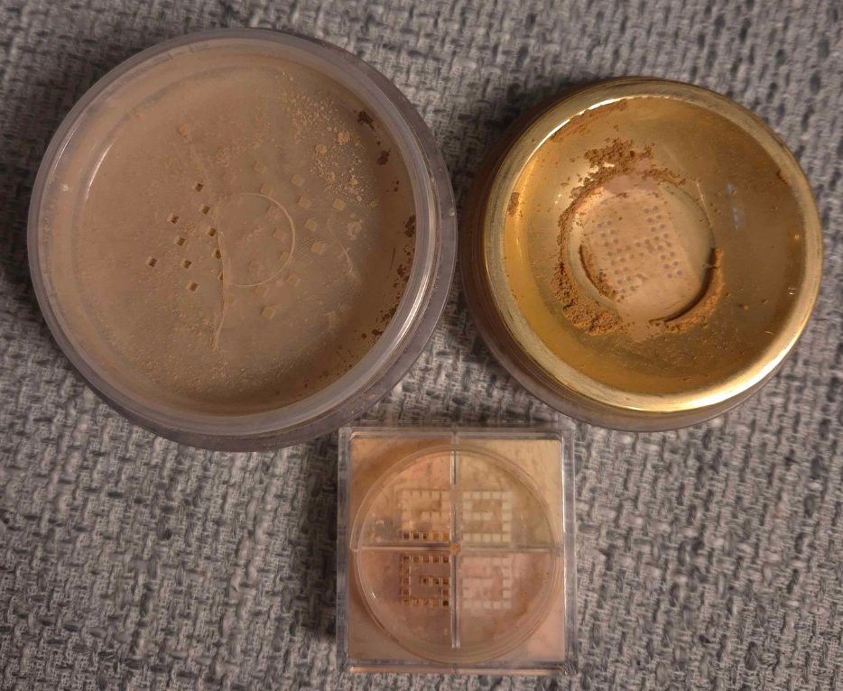
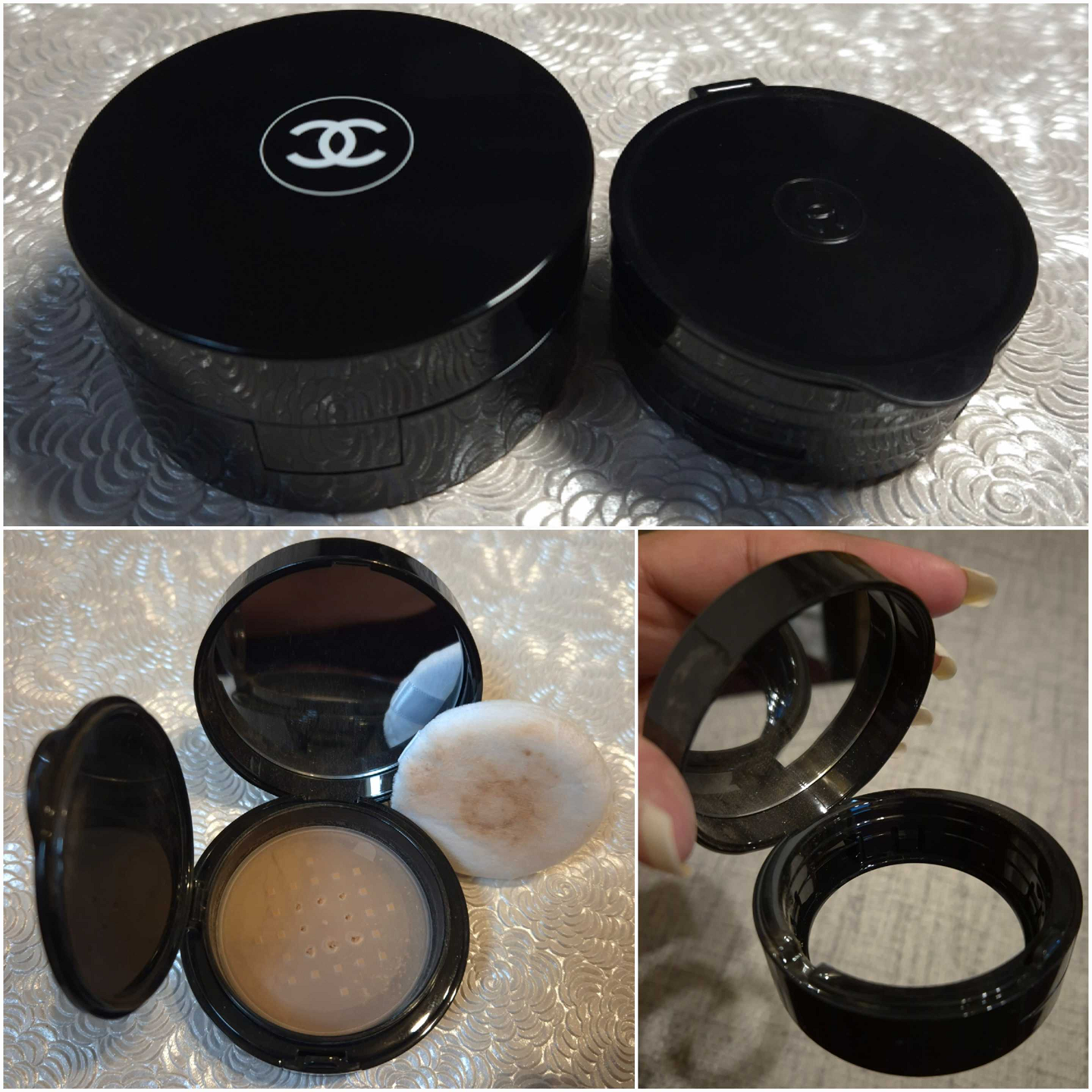
Chanel Universal Libre Powder (On-the-Go Format) in 40 Medium Plus and 50 Medium Intense
Based on the ingredient lists I can see on Chanel’s website, the main differences between the original format of this powder and the refillable “to-go version” is that the standard contains silica instead of cellulose, plus the additional ingredients towards the bottom which are sodium lauroyl glutamate, lysine, and magnesium chloride.
Since I consider the powders to be pretty much the same, and the two products are similarly priced at the discount websites, I opted for the newer packaging. There is a huge difference in the amount of product though, considering the non-refillable jar contains 1 oz (30 grams) of product, but the refillable packaging contains 0.21 oz (6 grams). I’ve only ever used up one powder, so it’s not a concern to me, but that could be a factor for others.
I also heard that the jar packaging is super messy to handle. I have always kept the stickers over the holes of my loose powders and punctured just a few so that I have way more control over how much comes out. I’m not sure if even that tactic would be enough. I find that the refill packaging is still messy if I don’t use my typical methods.
I hate having powder float everywhere, so I only punctured the 8 innermost holes in the sticker. I knock the base to tip the powder contents out onto the lid of the refill. I use what’s needed. I pick up the excess powder back up with my brush to clean off the lid. If there’s still too much powder left, then I use the powder puff that’s included (in both the full to-go packaging and the solo refills) to wipe off the rest. Then I place the puff back over the sticker and holes, and close everything up!
The reason I clear the lid each time is so that the top of the puff will remain looking clean.
I have both the full packaging and a separate refill. The first shade I bought (50 Medium Intense) looks light in the swatches below, but it deepens up a little on my skin. I can wear it on my face, but not under my eyes. Also, the closure part of the refill lid is so easy to open that I worried if I stored it anywhere other than flat on a shelf that I’d have a massive mess to clean up. So, I put it back in the unicarton on my shelf and I waited for a good sale to get the complete packaging in the shade 40 Medium Plus. That one is perfect for my undereyes!
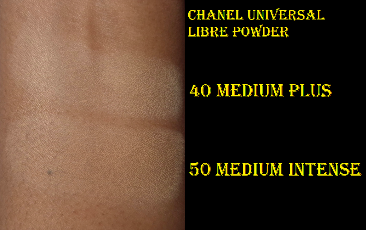
As far as I’m aware, this powder is meant to lightly mattify and be translucent, rather than offering coverage like a powder foundation. So, I was surprised to discover that the shades 70, 91, 121, and 152 exist. I haven’t found a single retailer in Germany that sells anything darker than 50. The darker shades are only on the Chanel website.
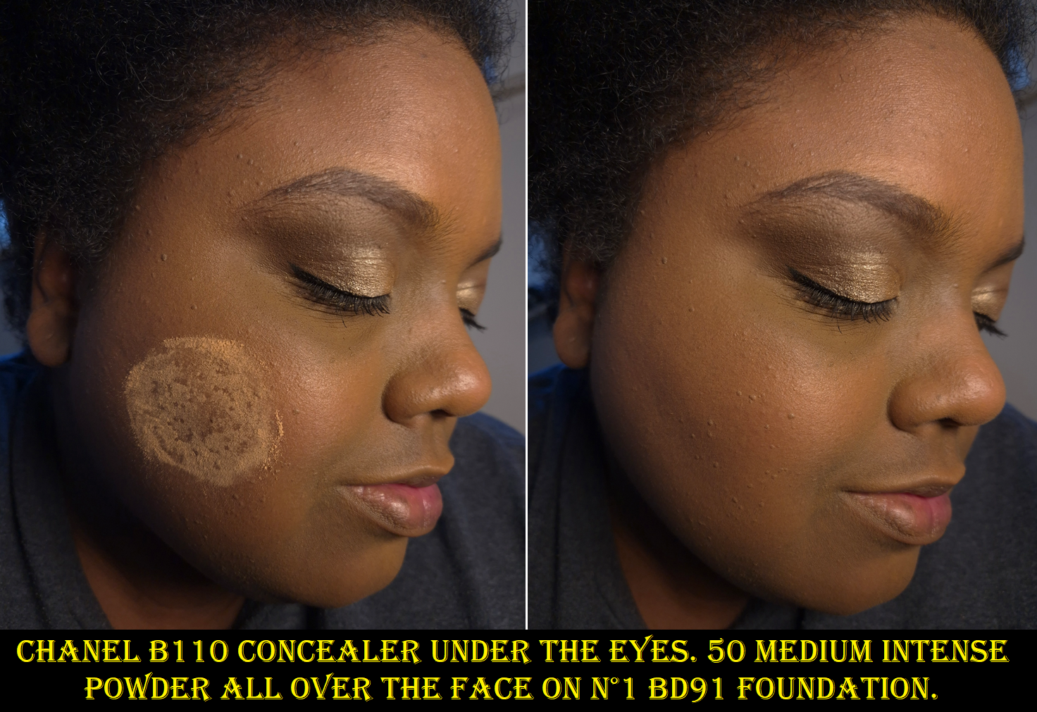
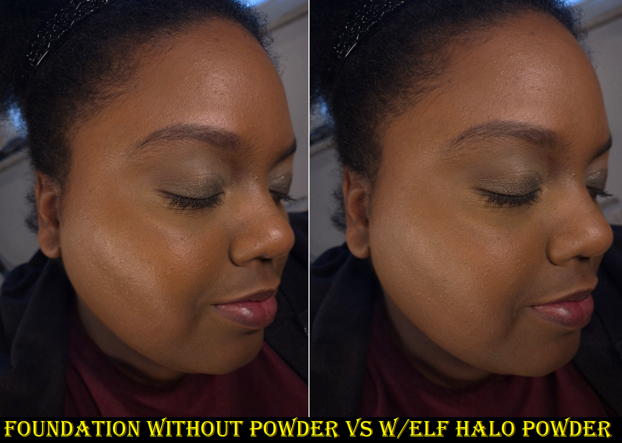
I’m glad that all the hype about this powder being dry-skin friendly is true. It is a super finely milled and thin powder. It doesn’t work as well with my concealers that require stronger powders to lock them in, but I bought this specifically to pair with Chanel’s concealer. Although I still have problems with the wear time of the concealer, the Chanel powder has given me the best results with it. I find it to be slightly blurring and this is the most lightweight loose powder I own that can successfully give me a soft matte finish without making my face look drier. That’s why I don’t think this will work well for people with oily skin. If I use the bare minimum of skincare with most of my foundations, this powder will keep me matte for most of the day, but when my products give me dewy skin and I use the Chanel Powder, I become shiny again within four hours. I imagine that length of time would be increased for someone who doesn’t have dry skin like mine.
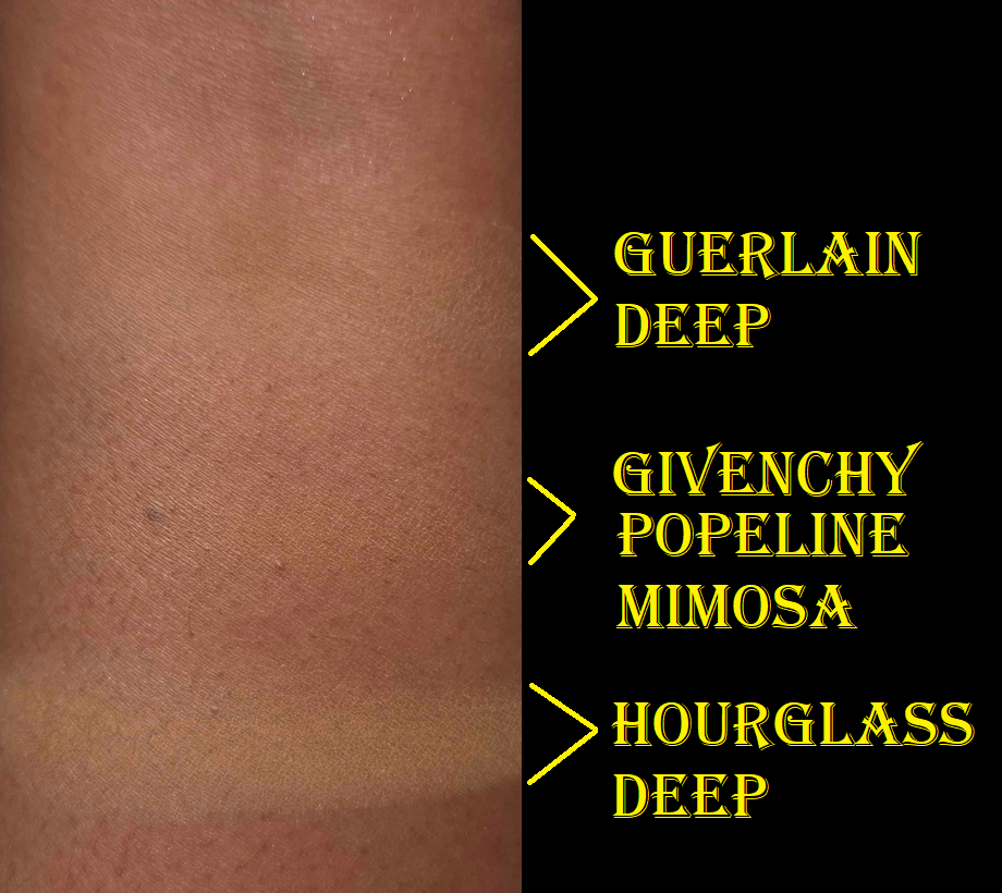
I like Chanel’s powder more than the uber expensive Guerlain Parure Gold Powder because I can’t smell any fragrance (even though this does have parfum listed in the ingredients).
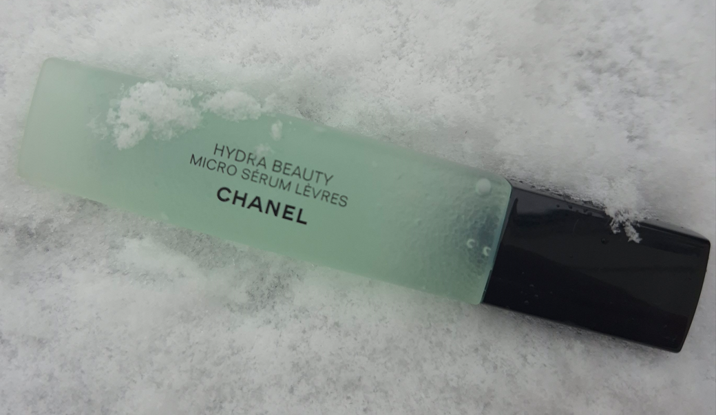
Chanel Hydra Beauty Micro Sérum
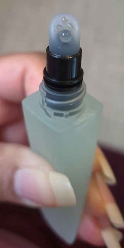
I didn’t know about this product’s existence until Kackie Reviews Beauty talked about it in one of her videos. The way she described it was so fascinating that I bought it the very next day!
The retail price is €56 ($60) but I got mine from Parfümerie Pieper for €39.
I usually take product descriptions with a grain of salt, but Chanel’s is pretty on point with what I have experienced. According to them: “The Micro Sérum Lèvres is a dual-phase formula consisting of an aqueous base with hyaluronic acid and White Camellia Extract, which have a moisturizing, plumping, and soothing effect, and an oily phase with White Camellia OFA (Oleofractioned Active) micro-droplets which melt into skin and lock in hydration.”
Furthermore, “this lightweight and water-fresh serum immediately absorbs and forms a thin protective layer on lips, keeping them hydrated for up to 24 hours** and leaving them perfectly prepped for makeup.”
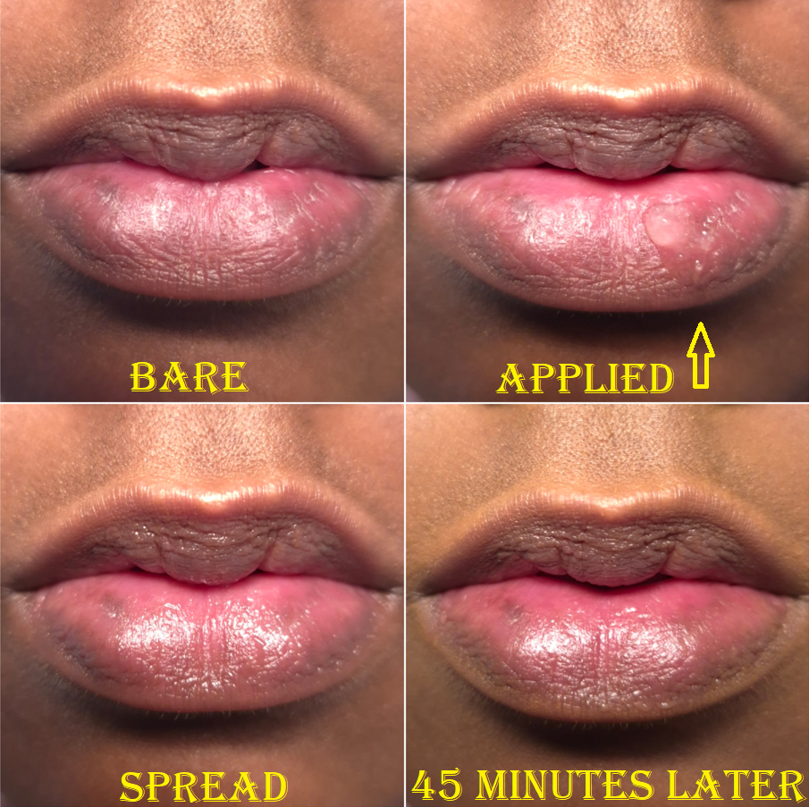
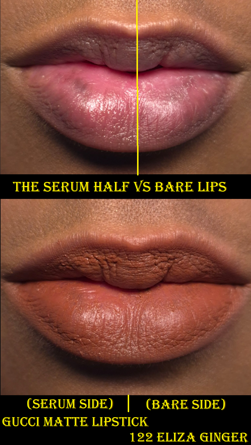
This serum “plumps” in the sense that it fills in lip lines, and its shine gives an appearance of fullness, but this is not a lip plumper that would cause the lips to be enlarged. Chanel doesn’t call this a lip plumper, but many customers would assume it could double as one by stating that this has “plumping effects.” This is the only aspect of the website description that is questionable.
After applying the Hydra Beauty Micro Serum, I’m left with a somewhat shiny finish on my lips, which have the tiniest bit of grip. I can wear this alone as a gloss or balm, but the occlusive gel layer is so lightweight that I need to reapply it at least once or twice throughout the day, especially since it’s easily removed while eating. When I rub my lips together, it feels truly unlike any other lip product I’ve used. Also, this is not fragrance-free, since it has a slight fruit-candy type of scent.
What makes this a useful product to me is how quickly it seeps in to smooth and hydrate my lips, combined with its priming abilities. I have spent a long time seeking products that nourish and condition my lips. All of my favorites are thick and/or sticky, oily, and basically don’t have the kind of consistency that I can use to continue improving the condition of my lips (or prevent my lips from drying further) while wearing other products on top. Products like the Ami Colé Lip Treatment Oil, Clarins Lip Comfort Oil, and Eadem Le Chouchou Peptide Lip Balm are better at improving the condition of my lips over the course of a full day, but this Chanel product is what I’ve been using when I want my lips to look better fast, and wiping those other products off my lips would leave too much residue behind. That occlusive layer is what makes my favorites and so long-lasting, while also preventing me from using them as lip prep products. This is where the Chanel serum fills a void in my collection.
The reason I wear lip glosses and balms so much isn’t just out of enjoyment of low maintenance products. It’s also out of necessity. Although this lip serum can make matte lipsticks look satin, I’ll take that over not being able to wear my lipsticks that often due to my chronic dry lips issue.
So, this isn’t deeply nourishing to me. It’s a quick fix. According to the statistics Chanel provided, “After 4 weeks of use, lips look 49%* more plump and 70%* smoother. Natural lip colour appears 62%*** more vibrant.”
I have not used this product daily for 4 weeks straight, so I cannot comment on how true that sounds or not. Based on at least one week of consistent use, I don’t think the ingredients are enough for my lips to be nourished long-term. This serum has come in handy so many times as a lip primer since I bought it in September. I have only ever used a couple of actual lip primers, so I can’t say for sure how much better this is from other lip preps out there. Since I’m not interested in spending even more money trying to test other products like this, I will stick with what I know.
Should I ever use up this product, I hope that I’ll be able to get another on sale again!
This lip serum is useful to be able to wear less comfortable lipstick formulas. However, if I stick to only buying balms that condition and deposit a nice amount of color, I wouldn’t need the Chanel Hydra Micro Serum as much. If I downsize my lip collection each year, there may reach a point that it will no longer be necessary to have a product like this around.
That day isn’t today though, and I am happy I’ve got it!
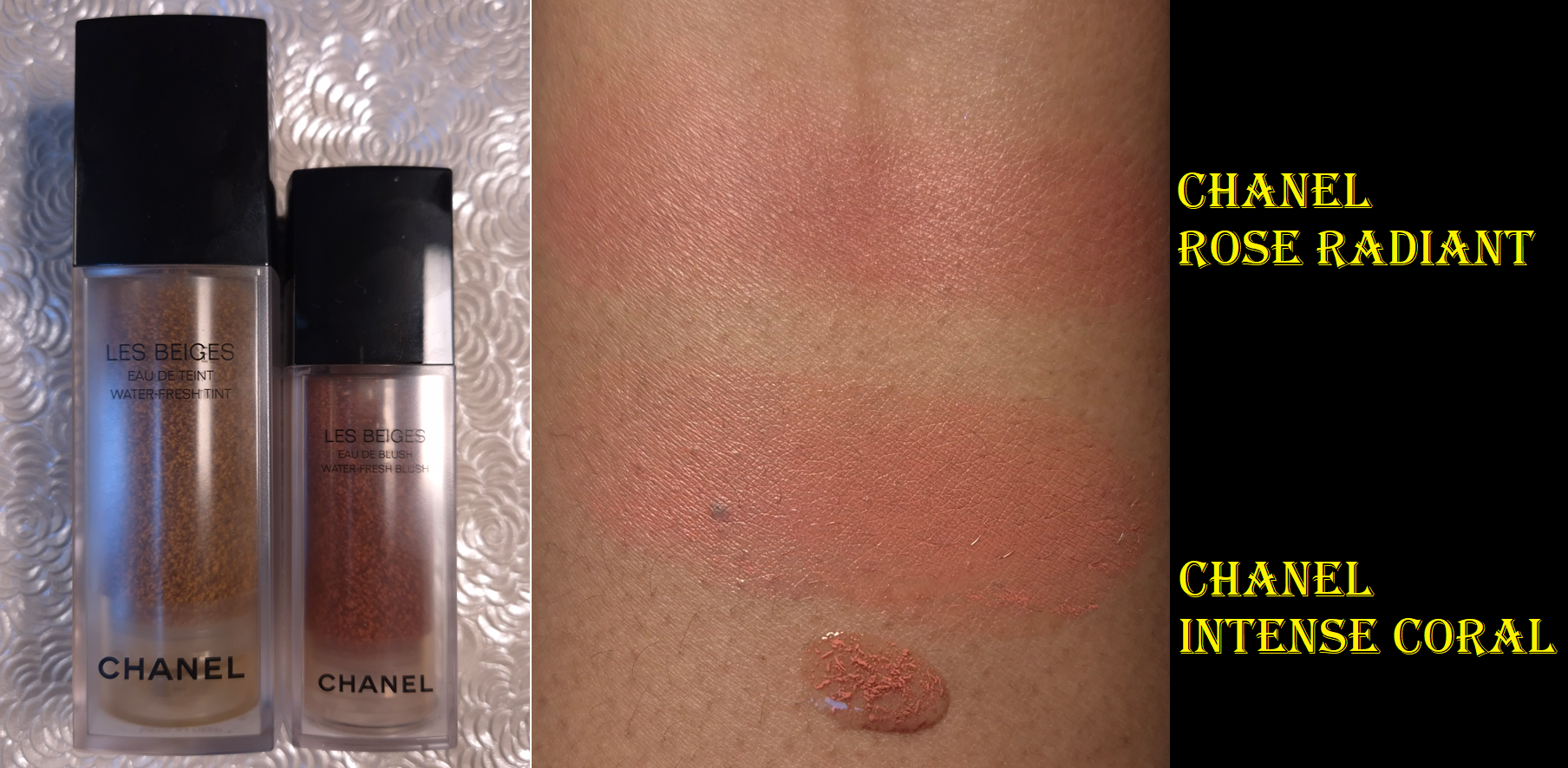
Chanel Les Beiges Water-Fresh Blush in Intense Coral
I’ve been avoiding buying liquid and cream blushes for over three years, so I had no plans to buy the Chanel Blush until I watched Alicia Archer’s video.
Admittedly, my first choice for the color would have been Deep Bronze, but it’s a Chanel exclusive shade. So, I went with my second favorite option and ordered Intense Coral from Flaconi at a discount.
Intense Coral shows up on me and can be built up in more obvious layers, but it might not look that great on someone with a skintone several shades darker than mine.
Intense Coral reminded me of the Joues Contraste Intense Cream-to-Powder Blush in the shade Radiant Rose, but Radiant Rose is the tiniest bit darker with a little more warmth.
The watery gel-like consistency and the fragrance are the same as the Water-Fresh Tint. The blush has half the amount of product, but it isn’t half the price of the tint ($72 vs $56). The price per ounce or milliliters for the blush is even more expensive here, considering it’s €67 for the tint and €55 for the blush.
I like the hydrated feel of the blush on my skin and that it dries down. One pump is enough to give a beautiful flush to both cheeks. Although I can blend it well with fingers, I prefer the control I get with a brush application by pumping the blush into the back of my hand and coating the brush bristles evenly before alternating pouncing the product onto both cheeks.
When I wear this on my bare skin, even on top of skincare, this has terrible longevity. The blush is significantly faded within a few hours. At a minimum, if I wear my typical skin prep products and the Chanel Water Fresh Tint underneath the blush, it can last most of the day with an acceptable amount of fading. However, it is still susceptible to being easily removed by liquids. On one of the testing days, my watery eyes caused the skin tint and blush tint to disappear where the droplets rolled down my cheek. Adding a primer to the prep steps is enough to combat the water-soluble issue and prevent the blush from fading.
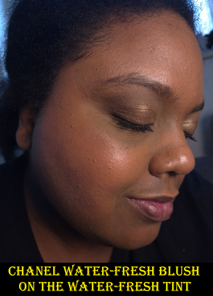
When I wear the Water Fresh Blush on top of my Chanel N1 Foundation, I have no longevity issues at all. I figure that’s because it provides an even stronger barrier between my skin and the blush. So, although this product is appealing to makeup minimalists and those that want the most lightweight layers of product with the most skin-like finishes, this blush has to be used in specific ways to get it to last. I’d also like to note that due to lighting, the blush is easier to see in person than in my photos.
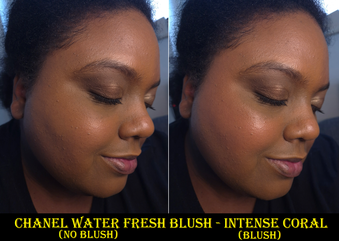
I like the blush color, the dewy looking finish, the seamless blend, and how easy it is to use despite being a liquid form. Usually liquid blushes are the most troublesome for me to work with.
The €36 I paid for this was a fair price for Chanel makeup. I like this product a lot, but I don’t think it will become a favorite purely because I am a powder blush fan. I wanted to be able to wear this all day on bare skin and have it still be long-lasting. I haven’t tested this idea yet, but if adding a face primer to my cheeks is enough to fix the longevity problem without needing to wear a tint/foundation too, this could make me use this blush more often. I’d be able to wear it on low-makeup days as planned.
That ends this post! I hope it has been helpful. Please keep an eye out for Part 2 if you enjoyed this!
-Lili ❤