I’ve been using the Heroline as my sole liquid eyeliner since at least October 2025, but it took so long for me to complete this review because of how infrequently I reached for the Color Fluids. Powder products have always been my preference, and I basically have the Color Fluid shades within my Beautopsy Palette. So, I tend to reach for the easier-to-use powders over the more advanced liquid form. What swayed me into buying products I may not get much use from were all the gorgeous looks Hindash created and shared on social media. The way the Color Fluids mixed together and the finish on the skin is not achievable with the powders alone. So, I gave these a try, and I don’t think I regret it.
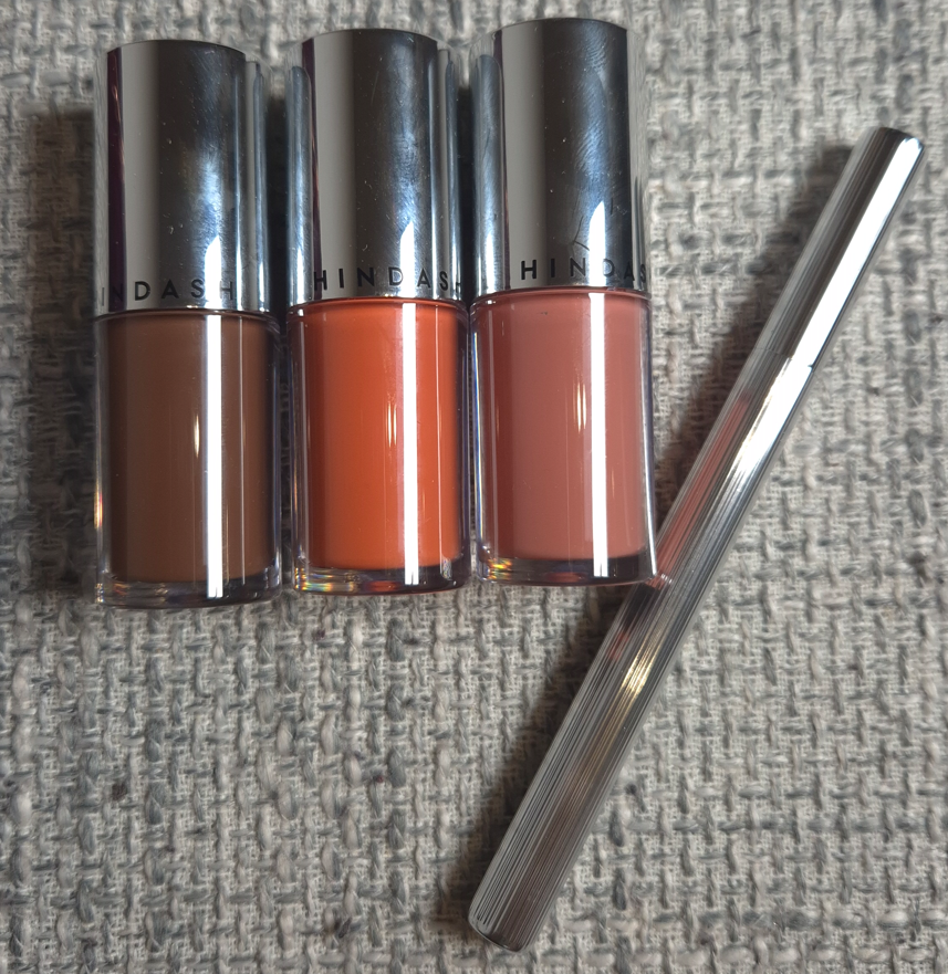
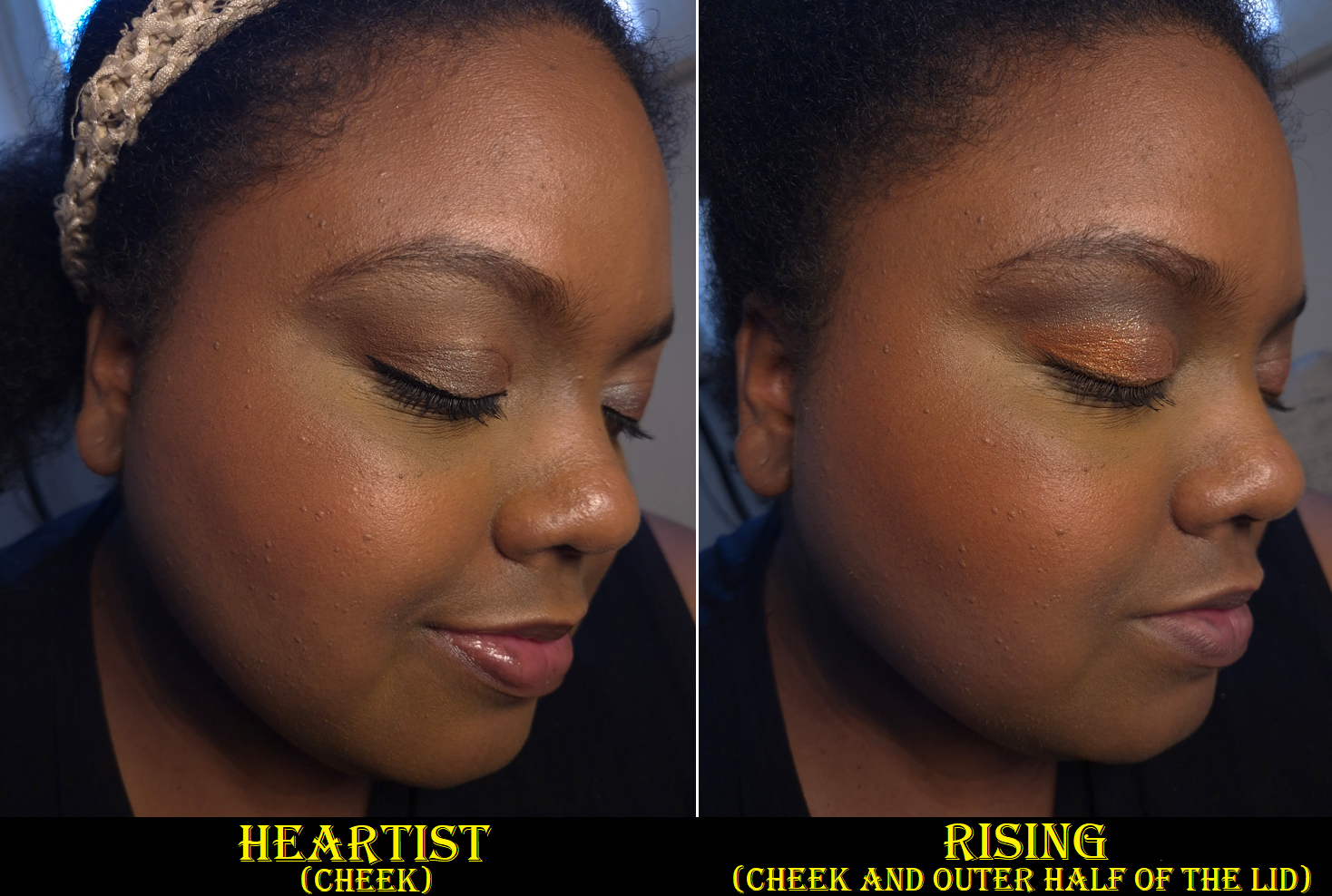
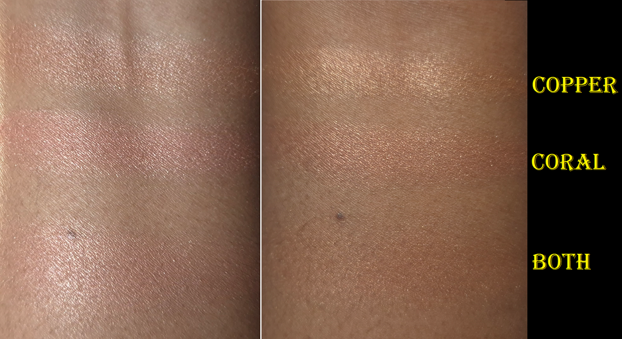
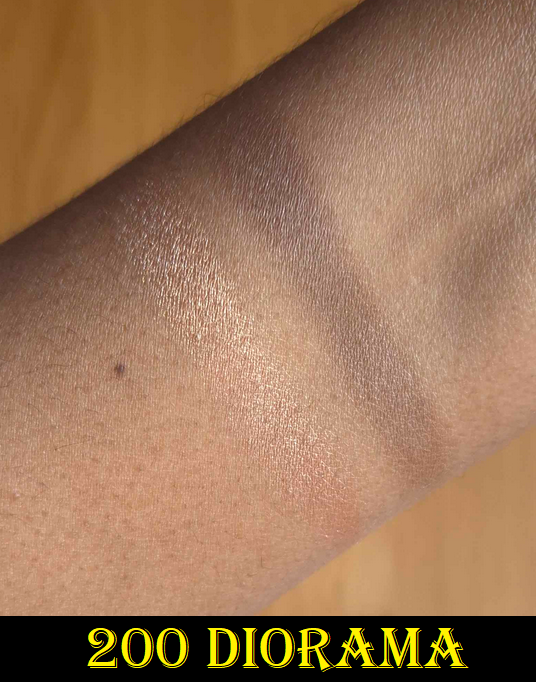
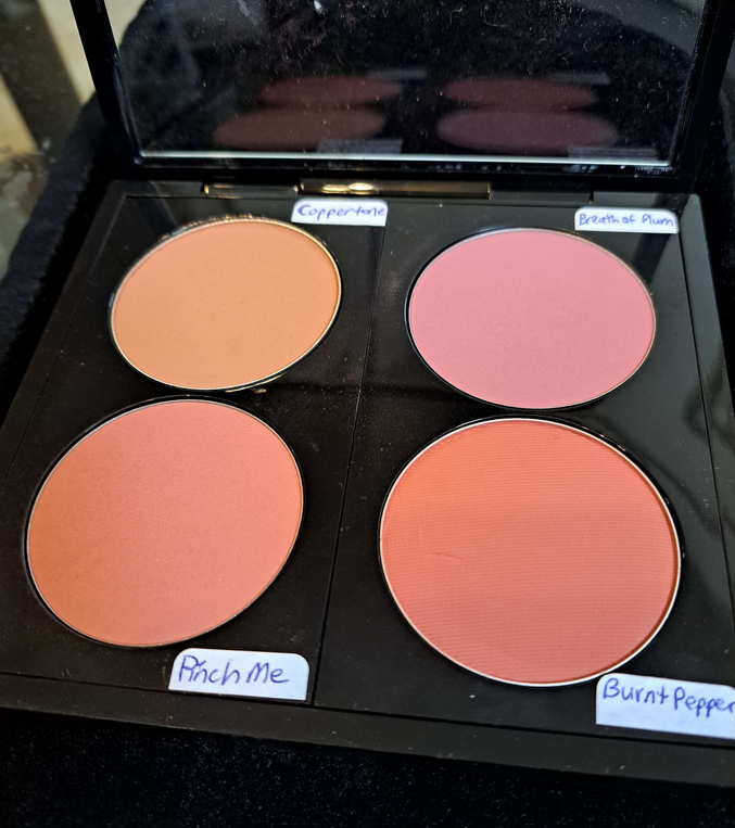
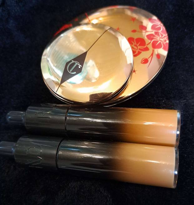
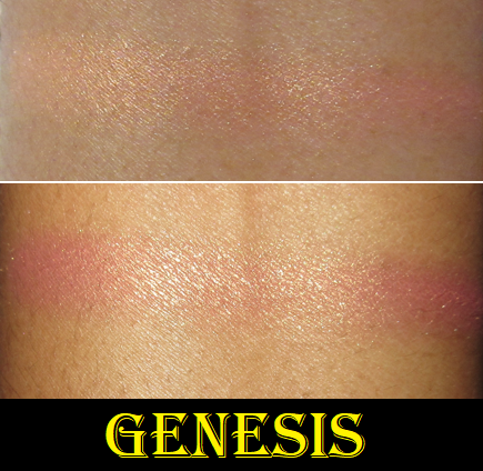
Hindash Heroline and Hindash Color Fluid in Thorn, Heartist, and Rising
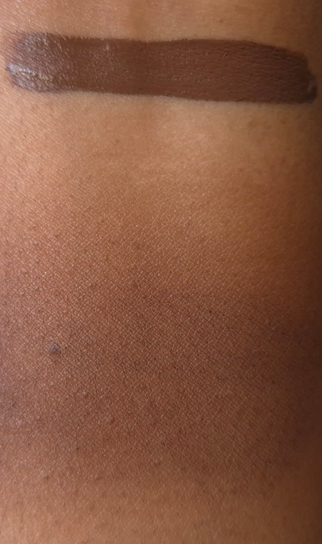
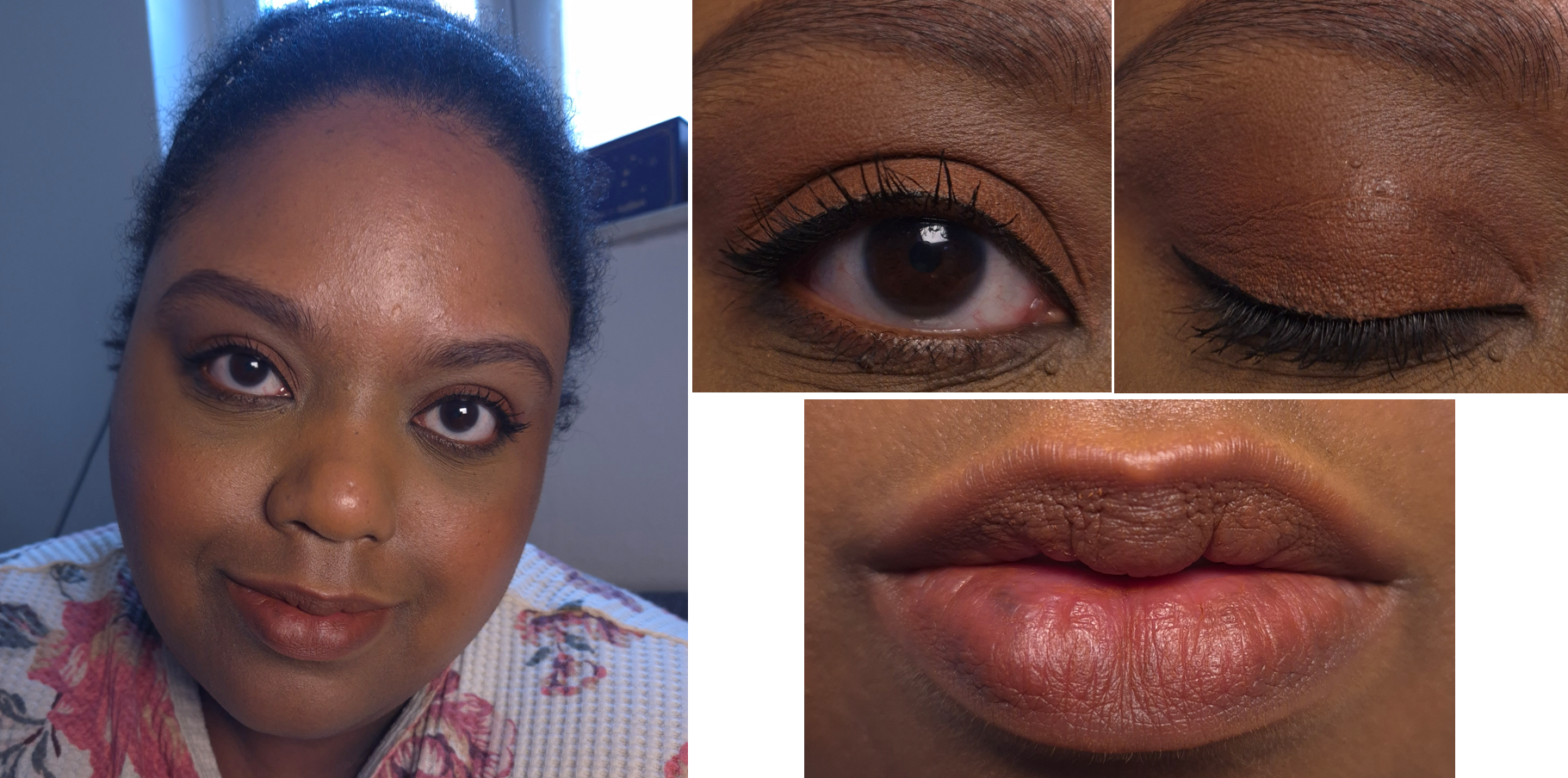
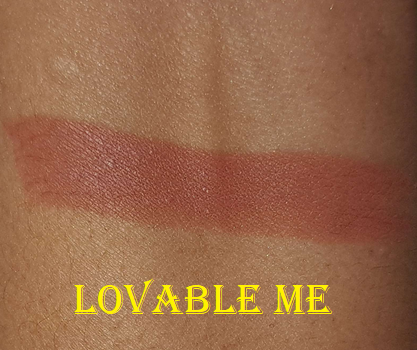
Thorn swatch via applicator and swatch blended out with a finger.
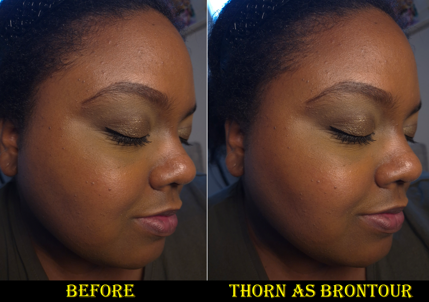
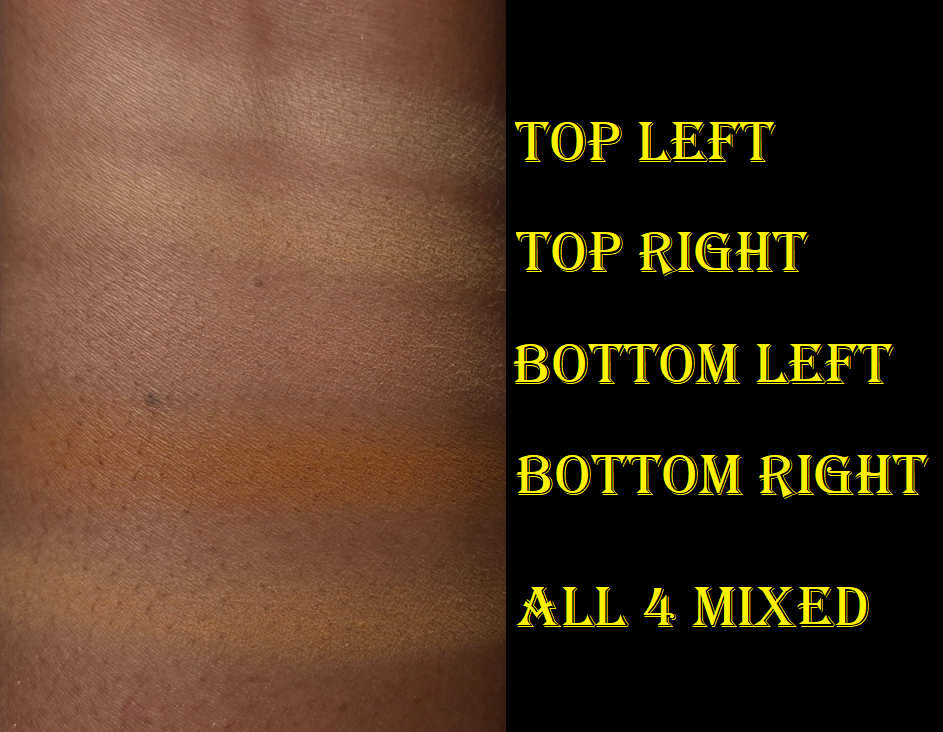
I can apply the Color Fluids directly to the face and then blend them out, but there isn’t a large amount of time to work with them before they set. Applying one to a makeup mixing plate, or the back of my hand, and picking up a smaller dab of it with my brush is the easiest way to ensure I don’t overapply. Thorn is a beautiful color as brontour, but it’s a bit deep. I would only use it when I’m darker (like in the photo above taken a year ago) or when I want a more intense bronzed look.
To make Thorn even more natural looking and easier to blend into the skin, the brand recommends mixing it with a base product (foundation, skin tint, etc.). I’m too lazy for that, and would just reach for any of my current favorite bronzers, instead. I still thought it was important to mention that there are ways to sheer out this product and lighten it by utilizing additional products and steps. The Color Fluids are fantastic for makeup artists and minimalists, but they might take more effort than the average consumer will want to make. I don’t feel that Hindash’s products are too difficult for beginners to use, but I believe the more advanced at makeup someone is, the more likely they are to appreciate the brand’s formulas. I like knowing how versatile the Color Fluids are, even though I admittedly don’t use them to their full potential. I’m often rushing through putting on my makeup, so I try to keep the amount of mixing I need to do at a minimum. However, I absolutely wish I had this product when I was getting married and looking for a good product for contour underpainting. My wedding and other major events are the only time I will really sit down and play with colors to try and get the absolute closest shade matches and most blended natural-looking base.
TL;DR: These products work for people of all skill levels, but they are best suited to makeup enthusiasts and makeup artists. People who enjoy playing with makeup are most likely to love the Color Fluids, but they might not have the time for it and prefer to reach for other products that are quicker and easier to use.
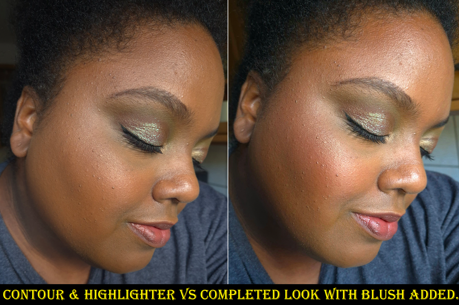
As blush, these are so quick to blend in and they last all day without fading. Even if I wear my hydrating skincare and foundation, these still set down on their own without powder. These are shimmer-less shades, but some of the glow from the products underneath are able to come through, preventing my cheeks from looking dry regardless of the matte formula. I consider them to be matte because, as far as I can tell from the ingredients, there are no shimmer or glitter particles and the mica just adds a kind of sheen and some reflectivity. Beautylish eventually added the liquid highlighter, Boy Tears, to the Color Fluid category, but they used to be considered separate items. This leads me to guess the brand will eventually launch additional shimmer options, but Boy Tears is currently the only one that isn’t matte.
There’s a certain level of pigment coverage needed for these to be suitable as eyeliners too. So, a little goes a long way when trying to wear the Color Fluids as sheer cheek products. That’s another reason Thorn requires a little more skill to use it as a bronzer or sculpting shade, but I don’t have to worry as much about precision when using them as blush. If I want to try and customize the blush color by mixing two or more shades together, then the difficulty level rises again.
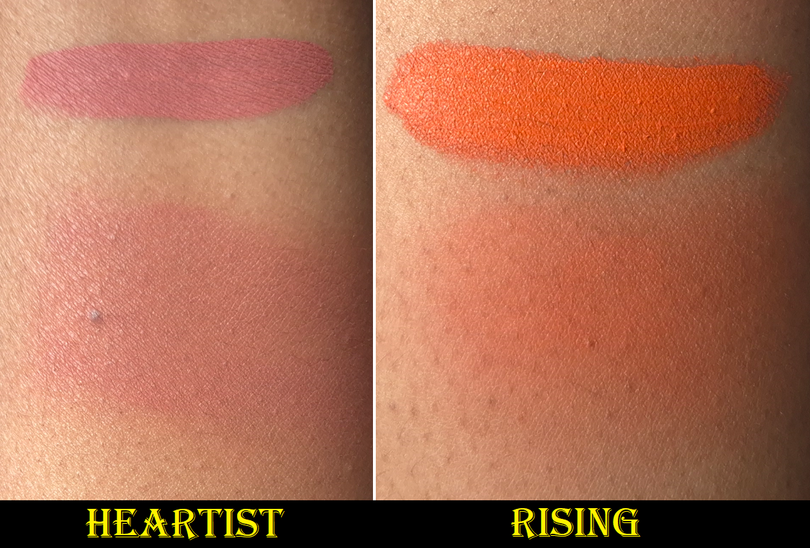
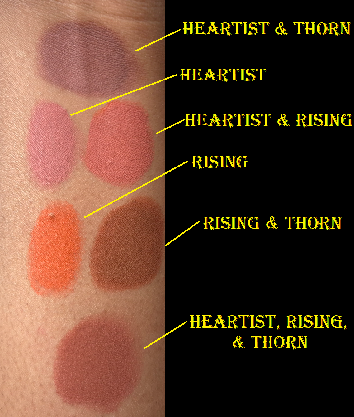
None of the combinations were created with equal amounts of color. I always used a much smaller amount of Thorn because of how easily it can overpower the other two shades.
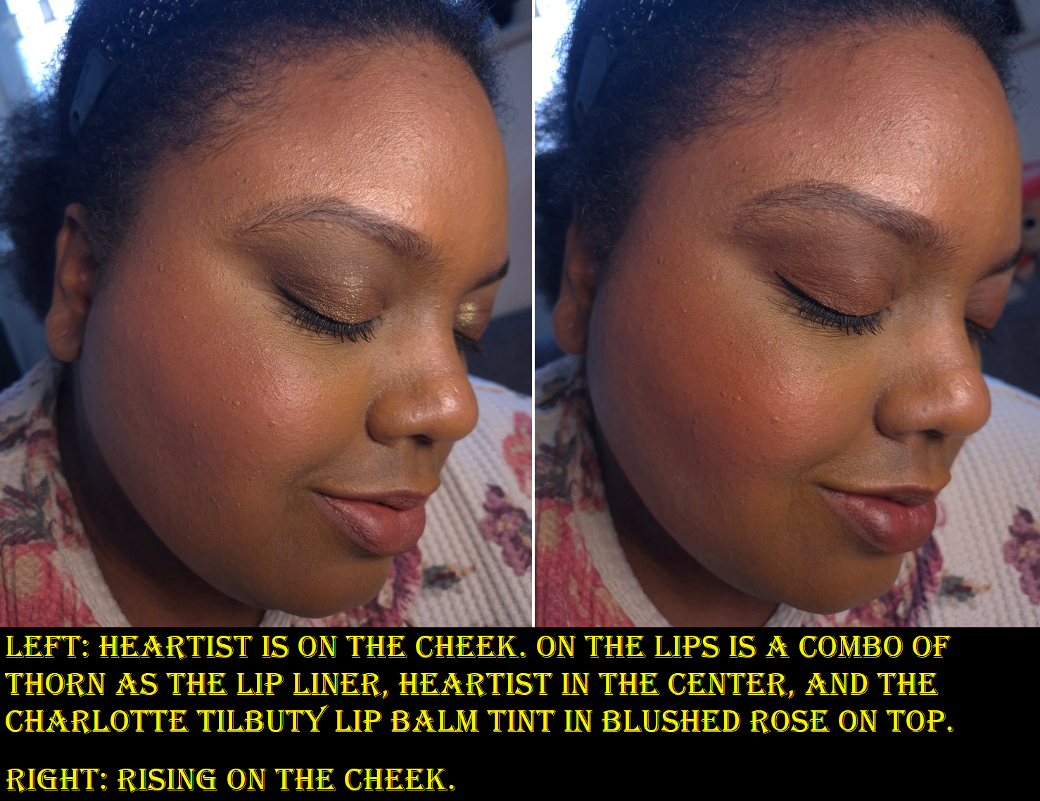
Due to my lighting conditions, Heartist is diffcult to show up in my photos, but it is very much visible in person. I like that it’s not a bold color on my cheeks. Rising looks like a neon orange mixed with red, which gives it a pop of brightness despite being a medium-dark color. It doesn’t look that unnatural on my cheeks, but I sometimes combine it with Thorn so that it leans more nude.
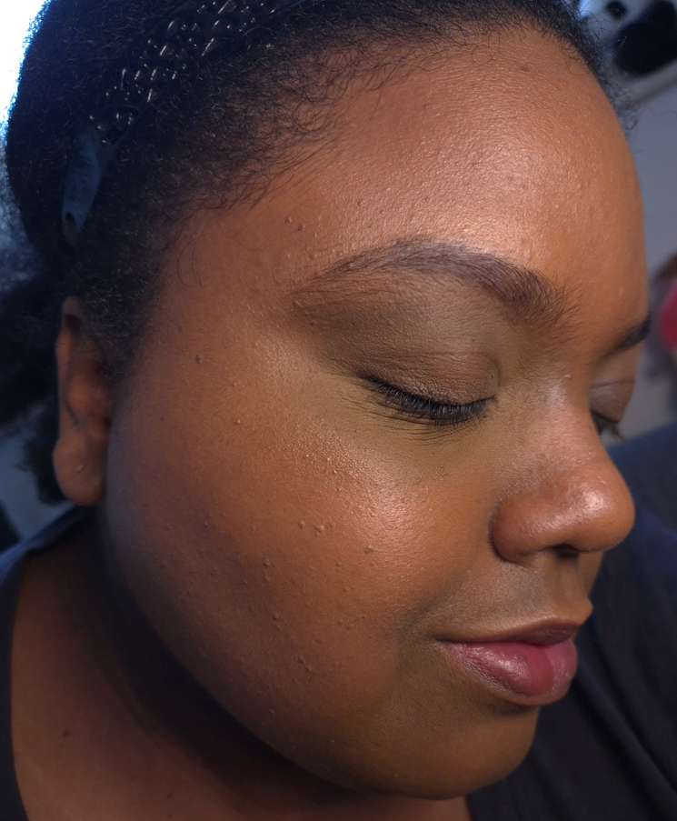
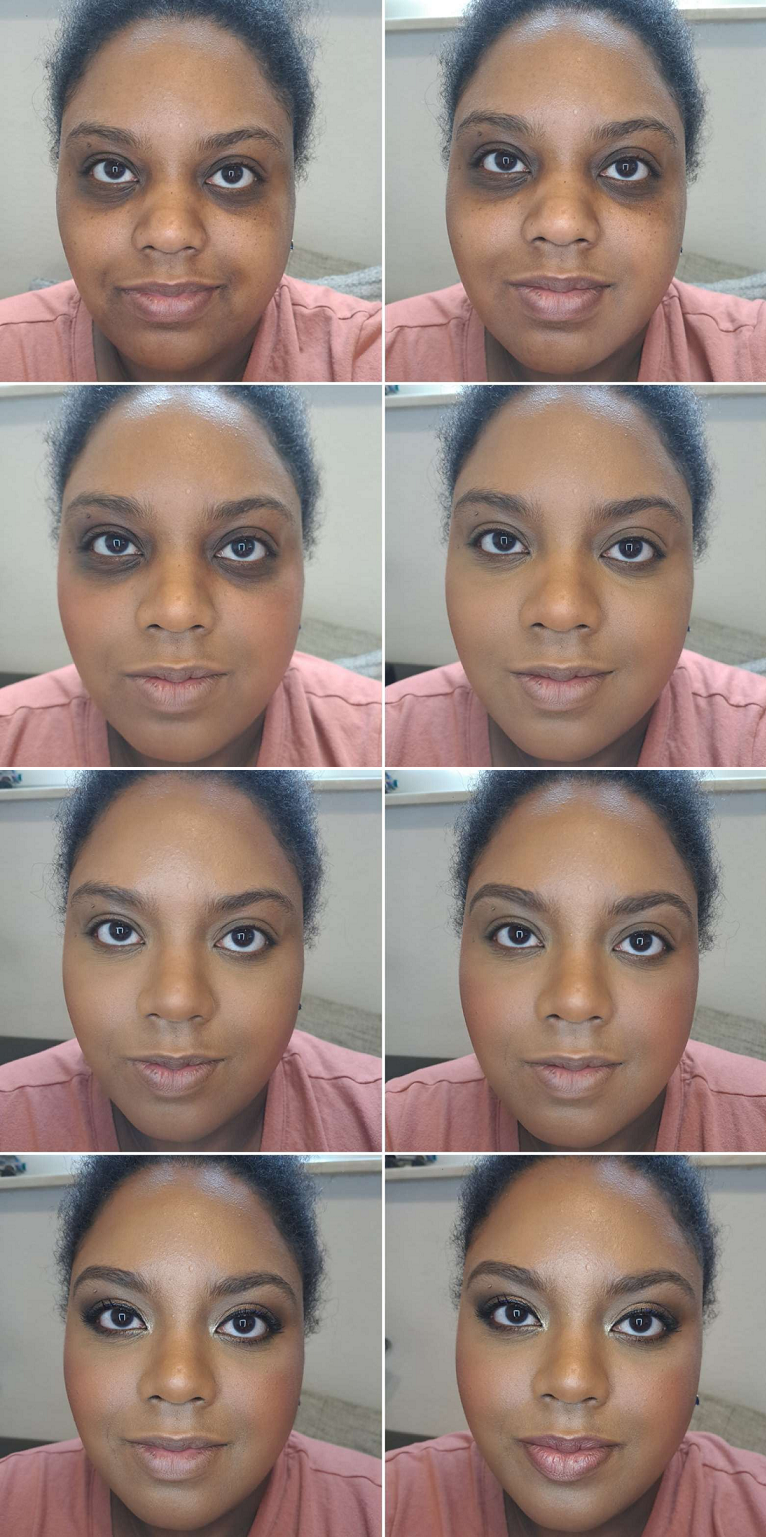
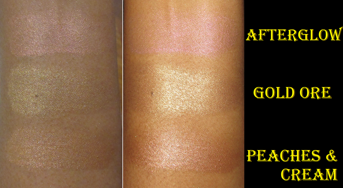
I believe I used the Hindash Gradiant Highlighter (Peak Heat) as the shimmer element in this look, but I took this photo over a year ago, so I can’t remember for certain.
These work as eyeshadow bases and liquid eyeshadows, but I’m not thrilled with these colors on my eyes. I think it has to do with them looking intended for softer looks, rather than intense ones. It’s that softness that makes them so pretty as cheek products, which is ironic because I have often said I prefer to use the Hindash Beautopsy Palette on my cheeks more than my eyes too. For eyeliner purposes, the formula is great because they lock on and are waterproof. With Isododecane as the first ingredient, it doesn’t surprise me how long-lasting these are.
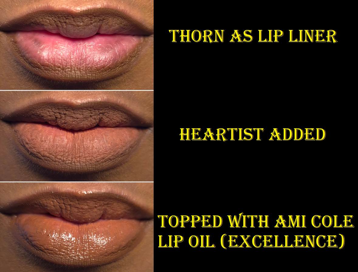
As a lip product, particularly as lip liner, these are beautiful. The Color Fluids blend into each other and layer up nicely when I’m trying to build up the opacity when spreading them across my lips. I’ve eaten oily meals with this on and it only looks funny at the inner edges of my lips (the most inward mouth opening). I can get through two meals at most, and then only the lip liner will remain. It doesn’t last through meals without needing a touch-up if I wore a balm underneath the Color Fluids or have a different product on top. So, these essentially work like liquid lipsticks with the same kind of pros and cons.
When I use these in the main section of my lips, it looks super dry and highlights the look of that dryness. Color gathers around chapped patches. Because it dries out my lips too much, I wouldn’t use this as a lip color, though perhaps just as lip liner. The brand recommends using a balm underneath to increase the level of comfort. Applying a lip oil on top has helped in my personal experience, but I have too many lip products I like to bother using the Color Fluids this way anymore.
So, my favorite way to use these (and pretty much the only thing I’ll use them for going forward) are as cheek products. I definitely don’t need anymore items in that makeup category though, so I don’t foresee myself buying more in the future. However, all this time later, I am still glad to have bought them.
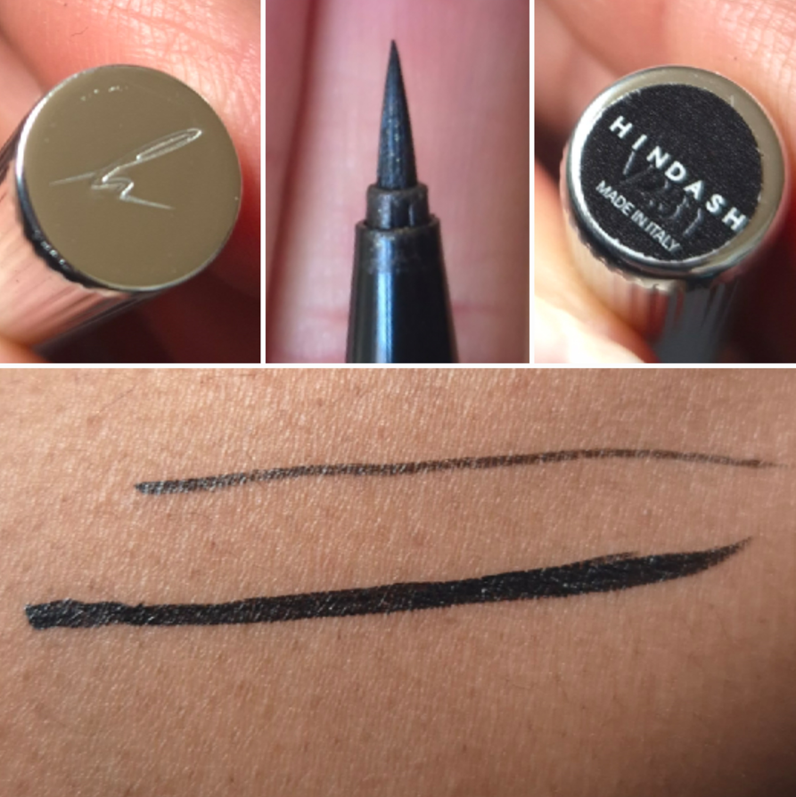
I will always be partial to the classic black liquid eyeliner pen. The one I’ve used the longest in my time wearing makeup has been the Stila Stay All Day Liquid Waterproof Eyeliner that I used to buy at 50% off via Ulta’s 21 Days of Beauty sale. When I moved to Germany, I figured I would switch to my second most used liner which is the Nyx Epic Ink Liner. Before that though, I decided to give the Hindash Heroline a try during one of the brand’s sales (which ended up full price when I got hit with the Einfuhrzölle/Steuern/Bearbeitungsgebühr via DHL). I bought it in June 2025, but I remember not wanting to start using it until I ran out of my previous liner. That’s why I can only confirm I’ve been using it since October 2025 based on my phone’s camera roll, but it could have been longer.
As far as I’m concerned, this eyeliner has no flaws. I can create a super thin line (even thinner than the One/Size Liquid Eyeliner Pen) or thicker for more drama. I don’t get cracking when it dries down. I don’t have the issue of it being so liquidy that it feathers around the lash line. Usually after six months, I would be running out of the Stila Liner, but the Heroline hasn’t shown any signs yet of drying out or running out, even though I believe it has less liquid inside than Stila’s pen (0.4 grams vs 0.45 grams). The tip has remained a lot cleaner than my other eyeliners tend to be, though I haven’t been using multichromes as often.
The brand claims this is water-resistant (not waterproof), but on me it doesn’t budge, and it takes nearly as long to remove as a waterproof eyeliner does. The lines on the packaging aren’t just a pretty design choice. It helps with gripping too, so I’m able to keep my hands relatively steady.
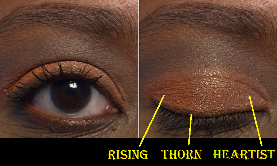
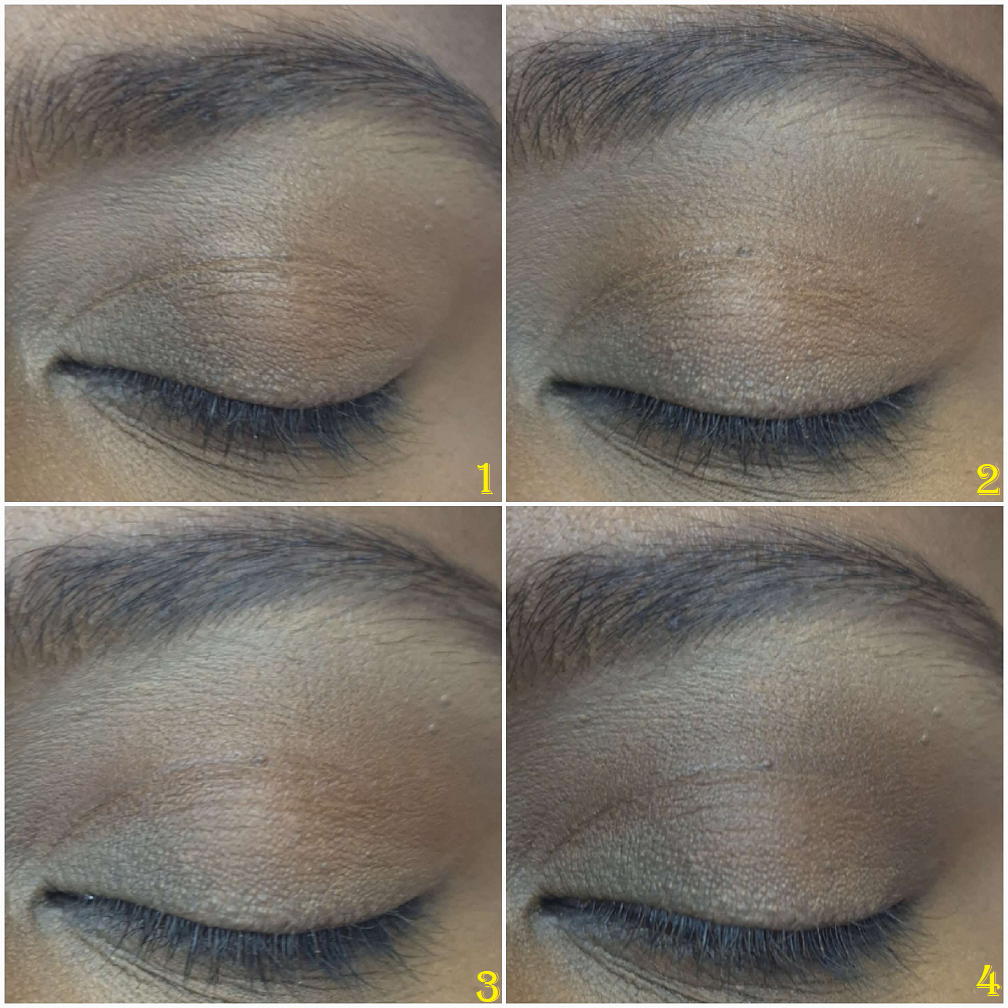
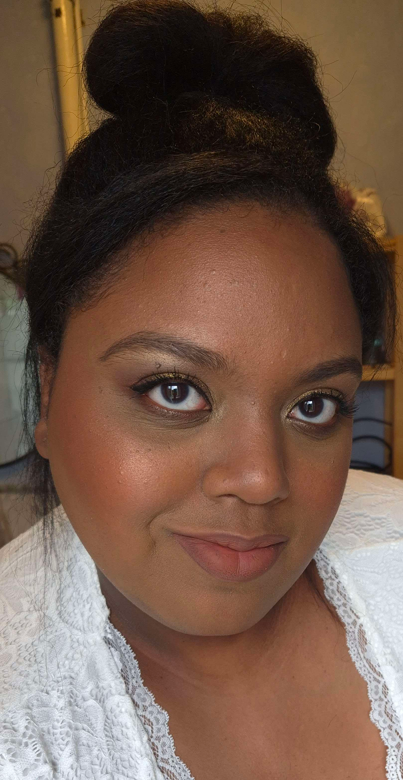
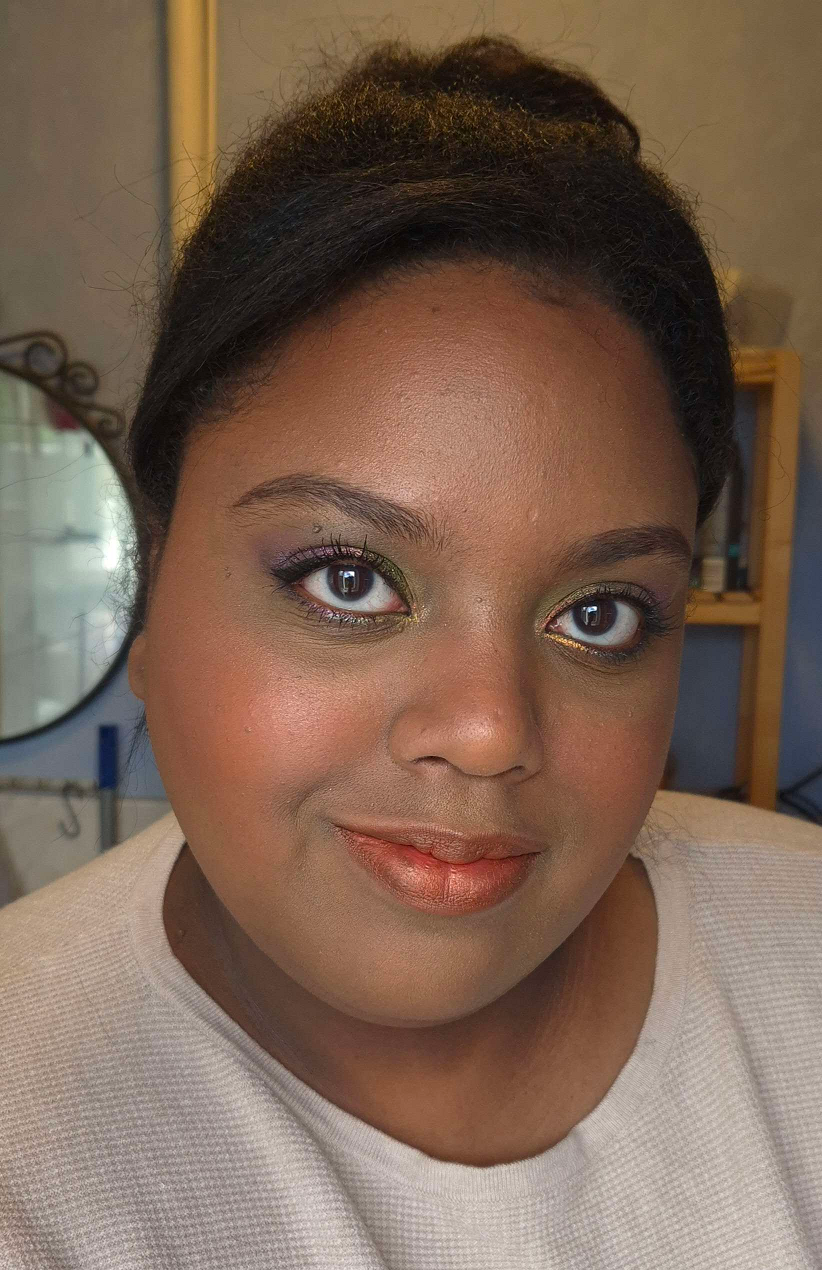
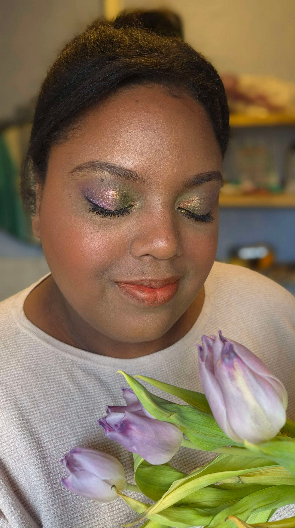
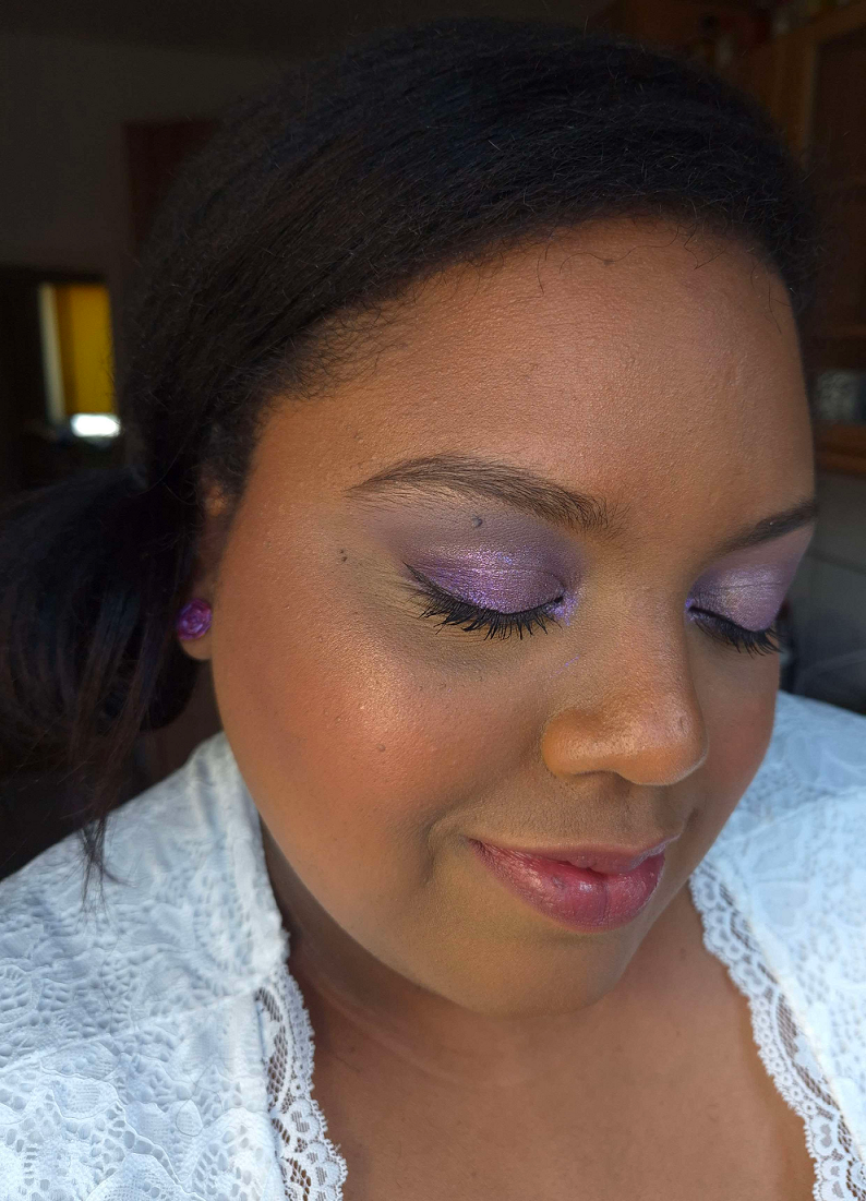
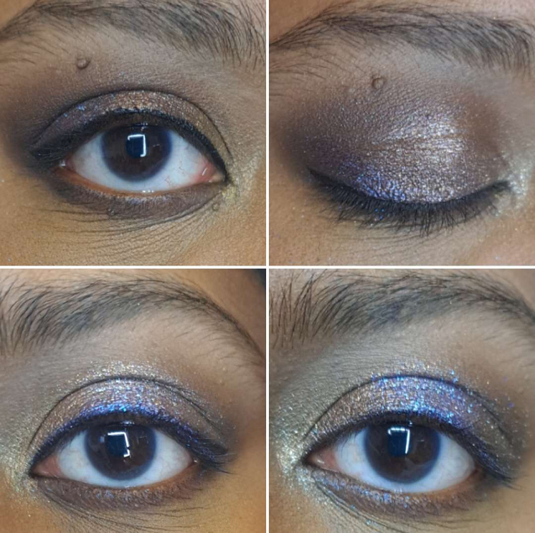
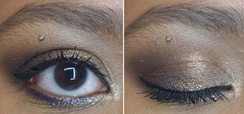
For a demonstration of how this looks in eye demos, one can just scroll through the eyeshadow posts from the past six months, but I’ll repost some previous examples here.
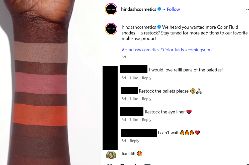
Overall, this is a great product! I understand why everyone I’ve seen reviewing this brand has praised it. However, I don’t have enough of an issue using the Nyx Liner to be certain whether it’s worth it to spend double the price on the Heroline instead. I’ve gone back and forth about that issue, but it doesn’t matter anyway if Hindash doesn’t restock it. The brand’s restocks take forever, to the point that I frequently wonder if the manufacturer is super slow, crazy busy making other products, or if it’s the brand having trouble with funds. It has at least been hinted on the Hindash Cosmetics IG page that a range expansion and restocks could be coming soon. However, I’m not getting my hopes up too high because I remember hearing Hindash talk about potentially releasing a gradient palette with shimmers, but it has been four years since he has launched any palette at all.
I hope this post has been helpful to anyone wanting to see more opinions regarding Hindash Cosmetics products, especially since they don’t get talked about (at least in the US) as much as products by other makeup artist brands (Lisa Eldridge, Victoria Beckham Beauty, etc). I am a big fan of this brand and I continue to wait semi-impatiently for them to release more!
I’m still trying to catch up on reviewing some of my “older” makeup purchases, but today’s post is focused on some of the newer launches and shade extensions!
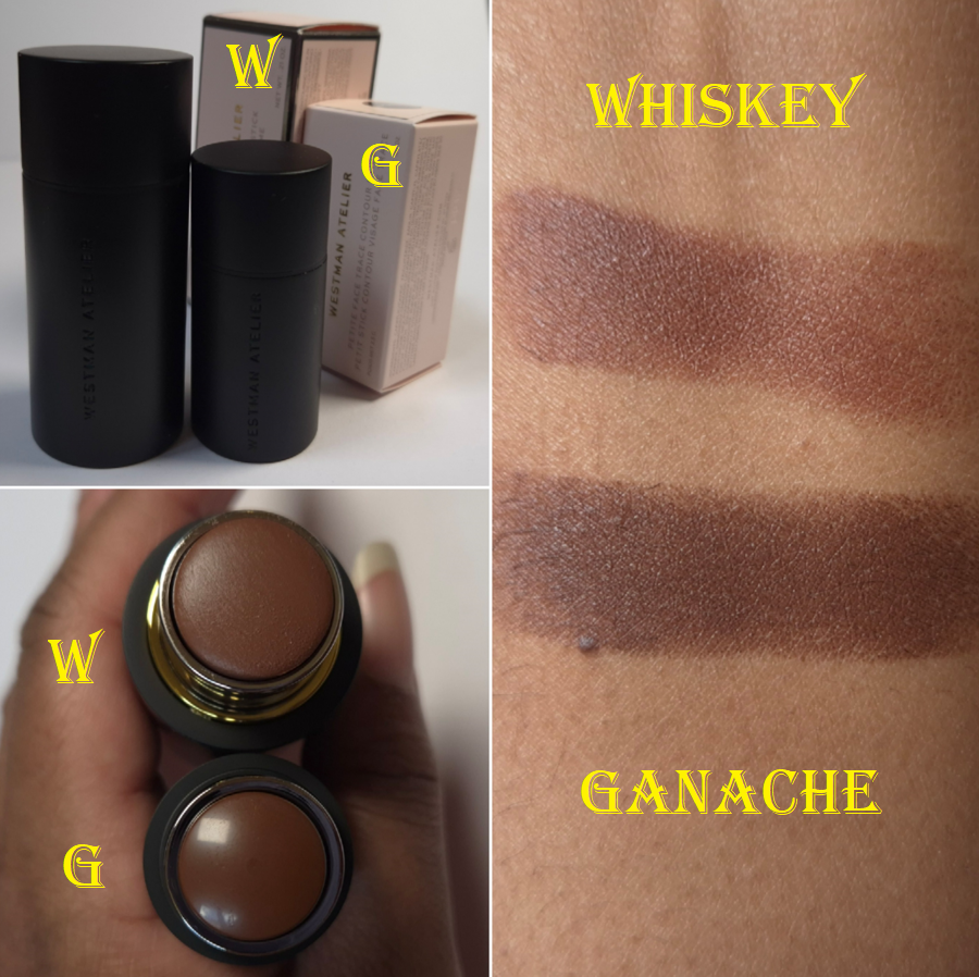
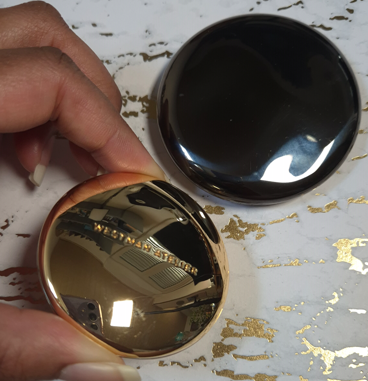
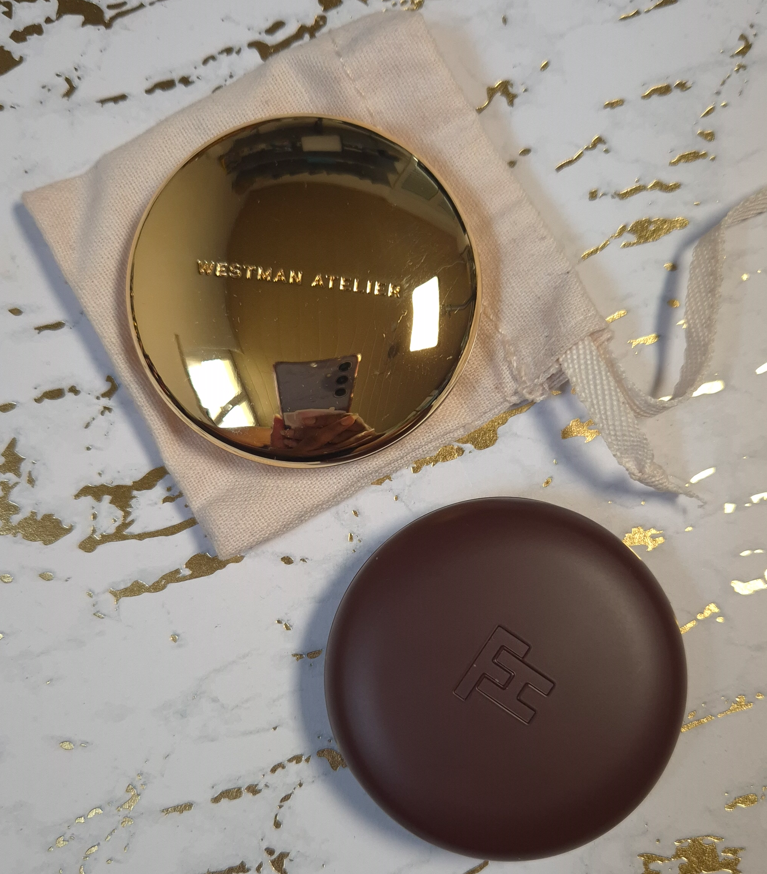
Westman Atelier Face Trace Contour Stick in Whiskey and Ganache
Since its launch, I have only ever heard good things about the Westman Atelier powder bronzers, cream contours, and cream blushes. Unfortunately, their shade options were considerably lacking in those days. I could finally try the Beauty Butter Powder Bronzer when they introduced the shade Beau Soleil in Summer 2023; and I loved it! I had also gotten a sample pack that included the cream contour in Truffle and cream blush in Petal. They seemed nice, but I couldn’t get a true sense of the products’ performance because those shades are intended for makeup lovers much lighter than me.
After learning that the brand expanded the Trace Contour range, I only had enough self-control to wait for a sale before finally giving in. Nice cream blushes are a dime a dozen, but I don’t have a cream contour that I can point to as my favorite. So, this was a wish fulfillment type of purchase. After buying Whiskey, I wondered if I might have been better off with the shade Ganache, which is not part of this most recent expansion. It’s just that all the promo images for Ganache made that shade look so rich by comparison, so I assumed it would be too deep for me. It also looked quite red, instead of cool, in some photos and videos. After seeing the brand’s swatches of the full range together, Ganache didn’t seem as dark, though perhaps still a little red. I didn’t plan on buying a second shade until I realized Cult Beauty stocks the mini sizes and they ship to Germany. So, my curiosity got the better of me and that’s how I ended up with another one.
For those curious about the differences in packaging between the full-size and the “petite” is that the full-size has a magnetic closure, gold colored ring around the twist up base, and the brand name etched into the rim of the lid. It’s also weighted (not just from there being more product inside) and it costs €50 for 6 grams of product. The mini is not magnetic and closes with a snap. It’s too small to have words around the rim of the lid, but the “WA” heart logo is inside the cap. There’s still some weightiness to the mini, but it’s not comparatively heavy, and it costs €27 for 2.5 grams.
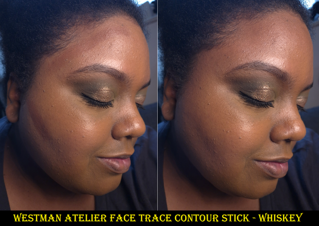
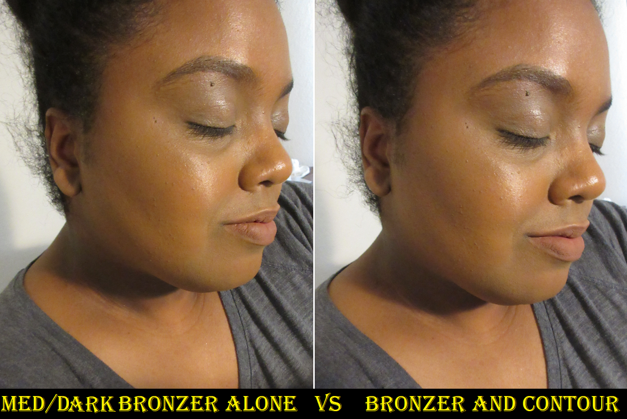
I don’t mind the fact that Whiskey blends in so much that it is hard to see in photos. The best contours are the ones that create the sculpted effect without being able to tell it’s due to makeup. Unfortunately though, this shade doesn’t create a shadow. I knew this was a neutral color, but I didn’t think about the fact that neutral ones that worked for me in the past were a lot deeper (brontours). So, because this isn’t that much darker than my skin tone, I can just see a brownish-pink color without it having any affect other than adding the tiniest bit of dimension from being a different color than my foundation. It doesn’t create a true shadow, so it doesn’t work like a real contour on me.
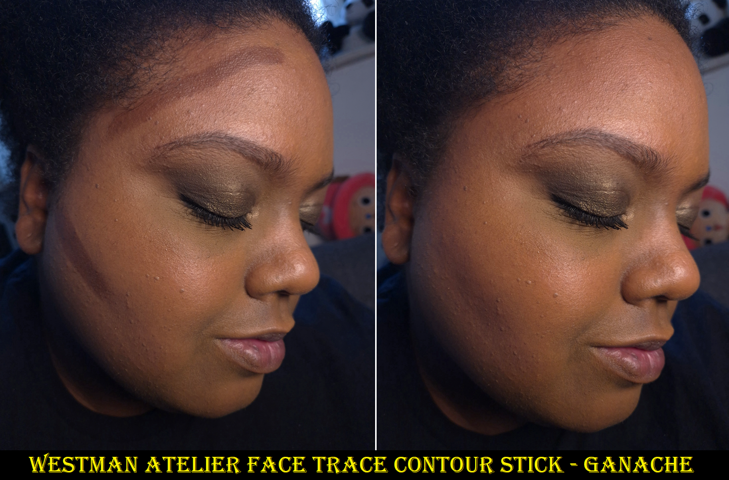
I didn’t want to buy Ganache because I didn’t think this formula was that much better than the €30 Fenty Match Stix Matte Skinstick, and I still liked the €38 Uoma Double Contour Stick even more. To me, it’s not that much different from the €34 Anastasia Beverly Hills Smooth Blur Contour Stick either. However, getting a better shade did improve my overall opinion of the product. Ganache still has some red to it, so it can look a little more like a bronzer on me, but the depth level does create a sculpting effect. So, I view it as a brontour.
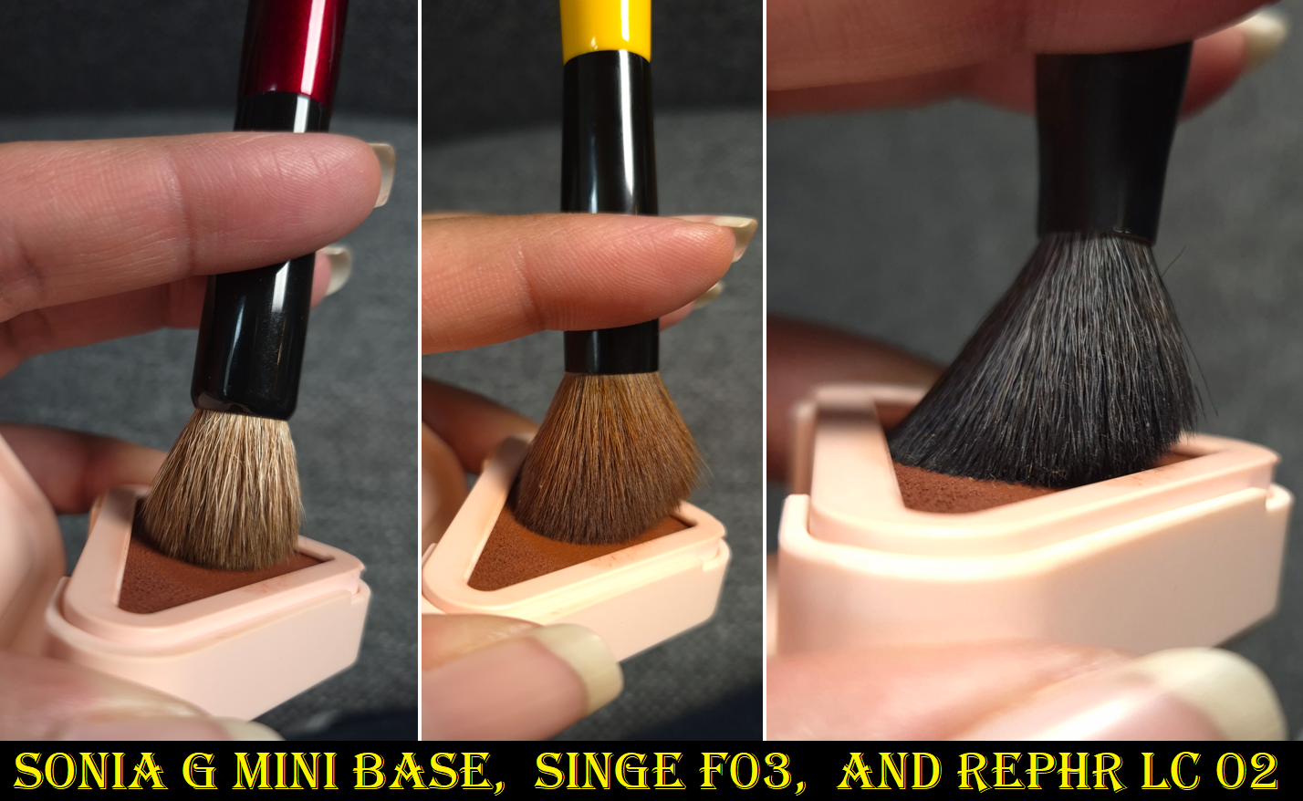
My holy grail cream contour brush is the one by Patrick Ta, but the Westman Atelier Contour continually looked patchy when I used it (even if I didn’t draw the stick directly on my skin). The same happened when I used the Trace Contour with my Bisyodo S-517, but I was successful in blending it with the Sonia G Mini Base. Finding the right brush for this definitely raised my opinion of the product, but for that price I would expect it to blend beautifully with all of my favorite brushes for cream and liquid products. The sleek black packaging with magnetic closure feels luxurious, but the formula is a little stiffer than I prefer. It doesn’t glide as easily as the Uoma or ABH, even when I warm it up on my skin first before applying it.
I appreciate the longevity and non-dewy nature of the Trace Contour that sets to a dry touch, plus it being fragrance-free, but formulas exist (at least in bronzer ranges) that are creamier while still drying down and setting on their own. My favorite type of cream cheek product is melty like the Rare Beauty Warm Wishes Effortless Bronzer Stick. This is my preference because of my dry skin type, and perhaps people with normal, combination, and oily skin get along well with the Westman Atelier Contour because it’s less emollient and has kaolin clay. Plus, the amount of pigment one gets with a thin layer lends to it being easier than other sticks to build up color without overdoing it.
With these aspects in mind, perhaps it is much harder for others to find contours that suit their skin type or undertone, so this product is worth it to them. As that isn’t a problem for me, I can’t help but feel a little bit of regret in buying the full-size, though I didn’t know the petite size existed until I started shopping through Cult Beauty for the first time.
I may as well mention that I don’t intend to buy the newly launched Westman Atelier Sun Tone Bronzing Crème because the duo best suited to my skin tone is Soleil Parfait 4, which is practically the same depth as Ganache. I don’t believe the slight undertone difference among them, based on swatches by Daps_Makeup, is going to look different enough on my face.
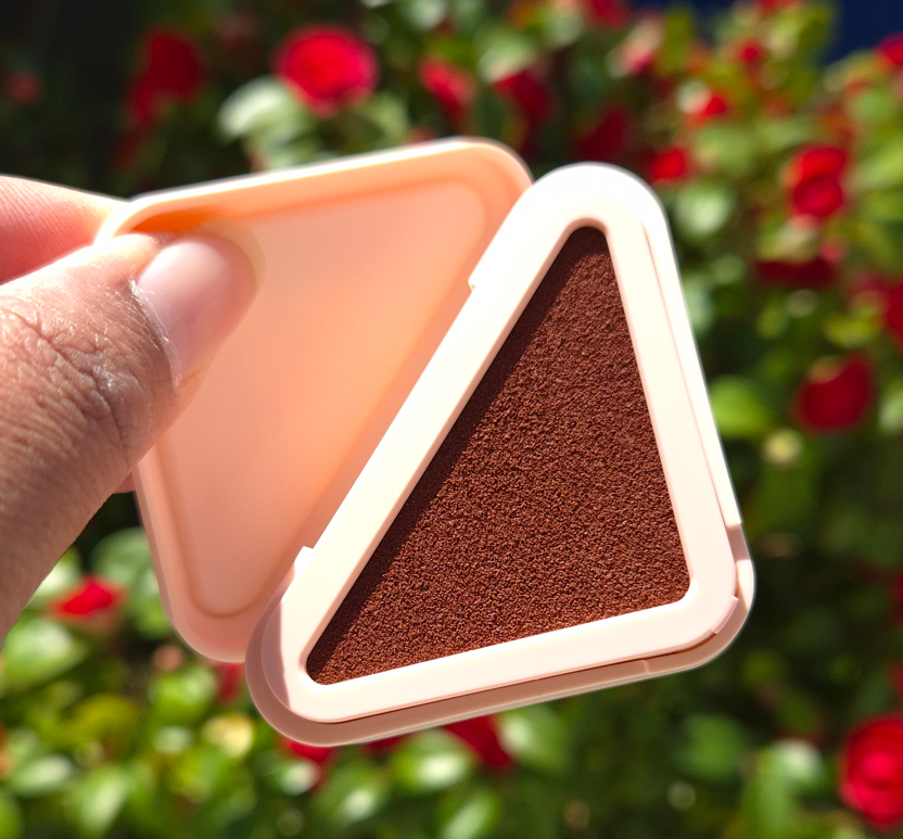
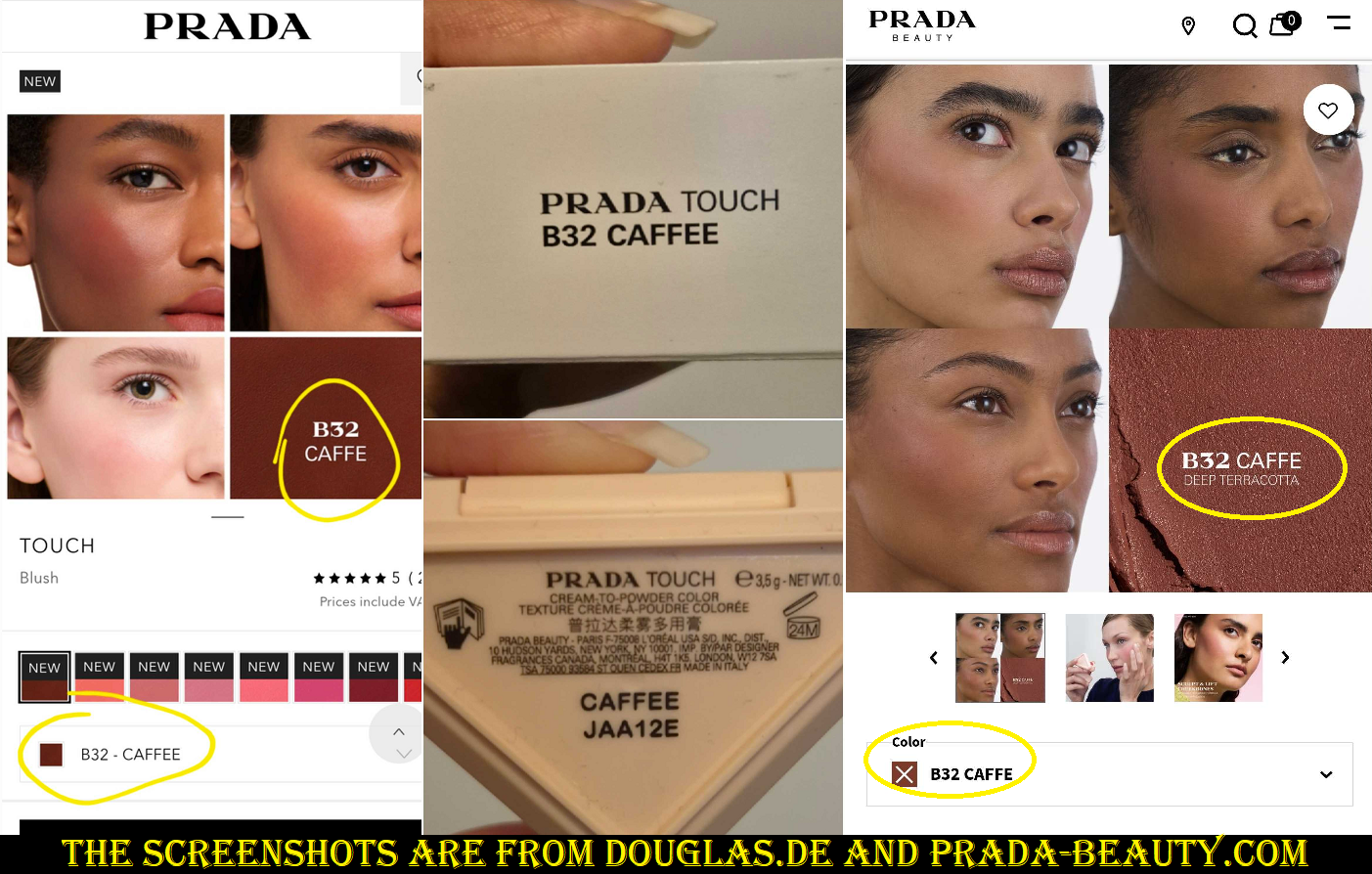
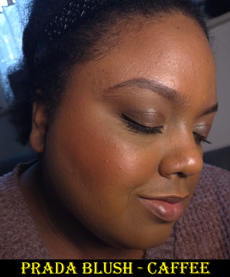
Prada Touch Cream to Powder Blush in B32 Caffee
I continually see this shade name written as “Caffe” in the marketing photos, but it says “Caffee” on the unicarton and blush packaging itself, so that’s how I’ll reference it. Coffee is “caffè” in Italian, so it sounds like that should be the correct spelling, but I believe the name written on the product determines what is correct over what is listed online. I might have thought the names were different depending on which country they are sold in, but the US-websites also say Caffe instead of coffee and the German word for coffee is Kaffee. So, that doesn’t apply either.
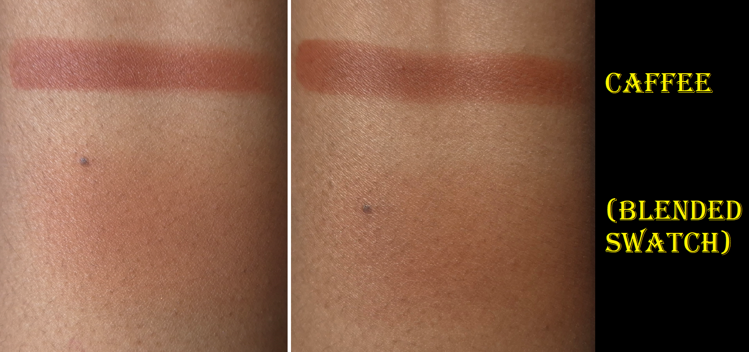
This blush is long-lasting, but doesn’t set down to 100% dryness on a moisturized base (for example: a dewy sunscreen, glowy primer, and hydrating foundation). So there is a little bit of transfer. This doesn’t have as much slip as I’m used to in a cream to powder formula. It leans more on the side of being a cream.
When I’ve had a drier base that was powder-set before applying this blush to the cheeks (versus the other cheek being powdered after the blush was applied), I could still feel moisture on my skin which also still had some transfer. Powdering makes the blush finish look matte, but it doesn’t do much else. What stops transfer is the Pat Mcgrath Glass Setting Spray, which also lets me keep the hydrated look.
I heard this can be used on the eyes and lips as well, so I tried those once. On one eye, I didn’t use a primer and the other eye I used the Lisa Eldridge Liquid Silk. I had creasing on both eyes, but the one without the Lisa Eldridge product was worse. I was able to fix the creasing by powder-setting the better side and that worked. However, it also muted out the color a bit. So, I don’t plan on using this blush on my eyes again.
As a lip product, it looks beautiful. I feel it looked even better than Fwee Pudding Pots, but it’s drier. The time it takes to repair my lips once it dries past a certain point isn’t worth using Caffee this way again.
Although “parfum/fragrance” is not written on the ingredient list, it still contains aroma/flavor, vanillin, and quite a few essential oils and extracts that have scents. It still smells exactly like my Prada lip balm and highlighter, but thankfully nowhere near as potent. I had to bring the blush right up to my nose to detect it.
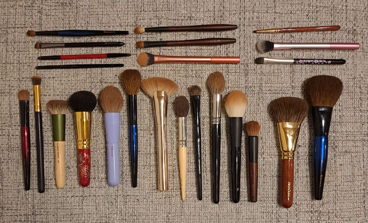
These are some of my small cheek brushes that fit fairly well in the pan, but can still get some product around the edges.
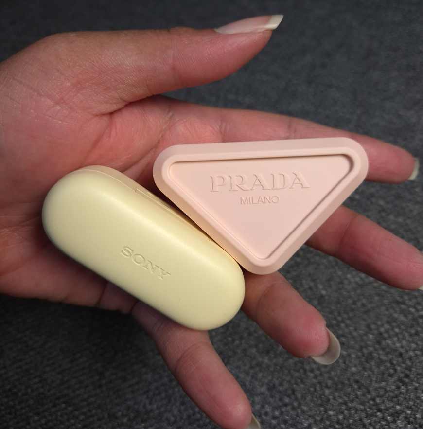
Please forgive me if you’re tired of hearing or reading complaints about the packaging, but it’s something I cannot overlook. Packaging has always been important to me, to the point where I’ve bought items in the past that I knew were purely for collecting/display purposes. In my post about Weighty Makeup Packaging, I talked about the look and feel of a product contributing to the perception of luxury and what my expectations are if it comes with a high price tag. In the case of the Prada Blushes, I could tell from photos that the plastic would be light, and that fact alone almost stopped me from buying one. Even though the square silver and gold mirrored refillable compacts aren’t that heavy, they still have a high end look to them. Although I wouldn’t want to pay the same price for the blushes as the brand’s eyeshadow quads and highlighters cost, I would still be willing to spend an extra €20 for a more substantial container than what they chose. The Prada Blushes feel exactly like the material used for my Bluetooth earbuds case!
It was the brand offering a blush in my favorite type of color, combined with the 20% discount from Douglas, that made me give this product a chance. However, I can’t help but be disappointed whenever I hold it (which is ironic because I love my Bluetooth case) because it feels like I’m handling a knockoff instead of an authentic product from Prada. The chunky triangle in that soft color is somewhat cute, and I understand the appeal at being able to snap two or more blushes together in that packaging, but I don’t even get to utilize that feature unless I buy another one. Products should be satisfying to use on their own without the gimmick of being stackable. The discounted price I paid was supposed to make up for the disappointing packaging as long as I loved the actual makeup inside. Because it’s not the type of cream-to-powder that dries down completely, it didn’t fully make up for it.
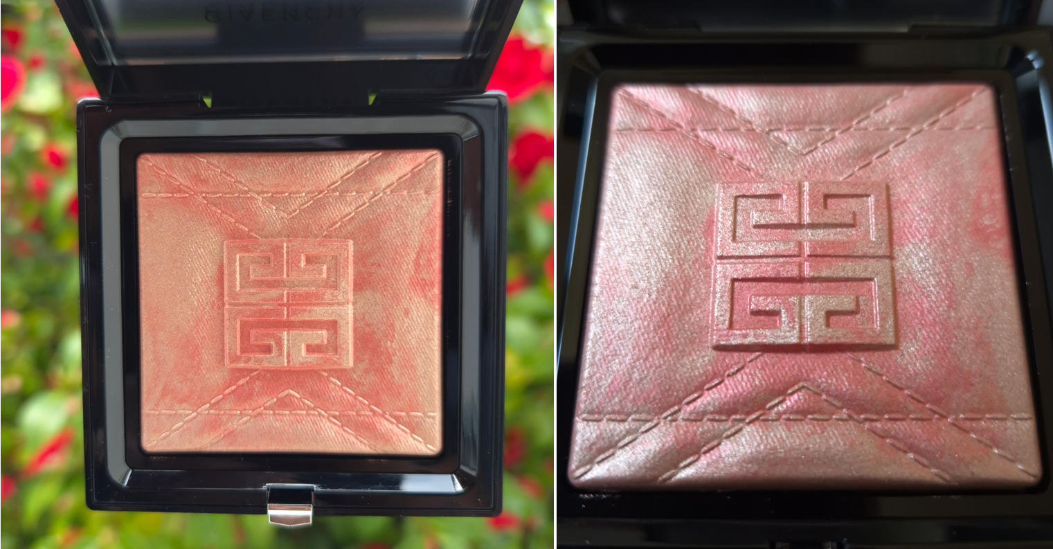
Givenchy Prisme Libre Highlighter Powder in 004 Coral Copper
This is another wish fullfillment purchase of sorts. The coral portion of this highlighter has the same kind of vibrant vibes as the Haus Labs highlighter in the color Fire Opal, which I ended up returning because that specific shade was way too glittery. This tone of highlighter isn’t that popular compared to the typical pink, champagne, gold, and bronze. I wasn’t even sure if Coral Copper would suit me, but I wanted something different. The only highlighter that comes to mind from my collection that’s anywhere near similar to this one is Dreamsicle by Becca Cosmetics, which is eight years old.
Thanks to A A Luxury Makeup stating that this highligher isn’t as deep as marketing images show, and the discounted price of €37 at Flaconi, I felt there was less risk of dissatisfaction in making this purchase. Plus, it’s a baked product, which is a feature I tend to like in highlighters (or at least I love baked gelee and gel-powder hybrid formulas). The Prisme Libre Highlighter Powder is said to contain micro hyaluronic acid and squalane for hydration and comfort.
One of the first things I look for in a highlighter is incredible smoothness in texture. The tinier the particle size the better. I also prefer highlighters that can be subtle up to medium intensity. This highlighter is an interesting mix of having small particles and looking smooth, but some of the shimmer in the mixture is super reflective and pearly. The base colors partly blend into my skin, so it looks subtle in that way, but the reflect is strong enough to be considered a strobe type of highlight. To quote the brand, “A blend of blurring powders and light-reflecting pearls, helping to visually smooth the skin and provide multidimensional radiance and a long-lasting blurring effect.” This has indeed been my experience. I like the blur properties, but the reflect is too much for me, so I tend to blend out the highlighter quite a bit or use brushes specifically suited to pick up less product.
Sheerest application vs heavier application on top of a peach colored blush.
A different lighting situation with a normal application vs a normal amount on moisturized skin.
My experience with this highlighter has been very inconsistent because it looks different in various lighting situations. It looks exactly to the smoothness level I like at some angles, but then the shimmer looks obvious at others. If I’m using all my hydrating skincare underneath, the highlighter practically melts into my skin and looks subtle even with a heavy application. If my face is on the drier side, I can see the highlighter take on a little bit of a wet look that’s either textured or smooth depending on how the light hits it in that moment. Essentially, this isn’t a perfect highlighter for me. It’s too reflective to pass as a natural looking glow, however, pairing this with a peachy or coral blush (to match the base color) gives me results that I am the happiest with.
So, this range is best suited for someone who likes a beaming and obvious highlighter without containing actual glitter. Parfum is fairly high on the ingredient list, so that could be a potential issue for someone. It smells like the typical Prada powders mixed with the typical Dior powder scent. I can detect it the entire time the compact is open, and I can also smell it on my face for at least ten minutes before it goes away. It’s not the strongest I’ve ever smelled and it’s not overwhelming, but I never fail to notice it.
In terms of longevity, I’ve had no issues. It’s just the perfume and radiance level that I’m not thrilled about, but I’m so pleased with how it looks paired with certain blushes that I’m still glad I bought this. I must admit though that I’d be unhappy if I paid full price for it. It costs the same as a Prada highlighter refill, which I think is a worthier purchase, minus the Prada one being overly perfumed. I still hate that.
The packaging can seem a bit bulky, since it’s the same size as the Prisme Libre pressed powders and bronzers without including the brush. However, I don’t mind because of the potential to be refillable (the bottom pops out), and the fact that I dropped it on a hard floor and the compact sprung open without the highlighter breaking.
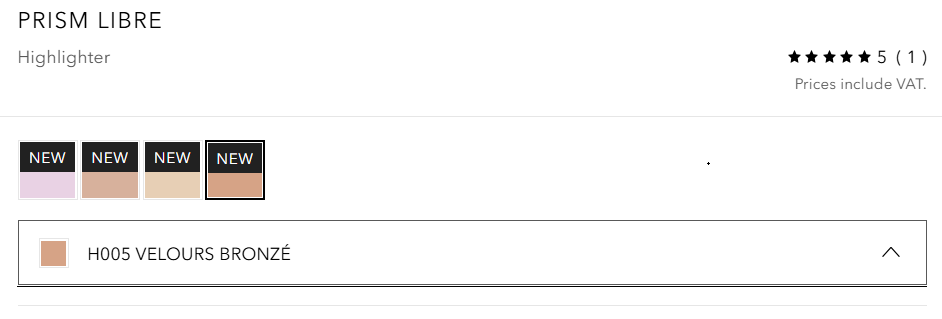
One more thing I wanted to mention is that for some reason, the Douglas website lists the shade I own (H004 Coral Copper) as “H005 VELOURS BRONZÉ.” This makes me wonder if there is a 5th shade coming and they accidentally listed it. However, it could also be purely an error. Shade H002 Rosy Gold is currently listed as Coral Copper instead. At the time that I finished typing this post, the shade names for the new/reformulated Tom Ford Bronzers are still incorrect and I’ve seen incorrect names as well as two products with switched names listed before. So, it could mean nothing, or maybe it was even a planned shade that got scrapped, but how fun if I learned a secret!
Whenever I discovered errors on the Sephora-US website, I used to email customer service and they corrected it within a few days. I’ve attempted to contact Douglas twice in the past and once I never got a response. The other time was regarding the swapped names of the holiday Gucci blushes and they didn’t respond back until three or four weeks later and it took another week for them to attempt to correct it (which still had another error). So, I don’t bother.
Anyway, that concludes this series of reviews! I hope this has been helpful. Thank you for reading!
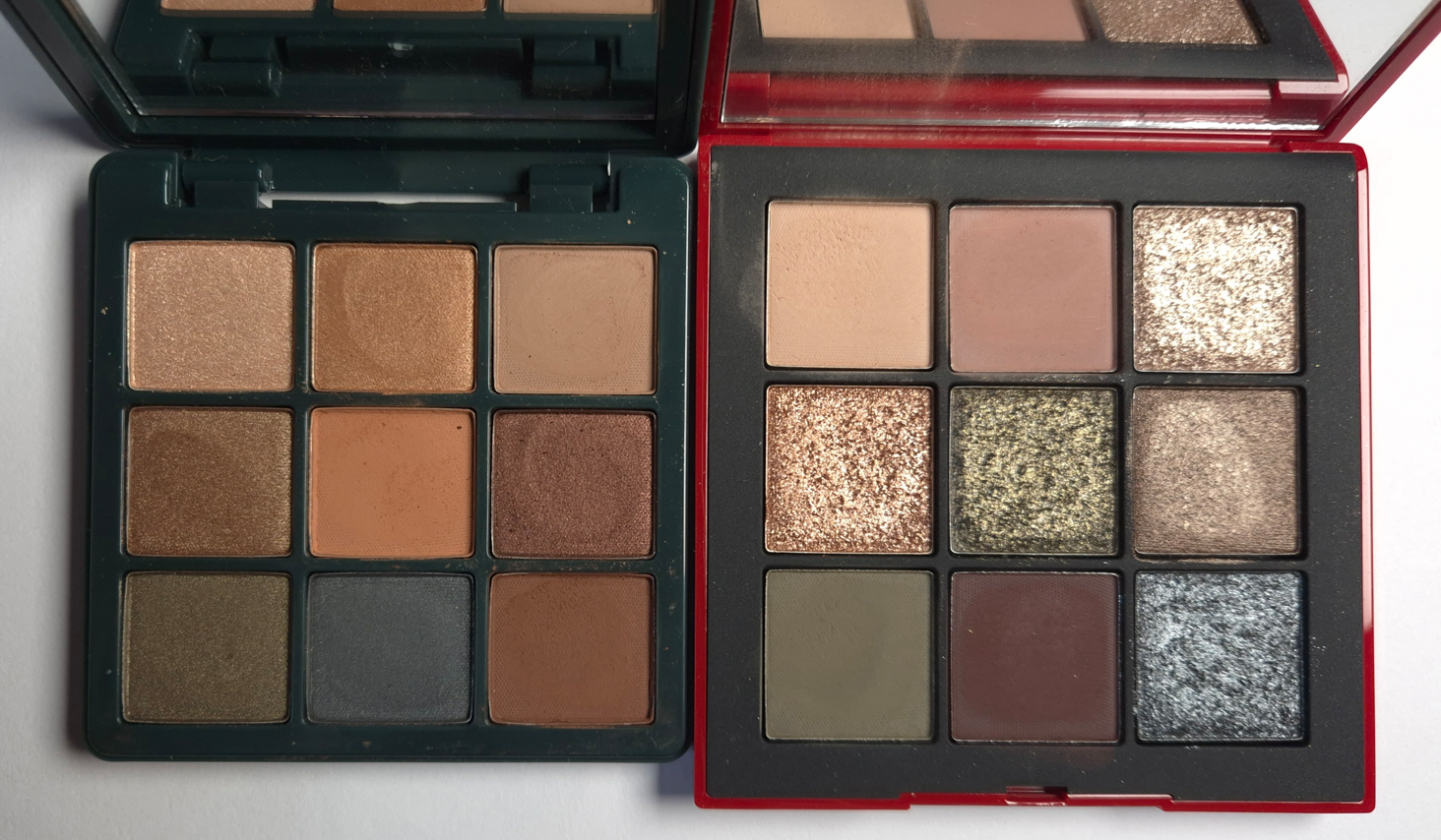
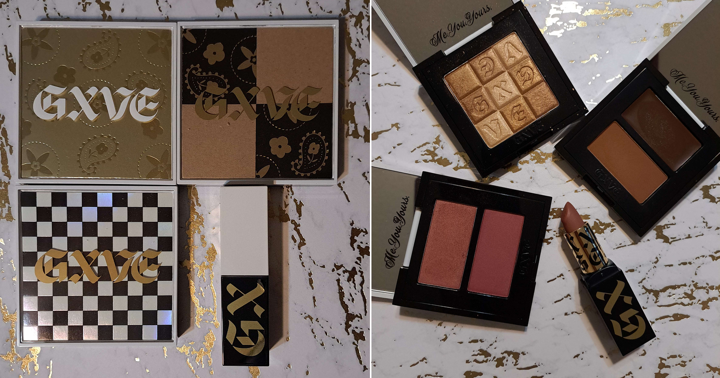
The D&G Blush, ABH Highlighter, VBB Lid Lustre, and PML Quad are not pictured here, but they will be discussed in this post.
After the bombshell that was dropped regarding the Louis Vuitton Beauty line and their prices, I started to think about which items in my collection were the most expensive, which ones I thought had the prettiest packaging, if the prettiest was actually the most luxurious looking, and which ones had the most weight. I was surprised to discover that so few items fit into all of these categories.
I was happy to see the people I follow enjoying their La Beauté Louis Vuitton products, but some felt they needed to justify their reasons for making the purchase beyond just stating, “I wanted it, so I got it.” Across the board, customers who thought the items were or were not worth buying seemed to at least come to the consensus that the price (besides paying for the brand recognition), was largely due to the packaging. The lipstick components were said to be fully metal, along with the bespoke metal packaging of the eyeshadow quads. “You could hurt someone if you hit them with this,” was stated more than a few times by various people.
How a product looks and its weight are my top two criteria for feeling like the item I own is luxurious. Looks are subjective, but weight can be measured and precise. I started to think about the heaviest packaging in my collection (proportionate to its size dimensions) in order to answer the question…are these automatically the most lux?
Lisa Eldridge Rouge Experience Refillable Lipstick (68 grams)
In order to highlight how great this packaging is, I need to do a deep dive into comparing it to another brand. Please, bear with me on this, especially if you’re a fan of LV. I don’t judge anyone on how they spend their money, and this is just me working out why I am perfectly satisfied with Lisa’s lipstick being the height of luxury for me.
Lisa Eldridge took great pride explaining in her launch video how her refills were mono material, made of 100% aluminum and could therefore be recycled without degrading once repurposed, unlike the vast majority of other brands’ refills that have mixed metal with plastic.
According to Google: “You cannot usually recycle a lipstick refill that has both plastic and metal components together, as most curbside recycling facilities cannot separate the mixed materials and are not equipped to handle small, complex items.”
There is plastic inside the forever case by Lisa Eldridge, as this has a click closure, but she wanted the actual refills to be sustainable.
I cannot compare the LV lipsticks from personal experience, but it is my understanding that the refills are all metal as well and come with plastic caps that can be removed when recycling. The lipstick cases have an aluminum shell and brass detailing, but the magnetic closure that is so satisfying to use (and adds to the weightiness of a product) keeps it from being recyclable as well.
Summarized from Okon Recycling: Recycling magnets is technically possible, but challenging as it involves disassembling the magnet and removing any non-magnetic materials. However, there are some magnets that cannot be recycled.
So, it sounds as if both LV and Lisa Eldridge have cases that aren’t realistic to recycle but have refills that are fully recyclable. The LV lipstick case has a lot of expensive details like the product names and logo being etched in, the monogram flower-shaped refill bottom, etc. Lisa Eldridge has her logo etched at the top of the cap, allows the customer to personalize the base of the case with their initials etched in (up to three letters), and the case shape had to be custom made as well. Perhaps some prefer the sleeker LV design while others appreciate the vintage inspiration of Lisa’s more.
LV’s Lipstick Case + Refill is $160 and the refill alone is $69. Lisa Eldridge’s Lipstick Case + Refill is $63 (engraving price included) and the refill alone is $30.
Sure, LV’s refill costs the same amount as other high end and luxury lipsticks in their completed form, but considering the details I listed above, is the LV case really $100 better that other brands’ cases, particularly Lisa Eldridge?
It can’t come down to the actual lipstick formula, because that’s part of LV’s $69 refill price.
At the time that I bought the Lisa Eldridge lipstick, I felt it was incredibly expensive. It is still the most expensive lipstick in my collection, based on what I paid and not the retail price. I rationalized my purchase because of the sustainability aspect, all the custom elements, the personalized touch, and how heavy it felt.
Taking branding completely out of the equation and thinking about the components alone, I do feel like this product by Lisa Eldridge is among the most luxurious out there, and I am no longer gritting my teeth at the price.
It would be nice if I liked the lipstick formula more, but there is some hope for me! I wrote a comment on Instagram that the brand responded to, and while the Velvet formula won’t be put in the refillable form, there might still be the possibility of the Lucents that I enjoy so much!
There are other things they’ve been “working on” that has taken years, such as making the empty eyeshadow palettes available for purchase alongside the eyeshadow singles, the return of the liquid blush in better packaging, etc. So, I’m prepared for this to take a while to happen.
If I can get the Luxuriously Lucent Lip Colours and/or Baume Embraces as refills, I will definitely get more use out of mine!
Whenever I think about heavy makeup packaging, the Olivia Palermo Eyeshadow Palette immediately comes to mind. I’ve had it for years, yet I’m still not sure how I feel about the pattern, and I’m not sure what it’s technically called (perhaps wicker, woven link, basket weave, oyster strap, etc.). It just makes me think of the types of patterns I’ve seen for watch straps, which isn’t too terribly off track. Apparently Olivia drew inspiration for the packaging, “by a vintage Art Deco bracelet she was given for her 21st birthday.”
The eyeshadow palette has a magnetic closure and mirror, which further increases the weight, on top of the fact that the packaging is metal.
Although I’m not sure if they could have created a different pattern that I would like more, I can say it’s at least cool, unique, and easily recognizable. Plain flat gold is always beautiful to me, but this packaging looks different from any other I’ve seen. Well, almost. As of a year ago, Hatice Schmidt released a refillable lipstick range called, “The Gift,” with a case inspired by jewelry and the pattern reminds me of a curb chain/Cuban link style. So, there are at least two jewelry inspired components from brands that I know of.
I bought the Olivia Palermo lipstick at the reduced price of €32 (originally €40) from Niche-Beauty, and the eyeshadow palette for $28 (originally $58). I’ve discussed how I procured the eyeshadow palette in a past review, but it was during the time that I started working on this post that I felt the compulsion to finally get the lipstick. I have checked in on the brand on and off over the years, waiting for them to release additional products. Earlier this year, I saw a notice on the official website that the beauty products would no longer be sold and that they were turning the website into an influencer style page (oliviapalermo.com now redirects to her affiliate shopmy page). I assumed that meant the brand was shutting down, especially since I’ve only heard two beauty reviewers reference the brand one time each within the last three years. However, I was shocked to see the products appear on the Douglas website in either August or September, and then I saw them at Niche-Beauty as well. I don’t know if Olivia has better sales in Europe, or Germany specifically. I’m not even sure if she still has products available elsewhere in the US.
I felt Lisa Eldridge’s lipstick deserved to be in the post, but Olivia Palermo’s lipstick is the only one in my collection that is heavier. OPB’s lipstick is less expensive, but it isn’t refillable and the central part of the lipstick component is made of plastic. The outer packaging is what makes this seem so fancy.
Regarding the eyeshadow palette, it definitely screams luxury. It isn’t something you want to carry around in your purse or travel with it. Olivia wanted the old Hollywood glamour look and feel to her products, so this is something that you would want to keep on a vanity.
This is by far my most luxurious palette, and though it doesn’t have some of the additional premium features of the LV Quads, it makes me feel a lot more content about my collection and avoid FOMO. If I want heavy eyeshadow packaging, I certainly have it with this product!
This is my golden pebble! It is tiny in size but mighty in weight!
Chantecaille is another brand with nicknamed “pebble” packaging, but theirs is plastic, thin, and it doesn’t feel substantial, even though they cost the same amount!
I bought my WA bronzer at 20% off, so the title of most expensive bronzer in my collection belongs to Hermes, even though I only bought the refill. Had I paid for the compact too, that wouldn’t have helped it to feel more luxurious than the Westman Atelier bronzer, considering Hermes’ thin plastic packaging.
This has a tiny mirror that I don’t use, and a magnetic closure. The brand has highlighters and face powders in this same style of packaging. I haven’t used their cream sticks or drops, but they don’t look as luxurious to me. The only other Westman Atelier packaging I have handled are the powder duos, which are certainly substantial and pretty to look at, but I don’t think it compares to this gold compact.
When it comes to the prettiest bronzer packaging, I think of Gucci’s and Charlotte Tilbury’s powder one, even though they are much lighter in terms of their size. However, I would never call something that’s a solid gold color ugly. So, it may as well be my most glamorous bronzer.
Fara Homidi Essential Bronzer Refillable Compact (106 grams)
This compact is about the same size and weight as the Westman Atelier Butter Bronzer. The amount of product from FH is 3.5 grams and the amount of product from WA is 8 grams. That is close enough to accounting for the 6 gram difference when I weighed the two products, which is why I’m still including it in this post.
Aesthetically, I find the Westman Atelier bronzer to be more appealing. Shiny things get me. However, I still think Fara’s is classy and pleasing to hold in the hand. Her other products come in red and blue packaging of the same weight. I don’t like the red, but the blue is very eye-catching. If the next product she releases is in purple or green packaging, it just might surpass WA’s as a favorite compact for bronzers.
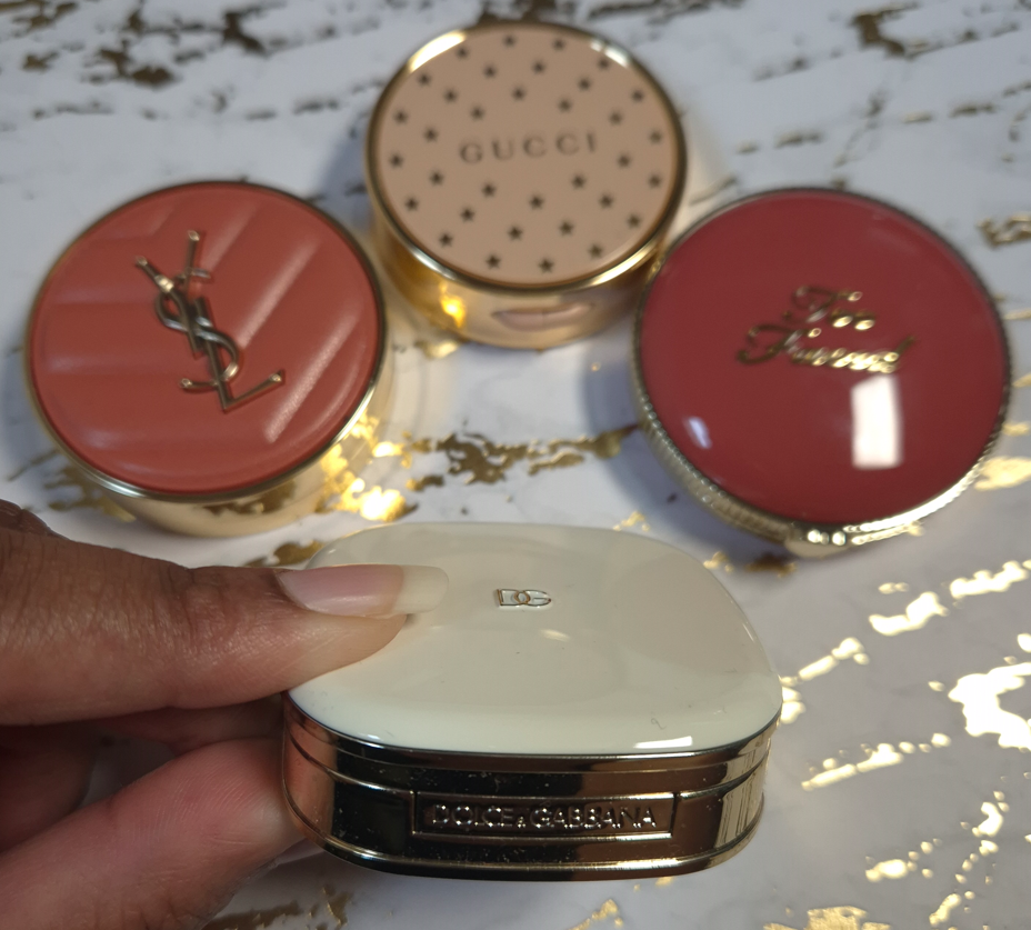
D&G Cheeks&Eyes Match Blush (91 grams)
I have plenty of blush packaging that is bigger than this, and therefore heavier. However, for this small size, this is very heavy! Nothing really comes close to the weight, but I have to say that Gucci’s powder blush packaging is quite nice too, even if it’s lighter. Visually, I like Gucci’s more as well. In fact, I have a lot of blushes that aren’t luxurious feeling, but I love them anyway (such as YSL’s Make Me Blush Bold Blurring Blushes and Too Faced Cloud Crush Blushes). So, this is one of the few categories where my heaviest blush might be the most luxurious, but it isn’t necessarily my favorite packaging. I do like it a lot though!
I have to add that this packaging feels like a mixture of plastic and metal components. I believe there’s something in the base of this compact adding weight artificially, especially since it doesn’t even have a magnetic closure. It has a push button instead.
Victoria Beckham Beauty Products: Matte Bronzing Brick (166 grams), Eye Wardrobe (116 grams), Cheeky Posh (37 grams), and Lid Lustre (41 grams)
Similar to Olivia Palermo Beauty, VBB has a certain aesthetic that they maintain across most of their products. I like the horn brown/tortoise pattern, and it can be fashionable, but I don’t automatically associate it with luxury because of how many cheap products I’ve seen made in tortoiseshell style. The gold colored trim helps to elevate the look of the packaging, but it is the weight and feel of these components that make them undoubtedly luxurious.
The Bronzing Duo and Eyeshadow Quad are among my heaviest based on size. The Cheeky Posh blush is small and doesn’t have that much extra weight, but I figure that’s because the component isn’t refillable like the other two. I’m including it because it has the same style of packaging as the others, and I still feel bougie when I handle it.
I rarely buy single eyeshadows, so I don’t have much to compare in terms of weight. The prettiest I own is probably the Charlotte Tilbury Hypnotizing Pop Shots, but those have lightweight plastic packaging and they are powders, which I don’t believe is fair to compare. It would be interesting to see how the glass packaging of Charlotte’s Eyes to Mesmerise stacks up, but I don’t own that. I no longer have the glass packaging of Maybelline’s 24 HR Color Tattoo, but the best I’ve got is Melt’s Gel Liner (47 grams) and a MAC Paint Pot (56 grams). I like glass as a component material, but it’s not uncommon to find for eye products. The Lid Lustre packaging has an elevated look compared to MAC’s, for example. The Melt Cosmetics Gel Liner that has the gold lid and butterfly print around the rim with the glass base is prettier to me, while also being slightly heavier. However, the font for the brand logo makes it look less sophisticated. I don’t think eye related categories of makeup follow the trend of weight indicating how luxurious a product will look and feel.
One thing about VBB packaging that does take away from the experience is the issue with the closing mechanism. I heard this was a problem in the past, and I never had an issue with my Bronzing Brick, but my eyeshadow quad doesn’t always stay shut when I snap it closed. Sometimes it’s fine, but other times it likes to pop back open with the slightest touch. I haven’t heard about anyone else having an issue with the quads, so perhaps I’m unlucky in getting one of the few faulty ones.
Pat Mcgrath Mothership Palettes (392 grams) and Eyeshadow Quads (122 grams)
All the previous components I’ve discussed had metal or a mix of metal and plastic packaging. The Mothership Palettes are fully plastic, but they are quite hefty in weight. The palettes are big for only holding ten eyeshadows, but that black shiny lacquer with the gold bottom still look lux to me. My Victoria Beckham and Olivia Palermo palettes are the only ones I can recall from my collection that aren’t made of plastic or cardboard. In fact, the Victoria Beckham Eye Wardrobe quad is only six grams less than a Pat Mcgrath quad, but Victoria’s compact is almost half the size! I still chose these PML products as the next heaviest in the luxury category, though I have to admit that I have some lightweight quads that look fancier because they are gold colored. For example, Tom Ford (the trim technically), Guerlain, YSL (trim), Prada (mixed gold and silver), Lisa Eldridge, etc. I find it difficult to equate weight with luxury in the eyeshadow category because of how many bulky heavy palettes brands have released over the years. So many of Jeffrey Star’s earliest palettes, Plouise, and Glamlite’s Food palettes were huge. I also recall when Stila had the Luxe Eye Shadow Palette in Happy Hour, which was a similar weight and size to the Mothership Palettes, but I bought it for $36. I can’t remember what the full retail price was, but it cost nowhere near the same amount as a Mothership.
So, I’ve come to the conclusion that weight doesn’t automatically equate with luxury in this category either. However, because of how uncommon it is to find hefty quads and palettes that are reasonably sized (Olivia Palermo, Victoria Beckham, and Pat Mcgrath), the ones that are weighty feel extra special to me.
Beekman 1802 Milk Tint SPF 43 Tinted Primer Serum
I didn’t want to include skincare, but this technically falls under the makeup umbrella. If I count it as a primer, it might be the heaviest I ever owned (even heavier than the glass bottle of Rituel de Fille Thorn Oil). Beekman’s looks like ceramic, but it’s colored glass.
I have to say “might be the heaviest,” because I don’t recall how it compares to the Guerlain L’Or Radiance Primer (now called the Guerlain Parure Gold 24K Radiance Primer), which is definitely the most luxurious looking primer I ever bought. The look of the Beekman product doesn’t appeal to me at all, but I was so impressed by how it felt in the hands. I had to leave it behind though because it was so heavy that I didn’t want to bring it back in my luggage.
If this counts as a skin tint, then it’s a lot less special. Plenty of brands make glass bottle complexion products. That’s why I didn’t include any true foundations or concealers in this post, because the prettiest bottles in my collection tend to look and weigh around the same.
When it comes to heavy primer packaging being the most luxurious, I have to say the Guerlain primer squashes that theory.
This bronzer is larger than the one from Westman Atelier, but it weighs the same. The reason I decided to include it anyway is because it’s still substantially heavier than the remaining bronzers in my collection. Plus, the highlighter component is a similar size and even weightier. I cannot think of a single highlighter I own that comes in heavy packaging, other than this one.
I have noticed over the years that ABH has gradually been upgrading the packaging of most of their products. Their two most recent mascaras felt like either super heavy plastic or a mix of metal and plastic. The Smooth Blur Cream Contour Stick has a brushed gold colored metal cap and additional gold details. The Smooth Blur Matte Bronzer and Glow Seeker Highlighter have a magnetic closure and they feel quite substantial in the hand. I’m impressed with the packaging and find it to be quite pretty, but this is still another example of how weight doesn’t necessarily equate with a luxurious look. This packaging feels so much more substantial to hold and interact with than pretty much all others in the drugstore, mid-range, and high end categories. It feels like it should cost more than it does, and it looks appropriately high end to me, but not quite broaching luxury territory. I still think the Gucci Bronzer packaging tops it, despite it being lighter in weight, because it looks classier overall. As another example, MAC’s Sunstruck Bronzers look so beautiful, even though they are in lightweight compacts as well.
Final Thoughts
Based on my own personal collection, I’ve confirmed that in certain makeup categories, the most luxurious packaging is the heaviest. At the same time, I have many other products with a timeless and elegant look to them that are lightweight and made of plastic or other inexpensive materials. Essentially, the weight of a product enhances the luxury experience, but it does very little to elevate plain looking packaging. The best example of this is the Beekman 1802 Tint.
If I can get an Olivia Palermo palette that retails for $58 and feels ultra lux, but I can also buy a limited edition plastic Chanel quad for $86 and still feel like that’s luxurious as well, would that be considered silly? Should I be raising my expectations for all luxury brands? At the beginning of this experiment, I would have said yes. However, I now see that if Chanel, Dior, Gucci, and other designer brands used higher quality materials, their products would likely fall in the LV Beaute range of prices (if not more). Some examples of that are the Chanel 31 Le Rouge lipsticks in the glass case, Dior Rouge Premier Lipsticks with the ceramic case and “formula infused with 24k gold,” along with the Guerlain Rouge G Exceptional Piece lines. There is only so much a person is willing to pay for a product from a luxury brand if the materials are the same as a mid-tier brand. So, that keeps designer brands from going overboard with their prices. There are also advantages to using lightweight materials, such as them being more convenient to take on-the-go for customers or makeup artists with large kits, sitting at attainable prices for aspirational shoppers, thinner packaging contributing to less waste of materials and sustainability efforts, etc.
So, when I really think about it, I wouldn’t be able to buy as many products in the luxury category if the components were more expensive to make or if they were made from higher quality materials. In fact, the majority of the products in this post were purchased with some kind of discount. Of course, I would love to have all my luxury goods in weighty packaging, but if that means I would have to accept those products being less likely to go on sale and/or accepting that the prices of them would double or triple, I am unwilling to do so.
The Dior Powder-no-Powder is one of my favorite makeup products of all time, yet the most I was willing to spend was €45 (essentially just paying full price) to get my name etched onto the compact. If I had the opportunity to buy it in a gold colored compact with a magnetic closure or some stunning limited edition pattern for €100, I don’t think I’d be willing to do that. This tells me that despite a product having a holy grail formula that is unable to be duped, I still have my limits. Some makeup will just never be worth it to me to buy, past a certain pricepoint, no matter what it’s made of. That means I cannot use the product’s weight, materials (including formula), or looks to justify a super high spend amount. However, I know that when a product gets hyped up, it can be much easier for me to consider crossing that price threshold if I can make a case for it being top tier from every other angle. I bought one of the Chanel Boutons quads directly from Chanel because so many influencers were told by their SAs that the collection would be extremely limited, and I feared missing out. Less than one month after launch, I found the quads at multiple retailers for a minimum of 30% off. FOMO works similarly to getting caught up in the hype of a product. I sometimes make purchasing decisions that I normally wouldn’t.
This is why I decided to make this post. I know there are others like me who enjoy luxury makeup and don’t have the biggest budget to work with. There are those who will be tempted by the exclusivity of a certain new beauty line and would normally not even consider getting anything at those prices, but the hype may be wearing down that resolve. To those that want to be talked out of buying makeup at $100 or more…just remember that luxury makeup with fantastic formulas and high quality packaging can be found at a lower price. This post is full of examples of this. If one brand is out of your price range, you might be able to get similar products from another prestige brand. Other amazing and beautifully packaged products are just around the corner.
I hope this topic has been interesting, and even helpful.
I remember a time when everything this brand launched with had a ton of hype surrounding it. The pace of their new releases slowed in recent years, so much so that I didn’t even buy anything from them in 2024.
When I think about my ABH purchases in 2025, I’ve realized that nearly all of them were bought to replace something I missed out on. I didn’t get the brand’s first iteration of powder bronzers because I didn’t think the darkest shade (Mahogany) would work for me. I ended up buying their Smooth Blur Bronzer instead. In 2016, I wasn’t interested in the Anastasia Beverly Hills Master Palette by Mario, but later regretted not buying it. So, Embers seemed like the next best thing. I also always wanted a dark skin friendly version of the Anastasia Beverly Hills Amrezy Highlighter, but they didn’t create additional colors. So, I hoped the newest shade of Glow Seeker Highlighter could fill that role. I finally bought the Stick Blush four years after it launched, figuring ABH had no plans to expand the range further. I feel like the production of the Magic Touch Blush Trios are confirmation of that. Lastly, the only product I didn’t buy to fill a void of something I missed out on, is the Smooth Blur Contour Stick. I liked the cream bronzer so much, along with the powder bronzer from the “Smooth Blur” line, that I eventually caved and bought the contour in the hopes I’d like it too.
Let’s dive into the reviews and see if these products ended up being worth getting!
Embers Mini Eyeshadow Palette
I acknowledge that this is a soft color story, and that soft tones don’t pop as easily on dark skin. However, I expected these muted eyeshadows to still be pigmented, along the lines of the Nouveau Palette. Most of the swatches in the photo above needed to be built up in 3-5 swipes instead of my usual 1-2. I have five other ABH palettes and none of them require the amount of building up I’ve had to do to with Embers. I have to be so precise with my placement of the deepest shades in order to avoid the other eyeshadows blending into it and lightening it up too much in the process. I have to actually dampen my brush when using some of the satins in order to aid in packing on the color.
I was looking forward to having a subdued and earthy palette, but these shadows are more gently pigmented than I could have anticipated. After all, according to the brand, “Anastasia Beverly Hills Embers Mini Eyeshadow Palette was designed to spark artistry with depth, warmth, and intensity. Featuring 9 full pigment shades—including rich, blendable mattes and molten metallics that glow like firelight…”
I’m sorry, but to call any of these non-mattes a molten metallic is wild! Which of the shades in my swatches are rich or intense? Is the “full pigment” in the room with us?
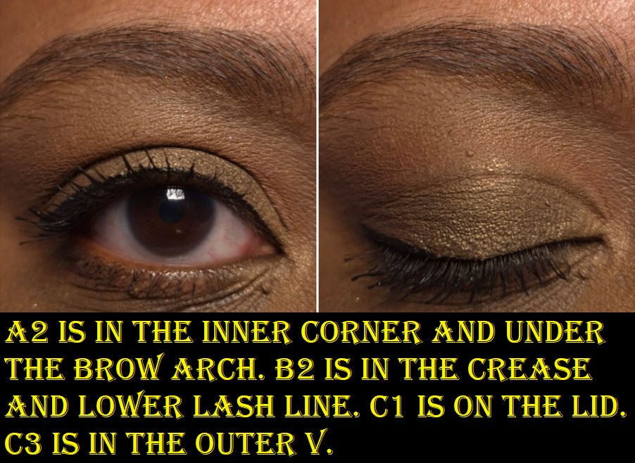
Anyway, because it’s so easy to create toned down looks, I did my best to show the maximum color payoff I can get with this palette. The end result is at the subdued level I wanted, so my only issue is how much effort it took to create the three looks below.
Creating a bold look isn’t going to be a problem for someone within the fair to medium skin tone range, but those expecting high-shine metallics (instead of sooty satins and low impact shimmers) might still be disappointed.
To anyone who was hoping to achieve the kind of look that’s featured on the official website, I recommend managing your expectations. I couldn’t get that depth of color from the browns, so I checked the brand’s YouTube page to see what kind of techniques were used. I am fairly certain the “Terracotta Spice Fall Eyeshadow Look,” is the one used. How the makeup appears in the video looks washed out, but how the photo is depicted on the Anastasia Beverly Hills site looks manipulated to appear bolder. The truth might be somewhere in the middle!
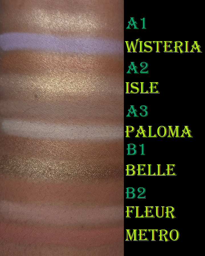
The mattes blend and layer decently, but I had a hard time creating depth with C3 and struggled to have B2 show up. I expected B2 to be like Metro from Nouveau, but it’s not. When I think about that palette compared to Embers, I start to feel like perhaps I should have just stuck with the former!
If the Master Palette never existed, I would have thought Embers was meant to be a companion palette and/or a softer version of Nouveau.
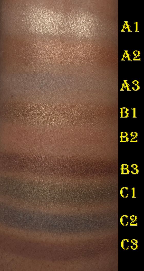
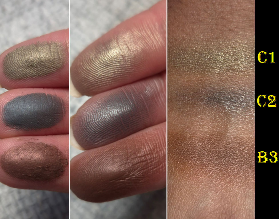
A1, A2, and B1 are the inner corner type of shades, which I’m satisfied with. C1, C2, and B3 are the visual standouts, but they have a sooty quality to them that I can easily see when I rub them into my skin. I’ve seen this kind of effect from multichromes, duochromes, and sparkly formulas to look even more intense. With the type of finish these have, I feel like these colors veer away from the muted category and closer to dull. I wish these had more of a wet metallic finish instead.
On the bright side, I don’t have issues with creasing or fading throughout the day. I get quite a bit of kickup in the pan, but I feel that’s pretty normal for ABH. The shadows are soft to the touch, but not creamy or buttery. The eyeshadows don’t feel like they were pressed hard into their individual pans, so it makes sense that it’s easy to pick up a lot onto my brushes.
The Nouveau Palette is more to my liking because of the formula. The Nars Climax Palette has a similar vibe to Embers, but the mattes are more pigmented and the shimmers have so much impact. Metaphorically, Climax and Embers aren’t sisters, but they could be cousins! Climax is also a light neutral palette with pops of green and blue!
Joking aside, I don’t feel as bad about making this purchase considering I didn’t pay full price for it. I’ve had far worse performing palettes in my collection: ones that stick in one place and are patchy, ones that don’t layer well on each other, some that don’t adhere to the lids, etc. So, I consider the quality to be at least “okay.” I don’t know how this formula compares to the other minis in the 9-pan format, but I don’t consider it to be as good as the brand’s larger palettes (excluding Fall Romance).
A final point I should mention is that I had the worst experience with these eyeshadows when I applied them on skin primed with the MAC Paint Pot. Using the Lisa Eldridge Liquid Silk Eyeshadow as a base gave better results. Perhaps the Embers Palette would look even better on top of ABH’s own primer, but I no longer have that one.
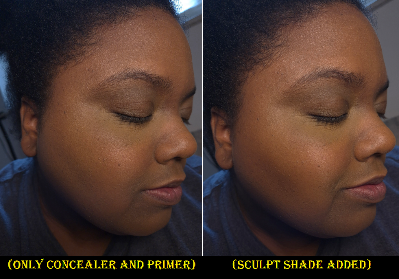
Smooth Blur Cream Contour Stick in Core Shadow
I’m the one in my friend group that everyone comes to for beauty product recommendations, but this cream contour was actually recommended to me instead! I held off on buying it because I felt unsure if Core Shadow would be the right shade for me, in addition to me being on a cream product low-buy.
It turns out this shade is great around my cheekbones and jaw, but I can see a touch of red when I apply it along my nose. The consistency of the cream also breaks down my concealers. In addition to the bridge of my nose, I usually also apply a little on both sides where I have discoloration. Putting product on these particular spots gives the illusion of pushing those spots back, which makes my nose look less flat. Unfortunately, this trick just doesn’t work with this shade of contour and this kind of cream formula.
When I tried to take a photo of the contour below my cheekbone, it looked too natural. So, I drew on more product and left it unblended so it would be easier to see the sculpting power of the Core Shadow shade on my skin tone.
When I use my go-to cream and liquid contour brush (by Patrick Ta), it’s too easy to go overboard. If I use a small amount of the cream contour and try to build it up, it doesn’t look as well blended in the end because some parts have dried at different times and other parts have a heavier look from the overlapping of layers. If I use a normal amount, it looks better blended, but it’s more intense than I want. So, I end up having to use leftover foundation from my brushes to try and tone it back down. It’s an extra step in my routine that I would rather not have to do.
This product isn’t as stiff as the Milk Makeup Sculpt Cream Contour Stick, but it’s stiffer than the one from Uoma Beauty that I used to use, and it’s a little drier than the Fenty Match Stix Contour Skinstick. I hoped this would be more like the Rare Beauty Warm Wishes Effortless Bronzer Stick that is so easy to blend and melts into the skin. Even the Anastasia Beverly Hills Cream Bronzer is easier to spread. While it’s typical for a stick version of something to be firmer and less emollient than a pot version, I didn’t expect this one to be more difficult to blend than the Anastasia Beverly Hills Stick Blush. Perhaps this is a tradeoff for longevity, because this contour at least lasts on my face all day.
I don’t have a lot of contours (compared to my collection of bronzers), so even though this isn’t perfect for me, I’ve continued using it beyond the testing phase. At the discounted price I paid, I don’t regret buying it. However, I still think there are better options out there, especially at a lower price. It gets the job done with extra effort, and the packaging is nice to look at, but I’m a little reluctant to recommend it. Between the cream stick blush, cream bronzer, and now cream contour stick that I’ve used from ABH…the best product is definitely their Cream Bronzer.
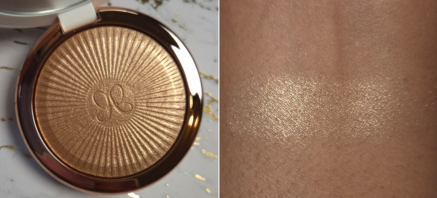
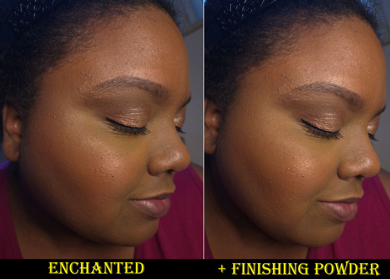
Glow Seeker Highlighter in Enchanted
I can’t think of another highlighter that has received as much long term hype and praise as the ABH x Amrezy Highlighter from 2018. It was the standard by which all highlighters were compared for so many years. Even Champagne Pop from Becca x Jacyln Hill in 2016 didn’t manage to stay relevant for quite as long. Becca’s highlighter (technically now Smashbox x Becca) might have made more sales overall, but Amrezy’s continues to be referenced more in the makeup zeitgeist of the past decade.
When ABH released the “Iced Out” highlighter four years ago, so many influencers were claiming it was the same formula as Amrezy’s. I was suspicious when I found it online for 25% off in just the first few weeks of launch. Then, I understood. It is pretty, but dry, and the color is yellow gold with a slightly greenish tinge (thankfully the green didn’t show up on my cheeks). To me, it wasn’t similar enough to the Amrezy texture to feel like my wish was fulfilled. I was so annoyed by the intentional or unintentional trickery that I never ended up reviewing it on my blog.
Now, we have the Glow Seeker Highlighters that everyone has been saying is practically the Amrezy formula. I can’t help but feel slightly led astray again. This highlighter has a lot more of a shimmery mica sheen, and it doesn’t have as much of the wet-look shine that I associate with gelee formulas like the Amrezy one. The Glow Seeker formula seems to have less squalane and more glycerin. It’s at least less dry than the Iced Out highlighter, but I still wish there was more slip considering I have dry skin and prefer highlighters to look slick and smooth. I can admit that I’m extremely picky about highlighters, so other people will probably say the two products are similar enough to be dupes. This is most likely also the closest ABH will get to making the Amrezy highlighter without recreating the formula completely. Someone who likes high impact and shimmery (but not glittery) highlighters will probably be pleased with this. The brand launched a single shade at first, called Sun Idol, but now there are two additional shades: Ethereal and Enchanted.
I like glow, and I’m glad this isn’t sparkly with large shimmer particles, but the shimmer isn’t quite as refined enough for me to like this as is. However, there is a bright side. I have found that when I use a finishing powder on top, it tones things down and makes my highlighter application look smoother. Typically, I use a finishing powder first before adding highlighter as the final step in my makeup routine to avoid dulling down the shine, but it works better for me to swap the order in this case! Using this method has made me like the highlighter a lot more. I don’t like adding extra steps to my routine, but since it’s merely adding finishing powder to a spot I usually skip, I don’t consider this to be a problem.
I unfortunately can’t do comparison swatches with either of the previous ABH highlighter formulas because I left them in the US.
Color, finish, texture, and all other preference things aside, I don’t have any issues with this product. I can pick up the amount I want easily on my brushes, it adheres and blends well enough on my cheeks, and the glow doesn’t dim or disappear until I’m ready to remove it myself.
I didn’t pay full price for this, and the full presentation of the weighty packaging and embossed highlighter surface is beautiful, so I wouldn’t regret buying something like this under normal circumstances. However, I can’t feel like it was a great purchase if it hasn’t surpassed my top highlighters (Hindash and Prada included). I was only interested in this highlighter for nostalgic reasons, wishing I could capture the Amrezy excitement that I didn’t get to fully participate in because the color of that highlighter was too light for me. So, this wasn’t a good buy for me personally, but it’s nice enough that I wouldn’t discourage someone else from ordering it.
I would say the quality is on par with Nars, and theirs is $42. I’m more inclined to recommend Hindash’s Gradiant Highlighters, which cost the same $40, but ABH does have better packaging. My highlighter favorites tend to be quite expensive, but I’d rather buy something with worse packaging if the tradeoff is an amazing formula.
As a side note, Amrezy debuted her own brand in August. They only have lip products at the moment. I’m guessing Amrezy doesn’t have the rights to ABH’s formula, but I wonder if she will try to capitalize off of the past hype and come out with her own highlighters too.
So, that’s all I have for today! I’ve been impressed by this brand stepping up their packaging and releasing decent products, but they haven’t really become staples for me. I would say perhaps others will have an even better experience with the makeup than me, but I don’t think the brand is doing so well right now. After all, Anastasia Beverly Hills’ credit rating was downgraded after missing their payment to their creditors in August. So, that’s not a good sign regarding the brand’s finances.
In any case, I hope this post has been helpful. My opinions of these products may seem a bit critical to some, but there are plenty of other reviews going around the web singing the brand’s praises. I wish someone had told me some of the downsides to these products before I bought them. They’re not bad, but they’re not going to be right for everyone.
The bronzer should be available in the US by June. The pressed powder is already available worldwide.
The luxury beauty community was up in arms about Givenchy reformulating their loose setting powder because it left a sheen on the skin (which emphasized texture and wasn’t as blurring). From what I’ve heard, it sounds like the loose powders intended for fair to medium skin tones contained a lot more Synthetic Fluorphlogopite, but mine called Popeline Mimosa seemed to only have shiny particles in the darkest square, which is practically the only section of the container I use. I put tape over the lighter squares, and only have a few holes open for the orange color. It bothered me that I could essentially use only 1/4 of the product, and I prefer using pressed powders over loose ones. When I heard about the brand’s new pressed version that is supposed to be more similar to the original formulation, I was interested.
I’m not sure if the original pressed powders were ever available in the US, but the deepest shade in that line was called 06 – Flanelle Épicée and is still available via the retailer Flaconi. In the current version, the deepest is called 06 Organza Ambré and I was willing to give this powder a try considering the original bright pink corner was replaced with what I thought was a peach color. It turned out to be closer to salmon.
The brand also resolved the issue of the brush-holding flap lifting upwards and covering the mirror, because it now flips to the side.
I’ll discuss the powder more a bit later, but I’d like to first talk about the Bronzer because it’s the product I actually bought first. I enjoyed the silkiness of it and ability to customize it so much that I had hope that the pressed powder could be even more useful to me than the loose one.
DISCLOSURE: All products in this post were purchased by me with my own money.Unhighlighted links in bold blue font (Example) are normal non-affiliate links. Links marked in bold black font with a light blue background (Example) are affiliate links. Affiliate links allow me to get a commission if purchases are made on the website after being redirected there. The price of the product is not affected by these links, and anyone who uses them would be supporting this blog. Sorry for this interruption, but an explanation about affiliate links are required by the FTC whenever they are used. The only affiliate links in this post are for brushes through CDJapan, not Givenchy. And for anyone else wondering, I usually reserve non-link font colors like (Orange) for updates, (Red) for subject titles, and (Purple) for product titles.
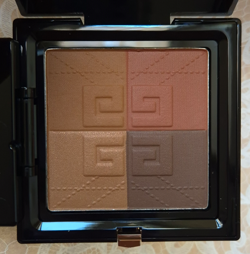
Givenchy Prisme Libre Bronzing and Sculpting Powder in 003 Organza Bronzé
Organza Bronze is currently the darkest of the Bronzer Powders available. It works for me, but I think this really doesn’t go deep enough, and I’m hoping they will expand the range. It has been out for a few weeks already in Europe, but I heard it will come to the US by June.
The four colors are supposed to allow one to, “add tan, warmth, modeling, and brightening.” In the top left corner is supposed to be the bronzer shade, which is basically my skin tone. I can’t use this as a bronzer unless I mix it with the darkest block. Then, it does add subtle bronzing. I’m glad this is such a blendable product that layers and builds well because I have tried other “customizable” powders in the past that formed uneven mixtures that didn’t look seamless on the skin. This product really is customizable.
In the bottom left corner is the brightening square. I have tried using this as a highlighter before, and it adds a super subtle sheen, but isn’t enough for me to replace using an actual highlighter in my routine. As a glow enhancer to turn this soft matte product into a radiant bronzer, this doesn’t do a whole lot either. It makes it less matte, but I don’t think there’s enough oomph to satisfy a true shimmer-bronzer lover. What this does is literally lighten the color of whatever mixture I try to create. So, if I go overboard on the darkest color, adding this will lighten it up, but so will the bronzer shade.
In the bottom right corner is the modeling or sculpting block. It is the darkest section of the pan and is a cool-leaning neutral shade. It works perfectly as subtle contour in the sense that it isn’t overly gray. This color choice aids in the ability for it to mix with the other shades without going muddy. This isn’t guaranteed to be the case with Mousseline Bronzée or Popeline Bronzée though.
In the top right corner is the warmth-adder. If I want my bronzer to be less subtle, then I must rely more heavily on the darker quarter. That dark powder has just enough coolness that mixing it with the lighter browns combine into a neutral shade. If I’m feeling like having a little extra warmth, I can easily add this burnt red color to the mix. However, it works quite beautifully as a blush, which I first discovered when watching Brie Moore use it that way in her YouTube video.
How I’ve been using this the most has been to contour with the darkest shade, then mix all the browns together for a subtle bronze, and finally using the red color as blush. This tailored approach is much better suited for me than swirling all four colors together. The combined color is a bit too light for me anyway. This means that the nice and soft synthetic brush Givenchy includes in here has very little purpose for me. The shape makes it very cumbersome to try and isolate one of the four shades alone. It can be done, and I’ve used it in the darkest square to contour under my cheekbone, but I’d much rather stick to my Face 11 brush from the brand called Number Eight. The candle tapered shape is ideal for dipping into a small section, but dispersing the product in a wider area. Small cheek brushes also work, like the HSC-2 Hana Sakura Brush for those that want an even subtler application or the Chikuhodo FO-2 that will give a stronger application and still fits in each square despite being a flat top brush with a decent amount of surface area.
I think this is a great product. The powders are super refined, blendable, soft, layer well, and last all day without fading. They’re not splotchy, they’re multi-purpose (I’ve even seen someone use them as eyeshadows), and I think the black packaging with the bronze details makes it look luxe even though it’s so lightweight. Only time can tell whether I will continue to find the customization element necessary or if I will go back to using my individual makeup favorites. The one major negative for me is simply the fragrance in here. This bronzer is so heavily perfumed and even though it’s not a bad smell, it’s stronger than I want in a makeup product and I can still smell it briefly while it’s on my face. I hope the scent will dissipate within the package over time.
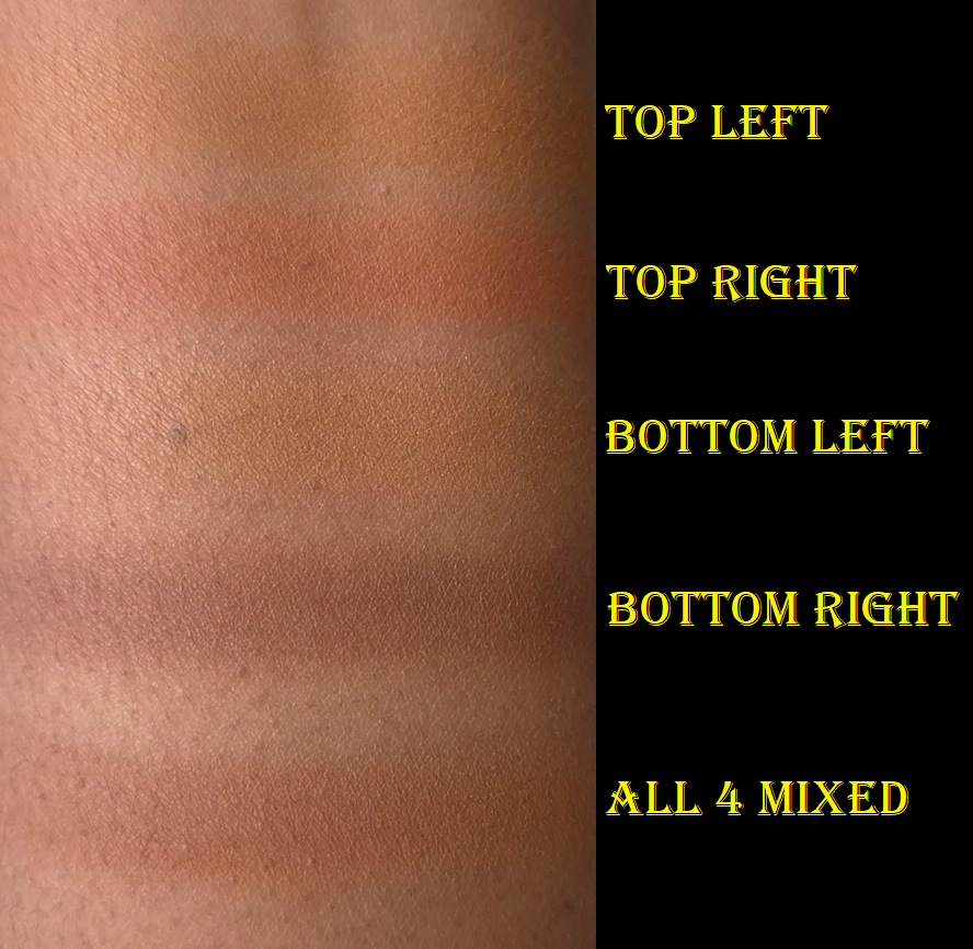
Givenchy Prisme Libre Pressed Powder in 06 Organza Ambré
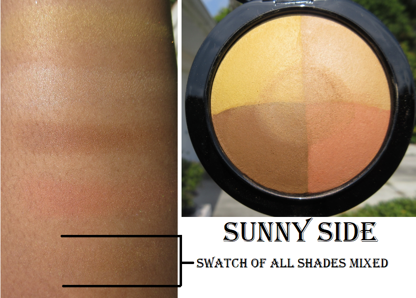
The first thing I thought when I saw the four colors for this shade of pressed powder is how it reminded me of my MAC Mineralize Skinfinish in Sunny Side that was a limited edition product first released in 2016. The photo below is from my review from 2020.
I contemplated bringing Sunny Side back to Germany with me after seeing it again in person in the US, but considering this is 9 years old, it has no functional use except for nostalgia and collecting purposes. It can remain where it is on my “retired products” shelf for things I loved but will not use on my face.
Unlike Popeline Mimosa that was too light for me to use all 4 shades together, I am able to wear the four shades combined from Organza Ambré (at least under my eyes).
The salmon color in the bottom left of the compact doesn’t look strong in swatches, but it can clash a bit with my undertone if I accidentally use too much of it. Givenchy included that color to, “correct and conceal shadows.” I played around with different combinations blended onto my arm to see which ones had the highest likelihood of suiting me. In that process, and then confirming it under my eyes, I discovered that combining the yellow in the top left with the deep caramel brown on the bottom right looked the best for brightening. According to the brand, the yellow is intended to, “correct blue tones,” while the brown, “unifies the skintone.” The combination of the yellow, brown, and a bit of that orange (reminds me of the Crayola shade Macaroni and Cheese) is semi color-correcting. However, the orange, which the brand says is supposed to, “boost the skin’s radiance,” isn’t deep enough to be successful using it on its own on top of my Givenchy concealer. Combining the orange and salmon though works. My favorite combination is simply the yellow and brown together.
I’m quite satisfied with this powder, paired with the Prisme Libre concealer, but it doesn’t do as nice of a job on top of some of my other concealers (for instance the KVD Good Apple). Also, the only difference I can see between this powder and the reformulated loose one is the lack of sheen. It looks nice and blurs a little, but it doesn’t have noticeable extra blurring or anything special enough for me to see what all the hype was about. I’m honestly not even sure if this reformulated, but fully matte, powder is as close to the original as some people have been saying it is, considering how similar it is to the mini I own.
This isn’t the kind of powder I want to put all over my face because it’s too mattifying for my dry skin. However, I did it for the sake of this review. Even though combining the four shades works under my eyes, it’s still too light for my whole face. It doesn’t look drying on the majority of my face, but it’s unflattering in areas that are my most dry and have the most fine lines. It’s mainly around my mouth that the powder actually emphasizes texture.
It’s interesting that I like the bronzer so much, but not the powder, considering they are practically the same formula. The only notable differences is that Zinc Stearate is higher up the list for the pressed powder and Kaolin is higher on the list in the bronzer.
The reason the bronzer doesn’t look too drying is specifically due to the areas I use it, which is the perimeter of the face and cheeks. If I tried to use the bronzer all over my face, and especially around the mouth, I would probably dislike it too.
So, this continues to be a powder that I only use under my eyes to set concealer and pretty much only with the Givenchy concealer. Though I got this for 20% off, I wish my curiosity hadn’t gotten the better of me and that I skipped buying this powder entirely. I like the Guerlain Parure Gold Powder more than this! That one felt drier, but at least it didn’t look dry.
Since the bronzer and pressed powder have nearly identical ingredients, I feel validated in assuming that if I liked the bronzer formula then I should like the pressed powder too. My mistake was not taking placement into consideration.
That’s all for today! Thank you for reading. I hope you’ll join me again for next week’s post!
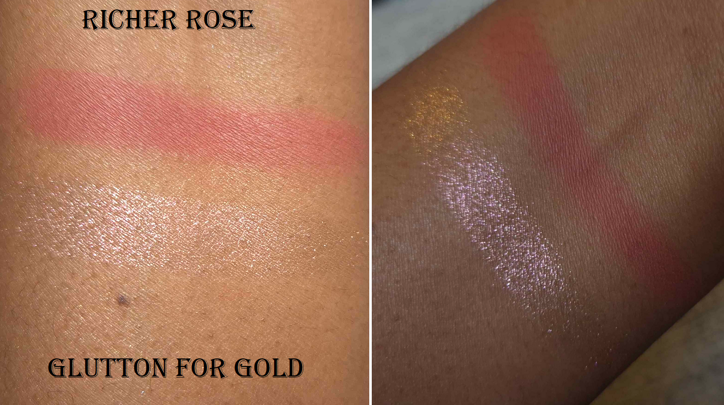
Richer Rose is in MAC’s Sheertone Powder Blush formula, which is great. The shade is like a softer slightly muted version of MAC’s Frankly Scarlet, so I love the color. It still builds up pigment quickly for a “sheertone” blush, so I recommend using a non dense buffing brush or any shape that’s airy.
Glutton for Gold is in the brand’s Extra Dimension Skinfinish Highlighter formula. This particular shade is a duochrome gold to pink, though it just looks pink on my skin tone. It’s a smooth formula, but the shimmer particles are reflective enough and large enough to look borderline glittery on my cheeks. I like it best when used sparingly and really worked into my skin, because then it’s more wearable for me (and especially acceptable for the holidays).
These two colors pair very well together. In terms of performance, it’s the same great quality one can expect from MAC. There are no blending or longevity issues. It all comes down to color and intensity preferences.
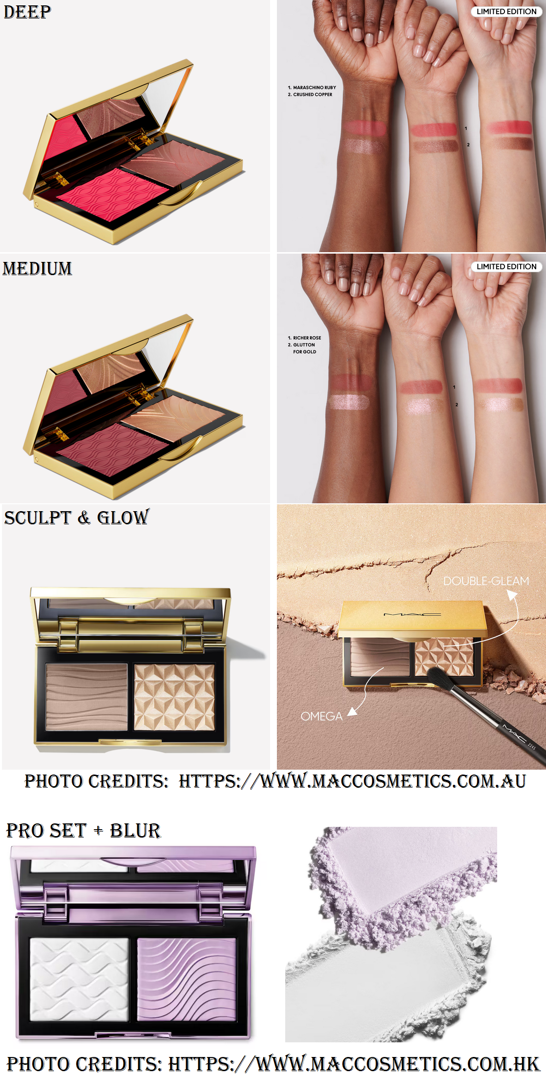
In the last two years, I’ve been observing the timeline of what’s available from MAC by region (Asia and Australia vs Europe vs North American markets), available online vs in-store, which things to go their US and EU retailers, and what ends up at the CCO/CCS. It’s not unheard of for MAC to have specific products that are only sold to one sector, and that seems to be the case with these Golden Hour Glow Face Palettes. At the time that I’m writing this, the only colorway available in Germany is Medium. In Australia, I see that they have Medium and Deep (with Deep containing the Maraschino Ruby blush and Crushed Copper highlighter). This packaging is a more decorative version of the Sculpt & Glow duos and Pro Set & Blur Pressed Powder Duo MAC only offers online to their Asian and Australian markets thus far.
I haven’t seen a light version of a Golden Hour Glow Face Palette, but I would not be surprised if one gets found some way somewhere in the future.
I am very happy that I got this product at a 28% discount via a promo code. I’m not saying that it isn’t worth full-price, but since MAC always has 30-50% sales at some point and the holiday items rarely sell out before Christmas, I recommend waiting for some kind of deal for those wanting to purchase this.
For anyone curious, this is very likely to be my only MAC holiday purchase this year. I could be tempted into getting the MAC Skinfinish Metallic Cream Blush in Coveted Coral if I ever find it for under 25 Euros.
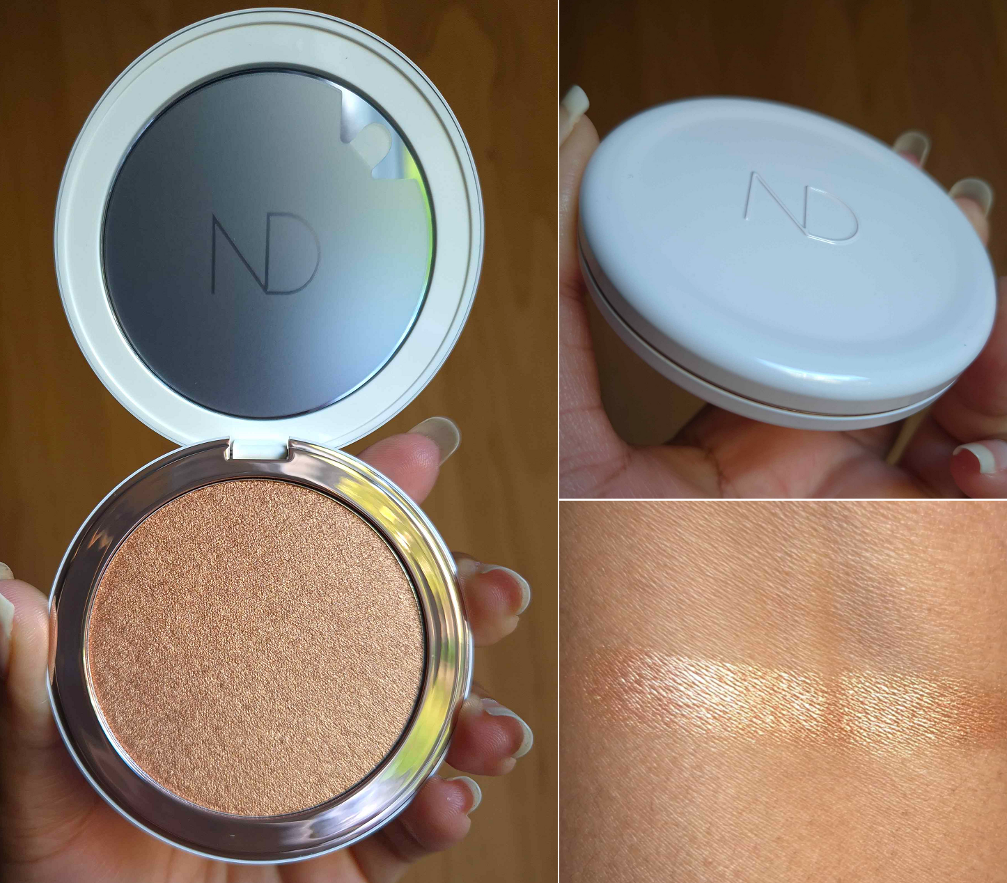
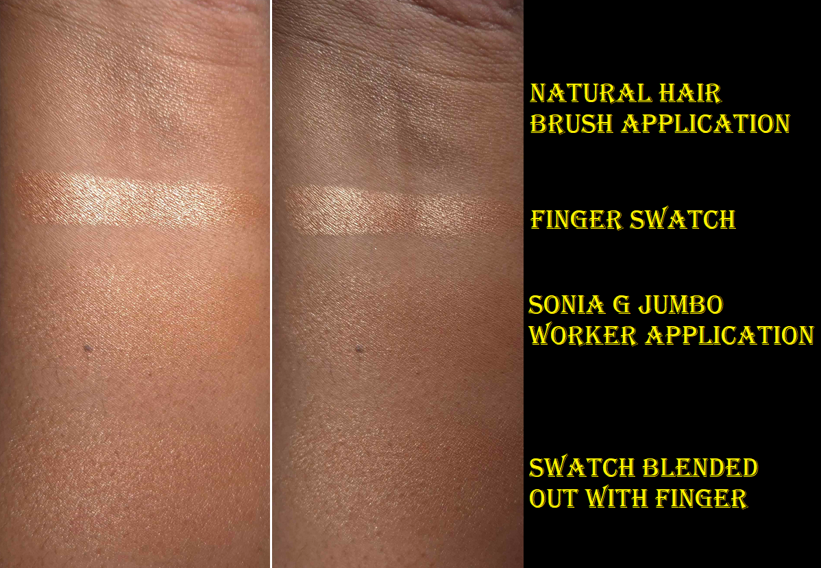
Natasha Denona Hy-Gen Skincare Infused Glow Beautifier in 03 Dark
I had no intentions to buy this because of the price and me being on a highlighter low-buy, but I kept hearing so many beauty creators continually talk about loving this highlighter and it having a unique texture. When it was on sale at Sephora’s DE website over a month ago, I could no longer resist.
I’m going to get the worst part out of the way; I hate how this smells! I was shocked to see that parfum was listed in the ingredients, because that means it was actually intended to smell like a mix of shea butter, baby oil, and something else I can’t quite determine. It’s objectively not repulsive, but the fact that it instantly brings to mind the ORS Olive Oil Moisturizing Hair Lotion is something I don’t like. It makes it feel wrong to put this product on my face!
Trying to pick up this product on a brush isn’t difficult, but I don’t like how it applies. With a natural hair brush, the particles get spread out on my cheeks and has that scattered sparkles look that I don’t like. If I apply it with my fingers the particles are packed together and then form one smooth looking surface. However, I then have the issue of trying to blend out the edges to avoid having a stripe, which becomes more sparkly on the perimeter from having been dispersed/thinned back out. Because it’s not a traditional powder formula and acts like a liquid highlighter, it takes some force to blend out the finger application because it doesn’t actually sink into the skin the way a cream would. The best method of application I could find was using the Sonia G Jumbo Worker brush. It’s a mix of synthetic and natural hair, is dense to pack on the product, but around the edges is slightly looser and partly fanned out to help diffuse. A fully synthetic option that’s nearly as well performing as the Sonia G brush with this particular product is the Fenty 120 Highlight Brush because of the spot product gets packed onto and the shape of the brush hugging the contours of the cheek. It’s perhaps less successful in other spots to highlight on the face.
Unfortunately, this product just isn’t for me. I love the feel of it, the shade options, and how it can look wet on the skin, but the cons don’t outweigh the pros for me. The functions of this highlighter is more easily accomplished for me by Charlotte Tilbury’s Unreal Skin Sheer Glow Foundation Tint. The CT product is a bit too light for me right now (and I’m not going to buy a darker one), and Charlotte’s is nowhere near as shimmery, but that’s why it’s better suited to my preferences and what I wanted to achieve with this kind of wet looking highlighter.
Spraying my face first before applying the Natasha Denona highlighter also helps it to look smoother, but when I’ve seen this highlighter under different lights I saw that it can appear ultra sparkly, so I really don’t like that. I found this out when I saw myself in the mirror before leaving home, versus what my highlighter looked like in the bathroom of my in-laws. I don’t know what kind of bulbs they have, but I’d rather not look like that again.
Below is a photo using some elements of everything I reviewed today. The highlighter on the cheeks is the Natasha Denona one.
If this kind of highlighter is to someone’s taste, I feel jealous of that person because I really wanted this to work. I paid for it, so of course I hoped to love it (and I can’t return it in the EU). The packaging feels so luxe to me. It looks like it could be a mini porcelain soap dish the way it has the indent at the top and feels weirdly cold on the outside. I also like the rose gold around the rim. The compact has the right amount of plastic to feel like I’m holding something substantial without it actually being heavy. In the future, I’m likely to either depot it (and put a pan of something else inside) or sell it.
Dior Forever Rouge Blush Contour & Glow in 200 Diorama
For several years, I’ve been using either deep bronzers (for brontouring) or the Hindash Beautopsy Palette for contouring purposes. Today, I’ll be sharing my thoughts on the first actual contour I’ve purchased in so long (and the highlighter that comes with it).
Dior released many blush and highlighter duos this year, but I decided to go for this product instead because there’s a bigger void for it in my collection. The texture reminded me of the Dior Powder No Powder, so I had high hopes for it being a smoothing and blurring contour. I was surprised to find that this is a little too dark and pigmented for me. I can’t use a wispy brush because it needs to be strong enough to pick up the product on the bristles, but at the same time a dense brush packs on a lot of product. A brush too wide is hard to blend out and can make my blush look muddy when some of it goes on top. A brush too thin concentrates the product even more to create a stripe. It can look patchy if not evenly applied and blended out. It’s hard to fix once it’s overapplied because the pigment is so intense. So, the Patrick Ta contour brush has been the best option I’ve found thus far. This product is finicky primarily because of the color.
The highlighter is quite pretty and fairly smooth. It reminds me of Bobbi Brown’s Copper Glow, without the random larger shimmer specks. I have highlighters with shimmer more refined than this, but this is still very nice. I’m happy with it and with my purchase overall. Don’t be surprised if you hear I’ve gone back to contouring with the Beautopsy Palette though!
I also feel compelled to add that I wish Dior would make deeper highlighter options. I don’t follow the brand super closely, but I follow them enough to feel confident in saying this is the darkest* powder highlighter they’ve ever made and it’s right on the cusp of being too light for me post-summer. *Based on online photos, the highlighter in the 757 Wild Dior duo looks to be the exact same depth and just be slightly more pink in tone.
Every time they release a highlighter, I’m drawn to it, but they’re always too light in the way they reflect. Without there being much base color, yes, the highlighters can stretch across many more skin tones. However, the reflect looking pearly white on me isn’t flattering, even if there’s a warmer base or one that’s deep enough for me. That’s why I was too afraid to buy either of the holiday highlighters this year, despite it looking pretty on someone darker than me (who doesn’t mind an icy highlighter). I would love an option that I don’t just wear in the winter-spring time when I’m lighter. Something comfortably dark enough.
The photo above demonstrates some of the various stages that I was testing different makeup products and practicing techniques in the weeks prior to the wedding. The very first example is what I would consider my typical amount of makeup, versus the last photo where I put in way more effort with a ton of extra steps that were necessary to create the look I envisioned for myself.
In Part 1, I explained which strategies I chose and showed the specific makeup products used. In Part 2, I’m going into greater detail listing the actual order of the steps I took. That includes all the details about the eyeshadows that I left out of the previous wedding post. I will also include photos of alternative wedding/special occasion looks in both the cold winter theme, classic looks, and a few colorful ones now that we’re in spring.
The makeup artists were upfront about either not being available on the day of the wedding or not having their own products to match me. I was a bit nervous about having to do it on my own, considering I’m just a makeup enthusiast, but many loved ones reassured me that I knew my own face better than anyone else and they were confident I could pull it off. I hope that this post will be inspiring to anyone else in a similar situation where you have an important event coming up and aren’t sure where to start or would just like to see extra ideas.
My Wedding Makeup Step-By-Step
First, I applied skincare (and this would normally include sunscreen though I skipped it), allowing ample time for everything to absorb in the skin before moving onto applying primer(s).
I then applied color correctors to the spots I have discoloration, put on the liquid contour for my nose and under the cheeks, and added liquid blush. I left them only halfway blended since the foundation would go over everything anyway as part of the underpainting technique.
I made a mixture of foundation shades and applied it to the outer perimeter of my face. The lighter foundation color, I applied to the central zone of my face.
The eye primer came next before I filled in my brows with my brow pencil of choice.
I applied my skin tone shade of concealer to my under eyes and areas of discoloration. I applied a combination of my skin tone shade and a lighter color to my under eye area again, the bridge of my nose, center of my forehead, and chin. I use the lighter concealer color alone to highlight under my eyebrows.
After setting those concealer areas with powder, I did a first round of setting spray to lock those in.
In the photo series above, I saved my eye makeup for last, but I switched the order on the day of the wedding to do the eye makeup next in case I had a mishap with eyeliner, if mascara got on the lids, etc.
1. First, I applied Viseart’s Illusion shade from the Peridot quad under my brows on top of where I laid down the lighter concealer shade.
2. Then I applied Melt’s Rubbish shade from the Rust palette in the space under the Viseart shadow, but above the crease.
3. Next was Melt’s Rust shade from the same palette tightly in the crease, not going past the previous shade.
4. I lightly added Log from Natasha Denona’s Gold Palette, building up the outer corner and moving halfway inward. I chose this placement because of my particular eye shape.
5. I then built up the depth and smokey factor in the outer v area using Xtreme Black from Pat McGrath’s Mothership III: Subversive palette.
6. I smudged the Urban Decay 24/7 Glide on Pencil along the outer quarter of the lower lash line before using Deep Shade (actual name) from the same PML palette on the rest of the lower lash line.
7. I smoothed on the Nyx Glitter Primer to the empty space on my lids and applied Bronzed Mink from PML’s Bronze Bliss palette to the outer half of the lid, taking care to not cover up the dark shadows in the outer corner.
8. I added Divine Dahlia from PML’s Interstellar Icon Quad on top of Bronze Mink to tone down the warmth of that shade.
9. The next step was picking up Nude Moon from Bronze Bliss on my brush, spraying it with MAC Fix+ and applying it to the inner half of the lids.
10. I placed Skinshow Fever from Mothership III: Subversive in the inner corner, under the brow arch, and the inner third of the lower lash line for highlighting purposes.
11. For extra sparkle, I added Lunar Luxury damp from Bronze Bliss to the inner corner. I applied the waterproof eyeliner to my upper lash line, along with two coats of waterproof mascara to my upper lashes, but only one coat on my lower lashes. Had I used the Clionadh multichrome, I would have placed a small dot that was eyeliner width to the center of the upper lash line.
Going back to my base, I applied powder contour under the cheeks and along my jawline. I applied a cooler toned contour to my nose, and on top of the other contoured spots.
I applied bronzer along my forehead and slightly above the contour under my cheeks.
I used my face powder and the Beautyblender Puff to clean up a small section of my sculpting work without going too far in. Just about one inch inward from my ear.
I applied my intense highlighter to the tops of my cheekbones.
I applied the mixture of powder blushes to my cheeks.
I applied my more subtle highlighters to the top of my cheekbones again, bridge of my nose, above the brows, and any remaining product on the brush to my forehead and chin.
I used my blurring finishing powder in any areas that needed extra blending/blurring.
I lined my lips with the lip liner of choice, filled it in with liquid lipstick, and added a lighter lip product to the center of my lips. During trial sessions, I even added highlighter, but didn’t end up doing it on the wedding day.
I put the leftovers of foundation from my brush and applied it to the spots on my neck that would be seen.
I applied highlighter to my collarbones and shoulders.
Lastly, I finished up with a generous amount of setting spray to my face. Had I remembered, I would have sprayed my neck and the spots I applied body highlighter.
And that’s everything! It’s a lot of steps, but worth the time and effort for one of the most important days of my life!
Just as unexpected problems can arise on important days, unfortunately, nearly every day that I set aside free time has been a dark day. I’ve done my best to play around with artificial light, take photos during the brightest part of the day for natural light, and do some color adjusting with the photos, but I’m dealing with cloudy days constantly over here. Times like these, I miss Florida haha.
Recreation of my Wedding Makeup/Neutral Glam: Used all the products I still have on hand. Photo Setup: (1) In front of an open window on a cloudy day. (2) In a room with warm light and a second cell phone’s flashlight was lit behind the camera. (3) In front of an open window with warm white bulbs overhead.
Here are the additional looks!
Frost Queen: Milky Hydro Grip Primer and Armani Luminous Silk Hydrating Primer, Armani Luminous Silk Foundation in 10, Hourglass Cosmetics Vanish Airbrush Concealer in Maple and Umber, Chantecaille Perfect Blur Powder in Med/Deep, r.e.m. Beauty Hypernova Satin Matte Bronzer in Cocoa-Nut, REM Beauty Highlighter Topper in Miss Mars, Hindash Beautopsy Palette (nose contour), Armani Neo Nude Melting Color Balm in 60 Warm Plum and Hourglass Ambient Light Blush in At Night, ELF Instant Lift Brow Pencil in Deep Brown, Stila Stay All Day Waterproof Liner, KVD Full Sleeve Mascara, Juvia’s Place Lip Liner in Brownie, Lisa Eldridge True Velvet Lip Color in Sorcery, Colourpop Hocus Pocus 2 So Glassy Lip in Boys Will Love Me, the eyeshadow shade Memory (Metallic) from the Tati Beauty Textured Neutrals Volume 1 palette, and shades Nowhere, Christmas Eve, and Snowflake from the Oden’s Eye Christmas Eve Palette. Photo Setup: In front of an open window with a warm white bulb overhead on a partly sunny day, but near sundown.
Playful Pinks: Milk Hydro Grip Primer, Nars Light Reflecting Foundation in MD3.3 Caracas, KVD Good Apple Concealers, Huda Faux Filter Corrector in Mango, Nars Soft Matte Advanced Perfecting Powder in High Tide, GloWish Soft Radiance Bronzing Powder in 04 Deep Tan, Dior Backstage Powder No Powder, Hindash Beautopsy Palette (nose contour), Dior Rosy Glow Blush in 012 Rosewood and Nabla Skin Glazing in Lola, Pat Mcgrath Labs Skin Fetish: Ultra Glow Highlighter in Divine Rose, Suqqu Treatment Wrapping Lip in 05, Coloured Raine Lip Liner in Decadent, Benefit Precisely, My Brow Pencil in 05, KVD Full Sleeve Mascara, Stila Stay All Day Liquid Eyeliner, MAC Fix+, Melt’s eyeshadows from the Gemini II Palette with shades Bela, Sweetheart, Gemalas, and LX Queen, and the Rust palette with shade Antique. Devinah Cosmetics Eyeshadows in shades Empress, Pixy Stix, and Gelicide. Pat Mcgrath Labs’ eyeshadows from the Mothership III: Subversive palette in VR Pink and from the Celestial Nirvana 5 pan Palette in Nude Allure in the shades Mercurial Rose and Coral Kiss. Photo Setup: In front of an open window on a less cloudy day, but during late afternoon hours and a warm white bulb overhead.
Chocolate-Gold Glam: Milk Hydro Grip Primer, Armani Luminous Silk Hydrating Primer, Hourglass Ambient Soft Glow Foundation in 13.5 and 14, L’Oréal Infallible Full Wear Waterproof Concealer in 415 Honey, Huda Beauty Easy Bake Loose Baking & Setting Powder in Blondie, Gxve Beauty Check My Glow Multi-Dimensional Illuminating Highlighter in Karat Country, Anastasia Beverly Hills Cream Bronzer in Terracotta, Dior Powder No Powder, Chanel Blush Lumiere Illuminating Blush Powder in Brun Roussi, ELF Instant Lift Brow Pencil in Deep Brown, MAC Macstack Mascara, One/Size Waterproof Liquid Eyeliner Pen, Palladio Waterproof Lip Pencil in Coffee, and Kaleidos Cloud Lab Lip Clay in Sienna. Hindash Beautopsy Palette (nose contour and no contouring anywhere else). Viseart’s Illusion shade from the Peridot Quad, Deep Shade (actual name) and Gigabyte from Pat Mcgrath Labs Mothership III: Subversive, Clionadh Cometics’ shade Lux, and Devinah Cosmetics’ shade Ambrosia. Photo Setup: In front of an open window on a less cloudy day with a warm white bulb overhead.
Flower Garden: Haus Labs by Lady Gaga Triclone Skin Tech Foundation in 425 Medium Deep Neutral, Tatcha the Liquid Silk Canvas Fenty We’re Even Concealer in 410 W and 385W, Givenchy Prisme Libre Powder in 5 Popeline Mimosa, Dior Powder No Powder, Hindash Beautopsy Palette (nose contour), Victoria Beckham Matte Bronzing Brick 05 (regular contour), Gucci Bronzer in 04, MAC Glow Play Blush in Peaches N Dreams, Sephora Blush Duo in 02 Peach Blossom, Tom Ford Shade and Illuminate Highlighting Duo in Tanlight, Benefit Precisely, My Brow Pencil in 05, L’Oreal Telescopic Lift Macara, Stila Stay All Day Waterproof Liquid Eyeliner, Danessa Myricks Infinite Chrome Micropencil Eyeliners in Jade, Amethyst, and Lemon Quartz. Devinah Matte Eyeshadows in Courtney and Meraki, Clionadh Cosmetics Stained Glass Shadows in Mural, Patina, Quest, Noble, and Spire. Coloured Raine Lip Liner in Pine and Suqqu Sheer Matte Lipstick in 112. Photo Setup: In front of an open window with the sun poking out randomly on and off from behind the mostly cloudy sky, and a warm white bulb overhead.
Spring Purples: Milk Hydro Grip Primer, Glossier Futuredew, Lisa Eldridge Seamless Skin Foundation in 27, KVD Good Apple Concealers, ELF Camo Color Corrector in Orange, Charlotte Tilbury Airbrush Flawless Finish in 2 and 3, Hermès Plein Air H Trio Healthy Glow Mineral Powder, Dior Backstage Powder No Powder, Hindash Beautopsy Palette (contour), ColourPop Pressed Powder Blush in Potted and Gucci Cheeks & Eyes Powder Luminous Matte in 06 Warm Berry, Hourglass Metallic Strobe Powder in Infinite Strobe Light, Lisa Eldridge Enhance and Define Lip Pencil in Sorcery and Lisa Eldridge Luxuriously Lucent Lip Colour in Painterly, Benefit Precisely, My Brow Pencil in 05, KVD Full Sleeve Mascara, Stila Stay All Day Liquid Eyeliner, Melt’s eyeshadows from the She’s In Parties Palette with shades Total Immortal and Last Caress. Clionadh Cosmetics Multichromes in shades UV and Tracery. Sydney Grace Eyeshadows in Dear Reader, Flannel, and Sovereign Reign. Photo Setup: (1) In front of a window on a partly sunny day. (2) Same as the first, but from the opposite direction. (3) In front of an open window on partly sunny day and a warm white bulb overhead.
That’s all for today! Thank you for stopping by! I hope you’ll click to follow or bookmark this page to come visit again!
Also, I seem to be having an issue with WordPress. For some reason, images have a hard time loading for those viewing my blog within Germany. The customer service advisors were unhelpful and the only way that even I was able to get around loading issues was to use a VPN. If you live in the US or most other countries, it should be working fine. The issue, as far as I’m aware, is a DE issue for some reason.
There were a lot of factors to consider when it came to doing my own wedding makeup. I scoured the internet for tips and tricks, but at times the answers were contradictory. I thought I had a good plan in the beginning, but as I practiced doing multiple looks, I realized I needed to make some changes along the way.
Today, we’ll cover the things that should be decided on in advance and what I ultimately chose to do. The conclusions I came to won’t be the same for everyone since it depends on each individual’s personal tastes, skin type, skin texture, skin tone, undertone, priorities, etc.
Although I was inspired to create this post with weddings in mind, this topic is for anyone with an upcoming special event/occasion where photographs will be taken. I was not in a position where I could afford to forget something and run to grab it at the last second, so hopefully these topics will help others avoid having to make last minute decisions and purchases too.
DISCLOSURE: All makeup products in this post were purchased by me with my own money. The only affiliate links in this post are for a few of the brushes mentioned towards the end. Non-highlighted links in bold blue font (Example) are standard non-affiliate links. Links marked in bold black font with a light blue background (Example) are affiliate links. This means that I would make a commissionif purchases were made directly using my link. Whether you click to shop through them or not, I appreciate you visiting and I hope you find the information I’ve provided to be helpful!
Red – Titles/Topics, Purple – Products Used, Green – Additional Options to Consider
Deciding Between Looking Better in Person or Looking Better on Camera
We had a micro wedding (less than 25 people) and the majority of the guests were non-makeup wearers or neutral-color wearing minimalists. I was concerned with looking overly made up in person compared to the group, but also recognized that full coverage and full glam faces result in the most photogenic pictures. I would love to look as natural and fresh-faced as possible, but I think I look the prettiest with “a beat face,” so to speak. So, I decided that I ultimately would start researching ways to look best in photography since pictures last longer and can even serve to replace memories in the minds of those who see them. If it was possible, my plan was to still try and find a balance between the two goals. This balance involved using other techniques such as color-correcting so I could use less concealer and foundation to hide my skin discoloration, using underpainting techniques to have my sculpting attempts look as natural as possible and reduce the need for as much powder on the surface layer, using full-coverage makeup paired with brushes that apply less product so that I could build up to the minimum amount of makeup I needed in small layers instead of packing it on heavily all at once.
In the age of social media, it’s safe to assume the majority of people prioritize how makeup will look on camera versus how it looks in real life, as discussed on the Mixed Makeup YouTube Channel. However, this is still a question everyone has to ask themselves because the degree to which direction one leans will dictate how they have to proceed with the next steps.
After Choosing to Prioritize How One Looks on Camera…
When I do a full-face in the type of soft tones that are typical of bridal makeup, I don’t feel satisfied with my appearance. So, looking natural was less of an option for me. In addition, if I wanted things like blush to be seen on camera, I had to get comfortable packing on way more than usual because blush gets washed out so easily. As described by Kackie of Kackie Reviews Beauty, the key is applying makeup in a way to add more dimension that the camera can pick up even when pulled back. I had to practice applying more than usual, taking pictures, and then adding more and photographing that to learn how much would actually be needed on the day. Blush, highlighter, and eyeshadows were the things I had to work on amplifying dramatically in order to get photos I was satisfied with (at least on my own camera).
One of the first big decisions I had to make was deciding what finish I wanted for my skin. A matte base with strategically placed glow seems to be the consensus for what photographs the best. However, I did not anticipate the climate when I chose what products to bring with me when I moved overseas. The products that looked the best on camera for me in Florida were extra dry looking on me in Germany and I didn’t bring my dewier foundations because I have them in my darker summer shade. This led me to buy a new foundation (N°1 DE CHANEL Revitalizing Foundation), the only one that mimicked the appearance of natural oils peaking through my face, and it remained that way through the end of the night. It basically looked like a natural-finish foundation on my dry skin. I used the Glossier Futuredew, to ramp up the glow in typical places I highlight, the MILK Hydro Grip primer for hydration and lasting power, and the Benefit Porefessional Hydrating primer in my T-zone for a smoothing effect without a silicone texture. I have all three of these products in minis (and a travel container).
I did have the Nars Light Reflecting Foundation with me, but my research scared me away from using it. Since Nars is an artist brand, I always assumed their products looked fantastic on professional cameras, but I kept coming across warnings against using too many light reflecting products. Considering how dark it is in Germany, I knew the chances of flash being used was high, so I didn’t want to look crazy on other people’s cameras either (even though Nars’ foundation is supposed to be photo-friendly and produce no flashback, but I didn’t know if that would still be the case if paired with other light reflecting products). So, I didn’t use that one just to be safe. Skipping it turned out to be necessary because I tried using it in strategic spots and it still wasn’t luminous enough for my liking while not in Florida. Lisa Eldridge was one example of someone who discussed light reflecting products in flash photography and Pete Coco Photography cautioned against using shimmers in studio settings, but I saw more mentions of light reflection from various articles and blogs.
For those curious, the top foundations I wanted to use if the climate was more like Florida would have been the Lisa Eldridge Seamless Skin Foundation or Hourglass Ambient Soft Glow Foundation (this one only starts to look good for me if oils break through and my skin is prepped for maximum hydration including using a facial oil). The Lisa Eldridge foundation is extremely similar looking to the Chanel one I opted for, but without as much luminosity. I also own two lighter coverage products that make my skin look beautiful in person: the Fenty Eaze Drop Blurring Skin Tint in Shade 18 and the Rose Inc Skin Enhance Luminous Tinted Serum in Shade 100. I was looking for high coverage, but if I had to recommend another option it would be the one from Fenty. I normally dislike their foundations, but this newer one finally agrees with my dry skin. The Rose Inc one unfortunately can come off extra warm colored on camera. Sometimes I look orange in photos even though I don’t in person. It’s also random when it happens as well. I’m not sure if it’s some interaction with a specific product I might sometimes pair with it. So, that’s why I don’t recommend that one.
Deciding On the Color Scheme and Undertones of the Makeup
I had quite the dilemma trying to figure out what colors I wanted to use as a person with warm undertones who was planning to wear cool toned accessories and have blue and purple flowers in my bouquet. I like wearing eyeshadow that matches what I’m wearing in some way, whether it’s clothing, a purse, jewelry, etc but I never like how cool toned eyeshadows look on me as much as warmer ones. At the same time, I didn’t want the winter aesthetic I planned for my look to clash with my natural warmth and make me look extra warm by comparison. I did a test run using my go-to makeup and just switching to a cool toned blush, but I didn’t like the outcome. My second solution was to wear neutral makeup to bridge the two types of looks, but after doing another test run, I just didn’t feel my makeup was as pretty as it usually would be.
Experts say that although anyone can wear any color they want, we tend to find shades in our undertone to look prettiest on ourselves. For instance, Lisa Eldridge says it’s nice to match the wedding scheme/theme, but not if it’s against your coloring. Ultimately, I felt that if I didn’t wear the kind of shades that were natural for me, I would have regrets looking back at pictures thinking my everyday makeup looked somehow better than what I chose for my own wedding.
Many makeup artists recommend trying to look like an enhanced version of yourself, and not looking like someone else. This concept is what helped me solidify the decision to use warm tones, just ones that didn’t veer too far off from neutrals. This idea of trying to look like myself also had me wondering how I could possibly incorporate a pop of color into my look because that’s “me” too. Even when I’m on a nude colors kick, I still end up popping on a multichrome or some other colorful indie brand’s eyeshadow. Considering the wedding colors were blue, purple, and ivory/cream/whitish (we couldn’t really nail that one down), I thought it might be a good idea to add a blue-purple multichrome into the eye look. I really wanted for it to be one from Clionadh Cosmetics like Etched or Spire, since it’s my favorite brand, but the reason I love theirs is how intensely they stand out. In this situation, every technique and position I tried to place the multichrome was just too much.
Because all my other makeup was in natural tones, my eyes were instantly drawn to the spot with the multichrome and stole attention from the rest of the look. Eventually, I was recommend by someone on Instagram to try putting the tiniest dot in the center. This worked in low light in a very pretty way, but the second actual lights hit my eyes, it was still too much for what I wanted. Ultimately, as much as incorporating color into my looks is something I’m known for doing, I wanted something classic and timeless for my wedding. So, I decided to go back to the neutral glam idea for eyeshadows and using my slightly warm tones of makeup for everything else. My blush was still a mix of everything. I used a liquid blush and then ended up using powders on top further into the makeup process. For those curious, it was three shades from MAC: a whisper amount of Breath of Plum for a slight cool-toned wintery cheek look, a normal amount of Pinch Me as the main color and a natural looking pink on me, and the tiniest bit of Burnt Pepper to add a little more warmth that compliments my undertone and depth of my skin color.
The eyeshadows I ended up going with were mainly from Pat Mcgrath Labs. I intend to do a part 2 to this post, which I can hopefully complete and upload within a few weeks. In there, I’ll post more details on the step-by-step process.
Making Sure Base Techniques are Down Pat
After using my various primers, the next step for me was to color correct the areas of hyperpigmentation. Most of the time, I don’t bother with color correcting because I prefer to just lean on full coverage concealers for that job. However, I wanted to avoid my base makeup looking heavy, since I knew I would be putting more layers of product than usual. I only had two options with me: the E.L.F. Camo Color Corrector in Orange and the Huda Beauty #Fauxfilter Color Corrector in Mango. Although I prefer Huda’s on a regular basis, the ELF one worked better with the KVD concealer, as well as me wanting more intense color-correcting from using a darker color.
I would normally recommend using a color-corrector under the eyes too for those who have intense dark circles like I do. In my particular case though, I already know the ELF formula creases/gathers like mad in areas with lines, which is why I only use it in smoother areas of my face. So, I had no choice but to skip that step on myself. For those that don’t have discoloration issues like I do, color-correcting is not a necessary step. The most coverage one can achieve using the least amount of products is better, so if you can skip it, then please skip it. Ultimately, even I would have skipped this step, but I tested out how my makeup looked with color correcting versus going without it and the results spoke for themselves. I decided it was a step worth doing because I wanted as close to a flawless base as possible.
Although I settled on a foundation, the color match wasn’t as spot-on as I hoped, considering it was a bit more orange rather than yellow/golden and just slightly darker. I had purchased shade BD121, so my only other option was to buy BD91 to mix with it. The brand makes shade BD111, but it’s exclusive to the Chanel website and was sold out. Thankfully, using a ratio of roughly 2 parts BD121 to 1 part BD91 gave me a better color match. At least, that’s the mixture I used on the outer perimeter of my face and then used BD91 by itself in the central part of my face for a more natural gradient of color. My foundation application did not come first immediately after priming and color correcting though.
The other technique I wanted to utilize was under-painting. I have a naturally round face, besides it being chubby. Trying to create a chiseled look is by nature going to be easier for those with a clearly visible bone structure. Although I still have slight indent in my cheek area, I have an undefined jawline made weaker by having a rounder face. There’s only so much one can do to make a believable contour on a face like mine. One of the most believable options, if done correctly, is underpainting: to do the contouring and highlighting as a cream or liquid step first before applying foundation on top (and following it up with powder products afterwards too). Funnily enough, I learned about this technique about ten years ago when under eye concealers weren’t full coverage enough for me. I don’t think it’s necessary to do a full-face of underpainting like you see in TikTok and around social media as a fad, only the specific areas that need extra help to again minimize product usage. So, I bought the darkest shade of the most affordable foundation I could get my hands on (that I knew would work well). This was the Sephora Best Skin Ever Foundation in 68N. I would have preferred for it to be cool-toned, but “cool” shades in the darkest colors tend to be red instead of blue-grey so I figured neutral would be good enough. I could have used a concealer as well, but considering how much I spent on those Chanel foundations (even though they were discounted), I wanted to save as much money as possible. I could have also tried to use an actual cream contour, but I figured using a foundation would look even more natural on the skin and potentially blend better as cream contours can sometimes be too emollient. The 68N shade worked well enough for my cheekbone and jaw area, but since my nose is a lot more yellow than brown, it looked a little more red in that spot that I like. So, I just had to apply the product even more sparingly and make sure to use more greys when I contoured with powder later.
Besides applying contour, I also used a Rare Beauty Soft Pinch Liquid Blush sample of Joy as an underlayer of blush to help ensure longevity for the whole day. Plus, this particular shade is bright without being overly vibrant, which tends to work well for me. Using this underneath wasn’t overkill when I used the MAC blushes later. In fact, I still had room to go heavier with my blush.
After the liquid blush is when I would apply my foundations. I think some people recommend doing highlighting with concealer (product several shades lighter to bring those areas forward and not the shimmery type of highlighter) underneath foundation, but the KVD Good Apple Concealer formula that I used can sometimes melt/fade away with other products. The foundation on top of this one would have been covered up too completely, so I applied the mixture after foundation. I could have tried to use a different concealer for underpainting, but I was running out of time and just wanted to stick to what I knew. I began practicing applying the makeup on an off nearly two months before the wedding (with more consistent daily testing in the final three weeks). It’s not useful to test out all new products at once, since it would be too hard to tell which products were interacting badly with others, or were only working well depending on what it was paired with. I could only test a few combinations at a time. So, even the two months wasn’t as much time as I thought. In retrospect, three months would have been ideal for me.
The theme of this sections is to make sure the base techniques are nailed. Part of that was my realization that in all the bridal makeup photos I liked, they really utilized highlighting for color in addition to the glow factor. However, I’ve never liked an overly brightened under eye on myself. When I was younger without so many lines to worry about drawing attention to, that was a different story. So, I had to think about what’s more natural for myself and my style rather than just sticking to the template of instructions on how most people do wedding makeup. I thought perhaps I could use my typical Tan 167 all over and apply my new Tan 161 (this specific shade was on sale which is why I chose this one for my highlight option) on top in strategic spots to highlight with, but I didn’t like the outcome. It was still too stark of a contrast for me to be comfortable with no matter how great it could have potentially looked on camera. What worked best for me was applying my near skin-tone shade 167 and then using a combination of 167 and 161 mixed together as the highlighting concealer color on top. The transition was more natural, which I ended up liking a lot better than using 161 alone (though I did use 161 alone to highlight my brow bone area). I then set my concealer with the Charlotte Tilbury Airbrush Flawless Finish Powder in either Medium (which I bought in the travel size) or a combination of Medium plus my usual shade in Tan. I tested out plenty of different powders and the one that worked the best to keep the KVD concealer creasing the least and not fading at the end of the night was this Charlotte Tilbury powder. The Huda Beauty Easy Bake Loose Powder was a close second since it worked so well with other concealers I was testing at the time (Fenty We’re Even Concealer and L’Oréal Infallible Full Wear Concealer). However, the results of the KVD and CT combo won out.
I would normally use the back of my hand as a spot to mix shades, but since I wanted to have leftover mixtures reserved on the side for touch-ups, I started to wish for a makeup mixing palette or plate. Since I didn’t bring any with me and didn’t want to buy one, I used the top lid of the Charlotte Tilbury Cream Bronzer compact (pictured in the foundation photo above). It has a surface that’s easy to wipe down with a makeup wipe or makeup eraser cloth. Also, when I mixed with my brushes, I got too much product on the bristles, so I started using the brush handle to mix shades and then wiped off the handle onto my microfiber cloth. That way, I’m able to pick up smaller amounts of product with the bristles and even switch to a smaller brush for spot applications where needed.
Securing the base is important, but so is recognizing whether the recommended techniques have to be tweaked to your specific preferences and what makes you the most comfortable. It’s okay if you hate contouring to skip doing it. It’s okay to go with a sheer coverage foundation and then just use concealer in areas that require more coverage. The most important thing to do is to practice techniques as much as possible before the wedding or special event if you’re doing your own makeup. Sometimes products don’t perform the way we remember them and the last thing you want is to discover that on an important day. You want to thoroughly test your full look in every step in order to make sure you can replicate the same results every time, in every type of lighting, and in every weather scenario.
To Bake or Not to Bake, Setting Spray vs Fix+
Continuing the theme of getting used to wearing more makeup that usual and utilizing techniques I normally don’t, I had to decide whether or not to utilize the baking technique. Since I already narrowed down my concealer, it was just a matter of doing a wear test all day to see if my makeup looked better with or without baking. As it turned out, with my products and my skin type, baking really wasn’t necessary, or at least not in the traditional sense of loading a ton of powder on and then dusting it away after five minutes or so. I ended up not even needing to powder my whole face since I was utilizing setting sprays too.
My process was applying my concealer to my under eyes and face area before using my normal brush to powder-set those spots. As the days were counting down to the wedding, I started to utilize more skincare such as using the Lisa Eldridge Skin Enhancing Treatment Cleanser as a mask, which made my skin more hydrated and strangely enough need more setting powder under my eyes. So, after setting my concealer I would wait until I noticed creasing before patting the creases back out with my Sonia G Jumbo Concealer Brush, and then using the Charlotte Tilbury powder with my Beautyblender Power Pocket Puff to lightly apply a thin layer in the areas I highlighted with the concealer mixture (skipping hyperpigmentation areas that didn’t need extra powder) and also slightly under my contour to sharpen those spots and “clean them up.” The puff still came in handy because some days during the trials it was even necessary to go as far as to spray the silicone side of the BB puff with setting spray, press that into the concealer creases, reapply a little more concealer, and then set it with powder using the velour side of the puff. This was during the trial days I started using different skincare that I should have been testing much earlier in the process. So, this is all I need in terms of baking, but those that have combo or oily skin will probably need to take additional steps to lock the makeup into place. The puff also comes in handy while on-the-go. Instead of me needing a face powder brush and an under-eye powder setting brush (plus technically I could use other areas of the puff for other types of powder products), I just needed this on hand in the “Emergency Bride Kit” for touch-ups.
After I apply my liquid and cream layers, I set my face with setting spray, finish applying all my powder products, and then set my face again. I tested a few sprays before I moved, but the only one I brought with me was the One/Size On ‘Til Dawn Waterproof Setting Spray. I had the mini size and as I started testing, I got paranoid that I would end up using it all before the wedding and it’s not available for purchase in Germany. So, I ended up buying the Sephora Makeup Setting Spray for my trial runs. What I like more about the Sephora spray, besides the lower price, is that it’s unscented. The One/Size spray has a slightly floral, but not overwhelming smell.
I’ve tested both of the waterproof claims by splashing water on my face and have seen how the water rolls off my face without leaving streaks in my makeup. In terms of making things transfer-proof, that wasn’t the case with One/Size unless I just wasn’t using enough of it. The Sephora Spray only seemed to make my makeup transfer-proof that was in lighter layers and on lighter makeup days. It didn’t seem to work with a full face of everything. I haven’t tested the One/Size spray in the same scenario of a lighter makeup day, so perhaps they are equal. On my actual wedding day, I still stuck with using the One/Size product. We ended up doing a second day of photos, so the picture below shows what I looked like by the end of the night. On my wedding night, I got home at nearly 3 am, so I don’t have a photo for that. All things considered, I think it held up pretty well. It rained on the actual wedding day, but my makeup didn’t budge. I just transferred some of my nose contour onto my husband’s nose. I had to wipe it off him a few times, but it didn’t transfer any further after that.
I always use MAC Fix+ if I want to dampen my shimmer eyeshadows. It can make the face look hydrated, which is what I need, but sometimes it can cause makeup to not last quite as long and break down a little faster. So, I was too scared to use it on my face (nor did I have the time to test it with everything), so I just used it for my eyelid shades. At one point during my trials, I tested spritzing my highlighters with setting spray and my sample of Fix+ to see if I could intensify the look without leaving a stripe on my face. I ended up deciding to just skip that step as the Charlotte Tilbury Face Architect Glow Glide Highlighter worked well enough as a base highlighter. Others might prefer using a liquid highlighter, but powder products are always easier for me and I was planning to do a technical enough makeup application, so I’d accept easier options wherever possible. Throughout the practice days, I used some combination of multiple other highlighters shown below. On the actual day, I ended up sticking to just Charlotte Tilbury by adding the Pillow Talk Multi-Glow highlighter and I used the Tom Ford Shade and Illuminate Highlighting Duo on my shoulders and collarbone. Since I ended up wearing a faux fur shawl/stole and my hair was down, that final step ended up being pointless. It couldn’t be seen on my body. I also forgot to spray setting spray to those spots on my body afterwards, which could have potentially helped lock the highlighter into place.
Although I didn’t end up glowing as intensely as the models in the inspiration photos I procured from Google, seen below, I was still happy with my makeup choices. I applied highlighter to my brow arch, slightly above the brows on either side of the forehead, one specific spot on the bridge of my nose that I build up with contour and another spot lower down, and the tops of my cheekbones.
I mentioned earlier that I used the underpainting technique to contour. Then I used the powder contour in the Kaleidos Symphony Trio for more depth. It’s not grey toned enough to give an actual shadowed effect, so I added a mix of Feel + Real from my Hindash Beautopsy Palette to create the shadowing for my jawline, under the cheekbones, and nose contour. I didn’t use the Kaleidos powder on my nose, only Hindash’s product because I didn’t want it to be overkill in person.
When it came to bronzer, I was dead set on using the Hermès Plein Air H Trio Healthy Glow Mineral Powder because it’s the highest quality powder one that I own. However, in test photos I kept feeling like I was looking too warm toned. With a few days to spare, I tried some of my other top powders like the Glowish Soft Radiance Bronzer Powder, but that one was too red toned. Ultimately, the one best suited for my undertone is the Charlotte Tilbury Beautiful Skin Sun Kissed Glow Bronzer in Tan. Even though it’s a cream product, it went next to and slightly on top of my powder contour with no issues. This meant that my bronzer was going to be natural looking in person and likely too subtle to see much of it on camera, but it was a better alternative for me than having my face pull too orange.
I finished my face with my Dior Face & Body Powder No Powder. It blurs imperfections and helps blend the makeup seamlessly into each other. I didn’t use it all over my face, just in key areas that I wanted to touch up. If I had a sparkle-free version of Ambient Lighting Finishing Powder from Hourglass in my shade, I would have considered using that instead or in conjunction with the Dior product. Finishing powders can do wonders for a makeup look, but be sure to test in photos whether the sheen might or might not be too reflective for flash photography!
Waterproof Tests are Required
I’ve always hated waterproof mascaras because of what a pain they are to remove, but I was so certain I would need one for the wedding. I have plenty of favorite mascaras, but according to customer reviews I’ve seen online, apparently getting a waterproof version doesn’t mean it will perform as well as the normal formula. Some of the most beloved mid-range and high end mascaras have terrible reviews for their waterproof counterparts. So, I decided to try exploring the higher rated drugstore waterproof mascaras that I was familiar with in the original form. In my testing, the L’Oréal Voluminous Lash Paradise gave volume, but not as much length and was prone to clumping. The L’Oréal Bambi Eye Mascara gave length, but not much volume. I was debating whether or not to try using both, but it ended up not being necessary because I got the results I wanted from the Essence Lash Princess Waterproof Mascara.
Another alternative I considered was the KVD Beauty Full Sleeve Long + Defined Tubing Mascara. I love the length and volume of that one, and in theory tubing mascaras aren’t supposed to come off easily unless under warm water. While the KVD one seems to be harder to remove than other mascaras with regular temperature water, it can still be done. So, I didn’t want to risk a circumstance where I would have even the slightest chance of having my mascara come off. So, I stuck with using the Essence mascara.
When it comes to using eyeliner, I have a few that are supposed to be waterproof (Stila Stay All Day Liquid Liner and One/Size Point Made 24-hr Liquid Eyeliner pen), but they aren’t as effective when my eyelids get too oily. I’ve always had great results from Sephora’s waterproof liners, so I purchased the Sephora Collection Hot Line Brush Tip Waterproof Liquid Eyeliner. It definitely did the job. I didn’t end up crying, but there was a bit of rain and both the mascara and eyeliner held up completely all day and night.
For the tiny spot I wanted to smudge on my outer lower lash lines, I used the Urban Decay 24/7 Glide-on Eye Pencil. I don’t find them to be as waterproof as my other liners, but I can’t get the smudge effect with those, so this was my best option. One thing I should have considered was getting colorful eyeliners to put on my lower lash line instead of regular eyeshadows. It’s possible I could have still ended up with a mess if I had actually gotten teary-eyed. I lucked out, but that might be something to consider.
I’d like to note here that another option for waterproof eyeliners could be those false lashes eyeliner pens. I went back and forth debating whether or not I wanted to wear fake lashes for the wedding. They look amazing on camera, but they are an absolute nuisance for me to wear, especially for an extended period of time. My eye shape, with my super rounded upper lash line, doesn’t hold onto even extreme lash glues very well. Within an hour max, either the inner or outer corner will lift up. The majority of lashes are too short (in width) for my eyes because I need extra length to account for the higher degree angle of the rounded curve of my eye. If I want to rock a half-lash, I have to use 3/4 length lashes. Then, even if I put the eyelashes properly on my lash line, I can still see them in my field of vision. I still thought that if I practiced putting them on enough times, I could make them work. I also heard of the recommendation to cut the lashes into 3 pieces (also from Mixed Makeup) instead of 2. Since splitting them in half never worked for my eye shape, I was willing to give smaller ones a try. My lashes ended up looking like the Cynthia doll’s hairline from Rugrats! Even when I tried to use the pieces just on the outer lash line, it was so hard to get them to look even since I don’t have perfectly symmetrical eyes. Plus, it’s my inner lashes that need the most help, but it would look just as strange if I had lashes there and nowhere else.
Ultimately, for all the hassle it would cause me on the wedding day, I decided to skip the false lashes. I figured I could just try to cheat the look with more coats of mascara and extending the eyeliner out a bit more. This trick worked well enough for my satisfaction. From all the trials though, I did figure out that the House of Lashes Lash & Dash Glue Liner pen makes for a tough to remove waterproof liner even without putting lashes on top of it.
Brow products are never exciting to me, so I almost forgot to mention that the brow product I used is the Benefit Precisely, My Brow PencilWaterproof Eyebrow Definer in shade 5. Although I don’t recall if I’ve purposely tested the waterproof claims, I know from experience that I’ve never had my brows run or smudge when using this product, so I didn’t think twice about using it on the day.
The last waterproof or transfer-proof thing to consider is the lip product. I’m sure most spouses-to-be would be grateful not to have lipstick transfer onto them. However, I didn’t go that route because my lips were in too poor of condition, even with using masks. There are some great waterproof lip liners that I could have used to cover the entirety of my lips instead of opting for a liquid lipstick, but I decided I didn’t want to go that route either.
My lip combination was to use the Coloured Raine Botanical Collection Lip Liner in the shade Decadent. It’s darker than my natural lip line to give me a slight shaping effect. I consider it a transfer-resistant product, but it only claims to be long-wearing. I then filled the insides with the Lisa Eldridge Velveteen Liquid Lip Colour in Muse. This isn’t like most liquid lipsticks that dry out the skin like crazy, but that also means it’s a low-transfer product rather than transfer-proof or even transfer-resistant. The brand claims it’s “smudge-proof and budge-proof,” but that hasn’t been my experience. The final step for slight shine is from using my Nars Satin Lip Pencil in Rikugien. Unfortunately, it doesn’t last very long, but I wanted a little bit of shimmer and a slightly creamy look to the center of my lips. My husband hates lip gloss or any kind of sticky balmy product on my lips (which makes keeping them conditioned even more of an uphill battle). So, for his sake, I held off on using any gloss products until later in the night.
Many makeup artists commented that having some color and shine on the lips looks beautiful on camera. For that reason, I wanted to make sure I carried the Pat Mcgrath Lip Gloss in Bronze Temptation in my makeup touchup kit. On the second day of taking photos (because the weather was bad), I didn’t bother with the other products and just applied this gloss.
I chose the other three products because their tones of pink looked so complimentary with my blush. My PML lip gloss shade is a warm toned one, so that was something easy to carry with me to warm up the look if I wanted. The other lip product I considered swapping out instead of Lisa Eldridge’s was the Kaleidos Cloud Lab Lip Clay in Sienna. That shade went very well with my skin tone, but looked almost too natural. I wanted more of an impact since I don’t often wear colored lip products and usually stick to clear or slightly tinted glosses and balms. The Kaleidos product is also long-wearing and not completely transfer-proof.
Considering the amount of kissing throughout the day and night, the transfer onto my husband’s lips was minimal. It also helps that I was wearing pinks that weren’t ultra vibrant. Food was the culprit that removed most of my lip products.
Tools and Extra Makeup Helpers
I mentioned the MAC Fix+ as something I always have on hand, but another one is the Nyx Glitter Primer to help make my shimmer eyeshadows pop and better adhere to my lids. For any mistakes that need to be cleaned up, I have Q-tips, but for more precise spots I like to use these tiny fine point cotton buds from MyKitCo called the My Small ‘On Point’ Buds. I dip them in a little micellar water, which my tried and true is the Bioderma Sensibio H2O. These are the types of things that are easy to forget when getting ready, that is, until they’re needed.
For my touch-up bag, I kept my skin-tone matching concealer and brush, the BB puff, the travel size mini CT powder, and the lip gloss. I was also gifted a slim compact with a magnifying mirror. I didn’t end up doing any makeup touch ups at all on the wedding day, but it’s nice to have things on hand in case there is an accident. Other random products in my Emergency Bride Kit were bobby pins, safety pins, band-aids, ibuprofen and pain meds (in case my back decided to act up which thankfully weren’t needed), hand lotion because of the constant dryness on my knuckles in this weather and taking pictures up close of the rings, eye drops with a backup pair of contacts, and tissues.
The photo above shows all the brushes I used on the wedding photo days!
Sonia G Mini Booster – Used for darker eyeshadow shades on the outer corner. Needed a small size blender brush for precision and for it to be not too dense to build up the color slowly. Mizuho MB123 – For applying the transition matte eyeshadows. Smashbox Double-Ended Smudger Brush -Used to apply shadows to the lower lash line, smudging the UD liner with the rubber side, applying the shimmer highlight shades to the brow arch and inner corner. Wayne Goss 08 – Applying concealer under the brows and to clean up any other spots around the eye makeup. Sonia G T4 – Extra blending to the eye look with no product on the brush plus blending out the nose contour. Sonia G T2 – Applying/stamping powder nose contour. Real Techniques Brightening Concealer – Used on the first day used to apply highlighter on the collarbone and shoulders, but the next was was used to set my under eye concealer with powder. Bisyodo B-ES-08 Eye Shadow – Was intended to apply the Clionadh multichrome. Real Techniques Setting – My usual under eye setting powder brush. MS-4 Mai Sakura Eyeshadow – Brush to apply shimmers to the lids prior to using my finger afterwards to build up eyeshadow in strategic spots.
Sonia G Jumbo Concealer – My holy grail concealer brush because it gets the most coverage by packing on a lot of product at once, but it can still smooth things out. Amazon Brush? – Used to apply eyeshadow primer to the lids and touch up concealer in other places. Chikuhodo FO-2 – Used to apply the Dior Powder No Powder. Eihodo WP PC-1 PUFF Makie Powder Brush Goldfish – Used to stamp on foundation mainly on the outer perimeter and over under-painted creams and liquids. The denseness and surface area size help with quick blending if needed and also aid in giving maximum coverage from not soaking up as much product. OdensEye Blush – Used to whip across the face the lighter shade of foundation. Functions like a stippling brush. Sonia G Soft Cheek – Applied powder blushes lightly, which was needed since I was building up three shades. Patrick Ta Contour – Applied the CT cream bronzer and is a holy grail product for sculpting around my face. Bisyodo CH-HC – Used to apply highlighter to the face in a light non-concentrated way, but without being dispersed in too wide of an area. Sephora Concealer Pro Concealer #71 – Used to apply liquid contour (the deep foundation shade) around the face. The angle of the brush was helpful, but technically many other brushes could have been used. Eihodo Outlet 153 Highlighting/Blush – Used to apply the contour shades from the Hindash Beautopsy palette over the areas that already had the Kaleidos contour. Was very useful for it’s small size considering the shape of the Beautopsy pans. Wayne Goss F3 – Used to lightly apply the Kaleidos Symphony Trio contour under the cheekbones and along the jawline. Sonia G Mini Base Keyaki Version – Used to apply the Rare Beauty liquid blush for under-painting. Bisyodo B-F-05 Perfect Fit – Intended to apply powder bronzer in a slightly concentrated amount under the cheekbones, but I used it instead to do slightly more blending to the contour areas. Sonia G Jumbo Bronzer – Intended to apply a lighter application of powder bronzer around the forehead, though on the actual wedding day I changed plans and opted for a cream bronzer instead.
Using the correct tool for the job is extremely important. To make things easier, I started narrowing my collection down ahead of time so that I wouldn’t be wasting time digging around looking for specific brushes. I knew which one (or ones) I wanted for each specific type of makeup. This came from practicing those makeup looks as often as I did. The backup brushes I also had on hand, but didn’t end up using, are in the photo below.
Another very important tip is to make sure the brushes are clean or “clean enough” before the big day. Gunked up old product on brushes can effect the performance of the makeup. Things can be harder to blend, not be color accurate, not apply as smoothly or in the right amounts.
All this being said, and for all the effort and planning I did…the funny thing is that I don’t have up-close shots of my face! The photos below are the best I’ve been able to produce. We couldn’t get a professional photographer in time and a coworker of the family graciously offered to take pictures on her high quality camera for us. The pictures were often dark or on some setting I’m not sure what (I’m not very knowledgeable about photography myself). My focus was to apply makeup in a way that would stand out at far distances, and it’s a good thing I did because most of the pictures were taken from father back and the quality dips when trying to zoom in closer. I have some wedding photos that I ended up liking or loving after tweaking them a little, so I’m happy about that. However, I don’t have ones for blog usage that specifically showcase the makeup except the two below. Sorry about that! I had too much on my mind to really think about how the pictures would turn out after a while.
Like I mentioned in the eyeshadow section, I plan to post a Part 2 with step-by-step details on how I completed my wedding look. Over the next few weeks, I plan to create a few alternative makeup looks as well. I hoped to get it finished sooner, but I got bronchitis and was feeling sick for over a week. Then, I took two weeks off of blogging to finish the wedding planning. Unfortunately, we all got Covid immediately after that, which put me out for a while too. And now, since the beginning of March and for the next eight weeks I’m taking an intensive course so I can get A1 certification in German language, as is required for me to have in this moving process. So, my usual Monday postings will likely be interrupted again. I’ll be back as soon as I can!
Gxve Beauty by Gwen Stefani had 50% off all products for Black Friday, so it felt like the perfect time to try the makeup. This is a “first impression” style review, since my order arrived shortly before my trip, and I was only able to wear everything 1-2 times. I liked them all and planned to bring them with me to Germany, but due to baggage weight limits I had to leave everything except the highlighter behind. However, the impression left on me by these products were strong enough that I feel I can still review them.
In the photo above, I’m wearing the highlighter (all colors swirled together), the bronzer and contour, both shades in the blush compact, and the matte lipstick.
Pick It Up Cream Contour & Talc-Free Powder Bronzer Duo in Heat Wave
The cream contour blends decently into the skin and sets without remaining balmy. However, due to the shine from it being a cream product, I prefer to set it with a powder of some kind. It looks intense when it’s first placed onto the skin, but sheers out without being patchy as it’s worked onto the face. The shade I chose was still a bit too deep for me, so I had to be extra precise in the placement of it, and it was too unnatural to look nice in my jaw area.
The powder bronzer was extremely warm in color, along the lines of Pat Mcgrath’s bronzer in the shade Burnished Honey. It’s quite pigmented and doesn’t cling to more dewy spots on the face, nor did it deepen up from moisture. It has a similar looking finish and performance to PML’s bronzer as well. I tend to prefer a slight sheen in my bronzer, even more than what’s considered soft matte, but I still liked this one.
The longevity is good on both products. My bigger critique is that there isn’t a plastic flap to help prevent powder bronzer kickup from ending up in the cream contour. This issue didn’t happen to me yet, but I can see it being a problem with repeated use or if someone accidentally drops the compact and some of the powder breaks and goes everywhere.
If I’d been able to get this for half price again and have it arrive in time, I would have been tempted to get the shade Super Hot intended for tan skin tones and hoped it wouldn’t be too light. But in thinking it over, I still prefer powder contours over all the cream ones I’ve ever tried because for some reason they tend to not be matte. When creating a shadow on my face, I need that to be matte and not shiny, which powders give me. As for bronzers, I have plenty that rank higher, so this is ultimately why I decided that I’ll just continue to use this one when I eventually return to the US and make do with the color I’ve got.
Feelin’ Cheeky Clean Amplifying Talc-Free Blush Duo in Crush On You
According to the brand, “Each blush duo includes 2 shades: a Sheer Satin shade to add luminosity and dimension and a Natural Radiant shade to pump up the vibrancy.” I would have thought they’d be the other way around, but the shimmery blush is apparently the satin. It doesn’t give enough color payoff for me to wear on its own. The radiant shade, although not flat matte, is a bit darker than the satin and doesn’t pop enough for my taste, which is why I ended up putting the satin on top of the radiant one both times since they look better together on me. It becomes a combination of blendable and buildable color paired with the oomph and brightness I prefer in a blush. The satin isn’t as luminous as a true shimmer blush, so perhaps the description of it makes sense. The color lasted on my cheeks all day without fading.
I would have loved to get another duo, but the brand’s photos only show the coral shade (Lasting Love) on a model with light skin and the peachy-beige (Stars Aligned) demonstrated on a light/medium model, so I couldn’t tell if any other colors I liked would work for my skin tone. It would have been even more of a risk to blindly buy considering the radiant shade intended to “pump up the vibrancy” needed to be built up a little despite being the deepest duo.
The only reason I left this one behind is because I filled nearly an entire large Relavel case (16.5 x 5.5 x 12 inches) with blushes. I already was bringing so many with me, some which even had sentimental value, that I couldn’t justify this one. Especially since this type of color is a darker version of what I love and have too many shades of in my collection and in finishes I prefer even more. I would still like to get additional shades of these blushes one day though.
Check My Glow Multi-dimensional Illuminating Talc-Free Highlighter in Karat Country
I can’t recall if I smelled fragrance in the contour/bronzer duo, but there is definitely perfume in the blush duo and this highlighter. It smells so strongly of baby powder, but mixed with some florals. The smell doesn’t linger on the face, but it’s a little unnerving to be applying so much scented makeup, especially when using more than one Gxve Beauty product at a time. I try to limit the amount of perfumed products I use out of fear of increasing my chances of developing skin sensitization, plus scented products can often give me a headache. I’m glad the ones from Gxve haven’t done that to me, but I felt it’s important to mention.
This is the one product in this post I kept with me, which shows just how much I love it. How light or dark my skin is can fluctuate throughout the year, so the idea that I can tailor my highlighter color to suit me is a great advantage. The shimmer quality is smooth. It’s one of the least texture enhancing highlighters I’ve used in proportion to the intensity level of the shine and reflectivity. I haven’t done a highlighter ranking post yet, but this has to be in my top 10. I mentioned that I used everything in this post at least 1-2 times prior to my trip. Since arriving at my destination, I have continued to use this one every time I put on makeup. I can apply it sparingly with an airy brush for a more subtle look, but achieving medium to medium-high intensity is easy. I don’t consider this a blinding highlighter, but choosing one of the brand’s lighter shades would give me that effect if I wanted that. Medium level of radiance is the most I like, so this is very much perfect for me.
Original Me Clean High-Performance Matte Lipstick in Lovable Me
Well, this certainly takes me back! I haven’t worn a lip product associated with Gwen Stefani since the collab with Urban Decay in early 2016! It was the only item I bought from that collection, and it was more for collector purposes because I loved the packaging.
The Gxve brand packaging is quite cool, especially with the brand lettering under the twist up portion of the component that can be seen when the cap is removed. Lovable Me is a really pretty color that I can almost wear without a lip liner (liner-free demonstration is at the top of the page).
Considering it’s a matte lipstick, I was surprised that the formula had a slight creaminess to it that made it easy to glide onto the lips and was comfortable to wear. It lasted through two meals before needing to be touched up. My lips were drier than when I started at the end of the night, like pretty much every colored lip product I wear, but it’s one of the most comfortable mattes I’ve worn. It looked nice even on my semi-chapped lips. This lipstick unsurprisingly contains fragrance, but it smells more like vanilla than the other products from Gxve Beauty.
Overall, I think this brand has pretty good products. I’m certainly interested in seeing what else they will make in the future, although I don’t believe they ship outside of the US. So, unfortunately, this might be my one and only brand review unless they expand globally.
A few things happened between working on Part 1 and Part 2. First, I decided to keep a few extra products from the Mystery Bundles instead of giving them away. Second, the only lip pencil I received that smelled relatively normal in the beginning ended up starting to smell very off like the others (still without me ever even using it), so I’m no longer going to review it. Third, Melt had a 50% off sale the day after I posted Part 1, so I bought the few remaining things I wanted from the brand. This means I’ll be reviewing a few extra things not pictured above.
Part 1 with reviews of all the eye products in the photo can be found HERE.
The Sculpt Stack
This stack is surprisingly handy! I love that it comes with a small mirror as the “cap” for the stack. The med/dark bronzer and contour both work for my skin tone, but even the light/med bronzer I’ve been able to use as a setting powder! It’s just the light/med contour that I have little use for. I prefer my contours to have slightly more grey than this one has, so I had the idea to mix some of the light/med contour shade with it, but I was unsuccessful in making those two properly blend together to turn into the perfect contour shade for my liking. Using the Med/Dark contour on its own looked better than the combination of the two.
These blend easily enough, though it can stick in place a little bit if my face is dewy, but that just requires a dense brush to buff out and then it looks fine again. The Chikuhodo FO-2 is a beloved buffer brush up to that task, for example.
These don’t fade. They are matte, but not drying. I love a slight sheen to my bronzers, which this doesn’t give, but it’s still quite nice. Overall, my impression of the stack is that it’s a useful product. It’s not in my very top favorites, but I do enjoy this product a lot and will continue using it. In fact, I wouldn’t be surprised if this turns out to be something I like even more over time.
Ultra Matte Bronzer in Malibu
Despite the “Ultra Matte” name, I don’t find this product to be drying on the skin or to look any more matte than the bronzer in the stack. The powder feels slightly silkier to the touch, but it’s actually less easy to use than the stack because of my preference for wearing slightly dewy foundations. If I’m wearing a drier foundation, the blend is at least equal to the bronzer in the stack. Overall, I prefer the stack’s color and blendability than Melt’s actual dedicated line of bronzers. Plus, whatever makes this formula different from the one in the stack also causes it to start forming a weird film on the top layer (presumably from double dipping between the compact and the moisture on my face from skincare, primer, and/or dewy foundation).
I find it interesting that the shade range seems to lean on the darker end of the spectrum. My shade is number 3 out of 4 and Malibu is even a bit darker than I tend to wear these days, though perhaps it’ll be perfect in the summertime. However, I will realistically not reach for this because I prefer the stack and plenty of other bronzers in my collection over this one. It’s not bad, but I just don’t think it’s worth full price. Even at half price, I’d choose a Mented Cosmetics bronzer, Nabla Skin Bronzing, or Covergirl Trublend So Flushed.
Cream Blushlight in Pinched and Lynx
I’ve reviewed this type of product before and it falls into the category of loving the shades and finishes, but not liking the fact that these don’t set down to a dry finish on the skin. Just like the Rose Inc blushes that I have the same issue with, I was unable to turn down the opportunity to buy something (like a mystery box) to essentially get the blushes for free. They’re so pretty! I just wish they could set without a strong powder (like a powder blush that fully removes the glow and warps the color which defeats the purpose of wearing them at all).
Pinched looks quite similar to Polished, but I wanted an option that didn’t have shimmer and was more pigmented on my cheeks and Lynx made for a gorgeous cream highlighter. I’m satisfied with these two shades, and will use them for photos, but the continued wet feeling on the cheeks is why I will never get much use out of them in public or private. For those who don’t mind a wet creamy cheek, these are beautiful. And I know there are some people who absolutely love this formula, like Amy Loves Makeup who owns them all.
Digital Dust Highlighter in Genesis
This highlighter was in the “last chance” section of the website, so it’s discontinued now, but something about pink and gold shimmery hues intrigue me. If they’re too pink, I tend to not like them, but if they are gold with a slight pink tinge, I tend to find them beautiful. Genesis is the kind I like. The shine can be built up to medium intensity in person, but it remains subtle on camera. I thought at first it just blended in very well on a day I wore my Rituel de Fille Thorn Oil (left photo), but when I made sure to take pictures again with a drier base, the shimmer particles were more obvious, but still didn’t look very reflective on camera (right photo). So, this is the type of highlighter I would wear in public, but not if I wanted my highlight to pop in pictures.
Sexfoil Liquid Highlight in Peaches & Cream
I reviewed these before and even mentioned that I think Peaches & Cream might show up more intensely on me. Ironically, it’s even more subtle than Gold Ore, but I think it’s a far better match for my skintone and even prettier. This product has a tendency to lift, depending on what other makeup I wear underneath it, but because the base color is about my skin tone, it covers up any patches while also having shimmer light enough to reflect and still work as a highlighter for my face.
Although I rarely use liquid highlighters, this might be the exception.
Gel Liner in Fortune
I have an example of this on the eyes in the Half Lashes section with the green eyeshadow look. Just like the other Melt liners, they dry quickly, don’t smudge, and last all day without the line cracking. I prefer eyeliner pens because of the convenience of not needing to use a second tool to apply it, but I find these gel ones to be great from Melt, especially in the waterproof formula that works for the waterline, though I only reach for them occasionally. If the brand ever releases felt tip eyeliner pens, I would definitely want to give one a try.
Johnny Half Lash
This was my first time ever buying Half Lashes and, just like most full strip lashes, these aren’t for me. The issue is that I have a very rounded curve to my eyes directly in the middle. This requires me to have strip lashes that are longer than usual. My eyes also have a steep downward curve at the outer edge, which I try to balance out with cat-eye wings. So, in order to have room to adjust to my eye shape, I would need a longer half lash (something like a 3/4 strip) and for the outer portion to have much longer lashes so that it can look like it’s curving upward at the ends. On my eyes, putting the half lash from the actual middle to end part looks strange because my inner lashes are super short, which doesn’t have a normal looking transition from shorter lashes to suddenly longer outer ones. This causes the outer part to look either downturned or just makes the eye look heavy. If I move the lash slightly more inwards from the top of my curve in the center to almost the end to keep it from looking downturned, it looks even more ridiculous because the lashes go from short to long to short again.
The best I could get it to look was in the purple look when I made sure to have a wing that made the outer edge appear to curve up higher than the actual lash was curving. It still looks quite heavy though, so this style of lash just isn’t for me. If I want half lashes, I think I would need to just slightly trim a full strip and ensure it has a very flared out end. But considering my sparse and shorter inner lashes, I’d just stick with House of Lashes Iconic Lites.
Amor y Mariposas Collection
Recuerdos Lipstick and Corazon Lip Pencil
As I mentioned in the beginning of the post, I didn’t end up wearing the lip pencil because of the smell. As for the lipstick, it’s certainly an interesting color. It still has a vanilla scent to it that is similar to the cream blushlights. The color isn’t very even and this formula is very drying and the bullet was stiff. I don’t know if this is the case with all of Melt’s lipsticks (I have heard they aren’t very comfortable) or if this is just performing this way because of how long ago the collection was released. The gold packaging is absolutely stunning though. I love the details, as well as the imprint on the lipstick bullet. I will never wear this lipstick again (and removed it after taking the photo so I have no idea how good the longevity is), but I want to save the packaging and maybe pour a homemade balm into it so I can reuse it for something because it’s so pretty, plus luxurious feeling from the metal with magnetic closure.
Mirror
I ended up with two of these when it was temporarily reduced to $5 with a purchase of an Amor y Mariposas item and then again when it was temporarily free with either a mystery box or certain spending minimum. It was never officially announced, but something I noticed in the website carts. So, I gave the spare one to my sister!
This mirror is beautiful. I love the gold writing on the back and the clear red color. It’s a thick plastic though, so it feels weighty but isn’t too heavy as to be uncomfortable for a handheld mirror. The only downside is that it’s quite small, around the size of Colourpop mirrors. The one I got from Gerard Cosmetics is the current one I use because it’s much bigger in size, which I compared in the photo below. I can be quite clumsy and have already broken five mirrors in my lifetime, so I don’t mind having backups. However, if my Gerard one breaks, I would probably repurchase it because I like how much larger of a mirror surface it has. I know I own plenty of palettes with mirrors, but those are heavier to lift up, or the lid doesn’t stay up in position, or the mirror is just too small for my liking. So, I continue to use hand mirrors and I like collecting pretty ones, even if I barely use the spare ones.
Brush Set
The brushes in the order pictured are Rubor 718, Pomulo Alto 779, Pincel Denso 23, Mini Difumadora 808, Sombra Angular 627, Sombra Plana 24, and Lapiz Fino 523.
Rubor makes for a decent sweeping blush and bronzer brush. I like the density level, but wish it was more of Pomulo’s shape. Pomulo is my kind of blush brush, but it’s not as dense as I like and makes for a sheerer blush application. If I want something this sheer, I’d just use one of my natural hair brushes, so it disappointed me a bit. Pincel is a bit large for my eyes, but I have used it as a highlighting brush. It’s okay for that purpose, but a little odd because of the pointed tip. I’ve also used it to spread out one of my more liquid eye primers and preferred it for that, though I spread the product a bit wider out than anticipated since it’s so big for my eye. Mini Difumadora I’ve also used for highlighter and do like it for that. Sombra Angular I’ve used for eye primer and liked it. Sombra Plana I’ve used as an eyeliner brush, though I would prefer if it came even thinner at the tips for even more precision. I think it’s technically a concealer brush as it’s similar in shape and size to my Smashbox concealer brush that I also don’t use for concealer. Sonia G’s Jumbo Concealer brush is much more my style in shape and thickness. Lapiz Fino is a strange one because it’s shaped like an eyeliner brush, but it’s so thick that I never want to use it for eyeliner and can’t think of any other purpose for that brush either. Maybe spot concealing, but I almost never do that.
Overall, I do think this brush set is worth the currently reduced $35 price. I got one set free in a mystery box, but I did buy another set for my sister who is always afraid to use pretty brushes for fear of messing them up. I got this set specifically for her to “mess up” as much as she wants but she still finds the gold metal outside (I’m guessing full aluminum) and lovely shade of red synthetic bristles to be too pretty.
I’ve only washed these brushes once, but I did not notice any dye seeping out. Just wanted to mention that. However, I wash my brushes with cold or lukewarm water at most.
Before we go, I should post this disclaimer…
*DISCLOSURE: Unhighlighted links in bold blue font (Example) are non-affiliate links that will not generate commission. The vast majority of links on this blog are traditional non-affiliate ones. Links marked in bold black font with a light blue background (Example) are affiliate links. Affiliate links allow me to get a commission if purchases are made directly using my links. The price of the product is not affected by these links, and anyone who uses them would be supporting this blog. Whether you click to shop through them or not, I appreciate you visiting and I hope you find the information I’ve provided helpful!
That’s everything for today. Thank you for reading!