The Armani Neo Nude Melting Colour Balms ranked among the top of my favorite cream-to-powder blushes. They were discontinued, and I believe it was due to the myriad of manufacturing flaws and inconsistent formula that I talked about in great detail in my first Armani Blush Post and the subsequent one.
I wished dearly for the brand to reformulate and relaunch them, because that line had so much potential, but it appears we have the Dolci Makeup Blurring Multi-Use Blush Balms instead.
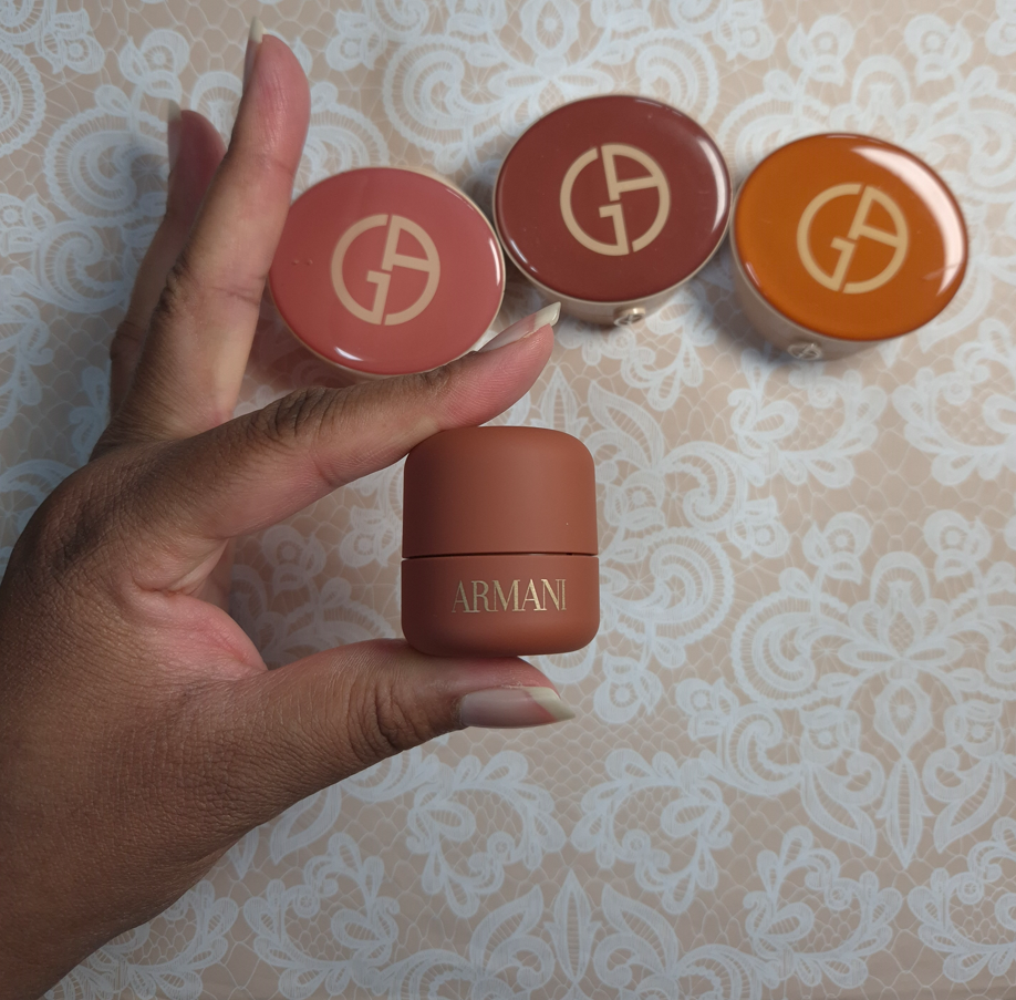
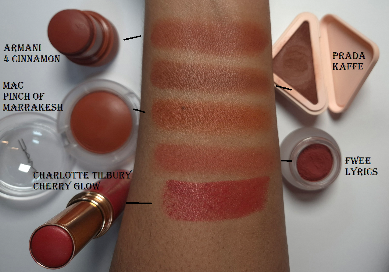
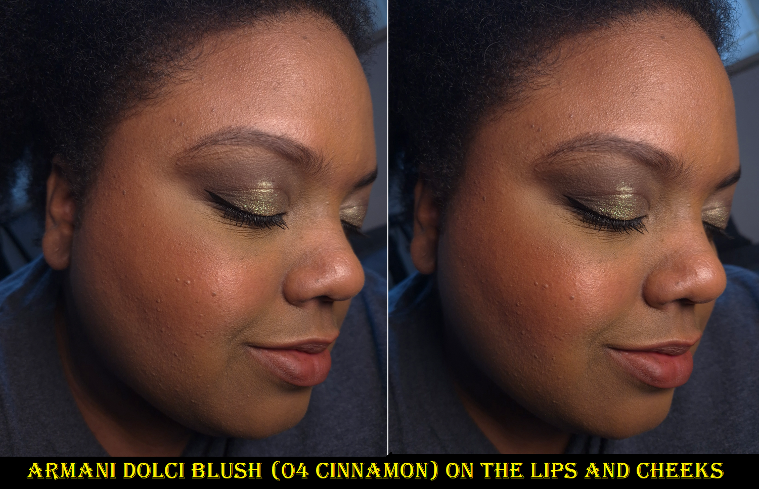
I never bought 45 Brick Red from the Neo Nude line because it verged closer to orange than I wanted. So, when I saw the Dolci Blush in 4 Cinnamon, I was intrigued! It’s a reddish brown blush that isn’t too vibrant, which is one of my favorite kinds of blush colors. Out of the swatch comparisons below, the shade I am always drawn to is more along the lines of Prada’s Kaffe because it has a little more brown. A color like MAC’s Pinch of Marrakesh is of similar depth, but too orange. Ironically, I always felt Fwee’s Lyrics was too warm, but it looks so pink compared to the others!
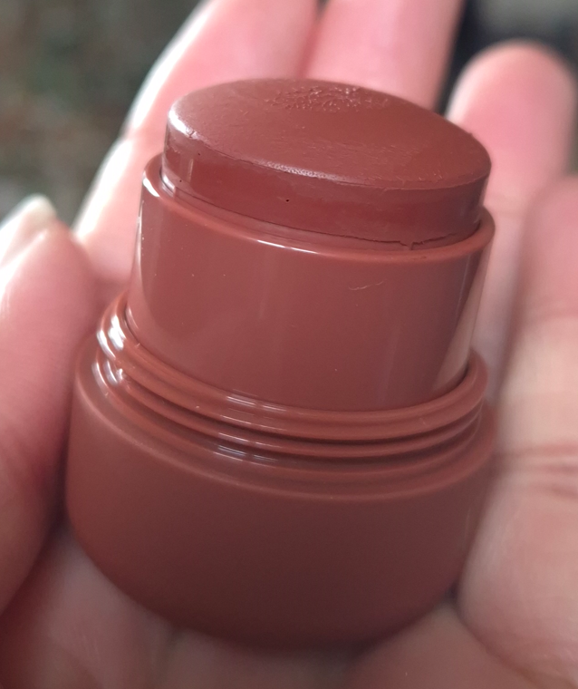
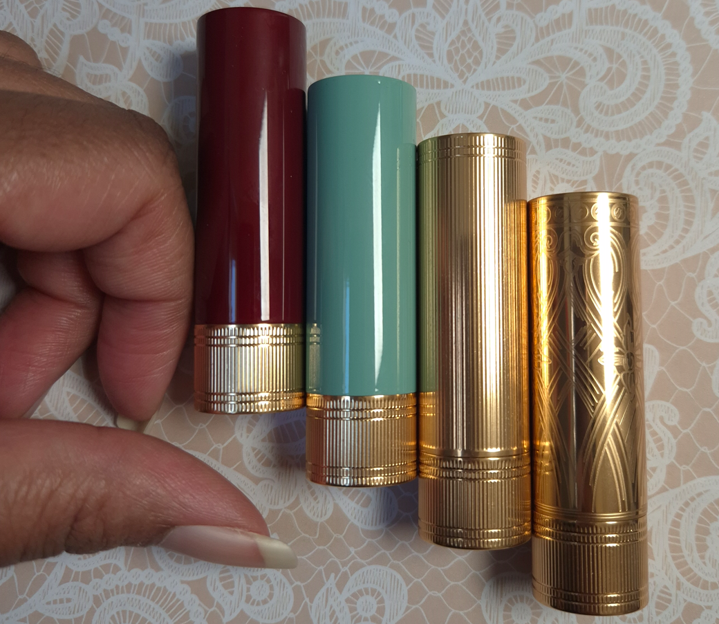
While we’re on the topic of comparing blushes, I have to say that while I was aware that the packaging would be small, I was still shocked to see it in person. The photo below shows the maximum amount of blush that can be rolled up. It looks smaller than the Prada blush, but surprisingly the Prada only has 3.5 grams of product (which is the same amount the Armani Neo Nude Blushes had). Armani claims the Dolci blushes weigh 8 grams, so I wonder if that amount is what’s shown in my photo below, or if there’s more product below that would need to be scraped out. I’m not curious enough to dig into this product and find out, but perhaps someone else online will!
Although Cinnamon isn’t the perfect tone of reddish-brown that I love, I have been able to add other blushes to the apples of my cheeks and been thrilled with the end result! It’s still a very pretty color and I’ve become more impressed with the Dolci Blush the more I use it.
At first, I was dabbing the stick directly onto my cheeks and then blending the blush out with dense brushes. Doing it that way results in a very blended look, perhaps due to the soft matte and blurring properties, but it sometimes looked a little cakey. It wasn’t until I started running my brush bristles over the stick to pick it up that way that I realized this formula is sheerer than I thought. With a brush like the Singe Beauty FO3 that’s tighter packed around the base, but has a lot more splay and movement midway through to the tips, I can get such a light veil of color that the blush looks so skin-like and natural! That was the biggest reason I fell in love with the Neo Nude Melting Balms in the first place! For those that want stronger pigment, this still builds quite a bit and I would recommend using something denser like the Rephr LC02. I’ve even used the Smashbox Full Coverage Foundation brush with it.
The Neo Nude Blushes had a cross between a dimethicone type of slip and the tiniest bit of oil. Once it dries, it has the silicone feel of a waterproof type of product (except shade 30). The Dolci Blush feels creamier and more emollient. Once it dries, it has a bit of a powdery feel, but there’s still a little residue that slightly transfers. Both blushes contain dimethicone and silicones, but dimethicone is way farther down the Dolci Blush ingredient list. Also, the Dolci Blush contains fragrance. It’s sweet and fruity (according to their Canadian website it’s supposed to be “upcycled pear and luscious fig”), but something smells slightly floral in there as well. It’s present, but thankfully not as strong as many other designer brands’ makeup. It doesn’t give me a headache, but I still prefer to not have perfume in my makeup. Wearing multiple scented products at one time can be overwhelming.
Other than this blush being easy to blot away with physical contact, as long as nothing touches my cheeks, the color remains unfaded and intact all day. The times when I lay my head on a pillow or touch my face more than usual, I’m not left completely bare-cheeked by nighttime. However, the blush is still pretty faint if I was going for a sheer look to begin with. Because this isn’t as much of a problem for me, I haven’t tested to see if using a setting spray or some other product could make it budge-proof.
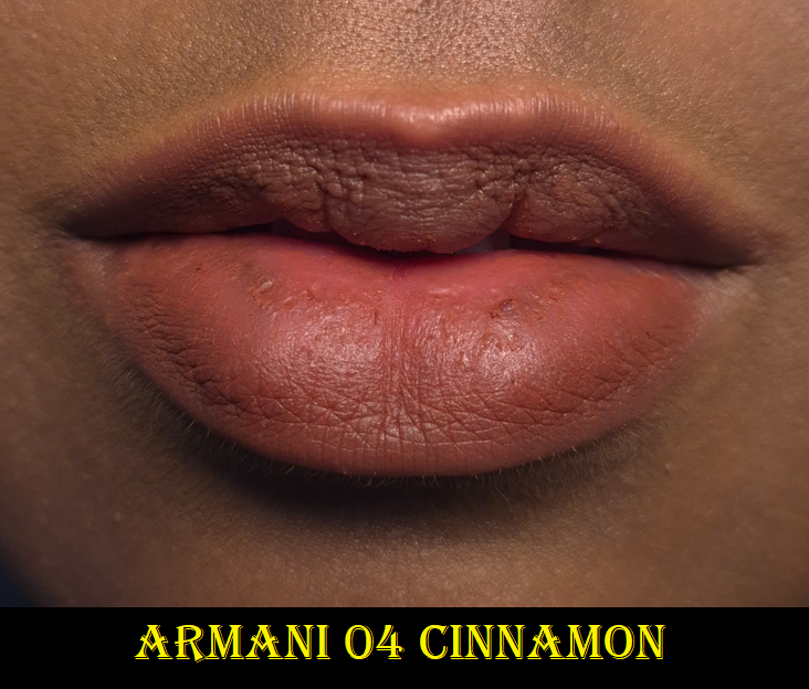
As a lip product, it has a suede-like feel when it dries. I love the blurred look and it appears smooth and pretty. However, my chronically dry lips need an occlusive layer in order to stay in good condition. This looks good while on, but it feels drying and even appears drier once I remove it. Also, this doesn’t stand up very well to my drinking and eating habits. I don’t get long wear out of it.
This costs €42 Euros in Germany (around $48 USD). I was able to get a discount that brought the price down to around the $39 price that it costs within the US. The Neo Nude blushes were $38 in 2021, and had packaging I preferred, including a mirror. The Dolci blushes have a pleasing soft touch matte component and more than double the product, so that’s the tradeoff. It’s adorably small. As much as I want to say it should cost less based on how tiny it is, I’m willing to pay that kind of price for this formula. However, I’m not in a rush to buy additional shades since it’s only worth it if it’s going to be a color I’m crazy about.
That’s about all I can think of to discuss in this post. I hope it has been helpful!
In addition to the Benefit and Nabla products that are newly released, I’m also going to show photos of the ABH Archibrow since I have no plans to make a dedicated Anastasia Beverly Hills post anytime soon. As I’ve mentioned before, due to things going on in my personal life, it’s not easy for me to do as extensive of makeup testing lately. Thankfully, shade expansions don’t require that and I’ve had the ABH brow product for several months already.
Benefit Hoola Bronzer in Rosy Deep
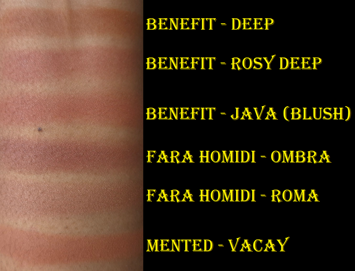
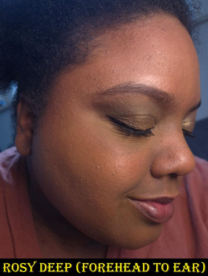
I think it’s important to see the shade Rosy Deep compared to Deep (above on the left), and the blush that Benefit describes as “rosy mocha” (called Java which is above on the right). That way, one can properly see the amount of pink within the shade in comparison to a typical warm bronzer, plus how it differs from an actual blush that could potentially be seen as another “blonzer” type of color.
As seen on this brush, the rosy color is not subtle, and is like a slightly desaturated pinkish-red. In swatches, it looks kind of mauve on my arm, but it’s very much a brownish pink on my face. I can’t explain the color theory behind it except that my arm is lighter with more yellow and green undertones on my arm than on my face. There is extra warmth in my face after needing to keep the windows open for two weeks during the heat wave and I often forgot to put on sunscreen.
On my face, the Rosy Deep bronzer still has a touch of warmth, but it’s a tad cooler and more muted than the normal Deep shade. The Java blush has more red in it. Fara Homidi’s Ombra bronzer has more plum-purple tones to it than Rosy Deep. Previously, the pinkest bronzer I owned was Vacay by Mented, but it looks orange comparatively next to the other bronzer swatches in the photo above! This makes me very curious how the Jones Road Bronzer in the shade Terracotta would compare to Benefit’s Rosy Deep, but I don’t own anything from that brand. I don’t want to spend 55 Euros ($63 USD), shipping included, to get it in Germany since they only sell through their website and not at retailers. Now that I have Rosy Deep, I may not be missing out!
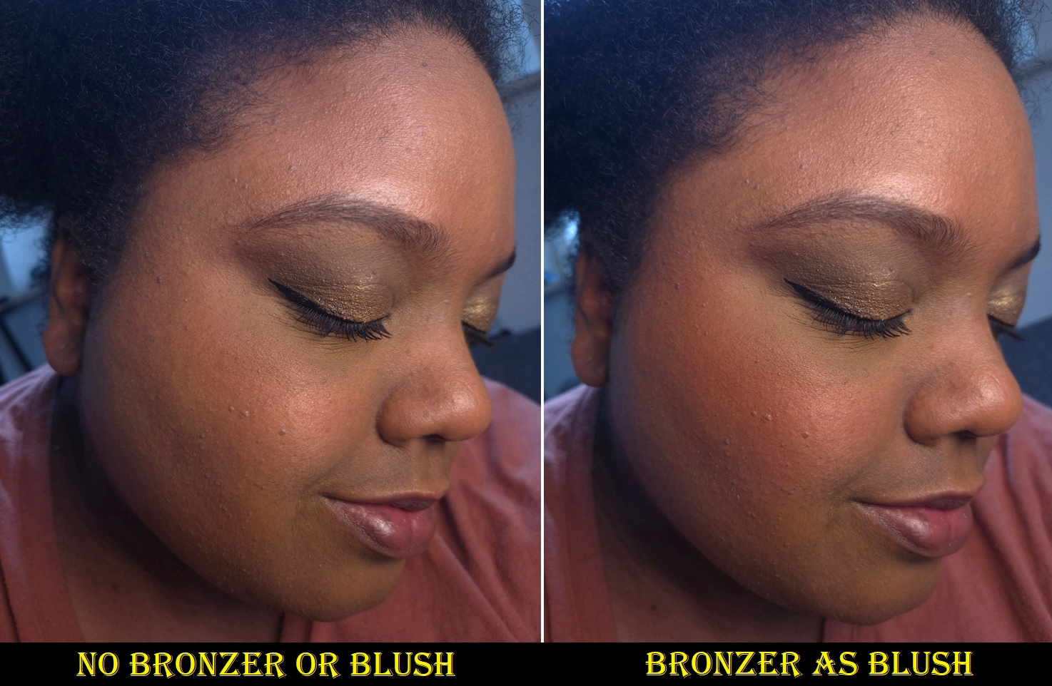
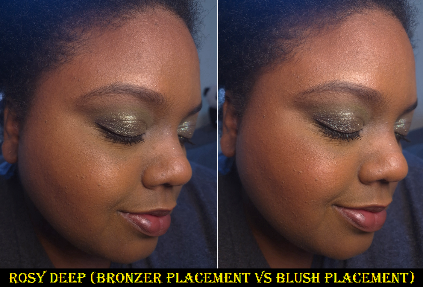
As for the performance, it’s no different than when I reviewed the reformulation last year. It’s thankfully not as prone to hard-pan compared to the original. It’s pigmented, but with my airy brushes I have no issues building it up in a more controlled manner. It blends nicely and used to be one of my favorite performing bronzers, though by now I’ve come to realize it doesn’t have as airbrushed or blurred of a look as my current top favorite powder bronzers. However, it’s still good and wears very well where I typically apply bronzer. If I wear it exclusively as blush, it can have some fading if after all my skincare and cheek products my face is still too dry. Then there isn’t as much for Rosy Deep to grip onto.
Benefit Cosmetics is notorious for having very limited shade ranges. Because there is such a high demand for pink/muted/cool toned bronzers in the fair and light skin category, I would have expected Benefit to stick to their usual m.o. and further expand the lighter range again before releasing not only Rosy Deep but Rich-Deep too! So, I am very pleasantly surprised. Kudos to Beneft! For deeper skin tones, the majority of bronzers are highly saturated oranges and reds. So, a color like Rosy Deep is very hard to find as a powder bronzer. There are more options in cream form though. I usually apply a thin veil of powder blush to go on top of my powder bronzer whenever I want to achieve this same effect that Rosy Deep gives. That’s why having a pink bronzer isn’t a necessity, but it’s an added convenience! Plus, this makes a gorgeous blush too!
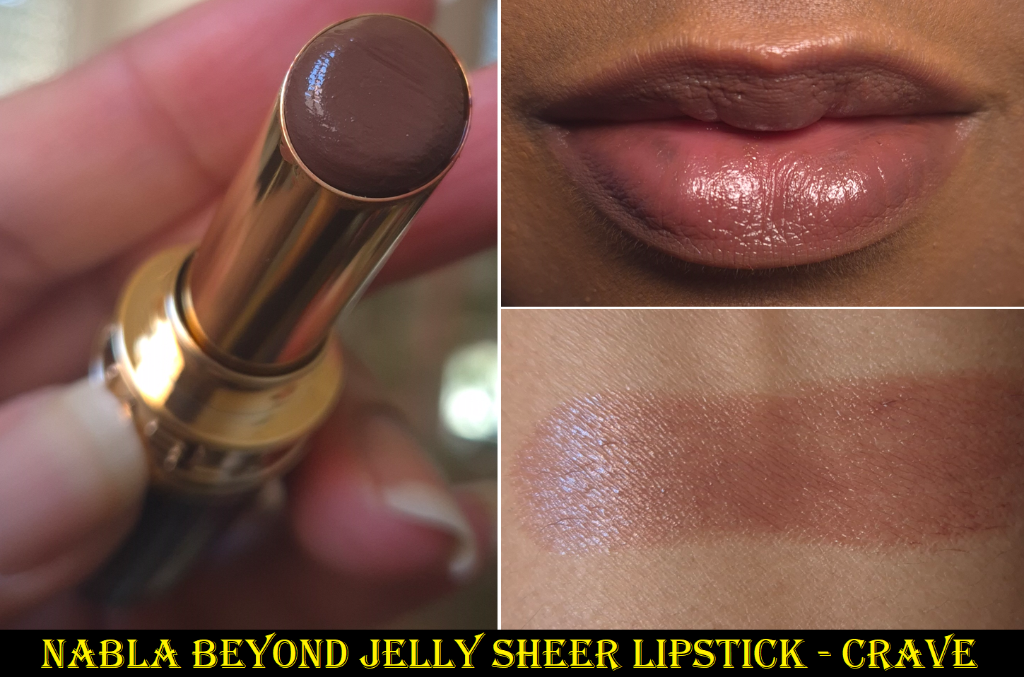
Nabla Beyond Jelly Sheer Supple Lipstick in Crave
When I reviewed this lipstick the first time, I talked about how strong the scent was, but how it goes away over time. I don’t know if Nabla has decreased the amount of fragrance used for all the new shades, but this one from the start already isn’t as strong. I’m happy about that!
Everything else about it is still the same. The texture is similar to the YSL Candy Glazes and Fenty Gloss Bomb Stix. It feels a bit like a gel, but has an emollient feel from the sunflower seed oil, but it’s a little more solid than the melty type of balms because there are enough waxes. It has more ‘slip’ than ‘stick’, but I still consider it a slightly sticky product because of the occlusive layer that moisturizes and also helps the lipstick to grip on for longer.
I like how it smooths out my lips, even when there’s chapped skin, and it has sheer to medium coverage. I definitely recommend this line.
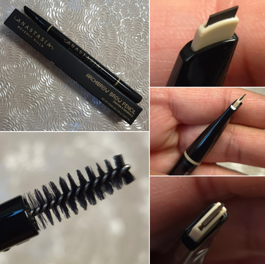
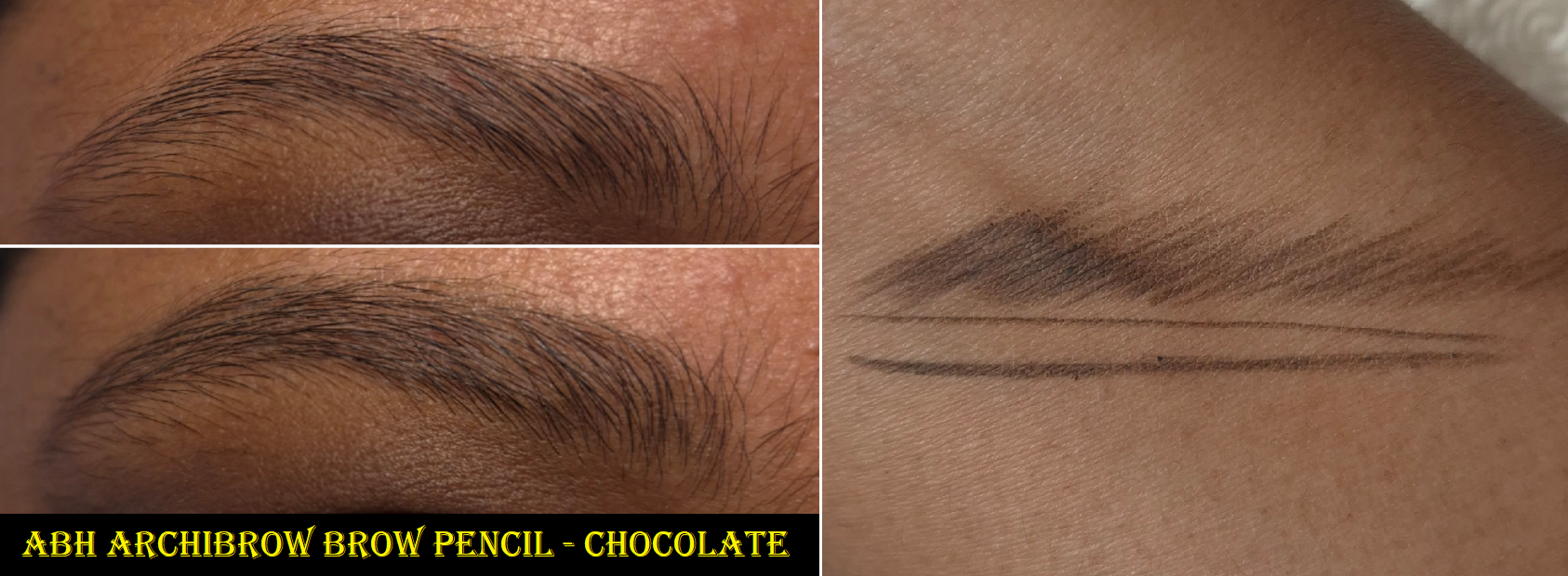
Anastasia Beverly Hills Archibrow Brow Pencil in Chocolate
I like the fullness of my natural brows, so I don’t require much from brow products. Essentially, I want the pencil to glide smoothly enough so it won’t tug at my skin and/or hair. I want it to be smudge-proof and at least water-resistant. I don’t mind it being a heavy pigment product as long as it can be combed through to look natural. A thin pencil for precision and creating realistic feather-like strokes is a major bonus, but I won’t like it if it’s so fragile that it breaks a lot. One such example is the fact that I prefer the e.l.f. Instant Lift Brow Pencil over their Ultra Precise Brow Pencil for that same breakage reason.
The brow on the top left is my natural eyebrow with no product in it. The bottom left is typically the most amount of product I put in my brows. I like them to look natural and only minimally defined.
The Archibrow checks off all the boxes. It’s not a heavily pigmented product, but added pressure or repeated strokes can build up the color for those that like a more obvious application. One has to be careful to only have the smallest amount of the pencil twisted up because the stick of product itself does not retract and if too much of it is poking out, that piece will definitely break off. The amount showing in my photo is already too much. I only did that in order to have an easier time capturing how it looks in pictures.
It doesn’t take long to figure out how to use the pencil to get more opaque or sheerer lines, plus thin or thick ones. Even though the shade Chocolate is intended for those with medium brown hair, It looks quite dark to me! This is why I continue choosing this shade out of ABH’s brow options. It’s warm, but not too red. It can create a more defined tail and edges, along with light shadowing under the hair to give an appearance of fullness.
The strangest thing about this pencil is the lack of cap. When twisted all the way down, it’s only around 3mm from the surface. So, I was concerned that the pencil would dry out from the exposure to air, but my pencil hasn’t been effected it in the nearly 3 months that I’ve owned it. Then again, I keep it stored in the box to minimize the amount of air, dust, lint, crumbs, and whatever other element the open hole could be exposed to. Also, the spoolie is the shortest, yet thickest one I own.
The Archibrow is only $4 more than the Brow Wiz, but it has about half the amount of product. For this reason, I might just stick to the Nyx Micro Brow Pencil or any of the other brow pencils I regularly repurchase that are either inexpensive or were on sale for 50% off. This pencil is great, but my brows aren’t difficult enough for me to feel like I’m lacking that much when I choose less pricey options.
So that’s everything for this week! I hope this post has been helpful and informative!
There has been a heat wave in Germany and other parts of Western Europe, so I have admittedly had very little motivation to do makeup testing while cooped up at home with no AC with back-to-back days of 90-101 degree weather. Plus, there have been family matters to deal with.
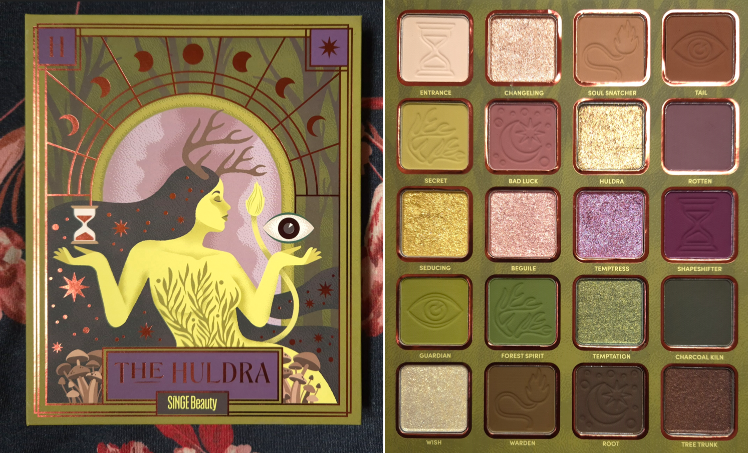
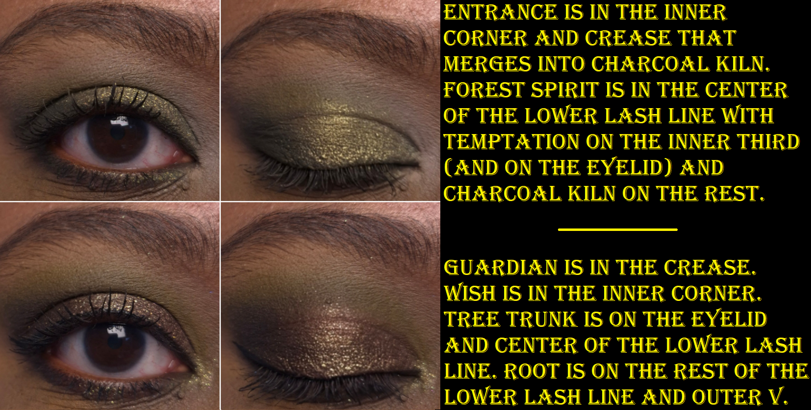
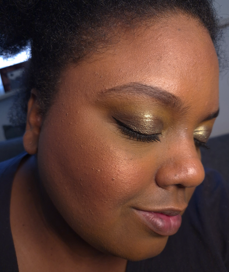
Instead of skipping this week’s post, I decided to at least show the swatches and eye looks of this palette. I am in love with the color story. It’s the purple-green palette of my dreams! The depths of the shades, tones of colors, saturation level, and pigmentation are all just how I like.
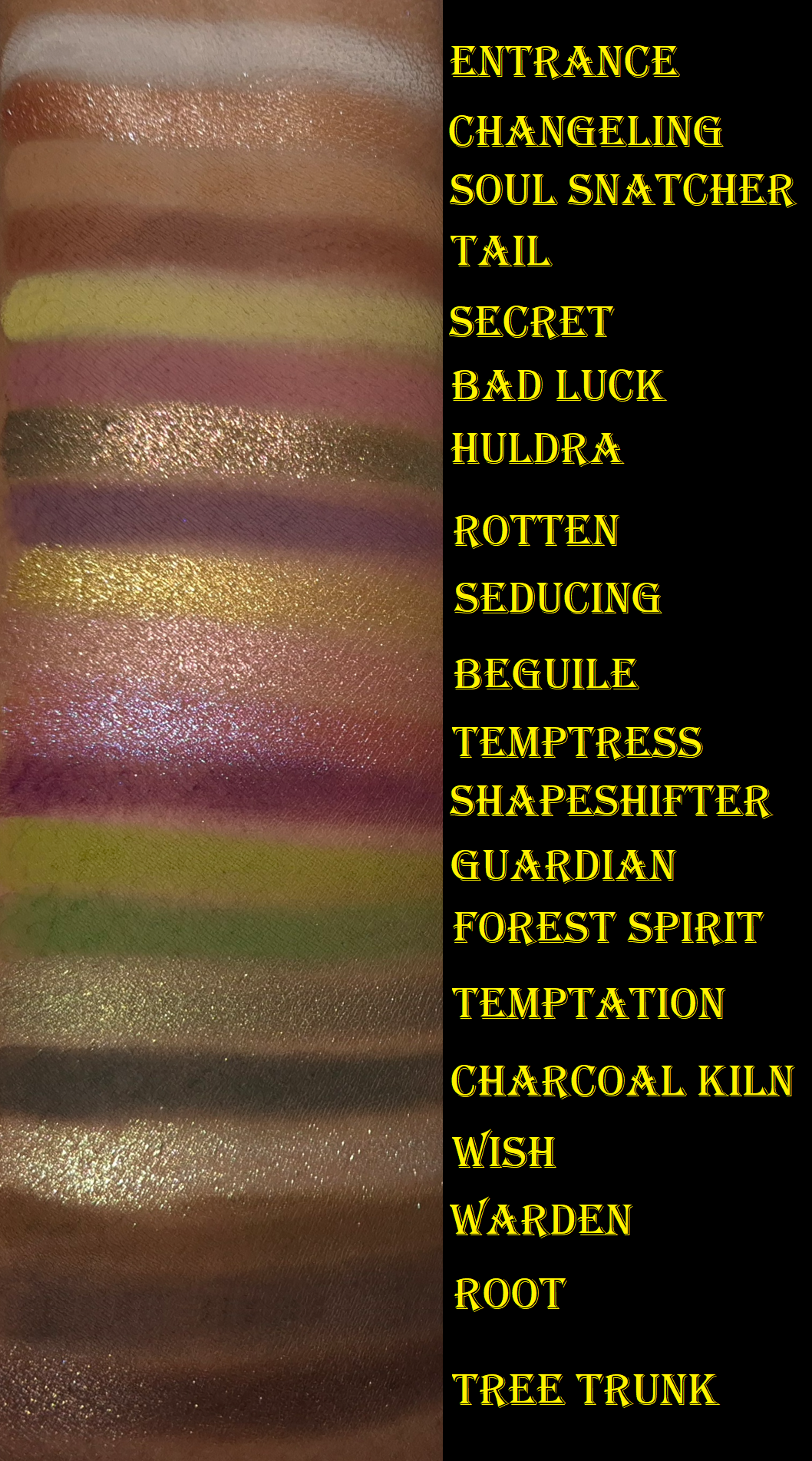
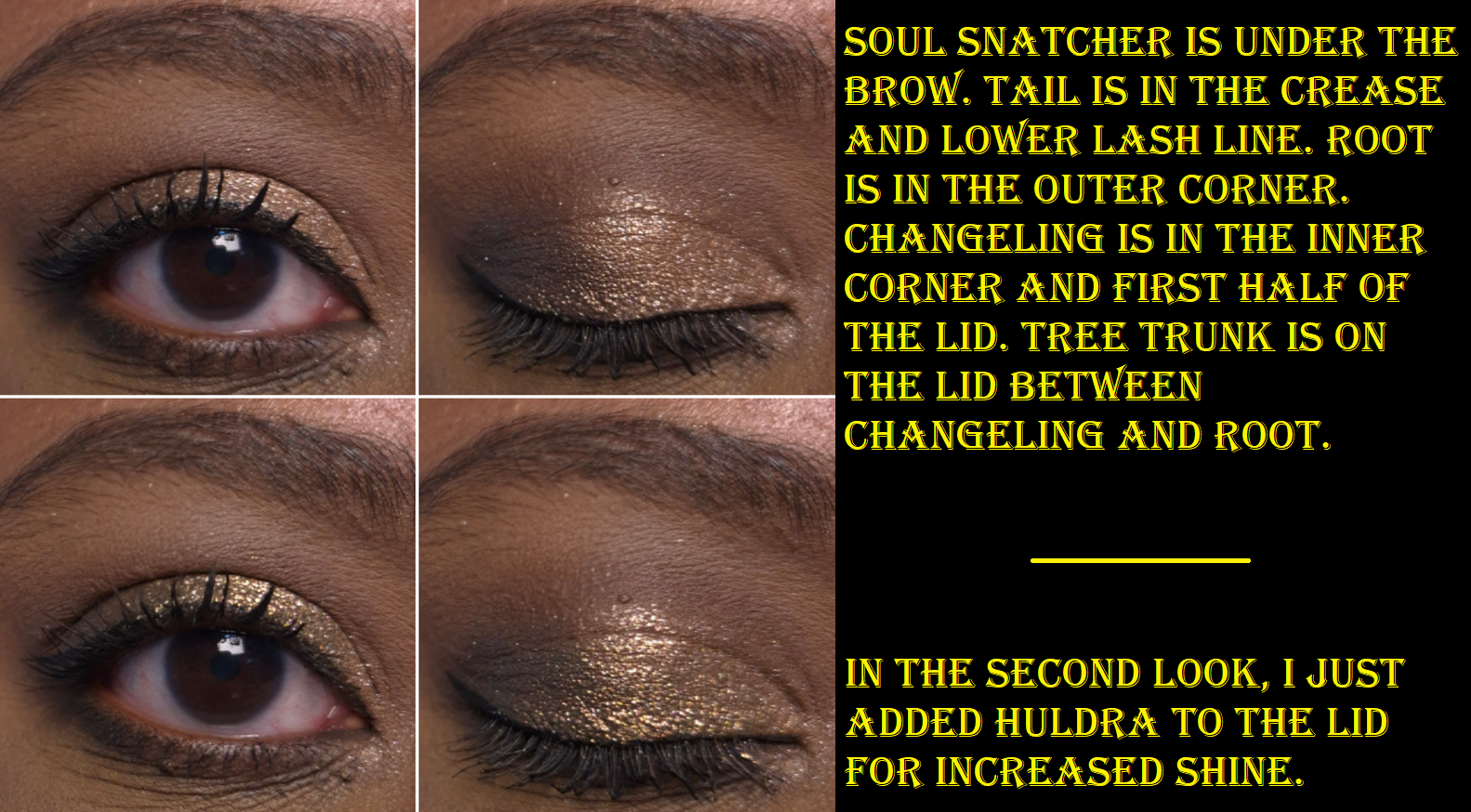
I believe this is Singe’s first eyeshadow palette that is talc-free. I haven’t used this palette that much yet, but I’ve been happy with the performance. These swatch amazingly and the shimmers are great. They don’t crease on me or fade. I don’t even need to apply the shimmers damp, except the ones that I want to stick to a smaller area and not have too much of a scattered look. The mattes are pigmented, but only so much adheres to my eye area with the Lisa Eldridge Liquid Silk Canvas as a base. So, it looks like I can build up the mattes, but a lot of it gets knocked back off my eyes. Essentially, some of the deepest smokiest shades can look less intense on me because of this. It ends up being a soft type of smokey, which works out because that has been my style lately. Ironically, Entrance and Secret build up quite well! I sometimes have issues with yellows and the white type of shades from Singe (and even Angie’s Odens Eye collabs) have always given me trouble in the past from either not adhering as well or being too sheer. So, I’m happy that wasn’t an issue this time.
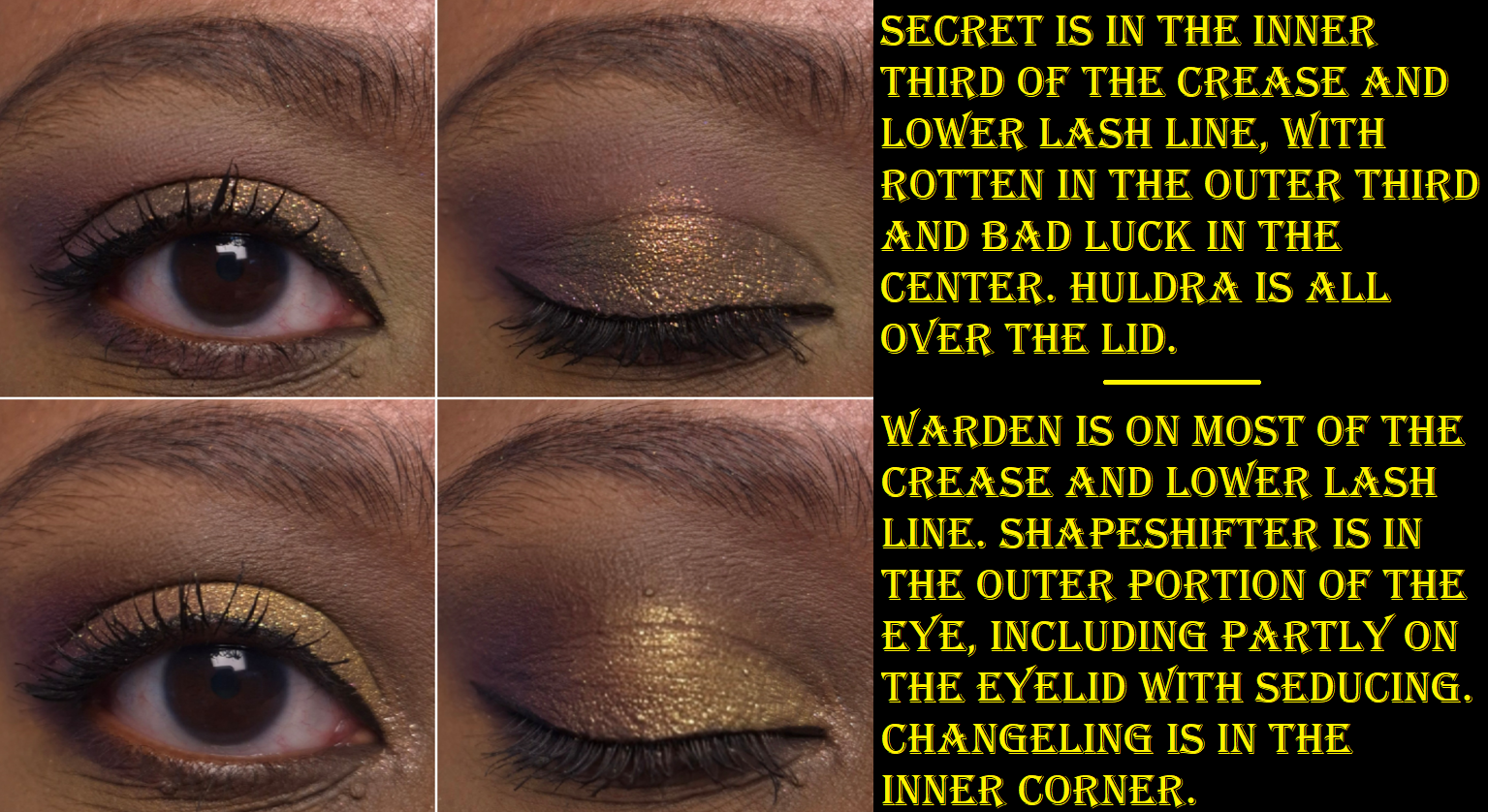
Huldra is the star shade in this palette. It doesn’t look as shifty in my eye demo photos, but in person, it’s very easy to tell that it’s a multichrome.
I’ve been spoiled by my high end and luxury eyeshadows that are super quick to blend. By comparison, the mattes take some extra time, but I think it’s still a reasonable amount of blending considering the pigment level. I’ve used mattes from other indie brands that were harder to blend than this.
That’s all I am able to say based on the short amount of time I’ve spent using this palette.
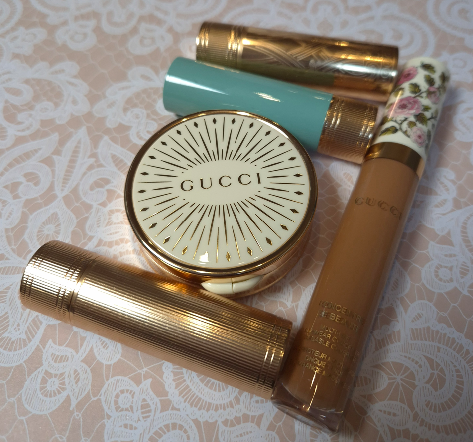
I began working on this post in September 2025, but the constant delays were due to my own inability to stop buying, “Just one more thing,” from Gucci. For instance, I started with a single lipstick, but then I wondered about the various formulas, finishes, and limited edition shades. I thought I could get over having the wrong shade of concealer, but apparently not. I thought I would be content enough with my Gucci Matte Blushes and could skip getting the Glow line, then figured I could suffice with just one, and then I felt compelled to get the remaining shade I wanted.
That is how I ended up reviewing all of these so late!
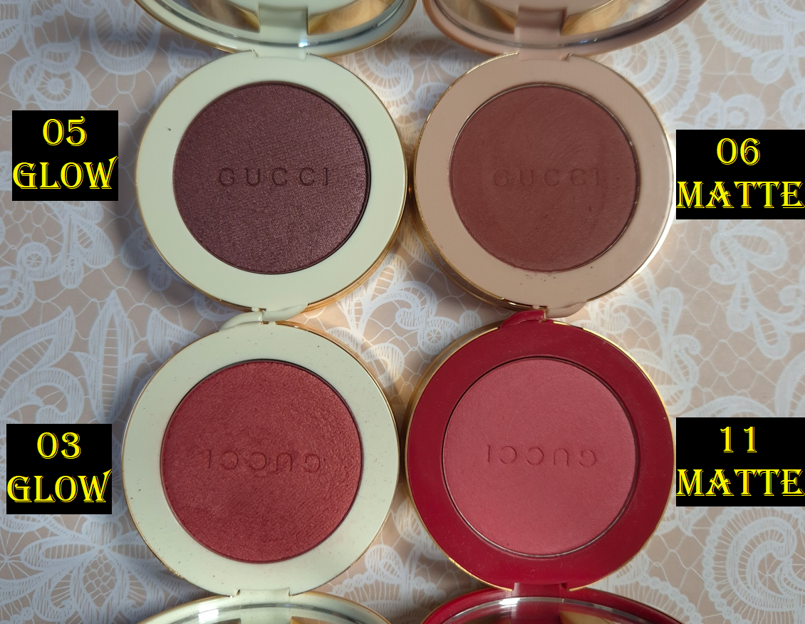
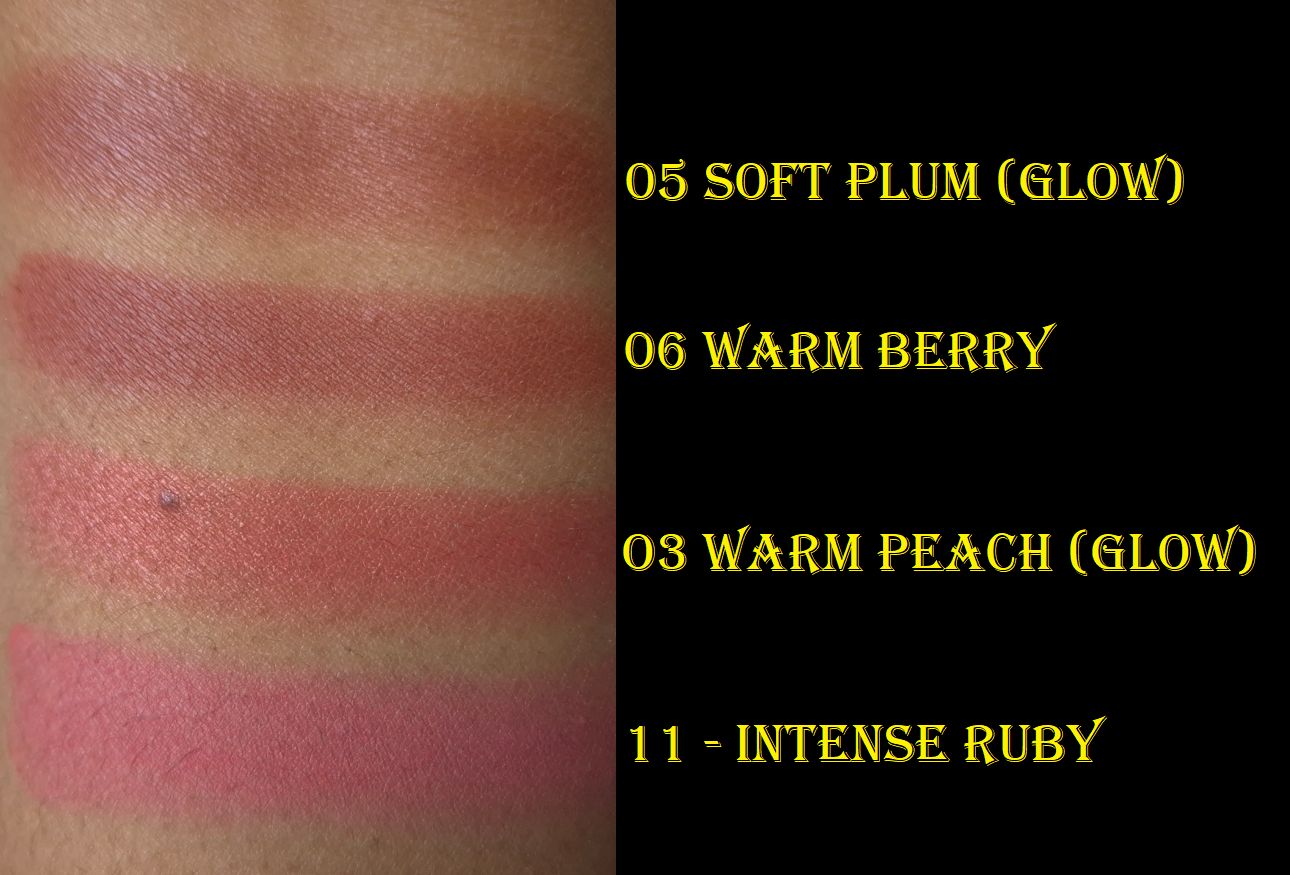
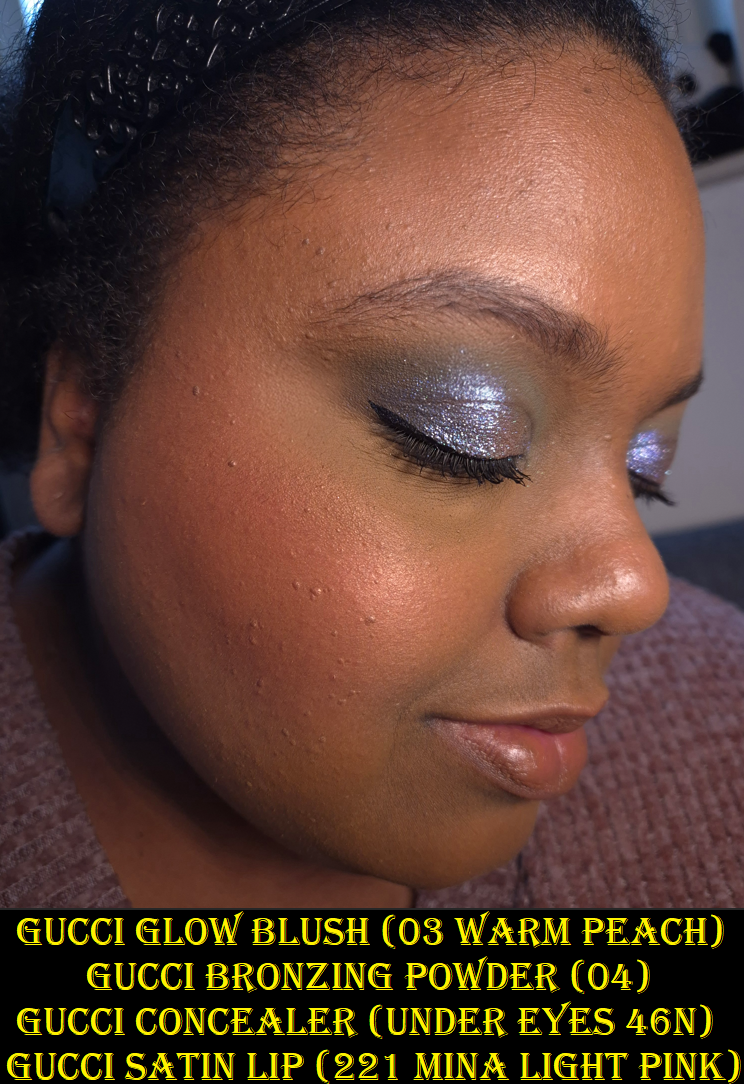
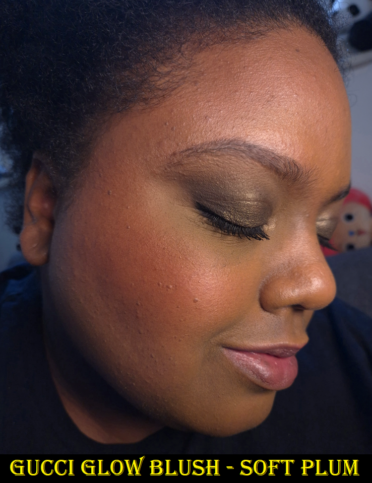
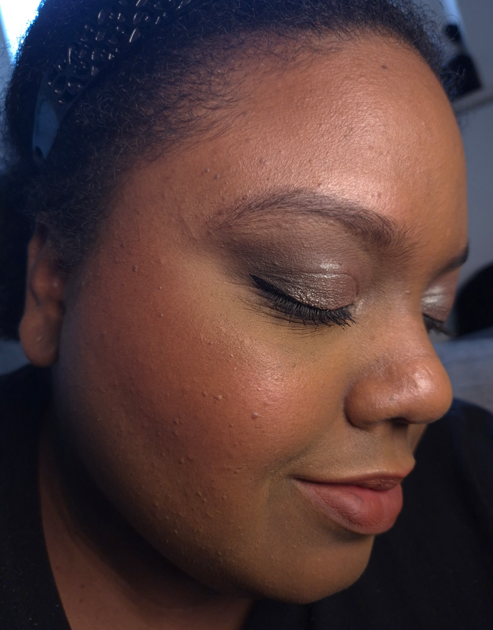
Gucci Glow Blush in 03 Warm Peach and 05 Soft Plum
I reviewed Gucci’s Luminous Matte Blushes a few years ago, and since then I’ve sold or given away two of them, but I kept Warm Berry and Intense Ruby (the latter for the limited edition packaging). They have a soft matte, almost satin-like, finish. The reason I didn’t enjoy them as much is because I wish they lived up to their name and were actually luminous. So, I became super excited to check out the Glow Blushes.
As seen in the swatches and blush demos, these “Glow” Blushes aren’t that glowy either. In low light, they look satin at best. In brighter settings, I can see some radiance, but the finish isn’t that satisfying to me as a luminous blush lover. What the Glow Blush line has going for it are the shade options and being able to build up the color. The Luminous Blushes are very pigmented and the darker colors are easy to go overboard. I believe the two shades I picked up among the Glow Blushes are the most popular colors and very easy to wear sheer or build up the opacity to full clown cheeks.
Although Soft Plum looks purple-red in the swatch, it is basically just red on my cheeks when I blend it in. I also see even less sheen on my skin from Soft Plum than Warm Peach.
Between Gucci’s two powder blush lines, unless there is a specific shade among the Glow Blushes that someone likes, I recommend the Luminous Blushes instead. For the amount of glow I get, in which texture is a little emphasized, I feel that I may as well go for the soft matte blush. It would at least look blurred. Regarding the longevity of the Glow Blushes, I haven’t noticed any problems. I get a very minimal amount of fading, but still plenty of blush on my cheeks by the end of the day.
If you’d like to see the shade Arctic Rose, I recommend checking out Olive Unicorn Beauty‘s review.
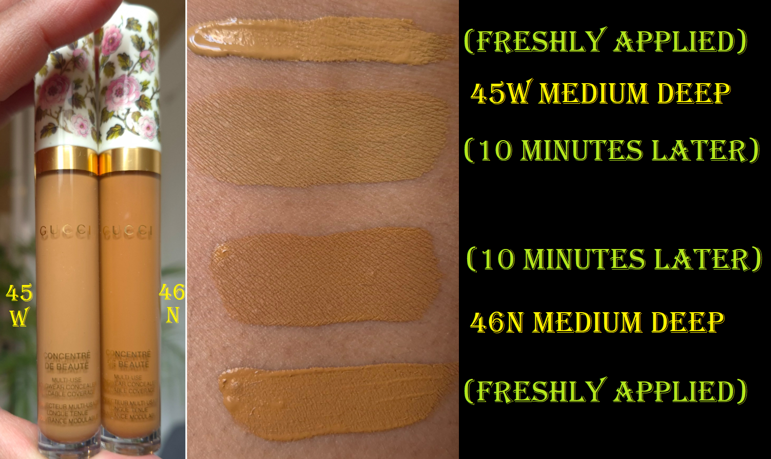
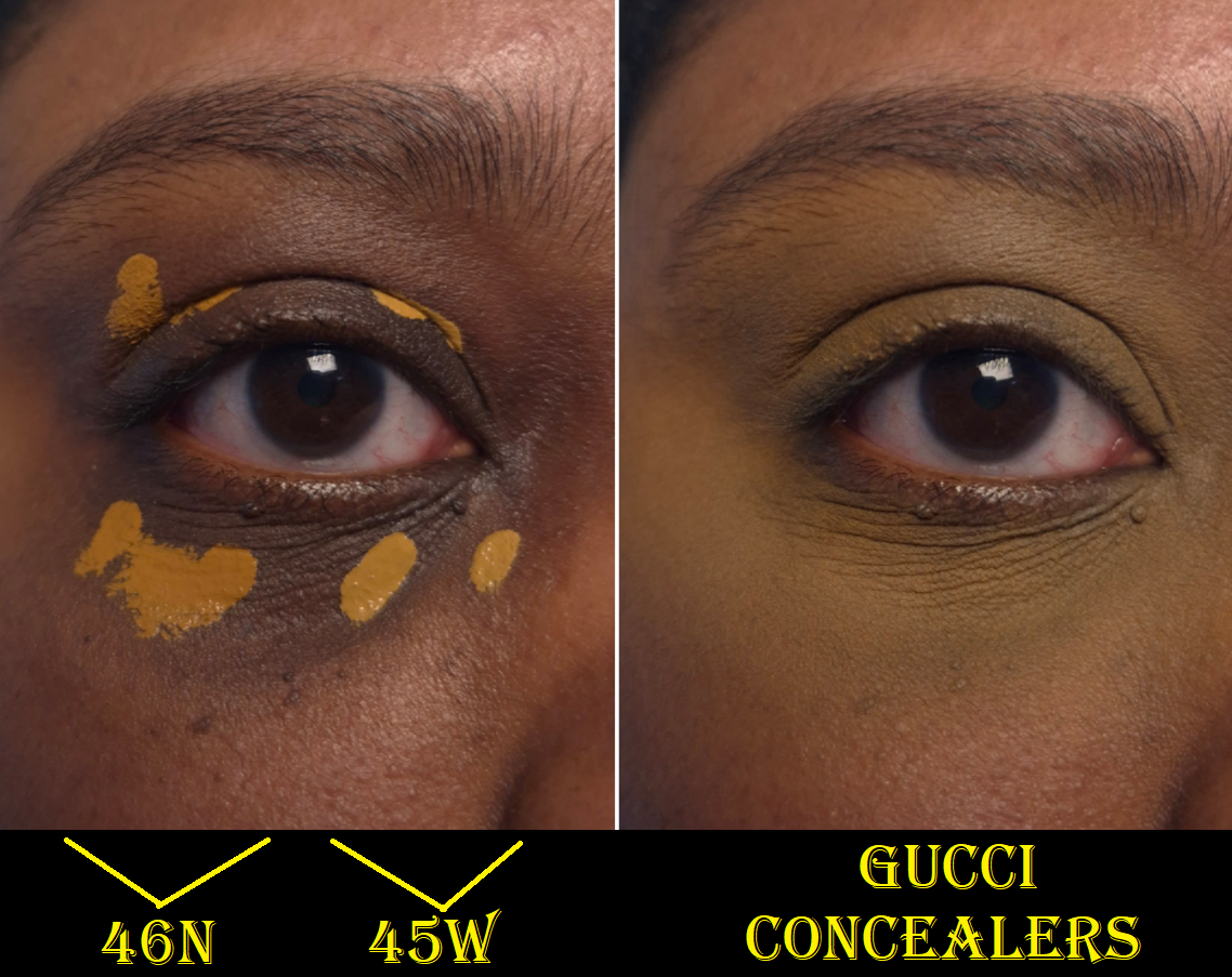
Gucci Concentré de Beauté Concealer in 45W Medium Deep and 46N Medium Deep
The feature most important to me about a concealer is that it needs to cover my intensely dark under eye circles for the entire day. With the amount of lines under my eyes, I expect some creasing, but less is of course better. I also expect the concealers that lock onto my skin to be and look dry, so if it manages to set down and still appear hydrated, that is a win for me. I prefer if a concealer plays well with my other skincare and base makeup products. It’s also a nice bonus if it works well with multiple different setting powders I own and not just one (or worse if it’s none). And then of course I have to be able to find the right shade match for depth and undertone!
The consistency of Gucci’s concealer is on the thinner lightweight side and it has medium coverage. However, I think the coverage is still buildable and I can get closer to full if I apply a lot. This dries to a natural finish, but I need to set this with powder, which unsurprisingly immediately takes any shine away. The concealer looks as flattering over my lines as is reasonably possible. For reference, Chanel’s Ultra Correcteur and Givenchy Prisme Libre concealers are more flattering over mature skin, but Chanel’s doesn’t last on me and Givenchy’s doesn’t have as much coverage.
The longevity is fantastic. Occasionally the oils that are sometimes produced in the lines under my eyes break through the concealer layer, but it mostly stays looking the same from the start of the day until I’m ready to remove it in the evening. That’s at least 10 hours.
The reason I don’t like this concealer is purely due to the shades, which is disappointing considering how many options there are. I still should have expected this to happen because of the problems I’ve had with Gucci’s foundation ranges. Usually a shade like 46N has color correcting effects from the orange tone. So, I’ve been using it around my mouth and mixed with other concealers. It’s still a bit too dark for me to use as correcter under my eyes, and the color is so saturated of an orange in addition to darkening once it’s fully dry. I bought 45W this year, and it’s a brightening yellow shade that looks like it could work until it sets and then turns an ashy olive tone once it’s dry. It is difficult enough trying to choose the right color based on how the online models and swatches look, but then the concealers oxidize on top of that!
I know going a shade even lighter, 43W, won’t work for me because of how well it suits Mo Makeup Mo Beauty. Any makeup that matches her perfectly is guaranteed to be too light for me.
I’ve owned 46N since May 2025, so I have been giving this concealer a chance for a long time. It’s such a shame that I can’t find a better color because it’s a nice formula.
Even though I was able to get these concealers at a discount, I still view them as expensive mistakes. I think I’m ready to give up on Gucci base products for good. Now that I think about it, the face powder is the only Gucci product I’ve purchased that I got in the correct shade on the first try! The product photography always throws me off, and at least regarding foundations and concealers, I know that’s been one of the biggest complaints other purchasers have as well.
Lip Products
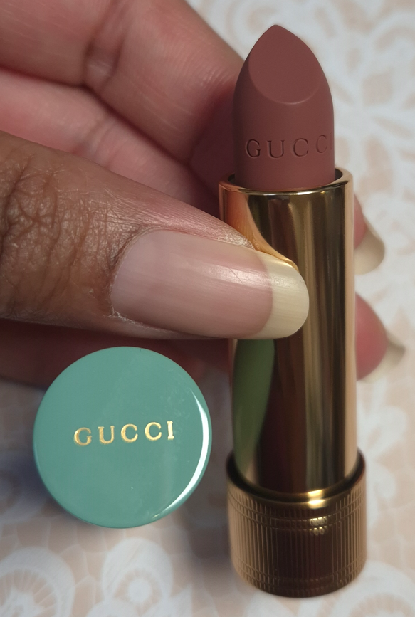
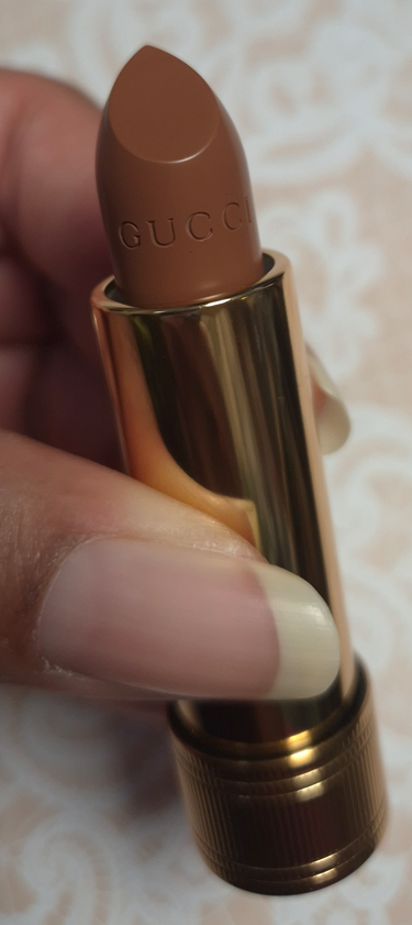
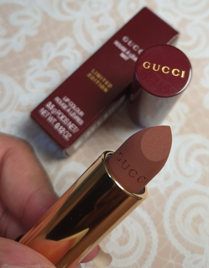
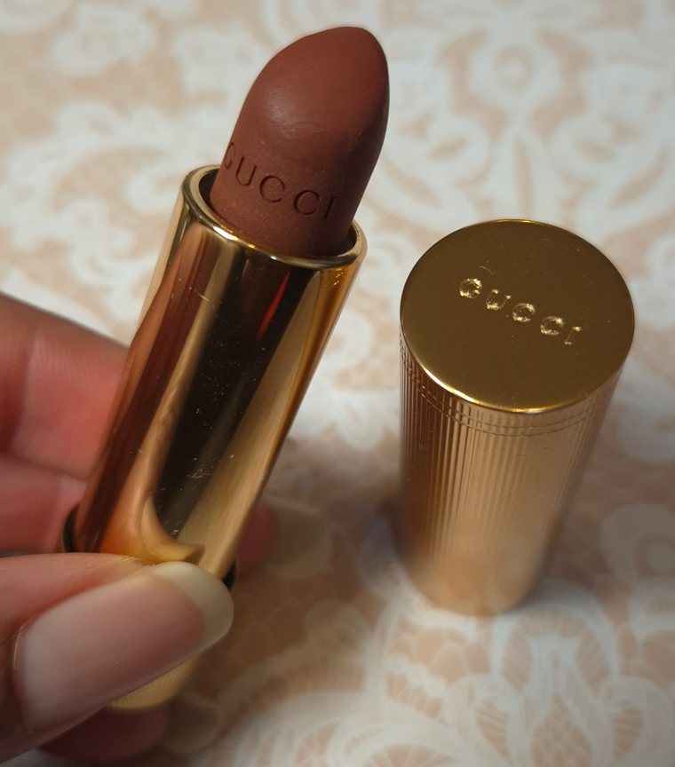
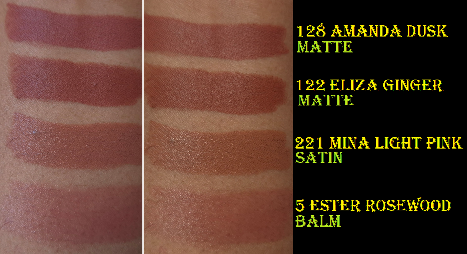
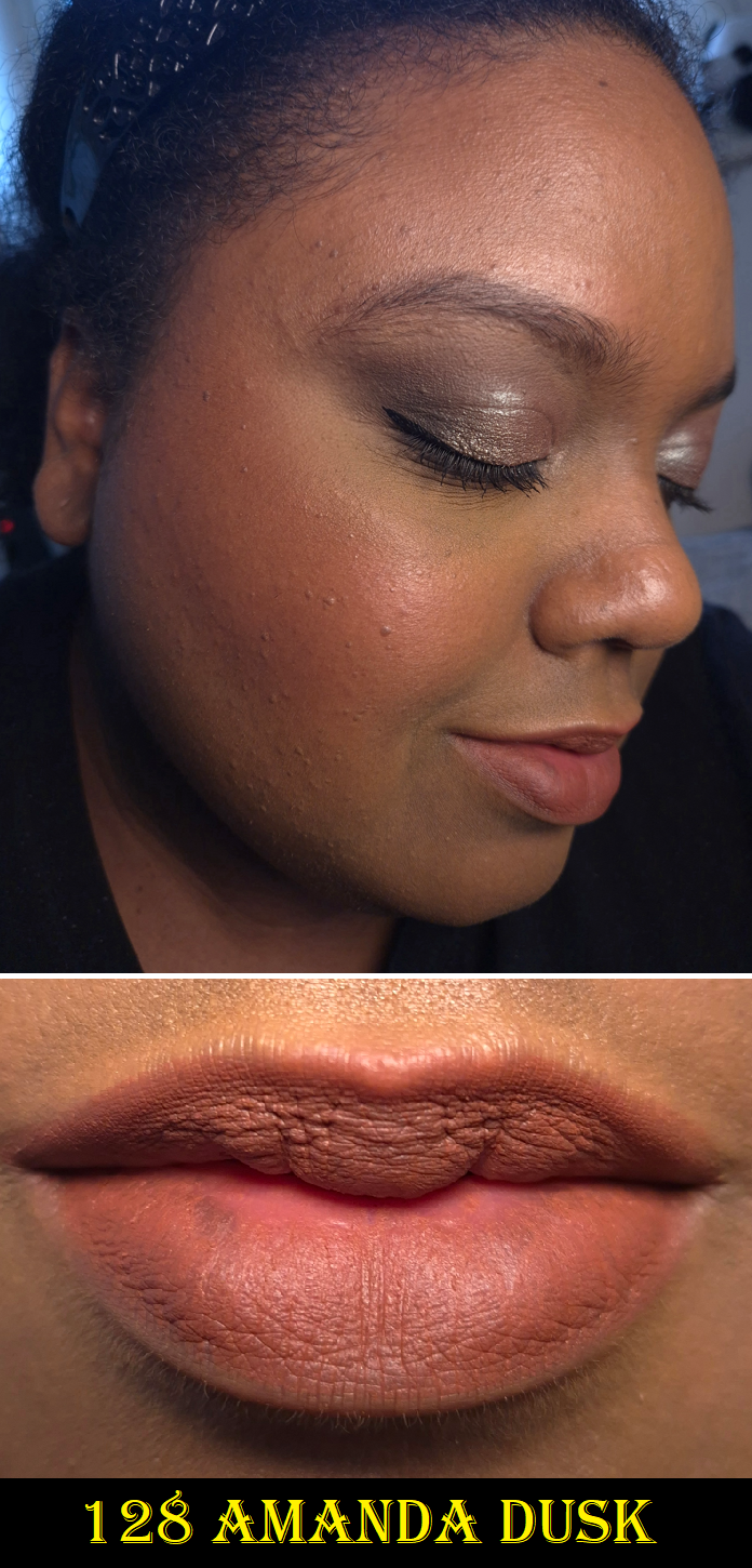
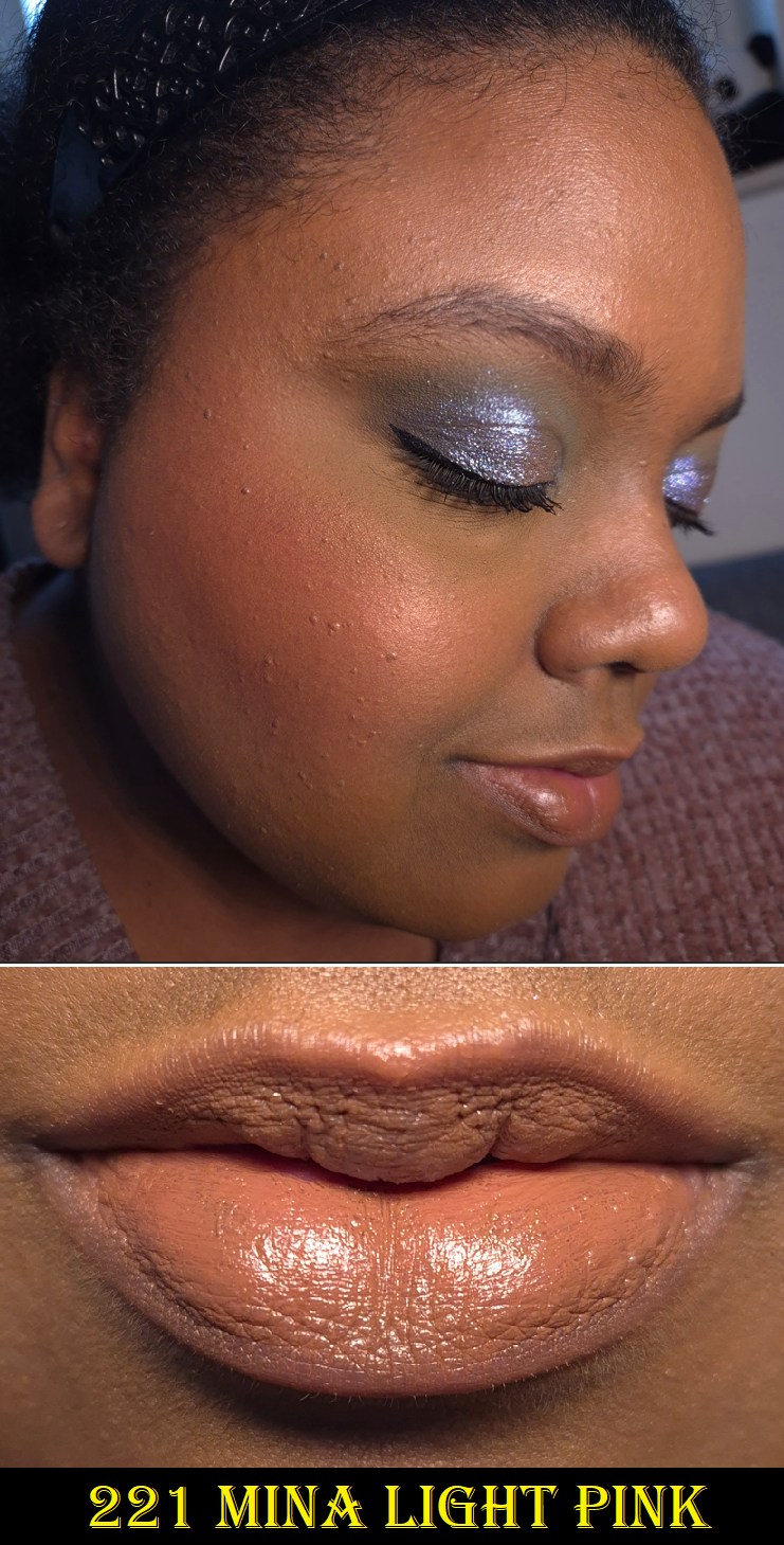
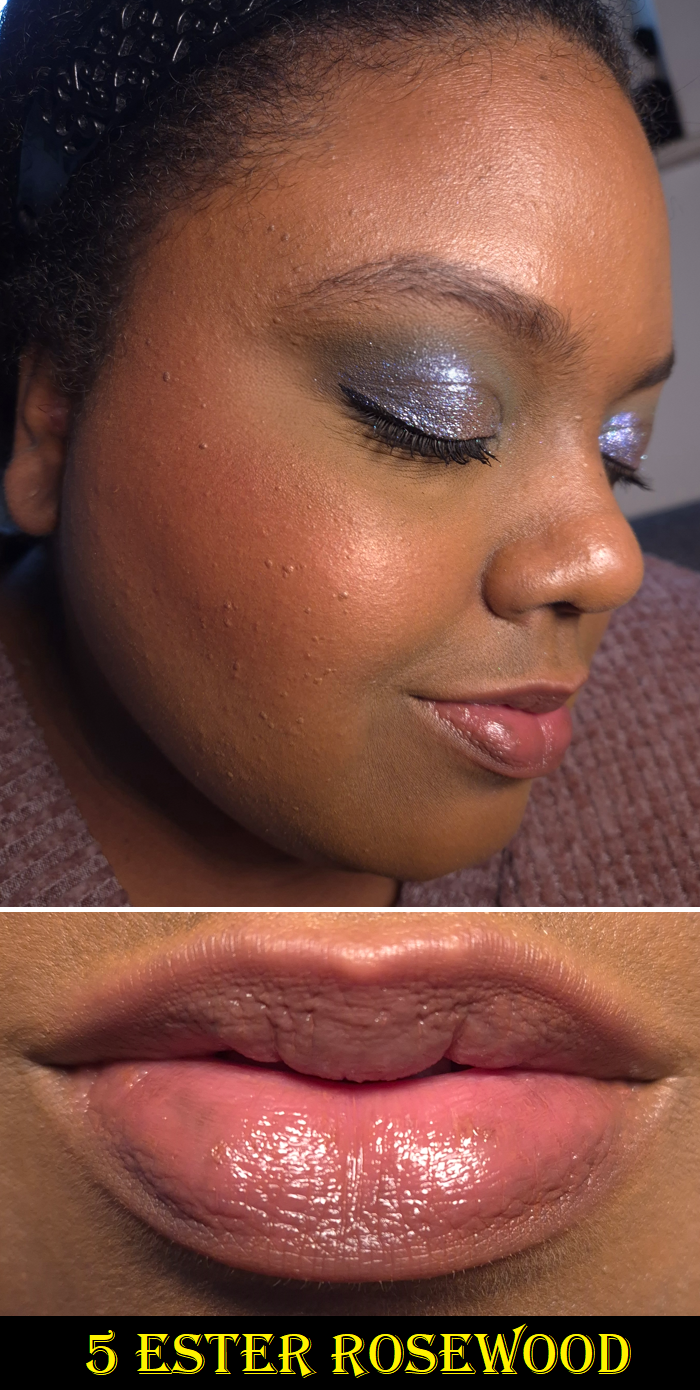
Gucci Lip Balm in 5 Ester Rosewood, Matte Lip Colour in 122 Eliza Ginger and 128 Amanda Dusk, and Satin Lip Colour in 221 Mina Light Pink
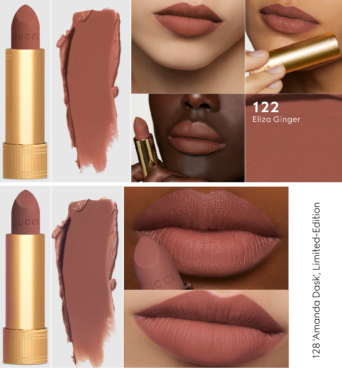
As a lover of pretty packaging, I’ve always wanted to buy Gucci lipsticks, but I couldn’t justify the price. In addition, over the last few years, I’ve been trying my best to limit the amount of lipsticks I buy since I wear them so infrequently. In October 2025, I finally noticed that the retailer Flaconi often sold Gucci lipsticks within the €35-40 range. I initially just wanted one matte and one satin lipstick. Then, I heard such good things about the lip balms that I purchased that next. Eliza Ginger and Mina Light Pink weren’t exactly as I expected, but I did love the balm, so from then on I scoured the internet to try and figure out if there was any other lipstick shade I would like more. From the time Amanda Dusk was released, I couldn’t get the color off of my mind and waited for the best sale to be able to buy it.
From left to right: Ester Rosewoodand Mina Light Pink
From left to right: Amanda Dusk and Eliza Ginger
Unfortunately for me, I continue to have the same issue with Gucci’s lipsticks as I do with their complexion range. How the products appear in their model photos, swatches, or even the color of the bullet can’t help me to predict how the shade will look on my lips. Eliza Ginger and Amanda Dusk don’t look similar at all in their tubes, but on my skin, the only difference is that Amanda Dusk isn’t as warm of a red color.
Is there something wrong with my perception of color, which allowed me to think I would be getting medium toned nude brown shades instead of dark reds, when I look at what Gucci’s website photos?
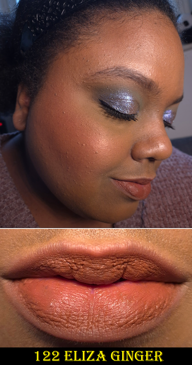
The effects of wearing the Gucci balm first (and then wiping it off) led to my lips looking pruney in this close-up of Eliza Ginger. The photo below is more accurate to how the matte finish looks on top of dry lips.
Putting the color issue aside, what is important to me about matte lipsticks is the comfort level while wearing it. Mattes have no shimmer and no or low sheen, and I expect some level of dryness due to the nature of the formulas lacking emollients. However, my super dry lips force me to be picky with matte lipsticks so that the more moisturizing it is, the better. If it doesn’t feel drying, but still looks bad over chapped skin or it’s not smooth over the lines of my lips, I won’t like it either.
Gucci’s matte formula usually doesn’t feel dry when I wear it, but it is not conditioning or moisturizing either. When I rub my lips together, I can feel as though there’s a waxy layer that grips my lips and keeps the color locked on. If my lips are in a rough state, the lipstick has a minimal amount of smoothing, but still won’t look very flattering without some help. Using Chanel’s Hydra Micro Serum underneath completely transforms the Gucci lipstick into a much more flattering and smoother looking lipstick. It loses some of the matte look because of the sheen, but I actually prefer that.
Also, I tend to wear a thin layer of these lipsticks, but they are quite pigmented and build to full opacity easily.
The matte formula is unsurprisingly the longest lasting of the Gucci finishes I’ve tried. I can usually get away with a few hours post-eating before I need to touch up the lipstick. So, I consider this to have good staying power. I think this matte lipstick is pretty good, but it’s not suited well enough to me to be worth full price. If I were to buy more in the future, it would be for the packaging and only if the discount was high enough.
Mina Light Pink looks milky in the closeup, but how it appears in the full face photo is a more accurate depiction of the color (which pretty much matches the brand’s website photos). When I rub my lips together, it feels like some of the wax was replaced by some emollients, giving this satin lipstick a creamier feel than the mattes.
The coverage is quite high. I can still faintly see the shadow of my lower lip’s darker pigmented spot. The longevity is pretty good for a satin, but the amount of transfer combined with the moisture level aren’t good enough tradeoffs for me to want to buy another satin lipstick from Gucci. I feel like I’d rather just wear the Gucci lip balm for the increased moisture for my lips.
Gucci states that their balms can also be used on the cheeks, but there’s no way I’m trying that! I hate the feeling of wet cheeks. The texture of the balm feels like a combination of wax and oils as opposed to the creaminess of the satin formula. It reminds me a bit of the Rituel de Fille Color Nectar Balms, which were also multi-purpose. According to Gucci, this balm isn’t sticky. I disagree. It has very low tack, but if I can still press something to my lips (such as a piece of paper, strand of hair, etc.) and it doesn’t detach when I move my lips around, I call that sticky!
The matte and satin lipsticks contain parfum and essential oils, but the balm does not according to the ingredient list on the box. It isn’t odorless though, as it has a raw ingredient scent (smells a bit waxy).
Ester Rosewood is currently the deepest option, which goes to show how sheer it is if such a dark color is essentially a medium purple-pink on me. For this reason, I haven’t dared to try any other shade out of fear they might just look clear on me. I know of just one other shade in this line that contains Red Lake 28, another “ph adjuster” like Red Lake 27. There’s also mica in the formula, which adds to the shine.
This has the worst wear time of the three finishes I bought, but it’s a normal length for a lip balm. I basically only need to reapply after meals, since most of the time it lasts through drinking. Gucci’s lip balm is definitely moisturizing and smooths out the lines of my lips. It feels great while I’m wearing it, but once it’s off, my lips feel dry very fast. I still really enjoy this color, so my way around this is that once I’m done wearing this lip balm, I switch to my go-to nourishing lip balms/glosses/overnight treatments and that takes care of the issue.
The lip balm is surprisingly my favorite lip product (that I’ve tried) from Gucci, but I don’t think it’s worth full price either because of it not being super nourishing. I enjoy it more for its look as a makeup product, and I’m not willing to spend as much money on lip products that aren’t ultra conditioning.
So, even though I don’t regret buying the lipsticks and lip balm, I don’t intend to get anymore of them. Gucci’s limited edition packaging tempts me every time though!
This is a continuation of my review of the MAC Colourstruck Blushes. They are my final purchases that I did not have time to show photos of sooner. Now, I officially own all 11 of the 29 that I wanted!
I will update my original post to include these, but I wanted to post this separate review to inform the email subscribers of the new additions!
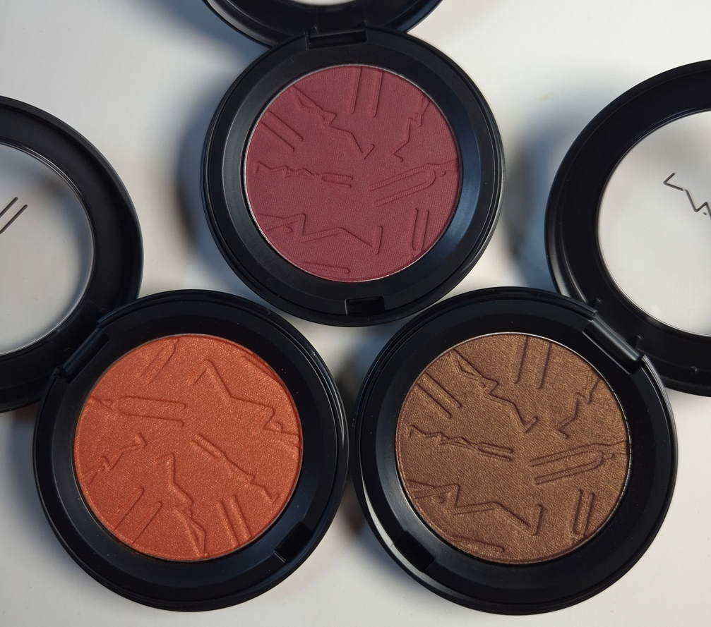
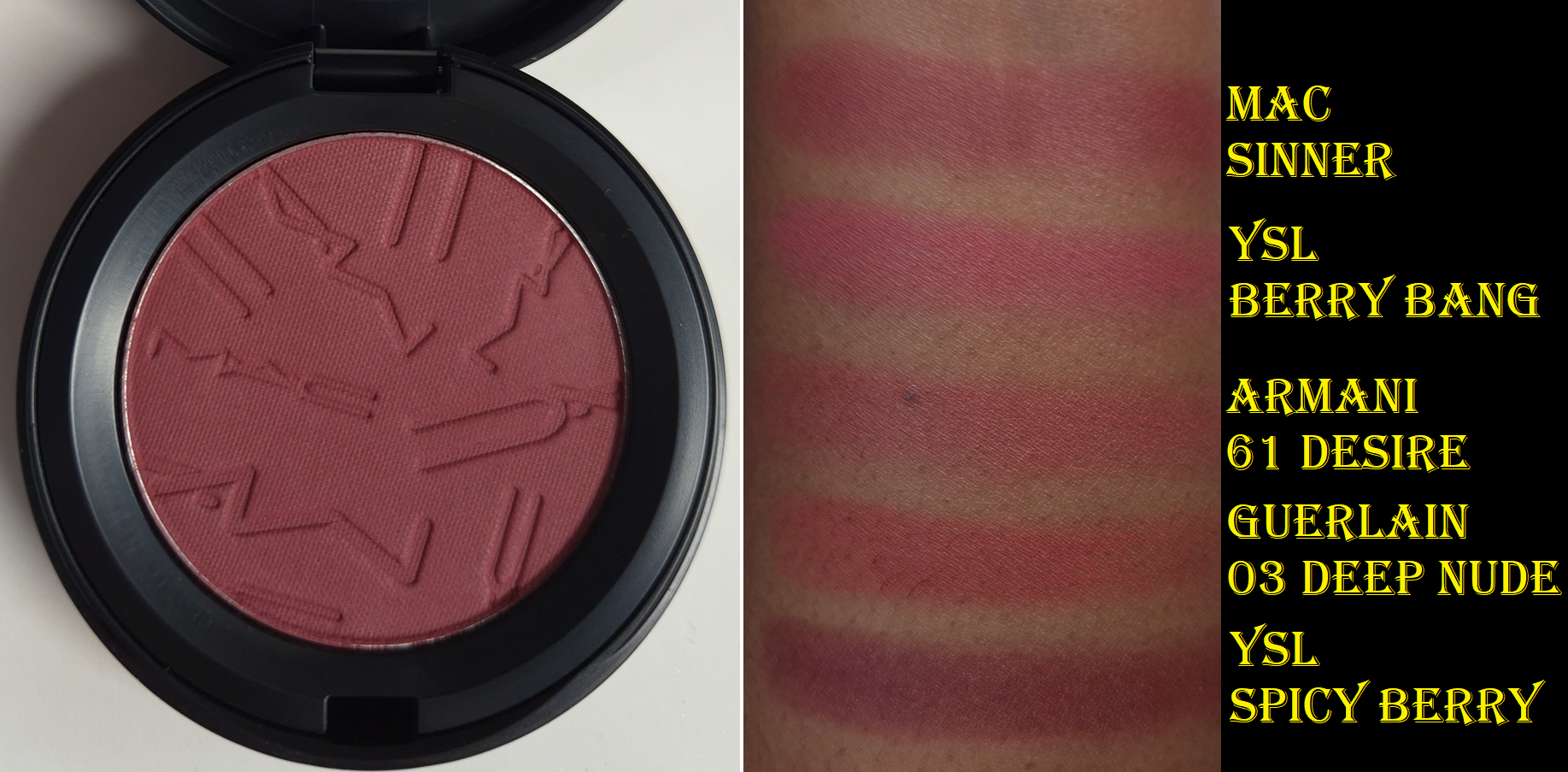
Skinfinish Colourstruck Blushes in Sinner (matte), CB96 (radiant), and Antique Velvet (radiant)
Sinner
For the swatch comparisons, I had to fish the berry shades out of my “box of products I wouldn’t mind decluttering” because I wasn’t as happy with those colors. YSL’s Spicy Berry is the exception.
When it comes to berry blush shades, I either love or hate the way they look on me. The best one I ever wore was the Make Up For Ever HD Cream Blush in Raspberry 510 (color shown here), which I bought twice before it was discontinued. Sinner is cooler-toned, but I saw someone with a warm undertone and dark skin wearing it, and the end result was similar to what I got with MUFE’s Raspberry! So, I had to buy it!
I am very happy with how it looks on me! Once again, MAC’s blushes can be effected by the undertone of foundation underneath. So, it doesn’t look cool-toned enough to clash with the warmth of my skin. Sinner is perfect for when I want that I’ve-been-out-in-the-cold type of look.
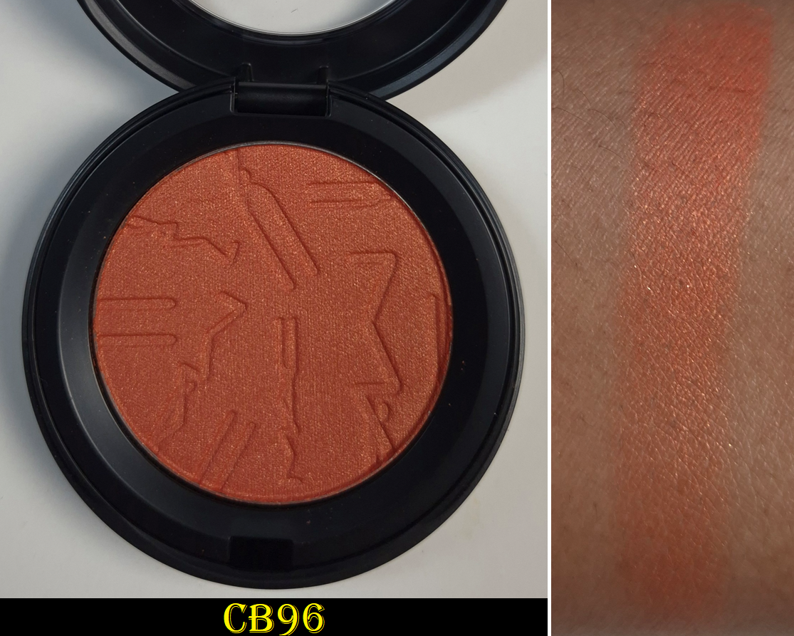
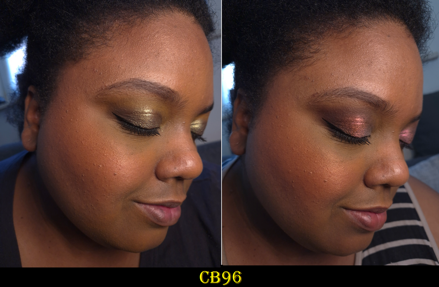
CB96
This color looks gorgeous on the MAC’s models, and on NikkifromHR, but I was hesitant to buy it because of how picky I can be about orange blushes. I was happy with Cheeky Chili, but even that shade ranked lowest of the original eight blushes I bought. I even mentioned before that I prefer coral-pink shades (like Pink Flamingo) over coral-oranges (like this one), so how could I justify getting it anyway? Eventually my curiosity got the better of me and I’m actually happy that I caved!
If I had Nars’ Taj Mahal and Fenty’s Shimmer Match Stix in Chili Mango with me in Germany, I would have tried to do comparison swatches. However, the only orange blushes I have with me are mattes. I can’t recall if I ever owned an orange shimmery blush that was opaque and dark enough to not look like a highlighter on me. CB96 might be the first!
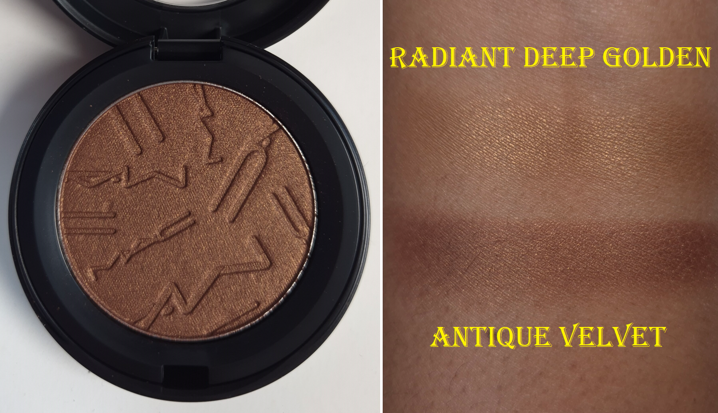
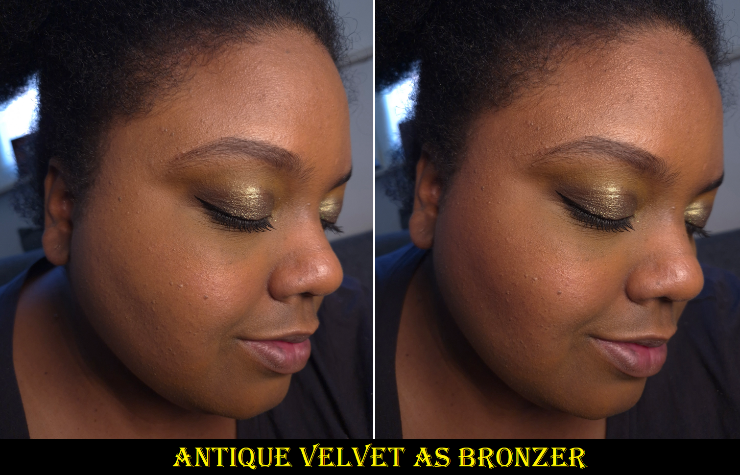
Antique Velvet
Because the Radiant Deep Golden bronzer was a fail for me, with no “Radiant Rich Golden” as an option, I figured I could try using this shade for that purpose! Film Noir Buff worked well as a brontour/contour, and I’m happy to say this makes a better bronzer than Radiant Deep Golden, even if it’s a bit deep for me.
The darkest warm brown shimmery blushes I own are Chanel’s Lumiere Brun Roussi, Dior’s Bronzed Glow, and MAC’s Sweet as Cocoa, but all of them are discontinued shades and none anywhere as deep. So, I don’t have anything current to compare to Antique Velvet.
So that’s all I’ve got for today! Notes on longevity, performance, and so on are detailed in my original review.
I can say with confidence that these 11 are all I will buy until MAC expands the range further. I am very much satisfied with the amount I have!
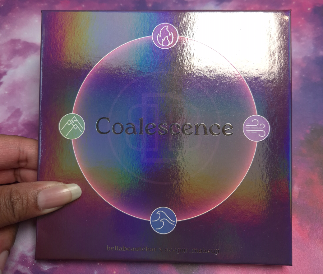
DISCLAIMER: Whenever I post about a brand, Influencer, or other public figure for the first time, I write a disclaimer to inform readers about any potential biases. Regarding Bella Beauté Bar, I am not affiliated with them in any way. I’ve heard nothing but positive things about their eyeshadow quality, so they’ve been on my list of indie brands to try for a long time. Regarding Noopur, I believe her Instagram account is one of the most well-known for indie brand swatches, especially multichromes. Her work is frequently in my feed, but I don’t know anything about her as a person.
I purchased this palette because purple and green are my top choices for colorful eyeshadows, and I love multichromes. All thoughts and opinions are my own.
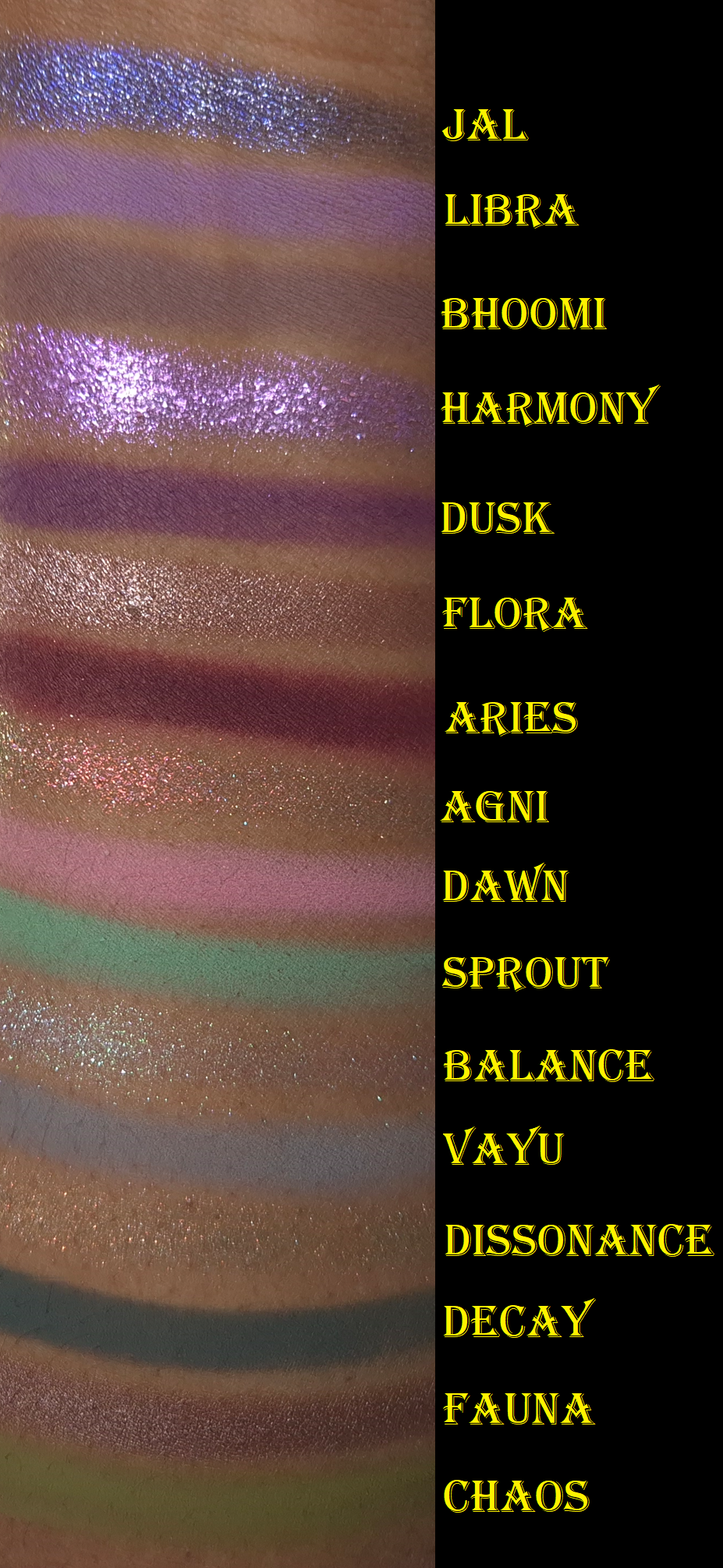
I ran out of room on my arm, so I moved Jal to the top. This is why the swatches aren’t completely in order.
I’ve owned this palette since the end of November 2025 and considering how infrequently I’ve been wearing colorful eyeshadows, I’m still surprised that I’ve used this a fair amount. Wanting to test this palette organically over time instead of forcing myself to apply it daily in a two-week period is why it has taken me so long to post this review.
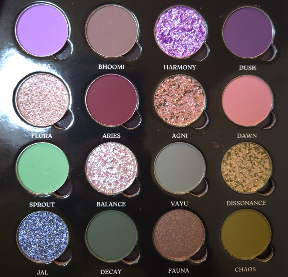
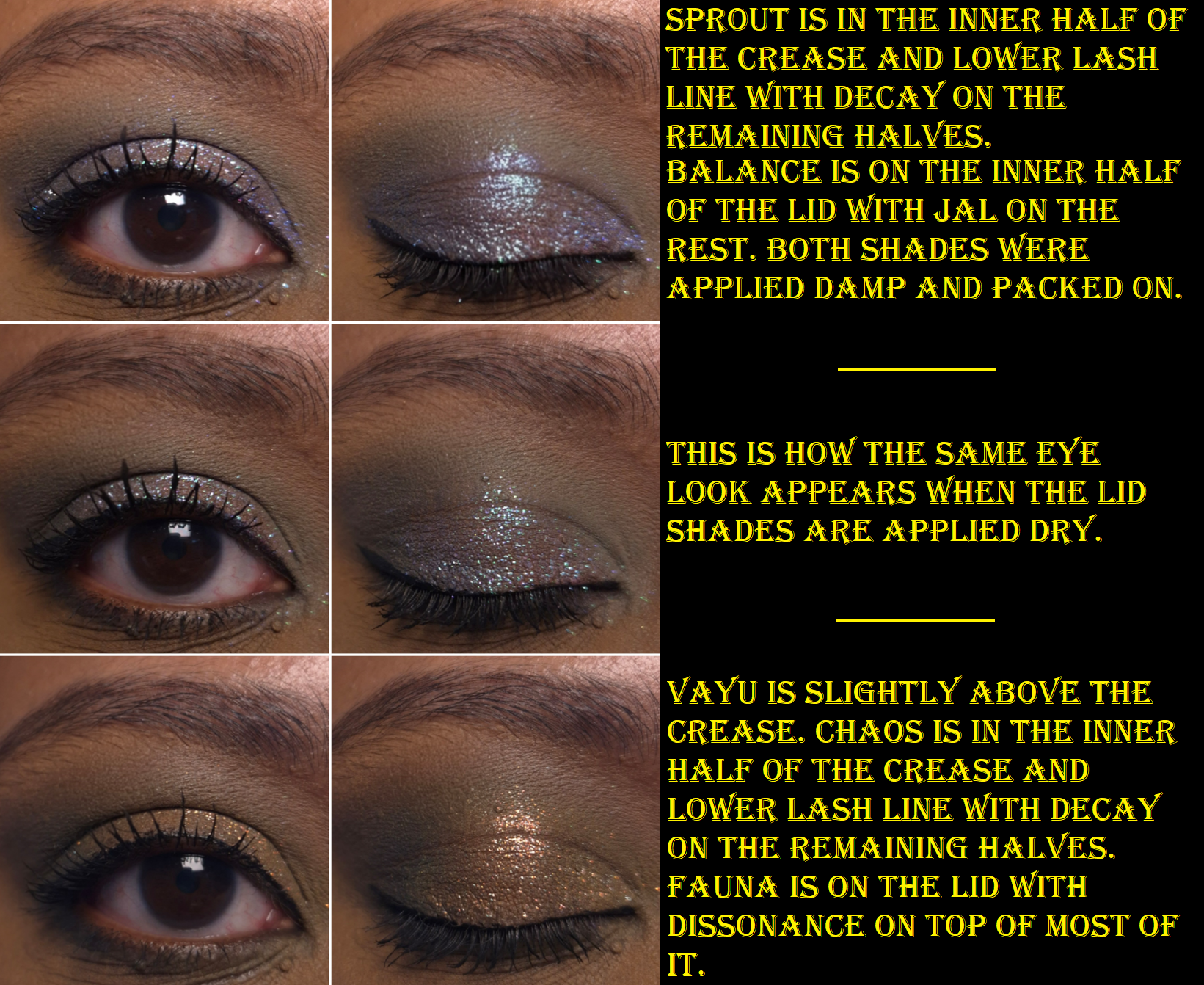
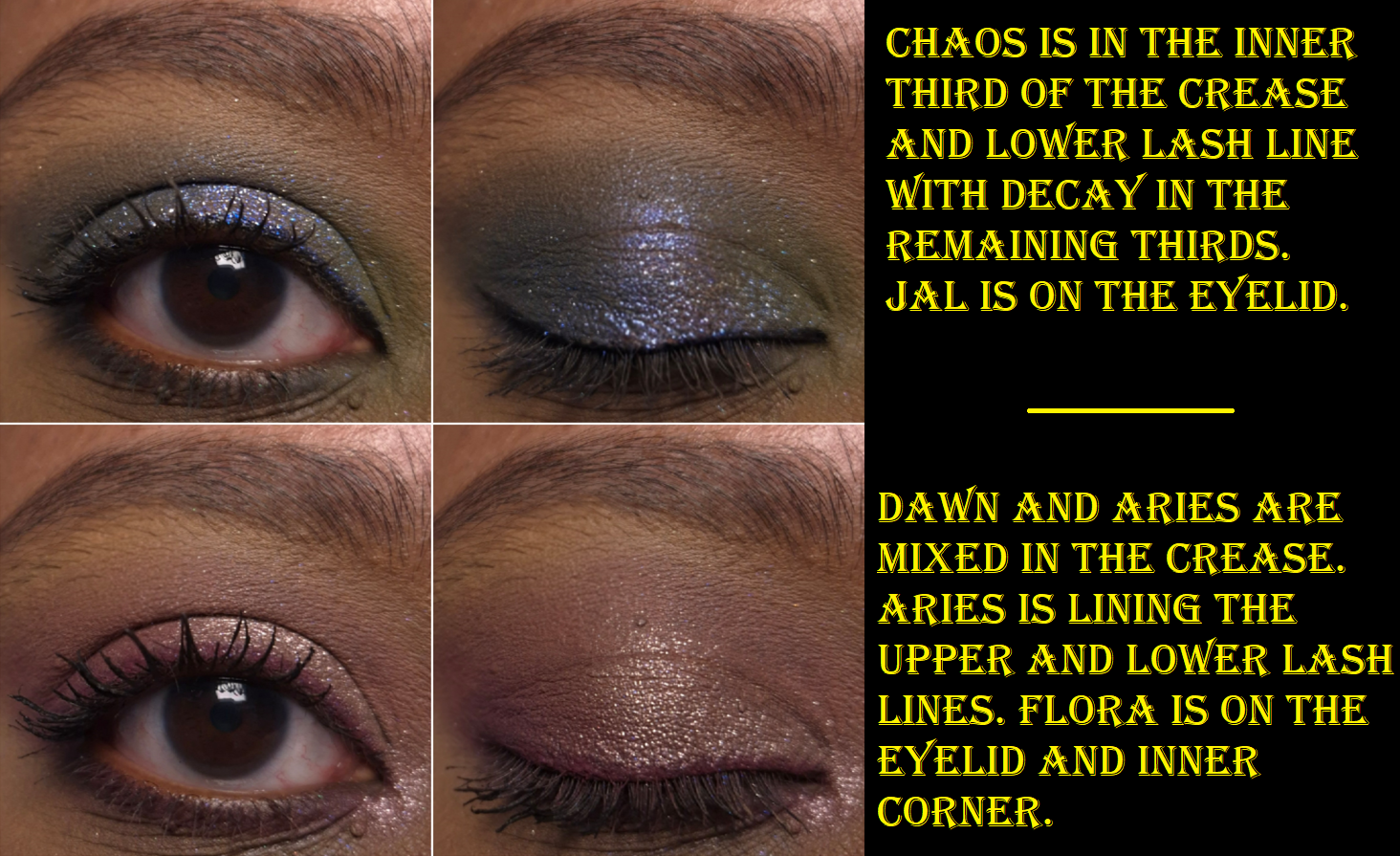
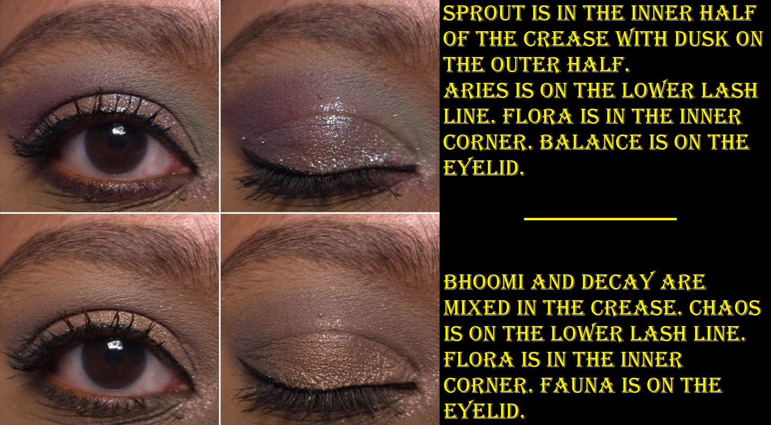
The Coalescence mattes remind me of Natasha Denona’s mattes, but with even more pigment. Some feel silkier (with some slip), some feel buttery, and all of them are soft to the touch. I am impressed by the kind of pastel shades not looking ashy on dark skin. However, they don’t build up and adhere as well to my eyes if I’m using my tried and true Lisa Eldridge Liquid Silk eyeshadow as a base. When I want to wear Libra, Dawn, and Sprout without them looking like sheer veils of color, I have to switch to the MAC Paint Pot or Milk Hydro Grip Eye Primer. The only other matte that needs special treatment is Aries because of its ultra pigmented nature. A little goes a long way, and it is slightly less blendable than the others. When I wipe my makeup brush onto my microfiber towel, it gets everywhere and has even transferred back off the cloth onto other objects before (brushes, fingers, etc). So, I try not to pick up as much onto my brush and build it gradually.
Although I was drawn to this palette for the greens and purples, I found myself mixing mattes together to try and turn them into the specific shades/tones I envisioned for my eye looks. These eyeshadows are formulated in a way that is actually pretty good at being able to do that. Some brands’ eyeshadows can sometimes be a little too good and turn a new color while I’m attempting to just create a gradient of one shade blending into another without lines of demarcation. Thankfully, I don’t have that problem with these, but I don’t try to just blend one shade on top of another when I’m mixing. I dip into both colors with my brush when I pick them up initially, so I can blend them into my skin at the same time. Then, I adjust it with additional product afterwards if needed.
All of the shimmers in the palette had small round foam coverings over them, which I assumed was to protect them in transit because they’re fragile. Imagine my surprise when I tried to rub my finger in Jal for the first time and nearly shifted half of the eyeshadow out of the pan! Thankfully, they can be pressed back into place in the pans.
This also happened with Agni, which is another of the flaky eyeshadows. Essentially, Flora and Fauna have traditional metallic and satin finishes. Flora has the benefit of being an impactful shimmer, but smooth enough for me to use it to brighten my under eyes. Fauna is even smoother, but is too dark to serve that purpose. I like having a neutral option theoretically, but since it’s so outnumbered by the more colorful options (and even the muted shades still pop), I find myself struggling to incorporate it into looks.
To minimize fallout, I can dampen my brush and use the Nyx glitter primer, but it still happens throughout the day. However, it’s not bad enough for me to consider it messy looking.
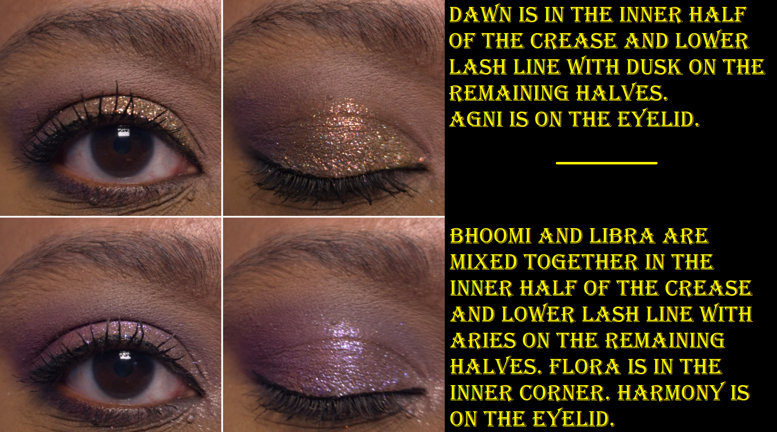
Harmony is described as having a “sheer purple base and shifts blue-purple-pink-peach with additional purple sparkles throughout.” I can see blue, purple, and pink as sparkles, but not as a color changing shift.
Agni is described as a “holochrome with a grey base and shifts pink-orange-gold,” which I agree with, along with Balance having a “super sheer base and a mix of green-pink shifting sparkles as well as blue-purple sparkles.” When I’ve tried to intensify the look of this eyeshadow and pack it on by wetting it or using glitter primer, I haven’t liked the look as much because it seemed like only the blue color grew bolder. I wish the shift was a bit stronger, but Balance is one of my favorite shades in the palette.
I have to admit that I was a bit disappointed that Dissonance, the “super sheer light olive base with silver sparkles and orange-gold shifting sparkles mixed in,” looks mostly just orange on me and not as green as it appears in the pan. It’s a pretty color, but I love greens and the only eyeshadows that read green on me are mattes: Sprout, Decay, and Chaos.
And then finally, Jal is a bright blue with silver sparkles. I’m not a lover of blue eyeshadows, so I didn’t intend to get much use out of this shade. When I think about it though, between Jal, Vayu being a blue-grey, Sprout being a minty-blue, Decay being a blue leaning green, plus the blue sparkles in Harmony and Balance, this palette feels like more of a blue palette than green. This explains why I sometimes get this sense of being unfulfilled when I use this palette despite the pretty colors and them having the sparkle intensity and impact that I like.
If the other Bella Beauté Bar palettes have this type of quality, I would happily purchase additional palettes in the future. The Coalescence eyeshadows, although able to be combined and tweaked, are not totally within my palette preferences. Part of my preferences is having ready-made colors available that I love, so that I can create looks quickly without too much thought. There are times when I do still enjoy playing with colors, which is why I’ve continued to reach for this palette periodically over the past six months. One of the great features of this palette is that it’s magnetic with finger holes in which to rearrange or swap shades. So, I still have an easy way to tailor the palette with other BBB shades or exchange them with standard eyeshadow pans (26mm) from brands like Sydney Grace, Clionadh, Devinah, Terra Moons Cosmetics, Fantasy Cosmetica, etc. The only thing to watch out for is that some of the brands overfill the pans (Sydney Grace mainly) so the mirror/inner lid of the palette could get messy from having eyeshadows press against it.
There are four pressed pigment singles that are part of the collab. They look stunning, but they were sold out on the Monolith-EU website when I was buying the palette, so I didn’t think about them again. I am still curious about how those differ from the shimmers in this palette, but I think I will pass on them anyway.
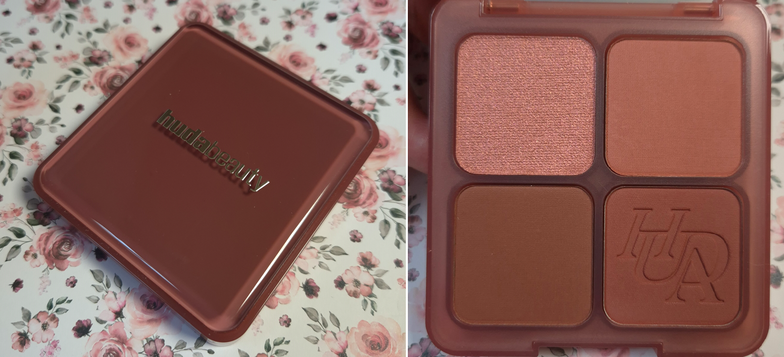
The brand initially launched three of these palettes in similar packaging with a silver cover, but I love the way this fourth one looks. It has those same aesthetically pleasing rounded corners, like the Huda Beauty Blush Filter Liquid Blushes, and the overall color is pretty too. The packaging is heavier than I expected, but still light enough to be travel-friendly. The mirror is very high quality as well, and magnified.
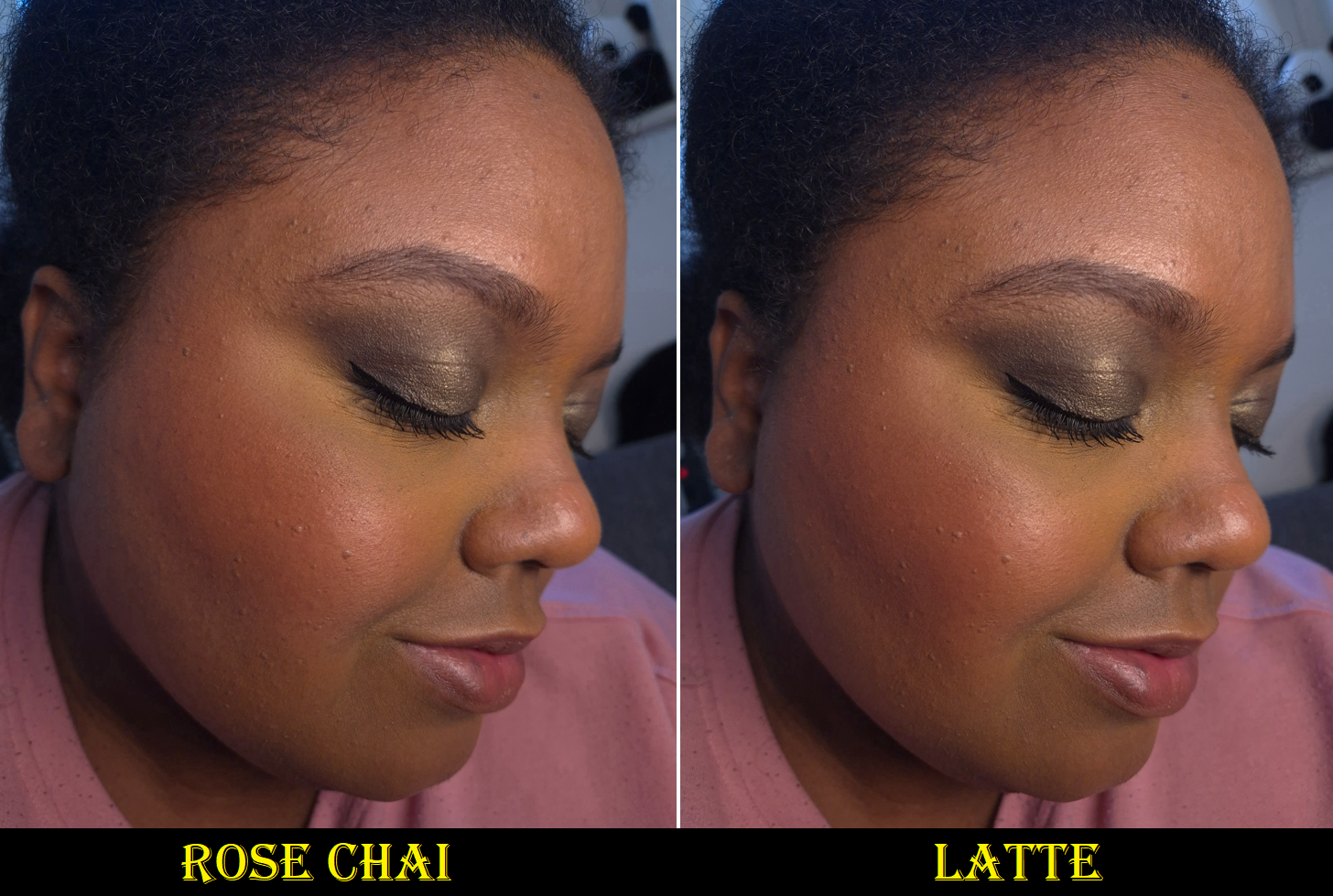
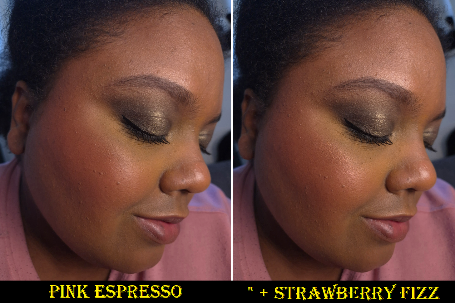
Huda Beauty Blush Filter Blurring Blushlighters Palette in Strawberry Latte
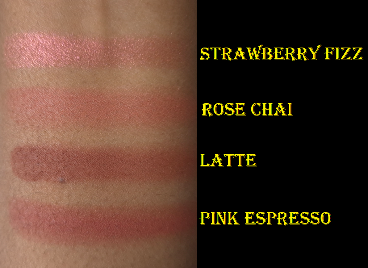
I love pinky-brown and reddish-brown blushes that look like natural colors for my skintone. This is why the Strawberry Latte shades appealed to me. This palette is described as, “A delicious blend of creamy mauve, warm rose, and rich espresso tones.” When swatched, I can tell the shades apart, but they all look like varying shades of rose on me. It’s not what I was expecting, especially for Latte to appear brick red instead of brown, but I at least still enjoy rosy blushes.
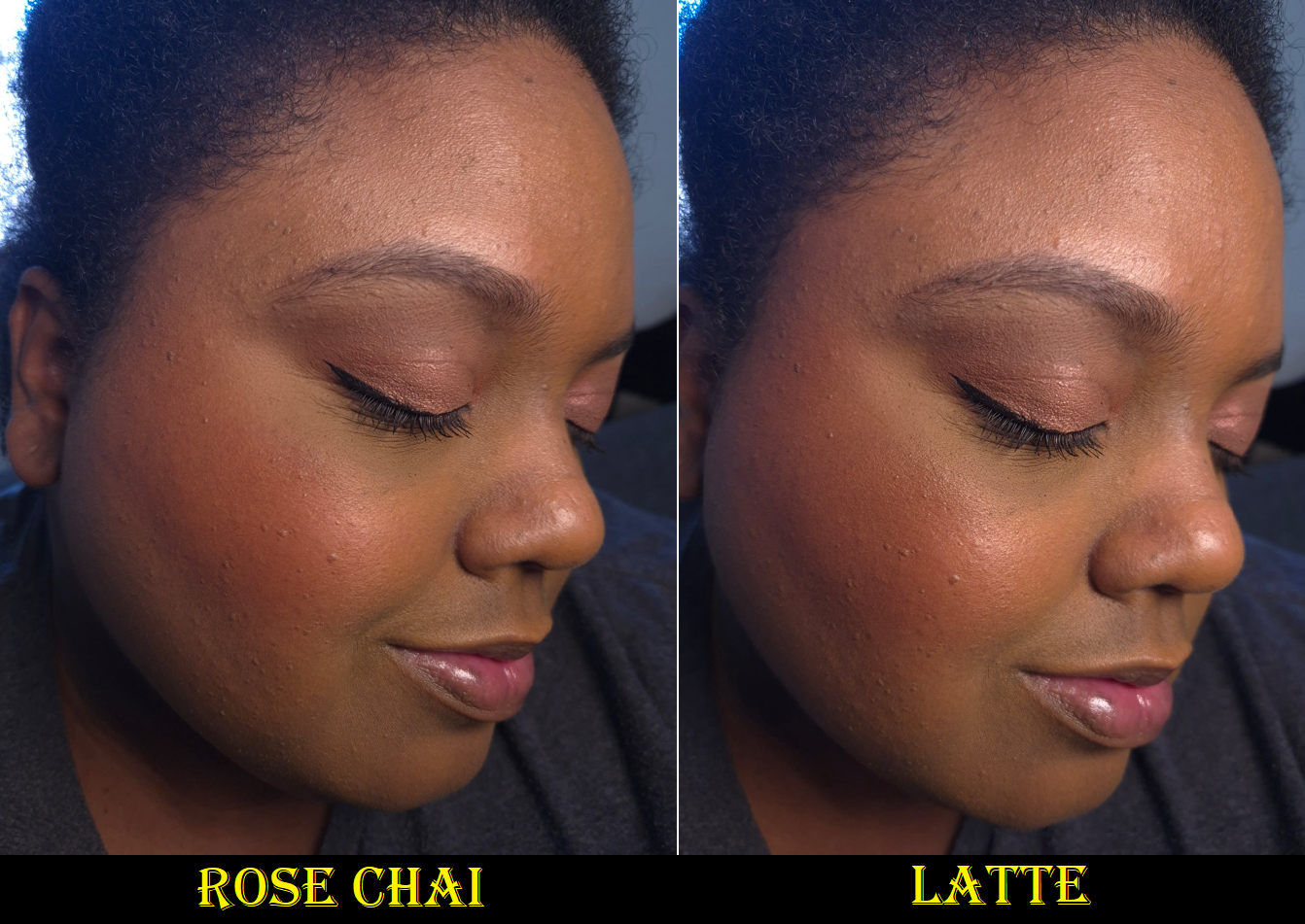
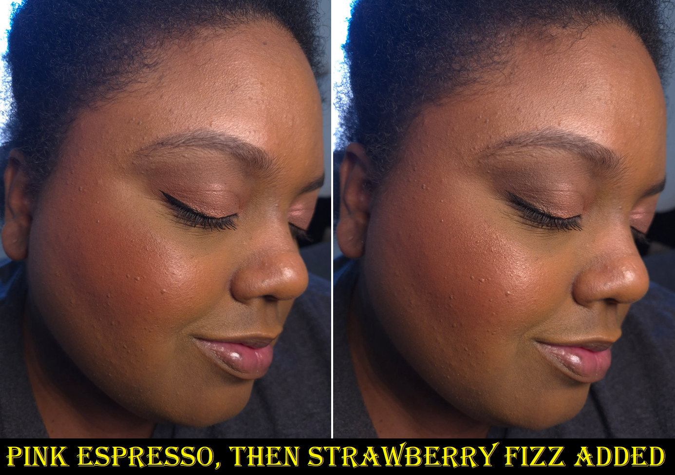
On my cheeks, I can still see the difference in blush tones, but they look really similar in photos. I did my best to capture them as differently as possible, but it was tricky. Rose Chai looks like a darker color on my skin than in the pan. I had to use enough for it to be seen in pictures, but if I applied too much then it looked like Pink Espresso. Too little of Latte didn’t show enough brown, but too much looked like Pink Espresso as well.
ROUND ONE
I’m wearing the blushes as eyeshadow in all four photos, but in the last one, I added bronzer and a dark eyeshadow (VBB Victoria Quad) to the outer corner in order to complete the look.
I’m not the only one who experienced the matte shades looking similar, as I discovered in the comment section of my swatch post on Instagram. I wish Rose Chai was less muted so it could be a brighter pop of pink. If the brand dialed back a little bit of that red in Latte, I believe the colors would be more satisfactory in standing out from each other.
I own the shade Latte in the liquid blush formula. The review for that can be found HERE. The powder version has deeper and stronger red tones.
ROUND TWO
These are quite pigmented blushes. I avoid using dense brushes in order to build up the pigment slowly, but the shape of the airy brush matters. The blushes don’t move/spread across the cheeks as easily while being blended. So, a brush that has an angle or 3D shape with varying denseness (typically dense at the base of the shorter section and wispier towards the longer tips) can have sheer spots and heavier spots instead of the intended gradient look. By trying to fill the sheerer gaps with more product, I sometimes overapply and have tone it back down by adding foundation to the top. Rounded cheek brushes that are tighter packed in the center, but splay wider and looser around the edges can lead to the same uneven result, even though that type of brush is intended to give a diffused look. So far, the brushes I discovered that gave nice results with the matte blushes was a flat-top like the Sonia G Smooth Buffer and through sweeping with the Sonia G ALP3.
The Blushlighter shade isn’t as smooth or refined as what I got from the brand’s Glow Obsession Highlighter Palette. I’m a bit disappointed that I had to look beyond my highlighter brush favorites to find a different one for this product (also the ALP 3 by sweeping along one of the angled sides). The Strawberry Fizz color is pretty, but the shimmer particles are about medium sized and my texture is emphasized a bit. I just prefer much smoother highlighters and blush toppers.
I’m glad I found brushes that work well with these products, but I still feel I shouldn’t have had as much trouble with the “wrong” brushes as I did. Although I still think the blush formula is fairly good, there are plenty of blushes on the market that are easier to blend with the same amount of pigment and at more affordable prices. These actually remind me of the Cheek Palettes Colourpop used to make, which is ironic because there was a point in time that it seemed Colourpop was copying what Huda Beauty was doing (the 9 pan monochromatic eyeshadow palettes for instance). Any time I’ve seen a Colourpop comparison to Huda Beauty products, I’ve always felt Huda’s was better and worth the increase in price. Regarding the Blush Filter Palette, it’s fairly priced for getting four products in one, but I’m sorry to say I don’t think the quality matches. I would have expected it to be $35 at most.
Considering how these adhere (including the blushlighter) while being applied, I’d have been shocked if this formula wasn’t long-lasting. The products stay put all day and don’t fade. My thoughts overall is that I like the shades and I have the tools to ensure that the application and blending processes goes fairly well. I like the packaging, and the quality of the powders inside are at least good, but not impressive.
In my excitement over the shade options, I completely forgot that I did not want to buy face palettes any longer because I don’t use them enough. I don’t think this palette will be an exception to that either.
Three additional blushes (not pictured here) were added to this post.
Today’s post features the two makeup launches I’ve been the most excited about thus far in 2026! Although I needed to Downsize My MAC Blush Collection, I have owned at least fifty different shades of their powder blushes within the past decade. My first MAC post, which covered nineteen of their blushes, currently has the highest amount of views on my blog. It’s thanks to that post, and the Follow-Up with an additional twelve shades, that I’ve been able to connect with many other people who love MAC’s blushes as much as I do! So, they have a special place in my heart.
I have to shout out NikkifromHR and TheMakeupPen as some of the bloggers I chat with about MAC!
When MAC started discontinuing shades from their “permanent” standard blush range in 2021, I knew it was only a matter of time before they revamped the line, but I had no clue it would take almost five years for that to happen! I also didn’t expect it would be three years before MAC relaunched the Sunstruck Bronzers.
MAC reused the model photos and swatch photos of the older Sunstruck Bronzers in the listings for the newer ones, in addition to them bearing the same shade names in the matte and radiant finishes. So, I don’t think there have been intentional changes to the bronzer colors.
Whether intentional or not, my version of Matte Rich Golden is slightly different. So, I will delve deeper into that in the bronzer review section.
The photos and videos I’ve seen, such as this one from lokalekatastrophe, have led me to believe some of the blush shades have been tweaked. Everyone’s version of Desert Rose looks lighter, for example on this reddit page. When I build up Raizin The Roof, I believe it can look pretty much like the original Raizin. However, Film Noir Buff is a muted brown-purple, unlike the original Film Noir that I believe had a reddish-purple tone, like in the YouTube short by CocoaSwatches. I will do my best to share shade comparisons in the blush review section, but I don’t have access to my full collection anymore.
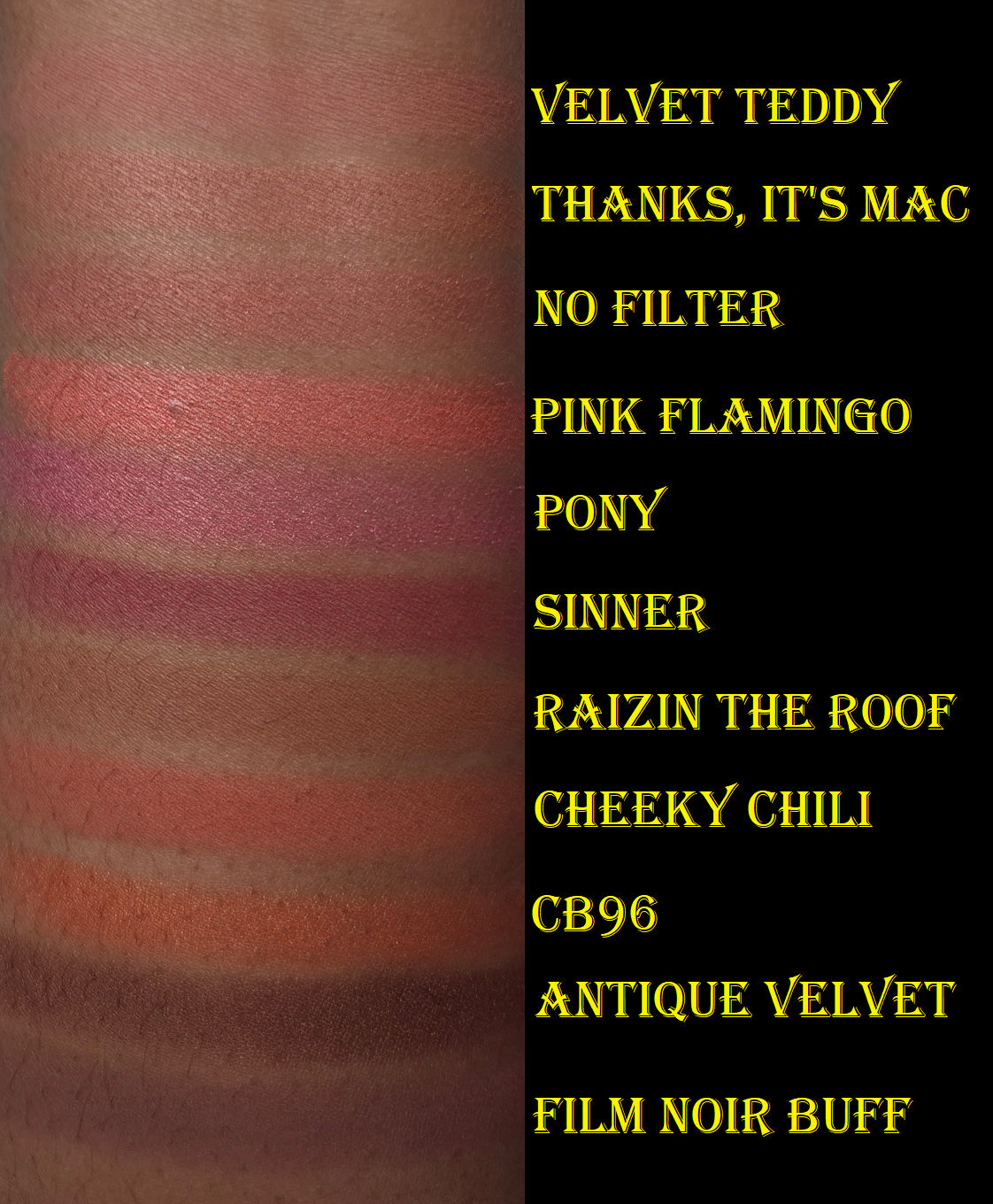
Skinfinish Colourstruck Blushes in Pony (radiant), Pink Flamingo (radiant), Thanks, It’s MAC (radiant), No Filter (radiant), Velvet Teddy (matte), Cheeky Chili (matte), Raizin the Roof (matte), Film Noir Buff (matte), Sinner (matte), CB96 (radiant), and Antique Velvet (radiant)
MAC launched with 29 blushes in the Skinfinish Colourstruck line. I did not wish to repurchase shades I already own, so that narrowed down the list of blushes I wanted to buy. I created a table for anyone curious about which shades are completely new to MAC or might only exist in a different form, such as their lipsticks. My research was done to the best of my ability, but MAC has been around since before I was born, so I could have missed something.
Within the standard powder range, there used to be five categories: matte, sheertone, sheertone shimmer, satin, and frost. Now, there are just matte and radiant blushes.
It is said that the new matte version is intended to have a soft matte finish rather than flat. I’ve noticed that the Colourstruck mattes are smooth, but only softer than some of the older shades. The new blushes are a little less pigmented, apply the tiniest bit smoother (depending on which older shade it’s compared to), and leave some kickback, which may or might not be a significant amount depending on what kind of brush is used. Some of my older MAC blushes were hard-pressed and felt rough to the touch. Even without hard-pan, they became more difficult to pick up over time. However, some of my MAC blushes still feel silky and powdery to this day. I would be willing to buy replacements of my older blushes with a rough texture (such as Modern Mandarin and Frankly Scarlet), but none of my hard pressed ones got reformulated.
The radiant blushes are still nowhere near as glowy as the Extra Dimension Blushes. I would say the amount of shimmer is somewhere between the satin and sheertone shimmer level. When I’ve compared the swatches of the radiant blushes to the glowy blushes from other brands, MAC’s doesn’t look as shimmery. It’s only really when bright light is directly shining on my face that the sheen becomes obvious to see. I’ve complained about Gucci’s Glow Blush line not being glowy enough (review coming in perhaps 3 weeks), but I can say MAC’s Radiant Blushes are at least glowier than Gucci’s. Essentially, I view the Radiant line as satins, but it’s possible that the lighter shades could have more pearl in it, if MAC follows the trend in the past of having their frosty/highlighter-like blushes as mostly lighter colors. I would have to see those in person to know for sure.
Pony
I chose to show, in the photo above, how a single swipe of this blush looks prior to being smoothed out (like I did for the Colourstruck group swatch photo). For some reason, Pony picks up in chunks and has to be worked into my cheeks a bit to eventually appear as even looking as the rest of the blushes. By now, the top layer is completely flat, despite it being one of my least used blushes. The debossed “MAC” pattern still hasn’t worn away from any of the others! I don’t know why this blush is so crumbly, but thankfully it only takes a little bit longer than the rest to blend in properly.
Over the past two years, I’ve been favoring nude/natural blush tones, but I suddenly found Pony very appealing. I can’t recall ever owning a blush this vibrantly pink before, though it does remind me a bit of MAC’s Sweets for My Sweet blush in the Extra Dimension finish.
Pink Flamingo
I still love corals, especially pink-coral over coral-orange, so this was another shade I couldn’t resist. Aside from the blushes I swatched above, Pink Flamingo also reminds me of Nars’ Orgasm X and MAC’s Cheeky Bits Extra Dimension Blush.
This shade and Pony look completely different in swatches, but they’re ultimately both pink blushes. They look similar on me, with the main difference being that Pink Flamingo is a bit lighter and warmer. That being said, I’m still unable to choose between them, so I’m happy I bought both of them.
Thanks, It’s MAC
I had the hardest time deciding between Thanks, It’s MAC and No Filter. Essentially, this shade is a little more of a yellow-orange brown (as opposed to pink-brown) and it appears lighter than No Filter on my cheeks. I swatched it next to a lot of my warm brown blushes and was surprised how few dupes I could find, but Maiden’s Blush is quite close. Thanks, It’s MAC reminds me of the Hushed Tone Extra Dimension Blush (that I stopped using in favor of Faux Sure). This is pigmented enough that I can easily see it in person, but it blends in a lot with my skin in photos.
I like this color, but I prefer Benefit’s Starlaa and Suqqu’s Kafuu (discontinued). It’s tied with YSL’s Nocturnal Nude (also discontinued). So, perhaps I could have skipped buying this one in hindsight, but I always feel compelled to buy a dark nude blush when I see one because of how uncommon it is to find one suitable for medium-dark skin.
No Filter
I can see some shimmer particles in the pan, but this blush can pass for matte if I only apply a sheer layer.
Because it’s a little deeper, pink-brown, and easier to see on my cheeks than Thanks, It’s MAC, I prefer this color. I like to think of it as a toned down version of Faux Sure, which is my most used MAC Blush, and just one of the most used blushes in my entire makeup collection! There was no way I was going to pass on getting this shade!
Velvet Teddy
This blush looks so faint in the photos of MAC’s models, so I assumed it wouldn’t show up on me. However, it does, and this is literally my favorite color out of all 29! The brand describes this as a deep beige. It looks more like a light pink on my cheeks and creates a youthful flush. It was extremely difficult to try and get color accurate photos where the blush can actually be seen. It’s very much visible in person.
In some photos I’ve seen, it looks warm. Some photos it looks cool-toned. On my skintone, it can look warm or neutral. As with most of MAC’s blushes, the undertone of one’s foundation can affect how strongly those tones will actually look. That’s how I’m able to wear some of MAC’s cooler toned blushes without it clashing. These blushes are great for combining into each other to customize the depth and tone. Now that MAC’s blushes are less pigmented than before, they’re even better suited for layering together.
Cheeky Chili
MAC describes this color as, “warm brick red,” which is basically orange mixed with brick red. I expected it to be redder and resemble Burnt Pepper, which remains discontinued, but thankfully there’s also enough brown to keep the color from venturing too far into vibrant territory. Cheeky Chili still pops on my skintone, but isn’t the kind of bold orange that I dislike.
Raizin The Roof
This blush is a great reminder of how tastes change over time. I rarely ever used the original Raizin because I thought it was too deep and bruise-looking on my skintone. I could never figure out why I didn’t like it considering it’s a reddish-brown blush and I typically like those kinds of colors. However, I started using and liking it again just before the Colourstruck Blushes launched. Perhaps if I had the Sonia G Soft Cheek Brush or Rephr Kōyō back then, my mind could have been changed sooner.
Raizin the Roof is described as a golden reddish brown, and it being slightly less red than Raizin is why it initially looks lighter when compared. However, if I build up extra layers, they look nearly identical on me.
I know some people are disappointed that Raizin The Roof isn’t as richly pigmented as Raizin. Raizin used to be one of the most recommended blushes for people with a deep skintone, so I’m sure it’s hard to see changes made to such an iconic color. Selfishly though, I can’t help but be happy because Raizin The Roof is easier for me to use. I really like this shade. It’s also a nice “blonzer” shade to add a toasty sunkissed look across the forehead or bridge of the nose instead of bronzer.
The difference between Cheeky Chili and Raizin The Roof is that Raizin the Roof isn’t as saturated. They both have red, orange, and brown, but Raizin The Roof leans redder. I actually like mixing the two together so that the end result has calmed down the orange from Cheeky Chili, but pops more than Raizin The Roof does by itself.
If I had to choose between them, I would skip Cheeky Chili and just stick with Raizin the Roof. I’m just not as interested in orange, as evidenced by the fact that I left nearly all of my orange blushes behind when I was moving.
Film Noir Buff
I never owned the original Film Noir because it seemed too deep for me and I assumed it would be too red for my liking. However, Film Noir Buff is practically a muted purple-brown! MAC describes it as a “rich warm chocolate,” but those models on their website look like they’re rocking contours. I was thrilled when I noticed it had the potential to be my replacement for the purple contour/blush shade in ABH’s Gradient Blush Kit from 2017. I don’t have a single other blush like this in my collection because of that slight bit of purple. The closest comparison I can think of is the previous version of Dior Rosy Glow Blush in the shade Mahogany. That one had a similar depth level of brown, but also had some red from the ph-adjusting pigment. The tone of red was on the cooler side, but not quite in the same way as Film Noir Buff.
I’m confused as to why they call it “warm” when it’s listed as cool on their social media diagrams. Although Film Noir Buff does have some red in it (as it’s needed to make purple), there’s still some grey to cool it down.
In the photos above, I’m wearing no contour on the left. On the right, I used Film Noir Buff very lightly as contour. On my face, it’s like a muted red, but the depth level enhances the sculpted look. It’s more like a brontour.
It looks very red in these photos on my cheeks, and kind of pretty, but in person it looks like dirt. I don’t like it alone as blush, but it pairs beautifully with Velvet Teddy if I keep Film Noir Buff towards the back and Velvet Teddy mainly on the apples of my cheeks. So, this color is excellent for blush draping/soft contouring.
UPDATEJune 15, 2026: I added three more blushes to this post!
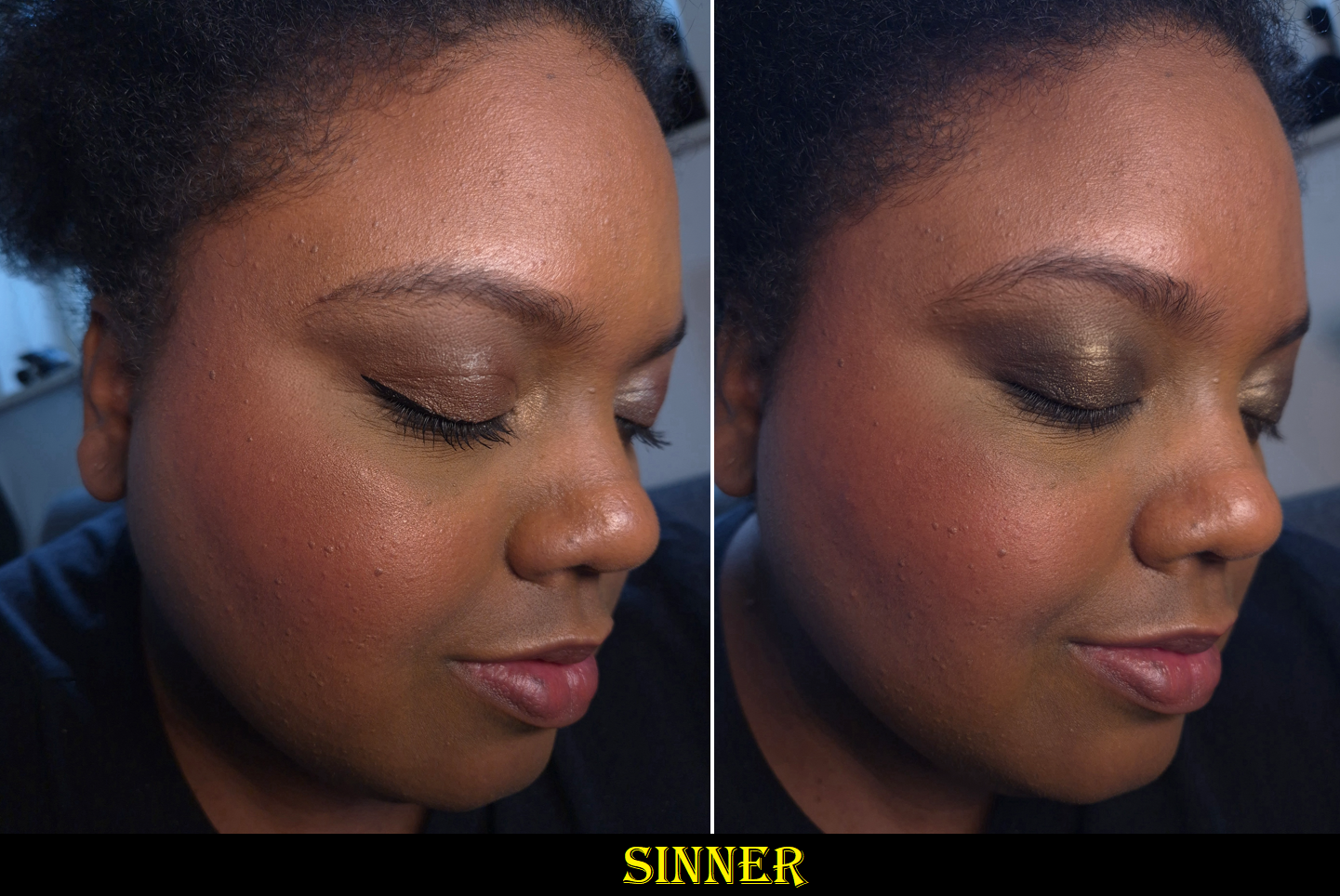
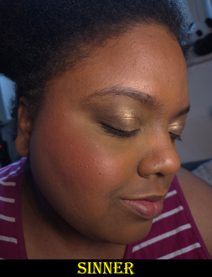
Sinner
For the swatch comparisons, I had to fish the berry shades out of my “box of products I wouldn’t mind decluttering” because I wasn’t as happy with those colors. YSL’s Spicy Berry is the exception.
When it comes to berry blush shades, I either love or hate the way they look on me. The best one I ever wore was the Make Up For Ever HD Cream Blush in Raspberry 510 (color shown here), which I bought twice before it was discontinued. Sinner is cooler-toned, but I saw someone with a warm undertone and dark skin wearing it, and the end result was similar to what I got with MUFE’s Raspberry! So, I had to buy it!
I am very happy with how it looks on me! Once again, MAC’s blushes can be effected by the undertone of foundation underneath. So, it doesn’t look cool-toned enough to clash with the warmth of my skin. Sinner is perfect for when I want that I’ve-been-out-in-the-cold type of look.
CB96
This color looks gorgeous on the MAC’s models, and on NikkifromHR, but I was hesitant to buy it because of how picky I can be about orange blushes. I was happy with Cheeky Chili, but even that shade ranked lowest of the original eight blushes I bought. I even mentioned before that I prefer coral-pink shades (like Pink Flamingo) over coral-oranges (like this one), so how could I justify getting it anyway? Eventually my curiosity got the better of me and I’m actually happy that I caved!
If I had Nars’ Taj Mahal and Fenty’s Shimmer Match Stix in Chili Mango with me in Germany, I would have tried to do comparison swatches. However, the only orange blushes I have with me are mattes. I can’t recall if I ever owned an orange shimmery blush that was opaque and dark enough to not look like a highlighter on me. CB96 might be the first!
Antique Velvet
Because the Radiant Deep Golden bronzer was a fail for me (*spoiler*), with no “Radiant Rich Golden” as an option, I figured I could try using this shade for that purpose! Film Noir Buff worked well as a brontour/contour, and I’m happy to say this makes a better bronzer than Radiant Deep Golden, even if it’s a bit deep for me.
The darkest warm brown shimmery blushes I own are Chanel’s Lumiere Brun Roussi, Dior’s Bronzed Glow, and MAC’s Sweet as Cocoa, but all of them are discontinued shades and none anywhere as deep. So, I don’t have anything current to compare to Antique Velvet.
Some additional things I want to mention about the blushes overall is that the packaging was updated to be flat. They can now be stored flush next to each other or balanced in a stack without that domed lid. It’s more convenient to handle now, but it also looks a lot more generic.
In 2020, MAC blushes used to cost $25 per compact. So, $34 is quite a jump for even less product! In Germany, the full retail price is €34, but I found them less than a week after launch for as low as €25-€29 depending on the shade and retailer. I still find that to be expensive, but it’s a price I was willing to accept. I got some truly incredible deals on my old MAC blushes, so maybe that’s the cosmic tradeoff.
The longevity of the blushes are just as good. They don’t contain parfum. Other than Pony, these are easy to blend and work with while I’m using my regular products and skincare. However, if I’m wearing a gripping primer, a dewy sunscreen that leaves a slightly tacky residue, or some other product that makes my face essentially sticky, then I try to powder my face before applying these blushes. If I don’t do that first, then the blushes adhere a little too well and require more effort to blend.
I find MAC’s blush quality, whether matte or radiant, to be quite good. I do have blushes from other brands that are glowier, more blurring, even more finely milled, creamier and softer to the touch, etc. What has always pushed MAC powder blushes into holy grail status for me has been the shade offerings. Having so many dark-skin friendly options, especially less saturated ones and the variety of nudes, is why I’ve always regarded them so highly. I might be able to get a few of my favorite colors from a single brand, but only MAC has this many! The only other brands that come close are Fwee (though tough luck if you only want powder formulas) and Hourglass (for those who are around my skintone or lighter).
I’m happy with these new blushes, and I recommend them, but they aren’t something anyone needs to run out and immediately purchase. These may just be special to those seeking particular colors that are hard to find in a specific tone or depth.
Skinfinish Sunstruck Bronzers in Matte Rich Golden and Radiant Deep Golden
For those who may not remember, these bronzers launched on the 17th of March in 2023, were pulled two days later, and then made their return a month after. I don’t think the brand ever explained why, and it’s not as though MAC could have reformulated them that quickly before they returned to store shelves. I have more details and theories about it in my original review, but essentially how I was even able to order them was because I could add them to my cart using the quick shop feature. I wasn’t able to add them though the usual means and had just assumed it was a website glitch. Shortly after, the product page was missing, and so I thought perhaps MAC accidentally launched the bronzers earlier than planned. They did not cancel my order, and that’s how I ended up with two stinky bronzers! I don’t mean that figuratively either. They literally had a terrible odor (like the vomit flavored beanbozzled jelly beans). Since the smell came and went for a while, I was hopeful that the smell would just eventually disappear. Nine months later, the worst part of the stink faded enough for me to be willing to bring one to Germany with me, but my fear of there being something wrong with it (actually rancid, contaminated ingredient, etc.) made me unwilling to use it that often. It felt like I was taking a gamble every time I used it, and the only reason I didn’t throw my original Matte Rich Golden away is because that has been the only yellow-golden bronzer I’ve ever found that was dark enough to show up on my skin year-round. I own neutral bronzers, ones that lean pink, orange, and red. However, all other yellow-golden ones are either the same color as my face (so basically invisible on me) or too light.
Three years later, my old Matte Rich Golden is nearly odorless, but still not 100% free of the smell. So, it’s no surprise that I decided to repurchase it in order to stop worrying about whether or not there is something wrong with it. Unfortunately, the new one is a warmer than the original version. If I keep the application super sheer, it passes for golden, but it looks orange when I build it up. I’m a bit disappointed about that, even though MAC at least improved upon the formula. It no longer darkens like crazy when I swatch it or wear it on top of a dewy base. I don’t see any other performance differences though in terms of smoothness, blendability, and longevity. The old and new ones are equally great, but I still have even better ones in my collection (though at twice the price). If this bronzer leaned more yellow than orange, I’d have put it in regular rotation!
If you’re around my skintone and prefer yellow bronzers as well, I’ve had better luck finding some in cream formulas, but by now they’re discontinued. One that’s still available is the Charlotte Tilbury Beautiful Skin Sun-Kissed Glow Cream Bronzer in Tan, but that is more on the yellow-olive side than yellow-golden.
Matte Rich Golden
*How orange Sienne appears depends on what proportions of the three shades in its pan are used.
I have mixed feelings about this bronzer based on the shade. While I’m happy about the performance aspects that improved, and I acknowledge that the color isn’t overly orange, the shade of the new version isn’t as unique to my collection. This means I won’t be reaching for it over my top ranked bronzers. It also means that I don’t feel like this replaces the old version.
Radiant Deep Golden
I made brush swatches, since the 2023 version of the bronzer darkens when rubbed with my finger.
As for my original Rich Rosy, the depth level was correct, but I didn’t think the color suited me. The only reason I didn’t get Radiant Deep Golden sooner is because I assumed it would look like a highlighter and be unable to bronze me. Unfortunately, mine seems to be inconsistently mixed. Sometimes, the base color is visible underneath all that shimmer and actually bronzes me. At other times, it does look like a highlighter!
The amount of shimmer is less than the Too Faced Sun Bunny Blushing Bronzer and the 2nd version of baked bronzer from Kosas. I’ve considered using Radiant Deep Golden as a bronzer topper to add radiance to a matte bronzer. Unfortunately, it is so hard-pressed that I get annoyed every time I use it. The powder is so stiff and rough that it feels like I’m wiping dirt off a clay tile while trying to get product onto my finger to photograph swatches. The surface is so hard that it feels baked. My natural hair brushes are too soft to pick up much product, and even my dense synthetic brushes require a lot of force to practically dig into the pan.
Even after I stopped swatching this bronzer with my finger, it continued to get hard pan until I scraped off enough of the surface to flatten the top layer. Now, I no longer have hard-pan, but I still can’t use this bronzer with my natural hair brushes. The surface is too tough.
Another strange thing is that this doesn’t wipe off my finger the way a normal powder does on my Makeup Eraser cloth. It grips almost like dried paint! Normally, a few swipes across the dry cloth is enough to clean my fingers between swatches. The exception is when it’s a pressed pigment or dye that stains my fingers. I can’t explain why the consistency of the new Radiant Bronzer is so much worse than my old one. At most, I’ve heard others say theirs is hard-pressed too (such as Audrey Michelle), but so was the 2023 version. It doesn’t seem like anyone else’s is as messed up as my new one. There’s hard pressed, and then there’s this…
Just like eyeshadows that stain my fingers when swatching, I can use a little Bioderma with the cloth to completely and easily remove it. It’s just unusual that I would have to do that with a bronzer that isn’t technically staining (just clinging like there’s too much binder or something in the formula). Radiant Deep Golden adheres to my face in a way that makes it a little challenging to blend out, but I can at least remove most of it with a dry cloth.
Considering my issue with the blush-half of the Too Faced Sun Bunny Blushing Bronzer and my issue with Tom Ford’s Soleil Bronzer specifically in the shade Panarea, I don’t think I simply got unlucky to have gotten a dud. Something is going on with these Estee Lauder bronzer reformulations!
The bronzers cost $35 in 2023, and are now just $36. That’s about €31 in Germany, but for some reason they are actually €47 ($55) here. I’m not sure why MAC hiked up the price so high for the bronzers, yet didn’t raise it as much for the blushes. The matte bronzer formula is worth getting on sale, but I absolutely don’t recommend the radiant bronzers. I know some people are loving theirs, and my experience with this botched bronzer is not the norm. However, I still thought the 2023 matte bronzer was superior to the radiant ones back then. I suspect it would be the same for the 2026 bronzers, even if I had a “good” one.
If you’re darker than me with a golden undertone too, I recommend trying Antique Velvet as a bronzer. It has more warmth than Film Noir Buff, and the shimmer in the blushes are more refined than the shimmer in the Radiant Bronzers (or at least it’s more refined than my messed up bronzer).
That’s everything for this week’s post! Thank you so much for stopping by!
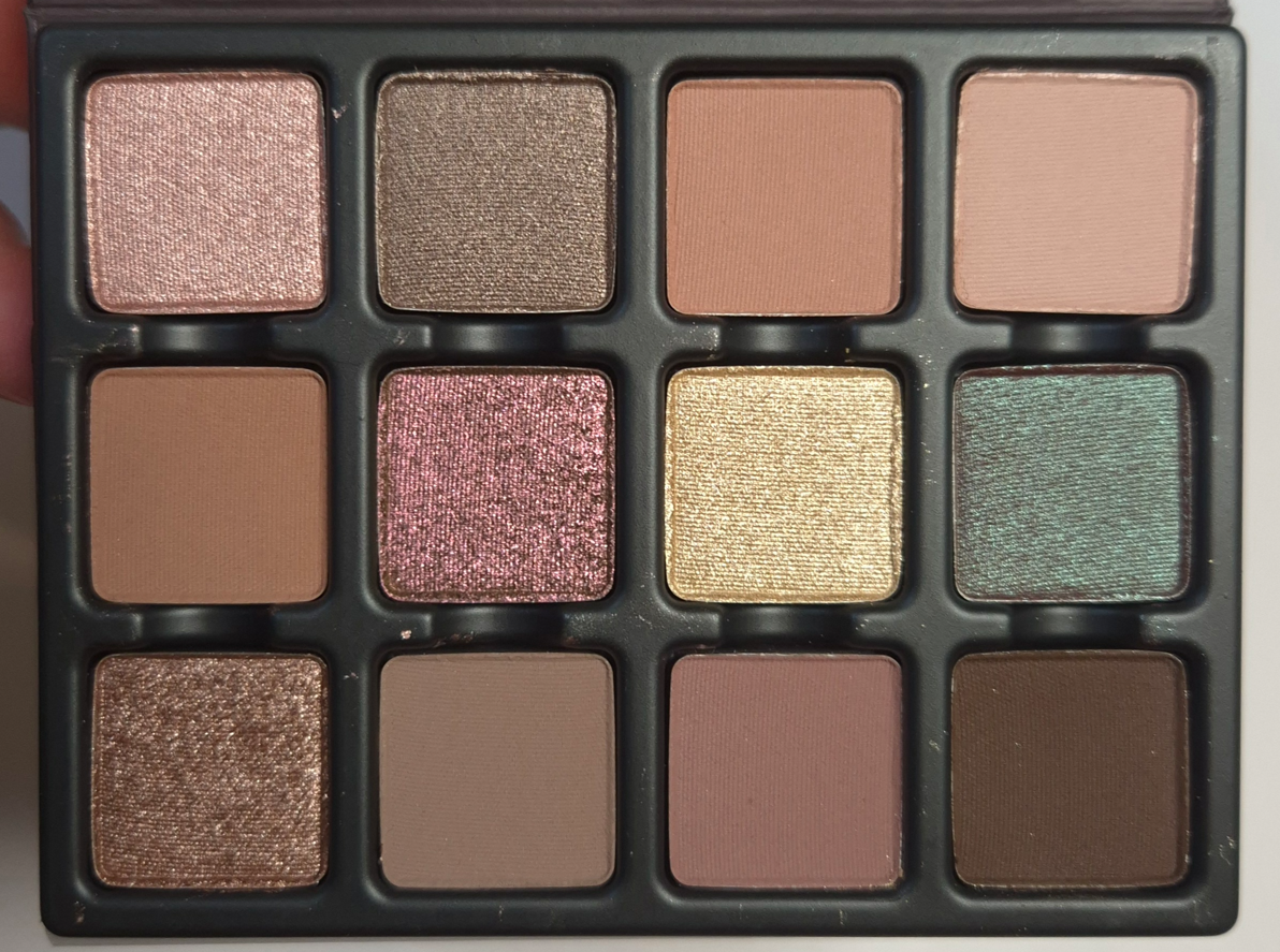
I haven’t mentioned Viseart since the last Eyeshadow Palette Ranking. One year after that post, I bought the Cashmerie Charmeuse palette on sale from the Irress Beauty website. I hadn’t heard of that business before, so I was nervous to shop from them, but there were no issues with my order.
Even though I’ve had this palette since October 2025, the bulk of its usage was in the beginning weeks of me getting it (riding on the excitement of being a new addition to my makeup collection). Of course, I’ve used it more recently as well to refresh my memory on how it performs.
I am so happy to report that the eyeshadow quality in this palette is as great as I expect from Viseart! There were a few years that I felt the quality had dropped (coinciding with the transitional year that Viseart started manufacturing in California, alongside France). I believe 2022 was when I started to regain confidence in the brand’s formulas and considered them to be stable again. Regarding their formulas, the brand prides itself on the fact that, “90% of the ingredients in our palettes are the same across the entire product range to create a range of color true shades for our global audience to choose from.” That being said, Viseart’s eyeshadows contain talc, including their latest launch called Lisa Says Gah x AQUA Étendu. This may be fine in the US, but they still manufacture in France and talc may be banned within the EU by 2027. So, changes to Viseart’s formula could be coming whether we the customers like it or not.
Before I move onto the finer details of this palette, I want to acknowledge that this type of color story usually does not interest me. I prefer high contrast looks on myself, so I tend to favor dark dramatic eyeshadows, bold colorful mattes, and sparkly shimmers. I cannot explain why I was so drawn to this color story when it has so many midtone/medium deep colors that will not show up as well on my skin, many of which are muted and had the risk of looking dull compared to the saturation of my skin. This color story is geared towards “soft looks,” which is rare for me to own, but I wanted it anyway!
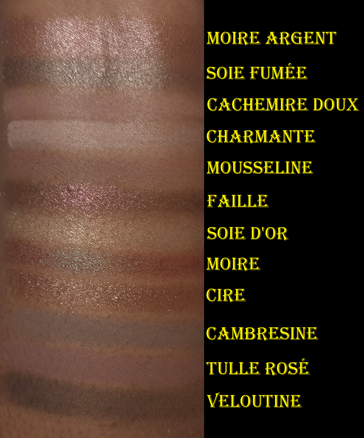
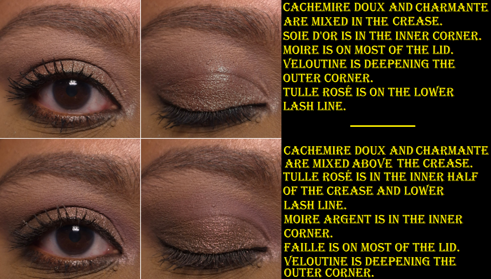
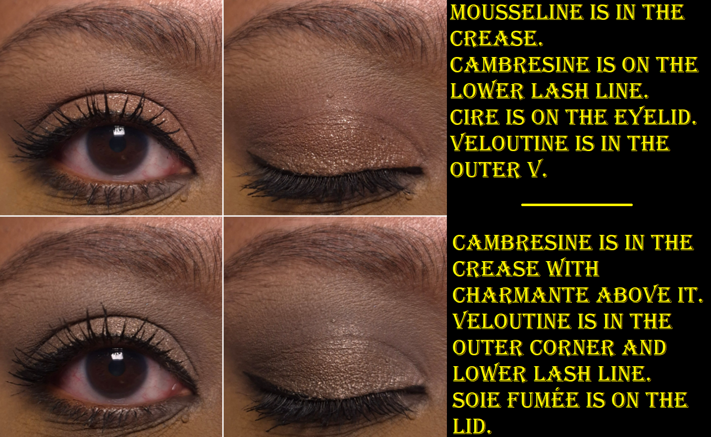
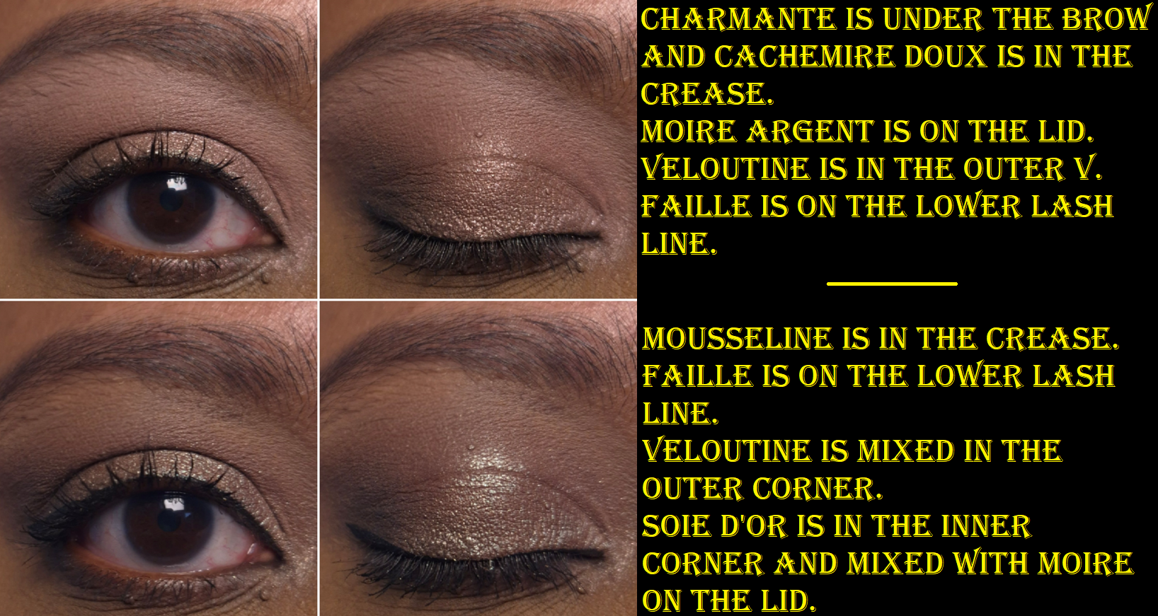
Veloutine is my only option for creating depth in the outer corner. It is described as an “espresso bitter brown,” so it’s not quite as dark as I would wish, but it still gets the job done. All the other mattes in this palette require very little effort to blend, so this one is a bit troublesome in comparison. It sticks a bit where it’s placed, so I rely on my workhorse brushes (mainly Sonia G) to make things look even. I don’t consider it a bad eyeshadow though since I can get the kind of results, seen in the eyeshadow looks, in a reasonable amount of time.
The two colors I rely on for brightening the inner corners are Moire Argent and Soie d’Or. What impressed me the most about Moire Argent is that it’s one of the few light pink shimmers that actually look pink (and not silver, gray, or white) on me. Since it’s described as a “lilac rose” perhaps the slight addition of purple is the reason, explainable by color theory.
I typically use Cachemire Doux and Charmante mixed together to brighten the area under my brows. Charmante is so whitish-pink that it only looks good on my warm medium-dark skintone if I’m doing pink or cool toned looks. Cachemire Doux is a little too dark to use under my brows by itself.
Mousseline, described as a “burnt plum,” and Cambresine, which has a “midtone greige stone hue,” are surprisingly darker on the skin than they appear in their pans. I use them in the crease, along with Tulle Rosé.
Soie Fumée has such a fancy sounding description as a “midtone smokey pewter thistle,” but I just think of it as a taupe color. I only use it when I’m creating a full-on cool toned look. The “light bark lilac taupe” is called Cire, and it looks brown on me. So, I use that one when want a neutral type of eyeshadow.
Faille and Moire are the most exciting shades in this palette, and both are listed as duochromes. I cannot detect a shift in Faille, as I only see a burgundy brown base color with purple shimmer. However, it’s still quite a pretty shade. I get some fallout from it, but not enough to prevent me from wanting to wear it. Moire is one of the most common duochrome eyeshadow colors, but I still love a classic! I have to admit that I’m a bit disappointed that it doesn’t stand out as boldly as I want, even when applied with a wet brush. It doesn’t compete with Verrerie from the Violetta Petit Fours quad, but not everyone wants their duochromes and multichromes to be attention-grabbers like I do.
In case anyone is wondering, here is how the new ranking would look like.
Ranking List of All the Viseart Palettes I Ever Owned:
Cashmerie Charmeuse satisfies me when I have a unusual craving for soft looks, mauves, mid-toned colors, and either cool toned or neutral eye looks. Although I won’t be using this palette often, the quality and performance make this a purchase I don’t regret! It pleases me that Viseart continues to be an eyeshadow brand that I enjoy and can recommend. I just hope they will be able to manage through the EU cosmetic regulation changes in 2027!
Thanks to the approaching deadlines over regulation changes in the EU, the Tom Ford Beauty brand has been reformulating a ton of their products across multiple categories. Today’s post will be covering the few that I bought from this year’s relaunches.
*DISCLOSURE: Non-highlighted links in bold blue font (Example) are standard non-affiliate links. Links marked in bold black font with a light blue background (Example) are affiliate links. Affiliate links allow me to get a commission if purchases are made directly using my link. Whether you click to shop through them or not, I appreciate you visiting and I hope you find the information I’ve provided to be helpful! In this review, the only affiliate links are for brushes through CDJapan. I have no affiliation with Tom Ford Beauty.
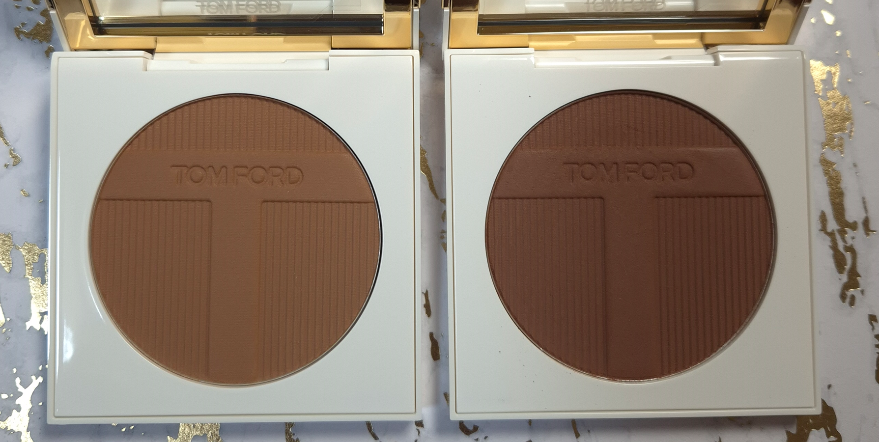
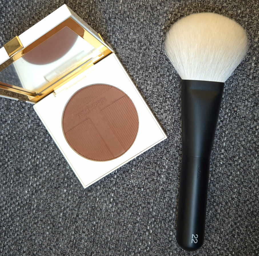
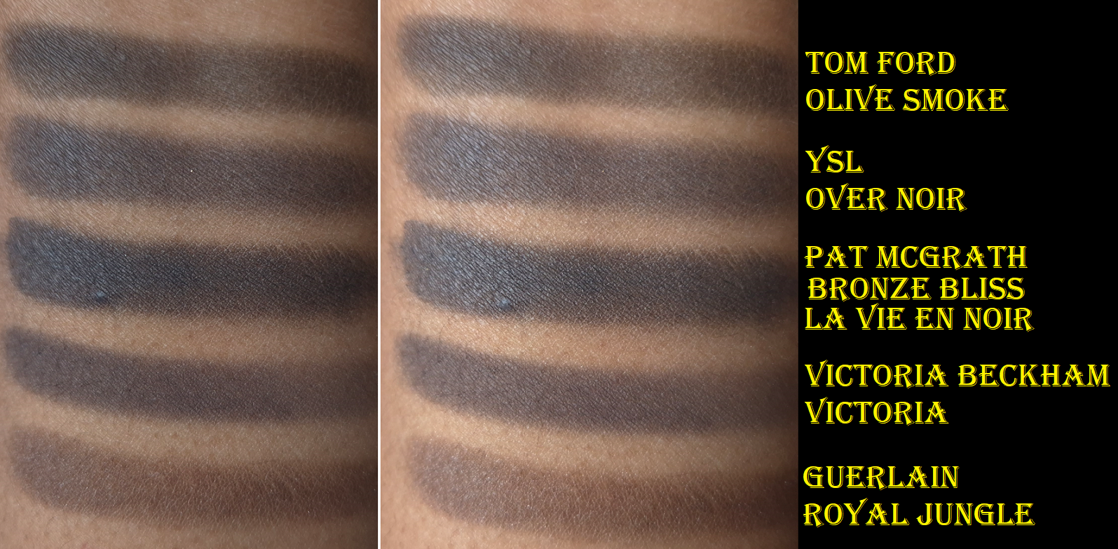
Tom Ford Soleil Bronzing Powder in 03 Panarea and 04 Formentera
During the peak days of YouTube’s Beauty community, some of the most hyped up bronzers were the Benefit Hoola Bronzer, Charlotte Tilbury Airbrush Matte Bronzer, Physician’s Formula Murumuru Butter Bronzer, Hourglass Ambient Lighting Bronzer, Nars Laguna Bronzer, Guerlain Terracotta Bronzer, Tom Ford Soleil Glow Bronzer, and Marc Jacobs Beauty O!Mega Bronzer. Since then, many of those brands have expanded their ranges, including Tom Ford. I was so excited at the prospect of finally having a powder bronzer from Tom Ford that was deep enough to show up on my skin! However, the brand didn’t take inclusivity as far as I would have expected. There are only 4 options and the gap between shades 3 and 4 is huge!
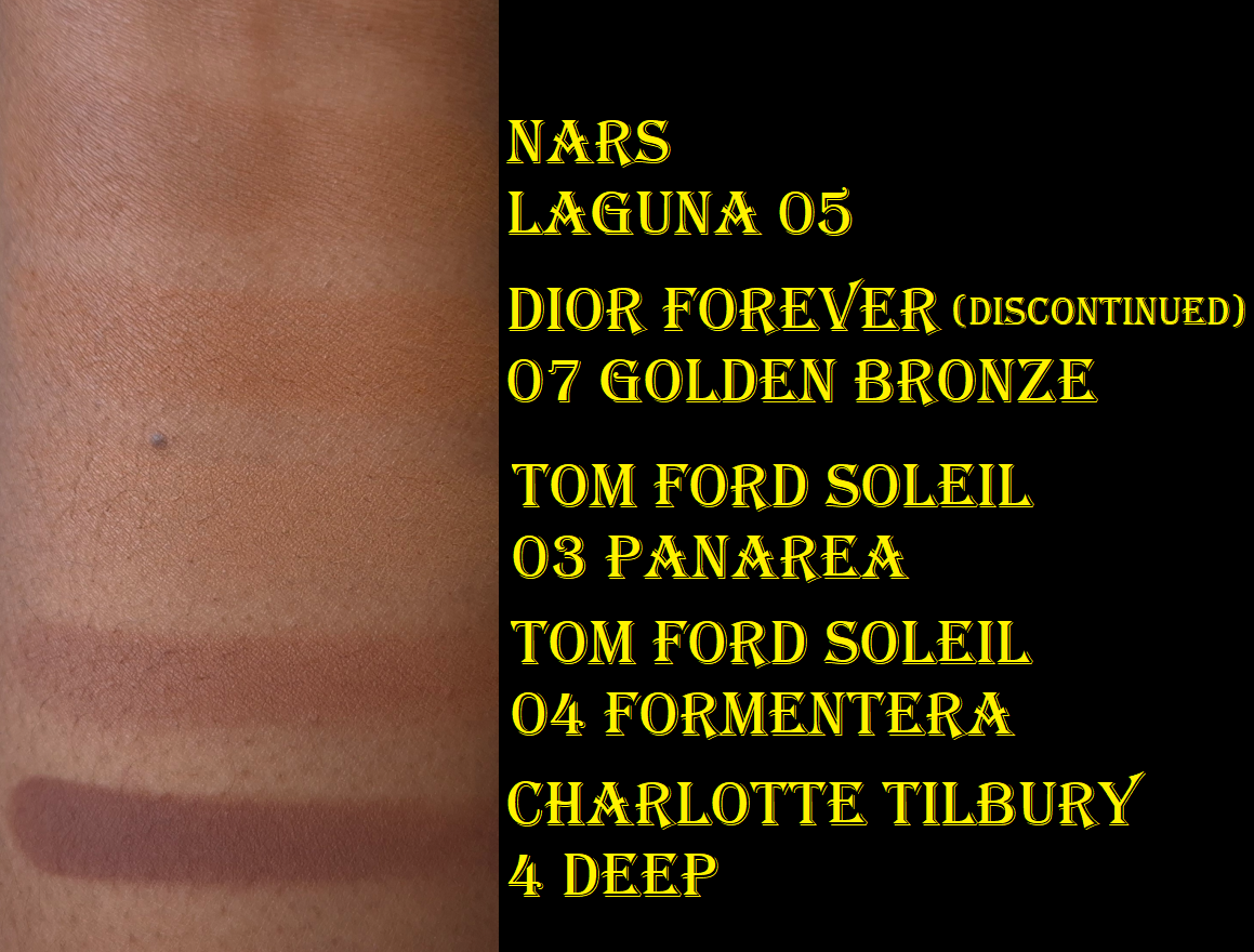
Below are swatches of two of my lightest bronzers (that I typically mix with a darker bronzer in order to wear them) compared to Panarea. As seen in the photo, Panarea is nearly invisible on my arm. To jump from that shade to Formentera is wild, but even wilder is the fact that Tom Ford’s fourth bronzer is the darkest in the range. It’s significantly lighter than Charlotte Tilbury’s bronzer in Deep, which is also the 4th and last shade in her powder bronzer range. To be fair, Charlotte’s third shade option is about as light as Nars Laguna 05. So, that brand has a shade jump too, but she has bronzers that will work for someone at least several shades darker than me.
I thought these shades would be darker based on how deep they appear in the pan, but they still look lighter even after being built up. Panarea looks tan, but on me it’s like a beige-bisque. It’s technically warm, but can look almost pink toned in some lighting. Formentera looks like it should be a contour color, but it’s a red toned bronzer (though still not overly warm).
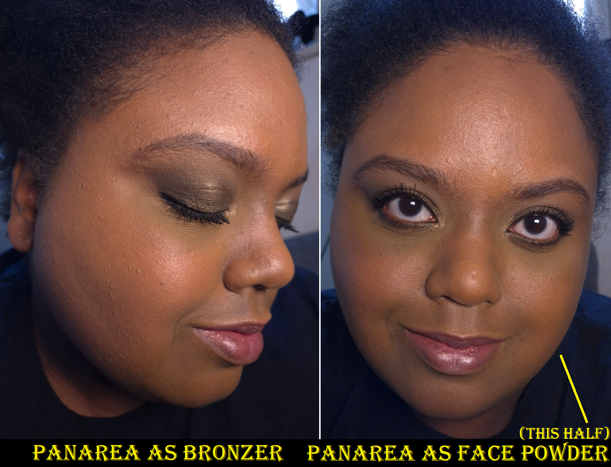
I’ve seen my friends who are darker than me try to use bronzers as face powders to find use for ones that were too light for them. I decided to give that tactic a try with Panarea and I can say whatever changes it made to my face were negligible. In a side-by-side comparison, perhaps my face was the tiniest bit more matte. Perhaps shade 03 changed the color of my face the tiniest bit, but not enough for anyone else to notice and my face didn’t stay matte for long. Essentially, this bronzer wasn’t good enough for powdering my face, over using my actual finishing powders that blur and/or add a beautiful sheen. So, I don’t recommend bothering to use it in this way.
Before I even attempted to use this as a face powder, the third shade was already getting hard pan. I thought perhaps this formula doesn’t like to be swatched or maybe these bronzers are hard-pressed, but Formentera is still perfectly fine and easy to pick up with my brushes. In just three weeks, the surface of Panarea feels hard and dry, which is such a contrast to the continued softness (verging on creamy) of Formentera. In the comment sections of YouTube videos, such as the one by Mo Makeup Mo Beauty on the Soleil Collection, a few people described having issues with the performance of Panarea too. So, perhaps there’s something off with this batch.
The Soleil Bronzers are unscented, have a matte finish, and the powder consistency is fairly thin, though not as thin as Victoria Beckham or Charlotte Tilbury. These are pigmented, but the amount my brushes pick up ensure that I can build up sheer layers of product and not worry about overapplying.
The amount of kickup is determined by the brush used. My first instinct was to test them with some of my go-to bronzer brushes, which are the Bisyodo B-F-05 Perfect Fit Brush, Number Eight Face 08, Sonia G Smooth Buffer, and Rephr Kōyō brush (though I use Kōyō more often for blush). I got minimal kickup with all except the one by Number Eight.
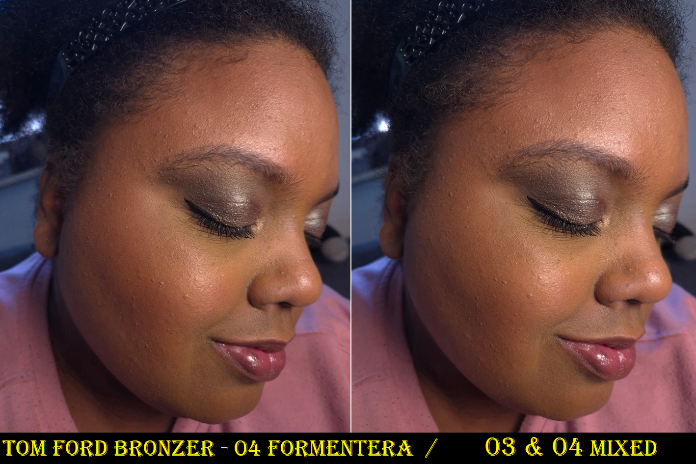
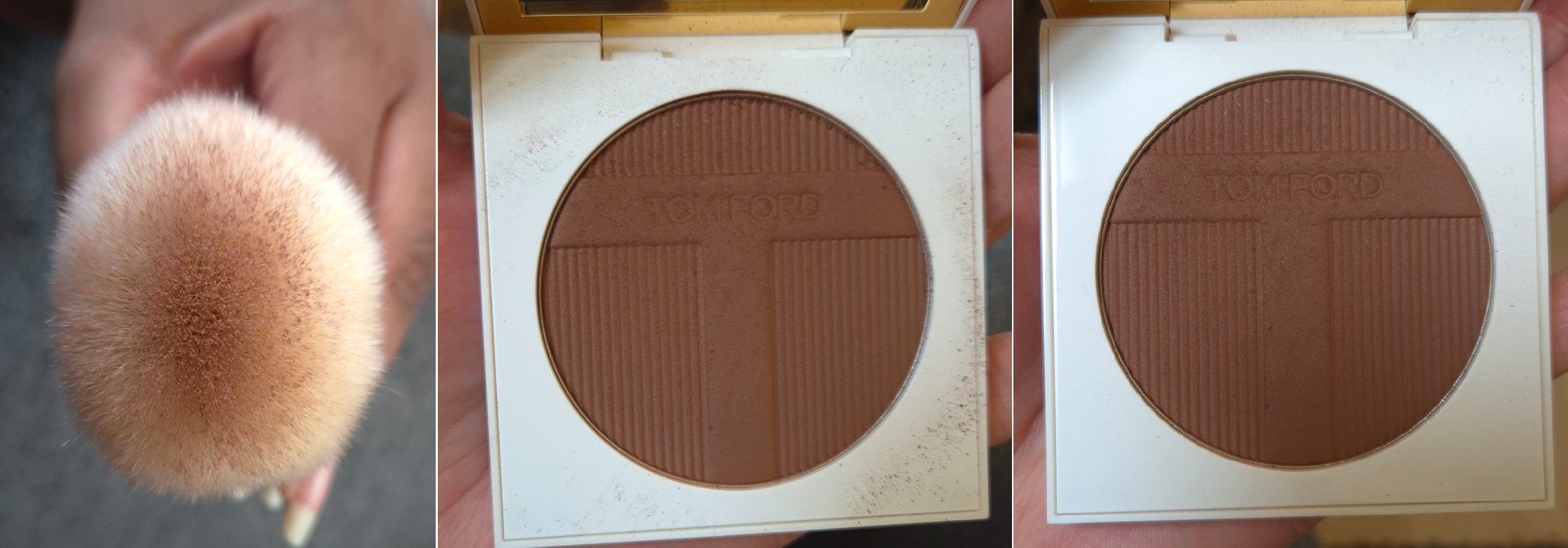
It occurred to me that I should try to use the bronzers with the Rephr 22, because it’s considered by many to be the closest natural hair dupe for the highly regarded original Tom Ford 05 Bronzer Brush. For those that like very diffused bronzer applications, these two are a great pairing. However, the Rephr 22 gave me the most kickup.
The first of the three pictures is a demonstration of how much of the Rephr 22 gets coated from two dabs into the pan. A smaller area in the center will distribute the bronzer onto the face, while the surrounding bristles with less or no product at all will help buff. The middle photo shows how much kickup is left after applying bronzer to just one side of my face. I wiped the surface of the compact before applying bronzer to the other side of my face with the Rephr Kōyō instead, so the third picture shows how little kickup there was by comparison.
Longevity isn’t an issue with these. The Tom Ford bronzers are decently blendable, but I have even more skin-like bronzers or ones that give more of an airbrush finish at better prices too. So, I like the bronzer, but I still feel like I overpaid, even with the 20% discount and reward points used. This might have been a different story if the bronzers had more of a glowy finish, which would make them more in line with my preferences.
Formentera definitely shows up on me, but I’m very picky about red-toned bronzers. So, I have tried mixing Panarea and Formentera together. While I like the results, I’m at the point in my makeup journey that I no longer wish to bother combining bronzer shades. I just want to carry a single compact with a color that works easily without me having to think about the ratios or worry so much about blending it well enough. With the Victoria Beckham Bronzing Brick, equal amounts of both shades works perfectly for me. When I try to mix the Tom Ford Bronzers, I have to pick up enough of Panarea to lighten Formentera, but still keep it dark enough that it’s able to be seen on my skin. On top of that, Panarea’s hard press and hard pan issue makes the number of necessary swipes inconsistent. Sometimes I need to dig into it more than other times. Plus, mixing both of them together doesn’t help remove that feeling of me having overpaid! I have at least figured out that I am happy with how Formentera looks if I’m wearing one of my more yellow-toned foundations. If I’m using a foundation that has stronger orange tones and/or is slightly darker than my current skintone, then the bronzer makes me look too red for comfort. So, I can keep that in mind too.
Too Faced has six options with two that are darker than I need. MAC has 10 options in the matte finish and 5 in the radiant finish in a range that also goes beyond my skin’s depth. Too Faced (as of now) and MAC are Estée Lauder owned brands alongside Tom Ford Beauty. So, it’s not as if additional shades couldn’t be made. Someone decided to keep the range of this premium brand limited.
In the past, the Soleil Collections were limited edition. I cannot imagine that all the bronzers, highlighters, and eyeshadows released aren’t permanent items, but perhaps the intent is to expand upon them every summer going forward. However, I don’t foresee myself buying any unless the brand releases some immaculately perfect shade for me. This is one of the reasons I didn’t buy one of their reformulated highlighters. Based on other reviews I saw, Amalfi may be similar to Reflects Gilt (which is too light for me) and Portafino could be close to the bronze shade from the Shade Illuminate Highlighting Duo in Tanlight. Just like I said in my Best Highlighters Showcased post, I’m so happy with Tanlight that I don’t feel the need to buy anymore highlighters from Tom Ford…unless something happens to mine.
Tom Ford Eye Color Quad Crème in Olive Smoke
I was incredibly tempted to buy Olive Smoke when it first came out, but reviews were mixed. I was even more tempted when it was being discontinued and listed on sale for 50% off. Since all of the brand’s quads have been newly reformulated, I hoped that meant I’d have a better experience with the new version of Olive Smoke than NikkifromHR had with the previous formula.
I am happy to report that I get very minimal creasing with these reformulated eyeshadows. I’ve tested these with and without primer (my primers of choice being the Lisa Eldridge Silk Canvas and MAC Paint Pot). Without a primer, the creasing is a bit worse, but good enough for me to still be satisfied with how the eyeshadows look throughout the day. These eyeshadows are very pigmented, but still buildable. The way the black eyeshadow feels and performs is what I think Guerlain was aiming for (but failed) when they made the black shade in their Royal Jungle quad. It’s not as wet feeling as the black eyeshadow from Pat Mcgrath’s Bronze Bliss, but TF’s black is truer (less blue).
The reason I’m so focused on the black shade is because it’s the one I rely on to create depth, and I like black eyeshadows that are rich in pigment, but not hard to control. I’ve had black eyeshadows that were patchy, not dark enough, or so pigmented that they were hard to blend. So, whenever I come across one that works just how I want, I’m happy. The one in this palette is like that.
The pale gold and dark gold aren’t very exciting colors, but they fit well with the Olive Smoke theme and are necessary for adding brightness, along with taking the eye looks in a less smokey direction whenever that’s wanted.
The Olive color is the most appealing shade. It’s what drew me into this palette because of how infrequently greens are featured among luxury brand eyeshadows. 2025 seemed like the year of the green palettes, but there were still less around compared to years when pinks, blues, or purples were the “it” colors for that year. This is a deeper tone of Olive than I typically see. As is typical of Tom Ford, the shimmer is smooth and reflective, but not intense, dramatic, or sparkly. There is an elegance and refinement to these eyeshadows, which is something I want sometimes, but not all the time.
The pigment is there. The formula is good. I’m relieved that despite having a bit of slip, these don’t crease like crazy. They don’t fade. There’s no fallout. I’m happy to know that Tom Ford’s Crème formula is good, but if I’m going for a sophisticated eye look, I still don’t think any of the brand’s eyeshadow ranges surpass their Wet/Dry a.k.a Soleil/Lumière formula. My issue has always been that they rarely make color stories in that formula that interest me. In fact, that’s one of the biggest issues I have with Tom Ford. The eyeshadows in the quads either lack a deepening shade, are too similar in depths, too similar of colors within the same quad, or the color story is too “safe.” So, even if the formula was in my top 3 favorites (which it is still not), there are so few that I’m interested enough in to purchase.
Because these eyeshadows aren’t fully within my preferences, the price rarely feels worth it. Comparing this Crème formula (which I think is still better than the standard/Runway) to other luxury and designer palettes, there tends to be a standout feature in addition to have an option of costing less.
Tom Ford Quads – €85 Victoria Beckham Quads – €84 Prada Quads – €82 Guerlain Quads – €75 Dior Quints – €73 YSL Quads – €69 Pat Mcgrath Quads – €69 Chanel Quads – €66 (not limited edition)
VBB Quads have one shimmer that is practically like a pressed version of Lid Lustres and the best discount is 25% off. There is also the option to get a refill, which is naturally going to cost less. The Prada quads have a cream to powder formula that I love, in addition to the option to get a lower priced refill and/or 20% off. The Guerlain Quads I only find special when they are not in eyeshadow pans and I’ve seen them listed as high as 40% off (the older quads). YSL Quads have some of my favorite formulas and I’ve seen them close to 50% off. Pat Mcgrath Quads sometimes have the “special” baked shades and can be up to 40% off depending on the type of deal there is going on.
So, when I see the kind of prices I can pay for quads with formulas or features I like even more, I always feel like I paid too much for what I got from Tom Ford. To be more accurate, I felt like I paid what I should whenever I purchased Tom Ford from a CCO/CCS (Cosmetic Company Outlet). Those are owned by Estee Lauder and they sell out-of-season beauty products, like Tom Ford, for up to 40% off or sometimes there are even better bundle deals.
Since I no longer have access to Tom Ford products at these kinds of prices, whatever I do end up buying has to be something I really want, such as the Olive Smoke Palette I’ve been pining over since early 2025. This is ultimately why I did not buy any of the Soleil Eye Quads, despite that being my favorite of the three types.
I still want to continue my eyeshadow ranking series, and I’ve had Tom Ford on the list for a long time, but I never even reviewed Leopard Sun, nor the limited edition quad I bought before the reformulations (Electric Cherry). I also forgot that I technically had a mini review in the May 2022 Purchases Reviewed post featuring African Violet, Photosynthesex and Honeymoon. Now, a ranking doesn’t seem all that relevant considering 5 out of my 6 Tom Ford quads have been reformulated or discontinued. If anyone is still curious, it would be as follows from favorite to least favorite:
Honeymoon
Photosynthesex
Olive Smoke
Electric Cherry
African Violet
Leopard Sun
I don’t care that my version of Honeymoon is very old by now. I didn’t use it enough to be worth repurchasing in the new formula.
I hope this has been helpful, or at least an interesting discussion. Thanks for reading!