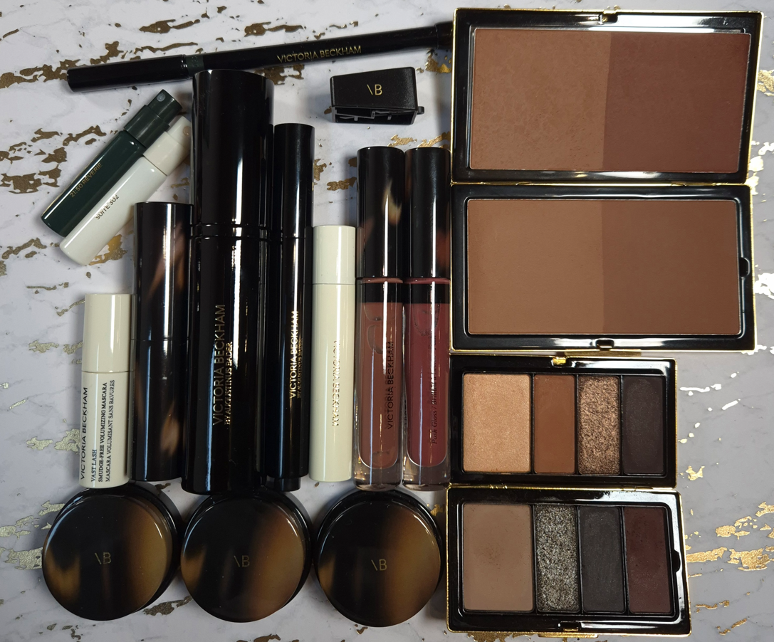
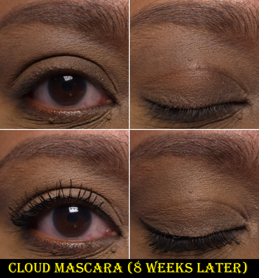
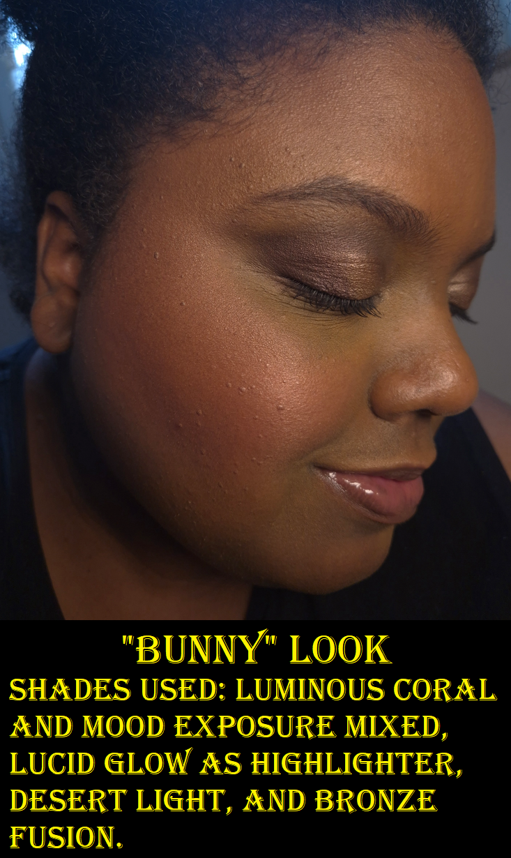
In addition to the Benefit and Nabla products that are newly released, I’m also going to show photos of the ABH Archibrow since I have no plans to make a dedicated Anastasia Beverly Hills post anytime soon. As I’ve mentioned before, due to things going on in my personal life, it’s not easy for me to do as extensive of makeup testing lately. Thankfully, shade expansions don’t require that and I’ve had the ABH brow product for several months already.
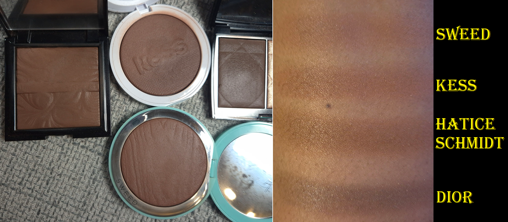
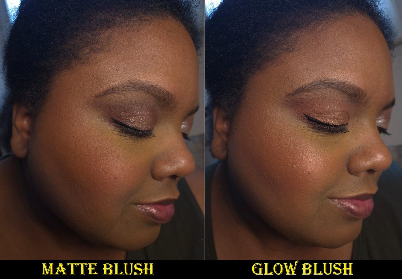
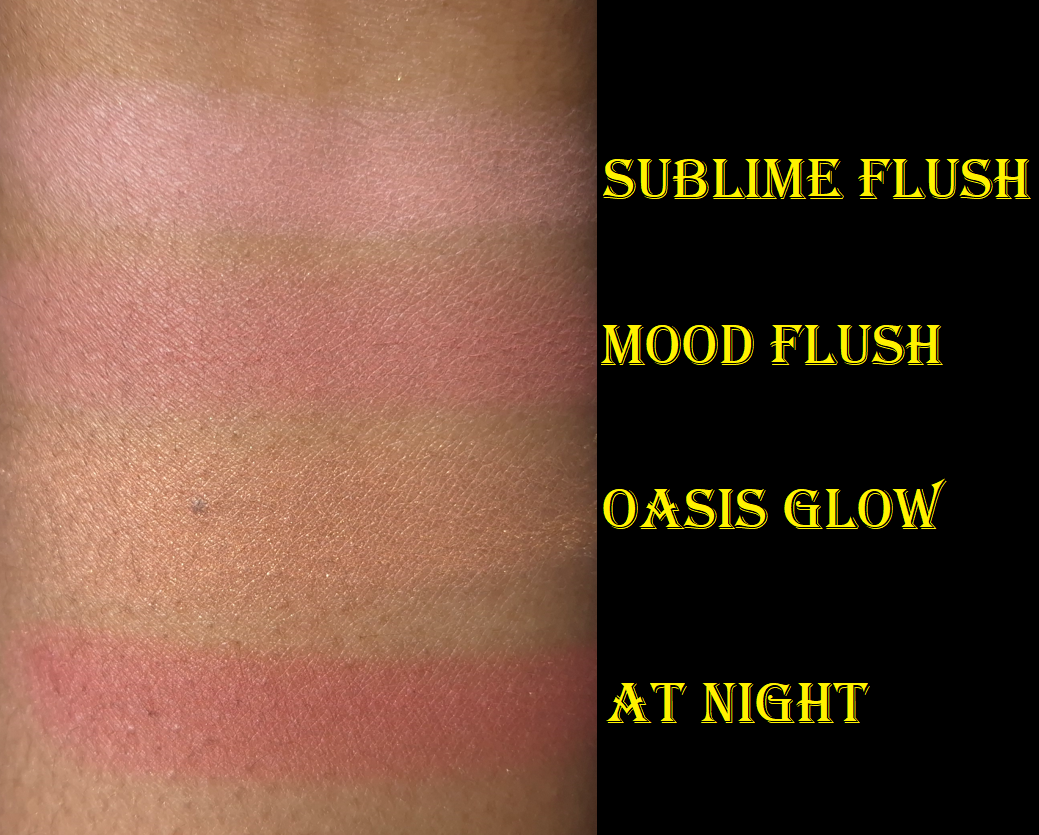
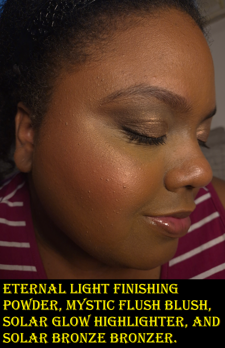
Benefit Hoola Bronzer in Rosy Deep
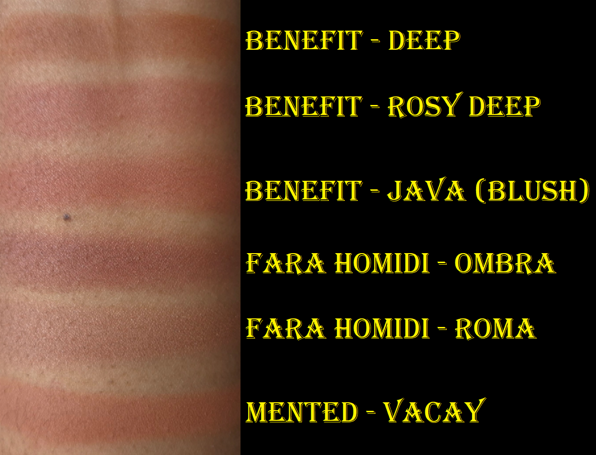
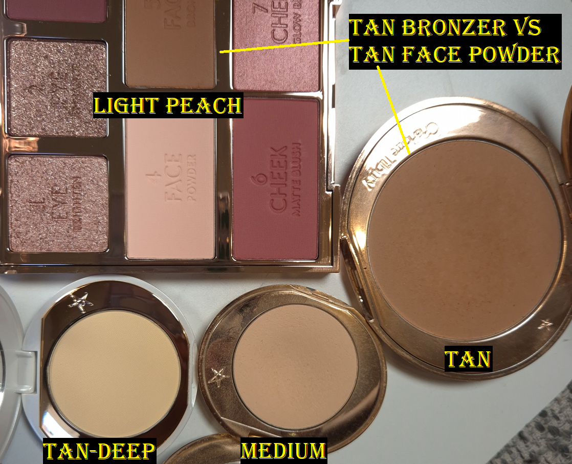
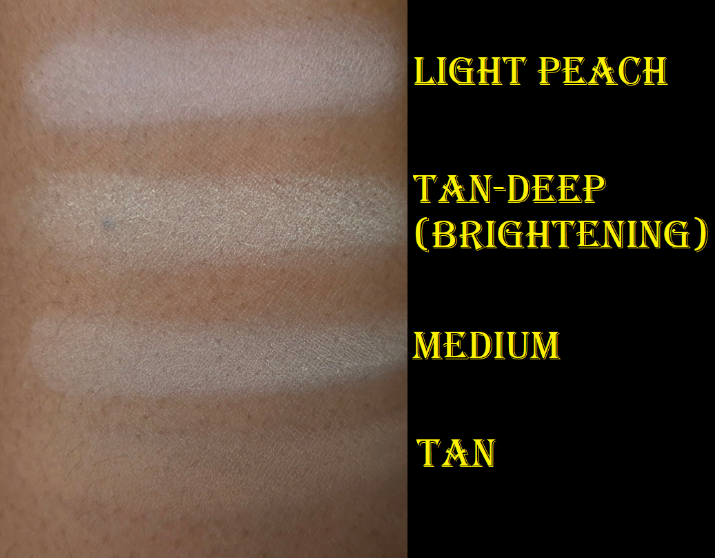
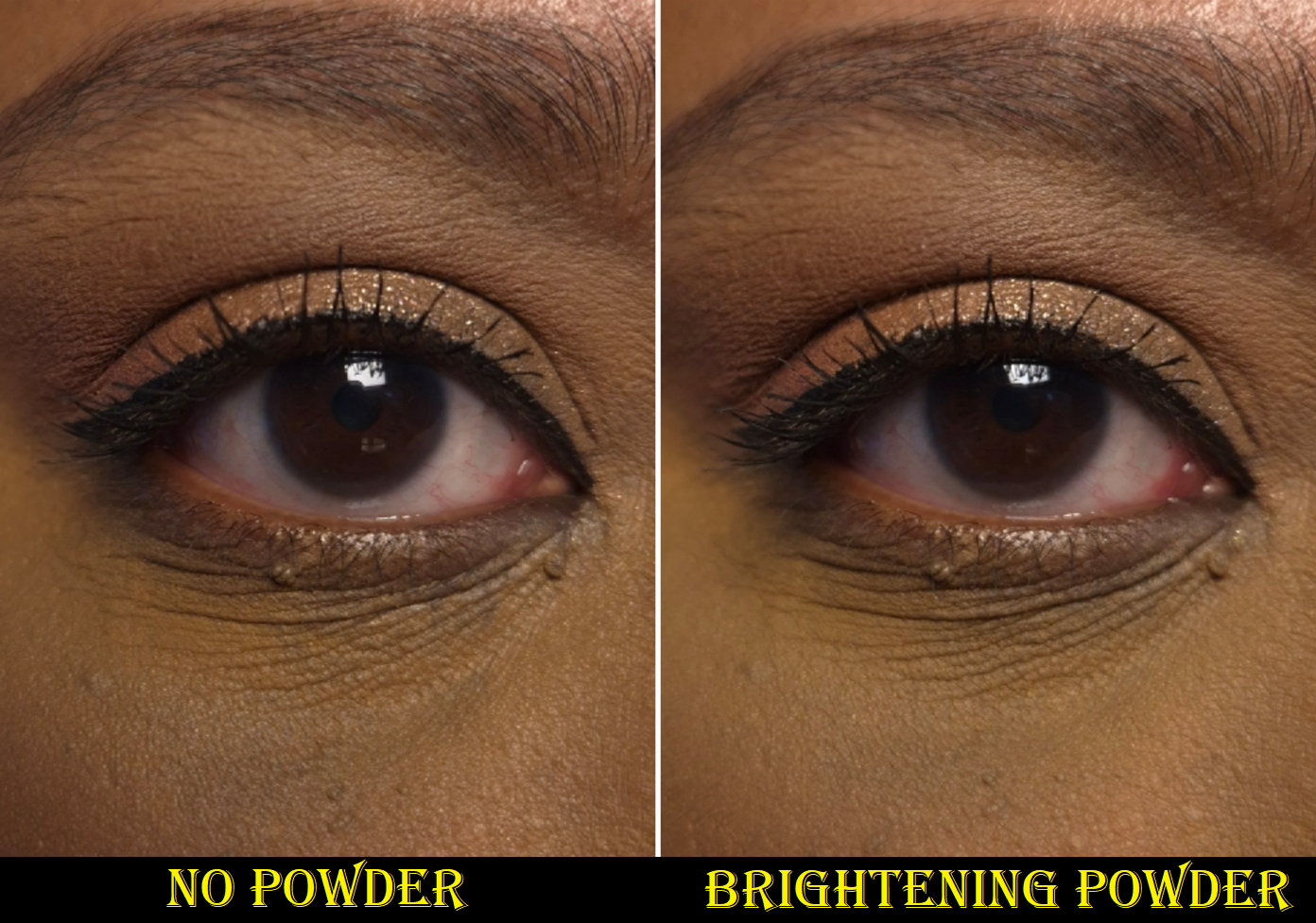
I think it’s important to see the shade Rosy Deep compared to Deep (above on the left), and the blush that Benefit describes as “rosy mocha” (called Java which is above on the right). That way, one can properly see the amount of pink within the shade in comparison to a typical warm bronzer, plus how it differs from an actual blush that could potentially be seen as another “blonzer” type of color.
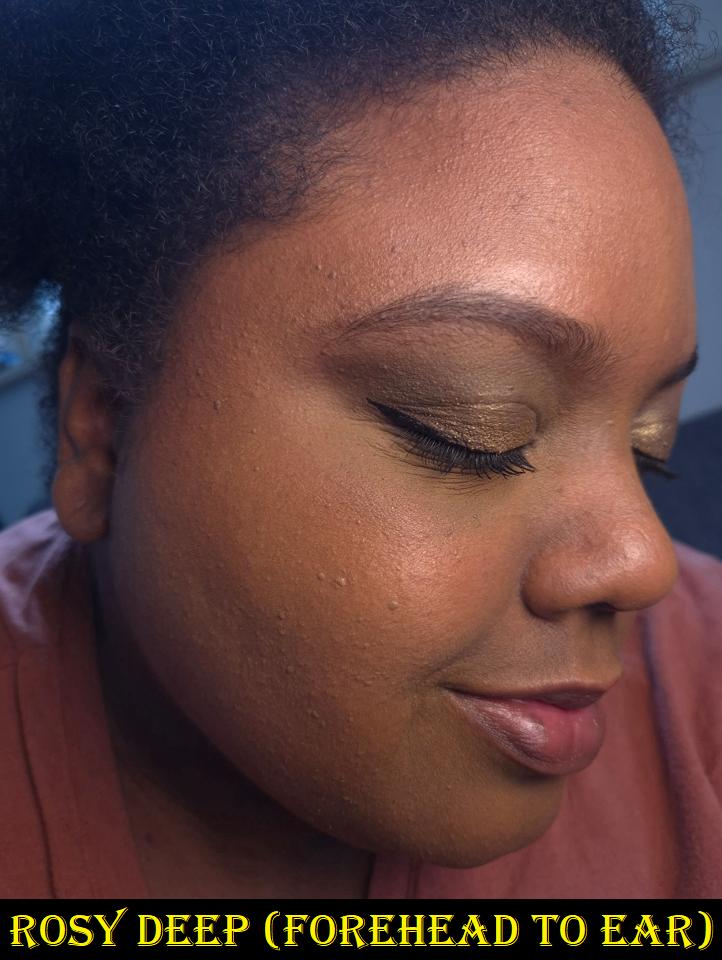
As seen on this brush, the rosy color is not subtle, and is like a slightly desaturated pinkish-red. In swatches, it looks kind of mauve on my arm, but it’s very much a brownish pink on my face. I can’t explain the color theory behind it except that my arm is lighter with more yellow and green undertones on my arm than on my face. There is extra warmth in my face after needing to keep the windows open for two weeks during the heat wave and I often forgot to put on sunscreen.
On my face, the Rosy Deep bronzer still has a touch of warmth, but it’s a tad cooler and more muted than the normal Deep shade. The Java blush has more red in it. Fara Homidi’s Ombra bronzer has more plum-purple tones to it than Rosy Deep. Previously, the pinkest bronzer I owned was Vacay by Mented, but it looks orange comparatively next to the other bronzer swatches in the photo above! This makes me very curious how the Jones Road Bronzer in the shade Terracotta would compare to Benefit’s Rosy Deep, but I don’t own anything from that brand. I don’t want to spend 55 Euros ($63 USD), shipping included, to get it in Germany since they only sell through their website and not at retailers. Now that I have Rosy Deep, I may not be missing out!
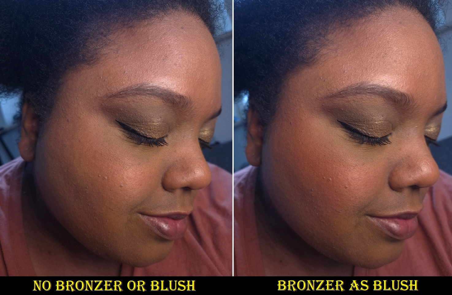
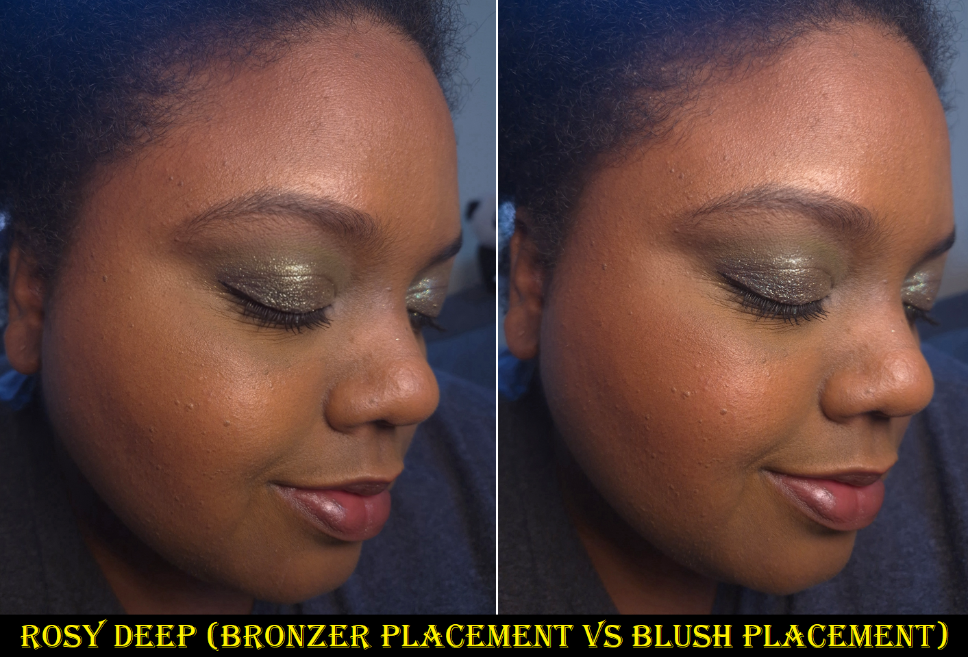
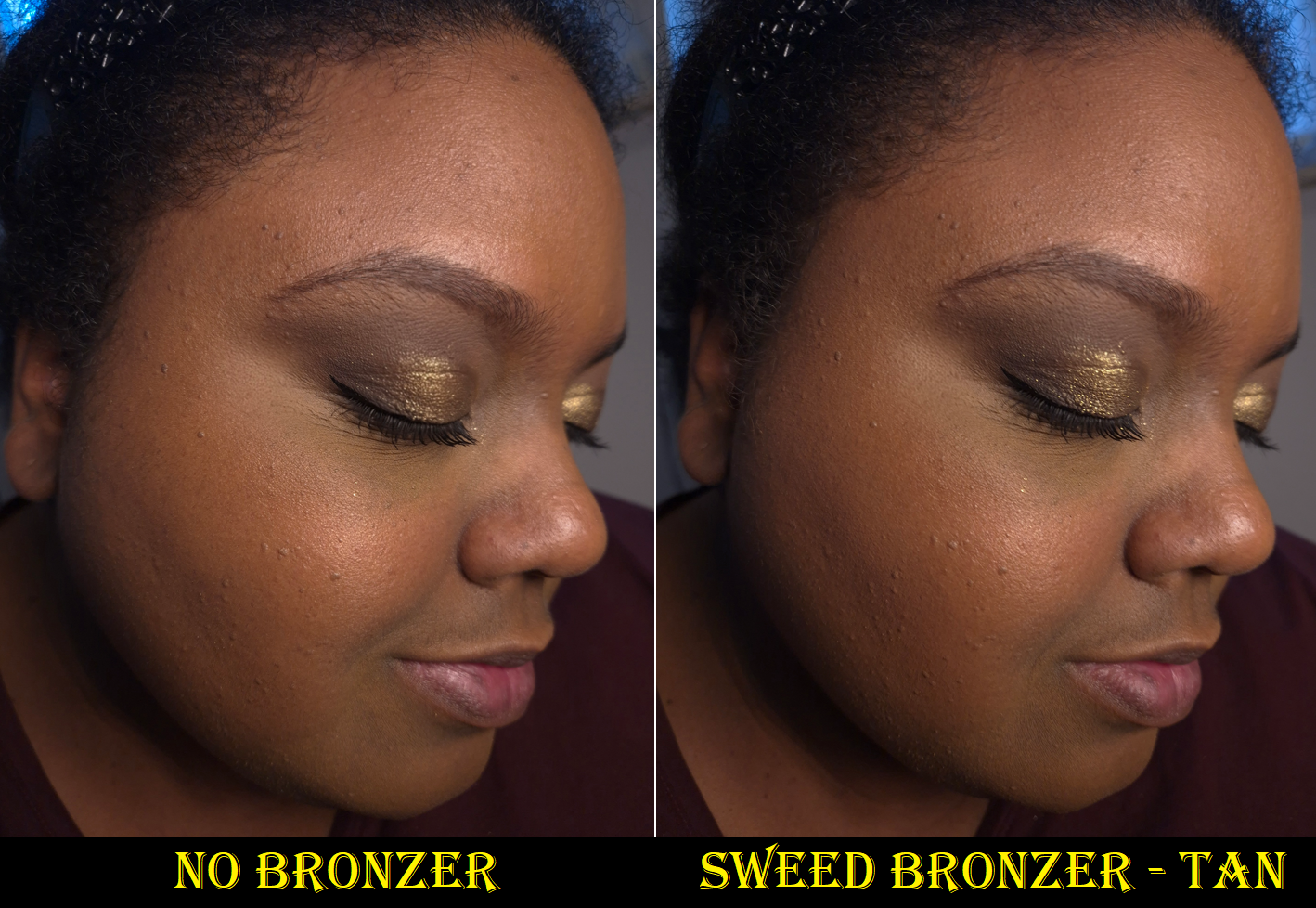
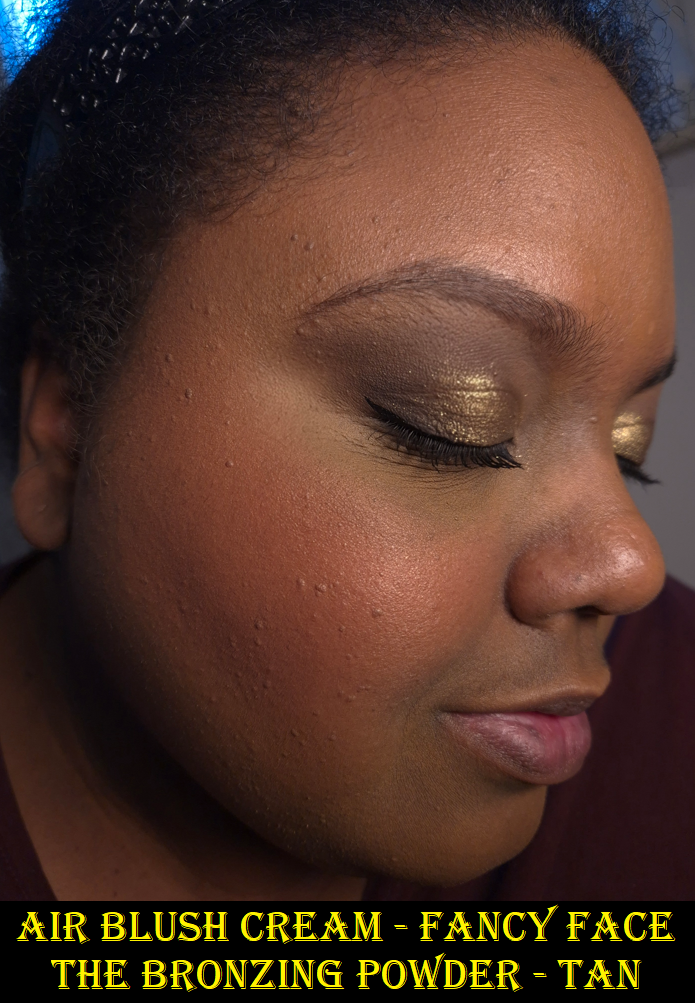
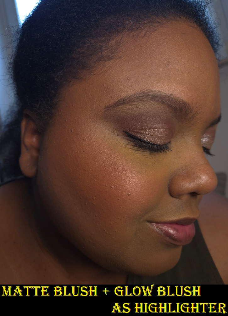
As for the performance, it’s no different than when I reviewed the reformulation last year. It’s thankfully not as prone to hard-pan compared to the original. It’s pigmented, but with my airy brushes I have no issues building it up in a more controlled manner. It blends nicely and used to be one of my favorite performing bronzers, though by now I’ve come to realize it doesn’t have as airbrushed or blurred of a look as my current top favorite powder bronzers. However, it’s still good and wears very well where I typically apply bronzer. If I wear it exclusively as blush, it can have some fading if after all my skincare and cheek products my face is still too dry. Then there isn’t as much for Rosy Deep to grip onto.
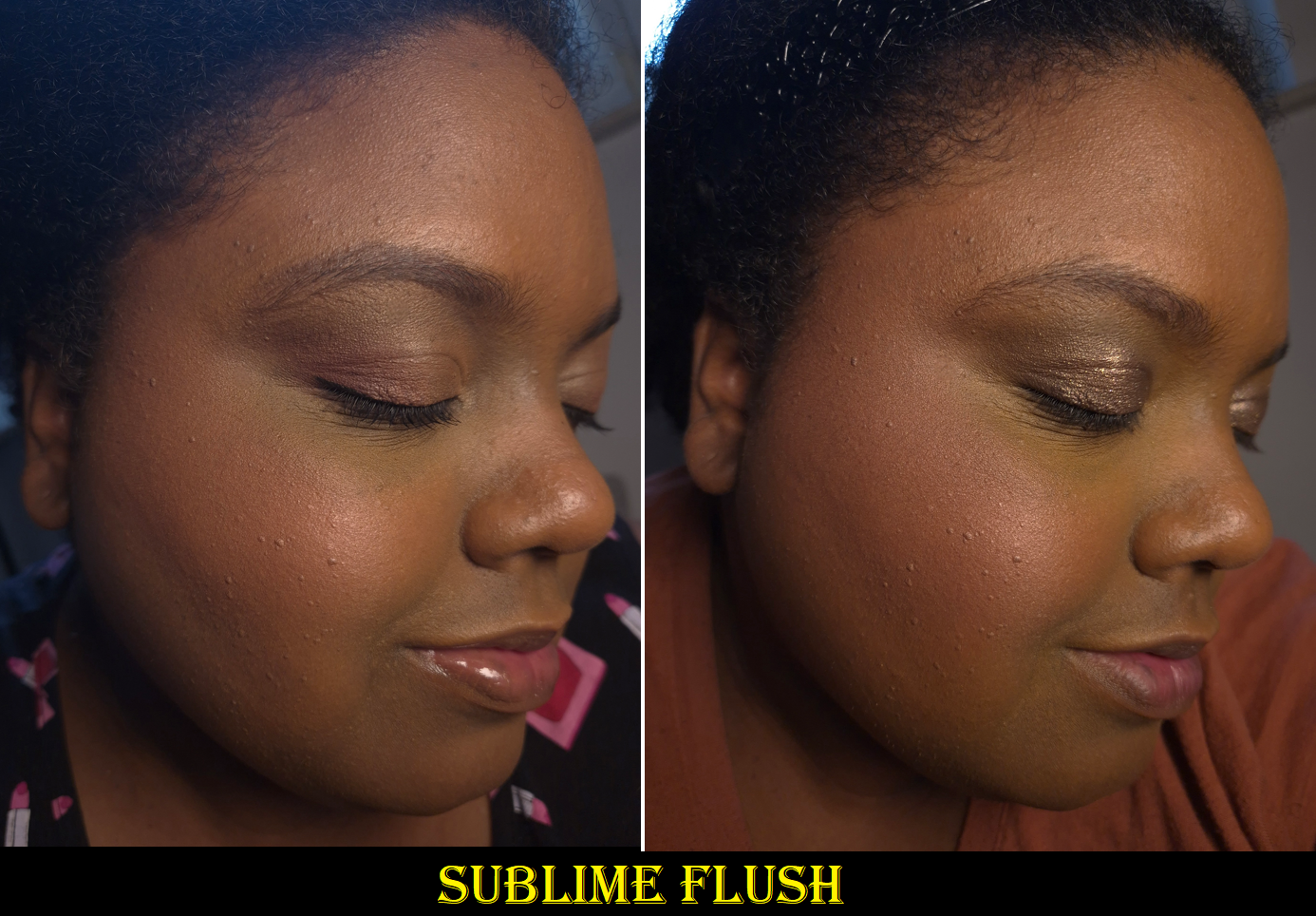
Benefit Cosmetics is notorious for having very limited shade ranges. Because there is such a high demand for pink/muted/cool toned bronzers in the fair and light skin category, I would have expected Benefit to stick to their usual m.o. and further expand the lighter range again before releasing not only Rosy Deep but Rich-Deep too! So, I am very pleasantly surprised. Kudos to Beneft! For deeper skin tones, the majority of bronzers are highly saturated oranges and reds. So, a color like Rosy Deep is very hard to find as a powder bronzer. There are more options in cream form though. I usually apply a thin veil of powder blush to go on top of my powder bronzer whenever I want to achieve this same effect that Rosy Deep gives. That’s why having a pink bronzer isn’t a necessity, but it’s an added convenience! Plus, this makes a gorgeous blush too!
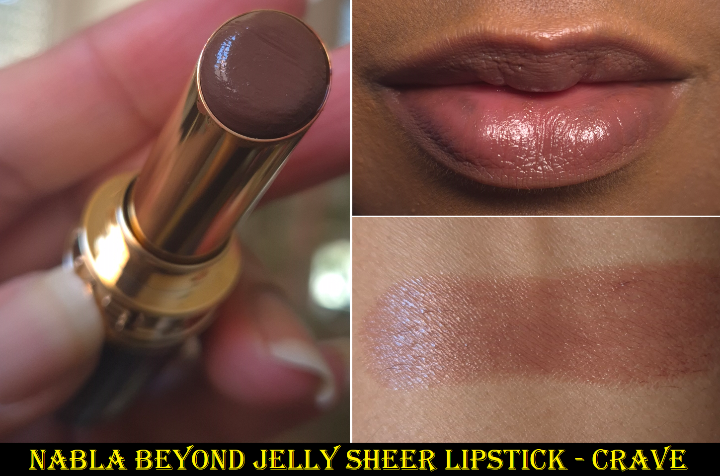
Nabla Beyond Jelly Sheer Supple Lipstick in Crave
When I reviewed this lipstick the first time, I talked about how strong the scent was, but how it goes away over time. I don’t know if Nabla has decreased the amount of fragrance used for all the new shades, but this one from the start already isn’t as strong. I’m happy about that!
Everything else about it is still the same. The texture is similar to the YSL Candy Glazes and Fenty Gloss Bomb Stix. It feels a bit like a gel, but has an emollient feel from the sunflower seed oil, but it’s a little more solid than the melty type of balms because there are enough waxes. It has more ‘slip’ than ‘stick’, but I still consider it a slightly sticky product because of the occlusive layer that moisturizes and also helps the lipstick to grip on for longer.
I like how it smooths out my lips, even when there’s chapped skin, and it has sheer to medium coverage. I definitely recommend this line.
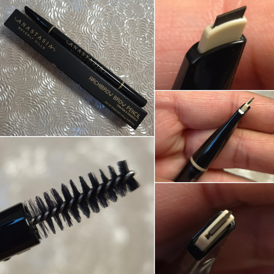
Anastasia Beverly Hills Archibrow Brow Pencil in Chocolate
I like the fullness of my natural brows, so I don’t require much from brow products. Essentially, I want the pencil to glide smoothly enough so it won’t tug at my skin and/or hair. I want it to be smudge-proof and at least water-resistant. I don’t mind it being a heavy pigment product as long as it can be combed through to look natural. A thin pencil for precision and creating realistic feather-like strokes is a major bonus, but I won’t like it if it’s so fragile that it breaks a lot. One such example is the fact that I prefer the e.l.f. Instant Lift Brow Pencil over their Ultra Precise Brow Pencil for that same breakage reason.
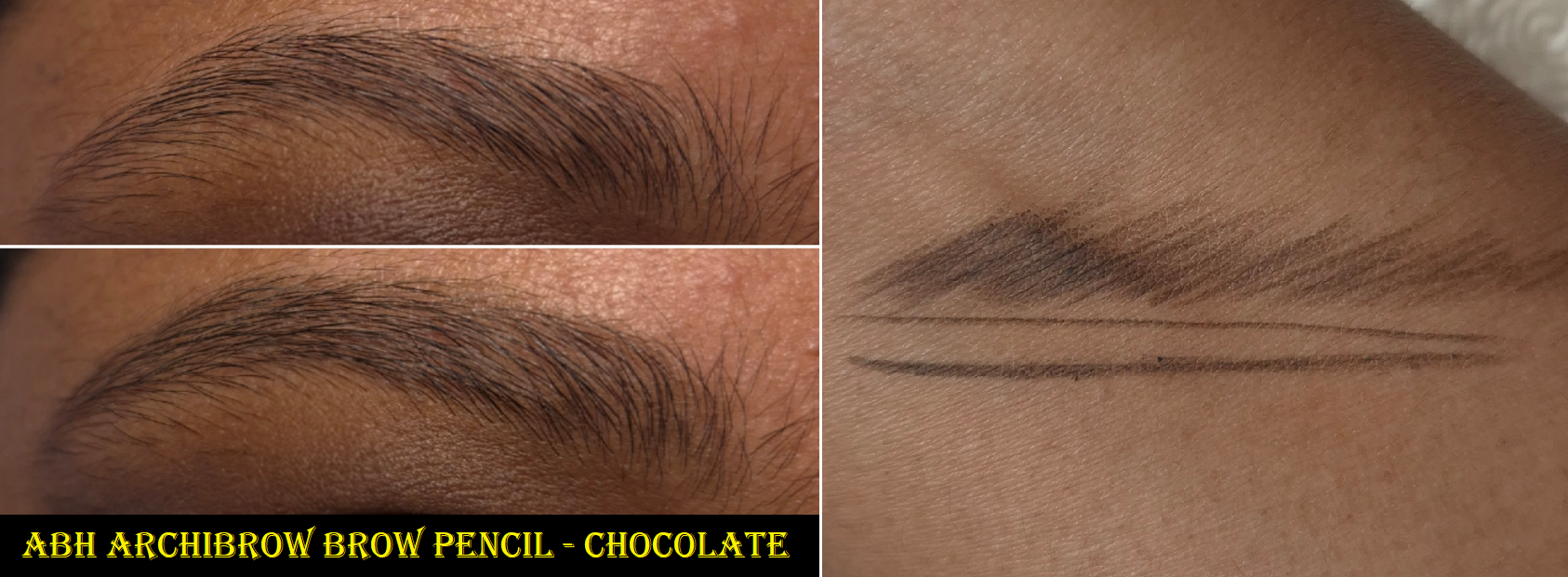
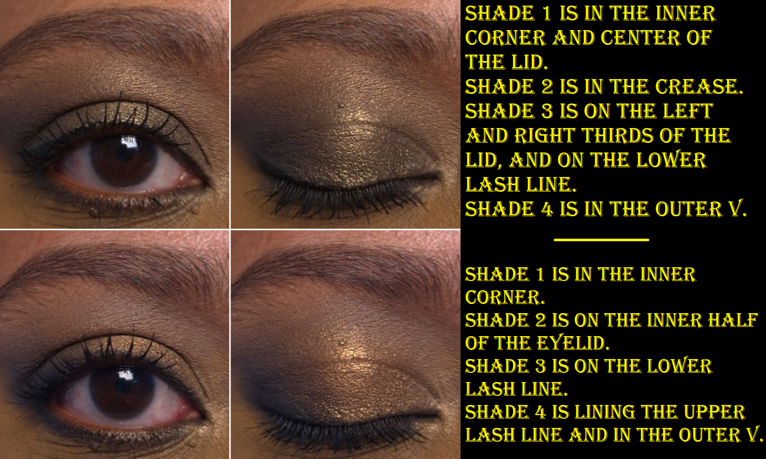
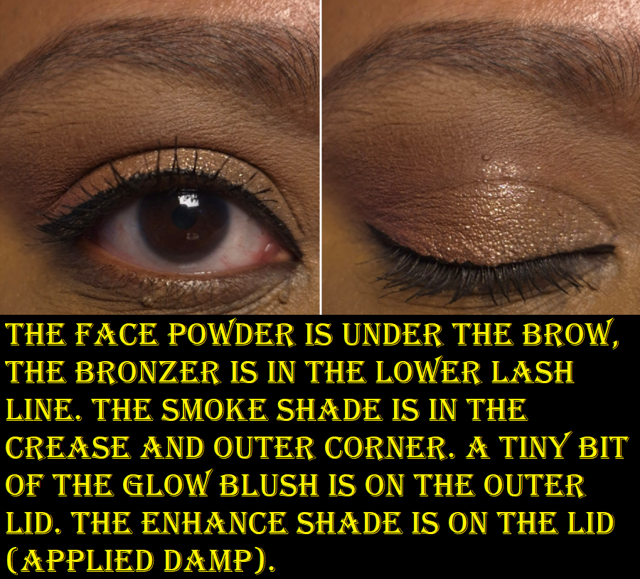
The brow on the top left is my natural eyebrow with no product in it. The bottom left is typically the most amount of product I put in my brows. I like them to look natural and only minimally defined.
The Archibrow checks off all the boxes. It’s not a heavily pigmented product, but added pressure or repeated strokes can build up the color for those that like a more obvious application. One has to be careful to only have the smallest amount of the pencil twisted up because the stick of product itself does not retract and if too much of it is poking out, that piece will definitely break off. The amount showing in my photo is already too much. I only did that in order to have an easier time capturing how it looks in pictures.
It doesn’t take long to figure out how to use the pencil to get more opaque or sheerer lines, plus thin or thick ones. Even though the shade Chocolate is intended for those with medium brown hair, It looks quite dark to me! This is why I continue choosing this shade out of ABH’s brow options. It’s warm, but not too red. It can create a more defined tail and edges, along with light shadowing under the hair to give an appearance of fullness.
The strangest thing about this pencil is the lack of cap. When twisted all the way down, it’s only around 3mm from the surface. So, I was concerned that the pencil would dry out from the exposure to air, but my pencil hasn’t been effected it in the nearly 3 months that I’ve owned it. Then again, I keep it stored in the box to minimize the amount of air, dust, lint, crumbs, and whatever other element the open hole could be exposed to. Also, the spoolie is the shortest, yet thickest one I own.
The Archibrow is only $4 more than the Brow Wiz, but it has about half the amount of product. For this reason, I might just stick to the Nyx Micro Brow Pencil or any of the other brow pencils I regularly repurchase that are either inexpensive or were on sale for 50% off. This pencil is great, but my brows aren’t difficult enough for me to feel like I’m lacking that much when I choose less pricey options.
So that’s everything for this week! I hope this post has been helpful and informative!
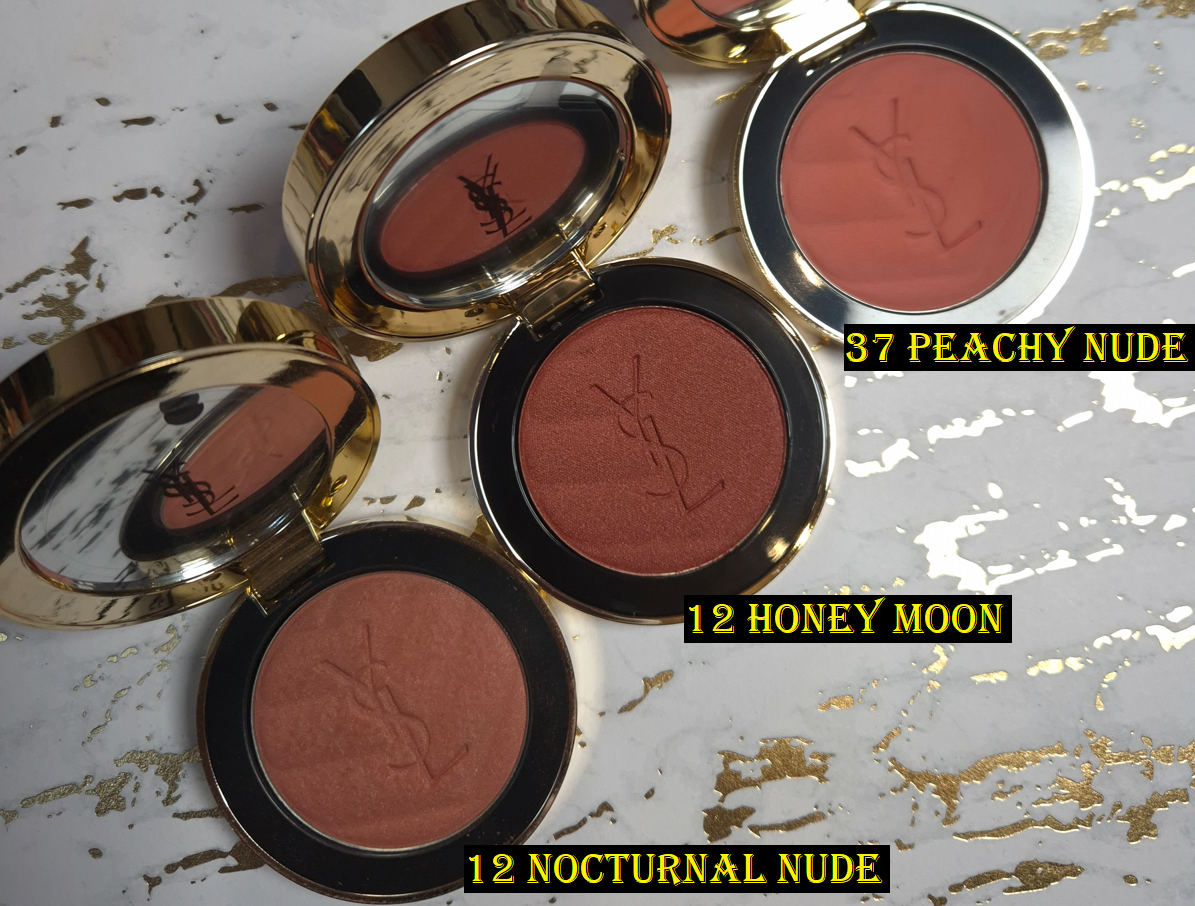
Three additional blushes (not pictured here) were added to this post.
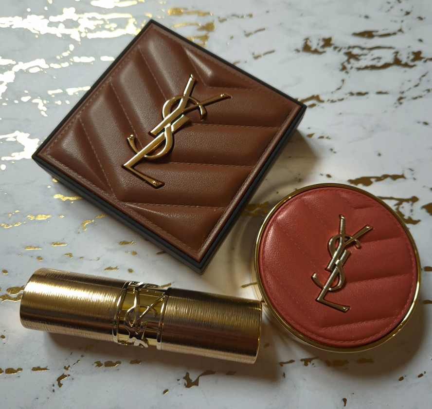
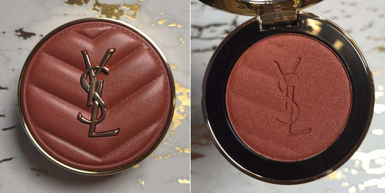
Today’s post features the two makeup launches I’ve been the most excited about thus far in 2026! Although I needed to Downsize My MAC Blush Collection, I have owned at least fifty different shades of their powder blushes within the past decade. My first MAC post, which covered nineteen of their blushes, currently has the highest amount of views on my blog. It’s thanks to that post, and the Follow-Up with an additional twelve shades, that I’ve been able to connect with many other people who love MAC’s blushes as much as I do! So, they have a special place in my heart.
I have to shout out NikkifromHR and TheMakeupPen as some of the bloggers I chat with about MAC!
When MAC started discontinuing shades from their “permanent” standard blush range in 2021, I knew it was only a matter of time before they revamped the line, but I had no clue it would take almost five years for that to happen! I also didn’t expect it would be three years before MAC relaunched the Sunstruck Bronzers.
MAC reused the model photos and swatch photos of the older Sunstruck Bronzers in the listings for the newer ones, in addition to them bearing the same shade names in the matte and radiant finishes. So, I don’t think there have been intentional changes to the bronzer colors.
Whether intentional or not, my version of Matte Rich Golden is slightly different. So, I will delve deeper into that in the bronzer review section.
The photos and videos I’ve seen, such as this one from lokalekatastrophe, have led me to believe some of the blush shades have been tweaked. Everyone’s version of Desert Rose looks lighter, for example on this reddit page. When I build up Raizin The Roof, I believe it can look pretty much like the original Raizin. However, Film Noir Buff is a muted brown-purple, unlike the original Film Noir that I believe had a reddish-purple tone, like in the YouTube short by CocoaSwatches. I will do my best to share shade comparisons in the blush review section, but I don’t have access to my full collection anymore.
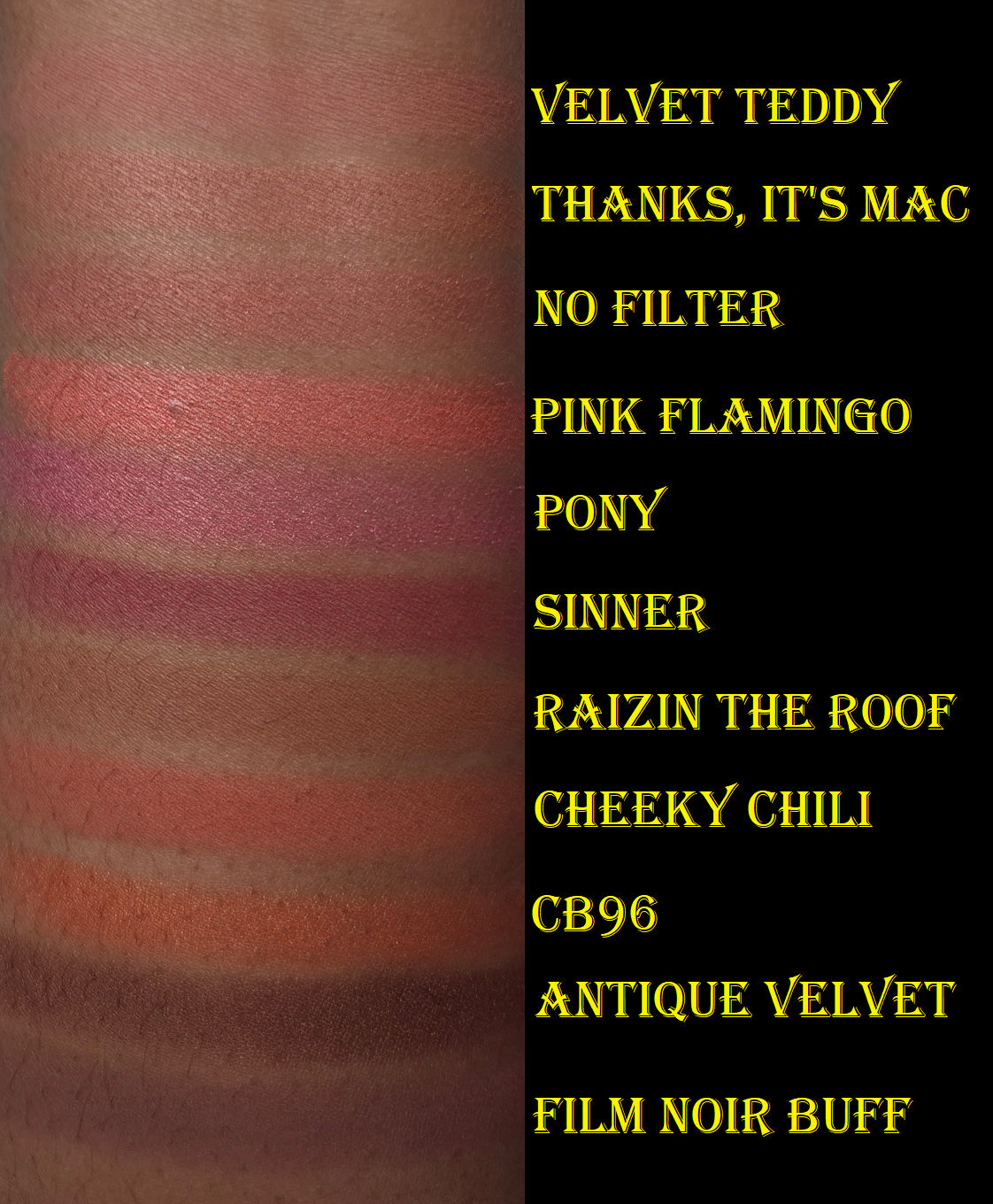
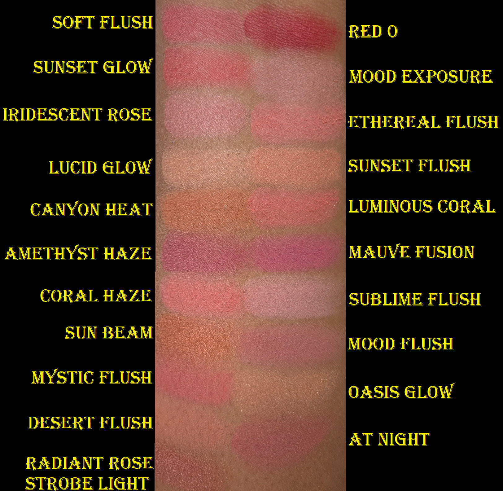
Skinfinish Colourstruck Blushes in Pony (radiant), Pink Flamingo (radiant), Thanks, It’s MAC (radiant), No Filter (radiant), Velvet Teddy (matte), Cheeky Chili (matte), Raizin the Roof (matte), Film Noir Buff (matte), Sinner (matte), CB96 (radiant), and Antique Velvet (radiant)
MAC launched with 29 blushes in the Skinfinish Colourstruck line. I did not wish to repurchase shades I already own, so that narrowed down the list of blushes I wanted to buy. I created a table for anyone curious about which shades are completely new to MAC or might only exist in a different form, such as their lipsticks. My research was done to the best of my ability, but MAC has been around since before I was born, so I could have missed something.
Within the standard powder range, there used to be five categories: matte, sheertone, sheertone shimmer, satin, and frost. Now, there are just matte and radiant blushes.
It is said that the new matte version is intended to have a soft matte finish rather than flat. I’ve noticed that the Colourstruck mattes are smooth, but only softer than some of the older shades. The new blushes are a little less pigmented, apply the tiniest bit smoother (depending on which older shade it’s compared to), and leave some kickback, which may or might not be a significant amount depending on what kind of brush is used. Some of my older MAC blushes were hard-pressed and felt rough to the touch. Even without hard-pan, they became more difficult to pick up over time. However, some of my MAC blushes still feel silky and powdery to this day. I would be willing to buy replacements of my older blushes with a rough texture (such as Modern Mandarin and Frankly Scarlet), but none of my hard pressed ones got reformulated.
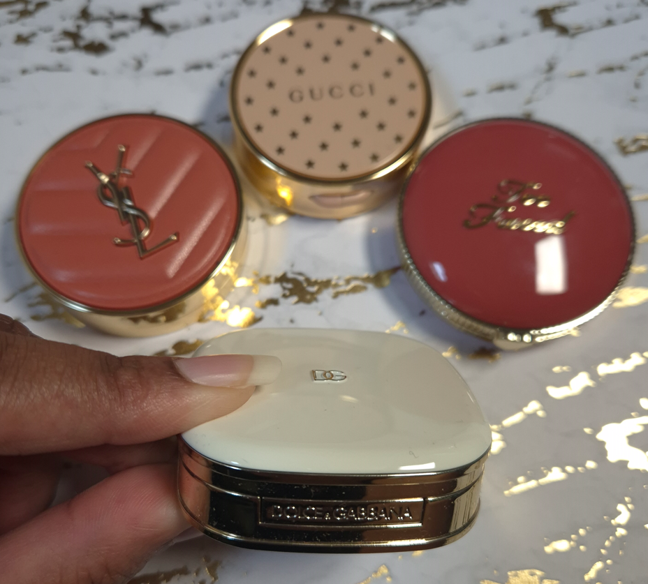
The radiant blushes are still nowhere near as glowy as the Extra Dimension Blushes. I would say the amount of shimmer is somewhere between the satin and sheertone shimmer level. When I’ve compared the swatches of the radiant blushes to the glowy blushes from other brands, MAC’s doesn’t look as shimmery. It’s only really when bright light is directly shining on my face that the sheen becomes obvious to see. I’ve complained about Gucci’s Glow Blush line not being glowy enough (review coming in perhaps 3 weeks), but I can say MAC’s Radiant Blushes are at least glowier than Gucci’s. Essentially, I view the Radiant line as satins, but it’s possible that the lighter shades could have more pearl in it, if MAC follows the trend in the past of having their frosty/highlighter-like blushes as mostly lighter colors. I would have to see those in person to know for sure.
Pony
I chose to show, in the photo above, how a single swipe of this blush looks prior to being smoothed out (like I did for the Colourstruck group swatch photo). For some reason, Pony picks up in chunks and has to be worked into my cheeks a bit to eventually appear as even looking as the rest of the blushes. By now, the top layer is completely flat, despite it being one of my least used blushes. The debossed “MAC” pattern still hasn’t worn away from any of the others! I don’t know why this blush is so crumbly, but thankfully it only takes a little bit longer than the rest to blend in properly.
Over the past two years, I’ve been favoring nude/natural blush tones, but I suddenly found Pony very appealing. I can’t recall ever owning a blush this vibrantly pink before, though it does remind me a bit of MAC’s Sweets for My Sweet blush in the Extra Dimension finish.
Pink Flamingo
I still love corals, especially pink-coral over coral-orange, so this was another shade I couldn’t resist. Aside from the blushes I swatched above, Pink Flamingo also reminds me of Nars’ Orgasm X and MAC’s Cheeky Bits Extra Dimension Blush.
This shade and Pony look completely different in swatches, but they’re ultimately both pink blushes. They look similar on me, with the main difference being that Pink Flamingo is a bit lighter and warmer. That being said, I’m still unable to choose between them, so I’m happy I bought both of them.
Thanks, It’s MAC
I had the hardest time deciding between Thanks, It’s MAC and No Filter. Essentially, this shade is a little more of a yellow-orange brown (as opposed to pink-brown) and it appears lighter than No Filter on my cheeks. I swatched it next to a lot of my warm brown blushes and was surprised how few dupes I could find, but Maiden’s Blush is quite close. Thanks, It’s MAC reminds me of the Hushed Tone Extra Dimension Blush (that I stopped using in favor of Faux Sure). This is pigmented enough that I can easily see it in person, but it blends in a lot with my skin in photos.
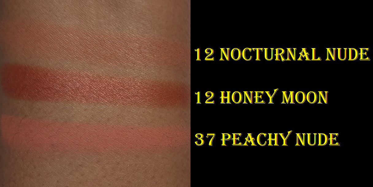
I like this color, but I prefer Benefit’s Starlaa and Suqqu’s Kafuu (discontinued). It’s tied with YSL’s Nocturnal Nude (also discontinued). So, perhaps I could have skipped buying this one in hindsight, but I always feel compelled to buy a dark nude blush when I see one because of how uncommon it is to find one suitable for medium-dark skin.
No Filter
I can see some shimmer particles in the pan, but this blush can pass for matte if I only apply a sheer layer.
Because it’s a little deeper, pink-brown, and easier to see on my cheeks than Thanks, It’s MAC, I prefer this color. I like to think of it as a toned down version of Faux Sure, which is my most used MAC Blush, and just one of the most used blushes in my entire makeup collection! There was no way I was going to pass on getting this shade!
Velvet Teddy
This blush looks so faint in the photos of MAC’s models, so I assumed it wouldn’t show up on me. However, it does, and this is literally my favorite color out of all 29! The brand describes this as a deep beige. It looks more like a light pink on my cheeks and creates a youthful flush. It was extremely difficult to try and get color accurate photos where the blush can actually be seen. It’s very much visible in person.
In some photos I’ve seen, it looks warm. Some photos it looks cool-toned. On my skintone, it can look warm or neutral. As with most of MAC’s blushes, the undertone of one’s foundation can affect how strongly those tones will actually look. That’s how I’m able to wear some of MAC’s cooler toned blushes without it clashing. These blushes are great for combining into each other to customize the depth and tone. Now that MAC’s blushes are less pigmented than before, they’re even better suited for layering together.
Cheeky Chili
MAC describes this color as, “warm brick red,” which is basically orange mixed with brick red. I expected it to be redder and resemble Burnt Pepper, which remains discontinued, but thankfully there’s also enough brown to keep the color from venturing too far into vibrant territory. Cheeky Chili still pops on my skintone, but isn’t the kind of bold orange that I dislike.
Raizin The Roof
This blush is a great reminder of how tastes change over time. I rarely ever used the original Raizin because I thought it was too deep and bruise-looking on my skintone. I could never figure out why I didn’t like it considering it’s a reddish-brown blush and I typically like those kinds of colors. However, I started using and liking it again just before the Colourstruck Blushes launched. Perhaps if I had the Sonia G Soft Cheek Brush or Rephr Kōyō back then, my mind could have been changed sooner.
Raizin the Roof is described as a golden reddish brown, and it being slightly less red than Raizin is why it initially looks lighter when compared. However, if I build up extra layers, they look nearly identical on me.
I know some people are disappointed that Raizin The Roof isn’t as richly pigmented as Raizin. Raizin used to be one of the most recommended blushes for people with a deep skintone, so I’m sure it’s hard to see changes made to such an iconic color. Selfishly though, I can’t help but be happy because Raizin The Roof is easier for me to use. I really like this shade. It’s also a nice “blonzer” shade to add a toasty sunkissed look across the forehead or bridge of the nose instead of bronzer.
The difference between Cheeky Chili and Raizin The Roof is that Raizin the Roof isn’t as saturated. They both have red, orange, and brown, but Raizin The Roof leans redder. I actually like mixing the two together so that the end result has calmed down the orange from Cheeky Chili, but pops more than Raizin The Roof does by itself.
If I had to choose between them, I would skip Cheeky Chili and just stick with Raizin the Roof. I’m just not as interested in orange, as evidenced by the fact that I left nearly all of my orange blushes behind when I was moving.
Film Noir Buff
I never owned the original Film Noir because it seemed too deep for me and I assumed it would be too red for my liking. However, Film Noir Buff is practically a muted purple-brown! MAC describes it as a “rich warm chocolate,” but those models on their website look like they’re rocking contours. I was thrilled when I noticed it had the potential to be my replacement for the purple contour/blush shade in ABH’s Gradient Blush Kit from 2017. I don’t have a single other blush like this in my collection because of that slight bit of purple. The closest comparison I can think of is the previous version of Dior Rosy Glow Blush in the shade Mahogany. That one had a similar depth level of brown, but also had some red from the ph-adjusting pigment. The tone of red was on the cooler side, but not quite in the same way as Film Noir Buff.
I’m confused as to why they call it “warm” when it’s listed as cool on their social media diagrams. Although Film Noir Buff does have some red in it (as it’s needed to make purple), there’s still some grey to cool it down.
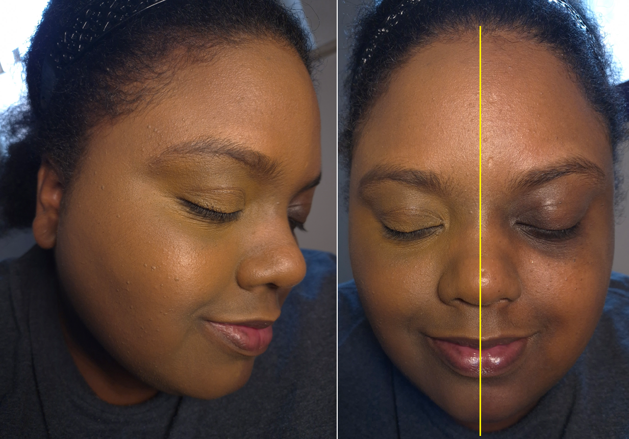
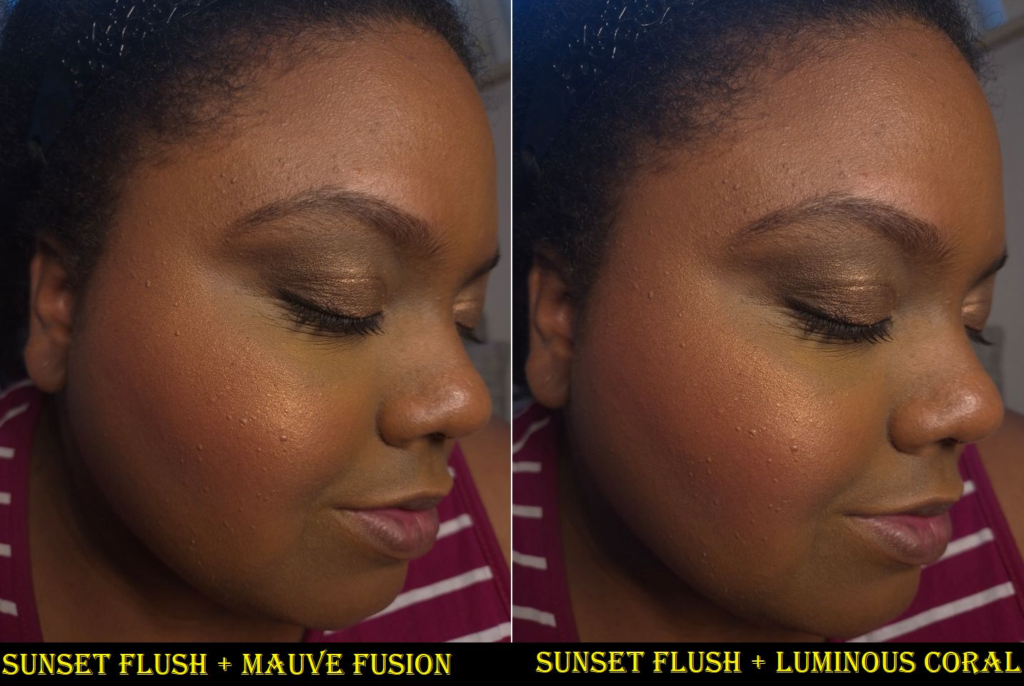
In the photos above, I’m wearing no contour on the left. On the right, I used Film Noir Buff very lightly as contour. On my face, it’s like a muted red, but the depth level enhances the sculpted look. It’s more like a brontour.
It looks very red in these photos on my cheeks, and kind of pretty, but in person it looks like dirt. I don’t like it alone as blush, but it pairs beautifully with Velvet Teddy if I keep Film Noir Buff towards the back and Velvet Teddy mainly on the apples of my cheeks. So, this color is excellent for blush draping/soft contouring.
UPDATEJune 15, 2026: I added three more blushes to this post!
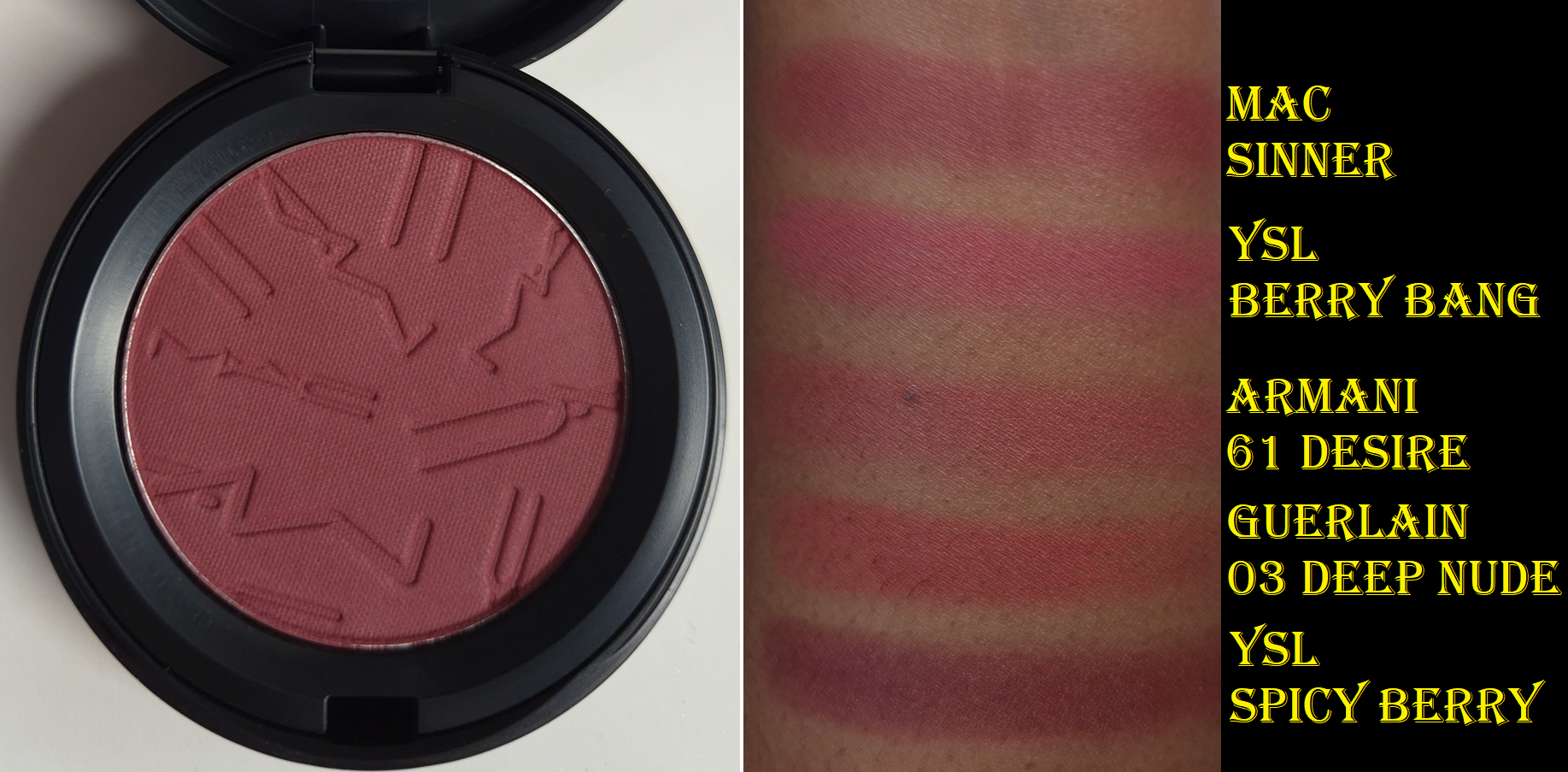
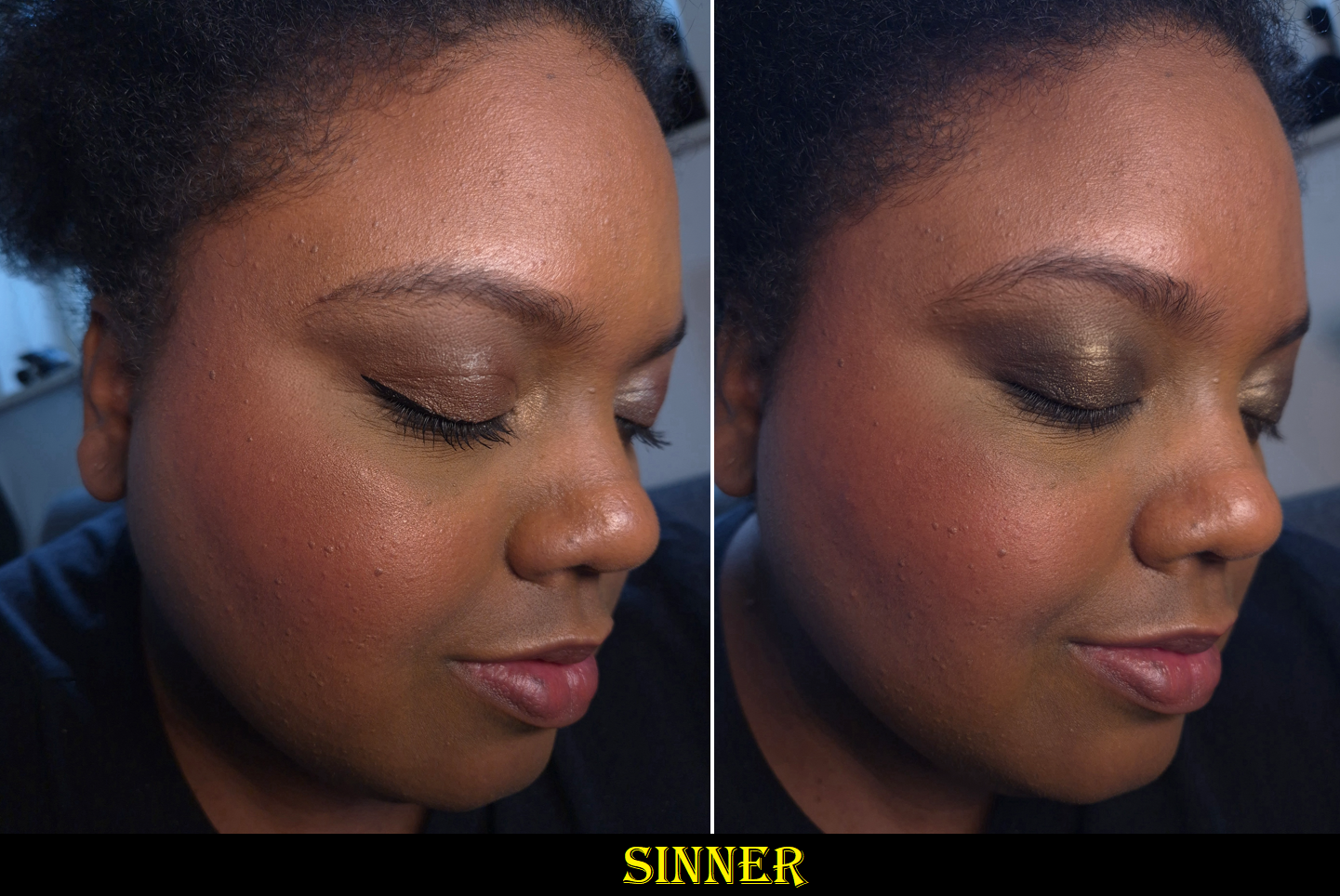
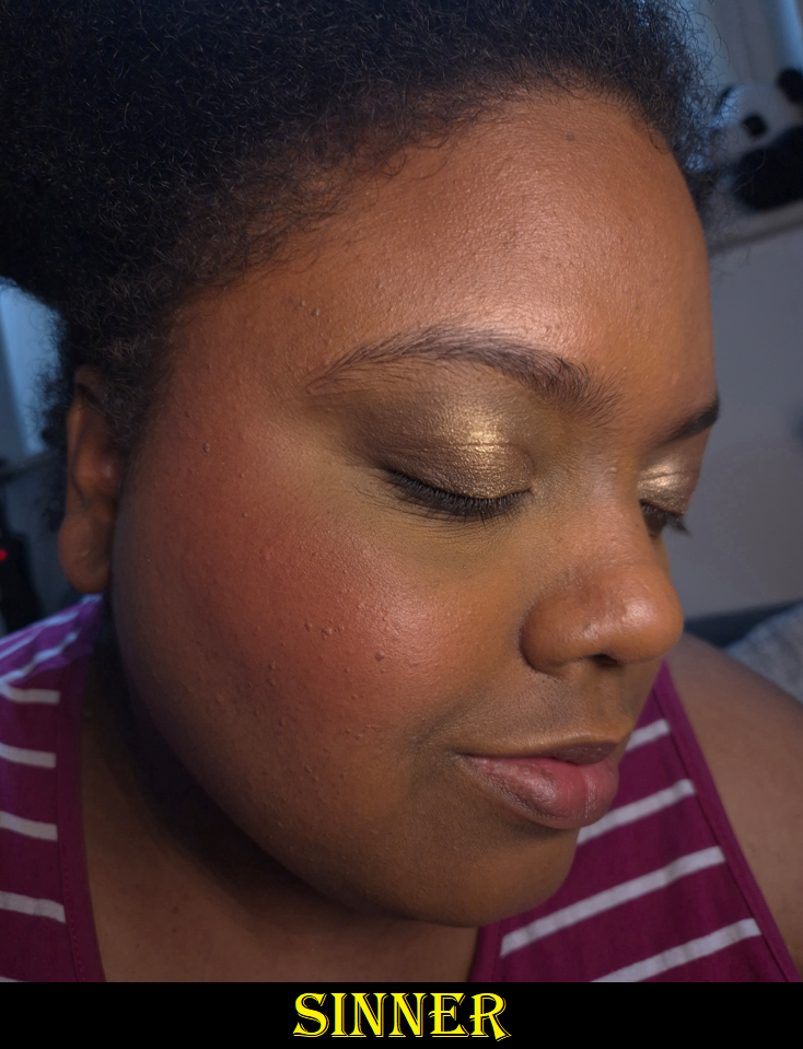
Sinner
For the swatch comparisons, I had to fish the berry shades out of my “box of products I wouldn’t mind decluttering” because I wasn’t as happy with those colors. YSL’s Spicy Berry is the exception.
When it comes to berry blush shades, I either love or hate the way they look on me. The best one I ever wore was the Make Up For Ever HD Cream Blush in Raspberry 510 (color shown here), which I bought twice before it was discontinued. Sinner is cooler-toned, but I saw someone with a warm undertone and dark skin wearing it, and the end result was similar to what I got with MUFE’s Raspberry! So, I had to buy it!
I am very happy with how it looks on me! Once again, MAC’s blushes can be effected by the undertone of foundation underneath. So, it doesn’t look cool-toned enough to clash with the warmth of my skin. Sinner is perfect for when I want that I’ve-been-out-in-the-cold type of look.
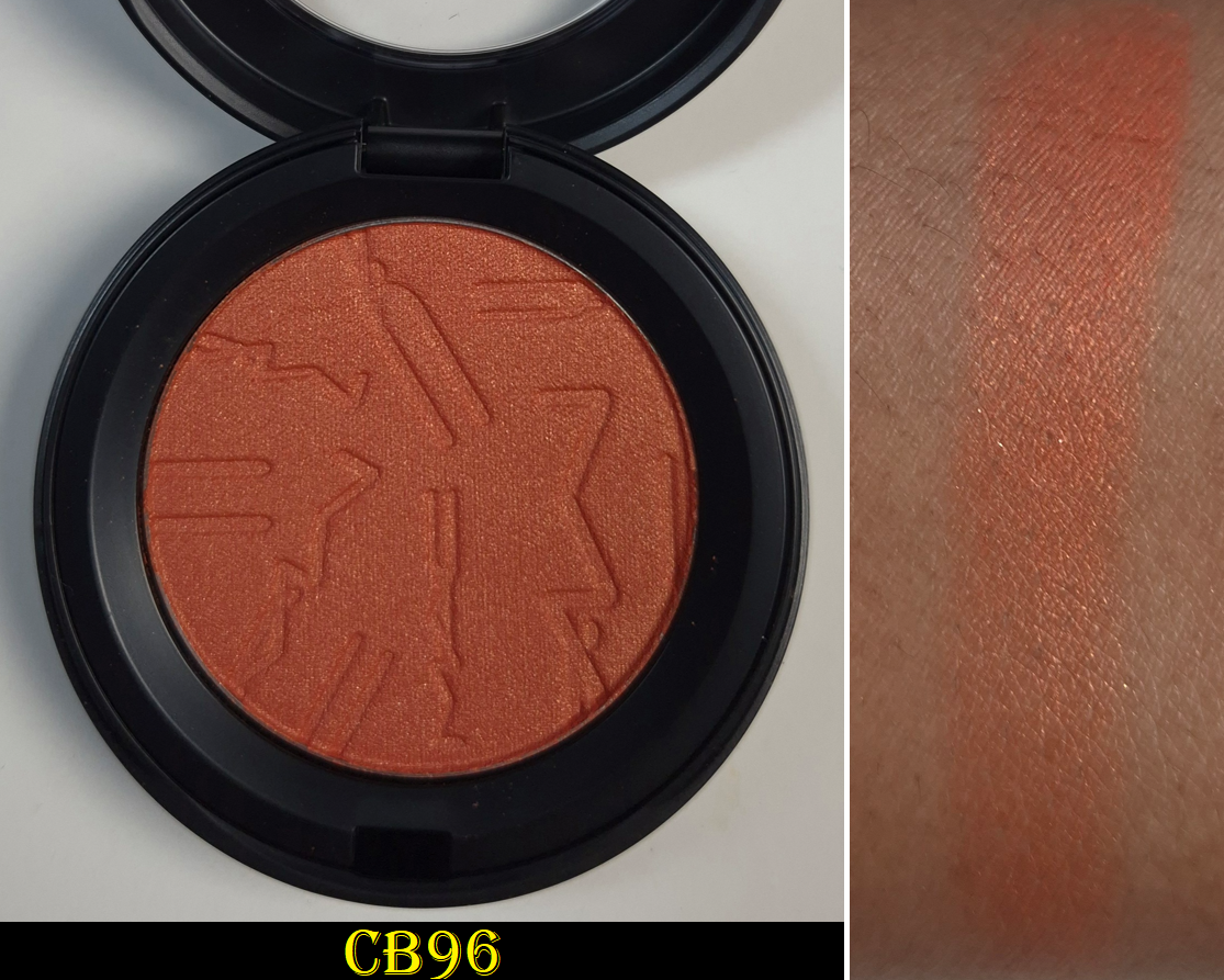
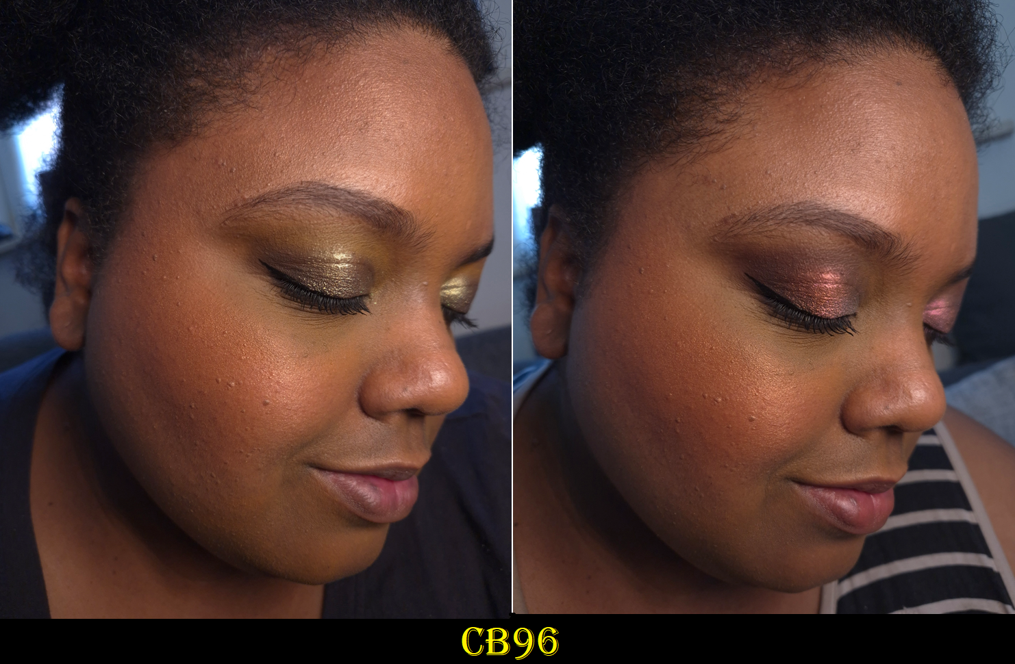
CB96
This color looks gorgeous on the MAC’s models, and on NikkifromHR, but I was hesitant to buy it because of how picky I can be about orange blushes. I was happy with Cheeky Chili, but even that shade ranked lowest of the original eight blushes I bought. I even mentioned before that I prefer coral-pink shades (like Pink Flamingo) over coral-oranges (like this one), so how could I justify getting it anyway? Eventually my curiosity got the better of me and I’m actually happy that I caved!
If I had Nars’ Taj Mahal and Fenty’s Shimmer Match Stix in Chili Mango with me in Germany, I would have tried to do comparison swatches. However, the only orange blushes I have with me are mattes. I can’t recall if I ever owned an orange shimmery blush that was opaque and dark enough to not look like a highlighter on me. CB96 might be the first!
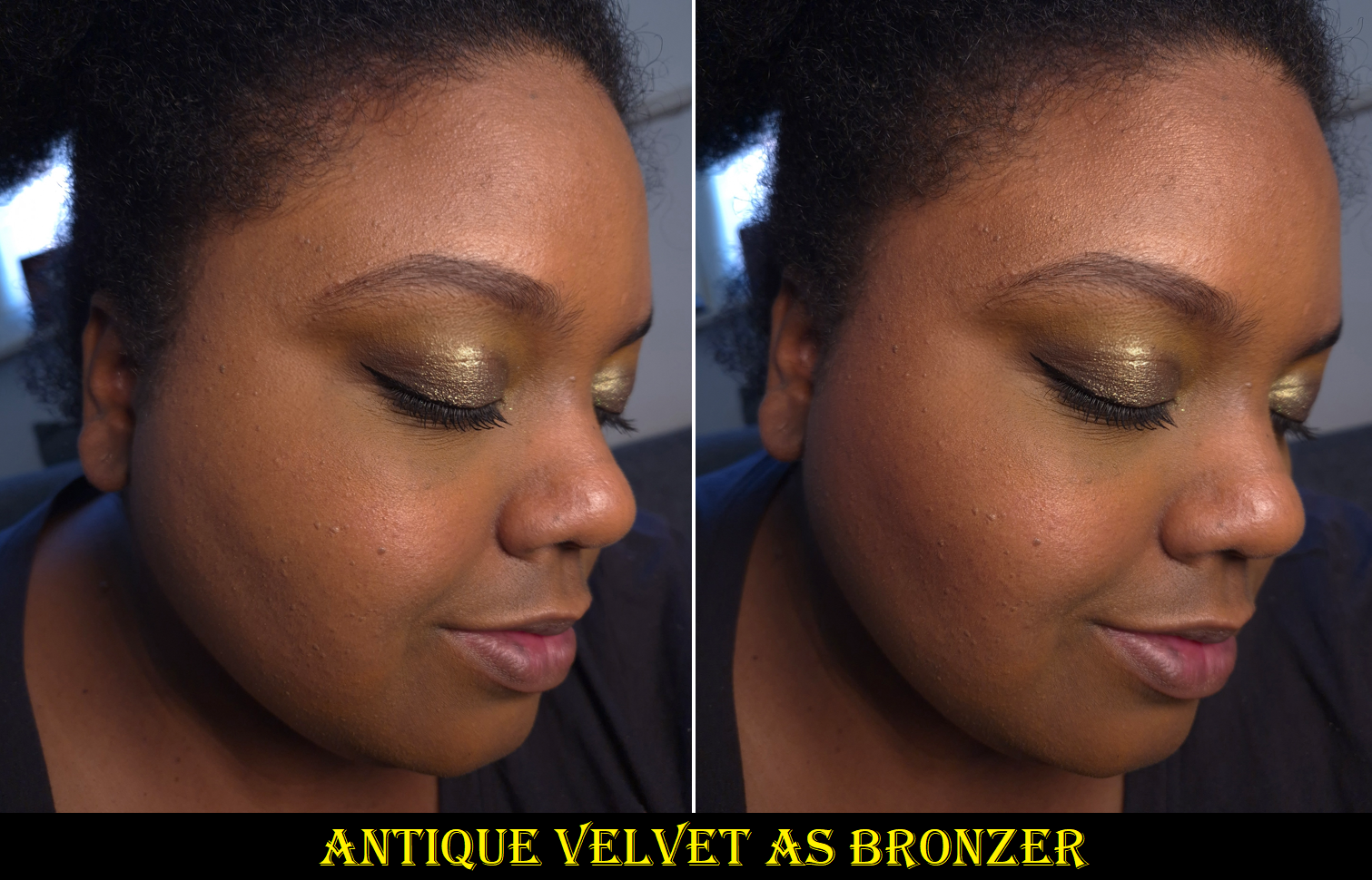
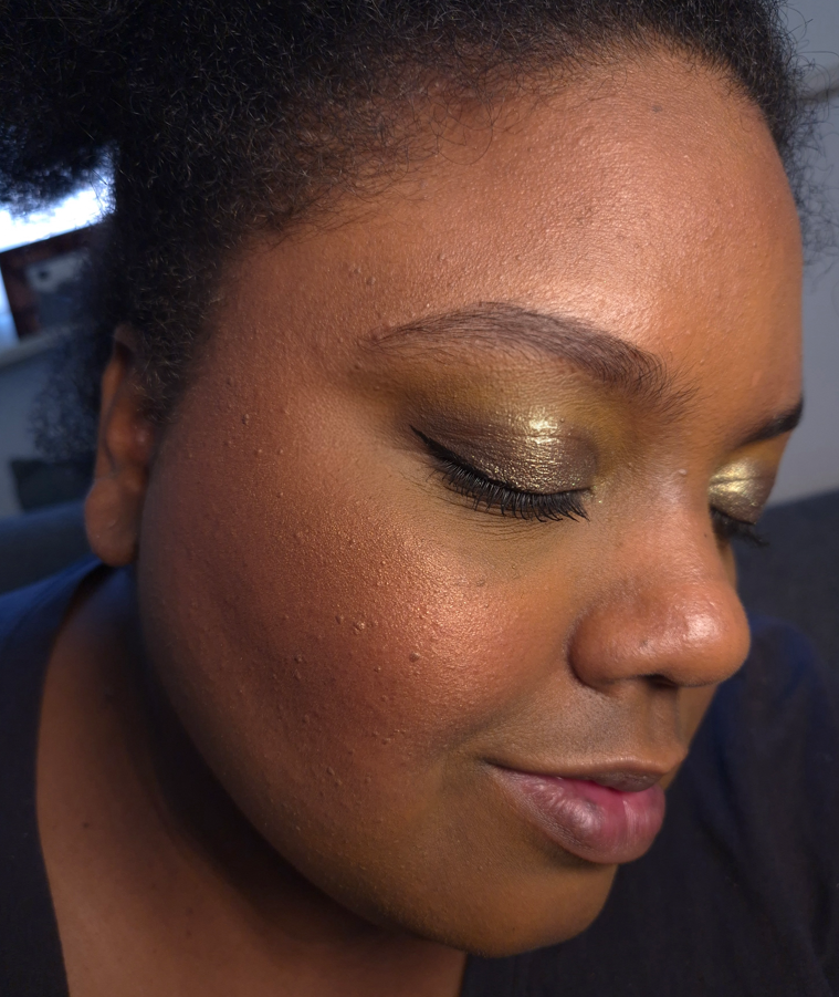
Antique Velvet
Because the Radiant Deep Golden bronzer was a fail for me (*spoiler*), with no “Radiant Rich Golden” as an option, I figured I could try using this shade for that purpose! Film Noir Buff worked well as a brontour/contour, and I’m happy to say this makes a better bronzer than Radiant Deep Golden, even if it’s a bit deep for me.
The darkest warm brown shimmery blushes I own are Chanel’s Lumiere Brun Roussi, Dior’s Bronzed Glow, and MAC’s Sweet as Cocoa, but all of them are discontinued shades and none anywhere as deep. So, I don’t have anything current to compare to Antique Velvet.
Some additional things I want to mention about the blushes overall is that the packaging was updated to be flat. They can now be stored flush next to each other or balanced in a stack without that domed lid. It’s more convenient to handle now, but it also looks a lot more generic.
In 2020, MAC blushes used to cost $25 per compact. So, $34 is quite a jump for even less product! In Germany, the full retail price is €34, but I found them less than a week after launch for as low as €25-€29 depending on the shade and retailer. I still find that to be expensive, but it’s a price I was willing to accept. I got some truly incredible deals on my old MAC blushes, so maybe that’s the cosmic tradeoff.
The longevity of the blushes are just as good. They don’t contain parfum. Other than Pony, these are easy to blend and work with while I’m using my regular products and skincare. However, if I’m wearing a gripping primer, a dewy sunscreen that leaves a slightly tacky residue, or some other product that makes my face essentially sticky, then I try to powder my face before applying these blushes. If I don’t do that first, then the blushes adhere a little too well and require more effort to blend.
I find MAC’s blush quality, whether matte or radiant, to be quite good. I do have blushes from other brands that are glowier, more blurring, even more finely milled, creamier and softer to the touch, etc. What has always pushed MAC powder blushes into holy grail status for me has been the shade offerings. Having so many dark-skin friendly options, especially less saturated ones and the variety of nudes, is why I’ve always regarded them so highly. I might be able to get a few of my favorite colors from a single brand, but only MAC has this many! The only other brands that come close are Fwee (though tough luck if you only want powder formulas) and Hourglass (for those who are around my skintone or lighter).
I’m happy with these new blushes, and I recommend them, but they aren’t something anyone needs to run out and immediately purchase. These may just be special to those seeking particular colors that are hard to find in a specific tone or depth.
Skinfinish Sunstruck Bronzers in Matte Rich Golden and Radiant Deep Golden
For those who may not remember, these bronzers launched on the 17th of March in 2023, were pulled two days later, and then made their return a month after. I don’t think the brand ever explained why, and it’s not as though MAC could have reformulated them that quickly before they returned to store shelves. I have more details and theories about it in my original review, but essentially how I was even able to order them was because I could add them to my cart using the quick shop feature. I wasn’t able to add them though the usual means and had just assumed it was a website glitch. Shortly after, the product page was missing, and so I thought perhaps MAC accidentally launched the bronzers earlier than planned. They did not cancel my order, and that’s how I ended up with two stinky bronzers! I don’t mean that figuratively either. They literally had a terrible odor (like the vomit flavored beanbozzled jelly beans). Since the smell came and went for a while, I was hopeful that the smell would just eventually disappear. Nine months later, the worst part of the stink faded enough for me to be willing to bring one to Germany with me, but my fear of there being something wrong with it (actually rancid, contaminated ingredient, etc.) made me unwilling to use it that often. It felt like I was taking a gamble every time I used it, and the only reason I didn’t throw my original Matte Rich Golden away is because that has been the only yellow-golden bronzer I’ve ever found that was dark enough to show up on my skin year-round. I own neutral bronzers, ones that lean pink, orange, and red. However, all other yellow-golden ones are either the same color as my face (so basically invisible on me) or too light.
Three years later, my old Matte Rich Golden is nearly odorless, but still not 100% free of the smell. So, it’s no surprise that I decided to repurchase it in order to stop worrying about whether or not there is something wrong with it. Unfortunately, the new one is a warmer than the original version. If I keep the application super sheer, it passes for golden, but it looks orange when I build it up. I’m a bit disappointed about that, even though MAC at least improved upon the formula. It no longer darkens like crazy when I swatch it or wear it on top of a dewy base. I don’t see any other performance differences though in terms of smoothness, blendability, and longevity. The old and new ones are equally great, but I still have even better ones in my collection (though at twice the price). If this bronzer leaned more yellow than orange, I’d have put it in regular rotation!
If you’re around my skintone and prefer yellow bronzers as well, I’ve had better luck finding some in cream formulas, but by now they’re discontinued. One that’s still available is the Charlotte Tilbury Beautiful Skin Sun-Kissed Glow Cream Bronzer in Tan, but that is more on the yellow-olive side than yellow-golden.
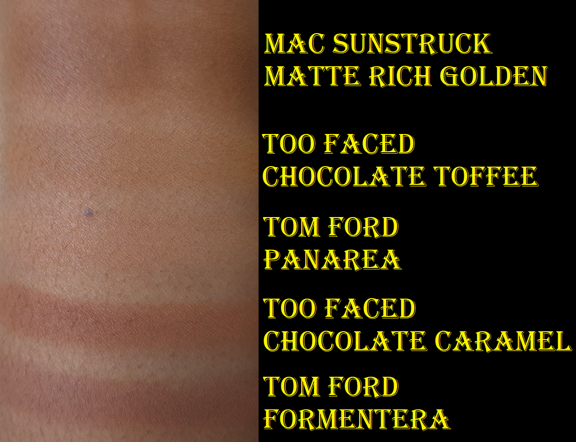
Matte Rich Golden
*How orange Sienne appears depends on what proportions of the three shades in its pan are used.
I have mixed feelings about this bronzer based on the shade. While I’m happy about the performance aspects that improved, and I acknowledge that the color isn’t overly orange, the shade of the new version isn’t as unique to my collection. This means I won’t be reaching for it over my top ranked bronzers. It also means that I don’t feel like this replaces the old version.
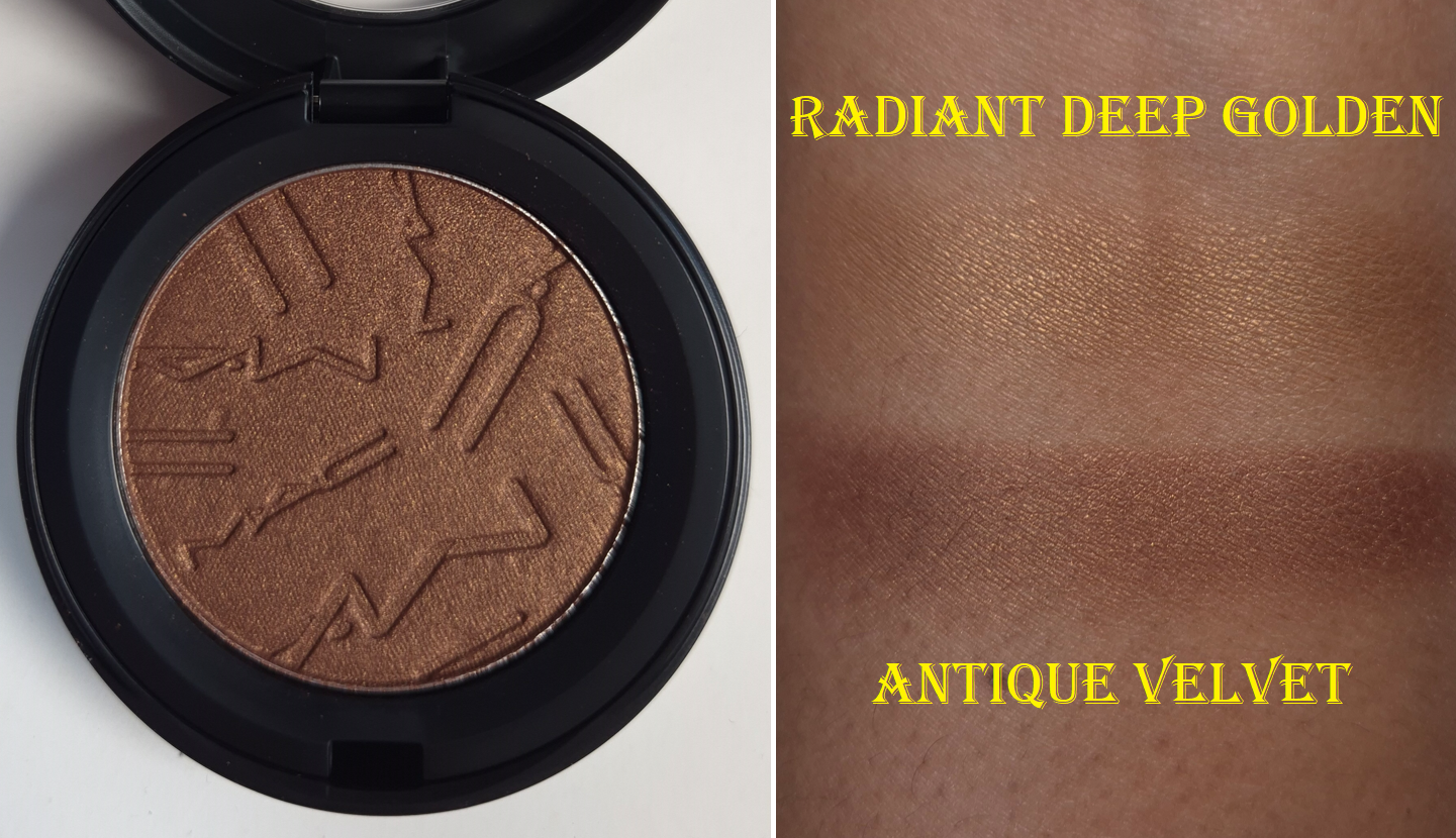
Radiant Deep Golden
I made brush swatches, since the 2023 version of the bronzer darkens when rubbed with my finger.
As for my original Rich Rosy, the depth level was correct, but I didn’t think the color suited me. The only reason I didn’t get Radiant Deep Golden sooner is because I assumed it would look like a highlighter and be unable to bronze me. Unfortunately, mine seems to be inconsistently mixed. Sometimes, the base color is visible underneath all that shimmer and actually bronzes me. At other times, it does look like a highlighter!
The amount of shimmer is less than the Too Faced Sun Bunny Blushing Bronzer and the 2nd version of baked bronzer from Kosas. I’ve considered using Radiant Deep Golden as a bronzer topper to add radiance to a matte bronzer. Unfortunately, it is so hard-pressed that I get annoyed every time I use it. The powder is so stiff and rough that it feels like I’m wiping dirt off a clay tile while trying to get product onto my finger to photograph swatches. The surface is so hard that it feels baked. My natural hair brushes are too soft to pick up much product, and even my dense synthetic brushes require a lot of force to practically dig into the pan.
Even after I stopped swatching this bronzer with my finger, it continued to get hard pan until I scraped off enough of the surface to flatten the top layer. Now, I no longer have hard-pan, but I still can’t use this bronzer with my natural hair brushes. The surface is too tough.
Another strange thing is that this doesn’t wipe off my finger the way a normal powder does on my Makeup Eraser cloth. It grips almost like dried paint! Normally, a few swipes across the dry cloth is enough to clean my fingers between swatches. The exception is when it’s a pressed pigment or dye that stains my fingers. I can’t explain why the consistency of the new Radiant Bronzer is so much worse than my old one. At most, I’ve heard others say theirs is hard-pressed too (such as Audrey Michelle), but so was the 2023 version. It doesn’t seem like anyone else’s is as messed up as my new one. There’s hard pressed, and then there’s this…
Just like eyeshadows that stain my fingers when swatching, I can use a little Bioderma with the cloth to completely and easily remove it. It’s just unusual that I would have to do that with a bronzer that isn’t technically staining (just clinging like there’s too much binder or something in the formula). Radiant Deep Golden adheres to my face in a way that makes it a little challenging to blend out, but I can at least remove most of it with a dry cloth.
Considering my issue with the blush-half of the Too Faced Sun Bunny Blushing Bronzer and my issue with Tom Ford’s Soleil Bronzer specifically in the shade Panarea, I don’t think I simply got unlucky to have gotten a dud. Something is going on with these Estee Lauder bronzer reformulations!
The bronzers cost $35 in 2023, and are now just $36. That’s about €31 in Germany, but for some reason they are actually €47 ($55) here. I’m not sure why MAC hiked up the price so high for the bronzers, yet didn’t raise it as much for the blushes. The matte bronzer formula is worth getting on sale, but I absolutely don’t recommend the radiant bronzers. I know some people are loving theirs, and my experience with this botched bronzer is not the norm. However, I still thought the 2023 matte bronzer was superior to the radiant ones back then. I suspect it would be the same for the 2026 bronzers, even if I had a “good” one.
If you’re darker than me with a golden undertone too, I recommend trying Antique Velvet as a bronzer. It has more warmth than Film Noir Buff, and the shimmer in the blushes are more refined than the shimmer in the Radiant Bronzers (or at least it’s more refined than my messed up bronzer).
That’s everything for this week’s post! Thank you so much for stopping by!
Thanks to the approaching deadlines over regulation changes in the EU, the Tom Ford Beauty brand has been reformulating a ton of their products across multiple categories. Today’s post will be covering the few that I bought from this year’s relaunches.
*DISCLOSURE: Non-highlighted links in bold blue font (Example) are standard non-affiliate links. Links marked in bold black font with a light blue background (Example) are affiliate links. Affiliate links allow me to get a commission if purchases are made directly using my link. Whether you click to shop through them or not, I appreciate you visiting and I hope you find the information I’ve provided to be helpful! In this review, the only affiliate links are for brushes through CDJapan. I have no affiliation with Tom Ford Beauty.
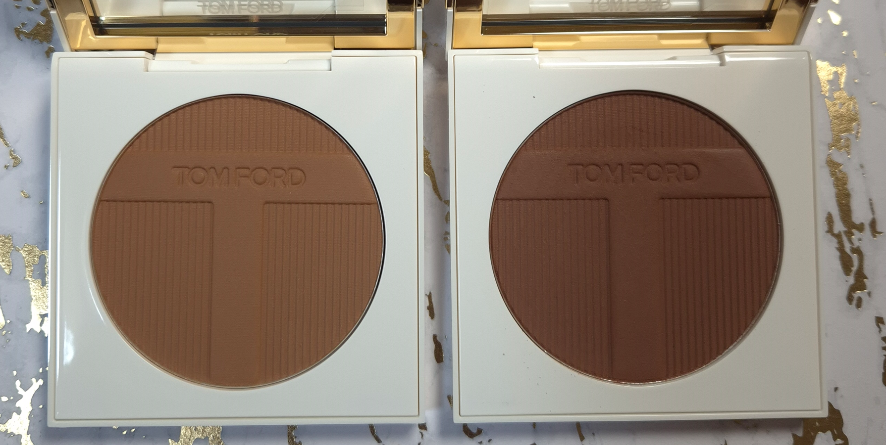
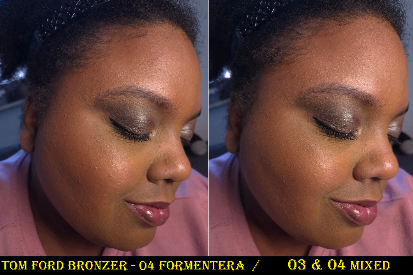
Tom Ford Soleil Bronzing Powder in 03 Panarea and 04 Formentera
During the peak days of YouTube’s Beauty community, some of the most hyped up bronzers were the Benefit Hoola Bronzer, Charlotte Tilbury Airbrush Matte Bronzer, Physician’s Formula Murumuru Butter Bronzer, Hourglass Ambient Lighting Bronzer, Nars Laguna Bronzer, Guerlain Terracotta Bronzer, Tom Ford Soleil Glow Bronzer, and Marc Jacobs Beauty O!Mega Bronzer. Since then, many of those brands have expanded their ranges, including Tom Ford. I was so excited at the prospect of finally having a powder bronzer from Tom Ford that was deep enough to show up on my skin! However, the brand didn’t take inclusivity as far as I would have expected. There are only 4 options and the gap between shades 3 and 4 is huge!
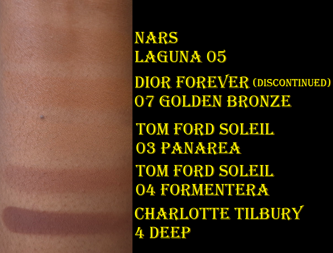
Below are swatches of two of my lightest bronzers (that I typically mix with a darker bronzer in order to wear them) compared to Panarea. As seen in the photo, Panarea is nearly invisible on my arm. To jump from that shade to Formentera is wild, but even wilder is the fact that Tom Ford’s fourth bronzer is the darkest in the range. It’s significantly lighter than Charlotte Tilbury’s bronzer in Deep, which is also the 4th and last shade in her powder bronzer range. To be fair, Charlotte’s third shade option is about as light as Nars Laguna 05. So, that brand has a shade jump too, but she has bronzers that will work for someone at least several shades darker than me.
I thought these shades would be darker based on how deep they appear in the pan, but they still look lighter even after being built up. Panarea looks tan, but on me it’s like a beige-bisque. It’s technically warm, but can look almost pink toned in some lighting. Formentera looks like it should be a contour color, but it’s a red toned bronzer (though still not overly warm).
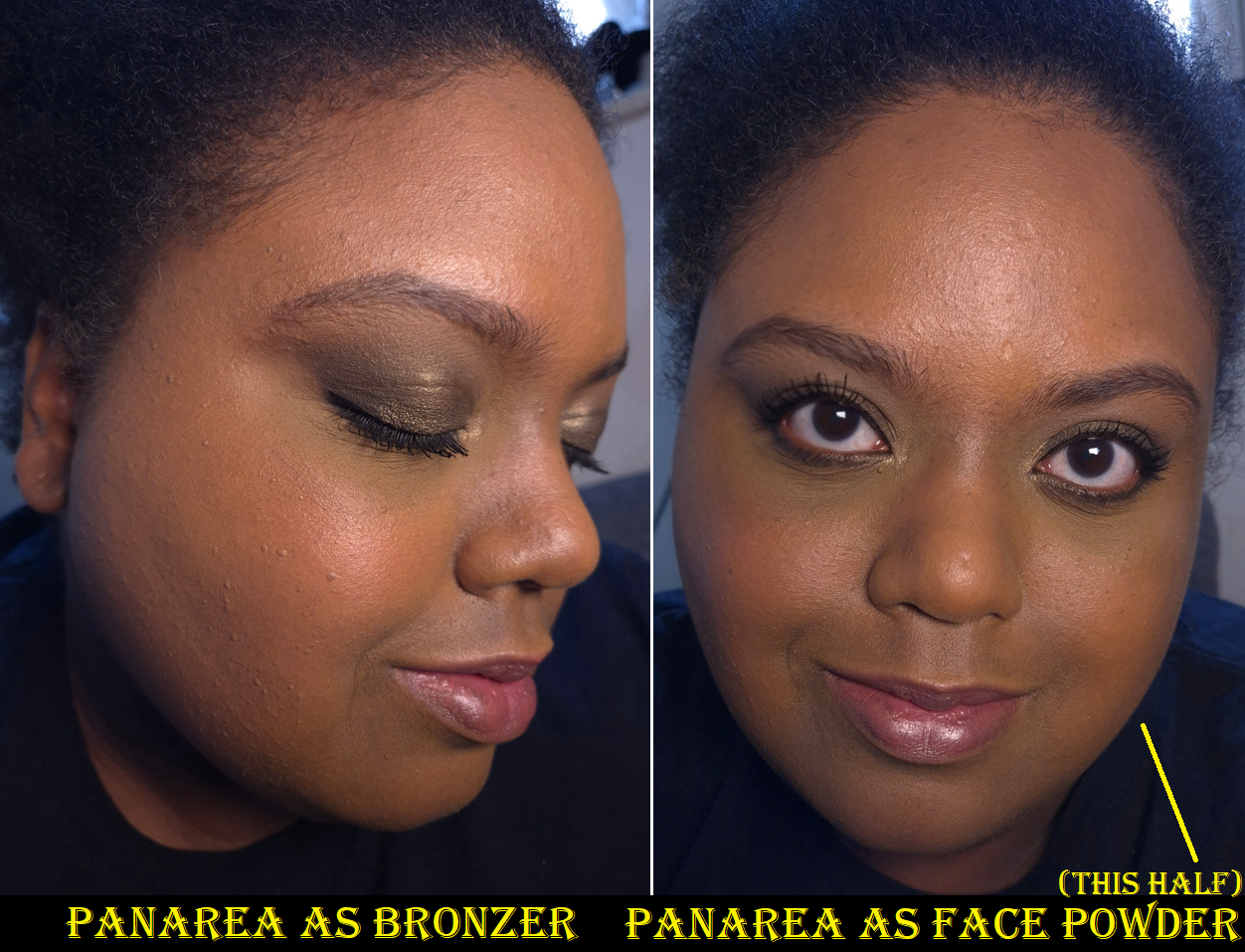
I’ve seen my friends who are darker than me try to use bronzers as face powders to find use for ones that were too light for them. I decided to give that tactic a try with Panarea and I can say whatever changes it made to my face were negligible. In a side-by-side comparison, perhaps my face was the tiniest bit more matte. Perhaps shade 03 changed the color of my face the tiniest bit, but not enough for anyone else to notice and my face didn’t stay matte for long. Essentially, this bronzer wasn’t good enough for powdering my face, over using my actual finishing powders that blur and/or add a beautiful sheen. So, I don’t recommend bothering to use it in this way.
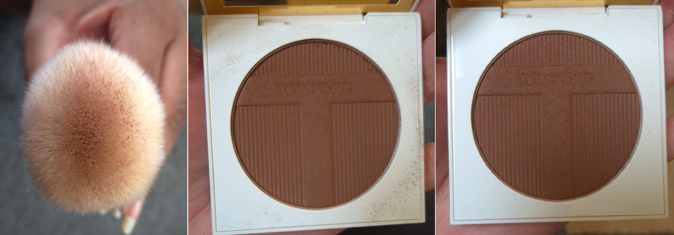
Before I even attempted to use this as a face powder, the third shade was already getting hard pan. I thought perhaps this formula doesn’t like to be swatched or maybe these bronzers are hard-pressed, but Formentera is still perfectly fine and easy to pick up with my brushes. In just three weeks, the surface of Panarea feels hard and dry, which is such a contrast to the continued softness (verging on creamy) of Formentera. In the comment sections of YouTube videos, such as the one by Mo Makeup Mo Beauty on the Soleil Collection, a few people described having issues with the performance of Panarea too. So, perhaps there’s something off with this batch.
The Soleil Bronzers are unscented, have a matte finish, and the powder consistency is fairly thin, though not as thin as Victoria Beckham or Charlotte Tilbury. These are pigmented, but the amount my brushes pick up ensure that I can build up sheer layers of product and not worry about overapplying.
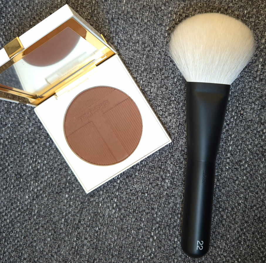
The amount of kickup is determined by the brush used. My first instinct was to test them with some of my go-to bronzer brushes, which are the Bisyodo B-F-05 Perfect Fit Brush, Number Eight Face 08, Sonia G Smooth Buffer, and Rephr Kōyō brush (though I use Kōyō more often for blush). I got minimal kickup with all except the one by Number Eight.
It occurred to me that I should try to use the bronzers with the Rephr 22, because it’s considered by many to be the closest natural hair dupe for the highly regarded original Tom Ford 05 Bronzer Brush. For those that like very diffused bronzer applications, these two are a great pairing. However, the Rephr 22 gave me the most kickup.
The first of the three pictures is a demonstration of how much of the Rephr 22 gets coated from two dabs into the pan. A smaller area in the center will distribute the bronzer onto the face, while the surrounding bristles with less or no product at all will help buff. The middle photo shows how much kickup is left after applying bronzer to just one side of my face. I wiped the surface of the compact before applying bronzer to the other side of my face with the Rephr Kōyō instead, so the third picture shows how little kickup there was by comparison.
Longevity isn’t an issue with these. The Tom Ford bronzers are decently blendable, but I have even more skin-like bronzers or ones that give more of an airbrush finish at better prices too. So, I like the bronzer, but I still feel like I overpaid, even with the 20% discount and reward points used. This might have been a different story if the bronzers had more of a glowy finish, which would make them more in line with my preferences.
Formentera definitely shows up on me, but I’m very picky about red-toned bronzers. So, I have tried mixing Panarea and Formentera together. While I like the results, I’m at the point in my makeup journey that I no longer wish to bother combining bronzer shades. I just want to carry a single compact with a color that works easily without me having to think about the ratios or worry so much about blending it well enough. With the Victoria Beckham Bronzing Brick, equal amounts of both shades works perfectly for me. When I try to mix the Tom Ford Bronzers, I have to pick up enough of Panarea to lighten Formentera, but still keep it dark enough that it’s able to be seen on my skin. On top of that, Panarea’s hard press and hard pan issue makes the number of necessary swipes inconsistent. Sometimes I need to dig into it more than other times. Plus, mixing both of them together doesn’t help remove that feeling of me having overpaid! I have at least figured out that I am happy with how Formentera looks if I’m wearing one of my more yellow-toned foundations. If I’m using a foundation that has stronger orange tones and/or is slightly darker than my current skintone, then the bronzer makes me look too red for comfort. So, I can keep that in mind too.
Too Faced has six options with two that are darker than I need. MAC has 10 options in the matte finish and 5 in the radiant finish in a range that also goes beyond my skin’s depth. Too Faced (as of now) and MAC are Estée Lauder owned brands alongside Tom Ford Beauty. So, it’s not as if additional shades couldn’t be made. Someone decided to keep the range of this premium brand limited.
In the past, the Soleil Collections were limited edition. I cannot imagine that all the bronzers, highlighters, and eyeshadows released aren’t permanent items, but perhaps the intent is to expand upon them every summer going forward. However, I don’t foresee myself buying any unless the brand releases some immaculately perfect shade for me. This is one of the reasons I didn’t buy one of their reformulated highlighters. Based on other reviews I saw, Amalfi may be similar to Reflects Gilt (which is too light for me) and Portafino could be close to the bronze shade from the Shade Illuminate Highlighting Duo in Tanlight. Just like I said in my Best Highlighters Showcased post, I’m so happy with Tanlight that I don’t feel the need to buy anymore highlighters from Tom Ford…unless something happens to mine.
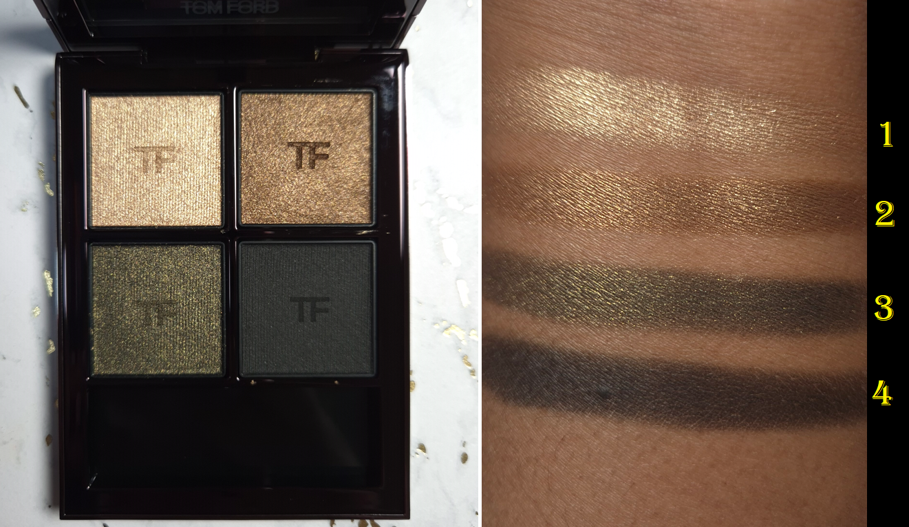
Tom Ford Eye Color Quad Crème in Olive Smoke
I was incredibly tempted to buy Olive Smoke when it first came out, but reviews were mixed. I was even more tempted when it was being discontinued and listed on sale for 50% off. Since all of the brand’s quads have been newly reformulated, I hoped that meant I’d have a better experience with the new version of Olive Smoke than NikkifromHR had with the previous formula.
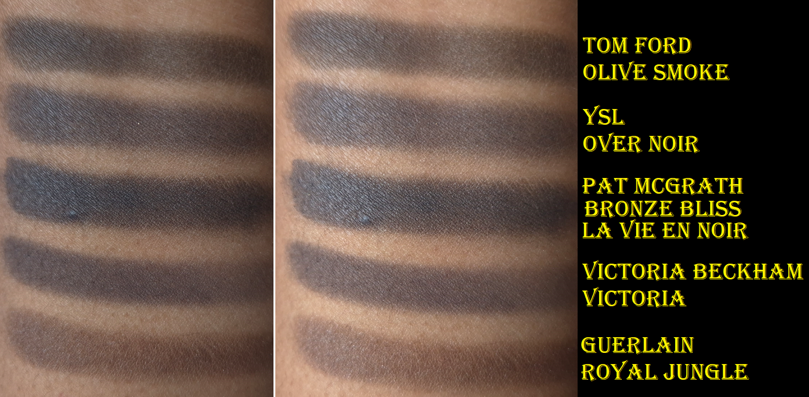
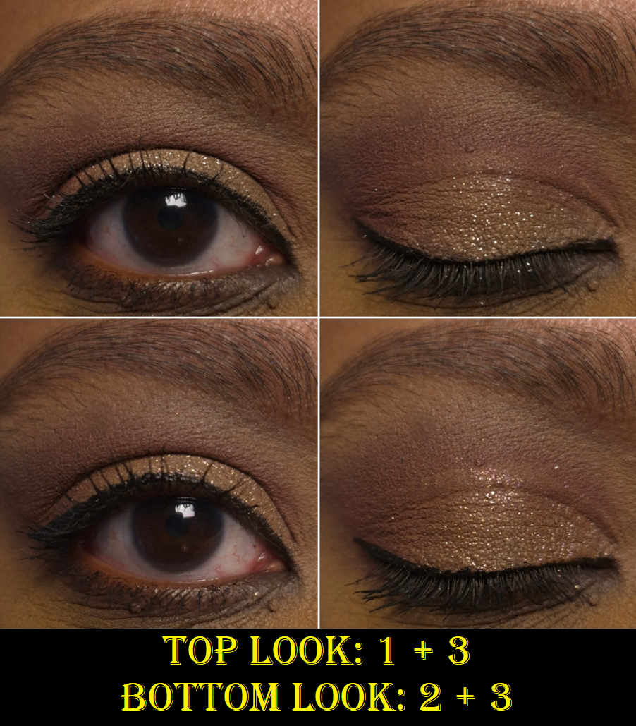
I am happy to report that I get very minimal creasing with these reformulated eyeshadows. I’ve tested these with and without primer (my primers of choice being the Lisa Eldridge Silk Canvas and MAC Paint Pot). Without a primer, the creasing is a bit worse, but good enough for me to still be satisfied with how the eyeshadows look throughout the day. These eyeshadows are very pigmented, but still buildable. The way the black eyeshadow feels and performs is what I think Guerlain was aiming for (but failed) when they made the black shade in their Royal Jungle quad. It’s not as wet feeling as the black eyeshadow from Pat Mcgrath’s Bronze Bliss, but TF’s black is truer (less blue).
The reason I’m so focused on the black shade is because it’s the one I rely on to create depth, and I like black eyeshadows that are rich in pigment, but not hard to control. I’ve had black eyeshadows that were patchy, not dark enough, or so pigmented that they were hard to blend. So, whenever I come across one that works just how I want, I’m happy. The one in this palette is like that.
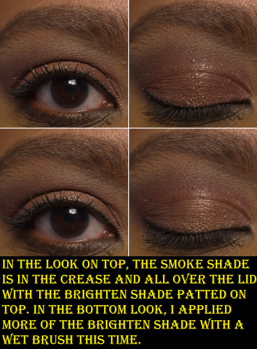
The pale gold and dark gold aren’t very exciting colors, but they fit well with the Olive Smoke theme and are necessary for adding brightness, along with taking the eye looks in a less smokey direction whenever that’s wanted.
The Olive color is the most appealing shade. It’s what drew me into this palette because of how infrequently greens are featured among luxury brand eyeshadows. 2025 seemed like the year of the green palettes, but there were still less around compared to years when pinks, blues, or purples were the “it” colors for that year. This is a deeper tone of Olive than I typically see. As is typical of Tom Ford, the shimmer is smooth and reflective, but not intense, dramatic, or sparkly. There is an elegance and refinement to these eyeshadows, which is something I want sometimes, but not all the time.
The pigment is there. The formula is good. I’m relieved that despite having a bit of slip, these don’t crease like crazy. They don’t fade. There’s no fallout. I’m happy to know that Tom Ford’s Crème formula is good, but if I’m going for a sophisticated eye look, I still don’t think any of the brand’s eyeshadow ranges surpass their Wet/Dry a.k.a Soleil/Lumière formula. My issue has always been that they rarely make color stories in that formula that interest me. In fact, that’s one of the biggest issues I have with Tom Ford. The eyeshadows in the quads either lack a deepening shade, are too similar in depths, too similar of colors within the same quad, or the color story is too “safe.” So, even if the formula was in my top 3 favorites (which it is still not), there are so few that I’m interested enough in to purchase.
Because these eyeshadows aren’t fully within my preferences, the price rarely feels worth it. Comparing this Crème formula (which I think is still better than the standard/Runway) to other luxury and designer palettes, there tends to be a standout feature in addition to have an option of costing less.
Tom Ford Quads – €85 Victoria Beckham Quads – €84 Prada Quads – €82 Guerlain Quads – €75 Dior Quints – €73 YSL Quads – €69 Pat Mcgrath Quads – €69 Chanel Quads – €66 (not limited edition)
VBB Quads have one shimmer that is practically like a pressed version of Lid Lustres and the best discount is 25% off. There is also the option to get a refill, which is naturally going to cost less. The Prada quads have a cream to powder formula that I love, in addition to the option to get a lower priced refill and/or 20% off. The Guerlain Quads I only find special when they are not in eyeshadow pans and I’ve seen them listed as high as 40% off (the older quads). YSL Quads have some of my favorite formulas and I’ve seen them close to 50% off. Pat Mcgrath Quads sometimes have the “special” baked shades and can be up to 40% off depending on the type of deal there is going on.
So, when I see the kind of prices I can pay for quads with formulas or features I like even more, I always feel like I paid too much for what I got from Tom Ford. To be more accurate, I felt like I paid what I should whenever I purchased Tom Ford from a CCO/CCS (Cosmetic Company Outlet). Those are owned by Estee Lauder and they sell out-of-season beauty products, like Tom Ford, for up to 40% off or sometimes there are even better bundle deals.
Since I no longer have access to Tom Ford products at these kinds of prices, whatever I do end up buying has to be something I really want, such as the Olive Smoke Palette I’ve been pining over since early 2025. This is ultimately why I did not buy any of the Soleil Eye Quads, despite that being my favorite of the three types.
I still want to continue my eyeshadow ranking series, and I’ve had Tom Ford on the list for a long time, but I never even reviewed Leopard Sun, nor the limited edition quad I bought before the reformulations (Electric Cherry). I also forgot that I technically had a mini review in the May 2022 Purchases Reviewed post featuring African Violet, Photosynthesex and Honeymoon. Now, a ranking doesn’t seem all that relevant considering 5 out of my 6 Tom Ford quads have been reformulated or discontinued. If anyone is still curious, it would be as follows from favorite to least favorite:
Honeymoon
Photosynthesex
Olive Smoke
Electric Cherry
African Violet
Leopard Sun
I don’t care that my version of Honeymoon is very old by now. I didn’t use it enough to be worth repurchasing in the new formula.
I hope this has been helpful, or at least an interesting discussion. Thanks for reading!
In this post, we’ll be looking at the newest relaunches of Too Faced’s classic products. The originals were released over a decade ago, but until 2026, neither product were deep-skin friendly. Whenever something I’ve been waiting years for becomes available, I find it difficult to resist purchasing, regardless of whether it’s a good addition to my collection or not. So, that’s how I ended up buying both of them.
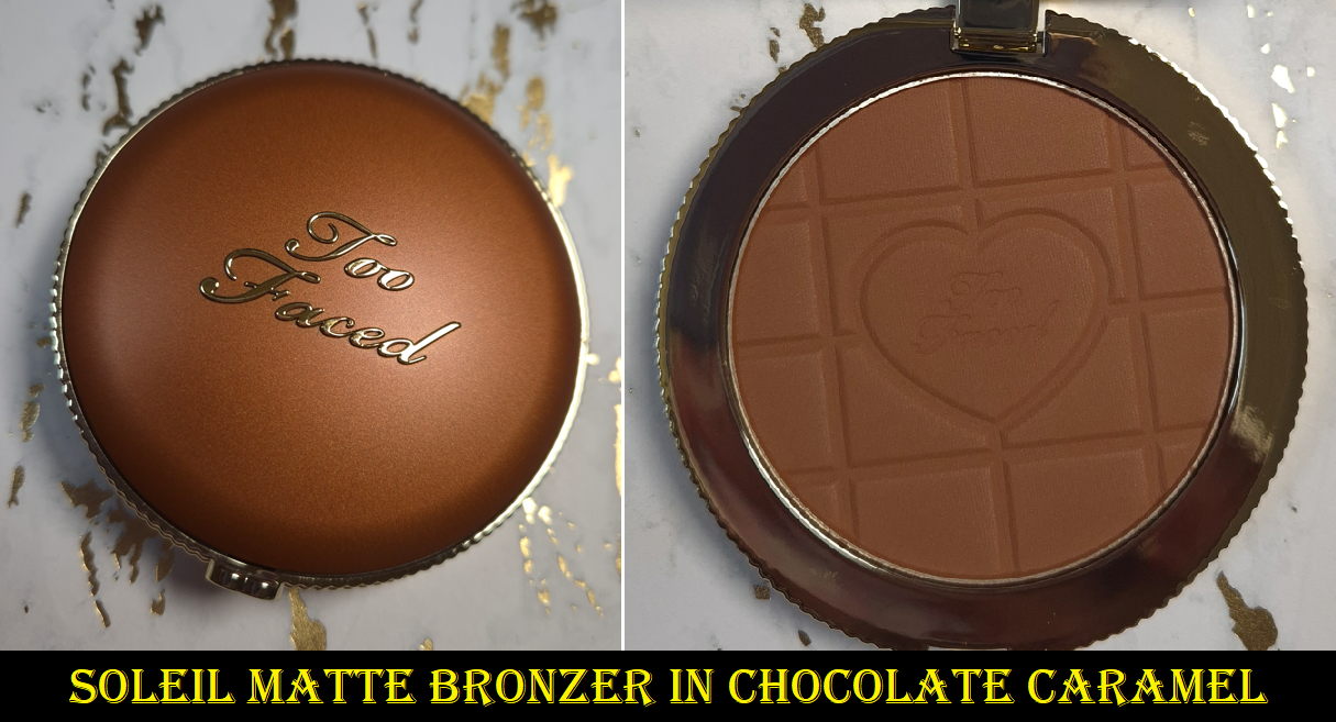
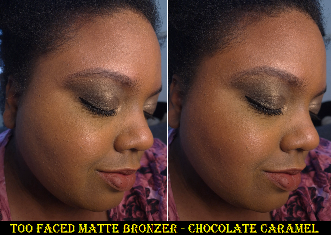
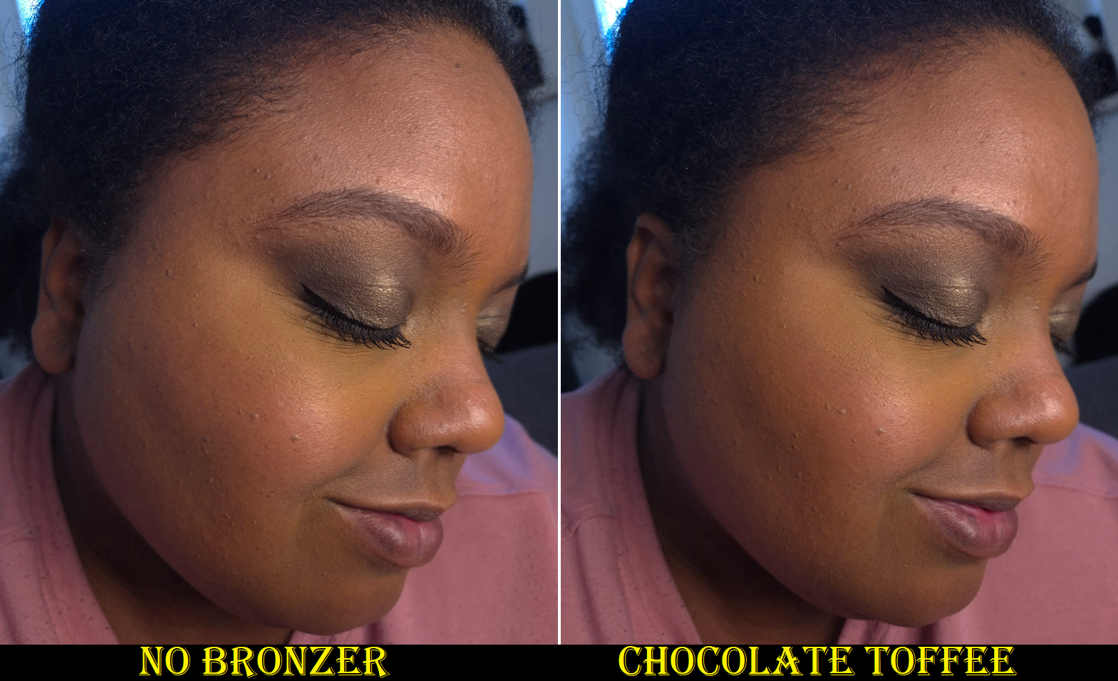
Too Faced Chocolate Soleil Matte Blurring Bronzer in Chocolate Caramel (and Chocolate Toffee)
This bronzer is soft to the touch, and it’s matte, but it doesn’t feel or look dry on the skin. It has an almost creamy feel and it’s on the thicker side for a powder, but not in an unpleasant way. Because it’s very pigmented and easy to pick up with any brush, I tried to exclusively use my delicate natural hair brushes with it. The Chocolate Soleil Bronzer is pretty blendable, but not quite on the level of my favorite high end and luxury bronzers that are even more finely milled. So, I’ve found that saikoho goat and fox hair brushes that are bundled in an airy way give me better results than my squirrel brushes. This ensures I still get a diffused application, but with more blending and buffing strength. It’s not that the bronzer needs a lot of buffing, but the right tools make the task even quicker and easier!
I have no issues with this bronzer’s longevity. It lasts all day.
“Blurring” is the new buzz word that every brand seems to claim their powder products are capable of. I actually agree that this bronzer can be a little blurring, but it needs to be properly blended or else it has the opposite effect.
This contains a fair bit of fragrance and smells like chocolate (the same scent that’s in the Too Faced Chocolate Bar Eyeshadow palettes). I enjoy it, even though I generally prefer my beauty products to be unscented. I have to admit that I might be viewing this product even more favorably because of the happy feelings I get from smelling the chocolate. I’m only human!
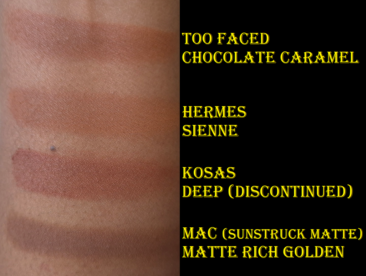
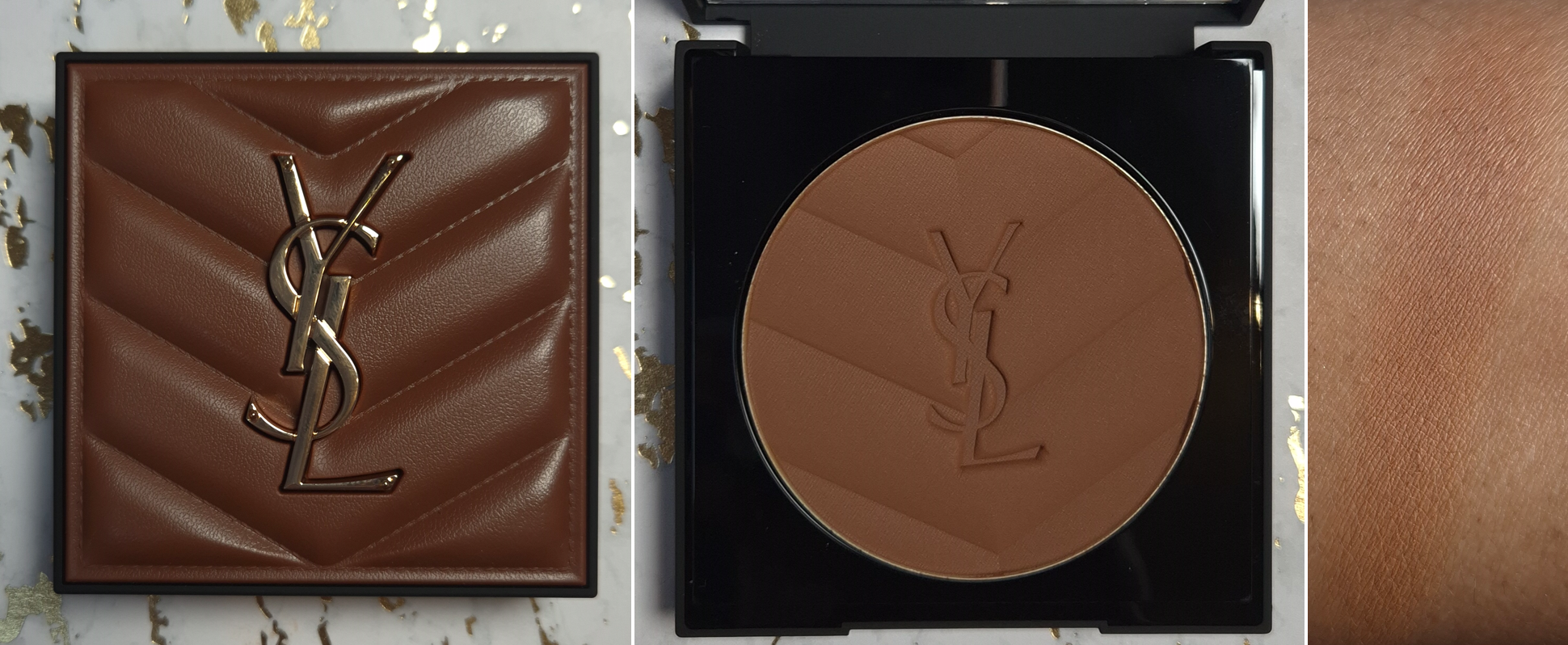
The aspect I was a little disappointed by is how orange the Chocolate Caramel shade looks. I believe I may have confused it with the shade Chocolate Toffee. I think the color still looks nice on me, but I have to be in a particular mood to want to wear such a warm bronzer. Chocolate Caramel is a reddish-orange-brown shade. Sienne from Hermes is a yellow-orange-brown, as seen in the swatch comparison photo below, so I like that one even more. Plus, I’ve had it for just over three years and it still swatched more evenly and smoothly than the brand new Too Faced bronzer. Swatches don’t tell the whole story, but the Hermes Plein Air H Trio Healthy Glow Mineral Powder is my number one bronzer for a reason.
I wish I had Pat Mcgrath’s bronzers in Bronze Divinity and Burnished Honey with me to show comparisons, but I left them behind in the US. I thought PML would continue releasing face palettes with repeat products and that I would end up with the bronzers again anyway, but that has not happened. Based on memory and my review photos, I believe Chocolate Caramel might be closest in undertone and depth level to Burnished Honey.
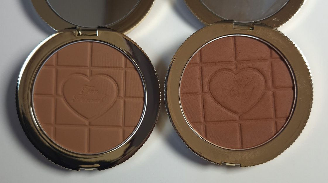
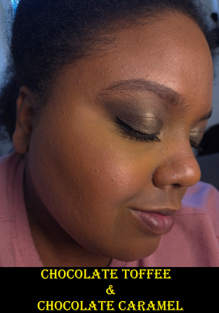
Even though I have plenty of bronzers that perform even better or have some special qualities about them, I still like this quite a bit. In fact, my insistence on not buying a second shade only lasted a week. Now, for the benefit of you who is reading, I can also compare Chocolate Toffee. It is indeed a yellow-golden kind of shade.
I considered not taking photos of Chocolate Toffee on myself because it’s like 5% darker than my bare skin. It gives the faintest hint of color, but because it’s still lighter than most of my foundations, it doesn’t show up on a full face of makeup. Mixing Chocolate Toffee and Chocolate Caramel is a beautiful combination, though I already have yellow toned bronzers (too light for me to use on their own) I could have paired with Chocolate Caramel. So, I know I shouldn’t have really bought the additional shade, but I had no self-control.
I wore the Chanel Water Fresh Tint in the photos with the solid pink shirt in the hopes that it would be sheer enough for Chocolate Toffee to be seen.
I have to say that it would be amazing if more brands had dark yellow-golden toned bronzer options. I only found a few, and most are too light on me to really be visible for most of the year. MAC’s is the only one that’s deep enough. It doesn’t look that yellow in the first swatch, but that’s because it deepens up a lot when swatched with a finger. The second photo has a brush swatch. I’m still hoping to one day have a shade like Rich Golden, but in an even better formula. And speaking of MAC, they just launched the reformulated and/or repacked Sunstruck Bronzers in both finishes! The main reason I haven’t used mine more is because I always felt uneasy about them after they had been pulled from store shelves within days of their original launch and smelled terrible for so long. So, I am considering whether I want to buy the new ones because no other brand has a color like Rich Golden that shows up on me.
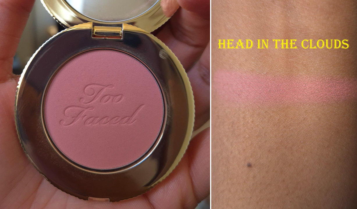
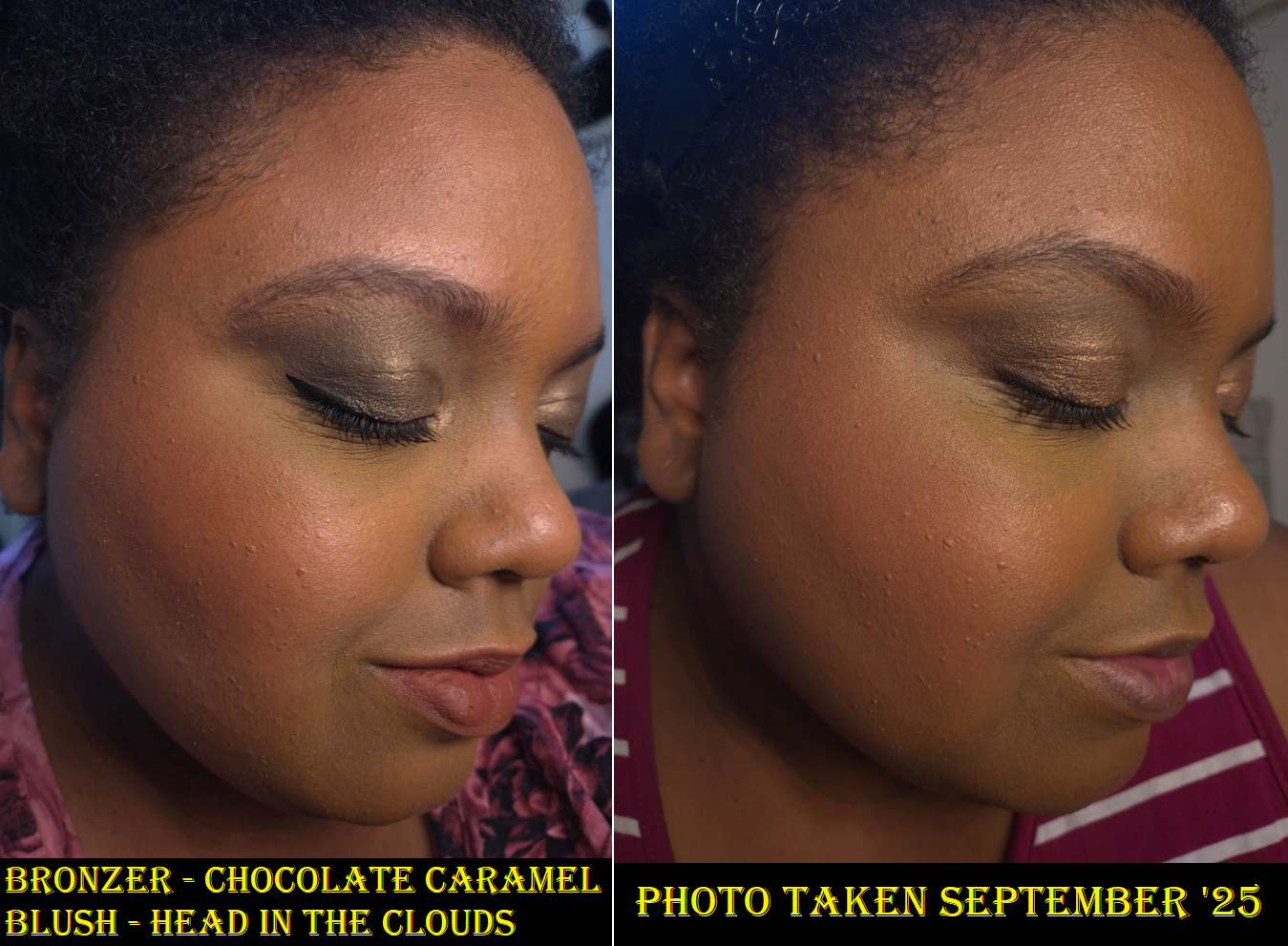
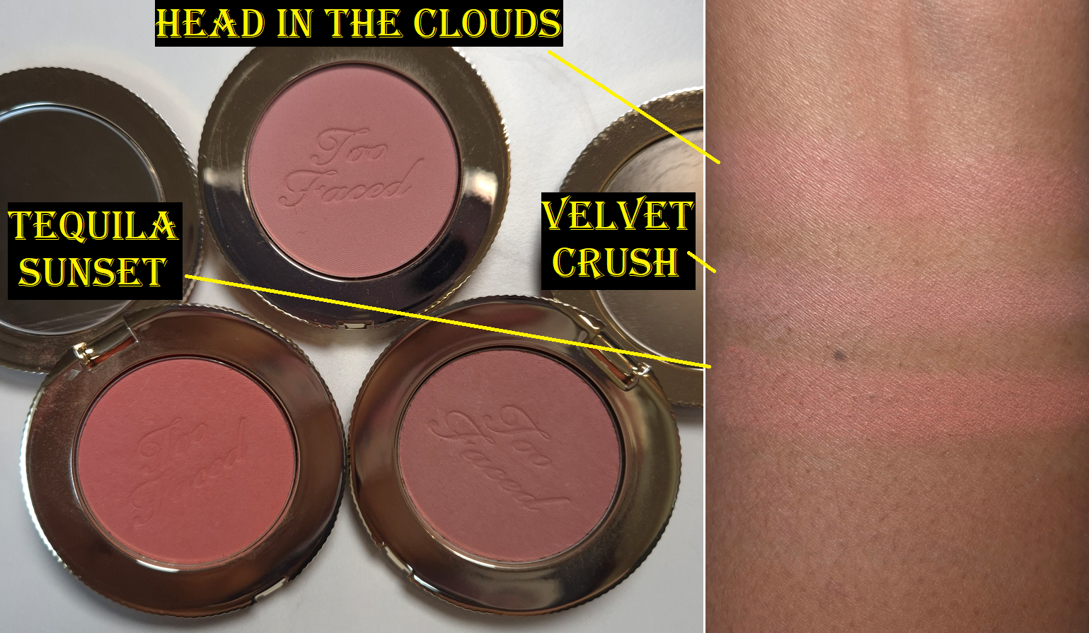
As for the Cloud Crush Blurring Blushes, last year I saw someone close to my skintone wearing the shade Head in the Clouds and once I saw it was on sale via the retailer Douglas, I immediately bought it.
The photo above was taken in April 2026 and is a more accurate depiction of Head in the Clouds than the group blush photo lower down. I no longer have them, so I could not retake that picture.
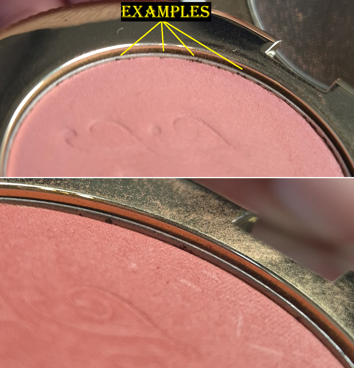
The photo above and the photo below were taken in September. When I was just about finishing, I noticed the dark spots around the rim of the blushes. I can’t say for certain what they are, but the pan edges didn’t look like that when I bought them. Head in the Clouds doesn’t have them either. So, I no longer trusted that my older ones were safe to use, and I tossed them out.
Velvet Crush looked the worst, and I bought it from Sephora-US in December 2022, but I bought Tequila Sunset exactly one month later. The differences between them is that I had actually left Velvet Crush in Florida for longer. When I moved to Germany, I only brought Tequila Sunset with me. I stored them properly in both locations, so I wonder what happened. The brand boasts about these having, “93% naturally-derived ingredients,” so perhaps they aren’t the best preserved. The blushes lasting almost three years is acceptable, but I have so many older products that are still in amazing condition, so I can’t help but be disappointed in needing to toss these early. To be honest though, I wish I remembered how strong the “Tropical Beach,” fragrance was in these blushes. It’s pleasing, but so heavy that sometimes I change my mind about using it when I open the compact and that wave of perfume hits me.
I could recommend the Too Faced Chocolate Soleil Bronzer, but I no longer recommend the Cloud Crush Blushes, even though they are pretty. I think the Soleil Bronzers are actually appropriately priced. The quality isn’t S-tier, but I’d give it a B+
Also, kudos to whoever decided to finally make an inclusive bronzer range for Too Faced. I’m impressed.
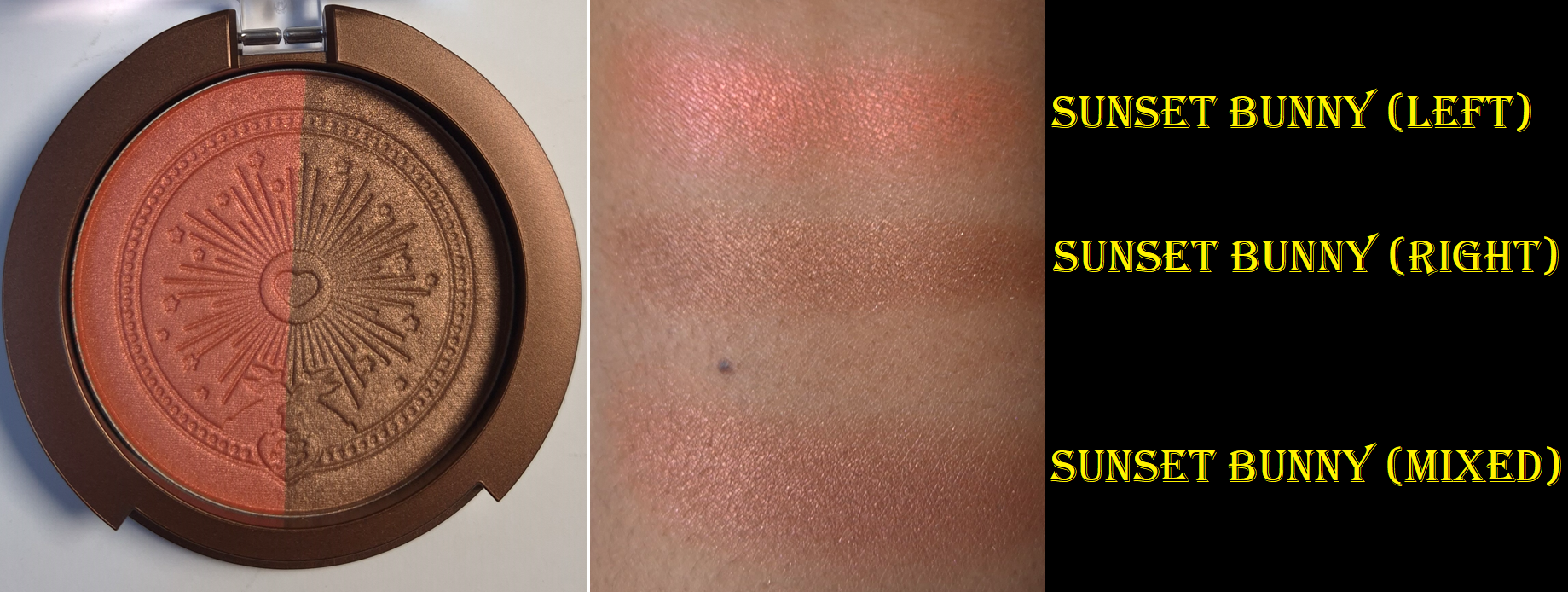
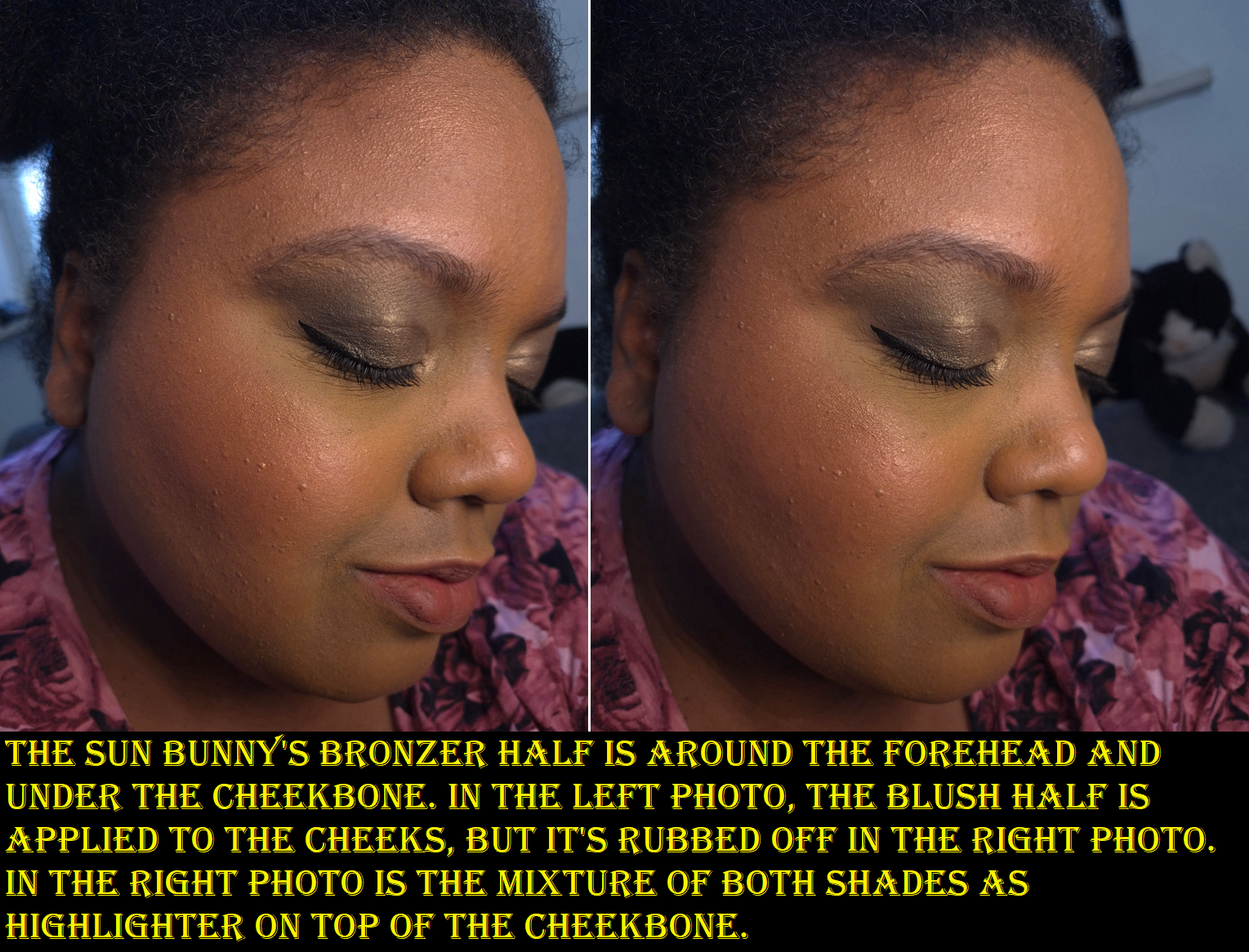
Too Faced Sun Bunny Blushing Bronzer in Sunset Bunny
When I saw the promo photos, I was practically salivating to buy this product. I was so entranced by how shiny and pretty the colors were, that I didn’t even stop to think about the fact that these are not going to be worn as highlighters. Why would I ever want a blush, and especially a bronzer, to look that shimmery on my face? I stopped wearing the Glossier Solar Paint Bronzers for precisely that reason (which others must not have liked either since it has been discontinued). The Solar Paints still looked better on my skin than this product!
This cheek duo highlights all the bumps and uneven texture I have on my forehead and cheeks. The colors themselves are beautiful, but I cannot ignore the obvious shimmer particles. The blush shimmer is as reflective as MAC’s Extra Dimension Blushes, but aren’t as refined. That makes the biggest difference. The amount in the bronzer is even more than the reformulated and repacked Kosas Sun Show Baked Bronzers that I never use, and Physicians Formula Murumuru Butter Bronzer that I got rid of.
Putting aside my preferences, another aspect that threw me for a loop is the fact that the blush side is so firmly pressed in the pan. It felt like there was hard-pan the first day I used it. It took about four layers of swiping to get that finger swatch that’s two photos up, yet only one swipe for the bronzer. I don’t know if I have a dud or if everyone’s duos are like this.
The biggest problem of all is the “Coconut Cream” scent. I always like the smell of Too Faced products, but whether I can handle them is another story. This one is so overpowering and headache-inducing! The photos I included in this post are the best I could do because the two times I tried to wear the Sun Bunny Bronzer, I needed to remove it within 20-30 minutes. This is on par with the Too Faced Peach Perfect Instant Coverage Concealer that I couldn’t use either because the fragrance in it gave me intense headaches.
So, I unfortunately could not do any wear tests and the packing (with its clear lid) isn’t cute enough for me to keep it as a collector item. This will be exiting my makeup collection.
So, that concludes this week’s post. The Sun Bunny was a total letdown, but the Chocolate Soleil powder bronzers made up for it!
I hope this has been helpful. Thanks for stopping by!
Not pictured above (but will still be reviewed) are two additional Satin Kajals, the Brightening Waterline Pencil, and the Orchid Palette.
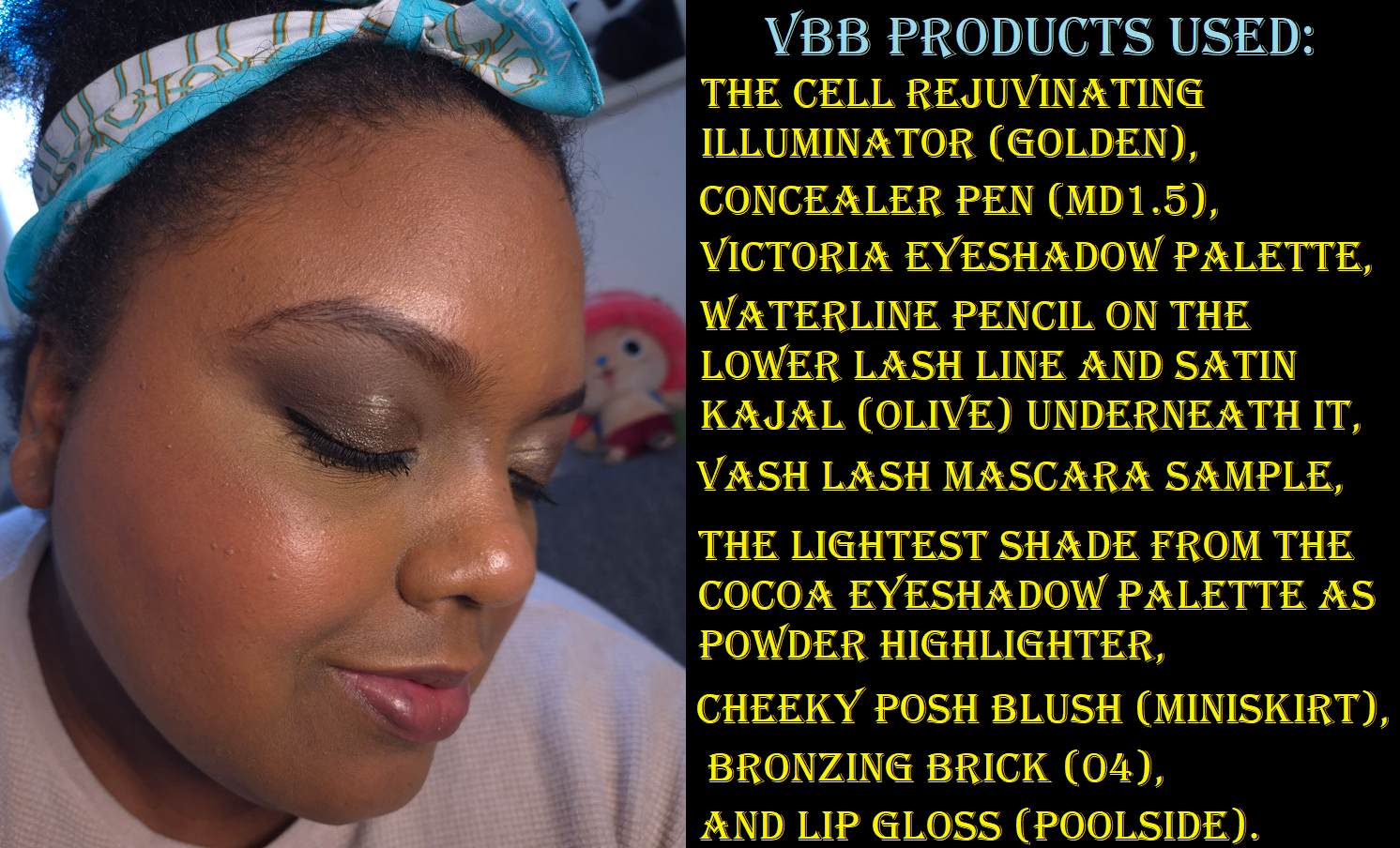
I utilized the 20 and 25% off sales Victoria Beckham Beauty had during November and December last year to buy new (to me) products, along with additional shades of things I already love from the brand! So, let’s get right to the reviews and updates!
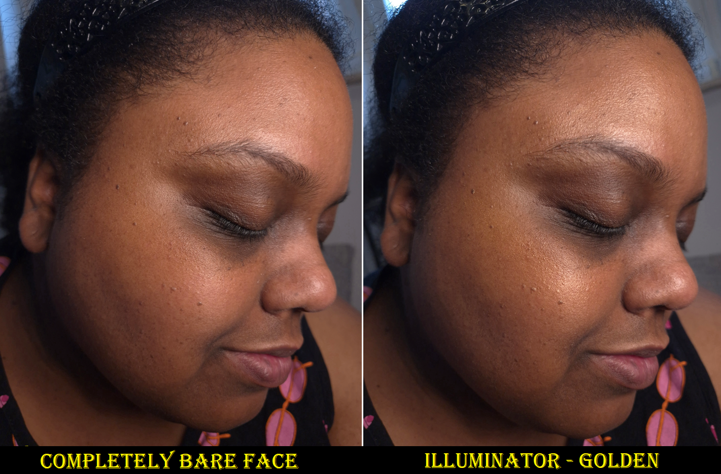
The Cell Rejuvenating Illuminator in Golden
This product contains the Augustinus Bader proprietary TFC8® blend of skincare ingredients in the formulation. I bought the smaller 20ml size which retails for €88. A mini sizes of the Augustinus Bader face creams are 15ml for €93. So, I was curious how comparable these two products would be. Unfortunately, since Augustinus Bader doesn’t sell minis of The Light Cream (only The Cream and The Rich Cream), I can’t confirm if The Light Cream has the most similar consistency to the Victoria Beckham Beauty Illuminator. I can only say that AB’s The Cream is thicker, not as lightweight, and feels more moisturizing. I don’t consider it that heavy as a skincare product on bare faced days or to sleep in overnight, but I prefer to wear thinner layers of skincare when I plan to wear makeup.
Although I need a lot of hydration to combat my dry skin, putting heavy products or adding too many layers (that build up to a thick amount of skincare) clogs my pores easily and leads to other problems. So, I always prefer using the most lightweight yet effective hydrating and moisturizing products. At a bare minimum, I try to use a milky toner and sunscreen daily. Depending on which combination I use of those two products, adding a moisturizer on top is already overkill. With this Illuminator from VBB, I tend to be able to use my milky toners and my best absorbing sunscreens together without there being any problems. So, the VBB Illuminator is better at doubling as a moisturizer and primer, coupled with my other skincare products, than AB’s The Cream.
I’ve been using the Illuminator since January, but strictly as a primer under makeup. I haven’t noticed any long-term changes to my skin, but my face feels suppler and hydrated each time I put it on. It makes for a nice smooth canvas to put makeup on and the glow is subtle. It does turn my skin a little more golden-yellow in color, but it’s only strong enough to impact the shade of my foundation if I’m using one that has sheer to light coverage. This actually helped turn one of my Chanel foundations into a better shade match, but it has also made a bad match worse. So, it would be nice to have an option that’s clear or close to it. I have heard that the shade Pearlescent might not be the frosty white color I assumed it would be, so, I might consider trying that one in the future.
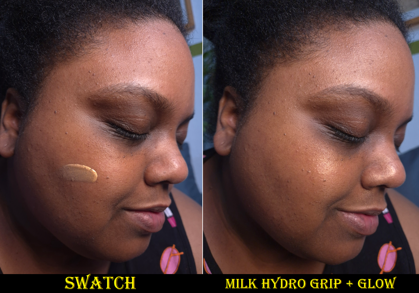
This isn’t the only glowy golden product out there. I also own a mini of the Milk Hydro Grip + Glow Primer.
Milk’s primer is thicker. It has less gold pigment, which means it doesn’t alter my foundations as easily. Milk’s glow comes from shimmer particles, whereas VBB’s shine is due to a combination of shimmer and the slightly emollient finish. VBB’s sinks into the skin and is better at hydrating than forming a slight barrier (like Milk’s). Other than hyaluronic acid, there isn’t that much else benefiting the skin in the Milk formula, but it does extend the wear of makeup because it has stronger gripping power. VBB’s is better for those that prioritize skincare because, for example, among the long list of skincare ingredients is four types of hyaluronic acid instead of just one. There is a big price difference, but part of that is due to the ingredients used as well as the packaging. Milk’s is plastic. VBB’s is super luxurious and heavy with a magnetic closure for the cap. I’ve seen the cap stand askew when I’ve taken it out of my makeup bag, but the magnetic hold is strong enough that it never got knocked off entirely.
I can also think of the Charlotte Tilbury Hollywood Flawless Filter and Dior Forever Glow Star Filter Multi-Use Highlighter as additional products that can be used as glowy primers, but they don’t feel as nice on my skin when they cover my entire face, rather than being used in specific areas as liquid highlighters.
Although I haven’t been able to detect long term changes to my skin, I enjoy the nourishing feel of the Illuminator so much that I will seriously consider repurchasing it (on sale) after I’ve emptied my current container. Even though getting the full size is more cost effective in terms of price per milliliter, VBB is still a “clean” beauty brand. So, I don’t want to risk getting a larger size and not using it up within the 12 month period after opening time frame. Also, if Augustinus Bader ever releases The Light Cream in a travel size, I could potentially prefer that instead for pricing reasons. I’ve gotten Augustinus Bader skincare for up to 30% off at various retailers, but the maximum discount I’ve been able to get from VBB has been 25% during the holidays. Then again, AB’s product might not be as suitable for me under makeup. So, I will consider these factors and make my decision by the end of 2026.
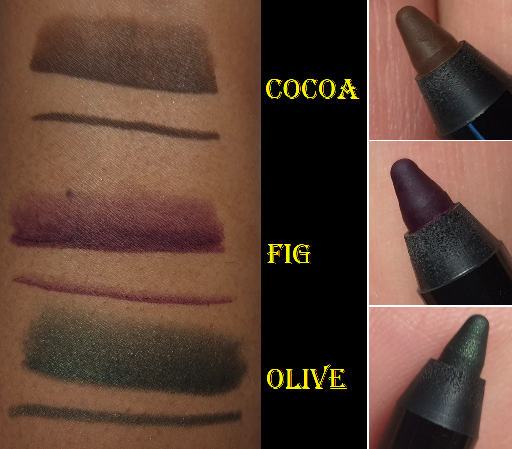
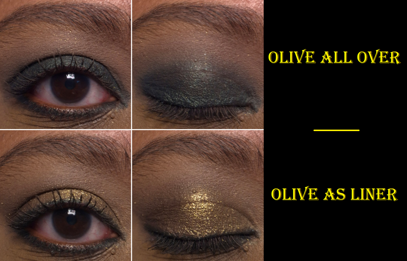
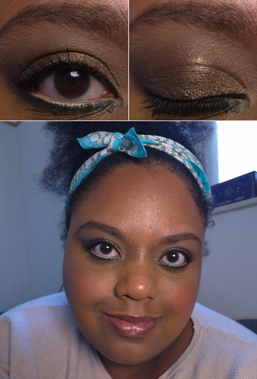
Satin Kajal Liner (with Sharpener) in Cocoa, Fig, and Olive
It’s very difficult to get me excited about a colorful eyeliner, so it says a lot that I own three of these. Of course, I have heard so many beauty gurus praising the Satin Kajals and even going so far as to say they’re the best on the market. Considering how many good and affordable eyeliners are out there, I rarely feel that high end and luxury eyeliners are worth the price. I still can’t answer that question of worth for others, but I will say these are my current favorite non-liquid and standard colored eyeliners. By “standard colors,” I mean eyeliners that aren’t duochromes or multichromes.
There are matte, shimmer, and jewel liner finishes. Cocoa and Fig are matte, but Olive has a shimmer finish. I did not purchase any jeweled ones because that’s the only type I’ve heard aren’t as well liked by other customers (because the jeweled ones are supposedly gritty feeling).
The consistency of these liners are super creamy in the first few uses, but afterwards they are a more controllable level of creaminess that allows one to glide the product over the skin without tugging and there is enough time to smudge it a bit and smooth it out before it sets down to its budge-resistant and waterproof finish. The evenness of the distribution of color and ease of creating the shaded effect are what puts these above many other eyeliners.
Also, I am mindful to keep the proper cap on each side of the pencil. I came across a video where a brand owner explained that the cap with the extra lining inside the plastic is meant to keep it airtight (I forgot the exact term that was used), whereas the cap that fits over the smudger side does not have this lining. The Kajal could dry out if the caps get swapped for an extended amount of time. Since I hadn’t paid attention to this kind of thing until this year, I wanted to share this reminder for anyone else who might not have known this. In the case of the VB Beauty kajals, the cap for the pencil side has a white inner ring and the smudger side is black.
Besides using these to line the eyes, they also make for great eyeshadow bases to used solo or to intensify the color of whatever powder eyeshadow gets used on top.
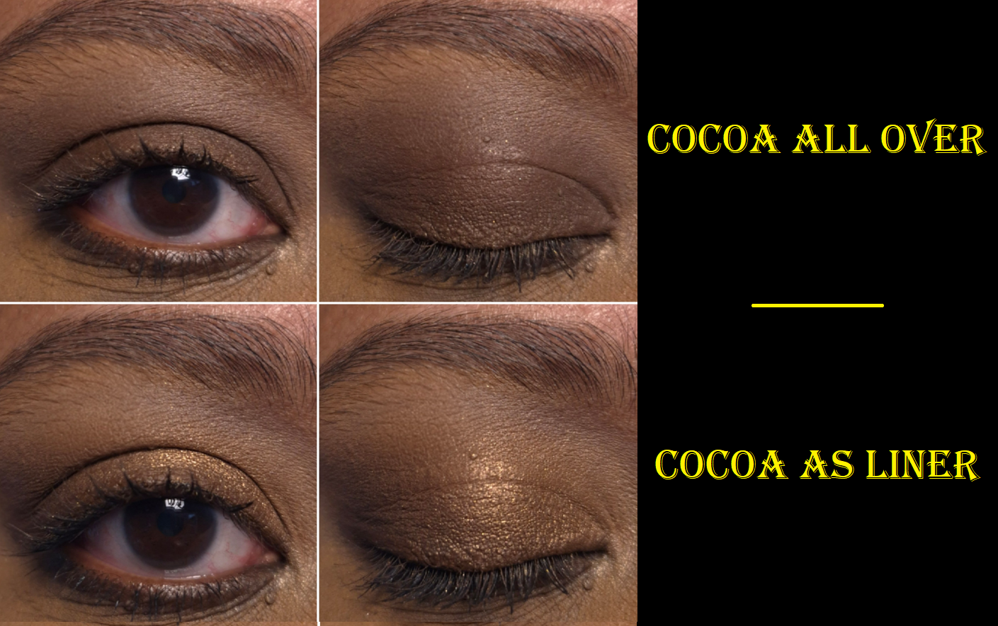
Cocoa is a beautiful shade of brown, but it’s too light to add definition/dimension to my lash line. I still use it sometimes as a transition color in deeper dramatic looks.
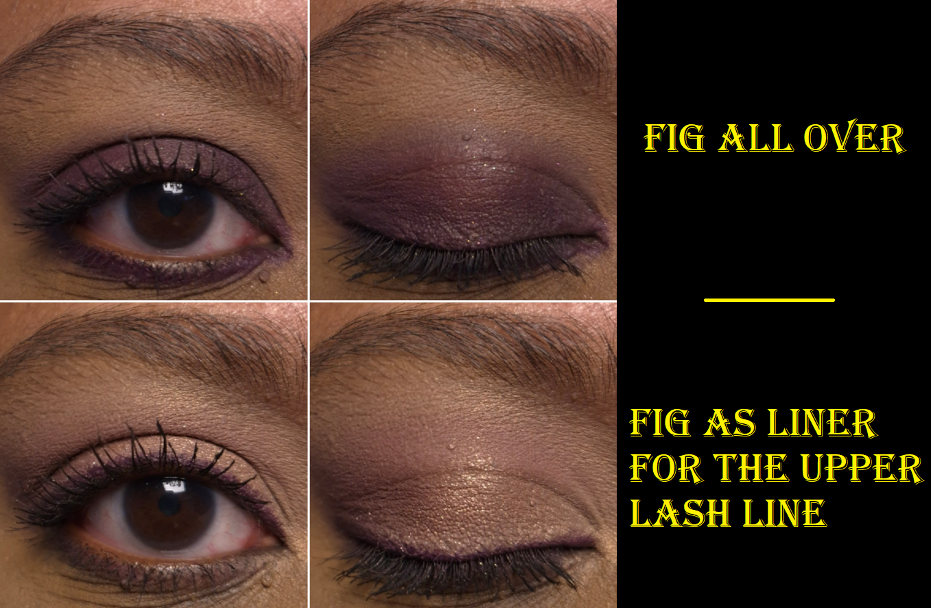
I love this shade of purple, but it can look patchy when smudged or blended out. It looks best when drawn on, like for eyeliner use, and not touched much afterwards. If I use it as a base color that will be covered up anyway, then patchiness isn’t a big deal.
My only complaint about Olive is that it’s not actually olive in color/tone. This is a blue-based green or deep teal-green. I’d expect this color to be called Peacock or something. It’s still a pretty color, but the name is misleading.
I do find these to be long-lasting and waterproof (yet easy enough to remove with micellar water and a makeup eraser cloth). However, because this formula gives some wiggle room in which to be able to smudge it before it fully sets down, I struggle to use these in my waterline. They drip away or get wiped away long before being able to lock down. So, I don’t bother trying to tightline with these. I’m fine with this being the situation because of how well they perform at other tasks.
These might be the best kajals in the world, but I will always love and prefer a black liquid eyeliner pen. I very seldom have the desire to use a colorful eyeliner, so I am perfectly content with having just a few of these. I still don’t think it’s totally necessary for a casual makeup wearer to spend so much on a Satin Kajal considering how many great eyeliners are available at more affordable prices. However, I can acknowledge these are extremely good.
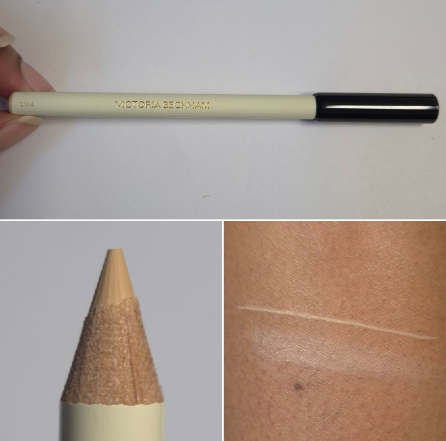
Instant Brightening Waterline Pencil
Historically, this type of product has always been difficult for me to use because of my easy-to-become-watery eyes. I gave up buying them several years ago and the only reason I decided to get this one is because it’s made specifically for use in the waterline. The Satin Kajals have their own formula and don’t work for me in the waterline, but are amazing for many other purposes, so I thought this product being sold apart from them for this designated task could be the answer I’ve been looking for.
In terms of this “universal” color, I do think it’s a good one. It has the right undertone balance and isn’t too light/white. Unfortunately, my watery eyes do not allow this to work. My waterline is too wet and even if I get the color to stay there, it never fully sets. The tiniest touch hours later still makes it come off instantly. Also, my eyes look too strange if I have a light color on my lower lash line and nothing below it adding definition. So, I usually put a dark eyeliner between and below my lower eyelashes. In doing so, if my pencil isn’t sharp enough to avoid getting some in the brightened liner section, I have the hardest time fixing it. And then the darker color discrepancy looks messy and amateurish.
While I like the creaminess of the pencil for gliding it across the waterline, it taking too long to dry (if at all), makes this just as much of a struggle to create this kind of eye look as all the other liners in my past. The part that is nearest to my eyelashes (basically between my eyelashes) is what stays put and sets down as long as actual tear droplets haven’t fallen and wet the whole area. So, I know this can work. It’s just not that great on me.
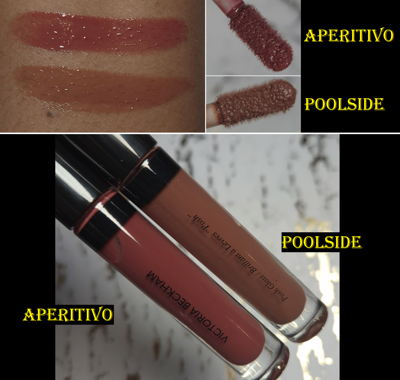
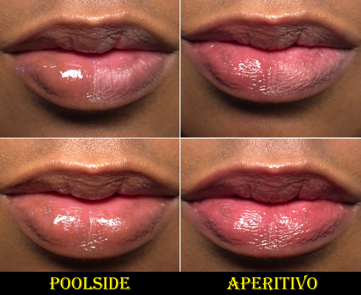
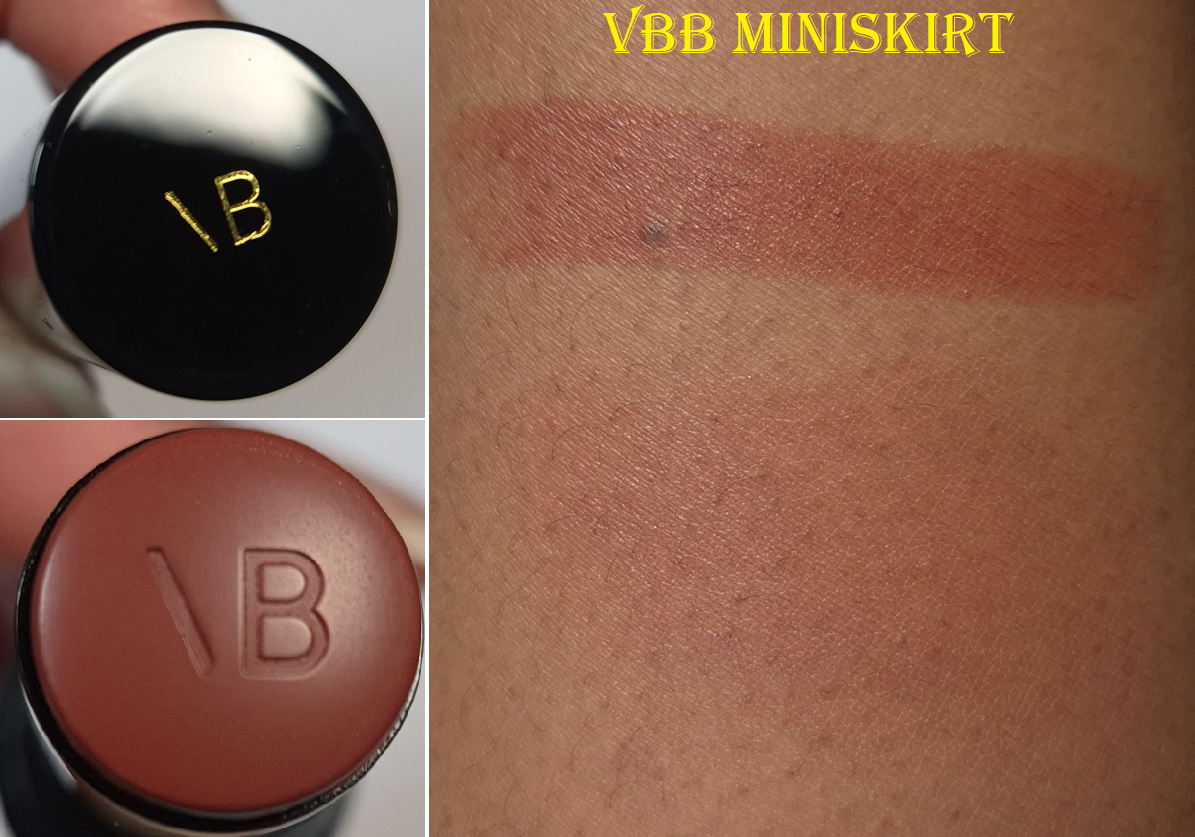
Posh Gloss in Poolside and Aperitivo
The Posh Glosses adhere well to the lips, and both hydrate and form a moisturizing barrier. It can last through at least one meal and several drinks before needing to be reapplied. The brand claims (and pretty much all other brands too) that their gloss isn’t sticky, but it is a little. However, it’s a lot less than many other glosses I use. I don’t think it would cling so well to the lips and be as long lasting without having at least some tack to it.
This formula has totally different ingredients from the Pat Mcgrath Lust Glosses, but they remind me of each other in how plush they feel on my lips and how conditioning they are. If I had to nitpick at the tiny differences, I would say that PML’s has a thinner viscosity, more shine, and it has a scent. VBB’s is better at conditioning my lips and the oil content makes it slightly less sticky despite having a thicker overall texture. Less gloss comes out onto VBB’s applicator, so it’s easy to get an almost as thin layer from just applying one swipe on the lips and then rubbing them together. When it comes to the pigment level, the Lust Glosses range from being equally pigmented, less, or more pigmented than the Posh Glosses.
What I look for most in a gloss is how well it helps combat dryness and how pretty the color looks. I prefer them to be unscented and they don’t need to be high-shine (just have some shine). I essentially view my favorites as liquid lip balms. With all this in mind, the Posh Glosses have surpassed Pat Mcgrath’s formula in my eyes, but I still reach for Pat’s for specific colors. PML has twice as many shade options. I still easily recommend both products, and they are around the same price at €34 for 4.5ml for PML and €36 for 4ml for VBB. However, Pat Mcgrath usually has a holiday sale where the Lust Glosses are marked down by 50% (or $12), at least in the US. Whether the brand will continue to do that sale during the bankruptcy proceedings is unknown. As for the Posh Glosses, I believe 25% off is the biggest discount the brand offers.
There is no shortage of great glosses out there. I will happily continue to use Poolside (Aperitivo is a brighter pink than I expected), but I haven’t found a shade in the lineup that I’m over the moon about. So, I like this a lot, but it hasn’t breached the “favorites”category. I don’t regret buying one, but given the size of my lippie collection, it should have stayed at just one.
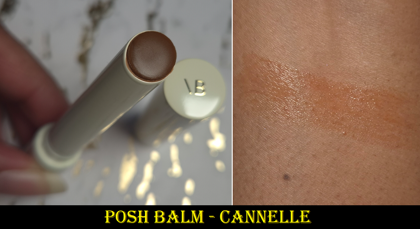
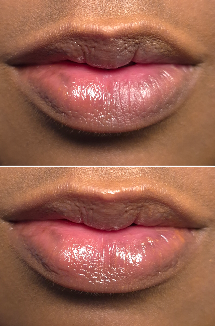
Posh Balm in Cannelle
In the top photo, the balm is on the left half and the right half is bare. In the bottom photo, the balm is spread across the lips entirely.
The lip balm feels great on the lips. I still consider it to be a little sticky, but it’s less so than the lip glosses. These aren’t as long lasting either though and the pigment level is much lower. As far as I know, the shades Colette, Fleur, and Cassis have the pH-adapting ingredients, but Glacé does not. One of the reviewers I watch said Cannelle doesn’t have it either, but Red 27 is listed as one of the ingredients for that shade and after having used this enough times, there is now a little bit of pink around the rim of the packaging. So, I think it’s safe to say this shade is pH-adaptive too. There just isn’t a lot in it.
The amount of shine I get from the balm is good, but the color can cling a bit to the cracks of peeling skin. I have to be careful to really work the product into my lips, a bit more than I’d expect from a low pigment product.
I prefer my lipgloss to be nourishing, but I absolutely expect a balm to have even more lip-caring ingredients. While this balm does satisfy me regarding hydration, the need for me to reapply it more often than the brand’s lip gloss is why I won’t be buying anymore. I cannot gain the benefits if the moisture layer comes off and I don’t notice it until many hours later. At least when most of the Posh Gloss has worn off from eating, I can still feel residue that continues to keep my lips protected. So, if I delay in reapplying, it isn’t as much of an issue.
I will say though that the Posh Balm is more nourishing than a lot of high-end and luxury balms I have used in the past. I have not tried the reformulated Nars Afterglow Lip Balms, but I loved the previous Laguna shade (similar to Cannelle), and yet I rarely wore it because it wasn’t hydrating enough. In fact, I end up not liking the majority of lip balms in stick form, so I still give the brand kudos for the Posh Balm. One product that I like more is the Lisa Eldridge Baume Embrace simply because of the similar amount of nourishment and the extra pigment. Although I have to reapply the Baume Embrace more often, that’s the tradeoff for have significantly less stickiness. I’m glad I bought one of these, but I don’t need anymore.
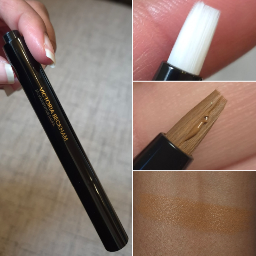
The Concealer Pen with TFC8® in MD1. 5
I would ordinarily never spend €56 (the sale price) on a concealer, especially taking into account the minuscule 2.4 ml (0.08 fl oz) of product and how much of it is wasted due to the click delivery system (and what gets stuck in the applicator’s bristles), but I had many reasons to think this would be worth it:
The Augustinus Bader TFC8 blend is in this product. I rarely use eye creams, so this seemed like an easy way to finally get good skincare into this area while also being able to camouflage my dark under eye circles.
Although the brand’s foundation is out of my price range, I still wanted to have a better idea of what my shade could be among the VBB complexion products. This knowledge could benefit me if the brand ever decides to release another foundation or concealer in the future.
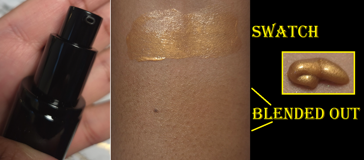
I was impressed by this concealer’s performance when I tried it out via the foil sample pack. This provided a lot more coverage than I expected and although I could only test it for six hours, it didn’t budge in that time frame. So, I figured that even if the full wear time didn’t end up going far past six hours, I could at least use this like a daytime eye cream on no-makeup days or potentially even like an under-eye primer if it played nice with other concealers.
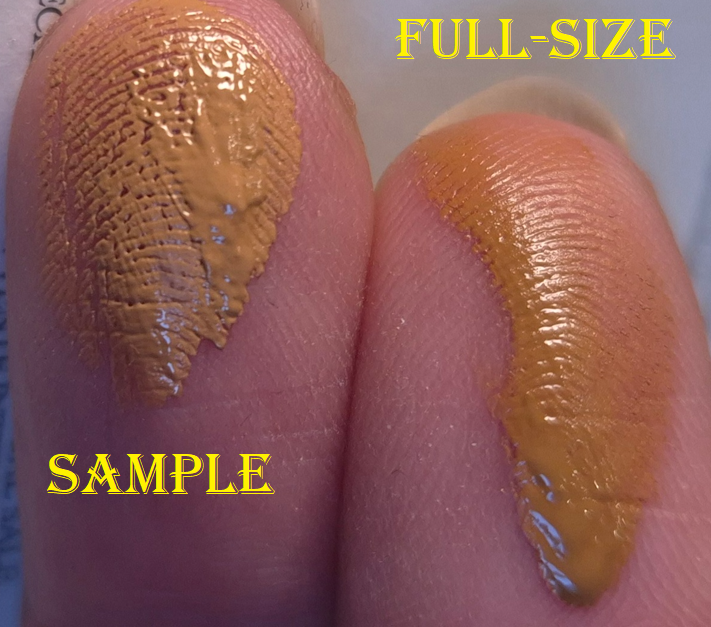
Unfortunately, the consistency of the samples are not the same as what customers get from the actual product. The sample is thicker and less fluid. I can only assume that’s due to being old and/or it managed to gradually dry over time within the foil. That sounds like it would be a bad thing, but the sample adhered to my skin way better! How the sampler looked right after being opened can be seen HERE, but also the photo below shows the difference in viscosity and even how it looks over the lines of skin vs the concealer pen. This isn’t a one-time incident either. The photos I took below were from a second sample pack that I got from my most recent order.
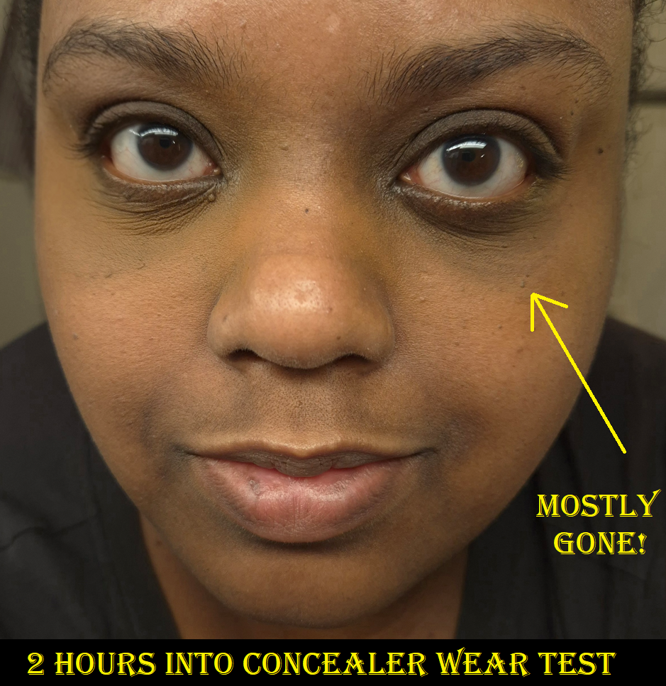
It makes sense that the concealer needs to be very fluid, given the type of dispenser the brand chose. The reason this matters is because products this creamy and emollient do not stick around on me. I had a similar problem with the Chanel Ultra Le Teint Correcteur Concealer. No matter what methods I use, I cannot prevent it from being absorbed by my skin and/or fading. It starts early and just continues gradually disappearing within 2-6 hours depending on how unlucky I am.
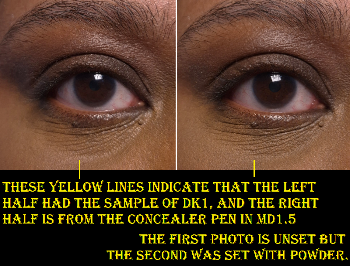
When I put the sample and actual product side-by-side, as shown in the photo below, I can see that the right half looks more emollient and continues to look wetter after being set with powder. Also, the act of patting in powder with a brush manages to lift some of the concealer back off.
It doesn’t help that when my eyes get watery, any falling droplets makes it disappear too.
I used a lot of product under my eyes while taking these blog photos, but that is not the cause of the problems. When I use less product under my eyes, it just disappears faster. I’ve tried different powders with it, my MILK under eye primer, leaving the product to sit for a while before setting it, etc. Not only does it not fade gracefully, it also creases. So, even if I wanted to just use it as an eye cream, it looks terrible after 3-4 hours. Mixing it with other concealers or using a tiny amount underneath them doesn’t help either because the VBB concealer breaks the others down. So, this product was an absolute fail for me. It’s incredibly disappointing to buy a product, expecting it to work as wonderfully as the sample, but then it doesn’t.
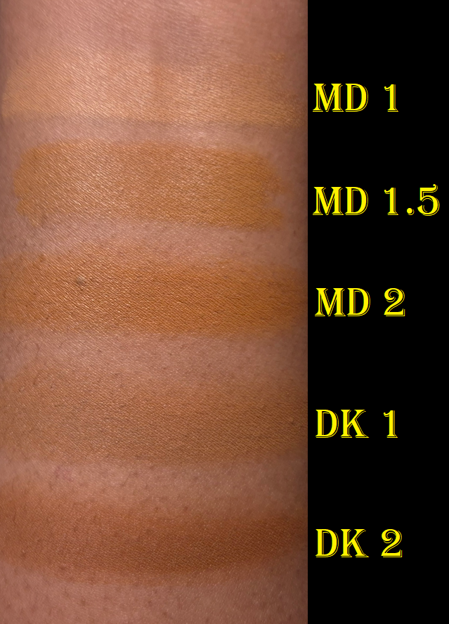
I decided to post swatches of how MD1.5 compares to the others, since my shade isn’t available in the free sample pack. Although DK1 is neutral, I think it actually might have been the better choice for me than MD1.5, but it doesn’t matter at the end of the day if the fading issue can’t be resolved.
The thought has crossed my mind to try and transfer the concealer from the pen into a tiny jar (in the hopes it can dry and solidify a little without drying out completely). However, doing that could lessen the efficacy of the skincare ingredients.
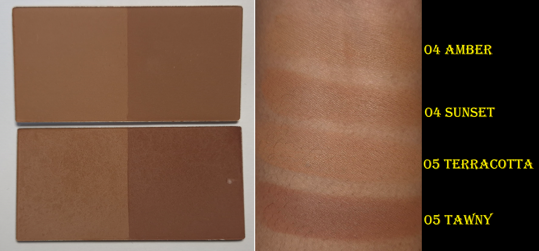
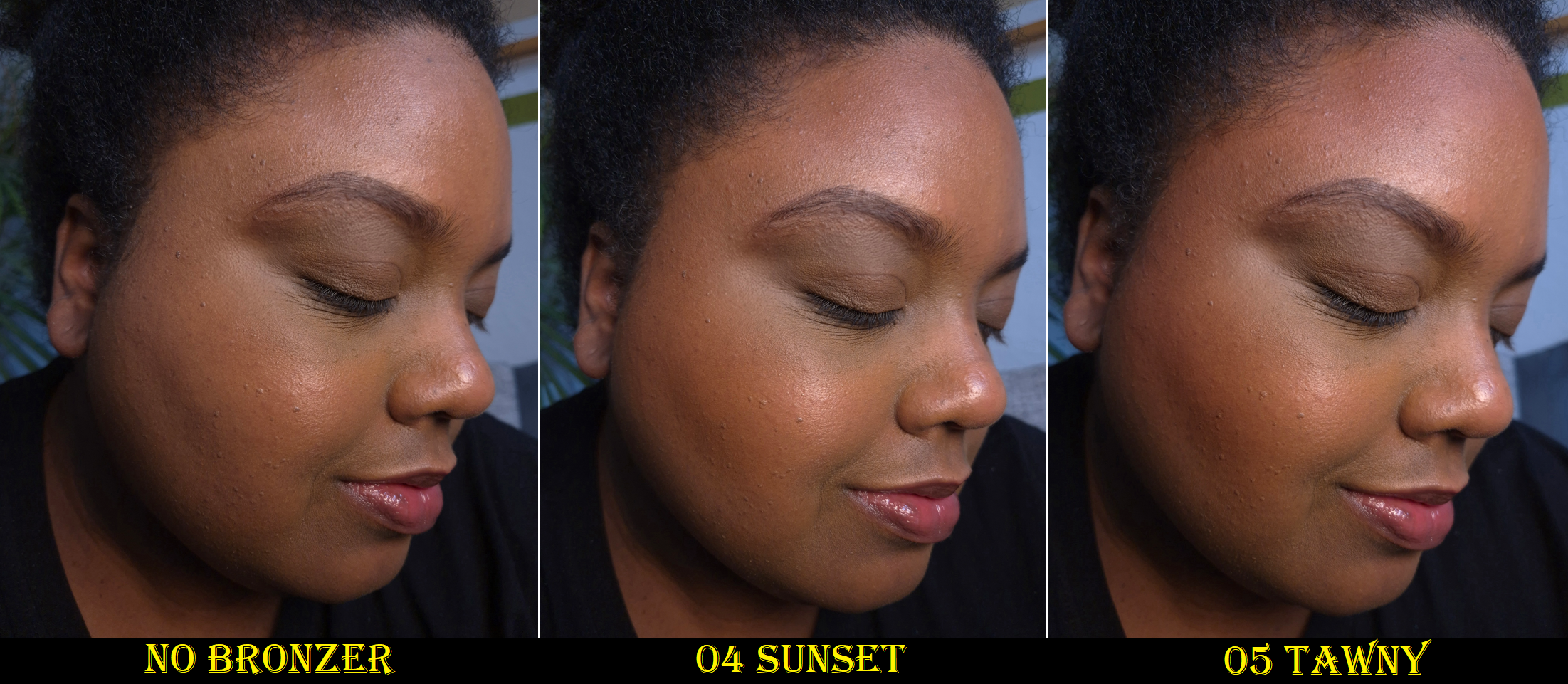
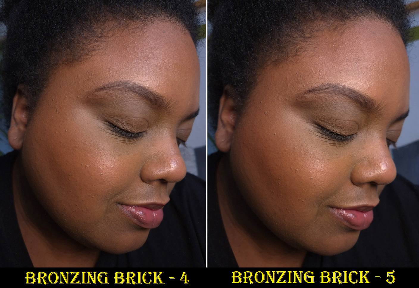
Matte Bronzing Brick in 4 (Warm: Amber / Contour: Sunset)
I bought my first Bronzing Brick three years ago and posted a review showcasing Shade 5. Since the moment I first tried this product, it has always ranked among my top 5 favorite bronzers, but I didn’t use it as often because I always needed to mix the two shades. The right half had too strong of a red undertone for my preference, so I would combine it with the left half to try and balance out the color and tone down how dark it was.
I finally decided to give Shade 4 a try, and I’m so glad I did! The darker half has more of a golden-orange undertone that I can use by itself. I still use the lighter half of the pan to either diffuse the edges or lighten the overall color. Essentially, the main difference between the two Bronzing Brick colors is that Shade 4 makes it way easier for me to create a natural flush of warmth without overapplying. Purely because of that ease, I stopped using Shade 5.
These are examples of the darker bronzers in the duo used by themselves.
These are examples of how the bronzers look on me utilizing both halves of the Bronzing Brick in the proportions that I like (and not equal amounts of each shade in the duo).
In case anyone has read my old review, I want to clarify that although I was concerned that my powder might be getting hard pan, it never fully did. The look on the surface seems to really have been caused by the oil based products I was using at the time. I took the photo of Shade 4 when it was untouched, but I can attest to mine still looking normal after at least fifteen uses.
The reason I love this bronzer so much is because it’s incredibly finely milled, super blendable, and gives such a natural look to the skin. It’s matte, but doesn’t look flat. I also like the ability to tweak the color. I can pick up product easily, even with my most delicate natural hair brushes, and it doesn’t have powder kicking up everywhere. This is an expensive product, but I can see how much finer it is than the majority of my powder bronzers. Whether that small difference is worth the increased price is up to the individual consumer. As a bronzer lover, I definitely would not want to be without this.
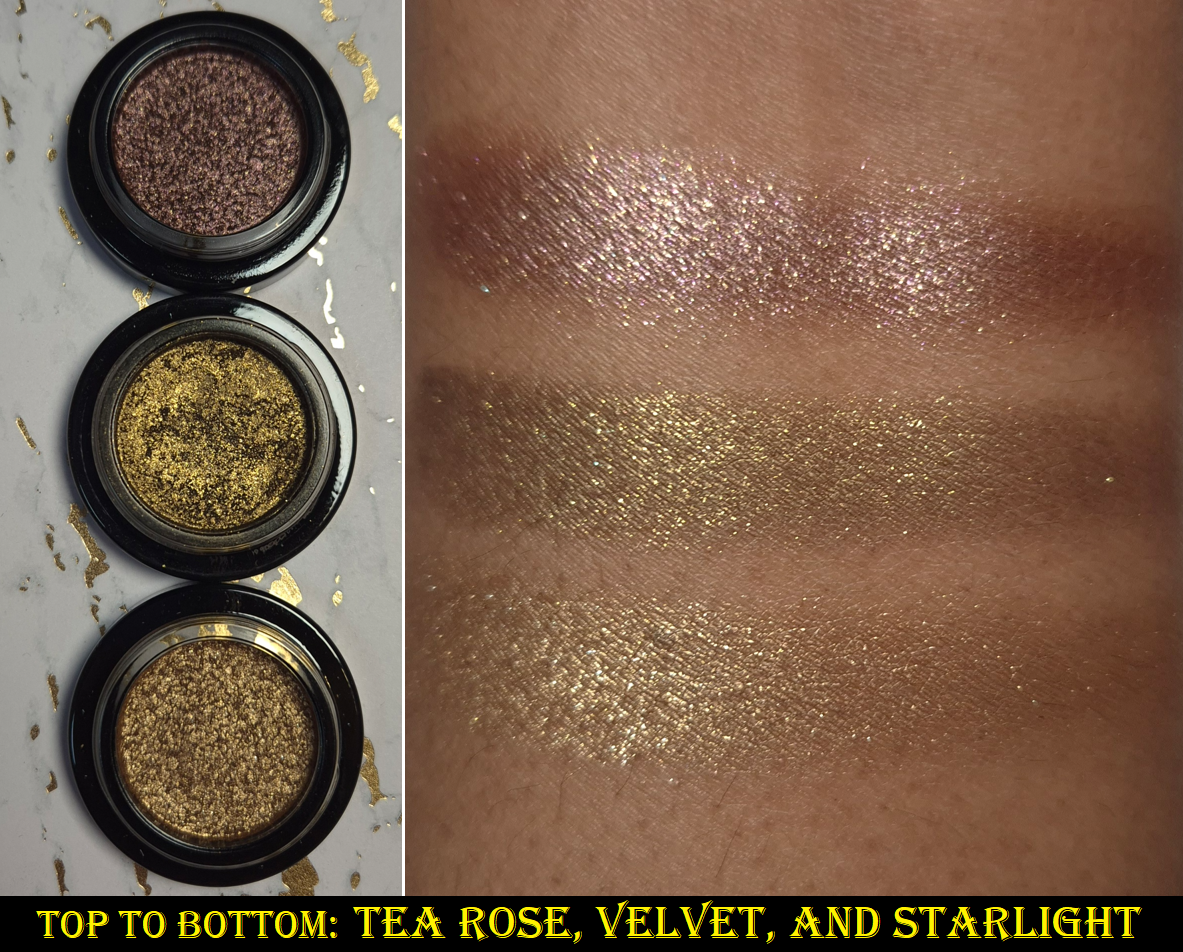
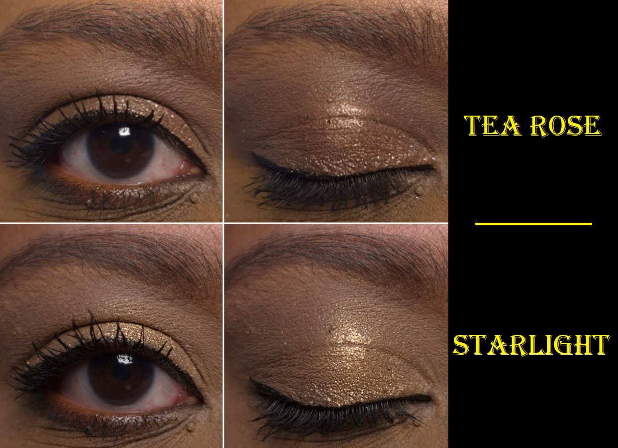
Lid Lustre in Tea Rose and Starlight
I reviewed the shade Velvet before in my Cocoa Eye Wardrobe post I keep linking, so the other two Lid Lustres are the newest additions to my collection. I rarely buy single eyeshadows, but most of the Lid Lustres are known for their incredible shine and sparkle. I watched many swatch videos and decided that Tea Rose and Starlight were the only remaining shades I wanted.
Tea Rose is supposed to be “infused with Quartz” and “Citrine Extract” is in Starlight. These two might not look as impressive on my eyes when used solo, especially since my camera doesn’t do them justice, but I am rarely disappointed when I use them to amp up the shimmer effect in my eyeshadow looks. I must admit that these two shades don’t stand out as much on my eyes as Velvet does, but I still like them.
I’ve found that this formula works best when applied with a finger. It has good adherence and very little fallout. It doesn’t fade and it looks smoother if I apply it with a damp brush, but wetting it doesn’t increase the overall shimmer impact. I don’t get creasing or fading when I use the Lisa Eldridge Liquid Silk Liquid Eyeshadow underneath because it’s a good barrier to prevent the oils from my eyelids from breaking down the eyeshadow. If I use a Lid Lustre on my bare oily eyelids, there will be creasing before it begins to break down fully. So, please be aware that if you have oily lids too, a good primer is likely necessary. I updated my original review with this clarification.
Because I have so much makeup, it’s not unusual for me to eventually stop reaching for a product after I’ve completed the review in favor of starting to use something new. When it comes to these Lid Lustres, I can’t say that they’ve been used often since last October, but the amount is certainly more than I expected!
21:50 Rêverie Eau de Parfum (Sample Size), Suite 302 (Sample Size), and San Ysidro Drive (Sample Size)
The fragrance category is the most subjective category within the realm of beauty, which is why I rarely talk about the perfumes I’ve purchased or sampled. However, it felt like a wasted opportunity to forgo talking about these altogether considering I have 3 of the 4 scents and even the travel sizes are expensive to blind-buy. Perhaps my opinions as a perfume dabbler could still be helpful.
21:50 Rêverie Eau de Parfum – “Tobacco leaves, plum, vanilla pods and Tonka beans blending with the cedarwood.”
The initial impression I get when I spray this is that it’s a sweet fragrance with some amber. After it dries down on my skin, vanilla is definitely the most prominent smell. I like that 21:50 Rêverie features a creamier type of vanilla scent as opposed to sugary.
After about an hour in, the tobacco leaves and cedar come through. This combination of creamy, smoky, and slight woody scent is how it continues to smell for the rest of the day. It projects within a small area in the beginning, but after 2-3 hours it becomes a personal scent. I have to clarify though that I only spray 1-2 spritzes of a perfume on myself, at most, since everyone I interact with in my daily life are incredibly sensitive to fragrances. The majority of perfumes I buy are basically skinscents on me (perfumes are more prone to fading/dulling down on dry skin), which is why I tend to spray my clothes instead. Doing so takes skin chemistry out of the equation. If I just spray my clothes, I can smell this perfume for longer than many others I own.
I must admit that I cannot smell the plum at all, which is disappointing since I love the smell of plums. If I was able to detect it, that would probably be the push I’d need to buy a travel size of this because this is my favorite scent out of the three from VBB that I’ve tried. This is a very nice fragrance, but I don’t love it enough to be willing to spend so much on it, especially since I have to be so careful and so selective about how and when I am able to wear perfumes out of consideration to those around me.
Suite 302 Eau de Parfum– “Black cherry and red peppercorn; rose centifolia, midnight violet, and narcotic musk; plush velvets saturated with papyrus, black leather and masculine tobacco leaf.”
Tom Ford’s Lost Cherry and Kayali’s Lovefest Burning Cherry are some of my favorite perfumes. I love a good cherry fragrance, so I expected to like Suite 302 as much as 21:50 Rêverie or potentially even more.
When this fragrance first hits the air, I can detect the sweet cherry smell, but there is a smoky spice element that overtakes it once it settles onto my skin. To me, it smells like incense. Thankfully, this scent grows sweeter within the first hour. I can smell more of the cherries. However, after that first hour I smell florals and sweetness mixed with a peppery-spice smell, and that’s basically how it stays for the rest of the day. I don’t consider this a true cherry perfume because of how quickly that specific note just registers as sweet rather than fruity. If I check how I smell midday, I could easily forget there was supposed to be cherries at all. This scent profile overall is interesting, but I don’t like it enough to be willing to spend that amount of money on it.
The projection and longevity of this one is on par with 21:50 Rêverie.
San Ysidro DriveEau de Parfum – “Passion fruit and pink peony; ocean air infused with rich rose absolute, saffron flower and agarwood; black amber and vanilla”
In the opening, I cannot distinguish what kind of florals are used. There is a sweetness, but it doesn’t register as passion fruit to me. The overall scent of this is bright and uplifting, though not my style as a gourmand lover. I wasn’t very interested in this scent, but I chose it specifically to review since I didn’t want the other free samples, and I have backups of the other two fragrances already.
Fairly early into the wear time, I can smell the saffron and more of the salts and wood. The dominating smell is still “sweet floral” up to that first hour. After that, I can isolate the rose smell and finally the vanilla. Eventually, I can tell there’s amber as well, but that’s as far as it goes. Once the top notes have faded, what is left behind is more my speed, but it’s also a much less unique type of smell.
I also have to admit that I don’t have many fragrances with oud, and the ones I do own are blended with so many other things that I can’t say for sure that I know how oud smells on its own. According to Google, it can be so many things: woody, earthy, animalic/musky, smoky, resinous, and “depending on the origin (e.g., Thailand, Cambodia), it can range from fruity and floral to medicinal, spicy, or leathery.” So, basically it’s a broad category that can account for practically everything! San Ysidro Drive had a tiny bit of an incense smell as well, though weaker than Suite 302, so I’m going to guess that that was due in part to the oud.
I don’t know if it’s just my sample, but I think it’s interesting that this projects the most of the three, but its scent is the quickest to fade (after about six hours). Without being able to smell any passion fruit, I’m not a fan of this in the beginning, but I like how it wears as the day goes on. That being said, it’s my least favorite of the three samples and I unsurprisingly don’t have any interest in buying it.
I know Portofino ’97 is popular with a lot of people, but the notes are so far away from the kind I like. It even has patchouli, which I hate 95% of the time. So, I don’t intend to ever try it. I’m very glad that the brand offers these samples to customers though, and there is a discovery set with all four in case someone does not want to wait to get the complimentary samples one order at a time.
Additional Updates
Eye Wardrobes
Since I posted a First Impression of the Orchid Palette, I wanted update that the quality in this one is on par with Victoria and Cocoa. The mattes are soft to the touch and create low or medium kickup depending on the brushes used. The light purple shade (Shade 2) tends to lean quite pink on my skin tone, but it still looks enough of an orchid-purple color to satisfy me. The deeper purple (Shade 3) doesn’t swatch very well and looks patchy, but that quality is what gives the hazy smokey effect on my eyes that I like. Having a deep shade like this is easier to control. The mattes blend well into each other and although Shade 2 can appear as if it has a bit less pigment than the amount in all the other quads, I think it’s just a matter of this type of color not popping as much on my skintone. The satin eyeshadow (Shade 1) can be used as a highlighter on my face. I like putting it in the inner corner since it’s much smoother than the shimmer eyeshadow (Shade 4), which is practically a Lid Lustre in pressed form. I don’t get creasing from the shimmer (but I always use an eyeshadow primer or eyeshadow base) and the shine doesn’t fade. It grips to my eyelids well enough that I don’t feel the need for a specific glitter primer or to spray my brush.
I’ve had no issues with longevity, but my eyeshadow looks are so much more impressive when I incorporate the Fig Satin Kajal into the eyeshadow looks. For example, I love how much more purple Shade 2 looks if I apply it on top of Fig. I get so much more depth from Shade 3 as well. The best part though is that my eyeshadow looks practically newly applied by the end of the night when I use the Kajal as my base. I did a side-by-side wear test and could see that without the Kajal, the eyeshadows still looked great, just not as fresh looking. The pictures I take at night aren’t the best representation (due to lighting issues), but I’ll post an example anyway.
Vast Lash
I’ve talked about this mascara in the Cocoa Eye Wardrobe review. Sometimes a mascara gets better over time, but the sample I own did not. An example of how this mascara looks on me is in the Eye Brighter section of this post. I don’t think it looks good on me and my eye lashes are at its best and longest right now because I’m still using the Sweed Eyelash Growth Serum. So, I can officially confirm this mascara isn’t for me. I can’t help but still be curious about the Future Lash mascara, but the brand doesn’t offer samples of it at this time.
Cheeky Posh
I first bought Miniskirt four years ago and it eventually started to smell like crayons, which indicated that it needed to be replaced. Even though I loved the color, which was so similar to Fenty’s Rose Latte, I hardly used it because I had such an issue with the color blending away and transferring. Still, because the Victoria Beckham Beauty brand had quickly risen to be among my top five favorite brands, I wanted to have a usable blush again. So, I decided to repurchase it. Miniskirt continues to be my favorite shade within the range, so I thought it would be best to stick with that color.
I don’t know if the change in climate or the fact that I’m using different skincare and makeup can explain why I no longer have the same problems as before, but I’m very happy about it! The Cheeky Posh blush is a bit firm, but I am still able to draw a line or stamp the product along my cheeks and blend it out with my brush of choice without it disturbing the foundation under it. The warmth of my skin helps the blush to spread a little more as I work my Rephr LC02 brush into my cheek. Sometimes, out of habit, I still warm it up on my hand before applying it with the brush.
I can’t speak for all the shades, but Miniskirt imparts a good amount of pigment. It still sheers out a bit the more it gets worked into the skin, so I don’t have to worry about applying too much.
This product looks the tiniest bit dewy, but it’s not very emollient or sticky. At most, if I touch my face it just feels like residue left behind from a moisturizer. Setting it with powder eliminates that feeling entirely, but at the cost of turning it completely matte.
Even if I don’t set this with powder, I no longer have the issue of it transferring. If I press a napkin to my cheeks, I can only see the faintest hint of color. That does not mean that this product is long-wearing though. If I don’t use a primer, powder, or some other means to increase the longevity of makeup, this blush significantly fades from my cheeks within six hours. With helper type of products, I can get at least eight hours of wear before the fading starts to be noticeable. Twelve hours in, I can still see a light flush of color on my cheeks. I don’t know how much longer it lasts before disappearing because 8-12 hours is my typical wear test limits.
I honestly don’t know how much use I’ll get out of this because I use powder blushes at least 80% of the time. However, I’m still happy to have a fresh one.
Also, for anyone wondering about the scarf I tied around my hair in some of the photos, it’s the Victoria Beckham Beauty ’97 Portofino Scarf that was a limited edition free gift with purchase item.
I also want to acknowledge that in the time since the Orchid Eye Wardrobe launch, the brand has released a new shade of Posh Lip lipstick and two Colour Wash Bronze Water Tints. I do not intend to buy either products because I’m on a lipstick low-buy and liquid cheek products are not my thing. Plus, the Bronze Tints aren’t likely to work on anyone darker than tan. Whenever I am unsure if a product will show up on me, I try to wait and see if EnamoredBeauty on Instagram will review it (since we have similar taste in makeup), and it was pretty much invisible on her. I also watched reviews of ladies with light to medium skintones being able to pull off wearing both Water Tint shades. The decision to launch only these two colors in similar depths is…interesting.
I’m glad I didn’t have my heart set on trying that product anyway. It also means that this brand review is complete with me having reviewed everything I wanted by the brand. Anything else I buy from VBB in the future should be new products and/or shade extensions to things I love.
Important Note About the Referral Program
Victoria Beckham Beauty has a referral program, which they send reminders about to customers via email. There are very few brands I like enough to want to spread the word about, but because VBB had become one of my favorites, I figured there was no harm in talking about it. Looking back, I could have thought harder about the fact that although I see everyone I talk to in the comment section here on my blog as friends, as well as those I chat with via social media, they are probably not who the brand meant when they ask customers to “refer a friend.” In hindsight, they most likely meant people I know personally, even though I am extremely close with several online friends across the world that I have never met. Still, I had the sense to check the fine print details in the email, the Referral Program terms and conditions, as well as the V-Suite Loyalty Program terms and conditions. As of February 2026, there was nothing in there prohibiting customers from sharing their referral codes publicly. There was no warning stating that it’s possible for a referral code to be able to be misused and that if someone misused it, it would endanger the standing between the brand and referrer. Based on everything I read, there was zero reason to suspect that sharing the link with my friends and strangers via my blog would bring anything but a positive outcome. Posting on my blog would bring more business to the brand than sharing with my in-person friends who don’t buy luxury makeup.
What happened to me is that I shared my referral link/code in one of my Victoria Beckham Beauty reviews. Someone used it and everything was fine. Then, in another Victoria Beckham Beauty post, I wrote a thank you message hoping the person who used my link would be able to see it and I posted my link again. Other strangers used it and that’s when my account got blocked with no warning whatsoever.
I noticed that my year-to-date spending had been reset to zero and I had been knocked back to Tier 1, which is actually the reason I reached out to customer service. It was then that I was informed that whoever else used my referral link, “are using drop-shipping addresses to place their orders which is explicitly prohibited by the terms and conditions.” Therefore, I was kicked out of the referral program, loyalty program, and would not receive any other benefits.
I had to look up what drop-shipping is, and if you use ctrl+f to search for the word “drop” it does not come up at all in the terms and conditions. Accounts with fraudulent activity can be terminated or suspended at VBB’s discretion, which is perfectly understandable. The part that they don’t state is that by posting a referral link for the general public, any fraud that a stranger commits with that link (which a referrer has no control over), will result in them flagging the referrer’s account as participating in fraud as well. Since I don’t normally participate in referral programs, I didn’t know that it was possible for fraud to be committed through a link, and as I mentioned before, there is no warning written about that being possible in the terms and conditions. So, when a customer gets an email asking them to talk about the brand with their friends and encourage them to check out the products, doing so leaves that customer vulnerable to their own account being permanently blocked. Had I known this was possible, I would never have shared it with anyone! Not even my own family! Another aspect that confuses me is the line in the TOC stating, “Referral benefits are subject to the referral program terms, which are separate from these Terms.” So, I would have accepted getting removed from the referral program, but to have my entire account blocked for something out of my control and not clearly stated anywhere on the website or emails felt unjust.
One other aspect that I keep wondering about is the fact that Influencers/Affiliates talk about a brand and post links and codes publicly. Out of the hundreds and thousands of people who use their codes, there’s no way that none of them are misused (for example if one of the customers continually buys products, uses them, and then returns them). Yet, not a single company would ever hold an Influencer or Affiliate accountable for what a stranger does. So an Influencer who gets paid by a brand is protected from something like this, but a customer who gets a 20% off discount to give more money to a brand is considered undeserving of the same protection.
Feeling quite defeated about the whole situation, I immediately deleted the referral links from my blog. I replied to the email and figured it was 50/50 whether my account would be reinstated or not. Two days later, I got the news that my Uncle (who was also my godfather) had passed away, so I honestly didn’t have any fight in me to post about the situation on social media or do anything further to contest what happened. I have no issues accepting repercussions if I break terms and conditions, but what I did (posting my link on my public blog) was not listed as a prohibited action. Warning that what someone does with your link can jeopardize your own personal account was not listed either.
Another line in the terms and conditions states, “Any disputes related to the Program should be directed to Victoria Beckham Beauty’s customer service team. We aim to resolve disputes fairly and amicably.” I can say that this seems to hold true. A few weeks later, VBB wrote back that they reviewed my case and so my account was reinstated. One of the points I had expressed was the fact that the terms and conditions should be updated so that all customers now and in the future will understand what they’re getting themselves into by giving their referral links to anyone, and so they can be aware of the possible repercussions that doing so could bring (not just the positives). I am grateful that the representative on my case accepted and even thanked me for the feedback. The response back to me was very kind and understanding. This issue was able to be resolved, but it does not change the fact that I feel it is my responsibility to warn readers about the negative side and risks that are possible by sharing your customer referral links with others. I had made a post encouraging people to refer the brand too and thanking the ones who used my VBB link. So, of course I feel a strong obligation to talk about it here in the hopes that this doesn’t happen to anyone else.
This whole thing has not changed how I view Victoria Beckham Beauty products. Other than the Brightening Pencil and Concealer Pen that simply don’t work for me, everything else is a hit. The bronzers and eyeshadows rank in my Top 5 within both of those categories. The Posh Glosses and Satin Kajals are among my favorites as well. The brand got me to spend €66 on a primer, which I am even considering repurchasing in the future. I love many of these products, and based on that I still consider VBB one of my few favorite brands. However, I still have some lingering negative feelings over the whole ordeal. I was so happy initially when my referral link was used, and then what happened afterwards was like getting kicked down several pegs. As if I should know my place as a customer and not try to share things publicly as if I’m an influencer. The benefits of a loyal customer who is in the highest tier of their reward program isn’t anywhere near as important as an influencer with clout. That’s how it felt to me.
My account getting reinstated helped to repair some of the damage, at least enough that I made another purchase since then, but I honestly still have some lingering negative feelings. Regardless, my reviews of VBB products will continue to be unbiased. There’s no denying that they are high quality products with some of my favorite luxury packaging. I don’t expect those aspects to be any different in the future and I hope to only have good things to say about the brand going forward.
Thank you for reading, and I sincerely hope this has been helpful.
I’ve had these products for several months, so I decided I may as well combine them into one review!
Yves Saint Laurent Make Me Blush Bold Blurring Powder Blush in 12 Honey Moon
YSL started off the year releasing three additional shades to their powder blush line. I first reviewed Peachy Nude, Restless Rosé, and Nocturnal Nude HERE. Then, I discussed Rose Haze and Spicy Berry HERE. My versions of Nude Lavalliere and Berry Bang came from the brand’s first face palette in Golden Oasis HERE.
Although I have plenty of the brand’s blushes already, I have an especially hard time resisting the ones in their shimmer finish. So, I purchased this while at a slight discount via Flaconi. There are technically only shimmer/satin and matte finishes listed in the Make Me Blush Bold Blurring Blush line, but among the shimmers there are a few as sheer as highlighters such as 69 Lavender Lust and another of the three new ones called 10 Stardust Love.
Before we move onto the review, I feel it’s necessary to point out that YSL has already released a number 12 blush, but it’s called Nocturnal Nude. I assumed the duplicate number was a typo or simply an oversight, seeing as how there are at least 18 shades in the range, plus a few in the liquid formula as well. It’s not unbelievable that there could be a mixup. However, Nocturnal Nude was one of the blushes that did not get released at every retailer. In fact, I’m not even sure if it ever launched in the US. I had heard people living in the US had to get theirs from Selfridges in the UK. As for Germany, the only two places I can confirm had Nocturnal Nude was Flaconi and the YSL-Deutschland website. Nocturnal Nude was removed from Flaconi’s website and it has been listed as out of stock at YSL for at least six months. So, it seems as if that blush has been discontinued. It’s still a strange choice to reuse the number, even though Honey Moon is basically an amped up version of the shade in terms of depth, shimmer, and pigmentation levels.
I’m pleased with this new addition, but I hope YSL will consider making a deep brown-pink nude shade someday, since we already have three that lean orange.
In the second photo, I changed my eyeshadow crease shade and added the YSL Loveshine on my lips.
The majority of the blushes in this line are pigmented, but the lighter shades are unsurprisingly easier to control. Honey Moon isn’t as intensely pigmented as Spicy Berry (which could appear patchy in specific circumstances), but I still need to apply it lightly. Unlike many blushes that just need an wispy brush to build up the product slowly, the consistency of the blush powder is on the thicker side. To ensure the best application, I use brushes that have both an airy and medium dense section of the brush (for instance 3D styles or angled brushes). This way, it can pick up and apply a small amount of product from the looser side, but the other part of the brush has decent buffing power. My rephr Kōyō brush has always been perfect for that, but I can even use the Hakuhodo G6440 if I only do a single tap into the blush surface before buffing the color all over. Using a loose brush to apply with and switching to a buffing brush to blend it in works too.
Of the blushes I own, Spicy Berry and Nocturnal Nude are definitely satins because they have a sheen, but the shimmer particles aren’t as easy to see after being blended in. Restless Rosé has more obvious shimmer, as does Honey Moon. As long as I keep my blush layer of Honey Moon sheer, and especially if I use a blurring and/or finishing powder on top, texture isn’t as emphasized. So, I don’t mind this shade being so shimmery.
Other than being mindful about which brush is used, I don’t have any other issues with Honey Moon. It has good longevity and no added parfum. It just comes down to preferences whether someone will like this or not.
Yves Saint Laurent All Hours Hyper Bronze in #5
After getting the Golden Oasis palette with its blushes and highlighters, I couldn’t let go of the feeling that if I bought the bronzer, that would be the last face powder product from YSL that I cared to test out. Curiosity finally got the better of me and I caved.
Based on the countless reviews I saw, I knew the current darkest shade was my only option. #5 in the pan looks like it will be quite dark, but packing on the product still results in a fairly sheer application. It having a very thin consistency aids in its buildable nature. I was relieved to see the hype surrounding this bronzer wasn’t exaggerated. The matte airbrush finish is akin to the Victoria Beckham Beauty and Charlotte Tilbury bronzers, though YSL’s is slightly drier looking than them on my face. It also leans red, but thankfully isn’t overly red to the point that I wouldn’t want to use it. Still, I’d prefer if the brand had a shade extension with a deep golden option. I heard someone say that YSL’s pressed powder range goes even deeper than the bronzers, so I once considered using that as a bronzer, but I decided not to try that out of fear that the color could be even more sheer.
Bronzer vs Completed Look
I’ve had no longevity issues with the product. It’s blendable and doesn’t require any special brushes. If I want to maintain that sheer quality, I use my airy brushes. If I want maximum color payoff, like in the photo above on the left, I use a denser brush. It being sheer makes it prone to being easily covered up by a bold blush or toned down too much by my finishing powders, so I have to keep that in mind.
I don’t believe I’ve posted a new bronzer ranking for 2025, but based on my list from 2024, I would possibly rank this above Vieve as a new #13.
Yves Saint Laurent Loveshine Candy Glaze Holiday Collection in 22 Shimmer Rose (Medium Pearlescent Pink).
I like the YSL Candy Glazes, but I made a mistake in assuming the 2025 limited edition shimmer lippie would be the same formula as the shimmer one from 2024, which is actually a Loveshine Lipstick. That 2024 Holiday Loveshine has a wonderful emollient yet balmy consistency, but the shade of pink is quite bold and bright on me. I was too overly excited about this more natural looking color to check which line it was actually from.
The way Shimmer Rose looks in the tube in the leftmost photo is a bit too warm, but my reason for posting it was just to show how much smaller the shimmer particles look compared to Pink Desire.
I found it interesting that Shimmer Rose is even stickier than the permanent Candy Glazes and it still isn’t as natural looking on me because the shade looks even more cool toned compared to my warm undertone. Although it turns more bubble-gum pink than I wanted, I consider Shimmer Rose to be more wearable on me than Pink Desire. Besides the photo below, I’m also wearing it in the photo on the right side in the blush section.
As seen in the arm and lip swatches, there are chunkier pieces that come onto the lips when first applied, but they can be smoothed out nicely and evenly. My other Candy Glazes don’t swatch like this, but rubbing my lips together a few times makes it a non-issue.
I don’t feel any graininess from the shimmer, this has a light fruity scent, and the stickiness extends the time that I have a moisture barrier gripping my lips. Even if I wipe my lips with a wet paper towel, the sticky residue persists, so oil is the easiest way to remove it completely.
I can, and have, used this a few times in the center of my lips to boost the gloss level of other lip products. However, I still don’t use this enough to be able to say this was a good purchase for me. It honestly wasn’t, but at least the packaging is beautiful!
I will do my best to be better informed when this year’s limited edition lip products launch towards the end of the year. Then again, I’m supposed to be on a lip product no-buy, so maybe I should avoid it altogether!
I heard great things about all of the products I purchased from Sweed Beauty, but it’s hard to know what is truly a “bestseller” considering the brand put nearly every product they make on their bestsellers page! It’s pretty much just their full range of false lashes and their makeup brushes that are excluded.
Everyday Sunshine, Allfeisty, and Kackie Reviews Beauty are the only influencers I follow that talk about the brand, but none of them are anywhere close to my skin tone. Since it was extremely difficult for me to find anyone darker than tan using Sweed products, I figured sharing my photos and thoughts on the products could be helpful. And for those living in Germany, I’ve found Sweed products on Niche-Beauty, Douglas, and Flaconi retail sites.
Side Note: I linked videos for each creator, but Kackie’s is just a lip product. I could have sworn she has talked about the mascara, foundation, and blush before. She’s the one I attribute to making me the most interested in the Glass Skin Foundation in particular, and she’s the reason I kept being curious about Sweed, but I can’t find the videos on her page. Now, I feel like I’m gaslighting myself and could be confusing Sweed with Thrive, whose products have a similar color scheme.
Working my way from the makeup I like the least to the ones I like most, let’s begin with the foundation.
Glass Skin Foundation in 11 Deep W
This shade is described as having a warm red undertone, but it looks quite yellow. Even though I always try to grab a yellow or golden foundation, the strength of that yellow is too much for me. It doesn’t help that it’s too light for me as well.
In the straight-on face photo, the half of my face without foundation looks a little redder because I had just scrubbed off makeup that I was previously wearing.
I feared shade 12 Deep N/W would be too neutral despite being described as having neutral to warm yellow undertones. Frankly, I’m not convinced that any of the shades would work for me. Between the model photos (in which 11 is too light and 12 is too dark and red), the computer generated-looking arm swatches that all appear ashy on the darker arm, the liquid swatches that even 12 looks too light, and the real swatches on the hand that is ironically missing shades 11 and 12, I had no way of knowing which one to go by. Shade 11 had the greater discounted price between 11 and 12, so I let that be my guide.
The shade match being wrong isn’t the only reason it looks mask-like. Despite the thin and watery consistency of the foundation, it doesn’t spread as wide and easily as I expected. I had to put more on to cover my whole face. Perhaps I could get it to apply thinner and more evenly if I used a beautyblender, but I couldn’t bring myself to try additional steps since I think having the wrong shade would leave me dissatisfied no matter what. This is called the “Glass Skin” foundation, but the finish appears satin-like to me instead of wet, shiny, or truly glassy. It’s supposed to be suited for every skin type, but I disagree.
One positive aspect is that this dries down on my dry skin without requiring powder and there is very little transfer. Overall though, I don’t plan to use this foundation ever again and I wouldn’t purchase another shade if there was an expansion. I didn’t know it at the time, but apparently customers can send photos of themselves in daylight to the brand’s email address info@sweedbeauty.com or Instagram DMs for advice with shade matching. Hopefully this will help.
The Bronzing Powder in Tan
Fans of baked gelee products will probably enjoy the texture and performance of this bronzer as much as I do. It instantly reminded me of the contour shade from Dior’s Contour & Glow Duo in 200 Diorama, Nabla’s Skin Bronzing, the Hatice Schmidt Bronzer, and from Kess. All of these products were made in Italy as well.
This is a skin-like bronzer with subtle luminosity. It’s buildable, to the point that I can at least see it on myself in person, but I cannot get it to show easily in photos. I’ve tried on three different occasions to photograph myself wearing it, and the best one is below.
Tan is the darkest of the two colors that Sweed offers and I have used so much product trying to build up that shade, that I can faintly see a dip in the pan after only a few months of sporadic use. It looks more used than the other bronzers in the photo above despite it actually containing the most amount of product at 10 grams.
The Tan shade has a little bit of a red undertone, but it looks neutral on me most of the time until I build it up as intensely as it can get.
I have no issues with blending or fading. It’s a great product. I love bronzers that have this kind of formula, but an airbrushed and blurred type of finish can outrank them. With the exception of the Nabla Skin Bronzing product (which is significantly less expensive but also harder pressed), €35 is about the standard price for a baked gelee or gel-powder hybrid type of bronzer. However, €50 is usually the starting price for the type of powder bronzer that actually blurs and is finely milled enough for me to call it the best of the best in my collection (Hermes, Charlotte Tilbury, Victoria Beckham, and so on). Even the most bronzer-obsessed person might be unwilling to spend that kind of money, so the hybrid formulas present an alternative option that still tends to be fantastic quality.
Sweed’s bronzer is $45 in the US and €45 at full price in Germany. I find that to be a little high, but I guess it can still be justified. I must admit that due to the preferred undertone and depth of the Hatice Schmidt bronzer, I prefer it over the Sweed one, and it’s conveniently €10 lower in price for 8.5 grams. Although I can recommend this as a good product, I have to acknowledge that better prices and more shade options for similar formulas of bronzer exist.
Air Blush Cream in Fancy Face
This blush has faint gold shimmer throughout, which gives the barest hint of luminosity to the cheeks. The surface of the blush feels a little creamy to the touch, but it feels completely dry on my face, as if I applied a pure powder product. It fully sets on my skin, and how long-lasting it is depends on whether or not I used specific skincare or foundation that left my skin feeling dewy. If so, then the blush starts to fade as quickly as 5-6 hours. Otherwise, on a drier base, the blush lasts a minimum of 8 hours.
Fancy Face is the darkest shade they have at the time that I’m writing this. I like to apply this blush subtly, so it doesn’t look very intense on me in the photos I take. However, it still isn’t that dark in my arm swatch. This shade is buildable, and might still work on someone within the deep skin category, but it could be ashy on someone with a rich skin tone.
Although the Sweed Blush is firmer in the pan than the Rare Beauty Soft Pinch Matte Bouncy Blush, both leave a similar finish on the skin. It’s that blurry dimethicone-matte type of look that’s become increasingly popular over the years, especially in the K-Beauty realm.
The edge that Sweed has over Rare Beauty is that tiniest bit more glow. However, it’s not radiant enough for me to be satisfied. It still looks more matte than I like, so I have to use a hydrating spray with both. Rare Beauty’s blushes are more pigmented, but apply just as smoothly. They are longer lasting and their range has more dark-skin friendly options at the price of €28 for 6.4 grams of product as opposed to Sweed’s €34 for 5 grams. The US prices are $27 vs $35. So, even if Sweed expands the range, I don’t think I’ll buy anymore. It’s not due to a lack of quality and is purely about my preferences.
Cloud Mascara in Black
This is a bit difficult to review because I know that mascara formulas can change over time. Within a few weeks or months it can become drier and harder to use. In some cases it can start off too wet, but drying over time makes it work better. They can clump more or flake more. Essentially, how I feel about a mascara in the beginning can differ within a month or two, but I only used the Cloud Mascara for about two to three weeks prior to beginning to use the brand’s eyelash serum. The photos above were taken prior to using any lash serum and it was probably my third time wearing the mascara.
In the beginning, I thought this mascara worked fine, but I didn’t love it. It took me a while to realize that I couldn’t get as far trying to build up a very heavy first coat like I do with the majority of my favorite mascaras. Waiting for it to fully dry before adding a second coat sometimes led to it being unevenly built up, spidery, and sometimes I’d get a few clumps.
What works best for me is to build up the first layer of one set of eyelashes, repeat the process on the other eye, and by the time I’m finished I can add a second layer to my first eye before it has time to fully dry down. The end result is much more to my satisfaction and can be viewed in my Isamaya Core 1.0 Palette post, which I used the Cloud Mascara exclusively in all of the eyeshadow looks. I had been using the lash serum between 3-4 weeks when I took the pictures, but I didn’t observe any improvement from the lash serum that early. So, I feel like it’s still a good representation of the mascara’s best results on me without additional help.
This is the type of mascara that’s on the wet side, but not too wet. Since mascaras are recommended to be tossed out every 3-6 months (whether I do so or not), I only judge one by its performance up to that 3 month mark because additional changes could just be the start of it going bad. I can say that I have noticed zero differences in formula consistency within those three months.
I don’t get clumping (when I use my specific technique) and I haven’t spotted any flaking. One of the things I especially like is that my lashes don’t feel stiff after I apply the mascara. If I get an itch, I can rub my lashes with the side of my finger or nail and my lashes are still fairly soft. Many other mascaras give me a tugging sensation at the root of my lashes when I do the same thing.
The brand advertises this to be both a volumizing and lengthening mascara that keeps lashes separated and fan-like. I agree that it’s very good at separation and it adds decent volume, but my current favorites give me more length.
After completing the full round of lash serum, I definitely like how the mascara looks even more.
However, I feel like I shouldn’t factor that into my review of the mascara. Based on how it looked prior to the lash serum’s effects being visible, I can’t say that this mascara was worth €28 for me, even though it contains Panthenol (Vitamin B5) which, “improves elasticity and helps reduce breakage.” I got this mascara on sale for €21 (a little over $24), but I’m still uncertain if I will repurchase it or not. I don’t know how much of an effect the panthenol may or may not have had an impact on my lashes not breaking off. My gut tells me this mascara is overhyped. I like it, but I feel much stronger about my other mascara favorites.
If I end up changing my mind on this, I’ll update this post.
Eyelash Growth Serum – 3ml size
I owned the other Sweed products since September 2025, but I bought this serum at the end of October. Since it’s supposed to take at least 4-6 weeks for results, I decided to push back the release date for this review until I had tested it thoroughly.
I have been afraid of lash serums since the GrandeLash lawsuit when I learned about prostaglandin analogs, ingredients that are in the majority of eyelish serums and are listed under a ton of different names. I was too scared of the potential iris and eye skin darkening, eye irritation, and other side effects, to ever use one. The fact that Sweed’s serum does not contain any prostaglandin analogs is the only reason I was willing to give it a try.
Before we get into the review, I wanted to point out that the directions on the box just say, “Apply directly with a single stroke to the base of the upper eyelash.” I felt like there had to be more to it, so I watched videos of people applying it, and some put it so close to the lash line that some of it got onto their actual eyelashes. The instructions on the website stated, “Apply with the product’s applicator, using one stroke on your eyelid just above your upper lash line. Apply by starting from the outer to inner corner of the upper lash line.”
I believe the guidelines I should be most inclined to follow is on the official Sweed website. So, that is what I did after the third week, because it took me that long to look it up. I had just been following the information on the box.
At the 4 week mark, it appeared as if my eyelashes that fell were a little longer than usual, but I couldn’t see much difference on my eyes overall. By 6 weeks, I definitely noticed fullness of my lash line. My eyelashes didn’t look longer, but they weren’t as sparse, even in my problem section of my inner lashes. By 8 weeks, I realized my lashes were a lot more curled up, which is why I hadn’t noticed they were longer than before. After 10 weeks, it became clear to me that the outer half of my lashes were fuller than ever and looked slightly longer than the years when my natural eyelash growth was at its peak. However, from 8 weeks and on, I accepted the fact that my natural lashes aren’t dark enough and are too curled to look long while bare. When I close one eye and look sideways, I can see how long my eyelashes are, but looking straightforward, the effects of the lash serum can’t be seen until I put on mascara.
I still wish to have more fullness in the inner lash region, but I am pleased with the improvement. Part of the difficulty for my inner lash region is the fact that I frequently rub my eyes, especially before bedtime which is when I apply the serum. I’m not sure where I heard or read the information to apply it at night. The directions on the website merely state to use this once a day without a specific time. Anyway, when I rub my eyes, I basically remove whatever lingering bit of serum hadn’t yet absorbed in my inner corners.
These are the results, with and without mascara, at the 8 week mark.
Although my eyelashes didn’t get crazy long, I can see how many more lashes stand above my crease line with mascara on compared to before. I don’t lose my eyelashes as frequently either.
The directions state to use the serum daily for 4-6 weeks, and then switch to using it 2-3 times a week for maintenance. After the initial six weeks, I continued to use it more or less on a daily basis until after the 8th week. Then, I lowered the usage to every other day or two. As for my bottom eyelashes, I have not noticed a difference, but I didn’t expect any considering I did not apply the lash serum there and the serum is not recommended for that.
The photos above are not the best representation of my mascara favorites since I had them for far too long and the last bits of mascara left in the tubes are partly dried up. However, I think my lashes still looked great!
I managed my expectations and got enough results to be happy with this product. My issue trying to regain the fullness I used to have was resolved. This product is supposed to last 3 months* and my eyelashes will return to normal if I halt using it for one month.
*I’ve been using this at a rate of around 2 months daily and 1 month every few days, yet my tube hasn’t run out. So perhaps the estimate of 3 months is if someone used it daily during that whole time or perhaps the 3 months is a minimum of how long it’ll take before the serum runs out.
This is not a cheap product. It’s sold for $55 in the US or €49 in Germany for 3ml. The 5ml tube is frequently out of stock and costs €70. I bought my 3ml at a discounted price via Flaconi for €33. At that price, I do like it enough to repurchase it considering it’s as much as a high end mascara and it makes all my mascaras look even better. A regular eyelash primer might give me even longer lashes, but it wouldn’t solve my fullness/sparse lash issues. So, I will most likely continue to make repurchases at the lower price.
I highly recommend watching Abbey Yung’s video for those curious about the serum’s ingredients, understanding how it works differently to traditional lash serums, and seeing her own results.
Overall, I have a positive impression of Sweed’s products. Their makeup is very high quality, but some of the products don’t match my specific preferences, and the shade range is a bit lacking. So, I will continue to keep an eye on this brand’s new launches and I’ll potentially purchase from them again in the future.
I hope this post has been helpful to you! Thanks for stopping by and reading!
The D&G Blush, ABH Highlighter, VBB Lid Lustre, and PML Quad are not pictured here, but they will be discussed in this post.
After the bombshell that was dropped regarding the Louis Vuitton Beauty line and their prices, I started to think about which items in my collection were the most expensive, which ones I thought had the prettiest packaging, if the prettiest was actually the most luxurious looking, and which ones had the most weight. I was surprised to discover that so few items fit into all of these categories.
I was happy to see the people I follow enjoying their La Beauté Louis Vuitton products, but some felt they needed to justify their reasons for making the purchase beyond just stating, “I wanted it, so I got it.” Across the board, customers who thought the items were or were not worth buying seemed to at least come to the consensus that the price (besides paying for the brand recognition), was largely due to the packaging. The lipstick components were said to be fully metal, along with the bespoke metal packaging of the eyeshadow quads. “You could hurt someone if you hit them with this,” was stated more than a few times by various people.
How a product looks and its weight are my top two criteria for feeling like the item I own is luxurious. Looks are subjective, but weight can be measured and precise. I started to think about the heaviest packaging in my collection (proportionate to its size dimensions) in order to answer the question…are these automatically the most lux?
Lisa Eldridge Rouge Experience Refillable Lipstick (68 grams)
In order to highlight how great this packaging is, I need to do a deep dive into comparing it to another brand. Please, bear with me on this, especially if you’re a fan of LV. I don’t judge anyone on how they spend their money, and this is just me working out why I am perfectly satisfied with Lisa’s lipstick being the height of luxury for me.
Lisa Eldridge took great pride explaining in her launch video how her refills were mono material, made of 100% aluminum and could therefore be recycled without degrading once repurposed, unlike the vast majority of other brands’ refills that have mixed metal with plastic.
According to Google: “You cannot usually recycle a lipstick refill that has both plastic and metal components together, as most curbside recycling facilities cannot separate the mixed materials and are not equipped to handle small, complex items.”
There is plastic inside the forever case by Lisa Eldridge, as this has a click closure, but she wanted the actual refills to be sustainable.
I cannot compare the LV lipsticks from personal experience, but it is my understanding that the refills are all metal as well and come with plastic caps that can be removed when recycling. The lipstick cases have an aluminum shell and brass detailing, but the magnetic closure that is so satisfying to use (and adds to the weightiness of a product) keeps it from being recyclable as well.
Summarized from Okon Recycling: Recycling magnets is technically possible, but challenging as it involves disassembling the magnet and removing any non-magnetic materials. However, there are some magnets that cannot be recycled.
So, it sounds as if both LV and Lisa Eldridge have cases that aren’t realistic to recycle but have refills that are fully recyclable. The LV lipstick case has a lot of expensive details like the product names and logo being etched in, the monogram flower-shaped refill bottom, etc. Lisa Eldridge has her logo etched at the top of the cap, allows the customer to personalize the base of the case with their initials etched in (up to three letters), and the case shape had to be custom made as well. Perhaps some prefer the sleeker LV design while others appreciate the vintage inspiration of Lisa’s more.
LV’s Lipstick Case + Refill is $160 and the refill alone is $69. Lisa Eldridge’s Lipstick Case + Refill is $63 (engraving price included) and the refill alone is $30.
Sure, LV’s refill costs the same amount as other high end and luxury lipsticks in their completed form, but considering the details I listed above, is the LV case really $100 better that other brands’ cases, particularly Lisa Eldridge?
It can’t come down to the actual lipstick formula, because that’s part of LV’s $69 refill price.
At the time that I bought the Lisa Eldridge lipstick, I felt it was incredibly expensive. It is still the most expensive lipstick in my collection, based on what I paid and not the retail price. I rationalized my purchase because of the sustainability aspect, all the custom elements, the personalized touch, and how heavy it felt.
Taking branding completely out of the equation and thinking about the components alone, I do feel like this product by Lisa Eldridge is among the most luxurious out there, and I am no longer gritting my teeth at the price.
It would be nice if I liked the lipstick formula more, but there is some hope for me! I wrote a comment on Instagram that the brand responded to, and while the Velvet formula won’t be put in the refillable form, there might still be the possibility of the Lucents that I enjoy so much!
There are other things they’ve been “working on” that has taken years, such as making the empty eyeshadow palettes available for purchase alongside the eyeshadow singles, the return of the liquid blush in better packaging, etc. So, I’m prepared for this to take a while to happen.
If I can get the Luxuriously Lucent Lip Colours and/or Baume Embraces as refills, I will definitely get more use out of mine!
Whenever I think about heavy makeup packaging, the Olivia Palermo Eyeshadow Palette immediately comes to mind. I’ve had it for years, yet I’m still not sure how I feel about the pattern, and I’m not sure what it’s technically called (perhaps wicker, woven link, basket weave, oyster strap, etc.). It just makes me think of the types of patterns I’ve seen for watch straps, which isn’t too terribly off track. Apparently Olivia drew inspiration for the packaging, “by a vintage Art Deco bracelet she was given for her 21st birthday.”
The eyeshadow palette has a magnetic closure and mirror, which further increases the weight, on top of the fact that the packaging is metal.
Although I’m not sure if they could have created a different pattern that I would like more, I can say it’s at least cool, unique, and easily recognizable. Plain flat gold is always beautiful to me, but this packaging looks different from any other I’ve seen. Well, almost. As of a year ago, Hatice Schmidt released a refillable lipstick range called, “The Gift,” with a case inspired by jewelry and the pattern reminds me of a curb chain/Cuban link style. So, there are at least two jewelry inspired components from brands that I know of.
I bought the Olivia Palermo lipstick at the reduced price of €32 (originally €40) from Niche-Beauty, and the eyeshadow palette for $28 (originally $58). I’ve discussed how I procured the eyeshadow palette in a past review, but it was during the time that I started working on this post that I felt the compulsion to finally get the lipstick. I have checked in on the brand on and off over the years, waiting for them to release additional products. Earlier this year, I saw a notice on the official website that the beauty products would no longer be sold and that they were turning the website into an influencer style page (oliviapalermo.com now redirects to her affiliate shopmy page). I assumed that meant the brand was shutting down, especially since I’ve only heard two beauty reviewers reference the brand one time each within the last three years. However, I was shocked to see the products appear on the Douglas website in either August or September, and then I saw them at Niche-Beauty as well. I don’t know if Olivia has better sales in Europe, or Germany specifically. I’m not even sure if she still has products available elsewhere in the US.
I felt Lisa Eldridge’s lipstick deserved to be in the post, but Olivia Palermo’s lipstick is the only one in my collection that is heavier. OPB’s lipstick is less expensive, but it isn’t refillable and the central part of the lipstick component is made of plastic. The outer packaging is what makes this seem so fancy.
Regarding the eyeshadow palette, it definitely screams luxury. It isn’t something you want to carry around in your purse or travel with it. Olivia wanted the old Hollywood glamour look and feel to her products, so this is something that you would want to keep on a vanity.
This is by far my most luxurious palette, and though it doesn’t have some of the additional premium features of the LV Quads, it makes me feel a lot more content about my collection and avoid FOMO. If I want heavy eyeshadow packaging, I certainly have it with this product!
This is my golden pebble! It is tiny in size but mighty in weight!
Chantecaille is another brand with nicknamed “pebble” packaging, but theirs is plastic, thin, and it doesn’t feel substantial, even though they cost the same amount!
I bought my WA bronzer at 20% off, so the title of most expensive bronzer in my collection belongs to Hermes, even though I only bought the refill. Had I paid for the compact too, that wouldn’t have helped it to feel more luxurious than the Westman Atelier bronzer, considering Hermes’ thin plastic packaging.
This has a tiny mirror that I don’t use, and a magnetic closure. The brand has highlighters and face powders in this same style of packaging. I haven’t used their cream sticks or drops, but they don’t look as luxurious to me. The only other Westman Atelier packaging I have handled are the powder duos, which are certainly substantial and pretty to look at, but I don’t think it compares to this gold compact.
When it comes to the prettiest bronzer packaging, I think of Gucci’s and Charlotte Tilbury’s powder one, even though they are much lighter in terms of their size. However, I would never call something that’s a solid gold color ugly. So, it may as well be my most glamorous bronzer.
Fara Homidi Essential Bronzer Refillable Compact (106 grams)
This compact is about the same size and weight as the Westman Atelier Butter Bronzer. The amount of product from FH is 3.5 grams and the amount of product from WA is 8 grams. That is close enough to accounting for the 6 gram difference when I weighed the two products, which is why I’m still including it in this post.
Aesthetically, I find the Westman Atelier bronzer to be more appealing. Shiny things get me. However, I still think Fara’s is classy and pleasing to hold in the hand. Her other products come in red and blue packaging of the same weight. I don’t like the red, but the blue is very eye-catching. If the next product she releases is in purple or green packaging, it just might surpass WA’s as a favorite compact for bronzers.
D&G Cheeks&Eyes Match Blush (91 grams)
I have plenty of blush packaging that is bigger than this, and therefore heavier. However, for this small size, this is very heavy! Nothing really comes close to the weight, but I have to say that Gucci’s powder blush packaging is quite nice too, even if it’s lighter. Visually, I like Gucci’s more as well. In fact, I have a lot of blushes that aren’t luxurious feeling, but I love them anyway (such as YSL’s Make Me Blush Bold Blurring Blushes and Too Faced Cloud Crush Blushes). So, this is one of the few categories where my heaviest blush might be the most luxurious, but it isn’t necessarily my favorite packaging. I do like it a lot though!
I have to add that this packaging feels like a mixture of plastic and metal components. I believe there’s something in the base of this compact adding weight artificially, especially since it doesn’t even have a magnetic closure. It has a push button instead.
Victoria Beckham Beauty Products: Matte Bronzing Brick (166 grams), Eye Wardrobe (116 grams), Cheeky Posh (37 grams), and Lid Lustre (41 grams)
Similar to Olivia Palermo Beauty, VBB has a certain aesthetic that they maintain across most of their products. I like the horn brown/tortoise pattern, and it can be fashionable, but I don’t automatically associate it with luxury because of how many cheap products I’ve seen made in tortoiseshell style. The gold colored trim helps to elevate the look of the packaging, but it is the weight and feel of these components that make them undoubtedly luxurious.
The Bronzing Duo and Eyeshadow Quad are among my heaviest based on size. The Cheeky Posh blush is small and doesn’t have that much extra weight, but I figure that’s because the component isn’t refillable like the other two. I’m including it because it has the same style of packaging as the others, and I still feel bougie when I handle it.
I rarely buy single eyeshadows, so I don’t have much to compare in terms of weight. The prettiest I own is probably the Charlotte Tilbury Hypnotizing Pop Shots, but those have lightweight plastic packaging and they are powders, which I don’t believe is fair to compare. It would be interesting to see how the glass packaging of Charlotte’s Eyes to Mesmerise stacks up, but I don’t own that. I no longer have the glass packaging of Maybelline’s 24 HR Color Tattoo, but the best I’ve got is Melt’s Gel Liner (47 grams) and a MAC Paint Pot (56 grams). I like glass as a component material, but it’s not uncommon to find for eye products. The Lid Lustre packaging has an elevated look compared to MAC’s, for example. The Melt Cosmetics Gel Liner that has the gold lid and butterfly print around the rim with the glass base is prettier to me, while also being slightly heavier. However, the font for the brand logo makes it look less sophisticated. I don’t think eye related categories of makeup follow the trend of weight indicating how luxurious a product will look and feel.
One thing about VBB packaging that does take away from the experience is the issue with the closing mechanism. I heard this was a problem in the past, and I never had an issue with my Bronzing Brick, but my eyeshadow quad doesn’t always stay shut when I snap it closed. Sometimes it’s fine, but other times it likes to pop back open with the slightest touch. I haven’t heard about anyone else having an issue with the quads, so perhaps I’m unlucky in getting one of the few faulty ones.
Pat Mcgrath Mothership Palettes (392 grams) and Eyeshadow Quads (122 grams)
All the previous components I’ve discussed had metal or a mix of metal and plastic packaging. The Mothership Palettes are fully plastic, but they are quite hefty in weight. The palettes are big for only holding ten eyeshadows, but that black shiny lacquer with the gold bottom still look lux to me. My Victoria Beckham and Olivia Palermo palettes are the only ones I can recall from my collection that aren’t made of plastic or cardboard. In fact, the Victoria Beckham Eye Wardrobe quad is only six grams less than a Pat Mcgrath quad, but Victoria’s compact is almost half the size! I still chose these PML products as the next heaviest in the luxury category, though I have to admit that I have some lightweight quads that look fancier because they are gold colored. For example, Tom Ford (the trim technically), Guerlain, YSL (trim), Prada (mixed gold and silver), Lisa Eldridge, etc. I find it difficult to equate weight with luxury in the eyeshadow category because of how many bulky heavy palettes brands have released over the years. So many of Jeffrey Star’s earliest palettes, Plouise, and Glamlite’s Food palettes were huge. I also recall when Stila had the Luxe Eye Shadow Palette in Happy Hour, which was a similar weight and size to the Mothership Palettes, but I bought it for $36. I can’t remember what the full retail price was, but it cost nowhere near the same amount as a Mothership.
So, I’ve come to the conclusion that weight doesn’t automatically equate with luxury in this category either. However, because of how uncommon it is to find hefty quads and palettes that are reasonably sized (Olivia Palermo, Victoria Beckham, and Pat Mcgrath), the ones that are weighty feel extra special to me.
Beekman 1802 Milk Tint SPF 43 Tinted Primer Serum
I didn’t want to include skincare, but this technically falls under the makeup umbrella. If I count it as a primer, it might be the heaviest I ever owned (even heavier than the glass bottle of Rituel de Fille Thorn Oil). Beekman’s looks like ceramic, but it’s colored glass.
I have to say “might be the heaviest,” because I don’t recall how it compares to the Guerlain L’Or Radiance Primer (now called the Guerlain Parure Gold 24K Radiance Primer), which is definitely the most luxurious looking primer I ever bought. The look of the Beekman product doesn’t appeal to me at all, but I was so impressed by how it felt in the hands. I had to leave it behind though because it was so heavy that I didn’t want to bring it back in my luggage.
If this counts as a skin tint, then it’s a lot less special. Plenty of brands make glass bottle complexion products. That’s why I didn’t include any true foundations or concealers in this post, because the prettiest bottles in my collection tend to look and weigh around the same.
When it comes to heavy primer packaging being the most luxurious, I have to say the Guerlain primer squashes that theory.
This bronzer is larger than the one from Westman Atelier, but it weighs the same. The reason I decided to include it anyway is because it’s still substantially heavier than the remaining bronzers in my collection. Plus, the highlighter component is a similar size and even weightier. I cannot think of a single highlighter I own that comes in heavy packaging, other than this one.
I have noticed over the years that ABH has gradually been upgrading the packaging of most of their products. Their two most recent mascaras felt like either super heavy plastic or a mix of metal and plastic. The Smooth Blur Cream Contour Stick has a brushed gold colored metal cap and additional gold details. The Smooth Blur Matte Bronzer and Glow Seeker Highlighter have a magnetic closure and they feel quite substantial in the hand. I’m impressed with the packaging and find it to be quite pretty, but this is still another example of how weight doesn’t necessarily equate with a luxurious look. This packaging feels so much more substantial to hold and interact with than pretty much all others in the drugstore, mid-range, and high end categories. It feels like it should cost more than it does, and it looks appropriately high end to me, but not quite broaching luxury territory. I still think the Gucci Bronzer packaging tops it, despite it being lighter in weight, because it looks classier overall. As another example, MAC’s Sunstruck Bronzers look so beautiful, even though they are in lightweight compacts as well.
Final Thoughts
Based on my own personal collection, I’ve confirmed that in certain makeup categories, the most luxurious packaging is the heaviest. At the same time, I have many other products with a timeless and elegant look to them that are lightweight and made of plastic or other inexpensive materials. Essentially, the weight of a product enhances the luxury experience, but it does very little to elevate plain looking packaging. The best example of this is the Beekman 1802 Tint.
If I can get an Olivia Palermo palette that retails for $58 and feels ultra lux, but I can also buy a limited edition plastic Chanel quad for $86 and still feel like that’s luxurious as well, would that be considered silly? Should I be raising my expectations for all luxury brands? At the beginning of this experiment, I would have said yes. However, I now see that if Chanel, Dior, Gucci, and other designer brands used higher quality materials, their products would likely fall in the LV Beaute range of prices (if not more). Some examples of that are the Chanel 31 Le Rouge lipsticks in the glass case, Dior Rouge Premier Lipsticks with the ceramic case and “formula infused with 24k gold,” along with the Guerlain Rouge G Exceptional Piece lines. There is only so much a person is willing to pay for a product from a luxury brand if the materials are the same as a mid-tier brand. So, that keeps designer brands from going overboard with their prices. There are also advantages to using lightweight materials, such as them being more convenient to take on-the-go for customers or makeup artists with large kits, sitting at attainable prices for aspirational shoppers, thinner packaging contributing to less waste of materials and sustainability efforts, etc.
So, when I really think about it, I wouldn’t be able to buy as many products in the luxury category if the components were more expensive to make or if they were made from higher quality materials. In fact, the majority of the products in this post were purchased with some kind of discount. Of course, I would love to have all my luxury goods in weighty packaging, but if that means I would have to accept those products being less likely to go on sale and/or accepting that the prices of them would double or triple, I am unwilling to do so.
The Dior Powder-no-Powder is one of my favorite makeup products of all time, yet the most I was willing to spend was €45 (essentially just paying full price) to get my name etched onto the compact. If I had the opportunity to buy it in a gold colored compact with a magnetic closure or some stunning limited edition pattern for €100, I don’t think I’d be willing to do that. This tells me that despite a product having a holy grail formula that is unable to be duped, I still have my limits. Some makeup will just never be worth it to me to buy, past a certain pricepoint, no matter what it’s made of. That means I cannot use the product’s weight, materials (including formula), or looks to justify a super high spend amount. However, I know that when a product gets hyped up, it can be much easier for me to consider crossing that price threshold if I can make a case for it being top tier from every other angle. I bought one of the Chanel Boutons quads directly from Chanel because so many influencers were told by their SAs that the collection would be extremely limited, and I feared missing out. Less than one month after launch, I found the quads at multiple retailers for a minimum of 30% off. FOMO works similarly to getting caught up in the hype of a product. I sometimes make purchasing decisions that I normally wouldn’t.
This is why I decided to make this post. I know there are others like me who enjoy luxury makeup and don’t have the biggest budget to work with. There are those who will be tempted by the exclusivity of a certain new beauty line and would normally not even consider getting anything at those prices, but the hype may be wearing down that resolve. To those that want to be talked out of buying makeup at $100 or more…just remember that luxury makeup with fantastic formulas and high quality packaging can be found at a lower price. This post is full of examples of this. If one brand is out of your price range, you might be able to get similar products from another prestige brand. Other amazing and beautifully packaged products are just around the corner.
I hope this topic has been interesting, and even helpful.
I’ve been using the Hollywood Instant Look in a Palette (in Dreamy, Bronzed Beauty) sporadically over the past two weeks, so I feel ready to share my thoughts.
Before we start the review, I’d like to highlight the fact that Charlotte Tilbury used to have annual face palette launches, but they were usually not deep-skin friendly. The photos below are of the three darkest palettes the brand created until this year. I didn’t end up buying the one on the left because of how light it looked on tan reviewers I saw on YouTube. I didn’t get the one in the middle because I feared none of the cheek products would work on my skintone, especially since I was darker in 2021. I didn’t buy the one on the right because I rarely reach for blush and highlighter palettes. A face palette doesn’t feel complete to me without at least a blush, bronzer, and highlighter together.
In 2023 and 2024, the brand took a break from making larger face palettes, so I’ve been waiting at least six years to finally try one! That’s why, despite my pledge to quit buying face palettes, I made this exception.
I wanted to acknowledge this history because I have always been critical of Hourglass for their limited shade selections in Ambient Edit Palettes, yet I haven’t said nearly as much about the Charlotte Tilbury ones. I think it’s because as much hype as Charlotte Tilbury powder products get, it’s never to the level of Hourglass. So, I was far more disappointed when I could not use an Hourglass Palette vs one from Charlotte Tilbury.
Starting with the eyeshadows, the 1 Brighten shade is described as a warm tan with silver shimmer. On my skin tone, the tan color is only visible if I apply it wet (as seen in the photo above), and technically on top of a darker shadow. So, if I just tap it on top of my lids without dampening it, only the silver particles show in a scattered-effect-topper kind of way.
2 Enhance is described as warm copper with pink shimmer. As seen in the second pair of eye looks, it is difficult to tell the difference between the two shades on my lids. In real life, if I put Enhance on one eyelid and Brighten on the other, my eyes wouldn’t be closed long enough for anyone to be able to spot the difference. So, I can’t help but feel like I got a duplicate eyeshadow in this palette. I don’t mind having what amounts to one topper shade, but to have two out of three is a bit disappointing. That being said, they’re at least pretty. If I want a sparkly and slightly less scattered look, I reach for Enhance instead of Brighten. It is also true that I can get a slightly pinker look when I dampen this eyeshadow shade, or much pinker when I use the blushes on my eyes too.*
*If you’re concerned about whether or not the face products are considered eye safe, based on your government’s regulations, I recommend checking the official Charlotte Tilbury website and ingredient lists for information regarding that. I have not looked into this, and have tried them at my own risk.
Regarding fallout, applying the shimmer eyeshadows damp ensures that I don’t have too many particles under by eyes by the end of the day, especially if I also use the Nyx Glitter primer. Plus, I get the bonus of these methods intensifying the amount of sparkle that’s on my lids.
3 Smoke is described as a rich burgundy matte. It is indeed dark enough that I can be satisfied with creating eye looks using only this matte and one of the shimmers. I don’t like how rounded my natural eye shape is, so I prefer to use at least three eyeshadows to create a high contrast look with a sculpted outer corner in an almond shape that detracts attention from how rounded my upper lash line is.
I get decent pigment from this shade, though I still have to build it up a little to be satisfied. Layering and blending with it is fine, but not super quick. Basically, this isn’t an amazing eyeshadow quality, but it’s nice enough. I at least don’t have issues with patchiness. For those wondering, I use the Lisa Eldridge Liquid Silk Eyeshadow as my main eyeshadow base.
I have attempted to create eyeshadow looks using the bronzer and blushes as well, but they are not deep enough to give me the depth I require in my eye looks. I have to end up using Smoke or reaching for a different palette to finish the look.
So, if I include the brown bronzer as a blending out or softening shade, the face powder as a brightening shade, the raspberry-pink matte blush and shimmery glow blush as ways to intensify the pink elements of eye looks, the Smoke shade for dimension, and I use the two shimmers damp, I’m content enough with the variety of pink and purple eye looks I can create.
Moving on to the face products, I thought it was a good opportunity to show the differences between the Flawless Finish powder shades.
The swatches look quite stark and ashy, but all of these work for me under my eyes. In fact, Tan looks the best suited for me in the swatch, but I rarely use it on its own because it darkens the look of my under eye concealer if I’m using one that’s already a skin-tone shade. My go-to combination has been to use a mixture of Medium and Tan together. When I’ve used Light Peach, it has been for its color-correcting elements, lightening a blush, or if I’m in a hurry and don’t feel like reaching for a different powder shade while I already have this palette open. This also applies to when I’m using the Soulmates Duo, which is where Light Peach (it may also be referred to as Flawless Peach) was first debuted by the brand. It’s the same great quality I’m used to from the permanent line of face powders.
As for the Tan-Deep shade in the brightening formula, I bought a mini for color-correcting purposes once again. I have only used it once, so I don’t feel comfortable posting a full review. However, I wanted to at least demonstrate how it looks for anyone curious.
I have a bigger Charlotte Tilbury post I’ve been working on for a while, so if there is any information I need to update, I will post about it at that time. That post might not be ready until next year though. There are a lot of other reviews I’d like to complete first.
Next up to discuss is the bronzer. When I heard it was the shade Tan, I was a bit disappointed because that shade has never worked for me in the past. However, the one in this palette does faintly show up!
I wish I still had my older version of Tan to be able to compare it to the new one and see if there has been a slight color change. The reason I think it’s possible is because it’s stated on the website that this bronzer is actually a new powder formula. So, maybe the brand made this version the tiniest bit darker. Maybe it’s not actually darker, and is just easier to see because it’s a warmer tone of orange that stands out more on my skintone. The third possibility is that I might be lighter now than when I was in Florida, so I have no idea if the older powder version of Tan would work for me by now. The cream version of Tan has always worked though.
Shade match aside, I do believe there is a difference between the old powder bronzer and new one. My powder version of Deep is fairly old by now, so I don’t know if that could account for the new one feeling the tiniest bit softer and creamier, whereas the older one has a more powdery consistency. The older one had a beautiful airbrushed finish, which also accounted for a more obvious makeup look. The newer one has a more skin-like finish, which I would normally consider a great thing. However, I reach for Charlotte’s bronzer specifically when I want a slightly heavier glam look. The airbrushed blur is what made it stand out from most of my bronzer collection. As nice as this bronzer finish is now, it’s not as unique.
The reformulated version matches the quality of many of my high-end and luxury products, which makes it a great addition to this palette. The blendability is nice. I have no issues with longevity. So, I wouldn’t go out of my way to reach for a different bronzer if I’m already in the process of using this face palette. This difference might just effect whether I would buy an individual compact of the brand’s reformulated bronzer if they do end up launching them, considering it wouldn’t be giving me something different from what I already have from Hermes, the older Dior bronzer formula, etc. Powdery airbrush type of bronzers I love are by Victoria Beckham, Gucci, Vieve, etc. It’s just that Charlotte’s ranked above all of them for this specific look. The new formula is still good, but I would want it when I’m in the mood for a different makeup style (like neutral or natural).
Moving onto blushes, I don’t think Charlotte Tilbury has expanded their permanent powder blush range since the addition of Pillow Talk Intense in 2020. There have been limited edition powder blushes, but it’s interesting that the brand’s focus for the past several years has been to extend the options of Beauty Wands and various cream formulas. The limited edition powder blush shades intended for those with medium, tan, and dark skin have been just different enough for me to justify owning them all. However, I can understand some of the frustrations I hear my fellow makeup lovers talk about regarding the options. People are ready for something distinctly different, and not just in liquid or cream form.
Blushes are still currently my favorite category of makeup, although eyeshadows are getting close to reclaiming their former position. So, these blushes were what I was the most excited to try. When I saw 6 Cheek Matte Blush in person, I was nervous because it reminded me of YSL’s Berry Bang that I got in August. However, I was very happy that I find Charlotte’s to be a prettier tone on me. It’s pigmented, soft, and buildable. To have a little more control of the matte blush and get it to have as light of a layer as it appears in the demonstration photos above, I used the Sonia G Soft Cheek Brush.
This blush lasts all day without fading. It also doesn’t look too matte for my dry skin, although I prefer to add a little of 7 Cheek Glow Blush on top to make my cheeks appear a bit more supple.
I was surprised to see that the Cheek Glow Blush is the only one not inside a pan. It feels like a gelee or slurry formula on top of plastic netting/mesh. Some products like this can be hard pressed, but this one is not. I have no issues getting enough product onto my brushes, but since it’s not as pigmented as the matte blush, I like to cut to the chase and use a brush that’s a bit denser and picks up more, like the Hakuhodo G6440.** One other brush I’ve been loving with it is the Bisyodo B-P-03 Perfect Fit Powder Brush.* I haven’t written an official review for it yet, but I want to share the fact that it lays down these blushes so well and it’s great to blend with. Despite being large, I can dip the lower angled portion of the brush onto the surface of the blushes, and then when I blend, there is a portion of the brush that doesn’t have product on there. So, I can diffuse the blush without packing on additional product in the process.
*DISCLOSURE: Every link (in thisBoldBlue Font) is a regular non-affiliate link. The brush link (in thisBold Black Font With a Blue Background) is the only affiliate link in this post. This means I would get a commission from anyone who decides to make a purchase from CDJapan after clicking my link.Athough chances are slim that anyone who has used my links in the past will see this message in a post that isn’t dedicated specifically to Japanese Fude, I still want to show my thanks and appreciation. As someone with such a tiny blog, it’s still a shock to me whenever I see that someone has used my link, or even to just see the number of people who have clicked them. Thank you very much. ❤
**Side Note: I feel compelled to point out that when I bought the Hakuhodo brush almost a year ago, it was listed at 19,000 YEN. Between Black Friday discounts and the shipping fee via shopping through Fude Bobo, I ended up spending a little less than that on the brush, and it still felt like quite the splurge for a brush of that size. Four months ago, Hakuhodo raised their prices again, so this brush costs 26,000 YEN now! As much as I love this brush, I cannot recommend Hakuhodo anymore at these prices.
Returning to the subject of the glowy blush, one downside is that it emphasizes texture a little bit. It’s not as intense or metallic looking as certain shades of the brand’s Blush Wands can appear, but it could still be too much for some people’s makeup preferences. Also, this blush shade shows up enough on me to consider it a usable standalone blush, but I find it more practical to regard it as a blush topper. It’s shiny enough to add glow like a highlighter, but the tone matches so well with the blush that I feel it doesn’t stands out enough or draws enough focus to my cheeks like a traditional highlighter would. So, I prefer to add the Cheek Glow Blush to the apples of my cheeks and/or the top of my cheekbones, but still apply a real highlighter on top to finish the look. Perhaps I would feel differently if my undertone wasn’t golden, since pink highlighters don’t pass for natural on me.
The YSL All Hours Couture Palette in Golden Oasis still feels new to me, so it’s natural to want to compare these two products. In USD, YSL’s face palette contains three blushes and three highlighters for $85. Charlotte’s face palette contains three eyeshadows, two blushes, one face powder and one bronzer for $69. The differences in Germany were much smaller as it’s €72 for YSL and €69 for the Charlotte Tilbury palette. I essentially liked half of the YSL palette, but would only really use two blushes (and I already owned one of those two). With the Charlotte Tilbury palette, I can use everything in multiple ways and I like all of the shades. I can finish a good portion of my makeup by whipping out this single palette. I like it more than the YSL and more than the Nars Hot Escape Cheek Palette. I still stand by my thoughts that the ones from YSL and Nars could be good in particular circumstances, and what I actually paid for them was a pretty good deal. This one just turned out to be even better.
I don’t believe it’s recency bias if I consider this to be among my most useful face palettes: Hindash Beautopsy, Sephora Microsmooth Multi-Tasking Baked Face Palette, Hourglass Ambient Edit Palettes, and now the Charlotte Tilbury Instant Look in a Palette. Considering the fact that I don’t like to use any of the others on the eyes, this palette has that edge. Hindash’s still has my best contour color, Sephora’s has a true highlighter, and Hourglass’ has a glowy bronzer option. So, I like and use these on different occasions. I believe the reason I would end up getting a lot of use out of the Charlotte Tilbury palette is for convenience. It’s just easy to have so many usable pretty products in one palette, which is the whole appeal of having a face palette in the first place. I am glad that this one turned out to be such a good purchase!
That’s everything for this week. Thank you for reading!
Today’s post will be a review of the Swan Palette and Dusk Quad, plus I will show some mock ups of the DIY custom palettes I’m considering making using the Ambient Lighting Powders.
I already reviewed the Fox Palette, so if you wish to see more details about that one, please click HERE.
If you’d like to see even older Hourglass Palettes, I have a list HERE with the links to all of them.
Hourglass Ambient Lighting Edit – Unlocked- Swan (in Deer Packaging)
The Swan Palette comprises of Color Palette 2, generally known to be geared towards those with medium skin. I will admit the reason I bought another palette after Fox was because I could not let that beautiful Deer Packaging go. I like the original Swan design, but I felt an even stronger pull towards the Deer. So, I needed to put something inside it. I contemplated going for the Fox color story again, but I thought it might be more helpful for review purposes for me to choose Swan’s Color Palette 2 and see just how many shades I could get away with using. Plus, the blushes all looked pretty. So that’s what I did, and it’s not the first time either! I own the Owl Palette from 2023 that holds the Leopard color story, and I’ve gotten a surprising amount of use out of it!
DIM LIGHT (Finishing Powder) – This is one of the most frequently repeated shades among the Ambient Edit palettes, but thankfully only my second time getting it. It’s the lightest finishing powder Hourglass makes that I can pull off if I use it lightly, and if I’ve stayed out of the sun enough. At the moment, it’s a bit too light for me to wear with my regular foundations, but I have been successful in using it to lighten some of my foundations that are too dark or too orange right now.
In my review of the Fox palette, I mentioned that the quality seems better than it has been in the last few years. The powders feel softer and less dry. Out of curiosity, I felt my older Dim Light Powder from the Leopard Palette compared to the newer one, and this year’s feels the tiniest bit silkier. When I swatch them, the shades are identical, but when I rub them into my skin, I can see slightly more of a cast from the older powder. I hope my photo helps, but it’s a bit difficult to try and demonstrate the results from a sheer finishing powder on the skin.
This change probably won’t make much difference on someone with a light skin tone, but it works out better for me. Realistically though, I’m going to stick to using Eternal Light or Desert Light instead. So, Dim Light might be ignored by me when I open this palette.
GOLDEN HOUR (Highlighter) – This is a new shade for Hourglass and I feel it is one of the more refined highlighters they’ve made. There’s no avoiding that this is quite beaming, but it doesn’t look as crazy on me as I expected. In swatches, it is clear that Golden Hour is lighter than Divine Strobe Light, but it blends into my skin so well that I feel I can pull off Golden Hour even better.
Darker highlighters are obviously going to look better on me, so I don’t foresee myself using Golden Hour very much. However, it’s nice that I could if I wanted to. Since the quality is great, I think most people who like intense highlighters will be happy with this one.
This photo demonstrates my best efforts at applying a sheer amount of Golden Hour to make it work. It is incredibly easy for it to look beaming and intense if that’s what I wanted.
NATURAL BRONZE (Bronzer) – It’s no surprise that this doesn’t work for me as a bronzer. I can just barely see a cool-toned tinge on my skin in person (it’s invisible in photos). Hourglass finishing powders can be used as bronzer, so the reverse is true as well. However, because Natural Bronze leaves a slight grey tone on me, I cannot use it for either purpose. I’m fine with that considering it’s the only truly unusable powder for me out of six.
One of the complaints a lot of people with a lighter skin tone have is that Hourglass bronzers tend to lean too warm/orange. So, I wonder if this particular color will make the majority of customers happy. It is apparently not a new shade, but I don’t know where else it has been.
LUMINOUS CORAL (Blush) – I really like this color! It is a little darker than Ethereal Flush, and warmer than Coral Haze, which makes it my favorite of Hourglass’ coral blush shades! It’s vivid enough to pop on my cheeks without looking clownish and it doesn’t require too much effort building it up.
SUNSET FLUSH (Blush) – This blush has the Nars Orgasm effect on me: a slight tinge of pink may be seen when I face forward, but a gold sheen is all that shows when I turn my head towards the light. I could use this as a highlighter, but I prefer how it looks as a blush topper for Luminous Coral and Mauve Fusion.
MAUVE FUSION (Blush) – Although this blush is lighter than Amethyst Haze from the Fox Palette, it has enough pigment to look extremely bold with enough layers and a dense brush. In swatches, Mauve Fusion looks fuchsia-pink and Amethyst Haze looks magenta-pink. On my cheeks, Mauve Fusion looks like a normal pink blush. I still think it’s pretty, and between the two, I do think Mauve Fusion looks the most purple on my cheeks. However, I find Mood Flush to look like a truer mauve. Perhaps Mauve Fusion will look different on other people with a different undertone than mine (and a different ratio of color marbling in the blush).
Overall, the Swan Palette colors work pretty well for me. Luminous Coral and Golden Hour were my favorites, but Luminous Coral, Sunset Flush, and Mauve Fusion combined are the real standouts.
As much as I like this palette, I don’t love any of the powders enough to say that I’d have been missing out if I skipped getting Swan. However, I don’t regret my purchase when the goal was to have Deer Packaging, and I ended up with five usable products to boot.
Hourglass Ambient Lighting Edit Quad – Dusk
As you might already know, Hourglass released five curated quads in May 2025, plus the option for US-only customers to choose 4 out of 24 Ambient Lighting powders to put in a custom quad. In my Window Shopping Hourglass post, I said the smartest move would be for me to wait and see if any of the shades I want will end up in one of the deeper holiday palettes I planned to buy anyway. This was my plan, but I kept thinking about the Hourglass Barney’s Volume III Palette that had my two most sought after shades (Lucid Glow and At Night in the “edit” size), and how it was never restocked. So, that compelled me to get the Dusk Palette in its final restock, which sold out a minute after I ordered it. Considering At Night did not make it into this year’s holiday palettes, I really don’t regret my decision. Plus, I got a discount on it.
I’ve had this quad for quite a while, but I figured the start of the holidays would be the best time to review it.
SUBLIME FLUSH (Blush) – I knew this blush would look cool-toned on me, and potentially ashy. Sometimes this shade doesn’t look too bad on me if I mix it with other blushes, but it’s really not for me.
MOOD FLUSH (Blush) – I have to build up this color quite a bit, but I love this blush. It’s a duplicate shade for me, as I already own and depotted one out of the Sculpture Quad, but that just means I can keep one in two different custom palettes of my own making.
OASIS GLOW (Blush) – I knew the chances were high that I couldn’t use this as a blush on my skin tone. I wanted this shade as a subtle highlighter, and that’s exactly how I’ve been able to use it.
AT NIGHT (Blush) – I own this in the full-size, but wanted it in the smaller Ambient Edit size to be able to put it in custom palettes. I love the one that came in the Dusk Quad because I have a larger section of deep red marbling, making it easier to get more of that dark color and less of the tan-beige color. This means it’s even deeper and requires less building up, so I’m very pleased.
I have been content to leaving this quad as is, as a blush/highlighter palette. However, with the additions of Fox and Swan, I’m feeling even more of an impulse to rearrange one or even two Ambient Edit Palettes!
With this year’s launch (and my purchase of the Dusk quad), I have procured nearly every shade from Hourglass that I’ve wanted from the beginning of the launch of these palettes until now. Iridescent Coral is the only one missing, but it would likely be another highlighter shade on me, so I’m giving up on it.
I have experience depotting and rearranging these myself, which is great considering the brand still hasn’t made that option available to those outside of the US. I could continue to wait for this to happen, but there’s no telling when they will roll it out internationally, when they will use 6-pan palettes instead of quads, whether the palettes will be made of tin instead of plastic (which is more ideal for depotting without ruining the packaging). So, I am feeling a bit impatient when I see that creating my perfect palette is now within reach! My biggest obstacle at this point would just be procuring the right magnets and trying to depot the powders old-school style without my Z-Potter.
Below is a mock up of the first concept palette I decided upon, which I gave the name Panda for no reason other than to wish it into existence. I’d love a Panda design in next year’s Hourglass Palettes!
CONCEPT PALETTE: “PANDA”
Eternal Light (Finishing Powder) – Lotus, Permanent Shade Solar Glow (Highlighter) – Fox At Night (Blush) – Dusk Quad, Permanent Shade Mood Flush (Blush) – Sculpture and Dusk Quad Mystic Flush (Blush) – Snake Solar Bronze (Bronzer) – Snake
When it comes to choosing the best shades for me, as a person with a medium-deep skin tone, I think I’d put Eternal Light in any palette to be on the safe side of working for me, but Desert Light poses a very tempting second option.
There are plenty of pretty highlighters from Hourglass that I can make work, but the newest one from Fox is the clear winner. Solar Glow would be in any version of my ultimate palette, but if I made a second custom palette, there are a few blushes I use as highlighters that I’ve come to enjoy enough to put in the running.
My two bronzer contenders are Solar Bronze and Solar Fusion with one being my best shade match and the other being similar to that with an added sheen. At times, Solar Fusion will be too light, so the Solar Bronze would need to be in my alpha palette (Panda).
At Night is one of my favorite blush shades of all time, so a perfect palette would be incomplete without it. Mood Flush is typically my second favorite. It works alone as a subtle blush, but also pairs well with At Night. Mystic Flush is the most pigmented and easy to blend of the medium-dark pinks, so that’s typically my third blush option, but Sunset Glow is such a similar color that I go back and forth as to which I like more.
Desert Flush, Luminous Coral, and Ethereal Flush are the next ones that grab my attention the most from the blush swatch photo in the Luminous Coral review section. Truth be told, I haven’t been wearing Desert Flush because I’ve gotten more sun this year and that shade is really only usable for me when my skin is at its lightest. Luminous Coral is brand new, so I’m not fully committed to moving it around. Ethereal Flush is one that I keep forgetting about since it’s in my palette with lighter shades (Owl).
Speaking of lighter shades, Mood Exposure also shows up as a solo blush, depending on the time of year, but I also like using it to calm down punchier blush shades. So, I could see myself adding it to a custom palette as well.
Mood Exposure on the cheeks.
It wasn’t until this week that I started to question whether I should put all of my favorite Hourglass blush shades into one palette considering At Night and Mystic Flush can sometimes look alike. I need to have blush variety, but the colors should be the ones I wear most often. I considered placing Canyon Heat instead of Mystic Flush for the greater difference between shades, but ultimately left it as is.
The more I look at the Panda Concept, the more interested I am in making it.
CONCEPT PALETTE: “RABBIT”
Mood Exposure (Blush) – 5 Holiday Palettes, Permanent Shade Lucid Glow (Blush as Highlighter) – Fox, Ghost Quad, Sunset Quad, Barney’s Volume III Desert Light (Finishing Powder) – Fox Luminous Coral (Blush) – Swan Canyon Heat (Blush) – Fox Bronze Fusion (Bronzer) – Fox
Since Desert Light and Bronze Fusion were close to matching my top picks, and Luminous Coral is the best of the corals, I decided to create a second mock up called “Rabbit.” The majority of shades in this one are from Fox, and while I might’ve been content to leave that palette as-is, rearranging them might help me get even more use out of them.
Lucid Glow and Oasis Glow are my top two blush-as-highlighter products from Hourglass, but Lucid Glow has more shimmer impact, so it won out. I did contemplate putting Infinite Strobe Light, but it’s just easier to keep Lucid Glow within the Fox Palette to minimize the amount of depotting I have to do.
For a similar reason, I’m leaving in Canyon Heat. It’s too new for me to know if it can top my other favorite blushes, but I’m still looking to have variety. This is the best of the oranges.
I could use Mood Flush a second time, since I have two now, or Sunset Glow to act as a duplicate for Mystic Flush, but I want to see how well this arrangement can do first.
It’s a little ironic that Mauve Fusion and Amethyst Haze didn’t make it into either of my theoretical custom palettes, considering they were the two blushes I was the most excited to see this year. They both have the potential to rise up the ranks though. I just need more time with them.
At this point, I can finally say that I don’t need additional Hourglass powders. I have all the shades I want. However, it’s not even about the powders anymore. I enjoy collecting them and whether I end up loving or hating the offerings, it’s one of the most exciting makeup events of the year for me to talk about with other makeup lovers. So, as long as the brand doesn’t do anything cancel-worthy next year, I will likely buy another palette. I will just try my hardest to limit it to one and not two!