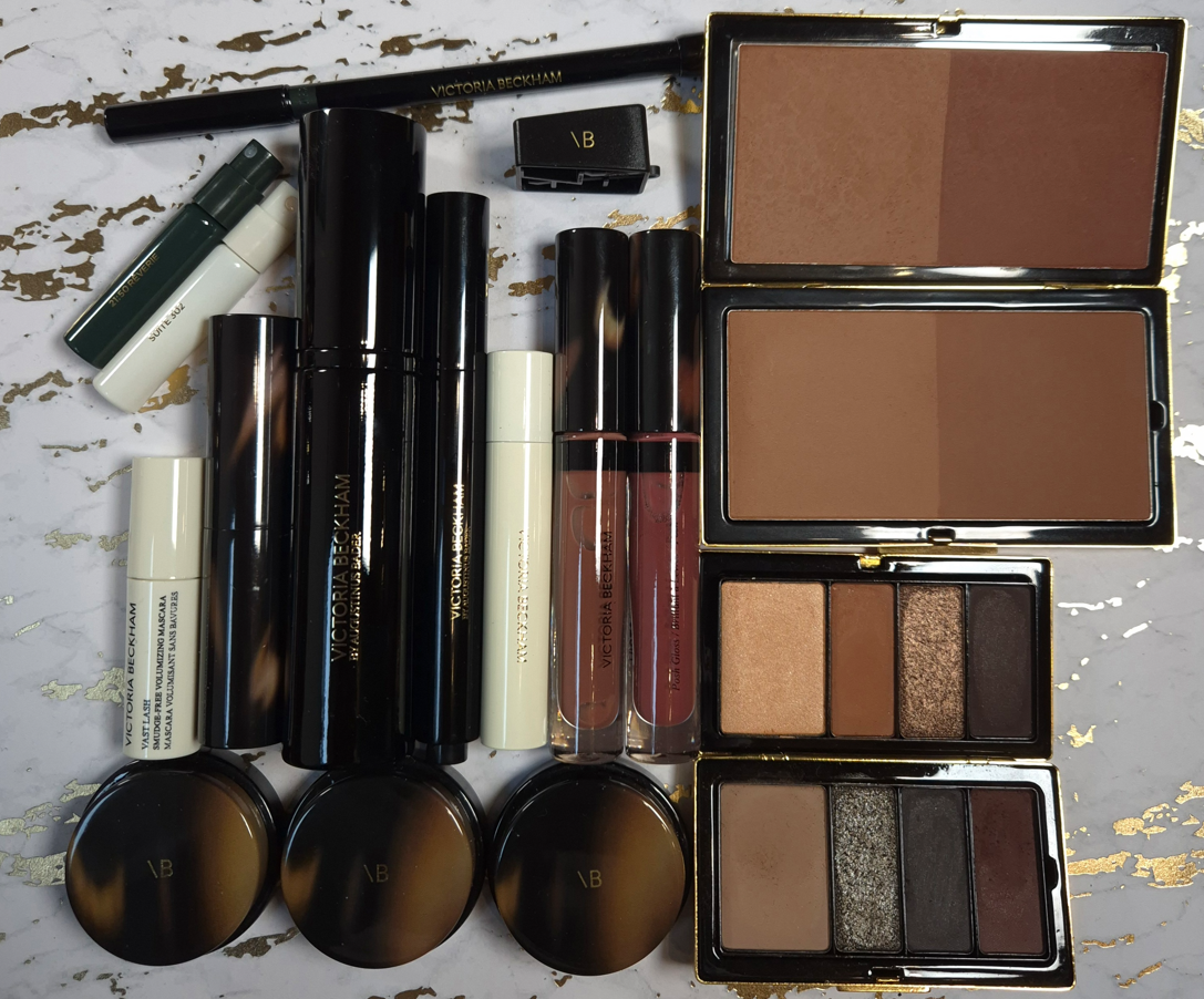
I’m still trying to catch up on reviewing some of my “older” makeup purchases, but today’s post is focused on some of the newer launches and shade extensions!
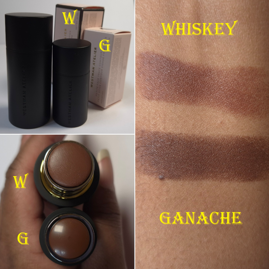
Westman Atelier Face Trace Contour Stick in Whiskey and Ganache
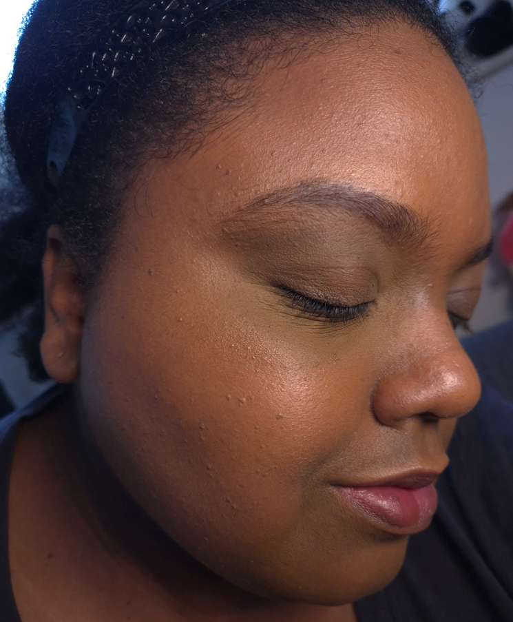
Since its launch, I have only ever heard good things about the Westman Atelier powder bronzers, cream contours, and cream blushes. Unfortunately, their shade options were considerably lacking in those days. I could finally try the Beauty Butter Powder Bronzer when they introduced the shade Beau Soleil in Summer 2023; and I loved it! I had also gotten a sample pack that included the cream contour in Truffle and cream blush in Petal. They seemed nice, but I couldn’t get a true sense of the products’ performance because those shades are intended for makeup lovers much lighter than me.
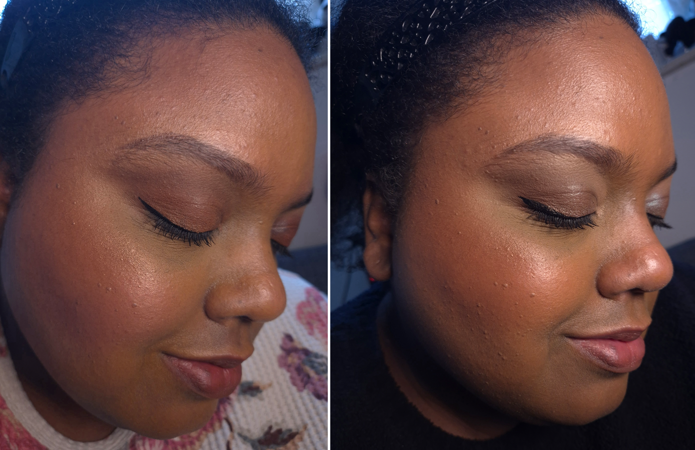
After learning that the brand expanded the Trace Contour range, I only had enough self-control to wait for a sale before finally giving in. Nice cream blushes are a dime a dozen, but I don’t have a cream contour that I can point to as my favorite. So, this was a wish fulfillment type of purchase. After buying Whiskey, I wondered if I might have been better off with the shade Ganache, which is not part of this most recent expansion. It’s just that all the promo images for Ganache made that shade look so rich by comparison, so I assumed it would be too deep for me. It also looked quite red, instead of cool, in some photos and videos. After seeing the brand’s swatches of the full range together, Ganache didn’t seem as dark, though perhaps still a little red. I didn’t plan on buying a second shade until I realized Cult Beauty stocks the mini sizes and they ship to Germany. So, my curiosity got the better of me and that’s how I ended up with another one.
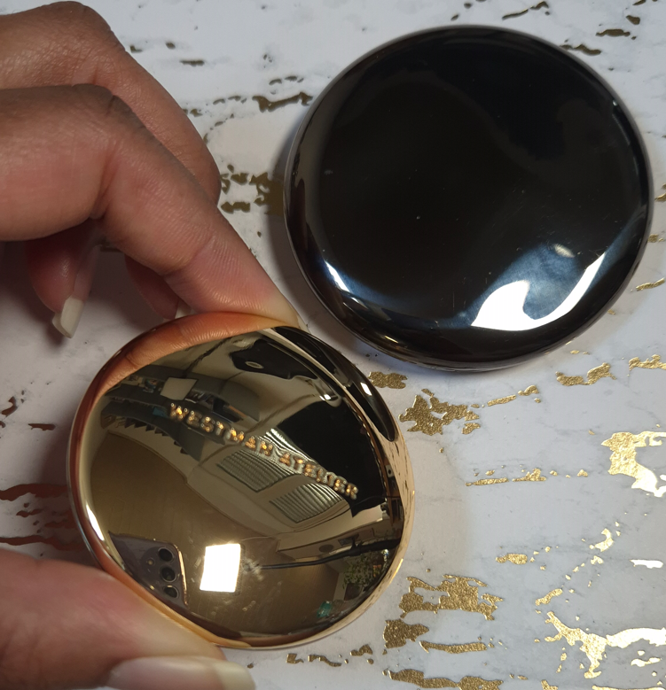
For those curious about the differences in packaging between the full-size and the “petite” is that the full-size has a magnetic closure, gold colored ring around the twist up base, and the brand name etched into the rim of the lid. It’s also weighted (not just from there being more product inside) and it costs €50 for 6 grams of product. The mini is not magnetic and closes with a snap. It’s too small to have words around the rim of the lid, but the “WA” heart logo is inside the cap. There’s still some weightiness to the mini, but it’s not comparatively heavy, and it costs €27 for 2.5 grams.
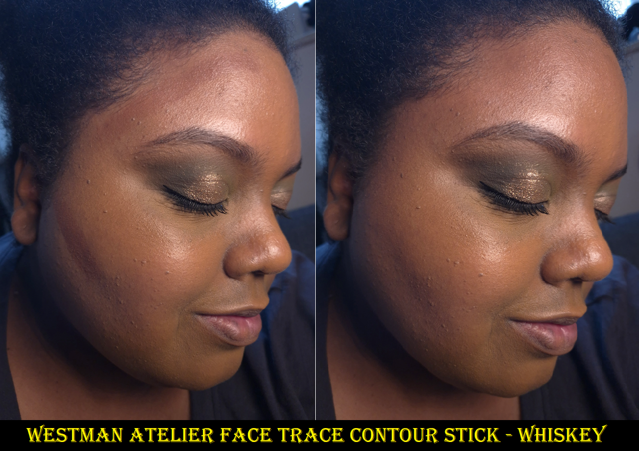
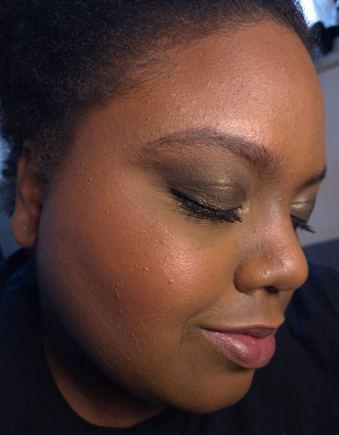
I don’t mind the fact that Whiskey blends in so much that it is hard to see in photos. The best contours are the ones that create the sculpted effect without being able to tell it’s due to makeup. Unfortunately though, this shade doesn’t create a shadow. I knew this was a neutral color, but I didn’t think about the fact that neutral ones that worked for me in the past were a lot deeper (brontours). So, because this isn’t that much darker than my skin tone, I can just see a brownish-pink color without it having any affect other than adding the tiniest bit of dimension from being a different color than my foundation. It doesn’t create a true shadow, so it doesn’t work like a real contour on me.
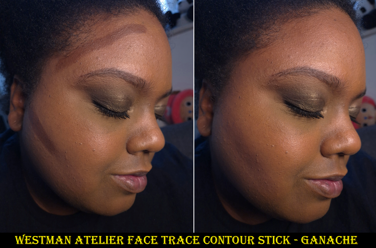
I didn’t want to buy Ganache because I didn’t think this formula was that much better than the €30 Fenty Match Stix Matte Skinstick, and I still liked the €38 Uoma Double Contour Stick even more. To me, it’s not that much different from the €34 Anastasia Beverly Hills Smooth Blur Contour Stick either. However, getting a better shade did improve my overall opinion of the product. Ganache still has some red to it, so it can look a little more like a bronzer on me, but the depth level does create a sculpting effect. So, I view it as a brontour.
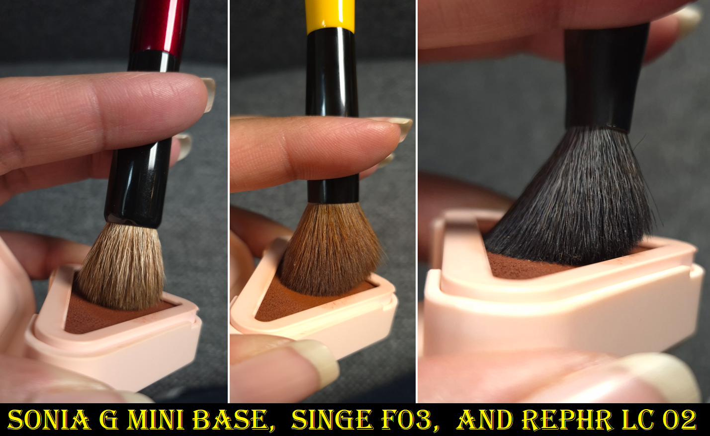
My holy grail cream contour brush is the one by Patrick Ta, but the Westman Atelier Contour continually looked patchy when I used it (even if I didn’t draw the stick directly on my skin). The same happened when I used the Trace Contour with my Bisyodo S-517, but I was successful in blending it with the Sonia G Mini Base. Finding the right brush for this definitely raised my opinion of the product, but for that price I would expect it to blend beautifully with all of my favorite brushes for cream and liquid products. The sleek black packaging with magnetic closure feels luxurious, but the formula is a little stiffer than I prefer. It doesn’t glide as easily as the Uoma or ABH, even when I warm it up on my skin first before applying it.
I appreciate the longevity and non-dewy nature of the Trace Contour that sets to a dry touch, plus it being fragrance-free, but formulas exist (at least in bronzer ranges) that are creamier while still drying down and setting on their own. My favorite type of cream cheek product is melty like the Rare Beauty Warm Wishes Effortless Bronzer Stick. This is my preference because of my dry skin type, and perhaps people with normal, combination, and oily skin get along well with the Westman Atelier Contour because it’s less emollient and has kaolin clay. Plus, the amount of pigment one gets with a thin layer lends to it being easier than other sticks to build up color without overdoing it.
With these aspects in mind, perhaps it is much harder for others to find contours that suit their skin type or undertone, so this product is worth it to them. As that isn’t a problem for me, I can’t help but feel a little bit of regret in buying the full-size, though I didn’t know the petite size existed until I started shopping through Cult Beauty for the first time.
I may as well mention that I don’t intend to buy the newly launched Westman Atelier Sun Tone Bronzing Crème because the duo best suited to my skin tone is Soleil Parfait 4, which is practically the same depth as Ganache. I don’t believe the slight undertone difference among them, based on swatches by Daps_Makeup, is going to look different enough on my face.
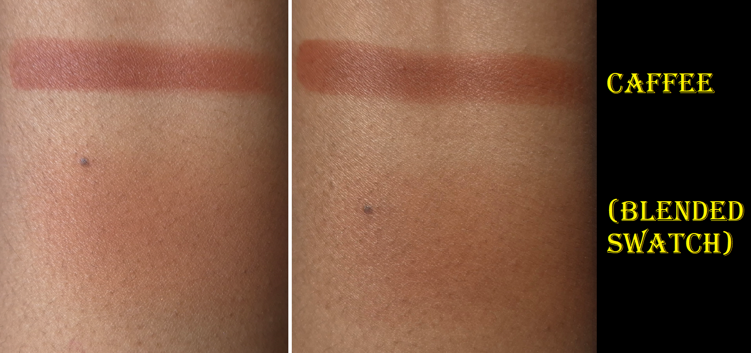
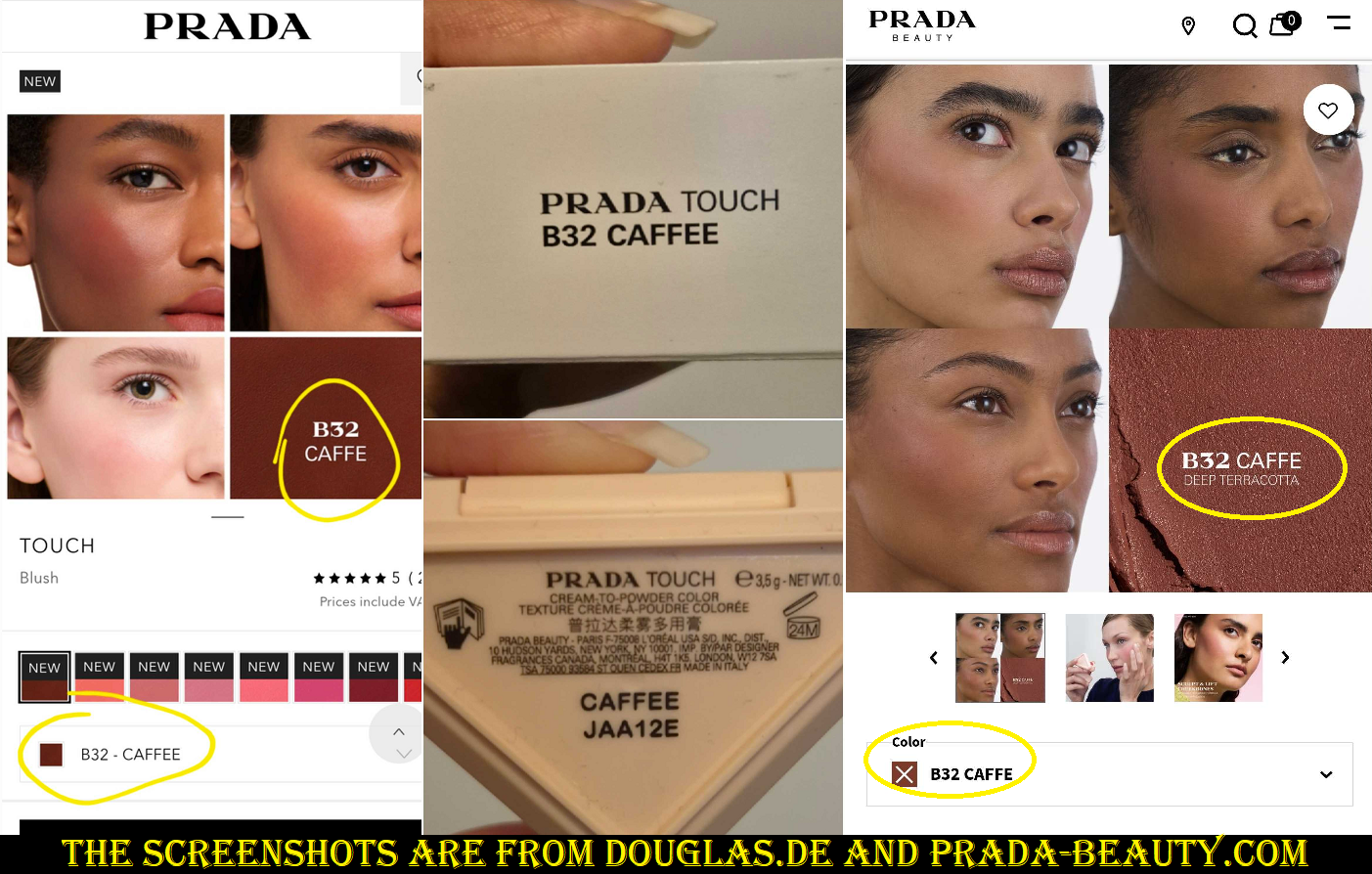
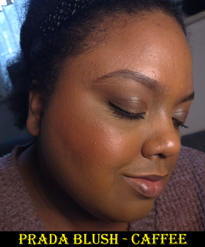
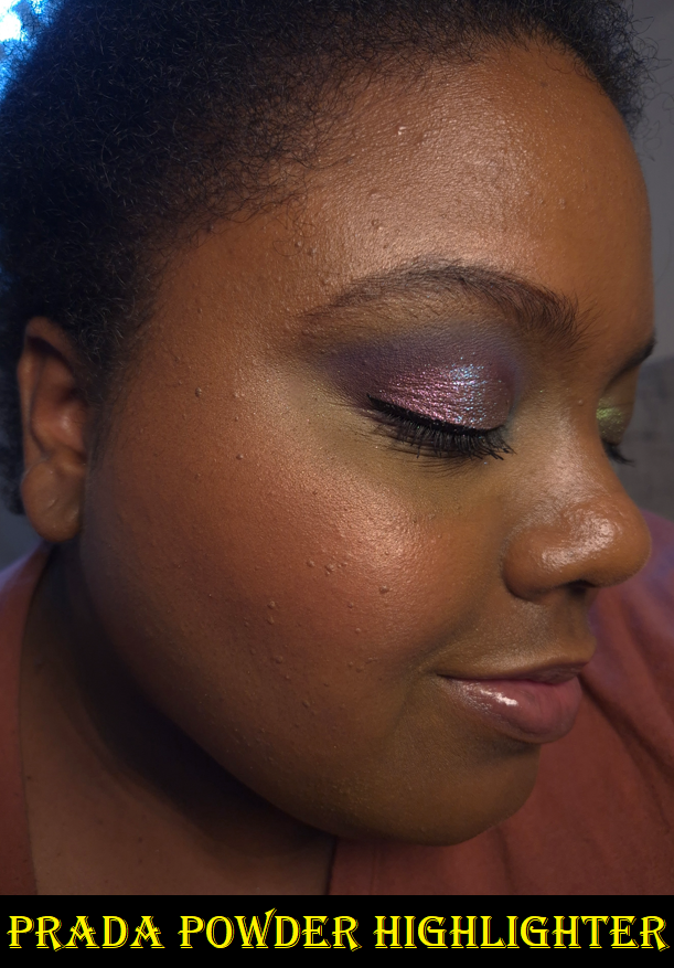
Prada Touch Cream to Powder Blush in B32 Caffee
I continually see this shade name written as “Caffe” in the marketing photos, but it says “Caffee” on the unicarton and blush packaging itself, so that’s how I’ll reference it. Coffee is “caffè” in Italian, so it sounds like that should be the correct spelling, but I believe the name written on the product determines what is correct over what is listed online. I might have thought the names were different depending on which country they are sold in, but the US-websites also say Caffe instead of coffee and the German word for coffee is Kaffee. So, that doesn’t apply either.
This blush is long-lasting, but doesn’t set down to 100% dryness on a moisturized base (for example: a dewy sunscreen, glowy primer, and hydrating foundation). So there is a little bit of transfer. This doesn’t have as much slip as I’m used to in a cream to powder formula. It leans more on the side of being a cream.
When I’ve had a drier base that was powder-set before applying this blush to the cheeks (versus the other cheek being powdered after the blush was applied), I could still feel moisture on my skin which also still had some transfer. Powdering makes the blush finish look matte, but it doesn’t do much else. What stops transfer is the Pat Mcgrath Glass Setting Spray, which also lets me keep the hydrated look.
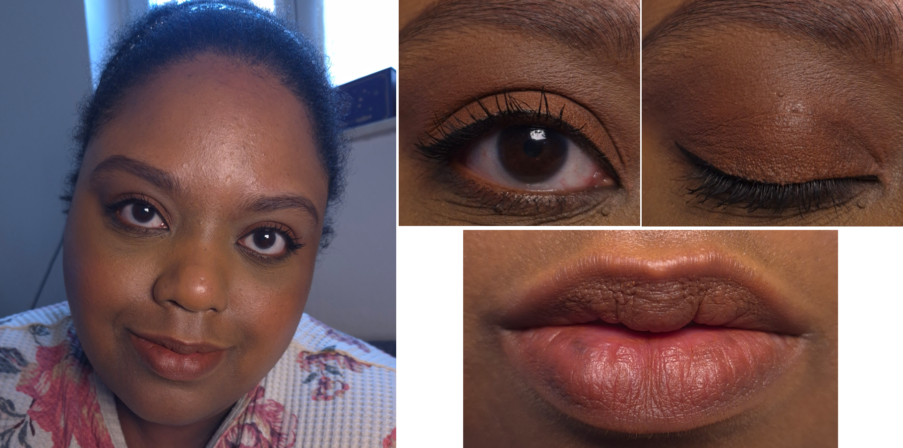
I heard this can be used on the eyes and lips as well, so I tried those once. On one eye, I didn’t use a primer and the other eye I used the Lisa Eldridge Liquid Silk. I had creasing on both eyes, but the one without the Lisa Eldridge product was worse. I was able to fix the creasing by powder-setting the better side and that worked. However, it also muted out the color a bit. So, I don’t plan on using this blush on my eyes again.
As a lip product, it looks beautiful. I feel it looked even better than Fwee Pudding Pots, but it’s drier. The time it takes to repair my lips once it dries past a certain point isn’t worth using Caffee this way again.
Although “parfum/fragrance” is not written on the ingredient list, it still contains aroma/flavor, vanillin, and quite a few essential oils and extracts that have scents. It still smells exactly like my Prada lip balm and highlighter, but thankfully nowhere near as potent. I had to bring the blush right up to my nose to detect it.
These are some of my small cheek brushes that fit fairly well in the pan, but can still get some product around the edges.
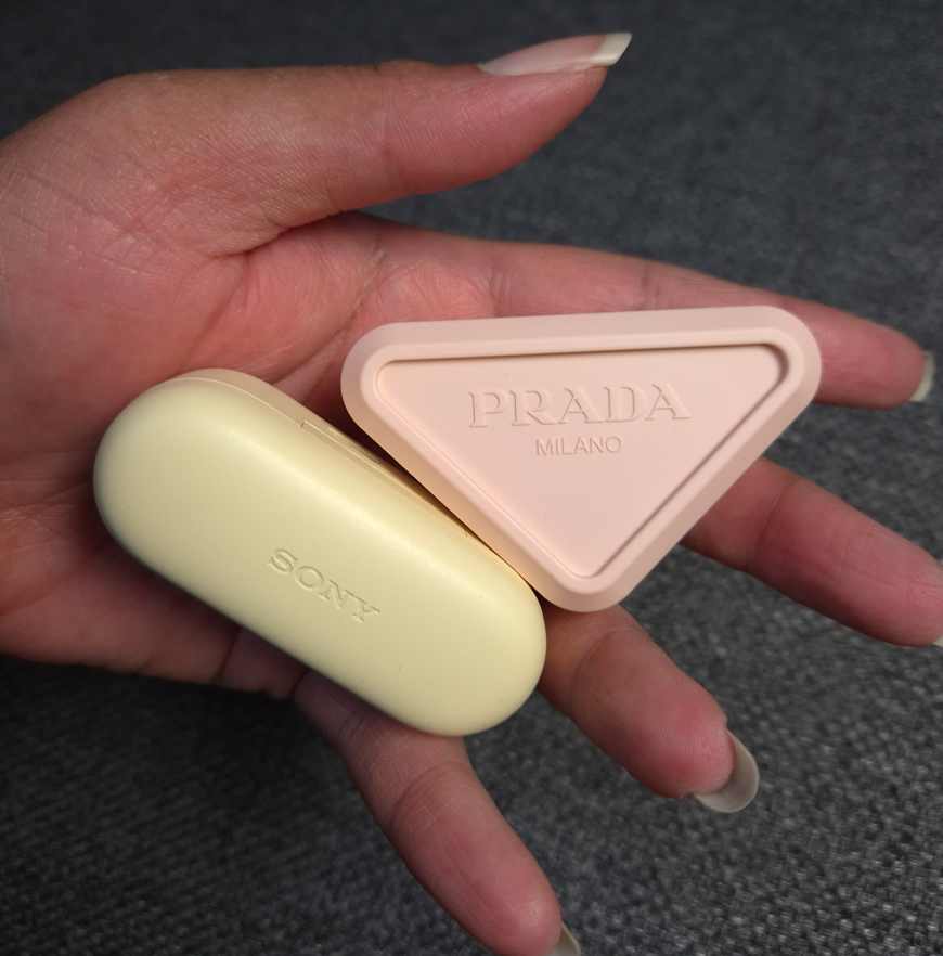
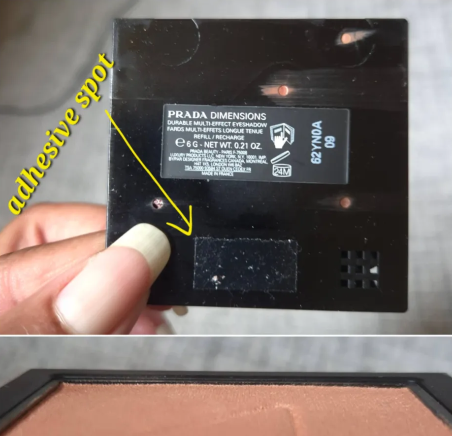
Please forgive me if you’re tired of hearing or reading complaints about the packaging, but it’s something I cannot overlook. Packaging has always been important to me, to the point where I’ve bought items in the past that I knew were purely for collecting/display purposes. In my post about Weighty Makeup Packaging, I talked about the look and feel of a product contributing to the perception of luxury and what my expectations are if it comes with a high price tag. In the case of the Prada Blushes, I could tell from photos that the plastic would be light, and that fact alone almost stopped me from buying one. Even though the square silver and gold mirrored refillable compacts aren’t that heavy, they still have a high end look to them. Although I wouldn’t want to pay the same price for the blushes as the brand’s eyeshadow quads and highlighters cost, I would still be willing to spend an extra €20 for a more substantial container than what they chose. The Prada Blushes feel exactly like the material used for my Bluetooth earbuds case!
It was the brand offering a blush in my favorite type of color, combined with the 20% discount from Douglas, that made me give this product a chance. However, I can’t help but be disappointed whenever I hold it (which is ironic because I love my Bluetooth case) because it feels like I’m handling a knockoff instead of an authentic product from Prada. The chunky triangle in that soft color is somewhat cute, and I understand the appeal at being able to snap two or more blushes together in that packaging, but I don’t even get to utilize that feature unless I buy another one. Products should be satisfying to use on their own without the gimmick of being stackable. The discounted price I paid was supposed to make up for the disappointing packaging as long as I loved the actual makeup inside. Because it’s not the type of cream-to-powder that dries down completely, it didn’t fully make up for it.
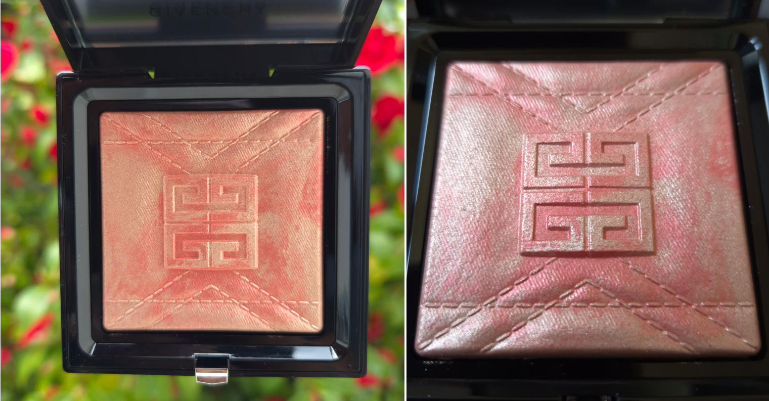
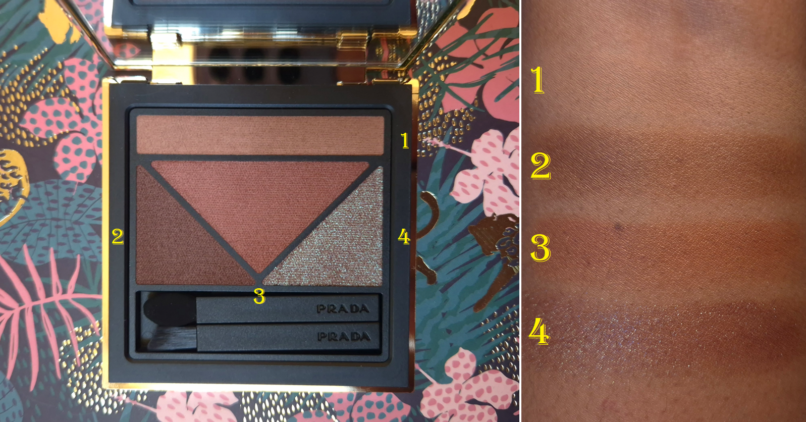
Givenchy Prisme Libre Highlighter Powder in 004 Coral Copper
This is another wish fullfillment purchase of sorts. The coral portion of this highlighter has the same kind of vibrant vibes as the Haus Labs highlighter in the color Fire Opal, which I ended up returning because that specific shade was way too glittery. This tone of highlighter isn’t that popular compared to the typical pink, champagne, gold, and bronze. I wasn’t even sure if Coral Copper would suit me, but I wanted something different. The only highlighter that comes to mind from my collection that’s anywhere near similar to this one is Dreamsicle by Becca Cosmetics, which is eight years old.
Thanks to A A Luxury Makeup stating that this highligher isn’t as deep as marketing images show, and the discounted price of €37 at Flaconi, I felt there was less risk of dissatisfaction in making this purchase. Plus, it’s a baked product, which is a feature I tend to like in highlighters (or at least I love baked gelee and gel-powder hybrid formulas). The Prisme Libre Highlighter Powder is said to contain micro hyaluronic acid and squalane for hydration and comfort.
One of the first things I look for in a highlighter is incredible smoothness in texture. The tinier the particle size the better. I also prefer highlighters that can be subtle up to medium intensity. This highlighter is an interesting mix of having small particles and looking smooth, but some of the shimmer in the mixture is super reflective and pearly. The base colors partly blend into my skin, so it looks subtle in that way, but the reflect is strong enough to be considered a strobe type of highlight. To quote the brand, “A blend of blurring powders and light-reflecting pearls, helping to visually smooth the skin and provide multidimensional radiance and a long-lasting blurring effect.” This has indeed been my experience. I like the blur properties, but the reflect is too much for me, so I tend to blend out the highlighter quite a bit or use brushes specifically suited to pick up less product.
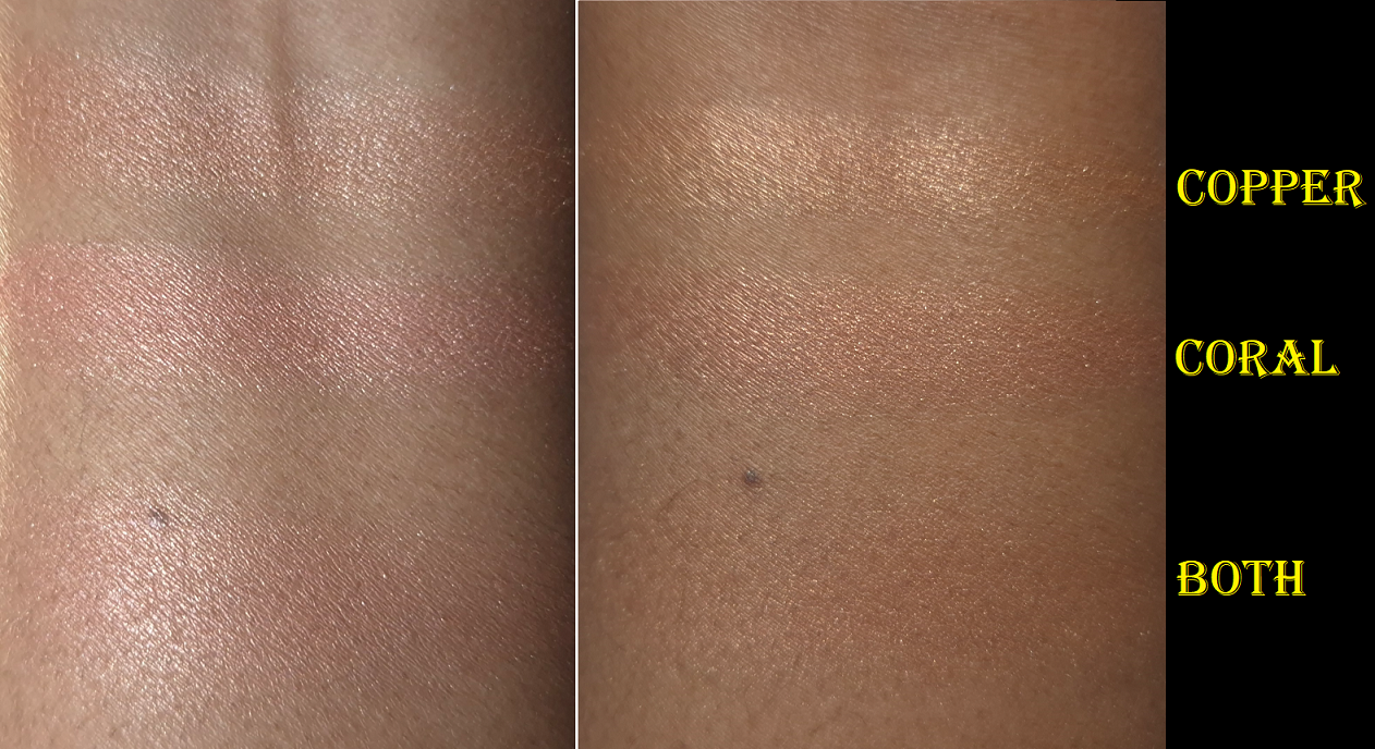
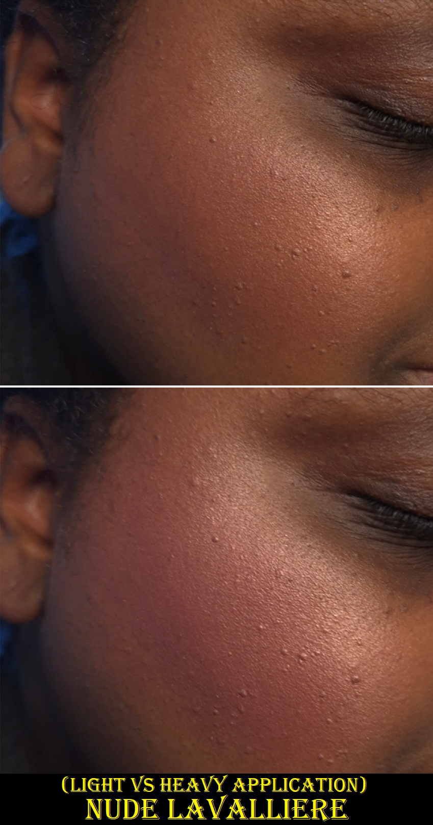
Sheerest application vs heavier application on top of a peach colored blush.
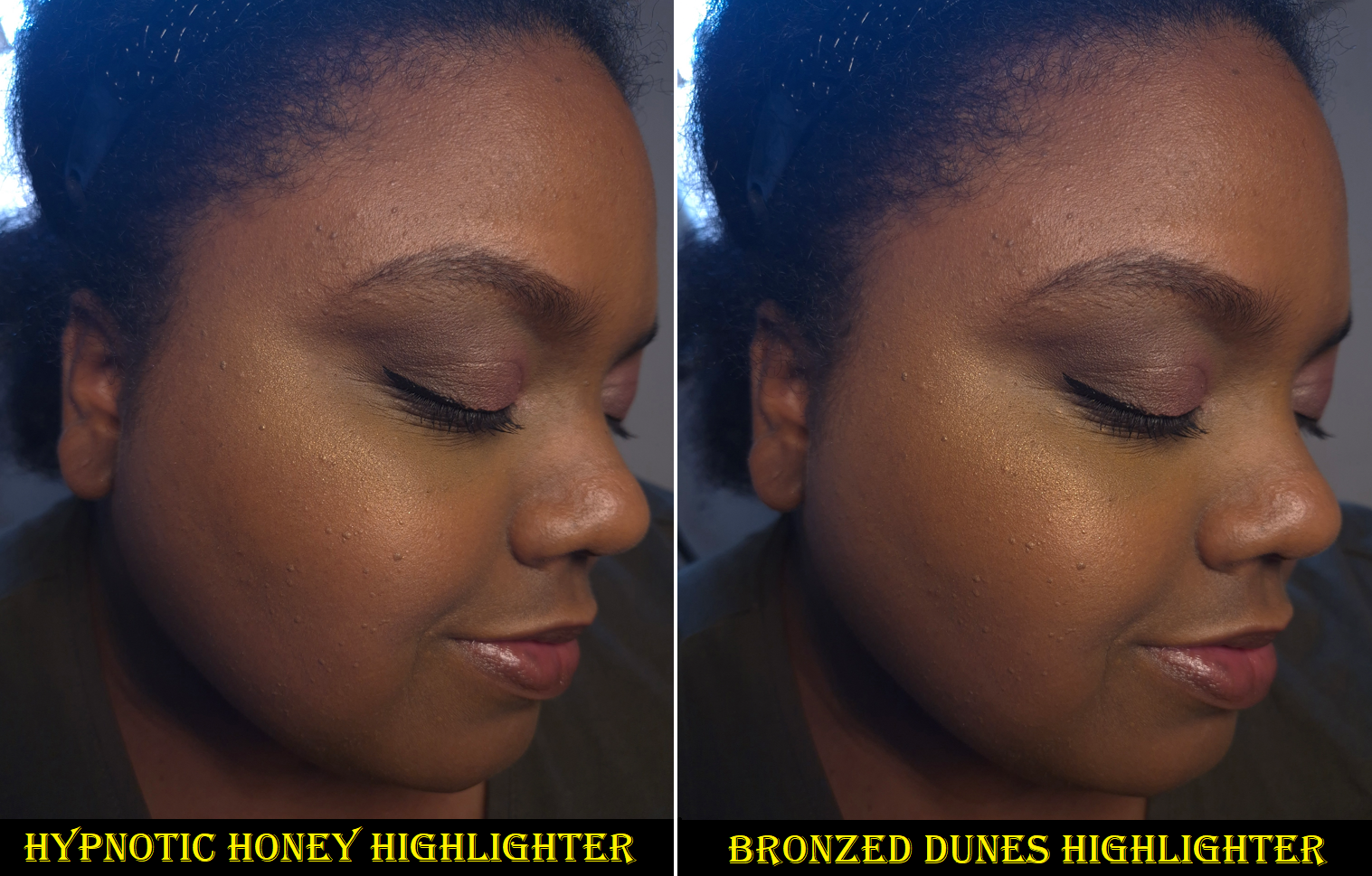
A different lighting situation with a normal application vs a normal amount on moisturized skin.
My experience with this highlighter has been very inconsistent because it looks different in various lighting situations. It looks exactly to the smoothness level I like at some angles, but then the shimmer looks obvious at others. If I’m using all my hydrating skincare underneath, the highlighter practically melts into my skin and looks subtle even with a heavy application. If my face is on the drier side, I can see the highlighter take on a little bit of a wet look that’s either textured or smooth depending on how the light hits it in that moment. Essentially, this isn’t a perfect highlighter for me. It’s too reflective to pass as a natural looking glow, however, pairing this with a peachy or coral blush (to match the base color) gives me results that I am the happiest with.
So, this range is best suited for someone who likes a beaming and obvious highlighter without containing actual glitter. Parfum is fairly high on the ingredient list, so that could be a potential issue for someone. It smells like the typical Prada powders mixed with the typical Dior powder scent. I can detect it the entire time the compact is open, and I can also smell it on my face for at least ten minutes before it goes away. It’s not the strongest I’ve ever smelled and it’s not overwhelming, but I never fail to notice it.
In terms of longevity, I’ve had no issues. It’s just the perfume and radiance level that I’m not thrilled about, but I’m so pleased with how it looks paired with certain blushes that I’m still glad I bought this. I must admit though that I’d be unhappy if I paid full price for it. It costs the same as a Prada highlighter refill, which I think is a worthier purchase, minus the Prada one being overly perfumed. I still hate that.
The packaging can seem a bit bulky, since it’s the same size as the Prisme Libre pressed powders and bronzers without including the brush. However, I don’t mind because of the potential to be refillable (the bottom pops out), and the fact that I dropped it on a hard floor and the compact sprung open without the highlighter breaking.
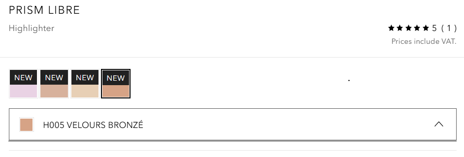
One more thing I wanted to mention is that for some reason, the Douglas website lists the shade I own (H004 Coral Copper) as “H005 VELOURS BRONZÉ.” This makes me wonder if there is a 5th shade coming and they accidentally listed it. However, it could also be purely an error. Shade H002 Rosy Gold is currently listed as Coral Copper instead. At the time that I finished typing this post, the shade names for the new/reformulated Tom Ford Bronzers are still incorrect and I’ve seen incorrect names as well as two products with switched names listed before. So, it could mean nothing, or maybe it was even a planned shade that got scrapped, but how fun if I learned a secret!
Whenever I discovered errors on the Sephora-US website, I used to email customer service and they corrected it within a few days. I’ve attempted to contact Douglas twice in the past and once I never got a response. The other time was regarding the swapped names of the holiday Gucci blushes and they didn’t respond back until three or four weeks later and it took another week for them to attempt to correct it (which still had another error). So, I don’t bother.
Anyway, that concludes this series of reviews! I hope this has been helpful. Thank you for reading!
Not pictured above (but will still be reviewed) are two additional Satin Kajals, the Brightening Waterline Pencil, and the Orchid Palette.
I utilized the 20 and 25% off sales Victoria Beckham Beauty had during November and December last year to buy new (to me) products, along with additional shades of things I already love from the brand! So, let’s get right to the reviews and updates!
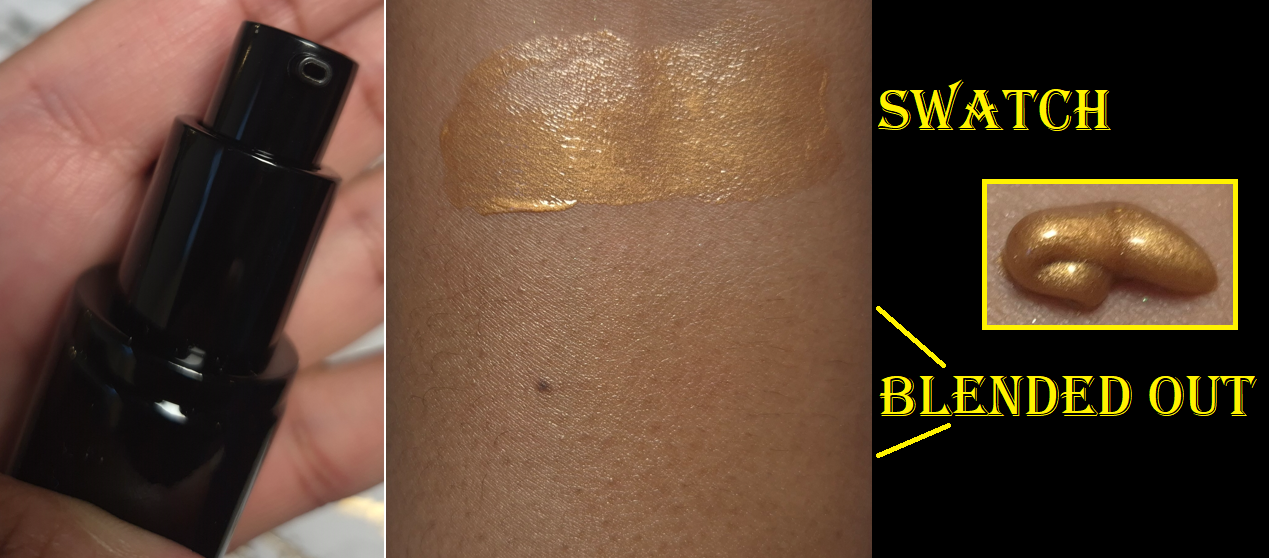
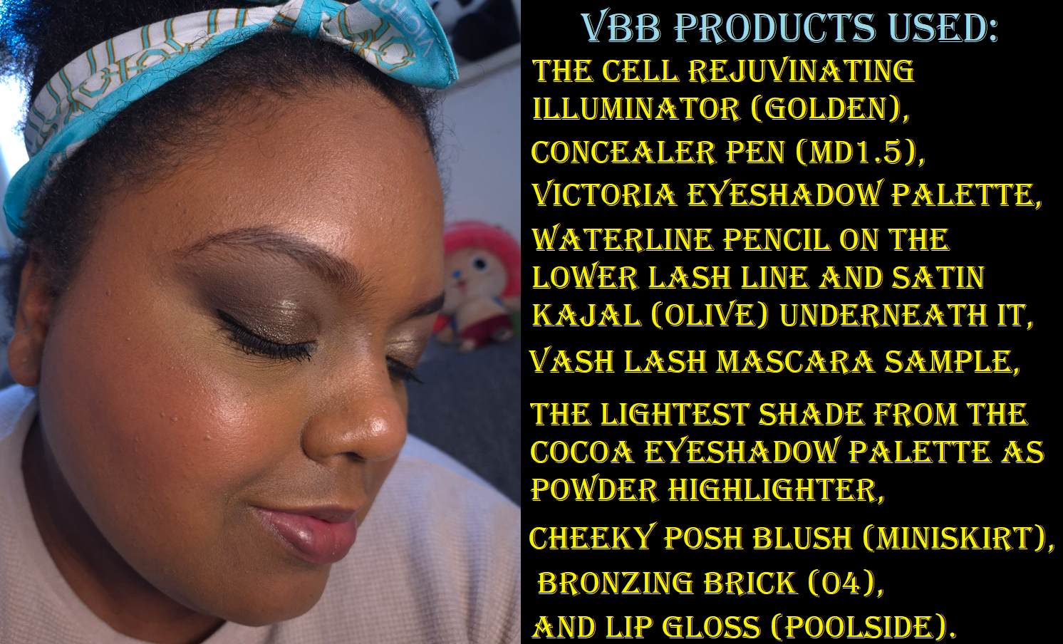
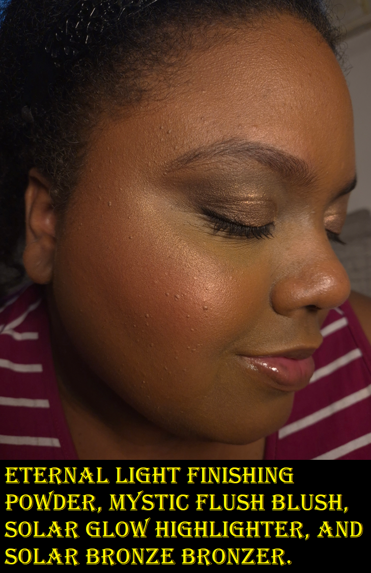
The Cell Rejuvenating Illuminator in Golden
This product contains the Augustinus Bader proprietary TFC8® blend of skincare ingredients in the formulation. I bought the smaller 20ml size which retails for €88. A mini sizes of the Augustinus Bader face creams are 15ml for €93. So, I was curious how comparable these two products would be. Unfortunately, since Augustinus Bader doesn’t sell minis of The Light Cream (only The Cream and The Rich Cream), I can’t confirm if The Light Cream has the most similar consistency to the Victoria Beckham Beauty Illuminator. I can only say that AB’s The Cream is thicker, not as lightweight, and feels more moisturizing. I don’t consider it that heavy as a skincare product on bare faced days or to sleep in overnight, but I prefer to wear thinner layers of skincare when I plan to wear makeup.
Although I need a lot of hydration to combat my dry skin, putting heavy products or adding too many layers (that build up to a thick amount of skincare) clogs my pores easily and leads to other problems. So, I always prefer using the most lightweight yet effective hydrating and moisturizing products. At a bare minimum, I try to use a milky toner and sunscreen daily. Depending on which combination I use of those two products, adding a moisturizer on top is already overkill. With this Illuminator from VBB, I tend to be able to use my milky toners and my best absorbing sunscreens together without there being any problems. So, the VBB Illuminator is better at doubling as a moisturizer and primer, coupled with my other skincare products, than AB’s The Cream.
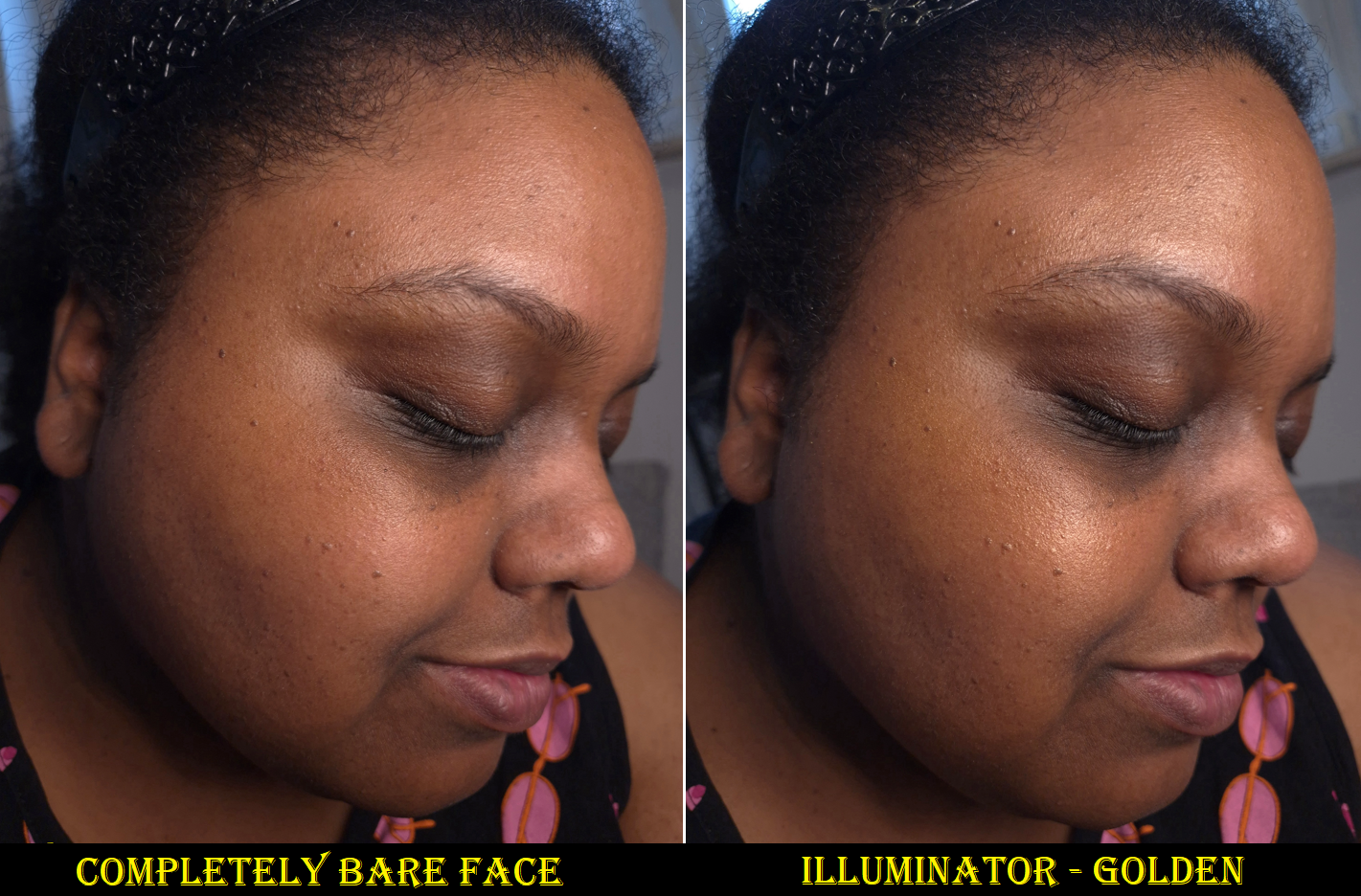
I’ve been using the Illuminator since January, but strictly as a primer under makeup. I haven’t noticed any long-term changes to my skin, but my face feels suppler and hydrated each time I put it on. It makes for a nice smooth canvas to put makeup on and the glow is subtle. It does turn my skin a little more golden-yellow in color, but it’s only strong enough to impact the shade of my foundation if I’m using one that has sheer to light coverage. This actually helped turn one of my Chanel foundations into a better shade match, but it has also made a bad match worse. So, it would be nice to have an option that’s clear or close to it. I have heard that the shade Pearlescent might not be the frosty white color I assumed it would be, so, I might consider trying that one in the future.
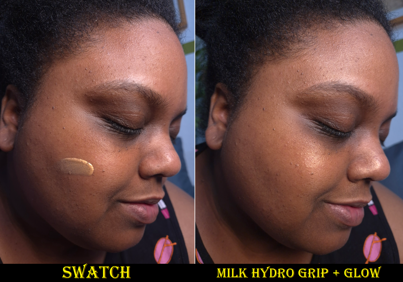
This isn’t the only glowy golden product out there. I also own a mini of the Milk Hydro Grip + Glow Primer.
Milk’s primer is thicker. It has less gold pigment, which means it doesn’t alter my foundations as easily. Milk’s glow comes from shimmer particles, whereas VBB’s shine is due to a combination of shimmer and the slightly emollient finish. VBB’s sinks into the skin and is better at hydrating than forming a slight barrier (like Milk’s). Other than hyaluronic acid, there isn’t that much else benefiting the skin in the Milk formula, but it does extend the wear of makeup because it has stronger gripping power. VBB’s is better for those that prioritize skincare because, for example, among the long list of skincare ingredients is four types of hyaluronic acid instead of just one. There is a big price difference, but part of that is due to the ingredients used as well as the packaging. Milk’s is plastic. VBB’s is super luxurious and heavy with a magnetic closure for the cap. I’ve seen the cap stand askew when I’ve taken it out of my makeup bag, but the magnetic hold is strong enough that it never got knocked off entirely.
I can also think of the Charlotte Tilbury Hollywood Flawless Filter and Dior Forever Glow Star Filter Multi-Use Highlighter as additional products that can be used as glowy primers, but they don’t feel as nice on my skin when they cover my entire face, rather than being used in specific areas as liquid highlighters.
Although I haven’t been able to detect long term changes to my skin, I enjoy the nourishing feel of the Illuminator so much that I will seriously consider repurchasing it (on sale) after I’ve emptied my current container. Even though getting the full size is more cost effective in terms of price per milliliter, VBB is still a “clean” beauty brand. So, I don’t want to risk getting a larger size and not using it up within the 12 month period after opening time frame. Also, if Augustinus Bader ever releases The Light Cream in a travel size, I could potentially prefer that instead for pricing reasons. I’ve gotten Augustinus Bader skincare for up to 30% off at various retailers, but the maximum discount I’ve been able to get from VBB has been 25% during the holidays. Then again, AB’s product might not be as suitable for me under makeup. So, I will consider these factors and make my decision by the end of 2026.
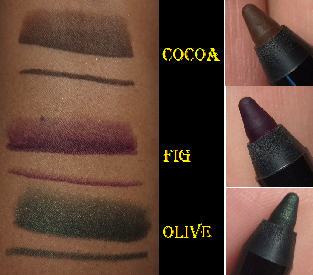
Satin Kajal Liner (with Sharpener) in Cocoa, Fig, and Olive
It’s very difficult to get me excited about a colorful eyeliner, so it says a lot that I own three of these. Of course, I have heard so many beauty gurus praising the Satin Kajals and even going so far as to say they’re the best on the market. Considering how many good and affordable eyeliners are out there, I rarely feel that high end and luxury eyeliners are worth the price. I still can’t answer that question of worth for others, but I will say these are my current favorite non-liquid and standard colored eyeliners. By “standard colors,” I mean eyeliners that aren’t duochromes or multichromes.
There are matte, shimmer, and jewel liner finishes. Cocoa and Fig are matte, but Olive has a shimmer finish. I did not purchase any jeweled ones because that’s the only type I’ve heard aren’t as well liked by other customers (because the jeweled ones are supposedly gritty feeling).
The consistency of these liners are super creamy in the first few uses, but afterwards they are a more controllable level of creaminess that allows one to glide the product over the skin without tugging and there is enough time to smudge it a bit and smooth it out before it sets down to its budge-resistant and waterproof finish. The evenness of the distribution of color and ease of creating the shaded effect are what puts these above many other eyeliners.
Also, I am mindful to keep the proper cap on each side of the pencil. I came across a video where a brand owner explained that the cap with the extra lining inside the plastic is meant to keep it airtight (I forgot the exact term that was used), whereas the cap that fits over the smudger side does not have this lining. The Kajal could dry out if the caps get swapped for an extended amount of time. Since I hadn’t paid attention to this kind of thing until this year, I wanted to share this reminder for anyone else who might not have known this. In the case of the VB Beauty kajals, the cap for the pencil side has a white inner ring and the smudger side is black.
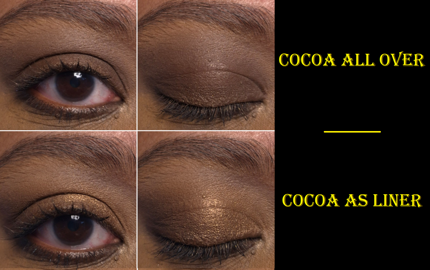
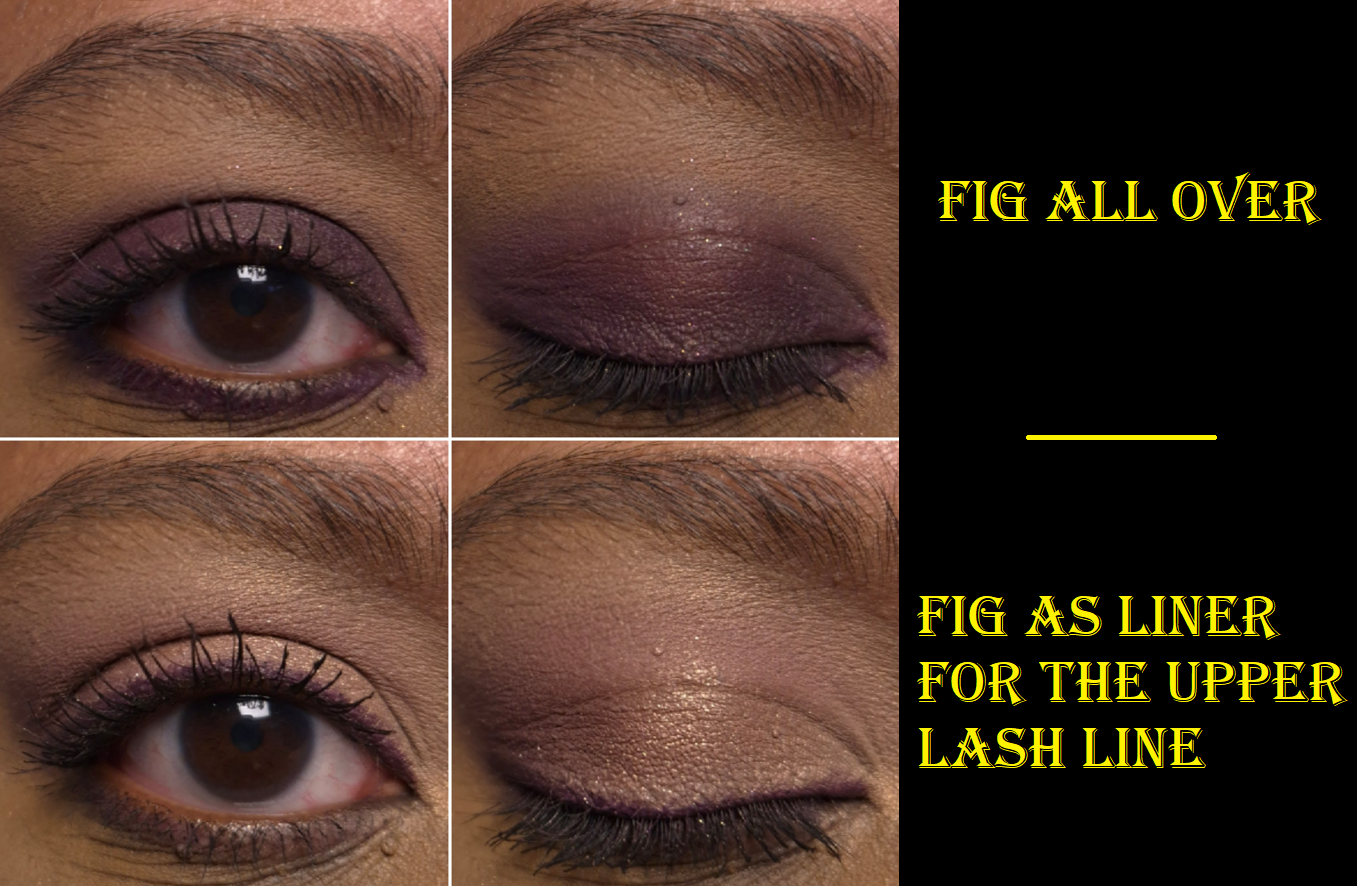
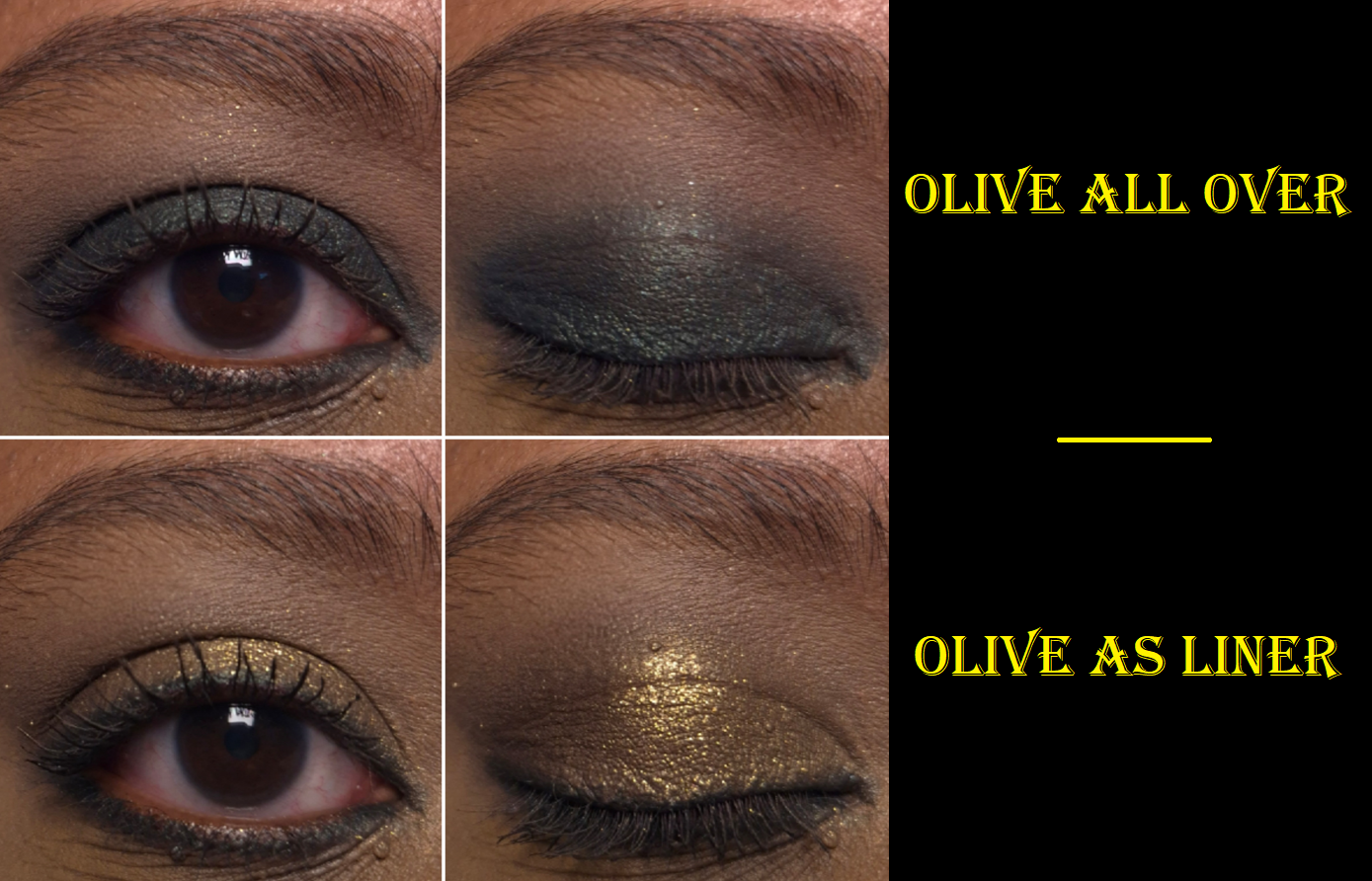
Besides using these to line the eyes, they also make for great eyeshadow bases to used solo or to intensify the color of whatever powder eyeshadow gets used on top.
Cocoa is a beautiful shade of brown, but it’s too light to add definition/dimension to my lash line. I still use it sometimes as a transition color in deeper dramatic looks.
I love this shade of purple, but it can look patchy when smudged or blended out. It looks best when drawn on, like for eyeliner use, and not touched much afterwards. If I use it as a base color that will be covered up anyway, then patchiness isn’t a big deal.
My only complaint about Olive is that it’s not actually olive in color/tone. This is a blue-based green or deep teal-green. I’d expect this color to be called Peacock or something. It’s still a pretty color, but the name is misleading.
I do find these to be long-lasting and waterproof (yet easy enough to remove with micellar water and a makeup eraser cloth). However, because this formula gives some wiggle room in which to be able to smudge it before it fully sets down, I struggle to use these in my waterline. They drip away or get wiped away long before being able to lock down. So, I don’t bother trying to tightline with these. I’m fine with this being the situation because of how well they perform at other tasks.
These might be the best kajals in the world, but I will always love and prefer a black liquid eyeliner pen. I very seldom have the desire to use a colorful eyeliner, so I am perfectly content with having just a few of these. I still don’t think it’s totally necessary for a casual makeup wearer to spend so much on a Satin Kajal considering how many great eyeliners are available at more affordable prices. However, I can acknowledge these are extremely good.
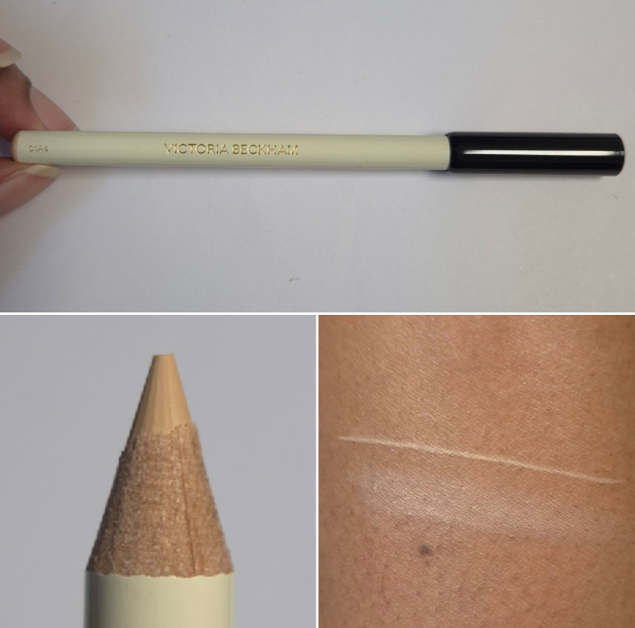
Instant Brightening Waterline Pencil
Historically, this type of product has always been difficult for me to use because of my easy-to-become-watery eyes. I gave up buying them several years ago and the only reason I decided to get this one is because it’s made specifically for use in the waterline. The Satin Kajals have their own formula and don’t work for me in the waterline, but are amazing for many other purposes, so I thought this product being sold apart from them for this designated task could be the answer I’ve been looking for.
In terms of this “universal” color, I do think it’s a good one. It has the right undertone balance and isn’t too light/white. Unfortunately, my watery eyes do not allow this to work. My waterline is too wet and even if I get the color to stay there, it never fully sets. The tiniest touch hours later still makes it come off instantly. Also, my eyes look too strange if I have a light color on my lower lash line and nothing below it adding definition. So, I usually put a dark eyeliner between and below my lower eyelashes. In doing so, if my pencil isn’t sharp enough to avoid getting some in the brightened liner section, I have the hardest time fixing it. And then the darker color discrepancy looks messy and amateurish.
While I like the creaminess of the pencil for gliding it across the waterline, it taking too long to dry (if at all), makes this just as much of a struggle to create this kind of eye look as all the other liners in my past. The part that is nearest to my eyelashes (basically between my eyelashes) is what stays put and sets down as long as actual tear droplets haven’t fallen and wet the whole area. So, I know this can work. It’s just not that great on me.
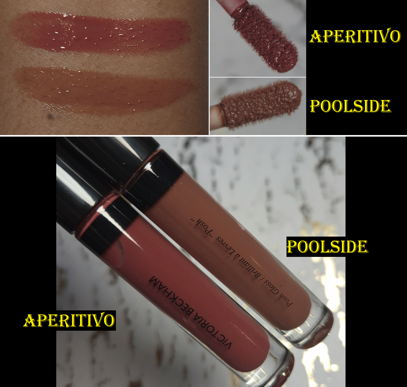
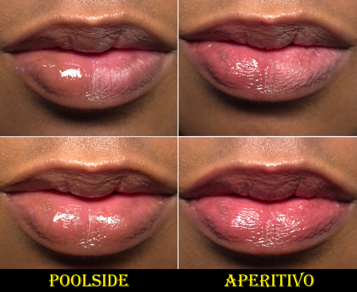
Posh Gloss in Poolside and Aperitivo
The Posh Glosses adhere well to the lips, and both hydrate and form a moisturizing barrier. It can last through at least one meal and several drinks before needing to be reapplied. The brand claims (and pretty much all other brands too) that their gloss isn’t sticky, but it is a little. However, it’s a lot less than many other glosses I use. I don’t think it would cling so well to the lips and be as long lasting without having at least some tack to it.
This formula has totally different ingredients from the Pat Mcgrath Lust Glosses, but they remind me of each other in how plush they feel on my lips and how conditioning they are. If I had to nitpick at the tiny differences, I would say that PML’s has a thinner viscosity, more shine, and it has a scent. VBB’s is better at conditioning my lips and the oil content makes it slightly less sticky despite having a thicker overall texture. Less gloss comes out onto VBB’s applicator, so it’s easy to get an almost as thin layer from just applying one swipe on the lips and then rubbing them together. When it comes to the pigment level, the Lust Glosses range from being equally pigmented, less, or more pigmented than the Posh Glosses.
What I look for most in a gloss is how well it helps combat dryness and how pretty the color looks. I prefer them to be unscented and they don’t need to be high-shine (just have some shine). I essentially view my favorites as liquid lip balms. With all this in mind, the Posh Glosses have surpassed Pat Mcgrath’s formula in my eyes, but I still reach for Pat’s for specific colors. PML has twice as many shade options. I still easily recommend both products, and they are around the same price at €34 for 4.5ml for PML and €36 for 4ml for VBB. However, Pat Mcgrath usually has a holiday sale where the Lust Glosses are marked down by 50% (or $12), at least in the US. Whether the brand will continue to do that sale during the bankruptcy proceedings is unknown. As for the Posh Glosses, I believe 25% off is the biggest discount the brand offers.
There is no shortage of great glosses out there. I will happily continue to use Poolside (Aperitivo is a brighter pink than I expected), but I haven’t found a shade in the lineup that I’m over the moon about. So, I like this a lot, but it hasn’t breached the “favorites”category. I don’t regret buying one, but given the size of my lippie collection, it should have stayed at just one.
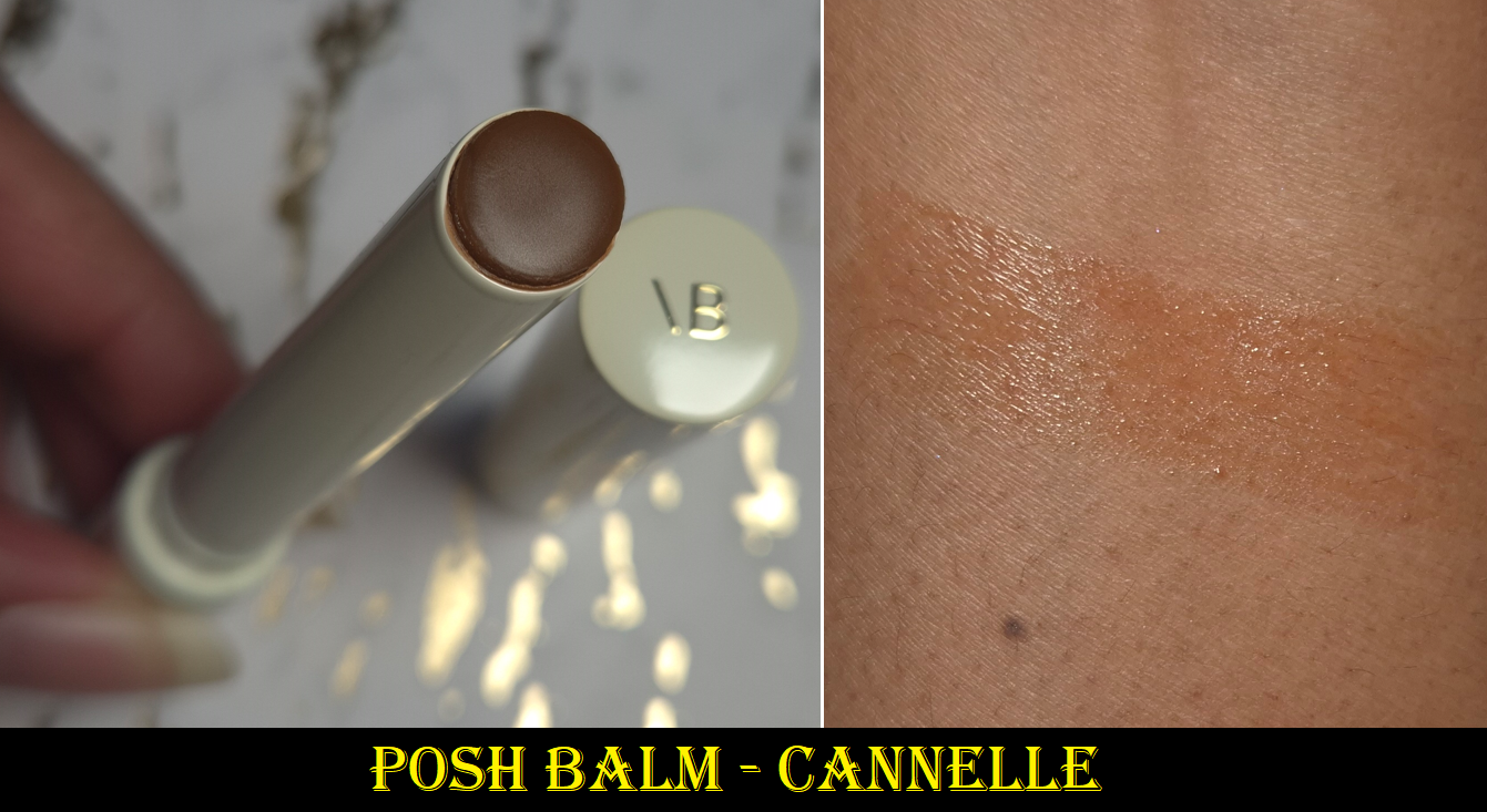
Posh Balm in Cannelle
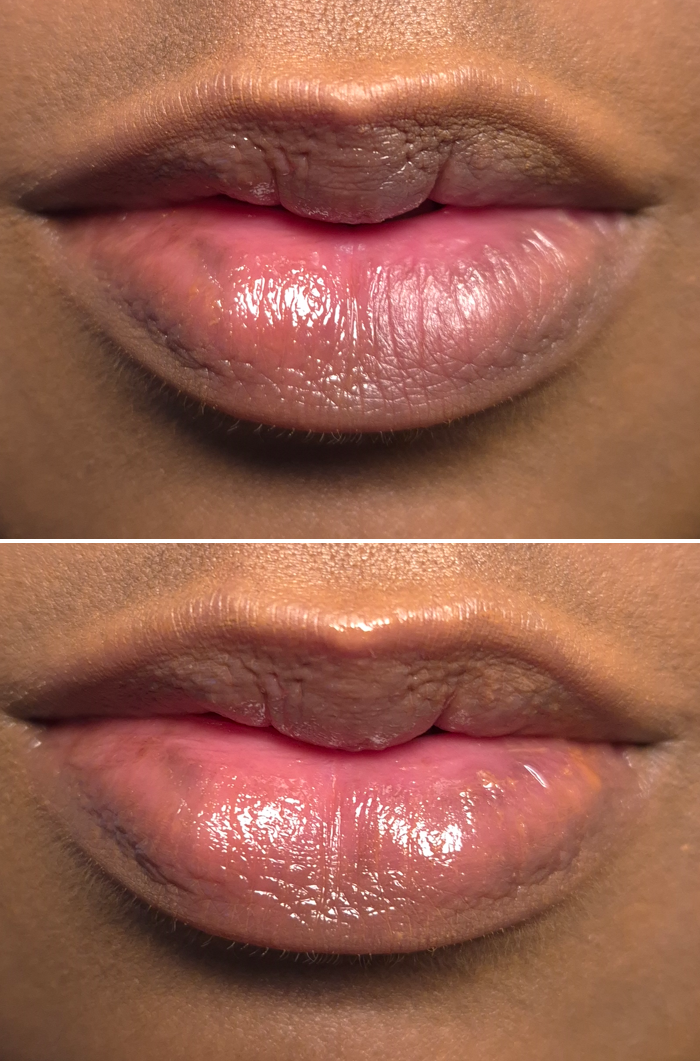
In the top photo, the balm is on the left half and the right half is bare. In the bottom photo, the balm is spread across the lips entirely.
The lip balm feels great on the lips. I still consider it to be a little sticky, but it’s less so than the lip glosses. These aren’t as long lasting either though and the pigment level is much lower. As far as I know, the shades Colette, Fleur, and Cassis have the pH-adapting ingredients, but Glacé does not. One of the reviewers I watch said Cannelle doesn’t have it either, but Red 27 is listed as one of the ingredients for that shade and after having used this enough times, there is now a little bit of pink around the rim of the packaging. So, I think it’s safe to say this shade is pH-adaptive too. There just isn’t a lot in it.
The amount of shine I get from the balm is good, but the color can cling a bit to the cracks of peeling skin. I have to be careful to really work the product into my lips, a bit more than I’d expect from a low pigment product.
I prefer my lipgloss to be nourishing, but I absolutely expect a balm to have even more lip-caring ingredients. While this balm does satisfy me regarding hydration, the need for me to reapply it more often than the brand’s lip gloss is why I won’t be buying anymore. I cannot gain the benefits if the moisture layer comes off and I don’t notice it until many hours later. At least when most of the Posh Gloss has worn off from eating, I can still feel residue that continues to keep my lips protected. So, if I delay in reapplying, it isn’t as much of an issue.
I will say though that the Posh Balm is more nourishing than a lot of high-end and luxury balms I have used in the past. I have not tried the reformulated Nars Afterglow Lip Balms, but I loved the previous Laguna shade (similar to Cannelle), and yet I rarely wore it because it wasn’t hydrating enough. In fact, I end up not liking the majority of lip balms in stick form, so I still give the brand kudos for the Posh Balm. One product that I like more is the Lisa Eldridge Baume Embrace simply because of the similar amount of nourishment and the extra pigment. Although I have to reapply the Baume Embrace more often, that’s the tradeoff for have significantly less stickiness. I’m glad I bought one of these, but I don’t need anymore.
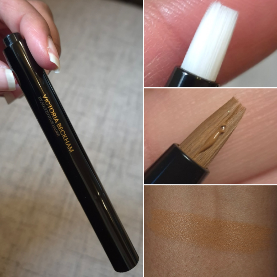
The Concealer Pen with TFC8® in MD1. 5
I would ordinarily never spend €56 (the sale price) on a concealer, especially taking into account the minuscule 2.4 ml (0.08 fl oz) of product and how much of it is wasted due to the click delivery system (and what gets stuck in the applicator’s bristles), but I had many reasons to think this would be worth it:
The Augustinus Bader TFC8 blend is in this product. I rarely use eye creams, so this seemed like an easy way to finally get good skincare into this area while also being able to camouflage my dark under eye circles.
Although the brand’s foundation is out of my price range, I still wanted to have a better idea of what my shade could be among the VBB complexion products. This knowledge could benefit me if the brand ever decides to release another foundation or concealer in the future.
I was impressed by this concealer’s performance when I tried it out via the foil sample pack. This provided a lot more coverage than I expected and although I could only test it for six hours, it didn’t budge in that time frame. So, I figured that even if the full wear time didn’t end up going far past six hours, I could at least use this like a daytime eye cream on no-makeup days or potentially even like an under-eye primer if it played nice with other concealers.
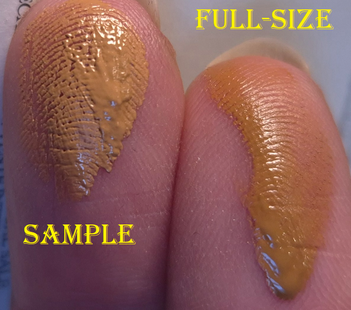
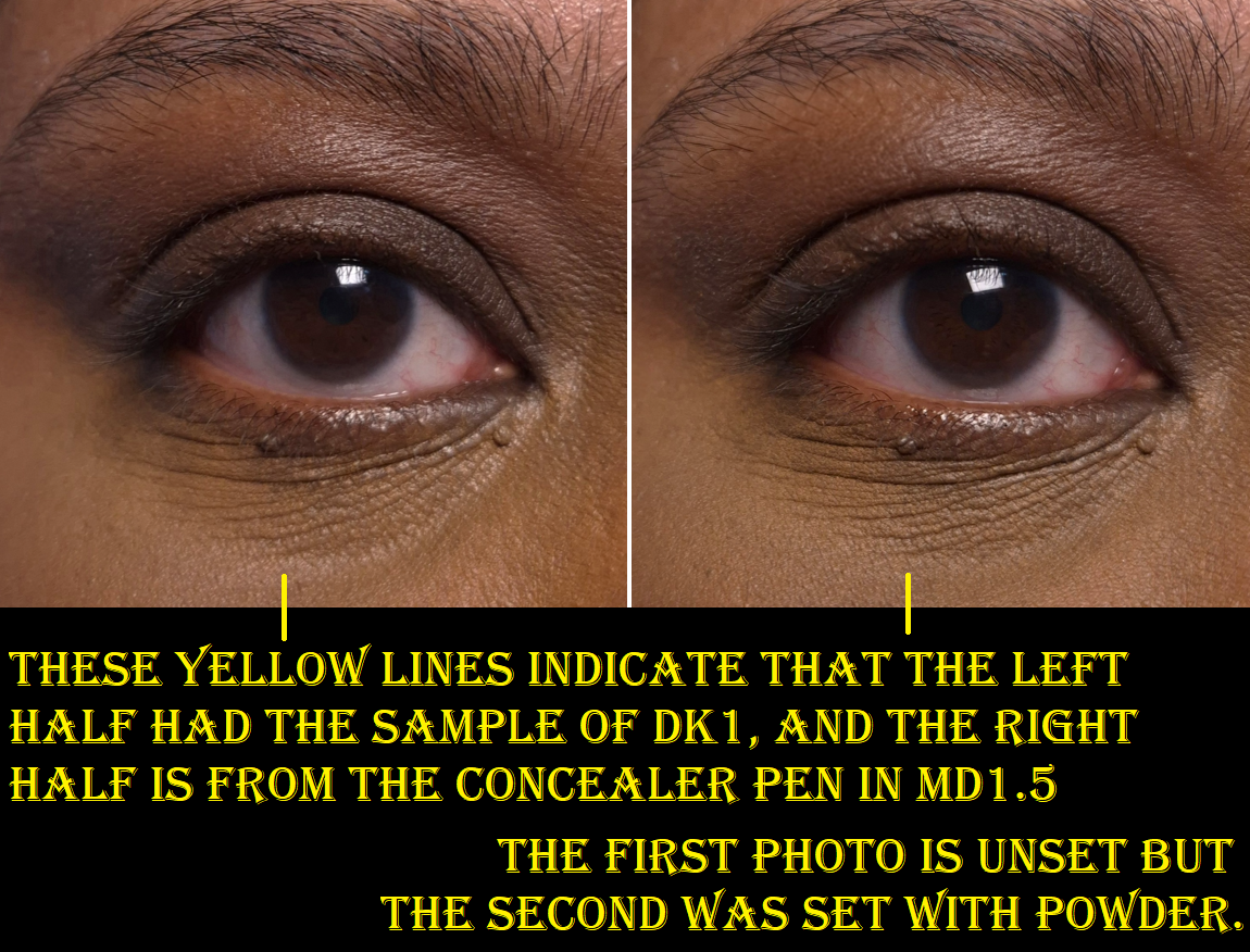
Unfortunately, the consistency of the samples are not the same as what customers get from the actual product. The sample is thicker and less fluid. I can only assume that’s due to being old and/or it managed to gradually dry over time within the foil. That sounds like it would be a bad thing, but the sample adhered to my skin way better! How the sampler looked right after being opened can be seen HERE, but also the photo below shows the difference in viscosity and even how it looks over the lines of skin vs the concealer pen. This isn’t a one-time incident either. The photos I took below were from a second sample pack that I got from my most recent order.
It makes sense that the concealer needs to be very fluid, given the type of dispenser the brand chose. The reason this matters is because products this creamy and emollient do not stick around on me. I had a similar problem with the Chanel Ultra Le Teint Correcteur Concealer. No matter what methods I use, I cannot prevent it from being absorbed by my skin and/or fading. It starts early and just continues gradually disappearing within 2-6 hours depending on how unlucky I am.
When I put the sample and actual product side-by-side, as shown in the photo below, I can see that the right half looks more emollient and continues to look wetter after being set with powder. Also, the act of patting in powder with a brush manages to lift some of the concealer back off.
It doesn’t help that when my eyes get watery, any falling droplets makes it disappear too.
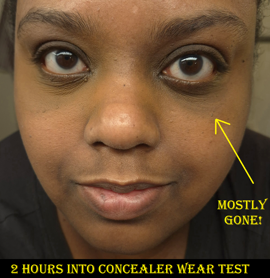
I used a lot of product under my eyes while taking these blog photos, but that is not the cause of the problems. When I use less product under my eyes, it just disappears faster. I’ve tried different powders with it, my MILK under eye primer, leaving the product to sit for a while before setting it, etc. Not only does it not fade gracefully, it also creases. So, even if I wanted to just use it as an eye cream, it looks terrible after 3-4 hours. Mixing it with other concealers or using a tiny amount underneath them doesn’t help either because the VBB concealer breaks the others down. So, this product was an absolute fail for me. It’s incredibly disappointing to buy a product, expecting it to work as wonderfully as the sample, but then it doesn’t.
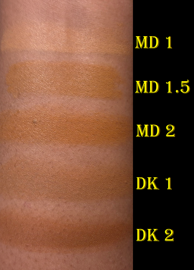
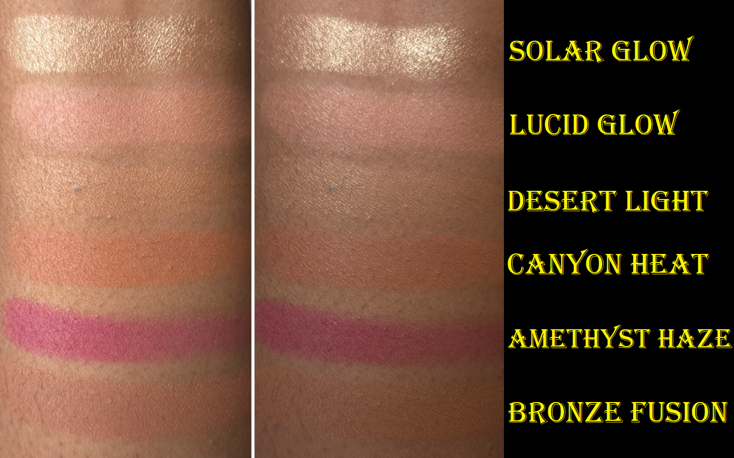
I decided to post swatches of how MD1.5 compares to the others, since my shade isn’t available in the free sample pack. Although DK1 is neutral, I think it actually might have been the better choice for me than MD1.5, but it doesn’t matter at the end of the day if the fading issue can’t be resolved.
The thought has crossed my mind to try and transfer the concealer from the pen into a tiny jar (in the hopes it can dry and solidify a little without drying out completely). However, doing that could lessen the efficacy of the skincare ingredients.
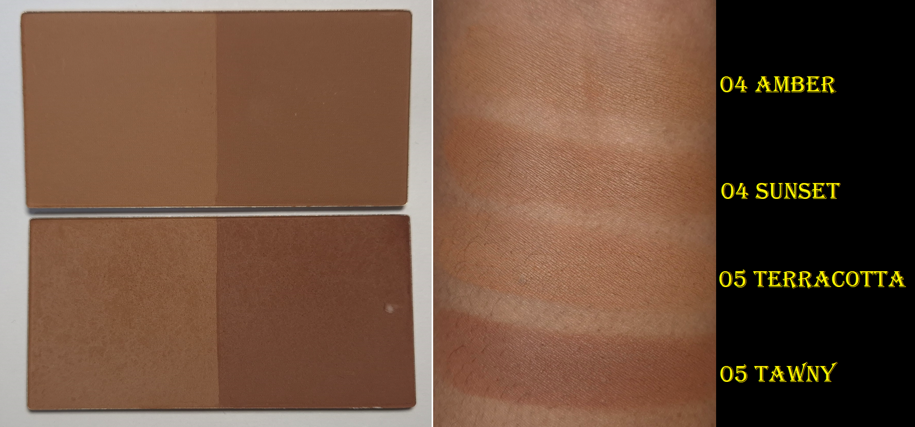
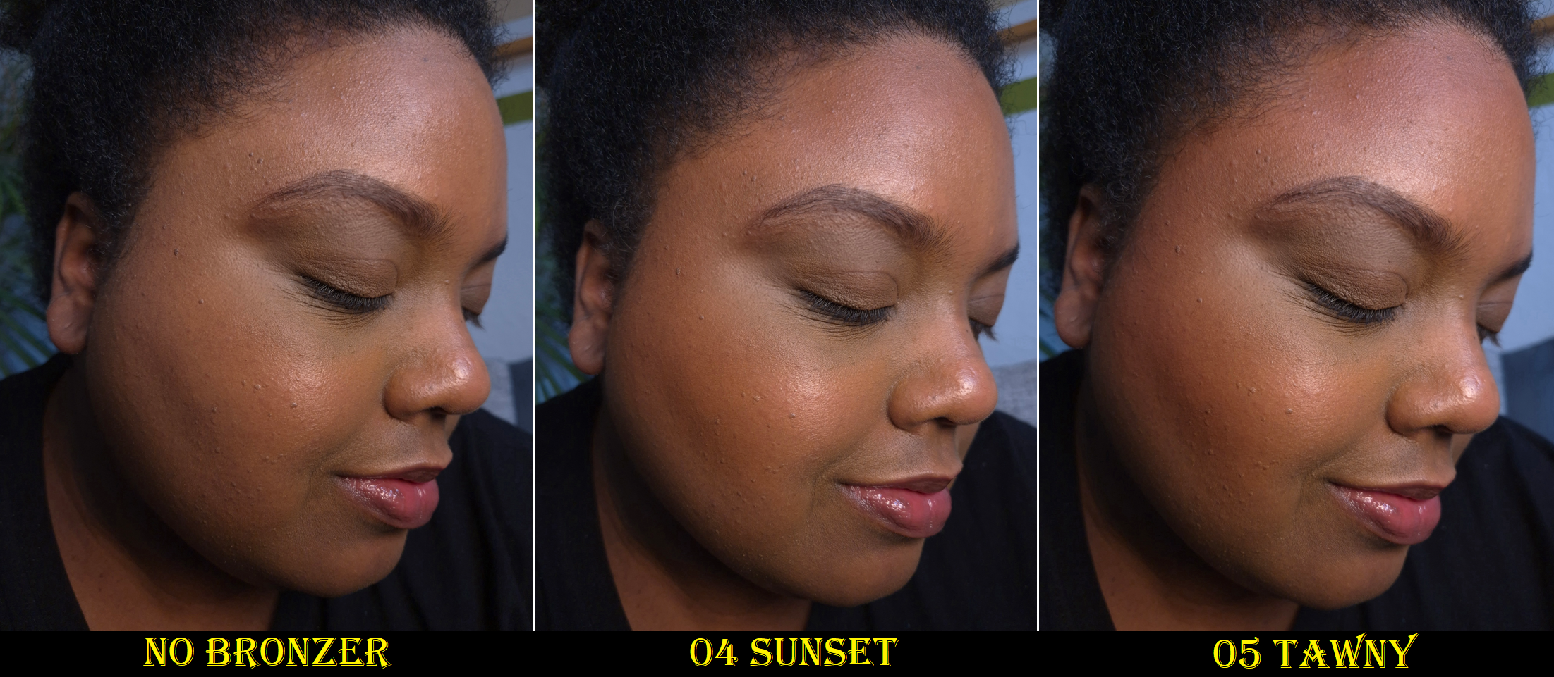
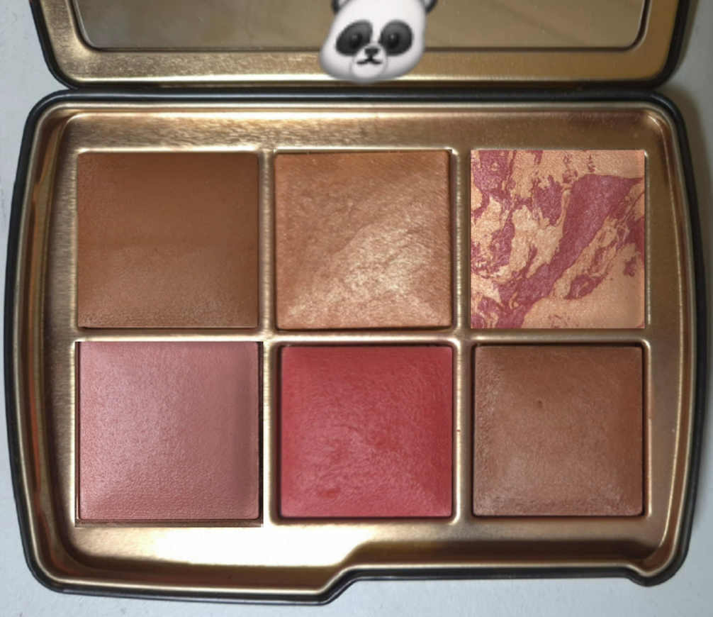
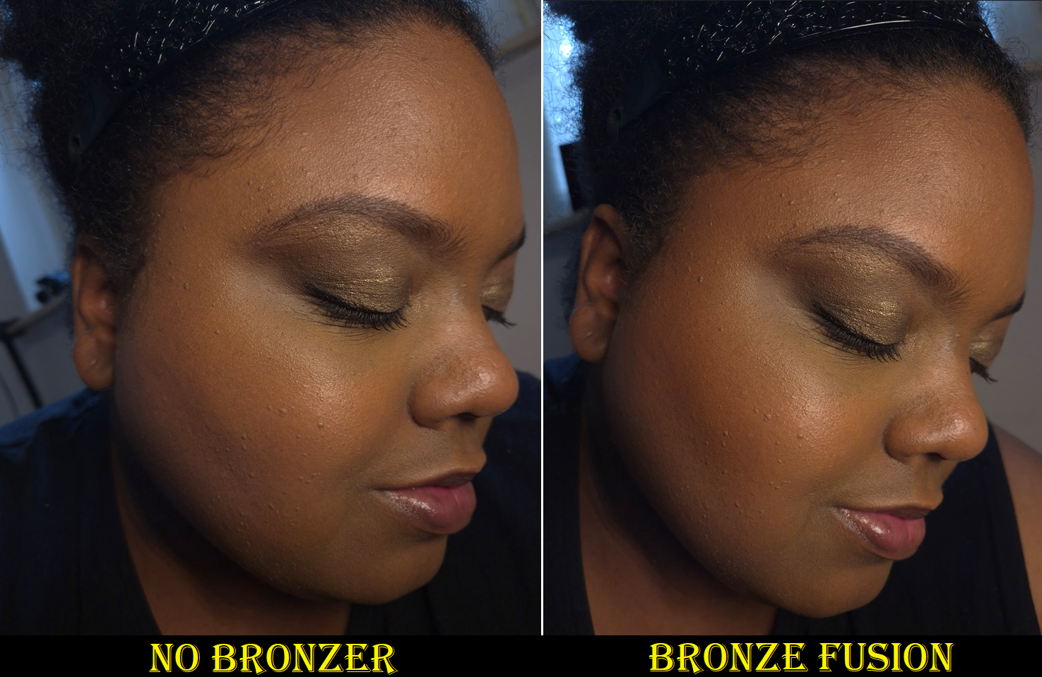
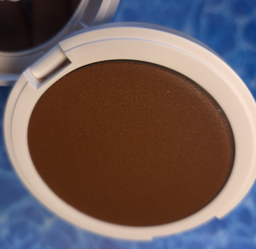
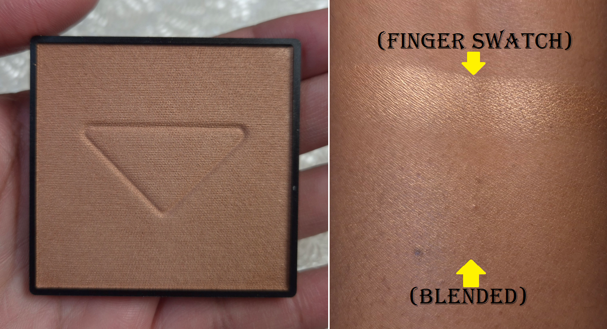
Matte Bronzing Brick in 4 (Warm: Amber / Contour: Sunset)
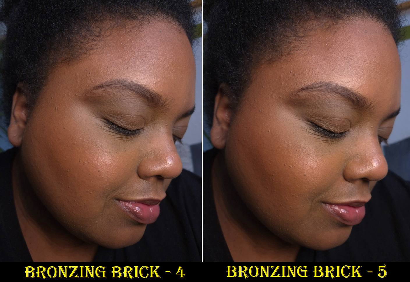
I bought my first Bronzing Brick three years ago and posted a review showcasing Shade 5. Since the moment I first tried this product, it has always ranked among my top 5 favorite bronzers, but I didn’t use it as often because I always needed to mix the two shades. The right half had too strong of a red undertone for my preference, so I would combine it with the left half to try and balance out the color and tone down how dark it was.
I finally decided to give Shade 4 a try, and I’m so glad I did! The darker half has more of a golden-orange undertone that I can use by itself. I still use the lighter half of the pan to either diffuse the edges or lighten the overall color. Essentially, the main difference between the two Bronzing Brick colors is that Shade 4 makes it way easier for me to create a natural flush of warmth without overapplying. Purely because of that ease, I stopped using Shade 5.
These are examples of the darker bronzers in the duo used by themselves.
These are examples of how the bronzers look on me utilizing both halves of the Bronzing Brick in the proportions that I like (and not equal amounts of each shade in the duo).
In case anyone has read my old review, I want to clarify that although I was concerned that my powder might be getting hard pan, it never fully did. The look on the surface seems to really have been caused by the oil based products I was using at the time. I took the photo of Shade 4 when it was untouched, but I can attest to mine still looking normal after at least fifteen uses.
The reason I love this bronzer so much is because it’s incredibly finely milled, super blendable, and gives such a natural look to the skin. It’s matte, but doesn’t look flat. I also like the ability to tweak the color. I can pick up product easily, even with my most delicate natural hair brushes, and it doesn’t have powder kicking up everywhere. This is an expensive product, but I can see how much finer it is than the majority of my powder bronzers. Whether that small difference is worth the increased price is up to the individual consumer. As a bronzer lover, I definitely would not want to be without this.
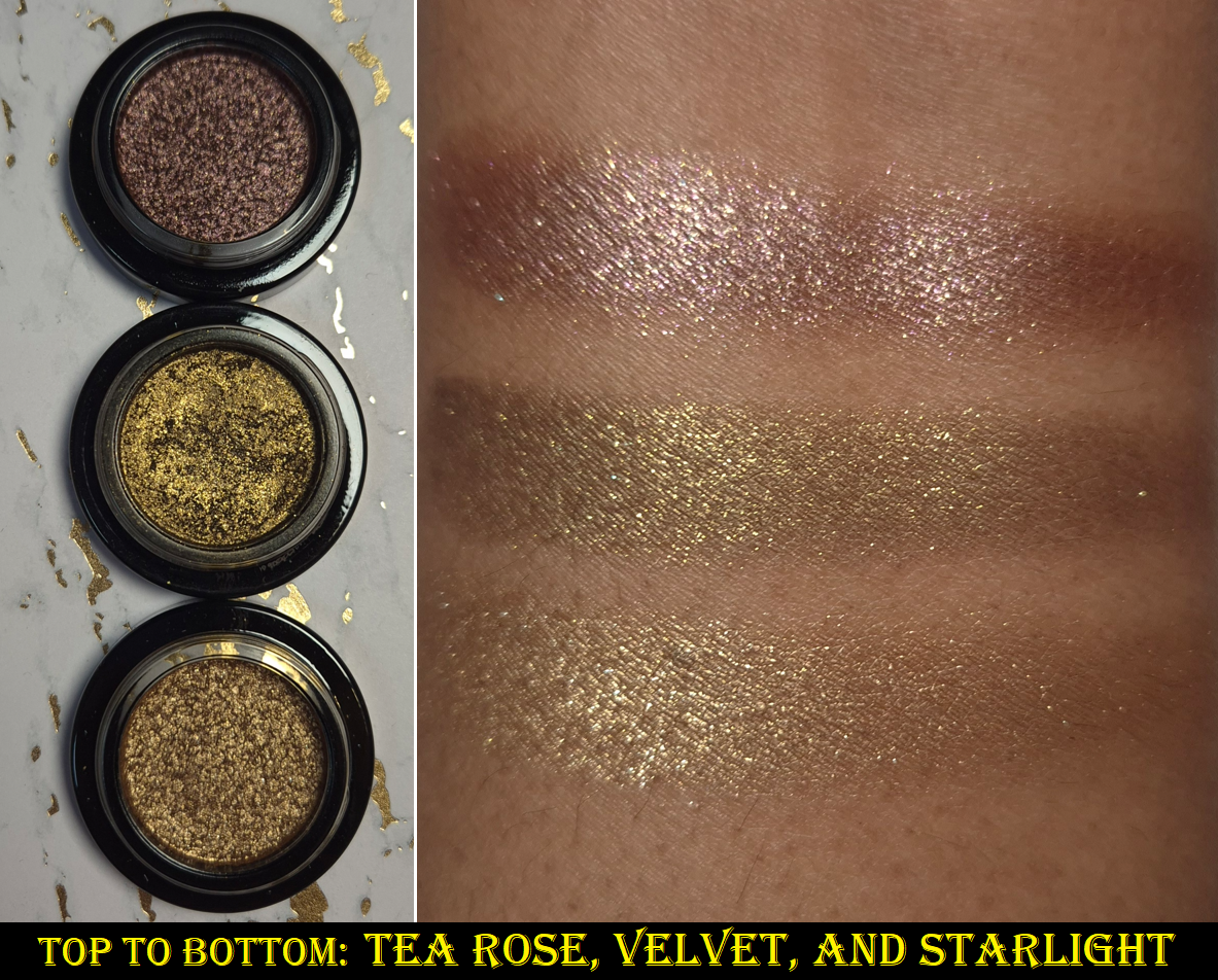
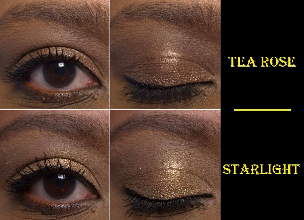
Lid Lustre in Tea Rose and Starlight
I reviewed the shade Velvet before in my Cocoa Eye Wardrobe post I keep linking, so the other two Lid Lustres are the newest additions to my collection. I rarely buy single eyeshadows, but most of the Lid Lustres are known for their incredible shine and sparkle. I watched many swatch videos and decided that Tea Rose and Starlight were the only remaining shades I wanted.
Tea Rose is supposed to be “infused with Quartz” and “Citrine Extract” is in Starlight. These two might not look as impressive on my eyes when used solo, especially since my camera doesn’t do them justice, but I am rarely disappointed when I use them to amp up the shimmer effect in my eyeshadow looks. I must admit that these two shades don’t stand out as much on my eyes as Velvet does, but I still like them.
I’ve found that this formula works best when applied with a finger. It has good adherence and very little fallout. It doesn’t fade and it looks smoother if I apply it with a damp brush, but wetting it doesn’t increase the overall shimmer impact. I don’t get creasing or fading when I use the Lisa Eldridge Liquid Silk Liquid Eyeshadow underneath because it’s a good barrier to prevent the oils from my eyelids from breaking down the eyeshadow. If I use a Lid Lustre on my bare oily eyelids, there will be creasing before it begins to break down fully. So, please be aware that if you have oily lids too, a good primer is likely necessary. I updated my original review with this clarification.
Because I have so much makeup, it’s not unusual for me to eventually stop reaching for a product after I’ve completed the review in favor of starting to use something new. When it comes to these Lid Lustres, I can’t say that they’ve been used often since last October, but the amount is certainly more than I expected!
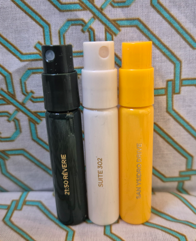
21:50 Rêverie Eau de Parfum (Sample Size), Suite 302 (Sample Size), and San Ysidro Drive (Sample Size)
The fragrance category is the most subjective category within the realm of beauty, which is why I rarely talk about the perfumes I’ve purchased or sampled. However, it felt like a wasted opportunity to forgo talking about these altogether considering I have 3 of the 4 scents and even the travel sizes are expensive to blind-buy. Perhaps my opinions as a perfume dabbler could still be helpful.
21:50 Rêverie Eau de Parfum – “Tobacco leaves, plum, vanilla pods and Tonka beans blending with the cedarwood.”
The initial impression I get when I spray this is that it’s a sweet fragrance with some amber. After it dries down on my skin, vanilla is definitely the most prominent smell. I like that 21:50 Rêverie features a creamier type of vanilla scent as opposed to sugary.
After about an hour in, the tobacco leaves and cedar come through. This combination of creamy, smoky, and slight woody scent is how it continues to smell for the rest of the day. It projects within a small area in the beginning, but after 2-3 hours it becomes a personal scent. I have to clarify though that I only spray 1-2 spritzes of a perfume on myself, at most, since everyone I interact with in my daily life are incredibly sensitive to fragrances. The majority of perfumes I buy are basically skinscents on me (perfumes are more prone to fading/dulling down on dry skin), which is why I tend to spray my clothes instead. Doing so takes skin chemistry out of the equation. If I just spray my clothes, I can smell this perfume for longer than many others I own.
I must admit that I cannot smell the plum at all, which is disappointing since I love the smell of plums. If I was able to detect it, that would probably be the push I’d need to buy a travel size of this because this is my favorite scent out of the three from VBB that I’ve tried. This is a very nice fragrance, but I don’t love it enough to be willing to spend so much on it, especially since I have to be so careful and so selective about how and when I am able to wear perfumes out of consideration to those around me.
Suite 302 Eau de Parfum– “Black cherry and red peppercorn; rose centifolia, midnight violet, and narcotic musk; plush velvets saturated with papyrus, black leather and masculine tobacco leaf.”
Tom Ford’s Lost Cherry and Kayali’s Lovefest Burning Cherry are some of my favorite perfumes. I love a good cherry fragrance, so I expected to like Suite 302 as much as 21:50 Rêverie or potentially even more.
When this fragrance first hits the air, I can detect the sweet cherry smell, but there is a smoky spice element that overtakes it once it settles onto my skin. To me, it smells like incense. Thankfully, this scent grows sweeter within the first hour. I can smell more of the cherries. However, after that first hour I smell florals and sweetness mixed with a peppery-spice smell, and that’s basically how it stays for the rest of the day. I don’t consider this a true cherry perfume because of how quickly that specific note just registers as sweet rather than fruity. If I check how I smell midday, I could easily forget there was supposed to be cherries at all. This scent profile overall is interesting, but I don’t like it enough to be willing to spend that amount of money on it.
The projection and longevity of this one is on par with 21:50 Rêverie.
San Ysidro DriveEau de Parfum – “Passion fruit and pink peony; ocean air infused with rich rose absolute, saffron flower and agarwood; black amber and vanilla”
In the opening, I cannot distinguish what kind of florals are used. There is a sweetness, but it doesn’t register as passion fruit to me. The overall scent of this is bright and uplifting, though not my style as a gourmand lover. I wasn’t very interested in this scent, but I chose it specifically to review since I didn’t want the other free samples, and I have backups of the other two fragrances already.
Fairly early into the wear time, I can smell the saffron and more of the salts and wood. The dominating smell is still “sweet floral” up to that first hour. After that, I can isolate the rose smell and finally the vanilla. Eventually, I can tell there’s amber as well, but that’s as far as it goes. Once the top notes have faded, what is left behind is more my speed, but it’s also a much less unique type of smell.
I also have to admit that I don’t have many fragrances with oud, and the ones I do own are blended with so many other things that I can’t say for sure that I know how oud smells on its own. According to Google, it can be so many things: woody, earthy, animalic/musky, smoky, resinous, and “depending on the origin (e.g., Thailand, Cambodia), it can range from fruity and floral to medicinal, spicy, or leathery.” So, basically it’s a broad category that can account for practically everything! San Ysidro Drive had a tiny bit of an incense smell as well, though weaker than Suite 302, so I’m going to guess that that was due in part to the oud.
I don’t know if it’s just my sample, but I think it’s interesting that this projects the most of the three, but its scent is the quickest to fade (after about six hours). Without being able to smell any passion fruit, I’m not a fan of this in the beginning, but I like how it wears as the day goes on. That being said, it’s my least favorite of the three samples and I unsurprisingly don’t have any interest in buying it.
I know Portofino ’97 is popular with a lot of people, but the notes are so far away from the kind I like. It even has patchouli, which I hate 95% of the time. So, I don’t intend to ever try it. I’m very glad that the brand offers these samples to customers though, and there is a discovery set with all four in case someone does not want to wait to get the complimentary samples one order at a time.
Additional Updates
Eye Wardrobes
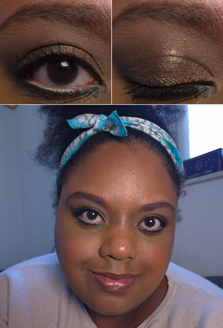
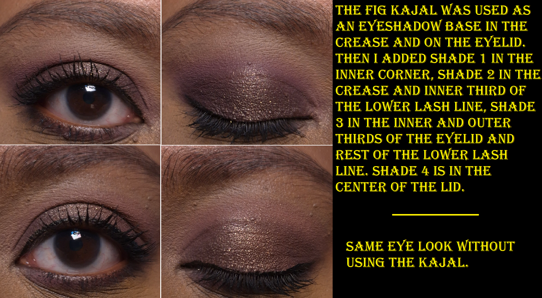
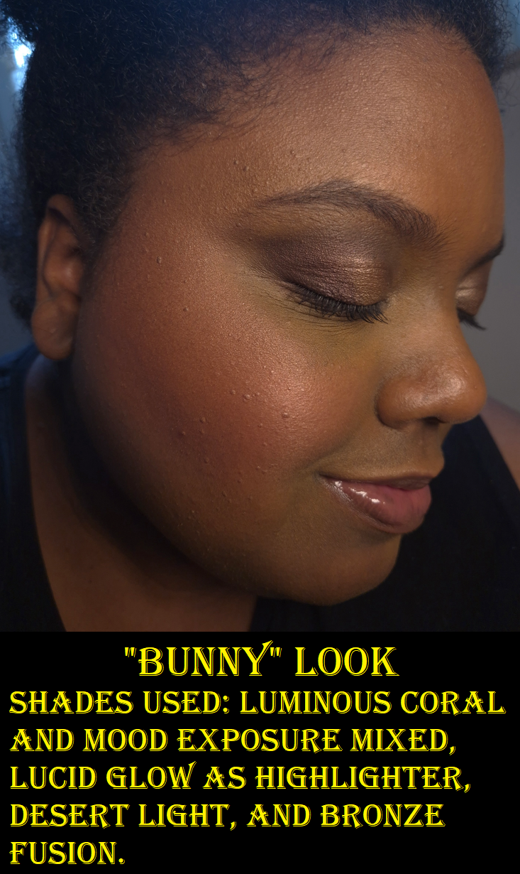
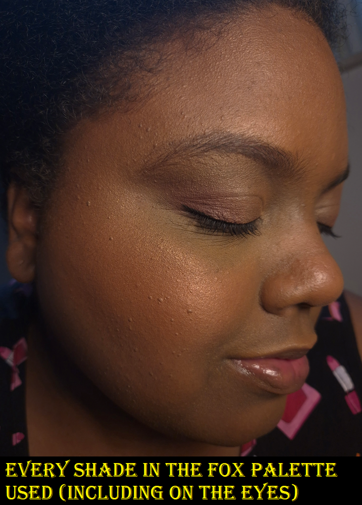
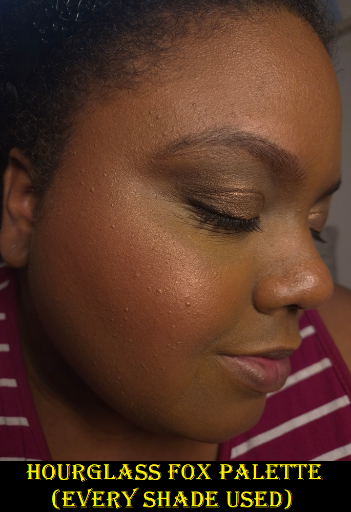
Since I posted a First Impression of the Orchid Palette, I wanted update that the quality in this one is on par with Victoria and Cocoa. The mattes are soft to the touch and create low or medium kickup depending on the brushes used. The light purple shade (Shade 2) tends to lean quite pink on my skin tone, but it still looks enough of an orchid-purple color to satisfy me. The deeper purple (Shade 3) doesn’t swatch very well and looks patchy, but that quality is what gives the hazy smokey effect on my eyes that I like. Having a deep shade like this is easier to control. The mattes blend well into each other and although Shade 2 can appear as if it has a bit less pigment than the amount in all the other quads, I think it’s just a matter of this type of color not popping as much on my skintone. The satin eyeshadow (Shade 1) can be used as a highlighter on my face. I like putting it in the inner corner since it’s much smoother than the shimmer eyeshadow (Shade 4), which is practically a Lid Lustre in pressed form. I don’t get creasing from the shimmer (but I always use an eyeshadow primer or eyeshadow base) and the shine doesn’t fade. It grips to my eyelids well enough that I don’t feel the need for a specific glitter primer or to spray my brush.
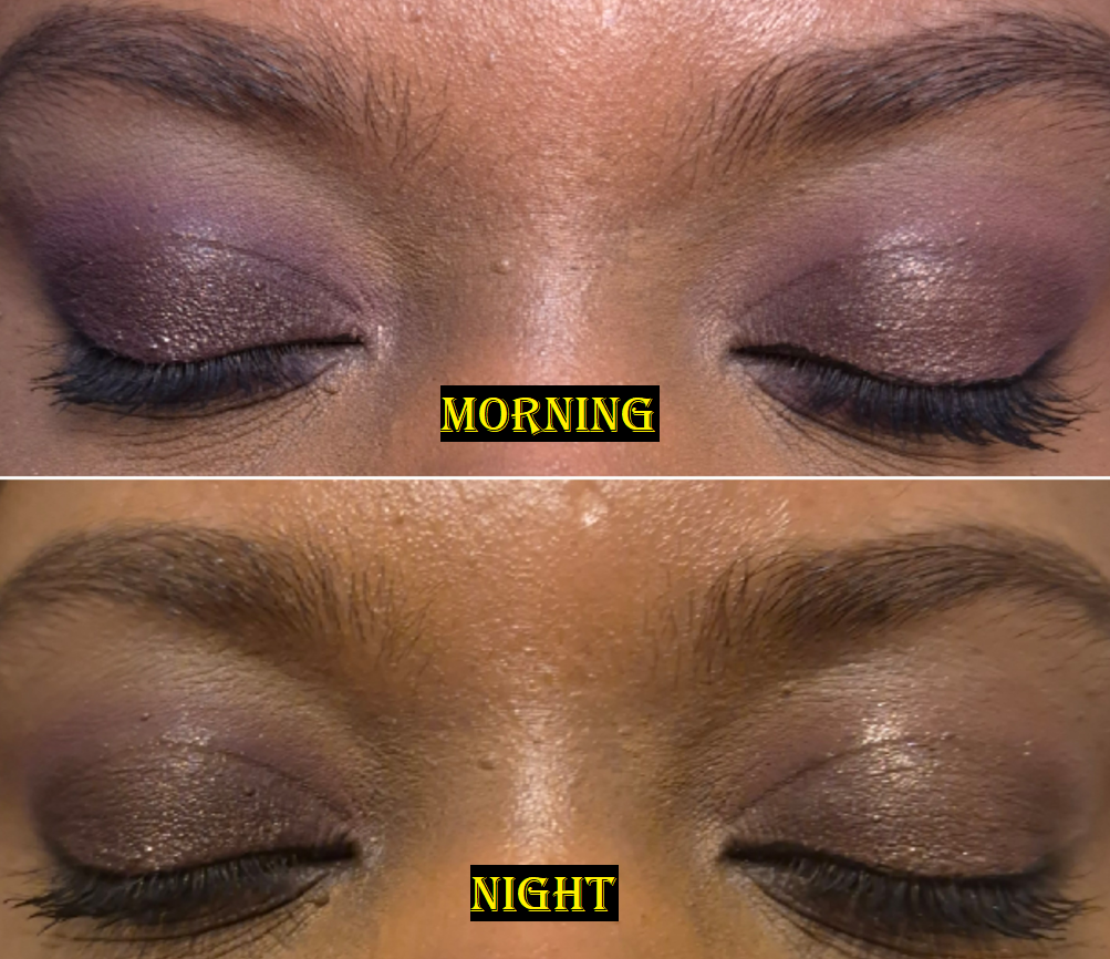
I’ve had no issues with longevity, but my eyeshadow looks are so much more impressive when I incorporate the Fig Satin Kajal into the eyeshadow looks. For example, I love how much more purple Shade 2 looks if I apply it on top of Fig. I get so much more depth from Shade 3 as well. The best part though is that my eyeshadow looks practically newly applied by the end of the night when I use the Kajal as my base. I did a side-by-side wear test and could see that without the Kajal, the eyeshadows still looked great, just not as fresh looking. The pictures I take at night aren’t the best representation (due to lighting issues), but I’ll post an example anyway.
Vast Lash
I’ve talked about this mascara in the Cocoa Eye Wardrobe review. Sometimes a mascara gets better over time, but the sample I own did not. An example of how this mascara looks on me is in the Eye Brighter section of this post. I don’t think it looks good on me and my eye lashes are at its best and longest right now because I’m still using the Sweed Eyelash Growth Serum. So, I can officially confirm this mascara isn’t for me. I can’t help but still be curious about the Future Lash mascara, but the brand doesn’t offer samples of it at this time.
Cheeky Posh
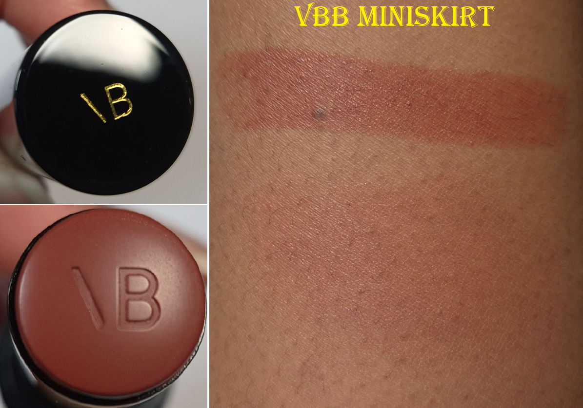
I first bought Miniskirt four years ago and it eventually started to smell like crayons, which indicated that it needed to be replaced. Even though I loved the color, which was so similar to Fenty’s Rose Latte, I hardly used it because I had such an issue with the color blending away and transferring. Still, because the Victoria Beckham Beauty brand had quickly risen to be among my top five favorite brands, I wanted to have a usable blush again. So, I decided to repurchase it. Miniskirt continues to be my favorite shade within the range, so I thought it would be best to stick with that color.
I don’t know if the change in climate or the fact that I’m using different skincare and makeup can explain why I no longer have the same problems as before, but I’m very happy about it! The Cheeky Posh blush is a bit firm, but I am still able to draw a line or stamp the product along my cheeks and blend it out with my brush of choice without it disturbing the foundation under it. The warmth of my skin helps the blush to spread a little more as I work my Rephr LC02 brush into my cheek. Sometimes, out of habit, I still warm it up on my hand before applying it with the brush.
I can’t speak for all the shades, but Miniskirt imparts a good amount of pigment. It still sheers out a bit the more it gets worked into the skin, so I don’t have to worry about applying too much.
This product looks the tiniest bit dewy, but it’s not very emollient or sticky. At most, if I touch my face it just feels like residue left behind from a moisturizer. Setting it with powder eliminates that feeling entirely, but at the cost of turning it completely matte.
Even if I don’t set this with powder, I no longer have the issue of it transferring. If I press a napkin to my cheeks, I can only see the faintest hint of color. That does not mean that this product is long-wearing though. If I don’t use a primer, powder, or some other means to increase the longevity of makeup, this blush significantly fades from my cheeks within six hours. With helper type of products, I can get at least eight hours of wear before the fading starts to be noticeable. Twelve hours in, I can still see a light flush of color on my cheeks. I don’t know how much longer it lasts before disappearing because 8-12 hours is my typical wear test limits.
I honestly don’t know how much use I’ll get out of this because I use powder blushes at least 80% of the time. However, I’m still happy to have a fresh one.
Also, for anyone wondering about the scarf I tied around my hair in some of the photos, it’s the Victoria Beckham Beauty ’97 Portofino Scarf that was a limited edition free gift with purchase item.
I also want to acknowledge that in the time since the Orchid Eye Wardrobe launch, the brand has released a new shade of Posh Lip lipstick and two Colour Wash Bronze Water Tints. I do not intend to buy either products because I’m on a lipstick low-buy and liquid cheek products are not my thing. Plus, the Bronze Tints aren’t likely to work on anyone darker than tan. Whenever I am unsure if a product will show up on me, I try to wait and see if EnamoredBeauty on Instagram will review it (since we have similar taste in makeup), and it was pretty much invisible on her. I also watched reviews of ladies with light to medium skintones being able to pull off wearing both Water Tint shades. The decision to launch only these two colors in similar depths is…interesting.
I’m glad I didn’t have my heart set on trying that product anyway. It also means that this brand review is complete with me having reviewed everything I wanted by the brand. Anything else I buy from VBB in the future should be new products and/or shade extensions to things I love.
Important Note About the Referral Program
Victoria Beckham Beauty has a referral program, which they send reminders about to customers via email. There are very few brands I like enough to want to spread the word about, but because VBB had become one of my favorites, I figured there was no harm in talking about it. Looking back, I could have thought harder about the fact that although I see everyone I talk to in the comment section here on my blog as friends, as well as those I chat with via social media, they are probably not who the brand meant when they ask customers to “refer a friend.” In hindsight, they most likely meant people I know personally, even though I am extremely close with several online friends across the world that I have never met. Still, I had the sense to check the fine print details in the email, the Referral Program terms and conditions, as well as the V-Suite Loyalty Program terms and conditions. As of February 2026, there was nothing in there prohibiting customers from sharing their referral codes publicly. There was no warning stating that it’s possible for a referral code to be able to be misused and that if someone misused it, it would endanger the standing between the brand and referrer. Based on everything I read, there was zero reason to suspect that sharing the link with my friends and strangers via my blog would bring anything but a positive outcome. Posting on my blog would bring more business to the brand than sharing with my in-person friends who don’t buy luxury makeup.
What happened to me is that I shared my referral link/code in one of my Victoria Beckham Beauty reviews. Someone used it and everything was fine. Then, in another Victoria Beckham Beauty post, I wrote a thank you message hoping the person who used my link would be able to see it and I posted my link again. Other strangers used it and that’s when my account got blocked with no warning whatsoever.
I noticed that my year-to-date spending had been reset to zero and I had been knocked back to Tier 1, which is actually the reason I reached out to customer service. It was then that I was informed that whoever else used my referral link, “are using drop-shipping addresses to place their orders which is explicitly prohibited by the terms and conditions.” Therefore, I was kicked out of the referral program, loyalty program, and would not receive any other benefits.
I had to look up what drop-shipping is, and if you use ctrl+f to search for the word “drop” it does not come up at all in the terms and conditions. Accounts with fraudulent activity can be terminated or suspended at VBB’s discretion, which is perfectly understandable. The part that they don’t state is that by posting a referral link for the general public, any fraud that a stranger commits with that link (which a referrer has no control over), will result in them flagging the referrer’s account as participating in fraud as well. Since I don’t normally participate in referral programs, I didn’t know that it was possible for fraud to be committed through a link, and as I mentioned before, there is no warning written about that being possible in the terms and conditions. So, when a customer gets an email asking them to talk about the brand with their friends and encourage them to check out the products, doing so leaves that customer vulnerable to their own account being permanently blocked. Had I known this was possible, I would never have shared it with anyone! Not even my own family! Another aspect that confuses me is the line in the TOC stating, “Referral benefits are subject to the referral program terms, which are separate from these Terms.” So, I would have accepted getting removed from the referral program, but to have my entire account blocked for something out of my control and not clearly stated anywhere on the website or emails felt unjust.
One other aspect that I keep wondering about is the fact that Influencers/Affiliates talk about a brand and post links and codes publicly. Out of the hundreds and thousands of people who use their codes, there’s no way that none of them are misused (for example if one of the customers continually buys products, uses them, and then returns them). Yet, not a single company would ever hold an Influencer or Affiliate accountable for what a stranger does. So an Influencer who gets paid by a brand is protected from something like this, but a customer who gets a 20% off discount to give more money to a brand is considered undeserving of the same protection.
Feeling quite defeated about the whole situation, I immediately deleted the referral links from my blog. I replied to the email and figured it was 50/50 whether my account would be reinstated or not. Two days later, I got the news that my Uncle (who was also my godfather) had passed away, so I honestly didn’t have any fight in me to post about the situation on social media or do anything further to contest what happened. I have no issues accepting repercussions if I break terms and conditions, but what I did (posting my link on my public blog) was not listed as a prohibited action. Warning that what someone does with your link can jeopardize your own personal account was not listed either.
Another line in the terms and conditions states, “Any disputes related to the Program should be directed to Victoria Beckham Beauty’s customer service team. We aim to resolve disputes fairly and amicably.” I can say that this seems to hold true. A few weeks later, VBB wrote back that they reviewed my case and so my account was reinstated. One of the points I had expressed was the fact that the terms and conditions should be updated so that all customers now and in the future will understand what they’re getting themselves into by giving their referral links to anyone, and so they can be aware of the possible repercussions that doing so could bring (not just the positives). I am grateful that the representative on my case accepted and even thanked me for the feedback. The response back to me was very kind and understanding. This issue was able to be resolved, but it does not change the fact that I feel it is my responsibility to warn readers about the negative side and risks that are possible by sharing your customer referral links with others. I had made a post encouraging people to refer the brand too and thanking the ones who used my VBB link. So, of course I feel a strong obligation to talk about it here in the hopes that this doesn’t happen to anyone else.
This whole thing has not changed how I view Victoria Beckham Beauty products. Other than the Brightening Pencil and Concealer Pen that simply don’t work for me, everything else is a hit. The bronzers and eyeshadows rank in my Top 5 within both of those categories. The Posh Glosses and Satin Kajals are among my favorites as well. The brand got me to spend €66 on a primer, which I am even considering repurchasing in the future. I love many of these products, and based on that I still consider VBB one of my few favorite brands. However, I still have some lingering negative feelings over the whole ordeal. I was so happy initially when my referral link was used, and then what happened afterwards was like getting kicked down several pegs. As if I should know my place as a customer and not try to share things publicly as if I’m an influencer. The benefits of a loyal customer who is in the highest tier of their reward program isn’t anywhere near as important as an influencer with clout. That’s how it felt to me.
My account getting reinstated helped to repair some of the damage, at least enough that I made another purchase since then, but I honestly still have some lingering negative feelings. Regardless, my reviews of VBB products will continue to be unbiased. There’s no denying that they are high quality products with some of my favorite luxury packaging. I don’t expect those aspects to be any different in the future and I hope to only have good things to say about the brand going forward.
Thank you for reading, and I sincerely hope this has been helpful.
By now, many brands have been moving towards being talc-free due to upcoming changes in EU Regulations, but Nars was among the first by reformulating their bronzers in 2023 and the blushes in 2024. What baffles me is that the formulas of their products are not consistent across the board.
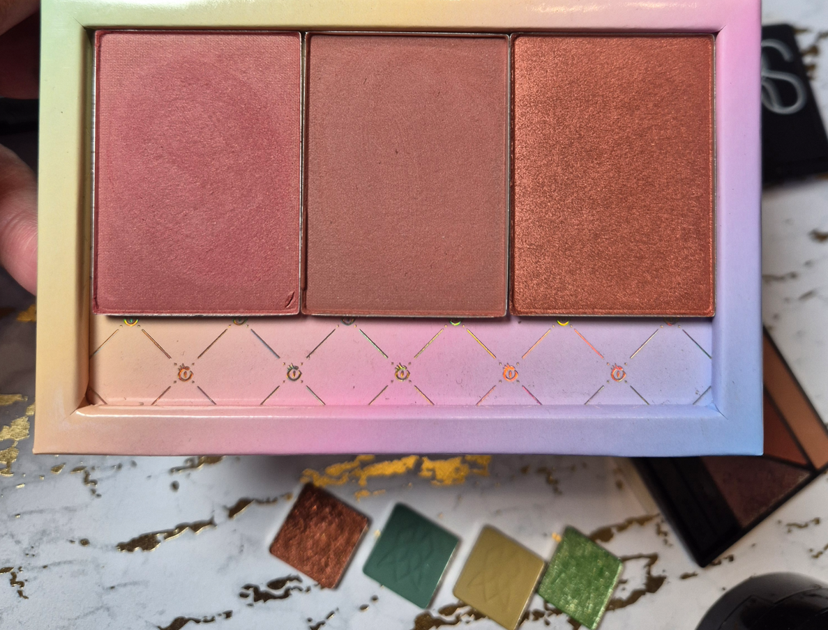
As I mentioned in my review of the Hot Escapes Palette, the highlighters in there share the same names as the highlighters in the Light Reflecting Luminizing Powders range, but the ingredients don’t match up, nor even all of the colors. This has been a growing annoyance for a lot of customers hoping to repurchase their favorite shades, only to discover that they are not identical. For example, my reformulated bronzer in 06 is darker than the even newer 06 bronzer from the Hot Escapes Palette. My older Dolce Vita blush is similar, but not identical to the newer one either. It’s also confusing to buy a product expecting a certain finish and texture, only to end up with something different. The highlighters are a prime example of that.
In an effort to finally put my curiosity to rest, I bought a Light Reflecting Luminizing Powder to compare with what is in the Hot Escapes Palette. I also purchased three blushes in the new formula to compare to the older one.
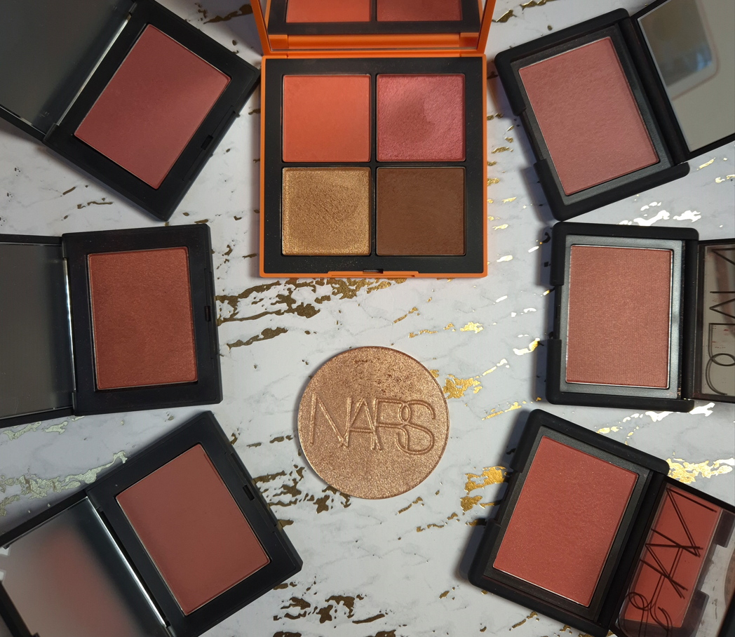
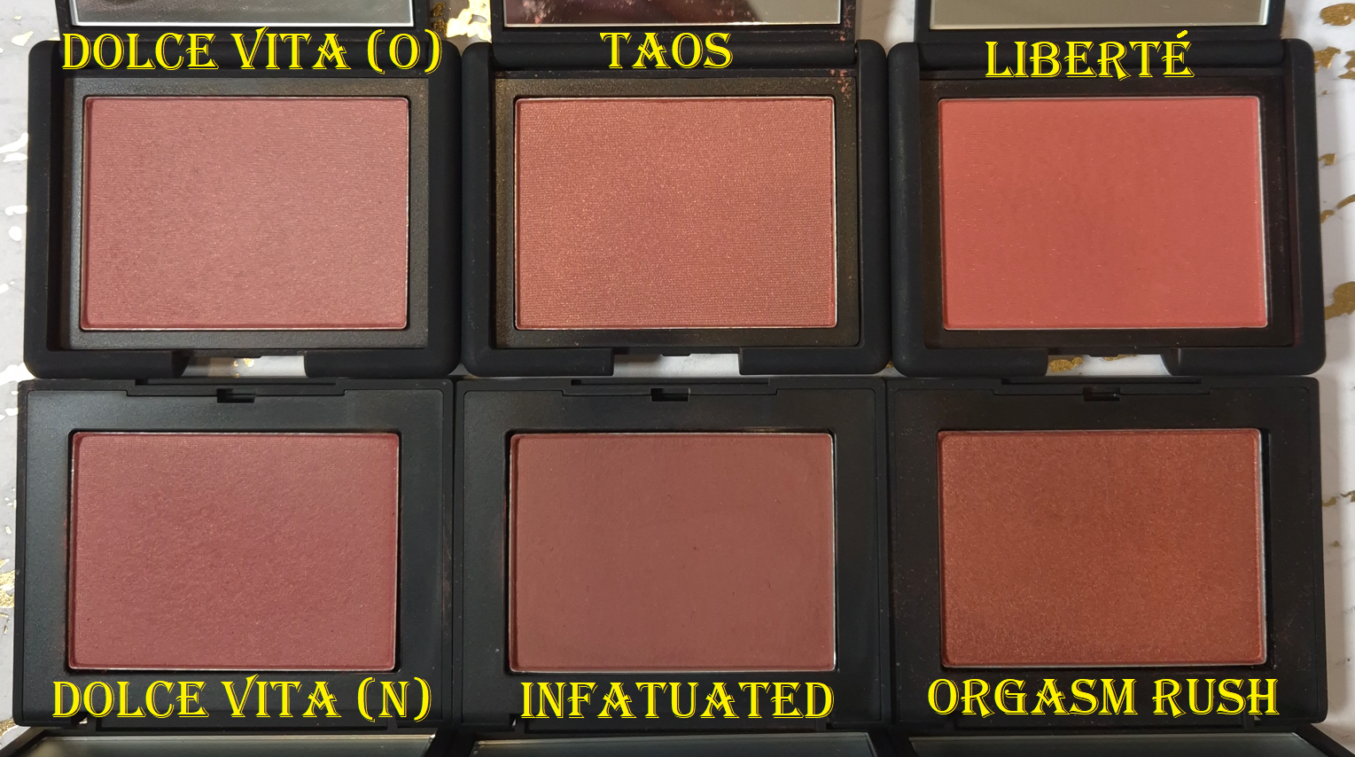
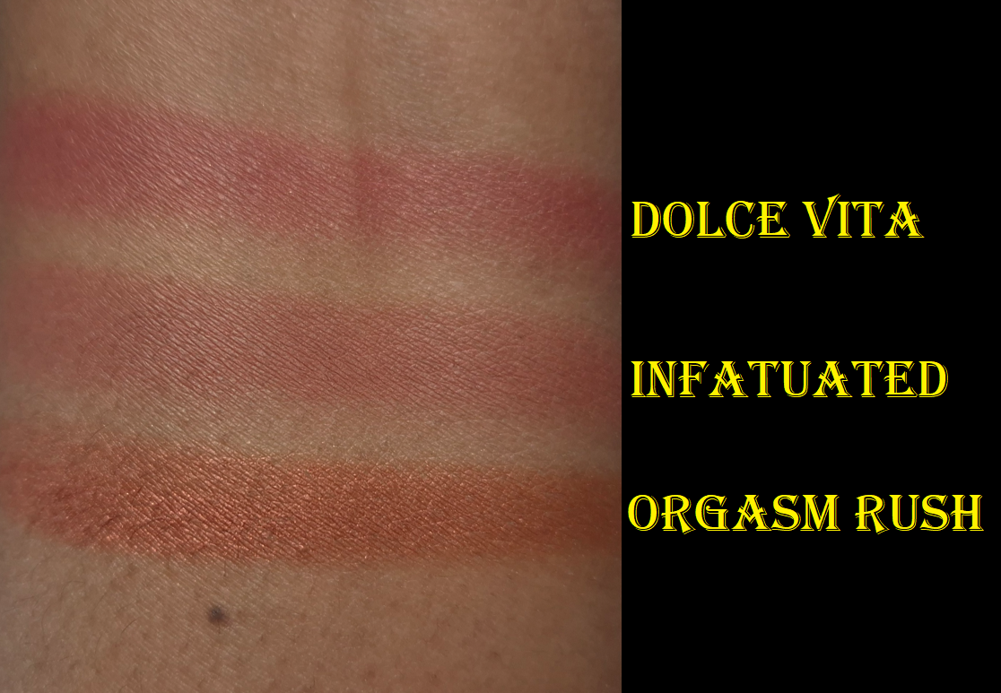
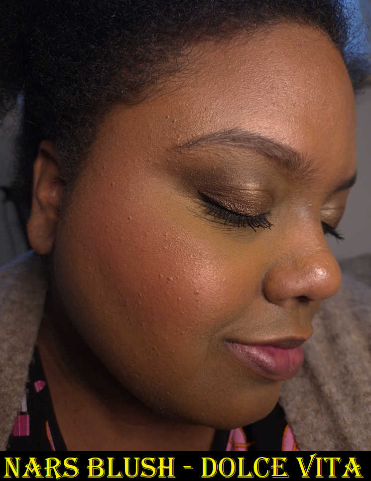
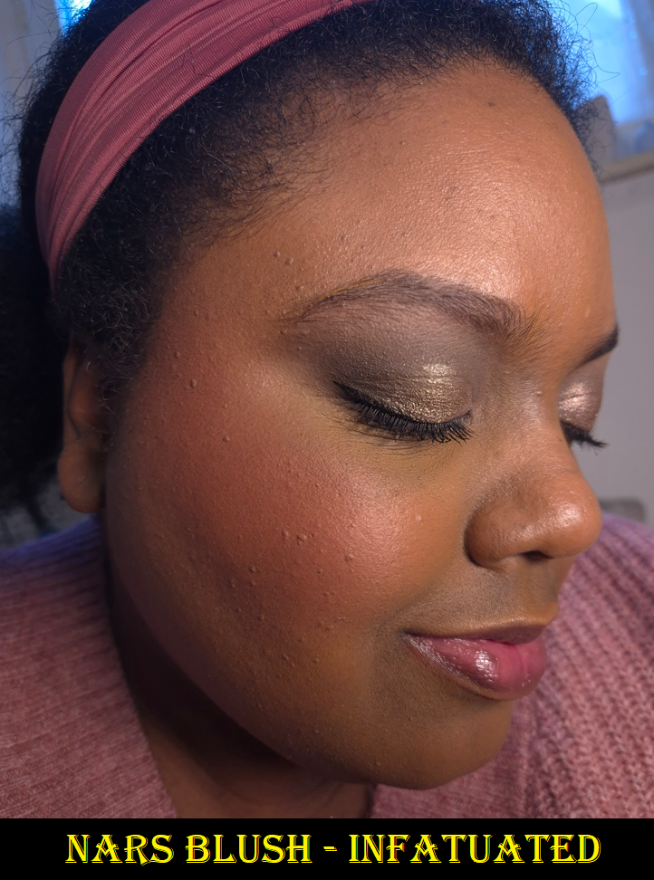
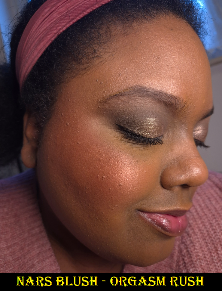
Nars Powder Blushes in Dolce Vita, Infatuated, and Orgasm Rush
A change that Nars made, that I can definitely support, is that these blushes are refillable. Less packaging being produced is better for the environment, but of course I like the ability to just purchase a pan of blush for a cheaper price and be able to stick it in an empty magnetic palette. Unfortunately, Nars hasn’t improved that option since the launch. At the time that I’m writing this in 2026, there are still only 5 shades available as refills. None of those are dark-skin friendly.
The cost of refills from the Nars are €29 each, but I have been able to get the full products from Flaconi for €19 each. So, I don’t have much incentive to buy refills or purchase directly from Nars anyway.
My history with Nars blushes has been long and unstable. To sum up the gist of my Rediscovering Nars Blushes post: I tend to like them, but I rarely love them. They almost always play second fiddle to my MAC blushes.
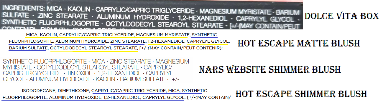
The matte blush from Hot Escape shares the same ingredients as the current matte single blushes, but the order is shuffled around. The shimmer blush from Hot Escape contains no kaolin, but the current shimmery singles have some (and definitely less than the mattes).
One of the biggest reasons I didn’t like some of Nars’ past blushes is because they looked a little dry on me. So, I thought if the current line of powder blushes use less kaolin, that could have explained why I prefer the blush singles over the older ones, but it’s still the second ingredient in the matte formula. Now, I’m unsure what is responsible for the reformulated blushes looking better on me.
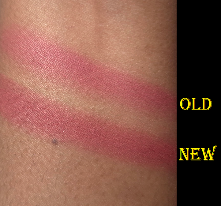
Dolce Vita is described as a “matte dusty rose” and Infatuated as a “matte deep plumberry” but I can see faint shimmer within the surface of the blush pan of Dolce Vita. I cannot see that shimmer in swatches, but there’s a slight glow on my cheeks in the photo below. Both of these blush shades look much softer on my cheeks than the previous Nars blushes. They’re pigmented, but they build color slower than their predecessors. I’ve always given credit to Nars when they’ve launched dark-skin friendly shades. However, they tended to be very intense in pigment and/or bold in color. For someone like me who prefers subtle natural flushes of color and the occasional pop, the lack of nude options is why I often turned to MAC instead.
Although I love the shades Taos and Liberte in the old formula, I didn’t wear them that often because of the issues of being easy to overapply and looking drier on my cheeks than I like. The reformulated blushes don’t have these issues.
I like my new version of Orgasm Rush better than Night Swim because it’s slightly more buildable and blendable. They don’t seem hugely different in terms of texture (perhaps Orgasm Rush is the slightest bit silkier), yet the small changes made all the difference to me.
The only time Nars used to put this much shimmer in a blush was in their baked gelee formula, so I was surprised to see the shimmer level of Night Swim, and see shades like Orgasm Rush in the permanent blush line. I never ended up reviewing the Nars Orgasm Four Play Blush Quad, but I had the shade Orgasm Rush already from there in the baked gelee formula. Unfortunately, I cannot compare that one with the current talc-free version I own because I left it in the US.
I really like how these single blushes look on me, and I am more likely to reach for these over any others from Nars. That being said, there are still plenty of blushes I like even more from other brands. So, I will only buy additional shades in the future if they are truly breathtaking colors that I can’t resist.
Of course, in true Nars fashion, these relatively new and reformulated blushes aren’t enough. According to @VoceMagazine on Instagram, Nars will be releasing Light Reflecting Luminizing Blushes in seven shades in April or May. I’m guessing these will also be refillable since they share the same compact design as the Light Reflecting Luminizing Powders range.
The link to Voce’s swatch video can be found HERE.
If anyone is wondering, I don’t intend to buy these upcoming blushes.
HIGHLIGHTER
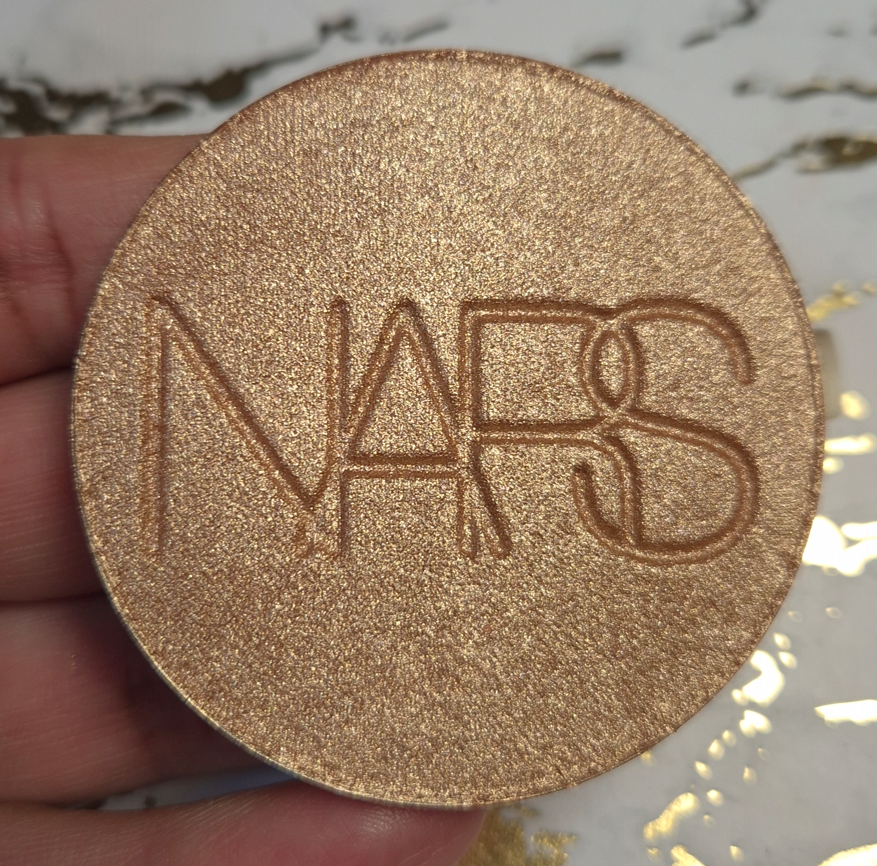
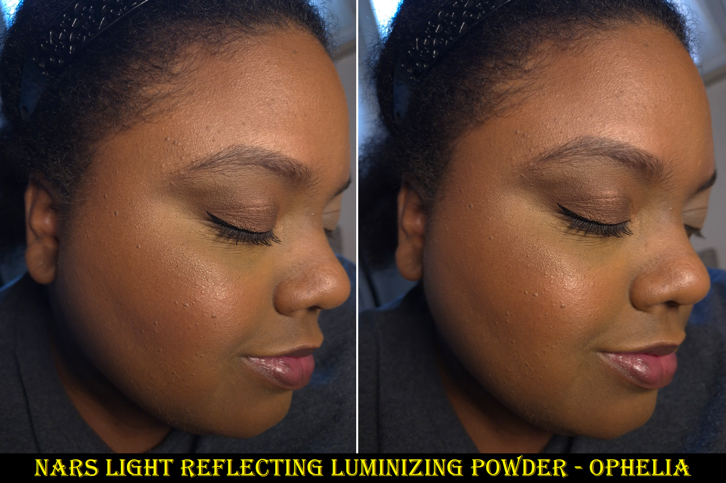
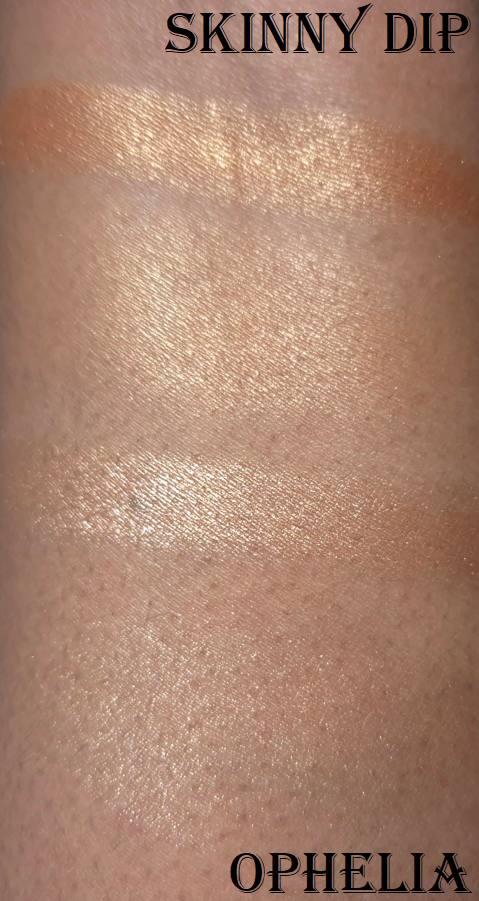
In October 2025, I purchased the refill of the Light Reflecting Luminizing Powder in the shade Ophelia for €19 from Flaconi. I already figured this would not become a favorite of mine based on the review from NikkifromHR, as we have similar highlighter preferences. However, I couldn’t rid myself of the need to buy it in order to personally see how it differed from the Hot Escape highlighter. These kind of decisions based on intense curiosity is something I’m trying to get better about in 2026!
As expected, this did not become a favorite. If I use enough highlighter to get easily visible shine, it’s more metallic looking than I typically go for and the individual shimmer particles are easy to spot when you click the photo to see the enlarged version. It’s smoother than I expected and it’s pretty when looking at it from afar, but it’s still not really to my taste. It’s more important to me to have products that look great in person over ones that look better in photos.
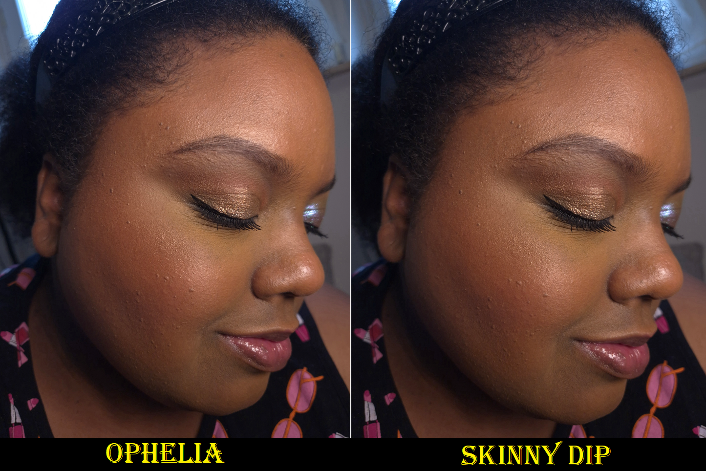
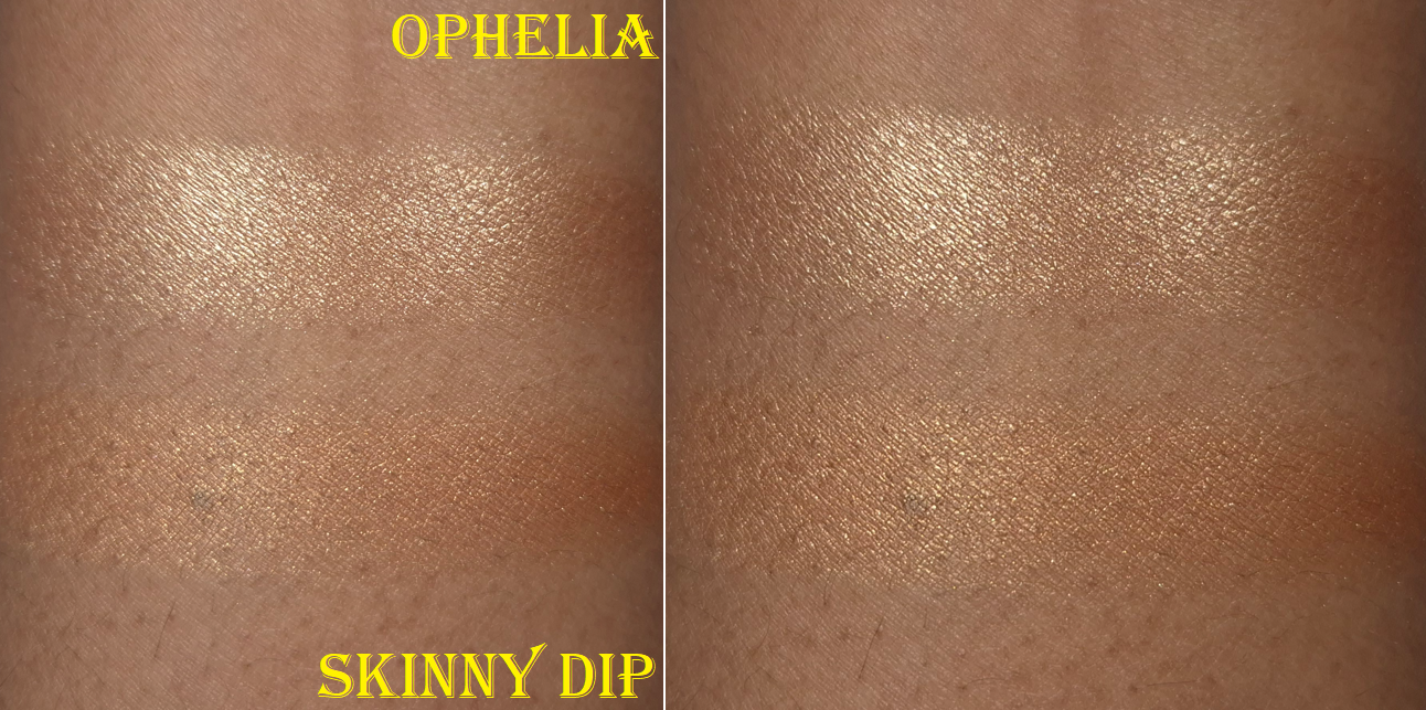
The smallest amount of Ophelia is comparable in luminosity to a light(ish) application of Skinny Dip from the Hot Escape III Palette. Skinny Dip blends into my skin more because it’s darker, but I also find the shimmer particles to be less reflective in a good way. It’s all a matter of preference though and someone else could still love the Light Reflecting formula.
The photos above and below are some examples in different lighting, plus unblended vs blended swatches.
I prefer Skinny Dip, but even that isn’t my favorite. I’ve created many posts featuring highlighters that I prefer even more. Additional ones not included on that list are the Prada Light Glowing Highlighter Powder as my current number one and the Hindash Gradient Highlighter. I love the effect of the Prada one so much that I could be swayed into never buying another highlighter again if not for it being so heavily scented! In any case, I’ll be reaching for Skinny Dip instead of Ophelia if I ever want to create a “Full Face of Nars Products” type of look.
One final thing to note about the Light Reflecting Luminizers is that the refills have plastic mesh backing, so the product is not housed in a pan. I could try to attach a metal sticker to the bottom, but I just store mine within the original refill packaging and not an empty magnetic palette.
That’s all for today. I hope you enjoyed reading and visiting this blog!
The D&G Blush, ABH Highlighter, VBB Lid Lustre, and PML Quad are not pictured here, but they will be discussed in this post.
After the bombshell that was dropped regarding the Louis Vuitton Beauty line and their prices, I started to think about which items in my collection were the most expensive, which ones I thought had the prettiest packaging, if the prettiest was actually the most luxurious looking, and which ones had the most weight. I was surprised to discover that so few items fit into all of these categories.
I was happy to see the people I follow enjoying their La Beauté Louis Vuitton products, but some felt they needed to justify their reasons for making the purchase beyond just stating, “I wanted it, so I got it.” Across the board, customers who thought the items were or were not worth buying seemed to at least come to the consensus that the price (besides paying for the brand recognition), was largely due to the packaging. The lipstick components were said to be fully metal, along with the bespoke metal packaging of the eyeshadow quads. “You could hurt someone if you hit them with this,” was stated more than a few times by various people.
How a product looks and its weight are my top two criteria for feeling like the item I own is luxurious. Looks are subjective, but weight can be measured and precise. I started to think about the heaviest packaging in my collection (proportionate to its size dimensions) in order to answer the question…are these automatically the most lux?
Lisa Eldridge Rouge Experience Refillable Lipstick (68 grams)
In order to highlight how great this packaging is, I need to do a deep dive into comparing it to another brand. Please, bear with me on this, especially if you’re a fan of LV. I don’t judge anyone on how they spend their money, and this is just me working out why I am perfectly satisfied with Lisa’s lipstick being the height of luxury for me.
Lisa Eldridge took great pride explaining in her launch video how her refills were mono material, made of 100% aluminum and could therefore be recycled without degrading once repurposed, unlike the vast majority of other brands’ refills that have mixed metal with plastic.
According to Google: “You cannot usually recycle a lipstick refill that has both plastic and metal components together, as most curbside recycling facilities cannot separate the mixed materials and are not equipped to handle small, complex items.”
There is plastic inside the forever case by Lisa Eldridge, as this has a click closure, but she wanted the actual refills to be sustainable.
I cannot compare the LV lipsticks from personal experience, but it is my understanding that the refills are all metal as well and come with plastic caps that can be removed when recycling. The lipstick cases have an aluminum shell and brass detailing, but the magnetic closure that is so satisfying to use (and adds to the weightiness of a product) keeps it from being recyclable as well.
Summarized from Okon Recycling: Recycling magnets is technically possible, but challenging as it involves disassembling the magnet and removing any non-magnetic materials. However, there are some magnets that cannot be recycled.
So, it sounds as if both LV and Lisa Eldridge have cases that aren’t realistic to recycle but have refills that are fully recyclable. The LV lipstick case has a lot of expensive details like the product names and logo being etched in, the monogram flower-shaped refill bottom, etc. Lisa Eldridge has her logo etched at the top of the cap, allows the customer to personalize the base of the case with their initials etched in (up to three letters), and the case shape had to be custom made as well. Perhaps some prefer the sleeker LV design while others appreciate the vintage inspiration of Lisa’s more.
LV’s Lipstick Case + Refill is $160 and the refill alone is $69. Lisa Eldridge’s Lipstick Case + Refill is $63 (engraving price included) and the refill alone is $30.
Sure, LV’s refill costs the same amount as other high end and luxury lipsticks in their completed form, but considering the details I listed above, is the LV case really $100 better that other brands’ cases, particularly Lisa Eldridge?
It can’t come down to the actual lipstick formula, because that’s part of LV’s $69 refill price.
At the time that I bought the Lisa Eldridge lipstick, I felt it was incredibly expensive. It is still the most expensive lipstick in my collection, based on what I paid and not the retail price. I rationalized my purchase because of the sustainability aspect, all the custom elements, the personalized touch, and how heavy it felt.
Taking branding completely out of the equation and thinking about the components alone, I do feel like this product by Lisa Eldridge is among the most luxurious out there, and I am no longer gritting my teeth at the price.
It would be nice if I liked the lipstick formula more, but there is some hope for me! I wrote a comment on Instagram that the brand responded to, and while the Velvet formula won’t be put in the refillable form, there might still be the possibility of the Lucents that I enjoy so much!
There are other things they’ve been “working on” that has taken years, such as making the empty eyeshadow palettes available for purchase alongside the eyeshadow singles, the return of the liquid blush in better packaging, etc. So, I’m prepared for this to take a while to happen.
If I can get the Luxuriously Lucent Lip Colours and/or Baume Embraces as refills, I will definitely get more use out of mine!
Whenever I think about heavy makeup packaging, the Olivia Palermo Eyeshadow Palette immediately comes to mind. I’ve had it for years, yet I’m still not sure how I feel about the pattern, and I’m not sure what it’s technically called (perhaps wicker, woven link, basket weave, oyster strap, etc.). It just makes me think of the types of patterns I’ve seen for watch straps, which isn’t too terribly off track. Apparently Olivia drew inspiration for the packaging, “by a vintage Art Deco bracelet she was given for her 21st birthday.”
The eyeshadow palette has a magnetic closure and mirror, which further increases the weight, on top of the fact that the packaging is metal.
Although I’m not sure if they could have created a different pattern that I would like more, I can say it’s at least cool, unique, and easily recognizable. Plain flat gold is always beautiful to me, but this packaging looks different from any other I’ve seen. Well, almost. As of a year ago, Hatice Schmidt released a refillable lipstick range called, “The Gift,” with a case inspired by jewelry and the pattern reminds me of a curb chain/Cuban link style. So, there are at least two jewelry inspired components from brands that I know of.
I bought the Olivia Palermo lipstick at the reduced price of €32 (originally €40) from Niche-Beauty, and the eyeshadow palette for $28 (originally $58). I’ve discussed how I procured the eyeshadow palette in a past review, but it was during the time that I started working on this post that I felt the compulsion to finally get the lipstick. I have checked in on the brand on and off over the years, waiting for them to release additional products. Earlier this year, I saw a notice on the official website that the beauty products would no longer be sold and that they were turning the website into an influencer style page (oliviapalermo.com now redirects to her affiliate shopmy page). I assumed that meant the brand was shutting down, especially since I’ve only heard two beauty reviewers reference the brand one time each within the last three years. However, I was shocked to see the products appear on the Douglas website in either August or September, and then I saw them at Niche-Beauty as well. I don’t know if Olivia has better sales in Europe, or Germany specifically. I’m not even sure if she still has products available elsewhere in the US.
I felt Lisa Eldridge’s lipstick deserved to be in the post, but Olivia Palermo’s lipstick is the only one in my collection that is heavier. OPB’s lipstick is less expensive, but it isn’t refillable and the central part of the lipstick component is made of plastic. The outer packaging is what makes this seem so fancy.
Regarding the eyeshadow palette, it definitely screams luxury. It isn’t something you want to carry around in your purse or travel with it. Olivia wanted the old Hollywood glamour look and feel to her products, so this is something that you would want to keep on a vanity.
This is by far my most luxurious palette, and though it doesn’t have some of the additional premium features of the LV Quads, it makes me feel a lot more content about my collection and avoid FOMO. If I want heavy eyeshadow packaging, I certainly have it with this product!
This is my golden pebble! It is tiny in size but mighty in weight!
Chantecaille is another brand with nicknamed “pebble” packaging, but theirs is plastic, thin, and it doesn’t feel substantial, even though they cost the same amount!
I bought my WA bronzer at 20% off, so the title of most expensive bronzer in my collection belongs to Hermes, even though I only bought the refill. Had I paid for the compact too, that wouldn’t have helped it to feel more luxurious than the Westman Atelier bronzer, considering Hermes’ thin plastic packaging.
This has a tiny mirror that I don’t use, and a magnetic closure. The brand has highlighters and face powders in this same style of packaging. I haven’t used their cream sticks or drops, but they don’t look as luxurious to me. The only other Westman Atelier packaging I have handled are the powder duos, which are certainly substantial and pretty to look at, but I don’t think it compares to this gold compact.
When it comes to the prettiest bronzer packaging, I think of Gucci’s and Charlotte Tilbury’s powder one, even though they are much lighter in terms of their size. However, I would never call something that’s a solid gold color ugly. So, it may as well be my most glamorous bronzer.
Fara Homidi Essential Bronzer Refillable Compact (106 grams)
This compact is about the same size and weight as the Westman Atelier Butter Bronzer. The amount of product from FH is 3.5 grams and the amount of product from WA is 8 grams. That is close enough to accounting for the 6 gram difference when I weighed the two products, which is why I’m still including it in this post.
Aesthetically, I find the Westman Atelier bronzer to be more appealing. Shiny things get me. However, I still think Fara’s is classy and pleasing to hold in the hand. Her other products come in red and blue packaging of the same weight. I don’t like the red, but the blue is very eye-catching. If the next product she releases is in purple or green packaging, it just might surpass WA’s as a favorite compact for bronzers.
D&G Cheeks&Eyes Match Blush (91 grams)
I have plenty of blush packaging that is bigger than this, and therefore heavier. However, for this small size, this is very heavy! Nothing really comes close to the weight, but I have to say that Gucci’s powder blush packaging is quite nice too, even if it’s lighter. Visually, I like Gucci’s more as well. In fact, I have a lot of blushes that aren’t luxurious feeling, but I love them anyway (such as YSL’s Make Me Blush Bold Blurring Blushes and Too Faced Cloud Crush Blushes). So, this is one of the few categories where my heaviest blush might be the most luxurious, but it isn’t necessarily my favorite packaging. I do like it a lot though!
I have to add that this packaging feels like a mixture of plastic and metal components. I believe there’s something in the base of this compact adding weight artificially, especially since it doesn’t even have a magnetic closure. It has a push button instead.
Victoria Beckham Beauty Products: Matte Bronzing Brick (166 grams), Eye Wardrobe (116 grams), Cheeky Posh (37 grams), and Lid Lustre (41 grams)
Similar to Olivia Palermo Beauty, VBB has a certain aesthetic that they maintain across most of their products. I like the horn brown/tortoise pattern, and it can be fashionable, but I don’t automatically associate it with luxury because of how many cheap products I’ve seen made in tortoiseshell style. The gold colored trim helps to elevate the look of the packaging, but it is the weight and feel of these components that make them undoubtedly luxurious.
The Bronzing Duo and Eyeshadow Quad are among my heaviest based on size. The Cheeky Posh blush is small and doesn’t have that much extra weight, but I figure that’s because the component isn’t refillable like the other two. I’m including it because it has the same style of packaging as the others, and I still feel bougie when I handle it.
I rarely buy single eyeshadows, so I don’t have much to compare in terms of weight. The prettiest I own is probably the Charlotte Tilbury Hypnotizing Pop Shots, but those have lightweight plastic packaging and they are powders, which I don’t believe is fair to compare. It would be interesting to see how the glass packaging of Charlotte’s Eyes to Mesmerise stacks up, but I don’t own that. I no longer have the glass packaging of Maybelline’s 24 HR Color Tattoo, but the best I’ve got is Melt’s Gel Liner (47 grams) and a MAC Paint Pot (56 grams). I like glass as a component material, but it’s not uncommon to find for eye products. The Lid Lustre packaging has an elevated look compared to MAC’s, for example. The Melt Cosmetics Gel Liner that has the gold lid and butterfly print around the rim with the glass base is prettier to me, while also being slightly heavier. However, the font for the brand logo makes it look less sophisticated. I don’t think eye related categories of makeup follow the trend of weight indicating how luxurious a product will look and feel.
One thing about VBB packaging that does take away from the experience is the issue with the closing mechanism. I heard this was a problem in the past, and I never had an issue with my Bronzing Brick, but my eyeshadow quad doesn’t always stay shut when I snap it closed. Sometimes it’s fine, but other times it likes to pop back open with the slightest touch. I haven’t heard about anyone else having an issue with the quads, so perhaps I’m unlucky in getting one of the few faulty ones.
Pat Mcgrath Mothership Palettes (392 grams) and Eyeshadow Quads (122 grams)
All the previous components I’ve discussed had metal or a mix of metal and plastic packaging. The Mothership Palettes are fully plastic, but they are quite hefty in weight. The palettes are big for only holding ten eyeshadows, but that black shiny lacquer with the gold bottom still look lux to me. My Victoria Beckham and Olivia Palermo palettes are the only ones I can recall from my collection that aren’t made of plastic or cardboard. In fact, the Victoria Beckham Eye Wardrobe quad is only six grams less than a Pat Mcgrath quad, but Victoria’s compact is almost half the size! I still chose these PML products as the next heaviest in the luxury category, though I have to admit that I have some lightweight quads that look fancier because they are gold colored. For example, Tom Ford (the trim technically), Guerlain, YSL (trim), Prada (mixed gold and silver), Lisa Eldridge, etc. I find it difficult to equate weight with luxury in the eyeshadow category because of how many bulky heavy palettes brands have released over the years. So many of Jeffrey Star’s earliest palettes, Plouise, and Glamlite’s Food palettes were huge. I also recall when Stila had the Luxe Eye Shadow Palette in Happy Hour, which was a similar weight and size to the Mothership Palettes, but I bought it for $36. I can’t remember what the full retail price was, but it cost nowhere near the same amount as a Mothership.
So, I’ve come to the conclusion that weight doesn’t automatically equate with luxury in this category either. However, because of how uncommon it is to find hefty quads and palettes that are reasonably sized (Olivia Palermo, Victoria Beckham, and Pat Mcgrath), the ones that are weighty feel extra special to me.
Beekman 1802 Milk Tint SPF 43 Tinted Primer Serum
I didn’t want to include skincare, but this technically falls under the makeup umbrella. If I count it as a primer, it might be the heaviest I ever owned (even heavier than the glass bottle of Rituel de Fille Thorn Oil). Beekman’s looks like ceramic, but it’s colored glass.
I have to say “might be the heaviest,” because I don’t recall how it compares to the Guerlain L’Or Radiance Primer (now called the Guerlain Parure Gold 24K Radiance Primer), which is definitely the most luxurious looking primer I ever bought. The look of the Beekman product doesn’t appeal to me at all, but I was so impressed by how it felt in the hands. I had to leave it behind though because it was so heavy that I didn’t want to bring it back in my luggage.
If this counts as a skin tint, then it’s a lot less special. Plenty of brands make glass bottle complexion products. That’s why I didn’t include any true foundations or concealers in this post, because the prettiest bottles in my collection tend to look and weigh around the same.
When it comes to heavy primer packaging being the most luxurious, I have to say the Guerlain primer squashes that theory.
This bronzer is larger than the one from Westman Atelier, but it weighs the same. The reason I decided to include it anyway is because it’s still substantially heavier than the remaining bronzers in my collection. Plus, the highlighter component is a similar size and even weightier. I cannot think of a single highlighter I own that comes in heavy packaging, other than this one.
I have noticed over the years that ABH has gradually been upgrading the packaging of most of their products. Their two most recent mascaras felt like either super heavy plastic or a mix of metal and plastic. The Smooth Blur Cream Contour Stick has a brushed gold colored metal cap and additional gold details. The Smooth Blur Matte Bronzer and Glow Seeker Highlighter have a magnetic closure and they feel quite substantial in the hand. I’m impressed with the packaging and find it to be quite pretty, but this is still another example of how weight doesn’t necessarily equate with a luxurious look. This packaging feels so much more substantial to hold and interact with than pretty much all others in the drugstore, mid-range, and high end categories. It feels like it should cost more than it does, and it looks appropriately high end to me, but not quite broaching luxury territory. I still think the Gucci Bronzer packaging tops it, despite it being lighter in weight, because it looks classier overall. As another example, MAC’s Sunstruck Bronzers look so beautiful, even though they are in lightweight compacts as well.
Final Thoughts
Based on my own personal collection, I’ve confirmed that in certain makeup categories, the most luxurious packaging is the heaviest. At the same time, I have many other products with a timeless and elegant look to them that are lightweight and made of plastic or other inexpensive materials. Essentially, the weight of a product enhances the luxury experience, but it does very little to elevate plain looking packaging. The best example of this is the Beekman 1802 Tint.
If I can get an Olivia Palermo palette that retails for $58 and feels ultra lux, but I can also buy a limited edition plastic Chanel quad for $86 and still feel like that’s luxurious as well, would that be considered silly? Should I be raising my expectations for all luxury brands? At the beginning of this experiment, I would have said yes. However, I now see that if Chanel, Dior, Gucci, and other designer brands used higher quality materials, their products would likely fall in the LV Beaute range of prices (if not more). Some examples of that are the Chanel 31 Le Rouge lipsticks in the glass case, Dior Rouge Premier Lipsticks with the ceramic case and “formula infused with 24k gold,” along with the Guerlain Rouge G Exceptional Piece lines. There is only so much a person is willing to pay for a product from a luxury brand if the materials are the same as a mid-tier brand. So, that keeps designer brands from going overboard with their prices. There are also advantages to using lightweight materials, such as them being more convenient to take on-the-go for customers or makeup artists with large kits, sitting at attainable prices for aspirational shoppers, thinner packaging contributing to less waste of materials and sustainability efforts, etc.
So, when I really think about it, I wouldn’t be able to buy as many products in the luxury category if the components were more expensive to make or if they were made from higher quality materials. In fact, the majority of the products in this post were purchased with some kind of discount. Of course, I would love to have all my luxury goods in weighty packaging, but if that means I would have to accept those products being less likely to go on sale and/or accepting that the prices of them would double or triple, I am unwilling to do so.
The Dior Powder-no-Powder is one of my favorite makeup products of all time, yet the most I was willing to spend was €45 (essentially just paying full price) to get my name etched onto the compact. If I had the opportunity to buy it in a gold colored compact with a magnetic closure or some stunning limited edition pattern for €100, I don’t think I’d be willing to do that. This tells me that despite a product having a holy grail formula that is unable to be duped, I still have my limits. Some makeup will just never be worth it to me to buy, past a certain pricepoint, no matter what it’s made of. That means I cannot use the product’s weight, materials (including formula), or looks to justify a super high spend amount. However, I know that when a product gets hyped up, it can be much easier for me to consider crossing that price threshold if I can make a case for it being top tier from every other angle. I bought one of the Chanel Boutons quads directly from Chanel because so many influencers were told by their SAs that the collection would be extremely limited, and I feared missing out. Less than one month after launch, I found the quads at multiple retailers for a minimum of 30% off. FOMO works similarly to getting caught up in the hype of a product. I sometimes make purchasing decisions that I normally wouldn’t.
This is why I decided to make this post. I know there are others like me who enjoy luxury makeup and don’t have the biggest budget to work with. There are those who will be tempted by the exclusivity of a certain new beauty line and would normally not even consider getting anything at those prices, but the hype may be wearing down that resolve. To those that want to be talked out of buying makeup at $100 or more…just remember that luxury makeup with fantastic formulas and high quality packaging can be found at a lower price. This post is full of examples of this. If one brand is out of your price range, you might be able to get similar products from another prestige brand. Other amazing and beautifully packaged products are just around the corner.
I hope this topic has been interesting, and even helpful.
I remember a time when everything this brand launched with had a ton of hype surrounding it. The pace of their new releases slowed in recent years, so much so that I didn’t even buy anything from them in 2024.
When I think about my ABH purchases in 2025, I’ve realized that nearly all of them were bought to replace something I missed out on. I didn’t get the brand’s first iteration of powder bronzers because I didn’t think the darkest shade (Mahogany) would work for me. I ended up buying their Smooth Blur Bronzer instead. In 2016, I wasn’t interested in the Anastasia Beverly Hills Master Palette by Mario, but later regretted not buying it. So, Embers seemed like the next best thing. I also always wanted a dark skin friendly version of the Anastasia Beverly Hills Amrezy Highlighter, but they didn’t create additional colors. So, I hoped the newest shade of Glow Seeker Highlighter could fill that role. I finally bought the Stick Blush four years after it launched, figuring ABH had no plans to expand the range further. I feel like the production of the Magic Touch Blush Trios are confirmation of that. Lastly, the only product I didn’t buy to fill a void of something I missed out on, is the Smooth Blur Contour Stick. I liked the cream bronzer so much, along with the powder bronzer from the “Smooth Blur” line, that I eventually caved and bought the contour in the hopes I’d like it too.
Let’s dive into the reviews and see if these products ended up being worth getting!
Embers Mini Eyeshadow Palette
I acknowledge that this is a soft color story, and that soft tones don’t pop as easily on dark skin. However, I expected these muted eyeshadows to still be pigmented, along the lines of the Nouveau Palette. Most of the swatches in the photo above needed to be built up in 3-5 swipes instead of my usual 1-2. I have five other ABH palettes and none of them require the amount of building up I’ve had to do to with Embers. I have to be so precise with my placement of the deepest shades in order to avoid the other eyeshadows blending into it and lightening it up too much in the process. I have to actually dampen my brush when using some of the satins in order to aid in packing on the color.
I was looking forward to having a subdued and earthy palette, but these shadows are more gently pigmented than I could have anticipated. After all, according to the brand, “Anastasia Beverly Hills Embers Mini Eyeshadow Palette was designed to spark artistry with depth, warmth, and intensity. Featuring 9 full pigment shades—including rich, blendable mattes and molten metallics that glow like firelight…”
I’m sorry, but to call any of these non-mattes a molten metallic is wild! Which of the shades in my swatches are rich or intense? Is the “full pigment” in the room with us?
Anyway, because it’s so easy to create toned down looks, I did my best to show the maximum color payoff I can get with this palette. The end result is at the subdued level I wanted, so my only issue is how much effort it took to create the three looks below.
Creating a bold look isn’t going to be a problem for someone within the fair to medium skin tone range, but those expecting high-shine metallics (instead of sooty satins and low impact shimmers) might still be disappointed.
To anyone who was hoping to achieve the kind of look that’s featured on the official website, I recommend managing your expectations. I couldn’t get that depth of color from the browns, so I checked the brand’s YouTube page to see what kind of techniques were used. I am fairly certain the “Terracotta Spice Fall Eyeshadow Look,” is the one used. How the makeup appears in the video looks washed out, but how the photo is depicted on the Anastasia Beverly Hills site looks manipulated to appear bolder. The truth might be somewhere in the middle!
The mattes blend and layer decently, but I had a hard time creating depth with C3 and struggled to have B2 show up. I expected B2 to be like Metro from Nouveau, but it’s not. When I think about that palette compared to Embers, I start to feel like perhaps I should have just stuck with the former!
If the Master Palette never existed, I would have thought Embers was meant to be a companion palette and/or a softer version of Nouveau.
A1, A2, and B1 are the inner corner type of shades, which I’m satisfied with. C1, C2, and B3 are the visual standouts, but they have a sooty quality to them that I can easily see when I rub them into my skin. I’ve seen this kind of effect from multichromes, duochromes, and sparkly formulas to look even more intense. With the type of finish these have, I feel like these colors veer away from the muted category and closer to dull. I wish these had more of a wet metallic finish instead.
On the bright side, I don’t have issues with creasing or fading throughout the day. I get quite a bit of kickup in the pan, but I feel that’s pretty normal for ABH. The shadows are soft to the touch, but not creamy or buttery. The eyeshadows don’t feel like they were pressed hard into their individual pans, so it makes sense that it’s easy to pick up a lot onto my brushes.
The Nouveau Palette is more to my liking because of the formula. The Nars Climax Palette has a similar vibe to Embers, but the mattes are more pigmented and the shimmers have so much impact. Metaphorically, Climax and Embers aren’t sisters, but they could be cousins! Climax is also a light neutral palette with pops of green and blue!
Joking aside, I don’t feel as bad about making this purchase considering I didn’t pay full price for it. I’ve had far worse performing palettes in my collection: ones that stick in one place and are patchy, ones that don’t layer well on each other, some that don’t adhere to the lids, etc. So, I consider the quality to be at least “okay.” I don’t know how this formula compares to the other minis in the 9-pan format, but I don’t consider it to be as good as the brand’s larger palettes (excluding Fall Romance).
A final point I should mention is that I had the worst experience with these eyeshadows when I applied them on skin primed with the MAC Paint Pot. Using the Lisa Eldridge Liquid Silk Eyeshadow as a base gave better results. Perhaps the Embers Palette would look even better on top of ABH’s own primer, but I no longer have that one.
Smooth Blur Cream Contour Stick in Core Shadow
I’m the one in my friend group that everyone comes to for beauty product recommendations, but this cream contour was actually recommended to me instead! I held off on buying it because I felt unsure if Core Shadow would be the right shade for me, in addition to me being on a cream product low-buy.
It turns out this shade is great around my cheekbones and jaw, but I can see a touch of red when I apply it along my nose. The consistency of the cream also breaks down my concealers. In addition to the bridge of my nose, I usually also apply a little on both sides where I have discoloration. Putting product on these particular spots gives the illusion of pushing those spots back, which makes my nose look less flat. Unfortunately, this trick just doesn’t work with this shade of contour and this kind of cream formula.
When I tried to take a photo of the contour below my cheekbone, it looked too natural. So, I drew on more product and left it unblended so it would be easier to see the sculpting power of the Core Shadow shade on my skin tone.
When I use my go-to cream and liquid contour brush (by Patrick Ta), it’s too easy to go overboard. If I use a small amount of the cream contour and try to build it up, it doesn’t look as well blended in the end because some parts have dried at different times and other parts have a heavier look from the overlapping of layers. If I use a normal amount, it looks better blended, but it’s more intense than I want. So, I end up having to use leftover foundation from my brushes to try and tone it back down. It’s an extra step in my routine that I would rather not have to do.
This product isn’t as stiff as the Milk Makeup Sculpt Cream Contour Stick, but it’s stiffer than the one from Uoma Beauty that I used to use, and it’s a little drier than the Fenty Match Stix Contour Skinstick. I hoped this would be more like the Rare Beauty Warm Wishes Effortless Bronzer Stick that is so easy to blend and melts into the skin. Even the Anastasia Beverly Hills Cream Bronzer is easier to spread. While it’s typical for a stick version of something to be firmer and less emollient than a pot version, I didn’t expect this one to be more difficult to blend than the Anastasia Beverly Hills Stick Blush. Perhaps this is a tradeoff for longevity, because this contour at least lasts on my face all day.
I don’t have a lot of contours (compared to my collection of bronzers), so even though this isn’t perfect for me, I’ve continued using it beyond the testing phase. At the discounted price I paid, I don’t regret buying it. However, I still think there are better options out there, especially at a lower price. It gets the job done with extra effort, and the packaging is nice to look at, but I’m a little reluctant to recommend it. Between the cream stick blush, cream bronzer, and now cream contour stick that I’ve used from ABH…the best product is definitely their Cream Bronzer.
Glow Seeker Highlighter in Enchanted
I can’t think of another highlighter that has received as much long term hype and praise as the ABH x Amrezy Highlighter from 2018. It was the standard by which all highlighters were compared for so many years. Even Champagne Pop from Becca x Jacyln Hill in 2016 didn’t manage to stay relevant for quite as long. Becca’s highlighter (technically now Smashbox x Becca) might have made more sales overall, but Amrezy’s continues to be referenced more in the makeup zeitgeist of the past decade.
When ABH released the “Iced Out” highlighter four years ago, so many influencers were claiming it was the same formula as Amrezy’s. I was suspicious when I found it online for 25% off in just the first few weeks of launch. Then, I understood. It is pretty, but dry, and the color is yellow gold with a slightly greenish tinge (thankfully the green didn’t show up on my cheeks). To me, it wasn’t similar enough to the Amrezy texture to feel like my wish was fulfilled. I was so annoyed by the intentional or unintentional trickery that I never ended up reviewing it on my blog.
Now, we have the Glow Seeker Highlighters that everyone has been saying is practically the Amrezy formula. I can’t help but feel slightly led astray again. This highlighter has a lot more of a shimmery mica sheen, and it doesn’t have as much of the wet-look shine that I associate with gelee formulas like the Amrezy one. The Glow Seeker formula seems to have less squalane and more glycerin. It’s at least less dry than the Iced Out highlighter, but I still wish there was more slip considering I have dry skin and prefer highlighters to look slick and smooth. I can admit that I’m extremely picky about highlighters, so other people will probably say the two products are similar enough to be dupes. This is most likely also the closest ABH will get to making the Amrezy highlighter without recreating the formula completely. Someone who likes high impact and shimmery (but not glittery) highlighters will probably be pleased with this. The brand launched a single shade at first, called Sun Idol, but now there are two additional shades: Ethereal and Enchanted.
I like glow, and I’m glad this isn’t sparkly with large shimmer particles, but the shimmer isn’t quite as refined enough for me to like this as is. However, there is a bright side. I have found that when I use a finishing powder on top, it tones things down and makes my highlighter application look smoother. Typically, I use a finishing powder first before adding highlighter as the final step in my makeup routine to avoid dulling down the shine, but it works better for me to swap the order in this case! Using this method has made me like the highlighter a lot more. I don’t like adding extra steps to my routine, but since it’s merely adding finishing powder to a spot I usually skip, I don’t consider this to be a problem.
I unfortunately can’t do comparison swatches with either of the previous ABH highlighter formulas because I left them in the US.
Color, finish, texture, and all other preference things aside, I don’t have any issues with this product. I can pick up the amount I want easily on my brushes, it adheres and blends well enough on my cheeks, and the glow doesn’t dim or disappear until I’m ready to remove it myself.
I didn’t pay full price for this, and the full presentation of the weighty packaging and embossed highlighter surface is beautiful, so I wouldn’t regret buying something like this under normal circumstances. However, I can’t feel like it was a great purchase if it hasn’t surpassed my top highlighters (Hindash and Prada included). I was only interested in this highlighter for nostalgic reasons, wishing I could capture the Amrezy excitement that I didn’t get to fully participate in because the color of that highlighter was too light for me. So, this wasn’t a good buy for me personally, but it’s nice enough that I wouldn’t discourage someone else from ordering it.
I would say the quality is on par with Nars, and theirs is $42. I’m more inclined to recommend Hindash’s Gradiant Highlighters, which cost the same $40, but ABH does have better packaging. My highlighter favorites tend to be quite expensive, but I’d rather buy something with worse packaging if the tradeoff is an amazing formula.
As a side note, Amrezy debuted her own brand in August. They only have lip products at the moment. I’m guessing Amrezy doesn’t have the rights to ABH’s formula, but I wonder if she will try to capitalize off of the past hype and come out with her own highlighters too.
So, that’s all I have for today! I’ve been impressed by this brand stepping up their packaging and releasing decent products, but they haven’t really become staples for me. I would say perhaps others will have an even better experience with the makeup than me, but I don’t think the brand is doing so well right now. After all, Anastasia Beverly Hills’ credit rating was downgraded after missing their payment to their creditors in August. So, that’s not a good sign regarding the brand’s finances.
In any case, I hope this post has been helpful. My opinions of these products may seem a bit critical to some, but there are plenty of other reviews going around the web singing the brand’s praises. I wish someone had told me some of the downsides to these products before I bought them. They’re not bad, but they’re not going to be right for everyone.
Today’s post will be a review of the Swan Palette and Dusk Quad, plus I will show some mock ups of the DIY custom palettes I’m considering making using the Ambient Lighting Powders.
I already reviewed the Fox Palette, so if you wish to see more details about that one, please click HERE.
If you’d like to see even older Hourglass Palettes, I have a list HERE with the links to all of them.
Hourglass Ambient Lighting Edit – Unlocked- Swan (in Deer Packaging)
The Swan Palette comprises of Color Palette 2, generally known to be geared towards those with medium skin. I will admit the reason I bought another palette after Fox was because I could not let that beautiful Deer Packaging go. I like the original Swan design, but I felt an even stronger pull towards the Deer. So, I needed to put something inside it. I contemplated going for the Fox color story again, but I thought it might be more helpful for review purposes for me to choose Swan’s Color Palette 2 and see just how many shades I could get away with using. Plus, the blushes all looked pretty. So that’s what I did, and it’s not the first time either! I own the Owl Palette from 2023 that holds the Leopard color story, and I’ve gotten a surprising amount of use out of it!
DIM LIGHT (Finishing Powder) – This is one of the most frequently repeated shades among the Ambient Edit palettes, but thankfully only my second time getting it. It’s the lightest finishing powder Hourglass makes that I can pull off if I use it lightly, and if I’ve stayed out of the sun enough. At the moment, it’s a bit too light for me to wear with my regular foundations, but I have been successful in using it to lighten some of my foundations that are too dark or too orange right now.
In my review of the Fox palette, I mentioned that the quality seems better than it has been in the last few years. The powders feel softer and less dry. Out of curiosity, I felt my older Dim Light Powder from the Leopard Palette compared to the newer one, and this year’s feels the tiniest bit silkier. When I swatch them, the shades are identical, but when I rub them into my skin, I can see slightly more of a cast from the older powder. I hope my photo helps, but it’s a bit difficult to try and demonstrate the results from a sheer finishing powder on the skin.
This change probably won’t make much difference on someone with a light skin tone, but it works out better for me. Realistically though, I’m going to stick to using Eternal Light or Desert Light instead. So, Dim Light might be ignored by me when I open this palette.
GOLDEN HOUR (Highlighter) – This is a new shade for Hourglass and I feel it is one of the more refined highlighters they’ve made. There’s no avoiding that this is quite beaming, but it doesn’t look as crazy on me as I expected. In swatches, it is clear that Golden Hour is lighter than Divine Strobe Light, but it blends into my skin so well that I feel I can pull off Golden Hour even better.
Darker highlighters are obviously going to look better on me, so I don’t foresee myself using Golden Hour very much. However, it’s nice that I could if I wanted to. Since the quality is great, I think most people who like intense highlighters will be happy with this one.
This photo demonstrates my best efforts at applying a sheer amount of Golden Hour to make it work. It is incredibly easy for it to look beaming and intense if that’s what I wanted.
NATURAL BRONZE (Bronzer) – It’s no surprise that this doesn’t work for me as a bronzer. I can just barely see a cool-toned tinge on my skin in person (it’s invisible in photos). Hourglass finishing powders can be used as bronzer, so the reverse is true as well. However, because Natural Bronze leaves a slight grey tone on me, I cannot use it for either purpose. I’m fine with that considering it’s the only truly unusable powder for me out of six.
One of the complaints a lot of people with a lighter skin tone have is that Hourglass bronzers tend to lean too warm/orange. So, I wonder if this particular color will make the majority of customers happy. It is apparently not a new shade, but I don’t know where else it has been.
LUMINOUS CORAL (Blush) – I really like this color! It is a little darker than Ethereal Flush, and warmer than Coral Haze, which makes it my favorite of Hourglass’ coral blush shades! It’s vivid enough to pop on my cheeks without looking clownish and it doesn’t require too much effort building it up.
SUNSET FLUSH (Blush) – This blush has the Nars Orgasm effect on me: a slight tinge of pink may be seen when I face forward, but a gold sheen is all that shows when I turn my head towards the light. I could use this as a highlighter, but I prefer how it looks as a blush topper for Luminous Coral and Mauve Fusion.
MAUVE FUSION (Blush) – Although this blush is lighter than Amethyst Haze from the Fox Palette, it has enough pigment to look extremely bold with enough layers and a dense brush. In swatches, Mauve Fusion looks fuchsia-pink and Amethyst Haze looks magenta-pink. On my cheeks, Mauve Fusion looks like a normal pink blush. I still think it’s pretty, and between the two, I do think Mauve Fusion looks the most purple on my cheeks. However, I find Mood Flush to look like a truer mauve. Perhaps Mauve Fusion will look different on other people with a different undertone than mine (and a different ratio of color marbling in the blush).
Overall, the Swan Palette colors work pretty well for me. Luminous Coral and Golden Hour were my favorites, but Luminous Coral, Sunset Flush, and Mauve Fusion combined are the real standouts.
As much as I like this palette, I don’t love any of the powders enough to say that I’d have been missing out if I skipped getting Swan. However, I don’t regret my purchase when the goal was to have Deer Packaging, and I ended up with five usable products to boot.
Hourglass Ambient Lighting Edit Quad – Dusk
As you might already know, Hourglass released five curated quads in May 2025, plus the option for US-only customers to choose 4 out of 24 Ambient Lighting powders to put in a custom quad. In my Window Shopping Hourglass post, I said the smartest move would be for me to wait and see if any of the shades I want will end up in one of the deeper holiday palettes I planned to buy anyway. This was my plan, but I kept thinking about the Hourglass Barney’s Volume III Palette that had my two most sought after shades (Lucid Glow and At Night in the “edit” size), and how it was never restocked. So, that compelled me to get the Dusk Palette in its final restock, which sold out a minute after I ordered it. Considering At Night did not make it into this year’s holiday palettes, I really don’t regret my decision. Plus, I got a discount on it.
I’ve had this quad for quite a while, but I figured the start of the holidays would be the best time to review it.
SUBLIME FLUSH (Blush) – I knew this blush would look cool-toned on me, and potentially ashy. Sometimes this shade doesn’t look too bad on me if I mix it with other blushes, but it’s really not for me.
MOOD FLUSH (Blush) – I have to build up this color quite a bit, but I love this blush. It’s a duplicate shade for me, as I already own and depotted one out of the Sculpture Quad, but that just means I can keep one in two different custom palettes of my own making.
OASIS GLOW (Blush) – I knew the chances were high that I couldn’t use this as a blush on my skin tone. I wanted this shade as a subtle highlighter, and that’s exactly how I’ve been able to use it.
AT NIGHT (Blush) – I own this in the full-size, but wanted it in the smaller Ambient Edit size to be able to put it in custom palettes. I love the one that came in the Dusk Quad because I have a larger section of deep red marbling, making it easier to get more of that dark color and less of the tan-beige color. This means it’s even deeper and requires less building up, so I’m very pleased.
I have been content to leaving this quad as is, as a blush/highlighter palette. However, with the additions of Fox and Swan, I’m feeling even more of an impulse to rearrange one or even two Ambient Edit Palettes!
With this year’s launch (and my purchase of the Dusk quad), I have procured nearly every shade from Hourglass that I’ve wanted from the beginning of the launch of these palettes until now. Iridescent Coral is the only one missing, but it would likely be another highlighter shade on me, so I’m giving up on it.
I have experience depotting and rearranging these myself, which is great considering the brand still hasn’t made that option available to those outside of the US. I could continue to wait for this to happen, but there’s no telling when they will roll it out internationally, when they will use 6-pan palettes instead of quads, whether the palettes will be made of tin instead of plastic (which is more ideal for depotting without ruining the packaging). So, I am feeling a bit impatient when I see that creating my perfect palette is now within reach! My biggest obstacle at this point would just be procuring the right magnets and trying to depot the powders old-school style without my Z-Potter.
Below is a mock up of the first concept palette I decided upon, which I gave the name Panda for no reason other than to wish it into existence. I’d love a Panda design in next year’s Hourglass Palettes!
CONCEPT PALETTE: “PANDA”
Eternal Light (Finishing Powder) – Lotus, Permanent Shade Solar Glow (Highlighter) – Fox At Night (Blush) – Dusk Quad, Permanent Shade Mood Flush (Blush) – Sculpture and Dusk Quad Mystic Flush (Blush) – Snake Solar Bronze (Bronzer) – Snake
When it comes to choosing the best shades for me, as a person with a medium-deep skin tone, I think I’d put Eternal Light in any palette to be on the safe side of working for me, but Desert Light poses a very tempting second option.
There are plenty of pretty highlighters from Hourglass that I can make work, but the newest one from Fox is the clear winner. Solar Glow would be in any version of my ultimate palette, but if I made a second custom palette, there are a few blushes I use as highlighters that I’ve come to enjoy enough to put in the running.
My two bronzer contenders are Solar Bronze and Solar Fusion with one being my best shade match and the other being similar to that with an added sheen. At times, Solar Fusion will be too light, so the Solar Bronze would need to be in my alpha palette (Panda).
At Night is one of my favorite blush shades of all time, so a perfect palette would be incomplete without it. Mood Flush is typically my second favorite. It works alone as a subtle blush, but also pairs well with At Night. Mystic Flush is the most pigmented and easy to blend of the medium-dark pinks, so that’s typically my third blush option, but Sunset Glow is such a similar color that I go back and forth as to which I like more.
Desert Flush, Luminous Coral, and Ethereal Flush are the next ones that grab my attention the most from the blush swatch photo in the Luminous Coral review section. Truth be told, I haven’t been wearing Desert Flush because I’ve gotten more sun this year and that shade is really only usable for me when my skin is at its lightest. Luminous Coral is brand new, so I’m not fully committed to moving it around. Ethereal Flush is one that I keep forgetting about since it’s in my palette with lighter shades (Owl).
Speaking of lighter shades, Mood Exposure also shows up as a solo blush, depending on the time of year, but I also like using it to calm down punchier blush shades. So, I could see myself adding it to a custom palette as well.
Mood Exposure on the cheeks.
It wasn’t until this week that I started to question whether I should put all of my favorite Hourglass blush shades into one palette considering At Night and Mystic Flush can sometimes look alike. I need to have blush variety, but the colors should be the ones I wear most often. I considered placing Canyon Heat instead of Mystic Flush for the greater difference between shades, but ultimately left it as is.
The more I look at the Panda Concept, the more interested I am in making it.
CONCEPT PALETTE: “RABBIT”
Mood Exposure (Blush) – 5 Holiday Palettes, Permanent Shade Lucid Glow (Blush as Highlighter) – Fox, Ghost Quad, Sunset Quad, Barney’s Volume III Desert Light (Finishing Powder) – Fox Luminous Coral (Blush) – Swan Canyon Heat (Blush) – Fox Bronze Fusion (Bronzer) – Fox
Since Desert Light and Bronze Fusion were close to matching my top picks, and Luminous Coral is the best of the corals, I decided to create a second mock up called “Rabbit.” The majority of shades in this one are from Fox, and while I might’ve been content to leave that palette as-is, rearranging them might help me get even more use out of them.
Lucid Glow and Oasis Glow are my top two blush-as-highlighter products from Hourglass, but Lucid Glow has more shimmer impact, so it won out. I did contemplate putting Infinite Strobe Light, but it’s just easier to keep Lucid Glow within the Fox Palette to minimize the amount of depotting I have to do.
For a similar reason, I’m leaving in Canyon Heat. It’s too new for me to know if it can top my other favorite blushes, but I’m still looking to have variety. This is the best of the oranges.
I could use Mood Flush a second time, since I have two now, or Sunset Glow to act as a duplicate for Mystic Flush, but I want to see how well this arrangement can do first.
It’s a little ironic that Mauve Fusion and Amethyst Haze didn’t make it into either of my theoretical custom palettes, considering they were the two blushes I was the most excited to see this year. They both have the potential to rise up the ranks though. I just need more time with them.
At this point, I can finally say that I don’t need additional Hourglass powders. I have all the shades I want. However, it’s not even about the powders anymore. I enjoy collecting them and whether I end up loving or hating the offerings, it’s one of the most exciting makeup events of the year for me to talk about with other makeup lovers. So, as long as the brand doesn’t do anything cancel-worthy next year, I will likely buy another palette. I will just try my hardest to limit it to one and not two!
In my post called Window Shopping the Hourglass Custom Quads, I came to this realization: “The more I think about it, the more I realize having a quad isn’t necessarily what I want. A palette with one finishing powder, one highlighter, one bronzer, and three blushes sounds like heaven!”
So, Hourglass is off to a great start by having the Fox palette, the darkest of this year’s holiday offerings, meet those exact specifications. In addition, this palette contains 5 new shades and the only repeat is Lucid Glow, which I don’t own and have been trying to get my hands on. Fantastic!
Today’s post is going to follow my usual format when discussing Hourglass products. First will be the review with comparison swatches included, next will be the assessment as to how well the brand has done this year, and lastly a list of things I wish to see in the future.
I received this product early because I purchased it prior to the official launch (shortly after the links were available online), and I paid for express shipping. However, I also ordered the Swan Palette (in Deer packaging) via standard shipping. It arrived too late for me to include anything but comparison swatches in this week’s post, but I will publish the review as a bonus post as soon as it’s completed. A review of the Dusk Quad will be in the Swan post as well. If you haven’t already, be sure to click follow to be notified by email whenever a new review is out!
DISCLOSURE: I am not affiliated with this brand. All thoughts and opinions are my own. I used two random influencers’ codes that I found online (via Retailmenot) to get 10% off my orders.
Anyone who wants to see a list of links to my past Hourglass reviews can find them HERE.
What We Got
Hourglass Ambient Lighting Edit – Unlocked- Fox Palette
IMPORTANT NOTE: Any Hourglass powders that have a swirl/marble/veining can differ in color from palette to palette. For example, Lucid Glow could look lighter and yellower or a darker coral-pink than mine depending on how much of each color is present in the blush. Amethyst Haze can look more of a plum-purple if it contains less of the shimmery pink. So, even though I am sharing swatches, mine may look different compared to what others have.
SOLAR GLOW (Highlighter) – I finally have a perfect highlighter from Hourglass! In terms of shade, last year’s Gilded Strobe Light from the Lotus Palette was everything I wanted, but the strobe formula tends to enhance texture more than I like. For some reason, this new one does not. Gilded Strobe Light is a golden shade with the same color depth as Solar Glow, but Solar Glow has warm yellow-gold veining along with marbling that looks identical to Gilded Strobe Light. Although Solar Glow is described as a “golden bronze” on the website, the yellow veining keeps it from having as much of a golden-orange tone as Gilded Strobe Light. So, the color stands out a little more on my skin, but it’s still in the right color family for me.
The shade match, plus the level of shimmer refinement makes this not just the best highlighter I own from Hourglass, but the kind of highlighter I like in general. Infinite Strobe Light from the Snake Palette was also a decent shade match, a little less reflective than the typical strobe highlighters, and it is slightly darker than Solar Glow. Divine Strobe Light from the Tiger Palette worked too, but neither than one nor Infinite Strobe Light became favorites. With Solar Glow, I can use my best brushes to get the exact level of shine I want, as it blends easily into my skin. The shine doesn’t fade or dull down as the day goes on, nor does it have any other longevity issues.
I have swatch comparisons below, and a photo with me wearing the highlighter is in the Canyon Heat section.
LUCID GLOW (Blush) – If I wear this like a blush, I can see a faint peachy-pink tinge (the brand describes it as coral) on my cheeks. However, I feel this looks the best on me as a highlighter when paired with Amethyst Haze. Although Lucid Glow is a warm shade, the pink tone still manages to compliment the cooler pink-berry color of Amethyst Haze better than Solar Glow, which is even warmer.
Lucid Glow also makes a great blush topper for Canyon Heat. I prefer to wear a radiant blush the majority of the time, so the sheer color from Lucid Glow doesn’t alter the color of Canyon Heat that much, and just adds the glow.
I see this color as the warmer version of Iridescent Rose, a shade that Hourglass has put in at least 4 palettes by now. It’s around the same depth as Lucid Glow, and the brand calls it a warm rose, but it has a pearly-mica type of sheen that makes it appear cooler toned on me. Perhaps Iridescent Rose would look even better with Amethyst Haze on those with a cool undertone, but Lucid Glow helps to bridge the gap in making that shade work on me. Therefore, I don’t mind having this in my palette, even though I don’t wear it as a standalone blush.
The lightest blush from the Lotus Palette, Desert Flush, is still darker than Sunset Flush from the Swan Palette and Lucid Glow from the Fox Palette.The Lotus Palette continues to be the darkest Ambient Edit Palette thus far.
DESERT LIGHT (Finishing Powder) – The performance of all Hourglass finishing powders are the same on me, as long as the shade isn’t too light, which then makes my skin look dry, textured, and ashy. These powders are lightweight, sheer, easy to blend, have minimal ability to lock in makeup, and minor blurring capabilities. So, choosing between them comes down to whether or not there is visible shimmer and if the shade is a good match. The palest one I can wear from Hourglass is Dim Light, but it can slightly lighten my foundation if I am too heavy-handed. Desert Light is darker and warmer, so it suits me even better. It is technically still lighter than my skin tone, but I could only tell by applying a heavy swatch to my face. When rubbed in, the slightly brightened area did not look unnatural. So, it’s no surprise that using a normal amount on my face works well as a finishing powder.
My closest match, especially right now, is Eternal Light. Eternal Light is the tiniest bit darker than my skin tone (again only detectable when swatched heavily), but applying a normal amount looks perfect. I always have to preface that the Eternal Light shade from the Ambient Lighting Palette Trio in Volume III had noticeable gold specks in it, but Eternal Light from the Ambient Lighting Edit Unlocked Lotus Palette does not. This is why I prefer Eternal Light from Lotus and that’s the one I consider to be my best finishing powder shade from Hourglass. This new one, Desert Light, contains gold shimmer again, but the particles are far tinier than the Volume III trio. So, I don’t mind the beautiful sheen and the brightening effect. Desert Light is particularly well suited to calming down a “loud” blush, like Amethyst Haze, plus it adds a little warmth. I just have to be careful using it in my bronzer zone because it can make Bronze Fusion look even more subtle than it already is.
CANYON HEAT (Blush) – This is finally an orange blush I can get behind! Past orange blushes from Hourglass were metallic, to the point of seeming more like highlighters, and were just too saturated for my liking. Canyon Heat is more of a slightly muted terracotta with a soft matte finish. The earthy orange-brown hue is quite flattering. It shows up on me, but a little more pigment could have made this blush better able to suit those who are darker than me. This is probably going to be too light for some people I know.
I find it interesting that of the three blushes, this one has the least amount of sheen. However, it still contains Mica, Synthetic Fluorphlogopite, and Boron Nitride as the first three ingredients. There is a possibility that other people could have a stronger sheen in theirs than mine. Then again, the Desert Light finishing powder also has those top three ingredients, but still has even less of a sheen than Canyon Heat. In any case, Canyon Heat is not flat matte, but isn’t shimmery like the other blushes either.
I like Canyon Heat, but I need more time with it to decide if it can surpass my older favorites.
AMETHYST HAZE (Blush) – Hourglass has a few mauve blushes (Mood Flush and Mood Exposure), and they released a deep-pink berry blush called Rose Heat from Universe Unlocked in 2021, but Amethyst Haze and Mauve Fusion are the closest they’ve gotten to making a purple blush. Amethyst Haze is like a magenta-berry and is one of their darkest blushes, alongside Red 0 from the Lotus Palette in 2024 and Rose Heat from the 2021 Universe Unlocked Palette. Mauve Fusion from this year’s Swan Palette is a slightly lighter, cooler, and less pigmented version of Amethyst Haze. I consider it to be a fuchsia-pink. Mauve Fusion has a touch more blue tone, while Amethyst Haze has a little more red.
I’m always happy to see a dark blush option from Hourglass, and that it’s less pigmented, making it easier to work with than Red 0. Amethyst Haze is also only moderately metallic, so I think it has a pretty finish.
BRONZE FUSION (Bronzer) – This bronzer isn’t as light as Lustrous Bronze Light from the Leopard and Elephant Palettes, but it’s just barely dark enough to show up on my skin while the last of my summer color is clinging on. Solar Bronze has been my correct bronzer shade up to this point, but what Bronze Fusion has going for it is the fact that it’s the darkest shimmer/glow bronzer Hourglass has made so far.
The foundation shades I wear most of the year are Nars Light Reflecting Foundation in Caracas (but in some formulas, like Sheer Glow, I wear Macao), Hourglass Ambient Glow Foundation 13.5W, Danessa Myricks Yummy Skin Serum Tint in 11, and Chanel N1 in BD91. I should theoretically wear BD101, but I make BD91 work even outside of winter. I used to mix BD91 and BD121, but BD121 is too orange.
Why this is important is because I can see the bronzer on me when I wear BD91, but when I wear a full face of BD121, I can only see the warmth the bronzer adds in person. The sheen is subtle to begin with, but even harder to see in photos. So, once again, I find myself liking a product that will unfortunately be unusable for a lot of makeup lovers that have come to expect the “Color Palette 3” of the holiday palettes to be deep-skin friendly.
Wearing Chanel Foundation in BD91
How well this continues to show on my skin throughout the year will determine whether it’s above or below Solar Bronze as my favorite.
When it comes to using these powders on the eyes, it’s once again something I’ve done for review purposes, but will rarely do in my everyday life. It’s similar to how I dislike using Hindash powders on my eyes, but love them on my face. They just look so dull on me as eyeshadows.
How Did Hourglass Do This Year?
My Tiger Palette in the top left contain two blushes from the Butterfly Palette.My Owl Palette contains the color story of Leopard, but I swapped out one blush for Mood Flush. My Leopard Palette has contains the color story of Snake.
Regarding the Fox Palette specifically, I think Hourglass did a fantastic job in catering it to my preferences. I’m thrilled about that for myself, but it’s a step backwards from being inclusive towards those with deeper and richer skin than mine. There are four options this year, if we count the Sephora-US exclusive Horse Palette. Considering that one has all repeat shades, I’m willing to overlook it, but I understand why some of the people I know are disappointed that Fox is their only option and that they can only use half of the palette.
Staying on the topic Fox, I feel that the quality is better this year. The powders feel slightly less dry. The shimmers are more refined. The choices to make most of the shades warm-toned suits me well. One of my biggest complaints with how they used the marbling “miscelare technique” in the past was to combine a color with beige, effectively ensuring the combination would turn into a medium value color at the darkest. As fascinating as the swirls look, I would have rather Hourglass make dark palettes with solid colors (like they did in Lotus) to ensure there aren’t huge shade discrepancies among the same palettes. Lucid Glow isn’t new, so I’m lucky mine had enough pink veining to be wearable. Amethyst Haze and Bronze Fusion look solid from afar, but they are actually the combination of two dark colors on each tile. I believe even the Solar Glow highlighter has the subtlest bit of marbling between dark warm gold and bronze. I’m happy they’ve done this successfully for the darker powders.
Although the depth of the colors could be be improved, I feel like Fox has the most cohesive and complementary options for those in the warm-toned Tan to Medium-Deep skin category. For example, with the Lotus Palette, I felt that I was forced to use the two blushes together to create a middle-ground color because the two had such a huge difference in depth. The person who could rock the lightest blush alone wouldn’t be able to use either of the two highlighters. In Fox, I can use Lucid Glow in various ways with both blushes, and technically by itself. The highlighter, bronzer, and Canyon Heat blush are beautifully warm and clearly go together. If I feel Amethyst Haze is too dark or too cool, I can fix both issues once I put the finishing powder on top. I can also use all three blush shades to create the perfect medium toned neutral flush on the cheek that isn’t too muted or too bold and isn’t too shimmery either. The only downside is that I have to be careful using the entire face palette together since the combination of Lucid Glow and Desert Heat can tone down the vibrancy a bit too much. Some examples of this are in the photo below, but I would realistically only use 4-5 shades at a time.
I’m still gathering my thoughts about the Swan Palette, and I don’t own Deer, but it seems Hourglass intended for Deer to suit those with fair skin who want not only light Ambient powders, but ones specifically formulated to require building up. Both Han Beauty 101 and Theresa is Dead seemed less than pleased by the Deer Palette, even though it was intended for people like them. It really highlights the fact that it’s not enough to match someone’s skin tone depth. Preferences play a big part, which is why being able to customize these palettes in the future is so important. Hourglass makes a lot of money off people (like me) who buy more than one palette, but they also know fatigue is starting to set in. The limited availability of custom quads was likely a test, and I hope the customers passed that test. Also, regarding Deer, Han Beauty 101 said that she has used the palette enough times that she’s getting more pigment now, especially having switched to a denser brush. So, perhaps that’s something to keep in mind for those who want to buy Deer.
I think the amount of repeat products Hourglass put in the palettes are acceptable (Deer – 3, Swan -2, Fox -1, Horse-6), because I view Horse as no different than the Owl Palette from 2023 that didn’t have a Color Palette attached to it. Besides the holiday palettes with special packaging, Hourglass releases a few repeat palettes and trios each year anyway. They just don’t get talked about as much and disappear off their website just as quickly as they arrived.
Overall, I’m quite happy with Fox. Usually it’s the blushes that have me the most excited for the holiday palettes, but this year it’s the highlighter, finishing powder, and bronzer. I think this is a good addition to my collection, which is quite the relief considering I am supposed to be cooling it on buying face palettes. It’s nice to know the hefty price was worth it. I didn’t get all holy grail shades, but many of them have become second favorites instead.
Future Wishes
I liked the animal options this year. The new artist they hired, Sasha Unisex did a great job. After all, a good portion of my decision to buy a second palette was for the packaging. I am still hoping and wishing Hourglass will commission a Panda and Rabbit in the future. Since we’ve had non-animal ones like the Barney’s cover, Evil Eye, and Lotus, I would go crazy for a star/moon/celestial design. I’d also love to continue on the mythological train and have a phoenix, mermaid/siren, unicorn, etc.
I’m still hoping Hourglass will take the two colors within At Night to be mixed into one solid color, with an increase in pigmentation. If they made a solo blush out of the darker of the two colors in At Night, I think that would be pretty great too.
Hourglass makes a lot of pinks and berries, but I’d love a red-brown similar to Pat Mcgrath’s Paradise Venus or Benefit’s Terra. Perhaps the reason Hourglass has zero true red blushes is because they don’t use carmine. Red 0 from Lotus was still an ultra deep pink. I would just like to have less pink and orange, and I’m still hoping we’ll get darker nude blushes that will look natural on someone with dark skin.
The creation of a rich dark bronzer is still on the wishlist for so many people. That would be great to finally see next year.
Sometimes I create mock ups of what my perfect Hourglass Ambient Edit Palette would look like, if I was in charge of the arrangement. It was easy to decide my top two finishing powders, bronzers, and highlighters, but I have been so indecisive about the blushes that I decided to cut that portion from today’s review. I think I will try to include it in the Swan post instead. So, if you’re interested in seeing that as well, please visit my blog again soon!
YSL continues to be one of those brands that I allow to be an exception to my Project Pan rules! I want to be much stricter with my face palette purchases, and this technically is one, but I don’t consider a product to be a true face palette if it doesn’t include a bronzer as well. There is a shade called Bronzed Dunes that is worn all over the cheek like a blush in the promo photo, but it is technically a highlighter. Therefore, this is just a blush and highlighter palette.
This product contains the following shades:
93 Restless Rose 02 Hypnotic Honey 77 Hallucinating Pink 44 Nude Lavalliere 54 Berry Bang 22 Bronzed Dunes
Size Comparison
Before we move onto the review, I just wanted to show a size difference in the photo above between the face palette, eyeshadow quad, and blush. I don’t own the individual highlighters or bronzers, but I believe those compacts have more of a square shape than the rectangular eyeshadow quads.
In my opinion, this palette is still small enough to be suitable for travel, but also contains pans large enough for small and medium sized face brushes to fit in them.
The Blushes
None of the blushes in this palette are new to the brand, but Nude Lavalliere and Berry Bang are new to my personal collection. I thought both shades were pretty, but I half expected them to not look as nice on me due to them leaning on the cool toned side vs my very warm undertone.
It’s true that in certain lights the Nude Lavalliere blush can look frosty on me and too purple if I build it up heavily. However, when I wear a light amount, I think I’m still able to pull off this color. The mauve-purple veil over the yellow-orange tone in my skin has a pink effect.
As for Berry Bang, it ends up looking warm on me, and my guess as to the cause is because of how little product I use, which allows my undertone to dictate how the color looks overall. One heavy application is all it takes for it to look cool toned again. Berry Bang is the most pigmented product in this palette, so I have to be careful in choosing airy brushes to work with it.
The satin-finish blushes are pigmented as well, but because less of the product gets picked up by my brushes, I still have to build them up a little. This is because the blushes are pressed harder in the pans of the face palette compared to what they are like in the single compact form.
Another difference I noticed is that the base color of Restless Rose from the palette is actually a little lighter and cooler toned than the single. However, that shade still has a golden shift, so it continues to look moderately warm on the cheeks.
Golden Oasis seems to lean cooler than the name suggests, between this version of Restless Rose with a cooler base, the mix of pearly and warm yellow tones of Hypnotic Honey, the purple and pink shimmer within Hallucinating Pink, and Nude Lavalliere’s pearl-colored shimmer and mauve tinge. Still, it’s technically a mixed temperature palette.
I’ve noticed no other differences in performance between the single blushes and the blushes in this palette. They’re still long lasting and blend well, even when multiple blushes are layered together to create a custom shade.
I have to acknowledge that I have heard some people say these are patchy and don’t blend well, whereas the vast majority say they are a favorite or even their holy grail blush. While differences in opinions are normal, these are so polarizing that I wonder if there are different factories involved, and batches from one facility turn out better than others. I’ve noticed the people who say they are patchy tend to be located in the US and tend to have oily skin. I have no other explanations and can just say my experience with the blushes has been great, though I do prefer YSL’s satin formula over the matte ones.
More photos of Restless Rose, plus Peachy Nude and Nocturnal Nude can be found HERE, along with photos of Rose Haze and Spicy Berry HERE.
In case anyone is wondering, I do not have plans to buy the three newest individual shades (Hot Mauve, Chili Crush, and Mischievous Magenta). Chili Crush is tempting, but I have enough red blushes. Hot Mauve is super appealing, but too close in color to Rose Haze, which is the only YSL Blush I bought that I have since decluttered. It showed up on my skin, but was still lighter than I prefer to wear on myself.
The Highlighters
Hallucinating Pink (not to be confused with YSL’s other pink highlighter called 03 Rosy Sand) and Bronzed Dunes are the new highlighter shades. 02 Hypnotic Honey already exists, but it’s new to my collection.
YSL Candy Glaze #14 Scenic Brown is on the lips.
Restless Rose is also used on the eyes in the left photo. Nude Lavalliere is on the eyes in the photo on the right.
I’m going to keep this section short because there isn’t much to say. Hallucinating Pink makes for a pretty shimmer on the eyes, but it’s too noticeable in shimmer size and color on my skin tone. I’m sure it looks better on those with a cool undertone. Pink highlighters rarely look good on me. Bronzed Dunes has the same particle size as Hallucinating Pink, but because it’s closer to my skin tone, it looks more natural. That being said, Hypnotic Honey still manages to look smoother than Bronzed Dunes in most face photos and even the swatches. I prefer the Bronzed Dunes color, but Hypnotic Honey looks better to me. At the end of the day though, none of them are a favorite. I was curious about YSL’s formula, which is why this palette was so appealing. This palette’s retail price is €72 (some websites in Germany had it at 20% off instantly, making it close to €58. The highlighters alone are €62. So, it made way more sense to buy this full palette if I wanted to try out multiple shades. At several retailers in the EU, the highlighters can be found around €40-€45 during sales. The blushes are often between €30-€36. So, the palette is still a better deal, though maybe not in terms of cost per gram. I haven’t done that math.
I don’t regret my decision to buy this palette. I just wish I liked it more so that it wouldn’t go to waste in my collection. I will always choose my top eleven highlighters over the ones in this palette, plus my new number one (Prada). As for the blushes, Nocturnal Nude and Restless Rose are my most used, but it would be so much easier to grab my single compact of Restless Rose over this large palette.
Using the Blushes and Highlighters as Eyeshadows
Beyond having two functions already, or technically a third if you have a light enough skintone to use Bronzed Dunes as a shimmery bronzer, I’ve also used this palette several times on my eyes (as seen in the various face photos throughout this post). I haven’t read up on whether these blushes and highlighters are technically eye safe, and whether they are or not depends on the regulations of one’s country anyway. I can only say that I have used them, for the sake of curiosity, and they work fine for me. For those not wanting to take chances regarding eye safety, I recommending asking the brand and/or researching that information.
Hallucinating Pink works more like a topper eyeshadow. Restless Rose and Nude Lavalliere had to be built up for the sake of getting full opacity. And even though Berry Bang is a dark pink/raspberry color, it’s too bright to create depth. If I put Berry Bang in the outer corner and have Hypnotic Honey more in the center, I can create a gradient from light to dark. However, Berry Bang pops so much on my skin tone that there is still a forward illusion instead of a receding one. So, I can only be satisfied when I use a darker eyeshadow with it (such as the darker colors from the Victoria Beckham Eye Wardrobe in Victoria).
My Reason For Buying This Palette
I must admit that YSL not launching the limited edition Burning Desire quad in Germany instilled some FOMO into me, and I did not want to miss out on something again. This is the real reason I couldn’t talk myself out of buying this palette. That Burning Desire quad is available in the UK via Selfridges, but “due to changes in regulations,” Selfridges is not allowed to ship food and cosmetics to the EU. There was a brief time (I believe in 2023) that cosmetics were temporarily blocked from shipping to Germany, but that was lifted before the end of that year. The return of this no-food-and-cosmetics ruling has been ongoing since sometime after February 2025.
I can rationalize my purchase from the angle of wanting to own one of their highlighters and the benefit of getting two colors which I could theoretically even combine to create a better shade match on myself. Factoring in the two blushes I wanted, but only withheld buying because of the risk of them not looking great on me, this makes four products I got for a significantly lower price. The quality is great. The packaging is appealing. All of these things are the reason why I can recommend this face palette to anyone who really wants it.
So, I can rationalize the purchase, but the reason I can’t justify it is because I knew beforehand that the highlighters were going to be too shimmery for my taste. Some reviewers keep calling them “smooth” but I saw enough discussions about them having visible sparkle to know that I should have stayed away. There are so few sparkly highlighters that I like, and even those I still almost never wear past the review process. As for the blushes, liking them isn’t enough to make me want to wear them as many times as would be needed to feel like I wasn’t being wasteful. I just got caught up in the excitement and fear of missing out.
Because this product isn’t just called the YSL Face Palette, and has the actual name Golden Oasis, I fully expect the brand to release additional face palettes in the future. There are currently fifteen powder blushes, so they still have enough additional shades to release a blush-only palette if they wanted. I doubt there will be powder bronzers included, unless those would be the new shades to expand the range. So those that don’t find Golden Oasis appealing enough could like the next one instead.
Hopefully, you’ve found this review helpful.Thank you for reading!
For the last couple of years, Benefit has been mainly releasing sets containing already existing products. Surprisingly, in the first half of 2025, we already got reformulated Hoola bronzers, an additional bronzer formula, a new line of highlighters, an additional shade of the Wanderful World blushes, a shade extension for the Benetints, a new mascara, and the Porefessional Foundation.
I got swept up in the excitement and purchased three new products from the brand (not including the Badgal Bounce mascara I reviewed in March). Two are hits and one is a miss.
Benefit Hoola Wave Cream Bronzing Balm in Deep
I immediately spotted the gold shimmer particles in the pan, and was concerned that this formula might be like the Juvia’s Place Bronzed Cream Bronzer that looked ridiculous on my skin. I was very happy to see that the shimmer is not noticeable in swatches or on my face. It makes my skin look hydrated with a natural-finish type of glow.
This product sheers out fairly well, so I consider it a blendable formula that can build up in color intensity, but it’s not the slow building type. I get a lot of pigment right away. With my holy grail cream/liquid bronzer brush, the Patrick Ta Contour 1, I have to be careful not to overapply because it’s such a dense brush. However, I don’t get as smooth of a blend when I try to use looser packed brushes.
What works best for me is to tap the bristles into the pan once and then stamp it along the perimeter of my face in big enough gaps so I have room to blend and spread the bronzer out without having too much concentrated in one area.
The texture of this product is not one that I encounter that often. It’s emollient like a cream, but it’s slightly stiff and doesn’t melt as quickly into the skin like the Rare Beauty Warm Wishes Effortless Cream Bronzer Stick or Anastasia Beverly Hills Cream Bronzer. It blends well, but it just doesn’t spread in the same way as the others. It has “balm” in the name, but that makes it sound like it will be sticky, dewy, and/or waxy, which this product is not. The formula consists of silica, waxes, and oils, but it feels balanced in a way that doesn’t lean too much in either of those directions. Essentially, the most comparable product to this one is the Rose Inc Cream Bronzer that I loved enough to consider one of my top five in the cream and liquid bronzer category, until it dried up unexpectedly quick. Benefit and Rose Inc’s bronzers don’t have the same formula and this product isn’t as stiff as the one from Rose Inc, so I am hopeful that I will not run into the same issue six months from now. If it does, I will update this post with the details.
The Hoola Wave feels weightless on the face and sets on its own, so I don’t need to powder it, and it lasts all day. If I had to put it on my Bronzer Ranking List, it would be the new #26. That puts it below the Nars Laguna Cream Bronzer and Powder Bronzer, but still above the one from Rose Inc. I like it a lot, but there are many I like even more, including affordable ones. For instance, I think the Colourpop Supershock Bronzer is even better.
I also want to clarify that my ranking list is of all the bronzers I like, not all the bronzers in my collection. So, 26 is still high in the grand scheme of things.
Benefit Hoola Bronzing Powder in Deep
I owned and decluttered Hoola Caramel for being too light and Hoola Toasted for being too red and deep for me. I thought the bronzer quality was fantastic, but whenever my skin would get lighter, I couldn’t use it. Plus, it would get hard pan every time I needed to do comparison swatches. I gave up on it, but continued to wish for a shade between Caramel and Toasted.
So, when I heard about the reformulation and packaging design change, I still wasn’t excited until I saw the shade range. Deep looked, and actually turned out to be, less red than before. I think it’s also a hair lighter, but I don’t have Toasted anymore to be able to compare. As for “medium deep,” which I believe is supposed to be the same depth as the old Caramel, they made it cool toned instead. So, that was definitely not an option for me. While I’m happy to have a better suited color in a formula that performs just like the old one, it means those that used the old Toasted might not like or be able to wear the new version of Deep.
As I mentioned, the performance is just how I remember. It’s pigmented, but buildble, and it’s easy to achieve an airbrushed look (though not quite as airbrushed as the Charlotte Tilbury powder bronzer). The blend is so smooth and never patchy. There is no added fragrance and I have no issues with longevity.
I’m still not pleased with the box packaging, though it’s at least slimmer and matches the size of the Wanderful World blushes. As to whether or not these new ones hardpan quickly, I can’t say because I refuse to put my finger in it, even for science. That’s why the swatches are in the Hoola Wave section and was applied with a brush to confirm Deep is the same shade in both formulas.
In the photo above, I applied it heavily so it would show up for review purposes. However, I can get a sheerer application if I use my airier brushes. In fact, it’s easier to apply a sheer layer of this powder than with Benefit’s cream bronzer.
If I needed to put this on the Bronzer Ranking List, it’s hard to say whether it tops #12 Dior Forever Natural Bronzer or #13 Vieve Modern Bronzer Duo, because I haven’t used those two in quite a while.
Benefit Glow-La-La Powder Highlighter in Lumi
I waited over five years for Benefit to make a highlighter darker than Tickle, so even though I am supposed to be on a highlighter no-buy, I made an exception for this release.
There are six highlighters in the line (which is more shades than the bronzer), and the one I bought is the second to last color. It makes me glad to see Benefit with an inclusive set of highlighters, especially considering how long they took to create.
This feels as wet and smooth as the Natasha Denona Hy Gen highlighters, and they also turn dry once contact is made with the skin. It’s thankfully also fragrance-free.
Based on how smoothly Lumi swatched, I thought for certain I would love this. However, when I use this with my holy grail highlighter brush, it looks terrible! It’s pretty from far away, but up close I can see all the individual shimmer particles. I was very unhappy with it in the beginning, so I switched to the Bisyodo B-ES-03, which has denser sections, but it’s thin enough to apply precisely. Using a denser brush to pack on more product helped to alleviate the scattered look effect. Then taking time blending the highlighter (more than any other highlighter I’ve owned) helped to disperse the highlighter more evenly and have the shimmer sparkles closer together so that the overall look is smoother.
I found a way to make this highlighter work, but I don’t foresee myself getting much use out of it if I can’t use it with my favorite brush. I also don’t want to have to put as much effort blending my highlighter as I do when I’m blending eyeshadows.
The brand succeeds in creating a “wet look,” which is a positive thing, but visible shimmer is a stronger negative in my book. I purchased the Prada highlighter a week or two after this one, and the differences were even more glaring. Quite a few of my friends on Instagram like this highlighter from Benefit, and it’s made in Italy, so the brand probably spent quite a bit of money in the formula. It’s still just too far from my preferences.
Also, I don’t think this should be priced over $30. Yes, this is coming from someone who spent a lot on a Prada highlighter refill. I’ve been glad to see plastic packaging instead of cardboard from Benefit, but it feels so cheap in the hand! It’s still way bulkier than it needs to be.
I can recommend the bronzers, but not the highlighter. The blushes are still some of my favorites too, so I still recommend those!
That’s all I have for today! Thank you for reading.
I have been purchasing more luxury makeup than usual over the past year and a half, but there are some brands I have tried to avoid for fear of liking them too much and not having the self-control to stop myself from buying everything they make! Prada is one of those brands that every single release has been hyped on social media as “the best on the market,” but as long as I didn’t take that first step in trying something, I was safe.
Well, I am no longer safe! I finally bought the eyeshadow palette that appealed to me most, and then shortly after bought the highlighter in the refill form.
Before we get into the reviews, I want to discuss the logistics of this refill system because many Influencers have been saying, “If it’s too expensive, you can save money by buying one with a compact and getting refills of the rest,” without even checking what that actually entails for the customer.
For starters, this is not like Charlotte Tilbury refillable products where the compacts have magnetic bases with metallic pans that are easy to pop in and out. The Prada “pans” are made of plastic. There is a triangular shaped gap in the back of the compact that one can press through to lift out the plastic pan. On the bottom of the pan is a rectangular section with adhesive on it. This adhesive is what holds these pans in place within the compacts.
The bottom photo shows how flush the pan is to the surface, so adding a magnetic sheet to the bottom to turn it into a magnetic compact is not possible.
That adhesive will be exposed to the air and other elements if removed from the compact and set down on top of an object. So, something (perhaps scotch tape or the paper from another refill) will be needed to cover the sticky section. If the plan is to swap out products repeatedly, the cover piece has to be easily removable and not lessen the sticky power over time. The adhesive isn’t that strong to begin with. I’ve seen two people whose pans immediately fell out of their compacts, and mine continues to as well.
When one purchases an individual refill, it does not come in a plastic case/clamshell. There is the cardboard unicarton and the extra bit of cardboard on the inside that keeps the product stable during transport. That’s it. There is a square paper tab on the bottom that keeps the adhesive section from sticking to anything else. Alicia Archer demonstrates how the refill is stored here.
With mine, I placed metal stickers on the bottom of the plastic refill pan, so I could store it in any of my custom magnetic palettes. When using the square size metal stickers, at least two are required for it to cling well enough to the palette. The idea was to place them in areas that would not interfere with the lifter tab in the compact if I decided to swap out the eyeshadow palette and put the highlighter there instead. For anyone who only wants to buy refills and put them in custom magnetic palettes, adding metal stickers and keeping the adhesive spot covered is simple enough.
When I was ready to transfer pans, I stuck to the plan of covering the eyeshadow palette’s exposed adhesive spot with the new sticker off the highlighter refill, and then added metal stickers to the back of the eyeshadow palette. So far so good! I placed the newly exposed highlighter pan into the compact and pressed down to secure it. It worked, but the extra weight of the metal stickers combined with the fairly weak adhesive power made it easier for the pan to plop back out if shaken not-so-gently upside down. I ended up removing the metal stickers off the back of the highlighter to give it its best chance to stay stuck in the compact. It does still pop out with every few uses, especially when jostled in my makeup bag. So, even if the goal was to make these easier to recycle, it’s an annoyance for the customer. When spending this kind of money, it should be securely in there. I wish they had just used magnets.
I am used to depotting things, so I have the necessary supplies. However, the typical customer might be surprised to find out there are more steps to the process than just pressing the back and popping out the pan. One can use the refills to replace an empty pan, use it in and out of the original cardboard packaging, or find a way to house it in a magnetic palette. Exchanging multiple products in and out of the Prada compacts though is not realistic.
I am at least glad they didn’t go the Hermes route (and other luxury brands). Hermes sells refills in pans, but the pans are aluminum and therefore not magnetic. I’ve had to add metal stickers to the bottom of mine. In addition, if one buys a compact with a product already inside, the compact is not magnetic and the pan is pre-glued. So, once you take out the original pan for swapping purposes, you will have to do something to either cover the glue or remove it. Then you’d have to glue in the next refill and hope you can still take it out once that replacement is done.
In some compacts, I have been able to place a magnet sheet on the inside and turn it into a custom magnetic compact, but if the sheet is too thin the magnetic hold might not be strong enough to support the weight of the pan. If the sheet is too thick, the pan could be raised too high up and one can’t close the compact. The Prada compacts, for example, are too flush with the surface and cannot be turned into an empty magnetic palette like how I’ve done with Hourglass palettes.
So, sometimes refillable makeup has limitations on the various ways someone can use them depending on how the brand does their packaging.
Prada Light Glowing Highlighter Powder in 03 Deep
A highlighter’s core function is to brighten the skin wherever it is used. Even a matte product can serve that purpose, as long as it’s lighter than a person’s skin tone. Therefore, additional attributes such as the consistency, finish, reflect level, etc are completely subjective. If someone has a list the traits that they seek in a highlighter, the product that checks off most of those boxes is considered to be “the best.” What is best for one person could be the worst on someone else’s list!
I can say right now that the Prada highlighter is among the best for me, and perhaps even in the number one spot!
There are three shades currently available: Champagne, Pink, and Deep. I don’t consider Deep to be that dark, but it works for my skin tone. I would like to see the brand expand the range in both directions because I don’t think these three shades are that flexible. I have a cousin who would probably love this highlighter, but she’s considerably darker than me. There wouldn’t be a point in me recommending this to her because it would probably look grey on her skin from being too light. So, I think it’s important for brands to offer a wider variety of highlighter colors within a line, especially if it’s a more opaque type or if the pearlescent finish is strong.
This highlighter is satin-like to the touch. Most powder highlighters that achieve this level of smoothness are hybrid cream-powder ones or putty-like. They basically feel wet. The Prada highlighter is different because it still feels like a powder, but in the smoothest form. When applied to the skin, it practically melts in to the point that I can hardly see individual shimmer particles. It is ultra refined with the brand’s trademarked “Micro-Pixel™ Pearls”. The effect is as close to the performance of a cream or liquid highlighter without it actually being liquid. The moisture level within this product is perfectly balanced. I cannot imagine how a powder could be any more hydrating from the jojoba butter, maracuja oil, and squalane without venturing into dewy territory. Kudos to the lab that formulated this!
I’ve only used my natural hair brushes with this highlighter. They all pick up the right amount of product to start me off with a beautiful subtle layer, but I can build it up to the lighter side of medium intensity. When I swipe it across my skin, I don’t even need to blend it. It doesn’t leave a visible stripe. If I build it up, it still requires such little effort to blend. This highlighter has no problem sticking to my bare skin on low-makeup days and still doesn’t look extreme over a dewy base. It lasts all day without diminishing in brightness.
I have always wanted a powder highlighter with the smallest possible shimmer particles that would provide the most natural lit-from-within glow. My perfect highlighter couldn’t be too pearly or metallic. I would have no other issues with the performance, and the packaging would look luxurious. These are all reasons why the Prada highlighter should be perfect for me. There is just one flaw for me, and it’s the added fragrance!
This highlighter contains parfum and naturally fragrant ingredients (limonene, geraniol, citronellol, and linalol). It’s not an unpleasant smell, but I can’t enjoy it either because of how strong it is. It hits me as soon as I open the compact, and it continues to linger in my brushes for a while. I can smell it on my face for several hours too. I hope the scent will dissipate and air out over time because it only takes me using it with one or two other strongly perfumed products, such as the Guerlain Parure Loose Powder, to induce a headache. The parfum is bad enough, but to have all those potentially skin sensitizing essential oils too is a huge drawback for me. I will continue using this because, if not for the fragrance, it would be my number one holy grail highlighter. Unfortunately, it’s just not the kind of scent that is easy to ignore.
I want a subtle highlighter 80% of the time. The other 20% of the time, I want medium intensity at most. So, there are still moments that I reach for the Hindash Gradient Highlighter and Charlotte Tilbury highlighters instead. However, we have now reached the point where the Prada formula is so good that I cannot justify buying another highlighter ever again. The only time it would make sense for me to get a new one is for limited edition packaging or if I hear someone has identically duped the Prada one in a fragrance-free version. This is it for me!
Prada Holo Nude Eyeshadow in 09 Primula
Everyone said this formula is creamy, but my goodness, they were not exaggerating! They feel like cream-to-powder formulas. In fact, they’re so creamy that I’m amazed they are still solid powders. The most comparable eyeshadow formula I can think of that’s not technically cream-to-powder are the ones from YSL, but the Prada eyeshadows are more moisturizing and creamy. These have a pigment level that’s between Lisa Eldridge Velvets and and her Seamless Mattes, but these don’t feel as firm/compact in the pan. I use natural hair packing shader brushes and the Sonia G Fusion Eye Builder to speed up the process of loading on the color, as the eyeshadow payoff is the soft buildable kind, but I also want a diffused edge without needing to spend as much time blending it out.
I am very unlikely to hit pan on these, but I would like to point out that the long rectangular strip across the top is quite annoying to fit my brushes into there. I hope Prada will come out with a different pan layout in the future.
I like that this color story is a bit sultry, but I can’t create as much depth and dimension as someone else could who has a lighter skin tone than mine. Primula still looks pretty on me, but after the testing phase ended, I started using the darkest shadow from VBB’s Victoria palette in the outer corner, but just enough to keep the overall look still soft by my standards.
Shade 1 is useful in blending out edges and keeping the area looking clean between the crease and brows. Shade 2 adds depth. If that color couldn’t be deeper, then I wish the brand made Shade 3 a little lighter for a greater difference in color value and not just Shade 3 being warmer. Shade 4 looks gorgeous in the pan. Based on photos I’ve seen, I do believe the shimmer in Primula is the prettiest of the three palettes in the Holo collection. However, even if I wet the eyeshadow, I still find it to be a little less impactful, shimmery, and shifty than I hoped. The red base just kind of blends in too much with the two warm toned shades, especially Shade 3. I like a gentle gradient sometimes, so this palette is great for those moments. In the phase I’m in currently, it’s a little less suited to my eyeshadow preferences.
I don’t want to take away from how happy I am that a luxury brand is including atypical colors in their palettes. And I do understand that putting a shade like Asteria by Devinah Cosmetics instead might be too bold for the kind of customer luxury brands try to sell to. I just don’t want to overlook the fact that what drew me to this palette in the first place can still be found in my collection. I can’t find mattes of Prada quality from indie brands, but the shimmers are another story. I don’t have to pay Prada prices to get it.
Because these eyeshadows are smooth, but not reliant on overdoing it with dimethicone to get that smoothness, I don’t have issues with creasing. I don’t have any problems with adherence or longevity either.
Overall, the quality is fantastic. I purchased this at a discount from Douglas, but it’s still quite expensive for a quad. I won’t say that I’m never purchasing another one, considering I’ve purchased Gucci and Guerlain palettes for a similar (discounted) price, and the Prada quality is superior to theirs. I would just need to stick to my normal criteria in being excited about the majority of the palette colors, if I were to buy one more.
I mentioned that I am no longer safe from being tempted into buying more makeup from Prada, but that’s in the future. For now, I’m content with the two products I have, especially the highlighter.
That’s all for today! Thank you for reading and I hope this has been helpful.