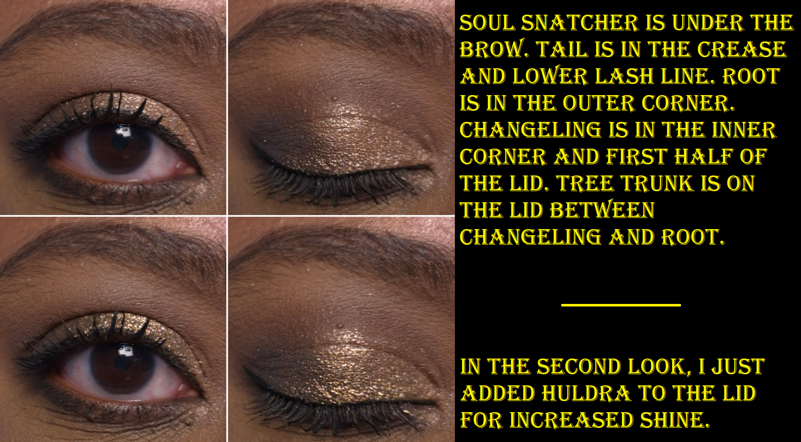
There has been a heat wave in Germany and other parts of Western Europe, so I have admittedly had very little motivation to do makeup testing while cooped up at home with no AC with back-to-back days of 90-101 degree weather. Plus, there have been family matters to deal with.
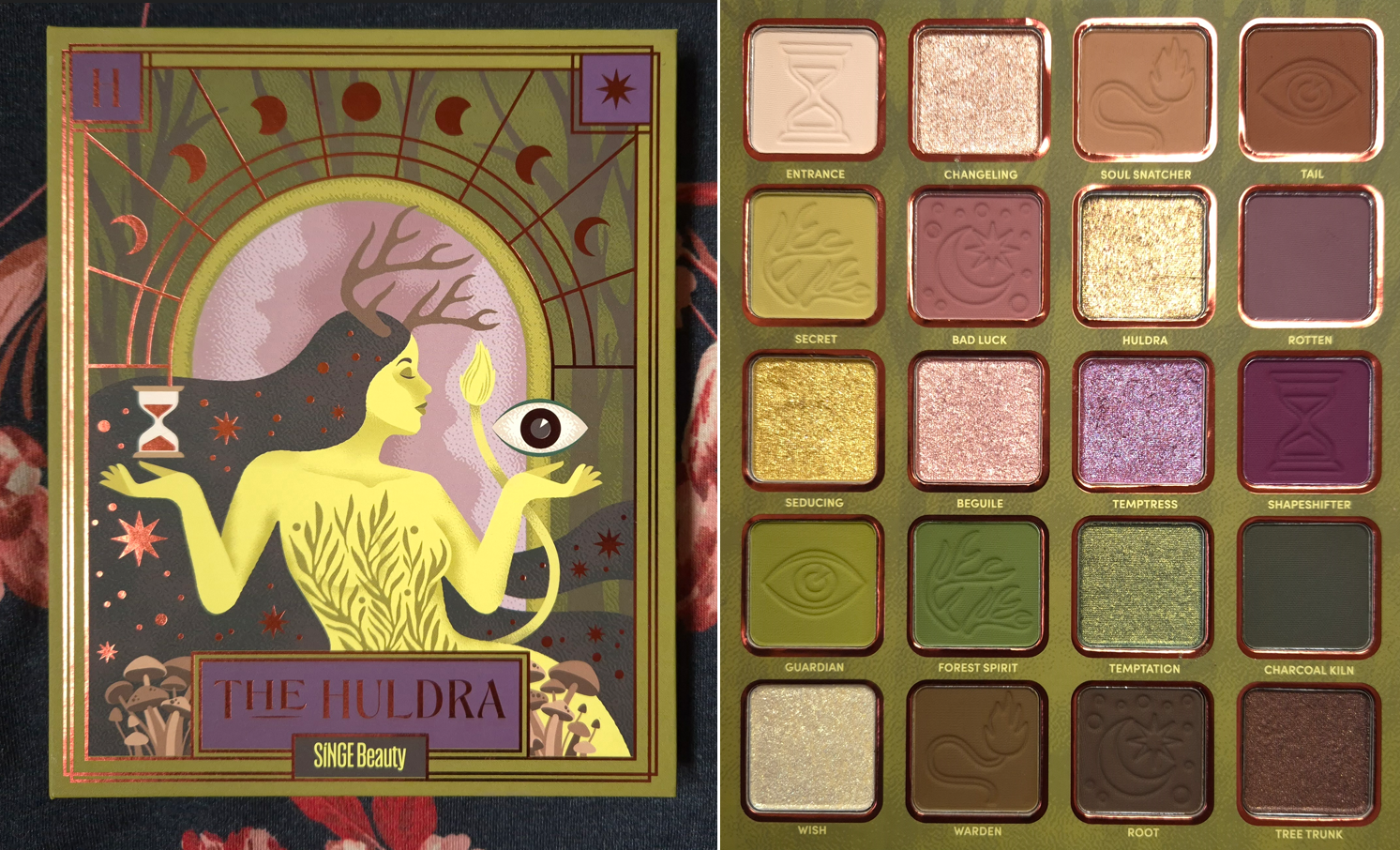
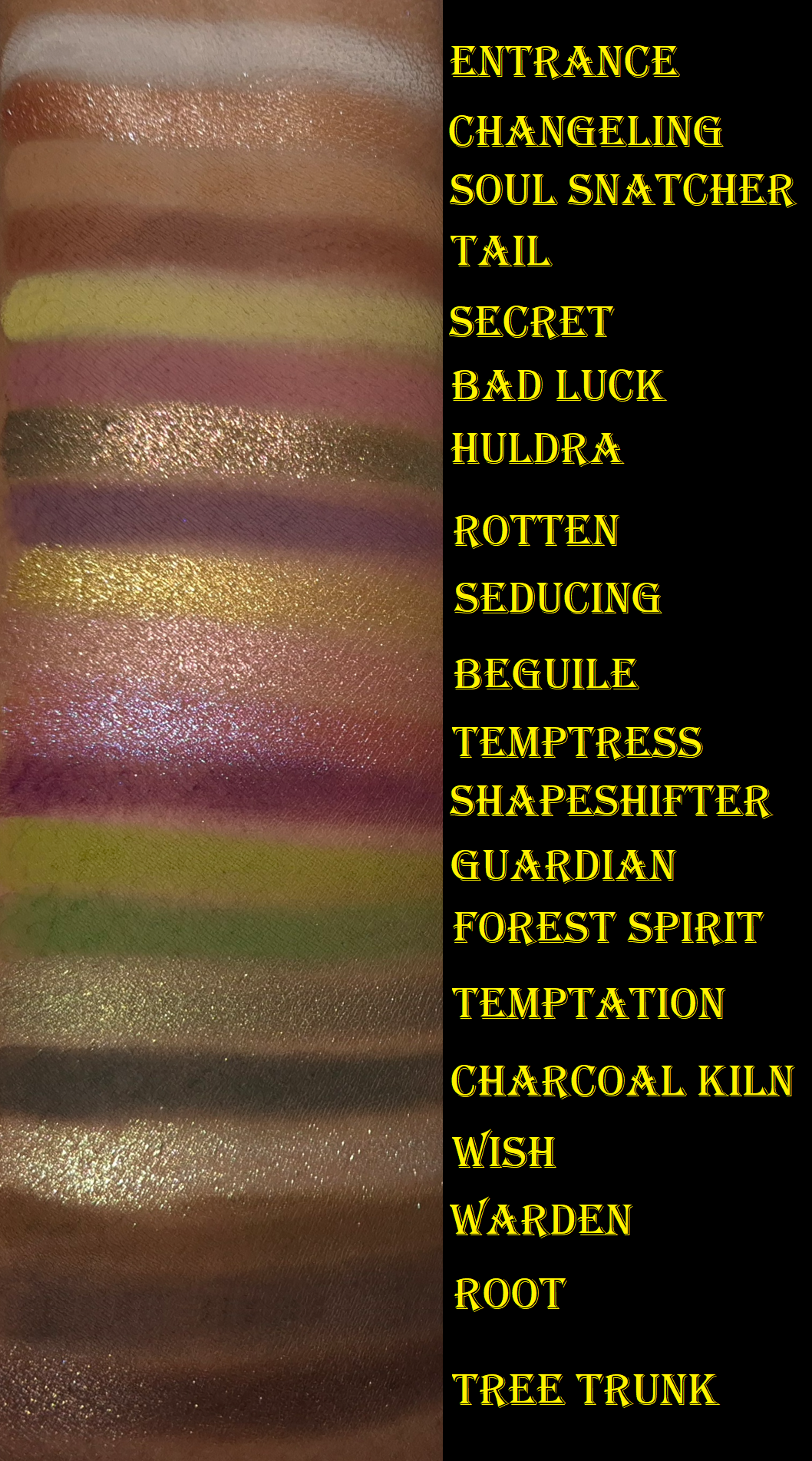
Instead of skipping this week’s post, I decided to at least show the swatches and eye looks of this palette. I am in love with the color story. It’s the purple-green palette of my dreams! The depths of the shades, tones of colors, saturation level, and pigmentation are all just how I like.
I believe this is Singe’s first eyeshadow palette that is talc-free. I haven’t used this palette that much yet, but I’ve been happy with the performance. These swatch amazingly and the shimmers are great. They don’t crease on me or fade. I don’t even need to apply the shimmers damp, except the ones that I want to stick to a smaller area and not have too much of a scattered look. The mattes are pigmented, but only so much adheres to my eye area with the Lisa Eldridge Liquid Silk Canvas as a base. So, it looks like I can build up the mattes, but a lot of it gets knocked back off my eyes. Essentially, some of the deepest smokiest shades can look less intense on me because of this. It ends up being a soft type of smokey, which works out because that has been my style lately. Ironically, Entrance and Secret build up quite well! I sometimes have issues with yellows and the white type of shades from Singe (and even Angie’s Odens Eye collabs) have always given me trouble in the past from either not adhering as well or being too sheer. So, I’m happy that wasn’t an issue this time.
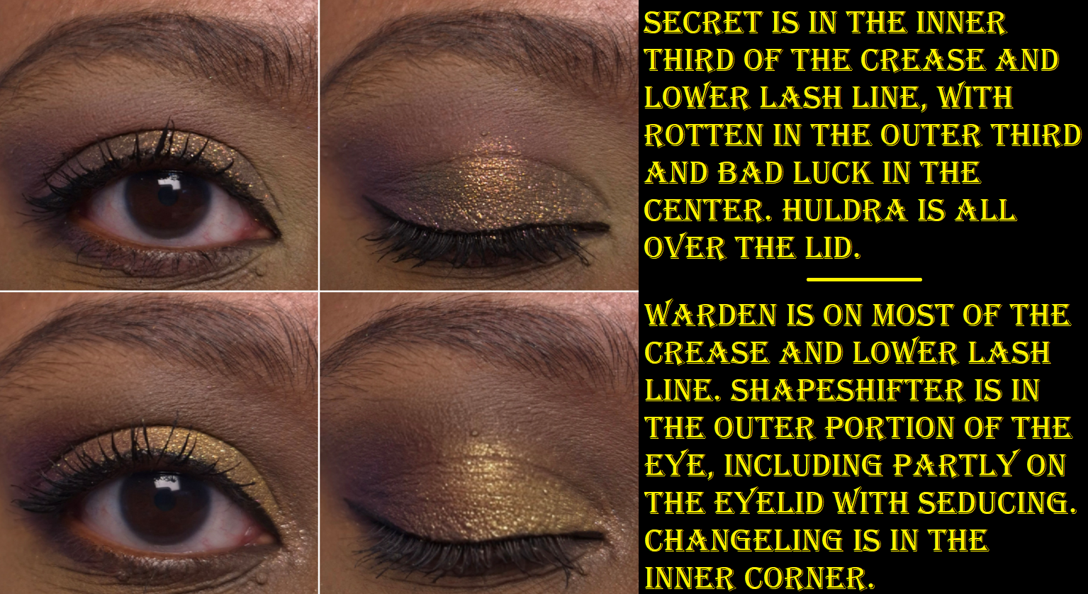
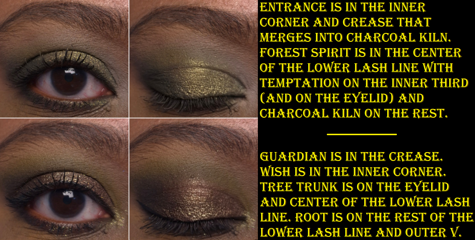
Huldra is the star shade in this palette. It doesn’t look as shifty in my eye demo photos, but in person, it’s very easy to tell that it’s a multichrome.
I’ve been spoiled by my high end and luxury eyeshadows that are super quick to blend. By comparison, the mattes take some extra time, but I think it’s still a reasonable amount of blending considering the pigment level. I’ve used mattes from other indie brands that were harder to blend than this.
That’s all I am able to say based on the short amount of time I’ve spent using this palette.
DISCLAIMER: Whenever I post about a brand, Influencer, or other public figure for the first time, I write a disclaimer to inform readers about any potential biases. Regarding Bella Beauté Bar, I am not affiliated with them in any way. I’ve heard nothing but positive things about their eyeshadow quality, so they’ve been on my list of indie brands to try for a long time. Regarding Noopur, I believe her Instagram account is one of the most well-known for indie brand swatches, especially multichromes. Her work is frequently in my feed, but I don’t know anything about her as a person.
I purchased this palette because purple and green are my top choices for colorful eyeshadows, and I love multichromes. All thoughts and opinions are my own.
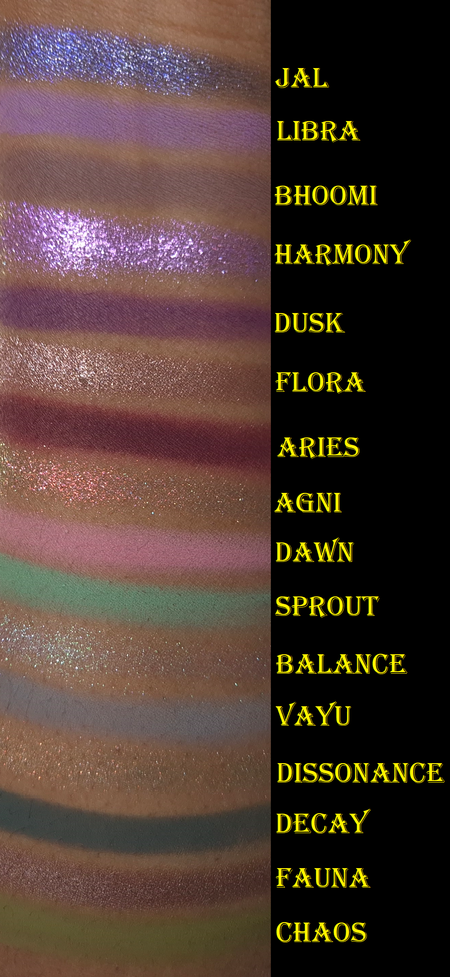
I ran out of room on my arm, so I moved Jal to the top. This is why the swatches aren’t completely in order.
I’ve owned this palette since the end of November 2025 and considering how infrequently I’ve been wearing colorful eyeshadows, I’m still surprised that I’ve used this a fair amount. Wanting to test this palette organically over time instead of forcing myself to apply it daily in a two-week period is why it has taken me so long to post this review.
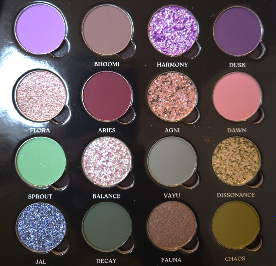
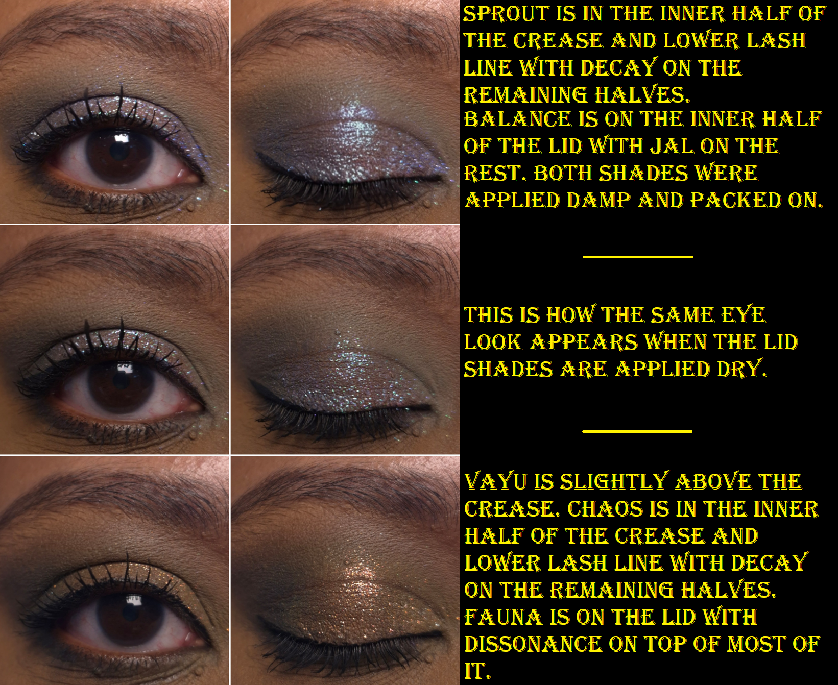
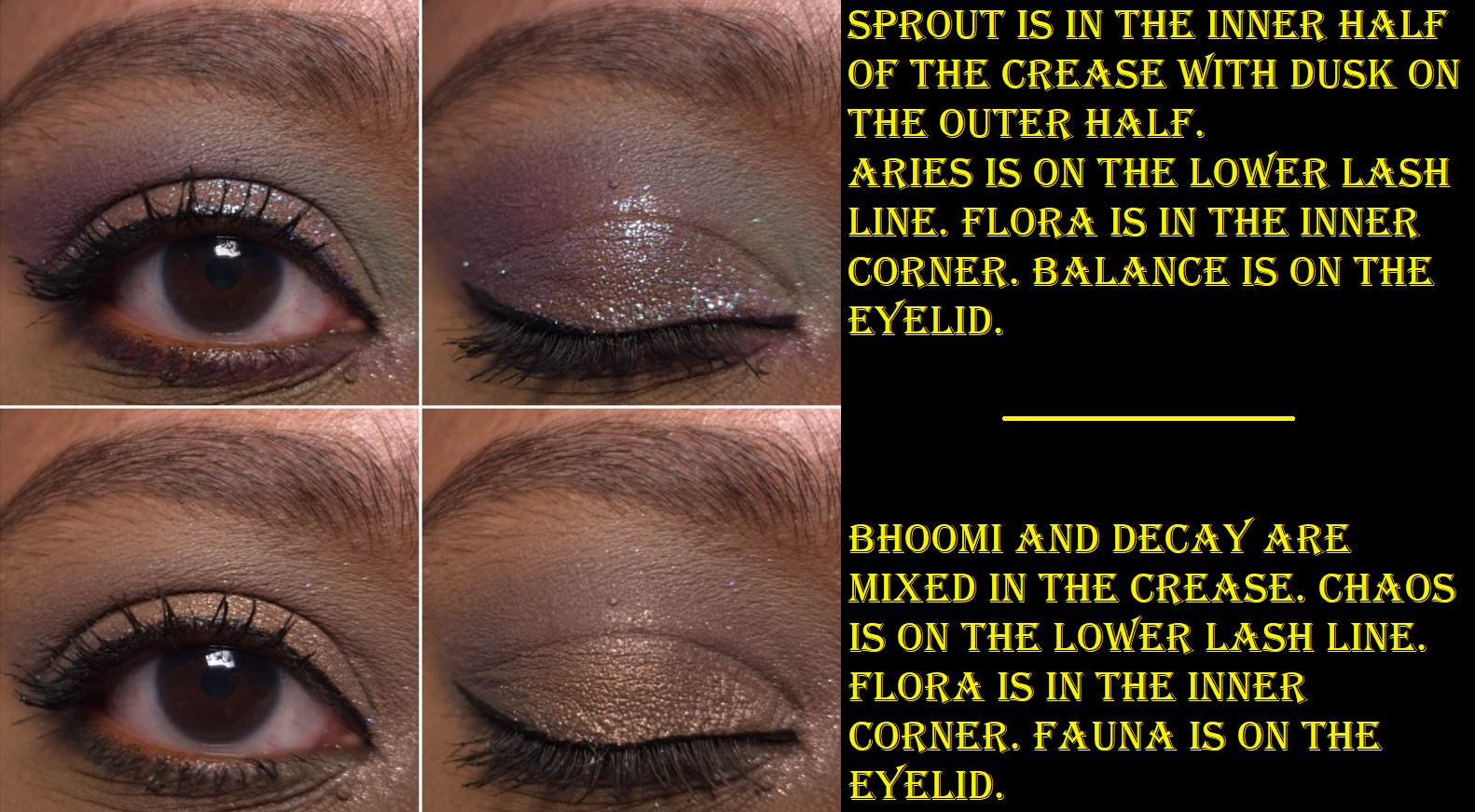
The Coalescence mattes remind me of Natasha Denona’s mattes, but with even more pigment. Some feel silkier (with some slip), some feel buttery, and all of them are soft to the touch. I am impressed by the kind of pastel shades not looking ashy on dark skin. However, they don’t build up and adhere as well to my eyes if I’m using my tried and true Lisa Eldridge Liquid Silk eyeshadow as a base. When I want to wear Libra, Dawn, and Sprout without them looking like sheer veils of color, I have to switch to the MAC Paint Pot or Milk Hydro Grip Eye Primer. The only other matte that needs special treatment is Aries because of its ultra pigmented nature. A little goes a long way, and it is slightly less blendable than the others. When I wipe my makeup brush onto my microfiber towel, it gets everywhere and has even transferred back off the cloth onto other objects before (brushes, fingers, etc). So, I try not to pick up as much onto my brush and build it gradually.
Although I was drawn to this palette for the greens and purples, I found myself mixing mattes together to try and turn them into the specific shades/tones I envisioned for my eye looks. These eyeshadows are formulated in a way that is actually pretty good at being able to do that. Some brands’ eyeshadows can sometimes be a little too good and turn a new color while I’m attempting to just create a gradient of one shade blending into another without lines of demarcation. Thankfully, I don’t have that problem with these, but I don’t try to just blend one shade on top of another when I’m mixing. I dip into both colors with my brush when I pick them up initially, so I can blend them into my skin at the same time. Then, I adjust it with additional product afterwards if needed.
All of the shimmers in the palette had small round foam coverings over them, which I assumed was to protect them in transit because they’re fragile. Imagine my surprise when I tried to rub my finger in Jal for the first time and nearly shifted half of the eyeshadow out of the pan! Thankfully, they can be pressed back into place in the pans.
This also happened with Agni, which is another of the flaky eyeshadows. Essentially, Flora and Fauna have traditional metallic and satin finishes. Flora has the benefit of being an impactful shimmer, but smooth enough for me to use it to brighten my under eyes. Fauna is even smoother, but is too dark to serve that purpose. I like having a neutral option theoretically, but since it’s so outnumbered by the more colorful options (and even the muted shades still pop), I find myself struggling to incorporate it into looks.
To minimize fallout, I can dampen my brush and use the Nyx glitter primer, but it still happens throughout the day. However, it’s not bad enough for me to consider it messy looking.
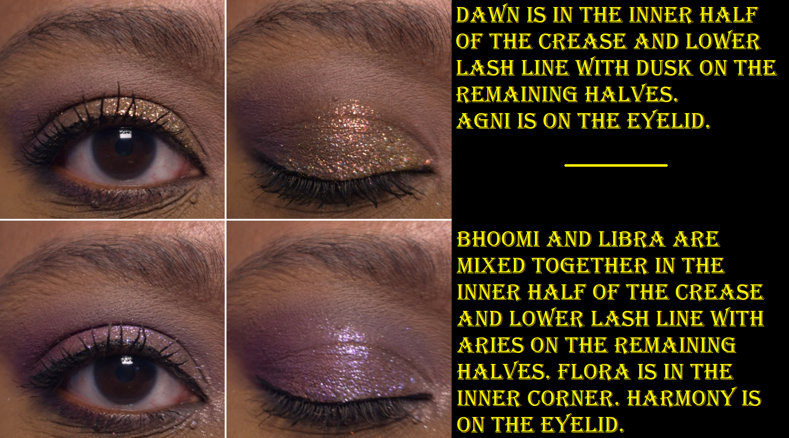
Harmony is described as having a “sheer purple base and shifts blue-purple-pink-peach with additional purple sparkles throughout.” I can see blue, purple, and pink as sparkles, but not as a color changing shift.
Agni is described as a “holochrome with a grey base and shifts pink-orange-gold,” which I agree with, along with Balance having a “super sheer base and a mix of green-pink shifting sparkles as well as blue-purple sparkles.” When I’ve tried to intensify the look of this eyeshadow and pack it on by wetting it or using glitter primer, I haven’t liked the look as much because it seemed like only the blue color grew bolder. I wish the shift was a bit stronger, but Balance is one of my favorite shades in the palette.
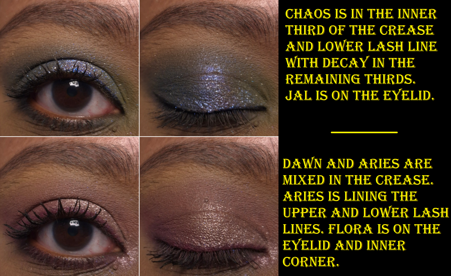
I have to admit that I was a bit disappointed that Dissonance, the “super sheer light olive base with silver sparkles and orange-gold shifting sparkles mixed in,” looks mostly just orange on me and not as green as it appears in the pan. It’s a pretty color, but I love greens and the only eyeshadows that read green on me are mattes: Sprout, Decay, and Chaos.
And then finally, Jal is a bright blue with silver sparkles. I’m not a lover of blue eyeshadows, so I didn’t intend to get much use out of this shade. When I think about it though, between Jal, Vayu being a blue-grey, Sprout being a minty-blue, Decay being a blue leaning green, plus the blue sparkles in Harmony and Balance, this palette feels like more of a blue palette than green. This explains why I sometimes get this sense of being unfulfilled when I use this palette despite the pretty colors and them having the sparkle intensity and impact that I like.
If the other Bella Beauté Bar palettes have this type of quality, I would happily purchase additional palettes in the future. The Coalescence eyeshadows, although able to be combined and tweaked, are not totally within my palette preferences. Part of my preferences is having ready-made colors available that I love, so that I can create looks quickly without too much thought. There are times when I do still enjoy playing with colors, which is why I’ve continued to reach for this palette periodically over the past six months. One of the great features of this palette is that it’s magnetic with finger holes in which to rearrange or swap shades. So, I still have an easy way to tailor the palette with other BBB shades or exchange them with standard eyeshadow pans (26mm) from brands like Sydney Grace, Clionadh, Devinah, Terra Moons Cosmetics, Fantasy Cosmetica, etc. The only thing to watch out for is that some of the brands overfill the pans (Sydney Grace mainly) so the mirror/inner lid of the palette could get messy from having eyeshadows press against it.
There are four pressed pigment singles that are part of the collab. They look stunning, but they were sold out on the Monolith-EU website when I was buying the palette, so I didn’t think about them again. I am still curious about how those differ from the shimmers in this palette, but I think I will pass on them anyway.
I haven’t mentioned Viseart since the last Eyeshadow Palette Ranking. One year after that post, I bought the Cashmerie Charmeuse palette on sale from the Irress Beauty website. I hadn’t heard of that business before, so I was nervous to shop from them, but there were no issues with my order.
Even though I’ve had this palette since October 2025, the bulk of its usage was in the beginning weeks of me getting it (riding on the excitement of being a new addition to my makeup collection). Of course, I’ve used it more recently as well to refresh my memory on how it performs.
I am so happy to report that the eyeshadow quality in this palette is as great as I expect from Viseart! There were a few years that I felt the quality had dropped (coinciding with the transitional year that Viseart started manufacturing in California, alongside France). I believe 2022 was when I started to regain confidence in the brand’s formulas and considered them to be stable again. Regarding their formulas, the brand prides itself on the fact that, “90% of the ingredients in our palettes are the same across the entire product range to create a range of color true shades for our global audience to choose from.” That being said, Viseart’s eyeshadows contain talc, including their latest launch called Lisa Says Gah x AQUA Étendu. This may be fine in the US, but they still manufacture in France and talc may be banned within the EU by 2027. So, changes to Viseart’s formula could be coming whether we the customers like it or not.
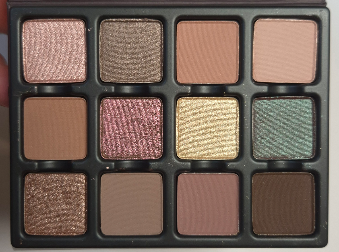
Before I move onto the finer details of this palette, I want to acknowledge that this type of color story usually does not interest me. I prefer high contrast looks on myself, so I tend to favor dark dramatic eyeshadows, bold colorful mattes, and sparkly shimmers. I cannot explain why I was so drawn to this color story when it has so many midtone/medium deep colors that will not show up as well on my skin, many of which are muted and had the risk of looking dull compared to the saturation of my skin. This color story is geared towards “soft looks,” which is rare for me to own, but I wanted it anyway!
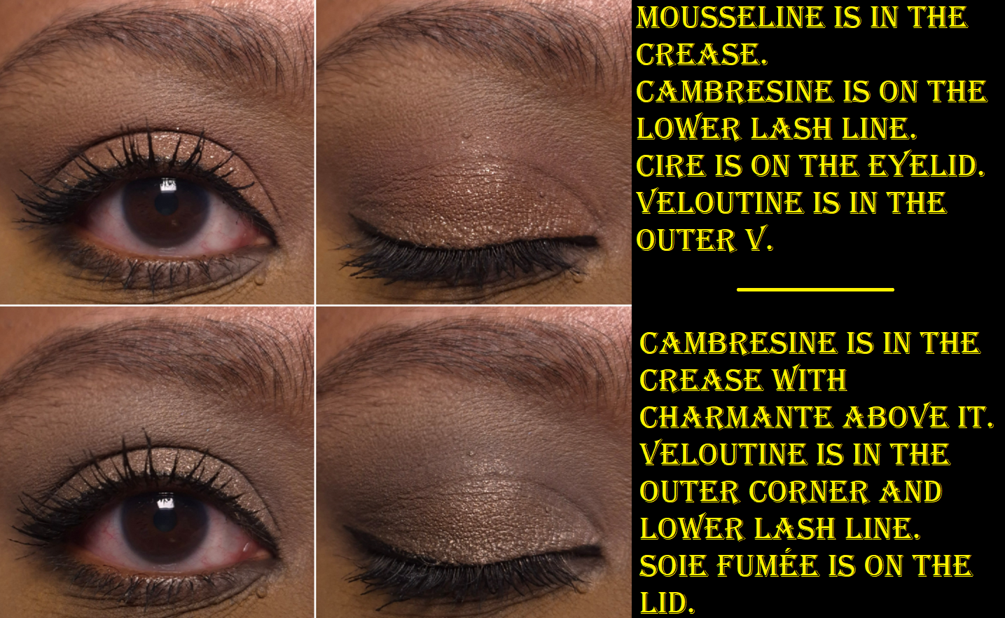
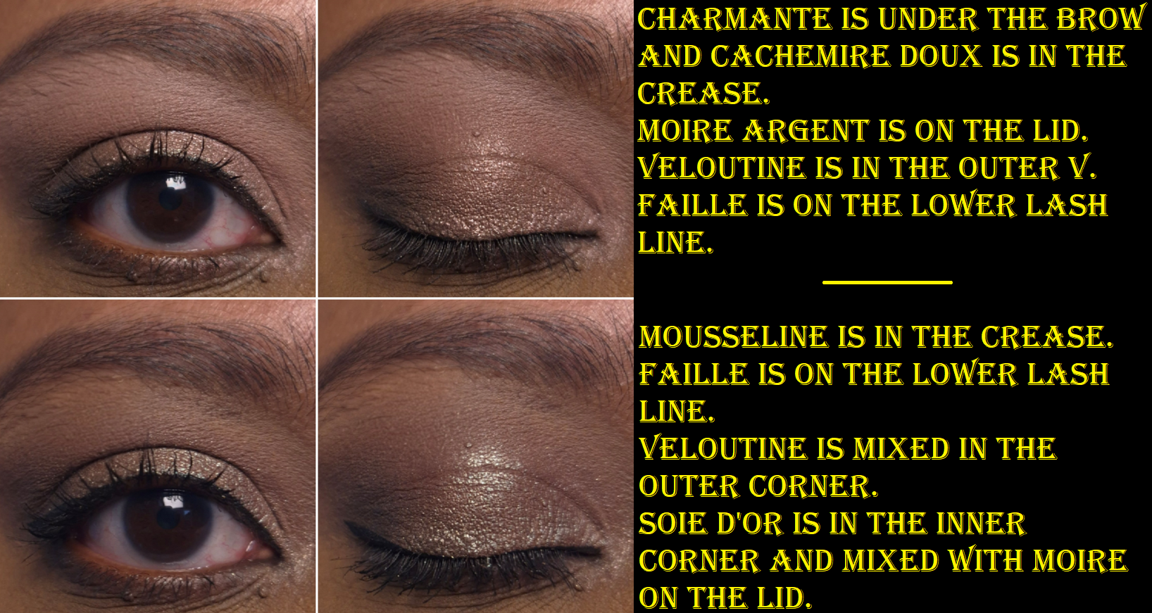
Veloutine is my only option for creating depth in the outer corner. It is described as an “espresso bitter brown,” so it’s not quite as dark as I would wish, but it still gets the job done. All the other mattes in this palette require very little effort to blend, so this one is a bit troublesome in comparison. It sticks a bit where it’s placed, so I rely on my workhorse brushes (mainly Sonia G) to make things look even. I don’t consider it a bad eyeshadow though since I can get the kind of results, seen in the eyeshadow looks, in a reasonable amount of time.
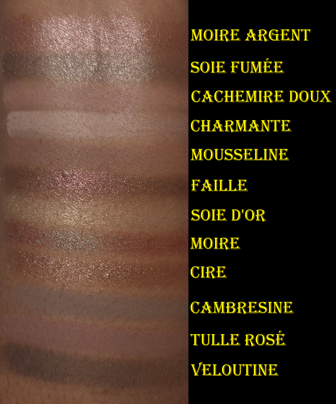
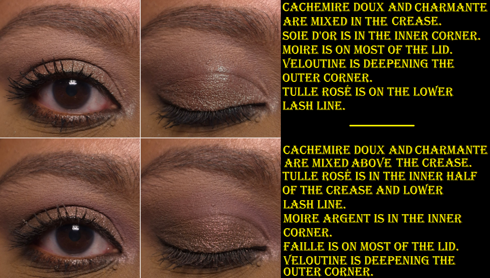
The two colors I rely on for brightening the inner corners are Moire Argent and Soie d’Or. What impressed me the most about Moire Argent is that it’s one of the few light pink shimmers that actually look pink (and not silver, gray, or white) on me. Since it’s described as a “lilac rose” perhaps the slight addition of purple is the reason, explainable by color theory.
I typically use Cachemire Doux and Charmante mixed together to brighten the area under my brows. Charmante is so whitish-pink that it only looks good on my warm medium-dark skintone if I’m doing pink or cool toned looks. Cachemire Doux is a little too dark to use under my brows by itself.
Mousseline, described as a “burnt plum,” and Cambresine, which has a “midtone greige stone hue,” are surprisingly darker on the skin than they appear in their pans. I use them in the crease, along with Tulle Rosé.
Soie Fumée has such a fancy sounding description as a “midtone smokey pewter thistle,” but I just think of it as a taupe color. I only use it when I’m creating a full-on cool toned look. The “light bark lilac taupe” is called Cire, and it looks brown on me. So, I use that one when want a neutral type of eyeshadow.
Faille and Moire are the most exciting shades in this palette, and both are listed as duochromes. I cannot detect a shift in Faille, as I only see a burgundy brown base color with purple shimmer. However, it’s still quite a pretty shade. I get some fallout from it, but not enough to prevent me from wanting to wear it. Moire is one of the most common duochrome eyeshadow colors, but I still love a classic! I have to admit that I’m a bit disappointed that it doesn’t stand out as boldly as I want, even when applied with a wet brush. It doesn’t compete with Verrerie from the Violetta Petit Fours quad, but not everyone wants their duochromes and multichromes to be attention-grabbers like I do.
In case anyone is wondering, here is how the new ranking would look like.
Ranking List of All the Viseart Palettes I Ever Owned:
Cashmerie Charmeuse satisfies me when I have a unusual craving for soft looks, mauves, mid-toned colors, and either cool toned or neutral eye looks. Although I won’t be using this palette often, the quality and performance make this a purchase I don’t regret! It pleases me that Viseart continues to be an eyeshadow brand that I enjoy and can recommend. I just hope they will be able to manage through the EU cosmetic regulation changes in 2027!
Thanks to the approaching deadlines over regulation changes in the EU, the Tom Ford Beauty brand has been reformulating a ton of their products across multiple categories. Today’s post will be covering the few that I bought from this year’s relaunches.
*DISCLOSURE: Non-highlighted links in bold blue font (Example) are standard non-affiliate links. Links marked in bold black font with a light blue background (Example) are affiliate links. Affiliate links allow me to get a commission if purchases are made directly using my link. Whether you click to shop through them or not, I appreciate you visiting and I hope you find the information I’ve provided to be helpful! In this review, the only affiliate links are for brushes through CDJapan. I have no affiliation with Tom Ford Beauty.
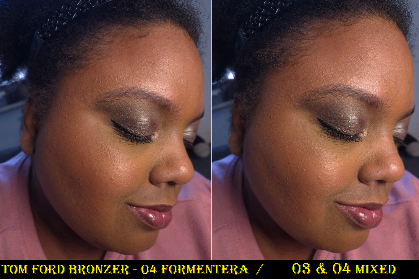
Tom Ford Soleil Bronzing Powder in 03 Panarea and 04 Formentera
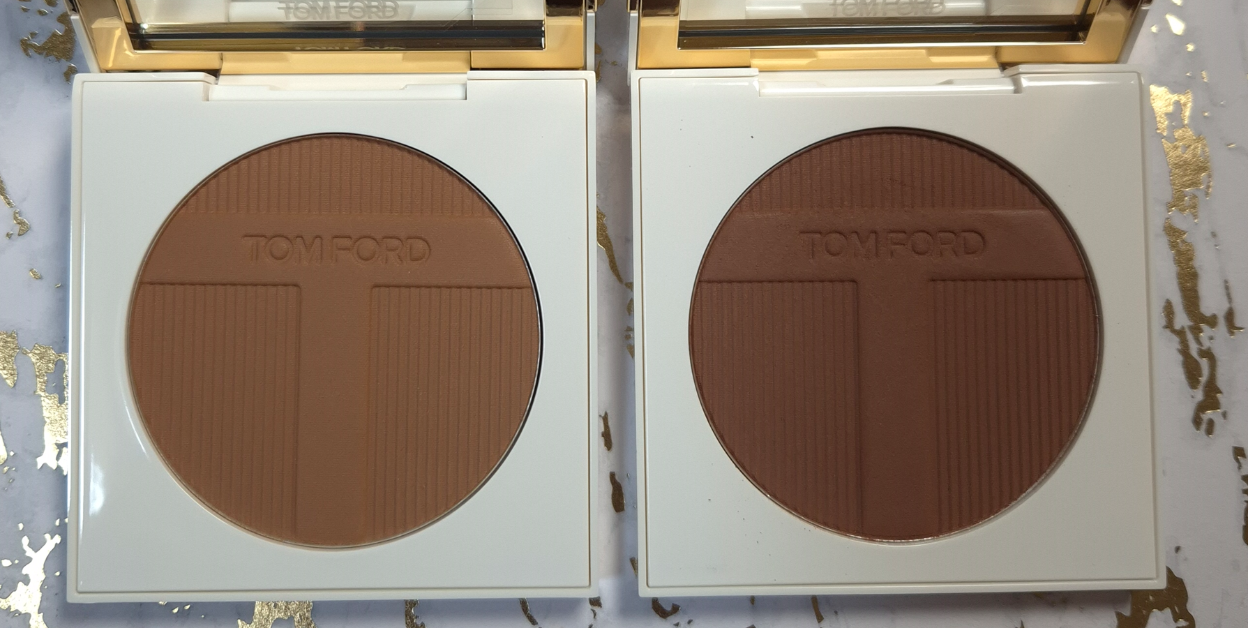
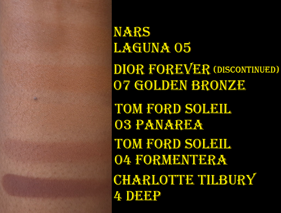
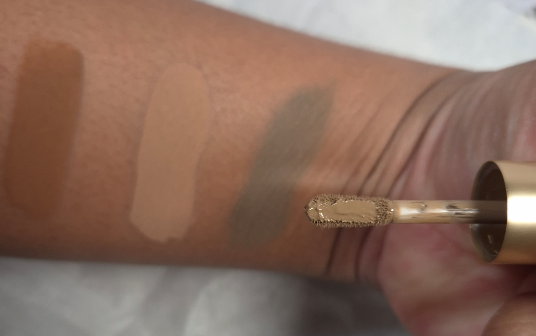
During the peak days of YouTube’s Beauty community, some of the most hyped up bronzers were the Benefit Hoola Bronzer, Charlotte Tilbury Airbrush Matte Bronzer, Physician’s Formula Murumuru Butter Bronzer, Hourglass Ambient Lighting Bronzer, Nars Laguna Bronzer, Guerlain Terracotta Bronzer, Tom Ford Soleil Glow Bronzer, and Marc Jacobs Beauty O!Mega Bronzer. Since then, many of those brands have expanded their ranges, including Tom Ford. I was so excited at the prospect of finally having a powder bronzer from Tom Ford that was deep enough to show up on my skin! However, the brand didn’t take inclusivity as far as I would have expected. There are only 4 options and the gap between shades 3 and 4 is huge!
Below are swatches of two of my lightest bronzers (that I typically mix with a darker bronzer in order to wear them) compared to Panarea. As seen in the photo, Panarea is nearly invisible on my arm. To jump from that shade to Formentera is wild, but even wilder is the fact that Tom Ford’s fourth bronzer is the darkest in the range. It’s significantly lighter than Charlotte Tilbury’s bronzer in Deep, which is also the 4th and last shade in her powder bronzer range. To be fair, Charlotte’s third shade option is about as light as Nars Laguna 05. So, that brand has a shade jump too, but she has bronzers that will work for someone at least several shades darker than me.
I thought these shades would be darker based on how deep they appear in the pan, but they still look lighter even after being built up. Panarea looks tan, but on me it’s like a beige-bisque. It’s technically warm, but can look almost pink toned in some lighting. Formentera looks like it should be a contour color, but it’s a red toned bronzer (though still not overly warm).
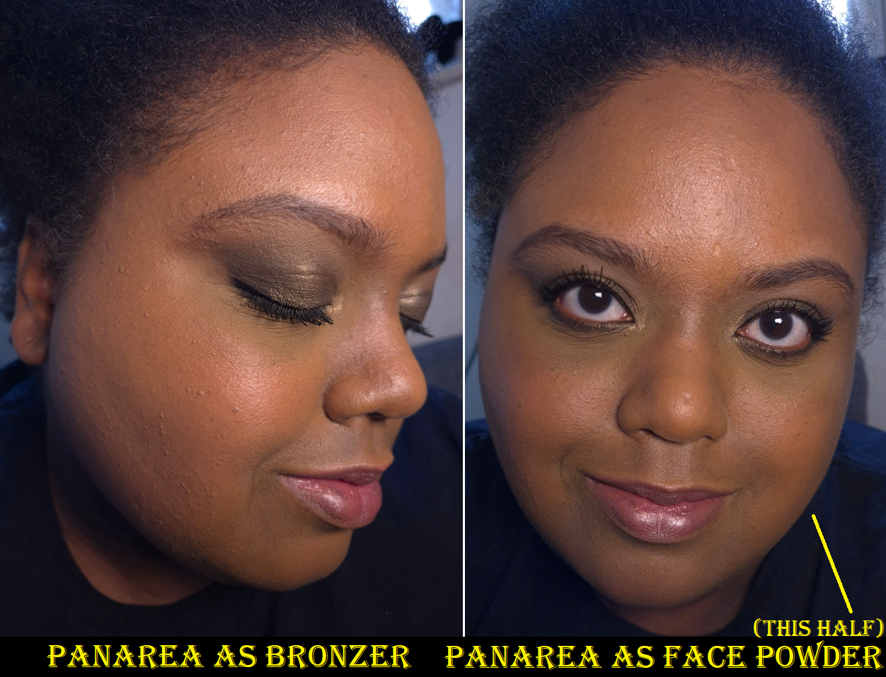
I’ve seen my friends who are darker than me try to use bronzers as face powders to find use for ones that were too light for them. I decided to give that tactic a try with Panarea and I can say whatever changes it made to my face were negligible. In a side-by-side comparison, perhaps my face was the tiniest bit more matte. Perhaps shade 03 changed the color of my face the tiniest bit, but not enough for anyone else to notice and my face didn’t stay matte for long. Essentially, this bronzer wasn’t good enough for powdering my face, over using my actual finishing powders that blur and/or add a beautiful sheen. So, I don’t recommend bothering to use it in this way.
Before I even attempted to use this as a face powder, the third shade was already getting hard pan. I thought perhaps this formula doesn’t like to be swatched or maybe these bronzers are hard-pressed, but Formentera is still perfectly fine and easy to pick up with my brushes. In just three weeks, the surface of Panarea feels hard and dry, which is such a contrast to the continued softness (verging on creamy) of Formentera. In the comment sections of YouTube videos, such as the one by Mo Makeup Mo Beauty on the Soleil Collection, a few people described having issues with the performance of Panarea too. So, perhaps there’s something off with this batch.
The Soleil Bronzers are unscented, have a matte finish, and the powder consistency is fairly thin, though not as thin as Victoria Beckham or Charlotte Tilbury. These are pigmented, but the amount my brushes pick up ensure that I can build up sheer layers of product and not worry about overapplying.
The amount of kickup is determined by the brush used. My first instinct was to test them with some of my go-to bronzer brushes, which are the Bisyodo B-F-05 Perfect Fit Brush, Number Eight Face 08, Sonia G Smooth Buffer, and Rephr Kōyō brush (though I use Kōyō more often for blush). I got minimal kickup with all except the one by Number Eight.
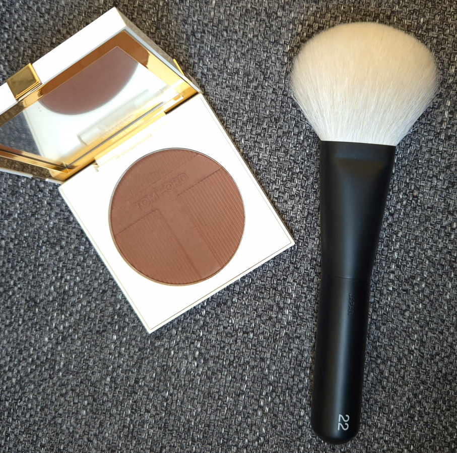
It occurred to me that I should try to use the bronzers with the Rephr 22, because it’s considered by many to be the closest natural hair dupe for the highly regarded original Tom Ford 05 Bronzer Brush. For those that like very diffused bronzer applications, these two are a great pairing. However, the Rephr 22 gave me the most kickup.
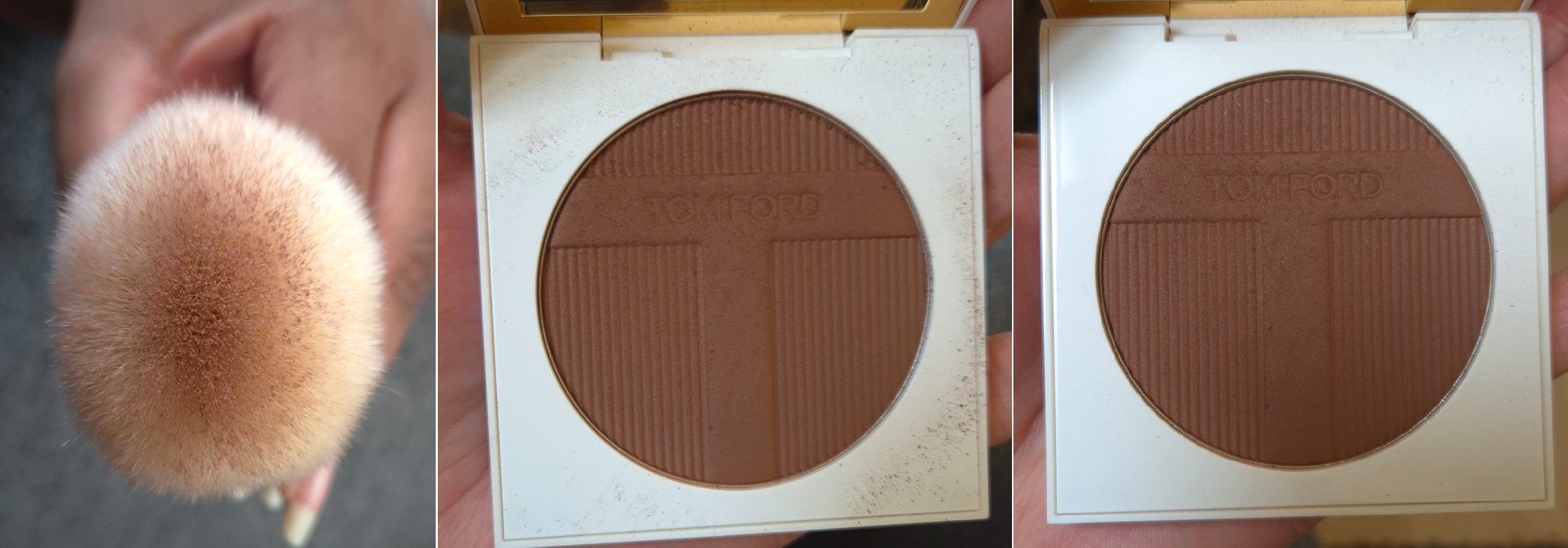
The first of the three pictures is a demonstration of how much of the Rephr 22 gets coated from two dabs into the pan. A smaller area in the center will distribute the bronzer onto the face, while the surrounding bristles with less or no product at all will help buff. The middle photo shows how much kickup is left after applying bronzer to just one side of my face. I wiped the surface of the compact before applying bronzer to the other side of my face with the Rephr Kōyō instead, so the third picture shows how little kickup there was by comparison.
Longevity isn’t an issue with these. The Tom Ford bronzers are decently blendable, but I have even more skin-like bronzers or ones that give more of an airbrush finish at better prices too. So, I like the bronzer, but I still feel like I overpaid, even with the 20% discount and reward points used. This might have been a different story if the bronzers had more of a glowy finish, which would make them more in line with my preferences.
Formentera definitely shows up on me, but I’m very picky about red-toned bronzers. So, I have tried mixing Panarea and Formentera together. While I like the results, I’m at the point in my makeup journey that I no longer wish to bother combining bronzer shades. I just want to carry a single compact with a color that works easily without me having to think about the ratios or worry so much about blending it well enough. With the Victoria Beckham Bronzing Brick, equal amounts of both shades works perfectly for me. When I try to mix the Tom Ford Bronzers, I have to pick up enough of Panarea to lighten Formentera, but still keep it dark enough that it’s able to be seen on my skin. On top of that, Panarea’s hard press and hard pan issue makes the number of necessary swipes inconsistent. Sometimes I need to dig into it more than other times. Plus, mixing both of them together doesn’t help remove that feeling of me having overpaid! I have at least figured out that I am happy with how Formentera looks if I’m wearing one of my more yellow-toned foundations. If I’m using a foundation that has stronger orange tones and/or is slightly darker than my current skintone, then the bronzer makes me look too red for comfort. So, I can keep that in mind too.
Too Faced has six options with two that are darker than I need. MAC has 10 options in the matte finish and 5 in the radiant finish in a range that also goes beyond my skin’s depth. Too Faced (as of now) and MAC are Estée Lauder owned brands alongside Tom Ford Beauty. So, it’s not as if additional shades couldn’t be made. Someone decided to keep the range of this premium brand limited.
In the past, the Soleil Collections were limited edition. I cannot imagine that all the bronzers, highlighters, and eyeshadows released aren’t permanent items, but perhaps the intent is to expand upon them every summer going forward. However, I don’t foresee myself buying any unless the brand releases some immaculately perfect shade for me. This is one of the reasons I didn’t buy one of their reformulated highlighters. Based on other reviews I saw, Amalfi may be similar to Reflects Gilt (which is too light for me) and Portafino could be close to the bronze shade from the Shade Illuminate Highlighting Duo in Tanlight. Just like I said in my Best Highlighters Showcased post, I’m so happy with Tanlight that I don’t feel the need to buy anymore highlighters from Tom Ford…unless something happens to mine.
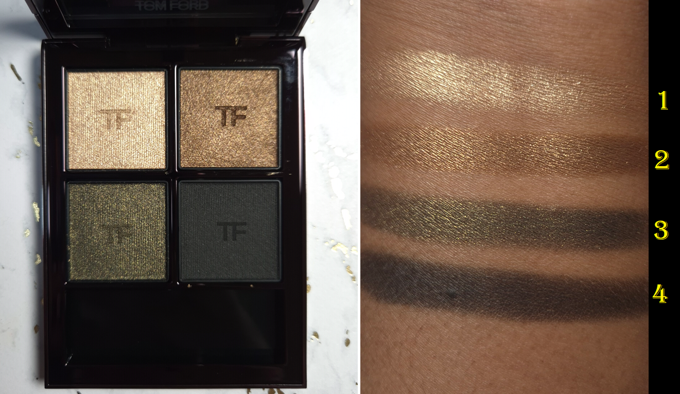
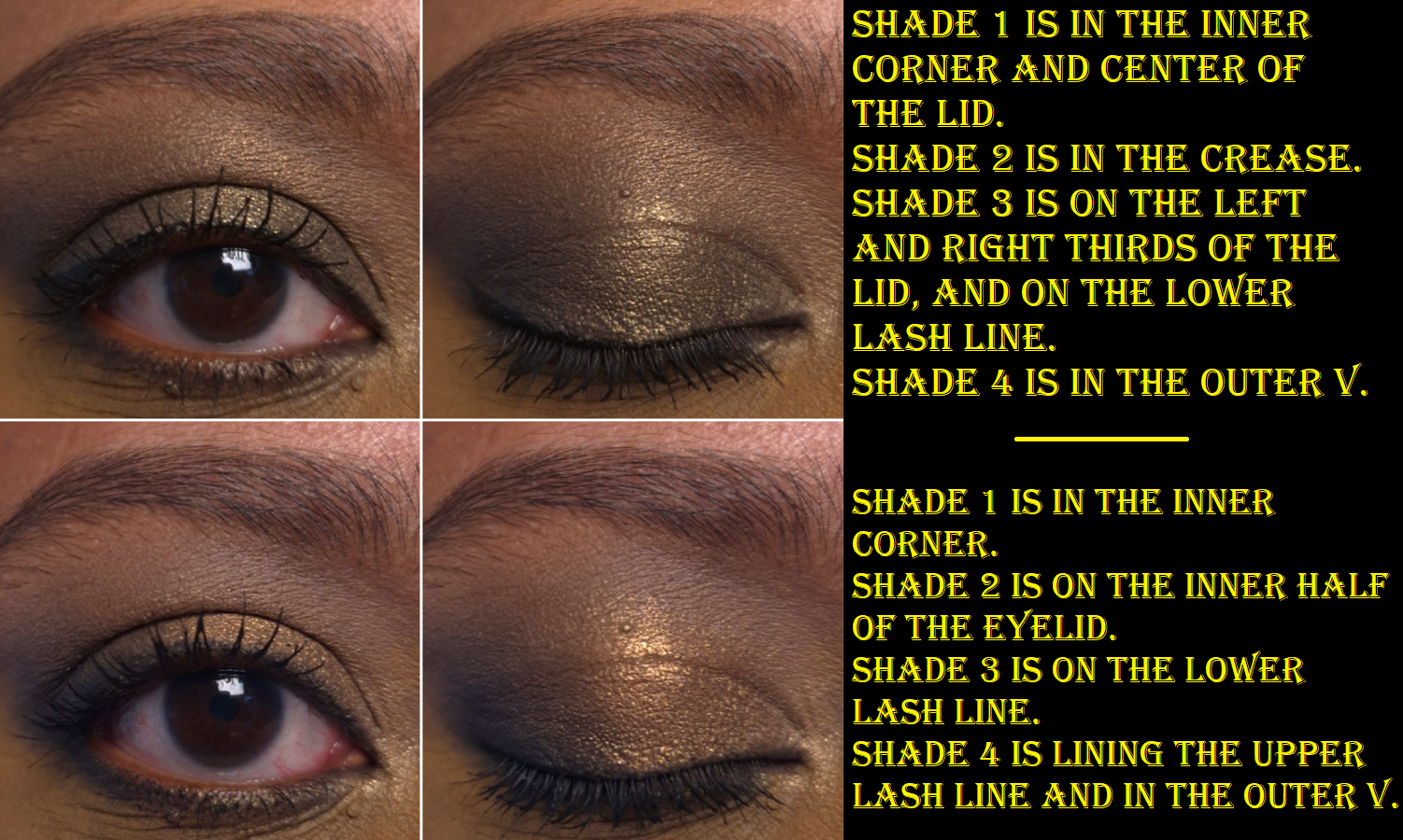
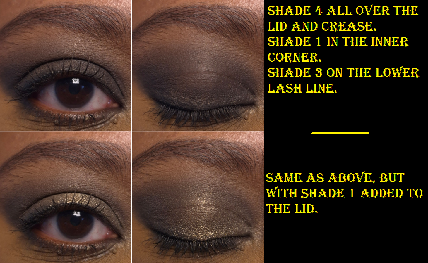
Tom Ford Eye Color Quad Crème in Olive Smoke
I was incredibly tempted to buy Olive Smoke when it first came out, but reviews were mixed. I was even more tempted when it was being discontinued and listed on sale for 50% off. Since all of the brand’s quads have been newly reformulated, I hoped that meant I’d have a better experience with the new version of Olive Smoke than NikkifromHR had with the previous formula.
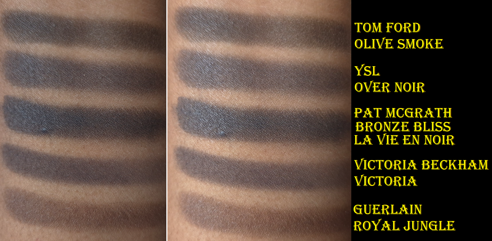
I am happy to report that I get very minimal creasing with these reformulated eyeshadows. I’ve tested these with and without primer (my primers of choice being the Lisa Eldridge Silk Canvas and MAC Paint Pot). Without a primer, the creasing is a bit worse, but good enough for me to still be satisfied with how the eyeshadows look throughout the day. These eyeshadows are very pigmented, but still buildable. The way the black eyeshadow feels and performs is what I think Guerlain was aiming for (but failed) when they made the black shade in their Royal Jungle quad. It’s not as wet feeling as the black eyeshadow from Pat Mcgrath’s Bronze Bliss, but TF’s black is truer (less blue).
The reason I’m so focused on the black shade is because it’s the one I rely on to create depth, and I like black eyeshadows that are rich in pigment, but not hard to control. I’ve had black eyeshadows that were patchy, not dark enough, or so pigmented that they were hard to blend. So, whenever I come across one that works just how I want, I’m happy. The one in this palette is like that.
The pale gold and dark gold aren’t very exciting colors, but they fit well with the Olive Smoke theme and are necessary for adding brightness, along with taking the eye looks in a less smokey direction whenever that’s wanted.
The Olive color is the most appealing shade. It’s what drew me into this palette because of how infrequently greens are featured among luxury brand eyeshadows. 2025 seemed like the year of the green palettes, but there were still less around compared to years when pinks, blues, or purples were the “it” colors for that year. This is a deeper tone of Olive than I typically see. As is typical of Tom Ford, the shimmer is smooth and reflective, but not intense, dramatic, or sparkly. There is an elegance and refinement to these eyeshadows, which is something I want sometimes, but not all the time.
The pigment is there. The formula is good. I’m relieved that despite having a bit of slip, these don’t crease like crazy. They don’t fade. There’s no fallout. I’m happy to know that Tom Ford’s Crème formula is good, but if I’m going for a sophisticated eye look, I still don’t think any of the brand’s eyeshadow ranges surpass their Wet/Dry a.k.a Soleil/Lumière formula. My issue has always been that they rarely make color stories in that formula that interest me. In fact, that’s one of the biggest issues I have with Tom Ford. The eyeshadows in the quads either lack a deepening shade, are too similar in depths, too similar of colors within the same quad, or the color story is too “safe.” So, even if the formula was in my top 3 favorites (which it is still not), there are so few that I’m interested enough in to purchase.
Because these eyeshadows aren’t fully within my preferences, the price rarely feels worth it. Comparing this Crème formula (which I think is still better than the standard/Runway) to other luxury and designer palettes, there tends to be a standout feature in addition to have an option of costing less.
Tom Ford Quads – €85 Victoria Beckham Quads – €84 Prada Quads – €82 Guerlain Quads – €75 Dior Quints – €73 YSL Quads – €69 Pat Mcgrath Quads – €69 Chanel Quads – €66 (not limited edition)
VBB Quads have one shimmer that is practically like a pressed version of Lid Lustres and the best discount is 25% off. There is also the option to get a refill, which is naturally going to cost less. The Prada quads have a cream to powder formula that I love, in addition to the option to get a lower priced refill and/or 20% off. The Guerlain Quads I only find special when they are not in eyeshadow pans and I’ve seen them listed as high as 40% off (the older quads). YSL Quads have some of my favorite formulas and I’ve seen them close to 50% off. Pat Mcgrath Quads sometimes have the “special” baked shades and can be up to 40% off depending on the type of deal there is going on.
So, when I see the kind of prices I can pay for quads with formulas or features I like even more, I always feel like I paid too much for what I got from Tom Ford. To be more accurate, I felt like I paid what I should whenever I purchased Tom Ford from a CCO/CCS (Cosmetic Company Outlet). Those are owned by Estee Lauder and they sell out-of-season beauty products, like Tom Ford, for up to 40% off or sometimes there are even better bundle deals.
Since I no longer have access to Tom Ford products at these kinds of prices, whatever I do end up buying has to be something I really want, such as the Olive Smoke Palette I’ve been pining over since early 2025. This is ultimately why I did not buy any of the Soleil Eye Quads, despite that being my favorite of the three types.
I still want to continue my eyeshadow ranking series, and I’ve had Tom Ford on the list for a long time, but I never even reviewed Leopard Sun, nor the limited edition quad I bought before the reformulations (Electric Cherry). I also forgot that I technically had a mini review in the May 2022 Purchases Reviewed post featuring African Violet, Photosynthesex and Honeymoon. Now, a ranking doesn’t seem all that relevant considering 5 out of my 6 Tom Ford quads have been reformulated or discontinued. If anyone is still curious, it would be as follows from favorite to least favorite:
Honeymoon
Photosynthesex
Olive Smoke
Electric Cherry
African Violet
Leopard Sun
I don’t care that my version of Honeymoon is very old by now. I didn’t use it enough to be worth repurchasing in the new formula.
I hope this has been helpful, or at least an interesting discussion. Thanks for reading!
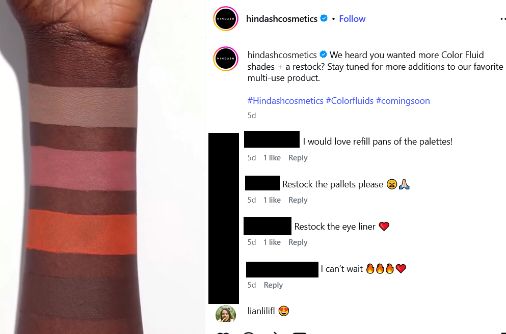
I’ve been using the Heroline as my sole liquid eyeliner since at least October 2025, but it took so long for me to complete this review because of how infrequently I reached for the Color Fluids. Powder products have always been my preference, and I basically have the Color Fluid shades within my Beautopsy Palette. So, I tend to reach for the easier-to-use powders over the more advanced liquid form. What swayed me into buying products I may not get much use from were all the gorgeous looks Hindash created and shared on social media. The way the Color Fluids mixed together and the finish on the skin is not achievable with the powders alone. So, I gave these a try, and I don’t think I regret it.
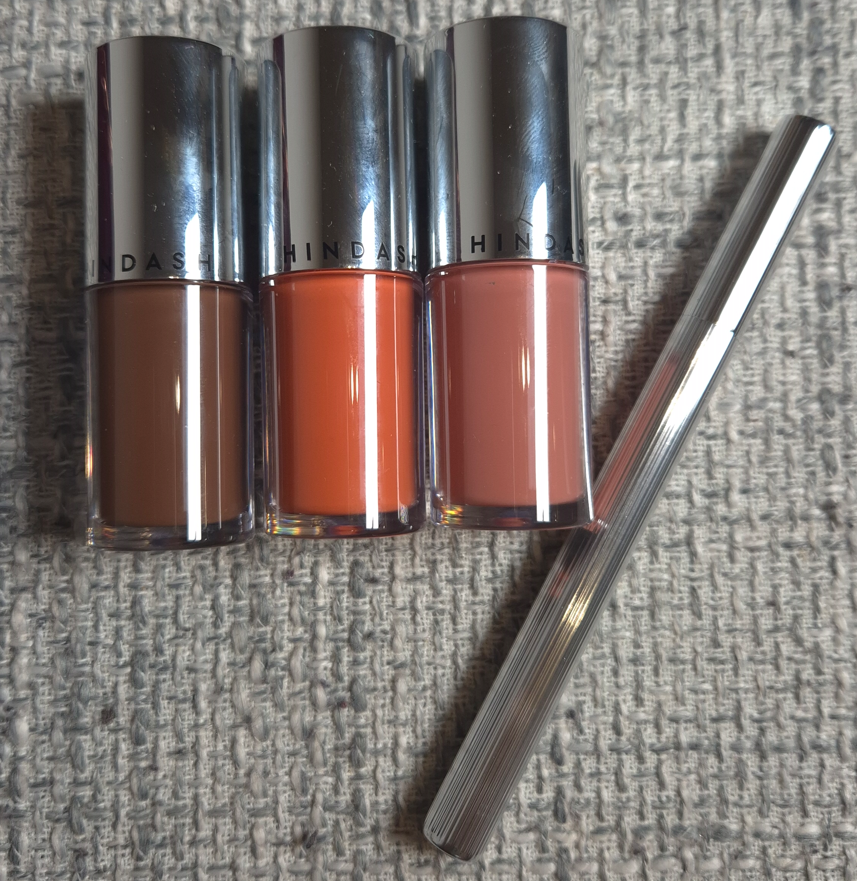
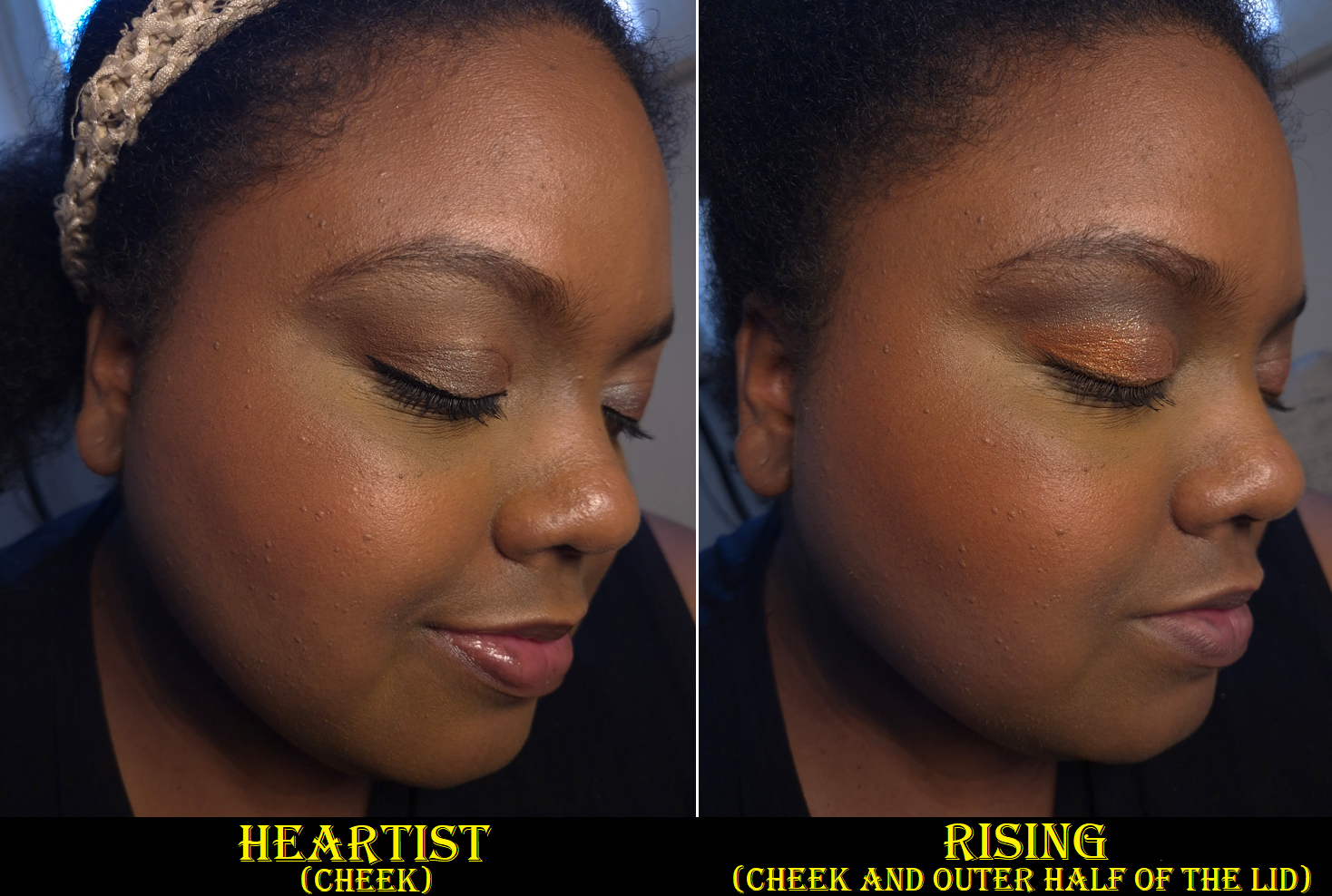
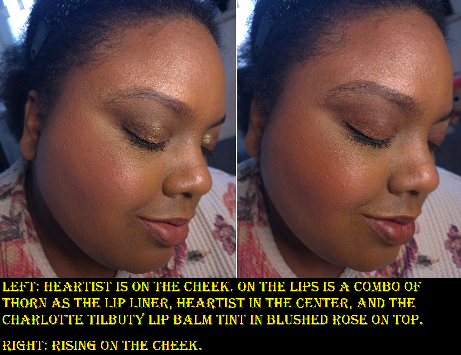
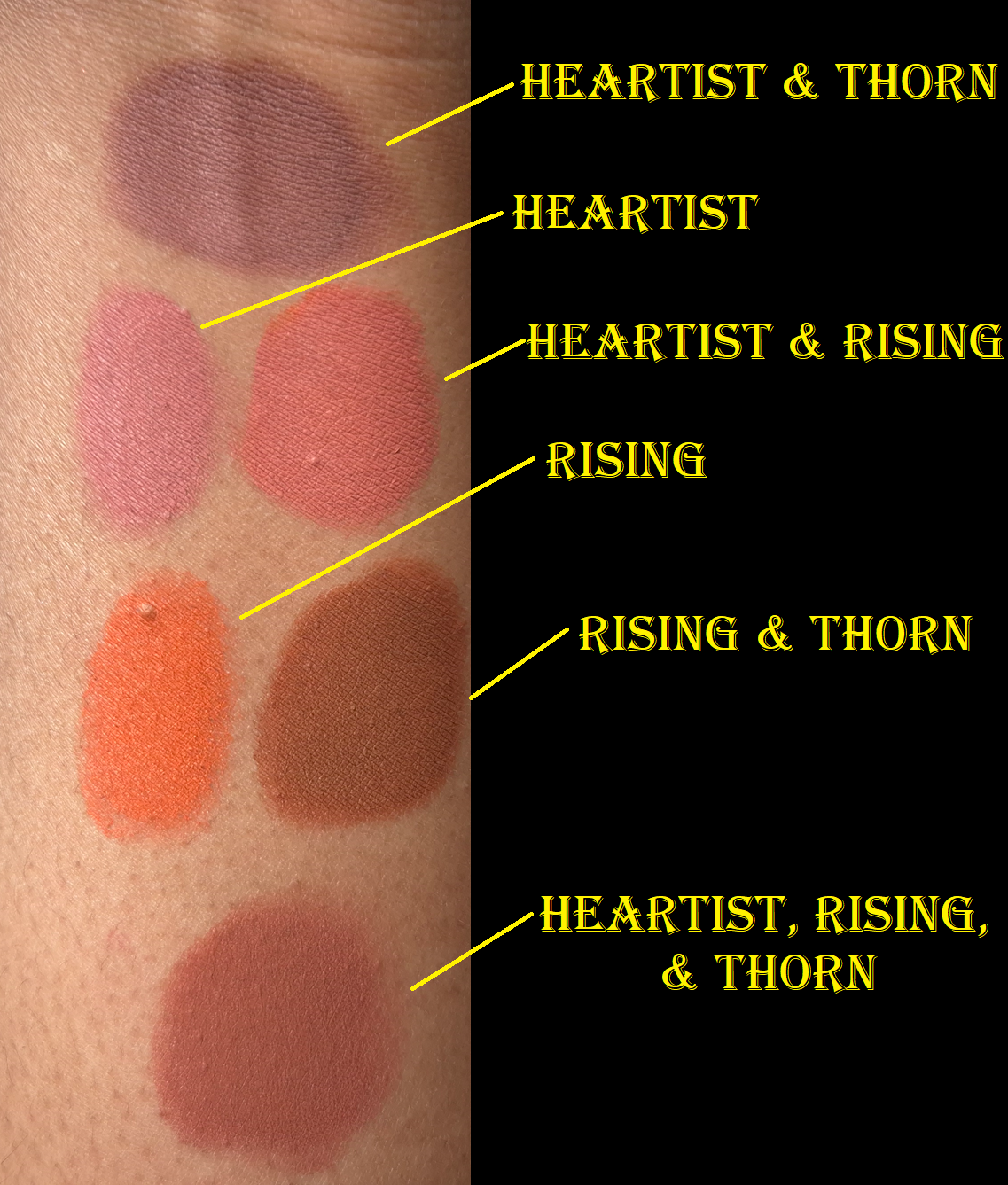
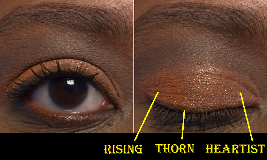
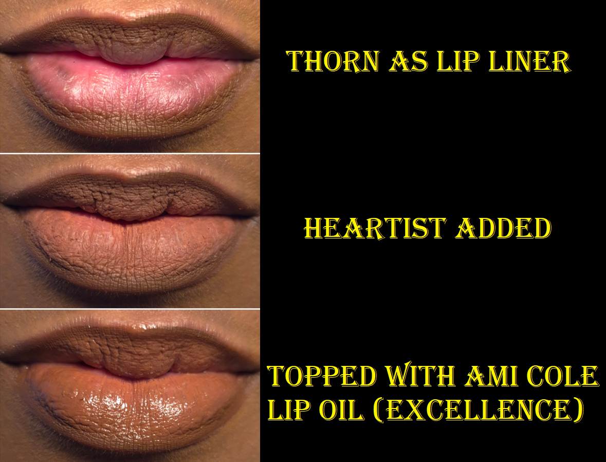
Hindash Heroline and Hindash Color Fluid in Thorn, Heartist, and Rising
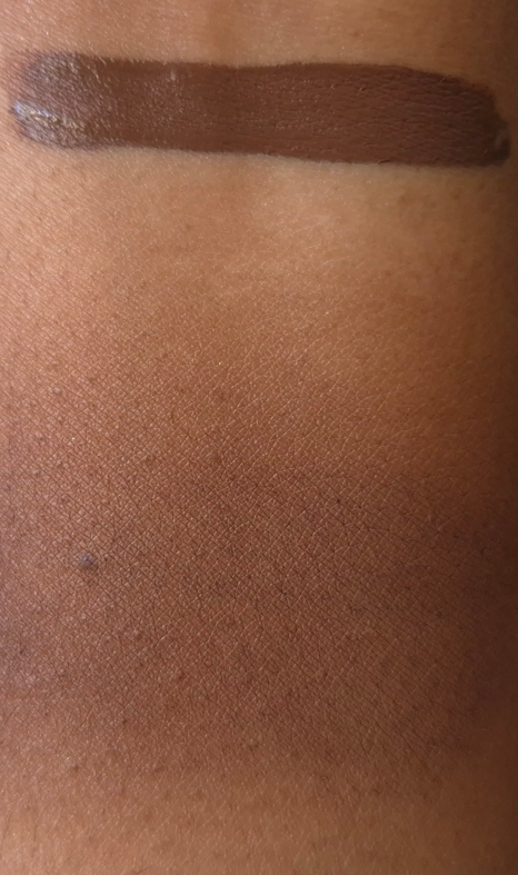
Thorn swatch via applicator and swatch blended out with a finger.
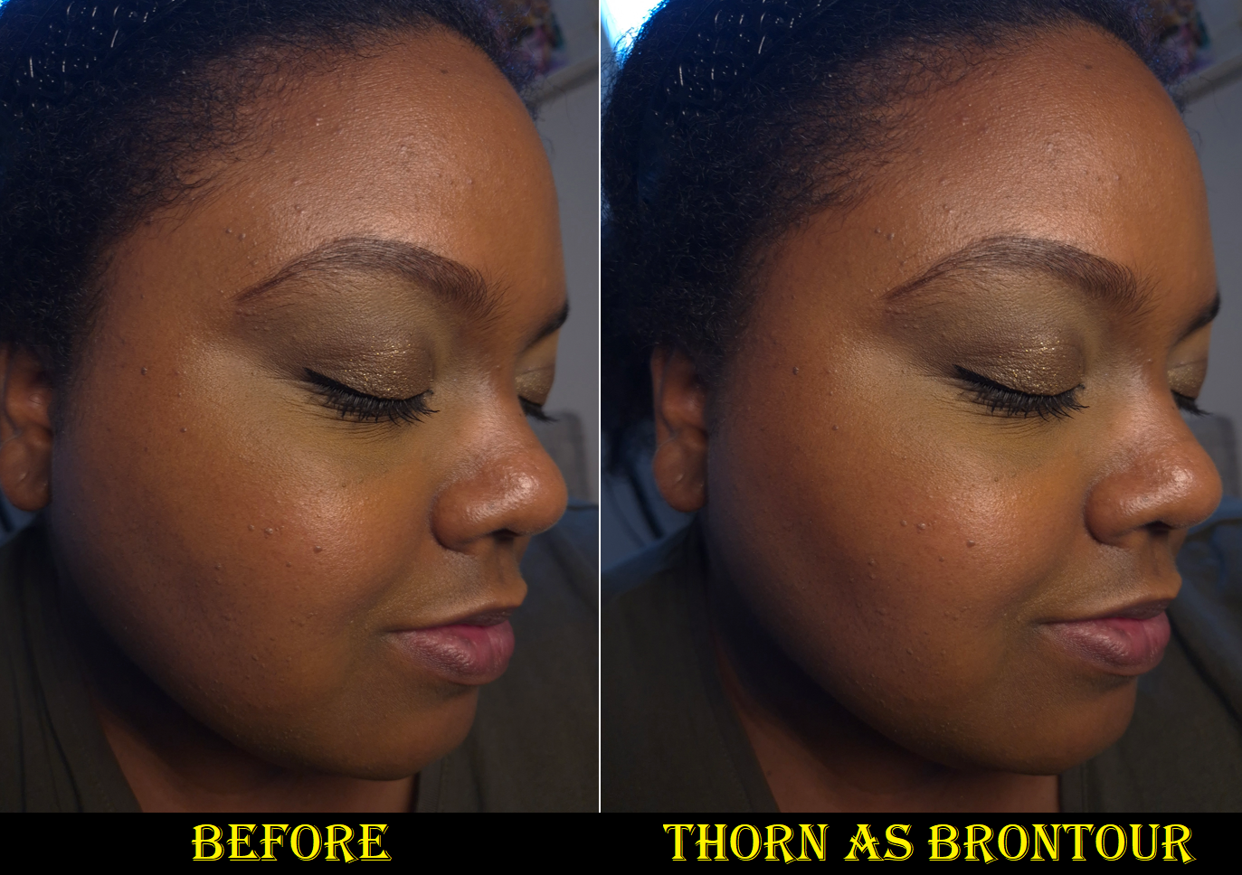
I can apply the Color Fluids directly to the face and then blend them out, but there isn’t a large amount of time to work with them before they set. Applying one to a makeup mixing plate, or the back of my hand, and picking up a smaller dab of it with my brush is the easiest way to ensure I don’t overapply. Thorn is a beautiful color as brontour, but it’s a bit deep. I would only use it when I’m darker (like in the photo above taken a year ago) or when I want a more intense bronzed look.
To make Thorn even more natural looking and easier to blend into the skin, the brand recommends mixing it with a base product (foundation, skin tint, etc.). I’m too lazy for that, and would just reach for any of my current favorite bronzers, instead. I still thought it was important to mention that there are ways to sheer out this product and lighten it by utilizing additional products and steps. The Color Fluids are fantastic for makeup artists and minimalists, but they might take more effort than the average consumer will want to make. I don’t feel that Hindash’s products are too difficult for beginners to use, but I believe the more advanced at makeup someone is, the more likely they are to appreciate the brand’s formulas. I like knowing how versatile the Color Fluids are, even though I admittedly don’t use them to their full potential. I’m often rushing through putting on my makeup, so I try to keep the amount of mixing I need to do at a minimum. However, I absolutely wish I had this product when I was getting married and looking for a good product for contour underpainting. My wedding and other major events are the only time I will really sit down and play with colors to try and get the absolute closest shade matches and most blended natural-looking base.
TL;DR: These products work for people of all skill levels, but they are best suited to makeup enthusiasts and makeup artists. People who enjoy playing with makeup are most likely to love the Color Fluids, but they might not have the time for it and prefer to reach for other products that are quicker and easier to use.
As blush, these are so quick to blend in and they last all day without fading. Even if I wear my hydrating skincare and foundation, these still set down on their own without powder. These are shimmer-less shades, but some of the glow from the products underneath are able to come through, preventing my cheeks from looking dry regardless of the matte formula. I consider them to be matte because, as far as I can tell from the ingredients, there are no shimmer or glitter particles and the mica just adds a kind of sheen and some reflectivity. Beautylish eventually added the liquid highlighter, Boy Tears, to the Color Fluid category, but they used to be considered separate items. This leads me to guess the brand will eventually launch additional shimmer options, but Boy Tears is currently the only one that isn’t matte.
There’s a certain level of pigment coverage needed for these to be suitable as eyeliners too. So, a little goes a long way when trying to wear the Color Fluids as sheer cheek products. That’s another reason Thorn requires a little more skill to use it as a bronzer or sculpting shade, but I don’t have to worry as much about precision when using them as blush. If I want to try and customize the blush color by mixing two or more shades together, then the difficulty level rises again.
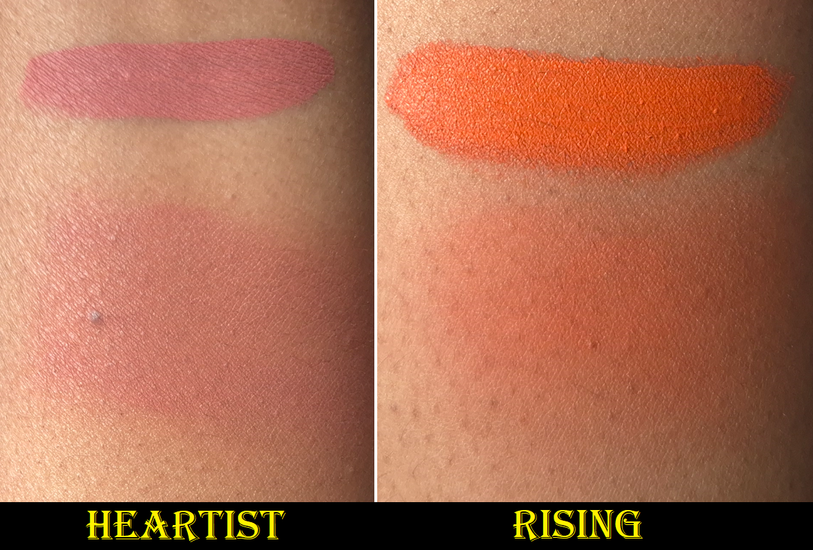
None of the combinations were created with equal amounts of color. I always used a much smaller amount of Thorn because of how easily it can overpower the other two shades.
Due to my lighting conditions, Heartist is diffcult to show up in my photos, but it is very much visible in person. I like that it’s not a bold color on my cheeks. Rising looks like a neon orange mixed with red, which gives it a pop of brightness despite being a medium-dark color. It doesn’t look that unnatural on my cheeks, but I sometimes combine it with Thorn so that it leans more nude.
I believe I used the Hindash Gradiant Highlighter (Peak Heat) as the shimmer element in this look, but I took this photo over a year ago, so I can’t remember for certain.
These work as eyeshadow bases and liquid eyeshadows, but I’m not thrilled with these colors on my eyes. I think it has to do with them looking intended for softer looks, rather than intense ones. It’s that softness that makes them so pretty as cheek products, which is ironic because I have often said I prefer to use the Hindash Beautopsy Palette on my cheeks more than my eyes too. For eyeliner purposes, the formula is great because they lock on and are waterproof. With Isododecane as the first ingredient, it doesn’t surprise me how long-lasting these are.
As a lip product, particularly as lip liner, these are beautiful. The Color Fluids blend into each other and layer up nicely when I’m trying to build up the opacity when spreading them across my lips. I’ve eaten oily meals with this on and it only looks funny at the inner edges of my lips (the most inward mouth opening). I can get through two meals at most, and then only the lip liner will remain. It doesn’t last through meals without needing a touch-up if I wore a balm underneath the Color Fluids or have a different product on top. So, these essentially work like liquid lipsticks with the same kind of pros and cons.
When I use these in the main section of my lips, it looks super dry and highlights the look of that dryness. Color gathers around chapped patches. Because it dries out my lips too much, I wouldn’t use this as a lip color, though perhaps just as lip liner. The brand recommends using a balm underneath to increase the level of comfort. Applying a lip oil on top has helped in my personal experience, but I have too many lip products I like to bother using the Color Fluids this way anymore.
So, my favorite way to use these (and pretty much the only thing I’ll use them for going forward) are as cheek products. I definitely don’t need anymore items in that makeup category though, so I don’t foresee myself buying more in the future. However, all this time later, I am still glad to have bought them.
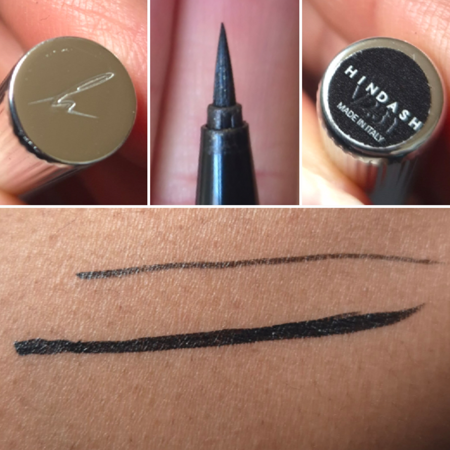
I will always be partial to the classic black liquid eyeliner pen. The one I’ve used the longest in my time wearing makeup has been the Stila Stay All Day Liquid Waterproof Eyeliner that I used to buy at 50% off via Ulta’s 21 Days of Beauty sale. When I moved to Germany, I figured I would switch to my second most used liner which is the Nyx Epic Ink Liner. Before that though, I decided to give the Hindash Heroline a try during one of the brand’s sales (which ended up full price when I got hit with the Einfuhrzölle/Steuern/Bearbeitungsgebühr via DHL). I bought it in June 2025, but I remember not wanting to start using it until I ran out of my previous liner. That’s why I can only confirm I’ve been using it since October 2025 based on my phone’s camera roll, but it could have been longer.
As far as I’m concerned, this eyeliner has no flaws. I can create a super thin line (even thinner than the One/Size Liquid Eyeliner Pen) or thicker for more drama. I don’t get cracking when it dries down. I don’t have the issue of it being so liquidy that it feathers around the lash line. Usually after six months, I would be running out of the Stila Liner, but the Heroline hasn’t shown any signs yet of drying out or running out, even though I believe it has less liquid inside than Stila’s pen (0.4 grams vs 0.45 grams). The tip has remained a lot cleaner than my other eyeliners tend to be, though I haven’t been using multichromes as often.
The brand claims this is water-resistant (not waterproof), but on me it doesn’t budge, and it takes nearly as long to remove as a waterproof eyeliner does. The lines on the packaging aren’t just a pretty design choice. It helps with gripping too, so I’m able to keep my hands relatively steady.
For a demonstration of how this looks in eye demos, one can just scroll through the eyeshadow posts from the past six months, but I’ll repost some previous examples here.
Overall, this is a great product! I understand why everyone I’ve seen reviewing this brand has praised it. However, I don’t have enough of an issue using the Nyx Liner to be certain whether it’s worth it to spend double the price on the Heroline instead. I’ve gone back and forth about that issue, but it doesn’t matter anyway if Hindash doesn’t restock it. The brand’s restocks take forever, to the point that I frequently wonder if the manufacturer is super slow, crazy busy making other products, or if it’s the brand having trouble with funds. It has at least been hinted on the Hindash Cosmetics IG page that a range expansion and restocks could be coming soon. However, I’m not getting my hopes up too high because I remember hearing Hindash talk about potentially releasing a gradient palette with shimmers, but it has been four years since he has launched any palette at all.
I hope this post has been helpful to anyone wanting to see more opinions regarding Hindash Cosmetics products, especially since they don’t get talked about (at least in the US) as much as products by other makeup artist brands (Lisa Eldridge, Victoria Beckham Beauty, etc). I am a big fan of this brand and I continue to wait semi-impatiently for them to release more!
In May 2025, there was a sale on Pat Mcgrath’s website that applied to bundles. So, I was able to get two Mothership Palettes for €73 each. Both of these palettes have been available for several years, so I can’t explain why I suddenly wanted them, but I did.
Because these palettes are “old” in terms of release date (2018 for Bronze Seduction and 2019 for Divine Rose), I feared the Motherships purchased in 2025 wouldn’t have the same formulas as the original launches. I cannot say whether the Moonlit and Sunlit Seduction Palettes were simply free of the four “special shades” in the right section of those palettes or if all of the later eyeshadow formulas were tweaked. I just know that Petalmorphosis has very different shimmers compared to what is in Motherships 1-9. Considering the additional formula differences among the brand’s 5-pan and holiday palettes, I wasn’t sure if PML quit working with the same lab entirely.
Thankfully, the quality of my new palettes match that of my Mothership 3. Even though there are no more “special shades” in Motherships 10-12, the special shades continue to be produced in the palettes that always had them. It’s great to confirm that the mattes are still pigmented and easy to blend. They layer well with each other. The shimmers are opaque and very impactful. The duochromes and iridescent shades are a bit flaky and can be messy, but they still have that “wow” factor!
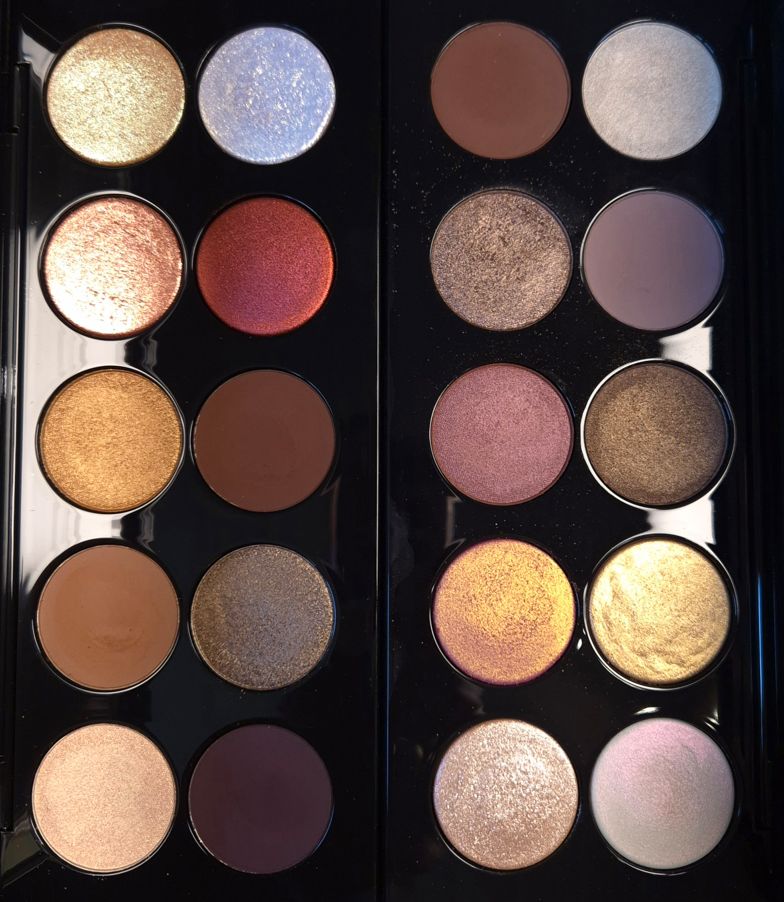
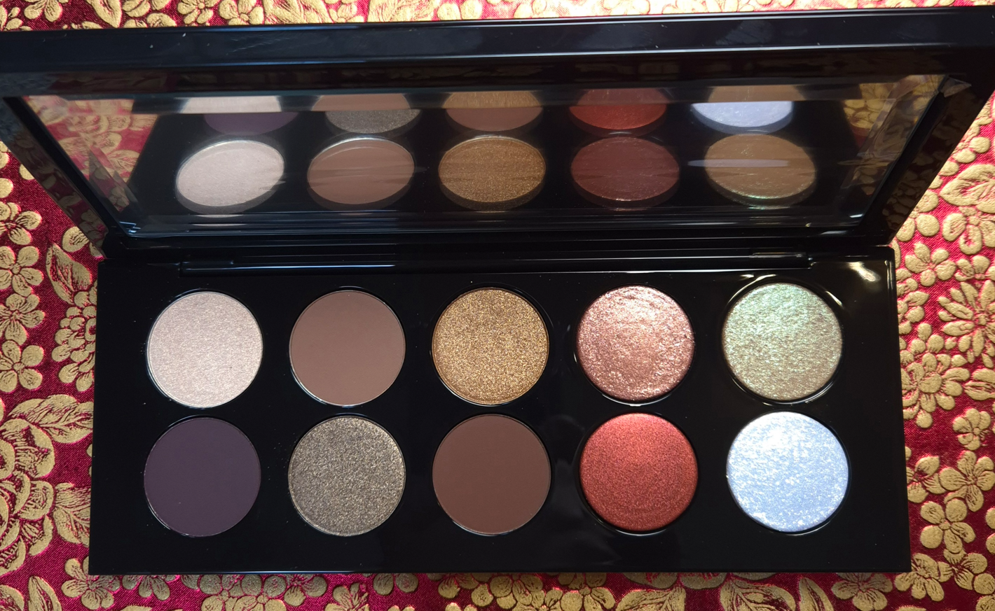
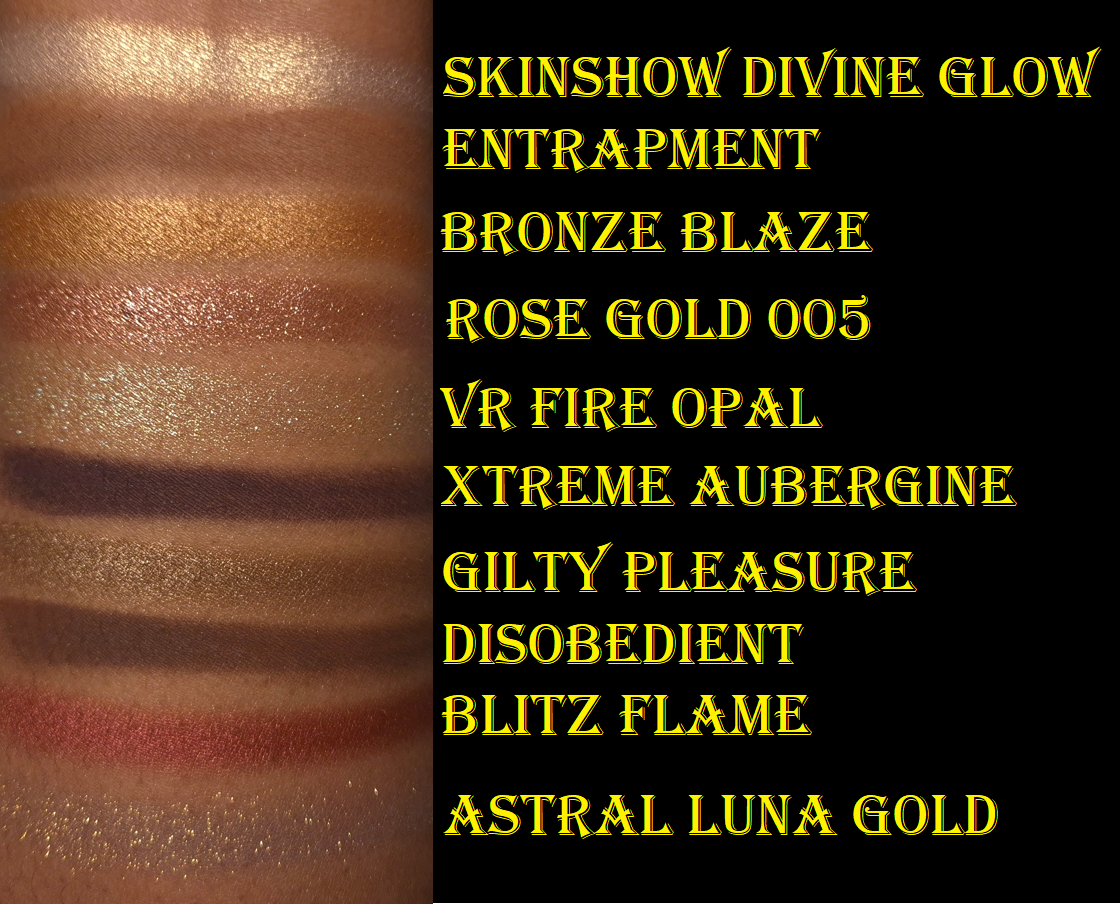
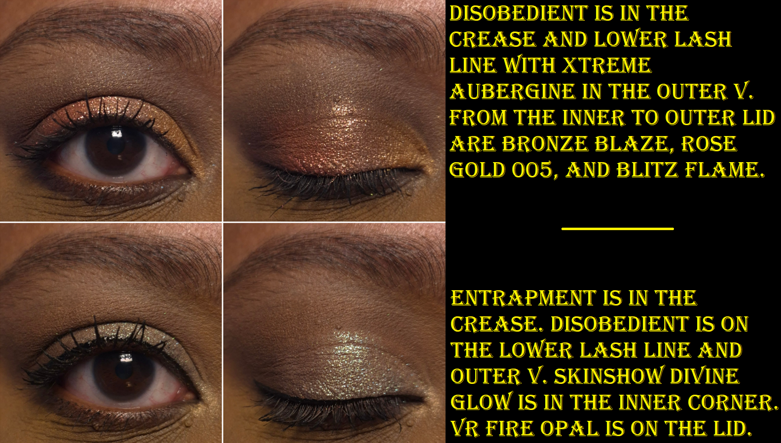
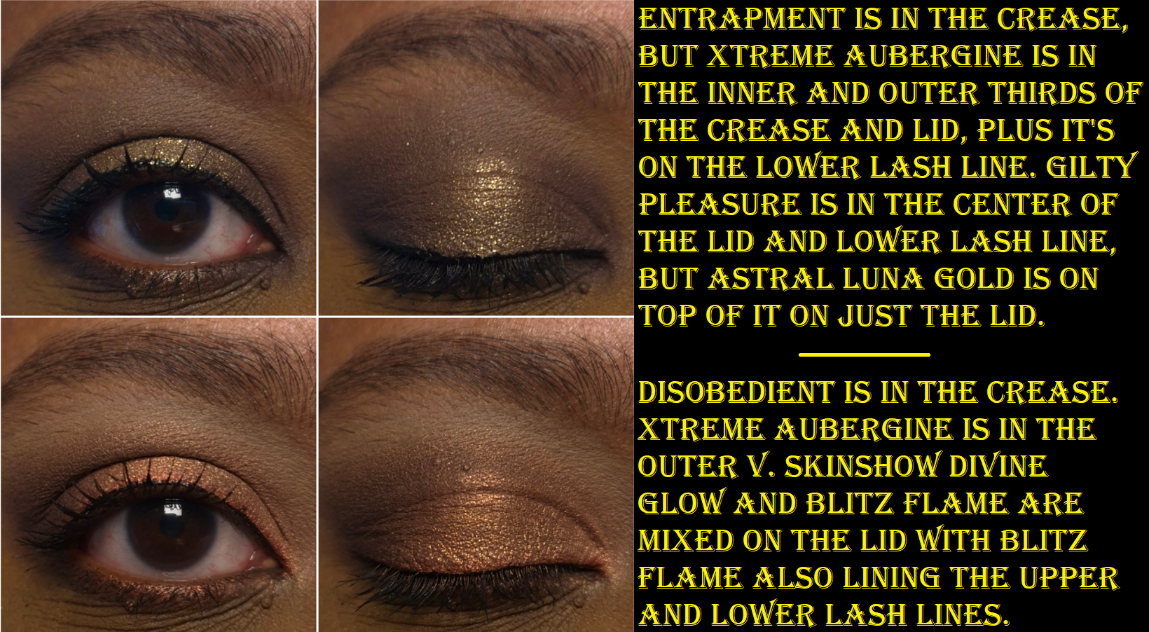
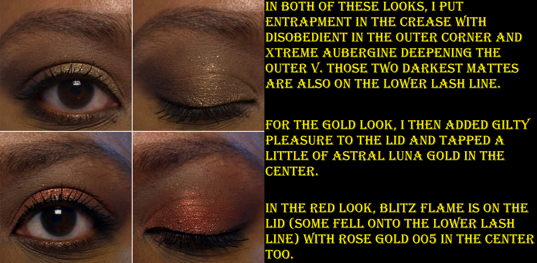
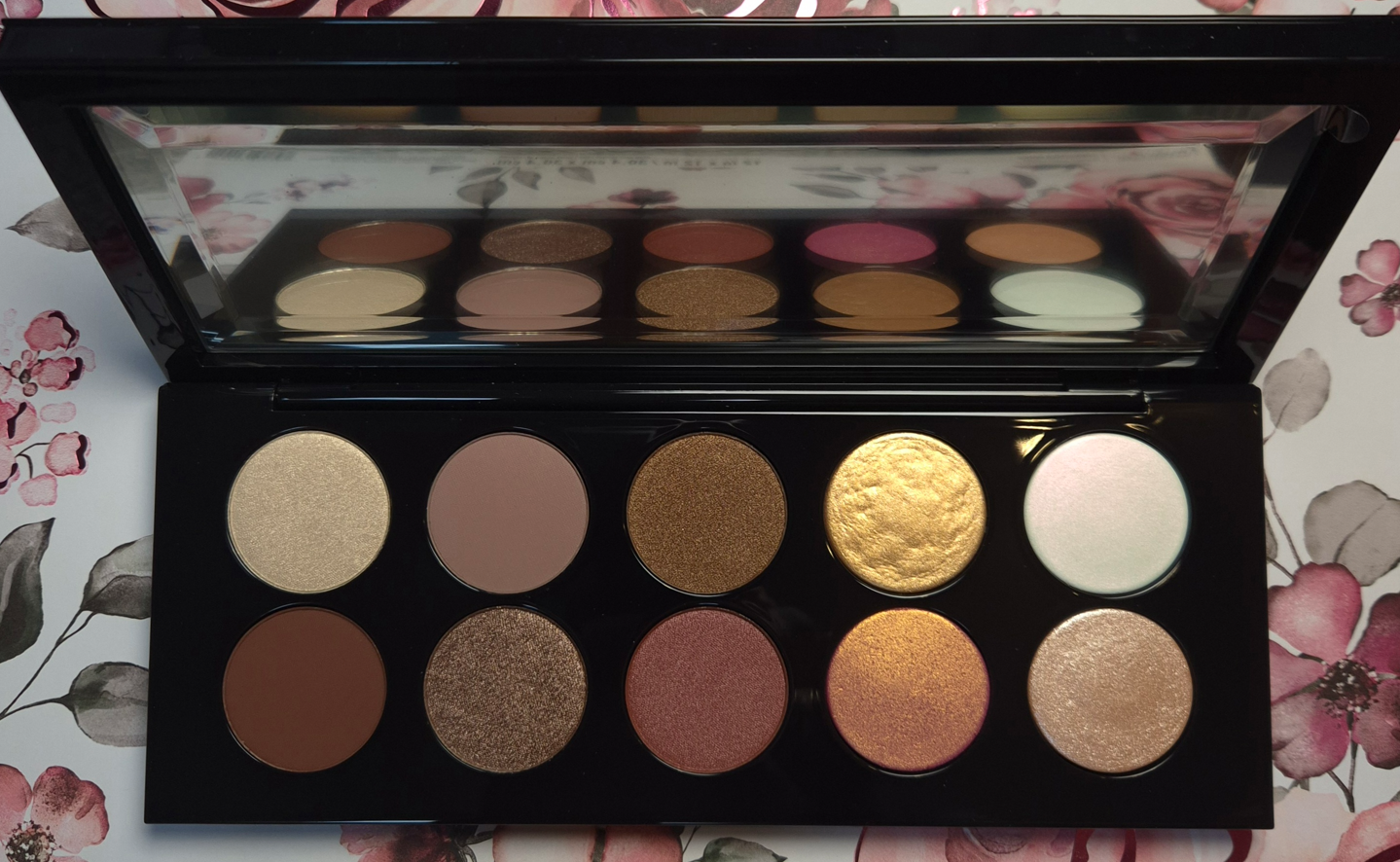
Mothership V: Bronze Seduction
There really isn’t much to say in terms of a review. These are the high quality eyeshadows I know and love from the brand. They’re soft and powdery without excessive kickup. They’re blendable, layer well, and the shimmers are intense enough that I don’t feel the need to dampen my brush to apply them. They don’t crease and they’re overall wonderful to work with!
Xtreme Aubergine is the only one that requires a little extra time to blend because it can stick and be patchy. It’s so pigmented that it can be easy to go overboard. So, I use something small and pointed like the Sonia G Crease One for outer corner work. I build it up carefully and slowly, which prevents me from having issues.
I rarely use red eyeshadows, so that was a big reason I wasn’t interested in this palette in the past. Then, it dawned on me that if I exclude Blitz Flame, this is basically a brown neutral palette. I was in my colorful phase in 2018, but now I appreciate neutrals again, and find this palette to be super appealing.
After buying Bronze Seduction, I used it on and off for a few months, but then it took a backseat to other new launches (and even the YSL Over Brun Quad and Natasha Denona Mini Gold). Normally, I would take that as an indication that I shouldn’t have made this purchase since I don’t use it enough. This time, I can’t regret it because of how beautiful the colors are and the knowledge that it’s available to me whenever I do have the urge to use it. Considering everything going on with the brand right now, I appreciate the nostalgia of having a palette that reminds me of a time when PML was in its prime.
Mothership VII: Divine Rose
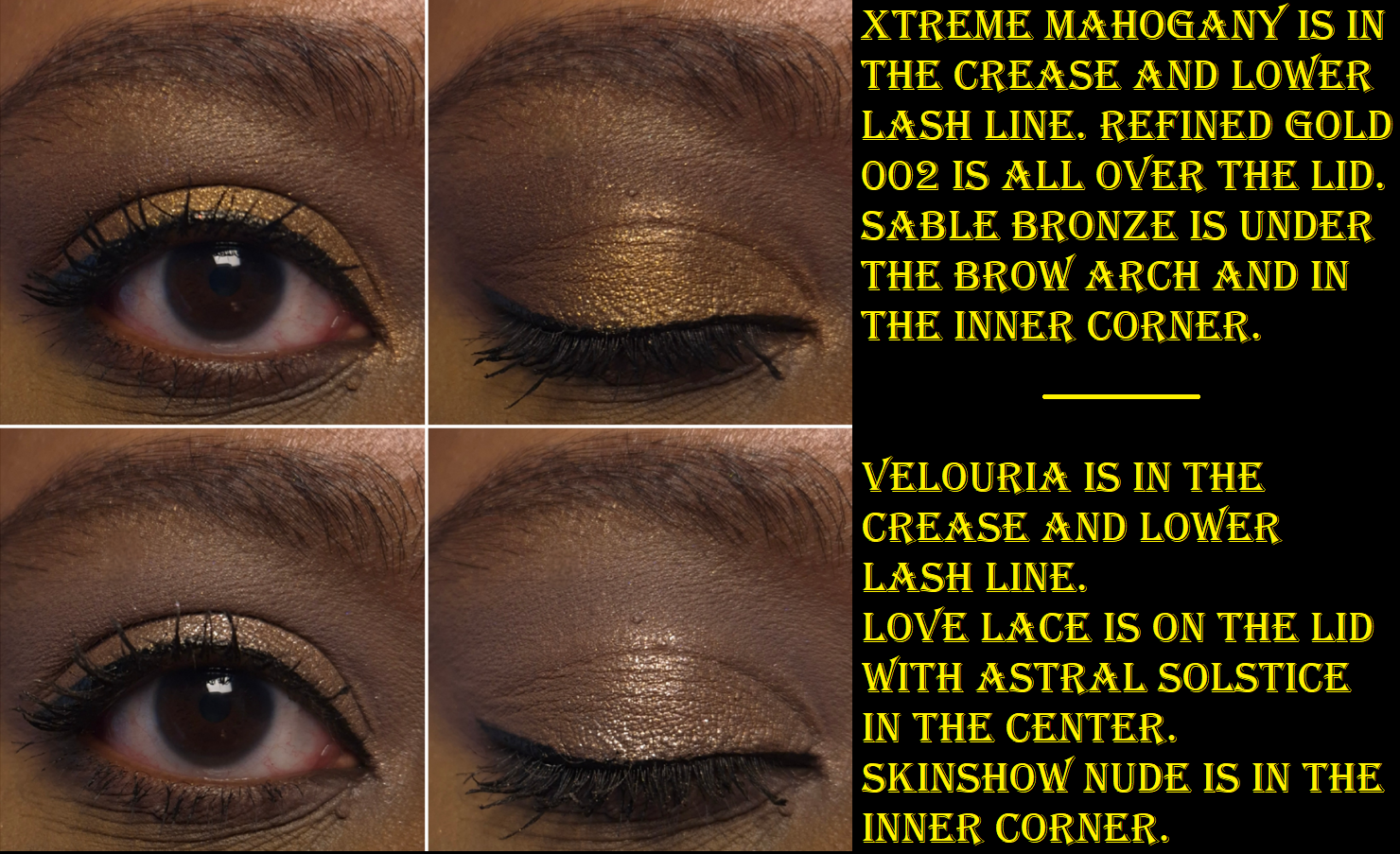
Getting me to want a palette with light eyeshadows and a low contrast color story was a hard sell, especially during my phase when I was sick of pinks, but PML managed to do it in the end. The best shade I have in this palette to create depth with is Xtreme Mahogany, and it’s not quite enough to satisfy me. However, there are plenty of dark colors across the other Mothership Palettes that I can pull from. I still liked all the looks I created for this post, but I’ve needed to reach outside of this palette for all the looks I’ve recreated since then.
Divine Rose performed just as well as Bronze Seduction and gave me no performance issues. I really wanted the YSL Quad in 825 Burning Desire, but after seeing Han Beauty 101’s comparison swatches, I decided there were too many shades in common. YSL, Victoria Beckham Beauty, and Prada make my favorite luxury eyeshadows, so the fact that Divine Rose was good enough to keep me from buying Burning Desire says a lot. Still, I honestly haven’t used this palette very much after the testing phase ended. I have to be in a very specific mood when I want to wear these type of colors, but that’s precisely why having Divine Rose is a good thing. The Tarte Tartelette Juicy Amazonian Clay Eyeshadow Palette was supposed to be my ultimate pink palette and get me to stop buying more. So far, Divine Rose has been the one to curb my appetite.
2025/2026 UPDATED RANKING FROM FAVORITE TO LEAST FAVORITE:
1. Mothership III – Subversive
2. Celestial Nirvana (5 pan) – Bronze Bliss
3. Luxe Quad – Interstellar Icon
4. Mothership VIII – Divine Rose II
5.Mothership V – Bronze Seduction
6.Mothership XII – Petalmorphosis
7. Celestial Nirvana (5 pan) – Nude Allure
8. Mothership IX – Huetopian Dream
9. Mothership VII – Divine Rose
10. Bijoux Brilliance (5 pan) – Bronze Ecstasy
11. Pat Mcgrath Labs x Star Wars Eye (5 pan) – The Golden One
12. Mega MTHRSHP Celestial Divinity
13. Pat Mcgrath x Star Wars MTHRSHP Galactic Gold
14. Bijoux Brilliance (5 pan) – Lunar Nightshade
15. MTHRSHP Subversive La Vie En Rose
16. Mini Eye Ecstasy: Subversive
17. Pat Mcgrath Labs x Star Wars (5 pan) – Divine Droid
18. Blitz Astral Quad – Nocturnal Nirvana
19. Pat Mcgrath x Star Wars MTHRSHP Dark Galaxy
20. MTHRSHP Rose Decadence
21. MegaMTHRSHP Celestial Nirvana
22. MTHRSHP Velvet Liaison
I can’t end this post without mentioning the Chapter 11 Bankruptcy filing of Pat Mcgrath Labs. Considering this is my number one favorite mainstream brand, it saddens me to see them in this position. At the same time, PML has been too focused on trying to follow the trends of what sells (overuse of pinks and neutrals particularly after the success of Divine Rose I) rather than fostering innovation. There are many other reasons that contributed to customers being unhappy and unwilling to spend as much money on the products that have been released in the past three to five years.
I am still holding out hope that they can make a comeback. It has long been suspected that Pat Mcgrath has had much less creative control in the last years, and the success of the Louis Vuitton makeup line shows that people are still interested in her vision. If she can take back the reigns in the Creative Director position, and the business end of things gets sorted, there could still be hope! PML still has so much potential!
That’s all for now. I’m going to treasure my Motherships even more now!
I’m a huge fan of the Liquid Silk product as an eyeshadow primer. It has enough coverage to conceal the discoloration around my eyes, but the shade Phoebe doesn’t alter the colors of the eyeshadows I put on top all that much. As standalone eyeshadows, they look smoothing and non-drying on the lids. I have enough time to blend out the edges before it fully sets and it mixes well with other shades. It doesn’t crease, doesn’t fade, and stays put very well in my deepest eye wrinkle/crease.
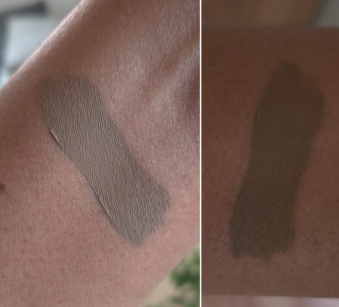
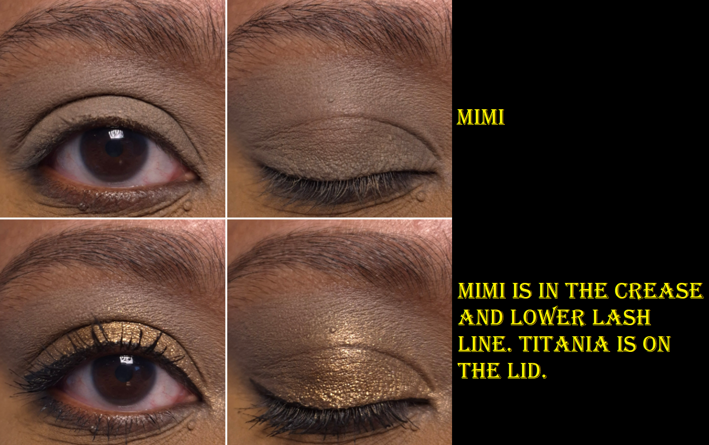
I was so excited to buy Mimi because I figured it would go very well with neutral and green eyeshadows that are my go-to kind of looks lately. However, I did not expect it to look so brownish-grey with a slight tinge of green. The weirdest part though is that my cell phone camera makes the swatch look way more green than it is in person. It was driving me absolutely crazy! The eye swatches were accurate, but every arm swatch looked so green! I can’t explain how my phone could capture the color on the applicator correctly, but not the swatch within the same photo!
After trying to photograph Mimi in different lighting conditions, the two below are the best I could get. The one on the left is closest to how the color looks on my eyes. The one on the right (where I blocked out light from shining on the swatch directly) is closest to how it’s supposed to look on my arm.
How it looks on the eyes is the most important part to show, which is at least accurate.
Even though Mimi looks different than what I expected and wanted, it’s such an unusual shade of brown that I actually like it!
At this point in time, I now have the shades Mimi, Phoebe (my second tube of it), and Gaia. As interesting as I find some of the other colors, I don’t use liquid eyeshadows enough to justify adding more. The only reason I used up Phoebe is because it has been my main primer of choice throughout 2025.
In my initial review, I added an update about the stopper problem and how I started to struggle with reaching the product within 3-6 months of use before I removed the stopper entirely. I was correct in guessing that I had finished half of Phoebe within the first six months, and I used up the remainder in another six months. I was worried Phoebe would dry out quicker after removing the stopper, so I was careful to not leave the cap off for too long between uses. It was only in the final two months that the product got noticeably drier. So, I will repeat this strategy if the issue reoccurs with my other Liquid Silks. Gaia is my oldest one, but I still haven’t used up that much of it.
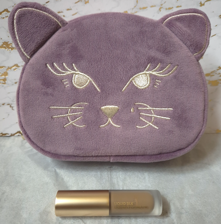
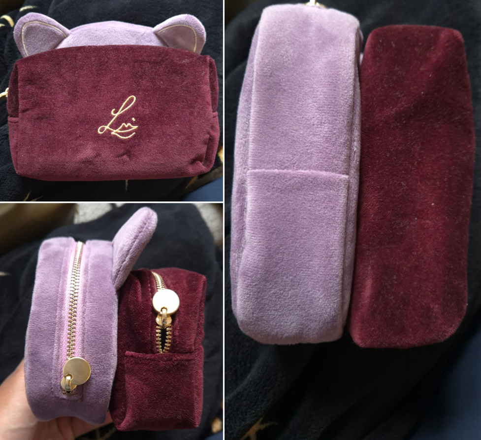
As for the Betty Kitten Pouch, it’s just as soft as Lisa Eldridge’s other velvet pouches, and it’s nice to have the taller shape. I couldn’t resist!
The Betty Pouch is free with orders over $125 (or €108), but I purchased it outright for €35.
Anyway, that was my quick review/update! I hope this has been helpful!
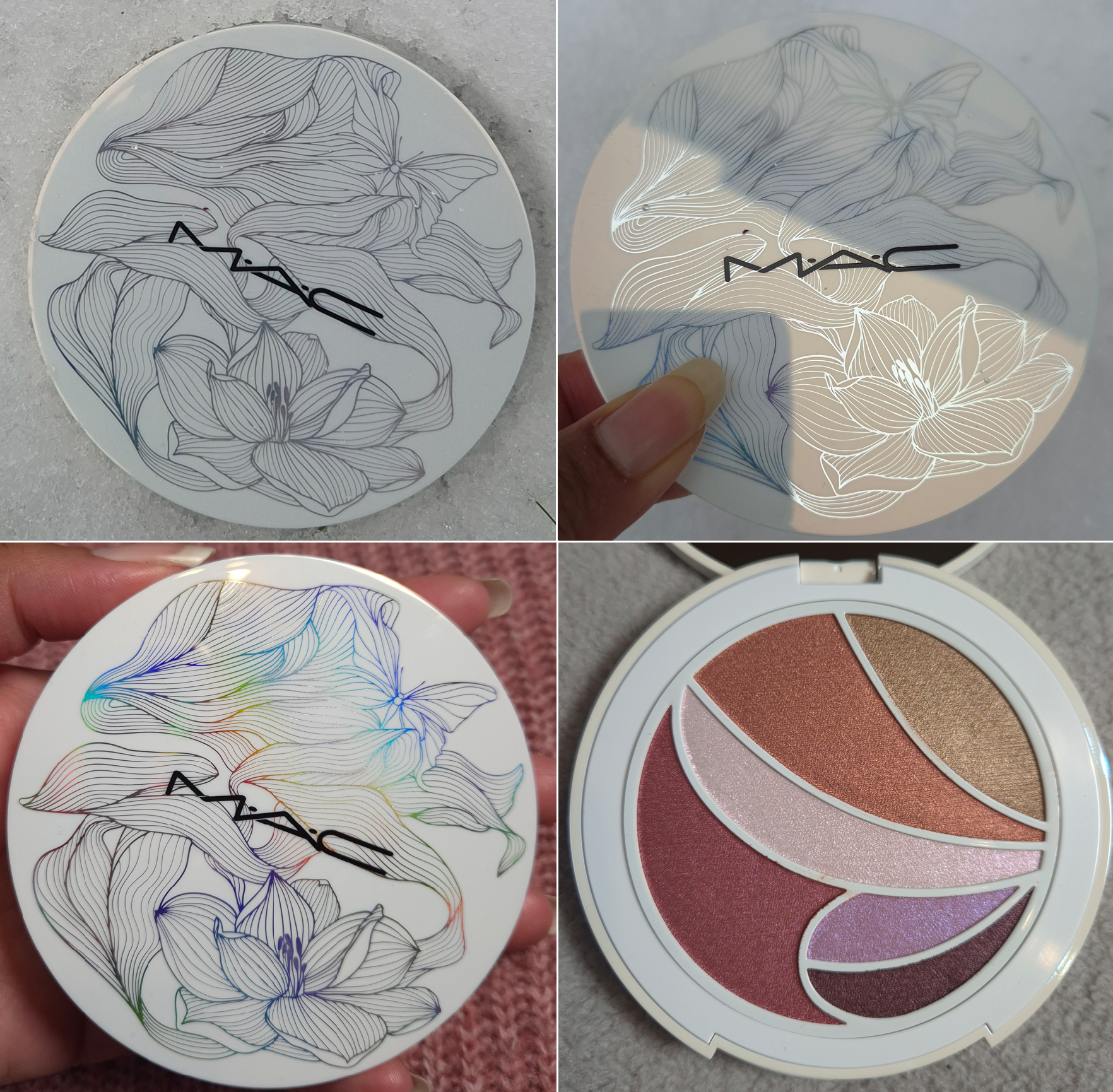
If you’re already familiar with my blog and my interests, you’ll know right away that I wanted this palette for the packaging. I love how the design appears to be a simple, yet pretty, black and white drawing until it is turned at different angles in the light, revealing all the colors of the rainbow.
MAC’s face and cheek products have always been among my favorites in my makeup collection, but I tend to be unimpressed by their eyeshadows. The last palette I tried from MAC was the Lunar Luck Made My Fortune Eyeshadow Palette from 2022. Since then, the brand has reformulated their eyeshadows. I hear they perform better than before, but I was unwilling to take that chance until now.
Technically, the latest single eyeshadow I’ve tried from MAC has been their Jelly Shine Eyeshadow, but it’s a new formula for them. So, I couldn’t use that as a gauge for whether or not I’d enjoy their standard eyeshadows.
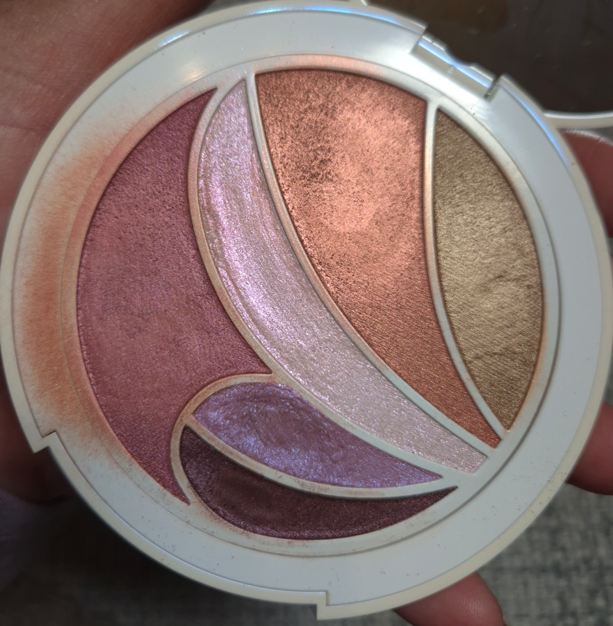
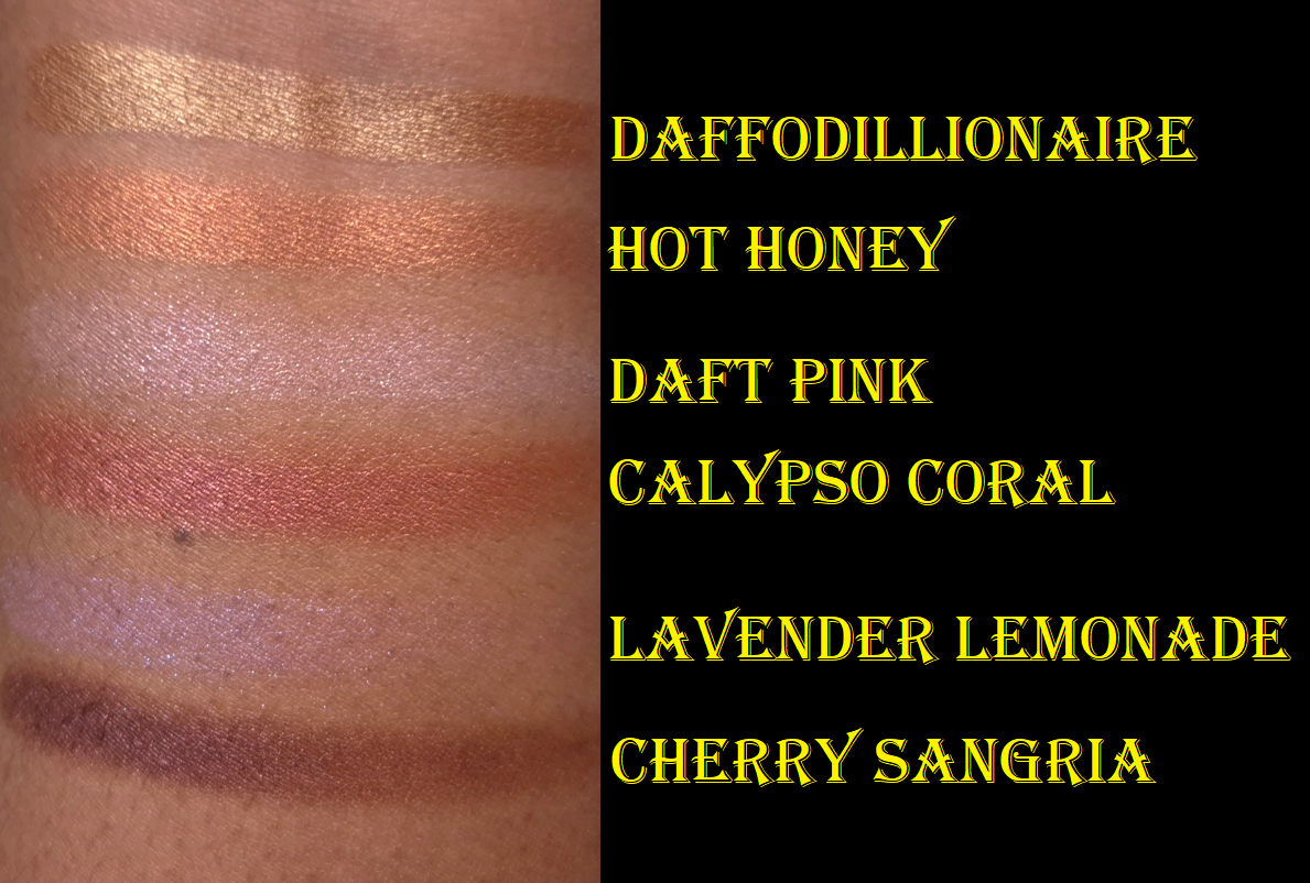
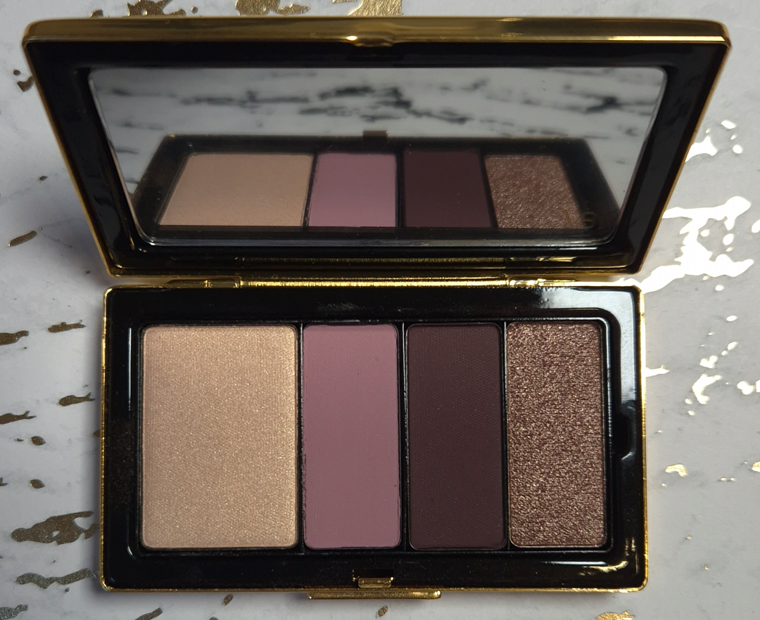
Frankly, I can’t consider this palette an example of what MAC’s primary eyeshadow formula is like either because these are so different from anything I’ve previously experienced from them! To start with, these don’t feel like traditional powder eyeshadows. They all have a very slick and smooth feel to the touch that’s prevalent in dimethicone-heavy formulas. Daft Pink, Lavender Lemonade, and Cherry Sangria in particular are more pliable as if they’re slightly stiffer Colourpop Super Shocks. Lavender Lemonade is the closest to having a Super Shock consistency because it’s the one that’s easy to push and move around. On the box, it’s written that the ingredients for Cherry Sangria and Daffodillionaire are supposed to be the same, and that Daft Pink, Hot Honey, Lavender Lemonade and Calypso Coral are the same. Considering the fact that I find Daffodillionaire, Hot Honey, and Calypso Coral to be the firmer ones instead, I cannot fathom why the slippery, yet more solidly pressed, eyeshadow is in the same category as the looser goopier one. The photo below shows how messy this gets after just one day.
I have to thank Nikki for pointing out that other than Synthetic Fluorphlogopite, this palette and MAC’s Shadeshift Chrome Eyeshadow formula seem to be the same.
What I found from checking a few ingredient lists on MAC’s website (which tend to be incomplete), is that the formula with the second-most ingredients in common to these are the Jelly Shine eyeshadows with 6 out of 13 shared. However, the Jelly Shine are still much more similar to MAC’s standard shimmer/metallic formula than the ones in the Metamorphosis Palette with around 12 out of 17 in common.
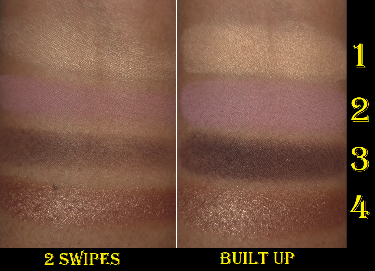
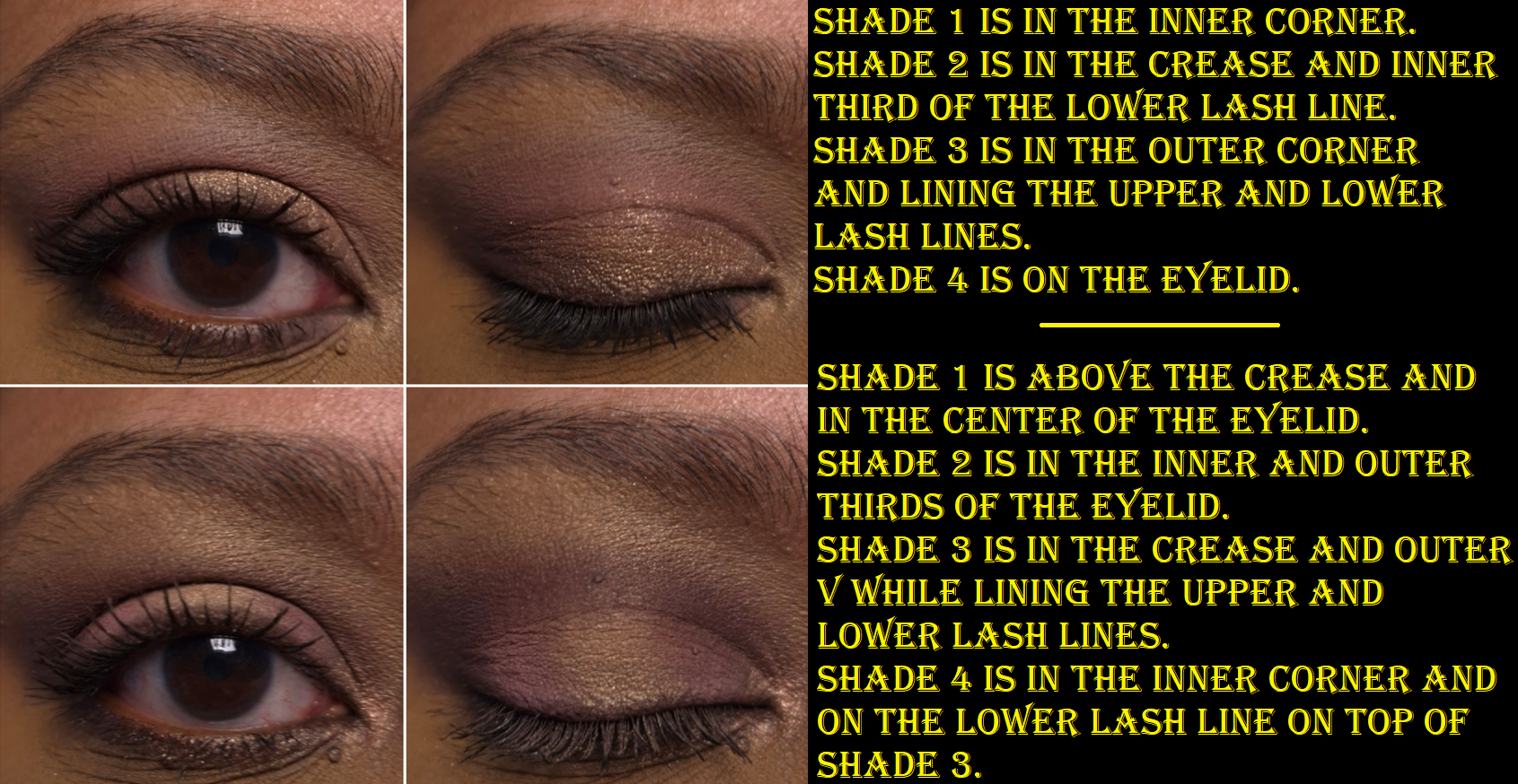
These eyeshadows are pigmented, but they blend out in such a way that I get some translucency and can see my skin underneath. I can build them up to be opaque if I want, but it takes a lot more effort with a brush. This formula is much more suited to finger-application. Since none of these are matte, I instinctively want to apply them to my eyes with my fingers anyway. The problem is that the smallest petal-shaped pans are more difficult to get into. Plus, the blush type of shades (Hot Honey and Cherry Sangria) can look a bit patchy in the first layers with a brush, so the issue is exacerbated if I try to apply those to my cheeks with my fingers. The Singe Beauty FO-3 and Rephr LC02 are small cheek brushes, but I still have to be careful about accidentally picking up some of the neighboring eyeshadows.
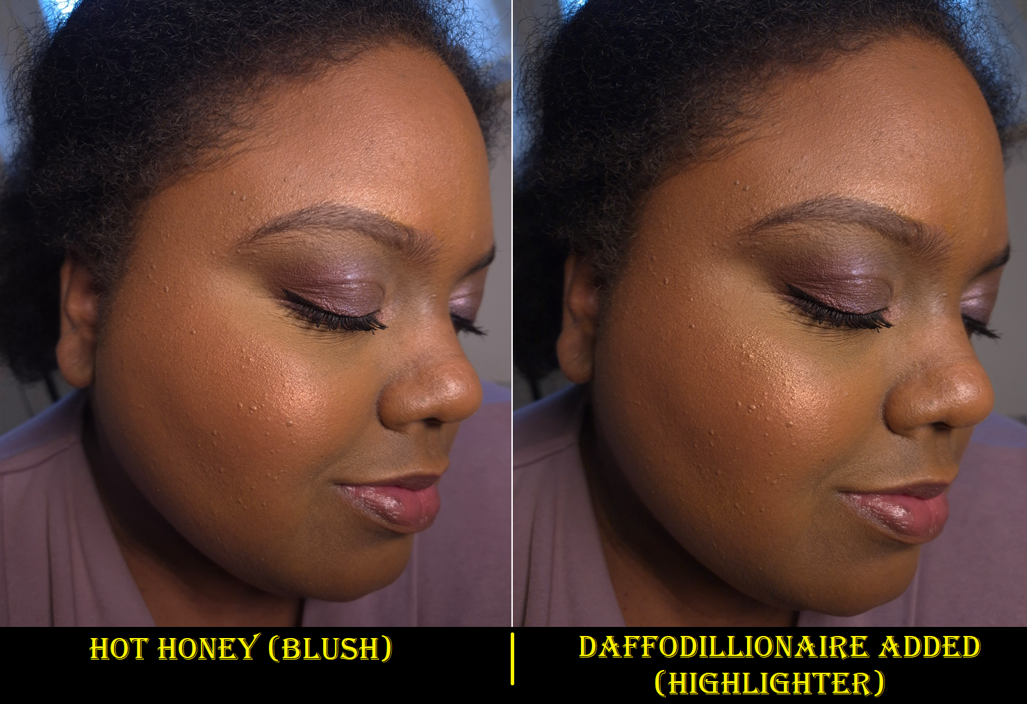
Daffodillionaire is my kind of highlighter shade, so I was pleased to know it suits me on my face and eyes. Even though these are buildable formulas that can be sheered out, I imagine this would be too dark for those with lighter skin and too warm for those with a cool undertone. On my eyes, it’s just light enough to add brightness. On my face, it draws more attention to texture, but the lack of shimmer makes it still fairly smooth looking for a highlighter.
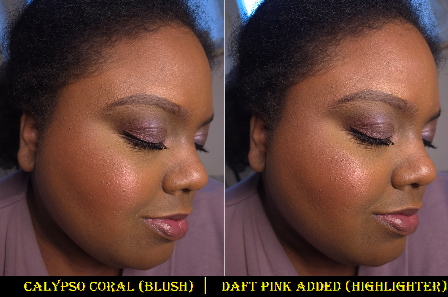
Hot Honey is easy to see on my eyes, but the color tone doesn’t stand out as vividly on my cheeks. I like this though, because too many orange blushes are bold and unnatural looking on me. That being said, I still prefer a flush of pink, so I either skip using this shade as blush altogether or I mix it with Calypso Coral.
Daft Pink is an iridescent type of pink, along with being more topper-like than the other shades. It takes more effort to build it up on my eyes, and especially as a highlighter on my cheeks. This shade looks quite pretty paired with Calypso Coral, but if I add enough layers to see the color and have the shine from it stand out more than the amount Calypso Coral already has, then I start to notice a slightly frosty white cast on my skin.
Calypso Coral has a sheer quality to it that requires multiple layers, but over-applying this dark color will result in it looking too intense and metallic as well. So, finding that balance every time for blush usage can be a challenge. I have a similar problem with it showing up on my eyes, and though wetting my brush serves to make it easier to deposit the product, it doesn’t do much intensifying. When I accidentally covered some of Calypso Coral with Hot Honey on my eyes, it was very difficult to get that red tone back, as there is a maximum to how many layers can be built on each other. A wet brush helped, but not a lot.
Lavender Lemonade is the other topper-style shade, but it has more pigment than Daft Pink. Because it’s a light purple with blue-purple shimmer, I find it to be the most interesting pan of product in the palette. This and Cherry Sangria are the only ones I’d use exclusively as eyeshadows, and not face products, which is probably why MAC chose to put them in the smaller pans. I could see this being a cool highlighter for someone who likes more adventurous or avant garde type of looks. The official MAC website has some intriguing spring-inspired editorial looks that I might want to recreate when it’s actually spring time, but not right now.
I like Cherry Sangria as a deepening shade for the outer corner in eye looks. It’s easier for me to use my finger with this as an eyeshadow, but when I’ve tried to wear it as eyeliner, it took too many passes over the lash lines with a dry liner brush. So, I go in right away with a damp brush to save time.
Wearing Hot Honey and Calypso Coral on my cheeks makes me think about how I really should start using my MAC Extra Dimension Blushes again. The Extra Dimension ones give more color payoff quicker, and have a similar amount of shine. However, the Metamorphosis shades have a subtler look overall because the consistency is creamier and blends better into my foundation. The reflect isn’t a natural-looking glow, but it looks better blended into my skin. The Metamorphosis pigment level reminds me a bit of MAC’s discontinued Sheertone Shimmer Blush formula, but those had a more obvious powder look even if the shades themselves were more muted and less opaque.
I get at least six hours of wear time for the Metamorphosis products on my cheeks and eyes before the fading starts. It holds up better on my eyes if I use an eyeshadow primer, but I just accept that my makeup is going to look more muted before the day is over. Also, at some point in the day, the product will be missing from the inner part of my crease line.
So, this doesn’t have the best longevity. The shades still need to be built up on me. I have to use specific brushes or dig my fingers in the pans, and it’s inevitable that I will dirty the outer rim and the edges that divide the shades. Despite these inconveniences, I’m happy with this product!
Typically, I don’t find spring collections to be appealing because light shades, especially pastels, are difficult for me to pull off. Springs shades also tend to be in cool or neutral tones, similar to the kind of spring looks I did in my Wedding Makeup post. However, there were enough warm shades in the Metamorphosis Palette, and deeper colors, to make me feel like this is actually suited to me. I thought for sure that the face and eye aspect would be a gimmick, but this really is quite versatile. I don’t think it’s going to be great for everyone, but maybe others will appreciate that it’s a little different from what is typically released for spring.
I had an unredeemed birthday discount code from Douglas (in January), so I figured it would be a nice gift to myself. I know for sure that I’m only going to reach for this palette in the winter to spring set of months, but I’ve never regretted getting the first set of Oden’s Eye holiday palettes that I now only really use in the month of December. That’s still more attention than I give plenty of other palettes in my makeup collection!
I hope this review has been helpful! Thank you for reading!
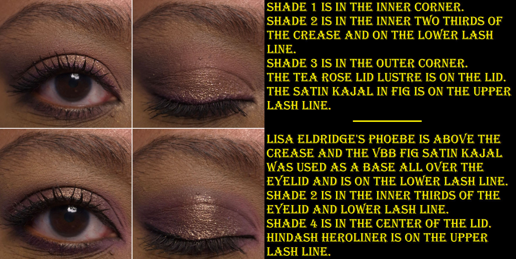
I’ve been working on a Victoria Beckham Beauty brand review (coming in March or April), but today’s post is a quick demonstration of the new Orchid palette in action, along with swatches.
For a more detailed and thorough review, please keep an eye out for that upcoming VB Beauty post.
Victoria Beckham Beauty Eye Wardrobe in Orchid
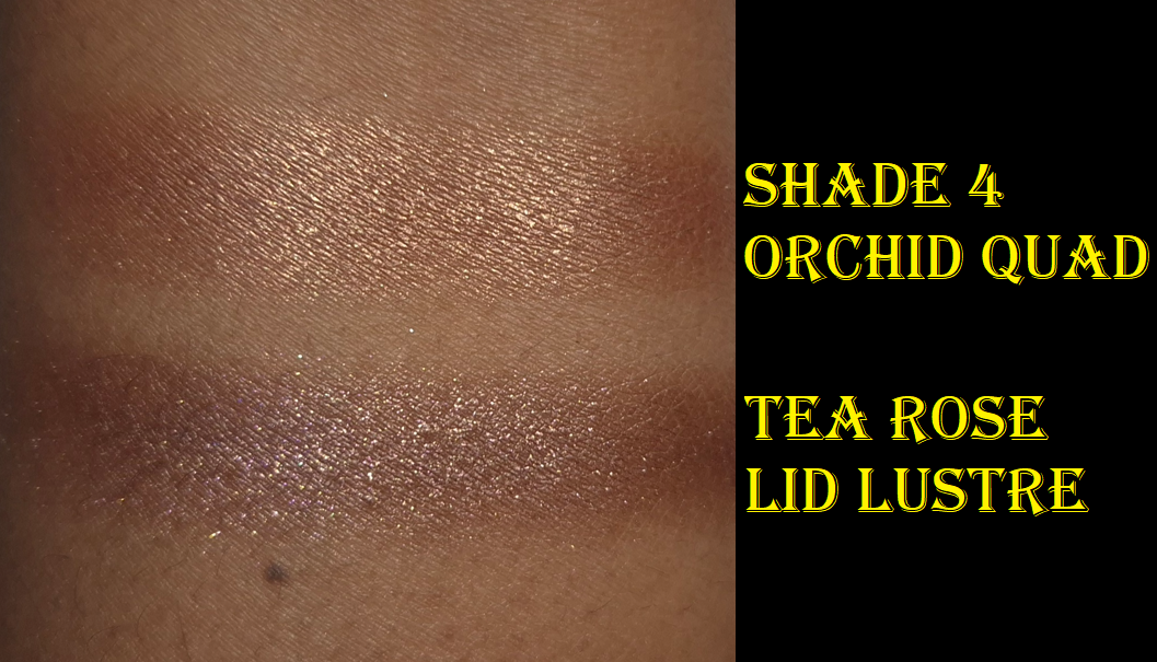
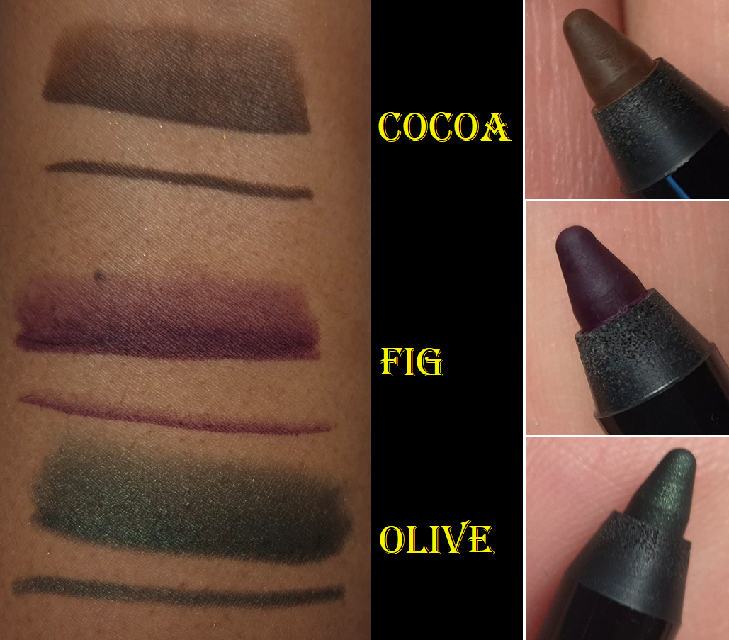
I imagine the Satin Kajal Liner in the shade Orchid would pair very well with this palette, but Fig is the type of color I would wear more often, so I bought that instead.
I have swatches for those curious how similar or not the shimmer eyeshadow from the Orchid Palette is compared to the Tea Rose Lid Lustre. Tea Rose has more purple compared to Shade 4, which is more of a Rose Gold.
I may as well share swatches of all the kajals I own, but the review for them will be in that upcoming post.
I’ve talked about the brand’s shipping in the past, which has always been fast. This time was ridiculously quick! I placed my order on Tuesday, just one hour after the V-Suite email came in, and my parcel arrived at 9 am the next day! That’s just 25 hours! Because it arrived so fast and I just got hit with a cold today, I wanted to get these pictures and post them as fast as possible while I still have energy. Otherwise, I probably would not have been able to post this for a long time.
So, that’s everything for today! I just wanted to take the time to thank the person who used my referral link from my previous VBB post. In addition to them getting 20% off, I was able to get this order of the refill and two kajals discounted for 20% off too! So, thank you very much!
*UPDATE FEBRUARY 23, 2026: Another person used my referral link and I was notified by the brand that if someone uses a drop-shipping method to do so, it will lead to your own account being terminated. I do not recommend that anyone participate in their program considering the risks it puts your own account because of someone else’s actions. I will discuss this more in my upcoming brand review.
Thank you to everyone else who visits/follows this blog. I’m honored that you take the time to read my posts and I hope they continue to be helpful!
I’ve loved Clionadh Cosmetics eyeshadows from the moment I first tried them at the start of 2020. Their Stained Glass Collection is ever growing, and it’s their claim to fame for good reason. Other brands have eyeshadows that use some of the same pigments and have the same shifts, but I have yet to see anyone replicate the slick “mirror finish” of the Jeweled Multichromes. I was never a big fan of iridescent eyeshadows because of the way they can look dusty and dry on my skin tone, but Clionadh thought about those with more melanin and created the Deep Iridescent Multichromes with different colored bases (instead of white) to fix this problem. They created Glitter and Dimensional Multichromes for people that adore having maximum, but still eye safe, sparkle. Vibrant and Electric Multichromes are for true color lovers. Earth Vibrant Multichromes are for those that prefer muted tones, but still want easy-to-see color shifts. There are even combination types such as Glitter-Vibrants and Hybrids.
Clionadh has multichromes to suit everyone’s tastes.
As I mentioned before, the brands get their multichrome pigments from basically the same place, but Clionadh has perfected the art of combining them with various base colors to create a decent amount of eyeshadows that haven’t been duped. So, there are still some that are completely unique colors.
There are some duochromes within the Stained Glass line, but they also exist in the “standard circle” format, along with more traditional shimmer eyeshadows. These are less expensive and I find them to still be very nice quality. The mattes weren’t perfect, but I still like them when they used to be sold individually.
The only reason I haven’t talked about Clionadh as much within the last year is because of the difficulty I have in getting products in Germany. Their website doesn’t collect VAT/taxes/customs, so DHL (who did the final part of the delivery) demanded exact cash payment in person (which included the missing VAT plus their fee), without letting me know the amount in advance. If I want to know ahead of time, I would have to pay the $42 (36 Euro) shipping option on top of the VAT and extra fees, which I just haven’t felt was worth the added costs. I hope Clionadh will work out some kind of deal with Monolith EU again, as that would certainly make things easier for me!
I have some Clionadh eyeshadows that are getting close to turning six years old. Some of them don’t feel quite as smooth and creamy, but they still perform beautifully and haven’t gone bad yet. I’ve had eyeshadows that didn’t even last beyond a year (admittedly mostly vegan eyeshadow formulas like from KVD, Urban Decay, Coloured Raine’s different formula, etc). So, that makes me happy considering how expensive Clionadh eyeshadows can be. If you take four of Clionadh’s most expensive eyeshadows, it would be slightly more expensive than many luxury brand quads (but justifiable in price considering they’d be all multichromes).
Clionadh has a relatively small team, and I respect the fact that they make their eyeshadows in-house in Canada.
Oden’s Eye
Oden’s Eye is a favorite because they have every type of powder finish eyeshadow I could want: multichromes, duochromes, sparkly shimmers, smooth metallics, pastels, and just lots of colors in interesting tones. The variety is great and the quality is mostly good. Some palettes are randomly not as good, and I can’t explain why. For instance, I like the colors in Makeup Just For Fun’s palette, but the shadows were more powdery and the shimmers are thinner. I can only guess it’s due to what the creator requested of the formula. Fantasy Cosmetica has shimmers and mattes on par with Odens Eye, but I get 1 or 2 duds from the 9-pan palettes I’ve tried, which isn’t the case for my top 5 Odens Eye palettes. So, Fantasy Cosmetica ranks lower for that reason.
These shadows are also more suited for color lovers, but Oden’s Eye tries to appeal to neutral and color lovers by giving softer and non-grungy options sometimes within the palettes.
It’s a Swedish brand, but their eyeshadows are made in the PRC.
Fantasy Cosmetica
This is the brand I have the least experience with, as I only started buying their palettes in 2024. However, I love the color offerings among all the palettes and their theming. Even when they make brown shades, there’s nothing basic about them. They have very interesting tones. The Fighter Palette is a dream for those that prefer glam style neutral eyeshadows. Pat Mcgrath fans would probably like them, but the quality isn’t quite as refined as PML’s. The big price difference puts that in perspective! Some of their eyeshadows/pressed pigments are ultra vibrant. They’re all pigmented and opaque shadows. Most of them blend well. I usually have at least one troubleshade shade in every palette, but it’s rarely one of the shadows I was looking forward to using anyway. This brand does cater mostly to color-lovers, and they’re known for their intense shimmers, but I even like some of their smoother satin shades too. They find a way to make the toned down shadows appealing for me.
I believe these eyeshadows are made in the PRC.
Devinah Cosmetics
Devinah has my second favorite multichrome and duochrome formula, but their normal shimmers are just okay, which is why the brand doesn’t rank higher overall. Their mattes are also decent, but not the easiest to blend and use. In fact, they probably have the “worst” mattes of all the brands I’m mentioning in this post. However, they don’t make pre-made palettes, so customers can skip buying their mattes altogether.
I started purchasing from them in April 2020, and all but one eyeshadow (it’s a discontinued formula) is still in perfect condition. The performance, look, and feel of the shadows hasn’t changed. So, I can confirm mine have good preservatives in them!
It’s because of the fact that I had to acknowledge their multichromes and duochromes as coming second to Clionadh that I stopped buying from them in early 2022. However, to still maintain that number two spot is impressive. The custom palette I created with mostly Devinah shades has come with me on several trips and there are shades I’ve used in there even more frequently than Clionadh. So, if you live in the US and are dealing with the tariff situation, this could be a nice US-based brand to check out.
I don’t know if all of Devinah’s eyeshadows are made in-house, and if only some of their catalogue isn’t made in a lab, but I can confirm that at least the mattes are made by them.
Sydney Grace
Sydney Grace isn’t really in the multichrome game with powder eyeshadows, but they have a gigantic selection of standard shimmer eyeshadows in unique tones. They have many colorful sparkling eyeshadows, but the brand puts a lot of focus on natural/neutral and more muted types of shades. They also have a lot of satins that appeal to fans of luxury eyeshadows who prefer a smoother texture-friendlier look, but just crave more pigment than most luxury eyeshadows provide. The Sydney Grace eyeshadows are pigmented, opaque, and also thick. I like my finished eye looks with them, but I tend to prefer my even more blingy, shiny, and exciting eyeshadows from other brands. Also, their mattes are pretty good. They are almost on the same level as Odens Eye, but Sydney Grace’s best mattes are typically in boring colors I can get from any brand. So, I tend to not use them.
Sydney Grace eyeshadows are made in the USA. I’m fairly sure they made their own eyeshadows and formula in the early days. I don’t know whether they have continued to make them in-house.
I have three honorable mentions.
For starters, Melt Cosmetics is technically an indie brand, but I have seen their products available at different retailers and they seem to be a much bigger business, so I have a hard time putting them in the same category. Considering how many huge sales I’ve seen in the last three years, and the lack of interest from among beauty lovers, I honestly wonder how long they will stay in business. In any case, the brand’s mattes are in my top 10 favorites. I love the colors, tones, pigment level, layerability and blendability. The shimmers are okay at best. They have such a big issue with mold or things growing on other people’s palettes that I always feel uncomfortable recommending the palettes, even though mine have been fine.
The second honorable mention is Kaleidos. I haven’t tried many of their palettes, but I loved the mattes in Club Nebula and Futurism 1: Sci-Fi Green. The shimmers are nice, but not super special. I can’t include them on the list because I haven’t tried any of their “newer” eyeshadows in the quad format, and it’s only recently that they launched their first new products in the last two years. So, it’s been quite a few years in total since I’ve been interested in their eyeshadows.
Terra Moons is an honorable mention mainly to address the fact that I’ve often said their multichromes are my third favorite formula. However, the normal shimmer and matte quality pulls them below being in my favorite indie brands. There is also the fact that I hardly use my Terra Moons shadows because I think to myself, “Why use these when I could use my Clionadh and Devinah?” So, I only use the shades I don’t have a close match for in the other brands, but then I think about how the eyeshadows made by the others are still good enough and I don’t need this unique one! The mattes I bought from Terra Moons are unique to my collection, but I wish the quality was better. So, I can’t call this brand a favorite if I don’t use them.
This isn’t an honorable mention, but I feel compelled to explain that I like Lethal Cosmetics a lot as a brand and I respect what they create. Their eyeshadow formula is a bit chunky. The multichromes are on the weaker side. The mattes are fine. I like the eyeshadows with uncommon tones, but I just don’t think about them often enough. I feel like I’ve moved on from their eyeshadow formulas.
So, this is my list! I hope this is helpful to fans of small independent businesses, and to anyone curious as to which brands to start with if you’re trying to move away from paying for mainstream eyeshadows.
This is one of the posts I’ve held as a backup. I have a lot going on in my personal life, plus with the holidays. So, this will likely be my last post of 2025. I wish you a happy holiday season and I hope to see you in the New Year!