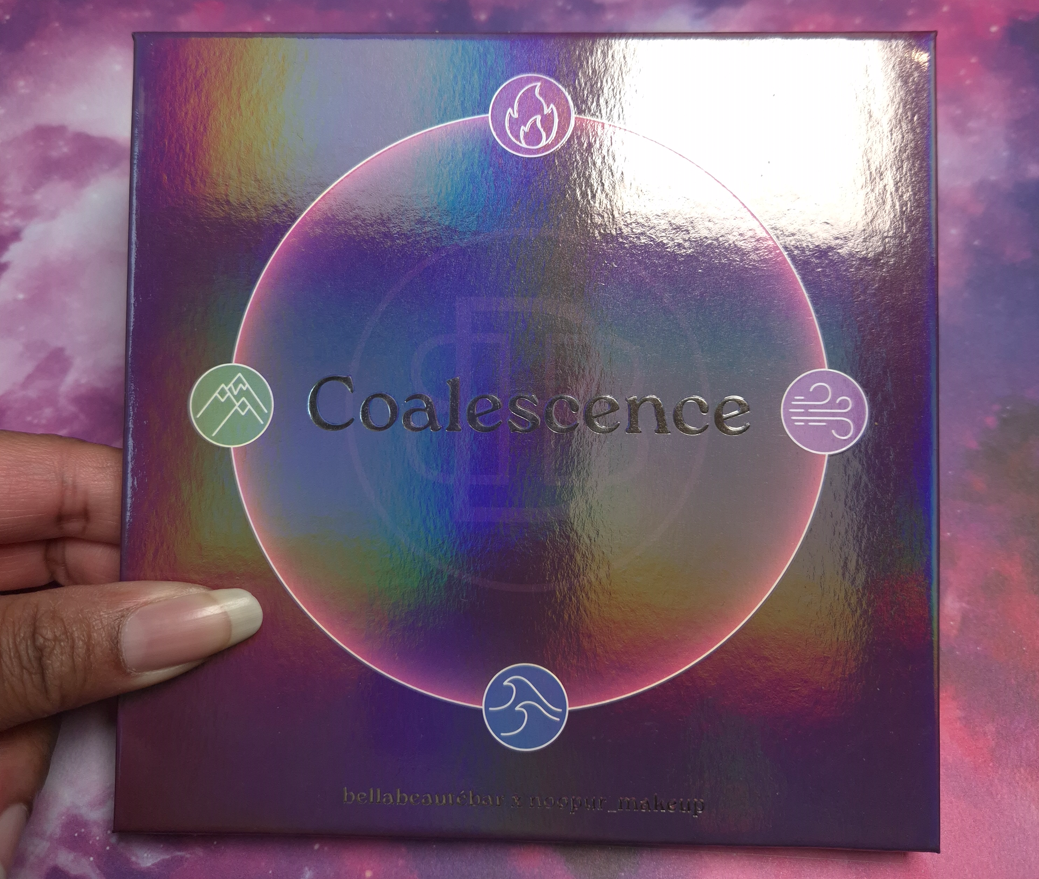
DISCLAIMER: Whenever I post about a brand, Influencer, or other public figure for the first time, I write a disclaimer to inform readers about any potential biases. Regarding Bella Beauté Bar, I am not affiliated with them in any way. I’ve heard nothing but positive things about their eyeshadow quality, so they’ve been on my list of indie brands to try for a long time. Regarding Noopur, I believe her Instagram account is one of the most well-known for indie brand swatches, especially multichromes. Her work is frequently in my feed, but I don’t know anything about her as a person.
I purchased this palette because purple and green are my top choices for colorful eyeshadows, and I love multichromes. All thoughts and opinions are my own.
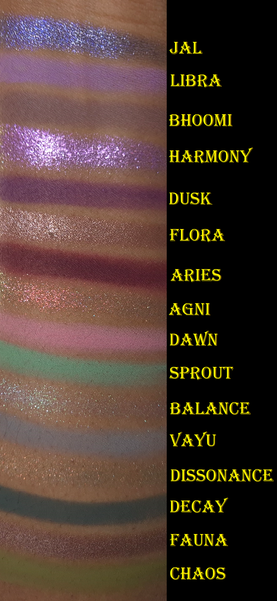
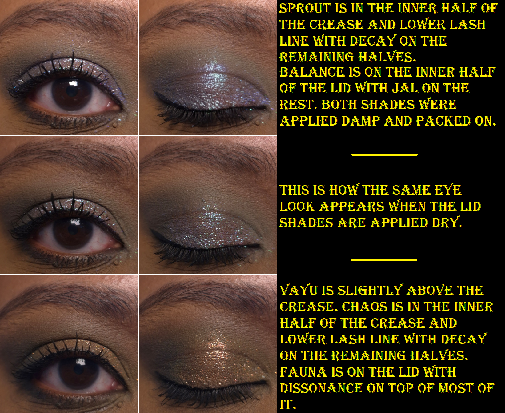
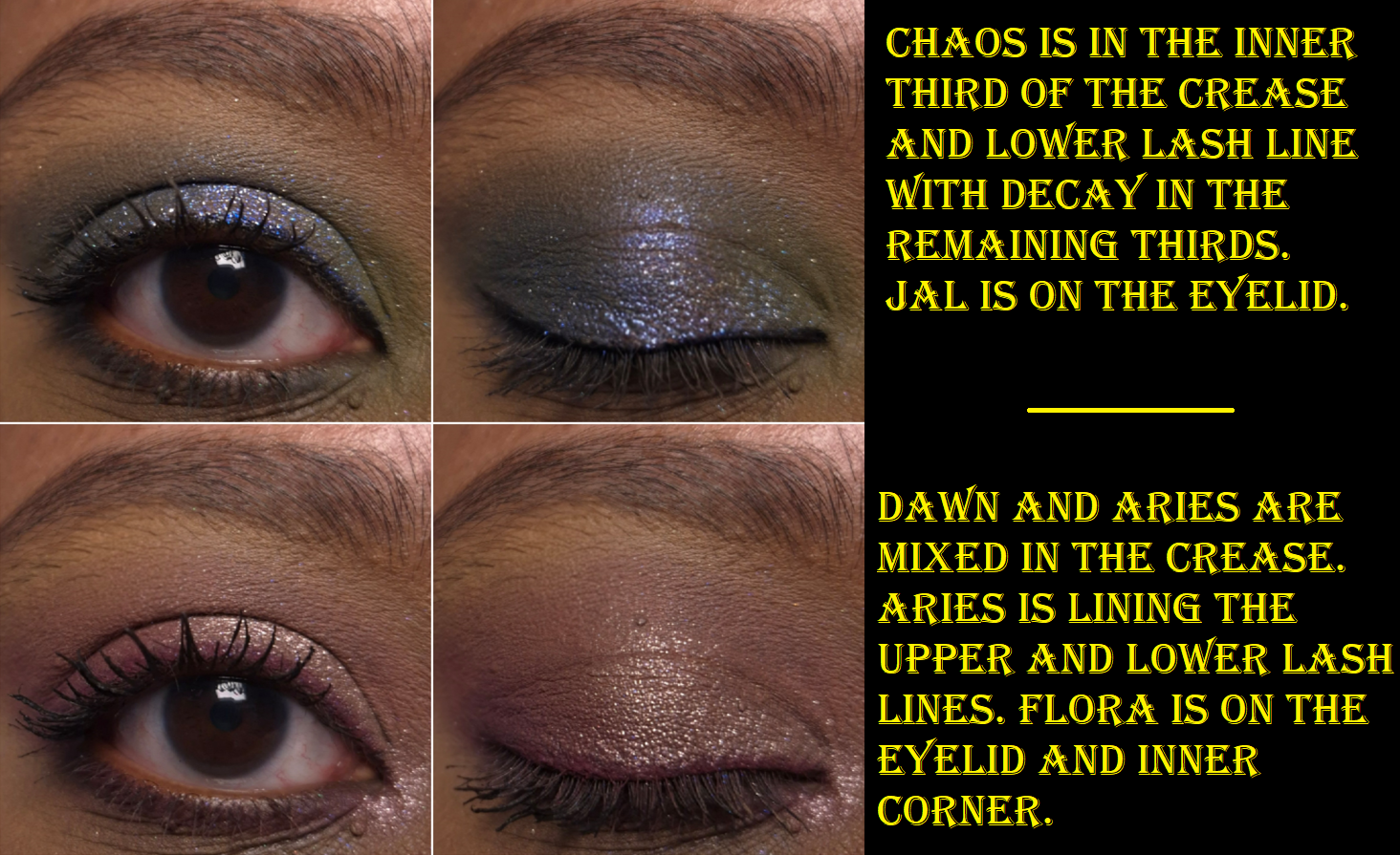
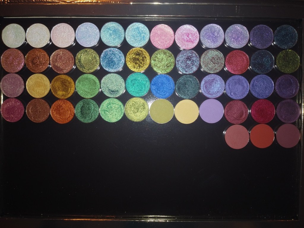
I ran out of room on my arm, so I moved Jal to the top. This is why the swatches aren’t completely in order.
I’ve owned this palette since the end of November 2025 and considering how infrequently I’ve been wearing colorful eyeshadows, I’m still surprised that I’ve used this a fair amount. Wanting to test this palette organically over time instead of forcing myself to apply it daily in a two-week period is why it has taken me so long to post this review.
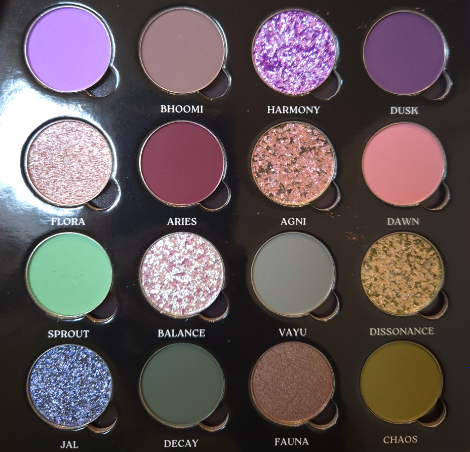
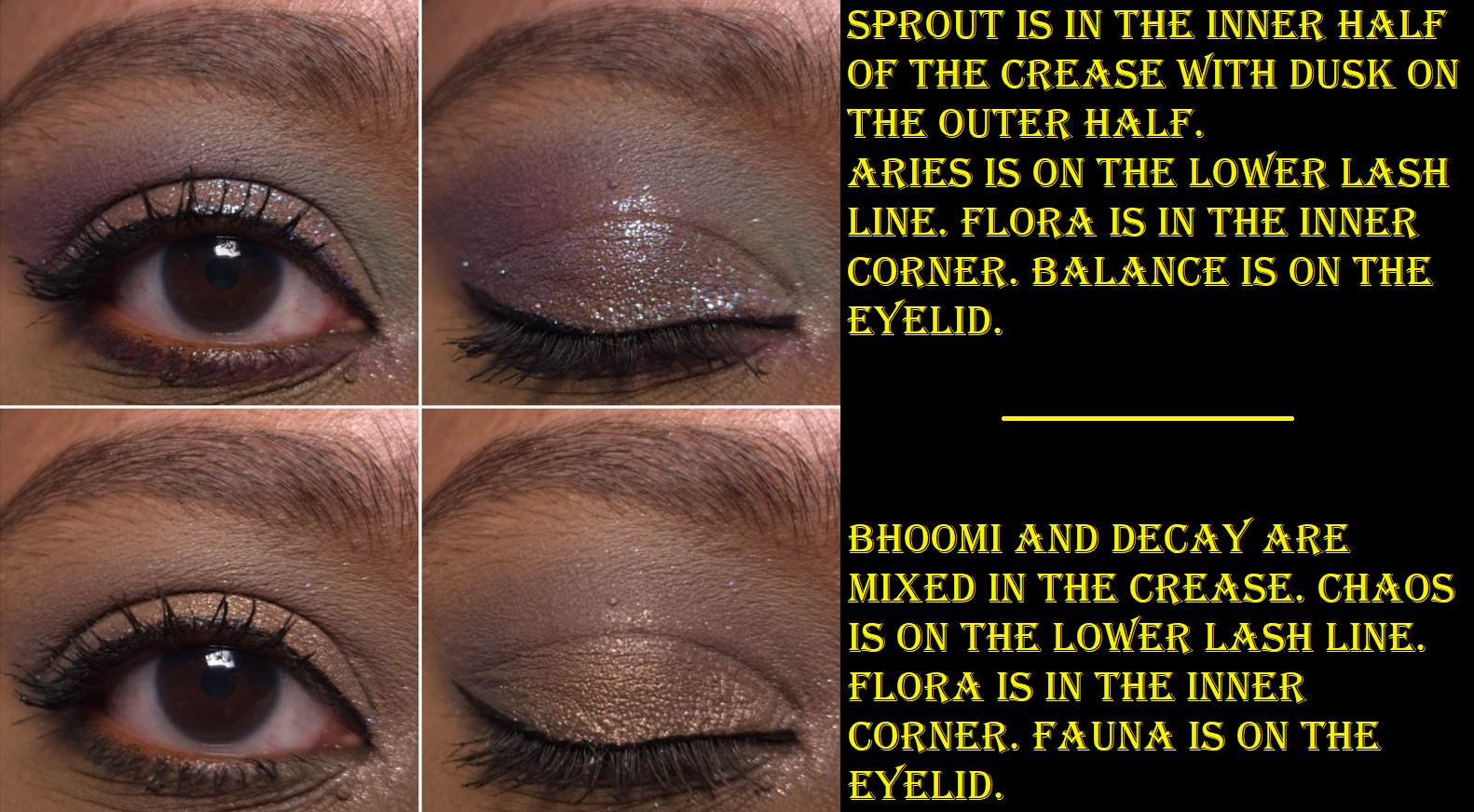
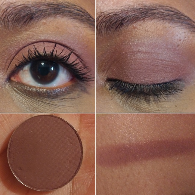
The Coalescence mattes remind me of Natasha Denona’s mattes, but with even more pigment. Some feel silkier (with some slip), some feel buttery, and all of them are soft to the touch. I am impressed by the kind of pastel shades not looking ashy on dark skin. However, they don’t build up and adhere as well to my eyes if I’m using my tried and true Lisa Eldridge Liquid Silk eyeshadow as a base. When I want to wear Libra, Dawn, and Sprout without them looking like sheer veils of color, I have to switch to the MAC Paint Pot or Milk Hydro Grip Eye Primer. The only other matte that needs special treatment is Aries because of its ultra pigmented nature. A little goes a long way, and it is slightly less blendable than the others. When I wipe my makeup brush onto my microfiber towel, it gets everywhere and has even transferred back off the cloth onto other objects before (brushes, fingers, etc). So, I try not to pick up as much onto my brush and build it gradually.
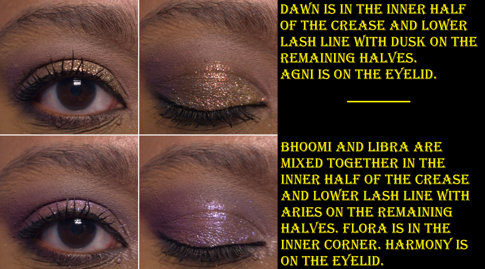
Although I was drawn to this palette for the greens and purples, I found myself mixing mattes together to try and turn them into the specific shades/tones I envisioned for my eye looks. These eyeshadows are formulated in a way that is actually pretty good at being able to do that. Some brands’ eyeshadows can sometimes be a little too good and turn a new color while I’m attempting to just create a gradient of one shade blending into another without lines of demarcation. Thankfully, I don’t have that problem with these, but I don’t try to just blend one shade on top of another when I’m mixing. I dip into both colors with my brush when I pick them up initially, so I can blend them into my skin at the same time. Then, I adjust it with additional product afterwards if needed.
All of the shimmers in the palette had small round foam coverings over them, which I assumed was to protect them in transit because they’re fragile. Imagine my surprise when I tried to rub my finger in Jal for the first time and nearly shifted half of the eyeshadow out of the pan! Thankfully, they can be pressed back into place in the pans.
This also happened with Agni, which is another of the flaky eyeshadows. Essentially, Flora and Fauna have traditional metallic and satin finishes. Flora has the benefit of being an impactful shimmer, but smooth enough for me to use it to brighten my under eyes. Fauna is even smoother, but is too dark to serve that purpose. I like having a neutral option theoretically, but since it’s so outnumbered by the more colorful options (and even the muted shades still pop), I find myself struggling to incorporate it into looks.
To minimize fallout, I can dampen my brush and use the Nyx glitter primer, but it still happens throughout the day. However, it’s not bad enough for me to consider it messy looking.
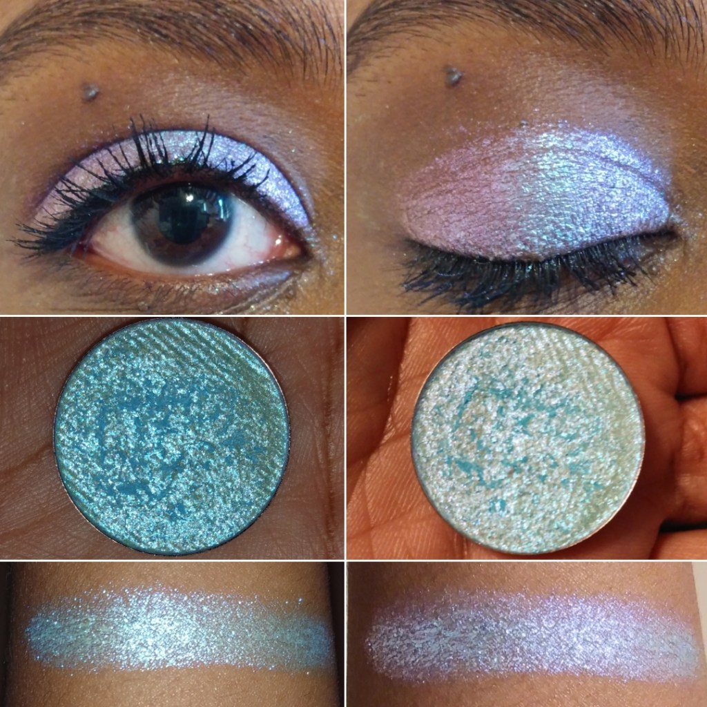
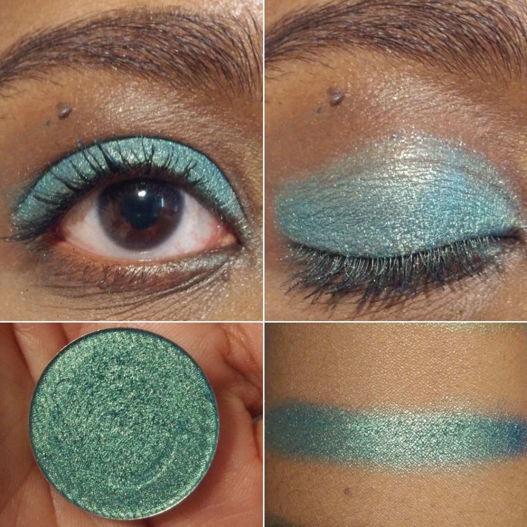
Harmony is described as having a “sheer purple base and shifts blue-purple-pink-peach with additional purple sparkles throughout.” I can see blue, purple, and pink as sparkles, but not as a color changing shift.
Agni is described as a “holochrome with a grey base and shifts pink-orange-gold,” which I agree with, along with Balance having a “super sheer base and a mix of green-pink shifting sparkles as well as blue-purple sparkles.” When I’ve tried to intensify the look of this eyeshadow and pack it on by wetting it or using glitter primer, I haven’t liked the look as much because it seemed like only the blue color grew bolder. I wish the shift was a bit stronger, but Balance is one of my favorite shades in the palette.
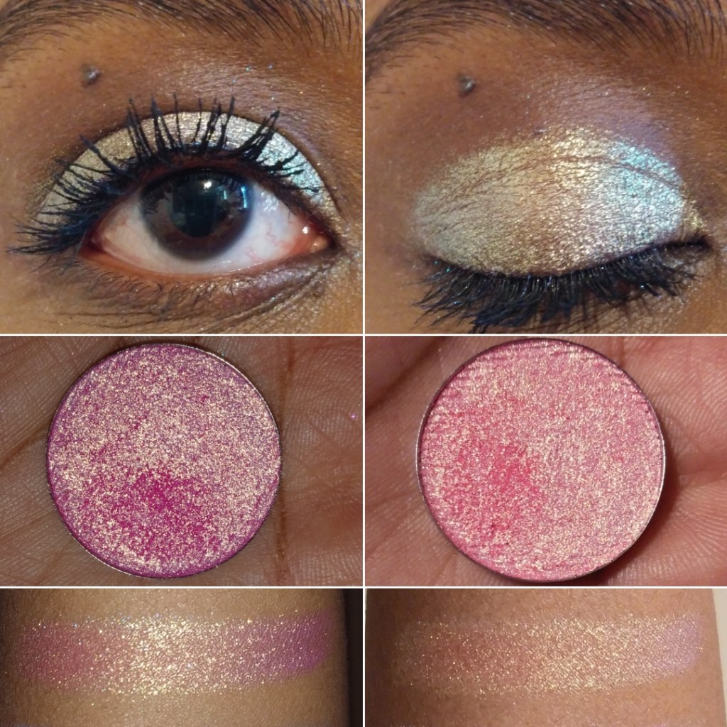
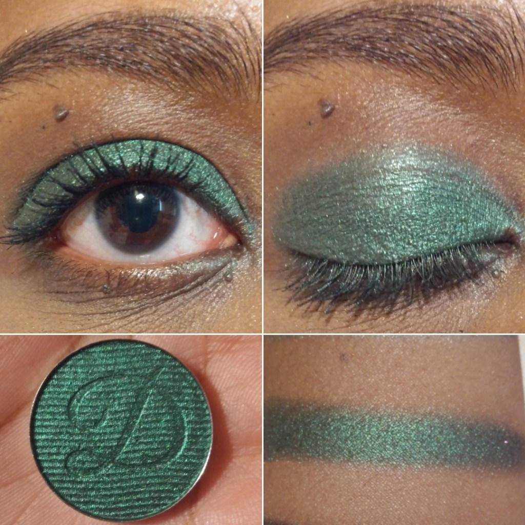
I have to admit that I was a bit disappointed that Dissonance, the “super sheer light olive base with silver sparkles and orange-gold shifting sparkles mixed in,” looks mostly just orange on me and not as green as it appears in the pan. It’s a pretty color, but I love greens and the only eyeshadows that read green on me are mattes: Sprout, Decay, and Chaos.
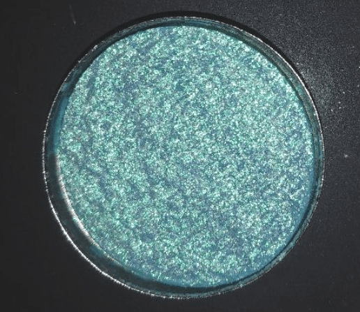
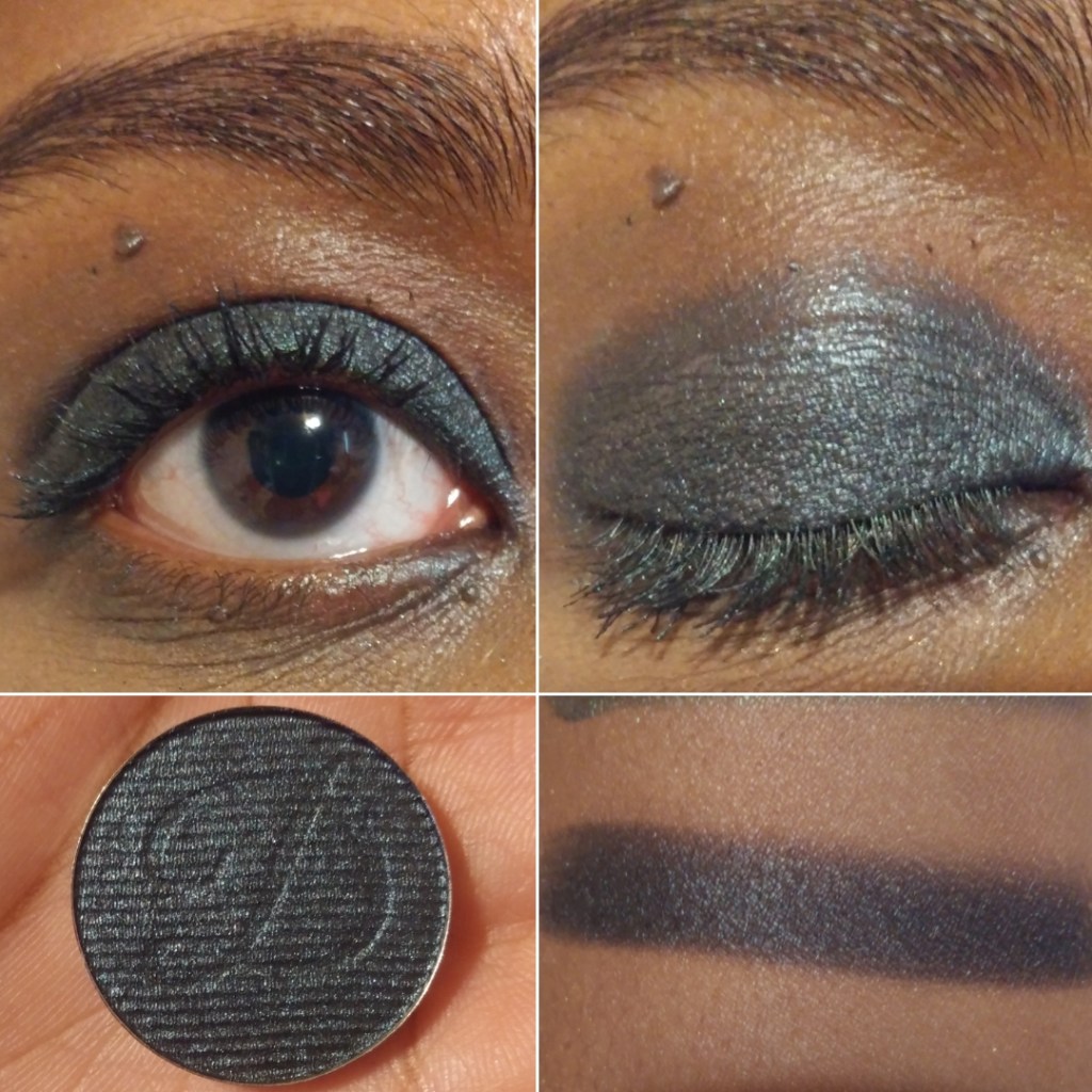
And then finally, Jal is a bright blue with silver sparkles. I’m not a lover of blue eyeshadows, so I didn’t intend to get much use out of this shade. When I think about it though, between Jal, Vayu being a blue-grey, Sprout being a minty-blue, Decay being a blue leaning green, plus the blue sparkles in Harmony and Balance, this palette feels like more of a blue palette than green. This explains why I sometimes get this sense of being unfulfilled when I use this palette despite the pretty colors and them having the sparkle intensity and impact that I like.
If the other Bella Beauté Bar palettes have this type of quality, I would happily purchase additional palettes in the future. The Coalescence eyeshadows, although able to be combined and tweaked, are not totally within my palette preferences. Part of my preferences is having ready-made colors available that I love, so that I can create looks quickly without too much thought. There are times when I do still enjoy playing with colors, which is why I’ve continued to reach for this palette periodically over the past six months. One of the great features of this palette is that it’s magnetic with finger holes in which to rearrange or swap shades. So, I still have an easy way to tailor the palette with other BBB shades or exchange them with standard eyeshadow pans (26mm) from brands like Sydney Grace, Clionadh, Devinah, Terra Moons Cosmetics, Fantasy Cosmetica, etc. The only thing to watch out for is that some of the brands overfill the pans (Sydney Grace mainly) so the mirror/inner lid of the palette could get messy from having eyeshadows press against it.
There are four pressed pigment singles that are part of the collab. They look stunning, but they were sold out on the Monolith-EU website when I was buying the palette, so I didn’t think about them again. I am still curious about how those differ from the shimmers in this palette, but I think I will pass on them anyway.
I’ve loved Clionadh Cosmetics eyeshadows from the moment I first tried them at the start of 2020. Their Stained Glass Collection is ever growing, and it’s their claim to fame for good reason. Other brands have eyeshadows that use some of the same pigments and have the same shifts, but I have yet to see anyone replicate the slick “mirror finish” of the Jeweled Multichromes. I was never a big fan of iridescent eyeshadows because of the way they can look dusty and dry on my skin tone, but Clionadh thought about those with more melanin and created the Deep Iridescent Multichromes with different colored bases (instead of white) to fix this problem. They created Glitter and Dimensional Multichromes for people that adore having maximum, but still eye safe, sparkle. Vibrant and Electric Multichromes are for true color lovers. Earth Vibrant Multichromes are for those that prefer muted tones, but still want easy-to-see color shifts. There are even combination types such as Glitter-Vibrants and Hybrids.
Clionadh has multichromes to suit everyone’s tastes.
As I mentioned before, the brands get their multichrome pigments from basically the same place, but Clionadh has perfected the art of combining them with various base colors to create a decent amount of eyeshadows that haven’t been duped. So, there are still some that are completely unique colors.
There are some duochromes within the Stained Glass line, but they also exist in the “standard circle” format, along with more traditional shimmer eyeshadows. These are less expensive and I find them to still be very nice quality. The mattes weren’t perfect, but I still like them when they used to be sold individually.
The only reason I haven’t talked about Clionadh as much within the last year is because of the difficulty I have in getting products in Germany. Their website doesn’t collect VAT/taxes/customs, so DHL (who did the final part of the delivery) demanded exact cash payment in person (which included the missing VAT plus their fee), without letting me know the amount in advance. If I want to know ahead of time, I would have to pay the $42 (36 Euro) shipping option on top of the VAT and extra fees, which I just haven’t felt was worth the added costs. I hope Clionadh will work out some kind of deal with Monolith EU again, as that would certainly make things easier for me!
I have some Clionadh eyeshadows that are getting close to turning six years old. Some of them don’t feel quite as smooth and creamy, but they still perform beautifully and haven’t gone bad yet. I’ve had eyeshadows that didn’t even last beyond a year (admittedly mostly vegan eyeshadow formulas like from KVD, Urban Decay, Coloured Raine’s different formula, etc). So, that makes me happy considering how expensive Clionadh eyeshadows can be. If you take four of Clionadh’s most expensive eyeshadows, it would be slightly more expensive than many luxury brand quads (but justifiable in price considering they’d be all multichromes).
Clionadh has a relatively small team, and I respect the fact that they make their eyeshadows in-house in Canada.
Oden’s Eye
Oden’s Eye is a favorite because they have every type of powder finish eyeshadow I could want: multichromes, duochromes, sparkly shimmers, smooth metallics, pastels, and just lots of colors in interesting tones. The variety is great and the quality is mostly good. Some palettes are randomly not as good, and I can’t explain why. For instance, I like the colors in Makeup Just For Fun’s palette, but the shadows were more powdery and the shimmers are thinner. I can only guess it’s due to what the creator requested of the formula. Fantasy Cosmetica has shimmers and mattes on par with Odens Eye, but I get 1 or 2 duds from the 9-pan palettes I’ve tried, which isn’t the case for my top 5 Odens Eye palettes. So, Fantasy Cosmetica ranks lower for that reason.
These shadows are also more suited for color lovers, but Oden’s Eye tries to appeal to neutral and color lovers by giving softer and non-grungy options sometimes within the palettes.
It’s a Swedish brand, but their eyeshadows are made in the PRC.
Fantasy Cosmetica
This is the brand I have the least experience with, as I only started buying their palettes in 2024. However, I love the color offerings among all the palettes and their theming. Even when they make brown shades, there’s nothing basic about them. They have very interesting tones. The Fighter Palette is a dream for those that prefer glam style neutral eyeshadows. Pat Mcgrath fans would probably like them, but the quality isn’t quite as refined as PML’s. The big price difference puts that in perspective! Some of their eyeshadows/pressed pigments are ultra vibrant. They’re all pigmented and opaque shadows. Most of them blend well. I usually have at least one troubleshade shade in every palette, but it’s rarely one of the shadows I was looking forward to using anyway. This brand does cater mostly to color-lovers, and they’re known for their intense shimmers, but I even like some of their smoother satin shades too. They find a way to make the toned down shadows appealing for me.
I believe these eyeshadows are made in the PRC.
Devinah Cosmetics
Devinah has my second favorite multichrome and duochrome formula, but their normal shimmers are just okay, which is why the brand doesn’t rank higher overall. Their mattes are also decent, but not the easiest to blend and use. In fact, they probably have the “worst” mattes of all the brands I’m mentioning in this post. However, they don’t make pre-made palettes, so customers can skip buying their mattes altogether.
I started purchasing from them in April 2020, and all but one eyeshadow (it’s a discontinued formula) is still in perfect condition. The performance, look, and feel of the shadows hasn’t changed. So, I can confirm mine have good preservatives in them!
It’s because of the fact that I had to acknowledge their multichromes and duochromes as coming second to Clionadh that I stopped buying from them in early 2022. However, to still maintain that number two spot is impressive. The custom palette I created with mostly Devinah shades has come with me on several trips and there are shades I’ve used in there even more frequently than Clionadh. So, if you live in the US and are dealing with the tariff situation, this could be a nice US-based brand to check out.
I don’t know if all of Devinah’s eyeshadows are made in-house, and if only some of their catalogue isn’t made in a lab, but I can confirm that at least the mattes are made by them.
Sydney Grace
Sydney Grace isn’t really in the multichrome game with powder eyeshadows, but they have a gigantic selection of standard shimmer eyeshadows in unique tones. They have many colorful sparkling eyeshadows, but the brand puts a lot of focus on natural/neutral and more muted types of shades. They also have a lot of satins that appeal to fans of luxury eyeshadows who prefer a smoother texture-friendlier look, but just crave more pigment than most luxury eyeshadows provide. The Sydney Grace eyeshadows are pigmented, opaque, and also thick. I like my finished eye looks with them, but I tend to prefer my even more blingy, shiny, and exciting eyeshadows from other brands. Also, their mattes are pretty good. They are almost on the same level as Odens Eye, but Sydney Grace’s best mattes are typically in boring colors I can get from any brand. So, I tend to not use them.
Sydney Grace eyeshadows are made in the USA. I’m fairly sure they made their own eyeshadows and formula in the early days. I don’t know whether they have continued to make them in-house.
I have three honorable mentions.
For starters, Melt Cosmetics is technically an indie brand, but I have seen their products available at different retailers and they seem to be a much bigger business, so I have a hard time putting them in the same category. Considering how many huge sales I’ve seen in the last three years, and the lack of interest from among beauty lovers, I honestly wonder how long they will stay in business. In any case, the brand’s mattes are in my top 10 favorites. I love the colors, tones, pigment level, layerability and blendability. The shimmers are okay at best. They have such a big issue with mold or things growing on other people’s palettes that I always feel uncomfortable recommending the palettes, even though mine have been fine.
The second honorable mention is Kaleidos. I haven’t tried many of their palettes, but I loved the mattes in Club Nebula and Futurism 1: Sci-Fi Green. The shimmers are nice, but not super special. I can’t include them on the list because I haven’t tried any of their “newer” eyeshadows in the quad format, and it’s only recently that they launched their first new products in the last two years. So, it’s been quite a few years in total since I’ve been interested in their eyeshadows.
Terra Moons is an honorable mention mainly to address the fact that I’ve often said their multichromes are my third favorite formula. However, the normal shimmer and matte quality pulls them below being in my favorite indie brands. There is also the fact that I hardly use my Terra Moons shadows because I think to myself, “Why use these when I could use my Clionadh and Devinah?” So, I only use the shades I don’t have a close match for in the other brands, but then I think about how the eyeshadows made by the others are still good enough and I don’t need this unique one! The mattes I bought from Terra Moons are unique to my collection, but I wish the quality was better. So, I can’t call this brand a favorite if I don’t use them.
This isn’t an honorable mention, but I feel compelled to explain that I like Lethal Cosmetics a lot as a brand and I respect what they create. Their eyeshadow formula is a bit chunky. The multichromes are on the weaker side. The mattes are fine. I like the eyeshadows with uncommon tones, but I just don’t think about them often enough. I feel like I’ve moved on from their eyeshadow formulas.
So, this is my list! I hope this is helpful to fans of small independent businesses, and to anyone curious as to which brands to start with if you’re trying to move away from paying for mainstream eyeshadows.
This is one of the posts I’ve held as a backup. I have a lot going on in my personal life, plus with the holidays. So, this will likely be my last post of 2025. I wish you a happy holiday season and I hope to see you in the New Year!
Oden’s Eye Cosmetics is a brand I’ve really come to love over the past year and I’ve tried quite a few of their products. Their color stories and finishes don’t always match my style, but there was something compelling about the entire Legendary Diversa Collection. I couldn’t choose between them, so I decided to purchase all three. They each retail for $34 USD and shipping is free on orders over 50 euros (roughly $58). Influencer promo codes did not apply to the collection, but they worked on everything else. Each palette also comes with a corresponding scarf that matches the cover art. My products came in a special edition Legendary Diversa box, which I’m not sure if I got because I purchased all of them or if anyone who orders from the collection gets it.
I also got a free brush, which has happened for my last few orders. Again, I’m not sure if this is because I spent a certain amount of money or if everyone gets a free item when they order. I have not used the brush yet, so I will not be reviewing it here today. If you’d like to see my review of other products from Oden’s Eye, click here.
One thing I’d like to fully disclose is that these three palettes are collaborations with YouTubers: The Fancy Face, Annette’s Makeup Corner, and Judy. I follow Tina (The Fancy Face) and consider her one of my favorite YouTubers. I’ve spoken about her several times on this blog and while it’s true I would have purchased her palette regardless of the color story (this is partly to do with my trust in the quality of Oden’s Eye makeup), my support of her does not mean it gets a free pass. I hold it to the same testing standard as any other product I review. Annette is someone whose videos I watch from time to time and have started to watch a little more recently. As for Judy, she left me a nice comment on Instagram, but that’s the extent of our interactions. As for her content, I’ve only watched her Oden’s Eye videos. I wanted to make sure I put that out there in case anyone wonders if I will be biased. The artwork for all three palettes were equally beautiful and I wanted them all for that reason. The book-like format, sizing of the palettes, the unique outer texture, the reflective holographic sections that add a sort of glow when the light hits it, the shapes of the pans, etc are all so appealing to me. These packaging details are all part of the brand’s aesthetic. The collaborators’ images were used for the covers and it’s their color stories, themes, and final decision whether the formulas are up to par, but because these ladies were working with a great brand, it’s not surprising that I’d like their palettes. The infamous Too Faced x Nikki Tutorials collab is proof that the best of ideas a collaborator has will still do poorly if the company they’re working with fails on their end. Besides the packaging, I love Oden’s Eye’s formulas, so it’s just a winning combination between the brand and these three ladies. It comes down to whether someone likes Oden’s Eye shadows and in these particular shades.
Before we get started, I just wanted to add (so I won’t have to repeat myself three times) that each palette has a multichrome. These don’t have a dark base and they’re a thin metallic smooth type of formula, so they will actually look very different if layered on top of different eyeshadow colors. These provide a lot of shade variations and combination possibilities to the palettes.
The changes in lighting really do effect the looks of these shades. It’s mind boggling how they appear distinctly different in the pans, and while indoors, but if I step outside they suddenly look quite similar to each other.
These don’t surpass my top three favorite multichrome formulas from Clionadh, Devinah, and Terra Moons, but I do like them. They’re nice and shifty and perfect for those who don’t like the chunky, glittery, or dark-base types of multichromes.
The Hummingbird Palette
This palette appealed to me because it’s so bright and colorful. Purples and greens are my top two favorite eyeshadow shades, but I think I may have been intimidated by all the different color choices if it wasn’t for the Kaleidos x Angelica Nyqvist Club Nebula palette. The Club Nebula and Hummingbird palettes have a very similar vibe to each other. Because I learned what shades I like to pair together in Club Nebula, I knew exactly which combinations I wanted to try with the Hummingbird palette. Club Nebula will not be restocking, so if anyone missed getting that palette, I think this one is a great option.
There aren’t any spot on dupes, but some similar looks can be created. I will say, I prefer the multichromes from Oden’s Eye over the ones from Kaleidos. As much as I like the matte formula from Oden’s Eye, I think the mattes in Club Nebula specifically are even more my speed. The pros and cons for both make it so that I couldn’t choose which one I like more, so perhaps those who already know they like Club Nebula will enjoy Oden’s Eye’s palettes as well. Just as I felt the Club Nebula color story inspires me to try new things, I still see even more shade combinations I want to test out with the Hummingbird palette that I haven’t yet. It inspires me as well.
Of the three palettes, the Hummingbird palette has the most number of different finishes and also the greatest variation within the formulas. There are five mattes, the multichrome, two metallics, and four shimmers. Among the mattes we have Lagoon which is right on the cusp of being a cream to powder, or “cream to matte powder” as Tina describes it in her launch video. It’s just barely creamy enough to be detectable by touch in order to tell it’s more than just a creamy feeling shade. In fact, it reminds me of the satin-like metallics (Realism and Passion) and creamier shades (Obsessed and Colourful Black) from the Oden’s Eye Norn’s Palette. Unlike those shades from the Norn’s Palette, this one has no tugging on the skin and performs just like the other mattes. It’s a dark almost navy blue in the pan and can look that way if packed on, but when Lagoon is spread out, it’s revealed to be more of a deep teal. That’s why I compared it to Queen of Blades in the Club Nebula section rather than Void. Clear Blue is a very thin matte that can be built up to full opacity. It’s not my kind of shade on its own, but it makes a fantastic shade to blend out the edges of a matte. I love pairing it with Star Apple because it makes the edges turn a light violet purple. It also works beautifully with Lagoon. But speaking of Star Apple, that’s my one troublesome shade from the palette. All the other shades are easy to apply and blend, but Star Apple takes significantly longer to get an even color. At first I thought it was because it’s a patchier shade, but then I realized that whatever red-raspberry tone was used to create this purple actually peeks through. It’s visible in the edges of the swatches as well. When I take photos, the red that shows through makes it look unblended, even though it’s completely opaque in person. So in order to make it look nice for the camera, I actually take a tiny bit of Lagoon and blend it in. The blue from Lagoon mixed with the red spots in Star Apple turns it purple without changing the overall color. As much as I love the concept of the shade and how perfectly it captures the color of the actual fruit, it makes the most sense to just use it paired with the other pink and red shades in this palette. If I want to pair it with blues, I need Lagoon with it. Red Hills is a beautiful dark red that when applied in a thin layer shows a lovely warm orange hue it has to it. Hibiscus is the last matte and it’s a stunning vibrant deep-pink red shade. It’s difficult to describe and I don’t have a shade like this in my collection, which is a pretty big feat. The closest thing I have to it are some of the neon mattes from Terra Moons and Splash from the Coloured Raine Vivid Pigments. With Hibiscus, using the right primer will ensure it stays vibrant on the eyes. There are a few times I had issues of it deepening up.
The main differences between the metallic formula with shades Feathers and Tropics compared to the shimmer formula is just that they are a bit smoother and more fine. The other shimmers are a bit wetter in texture and a little on the chunky side. Among the shimmers, the shade that really stands out is Hummingbird because it’s a duochrome that’s mainly dark purple but has a variety of shades of purple and blue shimmer.
The Giant Wolves Palette
The Hummingbird Palette is vibrant and fun whereas this color story is the most “me.” It’s the selection of shades I was drawn to the most. It still has greens and purples, but with a grungier smoky side to those shades.
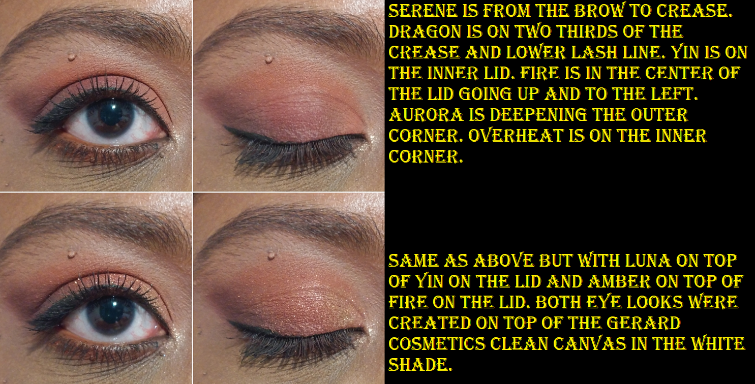
The first time I watched Annette’s launch video, I actually missed the part where she said each row of three could be one eye look. When I was deciding which colors to pair with each other, I swatched them in order on my arm. I did notice the groups of three were nice, but I loved how the groups of four looked together. Making those initial swatches was when I noticed the shade Hati was incredibly hard to pick up. I had to make 3-4 passes to build it up to what is shown above. It wasn’t so much an issue of being sheer as it was not getting it to spread across my arm. The fact that I could get product onto my finger every time showed me that it wasn’t hard panned, but the shadow was so compacted that I knew trying to pick it up with a dry brush would be quite the chore. I thought mine was a dud until I rewatched Annette’s video and saw that she said this shade was, “…harder pressed in the pan than I wanted.” This could mean physically pressed too hard or the use of too much of a binding ingredient. As it stands, the shade Hati is the only one I wasn’t impressed by and since a looser press had the chance of changing my feelings about it, I decided to try the physical route and repress it myself. I broke up the shadow using a cosmetic spatula and it remained in large soft chunks like dimethicone heavy shimmers tend to do. Then I used the spatula to lightly flatten it back down, particularly the edges, and then placed a paper towel over the shadow and gently pressed down with my finger. I did not add any liquids. It was a dry repress. I suspect there was already slightly too much dimethicone in the shadow in proportion to the other ingredients, but what I did still improved things a bit. I could swatch Hati across my arm with 2 passes. I considered it a topper type of shade before and pressing it myself didn’t change my mind about it. It can be built up to be very sparkly but it’s too sheer for me to want to use by itself, so I’ll keep using it as topper to add extra sparkle to looks.
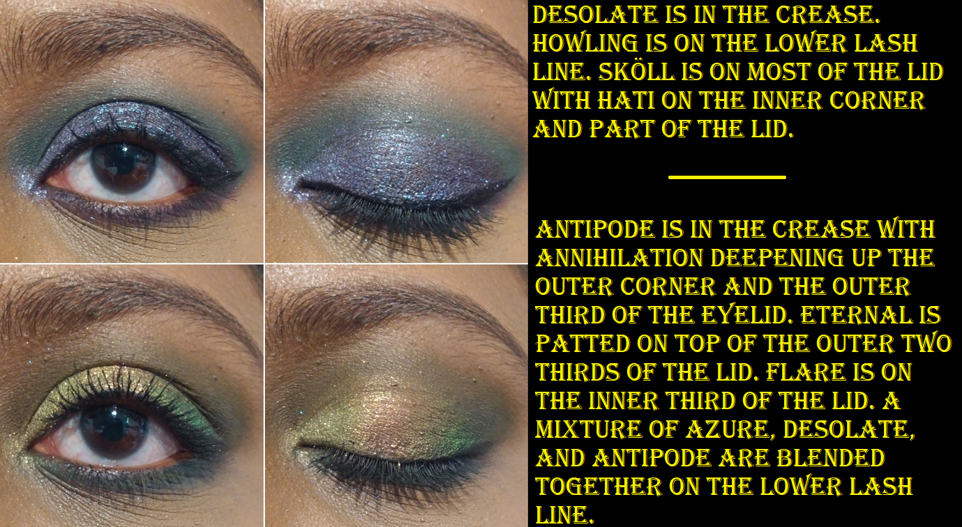
We have three other shimmers and seven mattes. They all perform perfectly and the only noteworthy things I want to mention is that Desolate looks a lot more green in the pan but on my skin it comes off as a green leaning dark teal. The actual shade description according to Oden’s Eye is, “grey…with a slight green tone.” Annette describes it as a “bright dark green” so I feel better about the fact that it’s hard to describe this kind of shade. But as I said, it’s more of a teal on my skin. Astral looks more gold than it does in the pan and Sköll is like a duochrome purple-blue. It’s a black based purple as opposed to the brighter purple of the shade Hummingbird from the Hummingbird palette.
This palette also inspires me to try new combinations and brings me so much joy to use.
The Red Dragon Palette
This is the most neutral of the palettes, which made it the only one I wasn’t certain I would get. However, I have Annette’s reveal video to thank for deciding to get it because the poolside video with the sun hitting those swatches showed the palette in all its glory. The colors are so much more stunning and more interesting than it looks on the surface. And then combined with Judy’s eyeshadow look in her launch video and using the shade Dragon for blush…I was officially sold!
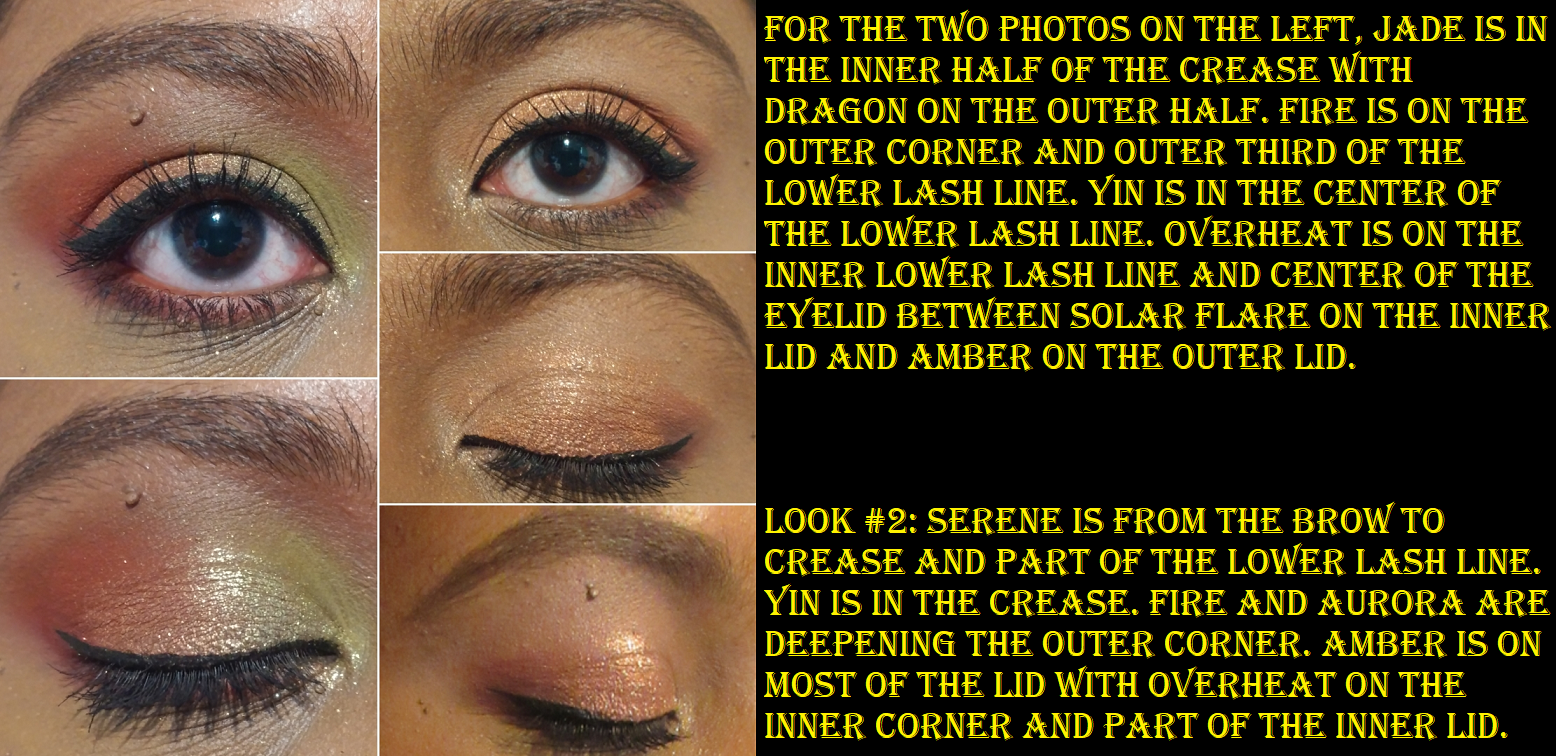
This is the most matte-heavy of the palettes with a grand total of eight. They all work beautifully and blend easily, but I should note that Sunrise, Jade, and Serene are a bit thin and will need some building up in order to be fully opaque. Also, Sunrise and Serene have a very hard time showing on camera, but they are visible in person. The effects of using Sunrise as the transition shade into Jade really helps to emphasize the yellow tone within Jade, but Jade is still beautiful on its own.
For deepening up looks, my options are Claw, Fire, and Aurora which add enough depth if I’m only pairing them with the light shades, but if I want to also use a mid-tone like Amber or Yin, then they aren’t quite as deep as I’d like for my skin tone. Aurora in particular looks like it should be dark enough, but I have a hard time layering it on top of other shadows. I appreciate the fact that Judy wanted to have these darker shades so no one would have to pull from other palettes to create a look, but it’s something I’ll still likely end up doing in the future.
Using a white or light base helps to distinguish all the red colors when I use them together on my eyes. They can get muddled if I don’t place them correctly, or use either a clear base or one that matches my skin tone.
I’m really quite shocked how much I enjoy this palette. I would not have thought to pair that mustard yellow-brown and jade green with those reds. I still struggle with shade pairing and finding new ways to put colors together, so this was a great learning experience. I’m very happy I decided to get this one as well.
So, do I recommend these palettes? Absolutely, yes! I recommend giving Oden’s Eye eyeshadows and even their blushes a chance. The older original palettes contain pressed glitters, but the releases in the Norn’s Collection and onwards do not have them.
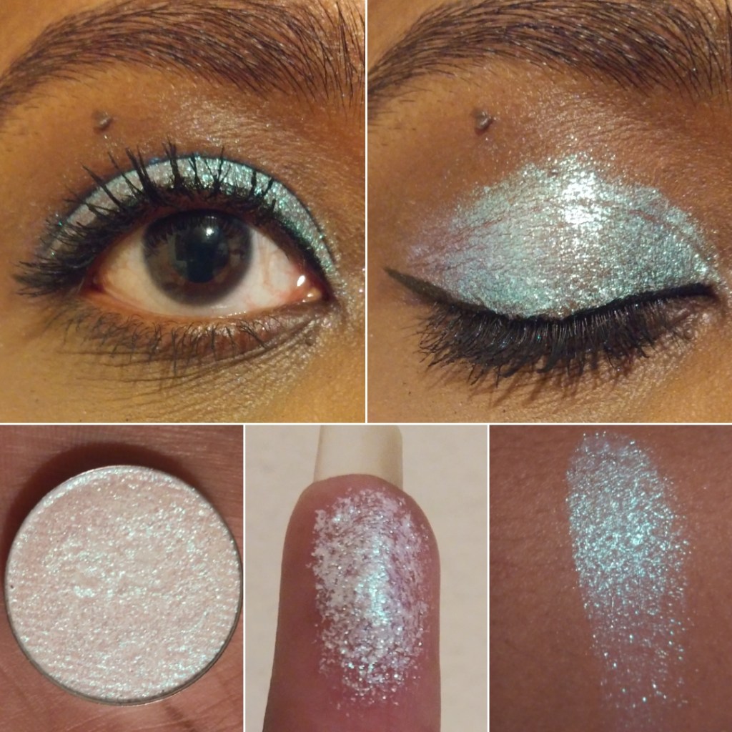
Devinah is one of my favorite indie brands. As a favorite, you can expect their products to be pigmented and beautiful like all the other shadows I love. What helps set them apart is that their price point for duochromes and multichromes are on the less expensive end. Their shadows are also a unique texture, unlike any other brand’s shadows I’ve experienced. Some of the mattes give some resistance when you try to rub your finger in the pan, yet they apply so smoothly to the skin. Some shimmers give resistance too, some are smooth, a few are dry, and some feel like a putty without moving around like a putty. The closest similarity would be to a Colourpop Supershock shadow, but without as much of the dimethicone/silicone feel to them. Devinah’s feel “heavier.” It’s hard for me to explain. The textural element is important to note because when I purchased the XPLODERS Collection, the Everlasting Gobstopper shade shrunk.
As you can see, it was unbroken and still in a perfect circle, just loose and sliding around in the pan. When I contacted them asking how this happened, they explained that the formula enables these shadows to be pressed back into place without breaking. They still offered a replacement or store credit, even though mine technically didn’t break, so their customer service is definitely top-notch!
It took very little effort to be able to press the shadow back together, and it looked like nothing had ever happened to it! I’ve been able to do this with Clionadh shimmers when I accidentally dropped them, and other soft shimmer shadows, but Devinah’s shadow is the only one I’ve been able to press back and have it look brand new using my fingers alone! Again, I think this goes back to the near putty-like texture.
As for Devinah’s multichromes, like the shades in the Butterfly collection, they feel closer to a traditional shimmer eyeshadow (still with some slip) in terms of texture. I apply the inner corner of shimmer shades with a brush, but I use my finger everywhere else on the lid. This is why texture has become an important element for me, since it adds to my enjoyment while using them, and why I felt it was important to delve into this much detail about it.
I use MAC Paint Pot for Matte shadows and Nyx Glitter Glue for the glittery/sparkly shadows. The more satin/metallic shades that shine without use of glitter have enough slip that I don’t think a primer is even necessary, but I still use MAC Paint Pot with them anyway.
SUGAR DROPS COLLECTION
The Sugar Drops are semi-transparent shifting glitter eyeshadows. Devinah recommends using a glitter glue to help the shadows adhere. They make great topper and highlighting shades and are recommended to try over white and black bases.
Cake Bomb – This shade shifts green and blue. On me it looks like seafoam green to powder blue.
Soda Swamp – This looks like a peachy pink to pinky-purple shift, but I mainly just see the peach-pink. I didn’t like the way this looked over white and black bases. Though the black base made the sparkles stand out more, it turned cooler-toned, which isn’t as flattering on me. Over the white base, I couldn’t see the shift anymore.
Puffles -This looks like a pink-blue-green shift. Of the three, this is the one I like most because it makes the biggest impact.
XPLODERS COLLECTION
This is the only Devinah Collection I have in its entirety. I bought them all because I couldn’t decide between the shades! The brand recommends using a glitter glue with this one too. They remind me of the sugar drops but with more of a base color.
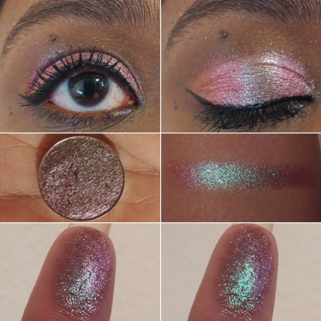
Everlasting Gobstopper – I can see purple-pink, a goldish green, and light blue. Blue is the dominating shade though in most types of lighting. I love how easy it is to see the shifts in this, though I wouldn’t wear a shade like this on it’s own.
Nerds – This has a blue-green-gold look, but on my eyelids the greenish gold is all I see. I don’t see blue, even though that’s the main color in the pan.
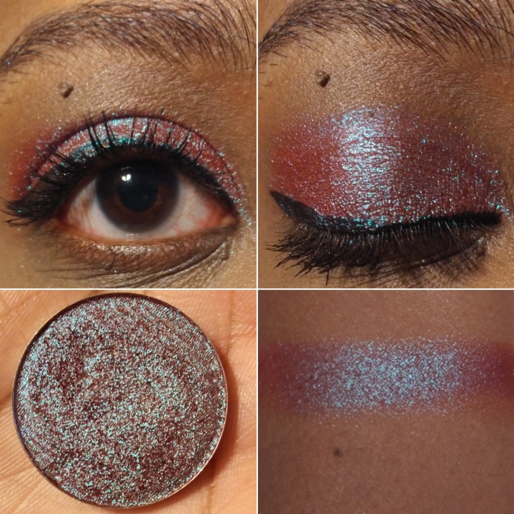
Swudge – This shade is blue-green with a purple shift, though strangely on my eyes the purple is more prevalent. This one I would feal comfortable wearing alone.
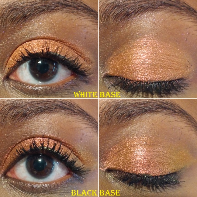
Pixy Stix – This is a pink to gold shift, but there’s no visible pink on my eyelids when glitter glue is used. Over a white base, the pale pink tones show and it looks similar to the shade Gelicide. Over a black base, it turns a darker gold.
Kazookles – This has a pink to purple shift, but on my eyelids it looks like there’s a bit of a gold shift as well.
Marshmallow Pillows – This is a pink to purple to blue shift. The blue and purple pop more on my eyelids, which makes this my favorite of the XPLODERS.
Runts – This shade is a lilac to purple with pink glitter, though the purple is so light that I can barely see it in person (and not in photos).
NEWEST MULTICHROMES
I bought two of the three new eyeshadows as part of the galaxy dust shifters collection. With these shadows, they recommend using glitter glue and trying them out over white or black bases.
Tucana – I would call this a rose gold shade, even though it shifts from golden peach to pink. Or maybe it’s rose gold to pink. I’m really not great at describing shades.
Centaurus – I describe this as a shift from yellow gold to a more orange-gold.
GALAXY DUST SHIFTERS COLLECTION
Whereas the Sugar Drops and XPLODERS are more on the iridescent side, the Galaxy Shifters have a lot more pigment to them. They remind me of Clionadh’s glitter and hybrid multichromes from the Stained Glass collection.
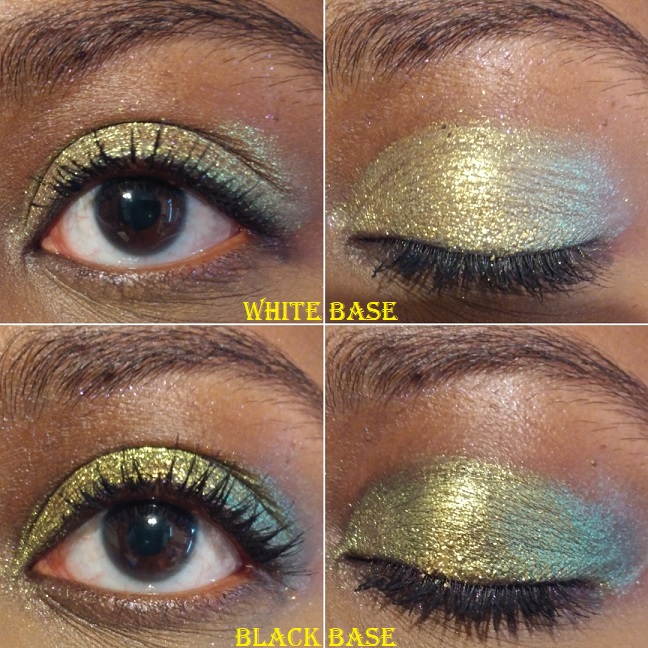
Celesta – This shade is like a vintage gold to olive. There isn’t a significant difference when used over a white base, as it just makes the shade lighter. Over a black base, it makes the green a little more apparent.
Skyla – This is like a fuchsia to purple with blue reflects.
Asteria – This one is a pretty cranberry to mint.
CANDY CAKES COLLECTION
The Candy Cakes shadows remind me of the Galaxy Dust Shifters, but without a shift. They’re like very pigmented duochromes. If there is a shift, perhaps I can’t see it because the shifting color is too close to the dominant one.
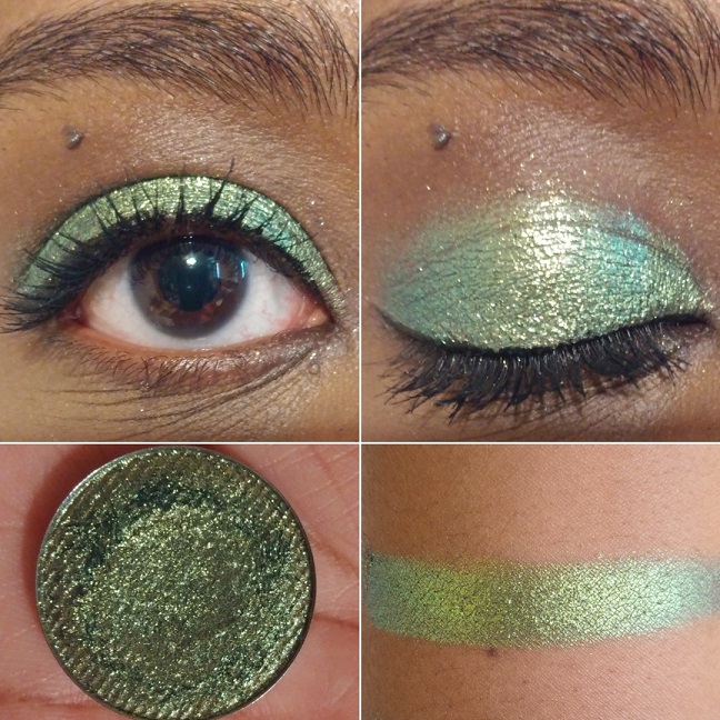
Rainbow Blossom – I really like this shade. It’s a beautiful fern green and gold.
Confetti Kisses – This is not my type of shade, but I was so curious about it that I had to get it. It’s like a bright sky blue with pink and purple shimmer.
Sweetie Sunbeam – I think this shade has a rosy base color but is mainly a coppery gold.
BUTTERFLY KALEIDOSCOPE COLLECTION
The Butterfly Multichromes have the most pigment and strongest shifts. These are the closest shadow comparisons to Clionadh’s Jeweled Multichromes, but without the black base.
Morphinae – The cool purple to blue shift is strong, but on the outer edges you can faintly see warmer purple too. A white base tones down the shade. I expected a huge impact when using a black base, but I didn’t get that. It did turn this shade smokier and intensified it slightly, but still nowhere near Clionadh or Sydney Grace’s multichrome level. That being said, not everyone wants that level of intensity. Some makeup lovers aren’t into deeper smoky colors and will possibly like these better. I love the ones with black bases, but I admittedly don’t always go for that look either.
Parthenos – The more obvious shift goes from a lighter green to a darker green, but the outer edges have a little aqua blue or cyan.
MULTICHROME MADNESS COLLECTION
Nacarat – This shade has a subtle shift from darker to lighter orange. I was surprised to discover this grouped in with the multichromes, since it’s so difficult to see any shift at all. I was also surprised to see both white and black bases dulled the intensity of the orange, though the black base showed the lighter orange shift better in the outer corner. Though it doesn’t show as much on camera, over the white and black bases, I also noticed a slightly pink tinge to the shade as well.
Pavonine – When I think of common duochrome and multichrome shades, this one comes to mind as a dark berry/burgundy with green-blue shimmer. Even though this isn’t a unique shade, I don’t have that many in my collection, so I decided to buy it anyway.
UNBUNDLED MULTICHROMES/DUOCHROMES
Gelicide – This shade was a lot lighter than I expected. It’s like a light baby pink with champagne shimmer. Strangely enough, I like it and think it would make for a great inner corner or inner third lid shade.
Empress – This shade reminds me of Sunbeam Sweetie, which I will compare later in this post. I love this one so much! Most pinks I encounter are cool-toned, which isn’t as flattering on my complexion. However, this one is deeper and warmer, so I love the way it looks.
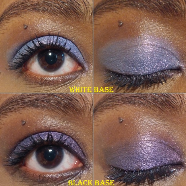
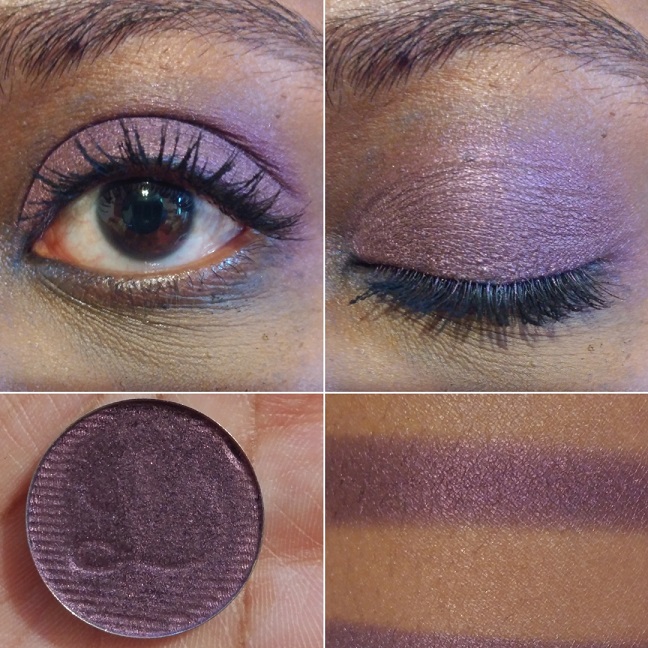
Charmed – This type of purple duochrome (with the light to medium blue shimmer) is a very popular eyeshadow shade, but it tends to be on the sheerer side. I’m glad I bought this one because it is the most pigmented purple of this kind I own.
Vicious – This eyeshadow is looks purple in the pan, but has a cool blue tone to it on the eyes. When I wore this in a video chat, it looked completely blue on camera. Over a white base, this shade looks relatively similar to what it looks like on a clear base, but the blue is slightly brighter and less silvery. Over a black base, this makes the purple dominate. This is probably my least favorite eyeshadow in my Devinah collection, with the exception of the shade it turns over the black base. That kind of purple is what I was hoping it would be from the beginning.
SOMEWHERE OVER THE RAINBOW SET
This collection was inspired by the Wizard of Oz. I love that so many of Devinah’s shade names are inspired by different things, for example, the types of butterflies in the Butterfly Kaleidoscope collection, the Willy Wonka theme of the XPLODERS, Salvatore from the Vampire Diaries. The owner (DeAndra) mentioned in an instagram post that she likes horror and murder mystery genres. With shade names like Homicide, Criminal, and Devious, it is very apparent. I’ve also seen Egyptian inspirations, the show Sparticus, etc.
Upon first impression, I despised these two shades because of the fallout. These were among my first the few Devinah purchases, when I had gotten accustomed to their regular shimmer and metallic formulas where using an eyeshadow primer wasn’t a necessity. I had used them over bare skin and then MAC paint pot and they looked so dull. Once I used them over a glitter glue, my opinion completely changed. Glitter fallout was no longer an issue and they looked a lot more opaque and impactful. I highly recommend using a glitter glue with the shadows in this Somewhere Over The Rainbow formula.
Are you a good witch – This is a sparkly dark purple with pink glitter.
I’ll be tender, I’ll be gentle – This shade is a deep teal with aqua glitter. It reminds me of the Lapis Lazuli shade I love from Pat Mcgrath.
PRESSED SHIMMERS
I don’t have much to say about the shadows in this formula, beyond what I mentioned in the introductory paragraphs. They perform well, have longevity, can work without a primer but I like them with my MAC Paint Pot (not as much with glitter glue though). Some of these are shimmers but some have more of a metallic feel with some slip. It’s as though each shade has its own tweaked formula to maximize its effectiveness and beauty.
Sphinx – I like this very pretty bright yellow shade.
Nefertiti – I don’t have any shade in my collection quite like this one It’s very metallic and the shadow even feels wet. I would describe the color as a yellow-orange brass.
Cleopatra – I think of tangerines when I see this color.
Ambrosia – I honestly bought this shade purely because of the name. I have this weird infatuation with the term. I think because I love mythology (Greek especially) and ambrosia was the food of the gods. I’m happy I actually like the way this caramel-bronzy shade looks on my eyes.
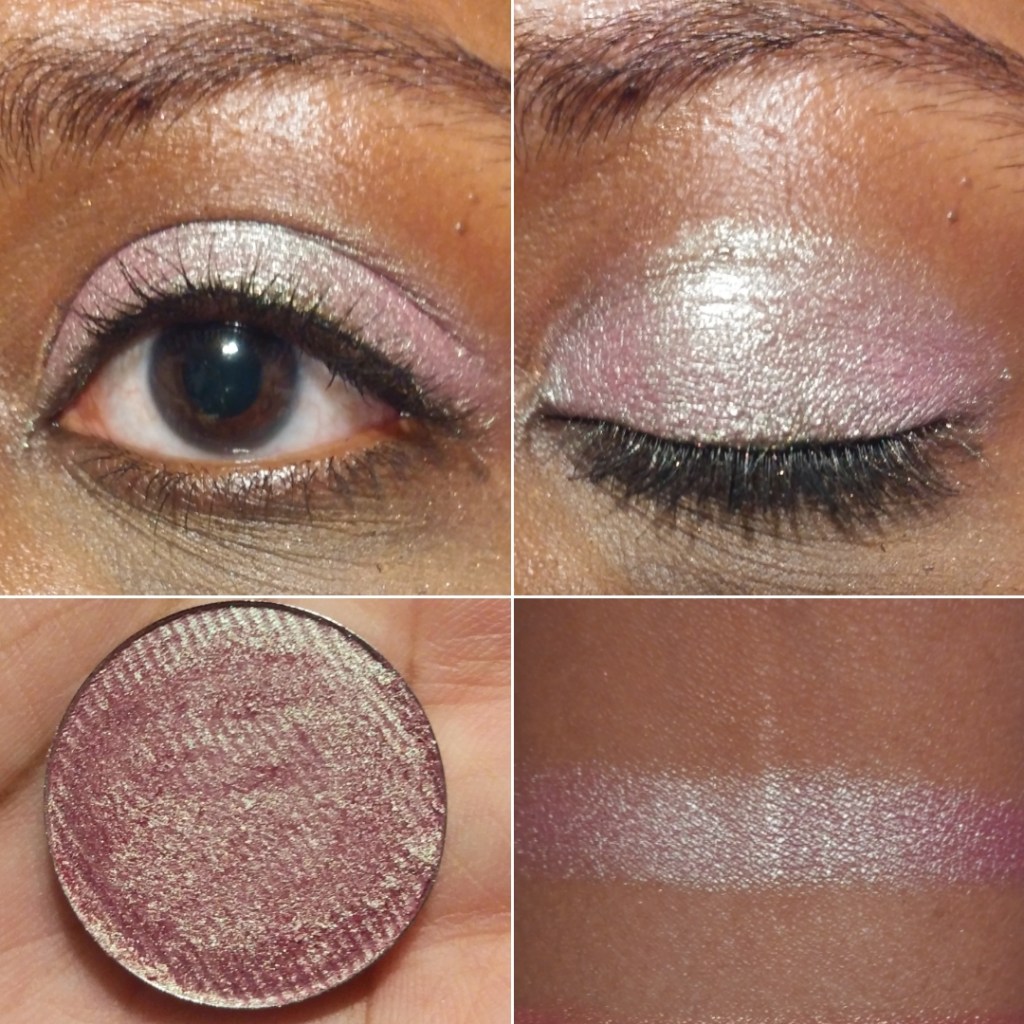
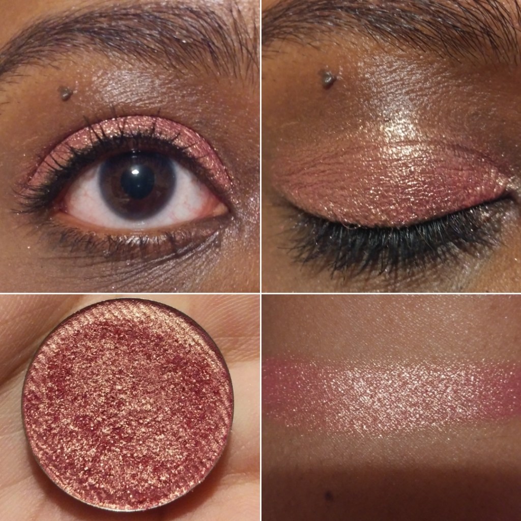
Paramour – This is another one of my favorite Devinah eyeshadows. I would describe it as a festive crimson shade that can be built up to look a little deeper.
Salvatore – This looks to be a true red shimmer.
Starlet – This shade is a dark slightly red toned purple, like a wine color.
Purple Kush – This shade is a dark blue toned purple.
Avalon – Is this blue? Is this purple? Another blurple?
Lurican – Purples are my favorite eyeshadow color and greens are my second favorite. I really like this green shade with gold shimmer. It’s similar to Rainbow Blossom without the intense glittery sparkles.
Ferly – This shade is the reason I didn’t buy Clionadh’s Lineage multichrome, as it reminds me so much of it based on swatches. It’s a very pretty almost minty green with gold shimmer. This is another favorite of mine.
Chimerical – I’d describe this as a mossy green with brighter green shimmer.
Alew – This is a blue-ish green shade with gold (and maybe even a little silver) shimmer. It reminds me of a slightly more green version of Hydra from Sydney Grace.
Odium – This color reminds me of Coloured Raine’s Forbidden shade (my favorite eyeshadow of all time). Coloured Raine’s single shadows are being discontinued, so I’m glad I have this as a close replacement.
Briseis – Talk about bright! This shade is so vibrantly ocean blue! Or Turquoise? I don’t know but this blows Coloured Raine’s Malibu shade out of the water!
Midnight – In pictures this looks mostly black with a slight greenish blue tinge. In person, the blue (or deep/darkened teal) is easier to see.
Hydra – Again with the insane vibrancy! I don’t have anything close to this shade in my collection. I would call this an Egyptian Blue shade.
PRESSED MATTES
Toska – I like this shade of yellow but it takes a lot of building up to look opaque on the lid.
Passion – I love this rusty orange. It was one of the first shades I bought from Devinah.
Runa – This is a more pigmented terracotta version of Passion.
Kaia – This is more of a pastel purple that isn’t the worst I’ve tried, but I don’t like this one as much. It might work better over a white base, but I haven’t tried that yet. And at least I can get it to look opaque.
Courtney – This is a very popular shade among Devinah customers. I can see how this type of grungy yellow-green would be liked on others, but it’s just okay for me.
Desma – This rich reddish brown is so nice! It’s rare that I wear just mattes on my eyes or even one-and-done eyeshadow looks, but I would feel comfortable wearing this on its own. It’s my favorite of the mattes I have.
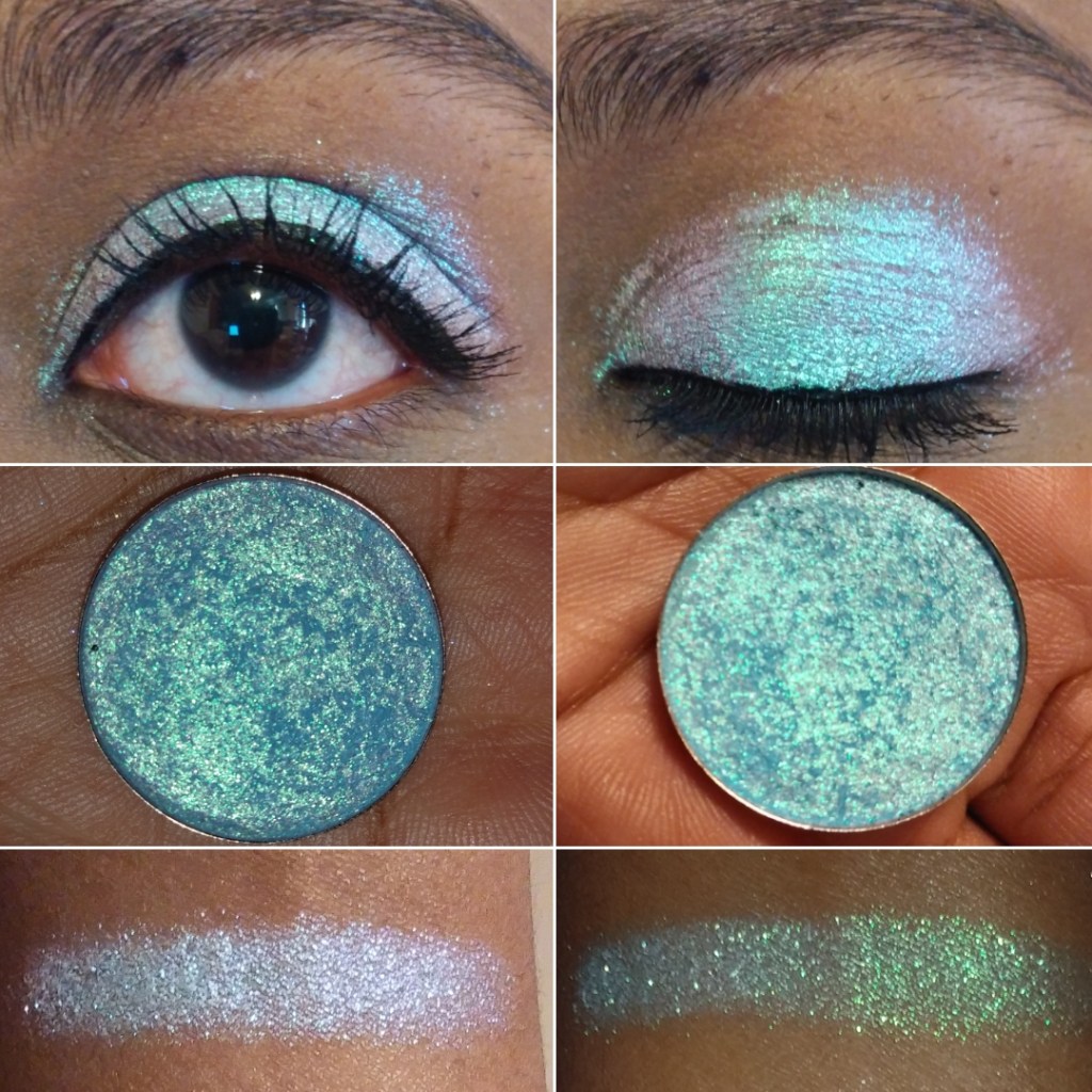
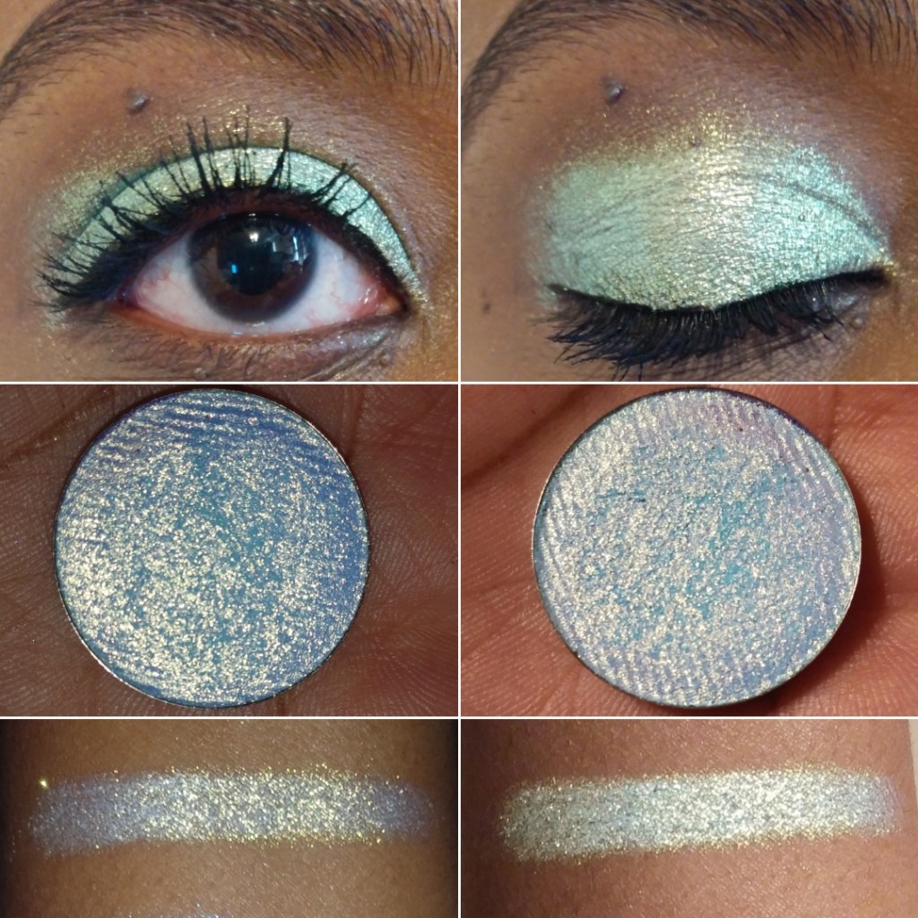
Here is a gallery of some comparison swatches to each other from Devinah and examples of other eye looks.
I would normally post more complicated eyeshadow examples, but Devinah’s shades are so unique and special on their own that in my everyday routine I just put a neutral shade in the crease, add a darker eyeshadow in the outer corner for smokiness, and let each shade shine on the lid on alone. This is why I decided to do the 50+ eye swatches rather than posting just hand swatches. Each eye swatch is already a look I would do.
Additional Information
As I mentioned earlier, Devinah’s prices are quite reasonable for what you’re getting. This is also the case when coupled with promo codes. When you initially sign up for their emails, you’ll get a code for 25% off. There are also influencer codes that can be found in different Youtubers’ video descriptions for 20% off. Also, after every purchase, I usually get an email with a coupon offering 25-30% off if I place another order within 7 days. The codes should work on everything except the Butterfly Multichrome shadows.
I’ve only been a customer with Devinah since they relocated/reopened in Oregon, so I’m not certain if they have regular sales throughout the year. I haven’t witnessed one yet, but the promo codes are a great deal as is. Shipping isn’t free and they recommend purchasing the $3.80 insurance as a USPS order upgrade to protect against loss, theft, or damage.
One of the other things I like about Devinah is that they’re interactive on Instagram and supportive of other indie brands, even liking posts that don’t have their own products in them. They recognize there’s room for everyone in the beauty industry. When you have a good product, it speaks for itself and people will notice.
Overall, I really like Devinah’s shadows and recommend them to anyone who has been thinking of trying out this brand. The glittery eyeshadows are a little more difficult to work with than Clionadh’s formula when dealing with fallout. The Xploders and Sugar Drops are particularly messy. I think this is because they are a little less emollient. However, this is the tradeoff because the shadows don’t settle into the lines of my eyelids as much as Clionadh’s can. Speaking of which, I still have a Clionadh Cosmetics post in the works. I just keep debating with myself whether to post it soon or just wait until I have everything I ordered (which would take a few more months).
JULY 19th, 2020 UPDATE: Towards the end of the post I have an update section with 24 additional eyeshadows, some of which have come from the new After Dark collection.
Note: I can’t post a review at this time without first mentioning that I hope everyone reading this is and remains safe during the COVID-19 pandemic. This year has been especially difficult with what is going on throughout the globe, in addition to having yet another surgery. The beauty world has been a comforting distraction for me these past few months and I hope that my blog posts are also a welcome distraction. Now, onto the review!
These are the shades I currently possess. There are twelve more eyeshadows I intend to purchase, after international shipping prices return to normal, which I believe would fully round out my collection.
Lethal’s website has a fun palette designing tool that helps to put a color story together. There were so many shades I wanted that didn’t go together, so I wish we weren’t limited to 12 spaces maximum (as my intention was always to put them in a larger magnetic palette), but it’s still helpful when getting started. Plus, the palette builder allows you to put the 12 shadows in a bundle to be discounted. You can see tons of combinations others have made following the #lethalbyop on Instagram. I found their examples to be quite inspiring. Here are some of my own.
PRICES, SHIPPING, AND CUSTOMER SERVICE
The eyeshadows are $6 each, which is great considering the normal cost of single shadows, but I do recommend using the palette designer to bundle for the best prices.
It usually comes out to be $58-$59 if you include one of their magnetic palettes, though you can bundle without one as seen in the screenshot above. The smaller Orbital palette holds 9 shadows and also gives a discounted price after putting it together.
Lethal Cosmetics is based in Germany, but shipping under normal circumstances takes about a week. Standard shipping used to be $7 or free on orders of $80 and up. Currently, due to the pandemic, it is $24 or free with orders at or above $150.
I love getting a good discount, so I spent hours looking for promo/affiliate/influencer codes, but I have been unsuccessful. By signing up for emails, you can get notified about sales (and the occasional code). I was able to find Jolina10 from Jolina Mennen who collaborated with Lethal Cosmetics to create their first (non-customizable) eyeshadow palette. However, the code does not work on everything, like Jolina’s own palette. Also, when the palette was first released, I heard that the Pieper Perfumery had 30% off, but even with Chrome’s help translating their site to English, it was hard to navigate.
My Duolingo lessons didn’t prepare me enough to understand the site either.
I have interacted with Lethal Cosmetics’ customer service a few times and the representatives I’ve spoken with have been so polite and friendly. They also have a great social media presence with the way they interact with customers regardless of their follow-count. This is not always the case, even regarding Indie brands, so I felt it was important to note and applaud good customer service whenever I come across it.
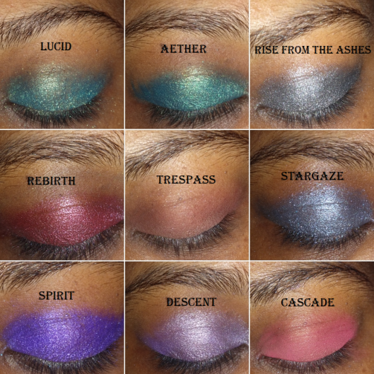
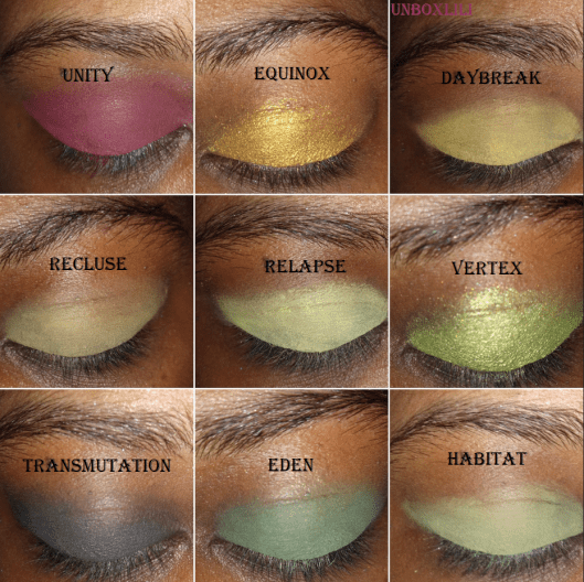
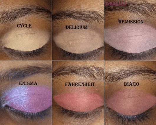
SWATCHES
I normally use eyeshadow primer when taking pictures for this blog, but I did not for any of these arm or eye swatches. However, for my different eyeshadow look examples, I used a MAC Paint Pot in Groundwork, ABH eyeshadow primer for the pastel look specifically, and Nyx Glitter Primer in any area requiring the metallic/shimmer eyeshadows.
For the mostpart, the color you expect from the website is what you get. However, I had quite a few surprises
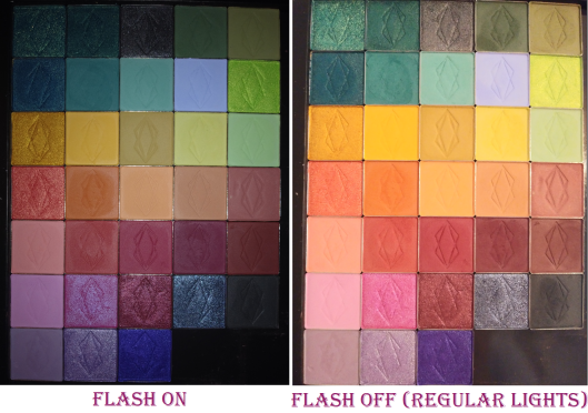
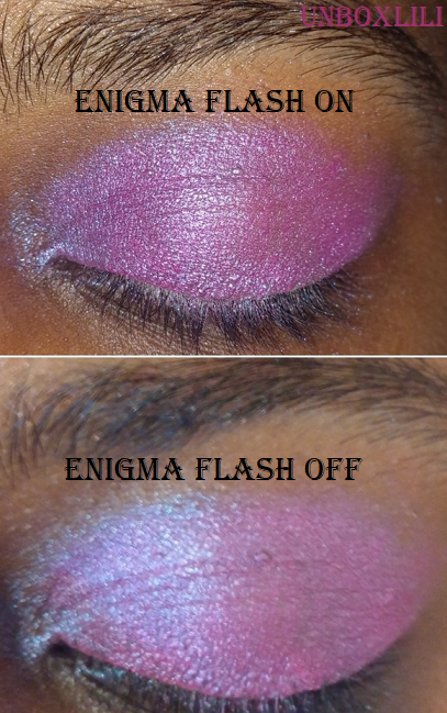
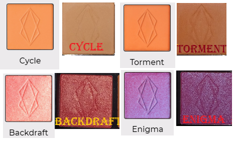
The orange shades look vastly different in the pan than what appears online, but when actually used on the eye, they do reflect the color presented on the website. Backdraft is way darker in person than on the website. It’s not the light peachy-pink I was expecting, though it is described as being “fiery.” Also, it says fuchsia in the description of Enigma on the website, but it looked so blue from the glitter shift that I was expecting a cooler blue-purple shade. Several more of the shades were slightly different than I expected, so I would recommend paying close attention to the descriptions on the site. Some, but not all, of the photos from the website include swatches. I wish they had light, medium, and dark arm swatches for all of them. Overall though, when you compare the shadows in my first picture with flash on, it shows more accurately what they look like in person (excluding enigma which looks more accurate with flash off in this case). The flash off side looks closer to what is on the website (again excluding Enigma which is the reverse).
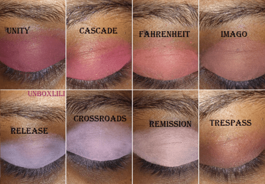
Another thing I noticed was how similar some of the shades look on my skintone. So, I put them together to have an easier time seeing the similarities and differences.
The similarities are less apparent once they’ve been built-up, such as Relapse and Habitat. Habitat builds up to a medium green. Crossroads and Release look alike because of the shared purple tone, with Crossroads being a cool pinkish purple compared to Release’s lavender shade.
PERFORMANCE
The darker and red-based mattes look opaque on my lids with minimal effort. The lighter and pastel shades take more time to build up, but they do build beautifully, especially when I use a light base such as the ABH primer underneath. The mattes blend so well, and though some take extra time, the unique shades make it worth the effort. I tried comparing them to other eyeshadows in my collection and could only find a few that were similar.
As for the metallic/shimmers, some shades worked well regardless of the tool used, but for the most part, I’ve been unable to get the maximum color payoff using just a brush. So, my favorite application method is to lay the color on first with the brush and then apply another layer with my finger. They all apply so smoothly and pigmented to my eye when using my finger that I don’t feel the need to wet my brush when I use them.
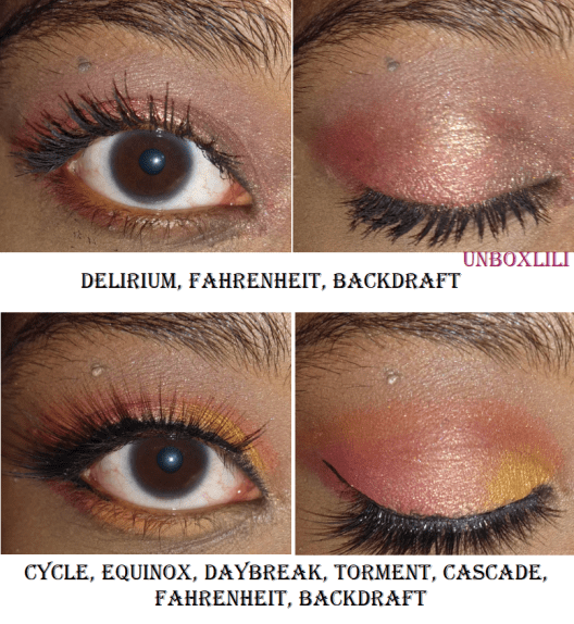
Here are some of the looks I’ve done:
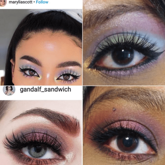
I also got the last two look ideas from Instagram:
There isn’t much more to say about these eyeshadows except that I enjoy the formula. I have some shadows, like Natasha Denona, where I can mix two shades on top of each other to create a new shade. I haven’t found that to really be the case for the Lethal Cosmetics shadows (or at least not easily), which is useful when I want to do a more complicated look involving more than four shades and want them to stay true to color. You definitely don’t have to worry about these shadows looking muddy on the eyes. The fact that they are different from the other shades in my collection and unique enough to inspire me makes these eyeshadows worth it to me. And as I mentioned earlier, I intend to get a few more!
JULY 19th, 2020 UPDATE
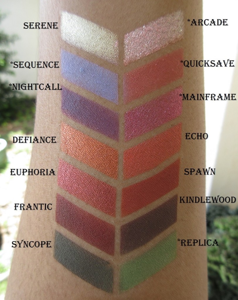
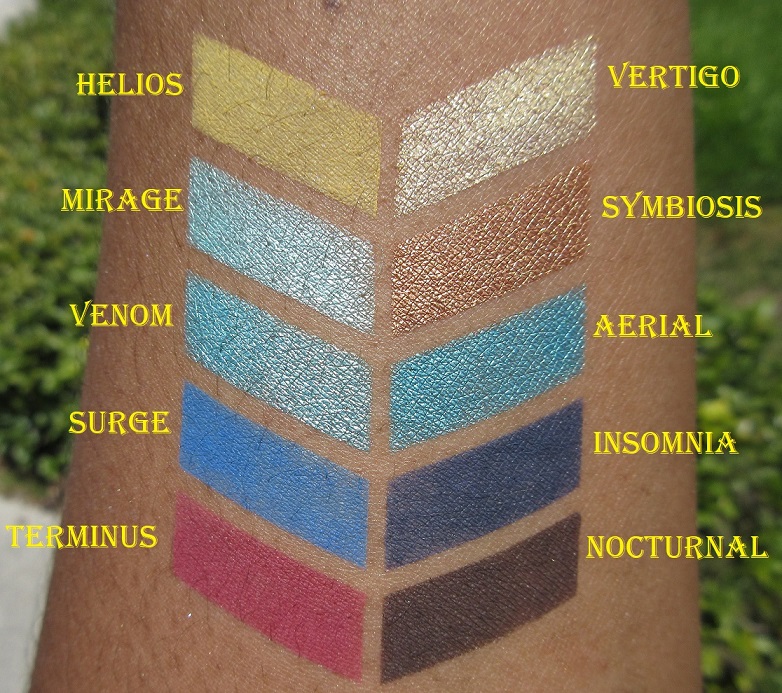
This is what my collection currently looks like with the new additions. The names with * in front of them in the swatch photos are brand new shades from the After Dark Collection.
Thank you for reading my first in an ongoing Indie spotlight series! I’m not sure when the next one will be since it takes me so much time to test them out. The new brands I’ve tried this year are Sydney Grace, Devinah Cosmetics, Clionadh Cosmetics, Give me Glow, Makeup Geek, Menagerie Cosmetics, etc. I’ve been posting a lot of eyeshadows lately so I might do a different topic for my next post.