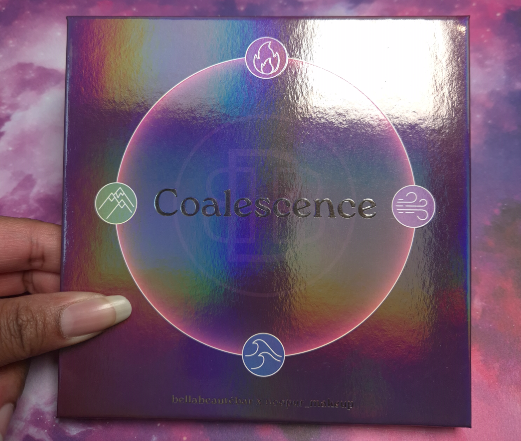
DISCLAIMER: Whenever I post about a brand, Influencer, or other public figure for the first time, I write a disclaimer to inform readers about any potential biases. Regarding Bella Beauté Bar, I am not affiliated with them in any way. I’ve heard nothing but positive things about their eyeshadow quality, so they’ve been on my list of indie brands to try for a long time. Regarding Noopur, I believe her Instagram account is one of the most well-known for indie brand swatches, especially multichromes. Her work is frequently in my feed, but I don’t know anything about her as a person.
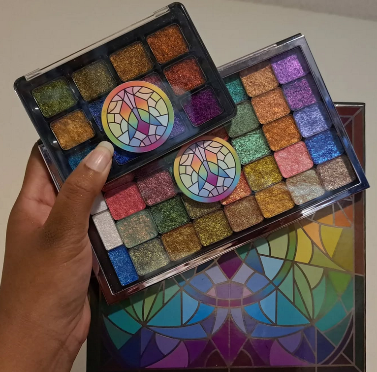
I purchased this palette because purple and green are my top choices for colorful eyeshadows, and I love multichromes. All thoughts and opinions are my own.
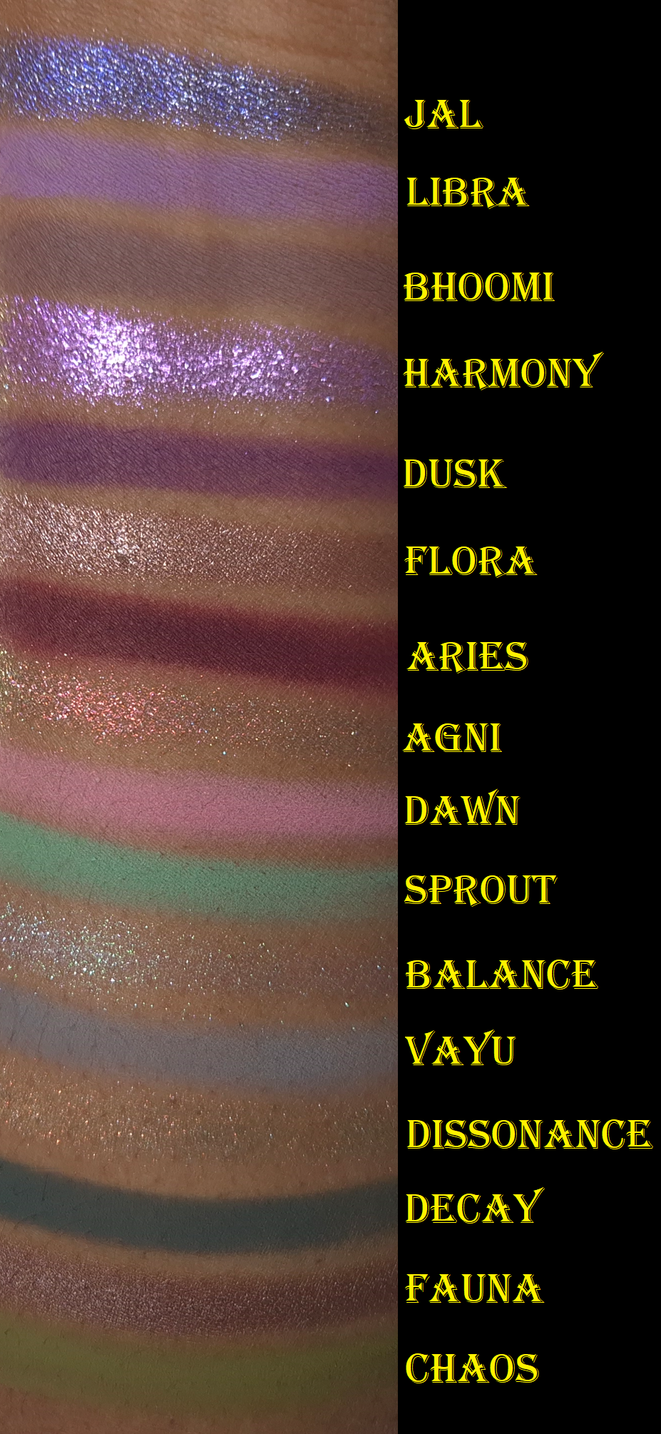
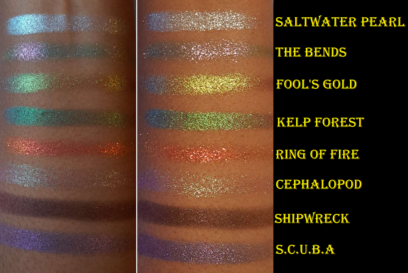
I ran out of room on my arm, so I moved Jal to the top. This is why the swatches aren’t completely in order.
I’ve owned this palette since the end of November 2025 and considering how infrequently I’ve been wearing colorful eyeshadows, I’m still surprised that I’ve used this a fair amount. Wanting to test this palette organically over time instead of forcing myself to apply it daily in a two-week period is why it has taken me so long to post this review.
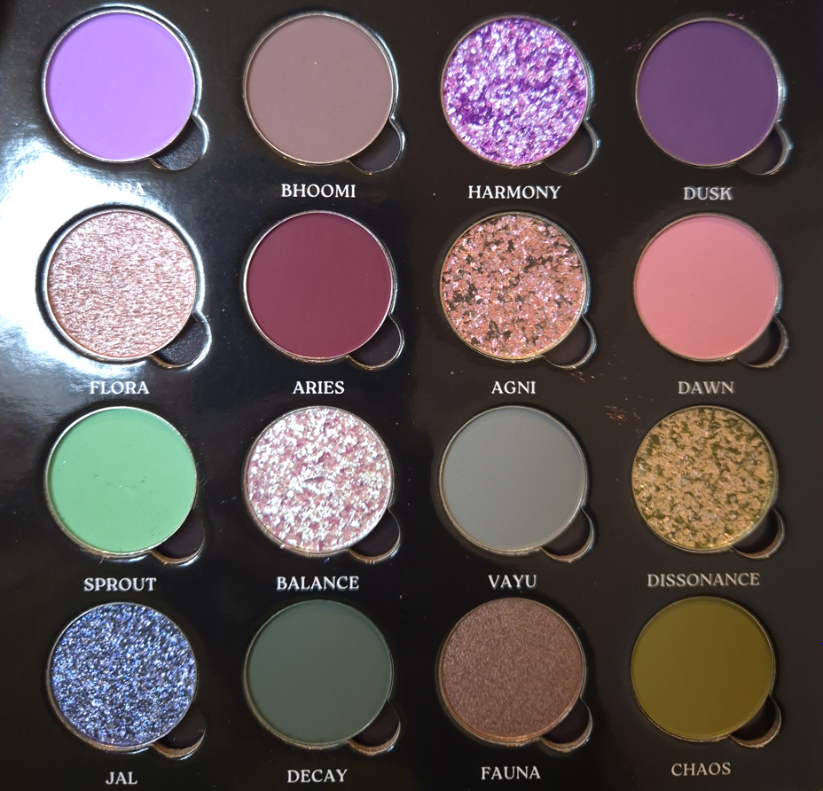
The Coalescence mattes remind me of Natasha Denona’s mattes, but with even more pigment. Some feel silkier (with some slip), some feel buttery, and all of them are soft to the touch. I am impressed by the kind of pastel shades not looking ashy on dark skin. However, they don’t build up and adhere as well to my eyes if I’m using my tried and true Lisa Eldridge Liquid Silk eyeshadow as a base. When I want to wear Libra, Dawn, and Sprout without them looking like sheer veils of color, I have to switch to the MAC Paint Pot or Milk Hydro Grip Eye Primer. The only other matte that needs special treatment is Aries because of its ultra pigmented nature. A little goes a long way, and it is slightly less blendable than the others. When I wipe my makeup brush onto my microfiber towel, it gets everywhere and has even transferred back off the cloth onto other objects before (brushes, fingers, etc). So, I try not to pick up as much onto my brush and build it gradually.
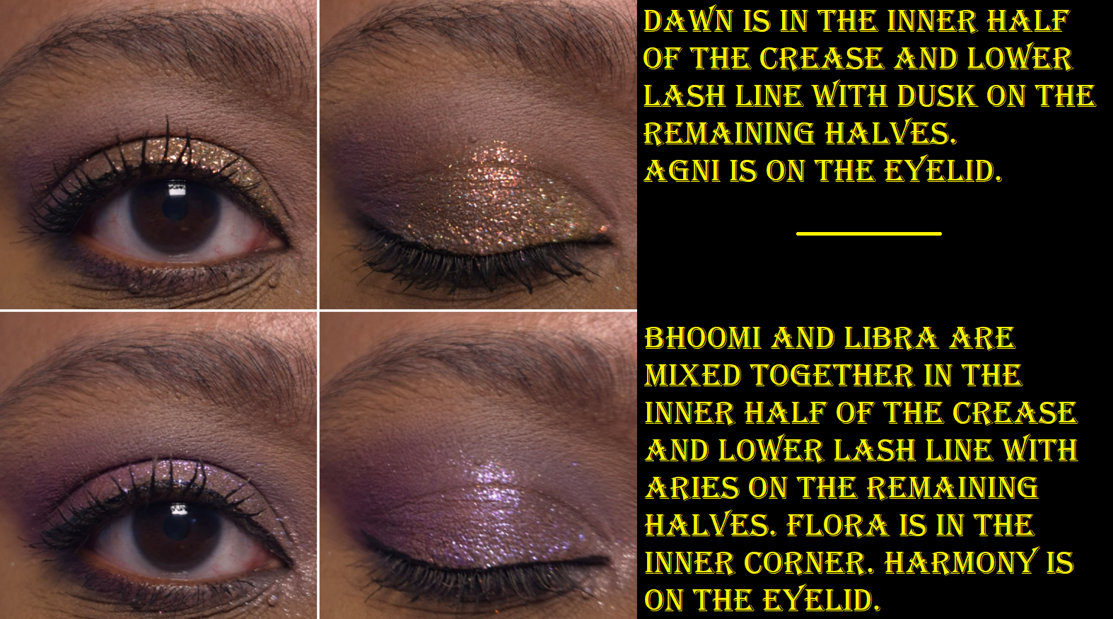
Although I was drawn to this palette for the greens and purples, I found myself mixing mattes together to try and turn them into the specific shades/tones I envisioned for my eye looks. These eyeshadows are formulated in a way that is actually pretty good at being able to do that. Some brands’ eyeshadows can sometimes be a little too good and turn a new color while I’m attempting to just create a gradient of one shade blending into another without lines of demarcation. Thankfully, I don’t have that problem with these, but I don’t try to just blend one shade on top of another when I’m mixing. I dip into both colors with my brush when I pick them up initially, so I can blend them into my skin at the same time. Then, I adjust it with additional product afterwards if needed.
All of the shimmers in the palette had small round foam coverings over them, which I assumed was to protect them in transit because they’re fragile. Imagine my surprise when I tried to rub my finger in Jal for the first time and nearly shifted half of the eyeshadow out of the pan! Thankfully, they can be pressed back into place in the pans.
This also happened with Agni, which is another of the flaky eyeshadows. Essentially, Flora and Fauna have traditional metallic and satin finishes. Flora has the benefit of being an impactful shimmer, but smooth enough for me to use it to brighten my under eyes. Fauna is even smoother, but is too dark to serve that purpose. I like having a neutral option theoretically, but since it’s so outnumbered by the more colorful options (and even the muted shades still pop), I find myself struggling to incorporate it into looks.
To minimize fallout, I can dampen my brush and use the Nyx glitter primer, but it still happens throughout the day. However, it’s not bad enough for me to consider it messy looking.
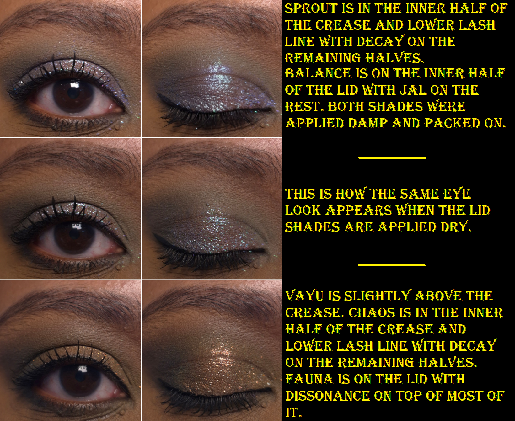
Harmony is described as having a “sheer purple base and shifts blue-purple-pink-peach with additional purple sparkles throughout.” I can see blue, purple, and pink as sparkles, but not as a color changing shift.
Agni is described as a “holochrome with a grey base and shifts pink-orange-gold,” which I agree with, along with Balance having a “super sheer base and a mix of green-pink shifting sparkles as well as blue-purple sparkles.” When I’ve tried to intensify the look of this eyeshadow and pack it on by wetting it or using glitter primer, I haven’t liked the look as much because it seemed like only the blue color grew bolder. I wish the shift was a bit stronger, but Balance is one of my favorite shades in the palette.
I have to admit that I was a bit disappointed that Dissonance, the “super sheer light olive base with silver sparkles and orange-gold shifting sparkles mixed in,” looks mostly just orange on me and not as green as it appears in the pan. It’s a pretty color, but I love greens and the only eyeshadows that read green on me are mattes: Sprout, Decay, and Chaos.
And then finally, Jal is a bright blue with silver sparkles. I’m not a lover of blue eyeshadows, so I didn’t intend to get much use out of this shade. When I think about it though, between Jal, Vayu being a blue-grey, Sprout being a minty-blue, Decay being a blue leaning green, plus the blue sparkles in Harmony and Balance, this palette feels like more of a blue palette than green. This explains why I sometimes get this sense of being unfulfilled when I use this palette despite the pretty colors and them having the sparkle intensity and impact that I like.
If the other Bella Beauté Bar palettes have this type of quality, I would happily purchase additional palettes in the future. The Coalescence eyeshadows, although able to be combined and tweaked, are not totally within my palette preferences. Part of my preferences is having ready-made colors available that I love, so that I can create looks quickly without too much thought. There are times when I do still enjoy playing with colors, which is why I’ve continued to reach for this palette periodically over the past six months. One of the great features of this palette is that it’s magnetic with finger holes in which to rearrange or swap shades. So, I still have an easy way to tailor the palette with other BBB shades or exchange them with standard eyeshadow pans (26mm) from brands like Sydney Grace, Clionadh, Devinah, Terra Moons Cosmetics, Fantasy Cosmetica, etc. The only thing to watch out for is that some of the brands overfill the pans (Sydney Grace mainly) so the mirror/inner lid of the palette could get messy from having eyeshadows press against it.
There are four pressed pigment singles that are part of the collab. They look stunning, but they were sold out on the Monolith-EU website when I was buying the palette, so I didn’t think about them again. I am still curious about how those differ from the shimmers in this palette, but I think I will pass on them anyway.
I’ve loved Clionadh Cosmetics eyeshadows from the moment I first tried them at the start of 2020. Their Stained Glass Collection is ever growing, and it’s their claim to fame for good reason. Other brands have eyeshadows that use some of the same pigments and have the same shifts, but I have yet to see anyone replicate the slick “mirror finish” of the Jeweled Multichromes. I was never a big fan of iridescent eyeshadows because of the way they can look dusty and dry on my skin tone, but Clionadh thought about those with more melanin and created the Deep Iridescent Multichromes with different colored bases (instead of white) to fix this problem. They created Glitter and Dimensional Multichromes for people that adore having maximum, but still eye safe, sparkle. Vibrant and Electric Multichromes are for true color lovers. Earth Vibrant Multichromes are for those that prefer muted tones, but still want easy-to-see color shifts. There are even combination types such as Glitter-Vibrants and Hybrids.
Clionadh has multichromes to suit everyone’s tastes.
As I mentioned before, the brands get their multichrome pigments from basically the same place, but Clionadh has perfected the art of combining them with various base colors to create a decent amount of eyeshadows that haven’t been duped. So, there are still some that are completely unique colors.
There are some duochromes within the Stained Glass line, but they also exist in the “standard circle” format, along with more traditional shimmer eyeshadows. These are less expensive and I find them to still be very nice quality. The mattes weren’t perfect, but I still like them when they used to be sold individually.
The only reason I haven’t talked about Clionadh as much within the last year is because of the difficulty I have in getting products in Germany. Their website doesn’t collect VAT/taxes/customs, so DHL (who did the final part of the delivery) demanded exact cash payment in person (which included the missing VAT plus their fee), without letting me know the amount in advance. If I want to know ahead of time, I would have to pay the $42 (36 Euro) shipping option on top of the VAT and extra fees, which I just haven’t felt was worth the added costs. I hope Clionadh will work out some kind of deal with Monolith EU again, as that would certainly make things easier for me!
I have some Clionadh eyeshadows that are getting close to turning six years old. Some of them don’t feel quite as smooth and creamy, but they still perform beautifully and haven’t gone bad yet. I’ve had eyeshadows that didn’t even last beyond a year (admittedly mostly vegan eyeshadow formulas like from KVD, Urban Decay, Coloured Raine’s different formula, etc). So, that makes me happy considering how expensive Clionadh eyeshadows can be. If you take four of Clionadh’s most expensive eyeshadows, it would be slightly more expensive than many luxury brand quads (but justifiable in price considering they’d be all multichromes).
Clionadh has a relatively small team, and I respect the fact that they make their eyeshadows in-house in Canada.
Oden’s Eye
Oden’s Eye is a favorite because they have every type of powder finish eyeshadow I could want: multichromes, duochromes, sparkly shimmers, smooth metallics, pastels, and just lots of colors in interesting tones. The variety is great and the quality is mostly good. Some palettes are randomly not as good, and I can’t explain why. For instance, I like the colors in Makeup Just For Fun’s palette, but the shadows were more powdery and the shimmers are thinner. I can only guess it’s due to what the creator requested of the formula. Fantasy Cosmetica has shimmers and mattes on par with Odens Eye, but I get 1 or 2 duds from the 9-pan palettes I’ve tried, which isn’t the case for my top 5 Odens Eye palettes. So, Fantasy Cosmetica ranks lower for that reason.
These shadows are also more suited for color lovers, but Oden’s Eye tries to appeal to neutral and color lovers by giving softer and non-grungy options sometimes within the palettes.
It’s a Swedish brand, but their eyeshadows are made in the PRC.
Fantasy Cosmetica
This is the brand I have the least experience with, as I only started buying their palettes in 2024. However, I love the color offerings among all the palettes and their theming. Even when they make brown shades, there’s nothing basic about them. They have very interesting tones. The Fighter Palette is a dream for those that prefer glam style neutral eyeshadows. Pat Mcgrath fans would probably like them, but the quality isn’t quite as refined as PML’s. The big price difference puts that in perspective! Some of their eyeshadows/pressed pigments are ultra vibrant. They’re all pigmented and opaque shadows. Most of them blend well. I usually have at least one troubleshade shade in every palette, but it’s rarely one of the shadows I was looking forward to using anyway. This brand does cater mostly to color-lovers, and they’re known for their intense shimmers, but I even like some of their smoother satin shades too. They find a way to make the toned down shadows appealing for me.
I believe these eyeshadows are made in the PRC.
Devinah Cosmetics
Devinah has my second favorite multichrome and duochrome formula, but their normal shimmers are just okay, which is why the brand doesn’t rank higher overall. Their mattes are also decent, but not the easiest to blend and use. In fact, they probably have the “worst” mattes of all the brands I’m mentioning in this post. However, they don’t make pre-made palettes, so customers can skip buying their mattes altogether.
I started purchasing from them in April 2020, and all but one eyeshadow (it’s a discontinued formula) is still in perfect condition. The performance, look, and feel of the shadows hasn’t changed. So, I can confirm mine have good preservatives in them!
It’s because of the fact that I had to acknowledge their multichromes and duochromes as coming second to Clionadh that I stopped buying from them in early 2022. However, to still maintain that number two spot is impressive. The custom palette I created with mostly Devinah shades has come with me on several trips and there are shades I’ve used in there even more frequently than Clionadh. So, if you live in the US and are dealing with the tariff situation, this could be a nice US-based brand to check out.
I don’t know if all of Devinah’s eyeshadows are made in-house, and if only some of their catalogue isn’t made in a lab, but I can confirm that at least the mattes are made by them.
Sydney Grace
Sydney Grace isn’t really in the multichrome game with powder eyeshadows, but they have a gigantic selection of standard shimmer eyeshadows in unique tones. They have many colorful sparkling eyeshadows, but the brand puts a lot of focus on natural/neutral and more muted types of shades. They also have a lot of satins that appeal to fans of luxury eyeshadows who prefer a smoother texture-friendlier look, but just crave more pigment than most luxury eyeshadows provide. The Sydney Grace eyeshadows are pigmented, opaque, and also thick. I like my finished eye looks with them, but I tend to prefer my even more blingy, shiny, and exciting eyeshadows from other brands. Also, their mattes are pretty good. They are almost on the same level as Odens Eye, but Sydney Grace’s best mattes are typically in boring colors I can get from any brand. So, I tend to not use them.
Sydney Grace eyeshadows are made in the USA. I’m fairly sure they made their own eyeshadows and formula in the early days. I don’t know whether they have continued to make them in-house.
I have three honorable mentions.
For starters, Melt Cosmetics is technically an indie brand, but I have seen their products available at different retailers and they seem to be a much bigger business, so I have a hard time putting them in the same category. Considering how many huge sales I’ve seen in the last three years, and the lack of interest from among beauty lovers, I honestly wonder how long they will stay in business. In any case, the brand’s mattes are in my top 10 favorites. I love the colors, tones, pigment level, layerability and blendability. The shimmers are okay at best. They have such a big issue with mold or things growing on other people’s palettes that I always feel uncomfortable recommending the palettes, even though mine have been fine.
The second honorable mention is Kaleidos. I haven’t tried many of their palettes, but I loved the mattes in Club Nebula and Futurism 1: Sci-Fi Green. The shimmers are nice, but not super special. I can’t include them on the list because I haven’t tried any of their “newer” eyeshadows in the quad format, and it’s only recently that they launched their first new products in the last two years. So, it’s been quite a few years in total since I’ve been interested in their eyeshadows.
Terra Moons is an honorable mention mainly to address the fact that I’ve often said their multichromes are my third favorite formula. However, the normal shimmer and matte quality pulls them below being in my favorite indie brands. There is also the fact that I hardly use my Terra Moons shadows because I think to myself, “Why use these when I could use my Clionadh and Devinah?” So, I only use the shades I don’t have a close match for in the other brands, but then I think about how the eyeshadows made by the others are still good enough and I don’t need this unique one! The mattes I bought from Terra Moons are unique to my collection, but I wish the quality was better. So, I can’t call this brand a favorite if I don’t use them.
This isn’t an honorable mention, but I feel compelled to explain that I like Lethal Cosmetics a lot as a brand and I respect what they create. Their eyeshadow formula is a bit chunky. The multichromes are on the weaker side. The mattes are fine. I like the eyeshadows with uncommon tones, but I just don’t think about them often enough. I feel like I’ve moved on from their eyeshadow formulas.
So, this is my list! I hope this is helpful to fans of small independent businesses, and to anyone curious as to which brands to start with if you’re trying to move away from paying for mainstream eyeshadows.
This is one of the posts I’ve held as a backup. I have a lot going on in my personal life, plus with the holidays. So, this will likely be my last post of 2025. I wish you a happy holiday season and I hope to see you in the New Year!
I will forever think of Agate Crosner when the word “Agate” comes up in anything.
Gaming reference aside, this is my first eyeshadow palette from Singe Beauty. I love greens and this color story reminded me of the Oden’s Eye Merry Christmas Palette. Of course, the thought crossed my mind that I should probably not get this palette if it reminds me of something else, but I was too impatient to try and wait for the brand to release a color story that attracted me while being different enough to be unique to my makeup collection. Singe doesn’t do fast releases, so it could potentially take years for me to be interested in another palette of theirs (though Paisley Hoot is quite pretty). I wanted to see what kind of eyeshadow formula Angie chose, so having a lot of colors I liked was good enough for me.
I’d like to note that I’ve owned this palette since June, so this is far from a first impression. I’ve been using it every-so-often organically in the latter half of 2025. By now, I’ve used it enough to share my thoughts.
I’ll start by getting into the specifics of the eyeshadows.
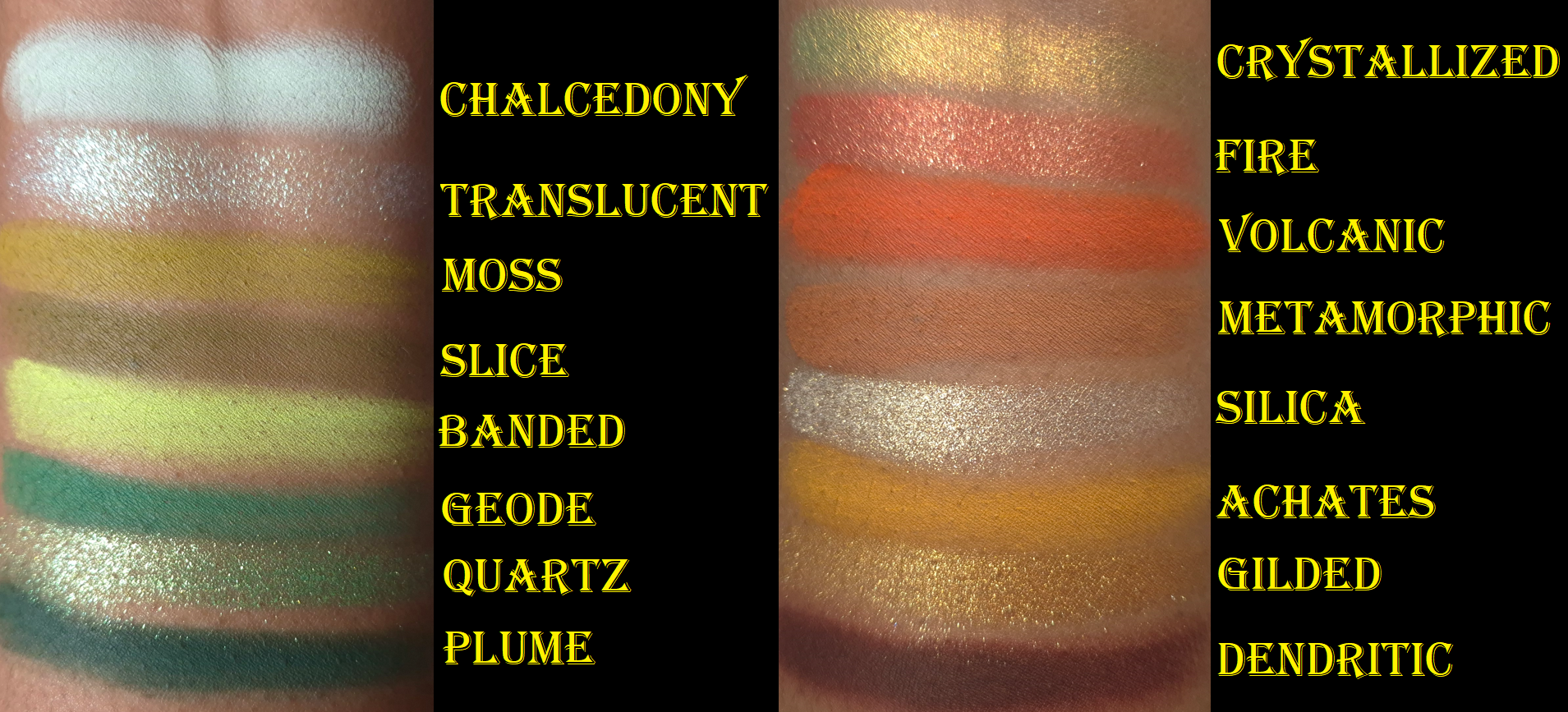
Achates and Metamorphic are very uncommon tones of orange and brown. I am shocked to say that they’re my favorite mattes in the palette, even above the greens! Achates reminds me of a higher quality version of the orange shade from the Juvia’s Place Nubian Glow Palette or a bit like Oromo from the Juvia’s Place Tribe Palette. I can’t recall where I’ve seen a shade like Metamorphic, but it reminds me of chocolate chip cookie dough. I can’t explain why!
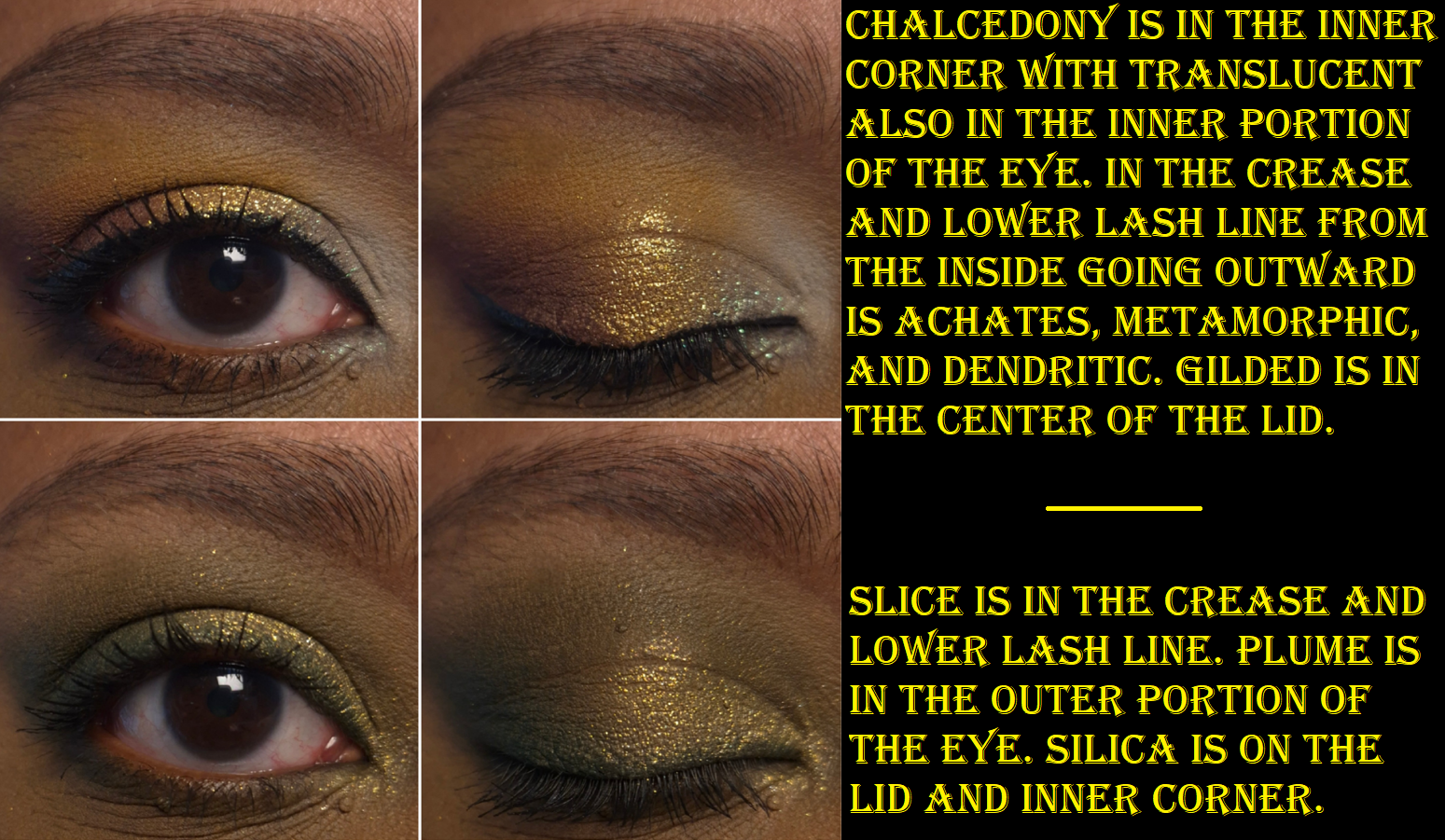
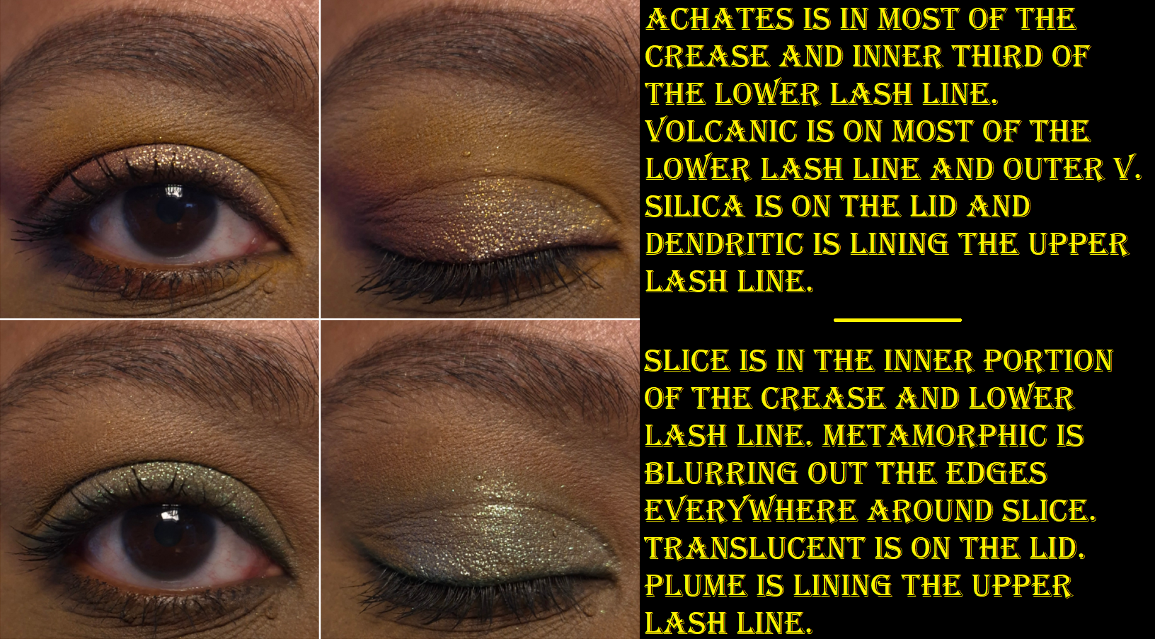
I usually rely on black eyeshadows to add depth and smokiness to the outer corners of my eyes, but Dendritic is such a beautiful rich brown that I feel perfectly happy just using this. It’s somehow soft and intense at the same time! Chalcedony is too light and thin, so I can see my skin through it unless I pack on a ridiculous amount of layers. I wish more of the pale mint tinge would show instead of it just looking white, but it doesn’t because of my skin tone. It would need to have more grey than white in the base for the green to show on me, like the shade Memory in the Urd palette from Oden’s Eye. Banded is not neon on my eyes, but I don’t mind that it’s an easier to wear kind of color. It’s thin as well, but I have an easier time with Banded than Chalcedony to hide my skin peeking through.
Moss, Slice, Geode, and Plume deserve recognition for being the kind of greens I use a lot. They just aren’t as uncommon, as they are similar to Melt Cosmetics greens, Oden’s Eye greens, the Coloured Raine Safari Palette and Juvia’s Place Tribe Palette. As for Volcanic, it’s not a shade I make a fuss for, but it goes well with the color story.
In summation, the mattes blend and layer nicely. It’s not a quick process, but it’s not tedious either. They have a semi-silky feeling, but they’re not creamy. The kickup is minimal. The pigmentation is high, but I still have to build up certain shades. Metaphorically, it’s as if someone took the old school Juvia’s Place formula (that I like way more than their current one) and combined it with Natasha Denona’s current matte formula (which is nice but still not a favorite). A few weeks ago, I reviewed my first palettes from Cosmic Brushes, Glaminatrix Cosmetics, and Wicked Widow. I can say, I definitely prefer Singe Beauty mattes over all of those.
The shimmers are impactful, but Quartz is super reflective and sparkly. The particle size is small enough to have a refined look to the eyeshadows, but not at the same level of high end and luxury brands, which is still fine. I don’t always want a blinging shimmer, or conversely a subtle satin, so this palette’s shimmers are great for the times when I’m in-between moods.
The consistency of the shimmers isn’t too thin or too thick. Quartz is the thickest. These eyeshadows feel a bit slick, but not enough to give me problems with creasing. In fact, it wasn’t until I was nearly finished with my final draft of this review that I learned Angie intentionally wanted shimmers on the thin and less emollient side so there wouldn’t be creasing. Translucent is the aptly named duochrome topper, which is bold, but not as intense as other indie brands’ more expensive eyeshadows. The same can be said for the multichrome, Chrystallized, which is pretty to look at in the pan, but not that shifty on my eyes. It’s ironic that it’s possibly one of the more expensive eyeshadows in the palette, yet its also one of my least favorites. Regarding the textures, I need to spray Translucent to combat the fallout and be able to apply a smooth and even amount to lids. Chrystallized is the hardest to pick up with my natural hair brushes, so it’s easier to apply with my finger. I admit that I haven’t used this palette with my Singe eye brushes, which are synthetic. They’re not in my container of brushes in rotation because I’m really behind on my Fude reviews. The Singe F03 is still in there though!
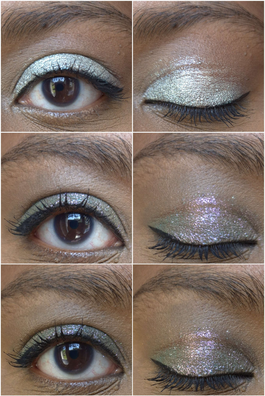
Silica is the “sparkly wet-looking topper,” that appears mostly gold in darker and warmer light, but I can see the mix of silver and gold in brighter settings. Examples of this are in the eyeshadow demo photos. Gilded is stunning, even though it’s a more “traditional” shimmer. The tone of this warm gold is just so flattering on my lids. Fire is a warm red with gold sparkles. So many brands make pink to gold eyeshadows, so it’s refreshing to see a twist. Reds aren’t my favorite for eyeshadow (unless it’s a rusty red-brown), but the shade is on the fringe of looking coral on my eyes, so I’m not opposed to it being in this palette.
When I think about the qualities of Agate Temptation, the phrase, “Jack of All Trades, Master of None,” comes to mind. This is a solidly good palette; it’s just not at a level that I could call phenomenal. These days, with the number of influencers that say everything is “amazing” or “my new holy grail,” something that has the rating of “really good” can still seem like it’s not worth anyone’s time. However, I like Agate Temptation enough to easily recommend it to anyone interested in buying it. These aren’t the world’s creamiest, most blinding, immaculately effortlessly blending eyeshadows on the market. These aren’t like my YSL or Prada eyeshadows, but I still enjoy using this palette. I don’t have Juvia’s Place Tribe or Coloured Raine Safari eyeshadows with me in Germany, but Agate Temptation gives me similar vibes and I get a nostalgic feeling when I use it. I’ve also been obsessed with the warm-mint chocolate chip eyeshadow combination I’ve seen others do, and I’ve enjoyed creating my variations of the look.
I see myself continuing to reach for this palette even after the review, which made it even more worth it to buy over some of the other palettes that I consider to be better performing. I know my criteria for judging a palette’s worth is largely centered around how much I love the formula. So, it’s strange to say these eyeshadows rank below my top ten favorite formulas, but still manages to be a purchase I’m glad to have made. The quality is good enough for me to enjoy working with the palette, and the mix of interesting neutrals with fun pops of color continue to entice me.
With the international shipping cost and fees in mind, I don’t know if this would have been worth it if I had to make the purchase directly from the Singe Beauty site. However, I am glad Angie continues to work with Monolith to provide products to the EU so that the prices aren’t double or triple what customers in the US pay. Also, for anyone interested in the rising cost of eyeshadow palettes, the ongoing debate whether a brand should focus on leaving out “special shades” to keep costs down, and how multichromes changed the trajectory of the indie community, I recommend watching Angie’s video How Multichromes Destroyed the Indie Makeup Pricepoint.
None of these palettes are new within the world of indie eyeshadows, but this is the first time I’ve purchased anything from each of these brands. This was made possible thanks to the brands working with the European retailer, Monolith!
I hear so many great things about many more independently owned businesses, such as Blend Bunny, Bella Beaute Bar, Dede Signature, Whats Up Beauty, etc. I’m just waiting for a launch from them that’s so exciting that I can no longer resist giving them a try.
For now, I have the following to play with…
Cosmic Brushes Tis the Season Palette
I purchased this palette in December 2024.
I consider the Cosmic Brushes matte formula to be better than Beauty Bay’s, on par with the better of Colourpop’s formula, but it doesn’t quite top the best of BH Cosmetics’ formulas. The mattes are colorful, pigmented, a bit dry, and are blendable enough to layer well with the other shades, but I wouldn’t call them low effort. That can make it sound like they’re troublesome to blend, which they are not. It just takes a little more time and I think it’s because most of them are pressed pigments rather than regular eyeshadows. So, that’s the trade off for the extra pigment. I find it best to work slowly, use smaller and fluffier brushes, and apply in the order from light to dark when trying to build the eye looks. If issues still occur, I recommend trying a different eyeshadow primer.
The only matte I consider a real problem is Party, because for some reason it fades like crazy no matter how much I layer on. To be more precise, it darkens to an ashier grey-purple shade that’s a similar color depth level as my dark circles and skin discoloration, giving the illusion of it having faded to almost nothing. I had to keep packing on more of Party while taking photographs of my eye looks so that the purple tone could continue to be seen. I have a similar problem with Ribbon, but because that shade is so bright to start with, what lingers behind is still a lighter sort of grey. Switching eyeshadow primers did not help with this one. Building up about six to eight layers makes it visible for a few hours, but it’s really not even worth the effort for me as those are not the kind of purples I like anyway.
Even though the mattes generally aren’t bad, I’ve been too spoiled by more expensive eyeshadow brands and prefer to work with those over these. When it comes to indie brands that have a better balance between pigmentation and ease of use, I recommend Fantasy Cosmetica and Oden’s Eye.
Regarding the shimmer formula, I’m pleased that they have the kind of impact I expect from an indie brand. There’s no need to spray my brush in order to intensify the shine, but a shade like Baubles is on the flakier side and could benefit from a damp brush to minimize the fallout. Candle Light and Fairy Lights are a bit thick, but smooth out across the eyelid nicely. Decorations is also chunky, but the wettest of all the shadows is Celebrate. Festive is thick and stiffer than the others, but somehow isn’t dry feeling either. It reminds me of the way Sydney Grace eyeshadows feel. Tinsel feels similar to Festive, though slightly less stiff. Cranberries is the smoothest of the shadows, but it doesn’t have that much more slip or wetness than the others.
According to the brand, the special shades are Cranberries, “a multichrome that shifts from a cranberry red, to orange to green,” Fairy Lights, “a multichrome metallic that shifts from pastel purple to pink, to soft yellow,” and Tinsel, “a duochrome pink to gold metallic.” I agree with their assessment of Cranberries and Tinsel, but Fairy Lights acts like an iridescent purple and pink duochrome on my skin tone. And even though Candle Light is only described as a, “fiery orange metallic,” and Baubles as, “a reflective fuchsia purple metallic,” those two look dimensional and above ordinary to me.
Although the shimmer formulas are damp, I thankfully don’t have to deal with creasing per say, just that the shimmers don’t like to stay in the deepest line in the crease of my eye, so that’s the first place for the eyeshadow to go missing.
Using this palette brought back a lot of nostalgic feelings. It was like working with the kind of indie eyeshadows I used so often in the early years of my makeup journey. I like the colors in this palette, and if I got this in 2019, I think I’d have been much happier with this. But, now that I’ve been spoiled by buttery, creamy, soft, highly blendable and very expensive eyeshadows from Victoria Beckham Beauty, YSL, Pat Mcgrath, and more, I am most likely to only whip this palette out during the holiday season. Even though my beloved Oden’s Eye Merry Christmas Palette contains no purples, it’s at least a holiday palette that I use all year round.
I also want to add that I think this is one of those palettes that is good for the price. To get multichromes and duochromes for $39 is pretty great, but I don’t know how much the shipping from the UK factors into the cost for those that live in the US. From the EU retailer Monolith, this cost me a little over €48 ($56) from VAT, but no additional shipping costs since I ordered enough other things to reach the free shipping minimum.
Glaminatrix Cosmetics Nocturnal Mini Palette
I bought this in October 2024.
These mattes are also quite stiff in the pans, but that doesn’t seem to effect the blend too much. I like the colors and tones, but the blues and purple are prone to changing color when I try to layer them and create a gradient. Shade mixing can be a good thing, just not when I want them to stay true to how they look in the pan. So, in order to have each individual shade be clearly recognizable in the photos, I couldn’t blend them as much as I wanted. Some of the eye looks I had to recreate a few times so they wouldn’t look like a muddy mess. Also, Gloom turns very dark on me as time goes on, to the point that it looks like a contour color on me. It going from grungy yellow-brown to an ashier kind of brown in spots can look really messy on my eyes without even trying to layer other shades with it. As for Fog, that color also darkens to more of my skin color, but if I can get it to show true to color for most of the day if I build up enough layers.
I should also note that despite these mattes being super pigmented, Shadow is even more so. I have to be very careful incorporating this into my looks. It can get out of hand quickly. I find it easier to do my crease shade and then put Shadow in the outer corner before adding the eyelid shimmer and topping a little bit of Shadow back on top. This is because Shadow doesn’t build on the shimmers as easily.
I like these mattes more than the ones from Cosmic Brushes, but I can understand why someone might disagree if the colors blending into one another or darkening is viewed as problematic. These remind me of Terra Moons mattes, but better. Despite considering these mattes to be nice enough to keep using, I still prefer to reach for easier formulas. Since living in Europe, I don’t do bold colorful looks as often, which is why the extra time needed to create these kind of looks isn’t worth it as much to me right now. However, this preference could change and in the times that I do want punchier colors, I am happy to have these options. I couldn’t resist the appeal of these tones of colors, and it cost me money to finally satisfy my curiosity. I at least paid less (€49) by getting this mini size version with 22mm eyeshadow pans.
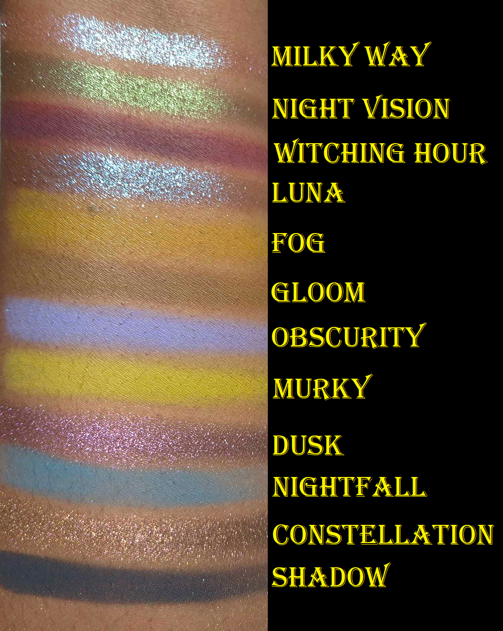
Milky Way and Luna are the flakier shimmers. Night Vision and Dusk are the smoothest ones while Constellation is smoother than the first two mentioned, but thicker than the latter two. All five of these are considered by the brand to be duochromes and are recommended to be used with glitter glue because of their thick texture. I haven’t found the need to use glitter glue with these, but I dampen my brush to minimize fallout.
My only gripe with Milky Way can’t really be helped. On my skintone, even when I’ve used this on top of a pink matte shade from another palette, it’s just blue. I don’t count an eyeshadow that looks one color and then disappears to turn into a different color as being a shift. That’s the same kind of trick a ph-adaptive product has. So, what makes Milky Way special to me is the high shine/reflect. I’m content enough with that. It would have been nice to be able to see some pink too though.
Night Visionis one of the shades that appealed to me most from the palette. The tradeoff for it looking smoother though is that it’s not as sparkly. The grungy dark base keeps it from looking the tad bit more vibrant as I would have liked. I believe in eye look number two, I put Murky on the lid first before adding Night Vision on top in the hopes that it would enhance the green tinge (but I cannot remember for certain). These shimmers are too thick to have a matte color underneath make a difference in the overall appearance. At least on myself, and at least with the shadows from other brands I’ve attempted to use these with. Also, the only time I’m impressed with the look of Night Vision is when light shines on it directly. I am not satisfied with a lit up room being required.
Luna has a blue to purple shift, but it mainly just looks blue on my eyes. It’s a beautiful color, but considering I’m way more interested in purples, this color helped push this palette further into the blue territory than I enjoy. It’s the most intense shimmer in the palette, so I can’t complain too much.
Dusk just looks purple to me. It’s usually easiest for me to see a shift in a chrome shadow by holding it at different angles pointing towards and away from light sources. With this shade, I have to hold it at a very harsh angle to see it change from a cool purple to what I believe is a warmer pink-purple. I just consider it a pretty purple eyeshadow. The shift isn’t prominent.
Constellation is like a bronzy-orange to green. I can see the color change easier with this shadow than Dusk, but the green isn’t obvious on my lids. If I saw this color on someone else, I would be able to detect that there’s something fascinating and special about how it appears. I would know it’s not just a simple bronze or orange, but would not be able to figure out what’s different about it. I think that’s the power of the green shift. It’s like an optical illusion where one catches a quick glance of something, but once the eye tries to focus on it, it’s unable to be seen anymore.
I’m proud of the first and fifth eye looks. They are the most eye-catching to me, but Constellation is actually my favorite eyeshadow in this palette.
I could not find this palette on the official website, so I don’t know if it’s discontinued. However, Monolith continues to stock it.
Wicked Widow Tales of Terror: A Haunting Palette
I bought this in June 2025.
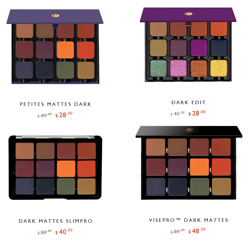
What drew me to Tales of Terror is how much the matte shades reminded me of the Viseart Dark Mattes Palette I bought in 2016. It was my favorite Fall color story, but around four years later, the eyeshadow performance gradually worsened. In 2021, I tried to use the Viseart Dark Edit Palette as a replacement, but I majorly disliked that palette. By now, there are less expensive options from Viseart, but I don’t have as much confidence in the consistency of Viseart’s batches anymore. This is due to the period of time when Viseart was transitioning from their products being produced in France, to being produced in the US.
The Tales of Terror palette has similar colors I loved, without the blues and red that I didn’t care about, plus the addition of shimmers. So, I felt compelled to give this a try! I waited for a sale on this one though because €69 is a lot of money to spend on a brand I hadn’t heard of until the release of this palette.
As these photos show, these shimmers are very big in particle size, bold in color, and reflective. Because they appear more textured, they naturally look less refined than the kind of shimmers I tend to use. That’s not a bad thing, as I bought this palette specifically for the eye-catching nature of it. It’s just that some brands, like Pat Mcgrath, are better at balancing intensity and sophistication at the same time. So, this palette is better suited for someone that wants maximum impact and drama. Someone who isn’t satisfied by mainstream eyeshadows is most likely to love a palette like this. Conversely, someone who likes toned down types of colorful palettes and neutral ones with a few exciting pops might find Tales of Terror to be a little too exciting.
The brand classifies all these shimmers as duochromes. They’re a bit thick and have an emollient feel. This formula is the most prone to want to migrate out of the deepest line of my eye crease. Also, the opacity level of the shimmers is so high that I can accidentally cover up all the crease work if I’m not careful with the placement. They definitely overpower the mattes, even though the mattes are super pigmented. The mattes also layer and blend out quite well. Of the three palettes I reviewed today, I like these mattes the most. As for the shimmers, it’s tied with Glaminatrix Cosmetics because it depends on my mood. The ones in Tales of Terror are the most intense, but I don’t always want intensity.
The important thing to note about specific shades is that Creepy Crawlers and Nevermore look very similar on my eyes when used together, but it can’t compete with the twin-ness of Flickering Lights and Autumn Dreams. The duochromatic shift is not as easy to see with Dark Void, but it changes from a spring green to a cooler aqua-green. Lastly, Spooky Nights is the kind of shade pretty much every brand that has duochromes and/or multichromes releases. However, this one is at least formulated very well. I never enjoy this kind of shade if it’s too sheer on my lids.
I like Tales of Terror enough that I foresee myself actually continuing to reach for it, though most likely just in the Fall season, the way I used to use my Viseart Dark Mattes palette. However, I don’t think I will buy more from the brand. This palette is still a bit bold for my current makeup style, and I don’t see that changing in the future. Adding additional ultra colorful palettes to my collection would be wasted on me.
I have a few more indie palettes to review, but they are coming much further in the future.
The timing of this post could not be helped. So many indie brands have suspended shipping to the US because of the tariff situation. It is ironic that I couldn’t get indie products for so long and now I might have access to makeup that my friends in the US can’t!
I hope that this post will still be helpful all the same.
I’ve always liked the fantasy genre, so this brand intrigued me from the moment I first heard about it. What took me so long to finally make a purchase was just the fact that my obsession with eyeshadows calmed down ever since my botched Low-Buy in 2022. It was easier to avoid overspending if I ignored trying new-to-me brands. Leaving the US also played a role, since I had less access to a lot of indie brands. However, I finally looked into Monolith EU’s website, and started trying different indie brands again through that online retailer.
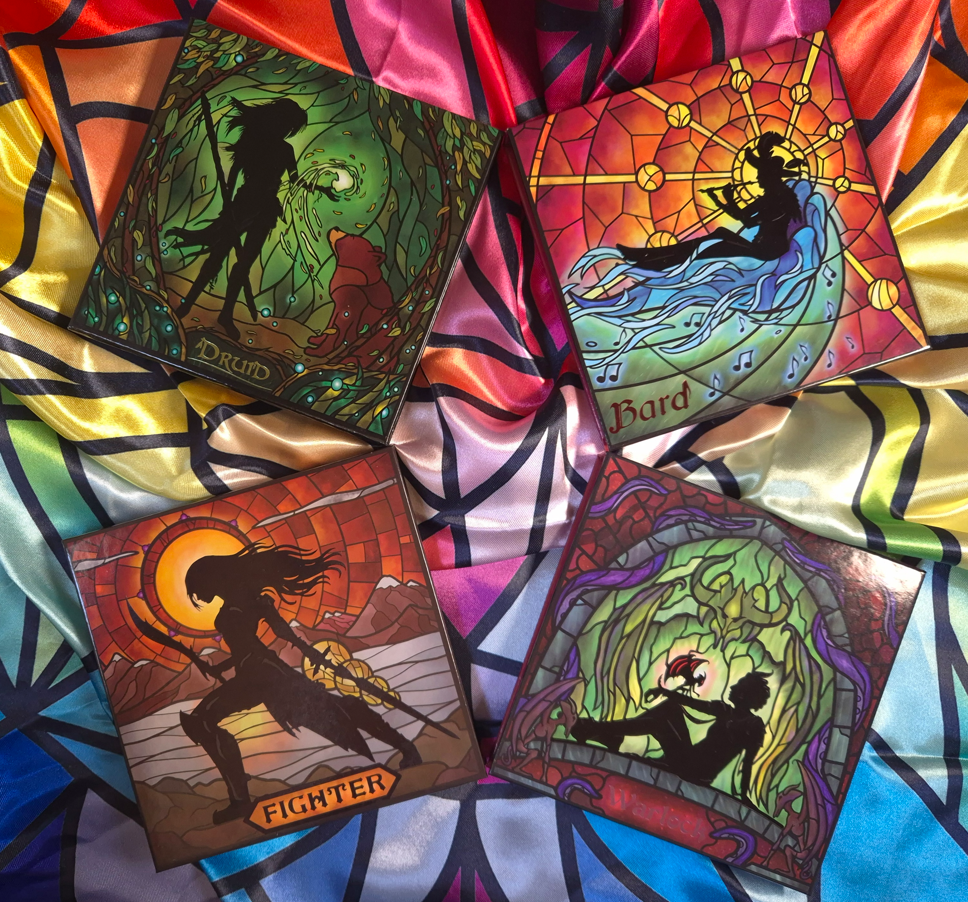
I purchased the Druid Palette in September last year and loved it so much that I considered buying additional eyeshadows. The issue was that I didn’t love a lot of the full color stories of the others palettes enough to be worth the upcharge from Monolith beyond the 19% VAT. Although Fantasy Cosmetica sells eyeshadows individually on their own website, Monolith does not. When Black Friday rolled around, I considered ordering their single eyeshadows and have them shipped within the US, but the discounted prices were such that it made more sense to actually buy the palettes in full! During my two week vacation, I tested out the Fighter, Warlock, and Bard palettes so that I could decide which of the eyeshadows I’d keep and which ones I’d leave behind, but I took them all!
All four palettes discussed today are part of the “Classes” series. At the time that I’m writing this, there are nine in total. I’ve played a few MMORPG’s in my early years, and it’s a bit funny to me that none of the characters I’ve been are in this collection of nine! I love playing a healer type in any game whether it’s a main healer like a Cleric, a partial tank-type like a Paladin, or a damage dealer like a Mage or Psychic. I’ve played a Shaman, which I guess is closest to a Druid. I’ve also been an Archer and low level Hunter, which is closest to a Ranger. Mage is probably closest to the Wizard. My point is that I’m shocked there still hasn’t been a Cleric, Paladin, or Priest! Perhaps one of those could be coming next.
First, let’s talk about the palette that turned me into a fan of this brand, which is Druid.
Druid Palette *NEW stained glass style*
I put “new stained glass style” in the title because that’s how it was listed via Monolith. However, I don’t know what the original palettes used to look like. The oldest videos I’ve seen have palettes that look similar to mine, so I don’t know what the differences are supposed to be.
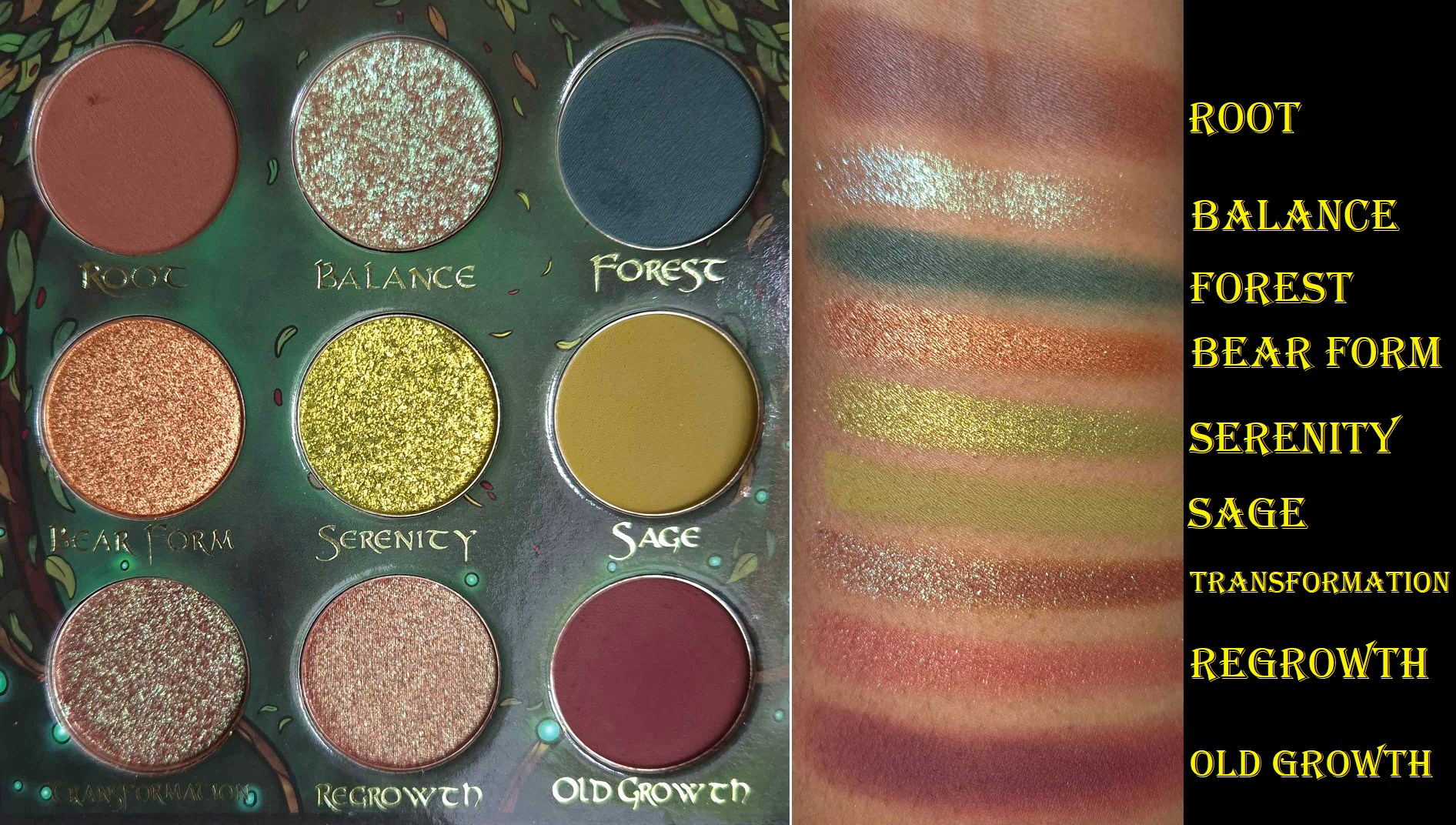
I have learned, based on these four palettes, that the Fantasy Cosmetica formulas has the kind of balance I love between high pigment and ease of use. The mattes are opaque, easy enough to blend (minus Old Growth) and layer well on each other. It’s not on the same level as Pat Mcgrath or YSL, but it’s almost on par with Oden’s Eye, which is great. The array of colors in this palette excited me as much as the Earth Palette from Lethal Cosmetics, but I prefer how these eyeshadows from Druid perform way more!
Some of the shimmers are on the satin side, but always in interesting shades to create a statement in at least that way, while the other shimmers are sparkly and impactful without looking chunky. They are creamy enough to spread easily and smoothly, but not emollient or slippery enough to crease on the eyes. How the eyeshadows look at the start of the day is how they’ll appear at night.
As I mentioned, the only matte that is harder to blend out is Old Growth. Wherever the shadow gets placed, it doesn’t really want to move from that spot. I remember the time period when Colourpop used to make this kind of shade a lot, and many of them had this issue as well. I think it has to do with the red-brown pigments used.
The only shimmer to give me an issue is Regrowth, which has a tendency to try to hard-pan. This eyeshadow has a red base and gold shimmer, but the hardpan is how I ended up with a matte looking outer corner in the 4th eye look above.
The most “boring” shimmer is Bear Form which is a metallic brownish orange. It’s pretty, but doesn’t have any special effects. Another one that appears like it should be straightforward is Serenity, but it has a yellow to green shift. It looks lime green in the pan, but it looks very yellow on my eyes.
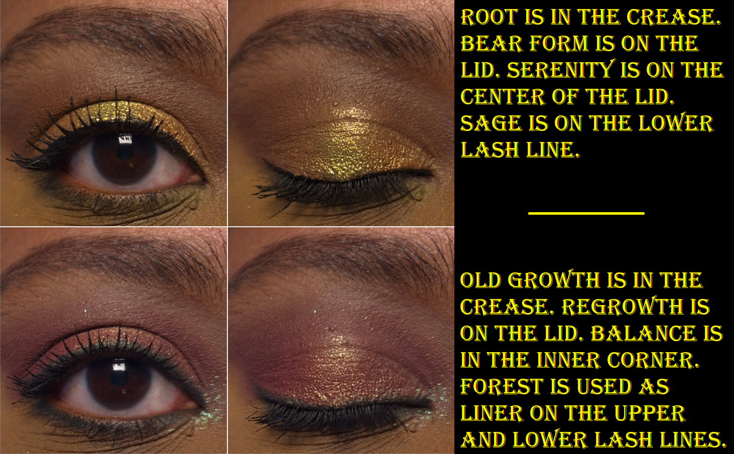
One of the stars of this palette is Balance, a transparent-based eyeshadow that can be used like a topper. It has pinkish-purple, aqua, and green shimmer. The other star is Transformation, the multichrome that goes from red to purple and then greenish blue. Green is the predominant color on my eyes.
This isn’t a perfect palette, but I really like it.
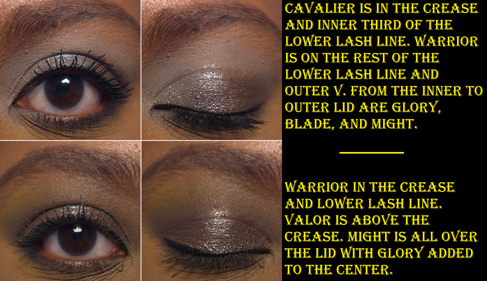
Fighter Palette
This is the most neutral color story available out of the Classes palettes. Therefore, I’m not surprised that this is also the palette with the most “traditional” type of shimmers. Glory is very much the standout. The base color is very sheer, but I can faintly see it’s yellow-brown, and the shift goes from pinkish-purple to blue. Might is also a fun color with its dark purple base and gold shimmer, but it looks like a very blackened purple when I use it on my eyes. I’ve noticed it hasn’t been as easy to see the gold on my eyes, and it looks like it’s wanting to hardpan like Regrowth in the Druid palette.
The three shimmers in the middle row of the palette are wetter and fairly thick. According to the brand’s description, Blade is a, “multidimensional shimmer – silver base with green and purple shifting sparkles.” Realistically, it’s a dark silver. I can faintly see purple specks if I rub the eyeshadow across my skin super thinly to sheer it out. I don’t think anyone would be able to tell there was any nuance to the silver when it’s on my eyes.
Fervor is a red with silver sparkles. The silver gives this eyeshadow more of a twinkling effect, but it’s still my least favorite color in the palette. It’s objectively pretty, but I’m not a fan of these kinds of reds.
And then finally, Victory is a, “multidimensional shimmer – warm brown with pink and silver sparkles.” Again, it looks pretty much orange to me. I can see some of the pink at a very sharp angle that I’m not so sure anyone else would be looking at me from.
Once more, the mattes are wonderful. Warrior is a little less blendable than the others, but it’s still good enough for me.
I go through phases of liking neutral palettes. Something about the curation of these colors and the way they look on the eyes paired together is very intriguing to me, no matter what my mood is. The only outlier for me is Fervor, but I can always swap it out with an eyeshadow single from another brand.
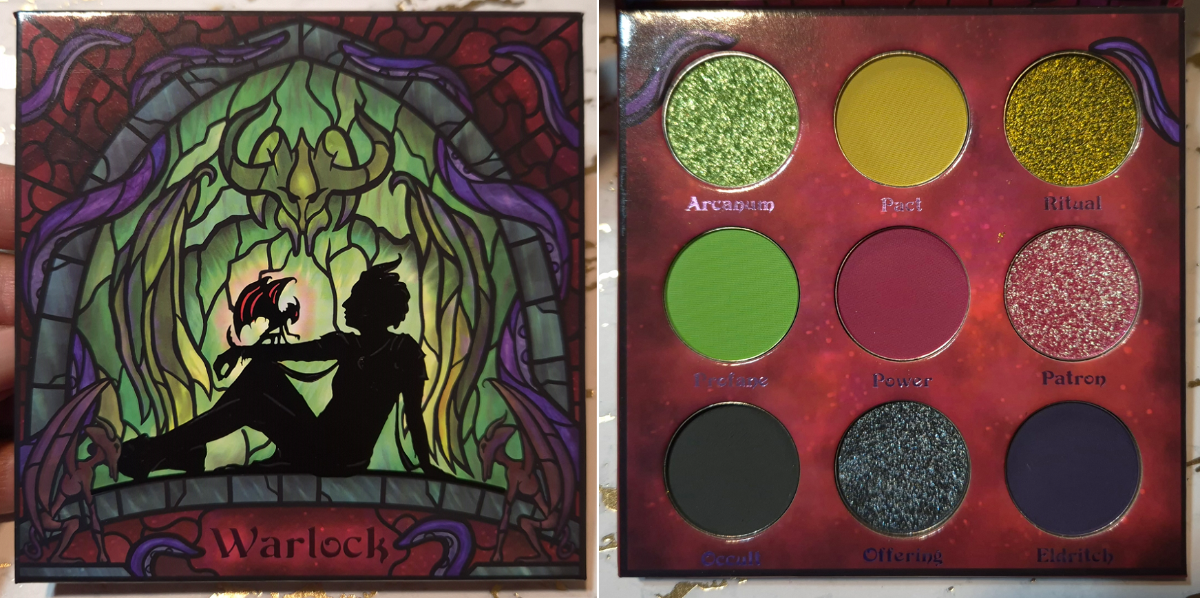
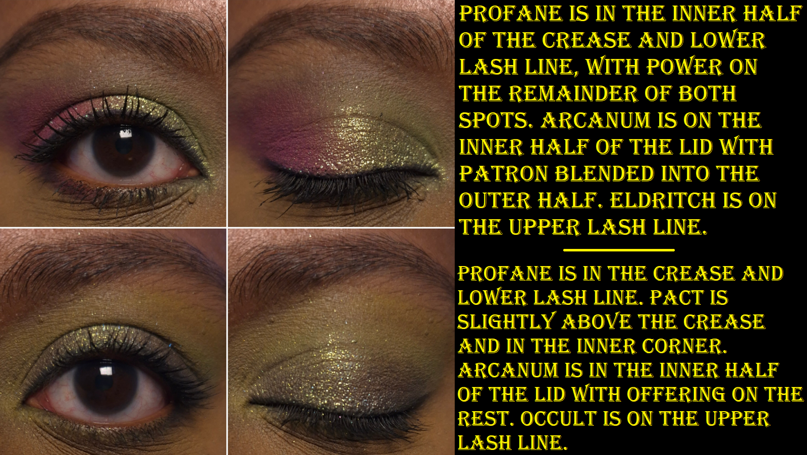
Warlock Palette
This palette is a surprise hit for me! Six of the shades are the kind of colors I only like when paired with certain other shades. This color story is thankfully grouped in a way that makes them all work. This was one of the biggest reasons I couldn’t just depot a few shades when I was planning which palettes to bring back with me.
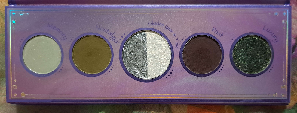
The shade I was pining for the most was Ritual, a true multichrome that shifts yellow, green, and blue. It reminded me of a Clionadh shadow, but nothing I swatched looked close enough to it. It had a similar flip but didn’t look the same head-on. I think perhaps it’s like Weathered, but I don’t own that shade from Clionadh. In any case, it’s a gorgeous color!
The greenish shift that Patron has reminds me of Transformation from the Druid palette, if that one had a dark pink base instead. I’m not always into pinks, but this is the kind I can get behind!
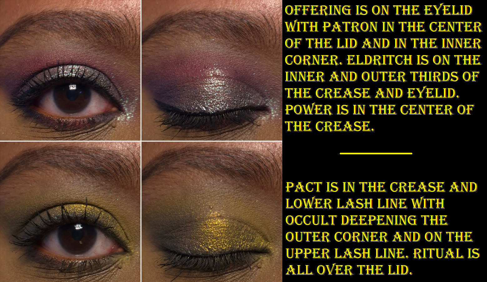
Arcanum, with its “acid green to light blue shift,” and Offering, with its “deep blue to pink shift,” are listed as duochromes, but they’re not as nuanced on my eyes. When I hold Arcanum at a sharp angle, I guess I can see blue, but on my eyes I can only see yellow and green. Regarding Offering, I consider it a deep steel blue-grey with purple shimmer. I really can’t see pink.
There’s usually at least one problem child in the palette, and in this one it is Eldritch. It’s the same issue with it just having a lot of pigment and requiring a bit more time to blend. Technically, Profane is also not perfect since it’s thin and I have to build it up, but colors that are practically neon tend to be like this for me.
Overall, this is probably the palette that intimidated me the most, but I think it’s my second favorite (Druid is at the top).
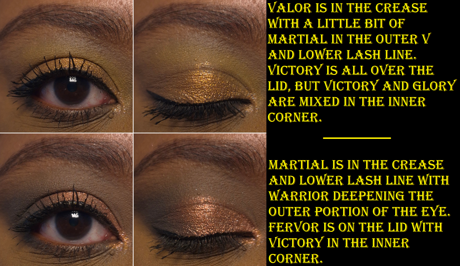
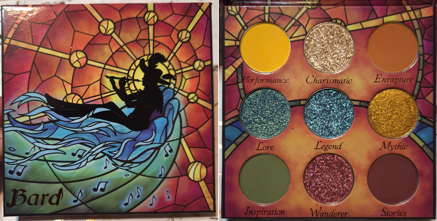
Bard Palette
Bard might not look like a rainbow palette because of the way the eyeshadows are arranged, but it may as well be.
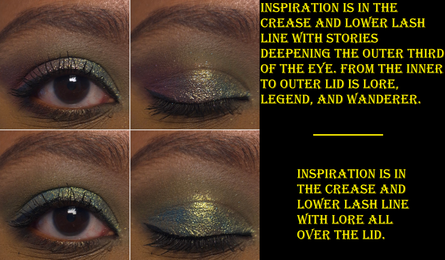
I still appreciate the brand’s choice in veering away from standard primary and secondary colors. For example, Performance is more of a golden and slightly orange leaning yellow. It’s similar to the Singe Beauty brand color. Stories is a super rich red, that is on the verge of purple. Enrapture is like a slightly toned down desaturated orange and Inspiration is a kind of murky muted green. Aside from needing to build up the yellow a green a bit, I have no issues with these mattes.
Mythic is a stunning orange color in a smooth texture. If Pat Mcgrath wanted to make an orange version of Gigabyte, I feel it would turn out looking like this.
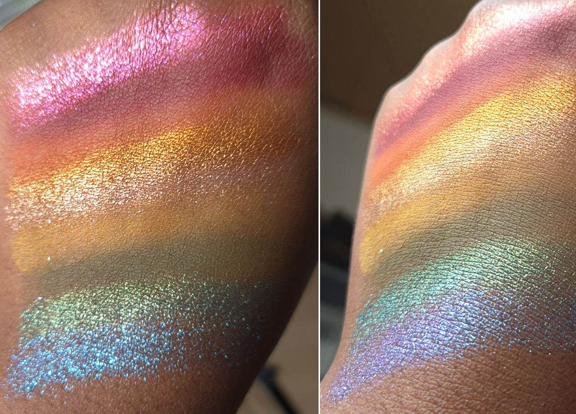
Wanderer has a bronze base with red and pink shimmer. It’s thick with a squishy consistency. Legend has the same texture, but with a sheer purple base and blue shimmer.
Charismatic is a pretty peachy color that shifts from pink to gold. A color like this is common among indie brands and even mainstream ones, but I like this opacity level. Sometimes brands have an iridescent version of this color that I don’t think looks as flattering on me. Unfortunately, this is another shimmer that’s starting to form hardpan.
The final showstopper in this palette is Lore, which goes from a bright golden green, to greenish-blue, and then a darker cool blue.
I don’t know how frequently I will use this palette, but I am still glad I bought it. I’m pleased with having all four, though dealing with the shadow sealing or forming hardpan might start to annoy me in the future. I can try to avoid it by strictly applying shimmers with my brush, but the habit to apply shimmers with my finger is very strong.
Bonus Shades and Enchanted Autumn Tinted Lip Balm
Before we bring this review to a close, I just wanted to mention that I received two Fantasy Cosmetica singles from Monolith as a free gift when my Singe Beauty blush order was delayed. As I mentioned before, Monolith doesn’t sell singles, so it was interesting to receive them. They unfortunately don’t have names written on the sleeves, nor the pans. At first, I thought they were the gold and silver from the Fighter palette, but they aren’t the same. Now, I’m wondering if they are from the Enchanted Autumn palette that I believe launched around the same time. Perhaps they are the shades Libra and Harvest Moon. In any case, the beautiful colors are another reason I was so interested in trying more Fantasy Cosmetica eyeshadows.
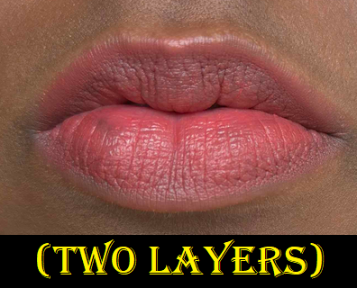
I included a photo of Pomander, which I’ve reviewed before in my Battle of the Lip Balms post, mainly because it is still a Fantasy Cosmetica product and should be part of this brand spotlight. They have brushes, fragrances, lip products, and candles. So, Fantasy Cosmetica is branching out.
This has been a great experience. Among all the indie brand eyeshadows I bought between 2024 and 2025 (Nomad Cosmetics, Cosmic Beauty, Lethal Cosmetics, Fantasy Cosmetica, and ShellWe Makeup), the Fantasy Cosmetica quality is my favorite of the five, and will be a brand I continue to keep my eye on. Since their products are made in China, I hope they will be able to manage through this tariff situation. I heard they were among the first indie brands to alert customers of potential issues via social media.
That’s all for today! I hope you’ve found this post to be helpful!
For the last several years, blush has been my #1 favorite category of makeup to purchase and wear. I have a similar taste in blushes as Angeschka Nyqvist, especially when it comes to shimmery ones, so it made sense for me to try some from her own brand. There are currently four shades in the range. I have three, but I did not buy Riveting Rhubarb under the assumption that it won’t be as flattering on my skintone as the others.
DISCLAIMER: I purchased all of these products with my own money. All thoughts and opinions are my own.
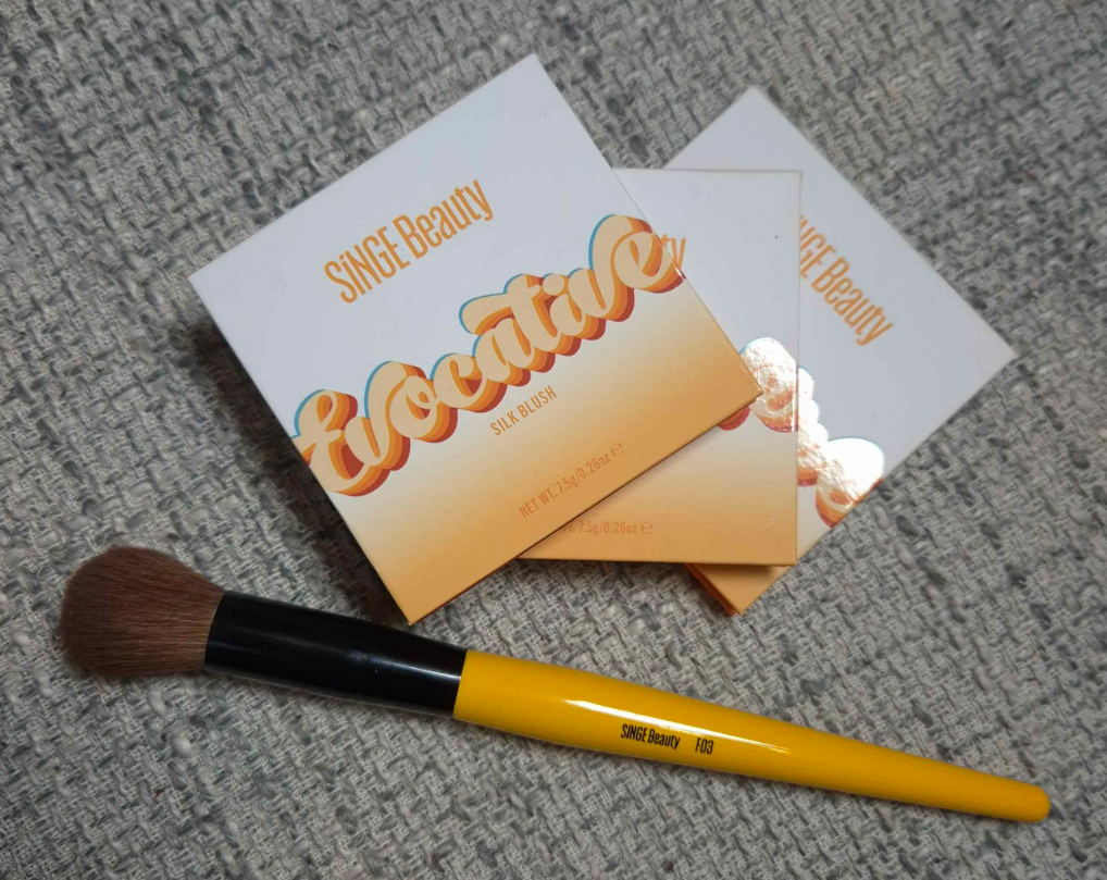
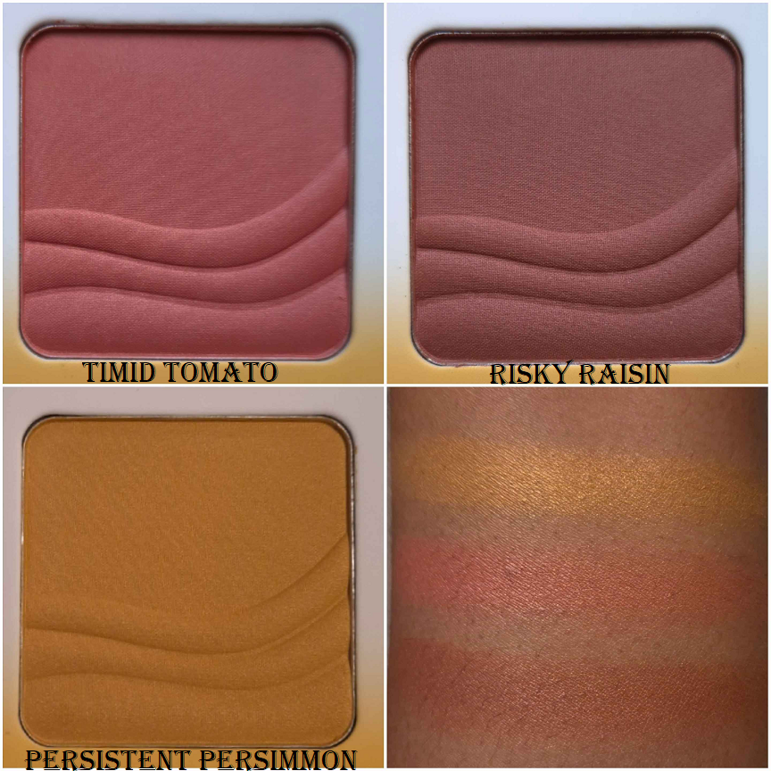
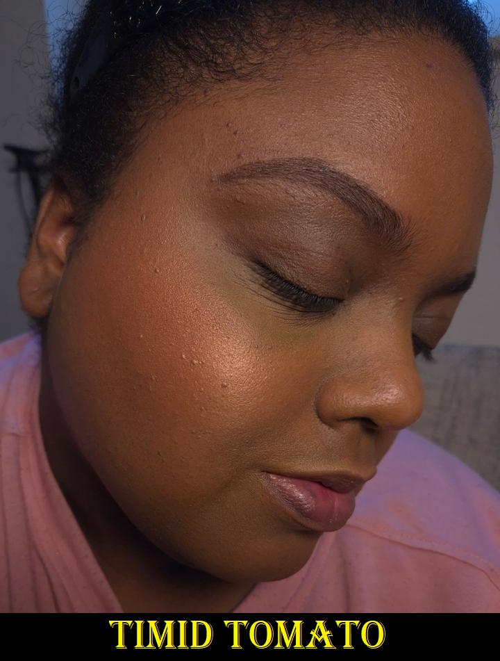
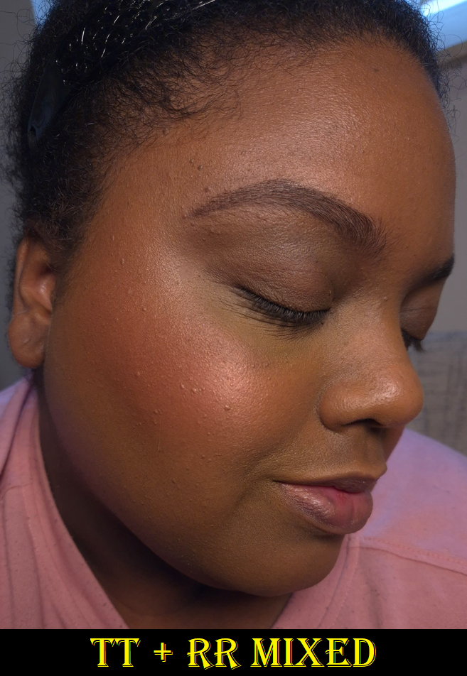
Singe Beauty Evocative Silk Blushes in Timid Tomato, Risky Raisin, and Persistent Persimmon
These blushes are pressed firmly enough to maintain the shape of that embossing, but they are loose enough to be easily picked up with any brush I own, whether they’re a delicate natural hair brush or a sturdier synthetic type. I get kickup in the pan, but it’s an acceptable amount most of the time. I got it on my clothes once from a brush that picked up a bit too much!
To the touch, these powders are soft and have a slightly silky feel to them. It’s difficult to see shimmer on the surface in normal lighting. The blush has to have light shining directly onto it to spot it easily. This makes me happy because when I say I want a shimmery blush, I don’t really wish to see large individual shimmer particles. I just want a sheen, or an ultra refined reflect to make my skin have a bit of glow to it. I’m not looking for a highlight-blush hybrid, so I’m pleased with the way these blushes are.
They are all quite pigmented. I prefer to use a medium density brush or one that is on the light side to have better control over how much I put on. It’s quite easy to get carried away and find myself saying, “slow build…gradual build…oh, gosh too much!” The blushes blend easily, especially with each other, but it still requires using a light hand. I’d rather they be pigmented over having the problem of being sheer because Timid Tomato is my favorite of these shades, but the inclusion of shimmer could have had the Nars Orgasm effect on me (that when the light hits it, the shine obscures the base color and then it looks like I just have highlighter on my cheeks instead of blush).
I have no longevity issues with this blush, as long as it’s on top of skin that is moisturized in some type of way (via skincare or foundation).
I bought the other two blushes in October 2024, but I didn’t get Persistent Persimmon until December of that same year. I kept seeing people use this blush to create a sunrise cheek type of look, which was pretty enough to make me reconsider. I knew this was too light to be a standalone color for my cheeks, but I remembered how Scott Barnes had a yellow blush in his Chic Cheek palette that could be used to add warmth to blushes if they were leaning too cool toned on someone. I’m less into matte blushes now, which is why I didn’t bother to keep that one with me, but I thought having a shimmery version could be perfect! Below are some examples of cool and/or berry blushes I don’t like as much and how Persistent Persimmon added on top turns them into a somewhat coral color that I like way more!
Besides using this shade for adding shimmer and warmth, I can partly lighten blushes that may be too dark for my liking. So, I’m happy that this turned out to be another “fixer” type of product in the same way that I use the Dior Powder No-Powder for blurring and blending or the r.e.m. beauty Interstellar Highlighter Topper to fill in the gaps of scattered effect highlighters.
I have considered the possibility that Singe’s pink blush could have the same role as Persistent Persimmon, except to cool things down, but my need for that is so rare that I don’t think it would be worth the purchase for that purpose.
As I mentioned before, these blushes look different in natural or indirect light compared to light hitting it straight on. This shade is like my version of Nars Orgasm X, but better.
Risky Raisin looks a bit close to Timid Tomato on my skin. The difference is that it’s a touch darker with some brown and is a less saturated color overall. The red tinge in Timid Tomato pops a little more.
Overall, these are nice shimmer blushes. I like them, but there are blushes in my collection that I’m crazy about. I don’t have the same level of excitement using them as I do with, for example, Dior’s Rosy Glow Blush in the shade Bronzed Glow or Benefit’s Wanderful World Blush in the shade Terra. Those two are also twice the price as the ones from Singe, so I can at least say these blushes are among the top shimmer formulas I’ve used for under $20 USD. Because of VAT, the price I paid is around 23 Euros each.
On a less important note, I’ve been spoiled by luxury packaging, but I don’t mind Singe’s cardboard packaging or the absence of a mirror. I like that these details have kept the cost down. However, I’d actually prefer if these were available as refills. I would like to keep them in one single custom magnetic palette, so I’ve considered depotting them. The only reason I haven’t is that I also like how lightweight this packaging is. All of the custom palettes currently in my possession feel heavier in their empty state than the weight of these three blushes in one hand. I still don’t have a proper makeup area (renovations are still taking place), so it’s easier for now to carry these around in their current packaging until I have a more permanent setup.
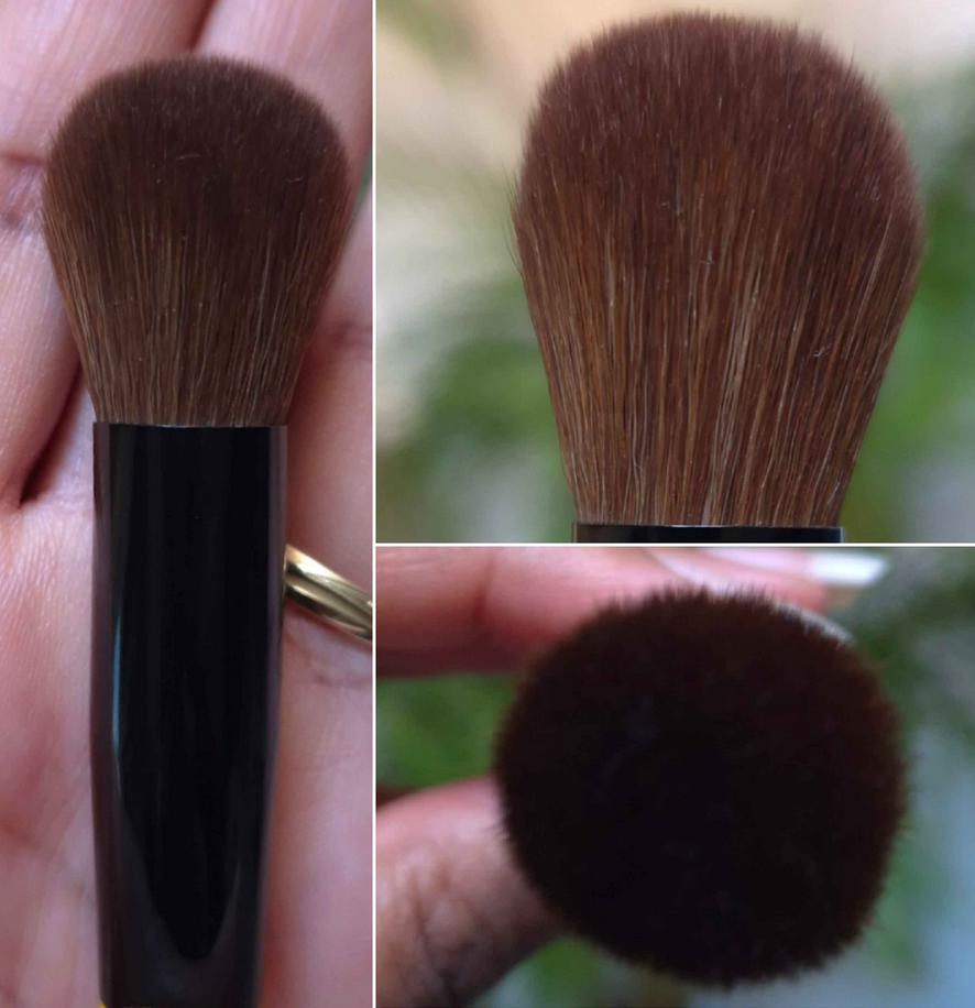
Singe Beauty F03 Brush
I’ve found Singe’s eye brushes to be useful, but not as enjoyable of an experience compared to my fude brushes. I decided they weren’t for me and assumed the face brushes would be the same. However, from one brush snob (I say this with love) to another, Tina the Fancy Face has given Singe’s face brushes a more positive review than the eye brushes. So, I assumed I would prefer them too.
This brush feels wonderful when I rub my fingers across the fibers, but it’s similar to rubbing Sokoho level goat across my cheeks. It feels nice at first, and certainly fine with the brand’s own blushes, but if I try to use a makeup product that requires additional blending time, it can irritate my cheeks a bit. My skin has admittedly gotten more sensitive with age (or perhaps I’m just so used to using ultra soft brush hair), so this won’t be a problem for everyone. I just wanted to put it out there that if you’re the type that uses mostly natural hair brushes and only loosely packed synthetic ones, you might not want to buy this brush. But I’d like to reiterate that it’s only if I have to spend a long time blending that it starts to agitate my skin.
The Singe blushes are pigmented, but I don’t have to worry about overapplying as much when it’s on my bare skin. The product looks so skin-like and I can use this specific brush in a heavy-handed way. However, when my face has a little dew to it, the application of blush with this brush can be too concentrated if I’m not careful. I have to dip the brush lightly onto the surface of the blush, tap off excess, and sweep it on first before attempting to do the full on circular buff.
Because of these two potential complications, it’s just easier for me to not reach for this brush with powder products. What it’s fantastic for are creams and liquids. The size and shape is somewhere in the middle between my holy grail Sonia G Mini Base and the Classic Base that was too big to be a multi-purpose brush for me. I have enjoyed using this brush with Glossier Cloud Paint blushes, the Chanel cream to powder (Joues Contraste Intense) blushes, the Charlotte Tilbury Unreal Skin Foundation Stick (that I use as highlighter), etc. Those are products that I pounce on and they practically blend themselves. The way this brush moves ensures I still get good color payoff without the product getting absorbed into the bristles or dispersed into too wide of an area. I will probably continue reaching for the Mini Base over this one, but the Sonia G brush is almost double the price, so perhaps the Singe F03 would be a good alternative for someone.
Because of my enjoyment of this brush, but my desire to have it in a softer hair/bristle type, I purchased the Hakuhodo G6440 from Fude Bobo’s website and it is so wonderful! It’s only for use with powders (as it’s a blue squirrel/goat mix), but I’m thrilled to have it! I got mine during Black Friday, but it was still super expensive. It might only be worth buying for people who are lovers of pom pom style of brushes.
That’s all for today! Thank you for reading and I hope this has been helpful.
In 2020, I reviewed my first Nomad Cosmetics product: the Tokyo Harajuku Palette. It is one of the worst palettes I ever owned, which is a shame because the palette art was so cute and I tried so hard to make it work on me. It was bad enough to scare me away from purchasing anything else from the brand. However, in the last 2-3 years I’ve heard nothing but good things about the brand’s eyeshadows. Beauty Influencers and other makeup enthusiasts that I trust all seemed to like their palettes. Granted, not a single one of them ever reviewed the Tokyo palette and even the people who owned nearly all of them coincidentally were only missing that one. I always found that to be strange considering the Tokyo palette was extremely hyped up when it first came out and it was the reason I even discovered that Nomad Cosmetics existed.
Pastels are notoriously tricky to make look good on dark skin, so I was willing to accept that factor could account for the particularly bad experience. I had also heard their formula “got even better” over time. So, at some point I made up my mind to give them another try, especially since I felt bad that their only review on my blog was a negative one. The problem was that none of the color stories were of interest to me until the launches of the Haunted Europe and Royal Europe palettes. I also didn’t want to spend so much money on a palette when the potential was high that I might not like it. So, I finally caught Haunted Europe in stock during Black Friday/Cyber Week!
Before we get into the review, I just wanted to mention that this palette was delivered to me in Germany via GLS. This was my first and hopefully last time having to deal with that service. I was literally looking out the window as the delivery van passed my building and stopped somewhere else to deliver a package, then continue driving away. At the end of the work day, they updated tracking with a note that my package couldn’t be delivered because I was on vacation, instead of them just admitting they forgot to stop at my place.
I sent an email to GLS customer service. My package was delivered the next day, but they never responded to that email. I found plenty of complaints about GLS online, so this wasn’t an isolated incident. If you’re ordering something that uses them as delivery partners, just be forewarned!
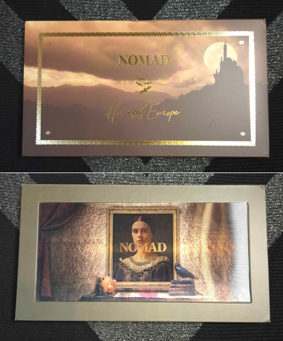
Haunted Europe Palette
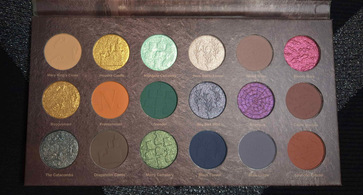
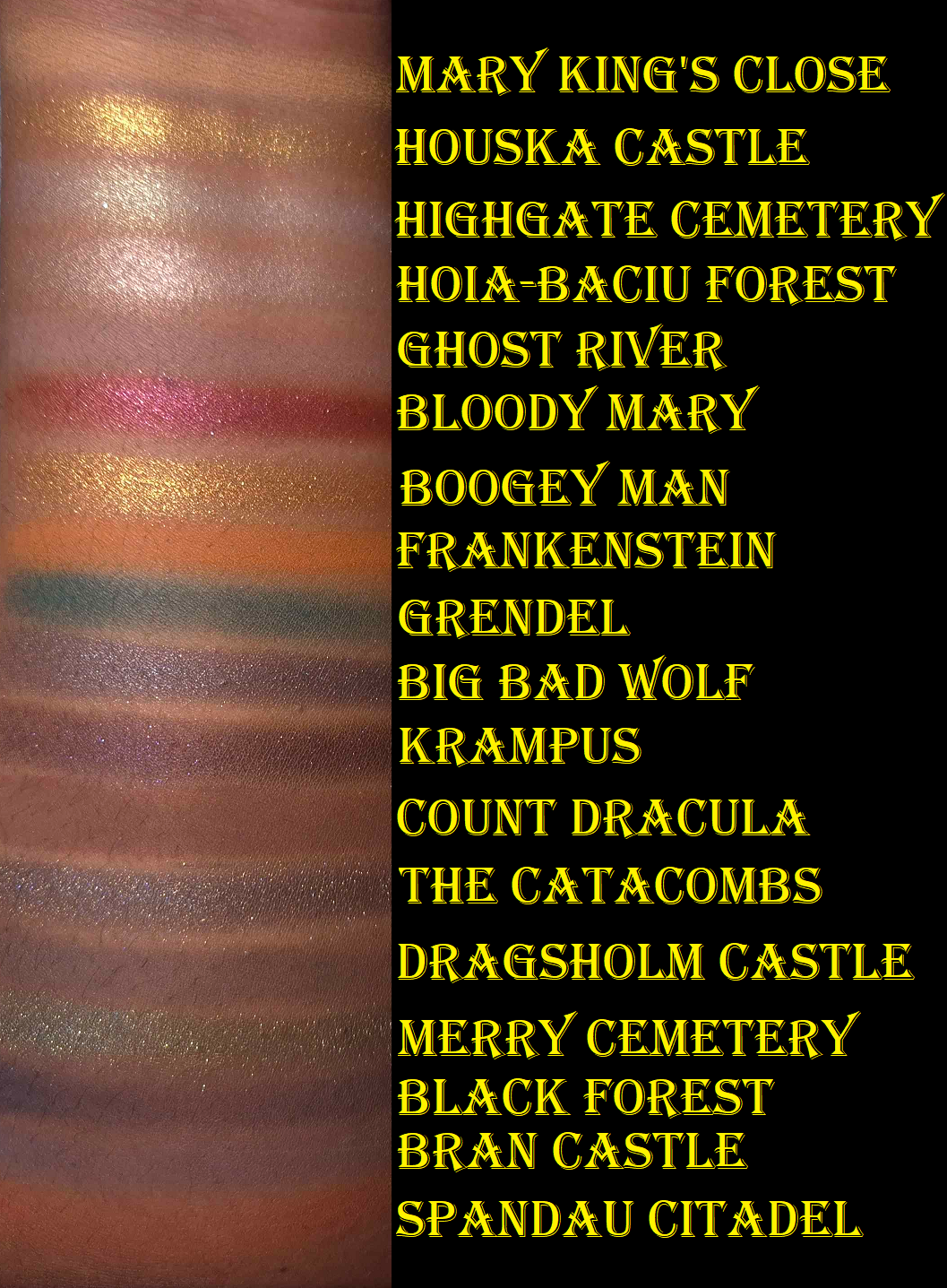
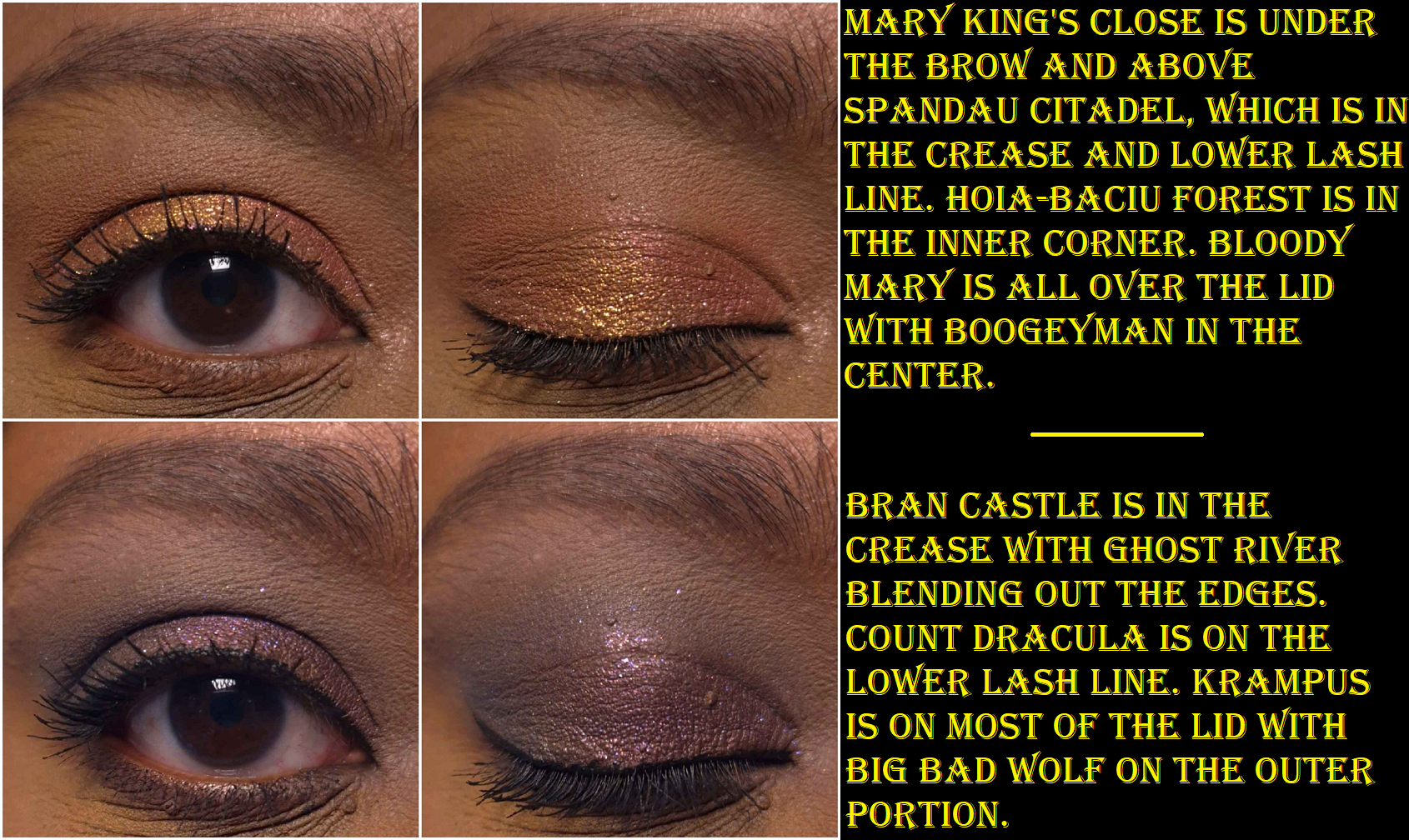
I was so relieved to discover that this palette is leaps and bounds better than the Tokyo palette!I’ve been able to create quite a few pretty eye looks. This has a nice mix of neutral and colorful shades, but the matte colors are a bit muted. The mattes are soft to the touch and powdery. They are all opaque and apply smoothly without being patchy, but they create a soft and hazy kind of look. The brand describes all their palettes as “intense,” including this one, which surprised me because these aren’t vibrant colors. I can’t think of a single indie brand whose eyeshadows are less saturated than these. For example, Spandau Citadel looks reddish brown in the pan, but it’s a medium pinky-orange on my eyes! Bloody Mary looks so promising in swatches, but it’s so much less impactful on my lids.
I’d like to clarify that I don’t think this is inherently a bad thing. It’s about preference and I think a palette like this is perfect for the neutral lover who wants to dive into color, but gets easily intimidated. This could also work for someone who likes to combine neutrals with colorful shades and without the overall look being too bold. Someone that likes smokier type of colors might enjoy this as well. It could also be the case that these look more intense on people with lighter skin or someone who uses different primers or bases. The ones I use with this palette are MAC Paint Pot and Lisa Eldridge’s Liquid Silk.
These mattes have a hazy effect that make them look well blended. It is easy to get a gradient look from a single shadow, but they aren’t easy to build up, nor to they layer well on top of each other. If I want real depth, I have to start with the darker shades first and work backwards from my usual order of eyeshadow application. Black Forest is the most pigmented shade in this palette and is the one that layers the best. Using that shade or the dark shimmers is the quickest way for me to deepen my looks with the least amount of effort. Grendel has the second strongest amount of pigment, but it’s not as easy to blend as Black Forest.
Houska Castle is a yellow-gold and Boogeyman is orange-gold. To keep them from feeling redundant, I think Nomad could have benefited from giving them different finishes instead of making them both smooth metallic shimmers.
The golds are fairly smooth, opaque, and vibrant. Highgate Cemetery and Merry Cemetery have bigger sparkle particles, but I can see my skin through them. I can fix that by wetting them so that they apply more compact on my lids. TheCatacombs and Bloody Mary have more opacity and more obvious shimmer, but they’re not able to complete with brands like Pat Mcgrath or Natasha Denona with intensity, let alone other indie brands. Big Bad Wolf and Krampus stand out because of the multi-colored shimmer, but they aren’t duochromes and they look smoother than the previous four I mentioned. Hoia-Baciu Forest is the smoothest of the shimmers and what I prefer to use as the highlighting shade, especially in the inner corner. It pairs well with nearly all the eyeshadows in this palette. To me, the shimmers are just fine. They don’t crease on me though, so that’s a plus. I also get an acceptable amount of fallout throughout the day, as it adheres to my lids pretty well, but after that it’s impossible to remove all the shimmer particles with micellar water and a microfiber cloth alone.
Since the theme of Haunted Europe is supposed to be spooky and smokey, I assume this is why the colors are muted and that Nomad’s other palettes are more saturated. That could mean that I still have gaps in my knowledge regarding the brand’s eyeshadows, and therefore shouldn’t assume the others perform like this one.
Haunted Europe is good enough to have redeemed Nomad Cosmetics in my eyes, and I can see how people would like the quality, but this is still in the middle of the road among the palettes in my collection. There are too many aspects that aren’t a perfect fit for my makeup preferences, so this is probably where the journey ends between Nomad and myself. My curiosity has been sated.
Oh boy! I can’t start this review without talking about the insanity of this launch. There was so much traffic to the website that it went down even before the starting time (4:00 pm Central European Time). There were continuous 500-504 Gateway errors. US shoppers had the option to try their luck with the retailer Camera Ready Cosmetics, but the rest of the world only had the official Lethal Cosmetics website to be able to purchase from. After about 40 minutes, the brand announced on Instagram that they would need time to fix things and for everyone to try again at 5:30 pm CET. They specifically mentioned they would hold the stock back so that even if someone was able to get on the site, they wouldn’t be able to purchase until the appointed time as to make it fair for the ones who got off the website. It was clear they needed less people overloading the servers. The website was still giving the same errors until 5:36 pm, which is when the queue page appeared for me.
I took a screenshot, but the numbers were counting down so quickly that I couldn’t capture my true number in line (a little over 2000), but it did say 55 minutes and took close to that long to get on the main website. I added things to my cart, but the checkout process was constantly producing those same gateway errors again. The saving grace was that I didn’t need to go back in the queue or add things to my cart again. Refreshing over and over eventually got me back to the checkout page at the points where I last left off.
The most confusing part of this process was when I finally returned to the PayPal page and clicked to submit the order, it started loading, and then brought me to the error message again. I had a moment of hope when I could hear my cell phone buzz and saw I had the PayPal confirmation notification and email confirmation from Lethal Cosmetics. Just to be even more certain, I continued to refresh the page in the hopes that I could get back on the website and check the order status through my account information. However, when it finally loaded, it said the items sold out in my cart. My cart had been emptied though, so I added everything back to the cart and noticed that this time the Appa Bag was listed as “preorder.” I checked my confirmation email, but it didn’t have a preorder description. So, I think I may have been one of the very last people to get the remaining stock! Lethal Cosmetics set the limit of 3 of the same type of item per person, so I had added a second bag to my order so I could gift one to my sister-in-law. I wanted the Appa Cosmetics Bag because it’s adorable, but my Schwägerin is an actual fan of the show and she was thrilled to have it! Her toddler was instantly attached to it as well and started filling it with toys. Thankfully, anyone unable to get this collection was able to pre-order for what is estimated to be a July/August shipment.
It took 2 hours and 40 minutes for me to complete my order. I nearly missed getting the items I wanted as non-preorder. My order took over two weeks to get shipped and delivered. Let’s see if it was worth it!
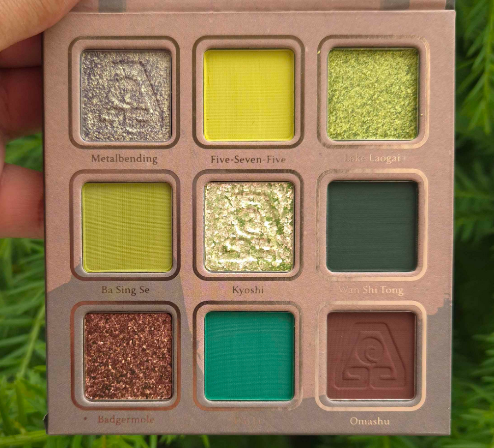
Earth Palette
For starters, I am so on board with this color story! If I’m going to wear yellow leaning greens or blue leaning greens, these are the shades I prefer. I love how bright Dai Li looks, although it darkens on my lids if used with other dark shadows or on one of my wetter primers. I’m not sure if Metalbending is technically a duochrome, but at the very least it has a beautiful yellow-green shimmer on what looks to be purple-grey base. I’m not the most knowledgeable about color theory, but on my eyes it looks like it leans on the cooler side of yellow. It has been a long time since I’ve used Lethal Cosmetics shadows and the shimmers seem more to my preference now than before. They don’t feel as thick, but they go on smoothly and opaque. I don’t know if the brand necessarily increased the sparkle level; it appears the particle size of the shimmers are just bigger. Kyoshi is a somewhat flaky multichrome. I have minimal fallout applying the shimmers with my brush and fingers, but Kyoshi gets messy if I try to apply it to my inner corners without dampening the brush.
I get a little creasing near the inner corners where my eye line is the deepest. Wherever I place the shimmer has a tendency to move up a bit higher on my eyes over time (basically covering up some of the crease). So, if you have oily eyelids, these might be a potential problem depending on the severity of it. The amount I get doesn’t deter me from using this palette.
The mattes are closer to how I remember them always being. With Lethal shadows, they’re going to pack a punch! They are pigmented and a bit on the dry side, not the soft nearly creamy feeling powder mattes that have become my preferred formula. I like that these apply opaquely. They require some work to blend, but the end result is beautiful. They adhere well and don’t fade throughout the day. I recommend not using a tightly packed brush and applying with something that won’t put on a ton of product at once. I recommend also using a resilient type of bristle for blending, though it being dense isn’t required per say. This isn’t the kind of formula where I can easily blend it out by working the edges back and forth repeatedly. It sticks too well to the skin, which ensures no patchiness and no fading, so the tradeoff is just needing to switch up my technique. I have an easier time applying a lighter color, darker color, and then applying the lighter color back on top to blend and create that gradient.
I used the Earth palette, plus a beige shade under the brow bone (Lodge) and shimmery greenish gold (Antheia) in the very inner corners of the eyes from Natasha Denona’s Mini Gold palette. So the majority of the eyeshadows used in the look are from Lethal Cosmetics.
If you’re a fan of depotting palettes to create custom magnetic ones or rearranging shadows, these pans are magnetic and able to be removed.
I have a gigantic Lethal Cosmetics eyeshadow collection. They’re one of the first indie brands I tried, and there was a time when I had nearly all of the shadows. I love their color stories and the way that they’ve grown as a company. Everything I have praised them for in the past holds true today. Their eyeshadows, though better than before, haven’t been my preference for a few years now. However, I have no regrets buying this palette. I don’t like to switch up my makeup applying techniques just to use specific products, but I don’t mind for this one.
Ty Lee Lipstick
Lipsticks are less exciting for me than other forms of makeup, but there was no way I could resist that component and with the intricate design on the bullet. It’s just so pretty! I like that it has a magnetic closure, but the magnets are on the weaker side. I would feel nervous chucking this in a purse with other objects for fear the top would come off. However, I assume it would be just fine in a pocket of a purse.
The lipstick bullet appears quite dark. All three shades in the collection looked to be the same depth with just different undertones in the marketing images. However, when applied to actual skin, this lipstick reveals itself to be a medium-dark pink. I understand the confusion about this shade though because Lethal’s Instagram page was flooded with comments about how “the Ty Lee lipstick should be pink” and “I wish these lipsticks weren’t all red.” The brand responded by telling people it was pink and that there was a softer option, but the color in the tube is not how it will actually appear when worn. It even looks dark and red in the brand’s swatches, but it appears much brighter on me. I can’t even say it’s a skin tone difference because they have swatches on an arm that’s similar in color to mine!
Regarding the formula, it has a creamy finish. It feels soft and the tiniest bit waxy (like a Burt’s Bees balm) as it spreads across the lips. It has a little shine, but it’s closer to a satin than a glossy formula. It feels comfortable in the beginning, but is drying over time. The shine lessens after several hours and although the lips continue to have some slip to it when I rub them together, I can still feel it drying beneath the surface.
It has medium pigmentation, so if I want the color to look opaque, I have put at least four layers to cover the two spots on my lips that are naturally darker than the rest. For this reason, I have the urge to want to pair a lip liner with this lipstick so that the outer edge remains defined and opaque, plus to fill in those darker spots so I could use less product. Despite it not being fully opaque, it has a slight staining effect. If I try to wipe it off after it’s been on for at least four hours, there will still be some color left behind, especially between the cracks of dry patches. It doesn’t take much to remove the stain though. Just a little water on a cloth will do the trick.
At the time that I took these photos, it had been cloudy all day for a full week. The pictures above were the better ones I could capture between using my artificial lights versus the natural light available to me. Videos of the products can be found on my Instagram post HERE.
Now that I’ve finished the testing phase, I’m going to stop using this lipstick. It’s not because it’s a bad formula; it’s because this shade of pink is a bit bright for my taste. I like the design and packaging of the lipstick, so I plan to keep it shelved as a collector’s piece instead.
Appa Makeup Bag
I wanted this because it’s cute! Don’t throw tomatoes at me, but I’ve only seen the M. Night Shyamalan version of The Last Airbender. I haven’t seen the Nickelodeon show*, nor the Netflix live-action show. However, it is on my list of things to watch. I have a feeling that once I do, I will be even more happy to have this bag. Cute creatures in anime always become my favorites like Chopper from One Piece, Happy and Frosh from Fairy Tail, Chiaotzu (technically human) and young Dende from Dragon Ball Z, etc. Call it FOMO, but I couldn’t shake the feeling that I would regret not getting one even though I have no need for more makeup bags.
This is another product that’s going to stay on a shelf for collector purposes! The “fur” is soft and seems pretty well made. I think $25 was a very reasonable price for it. It looks like it could hold a fair amount of makeup, but it doesn’t have a handle, which is what I would prefer to have for a functional cosmetics bag. Don’t be surprised if I end up stuffing this with soft accessories like scarves and wool caps and using it as a pillow or stuffed animal instead!
Yes, I still like stuffed animals.
Anyway, I think Lethal did a fantastic job with this collab. Even without me knowing very much about the series, it seems like they worked really hard to do this franchise justice. I would love for them to tackle another IP or do a Round 2 for this collection!
That’s all for today! Thank you for reading!
-Lili ❤
*UPDATE: I finished watching the animated series (not the Netflix live action), and although I didn’t like the show as much as I hoped, I did end up being happier with my decision to buy the Appa bag.
Not pictured above, but will be included in the rankings, is the Stone and Rock Palette.
I unofficially started an eyeshadow ranking series for the brands whose palettes I own the most of in my collection. So far, I’ve done this with Pat Mcgrath Labs and Huda Beauty. Today, we’ll be doing it with one of my top ten favorite eyeshadow brands: Oden’s Eye.
Each of the thirteen above (excluding #11) are linked to their previous reviews. I did many eyeshadow looks already, so anyone looking for that kind of inspiration specifically can click there.
I’d also like to note that even though there has to be something that falls in the worst category, the quality of these palettes is so good that I don’t hate any of them. #13 is there purely for preference reasons, and if I had to assign a grade for #12 in the USA grading system, it would be within the B- range, which is still quite good.
Disclosure: I am not affiliated with this brand/company. All opinions are my own and every palette was purchased by me with my own money. The links in this specific post are regular non-affiliated ones.
Top Three
I mentioned in my October 2022 low buy series what my top four were, and my thoughts haven’t changed. For a while, numbers one and two were nearly tied, but by now I have solidified my opinion on how they rate for me.
Because I typically use this palette in conjunction with Clionadh singles, I didn’t have many eye looks showcasing using this palette by itself, so I decided to add some here.
Looking at the state of my palette, it’s clear that I reach for specific shades mainly: the entire first row, Snow Man, Best Wish, Little Star, Gingerbread, Happy Ending, and Santa Star. The greens, duochromes, and neutrals in here allow me to create some of my all time favorite looks. Colors like Best Wish aren’t prevalent in my collection, so I have some unique options, and the palette layout’s color combinations inspire me. In addition, this is the brand’s best quality with no duds. The number of times the brand had to bring this and the Christmas Eve palette back is a testament to how good they are and why they’re so sought after.
In the purple eye look photo, you’ll notice I have a purple matte in the crease that I created using a blue and red shadow. That’s one of the things I love about Oden’s Eye, that their shadows are so blendable and layer well with each other, that I can do certain tricks to get even more use out of this palette. I really can’t stress enough how much this palette inspires me and how often I think about using it, even while testing other palettes and wishing I could incorporate some of the shades into whatever eye look I’m creating at the time.
I don’t think I ever want to have to rank my entire eyeshadow collection, but I know that if I did, this palette would place within the top ten. I don’t know where exactly it would fall on that list, but it would be somewhere among the cream of the crop!
Red Dragon (Legendary Diversa Group 1 Round 1 w/Judy)
Considering the number of beautiful greens, neutrals, and specialness of the duochromes that make up this palette, it’s no surprise why this was such a close contender for first place. I don’t care so much for Fire or Dragon, but everything else is a color I continually reach into this palette for. I’m a colorful eyeshadow lover at heart, and this palette gives me soft and more toned down colors than the Merry Christmas palette, which is why it took second place. It’s my dream version of a neutral palette, but slightly less inspiring. I can name a lot of other neutral palettes (or neutral palettes with pops of color) that I love, so it’s the shimmers in particular that helps this one stand out from the pack. Solar Flare is a particularly stunning shadow, and I really like Luna as well.
The quality is once again top notch. It’s not a perfectly performing palette since Aurora is still hard to layer with the other shadows and if I don’t want the look to be too soft, it takes some time building up the mid-tone shades. However, softness is a preference thing which could make the palette closer to perfection for someone else than it was for me.
The Urd Mini Palette (Norn’s Collection)
Following the theme, I love greens and I like having a neutral shade in the crease or to deepen up/add smokiness to the look (which is fulfilled by Past). This is why this palette is in third place. I love the shimmer level of Luxury and the tone of that dark green. Nostalgia is the kind of murky green I like, similar to Matcha Cookies in the Merry Christmas Palette and Jade from Red Dragon. I’m not usually one who likes pastels, but Memory works well. I rarely use the shades in the center, but they are additional options. At one point, this was my most used Oden’s Eye palette that I enjoyed bringing along while traveling. This was my ultimate small mini green palette for years until it got upstaged by the Natasha Denona Mini Gold palette. Since I got Mini Gold, I rarely use Urd anymore.
Because I can technically get a similar look from the two previously discussed Oden’s Eye palettes, and those other ones have extra shade options, I had to rank them higher. Also, the quality of Urd is very good considering this is technically the brand’s “older” formula. Their newer formula is a bit softer and a touch easier to blend.
Christmas Eve (Original Release Holiday 2022)
At first glance, this doesn’t look like the kind of palette I should like because of the number of cool toned shadows, especially the blues. However, something about the arrangement of the colors is very inspiring. It still has a green and some neutrals to appeal to me, but it also has those stunning golds and purples. This is the palette I think of in the rare instance that I actually want to incorporate some blue into my looks because I’m more likely to use deep blue or duochromatic ones, both of which this palette has to offer. When I feel like I’m wearing too much of the same look, I have this palette to break me out of that.
Again, the quality of this and the Merry Christmas palette have yet to be topped by any other Oden’s Eye palette. This is why, despite it not being my usual preference in colors, it deserves to be in the highest percentile for the quality. Because I use the Natasha Denona Mini Gold palette more than the Urd palette, it left room for Christmas Eve to be more used by now than Urd!
Norn’s (Norn’s Collection)
This is a bit nostalgic because it’s the color story that enticed me to try Oden’s Eye products in the first place. It’s no surprise that I like it considering the whole bottom row of duochromes, it having Pink Chameleon as a multichrome, there being greens, purples, and neutrals. It has so much of what I love, which is ironically a partial hindrance. It’s easy enough to mix colors with neutrals, but if I want to use two different color families or a two-tone look, these colors don’t all go together. I’ve done blue-purple looks and red-orange looks, which sound like they should work, but I didn’t like how they turned out. In addition, even though there are many colors I like, if I want to do a monochrome look there aren’t enough purples to complete it the way I would want it to look (unless I do some mixing like the photos seen below). For my green looks, I’m missing a midtone green shade. As sparkly and pretty as Amber Palace is, I’d prefer a smoother and less flaky gold shadow so I could use it in my inner corner. So, I love the colors and it’s a good quality palette, but it is a bit challenging to think up cohesive looks in the beginning. By now, I’ve used it enough times that I have my go-to looks for this palette.
Also, even though it doesn’t look the most used, it’s simply a matter of needing to test other palettes and being unable to use this more due to time restraints. This is not a palette I’ve ever forgotten and at least every few months I say to myself, “I should use Norn’s again.” For all these reasons, it had to rank highly. I even bought the updated formula so I could have it here when I moved! That’s why I chose to do eye looks below in order to test the quality and make sure that I liked it as much as the old one, if not better. Thankfully, it is a little bit of an upgrade, though Outsider is still not the easiest to blend.
Hela (Oden’s Eye x Angelica Nyqvist Round 1)
This palette has greens, but they lean a lot more yellow or blue toned than standard greens, which makes them less my preference. However, they’re still pretty. Goddess is a shade I rarely use, but in combination with the other shades, I’ve been able to make some really pretty looks. This color story makes me think partly outside the box and partly within my comfort zone, which I can at times appreciate. Angie intended for Hela to benefit both color and neutral lover’s alike, and I think she succeeded in that. It explains why this palette appeals to me so much, though I can get intimidated by the color story and sometimes don’t want to rise to the challenge in coming up with a look. The quality is fantastic, but because it’s 50/50 whether I want to use this palette or reach for another one instead, it’s place in the middle of the pack seems about right.
Hummingbird (Legendary Diversa Group 1 Round 1 w/Tina)
Visually, this palette stands out the most and is what I consider the “fun” one. It’s colorful and tropical with that beautiful multichrome called Fancy. I don’t choose this palette as often as the others because a fourth of these shades are blues, which I rarely use, and I don’t like how the Star Apple shade is formulated and looks on my eyes. It’s the only eyeshadow that is time consuming to blend, whereas all the other shades are really great quality. While I appreciate the vibrancy of the shadows, it’s hard for me to use this as a standalone palette. This is a major factor as to how I like it so much, and why I recall it so fondly in my memory, yet it still managed to rank at 7th place. I think a palette like this is useful to have in one’s collection, even as a companion palette. However, if I’m ranking things based on each palette’s own merits, I can’t position it any higher.
Giant Wolves (Legendary Diversa Group 1 Round 1 w/Annette)
To this day, I still have mixed feelings about this palette. The quality is fantastic, minus Hati which was the shade that needed to be repressed because it was impossible to get product out of that pan. This color story is appealing to me visually, but not as much to actually use. I’ve been able to make interesting and pretty looks in the past, but they’re a bit edgier than I’m into now. The top row and Desolate are the main reasons I reach for this palette, but I just keep using Merry Christmas or Red Dragon’s greens instead and forget I also have green options in this one. If I want a bright pink, I reach for the Hela palette instead of Ablaze. I don’t want those blues in the bottom row and I have plenty of grungy greens like Antipode by now.
The first four shades in this palette are similar to what’s in the Stone and Rock palette, but I can at least say I’d choose to use Giant Wolves’ version over Stone and Rock. I still like Desolate more than Cheer, and Sköll is like a way more exciting version of Splendid as a deep plummy blue-purple duochrome rather than dark gunmetal. So, although this palette is a little less unique, it’s still different enough to be worth keeping. I don’t think I’ll be getting much more use out of the palette, but I’m not ready to give up on it just yet.
Flora Story (Legendary Diversa Group 2 Round 1 w/Amanda)
The eyeshadows in this palette feel a little different from the brands other eyeshadow formulas I’m used to, and this could be at the request of Amanda/MakeupJustForFun who Oden’s Eye collaborated with on this palette. I discussed this palette and each shade at great length in the original review. To sum it up, this palette is full of soft tones that are still pigmented. The textures are a bit different, the two matte greens look similar on my eyes, and Orchid isn’t formulated in the way that I’d like in terms of how it appears on the eyes.
As I started working on this blog draft, I realized that the eye looks I created in the Merry Christmas palette are just a warmer version of the looks I created for my Flora Story review. One of the things I praised this palette for in the past is that it added something different to my Oden’s Eye collection, but since I figured out how to recreate those looks, it dropped down to 9th place. I also would have said I’d keep reaching for this palette in the future, but I have my doubts now. I don’t think I’ll be bringing it back to Germany with me.
Trick or Treat (Oden’s Eye x Angelica Nyqvist Round 2)
This is a nice performing palette, even better quality (in my opinion) than the Flora Story palette. The only reason it’s ranking this low is because the colors I like in here are close to some of the shades in the Merry Christmas palette, but in the tones I prefer less. Because I have the Merry Christmas palette in a color scheme more my style, I will reach for that over this one every single time which makes this almost pointless to have in my collection. Admittedly, I wanted it for the palette artwork on the cover, plus to support Angie after certain individuals were being unnecessarily mean rather than constructive about this holiday release. I won’t get into it here as I harped on it quite a bit in my original review. There are some pretty shades in here, but I’m more confused rather than inspired by this color story. Since I prefer the Merry Christmas palette, I don’t see myself using this again unless something happens to my Luxury shade from the Urd palette. Then Crypt Keeper could be a substitute.
Stone and Rock Palette
There are so many Oden’s Eye palettes with phenomenal greens in them, which is why I only allowed myself to purchase this one if it went on sale during Black Friday (which it did and so I had it shipped to Germany). I thought that this would become my go-to green palette, but once I saw how they looked on my skin, I realized these aren’t the tones of greens that I love. Madness, Exuberance, and High Spirits are right up my alley. I still have to build up Madness quite a bit for it to be visible though. Cheer, Dreamland, and Frenzy make a nice combination as they share a blue undertone, but as I mentioned countless times that isn’t my preference. Frenzy needed to be applied damp in order to get on my eyes smoothly, and Cheer is a dark blue-green that’s easy to blend unlike Outsider from the Norn’s palette. Jubilance is pretty, but blends in too much with my skin tone. Gleefulness is beautiful in tone, but it’s not my favorite to use because it’s so flaky (and strangely wet feeling in the pan compared to the other shimmers). Passion is slightly smoother, but still a little flaky. Cheerfulness looks light green in the pan, but the tone is more blue than I expected! It’s a smooth shimmer, but with some shimmer particles that are randomly bigger than the others. I didn’t need to apply Cheerfulness or Lightheartedness damp, nor High Spirits which was bound to be different since it’s a multichrome. High Spirits is truly smooth in texture and reminds me of Clionadh’s Jeweled Lite multichromes (based on photos online). Splendid is more like a traditional shimmer. It’s not as fine in shimmer as High Spirits, but it’s not flaky like most of the others. All of these shimmers have the amount of sparkle I like, but the downside for me is that they’re sheer. I can see my skin from beneath them unless I put a matte shade on the lid first. I tend to not like shimmer topper eyeshadows, and though these aren’t technically “toppers,” they’re still less opaque than I want. I also don’t get a strong enough green tone in them, considering this is a green palette, unless I put High Spirits on top.
I like that there are neutrals in here and a gradient of options from light, medium, to dark. That makes it a cohesive palette. This palette leans more cool than warm, which is not my favorite choice, but I’m sure many people would love that aspect. Elevated works nicely as a deepening shade, which I prefer over Passage. Black shadows can be tricky to find a balance between making an impact, but being buildable so it doesn’t immediately overpower a look. Passage isn’t the best, but it’s not the worst either.
Since this palette is said to be “richly pigmented” but also can be “…soft and natural,” I’m going to assume the sheerer shimmers was an intentional choice and not a downgrade in quality. The overall performance is pretty good, but I couldn’t help feeling disappointed by my own mistake of not realizing this color story of greens is intended for cool toned green lovers and not me. Among my entire eyeshadow collection, this would probably fall in the middle. It’s only because there’s such tough competition among the Oden’s Eye offerings that it landed this far down.
The Bottom Two
Solmane II is an admittedly very pretty color story. The pastels work well for me, which isn’t easy to accomplish on those with dark skin. However, I’m still not the biggest fan of wearing blues on my eyes, so the entire first row is a miss for me. The darkest shades in this palette are a little harder to blend than the usual Oden’s Eye quality I’m used to, but they get a passing grade. I like warm purples rather than cool purples, so even the middle row isn’t my favorite. Ironically, the oranges are my favorite aspect of this palette. It’s ironic because Oden’s Eye tends to do too straightforward of oranges for my taste, without much nuance, yet this is the palette in which I think they did oranges better. So, because the quality is alright (rather than fantastic) and the color story isn’t fully my preference, this is why it’s nearly last in my collection. I still don’t think it’s a bad palette, and if someone wanted to buy it, I wouldn’t dissuade them. I’ve certainly had worse from other brands. This one just isn’t for me and I don’t plan to use it again.
Cat’s Breath is in the bottom because I just cannot get myself to use this palette! I’ve only done a few looks with it and didn’t even complete a wear test because I didn’t like how they turned out. We’ve got the blue, a pastel, light cool toned silvery shimmers, and a standard orange: all things I dislike for eyeshadow colors. White Peach and Cat Hair are the only two colors I like, but Cat Hair is a tone of brown that doesn’t show on my eyelids. So, I haven’t been motivated to give this a thorough testing despite owning it for well over a year by now. I just wanted it for the adorable art design. This palette is also in Oden’s Eye’s older formula. It’s discontinued, so I especially don’t feel a reason to properly test this palette. It’s a collection piece and nothing more, which is why I had to mark it last.
And that is the end of this ranking post! If I was forced to do some spring cleaning, I would keep everything in the top 8 and declutter the rest. Of those at the top, I still need to bring over Hela, Hummingbird, and Giant Wolves. If it wasn’t for the baggage weight limit, Hela at the very least would come with me in the move.
This is more of a showcase than a review because I’ve talked about Clionadh eyeshadows so many times on this blog and the quality is always consistent. These are the same performance, pigmentation, and shine I’ve come to expect from the brand. A few things to note is that Clionadh has a few notices on their website regarding some of the shades. Kelp Forest and The Bends may cause staining. Also, S.C.U.B.A contains silver powder so, “Avoid contact with broken or abraded skin.” It’s like one time in a thousand that I ever notice staining issues on myself from eyeshadows I’ve used (and not yet from Clionadh), but it could be because of my skintone that I don’t see it and/or that I always use primers. I figured it’s still important to relay this information.
Also, Shipwreck is the smoothest shade that I can apply directly to my eye area with my fingers. Saltwater Pearl, Fool’s Gold, and Kelp Forest are fairly smooth as well. However, S.C.U.B.A. is semi-flaky. The extremely flaky ones are The Bends, Ring of Fire, and Cephalopod, so I have to apply them with a damp brush to minimize fallout and prevent making a mess everywhere under my eyes.
Of the three eye sets above, the first set shows Saltwater Pearl whereas the second and third are The Bends in slightly different lighting.
In the picture above is Fool’s Gold and the green shade is Kelp Forest. In the picture below is Ring of Fire in the top set and Cephalopod in the bottom set. I used a matte shadow from a different brand in the crease of the Cephalopod shade.
Below is the photo of Shipwreck at various angles.
The last photos are of S.C.U.B.A.
In saying that these are the Clionadh quality I’ve come to expect, they match some of the less dramatic lines. So, these aren’t as shifty as the Jewelled Multichromes nor intense and sparkly like the Glitter-Vibrants. They’re still pretty though. I truly only wanted Fool’s Gold, Cephalopod, and Shipwreck, but couldn’t buy them separately. Perhaps in the future they will be released as singles. I bought the palette on sale, but since Clionadh (at this time) doesn’t collect VAT, I was hit with a surprise 19 Euro fee that was demanded of me upon delivery to Germany, making the total more expensive than if I made the purchase to the US at full price. Thankfully my husband was home early from work because I didn’t understand what the DHL worker was asking, why he kept trying to walk away with my package, and that my husband had the exact amount in cash (the man refused to offer change back). I was still new to the whole VAT and international shipping thing, so for anyone in a similar situation, just know that there could be issues buying outside of the US and Canada.
That’s all for today! Thanks for checking this out! I hope this helps!