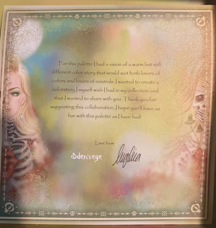
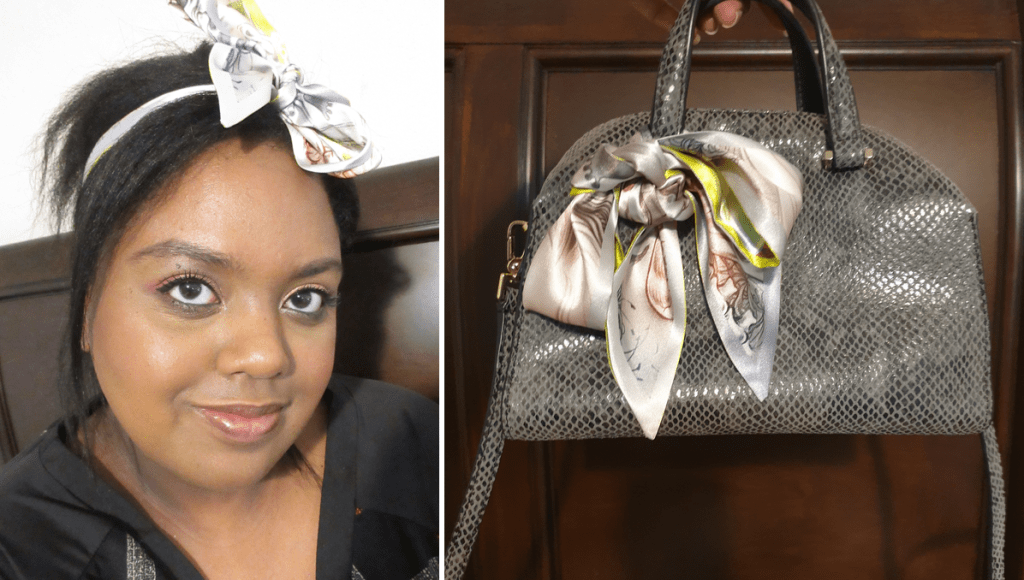
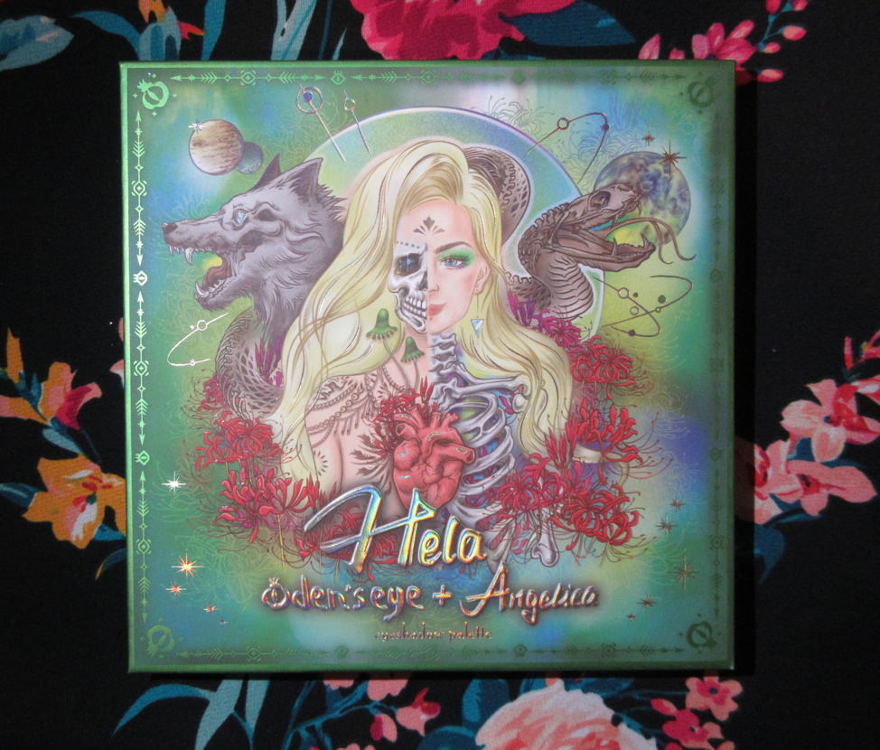
The collaboration palette between Angelica Nyqvist and Oden’s Eye is the newest addition to the Legendary Diversa Collection. Just like the previous release, all orders from this collection come in a box with the palette artwork printed on the inside. The free scarf idea was tweaked for this launch in the form of a reversible ribbon/Twilly, while supplies lasted.

This palette is currently sold out, but the restock is happening tomorrow: March 22nd 1:00 PM EST. I don’t know if the Hela box and/or Hela Twilly will be available again. Also, according to Angie, this may be the only restock.
The outer sleeve that’s around the palette has a different color scheme than the actual cover. For that reason, I plan on keeping the sleeve too.
The eye shadows are the same Oden’s Eye quality I’m used to and enjoy. The mattes are very pigmented. Some are a little on the thin side, making them easier to blend and build up if needed. My issue with thinner matte formulas can be that they either dust away the longer I blend them, aren’t opaque and leave patches, or they practically disappear in areas where a wetter shimmer formula touches it. This wasn’t an issue for any shadow except the shade Underworld, which was fixed by just adding a bit more of the shadow back on top of the spot.
A lot of eyeshadow formulas either work better if applied in order working from lightest to darkest or darkest to lightest. With the Hela palette, it doesn’t matter which way I’ve used it. The lighter shades are pigmented enough that I can use them to blend out the edges of darker shadows, but not so pigmented as to ruin the depth I try to create. The darker shadows are also not so dark as to overpower the look.
I expected Soot to be my most used shade and go-to shadow for deepening up the outer corner, but on my eyes the purple tone is very strong. The purple goes well with quite a few shades in the palette, but from my viewpoint, not as much as it would if it was a bit more of a neutral color. My partial solution for this is that I can use Decay on top to counteract the purple tone, but then it turns the whole thing into a dark grey.
Hellfire and River are two topper-type of shadows in this palette. They both have bases, but those bases really don’t show through on their own and need to be applied on top of other shades to get the effect I’m looking for. For example, the gorgeous peachy look to Hellfire in the pan just looks like the palest pink, almost white eye shadow on me. So, I just use it now as an inner corner highlight shade. I also don’t get the purple tone out of River, as seen in the photo above in the pink/purple look where the only effect it had when patted on top of Hellfire and Soot was to darken them slightly and add some extra sparkle.
I don’t have the best luck with yellows, so I was shocked at how well these built up and lasted on my skin, especially Rebirth because using pastels on dark skin can often be unflattering. Rebirth isn’t the kind of shade I’d wear on its own, but it’s very complimentary to the other yellows and greens in this palette, so I’m surprised to say I like it! My two most frequently used mattes are Wolf as a transition shade and Ouroboros as a deepening shade for the yellow/greens/browns and as a colorful pop when used with the shadows in the bottom rows of the palette. Decay is intriguing because the first time I used it was on top of Wolf and that made the taupe/cool brown tone turn more of a dark grey color, which is not the kind of shade I like to wear. However, I noticed it should be deep enough to create depth for some lighter looks, so I decided to try it again. When Decay was applied on top of Underworld, that helped to bring more of the brown out of that shade. In Angelica’s launch video, she says she wanted a colorful palette that still had some neutral leaning options. I haven’t liked any of my attempts to get a neutral look out of this palette, so I always turn them into a more colorful look to salvage it. Perhaps this wouldn’t be the case for someone of a different complexion than me. This is not a complaint, as usually I have the reverse issue where partly neutral colorful shades (like reddish brown, grayish purple, etc) just look solidly neutral on me. So, it’s kind of refreshing, but also unfortunate that I’m going through a neutral loving phase at the moment. How ironic!
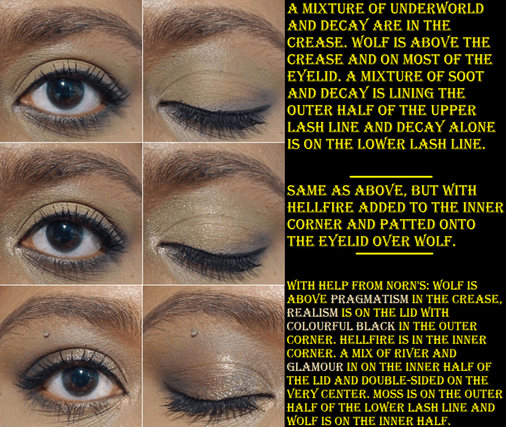
The best neutral look I’ve been able to create, and I think is just an okay look, is below. The first two pictures are with this palette alone, but the third is what I’d want from neutrals and I was able to create by combining Hela with the Norn’s palette.
Of all the yellows and greens, the only one that didn’t stand out for me was Fluorescence. Other than being an eyeshadow highlighting shade, I never have a purpose for this kind of color, but to each their own.
Golden Bridge is one of my favorite kinds of golden green shimmers. I actually tried not to use it too much in these eye looks because it’s such a go-to color for me. It’s the same with pairing Venom and Ouroboros together that is so instinctual for me. Because Venom is such a bright shade, I really wanted to use it on the center of the lower lash line, but it’s a bit thick and chunky for that spot and I had a difficult time smoothing it out. Perhaps I’ll need to apply it wet.
Moss is another really great shade. It’s a grungy green in the pan, but it’s a bit vibrant on my eyes, which I don’t mind. The way it looks is the tone I’m often drawn to as a transition color in my green eye looks.
Double-Sided is like an orange-pink-green shifting shade, but the orange shift is strongest on my lids. It’s everything I wanted out of the shade Hellfire, but with the fun twist of being a multichrome. I discovered that if I mixed Goddess, Rebirth, and Wolf together, I could create a peachy-orange shade, which brings out more of the peach in Double-Sided when I apply that shadow on top of it. I add a bit of Hela too, just to soften up Goddess, but technically the color can be achieved without it.
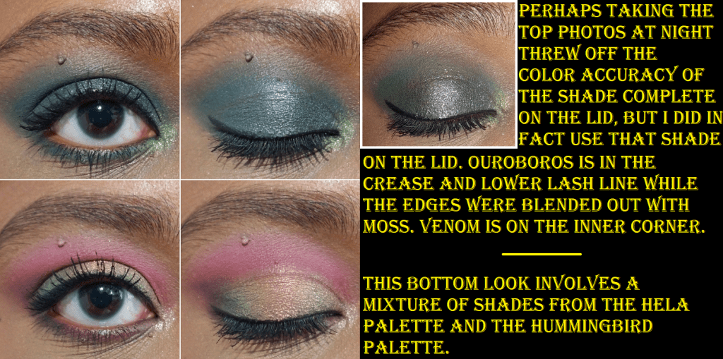
Complete is another fascinating shadow. In the photo above, I had to include a picture with flash on to show the black tones accurately when paired with Ouroboros. For some reason, those two together throw my camera off and make Complete look very teal. As seen in other eye looks with Complete, it still veers a bit blue, but is still very much a dark gunmetal-esque black. Oden’s Eye impressed me with the shade Colourful Black in the Norn’s Palette, and once again, they’ve impressed me with this one too. I keep wanting to use that shade in every eye look I do with this palette!
I have my own preferences when it comes to color stories, so is this the perfect one for me? No. Do I still enjoy this palette? Yes. Does it inspire me? Very much so! Angelica’s palettes push me outside of my comfort zone to think of new color pairings and combinations. I went from being an eyeshadow fanatic for most of my life to actually being a little less interested in palettes over the past twelve months. So, whenever one can give me the drive to want to be creative and play with eyeshadows, that is worth every penny.
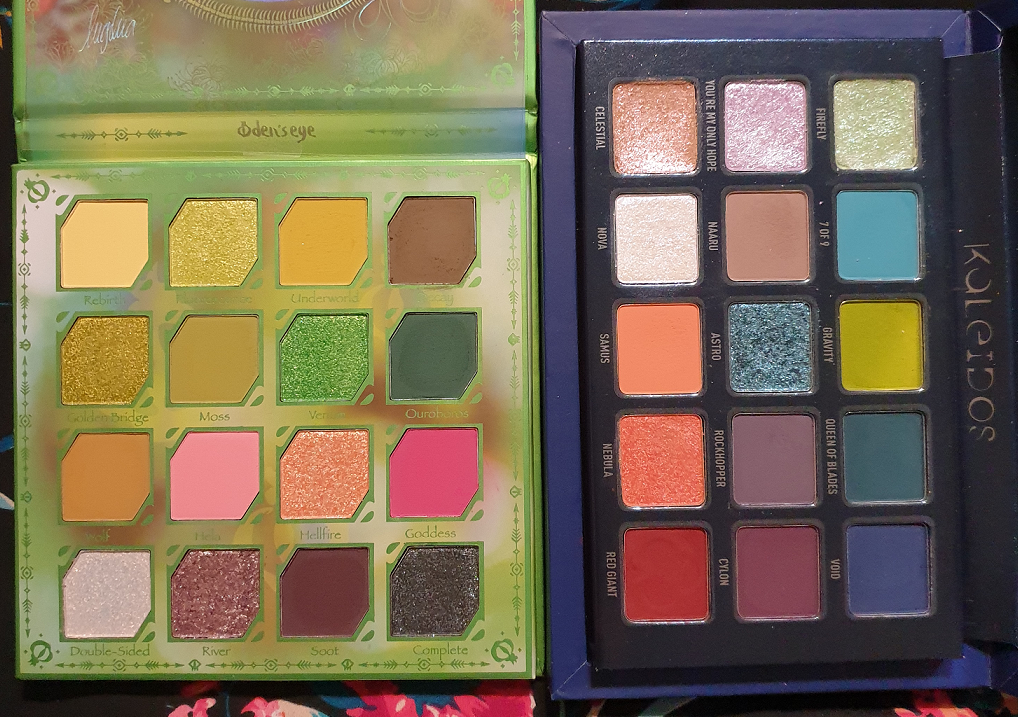
A comparison between Angie’s Oden’s Eye collab and her Kaleidos Club Nebula collab, for those wondering if they are different enough to purchase both (which the answer is yes)!
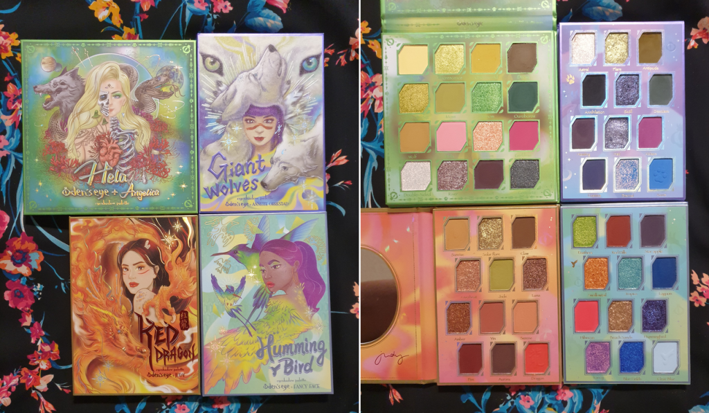
The Oden’s Eye palettes are part of my Shop My Stash for this month, so I’ve been enjoying combining shades from the Hela palette with each of the other Legendary Diversa palettes because they go so well together! I’m really happy to have made this purchase.
*UPDATE: Last minute eye looks! In the discussion with Nikki below, I realized my tendency to keep only using the top half or lower half of the palette, so here are two quick additional looks I created combining the two!
I believe that’s everything I wanted to discuss! I hope this has been helpful, especially for those considering purchasing the palette during tomorrow’s restock!
Thank you for reading!
-Lili ❤







It still feels like two different palettes to me, but I do like the versatility of looks you were able to create. Great post, you created some beautiful eye looks. I especially like the second to last look with complete on the lid.
LikeLiked by 1 person
Thank you! I usually only do a few looks but there were so many combos I wanted to try! lol. And I totally get what you mean. Even though I could have put the yellow and pinks together or the green and purple, my mind doesn’t go that way when I have so many other complimentary shades right there within either the top half alone or bottom half alone. Now I actually want to try and make that happen and update this post later. Haha.
LikeLiked by 1 person
Yea I think I would’ve gravitated to the same combinations you used. I always love pink and purple together.
LikeLiked by 1 person
Hahaha yes. Thank you for noting that observation though! It was something I specifically said I wanted to do when I first started working on the review (combining the shades from multiple parts of the palette), but I only did that with the more neutral leaning shades and not the colorful ones. I updated the post now with what I call the strawberry lemonade and Mardi Gras looks. lol. Well, it looks more Mardi Gras inspired in person. My camera only picked up all the blue out of the shade River, but that center lid shows a lot more of the other glitter colors in person.
LikeLiked by 1 person
The shades really hold their color but still blend out. You got a lot out of that palette 🙂.
LikeLiked by 1 person
I’m loving the greens and the pinks . But that might be my current bias talking lol
LikeLiked by 1 person
I’m a green lover too!
LikeLiked by 1 person
Pingback: My February Purchases Reviewed: KVD, Essence, Tarte, etc. – Lili's Beauty Blog
Pingback: Oden’s Eye Palette Ranking – Lili's Beauty Blog