

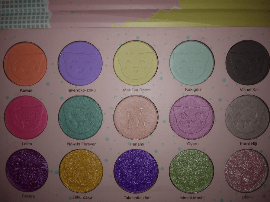
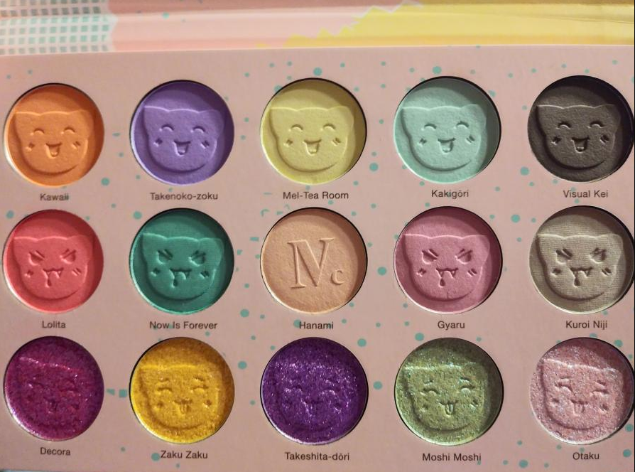

I’m starting this post with a description of the palette to set the tone of what I was expecting: “Nomad x Tokyo Harajuku Intense Eyeshadow Palette. This poppy pastel palette of fun combines 10 high-pigmented eyeshadows and 5 unique multi-chrome toppers for a sheer prismatic color effect. 15 kawaii shades inspired by the wild creativity of the trendy Tokyo youth. Infused with Camellia Japonica Oil to make skin soft and silky smooth. Cruelty-free & vegan.”
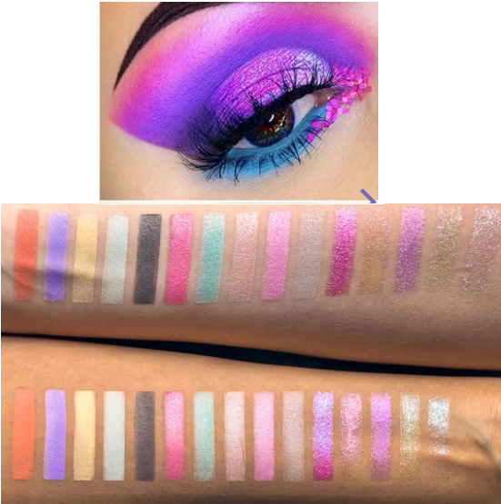
Nomad’s website features Instagram looks from people who have used the palette. Someone please teach me this sorcery of how you get that purple and that blue on the eye compared to the swatches that Nomad themselves posted. Below are my own swatches which I don’t think are that far off from Nomad’s. So, the color intensity from my palette matches up to what I was supposed to get. Yet the site description and photos give the impression that the palette is much more vibrant than it really is.

Perhaps this is considered “intense” because it’s not a neutral color story. Maybe it’s “highly pigmented” for an eyeshadow palette as opposed to the color payoff it should have if it was a pigment palette. There are many times I’ve seen a photo on Instagram with a list of multiple branded eyeshadows used in a single look, yet one brand will repost the photo and make it seem like the whole thing was created using just their eyeshadows. So, it’s possible this person used more than the Harajuku palette on the eyes and that would explain the color differences. Or they used highly pigmented bases/paints underneath. It’s also possible someone used editing tools to turn up the color saturation and tweak the brightness, intensity, etc. I’m not saying it’s impossible to be talented enough to produce that kind of look from this palette. I just have no idea how to naturally do that regardless of what base I used. I tried seven different ones, which I will discuss further into this post.
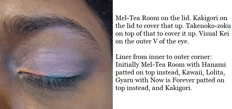
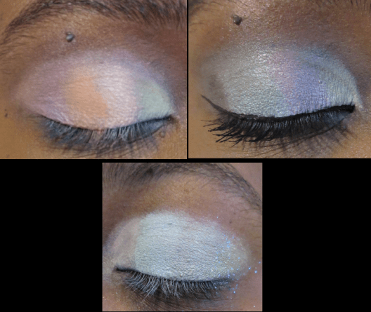
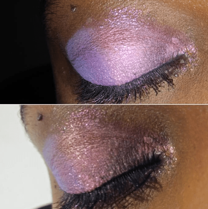
This was the outcome of my first use of this palette, which I quickly realized has a learning curve.
These eyeshadows swatch beautifully! They feel smooth and glide across the skin nice and evenly. I swatched them on my MAC Paint Pot in Groundwork, yet when I used the same base on my eyes, they wouldn’t stick and kept dusting away. The reason I was able to pack three different colors on top of each other on my lid was because the previous two blew away and just left me with white powder on the lids. Patting motions produce decent results with some of these eyeshadows, but I have been unable to actually blend any shade besides that dark grey called Visual Kei.
Pastel shades can be quite tricky to use, particularly on darker skintones. While it’s true that I tend to avoid pastels because they’re time consuming to use if the formula isn’t suited for me, the pastels from Lethal Cosmetics and Makeup Geek show that they can be made to work for everyone.
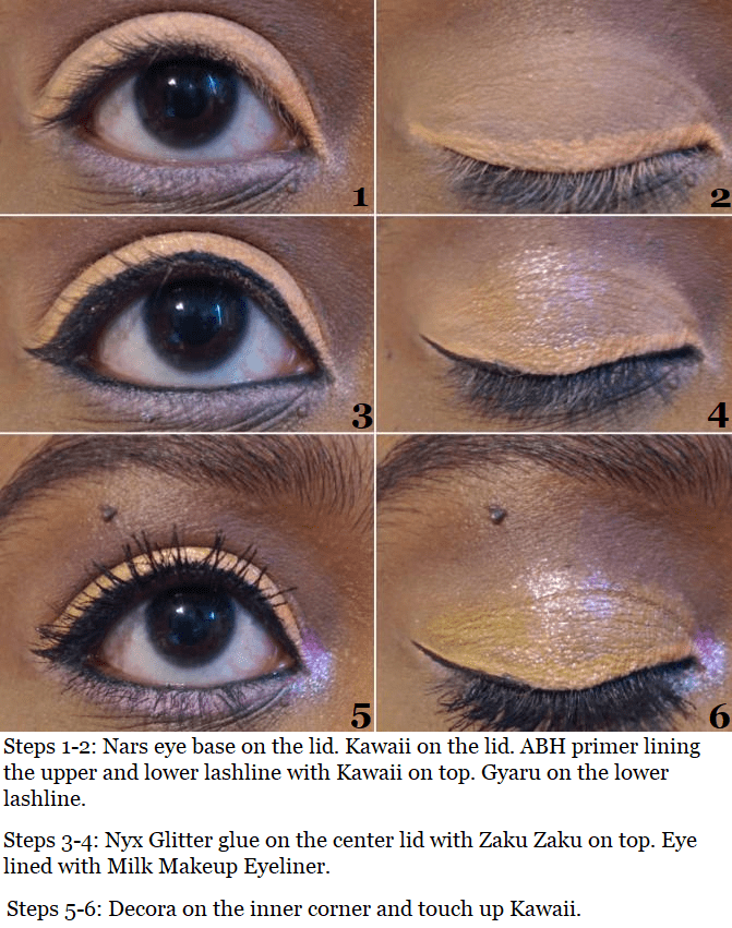

What I learned from my failed attempts is that it’s not enough to just have a creamy base (MAC paint pot) or a white base that is dry (Anastasia Beverly Hills eyeshadow primer), so I switched to the Nars Smudgeproof Eyeshadow base which is whitish-clear and emollient. Making this switch provided better results.
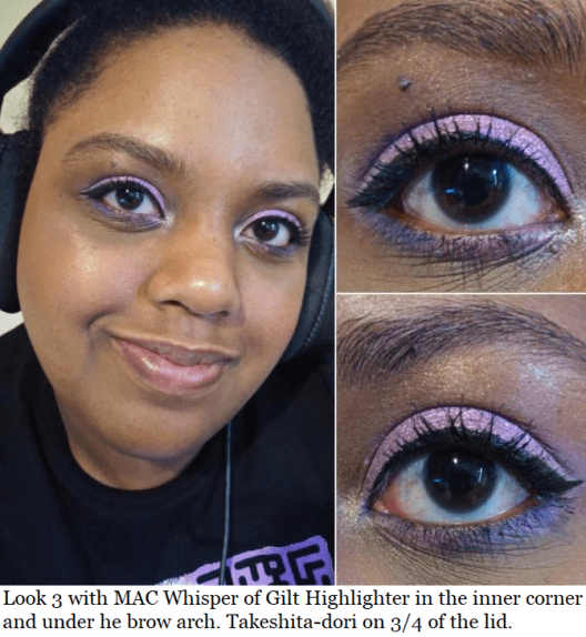
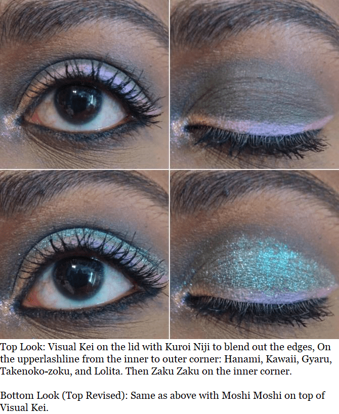
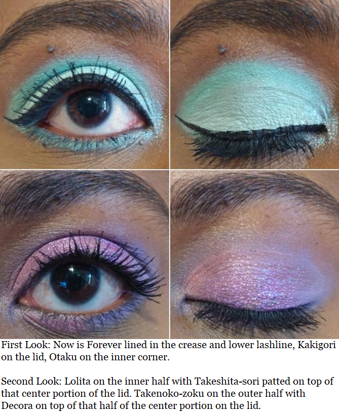
I still wasn’t satisfied though, so I continued to test things until I came to the realization that the Nyx Jumbo Eye Pencil in Milk is the best base that I have. I was able to get every shadow to perform decently from the top two rows of the palette, excluding the two shades which I couldn’t get to work with any base: Hanami and Kuroi Niji. And the satin finish in Now is Forever is what helps me distinguish between that shade and Kakigori, even though they look different in the pan.
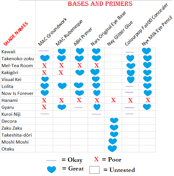
These are the results of my testing, which I hope better explains what I was trying to say. The difference between the lilac line and blue hearts is that some of the bases had the color show up but the shadows faded quickly. And even though the Nyx Jumbo Eye Pencil worked the best of all, there’s still a learning curve to using this too.

Shadows do crease on me, but if I use too much of the Nyx pencil on my eyes the creasing becomes deeper and more noticeable. Using too much also prevents it from drying down, but too little and the shadows won’t stick. A few hours after I did that eyeshadow look, which had a little too much of the Nyx pencil, I accidentally rubbed my eye and a thick patch of eyeshadow left a streak across my hand. I’ve had shadows come off a little but not to this degree. So, it’s important to find the right balance.
As for the “multi-chromes,” the five sparkly shades on the bottom row have multi-colored shimmery specks but when I think of a multi-chrome, I expect a color shift. Perhaps it just doesn’t show as well on my skintone, but to my own eyes these are duochromes at most. That doesn’t take away from the fact that these really are beautiful and are the stars of this palette. They stick fairly well on their own, but Nyx Glitter Glue ensures that there’s minimal glitter fallout. They definitely stay in place, even when rubbed.
The base in Decora is the most pigmented, and therefore is the darkest one, especially with its darker purple glitter. That’s why I often pair it with Takenoko-zoku over Lolita or Gyaru when one of those two are on the other half of my eyes. Takeshita-dori looks darker in the pan, but the light purple glitter makes it appear lighter than Decora. The vibrant yellow in Zaku Zaku doesn’t translate to the eye and appears more of a peachy pink, which is why I pair it most often with Kawaii. Moshi Moshi looks mostly green with blue glitter. Otaku looks pink in the pan, but it just looks blue on me.
FINAL THOUGHTS
Now that I know the trick to making this palette work for me, I can foresee myself continuing to use it. Liking 9 out of 15 shades is a decent ratio for a premade palette. However, I can’t recommend this despite loving the packaging, the concept, the texture of the shadows, and the results with specific shades. The formula is too finicky. And although it didn’t work as well for me, I thought it was still worthwhile to post about for anyone wanting to see this on a dark skintone. If you have a lighter complexion or a more advanced skillset than I do, you may enjoy this palette more than I did.
Thank you for reading!
-Lili ❤

I wouldn’t have given this so many chances lol, glad you found a way to enjoy it
LikeLiked by 1 person
Thank you! Every time I thought of giving up, a new idea came to mind and I couldn’t rest until I figured it out. Haha. Thank you for reading! I hope you have an amazing day!
LikeLike
Pingback: Is This Redemption For Nomad Cosmetics? – Lili's Beauty Blog