I’ve loved Clionadh Cosmetics eyeshadows from the moment I first tried them at the start of 2020. Their Stained Glass Collection is ever growing, and it’s their claim to fame for good reason. Other brands have eyeshadows that use some of the same pigments and have the same shifts, but I have yet to see anyone replicate the slick “mirror finish” of the Jeweled Multichromes. I was never a big fan of iridescent eyeshadows because of the way they can look dusty and dry on my skin tone, but Clionadh thought about those with more melanin and created the Deep Iridescent Multichromes with different colored bases (instead of white) to fix this problem. They created Glitter and Dimensional Multichromes for people that adore having maximum, but still eye safe, sparkle. Vibrant and Electric Multichromes are for true color lovers. Earth Vibrant Multichromes are for those that prefer muted tones, but still want easy-to-see color shifts. There are even combination types such as Glitter-Vibrants and Hybrids.
Clionadh has multichromes to suit everyone’s tastes.
As I mentioned before, the brands get their multichrome pigments from basically the same place, but Clionadh has perfected the art of combining them with various base colors to create a decent amount of eyeshadows that haven’t been duped. So, there are still some that are completely unique colors.
There are some duochromes within the Stained Glass line, but they also exist in the “standard circle” format, along with more traditional shimmer eyeshadows. These are less expensive and I find them to still be very nice quality. The mattes weren’t perfect, but I still like them when they used to be sold individually.
The only reason I haven’t talked about Clionadh as much within the last year is because of the difficulty I have in getting products in Germany. Their website doesn’t collect VAT/taxes/customs, so DHL (who did the final part of the delivery) demanded exact cash payment in person (which included the missing VAT plus their fee), without letting me know the amount in advance. If I want to know ahead of time, I would have to pay the $42 (36 Euro) shipping option on top of the VAT and extra fees, which I just haven’t felt was worth the added costs. I hope Clionadh will work out some kind of deal with Monolith EU again, as that would certainly make things easier for me!
I have some Clionadh eyeshadows that are getting close to turning six years old. Some of them don’t feel quite as smooth and creamy, but they still perform beautifully and haven’t gone bad yet. I’ve had eyeshadows that didn’t even last beyond a year (admittedly mostly vegan eyeshadow formulas like from KVD, Urban Decay, Coloured Raine’s different formula, etc). So, that makes me happy considering how expensive Clionadh eyeshadows can be. If you take four of Clionadh’s most expensive eyeshadows, it would be slightly more expensive than many luxury brand quads (but justifiable in price considering they’d be all multichromes).
Clionadh has a relatively small team, and I respect the fact that they make their eyeshadows in-house in Canada.
Oden’s Eye
Oden’s Eye is a favorite because they have every type of powder finish eyeshadow I could want: multichromes, duochromes, sparkly shimmers, smooth metallics, pastels, and just lots of colors in interesting tones. The variety is great and the quality is mostly good. Some palettes are randomly not as good, and I can’t explain why. For instance, I like the colors in Makeup Just For Fun’s palette, but the shadows were more powdery and the shimmers are thinner. I can only guess it’s due to what the creator requested of the formula. Fantasy Cosmetica has shimmers and mattes on par with Odens Eye, but I get 1 or 2 duds from the 9-pan palettes I’ve tried, which isn’t the case for my top 5 Odens Eye palettes. So, Fantasy Cosmetica ranks lower for that reason.
These shadows are also more suited for color lovers, but Oden’s Eye tries to appeal to neutral and color lovers by giving softer and non-grungy options sometimes within the palettes.
It’s a Swedish brand, but their eyeshadows are made in the PRC.
Fantasy Cosmetica
This is the brand I have the least experience with, as I only started buying their palettes in 2024. However, I love the color offerings among all the palettes and their theming. Even when they make brown shades, there’s nothing basic about them. They have very interesting tones. The Fighter Palette is a dream for those that prefer glam style neutral eyeshadows. Pat Mcgrath fans would probably like them, but the quality isn’t quite as refined as PML’s. The big price difference puts that in perspective! Some of their eyeshadows/pressed pigments are ultra vibrant. They’re all pigmented and opaque shadows. Most of them blend well. I usually have at least one troubleshade shade in every palette, but it’s rarely one of the shadows I was looking forward to using anyway. This brand does cater mostly to color-lovers, and they’re known for their intense shimmers, but I even like some of their smoother satin shades too. They find a way to make the toned down shadows appealing for me.
I believe these eyeshadows are made in the PRC.
Devinah Cosmetics
Devinah has my second favorite multichrome and duochrome formula, but their normal shimmers are just okay, which is why the brand doesn’t rank higher overall. Their mattes are also decent, but not the easiest to blend and use. In fact, they probably have the “worst” mattes of all the brands I’m mentioning in this post. However, they don’t make pre-made palettes, so customers can skip buying their mattes altogether.
I started purchasing from them in April 2020, and all but one eyeshadow (it’s a discontinued formula) is still in perfect condition. The performance, look, and feel of the shadows hasn’t changed. So, I can confirm mine have good preservatives in them!
It’s because of the fact that I had to acknowledge their multichromes and duochromes as coming second to Clionadh that I stopped buying from them in early 2022. However, to still maintain that number two spot is impressive. The custom palette I created with mostly Devinah shades has come with me on several trips and there are shades I’ve used in there even more frequently than Clionadh. So, if you live in the US and are dealing with the tariff situation, this could be a nice US-based brand to check out.
I don’t know if all of Devinah’s eyeshadows are made in-house, and if only some of their catalogue isn’t made in a lab, but I can confirm that at least the mattes are made by them.
Sydney Grace
Sydney Grace isn’t really in the multichrome game with powder eyeshadows, but they have a gigantic selection of standard shimmer eyeshadows in unique tones. They have many colorful sparkling eyeshadows, but the brand puts a lot of focus on natural/neutral and more muted types of shades. They also have a lot of satins that appeal to fans of luxury eyeshadows who prefer a smoother texture-friendlier look, but just crave more pigment than most luxury eyeshadows provide. The Sydney Grace eyeshadows are pigmented, opaque, and also thick. I like my finished eye looks with them, but I tend to prefer my even more blingy, shiny, and exciting eyeshadows from other brands. Also, their mattes are pretty good. They are almost on the same level as Odens Eye, but Sydney Grace’s best mattes are typically in boring colors I can get from any brand. So, I tend to not use them.
Sydney Grace eyeshadows are made in the USA. I’m fairly sure they made their own eyeshadows and formula in the early days. I don’t know whether they have continued to make them in-house.
I have three honorable mentions.
For starters, Melt Cosmetics is technically an indie brand, but I have seen their products available at different retailers and they seem to be a much bigger business, so I have a hard time putting them in the same category. Considering how many huge sales I’ve seen in the last three years, and the lack of interest from among beauty lovers, I honestly wonder how long they will stay in business. In any case, the brand’s mattes are in my top 10 favorites. I love the colors, tones, pigment level, layerability and blendability. The shimmers are okay at best. They have such a big issue with mold or things growing on other people’s palettes that I always feel uncomfortable recommending the palettes, even though mine have been fine.
The second honorable mention is Kaleidos. I haven’t tried many of their palettes, but I loved the mattes in Club Nebula and Futurism 1: Sci-Fi Green. The shimmers are nice, but not super special. I can’t include them on the list because I haven’t tried any of their “newer” eyeshadows in the quad format, and it’s only recently that they launched their first new products in the last two years. So, it’s been quite a few years in total since I’ve been interested in their eyeshadows.
Terra Moons is an honorable mention mainly to address the fact that I’ve often said their multichromes are my third favorite formula. However, the normal shimmer and matte quality pulls them below being in my favorite indie brands. There is also the fact that I hardly use my Terra Moons shadows because I think to myself, “Why use these when I could use my Clionadh and Devinah?” So, I only use the shades I don’t have a close match for in the other brands, but then I think about how the eyeshadows made by the others are still good enough and I don’t need this unique one! The mattes I bought from Terra Moons are unique to my collection, but I wish the quality was better. So, I can’t call this brand a favorite if I don’t use them.
This isn’t an honorable mention, but I feel compelled to explain that I like Lethal Cosmetics a lot as a brand and I respect what they create. Their eyeshadow formula is a bit chunky. The multichromes are on the weaker side. The mattes are fine. I like the eyeshadows with uncommon tones, but I just don’t think about them often enough. I feel like I’ve moved on from their eyeshadow formulas.
So, this is my list! I hope this is helpful to fans of small independent businesses, and to anyone curious as to which brands to start with if you’re trying to move away from paying for mainstream eyeshadows.
This is one of the posts I’ve held as a backup. I have a lot going on in my personal life, plus with the holidays. So, this will likely be my last post of 2025. I wish you a happy holiday season and I hope to see you in the New Year!
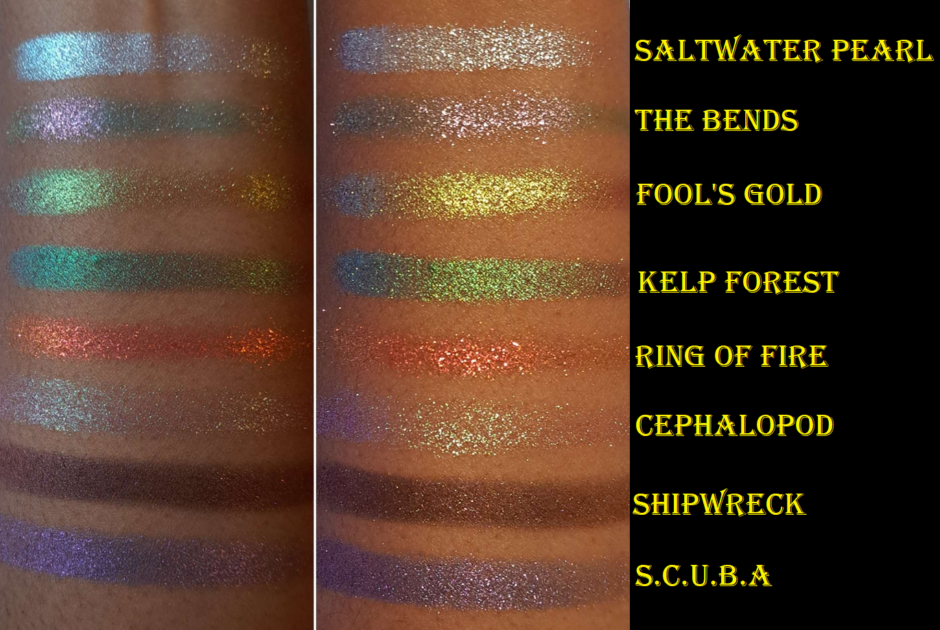
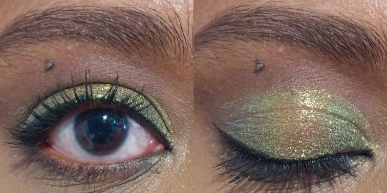
This is more of a showcase than a review because I’ve talked about Clionadh eyeshadows so many times on this blog and the quality is always consistent. These are the same performance, pigmentation, and shine I’ve come to expect from the brand. A few things to note is that Clionadh has a few notices on their website regarding some of the shades. Kelp Forest and The Bends may cause staining. Also, S.C.U.B.A contains silver powder so, “Avoid contact with broken or abraded skin.” It’s like one time in a thousand that I ever notice staining issues on myself from eyeshadows I’ve used (and not yet from Clionadh), but it could be because of my skintone that I don’t see it and/or that I always use primers. I figured it’s still important to relay this information.
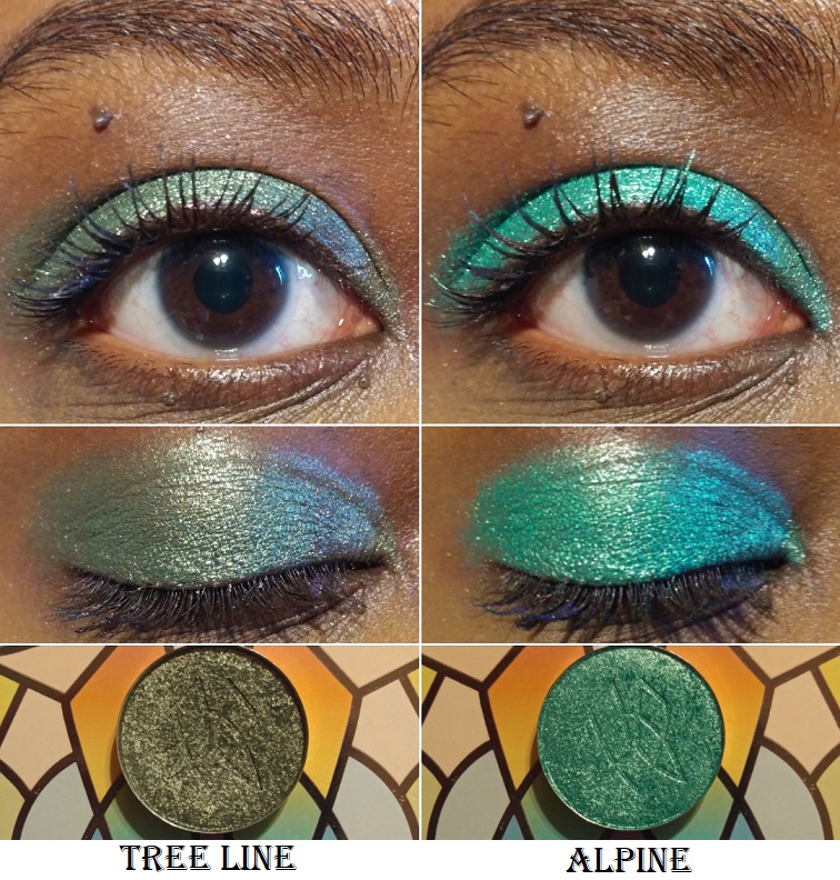
Also, Shipwreck is the smoothest shade that I can apply directly to my eye area with my fingers. Saltwater Pearl, Fool’s Gold, and Kelp Forest are fairly smooth as well. However, S.C.U.B.A. is semi-flaky. The extremely flaky ones are The Bends, Ring of Fire, and Cephalopod, so I have to apply them with a damp brush to minimize fallout and prevent making a mess everywhere under my eyes.
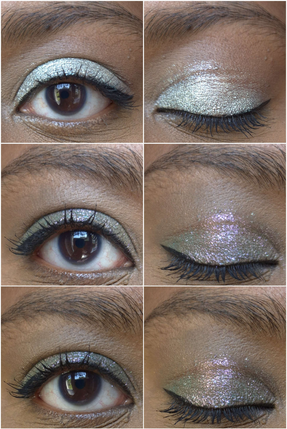
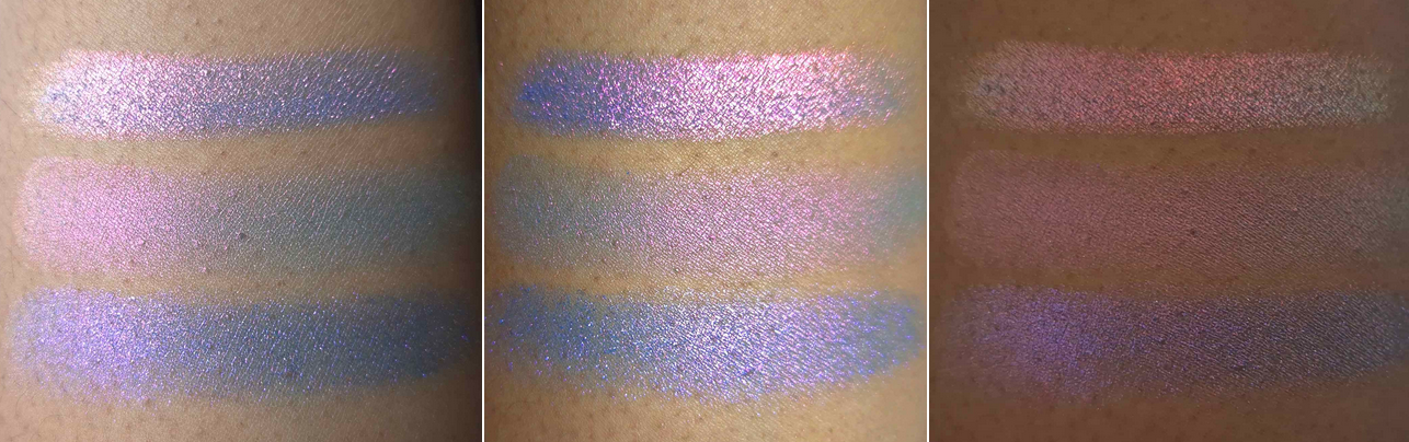
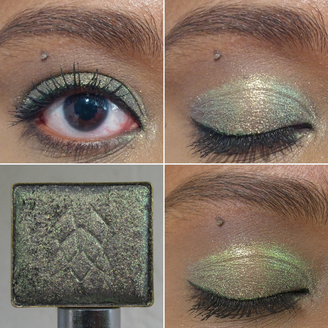
Of the three eye sets above, the first set shows Saltwater Pearl whereas the second and third are The Bends in slightly different lighting.
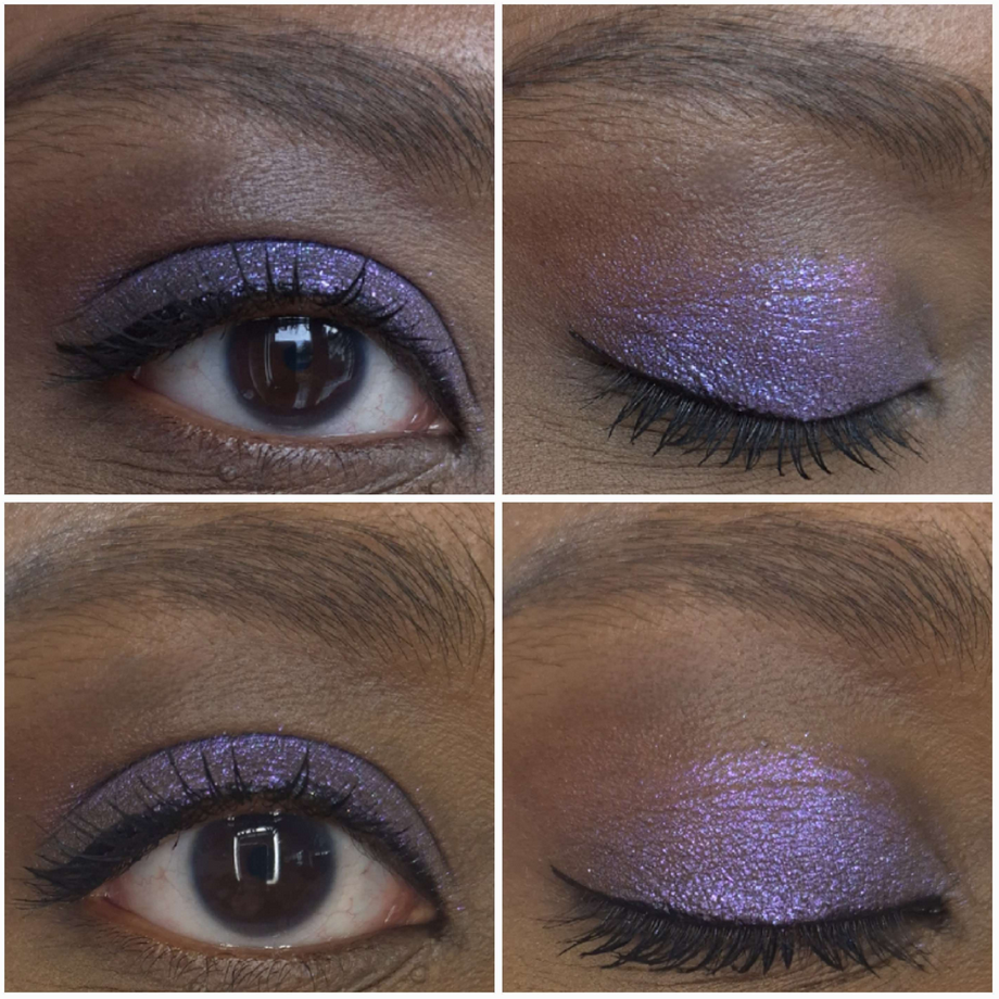
In the picture above is Fool’s Gold and the green shade is Kelp Forest. In the picture below is Ring of Fire in the top set and Cephalopod in the bottom set. I used a matte shadow from a different brand in the crease of the Cephalopod shade.
Below is the photo of Shipwreck at various angles.
The last photos are of S.C.U.B.A.
In saying that these are the Clionadh quality I’ve come to expect, they match some of the less dramatic lines. So, these aren’t as shifty as the Jewelled Multichromes nor intense and sparkly like the Glitter-Vibrants. They’re still pretty though. I truly only wanted Fool’s Gold, Cephalopod, and Shipwreck, but couldn’t buy them separately. Perhaps in the future they will be released as singles. I bought the palette on sale, but since Clionadh (at this time) doesn’t collect VAT, I was hit with a surprise 19 Euro fee that was demanded of me upon delivery to Germany, making the total more expensive than if I made the purchase to the US at full price. Thankfully my husband was home early from work because I didn’t understand what the DHL worker was asking, why he kept trying to walk away with my package, and that my husband had the exact amount in cash (the man refused to offer change back). I was still new to the whole VAT and international shipping thing, so for anyone in a similar situation, just know that there could be issues buying outside of the US and Canada.
That’s all for today! Thanks for checking this out! I hope this helps!
“At some point in the future, I plan on doing a follow-up post featuring any additional shades I purchased, along with the closest shade comparisons to multichromes among Clionadh and from other brands, and examples of how I’ve worked each shadow into completed eye looks.”
That was my intention after my first Expansion post, but since many things happened between now and then (such as Hurricane Ian, having spinal fusion surgery, and being overseas for a few more weeks) I decided I’ll show the various photos, eye looks, and swatches that I currently have. It was getting confusing keeping track of my files on three different devices dated weeks and months apart. In my next Clionadh update post, I will have those comparisons plus missing eye and arm swatches and completed eye looks.
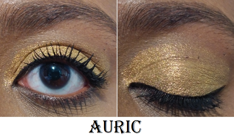
I’m also adding photos of the newest circle pan eyeshadows I’ve purchased as well! Plus, I finally got the other multichrome highlighter from the Dragonfruit Collection. The most I’m missing* are arm swatches of Quest, Auric, and Chalice. I at least have eye swatches of the latter two and video clips of all three.
*UPDATE: Here are the missing arm swatches in various lighting situations!
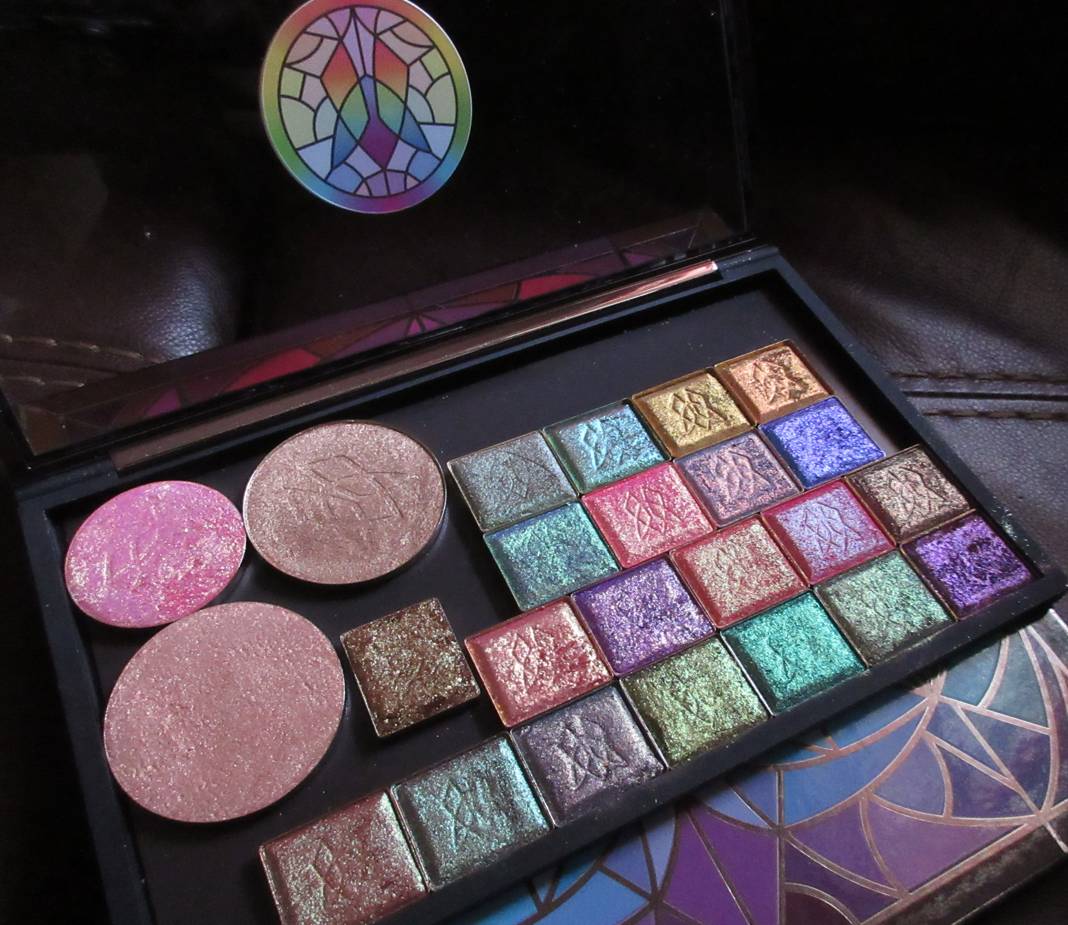
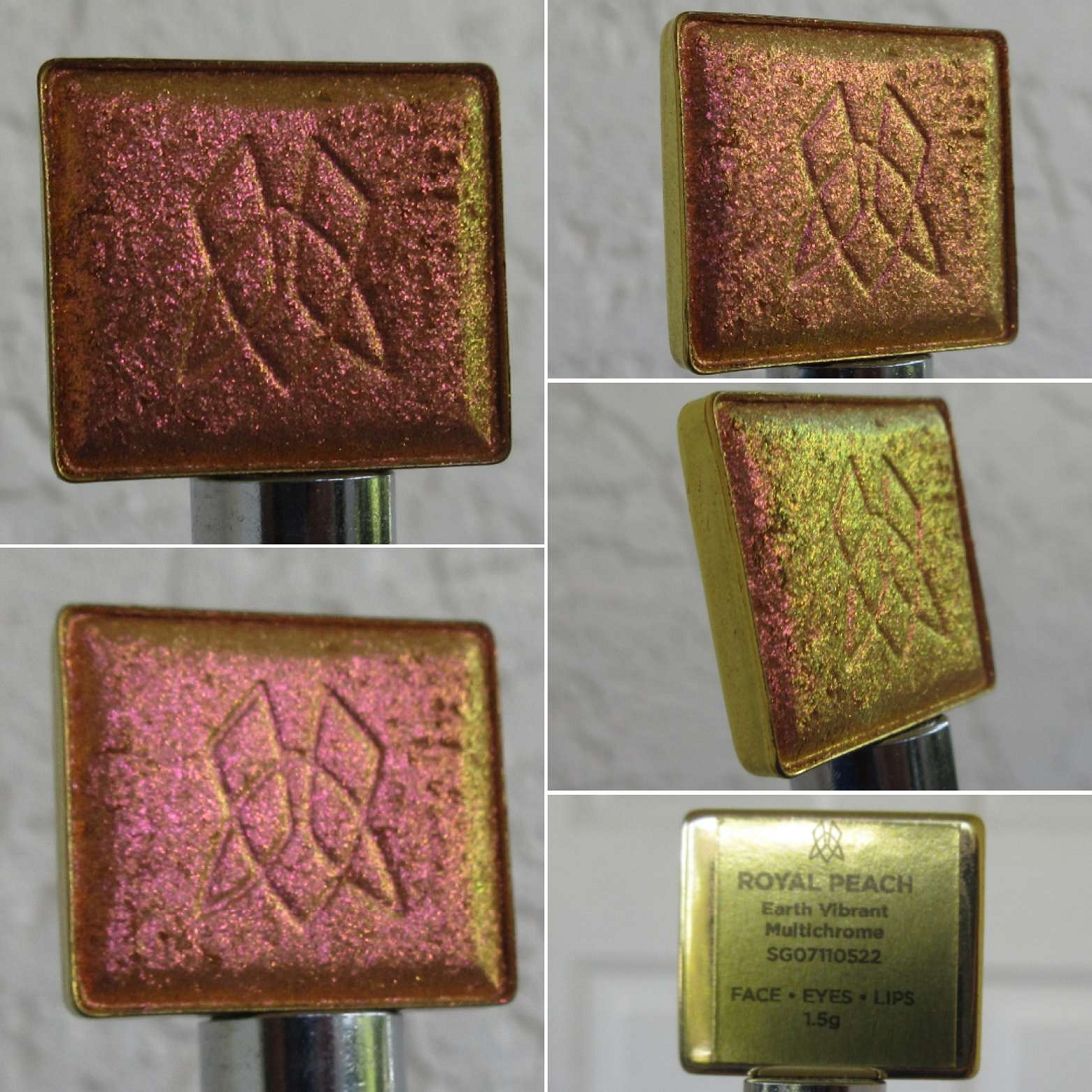
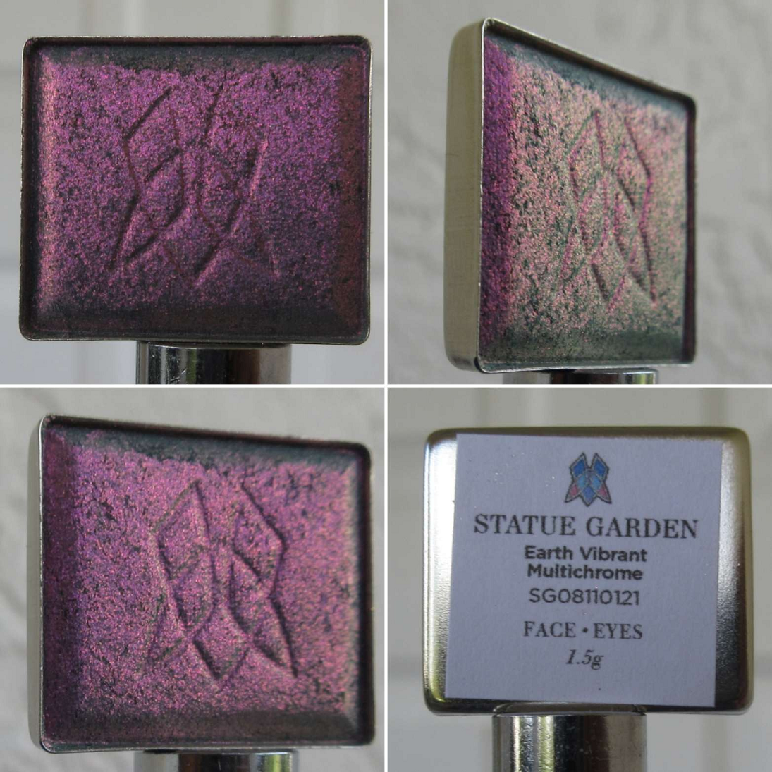
Earth Vibrant Multichromes
I now own 8 of 12 in the Earth Vibrant category, and this is still one of my favorite and most used lines within the Stained Glass Collection. The combination of beauty and subtlety is what makes these so enamoring.
Electric Multichromes
We’re now at 5 of 12 Electric Multichromes, but I believe I have all the ones in this category that appeal to me and aren’t too similar to other Clionadh shades.
Vibrant Multichrome
I own 2 of the 4 newly expanded Vibrant Multichromes, but 7 of the 12 total. These haven’t ended up being my most used category, but when I have a very specific eye look in mind, these end up being just what I want, filling that void of brightness or uniqueness.
Hybrid Multichromes
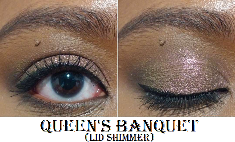
I chose to buy Chalice from the original collection because I don’t have as many yellows and golds from Clionadh and I wanted to see how different this one would be from the few I own from them. The answer is, “not very,” as it doesn’t have an easily discernible shift which makes it like a smoother version of the glitter multichromes. This addition, combined with Queen’s Banquet, put me at 8 of the 11. That is pretty wild considering the Hybrid formula is among my least favorite of the Stained Glass lines. That isn’t to say that they’re bad by any means. I just typically like more color impact, stronger shifts, or both. So, it’s a bit funny that I ended up with so many.
Jewelled Multichrome
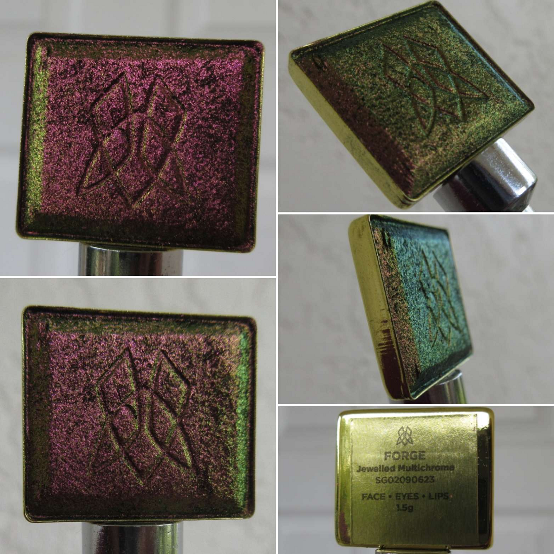
I now own 12 of the 20, though this category didn’t get expanded last year. It was just a matter of seeing more photos of Forge in a different light that prompted me to get it, even though it’s supposed to be similar to Pat Mcgrath’s Sextraterrestrial shade from Divine Rose II, which I don’t even use that often anymore despite how pretty it is. I didn’t get a chance to compare them yet though, so that will be added to the list for next time.
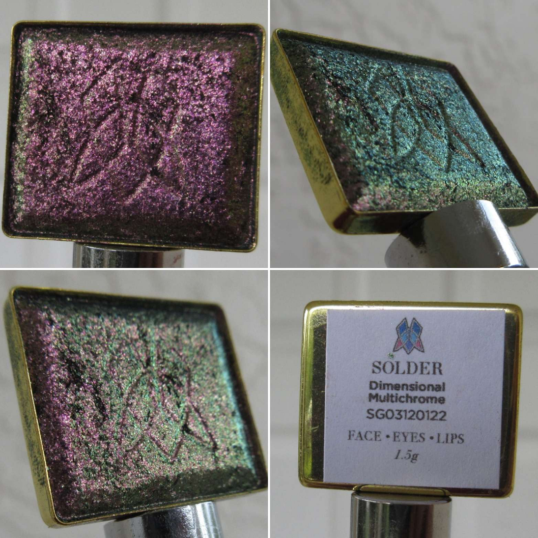
Dimentional Multichrome
I believe there are just two of these in the line so far, and it was released after the big expansion last year.
This category is supposed to be a brighter, more glittery version of the Jewelled multichromes. By using a grey base instead of a dark one, I can see how this line might be more appealing to those who felt the Jewelled ones were too intense, but that intensity is what I love about them. I can see the increase in sparkle, but there are other lines from Clionadh if I want a glittery multichrome versus a smooth metallic looking one. So, I don’t think this is a category I’ll be exploring as much (since I prefer the Jewelled ones), but I’m happy to have been able to try one.
Arm Swatches
Deep Iridescent Multichromes
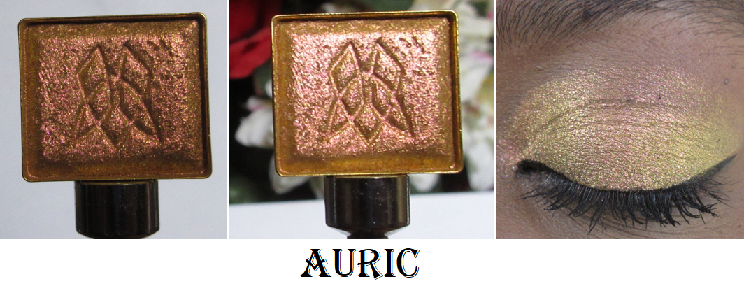
Despite missing arm swatches of Auric, I own 8 of 12. This isn’t surprising considering this is my second favorite line from Clionadh. I would love to own them all, but I don’t think I would get as much use out of the missing four shades, though I’m still tempted by Lapis Lazuli.
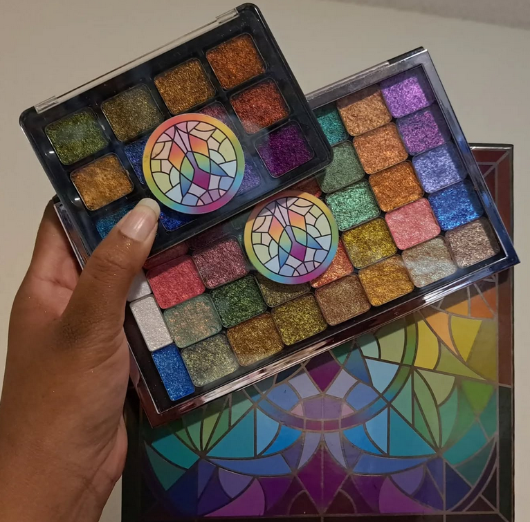
Also, I’m not sure if I’ve shown this before, but Clionadh has been including brand stickers in orders and I’ve saved them to stick onto custom palettes, such as the Viseart Empty SlimPro Palettes which Clionadh Stained Glass shadows fit perfectly into. I place stickers on the front and underside of the lid.
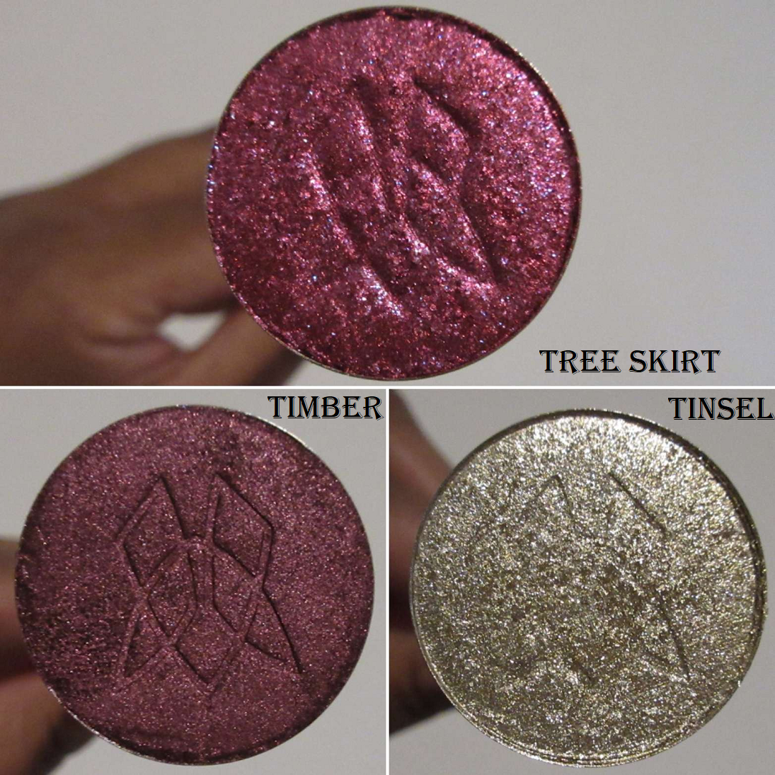
Stocking Stuffer Shadow Trio in Tree Skirt, Timber, and Tinsel
This was the brand’s holiday release for 2022. It even came with a tiny Christmas stocking to go with it.
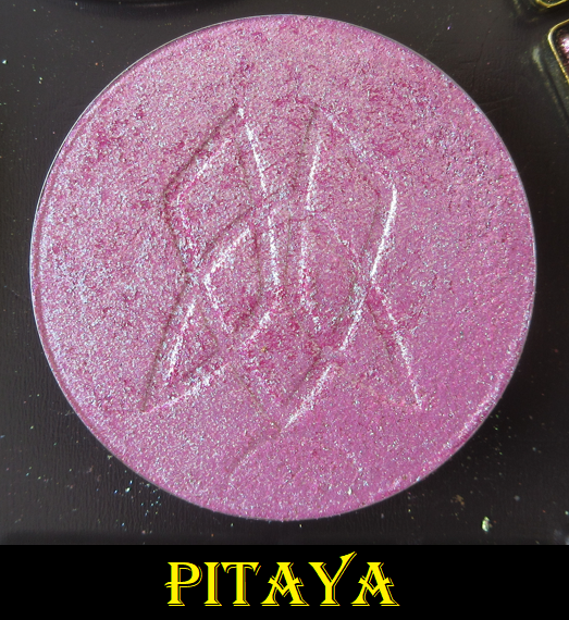
Additional Individual Circle Pan Eyeshadows and the Pitaya Fruitlighter
Caribou always appealed to me, but there was a time period when I wasn’t as interested in buying the neutral colors from Clionadh, though that has clearly changed by now. So, I finally bought that one. Centaur is a new eyeshadow released in 2023, and I’m not usually interested in taupe shades, but this one looked so pretty that I felt compelled to order it.
With this purchase of Pitaya, I now have both Dragonfruit Collection Fruitlighters that I use as eyeshadows.
That’s all I have for today! I apologize for this being quite disorganized and unfinished, but I wanted to be sure I finally got out at least something after all these months owning these additional Clionadh products.
Also, for anyone wondering if I’m going to purchase Clionadh’s upcoming Deep Sea Treasures palette the brand showed as a sneak peek of the cover art on Instagram…I’m not sure if I will. Without seeing the color story yet, I assume there will be a lot of blues, which is not my preference. As much as I love the brand, if the palette consists of too much of a shade I don’t wear a lot (such as the reds and pinks in the Dragonfruit palette), then I skip it and save that money towards a different new product release.
So, it’s probably likely there will be a lot of blues, and if so, I will probably pass on this one.
Thank you for visiting!
-Lili ❤
UPDATE: June 27, 2024 Here is a requested swatch comparison photo from top to bottom of Quest, Statue Garden, and Stencil in various lighting situations.
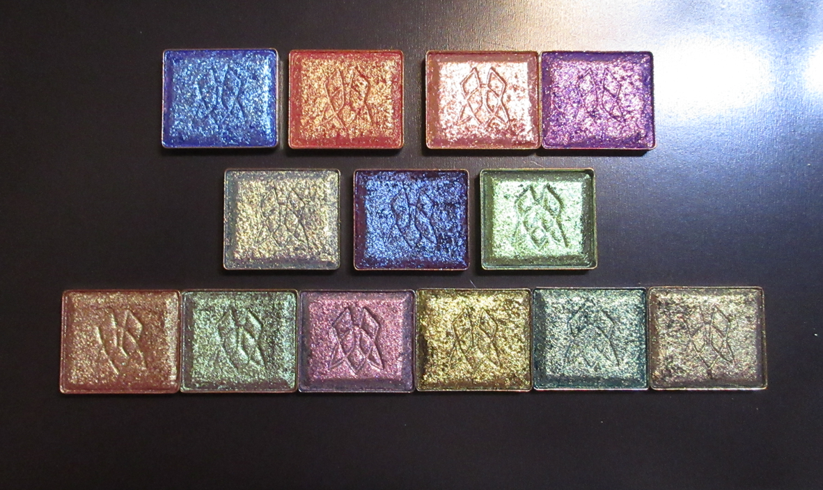
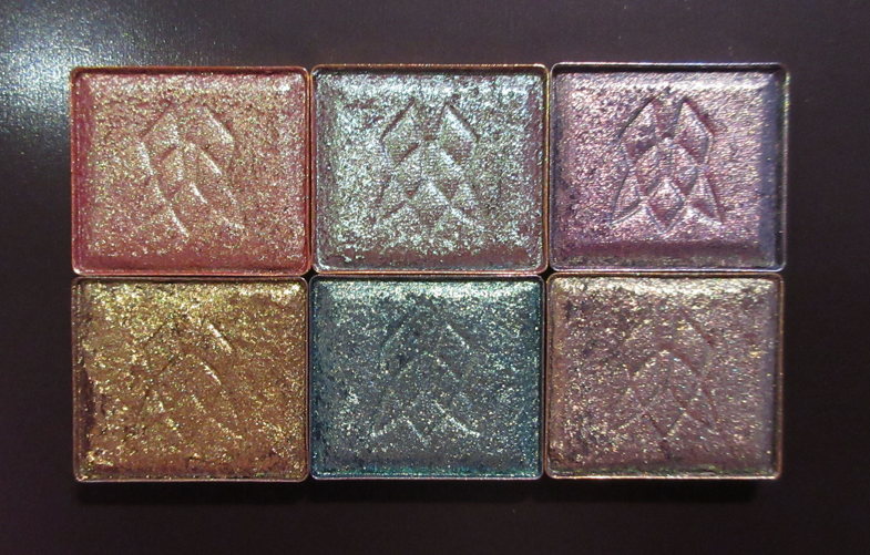
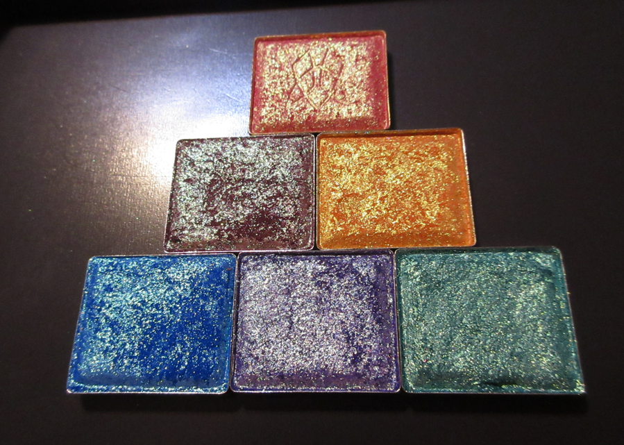
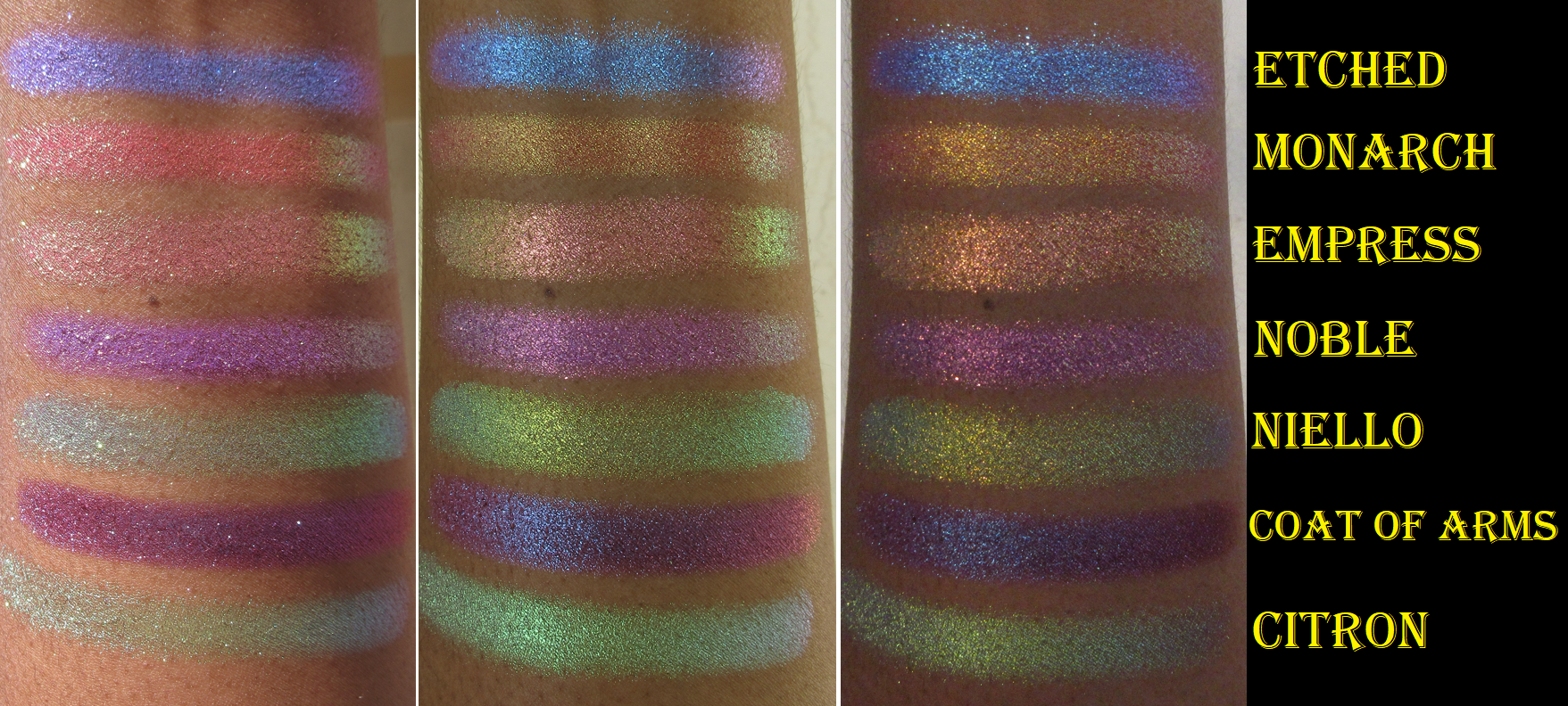
R1 (left to right): Etched, Monarch, Estate, Noble. R2: Niello, Coat of Arms, Citron R3: Bronze Fountain, Wall of Ivy, Royal Plum, Estate, Hedge Maze, and Iron Gate
The long awaited expansion to Clionadh’s massive Stained Glass Eyeshadow Collection is here! 54 new shades were released on August 8th. This new batch of multichromes extends the current formulas already available, in addition to ones we haven’t seen before. Also, Ciel and Glaziers Mark were reformulated.
I would have loved to purchase more than the thirteen I selected, but considering the shipping cost and Route Package Protection fee, I couldn’t fit more in the budget. Clionadh has the permanent promo code CROSS FORMULA which saved me $10 off my order of 10+ Stained Glass Eyeshadow singles. All bundles are already discounted, and therefore exempt. Influencer codes also only apply to the brand’s standard eyeshadows.*
*Update 09/2022: Clionadh announced that some influencer codes were newly affiliated. At that point, I noticed that certain influencer codes did include the Stained Glass Collection in the discount. I’m not sure if that was intentional or not.
My goal for today’s post is to show the shades and swatches to the best of my ability. I tried to get this out at quickly as possible to help those who are still trying to decide before the favorites go out of stock. At some point in the future, I plan on doing a follow-up post featuring any additional shades I purchased, along with the closest shade comparisons to multichromes among Clionadh and from other brands, and examples of how I’ve worked each shadow into completed eye looks.
Unless specifically stating otherwise, the majority of these shades were applied on eyelids and arms with no primer and not applied damp. I used concealer in certain areas to counteract the discoloration around my eyes, but it was not used enough to qualify as a primer either. I also applied the multichromes with a combined technique utilizing my finger and a brush.
Shadow Close-Up Videos
First Impression
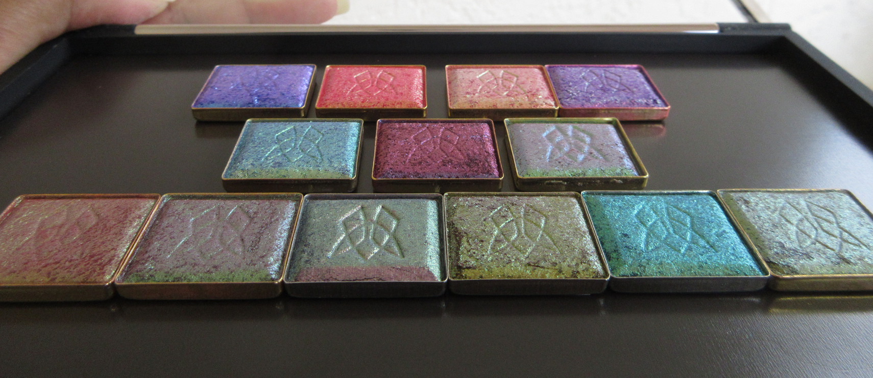
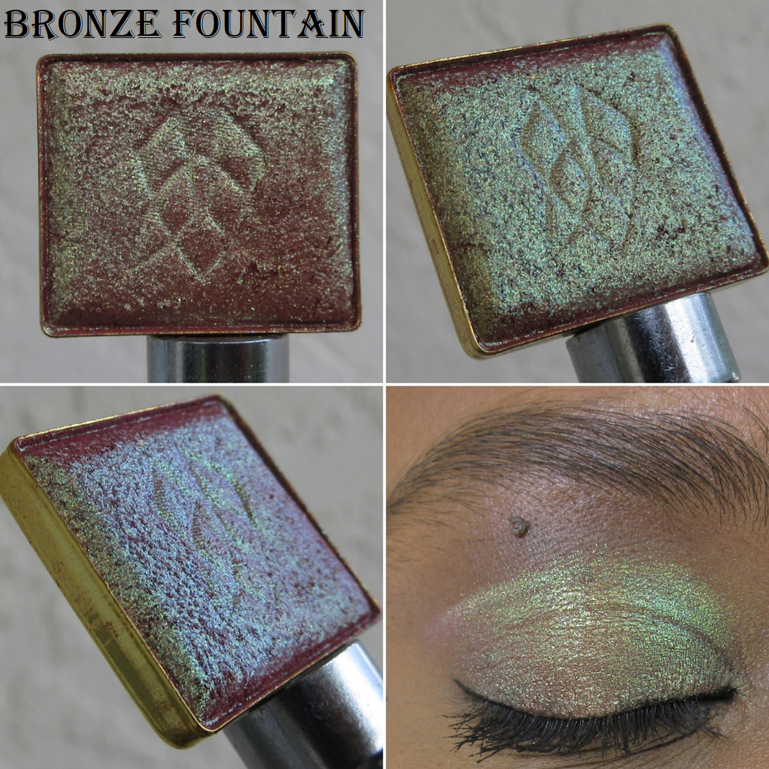
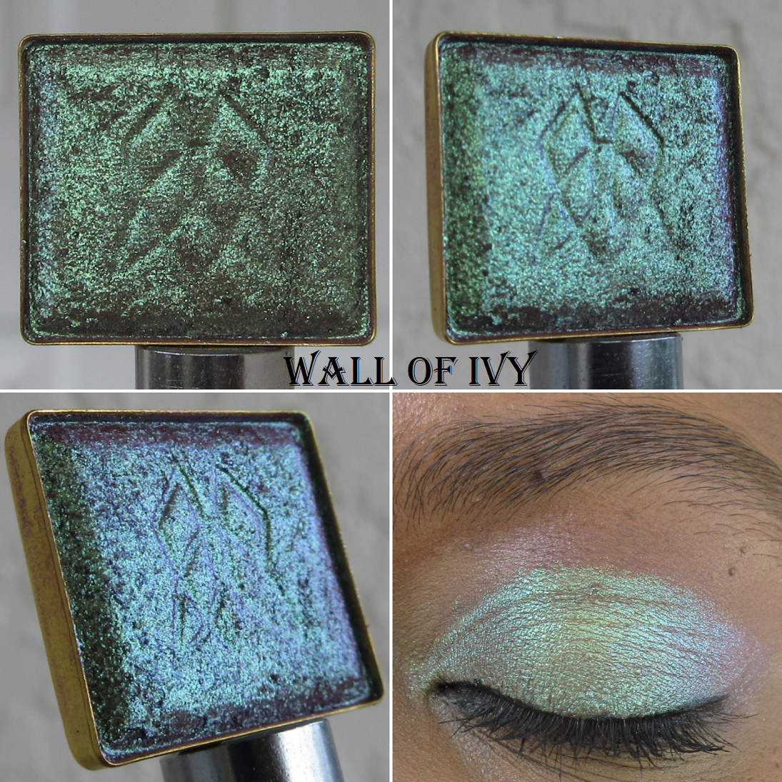
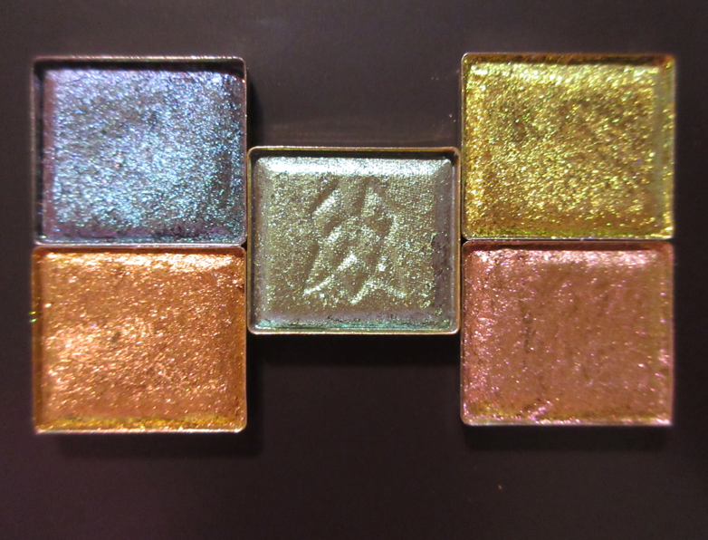
Earth Vibrant Multichromes in Bronze Fountain, Wall of Ivy, Royal Plum, Estate, Hedge Maze, and Iron Gate
I purchased six of the eleven multichromes in this highly anticipated new formula from Clionadh. Having “neutrals with a twist” is ideal for me in my current makeup phase, so it makes sense that I was drawn to the Earth Vibrant Multichromes the most.
I find it quite interesting that these shades are super shifty (as seen in the pans), but because they aren’t drastically different on the color wheel, likeEstate’s yellow-gold to lime to greenish aqua, most of the shifts aren’t as obvious on the eyes and can pass for one solid color if there aren’t various sources and angles of light. The Earth Vibrant shadows remind me of the Pastel Multichrome formula in terms of the texture and smoothness of the shimmer, but these are shinier with more shifts.
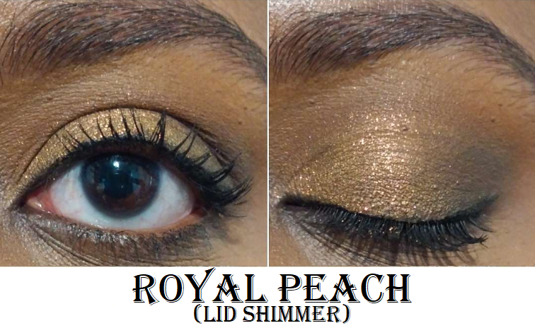
Bronze Fountain is one of my favorites out of the entire bunch that I purchased! It’s the terracotta base that shows through underneath that makes this shade extra special to me, especially with the lighting in the house. The bronze tone with the lime and gold shift and even more subtle aqua shift is the ultimate middle ground between loving colorful eyeshadows and neutrals.
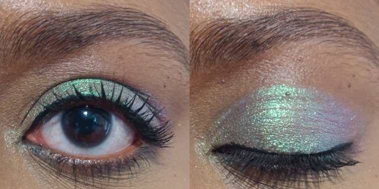
Whenever I come across a green-blue-purple multichrome, like Wall of Ivy, I can’t help but compare it in my mind to Verte, which is perhaps my single favorite eyeshadow from Clionadh. The main differences between the two are that Verte has a cool tan base versus Wall of Ivy’s warm brown one, in addition to the green in Verte being almost like a radioactive color. Wall of Ivy is still vibrant, but looks like the color mint. Because of how light the shimmer appears on my eyes, a shade like this will stand out more on my skin tone.
I can’t wait to try Royal Plum in a purple-smoky eye look! It has a fascinating grey-plum base, which gives it the overall gunmetal-esque look on my eyes, though I can still see the pink-purple going into aqua. This shade is one of the most unique multichromes in my whole makeup collection.
As I mentioned earlier, the “golden yellow-lime-aqua shifts” in Estate still mainly looks yellow or chartreuse. So even though it could pass for a “normal” eyeshadow to someone who isn’t staring intently at my eyes, how vibrant the yellow and lime elements can get depending on the light are still interesting aspects of this shade.
I knew Hedge Maze wasn’t going to have a dramatic shift, but because it has a grey base, I expected it to look smokier, like Royal Plum, and darker. In the end, it looks mainly like a medium-dark green with gold shimmer. Because that’s a very common type of color in my collection, I’m not as impressed with this shade. In addition, when I wear it outside, it looks quite similar to Wall of Ivy, but even less shifty.
I thought it was very strange how Iron Gate looked grey-olive-gold when worn indoors, until I looked at the pan photos I took and saw how in one split second in the light, it did turn that color. In other types of lighting, this shade is mostly gold-lime, and is like a toned down version of Estate. There are supposed to be peach and aqua shifts as well, and the base color is “grungy mauve” which likely accounts for how it managed to have that greyish tone I noticed while I wore Iron Gate inside the house. I’m still not sure how I feel about this shade, and I think I need to see how it pairs with other eye shadows in order to finalize my thoughts on it.
Bronze Fountain, Royal Plum, and Wall of Ivy are easily among my favorites and were absolutely worth the purchase for me.
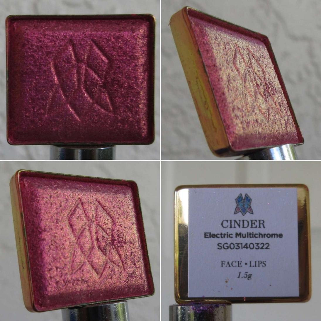
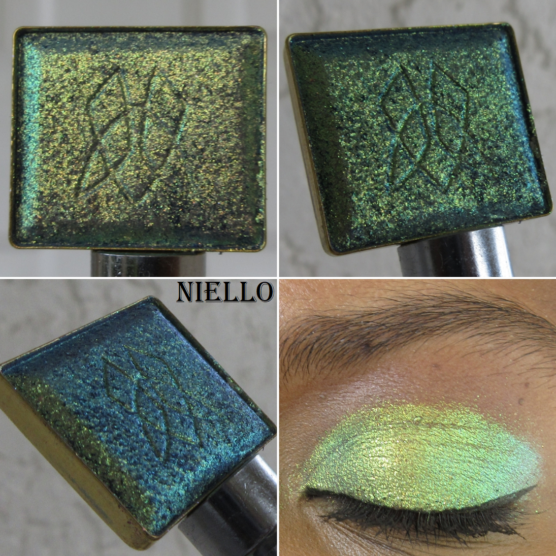
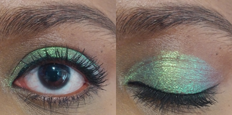
Electric Multichrome Pigment in Niello
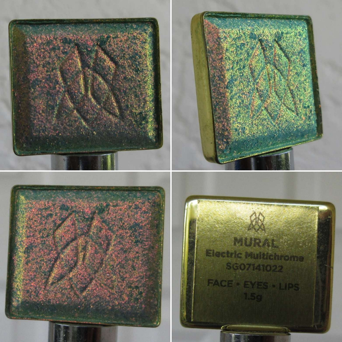
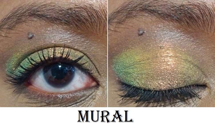
I surprised myself by choosing only one of the twelve shadows in this brand new formula. Several others interested me, including Mural which was the first of the new Stained Glass shadows to sell out on the website. However, there were so many swatches of Mural and other Electric Vibrant shades that I liked or disliked out of all the photos and videos I watched prior to the release day, that I wasn’t confident I would think anything other than Niello was worth buying.
However, now that I’ve seen Niello in action, I do wish I bought a few more of the Electrics I considered getting. Every shift is so pretty and even when it looks the most lime, which is perhaps the least interesting part for me out of the “dusty purple base with gold-lime-aqua shifts,” in a completed eye look, it’s the lime that turns super bright and electric, which helps make the look pop.
In the double eye look photo, I have just Niello alone on the lids in the first look. The second look was created using the Clionadh Tropico Highlighter on the inner corner. The rest were used with the Natasha Denona Metropolis Palette with Ripe on the lower lash line, Enigma on the outer third of the eye, a tiny bit of Royal in the center (which didn’t add much to the look and I skipped it in my version on Instagram), and Lethal on the inner third as well as blending out most of the crease.
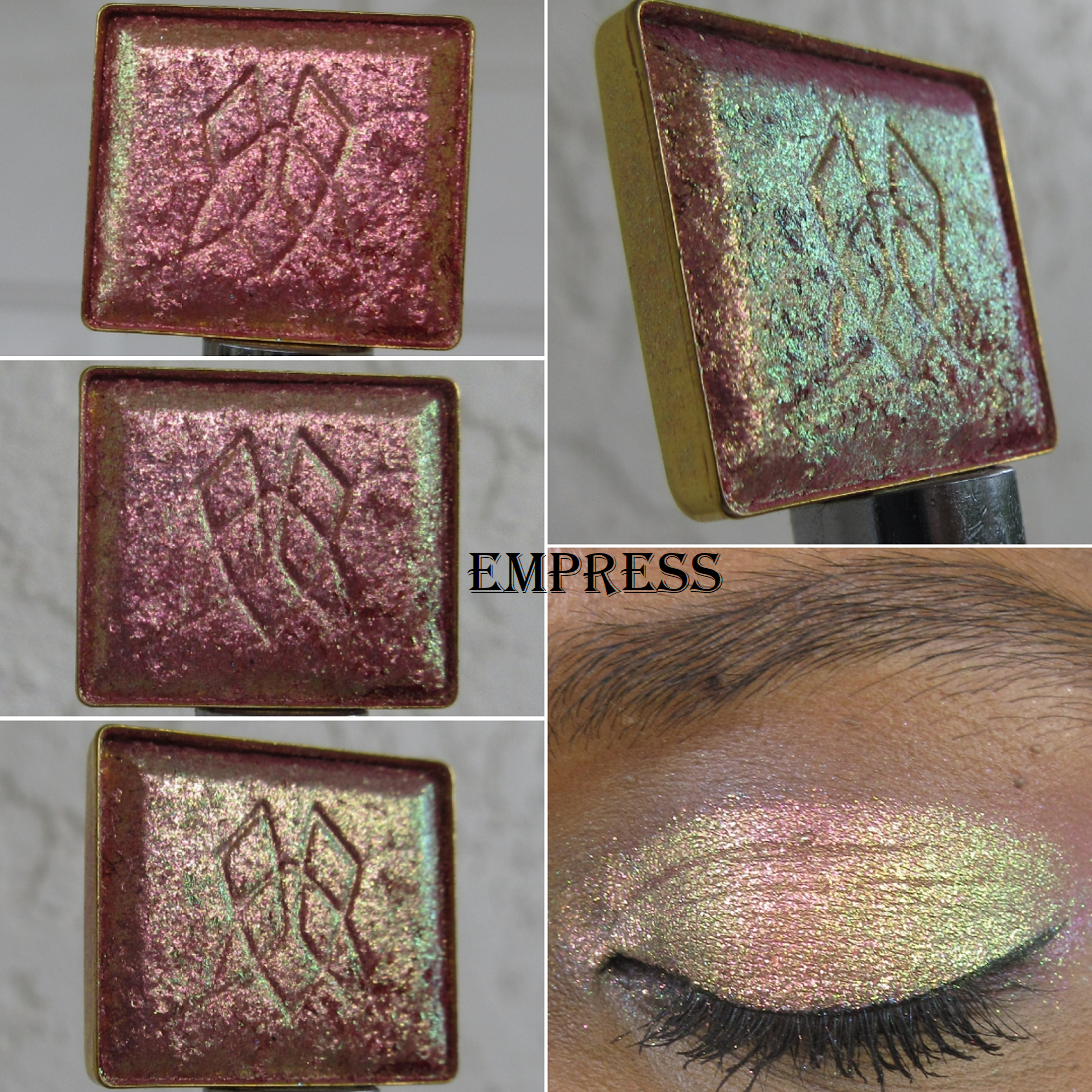
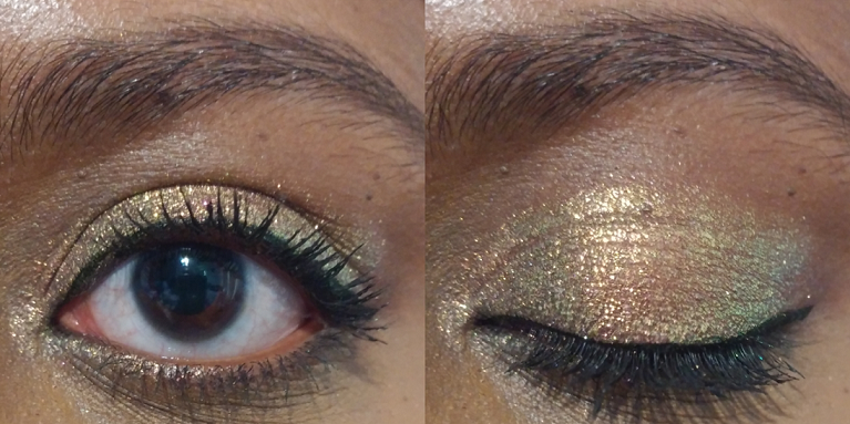
Glitter Vibrant Multichromes in Empress and Noble
This formula combines the large glitter particle size of some of the shadows in the Glitter collection, as well as the bright base and “intense colour shifting reflects” of the Vibrants. I bought two of the five newly released shadows, but the shade Regal was introduced last year and shares the same formula. I don’t own that shade, so this is my first time experiencing this category of multichromes for myself.
This formula is the kind I will only apply damp or with the Nyx Glitter Primer (as demonstrated in the outdoor closed eye swatch picture). For the open and closed eye swatch worn indoors, I applied them to bare lids to show how this formula can be a bit flaky and messy without some sort of aid to keep it in place. Empress has “a pink-red base with pink-peach-gold-lime shifts,” which I can certainly see in the pan. It has a similar vibe to the shade Bronze Fountain, but with more emphasis on the pink, peach, and gold. The lime is subtler. I like this shade, but I still need to compare it to a lot of other shadows in my collection because I’m not sure how much more different this really is.
Based on the description of Noble as “a warm violet base with pink-peach-lime-aqua shifts,” it sounds like it’s meant to be the purple equivalent of Empress, but this color doesn’t shift as much. I knew that ahead of time, thanks to seeing swatches in advance on Clionadh’s Instagram, but I wanted it anyway. I figured pink-purple-aqua would still be a pretty combination, but the pink is so pale on me in certain lighting situations that it looks silvery. I really don’t like that aspect.
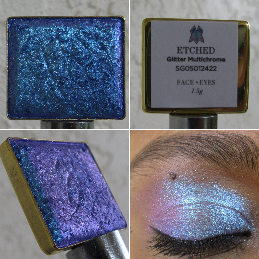
Glitter Multichrome in Etched
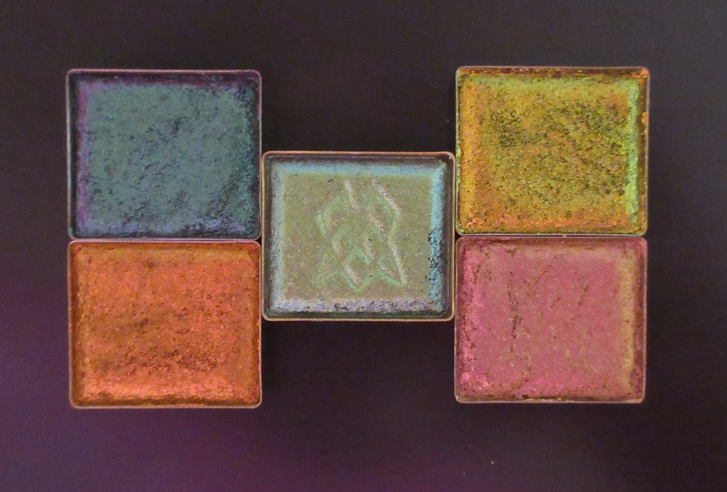
My current Glitter Multichrome collection after being whittled down. Etched is on the bottom right.
Quite a few shadows that I own in this formula ended up looking much different on my eyes than I expected. So, I ordered the shade I wanted most out of the eight new ones, and decided that if I still want others after I see how they look on more people, I can get them at that later date.
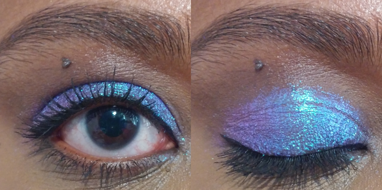
This shade is mainly blue, which rates low as an eye shadow color I like to wear, but because it has that beautiful pink-violet shift and it’s all with a purple base, I really wanted to get Etched anyway. It’s certainly pretty and even though I could have been fine without this shade and likely won’t use it regularly, I’m still happy to own it.
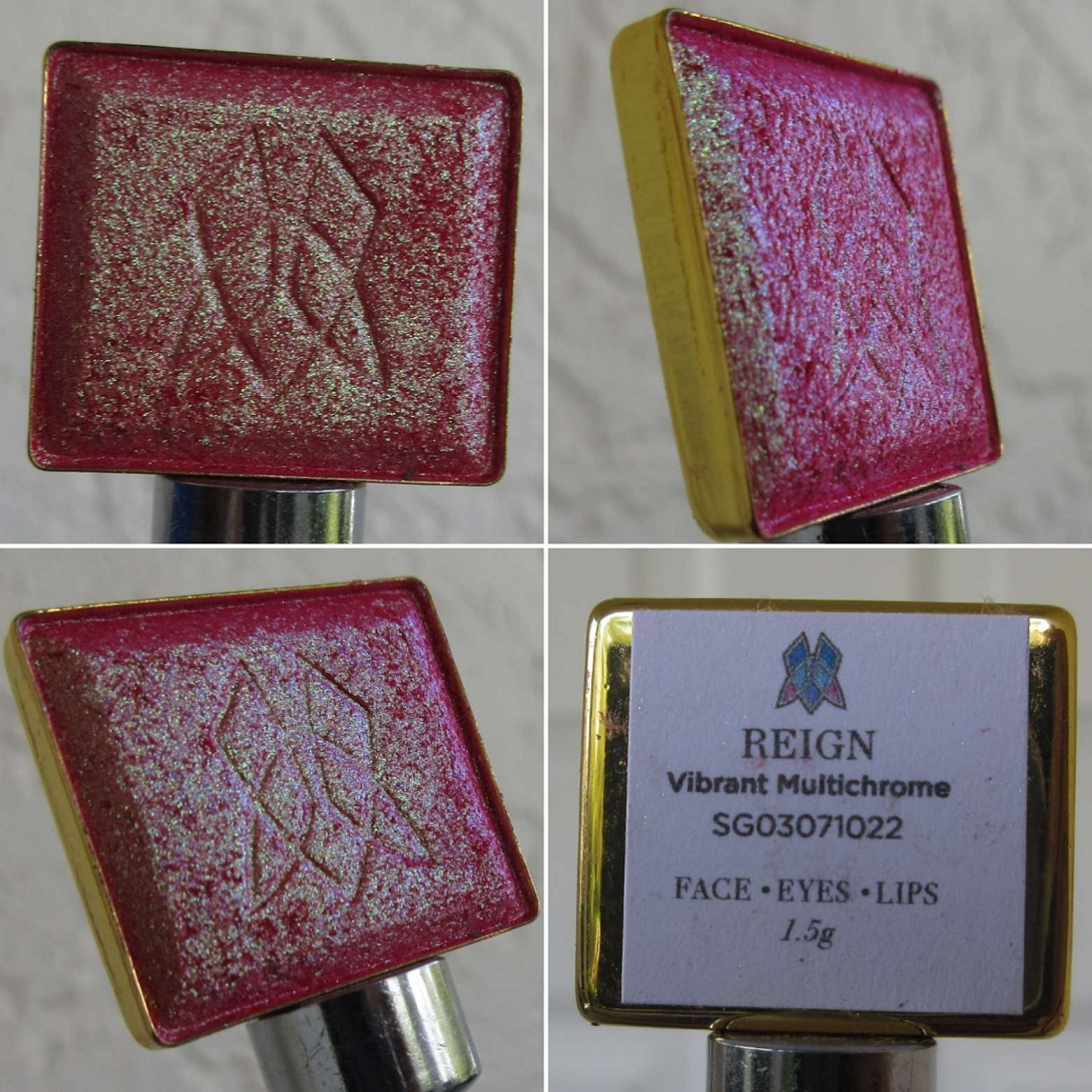
Vibrant Multichrome in Monarch
My Vibrant Multichromes with Monarch at the top.
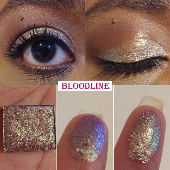
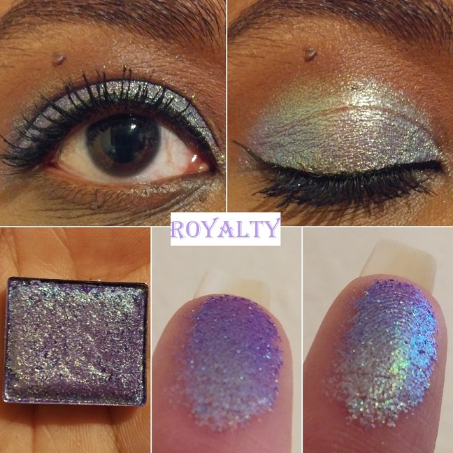
Monarch was the only shade I wanted of the four new additions to the Vibrant Multichrome category. I am absolutely thrilled with it! It’s like a more orange toned version of what I wanted Bloodline to be on me. In fact, both Bloodline and Royalty have a silvery look to the shimmer on my eyes. I was so relieved to see that this did not happen with Monarch. The base color in this is red, but all that gold makes it look orange.
I can certainly see the gold shift and subtle bit of lime, but not the aqua described on the website. I don’t mind because the way it looks is gorgeous enough for me.
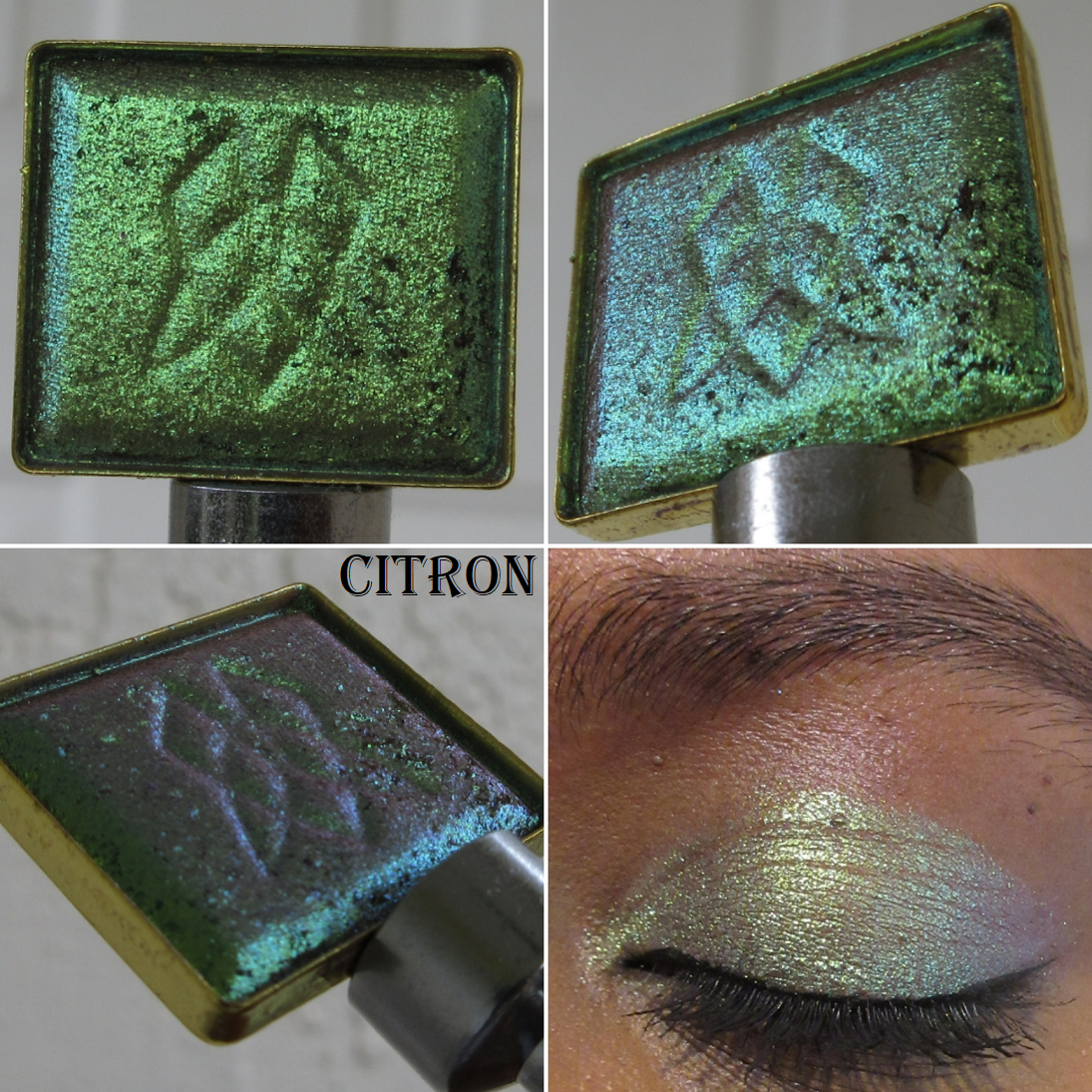
Deep Iridescent Multichrome in Citron
My Deep Iridescent Collection with Citron in the middle.
I only purchased one of the seven new DI Multichromes, but there are several more on my wishlist that I wanted and only stopped myself from getting them because the other shadows on my list seemed more color-shifting and unique. However, don’t be surprised if/when you see additional Deep Iridescent shadows in a future post!
All of the Deep Iridescents have a unique finish to them, as seen in the close-ups of the pan, and Citron is no different. Putting that shade on my eyes reminded me why it’s one of my favorite formulas from the Stained Glass Collection and I instantly regretted not taking the chance on getting more of them. I love how smoothly they apply and look on the eyes. Citron in certain situations looks quite unique because of that “cool taupe base with chartreuse-lime-aqua shifts,” but in the type of lighting I’m most commonly in, it reminds me yet again of Verte, which is part of this collection. More than just aqua, the shift in Citron looks borderline purple on me. Since, I love purples and greens anyway, I don’t mind. While it does remind me so much of Verte, the fact that Citron looks mainly chartreuse/lime when I’m outside keeps it distinctly different and justifiable to have both.
Hybrid Multichrome in Coat of Arms
My Hybrid Multichromes with Coat of Arms at the top.
This is one of the three new additions to the Hybrid category. I was interested in the others, but since the Hybrid formula is one of my least favorites in the Stained Glass Collection, I didn’t want to set myself up for disappointment and stuck to just one. Also, even though I say this is my least favorite formula, I clearly haven’t had the heart to declutter any of them, so that’s an indication of how much it’s a preference issue and not due to lack of quality.
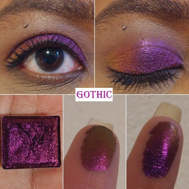
Coat of Arms is certainly not as deep and rich on my eyes as I expected, but thankfully it’s still a very pretty color. I’m actually glad it’s not as dark as it looks in the pan because I was concerned it would be too similar to Tapestry or the Jewelled Multichrome Spire, but it turns out those other two lean much more on the blue side. It’s quite similar to how Shard looks on me, except that Shard has a warmer purple look to it, whereas Coat of Arms is deeper and the stronger blue shift gives it a cooler toned look to it. For a Hybrid Multichrome, I’m pleasantly surprised how much I like it. However, I feel quite certain I have shades like this in my collection, so I haven’t decided if getting this one was worth it.
The only categories I did not purchase anything from were the Series 2 Iridescent Multichrome expansion and the newly released Pearlescent Multichromes.
As for the shadows I did purchase, I’m happy with my choices, though I still can’t help but want the few additional shades I had left on my wishlist. When I decide to look through my multichrome collection again to see if I have colors that are similar enough, perhaps I won’t feel that way. As I mentioned earlier in this post, I wanted to share the most important photos as soon as possible, but I also want to take my time enjoying this collection at a leisurely pace since I don’t think any other eyeshadows this year are going to top these. I want to have something new to look forward to trying out for weeks to come.
Thank you for reading and hopefully sharing in my excitement over these gorgeous multichromes! If you want to see my previous Clionadh reviews, I have links to them in this index post.
I normally post reviews exclusively on Mondays, but this post is more of a show-and-tell. I consider it a bonus!
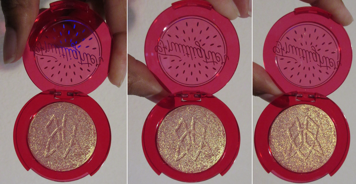
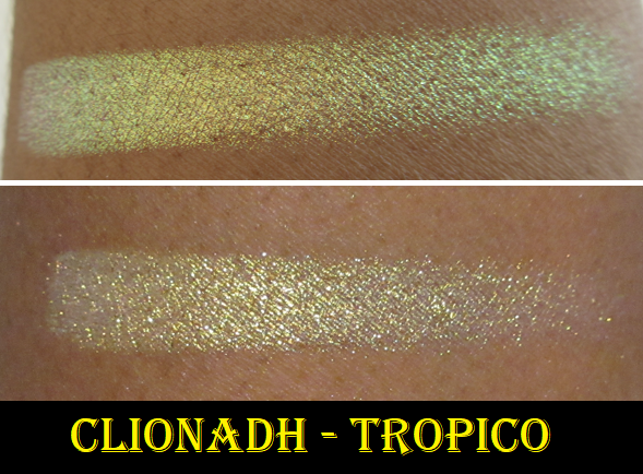
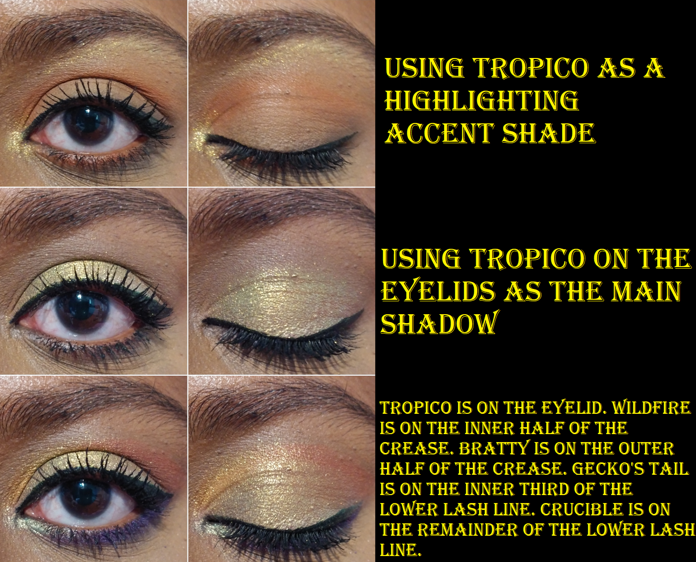
Clionadh Cosmetics Fruitlighter in Tropico
This highlighter, or fruitlighter as it is cutely called, is part of the collaboration Dragon Fruit Collection between Clionadh Cosmetics and Emily Violet Marie. Although I’m not following Emily on any social media, I have seen some of her videos discussing Clionadh products and I think it’s fantastic that the brand liked the concept she came up with long ago and decided to work with her. The entire collection is fun and summery, but I’m on a low-buy and a bit of a neutral phase, so I decided I would just get the two most unique items: the Fruitlighters. Unfortunately, the shade Pitaya sold out as I was checking out, but I still managed to get Tropico. I don’t think I can pull off duochrome and multichrome highlighters on my face, but I plan to use Tropico exclusively on my eyes.
I am very happy with this purchase and I know I will get some use out of it because I transferred it from the compact to my custom magnetic palette with my other Clionadh multichromes. When I was swatching Tropico, I observed the pan spin around and I figured out that it wasn’t glued in the compact, just stuck there via a magnetic bottom. So, I’m able to lift it out (gently with a thin object) and put it anywhere I want.
Tropico is in the palette on the bottom right.
In terms of longevity, I have no issues using Tropico on my eyes, nor the cheeks. It lasts all day wherever I put it. Clionadh highlighters in general are a bit glittery, which is why I prefer using them as eyeshadows, if it all. Part of why I was drawn to this shade, as can be seen in the swatch video, is that at a sharp angle you can get a partial rainbow colored shift of yellow, green, blue, and purple. I cannot recreate that effect indoors on my eyes, but it’s gorgeous all the same.
Clionadh Cosmetics Britt’s Birthday Trilogy Eyeshadow Trio Set
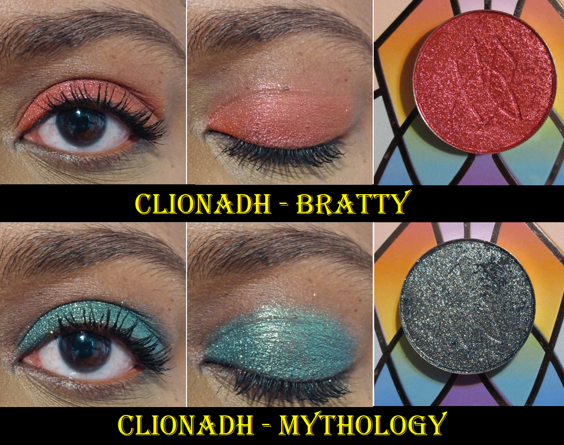
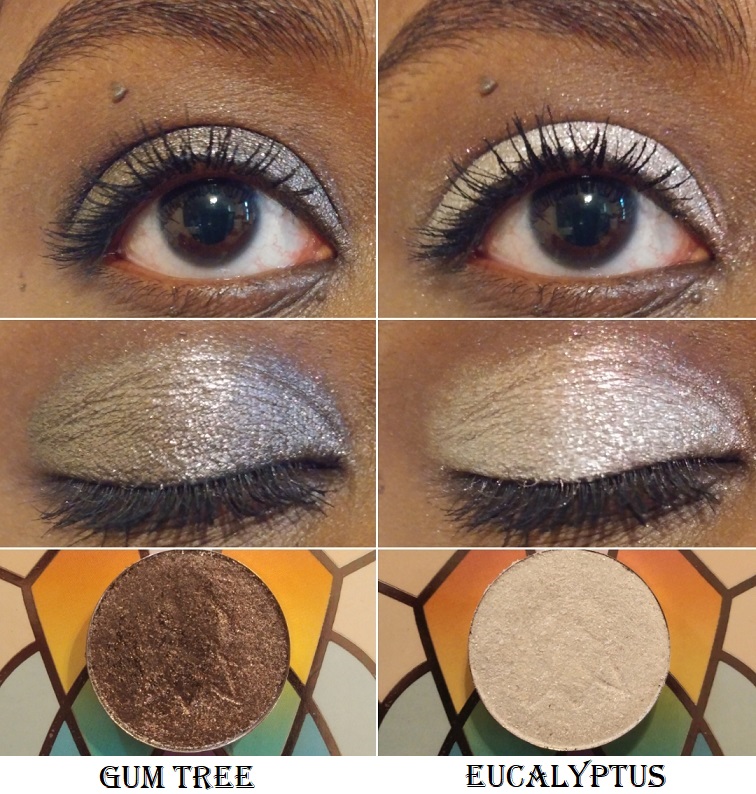
Leigh (aka Britt) and Maggie are the two Founders of Clionadh, and it was for Leigh’s birthday that this eyeshadow trio was created. I really wanted the green shade, and when I read that Nightmare was similar to Gum Tree (one of my favorite Clionadh shadows), I planned on purchasing the set whenever I had a bigger order to make. Somehow, I missed the part about Nightmare also having a similar vibe to BrittBritt, another shade that I also already own. So, the reason I haven’t swatched it with the others above is because I decided I won’t be keeping this shade.
The main differences between the three is that BrittBritt is a little more on the bronze and plummy side, Gum Tree is closer to a gunmetal dark-grey, and Nightmare is essentially just like Gum Tree but much darker in tone. So, I gave an example below of what Nightmare could potentially look like by combining the shadow Koala as a base, which is a dark grey-black, and putting Gum Tree on top. BrittBritt, Gum Tree, and Koala are all discontinued eyeshadows that were sold to contribute to various charities. If I did not already have all of those, I would have happily kept Nightmare. This Birthday Set is still limited edition, so it won’t be around forever!
It’s very important for me to not just keep makeup for the sake of keeping them. I really want to ensure I get more use out of my products, which is why I made the decision to just keep the Clionadh products I will actually use. I’ve barely made dents in my shadows despite how often I’ve used them because a little goes such a long way and I’ve calculated that even if I used a different shade every day, between the Stained Glass Collection and Clionadh’s standard shadows, I’d only be able to use them 5 times at most per year.
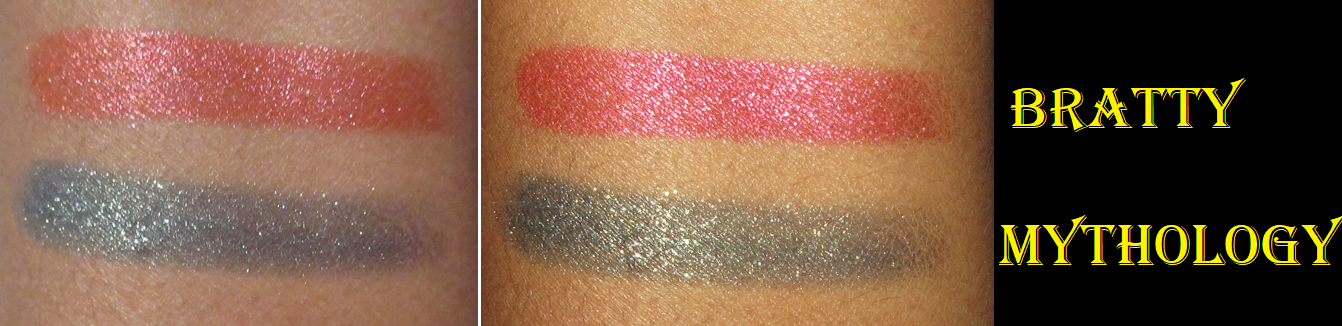
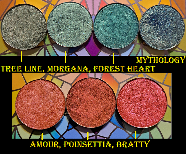
Below are the comparisons to the darkest greens and deepest reds in my collection with the new shades. One thing that really stands out with Mythology is that it has a lot more sparkle to it than the other greens. As for Bratty, it’s different enough from the others to want to keep, but between the reds and pinks I do have, it’s part of the reason I opted out of the Dragon Fruit palette. I do have a lot of those kinds of shades.
Per usual with Clionadh, these shadows remain opaque and pigmented on my eyes all day.
That’s everything! Thank you so much for reading! If you’d like to check out more of my Clionadh reviews and other indie brands, I have several of them categorized alphabetically here.
-Lili ❤
*DISCLOSURE: All products in this post were purchased by me with my own money.Non-highlighted links in bold blue font (Example) are non-affiliate links that will not generate commission. Links marked in bold black font with a light blue background (Example) are affiliate links. Affiliate links allow me to get a commission if purchases are made directly using my links.There are no affiliate links in this post.
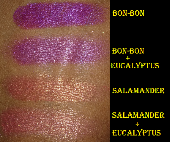
Clionadh is my favorite brand when it comes to duochromes and multichromes. Actually, it might be my favorite beauty brand period. In one of my previous reviews, I combined Kiln and Bloodline to create a gorgeous new shade and wondered what other exciting combinations could be made. Today, I’m showing a few that I experimented with and really like! I’ll also swatch the new Charity Bundle for 2021, along with the latest additions to my single shadow collection.
The Combinations
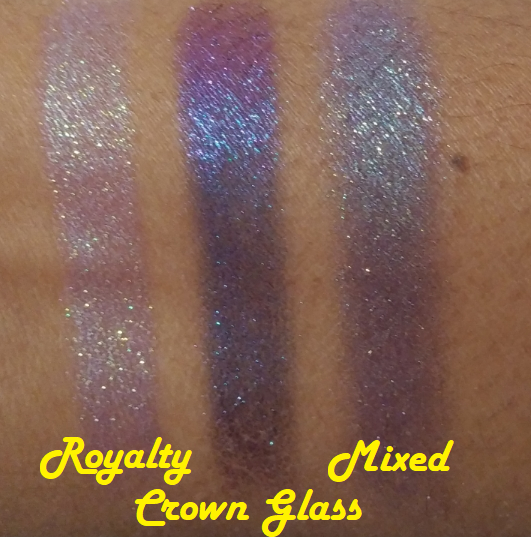
Trial 1
Royalty comes off as an icy purple on me, so I wanted to add more of a purple (with a little blue) tinge to my look. I ended up with more blue than purple, but I still thought it was quite pretty.
Trial 2
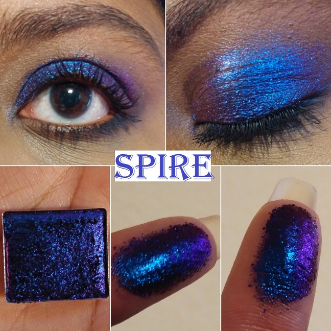
Crown Jewel is such a vibrant blue that I consider it a statement or occasion shade. It’s not something I’d wear on a regular outing. Spire is the dramatic opposite. It’s striking, but very dark, and also a bit much for daytime usage. So, I wondered if I could lighten up Spire and add an extra shift. I love how this turned out! It’s still not an everyday kind of shade but it’s gorgeous! I see myself creating this combination again in the future.
Trial 3
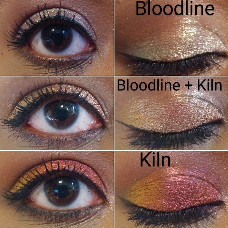
Opulent doesn’t do much for me besides being used as a highlight shade, so I thought if I could add Smoulder, I could perhaps get something a little darker and more pink. I hoped it would look closer to Bloodline, but the color it turned into reminds me of Weld or the Sextraterrestrial shade from Pat Mcgrath’s Divine Rose II (which is supposed to be a dupe for Forge but I don’t own Forge to compare).
Essentially, the most dramatic changes happen when I pair a shadow with one of the Jewelled Multichromes from the Stained Glass Collection. I tried many other combinations, but one issue I found is that some of them looked dramatically different on my arm, but on my eye there wasn’t a significant enough difference or the resulting combination looked too similar to one of the shadows already used.
Clionadh announced a shade extension coming to the Stained Class Collection, so I would be curious to see if any of them look like one of the Mixed shades I created!*
*Note: I completed this post months ago but kept pushing back the publish date. Clionadh originally announced a shade extension in time for Black Friday, but they decided to focus on restocking their current inventory in time for the sale and then afterwards fully focusing on building up the inventory of the new shades to be released in 2022. Their sale is still ongoing until December 3rd.
Collection Update
Left swatches were taken with flash off. Right swatches were alsotaken indoors but with flash on.
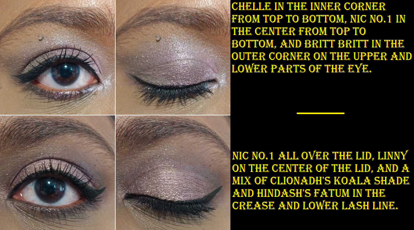
The Perfect Neutrals Collection Bundle
Other than Shani, these are not the types of shades I reach for because they rarely look nice on me. Baby pinks (or in this case rose gold) like Linny tend to look white or silver on my lids, but what makes this different is the gold they have running through it. On Clionadh’s website, Linny looks gold with a hint of rosiness, but the gold blends with my skin and lets the pink really pop. I’m left with a pale pink that actually looks pink on me, which is an unexpected surprise! It’s the same thing with Chelle that it’s supposed to be mauve, but it turns into the only lilac I’ve ever liked!
Although I’ve begun to appreciate neutrals again, I’m not interested in actively purchasing a ton of neutral shadows because they all look the same on the eyes. The reason I decided to add this bundle to my collection is because Clionadh does neutrals in a way that’s unlike the others on the market. The more intense shimmer neutrals tend to be a reflective metallic finish from other brands, rather than having this level of sparkle. The actual shimmer from others tend to be the standard gold or silver, but for instance, BrittBritt has pink, red, and gold glitter. Cookie has a pink shimmer that doesn’t translate as well on my camera but is very noticeable in person. I consider these shades to be spiced up neutrals, which is that much closer to the style of eyeshadow I’m into lately.
The other incentive for purchasing this set is that it’s Clionadh’s second charity bundle. According to their website, “100% of the profits will be split and donated to…True North Aid and The Black Queer Youth Collective.”
The previous charity bundle was limited edition, as is this one. When the Perfect Neutrals were released, the shadows were only available as a bundle, but were eventually listed individually. Some shades are already sold out and I believe I read somewhere that there will be no more restocks for it.
I should also note that the sparkle level of the shimmer shades in the bundle is similar to, but not as intense as Clionadh’s most glittery shadow options. They aren’t as flaky in texture as those and they aren’t as pigmented either. I wouldn’t call them topper shades, but the intensity lies in the sparkle level and not as much in the base pigment. It’s enough to give opaque results, but it’s not 100% opaque on the first swipe. The sparkle level and nuances of the shadows are what make this collection special, but in terms of color payoff and formula, I don’t consider them to be unique. The Stained Glass collection is where the special formula can be found.
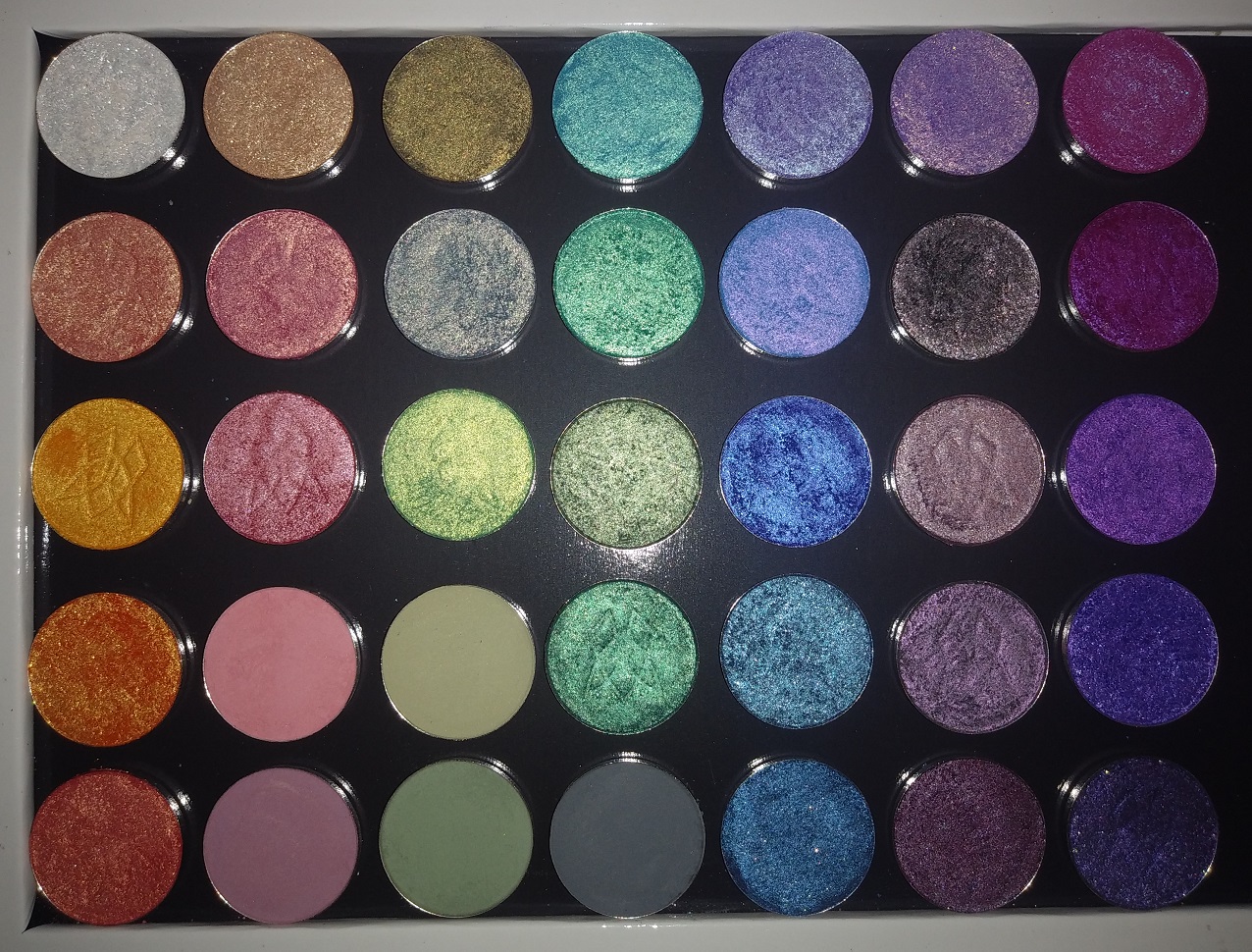
Circle Pan Eyeshadows
Every time I think I’m finished buying non-matte circle pan shadows, I end up getting more! Ironically, I had this post completely finished and then Clionadh had a surprise anniversary sale, so the bottom three are those new additions!
Clionadh brought back four shades from their discontinued Valentine’s Day set. I purchased one, Amour, thinking it would be a deep red-orange. I like it anyway, even though it’s not as deep when compared to the rich coppery red of Poinsettia. I have been very much into rusty red shades like this lately and thought I might have dupes in my collection. They look similar in their pans, but they are definitely not the same as can be seen in swatches.
I am also very happy I picked up Wormwood because it’s the type of maroon-brown shadow with blue reflects I used to love in my early makeup days but haven’t worn in ages!
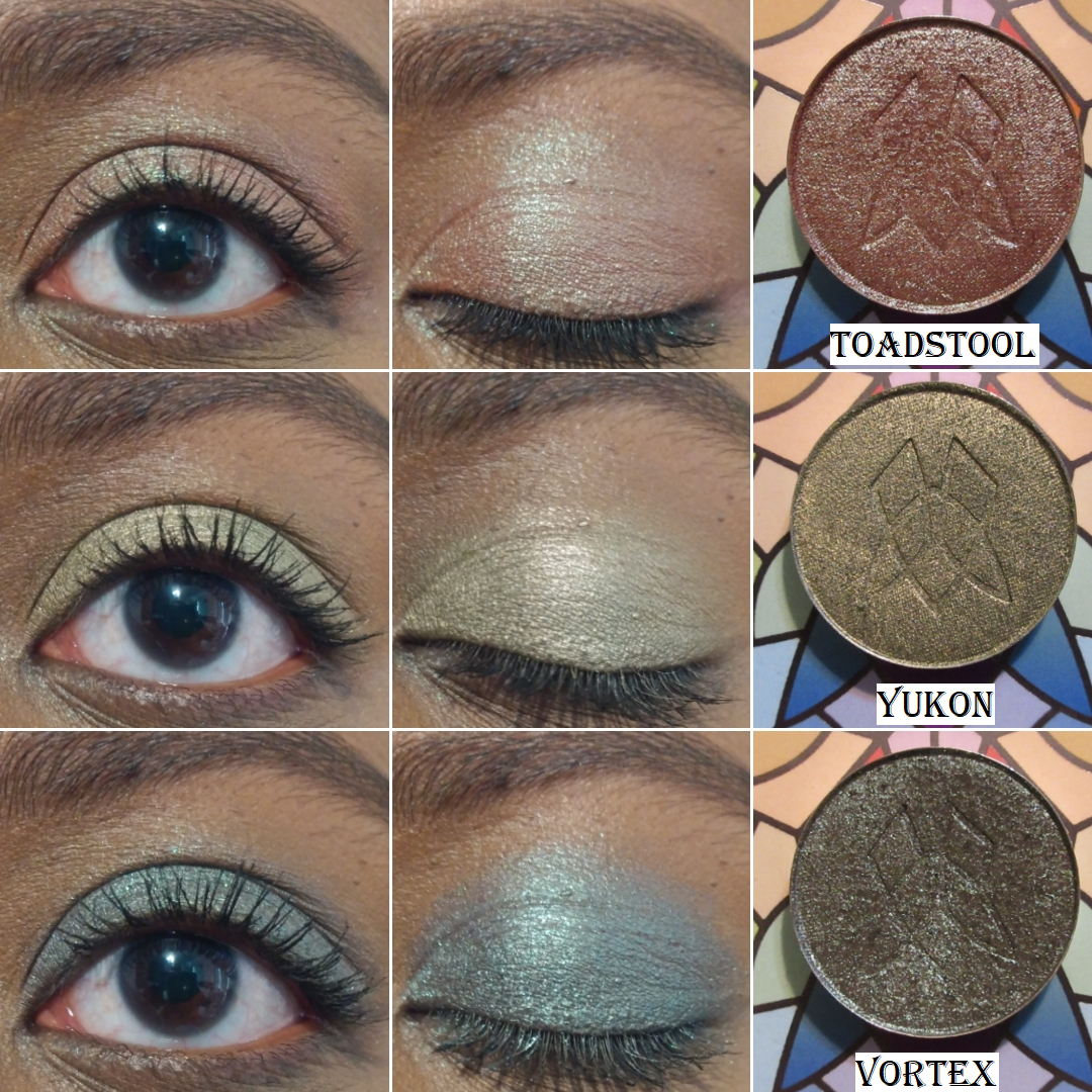
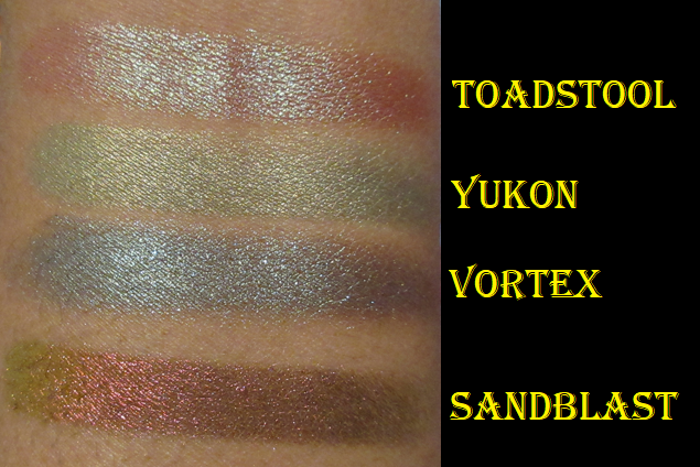
The anniversary sale shades I purchased are Toadstool, Yukon, and Vortex.
Toadstool is described as, “A rusty red-based duochrome eyeshadow with a bright green reflect. This is technically a tri-chrome shadow that will also shift up to red.” I’ve wanted this shade for a long time but finally took the plunge. Yukon is another one I’ve wanted for a long time, but I thought it might be too similar to Rune, so I didn’t get it until now. The two shades are about the same depth, but Rune has more of a yellow-olive tone whereas Yukon is a light golden green. Vortex is like Wormwood’s cousin. It has a brown base rather than a maroon one and it has green and aqua shimmer.
Stained Glass Collection Update
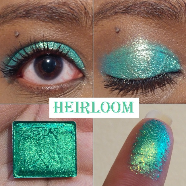
Majesty is described as having, “an orange base that shifts gold-green-turquoise.” I wish more of that orange would peek through on my eyes like it does on my finger and arm swatches. The gold and green are certainly visible though. Out of the five Vibrant Multichromes I have, only Heirloom and Crown Jewel look the way I expect them to on my eyes.
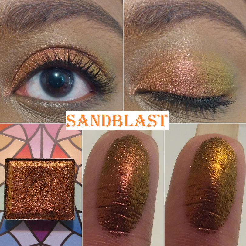
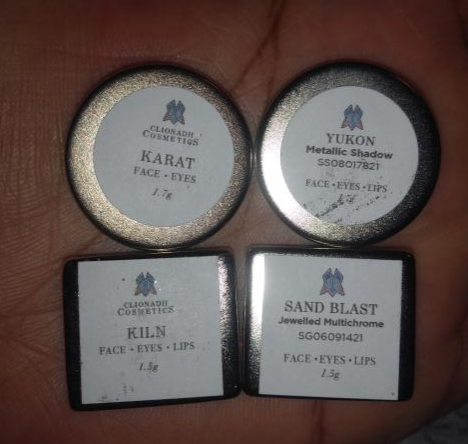
Sand Blast is the most orange in color of the Jewelled Multichrome category. It’s a dark orange with a gold and lime green shift. It’s not too far off from Smoulder (magenta-orange-gold-lime) and Kiln (red-orange-gold), which is why I figured I would like those two shades more. However, I couldn’t escape the feeling of missing an orange shade like this, so it is finally here!
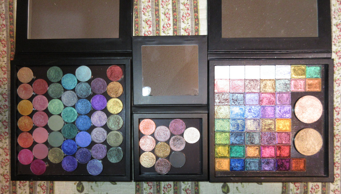
The other Stained Glass addition I purchased is the mini palette! It’s so cute! Even though I have zero plans to travel with my Clionadh shadows, I wanted to be able to keep my Charity shadows separate from the rest of the collection, so I put them in it. Below is a photo showing the size difference.
On Clionadh’s Instagram, I recall seeing a comment about the possibility of a Jumbo size palette in the future, so of course I’d be interested in that as well. Even though I have plenty of Coloured Raine’s gigantic 96 pan palettes, Clionadh’s shadows are so special to me that I want to keep them in special packaging as well. As it stands, my one mini and two standard size palettes are pretty much full.
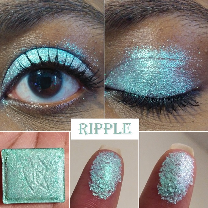
This is what my collection looks like now. I downsized the Stained Glass side by five shadows: Blaze, Sunbeam, Ripple, Spotlight, and Glazed. It was not easy to let them go, but I wanted to only keep shades I could happily use on their own without needing to mix them.
I think I’m finally set on the circle pan shadows unless Clionadh brings back the mattes. Parchment, Nectar, and Raspberry Fudge from the Harvest bundle are still on my wishlist. Halo is the only one left on the list from the Stained Glass collection. If I purchase any of the extended shadows in the future, I’ll make room by placing the highlighters in my custom face palette.
The last thing I want to mention is that Clionadh’s labels have changed since August at the latest, but likely before that. They now list the shadow type and removed the brand name.
Thank you for reading and Happy Shopping this Cyber Monday!
I tend to post my newest purchases far in advance on my Instagram page, so if you’ve found me through there, you may have seen some of these already. However, the majority of these shadows I’m featuring today have not been posted on this blog until now. In addition to arm swatches, I’ve also tried to do eye swatches and some finger swatches as well. Certain multichromes and duochromes look different depending on the light, so the trickiest ones to capture have the most variety of photos. Lastly, unlike my in-depth Monday reviews, the intent of the Swatchfest is to just show how these look on me. I will of course still make mentions of things that I feel are important to note, and may be different from my past reviews of these brands.
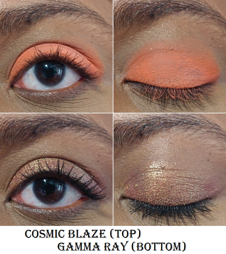
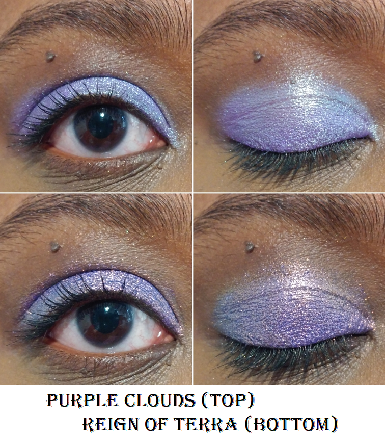
Terra Moons
Cosmic Blaze is one more pressed neon pigment I added to my collection. Purple Clouds is a duochrome. The rest of the shadows I purchased are part of the expanded range of Chameleon shadows.
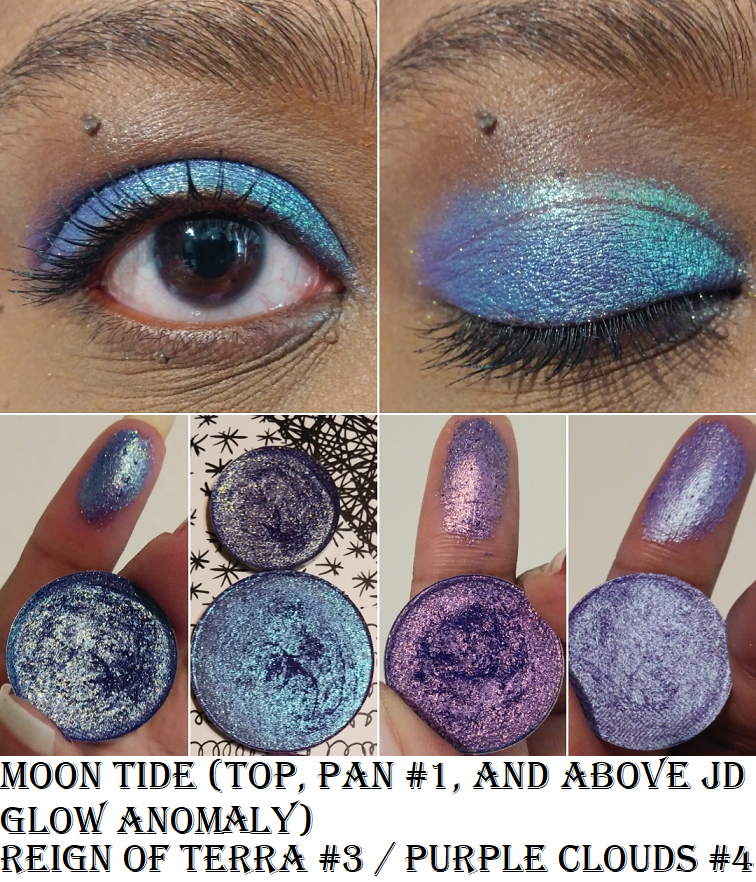
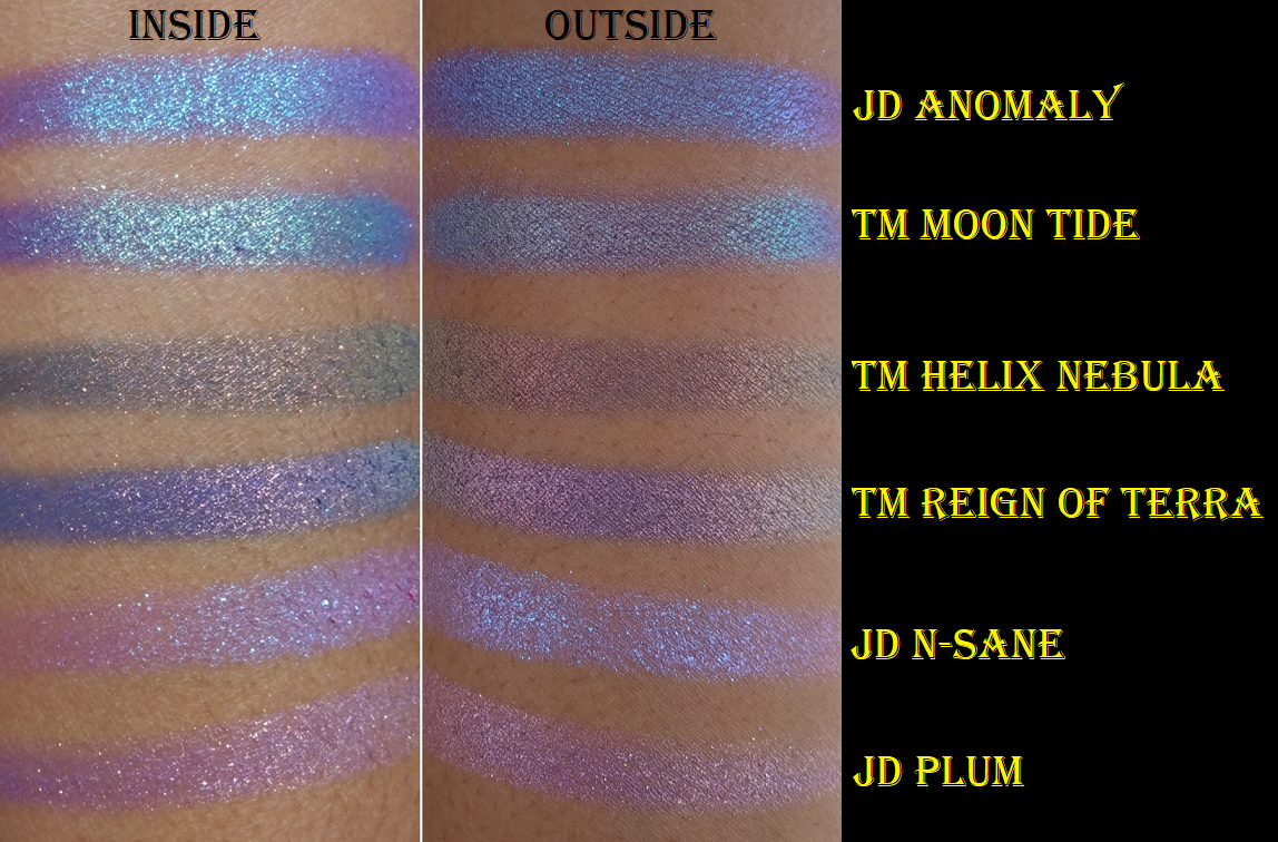
In the comment section of my Hindash review, I offered to compare a few shades in this post today. It’s interesting to see the differences between all the blue-purples. JD Glow’s Anomaly does look a lot like Terra Moons’ Moon Tide depending on the angle and the light. The base color of Anomaly leans purple with blue/aqua shimmer. The base color of Moon Tide is like a navy and purple with very similar shimmer. Moon Tide just has additional colors of shimmers as well. One doesn’t really need both, though differences are more noticeable on the eyelids.
JD Glow
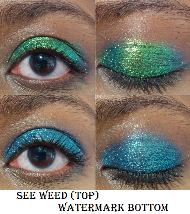
I said I wasn’t going to buy anymore JD Glow shadows, but I saw the words, “30% off sale,” and I couldn’t help myself. I always wanted the shade See Weed and even though the discount didn’t apply to this shadow, I still wanted it anyway. I’d like to say now I’m content with my JD Glow stash.
Anomaly is a Galaxy shadow. N-Sane is a Galaxy shadow I reviewed previously, but I wanted to show it again in comparison to Anomaly.
See Weed is a pressed multichrome. It also comes in a loose and liquid form too. Watermark is a Galaxy shadow.
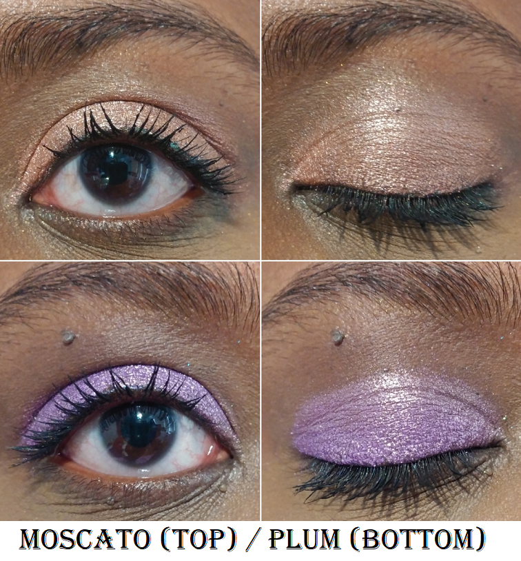
Moscato is part of the shimmer formula. Plum is a Galaxy shadow.
Devinah Cosmetics
At the time of me publishing this post, in one hour from now Devinah Cosmetics will be restocking most of their shadows and releasing their new Halo Moon Collection! I just wanted to let everyone know in case you’ve been waiting to get certain shades. I have a ton of duochromes and multichromes to go through, so I’m skipping the new launch for now.
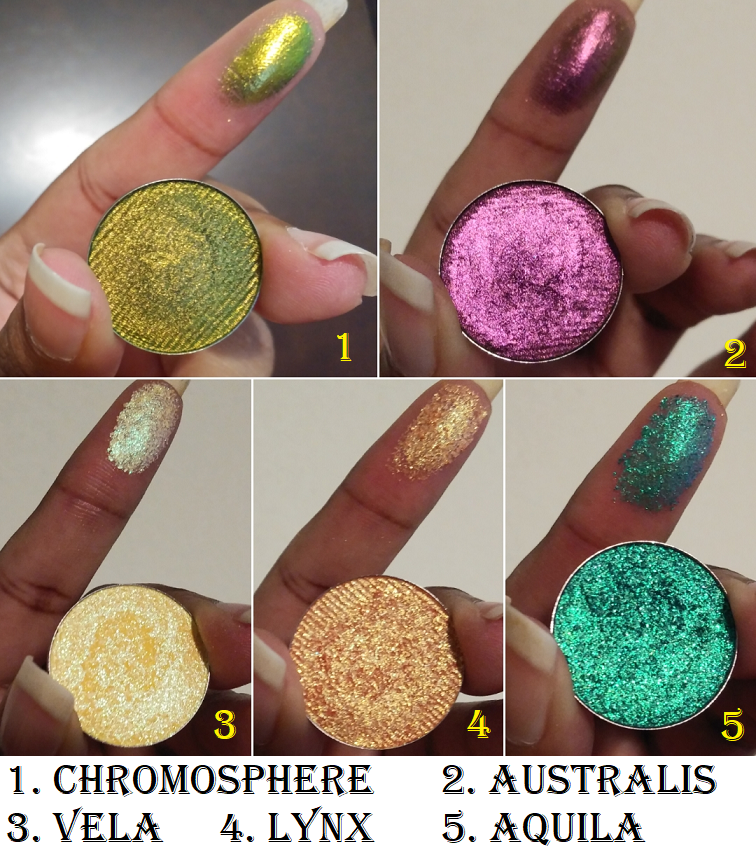
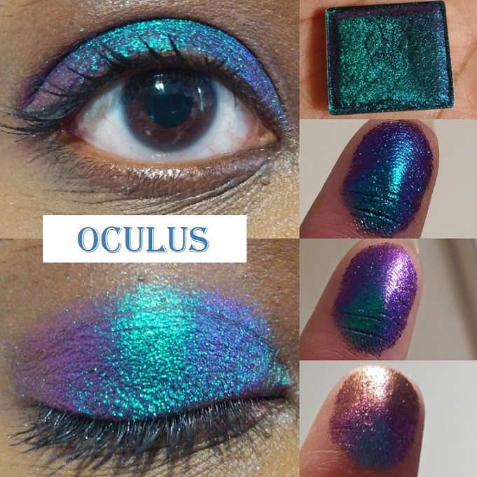
Chromosphere and Australis are Aurorae Flares, the shadows most comparable to the Clionadh Cosmetics’ Jewelled Multichromes. I like the finish of Clionadh’s a tiny bit more, but the ones from Devinah are smoother in texture and easier to apply. I was tempted to get other shades but Australis is already supposed to be a dupe of Smoulder (which I have), Phenomenon to Weathered (also have), Magnetosphere is often compared to Rosette (another I have), Exosphere is like Trefoil (which I don’t feel I need), Hemisphere to Gargoyle (I also don’t need), Thermosphere and Spire (again, already have), Borealis to Castle, and Polaris to Oculus. Oculus and Crown Glass are similar enough, so I didn’t want a third similar shade. Chromosphere is similar to Clionadh’s Patina but apparently not an exact dupe. To see these similarities in action, I will link one of Millie’s videos a.k.a. badtothebrow a.k.a. the Queen of Multichromes.
Vela and Lynx are part of the Star Chasers Collection. On my skin, Vela does not look as yellow like the pan. Lynx looks how I expected Vela to look. It’s yellow with only a hint of warm orange that I hoped for. They’re still pretty but I would have skipped buying them if I knew.
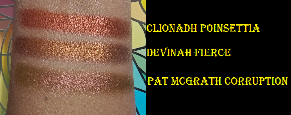
Aquila is another Star Chaser. I was a lot more impressed with this shade. It reminds me of a more sparkly and more blue version of Verte from Clionadh. Fierce is a pressed pigment that may be discontinued as I can no longer find it on the website. It is the perfect copper-red-bronze shade I’ve been wanting!
Grinch and Patina are pressed mattes.
Meraki and Bambi are also pressed mattes.
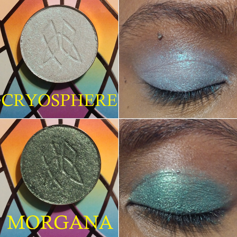
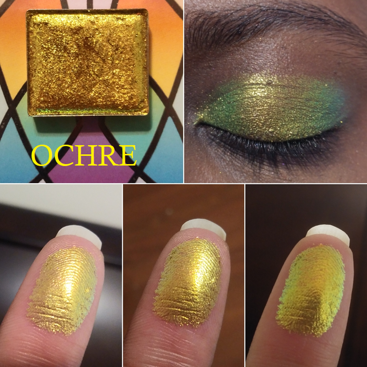
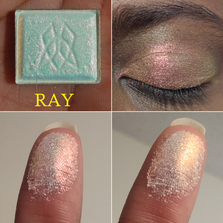
Clionadh Cosmetics
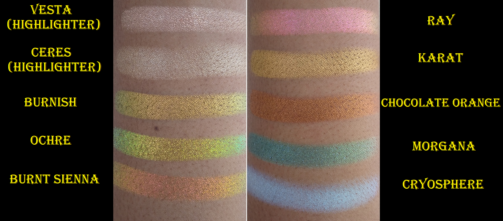
Cryosphere is from the 66.5 N collection. Morgana is from Witchcraft vs Alchemy.
Ochre and BurntSienna are Deep Iridescent Multichromes.
Karat and Chocolate Orange are from the Ultra Metals collection.
Ray is from the Series 2 of Iridescent Multichromes.
Burnish is a Jewelled Multichrome.
Viseart
Viseart had a spring sale, so I purchased directly from their website. It took nearly a month to arrive and one item was declared as sold out a week after I purchased it, so I’m not sure if they were overselling. It’s also a bit strange to me that they had everything available for purchase as single shadows, but after the sale they wiped everything. Muse Beauty Pro is once again the only place to buy Viseart singles as an authorized seller.
In addition to single shadows, I bought the Dark Edit Palette as a replacement for the shadows in my original Dark Mattes palette which were very old and not performing as well. I haven’t worn any of them on my eyes yet.
The last thing I bought was the BoxyCharm x Viseart version of the Neutral Matte palette because despite it not being my kind of color story, I could never shake my desire for this. It came in the old packaging (with the square edges). I had empty Viseart palettes I wasn’t using, so I transferred them into the nicer custom palette with the rounded edges. I cracked most of the shadows in the process, but I was able to save them as seen in the photo below!
Some of the browns look straight up grey, which I was not expecting. This isn’t a case of the shades getting mixed up together either. They just pull very cool and gray on me. I’ve started to appreciate greys a little more, but I don’t think I’ll get as much use out of this than I hoped. At least I can finally stop pining for it! Also, Viseart matte swatches look terrible, but I’ve tried these on the eyes and can confirm they blend far better than they look.
Anyway, those are all the swatches for today! The next post will be Monday as usual!
I’ve never been one to fawn over brands. There are some companies whose products I really like, and I speak about them highly, but when it comes to Clionadh Cosmetics I fully acknowledge I am a Stan.
I respect the company so much because of their amazing customer service, social media presence, and support of customers, creators, and even other indie brands. The biggest reason is of course their phenomenal eyeshadows. Their standard eyeshadow collections are fantastic (and underrated) but their Stained Glass Collection is several tiers above the rest. Other brands can make multichromes and do a decent job, but no one has been able to replicate Clionadh’s “mirror” finish in their Jewelled multichrome formula. Leigh and Maggie have created truly extraordinary eyeshadows.
THE ORDERING PROCESS / DELAYS
When I first heard about Clionadh, they were already popular. It was just a two-person team handmaking everything. The processing time was 20 business days and it was not uncommon having to wait 1-2 months for an order to arrive from Canada where they are based. However, they had a huge boom on January 21st, 2020 with their belated Black Friday sale. They had a new workspace and hired a few employees, but the demand was so massive that things were selling out within minutes. In order to give everyone a fair shot, they turned the Stained Glass collection into a pre-order collection and on February 4th they made preorders available and honored the sale price for the first two days. This is the reason why what once took a few months turned into a 2-5 month wait. In one of their updates they explained, “In total, we received more orders from this single restock than we did the entirety of 2019.”
This process became a lesson in patience for me. For the January 21st restock, I checked out 14 minutes after the launch and received my order on February 18th. For the February 4th Pre-Order launch (planned to ship in April), I was better prepared and checked out two minutes after the launch. However, I combined that order with my later February 25th order. So, my package arrived on July 8th. My March 4th order was also part of the April pre-orders and arrived on August 4th.
The COVID-19 pandemic with social distancing restrictions caused a far greater delay than anyone could have anticipated. This is the reason Clionadh didn’t catch up with everything until November 30th. That included closing their store for a month in order to complete the pending orders, build up inventory to reopen, move to an even larger space, hire additional help, order two custom pressing machines, and transfer their website to a different e-commerce platform. They have since reopened and from December 18th – December 31st, their biggest restock/sale yet has been underway. My intention was to post this before the sale, but my final order did not arrive in time for that to be possible.
Regarding the current sale, they plan to ship the standard orders after the holidays (January 2021) for the current inventory they have in stock. All orders containing a pre-order item will begin shipping in late February. This is a reasonable amount of time considering how long it takes to create new shadows, so it appears they won’t be as backed up in 2021 as they were this year.
This post has been many months in the making. I kept debating whether or not to post considering I still had so many pending orders. Ultimately, I decided to work on this a little at a time, as my orders came in, so I could finally make a giant 2020 Clionadh Collection post all in one!
PRICING
One of my initial deterrents from the brand was the cost of a single eyeshadow. Prior to watching Lauren Mae Beauty’s video, which is when I decided to finally try out the brand during their next sale, I only knew of Clionadh from photos on Instagram. I thought those pictures had been photoshopped or enhanced in some way because I didn’t think eyeshadows could ever look like that in real life. The irony is that they look even more stunning in person! At the time, I didn’t want to spend $25 on a shadow when I’d already been a little disappointed by the $15 multichromes I purchased from Sydney Grace. What I didn’t take into consideration is that the prices listed were in CAD, which is higher than USD. It’s only the most expensive shades, the Jewelled multichromes, which are 25 CAD at full price and $19 USD. Their website now has a conversion changer, which makes things easier to calculate.
Terra Moons Extreme Multichromes are $17, Sydney Grace Pressed Multichromes are $15, and JD Glow Multichromes are $16. Devinah Cosmetics shadows in the Butterfly Kaleidoscope Collection are $10, but the shifts are a lot weaker than the multichromes from the other brands. Devinah now has Aurorae Flares for $16 which are comparable to Clionadh’s Jewelled multichromes. They are the closest in quality that I have seen, though Clionadh’s are still just a touch better in my opinion due to that mirror shine. However, they are nearly identical enough that I would suggest if you live in the US and don’t already have the equivalent Clionadh shades to the Aurorae Flare shadows, you’d be saving $3 per shadow going with the Devinah options.
Clionadh’s prices for multichromes within the Stained Glass collection range from $8-19 USD. The duochromes from their other collections, which still have strong shifts depending on the shades, range from $5-6 USD. Devinah’s Duochromes are $8 with regular shadows as low as $5. Terra Moons’ are $6-13. Lethal Cosmetics Duochromes are $6.50-7. Give Me Glow’s regular shimmers are $7. JDGlow’s regular shimmers are $7.50. So, Clionadh’s eyeshadows are on par or better price-wise than other indie brands. Other brands have more sales though and some are at deeper discounts, so it just depends.
The cost of shipping to the US is around $11 (15 CAD) but it is tracked and insured. My last Terra Moons order cost me $7.29 insured shipping (free if you spend $65). Considering Clionadh is based in another country whereas Terra Moons is based in Tampa about one hour from where I live, I think it’s a pretty good deal. In addition, Clionadh knows that it would be so disappointing to wait months and have anything arrive broken, so they pack them the most securely of any brand. It takes me quite a while to unpack the shadows from all the bubble wrap!
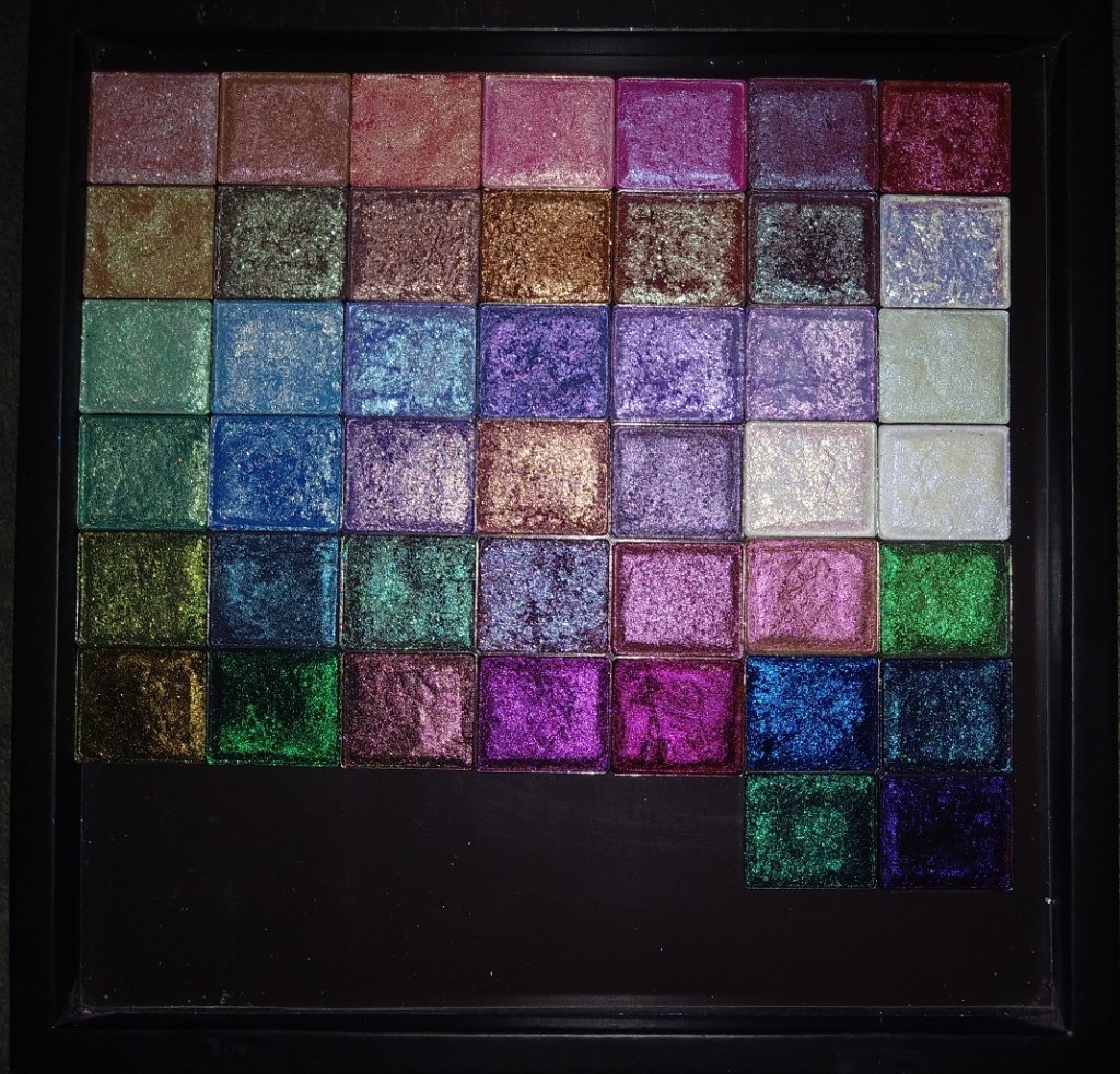
THE STAINED GLASS COLLECTION
I will be categorizing by formula and showcasing eye swatches. Arm swatches and other comparisons will be towards the end of the post. For eye swatches, I used Nyx Glitter Primer on shimmers and MAC Paint Pot for mattes. For arm swatches, I used Nyx Glitter Primer on the Stained Glass Collection and Urban Decay Primer Potion on the standard collection.
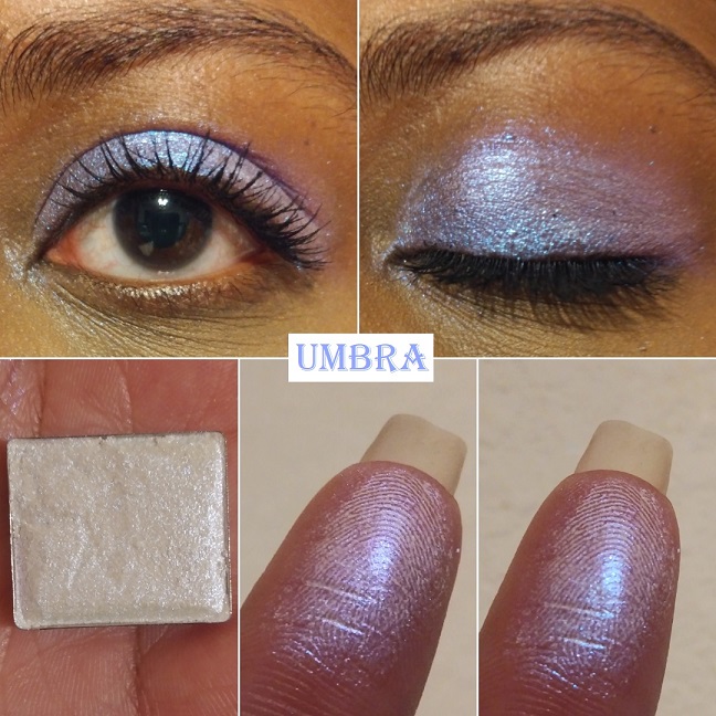
Series 1 Iridescent Multichromes
These appear white in the pan but have color shifts and a transparent base. They are recommended to be used as lid topper shades and highlighters for the eyes and face.
Umbra has “colour shifting reflects that go from blue-indigo-violet-pink.” This is the only one I have in this formula because although this kind of eyeshadow still works for me and is beautiful, it takes a bit of rubbing to make the white part of the powder disappear. It gets messy when I have to rub the shade rather than gently patting it onto my glitter-glue-primed eyes which I use to avoid fallout.
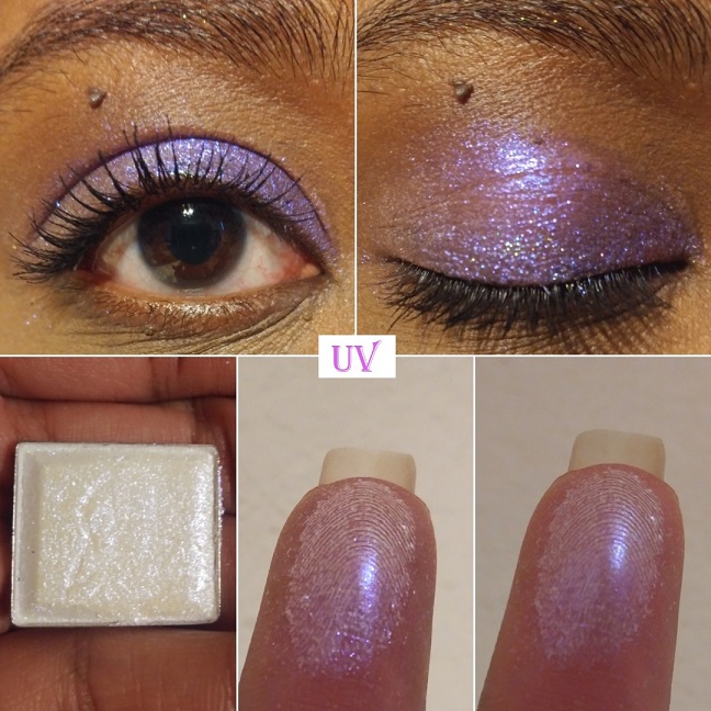
Series 2 Iridescent Multichromes
With Series 2, Clionadh says, “We don’t recommend using these on their own as a shadow because their formula is so thin and slippery, thus it doesn’t have the same adhesion a regular shadow would need on its own. But they certainly are perfect for the inner corner or brow bone.”
Of course, I still put them all over the lid for demonstration purposes. You can see a few sparse areas despite me building up these shades because they aren’t meant to be opaque. I currently have two shades and I was able to buy one more during the sale, which I will review in a future post.
Lux has “colour shifting reflects that go from yellow-lime-turquoise-violet with a slightly more glittery finish.” This shade is so reflective and beautiful that I literally gasped when I first swatched it. My camera doesn’t come close to doing it justice!
UV has “colour shifting reflects that go from violet-peach.” I can’t really see the peach on my skin tone but the shade of purple is beautiful and I’m happy with how it looks. It practically glows!
Overall, Series 1 feels a little more powdery and Series 2 does appear to have a more invisible base. With Series 2, I don’t have the same issue of needing to rub it in for the color to show. The regular application process is enough.
Deep Iridescent Multichromes
The Deep Iridescent Multichromes have a tan base which makes them easier for customers with medium to deep skin tones to wear without a white cast. They still look gorgeous on every skin tone though. I have 2 of 5 shades but I ordered two more during the restock. Clionadh mentioned plans to add new shades to the Stained Glass collection. I’m hoping they will expand the shades in the Deep Iridescent multichrome range, especially if they create a purple to top the ones I have from the Iridescent Series 1 and 2. A girl can dream!
These shadows go on easily and definitely don’t leave a cast. They look glittery but are super smooth in texture. Of all the iridescent formulas, this is my favorite!
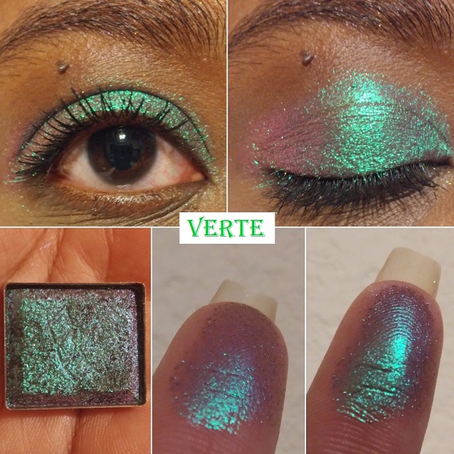
Verte is an “emerald-turquoise-purple-pink shifter with a medium, cool tan base.” This is another shade that made me audibly gasp. It’s one of my favorite shades from Clionadh’s entire collection and just my eyeshadows in general. It completely exceeded my expectations. I have quite a few green to purple shifting shades, but these tones are unlike anything else I’ve seen before!
Vermillion has a “light, warm tan base that shifts pink-orange-gold-lime.” It’s not easy for me to be impressed by pink shades but this one is very pretty. It’s a smoother and shiftier version of Devinah’s Tocana.
Iridescent Glitter Multichromes
The Glitter-Type Iridescent Multichromes aren’t pressed glitters. They have larger particles than most of the other shadows though, so I highly recommend using a glitter primer/glitter glue. Clionadh recommends this as well, along with, “applying them with your finger or a shader brush sprayed with a setting spray. Don’t swipe.”
Gilding “has a translucent base that reflects bright gold-silver-green-turquoise.” The eyeshadows in this line are so incredibly beautiful, but because I prefer smaller sized glitter specks, this is the only one I intend to have in this formula. Also, I love how intense this is, but I wish the silver wasn’t there. On my complexion, the silver looks like unblended white powder in comparison to all the gold.
Glitter Multichromes
The Glitter Multichromes are once again not pressed glitters or plastic-based glitters. Clionadh says, “These have varying levels of opacity in the base colour and varying sizes of glitter particles. They are safe to use on the eyes.”
I have 19 out of the 23 currently in the collection. The missing shades are Corrosion, Ornamental, Kaleidoscope, and Engrave. From pictures alone, those four don’t look the most unique or shifty to me, so I decided not to buy them just for the sake of wanting to complete the set.
Abrasion “has a semi-sheer burgundy base with large glitter particles that shift turquoise-indigo-violet.” The color it looks in the pan is so similar to a multitude of duochromes I’ve seen before, even from mainstream brands, but when it’s actually swatched and put on the eyes, you can see how multi-dimensional it is. It’s so much more special than I thought!
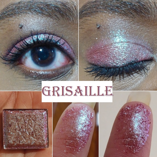
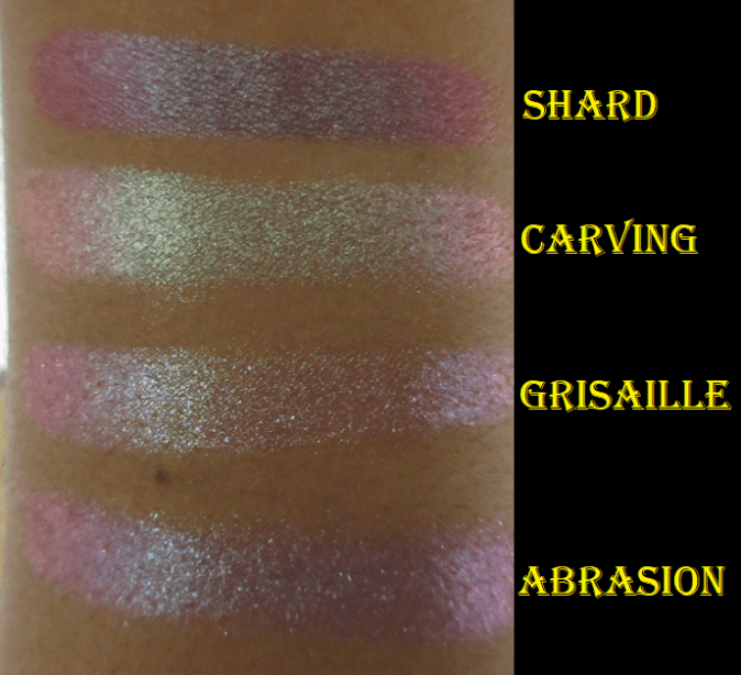
Grisaille “has a semi-pigmented terracotta base with medium glitter particles that shift turquoise-indigo-violet-pink.” This shade looked similar to Abrasion in the pan, but the base color changes the look on the eyes. Abrasion has a stronger turquoise shift whereas the sparkle in this appears more minty green, even though it isn’t described that way on the website. Pavonine from Devinah Cosmetics is a bit similar to this shade.
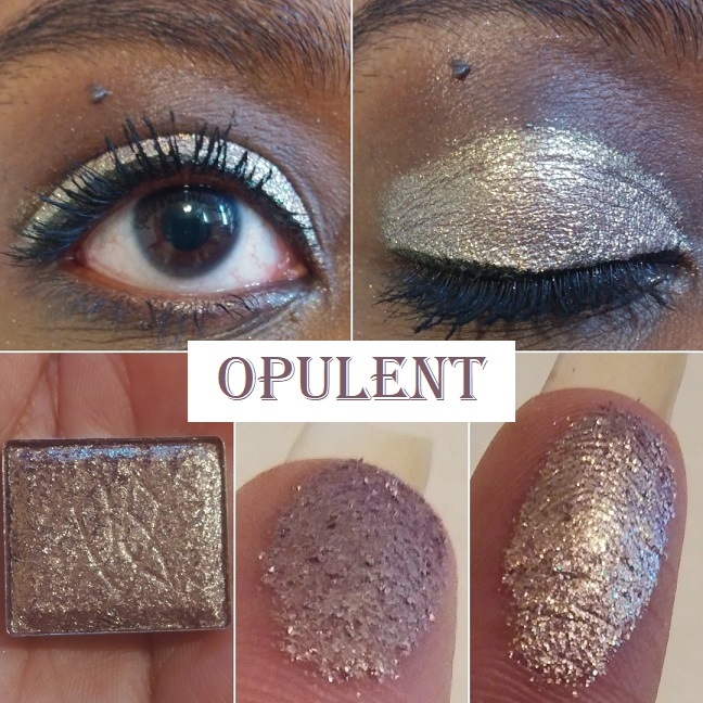
Opulent has “a warm purple-brown base (almost rose gold) with medium glitter particles that shift orange-gold-green-turquoise.” Certain shades don’t shift the way it is described, and I thought it might be due to my darkly pigmented eyelids, but I couldn’t see the other colors on my finger either. When I wear this one, it shifts from dark rose gold to a lighter and brighter gold, but that’s about all I can see. Perhaps the others show in different lighting. As it stands, the tone still makes it unique when seen in person.
Enamel “has a semi-sheer lavender base with small glitter particles that shift blue-violet-pink.” This shade is gorgeous! I absolutely love the color, but I’ve discovered that thinking a color is beautiful doesn’t mean I’ll love how it looks on me. For my comfort zone, this one is a little too pastel-bright to be used all over the lid. However, when this is patted on top of other eyeshadows in strategic places, I absolutely love how it looks! If Clionadh makes a shade in 2021 that has a deeper purple base (similar to Stencil) with a blue-violet-lavender shift I would be all over it!
Chandelier has “a sheer pale mustard yellow base with small glitter particles that shift turquoise-indigo-violet-pink.” This shade surprised me. I typically don’t like shadows this light, but the shifts make this so wearable and flattering. It’s such a unique take on what could have been a typical goldish green, especially with how it looks so intensely turquoise at night. This is one of my favorites to wear alone or combined with other eye looks to give it extra oomph.
Glazed “Has a sheer lilac base with large glitter particles that shift pink-orange-gold.” I’ve learned that lighter purples are not my favorite and this pulls very white-gold/baby pink on me, which I also don’t like. Combine this with the larger glitter particles, and therefore added mess risk factor, and it becomes clear that this shade isn’t for me. Objectively speaking, it’s a pretty color though. On my eyelid, in this photo, it looks more strongly pink. At night, when the lighting shifts, the lilac is a bit more apparent and looks like the color on my finger.
Sunbeam “has a sheer pink base with small/medium glitter particles that shift pale gold-lime-turquoise.” I have a few pink shadows with gold shimmer in my collection that I think are actually quite pretty: Pinkleberry from Coloured Raine, Meadowhawk and Golden Rose from Sydney Grace, and Empress from Devinah. This shade is more like Devinah’s Pixy Stix Xploder where it looks pink on my finger and in swatches, but on my dark eyelids, it looks incredibly light in a way I couldn’t have predicted. I have an easier time seeing the gold lime and turquoise at night when the lighting is different.
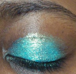
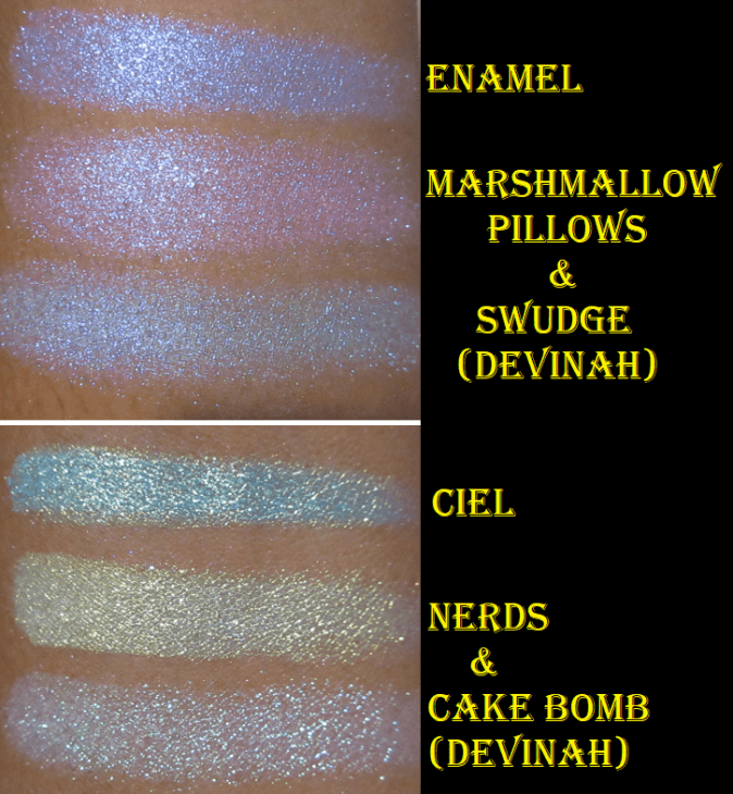
Ciel “has a semi-pigmented sky blue base with large glitter particles that shift gold-green-blue.” Ciel and Ripple aren’t typically the kind of blues that I like, but I thought if anyone could make me like this kind of color it would be Clionadh. Although it isn’t my favorite, I still use it from time to time. In the daytime, the lighter sky blue is more visible whereas, at night, it looks closer to the pan color.
Ripple has “a sheer aqua-green base with large glitter particles that shift turquoise-indigo-violet.” This shade looks similar to Ciel overall, but the shifts are different. It’s not easy for me to detect that shift in person or in photos though. I’ve noticed that quite a lot of the lighter shades look deeper at night, but with this one there wasn’t much of a difference. At sharp angles, I can see the violet, but it’s still just not easy for me to see.
Carving “has a sheer, grungy, light brown base with medium/large glitter particles that shift turquoise-indigo-violet-pink.” I still haven’t decided if I like this shade or not. I’ve only worn it twice, so perhaps I’ll have a stronger opinion once I’ve worn it more. The pinkish turquoise gives it an interesting twist and I don’t recall having anything quite like it in my collection, though it gives me similar vibes to Grisaille and Abrasion.
Stencil “has a semi-pigmented deep blue base with medium glitter particles that shift violet-pink-orange-gold.” I have purple-pink eyeshadows but nothing with this exact tone. Wow! It is so beautiful. If you’re a purple lover, this is an absolute must-have!
Tracery “has a semi-pigmented purple base with large glitter particles that shift indigo-pink-orange.” The purple and pink in this shade are close in tone, so the shift isn’t as apparent in person or on camera. I can see the variances between the indigo and pink, but I’ve yet to see orange.
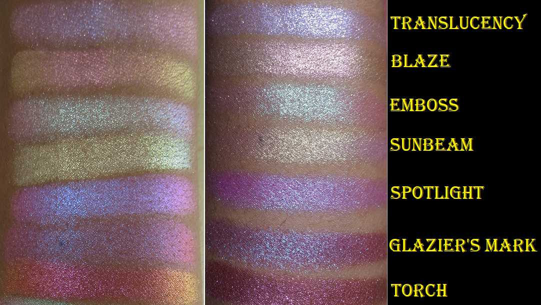
Spotlight “has a semi-sheer hot pink base with medium/large glitter particles that shift blue-indigo-pink.” I didn’t buy this shade based on the color in the pan. It was entirely based on how it looked in swatches where the hot pink takes on more of a purple tone. It still isn’t as purple as I had expected it to turn but, it’s an interesting shade. It’s not my favorite but I don’t hate it.
Translucency “has a sheer baby pink base with small glitter particles that shift blue-indigo-violet-pink, and tiny gold sparkles.” The way it looks in the daytime isn’t my kind of color, but how it looks at night is beautiful to me. It’s the kind of shade I prefer to use as a topper and not as a one-and-done eyeshadow.
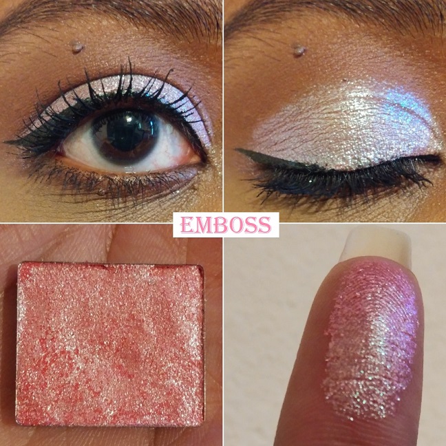
Emboss “has a semi-pigmented salmon base with small/medium glitter particles that shift lime-turquoise-blue.” On my eyelids, this looks a bit similar to how Carving and Sunbeam looked in regular daylight lighting. At night, I have an easier time seeing the lime and turquoise. I think I prefer Carving over Emboss, but I like Emboss more than Sunbeam.
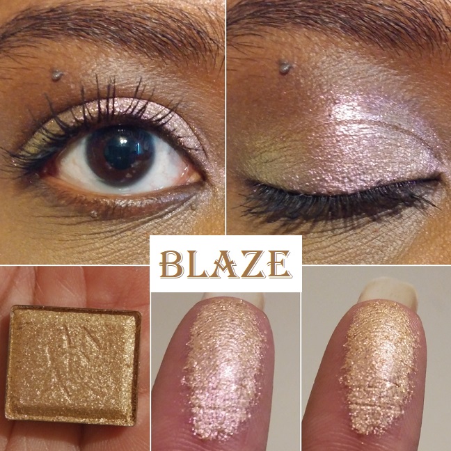
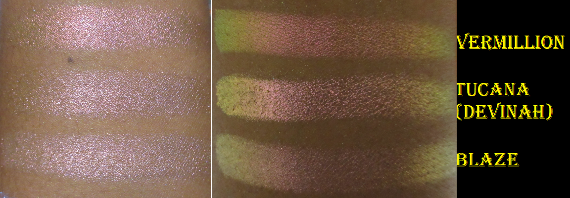
Blaze has “a sheer orange base with medium glitter particles that shift peach-gold-lime.” Blaze reminds me of Vermillion but with a less noticeable shift due to the peach, gold, and lime being all light tones and therefore harder to see without as much contrast in color. This is close to Devinah’s Tocana shade.
Torch has “a pigmented copper base with medium glitter particles that shift red-orange-gold.” This is very pretty but very hard to see a shift with indoor lighting. While outdoors, it was very easy to see orange and gold. This shade is like a toned-down version of Kiln.
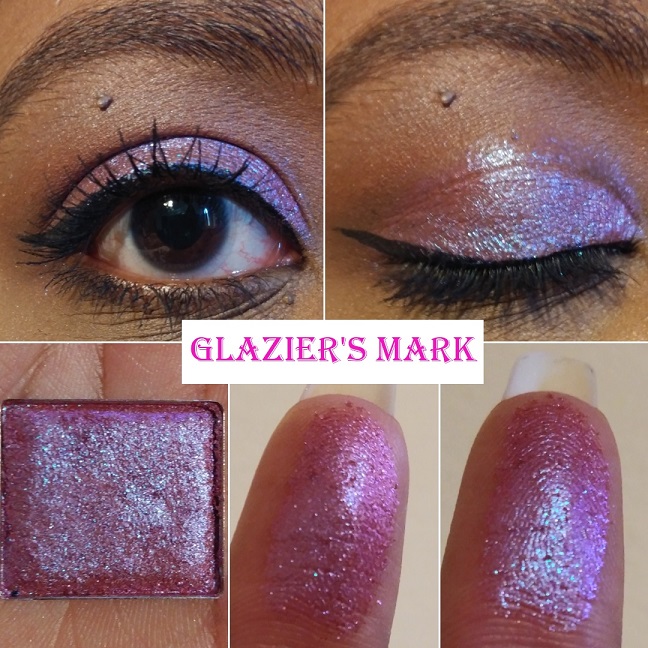
Glazier’s Mark “has a sheer orange base with medium glitter particles that shift indigo-violet-pink-orange.” My brain keeps saying I’ve seen shadows like this before, but everything I’ve tried to compare this to isn’t similar enough. On Temptalia’s blog, Enigma from Lethal Cosmetics and Magenta Dreams from Sydney Grace are some cited dupes that I also thought about based on the color in the pan. The way they look on my eyelids is where the biggest differences between them are seen and why I don’t think I have a close enough dupe. I think the choice to use an orange base, yet maintaining the magenta look, is what makes it a bit more unique.
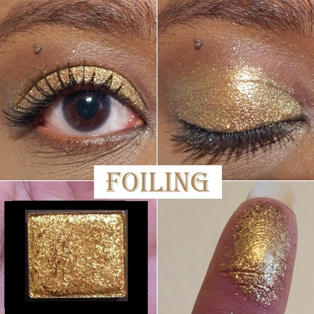
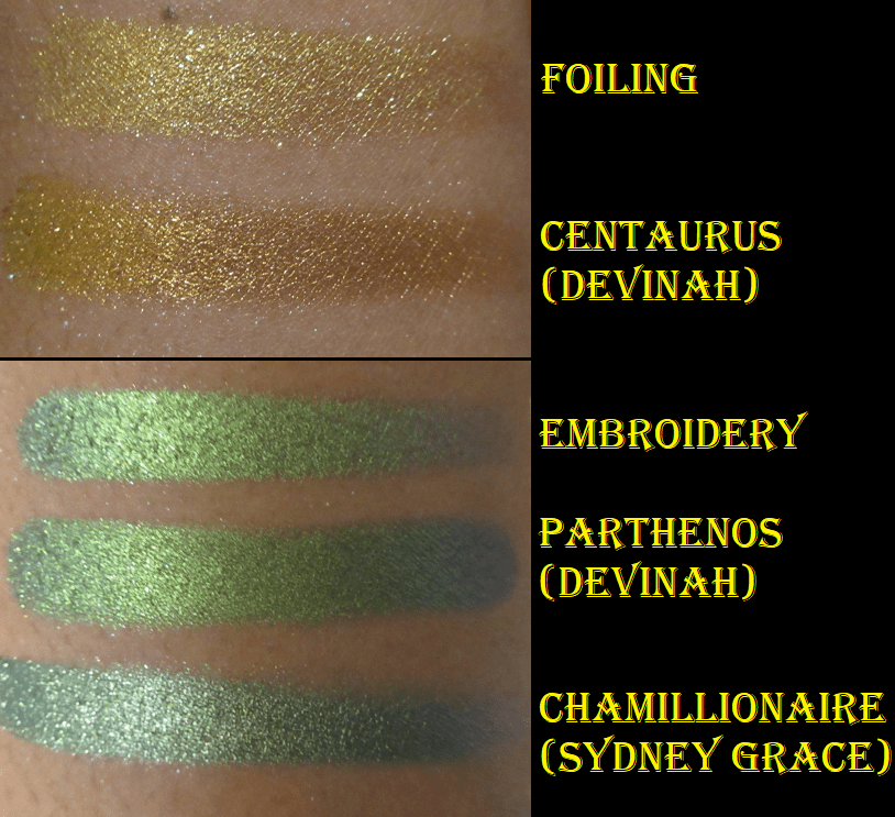
Foiling “has a pigmented warm gold base with medium/large glitter particles that shift orange-gold-lime.” This doesn’t show a shift easily. While outdoors, I can see the orange and gold, but still not the lime. I’m happy to have this because the glitter intensity and level of warmth in this gold shadow still make it stand out in my collection.
Hybrid Multichromes
The Hybrid Multichromes are supposed to be the middle ground between the Jewelled and Glitter Multichromes as they “behave more like the small/medium particle glitters, but with the tones of the Jewelled Multichromes.” They can be applied sheer for a wash of color or packed on for full opacity.
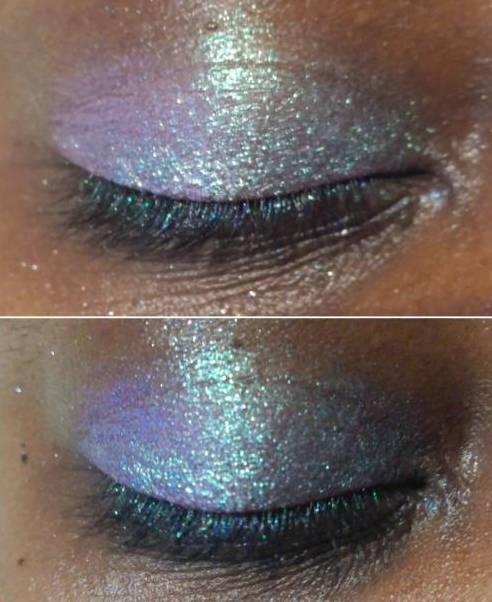
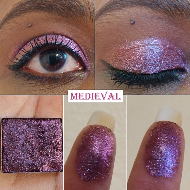
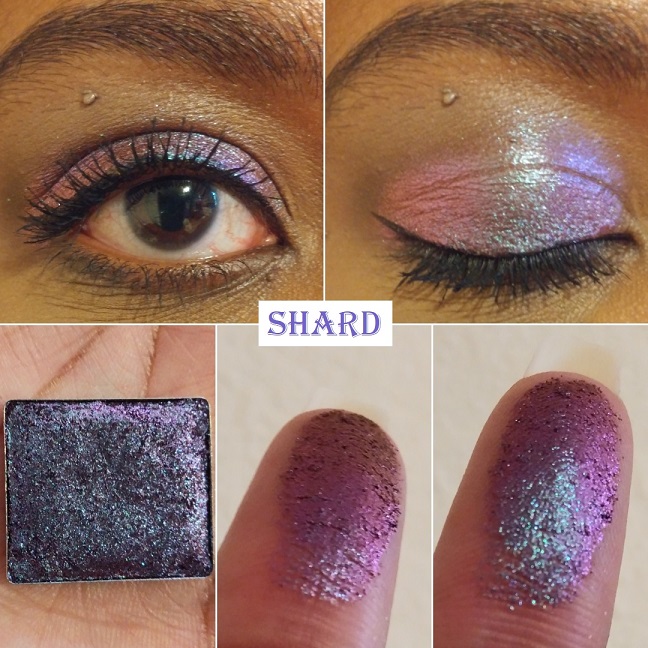
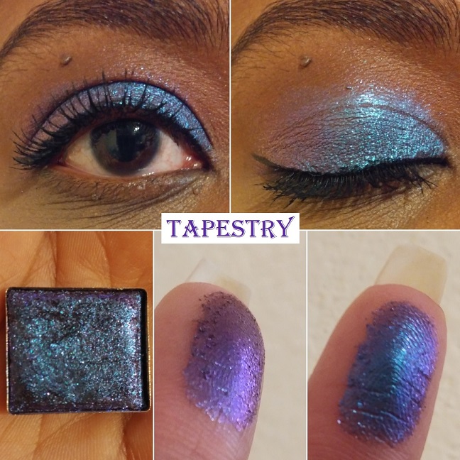
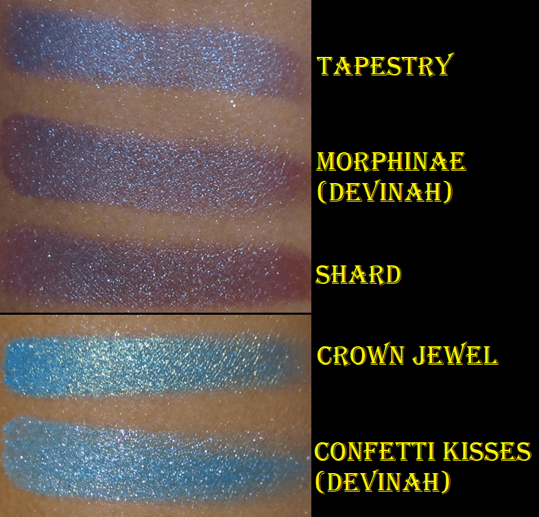
Because these are intended to be similar to my two favorite formulas in the Stained Glass collection, I had high expectations. I thought the shifts would be even stronger than the Glitter formula or essentially Jewelled shades without the black base. Shard, Embroidery, and Rose Line have lived up to that assumption but Medieval and Tapestry need particular lighting and a wet base to stand out like the others. It’s confusing because sometimes I wear those two and I’m amazed by their beauty but other times (again, due to lighting) they look dull and not as shifty.
I like that this collection has smaller particles and the fact that they still have visible shifts. I have five of the eight shades in this formula and while I’m constantly tempted to complete the collection, I keep thinking about my mixed feelings over Medieval and Tapestry, so it holds me back.
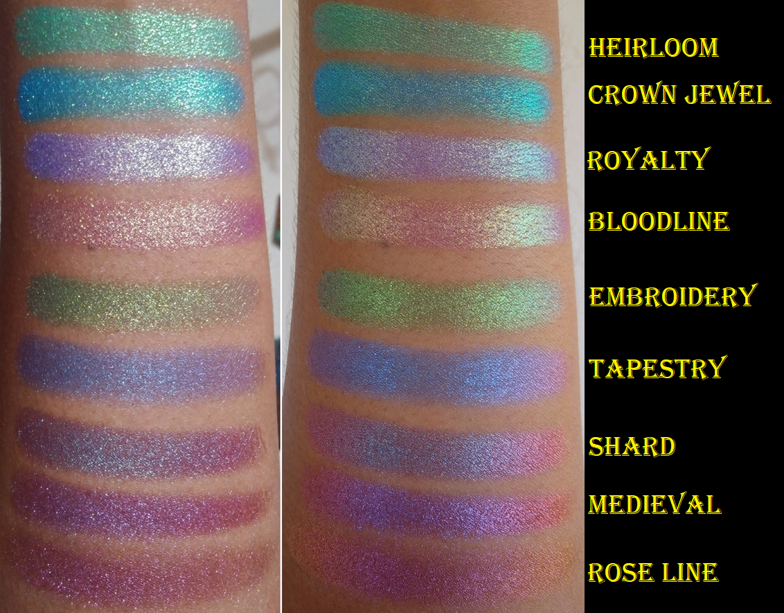
Medieval “has a warm brown base with medium glitter particles that shift indigo-violet-red-orange.” While Glitter Glue isn’t a necessity, I feel that it takes a tacky wet base to have a better shot at seeing all the color-shifting nuances in this shade. I like Abrasion more than Medieval, and that one is less expensive. This is still pretty. I just expected more from it.
Embroidery “has a grey base with small/medium glitter particles that shift lime-blue-purple. The shift is very clear to see on my finger. On my eyes, it’s just a hint, but it’s such a beautiful color that I don’t mind. You can see just a tinge of blue on the outer corner of my eye in the lid picture.
Shard “has a brown base with small/medium glitter particles that shift turquoise-indigo-violet-red.” Look how gorgeous it is on my finger! In some lighting this reminds me of Abrasion and in some lighting, it reminds me of Grisaille. This makes it different and interesting enough that I would probably still buy it if I knew at the time of purchase what I know now.
Tapestry “has a grey base with small glitter particles that shift blue-indigo-violet.” Like Medieval, I only like how this looks when applied wet and on a sticky base. It’s a pretty shadow, especially if you like blues with a tinge of purple, as opposed to purples with a tinge of blue. I am admittedly the latter.
Rose Line “has a brown base with medium glitter particles that shift rose-orange-yellow.” The rose and orange tones are very easy to see. I haven’t been able to see the yellow on my finger, but it’s faintly visible in the outer corner of my eye. Even with just the rose and orange, I’m happy with how it looks.
Jewelled Multichromes
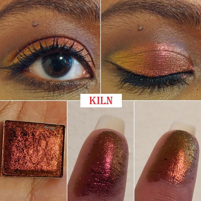
These are the crown jewels of Clionadh’s collections and of the Stained Glass formula. They state, “The Jewelled Multichromes are finely milled, ultra rich pigments. They have a black base and intense colour shifting reflects. They’re packed with a high pigment concentration, so the end result is a saturated, vibrantly shifting shadow.” This is the bar which all other multichromes are compared to for me. They have yet to be surpassed and I have nicknamed them the Rolls Royces of eyeshadows!
I have 9 out of 20. Aside from buying some for my sister, I may get 1 or 2 more in the future. The oranges and yellows are where I have gaps in my Clionadh collection.
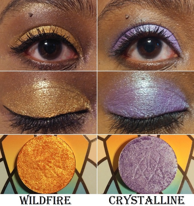
Gothic “shifts violet-pink-red-orange-gold.” This shade reminds me of an oil slick. It’s a beautiful warm purple and the shifts are very apparent in person. This isn’t a unique shade among multichromes, but from my research, this seems to be the best version of this color combo that anyone can buy.
Smoulder “shifts magenta-orange-gold-lime.” The magenta dominates this shade. I found it interesting that I could see the lime and orange on my eye, but I couldn’t capture the lime shade on my finger. The magenta, orange, and gold are very easy to see. It reminds me of Pat Mcgrath’s Sextraterrestrial shade, but replacing the magenta with pink. I’ve heard Forge is a closer dupe to Sextraterrestrial, which is why I didn’t buy Forge. Devinah’s Australis shade is very close to this.
Kiln “shifts red-orange-gold.” Green and purple have always been my favorite eyeshadow colors, so you can imagine my surprise that this shade became my most used shadow from the Jewelled formula. It reminds me of sunsets; which yellow, orange, and red tend to be one of my go-to color combos. This also reminds me of Autumn and beautiful changing leaf colors. The leaves stay green in Florida, so I’ve always been a little fascinated by that process in other parts of the world.
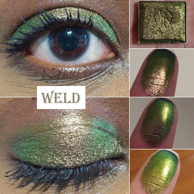
Weld “shifts grungy rose pink-antique gold-lime-teal-navy.” I bought this shadow specifically as a more neutral-leaning shade. I thought it would be cool to have that antique gold, which would look like a brown and blend in with my skin, which could also shift in different lighting to show an intense lime. When I wore this, I could see a little pink mixing in with the antique gold in the center of my lid, which again gave me Sextraterrestrial vibes, but it wasn’t strong enough for me to capture in the pictures.
Patina “shifts gold-lime-emerald-turquoise.” There is no doubt that this green is striking. In fact, it’s a little intimidating. I still have yet to use Patina to its full potential because I’ve been drawn to the other greens in this collection. I would say that simple eye looks are better with intensely shifting multichromes because nothing should detract from the beauty of each shade on its own. However, I want to reserve Patina as the surprise pop to a look; to elevate a look that might be otherwise boring.
Oculus “shifts turquoise-blue-violet-pink-red-orange-gold.” I can see why this is one of the most popular shades in the Stained Glass collection. It’s one of the most shifty shades of all of them and I could easily see all the colors described on the website!
Crown Glass “shifts teal-indigo-pink-red-orange-gold.” This shade and Oculus are very similar in their shifts, but I just could not decide between them. I chose Crown Glass first, but since I wasn’t totally satisfied and kept thinking about Oculus I decided to get that one as well. I thought this would be my favorite of the two because it leans more purple, however, with Oculus I still get purple and I think I favor the turquoise in that one over the teal in Crown Glass. I recommend getting at least one of the two because they are such standout shades in the collection.
Rosette “shifts indigo-violet-red-orange-gold.” I almost skipped out on getting this shade because I thought I had too many purples and didn’t want to get another one too similar to the others, but this is my favorite purple-dominating shade of them all! It’s what I wanted from the shade Spire, but with more shifts and leaning more purple than blue. I love it!
Spire “shifts royal blue-violet-red-orange.” This is actually the first Jewelled multichrome I purchased from Clionadh. Although the purple and blue are so close as to make the shift harder to see, I could still see the potential this collection had. I figured if I was pleased with this less obvious shifting shade, I would definitely love the others. This is great for dark dramatic looks, which I don’t do often, but it’s nice to have it available to me.
Pastel Multichromes
These “have a soft, sheer, grungy, grey base with bright, metallic coloured reflects.” They are a less intense version of the Jewelled multichromes. I like intense eyeshadows, so I honestly just bought one of the four in order to try out the formula in person to see what it was like for myself.
Turret has a “neutral grey base that shifts lilac-pink-orange-gold.” If I hadn’t read the description, I would have never known this was a multichrome. When I study the shade very hard, I can see a bit of a pink hue in the lilac, but the lilac color dominates. Despite this not being a favorite of mine, it still made me curious about the other pastel shades. However, I don’t see myself buying them when I know they aren’t intended to make a statement.
Vibrant Multichromes
Clionadh describes these best: “They behave more like the small/medium particle Glitter Multichromes. They have intense colour shifting reflects and colourful, saturated bases.“
These are extremely sparkly and glittery, even more than the glitter multichromes, despite these having just as small of glitter particles as them.
I have half of the collection, but I think that’s where I will stop. If I get another vibrant multichrome in the future, it would be Majesty.
Bloodline “has a burgundy-berry base that shifts gold-green-turquoise-blue-purple.” This is definitely my most used shade of the Vibrant multichromes, and among the top most used of the Stained Glass collection. In February’s preorder sale, this was the second shade to sell out. It’s definitely one of the favorites. The berry tones don’t show on me as much as I expected, but I still love this shade so much. When I’m looking to add a little more red/warmth, I pat a little bit of Kiln on top and it gives me exactly what I am looking for!
I have an example of this from a photo I uploaded to Instagram as seen above. Perhaps in the future I will make another blog post or a series of photos on Instagram showing new shades that can be created when combining two Stained Glass shadows together.
Royalty “has a grape purple base that shifts pink-gold-green-turquoise-blue-purple.” I wish the way it looked on my finger was how it looked on my eyelids. It’s more of a cool purple-blue than the vivid purple I had hoped for. However, this is a beloved shade and it was the first to sell out during the initial round of preorders. I may be able to create the shade I envisioned by patting one of the Stained Glass purples or blues on top, like Crown Glass. During the current sale that started December 18th, Clionadh released a very similar shade to this called Regal which has a blue base.
Crown Jewel “has a bright blue base that shifts gold-turquoise-blue.” It’s gorgeous and serves as another example of an eyeshadow shade I don’t wear but bought anyway purely because I couldn’t resist that stunning blue hue!
Heirloom “has a teal green base that shifts gold-green-turquoise.” Green and gold is a classic combo, but the base color is what gives this shade a unique twist. It’s such a fascinating shade that I don’t utilize enough.
CLIONADH’S OTHER EYESHADOW COLLECTIONS
Before we get into the shades from the different collections, I wanted to mention the Koala Charity eyeshadows that Clionadh said, “100% of the proceeds will be donated. This time to Wires Wildlife Rescue & Wildlife Victoria Emergency Funds, which benefit the wildlife affected by the Australian bushfires.” They kept their word, and although these shadows are no longer available, Clionadh plans to have another charity to support in 2021.
What I also needed to say about the standard eyeshadows is that the mattes are incredibly fragile! One arrived partially broken and one arrived with cracks, two broke when I accidentally dropped my palette (those are on me), but the last one literally shattered apart when I was placing the shadow into my magnetic palette. The draw of the magnet on the pan was so strong it slipped from my fingers a touch too high and that did it. So, please use the absolute most caution when handling the mattes. Clionadh mentioned at one point debating whether or not to continue imprinting their logo into some of the shadows for fear it would make some of them more fragile and they ultimately decided to just skip imprinting the delicate ones. The nice thing about the mattes is they do press back easily and perfectly using the dry pressing method. The quality of them is really nice. Just use care. If your shadows break in transit, they will replace them for you, but I haven’t gone through that process myself. Considering how busy they are and the shipping cost, I didn’t want to give them the trouble, especially now that I know how to fix them to look brand new.
Lastly, Clionadh updated their Witchcraft vs Alchemy Bundle (the duochrome collection) to include all the shades in the range. The largest one used to be missing a few shades and some shadows in the collection weren’t part of the main bundle or the “Additional Shadows Bundle.” Now you can get all 26 in one bundle. I also saw an option to create your own custom bundle of 6, but it was taken down before the sale.
Prophecy – from Team Witchcraft. This is the pinkish gold type of shade I always want, but when some brands make this kind of color, it looks more white than pink on my lids. This one is the same as the pan color, which makes me very happy.
Panacea – from Team Alchemy. It’s a vibrant beautiful “grape purple with pink reflect” that I recommend to any purple shadow lover.
Wildfire – from the Woodlands collection. This is a very sparkly shade that gets most of the intensity from the gold glitter, though I was hoping more of that deep fiery orange base would look stronger on my eyelid. When my next order arrives, I could try putting Burnt Sienna on top to see if it will give me the intensity level I envisioned.
Crystalline – from Team Witchcraft. I normally wouldn’t be interested in this light of a purple shade, but the duochrome aspect made it so much more intriguing of an eyeshadow. The reflect color is lime green but on my lids, I thought it looked aqua.
Beehive – from the Woodlands collection. This is one of the prettiest yellow-orange shades in my collection.
Poison Ivy – also from the Woodlands collection. This color reminds me of the mossy green shade called Habitat from Lethal Cosmetics.
Hex – from the Dreamweaver collection and Team Witchcraft. It’s a beautiful, “mid-toned purple base with a gold reflect.” Hex is lighter and cooler toned than I expected based on swatch photos I saw around social media. It’s not my favorite on me, but the color in the pan is true to what you get on the eyelid.
Calx – from Team Alchemy. Based on swatches, I thought the blue would be at least a deep mid-tone, but the description as a cornflower blue is accurate. Although the reflect is pink, the glitter color over the blue makes it look a little more on the purple side, which I like.
Rune – from the Harvest Moon Shadows and Team Alchemy. It is described as, “a grungy base with a gold-green reflect. This shade pulls more moss green on the eye.” It is so beautiful! I love green-gold, olive-gold, and antique gold type of shades, so this is perfect for me.
Bon-Bon – from the Dreamweaver Collection. This is a stunning color that’s as vibrant on the lids as it is in the pan! Clionadh describes this shade as, “a rich berry metallic with a cool purple reflect,” which surprised me because the base color is so intense that I didn’t notice the reflect on the eyes. The shimmer is so fine that the particles are undetectable, but it’s visible when the light hits it.
Charmed – also from the Dreamweaver Collection. I bought this shade during a time when I was really into using peachy pink and blushy medium pink shades in my crease for my pink and purple eye looks. Although my obsession with that combo has nearly passed, I still use this shade quite a bit.
Wildberry – from the Woodlands Collection. I tend to pair with this Charmed to slightly deepen up the outer corner when I don’t want to go for full smoky look. It looks like a mauve-purple in the pan but it shows up dark pink on the eye.
Sky Lights – from the 66.5° N Collection. This is “a shimmery shadow with a royal purple base and purple, blue and pink sparkle.” This was part of my first Clionadh order and it’s one of my favorites from the brand. The multicolored sparkle in person is even prettier than my picture shows.
Nocturnal – from Team Witchcraft. This “indigo base with a blue reflect” was also part of my first order. I love bluish-purple eyeshadows but the tones of this seem special. I love vibrant blues and there is nothing subtle about this one!
Forest Heart – from the Woodlands Collection. It’s described as a metallic teal-green and I always thought it had a bit of a blue tinge, but it just looks like a medium-deep green on my eyelids. Sky Lights, Nocturnal, and Forest Heart remain my top three favorites out of the standard eyeshadows. It’s very easy to overlook the “regular” shadows when you have the Stained Glass collection available, so if it wasn’t for these three shades blowing me away, I wouldn’t have continued purchasing from the standard eyeshadow collections.
Ursa – from the 66.5° N Collection. This is a “blackened-blue shadow with a blue reflect and gold sparkle.” It’s not as dark on my lids as it looks in the pan, which makes me happy. I like the tone of it on me. The sparkles get a bit lost though and although I can see that lighter blue reflect, it didn’t wow me like some of the other shades. However, Clionadh set a huge bar for themselves and though I wasn’t as impressed, it’s still a beautiful shade.
Bramble – from the Woodlands Collection. This is a light yellow-green shade. For some reason, on my camera it comes off looking way more yellow than green. I can confirm that in person it does look more green, but still with a strong yellow tone to it. This is one of the few shadows I wouldn’t miss if it was removed from my collection (based on the color, not performance).
Koala – from the Koala Trio. It’s a charcoal grayish black color, which is typically a shade I don’t like, but my goodness this is amazing! It would be great if Clionadh brought this shade back to be sold individually and not have to be tied to the charity aspect. This is such a perfect shade for creating a smoky eye that isn’t too intense and dramatic, though I’m into that kind of look as well. This pairs so nicely with all the other Clionadh shadows, and for a few weeks straight I used this shade exclusively to deepen up all my eyeshadow looks when using other brands’ eyeshadows too!
Gum Tree – from the Koala Trio. I definitely don’t have another eyeshadow like this in my collection. It’s like a gunmetal or antique pewter with a bronze-red reflect. It is so beautiful and such a shame it’s discontinued.
Eucalyptus – the last shade from the Koala Trio. It looks just white on my eyelid, but when applied sheer, like a topper, it’s an iridescent shade with red, gold, and a little bit of green reflect. It’s a fun and unique color that amps up any eye look when patted on top.
Fog – from Team Witchcraft. I’ve mentioned before that light colors aren’t my favorite, but this blue has enough warmth from the sparkle that I think it looks so pretty! It’s described as, “a dusty, teal base that shifts golden-peach.” It instantly reminded me of the shade Narrow Path from Sydney Grace. They have the same base color but that gold glitter makes me like Fog more than Narrow Path.
Crucible – from Team Alchemy. It’s a deep purple with a subtle “purple shift and gold sparkle.” Sky Lights is my perfect purple, so it’s harder for me to get excited about this shade by comparison. That being said, Crucible is so beautiful that it still deserves appreciation. It’s a great color to use for a purple smoky eye.
Honeycrisp – from the Harvest Moon Collection. Something about this shade was so alluring to me, particularly around the time I bought it. I was still going through my phase of searching for a golden pink. Honeycrisp is described as, “a coral pink satin with a pearly reflect.” Sydney Grace has a lot of shades along this same vein like Meadowhawk and Golden Strawberry. Even Salamander looks similar, like a slightly more orange toned version, especially in the photo above where I combined Salamander with Eucalyptus. This doesn’t take away from the fact that this is a gorgeous shade and despite having similar colors, I’m still glad I have it.
Salamander – from Team Witchcraft. This is described as, “a coral base with a gold reflect,” which accounts for the similarities between this shade and Honeycrisp. It’s like a fiery golden tangerine. I really like it.
Gecko’s Tail – from Team Alchemy. This shade has an “apple green base with gold reflect.” It’s a lighter tone than a typical Granny Smith Apple shade. I think I would have liked it more if it was a touch deeper, but it’s a fun color.
Clairvoyance – from Team Witchcraft. I didn’t expect to like this color, but I couldn’t resist buying it anyway. It’s “a turquoise base with a light green reflect.” It reminds me of Blitz Aquamarine from Pat Mcgrath, but the green reflect is a different twist.
Amulet – from Team Witchcraft. This is a “a bright fuchsia that shifts blue.” This is a very popular type of duochrome shade. The base color is similar to Bon-Bon but Bon Bon is much deeper.
Merlot – This is a metallic plum shade from the Ultra Metals Collection. It looked a little grey in some of the swatches I saw online, so I was much happier with the actual color. It looks very rich in person. It also looks like a regular shimmer or satin shade when applied dry. With a wet brush, this shade looks much more metallic and pretty. This is currently the only shade I have from the Ultra Metals because I was using this shade as a tester before I considered buying more.
Honeycomb – from the Woodlands Collection. As, “a warm beige metallic with gold sparkle,” I bought this shade to use specifically as an intense inner corner highlight.
Dahlia – from the Woodlands Collection. It’s “a light peach-gold duochrome” that I thought would look a little more different on me than Honeycomb. Between the two, I think I like this shade slightly better for all over the lid because of the pinkish shift. As an inner corner shade, I would prefer a more neutral color like Honeycomb.
Hunter – from the Woodlands Collection. Hunter is described as a metallic mulberry. The base color is a dark purple but the lighter shimmer prevents it from being a traditional dark purple. It’s like a silvery purple mauve.
Permafrost – from the 66.5° N Collection. It resembles Hunter on the eye, when looking straightforward, because of the grey tone. However, this shade has a noticeable pink shift in person that gives it a grey pinkish purple look.
Tree Line – from the 66.5° N Collection. This “sage green metallic” shade looks a bit more blue-tinged on my eyes, though I was expecting a brownish-green. I still like it.
Alpine – from the 66.5° N Collection. This is, “a rich, blue-toned metallic green,” as opposed to the teal-green shade in Forest Heart. This shade is a lot brighter. It’s like a deeper toned version of The Shallows from Sydney Grace.
Necromancer – from Team Alchemy. It has a “blackened-blue base with a teal reflect and silver sparkle” that looks similar to Ursa in the pan, but the teal reflect makes it look brighter and more vibrant than Ursa.
STAINED GLASS SWATCHES
On Instagram, I have videos of the Stained Glass swatches in this post. You just need to scroll sideways to see more.
STANDARD COLLECTION SWATCHES
EYESHADOW SHADE COMPARISONS
The hardest parts about comparing multichromes are that the shades in the pans don’t necessarily correlate to how they will look on the eyes, especially depending on the lighting. Sometimes they look similar based on one shift at one angle, or in the dark, or in bright light, or in the pan, or the types of colors that they shift to. Sometimes it’s only the base color that is similar.
I tested out many more comparisons that didn’t make it into this post for the reasons above. Some of the dissimilar ones I kept in order to demonstrate how similar pan shades can differ from the swatch.
The duochromes were easier to find comparisons with other brands, but the level of glitter/sparkle in Clionadh’s shadows tend to be so intense that they ended up not looking the same, despite having similar base colors.
TOP RECOMMENDED SHADES AND EXTRA EYE LOOKS
If I had to pick my personal favorite shades they would be Lux, Verte, Abrasion, Stencil, Enamel, Chandelier, Embroidery, Shard, Kiln, either Crown Glass or Oculus, Rosette, Bloodline, Sky Lights, Nocturnal, and Forest Heart.
When it comes to this brand, there really aren’t duds in terms of quality. It’s just a matter of personal preference like colors and particle sizes. I’ve been able to create some gorgeous looks even using shades that aren’t my favorites.
Just one shimmer shade or multichrome patted on top of an existing look can really change the outcome.
My camera always picks up the green hue in Weld even though, in person, the whole lid looks like the antique pink in the center. That’s what gave me the idea to use a different shadow to tone down the green in the photo below.
That’s everything! I know this was another incredibly long post, but I wanted to be thorough.