“At some point in the future, I plan on doing a follow-up post featuring any additional shades I purchased, along with the closest shade comparisons to multichromes among Clionadh and from other brands, and examples of how I’ve worked each shadow into completed eye looks.”
That was my intention after my first Expansion post, but since many things happened between now and then (such as Hurricane Ian, having spinal fusion surgery, and being overseas for a few more weeks) I decided I’ll show the various photos, eye looks, and swatches that I currently have. It was getting confusing keeping track of my files on three different devices dated weeks and months apart. In my next Clionadh update post, I will have those comparisons plus missing eye and arm swatches and completed eye looks.
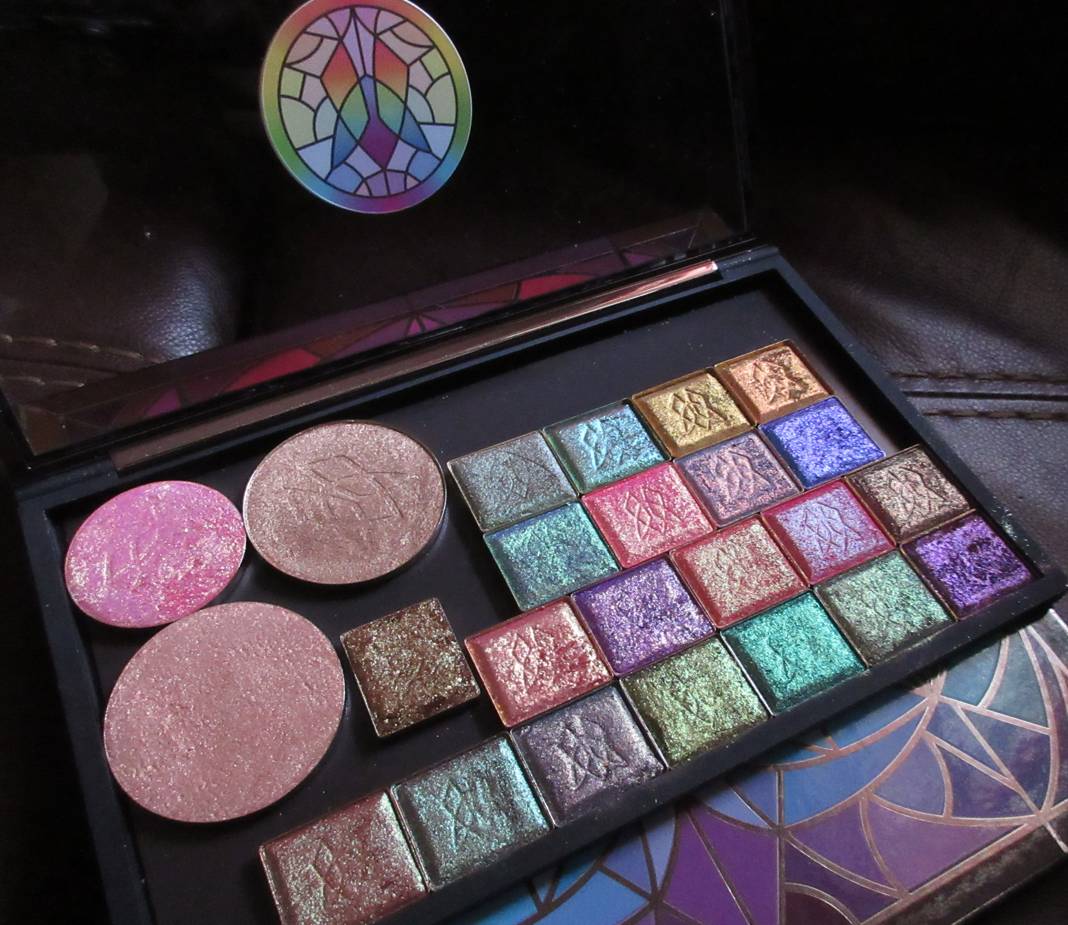
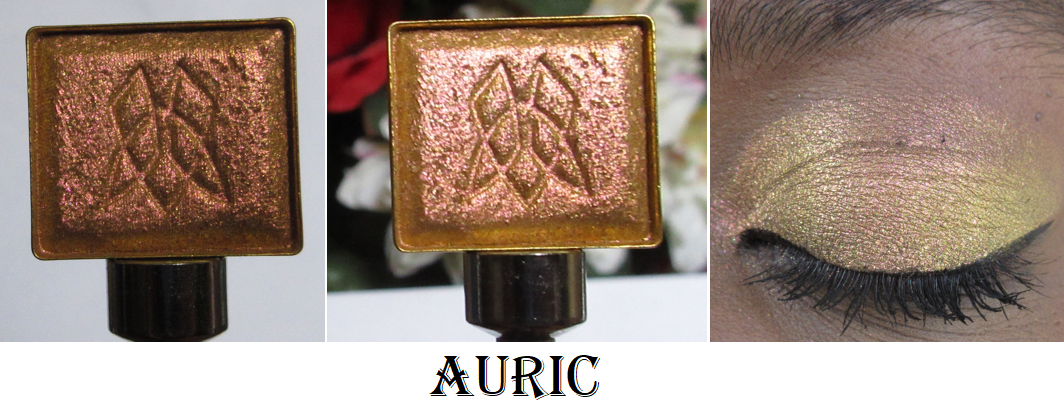
I’m also adding photos of the newest circle pan eyeshadows I’ve purchased as well! Plus, I finally got the other multichrome highlighter from the Dragonfruit Collection. The most I’m missing* are arm swatches of Quest, Auric, and Chalice. I at least have eye swatches of the latter two and video clips of all three.
*UPDATE: Here are the missing arm swatches in various lighting situations!
Earth Vibrant Multichromes
I now own 8 of 12 in the Earth Vibrant category, and this is still one of my favorite and most used lines within the Stained Glass Collection. The combination of beauty and subtlety is what makes these so enamoring.
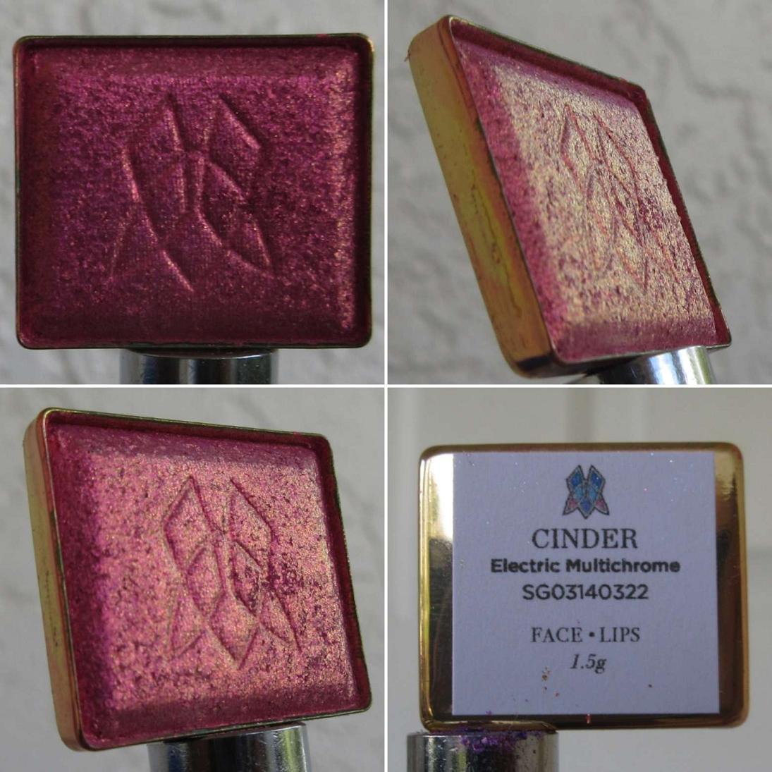
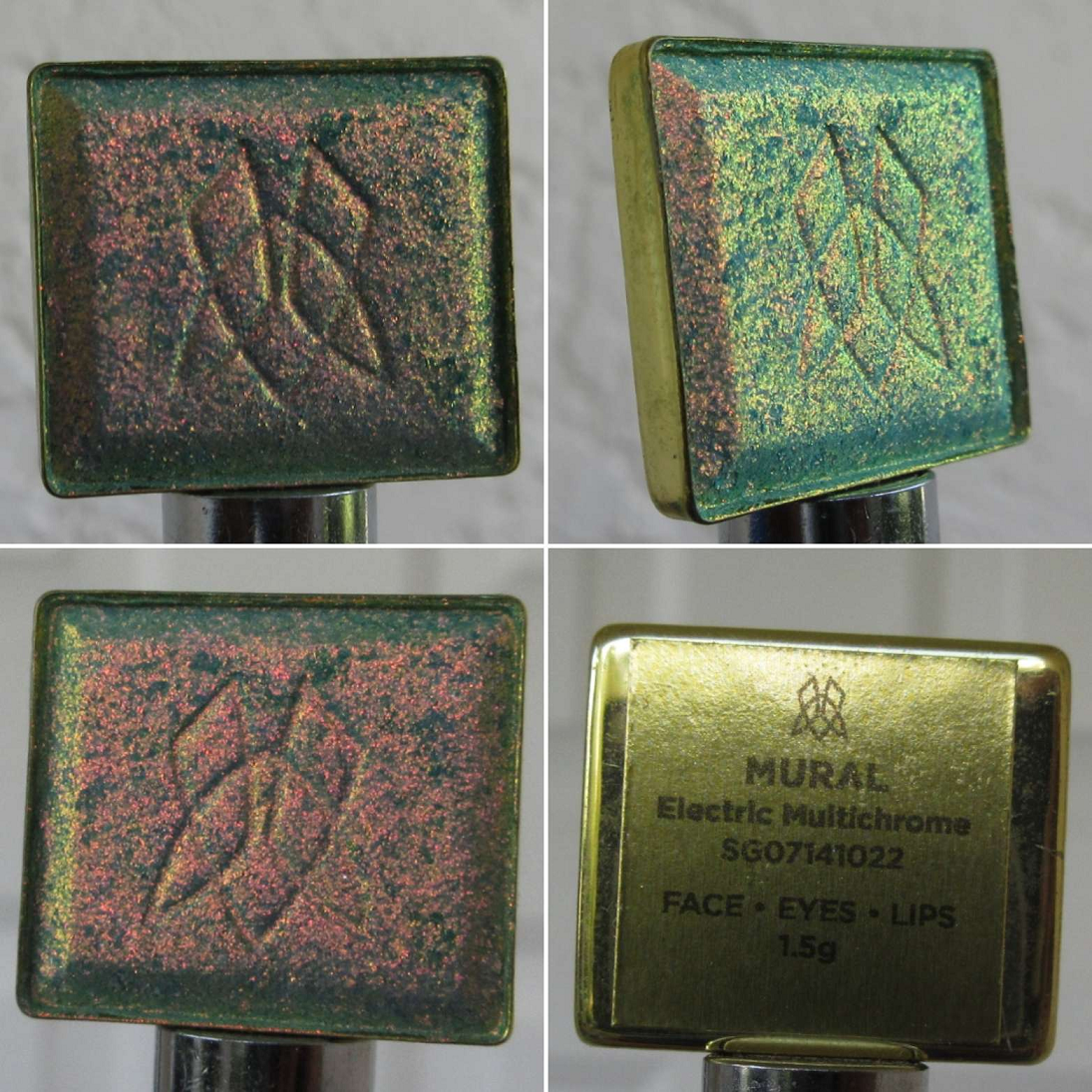
Electric Multichromes
We’re now at 5 of 12 Electric Multichromes, but I believe I have all the ones in this category that appeal to me and aren’t too similar to other Clionadh shades.
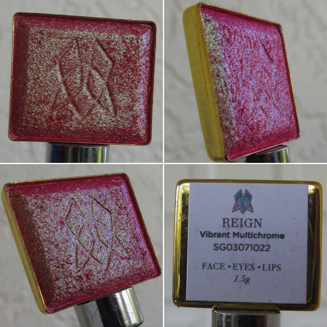
Vibrant Multichrome
I own 2 of the 4 newly expanded Vibrant Multichromes, but 7 of the 12 total. These haven’t ended up being my most used category, but when I have a very specific eye look in mind, these end up being just what I want, filling that void of brightness or uniqueness.
Hybrid Multichromes
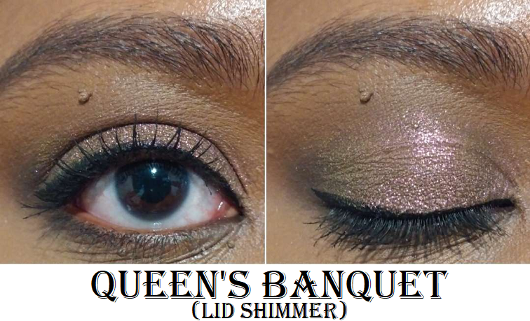
I chose to buy Chalice from the original collection because I don’t have as many yellows and golds from Clionadh and I wanted to see how different this one would be from the few I own from them. The answer is, “not very,” as it doesn’t have an easily discernible shift which makes it like a smoother version of the glitter multichromes. This addition, combined with Queen’s Banquet, put me at 8 of the 11. That is pretty wild considering the Hybrid formula is among my least favorite of the Stained Glass lines. That isn’t to say that they’re bad by any means. I just typically like more color impact, stronger shifts, or both. So, it’s a bit funny that I ended up with so many.
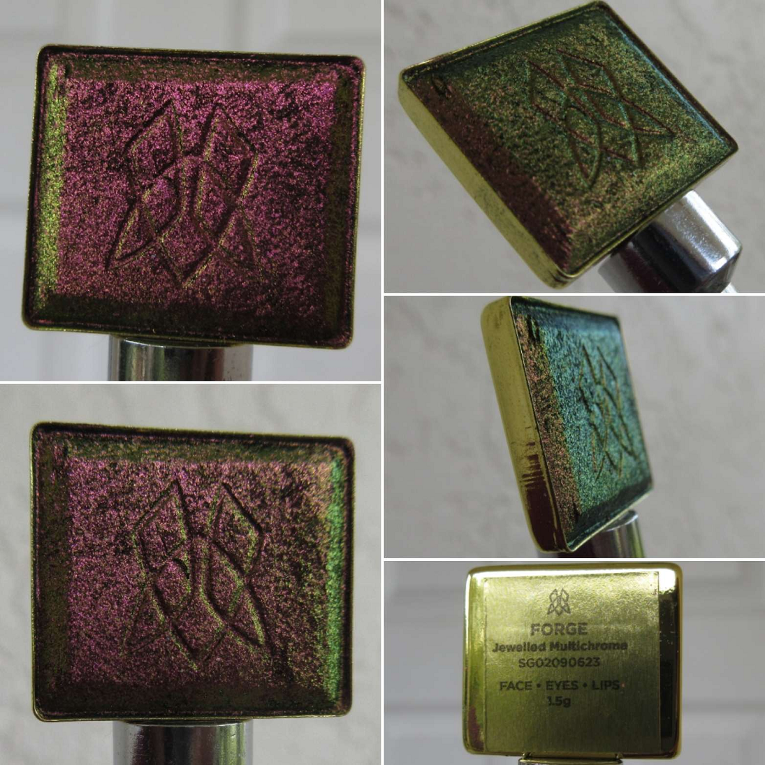
Jewelled Multichrome
I now own 12 of the 20, though this category didn’t get expanded last year. It was just a matter of seeing more photos of Forge in a different light that prompted me to get it, even though it’s supposed to be similar to Pat Mcgrath’s Sextraterrestrial shade from Divine Rose II, which I don’t even use that often anymore despite how pretty it is. I didn’t get a chance to compare them yet though, so that will be added to the list for next time.
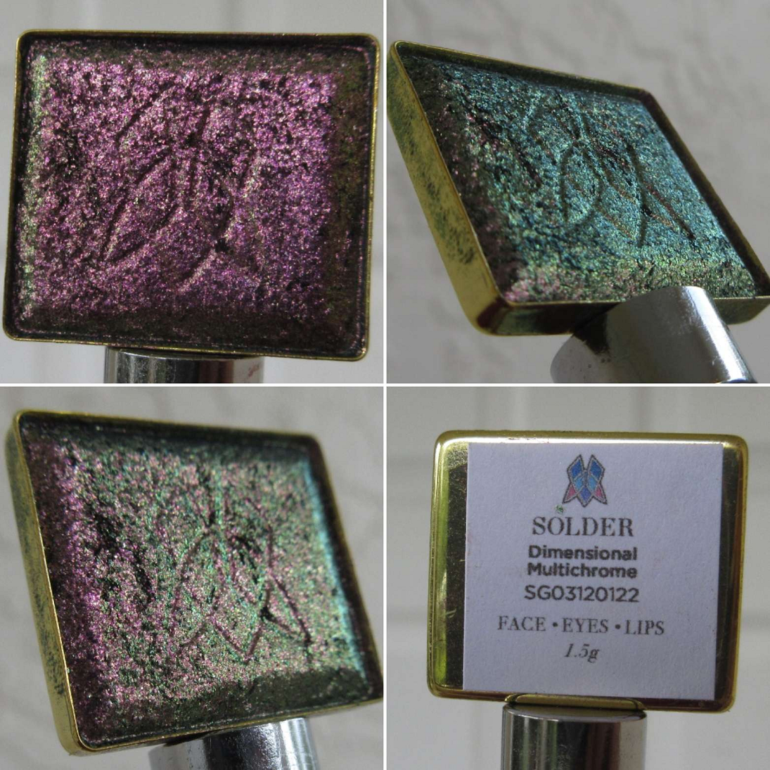
Dimentional Multichrome
I believe there are just two of these in the line so far, and it was released after the big expansion last year.
This category is supposed to be a brighter, more glittery version of the Jewelled multichromes. By using a grey base instead of a dark one, I can see how this line might be more appealing to those who felt the Jewelled ones were too intense, but that intensity is what I love about them. I can see the increase in sparkle, but there are other lines from Clionadh if I want a glittery multichrome versus a smooth metallic looking one. So, I don’t think this is a category I’ll be exploring as much (since I prefer the Jewelled ones), but I’m happy to have been able to try one.
Arm Swatches
Deep Iridescent Multichromes
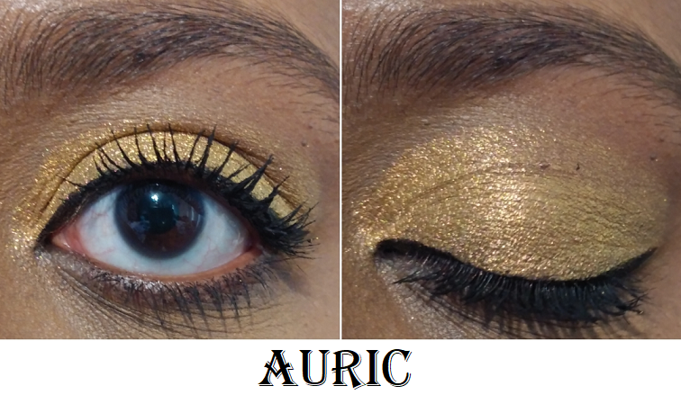
Despite missing arm swatches of Auric, I own 8 of 12. This isn’t surprising considering this is my second favorite line from Clionadh. I would love to own them all, but I don’t think I would get as much use out of the missing four shades, though I’m still tempted by Lapis Lazuli.
Also, I’m not sure if I’ve shown this before, but Clionadh has been including brand stickers in orders and I’ve saved them to stick onto custom palettes, such as the Viseart Empty SlimPro Palettes which Clionadh Stained Glass shadows fit perfectly into. I place stickers on the front and underside of the lid.
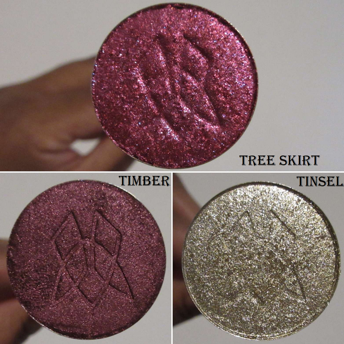
Stocking Stuffer Shadow Trio in Tree Skirt, Timber, and Tinsel
This was the brand’s holiday release for 2022. It even came with a tiny Christmas stocking to go with it.
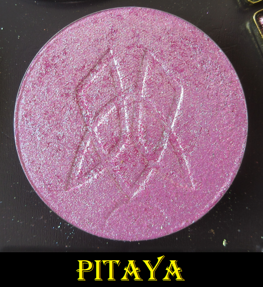
Additional Individual Circle Pan Eyeshadows and the Pitaya Fruitlighter
Caribou always appealed to me, but there was a time period when I wasn’t as interested in buying the neutral colors from Clionadh, though that has clearly changed by now. So, I finally bought that one. Centaur is a new eyeshadow released in 2023, and I’m not usually interested in taupe shades, but this one looked so pretty that I felt compelled to order it.
With this purchase of Pitaya, I now have both Dragonfruit Collection Fruitlighters that I use as eyeshadows.
That’s all I have for today! I apologize for this being quite disorganized and unfinished, but I wanted to be sure I finally got out at least something after all these months owning these additional Clionadh products.
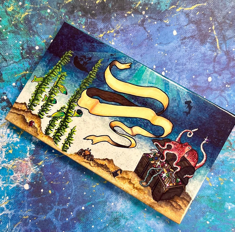
Also, for anyone wondering if I’m going to purchase Clionadh’s upcoming Deep Sea Treasures palette the brand showed as a sneak peek of the cover art on Instagram…I’m not sure if I will. Without seeing the color story yet, I assume there will be a lot of blues, which is not my preference. As much as I love the brand, if the palette consists of too much of a shade I don’t wear a lot (such as the reds and pinks in the Dragonfruit palette), then I skip it and save that money towards a different new product release.
So, it’s probably likely there will be a lot of blues, and if so, I will probably pass on this one.
Thank you for visiting!
-Lili ❤
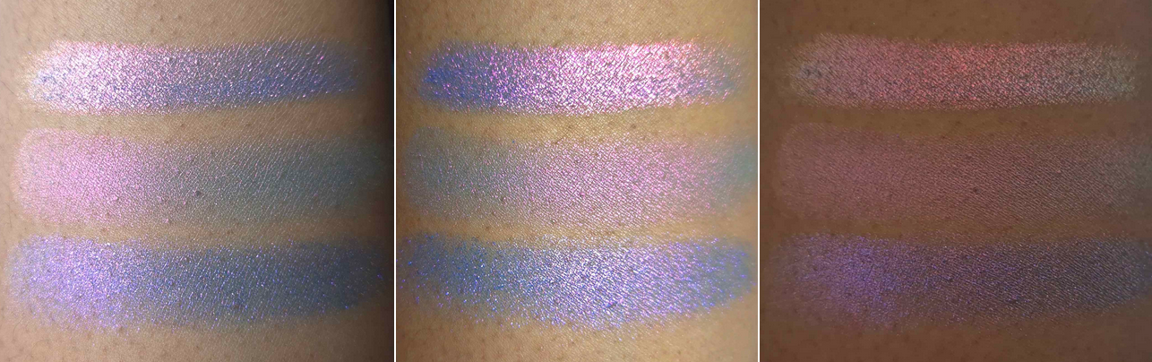
UPDATE: June 27, 2024 Here is a requested swatch comparison photo from top to bottom of Quest, Statue Garden, and Stencil in various lighting situations.
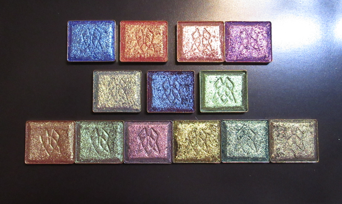
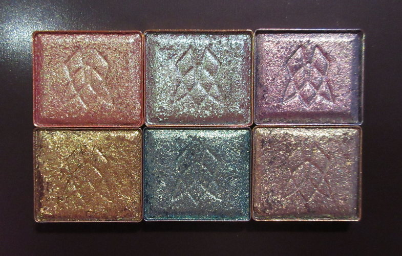
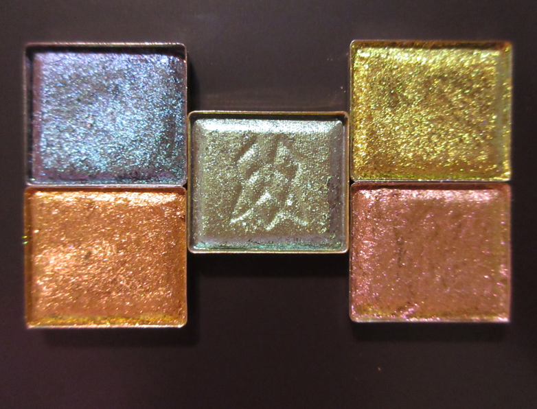
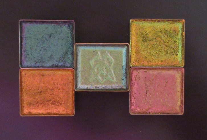
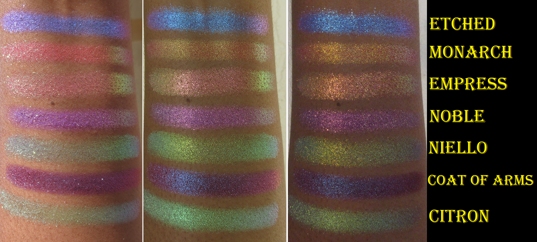
R1 (left to right): Etched, Monarch, Estate, Noble. R2: Niello, Coat of Arms, Citron R3: Bronze Fountain, Wall of Ivy, Royal Plum, Estate, Hedge Maze, and Iron Gate
The long awaited expansion to Clionadh’s massive Stained Glass Eyeshadow Collection is here! 54 new shades were released on August 8th. This new batch of multichromes extends the current formulas already available, in addition to ones we haven’t seen before. Also, Ciel and Glaziers Mark were reformulated.
I would have loved to purchase more than the thirteen I selected, but considering the shipping cost and Route Package Protection fee, I couldn’t fit more in the budget. Clionadh has the permanent promo code CROSS FORMULA which saved me $10 off my order of 10+ Stained Glass Eyeshadow singles. All bundles are already discounted, and therefore exempt. Influencer codes also only apply to the brand’s standard eyeshadows.*
*Update 09/2022: Clionadh announced that some influencer codes were newly affiliated. At that point, I noticed that certain influencer codes did include the Stained Glass Collection in the discount. I’m not sure if that was intentional or not.
My goal for today’s post is to show the shades and swatches to the best of my ability. I tried to get this out at quickly as possible to help those who are still trying to decide before the favorites go out of stock. At some point in the future, I plan on doing a follow-up post featuring any additional shades I purchased, along with the closest shade comparisons to multichromes among Clionadh and from other brands, and examples of how I’ve worked each shadow into completed eye looks.
Unless specifically stating otherwise, the majority of these shades were applied on eyelids and arms with no primer and not applied damp. I used concealer in certain areas to counteract the discoloration around my eyes, but it was not used enough to qualify as a primer either. I also applied the multichromes with a combined technique utilizing my finger and a brush.
Shadow Close-Up Videos
First Impression
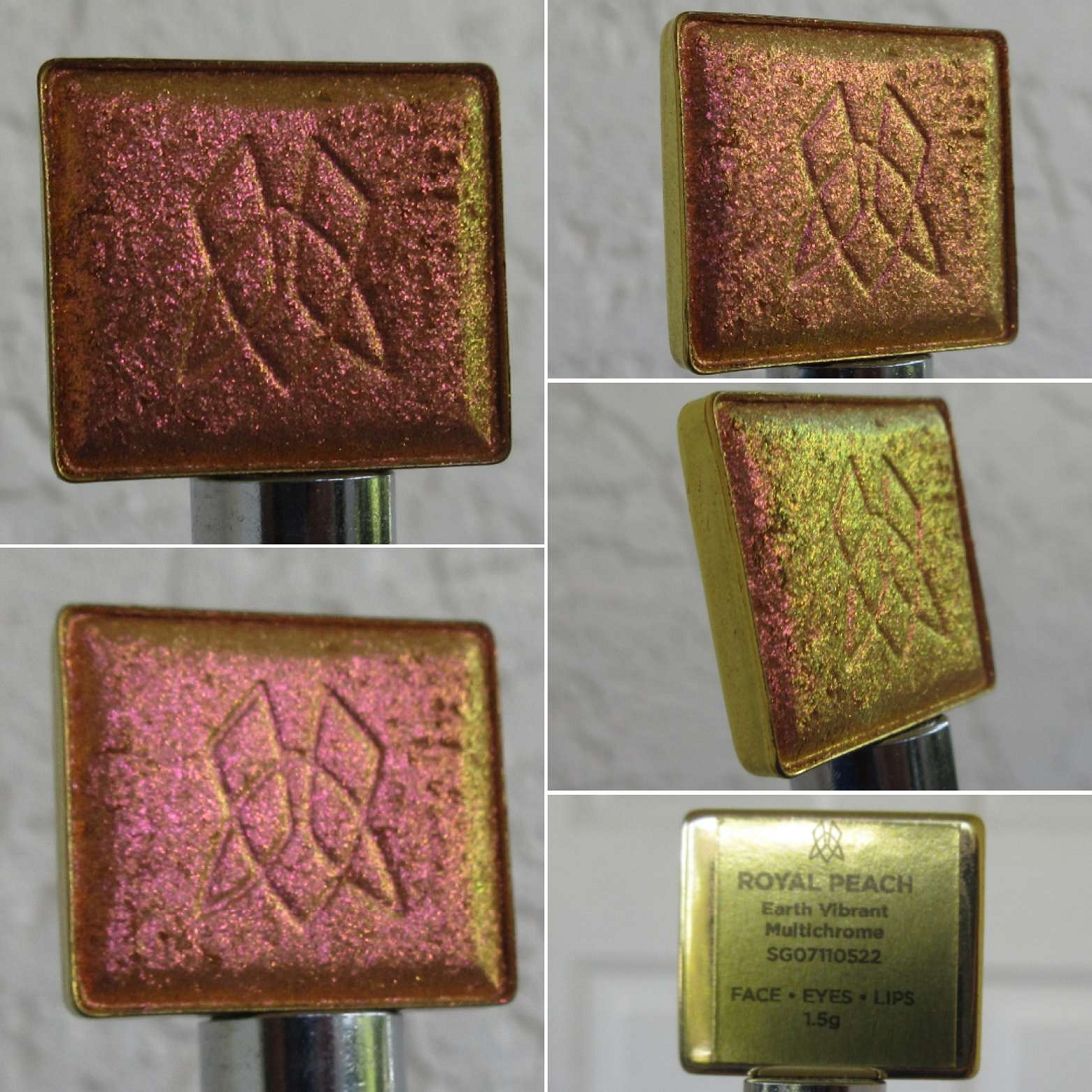
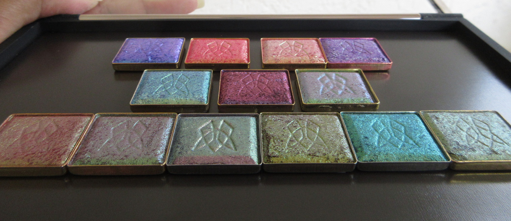
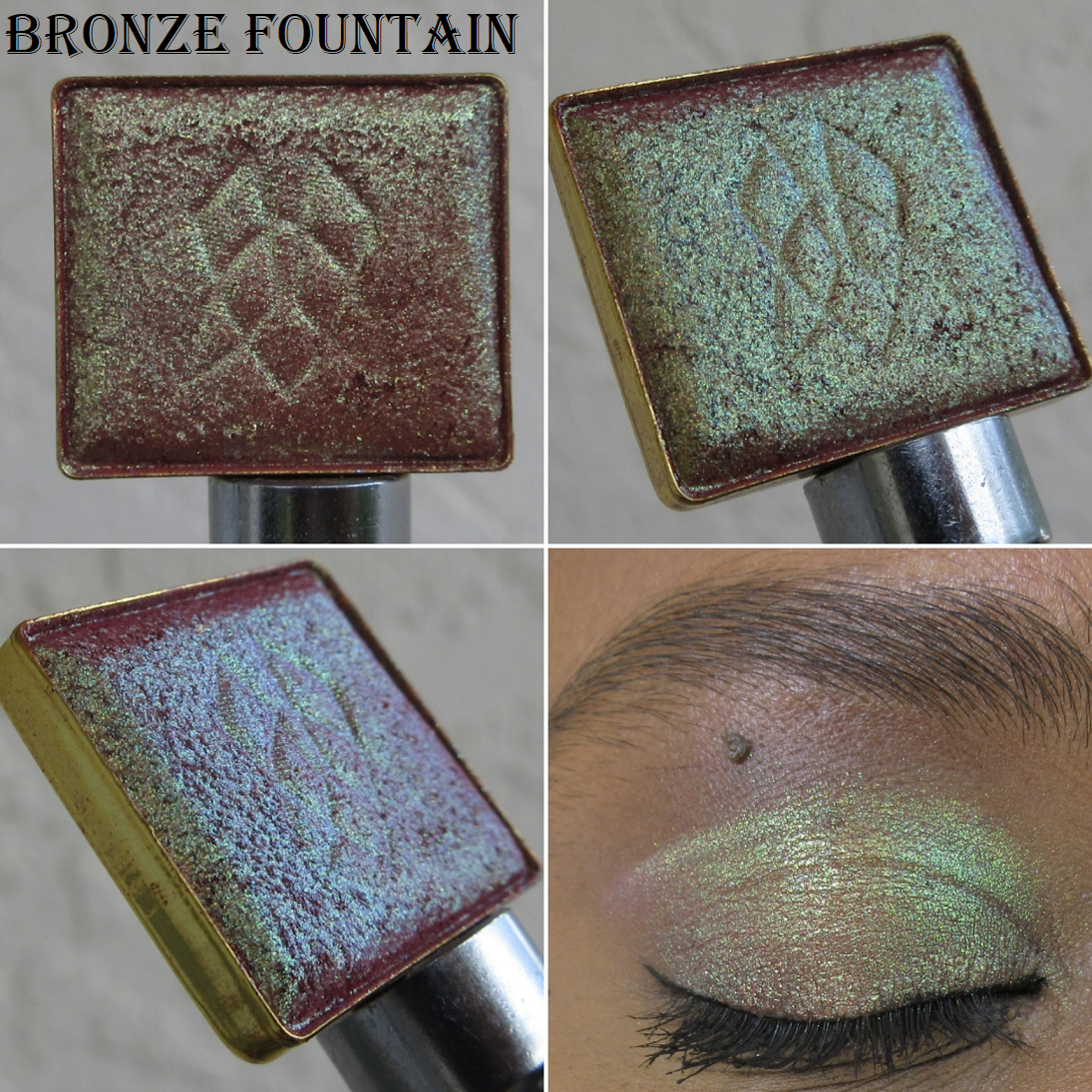
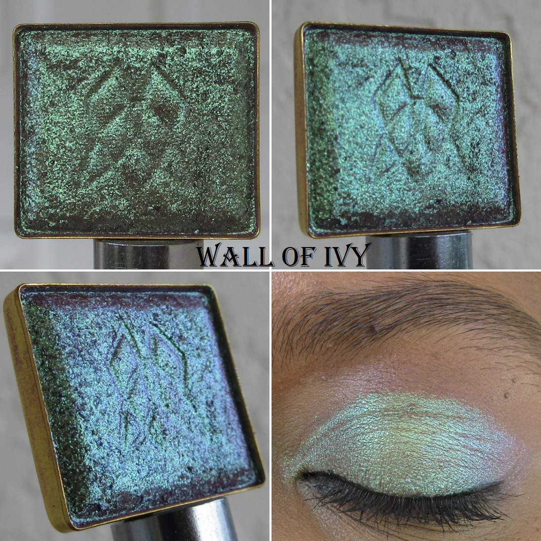
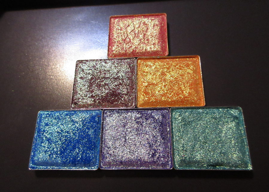
Earth Vibrant Multichromes in Bronze Fountain, Wall of Ivy, Royal Plum, Estate, Hedge Maze, and Iron Gate
I purchased six of the eleven multichromes in this highly anticipated new formula from Clionadh. Having “neutrals with a twist” is ideal for me in my current makeup phase, so it makes sense that I was drawn to the Earth Vibrant Multichromes the most.
I find it quite interesting that these shades are super shifty (as seen in the pans), but because they aren’t drastically different on the color wheel, likeEstate’s yellow-gold to lime to greenish aqua, most of the shifts aren’t as obvious on the eyes and can pass for one solid color if there aren’t various sources and angles of light. The Earth Vibrant shadows remind me of the Pastel Multichrome formula in terms of the texture and smoothness of the shimmer, but these are shinier with more shifts.
Bronze Fountain is one of my favorites out of the entire bunch that I purchased! It’s the terracotta base that shows through underneath that makes this shade extra special to me, especially with the lighting in the house. The bronze tone with the lime and gold shift and even more subtle aqua shift is the ultimate middle ground between loving colorful eyeshadows and neutrals.
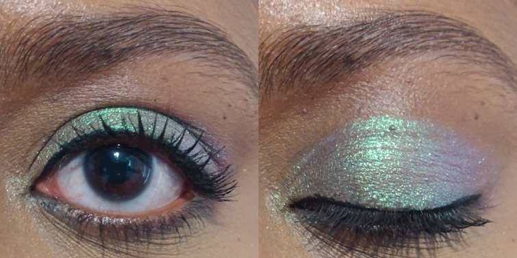
Whenever I come across a green-blue-purple multichrome, like Wall of Ivy, I can’t help but compare it in my mind to Verte, which is perhaps my single favorite eyeshadow from Clionadh. The main differences between the two are that Verte has a cool tan base versus Wall of Ivy’s warm brown one, in addition to the green in Verte being almost like a radioactive color. Wall of Ivy is still vibrant, but looks like the color mint. Because of how light the shimmer appears on my eyes, a shade like this will stand out more on my skin tone.
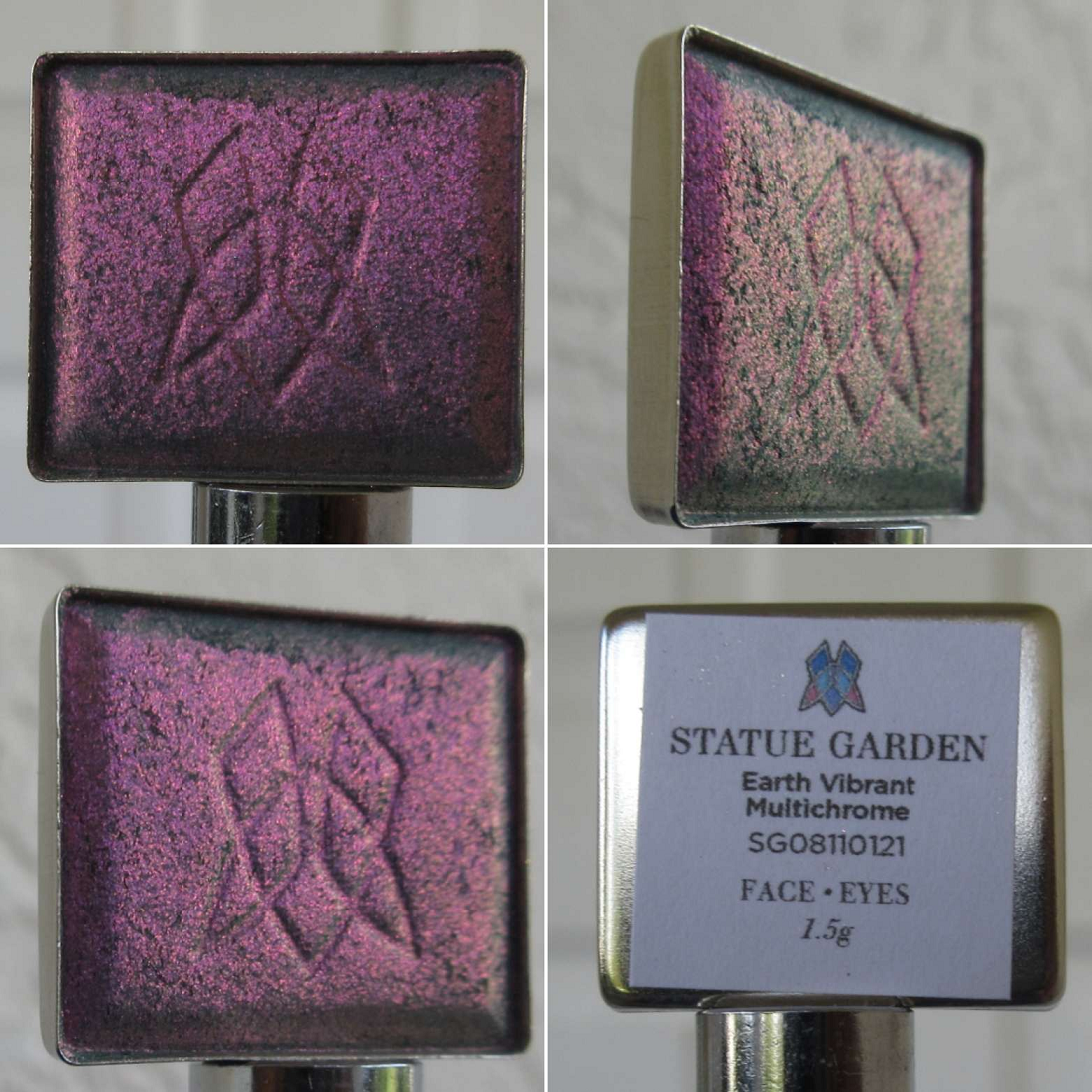
I can’t wait to try Royal Plum in a purple-smoky eye look! It has a fascinating grey-plum base, which gives it the overall gunmetal-esque look on my eyes, though I can still see the pink-purple going into aqua. This shade is one of the most unique multichromes in my whole makeup collection.
As I mentioned earlier, the “golden yellow-lime-aqua shifts” in Estate still mainly looks yellow or chartreuse. So even though it could pass for a “normal” eyeshadow to someone who isn’t staring intently at my eyes, how vibrant the yellow and lime elements can get depending on the light are still interesting aspects of this shade.
I knew Hedge Maze wasn’t going to have a dramatic shift, but because it has a grey base, I expected it to look smokier, like Royal Plum, and darker. In the end, it looks mainly like a medium-dark green with gold shimmer. Because that’s a very common type of color in my collection, I’m not as impressed with this shade. In addition, when I wear it outside, it looks quite similar to Wall of Ivy, but even less shifty.
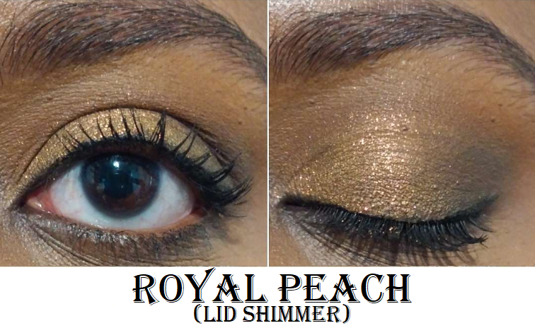
I thought it was very strange how Iron Gate looked grey-olive-gold when worn indoors, until I looked at the pan photos I took and saw how in one split second in the light, it did turn that color. In other types of lighting, this shade is mostly gold-lime, and is like a toned down version of Estate. There are supposed to be peach and aqua shifts as well, and the base color is “grungy mauve” which likely accounts for how it managed to have that greyish tone I noticed while I wore Iron Gate inside the house. I’m still not sure how I feel about this shade, and I think I need to see how it pairs with other eye shadows in order to finalize my thoughts on it.
Bronze Fountain, Royal Plum, and Wall of Ivy are easily among my favorites and were absolutely worth the purchase for me.
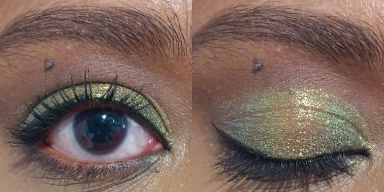
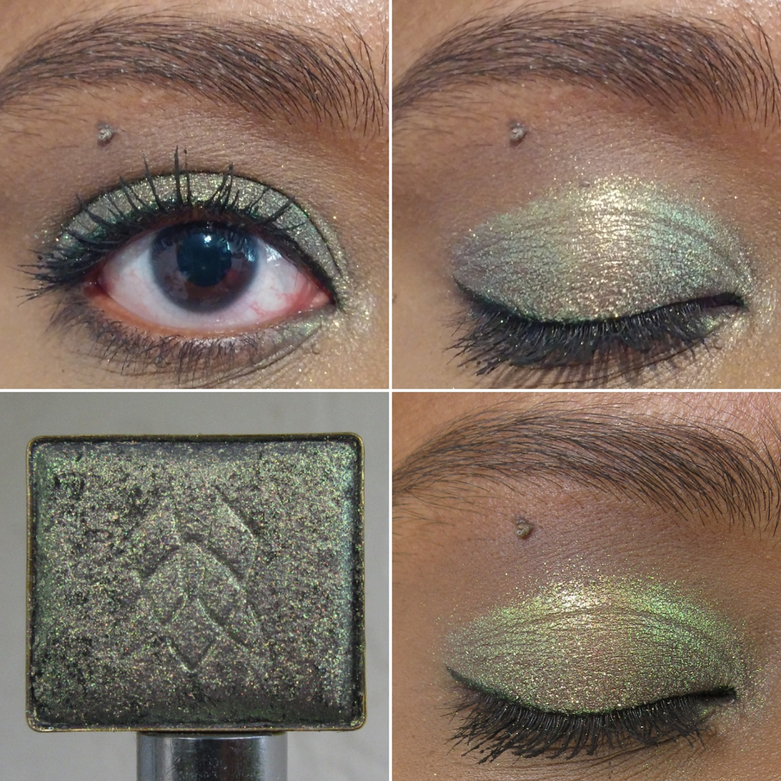
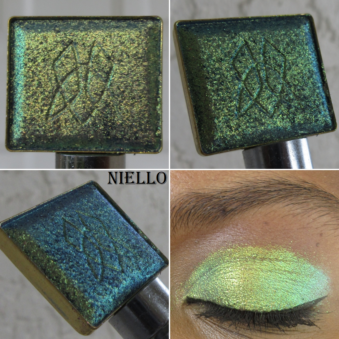
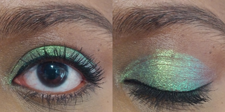
Electric Multichrome Pigment in Niello
I surprised myself by choosing only one of the twelve shadows in this brand new formula. Several others interested me, including Mural which was the first of the new Stained Glass shadows to sell out on the website. However, there were so many swatches of Mural and other Electric Vibrant shades that I liked or disliked out of all the photos and videos I watched prior to the release day, that I wasn’t confident I would think anything other than Niello was worth buying.
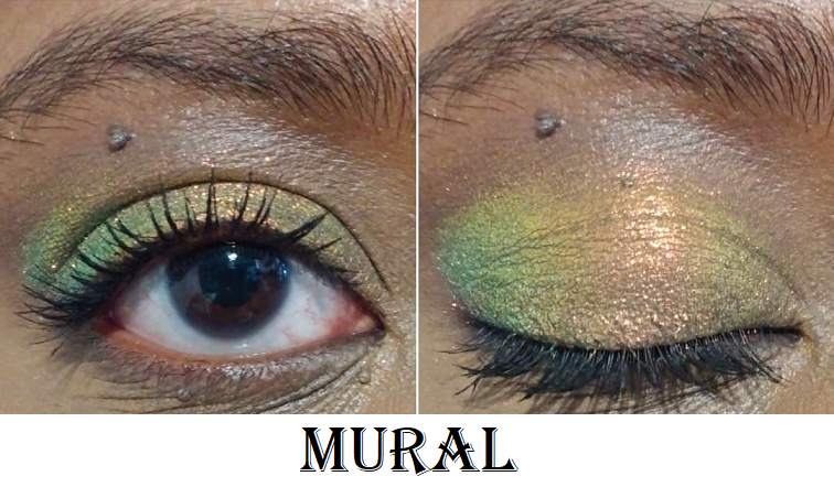
However, now that I’ve seen Niello in action, I do wish I bought a few more of the Electrics I considered getting. Every shift is so pretty and even when it looks the most lime, which is perhaps the least interesting part for me out of the “dusty purple base with gold-lime-aqua shifts,” in a completed eye look, it’s the lime that turns super bright and electric, which helps make the look pop.
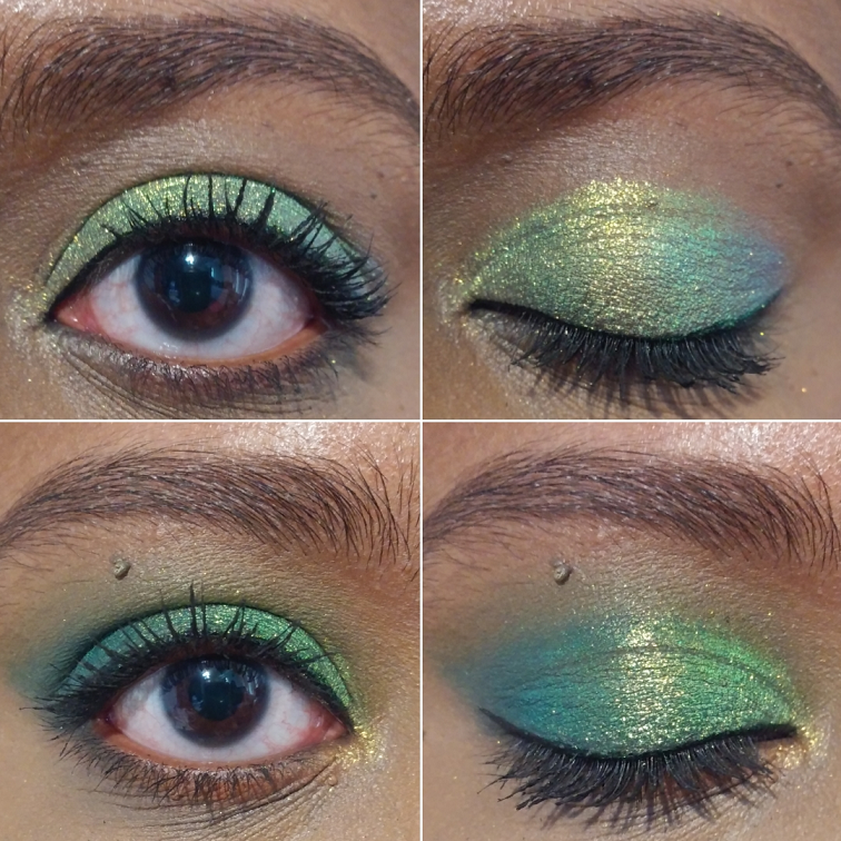
In the double eye look photo, I have just Niello alone on the lids in the first look. The second look was created using the Clionadh Tropico Highlighter on the inner corner. The rest were used with the Natasha Denona Metropolis Palette with Ripe on the lower lash line, Enigma on the outer third of the eye, a tiny bit of Royal in the center (which didn’t add much to the look and I skipped it in my version on Instagram), and Lethal on the inner third as well as blending out most of the crease.
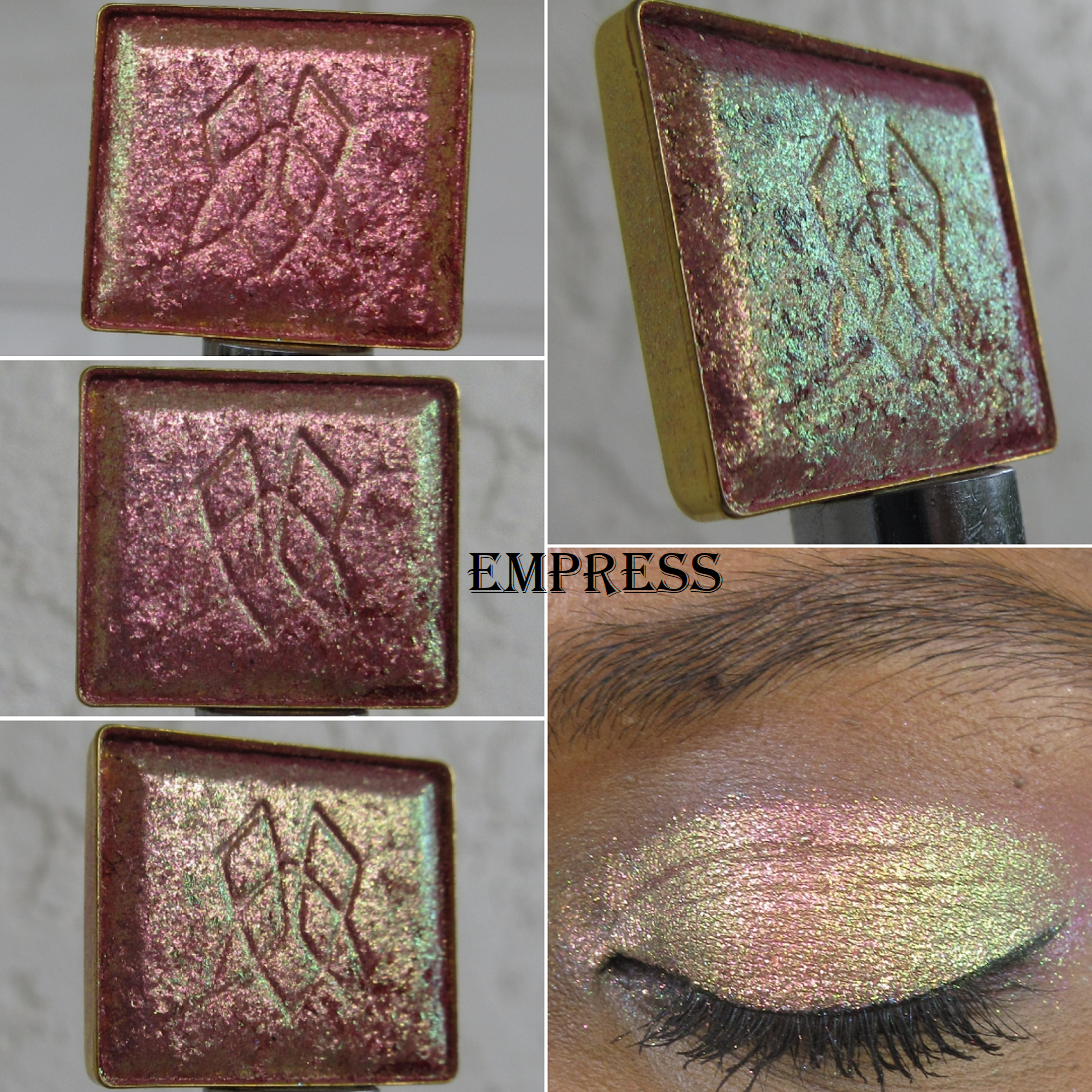
Glitter Vibrant Multichromes in Empress and Noble
This formula combines the large glitter particle size of some of the shadows in the Glitter collection, as well as the bright base and “intense colour shifting reflects” of the Vibrants. I bought two of the five newly released shadows, but the shade Regal was introduced last year and shares the same formula. I don’t own that shade, so this is my first time experiencing this category of multichromes for myself.
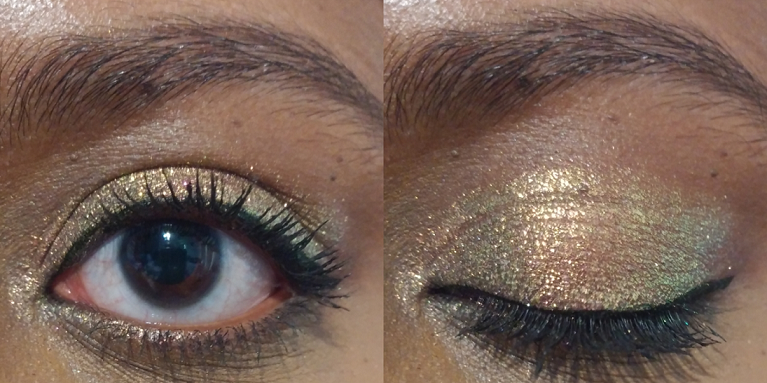
This formula is the kind I will only apply damp or with the Nyx Glitter Primer (as demonstrated in the outdoor closed eye swatch picture). For the open and closed eye swatch worn indoors, I applied them to bare lids to show how this formula can be a bit flaky and messy without some sort of aid to keep it in place. Empress has “a pink-red base with pink-peach-gold-lime shifts,” which I can certainly see in the pan. It has a similar vibe to the shade Bronze Fountain, but with more emphasis on the pink, peach, and gold. The lime is subtler. I like this shade, but I still need to compare it to a lot of other shadows in my collection because I’m not sure how much more different this really is.
Based on the description of Noble as “a warm violet base with pink-peach-lime-aqua shifts,” it sounds like it’s meant to be the purple equivalent of Empress, but this color doesn’t shift as much. I knew that ahead of time, thanks to seeing swatches in advance on Clionadh’s Instagram, but I wanted it anyway. I figured pink-purple-aqua would still be a pretty combination, but the pink is so pale on me in certain lighting situations that it looks silvery. I really don’t like that aspect.
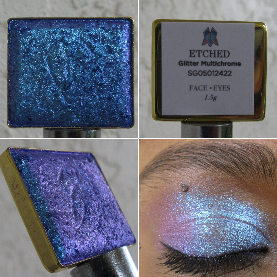
Glitter Multichrome in Etched
My current Glitter Multichrome collection after being whittled down. Etched is on the bottom right.
Quite a few shadows that I own in this formula ended up looking much different on my eyes than I expected. So, I ordered the shade I wanted most out of the eight new ones, and decided that if I still want others after I see how they look on more people, I can get them at that later date.
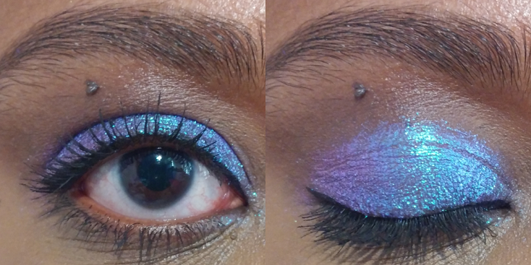
This shade is mainly blue, which rates low as an eye shadow color I like to wear, but because it has that beautiful pink-violet shift and it’s all with a purple base, I really wanted to get Etched anyway. It’s certainly pretty and even though I could have been fine without this shade and likely won’t use it regularly, I’m still happy to own it.
Vibrant Multichrome in Monarch
My Vibrant Multichromes with Monarch at the top.
Monarch was the only shade I wanted of the four new additions to the Vibrant Multichrome category. I am absolutely thrilled with it! It’s like a more orange toned version of what I wanted Bloodline to be on me. In fact, both Bloodline and Royalty have a silvery look to the shimmer on my eyes. I was so relieved to see that this did not happen with Monarch. The base color in this is red, but all that gold makes it look orange.
I can certainly see the gold shift and subtle bit of lime, but not the aqua described on the website. I don’t mind because the way it looks is gorgeous enough for me.
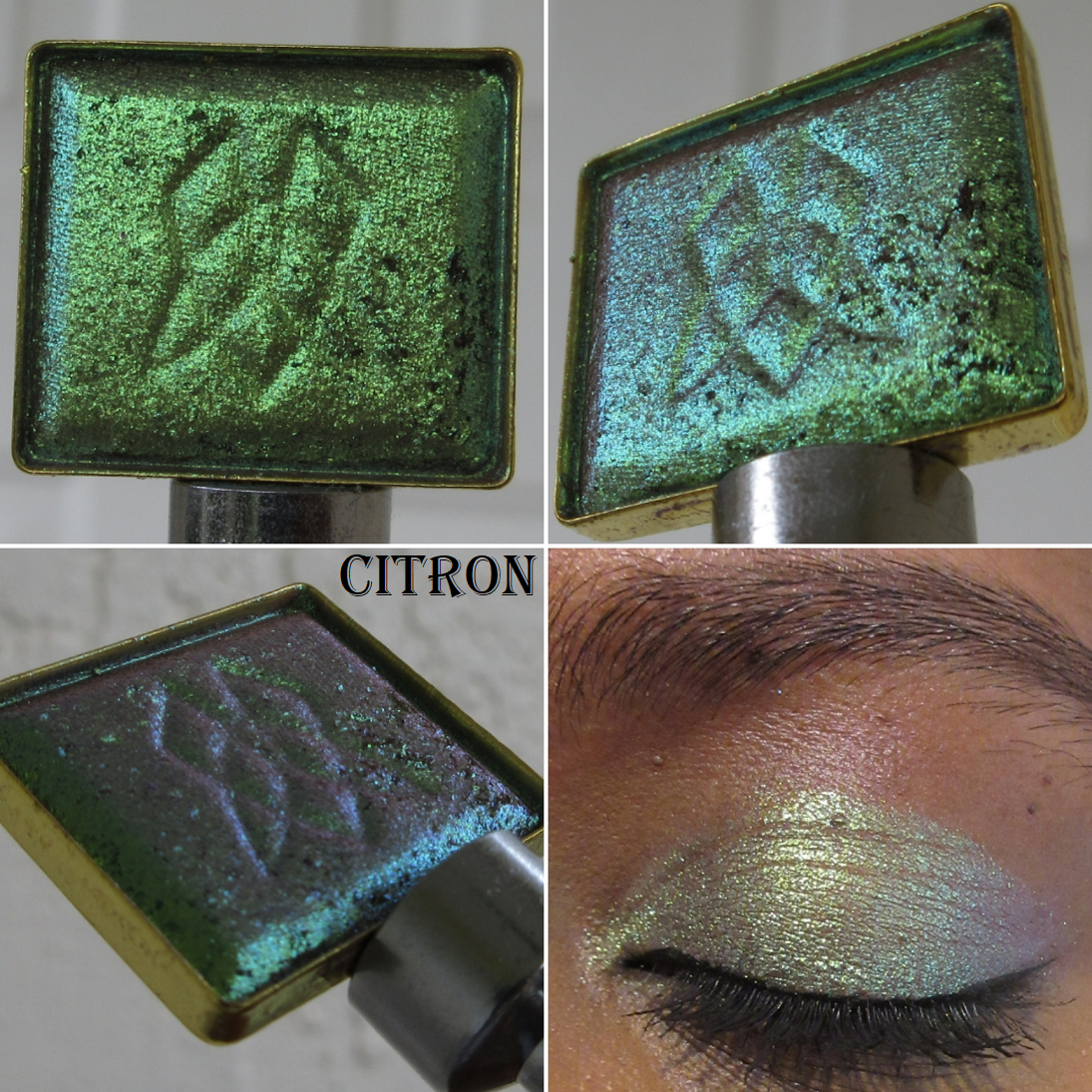
Deep Iridescent Multichrome in Citron
My Deep Iridescent Collection with Citron in the middle.
I only purchased one of the seven new DI Multichromes, but there are several more on my wishlist that I wanted and only stopped myself from getting them because the other shadows on my list seemed more color-shifting and unique. However, don’t be surprised if/when you see additional Deep Iridescent shadows in a future post!
All of the Deep Iridescents have a unique finish to them, as seen in the close-ups of the pan, and Citron is no different. Putting that shade on my eyes reminded me why it’s one of my favorite formulas from the Stained Glass Collection and I instantly regretted not taking the chance on getting more of them. I love how smoothly they apply and look on the eyes. Citron in certain situations looks quite unique because of that “cool taupe base with chartreuse-lime-aqua shifts,” but in the type of lighting I’m most commonly in, it reminds me yet again of Verte, which is part of this collection. More than just aqua, the shift in Citron looks borderline purple on me. Since, I love purples and greens anyway, I don’t mind. While it does remind me so much of Verte, the fact that Citron looks mainly chartreuse/lime when I’m outside keeps it distinctly different and justifiable to have both.
Hybrid Multichrome in Coat of Arms
My Hybrid Multichromes with Coat of Arms at the top.
This is one of the three new additions to the Hybrid category. I was interested in the others, but since the Hybrid formula is one of my least favorites in the Stained Glass Collection, I didn’t want to set myself up for disappointment and stuck to just one. Also, even though I say this is my least favorite formula, I clearly haven’t had the heart to declutter any of them, so that’s an indication of how much it’s a preference issue and not due to lack of quality.
Coat of Arms is certainly not as deep and rich on my eyes as I expected, but thankfully it’s still a very pretty color. I’m actually glad it’s not as dark as it looks in the pan because I was concerned it would be too similar to Tapestry or the Jewelled Multichrome Spire, but it turns out those other two lean much more on the blue side. It’s quite similar to how Shard looks on me, except that Shard has a warmer purple look to it, whereas Coat of Arms is deeper and the stronger blue shift gives it a cooler toned look to it. For a Hybrid Multichrome, I’m pleasantly surprised how much I like it. However, I feel quite certain I have shades like this in my collection, so I haven’t decided if getting this one was worth it.
The only categories I did not purchase anything from were the Series 2 Iridescent Multichrome expansion and the newly released Pearlescent Multichromes.
As for the shadows I did purchase, I’m happy with my choices, though I still can’t help but want the few additional shades I had left on my wishlist. When I decide to look through my multichrome collection again to see if I have colors that are similar enough, perhaps I won’t feel that way. As I mentioned earlier in this post, I wanted to share the most important photos as soon as possible, but I also want to take my time enjoying this collection at a leisurely pace since I don’t think any other eyeshadows this year are going to top these. I want to have something new to look forward to trying out for weeks to come.
Thank you for reading and hopefully sharing in my excitement over these gorgeous multichromes! If you want to see my previous Clionadh reviews, I have links to them in this index post.