Clionadh Cosmetics 2022 Stained Glass Expansion

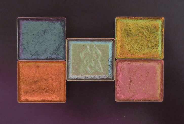
Indirect Outdoor Lighting

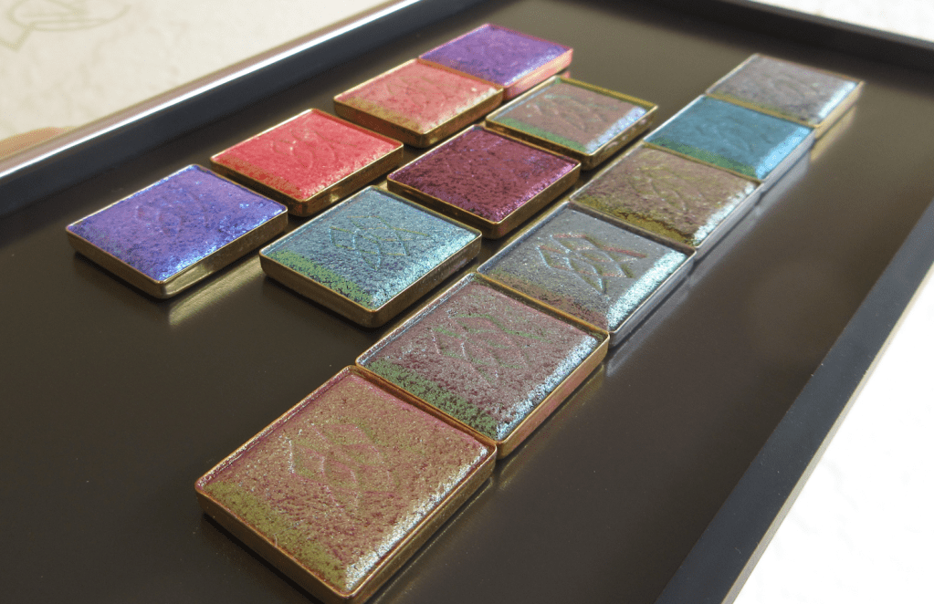
Direct Outdoor Lighting

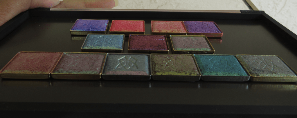
Direct Indoor Lighting

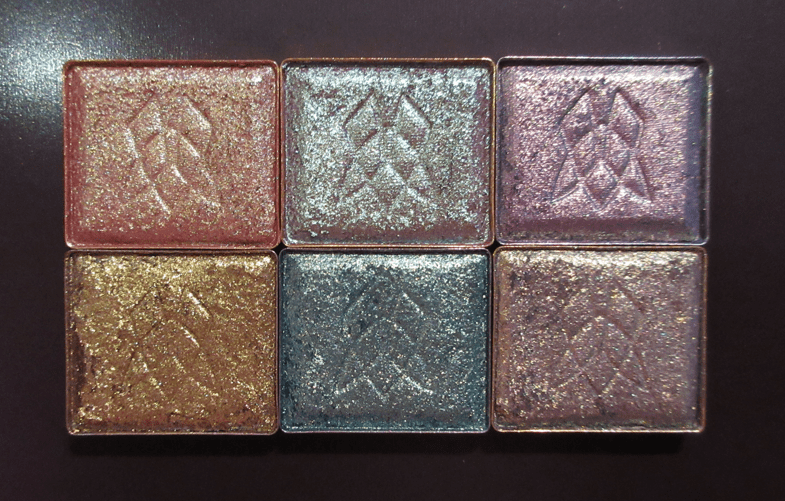
Various Angles of Indirect Outdoor Lighting

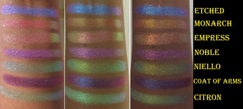
R1 (left to right): Etched, Monarch, Estate, Noble.
R2: Niello, Coat of Arms, Citron
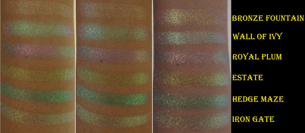
R3: Bronze Fountain, Wall of Ivy, Royal Plum, Estate, Hedge Maze, and Iron Gate

The long awaited expansion to Clionadh’s massive Stained Glass Eyeshadow Collection is here! 54 new shades were released on August 8th. This new batch of multichromes extends the current formulas already available, in addition to ones we haven’t seen before. Also, Ciel and Glaziers Mark were reformulated.

I would have loved to purchase more than the thirteen I selected, but considering the shipping cost and Route Package Protection fee, I couldn’t fit more in the budget. Clionadh has the permanent promo code CROSS FORMULA which saved me $10 off my order of 10+ Stained Glass Eyeshadow singles. All bundles are already discounted, and therefore exempt. Influencer codes also only apply to the brand’s standard eyeshadows.*

*Update 09/2022: Clionadh announced that some influencer codes were newly affiliated. At that point, I noticed that certain influencer codes did include the Stained Glass Collection in the discount. I’m not sure if that was intentional or not.

My goal for today’s post is to show the shades and swatches to the best of my ability. I tried to get this out at quickly as possible to help those who are still trying to decide before the favorites go out of stock. At some point in the future, I plan on doing a follow-up post featuring any additional shades I purchased, along with the closest shade comparisons to multichromes among Clionadh and from other brands, and examples of how I’ve worked each shadow into completed eye looks.

Unless specifically stating otherwise, the majority of these shades were applied on eyelids and arms with no primer and not applied damp. I used concealer in certain areas to counteract the discoloration around my eyes, but it was not used enough to qualify as a primer either. I also applied the multichromes with a combined technique utilizing my finger and a brush.

Shadow Close-Up Videos

First Impression

Earth Vibrant Multichromes
in Bronze Fountain, Wall of Ivy, Royal Plum, Estate, Hedge Maze, and Iron Gate

I purchased six of the eleven multichromes in this highly anticipated new formula from Clionadh. Having “neutrals with a twist” is ideal for me in my current makeup phase, so it makes sense that I was drawn to the Earth Vibrant Multichromes the most.

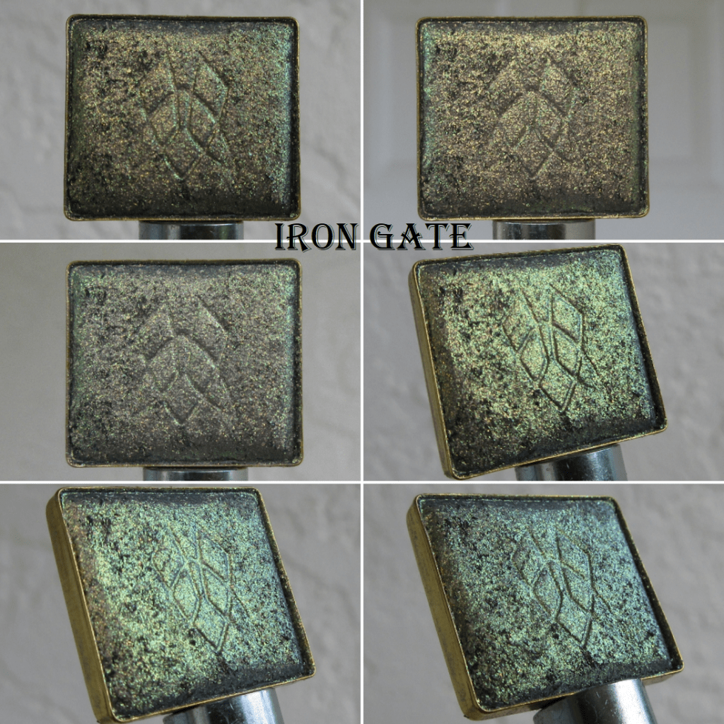
I find it quite interesting that these shades are super shifty (as seen in the pans), but because they aren’t drastically different on the color wheel, like Estate’s yellow-gold to lime to greenish aqua, most of the shifts aren’t as obvious on the eyes and can pass for one solid color if there aren’t various sources and angles of light. The Earth Vibrant shadows remind me of the Pastel Multichrome formula in terms of the texture and smoothness of the shimmer, but these are shinier with more shifts.

Bronze Fountain is one of my favorites out of the entire bunch that I purchased! It’s the terracotta base that shows through underneath that makes this shade extra special to me, especially with the lighting in the house. The bronze tone with the lime and gold shift and even more subtle aqua shift is the ultimate middle ground between loving colorful eyeshadows and neutrals.

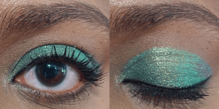
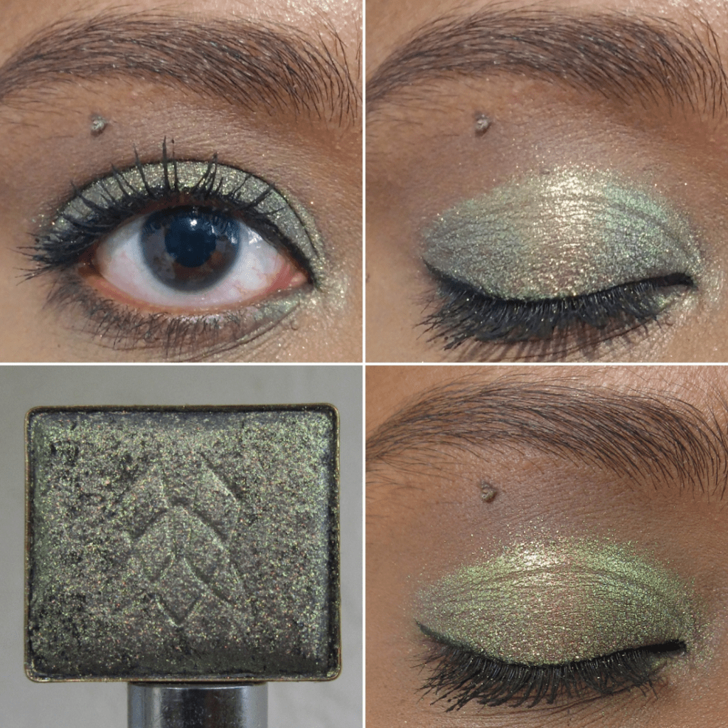
Whenever I come across a green-blue-purple multichrome, like Wall of Ivy, I can’t help but compare it in my mind to Verte, which is perhaps my single favorite eyeshadow from Clionadh. The main differences between the two are that Verte has a cool tan base versus Wall of Ivy’s warm brown one, in addition to the green in Verte being almost like a radioactive color. Wall of Ivy is still vibrant, but looks like the color mint. Because of how light the shimmer appears on my eyes, a shade like this will stand out more on my skin tone.

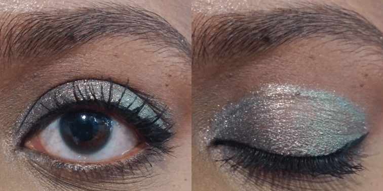
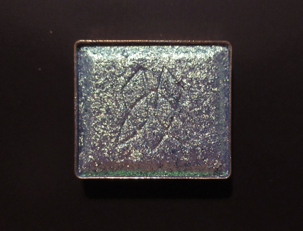
I can’t wait to try Royal Plum in a purple-smoky eye look! It has a fascinating grey-plum base, which gives it the overall gunmetal-esque look on my eyes, though I can still see the pink-purple going into aqua. This shade is one of the most unique multichromes in my whole makeup collection.

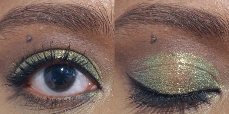
As I mentioned earlier, the “golden yellow-lime-aqua shifts” in Estate still mainly looks yellow or chartreuse. So even though it could pass for a “normal” eyeshadow to someone who isn’t staring intently at my eyes, how vibrant the yellow and lime elements can get depending on the light are still interesting aspects of this shade.

I knew Hedge Maze wasn’t going to have a dramatic shift, but because it has a grey base, I expected it to look smokier, like Royal Plum, and darker. In the end, it looks mainly like a medium-dark green with gold shimmer. Because that’s a very common type of color in my collection, I’m not as impressed with this shade. In addition, when I wear it outside, it looks quite similar to Wall of Ivy, but even less shifty.

I thought it was very strange how Iron Gate looked grey-olive-gold when worn indoors, until I looked at the pan photos I took and saw how in one split second in the light, it did turn that color. In other types of lighting, this shade is mostly gold-lime, and is like a toned down version of Estate. There are supposed to be peach and aqua shifts as well, and the base color is “grungy mauve” which likely accounts for how it managed to have that greyish tone I noticed while I wore Iron Gate inside the house. I’m still not sure how I feel about this shade, and I think I need to see how it pairs with other eye shadows in order to finalize my thoughts on it.

Bronze Fountain, Royal Plum, and Wall of Ivy are easily among my favorites and were absolutely worth the purchase for me.

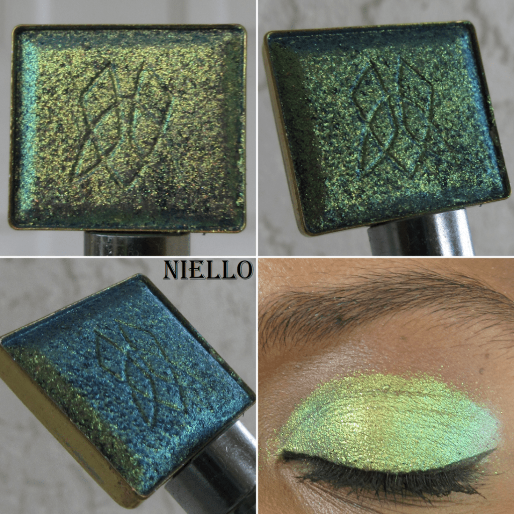
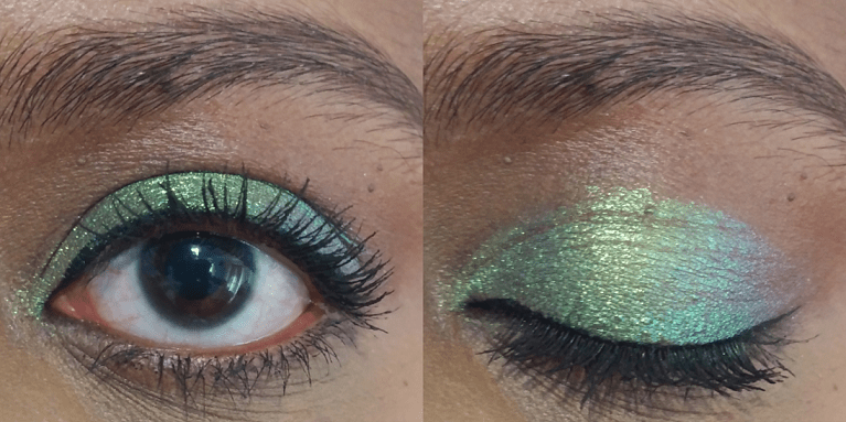
Electric Multichrome Pigment in Niello

I surprised myself by choosing only one of the twelve shadows in this brand new formula. Several others interested me, including Mural which was the first of the new Stained Glass shadows to sell out on the website. However, there were so many swatches of Mural and other Electric Vibrant shades that I liked or disliked out of all the photos and videos I watched prior to the release day, that I wasn’t confident I would think anything other than Niello was worth buying.

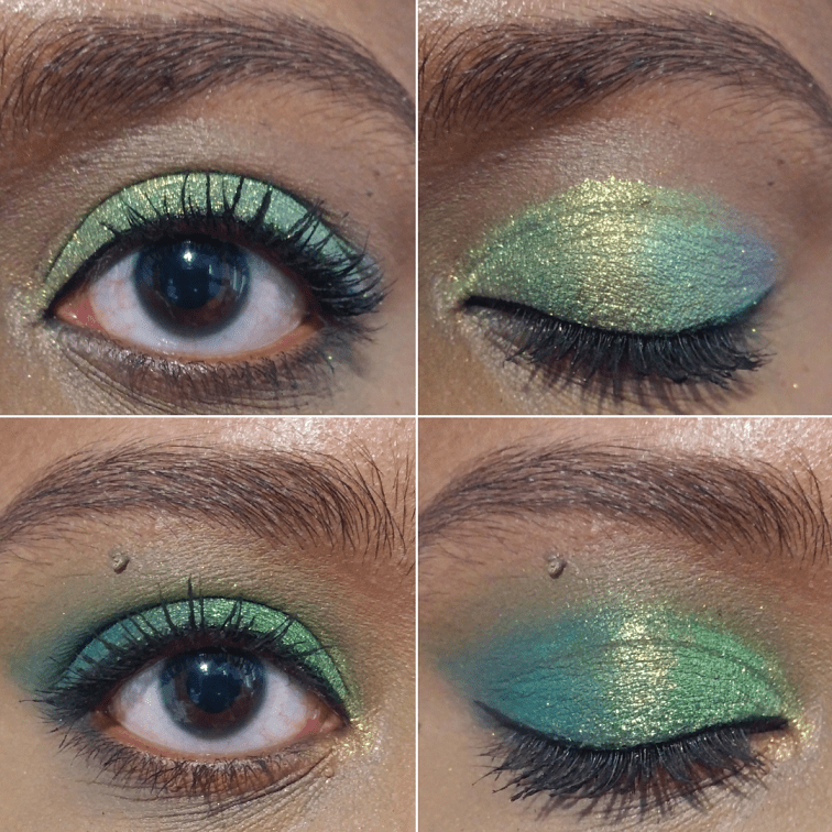
However, now that I’ve seen Niello in action, I do wish I bought a few more of the Electrics I considered getting. Every shift is so pretty and even when it looks the most lime, which is perhaps the least interesting part for me out of the “dusty purple base with gold-lime-aqua shifts,” in a completed eye look, it’s the lime that turns super bright and electric, which helps make the look pop.

In the double eye look photo, I have just Niello alone on the lids in the first look. The second look was created using the Clionadh Tropico Highlighter on the inner corner. The rest were used with the Natasha Denona Metropolis Palette with Ripe on the lower lash line, Enigma on the outer third of the eye, a tiny bit of Royal in the center (which didn’t add much to the look and I skipped it in my version on Instagram), and Lethal on the inner third as well as blending out most of the crease.

Glitter Vibrant Multichromes
in Empress and Noble

This formula combines the large glitter particle size of some of the shadows in the Glitter collection, as well as the bright base and “intense colour shifting reflects” of the Vibrants. I bought two of the five newly released shadows, but the shade Regal was introduced last year and shares the same formula. I don’t own that shade, so this is my first time experiencing this category of multichromes for myself.

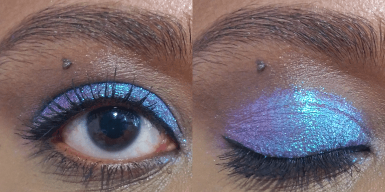
This formula is the kind I will only apply damp or with the Nyx Glitter Primer (as demonstrated in the outdoor closed eye swatch picture). For the open and closed eye swatch worn indoors, I applied them to bare lids to show how this formula can be a bit flaky and messy without some sort of aid to keep it in place. Empress has “a pink-red base with pink-peach-gold-lime shifts,” which I can certainly see in the pan. It has a similar vibe to the shade Bronze Fountain, but with more emphasis on the pink, peach, and gold. The lime is subtler. I like this shade, but I still need to compare it to a lot of other shadows in my collection because I’m not sure how much more different this really is.

Based on the description of Noble as “a warm violet base with pink-peach-lime-aqua shifts,” it sounds like it’s meant to be the purple equivalent of Empress, but this color doesn’t shift as much. I knew that ahead of time, thanks to seeing swatches in advance on Clionadh’s Instagram, but I wanted it anyway. I figured pink-purple-aqua would still be a pretty combination, but the pink is so pale on me in certain lighting situations that it looks silvery. I really don’t like that aspect.

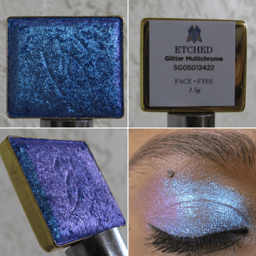
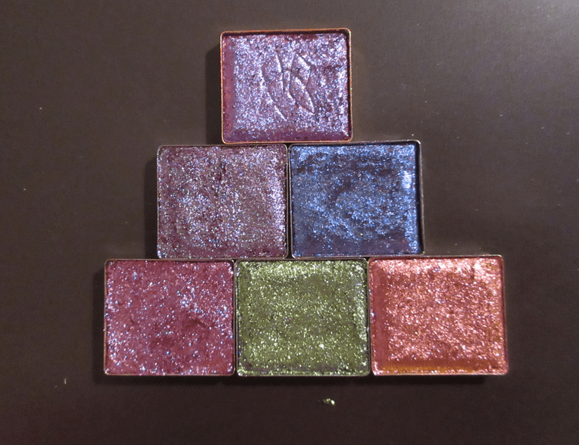
Glitter Multichrome in Etched

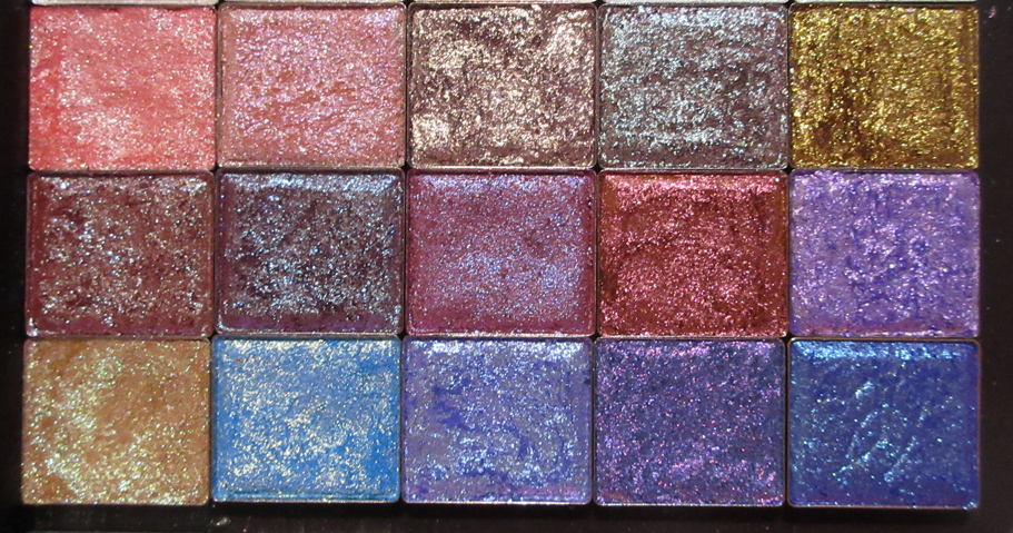
My current Glitter Multichrome collection after being whittled down. Etched is on the bottom right.

Quite a few shadows that I own in this formula ended up looking much different on my eyes than I expected. So, I ordered the shade I wanted most out of the eight new ones, and decided that if I still want others after I see how they look on more people, I can get them at that later date.

This shade is mainly blue, which rates low as an eye shadow color I like to wear, but because it has that beautiful pink-violet shift and it’s all with a purple base, I really wanted to get Etched anyway. It’s certainly pretty and even though I could have been fine without this shade and likely won’t use it regularly, I’m still happy to own it.

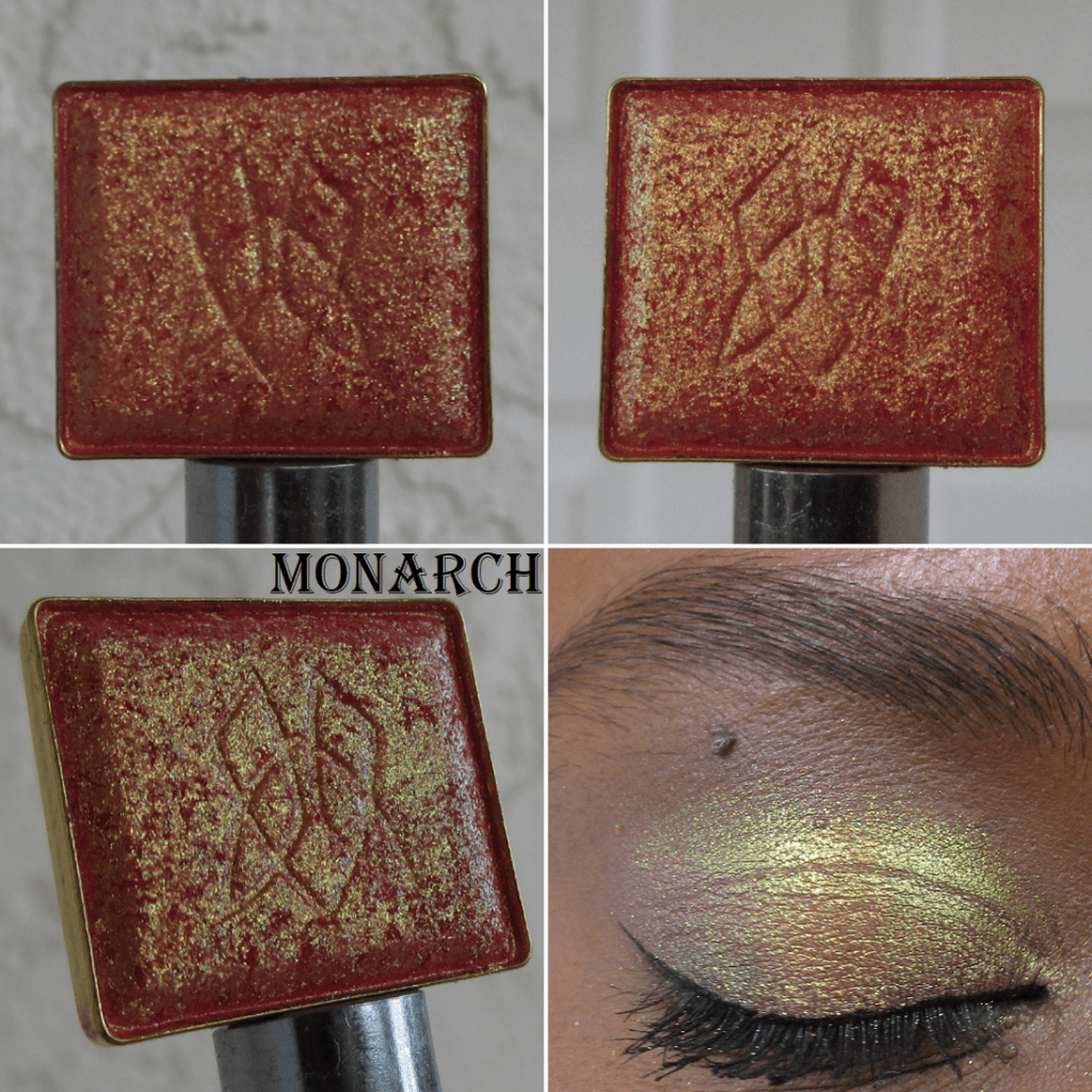
Vibrant Multichrome in Monarch

My Vibrant Multichromes with Monarch at the top.

Monarch was the only shade I wanted of the four new additions to the Vibrant Multichrome category. I am absolutely thrilled with it! It’s like a more orange toned version of what I wanted Bloodline to be on me. In fact, both Bloodline and Royalty have a silvery look to the shimmer on my eyes. I was so relieved to see that this did not happen with Monarch. The base color in this is red, but all that gold makes it look orange.

I can certainly see the gold shift and subtle bit of lime, but not the aqua described on the website. I don’t mind because the way it looks is gorgeous enough for me.

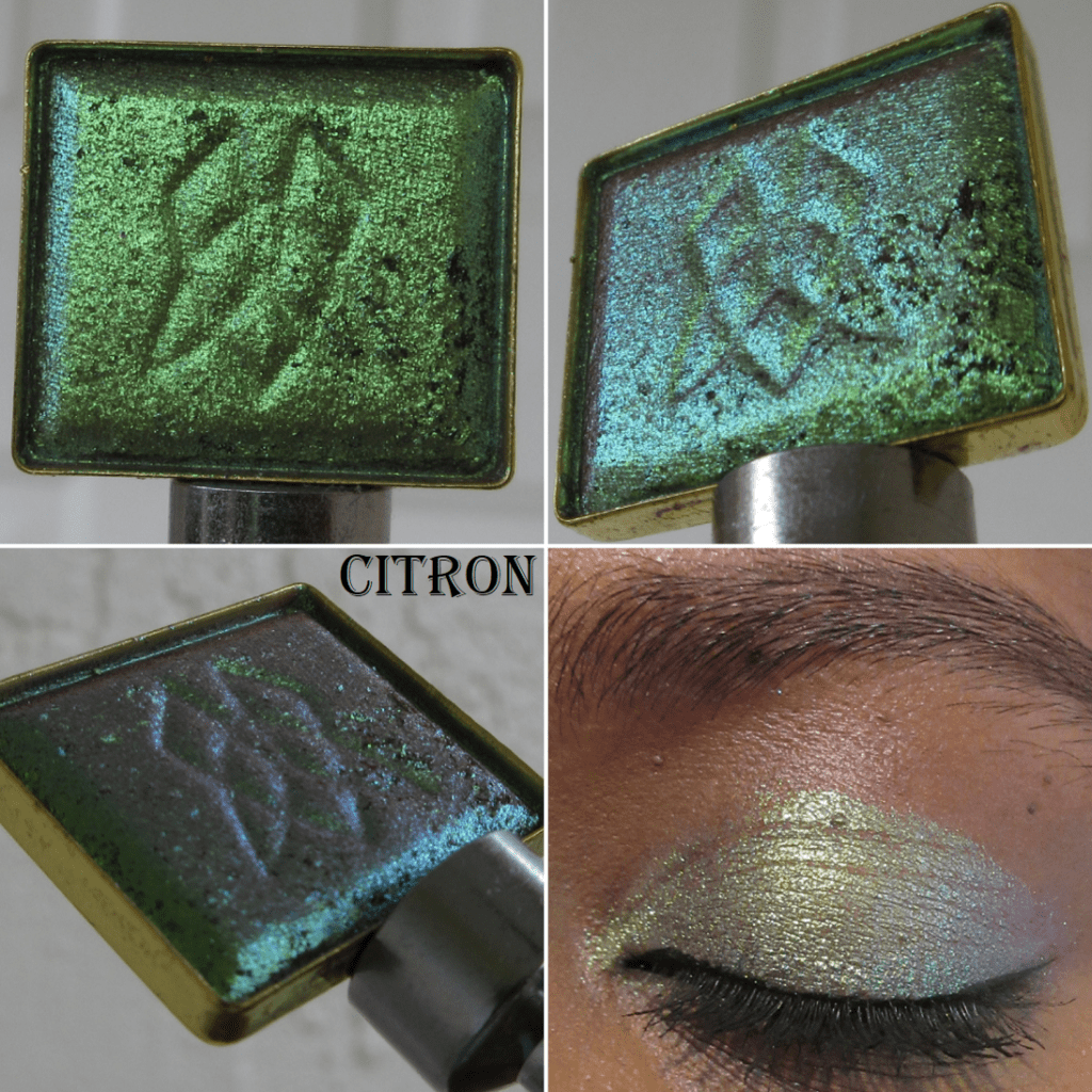
Deep Iridescent Multichrome in Citron

My Deep Iridescent Collection with Citron in the middle.

I only purchased one of the seven new DI Multichromes, but there are several more on my wishlist that I wanted and only stopped myself from getting them because the other shadows on my list seemed more color-shifting and unique. However, don’t be surprised if/when you see additional Deep Iridescent shadows in a future post!

All of the Deep Iridescents have a unique finish to them, as seen in the close-ups of the pan, and Citron is no different. Putting that shade on my eyes reminded me why it’s one of my favorite formulas from the Stained Glass Collection and I instantly regretted not taking the chance on getting more of them. I love how smoothly they apply and look on the eyes. Citron in certain situations looks quite unique because of that “cool taupe base with chartreuse-lime-aqua shifts,” but in the type of lighting I’m most commonly in, it reminds me yet again of Verte, which is part of this collection. More than just aqua, the shift in Citron looks borderline purple on me. Since, I love purples and greens anyway, I don’t mind. While it does remind me so much of Verte, the fact that Citron looks mainly chartreuse/lime when I’m outside keeps it distinctly different and justifiable to have both.

Hybrid Multichrome in Coat of Arms

My Hybrid Multichromes with Coat of Arms at the top.

This is one of the three new additions to the Hybrid category. I was interested in the others, but since the Hybrid formula is one of my least favorites in the Stained Glass Collection, I didn’t want to set myself up for disappointment and stuck to just one. Also, even though I say this is my least favorite formula, I clearly haven’t had the heart to declutter any of them, so that’s an indication of how much it’s a preference issue and not due to lack of quality.

Coat of Arms is certainly not as deep and rich on my eyes as I expected, but thankfully it’s still a very pretty color. I’m actually glad it’s not as dark as it looks in the pan because I was concerned it would be too similar to Tapestry or the Jewelled Multichrome Spire, but it turns out those other two lean much more on the blue side. It’s quite similar to how Shard looks on me, except that Shard has a warmer purple look to it, whereas Coat of Arms is deeper and the stronger blue shift gives it a cooler toned look to it. For a Hybrid Multichrome, I’m pleasantly surprised how much I like it. However, I feel quite certain I have shades like this in my collection, so I haven’t decided if getting this one was worth it.

Arm Swatch Videos and Photos

Sometimes it takes a long time to process in HD, so if for some reason it doesn’t load, here is the link to the unlisted YT short.

Closing

The only categories I did not purchase anything from were the Series 2 Iridescent Multichrome expansion and the newly released Pearlescent Multichromes.

As for the shadows I did purchase, I’m happy with my choices, though I still can’t help but want the few additional shades I had left on my wishlist. When I decide to look through my multichrome collection again to see if I have colors that are similar enough, perhaps I won’t feel that way. As I mentioned earlier in this post, I wanted to share the most important photos as soon as possible, but I also want to take my time enjoying this collection at a leisurely pace since I don’t think any other eyeshadows this year are going to top these. I want to have something new to look forward to trying out for weeks to come.

Thank you for reading and hopefully sharing in my excitement over these gorgeous multichromes! If you want to see my previous Clionadh reviews, I have links to them in this index post.

-Lili

Clionadh Cosmetics Partial Dragon Fruit and Birthday Collections

I normally post reviews exclusively on Mondays, but this post is more of a show-and-tell. I consider it a bonus!

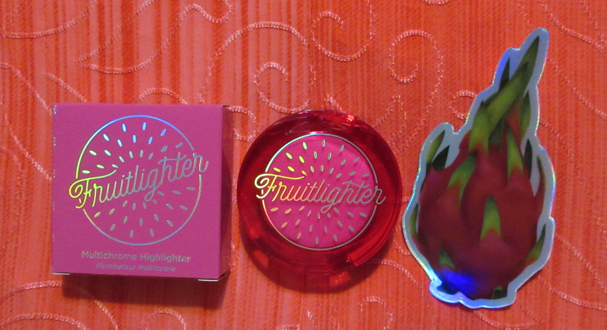
Clionadh Cosmetics Fruitlighter in Tropico

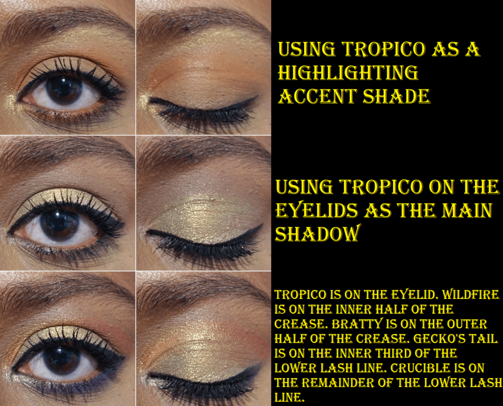
This highlighter, or fruitlighter as it is cutely called, is part of the collaboration Dragon Fruit Collection between Clionadh Cosmetics and Emily Violet Marie. Although I’m not following Emily on any social media, I have seen some of her videos discussing Clionadh products and I think it’s fantastic that the brand liked the concept she came up with long ago and decided to work with her. The entire collection is fun and summery, but I’m on a low-buy and a bit of a neutral phase, so I decided I would just get the two most unique items: the Fruitlighters. Unfortunately, the shade Pitaya sold out as I was checking out, but I still managed to get Tropico. I don’t think I can pull off duochrome and multichrome highlighters on my face, but I plan to use Tropico exclusively on my eyes.

I am very happy with this purchase and I know I will get some use out of it because I transferred it from the compact to my custom magnetic palette with my other Clionadh multichromes. When I was swatching Tropico, I observed the pan spin around and I figured out that it wasn’t glued in the compact, just stuck there via a magnetic bottom. So, I’m able to lift it out (gently with a thin object) and put it anywhere I want.

Tropico is in the palette on the bottom right.

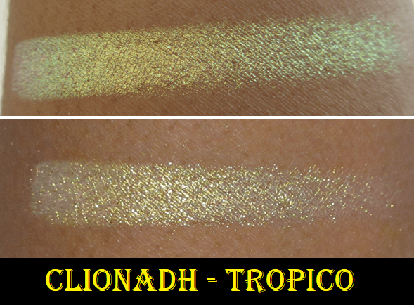
In terms of longevity, I have no issues using Tropico on my eyes, nor the cheeks. It lasts all day wherever I put it. Clionadh highlighters in general are a bit glittery, which is why I prefer using them as eyeshadows, if it all. Part of why I was drawn to this shade, as can be seen in the swatch video, is that at a sharp angle you can get a partial rainbow colored shift of yellow, green, blue, and purple. I cannot recreate that effect indoors on my eyes, but it’s gorgeous all the same.

Clionadh Cosmetics Britt’s Birthday Trilogy Eyeshadow Trio Set

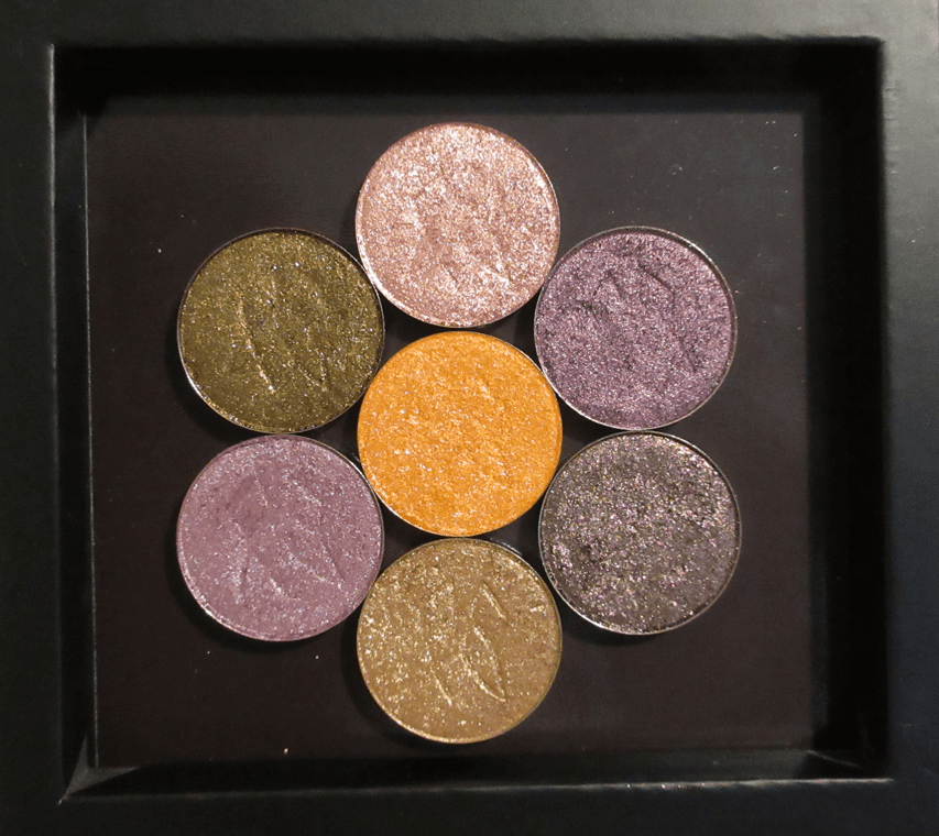
Leigh (aka Britt) and Maggie are the two Founders of Clionadh, and it was for Leigh’s birthday that this eyeshadow trio was created. I really wanted the green shade, and when I read that Nightmare was similar to Gum Tree (one of my favorite Clionadh shadows), I planned on purchasing the set whenever I had a bigger order to make. Somehow, I missed the part about Nightmare also having a similar vibe to BrittBritt, another shade that I also already own. So, the reason I haven’t swatched it with the others above is because I decided I won’t be keeping this shade.

The main differences between the three is that BrittBritt is a little more on the bronze and plummy side, Gum Tree is closer to a gunmetal dark-grey, and Nightmare is essentially just like Gum Tree but much darker in tone. So, I gave an example below of what Nightmare could potentially look like by combining the shadow Koala as a base, which is a dark grey-black, and putting Gum Tree on top. BrittBritt, Gum Tree, and Koala are all discontinued eyeshadows that were sold to contribute to various charities. If I did not already have all of those, I would have happily kept Nightmare. This Birthday Set is still limited edition, so it won’t be around forever!

It’s very important for me to not just keep makeup for the sake of keeping them. I really want to ensure I get more use out of my products, which is why I made the decision to just keep the Clionadh products I will actually use. I’ve barely made dents in my shadows despite how often I’ve used them because a little goes such a long way and I’ve calculated that even if I used a different shade every day, between the Stained Glass Collection and Clionadh’s standard shadows, I’d only be able to use them 5 times at most per year.

Below are the comparisons to the darkest greens and deepest reds in my collection with the new shades. One thing that really stands out with Mythology is that it has a lot more sparkle to it than the other greens. As for Bratty, it’s different enough from the others to want to keep, but between the reds and pinks I do have, it’s part of the reason I opted out of the Dragon Fruit palette. I do have a lot of those kinds of shades.

Per usual with Clionadh, these shadows remain opaque and pigmented on my eyes all day.

That’s everything! Thank you so much for reading! If you’d like to check out more of my Clionadh reviews and other indie brands, I have several of them categorized alphabetically here.

-Lili

*DISCLOSURE: All products in this post were purchased by me with my own money. Non-highlighted links in bold blue font (Example) are non-affiliate links that will not generate commission. Links marked in bold black font with a light blue background (Example) are affiliate links. Affiliate links allow me to get a commission if purchases are made directly using my links. There are no affiliate links in this post.

Clionadh Cosmetics Combos and Collection Update

Clionadh is my favorite brand when it comes to duochromes and multichromes. Actually, it might be my favorite beauty brand period. In one of my previous reviews, I combined Kiln and Bloodline to create a gorgeous new shade and wondered what other exciting combinations could be made. Today, I’m showing a few that I experimented with and really like! I’ll also swatch the new Charity Bundle for 2021, along with the latest additions to my single shadow collection.

The Combinations

Trial 1

Royalty comes off as an icy purple on me, so I wanted to add more of a purple (with a little blue) tinge to my look. I ended up with more blue than purple, but I still thought it was quite pretty.

Trial 2

Crown Jewel is such a vibrant blue that I consider it a statement or occasion shade. It’s not something I’d wear on a regular outing. Spire is the dramatic opposite. It’s striking, but very dark, and also a bit much for daytime usage. So, I wondered if I could lighten up Spire and add an extra shift. I love how this turned out! It’s still not an everyday kind of shade but it’s gorgeous! I see myself creating this combination again in the future.

Trial 3

Opulent doesn’t do much for me besides being used as a highlight shade, so I thought if I could add Smoulder, I could perhaps get something a little darker and more pink. I hoped it would look closer to Bloodline, but the color it turned into reminds me of Weld or the Sextraterrestrial shade from Pat Mcgrath’s Divine Rose II (which is supposed to be a dupe for Forge but I don’t own Forge to compare).

Essentially, the most dramatic changes happen when I pair a shadow with one of the Jewelled Multichromes from the Stained Glass Collection.
I tried many other combinations, but one issue I found is that some of them looked dramatically different on my arm, but on my eye there wasn’t a significant enough difference or the resulting combination looked too similar to one of the shadows already used.

Clionadh announced a shade extension coming to the Stained Class Collection, so I would be curious to see if any of them look like one of the Mixed shades I created!*

*Note: I completed this post months ago but kept pushing back the publish date. Clionadh originally announced a shade extension in time for Black Friday, but they decided to focus on restocking their current inventory in time for the sale and then afterwards fully focusing on building up the inventory of the new shades to be released in 2022. Their sale is still ongoing until December 3rd.

Collection Update

Left swatches were taken with flash off. Right swatches were also taken indoors but with flash on.

The Perfect Neutrals Collection Bundle

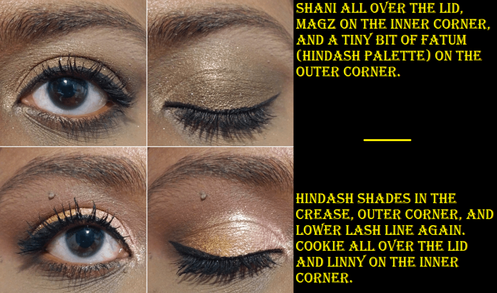
Other than Shani, these are not the types of shades I reach for because they rarely look nice on me. Baby pinks (or in this case rose gold) like Linny tend to look white or silver on my lids, but what makes this different is the gold they have running through it. On Clionadh’s website, Linny looks gold with a hint of rosiness, but the gold blends with my skin and lets the pink really pop. I’m left with a pale pink that actually looks pink on me, which is an unexpected surprise! It’s the same thing with Chelle that it’s supposed to be mauve, but it turns into the only lilac I’ve ever liked!

Although I’ve begun to appreciate neutrals again, I’m not interested in actively purchasing a ton of neutral shadows because they all look the same on the eyes. The reason I decided to add this bundle to my collection is because Clionadh does neutrals in a way that’s unlike the others on the market. The more intense shimmer neutrals tend to be a reflective metallic finish from other brands, rather than having this level of sparkle. The actual shimmer from others tend to be the standard gold or silver, but for instance, BrittBritt has pink, red, and gold glitter. Cookie has a pink shimmer that doesn’t translate as well on my camera but is very noticeable in person. I consider these shades to be spiced up neutrals, which is that much closer to the style of eyeshadow I’m into lately.

The other incentive for purchasing this set is that it’s Clionadh’s second charity bundle. According to their website, “100% of the profits will be split and donated to…True North Aid and The Black Queer Youth Collective.”

The previous charity bundle was limited edition, as is this one. When the Perfect Neutrals were released, the shadows were only available as a bundle, but were eventually listed individually. Some shades are already sold out and I believe I read somewhere that there will be no more restocks for it.

I should also note that the sparkle level of the shimmer shades in the bundle is similar to, but not as intense as Clionadh’s most glittery shadow options. They aren’t as flaky in texture as those and they aren’t as pigmented either. I wouldn’t call them topper shades, but the intensity lies in the sparkle level and not as much in the base pigment. It’s enough to give opaque results, but it’s not 100% opaque on the first swipe. The sparkle level and nuances of the shadows are what make this collection special, but in terms of color payoff and formula, I don’t consider them to be unique. The Stained Glass collection is where the special formula can be found.

Circle Pan Eyeshadows

Every time I think I’m finished buying non-matte circle pan shadows, I end up getting more! Ironically, I had this post completely finished and then Clionadh had a surprise anniversary sale, so the bottom three are those new additions!

Clionadh brought back four shades from their discontinued Valentine’s Day set. I purchased one, Amour, thinking it would be a deep red-orange. I like it anyway, even though it’s not as deep when compared to the rich coppery red of Poinsettia. I have been very much into rusty red shades like this lately and thought I might have dupes in my collection. They look similar in their pans, but they are definitely not the same as can be seen in swatches.

I am also very happy I picked up Wormwood because it’s the type of maroon-brown shadow with blue reflects I used to love in my early makeup days but haven’t worn in ages!

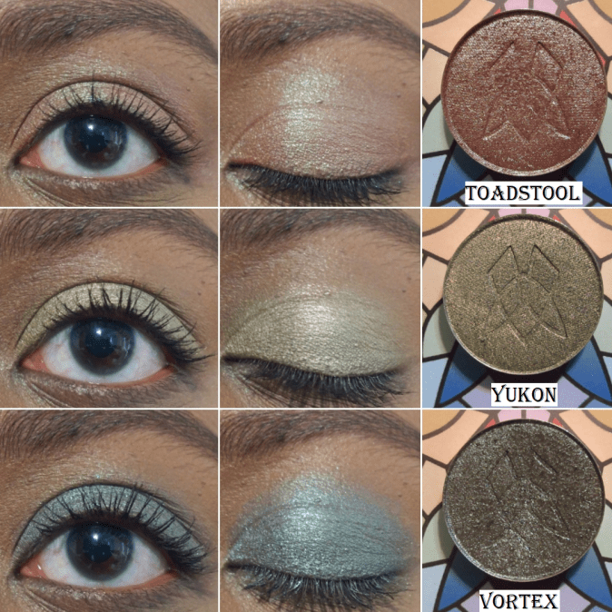
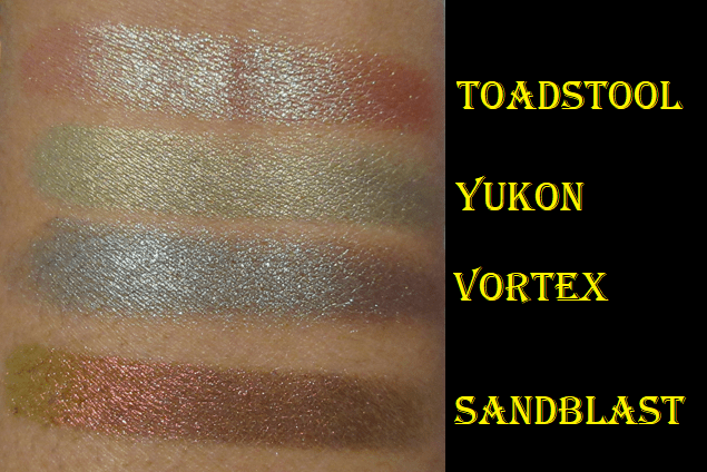
The anniversary sale shades I purchased are Toadstool, Yukon, and Vortex.

Toadstool is described as, “A rusty red-based duochrome eyeshadow with a bright green reflect. This is technically a tri-chrome shadow that will also shift up to red.” I’ve wanted this shade for a long time but finally took the plunge. Yukon is another one I’ve wanted for a long time, but I thought it might be too similar to Rune, so I didn’t get it until now. The two shades are about the same depth, but Rune has more of a yellow-olive tone whereas Yukon is a light golden green. Vortex is like Wormwood’s cousin. It has a brown base rather than a maroon one and it has green and aqua shimmer.

Stained Glass Collection Update

Majesty is described as having, “an orange base that shifts gold-green-turquoise.” I wish more of that orange would peek through on my eyes like it does on my finger and arm swatches. The gold and green are certainly visible though. Out of the five Vibrant Multichromes I have, only Heirloom and Crown Jewel look the way I expect them to on my eyes.

Sand Blast is the most orange in color of the Jewelled Multichrome category. It’s a dark orange with a gold and lime green shift. It’s not too far off from Smoulder (magenta-orange-gold-lime) and Kiln (red-orange-gold), which is why I figured I would like those two shades more. However, I couldn’t escape the feeling of missing an orange shade like this, so it is finally here!

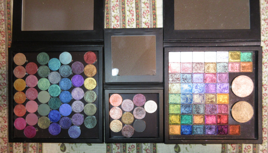
The other Stained Glass addition I purchased is the mini palette! It’s so cute! Even though I have zero plans to travel with my Clionadh shadows, I wanted to be able to keep my Charity shadows separate from the rest of the collection, so I put them in it. Below is a photo showing the size difference.

On Clionadh’s Instagram, I recall seeing a comment about the possibility of a Jumbo size palette in the future, so of course I’d be interested in that as well. Even though I have plenty of Coloured Raine’s gigantic 96 pan palettes, Clionadh’s shadows are so special to me that I want to keep them in special packaging as well. As it stands, my one mini and two standard size palettes are pretty much full.

This is what my collection looks like now. I downsized the Stained Glass side by five shadows: Blaze, Sunbeam, Ripple, Spotlight, and Glazed. It was not easy to let them go, but I wanted to only keep shades I could happily use on their own without needing to mix them.

I think I’m finally set on the circle pan shadows unless Clionadh brings back the mattes. Parchment, Nectar, and Raspberry Fudge from the Harvest bundle are still on my wishlist. Halo is the only one left on the list from the Stained Glass collection. If I purchase any of the extended shadows in the future, I’ll make room by placing the highlighters in my custom face palette.

The last thing I want to mention is that Clionadh’s labels have changed since August at the latest, but likely before that. They now list the shadow type and removed the brand name.

Thank you for reading and Happy Shopping this Cyber Monday!

-Lili