


Since the brand’s highlighter is one of my favorite products, I was excited to see the release of their new blushes and bronzers in similar packaging with the same pattern and soft looking texture. I won’t harp on the highlighter because I reviewed it in-depth in my Best Highlighters Showcased post just a few months ago, but I wanted to at least show it again in different lighting.
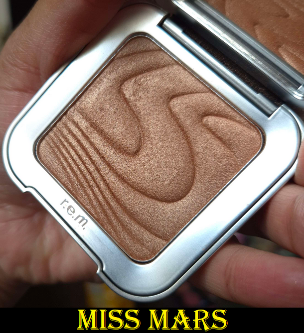
Although the texture isn’t exactly the same as the new products, because it’s a shimmer that feels slightly emollient to the touch, the others are a soft matte that feel like they still have a bit of slip to them.
r.e.m. Hypernova Bronzer in Cocoa-Nut
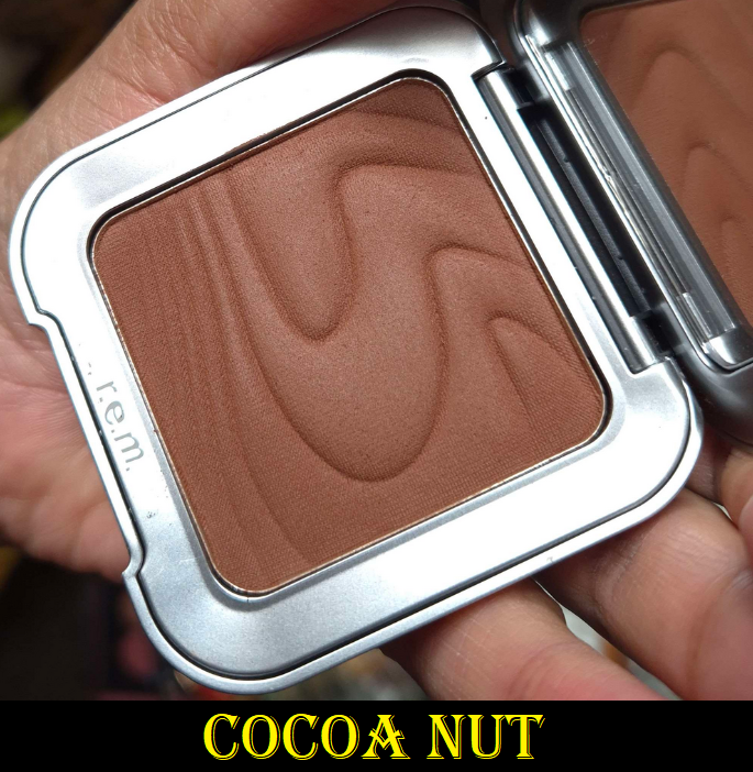
This is the fifth shade option out of six bronzer colors. Cocoa-Nut is described as, “very deep with warm undertones.” Warmth can mean it has anything between a yellow, orange, or red undertone. In this case, it’s red and a bit warmer than looks natural on me. I can still pull off this shade if I use it sparingly, but the color does impact my enjoyment of this bronzer. It’s possible the 4th shade called Solar Storm described as, “tan with warm undertones,” might work better for me, or just as easily could be too light.
I purchased this from Selfridges because, at the time, Sephora DE only carried the four lighter shades.
I recommend using an airy brush with this because it’s quite pigmented. It blends well, but it doesn’t have the best sticking power (which shortens how long it lasts throughout the day). Although I love the soft texture and it has a natural looking finish, I prefer bronzers with a little more of a satin sheen to them. I’ve also been spoiled to own so many bronzers that have an even more effortless blend.

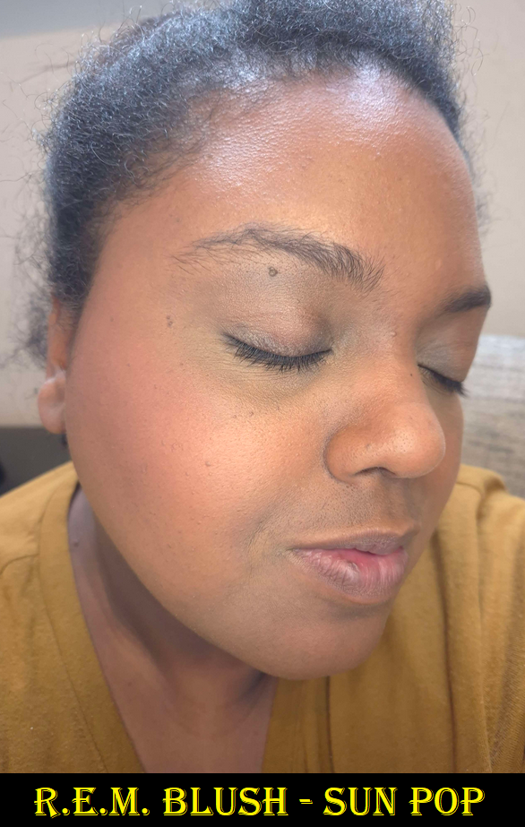
r.e.m. Hypernova Blushes in Jupiter Moon and Sun Pop
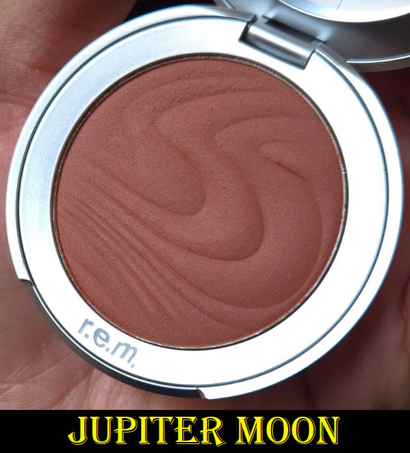

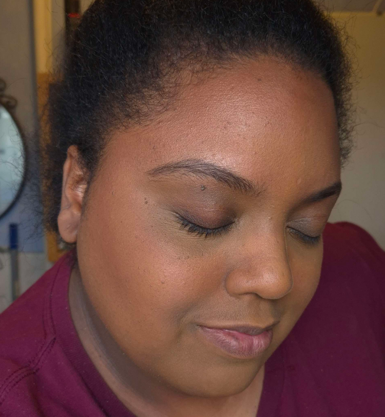
The blushes perform identically to the bronzers, though they have slightly less pigment. For that reason, although they are nice, I’m even less impressed. The blushes eventually become one with the skin, melting into my foundation, which looks pretty while it lasts, but it does fade as the day goes on. I love the Jupiter Moon shade because it’s in the family of reddish brown blushes, which I can pull off as long as it isn’t too red. I can list some that I still love more in terms of finish and performance such as Benefit’s Terra and Pat Mcgrath’s Paradise Venus. It’s still nice and I plan to continue using it on and off. In this case, I recommend using a medium density brush like the Sonia G Cheek Pro so that it has enough blending power while remaining buildable if you have a lighter skintone.
The shade Sun Pop, however, looks ashier on my skin and even looks more powdery in the swatch. I think it has to do with the vibrancy of the pigment as it’s akin to neon/fluorescent oranges/corals. All the promo images I saw in the beginning show this shade as looking orange, but in person it’s clear to see it’s coral. To be fair though, I had a hard time capturing the color accurately on camera because it does tend to pull orange in photos.
Just like the bronzers, I’m intrigued to see if there are more out of the eight options I’d prefer on myself. However, my blush collection is too large to justify buying more and at full price. Ironically, these I bought via Sephora DE because none were available at Selfridges on launch day.


I don’t usually include so many photos of the same products, but I was unsatisfied with how the pictures turned out. Every day I attempted to take pictures was a cloudy day. So, they were either too dark or too washed out with the lights I tried to use to compensate. Below are the newest ones and most color-accurate.

You can click on any image to enlarge them.
That’s all I have for today. Thank you for reading!
-Lili ❤
