Unearthly Cosmetics Lore Palette and Gigi Blush

Unearthly Cosmetics is the new rebranded name of Alien Cosmetics. I made my first purchase from the brand round July 2021, but soon after I heard there were reformulations, palettes getting new packaging, and other changes that made me decide to take a pause before talking about them here. I purchased the Gigi blush when I thought things were settled, but once again found out news that the brand was allegedly forced to change their name. So, I continued to hold off on talking about them until they had their new name secured and were officially finished selling products that still bore the Alien Cosmetics name.

Considering their track record of making changes to products seemingly out of nowhere, I have no clue if my products from 2021 are the same as what someone will get from Unearthly Cosmetics now. In case they are, I hope this review will still be valuable, but I needed to put out this disclaimer that it’s possible the quality is different.
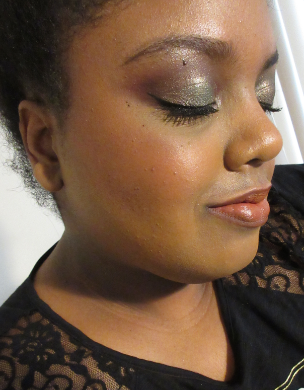
Lore Palette

As I mentioned above, I intended to review this palette well over a year ago. I have additional eye looks and a video showing the color shifts of the multichromes in this Instagram post.

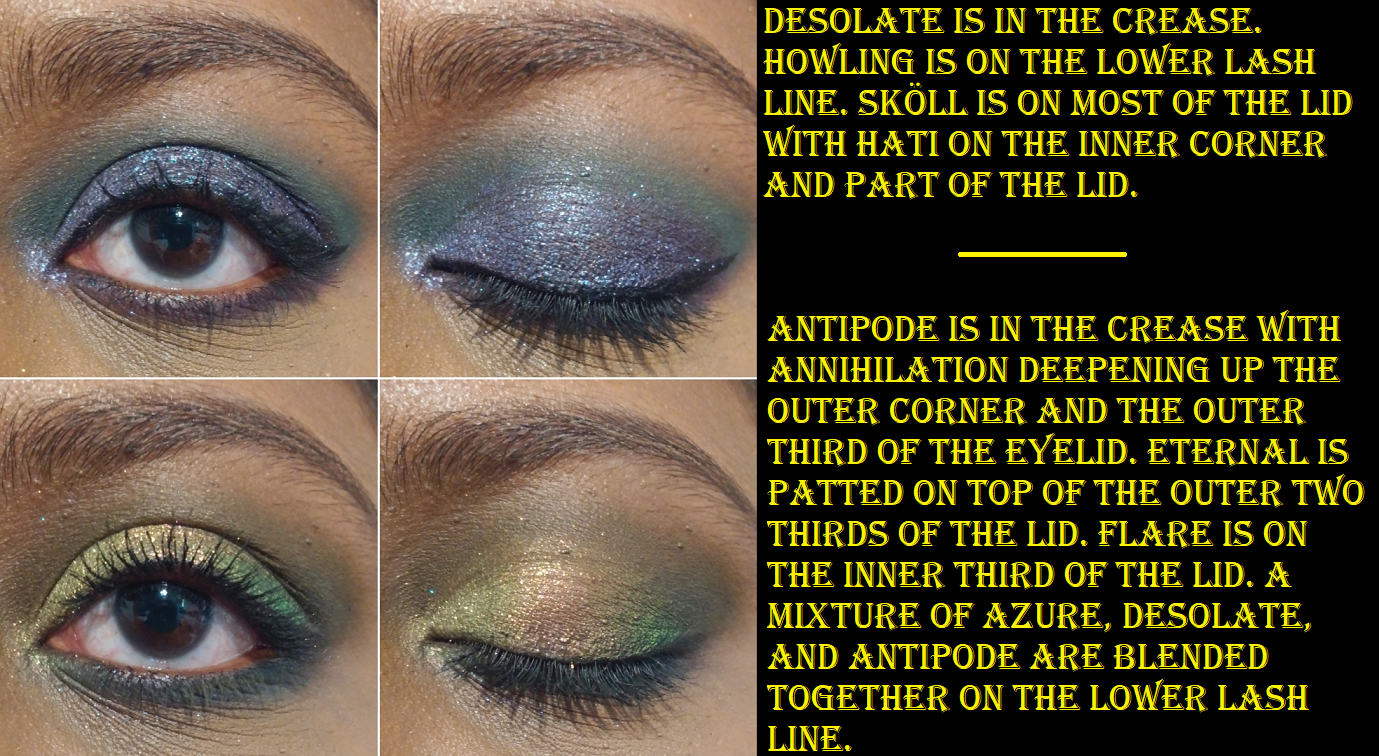
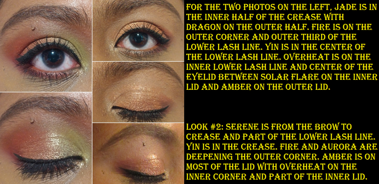
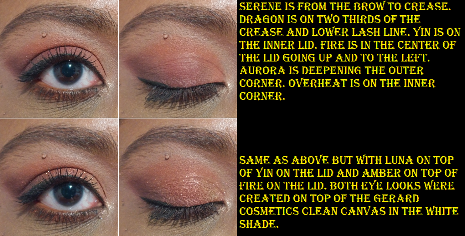
These mattes are very dry. I remember them being a bit like this when I first bought the palette, but I think over time, before even a year had passed, the mattes got drier. Minotaur is especially stiff and doesn’t want to move from where I place it, but Cerberus and Centaur blend decently. Cerberus just requires slow building since it can get intense fast depending on the brush used. Faun is one of those matte formulas with glitter specks in it where the glitter mostly dusts away when blended on the eyes. This shadow is quite thin, so to even get the base color to show takes a lot of building up on me. I wish Faun was either a bit more yellow or that Centaur was a deeper orange because the two shades look nearly identical when used together. Ironically, during the first launch, the brand sent out palettes with a brown shadow listed as Centaur and then mailed everyone who got the wrong shade the correct orange one. Perhaps I would have liked that accidental shadow better.

I was very excited to have duochrome and multichrome options in this palette, but I wasn’t expecting such near transparent bases to the point where three of the five shadows nearly function as toppers for me. Serpent‘s base is the faintest of all and looks like it’s just a sheerer version of the somewhat more visible hot pink base in Sphinx. I use Serpent when I want blue, green, and purple shifting sparkles with cool toned looks and Sphinx’s aqua, green, and gold sparkles look best with warm toned ones. Whenever I plan to use them in the palette, I have to swatch them first on my arm to remember which effects they give because I really didn’t like the times I’ve chosen the wrong combo. My favorite multichrome of the three is Medusa, which has a dark but still semi-transparent base. It pairs so well together with the deep blue-green shimmer shade called Basilisk. Medusa and Basilisk are my two favorite shadows in this palette. All the shimmers have a smooth texture except Griffin, which is a little chunkier, but has a very high-shine look to it. It’s like a less obvious color-shifting version of Centaurus from Devinah Cosmetics.

Showing the transparency of Medusa.

Regarding how they wear on my eyes, I didn’t have anymore creasing than usual. I didn’t have any extra fallout. The shimmers didn’t dull down as the day went on and they looked decent still by the end of the day. To anyone interested in this palette, I recommend it based on preferences. In general, with it not completely meeting what I want, $33 isn’t a bad price (it was $30 at the time I bought it with $5 shipping and no tax, but I used the influencer code ANGESCHKA), though it would be more like $38 now.

This palette would be a fantastic option for someone who likes grungy colors, high shine duochrome/multichromes with no dark bases, and is mostly in it for the shimmers so they don’t mind reaching for other palettes for better mattes.

Gigi Blush

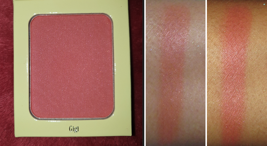
I’m not sure why “blush palette” is written on the packaging when it’s just a single blush, but in any case, I saw this shade and that Scorpion on the inside and I had to buy it! It’s aptly described on the website as a, “satin finish rosy terracotta,” blush. If I remember correctly, the brand is run by two sisters and this blush is named after Gigi and the highlighter that was released at the same time is named after Dani. I didn’t purchase the highlighter because I thought it would be too light for me, but it has a silver to gold shift. So, the gold would probably have looked nice, though I don’t know if the silver still would have been too much.
While there is visible dark pink shimmer in the blush, after all the blending that is required, I don’t see the shimmer on my cheeks.

Light-Medium application of Gigi blush to the cheeks.

I’ve tried to love this blush because it’s such a pretty color, but it’s super pigmented and not very blendable, regardless of the brush I use with it. I’ve tried my synthetic brushes like the Smashbox Sheer Buildable Cheek Brush, my MUFE Highlighting brush (basically blush size). I’ve tried my very expensive brushes with different types of natural hair suited for pigmented products, but the issue is that it sticks where it’s blended, but is also a thin powder so it’s also sheer in some places at the same time. It needs to be buffed properly to smooth it out. It’s not a terrible blush, as I have the tools to lightly apply it and switch to another brush to blend it out and make it look nice. However, with my huge blush collection, I don’t feel that it’s worth the effort for me, when I can get a smooth flush in a snap with other blushes out there.
I have tried powdering my cheeks first before applying the blush and that just prevents it from wanting to blend properly into my skin. Applying it to my cheek and then buffing with a finishing powder after also works, but again, it’s extra work.

One thing that this blush definitely has going for it though is the longevity. Using my normal application methods, this will last on my face all day without fading.

Unearthly Cosmetics released additional single blushes and highlighters in April of this year, so perhaps the formula is better than before. You really never know with their brand!

That’s all for today! Thank you for reading.

Note: This is my last completed pre-scheduled post. I had surgery September 15th and due to the long recovery period for this surgery, regular Monday postings will be interrupted/inconsistent for the rest of this year. I still have about 20 partial posts that were started prior to surgery, and therefore I will still have content coming to this blog, just not at a stable predictable rate. There may be a few weeks or a month gap without posts, but if you’re following via email, you will be notified of every post. Thank you for understanding.

-Lili

Oden’s Eye Legendary Diversa Collection

Oden’s Eye Cosmetics is a brand I’ve really come to love over the past year and I’ve tried quite a few of their products. Their color stories and finishes don’t always match my style, but there was something compelling about the entire Legendary Diversa Collection. I couldn’t choose between them, so I decided to purchase all three. They each retail for $34 USD and shipping is free on orders over 50 euros (roughly $58). Influencer promo codes did not apply to the collection, but they worked on everything else. Each palette also comes with a corresponding scarf that matches the cover art. My products came in a special edition Legendary Diversa box, which I’m not sure if I got because I purchased all of them or if anyone who orders from the collection gets it.

I also got a free brush, which has happened for my last few orders. Again, I’m not sure if this is because I spent a certain amount of money or if everyone gets a free item when they order. I have not used the brush yet, so I will not be reviewing it here today. If you’d like to see my review of other products from Oden’s Eye, click here.

One thing I’d like to fully disclose is that these three palettes are collaborations with YouTubers: The Fancy Face, Annette’s Makeup Corner, and Judy. I follow Tina (The Fancy Face) and consider her one of my favorite YouTubers. I’ve spoken about her several times on this blog and while it’s true I would have purchased her palette regardless of the color story (this is partly to do with my trust in the quality of Oden’s Eye makeup), my support of her does not mean it gets a free pass. I hold it to the same testing standard as any other product I review. Annette is someone whose videos I watch from time to time and have started to watch a little more recently. As for Judy, she left me a nice comment on Instagram, but that’s the extent of our interactions. As for her content, I’ve only watched her Oden’s Eye videos. I wanted to make sure I put that out there in case anyone wonders if I will be biased. The artwork for all three palettes were equally beautiful and I wanted them all for that reason. The book-like format, sizing of the palettes, the unique outer texture, the reflective holographic sections that add a sort of glow when the light hits it, the shapes of the pans, etc are all so appealing to me. These packaging details are all part of the brand’s aesthetic. The collaborators’ images were used for the covers and it’s their color stories, themes, and final decision whether the formulas are up to par, but because these ladies were working with a great brand, it’s not surprising that I’d like their palettes. The infamous Too Faced x Nikki Tutorials collab is proof that the best of ideas a collaborator has will still do poorly if the company they’re working with fails on their end. Besides the packaging, I love Oden’s Eye’s formulas, so it’s just a winning combination between the brand and these three ladies. It comes down to whether someone likes Oden’s Eye shadows and in these particular shades.

Before we get started, I just wanted to add (so I won’t have to repeat myself three times) that each palette has a multichrome. These don’t have a dark base and they’re a thin metallic smooth type of formula, so they will actually look very different if layered on top of different eyeshadow colors. These provide a lot of shade variations and combination possibilities to the palettes.

The changes in lighting really do effect the looks of these shades. It’s mind boggling how they appear distinctly different in the pans, and while indoors, but if I step outside they suddenly look quite similar to each other.

These don’t surpass my top three favorite multichrome formulas from Clionadh, Devinah, and Terra Moons, but I do like them. They’re nice and shifty and perfect for those who don’t like the chunky, glittery, or dark-base types of multichromes.

The Hummingbird Palette

This palette appealed to me because it’s so bright and colorful. Purples and greens are my top two favorite eyeshadow shades, but I think I may have been intimidated by all the different color choices if it wasn’t for the Kaleidos x Angelica Nyqvist Club Nebula palette. The Club Nebula and Hummingbird palettes have a very similar vibe to each other. Because I learned what shades I like to pair together in Club Nebula, I knew exactly which combinations I wanted to try with the Hummingbird palette. Club Nebula will not be restocking, so if anyone missed getting that palette, I think this one is a great option.

There aren’t any spot on dupes, but some similar looks can be created. I will say, I prefer the multichromes from Oden’s Eye over the ones from Kaleidos. As much as I like the matte formula from Oden’s Eye, I think the mattes in Club Nebula specifically are even more my speed. The pros and cons for both make it so that I couldn’t choose which one I like more, so perhaps those who already know they like Club Nebula will enjoy Oden’s Eye’s palettes as well. Just as I felt the Club Nebula color story inspires me to try new things, I still see even more shade combinations I want to test out with the Hummingbird palette that I haven’t yet. It inspires me as well.

Of the three palettes, the Hummingbird palette has the most number of different finishes and also the greatest variation within the formulas. There are five mattes, the multichrome, two metallics, and four shimmers.
Among the mattes we have Lagoon which is right on the cusp of being a cream to powder, or “cream to matte powder” as Tina describes it in her launch video. It’s just barely creamy enough to be detectable by touch in order to tell it’s more than just a creamy feeling shade. In fact, it reminds me of the satin-like metallics (Realism and Passion) and creamier shades (Obsessed and Colourful Black) from the Oden’s Eye Norn’s Palette. Unlike those shades from the Norn’s Palette, this one has no tugging on the skin and performs just like the other mattes. It’s a dark almost navy blue in the pan and can look that way if packed on, but when Lagoon is spread out, it’s revealed to be more of a deep teal. That’s why I compared it to Queen of Blades in the Club Nebula section rather than Void. Clear Blue is a very thin matte that can be built up to full opacity. It’s not my kind of shade on its own, but it makes a fantastic shade to blend out the edges of a matte. I love pairing it with Star Apple because it makes the edges turn a light violet purple. It also works beautifully with Lagoon. But speaking of Star Apple, that’s my one troublesome shade from the palette. All the other shades are easy to apply and blend, but Star Apple takes significantly longer to get an even color. At first I thought it was because it’s a patchier shade, but then I realized that whatever red-raspberry tone was used to create this purple actually peeks through. It’s visible in the edges of the swatches as well. When I take photos, the red that shows through makes it look unblended, even though it’s completely opaque in person. So in order to make it look nice for the camera, I actually take a tiny bit of Lagoon and blend it in. The blue from Lagoon mixed with the red spots in Star Apple turns it purple without changing the overall color. As much as I love the concept of the shade and how perfectly it captures the color of the actual fruit, it makes the most sense to just use it paired with the other pink and red shades in this palette. If I want to pair it with blues, I need Lagoon with it. Red Hills is a beautiful dark red that when applied in a thin layer shows a lovely warm orange hue it has to it. Hibiscus is the last matte and it’s a stunning vibrant deep-pink red shade. It’s difficult to describe and I don’t have a shade like this in my collection, which is a pretty big feat. The closest thing I have to it are some of the neon mattes from Terra Moons and Splash from the Coloured Raine Vivid Pigments. With Hibiscus, using the right primer will ensure it stays vibrant on the eyes. There are a few times I had issues of it deepening up.

The main differences between the metallic formula with shades Feathers and Tropics compared to the shimmer formula is just that they are a bit smoother and more fine. The other shimmers are a bit wetter in texture and a little on the chunky side. Among the shimmers, the shade that really stands out is Hummingbird because it’s a duochrome that’s mainly dark purple but has a variety of shades of purple and blue shimmer.

The Giant Wolves Palette

The Hummingbird Palette is vibrant and fun whereas this color story is the most “me.” It’s the selection of shades I was drawn to the most. It still has greens and purples, but with a grungier smoky side to those shades.

The first time I watched Annette’s launch video, I actually missed the part where she said each row of three could be one eye look. When I was deciding which colors to pair with each other, I swatched them in order on my arm. I did notice the groups of three were nice, but I loved how the groups of four looked together. Making those initial swatches was when I noticed the shade Hati was incredibly hard to pick up. I had to make 3-4 passes to build it up to what is shown above. It wasn’t so much an issue of being sheer as it was not getting it to spread across my arm. The fact that I could get product onto my finger every time showed me that it wasn’t hard panned, but the shadow was so compacted that I knew trying to pick it up with a dry brush would be quite the chore. I thought mine was a dud until I rewatched Annette’s video and saw that she said this shade was, “…harder pressed in the pan than I wanted.” This could mean physically pressed too hard or the use of too much of a binding ingredient. As it stands, the shade Hati is the only one I wasn’t impressed by and since a looser press had the chance of changing my feelings about it, I decided to try the physical route and repress it myself. I broke up the shadow using a cosmetic spatula and it remained in large soft chunks like dimethicone heavy shimmers tend to do. Then I used the spatula to lightly flatten it back down, particularly the edges, and then placed a paper towel over the shadow and gently pressed down with my finger. I did not add any liquids. It was a dry repress. I suspect there was already slightly too much dimethicone in the shadow in proportion to the other ingredients, but what I did still improved things a bit. I could swatch Hati across my arm with 2 passes. I considered it a topper type of shade before and pressing it myself didn’t change my mind about it. It can be built up to be very sparkly but it’s too sheer for me to want to use by itself, so I’ll keep using it as topper to add extra sparkle to looks.

We have three other shimmers and seven mattes. They all perform perfectly and the only noteworthy things I want to mention is that Desolate looks a lot more green in the pan but on my skin it comes off as a green leaning dark teal. The actual shade description according to Oden’s Eye is, “grey…with a slight green tone.” Annette describes it as a “bright dark green” so I feel better about the fact that it’s hard to describe this kind of shade. But as I said, it’s more of a teal on my skin. Astral looks more gold than it does in the pan and Sköll is like a duochrome purple-blue. It’s a black based purple as opposed to the brighter purple of the shade Hummingbird from the Hummingbird palette.

This palette also inspires me to try new combinations and brings me so much joy to use.


The Red Dragon Palette

This is the most neutral of the palettes, which made it the only one I wasn’t certain I would get. However, I have Annette’s reveal video to thank for deciding to get it because the poolside video with the sun hitting those swatches showed the palette in all its glory. The colors are so much more stunning and more interesting than it looks on the surface. And then combined with Judy’s eyeshadow look in her launch video and using the shade Dragon for blush…I was officially sold!

This is the most matte-heavy of the palettes with a grand total of eight. They all work beautifully and blend easily, but I should note that Sunrise, Jade, and Serene are a bit thin and will need some building up in order to be fully opaque. Also, Sunrise and Serene have a very hard time showing on camera, but they are visible in person. The effects of using Sunrise as the transition shade into Jade really helps to emphasize the yellow tone within Jade, but Jade is still beautiful on its own.

For deepening up looks, my options are Claw, Fire, and Aurora which add enough depth if I’m only pairing them with the light shades, but if I want to also use a mid-tone like Amber or Yin, then they aren’t quite as deep as I’d like for my skin tone. Aurora in particular looks like it should be dark enough, but I have a hard time layering it on top of other shadows. I appreciate the fact that Judy wanted to have these darker shades so no one would have to pull from other palettes to create a look, but it’s something I’ll still likely end up doing in the future.

Using a white or light base helps to distinguish all the red colors when I use them together on my eyes. They can get muddled if I don’t place them correctly, or use either a clear base or one that matches my skin tone.

I’m really quite shocked how much I enjoy this palette. I would not have thought to pair that mustard yellow-brown and jade green with those reds. I still struggle with shade pairing and finding new ways to put colors together, so this was a great learning experience. I’m very happy I decided to get this one as well.

So, do I recommend these palettes? Absolutely, yes! I recommend giving Oden’s Eye eyeshadows and even their blushes a chance. The older original palettes contain pressed glitters, but the releases in the Norn’s Collection and onwards do not have them.

That’s all for today! Thank you for reading.

-Lili