Unearthly Cosmetics is the new rebranded name of Alien Cosmetics. I made my first purchase from the brand round July 2021, but soon after I heard there were reformulations, palettes getting new packaging, and other changes that made me decide to take a pause before talking about them here. I purchased the Gigi blush when I thought things were settled, but once again found out news that the brand was allegedly forced to change their name. So, I continued to hold off on talking about them until they had their new name secured and were officially finished selling products that still bore the Alien Cosmetics name.
Considering their track record of making changes to products seemingly out of nowhere, I have no clue if my products from 2021 are the same as what someone will get from Unearthly Cosmetics now. In case they are, I hope this review will still be valuable, but I needed to put out this disclaimer that it’s possible the quality is different.
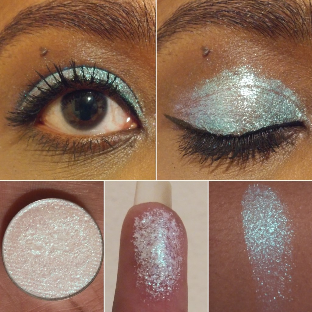
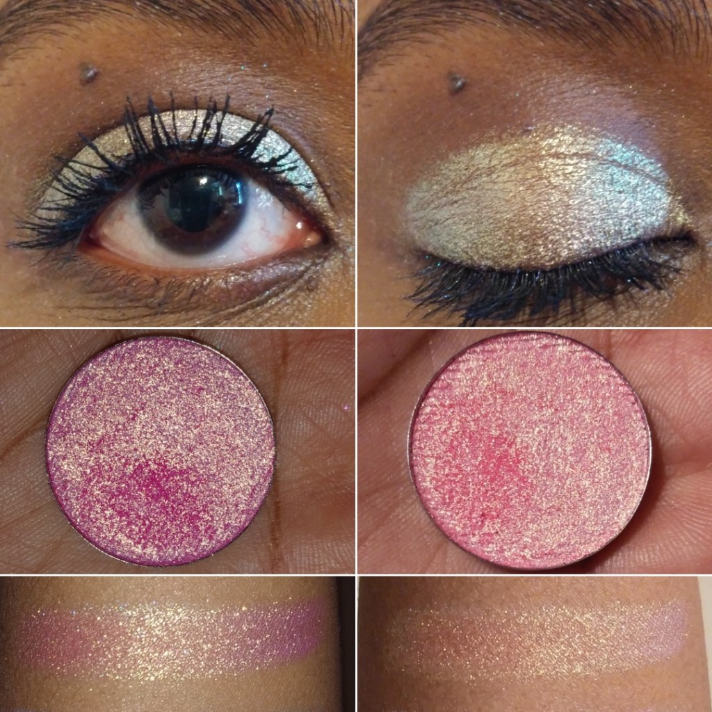
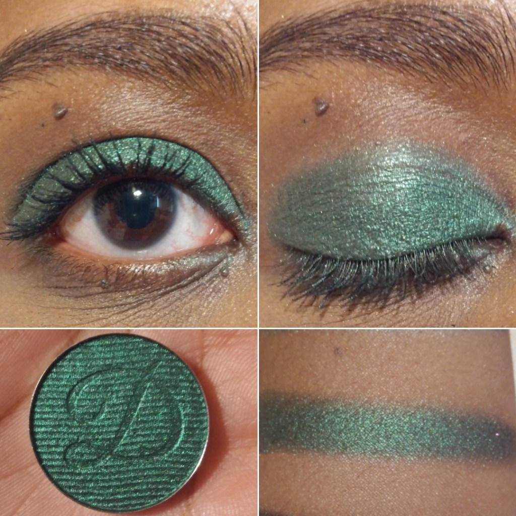
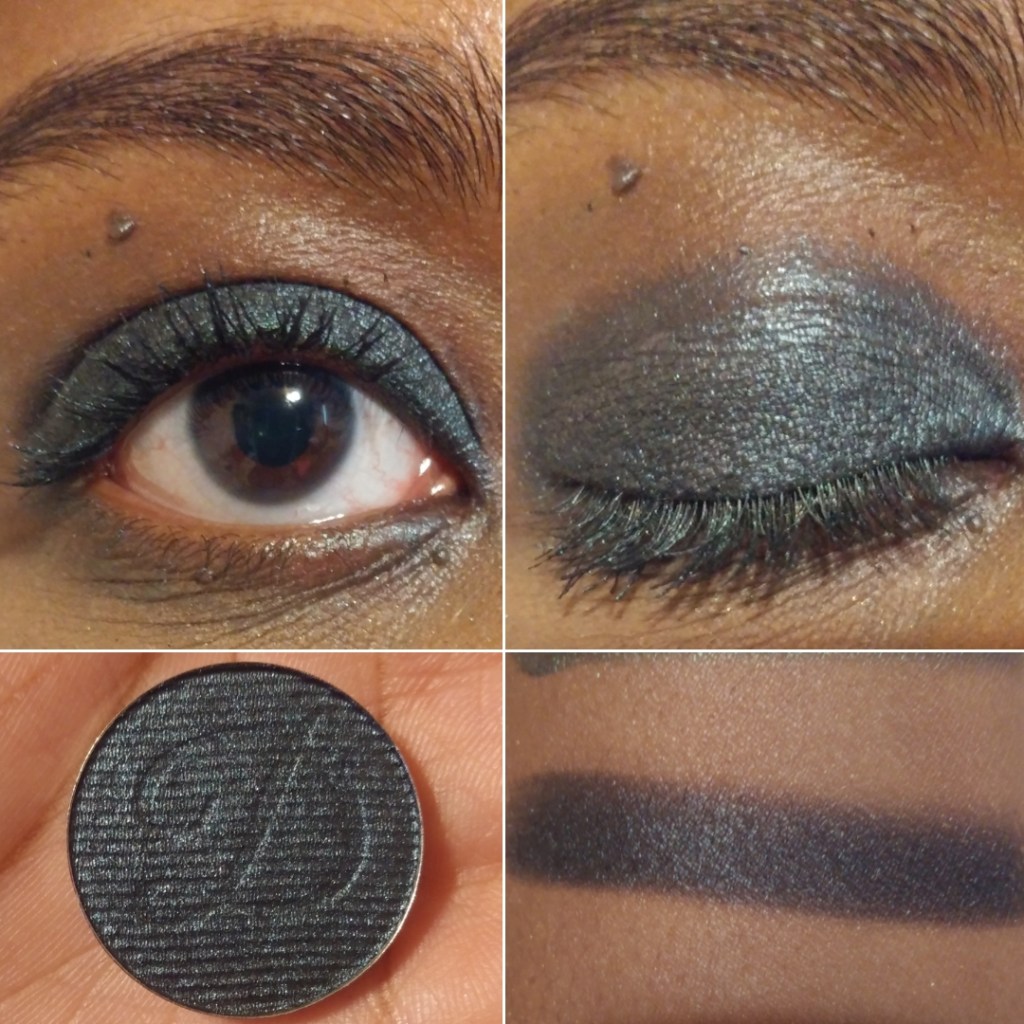
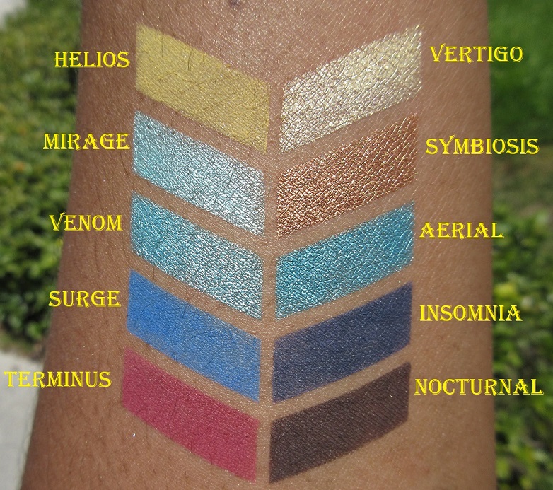
Lore Palette
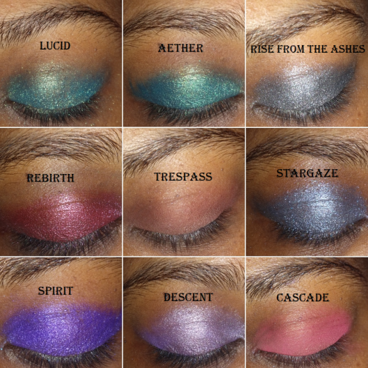
As I mentioned above, I intended to review this palette well over a year ago. I have additional eye looks and a video showing the color shifts of the multichromes in this Instagram post.
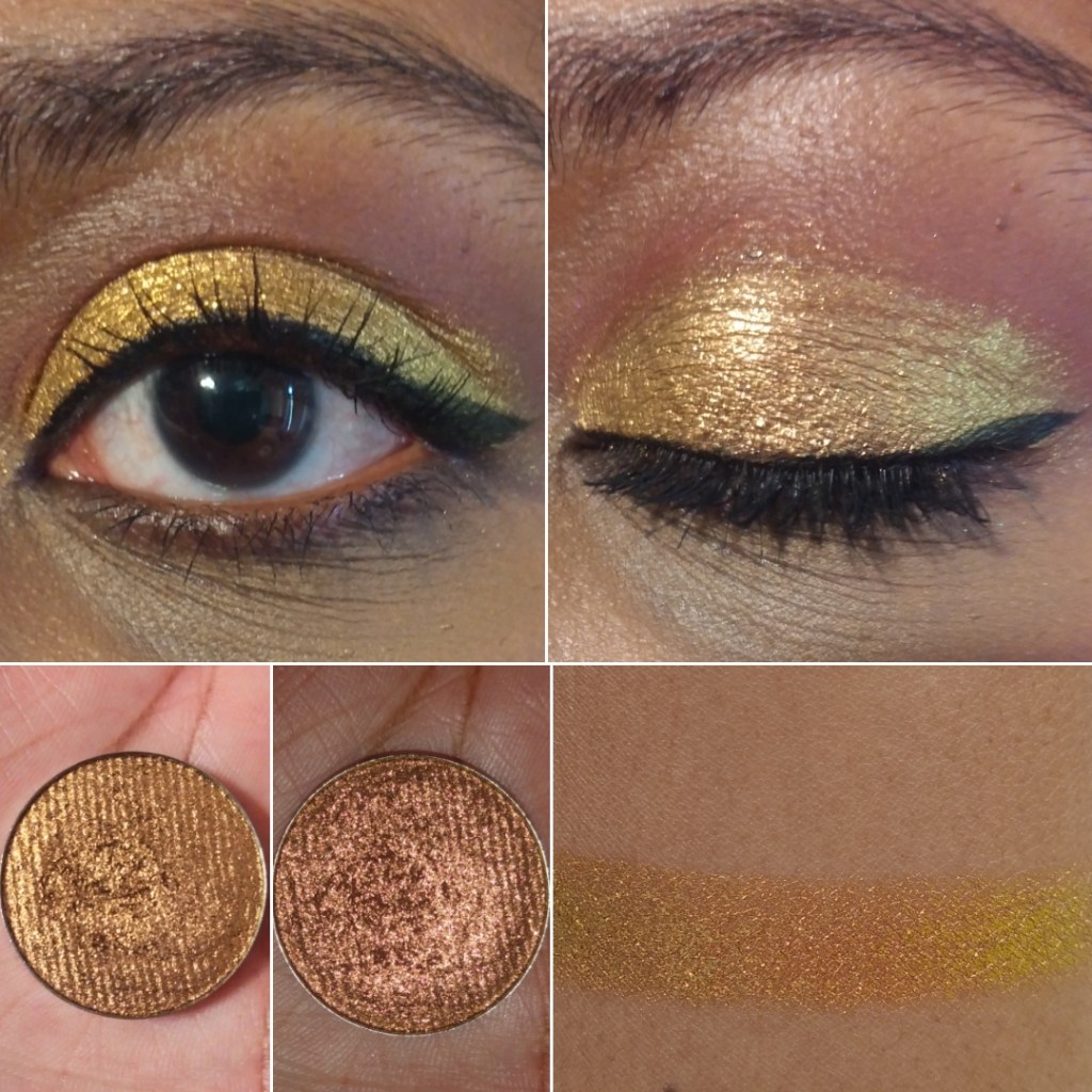
These mattes are very dry. I remember them being a bit like this when I first bought the palette, but I think over time, before even a year had passed, the mattes got drier. Minotaur is especially stiff and doesn’t want to move from where I place it, but Cerberus and Centaur blend decently. Cerberus just requires slow building since it can get intense fast depending on the brush used. Faun is one of those matte formulas with glitter specks in it where the glitter mostly dusts away when blended on the eyes. This shadow is quite thin, so to even get the base color to show takes a lot of building up on me. I wish Faun was either a bit more yellow or that Centaur was a deeper orange because the two shades look nearly identical when used together. Ironically, during the first launch, the brand sent out palettes with a brown shadow listed as Centaur and then mailed everyone who got the wrong shade the correct orange one. Perhaps I would have liked that accidental shadow better.
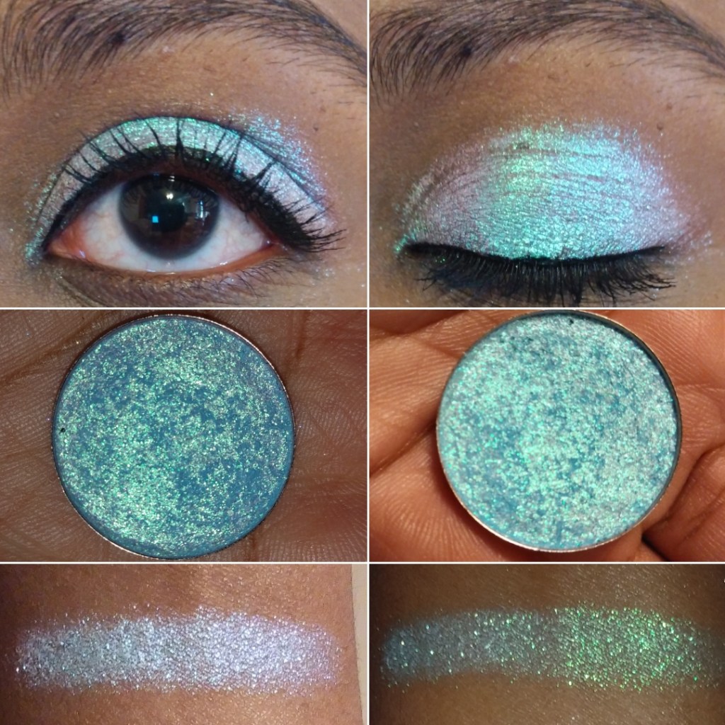
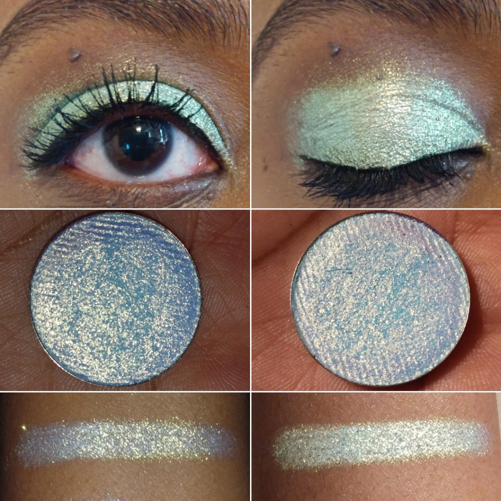
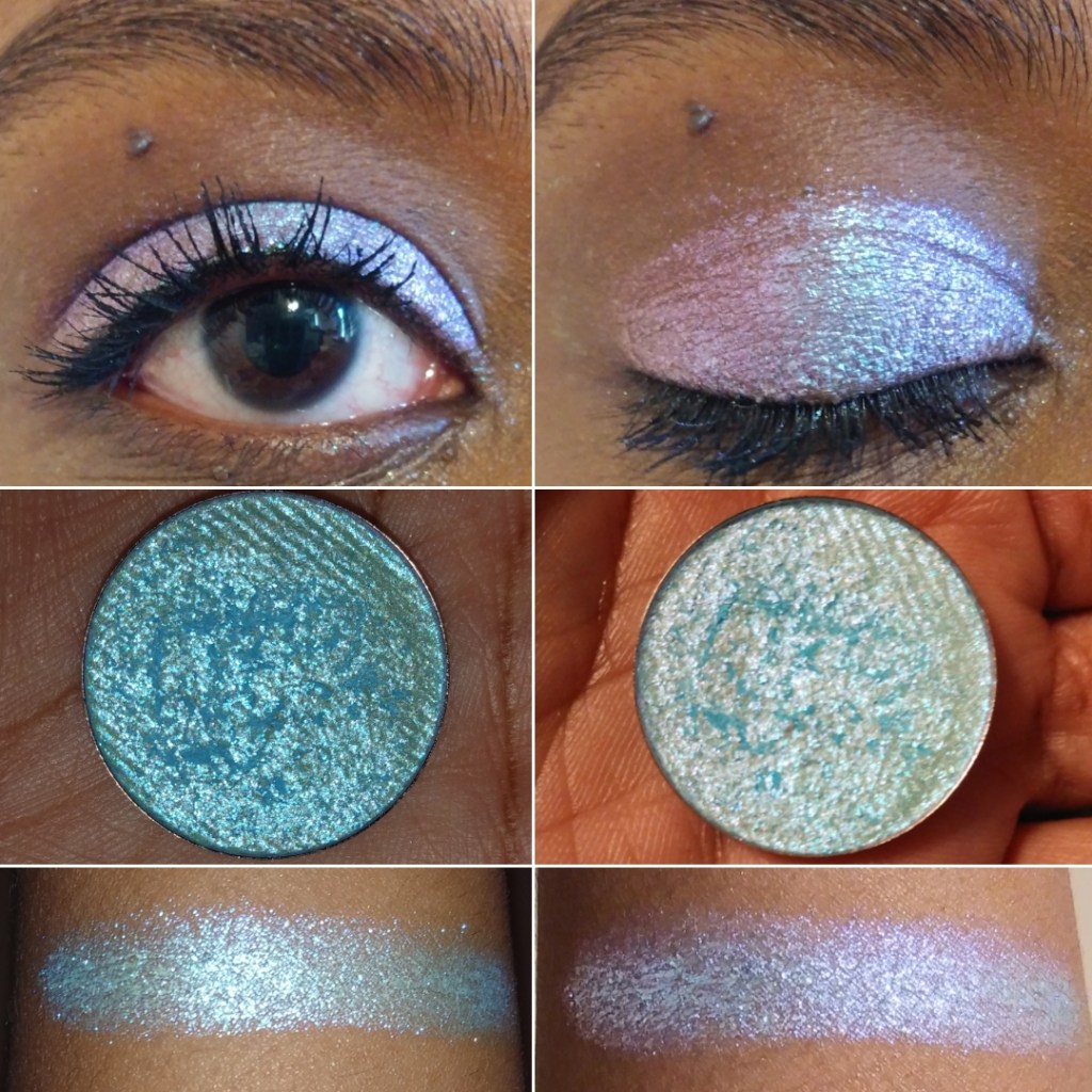
I was very excited to have duochrome and multichrome options in this palette, but I wasn’t expecting such near transparent bases to the point where three of the five shadows nearly function as toppers for me. Serpent‘s base is the faintest of all and looks like it’s just a sheerer version of the somewhat more visible hot pink base in Sphinx. I use Serpent when I want blue, green, and purple shifting sparkles with cool toned looks and Sphinx’s aqua, green, and gold sparkles look best with warm toned ones. Whenever I plan to use them in the palette, I have to swatch them first on my arm to remember which effects they give because I really didn’t like the times I’ve chosen the wrong combo. My favorite multichrome of the three is Medusa, which has a dark but still semi-transparent base. It pairs so well together with the deep blue-green shimmer shade called Basilisk. Medusa and Basilisk are my two favorite shadows in this palette. All the shimmers have a smooth texture except Griffin, which is a little chunkier, but has a very high-shine look to it. It’s like a less obvious color-shifting version of Centaurus from Devinah Cosmetics.
Showing the transparency of Medusa.
Regarding how they wear on my eyes, I didn’t have anymore creasing than usual. I didn’t have any extra fallout. The shimmers didn’t dull down as the day went on and they looked decent still by the end of the day. To anyone interested in this palette, I recommend it based on preferences. In general, with it not completely meeting what I want, $33 isn’t a bad price (it was $30 at the time I bought it with $5 shipping and no tax, but I used the influencer code ANGESCHKA), though it would be more like $38 now.
This palette would be a fantastic option for someone who likes grungy colors, high shine duochrome/multichromes with no dark bases, and is mostly in it for the shimmers so they don’t mind reaching for other palettes for better mattes.
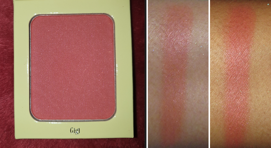
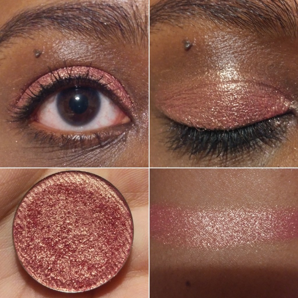
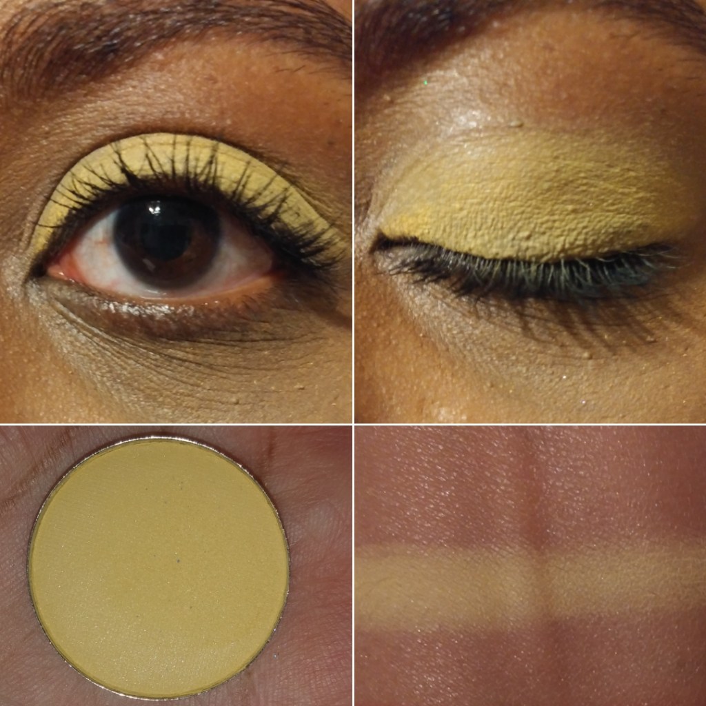
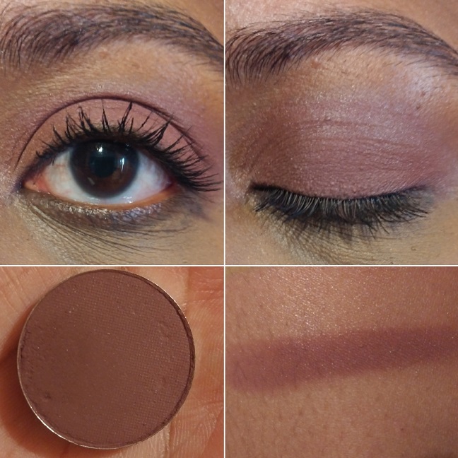
Gigi Blush
I’m not sure why “blush palette” is written on the packaging when it’s just a single blush, but in any case, I saw this shade and that Scorpion on the inside and I had to buy it! It’s aptly described on the website as a, “satin finish rosy terracotta,” blush. If I remember correctly, the brand is run by two sisters and this blush is named after Gigi and the highlighter that was released at the same time is named after Dani. I didn’t purchase the highlighter because I thought it would be too light for me, but it has a silver to gold shift. So, the gold would probably have looked nice, though I don’t know if the silver still would have been too much. While there is visible dark pink shimmer in the blush, after all the blending that is required, I don’t see the shimmer on my cheeks.
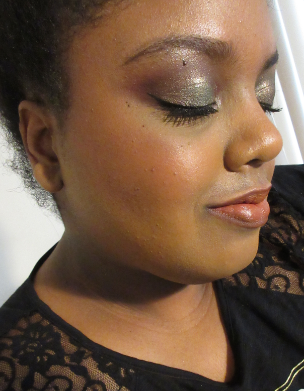
Light-Medium application of Gigi blush to the cheeks.
I’ve tried to love this blush because it’s such a pretty color, but it’s super pigmented and not very blendable, regardless of the brush I use with it. I’ve tried my synthetic brushes like the Smashbox Sheer Buildable Cheek Brush, my MUFE Highlighting brush (basically blush size). I’ve tried my very expensive brushes with different types of natural hair suited for pigmented products, but the issue is that it sticks where it’s blended, but is also a thin powder so it’s also sheer in some places at the same time. It needs to be buffed properly to smooth it out. It’s not a terrible blush, as I have the tools to lightly apply it and switch to another brush to blend it out and make it look nice. However, with my huge blush collection, I don’t feel that it’s worth the effort for me, when I can get a smooth flush in a snap with other blushes out there. I have tried powdering my cheeks first before applying the blush and that just prevents it from wanting to blend properly into my skin. Applying it to my cheek and then buffing with a finishing powder after also works, but again, it’s extra work.
One thing that this blush definitely has going for it though is the longevity. Using my normal application methods, this will last on my face all day without fading.
Unearthly Cosmetics released additional single blushes and highlighters in April of this year, so perhaps the formula is better than before. You really never know with their brand!
That’s all for today! Thank you for reading.
Note:This is my last completed pre-scheduled post. I had surgery September 15th and due to the long recovery period for this surgery, regular Monday postings will be interrupted/inconsistent for the rest of this year. I still have about 20 partial posts that were started prior to surgery, and therefore I will still have content coming to this blog, just not at a stable predictable rate. There may be a few weeks or a month gap without posts, but if you’re following via email, you will be notified of every post. Thank you for understanding.
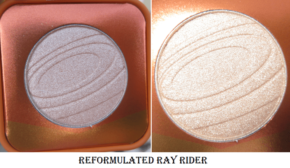
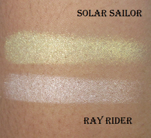
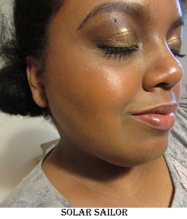
The Space Age line of highlighters from Kaleidos is known for having non-traditional shifty duo-chromatic shades like blue, bright red, green, etc. They even recently released a multichrome highlighter. As much fun as it would be to have colors like that in my collection, I’m not bold enough to rock shades like those regularly enough to get my money’s worth out of them. Instead, I chose to buy the two most traditional types of highlight colors: Solar Sailor, “a sleek and radiant satin gold,” and Ray Rider, “a velvety champagne sheen with a trace of peach.” Ray Rider was repromoted/reformulated during the launch of the Make Your Escape Collection. Although I don’t have the original shade to compare, according to Angelica Nyqvist, the new one is slightly lighter and smoother with a more translucent base. This change happened in June. As of November 2020, Ray Rider’s packaging was updated. However, it is not listed on the website as being a different from the original, unlike the shade Mars Melter which was reformulated with new packaging and is being sold as “Mars Melter” and “Mars Melter Original.”
The swatches are on bare skin. In the Solar Sailor photo I applied it under the brow arch and on the center of the lid. In both photos I have the highlighters on the cheekbones applied on top of a mixture of Love and Joy blushes from Rare Beauty.
These highlighters look glittery, which I usually despise, but because they blend a bit into the skin, they become a little more wearable. I used the tiniest amount of highlighter in these pictures, so a regular application would look much more intense! Ray Rider’s particles are a bit smaller, which I like more, but I prefer the actual shade of Solar Sailor on me. Because they are right on that line of glitter level that I like, I doubt I will wear them regularly, but they won’t be completely neglected in my collection.
The Futurism Eyeshadow Palettes
Futurism I: Sci-Fi Green
This was my first Kaleidos palette, but I purchased it from a third-party. I know I’m fortunate to have such low shipping fees as a US consumer, but having to pay for shipping still bugs me. I only wanted to try one palette to see if the eyeshadow formula was worth the hype and didn’t want to spend $8 in shipping to find out. The other three palettes, however, were purchased directly from Kaleidos.
Swatches over a light layer of MAC Paint Pot.
I do think these palettes are worth the hype. That black shade is incredibly rich and dark. Sometimes yellow shadows don’t stay true to color on my eyes, but I don’t have that issue with Radioactive. The shimmers have a wonderful slip to them and the mattes are pigmented and blendable. My only complaint is that although you can see the shade differences in the swatch, my forearm is lighter than my eyelids. On my dark lids, the two matte greens look almost the same. Glamora appears more yellow than green on my eyes, which makes it harder to distinguish from Nuclear.
Futurism II: Cyber Bronze
Swatches over a light layer of MAC Paint Pot.
I’d have to double-check my single shadows collection, but I do believe plasma is the best silver eyeshadow I own (though I don’t have that many silvers in my collection). It is shockingly brilliant and intense without even being applied wet or on glitter glue. Droid is my favorite shade out of all the palettes to use from the brow to the crease. Y2K and Carbon look a bit more subtle on my eyes because they’re closer to my natural crease and lid shades. I can still see them in person, but they aren’t as distinct on my camera. Quantum is an uncommon shade among my collection and I was pleasantly surprised how much I liked it. Infared looks intense in swatches but for some reason, that shade of red doesn’t have the same vibrancy on my eyes. If you like shades like Infared, I highly recommend Salvatore, Blazed, or Homicide from Devinah Cosmetics. In my opinion, theirs are the best.
Futurism III: Astro-Pink
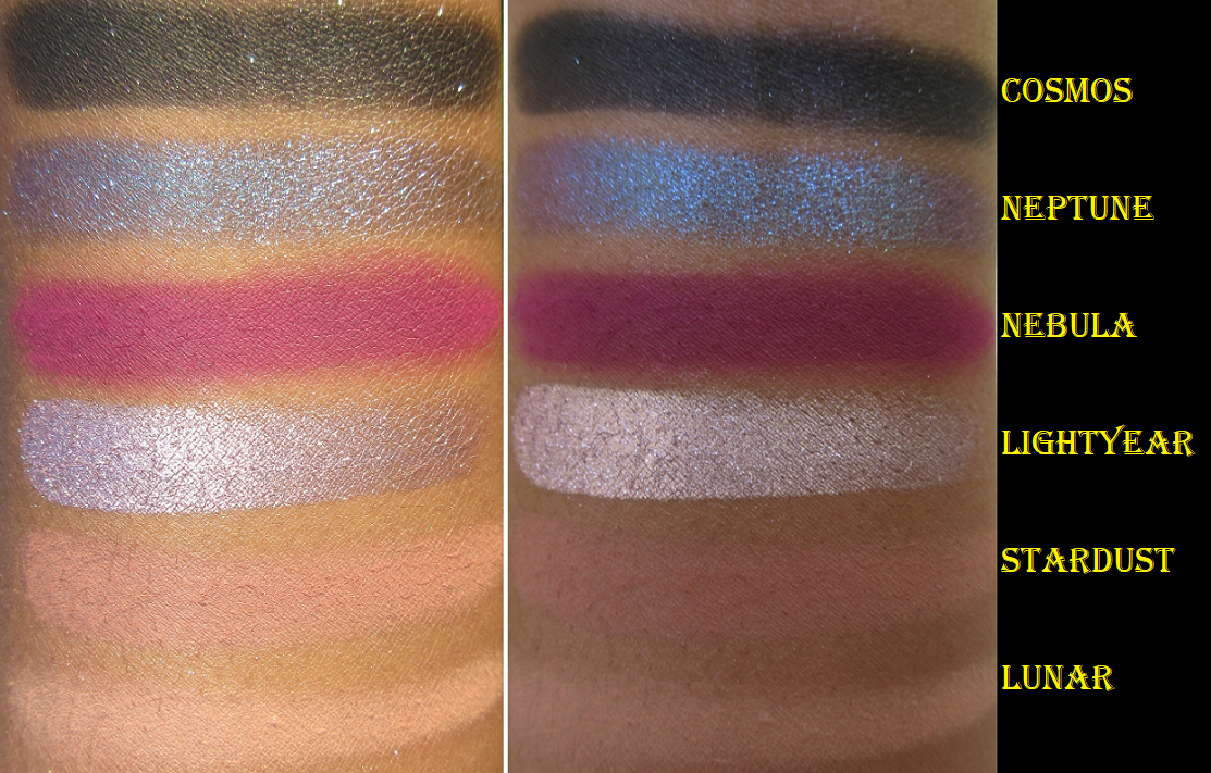
Swatches over a light layer of MAC Paint Pot.
This is my favorite of the four palettes I purchased! That blue-to-purple duochrome shade, Neptune, is gorgeous! The fuchsia shade, Nebula, isn’t a unique color but it is so incredibly smooth, pigmented, and easy to blend. It’s possibly the best-formulated version of that shade I have. Lightyear is just as brilliant as plasma, but with a light pinkish purple tone to it. It just looks silver on my eyes though. Cosmos is one of those sequin shades that usually drive me nuts (matte with a dash of glitter…just pick one shadow type!) but the glitter is so sparce that it’s mostly matte and I can use it as though it’s a plain matte, which is why I like it. And that shade is so pigmented and buttery smooth that I can easily use it as a powder liner. I’m not as impressed with Stardust and Lunar, purely because they don’t show up enough on my eyes, but they do give a rose-toned tinge under the brow and crease that pleases me to see in person, even if I know no one else will notice.
One interesting thing I noticed with the shimmers is that Nyx Glitter Primer, my tried and true product to enhance the impact of shadows on my eyes, doesn’t make much of a difference in terms of bringing out the pigments and sparkle. I still use it on the duochrome shades, but on the regular shimmers, in order to intensify the look, I dampen the brush with some MAC Fix+ spray. And even after that, I pack more shadow on top with my finger.
Futurism VI: Lunar Lavender
Swatches over a light layer of MAC Paint Pot.
I don’t enjoy being critical. I love gushing about good makeup, but I have to talk about issues that arise while using them. This palette gave me flashbacks to the Nomad Cosmetics Harajuku Tokyo palette that was a nightmare to use.
The top photo shows the patchy issues with MAC Paint Pot when trying to blend. The bottom two photos show how they look better on top of the Nars eye primer but despite that one being a wetter base, it still didn’t stick properly to the eyes and were blending away.
Unlike that formula, which worked better with a wet white base, I find these mattes work better on a dry white base. Because these shadows have more pigment than the Nomad Tokyo mattes, they are still usable and visible on the lids. This formula isn’t as bad as that one, but I don’t have the patience to try and make them work with continued use in the future. Even the two duochromes, though they work the same as the other Kaleidos duochromes, reminded me of the Nomad duochromes in terms of how they feel to the touch. But there’s no comparison in terms of performance and overall look. Kaleidos still wins on that front.
My improved eye looks using this palette when combined with a little of the Anastasia Beverly Hills eye primer.
Here are additional eye looks using shades from any of the 4 palettes.
Futurism V and VI are part of the new Fresh Fantasy collection, so I don’t know if there has been a tweak in the formula. As beautiful as the duochromes are, I cannot recommend anyone spend $24 to get just those two shades. $6-$8 CAD duochromes from Clionadh Cosmetics are still more intense, sparkly, and shifty than these.
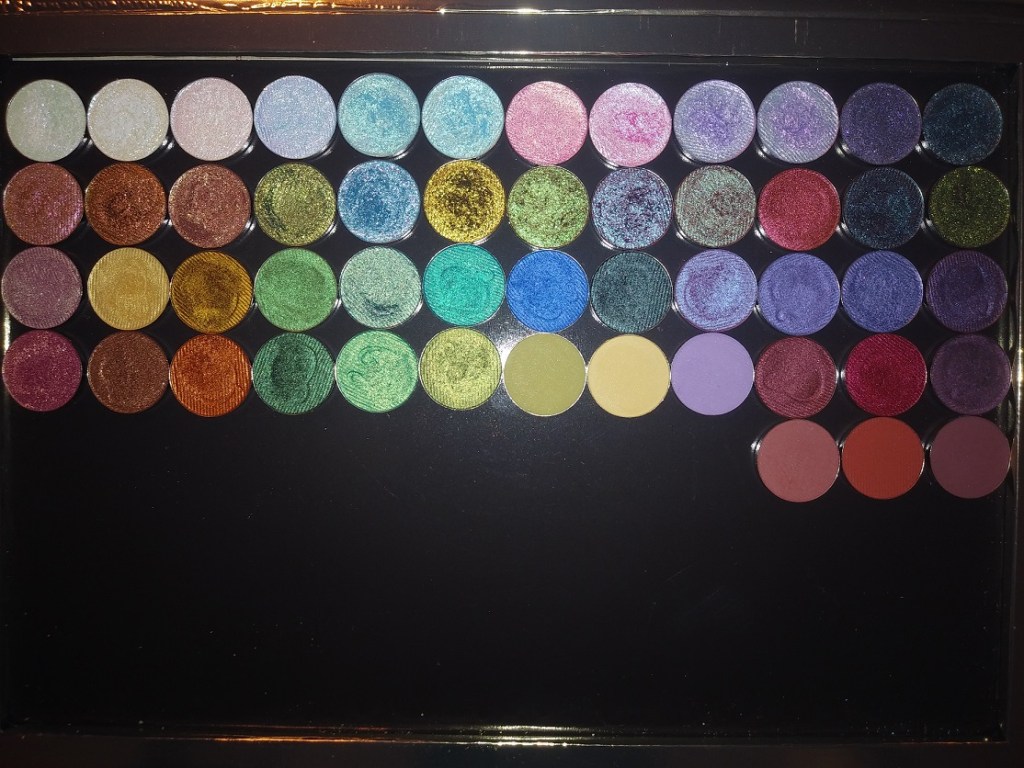
I have since decided to depot these and put them all together (excluding the Lunar Lavender mattes) in one large custom magnetic palette. I know I wouldn’t get as much use out of them if I kept them all in their separate smaller palettes.
For anyone interested in ordering from Kaleidos, I recommend checking out the bundle section on their website. That’s how I was able to get any three palettes I wanted (excluding the limited edition Futurism IV) for $59 instead of $72. There is free shipping at $70, so I only needed to add one more item to my cart. There are also affiliate codes that can be found from different YouTubers, but the codes don’t work on the bundle.
Also, you can expect a long wait once your order is placed. I completed my order on September 9th and it arrived October 13th. 24 of those days were in transit as it was shipped directly from their factory/manufacturer in China. It roughly took a week to travel from Shanghai to LA, a week to clear customs, and another week from Compton to my address.
I believe I covered everything. If you have any questions, feel free to leave a comment. Thank you for reading!
Devinah is one of my favorite indie brands. As a favorite, you can expect their products to be pigmented and beautiful like all the other shadows I love. What helps set them apart is that their price point for duochromes and multichromes are on the less expensive end. Their shadows are also a unique texture, unlike any other brand’s shadows I’ve experienced. Some of the mattes give some resistance when you try to rub your finger in the pan, yet they apply so smoothly to the skin. Some shimmers give resistance too, some are smooth, a few are dry, and some feel like a putty without moving around like a putty. The closest similarity would be to a Colourpop Supershock shadow, but without as much of the dimethicone/silicone feel to them. Devinah’s feel “heavier.” It’s hard for me to explain. The textural element is important to note because when I purchased the XPLODERS Collection, the Everlasting Gobstopper shade shrunk.
As you can see, it was unbroken and still in a perfect circle, just loose and sliding around in the pan. When I contacted them asking how this happened, they explained that the formula enables these shadows to be pressed back into place without breaking. They still offered a replacement or store credit, even though mine technically didn’t break, so their customer service is definitely top-notch!
It took very little effort to be able to press the shadow back together, and it looked like nothing had ever happened to it! I’ve been able to do this with Clionadh shimmers when I accidentally dropped them, and other soft shimmer shadows, but Devinah’s shadow is the only one I’ve been able to press back and have it look brand new using my fingers alone! Again, I think this goes back to the near putty-like texture.
As for Devinah’s multichromes, like the shades in the Butterfly collection, they feel closer to a traditional shimmer eyeshadow (still with some slip) in terms of texture. I apply the inner corner of shimmer shades with a brush, but I use my finger everywhere else on the lid. This is why texture has become an important element for me, since it adds to my enjoyment while using them, and why I felt it was important to delve into this much detail about it.
I use MAC Paint Pot for Matte shadows and Nyx Glitter Glue for the glittery/sparkly shadows. The more satin/metallic shades that shine without use of glitter have enough slip that I don’t think a primer is even necessary, but I still use MAC Paint Pot with them anyway.
SUGAR DROPS COLLECTION
The Sugar Drops are semi-transparent shifting glitter eyeshadows. Devinah recommends using a glitter glue to help the shadows adhere. They make great topper and highlighting shades and are recommended to try over white and black bases.
Cake Bomb – This shade shifts green and blue. On me it looks like seafoam green to powder blue.
Soda Swamp – This looks like a peachy pink to pinky-purple shift, but I mainly just see the peach-pink. I didn’t like the way this looked over white and black bases. Though the black base made the sparkles stand out more, it turned cooler-toned, which isn’t as flattering on me. Over the white base, I couldn’t see the shift anymore.
Puffles -This looks like a pink-blue-green shift. Of the three, this is the one I like most because it makes the biggest impact.
XPLODERS COLLECTION
This is the only Devinah Collection I have in its entirety. I bought them all because I couldn’t decide between the shades! The brand recommends using a glitter glue with this one too. They remind me of the sugar drops but with more of a base color.
Everlasting Gobstopper – I can see purple-pink, a goldish green, and light blue. Blue is the dominating shade though in most types of lighting. I love how easy it is to see the shifts in this, though I wouldn’t wear a shade like this on it’s own.
Nerds – This has a blue-green-gold look, but on my eyelids the greenish gold is all I see. I don’t see blue, even though that’s the main color in the pan.
Swudge – This shade is blue-green with a purple shift, though strangely on my eyes the purple is more prevalent. This one I would feal comfortable wearing alone.
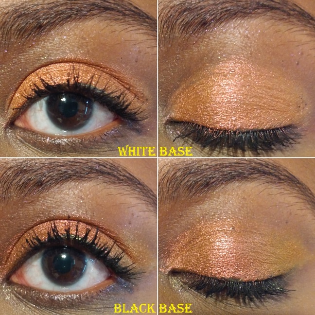
Pixy Stix – This is a pink to gold shift, but there’s no visible pink on my eyelids when glitter glue is used. Over a white base, the pale pink tones show and it looks similar to the shade Gelicide. Over a black base, it turns a darker gold.
Kazookles – This has a pink to purple shift, but on my eyelids it looks like there’s a bit of a gold shift as well.
Marshmallow Pillows – This is a pink to purple to blue shift. The blue and purple pop more on my eyelids, which makes this my favorite of the XPLODERS.
Runts – This shade is a lilac to purple with pink glitter, though the purple is so light that I can barely see it in person (and not in photos).
NEWEST MULTICHROMES
I bought two of the three new eyeshadows as part of the galaxy dust shifters collection. With these shadows, they recommend using glitter glue and trying them out over white or black bases.
Tucana – I would call this a rose gold shade, even though it shifts from golden peach to pink. Or maybe it’s rose gold to pink. I’m really not great at describing shades.
Centaurus – I describe this as a shift from yellow gold to a more orange-gold.
GALAXY DUST SHIFTERS COLLECTION
Whereas the Sugar Drops and XPLODERS are more on the iridescent side, the Galaxy Shifters have a lot more pigment to them. They remind me of Clionadh’s glitter and hybrid multichromes from the Stained Glass collection.
Celesta – This shade is like a vintage gold to olive. There isn’t a significant difference when used over a white base, as it just makes the shade lighter. Over a black base, it makes the green a little more apparent.
Skyla – This is like a fuchsia to purple with blue reflects.
Asteria – This one is a pretty cranberry to mint.
CANDY CAKES COLLECTION
The Candy Cakes shadows remind me of the Galaxy Dust Shifters, but without a shift. They’re like very pigmented duochromes. If there is a shift, perhaps I can’t see it because the shifting color is too close to the dominant one.
Rainbow Blossom – I really like this shade. It’s a beautiful fern green and gold.
Confetti Kisses – This is not my type of shade, but I was so curious about it that I had to get it. It’s like a bright sky blue with pink and purple shimmer.
Sweetie Sunbeam – I think this shade has a rosy base color but is mainly a coppery gold.
BUTTERFLY KALEIDOSCOPE COLLECTION
The Butterfly Multichromes have the most pigment and strongest shifts. These are the closest shadow comparisons to Clionadh’s Jeweled Multichromes, but without the black base.
Morphinae – The cool purple to blue shift is strong, but on the outer edges you can faintly see warmer purple too. A white base tones down the shade. I expected a huge impact when using a black base, but I didn’t get that. It did turn this shade smokier and intensified it slightly, but still nowhere near Clionadh or Sydney Grace’s multichrome level. That being said, not everyone wants that level of intensity. Some makeup lovers aren’t into deeper smoky colors and will possibly like these better. I love the ones with black bases, but I admittedly don’t always go for that look either.
Parthenos – The more obvious shift goes from a lighter green to a darker green, but the outer edges have a little aqua blue or cyan.
MULTICHROME MADNESS COLLECTION
Nacarat – This shade has a subtle shift from darker to lighter orange. I was surprised to discover this grouped in with the multichromes, since it’s so difficult to see any shift at all. I was also surprised to see both white and black bases dulled the intensity of the orange, though the black base showed the lighter orange shift better in the outer corner. Though it doesn’t show as much on camera, over the white and black bases, I also noticed a slightly pink tinge to the shade as well.
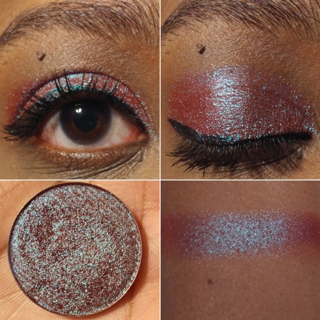
Pavonine – When I think of common duochrome and multichrome shades, this one comes to mind as a dark berry/burgundy with green-blue shimmer. Even though this isn’t a unique shade, I don’t have that many in my collection, so I decided to buy it anyway.
UNBUNDLED MULTICHROMES/DUOCHROMES
Gelicide – This shade was a lot lighter than I expected. It’s like a light baby pink with champagne shimmer. Strangely enough, I like it and think it would make for a great inner corner or inner third lid shade.
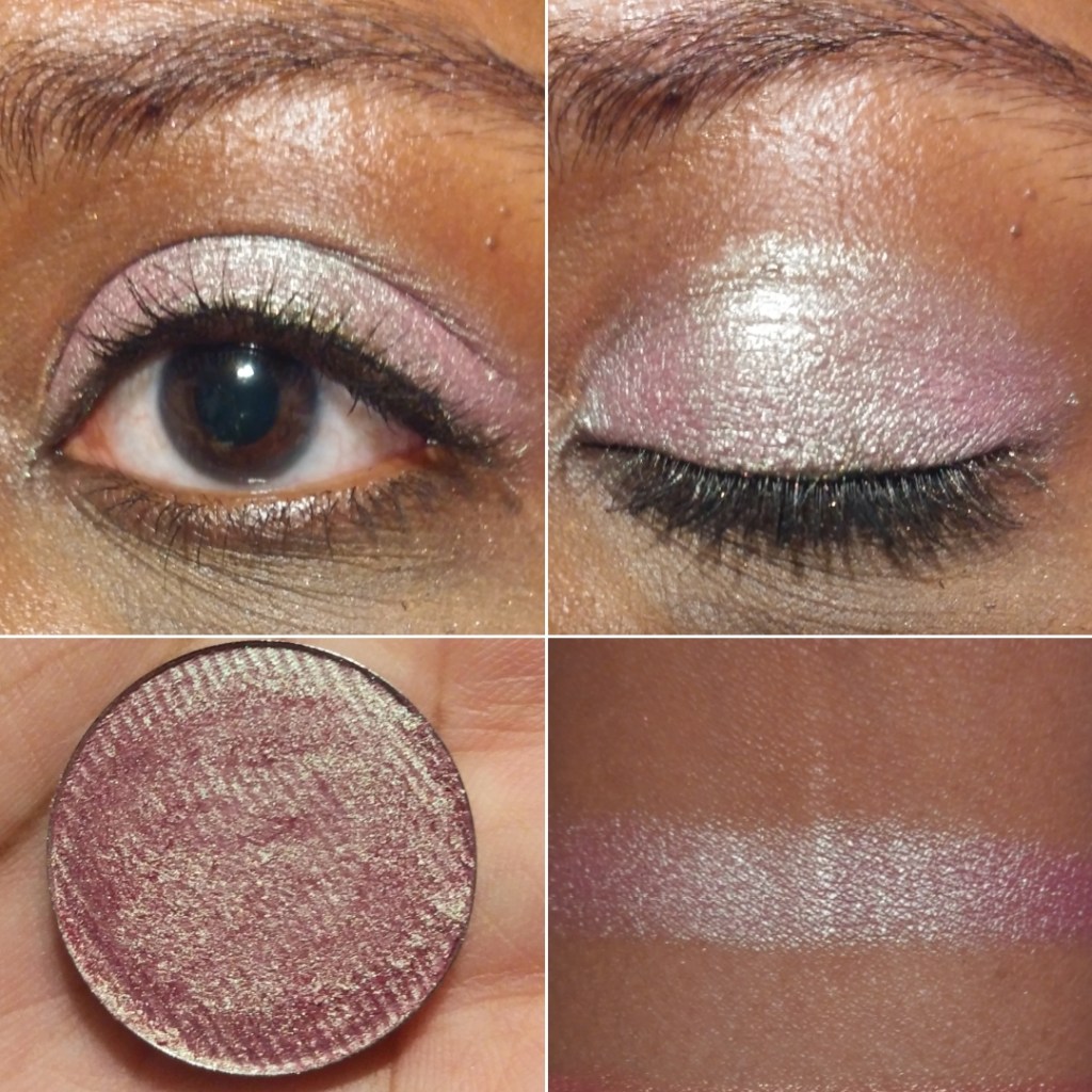
Empress – This shade reminds me of Sunbeam Sweetie, which I will compare later in this post. I love this one so much! Most pinks I encounter are cool-toned, which isn’t as flattering on my complexion. However, this one is deeper and warmer, so I love the way it looks.
Charmed – This type of purple duochrome (with the light to medium blue shimmer) is a very popular eyeshadow shade, but it tends to be on the sheerer side. I’m glad I bought this one because it is the most pigmented purple of this kind I own.
Vicious – This eyeshadow is looks purple in the pan, but has a cool blue tone to it on the eyes. When I wore this in a video chat, it looked completely blue on camera. Over a white base, this shade looks relatively similar to what it looks like on a clear base, but the blue is slightly brighter and less silvery. Over a black base, this makes the purple dominate. This is probably my least favorite eyeshadow in my Devinah collection, with the exception of the shade it turns over the black base. That kind of purple is what I was hoping it would be from the beginning.
SOMEWHERE OVER THE RAINBOW SET
This collection was inspired by the Wizard of Oz. I love that so many of Devinah’s shade names are inspired by different things, for example, the types of butterflies in the Butterfly Kaleidoscope collection, the Willy Wonka theme of the XPLODERS, Salvatore from the Vampire Diaries. The owner (DeAndra) mentioned in an instagram post that she likes horror and murder mystery genres. With shade names like Homicide, Criminal, and Devious, it is very apparent. I’ve also seen Egyptian inspirations, the show Sparticus, etc.
Upon first impression, I despised these two shades because of the fallout. These were among my first the few Devinah purchases, when I had gotten accustomed to their regular shimmer and metallic formulas where using an eyeshadow primer wasn’t a necessity. I had used them over bare skin and then MAC paint pot and they looked so dull. Once I used them over a glitter glue, my opinion completely changed. Glitter fallout was no longer an issue and they looked a lot more opaque and impactful. I highly recommend using a glitter glue with the shadows in this Somewhere Over The Rainbow formula.
Are you a good witch – This is a sparkly dark purple with pink glitter.
I’ll be tender, I’ll be gentle – This shade is a deep teal with aqua glitter. It reminds me of the Lapis Lazuli shade I love from Pat Mcgrath.
PRESSED SHIMMERS
I don’t have much to say about the shadows in this formula, beyond what I mentioned in the introductory paragraphs. They perform well, have longevity, can work without a primer but I like them with my MAC Paint Pot (not as much with glitter glue though). Some of these are shimmers but some have more of a metallic feel with some slip. It’s as though each shade has its own tweaked formula to maximize its effectiveness and beauty.
Sphinx – I like this very pretty bright yellow shade.
Nefertiti – I don’t have any shade in my collection quite like this one It’s very metallic and the shadow even feels wet. I would describe the color as a yellow-orange brass.
Cleopatra – I think of tangerines when I see this color.
Ambrosia – I honestly bought this shade purely because of the name. I have this weird infatuation with the term. I think because I love mythology (Greek especially) and ambrosia was the food of the gods. I’m happy I actually like the way this caramel-bronzy shade looks on my eyes.
Paramour – This is another one of my favorite Devinah eyeshadows. I would describe it as a festive crimson shade that can be built up to look a little deeper.
Salvatore – This looks to be a true red shimmer.
Starlet – This shade is a dark slightly red toned purple, like a wine color.
Purple Kush – This shade is a dark blue toned purple.
Avalon – Is this blue? Is this purple? Another blurple?
Lurican – Purples are my favorite eyeshadow color and greens are my second favorite. I really like this green shade with gold shimmer. It’s similar to Rainbow Blossom without the intense glittery sparkles.
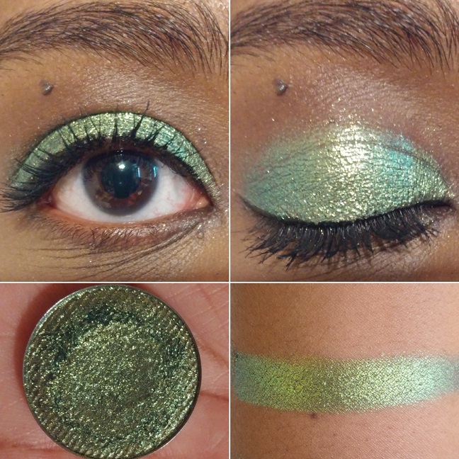
Ferly – This shade is the reason I didn’t buy Clionadh’s Lineage multichrome, as it reminds me so much of it based on swatches. It’s a very pretty almost minty green with gold shimmer. This is another favorite of mine.
Chimerical – I’d describe this as a mossy green with brighter green shimmer.
Alew – This is a blue-ish green shade with gold (and maybe even a little silver) shimmer. It reminds me of a slightly more green version of Hydra from Sydney Grace.
Odium – This color reminds me of Coloured Raine’s Forbidden shade (my favorite eyeshadow of all time). Coloured Raine’s single shadows are being discontinued, so I’m glad I have this as a close replacement.
Briseis – Talk about bright! This shade is so vibrantly ocean blue! Or Turquoise? I don’t know but this blows Coloured Raine’s Malibu shade out of the water!
Midnight – In pictures this looks mostly black with a slight greenish blue tinge. In person, the blue (or deep/darkened teal) is easier to see.
Hydra – Again with the insane vibrancy! I don’t have anything close to this shade in my collection. I would call this an Egyptian Blue shade.
PRESSED MATTES
Toska – I like this shade of yellow but it takes a lot of building up to look opaque on the lid.
Passion – I love this rusty orange. It was one of the first shades I bought from Devinah.
Runa – This is a more pigmented terracotta version of Passion.
Kaia – This is more of a pastel purple that isn’t the worst I’ve tried, but I don’t like this one as much. It might work better over a white base, but I haven’t tried that yet. And at least I can get it to look opaque.
Courtney – This is a very popular shade among Devinah customers. I can see how this type of grungy yellow-green would be liked on others, but it’s just okay for me.
Desma – This rich reddish brown is so nice! It’s rare that I wear just mattes on my eyes or even one-and-done eyeshadow looks, but I would feel comfortable wearing this on its own. It’s my favorite of the mattes I have.
Here is a gallery of some comparison swatches to each other from Devinah and examples of other eye looks.
I would normally post more complicated eyeshadow examples, but Devinah’s shades are so unique and special on their own that in my everyday routine I just put a neutral shade in the crease, add a darker eyeshadow in the outer corner for smokiness, and let each shade shine on the lid on alone. This is why I decided to do the 50+ eye swatches rather than posting just hand swatches. Each eye swatch is already a look I would do.
Additional Information
As I mentioned earlier, Devinah’s prices are quite reasonable for what you’re getting. This is also the case when coupled with promo codes. When you initially sign up for their emails, you’ll get a code for 25% off. There are also influencer codes that can be found in different Youtubers’ video descriptions for 20% off. Also, after every purchase, I usually get an email with a coupon offering 25-30% off if I place another order within 7 days. The codes should work on everything except the Butterfly Multichrome shadows.
I’ve only been a customer with Devinah since they relocated/reopened in Oregon, so I’m not certain if they have regular sales throughout the year. I haven’t witnessed one yet, but the promo codes are a great deal as is. Shipping isn’t free and they recommend purchasing the $3.80 insurance as a USPS order upgrade to protect against loss, theft, or damage.
One of the other things I like about Devinah is that they’re interactive on Instagram and supportive of other indie brands, even liking posts that don’t have their own products in them. They recognize there’s room for everyone in the beauty industry. When you have a good product, it speaks for itself and people will notice.
Overall, I really like Devinah’s shadows and recommend them to anyone who has been thinking of trying out this brand. The glittery eyeshadows are a little more difficult to work with than Clionadh’s formula when dealing with fallout. The Xploders and Sugar Drops are particularly messy. I think this is because they are a little less emollient. However, this is the tradeoff because the shadows don’t settle into the lines of my eyelids as much as Clionadh’s can. Speaking of which, I still have a Clionadh Cosmetics post in the works. I just keep debating with myself whether to post it soon or just wait until I have everything I ordered (which would take a few more months).
JULY 19th, 2020 UPDATE: Towards the end of the post I have an update section with 24 additional eyeshadows, some of which have come from the new After Dark collection.
Note: I can’t post a review at this time without first mentioning that I hope everyone reading this is and remains safe during the COVID-19 pandemic. This year has been especially difficult with what is going on throughout the globe, in addition to having yet another surgery. The beauty world has been a comforting distraction for me these past few months and I hope that my blog posts are also a welcome distraction. Now, onto the review!
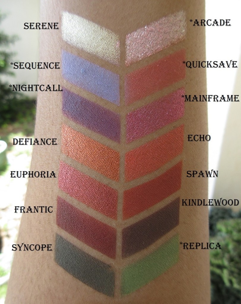
These are the shades I currently possess. There are twelve more eyeshadows I intend to purchase, after international shipping prices return to normal, which I believe would fully round out my collection.
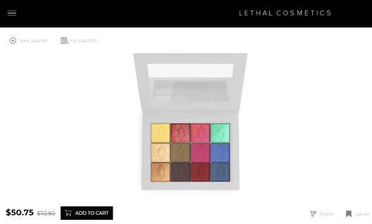
Lethal’s website has a fun palette designing tool that helps to put a color story together. There were so many shades I wanted that didn’t go together, so I wish we weren’t limited to 12 spaces maximum (as my intention was always to put them in a larger magnetic palette), but it’s still helpful when getting started. Plus, the palette builder allows you to put the 12 shadows in a bundle to be discounted. You can see tons of combinations others have made following the #lethalbyop on Instagram. I found their examples to be quite inspiring. Here are some of my own.
PRICES, SHIPPING, AND CUSTOMER SERVICE
The eyeshadows are $6 each, which is great considering the normal cost of single shadows, but I do recommend using the palette designer to bundle for the best prices.
It usually comes out to be $58-$59 if you include one of their magnetic palettes, though you can bundle without one as seen in the screenshot above. The smaller Orbital palette holds 9 shadows and also gives a discounted price after putting it together.
Lethal Cosmetics is based in Germany, but shipping under normal circumstances takes about a week. Standard shipping used to be $7 or free on orders of $80 and up. Currently, due to the pandemic, it is $24 or free with orders at or above $150.
I love getting a good discount, so I spent hours looking for promo/affiliate/influencer codes, but I have been unsuccessful. By signing up for emails, you can get notified about sales (and the occasional code). I was able to find Jolina10 from Jolina Mennen who collaborated with Lethal Cosmetics to create their first (non-customizable) eyeshadow palette. However, the code does not work on everything, like Jolina’s own palette. Also, when the palette was first released, I heard that the Pieper Perfumery had 30% off, but even with Chrome’s help translating their site to English, it was hard to navigate.
My Duolingo lessons didn’t prepare me enough to understand the site either.
I have interacted with Lethal Cosmetics’ customer service a few times and the representatives I’ve spoken with have been so polite and friendly. They also have a great social media presence with the way they interact with customers regardless of their follow-count. This is not always the case, even regarding Indie brands, so I felt it was important to note and applaud good customer service whenever I come across it.
SWATCHES
I normally use eyeshadow primer when taking pictures for this blog, but I did not for any of these arm or eye swatches. However, for my different eyeshadow look examples, I used a MAC Paint Pot in Groundwork, ABH eyeshadow primer for the pastel look specifically, and Nyx Glitter Primer in any area requiring the metallic/shimmer eyeshadows.
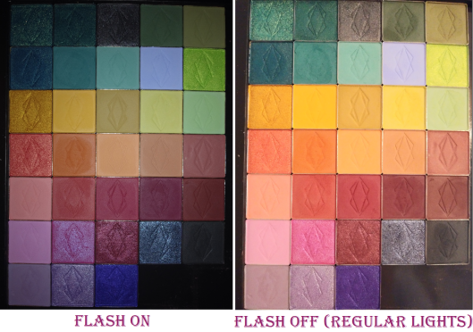
For the mostpart, the color you expect from the website is what you get. However, I had quite a few surprises
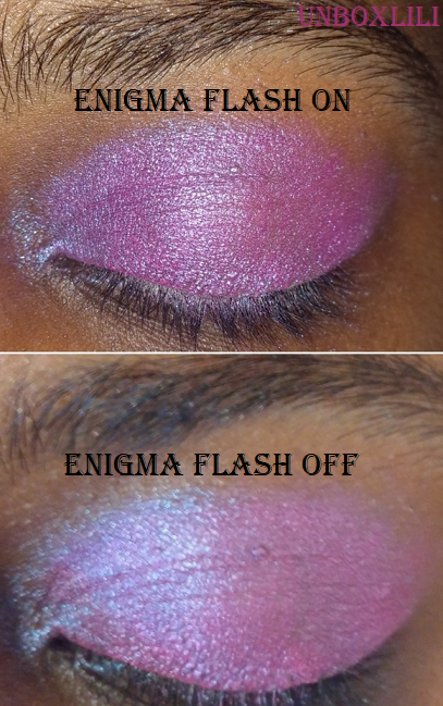
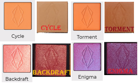
The orange shades look vastly different in the pan than what appears online, but when actually used on the eye, they do reflect the color presented on the website. Backdraft is way darker in person than on the website. It’s not the light peachy-pink I was expecting, though it is described as being “fiery.” Also, it says fuchsia in the description of Enigma on the website, but it looked so blue from the glitter shift that I was expecting a cooler blue-purple shade. Several more of the shades were slightly different than I expected, so I would recommend paying close attention to the descriptions on the site. Some, but not all, of the photos from the website include swatches. I wish they had light, medium, and dark arm swatches for all of them. Overall though, when you compare the shadows in my first picture with flash on, it shows more accurately what they look like in person (excluding enigma which looks more accurate with flash off in this case). The flash off side looks closer to what is on the website (again excluding Enigma which is the reverse).
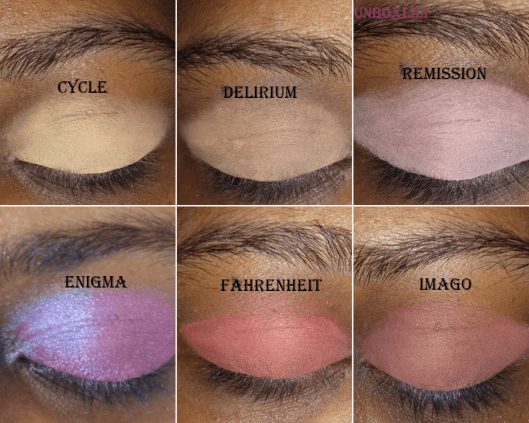
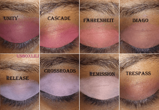
Another thing I noticed was how similar some of the shades look on my skintone. So, I put them together to have an easier time seeing the similarities and differences.
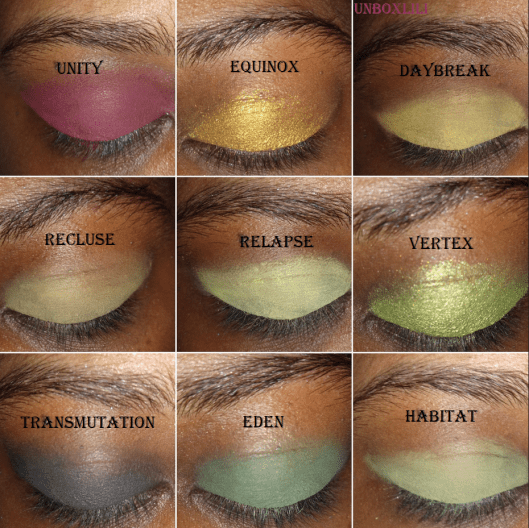
The similarities are less apparent once they’ve been built-up, such as Relapse and Habitat. Habitat builds up to a medium green. Crossroads and Release look alike because of the shared purple tone, with Crossroads being a cool pinkish purple compared to Release’s lavender shade.
PERFORMANCE
The darker and red-based mattes look opaque on my lids with minimal effort. The lighter and pastel shades take more time to build up, but they do build beautifully, especially when I use a light base such as the ABH primer underneath. The mattes blend so well, and though some take extra time, the unique shades make it worth the effort. I tried comparing them to other eyeshadows in my collection and could only find a few that were similar.
As for the metallic/shimmers, some shades worked well regardless of the tool used, but for the most part, I’ve been unable to get the maximum color payoff using just a brush. So, my favorite application method is to lay the color on first with the brush and then apply another layer with my finger. They all apply so smoothly and pigmented to my eye when using my finger that I don’t feel the need to wet my brush when I use them.
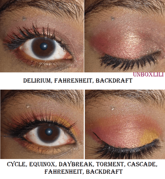
Here are some of the looks I’ve done:
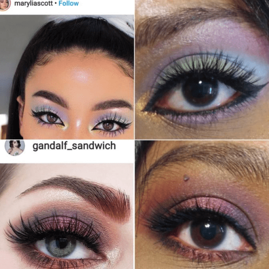
I also got the last two look ideas from Instagram:
There isn’t much more to say about these eyeshadows except that I enjoy the formula. I have some shadows, like Natasha Denona, where I can mix two shades on top of each other to create a new shade. I haven’t found that to really be the case for the Lethal Cosmetics shadows (or at least not easily), which is useful when I want to do a more complicated look involving more than four shades and want them to stay true to color. You definitely don’t have to worry about these shadows looking muddy on the eyes. The fact that they are different from the other shades in my collection and unique enough to inspire me makes these eyeshadows worth it to me. And as I mentioned earlier, I intend to get a few more!
JULY 19th, 2020 UPDATE
This is what my collection currently looks like with the new additions. The names with * in front of them in the swatch photos are brand new shades from the After Dark Collection.
Thank you for reading my first in an ongoing Indie spotlight series! I’m not sure when the next one will be since it takes me so much time to test them out. The new brands I’ve tried this year are Sydney Grace, Devinah Cosmetics, Clionadh Cosmetics, Give me Glow, Makeup Geek, Menagerie Cosmetics, etc. I’ve been posting a lot of eyeshadows lately so I might do a different topic for my next post.