DISCLAIMER: Whenever I post about a brand, Influencer, or other public figure for the first time, I write a disclaimer to inform readers about any potential biases.
Regarding Bella Beauté Bar, I am not affiliated with them in any way. I’ve heard nothing but positive things about their eyeshadow quality, so they’ve been on my list of indie brands to try for a long time.
Regarding Noopur, I believe her Instagram account is one of the most well-known for indie brand swatches, especially multichromes. Her work is frequently in my feed, but I don’t know anything about her as a person.
I purchased this palette because purple and green are my top choices for colorful eyeshadows, and I love multichromes. All thoughts and opinions are my own.
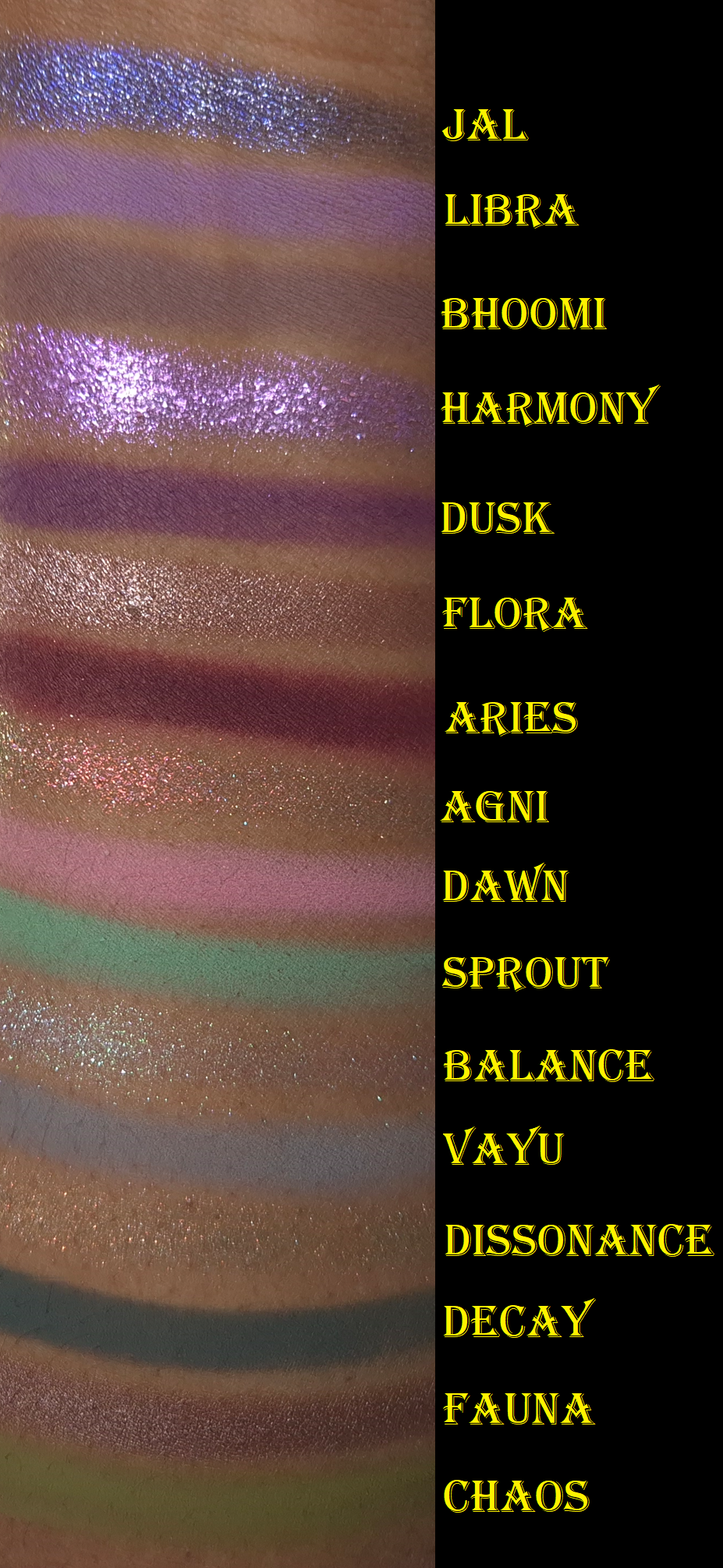
I ran out of room on my arm, so I moved Jal to the top. This is why the swatches aren’t completely in order.
I’ve owned this palette since the end of November 2025 and considering how infrequently I’ve been wearing colorful eyeshadows, I’m still surprised that I’ve used this a fair amount. Wanting to test this palette organically over time instead of forcing myself to apply it daily in a two-week period is why it has taken me so long to post this review.
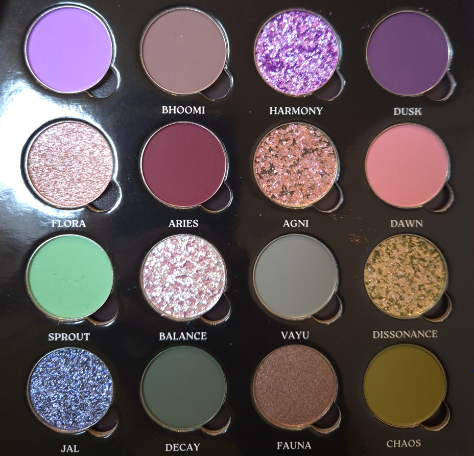
The Coalescence mattes remind me of Natasha Denona’s mattes, but with even more pigment. Some feel silkier (with some slip), some feel buttery, and all of them are soft to the touch. I am impressed by the kind of pastel shades not looking ashy on dark skin. However, they don’t build up and adhere as well to my eyes if I’m using my tried and true Lisa Eldridge Liquid Silk eyeshadow as a base. When I want to wear Libra, Dawn, and Sprout without them looking like sheer veils of color, I have to switch to the MAC Paint Pot or Milk Hydro Grip Eye Primer. The only other matte that needs special treatment is Aries because of its ultra pigmented nature. A little goes a long way, and it is slightly less blendable than the others. When I wipe my makeup brush onto my microfiber towel, it gets everywhere and has even transferred back off the cloth onto other objects before (brushes, fingers, etc). So, I try not to pick up as much onto my brush and build it gradually.
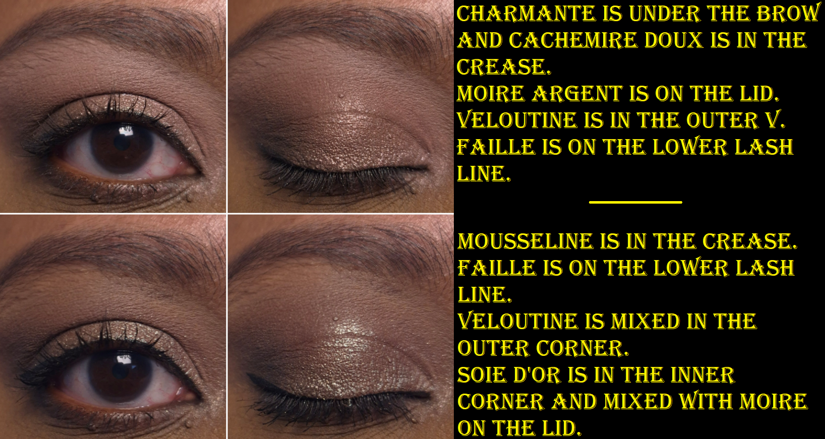
Although I was drawn to this palette for the greens and purples, I found myself mixing mattes together to try and turn them into the specific shades/tones I envisioned for my eye looks. These eyeshadows are formulated in a way that is actually pretty good at being able to do that. Some brands’ eyeshadows can sometimes be a little too good and turn a new color while I’m attempting to just create a gradient of one shade blending into another without lines of demarcation. Thankfully, I don’t have that problem with these, but I don’t try to just blend one shade on top of another when I’m mixing. I dip into both colors with my brush when I pick them up initially, so I can blend them into my skin at the same time. Then, I adjust it with additional product afterwards if needed.
All of the shimmers in the palette had small round foam coverings over them, which I assumed was to protect them in transit because they’re fragile. Imagine my surprise when I tried to rub my finger in Jal for the first time and nearly shifted half of the eyeshadow out of the pan! Thankfully, they can be pressed back into place in the pans.
This also happened with Agni, which is another of the flaky eyeshadows. Essentially, Flora and Fauna have traditional metallic and satin finishes. Flora has the benefit of being an impactful shimmer, but smooth enough for me to use it to brighten my under eyes. Fauna is even smoother, but is too dark to serve that purpose. I like having a neutral option theoretically, but since it’s so outnumbered by the more colorful options (and even the muted shades still pop), I find myself struggling to incorporate it into looks.
To minimize fallout, I can dampen my brush and use the Nyx glitter primer, but it still happens throughout the day. However, it’s not bad enough for me to consider it messy looking.
Harmony is described as having a “sheer purple base and shifts blue-purple-pink-peach with additional purple sparkles throughout.” I can see blue, purple, and pink as sparkles, but not as a color changing shift.
Agni is described as a “holochrome with a grey base and shifts pink-orange-gold,” which I agree with, along with Balance having a “super sheer base and a mix of green-pink shifting sparkles as well as blue-purple sparkles.” When I’ve tried to intensify the look of this eyeshadow and pack it on by wetting it or using glitter primer, I haven’t liked the look as much because it seemed like only the blue color grew bolder. I wish the shift was a bit stronger, but Balance is one of my favorite shades in the palette.
I have to admit that I was a bit disappointed that Dissonance, the “super sheer light olive base with silver sparkles and orange-gold shifting sparkles mixed in,” looks mostly just orange on me and not as green as it appears in the pan. It’s a pretty color, but I love greens and the only eyeshadows that read green on me are mattes: Sprout, Decay, and Chaos.
And then finally, Jal is a bright blue with silver sparkles. I’m not a lover of blue eyeshadows, so I didn’t intend to get much use out of this shade. When I think about it though, between Jal, Vayu being a blue-grey, Sprout being a minty-blue, Decay being a blue leaning green, plus the blue sparkles in Harmony and Balance, this palette feels like more of a blue palette than green. This explains why I sometimes get this sense of being unfulfilled when I use this palette despite the pretty colors and them having the sparkle intensity and impact that I like.
If the other Bella Beauté Bar palettes have this type of quality, I would happily purchase additional palettes in the future. The Coalescence eyeshadows, although able to be combined and tweaked, are not totally within my palette preferences. Part of my preferences is having ready-made colors available that I love, so that I can create looks quickly without too much thought. There are times when I do still enjoy playing with colors, which is why I’ve continued to reach for this palette periodically over the past six months.
One of the great features of this palette is that it’s magnetic with finger holes in which to rearrange or swap shades. So, I still have an easy way to tailor the palette with other BBB shades or exchange them with standard eyeshadow pans (26mm) from brands like Sydney Grace, Clionadh, Devinah, Terra Moons Cosmetics, Fantasy Cosmetica, etc. The only thing to watch out for is that some of the brands overfill the pans (Sydney Grace mainly) so the mirror/inner lid of the palette could get messy from having eyeshadows press against it.
There are four pressed pigment singles that are part of the collab. They look stunning, but they were sold out on the Monolith-EU website when I was buying the palette, so I didn’t think about them again. I am still curious about how those differ from the shimmers in this palette, but I think I will pass on them anyway.
That’s all for today! Thanks for reading!
-Lili ❤