Although I’ve been curious about Isamaya Beauty since its launch in 2022, this is finally my first purchase! I thought the green and brown shades from the first Industrial Palette looked pretty, but I heard mixed reviews about the formula. I also had a difficult time trying to justify the price, coming from a startup brand. So, I added it to my Anti-Haul.
By now, the Isamaya brand is a bit more established, especially since creating a line for retail stores like Sephora. I have heard the eyeshadow formula of the Core Palettes are better, and they added purples! Throw in the coupon code I could use via Niche-Beauty, and that was enough to get me to finally take the plunge!
Before we get into the review, I’d like to make it known that the information I have about Isamaya Ffrench is that she’s a makeup artist, is or was at some point the creative director at Byredo, and she had an edgy, quirky, and somewhat controversial vision for the initial Isamaya capsule collections. I don’t have any affiliations with the brand, nor personal feelings about the founder.
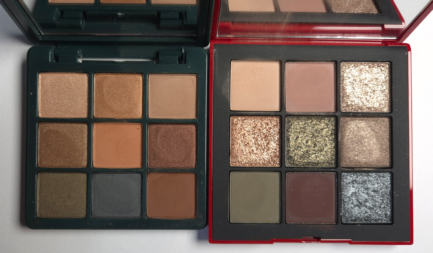
Isamaya Core Palette 1.0
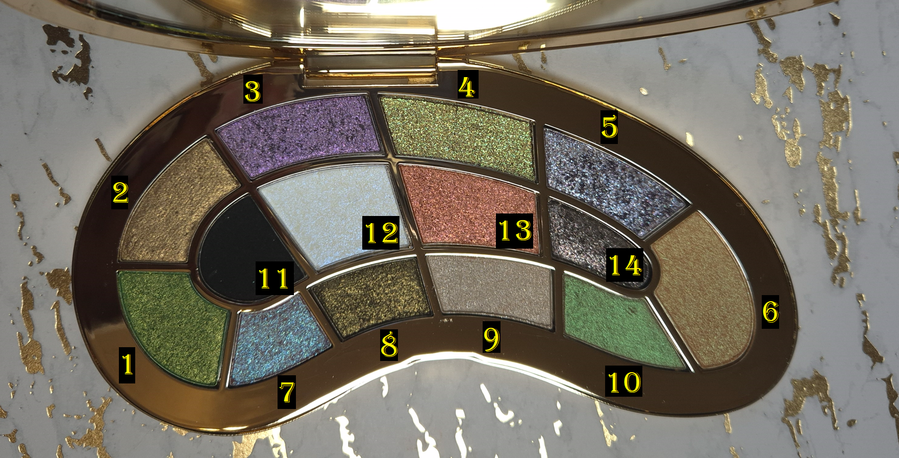

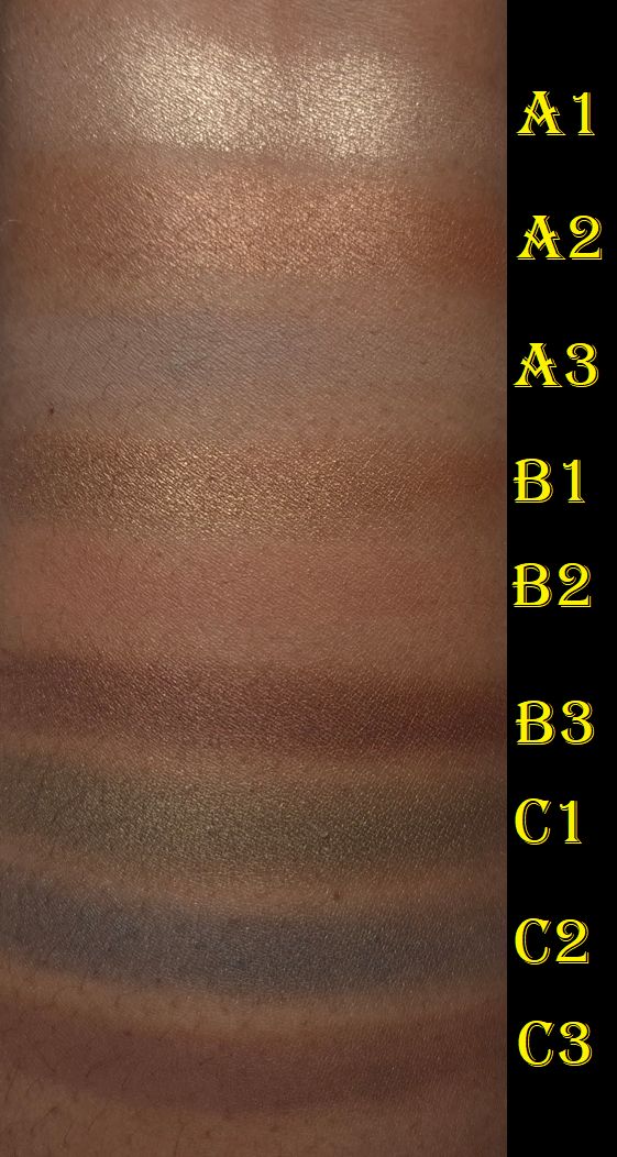
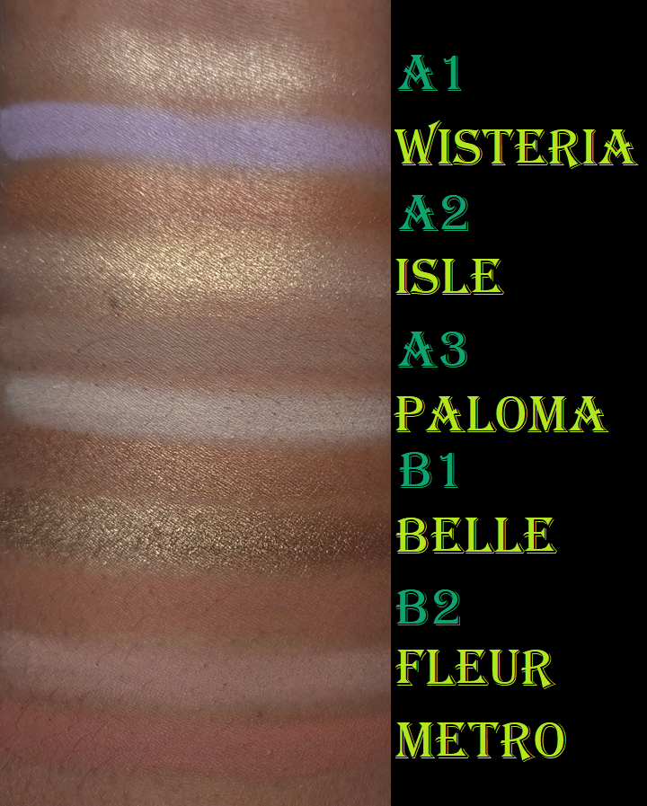
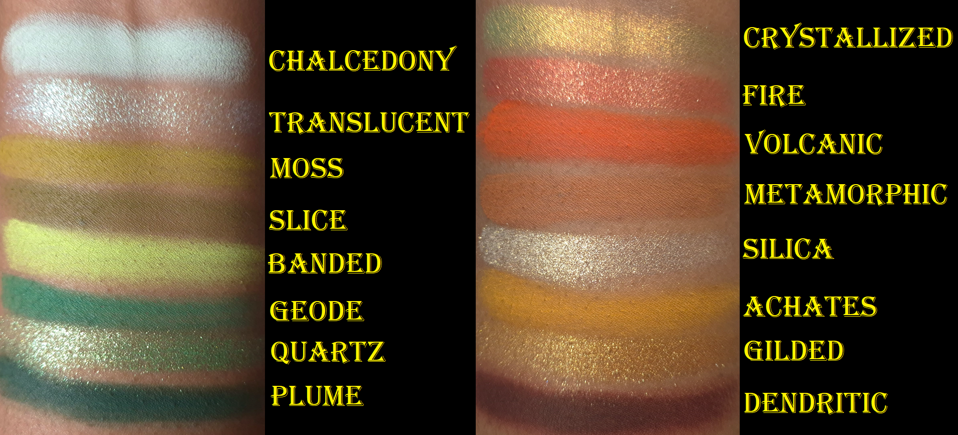
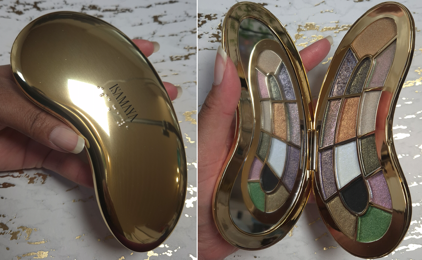
The first unique aspect of Core 1.0 is the emesis basin/kidney dish-shaped packaging with 14 custom eyeshadow pans. No two eyeshadow pan sizes are the same. This is well designed, and although I usually dislike non-uniform pans in palettes, the fact that the symmetry makes sense with little wasted space is why I like it. The downside is that I like to apply shimmers with my fingers, and so the smallest pans are a bit difficult to get into. It also means that shade names could not be printed on the palette directly, but at least the brand included the names on the protective sheet that was inside.
Below are some examples of palettes by Danessa Myricks Beauty, Urban Decay, and Kara Beauty that I would never buy because of the maddening eyeshadow pan layout.

When the Core palettes are turned sideways and opened, they almost look butterfly shaped!
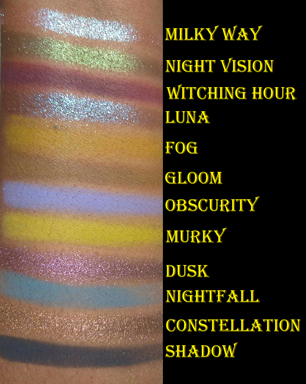
Another uncommon feature of the Core palettes are the various consistencies and finishes of the eyeshadows. Even though nearly all are shimmers, I will discuss each shade individually because their performances on me and my experiences with them are not the same across the board.
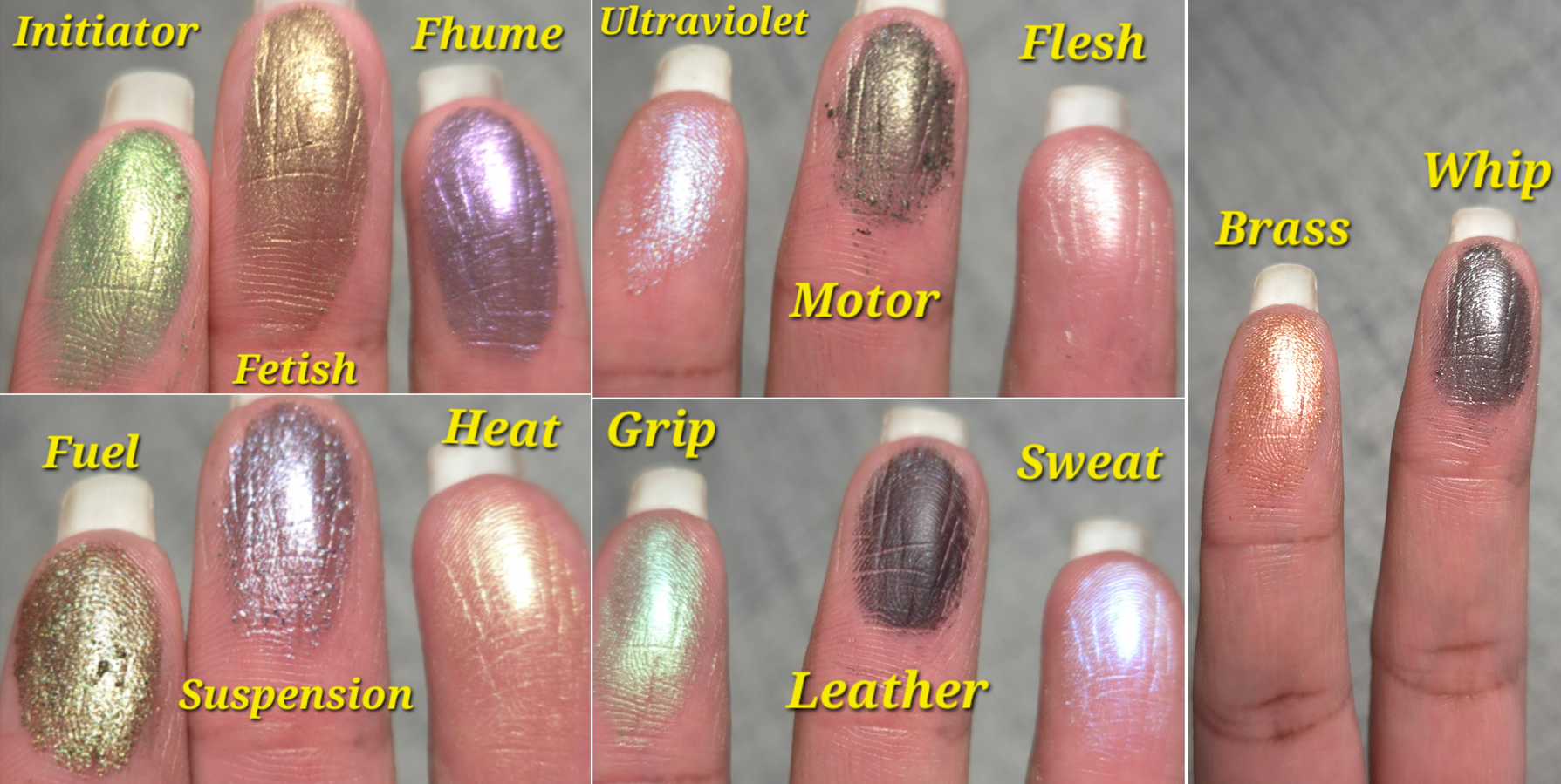
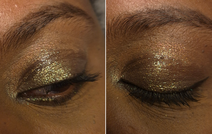
Initiator is one of the most opaque eyeshadows in the palette, but I still wouldn’t consider it to be heavily pigmented. Medium-high pigmentation is more accurate. It’s described as a metallic green, and although it’s a warm color with pretty yellow-golden flecks, I feel this is one of the less exciting shades in the palette. It’s smooth and easy to pick up with a brush and fingers. It’s definitely not thick, but most of the eyeshadows in this palette are thinner.
Flesh is the lightest, thinnest, and sheerest shade in the palette. It’s even listed as a “loose clear shimmer.” It looks a bit frosty on my skin, but it’s still one of the better shades for me to use to brighten the inner corners of my eyes. This isn’t the type of topper that relies on having a medium or larger particle size to create an instant impact. Flesh has a small shimmer size, so adding it (dry) on top of another eyeshadow won’t show much of an effect without light hitting it. Under the right conditions, it’s twinkly in a very refined way. To make it work in all lighting situations, I wet it to intensify the white color, and that contrast gives the brighter appearance.
Now, I’m not sure if it’s solely my fingers or using a damp brush that causes this particular eyeshadow to form hardpan, but it’s easy enough to remove.
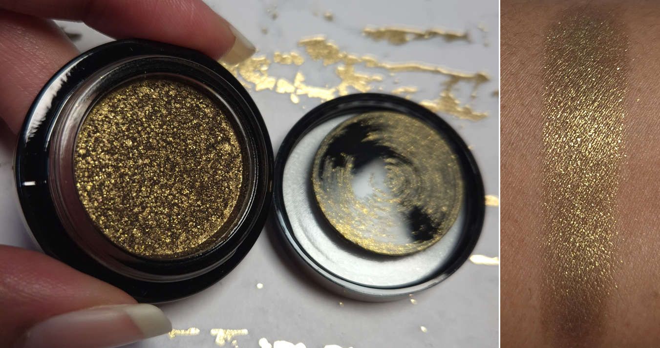
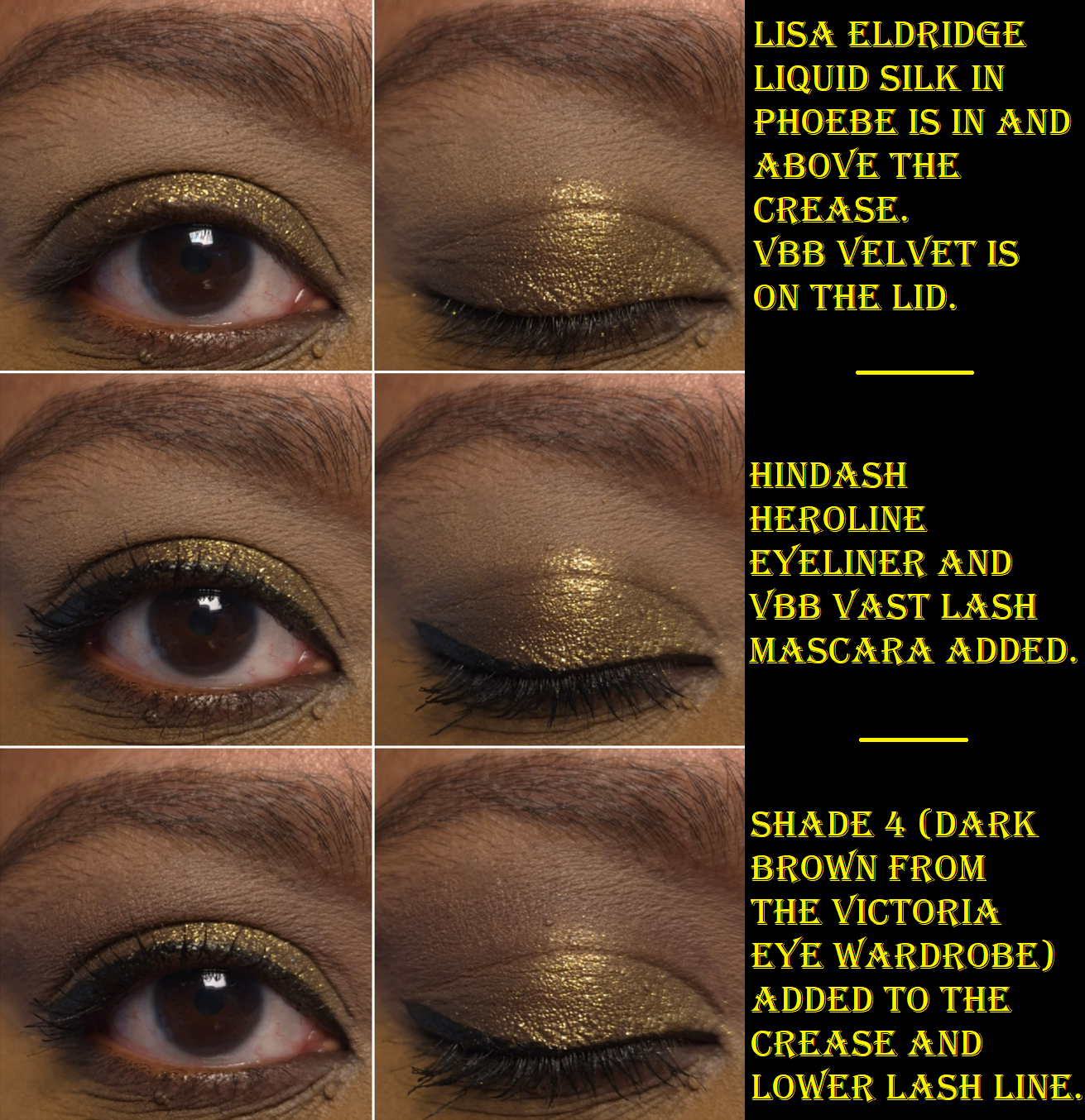
Fetish is described as a “pure ancient gold.” It’s a little less opaque than Initiator, but still less topper-like than the majority of the rest of the eyeshadows in this palette. It’s soft, a little powdery, and the darker base makes it a tad too dark for me to use as an inner corner highlight. It’s also thin enough to easily create a wash of color if a want, like how I used it in my crease in the first eye look below.

Brass is a shimmery orange-red color that looks like it’s going to be richly pigmented from how it appears in the pan, but it’s another medium opacity type of shade. I use it in a similar way as Fetish, which is to be a transition eyeshadow. Its texture is similar to Initiator and less powdery than Fetish.
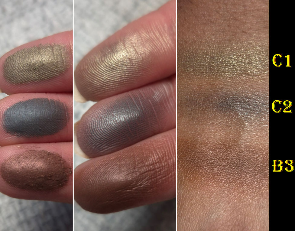
The brand describes Fuel as a dark grey with green shimmer. I’ve been honestly a little disappointed by this shade because of how prominent the green looks in the palette compared to how much of the grey shows (grey in photos but it looks brown in person) on my eyes. The texture of this shade is the wettest by far and close to me considering it a cream eyeshadow. To pick up enough product on my finger, I have to practically scoop out a small amount and then smooth that over my eyelids. It looks wet and goes well with an editorial look, but it creases and breaks up terribly on me, no matter what primer I’ve used.

I can get this shade to last 5-6 hours before the crease area starts to look noticeably worn in, provided I set my primer with powder and reinforce that spot with a powder matte eyeshadow to act as the first layer the oil eats up. Using the powder trick, I can finish the day without it looking anywhere near as bad as I photographed above.
Fuel is fine on my lower lash line, but I try to keep it out of my crease where there’s too much movement.

Fuel was one of the shades I looked forward to the most because it’s like a roided up version of Natasha Denona’s Antheia, which is one of my all-time favorite eyeshadows. Antheia is a duochrome and Fuel is a multichrome. It’s quite the shame that it’s too emollient of a shade to last on me, but I’m glad Antheia is still performing beautifully all these years later!

Sweat is a purple and blue iridescent eyeshadow. It’s thin and a bit slick feeling. The color reminds me of the shade UV from Clionadh, but Sweat is way less powdery with better adherence and with an even more translucent base. I honestly feel this is a more refined and modern formula than Clionadh’s, which is the highest of praise. To be fair though, Clionadh’s formula for the Series 2 Iridescents is at least five years old.
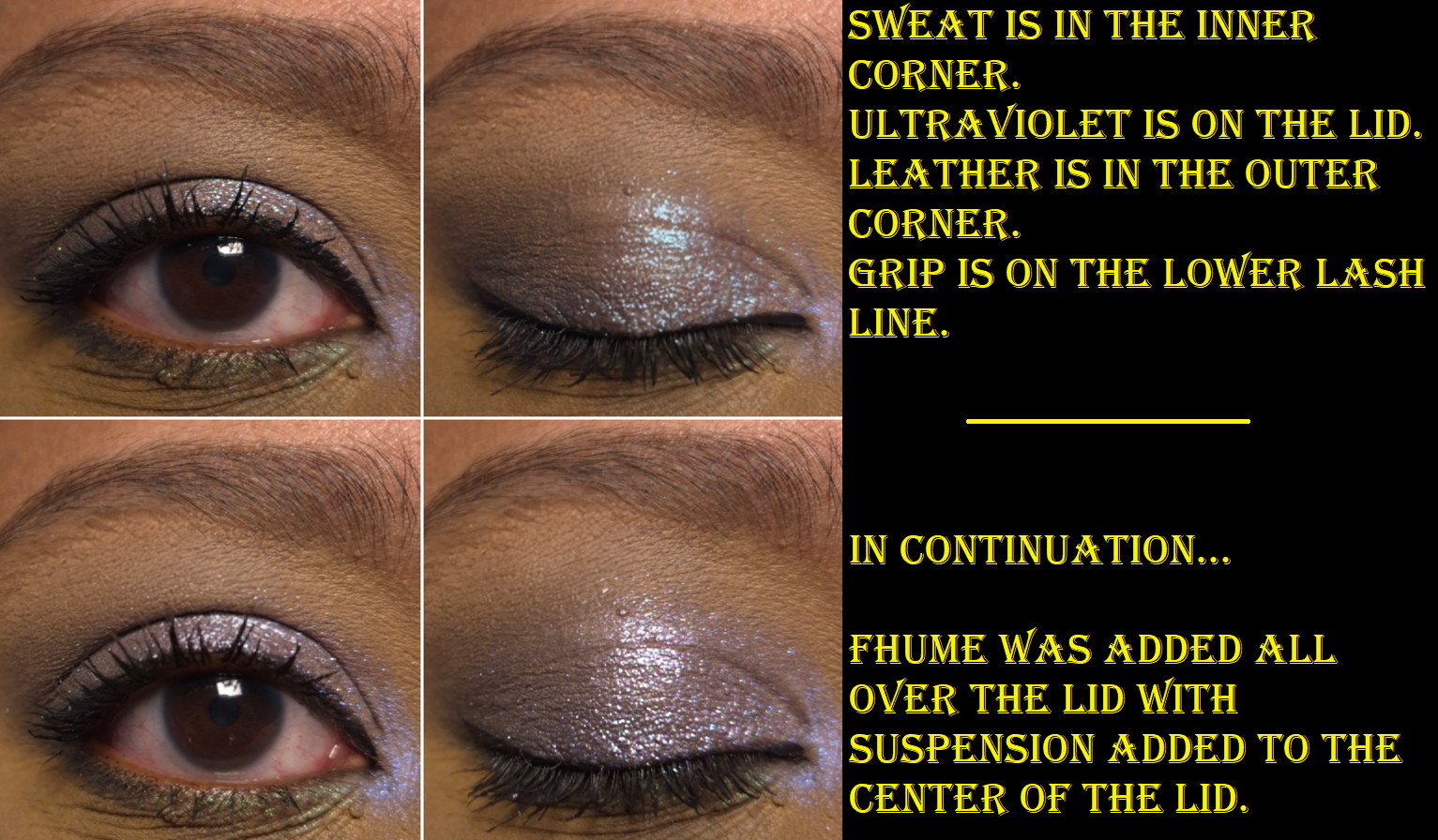
Ultraviolet is another purple and blue eyeshadow, or more specifically, “violet with bright cyan shimmer.” It’s a gorgeous dimensional multichrome, but it doesn’t look good on me as a lid shade with such a sheer base. So, I have to use this on top of other eyeshadows or keep it to the inner corner in order for me to be happy with it.
Grip is described as a grungy iridescent green. In the daytime, it looks magenta and green. At night, I have an easier time seeing blue and a cooler-toned purple as well. It’s quite sheer and also soft to the touch. It has a similar vibe to Viridian by Clionadh, which happens to be one of their most affordable shades in the Deep Iridescent Multichrome line. Grip has stronger shifts, but takes twice as many layers to build up to the same opacity level as Viridian. I still prefer Grip because it looks green head-on, whereas Viridian leans more aqua.
The brand says that Leather is a, “smokey black putty.” I can create a small indent in the surface, like with putties, but the performance is more like a cream-to-powder. It’s drier than Natasha Denona cream-to-powders, and the black shade from Pat Mcgrath’s Bronze Bliss palette, but wetter and much better performing than the black shade from Guerlain’s Ombres G Quad in Royal Jungle. The formula is such that I can create a thin hazy veil of smoke or build it up to use as a liner in daytime looks. However, it’s not quite enough to satisfy me if I’m going for maximum drama, unless I treat it like a cake liner and dampen my brush. Also, this isn’t 100% waterproof, but there seems to be a little bit of water resistance, along with it being budge and smudge resistant once it has had a minute or two to set. It’s easy to remove though with my Bioderma micellar water.
Some of the sparkles from Ultraviolet and/or Sweat have gotten into my pan of Leather, but I haven’t noticed it effecting other looks. Those shimmer particles don’t seem to transfer easily back out.


Fhume is purple with magenta shimmer specks. I would call this one a high pigment eyeshadow that is opaque like Initiator. It’s soft and easy to pick up on my brush without being powdery. It’s not too thick in consistency, nor too thin. Fhume looks pretty in the pan, but I think it’s even nicer on the eyes.
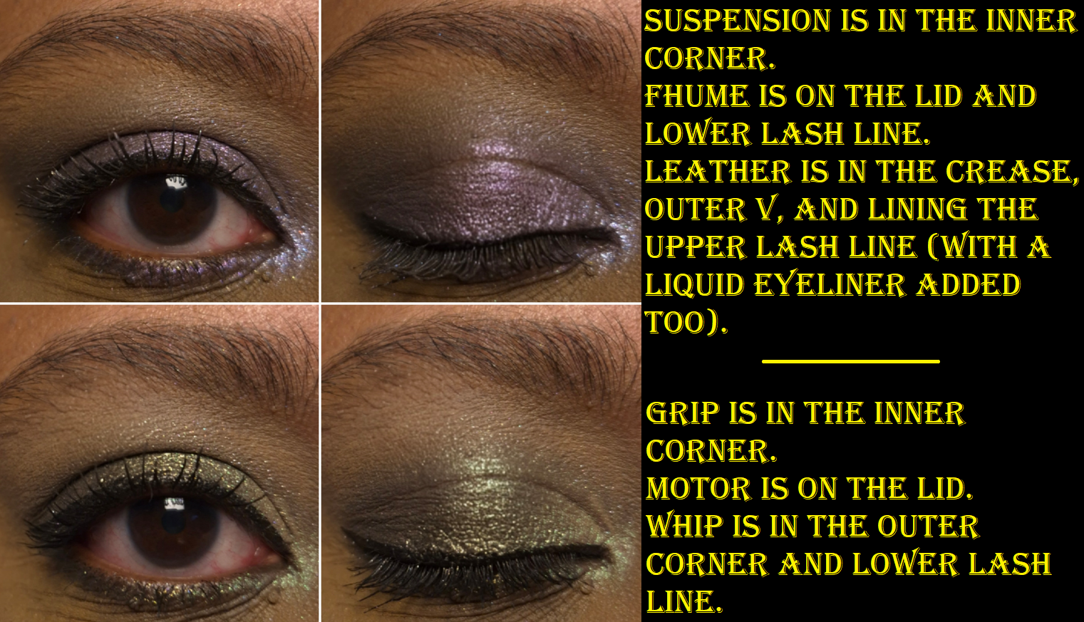
I’m the most confused by the description of Suspension as a, “plum with soft gold shimmer,” when it looks purely silvery to me. Perhaps they mean white gold? It’s a bit thicker of an eyeshadow and grittier. I definitely need to wet this or use glitter glue. It’s one of the most glittery shades in this palette and contains slightly larger shimmer particles than the others. Even though it has a dark base, that reflect is so sparkly and bright that I can use it like a highlighting shade to amp up the overall bling level of the eye look. I’ve tried using it in the outer corner and utterly failed to create depth there.
Whip is a charcoal color with purple and silvery sparkle. It’s a bit on the grittier and drier side than the others, but still has good adhesion and spreads very well. At least, I can get it onto my eyes without it looking messy. If I want to minimize the fallout, I do still need to use either a glitter glue and/or apply it damp. Despite this having a dark base, the shimmer is so bright that I could use it all over the lid instead of condemning it to only be used in the outer corner, as can sometimes be my instinct.
Motor is a dark antique gold that flashes olive green. It’s chunky in the sense that it’s thicker than many other eyeshadows in this palette, and little parts of it crumble off when picked up, but it’s too emollient feeling for me to call it crumbly. I like this color, but I wish it looked even more olive.
If Heat is a, “champagne with green shimmer,” just note that it has a warmer undertone than most eyeshadows that are referred to as champagne. It’s super thin, very sheer, and a little dry. It goes from a yellowish color to looking green under the light, but it doesn’t have as strong of a shimmery reflect as the majority of the other shades. It’s like a duochrome satin.

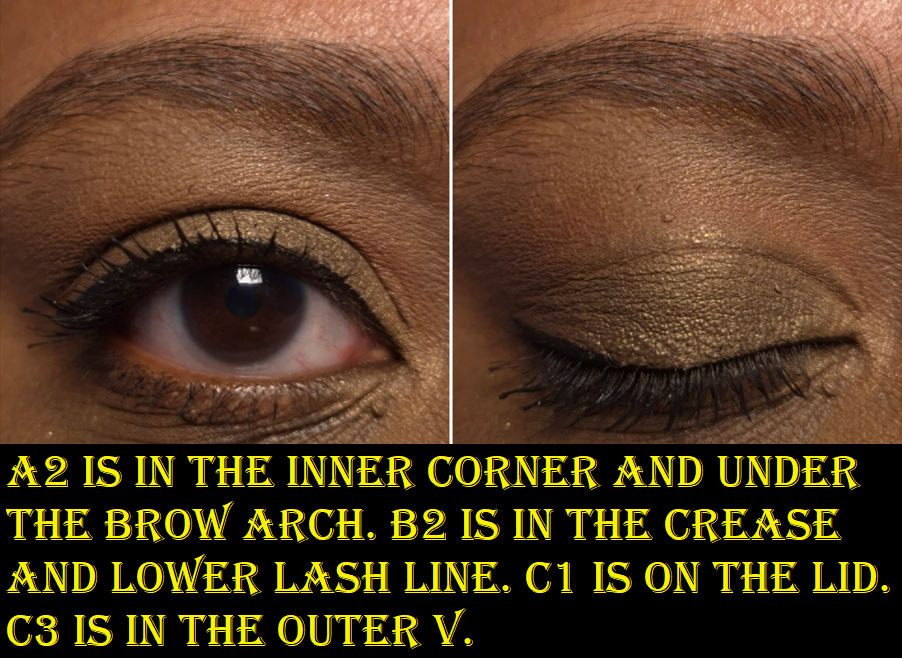
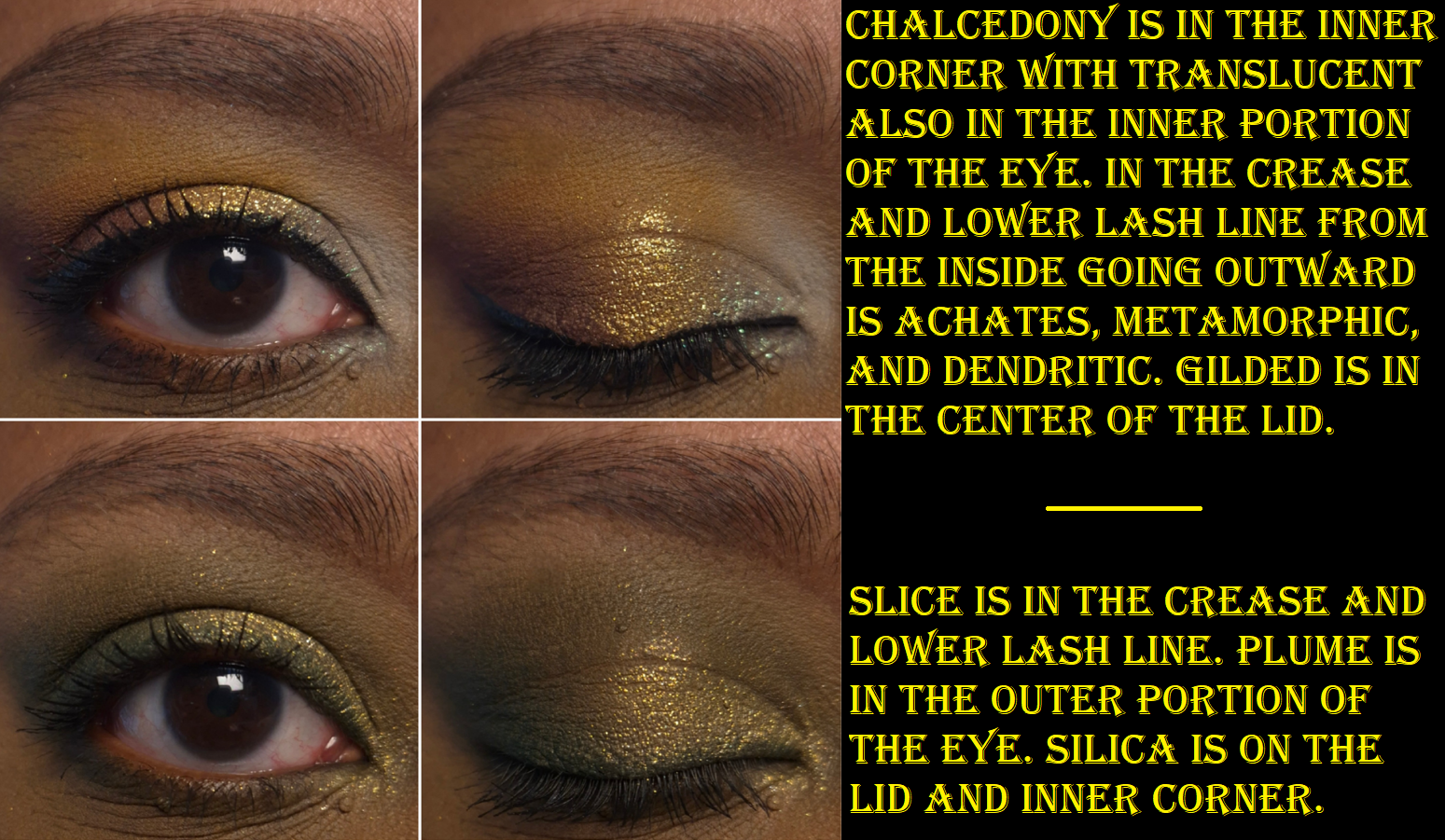
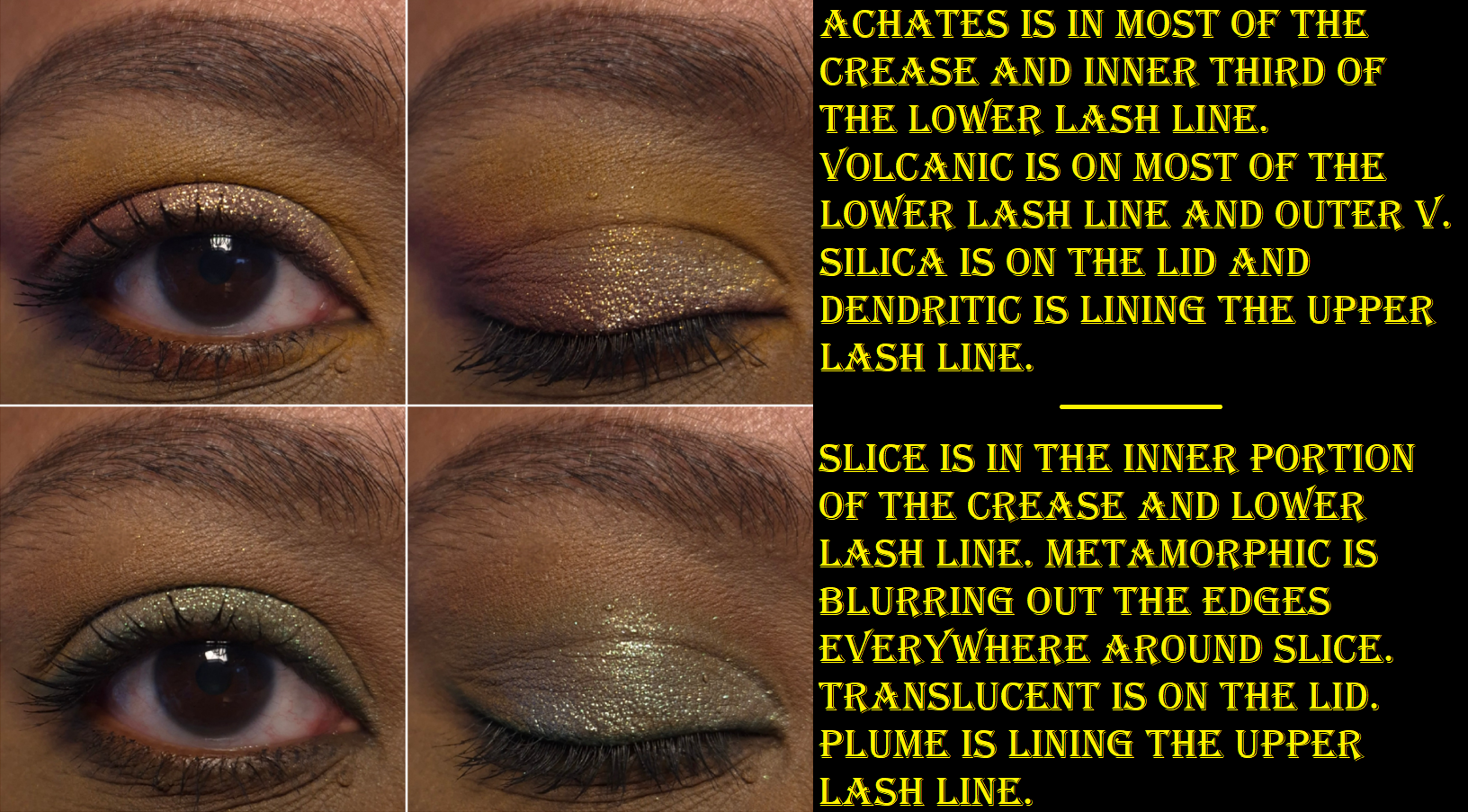
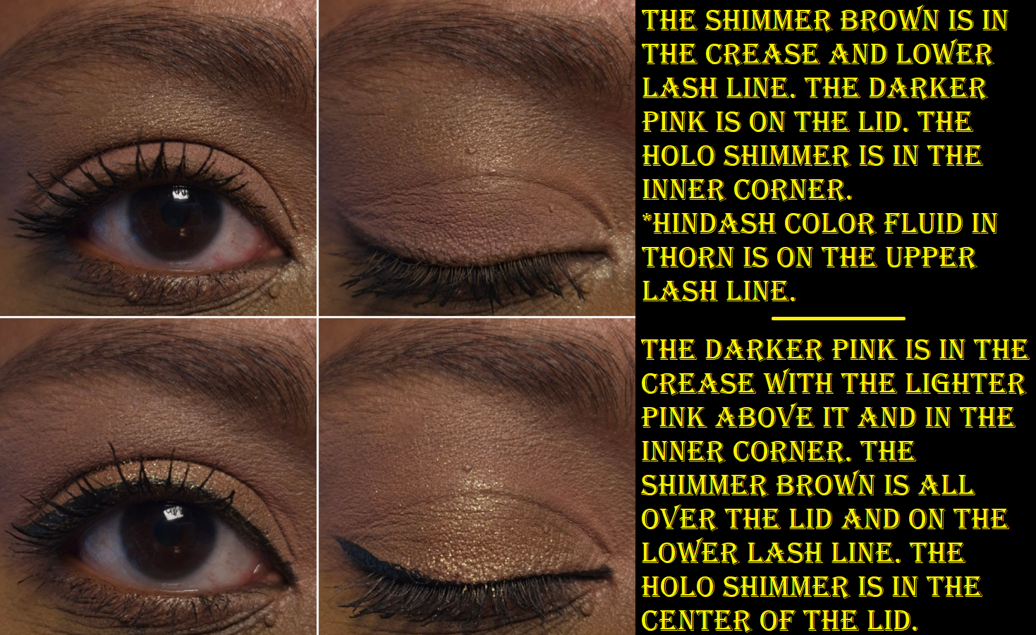
I figured I could create monochromatic all-shimmer looks that I liked, but I was surprised to see how many variations of eyeshadow pairings I enjoyed using together from Core 1.0.
The avant-garde makeup aesthetic isn’t really for me, but I love purples and greens, which is why I was so attracted to this palette. I like to incorporate fun pops of color into my looks, so it’s more practical for me to view this as a supplemental palette to use in conjunction with other palettes.
I appreciate the freedom one has to apply these as washes of color or to layer up the color. There’s clearly a market for people who want duochromes and multichromes, but in subtler and more refined versions. This isn’t too difficult of a palette to use, but it’s not beginner friendly either. For example, some shades don’t build up that much stronger even if applied damp or over glitter glue. Some look better with an actual mixing medium. Then again, at this pricepoint, I don’t think many beginners would start with something like this anyway.
My hope for every palette I buy is for the eyeshadows to be of high quality and perform the way I want. It’s an extra treat when those eyeshadows also come in various textures and finishes that I get to play with. It was difficult at first to remember the different ways I had to treat the various eyeshadows, but by now, I can recall just by seeing how they look on the surface. This has eliminated some of my earlier frustrations trying to use certain shades as a topper, and didn’t realize they were too thin to make a color difference on top of the thicker shades. Learning which order to layer them took some time (about a month with sporadic usage).
If I’m going to buy a duochrome or multichrome, I typically want full pigment right away. I want impact. So, it’s quite a new experience for me to find enjoyment in these kind of eyeshadows. The Isamaya brand managed to create something quite niche, even though it’s something I’m pretty familiar with from my experience exploring various indie brands’ eyeshadows. Danessa Myricks Lightwork Palettes are probably more in line with my preferences, yet I still haven’t shelled out the money for any of those, and they’re similar to the price range of a Core palette. That being said, as much as I like Core 1.0, I still wouldn’t pay full price for it precisely because it’s something I want for specific moods and occasions rather than being an everyday kind of product. I say this even if the high price-point can be justified for the custom packaging, where it was made, the formula and pigments, etc.
If the branding and these eyeshadows fit someone’s vibe, I can see it being worth full price. I don’t think someone expecting Clionadh, Devinah, and other high impact indie brand shimmer quality would like this palette, unless the plan is to use it with mixing mediums. For me, I can only recommend this on sale. In previous years, I’ve seen Isamaya products listed at 30% off. This past Black Friday/Cyber Monday, the Core Palettes were also reduced to 30% off from the brand’s official website. That’s definitely a more palatable price.
That’s all for today! Thank you for reading!
-Lili ❤