
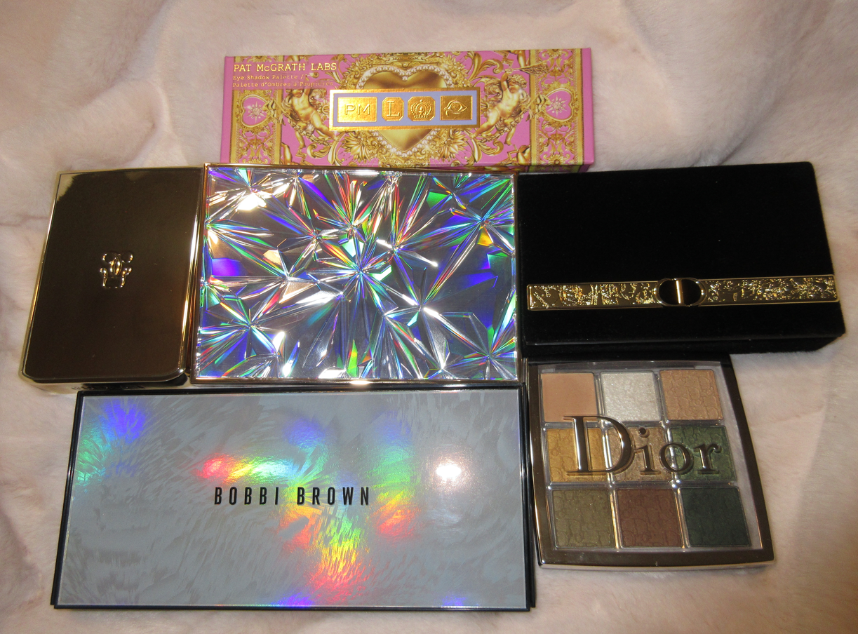
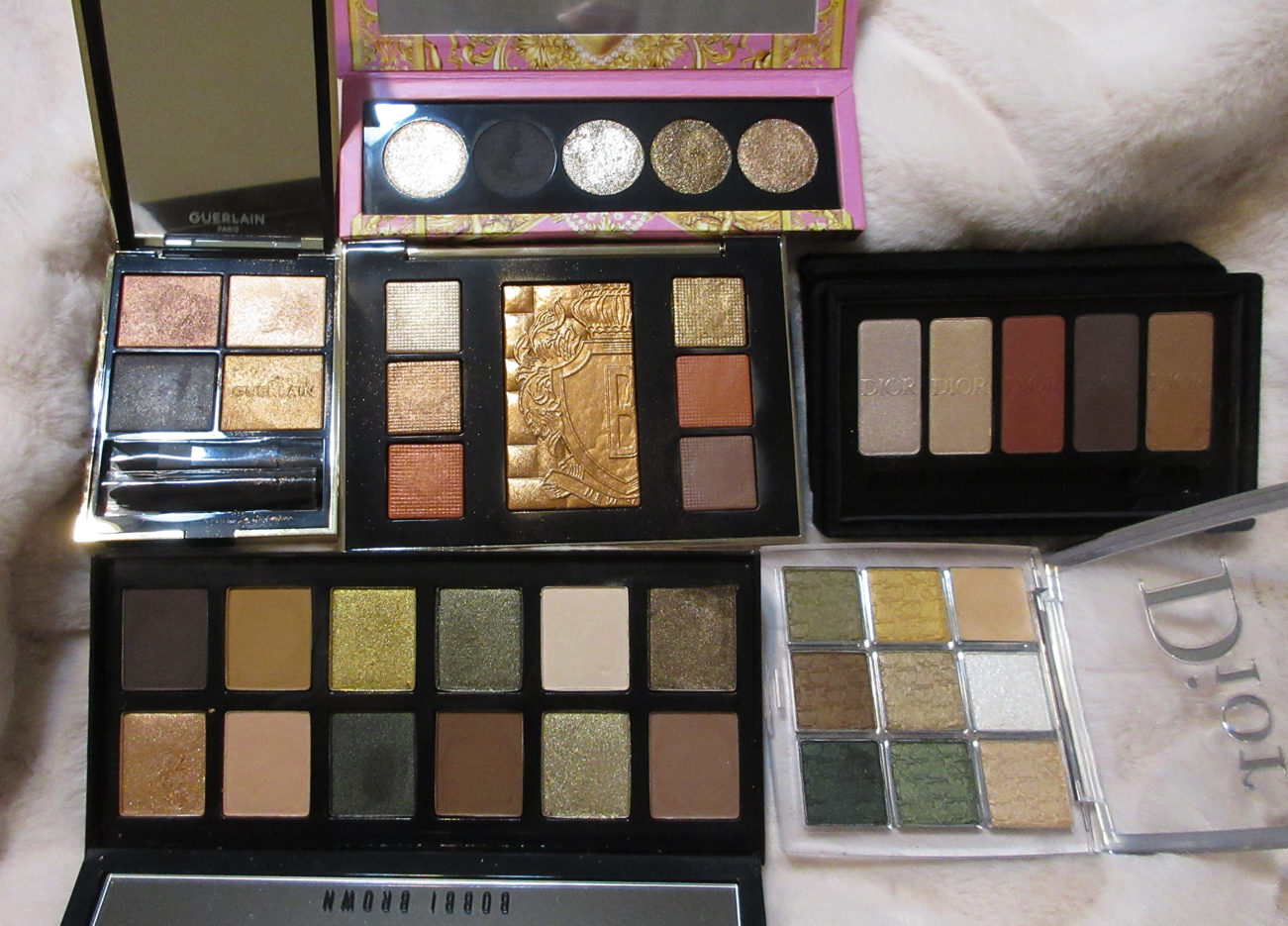
I typically buy makeup that is in the mid to high-end range, as well as from small indie brands. Purchasing this many luxury eye shadow palettes (and so neutral-heavy no less) is very unusual for me. I can’t explain why the sudden interest, but here we are!

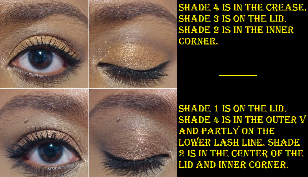
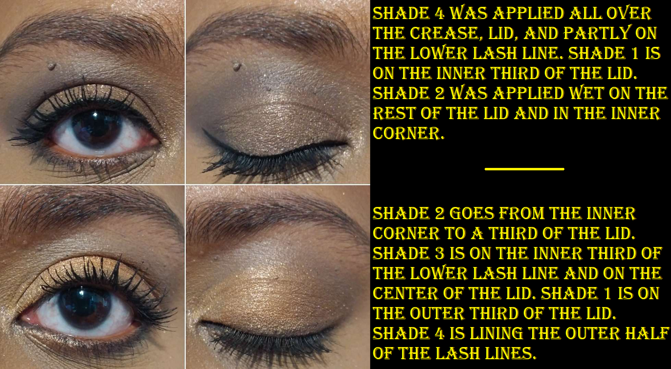
Pat Mcgrath Labs Celestial Nirvana Eye Shadow Palette in Bronze Bliss


I was intrigued when I read these were new formulas for the brand, and that was confirmed as soon as I saw and felt the eye shadows for the first time. La Vie En Noir, the only matte, is not creamy like Natasha Denona’s Cream Powder shadows, but it still has a creamier texture than Pat Mcgrath’s traditional mattes. The shadow is easy to pick up with a brush and finger, easy to smudge, and almost too easy to blend out. When blended, I can see the blue tinge in the shade. Some people will like that this isn’t a pure black shadow, but this feature will prevent me from being able to use this palette solo in the future. Although I technically don’t need a transition or crease shade, I prefer having a shadow there to add definition and block off the roundest portion of my eyes and get the defined almond shape I’m nearly always trying to achieve. I don’t mind using blue for that purpose with cool toned shades, but I’m not the biggest fan of using it with the palette’s two bronzes. If I want the deep black appearance La Vie En Noir can provide, the shadow has to be drawn on or nearly unblended, giving it more of a graphic lined look. If I’m not interested in something that harsh, I have to either accept that it’s going to look blue-black or I’ll need to reach for a supplemental palette.


The first three looks above, using the Bronze Bliss palette exclusively, demonstrate the various blended states of La Vie En Noir in the crease. The fourth look involving mattes outside of this palette where I can just use the blue-black exclusively in the outer corner, shows how it’s a lot less blue looking on the eyes when I use it as just an outer corner deepening shade, the way I prefer to use my darkest shadows. The photo demonstration below shows the process of that transformation.
It’s so tricky using this shade when very few strokes of buffing mean the difference between the shadow looking blended versus it looking faded to a borderline patchy level (and/or too blue).
Color aside, I’d be interested in trying out more mattes like this from the brand in this formula. The unbelievable spreading ability comes from that creamy element, but it’s not actually emollient where it will move on the eye or crease with normal eye movements. It’s only when I touch the shadow with my brush or finger that it comes off. It’s still a powder formula and fully dry to the touch on my eyes.
As for the shimmer formulas, these are definitely different from any other Pat Mcgrath shimmers I’ve experienced. Lunar Luxury is the wettest of them all, and feels the most like a cream shadow. It’s an intense silver, spreads far, and a lot of product gets picked up in one tap. So, I recommend starting with that one dip into the pan and slowly building up to the desired amount to avoid a thick application on the lids. Bronzed Mink and Bronze Illusion aren’t quite as wet, which makes them easier to apply since I don’t have to worry about them looking chunky on the eyes. They contain a nice amount of sparkle, but these can still be sprayed on the brush to really bring out that foiled nature (though a foiled texture comes with it). Nude Moon has the same consistency as the bronze shades, but it’s less metallic and closer to a traditional shimmer. It applies smoothly with my finger, but a lot of product still gets picked up onto my brush and I always have to apply one swipe to my eyes, wipe off my brush completely, and then spread what’s on my eyes with that clean brush so that it doesn’t add more product and can be smoothed out and not look so heavy. Although the shimmers don’t feel wet once they’re on my skin, they will transfer when touched and always transfer to my crease area in the places where my eyes are partly hooded. This is another reason I don’t like using La Vie En Noir as my crease shade, because the shimmers transfer onto it in a very obvious way. It makes it look like my shadows are creasing even though they aren’t. When I’m using mattes from other palettes with these shimmers, I don’t mind that they transfer higher.
Visually, the shimmers are stunning. Every formula in this palettes is interesting to work with and I like that there are warm and cool toned options for eye looks. This is very much a glam oriented palette and there’s certainly a place for that in my collection. Although it’s not a perfect solo palette for me, I think it’s a great product and I would love to buy more variations in the future (other than Nude Allure).
Guerlain Ombres G Eyeshadow Quad in 940 Royal Jungle
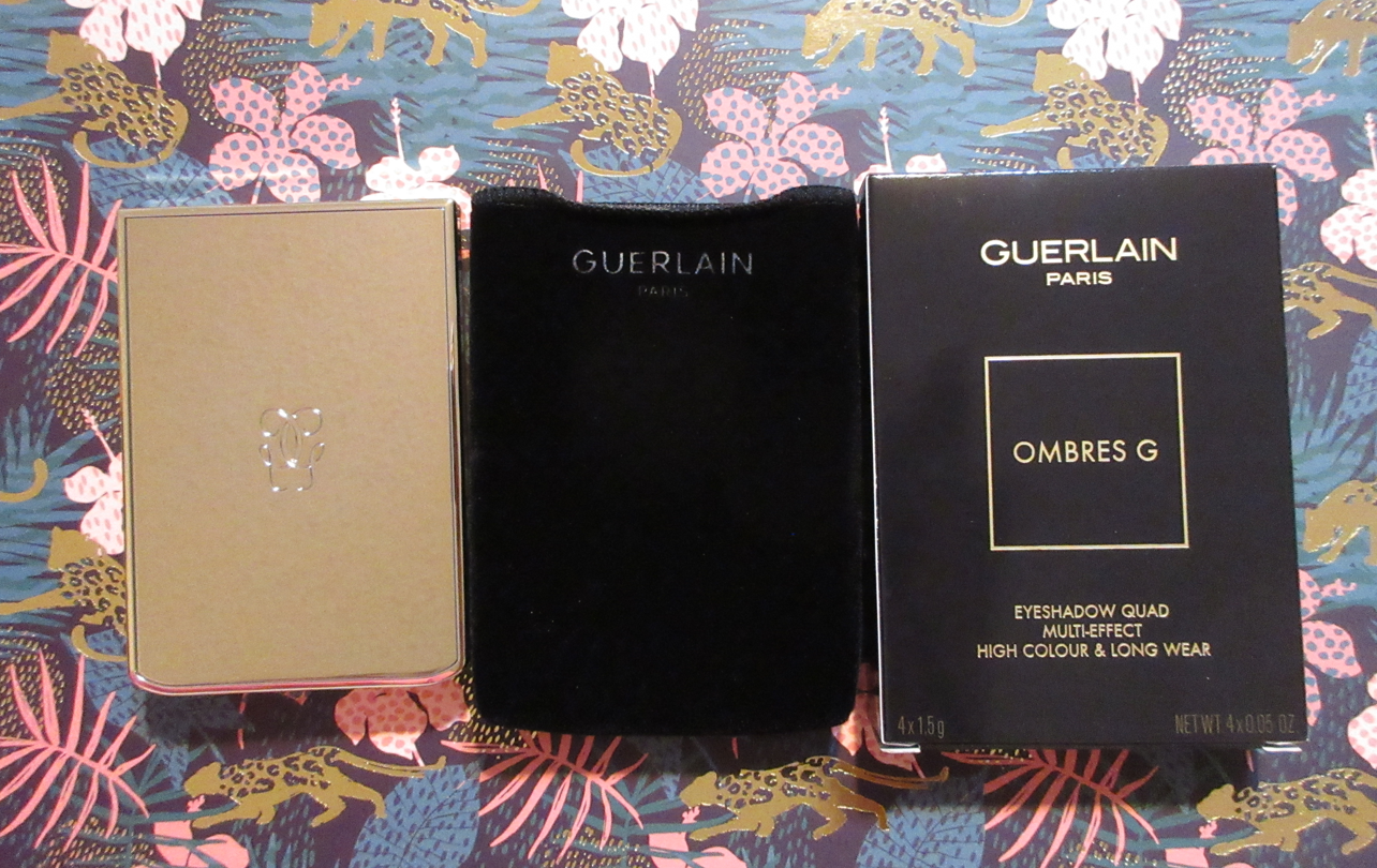


Guerlain had some colorful options in their new Ombres G line of eyeshadows, but I actually wanted a “basic” quad that I would be able to create looks from without needing to think too hard about coordinating the right colors together. I never heard that much praise regarding Guerlain’s eye shadows in the past, so I thought neutrals would be the safest bet since those shadows are easier to get right. This palette isn’t cheap at $85 USD at most retailers, but I got it for $62 via Selfridges. The conversion rate between USD and GBP has been in the favor of USD for a while now, so I’ve been utilizing my Selfridges Global Shipping to my best advantage.
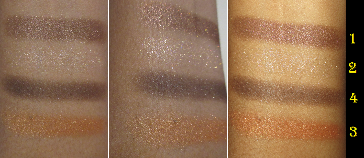
I think I threw out the box*, but the shades are 1-4 in a clockwise motion on Guerlain’s website. It’s very confusing seeing the top right shade as an orange that’s darker than the shadow below it when in reality, the top right corner shadow is the lightest of them all.
*Update: I found the box. The numbers written on it are the same as depicted on the website.

Shades 1-3 have the same texture, which is similar to Tom Ford’s wet/dry formula, but drier. The Guerlain shadows are soft, but the shimmers add a little grit. #1 is a gorgeous chocolate brown metallic with a dark base plus red and bronze shimmer reflects. This is my favorite shade in the palette and the type of shadow I love to wear either all over the lid or as a smoky outer lid shade. #2 is a warm toned pale gold with a transparent base heavily packed with purple, pink, and gold micro shimmer. It is such a stunning topper type of shadow that my photos just can’t do justice in showing. It looks nothing like the deep golden orange depicted in the promo pictures, not just on my skin but in the compact as well. Because of that sheer base, it only works for me as a highlighting type of shade and wherever I want to amp up the sparkle level. Applying it damp is the way to go for more of an effect, but glitter glue is needed to make it look opaque and like an actual shadow, not just a topper. #3 is an orange-gold metallic. It’s very smooth and opaque, but it looks soft on the lids unless it’s applied damp or over glitter glue. Using these damp and dipping the wet brush back into the shadows will start to effect the way it looks in the compact in terms of creating an unflattering texture. I just wanted to mention that for people like me who actively try to keep their shadows looking new and don’t dip their brushes in the same spots over and over to try and “pan it.”
The wear time for these shadows is pretty good. They can look slightly worn at the end of the day, but it’s not that bad. Plus, I have a bit of trouble keeping the pale topper/shimmer lasting in my inner corner unless I apply glitter glue there. Essentially the shadows in that spot are susceptible to the frequent rubbing of my eyes in that spot.
#4 appears to be a baked eye shadow like the others, but it feels creamier to the touch. It’s like Guerlain’s version of a cream to powder formula. It looks nearly black in the quad, but it’s a dark espresso brown that applies in a sheer layer and takes quite the effort to get enough product onto the brush and fingers. Using my finger was the easiest application method, but it wasn’t the best experience. It darkens up the outer corners of my eyes, but it can take on a sooty appearance because of the lack of control since depositing the color off my finger and onto my eyes requires a bit of tugging. I think the formula of this fourth shadow is intended for makeup lovers that prefer to slowly build up their darker shades. That isn’t me, and though I had some critiques about the darkest shadow from the Pat Mcgrath Bronze Bliss palette, even that tricky one was easier to use than this because of it’s spreadability. This one smokes out, but at the cost of requiring friction. While using various brushes, I had the best results with dense brushes with sturdy bristles. This meant my dense synthetic or weasel/sable/kolinsky brushes in pencil, liner, and packing shapes. Wetting the brush minimally increases the opacity and still takes many passes to build up to the level that satisfies me. However, I still cannot make it intense. The problem isn’t about that first layer of color, which isn’t so bad to lay down, but after that first layer it’s tedious to build up to the depth I want. Every look with it is on the softer side. There’s a time and place for that kind of thing, so it’s not the end of the world, but it’s a bit of a letdown of a shadow. That first initial thin layer might be enough product for someone with a lighter skin tone, but I only get a sooty appearance if I don’t manage to pack more on with those brushes I mentioned. Then again, Theresa is Dead on YouTube still had a problem with #4. I couldn’t find her original first impressions video but I linked another one where she discussed it.
Lastly, the shimmers all work fine with any primer I use, but #4 is harder to work with on one of my holy grail primers (MAC Paint Pot), perhaps due to the semi emollient nature of both.
For this pricey quad, I got two great shades, an okay/nice shade, and a troublesome shadow. If I paid full price, I think I would have had regrets considering all the fantastic other neutral and less expensive palettes out there. Weirdly enough, I’m still happy with this purchase despite it not being perfect. However, Guerlain would have to create the absolute perfect color story in order for me to want to purchase anymore from them. I like the packaging and some shadows are a hit, but it’s too expensive to have such limited options of four shadows with one being guaranteed to be hard to work with. Pat Mcgrath’s velvet matte, Nathasha Denona’s cream powder, and Tom Ford’s wet/dry formulas are all better than shade #4 from Guerlain.
Dior Écrin Couture Iconic Eye Makeup
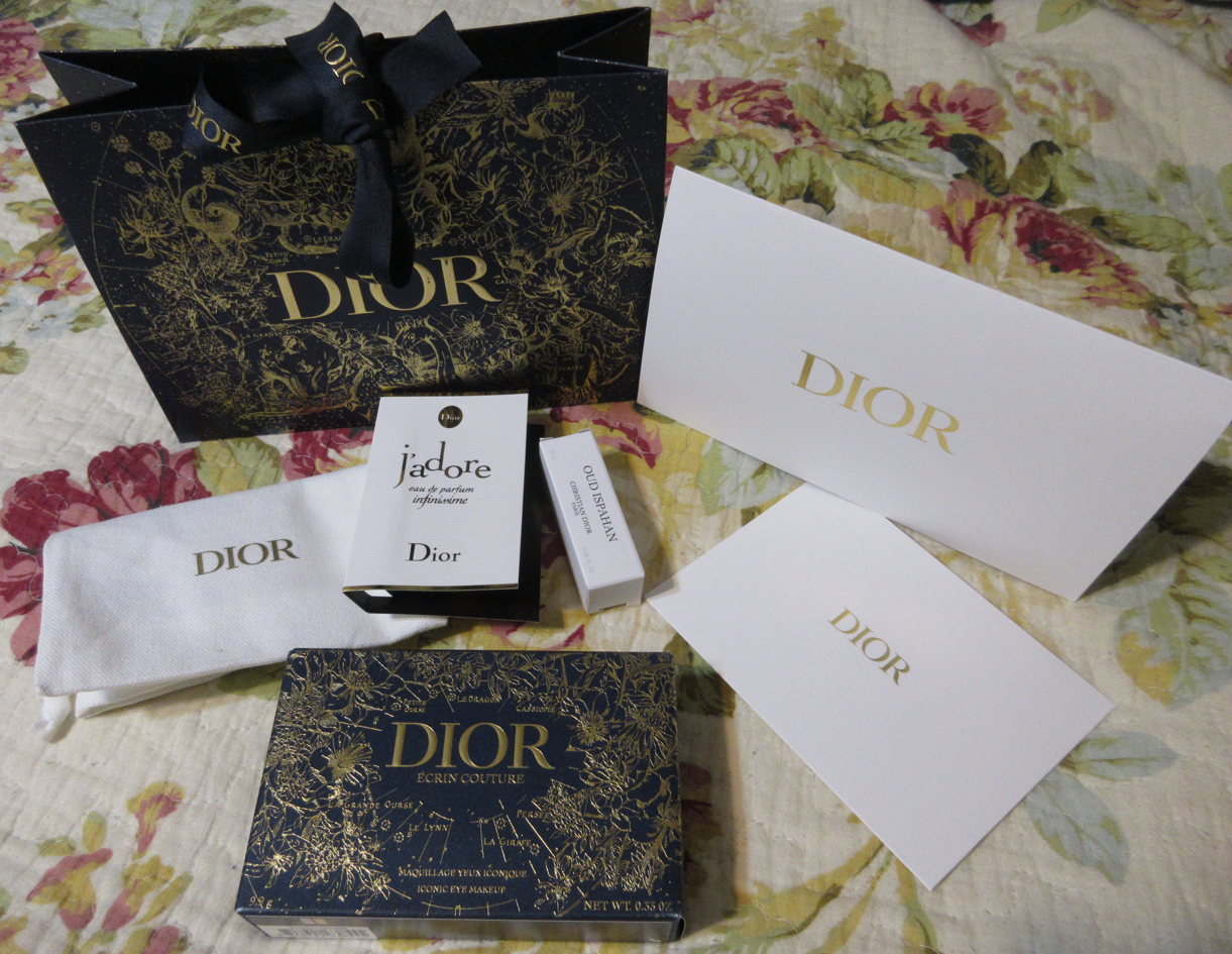
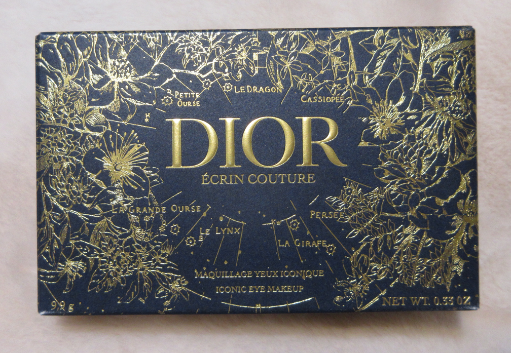
I recently fell down the rabbit hole into the world of Dior Beauty and its devoted following, and there was so much to learn! I hadn’t paid attention to the fact that Dior has special sets with special holiday packaging that changes every year. This year’s stunning floral and constellation design is by Pietro Ruffo. In addition to the box for the Écrin Couture palette, I also got a gift bag with the same design when I made this purchase via Dior’s website.


This (and technically the Dior Backstage Palette I’ll discuss after) is the only eyeshadow palette from Dior that I own. I always wondered what the quality was like of the brand’s traditionally packaged quints, but since this five pan palette is a special holiday release, I’m not sure if this quality is the same, better, or worse. I still plan on finding out one day, if Dior ever creates my dream color story. After using this palette, I’m even more interested in purchasing Dior’s eyeshadows if/when another color selection of theirs grabs my attention.
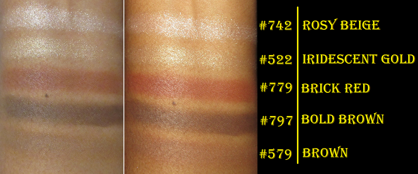
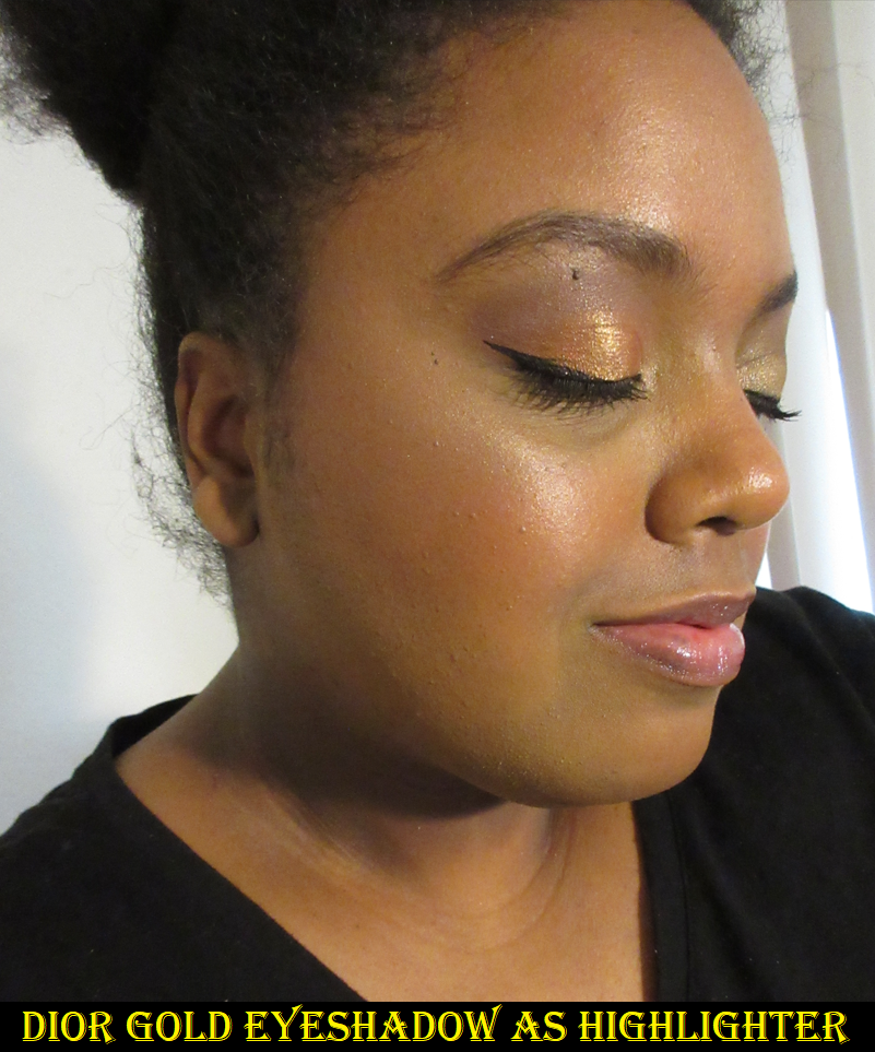
I’ve been interested in neutrals lately, but in using this palette, I very quickly realized that this is too basic of a color selection even for me. The shimmers are not as sparkly or reflective as I prefer for lid shades, though I appreciate how finely sized the shimmer particles are. In fact, the Iridescent Gold in particular has so fine a golden sheen that I can and have actually used it as a face highlighter. It’s very texture-friendly and despite being light for me as a face highlighter, it can still work if I’m on a trip or some other situation where I don’t have my usual variety of highlighters with me. I definitely can’t use Rosy Beige on my cheeks, not just because it’s too pale for me, but also because the texture of the particles are more visible in that shade.
The lightest color option is quite icy in contrast, but even the gold when used on my actual eyelids looks like a very pale yellow, so both are best as eye highlighting shades. If the shimmers were more intense, how pale they are would still limit how I’d want to use them in my eye looks anyway. Also, the shimmers are so thin that applying them damp or with glitter primer doesn’t intensify them enough for me; helping them along just makes them usable.

I’ve been enjoying the mattes more. It’s hard for me to see them as special, but objectively they are special in the sense that they don’t give me any problems to use them at all. They’re smooth, soft, and blend well into each other. I can build up the intensity of the Bold Brown to the level that’s deep enough for my needs. That shade and the Brick Red one are nicely pigmented and show up right away. The lighter Brown is only a few shades darker than the color around my eyes, so it’s a good transition shadow.
There really isn’t much to say. I’m not excited by these eyeshadows and they’re not very inspiring, but I can still see the value in having wearable everyday colors in a dependable easy to use formula. This palette is useful for transitioning between daytime and nighttime looks. It’s great to have as a supplemental palette to form a basic eye and pair it with another palette or single shadow for a lid shade with some added spice. This is the kind of palette that could be enticing to someone who wanted the Hindash Beautopsy palette, but with a focus on quality best suited for the eyes rather than a focus on the whole face (plus Écrin having the added bonus of shimmers). To clarify, the shadow formulas within Beautopsy and this one are completely different, but they have similar colors and both are fantastic quality in their own ways with differing strengths.
I don’t know if this palette was worth me getting, but I do really like the velour box packaging that I intend to repurpose for jewelry or something else long after the shadows expire. So, the keepsake element could be appealing for some people beyond just the makeup. In addition, the whole experience of unwrapping such extravagant packaging could make this a special gift for someone who owns very few eyeshadow palettes, neutral lovers, color-shadow-phobes, or those who just love luxury makeup.
One final random note I wanted to add is that the starry box was too cute to get rid of, but taking this palette in and out of the box was a pain, so I decided to use the dust bag that the perfume samples arrived in as a dust bag for the palette instead.
Dior BACKSTAGE Eyeshadow Palette in 008 Khaki Neutrals


Now, this is my kind of palette! It’s filled with so many varieties of greens in the kind of tones that I love, in addition to golds and a gorgeous brown. I’ve seen some comments around social media despising the addition of a primer in here, but because I don’t own multiple backstage palettes, this isn’t redundant or wasted space for me. The primer works well with the shadows, but my only gripe with it is the fact that it doesn’t have enough coverage to give me a blank canvas around my eyes. When used in the proper amount (and not as thick as a swatch) it’s quite sheer and all the discoloration on my lids and crease area show through. That’s fine if I’m using highly pigmented shadows, but these soft tones of shadows don’t do the best at covering them up. So, I prefer to use my own primers with this palette, but I solely used the primer included for the first two eyeshadow demo photos. In the bottom two, I used the Coloured Raine primer in the color Wheat.
Regarding Dior’s descriptions of the different finishes of these shades, it’s a bit confusing. Primer being an eye shadow primer and Top Coat having a sheer base but being the most sparkly and reflective of them all are straightforward descriptions. Golden Tan and Warm Gold are satins and just look like they have a sheen in their pans, but that sheen is quite reflective and gives them more of the look of being soft shimmers. However, I can accept their definitions of them as satins. Warm Brown is the final satin listed, but unlike the other two, this shade doesn’t have a strong sheen to it. It’s almost matte.
Pure Gold is a glitter and very similar in color to Golden Tan, except that Golden Tan is actually more reflective than Pure Gold, is more opaque, and ironically looks more golden because of the stronger sheen. Pure Gold’s base color is golden, but because the base is so sheer and the glitter is like a champagne, the shimmer overpowers it. So at certain angles, Pure Gold can look more champagne or more gold depending on the light. The very obvious glitter particles are why I accept this definition as a glitter. However, Khaki and Pine Green are the other two glitters listed in this palette. Pine Green does have dark green shimmer in it, but there’s so little visible sparkle that it may as well be matte. Even more matte than Pine Green is Khaki, which I can only see the gold sparkles in the pan. The sparkles just give a barely visible golden sheen and looks no more reflective than Warm Brown. I think of all the shade descriptions, Khaki should be considered a satin.
There’s only one metallic listed, and that’s Emerald, which does have a metallic reflect to it. However, Emerald has a golden sheen and so much visible gold shimmer that it takes away the smooth nearly foiled nature I expect when I think of metals and it looks like it should be considered a glitter shadow.
So, despite what Dior lists, I consider Top Coat to be a glitter, Golden Tan, Warm Gold, Emerald and Pure Gold to be shimmers, and Khaki, Warm Brown and Pine Green to be satins. That’s why I use that bottom row of the palette in place of mattes in the crease because the shimmer in the pans have such little effect on the eyes.


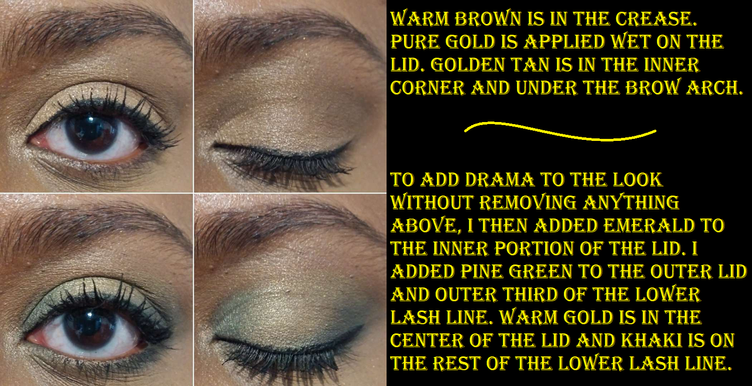
I love the color scheme, but the one aspect that doesn’t make sense to me is the fact that Top Coat is such a cool toned icy sparkle shadow when it clashes with all the gold shimmer and golden sheen that’s in the majority of these shadows. It doesn’t look right when I try to use it as an inner corner highlight shade either, so I doubt I will use it again once this review is posted. Also, Pine Green is seriously pigmented and a little more powdery to the touch than the rest, so I recommend using a precise brush with that shade, though it does still blend easily.
These shadows don’t swatch the best, but they blend well on the eyes and have a soft, pretty, smoothing, and sophisticated look to them. They’re more pigmented than I expected and I like the satins and glitters in this palette more than the shimmers in Dior Écrin Couture. If I want a little more drama, applying these damp gives me even more of what I want. Overall, I’ve really been enjoying this palette and the fact that it’s so compact in size makes it the kind of palette I can see myself packing as an extra travel palette. I can use them with any primer. I have no issues with creasing or longevity either.
Although I didn’t purchase this from Selfridges, I noticed it is cheaper there at the current price of $41 instead of $49.
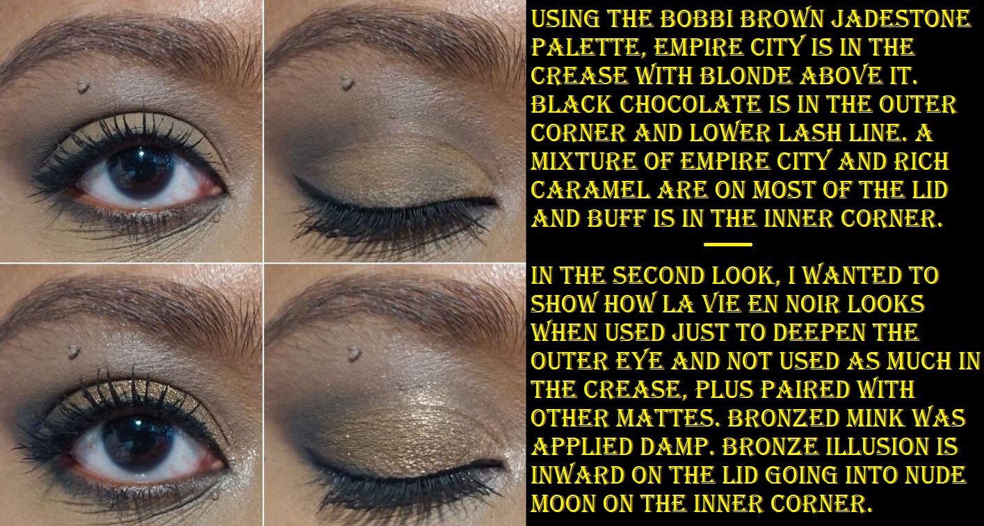
Bobbi Brown Jadestone Eye Shadow Palette
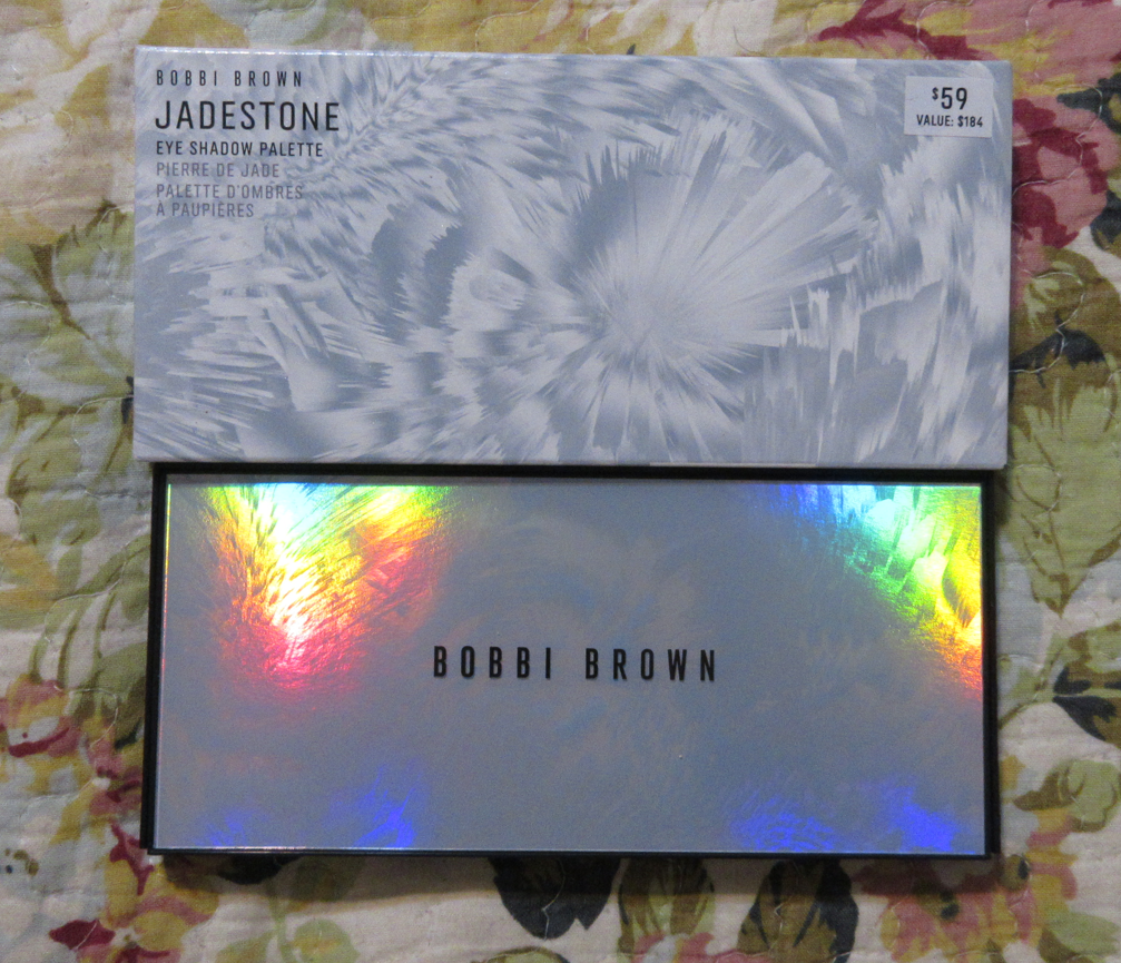


I bought this palette for 25% off during a “play to win a discount” event that brands sometimes do. I got free shipping as well for being part of Bobbi Brown’s reward program. Bronze Forest arrived broken, but I just pressed it back.

This palette is fantastic! I like it even more than the Dior Backstage Khaki Neutrals because I prioritize shimmers over satins and the shimmers in this palette are much more impactful, plus this has true mattes in it. This formula reminds me quite a lot of Lorac’s revamped PRO formula (Fairytale Forest in particular) with such buttery mattes and soft yet shiny shimmers. The shimmer particles are small in size, but nice and reflective. I also don’t have any issues with creasing or fading.
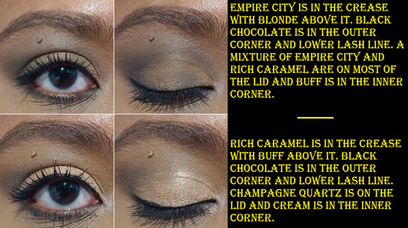
The mattes are buildable and blendable, but despite how pigmented Cream looks, it blended away and wouldn’t stick where I put it. So it left me with an ashy cast unless I mixed it with another shadow (like Champagne Quartz for my inner corner). As a brow highlighting shade, leaving a brightened cast wasn’t as much of an issue because it was so stark against my skin tone anyway. So, overall, I prefer to just avoid using that shade entirely and to use Buff instead as the matte highlighting eye shade.
Rich Caramel is essentially my skin tone and I love having a shade like that in here so I can make my eye area look natural again after using certain primers. For that reason, it’s among my favorite shades in the palette along with Bronze Forest and Jadestone. Electric City surprised me with how much brighter of a yellow tone in the gold that it has. Blonde also surprised me with how much darker of a taupe it looks when applied to my lids. It’s not dark enough to be a deepening shade on me, but it works as a transition shadow in the crease.

The brand calls all these shimmers metallic, but it’s only when they’re applied damp that I can see what they mean about that. For the price I paid, this was an absolute win. With Black Friday sales approaching, I recommend getting this palette for a deal if possible, for those who find these greens and neutrals appealing. The full price is a lot when I compare it to Lorac’s PRO prices and quality, but since I’m getting fantastic quality either way, I’m very happy to own this one. I have no regrets!
Bobbi Brown Luxe Eye & Cheek Palette in Copper Glow

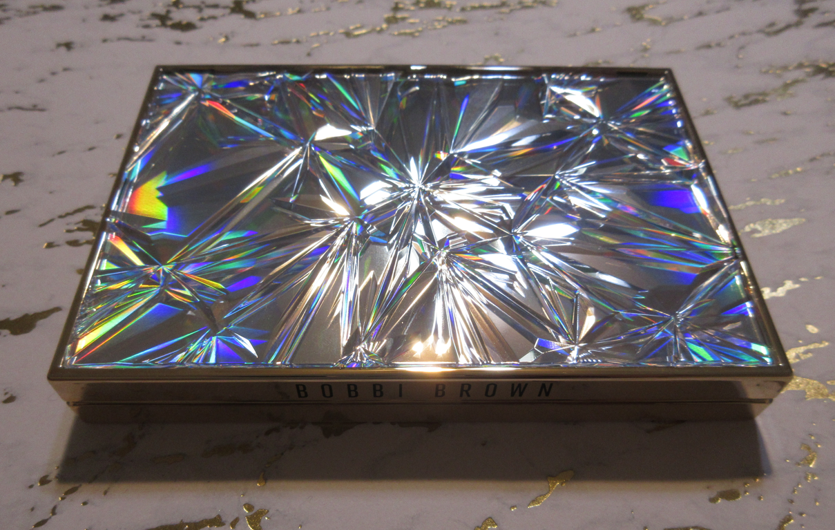
This is the final palette in this review, but I purchased it even before Jadestone. I didn’t get as great of a deal at 15% off my first purchase from the brand’s website, but it still helped to soften the blow of that price tag. For the same price as Jadestone but with fewer individual products inside, I guess the dazzling outer packaging was a big factor into the cost. It admittedly reminds me of Smashbox’s Hoodwitch Collection highlighter, in particular, because they have the exact same feeling plastic around them and the raised plastic light refracting top. Both brands are under the Estee Lauder umbrella, so it’s possible the packaging was made by the same place. The main difference is the shapes of the textured top and the Bobbi Brown one being extremely holographic.


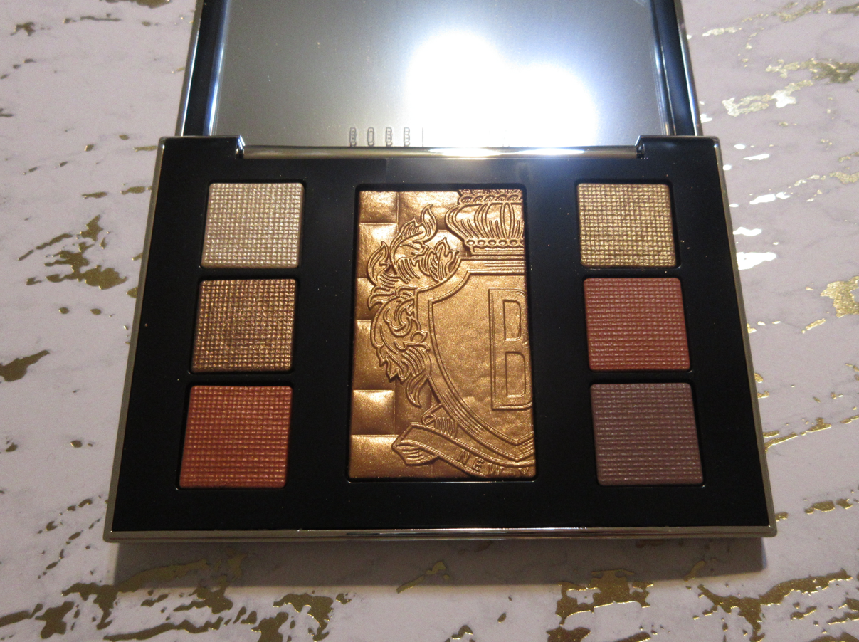
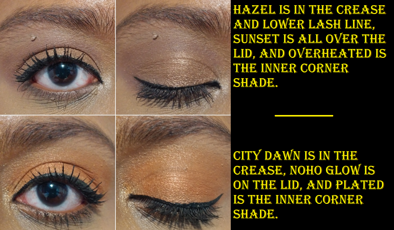
When I got my hands on this palette, I was surprised to see the reds look so orange on me and the matte brown, Hazel, gives me such little depth. It’s more of a rose-brown than the rich dark brown I expected and still feel this palette needs. Between Noho Glow and City Dawn, the former is a deeper orange with a hint of red while the latter is a medium toned warm orange. Despite me not minding the unexpected color, what throws me off is how similarly they look on my eyes, which makes them feel redundant in the palette despite them being two different finishes.
The stars of the show for me are the brownish-bronze shade called Sunset and the sparkly gold called Plated for the glittery impact it adds to eye looks.
Overheated is a little more interesting for an inner corner shade because it’s a pale gold that can go well with warm or cool looks, plus it has festive micro-fine green and red glitter that I only noticed upon close inspection within the palette. It just looks pale gold on the eyes though.

Just like with the Guerlain Quad, the makeup in this Luxe palette are baked shadows in a wet/dry formula. The shimmer and metallics are easy to pick up; they’re fine enough to use dry and to intensify when wet. The same goes for the red-orange matte, but Hazel is definitely less impactful when used dry. It doesn’t have the “deeply saturated shade intensity and clarity for dramatic payoff,” that is described on Bobbi Brown’s website. Using the non-mattes wet is easy, but with the matte shades I need to use only a tiny amount of liquid and spread it across the lid and/or crease in solid swipes or else it will dry strangely by literally looking like a discolored patch from thinning out the pigment and basically turning it into a watercolor shadow. Dampening Hazel doesn’t make it darker, but it does save time on needing to build it up in opacity and evenness.
As for the Copper Glow highlighter, it’s so smooth looking in the compact and gives me that wet look to my cheeks that I love. However, unlike the Bobbi Brown Highlighting powder I own with a similar texture, this one has additional larger size sparkles too. I’m a broken record about how I only want small particle sizes in my highlighters, but this is a bit of an exception. It’s not overly sparkly and there’s just enough twinkle to be the kind of highlighter I’d want to wear for festive occasions and even just for photos because it looks really nice on camera. In fact, in pictures it just catches the light and doesn’t show the dark cast that’s visible in person from the tone being a little too bronze-red for me. I can make it work in person if I pair it with the right blush.
Also, there is an Incandescent Glow version of this palette, which I do not own. However, I’ve heard the highlighter in that palette is extra glittery. Unlike Copper Glow, Incandescent Glow is a duochromatic highlighter, so perhaps the particles that make it a shifty pink to gold is responsible for it being sparkly, and perhaps even more sparkly than Copper Glow.


The brush I use makes a huge difference in the amount of product that gets picked up and the sparkle level. In the demonstration photos above, I used the Chikuhodo ZE-5 (silver fox hair) as a highlighting brush and it applied the amount I would normally want for a nice subtle, but not too subtle amount of product. In the photo on the right, I redid my eye makeup and cheek products (so the highlighter application isn’t two layers, just one) and I used my usual Bisyodo CH-HC (goat) which picked up and dispersed significantly more product. So, the tool will really make a difference in the intensity level. I haven’t applied this highlighter to damp skin, beyond the dewy level of my typical foundations, but I imagine this highlighter can get even more impactful.
I don’t give a grading scale because makeup is so subjective and my color preferences can even overshadow quality sometimes, but I will try to summarize how these rank compared to each other. In order of my most favorite to least favorite, it would be:
- Bobbi Brown Jadestone
- Dior Backstage Khaki Neutrals
- Pat Mcgrath Bronze Bliss
- Dior Écrin Couture
- Guerlain Royal Jungle
- Bobbi Brown Copper Glow.
The highest quality, easiest to use, and most well rounded palette is technically the Dior Écrin Couture, even though it’s not in the #1 spot. In terms of quality, the Bobbi Brown Jadestone should be in second place, but I love the color story in this palette the most so it’s my favorite. The Dior Backstage Khaki Neutrals comes next and is a great balance of quality, pigmentation, and color story, though it’s not a perfect palette with me not being thrilled to have the Top Coat shade and the Pine Green being a bit more powdery than the rest. I still ranked the Pat Mcgrath palette over the Dior Écrin Couture despite the tricky to use blue-black shadow and the transferring shimmers because of my love of the shimmer intensity on the lids, the tones of the bronzes, and the texture to the touch. Those two are the most polarizing to compare with one giving a very effortless, soft, and sophisticated glam look whereas the other bestows an intense, attention-grabbing, over-the-top glam look. The Guerlain palette ranked below the Pat Mcgrath palette because the issues with that deep brown shade is actually troublesome, not just tricky. Guerlain’s other shadows don’t have the transfer issues and are pretty hues too, but the amped up intensity from PML’s shadows is more important to me. Then, the last one on the list is Bobbi Brown Copper Glow because of the hassle with Hazel, the lack of variety with the color story despite having more shades to choose from than the Guerlain quad, and the shimmer/metallic intensity level.
I definitely love my top three of the six. Because of the packaging of the Dior Écrin Couture and my enjoyment of the non-mattes in the Guerlain quad, those are still going to stay in my collection. The only one that I’m unsure if I will keep for very long is the Bobbi Brown Copper Glow palette. It’s a decent product, but since I’m just one person that can only get a small percentage of use across my whole collection, being just “decent” means it’ll be on the chopping block during my next declutter.
That’s everything for today! Hopefully having six reviews in one post will make up for missing last Monday’s post. For those visiting my blog for the first time, be sure to click the follow button if you want to be notified of all future posts! My recovery is going really well, but as predicted, it’s going to be difficult for me to post on a consistent schedule for the rest of this year.
Thank you for reading!
-Lili ❤
DISCLOSURE: I haven’t posted one of these in a while, so just as a reminder, all products in this post were purchased by me. My opinions are my own and all links in this particular post are regular non-affiliated links. Any connections I have to brands and companies are detailed in the “About Me” section of my blog. Anything affiliated or sponsored in this blog and future posts will be clearly marked.

I did not expect to be more impressed by the Bobbi Brown eyeshadows than the Guerlain and Dior. The Dior backstage palette does look great but I expected better based on the raves those palettes are getting. Bobbi Brown does make those luxe eyeshadow singles, I might have to check those out.
LikeLiked by 1 person
Yeah, Jadestone for sure caught me by surprise! I think I’d be worried for my wallet if Bobbi Brown made my type of color stories more often. It’s lucky and unlucky for me that they don’t usually appeal to me. lol.
LikeLiked by 1 person
Yea, their prices are often creeping into the territory of luxury
LikeLiked by 1 person
Pingback: Viseart Palettes: Violetta, London Étoile, Grand Pro 1x, Bijouxette and Peridot – Lili's Beauty Blog
I actually wanted to try Bobbi Brown shadows. They did a collab with Tokidoki and the packaging and shades looked so cute . Also love the look of the Pat McGrath palette
LikeLiked by 1 person
I was tempted to get the Tokidoki palette honestly. Especially when they were (or maybe still are I’m not sure) offering 25% off their website (and shipping is free for those who sign in with their accounts). The only thing stopping me is that the color story is probably not the best for my skin tone. But my goodness the packaging is so cute! I actually thought of you when I found out Bobbi Brown was doing a collab with them!
LikeLiked by 1 person
The brush holder , highlighter and the palette packaging really caught my eye . I might check out that sale lol . I’m not sure how much I would use the palette , but I suppose I could mix with some of my other colors stories .
LikeLiked by 1 person
Pingback: Pat Mcgrath x Star Wars and Holiday 2022 Review – Lili's Beauty Blog
Pingback: Sep and Oct ’22 Purchases Reviewed and Updated Thoughts – Lili's Beauty Blog
Pingback: Pat Mcgrath Palette Ranking – Lili's Beauty Blog
Pingback: Guerlain Ombres G Quad Wild Nudes and Tower 28 Mascara – Lili's Beauty Blog
Pingback: When to Splurge on Makeup vs When to Save – Lili's Beauty Blog