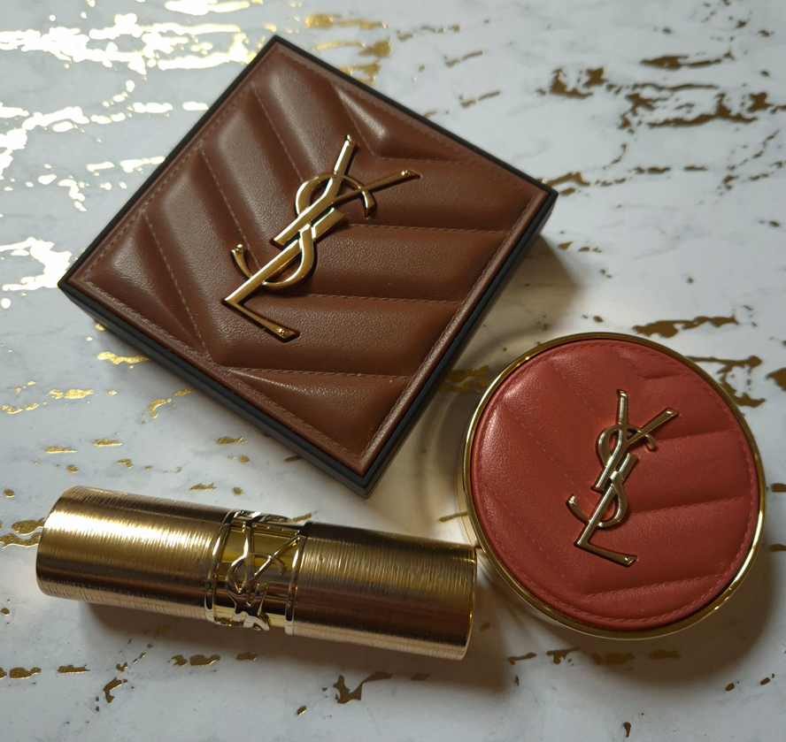
I’ve had these products for several months, so I decided I may as well combine them into one review!
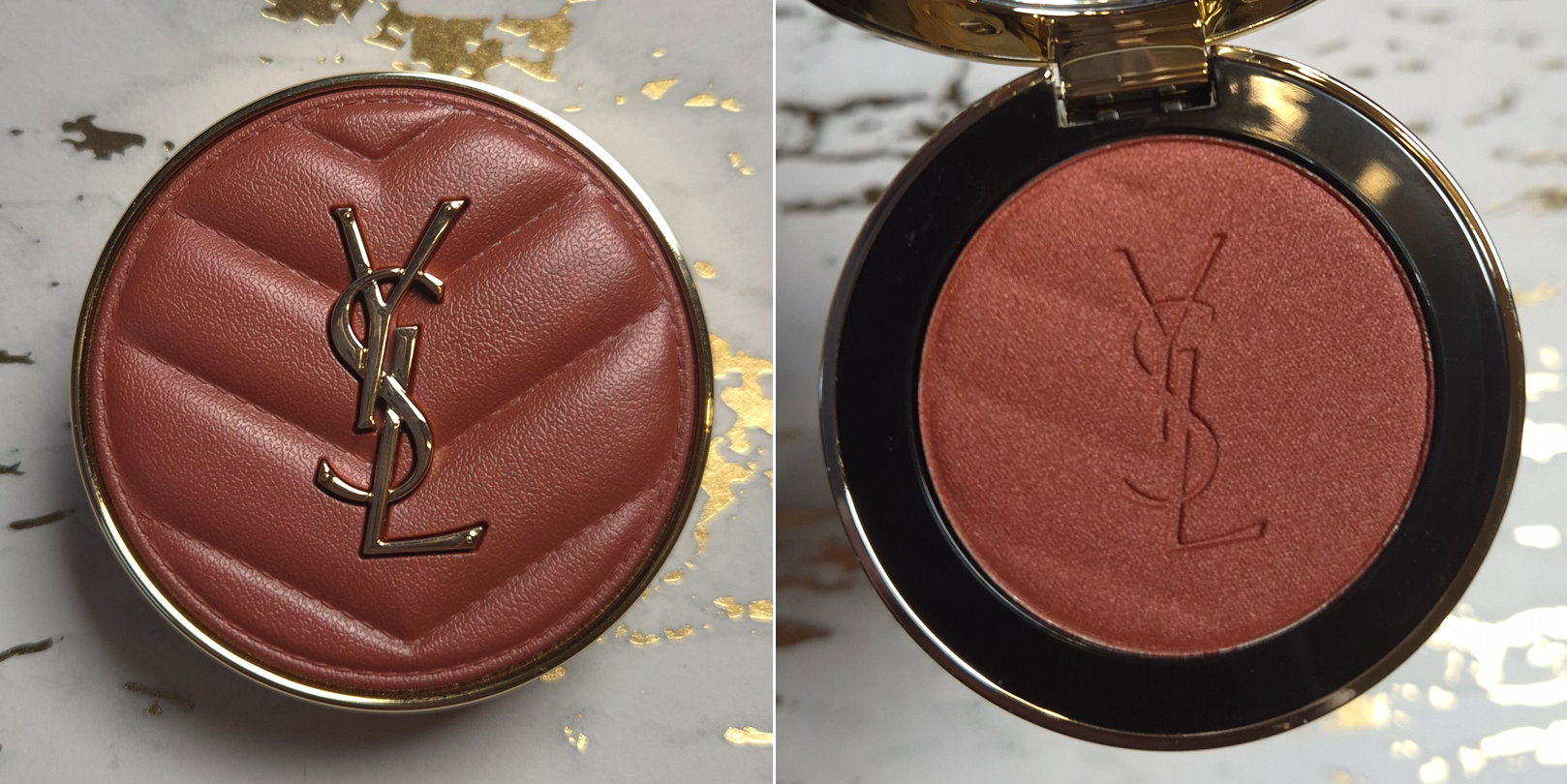
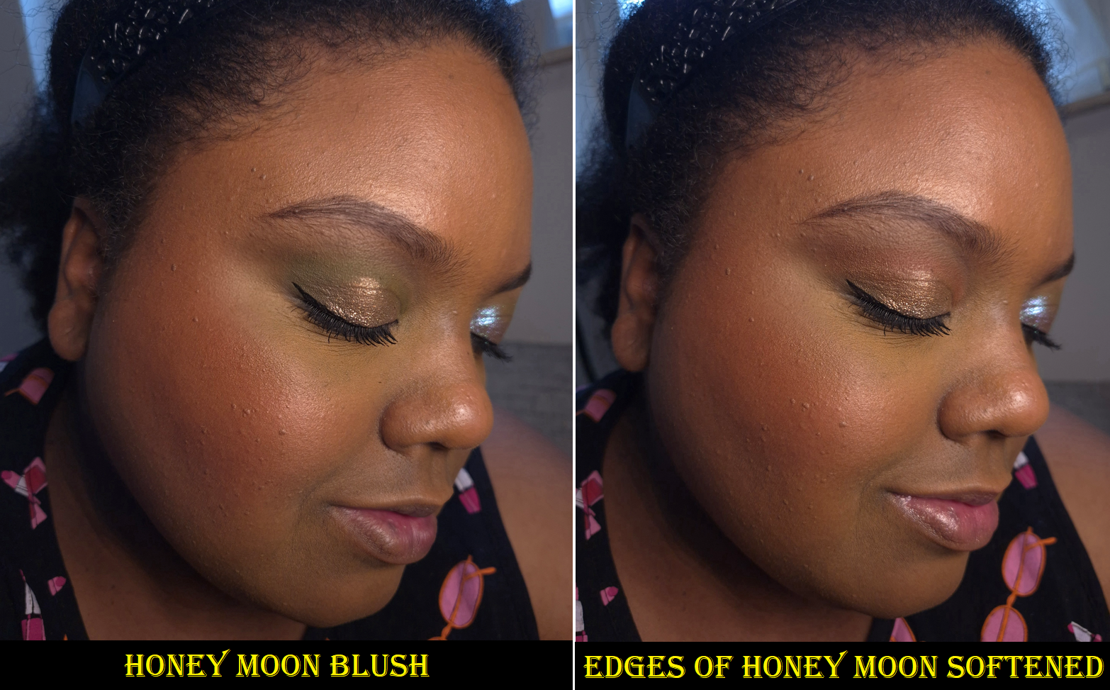
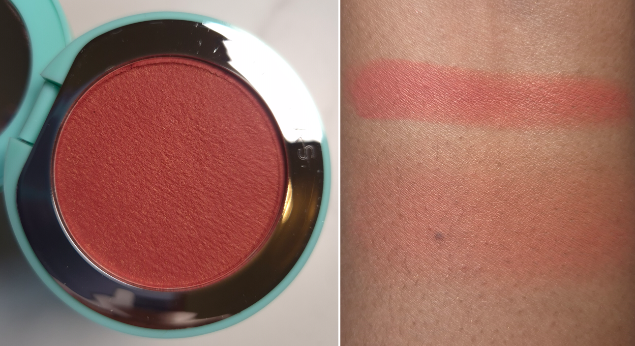
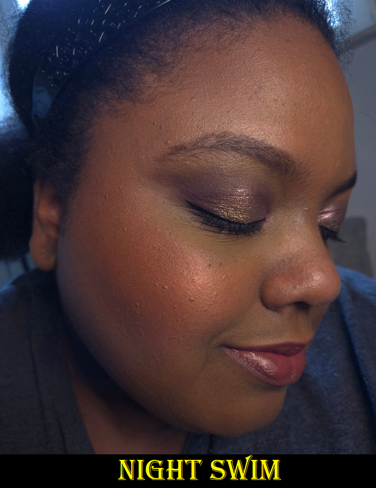
Yves Saint Laurent Make Me Blush Bold Blurring Powder Blush in 12 Honey Moon
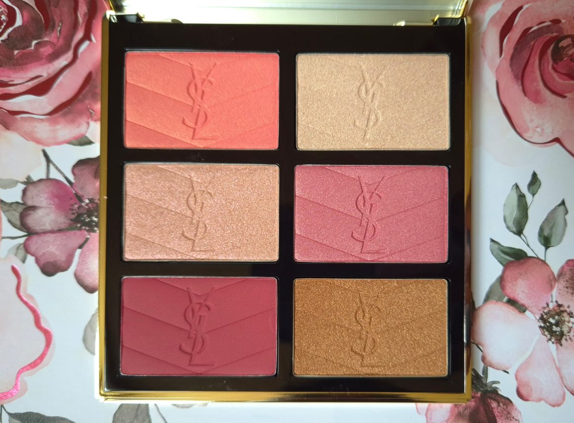
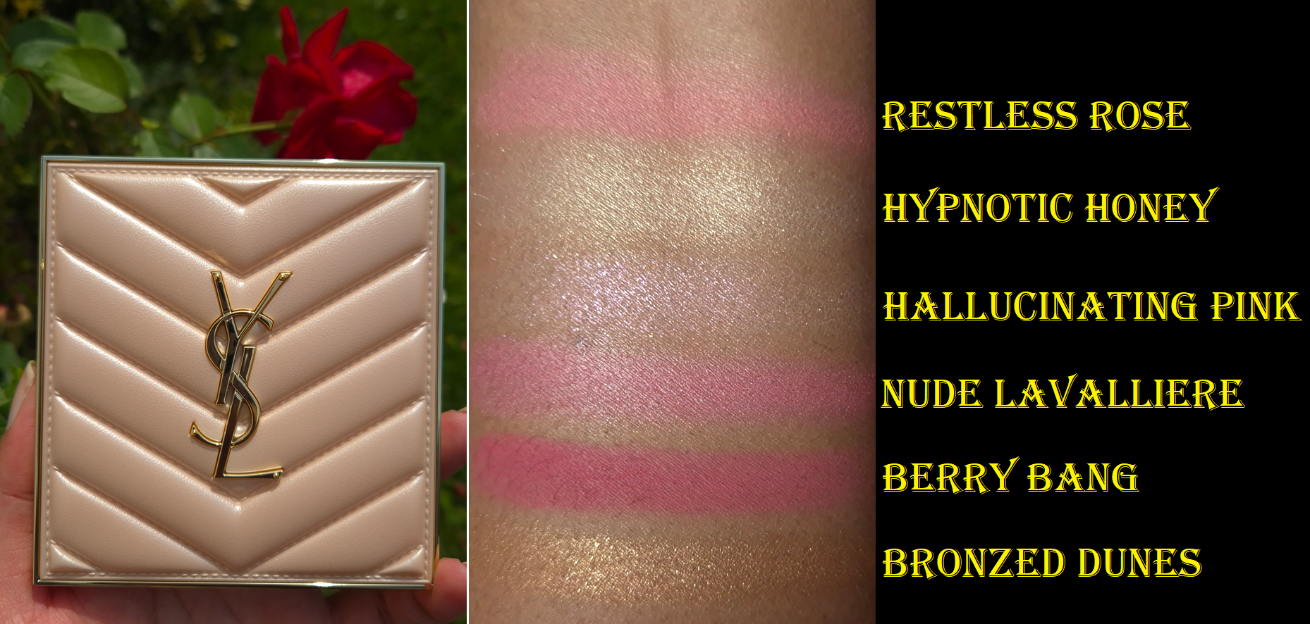
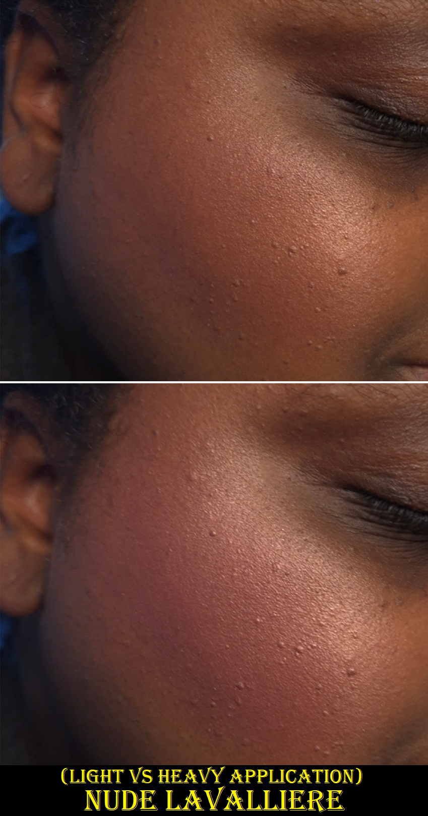
YSL started off the year releasing three additional shades to their powder blush line. I first reviewed Peachy Nude, Restless Rosé, and Nocturnal Nude HERE. Then, I discussed Rose Haze and Spicy Berry HERE. My versions of Nude Lavalliere and Berry Bang came from the brand’s first face palette in Golden Oasis HERE.
Although I have plenty of the brand’s blushes already, I have an especially hard time resisting the ones in their shimmer finish. So, I purchased this while at a slight discount via Flaconi. There are technically only shimmer/satin and matte finishes listed in the Make Me Blush Bold Blurring Blush line, but among the shimmers there are a few as sheer as highlighters such as 69 Lavender Lust and another of the three new ones called 10 Stardust Love.
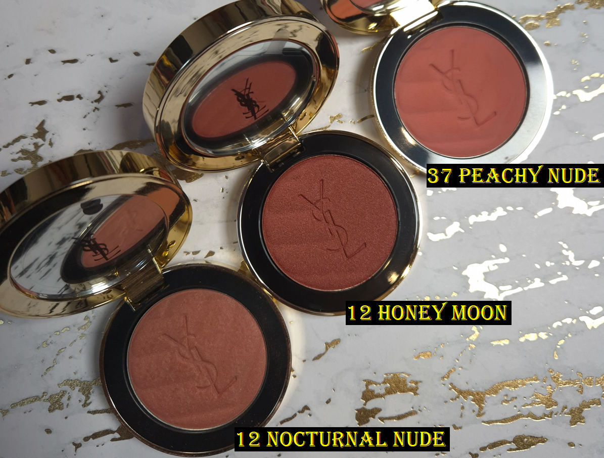
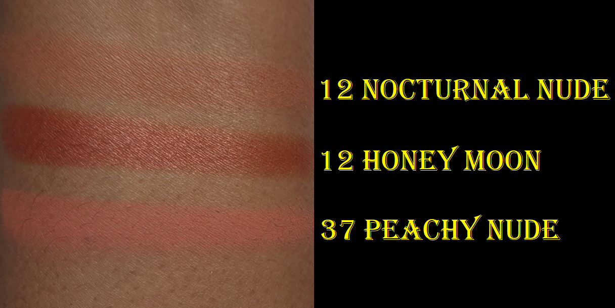
Before we move onto the review, I feel it’s necessary to point out that YSL has already released a number 12 blush, but it’s called Nocturnal Nude. I assumed the duplicate number was a typo or simply an oversight, seeing as how there are at least 18 shades in the range, plus a few in the liquid formula as well. It’s not unbelievable that there could be a mixup. However, Nocturnal Nude was one of the blushes that did not get released at every retailer. In fact, I’m not even sure if it ever launched in the US. I had heard people living in the US had to get theirs from Selfridges in the UK. As for Germany, the only two places I can confirm had Nocturnal Nude was Flaconi and the YSL-Deutschland website. Nocturnal Nude was removed from Flaconi’s website and it has been listed as out of stock at YSL for at least six months. So, it seems as if that blush has been discontinued. It’s still a strange choice to reuse the number, even though Honey Moon is basically an amped up version of the shade in terms of depth, shimmer, and pigmentation levels.
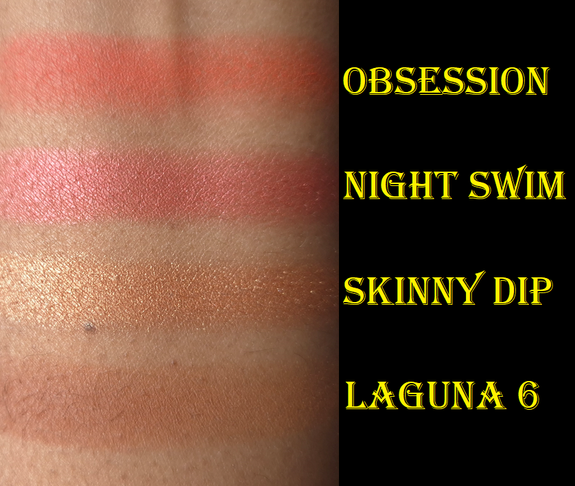
I’m pleased with this new addition, but I hope YSL will consider making a deep brown-pink nude shade someday, since we already have three that lean orange.
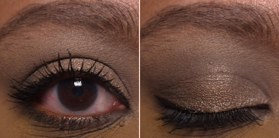
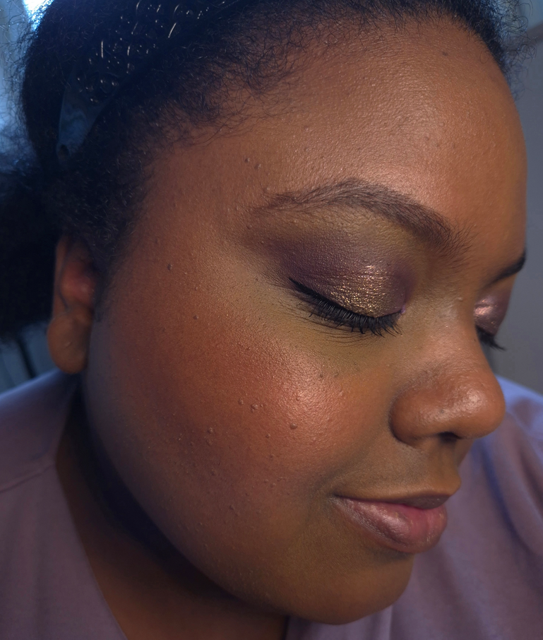
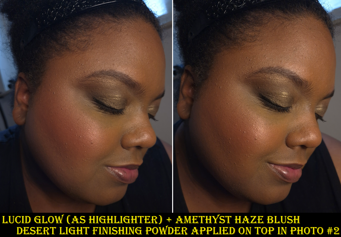
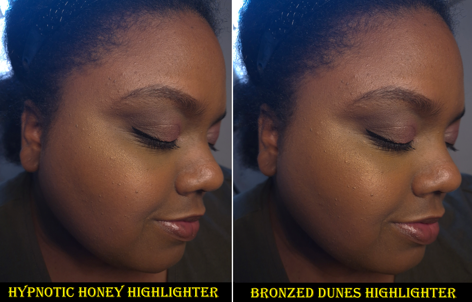
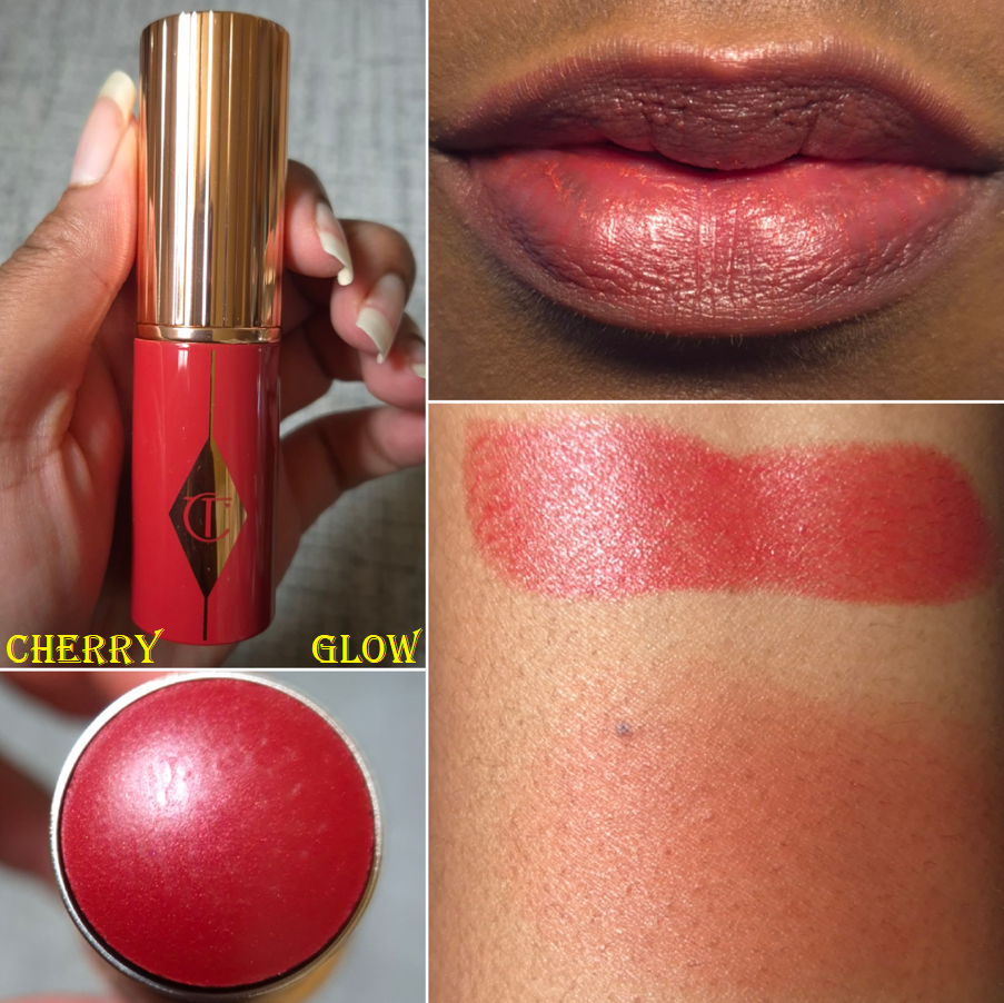
In the second photo, I changed my eyeshadow crease shade and added the YSL Loveshine on my lips.
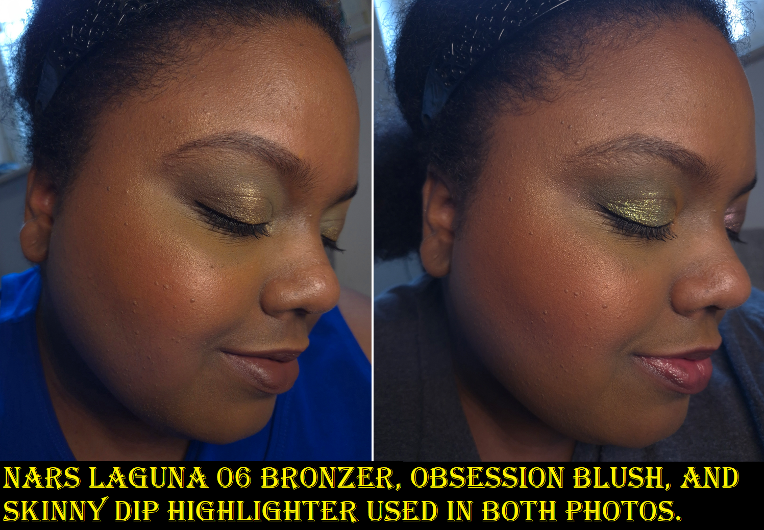
The majority of the blushes in this line are pigmented, but the lighter shades are unsurprisingly easier to control. Honey Moon isn’t as intensely pigmented as Spicy Berry (which could appear patchy in specific circumstances), but I still need to apply it lightly. Unlike many blushes that just need an wispy brush to build up the product slowly, the consistency of the blush powder is on the thicker side. To ensure the best application, I use brushes that have both an airy and medium dense section of the brush (for instance 3D styles or angled brushes). This way, it can pick up and apply a small amount of product from the looser side, but the other part of the brush has decent buffing power. My rephr Kōyō brush has always been perfect for that, but I can even use the Hakuhodo G6440 if I only do a single tap into the blush surface before buffing the color all over. Using a loose brush to apply with and switching to a buffing brush to blend it in works too.
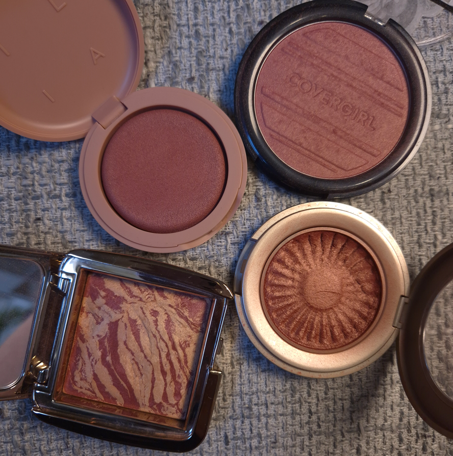
Of the blushes I own, Spicy Berry and Nocturnal Nude are definitely satins because they have a sheen, but the shimmer particles aren’t as easy to see after being blended in. Restless Rosé has more obvious shimmer, as does Honey Moon. As long as I keep my blush layer of Honey Moon sheer, and especially if I use a blurring and/or finishing powder on top, texture isn’t as emphasized. So, I don’t mind this shade being so shimmery.
Other than being mindful about which brush is used, I don’t have any other issues with Honey Moon. It has good longevity and no added parfum. It just comes down to preferences whether someone will like this or not.
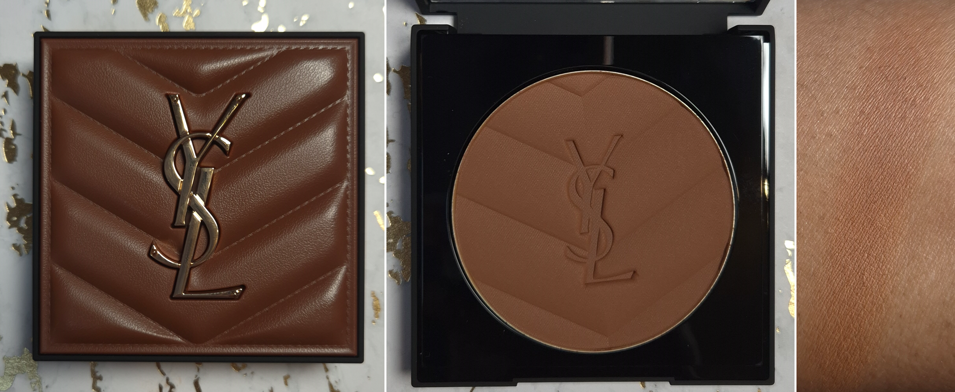
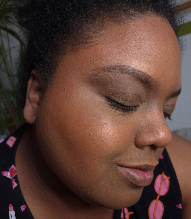
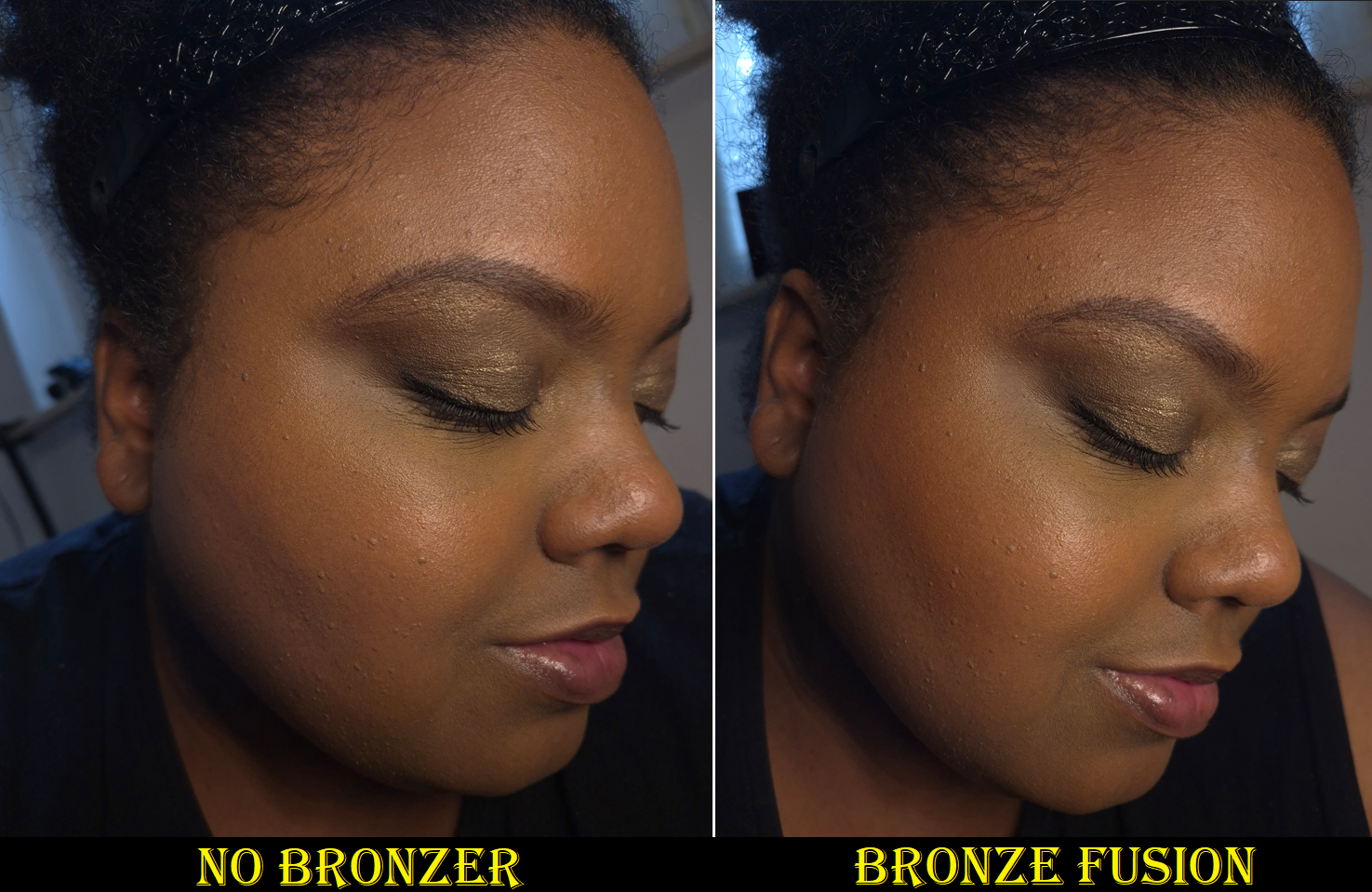
Yves Saint Laurent All Hours Hyper Bronze in #5
After getting the Golden Oasis palette with its blushes and highlighters, I couldn’t let go of the feeling that if I bought the bronzer, that would be the last face powder product from YSL that I cared to test out. Curiosity finally got the better of me and I caved.
Based on the countless reviews I saw, I knew the current darkest shade was my only option. #5 in the pan looks like it will be quite dark, but packing on the product still results in a fairly sheer application. It having a very thin consistency aids in its buildable nature. I was relieved to see the hype surrounding this bronzer wasn’t exaggerated. The matte airbrush finish is akin to the Victoria Beckham Beauty and Charlotte Tilbury bronzers, though YSL’s is slightly drier looking than them on my face. It also leans red, but thankfully isn’t overly red to the point that I wouldn’t want to use it. Still, I’d prefer if the brand had a shade extension with a deep golden option. I heard someone say that YSL’s pressed powder range goes even deeper than the bronzers, so I once considered using that as a bronzer, but I decided not to try that out of fear that the color could be even more sheer.
Bronzer vs Completed Look
I’ve had no longevity issues with the product. It’s blendable and doesn’t require any special brushes. If I want to maintain that sheer quality, I use my airy brushes. If I want maximum color payoff, like in the photo above on the left, I use a denser brush. It being sheer makes it prone to being easily covered up by a bold blush or toned down too much by my finishing powders, so I have to keep that in mind.
I don’t believe I’ve posted a new bronzer ranking for 2025, but based on my list from 2024, I would possibly rank this above Vieve as a new #13.
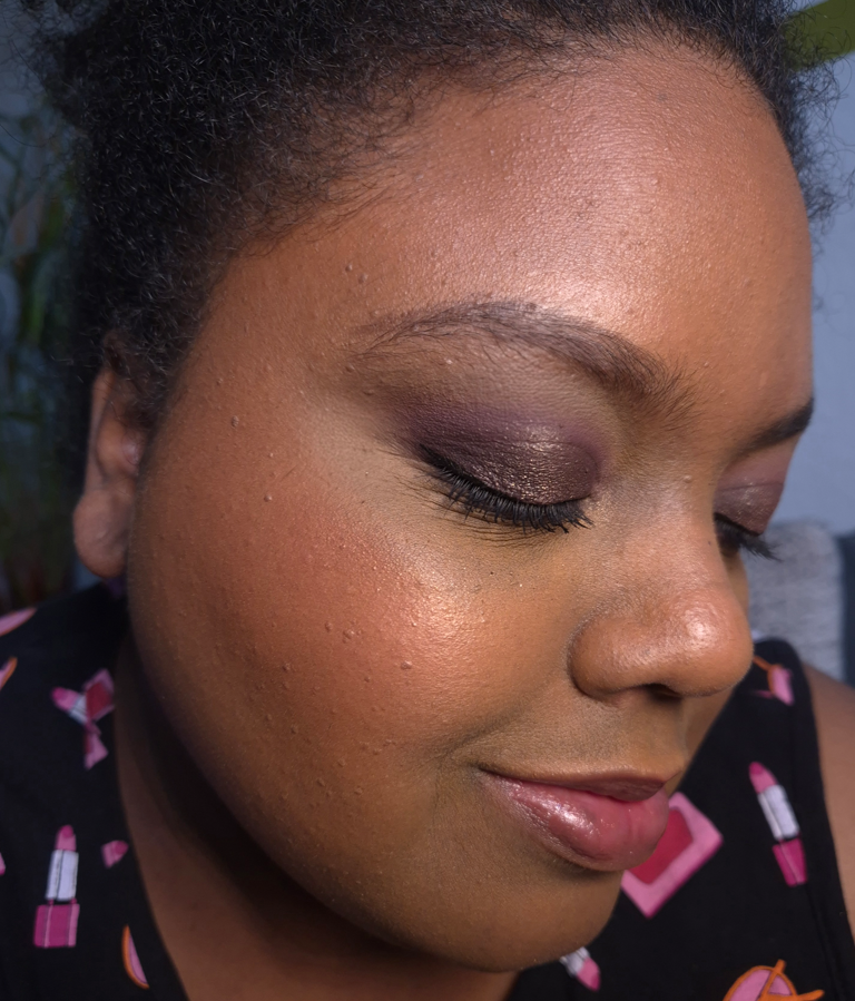
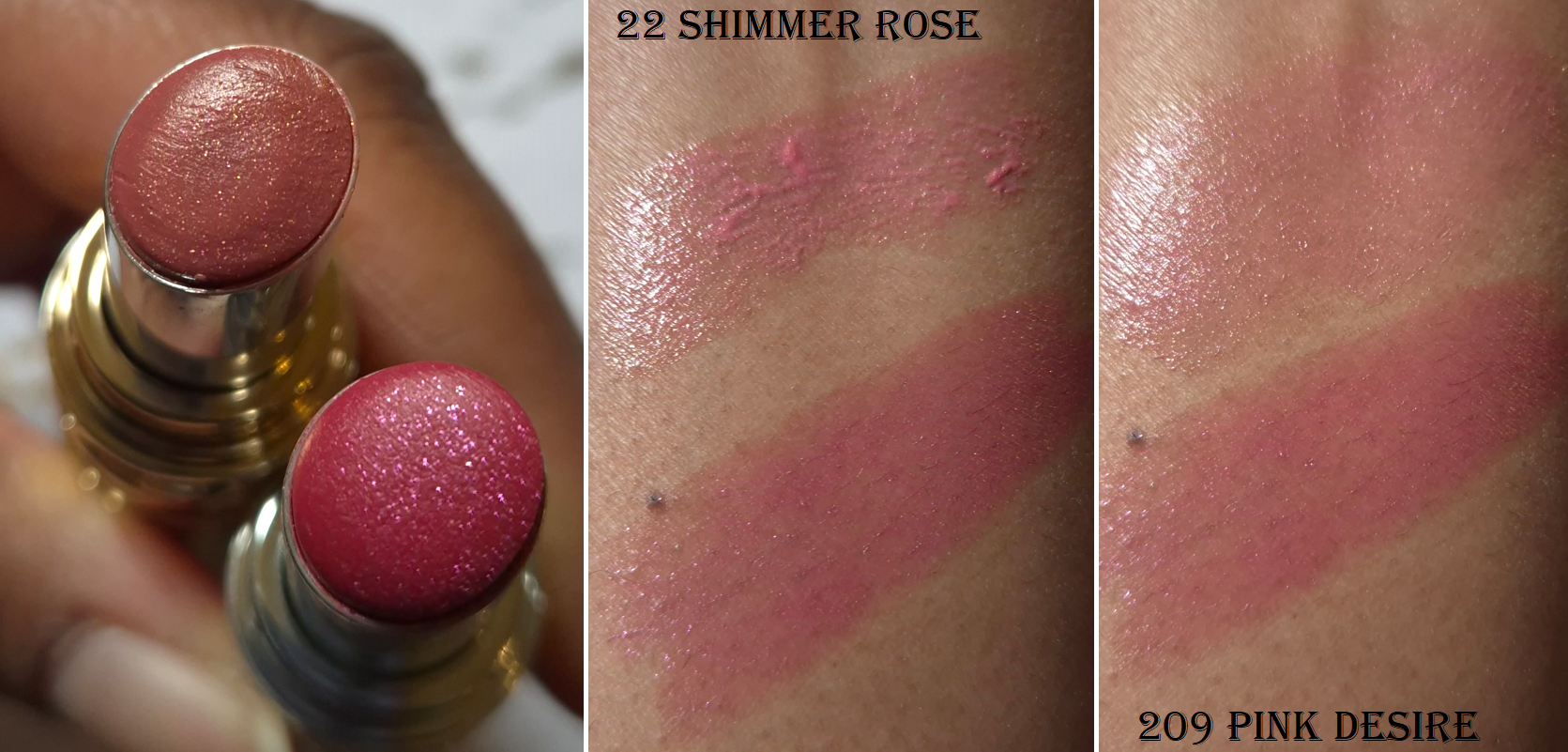
Yves Saint Laurent Loveshine Candy Glaze Holiday Collection in 22 Shimmer Rose (Medium Pearlescent Pink).
I like the YSL Candy Glazes, but I made a mistake in assuming the 2025 limited edition shimmer lippie would be the same formula as the shimmer one from 2024, which is actually a Loveshine Lipstick. That 2024 Holiday Loveshine has a wonderful emollient yet balmy consistency, but the shade of pink is quite bold and bright on me. I was too overly excited about this more natural looking color to check which line it was actually from.
The way Shimmer Rose looks in the tube in the leftmost photo is a bit too warm, but my reason for posting it was just to show how much smaller the shimmer particles look compared to Pink Desire.
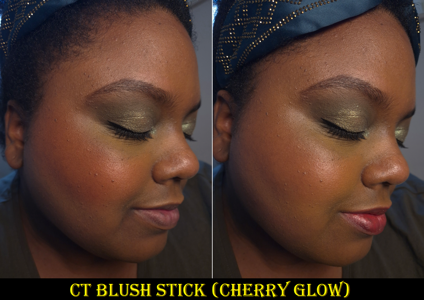
I found it interesting that Shimmer Rose is even stickier than the permanent Candy Glazes and it still isn’t as natural looking on me because the shade looks even more cool toned compared to my warm undertone. Although it turns more bubble-gum pink than I wanted, I consider Shimmer Rose to be more wearable on me than Pink Desire. Besides the photo below, I’m also wearing it in the photo on the right side in the blush section.
As seen in the arm and lip swatches, there are chunkier pieces that come onto the lips when first applied, but they can be smoothed out nicely and evenly. My other Candy Glazes don’t swatch like this, but rubbing my lips together a few times makes it a non-issue.
I don’t feel any graininess from the shimmer, this has a light fruity scent, and the stickiness extends the time that I have a moisture barrier gripping my lips. Even if I wipe my lips with a wet paper towel, the sticky residue persists, so oil is the easiest way to remove it completely.
I can, and have, used this a few times in the center of my lips to boost the gloss level of other lip products. However, I still don’t use this enough to be able to say this was a good purchase for me. It honestly wasn’t, but at least the packaging is beautiful!
I will do my best to be better informed when this year’s limited edition lip products launch towards the end of the year. Then again, I’m supposed to be on a lip product no-buy, so maybe I should avoid it altogether!
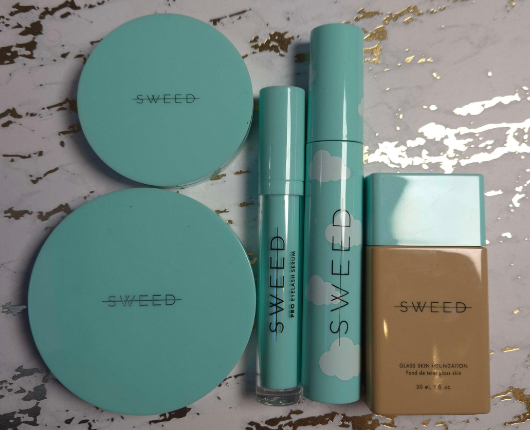
I heard great things about all of the products I purchased from Sweed Beauty, but it’s hard to know what is truly a “bestseller” considering the brand put nearly every product they make on their bestsellers page! It’s pretty much just their full range of false lashes and their makeup brushes that are excluded.
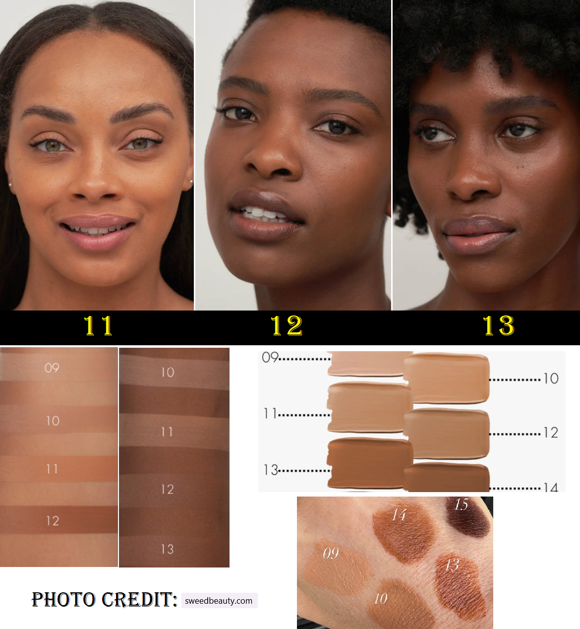
Everyday Sunshine, Allfeisty, and Kackie Reviews Beauty are the only influencers I follow that talk about the brand, but none of them are anywhere close to my skin tone. Since it was extremely difficult for me to find anyone darker than tan using Sweed products, I figured sharing my photos and thoughts on the products could be helpful. And for those living in Germany, I’ve found Sweed products on Niche-Beauty, Douglas, and Flaconi retail sites.
Side Note: I linked videos for each creator, but Kackie’s is just a lip product. I could have sworn she has talked about the mascara, foundation, and blush before. She’s the one I attribute to making me the most interested in the Glass Skin Foundation in particular, and she’s the reason I kept being curious about Sweed, but I can’t find the videos on her page. Now, I feel like I’m gaslighting myself and could be confusing Sweed with Thrive, whose products have a similar color scheme.
Working my way from the makeup I like the least to the ones I like most, let’s begin with the foundation.
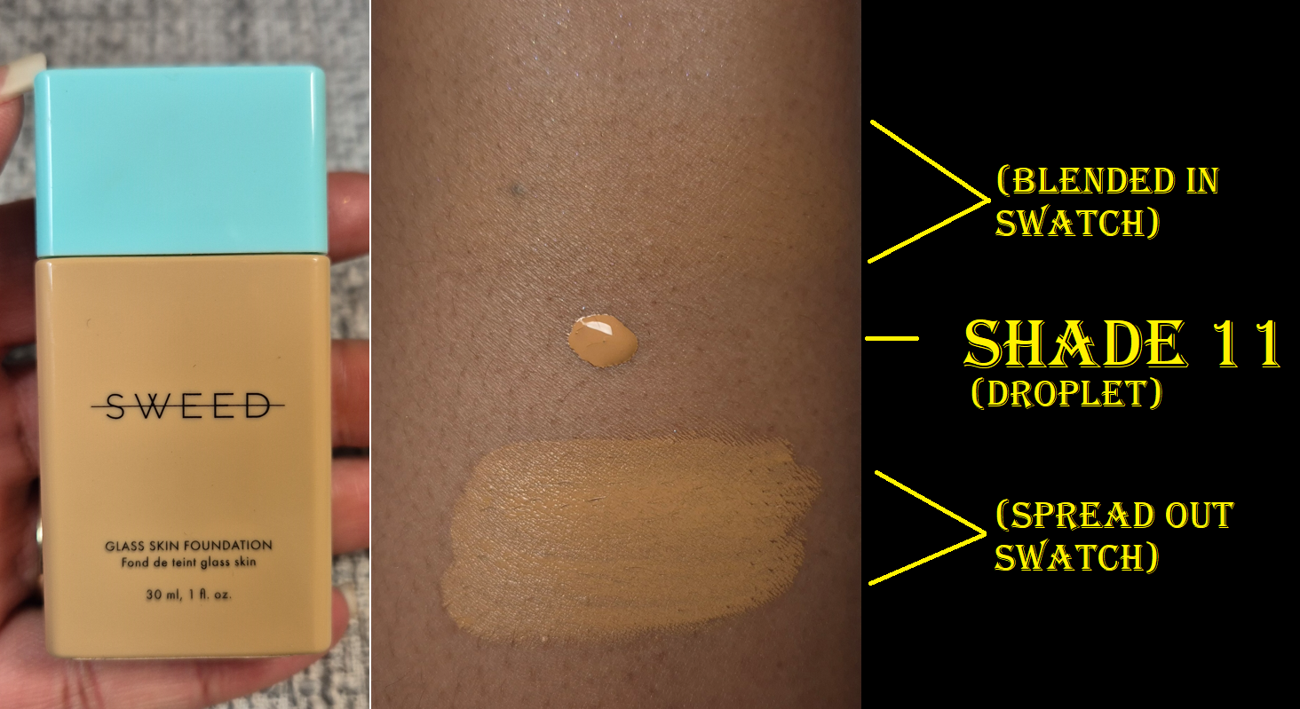
Glass Skin Foundation in 11 Deep W
This shade is described as having a warm red undertone, but it looks quite yellow. Even though I always try to grab a yellow or golden foundation, the strength of that yellow is too much for me. It doesn’t help that it’s too light for me as well.
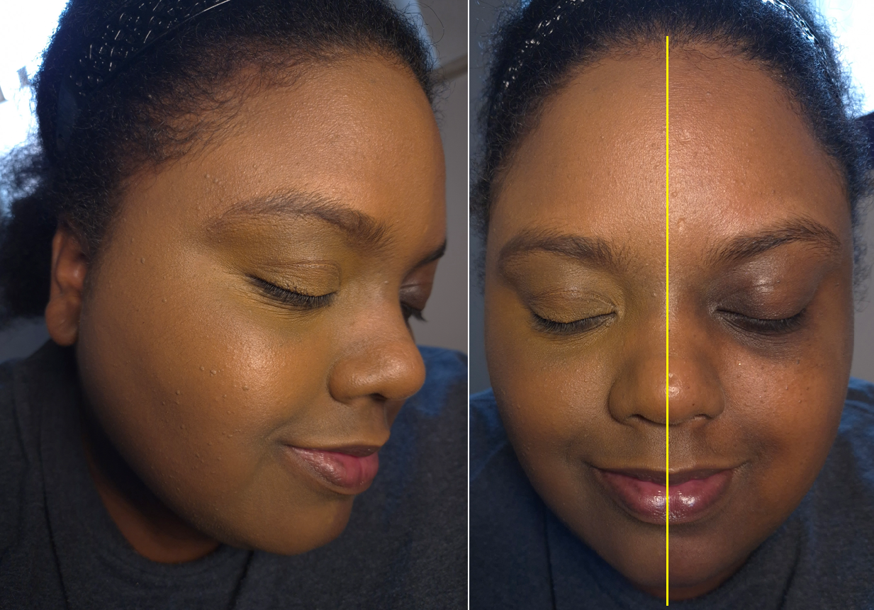
In the straight-on face photo, the half of my face without foundation looks a little redder because I had just scrubbed off makeup that I was previously wearing.
I feared shade 12 Deep N/W would be too neutral despite being described as having neutral to warm yellow undertones. Frankly, I’m not convinced that any of the shades would work for me. Between the model photos (in which 11 is too light and 12 is too dark and red), the computer generated-looking arm swatches that all appear ashy on the darker arm, the liquid swatches that even 12 looks too light, and the real swatches on the hand that is ironically missing shades 11 and 12, I had no way of knowing which one to go by. Shade 11 had the greater discounted price between 11 and 12, so I let that be my guide.
The shade match being wrong isn’t the only reason it looks mask-like. Despite the thin and watery consistency of the foundation, it doesn’t spread as wide and easily as I expected. I had to put more on to cover my whole face. Perhaps I could get it to apply thinner and more evenly if I used a beautyblender, but I couldn’t bring myself to try additional steps since I think having the wrong shade would leave me dissatisfied no matter what. This is called the “Glass Skin” foundation, but the finish appears satin-like to me instead of wet, shiny, or truly glassy. It’s supposed to be suited for every skin type, but I disagree.
One positive aspect is that this dries down on my dry skin without requiring powder and there is very little transfer. Overall though, I don’t plan to use this foundation ever again and I wouldn’t purchase another shade if there was an expansion. I didn’t know it at the time, but apparently customers can send photos of themselves in daylight to the brand’s email address info@sweedbeauty.com or Instagram DMs for advice with shade matching. Hopefully this will help.
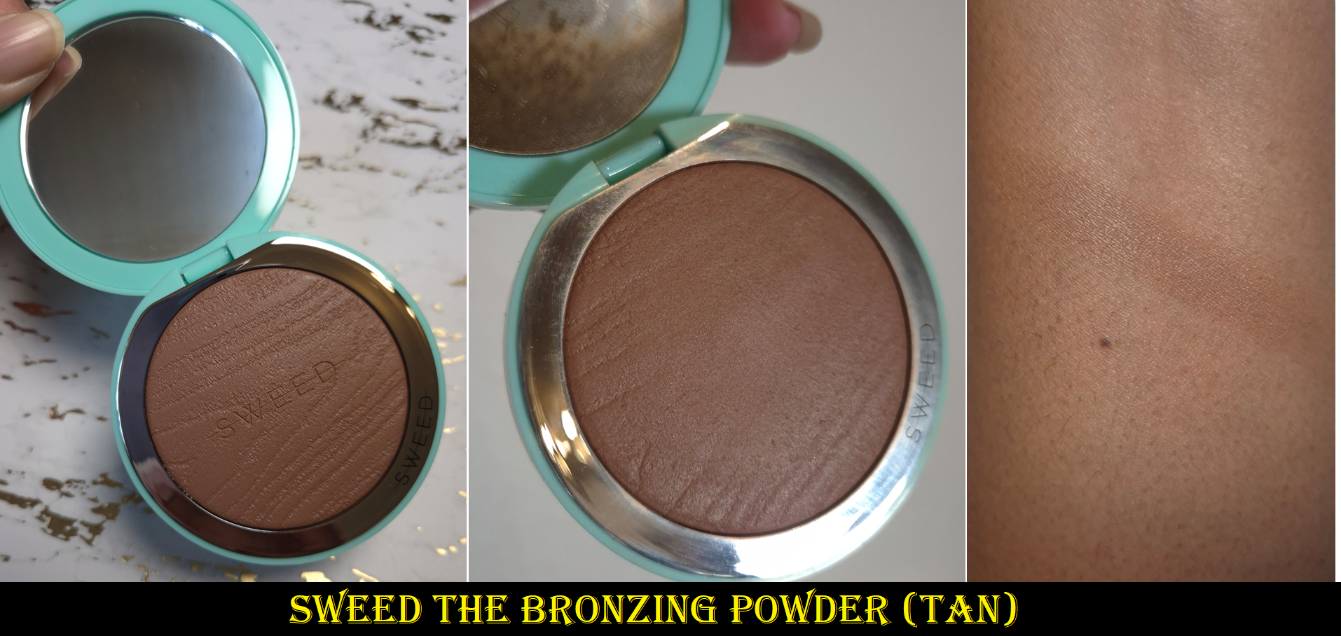
The Bronzing Powder in Tan
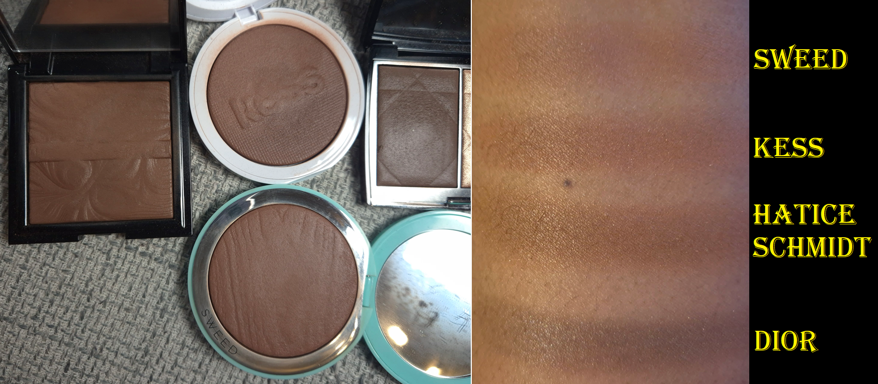
Fans of baked gelee products will probably enjoy the texture and performance of this bronzer as much as I do. It instantly reminded me of the contour shade from Dior’s Contour & Glow Duo in 200 Diorama, Nabla’s Skin Bronzing, the Hatice Schmidt Bronzer, and from Kess. All of these products were made in Italy as well.
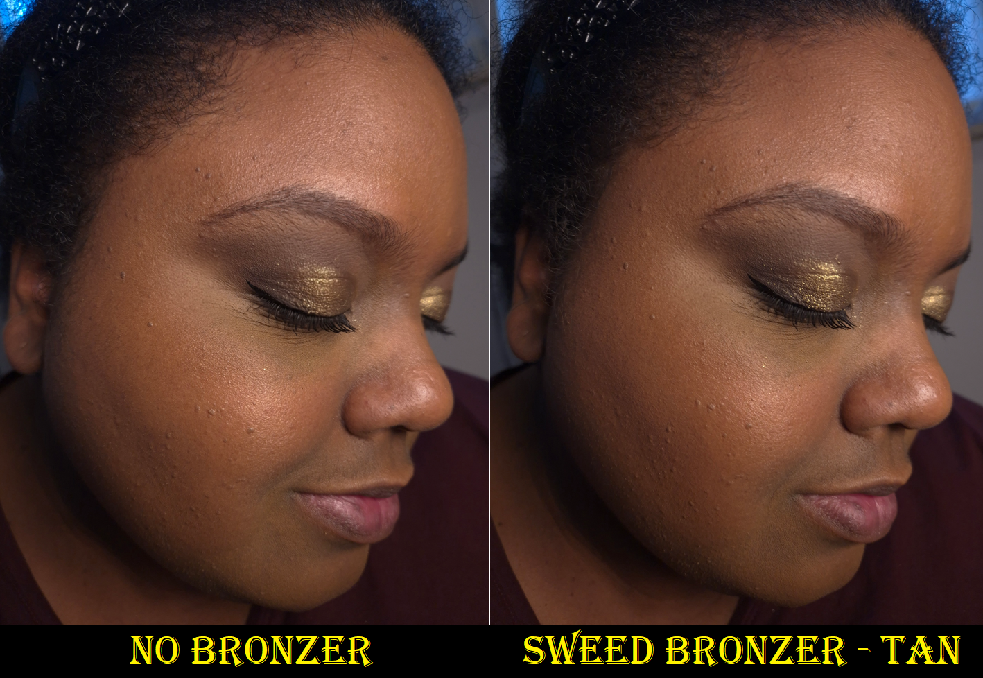
This is a skin-like bronzer with subtle luminosity. It’s buildable, to the point that I can at least see it on myself in person, but I cannot get it to show easily in photos. I’ve tried on three different occasions to photograph myself wearing it, and the best one is below.
Tan is the darkest of the two colors that Sweed offers and I have used so much product trying to build up that shade, that I can faintly see a dip in the pan after only a few months of sporadic use. It looks more used than the other bronzers in the photo above despite it actually containing the most amount of product at 10 grams.
The Tan shade has a little bit of a red undertone, but it looks neutral on me most of the time until I build it up as intensely as it can get.
I have no issues with blending or fading. It’s a great product. I love bronzers that have this kind of formula, but an airbrushed and blurred type of finish can outrank them. With the exception of the Nabla Skin Bronzing product (which is significantly less expensive but also harder pressed), €35 is about the standard price for a baked gelee or gel-powder hybrid type of bronzer. However, €50 is usually the starting price for the type of powder bronzer that actually blurs and is finely milled enough for me to call it the best of the best in my collection (Hermes, Charlotte Tilbury, Victoria Beckham, and so on). Even the most bronzer-obsessed person might be unwilling to spend that kind of money, so the hybrid formulas present an alternative option that still tends to be fantastic quality.
Sweed’s bronzer is $45 in the US and €45 at full price in Germany. I find that to be a little high, but I guess it can still be justified. I must admit that due to the preferred undertone and depth of the Hatice Schmidt bronzer, I prefer it over the Sweed one, and it’s conveniently €10 lower in price for 8.5 grams. Although I can recommend this as a good product, I have to acknowledge that better prices and more shade options for similar formulas of bronzer exist.
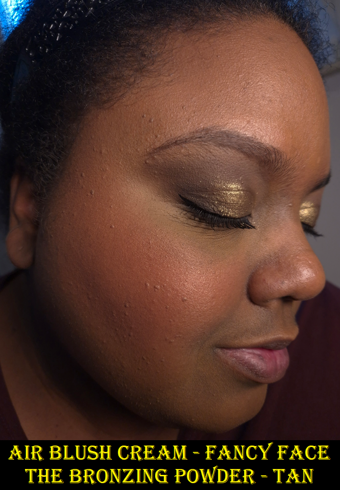
Air Blush Cream in Fancy Face
This blush has faint gold shimmer throughout, which gives the barest hint of luminosity to the cheeks. The surface of the blush feels a little creamy to the touch, but it feels completely dry on my face, as if I applied a pure powder product. It fully sets on my skin, and how long-lasting it is depends on whether or not I used specific skincare or foundation that left my skin feeling dewy. If so, then the blush starts to fade as quickly as 5-6 hours. Otherwise, on a drier base, the blush lasts a minimum of 8 hours.
Fancy Face is the darkest shade they have at the time that I’m writing this. I like to apply this blush subtly, so it doesn’t look very intense on me in the photos I take. However, it still isn’t that dark in my arm swatch. This shade is buildable, and might still work on someone within the deep skin category, but it could be ashy on someone with a rich skin tone.
Although the Sweed Blush is firmer in the pan than the Rare Beauty Soft Pinch Matte Bouncy Blush, both leave a similar finish on the skin. It’s that blurry dimethicone-matte type of look that’s become increasingly popular over the years, especially in the K-Beauty realm.
The edge that Sweed has over Rare Beauty is that tiniest bit more glow. However, it’s not radiant enough for me to be satisfied. It still looks more matte than I like, so I have to use a hydrating spray with both. Rare Beauty’s blushes are more pigmented, but apply just as smoothly. They are longer lasting and their range has more dark-skin friendly options at the price of €28 for 6.4 grams of product as opposed to Sweed’s €34 for 5 grams. The US prices are $27 vs $35. So, even if Sweed expands the range, I don’t think I’ll buy anymore. It’s not due to a lack of quality and is purely about my preferences.
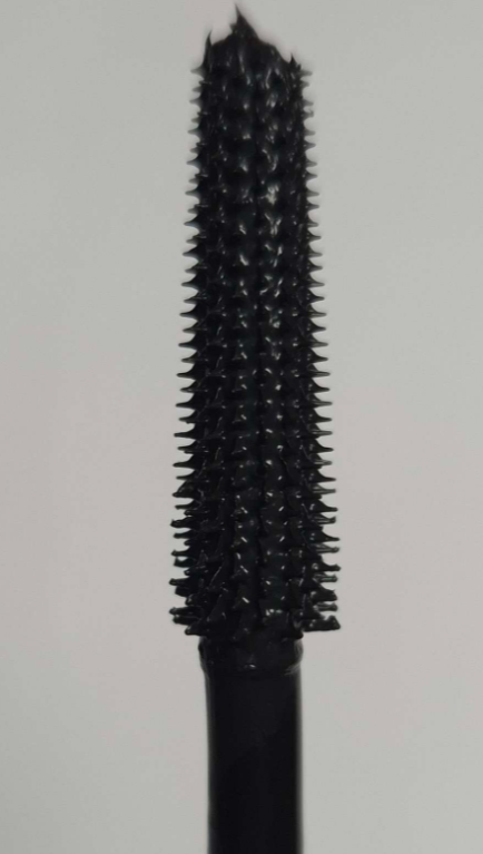
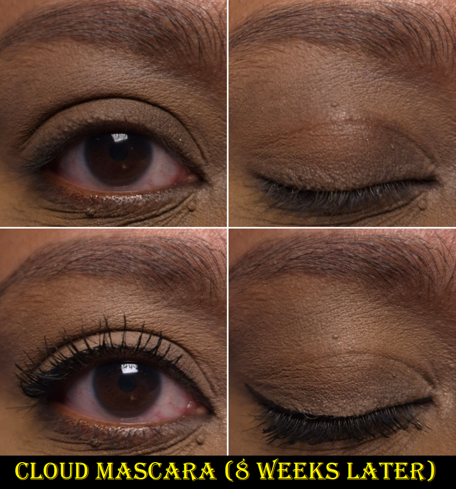
Cloud Mascara in Black
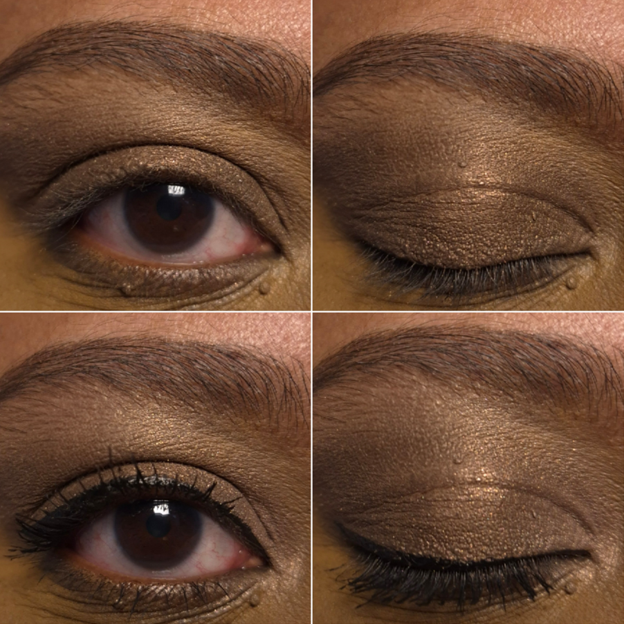
This is a bit difficult to review because I know that mascara formulas can change over time. Within a few weeks or months it can become drier and harder to use. In some cases it can start off too wet, but drying over time makes it work better. They can clump more or flake more. Essentially, how I feel about a mascara in the beginning can differ within a month or two, but I only used the Cloud Mascara for about two to three weeks prior to beginning to use the brand’s eyelash serum. The photos above were taken prior to using any lash serum and it was probably my third time wearing the mascara.
In the beginning, I thought this mascara worked fine, but I didn’t love it. It took me a while to realize that I couldn’t get as far trying to build up a very heavy first coat like I do with the majority of my favorite mascaras. Waiting for it to fully dry before adding a second coat sometimes led to it being unevenly built up, spidery, and sometimes I’d get a few clumps.
What works best for me is to build up the first layer of one set of eyelashes, repeat the process on the other eye, and by the time I’m finished I can add a second layer to my first eye before it has time to fully dry down. The end result is much more to my satisfaction and can be viewed in my Isamaya Core 1.0 Palette post, which I used the Cloud Mascara exclusively in all of the eyeshadow looks. I had been using the lash serum between 3-4 weeks when I took the pictures, but I didn’t observe any improvement from the lash serum that early. So, I feel like it’s still a good representation of the mascara’s best results on me without additional help.
This is the type of mascara that’s on the wet side, but not too wet. Since mascaras are recommended to be tossed out every 3-6 months (whether I do so or not), I only judge one by its performance up to that 3 month mark because additional changes could just be the start of it going bad. I can say that I have noticed zero differences in formula consistency within those three months.
I don’t get clumping (when I use my specific technique) and I haven’t spotted any flaking. One of the things I especially like is that my lashes don’t feel stiff after I apply the mascara. If I get an itch, I can rub my lashes with the side of my finger or nail and my lashes are still fairly soft. Many other mascaras give me a tugging sensation at the root of my lashes when I do the same thing.
The brand advertises this to be both a volumizing and lengthening mascara that keeps lashes separated and fan-like. I agree that it’s very good at separation and it adds decent volume, but my current favorites give me more length.
After completing the full round of lash serum, I definitely like how the mascara looks even more.
However, I feel like I shouldn’t factor that into my review of the mascara. Based on how it looked prior to the lash serum’s effects being visible, I can’t say that this mascara was worth €28 for me, even though it contains Panthenol (Vitamin B5) which, “improves elasticity and helps reduce breakage.” I got this mascara on sale for €21 (a little over $24), but I’m still uncertain if I will repurchase it or not. I don’t know how much of an effect the panthenol may or may not have had an impact on my lashes not breaking off. My gut tells me this mascara is overhyped. I like it, but I feel much stronger about my other mascara favorites.
If I end up changing my mind on this, I’ll update this post.
Eyelash Growth Serum – 3ml size
I owned the other Sweed products since September 2025, but I bought this serum at the end of October. Since it’s supposed to take at least 4-6 weeks for results, I decided to push back the release date for this review until I had tested it thoroughly.
I have been afraid of lash serums since the GrandeLash lawsuit when I learned about prostaglandin analogs, ingredients that are in the majority of eyelish serums and are listed under a ton of different names. I was too scared of the potential iris and eye skin darkening, eye irritation, and other side effects, to ever use one. The fact that Sweed’s serum does not contain any prostaglandin analogs is the only reason I was willing to give it a try.
Before we get into the review, I wanted to point out that the directions on the box just say, “Apply directly with a single stroke to the base of the upper eyelash.” I felt like there had to be more to it, so I watched videos of people applying it, and some put it so close to the lash line that some of it got onto their actual eyelashes. The instructions on the website stated, “Apply with the product’s applicator, using one stroke on your eyelid just above your upper lash line. Apply by starting from the outer to inner corner of the upper lash line.”
I believe the guidelines I should be most inclined to follow is on the official Sweed website. So, that is what I did after the third week, because it took me that long to look it up. I had just been following the information on the box.
At the 4 week mark, it appeared as if my eyelashes that fell were a little longer than usual, but I couldn’t see much difference on my eyes overall. By 6 weeks, I definitely noticed fullness of my lash line. My eyelashes didn’t look longer, but they weren’t as sparse, even in my problem section of my inner lashes. By 8 weeks, I realized my lashes were a lot more curled up, which is why I hadn’t noticed they were longer than before. After 10 weeks, it became clear to me that the outer half of my lashes were fuller than ever and looked slightly longer than the years when my natural eyelash growth was at its peak. However, from 8 weeks and on, I accepted the fact that my natural lashes aren’t dark enough and are too curled to look long while bare. When I close one eye and look sideways, I can see how long my eyelashes are, but looking straightforward, the effects of the lash serum can’t be seen until I put on mascara.
I still wish to have more fullness in the inner lash region, but I am pleased with the improvement. Part of the difficulty for my inner lash region is the fact that I frequently rub my eyes, especially before bedtime which is when I apply the serum. I’m not sure where I heard or read the information to apply it at night. The directions on the website merely state to use this once a day without a specific time. Anyway, when I rub my eyes, I basically remove whatever lingering bit of serum hadn’t yet absorbed in my inner corners.
These are the results, with and without mascara, at the 8 week mark.
Although my eyelashes didn’t get crazy long, I can see how many more lashes stand above my crease line with mascara on compared to before. I don’t lose my eyelashes as frequently either.
The directions state to use the serum daily for 4-6 weeks, and then switch to using it 2-3 times a week for maintenance. After the initial six weeks, I continued to use it more or less on a daily basis until after the 8th week. Then, I lowered the usage to every other day or two. As for my bottom eyelashes, I have not noticed a difference, but I didn’t expect any considering I did not apply the lash serum there and the serum is not recommended for that.
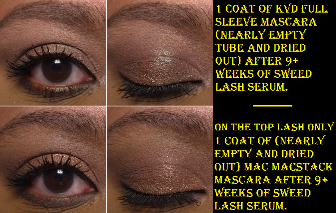
The photos above are not the best representation of my mascara favorites since I had them for far too long and the last bits of mascara left in the tubes are partly dried up. However, I think my lashes still looked great!
I managed my expectations and got enough results to be happy with this product. My issue trying to regain the fullness I used to have was resolved. This product is supposed to last 3 months* and my eyelashes will return to normal if I halt using it for one month.
*I’ve been using this at a rate of around 2 months daily and 1 month every few days, yet my tube hasn’t run out. So perhaps the estimate of 3 months is if someone used it daily during that whole time or perhaps the 3 months is a minimum of how long it’ll take before the serum runs out.
This is not a cheap product. It’s sold for $55 in the US or €49 in Germany for 3ml. The 5ml tube is frequently out of stock and costs €70. I bought my 3ml at a discounted price via Flaconi for €33. At that price, I do like it enough to repurchase it considering it’s as much as a high end mascara and it makes all my mascaras look even better. A regular eyelash primer might give me even longer lashes, but it wouldn’t solve my fullness/sparse lash issues. So, I will most likely continue to make repurchases at the lower price.
I highly recommend watching Abbey Yung’s video for those curious about the serum’s ingredients, understanding how it works differently to traditional lash serums, and seeing her own results.
Overall, I have a positive impression of Sweed’s products. Their makeup is very high quality, but some of the products don’t match my specific preferences, and the shade range is a bit lacking. So, I will continue to keep an eye on this brand’s new launches and I’ll potentially purchase from them again in the future.
I hope this post has been helpful to you! Thanks for stopping by and reading!
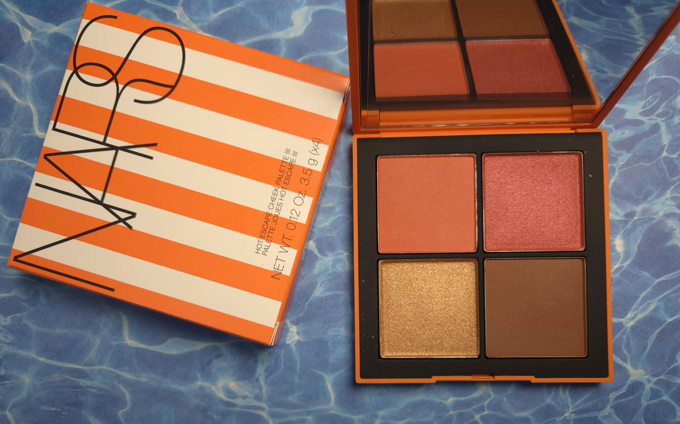
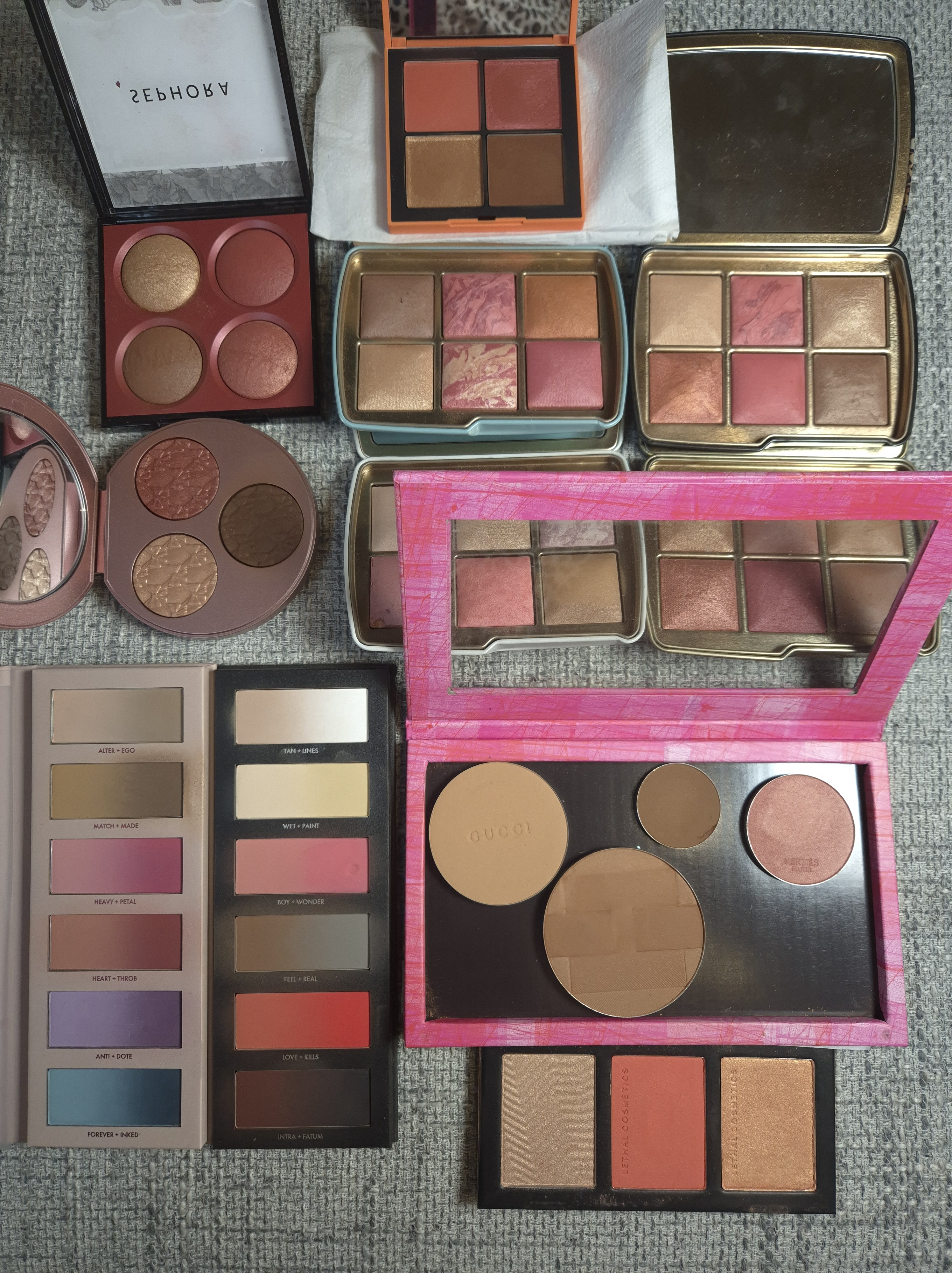
The D&G Blush, ABH Highlighter, VBB Lid Lustre, and PML Quad are not pictured here, but they will be discussed in this post.
After the bombshell that was dropped regarding the Louis Vuitton Beauty line and their prices, I started to think about which items in my collection were the most expensive, which ones I thought had the prettiest packaging, if the prettiest was actually the most luxurious looking, and which ones had the most weight. I was surprised to discover that so few items fit into all of these categories.
I was happy to see the people I follow enjoying their La Beauté Louis Vuitton products, but some felt they needed to justify their reasons for making the purchase beyond just stating, “I wanted it, so I got it.” Across the board, customers who thought the items were or were not worth buying seemed to at least come to the consensus that the price (besides paying for the brand recognition), was largely due to the packaging. The lipstick components were said to be fully metal, along with the bespoke metal packaging of the eyeshadow quads. “You could hurt someone if you hit them with this,” was stated more than a few times by various people.
How a product looks and its weight are my top two criteria for feeling like the item I own is luxurious. Looks are subjective, but weight can be measured and precise. I started to think about the heaviest packaging in my collection (proportionate to its size dimensions) in order to answer the question…are these automatically the most lux?
Lisa Eldridge Rouge Experience Refillable Lipstick (68 grams)
In order to highlight how great this packaging is, I need to do a deep dive into comparing it to another brand. Please, bear with me on this, especially if you’re a fan of LV. I don’t judge anyone on how they spend their money, and this is just me working out why I am perfectly satisfied with Lisa’s lipstick being the height of luxury for me.
Lisa Eldridge took great pride explaining in her launch video how her refills were mono material, made of 100% aluminum and could therefore be recycled without degrading once repurposed, unlike the vast majority of other brands’ refills that have mixed metal with plastic.
According to Google: “You cannot usually recycle a lipstick refill that has both plastic and metal components together, as most curbside recycling facilities cannot separate the mixed materials and are not equipped to handle small, complex items.”
There is plastic inside the forever case by Lisa Eldridge, as this has a click closure, but she wanted the actual refills to be sustainable.
I cannot compare the LV lipsticks from personal experience, but it is my understanding that the refills are all metal as well and come with plastic caps that can be removed when recycling. The lipstick cases have an aluminum shell and brass detailing, but the magnetic closure that is so satisfying to use (and adds to the weightiness of a product) keeps it from being recyclable as well.
Summarized from Okon Recycling: Recycling magnets is technically possible, but challenging as it involves disassembling the magnet and removing any non-magnetic materials. However, there are some magnets that cannot be recycled.
So, it sounds as if both LV and Lisa Eldridge have cases that aren’t realistic to recycle but have refills that are fully recyclable. The LV lipstick case has a lot of expensive details like the product names and logo being etched in, the monogram flower-shaped refill bottom, etc. Lisa Eldridge has her logo etched at the top of the cap, allows the customer to personalize the base of the case with their initials etched in (up to three letters), and the case shape had to be custom made as well. Perhaps some prefer the sleeker LV design while others appreciate the vintage inspiration of Lisa’s more.
LV’s Lipstick Case + Refill is $160 and the refill alone is $69. Lisa Eldridge’s Lipstick Case + Refill is $63 (engraving price included) and the refill alone is $30.
Sure, LV’s refill costs the same amount as other high end and luxury lipsticks in their completed form, but considering the details I listed above, is the LV case really $100 better that other brands’ cases, particularly Lisa Eldridge?
It can’t come down to the actual lipstick formula, because that’s part of LV’s $69 refill price.
At the time that I bought the Lisa Eldridge lipstick, I felt it was incredibly expensive. It is still the most expensive lipstick in my collection, based on what I paid and not the retail price. I rationalized my purchase because of the sustainability aspect, all the custom elements, the personalized touch, and how heavy it felt.
Taking branding completely out of the equation and thinking about the components alone, I do feel like this product by Lisa Eldridge is among the most luxurious out there, and I am no longer gritting my teeth at the price.
It would be nice if I liked the lipstick formula more, but there is some hope for me! I wrote a comment on Instagram that the brand responded to, and while the Velvet formula won’t be put in the refillable form, there might still be the possibility of the Lucents that I enjoy so much!
There are other things they’ve been “working on” that has taken years, such as making the empty eyeshadow palettes available for purchase alongside the eyeshadow singles, the return of the liquid blush in better packaging, etc. So, I’m prepared for this to take a while to happen.
If I can get the Luxuriously Lucent Lip Colours and/or Baume Embraces as refills, I will definitely get more use out of mine!
Whenever I think about heavy makeup packaging, the Olivia Palermo Eyeshadow Palette immediately comes to mind. I’ve had it for years, yet I’m still not sure how I feel about the pattern, and I’m not sure what it’s technically called (perhaps wicker, woven link, basket weave, oyster strap, etc.). It just makes me think of the types of patterns I’ve seen for watch straps, which isn’t too terribly off track. Apparently Olivia drew inspiration for the packaging, “by a vintage Art Deco bracelet she was given for her 21st birthday.”
The eyeshadow palette has a magnetic closure and mirror, which further increases the weight, on top of the fact that the packaging is metal.
Although I’m not sure if they could have created a different pattern that I would like more, I can say it’s at least cool, unique, and easily recognizable. Plain flat gold is always beautiful to me, but this packaging looks different from any other I’ve seen. Well, almost. As of a year ago, Hatice Schmidt released a refillable lipstick range called, “The Gift,” with a case inspired by jewelry and the pattern reminds me of a curb chain/Cuban link style. So, there are at least two jewelry inspired components from brands that I know of.
I bought the Olivia Palermo lipstick at the reduced price of €32 (originally €40) from Niche-Beauty, and the eyeshadow palette for $28 (originally $58). I’ve discussed how I procured the eyeshadow palette in a past review, but it was during the time that I started working on this post that I felt the compulsion to finally get the lipstick. I have checked in on the brand on and off over the years, waiting for them to release additional products. Earlier this year, I saw a notice on the official website that the beauty products would no longer be sold and that they were turning the website into an influencer style page (oliviapalermo.com now redirects to her affiliate shopmy page). I assumed that meant the brand was shutting down, especially since I’ve only heard two beauty reviewers reference the brand one time each within the last three years. However, I was shocked to see the products appear on the Douglas website in either August or September, and then I saw them at Niche-Beauty as well. I don’t know if Olivia has better sales in Europe, or Germany specifically. I’m not even sure if she still has products available elsewhere in the US.
I felt Lisa Eldridge’s lipstick deserved to be in the post, but Olivia Palermo’s lipstick is the only one in my collection that is heavier. OPB’s lipstick is less expensive, but it isn’t refillable and the central part of the lipstick component is made of plastic. The outer packaging is what makes this seem so fancy.
Regarding the eyeshadow palette, it definitely screams luxury. It isn’t something you want to carry around in your purse or travel with it. Olivia wanted the old Hollywood glamour look and feel to her products, so this is something that you would want to keep on a vanity.
This is by far my most luxurious palette, and though it doesn’t have some of the additional premium features of the LV Quads, it makes me feel a lot more content about my collection and avoid FOMO. If I want heavy eyeshadow packaging, I certainly have it with this product!
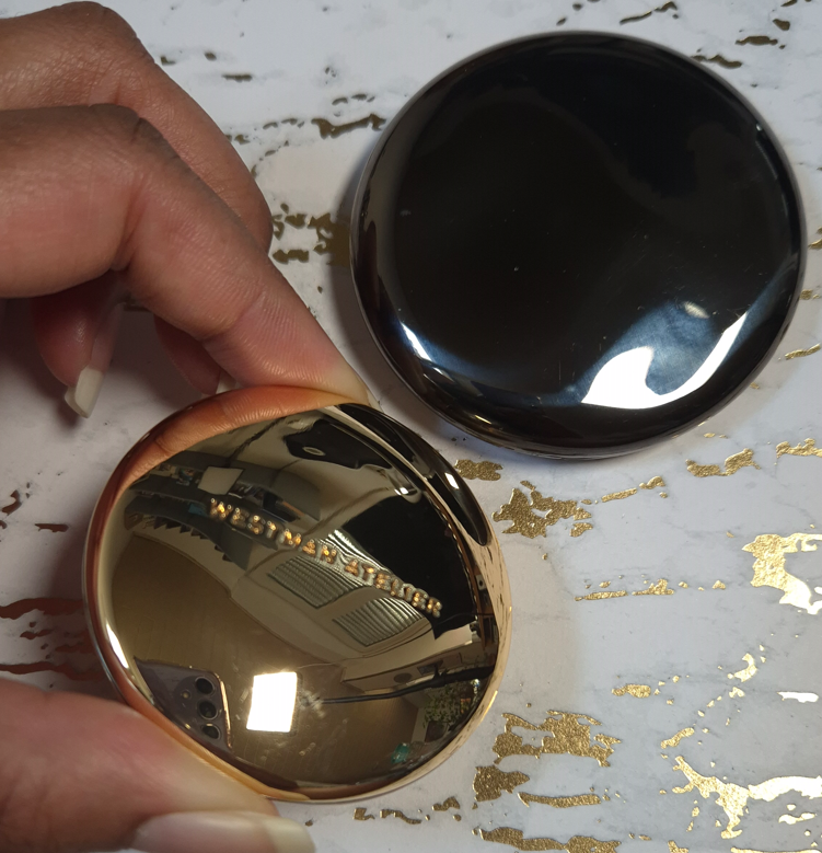
This is my golden pebble! It is tiny in size but mighty in weight!
Chantecaille is another brand with nicknamed “pebble” packaging, but theirs is plastic, thin, and it doesn’t feel substantial, even though they cost the same amount!
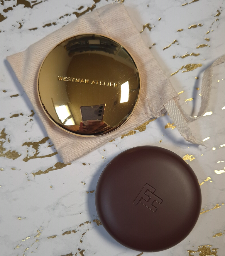
I bought my WA bronzer at 20% off, so the title of most expensive bronzer in my collection belongs to Hermes, even though I only bought the refill. Had I paid for the compact too, that wouldn’t have helped it to feel more luxurious than the Westman Atelier bronzer, considering Hermes’ thin plastic packaging.
This has a tiny mirror that I don’t use, and a magnetic closure. The brand has highlighters and face powders in this same style of packaging. I haven’t used their cream sticks or drops, but they don’t look as luxurious to me. The only other Westman Atelier packaging I have handled are the powder duos, which are certainly substantial and pretty to look at, but I don’t think it compares to this gold compact.
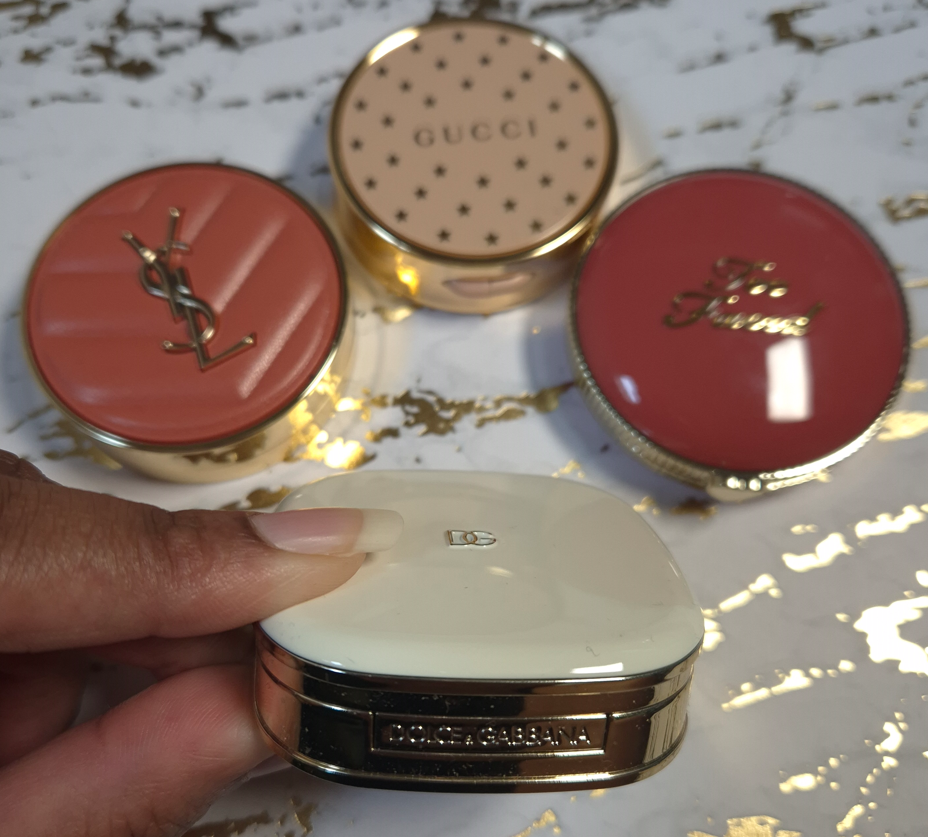
When it comes to the prettiest bronzer packaging, I think of Gucci’s and Charlotte Tilbury’s powder one, even though they are much lighter in terms of their size. However, I would never call something that’s a solid gold color ugly. So, it may as well be my most glamorous bronzer.
Fara Homidi Essential Bronzer Refillable Compact (106 grams)
This compact is about the same size and weight as the Westman Atelier Butter Bronzer. The amount of product from FH is 3.5 grams and the amount of product from WA is 8 grams. That is close enough to accounting for the 6 gram difference when I weighed the two products, which is why I’m still including it in this post.
Aesthetically, I find the Westman Atelier bronzer to be more appealing. Shiny things get me. However, I still think Fara’s is classy and pleasing to hold in the hand. Her other products come in red and blue packaging of the same weight. I don’t like the red, but the blue is very eye-catching. If the next product she releases is in purple or green packaging, it just might surpass WA’s as a favorite compact for bronzers.
D&G Cheeks&Eyes Match Blush (91 grams)
I have plenty of blush packaging that is bigger than this, and therefore heavier. However, for this small size, this is very heavy! Nothing really comes close to the weight, but I have to say that Gucci’s powder blush packaging is quite nice too, even if it’s lighter. Visually, I like Gucci’s more as well. In fact, I have a lot of blushes that aren’t luxurious feeling, but I love them anyway (such as YSL’s Make Me Blush Bold Blurring Blushes and Too Faced Cloud Crush Blushes). So, this is one of the few categories where my heaviest blush might be the most luxurious, but it isn’t necessarily my favorite packaging. I do like it a lot though!
I have to add that this packaging feels like a mixture of plastic and metal components. I believe there’s something in the base of this compact adding weight artificially, especially since it doesn’t even have a magnetic closure. It has a push button instead.
Victoria Beckham Beauty Products: Matte Bronzing Brick (166 grams), Eye Wardrobe (116 grams), Cheeky Posh (37 grams), and Lid Lustre (41 grams)
Similar to Olivia Palermo Beauty, VBB has a certain aesthetic that they maintain across most of their products. I like the horn brown/tortoise pattern, and it can be fashionable, but I don’t automatically associate it with luxury because of how many cheap products I’ve seen made in tortoiseshell style. The gold colored trim helps to elevate the look of the packaging, but it is the weight and feel of these components that make them undoubtedly luxurious.
The Bronzing Duo and Eyeshadow Quad are among my heaviest based on size. The Cheeky Posh blush is small and doesn’t have that much extra weight, but I figure that’s because the component isn’t refillable like the other two. I’m including it because it has the same style of packaging as the others, and I still feel bougie when I handle it.
I rarely buy single eyeshadows, so I don’t have much to compare in terms of weight. The prettiest I own is probably the Charlotte Tilbury Hypnotizing Pop Shots, but those have lightweight plastic packaging and they are powders, which I don’t believe is fair to compare. It would be interesting to see how the glass packaging of Charlotte’s Eyes to Mesmerise stacks up, but I don’t own that. I no longer have the glass packaging of Maybelline’s 24 HR Color Tattoo, but the best I’ve got is Melt’s Gel Liner (47 grams) and a MAC Paint Pot (56 grams). I like glass as a component material, but it’s not uncommon to find for eye products. The Lid Lustre packaging has an elevated look compared to MAC’s, for example. The Melt Cosmetics Gel Liner that has the gold lid and butterfly print around the rim with the glass base is prettier to me, while also being slightly heavier. However, the font for the brand logo makes it look less sophisticated. I don’t think eye related categories of makeup follow the trend of weight indicating how luxurious a product will look and feel.
One thing about VBB packaging that does take away from the experience is the issue with the closing mechanism. I heard this was a problem in the past, and I never had an issue with my Bronzing Brick, but my eyeshadow quad doesn’t always stay shut when I snap it closed. Sometimes it’s fine, but other times it likes to pop back open with the slightest touch. I haven’t heard about anyone else having an issue with the quads, so perhaps I’m unlucky in getting one of the few faulty ones.
Pat Mcgrath Mothership Palettes (392 grams) and Eyeshadow Quads (122 grams)
All the previous components I’ve discussed had metal or a mix of metal and plastic packaging. The Mothership Palettes are fully plastic, but they are quite hefty in weight. The palettes are big for only holding ten eyeshadows, but that black shiny lacquer with the gold bottom still look lux to me. My Victoria Beckham and Olivia Palermo palettes are the only ones I can recall from my collection that aren’t made of plastic or cardboard. In fact, the Victoria Beckham Eye Wardrobe quad is only six grams less than a Pat Mcgrath quad, but Victoria’s compact is almost half the size! I still chose these PML products as the next heaviest in the luxury category, though I have to admit that I have some lightweight quads that look fancier because they are gold colored. For example, Tom Ford (the trim technically), Guerlain, YSL (trim), Prada (mixed gold and silver), Lisa Eldridge, etc. I find it difficult to equate weight with luxury in the eyeshadow category because of how many bulky heavy palettes brands have released over the years. So many of Jeffrey Star’s earliest palettes, Plouise, and Glamlite’s Food palettes were huge. I also recall when Stila had the Luxe Eye Shadow Palette in Happy Hour, which was a similar weight and size to the Mothership Palettes, but I bought it for $36. I can’t remember what the full retail price was, but it cost nowhere near the same amount as a Mothership.
So, I’ve come to the conclusion that weight doesn’t automatically equate with luxury in this category either. However, because of how uncommon it is to find hefty quads and palettes that are reasonably sized (Olivia Palermo, Victoria Beckham, and Pat Mcgrath), the ones that are weighty feel extra special to me.
Beekman 1802 Milk Tint SPF 43 Tinted Primer Serum
I didn’t want to include skincare, but this technically falls under the makeup umbrella. If I count it as a primer, it might be the heaviest I ever owned (even heavier than the glass bottle of Rituel de Fille Thorn Oil). Beekman’s looks like ceramic, but it’s colored glass.
I have to say “might be the heaviest,” because I don’t recall how it compares to the Guerlain L’Or Radiance Primer (now called the Guerlain Parure Gold 24K Radiance Primer), which is definitely the most luxurious looking primer I ever bought. The look of the Beekman product doesn’t appeal to me at all, but I was so impressed by how it felt in the hands. I had to leave it behind though because it was so heavy that I didn’t want to bring it back in my luggage.
If this counts as a skin tint, then it’s a lot less special. Plenty of brands make glass bottle complexion products. That’s why I didn’t include any true foundations or concealers in this post, because the prettiest bottles in my collection tend to look and weigh around the same.
When it comes to heavy primer packaging being the most luxurious, I have to say the Guerlain primer squashes that theory.
This bronzer is larger than the one from Westman Atelier, but it weighs the same. The reason I decided to include it anyway is because it’s still substantially heavier than the remaining bronzers in my collection. Plus, the highlighter component is a similar size and even weightier. I cannot think of a single highlighter I own that comes in heavy packaging, other than this one.
I have noticed over the years that ABH has gradually been upgrading the packaging of most of their products. Their two most recent mascaras felt like either super heavy plastic or a mix of metal and plastic. The Smooth Blur Cream Contour Stick has a brushed gold colored metal cap and additional gold details. The Smooth Blur Matte Bronzer and Glow Seeker Highlighter have a magnetic closure and they feel quite substantial in the hand. I’m impressed with the packaging and find it to be quite pretty, but this is still another example of how weight doesn’t necessarily equate with a luxurious look. This packaging feels so much more substantial to hold and interact with than pretty much all others in the drugstore, mid-range, and high end categories. It feels like it should cost more than it does, and it looks appropriately high end to me, but not quite broaching luxury territory. I still think the Gucci Bronzer packaging tops it, despite it being lighter in weight, because it looks classier overall. As another example, MAC’s Sunstruck Bronzers look so beautiful, even though they are in lightweight compacts as well.
Final Thoughts
Based on my own personal collection, I’ve confirmed that in certain makeup categories, the most luxurious packaging is the heaviest. At the same time, I have many other products with a timeless and elegant look to them that are lightweight and made of plastic or other inexpensive materials. Essentially, the weight of a product enhances the luxury experience, but it does very little to elevate plain looking packaging. The best example of this is the Beekman 1802 Tint.
If I can get an Olivia Palermo palette that retails for $58 and feels ultra lux, but I can also buy a limited edition plastic Chanel quad for $86 and still feel like that’s luxurious as well, would that be considered silly? Should I be raising my expectations for all luxury brands? At the beginning of this experiment, I would have said yes. However, I now see that if Chanel, Dior, Gucci, and other designer brands used higher quality materials, their products would likely fall in the LV Beaute range of prices (if not more). Some examples of that are the Chanel 31 Le Rouge lipsticks in the glass case, Dior Rouge Premier Lipsticks with the ceramic case and “formula infused with 24k gold,” along with the Guerlain Rouge G Exceptional Piece lines. There is only so much a person is willing to pay for a product from a luxury brand if the materials are the same as a mid-tier brand. So, that keeps designer brands from going overboard with their prices. There are also advantages to using lightweight materials, such as them being more convenient to take on-the-go for customers or makeup artists with large kits, sitting at attainable prices for aspirational shoppers, thinner packaging contributing to less waste of materials and sustainability efforts, etc.
So, when I really think about it, I wouldn’t be able to buy as many products in the luxury category if the components were more expensive to make or if they were made from higher quality materials. In fact, the majority of the products in this post were purchased with some kind of discount. Of course, I would love to have all my luxury goods in weighty packaging, but if that means I would have to accept those products being less likely to go on sale and/or accepting that the prices of them would double or triple, I am unwilling to do so.
The Dior Powder-no-Powder is one of my favorite makeup products of all time, yet the most I was willing to spend was €45 (essentially just paying full price) to get my name etched onto the compact. If I had the opportunity to buy it in a gold colored compact with a magnetic closure or some stunning limited edition pattern for €100, I don’t think I’d be willing to do that. This tells me that despite a product having a holy grail formula that is unable to be duped, I still have my limits. Some makeup will just never be worth it to me to buy, past a certain pricepoint, no matter what it’s made of. That means I cannot use the product’s weight, materials (including formula), or looks to justify a super high spend amount. However, I know that when a product gets hyped up, it can be much easier for me to consider crossing that price threshold if I can make a case for it being top tier from every other angle. I bought one of the Chanel Boutons quads directly from Chanel because so many influencers were told by their SAs that the collection would be extremely limited, and I feared missing out. Less than one month after launch, I found the quads at multiple retailers for a minimum of 30% off. FOMO works similarly to getting caught up in the hype of a product. I sometimes make purchasing decisions that I normally wouldn’t.
This is why I decided to make this post. I know there are others like me who enjoy luxury makeup and don’t have the biggest budget to work with. There are those who will be tempted by the exclusivity of a certain new beauty line and would normally not even consider getting anything at those prices, but the hype may be wearing down that resolve. To those that want to be talked out of buying makeup at $100 or more…just remember that luxury makeup with fantastic formulas and high quality packaging can be found at a lower price. This post is full of examples of this. If one brand is out of your price range, you might be able to get similar products from another prestige brand. Other amazing and beautifully packaged products are just around the corner.
I hope this topic has been interesting, and even helpful.
I’ve been using the Hollywood Instant Look in a Palette (in Dreamy, Bronzed Beauty) sporadically over the past two weeks, so I feel ready to share my thoughts.
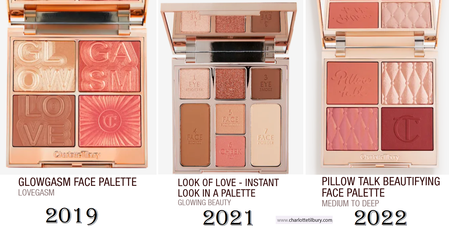
Before we start the review, I’d like to highlight the fact that Charlotte Tilbury used to have annual face palette launches, but they were usually not deep-skin friendly. The photos below are of the three darkest palettes the brand created until this year. I didn’t end up buying the one on the left because of how light it looked on tan reviewers I saw on YouTube. I didn’t get the one in the middle because I feared none of the cheek products would work on my skintone, especially since I was darker in 2021. I didn’t buy the one on the right because I rarely reach for blush and highlighter palettes. A face palette doesn’t feel complete to me without at least a blush, bronzer, and highlighter together.
In 2023 and 2024, the brand took a break from making larger face palettes, so I’ve been waiting at least six years to finally try one! That’s why, despite my pledge to quit buying face palettes, I made this exception.
I wanted to acknowledge this history because I have always been critical of Hourglass for their limited shade selections in Ambient Edit Palettes, yet I haven’t said nearly as much about the Charlotte Tilbury ones. I think it’s because as much hype as Charlotte Tilbury powder products get, it’s never to the level of Hourglass. So, I was far more disappointed when I could not use an Hourglass Palette vs one from Charlotte Tilbury.
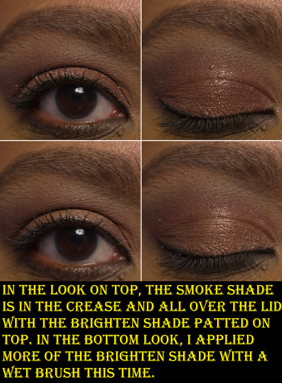
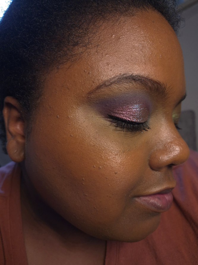
Starting with the eyeshadows, the 1 Brighten shade is described as a warm tan with silver shimmer. On my skin tone, the tan color is only visible if I apply it wet (as seen in the photo above), and technically on top of a darker shadow. So, if I just tap it on top of my lids without dampening it, only the silver particles show in a scattered-effect-topper kind of way.
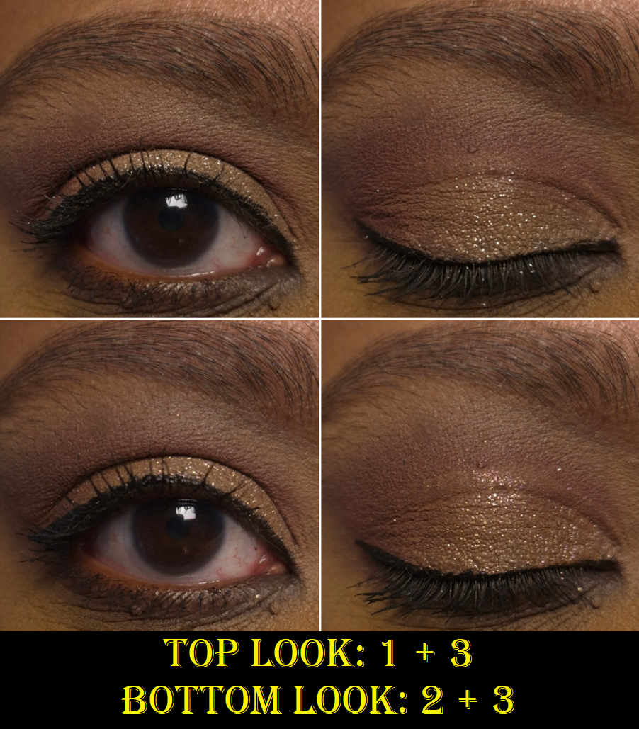
2 Enhance is described as warm copper with pink shimmer. As seen in the second pair of eye looks, it is difficult to tell the difference between the two shades on my lids. In real life, if I put Enhance on one eyelid and Brighten on the other, my eyes wouldn’t be closed long enough for anyone to be able to spot the difference. So, I can’t help but feel like I got a duplicate eyeshadow in this palette. I don’t mind having what amounts to one topper shade, but to have two out of three is a bit disappointing. That being said, they’re at least pretty. If I want a sparkly and slightly less scattered look, I reach for Enhance instead of Brighten. It is also true that I can get a slightly pinker look when I dampen this eyeshadow shade, or much pinker when I use the blushes on my eyes too.*
*If you’re concerned about whether or not the face products are considered eye safe, based on your government’s regulations, I recommend checking the official Charlotte Tilbury website and ingredient lists for information regarding that. I have not looked into this, and have tried them at my own risk.
Regarding fallout, applying the shimmer eyeshadows damp ensures that I don’t have too many particles under by eyes by the end of the day, especially if I also use the Nyx Glitter primer. Plus, I get the bonus of these methods intensifying the amount of sparkle that’s on my lids.
3 Smoke is described as a rich burgundy matte. It is indeed dark enough that I can be satisfied with creating eye looks using only this matte and one of the shimmers. I don’t like how rounded my natural eye shape is, so I prefer to use at least three eyeshadows to create a high contrast look with a sculpted outer corner in an almond shape that detracts attention from how rounded my upper lash line is.
I get decent pigment from this shade, though I still have to build it up a little to be satisfied. Layering and blending with it is fine, but not super quick. Basically, this isn’t an amazing eyeshadow quality, but it’s nice enough. I at least don’t have issues with patchiness. For those wondering, I use the Lisa Eldridge Liquid Silk Eyeshadow as my main eyeshadow base.
I have attempted to create eyeshadow looks using the bronzer and blushes as well, but they are not deep enough to give me the depth I require in my eye looks. I have to end up using Smoke or reaching for a different palette to finish the look.
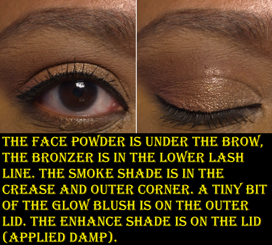
So, if I include the brown bronzer as a blending out or softening shade, the face powder as a brightening shade, the raspberry-pink matte blush and shimmery glow blush as ways to intensify the pink elements of eye looks, the Smoke shade for dimension, and I use the two shimmers damp, I’m content enough with the variety of pink and purple eye looks I can create.
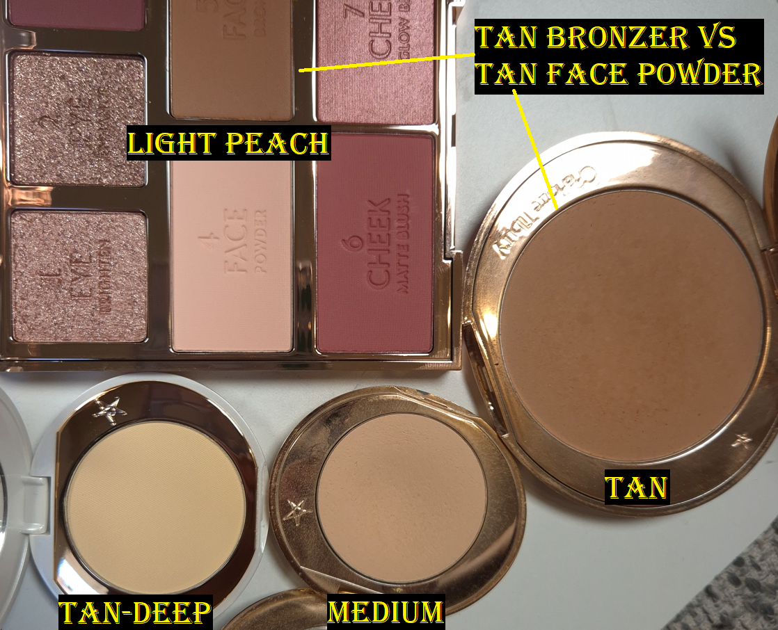
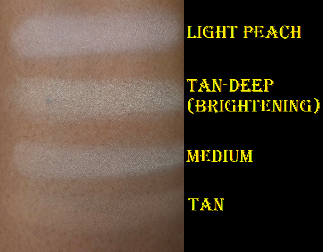
Moving on to the face products, I thought it was a good opportunity to show the differences between the Flawless Finish powder shades.
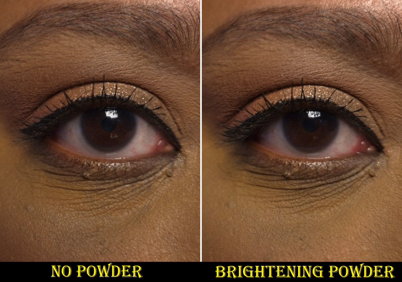
The swatches look quite stark and ashy, but all of these work for me under my eyes. In fact, Tan looks the best suited for me in the swatch, but I rarely use it on its own because it darkens the look of my under eye concealer if I’m using one that’s already a skin-tone shade. My go-to combination has been to use a mixture of Medium and Tan together. When I’ve used Light Peach, it has been for its color-correcting elements, lightening a blush, or if I’m in a hurry and don’t feel like reaching for a different powder shade while I already have this palette open. This also applies to when I’m using the Soulmates Duo, which is where Light Peach (it may also be referred to as Flawless Peach) was first debuted by the brand. It’s the same great quality I’m used to from the permanent line of face powders.
As for the Tan-Deep shade in the brightening formula, I bought a mini for color-correcting purposes once again. I have only used it once, so I don’t feel comfortable posting a full review. However, I wanted to at least demonstrate how it looks for anyone curious.
I have a bigger Charlotte Tilbury post I’ve been working on for a while, so if there is any information I need to update, I will post about it at that time. That post might not be ready until next year though. There are a lot of other reviews I’d like to complete first.
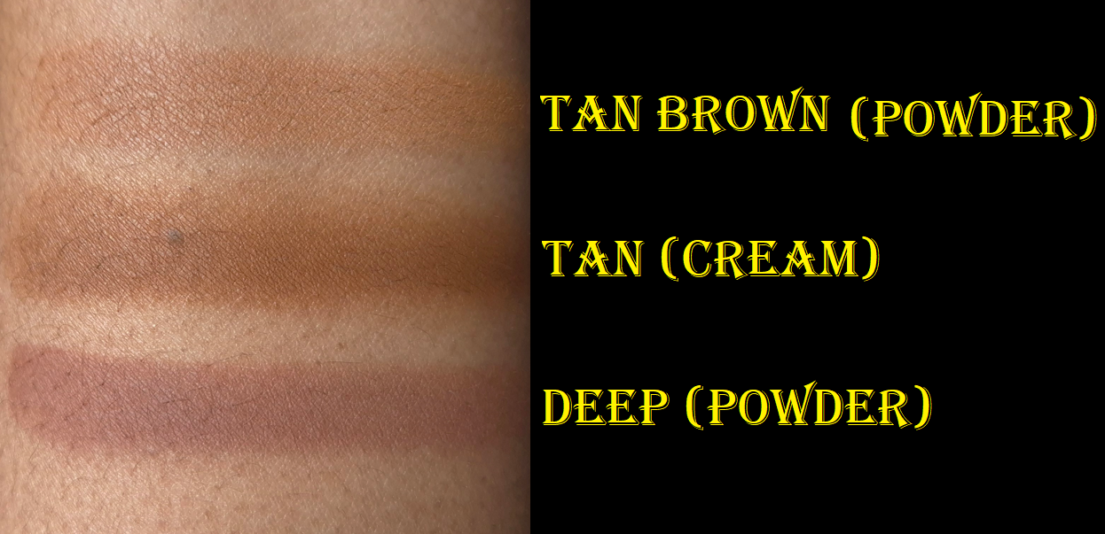
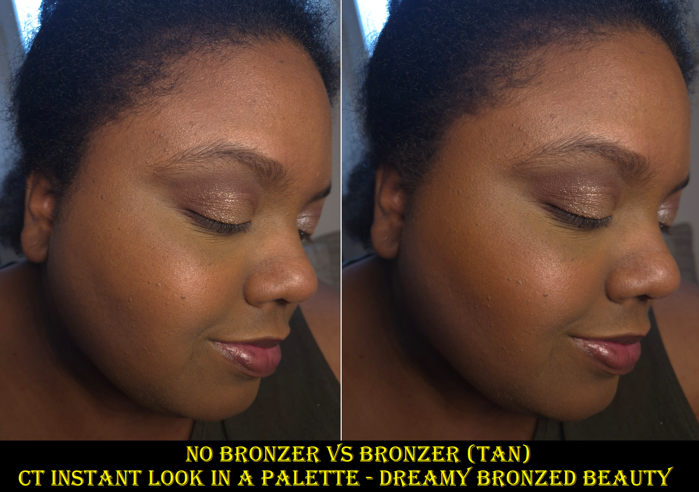
Next up to discuss is the bronzer. When I heard it was the shade Tan, I was a bit disappointed because that shade has never worked for me in the past. However, the one in this palette does faintly show up!
I wish I still had my older version of Tan to be able to compare it to the new one and see if there has been a slight color change. The reason I think it’s possible is because it’s stated on the website that this bronzer is actually a new powder formula. So, maybe the brand made this version the tiniest bit darker. Maybe it’s not actually darker, and is just easier to see because it’s a warmer tone of orange that stands out more on my skintone. The third possibility is that I might be lighter now than when I was in Florida, so I have no idea if the older powder version of Tan would work for me by now. The cream version of Tan has always worked though.
Shade match aside, I do believe there is a difference between the old powder bronzer and new one. My powder version of Deep is fairly old by now, so I don’t know if that could account for the new one feeling the tiniest bit softer and creamier, whereas the older one has a more powdery consistency. The older one had a beautiful airbrushed finish, which also accounted for a more obvious makeup look. The newer one has a more skin-like finish, which I would normally consider a great thing. However, I reach for Charlotte’s bronzer specifically when I want a slightly heavier glam look. The airbrushed blur is what made it stand out from most of my bronzer collection. As nice as this bronzer finish is now, it’s not as unique.
The reformulated version matches the quality of many of my high-end and luxury products, which makes it a great addition to this palette. The blendability is nice. I have no issues with longevity. So, I wouldn’t go out of my way to reach for a different bronzer if I’m already in the process of using this face palette. This difference might just effect whether I would buy an individual compact of the brand’s reformulated bronzer if they do end up launching them, considering it wouldn’t be giving me something different from what I already have from Hermes, the older Dior bronzer formula, etc. Powdery airbrush type of bronzers I love are by Victoria Beckham, Gucci, Vieve, etc. It’s just that Charlotte’s ranked above all of them for this specific look. The new formula is still good, but I would want it when I’m in the mood for a different makeup style (like neutral or natural).
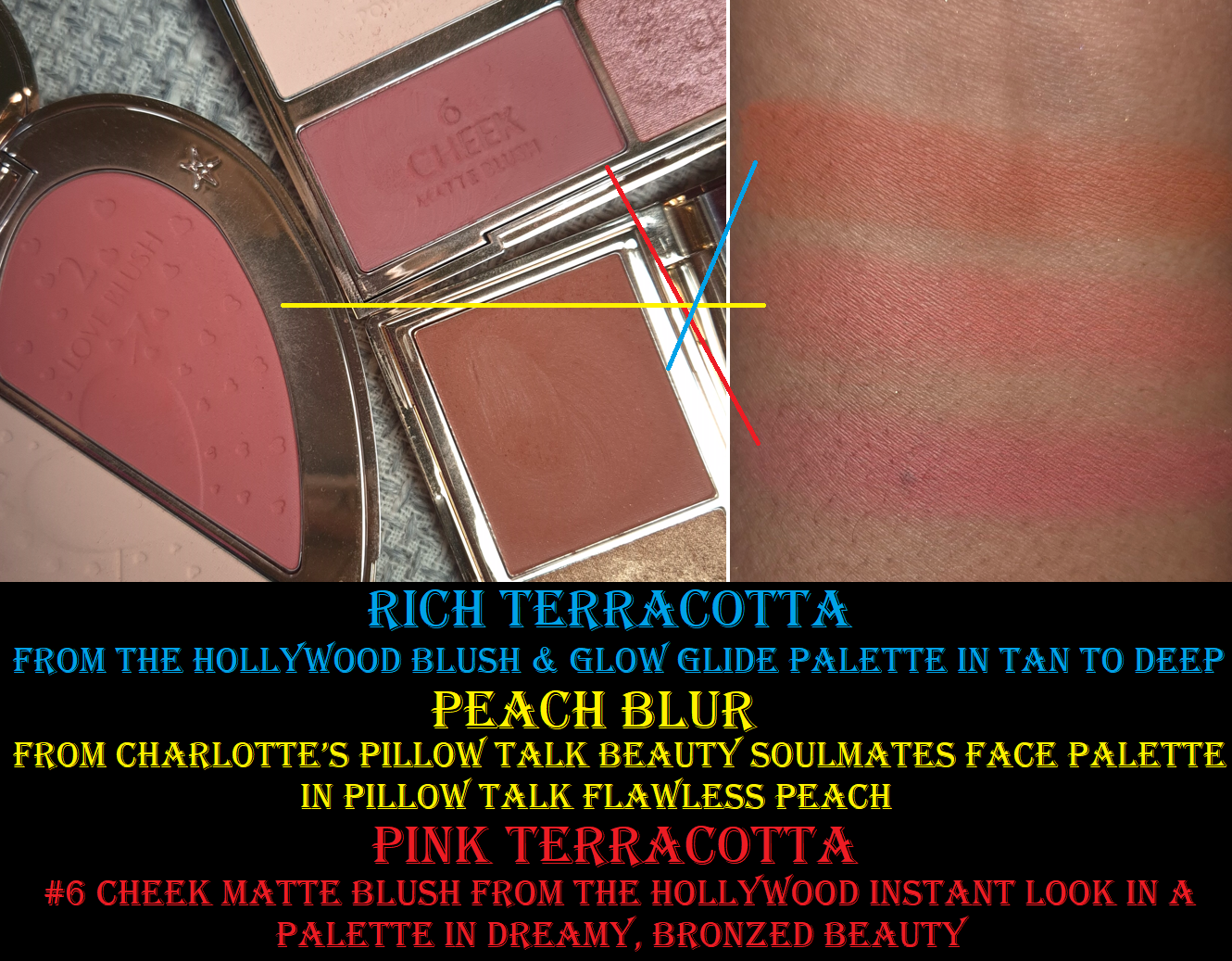
Moving onto blushes, I don’t think Charlotte Tilbury has expanded their permanent powder blush range since the addition of Pillow Talk Intense in 2020. There have been limited edition powder blushes, but it’s interesting that the brand’s focus for the past several years has been to extend the options of Beauty Wands and various cream formulas. The limited edition powder blush shades intended for those with medium, tan, and dark skin have been just different enough for me to justify owning them all. However, I can understand some of the frustrations I hear my fellow makeup lovers talk about regarding the options. People are ready for something distinctly different, and not just in liquid or cream form.
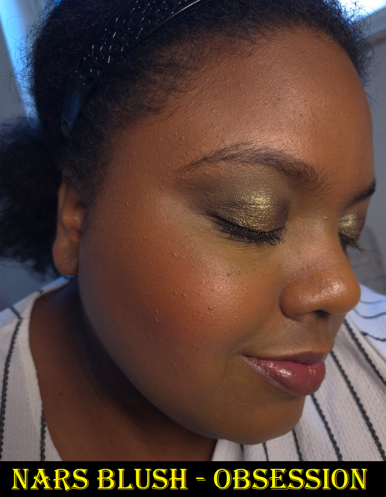
Blushes are still currently my favorite category of makeup, although eyeshadows are getting close to reclaiming their former position. So, these blushes were what I was the most excited to try. When I saw 6 Cheek Matte Blush in person, I was nervous because it reminded me of YSL’s Berry Bang that I got in August. However, I was very happy that I find Charlotte’s to be a prettier tone on me. It’s pigmented, soft, and buildable. To have a little more control of the matte blush and get it to have as light of a layer as it appears in the demonstration photos above, I used the Sonia G Soft Cheek Brush.
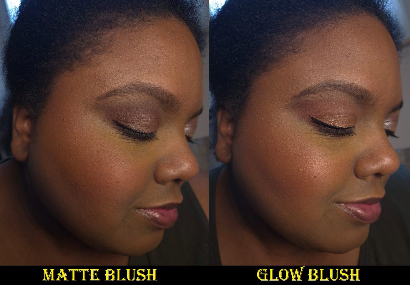
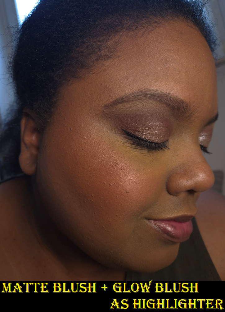
This blush lasts all day without fading. It also doesn’t look too matte for my dry skin, although I prefer to add a little of 7 Cheek Glow Blush on top to make my cheeks appear a bit more supple.
I was surprised to see that the Cheek Glow Blush is the only one not inside a pan. It feels like a gelee or slurry formula on top of plastic netting/mesh. Some products like this can be hard pressed, but this one is not. I have no issues getting enough product onto my brushes, but since it’s not as pigmented as the matte blush, I like to cut to the chase and use a brush that’s a bit denser and picks up more, like the Hakuhodo G6440.** One other brush I’ve been loving with it is the Bisyodo B-P-03 Perfect Fit Powder Brush.* I haven’t written an official review for it yet, but I want to share the fact that it lays down these blushes so well and it’s great to blend with. Despite being large, I can dip the lower angled portion of the brush onto the surface of the blushes, and then when I blend, there is a portion of the brush that doesn’t have product on there. So, I can diffuse the blush without packing on additional product in the process.
*DISCLOSURE: Every link (in thisBoldBlue Font) is a regular non-affiliate link. The brush link (in thisBold Black Font With a Blue Background) is the only affiliate link in this post. This means I would get a commission from anyone who decides to make a purchase from CDJapan after clicking my link.Athough chances are slim that anyone who has used my links in the past will see this message in a post that isn’t dedicated specifically to Japanese Fude, I still want to show my thanks and appreciation. As someone with such a tiny blog, it’s still a shock to me whenever I see that someone has used my link, or even to just see the number of people who have clicked them. Thank you very much. ❤
**Side Note: I feel compelled to point out that when I bought the Hakuhodo brush almost a year ago, it was listed at 19,000 YEN. Between Black Friday discounts and the shipping fee via shopping through Fude Bobo, I ended up spending a little less than that on the brush, and it still felt like quite the splurge for a brush of that size. Four months ago, Hakuhodo raised their prices again, so this brush costs 26,000 YEN now! As much as I love this brush, I cannot recommend Hakuhodo anymore at these prices.
Returning to the subject of the glowy blush, one downside is that it emphasizes texture a little bit. It’s not as intense or metallic looking as certain shades of the brand’s Blush Wands can appear, but it could still be too much for some people’s makeup preferences. Also, this blush shade shows up enough on me to consider it a usable standalone blush, but I find it more practical to regard it as a blush topper. It’s shiny enough to add glow like a highlighter, but the tone matches so well with the blush that I feel it doesn’t stands out enough or draws enough focus to my cheeks like a traditional highlighter would. So, I prefer to add the Cheek Glow Blush to the apples of my cheeks and/or the top of my cheekbones, but still apply a real highlighter on top to finish the look. Perhaps I would feel differently if my undertone wasn’t golden, since pink highlighters don’t pass for natural on me.
The YSL All Hours Couture Palette in Golden Oasis still feels new to me, so it’s natural to want to compare these two products. In USD, YSL’s face palette contains three blushes and three highlighters for $85. Charlotte’s face palette contains three eyeshadows, two blushes, one face powder and one bronzer for $69. The differences in Germany were much smaller as it’s €72 for YSL and €69 for the Charlotte Tilbury palette. I essentially liked half of the YSL palette, but would only really use two blushes (and I already owned one of those two). With the Charlotte Tilbury palette, I can use everything in multiple ways and I like all of the shades. I can finish a good portion of my makeup by whipping out this single palette. I like it more than the YSL and more than the Nars Hot Escape Cheek Palette. I still stand by my thoughts that the ones from YSL and Nars could be good in particular circumstances, and what I actually paid for them was a pretty good deal. This one just turned out to be even better.
I don’t believe it’s recency bias if I consider this to be among my most useful face palettes: Hindash Beautopsy, Sephora Microsmooth Multi-Tasking Baked Face Palette, Hourglass Ambient Edit Palettes, and now the Charlotte Tilbury Instant Look in a Palette. Considering the fact that I don’t like to use any of the others on the eyes, this palette has that edge. Hindash’s still has my best contour color, Sephora’s has a true highlighter, and Hourglass’ has a glowy bronzer option. So, I like and use these on different occasions. I believe the reason I would end up getting a lot of use out of the Charlotte Tilbury palette is for convenience. It’s just easy to have so many usable pretty products in one palette, which is the whole appeal of having a face palette in the first place. I am glad that this one turned out to be such a good purchase!
That’s everything for this week. Thank you for reading!
This is the first product I’ve ever purchased from Ilia. Nothing they made interested me until the release of their limited edition Ethereal Baked Face Palettes.* I didn’t buy one though because I didn’t like the packaging and I wasn’t a fan of the blush shades in the Deep palette. It would have cost $59 for four products (albeit smaller sizes), which on paper is a better deal than $36 for a single blush. However, if I didn’t like the formula, I would have technically wasted more money.
*Ilia brought back the face palettes in the US. They are still listed as limited edition, so I think they are planning to follow the Hourglass method: releasing curated palettes with powders in smaller sizes for the holidays, but having larger and more expensive individual powders in a permanent range.
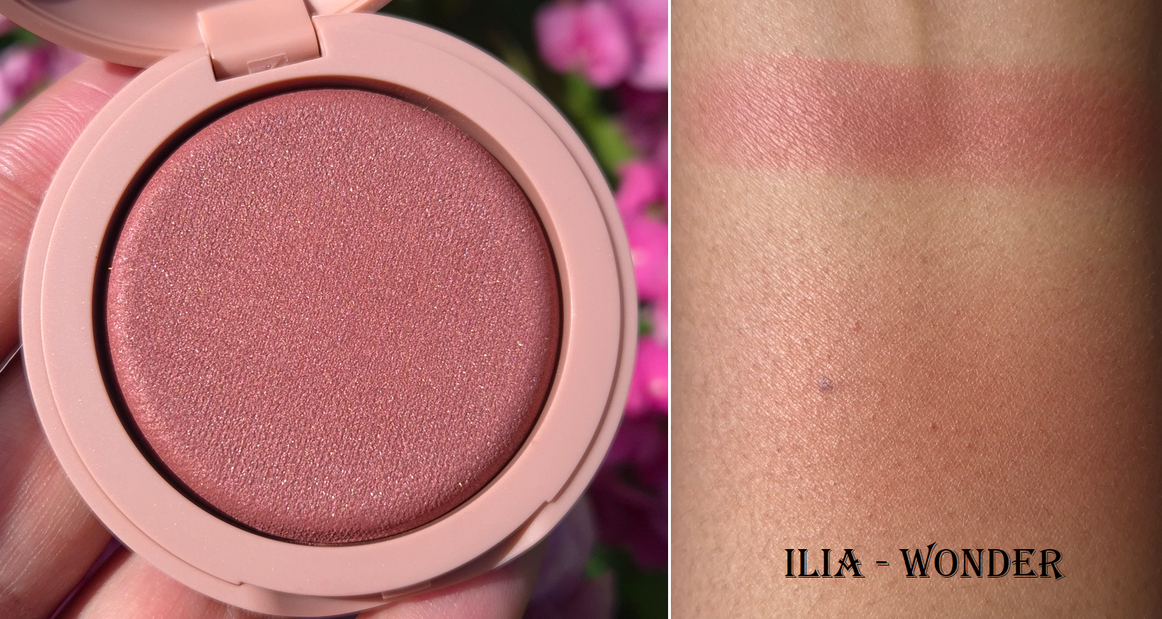
Ilia Soft Focus Blurring Blush in Wonder
Because this is a baked blush, I can’t help but want to compare it to Hourglass. Hourglass has blush finishes that are matte, shimmery (mica-sheen), more shimmery (with some larger shimmer specks), and high shine (practically metallic and could double as a highlighter or blush topper). The finish of Ilia’s blush is most similar to the subtlest of Hourglass’ blushes with a sheen, but Ilia’s has much more obvious mica that gives a pearlier look and it’s a little more reflective (but not enough to look metallic). I heard that most of the shades in this range have the cool-toned sheen except Pulse.
When I rub my finger into an Hourglass blush, it feels firm even though the powder itself is soft. When I rub an Ilia blush, there’s a hollow feeling as if it could fold under the pressure of my touch if I press too hard. There is only one other product I own that feels like this, and it’s the Fenty Demi Glow Light-Diffusing Highlighter. That one was actually prone to arriving to people broken during shipment and I recall even seeing a small crack in the first round of promo photos that were released. I don’t think the Ilia blushes are quite that fragile, but I handle mine carefully just in case.
These photos demonstrate how the blush looks in cooler lighting vs warmer lighting.
I find the finish to be a little blurring, though only as much as a luminous product can be. I use my airy delicate brushes with it, and one tap or two picks up the perfect amount of product to cover a cheek. Wonder is a very pigmented blush, but because it’s so easy to blend out, I can still use denser brushes if I want. It’s just easier to control if I use something like the Sonia G Soft Cheek or Chikuhodo Z-8 with it.
What really makes this blush stand out is the tone. There are a few vibrant shades in the range, but most are desaturated colors, which was just the kind of thing I’ve been looking for. Breathless is the shade that drew my interest in this launch, but I feared that between the mica and color depth, it would probably look ashy on me. Wonder seemed like a darker version of that shade, so I picked it, and I am convinced that no other color in the current range could have suited me better. That being said, I could not figure out why I wasn’t in love. It’s pretty, flattering, and long-lasting on my skin. There’s no fragrance and it’s supposed to last two years (which is great coming from a brand that touts itself as being “clean.” I could find no faults with the formula, yet there were times I would apply it to my cheeks and think BareMinerals Kiss of Rose would look better. It wasn’t until I watched Alicia Archer’s video about Terracotta Tones that I realized Wonder being more of a pink-rose terracotta instead of an earthy orange/red type of terracotta made all the difference in the world. It’s a very pretty shade and it doesn’t look bad on me, but it’s that tiny bit less flattering.
I tried to pull a few shades for comparison that I thought might be most similar to Wonder. Ironically, the closest is Kiss of Rose, and I can see how that little bit of extra warmth makes me like it more.
So, unfortunately, this didn’t work out so well for me purely based on the color. However, the formula is nice enough that I still recommend it to anyone interested in this range of blushes. In fact, if the brand comes out with a true terracotta-brown shade or some other color I love (that also has a warm sheen), I would very likely buy it. It’s $10 less than Hourglass Ambient Lighting Blushes for the equivalent amount of product as well, though the light plastic and mirror-less Ilia packaging probably contributes to a large portion of that lower price. Some people might think it looks too cheap for the price, and I can understand that feeling. For me, the compact color and the shape of it is pleasing enough to make up for that because components shaped like bars of soap are very satisfying to me. I’m not sure why!
I hope this review has been helpful. Thank you for reading!
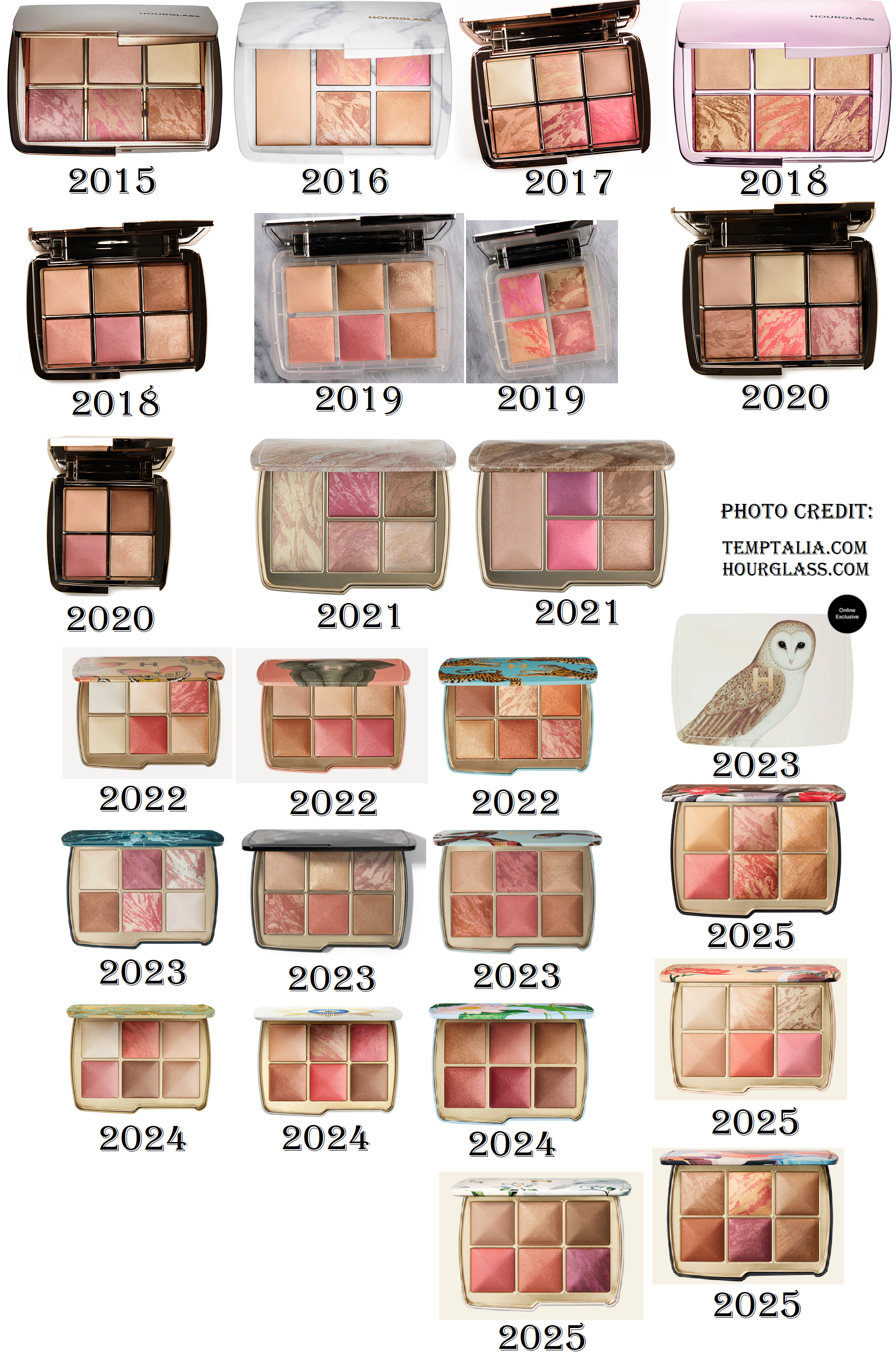
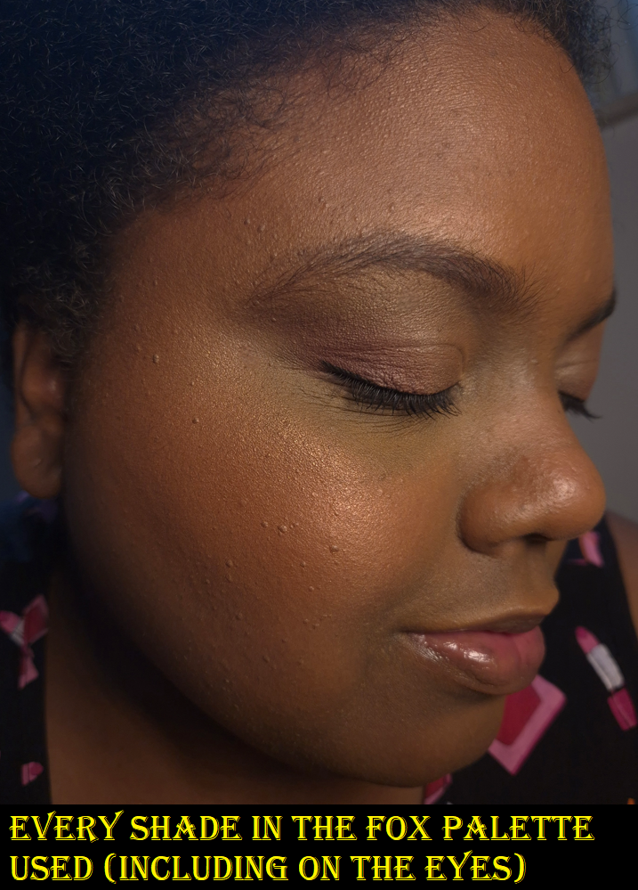
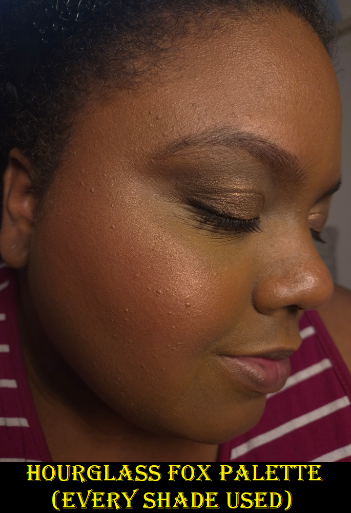
Today’s post will be a review of the Swan Palette and Dusk Quad, plus I will show some mock ups of the DIY custom palettes I’m considering making using the Ambient Lighting Powders.
I already reviewed the Fox Palette, so if you wish to see more details about that one, please click HERE.
If you’d like to see even older Hourglass Palettes, I have a list HERE with the links to all of them.
Hourglass Ambient Lighting Edit – Unlocked- Swan (in Deer Packaging)
The Swan Palette comprises of Color Palette 2, generally known to be geared towards those with medium skin. I will admit the reason I bought another palette after Fox was because I could not let that beautiful Deer Packaging go. I like the original Swan design, but I felt an even stronger pull towards the Deer. So, I needed to put something inside it. I contemplated going for the Fox color story again, but I thought it might be more helpful for review purposes for me to choose Swan’s Color Palette 2 and see just how many shades I could get away with using. Plus, the blushes all looked pretty. So that’s what I did, and it’s not the first time either! I own the Owl Palette from 2023 that holds the Leopard color story, and I’ve gotten a surprising amount of use out of it!
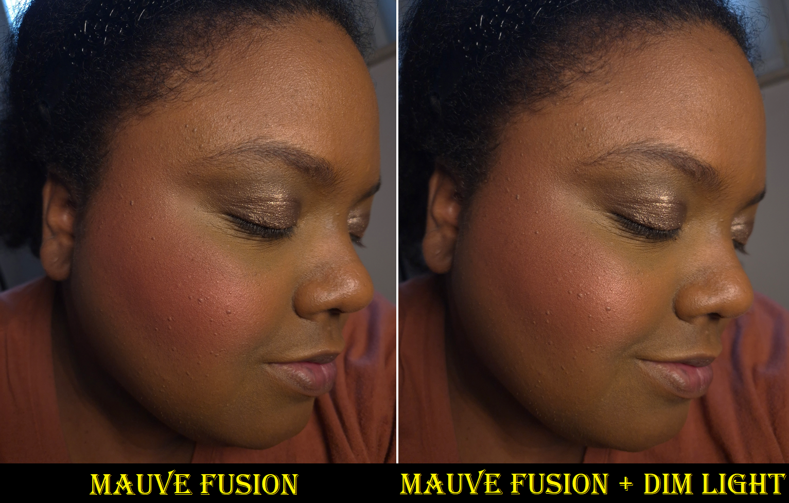
DIM LIGHT (Finishing Powder) – This is one of the most frequently repeated shades among the Ambient Edit palettes, but thankfully only my second time getting it. It’s the lightest finishing powder Hourglass makes that I can pull off if I use it lightly, and if I’ve stayed out of the sun enough. At the moment, it’s a bit too light for me to wear with my regular foundations, but I have been successful in using it to lighten some of my foundations that are too dark or too orange right now.
In my review of the Fox palette, I mentioned that the quality seems better than it has been in the last few years. The powders feel softer and less dry. Out of curiosity, I felt my older Dim Light Powder from the Leopard Palette compared to the newer one, and this year’s feels the tiniest bit silkier. When I swatch them, the shades are identical, but when I rub them into my skin, I can see slightly more of a cast from the older powder. I hope my photo helps, but it’s a bit difficult to try and demonstrate the results from a sheer finishing powder on the skin.
This change probably won’t make much difference on someone with a light skin tone, but it works out better for me. Realistically though, I’m going to stick to using Eternal Light or Desert Light instead. So, Dim Light might be ignored by me when I open this palette.
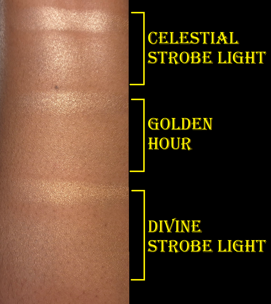
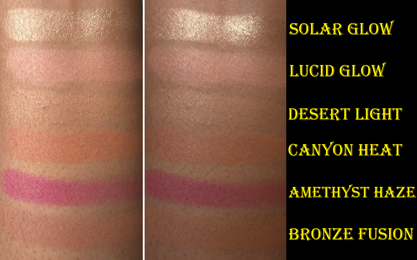
GOLDEN HOUR (Highlighter) – This is a new shade for Hourglass and I feel it is one of the more refined highlighters they’ve made. There’s no avoiding that this is quite beaming, but it doesn’t look as crazy on me as I expected. In swatches, it is clear that Golden Hour is lighter than Divine Strobe Light, but it blends into my skin so well that I feel I can pull off Golden Hour even better.
Darker highlighters are obviously going to look better on me, so I don’t foresee myself using Golden Hour very much. However, it’s nice that I could if I wanted to. Since the quality is great, I think most people who like intense highlighters will be happy with this one.
This photo demonstrates my best efforts at applying a sheer amount of Golden Hour to make it work. It is incredibly easy for it to look beaming and intense if that’s what I wanted.
NATURAL BRONZE (Bronzer) – It’s no surprise that this doesn’t work for me as a bronzer. I can just barely see a cool-toned tinge on my skin in person (it’s invisible in photos). Hourglass finishing powders can be used as bronzer, so the reverse is true as well. However, because Natural Bronze leaves a slight grey tone on me, I cannot use it for either purpose. I’m fine with that considering it’s the only truly unusable powder for me out of six.
One of the complaints a lot of people with a lighter skin tone have is that Hourglass bronzers tend to lean too warm/orange. So, I wonder if this particular color will make the majority of customers happy. It is apparently not a new shade, but I don’t know where else it has been.
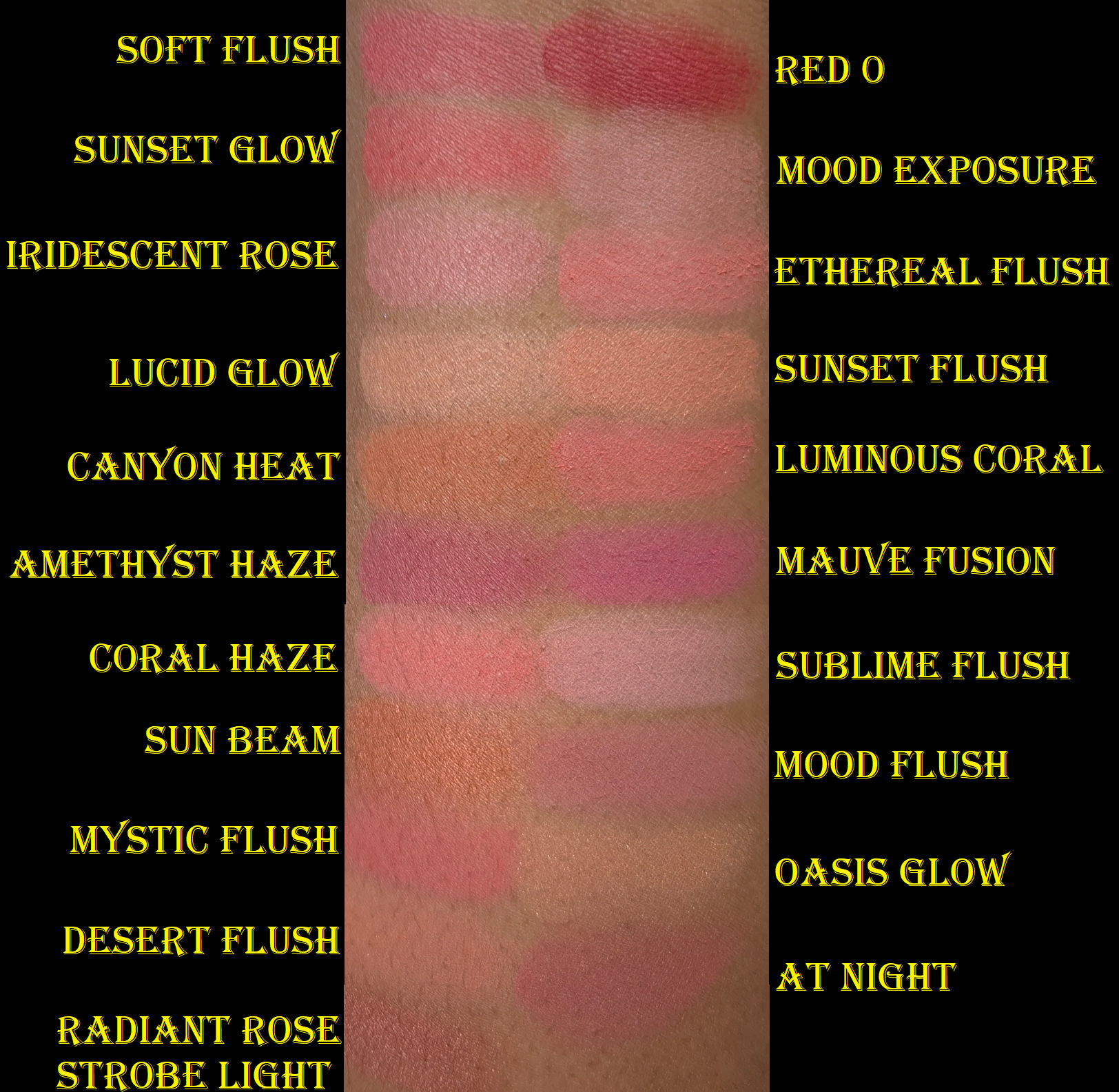
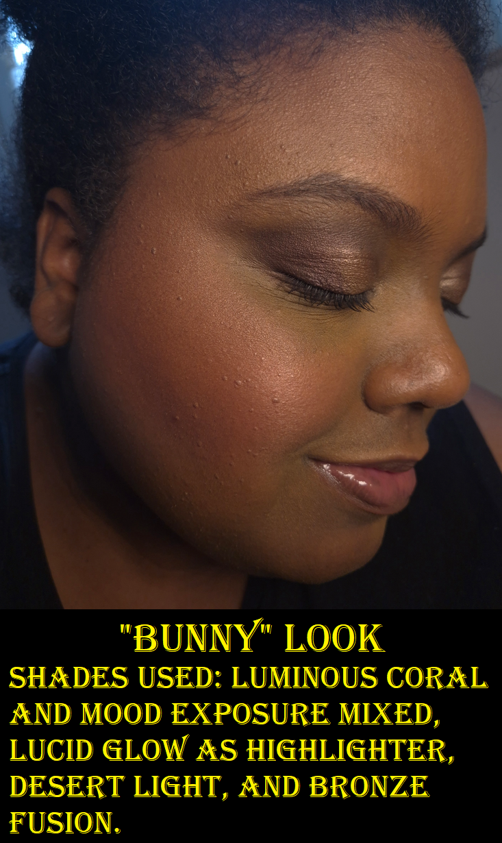
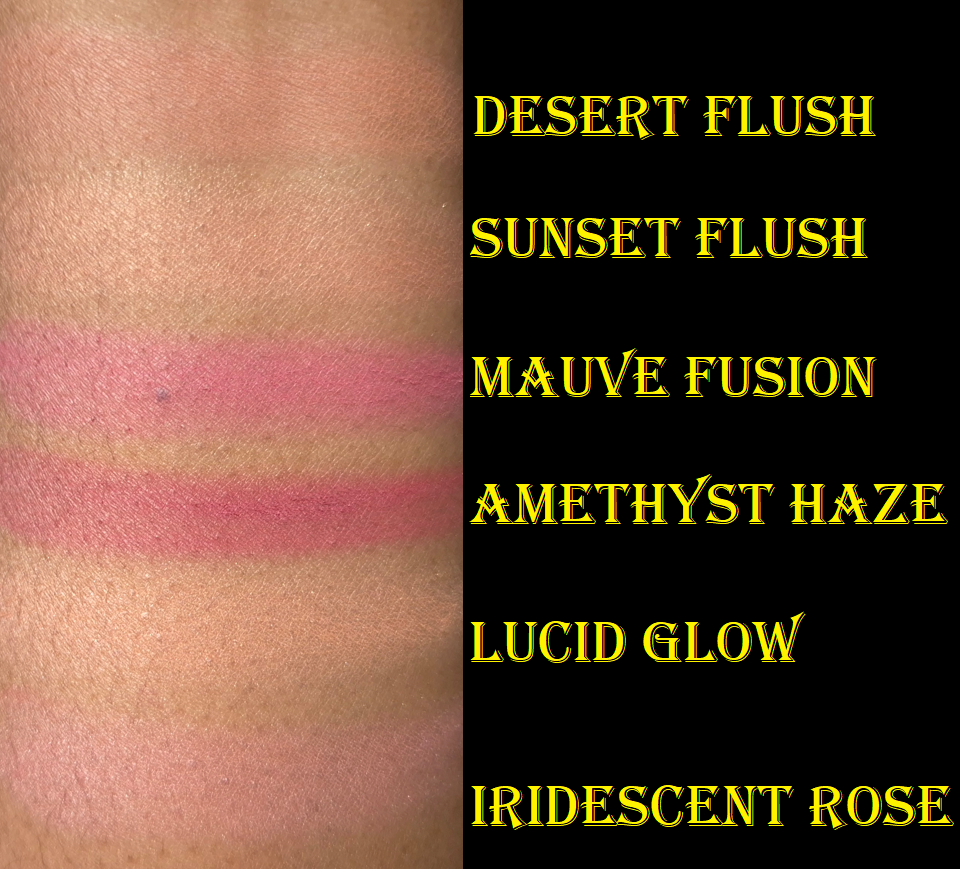
LUMINOUS CORAL (Blush) – I really like this color! It is a little darker than Ethereal Flush, and warmer than Coral Haze, which makes it my favorite of Hourglass’ coral blush shades! It’s vivid enough to pop on my cheeks without looking clownish and it doesn’t require too much effort building it up.
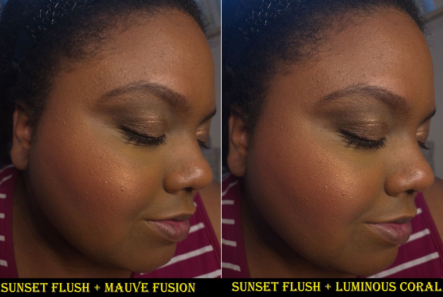
SUNSET FLUSH (Blush) – This blush has the Nars Orgasm effect on me: a slight tinge of pink may be seen when I face forward, but a gold sheen is all that shows when I turn my head towards the light. I could use this as a highlighter, but I prefer how it looks as a blush topper for Luminous Coral and Mauve Fusion.
MAUVE FUSION (Blush) – Although this blush is lighter than Amethyst Haze from the Fox Palette, it has enough pigment to look extremely bold with enough layers and a dense brush. In swatches, Mauve Fusion looks fuchsia-pink and Amethyst Haze looks magenta-pink. On my cheeks, Mauve Fusion looks like a normal pink blush. I still think it’s pretty, and between the two, I do think Mauve Fusion looks the most purple on my cheeks. However, I find Mood Flush to look like a truer mauve. Perhaps Mauve Fusion will look different on other people with a different undertone than mine (and a different ratio of color marbling in the blush).
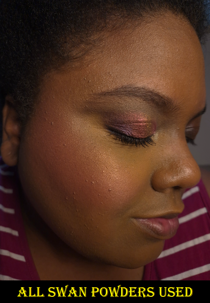
Overall, the Swan Palette colors work pretty well for me. Luminous Coral and Golden Hour were my favorites, but Luminous Coral, Sunset Flush, and Mauve Fusion combined are the real standouts.
As much as I like this palette, I don’t love any of the powders enough to say that I’d have been missing out if I skipped getting Swan. However, I don’t regret my purchase when the goal was to have Deer Packaging, and I ended up with five usable products to boot.
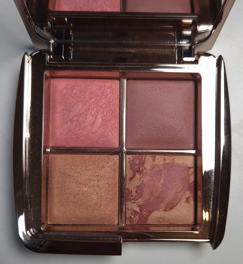
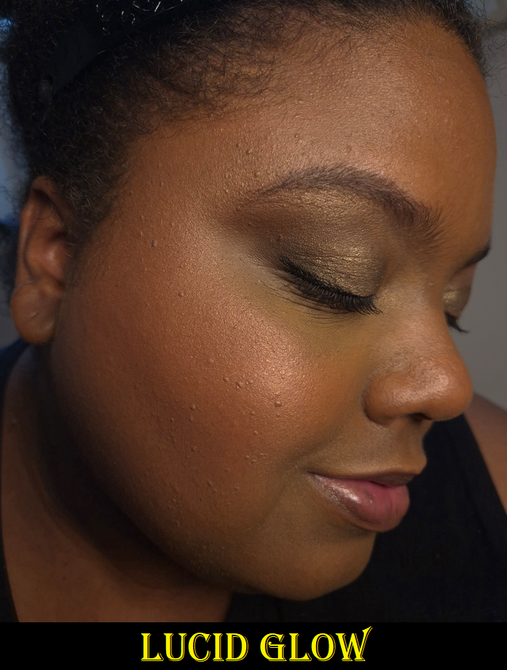
Hourglass Ambient Lighting Edit Quad – Dusk
As you might already know, Hourglass released five curated quads in May 2025, plus the option for US-only customers to choose 4 out of 24 Ambient Lighting powders to put in a custom quad. In my Window Shopping Hourglass post, I said the smartest move would be for me to wait and see if any of the shades I want will end up in one of the deeper holiday palettes I planned to buy anyway. This was my plan, but I kept thinking about the Hourglass Barney’s Volume III Palette that had my two most sought after shades (Lucid Glow and At Night in the “edit” size), and how it was never restocked. So, that compelled me to get the Dusk Palette in its final restock, which sold out a minute after I ordered it. Considering At Night did not make it into this year’s holiday palettes, I really don’t regret my decision. Plus, I got a discount on it.
I’ve had this quad for quite a while, but I figured the start of the holidays would be the best time to review it.
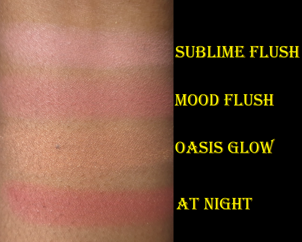
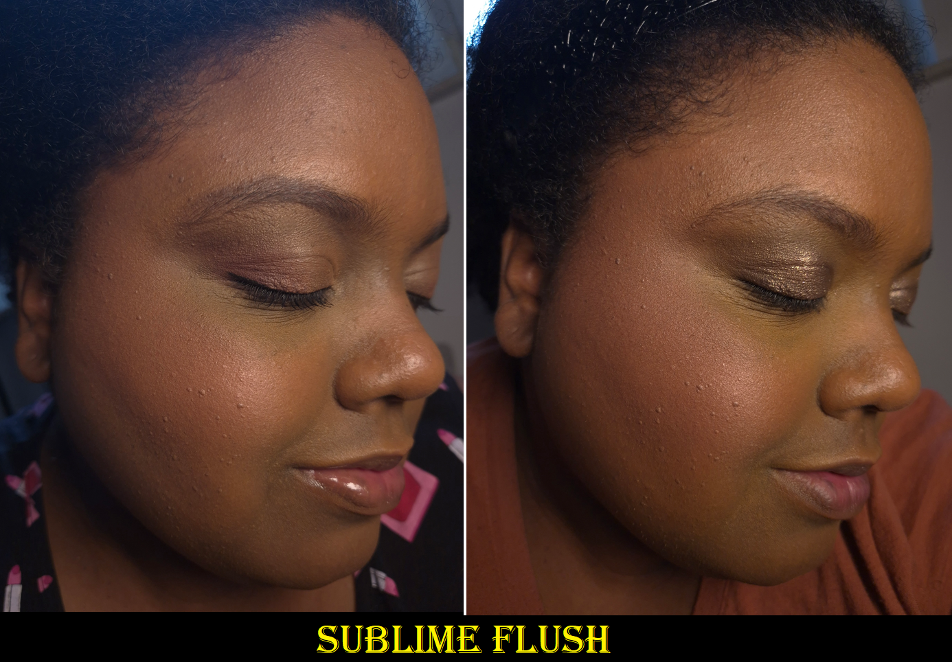
SUBLIME FLUSH (Blush) – I knew this blush would look cool-toned on me, and potentially ashy. Sometimes this shade doesn’t look too bad on me if I mix it with other blushes, but it’s really not for me.
MOOD FLUSH (Blush) – I have to build up this color quite a bit, but I love this blush. It’s a duplicate shade for me, as I already own and depotted one out of the Sculpture Quad, but that just means I can keep one in two different custom palettes of my own making.
OASIS GLOW (Blush) – I knew the chances were high that I couldn’t use this as a blush on my skin tone. I wanted this shade as a subtle highlighter, and that’s exactly how I’ve been able to use it.
AT NIGHT (Blush) – I own this in the full-size, but wanted it in the smaller Ambient Edit size to be able to put it in custom palettes. I love the one that came in the Dusk Quad because I have a larger section of deep red marbling, making it easier to get more of that dark color and less of the tan-beige color. This means it’s even deeper and requires less building up, so I’m very pleased.
I have been content to leaving this quad as is, as a blush/highlighter palette. However, with the additions of Fox and Swan, I’m feeling even more of an impulse to rearrange one or even two Ambient Edit Palettes!
With this year’s launch (and my purchase of the Dusk quad), I have procured nearly every shade from Hourglass that I’ve wanted from the beginning of the launch of these palettes until now. Iridescent Coral is the only one missing, but it would likely be another highlighter shade on me, so I’m giving up on it.
I have experience depotting and rearranging these myself, which is great considering the brand still hasn’t made that option available to those outside of the US. I could continue to wait for this to happen, but there’s no telling when they will roll it out internationally, when they will use 6-pan palettes instead of quads, whether the palettes will be made of tin instead of plastic (which is more ideal for depotting without ruining the packaging). So, I am feeling a bit impatient when I see that creating my perfect palette is now within reach! My biggest obstacle at this point would just be procuring the right magnets and trying to depot the powders old-school style without my Z-Potter.
Below is a mock up of the first concept palette I decided upon, which I gave the name Panda for no reason other than to wish it into existence. I’d love a Panda design in next year’s Hourglass Palettes!
CONCEPT PALETTE: “PANDA”
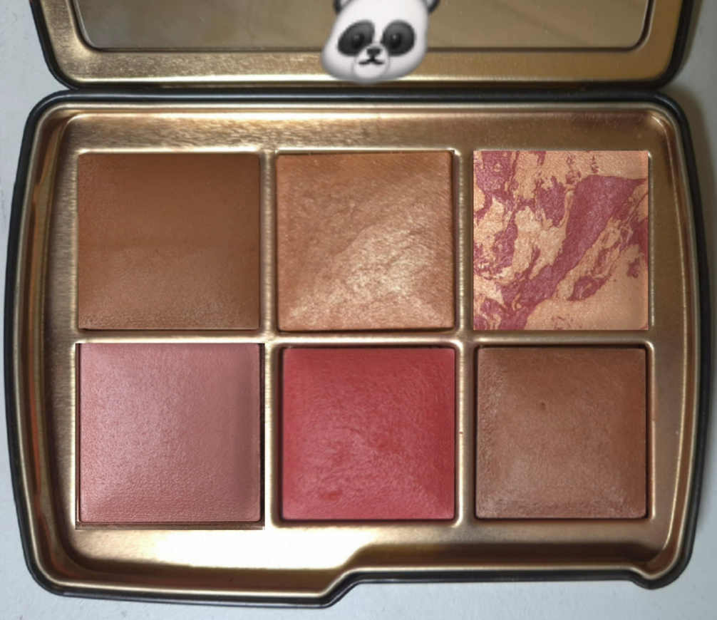
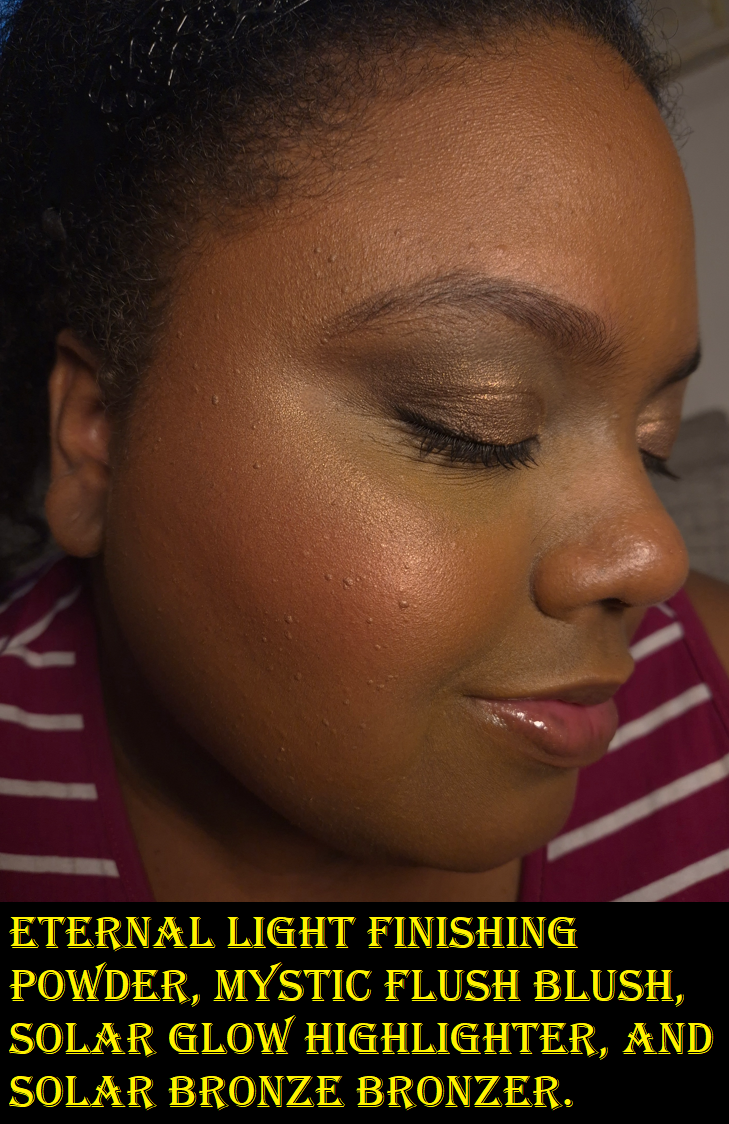
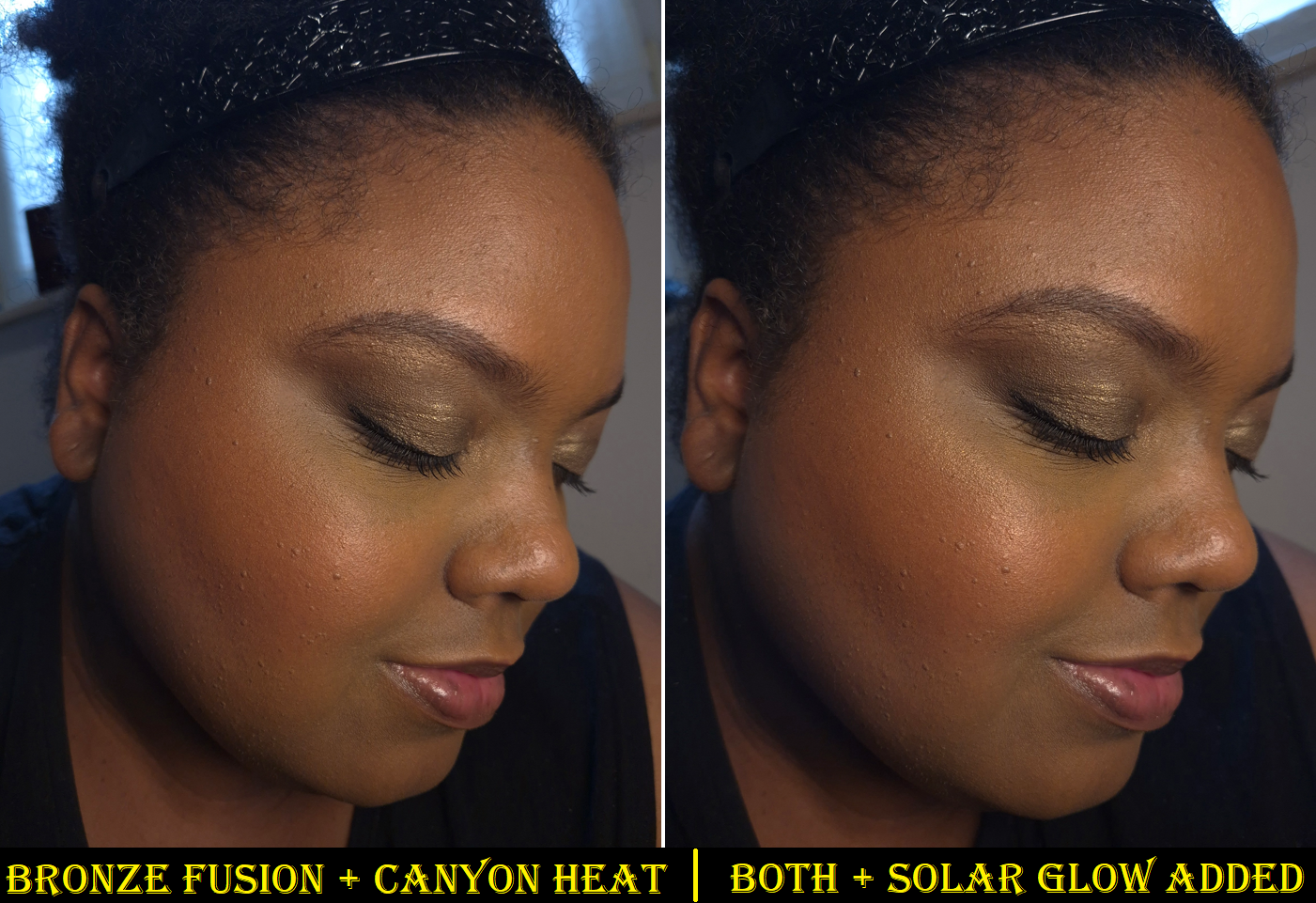
Eternal Light (Finishing Powder) – Lotus, Permanent Shade Solar Glow (Highlighter) – Fox At Night (Blush) – Dusk Quad, Permanent Shade Mood Flush (Blush) – Sculpture and Dusk Quad Mystic Flush (Blush) – Snake Solar Bronze (Bronzer) – Snake
When it comes to choosing the best shades for me, as a person with a medium-deep skin tone, I think I’d put Eternal Light in any palette to be on the safe side of working for me, but Desert Light poses a very tempting second option.
There are plenty of pretty highlighters from Hourglass that I can make work, but the newest one from Fox is the clear winner. Solar Glow would be in any version of my ultimate palette, but if I made a second custom palette, there are a few blushes I use as highlighters that I’ve come to enjoy enough to put in the running.
My two bronzer contenders are Solar Bronze and Solar Fusion with one being my best shade match and the other being similar to that with an added sheen. At times, Solar Fusion will be too light, so the Solar Bronze would need to be in my alpha palette (Panda).
At Night is one of my favorite blush shades of all time, so a perfect palette would be incomplete without it. Mood Flush is typically my second favorite. It works alone as a subtle blush, but also pairs well with At Night. Mystic Flush is the most pigmented and easy to blend of the medium-dark pinks, so that’s typically my third blush option, but Sunset Glow is such a similar color that I go back and forth as to which I like more.
Desert Flush, Luminous Coral, and Ethereal Flush are the next ones that grab my attention the most from the blush swatch photo in the Luminous Coral review section. Truth be told, I haven’t been wearing Desert Flush because I’ve gotten more sun this year and that shade is really only usable for me when my skin is at its lightest. Luminous Coral is brand new, so I’m not fully committed to moving it around. Ethereal Flush is one that I keep forgetting about since it’s in my palette with lighter shades (Owl).
Speaking of lighter shades, Mood Exposure also shows up as a solo blush, depending on the time of year, but I also like using it to calm down punchier blush shades. So, I could see myself adding it to a custom palette as well.
Mood Exposure on the cheeks.
It wasn’t until this week that I started to question whether I should put all of my favorite Hourglass blush shades into one palette considering At Night and Mystic Flush can sometimes look alike. I need to have blush variety, but the colors should be the ones I wear most often. I considered placing Canyon Heat instead of Mystic Flush for the greater difference between shades, but ultimately left it as is.
The more I look at the Panda Concept, the more interested I am in making it.
CONCEPT PALETTE: “RABBIT”
Mood Exposure (Blush) – 5 Holiday Palettes, Permanent Shade Lucid Glow (Blush as Highlighter) – Fox, Ghost Quad, Sunset Quad, Barney’s Volume III Desert Light (Finishing Powder) – Fox Luminous Coral (Blush) – Swan Canyon Heat (Blush) – Fox Bronze Fusion (Bronzer) – Fox
Since Desert Light and Bronze Fusion were close to matching my top picks, and Luminous Coral is the best of the corals, I decided to create a second mock up called “Rabbit.” The majority of shades in this one are from Fox, and while I might’ve been content to leave that palette as-is, rearranging them might help me get even more use out of them.
Lucid Glow and Oasis Glow are my top two blush-as-highlighter products from Hourglass, but Lucid Glow has more shimmer impact, so it won out. I did contemplate putting Infinite Strobe Light, but it’s just easier to keep Lucid Glow within the Fox Palette to minimize the amount of depotting I have to do.
For a similar reason, I’m leaving in Canyon Heat. It’s too new for me to know if it can top my other favorite blushes, but I’m still looking to have variety. This is the best of the oranges.
I could use Mood Flush a second time, since I have two now, or Sunset Glow to act as a duplicate for Mystic Flush, but I want to see how well this arrangement can do first.
It’s a little ironic that Mauve Fusion and Amethyst Haze didn’t make it into either of my theoretical custom palettes, considering they were the two blushes I was the most excited to see this year. They both have the potential to rise up the ranks though. I just need more time with them.
At this point, I can finally say that I don’t need additional Hourglass powders. I have all the shades I want. However, it’s not even about the powders anymore. I enjoy collecting them and whether I end up loving or hating the offerings, it’s one of the most exciting makeup events of the year for me to talk about with other makeup lovers. So, as long as the brand doesn’t do anything cancel-worthy next year, I will likely buy another palette. I will just try my hardest to limit it to one and not two!
In my post called Window Shopping the Hourglass Custom Quads, I came to this realization: “The more I think about it, the more I realize having a quad isn’t necessarily what I want. A palette with one finishing powder, one highlighter, one bronzer, and three blushes sounds like heaven!”
So, Hourglass is off to a great start by having the Fox palette, the darkest of this year’s holiday offerings, meet those exact specifications. In addition, this palette contains 5 new shades and the only repeat is Lucid Glow, which I don’t own and have been trying to get my hands on. Fantastic!
Today’s post is going to follow my usual format when discussing Hourglass products. First will be the review with comparison swatches included, next will be the assessment as to how well the brand has done this year, and lastly a list of things I wish to see in the future.
I received this product early because I purchased it prior to the official launch (shortly after the links were available online), and I paid for express shipping. However, I also ordered the Swan Palette (in Deer packaging) via standard shipping. It arrived too late for me to include anything but comparison swatches in this week’s post, but I will publish the review as a bonus post as soon as it’s completed. A review of the Dusk Quad will be in the Swan post as well. If you haven’t already, be sure to click follow to be notified by email whenever a new review is out!
DISCLOSURE: I am not affiliated with this brand. All thoughts and opinions are my own. I used two random influencers’ codes that I found online (via Retailmenot) to get 10% off my orders.
Anyone who wants to see a list of links to my past Hourglass reviews can find them HERE.
What We Got
Hourglass Ambient Lighting Edit – Unlocked- Fox Palette
IMPORTANT NOTE: Any Hourglass powders that have a swirl/marble/veining can differ in color from palette to palette. For example, Lucid Glow could look lighter and yellower or a darker coral-pink than mine depending on how much of each color is present in the blush. Amethyst Haze can look more of a plum-purple if it contains less of the shimmery pink. So, even though I am sharing swatches, mine may look different compared to what others have.
SOLAR GLOW (Highlighter) – I finally have a perfect highlighter from Hourglass! In terms of shade, last year’s Gilded Strobe Light from the Lotus Palette was everything I wanted, but the strobe formula tends to enhance texture more than I like. For some reason, this new one does not. Gilded Strobe Light is a golden shade with the same color depth as Solar Glow, but Solar Glow has warm yellow-gold veining along with marbling that looks identical to Gilded Strobe Light. Although Solar Glow is described as a “golden bronze” on the website, the yellow veining keeps it from having as much of a golden-orange tone as Gilded Strobe Light. So, the color stands out a little more on my skin, but it’s still in the right color family for me.
The shade match, plus the level of shimmer refinement makes this not just the best highlighter I own from Hourglass, but the kind of highlighter I like in general. Infinite Strobe Light from the Snake Palette was also a decent shade match, a little less reflective than the typical strobe highlighters, and it is slightly darker than Solar Glow. Divine Strobe Light from the Tiger Palette worked too, but neither than one nor Infinite Strobe Light became favorites. With Solar Glow, I can use my best brushes to get the exact level of shine I want, as it blends easily into my skin. The shine doesn’t fade or dull down as the day goes on, nor does it have any other longevity issues.
I have swatch comparisons below, and a photo with me wearing the highlighter is in the Canyon Heat section.
LUCID GLOW (Blush) – If I wear this like a blush, I can see a faint peachy-pink tinge (the brand describes it as coral) on my cheeks. However, I feel this looks the best on me as a highlighter when paired with Amethyst Haze. Although Lucid Glow is a warm shade, the pink tone still manages to compliment the cooler pink-berry color of Amethyst Haze better than Solar Glow, which is even warmer.
Lucid Glow also makes a great blush topper for Canyon Heat. I prefer to wear a radiant blush the majority of the time, so the sheer color from Lucid Glow doesn’t alter the color of Canyon Heat that much, and just adds the glow.
I see this color as the warmer version of Iridescent Rose, a shade that Hourglass has put in at least 4 palettes by now. It’s around the same depth as Lucid Glow, and the brand calls it a warm rose, but it has a pearly-mica type of sheen that makes it appear cooler toned on me. Perhaps Iridescent Rose would look even better with Amethyst Haze on those with a cool undertone, but Lucid Glow helps to bridge the gap in making that shade work on me. Therefore, I don’t mind having this in my palette, even though I don’t wear it as a standalone blush.
The lightest blush from the Lotus Palette, Desert Flush, is still darker than Sunset Flush from the Swan Palette and Lucid Glow from the Fox Palette.The Lotus Palette continues to be the darkest Ambient Edit Palette thus far.
DESERT LIGHT (Finishing Powder) – The performance of all Hourglass finishing powders are the same on me, as long as the shade isn’t too light, which then makes my skin look dry, textured, and ashy. These powders are lightweight, sheer, easy to blend, have minimal ability to lock in makeup, and minor blurring capabilities. So, choosing between them comes down to whether or not there is visible shimmer and if the shade is a good match. The palest one I can wear from Hourglass is Dim Light, but it can slightly lighten my foundation if I am too heavy-handed. Desert Light is darker and warmer, so it suits me even better. It is technically still lighter than my skin tone, but I could only tell by applying a heavy swatch to my face. When rubbed in, the slightly brightened area did not look unnatural. So, it’s no surprise that using a normal amount on my face works well as a finishing powder.
My closest match, especially right now, is Eternal Light. Eternal Light is the tiniest bit darker than my skin tone (again only detectable when swatched heavily), but applying a normal amount looks perfect. I always have to preface that the Eternal Light shade from the Ambient Lighting Palette Trio in Volume III had noticeable gold specks in it, but Eternal Light from the Ambient Lighting Edit Unlocked Lotus Palette does not. This is why I prefer Eternal Light from Lotus and that’s the one I consider to be my best finishing powder shade from Hourglass. This new one, Desert Light, contains gold shimmer again, but the particles are far tinier than the Volume III trio. So, I don’t mind the beautiful sheen and the brightening effect. Desert Light is particularly well suited to calming down a “loud” blush, like Amethyst Haze, plus it adds a little warmth. I just have to be careful using it in my bronzer zone because it can make Bronze Fusion look even more subtle than it already is.
CANYON HEAT (Blush) – This is finally an orange blush I can get behind! Past orange blushes from Hourglass were metallic, to the point of seeming more like highlighters, and were just too saturated for my liking. Canyon Heat is more of a slightly muted terracotta with a soft matte finish. The earthy orange-brown hue is quite flattering. It shows up on me, but a little more pigment could have made this blush better able to suit those who are darker than me. This is probably going to be too light for some people I know.
I find it interesting that of the three blushes, this one has the least amount of sheen. However, it still contains Mica, Synthetic Fluorphlogopite, and Boron Nitride as the first three ingredients. There is a possibility that other people could have a stronger sheen in theirs than mine. Then again, the Desert Light finishing powder also has those top three ingredients, but still has even less of a sheen than Canyon Heat. In any case, Canyon Heat is not flat matte, but isn’t shimmery like the other blushes either.
I like Canyon Heat, but I need more time with it to decide if it can surpass my older favorites.
AMETHYST HAZE (Blush) – Hourglass has a few mauve blushes (Mood Flush and Mood Exposure), and they released a deep-pink berry blush called Rose Heat from Universe Unlocked in 2021, but Amethyst Haze and Mauve Fusion are the closest they’ve gotten to making a purple blush. Amethyst Haze is like a magenta-berry and is one of their darkest blushes, alongside Red 0 from the Lotus Palette in 2024 and Rose Heat from the 2021 Universe Unlocked Palette. Mauve Fusion from this year’s Swan Palette is a slightly lighter, cooler, and less pigmented version of Amethyst Haze. I consider it to be a fuchsia-pink. Mauve Fusion has a touch more blue tone, while Amethyst Haze has a little more red.
I’m always happy to see a dark blush option from Hourglass, and that it’s less pigmented, making it easier to work with than Red 0. Amethyst Haze is also only moderately metallic, so I think it has a pretty finish.
BRONZE FUSION (Bronzer) – This bronzer isn’t as light as Lustrous Bronze Light from the Leopard and Elephant Palettes, but it’s just barely dark enough to show up on my skin while the last of my summer color is clinging on. Solar Bronze has been my correct bronzer shade up to this point, but what Bronze Fusion has going for it is the fact that it’s the darkest shimmer/glow bronzer Hourglass has made so far.
The foundation shades I wear most of the year are Nars Light Reflecting Foundation in Caracas (but in some formulas, like Sheer Glow, I wear Macao), Hourglass Ambient Glow Foundation 13.5W, Danessa Myricks Yummy Skin Serum Tint in 11, and Chanel N1 in BD91. I should theoretically wear BD101, but I make BD91 work even outside of winter. I used to mix BD91 and BD121, but BD121 is too orange.
Why this is important is because I can see the bronzer on me when I wear BD91, but when I wear a full face of BD121, I can only see the warmth the bronzer adds in person. The sheen is subtle to begin with, but even harder to see in photos. So, once again, I find myself liking a product that will unfortunately be unusable for a lot of makeup lovers that have come to expect the “Color Palette 3” of the holiday palettes to be deep-skin friendly.
Wearing Chanel Foundation in BD91
How well this continues to show on my skin throughout the year will determine whether it’s above or below Solar Bronze as my favorite.
When it comes to using these powders on the eyes, it’s once again something I’ve done for review purposes, but will rarely do in my everyday life. It’s similar to how I dislike using Hindash powders on my eyes, but love them on my face. They just look so dull on me as eyeshadows.
How Did Hourglass Do This Year?
My Tiger Palette in the top left contain two blushes from the Butterfly Palette.My Owl Palette contains the color story of Leopard, but I swapped out one blush for Mood Flush. My Leopard Palette has contains the color story of Snake.
Regarding the Fox Palette specifically, I think Hourglass did a fantastic job in catering it to my preferences. I’m thrilled about that for myself, but it’s a step backwards from being inclusive towards those with deeper and richer skin than mine. There are four options this year, if we count the Sephora-US exclusive Horse Palette. Considering that one has all repeat shades, I’m willing to overlook it, but I understand why some of the people I know are disappointed that Fox is their only option and that they can only use half of the palette.
Staying on the topic Fox, I feel that the quality is better this year. The powders feel slightly less dry. The shimmers are more refined. The choices to make most of the shades warm-toned suits me well. One of my biggest complaints with how they used the marbling “miscelare technique” in the past was to combine a color with beige, effectively ensuring the combination would turn into a medium value color at the darkest. As fascinating as the swirls look, I would have rather Hourglass make dark palettes with solid colors (like they did in Lotus) to ensure there aren’t huge shade discrepancies among the same palettes. Lucid Glow isn’t new, so I’m lucky mine had enough pink veining to be wearable. Amethyst Haze and Bronze Fusion look solid from afar, but they are actually the combination of two dark colors on each tile. I believe even the Solar Glow highlighter has the subtlest bit of marbling between dark warm gold and bronze. I’m happy they’ve done this successfully for the darker powders.
Although the depth of the colors could be be improved, I feel like Fox has the most cohesive and complementary options for those in the warm-toned Tan to Medium-Deep skin category. For example, with the Lotus Palette, I felt that I was forced to use the two blushes together to create a middle-ground color because the two had such a huge difference in depth. The person who could rock the lightest blush alone wouldn’t be able to use either of the two highlighters. In Fox, I can use Lucid Glow in various ways with both blushes, and technically by itself. The highlighter, bronzer, and Canyon Heat blush are beautifully warm and clearly go together. If I feel Amethyst Haze is too dark or too cool, I can fix both issues once I put the finishing powder on top. I can also use all three blush shades to create the perfect medium toned neutral flush on the cheek that isn’t too muted or too bold and isn’t too shimmery either. The only downside is that I have to be careful using the entire face palette together since the combination of Lucid Glow and Desert Heat can tone down the vibrancy a bit too much. Some examples of this are in the photo below, but I would realistically only use 4-5 shades at a time.
I’m still gathering my thoughts about the Swan Palette, and I don’t own Deer, but it seems Hourglass intended for Deer to suit those with fair skin who want not only light Ambient powders, but ones specifically formulated to require building up. Both Han Beauty 101 and Theresa is Dead seemed less than pleased by the Deer Palette, even though it was intended for people like them. It really highlights the fact that it’s not enough to match someone’s skin tone depth. Preferences play a big part, which is why being able to customize these palettes in the future is so important. Hourglass makes a lot of money off people (like me) who buy more than one palette, but they also know fatigue is starting to set in. The limited availability of custom quads was likely a test, and I hope the customers passed that test. Also, regarding Deer, Han Beauty 101 said that she has used the palette enough times that she’s getting more pigment now, especially having switched to a denser brush. So, perhaps that’s something to keep in mind for those who want to buy Deer.
I think the amount of repeat products Hourglass put in the palettes are acceptable (Deer – 3, Swan -2, Fox -1, Horse-6), because I view Horse as no different than the Owl Palette from 2023 that didn’t have a Color Palette attached to it. Besides the holiday palettes with special packaging, Hourglass releases a few repeat palettes and trios each year anyway. They just don’t get talked about as much and disappear off their website just as quickly as they arrived.
Overall, I’m quite happy with Fox. Usually it’s the blushes that have me the most excited for the holiday palettes, but this year it’s the highlighter, finishing powder, and bronzer. I think this is a good addition to my collection, which is quite the relief considering I am supposed to be cooling it on buying face palettes. It’s nice to know the hefty price was worth it. I didn’t get all holy grail shades, but many of them have become second favorites instead.
Future Wishes
I liked the animal options this year. The new artist they hired, Sasha Unisex did a great job. After all, a good portion of my decision to buy a second palette was for the packaging. I am still hoping and wishing Hourglass will commission a Panda and Rabbit in the future. Since we’ve had non-animal ones like the Barney’s cover, Evil Eye, and Lotus, I would go crazy for a star/moon/celestial design. I’d also love to continue on the mythological train and have a phoenix, mermaid/siren, unicorn, etc.
I’m still hoping Hourglass will take the two colors within At Night to be mixed into one solid color, with an increase in pigmentation. If they made a solo blush out of the darker of the two colors in At Night, I think that would be pretty great too.
Hourglass makes a lot of pinks and berries, but I’d love a red-brown similar to Pat Mcgrath’s Paradise Venus or Benefit’s Terra. Perhaps the reason Hourglass has zero true red blushes is because they don’t use carmine. Red 0 from Lotus was still an ultra deep pink. I would just like to have less pink and orange, and I’m still hoping we’ll get darker nude blushes that will look natural on someone with dark skin.
The creation of a rich dark bronzer is still on the wishlist for so many people. That would be great to finally see next year.
Sometimes I create mock ups of what my perfect Hourglass Ambient Edit Palette would look like, if I was in charge of the arrangement. It was easy to decide my top two finishing powders, bronzers, and highlighters, but I have been so indecisive about the blushes that I decided to cut that portion from today’s review. I think I will try to include it in the Swan post instead. So, if you’re interested in seeing that as well, please visit my blog again soon!
YSL continues to be one of those brands that I allow to be an exception to my Project Pan rules! I want to be much stricter with my face palette purchases, and this technically is one, but I don’t consider a product to be a true face palette if it doesn’t include a bronzer as well. There is a shade called Bronzed Dunes that is worn all over the cheek like a blush in the promo photo, but it is technically a highlighter. Therefore, this is just a blush and highlighter palette.
This product contains the following shades:
93 Restless Rose 02 Hypnotic Honey 77 Hallucinating Pink 44 Nude Lavalliere 54 Berry Bang 22 Bronzed Dunes
Size Comparison
Before we move onto the review, I just wanted to show a size difference in the photo above between the face palette, eyeshadow quad, and blush. I don’t own the individual highlighters or bronzers, but I believe those compacts have more of a square shape than the rectangular eyeshadow quads.
In my opinion, this palette is still small enough to be suitable for travel, but also contains pans large enough for small and medium sized face brushes to fit in them.
The Blushes
None of the blushes in this palette are new to the brand, but Nude Lavalliere and Berry Bang are new to my personal collection. I thought both shades were pretty, but I half expected them to not look as nice on me due to them leaning on the cool toned side vs my very warm undertone.
It’s true that in certain lights the Nude Lavalliere blush can look frosty on me and too purple if I build it up heavily. However, when I wear a light amount, I think I’m still able to pull off this color. The mauve-purple veil over the yellow-orange tone in my skin has a pink effect.
As for Berry Bang, it ends up looking warm on me, and my guess as to the cause is because of how little product I use, which allows my undertone to dictate how the color looks overall. One heavy application is all it takes for it to look cool toned again. Berry Bang is the most pigmented product in this palette, so I have to be careful in choosing airy brushes to work with it.
The satin-finish blushes are pigmented as well, but because less of the product gets picked up by my brushes, I still have to build them up a little. This is because the blushes are pressed harder in the pans of the face palette compared to what they are like in the single compact form.
Another difference I noticed is that the base color of Restless Rose from the palette is actually a little lighter and cooler toned than the single. However, that shade still has a golden shift, so it continues to look moderately warm on the cheeks.
Golden Oasis seems to lean cooler than the name suggests, between this version of Restless Rose with a cooler base, the mix of pearly and warm yellow tones of Hypnotic Honey, the purple and pink shimmer within Hallucinating Pink, and Nude Lavalliere’s pearl-colored shimmer and mauve tinge. Still, it’s technically a mixed temperature palette.
I’ve noticed no other differences in performance between the single blushes and the blushes in this palette. They’re still long lasting and blend well, even when multiple blushes are layered together to create a custom shade.
I have to acknowledge that I have heard some people say these are patchy and don’t blend well, whereas the vast majority say they are a favorite or even their holy grail blush. While differences in opinions are normal, these are so polarizing that I wonder if there are different factories involved, and batches from one facility turn out better than others. I’ve noticed the people who say they are patchy tend to be located in the US and tend to have oily skin. I have no other explanations and can just say my experience with the blushes has been great, though I do prefer YSL’s satin formula over the matte ones.
More photos of Restless Rose, plus Peachy Nude and Nocturnal Nude can be found HERE, along with photos of Rose Haze and Spicy Berry HERE.
In case anyone is wondering, I do not have plans to buy the three newest individual shades (Hot Mauve, Chili Crush, and Mischievous Magenta). Chili Crush is tempting, but I have enough red blushes. Hot Mauve is super appealing, but too close in color to Rose Haze, which is the only YSL Blush I bought that I have since decluttered. It showed up on my skin, but was still lighter than I prefer to wear on myself.
The Highlighters
Hallucinating Pink (not to be confused with YSL’s other pink highlighter called 03 Rosy Sand) and Bronzed Dunes are the new highlighter shades. 02 Hypnotic Honey already exists, but it’s new to my collection.
YSL Candy Glaze #14 Scenic Brown is on the lips.
Restless Rose is also used on the eyes in the left photo. Nude Lavalliere is on the eyes in the photo on the right.
I’m going to keep this section short because there isn’t much to say. Hallucinating Pink makes for a pretty shimmer on the eyes, but it’s too noticeable in shimmer size and color on my skin tone. I’m sure it looks better on those with a cool undertone. Pink highlighters rarely look good on me. Bronzed Dunes has the same particle size as Hallucinating Pink, but because it’s closer to my skin tone, it looks more natural. That being said, Hypnotic Honey still manages to look smoother than Bronzed Dunes in most face photos and even the swatches. I prefer the Bronzed Dunes color, but Hypnotic Honey looks better to me. At the end of the day though, none of them are a favorite. I was curious about YSL’s formula, which is why this palette was so appealing. This palette’s retail price is €72 (some websites in Germany had it at 20% off instantly, making it close to €58. The highlighters alone are €62. So, it made way more sense to buy this full palette if I wanted to try out multiple shades. At several retailers in the EU, the highlighters can be found around €40-€45 during sales. The blushes are often between €30-€36. So, the palette is still a better deal, though maybe not in terms of cost per gram. I haven’t done that math.
I don’t regret my decision to buy this palette. I just wish I liked it more so that it wouldn’t go to waste in my collection. I will always choose my top eleven highlighters over the ones in this palette, plus my new number one (Prada). As for the blushes, Nocturnal Nude and Restless Rose are my most used, but it would be so much easier to grab my single compact of Restless Rose over this large palette.
Using the Blushes and Highlighters as Eyeshadows
Beyond having two functions already, or technically a third if you have a light enough skintone to use Bronzed Dunes as a shimmery bronzer, I’ve also used this palette several times on my eyes (as seen in the various face photos throughout this post). I haven’t read up on whether these blushes and highlighters are technically eye safe, and whether they are or not depends on the regulations of one’s country anyway. I can only say that I have used them, for the sake of curiosity, and they work fine for me. For those not wanting to take chances regarding eye safety, I recommending asking the brand and/or researching that information.
Hallucinating Pink works more like a topper eyeshadow. Restless Rose and Nude Lavalliere had to be built up for the sake of getting full opacity. And even though Berry Bang is a dark pink/raspberry color, it’s too bright to create depth. If I put Berry Bang in the outer corner and have Hypnotic Honey more in the center, I can create a gradient from light to dark. However, Berry Bang pops so much on my skin tone that there is still a forward illusion instead of a receding one. So, I can only be satisfied when I use a darker eyeshadow with it (such as the darker colors from the Victoria Beckham Eye Wardrobe in Victoria).
My Reason For Buying This Palette
I must admit that YSL not launching the limited edition Burning Desire quad in Germany instilled some FOMO into me, and I did not want to miss out on something again. This is the real reason I couldn’t talk myself out of buying this palette. That Burning Desire quad is available in the UK via Selfridges, but “due to changes in regulations,” Selfridges is not allowed to ship food and cosmetics to the EU. There was a brief time (I believe in 2023) that cosmetics were temporarily blocked from shipping to Germany, but that was lifted before the end of that year. The return of this no-food-and-cosmetics ruling has been ongoing since sometime after February 2025.
I can rationalize my purchase from the angle of wanting to own one of their highlighters and the benefit of getting two colors which I could theoretically even combine to create a better shade match on myself. Factoring in the two blushes I wanted, but only withheld buying because of the risk of them not looking great on me, this makes four products I got for a significantly lower price. The quality is great. The packaging is appealing. All of these things are the reason why I can recommend this face palette to anyone who really wants it.
So, I can rationalize the purchase, but the reason I can’t justify it is because I knew beforehand that the highlighters were going to be too shimmery for my taste. Some reviewers keep calling them “smooth” but I saw enough discussions about them having visible sparkle to know that I should have stayed away. There are so few sparkly highlighters that I like, and even those I still almost never wear past the review process. As for the blushes, liking them isn’t enough to make me want to wear them as many times as would be needed to feel like I wasn’t being wasteful. I just got caught up in the excitement and fear of missing out.
Because this product isn’t just called the YSL Face Palette, and has the actual name Golden Oasis, I fully expect the brand to release additional face palettes in the future. There are currently fifteen powder blushes, so they still have enough additional shades to release a blush-only palette if they wanted. I doubt there will be powder bronzers included, unless those would be the new shades to expand the range. So those that don’t find Golden Oasis appealing enough could like the next one instead.
Hopefully, you’ve found this review helpful.Thank you for reading!
This post is a review of the Nars Hot Escape Palette, but I think it’s also a good opportunity to discuss how much value (if any) face palettes truly add to a makeup collection. I didn’t include any face palettes in my Project Pan, since I didn’t think I had an overconsumption issue in that category, but my ever growing Hourglass collection has made me feel the need to reconsider this. In addition, my Project Pan was centered around trying to use my absolute top favorite makeup items, and so few face palettes would have even ranked high enough to be included.
Nars Hot Escape Cheek Palette in (Version III) Medium Deep
In the last few years, I’ve begun to think that face palettes aren’t something I should be buying, considering how infrequently I use them. The reason I made an exception for this Nars palette is because I thought the blush shades looked quite pretty and I have never tried a true Nars highlighter before. I have technically only used pale shimmery blushes from Nars as highlighters that came within their blush palettes, so I’ve been curious about the potential differences.
The highlighters from the Hot Escape palettes are what tempted me the most because shortly after this launch, Nars had also released their Light Reflecting Luminizing Powders. I wanted to try those as well, but I feared Ophelia would be too light and Total Eclipse might be too dark. Skinny Dip from this palette looked like it was right in-between those two and would be a closer shade match for me. I also assumed the formulas would be the same between the Light Reflecting Luminizing Powders and the highlighters in the Hot Escape Cheek Palettes because Volumes 1, 2, and 4 share the same names (Ophelia, Electra, and Total Eclipse). As it turns out, the highlighter formulas are not the same and the colors don’t seem to be correct either! Ophelia as an individual highlighter is the fourth darkest color and is a light bronze tone. The “Ophelia” from the Hot Escape Palette looks more like the shade Heavenly and is described as an opalescent pink. It’s even in the lightest palette to boot. So, I’m not sure why Nars would do something so confusing. Perhaps it was not intentional and an employee made a mistake when preparing the names for the packaging labels.
The confusion doesn’t stop there. Even though the ingredient lists are the same for the bronzers, I noticed Laguna 06 in the Hot Escape palette seemed much lighter than the individual shade I have in the mini size. I hope the differences are clear enough in the swatch photo below.
The thought crossed my mind that my mini could be darker because I’ve had it for longer, but the surface of mine is actually still lighter than normal because of how often I mixed Laguna shades 05 and 06 because of how red toned 06 was from the start! So, my mini of 06 will look even darker than the new one once I use it a few more times solo. I don’t know why these two are different, and can only suspect they were made in different facilities even though they both say they’re made in the USA. It’s also possible Nars decided to tweak the shade a little in the palette, which doesn’t seem farfetched considering what they did with the Ophelia highlighter. I actually don’t mind the new 06 bronzer being lighter and less red because it suits my complexion better. The quality and performance seems to be about the same as well. It’s still a buildable formula and long lasting. I wish it wasn’t quite so matte though.
Laguna 06 Bronzer (new)
Starting with the blush called Obsession, I think it’s a pretty color, but it having a matte finish is preventing me from liking it more. As much as I’m attracted to blush colors by Nars, and like them, them looking slightly dry on me is always the reason I don’t fall in love with them. It’s something I could never make sense of considering MAC’s matte powder blushes look similar to the Nars ones, yet the MAC blushes melt better into my skin and somehow just look more life-like and healthier. I have to say, Obsession still looks better on my skin than some of the Nars blushes I’ve used in the past. So, this isn’t quite a favorite, but I am happy enough to have it.
Night Swim turned out to be a little more berry toned than I expected, which is a color category I can be very picky about. Because it’s a lighter berry, that helps me to like it more, as I feel deep colored blushes can age me. It certainly doesn’t look drying due to the shimmer, but the reflect is a little metallic, and I’m not really a fan of that. It’s not enough to make me dislike the blush, just that it prevents it from being a favorite. I think I still like this color even more than Obsession!
My skin tone and everything else (except the blush) is more color accurate in the photo with the pink shirt. It was a cloudy day in my grey shirt photo, so everything looks greyer and cooler, but the blush color is more accurate.
The Skinny Dip highlighter is a suitable color for me, as I suspected it would be. My favorite highlighter brush picks up quite a bit of product, so I have to be careful how much I apply because a little goes a long way. In terms of intensity, it already reaches medium with the amount my brush picks up, so I don’t try to layer it further. It’s already a lot more than I’ve been wearing lately, outside of testing days.
The blue shirt photo is more color accurate for Obsession and Skinny Dip, but I wanted to show how the photo turned out on a cloudy day to better help show the difference in Night Swim’s cloudy photo.
Skinny Dip is not as refined as my Hindash, Charlotte Tilbury, or Prada highlighters, but it still has small enough shimmer particles to keep me happy. I don’t like when highlighters have shimmer specks large enough to look like glitter or when they’re spaced out too much and it looks more like accidental fallout rather than intentional. This highlighter is smooth enough to avoid leaving a stripe and blends nicely. The glow it gives isn’t that metallic either, though I suspect the newest individual ones could be. Overall, I’m quite pleased with this highlighter. This and the blush Night Swim are my favorite two products in the quad.
Because I can use all four colors and I like them all, this has a higher percentage of success rate among my face palette purchases. It also helps that I got it on sale for 33 Euros ($40 USD). However, I don’t know that I love it enough to reach for it over my individual makeup favorites. So, this might not have been a good purchase for me after all. I can at least recommend it as a good quality product for those that enjoy Nars cheek powders and past palettes, even if it’s something I personally could have skipped.
Returning back to the subject of whether face palettes are worth it, I have to state that I first of all consider a face palette to be a product with at least one highlighter, blush, and bronzer. So, duos, blush palettes, and something that has for instance only a highlighter, bronzer, and face powder is one that I don’t consider a true face palette. I don’t always use contour or face powders in a makeup look, but I almost always wear blush, highlighter, and bronzer. This is why I clasisfy face palettes this way.
I own more face palettes than is pictured above, but they are the only ones I considered worth bringing with me or buying once I moved. I would like to point out one of the palettes is custom and the one from Lethal Cosmetics used to qualify, but I prefer their highlighter and blush quality, so I replaced the bronzer with another highlighter.
The first point in determining whether a face palette is worth it is remembering the rule of thumb that the more shades it contains that suit someone, the more it’s worth. It is rare that I like every single face product in palettes, or that I can even use all of them. If a palette doesn’t have magnetic pans or a way to make it easy to mix and match for more options, it makes that product pretty much permanently imperfect. That limits how often I want to reach for it. If there are premade, but customizable options, I have to consider the price and quality to determine if buying 2 or more palettes to create one perfect palette is really worth it.
The second thing to consider is whether there is even a single face palette that has quality that I consider a holy grail. It’s one thing to have all usable products in nice shades, but can they even compete with my single blushes, highlighters, and bronzers as individual singles? Plus, there are some brands that use cheaper formulas in multi-functional palettes and sets (i.e., Too Faced holiday items allegedly). So, you might pay less than what the premium products would individually total up to, but it’s not a true deal if the quality is lower. An example of this is when I had a few Tarte holiday sets containing mini blushes in a different formula versus their specifically labeled “Amazonian Clay” mini blushes set. The random blush formula was nice, but couldn’t compare to their claim to fame Amazonian ones, so I eventually decluttered them.
Within the Hourglass Ambient range, the At Night blush and finishing powders were once holy grails for me, but nothing else of theirs comes close. I wish the bronzers had a stronger sheen and the highlighters tend to be pretty, but have either too large of shimmer particles (even medium size is a lot to me) or too strong of a metallic reflect. There was a time that I considered their finishing powders to be unique, until Nikki told me about the Candleglow Sheer Perfecting Powders from Laura Mercier. As of late, the Ilia Soft Blurring Blushes (and I’ve heard even Kosas Baked Blushes) are giving Hourglass a run for their money. Still, I do use my Hourglass palettes a fair amount specifically because they are near-holy grails in terms of formula and because I depotted and rearranged many of them. I know I wouldn’t reach for them enough if not for these two factors combined. Proof of that is the fact that I still left some of my palettes behind in the US.
I have four other blush and highlighter palettes from Nars (one of them is unreviewed), yet I still chose to keep a few of my individual Nars blushes instead of bringing those with me. I find that to be quite telling.
The Sephora Collection Microsmooth Multi-Tasking Baked Face Palette contains all beautiful colors, but the matte blush and bronzer are a little too matte and dry looking for me since moving to a different climate. That’s the main reason I don’t use it anymore.
The MAC Effervescence Extra Dimension Face Compact has baked gelee powders with shimmer or sheen, so my only excuse for not using it as soon as it was back in my possession is that I was in the midst of my Project Pan. It has only been a week since I started using it again. The Sephora and MAC palettes have the highest chance of being favorites again because every shade in them work on me and have the kinds of tones I like.
Although I don’t consider the Hindash matte powder products to be more amazing than many of my matte blushes and bronzers, the brand makes my favorite and most used contour that’s within the Beautopsy palette. Plus, it’s really the tones and convenience of the powders being so multi-functional that causes me to continually reach for Beautopsy, especially when traveling. However, I haven’t stopped wanting to swap around Beautopsy and Monochromance shades to turn it into a perfect palette. Even if I did so, the next thing I would yearn for is to have a powder highlighter in that pan size, because that’s something I’m still missing to consider it a true face palette in my mind. So, this is why I haven’t bothered to depot and rearrange them yet.
My custom magnetic palette filled with face products also gets used a fair amount, specifically because my number one bronzer is in there. If I added my Prada highlighter and a MAC blush, I might seriously use that multiple times a week! But this highlights my realization about face palettes: Every powder in there has to be a perfectly suiting tone for me, plus in a formula that is an absolute favorite. So, I will have to either make my own custom face palette out of products from various brands in order to have one that I’ll use a ton, or I’ll have to commit to only buying new face palettes matching very high criteria in order for them to feel worth it.
I have come to this realization, but two things are in the forefront of my mind. The first is that in the midst of working on the initial draft of this post, I technically already bought another face palette (the YSL All Hours Couture Face Palette), but it’s more of a blush/highlighter palette for me. So, it technically doesn’t count? The second is that I am absolutely going to buy the Hourglass Ambient Light Fox Palette when it launches for the holidays. I have already established that this isn’t a holy grail formula, yet I am so hellbent on creating (through depotting) my ultimate Hourglass palette to somehow make it feel like I have finally reached perfection, which would finally make them all worth buying in my mind. In reality, I should quit while I’m behind, but this is a guilty pleasure of mine. I guess I can continue to make an exception for Hourglass.
Those are all my thoughts on face palettes, plus the Nars review. I hope it has been helpful!
So many brands are releasing blush sticks this year! I wasn’t supposed to buy any, as I mentioned in my Project Pan, but Dior, Charlotte Tilbury, and Anastasia Beverly Hills made me cave! I am determined for these to be the last ones I buy, because I’m more of a powder girlie!
Charlotte Tilbury Unreal Glow Blush Sticks in Peachy Glow and Cherry Glow
I have no problem with Peachy Glow showing up on my skintone in person, but between my lights, cell phone, and the shiny finish, it’s harder to detect in photos. It’s at least visible in the picture where it’s unblended on my cheek. If I’m not wearing foundation, and I blend this color to my bare skin, it looks a little pearly and ashy. So, Peachy Glow doesn’t work as well on me on minimal makeup days.
Fully blended (less light) vs less blended (and more direct light)
Unblended
Cherry Glow being the bolder color can be built up heavily, but I like how it looks when sheered out. It’s seamless on the skin, as most cream blushes are. This blush dries down to the point where it isn’t sticky, but I can still feel moisture on my cheeks. If I don’t set this with powder, it looks a bit faded within six hours. It is still there in the eight hours the brand promises it will last, but what’s left is the barest flush of color. By 12 hours, there is nothing but mica/shimmer particles visible. The actual color is gone. Also, the dewy wet look disappears at some point earlier in the day. I would rather set my face with powder and top it with a highlighter, or use a glowy setting spray to bring back a dry kind of shine, so I don’t have to deal with a partly dewy cheek. Every touch to my cheek transfers when unset with powder, which is annoying.
Normal application vs light/sheer application
When set with powder, the remaining luminosity eventually disappears too, but at least it’s dry, transfers less, and holds more color on the cheek by the end of 12 hours.
The blush sticks look so glowy that it makes adding highlighter seem unnecessary. I use Charlotte Tilbury’s Unreal Skin Tint as a highlighter. Adding the skin tint on top doesn’t make a big visual change in that moment, but since the shine of the blushes disappear on their own, having the tint on top makes a difference in the span of the whole day.
These blush sticks can be used on the lips, but they have a creamy surface, not a hydrating one. I can see the cracks of my dry lips underneath, along with my discolored spot since I can’t build the color to become fully opaque. Cherry Glow is better at hiding the flaws than Peachy Glow, but this is no surprise since it’s a darker color.
Because they launched so closely together, I can’t help but compare this to the Dior blush stick. It seems like the majority of people have the opposite experience as me because Dior’s actually dries down on me without powder, unlike Charlotte’s. I like the packaging of both, but Charlotte’s is cuter whereas Dior’s feels more lux. I don’t know if I would like Dior’s non-pearlescent blushes more than Charlotte’s, but the shine from Dior’s Candy lasts longer. Peachy Glow only looks wetter in the beginning. Ultimately, I prefer the Dior formula, excluding the Dior Lip Addict scent someone thought was a good idea to add to the blushes. It is so off-putting!
This release from Charlotte Tilbury is nice, but it’s not a must- have product. It has less of a chance of becoming a staple in my collection than Dior’s blush stick.
Anastasia Beverly Hills Cream Blush Stick in Peach Caramel
This product has been out for a long time, but I waited ages to get it at a discount over 20 percent! The reason it was important to me is because I knew there was a chance it wouldn’t show up on my skin. I heard the colors in this range were not the most pigmented, that they were less saturated than many on the market, and that the orange-brown tones could blend in too much with my skin tone. This all turned out to be mostly true. Although I can see the blush on my cheeks, it’s very difficult to spot in photos. Ultimately, taking a picture of it unblended with a winter foundation shade on was the best way to see at least something on my cheeks!
What this has in common with Charlotte Tilbury’s blush is how long it lasts. Even though the ABH Blush Stick is less emollient and dries to a powdery finish, I can still feel it on my cheeks, it still transfers a little (on top of a hydrated base), and can fade. The finish is also matte. It lacking creaminess makes it stiffer in terms of spreadability, though it still blends out smoothly. I think ABH has prettier colors because they are more skin-native, but they are also severely lacking in depth. Peach Caramel is the deepest shade! At least Charlotte has options for those of us darker than tan.
When I have very saturated blushes from other brands, I have tried pairing this blush with them in order to help tone things down, but I was unimpressed by most of the combinations. The differences in the finish leads to them sometimes not blending together as smoothly.
Conceptually, I like that there is a brush on the other end of the stick (like the one from Makeup by Mario), but the surface area size is so small and doesn’t blend as well as my full-size brushes. So, it’s only useful if I wanted to bring this on-the-go and I was in some weird situation where I didn’t have access to my usual makeup tools.
Because this blush isn’t intended to be glowy, I have lower expectations, which this at least meets. I think it’s a nice formula, but not that special in the blush stick category. I think I even prefer Makeup by Mario’s Soft Pop Blush Stick over this one, but I could be biased because of how much I was in love with the shade Earthy Pink. If this blush was a little deeper and showed up better, I might be singing a different tune. Within the realm of cream blushes as a whole, the ABH Cream Blush Stick is not something anyone needs to run out and buy. Both this and Charlotte Tilbury’s look completely different on the face because of their finishes, but they receive the same grade from me.
Thank you for taking the time to read my blog post.