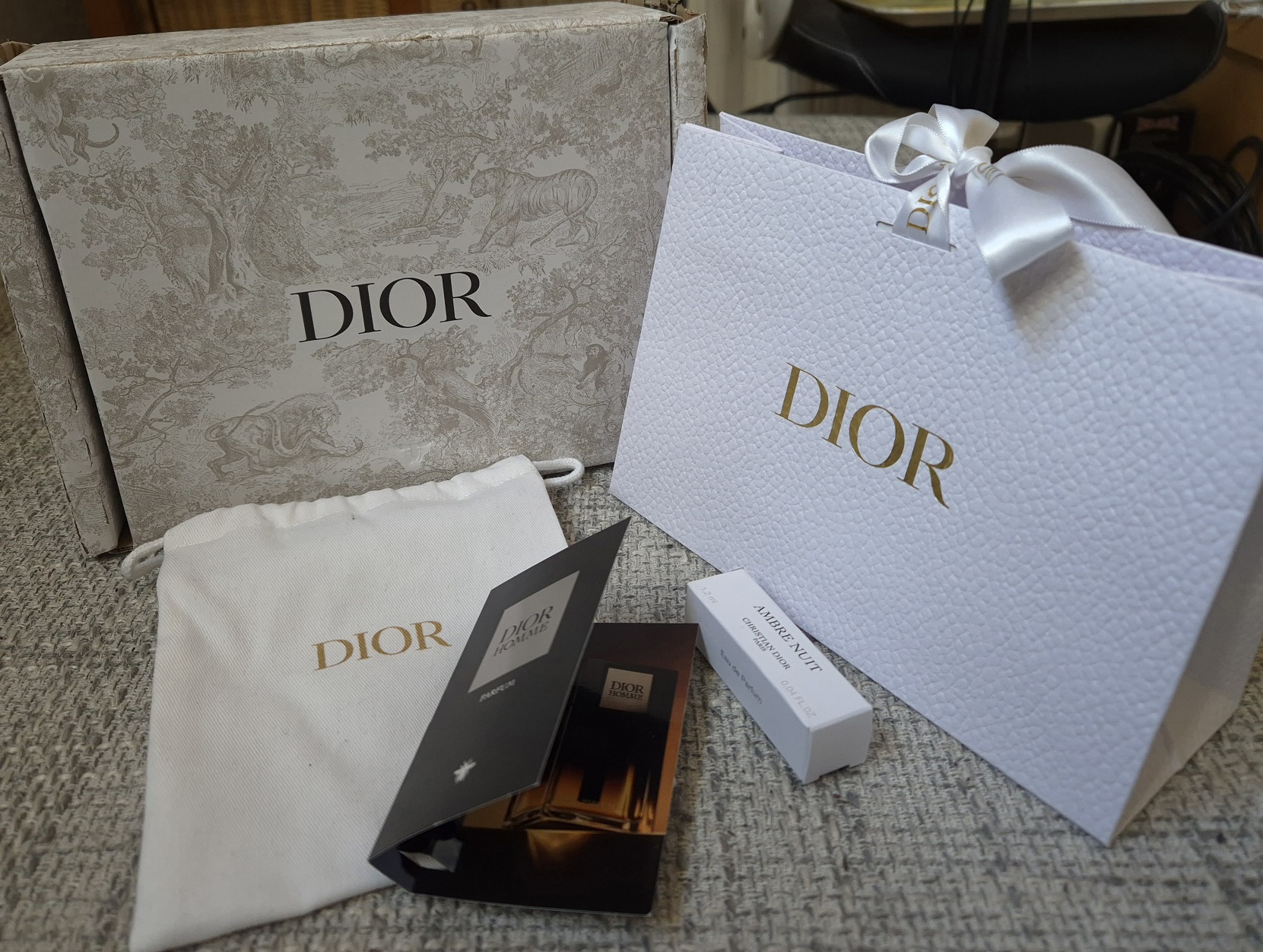
I visited the US in April and was reunited with the rest of my makeup collection, along with all the things I shipped there during 2024. Those products consisted of Japanese brushes that I didn’t want to pay extra customs fees for, reward point and gift card redemptions only applicable to US sites, products only sold within the US, etc. I had older makeup I still wanted to bring back to Germany, but I needed to decide which of the newer ones were worth coming along too. That’s how the idea for this post began! However, some of the makeup I brought back will be discussed in other posts, and I added some of my newer makeup purchases to this review instead.
Rare Beauty Soft Pinch Matte Bouncy Blush in Worth

It was difficult to photograph this color accurately because it looks darker in the pan than it actually is. I own the liquid version of Worth, and have reviewed it before, but I left it in the US. Since the liquid is sheer, I wasn’t surprised that I also needed to pack on a lot of this cream-to-powder version to get it to show up on camera.

I’ve been into subtle and/or nude blushes lately, so I expected to love this. I tried pairing it with so many different things expecting that perhaps my foundation shade mattered or that the undertone was clashing, that the color of my eyeshadow looks could be throwing it off, etc. I just wasn’t enjoying wearing it. The answer I settled on as to why that was the case is that it’s matte. I knew it would be from the name, but I’ve used shimmer-free creamy and bouncy type of blushes before that still had a natural emollient gleam to them from just being a cream product. Examples of this are the MAC Glow Play Blushes and Armani Neo Nude Color Melting Balms. Even within the Rare Beauty Soft Pinch Liquid Blush line that comes in dewy or matte finishes, the matte one still has some life to it. So, I wasn’t expecting this blush to have zero shine, especially from a product that has Synthetic Fluorphlogopite as the first ingredient.
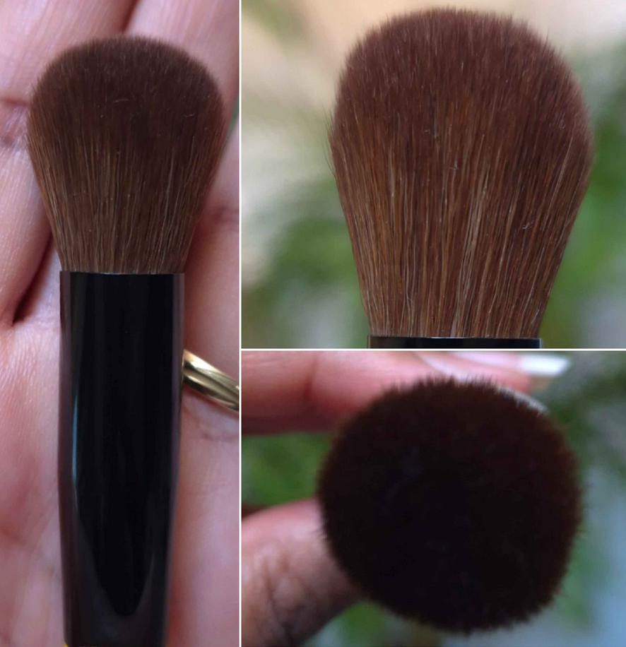
The longevity is fine. The blush blends into and becomes one with the skin. For the best results, I use my densest synthetic brushes with it.

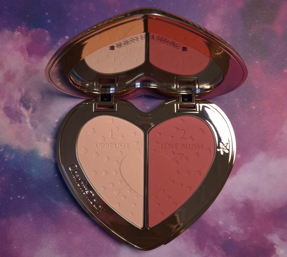
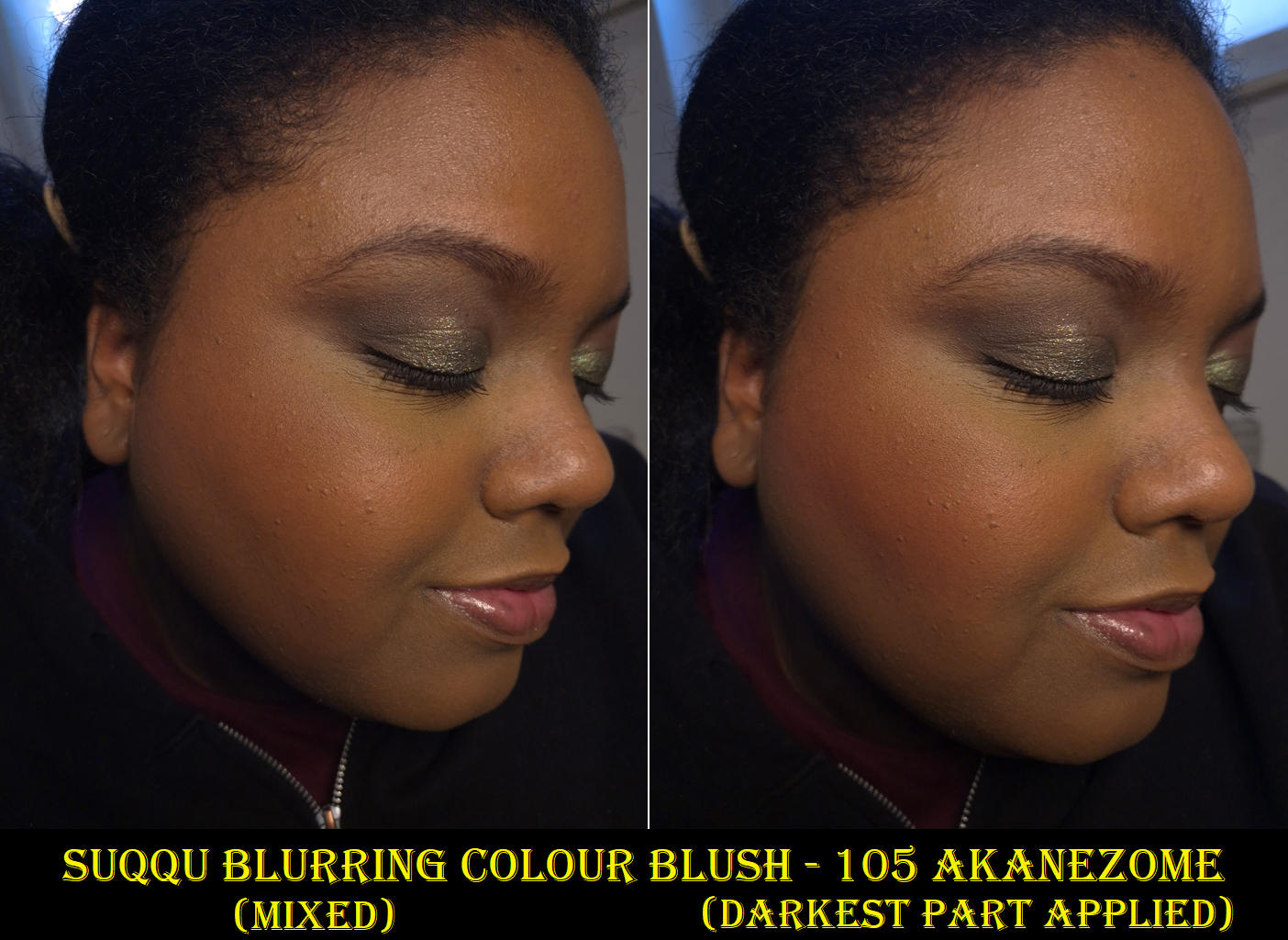
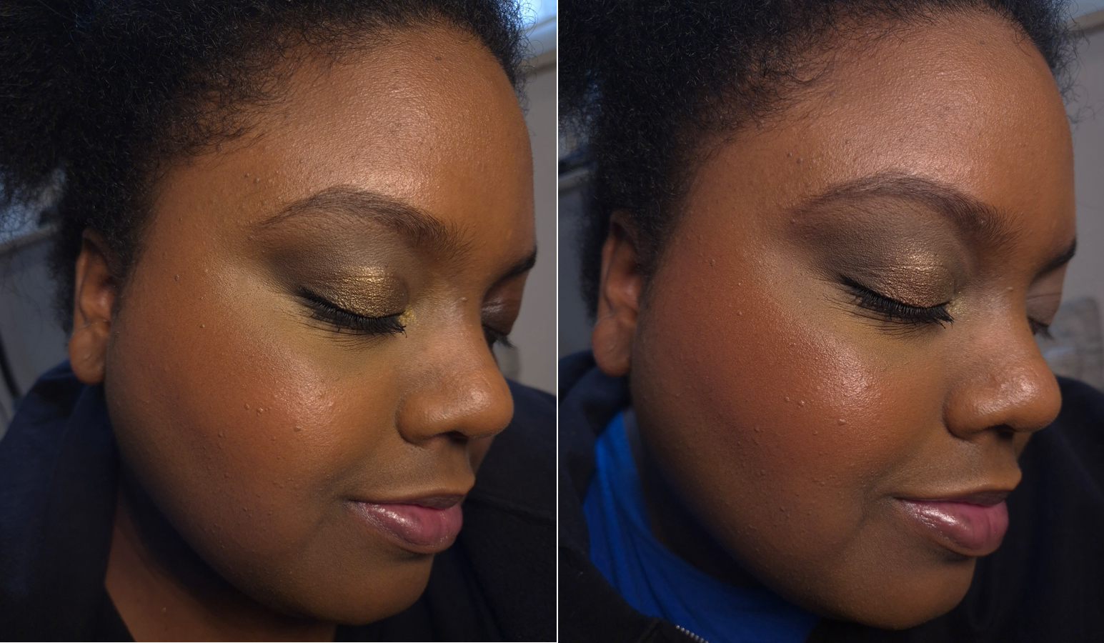
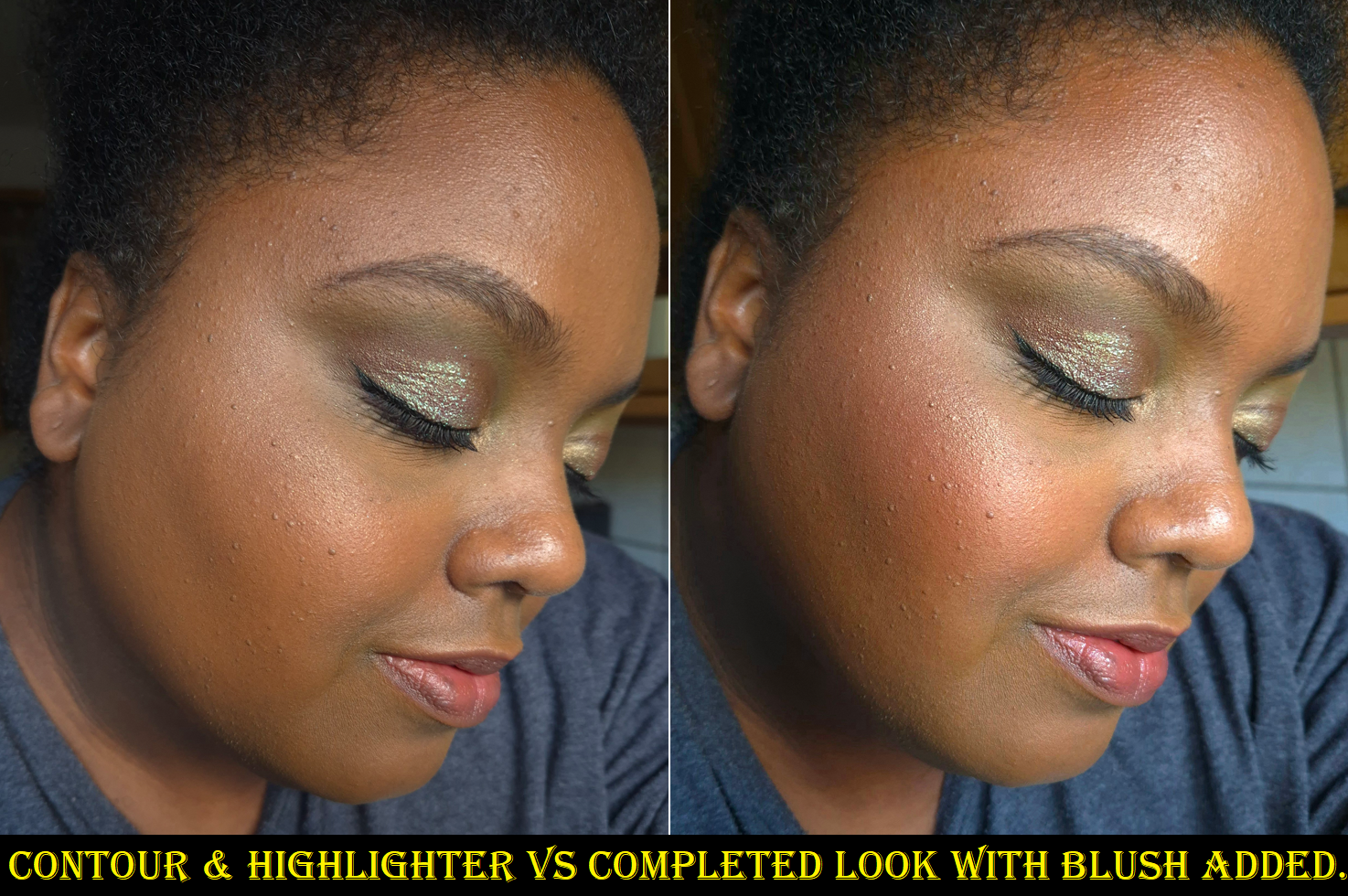
I borrowed the photo above from my Charlotte Tilbury x Genshin Impact post where I reviewed the Airbrush Flawless Setting Spray. By the time I started using that spray, I already knew that my issue with the Rare Beauty Blush was the fact that it’s matte. However, I was still taken aback when I saw with my own eyes how much of a difference some extra shine truly makes. I love how this blush looks when I use Charlotte’s spray over it. So this product changed from a miss to a hit for me!
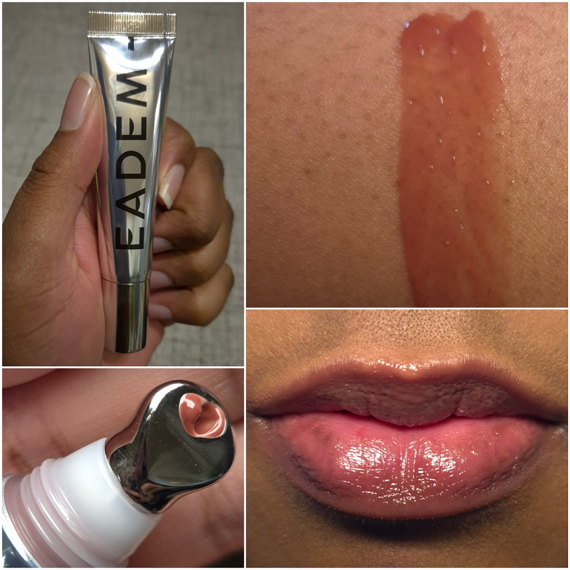
Eadem Le Chouchou Exfoliating + Softening Peptide Lip Balm in Fig Sauce
I mentioned in my Project Pan that there are only 5 brands I’m purchasing from in the lip category this year. One exception was this balm because I would have bought it ages ago if it was sold in Europe. I could only find one website that would ship it to me, but then I would have had to pay at least double the price.
The tradeoff for having to wait a long time to get it from USA’s Sephora was that I could buy it on sale and with a gift card.

I have to talk about the metal applicator because it feels amazing applying this lip balm! I don’t like when products have a cooling ingredient that makes my lips feel cold for 30 minutes to 2 hours depending on the brand. Instead, I only get that wonderfully cold sensation during the application process and then I can go about my day. This really adds to the experience, so much so that I’ve even put other products on my lips and then used this applicator to spread it out! Perhaps one day I’ll buy some empty tubes off the websites I’ve found by typing, “metal applicator cosmetic tube” into Google and transfer some other glosses into them.
This is a very nourishing product and lives up to its reputation as a lip treatment. It fills the lines and smooths over the lips. It’s thick, but not goopy in a gel or oil way. It has more of a creamy-waxy feel. It adheres fairly well to the lips, which helps it to last longer before needing to be touched up or reapplied. I still consider this a little sticky, but it’s not to Ami Cole levels. It has decent color payoff, enough for me to understand someone wanting to buy multiple shades, but I wouldn’t want to buy more than one extra.
The results I get are similar to Ami Cole glosses, which is to say my lips feel softer and more hydrated the next day, but this does not completely remove all of my chapped skin. I can always spot a few areas on my lips that are still chapped the next day.
So, this hasn’t claimed a spot in my top five, but I still like it a lot.
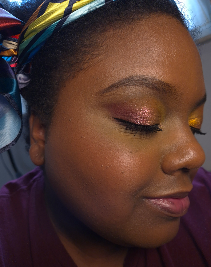
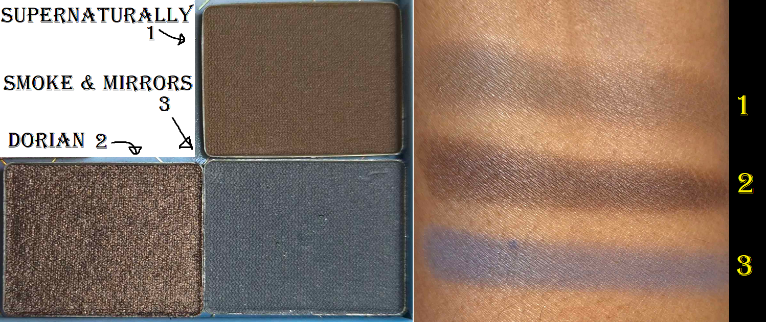
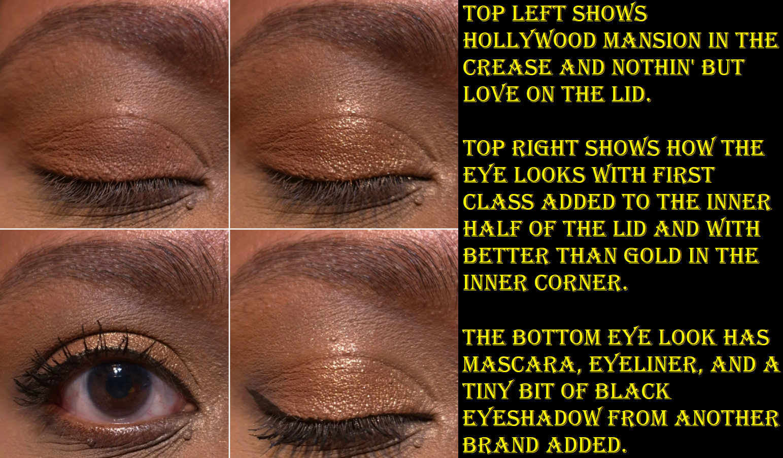
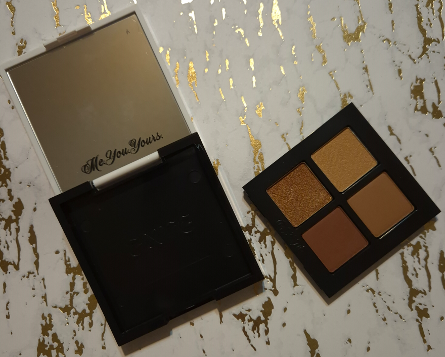
Gxve Beauty Eye See in Color in Rich Girl
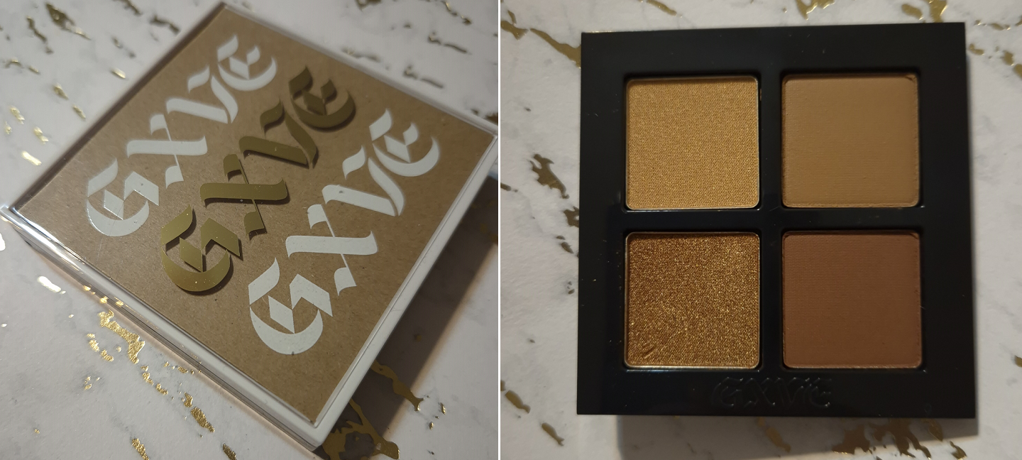

This was the only quad from the brand that I found appealing, but my immediate issue is that I don’t get enough depth from the darkest brown in this palette. While it theoretically shouldn’t be a problem to grab a dark eyeshadow from any other brand, I know I will subconsciously not reach for this palette since it is technically incomplete for me.
The completed look is pretty, but I couldn’t bring myself to choose this to pack in my suitcase over my many other options.
If the eyeshadow formula was superb, I would have considered taking this with me anyway. My issue is that the shimmers are a bit lackluster. There is still beauty in a lower impact shimmer if the intended eye look is supposed to be sophisticated or demure. I think the quality is fairly good, though it could have benefited from being a bit creamier. The mattes were fine. My brush picked up a lot of product, but with how soft they look on my eyes, I think someone would be surprised to know how much I tried to build up these eyeshadows. They are drier shadows that appear to be finely milled, but something about the formula just doesn’t feel modern.
This palette is long-lasting on me. It doesn’t take long to get a blended look. However, this isn’t for me. I do appreciate that the holder of the pans is easy to remove, so I could technically keep the compact or turn it into an empty magnetic palette if I inserted a magnetic sticker sheet. I could also technically add metal sticker pans to the bottom of the eyeshadow holder to pop it into a larger empty magnetic palette. Removeable packaging is always interesting to me.
In any case, this quad wasn’t a flop, but it also wasn’t good enough to keep around.
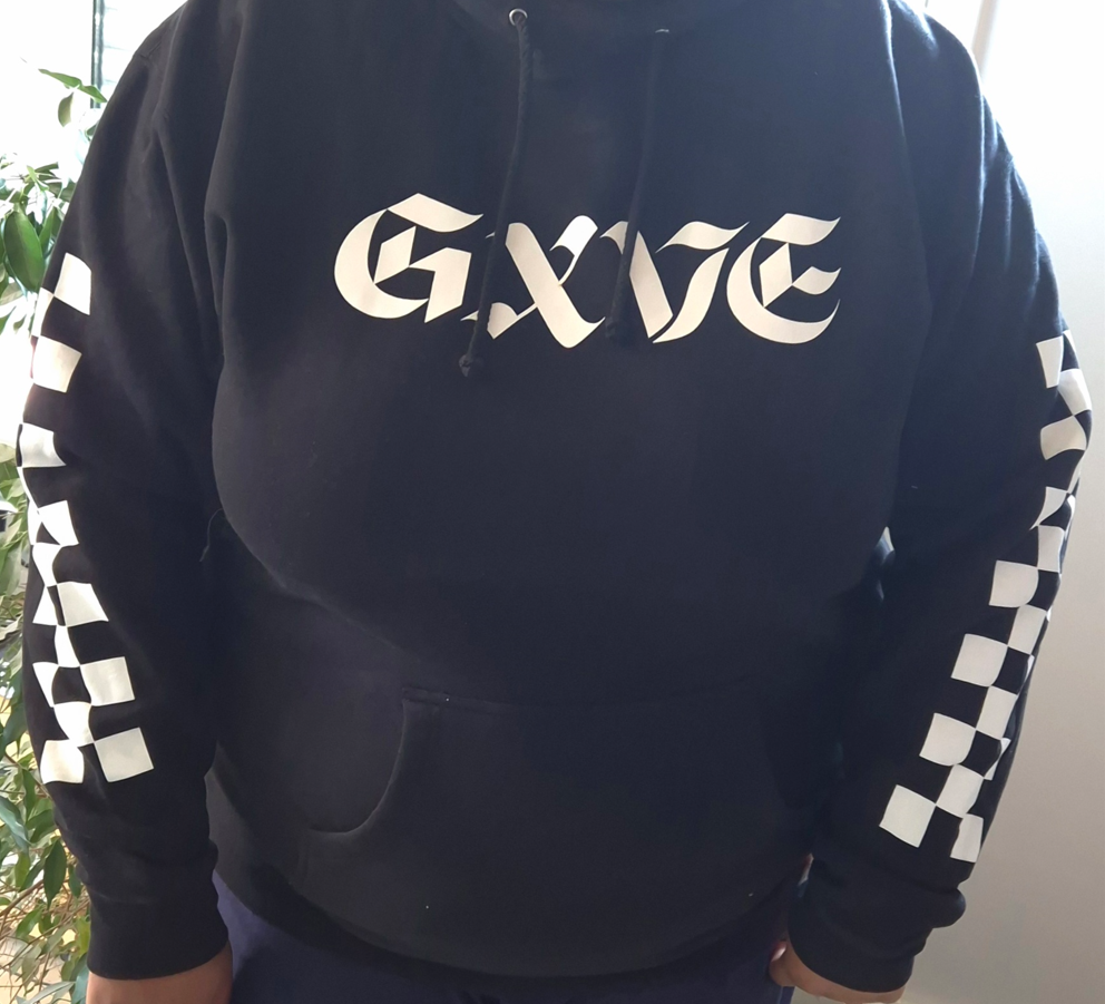
As a random side note, the Gxve Beauty website used to sell merch as well. I ordered one of the Signature Hoodies during a 50% off sale (just like I did with the palette). It has fleece lining on the inside, so I’m excited to wear it come winter. The website says products are now exclusively at Sephora and things are so frequently for 50% off that I really don’t know how the brand will continue to stay afloat.
I don’t know where these are being sold now. If they are discontinued, I’m glad I was able to snag one as a piece of makeup history.
Glossier Cloud Paint Bronzer in Coast

I liked the Glossier Solar Paints, but wished to have a version without shimmer. The Cloud Paint formula is one of my favorites for cream blushes, so to have a matte Cloud Paint in a bronze color seemed like it would be an instant win.
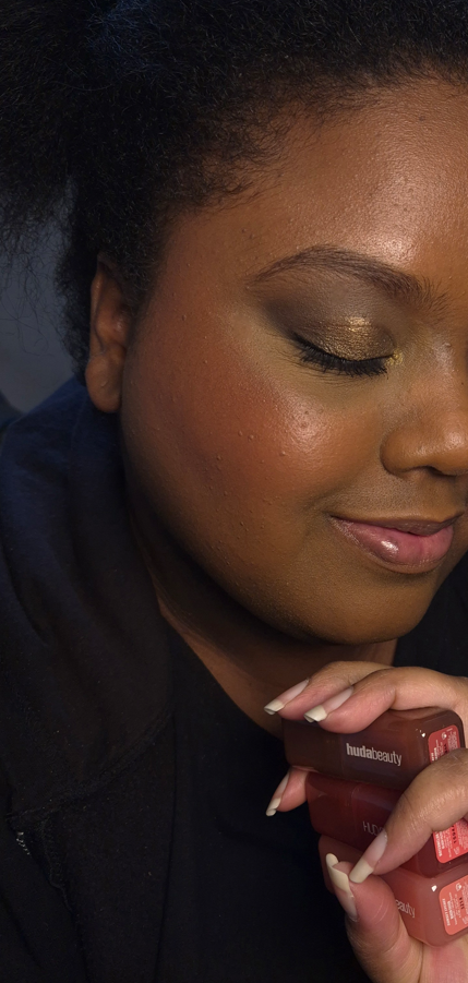
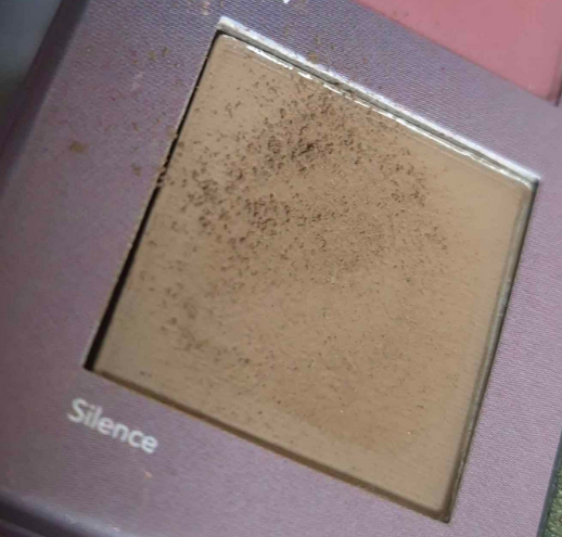
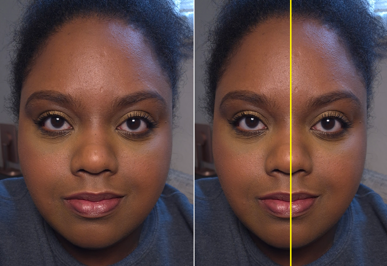
I picked Coast because it is the second darkest option and has a golden tone, which I wanted. The darkest color, Drift, looked like it would be too red for me despite being labeled by the brand as a deep neutral bronze. Coast is just too subtle for my skin tone right now. While I was in Florida, I didn’t do a good job of reapplying sunscreen. My skin had a slightly redder tone and was darker, so the bronzer really isn’t visible in photos as it was already so subtle in person. I have a photo below, but I apologize for the lighting being very off. I couldn’t get a clearer picture during the trip and my skin looks even redder in the photo than it was in real life (plus I was wearing the Beekman 1802 skin tint that’s red).

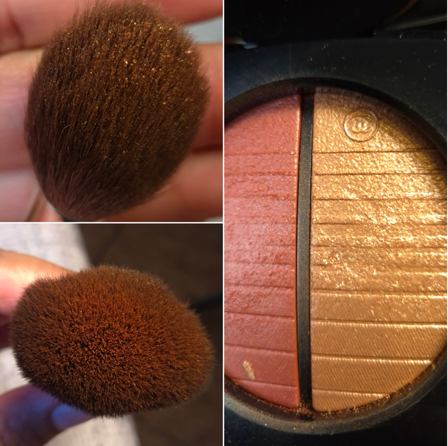
I don’t mind having a subtle bronzer, but my biggest issue wasn’t the color. I felt it just didn’t blend seamlessly enough into my skin. While it’s true that I didn’t bring my holy grail synthetic bronzer/contour brush with me, I came to realize that the watercolor kind of finish that’s beautiful and natural in a blush isn’t what I want in a bronzer. So, I left this behind. What a shame!
Tarte Tartelette Tubing Mascara vs Too Faced Ribbon Wrapped Lash Tubing Mascara

Back in 2014, during my short lived time making YouTube videos (all listed as private now), I kicked off my Mascara Showdown Series with a battle between Tarte’s Lights Camera Lashes and Too Faced Better Than Sex Mascaras.

I determined that Tarte was the winner because of the length, but the mascara I actually repurchased the most was from Too Faced. I don’t know if it’s because I ended up preferring the balance between length and volume or if I was just able to get the Too Faced mascara on sale more frequently. I eventually stopped buying the one from Too Faced because I started to get clumping and flaking issues that I never had before. I don’t know if the formula changed or there was a switch in manufacturers, but I moved on from that mascara.
The KVD Full Sleeve Long + Defined Tubing mascara made me interested in tubing mascaras again. I had a deluxe sample of the one from Tarte, so when Too Faced released theirs I thought why not…let’s do another showdown between these brands over a decade later!
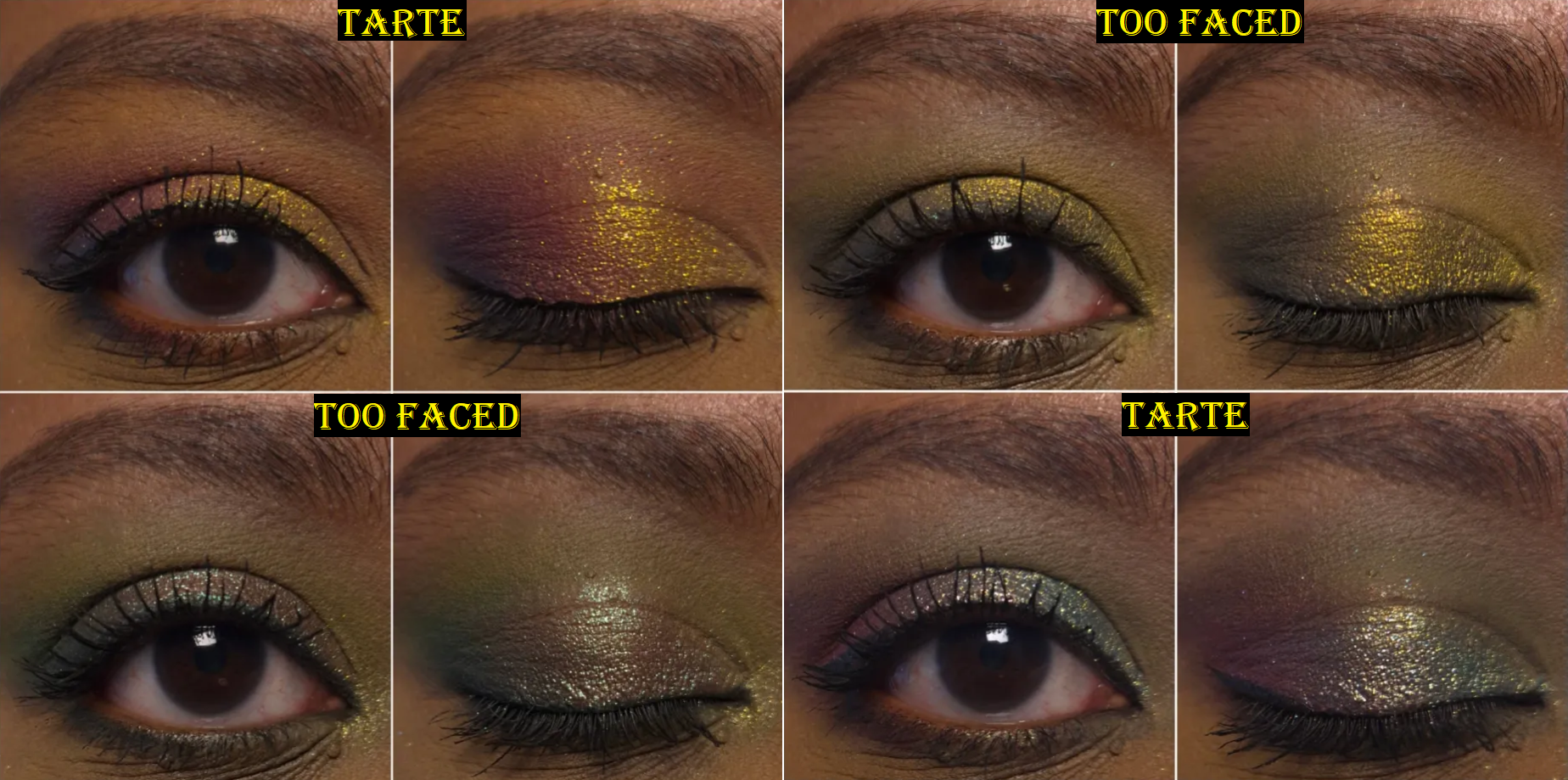
I never curl my lashes, so sometimes the mascaras look better or worse depending on how my eyelashes are naturally shaped that day. I’ve used the Tarte mascara five times and I can say that even if it had amazing results, what puts me off from it is how long it takes to dry. If I try to layer up even more product, then it takes even longer. I can touch my lashes thirty minutes later and it still doesn’t feel fully set. This is a big problem when I’m trying to photograph multiple eye looks in a day and in the process of removing my eyeshadow with a Makeup Eraser cloth and Bioderma, my eyelashes clump together, the color smears, and the stickiness makes it difficult to remove the rest. Part of the benefits of tubing mascara is the ease in which one can remove it with warm water. I can remove them with micellar water as well, so I’m not surprised that some of the Tarte mascara comes off. The annoying part is the weird middle ground where some of it comes off and smudges while the rest still clings on with a tight grip. It makes it so that I am forced to fully remove it every time when I want to do a new eye look, whereas with other tubing mascaras and even regular mascaras, it’ll come partly off and I can easily reapply more mascara because they didn’t turn my lashes spidery and hard. This is a makeup reviewer problem, but having to wait so long for it to fully dry is an issue overall. One time I made the mistake of applying this mascara not far enough in advance of watching a heartfelt scene in a show. The side with the Tarta mascara was a mess and got in my eyes. The side with Too Faced did not.
I didn’t like the Too Faced Ribbon mascara when I first tried it, but every time after that (at least 15 times so far), I have enjoyed it. Just like the showdown from many years ago, I found that Tarte’s mascara was better at lengthening, whereas Too Faced’s mascara was better with building volume while still giving nice length. It can start to clump if I build this up a lot, so I have to be careful about finding the balance between satisfaction and knowing when to stop.
I like the one from Too Faced, but I think I still prefer my tubing mascara from KVD. It gives better length than Tarte and if I’m patient enough I can build up the volume to similar results as Too Faced, though it can also start to form clumps if I take things too far.
The Tarte mascara is a miss. The Too Faced mascara is a hit.
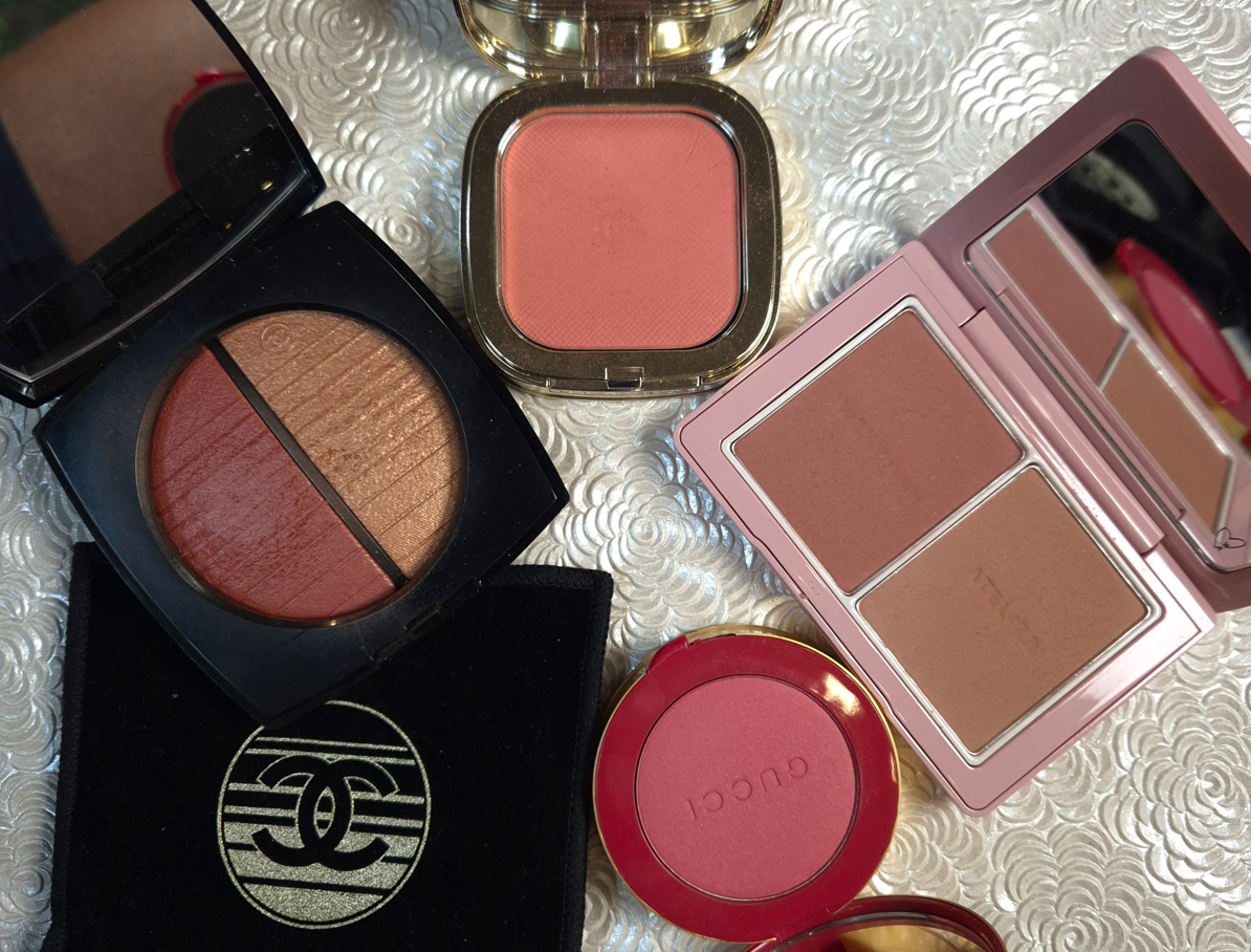
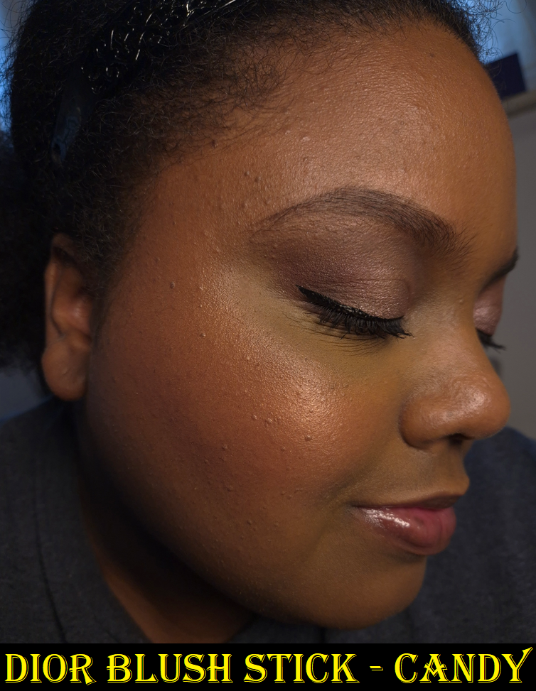
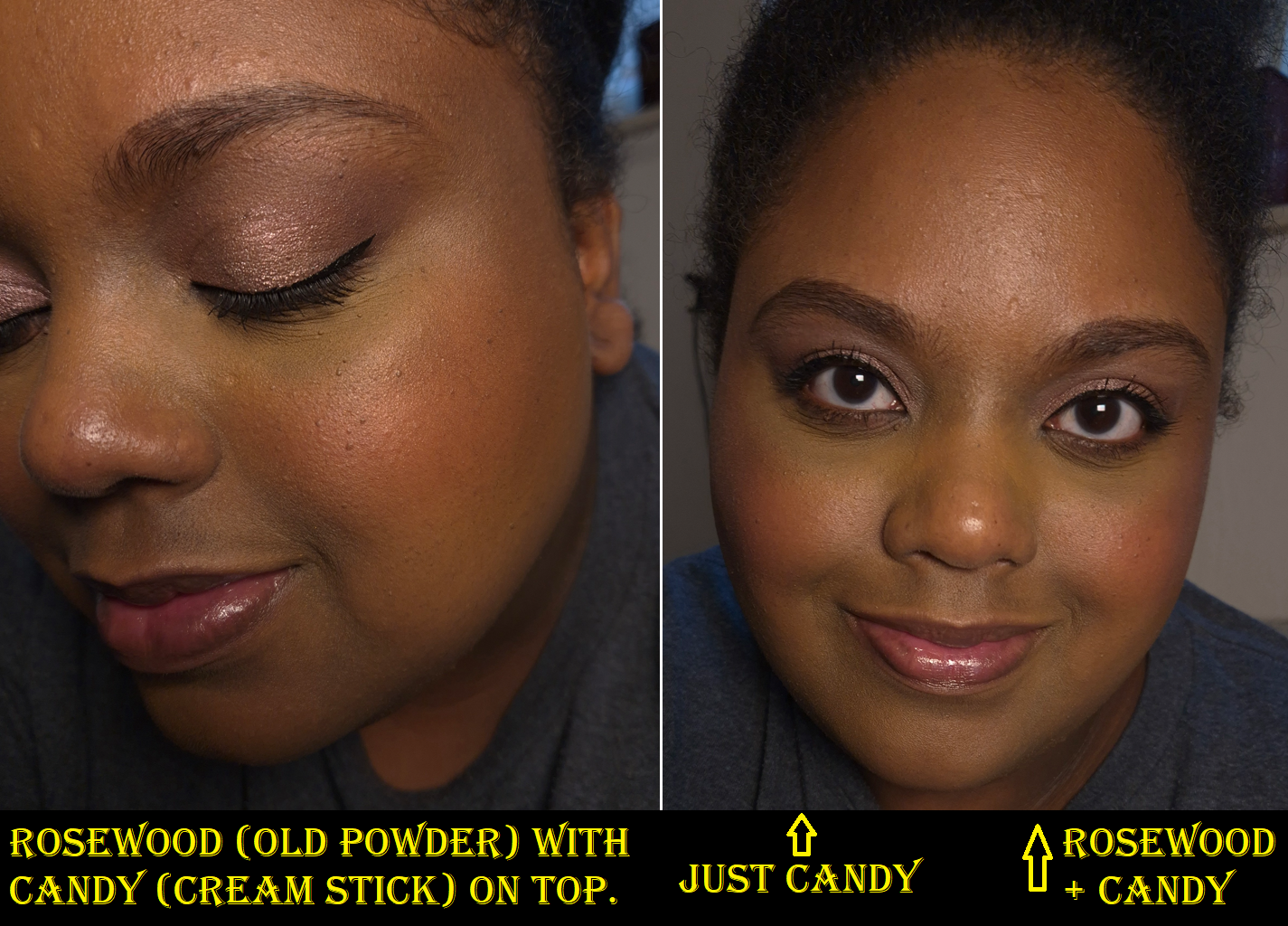
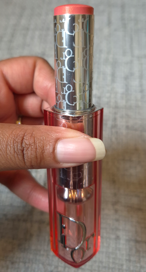
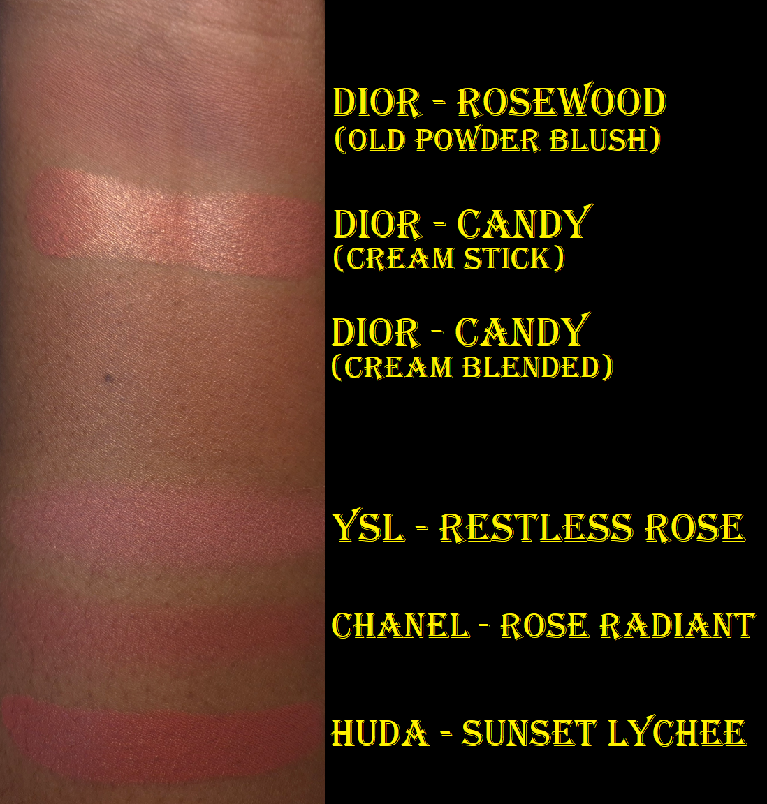
Dior Backstage Rosy Glow Blush in 077 Candy

I reviewed the cream blush stick version of Candy already, and updated the original post, but this still feels like a good place to talk about the powder blush since it’s a miss for me.
This new powder formula is definitely an improvement on the original formulation and first reformulation, in terms of being more pigmented and less hard-pressed. I also think this square packaging is cuter and easier to use with larger cheek brushes. The reason it’s a miss for me is purely due to the color. I loved the addition of shimmer in the Bronzed Glow shade from version 2 of these blushes, but the base color of Candy being so light means that it unfortunately does the same thing as Nars Orgasm on me. I can see the pink shade at one angle, but when it hits the light, the gold reflect is nearly all I can see. So, it appears as if I tried to use a highlighter as blush! This kind of shimmer is not that refined either, which makes it unsuitable for my preference as even a blushlighter or blush topper.

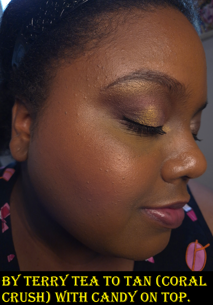
The saving grace for me is that I can add the Candy blush stick on top to help the shimmer become one with the skin, plus boost the appearance of the pink color.
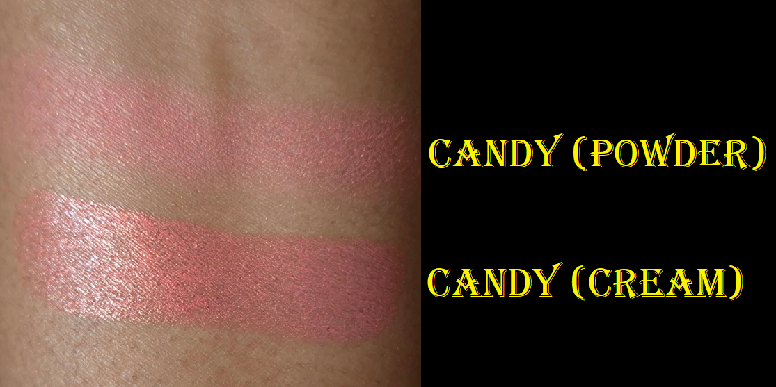
I’m happy using the Candy shade of Glow Stick on its own, but going forward, I will never wear the powder version of Candy by itself. Based on my continued enjoyment of the previous powder blush reformulation, and acknowledgement that the new one has improvements, I still recommend the powder blush. I just can’t recommend Candy or Toffee to anyone close to my skin tone because of that highlighter effect. Bronzed Glow still gives me hope that Dior can nail a shimmery blush in this new formula in the future if the base color is darker.
That’s everything I have for this week. Thank you for visiting and reading!
-Lili ❤