MAC Cosmetics is probably the most reviewed brand on my blog. They frequently release eye catching collections that manage to make me want even their repromoted shades, just to get the limited edition packaging. They often have sales, which plays on my deep love of getting a good deal. Their staple products are top notch and they’ve held onto their generally good reputation for decades. Unfortunately, MAC has made some questionable production decisions in the last few years to the point where I seriously considered taking a break from them. Today’s post is not about that, and is instead about sharing the newest additions to my MAC collection.
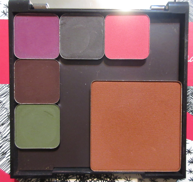
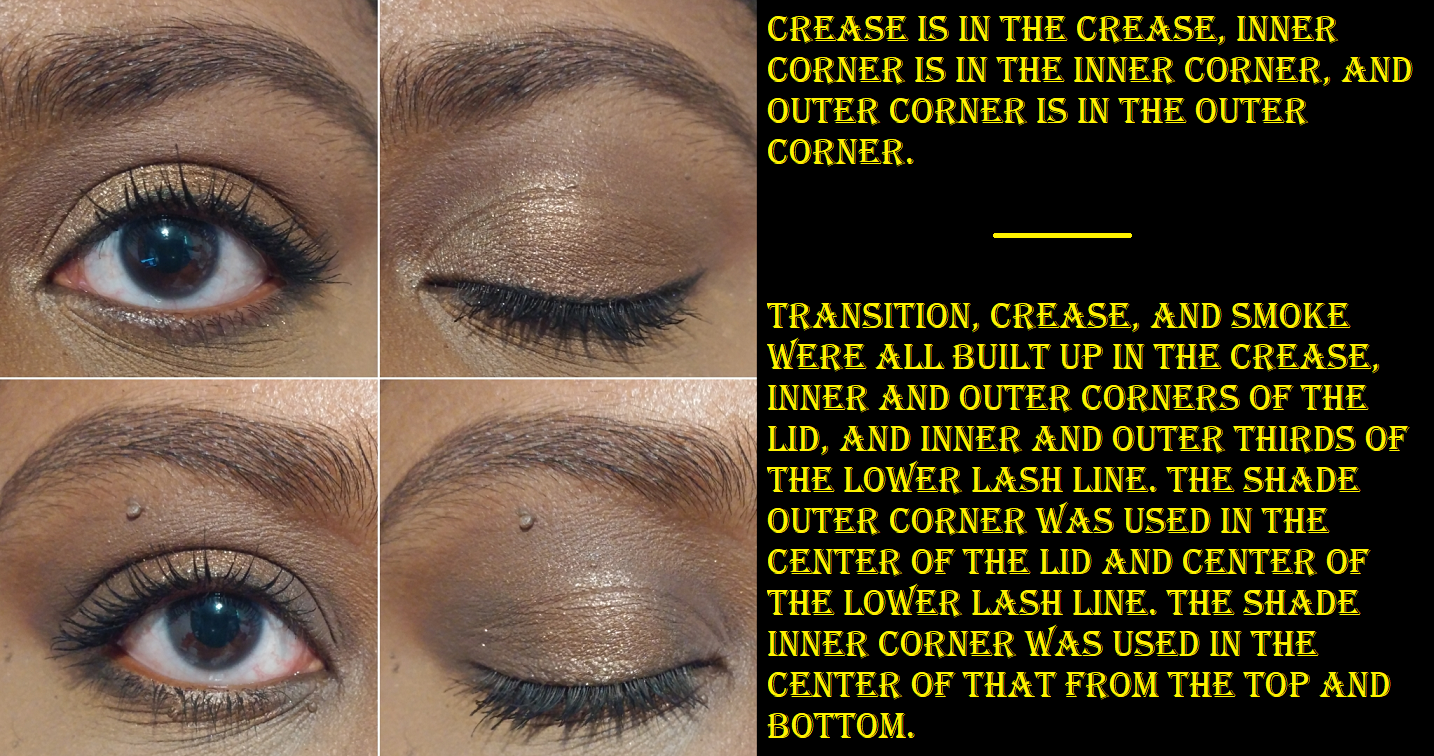
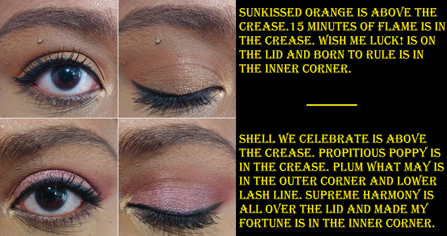
MAC Lunar Luck Eyeshadow x 9: Made My Fortune
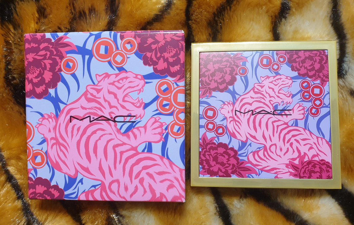

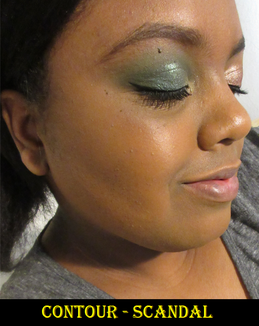
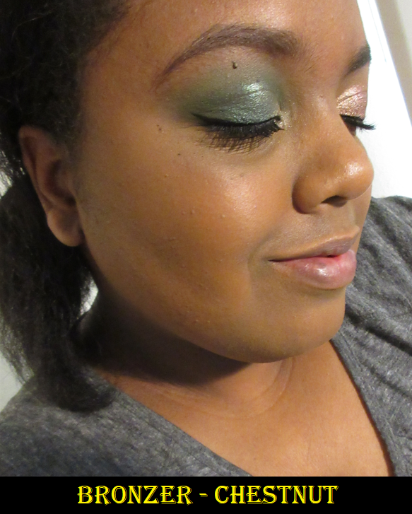
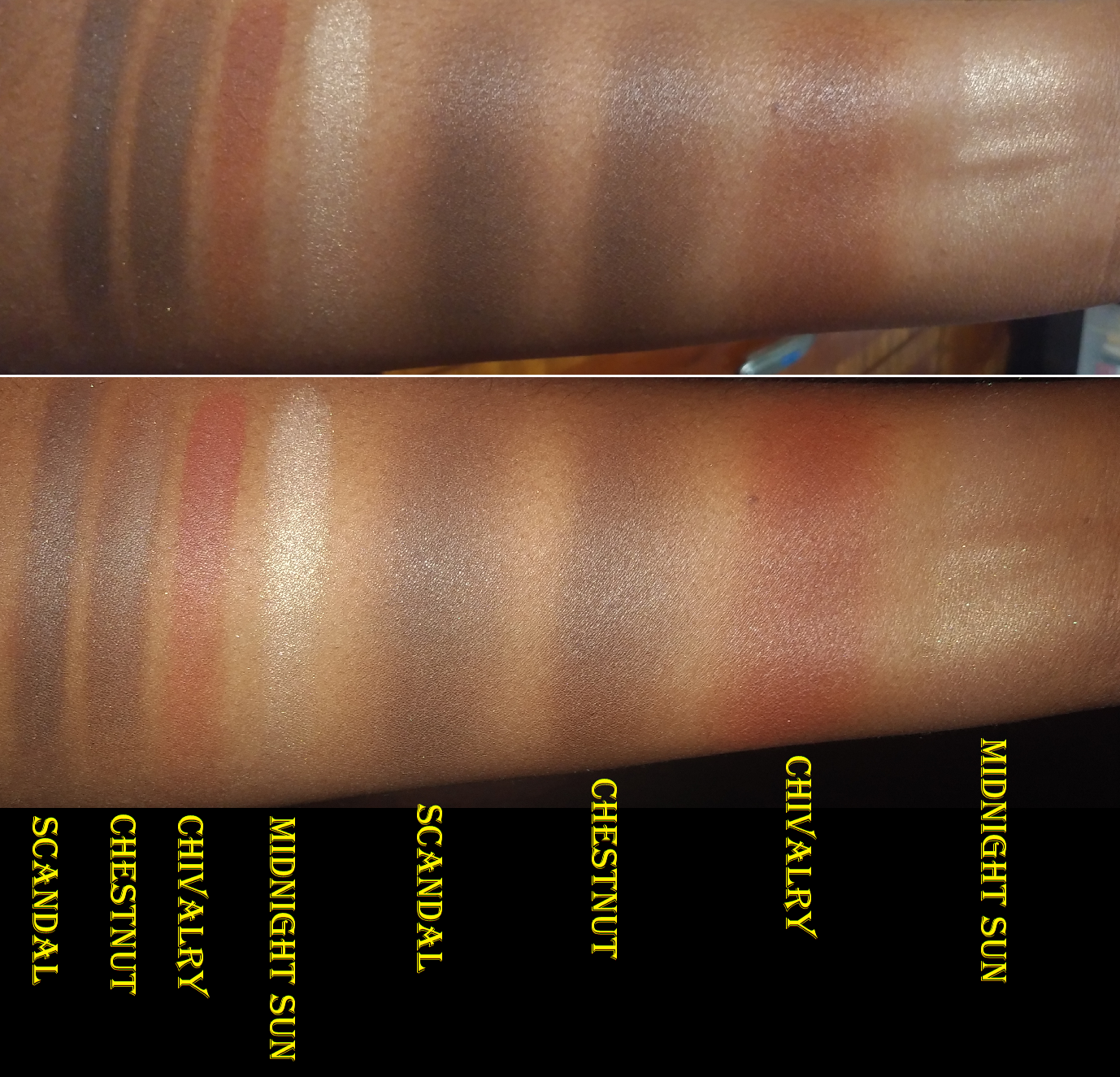
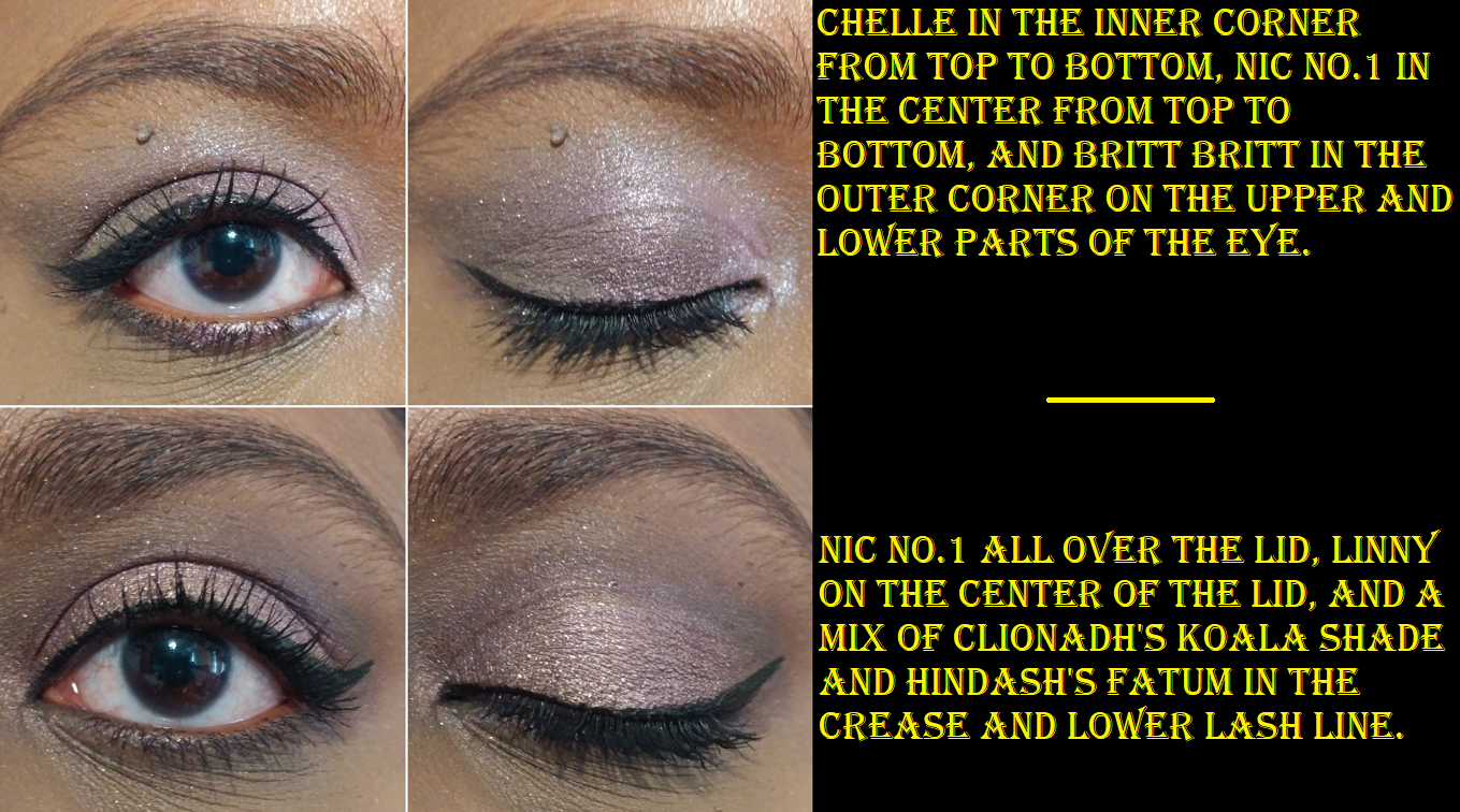
This palette was a gift from one of my best friends, and for that reason I will cherish it. It’s one of those things I wanted for the packaging, but not the makeup inside, since I tend to not be the biggest fan of MAC’s eyeshadows. I can at least say the quality of this one is the best I’ve tried from them. The shimmers have pigmented bases, but are a bit tame in sparkle reflectivity, even when used wet. I appreciate that they were easy to apply smoothly to the lids and inner corner. The mattes were also more pigmented than I expected from MAC, and slightly easier to blend than the ones I’ve used in the past. Creating the two looks shown below was enjoyable enough that I may continue to use this palette from time to time, but not enough to make me want to purchase anymore MAC shadows. There isn’t a whole lot of versatility among the two light mattes that hardly show on me (Shell We Celebrate and Sunkissed Orange) and two shades that look nearly identical when used next to each other (Propitious Poppy and Plum What May). The shimmers (excluding Supreme Harmony) don’t look that far off from each other in the pan, but I was pleased to see they are distinctly different on the eyes. Wish Me Luck!, 15 Minutes of Flame, and Born to Rule (as a highlight shade only) are my favorite eyeshadows in the palette. I’ve really been into the brown shimmer eyelid look lately. I still feel $32 is a bit pricey for the quality, so for anyone wanting this palette, I hope you’ll be able to get it on sale!
MAC Glow Play Blush in No Shame!

I’m a big fan of MAC’s Glow Play blush formula, so I wasn’t satisfied with having just one from their collection. I got this for 50% off on Black Friday.
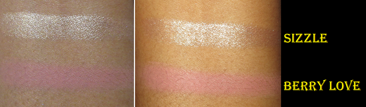
These blushes tend to look more vibrant and pigmented than they actually look on the skin, which can be tricky in trying to figure out which shades would work for me. No Shame! takes a lot of building up to get it to show on my cheeks, but the end result is pretty. It has that familiar putty-like texture that sets to a natural finish, just like the others.
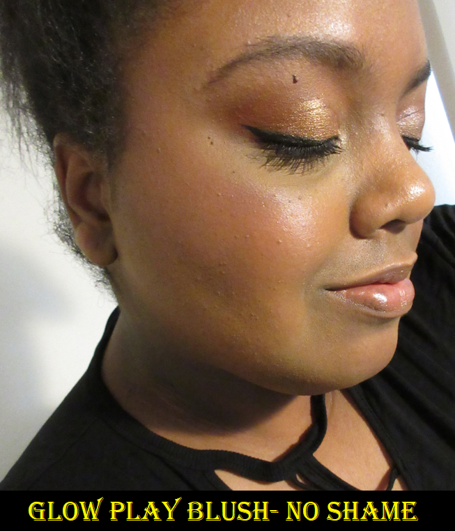
At the time that I’m writing this, I cannot find this shade on the website any longer. I think it’s safe to assume it has been discontinued, and I believe the reason is because of the release of HD Cherry Tree.
MAC Wild Cherry Collection Glow Play Blush in HD Cherry Tree

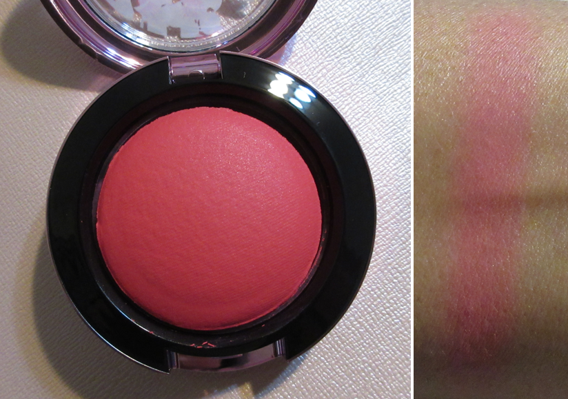
HD Cherry Tree is like a deeper, slightly more berry version of No Shame!. Quite a few people managed to get their hands on this blush before the US launch, so I purchased mine from one of them (and for less than the retail price)! I was unlucky that as soon as I flipped it over to let the plastic protector naturally fall out, the entire blush popped out with it. However, since it’s a bouncy blush, I was able to squish it back in the compact. Good as new!

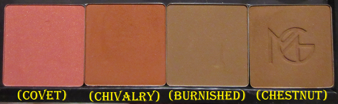
I’ve only purchased the Glow Play shades that I think would show up on me, and it’s a bit unfortunate that they look quite similar to each other.


My hope is for MAC to expand the range even further to fill in some gaps, like a medium-deep reddish brown, a terracotta, and a deep pink-mauve. Then again, I’m trying to buy fewer MAC products, so maybe it’s good that they don’t have those shade options!
The Wild Cherry collection is limited edition, but I wonder if MAC intends to make HD Cherry Tree a permanent shade in the future, but without the special packaging. There are two other Glow Play blushes in the Wild Cherry line, but I don’t plan on buying them. Between the Wild Cherry packaging and last year’s Black Cherry packaging, I prefer the look of this new one.

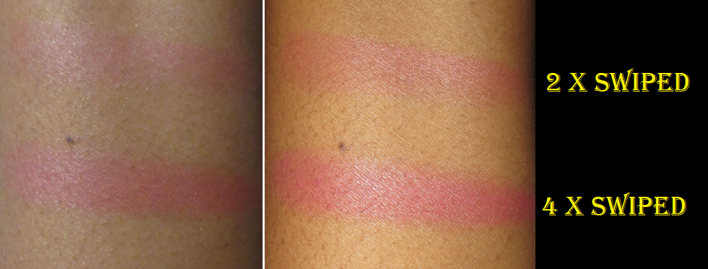
MAC x Lisa Blush in Melba

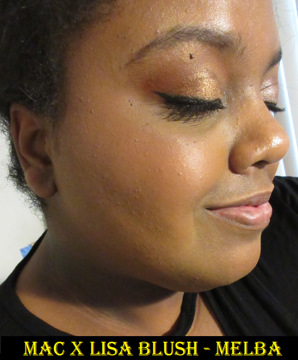
There isn’t much to say about this blush since I already reviewed it before, but I wanted it for the limited edition packaging since purple is my favorite color. I know Lisa is from the band BLACKPINK, but I don’t listen to their music, so the collab aspect didn’t entice nor deter me.
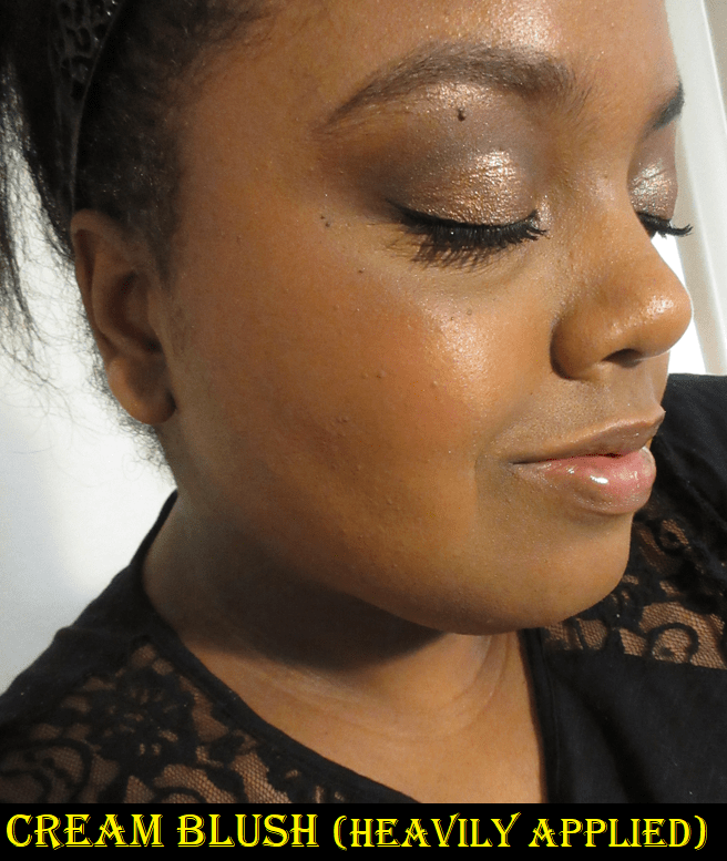
Melba only works for me when I’m at my lightest (typically winter), so I gave my original blush to my sister. This color is still so difficult to get it to show on camera*, but it is visible in person. After wanting to repurchase it for so many months, I decided to go ahead and do it when it was 40% off on Veteran’s Day. Around that time or soon after, I saw the sneak peeks of the MAC x L collection, but I had no idea they would repromote yet another product and that it would be Melba! It worked out in the end since I gifted my new and unused standard packaging version of Melba to the friend who gave me the Lunar New Year Tiger palette.
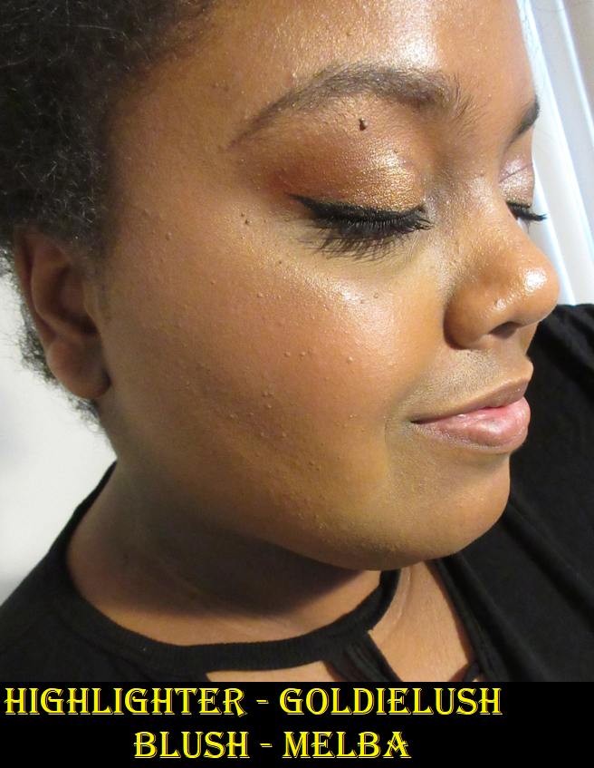
*Another photo showing Melba is in the Illuminate Face Palette section demonstrating how GoldieLush looks on the cheeks.
I’d like to add that my last purchases directly from MAC’s website was last November and December and both of them were listed as delivered according to the tracking history on my account page (I didn’t get shipping confirmation for either one), but they never arrived. I had to contact customer service for reshipment. Prior to that, my eyeshadow palette from the Tempting Fate collection was lost in the mail (after already being delayed for a week before getting shipped). I would typically view the carriers as responsible for undelivered mail, but the lack of shipping confirmation in two of those instances makes me wonder if the fulfillment center nearest to me is having issues and if it’s fixed by now.
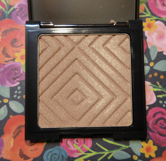
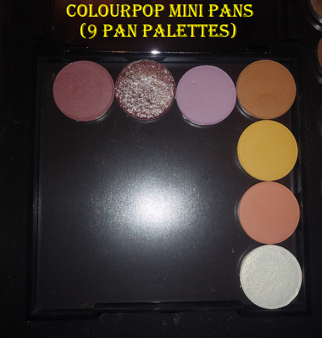
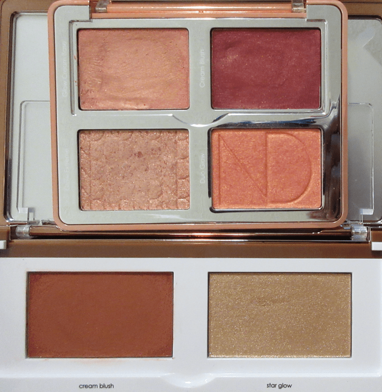
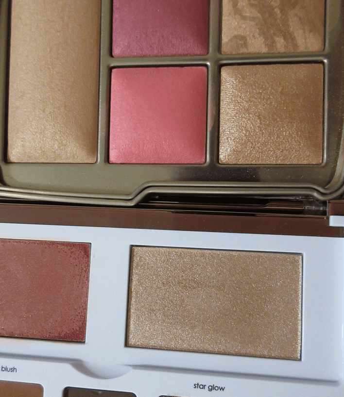
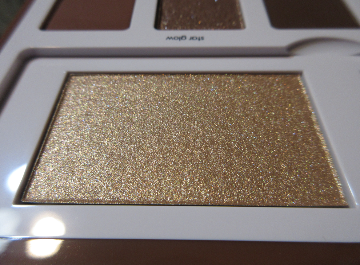
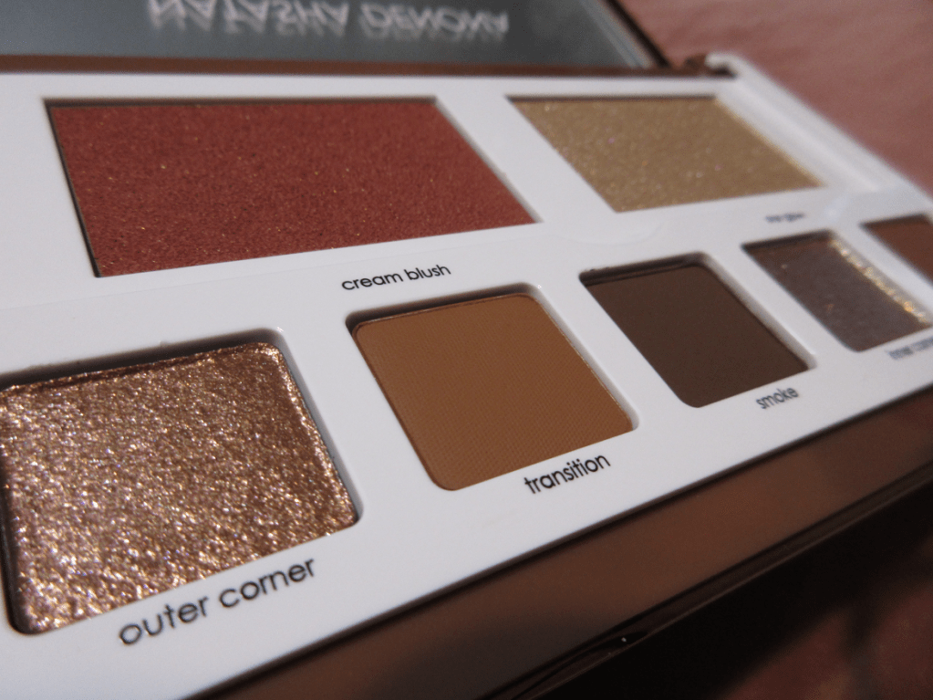
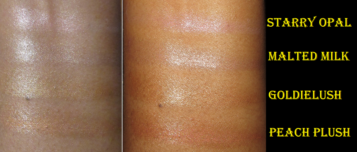
MAC Pro Face Palette: Illuminate


I was eligible for a free birthday gift in November, which was supposed to be an eyeshadow quad. Only three out of four shades were in stock, and it wouldn’t let me add them to my cart without choosing a non-existent fourth available shade. I asked customer service what I should do in this instance, since you can only redeem the gift with a purchase and I only had a few days left before the offer expired. The solution was to send me this palette, which I jumped on since I don’t really like MAC eyeshadows anyway.
This palette consists of cream highlighters that have an almost waxy texture. It reminds me of both edge gel and the Danessa Myricks Dew Wet Balms. I didn’t have high hopes because products in that consistency tend to remove my foundation underneath it, and this one did too, but it’s easy to apply a little concealer back on top without interfering with the shine level. Unlike the Dew Balm, this gave a perfectly smooth wet sheen without looking greasy. It doesn’t dry completely, but it’s not dewy enough for my hair to cling to it either. I was very happy with the results! It also makes a great base to intensify powder highlighters that are applied on top of it, although I don’t usually go for the super highlighted look. Powder highlighters are my preference, so I don’t know how often I’ll actually use this, but it certainly made a nice birthday gift!


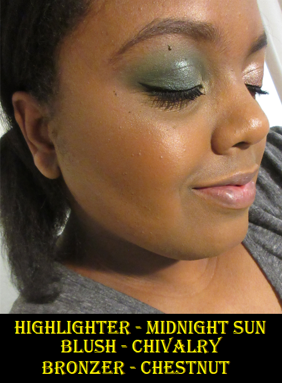
Please ignore the slightly lingering indent on my skin from wearing a mask. I took 3 of the 4 photos on the same day, which is why GoldieLush doesn’t have that mark.
They look nearly identical in photos, but the slight pink tinge in Starry Opal, the light silvery tone of Malted Milk, the traditional medium gold in GoldieLush, and the orange tint to Peach Plush are identifiable in person.
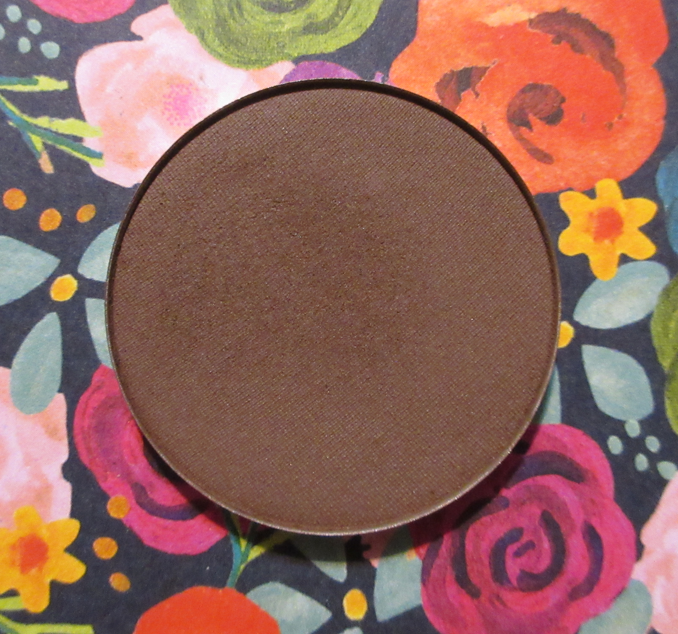
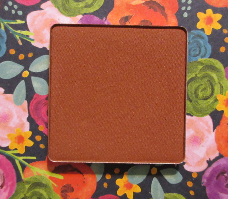
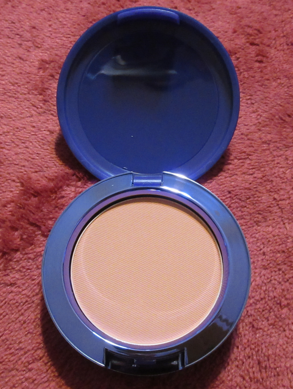
MAC Mineralize Skinfinish Natural in Dark Tan

I wanted to try this powder for so long, but trying to figure out which shade I should choose out of Dark, Dark Tan, Dark Golden, Dark Deep, and Dark Deepest (which didn’t look all that deep in all the photos and videos I scoured the internet to find) was quite frustrating. It’s helpful when brands list their products by order of either lightest to darkest or darkest to lightest, but these didn’t seem to follow that order all the way, which added to my confusion. The biggest difference between multiples of them seem to be the undertone, but MAC doesn’t have any descriptions of these shades. It would be great if the brand created a chart pairing MAC foundation shades with the suggested powder matches.
This powder tends to look lighter on camera, so it took ages for me to get an accurate photo. I can understand now why the same shade looks so different in the photos and videos I’ve seen others take too.

Based on the broken up powder photos from MAC’s website, I thought Dark Tan and Dark Deep were my two best options, but I questioned whether Dark Deep was slightly too dark and possibly a bit orange. Since powders can sometimes deepen on my skin when I wear a dewy foundation, I decided to ultimately get Dark Tan. Dark Tan is admittedly a tad light, but it still works for me. The bigger issue I have is that it looks a little dry on my skin because I grew unaccustomed to having such a matte look to my face, plus it being a bit light. I have only used this a few times, so I will continue to experiment some more using different brushes. It’s possible I applied too much or that it looks better with other complexion products. Because I was so iffy about whether I’d like this powder or be able to select the right shade, I decided to wait as long as it took for this product to finally be on sale for higher than 30%. It took years, but I was thrilled when MAC added this to the 50% off deal for Black Friday. So, that made satisfying my curiosity less of a financial hit!

This is everything new I’ve added to my collection from MAC so far. I do intend to get the Magnificent Moon Extra Dimension x 4 highlighter quad palette when it gets released. Of course, I shouldn’t because I’m on a highlighter no-buy, but this falls in line with one of the exceptions listed in my Beauty Resolutions post. I love moons. It’s one of the central aspects of my one and only tattoo, so that kind of imagery is significant for me. Other than that, I’m going to continue trying to slow down on the frequency of my MAC purchases so I can enjoy what I already have!
Thank you for reading!
-Lili ❤