I have nostalgic feelings when I think about Lorac Cosmetics. I bought my first palette from them in July 2014 and later it became the topic of my very first post on this blog! Back when I probably had ten total palettes in my makeup collection, I got so much use out of that Lorac Pro 2 Palette. This was during my short lived time of actually preferring cool toned eyeshadows over warm ones. Who would have thought!
I very quickly learned that I only liked Lorac’s PRO formula. The shadows in their Unzipped line was alright, but the PRO palettes were quite pigmented for what was available on the market, as well as being blendable. At a time when Urban Decay’s Naked line was their biggest competitor, I always favored Lorac’s formula over theirs. Unfortunately, the brand faded into near obscurity over the course of several years. They tried to make a comeback towards the end of 2020 with a revamped PRO line, but they returned with a large variety of primarily neutral shadows which many of their customers had gotten tired of in the first place. Lorac updated their packaging, formulas, and lowered their prices per palette, but they are nowhere near as popular as they used to be. Ulta put their palettes for 50% off during the 21 Days of Beauty, so I bought one purely for curiosity and nostalgia reasons. With the October release of Lorac’s smidgen of a more colorful palette, Fairytale Forest, the brand captured a temporary moment of hype. Macy’s had 15% off beauty products, so I went ahead and bought it in the hopes of eventually creating my version of the perfect semi-neutral palette. That didn’t quite go how I planned.
Will Lorac seize the moment and revitalize their brand or will they sink? Have their formulas improved? Are they worth buying?
These are some of the questions I hope to answer in this review!

The Lorac Mega Pro (purchased in August of 2019) is the only older Lorac palette I still own. Previous palettes owned were the afterGLO palette, Sweet Temptations Eyeshadow Collection, Pro 1, Pro 2, Unzipped, and Unzipped Gold.
OLD versus NEW
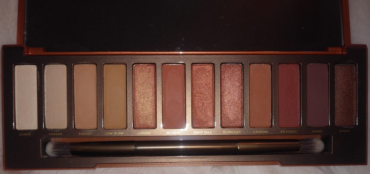
I’ve had the Mega Pro for two years and did not even swatch it until I began working on this post! The shade variety was so much less colorful in person than I expected from photos online. The retail price is $60, but I bought it on sale for $30 from Lorac’s website. It’s one of the few older palettes they still sell and it has been restocked a myriad of times since the first one launched in 2014.
Based on previous experience with their older formula, as well as this Mega Pro palette, I can see that the main difference between the previous mattes and the new ones is that the old formula is soft but more powdery. The current mattes still have quite a bit of kickup and they’re still soft powders too, but they’re silkier now. Both are blendable, but with the older mattes they needed a creamier type of primer like the Lorac brand primer that used to come with those original PRO palettes. The current mattes are more buildable and have enough grip that I can pretty much use any of my primers and get a nice result, though I prefer them the most with MAC Paint Pot.
Regarding Lorac’s specific ingredient changes, they no longer use mineral oil, kaolin, and parabens. Instead, the newer formula has shea butter in addition to many other emollient and skin conditioning ingredients. As far as I can see, the main preservative replacing parabens is potassium sorbate. There’s also glyceryl caprylate, which can have antimicrobial benefits, but that isn’t it’s primary function in cosmetics.
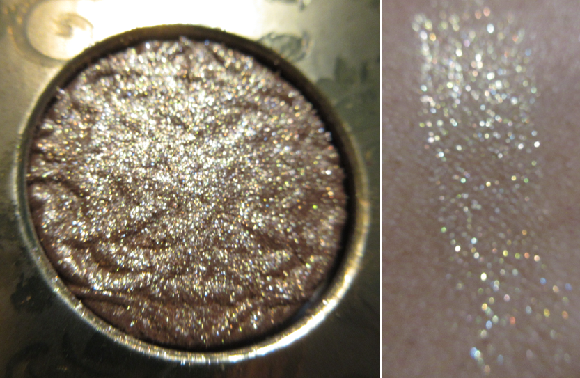
The newer matte formula is a noticeable upgrade, but still fairly similar to the original. The difference between the newer and original shimmers is literally visible by looking at them in the pans! Lorac now includes shinier and sparkly ingredients such as synthetic fluorphlogopite, calcium aluminium borosilicate, and diamond powder. Often times I don’t even feel the need to wet my brush before using them on the eyes because they’re intense enough to my satisfaction. However, I do get a lot of fallout when I skip using them wet or with a tacky base, so I recommend doing that. I still think there’s a place for Lorac’s more satin leaning shimmers, but I very much prefer the effect that the current shimmers give. The older ones were smooth whereas these current shimmers are creamier with more slip to them; they’re almost wet to the touch with a finger, but I can feel the grit from the sparkle shades when I apply them to my eyes.
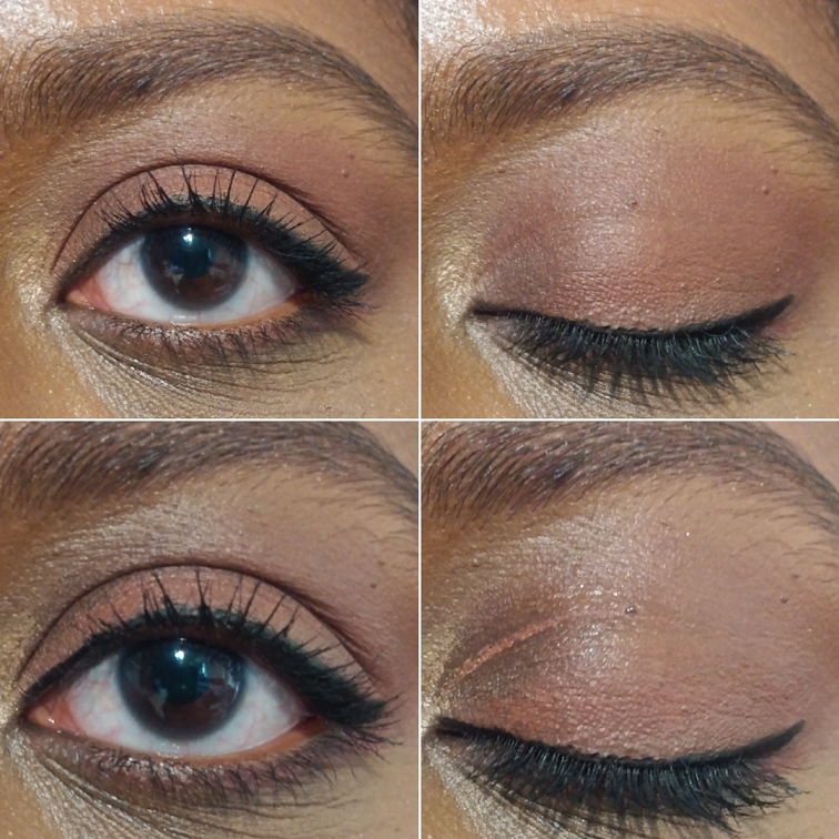
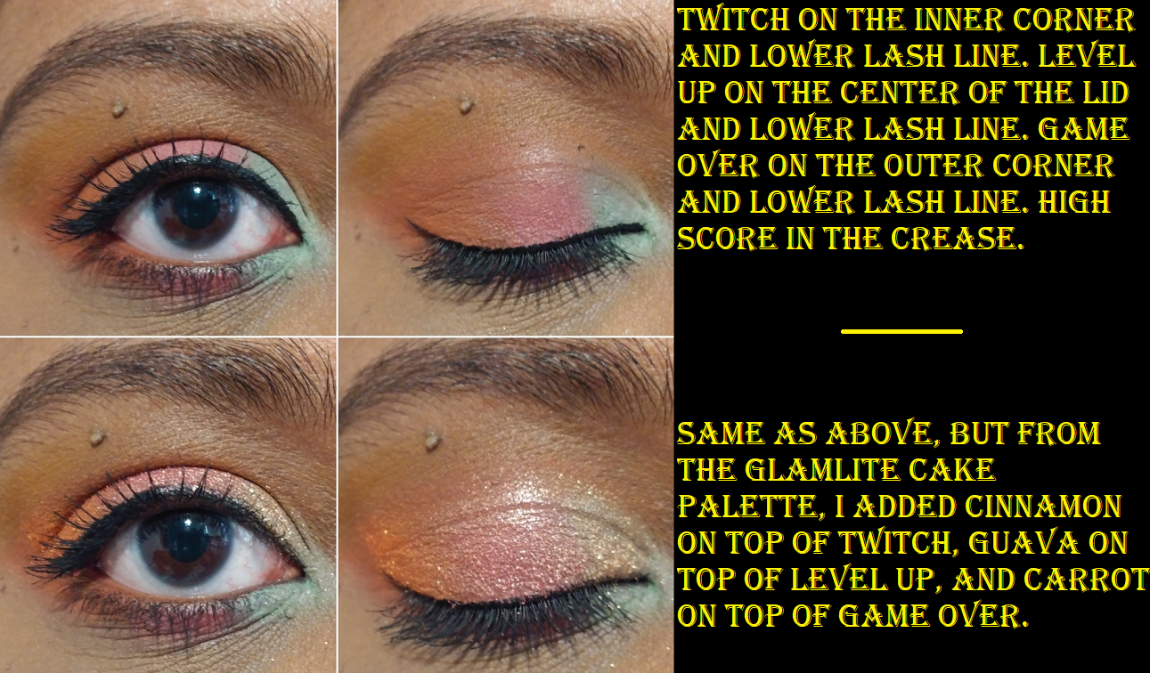
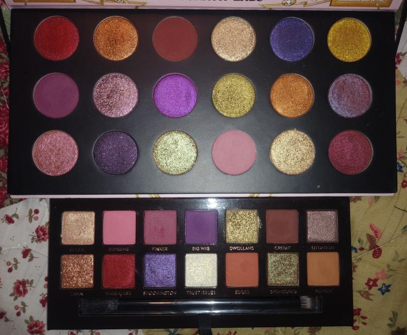
Lorac Noir Pro Palette
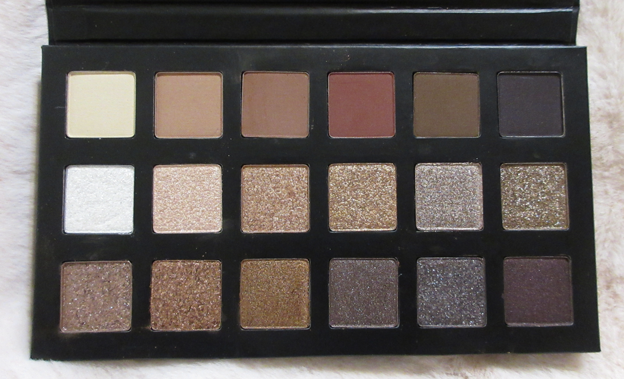


As beautiful as this palette was, I knew it would have shades that look pretty redundant for my skin tone. This is why I jumped on the half price sale, considering I figured I would just use half of Noir. I still found myself really liking this palette because even though I cannot get a wide range of looks, I appreciate the fact that there are cool tones and warm tones as well as different finishes.
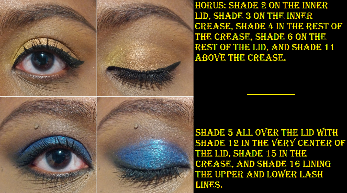
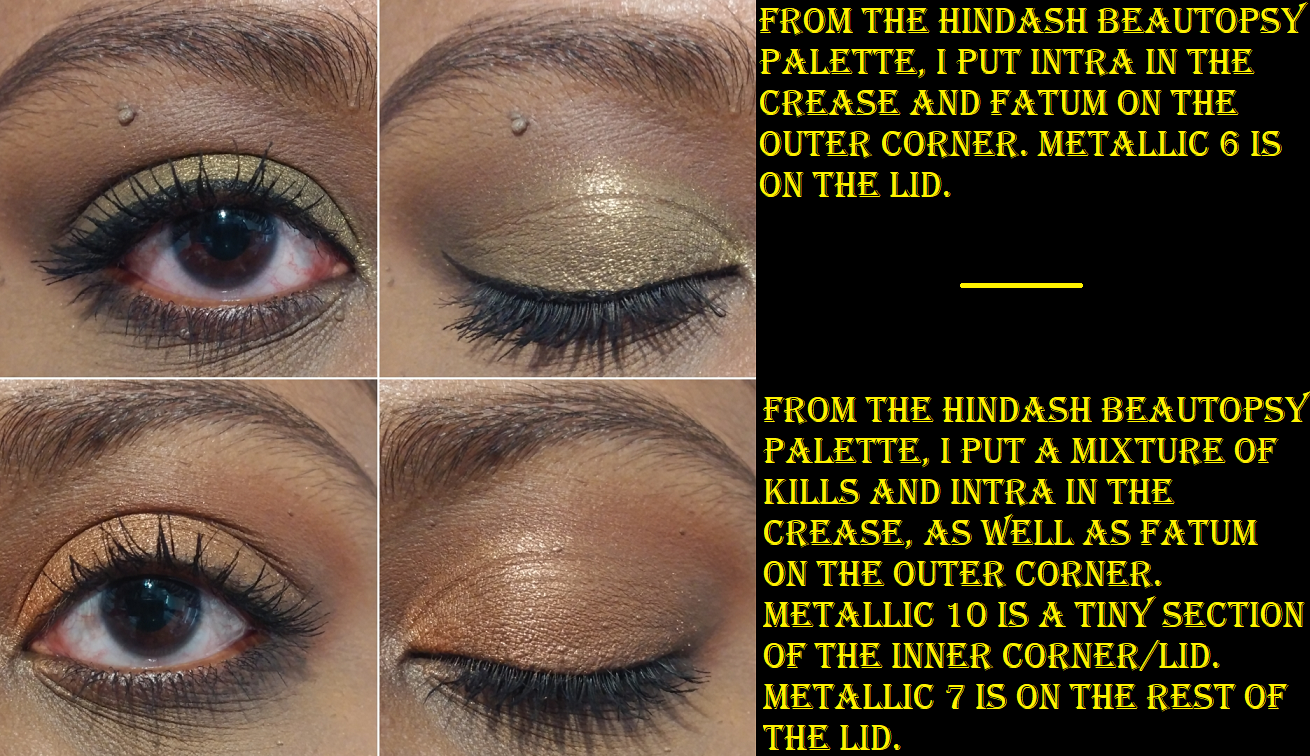
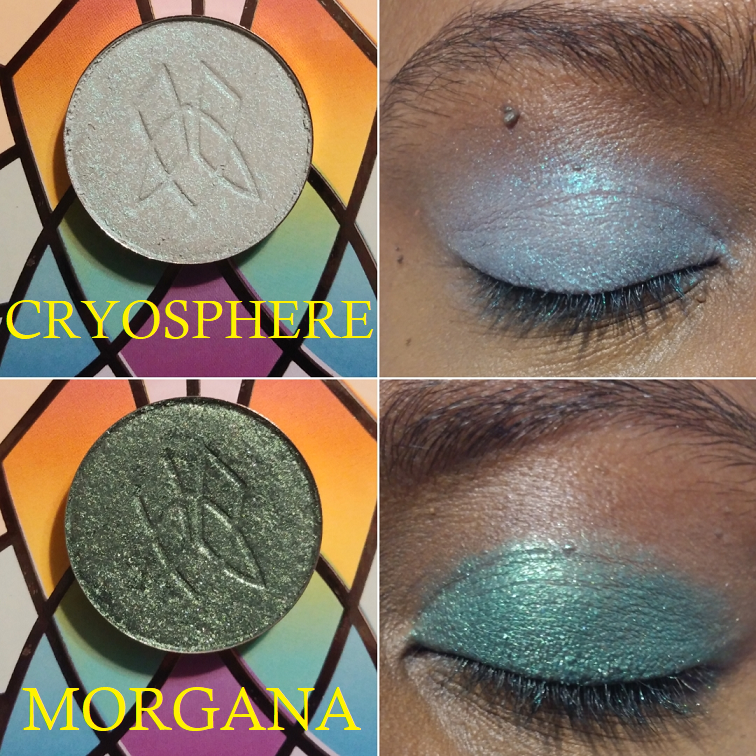
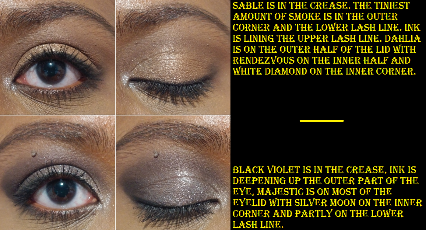
White Diamond is a true topper shade, as it has white sparkles but no base color. Rendezvous has silver sparkles and a brown base. That base color blends with my skin tone, so it gives me a topper shadow type of effect. Those two shades plus Stardust all have the same creaminess and slip as the traditional shimmer formula, but with those three I can also feel the actual grit from the glitter when I apply them to my eyes. Majestic is the high sparkle exception that I don’t feel grittiness from when I use it. It’s a grey/gunmetal type of shade, like Onyx, but Majestic is a glitter/sparkle eyeshadow whereas Onyx is a fine but impactful shimmer for those who want something reflective but not as dramatic. Whisper, Primrose, Lust, Silver Moon, Dahlia, and Whiskey are traditional shimmer shades, which is the area that feels most repetitive. Silver Moon is distinct enough, but Primrose, Lust, and Dahlia will give me nearly the same look on the eyelids despite their different tones. Black Violet is a nice smooth satin, but the purple hue doesn’t show as much as I wanted.
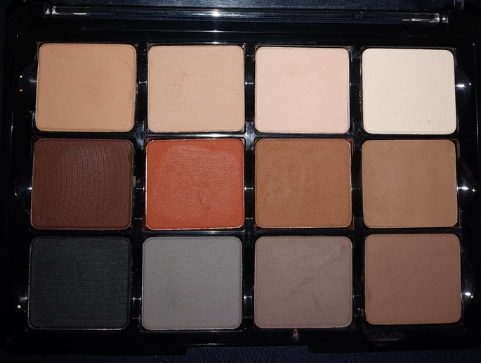
The mattes are a good gradient. I can use Ecru as my brow bone shade. Soft Taupe doesn’t show up on me at all, but it would probably work for someone else as a transition shade. A shade like this can still be useful in blending out edges without making the area lighter, but the way these shadows blend, I don’t feel like I need to use it that way either. Sable works as my transition shade. Burgundy looks mostly brown if I use a light amount. I have to really pack it on to get the reddish tones to show. Smoke looks so much darker in the pan than I expected. It’s a deep cool toned brown that is satisfactory enough for me to be content with that as my deepening up shade without needing Ink, the true black shade.


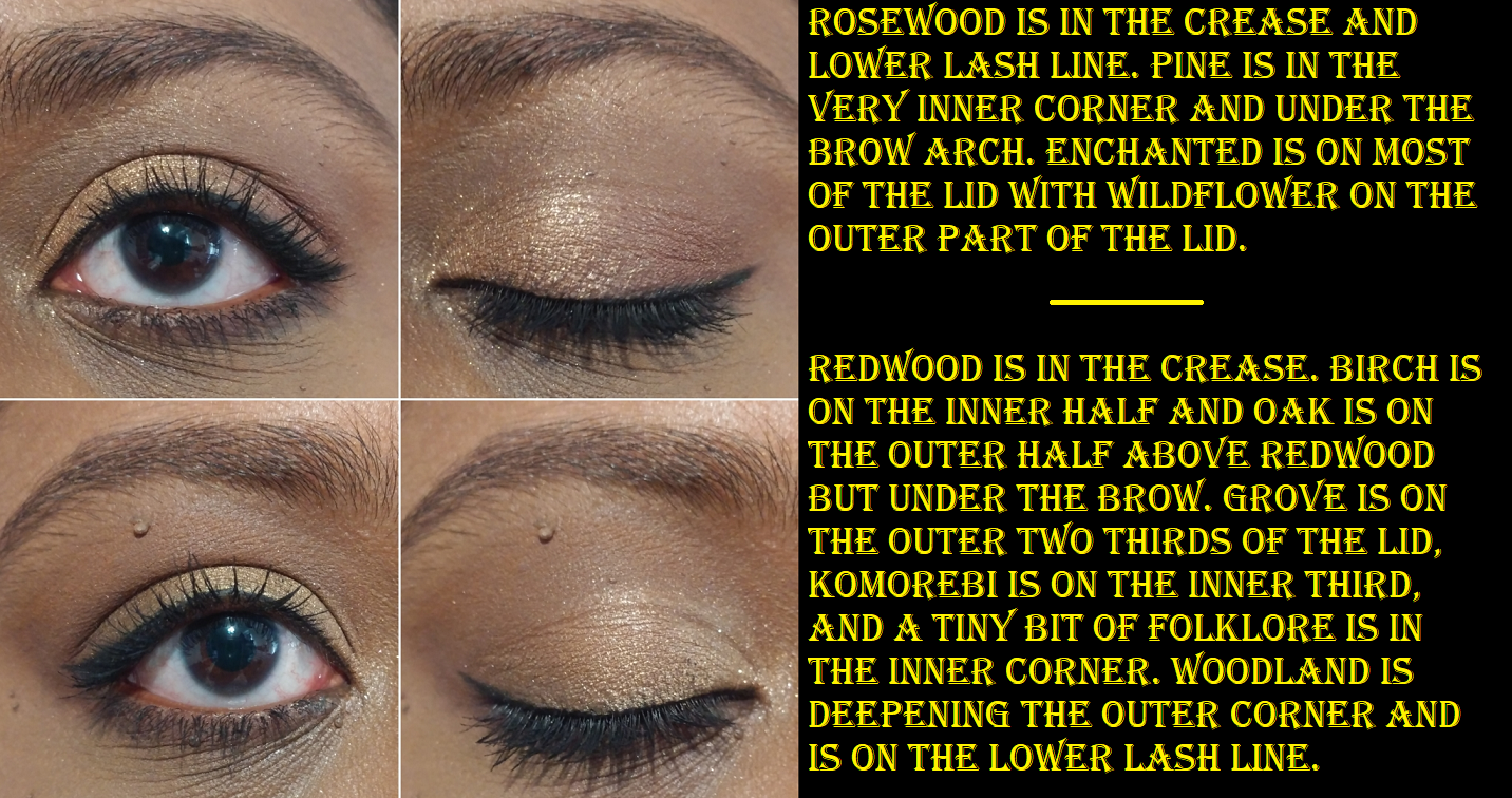
I tried my hardest to create some variety with these shadows but I found myself making the same 4 looks, even though I used totally different eyeshadows: a red look, a smokey warm look, a smokey cool look, and a caramel/gold look. Essentially, the only way to get some truly different looks comes down to the eyeshadow style and placement of the shadows like the classic placement, a halo eye, a cut crease, etc. That is what will bring the most variety. I am really pleased with this palette though and I do recommend it for the ability to create something basic, glam, or something in-between. It’s a good neutral all-rounder type of product with great quality that surpasses the original PRO formula.
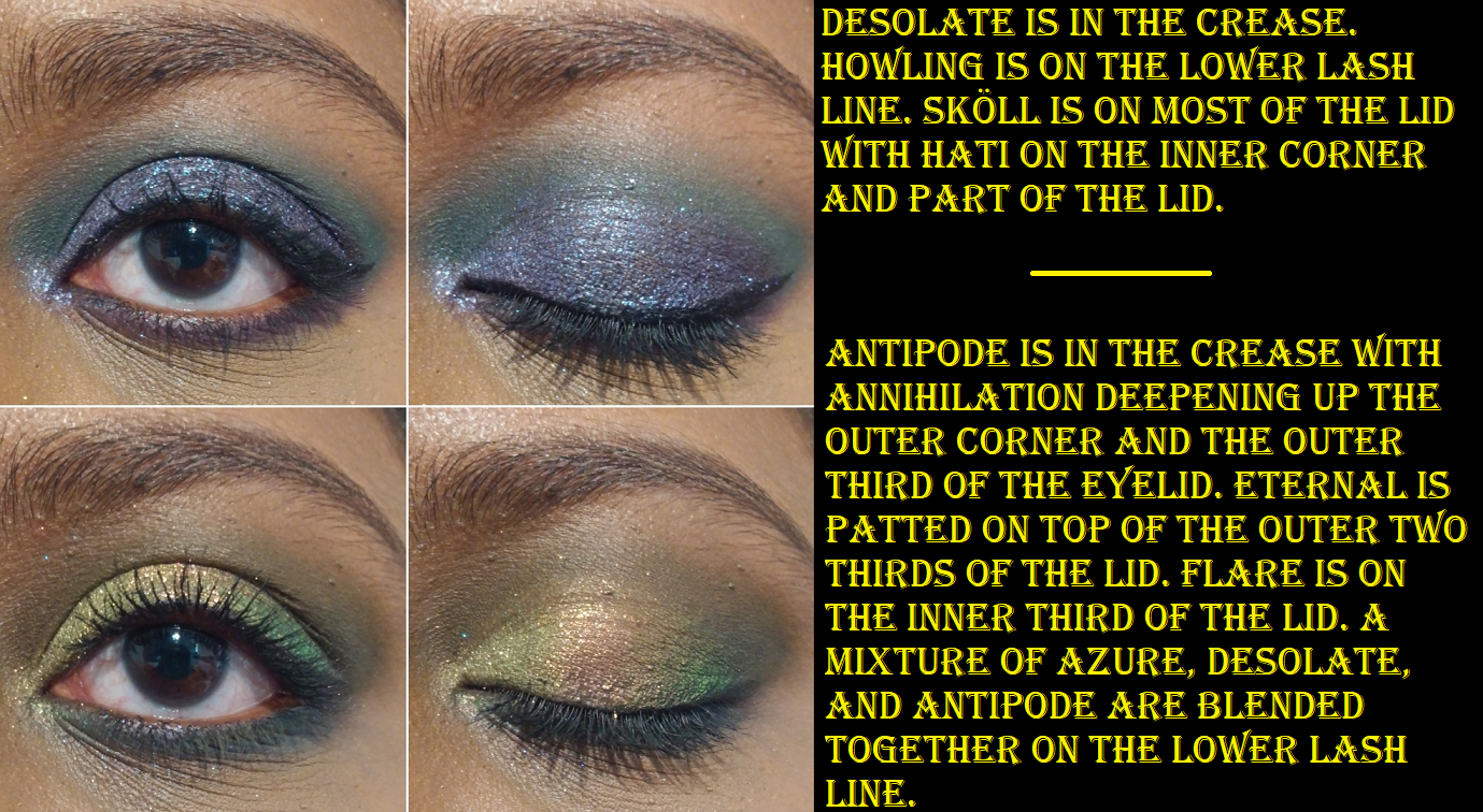
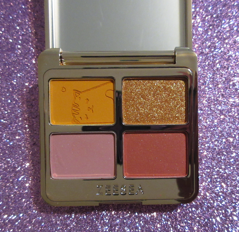
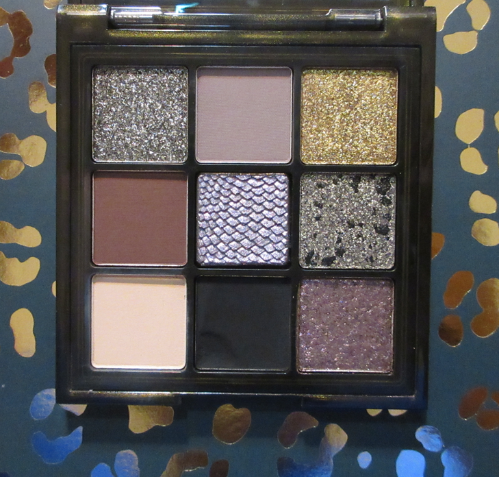
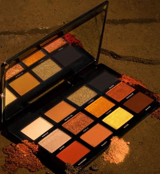
Lorac Fairytale Forest Pro Palette

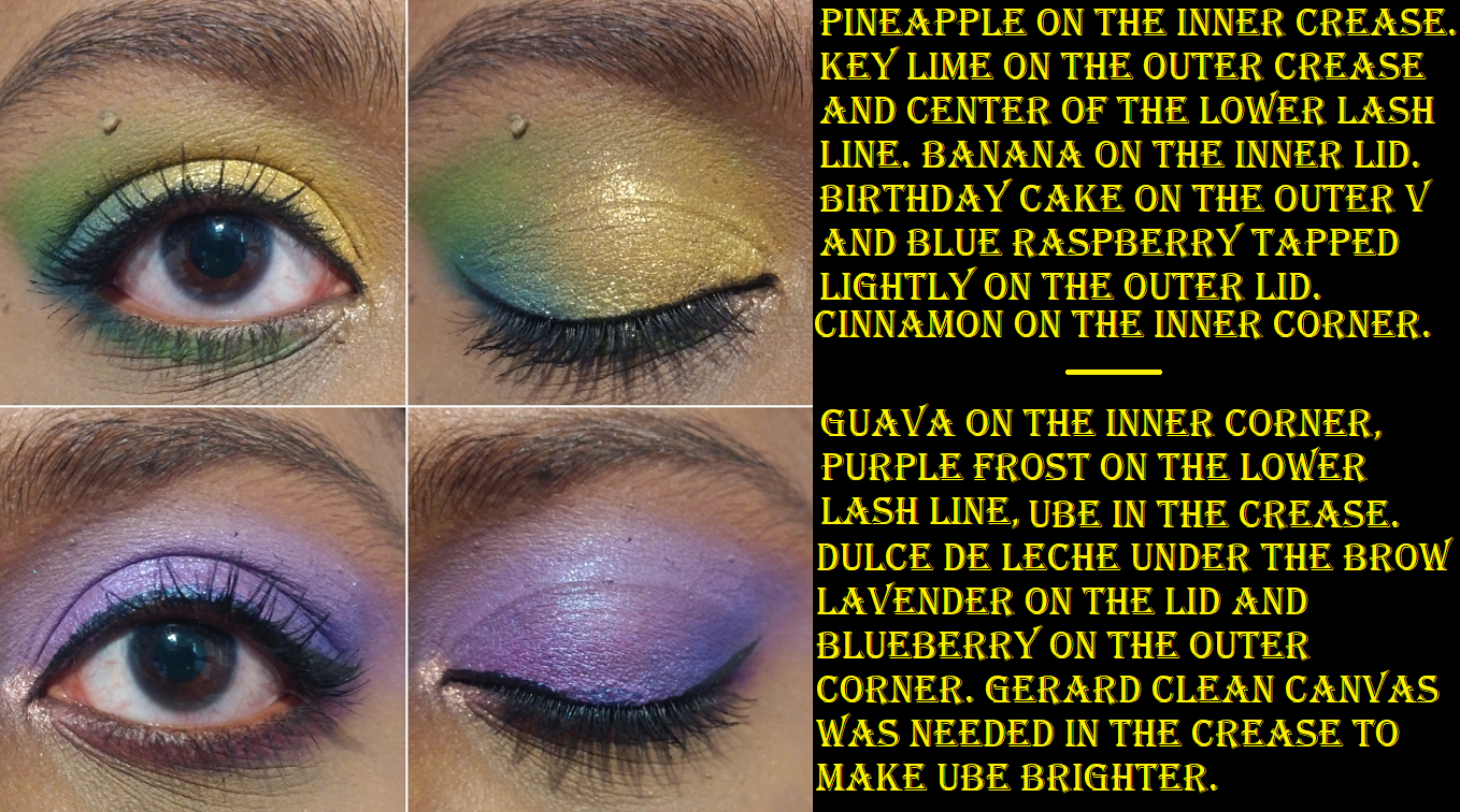
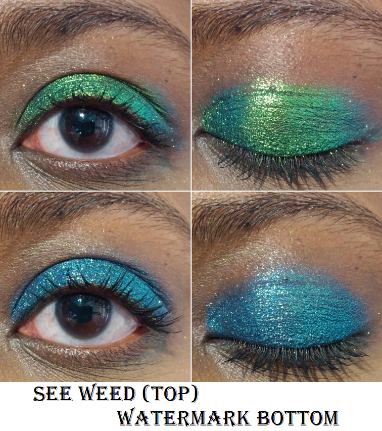
The six shadows on the bottom right corner are what got me to buy this palette. I could not get them off my mind! I figured between the Noir palette and this one, I would really have some repeats. So, my plan all along was to mix and match shades between them to create my ultimate semi-neutral palette. I did not expect to like Noir in it’s pre-made state as much as I did, so my plans had to change.
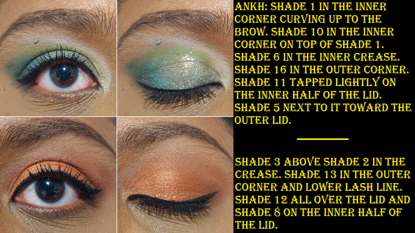
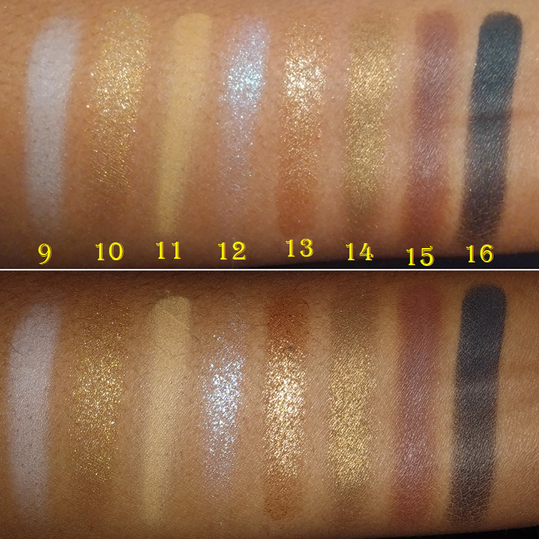
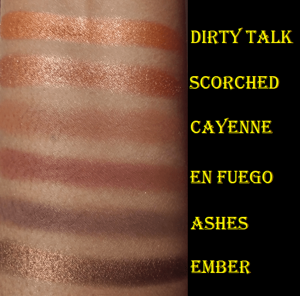
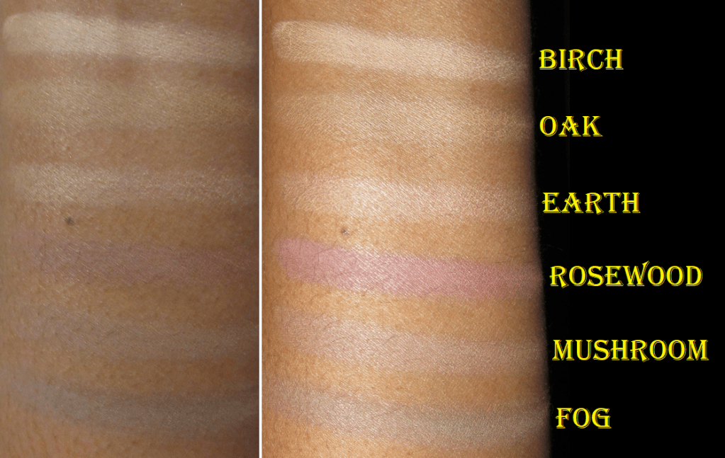
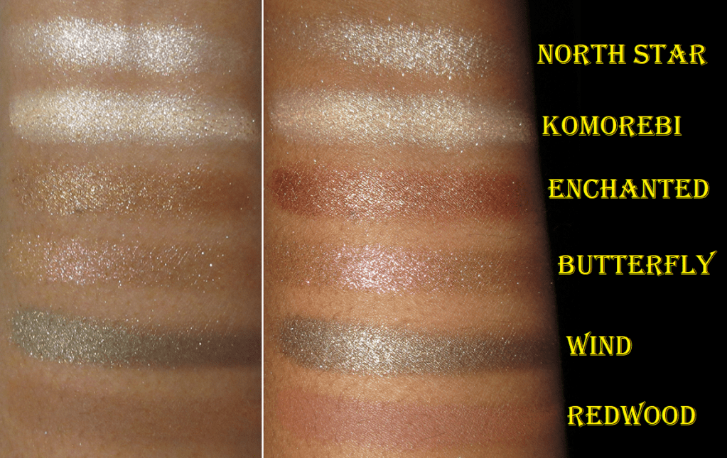
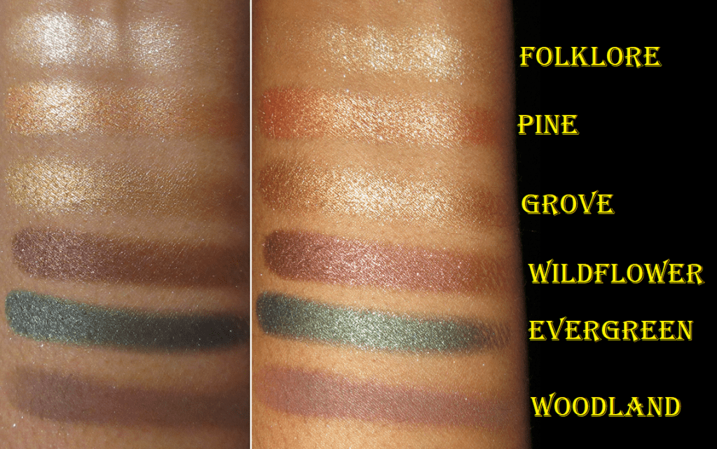
Birch, Oak, and Earth look identical on my eyes, and I sometimes skip applying a brow bone shade altogether, so those three aren’t useful to me. Wherever I apply Mushroom just looks like my skin color depth but as a cool tone shade. It doesn’t make as much impact as Fog, which is a darker and cooler grey. Rosewood is like a dusty pink. I have to built it up a lot to get it to show more pink and less taupe. Essentially, the entire top row doesn’t add much to my eyeshadow looks, but I was at least prepared for that. I was banking the most on Redwood and Woodland for a color punch and depth. Once again, to get more of the orange tone to show in Redwood, I have to build it a lot. With these more colorful mattes, I get pigment right away, but it either comes off grey or brown in those first few layers on the eye. That’s why I’m still pleased with the Lorac mattes overall, because they still give me something, but to get the colors to show true to what’s in the pans is where the time and effort comes in. I am impressed though that despite how much I pack on, they layer well on top of each other and are easy to blend. Woodland is the darkest shade and helps to deepen up the look when I pair it with the lighter colors, but I can see that it’s not quite as deep as I’d like when I use it with the midtone mattes and darker shimmers.
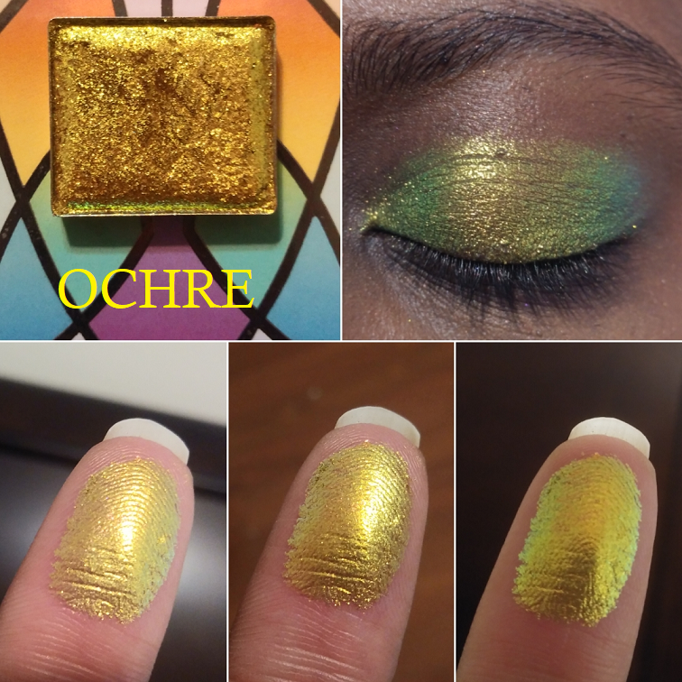
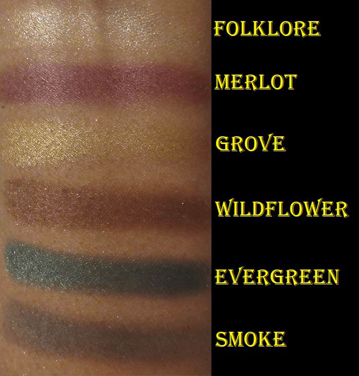
I did not notice any difference in performance between the mattes in Noir and Fairytale Forest. However, Fairytale Forest does not have any shades listed in the sparkle formula, just shimmers and metallics. The two “metallic” shades, Pine and Grove, felt like the traditional shimmer formula to me, though perhaps slightly less wet to the touch. Enchanted, Wind, Wildflower, and Evergreen feel borderline between creamy and wet to the point of being almost chunky in texture (but not quite).
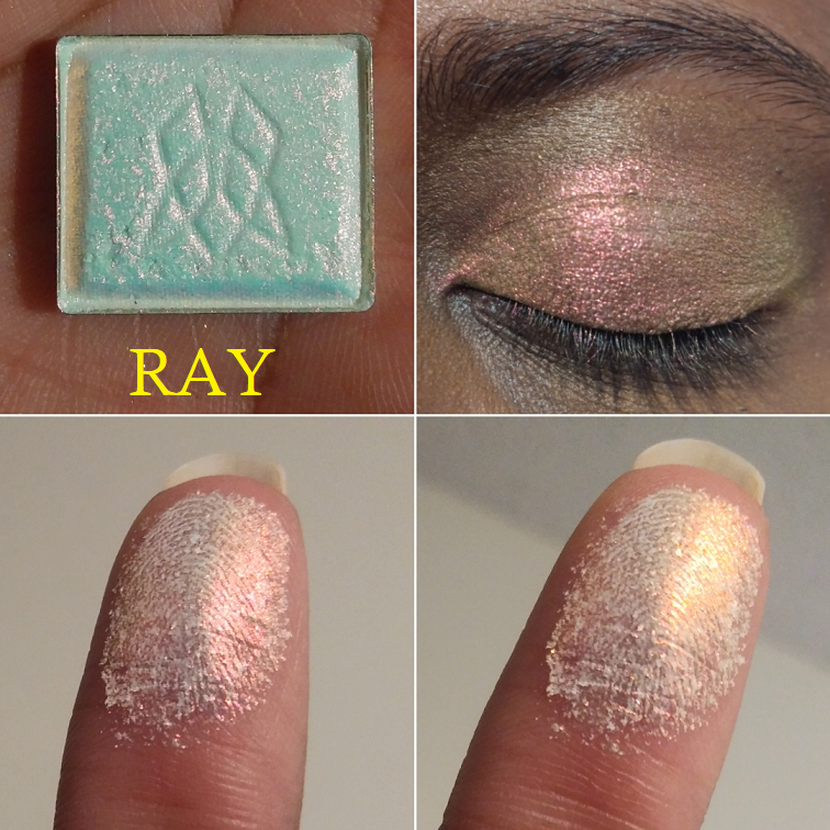
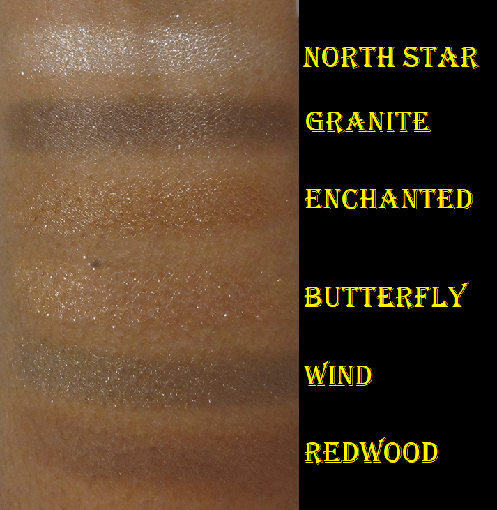
I was shocked to see North Star described by the brand as a “soft baby pink shimmer” since it looks flat out white to me and definitely sparkly. Both North Star and Folklore feel a tad drier than the rest of the shimmers, which is emphasized by the semi-gritty texture as well.
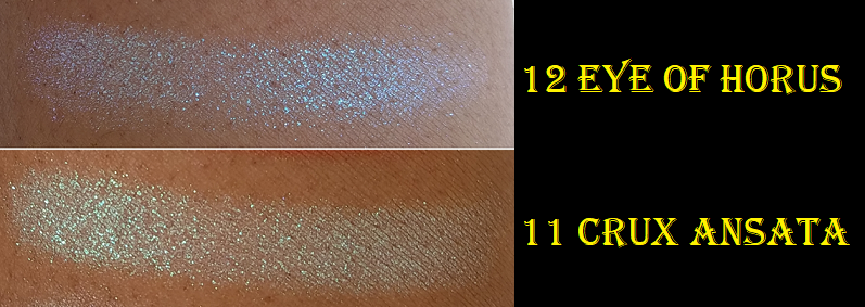
Butterfly stands out as it feels completely unlike any other shadow in the palette. It has the most slip, seems to have a transparent base, and is like a topper duochrome looking pink or rose gold depending on the angle. Enchanted looks like a duochrome as well, but it doesn’t have an actual shift. It has a bronze base which contrasts with the golden olive shimmer.
The only shimmer that I don’t think applies very well is Komorebi. It always looks patchy when I first apply it and it has to be smoothed over multiple times in order to look even in color. I smoothed it out in the swatches*, but apparently I didn’t smooth it over enough because it still doesn’t look as nice and even as the others.
*Note: When I changed my blog template, it made the proportions smaller than usual. In case someone doesn’t know about this, clicking on any photo on this blog will show the enlarged version of the picture. Also, holding the CTRL button and pressing + or – will magnify or minimize the size of font and photos on the website. I personally keep it at 110 or 120%

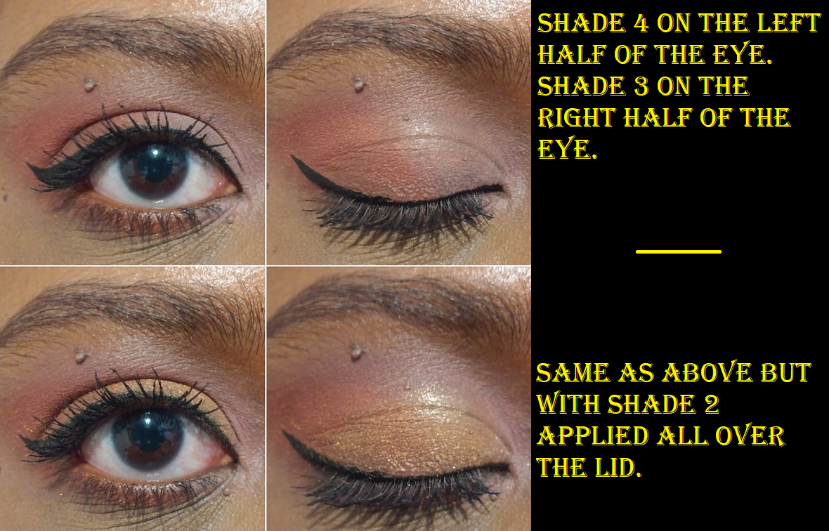
In the bottom two looks, I didn’t use any of the same shades, yet they look very similar.
Without distinct crease shades, I can’t get as much drama as I like, even though I’m getting more colorful options than Noir. I know myself and know that I would never reach for this palette if I kept it as is, just like the Mega Pro palette I couldn’t bring myself to even swatch in such an uninspiring shade selection and layout. So, I decided to combine the two!
REARRANGED PALETTES
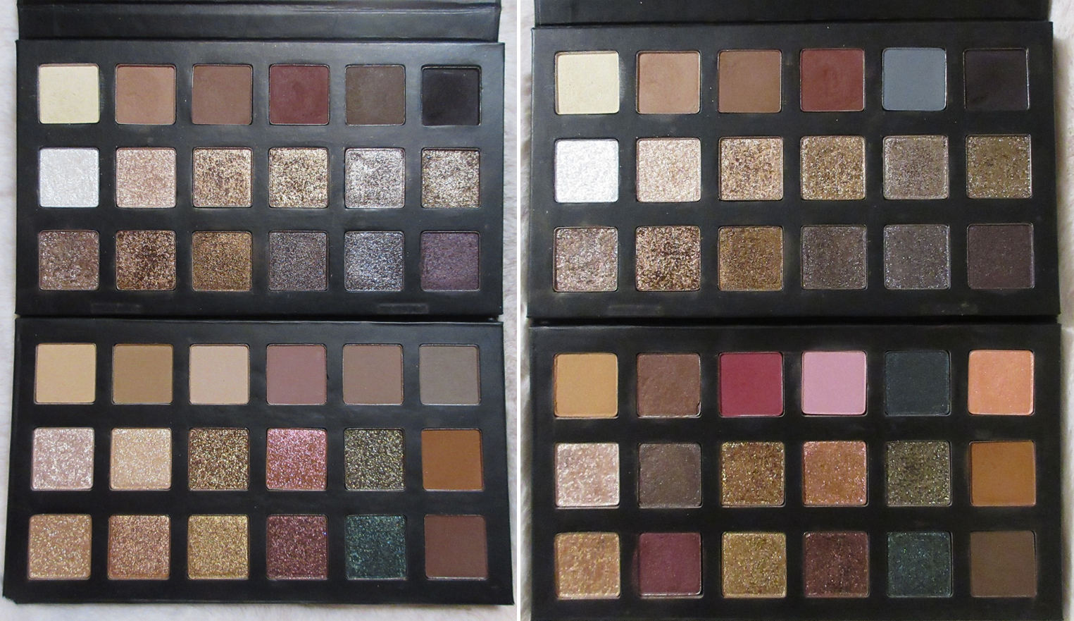
I depotted my favorite shades out of the Mega Pro palette, stuck a label sticker on the bottom of each pan to keep track of which shadows are which, and placed them in a custom mini magnetic palette. The pans are magnetized, but unlike these newer palettes, the older ones were held in place with glue. Whenever I depot palettes with the intent to reuse the packaging, I cut a strip of magnetic tape and place it at the bottom so I can pop the shades in and out as much as I want. However, Lorac’s pans sit so flush with the surface that even the thinnest magnet would cause the pans to stick up and out, which impacts the ability to close the palette properly and this would get even more eyeshadow all over the mirror than it already does.

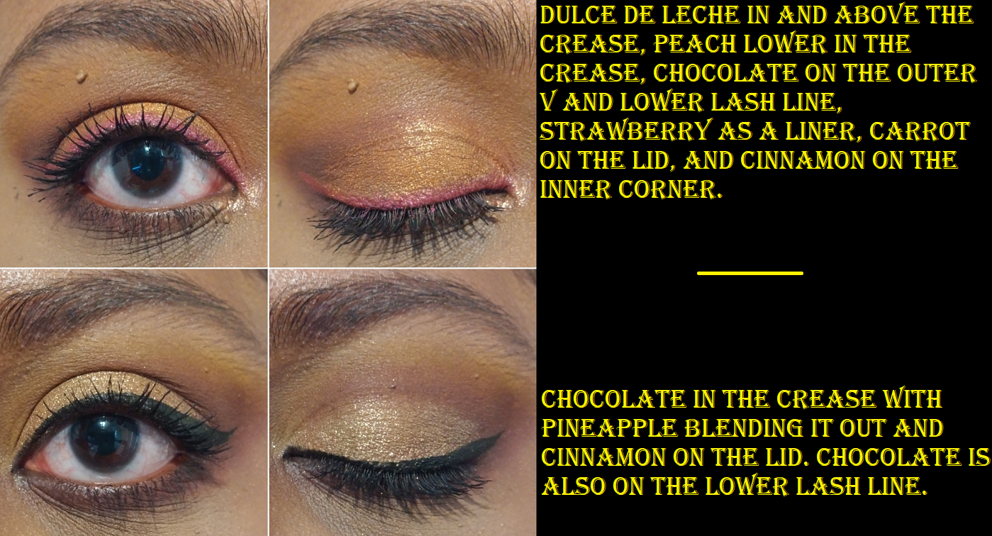
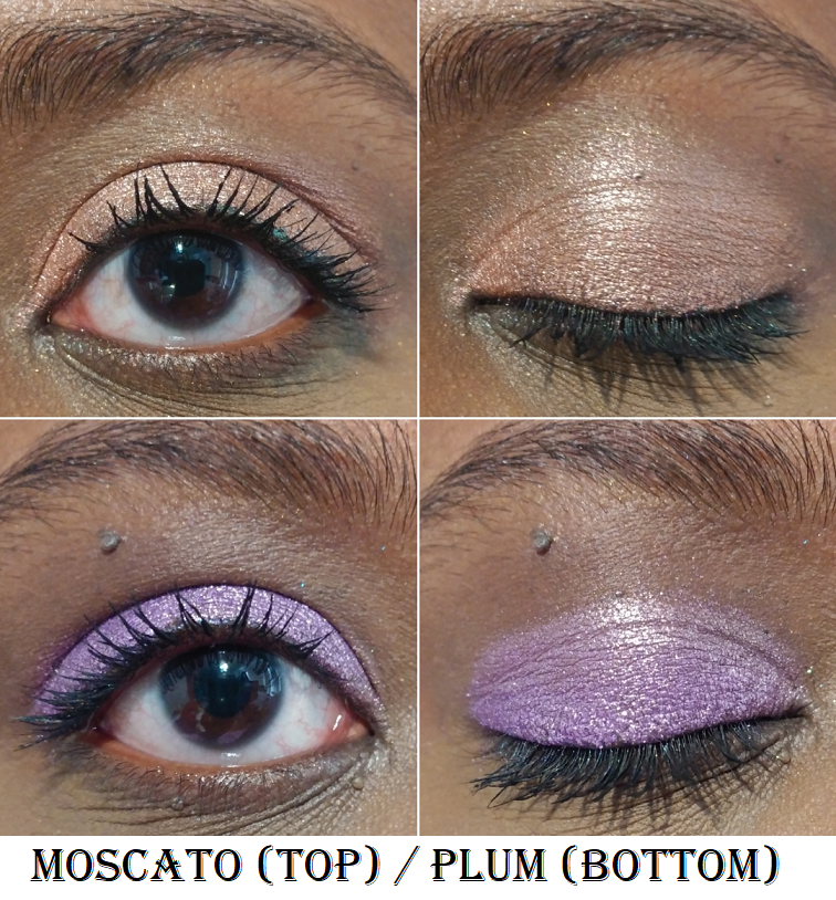
I removed Woodland from the Fairytale Forest palette and replaced it with Smoke from Noir to give me the depth I wanted and add a little smokiness. I filled the one vacant spot in Noir with the shade Gray so that I could keep with the theme of a traditional smokey neutral palette. Swapping out Smoke for Gray is the only change I made to Noir. Woodland is currently in the custom mini palette, along with the entire top row of shades from Fairytale Forest. In my first color swap version of FF (shown below) I initially kept Rosewood, plus added the shade Dusty Plum, but I ended up not getting enough impact out of either of them for my liking. They were too mid-toned. This is how I ended up removing them both again and putting Orchid instead.

First custom version

Current custom version

Orchid is not very opaque, but since it’s something I want to just use as a transition shade and blending out color for Mulberry, I don’t mind. Also, if I want a satin version of Mulberry, I basically have that in the shade Merlot. Redwood is the only original matte shade in the FF palette that remains. I could have kept any of the three lightest mattes, but I actually liked the Camel color and figured it could do the same job, just more subtly.
When I think of Fairytale Forest, I expect sparkle, iridescence, and a decent amount of greens. I would say that’s the most lacking aspect of the premade palette. I wish there were some matte greens in it. In any case, I added Deep Teal because I want to use it as a smokey green shadow to deepen up eye looks, even though it’s a satin and not matte. If Lorac ever sells a different kind of green as a single shadow, I might replace it. I thought Maroon was a good choice since it’s a neutral shade but the pink shimmer in it pairs well with both the browns and the reddish purples. Apricot was another last minute decision when I felt like I was missing a light color shimmer to highlight the brow arch. My other two light shades, North Star and Folklore, are too sparkly and don’t have a strong enough base color to them to fill that role. When I use Apricot, I can see it in person but it doesn’t pick up on my camera very well. I have a soft spot for chocolate brown shimmers, so that is why I chose Granite.

I think my choices still invoke the spirit of Fairytale Forest while still giving me just enough color to satisfy my desire for both colorful and neutral eyeshadows. I’m back to being tired out of neutrals for Lorac though. As wonderful as the quality is, I don’t need anything else from them unless they start really delving deeper into the realm of colorful shadows. I think Lorac could become popular again if they got out of the neutral box. Other brands that keep cranking out neutral palette after neutral palette have embraced exciting packaging as a way to entice customers into buying similar products repeatedly. As much as I like Lorac’s very professional (though basic in design) black packaging, the outside doesn’t grab me as a consumer, so it comes down to the color story. I want one that’s exciting and I don’t want anymore repeats than I currently have.
That’s all for today! And just so everyone knows, from November 14th through November 16th (my birthday!), Ulta has the Noir, Fairytale Forest, and other palettes on sale for 40% off! The link I included is a regular non-affiliated link.
-Lili ❤