
I’ve toyed with the idea of making an “Influencer Brands” review, but I kept pushing it back as I haven’t been inspired by the products in mind for that post. So, I decided to give Artist Couture a solo review. The brand is owned by Angel Merino, also known as “mac_daddyy” on social media. I heard the name mentioned many times by Jackie Aina when I used to follow her, but I’m more familiar with the brand than the owner. I remember when Artist Couture first started out with loose highlighters at Sephora. I wanted to try the brand, but I wasn’t interested in the products until the Midnight Maven palette. I did not end up buying that palette, but in 2021 my wish to try some of the products was finally too strong to ignore, especially near the peak of my blush obsession.
Artist Couture Love Sprung Face Palette Version 2


Fun Fact: In my order from the Artist Couture website, this was actually listed as VII, which looks like roman numeral 7. I was very confused when I added version 2 to my cart but the confirmation page had what I thought was Love Sprung 7, until I figured it out.
This was actually my first Artist Couture product! I purchased it before the Supreme Nudes palette, even though Supreme Nudes is an older release. I had no idea what to expect, but I was hopeful that it would be great. The satin blushes are both quite pigmented. They look like mattes in the pan but they are technically satins since they have the tiniest amount of sheen to them.
Infatuated is my preferred type of shade because I like blushes with a little bit of orange, but leaning more on the side of brown or pink. This one is described as a terracotta peach, which is just what I like. Bold oranges don’t look as nice on me.


I was surprised how pretty I thought Lotus Love was, considering I typically don’t go for berry blushes, but this isn’t a deep berry. Perhaps that makes a difference. I find it fascinating that oranges and berries, shades touted as being best for deep skin tones, are present in this blush palette, but in ways that make them more interesting and different from what is common on the market. These blend well into the skin, but they aren’t the longest lasting. They fade a bit quickly on my cheeks at around the six hour mark, and also when I’ve use them as eyeshadows. I don’t mind that as much, but it’s important to note. Also, the satins have an extreme amount of kickup! I haven’t seen kickup on a blush like this since reviewing the Milani Baked Blushes!

I’m also not certain if the pigments in these blushes have something that throws off cameras. It seems like a standard formula, but I attempted to take photos of these blushes four different times over the course of four different days before I finally settled on these. I literally had over over 500 unusable photos. I had to change my camera settings to properly get them to show up. I also had to wear specific clothing colors and lipstick colors to get the blushes to show true to color on my cheeks. I always struggle with my camera and lighting, but never to this extent!
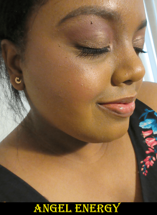
The shimmer blush in the center, called Angel Energy, is a mauve-pink intended to be more of a highlighter or blush topper than a standalone blush. It feels very wet to the touch and when I first opened the palette, I noticed part of the left side of the pan looked darker than the rest. It resembles the uncommon occurrence when oil separates from a creamy shimmer eyeshadow. I figured perhaps this shade wasn’t mixed well, but I looked at the ingredient list and saw the amount of emollients: the dimethicones, forms of glycerol, the oils, and waxes. It’s definitely not an issue of being mixed improperly. This is intended to feel slick. Sephora describes it as being a “bouncy” formula, which gives the impression that it would feel similar to a Colourpop Super Shock Blush or putty blush, but it’s not bouncy to me, just wet.

I’ve highlighted the ingredients that to my knowledge are emollient/slip/moisturizing ingredients in Angel Energy. I may have missed some or mismarked some as I am not a cosmetic chemist. As a makeup enthusiast, I did my best research.
Overall, I do recommend this palette. The packaging is cute, it blends well, the shades are pretty, and the price is pretty good. Of course, it’s only worth buying if you love the color story. The formula isn’t holy grail status by any means, just nice.
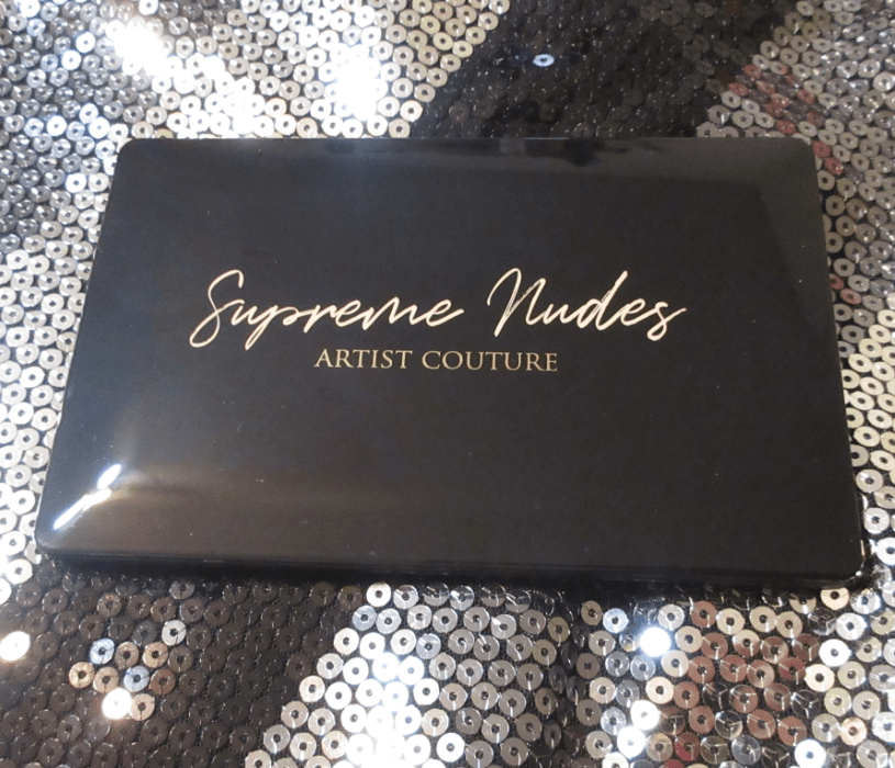
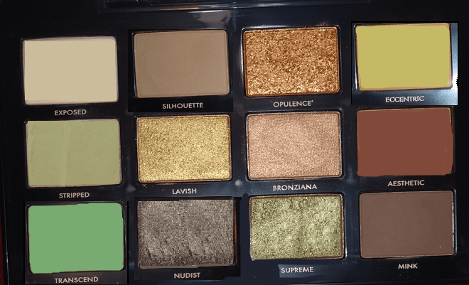
Artist Couture Supreme Nudes Palette


I wrestled with my decision to buy this palette for an entire year. I kept talking myself out of it because it’s a neutral palette when I prefer colorful ones, it has quite a lot of those light brown toned shades that tend not to show up on me, and the shimmers looked pretty but I knew they could never compare to the quality of shimmers from indie brands. During the last Sephora VIB sale, I couldn’t hold back and decided to get it. The shade Supreme was pretty much the sole reason I could not let go of this palette. Olive leaning antique gold type of shades are my Kryptonite.

The edited photo above represents how I expected this palette to work for me: repeat brow bone shades, repeat golds, a warm brown shimmer, antique olive green shimmer, a warm deepening shade, and a cool deepening shade. I wish I could say it turned out to be more diverse than I predicted, but it did not. While I can see the differences in tone among the six shades I marked above as being brow highlighting shades, it’s not enough to make a significant difference. Exposed and Stripped look cooler or warmer depending on what eye base I use; their own tones don’t matter. I’m glad that they at least are not stark or ashy on me like some light shades are. Nudist, Transcend, and Eccentric all blend into my skin and look like my natural skin tone, regardless of the color of the eyeshadow base. Silhouette looks like my natural skin color as well, but a cool tone version.
All the mattes in this palette are equally pigmented and blendable. There is a bit of kickup that I have to clean after each use, but it’s nowhere near as messy as the Love Sprung Blush palette.
As for the gold shades, Opulence has larger shimmer particles and takes on more of a copper gold tone. Lavish is a yellow-toned gold with finer shimmer, and when I put I these two next to each other on each eye, I could see the difference. However, as time went on during the day and the shadows started to dull, but not fade, they looked less different than before. In the future, I will likely stick to using Opulence on the lid for the sparkle factor and Lavish on the inner corner so I can worry less about it getting in my eye. They serve different purposes due to their consistencies and not as much for their color.
When it comes to the two deepest shades, Aesthetic slightly darkens the outer corner but isn’t deep enough to give me any real depth. For that purpose, I can only rely on Minx, but it makes all my eye looks a lot cooler-toned when I use it. I expected Aesthetic to be much warmer but it only stays warm if I use it on bare skin. If I use it over a base (whether a traditional eyeshadow primer or foundation/concealer), it deepens to a neutral toned brown, even if the base has fully dried down and even if it has been powder set as well.

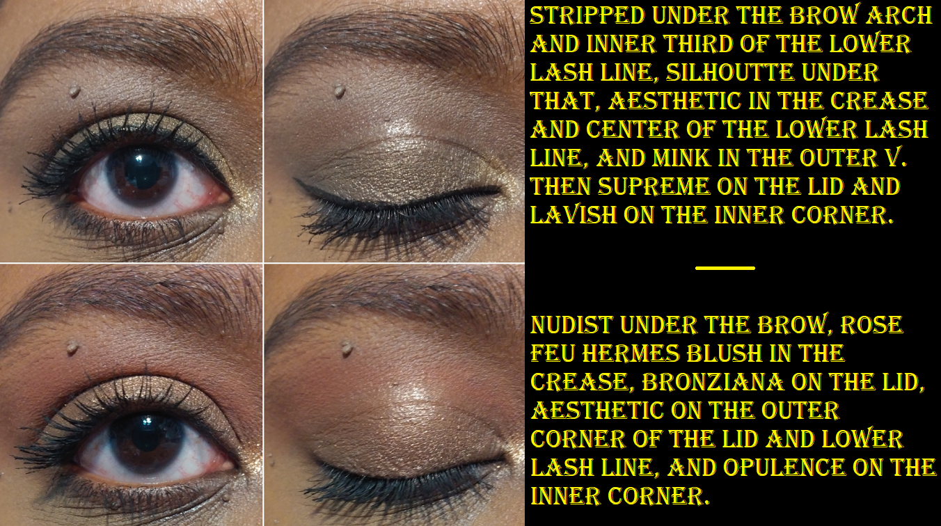

The two most distinct shades in the palette are Bronziana and Supreme. Bronziana is much prettier than it looks in photos. It’s a bronze shade, but I believe it has reddish specks in the shimmer as well. It’s what I imagine the Hot Chocolit Fenty Gloss Bomb would look like as an eyeshadow.
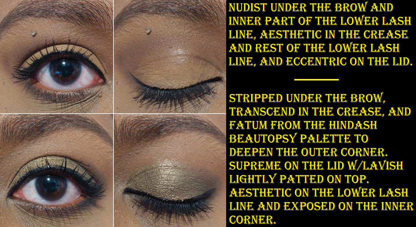
As mentioned before, Supreme is a dark shimmery olive, but it doesn’t look on me the way I had hoped. I didn’t think it would be dull and muted. I can make it shinier if I spray my brush with MAC Fix+ and make it brighter by lightly patting Lavish on top. You can see how it looks on its own in eye look #1 versus eye look #6. Wetting it also helps to last longer because my eyeshadow looked just as good 10 hours later on the day I sprayed it in look #6.

Left eye and Right eye after 10 hours of wear.
I would have been crazy for Supreme if it had a touch more green in it, similar to Antheia from the Natasha Denona Mini Gold palette. In fact, if I could recreate this palette, it would be a combination of shades from the Mini Gold, and I would add a brighter or darker green and turn up the saturation of the red in Aesthetic and the yellow in Eccentric.

Of course, my desires would make it a far less traditional “Nude” palette. It’s clear to me that besides usability, every time I’m drawn to a neutral palette, it’s never as exciting as I anticipate. I knew Supreme Nudes wasn’t going to suit my tastes, but I still bought it anyway, and that’s my own fault. But what’s amazing to me is the fact that every time I use this palette, I find it to look so boring on my eyes until I put liner and mascara. Then suddenly I appreciate how soft the colors are, and how blended it looks, and the way the shimmers sparkle when they catch the light just right. It’s not my favorite palette and yet I can create pretty looks with it. They aren’t diverse looks, but at least they look pretty.
While my main goal of wearing eyeshadows is to create a pretty look, I need to have a desire to keep using it in order for it to be worth the purchase. I’m not confident in how I feel about this palette. The quality is great. The color story will be diverse enough and perfect for some but redundant and limiting for others. What I appreciate about neutral palettes is the ability to create a complete look, which technically this does because of Mink, but I would prefer to use a deep brown or black from another palette instead. I do like this palette more when I have another one to supplement it with. The packaging is so pleasing to look at, touch, and use (and this goes for the Love Sprung Palette as well). Something about the smooth shape, rounded edges, and shiny black surface makes me happy on some strange emotional/psychological level. The actual smooth surface literally feels nice under my fingers in a tactilely pleasing way. Regarding the functionality, it has a great mirror size and I love that the lid fully folds back so that those of us with vision problems can bring the mirror closer to the eye. It’s also a compact size, with the right amount of product, and is priced fairly. Of course, there’s also the extreme hype regarding this palette. I think it was in most beauty gurus’ “Best of 2020” videos. Because of my love of colorful shadows and my preferences regarding the depths and tones of shades, it didn’t live up to the hype for me. However, I do think I will continue to get use out of it when I pair it with other things. It does bring me joy to have it in my collection. If you’re a fan of neutral shades, I could easily recommend this to you. If you are my skin tone and wouldn’t get as much variety from this palette, assuming you want more variety, I would say maybe think twice about how useful this will be.
For those who are a fan of the Supreme Nudes Palette, it may interest you to know that Artist Couture has released a similar palette called the Supreme Bronze Palette. If this palette had been released during the Sephora VIB sale earlier this year, I would have still chosen the Supreme Nudes instead, purely for the olive Supreme shade.
Photo and information credit goes to Trendmood1 on Instagram.
It is now available for purchase at the Artist Couture and Sephora websites.
Thank you for reading!
-Lili ❤

The brand does a nice job with their color selections, but it definitely sounds like there are better products out there. Really feels like they were going for an ABH x Mario palette dupe/alternative. Thanks for the review!
LikeLiked by 1 person
I hadn’t even realized that! You’re right! Other than the blue shade from the ABH and Mario palette, all the rest are similar!
LikeLike
Speaking of Mario, are you going to try anything from his soft sculpt collection?
LikeLike
Yes! I have two products so far that I’ve been testing out (the powder blush in Poppy Pink and blush stick in Earthy Pink) but my last item (powder blush in Creamy Peach) is still several days away from being delivered. I planned to have a review up next week, but that all depends if I can properly test Creamy Peach in time. I was very tempted by the powder bronzer, sculpt stick, and even the highlighters but I decided not to get those. At least not at this time. How about you? Anything caught your eye?
LikeLiked by 1 person
Nice, whenever you decide to post, I’m interested to hear your thoughts. I’m not sure if I’m going to buy anything. I do really like the look of the collection and I think the entire brand is nicely priced. It definitely has me taking a closer look at some of his older releases as well. I like that it seems to be straightforward, staple colors.
LikeLike
The only product I ended up getting from his past collection was the shimmer metallic palette (i actually have that review coming up too)! And that’s partly why I decided to give this collection a chance because I’m not sure if there will be a time again in the future when I’m interested in his stuff haha. So far, I like the pressed blush the most. I think it’s good but what makes it special is how well it lasts on my face. Like barely any fading by the end of the day. The blush stick is nice but I could have skipped it purely because it reminds me a bit of LYS, so I really didn’t need it. However, I still wanted that bumpy brush so it was worth getting in order to try it out lol. I haven’t tried the brush out yet on other cream blush formulas. That’s my next task for myself.
LikeLike
Lol yea so far his color selections can’t compete with the variety you can get from other some brands. I haven’t gotten into cream blushes, but I think I’d try the Fenty blushes first if I go the cream route. Pretty sure the last cream blush I used was a NARS multiple stick.
LikeLiked by 1 person
Exactly. And yes, the Fenty ones are solid. I think that’s where I started with cream blushes as well! Unless I’m remembering incorrectly lol.
LikeLiked by 1 person
Pingback: Artist Couture Love Sprung 3 and Quickie Palette Review – Lili's Beauty Blog