Some of the biggest beauty gurus on youtube say that these two brands make the best eyeshadows they have ever used. Although I am an eyeshadow junkie, I needed to do some research first before I invested in these products. And they are certainly an investment because you get a ton of product in each pan, which is ideal for makeup artists, but would last the average consumer ages. They’re also not cheap. The 5 pan palette was the most I was willing to commit to from ND’s line of shadows.
Natasha Denona Palette 04
 The single, 5-shadow, 10-shadow, and 28-shadow pans are available at Beautylish. Although ND has many other products for sale, the eyeshadows are the top sellers.
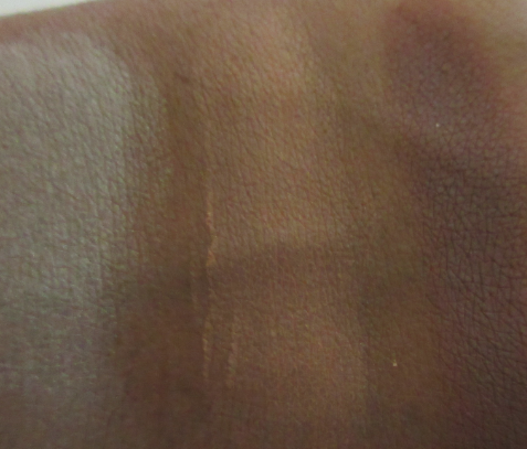
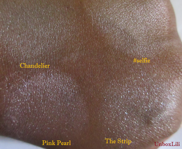
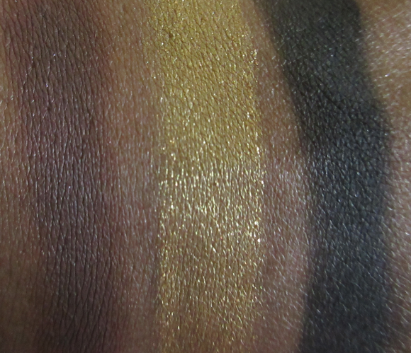
 I used finger swatches without primer in the photos above. When using the fingers, these shadows are unparalleled in pigmentation. The tiniest touch (not even a full single swipe) produced those swatches above.
 These are basically pressed pigments which are soft in texture, apply smoothly, and contain ingredients which maintain the shadow’s moisture while on the skin.
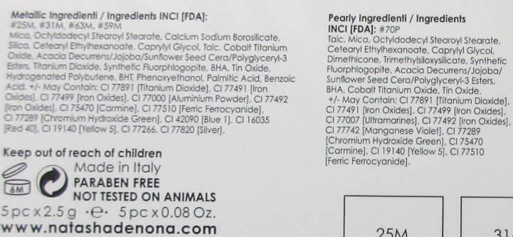 Although Natasha Denona stands behind the use of parabens in cosmetics, she removed all of them from her eyeshadows to assuage wary customers.
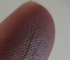
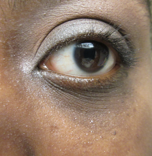
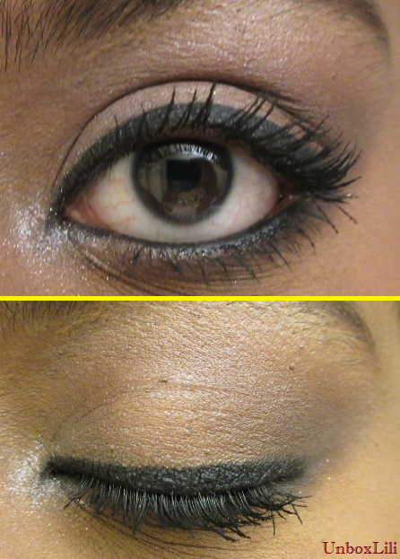
The shadows are very long lasting on my lids. The photo below is after 8 hours of wear.
 The video of the swatches going on and on, although true, is only practical for those who prefer to apply the eyeshadow with their fingers. Using the finger to apply it like a cream eyeshadow is actually the recommended method. If using a brush, Natasha Denona recommends one which is, “fluffy…thick and round, not flat brushes.”
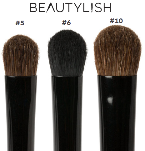 I do not own her brushes, so I used natural and synthetic bristle brushes from various brands in the photos for this post. I also used the Too Faced Shadow Insurance in the primed swatches.
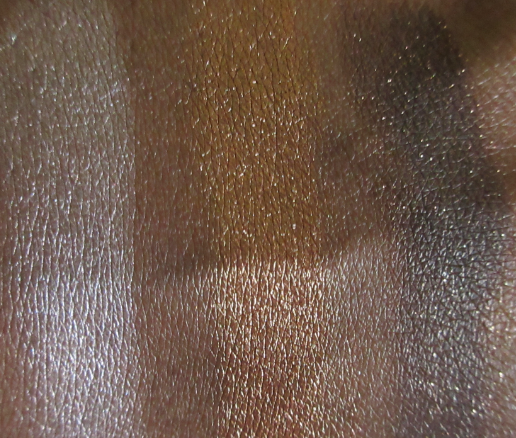
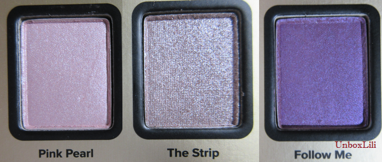
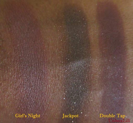
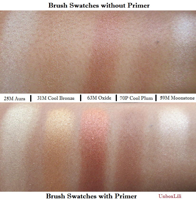 Please note that if used like any other eyeshadow, the color can be built up just as intense as the finger swatches. The brush demos were performed using one swirl of color, except Cool Plum. That shade required much more product to become visible at all on my skin. Here are some comparisons between my favorite and least favorite shades in the palette.

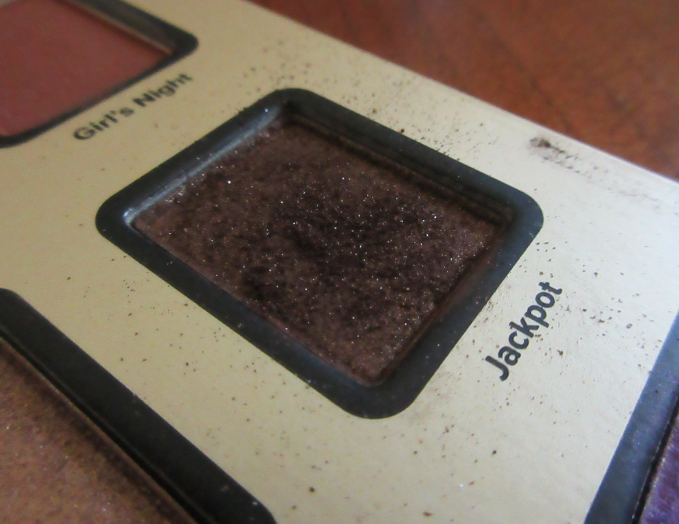
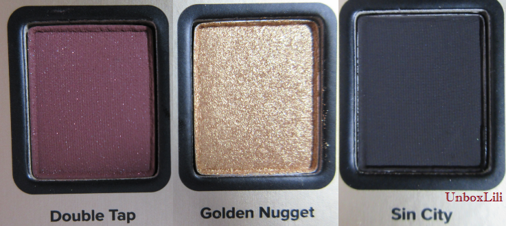
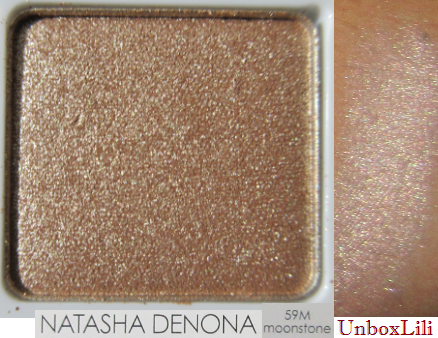
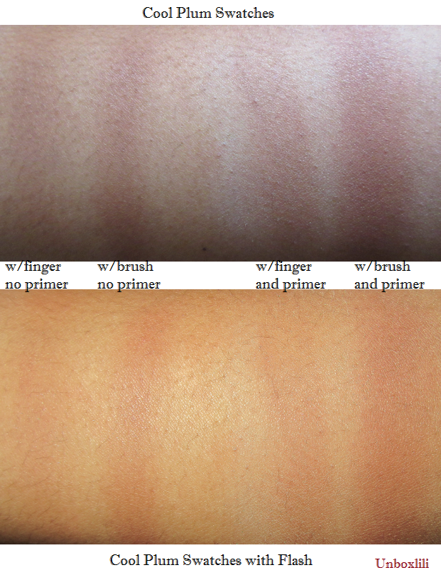 Cool Plum perplexes me. It is so much stiffer, harder to work with, and less pigmented than the other shadows. Considering the effort required to work with it, I’d rather use a dark color from any other palette instead. I’m also confused by the fact that it looks matte in person but in the photos of the palette online, and the description of the individual pan on both the ND and Beautylish websites, it’s supposed to be a shiny pearl shade. I see sparkle in their pictures but zero in mine.
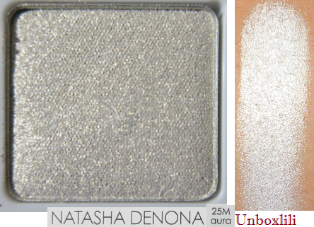
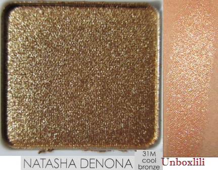
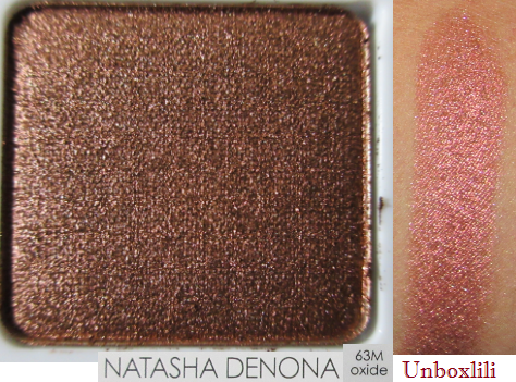
 From ND:

 From Beautylish:
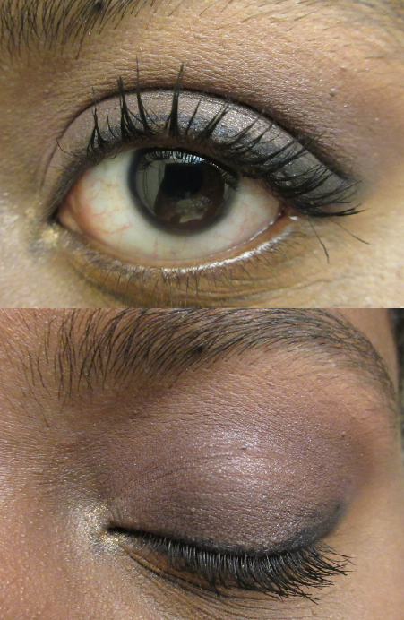
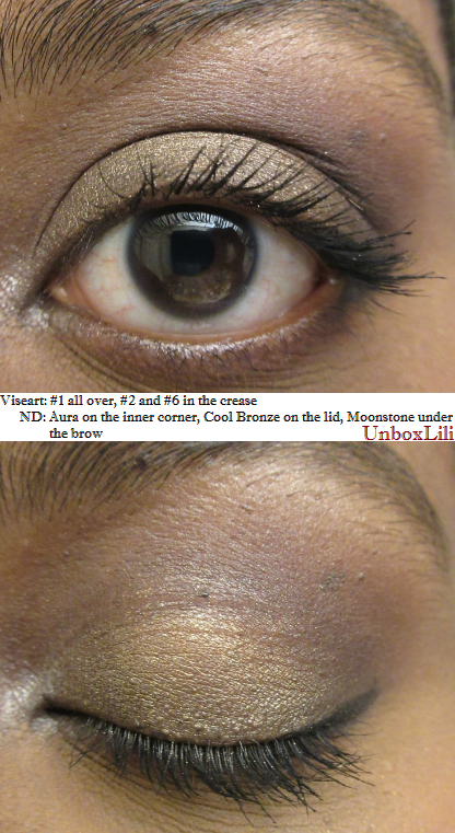
 I spoke with a friend who bought this palette at the same time that I did and hers looked matte as well. Aside from that mystery, there are a few more things to know; when using multiple colors they don’t just blend. They mix and form a new shade, like paint. So if you want to keep each shade separate you have to apply and blend carefully. Cool Bronze was partially on the inner corner when I applied Aura on top and it created a yellow gold color.
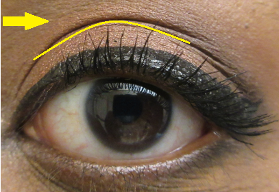
 If you have hooded eyelids you could run into the issue of color transferring from the lid to just above the crease. I have partially hooded eyes but this is the first time I’ve ever had this occur.
 There may be as simple of a fix as using a different eyeshadow primer, but I would have to look into it. Although not necessary for some, ND recommends those with oily eyelids to still use a primer.
 Overall, the negatives aren’t enough for me to dislike this palette or ND’s eyeshadows in general. I think the shimmers are very nice and I can see why so many people have been raving about them. The way it looks in person is quite special and I’m willing to work on perfecting a technique in order to use the shadows exactly the way I want. Minus Cool Plum.
Viseart Eyeshadow Palette 4 Dark Mattes
 This palette is also available at Beautylish but I purchased mine from Sephora.
The 01 Neutral Matte palette is what most people talk about but what makeup fanatic doesn’t already have at least one neutral palette after the Naked (and dupes) palette craze from 2014? There are seven of these 12-shadow palettes available and Viseart recently announced a new Rule of III collection of three half size (enfants) palettes coming soon to the makeup show LA.
For the rest of us, we can enjoy what is already available, like this Dark matte palette.
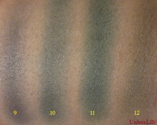
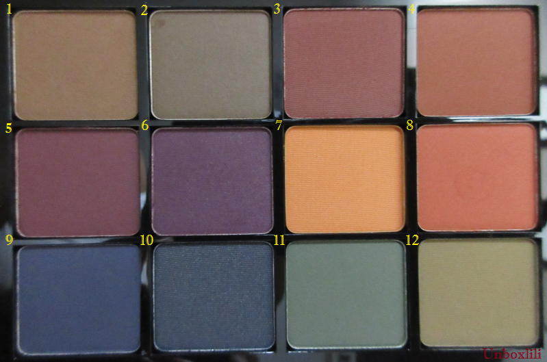 I’ve never seen such a beautiful arrangement of colors from a premade palette. I absolutely love fall colors and I will still be rocking these shades all year long. I absolutely love the first two rows. The last one is patchier but I don’t wear blue or green that often anyway. And when you build up the color it won’t be much of an issue. They all feel the same texturally. Not buttery but not super stiff either. They feel like Lorac matte shades but most of these perform even better. Below are single brush swipes over primer.


 Although the color and pigmentation is on the same level to me as Lorac mattes, the blendability of the Viseart mattes are insane. I’ve never seen mattes perform this way (minus the bottom row). Now, non-shimmers aren’t terribly exciting. Even if the colors pop, I always feel like something is missing without some shine on the lids.

 When I used an almost all Viseart eye look, I didn’t see what was so special about them at first. But then when I saw the pictures on camera it made complete sense. On camera they look ultra smooth/blended and just perfect. I’m certain a professional MUA can create even better looks with these eyeshadows than I can.
 These and Lorac Pro mattes share similarities but this palette is free of parabens, mineral oil, and other such ingredients. I have heard good things about Viseart shimmer shades as well but none of their colors grabbed my attention.
Final Thoughts on Viseart and Natasha denona Eyeshadows
In certain areas they do live up to the hype. I wouldn’t use either of these palettes alone and even together these two aren’t quite enough for me. Anyone looking for practical makeup for everyday use will likely find the difference in quality between these and other good palettes not quite enough to warrant the price. Those who take a lot of photos, make videos, or are MUAs may be more interested in testing and purchasing them. I do just enough for these to be relevant for me and to fit my needs.
❤ Lili