I can list too many examples of times I’ve wanted makeup and the look of the packaging swayed me into purchasing. There are also times I really wanted the packaging, so I chose whichever version would look best on me out of the options. The products I’m discussing today are the items in my collection that I bought purely for the packaging with the complete knowledge that the makeup inside didn’t suit my tastes. In this post, rather than reviewing the items, I’ll be looking deeper into why they attracted me so much.
Also, some of these photos were taken as long ago as October 2020. I’ve had the idea for this post for ages, but the fact that these items were always intended for the packaging and not the product inside, I kept dragging my feet on reviewing them. That’s why it took so long for me to finally complete this post.
Nostalgia Purchases
Glamlite Concha Highlighter
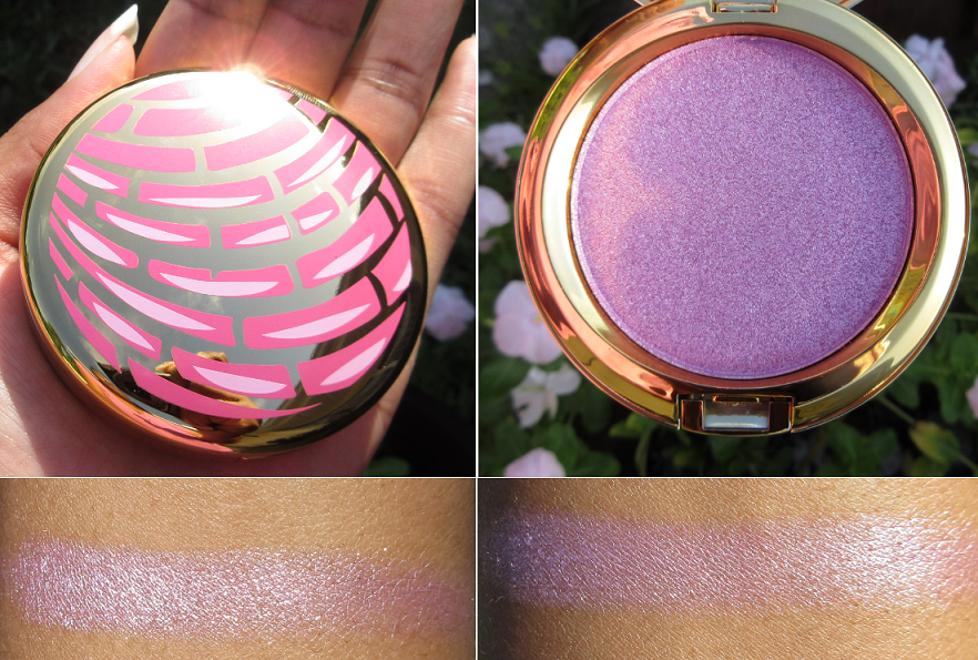
I believe Glamlite was founded at the end of 2017, and although I was interested in their products, my fears about online security made me extremely hesitant to purchase from anywhere but retail websites until 2019. I was even more selective about purchasing from relatively new indie brands, which I considered Glamlite to be. When I found out that Glamlite had a concha highlighter, all fears were thrust aside and I didn’t care that it wasn’t on sale and that I would have to pay full price for shipping. I wanted it and it was the only thing I bought in that first order!
The reason I had this kind of reaction is two-fold. For starters, my dad was a horticulturist from my childhood to teen years and commuted to and from the Tampa area for work, which has a large Hispanic population. The majority of the employees at the company were Mexican and would bring traditional dishes to the workplace. When I was a kid, my dad would sometimes bring me a concha that he got from someone selling them at work. I wasn’t allowed to have desserts and snack foods often, and I grew up with food as a reward system, so I was always so excited to be able to have one, especially the pink ones which were my favorite!
So, psychologically, I associated conchas with good behavior. I think this is the top reason I wanted to have that pretty packaging because it appealed to that desire to reestablish that feeling of being rewarded if I had it in my possession. The highlighter is too light and icy for my skin tone, but I needed it anyway.
The second reason is that I haven’t eaten a concha in like twenty years. I miss them. I don’t have access to them anywhere nearby. So, purchasing the highlighter was like my way of holding onto one forever. Ever since buying it in August 2020, I took the one photo pictured above and then never touched it again. It’s just been chilling in my highlighter drawer, but it brings me an inexplicable joy just knowing it’s there.
Sola Look Charmed Palette

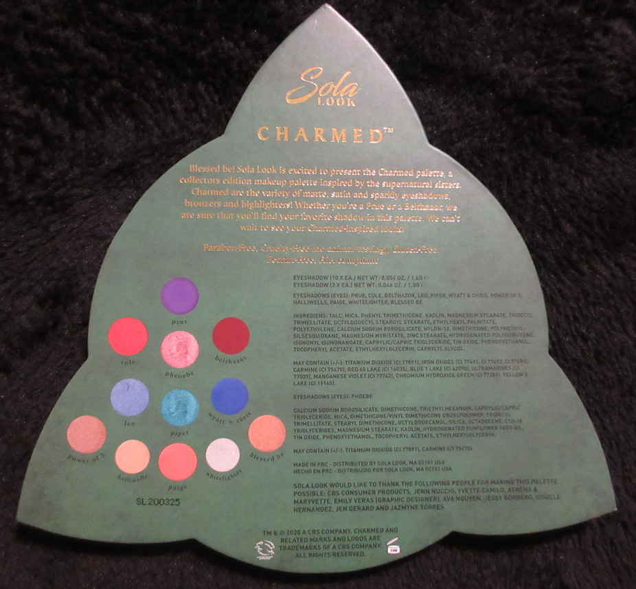


I learned about the Charmed Palette in July of 2020, but Sola Look had even fewer products available than Glamlite, which made me super nervous as to the brand’s legitimacy. I still signed up for their emails, so when I was notified a few months later about their 50% off labor day sale with free shipping, I was sold.
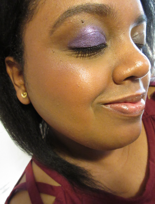
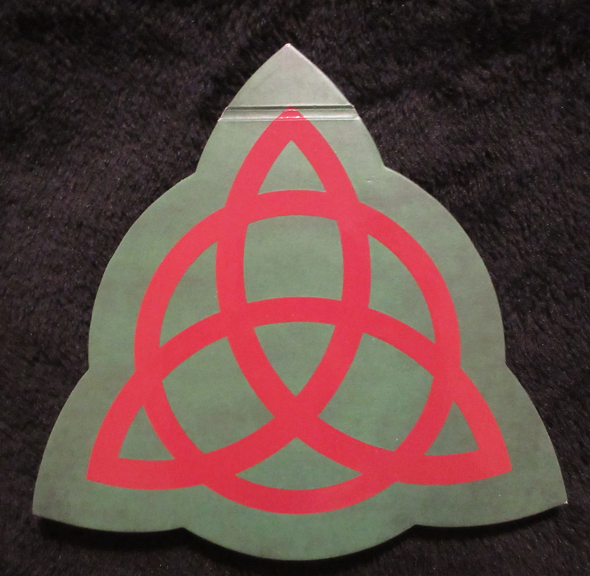
The original Charmed television show came out in 1999, but I didn’t hear about it until somewhere between 2002-2004. I was fascinated by the concept, but it wasn’t until one of my best friends bought me the first season on DVD that I was hooked! Absolutely hooked! After the final season, I rewatched the show in its entirety on an annual basis until around 2016. My friend and I were such fans of the show that I even made her a 167+ page photo album and recreation of the Book of Shadows, which required me to scour every episode of all 8 seasons to find wherever they showed a page of the Book of Shadows and type it up. It took months! I miraculously still have a copy of the typed pages and even though I intended to make one for myself too, I never ended up doing it. Instead, I have this palette to represent the Book of Shadows!
At the time that I bought the palette, Prue, Paige, Belthazor, and Piper were the only colors I was interested in having. This was far too neutral for me in 2020, but I can appreciate the shade selection a bit more now. I could have sworn I actually started a written review for this already when I did eye looks, but I couldn’t find anything on my computer except those swatches. I had to replace my harddrive last year after some of my files were corrupted, and I didn’t have everything on the cloud like I thought, so perhaps this was one of the missing things.
In any case, I described how much of a super fan I used to be, but the reason it holds so much importance to me is because the main characters were so relatable. I had a lot of lonely years and seeing these super powerful women and witches not always have their lives together, but be able to overcome it with the power of sisterhood, faith, love, etc really appealed to me. The relationship between Piper and Leo was my ideal dream romantic relationship. I would watch the show and say to myself, “That’s the kind of man I want.” The relationship between Phoebe and Cole/Balthazor also taught me that sometimes love isn’t enough. Love should never cost you to give up who you are and your ideals to make it work. It’s a painful lesson I had to learn in my real life and seeing the Charmed ones all make incredible heartbreaking sacrifices that would cause them pain, but they were better off doing, gave me the strength to make certain decisions as well. There are some dark themes in the show but also, the scenarios the characters got into were so entertaining and made me laugh during times in my life when I was really struggling with my mental health. The show helped me through those times in a way I can’t explain. That’s why I so badly wanted to combine my admiration of Charmed and my love of makeup together. That’s why I couldn’t resist eventually getting a palette with such a core important symbol of the show.
This palette is no longer available as Sola Look closed in February 2022.
The Cuteness Factor
The Creme Shop Hello Kitty Macaron Lip Balm

I talked about these in my lip balm post already, and how I expected the formula to do absolutely nothing for my lips, but I wanted it for the cute packaging! I love macarons and have even made some macaron clay jewelry (as well as the dessert), so there’s that. I didn’t watch the Hello Kitty show(s), but she’s so cute that I frequently want Hello Kitty themed things. I have no idea why I’m so drawn to her! There’s just something so intriguing about her being this cute character I see everywhere and know nothing about, even to this day. Hello Kitty has a die-hard following and I keep buying these items because I want to experience that excitement they have and be part of that club too!
I looked into why the design of Hello Kitty tugs at the heart and according to an article, “Branding expert Dorie Clark puts Hello Kitty’s popularity down to her simple, mouthless design. ‘She’s stoic, she’s expressionless, and people can put onto her almost any kind of emotion…she can mean almost anything to anyone.'”
ETUDE HOUSE x NESTLE: HERSHEY’S Play Color Eyes Mini Eyeshadow Palette

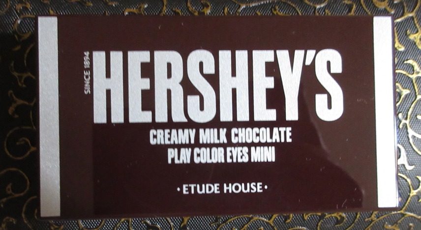
The idea of having makeup that looked like food that someone could pick up and get confused to find out it’s not edible was something my mischievous side always wanted, but there aren’t many that look realistic enough to trick someone or the item is too large and cumbersome to store. This release seemed perfect for me, but the adorable squares that looked just like the ones from a Hershey bar are what ultimately got me. I didn’t have the heart to even swatch the pans for fear of ruining it, and I don’t plan on trying it anytime soon either. I want it to remain pristine.
Too Faced Glowver Puppy Love Highlighter

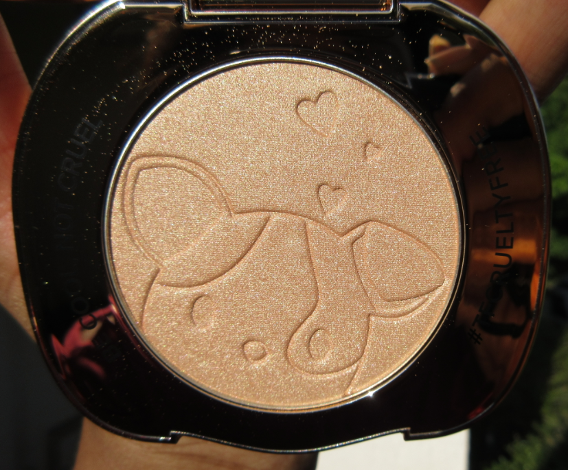

2020 (above) vs 2022 (below)
I love gold packaging, gold tone highlighters, and I’m a dog person. This would have been a match made in heaven if the highlighter wasn’t way too light for me, but I wanted it anyway. It doesn’t look too crazy on camera if blended in properly, but it’s more obvious in person. The shiny packaging with an adorable puppy face outside and imprint on the inside were too much to resist, but I couldn’t bring myself to pay full price for something I wasn’t going to use. It launched around May 2019 and I patiently waited for a sale that could justify the purchase. October 2020 it dropped to half price on Too Faced’s website, which is when I finally snapped it up! I really wanted this because it’s so cute, but it equally fits in the second category as a luxurious looking product because of that gold compact.
Looks Luxurious
Too Faced Diamond Light Multi-Use Diamond Fire Highlighter in Canary
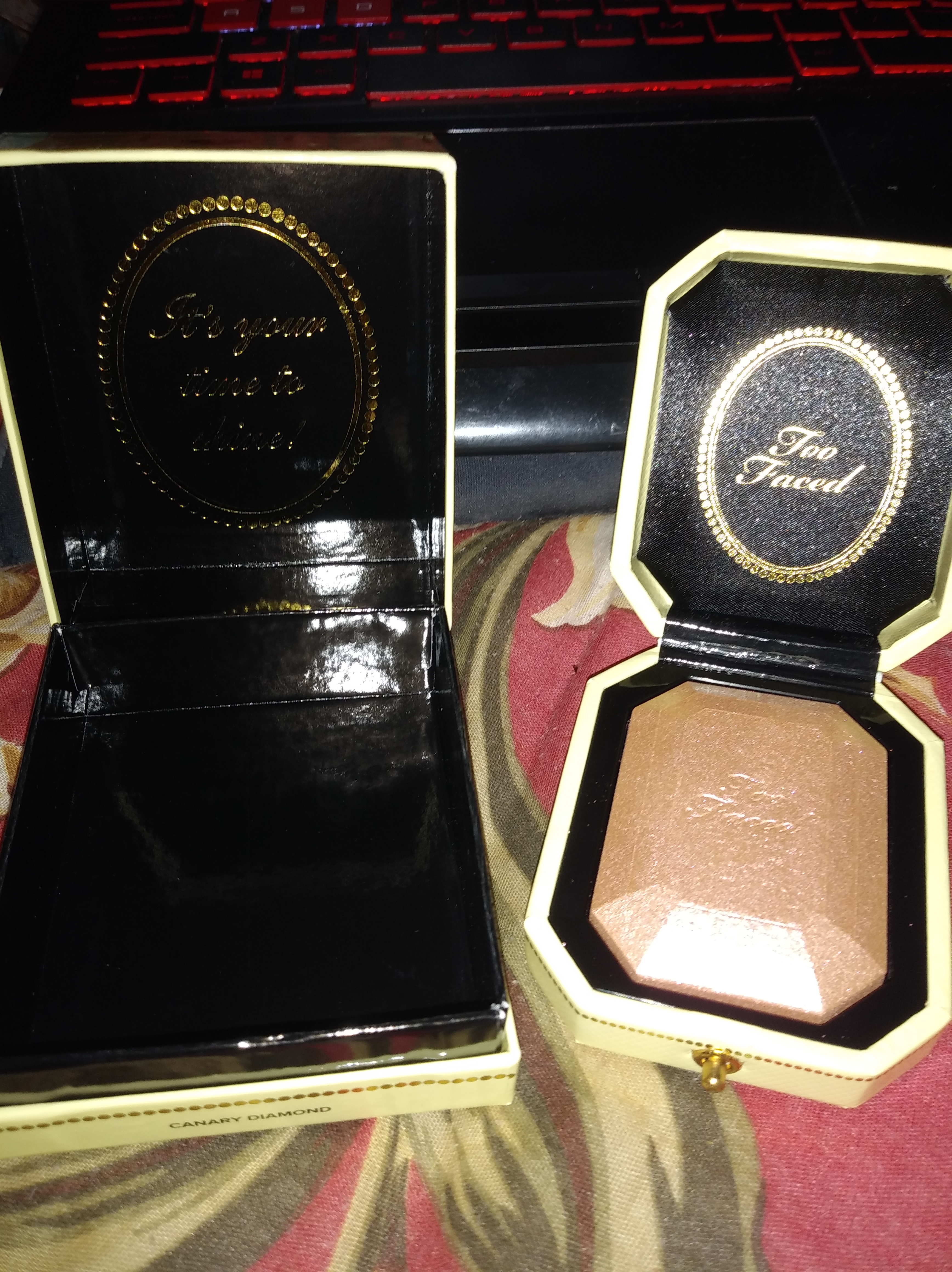

This seemed a lot more luxe to me in photos than when I got it in my hands, but I still really loved the unique octagonal shape of the packaging that held the all too glittery highlighter. It’s a bit bulky as well and even though it’s not on the level of me wanting to display it like I originally intended, I still don’t have the heart to get rid of it. At the very least, I would want to repurpose it in some way, like clean it out to be used as a keepsake box or jewelry box but at some point I think I will just end up decluttering it. The fact that it still reminds me of gems and luxury is what lured me in.
Smashbox + Hoodwitch Crystalized Highlighter and Cover Shot: Crystalized Eye Shadow Palette


I don’t believe I was aware of these products when they were originally launched in 2019, or I must not have thought they were worth getting at full price. In any case, when I eventually discovered these on Mercari, I purchased them for zero purpose of ever actually using them. I wanted to clean out the packaging to put my own DIY eyeshadows and face powders in them, but when I saw how pretty the gem design was inside the highlighter, I couldn’t bring myself to destroy it. So, both of these have been sitting untouched (by me) in my collection. I might still one day repurpose the eyeshadow palette, but the packaging for that one feels flimsier than the highlighter.
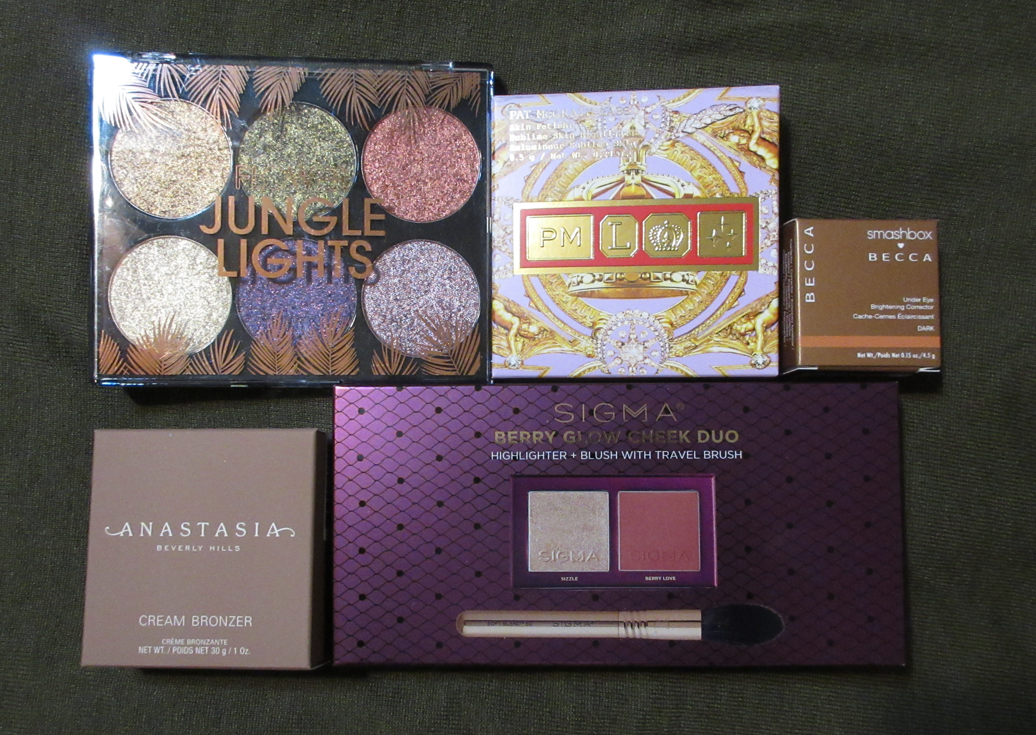
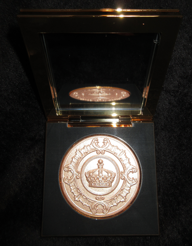
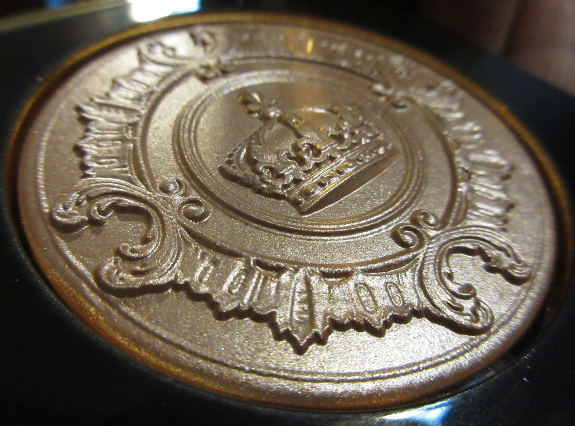
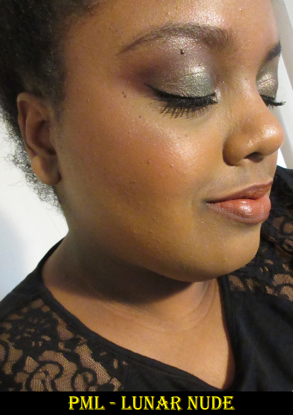
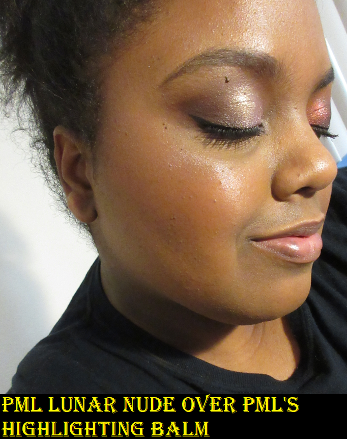
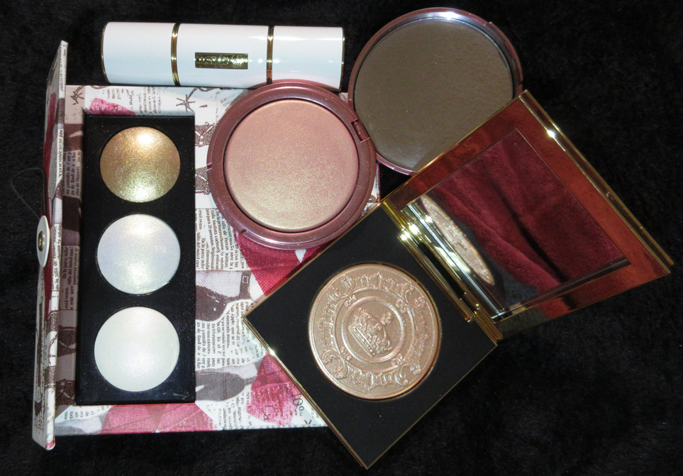
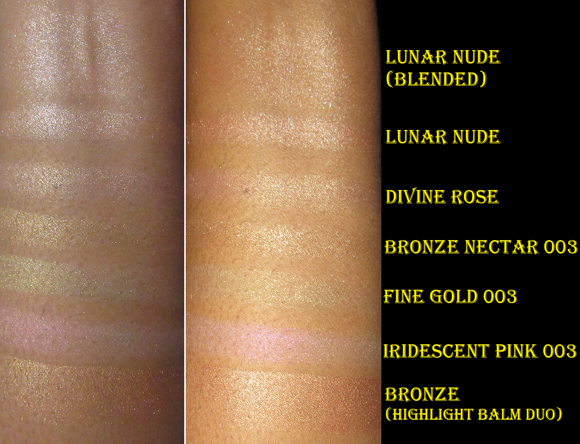
Pat Mcgrath Lunar Nude Sublime Skin Highlighter
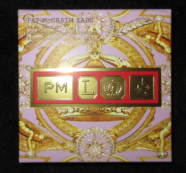

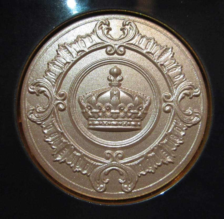

I’ve reviewed this product already, but this is one of those items I had to include here too because I knew ahead of time that I would find it too stark for my skin tone, but the gold packaging screamed luxury as well as the stunning crown embossing on the inside. Whenever Pat Mcgrath veers from the permanent black packaging, it’s incredibly difficult to turn a blind eye to it. Of all the products in the “luxury” category in this post, this one actually is luxurious, rather than just looking expensive. In the past, I hardly splurged on makeup beyond the high end category, so I was drawn to items that looked luxurious that was also within budget. I learned that it still won’t fulfill me to have fancy packaging if I can’t actually use what is inside. So, that’s something I’m trying to keep in mind now.
Bésame Cosmetics 1959 Sleeping Beauty Eyeshadow Palette
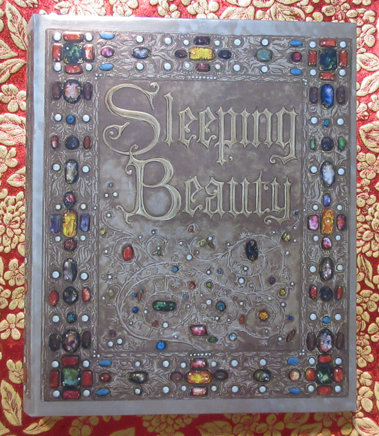


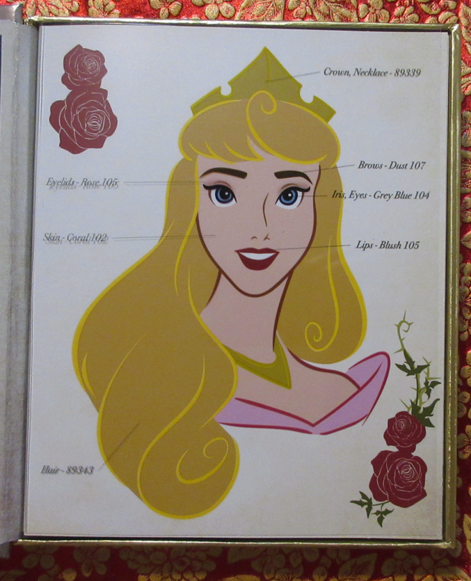
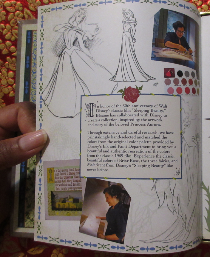

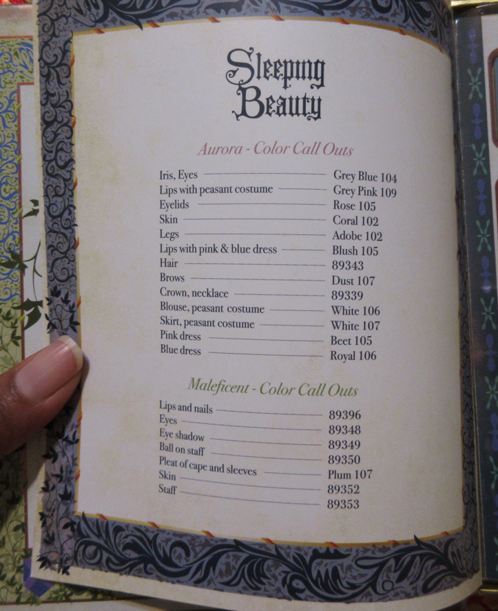
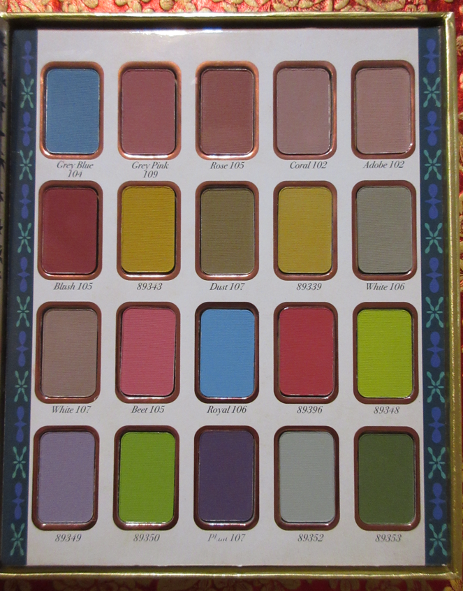
I bought this deeply discounted from Besame’s website and intend to keep it in pristine condition. None of these eyeshadow colors spoke to me, but I have a fascination with book-like packaging. This obsession of mine paired with the luxurious aspect of the gem pattern and top edge gilt/gilded page edges made this a must-have.
Fulfilled the FOMO
I Heart Revolution Teddy Bear Eyeshadow Palette Honey
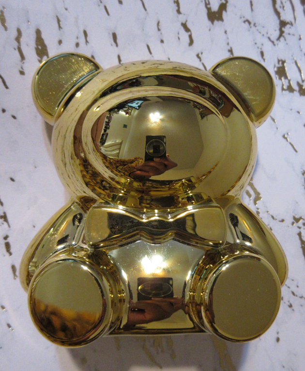
When the gold teddy bear Sephora x Moschino collection was released, I did a full review about the difficulty people had obtaining the items, as well as created a section specifically stating that I was anti-hauling the bear shaped palette. The reasons I cited were the repetitive colors both within the palette and among the shades in my collection, as well as the huge bulky shape that would take up too much vanity space. I did end up regretting not getting it, so when Makeup Revolution created smaller teddy bear palettes in various colors, I purchased this gold one in order to combat the FOMO I felt from missing out on the Moschino palette. Even though I’ve never used the makeup inside of this one and I don’t have any intention of doing so, somehow just having this in my collection for the very low price succeeded in making me not miss it. I probably wouldn’t have used the Moschino one anyway, so at least this takes up less room, wasn’t as much out of pocket, and fits on my vanity.
Although I try my best to avoid purchasing things purely for the packaging, I’m sure I will become susceptible again. In analyzing the traits that specific products have that succeed in getting me to buy them, I can recognize the signs and hopefully be able to rationalize with myself why I shouldn’t get them.
That’s all for today!
-Lili ❤