
The annual Sephora VIB sale ended last week and this was one of only three items I purchased. The Glam Face Palette appealed to the resurgence of my interest in neutral eyeshadows, my strong love of blush, and my attraction to highlighters. I did not enjoy Natasha Denona’s original blush duos that were part of her brand launch, but I’m a big fan of the Bloom Blush & Glow Palette, so I had high hopes.

I could see from videos that the back of the face palette did not have designated holes the brand sometimes includes for ease of popping shades in and out, but I hoped that with a magnet I could still pull the shadows out and be able to interchange them with any ND mid-size pans I wanted, since they’re the same size. Unfortunately for me, these pans are glued down to the palette, and since it’s metal glued to plastic as opposed to metal glued to cardboard, the pans would not pry loose no matter how much pressure I applied with my box cutter (which I use to depot shadows sometimes). I own a Z Potter, which theoretically is supposed to allow me to depot eyeshadows without destroying the palette, but the settings needed to melt glue in thick packaging has caused me, in the past, to accidentally melt and warp the packaging of things I wanted to reuse. So, I don’t want to take the chance of using it on this palette. In my eyes, this is the prettiest Natasha Denona packaging she’s ever made with such a sleek smooth mirrored bronze surface and those rounded edges. It looks and feels luxurious. Even though being able to customize the eyeshadow shades would be a game-changer, the price of the palette prohibits me from wanting to make further depotting attempts.


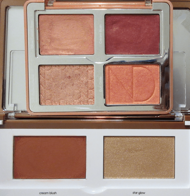
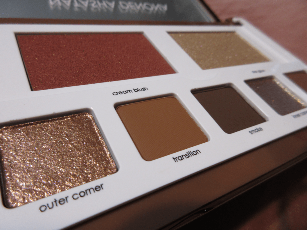
The plastic flap covers the blush and highlighter, so it’s natural to assume both are cream products, but it’s just the blush that has a creamy texture. The highlighter is a pressed powder in a formula that’s new to Natasha Denona’s brand, “that uses Japanese technology to deliver an extreme glow.” The way it looks in the pan with that texture instantly reminded me of the highlighter from Beauty Bakerie’s Brownie Bar.
The Glam Face Palette comes in a Light and Dark version, but choosing between them isn’t as straightforward as using only the Light palette if you have light skin and the Dark palette if you have dark skin. Those with light to medium skin could easily pull off wearing either palette because the face products in both are essentially in the medium zone. Ignoring what the shades look like in the palette, the Light version contains a light champagne highlighter with a blush that spans from light pink up to medium pink. The Dark version contains a medium champagne highlighter with a medium pink blush that can be realistically built up to medium-dark pink. I would describe the color itself as dark coral, which is akin to medium red in terms of depth, but just with a slightly different undertone. In fact, neither cheek shade in the Dark palette is actually in the dark range, which is why choosing which palette works best for those with light to medium skin could come down to the eyeshadows and whether someone prefers lighter or deeper toned eye looks. The highlighter doesn’t have a strong base color and the shimmer particles are so bright and reflective that it looks even lighter on the skin than it does in the pan. It may still leave a cast, but not as much as it would if it had a more opaque base. The blush is a buildable formula that blends out quite sheer depending on the application tool used, but even if I get the most concentrated amount of blush onto my cheek, it doesn’t look as dark as it does in the pan. That’s what also adds to the wiggle room as to which palette works best for someone. In Natasha’s own words, the Light palette is best for those with “light to medium” skin tones and the Dark palette is best for those with “medium or tan to deep skin…but both palettes wear beautifully on all skin tones.” However, I think someone with deep to rich skin tone might want to check what the palettes look like in-store because even the Dark palette doesn’t run all that dark in my opinion. The blush swatch in the photo above was done with two swipes with my finger, which kind of says it all. I also compared it to the blush from the Bloom Cheek palette further down and that took just one swipe of the blush from that palette. That one is what I consider to be an actual dark blush.
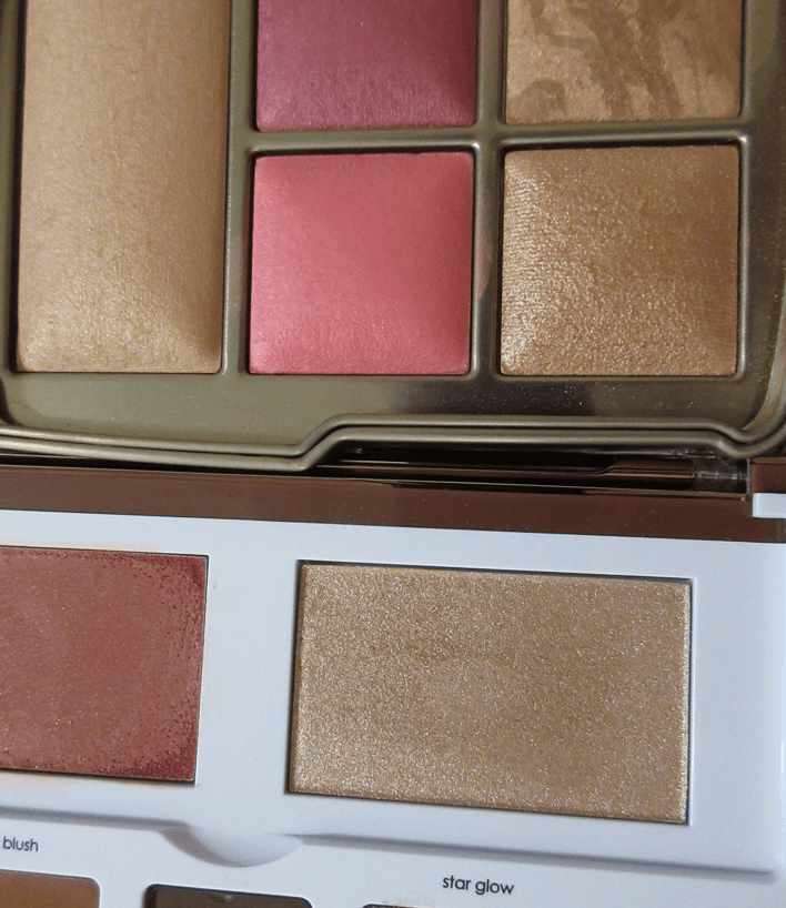
The Bloom Cheek Palette and Hourglass Ambient Edit Universe Unlocked Palette compared to the Face Glam Palette.

While I’m comparing palettes, I should add that the cream blush from the Bloom Cheek palette is a traditional cream formula, though it sets quickly and I definitely need to use it with the cream base to tone down the color. The cream blush from the Glam Face palette is cream to powder and doesn’t feel like anything on the skin until about the third layer, which is the minimum I need to get it to show as pigmented as I want. Using the Sonia G Classic Base, I’m not satisfied with the look of the blush until I’ve applied at least three layers, but it doesn’t get much deeper than that with even a fourth or fifth attempt using that brush. If I use my fingers, I get a lot more color payoff, but because the surface of my finger is so much smaller, I still need to apply three times to cover one cheek. So, I may as well use my brush which gives the smoother blend. When I try this with a denser flat top brush like the rephr 17, I’m able to build up the color to my satisfaction in 2 dips instead, but it’s definitely still not dark. With that brush I can achieve medium-dark level with about 4 layers. A sheer layer of this blush will set to the skin and be dry to the touch, but the more layers are added, the creamier it remains. In the amount I wear, it is not sticky but it’s also not transfer-proof.
With a sponge, I’m able to get the brightest color and most color payoff with the least amount of product, but as I continued to blend, it always moves the foundation and concealer I have in my cheek area on the left side of my face that’s covering up hyperpigmentation. So, my preferred method is using a dense brush. Another nice thing about the blush is that it lasts all day.
This buildable blush takes some effort to use, but I don’t mind because the result is so pretty! It’s the kind of shade I love where I get a natural flush without it being too bright, too dark, too light, too warm, or too cool. The color is perfection. The formula is almost perfect. There are random specks of shimmer in the blush, which I’m guessing is there intentionally to aid in the shine. I think I would have preferred if this had a sheen without the flecks, but at least the particles are on the smaller side and the area looks no more shimmery than I usually have on my cheeks anyway from shimmer eyeshadow fallout.
That ties in with another major thing to know about this palette. The top of the blush has a textured film over it which will make it a struggle to get any product onto the brush bristles. I recommend wiping off the top layer first before use. I think this is something that could affect many customers’ first impressions if this isn’t done.

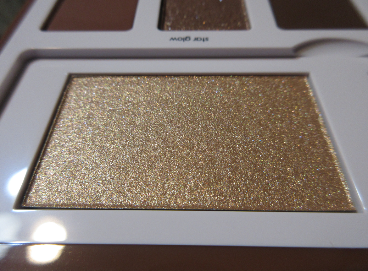
There’s no kickup when using the highlighter, which is nice. I can get Star Glow to look quite subtle using the Wayne Goss #15 Fan Brush and Smashbox Precise Highlighting Brush. With those brushes, I can dip into the pan multiple times to control how much I put on. However, when I use the Koyudo La Fuga del Gato highlighting brush, I gently tap my brush into the highlighter one time, yet that amount always lays an intense amount on my cheeks. Brushes make a big difference in look and performance with this highlighter! Star Glow is high shine. Even though the particles are very fine, it’s so reflective that it still gives me a sparkle effect. Sometimes I like it and sometimes it’s too much for me.
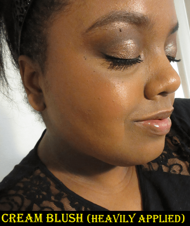


The amount of blush in the photo above is the most I can get if I’m not using a very dense brush. I would have to really go out of my way to successfully overapply the blush. The amount of highlighter in the rightmost photo was created with two passes from an brush that doesn’t pick up much product and one pass with a brush that picks up a lot. I would not want to build it up any further or it would start to look ill-suited for me.

As for the eyeshadows, I first tried following the guide based on their names. Because Transition and Crease are so close in depth with Transition being orange-brown and Crease being the slightest bit darker but red-brown, it was hard to see the distinction between them on my eyes, especially after adding Smoke. They just blended together without much of a gradient effect. I’m used to using transition and crease shades that are a little further apart in depth, so it took several tries to get used to having to be so careful where I place the shadows and how I blend where my eyes are partially hooded.

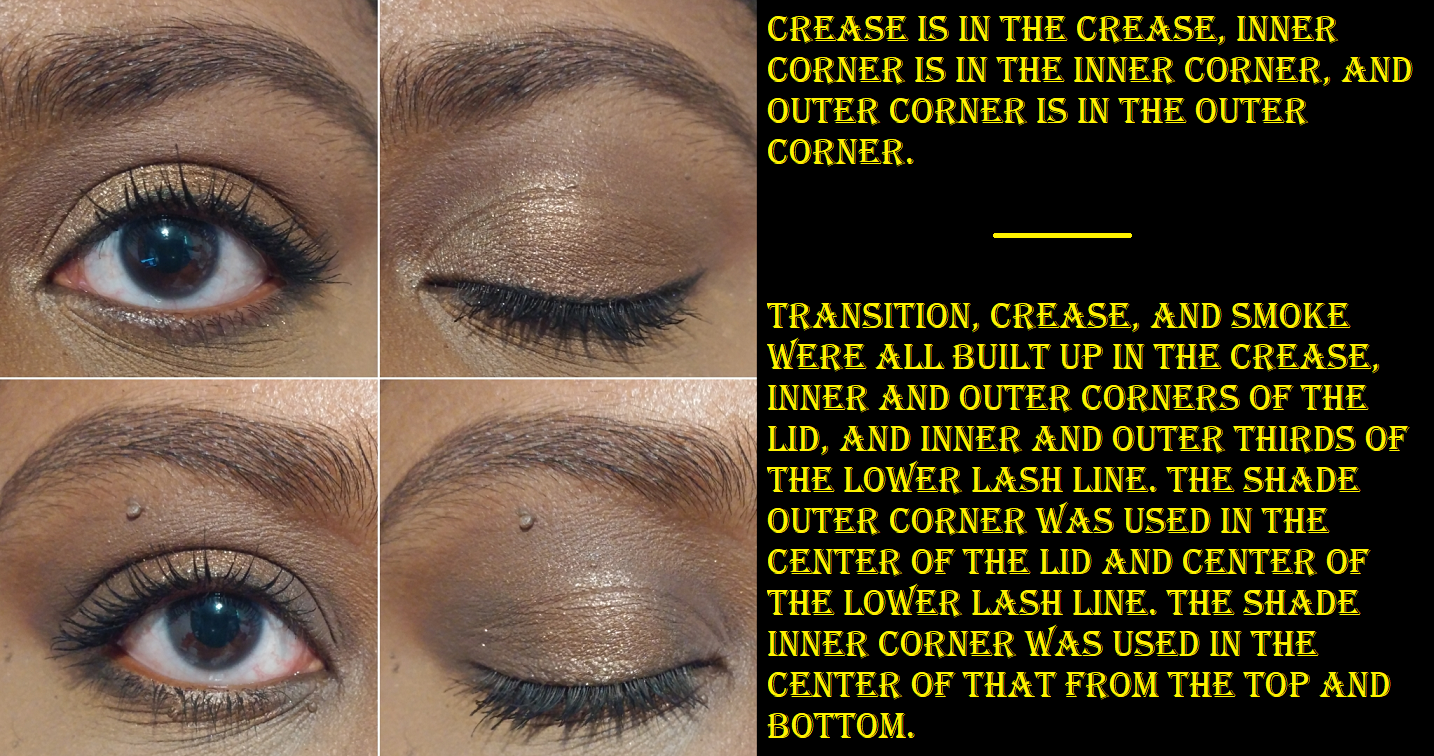

So far, I’ve used the shadows with the Gerard Cosmetics Clean Canvas, MAC Paint Pot, and Urban Decay Primer Potion. Although Cocoa and Layin’ Low aren’t darker than my natural eyelid color, I found that Transition shows the best when I use the clear-ish primer from Urban Decay. The shade Crease blends well on all of them. Smoke is a great deepening up shade, but I have to be careful to remember to give Paint Pot some time to dry down before applying the eyeshadows, or else the shades I lay down will darken up and be more difficult to blend. I don’t have to set Paint Pot with powder before using it with the eyeshadows in this palette, but it allows me to get started quicker. Another thing I observed is that I need to be careful in which direction I blow away the powder kickup. Sometimes the leftover matte eyeshadow dust goes into the pans of other shades and then when I dip my brush in there, I get a mix of another matte color.
The shimmers aren’t very intense unless they’re applied with a damp brush. Using my finger somewhat works for Inner Corner, but the shimmer from Outer Corner doesn’t stand out much without being foiled. Even if applied wet, I was still expecting something more sparkly like the shadows in the Lorac Noir palette. In order to create that effect, I have to pop Inner Corner on the center of the eyelid.

For my eye shape and considering the eyeshadow colors available, I will probably end up using Transition or Crease, but not both of them in the same look. I foresee myself using the mattes to create structure and then pulling a lid shade from another palette to complete the look, so some of the blend work will probably be covered up by my lid shade and the hooded skin anyway.
The eyeshadows are beautiful. From the lens of a neutral wearer or someone who loves wearing the same go-to eye look on a daily basis, I can see how this palette would be a beloved staple in their collection. I am absolutely crazy about the blush. The highlighter is nice, though not my favorite formula. Overall, this palette was completely worth the price at 20% off. It’s aesthetically pleasing on the outside and inside, and every single pan of product in this palette is usable for me. Even if it’s not my favorite, I can still use it all. I love it and I have no regrets purchasing it, but it doesn’t top the Hindash Beautopsy Palette in terms of the color variety I can get, the multiple types of uses, and being travel friendly. I can do my brows, eyeliner, blush, bronzer, contouring, setting powder, and eyeshadow with that one. Even though the Glam Face Palette has shimmers, I know I would still get bored of just having those two shades and would need a supplemental eyeshadow palette to use with it, just like I need with Beautopsy. The only thing Natasha’s palette has Hindash’s palette beat on is that it includes a highlighter, but since that doesn’t crack my top favorites list, I would want to bring a different highlighter if I took it traveling anyway. This wasn’t the most practical purchase for me, but I wanted it regardless. It brings me joy! In any case, this is going to be a more all-encompassing palette for a lot of other people, so if you were thinking about getting this one, I do recommend it.
That’s all for today! My next post will be after Thanksgiving, so for those who celebrate it, I wish you a happy time and I appreciate you stopping by my blog!
-Lili ❤

It’s funny you ended up mentioning a Lorac palette because seeing the eye looks had me saying to myself, wow I was more impressed by the Lorac shadows lol. I was expecting more from this palette but it is still beautiful.
LikeLiked by 1 person
Reviewing Lorac just before this did not do Natasha Denona any favors haha. The difference is quite surprising, especially since the new shimmer formula in the face palettes are being raved about by others, but I actually prefer shimmers from other palettes of hers like the Gold palette and Bronze.
LikeLiked by 1 person
Pingback: Natasha Denona Palette Ranking – Lili's Beauty Blog