
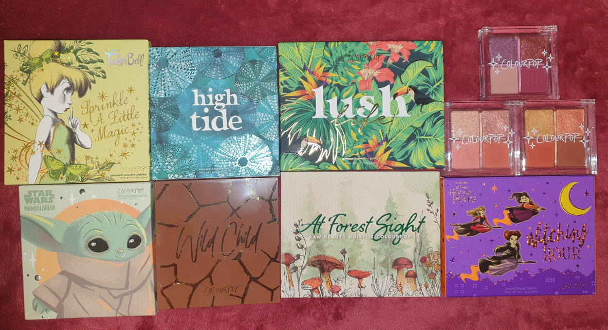
I originally drafted a post called, “Colourpop Update from Nov 2020 Til Now,” which was intended to finally catch up on all the Colourpop purchases I was making. The issue I ran into was that I kept waiting for my orders to arrive, but I was continuously buying Colourpop products monthly. Essentially I never caught up and that’s how we got here today. I have seven palettes and three quads that I bought from Colourpop that have just been sitting in my collection this whole time waiting to be used and reviewed.
It’s a bit fascinating how Colourpop’s marketing completely sucked me in. Here I was making monthly orders without even using and enjoying any of it, yet still unable to stop myself from continuing to buy the next “Must Have” thing that appealed to my sense of nostalgia or my love of particular color stories. Colourpop’s shipping went from a week to deliver (years ago) to a minimum of three weeks for delivery now. So, by the time I received my products, the hype was already gone and I felt very little motivation to post about it via social media and even less for my blog. It was like constantly chasing the excitement of what’s new, having it fade by the time it arrived, and then seeking something else to replace that feeling. The cycle was quite unhealthy and I knew that in the back of my head, yet they still got me regularly. The craziest part is that I actually did resist a ton of collections, yet I still ended up with all these unused eyeshadow palettes (plus everything else from other categories).
Colourpop x Raw Beauty Kristi At Forest Sight Collection Palette


Although this palette is no longer listed on the Colourpop website, so I cannot double-check the ingredients, Amanita has the symbol for what I’m guessing is a warning about potential eye staining due to the dye(s) used.
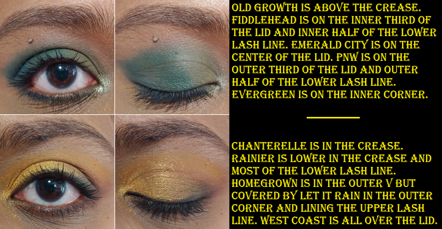
I only used this palette two or three times prior to reviewing it again now. This should be a color story I’m crazy for, but for some reason I don’t like how most of the shades look on my eyes and in combination with one another. The exceptions to this are Evergreen, Fiddlehead, and Homegrown. I love the shade Emerald City, but it’s a very patchy shadow. PNW at least fills the role. It’s blue, but leans closer to green than a standard blue shade. Other than my dislike of the tones, the patchiness of Emerald City, and the fact that Old Growth doesn’t show as pink on me, I think the other shades are okay despite them overall feeling dry and not the easiest to work with. I think this palette being a few years old by now is why the performance has declined from that first initial impression I had. It’s not bad, but it’s not as easy as my newer Colourpop palettes.

I always discuss my stance on an Influencer who is part of the collab, so in the case of Raw Beauty Kristi, I am still following her on YouTube though I don’t watch her anymore. She’s more into lifestyle content now, especially post having a baby. Congratulations to her, but I definitely don’t have the same attachment to her now as I did when I first bought this palette. Also, this is the only collab palette of hers that I have purchased. I did not buy her palette with PUR.
The packaging for this collab is cute. I love the theme. This collection was restocked quite a few times since Nov 2020, but I don’t believe it will be available anymore, which saves me from needing to say whether I recommend it or not. Other than Evergreen, Colourpop has these shades many times over among all their palettes, so most people could put this color story together on their own out of what they already have.
Colourpop x Star Wars the Mandalorian Child Pressed Powder Palette

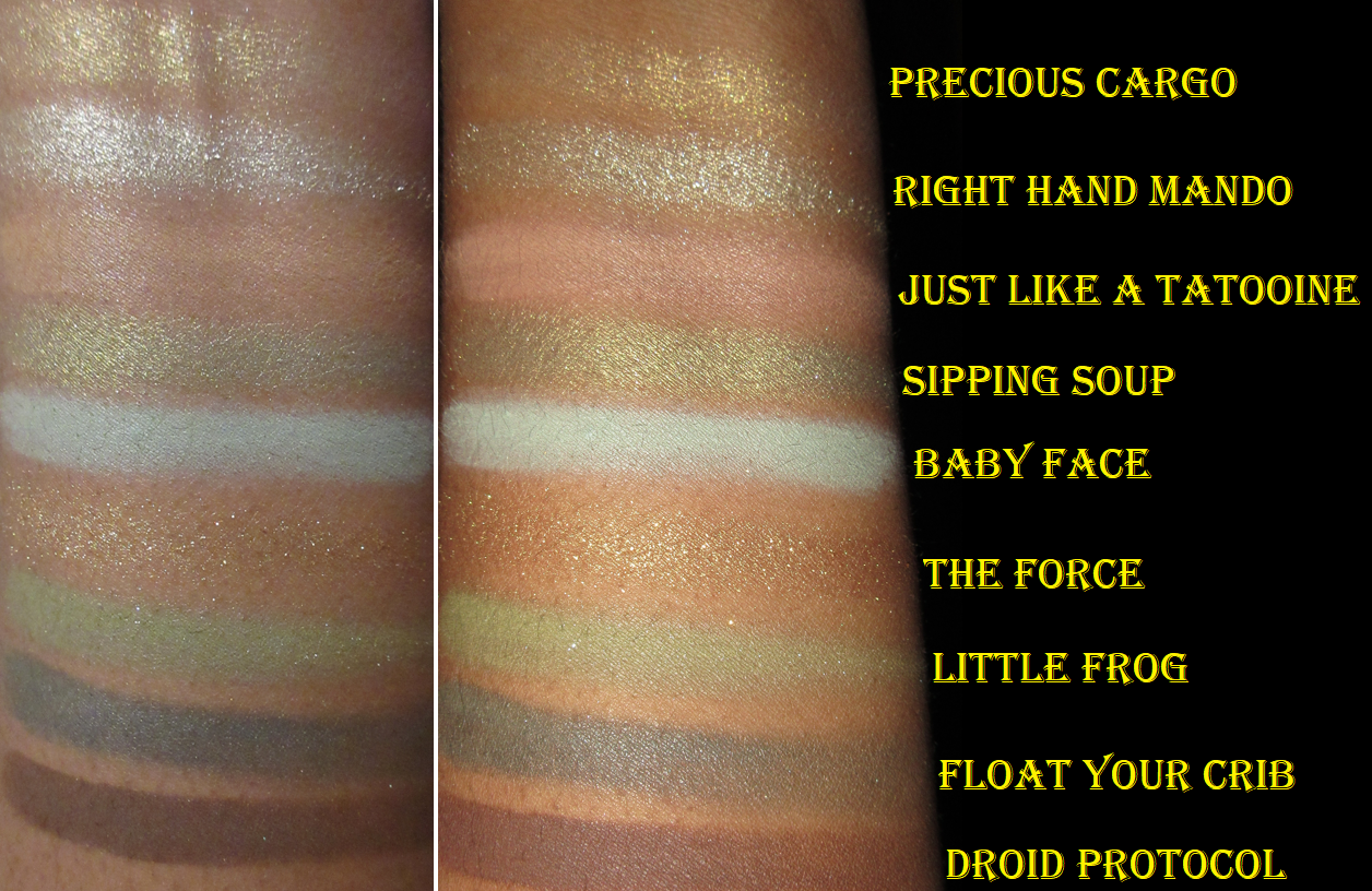
There are no eye safety warnings for this palette. The Force arrived broken, but I was able to re-press it.
I haven’t watched the Mandalorian TV show yet, but everyone knows about “Baby Yoda” (Grogu) and he looks absolutely adorable! I tried for a while to resist the packaging, but eventually I got it during a sale.
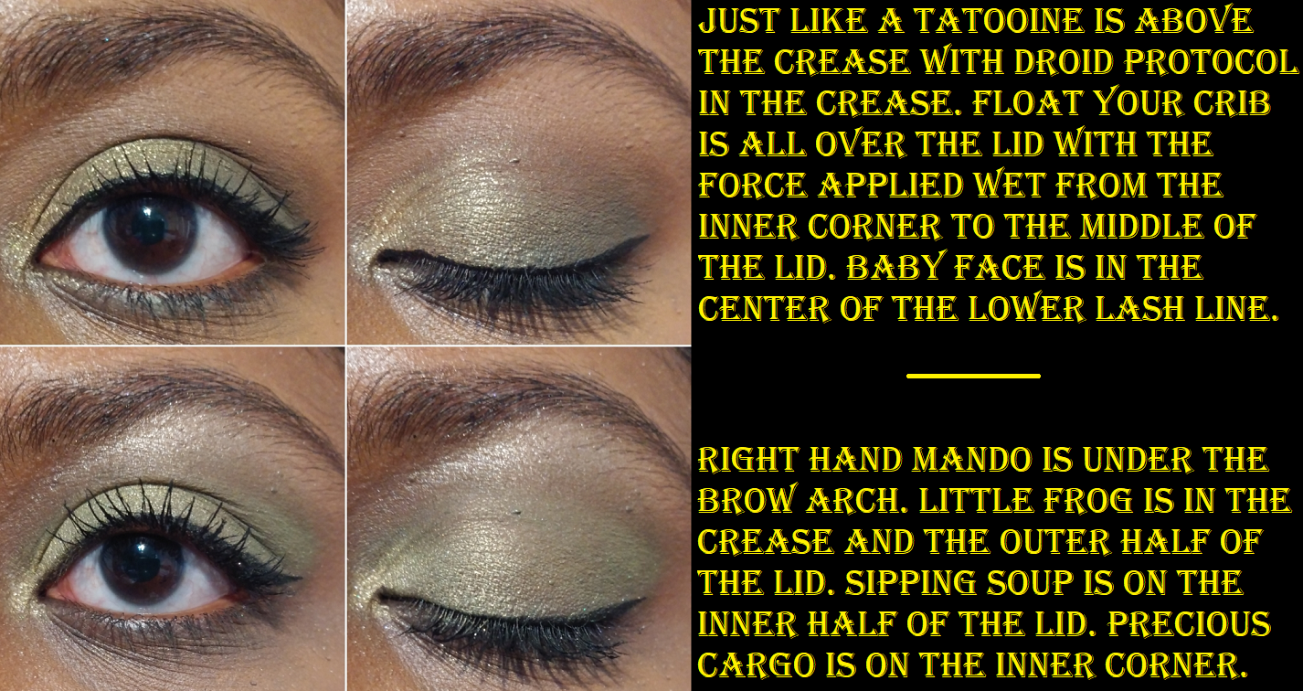
I love green eyeshadows and even though the depths of these greens are lighter than I typically go for, I really enjoyed the looks I’ve been able to create. However, the photos below show that I can make a similar look using entirely different eyeshadows from the palette. The matte shades aren’t redundant, but the swatches show two similar golds and two similar greens regardless of how they look in the pans.
The shadow quality is great. I think it is among Colourpop’s best in terms of performance. To those who like this color story, I could easily recommend this.
Colourpop Wild Child Palette
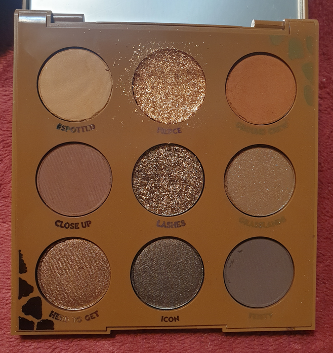
Sometimes Colourpop puts the warning asterisk next to the shade names on the inside of the palette, so I wrongly assumed this had no eye safety warnings. On the back of my palette, Grasslands was marked with the symbol of not being safe for use around the immediate eye area, but on Colourpop’s website it’s the shade Lashes that is listed as having PET glitter. More than that, it’s in an actual pressed glitter formula, so I will not be swatching or using that shade. This is quite unfortunate considering Lashes is the one that pretty much sold me on this palette. Since I cannot tell if my original packaging is correct and if Grasslands should also be considered not eye safe, I decided I won’t be using that shade on my eyes either. I dislike sequin/matte eyeshadows with shimmer in them anyway, and I don’t feel this particular color adds anything to the palette, so it’s an easy skip. I plan to depot them both after this review.
Fierce arrived shattered, so I pushed it back in, but it became a mess every time I used it. I somewhat resolved this by repressing it with some 90% isopropyl alcohol, but it still gives me fallout on the eyes if I don’t apply it wet.

The thought of getting rid of 2 out of 9 shades would normally make me question my decision to buy the palette, but the fact that I love all the other shades is why I don’t have regrets. If I’m reaching for a neutral shadow, I like a deep shimmery chocolate brown like Icon. I can build up enough depth to my liking with Feisty. Ground Crew makes for a nice transition shade and Close Up looks great in the crease. Herd to Get isn’t really my preference for the lid, but I do think it looks nice on me and it makes sense to have a shade like this in this palette. #Spotted I use for blending edges if needed since it doesn’t really show on me. Just like Herd to Get, I wouldn’t want to put Fierce all over my lids, but it’s a beautiful highlighting shade for the inner corner and center of the lid.
I like the looks I’ve created with this and I do want to continue using this palette. In the month of February, I made all the palettes listed in this post a part of my “shop my stash” and I repeatedly kept reaching for this one over the others. The quality is great and I easily recommend it. If there’s one thing Colourpop should nail, it’s a neutral palette considering how many of them they release and how chock full of neutrals most of their palettes are, including the more colorful ones.
Colourpop Lush Life Palette
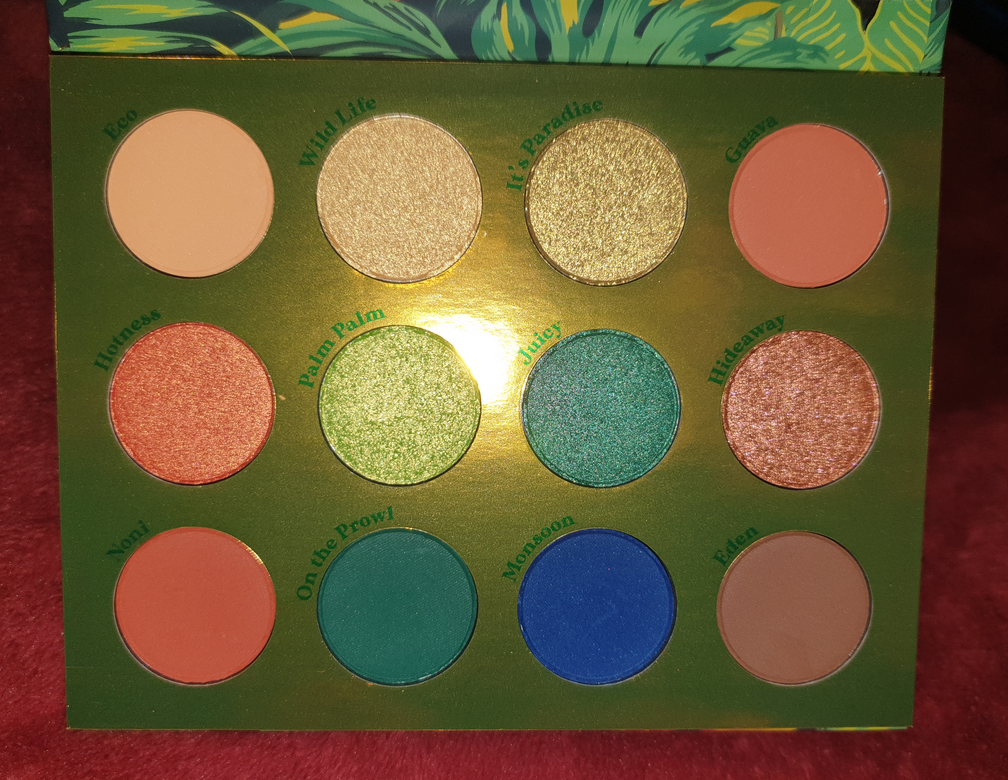

Speaking of a colorful palette with neutrals, we have Lush Life which is one of the most recent CP palettes in my collection. There are no eye safety warnings. I think the quality of the shadows in this palette is very good. It’s definitely among the best Colourpop has ever produced. The neutrals are pretty, though Eden is less of a plum brown than I expected from product photos online. It also gives me just barely enough depth for my liking.
It’s Paradise and Palm Palm are similar. This palette also has several matching matte and shimmer counterparts (On the Prowl and Juicy, Noni and Hotness, as well as Eco and Wild Life), which sometimes I can appreciate. In this instance, I find it limiting, but I plan on depotting some of these shades to create a custom palette anyway.
I have to give props to Colourpop for that stunningly vibrant Monsoon shade, and for it being so smooth and even as well. It’s probably the best vibrant blue I’ve seen Colourpop do. That shade paired with the greens, oranges, and yellow certainly capture the tropical vibe they were going for, and I like it a lot. This is another one I could easily recommend, even though it’s not something I’d be likely to use much if I kept them within just this color story in this palette.

Colourpop High Tide Palette
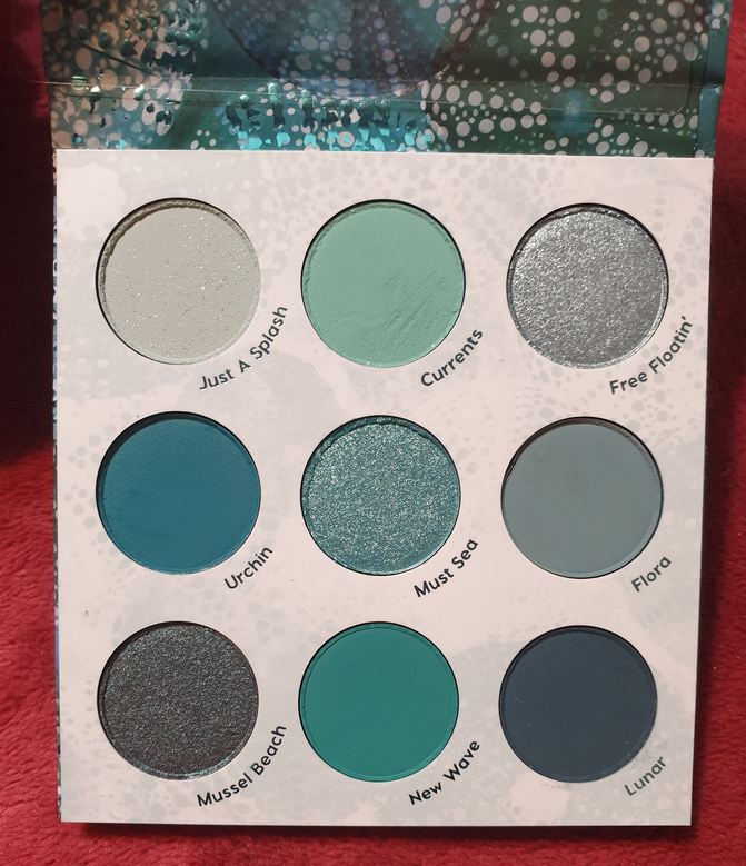

There are no eye safety warnings for this palette. It was first released as an Ulta exclusive before arriving on the Colourpop website. It’s mind boggling how much I felt I needed this palette until I actually got it in my hands. I love the look of these colors, but these are not the kinds of shades I wear all together. I don’t like pale blues on me, which eliminates half the shades. As for dark teals, which always attract me, I actually got sick of by the time I got around to using this palette. It was the last of the ten I tried and I kept dragging my feet on using it because I dreaded having to come up with eye looks for it. A lot of these palettes contain a teal/greenish-blue/warm blue and I was tired of wearing them back to back each day. Then, on the flip side, the third column of the palette contains cool blues, which was a nice change of pace, but I’m not the biggest fan of cool shadows on me. So, it’s quite perplexing how I was so intensely drawn to this palette and then quickly flipped opinions. It revealed my tendency to buy palettes with shades I find alluring, without thinking of how I would actually wear the eyeshadows together to make a look. This wasn’t a very expensive lesson, but it was a lesson all the same.

Other than the colors, the actual quality of these shadows is nice enough. The mattes are a bit on the thinner side, but I can understand wanting to do this since shadows this saturated can be harder to blend and patchy depending on the ratio of pigment/dyes. Two dips with my finger in the pan (as seen in the swatch photo) show how evenly I can spread the color, but also how they’re not as opaque because of how thin the powder is. The mattes have to be built up a little. As for the shimmer formula, there’s a bit more slip in these than usual. While this can help with spreading the shadows, it’s so much that I can accidentally pick the shimmer back off my eye and either onto my finger or move it to gather on a different spot. It basically can create sparser areas devoid of shimmer that I have to build up and smooth over. This doesn’t happen in a large enough area to be a nuisance, but it noticeably adds time when creating a look. This may seem like bad quality, but it’s just a matter of someone’s preference because some people really like that dimethicone feel to shadows or like a shadow that takes little effort to blend, even if it does mean having to build it up though. I’m able to create very pigmented looks, so I applaud Colourpop for that. However, I’m planning on only keeping Mussel Beach, Must Sea, and Lunar, so I can’t really recommend this palette on the basis of this not adding much to the Colourpop line. I do love that Mussel Beach is a bit different for Colourpop as a brown-teal duochrome shadow. It’s a teal version of Clionadh’s Vortex, but without much shine. That’s the one aspect that would have been better with the Mussel Beach shade if the shimmer particles were brighter.
Colourpop x TinkerBell Palette


This palette is no longer listed on the Colourpop website, but there appears to be no eye safety warnings on my packaging. I’m slightly conflicted about my feelings on this palette because it always makes me think of the Child palette, but then I want to reach for that one instead of this because those two pale beige-pink eyeshadows are so off putting. It’s a pet peeve of mine to see redundant shades and multiple brow bone shades. This palette hits at both of those points with Second Star looking insanely ashy on me and Big Magic being less ashy, but also not showing up very much at all. Once again, we have a mattes with shimmer counterparts between Awake and Neverland as well as Sleep and Tink. And, again, I feel as though this limits my looks.
The upside to this palette is the really great quality. I had no issues blending the mattes. The shadows are pigmented. The shimmers are opaque and easy to apply. Place Between is sparkly and gorgeous on the lids. Neverland is this deep green-blue that I tend to like. The palette packaging is very cute, though I wish it didn’t have actual glitter on it. It’s the gritty kind that you can feel is raised when handling the palette, and the kind that will start sprinkling a few glitter particles here and there as time goes on.

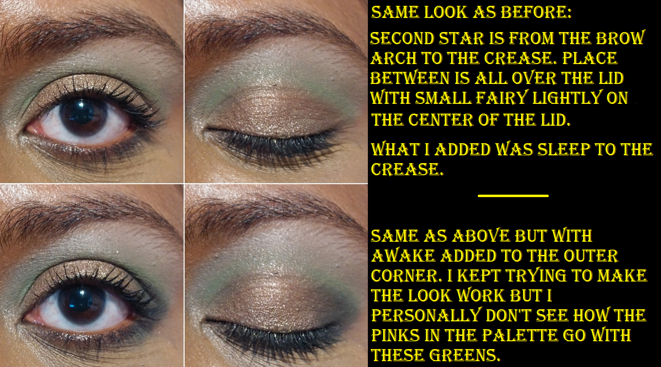
The biggest struggle I had was trying to fit the brown-pink shade, Place Between, into my eye looks while trying to exclusively use this palette. It makes sense to use it with the pink mattes, except that those shades don’t give me any color. So, I am forced to pair it with greens and I’m not sure how much I like that. It’s certainly a different color combination for me, but I don’t know if it’s a “nice” kind of different.
Colourpop released another green palette with a pop of pink called Limelight. I’m curious to see the reviews and comparisons for that one.
Colourpop x Hocus Pocus Witching Hour Palette

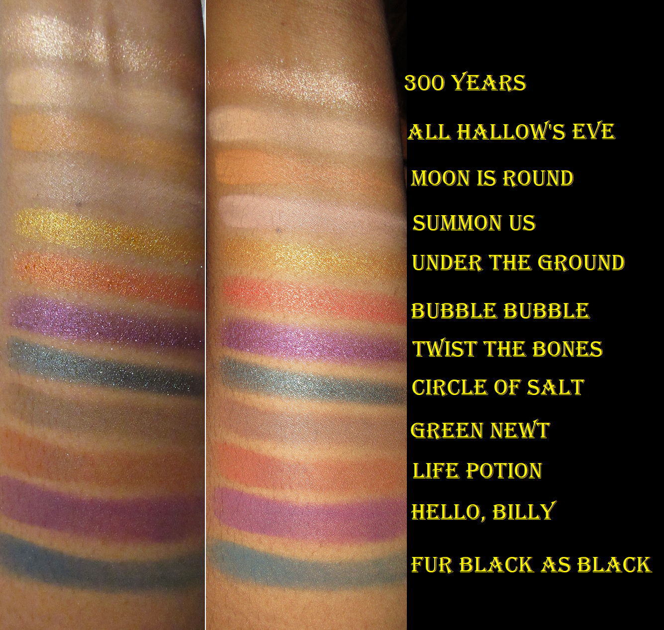
Hello Billy has an eye safety warning on the Colourpop website, which I believe is due to the dyes/staining. The palette arrived a bit messy around the edges of the pans, but nothing was broken.

Halloween is my favorite holiday, so I grew up watching and loving Hocus Pocus. I didn’t get anything from the first collection between the IP and Colourpop, but this palette had such a “me” color story that I had to buy it. I’ve complained about this aspect before, so I won’t harp on it, but I still need to point out the matte and shimmer counterpart thing as well as the similarity of Summon Us and All Hallow’s Eve on my skin tone.
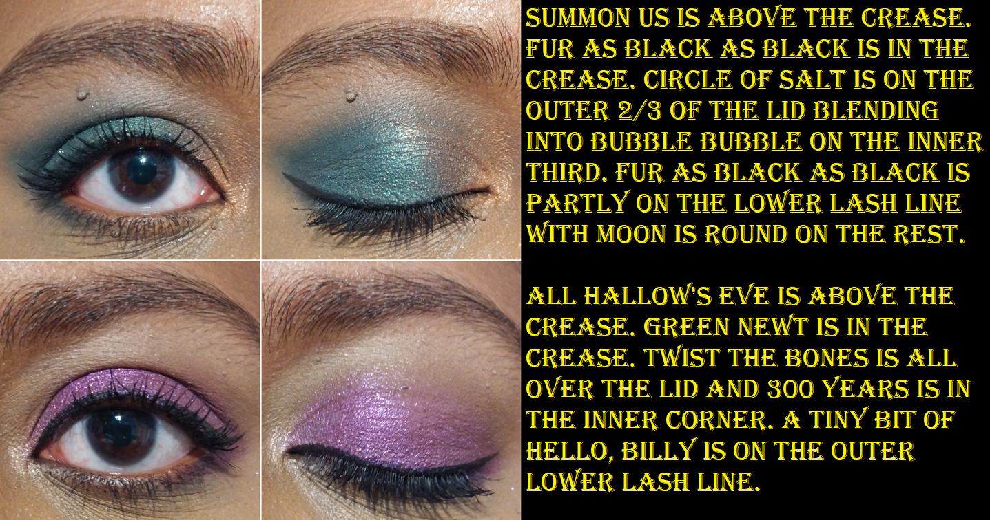
As has been seen in many of the other palettes reviewed today, I tend to pull 5-6 shadows in my eye looks. With this palette, I’m satisfied with my looks when I stick to 2-4, which saves me time. I like that I don’t have to think too hard about what I want to do with this palette. All the eye shadows perform nicely. I recommend this for those who don’t already have one of Colourpop’s many palettes containing teal-ish blue and purples like It’s a Mood, Play it Jewel, or So Jaded.
Colourpop Eyeshadow Quads in Creamsicle, Mocktail, and Secret Life of Scorpio
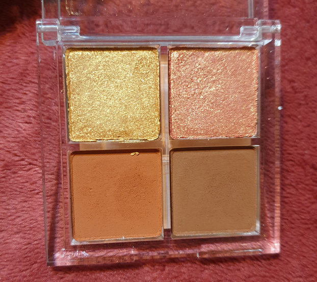


EYE SAFETY WARNINGS: For Creamsicle, Big Treat has PET glitter while On a Stick, I’m guessing, is dye/staining warnings. For Mocktail, Shaken has PET glitter. For Scorpio, Secrets Secrets might also have the warning for dye/staining. I should have been more careful and checked for PET before purchasing since I don’t like to use polyethylene terephthalate, even if it’s not in a pressed glitter formula. I am sad to say I will be decluttering Creamsicle and Mocktail from my collection since the pans in the quads are not removeable/replaceable. Plus, Iced from the Mocktail quad fell out of the pan on me already. I was able to press it back in, but I don’t want to have to worry about that happening again in the future.

Prior to working on this post, I only used Creamsicle and Mocktail twice each. The photo above showed the looks I created for Instagram. I was very much into these softer shades at the time that I bought them, which was when Colourpop first started making quads in this clear packaging. I love the concept of being able to have a curated look without needing to think about it, and having all the shades show up nice and pigmented on my eyes and not give me any issues to use. I also liked the level of sparkle, which I now know has the chance of being PET glitter, so I’m a bit unhappy about that.
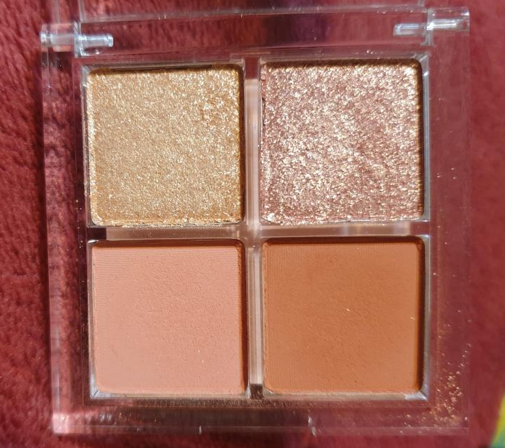
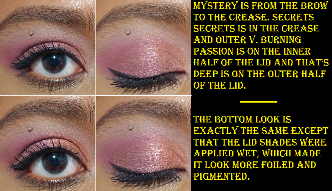
Before I knew this, I had already purchased the Scorpio quad because I knew the quality was going to at least be decent. This was also the first time anything Scorpio related (my astrological sign) had a color story I liked, as well as being the prettiest of the twelve released! Secrets Secrets is one of Colourpop’s most repeated type of reddish purple/burgundy colors they like to do, and the performance is always the same: very pigmented but slightly patchy. I always find this kind of shade appealing though. The shimmers are quite beautiful, but soft. They need to be applied wet or on glitter glue in order to make an impact.
Scorpio is a nice cohesive quad, but part of what always draws me to Colourpop is their packaging. Other than the outer cardboard that this comes in, there’s no design on the front of it to distinguish it from all the other quads, which makes it less special to me. No one is going to know this is a special Scorpio quad except me when that lightly imprinted Scorpio symbol is rubbed off the Secrets Secrets shade. If I’m buying makeup with basic packaging, the quality inside has to be worth it for me to reach for it. This quality is good, but I don’t intend to buy anymore. In fact, as much as I like the Colourpop palettes I have, I never reach for them. It’s always the packaging, rather than the eyeshadow formula that draws me in. So, unless they collaborate with an IP that would be nearly impossible for me to skip like Harry Potter, Doctor Who, a first actually good Marvel collab, etc. I’m going to try my hardest to stop buying Colourpop eyeshadow palettes.
BONUS REVIEWS
I decided to go ahead and also show the other eye products I also bought from the brand since November 2020 until now.
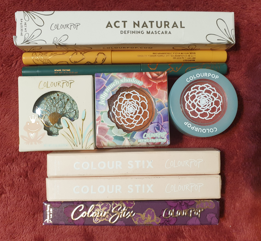
Colourpop x Raw Beauty Kristi At Forest Sight Liners in Marigold and Spare Thyme
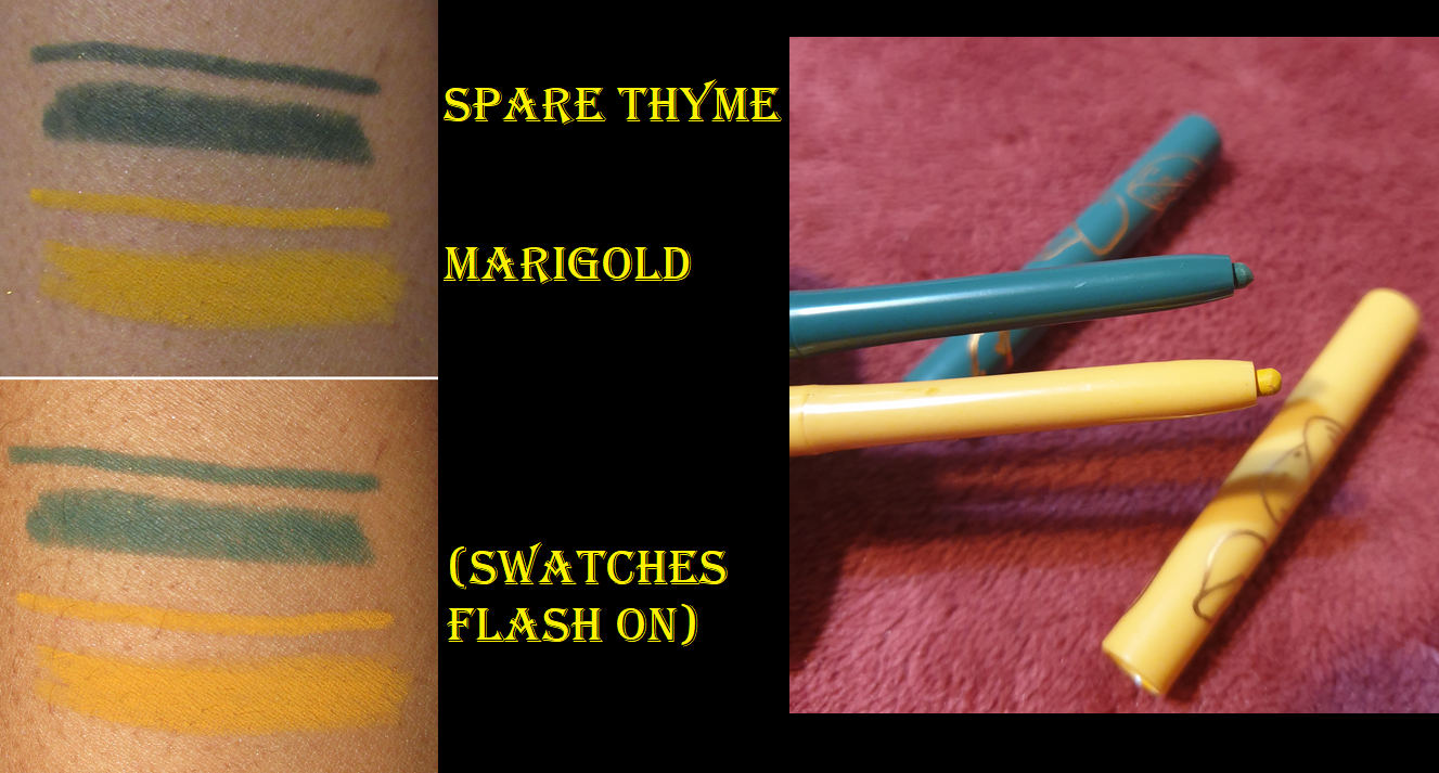
Spare Thyme sold out in my cart during the initial RBK launch. I was able to snag Marigold. I don’t have many colorful liners, and something about Colourpop ones (perhaps how matte and dry looking they can be) don’t look great on my waterline unless I border them with an additional black liner as a frame between the color line and my lower lashes (for example the first look in the At Forest Sight section). The fact that it took three or four restocks before I could successfully buy Spare Thyme before it sold out is why I ignored this fact with Marigold and decided that somehow Spare Thyme would work better. In this case, it actually does look better, but it’s more to do with it being a darker color. All the previous Colourpop liners I used were light shades. Because of my personal preferences, I can’t be objective in saying whether they are worth purchasing or not.

Colourpop Colour Stix in Free Time, Venus Slipper, and We’re Off


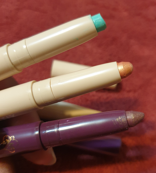
My issue with light shades of Colourpop liners are multiplied with the matte version of these Colour Stix. I don’t like the look of them on the lids from my experience with We’re Off and other videos I’ve seen online. Unlike this one, Free Time and Venus Slipper actually dry down and don’t rub away as easily. I’ve had Free Time for nearly a year longer than Venus Slipper, and that one is a bit stiffer. It’s not as easy to get smoothly onto the lid, so I’d keep that in mind for those wanting eye products to last longer than the recommended period after opening.

I’ve purchased a few of these for my sister, so I do like them (at least the shimmer/metallic formula), but shadow sticks generally aren’t my style, so I don’t think I’ll purchase more in the future.
Colourpop x Disney Princess Down in New Orleans Super Shock Shadow
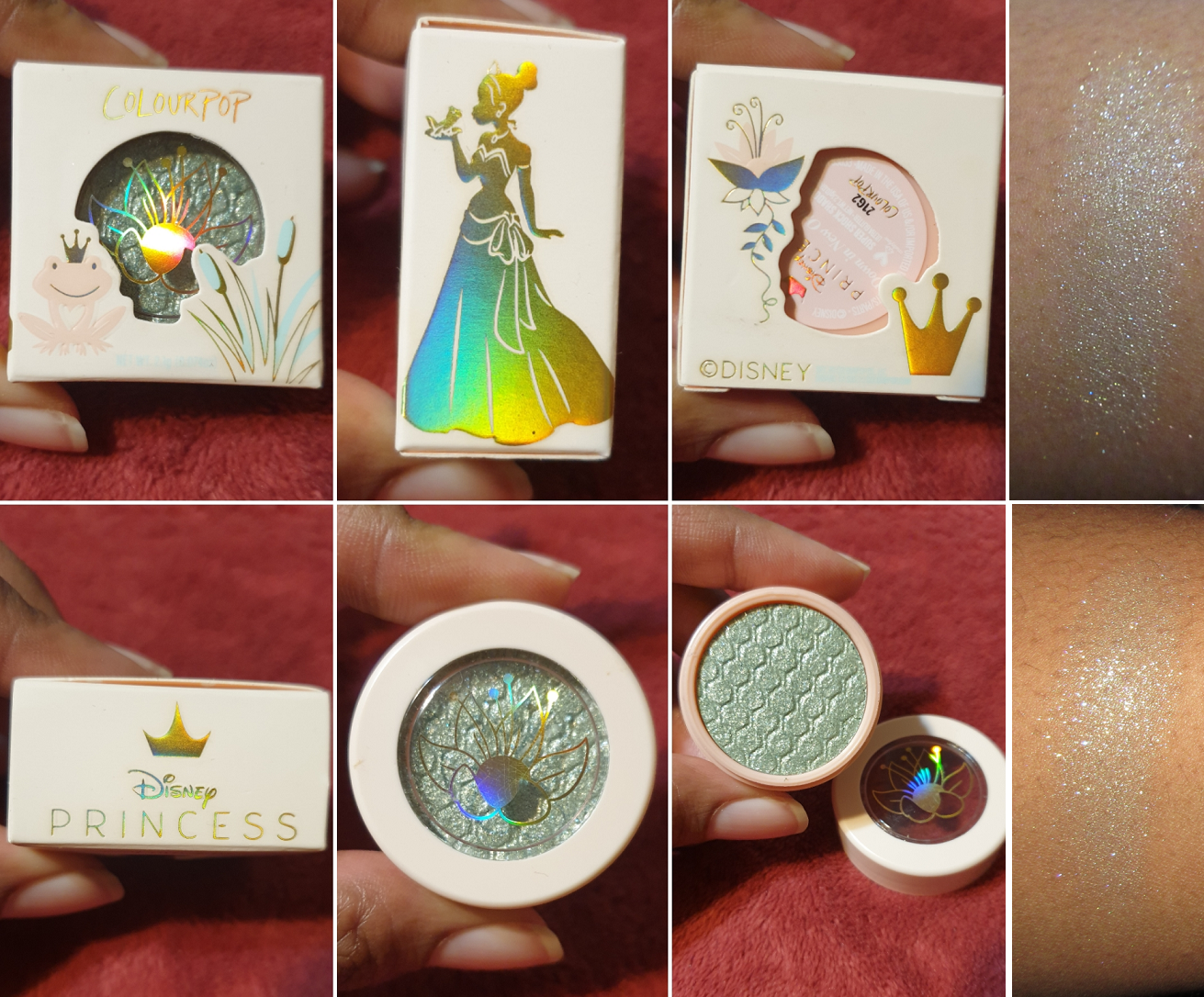
This SuperShock is more of a topper kind of shade, so I haven’t attempted to wear it alone on the lids. It took several rubs to get that swatch to even build up to that. I definitely did not buy this shade for the color. I bought it because I’m quite the fan of Tiana. Her personality reminds me of my sister in so many ways, so it’s only natural she’d be my favorite Disney Princess.
I could barely see the seafoam green base in the shade on my arm. When used as a topper, all I see is silvery white, so those with dark skin should keep that in mind. This shade is even less pigmented than my other Super Shock Eyeshadows, but if CP was aiming for a topper, they certainly nailed it. If it wasn’t for the Princess and the Frog theme, I would never have picked up a shadow like this, but it does have its uses as a highlighting shadow. I know myself though and I never reach for eyeshadow singles, so this is just a collector item for me.
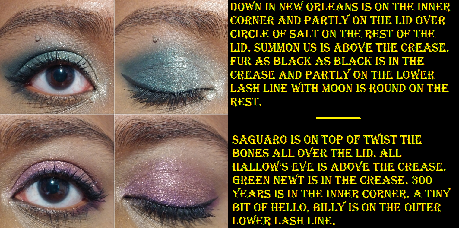
Colourpop Garden Variety Jelly Much Eyeshadows in Saguaro and She Grown

If those shades look dried out, it’s because they are. Saguaro was my “new” shade that I bought a little over a year ago and never used. When I finally opened the jar, as can be seen by the crust around the edges, I discovered it was dried out. The lid was partially open, so there was no hope of me being able to avoid that. Every so often in my Colourpop orders, products with lids aren’t screwed on all the way. I try to remember to check for that, but in this case I completely forgot to and just left it in the original packaging until it was time for this review.
I could still rub the surface of these shades. I was surprised to see that She Grown, the shade I’ve shown before in one of my last Colourpop reviews, swatched more smoothly than Saguaro even though it’s four months older than Saguaro and had been opened and reopened several times.
I’m going to toss these out, but they certainly were shiny and gorgeous. It’s a shame they went to waste because of my same issue with reaching for single eyeshadows. Because these eventually dry out, I can’t recommend them.
Colourpop Act Natural Defining Mascara

I’m wearing this mascara in the sections demonstrating the Colour Stix on the eyes and the RBK eyeliners. I got this for free in one of my orders. The bristles keep the lashes from clumping and turning spidery, but as much as I like long lashes, I still want some volume. This mascara formula is on the wet side. I’m not satisfied with how it looks after one coat, so I have to apply and then wait for it to dry before I go for an additional 1-2 coats. I’ll keep using this mascara, but I prefer mascaras that give me length and volume in one built up coat. Because this doesn’t meet my preferences, I recommend checking out Essence, Maybelline, L’Oreal, etc for some affordable mascaras that I prefer.
Alas! We have reached the end. Thank you for reading!
-Lili ❤
