YSL Beauty has been making eyeshadows for years, but I heard they were mediocre. It wasn’t until they created smaller versions of the Couture Clutch palettes in 2023 that my YouTube and Instagram feed became flooded with posts about them. I could not escape the hype for these. Praises were thrown all year after they launched, many calling them the best luxury eyeshadow formula, so I believed there had to be some truth to it.
The two factors holding me back from buying any were the color selections and the price. So, when the brand released four new quads, I was very interested in Over Brun, which is basically the warmer version of Stora Dolls. Only a few weeks after they launched in Europe, all the quads (including the new ones) were discounted at various retail websites. The lowest I saw, in the month of July that I started working on this post, was 32 Euros for the older ones and around 38 for the new ones. That was the push to get me to finally try these eyeshadows out!
*DISCLOSURE: A highlighted word section like this indicates that it is an affiliate link. If you click it and choose to make a purchase, I will get a commission. Words that are bolded in blue font alone like this are regular non-affiliate links. I have no affiliations with YSL, no affiliate links with the brand, and I purchased all products discussed in this review with my own money. My opinions are my own. I feel it’s important to clarify this, especially since I hold the product in high regard.
I purchased my quads in four separate orders through the retailer Beautywelt DE. The packages came with a few free samples, shipped the same day of ordering (except the last one that took a week to be shipped), and arrived the next day! They had a discount code featured at the top of the website, but I found a better one on the first Google search results page and it was not a one-time-use code. What luck!
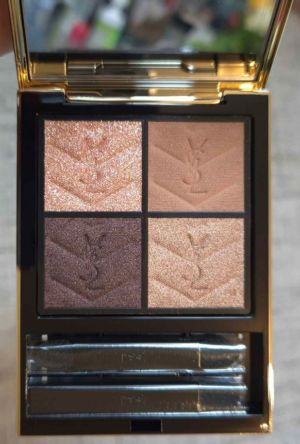
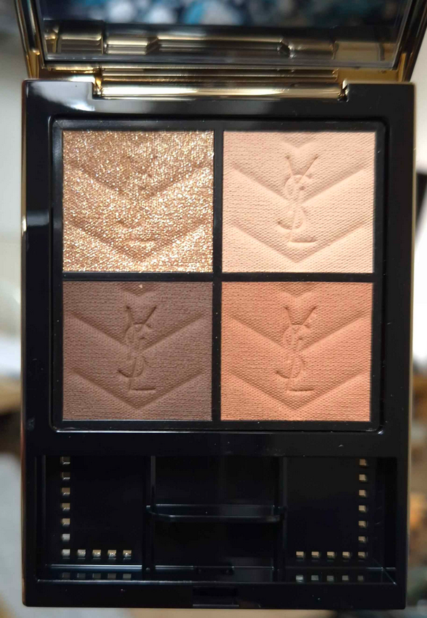
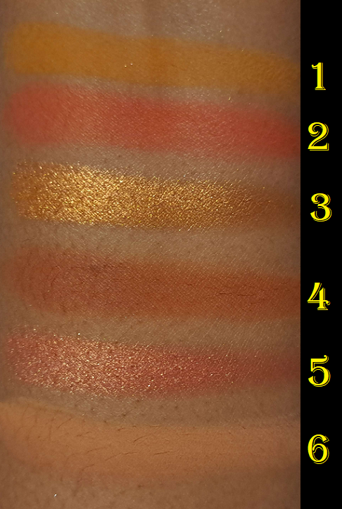
Yves Saint Laurent Couture Mini Clutch in 700 Over Noir, 710 Over Brun, 810 Over Orange, and 300 Kasbah Spices
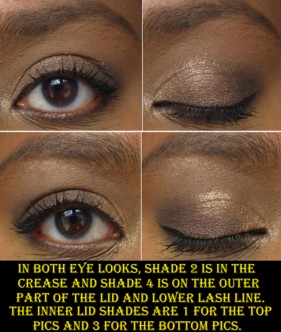
Over NoirOver BrunOver OrangeKasbah SpicesOver NoirOver BrunOver OrangeKasbah Spices
Like the Guerlain quads, the shades are numbered in a clockwise direction instead of up and down from left to right.
Kasbah Spices, Over Brun, Over Orange, and Over Noir from left to right.
I didn’t anticipate needing to review these individually, but my experience has not been the same! So, we’ll start with the best one.
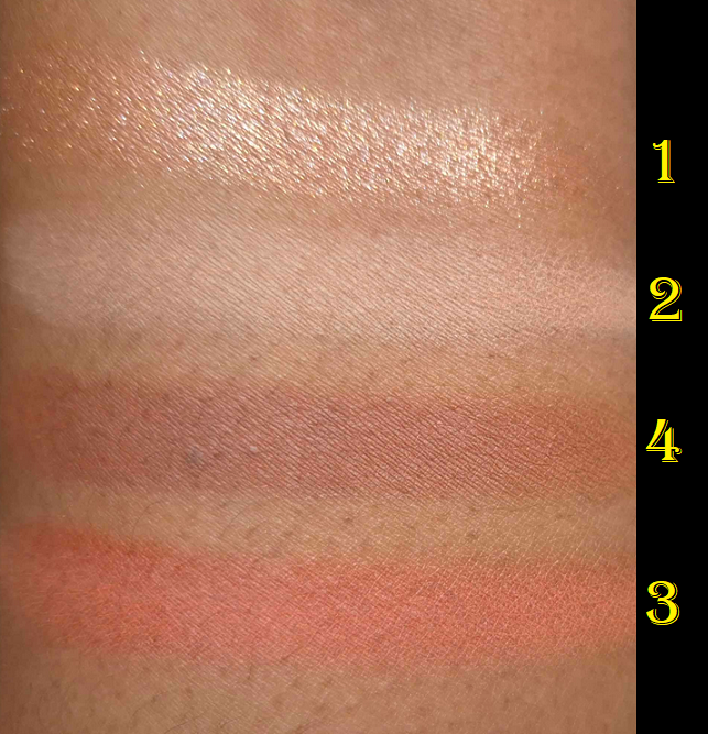
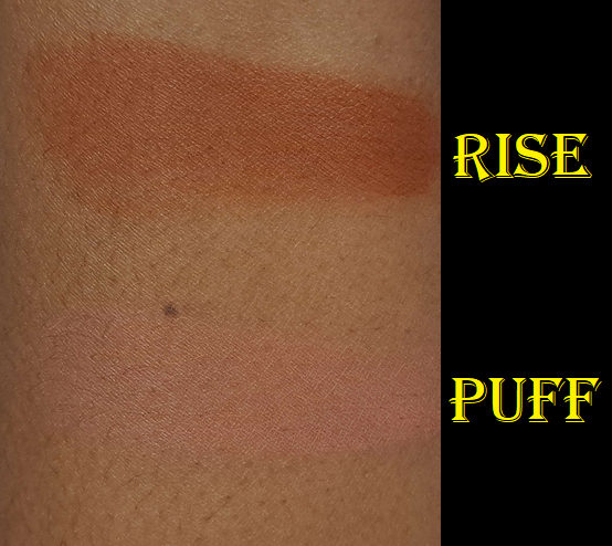
Over Brun is practically perfect. I’ve testedit with concealer as primer, MAC paint pot, and an eyeshadow base. It performs the same with all of them. I have no issues with longevity. There has been no fading, creasing, or fallout even with the sparkly shade! I’ve had no need to spray my brush to get the sparkly shadow to stick to my eyes or be intensified. The eyeshadows are all easy to pick up on my natural hair brushes, even squirrel ones. If I’m applying shadows to my lower lash line, I don’t need to press hard or make multiple passes due to the lash hairs being in the way. The shadows adhere on the first go. They blend well and quickly.
I should specify that I use laydown/packing brushes with this formula, such as the Koyudo Pine Squirrel Eyeshadow Brush. I’ve seen some people talking about issues with fallout while they’re using fluffy crease brushes or synthetic ones. Using different tools could effect the experience. It also depends on which quad one buys.
The texture of these shadows (shades 2, 3, and 4) are like a more buttery version of Pat Mcgrath’s cream powders from the 5-pan palettes that I was obsessed with. These are more buttery than Suqqu eyeshadows, more powdery than Surratt eyeshadows, and more pigmented than both. They’re not damp like a cream, just incredibly smooth. The brand describes the texture as silky. The closest comparison I can think of to describe the consistency of it is the Westman Atelier Butter Powder Bronzer.
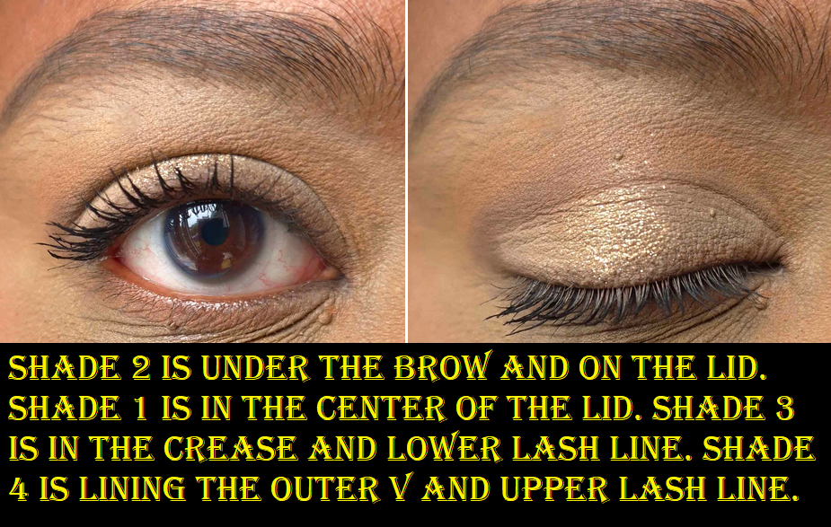
In theory, I love that each quad contains a sparkly shade to amp up the drama. These are all called Shade 1 in the top left position. However, I still want a more pigmented glimmer shade for their palettes going forward because I don’t need multiple semi-sheer base eyeshadow toppers when there are only four options to choose from per palette. This was my one complaint when I only had the Over Brun palette. Little did I know that all the other Shade 1 eyeshadows in the YSL quads have even sheerer bases and perform like true toppers! Shade 1 in Over Brun and Over Orange are the odd ones out in a good way. It’s still a bit unfortunate for me that those colors are so similar on my skin.
Over Orange has all the positive qualities that Over Brun has, except when it comes to Shade 3, the vibrant pop of Orange. This particular shade is a bit more powdery, it takes a little more effort to apply evenly without sparse portions. If I’m using a primer that’s on the drier side, I sometimes have to reapply it so I can pat the orange shade back on and have it stick. The way pure pigments and neon eyeshadows tend have rougher texture and have to be handled a bit differently, like the Terra Moon Neon Mattes, explains on the smallest scale what is happening with this shade. It’s the tradeoff for getting this kind of vibrancy. This is me nitpicking a bit though. When the shadows are all working so well, I can’t help but notice the slightest difference. The amount of work I have to put in is still fairly low effort because I don’t use my driest eyeshadow base that often.
I love the terracotta eyeshadow (Shade 4), but the depth level and strength of the orange tone within it make it less easy to differentiate when used right next to Shade 3. So, placement is key when it comes to making distinctly different looks using every shade in the quad.
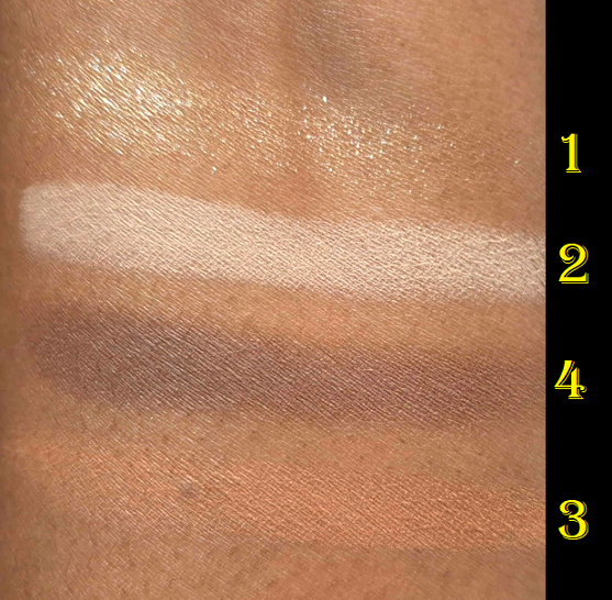
As for Over Noir, it performs identically to Over Brun, except with Shade 1. As I mentioned earlier, it has a clear base. Unlike the previous formulation, this particular color looks wet and reminds me of the original Fenty Diamond Bomb Highlighter (How many Karats). I rarely enjoy wearing silver or cool toned shadows on my eyes, but this shade is stunning! It also adheres just as well to my eyes as the other new ones. I might sometimes get a few particles that fall on my lashes or under my eyes while applying, but whatever is on my lids or inner corners stay there without giving me more fallout as the day goes on. Although I don’t own Over Dore, I assume this is a feature of all the new quads and part of the slight tweaks they made to the formula when they supposedly reformulated them.
The first two Noir eye looks were done in a rush. I am attending Sprachschule again with limited time during the week to do makeup looks with access to natural light directed through the window. I basically wanted to show what could be done in a rush versus the third one with a little more time. I was also rushing through the eye looks for the Over Orange quad, but since those tones are warmer and not as deep, it’s a lot more forgiving. So, when I say all the YSL quads are quick and easy to blend, there is the tiniest caveat which is that I shouldn’t be heavy handed with any black or dark gray eyeshadow no matter what brand it’s from. I’d also done multiple looks on the same eye with micellar water used in-between. So, the fact that they turned out okay is a testament to the quality.
The new round of YSL quads are phenomenal. However, I have to review Kasbah Spices differently. Starting with Shade 1, I get fallout. Using the same brushes I mentioned earlier doesn’t make it better and applying it damp doesn’t. The only thing that helps is glitter primer, and even then I still get some fallout as the day goes on. Glitter primer is still the better option than how my eyes look without it. This shadow feels smooth to the touch like all the other sparkly shimmers, but it doesn’t adhere the same way. It has more of a scattered effect on the eye, which I usually don’t like. I can change that entirely by wetting my brush at least (seen in look 2 of 3 below). The downside again is that it settles awkwardly in the deepest line in the crease of my eyes.
The rest of the shades in the palette are mattes and they also don’t adhere as well. I’ve tried various primers and bases, just like with the other quads, but eyeshadows in Kasbah Spices performs differently with each primer. The drier the better, it seems. Less dry primers cause settling in my deeper eye crease.
The strangest part about this all is that they feel no different to the touch than the newer launched quads, but they obviously are different. The Kasbah Spices mattes also look dustier on my eyes. The warm orange-brown gave way less depth than I expected. It reminds me of a creamsicle/dreamsicle type of color. I have to spend so much time packing on that color and Shade 2 in the looks above. Shade 4 gives me hardly any depth. I have to basically leave it partly unblended so it can be more visible in photos.
Other than these problems, which might be less of an issue for someone with a lighter skintone, these aren’t the worst eyeshadows I’ve ever used. The fact that I can still get a nice sparkle and enjoy the outcome if I resign myself to making a soft glam type of look makes this an okay quad for me. Ironically, the Shade 2 (all brow bone shades for me) in this quad is my favorite, but I intend to eventually declutter this palette. The equivalent light shadow in Over Orange is a very good alternative option. In fact, I consider Over Orange to be the Kasbah Spices for those with darker skin.
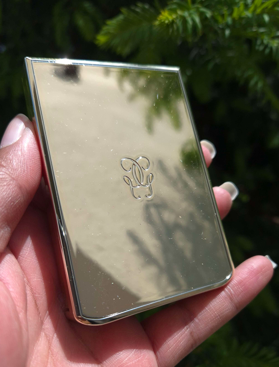
The packaging for all these quads is lightweight, but it still feels luxurious because of the black and gold coloring. Also, I love quilt patterned faux leather purses, so I find the lid appealing, and the bonus is that the raised parts are squishy. It’s a pleasant feeling gripping the quad in the hand. If they made a compact mirror like this, I would want to buy it to keep in my purse because of how enjoyable it is to handle!
Going back to these new eyeshadows, I don’t think there is a more perfect eyeshadow formula out there for me and my needs. They nailed every type of finish. My biggest complaint is the lack of colors available beyond neutrals. Even if this is the best version of them, the colors aren’t different from a ton of other neutral palettes I own. I was already content with Guerlain’s Royal Jungle, Pat Mcgrath’s Bronze Bliss, Tom Ford’s Honeymoon, etc. YSL has a Europe exclusive blue palette, but that’s my least favorite color in the rainbow. So, if the brand comes out with colorful quads that are more to my style, they will have truly done something in my book. It’s one thing to have the best formula, but quite another to have enough shades in that formula to make more than just a few looks. Even if I wanted to use YSL eyeshadows exclusively from now on, I couldn’t because of the limitations. Owning 4 out of the current 12 still hasn’t added enough variety for me to be fully satisfied. I think 12 of the 12 would not either, so I’m still looking to other brands for my eyeshadow desires.
Of the newest two I saw sneak peeked, I think the pastel packaging is stunning, but not my kind of color story inside unless the shades are more saturated in person. The upcoming holiday quad is gorgeous, but I would need to see swatches to know if those shimmer shades will have enough pigment to look different enough from what I own.
Photo Credit of Quad #125 Blooming Lust: Trendmood1 Photo Credit #024 Golden Lace: Trendmood1
Photo Credit of Quad #125 Blooming Lust: Sharonrulala
Regarding my purchases, the only one I regret is Kasbah Spices. At the same time though, I would have never known about the performance difference if I hadn’t tried it for myself. I watched a lot of reviews (trying to be an informed consumer too) and most people could not tell a difference at all. The few that did only noticed it with the sparkly shades. So, it might be the case that it’s only noticeable on someone with oily lids or just eye skin like mine.
I love Over Brun, and that’s what got me into this, so I have no regrets there. Over Noir is the quad I bought specifically to wear for my husband. I had a smokey gunmetal eye look on my first “fancy” date with him. Ever since then, smokey colors with gunmetals or pewters have been extra appealing to him. Ironically, I rarely wear those and don’t have many of them in my collection. I have one particular eyeshadow I saved specifically for those looks, but it’s quite old by now. Over Noir has been hubby-approved as a replacement.
I edited this post to include a photo from that date night I mentioned with the smokey eye look!
Over Orange is one that I like, but technically I could have skipped. It really wasn’t a necessary purchase, but I’m happy with it! I can enjoy using it on its own, but I’ve been liking how it pairs with Over Brun and sometimes use them together. It’s, once again, what I originally hoped I could do with Kasbah Spices, but am using Over Orange for instead.
That’s all for today! I hope this has been helpful. Knowing what I know now, I would have still bought Over Brun and Over Noir at full price because of how strongly I feel about them for myself and for nostalgia. However, I always recommend trying to get things discounted if possible! I would not have gotten the others otherwise.
Oh boy! I can’t start this review without talking about the insanity of this launch. There was so much traffic to the website that it went down even before the starting time (4:00 pm Central European Time). There were continuous 500-504 Gateway errors. US shoppers had the option to try their luck with the retailer Camera Ready Cosmetics, but the rest of the world only had the official Lethal Cosmetics website to be able to purchase from. After about 40 minutes, the brand announced on Instagram that they would need time to fix things and for everyone to try again at 5:30 pm CET. They specifically mentioned they would hold the stock back so that even if someone was able to get on the site, they wouldn’t be able to purchase until the appointed time as to make it fair for the ones who got off the website. It was clear they needed less people overloading the servers. The website was still giving the same errors until 5:36 pm, which is when the queue page appeared for me.
I took a screenshot, but the numbers were counting down so quickly that I couldn’t capture my true number in line (a little over 2000), but it did say 55 minutes and took close to that long to get on the main website. I added things to my cart, but the checkout process was constantly producing those same gateway errors again. The saving grace was that I didn’t need to go back in the queue or add things to my cart again. Refreshing over and over eventually got me back to the checkout page at the points where I last left off.
The most confusing part of this process was when I finally returned to the PayPal page and clicked to submit the order, it started loading, and then brought me to the error message again. I had a moment of hope when I could hear my cell phone buzz and saw I had the PayPal confirmation notification and email confirmation from Lethal Cosmetics. Just to be even more certain, I continued to refresh the page in the hopes that I could get back on the website and check the order status through my account information. However, when it finally loaded, it said the items sold out in my cart. My cart had been emptied though, so I added everything back to the cart and noticed that this time the Appa Bag was listed as “preorder.” I checked my confirmation email, but it didn’t have a preorder description. So, I think I may have been one of the very last people to get the remaining stock! Lethal Cosmetics set the limit of 3 of the same type of item per person, so I had added a second bag to my order so I could gift one to my sister-in-law. I wanted the Appa Cosmetics Bag because it’s adorable, but my Schwägerin is an actual fan of the show and she was thrilled to have it! Her toddler was instantly attached to it as well and started filling it with toys. Thankfully, anyone unable to get this collection was able to pre-order for what is estimated to be a July/August shipment.
It took 2 hours and 40 minutes for me to complete my order. I nearly missed getting the items I wanted as non-preorder. My order took over two weeks to get shipped and delivered. Let’s see if it was worth it!
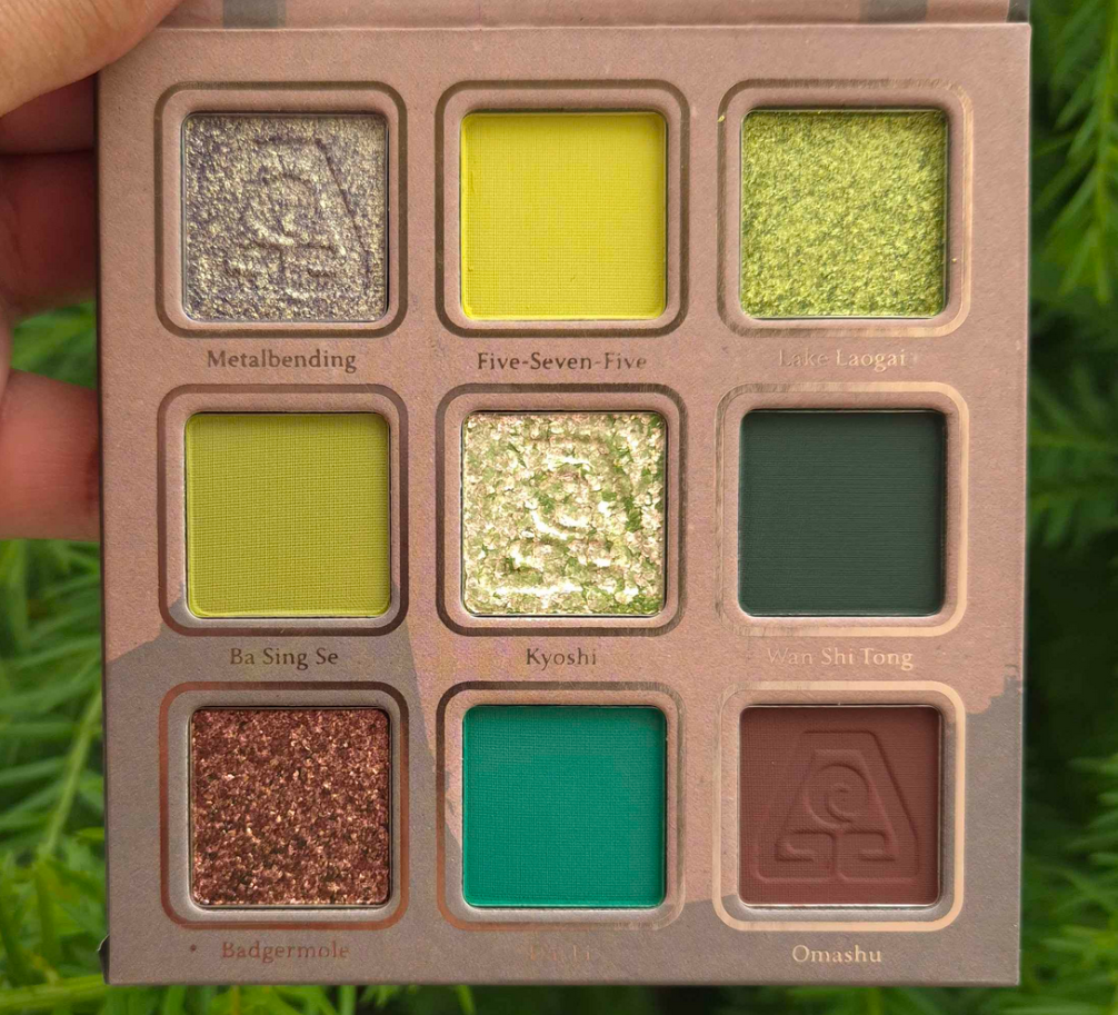
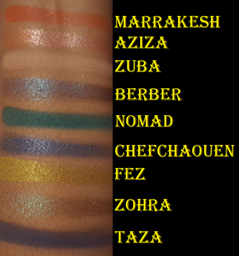
Earth Palette
For starters, I am so on board with this color story! If I’m going to wear yellow leaning greens or blue leaning greens, these are the shades I prefer. I love how bright Dai Li looks, although it darkens on my lids if used with other dark shadows or on one of my wetter primers. I’m not sure if Metalbending is technically a duochrome, but at the very least it has a beautiful yellow-green shimmer on what looks to be purple-grey base. I’m not the most knowledgeable about color theory, but on my eyes it looks like it leans on the cooler side of yellow. It has been a long time since I’ve used Lethal Cosmetics shadows and the shimmers seem more to my preference now than before. They don’t feel as thick, but they go on smoothly and opaque. I don’t know if the brand necessarily increased the sparkle level; it appears the particle size of the shimmers are just bigger. Kyoshi is a somewhat flaky multichrome. I have minimal fallout applying the shimmers with my brush and fingers, but Kyoshi gets messy if I try to apply it to my inner corners without dampening the brush.
I get a little creasing near the inner corners where my eye line is the deepest. Wherever I place the shimmer has a tendency to move up a bit higher on my eyes over time (basically covering up some of the crease). So, if you have oily eyelids, these might be a potential problem depending on the severity of it. The amount I get doesn’t deter me from using this palette.
The mattes are closer to how I remember them always being. With Lethal shadows, they’re going to pack a punch! They are pigmented and a bit on the dry side, not the soft nearly creamy feeling powder mattes that have become my preferred formula. I like that these apply opaquely. They require some work to blend, but the end result is beautiful. They adhere well and don’t fade throughout the day. I recommend not using a tightly packed brush and applying with something that won’t put on a ton of product at once. I recommend also using a resilient type of bristle for blending, though it being dense isn’t required per say. This isn’t the kind of formula where I can easily blend it out by working the edges back and forth repeatedly. It sticks too well to the skin, which ensures no patchiness and no fading, so the tradeoff is just needing to switch up my technique. I have an easier time applying a lighter color, darker color, and then applying the lighter color back on top to blend and create that gradient.
I used the Earth palette, plus a beige shade under the brow bone (Lodge) and shimmery greenish gold (Antheia) in the very inner corners of the eyes from Natasha Denona’s Mini Gold palette. So the majority of the eyeshadows used in the look are from Lethal Cosmetics.
If you’re a fan of depotting palettes to create custom magnetic ones or rearranging shadows, these pans are magnetic and able to be removed.
I have a gigantic Lethal Cosmetics eyeshadow collection. They’re one of the first indie brands I tried, and there was a time when I had nearly all of the shadows. I love their color stories and the way that they’ve grown as a company. Everything I have praised them for in the past holds true today. Their eyeshadows, though better than before, haven’t been my preference for a few years now. However, I have no regrets buying this palette. I don’t like to switch up my makeup applying techniques just to use specific products, but I don’t mind for this one.
Ty Lee Lipstick
Lipsticks are less exciting for me than other forms of makeup, but there was no way I could resist that component and with the intricate design on the bullet. It’s just so pretty! I like that it has a magnetic closure, but the magnets are on the weaker side. I would feel nervous chucking this in a purse with other objects for fear the top would come off. However, I assume it would be just fine in a pocket of a purse.
The lipstick bullet appears quite dark. All three shades in the collection looked to be the same depth with just different undertones in the marketing images. However, when applied to actual skin, this lipstick reveals itself to be a medium-dark pink. I understand the confusion about this shade though because Lethal’s Instagram page was flooded with comments about how “the Ty Lee lipstick should be pink” and “I wish these lipsticks weren’t all red.” The brand responded by telling people it was pink and that there was a softer option, but the color in the tube is not how it will actually appear when worn. It even looks dark and red in the brand’s swatches, but it appears much brighter on me. I can’t even say it’s a skin tone difference because they have swatches on an arm that’s similar in color to mine!
Regarding the formula, it has a creamy finish. It feels soft and the tiniest bit waxy (like a Burt’s Bees balm) as it spreads across the lips. It has a little shine, but it’s closer to a satin than a glossy formula. It feels comfortable in the beginning, but is drying over time. The shine lessens after several hours and although the lips continue to have some slip to it when I rub them together, I can still feel it drying beneath the surface.
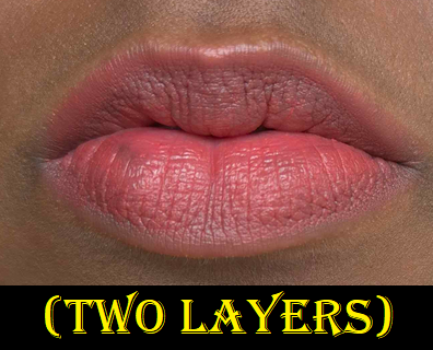
It has medium pigmentation, so if I want the color to look opaque, I have put at least four layers to cover the two spots on my lips that are naturally darker than the rest. For this reason, I have the urge to want to pair a lip liner with this lipstick so that the outer edge remains defined and opaque, plus to fill in those darker spots so I could use less product. Despite it not being fully opaque, it has a slight staining effect. If I try to wipe it off after it’s been on for at least four hours, there will still be some color left behind, especially between the cracks of dry patches. It doesn’t take much to remove the stain though. Just a little water on a cloth will do the trick.
At the time that I took these photos, it had been cloudy all day for a full week. The pictures above were the better ones I could capture between using my artificial lights versus the natural light available to me. Videos of the products can be found on my Instagram post HERE.
Now that I’ve finished the testing phase, I’m going to stop using this lipstick. It’s not because it’s a bad formula; it’s because this shade of pink is a bit bright for my taste. I like the design and packaging of the lipstick, so I plan to keep it shelved as a collector’s piece instead.
Appa Makeup Bag
I wanted this because it’s cute! Don’t throw tomatoes at me, but I’ve only seen the M. Night Shyamalan version of The Last Airbender. I haven’t seen the Nickelodeon show*, nor the Netflix live-action show. However, it is on my list of things to watch. I have a feeling that once I do, I will be even more happy to have this bag. Cute creatures in anime always become my favorites like Chopper from One Piece, Happy and Frosh from Fairy Tail, Chiaotzu (technically human) and young Dende from Dragon Ball Z, etc. Call it FOMO, but I couldn’t shake the feeling that I would regret not getting one even though I have no need for more makeup bags.
This is another product that’s going to stay on a shelf for collector purposes! The “fur” is soft and seems pretty well made. I think $25 was a very reasonable price for it. It looks like it could hold a fair amount of makeup, but it doesn’t have a handle, which is what I would prefer to have for a functional cosmetics bag. Don’t be surprised if I end up stuffing this with soft accessories like scarves and wool caps and using it as a pillow or stuffed animal instead!
Yes, I still like stuffed animals.
Anyway, I think Lethal did a fantastic job with this collab. Even without me knowing very much about the series, it seems like they worked really hard to do this franchise justice. I would love for them to tackle another IP or do a Round 2 for this collection!
That’s all for today! Thank you for reading!
-Lili ❤
*UPDATE: I finished watching the animated series (not the Netflix live action), and although I didn’t like the show as much as I hoped, I did end up being happier with my decision to buy the Appa bag.
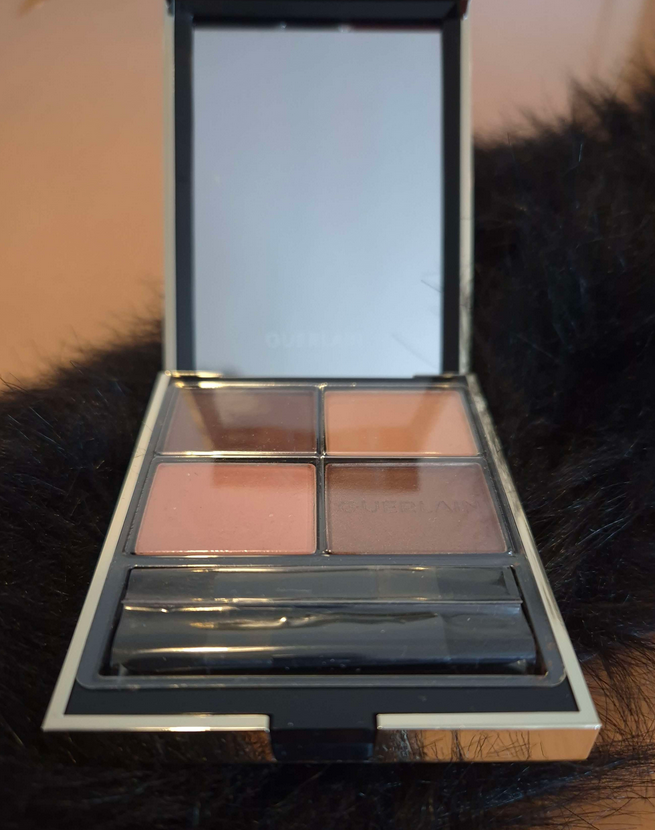
This quad was on sale via Douglas, and I’ve wanted it for ages, so I snapped it up! I had completely forgotten that the eyeshadows in here were set into pans and are not the same eyeshadow formula as the initial Ombres G launch from the permanent range. If you look at marketing images, they look like baked eyeshadows without a pan, but only the original releases are this way. It’s a big deal for me because the non-pan eyeshadows are a more special texture and typically cost more to make. The baked gelee formula helped make the hefty price more palatable, so when I learned the newer launches weren’t the same, I said I wouldn’t buy them. Oops!
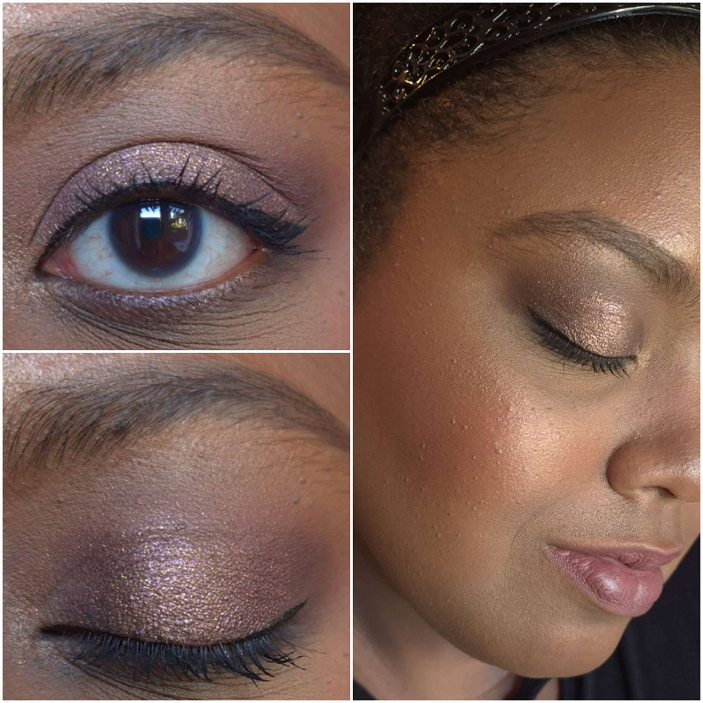
The colors are pretty, though very soft, muted, and natural on me. Shade 2 doesn’t really show on my eyes. I hoped Shade 1 would give me more dramatic depth. Shade 4 is quite pretty. Even though I have to be in a specific mood to want to wear pink, this is at least one of the types of pink I like. Shade 3 is pretty, but I can’t help but compare it to Shade 1 in the Royal Jungle palette that I love way more! It’s because the color in the Royal Jungle palette has a lot more pigment and sparkle. Wetting it makes it even more intense. Shade 1 from Wild Nudes is a satin and I will almost always prefer a shimmer over a satin.
Because the colors don’t show up intensely on me, I can’t really get much variety. I’m actually okay with that because I don’t expect too much from a quad. If I can get one very pretty look and wear that repeatedly, that’s fine with me. The unfortunate aspect is that Royal Jungle does that for me already, so I should have just stuck to using that one.
Guerlain Royal Jungle Compared to Wild Nudes
In terms of this eyeshadow formula, it’s a very smooth, finely milled powder. I definitely like this more than Tom Ford’s standard powder formula. However, I do still like Tom Ford’s wet/dry formula over Guerlain’s baked gelee one. I also still prefer Guerlain’s first release of permanent eyeshadows over the more normal powder one. My original review of Royal Jungle can be found HERE.
The Wild Nudes eyeshadows blend easily. They are opaque, though with a medium amount of pigment that’s slightly buildable, but not by much. They are soft to the touch, but not creamy and doesn’t have slip to them, so I don’t have to worry about creasing. There are no longevity issues either.
When I did an eye look combining shades from both palettes, I realized that other than the pink, the parts I liked about it were mainly from Royal Jungle. It’s only the black shade that is a bit of a dud in my quad. So, I also get some use out of having Wild Nudes to be able to use the dark brown matte even though I’d prefer if it was deeper.
Overall, this palette is nice, but not entirely worth the price I paid for it (even on sale). However, eyeshadow minimalists might love this one. For those wondering how I feel about Royal Jungle since my last review, I can say that I still enjoy it and that one was at least worth the discounted price.
As a bonus unofficial review, I wanted to mention that I’m wearing the Tower 28 MakeWaves mascara in all the eye photos. I purchased a travel size mini six months ago, but only started using it a few times within the last few months. It was such a hyped up mascara in 2023 that I could only deal with FOMO by stating I’d get it when it released in a smaller size. I have to say that I was not impressed. The formula was on the dry side, or rather, I couldn’t get much product on the mascara wand and had to dip in repeatedly. And then in order to get my lashes to look how they did in photos, I had to build up three layers (which I normally stick to one or two at most). Even with the extra layers, the end result wasn’t better than what I can get with my other mascara favorites in terms of length and volume. Granted, it’s possible that the full-size gives better results if the stopper isn’t so tight on that tube or perhaps mine partly dried already. Some mascaras in the travel size can perform differently than the full-size. I won’t be investing more money to try and investigate further though. I give allowance to the possibility that it could be different, but I’m personally going to treat this as an accurate representation of the full-size. On the positive side, I give credit for it not clumping or flaking, even with extra coats. Plus, the brand states that this mascara is intended to give “amped-up, natural-looking lashes” when I prefer more dramatic lashes. Influencers are the ones that hyped it up to be more my style. For those that want length and volume while also looking more on the natural side, I recommend Benefit Cosmetics Bad Gal Bang. It’ll give similar (but even prettier to me) results in less coats.
Not pictured above, but will be included in the rankings, is the Stone and Rock Palette.
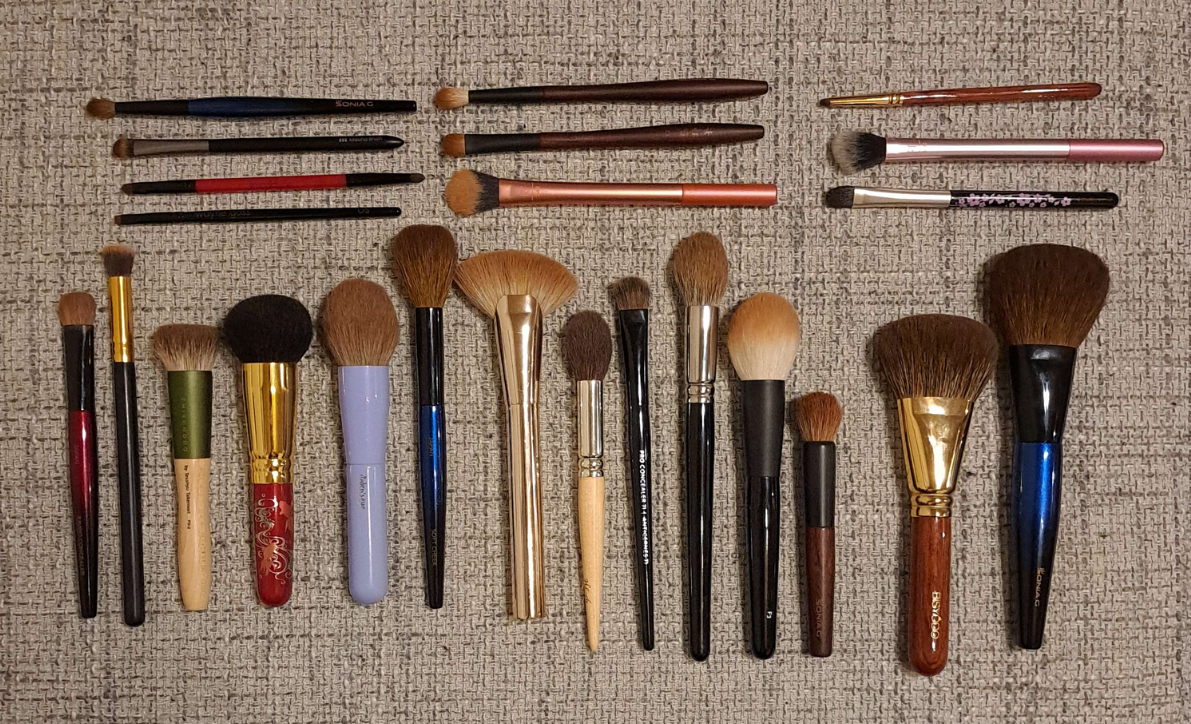
I unofficially started an eyeshadow ranking series for the brands whose palettes I own the most of in my collection. So far, I’ve done this with Pat Mcgrath Labs and Huda Beauty. Today, we’ll be doing it with one of my top ten favorite eyeshadow brands: Oden’s Eye.
Each of the thirteen above (excluding #11) are linked to their previous reviews. I did many eyeshadow looks already, so anyone looking for that kind of inspiration specifically can click there.
I’d also like to note that even though there has to be something that falls in the worst category, the quality of these palettes is so good that I don’t hate any of them. #13 is there purely for preference reasons, and if I had to assign a grade for #12 in the USA grading system, it would be within the B- range, which is still quite good.
Disclosure: I am not affiliated with this brand/company. All opinions are my own and every palette was purchased by me with my own money. The links in this specific post are regular non-affiliated ones.
Top Three
I mentioned in my October 2022 low buy series what my top four were, and my thoughts haven’t changed. For a while, numbers one and two were nearly tied, but by now I have solidified my opinion on how they rate for me.
Because I typically use this palette in conjunction with Clionadh singles, I didn’t have many eye looks showcasing using this palette by itself, so I decided to add some here.
Looking at the state of my palette, it’s clear that I reach for specific shades mainly: the entire first row, Snow Man, Best Wish, Little Star, Gingerbread, Happy Ending, and Santa Star. The greens, duochromes, and neutrals in here allow me to create some of my all time favorite looks. Colors like Best Wish aren’t prevalent in my collection, so I have some unique options, and the palette layout’s color combinations inspire me. In addition, this is the brand’s best quality with no duds. The number of times the brand had to bring this and the Christmas Eve palette back is a testament to how good they are and why they’re so sought after.
In the purple eye look photo, you’ll notice I have a purple matte in the crease that I created using a blue and red shadow. That’s one of the things I love about Oden’s Eye, that their shadows are so blendable and layer well with each other, that I can do certain tricks to get even more use out of this palette. I really can’t stress enough how much this palette inspires me and how often I think about using it, even while testing other palettes and wishing I could incorporate some of the shades into whatever eye look I’m creating at the time.
I don’t think I ever want to have to rank my entire eyeshadow collection, but I know that if I did, this palette would place within the top ten. I don’t know where exactly it would fall on that list, but it would be somewhere among the cream of the crop!
Red Dragon (Legendary Diversa Group 1 Round 1 w/Judy)
Considering the number of beautiful greens, neutrals, and specialness of the duochromes that make up this palette, it’s no surprise why this was such a close contender for first place. I don’t care so much for Fire or Dragon, but everything else is a color I continually reach into this palette for. I’m a colorful eyeshadow lover at heart, and this palette gives me soft and more toned down colors than the Merry Christmas palette, which is why it took second place. It’s my dream version of a neutral palette, but slightly less inspiring. I can name a lot of other neutral palettes (or neutral palettes with pops of color) that I love, so it’s the shimmers in particular that helps this one stand out from the pack. Solar Flare is a particularly stunning shadow, and I really like Luna as well.
The quality is once again top notch. It’s not a perfectly performing palette since Aurora is still hard to layer with the other shadows and if I don’t want the look to be too soft, it takes some time building up the mid-tone shades. However, softness is a preference thing which could make the palette closer to perfection for someone else than it was for me.
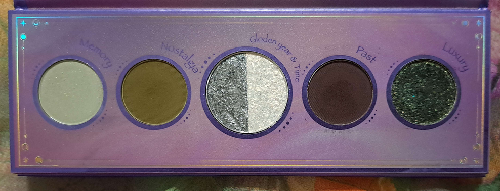
The Urd Mini Palette (Norn’s Collection)
Following the theme, I love greens and I like having a neutral shade in the crease or to deepen up/add smokiness to the look (which is fulfilled by Past). This is why this palette is in third place. I love the shimmer level of Luxury and the tone of that dark green. Nostalgia is the kind of murky green I like, similar to Matcha Cookies in the Merry Christmas Palette and Jade from Red Dragon. I’m not usually one who likes pastels, but Memory works well. I rarely use the shades in the center, but they are additional options. At one point, this was my most used Oden’s Eye palette that I enjoyed bringing along while traveling. This was my ultimate small mini green palette for years until it got upstaged by the Natasha Denona Mini Gold palette. Since I got Mini Gold, I rarely use Urd anymore.
Because I can technically get a similar look from the two previously discussed Oden’s Eye palettes, and those other ones have extra shade options, I had to rank them higher. Also, the quality of Urd is very good considering this is technically the brand’s “older” formula. Their newer formula is a bit softer and a touch easier to blend.
Christmas Eve (Original Release Holiday 2022)
At first glance, this doesn’t look like the kind of palette I should like because of the number of cool toned shadows, especially the blues. However, something about the arrangement of the colors is very inspiring. It still has a green and some neutrals to appeal to me, but it also has those stunning golds and purples. This is the palette I think of in the rare instance that I actually want to incorporate some blue into my looks because I’m more likely to use deep blue or duochromatic ones, both of which this palette has to offer. When I feel like I’m wearing too much of the same look, I have this palette to break me out of that.
Again, the quality of this and the Merry Christmas palette have yet to be topped by any other Oden’s Eye palette. This is why, despite it not being my usual preference in colors, it deserves to be in the highest percentile for the quality. Because I use the Natasha Denona Mini Gold palette more than the Urd palette, it left room for Christmas Eve to be more used by now than Urd!
Norn’s (Norn’s Collection)
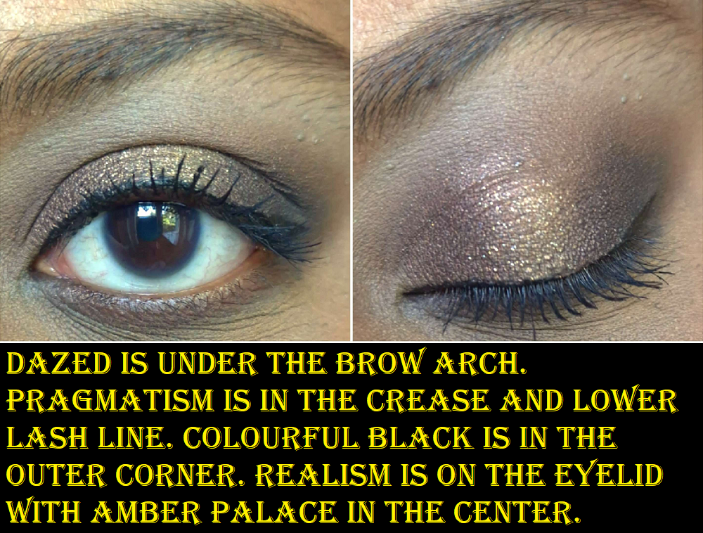
This is a bit nostalgic because it’s the color story that enticed me to try Oden’s Eye products in the first place. It’s no surprise that I like it considering the whole bottom row of duochromes, it having Pink Chameleon as a multichrome, there being greens, purples, and neutrals. It has so much of what I love, which is ironically a partial hindrance. It’s easy enough to mix colors with neutrals, but if I want to use two different color families or a two-tone look, these colors don’t all go together. I’ve done blue-purple looks and red-orange looks, which sound like they should work, but I didn’t like how they turned out. In addition, even though there are many colors I like, if I want to do a monochrome look there aren’t enough purples to complete it the way I would want it to look (unless I do some mixing like the photos seen below). For my green looks, I’m missing a midtone green shade. As sparkly and pretty as Amber Palace is, I’d prefer a smoother and less flaky gold shadow so I could use it in my inner corner. So, I love the colors and it’s a good quality palette, but it is a bit challenging to think up cohesive looks in the beginning. By now, I’ve used it enough times that I have my go-to looks for this palette.
Also, even though it doesn’t look the most used, it’s simply a matter of needing to test other palettes and being unable to use this more due to time restraints. This is not a palette I’ve ever forgotten and at least every few months I say to myself, “I should use Norn’s again.” For all these reasons, it had to rank highly. I even bought the updated formula so I could have it here when I moved! That’s why I chose to do eye looks below in order to test the quality and make sure that I liked it as much as the old one, if not better. Thankfully, it is a little bit of an upgrade, though Outsider is still not the easiest to blend.
Hela (Oden’s Eye x Angelica Nyqvist Round 1)
This palette has greens, but they lean a lot more yellow or blue toned than standard greens, which makes them less my preference. However, they’re still pretty. Goddess is a shade I rarely use, but in combination with the other shades, I’ve been able to make some really pretty looks. This color story makes me think partly outside the box and partly within my comfort zone, which I can at times appreciate. Angie intended for Hela to benefit both color and neutral lover’s alike, and I think she succeeded in that. It explains why this palette appeals to me so much, though I can get intimidated by the color story and sometimes don’t want to rise to the challenge in coming up with a look. The quality is fantastic, but because it’s 50/50 whether I want to use this palette or reach for another one instead, it’s place in the middle of the pack seems about right.
Hummingbird (Legendary Diversa Group 1 Round 1 w/Tina)
Visually, this palette stands out the most and is what I consider the “fun” one. It’s colorful and tropical with that beautiful multichrome called Fancy. I don’t choose this palette as often as the others because a fourth of these shades are blues, which I rarely use, and I don’t like how the Star Apple shade is formulated and looks on my eyes. It’s the only eyeshadow that is time consuming to blend, whereas all the other shades are really great quality. While I appreciate the vibrancy of the shadows, it’s hard for me to use this as a standalone palette. This is a major factor as to how I like it so much, and why I recall it so fondly in my memory, yet it still managed to rank at 7th place. I think a palette like this is useful to have in one’s collection, even as a companion palette. However, if I’m ranking things based on each palette’s own merits, I can’t position it any higher.
Giant Wolves (Legendary Diversa Group 1 Round 1 w/Annette)
To this day, I still have mixed feelings about this palette. The quality is fantastic, minus Hati which was the shade that needed to be repressed because it was impossible to get product out of that pan. This color story is appealing to me visually, but not as much to actually use. I’ve been able to make interesting and pretty looks in the past, but they’re a bit edgier than I’m into now. The top row and Desolate are the main reasons I reach for this palette, but I just keep using Merry Christmas or Red Dragon’s greens instead and forget I also have green options in this one. If I want a bright pink, I reach for the Hela palette instead of Ablaze. I don’t want those blues in the bottom row and I have plenty of grungy greens like Antipode by now.
The first four shades in this palette are similar to what’s in the Stone and Rock palette, but I can at least say I’d choose to use Giant Wolves’ version over Stone and Rock. I still like Desolate more than Cheer, and Sköll is like a way more exciting version of Splendid as a deep plummy blue-purple duochrome rather than dark gunmetal. So, although this palette is a little less unique, it’s still different enough to be worth keeping. I don’t think I’ll be getting much more use out of the palette, but I’m not ready to give up on it just yet.
Flora Story (Legendary Diversa Group 2 Round 1 w/Amanda)
The eyeshadows in this palette feel a little different from the brands other eyeshadow formulas I’m used to, and this could be at the request of Amanda/MakeupJustForFun who Oden’s Eye collaborated with on this palette. I discussed this palette and each shade at great length in the original review. To sum it up, this palette is full of soft tones that are still pigmented. The textures are a bit different, the two matte greens look similar on my eyes, and Orchid isn’t formulated in the way that I’d like in terms of how it appears on the eyes.
As I started working on this blog draft, I realized that the eye looks I created in the Merry Christmas palette are just a warmer version of the looks I created for my Flora Story review. One of the things I praised this palette for in the past is that it added something different to my Oden’s Eye collection, but since I figured out how to recreate those looks, it dropped down to 9th place. I also would have said I’d keep reaching for this palette in the future, but I have my doubts now. I don’t think I’ll be bringing it back to Germany with me.
Trick or Treat (Oden’s Eye x Angelica Nyqvist Round 2)
This is a nice performing palette, even better quality (in my opinion) than the Flora Story palette. The only reason it’s ranking this low is because the colors I like in here are close to some of the shades in the Merry Christmas palette, but in the tones I prefer less. Because I have the Merry Christmas palette in a color scheme more my style, I will reach for that over this one every single time which makes this almost pointless to have in my collection. Admittedly, I wanted it for the palette artwork on the cover, plus to support Angie after certain individuals were being unnecessarily mean rather than constructive about this holiday release. I won’t get into it here as I harped on it quite a bit in my original review. There are some pretty shades in here, but I’m more confused rather than inspired by this color story. Since I prefer the Merry Christmas palette, I don’t see myself using this again unless something happens to my Luxury shade from the Urd palette. Then Crypt Keeper could be a substitute.
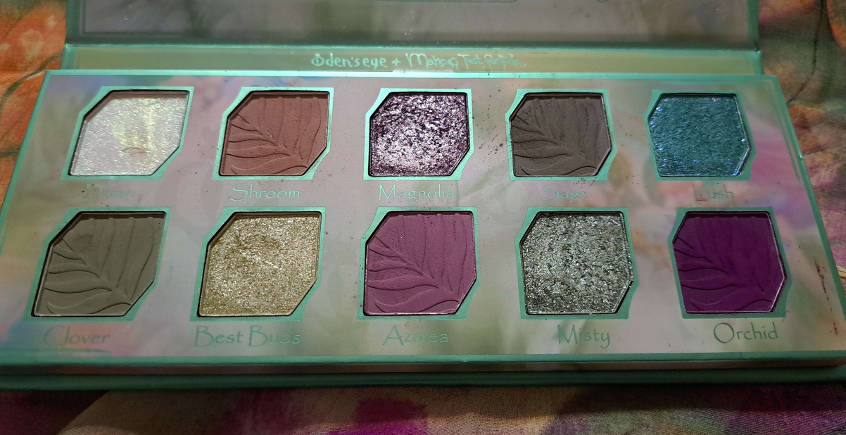
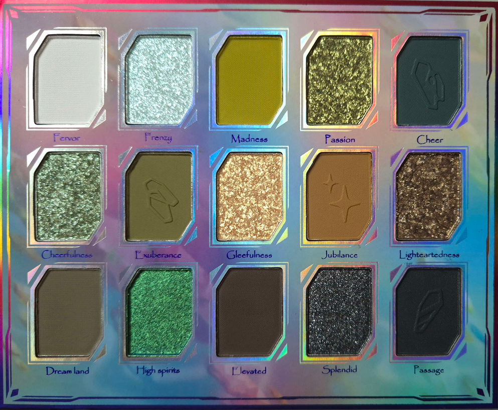
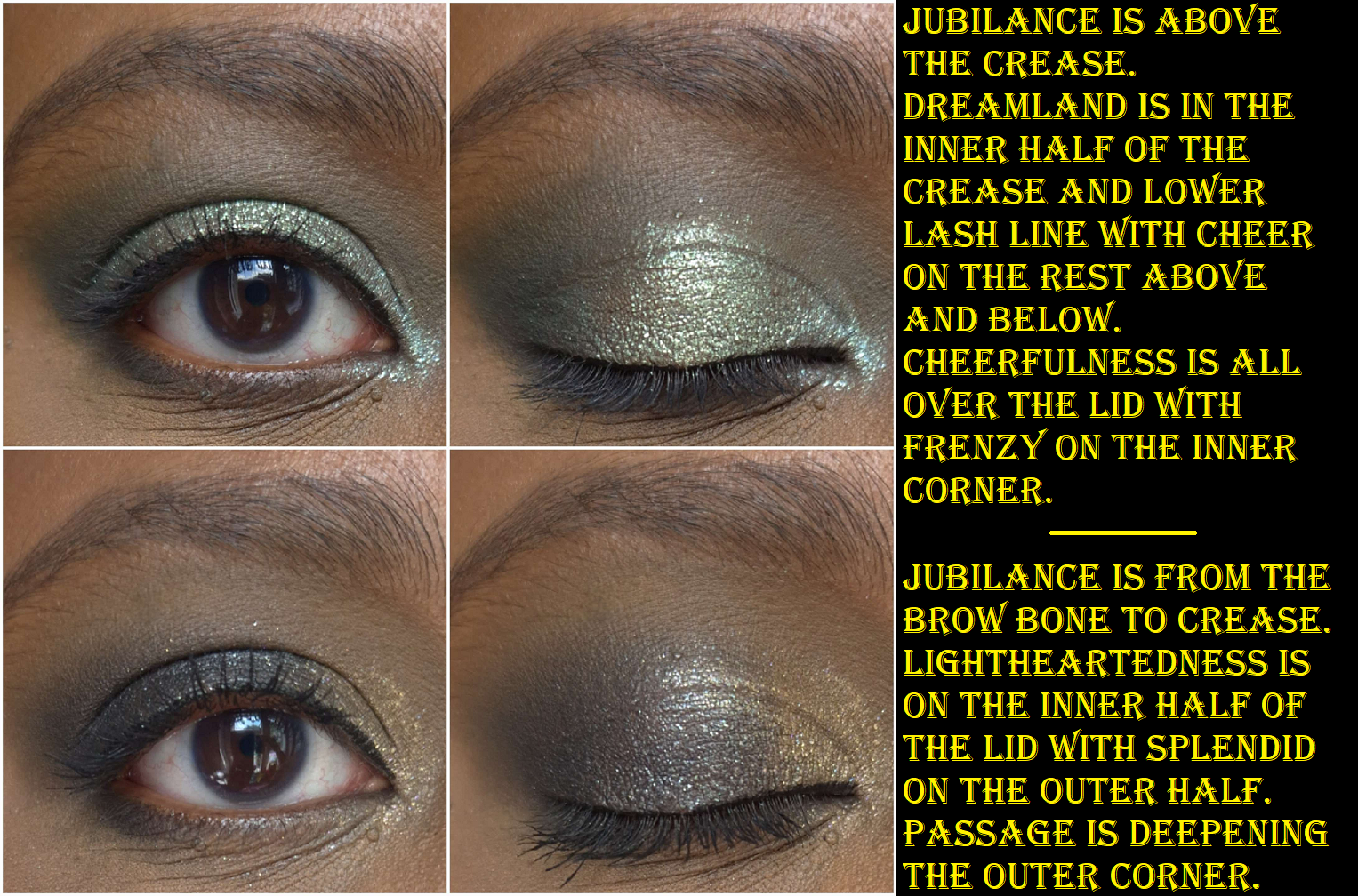
Stone and Rock Palette
There are so many Oden’s Eye palettes with phenomenal greens in them, which is why I only allowed myself to purchase this one if it went on sale during Black Friday (which it did and so I had it shipped to Germany). I thought that this would become my go-to green palette, but once I saw how they looked on my skin, I realized these aren’t the tones of greens that I love. Madness, Exuberance, and High Spirits are right up my alley. I still have to build up Madness quite a bit for it to be visible though. Cheer, Dreamland, and Frenzy make a nice combination as they share a blue undertone, but as I mentioned countless times that isn’t my preference. Frenzy needed to be applied damp in order to get on my eyes smoothly, and Cheer is a dark blue-green that’s easy to blend unlike Outsider from the Norn’s palette. Jubilance is pretty, but blends in too much with my skin tone. Gleefulness is beautiful in tone, but it’s not my favorite to use because it’s so flaky (and strangely wet feeling in the pan compared to the other shimmers). Passion is slightly smoother, but still a little flaky. Cheerfulness looks light green in the pan, but the tone is more blue than I expected! It’s a smooth shimmer, but with some shimmer particles that are randomly bigger than the others. I didn’t need to apply Cheerfulness or Lightheartedness damp, nor High Spirits which was bound to be different since it’s a multichrome. High Spirits is truly smooth in texture and reminds me of Clionadh’s Jeweled Lite multichromes (based on photos online). Splendid is more like a traditional shimmer. It’s not as fine in shimmer as High Spirits, but it’s not flaky like most of the others. All of these shimmers have the amount of sparkle I like, but the downside for me is that they’re sheer. I can see my skin from beneath them unless I put a matte shade on the lid first. I tend to not like shimmer topper eyeshadows, and though these aren’t technically “toppers,” they’re still less opaque than I want. I also don’t get a strong enough green tone in them, considering this is a green palette, unless I put High Spirits on top.
I like that there are neutrals in here and a gradient of options from light, medium, to dark. That makes it a cohesive palette. This palette leans more cool than warm, which is not my favorite choice, but I’m sure many people would love that aspect. Elevated works nicely as a deepening shade, which I prefer over Passage. Black shadows can be tricky to find a balance between making an impact, but being buildable so it doesn’t immediately overpower a look. Passage isn’t the best, but it’s not the worst either.
Since this palette is said to be “richly pigmented” but also can be “…soft and natural,” I’m going to assume the sheerer shimmers was an intentional choice and not a downgrade in quality. The overall performance is pretty good, but I couldn’t help feeling disappointed by my own mistake of not realizing this color story of greens is intended for cool toned green lovers and not me. Among my entire eyeshadow collection, this would probably fall in the middle. It’s only because there’s such tough competition among the Oden’s Eye offerings that it landed this far down.
The Bottom Two
Solmane II is an admittedly very pretty color story. The pastels work well for me, which isn’t easy to accomplish on those with dark skin. However, I’m still not the biggest fan of wearing blues on my eyes, so the entire first row is a miss for me. The darkest shades in this palette are a little harder to blend than the usual Oden’s Eye quality I’m used to, but they get a passing grade. I like warm purples rather than cool purples, so even the middle row isn’t my favorite. Ironically, the oranges are my favorite aspect of this palette. It’s ironic because Oden’s Eye tends to do too straightforward of oranges for my taste, without much nuance, yet this is the palette in which I think they did oranges better. So, because the quality is alright (rather than fantastic) and the color story isn’t fully my preference, this is why it’s nearly last in my collection. I still don’t think it’s a bad palette, and if someone wanted to buy it, I wouldn’t dissuade them. I’ve certainly had worse from other brands. This one just isn’t for me and I don’t plan to use it again.
Cat’s Breath is in the bottom because I just cannot get myself to use this palette! I’ve only done a few looks with it and didn’t even complete a wear test because I didn’t like how they turned out. We’ve got the blue, a pastel, light cool toned silvery shimmers, and a standard orange: all things I dislike for eyeshadow colors. White Peach and Cat Hair are the only two colors I like, but Cat Hair is a tone of brown that doesn’t show on my eyelids. So, I haven’t been motivated to give this a thorough testing despite owning it for well over a year by now. I just wanted it for the adorable art design. This palette is also in Oden’s Eye’s older formula. It’s discontinued, so I especially don’t feel a reason to properly test this palette. It’s a collection piece and nothing more, which is why I had to mark it last.
And that is the end of this ranking post! If I was forced to do some spring cleaning, I would keep everything in the top 8 and declutter the rest. Of those at the top, I still need to bring over Hela, Hummingbird, and Giant Wolves. If it wasn’t for the baggage weight limit, Hela at the very least would come with me in the move.
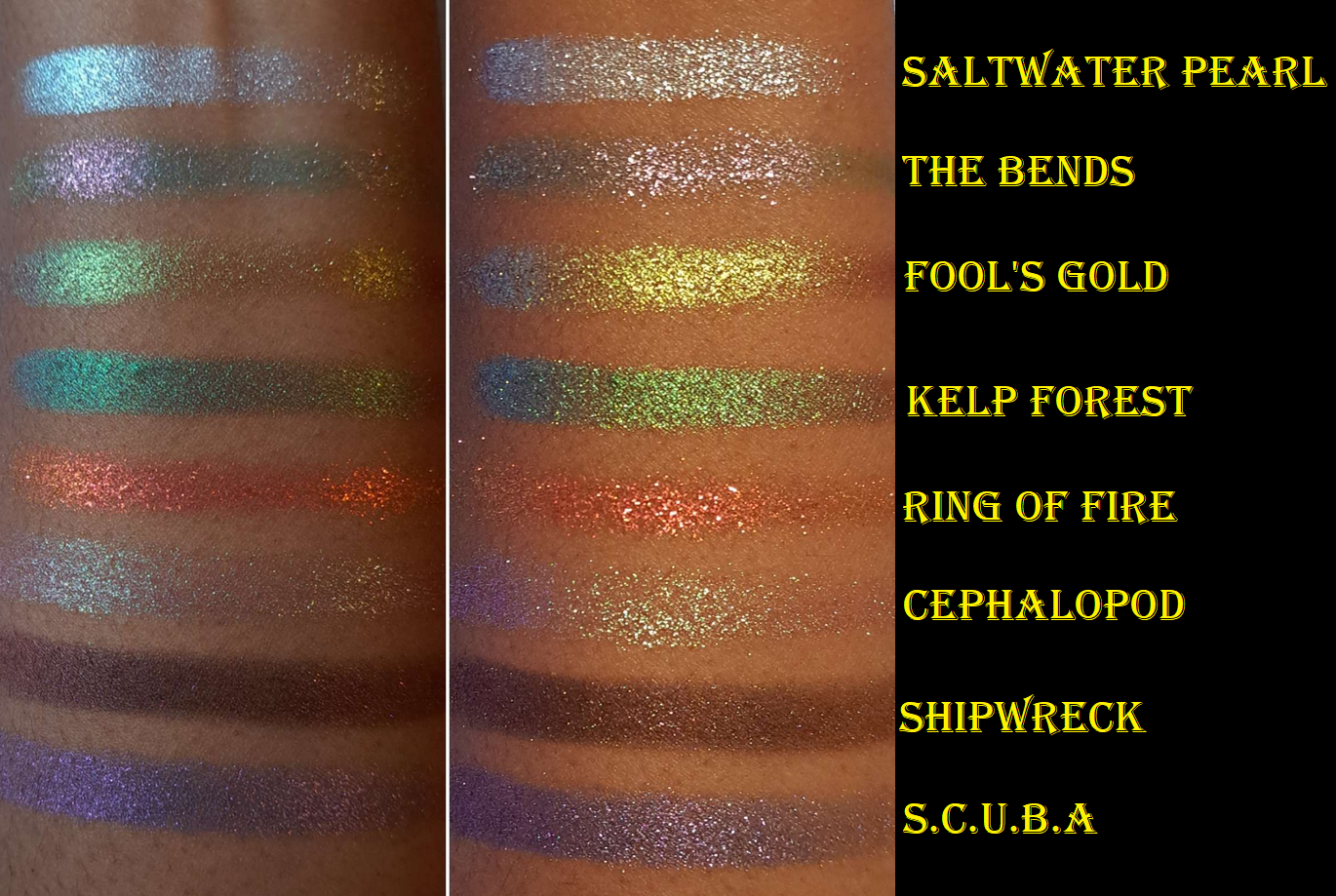
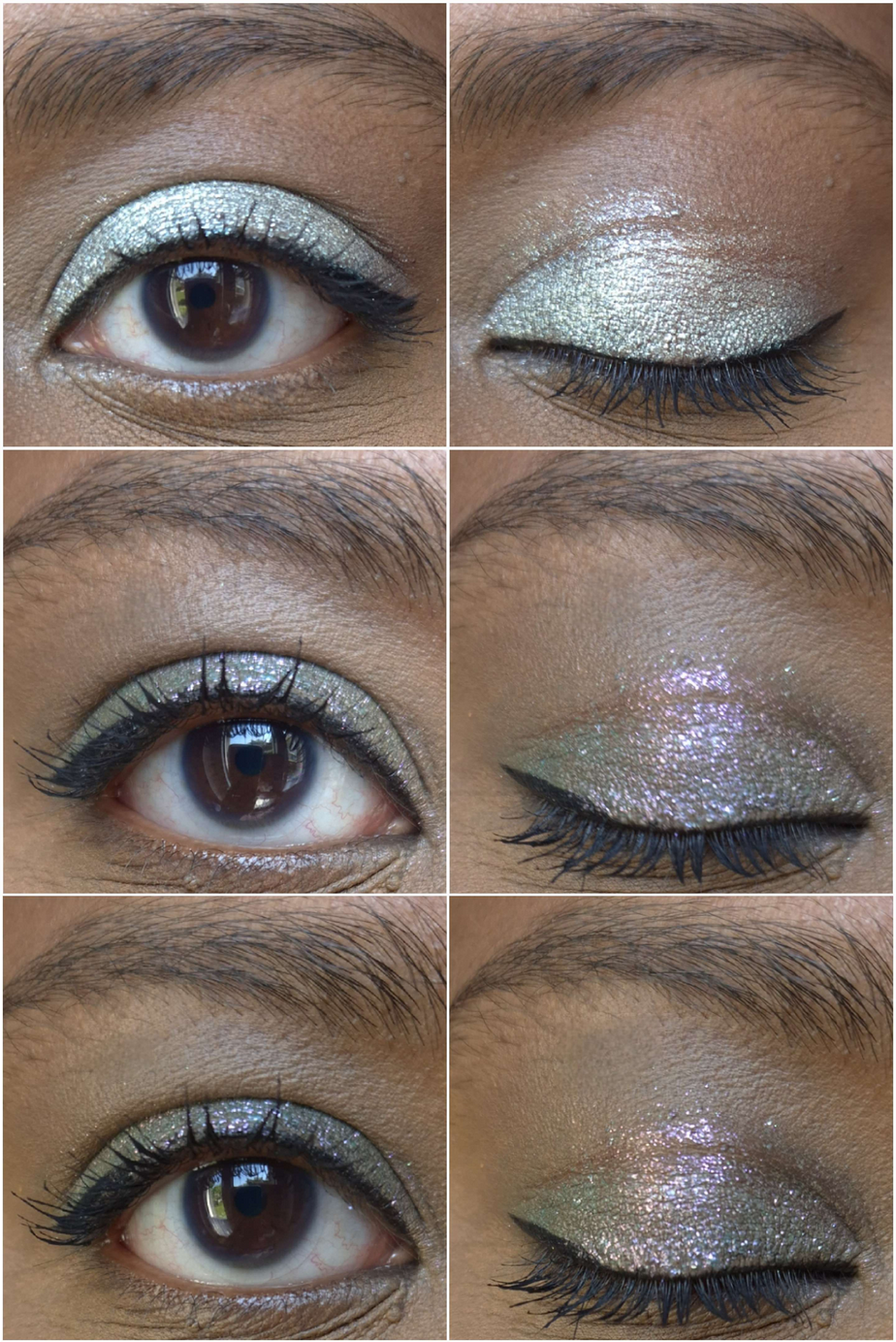
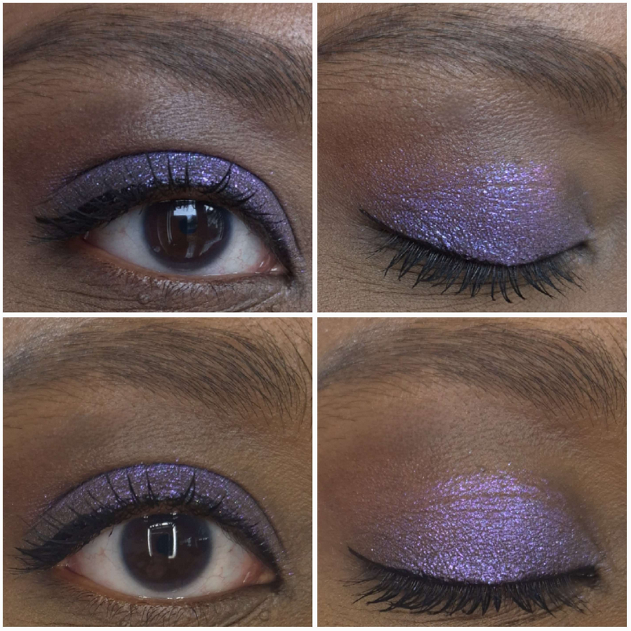
This is more of a showcase than a review because I’ve talked about Clionadh eyeshadows so many times on this blog and the quality is always consistent. These are the same performance, pigmentation, and shine I’ve come to expect from the brand. A few things to note is that Clionadh has a few notices on their website regarding some of the shades. Kelp Forest and The Bends may cause staining. Also, S.C.U.B.A contains silver powder so, “Avoid contact with broken or abraded skin.” It’s like one time in a thousand that I ever notice staining issues on myself from eyeshadows I’ve used (and not yet from Clionadh), but it could be because of my skintone that I don’t see it and/or that I always use primers. I figured it’s still important to relay this information.
Also, Shipwreck is the smoothest shade that I can apply directly to my eye area with my fingers. Saltwater Pearl, Fool’s Gold, and Kelp Forest are fairly smooth as well. However, S.C.U.B.A. is semi-flaky. The extremely flaky ones are The Bends, Ring of Fire, and Cephalopod, so I have to apply them with a damp brush to minimize fallout and prevent making a mess everywhere under my eyes.
Of the three eye sets above, the first set shows Saltwater Pearl whereas the second and third are The Bends in slightly different lighting.
In the picture above is Fool’s Gold and the green shade is Kelp Forest. In the picture below is Ring of Fire in the top set and Cephalopod in the bottom set. I used a matte shadow from a different brand in the crease of the Cephalopod shade.
Below is the photo of Shipwreck at various angles.
The last photos are of S.C.U.B.A.
In saying that these are the Clionadh quality I’ve come to expect, they match some of the less dramatic lines. So, these aren’t as shifty as the Jewelled Multichromes nor intense and sparkly like the Glitter-Vibrants. They’re still pretty though. I truly only wanted Fool’s Gold, Cephalopod, and Shipwreck, but couldn’t buy them separately. Perhaps in the future they will be released as singles. I bought the palette on sale, but since Clionadh (at this time) doesn’t collect VAT, I was hit with a surprise 19 Euro fee that was demanded of me upon delivery to Germany, making the total more expensive than if I made the purchase to the US at full price. Thankfully my husband was home early from work because I didn’t understand what the DHL worker was asking, why he kept trying to walk away with my package, and that my husband had the exact amount in cash (the man refused to offer change back). I was still new to the whole VAT and international shipping thing, so for anyone in a similar situation, just know that there could be issues buying outside of the US and Canada.
That’s all for today! Thanks for checking this out! I hope this helps!
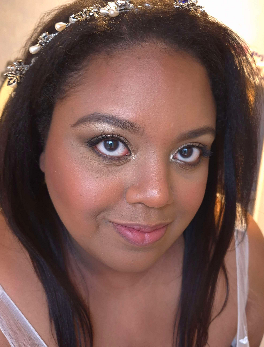
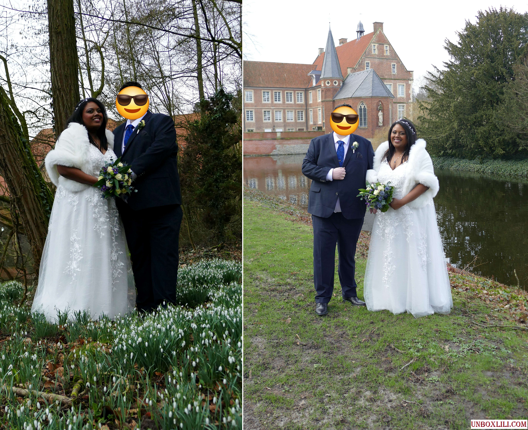
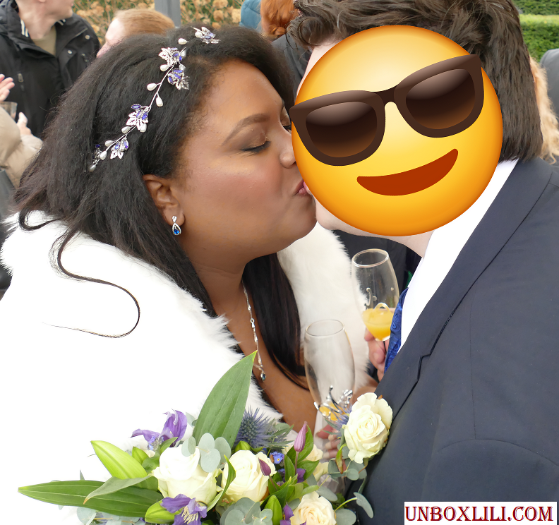
The photo above demonstrates some of the various stages that I was testing different makeup products and practicing techniques in the weeks prior to the wedding. The very first example is what I would consider my typical amount of makeup, versus the last photo where I put in way more effort with a ton of extra steps that were necessary to create the look I envisioned for myself.
In Part 1, I explained which strategies I chose and showed the specific makeup products used. In Part 2, I’m going into greater detail listing the actual order of the steps I took. That includes all the details about the eyeshadows that I left out of the previous wedding post. I will also include photos of alternative wedding/special occasion looks in both the cold winter theme, classic looks, and a few colorful ones now that we’re in spring.
The makeup artists were upfront about either not being available on the day of the wedding or not having their own products to match me. I was a bit nervous about having to do it on my own, considering I’m just a makeup enthusiast, but many loved ones reassured me that I knew my own face better than anyone else and they were confident I could pull it off. I hope that this post will be inspiring to anyone else in a similar situation where you have an important event coming up and aren’t sure where to start or would just like to see extra ideas.
My Wedding Makeup Step-By-Step
First, I applied skincare (and this would normally include sunscreen though I skipped it), allowing ample time for everything to absorb in the skin before moving onto applying primer(s).
I then applied color correctors to the spots I have discoloration, put on the liquid contour for my nose and under the cheeks, and added liquid blush. I left them only halfway blended since the foundation would go over everything anyway as part of the underpainting technique.
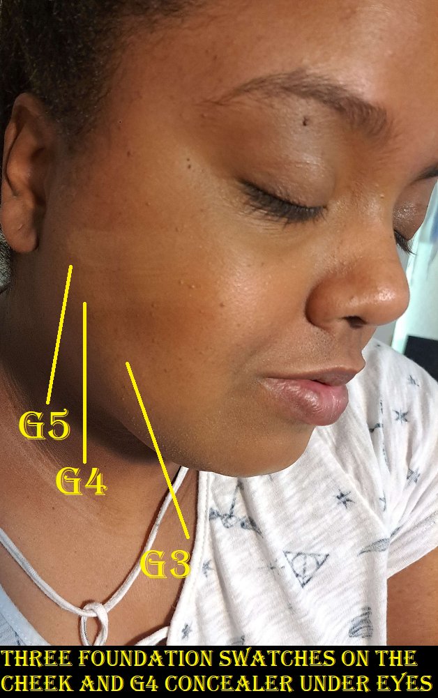
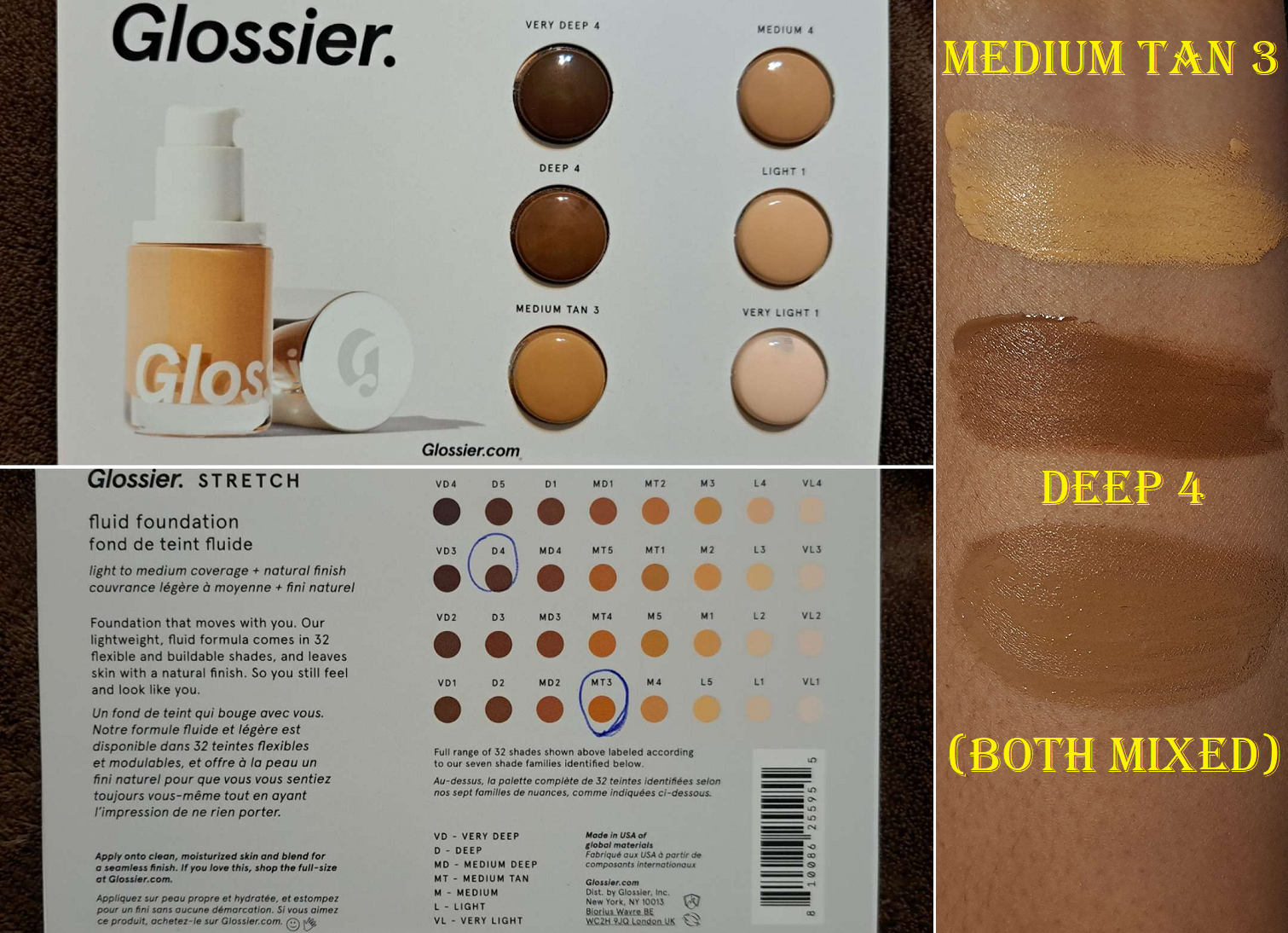
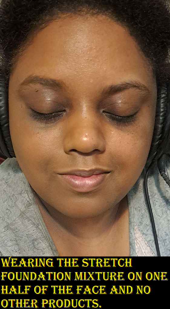
I made a mixture of foundation shades and applied it to the outer perimeter of my face. The lighter foundation color, I applied to the central zone of my face.
The eye primer came next before I filled in my brows with my brow pencil of choice.
I applied my skin tone shade of concealer to my under eyes and areas of discoloration. I applied a combination of my skin tone shade and a lighter color to my under eye area again, the bridge of my nose, center of my forehead, and chin. I use the lighter concealer color alone to highlight under my eyebrows.
After setting those concealer areas with powder, I did a first round of setting spray to lock those in.
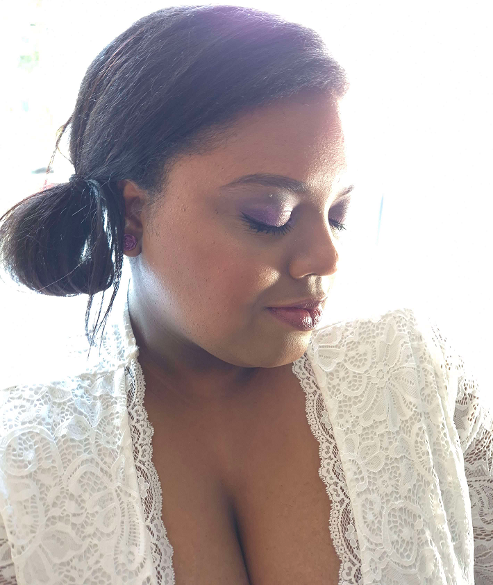
In the photo series above, I saved my eye makeup for last, but I switched the order on the day of the wedding to do the eye makeup next in case I had a mishap with eyeliner, if mascara got on the lids, etc.
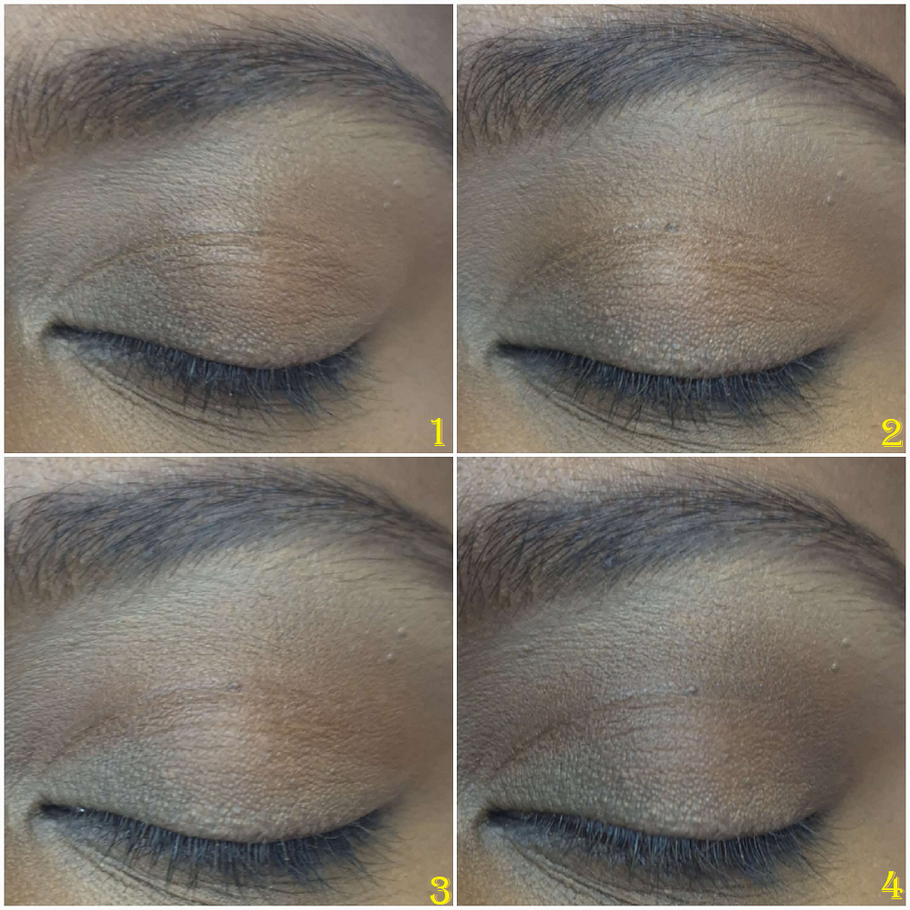
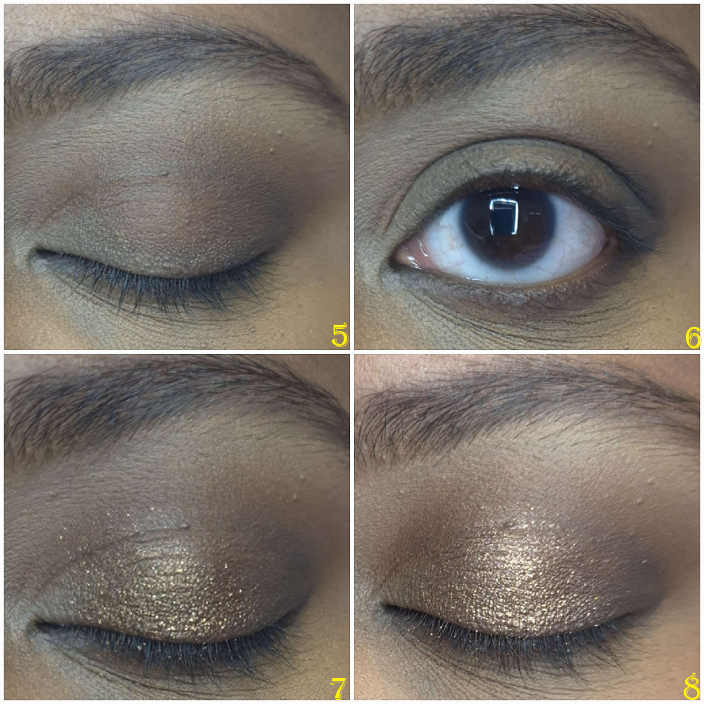
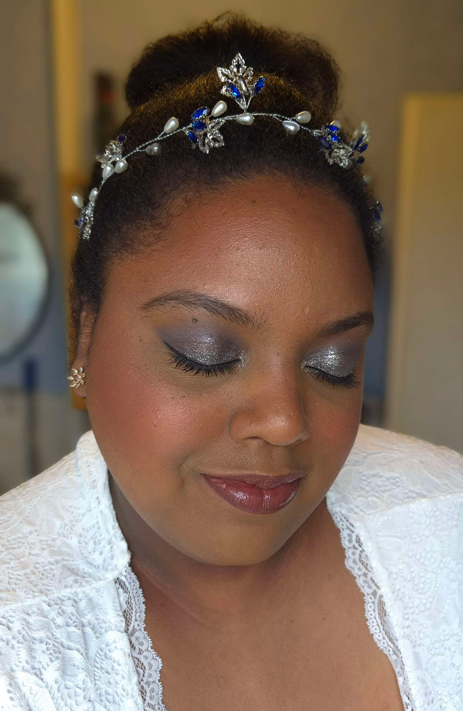
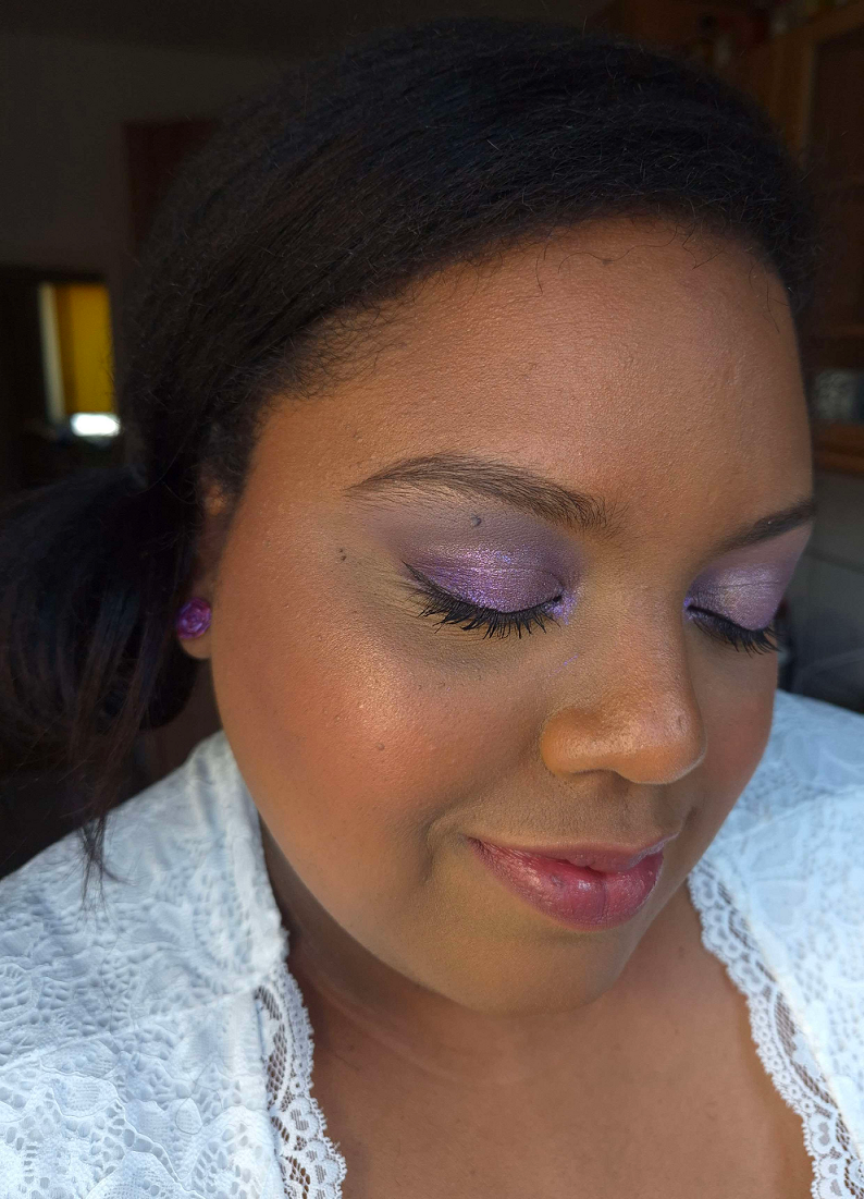
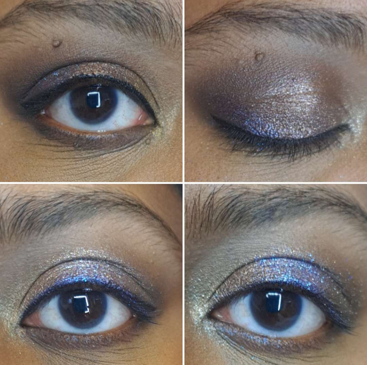
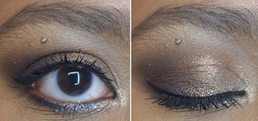
1. First, I applied Viseart’s Illusion shade from the Peridot quad under my brows on top of where I laid down the lighter concealer shade.
2. Then I applied Melt’s Rubbish shade from the Rust palette in the space under the Viseart shadow, but above the crease.
3. Next was Melt’s Rust shade from the same palette tightly in the crease, not going past the previous shade.
4. I lightly added Log from Natasha Denona’s Gold Palette, building up the outer corner and moving halfway inward. I chose this placement because of my particular eye shape.
5. I then built up the depth and smokey factor in the outer v area using Xtreme Black from Pat McGrath’s Mothership III: Subversive palette.
6. I smudged the Urban Decay 24/7 Glide on Pencil along the outer quarter of the lower lash line before using Deep Shade (actual name) from the same PML palette on the rest of the lower lash line.
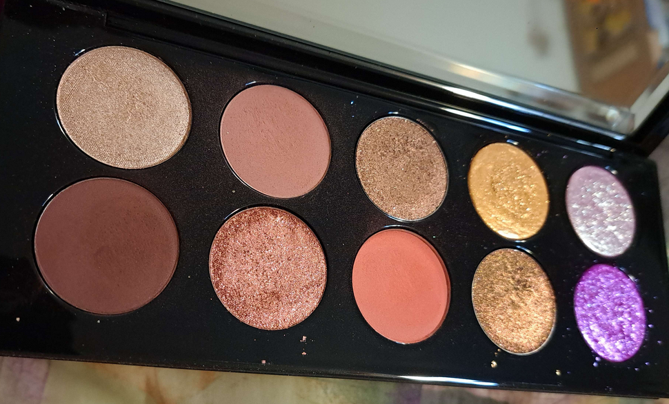
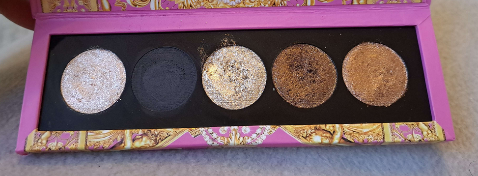
7. I smoothed on the Nyx Glitter Primer to the empty space on my lids and applied Bronzed Mink from PML’s Bronze Bliss palette to the outer half of the lid, taking care to not cover up the dark shadows in the outer corner.
8. I added Divine Dahlia from PML’s Interstellar Icon Quad on top of Bronze Mink to tone down the warmth of that shade.
9. The next step was picking up Nude Moon from Bronze Bliss on my brush, spraying it with MAC Fix+ and applying it to the inner half of the lids.
10. I placed Skinshow Fever from Mothership III: Subversive in the inner corner, under the brow arch, and the inner third of the lower lash line for highlighting purposes.
11. For extra sparkle, I added Lunar Luxury damp from Bronze Bliss to the inner corner. I applied the waterproof eyeliner to my upper lash line, along with two coats of waterproof mascara to my upper lashes, but only one coat on my lower lashes. Had I used the Clionadh multichrome, I would have placed a small dot that was eyeliner width to the center of the upper lash line.
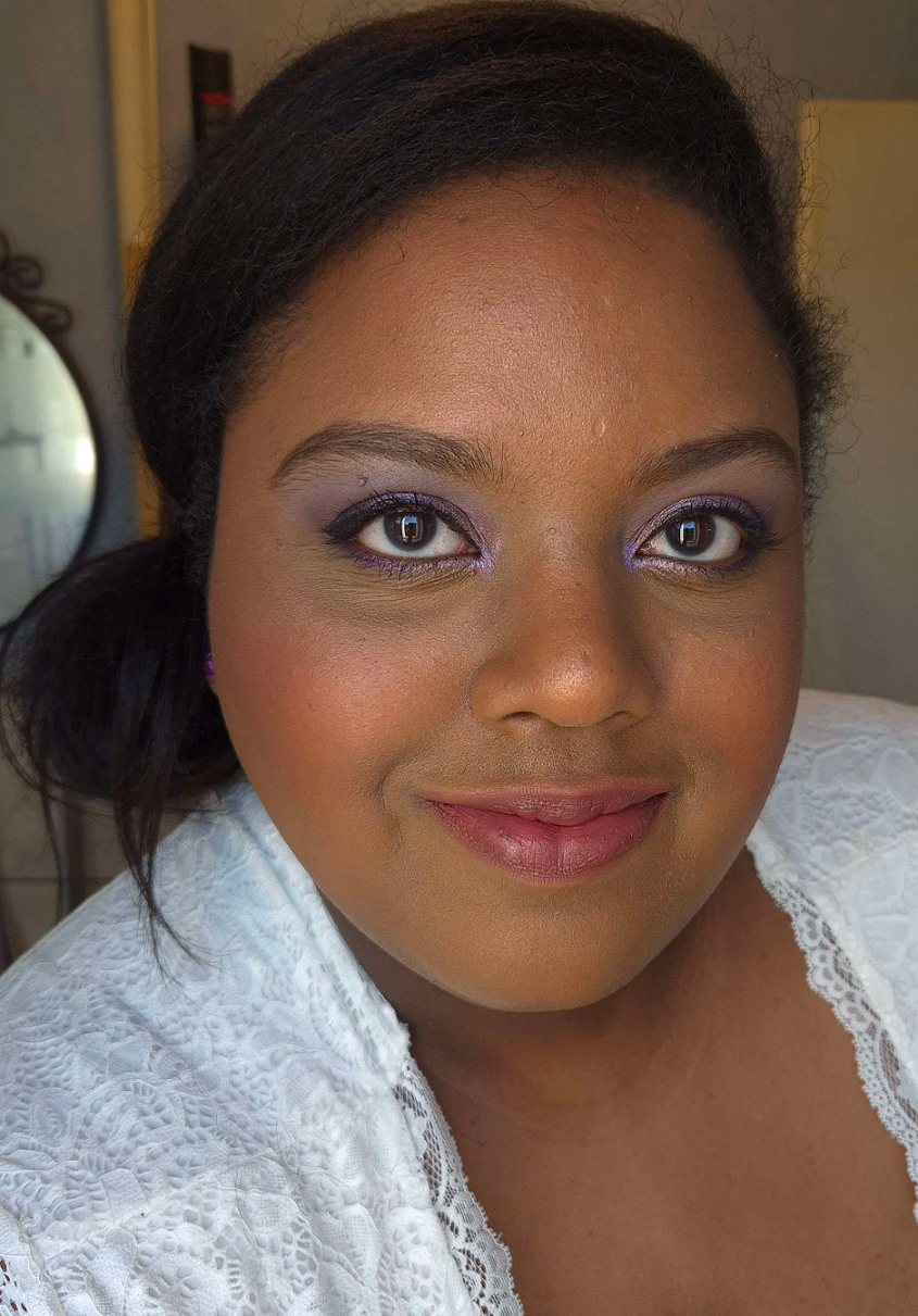
Going back to my base, I applied powder contour under the cheeks and along my jawline. I applied a cooler toned contour to my nose, and on top of the other contoured spots.
I applied bronzer along my forehead and slightly above the contour under my cheeks.
I used my face powder and the Beautyblender Puff to clean up a small section of my sculpting work without going too far in. Just about one inch inward from my ear.
I applied my intense highlighter to the tops of my cheekbones.
I applied the mixture of powder blushes to my cheeks.
I applied my more subtle highlighters to the top of my cheekbones again, bridge of my nose, above the brows, and any remaining product on the brush to my forehead and chin.
I used my blurring finishing powder in any areas that needed extra blending/blurring.
I lined my lips with the lip liner of choice, filled it in with liquid lipstick, and added a lighter lip product to the center of my lips. During trial sessions, I even added highlighter, but didn’t end up doing it on the wedding day.
I put the leftovers of foundation from my brush and applied it to the spots on my neck that would be seen.
I applied highlighter to my collarbones and shoulders.
Lastly, I finished up with a generous amount of setting spray to my face. Had I remembered, I would have sprayed my neck and the spots I applied body highlighter.
And that’s everything! It’s a lot of steps, but worth the time and effort for one of the most important days of my life!
Just as unexpected problems can arise on important days, unfortunately, nearly every day that I set aside free time has been a dark day. I’ve done my best to play around with artificial light, take photos during the brightest part of the day for natural light, and do some color adjusting with the photos, but I’m dealing with cloudy days constantly over here. Times like these, I miss Florida haha.
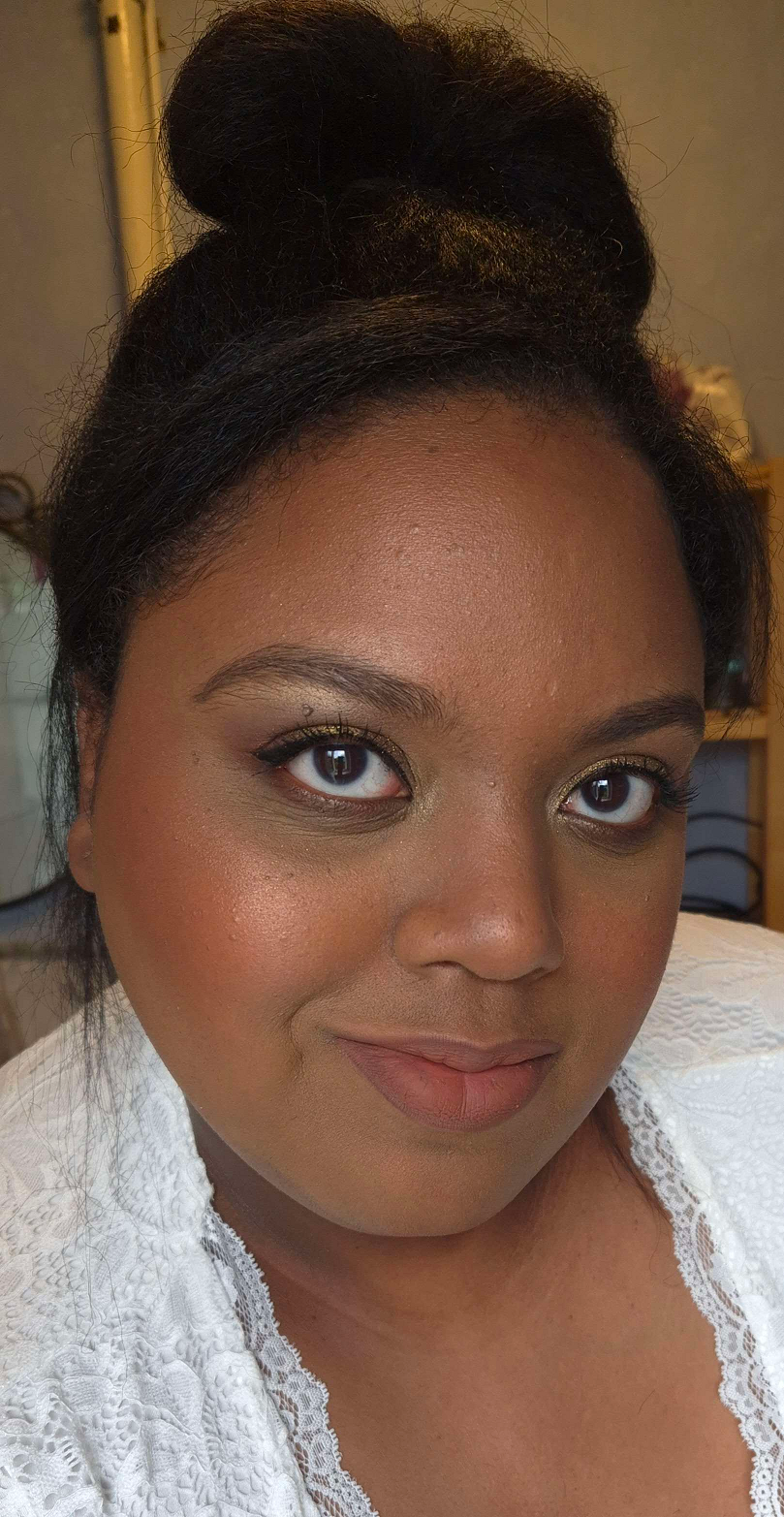
Recreation of my Wedding Makeup/Neutral Glam: Used all the products I still have on hand. Photo Setup: (1) In front of an open window on a cloudy day. (2) In a room with warm light and a second cell phone’s flashlight was lit behind the camera. (3) In front of an open window with warm white bulbs overhead.
Here are the additional looks!
Frost Queen: Milky Hydro Grip Primer and Armani Luminous Silk Hydrating Primer, Armani Luminous Silk Foundation in 10, Hourglass Cosmetics Vanish Airbrush Concealer in Maple and Umber, Chantecaille Perfect Blur Powder in Med/Deep, r.e.m. Beauty Hypernova Satin Matte Bronzer in Cocoa-Nut, REM Beauty Highlighter Topper in Miss Mars, Hindash Beautopsy Palette (nose contour), Armani Neo Nude Melting Color Balm in 60 Warm Plum and Hourglass Ambient Light Blush in At Night, ELF Instant Lift Brow Pencil in Deep Brown, Stila Stay All Day Waterproof Liner, KVD Full Sleeve Mascara, Juvia’s Place Lip Liner in Brownie, Lisa Eldridge True Velvet Lip Color in Sorcery, Colourpop Hocus Pocus 2 So Glassy Lip in Boys Will Love Me, the eyeshadow shade Memory (Metallic) from the Tati Beauty Textured Neutrals Volume 1 palette, and shades Nowhere, Christmas Eve, and Snowflake from the Oden’s Eye Christmas Eve Palette. Photo Setup: In front of an open window with a warm white bulb overhead on a partly sunny day, but near sundown.
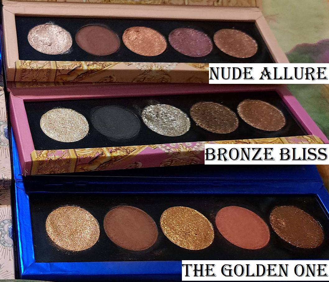
Playful Pinks: Milk Hydro Grip Primer, Nars Light Reflecting Foundation in MD3.3 Caracas, KVD Good Apple Concealers, Huda Faux Filter Corrector in Mango, Nars Soft Matte Advanced Perfecting Powder in High Tide, GloWish Soft Radiance Bronzing Powder in 04 Deep Tan, Dior Backstage Powder No Powder, Hindash Beautopsy Palette (nose contour), Dior Rosy Glow Blush in 012 Rosewood and Nabla Skin Glazing in Lola, Pat Mcgrath Labs Skin Fetish: Ultra Glow Highlighter in Divine Rose, Suqqu Treatment Wrapping Lip in 05, Coloured Raine Lip Liner in Decadent, Benefit Precisely, My Brow Pencil in 05, KVD Full Sleeve Mascara, Stila Stay All Day Liquid Eyeliner, MAC Fix+, Melt’s eyeshadows from the Gemini II Palette with shades Bela, Sweetheart, Gemalas, and LX Queen, and the Rust palette with shade Antique. Devinah Cosmetics Eyeshadows in shades Empress, Pixy Stix, and Gelicide. Pat Mcgrath Labs’ eyeshadows from the Mothership III: Subversive palette in VR Pink and from the Celestial Nirvana 5 pan Palette in Nude Allure in the shades Mercurial Rose and Coral Kiss. Photo Setup: In front of an open window on a less cloudy day, but during late afternoon hours and a warm white bulb overhead.
Chocolate-Gold Glam: Milk Hydro Grip Primer, Armani Luminous Silk Hydrating Primer, Hourglass Ambient Soft Glow Foundation in 13.5 and 14, L’Oréal Infallible Full Wear Waterproof Concealer in 415 Honey, Huda Beauty Easy Bake Loose Baking & Setting Powder in Blondie, Gxve Beauty Check My Glow Multi-Dimensional Illuminating Highlighter in Karat Country, Anastasia Beverly Hills Cream Bronzer in Terracotta, Dior Powder No Powder, Chanel Blush Lumiere Illuminating Blush Powder in Brun Roussi, ELF Instant Lift Brow Pencil in Deep Brown, MAC Macstack Mascara, One/Size Waterproof Liquid Eyeliner Pen, Palladio Waterproof Lip Pencil in Coffee, and Kaleidos Cloud Lab Lip Clay in Sienna. Hindash Beautopsy Palette (nose contour and no contouring anywhere else). Viseart’s Illusion shade from the Peridot Quad, Deep Shade (actual name) and Gigabyte from Pat Mcgrath Labs Mothership III: Subversive, Clionadh Cometics’ shade Lux, and Devinah Cosmetics’ shade Ambrosia. Photo Setup: In front of an open window on a less cloudy day with a warm white bulb overhead.
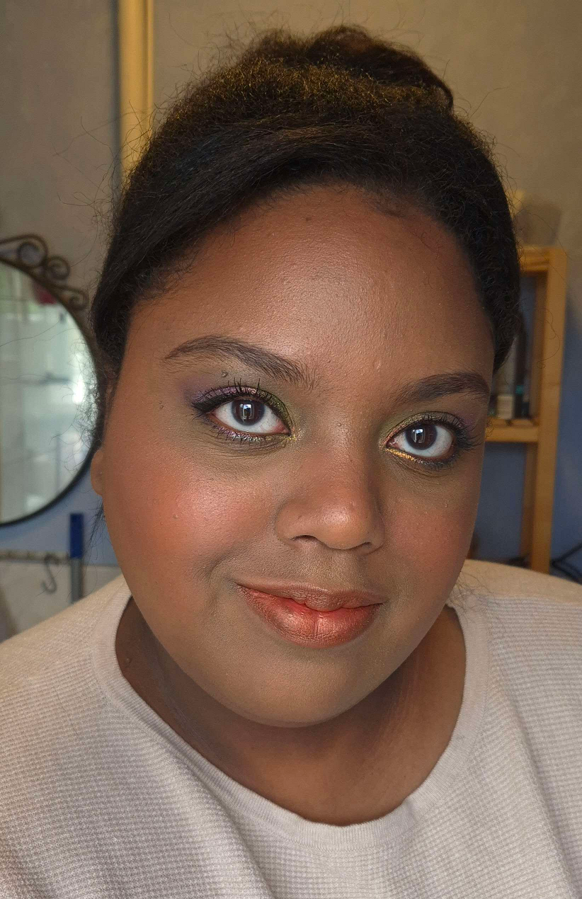
Flower Garden: Haus Labs by Lady Gaga Triclone Skin Tech Foundation in 425 Medium Deep Neutral, Tatcha the Liquid Silk Canvas Fenty We’re Even Concealer in 410 W and 385W, Givenchy Prisme Libre Powder in 5 Popeline Mimosa, Dior Powder No Powder, Hindash Beautopsy Palette (nose contour), Victoria Beckham Matte Bronzing Brick 05 (regular contour), Gucci Bronzer in 04, MAC Glow Play Blush in Peaches N Dreams, Sephora Blush Duo in 02 Peach Blossom, Tom Ford Shade and Illuminate Highlighting Duo in Tanlight, Benefit Precisely, My Brow Pencil in 05, L’Oreal Telescopic Lift Macara, Stila Stay All Day Waterproof Liquid Eyeliner, Danessa Myricks Infinite Chrome Micropencil Eyeliners in Jade, Amethyst, and Lemon Quartz. Devinah Matte Eyeshadows in Courtney and Meraki, Clionadh Cosmetics Stained Glass Shadows in Mural, Patina, Quest, Noble, and Spire. Coloured Raine Lip Liner in Pine and Suqqu Sheer Matte Lipstick in 112. Photo Setup: In front of an open window with the sun poking out randomly on and off from behind the mostly cloudy sky, and a warm white bulb overhead.
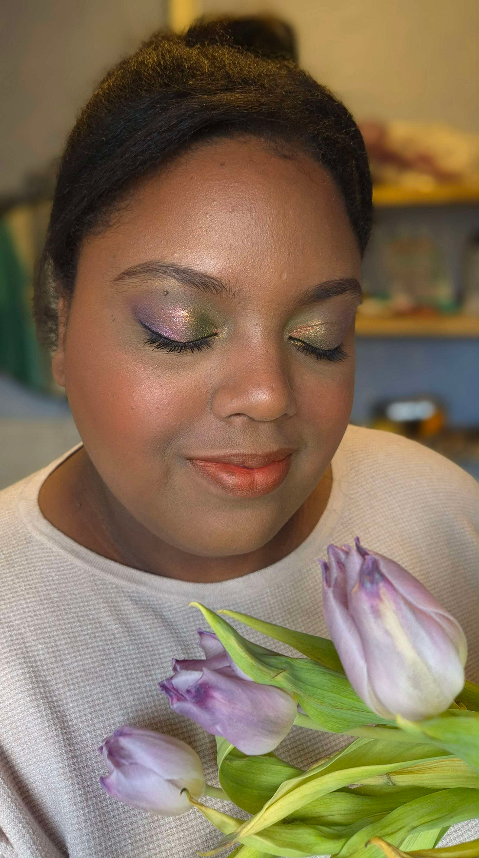
Spring Purples: Milk Hydro Grip Primer, Glossier Futuredew, Lisa Eldridge Seamless Skin Foundation in 27, KVD Good Apple Concealers, ELF Camo Color Corrector in Orange, Charlotte Tilbury Airbrush Flawless Finish in 2 and 3, Hermès Plein Air H Trio Healthy Glow Mineral Powder, Dior Backstage Powder No Powder, Hindash Beautopsy Palette (contour), ColourPop Pressed Powder Blush in Potted and Gucci Cheeks & Eyes Powder Luminous Matte in 06 Warm Berry, Hourglass Metallic Strobe Powder in Infinite Strobe Light, Lisa Eldridge Enhance and Define Lip Pencil in Sorcery and Lisa Eldridge Luxuriously Lucent Lip Colour in Painterly, Benefit Precisely, My Brow Pencil in 05, KVD Full Sleeve Mascara, Stila Stay All Day Liquid Eyeliner, Melt’s eyeshadows from the She’s In Parties Palette with shades Total Immortal and Last Caress. Clionadh Cosmetics Multichromes in shades UV and Tracery. Sydney Grace Eyeshadows in Dear Reader, Flannel, and Sovereign Reign. Photo Setup: (1) In front of a window on a partly sunny day. (2) Same as the first, but from the opposite direction. (3) In front of an open window on partly sunny day and a warm white bulb overhead.
That’s all for today! Thank you for stopping by! I hope you’ll click to follow or bookmark this page to come visit again!
Also, I seem to be having an issue with WordPress. For some reason, images have a hard time loading for those viewing my blog within Germany. The customer service advisors were unhelpful and the only way that even I was able to get around loading issues was to use a VPN. If you live in the US or most other countries, it should be working fine. The issue, as far as I’m aware, is a DE issue for some reason.
There were a lot of factors to consider when it came to doing my own wedding makeup. I scoured the internet for tips and tricks, but at times the answers were contradictory. I thought I had a good plan in the beginning, but as I practiced doing multiple looks, I realized I needed to make some changes along the way.
Today, we’ll cover the things that should be decided on in advance and what I ultimately chose to do. The conclusions I came to won’t be the same for everyone since it depends on each individual’s personal tastes, skin type, skin texture, skin tone, undertone, priorities, etc.
Although I was inspired to create this post with weddings in mind, this topic is for anyone with an upcoming special event/occasion where photographs will be taken. I was not in a position where I could afford to forget something and run to grab it at the last second, so hopefully these topics will help others avoid having to make last minute decisions and purchases too.
DISCLOSURE: All makeup products in this post were purchased by me with my own money. The only affiliate links in this post are for a few of the brushes mentioned towards the end. Non-highlighted links in bold blue font (Example) are standard non-affiliate links. Links marked in bold black font with a light blue background (Example) are affiliate links. This means that I would make a commissionif purchases were made directly using my link. Whether you click to shop through them or not, I appreciate you visiting and I hope you find the information I’ve provided to be helpful!
Red – Titles/Topics, Purple – Products Used, Green – Additional Options to Consider
Deciding Between Looking Better in Person or Looking Better on Camera
We had a micro wedding (less than 25 people) and the majority of the guests were non-makeup wearers or neutral-color wearing minimalists. I was concerned with looking overly made up in person compared to the group, but also recognized that full coverage and full glam faces result in the most photogenic pictures. I would love to look as natural and fresh-faced as possible, but I think I look the prettiest with “a beat face,” so to speak. So, I decided that I ultimately would start researching ways to look best in photography since pictures last longer and can even serve to replace memories in the minds of those who see them. If it was possible, my plan was to still try and find a balance between the two goals. This balance involved using other techniques such as color-correcting so I could use less concealer and foundation to hide my skin discoloration, using underpainting techniques to have my sculpting attempts look as natural as possible and reduce the need for as much powder on the surface layer, using full-coverage makeup paired with brushes that apply less product so that I could build up to the minimum amount of makeup I needed in small layers instead of packing it on heavily all at once.
In the age of social media, it’s safe to assume the majority of people prioritize how makeup will look on camera versus how it looks in real life, as discussed on the Mixed Makeup YouTube Channel. However, this is still a question everyone has to ask themselves because the degree to which direction one leans will dictate how they have to proceed with the next steps.
After Choosing to Prioritize How One Looks on Camera…
When I do a full-face in the type of soft tones that are typical of bridal makeup, I don’t feel satisfied with my appearance. So, looking natural was less of an option for me. In addition, if I wanted things like blush to be seen on camera, I had to get comfortable packing on way more than usual because blush gets washed out so easily. As described by Kackie of Kackie Reviews Beauty, the key is applying makeup in a way to add more dimension that the camera can pick up even when pulled back. I had to practice applying more than usual, taking pictures, and then adding more and photographing that to learn how much would actually be needed on the day. Blush, highlighter, and eyeshadows were the things I had to work on amplifying dramatically in order to get photos I was satisfied with (at least on my own camera).
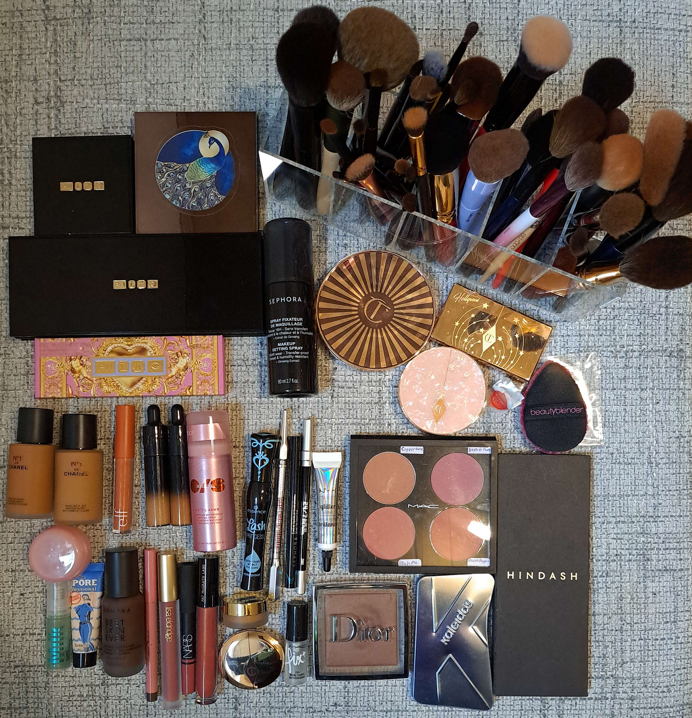
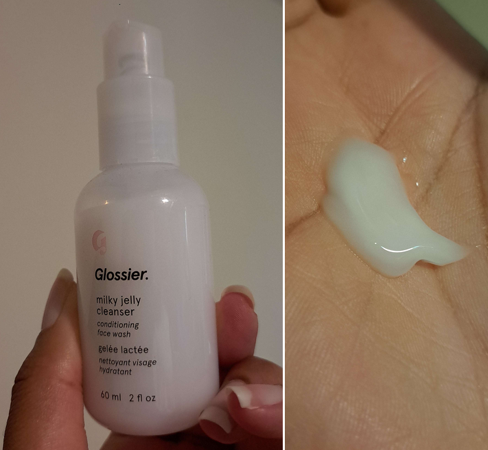
One of the first big decisions I had to make was deciding what finish I wanted for my skin. A matte base with strategically placed glow seems to be the consensus for what photographs the best. However, I did not anticipate the climate when I chose what products to bring with me when I moved overseas. The products that looked the best on camera for me in Florida were extra dry looking on me in Germany and I didn’t bring my dewier foundations because I have them in my darker summer shade. This led me to buy a new foundation (N°1 DE CHANEL Revitalizing Foundation), the only one that mimicked the appearance of natural oils peaking through my face, and it remained that way through the end of the night. It basically looked like a natural-finish foundation on my dry skin. I used the Glossier Futuredew, to ramp up the glow in typical places I highlight, the MILK Hydro Grip primer for hydration and lasting power, and the Benefit Porefessional Hydrating primer in my T-zone for a smoothing effect without a silicone texture. I have all three of these products in minis (and a travel container).
I did have the Nars Light Reflecting Foundation with me, but my research scared me away from using it. Since Nars is an artist brand, I always assumed their products looked fantastic on professional cameras, but I kept coming across warnings against using too many light reflecting products. Considering how dark it is in Germany, I knew the chances of flash being used was high, so I didn’t want to look crazy on other people’s cameras either (even though Nars’ foundation is supposed to be photo-friendly and produce no flashback, but I didn’t know if that would still be the case if paired with other light reflecting products). So, I didn’t use that one just to be safe. Skipping it turned out to be necessary because I tried using it in strategic spots and it still wasn’t luminous enough for my liking while not in Florida. Lisa Eldridge was one example of someone who discussed light reflecting products in flash photography and Pete Coco Photography cautioned against using shimmers in studio settings, but I saw more mentions of light reflection from various articles and blogs.
For those curious, the top foundations I wanted to use if the climate was more like Florida would have been the Lisa Eldridge Seamless Skin Foundation or Hourglass Ambient Soft Glow Foundation (this one only starts to look good for me if oils break through and my skin is prepped for maximum hydration including using a facial oil). The Lisa Eldridge foundation is extremely similar looking to the Chanel one I opted for, but without as much luminosity. I also own two lighter coverage products that make my skin look beautiful in person: the Fenty Eaze Drop Blurring Skin Tint in Shade 18 and the Rose Inc Skin Enhance Luminous Tinted Serum in Shade 100. I was looking for high coverage, but if I had to recommend another option it would be the one from Fenty. I normally dislike their foundations, but this newer one finally agrees with my dry skin. The Rose Inc one unfortunately can come off extra warm colored on camera. Sometimes I look orange in photos even though I don’t in person. It’s also random when it happens as well. I’m not sure if it’s some interaction with a specific product I might sometimes pair with it. So, that’s why I don’t recommend that one.
Deciding On the Color Scheme and Undertones of the Makeup
I had quite the dilemma trying to figure out what colors I wanted to use as a person with warm undertones who was planning to wear cool toned accessories and have blue and purple flowers in my bouquet. I like wearing eyeshadow that matches what I’m wearing in some way, whether it’s clothing, a purse, jewelry, etc but I never like how cool toned eyeshadows look on me as much as warmer ones. At the same time, I didn’t want the winter aesthetic I planned for my look to clash with my natural warmth and make me look extra warm by comparison. I did a test run using my go-to makeup and just switching to a cool toned blush, but I didn’t like the outcome. My second solution was to wear neutral makeup to bridge the two types of looks, but after doing another test run, I just didn’t feel my makeup was as pretty as it usually would be.
Experts say that although anyone can wear any color they want, we tend to find shades in our undertone to look prettiest on ourselves. For instance, Lisa Eldridge says it’s nice to match the wedding scheme/theme, but not if it’s against your coloring. Ultimately, I felt that if I didn’t wear the kind of shades that were natural for me, I would have regrets looking back at pictures thinking my everyday makeup looked somehow better than what I chose for my own wedding.
Many makeup artists recommend trying to look like an enhanced version of yourself, and not looking like someone else. This concept is what helped me solidify the decision to use warm tones, just ones that didn’t veer too far off from neutrals. This idea of trying to look like myself also had me wondering how I could possibly incorporate a pop of color into my look because that’s “me” too. Even when I’m on a nude colors kick, I still end up popping on a multichrome or some other colorful indie brand’s eyeshadow. Considering the wedding colors were blue, purple, and ivory/cream/whitish (we couldn’t really nail that one down), I thought it might be a good idea to add a blue-purple multichrome into the eye look. I really wanted for it to be one from Clionadh Cosmetics like Etched or Spire, since it’s my favorite brand, but the reason I love theirs is how intensely they stand out. In this situation, every technique and position I tried to place the multichrome was just too much.
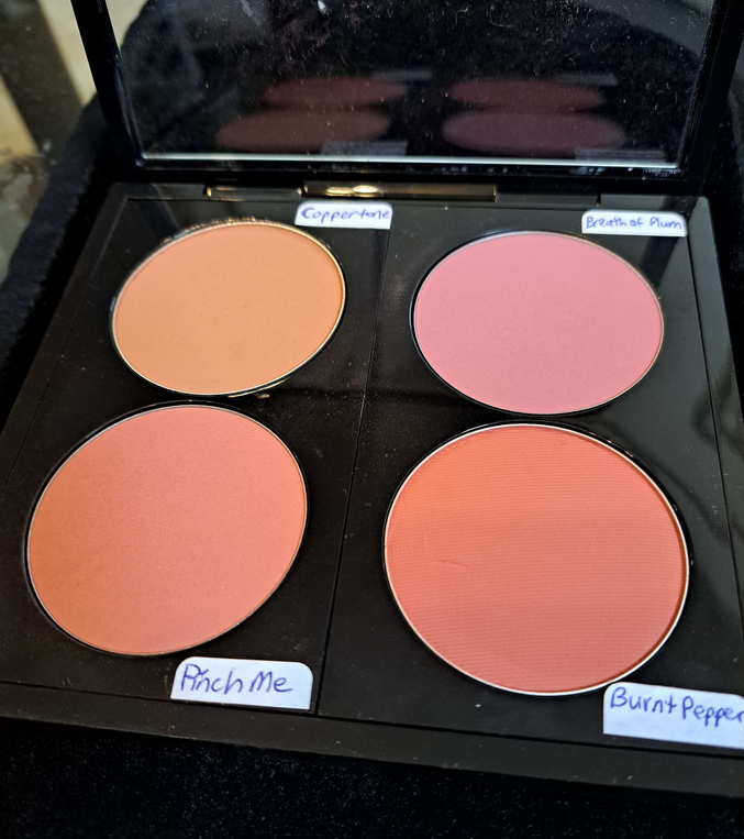
Because all my other makeup was in natural tones, my eyes were instantly drawn to the spot with the multichrome and stole attention from the rest of the look. Eventually, I was recommend by someone on Instagram to try putting the tiniest dot in the center. This worked in low light in a very pretty way, but the second actual lights hit my eyes, it was still too much for what I wanted. Ultimately, as much as incorporating color into my looks is something I’m known for doing, I wanted something classic and timeless for my wedding. So, I decided to go back to the neutral glam idea for eyeshadows and using my slightly warm tones of makeup for everything else. My blush was still a mix of everything. I used a liquid blush and then ended up using powders on top further into the makeup process. For those curious, it was three shades from MAC: a whisper amount of Breath of Plum for a slight cool-toned wintery cheek look, a normal amount of Pinch Me as the main color and a natural looking pink on me, and the tiniest bit of Burnt Pepper to add a little more warmth that compliments my undertone and depth of my skin color.
The eyeshadows I ended up going with were mainly from Pat Mcgrath Labs. I intend to do a part 2 to this post, which I can hopefully complete and upload within a few weeks. In there, I’ll post more details on the step-by-step process.
Making Sure Base Techniques are Down Pat
After using my various primers, the next step for me was to color correct the areas of hyperpigmentation. Most of the time, I don’t bother with color correcting because I prefer to just lean on full coverage concealers for that job. However, I wanted to avoid my base makeup looking heavy, since I knew I would be putting more layers of product than usual. I only had two options with me: the E.L.F. Camo Color Corrector in Orange and the Huda Beauty #Fauxfilter Color Corrector in Mango. Although I prefer Huda’s on a regular basis, the ELF one worked better with the KVD concealer, as well as me wanting more intense color-correcting from using a darker color.
I would normally recommend using a color-corrector under the eyes too for those who have intense dark circles like I do. In my particular case though, I already know the ELF formula creases/gathers like mad in areas with lines, which is why I only use it in smoother areas of my face. So, I had no choice but to skip that step on myself. For those that don’t have discoloration issues like I do, color-correcting is not a necessary step. The most coverage one can achieve using the least amount of products is better, so if you can skip it, then please skip it. Ultimately, even I would have skipped this step, but I tested out how my makeup looked with color correcting versus going without it and the results spoke for themselves. I decided it was a step worth doing because I wanted as close to a flawless base as possible.
Although I settled on a foundation, the color match wasn’t as spot-on as I hoped, considering it was a bit more orange rather than yellow/golden and just slightly darker. I had purchased shade BD121, so my only other option was to buy BD91 to mix with it. The brand makes shade BD111, but it’s exclusive to the Chanel website and was sold out. Thankfully, using a ratio of roughly 2 parts BD121 to 1 part BD91 gave me a better color match. At least, that’s the mixture I used on the outer perimeter of my face and then used BD91 by itself in the central part of my face for a more natural gradient of color. My foundation application did not come first immediately after priming and color correcting though.
The other technique I wanted to utilize was under-painting. I have a naturally round face, besides it being chubby. Trying to create a chiseled look is by nature going to be easier for those with a clearly visible bone structure. Although I still have slight indent in my cheek area, I have an undefined jawline made weaker by having a rounder face. There’s only so much one can do to make a believable contour on a face like mine. One of the most believable options, if done correctly, is underpainting: to do the contouring and highlighting as a cream or liquid step first before applying foundation on top (and following it up with powder products afterwards too). Funnily enough, I learned about this technique about ten years ago when under eye concealers weren’t full coverage enough for me. I don’t think it’s necessary to do a full-face of underpainting like you see in TikTok and around social media as a fad, only the specific areas that need extra help to again minimize product usage. So, I bought the darkest shade of the most affordable foundation I could get my hands on (that I knew would work well). This was the Sephora Best Skin Ever Foundation in 68N. I would have preferred for it to be cool-toned, but “cool” shades in the darkest colors tend to be red instead of blue-grey so I figured neutral would be good enough. I could have used a concealer as well, but considering how much I spent on those Chanel foundations (even though they were discounted), I wanted to save as much money as possible. I could have also tried to use an actual cream contour, but I figured using a foundation would look even more natural on the skin and potentially blend better as cream contours can sometimes be too emollient. The 68N shade worked well enough for my cheekbone and jaw area, but since my nose is a lot more yellow than brown, it looked a little more red in that spot that I like. So, I just had to apply the product even more sparingly and make sure to use more greys when I contoured with powder later.
Besides applying contour, I also used a Rare Beauty Soft Pinch Liquid Blush sample of Joy as an underlayer of blush to help ensure longevity for the whole day. Plus, this particular shade is bright without being overly vibrant, which tends to work well for me. Using this underneath wasn’t overkill when I used the MAC blushes later. In fact, I still had room to go heavier with my blush.
After the liquid blush is when I would apply my foundations. I think some people recommend doing highlighting with concealer (product several shades lighter to bring those areas forward and not the shimmery type of highlighter) underneath foundation, but the KVD Good Apple Concealer formula that I used can sometimes melt/fade away with other products. The foundation on top of this one would have been covered up too completely, so I applied the mixture after foundation. I could have tried to use a different concealer for underpainting, but I was running out of time and just wanted to stick to what I knew. I began practicing applying the makeup on an off nearly two months before the wedding (with more consistent daily testing in the final three weeks). It’s not useful to test out all new products at once, since it would be too hard to tell which products were interacting badly with others, or were only working well depending on what it was paired with. I could only test a few combinations at a time. So, even the two months wasn’t as much time as I thought. In retrospect, three months would have been ideal for me.
The theme of this sections is to make sure the base techniques are nailed. Part of that was my realization that in all the bridal makeup photos I liked, they really utilized highlighting for color in addition to the glow factor. However, I’ve never liked an overly brightened under eye on myself. When I was younger without so many lines to worry about drawing attention to, that was a different story. So, I had to think about what’s more natural for myself and my style rather than just sticking to the template of instructions on how most people do wedding makeup. I thought perhaps I could use my typical Tan 167 all over and apply my new Tan 161 (this specific shade was on sale which is why I chose this one for my highlight option) on top in strategic spots to highlight with, but I didn’t like the outcome. It was still too stark of a contrast for me to be comfortable with no matter how great it could have potentially looked on camera. What worked best for me was applying my near skin-tone shade 167 and then using a combination of 167 and 161 mixed together as the highlighting concealer color on top. The transition was more natural, which I ended up liking a lot better than using 161 alone (though I did use 161 alone to highlight my brow bone area). I then set my concealer with the Charlotte Tilbury Airbrush Flawless Finish Powder in either Medium (which I bought in the travel size) or a combination of Medium plus my usual shade in Tan. I tested out plenty of different powders and the one that worked the best to keep the KVD concealer creasing the least and not fading at the end of the night was this Charlotte Tilbury powder. The Huda Beauty Easy Bake Loose Powder was a close second since it worked so well with other concealers I was testing at the time (Fenty We’re Even Concealer and L’Oréal Infallible Full Wear Concealer). However, the results of the KVD and CT combo won out.
I would normally use the back of my hand as a spot to mix shades, but since I wanted to have leftover mixtures reserved on the side for touch-ups, I started to wish for a makeup mixing palette or plate. Since I didn’t bring any with me and didn’t want to buy one, I used the top lid of the Charlotte Tilbury Cream Bronzer compact (pictured in the foundation photo above). It has a surface that’s easy to wipe down with a makeup wipe or makeup eraser cloth. Also, when I mixed with my brushes, I got too much product on the bristles, so I started using the brush handle to mix shades and then wiped off the handle onto my microfiber cloth. That way, I’m able to pick up smaller amounts of product with the bristles and even switch to a smaller brush for spot applications where needed.
Securing the base is important, but so is recognizing whether the recommended techniques have to be tweaked to your specific preferences and what makes you the most comfortable. It’s okay if you hate contouring to skip doing it. It’s okay to go with a sheer coverage foundation and then just use concealer in areas that require more coverage. The most important thing to do is to practice techniques as much as possible before the wedding or special event if you’re doing your own makeup. Sometimes products don’t perform the way we remember them and the last thing you want is to discover that on an important day. You want to thoroughly test your full look in every step in order to make sure you can replicate the same results every time, in every type of lighting, and in every weather scenario.
To Bake or Not to Bake, Setting Spray vs Fix+
Continuing the theme of getting used to wearing more makeup that usual and utilizing techniques I normally don’t, I had to decide whether or not to utilize the baking technique. Since I already narrowed down my concealer, it was just a matter of doing a wear test all day to see if my makeup looked better with or without baking. As it turned out, with my products and my skin type, baking really wasn’t necessary, or at least not in the traditional sense of loading a ton of powder on and then dusting it away after five minutes or so. I ended up not even needing to powder my whole face since I was utilizing setting sprays too.
My process was applying my concealer to my under eyes and face area before using my normal brush to powder-set those spots. As the days were counting down to the wedding, I started to utilize more skincare such as using the Lisa Eldridge Skin Enhancing Treatment Cleanser as a mask, which made my skin more hydrated and strangely enough need more setting powder under my eyes. So, after setting my concealer I would wait until I noticed creasing before patting the creases back out with my Sonia G Jumbo Concealer Brush, and then using the Charlotte Tilbury powder with my Beautyblender Power Pocket Puff to lightly apply a thin layer in the areas I highlighted with the concealer mixture (skipping hyperpigmentation areas that didn’t need extra powder) and also slightly under my contour to sharpen those spots and “clean them up.” The puff still came in handy because some days during the trials it was even necessary to go as far as to spray the silicone side of the BB puff with setting spray, press that into the concealer creases, reapply a little more concealer, and then set it with powder using the velour side of the puff. This was during the trial days I started using different skincare that I should have been testing much earlier in the process. So, this is all I need in terms of baking, but those that have combo or oily skin will probably need to take additional steps to lock the makeup into place. The puff also comes in handy while on-the-go. Instead of me needing a face powder brush and an under-eye powder setting brush (plus technically I could use other areas of the puff for other types of powder products), I just needed this on hand in the “Emergency Bride Kit” for touch-ups.
After I apply my liquid and cream layers, I set my face with setting spray, finish applying all my powder products, and then set my face again. I tested a few sprays before I moved, but the only one I brought with me was the One/Size On ‘Til Dawn Waterproof Setting Spray. I had the mini size and as I started testing, I got paranoid that I would end up using it all before the wedding and it’s not available for purchase in Germany. So, I ended up buying the Sephora Makeup Setting Spray for my trial runs. What I like more about the Sephora spray, besides the lower price, is that it’s unscented. The One/Size spray has a slightly floral, but not overwhelming smell.
I’ve tested both of the waterproof claims by splashing water on my face and have seen how the water rolls off my face without leaving streaks in my makeup. In terms of making things transfer-proof, that wasn’t the case with One/Size unless I just wasn’t using enough of it. The Sephora Spray only seemed to make my makeup transfer-proof that was in lighter layers and on lighter makeup days. It didn’t seem to work with a full face of everything. I haven’t tested the One/Size spray in the same scenario of a lighter makeup day, so perhaps they are equal. On my actual wedding day, I still stuck with using the One/Size product. We ended up doing a second day of photos, so the picture below shows what I looked like by the end of the night. On my wedding night, I got home at nearly 3 am, so I don’t have a photo for that. All things considered, I think it held up pretty well. It rained on the actual wedding day, but my makeup didn’t budge. I just transferred some of my nose contour onto my husband’s nose. I had to wipe it off him a few times, but it didn’t transfer any further after that.
I always use MAC Fix+ if I want to dampen my shimmer eyeshadows. It can make the face look hydrated, which is what I need, but sometimes it can cause makeup to not last quite as long and break down a little faster. So, I was too scared to use it on my face (nor did I have the time to test it with everything), so I just used it for my eyelid shades. At one point during my trials, I tested spritzing my highlighters with setting spray and my sample of Fix+ to see if I could intensify the look without leaving a stripe on my face. I ended up deciding to just skip that step as the Charlotte Tilbury Face Architect Glow Glide Highlighter worked well enough as a base highlighter. Others might prefer using a liquid highlighter, but powder products are always easier for me and I was planning to do a technical enough makeup application, so I’d accept easier options wherever possible. Throughout the practice days, I used some combination of multiple other highlighters shown below. On the actual day, I ended up sticking to just Charlotte Tilbury by adding the Pillow Talk Multi-Glow highlighter and I used the Tom Ford Shade and Illuminate Highlighting Duo on my shoulders and collarbone. Since I ended up wearing a faux fur shawl/stole and my hair was down, that final step ended up being pointless. It couldn’t be seen on my body. I also forgot to spray setting spray to those spots on my body afterwards, which could have potentially helped lock the highlighter into place.
Although I didn’t end up glowing as intensely as the models in the inspiration photos I procured from Google, seen below, I was still happy with my makeup choices. I applied highlighter to my brow arch, slightly above the brows on either side of the forehead, one specific spot on the bridge of my nose that I build up with contour and another spot lower down, and the tops of my cheekbones.
I mentioned earlier that I used the underpainting technique to contour. Then I used the powder contour in the Kaleidos Symphony Trio for more depth. It’s not grey toned enough to give an actual shadowed effect, so I added a mix of Feel + Real from my Hindash Beautopsy Palette to create the shadowing for my jawline, under the cheekbones, and nose contour. I didn’t use the Kaleidos powder on my nose, only Hindash’s product because I didn’t want it to be overkill in person.
When it came to bronzer, I was dead set on using the Hermès Plein Air H Trio Healthy Glow Mineral Powder because it’s the highest quality powder one that I own. However, in test photos I kept feeling like I was looking too warm toned. With a few days to spare, I tried some of my other top powders like the Glowish Soft Radiance Bronzer Powder, but that one was too red toned. Ultimately, the one best suited for my undertone is the Charlotte Tilbury Beautiful Skin Sun Kissed Glow Bronzer in Tan. Even though it’s a cream product, it went next to and slightly on top of my powder contour with no issues. This meant that my bronzer was going to be natural looking in person and likely too subtle to see much of it on camera, but it was a better alternative for me than having my face pull too orange.
I finished my face with my Dior Face & Body Powder No Powder. It blurs imperfections and helps blend the makeup seamlessly into each other. I didn’t use it all over my face, just in key areas that I wanted to touch up. If I had a sparkle-free version of Ambient Lighting Finishing Powder from Hourglass in my shade, I would have considered using that instead or in conjunction with the Dior product. Finishing powders can do wonders for a makeup look, but be sure to test in photos whether the sheen might or might not be too reflective for flash photography!
Waterproof Tests are Required
I’ve always hated waterproof mascaras because of what a pain they are to remove, but I was so certain I would need one for the wedding. I have plenty of favorite mascaras, but according to customer reviews I’ve seen online, apparently getting a waterproof version doesn’t mean it will perform as well as the normal formula. Some of the most beloved mid-range and high end mascaras have terrible reviews for their waterproof counterparts. So, I decided to try exploring the higher rated drugstore waterproof mascaras that I was familiar with in the original form. In my testing, the L’Oréal Voluminous Lash Paradise gave volume, but not as much length and was prone to clumping. The L’Oréal Bambi Eye Mascara gave length, but not much volume. I was debating whether or not to try using both, but it ended up not being necessary because I got the results I wanted from the Essence Lash Princess Waterproof Mascara.
Another alternative I considered was the KVD Beauty Full Sleeve Long + Defined Tubing Mascara. I love the length and volume of that one, and in theory tubing mascaras aren’t supposed to come off easily unless under warm water. While the KVD one seems to be harder to remove than other mascaras with regular temperature water, it can still be done. So, I didn’t want to risk a circumstance where I would have even the slightest chance of having my mascara come off. So, I stuck with using the Essence mascara.
When it comes to using eyeliner, I have a few that are supposed to be waterproof (Stila Stay All Day Liquid Liner and One/Size Point Made 24-hr Liquid Eyeliner pen), but they aren’t as effective when my eyelids get too oily. I’ve always had great results from Sephora’s waterproof liners, so I purchased the Sephora Collection Hot Line Brush Tip Waterproof Liquid Eyeliner. It definitely did the job. I didn’t end up crying, but there was a bit of rain and both the mascara and eyeliner held up completely all day and night.
For the tiny spot I wanted to smudge on my outer lower lash lines, I used the Urban Decay 24/7 Glide-on Eye Pencil. I don’t find them to be as waterproof as my other liners, but I can’t get the smudge effect with those, so this was my best option. One thing I should have considered was getting colorful eyeliners to put on my lower lash line instead of regular eyeshadows. It’s possible I could have still ended up with a mess if I had actually gotten teary-eyed. I lucked out, but that might be something to consider.
I’d like to note here that another option for waterproof eyeliners could be those false lashes eyeliner pens. I went back and forth debating whether or not I wanted to wear fake lashes for the wedding. They look amazing on camera, but they are an absolute nuisance for me to wear, especially for an extended period of time. My eye shape, with my super rounded upper lash line, doesn’t hold onto even extreme lash glues very well. Within an hour max, either the inner or outer corner will lift up. The majority of lashes are too short (in width) for my eyes because I need extra length to account for the higher degree angle of the rounded curve of my eye. If I want to rock a half-lash, I have to use 3/4 length lashes. Then, even if I put the eyelashes properly on my lash line, I can still see them in my field of vision. I still thought that if I practiced putting them on enough times, I could make them work. I also heard of the recommendation to cut the lashes into 3 pieces (also from Mixed Makeup) instead of 2. Since splitting them in half never worked for my eye shape, I was willing to give smaller ones a try. My lashes ended up looking like the Cynthia doll’s hairline from Rugrats! Even when I tried to use the pieces just on the outer lash line, it was so hard to get them to look even since I don’t have perfectly symmetrical eyes. Plus, it’s my inner lashes that need the most help, but it would look just as strange if I had lashes there and nowhere else.
Ultimately, for all the hassle it would cause me on the wedding day, I decided to skip the false lashes. I figured I could just try to cheat the look with more coats of mascara and extending the eyeliner out a bit more. This trick worked well enough for my satisfaction. From all the trials though, I did figure out that the House of Lashes Lash & Dash Glue Liner pen makes for a tough to remove waterproof liner even without putting lashes on top of it.
Brow products are never exciting to me, so I almost forgot to mention that the brow product I used is the Benefit Precisely, My Brow PencilWaterproof Eyebrow Definer in shade 5. Although I don’t recall if I’ve purposely tested the waterproof claims, I know from experience that I’ve never had my brows run or smudge when using this product, so I didn’t think twice about using it on the day.
The last waterproof or transfer-proof thing to consider is the lip product. I’m sure most spouses-to-be would be grateful not to have lipstick transfer onto them. However, I didn’t go that route because my lips were in too poor of condition, even with using masks. There are some great waterproof lip liners that I could have used to cover the entirety of my lips instead of opting for a liquid lipstick, but I decided I didn’t want to go that route either.
My lip combination was to use the Coloured Raine Botanical Collection Lip Liner in the shade Decadent. It’s darker than my natural lip line to give me a slight shaping effect. I consider it a transfer-resistant product, but it only claims to be long-wearing. I then filled the insides with the Lisa Eldridge Velveteen Liquid Lip Colour in Muse. This isn’t like most liquid lipsticks that dry out the skin like crazy, but that also means it’s a low-transfer product rather than transfer-proof or even transfer-resistant. The brand claims it’s “smudge-proof and budge-proof,” but that hasn’t been my experience. The final step for slight shine is from using my Nars Satin Lip Pencil in Rikugien. Unfortunately, it doesn’t last very long, but I wanted a little bit of shimmer and a slightly creamy look to the center of my lips. My husband hates lip gloss or any kind of sticky balmy product on my lips (which makes keeping them conditioned even more of an uphill battle). So, for his sake, I held off on using any gloss products until later in the night.
Many makeup artists commented that having some color and shine on the lips looks beautiful on camera. For that reason, I wanted to make sure I carried the Pat Mcgrath Lip Gloss in Bronze Temptation in my makeup touchup kit. On the second day of taking photos (because the weather was bad), I didn’t bother with the other products and just applied this gloss.
I chose the other three products because their tones of pink looked so complimentary with my blush. My PML lip gloss shade is a warm toned one, so that was something easy to carry with me to warm up the look if I wanted. The other lip product I considered swapping out instead of Lisa Eldridge’s was the Kaleidos Cloud Lab Lip Clay in Sienna. That shade went very well with my skin tone, but looked almost too natural. I wanted more of an impact since I don’t often wear colored lip products and usually stick to clear or slightly tinted glosses and balms. The Kaleidos product is also long-wearing and not completely transfer-proof.
Considering the amount of kissing throughout the day and night, the transfer onto my husband’s lips was minimal. It also helps that I was wearing pinks that weren’t ultra vibrant. Food was the culprit that removed most of my lip products.
Tools and Extra Makeup Helpers
I mentioned the MAC Fix+ as something I always have on hand, but another one is the Nyx Glitter Primer to help make my shimmer eyeshadows pop and better adhere to my lids. For any mistakes that need to be cleaned up, I have Q-tips, but for more precise spots I like to use these tiny fine point cotton buds from MyKitCo called the My Small ‘On Point’ Buds. I dip them in a little micellar water, which my tried and true is the Bioderma Sensibio H2O. These are the types of things that are easy to forget when getting ready, that is, until they’re needed.
For my touch-up bag, I kept my skin-tone matching concealer and brush, the BB puff, the travel size mini CT powder, and the lip gloss. I was also gifted a slim compact with a magnifying mirror. I didn’t end up doing any makeup touch ups at all on the wedding day, but it’s nice to have things on hand in case there is an accident. Other random products in my Emergency Bride Kit were bobby pins, safety pins, band-aids, ibuprofen and pain meds (in case my back decided to act up which thankfully weren’t needed), hand lotion because of the constant dryness on my knuckles in this weather and taking pictures up close of the rings, eye drops with a backup pair of contacts, and tissues.
The photo above shows all the brushes I used on the wedding photo days!
Sonia G Mini Booster – Used for darker eyeshadow shades on the outer corner. Needed a small size blender brush for precision and for it to be not too dense to build up the color slowly. Mizuho MB123 – For applying the transition matte eyeshadows. Smashbox Double-Ended Smudger Brush -Used to apply shadows to the lower lash line, smudging the UD liner with the rubber side, applying the shimmer highlight shades to the brow arch and inner corner. Wayne Goss 08 – Applying concealer under the brows and to clean up any other spots around the eye makeup. Sonia G T4 – Extra blending to the eye look with no product on the brush plus blending out the nose contour. Sonia G T2 – Applying/stamping powder nose contour. Real Techniques Brightening Concealer – Used on the first day used to apply highlighter on the collarbone and shoulders, but the next was was used to set my under eye concealer with powder. Bisyodo B-ES-08 Eye Shadow – Was intended to apply the Clionadh multichrome. Real Techniques Setting – My usual under eye setting powder brush. MS-4 Mai Sakura Eyeshadow – Brush to apply shimmers to the lids prior to using my finger afterwards to build up eyeshadow in strategic spots.
Sonia G Jumbo Concealer – My holy grail concealer brush because it gets the most coverage by packing on a lot of product at once, but it can still smooth things out. Amazon Brush? – Used to apply eyeshadow primer to the lids and touch up concealer in other places. Chikuhodo FO-2 – Used to apply the Dior Powder No Powder. Eihodo WP PC-1 PUFF Makie Powder Brush Goldfish – Used to stamp on foundation mainly on the outer perimeter and over under-painted creams and liquids. The denseness and surface area size help with quick blending if needed and also aid in giving maximum coverage from not soaking up as much product. OdensEye Blush – Used to whip across the face the lighter shade of foundation. Functions like a stippling brush. Sonia G Soft Cheek – Applied powder blushes lightly, which was needed since I was building up three shades. Patrick Ta Contour – Applied the CT cream bronzer and is a holy grail product for sculpting around my face. Bisyodo CH-HC – Used to apply highlighter to the face in a light non-concentrated way, but without being dispersed in too wide of an area. Sephora Concealer Pro Concealer #71 – Used to apply liquid contour (the deep foundation shade) around the face. The angle of the brush was helpful, but technically many other brushes could have been used. Eihodo Outlet 153 Highlighting/Blush – Used to apply the contour shades from the Hindash Beautopsy palette over the areas that already had the Kaleidos contour. Was very useful for it’s small size considering the shape of the Beautopsy pans. Wayne Goss F3 – Used to lightly apply the Kaleidos Symphony Trio contour under the cheekbones and along the jawline. Sonia G Mini Base Keyaki Version – Used to apply the Rare Beauty liquid blush for under-painting. Bisyodo B-F-05 Perfect Fit – Intended to apply powder bronzer in a slightly concentrated amount under the cheekbones, but I used it instead to do slightly more blending to the contour areas. Sonia G Jumbo Bronzer – Intended to apply a lighter application of powder bronzer around the forehead, though on the actual wedding day I changed plans and opted for a cream bronzer instead.
Using the correct tool for the job is extremely important. To make things easier, I started narrowing my collection down ahead of time so that I wouldn’t be wasting time digging around looking for specific brushes. I knew which one (or ones) I wanted for each specific type of makeup. This came from practicing those makeup looks as often as I did. The backup brushes I also had on hand, but didn’t end up using, are in the photo below.
Another very important tip is to make sure the brushes are clean or “clean enough” before the big day. Gunked up old product on brushes can effect the performance of the makeup. Things can be harder to blend, not be color accurate, not apply as smoothly or in the right amounts.
All this being said, and for all the effort and planning I did…the funny thing is that I don’t have up-close shots of my face! The photos below are the best I’ve been able to produce. We couldn’t get a professional photographer in time and a coworker of the family graciously offered to take pictures on her high quality camera for us. The pictures were often dark or on some setting I’m not sure what (I’m not very knowledgeable about photography myself). My focus was to apply makeup in a way that would stand out at far distances, and it’s a good thing I did because most of the pictures were taken from father back and the quality dips when trying to zoom in closer. I have some wedding photos that I ended up liking or loving after tweaking them a little, so I’m happy about that. However, I don’t have ones for blog usage that specifically showcase the makeup except the two below. Sorry about that! I had too much on my mind to really think about how the pictures would turn out after a while.
Like I mentioned in the eyeshadow section, I plan to post a Part 2 with step-by-step details on how I completed my wedding look. Over the next few weeks, I plan to create a few alternative makeup looks as well. I hoped to get it finished sooner, but I got bronchitis and was feeling sick for over a week. Then, I took two weeks off of blogging to finish the wedding planning. Unfortunately, we all got Covid immediately after that, which put me out for a while too. And now, since the beginning of March and for the next eight weeks I’m taking an intensive course so I can get A1 certification in German language, as is required for me to have in this moving process. So, my usual Monday postings will likely be interrupted again. I’ll be back as soon as I can!
There are more shades of products that will be shown and discussed in this post than are represented in the photo above.
I consider Glossier to be one of those brands that cater to both Millennials and Gen Z, but they have this minimalist cool and youthful social media-loving aesthetic that feels unapproachable to me. The marketing just isn’t my vibe, yet I’m fascinated by it all the same. I’ve discussed the Cloud Paints and Solar Paints before, but this time I have one of the two newest full-size Cloud Paints to feature, plus the exclusive mini 2023 Holiday set, as well as the other Glossier products in my collection that haven’t been reviewed here until now. I’ve wanted to do a brand overview for years, but it’s taken so long to acquire enough products that suit my makeup preferences. So, here we go in 2024!
Cloud Paints
My collection of full-size ones I currently own are shown above. I am decluttering Spark, Beam, and my older tube of Storm because I’ve had them all for too long. The other three were purchased late last year.
I was so excited for the shade Rise because reddish brown/terracotta type of shades are my favorites for a natural looking flush of color on my cheeks. The minis that came in the holiday set are significantly smaller, which I don’t mind because you don’t need a lot of product. The downside is that the opening is the same size as the full-size, and the pressure needed to squeeze product from the base of the tube makes too much product come out every time, which then wastes what is already so little product. Even when I’m being super careful, I sometimes run into the issue of blush still squirting out forcefully.
Puff doesn’t really show on my cheeks, but it makes for an interesting mixer shade, the way I used to use Beam and am now using Dusk. These types of shades alter the undertone, making them more to my liking or tones down the vibrancy.
Two weeks ago, the brand distinguished between Cloud Paint Blushes and their newly launched Cloud Paint Bronzers. I would be interested in trying them in the future because my only issue with the Solar Paints was the intense shimmer present. If the Cloud Paint Bronzers are identical to that formula (but shimmer-free), I’d like them. If they are slightly sheer like the blushes, I’m not as sure. However, I wonder if they could potentially mix well with the blushes in order to turn them into toned down nude or more neutral leaning colors.
As for Soar, I literally forgot I reviewed this before HERE, but here we go again! I have a few more mixing examples over there.
After using Soar, Puff, and Rise, I can confirm what I said in my original review about Storm (newest at the time) compared to the older shades: the new shades continue to be less pigmented. These colors are vibrant, but the ratio of gel to pigment of the newer shades makes it easier to have an even more natural look to the skin while not being overly natural to the point of having a watercolor serum-like effect. When I want lighter coverage or something to wear on low-makeup days, I reach for these. When I want something with a bit more pigment, I reach for the Rare Beauty ones, but even RB’s newer shades are less pigmented too.
Glossier offers free samples with orders and this time I got the shade Eve which is a much deeper version of Storm. If I use it super sparingly, it can look quite pretty, but this type of hue on my skintone can also look a bit like a bruise. So, this isn’t a color I would buy, but figured I could show it anyway for anyone curious about that color.
If these were the only liquid blushes in my collection, I’d have way more of the shades to be able to mix and match them. It’s one of my top two favorite liquid blush formulas because of the ease of blending, longevity on the skin, and how it dries down fully without a dewy or sticky feeling left on the skin. Because these aren’t the only liquid blushes in my collection, I didn’t go overboard on the shade repurchases. However, if I ever use up my tube of Rise, the chances are high that I would eventually buy it again.
Futuredew Oil Serum Hybrid
Glossier’s Futuredew is one of those hero products I’ve heard everyone talk about before, so I was excited to finally try it. It has an interesting herbal scent. Up close I can see the tiny sparkles or “light-reflecting minerals” within the pearly light-pink liquid, so I was hopeful. However, it doesn’t do much for the look of my skin or makeup if used in a normal amount. Perhaps my skin is just too dry because within a minute of being rubbed in, it’s practically all absorbed by my skin (as seen in my hand photo above) without leaving much of a dewy look behind. It can make ashy skin look normal, but it never makes me look dewy unless I slather enough layers of it on my skin. For daily use, I use the maximum amount that feels comfortable for me to tolerate because in large amounts (which is needed for the dewy look) it feels greasy and a bit heavy. While it’s true that I can load it up, it’s not practical for me to do that on a regular basis. However, I’m willing to do that for special occasions, and it was admittedly super helpful for my wedding, but more on that later.
I wasn’t about to take the whole heavy thick glass bottle with me in my luggage, as shiny and pretty as it is, so I put some in a tiny container to bring with me to keep testing. I tried prepping my skin well and applying the Futuredew and the results on my bare face were the same. A difference is only made by layering it up, so I don’t bother to use this for skin prep.
When trying to utilize this as a makeup primer, it doesn’t improve the longevity of my makeup. The results are normal. In addition, the tiniest bit of sheen that lingers visibly is completely hidden the moment I put on foundation. No luminosity shows through underneath unless I apply an ultra generous amount of product. Considering how my dry skin is behaving in German winter, where my natural oils still don’t come out even at the end of the day, loading up the product has been the answer to getting my foundations to at least have a natural look to it rather than matte. Under foundation, it was still impossible to look dewy, especially when I needed to lock-in my makeup with setting powders and sprays to prevent transfer and keep my face looking as fresh as possible in photos, but my foundation would have looked displeasing without it. As unimpressed as I was with how much product I needed to use to achieve the look I wanted (and technically still could not achieve fully), the Futuredew still ended up being helpful to me and saved the day.
I should note that the brand says using this product will cause the skin to be brighter and more glowy over time, but I’m not sure that I believe those claims. I will continue using the amount I brought with me and if I notice any improvement, I’ll update this post.
Milky Jelly Cleanser (Travel Size)
This is another product I was excited to try because it was hyped up for years as this luxurious type of cleanser, especially by popular influencers. I’m planning to include this in a cleanser post in the future, but my full thoughts on this product is that I don’t like it. It’s not milky or jelly-like in texture, only in looks. The “conditioning” part of the label better explains how it feels, which is like I’m rubbing lotion or hair conditioner on my face. I don’t know if there’s a term for it, but I’ve always been the type that gets unnerved by having anything oily feeling on my fingers and palms. I can tolerate putting on lotion if it’s the fast absorbing type that doesn’t leave a film or slippery layer on my body that I will continue feeling when skin touches skin for an extended period of time. I don’t mind those in-shower body lotions because they go on my body, but rubbing this milky jelly cleanser on my face just feels wrong because of my quirky sensory issue. This might have been a feeling I could get used to over time, but this is advertised as being able to dissolve makeup even though it doesn’t! Or at least, my makeup is apparently too heavy duty for this cleanser to remove properly. Even on lighter makeup days, my skin never feels clean enough after washing my face with it, and it doesn’t pass the white towel test. If I wear heavier skincare like other facial oils, a thicker heavier face cream, and/or sunscreen, even those I don’t feel properly get removed from my face. If the brand wants to market this as a face conditioner, fine, but it’s not a good cleanser at all. A cleanser should be able to do the bare minimum and actually clean the face. There are better gentle cleansers out there.
Monochromes Essential Eyeshadow Trio Palette in Prairie
Oh, how I’ve waited so long for this to go on sale so I could justify buying it! I’ve certainly paid more for three eyeshadows, and even a single eyeshadow, but I wasn’t confident that I would like these, so I didn’t want to pay full price. The reviews were certainly mixed.
I am happy to report that I’m satisfied with the completed look. I got more pigment than I was expecting, which is a good thing in this situation. The matte blended nicely. The satin may as well have been a matte on my eyelids because there wasn’t much of a sheen. It looks very bland. The metallic didn’t have as much shine to it as I prefer, even after wetting my brush, but having it saved the look for me considering how much more I liked it instead of the satin. Also, I’m not sure why they call it a metallic when it’s more like a low impact shimmer. Then again, that description, though more accurate, probably wouldn’t help with sales.
The concept of this is certainly interesting for single shadow lovers to be able to have a potential favorite color in three different finishes all in one compact. That’s not me, so I was never going to be the target customer for this product. I was just curious about the quality, which is better than I expected, but the format just doesn’t suit my needs. It could be useful for me if each individual pan was customizable, so I could put a different color in place of that useless satin (for instance the Clay Matte, Teak Matte, Heather Metallic, or Rosin Metallic). Being stuck with a single trio that is only replaceable with another premade trio (and honestly wasted space that could have fit 4 eyeshadows if the logo wasn’t there) is very limiting.
For those that like minimal makeup and nothing too sparkly, I guess I could say this would be nice. However, it’s just so far removed from the type of makeup I like that I can’t help but feel there are so many other brands that do single eyeshadows better, trios, and quads and all for the same price or cheaper. I’d even recommend a little Natasha Denona mini 5 pan over this. ND’s quality is better. The closest equivalent I can think of is the Huda Beauty/GloWish Micro Mini Eyeshadow Palettes. Those are similar quality mattes (perhaps even slightly better) with soft shimmers that are only a little more impactful than the Glossier metallics, and in shades that can create a slightly more nuanced monochromatic look, all for $21 instead of $27 (or $22 for just the refill alone). Plus, I’ve seen the GloWish ones go on sale for half off (a better discount than I’ve ever seen from Glossier). The pan sizes are different, but the GloWish quad has 4.05 total grams (0.14 oz) of product versus Glossier’s 3.9 grams (0.12 oz).
Glossier Samples/First Impressions
Perfecting Skin Tint G1-G6 (Sample)
There wasn’t enough of the sample to do an actual wear test, so I wanted to just show off the shade range in swatches. G4 is my closest match, but it’s a half shade off. I would need to mix it with G3 to get something that matched my whole face and not just the lightest spots.
Stretch Concealer G1-G6 (Sample)
There was enough of the sample to do a wear test. This concealer is too creamy. As much as I would like a creamy concealer because my under eye area can be so dry sometimes, my eye area shape and lines require me to have a concealer that is flexible enough to stay put through movement (like Givenchy Prisme Libre) or to solidly lock into place (like Tarte Shape Tape). Creamy concealers move too much and crease on me horribly. That was unfortunately the situation with this one, which is a shame because I liked the coverage.
Stretch Foundation (Sample)
I can only guess that my shade would fall somewhere in the MD3 range. I did my best to mix the two closest ones in the sample card to create a custom shade for me. However, the mixture turned slightly grey from the two shades being too far apart in depth. I have a slightly grey tinge where I wore it in the photo below. It doesn’t look as bad in the photo, but it was quite obvious in person. So, I can’t really say how I liked this foundation in terms of looks. In terms of performance, that side of my face looked greasy at the end of the day. I like a little dew, but not that much. It felt nice on the skin, but it transfers more than the amount that’s acceptable to me. Perhaps powdering it would have changed things. I can’t say if I would recommend it or not based on the first impression. At the foundation’s price though, I’d rather spend a little more for my tried and true foundations instead. So, I won’t be buying this one.
Body Hero Oil Wash (Sample)
I mentioned in the cleanser section that I don’t mind in-shower body lotions. The ones I’ve used before don’t trigger my sensory issue. The same goes for this. I like how it instantly gets frothy and creamy when it hits water and gets rubbed onto the skin. It washes off easily and leaves my skin feeling clean and moisturized without a residue layer lingering on the skin. If I wasn’t such a Lush stan, I would consider buying a full-size bottle one day. It also has a nice light scent which makes for a great experience in the shower, though it doesn’t linger on my skin once I’m out. I should note that the scent of nearly all body washes don’t cling to my skin after I’ve dried off.
Another thing I noticed is that I was unable to see this product on the Glossier website until I changed my country settings to the US. I checked reddit and found out that as of at least 3 months ago, this product has been unavailable to those in the EU. I’m not sure why.
Anyway, that’s everything for today!
I continue to be intrigued by Glossier and its products. Thus far, the only ones that I can really stand behind are the Cloud Paints and Solar Paints (I admittedly decluttered my Solar Paint though), but I think I’ve given the brand a decent try and I will continue to keep my eye out for anything else they release in the hopes to find another gem like the Cloud Paints.
I buy a lot of eyeshadows from Pat Mcgrath, but they don’t always stay in my collection. When I recently had to choose which palettes to bring with me during the first wave of me moving overseas, and which products would have to wait until another time, I still ended up leaving some of the higher ranking palettes behind purely because of the brick-heavy packaging.
Today, I thought it would be fun to discuss where I would place all the quads and palettes I once owned if they competed head to head!
The Disappointments (Ranks 19-16): MTHRSHP Velvet Liaison, Mthrshp Mega Celestial Nirvana, MTHRSHP Rose Decadence, and Pat Mcgrath x Star Wars MTHRSHP Dark Galaxy
It’s strange to consider Velvet Liaison the lowest ranking palette because the quality is actually good. From my subjective perspective though, nothing else could be lower because this is the only PML palette I never had enough interest in to review, didn’t feel the need to bring it with me to the US, and haven’t felt compelled to use now that I’m back in Germany.
It being an all-matte palette instantly makes it a supplemental palette that doesn’t stand on its own. I always need a shimmer in my eye looks. The shades also don’t go together for me in a way that I would be satisfied with using on its own. The lightest color is also quite stark looking on the eyes but fades from my inner corner (where I’ve used it) fairly fast.
These mattes are smooth, blendable, and pigmented enough if I use the deep brown in everything, but I just can’t be excited by the color story. I bought this because it was deeply discounted and I didn’t have many palettes while I was on vacation, so shipping it to me made sense. The overall launch of the three palettes just wasn’t exciting either though. So, even though I think it’s better quality than the next palette, I’m rating it lower.
It’s weird to say, but I was feeling guilty about not buying Celestial Nirvana considering how much I’ve gone on and on about wishing the brand would make more colorful palettes (and especially including a green). The thing is though, I meant for the Motherships and MTHRSHPS. The Mega MTHRSHPS are a good deal for the customer for shade variety, but the bulky packaging makes me never want to reach for them, especially since this is even heavier than the first one they released. There also seems to be a difference sometimes in quality between the brand’s palettes made in Italy versus the US. I eventually bought this because swatches I saw looked so nice and it was deeply discounted at the time, but this doesn’t live up to the brand’s normal quality which makes the cost not as great of a deal. As I mentioned in my review, these are super pigmented (minus the neutral mattes), the mattes are more difficult than usual to blend (especially the purples), and the green I wanted so much was a complete dud. When I return to the US, I’m considering depotting some of the shimmers and decluttering the rest of the palette. It just isn’t worth bringing over or even trying to sell to be honest. At least, not when there are sixteen other palettes I liked more than this one.
Rose Decadence is a pretty color story, but I just couldn’t be excited by it. This was released during a time before the brand had any blushes, so the ability to use the lighter matte as a blush color was the main selling point. If I had been able to get a decent enough return on the purchasing price, I would have sold it, but the resale value on this palette was very low. That’s the main reason I still had it, plus the guilt that I never gave it enough of a chance. The quality was good. I just wasn’t interested in pink at the time and the beautiful rose packaging on the outside was a big selling point, along with the price. This was also during the time when the brand didn’t have as many sales so I couldn’t buy the pricier palettes.
Dark Galaxy was the opposite. The resale value was high, but I kept it around for a long time because of the limited edition factor. The colors were pretty, but just not the kind of looks I was interested in making. When I realized though that the quality of Pat’s eyeshadows do diminish over time, I tried to sell it while the quality was still good so that someone else could at least get more enjoyment out of it than I could. Sometimes the collector side of me feels a twinge of regret, but I know I made the right decision getting rid of a palette I just wasn’t ever going to use again.
Like, But Will Never Use (Ranks 15-11): Blitz Astral Quad – Nocturnal Nirvana, Pat Mcgrath Labs x Star Wars (5 pan) – Divine Droid, Mini Eye Ecstasy: Subversive, MTHRSHP Subversive La Vie En Rose, Bijoux Brilliance (5 pan) – Lunar Nightshade
Nocturnal Nirvana was difficult for me to decide to sell. I loved the green in here, as well as the purple color, but the purple shade dried out and became hard-panned. It became impossible to use that shade, the yellow-gold was a bit boring of a color in the time period that I was getting even more interested in yellow and gold shifting multichromes, and I never wear aqua blue eyeshaows. It did not seem worth keeping an entire quad in that heavy packaging for just one eyeshadow. Plus, I knew I could use the funds to purchase a different quad instead, so I stopped regretting it. To date, that purple is the only baked eyeshadow from the brand that worsened in quality like that.
I said I would depot the mini plastic palette, but I never did. I said I wanted to get more use out of those shades, but I never did. I still stand by the quality and acknowledge the beauty of those colors, but the lack of mattes really kept me from reaching for it and the clear packaging both deterred me from wanting to use it while preventing me from having the willpower to destroy it to try and get those pans out. Getting this small palette at the reduced price of $14 was still much better than if I had purchased the full size Mothership Decadence palette. So, I don’t have as many regrets about how this palette got cast aside. Also, I’m not sure why this was called Mini Subversive instead of Decadence considering the shades are from the Decadence palette and don’t resemble the Subversive range at all.
Speaking of the Subversive range, this palette I actually got a decent amount of use from. The colors weren’t perfect for me since I’m not interested in light purples or vibrant pinks, but I was obsessed with that rich luminous purple! Plus, the other shades were nice too. It’s unfortunate that the time when I was starting to get the most use out of La Vie En Rose was also when the quality was starting to deteriorate. The shades started applying patchy, especially my beloved purple shadow, so that’s the main reason I stopped using it. The reason this palette ranks in 12th place, for something I used to love so much, is mainly because the quality didn’t last as long as some of my other products from the brand that I had for even longer. Plus, the color story isn’t as versatile.
Of all the new 5-pan palettes from PML, Divine Droid is my least favorite because of the lack of mattes, the aqua blue, shades of green and red I don’t wear as often as other shades of those colors, and the quality being slightly lower than the rest (as discussed in my review). Having it is like having a weaker version of Nocturnal Nirvana, but at a better price-point. So, it gets 14th place.
Lunar Nightshade looked so unique in promo photos, but it’s debatable whether this is better or worse than Kaleidos’ Futurism III Astro Pink. Just like that palette, as much as I was fascinated by the color combination, I rarely wear a look that that on my eyes. I don’t have complaints about the quality. It just ranks lower than the rest because of how much more I prefer the other four that I own.
Like, But Don’t Use Enough (Ranks 10-5): Pat Mcgrath x Star Wars MTHRSHP Galactic Gold, Mega MTHRSHP Celestial Divinity, Mothership IX – Huetopian Dream, Pat Mcgrath Labs x Star Wars Eye (5 pan) – The Golden One, Bijoux Brilliance (5 pan) – Bronze Ecstasy, Celestial Nirvana (5 pan) – Nude Allure
Unlike Dark Galaxy, I really wrestled with the decision to sell Galactic Gold. I loved every shade except the dark purple, but it was a matter of me being distracted by my other palettes that I didn’t reach for it enough. I could tell the quality was starting to go the way of the other six-pans, but I was so reluctant to let go of it. Even when Celestial Divinity was released with the same shades (but smaller) of both palettes, it still took me a while to have the heart to declutter it. As a collector, I still felt a sense of regret on and off for the next few years until very recently when the brand re-released the Star Wars palettes “from the Vault,” and instantly the coveted aspect of having a limited edition never-to-be-released-again product was gone. I’m finally free of regrets now that it isn’t as special from the collector standpoint!
The reason this had to at least rank number 10 is the fact that I still don’t use those shades in the Celestial Divinity palette, yet I was so overwhelmed by nostalgia that I almost bought the Vault palette! Remembering the times I did create looks I loved from this palette had that strong of a hold on me! The reason it’s not higher though is the fact that I use other palettes more and the quality of this one started to drop.
As for Celestial Divinity, the fact that it includes shadows from both Star Wars collab palettes, plus six unique shades in which two of them I really liked, is why it had to rate higher. If the quality of this palette is still good, it will come back to Germany with me in the second wave of products.
Huetopian Dream is a hard one to rate because I find the left six shades to be so boring, but they’re admittedly very pretty on the eyes. It’s better than the previous pink palettes because I have some really stunning golds and a non-baked multichrome to work with. It’s lower down on the list because of the high cost for colors that are repetitive for the brand, having only three baked shades (the ones that add to the palette cost) instead of four, and having two shades that tend to crease on me as I mentioned in my review. It’s still fairly new in my collection, so my thoughts could change up or down on this one.
Now, we’re getting to the palettes I actually brought with me to Germany because I couldn’t be without them!
Of the 5-pan small palettes, the Golden One’s color story is not very exciting, but I’m still obsessed with the non-shimmers in this one. They’re such a fascinating texture and looks nice on the eyes, plus golds will always be pretty to me (albeit at times boring). Needing to pair this with something that gives me more depth is why it doesn’t rank higher. Based on the colors alone, Huetopian Dream is technically more exciting. The reason this is above it is because it has less flaws.
Bronze Ecstasy gives me several depth options, plus has this stunning bronze shade that I find super appealing. The lack of variety of the colors is why it doesn’t rate higher, and that bronze that I love can be troublesome as I discussed in my review, but I haven’t used this palette enough, so there’s room for me to rate it higher as I continue to use it this year. I know I’ll get more use out of this palette than The Golden One in the long run.
Surprisingly, Nude Allure is not my usual type of color story, but every look with the palette is so pretty that I could not rank it any lower than 5th place! The sparkle colors in these eyeshadows make them so much more nuanced than a typical peach, pink, or purple. The addition of that matte ensures that I can do complete looks with this palette as well. It’s so good. I definitely want to use it more in 2024.
Most Precious (Rank 4): Mothership VIII – Divine Rose II
This is the only palette in my top 7 that I didn’t bring with me. I wanted to bring it desperately, but for one thing, it’s just too heavy. I could only make space for one of the big Mothership palettes, so this had to stay behind. Plus, this was my first time using a Relavel case in my suitcase, and I didn’t know if I would have any makeup packaging casualties on the trip, so I didn’t want to take the risk that this palette could end up damaged. Part of what makes this palette so precious and in a category of its own is the limited edition mirror pink packaging. The brand hasn’t released something like this since, so the exclusive aspect and inability to replace it (only in the standard packaging) bumps up the value for me.
I’ve used the pinks in here as blush before. I like the Sextraterrestrial multichrome in here so much that I didn’t feel the need to buy the Clionadh equivalent for years! That’s really saying something!
This isn’t my favorite color story from the brand, but I like enough of the shades that I continually want to use it. It’s literally only because I’m so scared of ruining the packaging that I don’t reach for it more. You better believe this is at the top of the list for things I’m planning to bring back with me next time!
Must Haves (Rank 3-1): Luxe Quad – Interstellar Icon, Celestial Nirvana (5 pan) – Bronze Bliss, and Mothership III – Subversive
This was the toughest category to rank because I love Interstellar Icon, but I don’t use it enough. I absolutely love Bronze Bliss, but it’s not a universally exciting color story. I technically have stronger emotional ties to Divine Rose II than Subversive, but getting more use out of Mothership III has been on my mind the most out of everything. In terms of color variety, quality, and packaging, Subversive has it all. I think it’s the best and most well-rounded of all the Pat Mcgrath palettes I own. That’s why I ultimately decided it deserves the top spot.
Interstellar Icon is the quad I purchased with the money I made from selling Nocturnal Nirvana. I’m not much of a blue lover, except for use on my lower lash line, so that’s a slight negative against it. The Blue Blood color is the same as from Decadence and the mini I own, so I used to reach for the mini to use that in my eye looks and keep this one as new as possible until the quality inevitably drops and this becomes the “fresher” one. Now that I don’t have that palette with me, I’ve started using this pan of it again. Divine Dahlia is my favorite shade in the quad and the reason I typically reach for this. Even though I feel like I don’t use this a ton, it’s technically still one of my most used Pat Mcgrath palettes. Also, when I think about favorite eyeshadows from Pat Mcgrath, this quad always springs to mind.
Bronze Blissis my favorite of the 5-pans and literally what kicked off my love of this new eyeshadow formula from the brand. The silver color in the center is one of the most stunning silvers I’ve seen, but it’s a little messy to use since it’s so much wetter than the other shadows. The black and two bronze shades are what keeps me coming back to this palette or constantly thinking about it when I want to create a neutral glam eye look.
Last, but not least, is Subversive III. I can technically make eye looks from this palette without needing to reach for anything else because it gives me light options, deeper options, colorful shades, and neutrals. For that reason, it’s one of Pat’s most well balanced color stories (and certainly of the ones I own). The way I do makeup, I still miss having a medium toned brown, but for that I just reach into my Hindash Beautopsy palette.
As one of the big older Mothership palettes, it has those special shades in the final quadrant that most of the brand’s fans love. This, plus the lux packaging, makes it closer to being worth the price. As great as it is, I still think it’s only worth it at 30% off or greater. Eyeshadow formulations have come a long way in the past decade, so for those interested in the palette for its actual quality, it’s hard to justify such a steep price. For those that don’t mind the upcharge for the packaging, multichromes, the eyeshadows being made in Italy, and other extra costs, the pricing makes sense for such easy to blend eyeshadows and refined look to them on the eyes. Despite how old my palette is (not as old as the originals since I didn’t buy it until years after it first released), the performance is still there.
RECAP OF RANKING FROM FAVORITE TO LEAST FAVORITE:
1. Mothership III – Subversive
2. Celestial Nirvana (5 pan) – Bronze Bliss
3. Luxe Quad – Interstellar Icon
4. Mothership VIII – Divine Rose II
5. Celestial Nirvana (5 pan) – Nude Allure
6. Bijoux Brilliance (5 pan) – Bronze Ecstasy
7. Pat Mcgrath Labs x Star Wars Eye (5 pan) – The Golden One
8. Mothership IX – Huetopian Dream
9. Mega MTHRSHP Celestial Divinity
10. Pat Mcgrath x Star Wars MTHRSHP Galactic Gold
11. Bijoux Brilliance (5 pan) – Lunar Nightshade
12. MTHRSHP Subversive La Vie En Rose
13. Mini Eye Ecstasy: Subversive
14. Pat Mcgrath Labs x Star Wars (5 pan) – Divine Droid
15. Blitz Astral Quad – Nocturnal Nirvana
16. Pat Mcgrath x Star Wars MTHRSHP Dark Galaxy
17. MTHRSHP Rose Decadence
18. MegaMTHRSHP Celestial Nirvana
19. MTHRSHP Velvet Liaison
Over time, for various reasons, my love of the Pat Mcgrath Labs brand has dropped a bit. However, the love of my top ranking products from them hasn’t dwindled. They make good products and their launches are something I still always pay attention to. I’m still plenty interested in what they have next, even though I buy things from them at a slower pace now.
That’s all for today! I hope to see you next week!
There are more products reviewed, discussed, and photographed in this post than what is pictured above.
I took quite a long break from purchasing Juvia’s Place products, but they had an amazing Juneteenth sale with enough items I wanted to make it worth placing the order. Besides a few controversies, it was also the fact that the palettes with six pans and under weren’t performing as well as I was used to. Juvia’s Place and Coloured Raine used to make my favorite eyeshadows in my early blogging days, but both brands have changed things. So, just as I gave it some time before trying Coloured Raine again, I decided to give Juvia’s Place another chance in 2023 to see if it was just a string of bad luck and if I might enjoy their smaller palettes again.
I also bought the Coffee Shop palette, but it isn’t pictured with the group above because I ended up giving it to one of my friends. I wanted to mention that because I told Olive a long time ago that I bought that palette, with the implication that it would eventually be reviewed on this blog, but I forgot I gave it away. It looked so beautiful, but I purchased several neutral palettes at the same time, and with my friend visiting I hoped it would make a nice surprise gift. Anyway, I recommend checking out Olive Unicorn Beauty if you’re a fan of Juvia’s place, bright colorful eyeshadow looks, fun hair dyes, and more.
Eyeshadows
The photo above is an example of my biggest issue with Juvia’s Place shimmers from my previous review until now. This happens with slicker formula shimmers and isn’t any indication that it’s a bad shadow. It’s just unfortunate that my eyes (which produce more oils in the last few years than previously in my life) aren’t compatible with those slip-type and ‘cone’ heavy eyeshadows anymore. I can sometimes mitigate the issue by having a thick matte layer in the crease (or using setting powder) to keep those zones drier, but it doesn’t always work.
The Blushed Rose Eyeshadow Palette
This color story is so beautiful! I wanted it ever since it launched, so I could no longer resist being without it. Shade 2 called to me the most, as it looks so fiery warm and vibrant in the pan, but it’s not as unique on my actual eyes. They’re all so pretty. I’m just not sure they’re as special as I wanted.
I’m happy to say the creasing/breaking down of the shimmers wasn’t as bad with this palette. The matte quality was also better than when I decided to take a break from Juvia’s Place, but it’s still not quite as good as their older mattes. I’m at least glad they’re blendable and of similar quality to their larger “newer” palettes. The texture of the eyeshadows feel softer, which seems like a conscious decision to make them more of a buildable eyeshadow formula rather than ultra pigmented. The color is clearly still there, but it’s not as easy to layer up multiple colors to build up to the kind of depth I prefer. I think the shadows are still good for the price and with a lot of shade variety and nice finishes. I can see why people still love their eyeshadows. The switch is just not to my specific preference anymore.
The Bronzed Rustic Eyeshadow Palette
The colors in this palette look a lot more similar to each other on my eyes than I expected, so that makes it less enjoyable to me than the Blushed Rose Palette. Other than that, my praises and critiques for this palette are exactly the same. The mattes are better than I expected, but don’t give me the depth I want. They’re more buildable and thin instead of heavier and pigmented. The shimmers don’t crease as badly as I feared. The shimmers are more metallic and less sparkly.
The eye looks I created are pretty, but I was a little underwhelmed by this palette.
The Fula Palette
This palette has some really interesting shades, especially the duochromes. I was so excited when I swatched everything and I had high expectations, but wow this one was the ultimate letdown. The mattes were so hard to build. I got my color impact with Nomad and Taza, but Nomad was constantly fading away when I tried to blend it, whereas Taza had a sticking issue wanting to stay where it’s initially laid and doesn’t want to blend out. Marrakesh didn’t give me enough vibrancy of color and I struggled to blend out the edges. Then I had the issue of all the shimmers creasing horribly within hours. The bald patch photo I showed at the beginning of the post was from the first eye look shown below. Preferences are one thing, but I think this palette goes beyond a preference thing. I don’t think it’s as good of quality. Can it be made to work? Of course. I just can’t recommend it.
The Warrior Palette
Since this is one of the older palettes before I noticed a quality difference, and one of the larger ones, I had high hopes it would be great. Unfortunately, even the newer versions of older palettes seem different than I remember. The mattes were easier to blend than in the Fula palette, but still rougher than the Blush and Bronze palettes. They don’t layer as well or build as well either. The shimmers creased, but again, not as intensely as the Fula palette.
The colors in here are beautiful and the eye looks are nice, but I had to just face the facts that Juvia’s Place eyeshadows just aren’t suited for me anymore. Thankfully, the brand has branched out into so many other areas of makeup that I can continue to seek out and use their products. This doesn’t have to be the end.
Blushes
Juvia’s Place Blushed Liquid Blush in Marigold, Rosey Posey (should have been Peach Rose), Coral Rose, and Lily Love
As I mentioned in the beginning of the post, I bought these on June 19th, but I didn’t start working on this post until October. I took out a few products here and there prior to October, but when I initially got my order and saw that barbie pink liquid blush, I assumed I just make a mistake in what shade I chose and put it back in the box. It wasn’t until I started taking product photos and swatches that I realized it was called Rosey Posey, which I knew wasn’t one of the blush shades I was interested in. I checked my order confirmation page, and Peach Rose was the shade I actually ordered, but got Rosey Posey instead. It’s so many months later that I didn’t bother to contact Juvia’s Place customer service to try and fix it.
To give some kind of reference, I’m not the biggest liquid blush connoisseur, but my favorites are from Rare Beauty and Glossier. The ones from Glossier are a little more on the buildable natural side. The ones from Rare Beauty are much more pigmented. I need such a small amount from Rare Beauty to get the full pigment I want. The ones from Juvia’s Place though are equal in pigment or even more intense! I need practically a pinprick amount of Lily Love to cover my full cheek. That one is so unbelievably pigmented! For that reason, I prefer Coral Rose which is similar in tone to Lily Love, but less red, less intense, and a small drop won’t overdo things instantly.
These blushes dry down to a soft matte finish. They come in pretty colors. They’re long-lasting and don’t fade. They’re basically a more pigmented version of the Rare Beauty liquid blushes. That being said, I still prefer the Rare Beauty because they’re overall still easier to use and blend out. With the Juvia’s Place ones, I don’t even know if they disturb foundation underneath because they’re so opaque that anyone can cover up any bald spots or patches easily. That makes them a good thing or bad thing depending on someone’s needs.
One of the things going for these is that the Juvia’s Place liquid blushes cost $18 versus $23 from Rare Beauty, at least in the US. That doesn’t seem like a huge difference, but Rare Beauty blushes can be 26 Euros in Germany depending on the shade, whereas Juvia’s are 17 Euros. So, the overseas prices is where the difference can be larger. Plus, Juvia’s Place frequently has sales on their website and Ulta starting at around 30% off, so the price gap could widen even more.
I bought Marigold hoping it would be a decent substitute for Joy from Rare Beauty, but it’s not quite the same brightness and Joy also has a dewier looking finish that I prefer. So, I would like to one day repurchase that color. However, Coral Love is a decent enough substitute for my beloved Love shade.
I can recommend these, but I have to admit I still prefer the Rare Beauty ones myself.
Lip Products
Magic Lip Oil in Watermelon
I was so excited to try this lip oil because they’ve gotten so popular in the past year, but I just wasn’t impressed with this formula. It didn’t condition my lips. It felt more like a gel than an oil. It barely smelled like watermelon (like a watermelon mixed with chemicals). It doesn’t add any color to my lips, so the slight pink tinge is just for show. The shine disappears fairly quickly and it’s not long lasting in general on my lips either. With nothing good about it except how pretty it looks in the tube and the fun shape of the applicator, it made no sense to keep it. So, it’s out of my collection.
Lip Gloss in Sis!
This is a nice, functional, basic gloss. It has a bit of color and this particular shade looks slightly milky on me, but it’s still pretty, especially paired on top of a lipstick. It’s not as high shine as my favorites, but it’s also not as sticky either. I liked it enough that I bought one for my sister, and I’d consider getting another shade at some point in the future. I just have a ton of glosses that I like and am currently trying to use up that also have a conditioning effect to my lips, so it doesn’t really make sense to buy another at the moment.
Nude Velvety Matte Lipstick in Me and Toffee
I like the somewhat vanilla scent of these lipsticks. They go on the lips smoothly without tugging. They feel comfortable to wear on the lips. They’re not transfer-proof, but last a decent amount of time before touch-ups are required. The shape of the lipstick is interesting to look at, but the shape also seemed to make it easy to apply the product to my lips without going outside the lines. They’re a matte formula but have a slight creaminess to them. My preferred color of the two is Toffee because I can wear it without a darker lip liner. Toffee refused to show true-to-color on my camera unfortunately (in the lip photo but the swatch is accurate). I planned to retake photos while in Germany, but my plastic bag of lip products I intended to bring with me weighed 3 pounds (out of a 50 pound limit). These lipsticks survived the cut where I brought it down to 2 pounds, but ultimately I had to get that lip product bag even lower, so the Juvia’s Place lipsticks unfortunately had to be left behind.
If the colors were perfectly suited to my taste without lipliner, I would have found a way to bring one with me. The shade options were what did it. So, for anyone who is able to find colors they really like in Juvia’s Place’s shade offerings, I recommend giving one a try.
Miscellaneous
I Am Magic Natural Radiance Foundation in BURKINA-#310 [Dark with neutral warm undertone]
I believe this was too dark at the time I originally tried it, but just before I left the US, it was a passable shade match. The finish is quite pretty, a natural radiance just as described, but leaning more on the radiant side. It’s advertised as medium-to-full coverage. It can feel heavy if too much is applied, so the coverage I get for the amount I want to wear is high medium. The scent is extremely strong. There’s supposed to be “Acerola Cherry ferment” in here, and the cherry fragrance they added is a frequent reminder of that. I like the smell, but still wish it was excluded or at least that it was milder. It lingers on the skin for quite a while before I can’t smell it anymore. When I first tried this, it was with the Rituel de Fille Thorn Oil and that made it easy to transfer. By itself, it can actually set down without powder. It just takes a little longer than other foundations I own. I wish I could have been able to bring this with me, and I was very tempted to repurchase it during their Cyber Week sale to have it shipped to my location. However, the reason I left it is because I have so many other foundations I already love and have stood the test of time, plus in closer shade matches to me. They’re all at least double the price of this foundation, so for anyone unwilling to pay those kind of prices, this could be a less expensive option to look into.
Juvia’s Place I Am Magic Concealer in J11 [Dark with a Warm Undertone]
This looks like it should work for me, but it’s a bit too light when it’s actually on top of my dark under eye circles. I love the full coverage aspect to it, but the biggest issue is that it creases fast and too deeply for my liking. I tried it twice by itself with different powders and two other times mixed with other concealers to see if that would help, but nothing worked.
Also, regarding the shades, the next one that was still a warm undertone is J8, which looked like it would be way too deep for me based on the website photos. However, the color wouldn’t change the creasing problem I had with it.
Juvia’s Place Bronzed Cream Bronzer in Caramel
Taken from my Instagram post, since I summed it up best over there, I know I bought the incorrect shade for myself, but the biggest reason I didn’t try to exchange it for a better shade is because this bronzer has sparkles in it. It doesn’t show in swatches, and it’s too hard to see in the container, but those sparkles are way more obvious and look crazy when spread out on the face. I thought I was in the twilight zone because none of the YouTubers I watch talked about it in their initial videos (people with similar tastes to me), and it wouldn’t be until much later in a declutter video or update video that they mentioned noticing it later on and not liking it. It’s such a shame because I loved the feel of it on the skin and the way it blended was beautiful. I just can’t get on board with such a glittery look in a bronzer of all things! If they ever decide to release a version that isn’t, “crafted with shimmering pearls,” I’ll buy it in a heartbeat.
Also, $18 is mid to high end pricing if the price per grams are considered because it’s only 0.3 oz versus brands like Anastasia Beverly Hills that has a cream bronzer at $35 for 1 oz. I don’t mind a small size since it’s so hard for me to use up bronzers, blushes, and highlighters. However, it’s not as affordable of a product compared to what the brand’s prices usually are. This is the same brand whose foundation is $23 for 40ml when most brands’ foundations are only 30ml.
Those are pretty much all the products I’ve tried from Juvia’s Place in 2023. I did also buy their eye primer to compare to the one from Coloured Raine, but the primer separated in the bottle and looked really off-putting, so I didn’t even try it.
This was quite the mixture of good and mediocre performances with the products, but I still have an overall positive impression of the things they make. There’s no way to know whether something will be a hit or a miss from them, but I’m always intrigued.
That’s all for today! Thank you for reading! I wish you a Happy New Year and positive things for 2024!