
From 2018 until 2020, Coloured Raine used to be my number one favorite brand for non-multichrome eyeshadows. What made me take a long break from buying their palettes was them discontinuing their eyeshadows to go full vegan.
I’ve had issues with some vegan formulas blending away to nothing, or being too hard to blend, and being patchy. Some of the ones that did perform decently didn’t have an acceptable preservation method (tying in with the “clean beauty” anti-parabens movement), so I’d get hardly a year before the performance of the shadows changed and/or went bad.
So, I was already skeptical about whether or not Coloured Raine’s new vegan formula could measure up to their old one. When they released their Juicy Boost Collection in August 2020, the reviews I watched with the demos were terrible! That was enough for me to want to steer clear of their eyeshadows until their 2022 Memorial Day sale in May. I figured that should be enough time for the brand to fix whatever formula issues they had, so I decided to give them another chance.


The formulas, textures, and how the makeup performs turned out to be different depending on the collection. In today’s post, I’ll be sharing my observations and experiences with these products. Just keep reading to find out which items I loved and which ones I should have avoided!
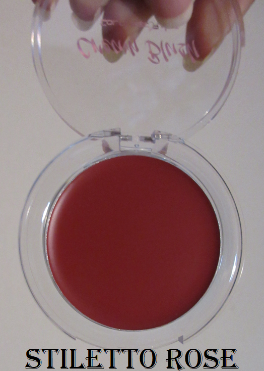
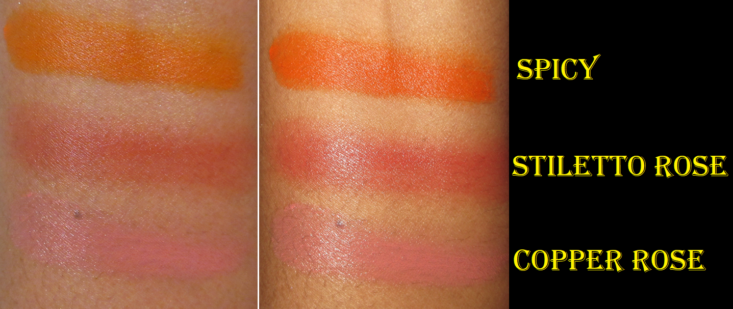
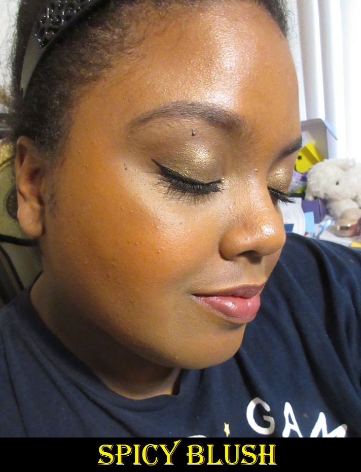
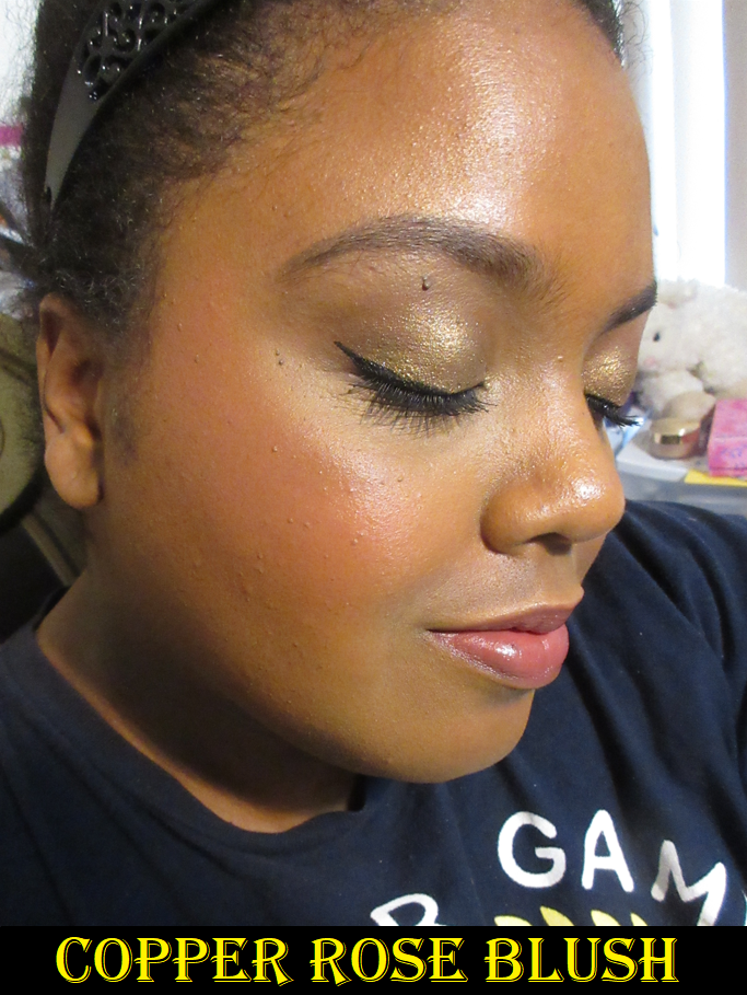
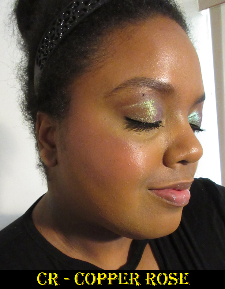
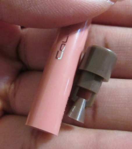
Coloured Raine Cream Blushes in Spicy (Original), Stiletto Rose and Copper Rose (Botanical Collection)


The first thing to know about these blushes is that despite them all sharing the description of “cream blush,” the original four that launched, which includes Spicy, are completely different from the two blushes from the Botanical Collection. The ingredient lists are different, along with the textures and pigmentation. The container of the originals are larger than the Botanical Blushes too!
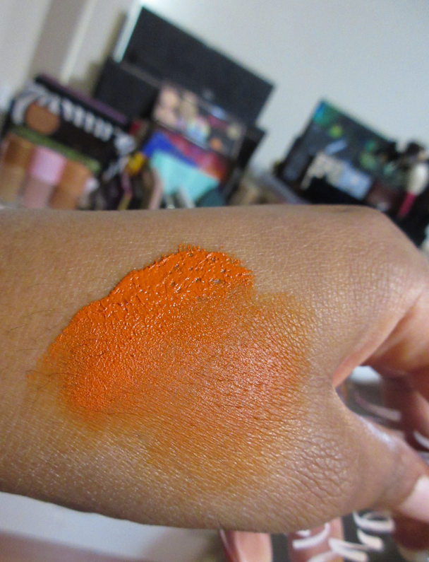
Spicy has a waxy consistency that’s so tacky it lifts up when touched. It’s thicker and more opaque. Picking up a little is still too much, so I put it on the back of my hand and warm up a small section first before applying it to my cheeks with that finger in tapping motions and then a final light sweep of the finger across the cheeks to ensure it’s fully smoothe. A little product comes off underneath, but it’s so pigmented that it will cover up the missing spot anyway. A brush will pick up way too much, but it’s still possible to use by putting it on the back of the hand or a makeup palette first (or even tapping the excess off on a towel) to get a lighter even layer across the bristles before applying it to the cheeks. I still prefer fingers because I have more control that way and can also warm up the product.


The Botanical Blushes have a higher concentration of slip agents (various silicones) that feel a little more gel-like, but still like a softer wax once the heat of a finger melts that top layer. I keep my finger on top of a spot for several seconds before I start to rub to pick up the blush onto my finger and tap it onto the cheeks. It looks like it will be just as pigmented as the original line of blushes, but when blended, it sheers out a fair amount. So, it takes a few light layers to build up to my satisfaction. This product also lifts what’s underneath, but it still looks fine to me as a veil of color. In the spots with discoloration that lifts, I put concealer back on top of the discolored spot and pack a little more blush on top, and those additional layers help it to stay.
I can use a brush with these, but it doesn’t pick up as much product without warmth.
These blushes remain creamy on the face. If I’m wearing something like the Rose Inc Luminous Foundation Serum, that wetter products tend to set well on top of, and apply the Botanical blushes in a thin layer with a brush, it can mostly set down. However, for the amount of pigmentation I want that isn’t just a flush, it’s going to remain creamy feeling on the skin unless I set it with powder. Spicy will absolutely not set on its own, plus easily transfers, so I only wear it powder-set. Setting all three of them with powder only temporarily makes them feel dry but at least does take down the creaminess enough that it won’t feel sticky or tacky. Powder-setting also makes the Botanical Blushes more transfer-resistant, but when it comes to Spicy it will definitely still transfer when touched, just a little less. Setting with powder has the final benefit of toning down the intensity level of Spicy, and even Stiletto Rose if I go overboard with that color.
These blushes will last all day, even without powder, as long as they aren’t touched. However, it’s just my preference to set them with powder, especially with a powder blush on top to add some nuance to the shades.


The photos above demonstrate the blushes with different foundations and at different times of the year. The middle three with the dark blue shirt were under the lighting conditions of my ring light. The others were with indoor lighting and some natural light coming in from behind the window blinds.
Had I completed this review three months ago, I’d have said, “These blushes require a little more effort, but are nice enough that I may still reach for them from time to time.” However, I’ve been going through my cream and liquid blush collection a lot more lately, and in comparison, these rank so low on the list. They still aren’t bad products, but I have so many options that don’t pick up product underneath, don’t require warmth or having to baby the formula, or do any other extra steps. Plus, my other blushes are in far more interesting colors. I’ve realized that I don’t like standard crayola type of blush colors like a pure orange, pure red, or pure pink. I love reddish browns, terracottas, pinky-orange corals, pinkish-browns, etc. Those type of colors look more natural on me. I expected Spicy to be a reddish orange with some brown, but it’s actually a slightly yellow leaning orange that may as well just be “orange.” Copper Rose sounded like it would be a fun copper-pink, but most of its warmth just comes from being picked up and mixed with my foundation and concealer while being blended on my cheeks. It’s not a very unique pink by itself. Stiletto Rose is a very common rosy red, although it’s the prettiest to me of them all.
I always wore a combination of Stiletto Rose and Copper Rose (on the apples) together anyway, which is why I initially had a better impression of those blushes. However, if I view these as individual products, they’re not something I want in my collection anymore.
Coloured Raine Lip Liners in Pine (Secret Garden), The Bee’s Knees (Queen Bee), and Decadent (Botanical)


It was very difficult to tell the differences among the selection of lip liner shades on the website. I now realize it’s because the ones I wanted are so incredibly similar! Pine was the first one from Coloured Raine I tried and later bought a backup of because it’s the first shade I ever found that I can actually cover my full lip-line with and have it look normal. I have a very thick and pronounced lip line (Vermilion border) that is way lighter than my lips and surrounding mouth color. So, when I have used lip liners on my actual lip line (and not just the edge between the lip and lip line), it always emphasized that thickness and looked like I attempted to overline my lips because it sticks out, even when it’s still within the lines. The color is described as a “spiced brown” and I consider it like a caramel-pink-brown.
The Bee’s Knees is described as a “brick” color, but it looks more like a neutral brown to me on my arm. In fact, I looked at the website photos again comparing the other shade in the Queen Bee collection and The Buzz is supposed to be the neutral brown. I almost wondered if some got swapped in the manufacturing process because my lip pencil stick doesn’t have any red in it that I can see, like the ones below, and instead looks like the brown ones near it. However, on my actual lips I think I see some red tones after building up the color? Like maybe a splash? If so, it’s certainly not as red as I expected and less red than I’d expect from a brick color. When built up, it’s also darker than Pine. It’s pretty regardless.


The third and final lip liner shade is the darkest of the three and also the creamiest, which I find interesting since it’s the one that launched first. I’m guessing the brand decided to switch formulas after this collection, which is a very plausible theory based on a comparison of the ingredient lists. The other two glide across the lips nicely and aren’t too soft or too stiff, but I do prefer the feel of Decadent. This color is described as, “neutral brown with slightly cool undertones” and I can see that in the squiggle swatch. Also, the lip liners from the Botanical collection came with sharpeners at the bottom. The newer lip liners do not. Perhaps the brand didn’t feel it was necessary because of the formula differences.
I haven’t noticed any issues or differences with the longevity among them all. They suit my needs and because they’re all so similar in color, they all work for me and give me that ability to line my lips in a way that others I’ve tried haven’t. It’s very specific to me, but it’s a huge deal. In general, objectively, I still believe these are a nice comfortable long lasting product.
Coloured Raine Paint Base Eyeshadow Base in Wheat

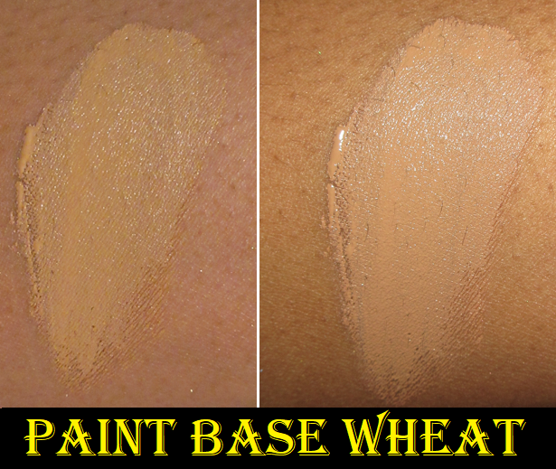
I first tried this primer underneath the eyeshadows from the Coloured Raine Botanical Palette and was disappointed to see the shadows creased. After all, the eyeshadow primer is expected to work the best with the brand’s own eyeshadows, so that wasn’t a good sign for anything else I planned to use with it.
However, in using it with my well behaved and favorite eyeshadows, and then as an alternative primer for eyeshadows I was testing that didn’t perform as well with my MAC Paint Pot, I realized it actually wasn’t the fault of the Paint Base! I’ll get back to the Botanical Palette in the next section, but basically every palette I tried with the Paint Base performed better or at least equal to my other primers! It quickly became one of the primers I keep in rotation along with the Gerard Cosmetics Clean Canvas and MAC Paint Pot. In fact, I bought a backup of it during the brand’s Black Friday sale.
I really like the ABH eye primer, but it is quite drying. That one helps to combat the oils that produce on my eyelids, but that’s sometimes to the detriment of buildable type of eyeshadows being able to stick properly. This Coloured Raine primer is similar to the ABH primer, but is less drying, which makes it the better of both worlds between combating the oils but still ensuring the eyeshadows can adhere properly. It’s fantastic! Because I bought the shade Wheat, it matches the color of my eyelids better and isn’t so stark against my skin, but still helps the shadows to pop. As with most primers, a little goes a long way (though not as long as the ABH and Gerard Cosmetics ones which are even more pigmented and thicker in consistency). Wheat still provides a good amount of coverage over the discoloration on my eyelids.
It’s interesting that the brand touts the squalane and sodium hyaluronate because I would have expected that to not go well with oily prone lids and would produce too much moisture for me, but it works somehow! The Paint Base sets on my lids to a natural finish. Perhaps those ingredients are what keeps it from being as drying as the ABH one.
When I’m working with an eyeshadow formula that’s not very creamy with a rougher texture, this primer can take a little longer to blend the shadows on it, but it’s a minor difference in time. That’s the extent of the negatives I’ve found in using this primer throughout the year, which made it an almost entirely positive experience.
Coloured Raine Botanical Eyeshadow Palette


I mentioned in the Eye Base review section that despite it being from the same brand, the Coloured Raine eye primer and this palette worked fine, except that it could not keep the shimmers from retreating from the deep line I have on my lid/crease. I have since used this palette with all my tried and true primers, and none of them stop this from happening. The best results I get though is if I set the primer with powder first. Then I’m much less prone to movement and creasing, but it’s not foolproof.
Cream Gerbera barely shows despite packing it on. I don’t mind, as I’d prefer a shade that light to be subtle rather than stark. Iberis and Leonidas have a decent amount of pigment and all three are decently blendable, but that’s a little bit of a letdown in itself because I remember how rich in color and buttery feeling Coloured Raine’s mattes used to be before they got rid of their single shadows. These are fine but not particularly special. The same goes for the shimmers. They are pretty and shimmery enough for my taste, but the formula is so much thinner, less smooth, way less impactful, less pigmented, and not vibrant like their single shadows once were. I mean, Coloured Raine shimmers used to be S-tier. Being “just fine” is going to be hugely disappointing by comparison. The quality of this palette reminds me of Colourpop, which is mostly good, but it’s not even like the best of Colourpop’s formulas.
These types of colors and this overall color story is a lot softer compared to what the brand used to release. I commend them going outside of their comfort zones. However, it isn’t just the color selection and lack of color saturation that makes it slightly underwhelming for me. There are so many brands that make satin shadows and have palettes with soft colors that still somehow look elegant and beautiful on the eyes. The literal texture of the eyeshadows themselves are so soft and buildable. These shadows don’t have those same qualities. They aren’t made the same way.
I also thought it was quite strange that the colors I expected based on how they looked in the pan did not look the same on my skin. Iberis was much more red than plum. Leonidas was a truer orange instead of terracotta. Rose Gold also had a stronger red tone, like a burgundy, when I was expecting a shimmering plum. The colors are still pretty, but when other eyeshadows like from Oden’s Eye and Sydney Grace give me a visceral excited reaction to using their palettes, I don’t see why I would want to reach for this one that doesn’t spark joy. It’s a new year. Being a decent, nice, workable palette isn’t enough. On the bright side, this isn’t one of Coloured Raine’s newest palettes and I believe they’ve continued to work on their formulas since the next palette is one that I actually will be keeping in my collection.

Coloured Raine Queen Bee Palette
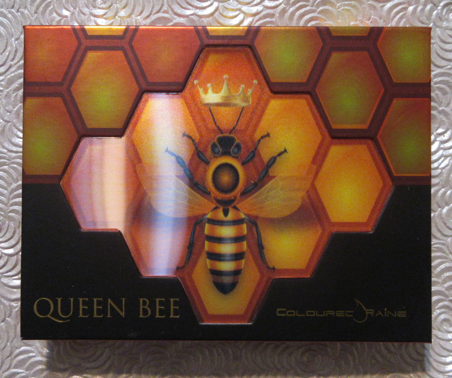


Unlike the Botanical Eyeshadow Palette, this one does not have “Eyeshadow” in the name, which is because it contains pressed pigments. Considering my experience with the previous palette, I was so nervous that the bump up in intensity with the mattes would mean the shadows would perform worse, but that’s not the case. Honeycomb is actually very soft and smooth feeling. I absolutely love this color of orange. Beehave and Pollen in Love are a little rougher to the touch, but they pack on the lids well and blend fairly well. I’ve had a little trouble building Bee-Witched on the other shadows at times, but it just takes a little more effort to get the definition I want without overdoing it or having it look unblended. It’s definitely not my favorite black matte, but it’s workable.
Using Honeycomb and Beehave together in the same eye look can be a bit tricky because I get a lot more pigment from Beehave right off the bat and it can easily overshadow/overpower Honeycomb, so I have to be careful with its placement.
The two shimmers look like they would have the same texture, but they’re definitely not the same formula. Unbeelievable is a chunkier and flakier shimmer that gives me a lot of fallout. It’s a foil shadow, but even applying it damp doesn’t give me the smoothness I want. I don’t enjoy that shadow at all and won’t be using it again when I open this palette. It’s a shame because the color is so pretty.
On the other hand, Mind Your Beesness is an almost glowing green-gold duochrome with more slip to it so that it glides easier across the lids. Because the binding solution is better, I get less fallout with this one. Honeycomb, Mind Your Beesness, and Pollen in Love are the colors that make this palette memorable and make me excited whenever I use it. This is the one that gives me hope for even better palettes in Coloured Raine’s future.


The eyeshadow primer and lip liners are absolute wins for Coloured Raine. The blushes aren’t the best and I have mixed views on the palettes. Considering what I paid, it was worth it to me to give them a chance and figure out how I feel about what the brand produced in 2022. At this point in time, I have hope for them in 2023 and I am truly rooting for them. However, the competition among indie and mainstream brands alike is the toughest it’s ever been. I recognize that they’ve lowered their price point, but I’d rather spend more for better quality. For me to continue purchasing from them, their products have to be truly special or incredibly appealing to my tastes. I look forward to seeing what they’ll release this year and I hope others will still give them a try. I heard positive reviews about their Rebellious Nudes palette, so I feel they’re on the right track. Here’s hoping!
Thank you for reading and Happy New Year!
-Lili ❤

I’m not sure what shadow shimmer you are wearing with the copper rose blush , but it’s beautiful!! I love it . Also I like the look of the bee palette , but I’ve been so shy to order Coloured Raine. I bought two liquid lipsticks , and I really wanted to love them but they were super drying on me . I was heartbroken as it was the galaxy metallic and the lime green . I wanted a lime green because of the new season Jojo’s Bizarre Adventure , but sadly it crumbles on my lips 😭.
LikeLiked by 1 person
Thank you so much! It’s Bronze Fountain from Clionadh Cosmetics. It’s one of my favorite shades from their new Earth Vibrant Multichromes! And yes, I totally understand not being willing to buy more from the brand after having a really disappointing experience with their products. There are a few brands I tried once, but never again for the same reason.
LikeLiked by 1 person
I need to check out Clionadh, I keep seeing their multichromes, and they look so pretty . Wjat is the best thing to wear under them to keep them shifty ?
LikeLiked by 1 person
A black base helps some of them pop more, but I typically don’t go that route. I just use nyx glitter primer to keep them in place and sometimes apply them with a slightly damp brush. Clionadh is my favorite because of the finishes and to me they have the best shifts.
LikeLiked by 1 person
Oh thanks ! I love that glitter glue too ! Good to know it’ll work with the multichromes
LikeLiked by 1 person
I was really hoping for a return to the old eyeshadow formula. I get that it was an unrealistic expectation lol but it was sad to see it go. I’m sadly less and less interested in the brand, but I hope they can get back on top of the eyeshadow game because they used to be so far ahead of other formulas.
LikeLiked by 1 person
Same here. I originally thought they were just trying to go vegan but when I recently saw the multi-stick post they had “CLEAN formula” written with the clean part in caps. I can’t help but wonder if that’s why they struggled to get anywhere near what their original formulas were like. I’m still hoping they can get something close to it, but now I can’t help but wonder if I’m going to have longevity issues with the products I do like if they’re also going “Clean.”
LikeLiked by 1 person
I didn’t notice that it was a “clean” formula. I shouldn’t be surprised since clean beauty is still trending, but I wish brands weren’t joining that bandwagon. I have no issue with brands avoiding any ingredients that they want to but the clean label misleads consumers into thinking that brands that don’t claim to be clean are bad for them.
LikeLiked by 1 person
Pingback: Trying Juvia’s Place Again – Lili's Beauty Blog