MAC Black Panther, Holiday ’22, and More

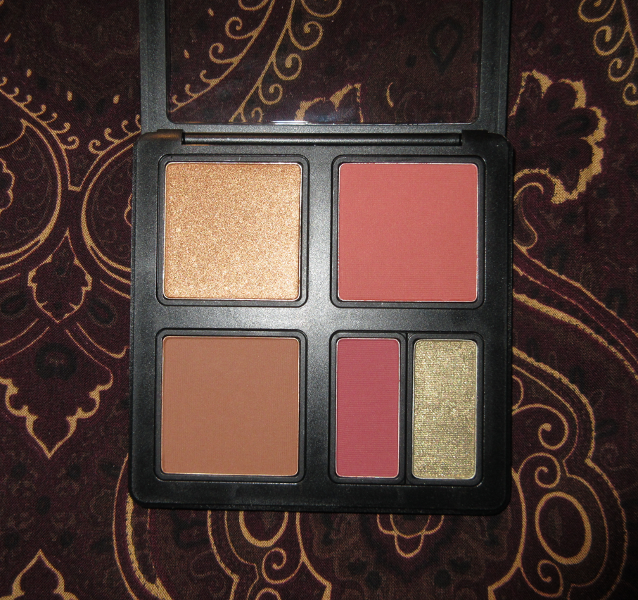
We’ve got ourselves another MAC Cosmetics post! These are the products from MAC that I purchased during the final few months of 2022. I’ll begin with the two item types I haven’t purchased or reviewed from MAC before, but the blushes and highlighters are formulas I’m very familiar with and will probably not have much new to add. For those interested in my previous MAC posts, the list with links can be found on this index page here.

Additional MAC Items

MAC Glow Play Lip Balm in Floral Coral

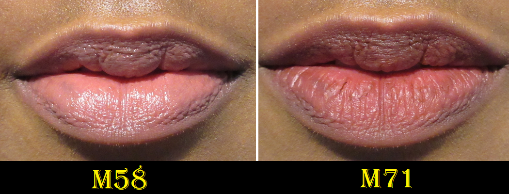
This is one of a few items I redeemed as a free birthday gift from MAC’s Reward Program. It’s a sheer product in a soft formula. The top layer of the bullet instantly melts when it touches my lips. If I apply the amount of balm to my lips based on how it feels, I get almost no color. I can build it up to show a pink tinge, but the amount I need to apply for that leaves my lips feeling excessively wet in a way that isn’t quite greasy or oily, but it’s a similar enough sensation that is uncomfortable for me. After I wear it for a short time, it gives me the feeling of dripping around the edges and a strong urge to wipe it off.

For this reason, I haven’t been using this beyond the handful of times I wore it to test it out. And even though it feels moisturizing, my lips aren’t actually being conditioned. The moisture lasts a few hours before I feel like I need to reapply, even if there’s still some balm left on my lips.
If I want to wear a slightly colorful balm for a short time, like in photos, this is fine. If I want a balm that’s actually lip conditioning and having color isn’t a necessity, I’d reach for plenty of other balms instead. So, I don’t really recommend this. According to a sneak peek I saw on IG, MAC might be releasing a Valentine collection of new and/or existing shades of Glow Play Lip Balms and other lipsticks. I won’t be purchasing them.

MAC Studio Fix Fluid SPF 15 Foundation in NC47
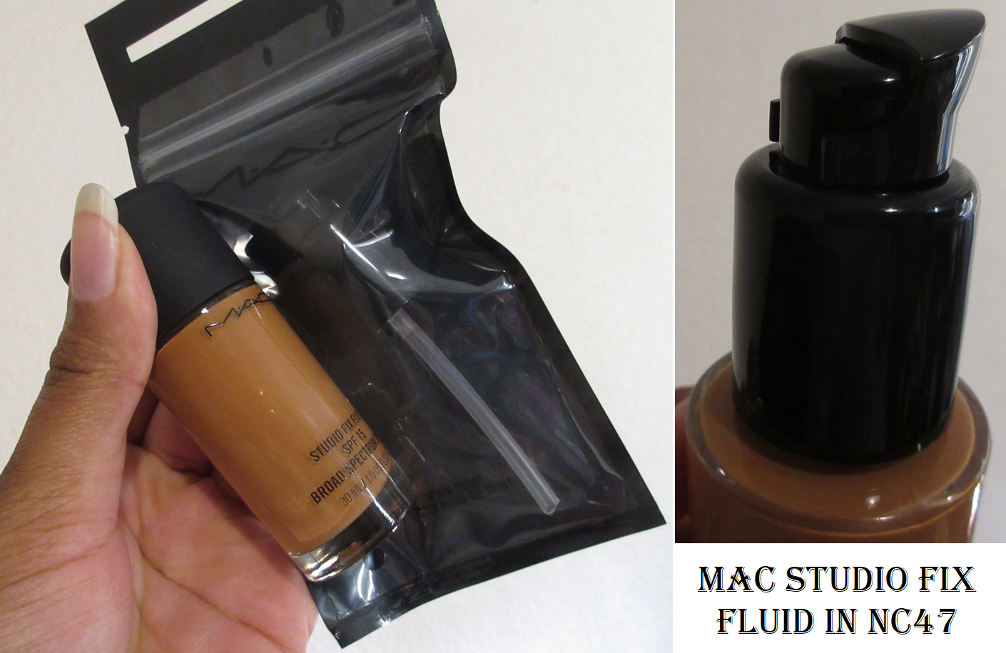
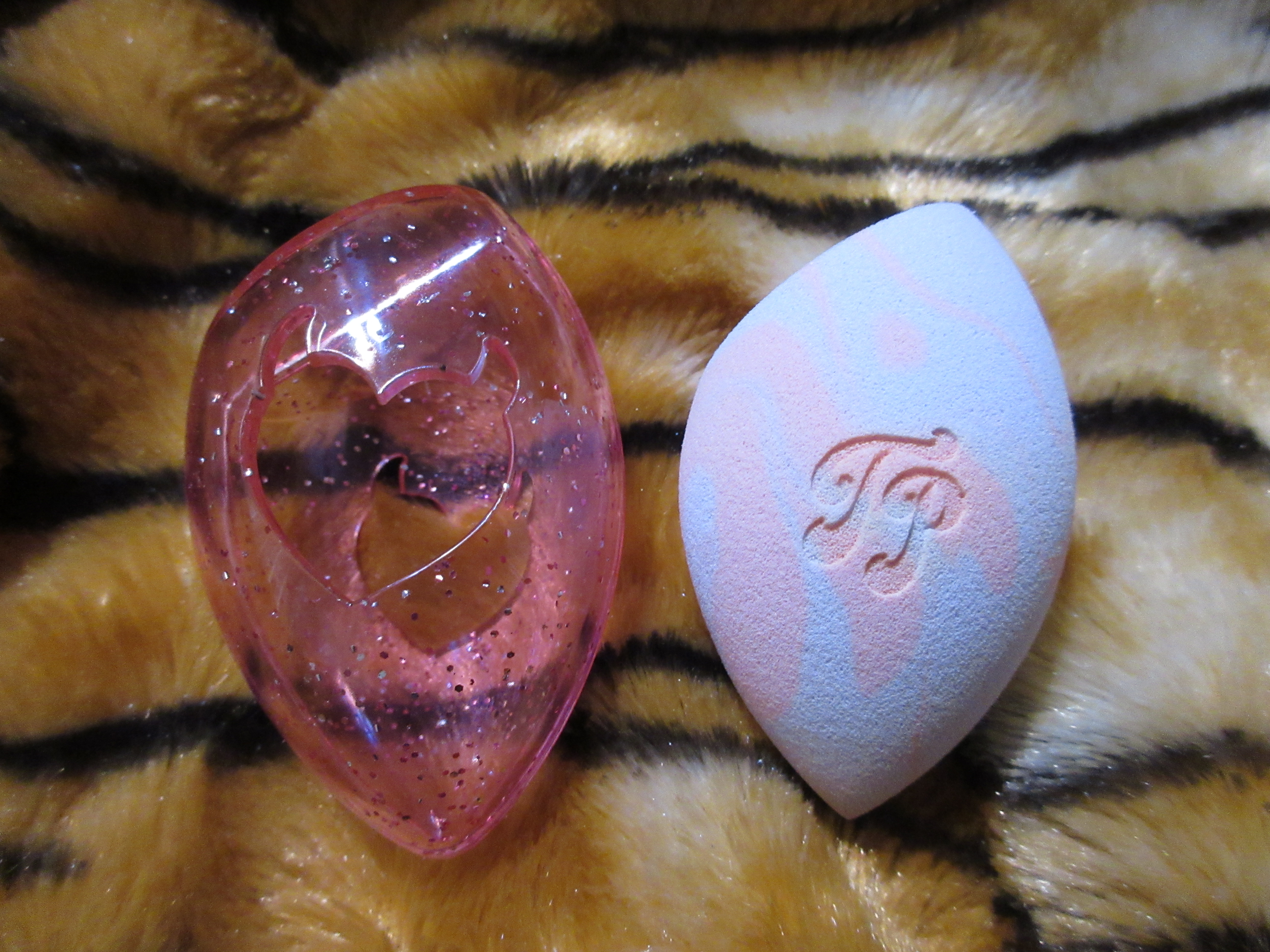
This was a Black Friday purchase when MAC had 40% off complexion. The pump for this foundation is sold separately, and unfortunately was full price. I wish the package with the pump came with an extra cap that could fit over the foundation instead of the little dispenser cover piece because I always lose tiny parts to makeup and skincare (like the little spoons to scoop out products in jars).

With “fluid” in the name, I expected this foundation to be watery like the Uoma Beauty Say What Foundation or Kosas Tinted Face Oil, but it’s more viscous than those while still managing to feel lightweight on the skin. MAC describes it as being a, “buildable, medium to full coverage [foundation] in a natural matte finish.” While I agree with the buildable claim, the amount I would normally pump out and blend in with my Blendiful gives me light coverage, and I have to use quite a bit more product in order to get a solid medium. I can technically build it up to nearly full, but I have to focus on targeting my areas of discoloration specifically, and at that point it can look a little mask-like since it’s not my absolute perfect shade. So, I keep it at a nice medium and use concealer in the areas I need more coverage.

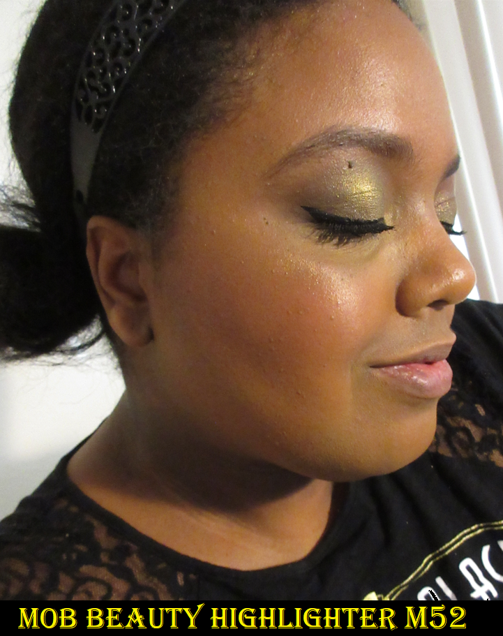
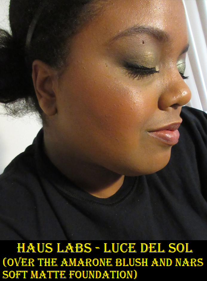
Additional photos of me wearing this foundation, under a different lighting situation (using my ring light), is in the highlighter section.

When I wore it the first time, I thought it was a pretty good color match, but upon subsequent usage and building it up to medium-full coverage, I realized it’s about a half a shade off in depth and it’s my correct undertone family but not perfect. The fact that I can wear it at all is quite surprising because I remember a time when I tried a sample of NC47 and it was too light for me, but the next shade NC50 was way too dark. I figured the hypothetical NC48 shade (if it existed) would be my perfect shade, but apparently NC47 can work for me in winter. Since I plan on wearing this at medium coverage level, it’s good enough of a match for me to keep it in rotation.

I do like the natural-matte finish of the foundation. It’s supposed to be sweat and humidity resistant, but I challenge that as well, since I managed to look sweaty on a day that was only 75 degrees Fahrenheit outside (and even colder in the house) when all I was doing was taking blog photos and rearranging my makeup drawers in the span of under two hours. It makes me wonder how this will look on me in the summertime when it’s between 85-98 degrees.
After I noticed how it was looking, I powdered my face (I initially skipped that step) and that helped to take away the extra shine. The other days I wore it were not hot days and I wasn’t doing anything that would make me produce sweat, so my face remained looking matte even without powder. So, I’m not sure what to make of those results. I will say that I love the fact that this sets on me to the point of being dry to the touch without a trace of wetness/creaminess and no transfer on my fingers that I can see. I love my natural and dewy foundations, but those usually come at the price of various levels of being transferable. I’ve had to train myself to just not touch my face and to be careful when switching outfits and hugging people. It’s actually a relief to have a foundation with some coverage again that I don’t have to be so careful with. I just wish they had my full on perfect shade in depth and undertone.

This is a pretty nice foundation. I like it, but I still prefer my Rose Inc and Estee Lauder Futurist Hydra. I can also think of past Nars Foundations and the original Makeup Up For Ever HD and Ultra HD that I preferred as well when I owned them. I haven’t been using this very long, and normally I don’t review a foundation until I’ve worn it at least 10 times, so there’s still room for my opinion to change. If that happens, I will try to remember to update this post.

My Latest MAC Highlighters

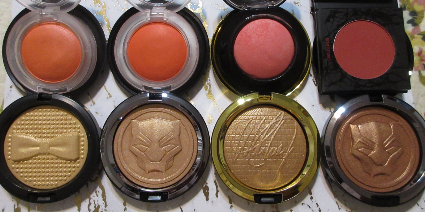
I make it a point now to try and make my MAC purchases via Selfridges because of the price difference being in favor of USD, or from MAC’s website when they have a sale of 30% off or higher. However, it was only the MAC Indulgent Glow Face Kits that came to Selfridges, so I had to purchase the others elsewhere. Of course, I could have waited until a potential sale for the collaboration items, but I didn’t want to take the chance of them selling out, so I purchased the Black Panther Royal Challenge and Whitney Houston ones at launch. I did at least get 20% off on Black Panther’s Royal Vibrancy when I bought that one from Ulta. At the time I’m posting this, the Black Panther Collection is on a deeper discount on MAC’s website, along with last year’s holiday items.

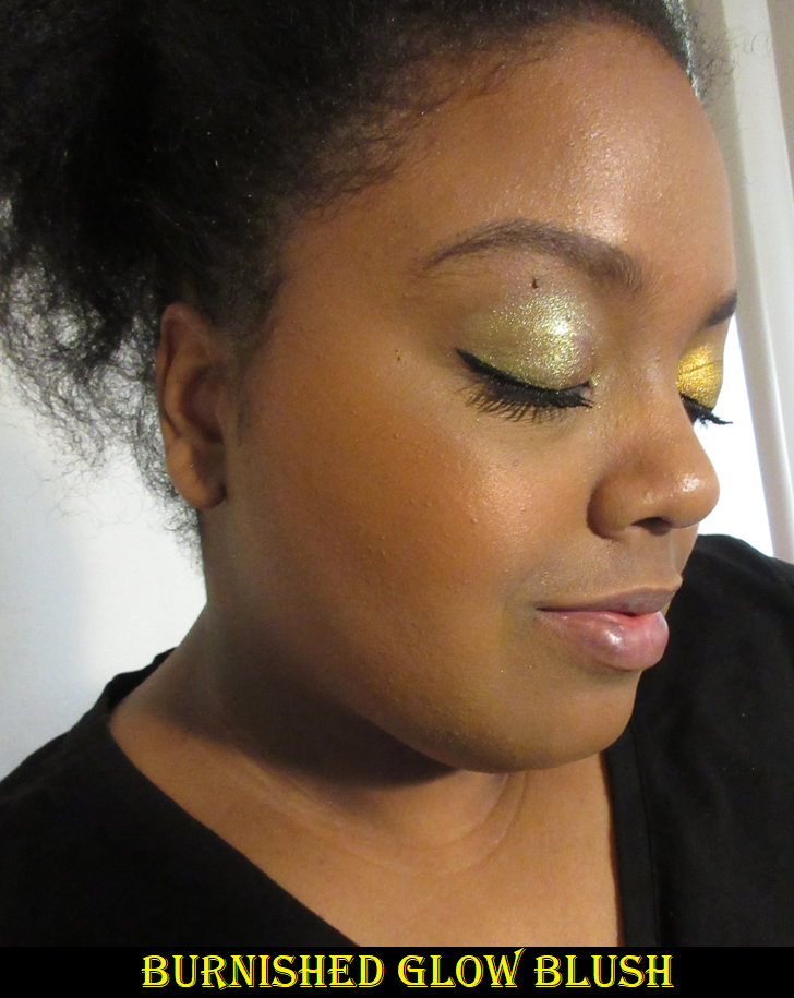
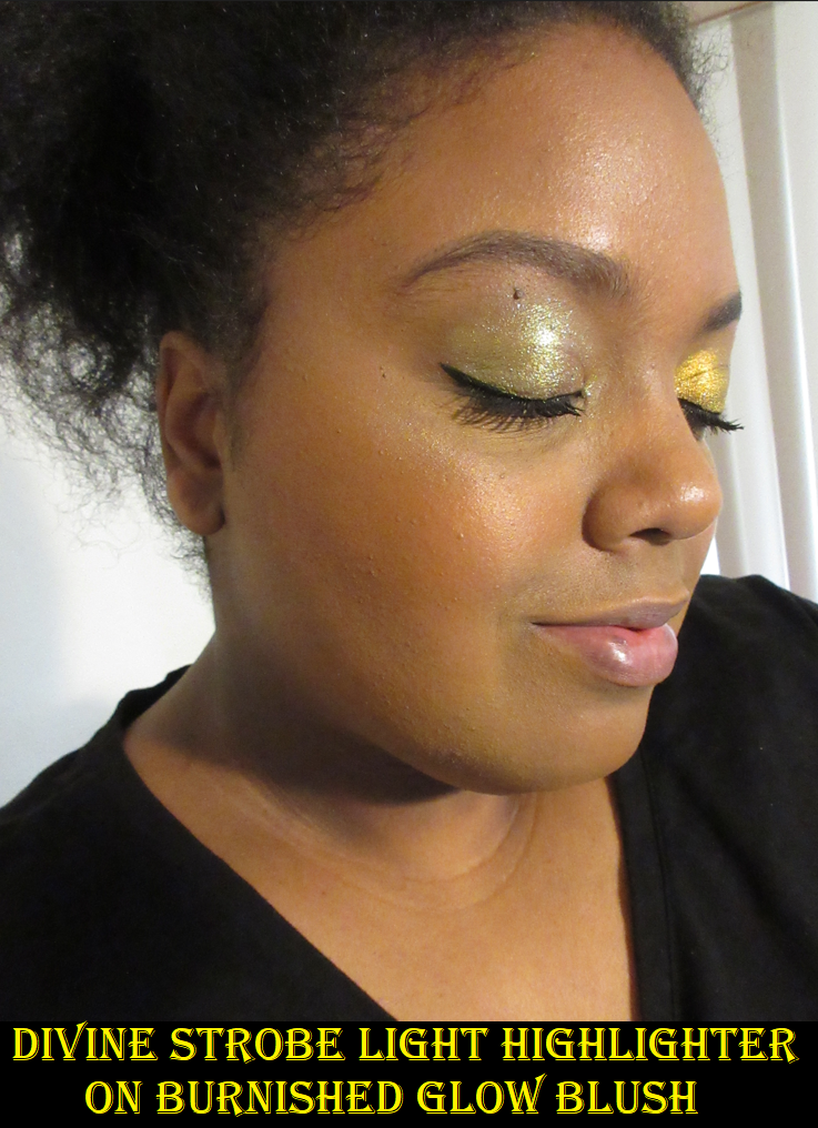
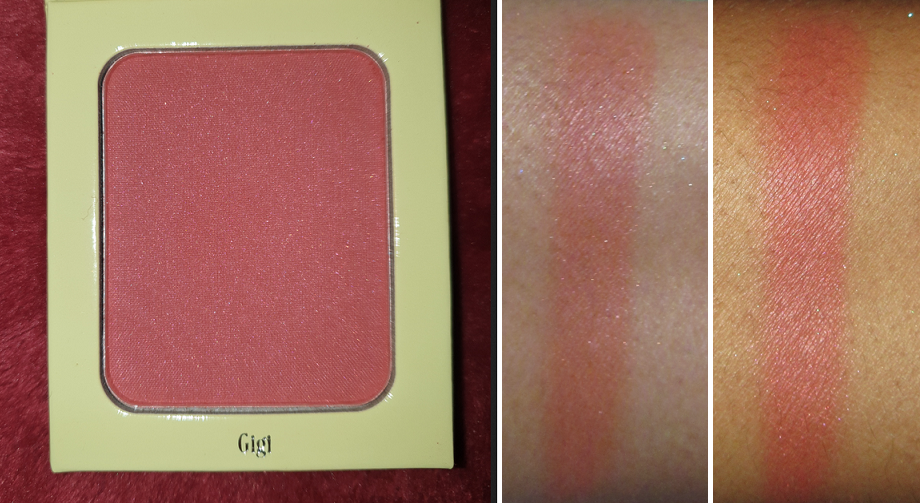
For those who may be curious, in all four highlighter photos I’m wearing the MAC foundation in NC47, The Anastasia Beverly Hills Cream Bronzer in Terracotta (newest shade addition to the line that came out after my review), and the Pat Mcgrath Divine Rose III blush.

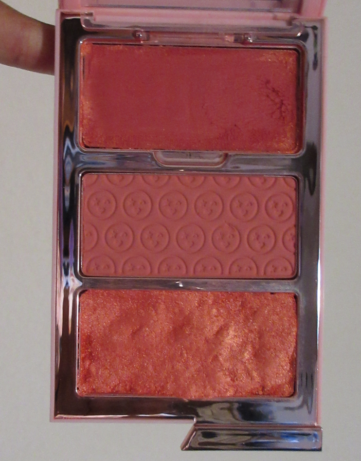
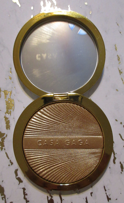
MAC Indulgent Glow Face Kit/Set in Sparkling Wine

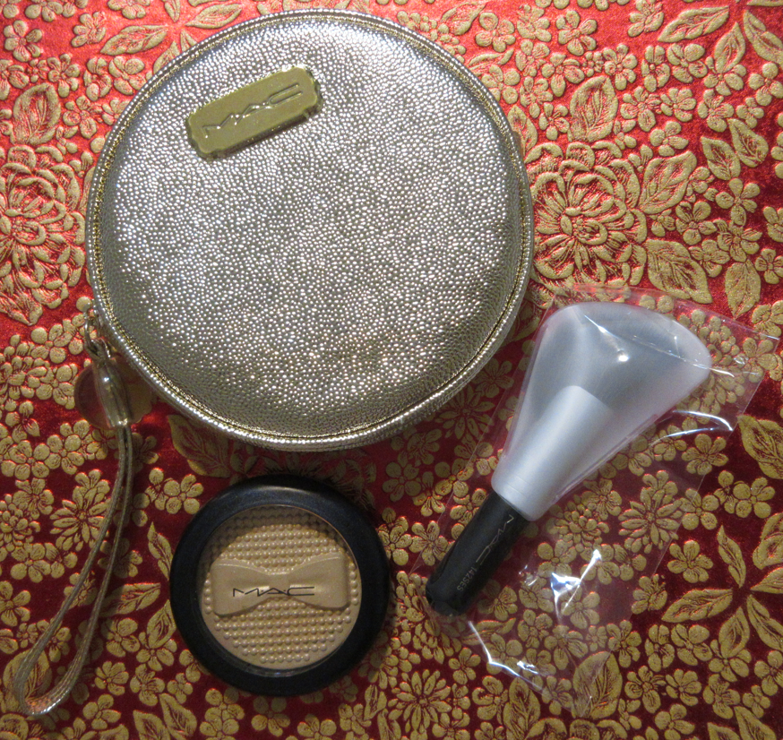
These kits came in two versions: Sparkling Wine and Rosé. I was impressed by the presentation of the box in a beautiful creamy light pink color and with a raised pattern on the surface.

The bag the items come in is quite cute. I haven’t found a purpose for it yet, but it’s a nice “free” addition considering MAC Extra Dimension Highlighters have risen in price to $40 (or $44 for collaboration versions). This set being $44 normally, means the bag and brush that come with it are essentially free. I paid $35 for it from Selfridges, so the deal was even better.

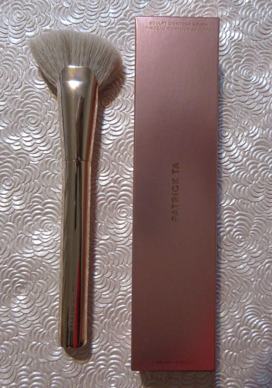
I didn’t have high expectations for this brush, but it actually surprised me!
The more deeply shaped and intricate the embossed pans are from MAC, the harder it will have been pressed. That makes the top layer a bit tougher to pick up product from when using softer bristle brushes. This one feels soft, but the strands themselves are strong enough to really dig into the highlighter while still dispersing the product softly across the skin. Rather than following the direction of the brush, I swirled it roughly in the pan in a circular motion to get the most product pickup with the least effort.
I’ve used this brush enough times that it softened the surface of Sparkling Wine, so I can now pick up the product with my natural hair brushes. Prior to that top layer being broken into, it was extremely difficult.

I’ve also used this brush to apply blush and bronzer in a sweeping motion and it’s pretty good with those as well!
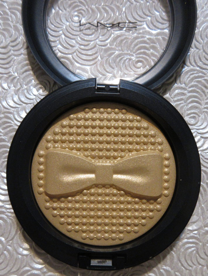
The highlighter embossing encapsulates the “Bubbles and Bows” theme MAC chose for holiday 2022.
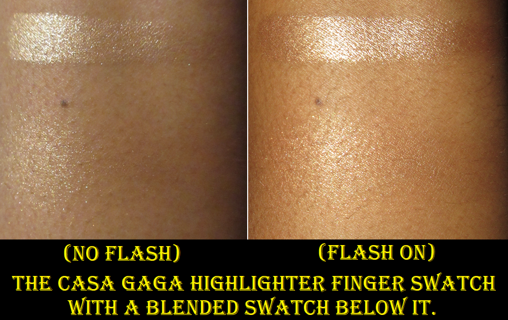
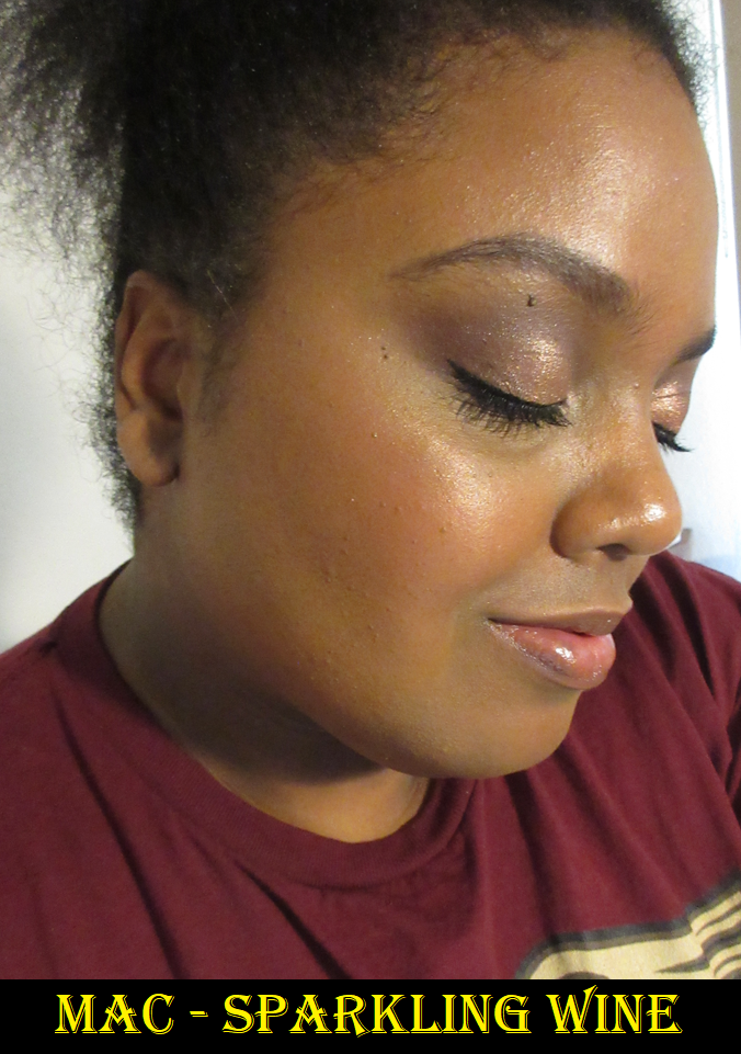
MAC Highlighters tend to be smooth to the touch, but even when I rub my finger across the smoother part of the bow, it feels slightly rough and dry. However, it has such a healthy glowy sheen with a few twinkling sparkles that are just enough for me to feel like this is a festive highlighter I would want to wear to a holiday event, and not enough to be considered glittery. This contains medium size sparkles instead of large ones, which is probably why I actually find them to be quite pretty and wearable.

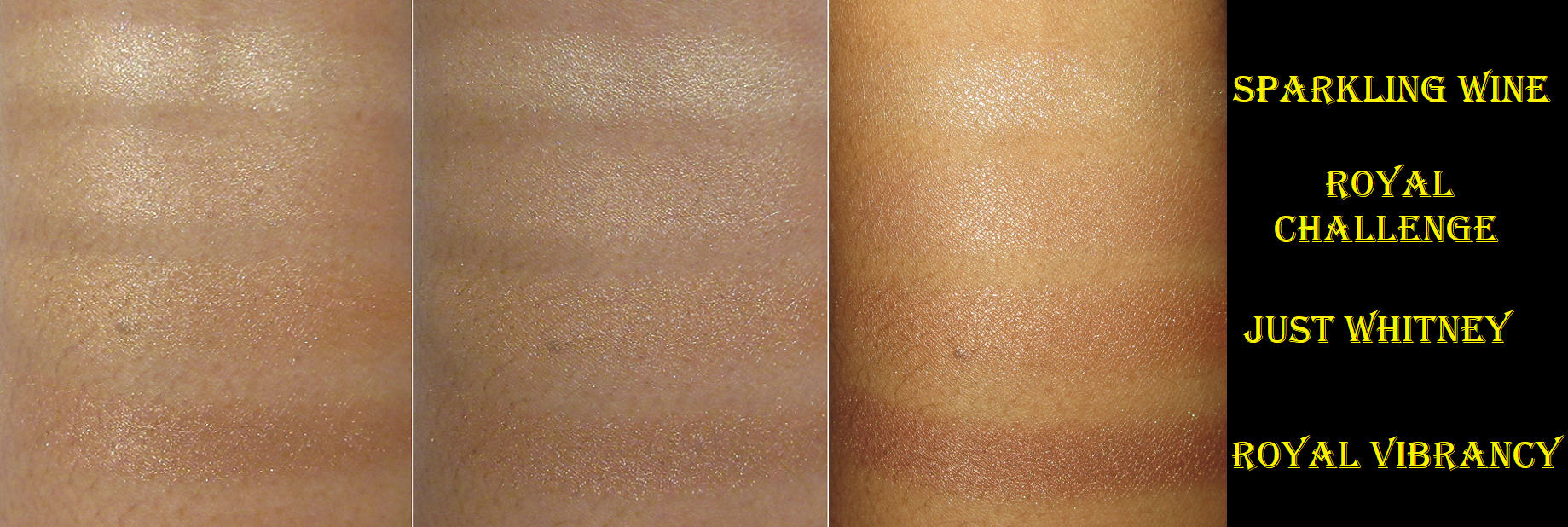
Ever since Fenty’s Trophy Wife highlighter came into being, I have feared pigmented deep yellow highlighters because of how terrible they look on me. So, I was afraid this one might be too yellow because of the way it looks in the pan, but then my fear switched to worrying it might be too light after seeing the swatch. However, on the face, it looks so pretty to me! Sparkling Wine has a semi-transparent base with just a hint of a yellow tinge to it. The color that peeks through blends with the undertone of my skin while not being pigmented enough to cause a stripe with the low amount of product I apply to my face. It also balances out the pearly looking particles within the highlighter. It looks lighter than Royal Challenge in swatches because the color of the inside of my arm is lighter than my face, but on my cheeks, the fact that Royal Challenge has a more pigmented and lighter base color gives it the lighter appearance, whereas Sparkling Wine’s slightly tinted base allows my darker cheekbone color to show underneath which makes it look darker than Royal Challenge overall. I really like this! As the embossing starts to wear down, I know I’m going to struggle with that part of me that doesn’t want to ruin it versus the side that wants to make sure I get good use out of the products I own. However, this embossing is lingering quite well so far, so I guess I have a ways to go before I need to start worrying!
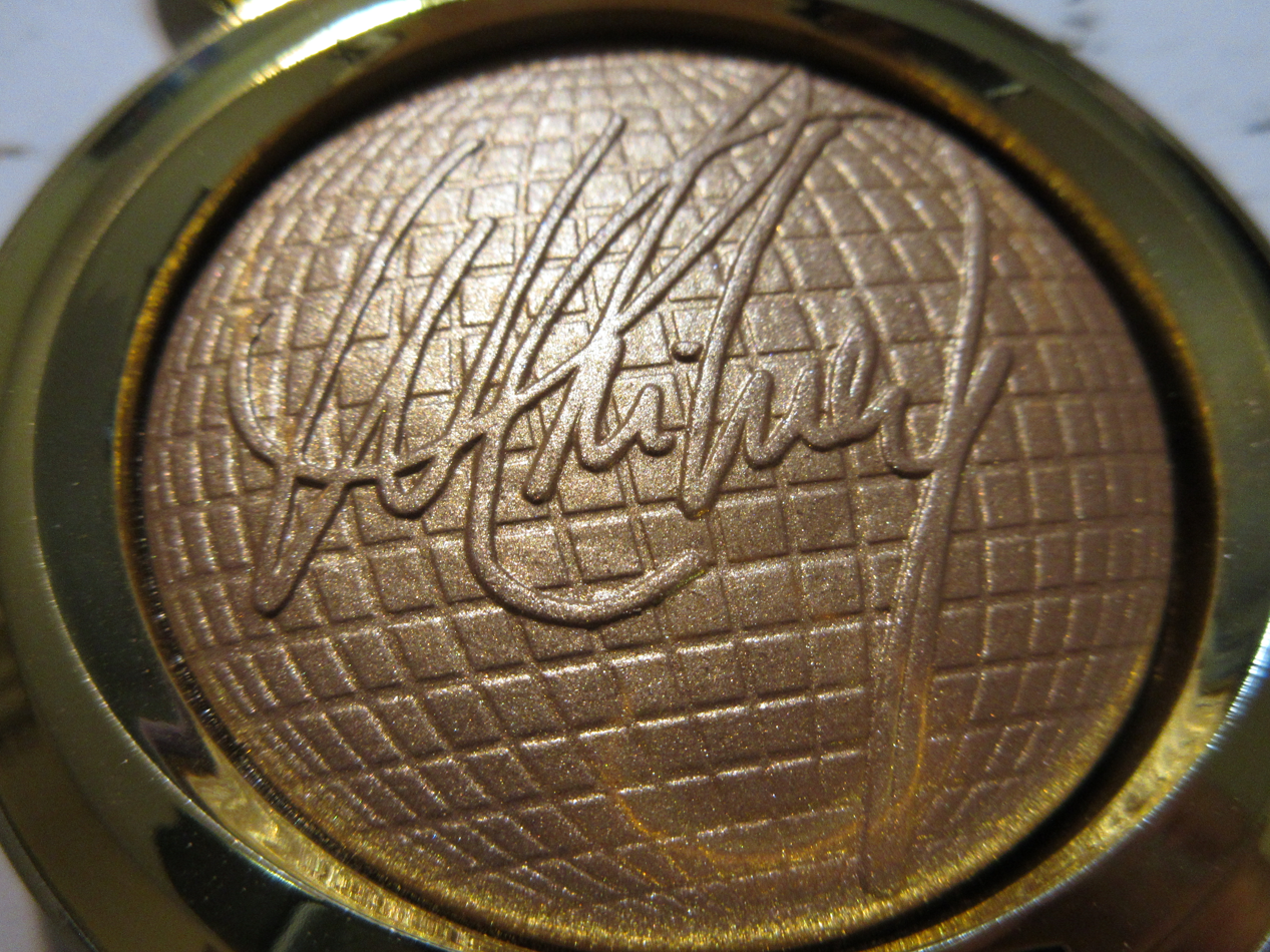
MAC x Whitney Houston Extra Diminision Skinfinish in Just Whitney

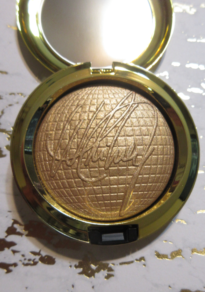
This is another highlighter that was hard-pressed in a way that just affected the very topmost layer and is now getting easier to use as the print is fading. And, once again, I’m reaching the point where I want to keep it intact, but want to be able to wear it. This is slightly smoother and less drying feeling than Sparkling Wine. It’s certainly closer to the kind of deep golden highlighter shades I tend to prefer to wear. Just like all my other highlighters from the brand, this lasts all day and remains shiny without losing its reflectivity as the day goes on. It’s a solid product, but because it’s the most common type of color in my collection, I instinctively compare it to everything else I own, and then it doesn’t seem quite worth the $44 price tag. If the highlighter was in standard packaging, I believe it should be within the $28-$35 range. Because of the collaboration with such a powerhouse of an icon (or at least Whitney’s Estate on her behalf), the pretty limited edition packaging, and the highlighter embossing, the special factor is there. So, I don’t mind it being the price I paid, but I’m just not sure this particular color being added to my collection would be worth it otherwise. For anyone else though, I would recommend it with the acknowledgement that it could be considered a bit overpriced.

MAC x Black Panther Extra Dimension Skinfinishes in Royal Challenge and Royal Vibrancy
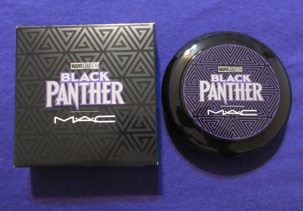
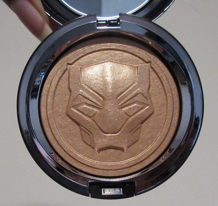
I still haven’t watched the Black Panther sequel, but I loved the first one, so I felt an inward obligation to purchase at least one thing from the collection. I tried to purchase the Black Panther Cosmetic Bag, but that was an utter mess. Even though I purchased it at 2am EST (I assume it launched at midnight), my order ended up canceled due to being “sold out,” but they didn’t cancel it until three weeks later after it was sold out at other retailers too. The most irritating part is that I called them about nine days in to ask them about the fact that they priced it at $35 whereas everywhere else had it for $25 and then they later changed the price to $25, but I hadn’t been reimbursed. That call, had the bags truly been out of stock, would have been the prime moment for them to let me know there weren’t any left and to cancel my order so I could have time to buy it somewhere else. However, they didn’t do that, so I don’t believe their statement to me about the bag being out of stock since the launch day, yet it somehow took weeks until it read “sold out” on the website.

Anyway, these two shades are gorgeous, but a better combination for me is to have Royal Challenge on the bottom and a little bit of Royal Vibrancy added on top. That way, I can get some of that darker shimmer without the dark cast when I turn my head at certain angles. In photos, Royal Vibrancy looks perfect for me, but I’ve been unsuccessful in capturing the dark cast I’m referring to from it being a little too deep bronze-red for me.

The texture feels soft and smooth. It’s softer than the others, but it’s also not as hard pressed because the embossing isn’t as detailed/intricate. Also, it’s lasting me quite a while. I forgot to take a photo of Royal Vibrancy prior to being used (or at least I lost the photos of it if I took them) so the picture I included above shows it after about eight uses and it looks nearly untouched! Granted, I was swiping highlighter across the entire pan and not just zeroing in on one specific spot in order to keep it looking even.

At the same time that I purchased these two, I also bought the Tom Ford Shade Illuminate Highlighting Duo in Tanlight that reminded me of a combination of those shades. However, in swatching them together, I see that the tones are slightly different. The lighter shade in Tanlight is more flattering on me than Royal Challenge and the deeper shade is not as dark, and therefore works on its own for me better than Royal Vibrancy. Most of the time I just mix the two Tanlight shades together for a highlighter shade I love a lot and it’s in an even smoother finish than the ones from MAC. Considering I paid around the same price for Tanlight (it was slightly discounted at Nordstrom) as the two MAC highlighters combined, it’s funny that the Tom Ford one was the better purchase for me. However, I also bought these as Black Panther/Wakanda Forever merchandise, so I don’t regret it.
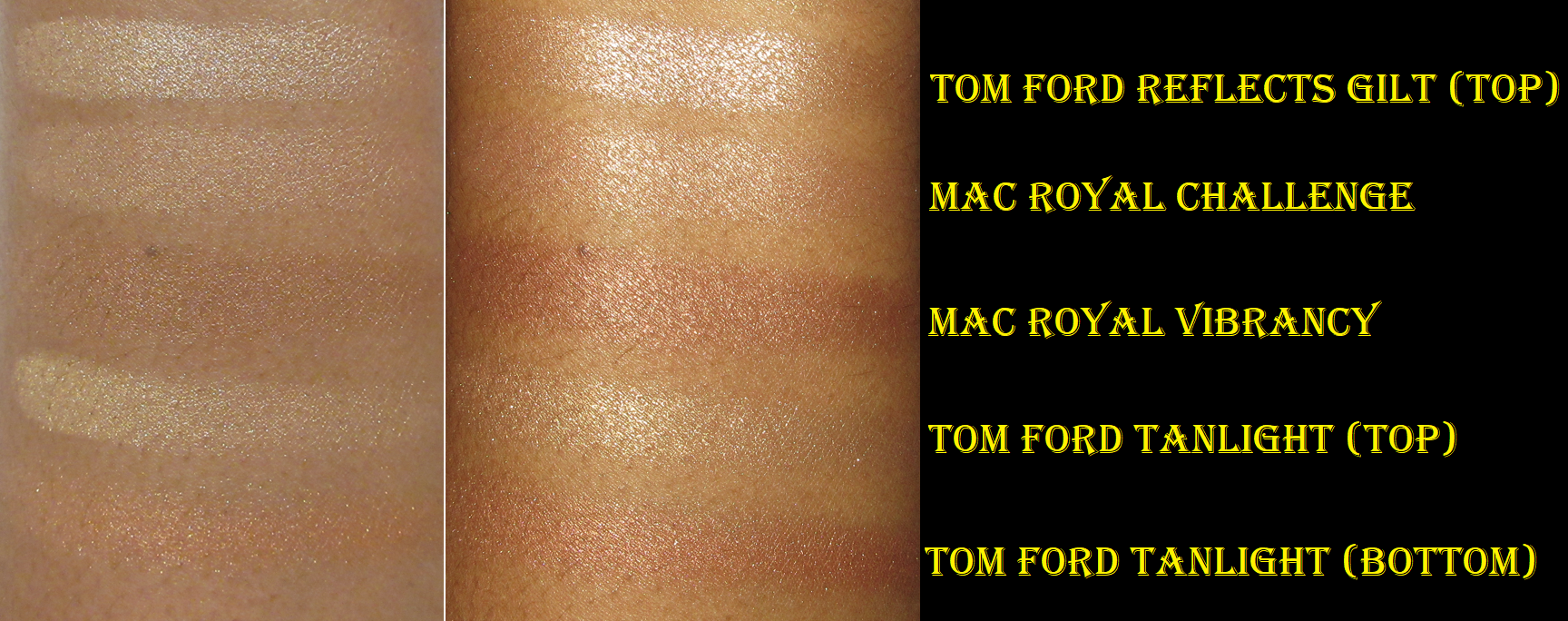
While I could have waited for these highlighters to go on a deeper discount, I like the franchise and didn’t want to chance missing out. So, for me, these were worth having. I think I will stop using Royal Vibrancy though, in order to keep one looking pristine, and just start using Royal Challenge mixed with a different darker highlighter, such as the R.E.M. Interstellar Highlight in Miss Mars.

My Latest MAC Blushes
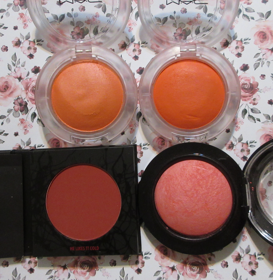
I currently have 35 MAC blushes in my collection (this number fluctuates as I get rid of some and purchase others) which is by far the most blushes I own from a single brand. Despite having so many, I can’t help but remain interested in them because MAC makes some of my favorite finishes, plus they’re pigmented, and are very long wearing. These four I’m discussing today are the remaining few that hadn’t been reviewed yet on this blog.

MAC Glow Play Blushes in Just Peachy and Groovy

That’s Peachy was the other free birthday item I chose. Based on how it looks, I thought there was no way it would show up on my skin. However, I felt the same way about Peaches ‘N’ Dreams, which ended up working on me too, so I tried it on a whim and was floored! Granted, I have to build it up a ton to get a flush of peach, but it still works and I think it’s beautiful!

Groovy looks like a deep coral-orange on me, and thankfully not a pure orange. As much as I love Heat Index, which was previously my favorite shade, Groovy dethroned it after just once use. I avoided getting this color for a long time because Nikki and a few others mentioned the formula difference in Groovy compared to the other Glow Play Blushes. It’s been a few years now since the Glow Plays launched (January 2020), so I think the original disappointing batch of Groovy are no longer being sold. Or at the very least, I was lucky and got one with the same texture as the others. I was more willing to chance it because I waited for a 40% off sale on blushes.

The Glow Play line remains one of my favorites from MAC and in general because they have the softness and sheen of a cream/putty with the benefit of drying down. They’re buildable and blend right into the skin. It’s a really gorgeous product that I highly recommend trying for those who haven’t.
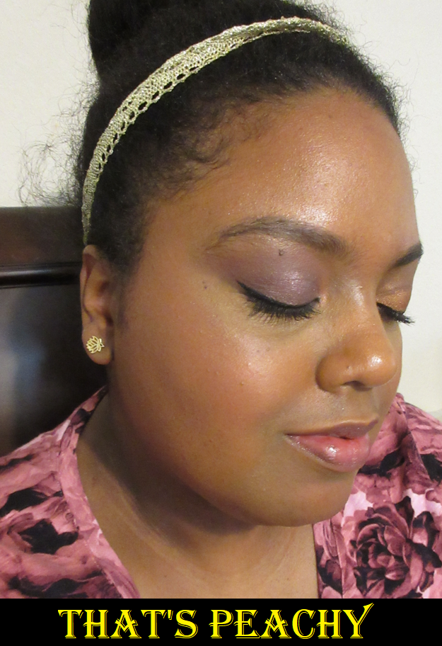
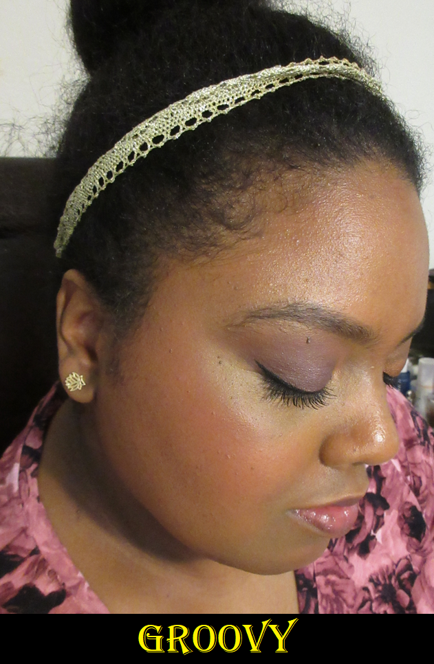
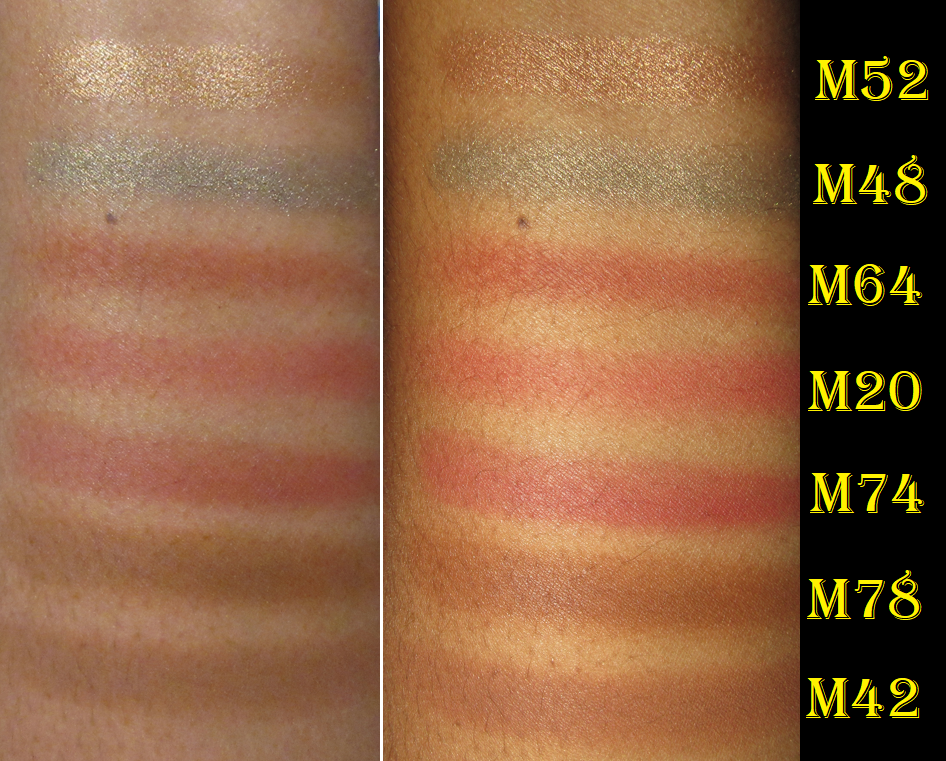
Because there are such subtle differences among the shades I own, I figured it would be helpful to show the ones I own all together and in swatches.

And for those who like limited edition packaging, MAC currently has the shades Heat Index and So Natural in their Lunar New Year 2023 packaging for their “New Year Shine” collection.

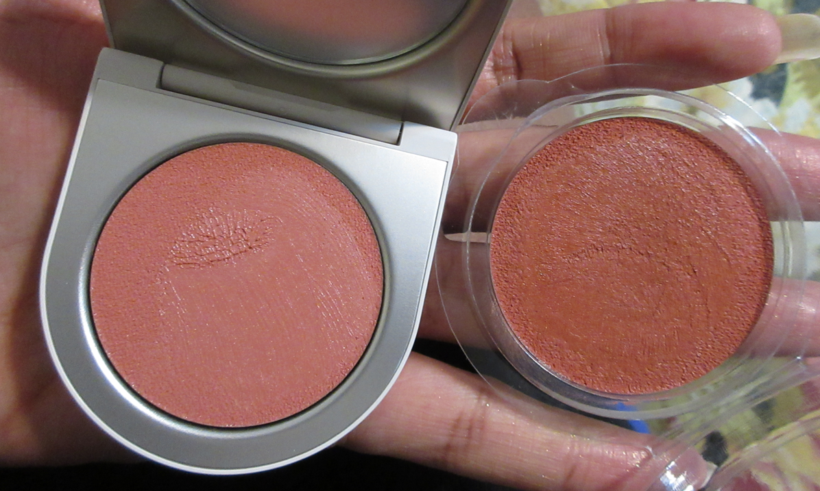
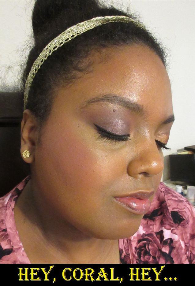
MAC Mineralize Blush in Hey, Coral, Hey…

I included a picture of how the blush looks on my finger, plus a swatch that isn’t fully blended, to demonstrate my issue with this particular Mineralize Blush. The deep reddish-coral pigment is gorgeous and is a tone that looks pretty and suitable for me when I pick it up, but it’s got a light base powder that when blended lightens the shade overall and turns it ashy on my skin. This is even evident looking at the surface of the blush itself between the darker and lighter patches. It’s not super ashy, but just enough on the cusp to make me not want to wear it.

I’ve had issues with most of the Mineralize Blush shades I’ve tried in the past (and said it looked too matte and dry and lighter on my skin than it looks in the compact), and now I’m starting to wonder if the base color in this particular line of blushes from MAC is the reason most don’t work for me. Love Thing and Flirting with Danger are currently the only two that I’ve liked and don’t look ashy on me because the pigment is deeper than I’d normally wear, but is more toned down and lighter when blended on my actual cheeks. It’s unfortunate that it took me buying six of them to finally realize why some shades of Mineralize Blushes work for me, yet others don’t. But, I’m happy that now I know that if MAC creates more colors in this formula, it’ll be safe for me to get them as long as they are the deepest ones (and deeper colors than I normally go for). Any of the colors that look medium-dark or lighter in the compacts just won’t work for my skin tone.

Hey, Coral, Hey… isn’t staying in my collection, but I still recommend the Mineralize Blush line overall, as long as it’s well established to be careful selecting the right colors if you have a dark/deep skin tone. The two shades that work for me are in my top favorites, not just among MAC blushes but among my blush collection as a whole.
MAC x Stranger Things Powder Blush in He Likes It Cold
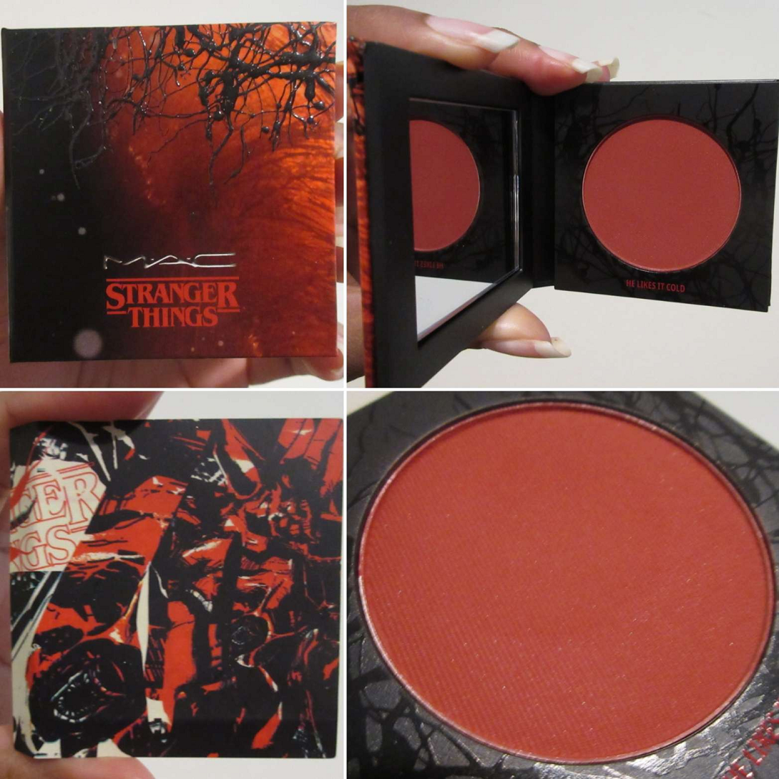
This color makes me think of MAC’s Flirting with Danger and Frankly Scarlet blush shades. I’ve tried several times to capture the variations in undertone, but they barely show a difference on my skin tone. I retook the photos again, but had to do brush swatches because my older powder blushes from MAC really don’t like to be finger swatched anymore. Nikki, who I’ve mentioned several times here, did a clear comparison of those three shades that can be found here on her blog for those interested, as well as a ton of other MAC content and more. Essentially, the undertone of those shades are going to make a bigger difference if you’re lighter than me (and then perhaps on the other end of the spectrum, if you’re much deeper).

I tried my hardest to skip buying this blush because I had similar enough shades to it, but I think I ended up paying $15 for it when it went on sale, so I couldn’t resist. This release celebrates Stranger Things Season 4, but I only watched seasons 1-3, so I don’t understand the “He Likes it Cold” reference (but it sounds creepy). It’s a pretty color, applies smoothly (even smoother than MAC’s older matte powder formula), and performs as fantastically as I expect from a MAC blush, so I’m happy I bought it. I just caution using a light hand with this particular shade.

That’s everything for today! I’m on another year long low-buy, so I would love to say it will be a long time before I do another MAC post, but that feels unrealistic as it’s one of the brands I purchase from the most. It can be expected that additional new releases from MAC will be reviewed here at some point, if not at launch, then perhaps after a big sale.

Thank you for reading!

-Lili

Disclaimer: Other than free birthday gift items everyone who joins MAC’s free reward program is entitled to (I can’t recall if you need to be a certain tier for it though), I purchased all the other items with my own money. I am not affiliated with the brand. There are no affiliate links in this specific post.

Reviewing Coloured Raine After a Two Year Break

From 2018 until 2020, Coloured Raine used to be my number one favorite brand for non-multichrome eyeshadows. What made me take a long break from buying their palettes was them discontinuing their eyeshadows to go full vegan.
I’ve had issues with some vegan formulas blending away to nothing, or being too hard to blend, and being patchy. Some of the ones that did perform decently didn’t have an acceptable preservation method (tying in with the “clean beauty” anti-parabens movement), so I’d get hardly a year before the performance of the shadows changed and/or went bad.
So, I was already skeptical about whether or not Coloured Raine’s new vegan formula could measure up to their old one. When they released their Juicy Boost Collection in August 2020, the reviews I watched with the demos were terrible! That was enough for me to want to steer clear of their eyeshadows until their 2022 Memorial Day sale in May. I figured that should be enough time for the brand to fix whatever formula issues they had, so I decided to give them another chance.

The formulas, textures, and how the makeup performs turned out to be different depending on the collection. In today’s post, I’ll be sharing my observations and experiences with these products. Just keep reading to find out which items I loved and which ones I should have avoided!

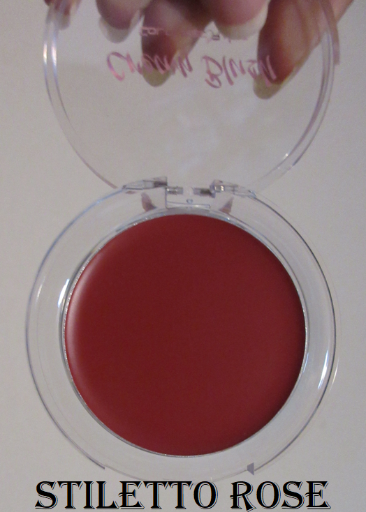
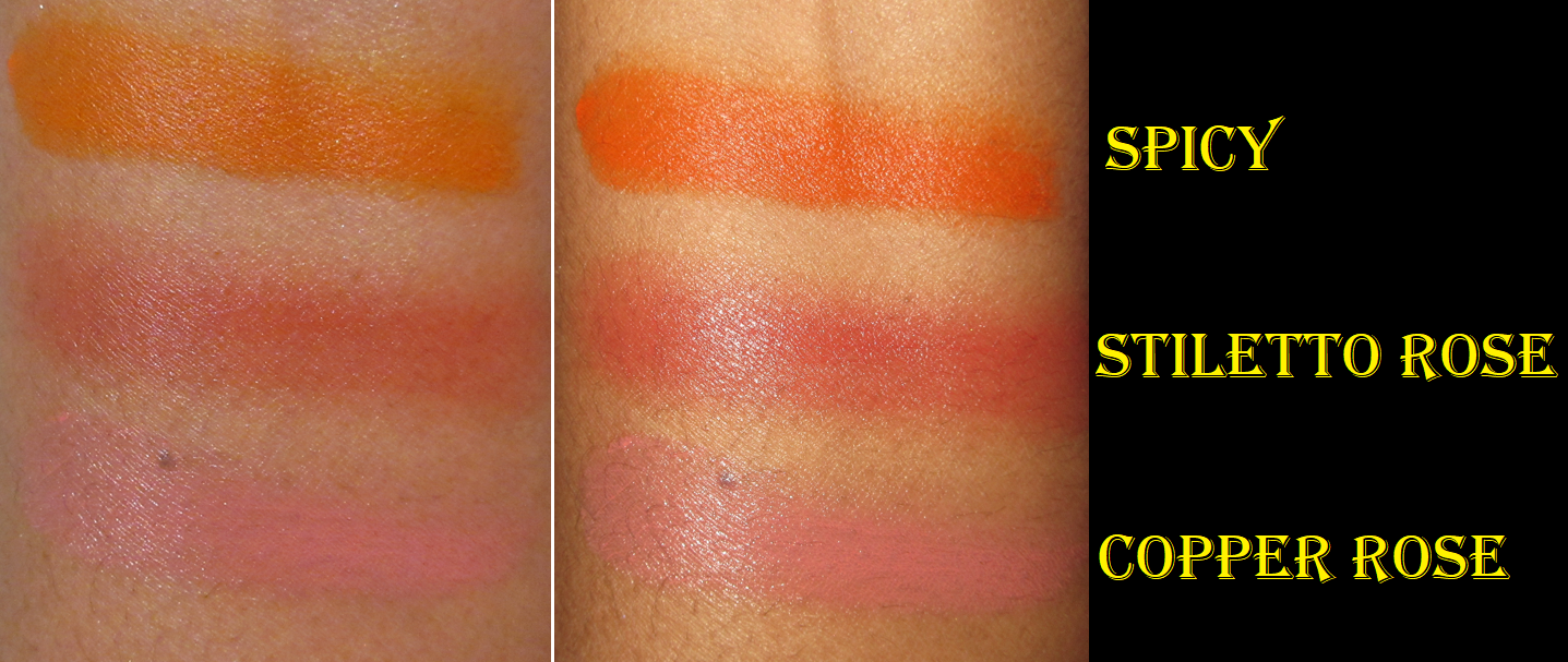
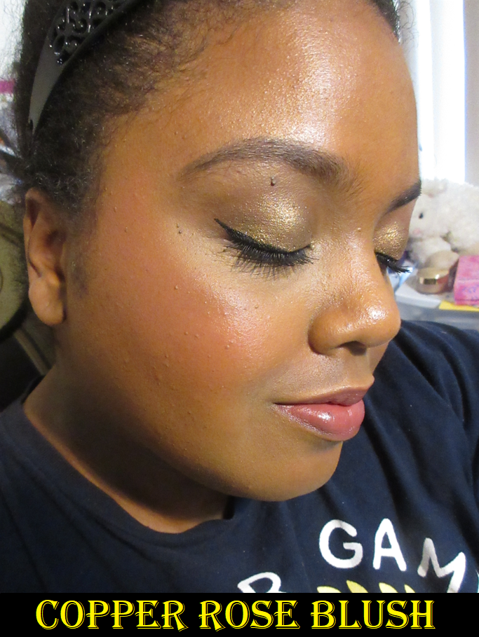
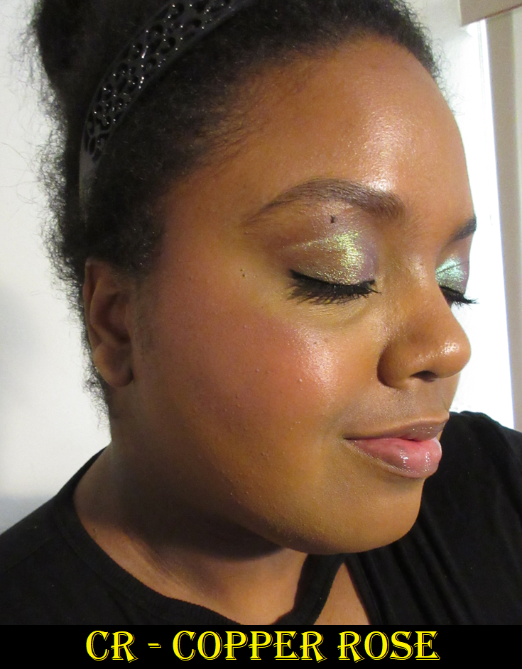
Coloured Raine Cream Blushes in Spicy (Original), Stiletto Rose and Copper Rose (Botanical Collection)

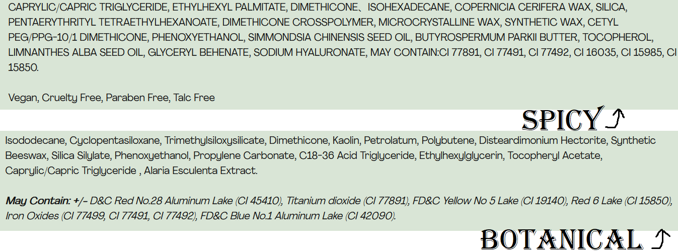
The first thing to know about these blushes is that despite them all sharing the description of “cream blush,” the original four that launched, which includes Spicy, are completely different from the two blushes from the Botanical Collection. The ingredient lists are different, along with the textures and pigmentation. The container of the originals are larger than the Botanical Blushes too!

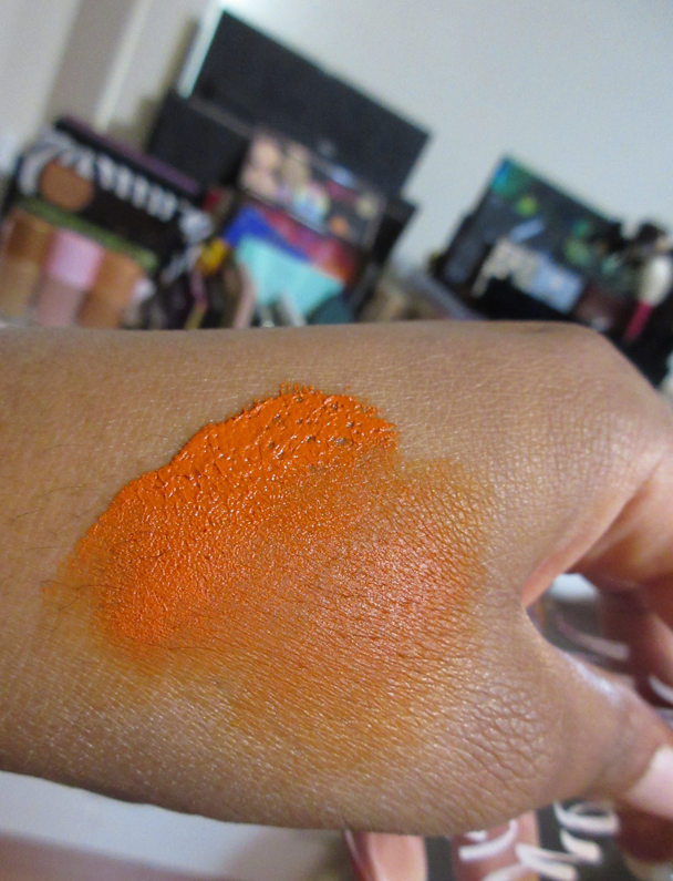
Spicy has a waxy consistency that’s so tacky it lifts up when touched. It’s thicker and more opaque. Picking up a little is still too much, so I put it on the back of my hand and warm up a small section first before applying it to my cheeks with that finger in tapping motions and then a final light sweep of the finger across the cheeks to ensure it’s fully smoothe. A little product comes off underneath, but it’s so pigmented that it will cover up the missing spot anyway. A brush will pick up way too much, but it’s still possible to use by putting it on the back of the hand or a makeup palette first (or even tapping the excess off on a towel) to get a lighter even layer across the bristles before applying it to the cheeks. I still prefer fingers because I have more control that way and can also warm up the product.

The Botanical Blushes have a higher concentration of slip agents (various silicones) that feel a little more gel-like, but still like a softer wax once the heat of a finger melts that top layer. I keep my finger on top of a spot for several seconds before I start to rub to pick up the blush onto my finger and tap it onto the cheeks. It looks like it will be just as pigmented as the original line of blushes, but when blended, it sheers out a fair amount. So, it takes a few light layers to build up to my satisfaction. This product also lifts what’s underneath, but it still looks fine to me as a veil of color. In the spots with discoloration that lifts, I put concealer back on top of the discolored spot and pack a little more blush on top, and those additional layers help it to stay.
I can use a brush with these, but it doesn’t pick up as much product without warmth.

These blushes remain creamy on the face. If I’m wearing something like the Rose Inc Luminous Foundation Serum, that wetter products tend to set well on top of, and apply the Botanical blushes in a thin layer with a brush, it can mostly set down. However, for the amount of pigmentation I want that isn’t just a flush, it’s going to remain creamy feeling on the skin unless I set it with powder. Spicy will absolutely not set on its own, plus easily transfers, so I only wear it powder-set. Setting all three of them with powder only temporarily makes them feel dry but at least does take down the creaminess enough that it won’t feel sticky or tacky. Powder-setting also makes the Botanical Blushes more transfer-resistant, but when it comes to Spicy it will definitely still transfer when touched, just a little less. Setting with powder has the final benefit of toning down the intensity level of Spicy, and even Stiletto Rose if I go overboard with that color.

These blushes will last all day, even without powder, as long as they aren’t touched. However, it’s just my preference to set them with powder, especially with a powder blush on top to add some nuance to the shades.

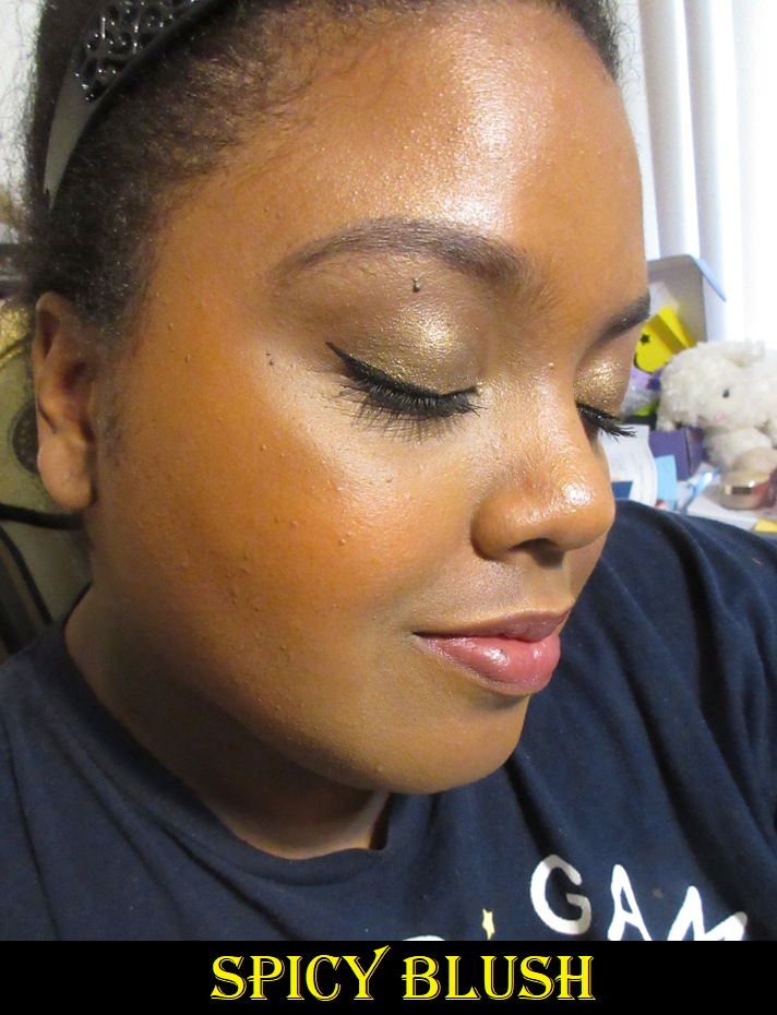
The photos above demonstrate the blushes with different foundations and at different times of the year. The middle three with the dark blue shirt were under the lighting conditions of my ring light. The others were with indoor lighting and some natural light coming in from behind the window blinds.

Had I completed this review three months ago, I’d have said, “These blushes require a little more effort, but are nice enough that I may still reach for them from time to time.” However, I’ve been going through my cream and liquid blush collection a lot more lately, and in comparison, these rank so low on the list. They still aren’t bad products, but I have so many options that don’t pick up product underneath, don’t require warmth or having to baby the formula, or do any other extra steps. Plus, my other blushes are in far more interesting colors. I’ve realized that I don’t like standard crayola type of blush colors like a pure orange, pure red, or pure pink. I love reddish browns, terracottas, pinky-orange corals, pinkish-browns, etc. Those type of colors look more natural on me. I expected Spicy to be a reddish orange with some brown, but it’s actually a slightly yellow leaning orange that may as well just be “orange.” Copper Rose sounded like it would be a fun copper-pink, but most of its warmth just comes from being picked up and mixed with my foundation and concealer while being blended on my cheeks. It’s not a very unique pink by itself. Stiletto Rose is a very common rosy red, although it’s the prettiest to me of them all.
I always wore a combination of Stiletto Rose and Copper Rose (on the apples) together anyway, which is why I initially had a better impression of those blushes. However, if I view these as individual products, they’re not something I want in my collection anymore.

Coloured Raine Lip Liners in Pine (Secret Garden), The Bee’s Knees (Queen Bee), and Decadent (Botanical)

It was very difficult to tell the differences among the selection of lip liner shades on the website. I now realize it’s because the ones I wanted are so incredibly similar! Pine was the first one from Coloured Raine I tried and later bought a backup of because it’s the first shade I ever found that I can actually cover my full lip-line with and have it look normal. I have a very thick and pronounced lip line (Vermilion border) that is way lighter than my lips and surrounding mouth color. So, when I have used lip liners on my actual lip line (and not just the edge between the lip and lip line), it always emphasized that thickness and looked like I attempted to overline my lips because it sticks out, even when it’s still within the lines. The color is described as a “spiced brown” and I consider it like a caramel-pink-brown.

The Bee’s Knees is described as a “brick” color, but it looks more like a neutral brown to me on my arm. In fact, I looked at the website photos again comparing the other shade in the Queen Bee collection and The Buzz is supposed to be the neutral brown. I almost wondered if some got swapped in the manufacturing process because my lip pencil stick doesn’t have any red in it that I can see, like the ones below, and instead looks like the brown ones near it. However, on my actual lips I think I see some red tones after building up the color? Like maybe a splash? If so, it’s certainly not as red as I expected and less red than I’d expect from a brick color. When built up, it’s also darker than Pine. It’s pretty regardless.

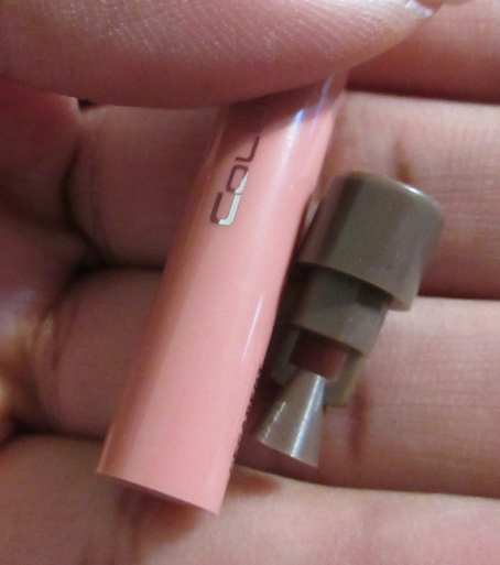
The third and final lip liner shade is the darkest of the three and also the creamiest, which I find interesting since it’s the one that launched first. I’m guessing the brand decided to switch formulas after this collection, which is a very plausible theory based on a comparison of the ingredient lists. The other two glide across the lips nicely and aren’t too soft or too stiff, but I do prefer the feel of Decadent. This color is described as, “neutral brown with slightly cool undertones” and I can see that in the squiggle swatch. Also, the lip liners from the Botanical collection came with sharpeners at the bottom. The newer lip liners do not. Perhaps the brand didn’t feel it was necessary because of the formula differences.

I haven’t noticed any issues or differences with the longevity among them all. They suit my needs and because they’re all so similar in color, they all work for me and give me that ability to line my lips in a way that others I’ve tried haven’t. It’s very specific to me, but it’s a huge deal. In general, objectively, I still believe these are a nice comfortable long lasting product.

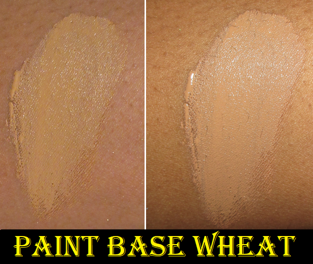
Coloured Raine Paint Base Eyeshadow Base in Wheat

I first tried this primer underneath the eyeshadows from the Coloured Raine Botanical Palette and was disappointed to see the shadows creased. After all, the eyeshadow primer is expected to work the best with the brand’s own eyeshadows, so that wasn’t a good sign for anything else I planned to use with it.
However, in using it with my well behaved and favorite eyeshadows, and then as an alternative primer for eyeshadows I was testing that didn’t perform as well with my MAC Paint Pot, I realized it actually wasn’t the fault of the Paint Base! I’ll get back to the Botanical Palette in the next section, but basically every palette I tried with the Paint Base performed better or at least equal to my other primers! It quickly became one of the primers I keep in rotation along with the Gerard Cosmetics Clean Canvas and MAC Paint Pot. In fact, I bought a backup of it during the brand’s Black Friday sale.

I really like the ABH eye primer, but it is quite drying. That one helps to combat the oils that produce on my eyelids, but that’s sometimes to the detriment of buildable type of eyeshadows being able to stick properly. This Coloured Raine primer is similar to the ABH primer, but is less drying, which makes it the better of both worlds between combating the oils but still ensuring the eyeshadows can adhere properly. It’s fantastic! Because I bought the shade Wheat, it matches the color of my eyelids better and isn’t so stark against my skin, but still helps the shadows to pop. As with most primers, a little goes a long way (though not as long as the ABH and Gerard Cosmetics ones which are even more pigmented and thicker in consistency). Wheat still provides a good amount of coverage over the discoloration on my eyelids.

It’s interesting that the brand touts the squalane and sodium hyaluronate because I would have expected that to not go well with oily prone lids and would produce too much moisture for me, but it works somehow! The Paint Base sets on my lids to a natural finish. Perhaps those ingredients are what keeps it from being as drying as the ABH one.

When I’m working with an eyeshadow formula that’s not very creamy with a rougher texture, this primer can take a little longer to blend the shadows on it, but it’s a minor difference in time. That’s the extent of the negatives I’ve found in using this primer throughout the year, which made it an almost entirely positive experience.

Coloured Raine Botanical Eyeshadow Palette

I mentioned in the Eye Base review section that despite it being from the same brand, the Coloured Raine eye primer and this palette worked fine, except that it could not keep the shimmers from retreating from the deep line I have on my lid/crease. I have since used this palette with all my tried and true primers, and none of them stop this from happening. The best results I get though is if I set the primer with powder first. Then I’m much less prone to movement and creasing, but it’s not foolproof.

Cream Gerbera barely shows despite packing it on. I don’t mind, as I’d prefer a shade that light to be subtle rather than stark. Iberis and Leonidas have a decent amount of pigment and all three are decently blendable, but that’s a little bit of a letdown in itself because I remember how rich in color and buttery feeling Coloured Raine’s mattes used to be before they got rid of their single shadows. These are fine but not particularly special. The same goes for the shimmers. They are pretty and shimmery enough for my taste, but the formula is so much thinner, less smooth, way less impactful, less pigmented, and not vibrant like their single shadows once were. I mean, Coloured Raine shimmers used to be S-tier. Being “just fine” is going to be hugely disappointing by comparison. The quality of this palette reminds me of Colourpop, which is mostly good, but it’s not even like the best of Colourpop’s formulas.

These types of colors and this overall color story is a lot softer compared to what the brand used to release. I commend them going outside of their comfort zones. However, it isn’t just the color selection and lack of color saturation that makes it slightly underwhelming for me. There are so many brands that make satin shadows and have palettes with soft colors that still somehow look elegant and beautiful on the eyes. The literal texture of the eyeshadows themselves are so soft and buildable. These shadows don’t have those same qualities. They aren’t made the same way.

I also thought it was quite strange that the colors I expected based on how they looked in the pan did not look the same on my skin. Iberis was much more red than plum. Leonidas was a truer orange instead of terracotta. Rose Gold also had a stronger red tone, like a burgundy, when I was expecting a shimmering plum. The colors are still pretty, but when other eyeshadows like from Oden’s Eye and Sydney Grace give me a visceral excited reaction to using their palettes, I don’t see why I would want to reach for this one that doesn’t spark joy. It’s a new year. Being a decent, nice, workable palette isn’t enough. On the bright side, this isn’t one of Coloured Raine’s newest palettes and I believe they’ve continued to work on their formulas since the next palette is one that I actually will be keeping in my collection.

I forgot to mention in the last look that a tiny spot of Primavera is in the center of the lower lash line too.

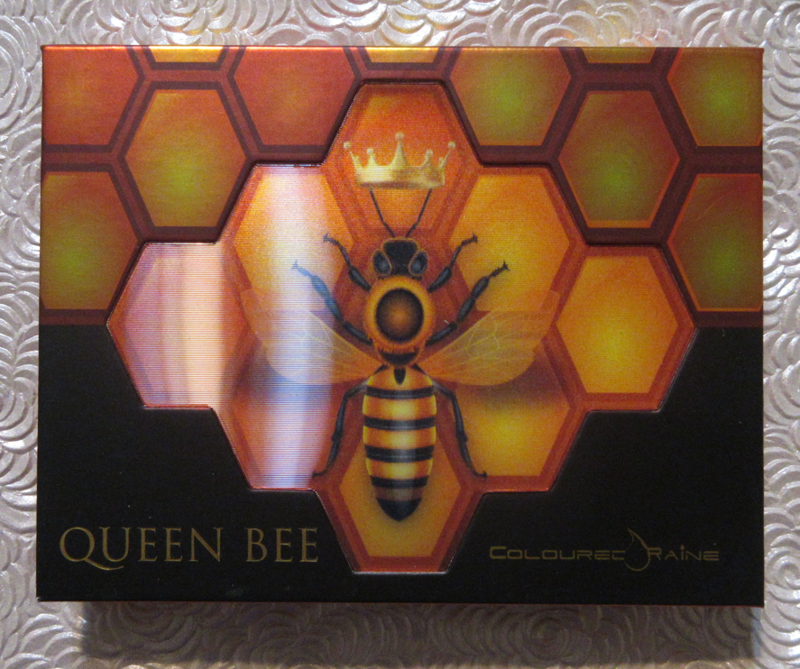
Coloured Raine Queen Bee Palette

Unlike the Botanical Eyeshadow Palette, this one does not have “Eyeshadow” in the name, which is because it contains pressed pigments. Considering my experience with the previous palette, I was so nervous that the bump up in intensity with the mattes would mean the shadows would perform worse, but that’s not the case. Honeycomb is actually very soft and smooth feeling. I absolutely love this color of orange. Beehave and Pollen in Love are a little rougher to the touch, but they pack on the lids well and blend fairly well. I’ve had a little trouble building Bee-Witched on the other shadows at times, but it just takes a little more effort to get the definition I want without overdoing it or having it look unblended. It’s definitely not my favorite black matte, but it’s workable.
Using Honeycomb and Beehave together in the same eye look can be a bit tricky because I get a lot more pigment from Beehave right off the bat and it can easily overshadow/overpower Honeycomb, so I have to be careful with its placement.

The two shimmers look like they would have the same texture, but they’re definitely not the same formula. Unbeelievable is a chunkier and flakier shimmer that gives me a lot of fallout. It’s a foil shadow, but even applying it damp doesn’t give me the smoothness I want. I don’t enjoy that shadow at all and won’t be using it again when I open this palette. It’s a shame because the color is so pretty.
On the other hand, Mind Your Beesness is an almost glowing green-gold duochrome with more slip to it so that it glides easier across the lids. Because the binding solution is better, I get less fallout with this one. Honeycomb, Mind Your Beesness, and Pollen in Love are the colors that make this palette memorable and make me excited whenever I use it. This is the one that gives me hope for even better palettes in Coloured Raine’s future.

Black liner was also added to the upper lash line of the last look.

The eyeshadow primer and lip liners are absolute wins for Coloured Raine. The blushes aren’t the best and I have mixed views on the palettes. Considering what I paid, it was worth it to me to give them a chance and figure out how I feel about what the brand produced in 2022. At this point in time, I have hope for them in 2023 and I am truly rooting for them. However, the competition among indie and mainstream brands alike is the toughest it’s ever been. I recognize that they’ve lowered their price point, but I’d rather spend more for better quality. For me to continue purchasing from them, their products have to be truly special or incredibly appealing to my tastes. I look forward to seeing what they’ll release this year and I hope others will still give them a try. I heard positive reviews about their Rebellious Nudes palette, so I feel they’re on the right track. Here’s hoping!

Thank you for reading and Happy New Year!

-Lili

Benefit Cosmetics Wanderful World Blushes and Limited Edition Set

Benefit’s new collection of blushes in the full-size and minis launched in May of 2022, and I bought them as soon as they were released on Benefit’s website, with the exception of Starlaa. Starlaa was the shade I wanted the most, so I planned to wait until it was available for purchase before posting this review. I figured it was delayed in shipping and would be ready in a few weeks, but rumor has it that Starlaa was pressed too softly and was shattering in transit, so Benefit had to remake them, which caused a four month delay! These powder blushes are on the softer side, so even my original mini of the Terra blush arrived broken. Granted, Benefit’s packaging of it was abysmal in the flimsiest recycled paper envelope in the world’s thinnest padding I’ve ever seen. It’s a miracle the other two didn’t break with it! The customer service exchange was tedious and required my email to be forwarded and to wait for the initial response back before trading multiple additional exchanges of information including photos, providing the lot number (only found by peeling back the sticker off the bottom), etc. The customer service rep(s) were polite, but the hassle of this instance and knowing what kind of horrible packaging such a delicate product was put in, makes me not want to order from Benefit’s website again. I opted for a replacement instead of a refund, and feel lucky that the second one made it safely.

In September, I saw Starlaa first available in the UK in one of Benefit’s holiday sets called the, “Blushin Benetint Bundle,” but in the mini size. I decided that since I waited so many months already, it couldn’t hurt to wait to get the full-size when it would eventually come to the US. I ended up buying it from QVC and got a discount with a promo code.

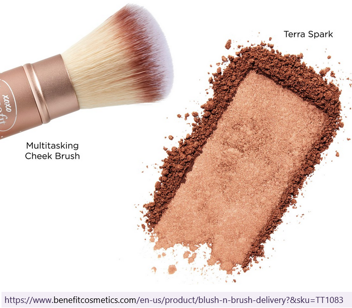
The holiday set called “Beauty Mail Blush n Brush gift set” (or “Blush ‘n Brush Delivery” later in the US), with the limited edition blush called Terra Spark, was also available in the UK first. I loved the original Terra blush, so I grew too impatient to wait for Terra Spark to come to the US and immediately ordered it from Selfridges. Imagine my surprise when I found out the shimmery red-gold blush I planned to use as a highlighter was basically Terra with a gold overspray!

The left swatch shows the first swipe with the gold overspray. The right swatch shows the second swipe from the same spot.

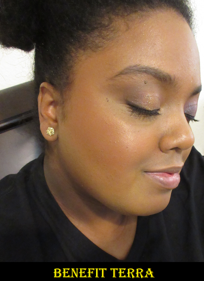
Terra is a “golden brick-red blush,” listed as having a shimmer finish, though the gold shimmer running through it isn’t nearly as obvious as other shimmer blushes I own. The only difference between Terra and Terra Spark (when the overspray is gone) is that Terra Spark has a stronger golden sheen, which alters the tone from brick-red to a slightly orange hue. They essentially look the same on my cheeks, though perhaps on someone with a lighter skin tone, the differences may be more significant. Those two blushes are so close that I had to double-check my files to make sure I didn’t get them confused in the cropping and labeling process because Terra can still look a bit terracotta if the light hits that shimmer a certain way too.

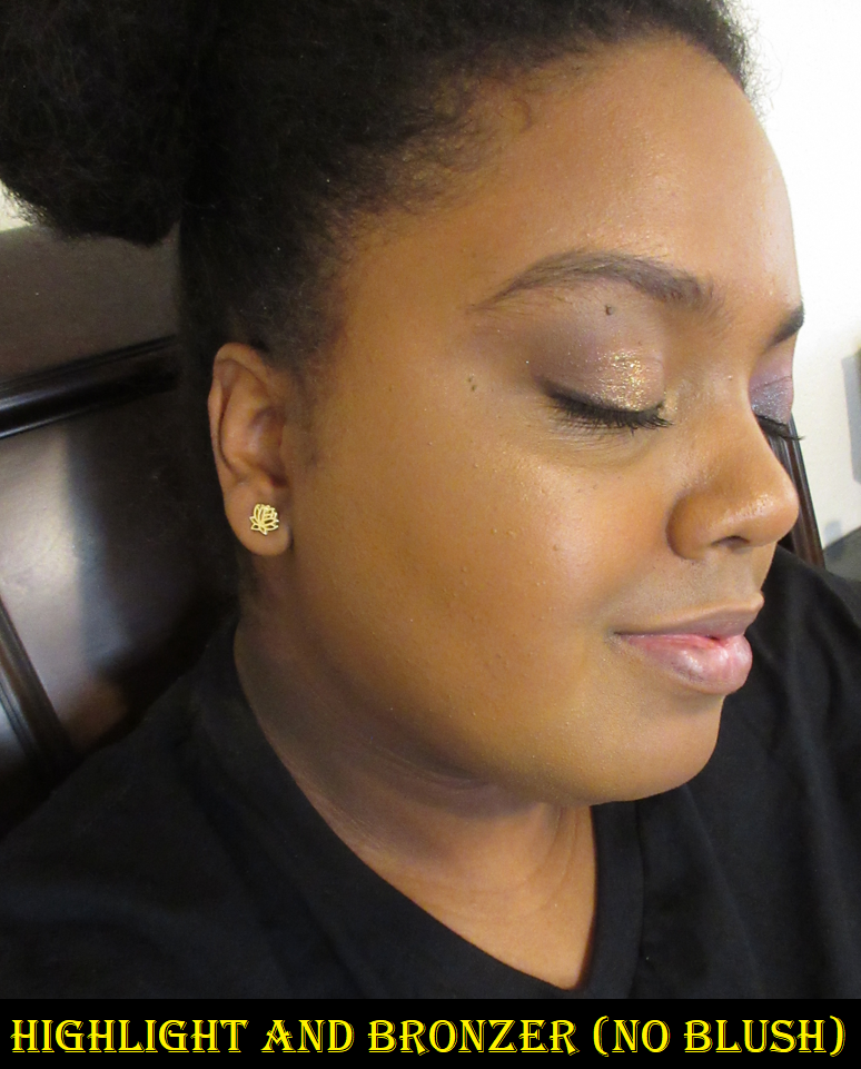
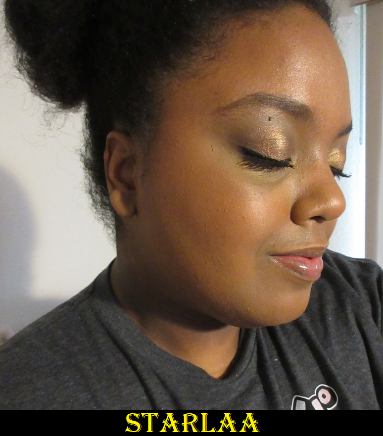
I put a photo with no blush next to Starlaa to emphasize how subtle the color is on me, but that it does show up.

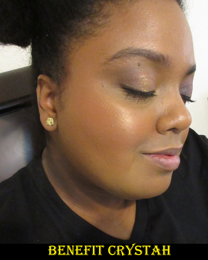
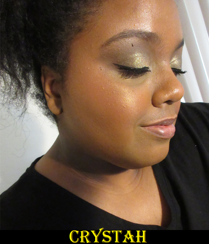
Photos of Crystah, Terra, and Java (while I’m wearing a ponytail in the section further down) were taken on the same day in June. The photo of Starlaa in the grey shirt was from October. The photos in this section were taken in November. I had to resort to using my ring light to get consistency in showing the way the blushes look on me. Previous attempts to retake these photos without it resulted in vast differences due to foundation choices, problems with my camera, and lighting issues. The highlighter and bronzer I’m wearing in this batch of photos above is the R.E.M Beauty Interstellar Highlighter Topper in Miss Mars and Huda Glowish Lightweight Blurring Pressed Powder (as bronzer) in Deep Tan.

Though they are technically different, I feel that the promo images for Terra Spark are misleading in representing how much of an impact the gold shimmer will have on the look of the blush.

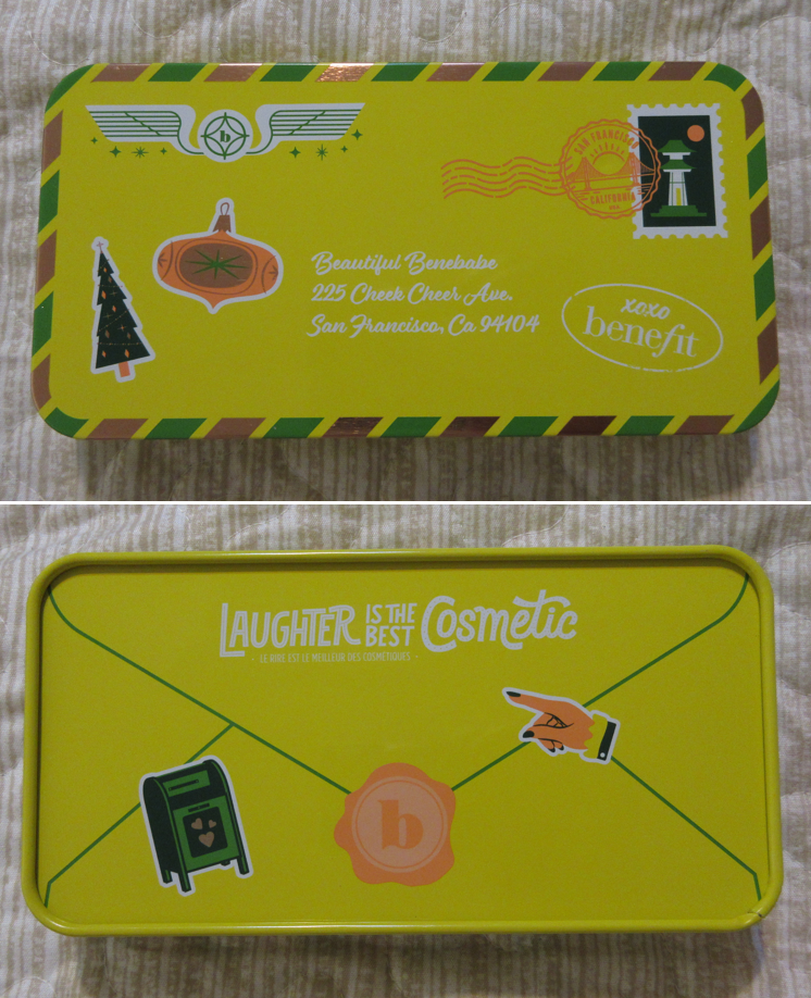
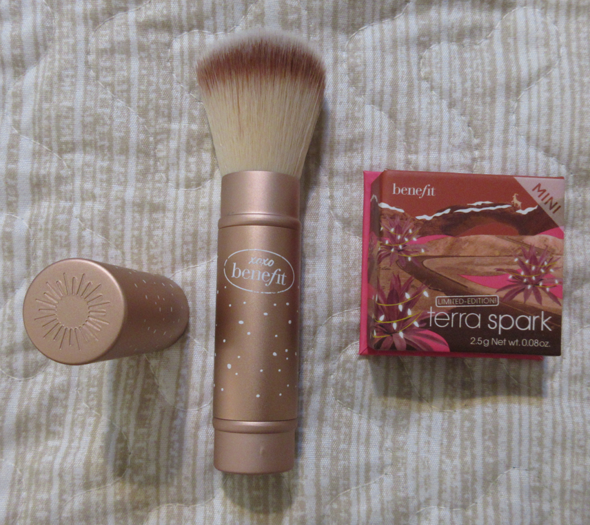
I bought this primarily for Terra Spark, though the set also came in a cute tin with a sheet of stickers and a retractable synthetic fiber blush brush. The tin can be reused for anything like storing pens, makeup brushes, liners, candy, holiday treats, and more. I haven’t decided yet how I will be repurposing mine.

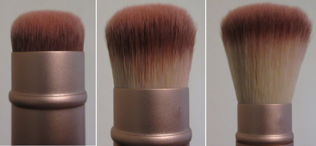
I didn’t expect to get much use out of the Benefit Multitasking Brush, and most of its value to me was the fact that it’s a limited edition version (same brush with painted white dots). However, it’s quite a bit handier than I expected because of the adjustable aspect! When the bristles are fully out, it’s the most floppy and least dense. To me, it’s almost unusable with the blushes in that state, but it’s perfect for something like a face powder that I’d want applied in a sheer layer and to be able to blend without needing to buff. With the head retracted a little further (about a third down) is the sweet spot for using this brush with the blushes. I get the amount of density I like for buffing them in. With most of the bristles pushed below, the brush is at its densest and strongest buffing power, suitable for something I want extra blended like sculpting powder products.

I have also used this brush with the Rare Beauty Soft Pinch Liquid Blushes, Glossier Solar Paint Bronzer, and the Nars Laguna Bronzing Cream in order to test out how this brush works with cream and liquid products. It works beautifully with them because of that ability to control how tightly or loosely the bristles are compacted, and therefore adjust to what each individual product requires. It stays in the position I set it, for the mostpart, but if I apply too much pressure it does start to slide down. However, I’m still very pleased with this brush and the fact that it came in this set for $30, which is the same price the non-limited edition brush retails for anyway.

I’ll get back to the blushes now.

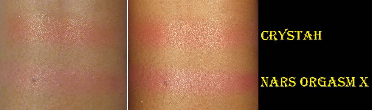
There are three different finishes among the permanent blushes: Crystah and Terra are shimmers, Starlaa is a satin, and Java is a matte. The shimmery affect in Terra is on the subtle side, though the base color is pigmented. I only need one dip in the pan to get the amount of blush I would normally want; two dips makes the blush prominent, but not garish. I would not exceed two dips into the pan with the brush. With Crystah, the gold shimmer is more abundant and brighter. It’s like Benefit’s version of Nars Orgasm X, but better in my eyes. One layer of blush is all I need to give me a vibrant flush of pink. I can see it straight on, but when I turn my head to the side, the gold reflects brightly and literally makes the pink less visible wherever the light is hitting it. So, at certain angles, it looks like I just have a golden cheek with the barest amount of pink tinge underneath. A lot of coral blushes with gold shimmer that I’ve used in the past have ended up looking silly on me because of the way light reflects off the shimmer, but in the case of Crystah, Benefit made the base color so pigmented that it still ends up looking pretty to me, especially since the shimmer is so fine in size. If I add a second layer, I can definitely see more of the pink color even when light hits it, but that means it’s also very intense when looking at it head on. I prefer to just stick to a light layer when using it alone, or it looks fantastic on top of Benefit’s blushes and as a topper for other blushes in my collection.
When it comes to Terra Spark, just like Crystah, the base color also pulls a disappearing act wherever a certain intensity of light hits the shimmer, but because the surrounding blush area is a much darker color than Crystah, it makes those camouflaged sections look patchy or poorly blended. So, I prefer to now use Terra Spark as a blush topper instead. That isn’t to say the Benefit shimmer formula isn’t opaque enough to be standalone blushes, it’s just the reflection issue that makes me prefer to mix them with other blushes.

Starlaa, in my eyes, is like a sheerer and slightly lighter version of Terra. This “rosy bronze” satin blush is mattifying, but it does have a sheen to it that keeps it from looking flat and adds a pretty finish to the skin without detectable shimmer. I have to build up this color a lot as the brown in it blends in so much with my skin tone. However, I love the slightest whisper of rosy pink that’s visible on my cheeks in person. It’s especially great for no-makeup makeup days. For that reason, I get a fair amount of use out of Starlaa, which is my second most used blush, while Terra reigns as the favorite.

Lastly is Java, which is thankfully not the kind of matte that will look powdery or heavy on my dry skin. In fact, it doesn’t look like a flat matte to me, but I wear mostly natural/dewy/glowy foundations, so that could be a factor. Java is described as a “rosy mocha” and one layer is more than enough product for each cheek since it, like most of the others, is so pigmented.

All of these blushes, no matter the finish, are long lasting on the cheeks. I love the fact that there are options to buy a decent amount of these in mini sizes. It makes it easier to afford owning multiple shades and is less wasteful, since I would be surprised if I used up all of even the mini sizes. Although I’m over Benefit putting their pressed powder products in the box packaging, this launch is when they introduced the slimmed down packaging that no longer included those mini brushes that a lot of us never used anyway. Also, I was glad to see that although the mini size is quite small for the $17 retail price, the pans are wide enough that I don’t have an issue fitting the blush brushes I want to use with them into those boxes.

Those who don’t like fragrance may not like these as they have an orange blossom or some other kind of sweet floral scent. Because I like this formula so much, I overlook the fragrance, and thankfully I am able to stop smelling it on my face after a few minutes. I thought I would post some comparison swatches of these to other brands that don’t include fragrance in their blushes.

Starting with MAC, Ambering Rose is nearly identical to Terra, but with a little more gold shimmer. Ambering Rose is in my top three favorite blush shades from MAC, so I understand now why I love Terra so much. Unfortunately, Ambering Rose is discontinued, but at least Terra is a good alternative. Peachtwist from MAC is also still available. It’s not an exact dupe, as it leans more peachy-pink, but it’s quite close.

I’m sure I could find more dupes for Java, since I have quite a few pink and red leaning brown blushes now in my collection, but since MAC makes my favorite blushes, a dupe for it would be my top recommendation. MAC’s Format has the same base color as Java, but it’s like the shimmer version with fine golden specks. MAC’s Raizin is matte and quite similar, but with a stronger red tone to it. Raizin had too much red in it for my liking, and I always thought it would be perfect if the brown was stronger in that shade, so I’m happy to have gotten my wish in the form of Java.

The closest dupe I have for Starlaa is MAC’s Sunbasque. I never use it because it’s too light for me to work as a blush. Starlaa is just barely dark enough with just enough of a deeper pink for it to show on my skin.

Swatching Crystah and Nars’ Orgasm X side by side, I now see why Crystah is a better fit for me. It’s more coral leaning in the base color rather than pink. With my undertone, I find corals to be more flattering.

So, those are all the new Benefit Blushes in my collection! When I love a blush formula, I tend to want to buy all the shades that work for me (or appear as though they would work), so I’m still tempted by Butterfly and PomPom, but those are currently only available in the full-sizes, which is why I haven’t taken the plunge. And when it comes to which finish I prefer, I’m so thoroughly impressed by how smooth and blendable Java is and how natural it looks on my face, so the mattes are my favorite. Then, when it comes to the satins or shimmers, the satin is the safer bet, because it doesn’t have as reflective of shimmer in it, but at the same time I can’t help but wish it was either firmly in the matte or shimmer categories. The slight shimmer effect in the satin feels almost pointless. I prefer the look of the shimmers over the satin, but Terra Spark and Crystah had that reflective issue while Terra did not. So, it would be riskier for me to blindly purchase another shimmer blush in the hopes that it will perform more like Terra.

Also, regarding the formulas, Benefit Powder products tend to get hard-pan easily if swatched too much. I was surprised to see that I don’t have this issue with the matte and shimmer blushes, but for some reason Starlaa does have that problem. So, I scraped off the top layer lightly and began using brushes for the remainder of the swatches I needed to do.

Well, I believe that’s everything I have to say about the Wanderful World Blushes! I love them and recommend them (but I personally would wait for at least 20% off which is easy to find between all the retailers that carry Benefit products).
Thank you for reading!

-Lili

Artist Couture Love Sprung 3 and Quickie Palette Review

The brand had a 40% off sitewide sale on Labor Day, so I used that as an opportunity to buy two items I’ve been unable to get out of my head. Love Sprung III had a blush that looked similar to Love Sprung II that I own and reviewed before and the Quickie palette admittedly has four repeat shades already present in the original Supreme Nudes palette, so I talked myself out of buying them until this all too enticing deal.

Love Sprung Face Palette 3 (listed as VIII for version three)

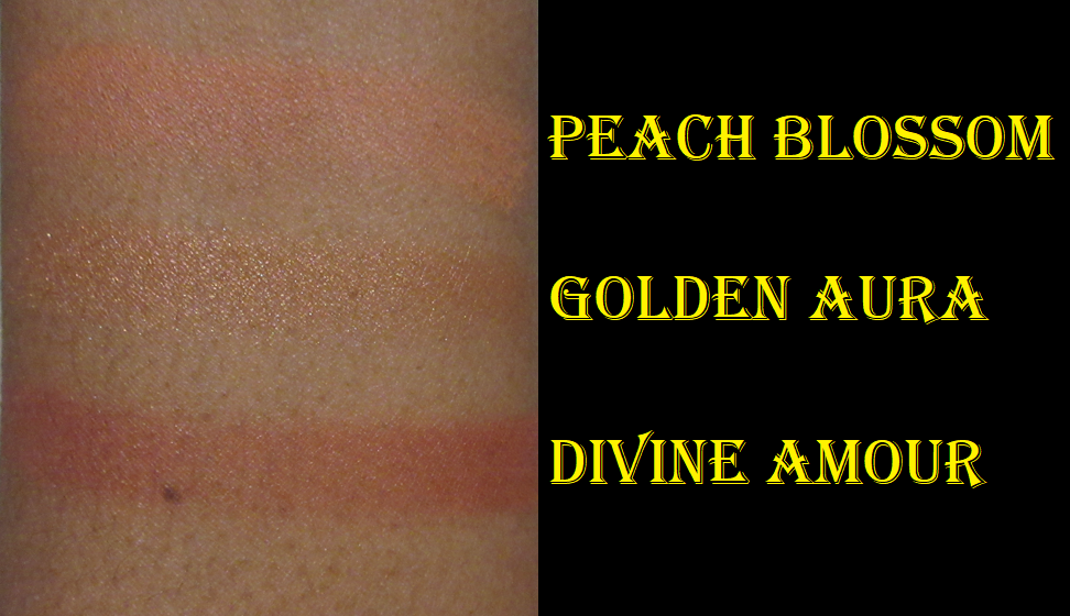
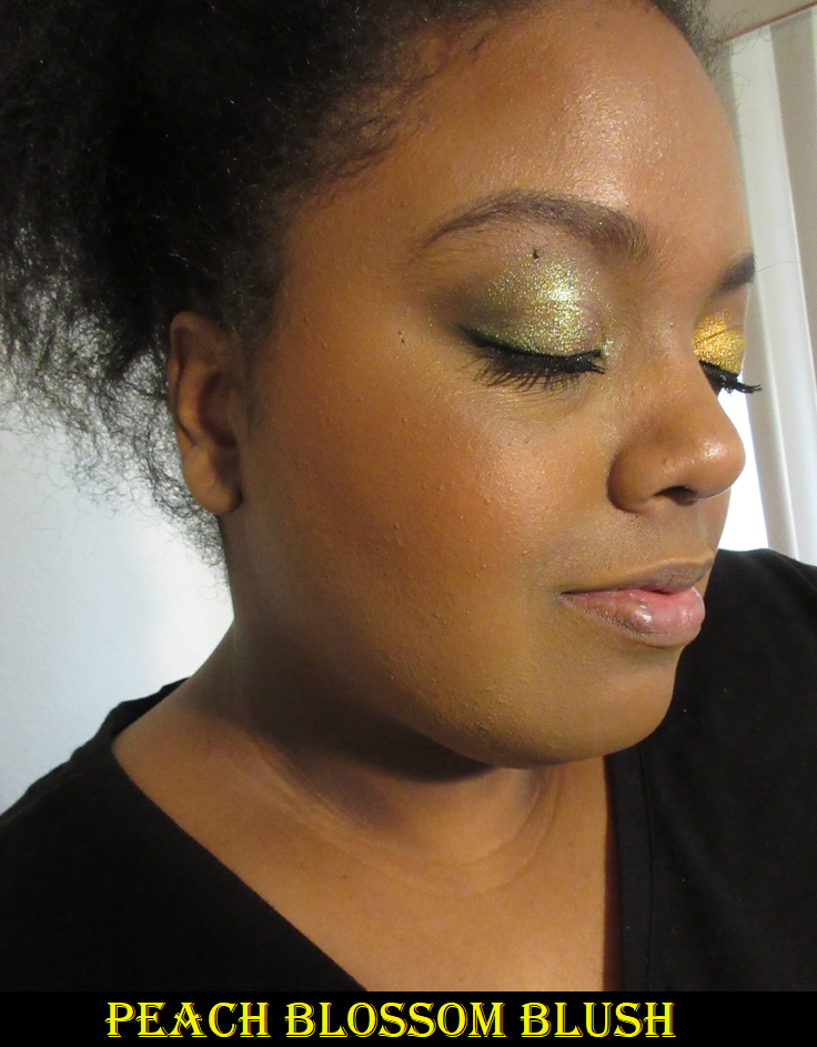
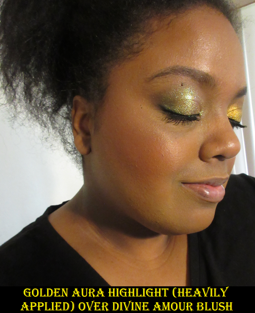
It turned out that despite how similar Infatuated and Divine Amour looked in their pans, they are different enough on the cheeks. I’m happy to say version III is the perfect one for me and the formula seems even better than the previous version II! The highlighter is certainly not as wet and is easier to apply and blend smoothly on the face.

I find it fascinating that Divine Amour and Infatuated look similar in the pans, but Infatuated is closer to Peach Blossom on the skin.

These blushes are very pigmented but easy to blend out, smooth looking on the skin, and the kind of tones I love. There’s a lot of kickup in the pan, but I don’t mind that when it’s so easy to clean because all the edges are smooth plastic. Peach Blossom surprised me that it showed so easily on my cheeks and deepened slightly, but it still maintained the peachy look I wanted. I had to build it up even more for the photo, so it looks a bit darker, especially next to the bronzer I’m wearing, but I think it will still look nice on a wide range of skin tones. Golden Aura is not very far off to my skin tone in terms of depth, so I can get a subtle look easily (which I prefer) or I can build it up to about a medium amount of shine. The shimmer isn’t light enough on me to be intensely bright. With Divine Amour, I barely need any product for it to show, but I don’t need to worry about being light-handed with it if I’m using one of my softer, looser, more delicate bristle brushes.

Even though I originally questioned why the brand would make such similar looking peach and pink leaning blushes among the three Love Sprung blush and highlight trios, this new one is my favorite! It’s the one I will actually get use out of and its slim compact packaging makes it easily portable. I’m very happy with this one!

Supreme Nudes: The Quickie Palette

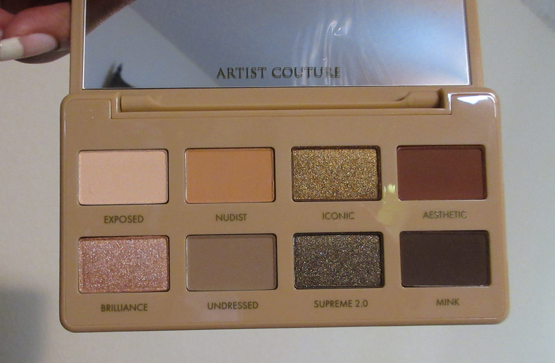
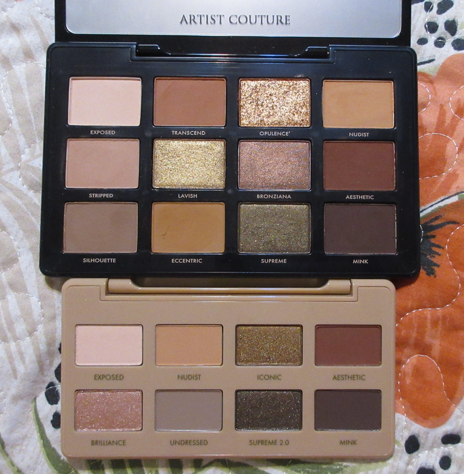
I was relieved to discover that the quality in the Quickie palette is the same as Supreme Nudes. Artist Couture’s palettes do not get consistently positive reviews. The Caliente, Ethereal Bloom, and Supreme Mauves palettes spring to mind as some I’ve heard people assume had a different formula based on the performance of those palettes. So, I’m glad that the mattes in Quickie are the pigmented and soft shadows that I’m familiar with and because of the amped up sparkle level of these shimmers, those have been upgraded in my book.

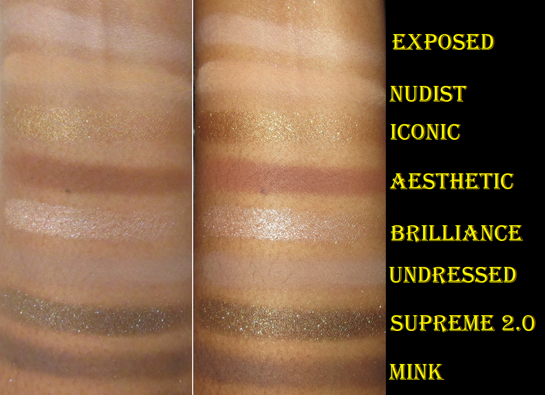
In my review of Supreme Nudes, I mentioned that all I see among the mattes are a bunch of brow bone shades, Aesthetic, and Mink. So, I support the decision to cut out some of those transition/crease shades, especially since Nudist, Transcend, and Eccentric had the same effect on my eyes. However, the cooler toned taupe called Undressed in Quickie replaced Silhouette which was a more neutral version and I would have preferred to keep Silhouette. However, because Undressed can take the look in a more cool toned direction, I understand why the brand wanted to swap it out in this mini palette.

The four new shades in this palette are Iconic, Brilliance, Supreme 2.0, and Undressed that we discussed above. I knew I was getting repeat shadows when I bought this palette, but I wasn’t expecting the new ones to be so similar to the full size. I do like the extra shimmer in Iconic over Lavish and the fact that it’s more of a true gold. Brilliance has no dupe, but it looks silvery white on my eyes, so that limits how I’d use it. I tried using it as a lid shade in the demo to do something different, but I don’t think it looks good. It’s just a spotlight shade for me. As for Supreme 2.0, I like that it has more sparkle and is a darker olive than Supreme, but with that silver shimmer, it gives the shade a cool toned look when I usually prefer to do a warm toned one if I’m wearing “natural” colors.

I thought having this mini would be handy for travel, but since it’s still not my perfect palette and by now I have many other green and neutral palettes I prefer, I would be more likely to take something else on vacation instead. I thought that I might like having a condensed version of Supreme Nudes and get a lot of use out of it, but I have only reached for Quickie a handful of times while knowing there are still shades in Supreme Nudes that I prefer. I also thought that if I ended up favoring either the Supreme Nudes or Supreme Nudes Quickie, I could declutter the other one, but my enjoyment of Iconic and Supreme 2.0 with my favorite two mattes (Aesthetic and Mink) is so strong that I can’t give it up, even though it still feels like I bought two of the same thing, yet have no will power to get rid of either of them. At least I only paid around $18 for Quickie.

So for those who like the color story in Quickie, I think it’s a nice palette even if it wasn’t the best decision for me to buy it. Considering the price difference of Mini Supreme Nudes Quickie being $30 and Supreme Nudes being $45, getting the mini for full price doesn’t feel like it would be worth it to me. I recommend trying to wait for a sale, which I expect to be possible at least one more time this year. For those who love Artist Couture mattes, the brand recently released a Supreme Nudes Matte Masterpiece palette in the same size and packaging as the Quickie palette. I won’t be picking that one up.

That’s all for today! Thank you for reading!

-Lili

Swatches of Previously Reviewed Makeup in New Shades

With today being Black Friday and holiday sales approaching, now is the time it’d be the most useful for me to get as many reviews out as possible. I’m constantly testing new products, but it takes ages for me to get closeups, swatches, demos, and the written portion of posts completed to my level of satisfaction. I’m allergic to posting first impressions, but I think it may be helpful to share photos of the new makeup I purchased that are just new shades of things I’ve already reviewed for this blog. The formulas of everything should be the same, and therefore the performances should be no different, with the exception of the first item I’m showcasing below.

Fenty Beauty Double Cheek’d Up: Freestyle Cream Blush Duo

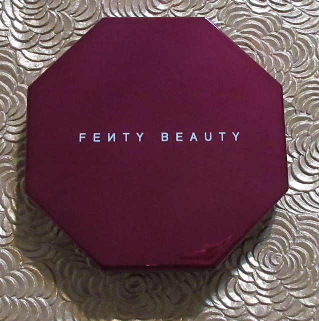
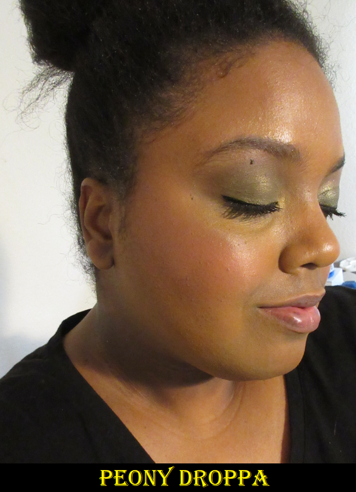
The compact color is stunning! I bought this partly for the packaging, along with liking Fenty’s permanent cream blush formula that I reviewed here. Since “Freestyle” is still in the name of the duo, I expected the formula to be the same, but it’s a little more emollient and slightly less pigmented. Because Peony Droppa is on the lighter side, it takes an extra few layers to build it up on me, but Mali’booze just needs one additional layer to build up to the level of opacity I get from the original shades. I was pleasantly surprised that Peony Droppa showed up on me and actually looked nice despite being cool-toned (warmer blushes look better with my undertone). I’ve only used this duo twice so far and I prefer how they look when I use the darker blush all over my cheek and keep the lighter one on just the apples. Trying to wear them mixed was a little tricky trying to find the tonal balance I liked, so I think I’ll stick to either using Mali’booze alone or applying both in those specific zones on the cheeks.

The compact is much bigger than the standard cream blushes and each half of the duo is 3g, meaning each shade in the duo has the same amount of product as the full size single cream blushes. The cream duo compact has the same dimensions as the full size bronzers, highlighter duos, etc. I get two products in one for $34 instead of $44 if they were sold separately, however, I still prefer Strawberry Drip to both of these shades because I get the bright popping color without it clashing with my skin tone. So, in my case, I’d still be better off buying a single blush. I got the duo at a discount via Ulta, and my single blushes from Fenty are two and a half years old by now, so this is a good time to have a replacement.

I was planning to make a dedicated Fenty update post, so I have photos already wearing this one, but I thought it would be best to just include them here.

Fenty Beauty Sun Stalk’R Face + Eye Bronzer & Highlighter Palette

I bought this one from Mercari. I have reviewed the Mocha Mami shade of Sun Stalk’r Instant Warmth Bronzer as an update to one of my bronzer posts here. I barely used it because the shade was more red than I liked, particularly for a matte formula. I suspected one of the other colors could work, or that I could mix the deepest two in this palette together as a better match. It turns out I was correct, as Coco Naughty works on me, or I can mix that one with Thick Mint for extra intensity. I was so concerned with knowing my correct shade that I failed to consider the fact that the formula is good but not great. There wasn’t a need to try and find a better color if I was still going to reach for my Huda Beauty Glowish Bronzer, Charlotte Tilbury, Kosas, and Nars bronzers first.

I find it interesting how much the color Private Island blended into my arm. At some point I’m going to test if that shade can be used as an all over setting powder or to set my under eyes. If so, that would be a nice way to make this palette even more useful.

The Phat Glass highlighter was a little broken, but I pressed it back. Also, that shade is way too light for me, so I don’t wear it alone anyway. The Gold Card color is very beautiful and suits me really well. I can wear it alone or mix it with Phat Glass for a little extra brightness. I’ve also used it on the cheekbones and then added Phat Glass to a tiny portion of the highest point to really emphasize the structured look I want in that area. It’s nice to finally have a Fenty highlighter that matches my preferences in terms of the smaller shimmer particle size. All others I tried from Fenty had some aspect that’s usually a negative, such as being in stick form in the MatchStix, an unnatural color as a Killawatt, or ultra glittery like the Diamond bombs. Even the Chocolate Swiller Fenty Toast’d Swirl Bronze Shimmer Powder with its smooth texture has some larger particle size shimmer specks that makes it something I only want to use periodically.

LYS Beauty Higher Standard 3-Piece Cream Blush Set

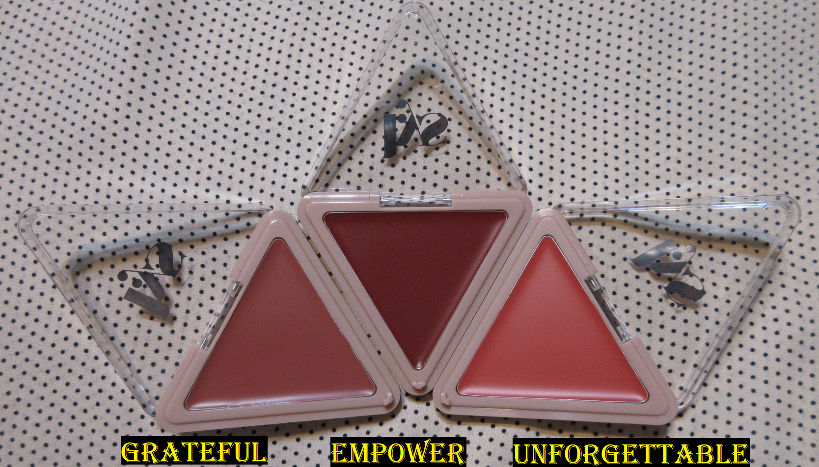
Grateful looks so much like Confident in the pan, but when swatched, it looks more like Self Love instead. This mini trio is $20, making it a really great option for trying out additional shades from the brand. The retail price of the single blushes is $16 and each individual “mini” has about 2/3 the product of the full size. The packaging isn’t as lux with the clear lid, but that also makes it easier to figure out which shade I’m grabbing. I only tried these out once so far, and don’t have pictures of each blush included, but that one time using it was enough to know the formula of the minis is the same. It’s one of my absolute favorite cream blush formulas, if not the top favorite, and I’ve felt like this long before I joined the LYS ambassador program. I’m technically still one, but I haven’t done anything for the brand in nearly a year. More about that is detailed here. As for my first review of this cream blush formula, that can be found here. All three included in this set show up on me.

Huda Beauty GloWish Cheeky Vegan Soft Glow Powder Blush in Sassy Saffron

This is another one of those situations where I was so enamored with the look of the new shades that I forgot how I actually felt about the formula being “not particularly special,” mentioned here. I thought this was colorful enough to work on my skin tone, especially with how much richer it looked online, but it was very ashy the first time I tried it. I will have to try it again focusing on the deeper swirl to see if that helps, but I have my doubts. I bought this during Sephora’s previous VIB sale, but Huda’s official website has an even better deal going on.

Chantecaille Perfect Blur Finishing Powder in Med/Dark

In my powder declutter post discussing the original shade here, I mentioned that I wasn’t getting the same amazing results that had been hyped up in all the reviews I’d seen, so perhaps a darker shade would work better on me. I planned to sell the original and get a darker version. The first iteration of the Med/Dark shade was from Chantecaille’s Flower Power line, but I hated that packaging and that wasn’t nice enough to make up for me having to sell that gorgeous hummingbird packaging. I contacted Chantecaille during that time, and they told me they wouldn’t bring the new shade in that hummingbird packaging, but it would at least come in the larger size of their “pebble” compacts, like their philanthropy blushes. After that, the Dior Powder-No-Powder was released and I got so much more blurring from that than I ever did with the original shade and at half the price, so I decided to just give up on this powder. Then, as luck should have it, Space NK had it deeply discounted during their sale in June this year. With shipping included, I only paid $33 for it!

The Med/Dark shade is much better suited to me. It looked invisible on my inner arm, so there was no point trying to post a swatch of it here. Even with the photo uploaded to my computer, I had a guess as to where it was based on my skin looking slightly more matte, but I wasn’t confident enough to mark it. Getting that new shade did work out better for me than the original. I could see a little bit of blurring, but it was nowhere near as good on me as the Dior Powder-No-Powder. So, I still recommend that one over this (though the Dior one has a sheen and this powder does not). I’m just glad I didn’t spend a fortune on it to figure that out!

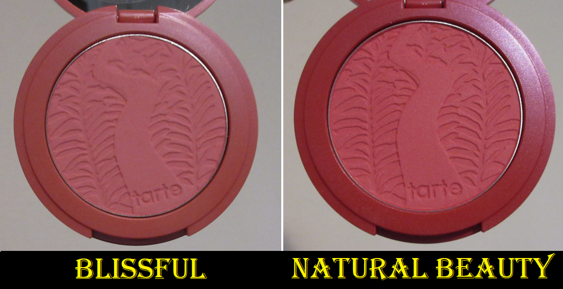
Tarte Amazonian Clay Blushes in Blissful and Natural Beauty

The Tarte blushes I owned were minis reviewed here. I really enjoyed them, so when Ulta had the full-size blushes on sale in September for $14 each, I couldn’t resist and bought several more. Since Exposed worked for me, I thought Seduce would be even better, but it doesn’t show on me at all. That one is out of my collection, so I couldn’t include it here. The tartelette blush in bloom Amazonian clay cheek palette didn’t work for me either, excluding the darkest shade, but it was too cool toned looking on me so that’s not in my collection anymore either. I’m glad Blissful and Natural Beauty worked out! Tarte’s Amazonian Clay Blushes have the issue of looking light in the pan but sometimes they work for me and sometimes they don’t, so I never know until I actually try them out.

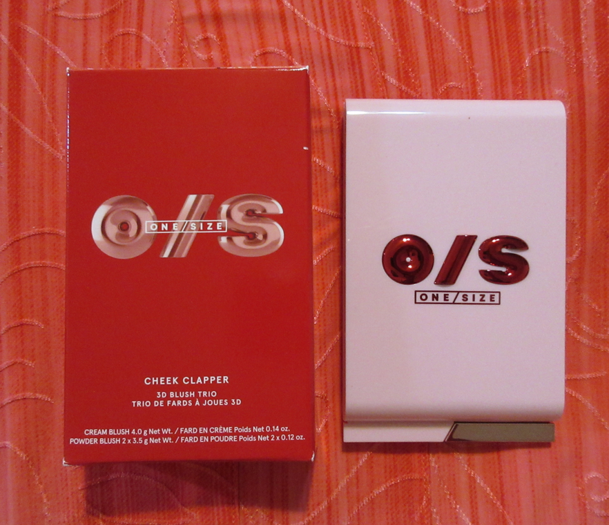
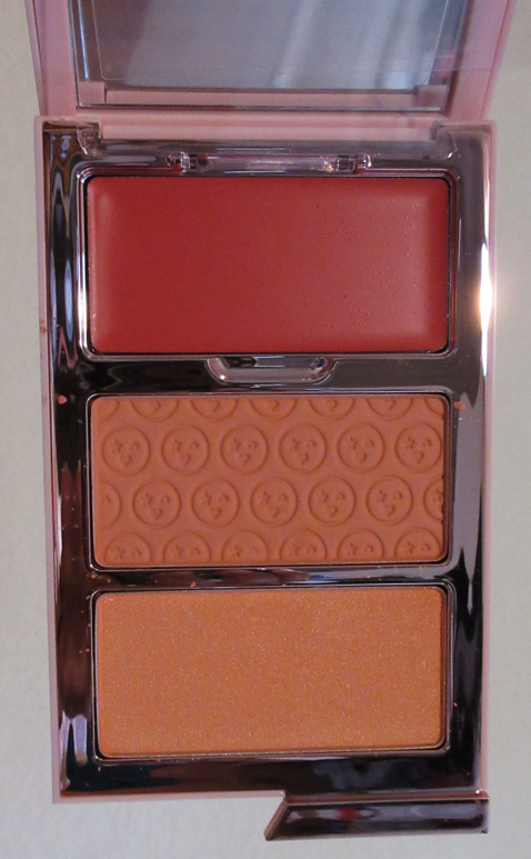
One/Size Cheek Clapper 3D Blush Trio Palette in Phat Ass

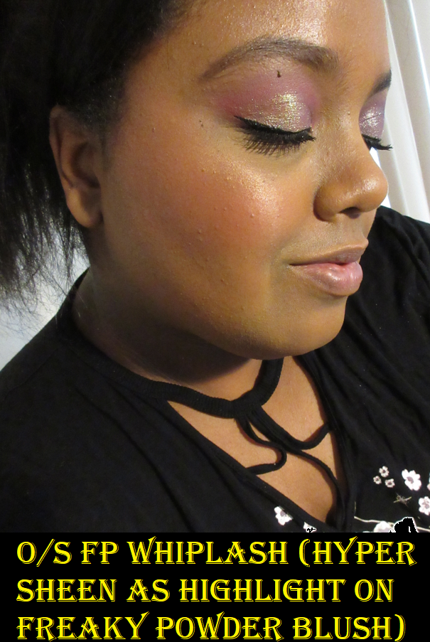
I loved the Freaky Peach shade, reviewed here, and was always drawn to Phat Ass, but with how similar the cream and powder versions looked, I didn’t think it would be worth it to buy another trio from One/Size. However, I saw a good deal on Mercari and bought this. Unfortunately, the shimmer exploded in the package, so it took quite a while for me to repress it (not my best work) and clean off the cream which it had also gotten into despite the plastic flap. Unlike Freaky Peach where the shimmer blush was light enough for me to use as a highlighter, the BBL shade in this one is a bit too deep and pigmented in the base color for that. I can use this as an actual shimmer blush or blush topper though, the way it was intended. It’s the kind of shade that’s along the lines of a Nars Orgasm X, but I like this one better!

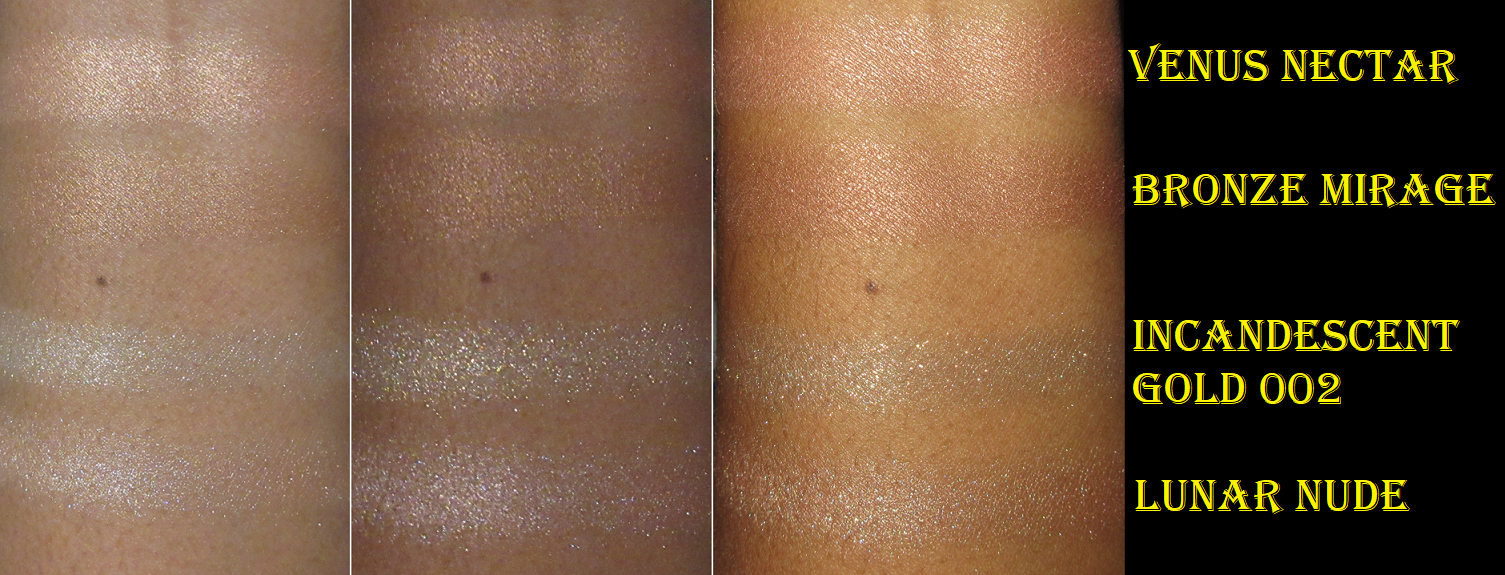
Pat Mcgrath Skin Fetish: Divine Glow Highlighter in Venus Nectar

Venus Nectar was another broken item I had to repair (dry pressing wasn’t an option with how broken it was). It’s on the pink side, but I love this formula from Pat Mcgrath. It’s a shame that I still can’t get the exact golden tone in this formula that I’m looking for with Bronze Mirage, reviewed here, being a bit deep for me. PML’s Ultra Glow Highlighter in the pink packaging still hasn’t been topped for me. Swatches of Venus Nectar and Bronze Mirage will be in the next section of PML highlighters lower down.

Pat Mcgrath x Bridgerton Skin Fetish: Sublime Skin Highlighter in Incandescent Gold 002

Don’t ask me why I bought a Bridgerton highlighter. I’m citing temporary insanity. I know I hate deep yellow highlighters (being scarred from Fenty’s Trophy Wife), so I opted for the other one instead because I heard it’s still gold but with a sheer base that’s technically supposed to work on the majority of skintones. The glitter level is my main issue with it, but I forgot that the highlighters in this particular formula, similar to my Lunar Nude highlighter (reviewed here), share this excessive sparkle feature. I only have this photo to show of it on my bare face. As much as I’d prefer not to show something like this, it’s all I’ve got at the moment.

As the swatches above show, the sparkle level and shimmer particle sizes are very different. I prefer the Divine Glow over the Sublime Skin, and I need to remember that in the future!

Rose INC Cream Blush Refillable Cheek & Lip in Wisteria

I’m sensing a pattern here. The pattern of trying to find the ultimate blush shade from every brand, despite how I feel about the formula. The Rose Inc blushes don’t dry down, as mentioned in my review here, so I have to be in a particular mood to wear them. I don’t know if I got confused while comparing the different shades on the Rose Inc website, but I could have sworn Wisteria looked darker in photos I saw. This shade does not work on me at all. It shows up, but is extremely ashy. I didn’t know it was going to be significantly lighter than Foxglove, which is already just a flush of color on my cheeks. In any case, I vow to myself that I will not buy another Rose Inc Cream Blush. Now, if they start making powder blushes, that will be another story.

Rose Inc Skin Enhance Luminous Tinted Serum in 100

In one of my Rose Inc orders, I got samples of additional foundation shades. Because of that, I was able to see that despite how much I loved the shade 110 (in that same review linked in the blush section), shade 100 is the better undertone match for me. So, I utilized Rose Inc’s fantastic Pre-Black Friday sale to get my better shade! I have to add though that I was shocked 100 is my shade considering the model photos on the website. Based on the model, 100 shouldn’t be for me at all. But it is!

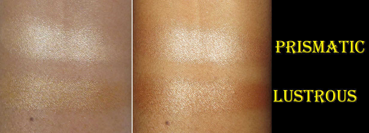
Rose Inc Solar Radiance Hydrating Cream Highlighter in Prismatic and Lustrous

This is a bonus mention because I hadn’t shown these on the blog until now, and I don’t intend on including it in any other posts this year. I bought the two refills of the Rose Inc Cream highlighters because I wasn’t sure if this formula would be closer to the blushes or the bronzers. These fall somewhere in the middle. They don’t fully dry down like the bronzers, but they aren’t as emollient feeling on the skin as the blushes, but that may also be due to me needing less product to get the impact I want. Prismatic is too light for me and I don’t intend to keep it in my collection. Lustrous is the perfect shade for me though. I wasn’t sure if I should get it because it looks dark online and bronzes tend to be too deep on me, but this is a lot lighter in person and more golden leaning. I’ve only worn them a few times, but I still don’t know how I feel about this product. As of now, they don’t get a recommendation from me despite the color and wet look that I like. Towards the end of the night I notice more texture and I’m not sure if the product slightly picking up is user error yet or a formula issue.

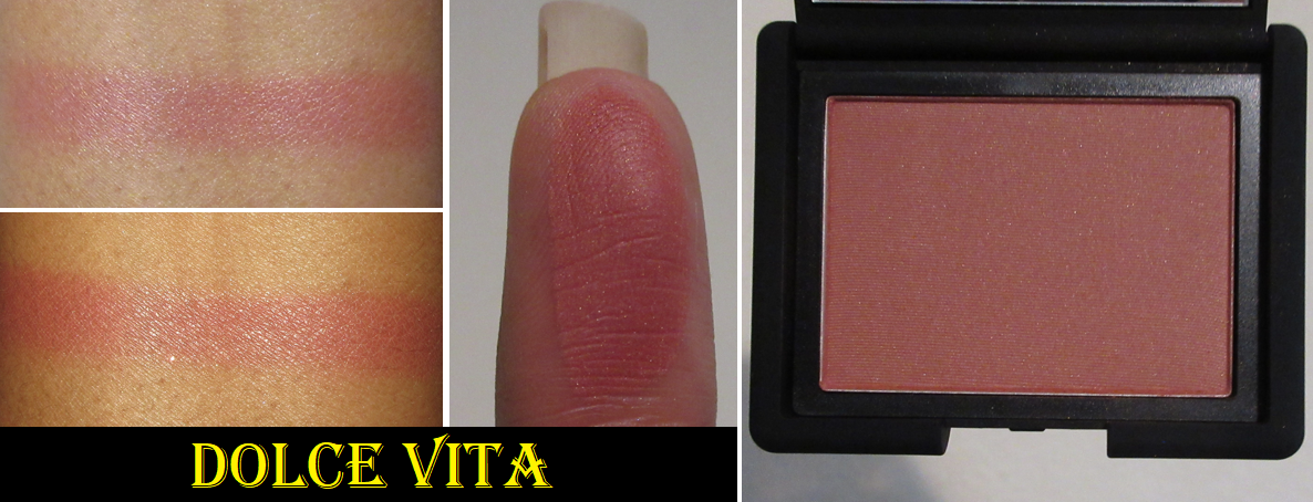
Nars Blush in Dolce Vita

I saw a review somewhere that this blush would work on deeper skin, despite how light it appeared in other photos I had seen. It was so pretty that even though Nars blushes (reviewed here) don’t quite measure up to MAC blushes that I have no shortage of, I still wanted it. Sometimes when I see a Nars blush shade I don’t own, I think I should hold off on buying it because chances are high that it will end up in a palette with some other repromoted shades. But Ulta had another deal, so I went with it and have no regrets! I like it quite a lot!

Vieve Sunset Blush in Piazza

In my March purchases post, here, I said the blush formula was great quality and that I wanted the Piazza shade, but it was supposed to be too similar to others I already own in my collection. SpaceNK’s pre-Black Friday sale made me change my mind and I bought this, plus the bronzer I had been curious about since its launch. It takes a while to arrive from GB, so it only arrived a few days ago. I haven’t actually worn this shade yet or the bronzer on my face, but they all look like they’ll work for me. And I have no reason to think Piazza will not be great since I’ve enjoyed Sorbet so much.

Whew! That’s everything for today! I did way more talking than I expected, though this isn’t a typical Swatchfest.

I hope everyone had a great day yesterday and that this post will be helpful for all the sales going on! I tried to get this post out in a rush, so if there are typos or errors I missed, please excuse them! Thank you for reading!

-Lili

Hourglass Ambient Lighting Edit Unlocked Tiger Palette Holiday ’22

Well…Hourglass did it.

In my holiday post from last year, I wrote at length about the things that would need to be different in order for me to be willing to purchase another palette from the brand. I had hoped for a more accurate reflection of the shades in their marketing images, a clearly designated palette suitable for tan to deep skin tones (or darker) or at least an extension of the permanent bronzer range. I also believed three face palette options should be the standard minimum (although I’d begrudgingly continue to accept two). In the mockup section for holiday palette ideas, I mentioned that I would have been satisfied if they swapped out Radiant Light and Coral Flush for Transcendent Light and At Night in the Universe Unlocked Palette and that would have made it appropriately deep skin friendly.

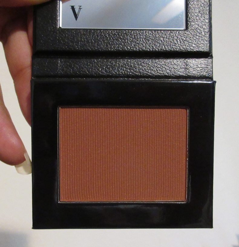
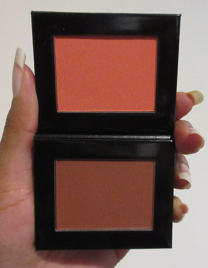
The deepest powder face products Hourglass has created thus far plus two other blushes not pictured here (The deepest blush in Universe Unlocked ’21 and the darkest blush from the Unlocked Butterfly ’22 palette).

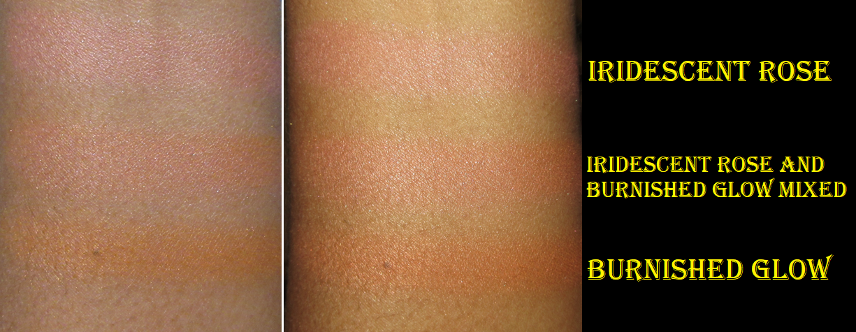
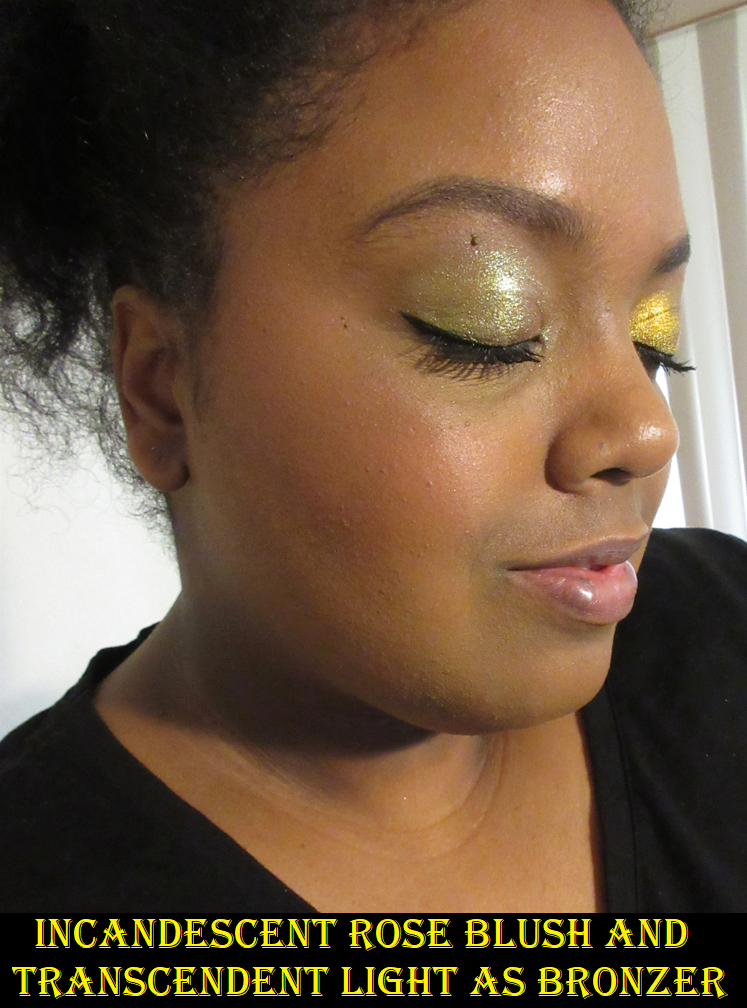
This year, they actually did put in Transcendent Light. Iridescent Rose isn’t as deep as At Night, but it’s at least workable for me. So, because the Tiger palette hit so many of the marks I specifically was critical about in the past, I decided to give this holiday palette a chance. It also helps that the Tiger design is beautiful!

So, this will be my review for the Tiger palette. Even though I had been stalking the website and was among the first to purchase one even ahead of the early access launch, I haven’t had the most time to spend with this palette because of my post-surgery recovery process, then losing power for over a week due to Hurricane Ian, and getting COVID. Thankfully, Hourglass powders perform consistently, so there weren’t any surprises. The formula is solid. Whether this palette is a good one to purchase really depends on a person’s skin tone and makeup preferences about the blush vibrancy and pigmentation level, highlighter intensity, and opinions on shimmer and texture.

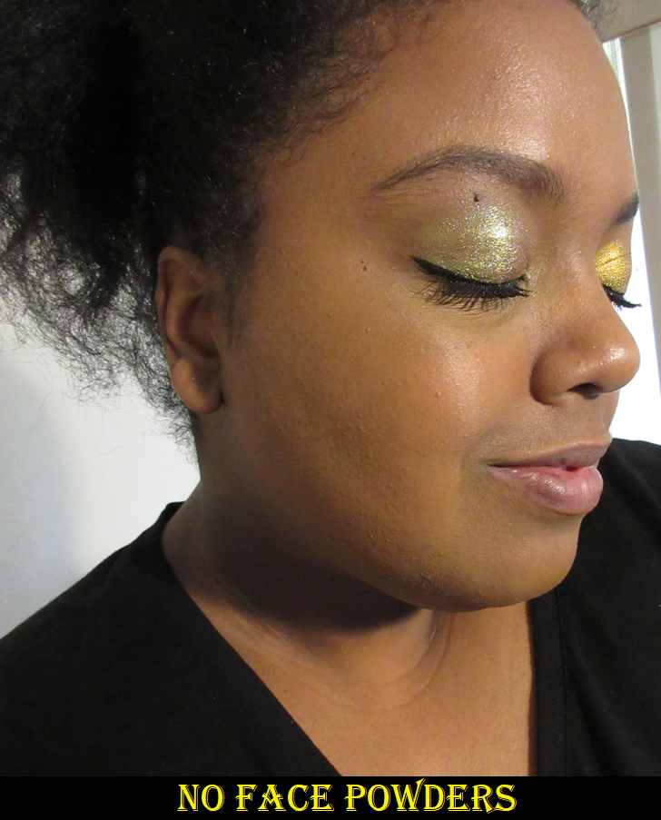
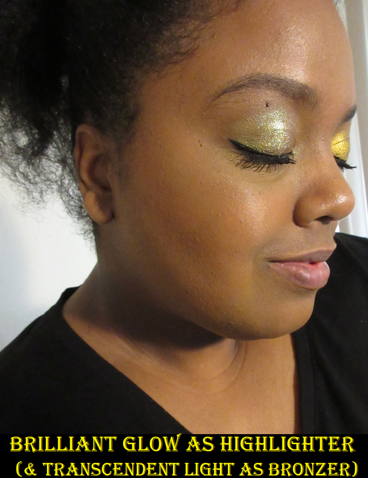
Transcendent Light is a warm dark brown finishing powder that leans a bit red-orange and that I use as a very subtle bronzer. It first debuted in the Ambient Lighting Volume III trio palette, but I could swear the one from the Tiger palette is a hint darker and a touch more neutral. However, I have mixed my other face powders (which are lighter and lean yellow or golden) with Transcendent Light, so perhaps my original one looks different on the surface level for that reason.

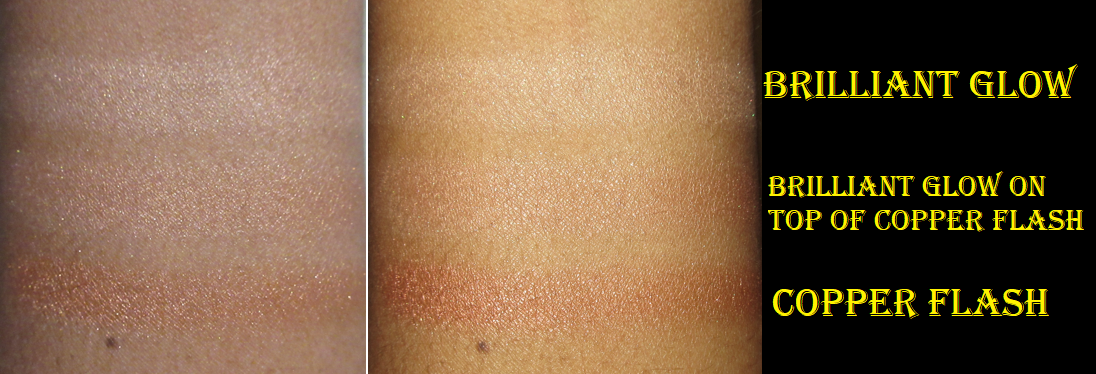
Brilliant Glow Strobe Light differs from the Ambient Lighting face powders in that there’s a shimmer quality to it. I find it interesting though that the intensity level of this shade is significantly more tame than the other two Strobe powders in this palette, in addition to the other “Strobe” formulas from Hourglass that I own. This product is more similar to the original Guerlain meteorites that can be used all over the face, though the particles are still visible, so I prefer to use meteorite-esque products as very subtle highlighters. Or, at least I would if this wasn’t borderline ashy on me despite the added peachy-brown swirl that gives more pigment to the shade. Because of the shimmer level, it keeps me from wanting to use it to brighten under my eyes. This is essentially a less refined version of Radiant Light. That aspect is disappointing as I wish the color stood out a little more within my Hourglass collection. It feels like getting more of the same again, with a different name. This isn’t to say this shade is pointless, as I’ve been successfully using it on top of the Copper Flash highlighter to lighten that color and make it more suitable for my skin tone.

Speaking of getting more of the same, Divine Strobe Light looks an awful lot like last year’s Solar Strobe Light from the Universe Unlocked palette. The main difference is that Divine Strobe Light is more of a traditional gold while the undertone of Solar Strobe leans toward a champagne gold. The differences are minor, but I do prefer Divine Strobe Light. It’s perfect for me! It would be great to have more of a shade variety among what I have, but since this slight tweak gives me an even more flattering highlighting option, I don’t mind. The formula for this one is more of what I expect from Hourglass Strobe powders with the metallic finish that can be built up for more intensity or present without being understated.

Unlocked Tiger on Top Compared to Universe Unlocked Below

Copper Flash Strobe Light is deep highlighter that’s a bit difficult for me to pull off if I’ve been too heavy-handed with it, but I can add Brilliant Glow on top to make it lighter. It also still works if I apply the barest layer on top of a pink or brown blush as a sort of blush topper, but not adding it too low on the face since this strobe formula isn’t the most texture-friendly depending on how much unevenness one has in the highlight and cheek zones. I don’t consider myself as having an issue with texture on the high points of my face, but I have some bumps and moles in my cheek area, so I personally just use Copper Flash as a highlighter and not a glowy blush. Even though I have to be creative with making this work for me, I appreciate that there’s such a rich option for those who are darker than me.

Burnished Glow is the blush I was the most excited for because Hourglass hasn’t done an orange blush in the past, let alone one that’s such a rich pumpkin color. In addition, my Oden’s Eye blush purchases this year made me forget how much of a struggle it used to be for me to find a shade of orange I liked. I usually love blushes with a sheen, but for some reason I really don’t like the intensity level of the sheen in this one. The shimmer is super finely milled, but the finish is a bit pearlescent, which is okay but not preferred. I think I would have enjoyed it more if it was matte. I also wish it was closer to a terracotta color to be better suited to my preference, but it’s objectively pretty, it shows up, and it’ll likely look great on others who are of a deeper brown skin tone than mine. I don’t think this tone of orange is bad on me, but it’s not going to be one I reach for by itself. Adding a bit of pink from another blush (like Iridescent Rose) creates a more pink-orange coral tone, and then I really enjoy that combination! Also, this blush is buildable. I can get it to look sheer easily, but it can be packed on for a more intense orange look.

Iridescent Rose isn’t new like I thought (it’s in the 2019 Ghost Palette). It looks quite ashy on me in swatches and barely shows up on my arm, but on my face with a dense brush I can build up the color easily enough and blending it in mixes the pink with the base color and takes that ashy powdery look away. I’m a bit at the mercy of the pink marbling because I need that deeper pink for it to show on my cheeks, but thankfully more of the pink is available deeper underneath and I can get to it when I swirl my brush around enough to shed more of the top layer. I was worrying about that with my At Night blush in using too much of the darker pigmented veins in the blush. At Night is still a better fit for me than Iridescent Rose, but since I mix Iridescent Rose with Burnished Glow (plus it pairs well with Copper Flash), it’s still useful for me within this palette. Ironically, I ended up mixing both of last year’s blushes together as well to create a shade that I liked more.

Tiger Palette Used on My Face

I can use every shade in this palette. The powders all show up on me. However, I have to admit that though I like this palette, I don’t love it. I’m very happy that Hourglass has given more options for everyone, but just as I said about last year’s palette, it still has to suit my taste in order to be worth buying and to be something I’ll continually want to select out of my vast makeup collection to use. I’m not confident that this will become a favorite face palette, though I do prefer Unlocked Tiger over Universe Unlocked. I think one day I’ll do a DIY project and depot the powders to form one ultimate palette of my favorites. However, for that, I would need Hourglass to finally make a mini of the At Night blush so it can fit in the 6 pan tins. If possible, I would put Transcendent Light, At Night, and Divine Strobe Light. I’m less certain about the other three spots.

*2025 UPDATE: I can’t believe it’s taken me three years to notice I kept going back and forth between calling the Iridescent Rose blush “Incandescent Rose.” Please excuse some of the mislabeled photo descriptions.

In the photos above I didn’t fully blend Copper Flash Strobe Light because the shimmery pink from Iridescent Rose blush blends in with the pink tones within that highlighter and on camera just looks like an extension of that shade. That’s why I prefer using those two together, but I had to keep it partly unblended so it would be easier to see in pictures. Also, when I wear a dewy foundation base, it’s harder to mix Brilliant Glow Strobe light with Copper Flash Strobe Light for the lightening effect. I also built up the Iridescent Rose shade of blush, but I did not build up Burnished Glow to full intensity and just showed it as lightly as I would likely use it.

I still don’t understand why the Butterfly palette with the palest face powders was the one with the deepest blushes of them all. I wish Hourglass could have committed to making deeper bronzers this year and had actually given the Tiger palette a true bronzer for deep skin tones rather than a face powder that is also deep enough to be used as a bronzer for those with skin tones in the dark tan and lighter range. However, the brand’s effort is admittedly better than last year and last year was already a small step in the right direction. So, I give Hourglass some Kudos. I also think it was brilliant to make the cases customizable because if the darkest palette didn’t have the Tiger print, I would have been sad to have missed out on it. I wish it was possible to make the actual powders inside customizable as well, but the price already went up this year by $5, so perhaps that kind of option would likely put us in the territory of being $100+ instead of $85. Also, how fun would it be if Hourglass used their “miscelare technique” to mix two medium or darker colorful shades in a series of blushes instead of pale beige bases with a single color? As it stands, I’m happy someone at Hourglass is doing more listening to their customers. I am still tentatively watching and waiting to see if the improvements towards inclusivity continues and if I can get to the point of feeling confident about the direction the brand is going. I truly hope they continue on this path.

Thank you for reading!

Also, thank you to those who have been understanding of my scheduling issues due to recovery, but also after being hit hard by Hurricane Ian. Being without electricity for nine days made it impossible to work on my blog during that time.

-Lili

Unearthly Cosmetics Lore Palette and Gigi Blush

Unearthly Cosmetics is the new rebranded name of Alien Cosmetics. I made my first purchase from the brand round July 2021, but soon after I heard there were reformulations, palettes getting new packaging, and other changes that made me decide to take a pause before talking about them here. I purchased the Gigi blush when I thought things were settled, but once again found out news that the brand was allegedly forced to change their name. So, I continued to hold off on talking about them until they had their new name secured and were officially finished selling products that still bore the Alien Cosmetics name.

Considering their track record of making changes to products seemingly out of nowhere, I have no clue if my products from 2021 are the same as what someone will get from Unearthly Cosmetics now. In case they are, I hope this review will still be valuable, but I needed to put out this disclaimer that it’s possible the quality is different.

Lore Palette

As I mentioned above, I intended to review this palette well over a year ago. I have additional eye looks and a video showing the color shifts of the multichromes in this Instagram post.
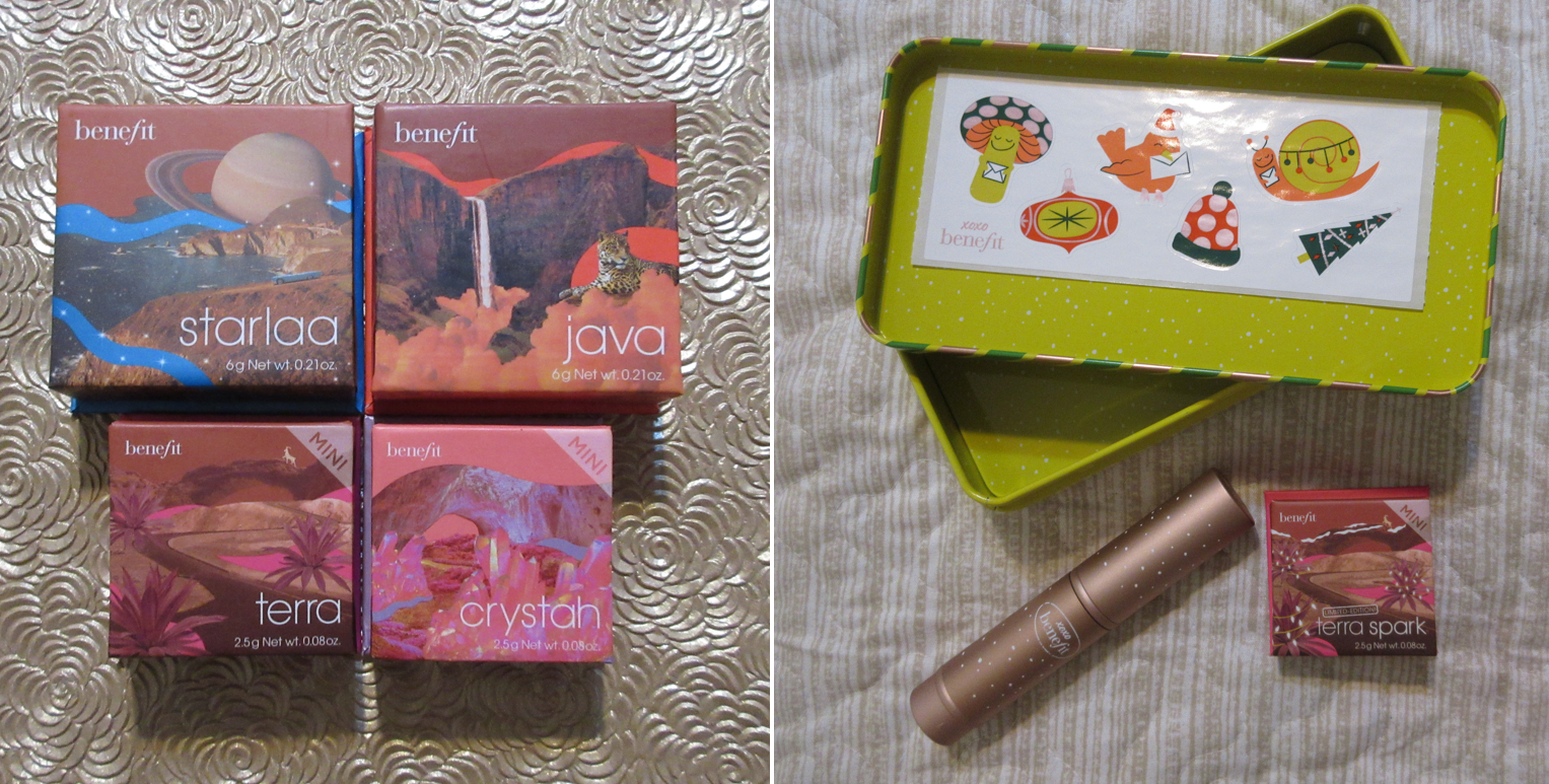
These mattes are very dry. I remember them being a bit like this when I first bought the palette, but I think over time, before even a year had passed, the mattes got drier. Minotaur is especially stiff and doesn’t want to move from where I place it, but Cerberus and Centaur blend decently. Cerberus just requires slow building since it can get intense fast depending on the brush used. Faun is one of those matte formulas with glitter specks in it where the glitter mostly dusts away when blended on the eyes. This shadow is quite thin, so to even get the base color to show takes a lot of building up on me. I wish Faun was either a bit more yellow or that Centaur was a deeper orange because the two shades look nearly identical when used together. Ironically, during the first launch, the brand sent out palettes with a brown shadow listed as Centaur and then mailed everyone who got the wrong shade the correct orange one. Perhaps I would have liked that accidental shadow better.

I was very excited to have duochrome and multichrome options in this palette, but I wasn’t expecting such near transparent bases to the point where three of the five shadows nearly function as toppers for me. Serpent‘s base is the faintest of all and looks like it’s just a sheerer version of the somewhat more visible hot pink base in Sphinx. I use Serpent when I want blue, green, and purple shifting sparkles with cool toned looks and Sphinx’s aqua, green, and gold sparkles look best with warm toned ones. Whenever I plan to use them in the palette, I have to swatch them first on my arm to remember which effects they give because I really didn’t like the times I’ve chosen the wrong combo. My favorite multichrome of the three is Medusa, which has a dark but still semi-transparent base. It pairs so well together with the deep blue-green shimmer shade called Basilisk. Medusa and Basilisk are my two favorite shadows in this palette. All the shimmers have a smooth texture except Griffin, which is a little chunkier, but has a very high-shine look to it. It’s like a less obvious color-shifting version of Centaurus from Devinah Cosmetics.

Showing the transparency of Medusa.

Regarding how they wear on my eyes, I didn’t have anymore creasing than usual. I didn’t have any extra fallout. The shimmers didn’t dull down as the day went on and they looked decent still by the end of the day. To anyone interested in this palette, I recommend it based on preferences. In general, with it not completely meeting what I want, $33 isn’t a bad price (it was $30 at the time I bought it with $5 shipping and no tax, but I used the influencer code ANGESCHKA), though it would be more like $38 now.

This palette would be a fantastic option for someone who likes grungy colors, high shine duochrome/multichromes with no dark bases, and is mostly in it for the shimmers so they don’t mind reaching for other palettes for better mattes.

Gigi Blush

I’m not sure why “blush palette” is written on the packaging when it’s just a single blush, but in any case, I saw this shade and that Scorpion on the inside and I had to buy it! It’s aptly described on the website as a, “satin finish rosy terracotta,” blush. If I remember correctly, the brand is run by two sisters and this blush is named after Gigi and the highlighter that was released at the same time is named after Dani. I didn’t purchase the highlighter because I thought it would be too light for me, but it has a silver to gold shift. So, the gold would probably have looked nice, though I don’t know if the silver still would have been too much.
While there is visible dark pink shimmer in the blush, after all the blending that is required, I don’t see the shimmer on my cheeks.

Light-Medium application of Gigi blush to the cheeks.

I’ve tried to love this blush because it’s such a pretty color, but it’s super pigmented and not very blendable, regardless of the brush I use with it. I’ve tried my synthetic brushes like the Smashbox Sheer Buildable Cheek Brush, my MUFE Highlighting brush (basically blush size). I’ve tried my very expensive brushes with different types of natural hair suited for pigmented products, but the issue is that it sticks where it’s blended, but is also a thin powder so it’s also sheer in some places at the same time. It needs to be buffed properly to smooth it out. It’s not a terrible blush, as I have the tools to lightly apply it and switch to another brush to blend it out and make it look nice. However, with my huge blush collection, I don’t feel that it’s worth the effort for me, when I can get a smooth flush in a snap with other blushes out there.
I have tried powdering my cheeks first before applying the blush and that just prevents it from wanting to blend properly into my skin. Applying it to my cheek and then buffing with a finishing powder after also works, but again, it’s extra work.

One thing that this blush definitely has going for it though is the longevity. Using my normal application methods, this will last on my face all day without fading.

Unearthly Cosmetics released additional single blushes and highlighters in April of this year, so perhaps the formula is better than before. You really never know with their brand!

That’s all for today! Thank you for reading.

Note: This is my last completed pre-scheduled post. I had surgery September 15th and due to the long recovery period for this surgery, regular Monday postings will be interrupted/inconsistent for the rest of this year. I still have about 20 partial posts that were started prior to surgery, and therefore I will still have content coming to this blog, just not at a stable predictable rate. There may be a few weeks or a month gap without posts, but if you’re following via email, you will be notified of every post. Thank you for understanding.
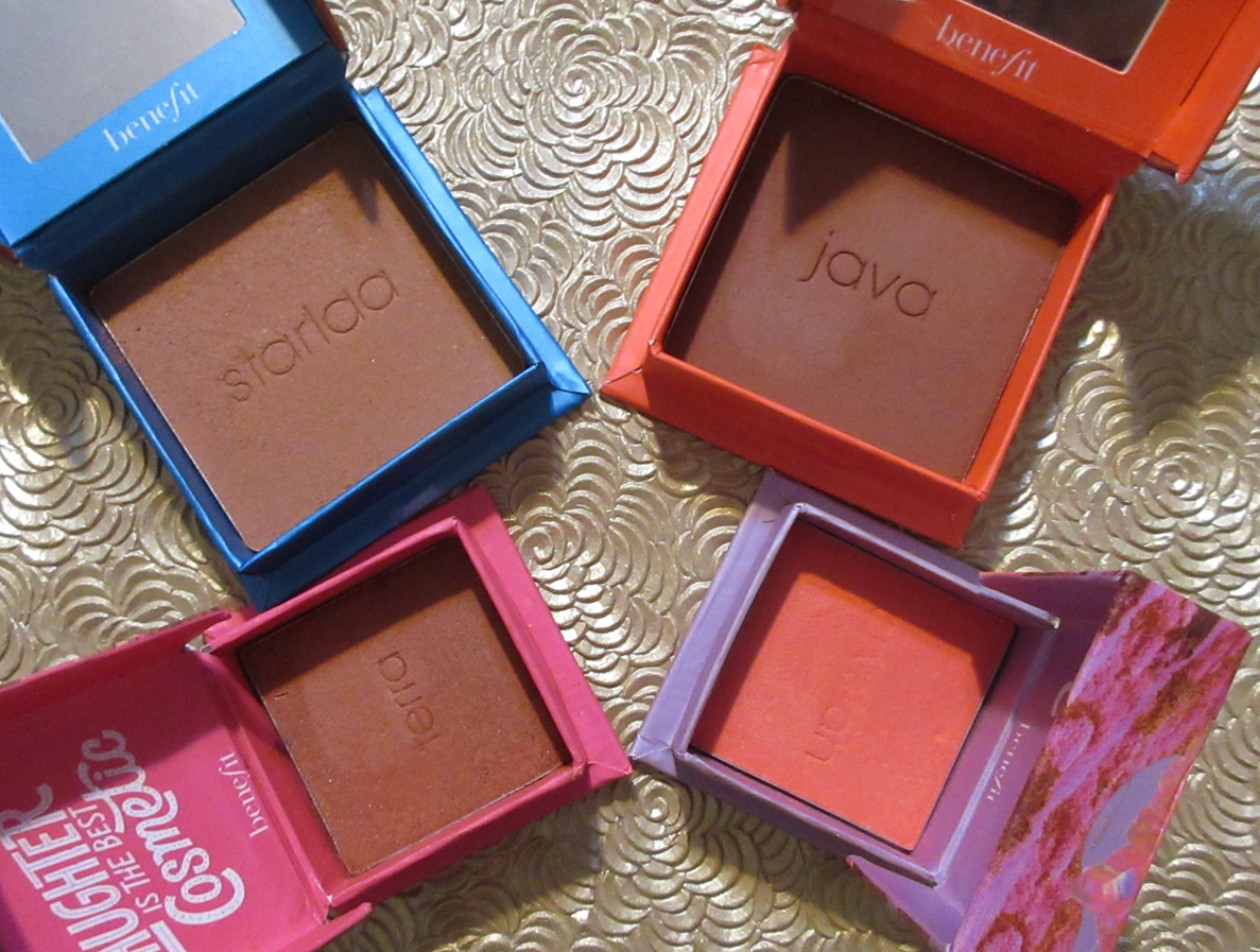
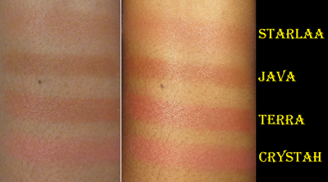
-Lili

MOB Beauty Custom Face Palette Review

I first heard about the brand when it arrived at Beautylish as a pop-up with two pre-made sets. Neither one had enough colors I wanted in them to be worth purchasing, which is a shame because those bundles are a significantly better value. For $75, a customer can get a mascara, lipstick, and either the “Soft” or “Rich” 4+ pan palette. The best deal I saw from MOB Beauty’s own website costs $85 after using a promo code and involves creating your own custom 4+ pan palette that does not include a mascara and lipstick, just two free samples. I was especially tempted to get a pre-made set anyway, considering Beautylish was advertising back in March that once these restocked sets were gone, they’d be gone for good this time. Yet, here we are in September and there’s a “returning soon” notice for one of the sold out sets. I like Beautylish, but it appears that they pulled a ‘limited edition’ marketing stunt again.

Eventually, when the items became available individually at various places, I made separate orders to HSN, Beautylish, and the official MOB Beauty website to make these purchases as affordable as possible for a custom palette. If I had just stuck with my original 4+, it would have been fine, but I ended up spending extra by changing my mind afterwards because I wanted to try the cream formulas too, and the refills would be exposed to the air if I didn’t get additional packaging to store them. MOB Beauty is a “Clean” brand, but the part that really interested me about them is that they are big proponents of recycling and sustainability. In the next section, I will show the cardboard packaging that each product arrives in, which is great for that recycling factor, but because the refills are surrounded in post-consumer recycled plastic (50-100% PCR, PET or PP Resin with the percentage of PCR getting lower the larger the palette is), it’s not possible to store the pans in something like an empty magnetic palette, which is a system that the majority of people who want to make custom palettes use to do it. And once the refill outer packaging (40% FSC bamboo and 60% recycled paper) is opened, there’s no way to keep it properly sealed after because the sticker layer is what keeps it together. So, one ends up having to purchase either single compacts that will take up space or pay for the larger custom palette and have the smaller one sitting around in case someone wants to take a smaller set traveling and just being generally unused. The need to buy more empty palettes is the downside of the attempt to be sustainable. I appreciate the effort, but it’s far from a perfect system and it’s the customer that has to take on that additional cost because of the brand’s decision to make unique packaging that can only be used with their own products exclusively, similar to what Hourglass did with their “Curator” system. In addition, the outer packaging is easy to recycle, but there are additional steps for those wanting to recycle the makeup pans afterwards, as noted on the MOB Beauty website:

They can also be turned into a Pact recycling bin inside any Credo store in the US, provided you live near one of their ten locations within the country, or Hudson’s Bay store in Canada.

The refills have holes in the back, so one could potentially push the metal out of the plastic and commit to using the products exclusively in a Z-palette and avoid needing to buy MOB’s custom palettes, but they’re glued down. Also, since they are made of aluminum, they aren’t magnetic and would need a metal magnetic sticker to be attached to the bottoms of them in order to not slide around in a magnetic palette. The mini samples of mine were glued to the cardboard since they don’t come with the plastic bottom like the others. So, I peeled off the label stickers with the shade names and cut them into small squares before I unstuck the pans and attached those stickers onto the backs of them to at least keep the glue from sticking to things before plopping them into a Z-palette, even though they’re free floating in there. I just needed to keep them somewhere they wouldn’t get lost while I was testing out the products, and I could continue to test for an extended period instead of just once. Again, I’m not sure what a better alternative would be. I give the brand kudos for being perfectly upfront about everything though and that they have clear instructions on how to recycle these properly.

Custom Palette Packaging and Components

The photo above shows how the items for my custom 4+ palette arrived, including the two samples and two slips of paper with the ingredients listed on them. The box on the left is what they were all shipped in, so there was no wasted space, which is something I really like to see in shipping materials (provided the items are still properly protected to prevent being damaged). The brown paper below all the items was the folded up paper layer in the box. This packaging was delivered by MOB Beauty, but if you order from HSN and Beautylish, the items will come in those retailers’ typical packaging.

This is what the 6+ pan and 4+ pans look like in the back when filled vs empty. The hole used to pop open the grate to place the pans inside are visible from the back.

I used one of my clay shaping tools to do the job of opening what I call the sealing/securing lid.

Once the plastic clear lid has been lifted and the hole in the back of the palette has been poked through in order to lift the second lid, the pans can be loaded in by aligning the two protruding rectangles with those empty spaces. They do not snap into place. They have to just be gently laid on top enough to stay put until every pan is on it and that second lid can be placed back on top to secure all the sides. This is the point where at least one snap should occur, so every edge plus the center should be touched and pressed to ensure that everything was locked into place and can only be opened again via the hole in the underside of the palette.

Additional photo of an empty versus filled palette.

Despite the 6+ pan being longer, I still consider it to be a travel-friendly size from the way it fits in my hand.

Important Tip About Choosing A Shade

Since the idea is to not be wasteful, choosing the best suiting product based on the brand’s photos is crucial. There is quite the difference in depth between how the color appears in their pans versus those arm swatches, and especially depending on the model bearing the swatches as well. The way these shades ended up looking on my skin was represented the most accurately on the tan (dark-tan) model across all formulas. I wanted to mention this for those who are around my skin tone and may have been wondering whether the model closest to our skin tone does the best job indicating how it will look on us or whether the swatches have been manipulated to look more saturated than they actually are and therefore we should make purchasing decisions based on the first model pictured below. I’m happy to report that MOB Beauty did a great job accurately reflecting the swatches, unlike many other brands that want to pretend their shades look the same even on deep skin and digitally manipulate the photos to prevent showing how ashy they’d be. So, I recommend feeling free to base purchasing decisions based on the swatches of the models closest to your skin tone.

I still found it useful to compare how the swatches looked on the other models in order to figure out what the starting undertones and depths were, and see at which point the shades start to look distinctly different from each other. For example, as seen on the third model, the M49 and M50 highlighters are the same depth and only differentiated by M49 being a pale pink and M50 being a pale gold. So, on tan skin and darker, the different undertones make no difference and those two highlighters will essentially look the same on the face. On the first model, the rose-gold M51 being a couple of shades darker than M49 still looks essentially like the other two highlighters, but on me, if I wanted all different looking highlighters, I would need to choose between M49 and M50 for the first option, then M51, then M52. If I removed the choices that look different in tone, but would look too stark on me, M51 and M52 are realistically my only highlighter options.

I continued this practice for each product. I looked at how they are supposed to look on the third model, where they start to look ashy or at least too similar to each other on the first model, and then narrowed down which of those remaining options looked prettiest on the second model.

Cream Clay Formula

As seen in the photo of the Cream Clay Bronzer in M78 on the left, the creams look as if there are bubbles under the surface, but that top layer is completely smooth. Since this looks like it was poured in while hot and then set, it’s possible those are air bubbles and not an indication of anything weird happening while in transit. Or perhaps they’re just condensation marks from it starting to sweat and melt in those hot delivery trucks, but then it cooled and imprints of the droplets were left on the surface. An example of the sweating is in the mini samples section.

When it came to selecting a bronzer, there were a completely different set of models, none of which were anywhere near as dark as me. However, based on the arm swatch photo, M78 and M79 looked like they would work for me. They are the same depth, so it was just a matter of an undertone difference. M78 was described as a “rose chocolate brown” and looked warm, but leaned closer to neutral than the “espresso brown” shade M79, which looked redder. M78 was certainly the better option because I would not have wanted it any warmer.
It shows up easily when I apply it to my skin, but it sheers out a fair amount as I blend, so I have to really load on the product to get the impact level that I like. In addition, my dry skin soaks up these cream products. If I try to keep the bronzer looking subtle, it’ll be significantly faded within the hour. So, I have to actually over-apply in order to get it to last on my face. The nice thing is that if I can accept it looking heavy in that first hour, I know it’ll at least look normal the rest of the time after that. It will still fade as the day goes on, but at least the fading is at a slower pace and will still be there at least 8 hours. I have tried so many times to wear this over a very moisturized face and different primers, but it still does this. For that reason, I use this product the most with my Patrick Ta Contour Brush because I can load it on and blend it out quickly. It essentially allows me to use this cream bronzer the way it was intended. My usual Sonia G Mini Base is actually too good with the blending. In the amount of time it takes for me to keep building up layers with that brush, it’s trying to set and then I can run into the issue of it starting to look a little patchy. And when I say “set” I just mean setting into place, as it doesn’t fully dry, but it’s at least not sticky. It just gets a little less easy to budge, but will still have some transfer. Applying powders on top hasn’t been successful in setting my face either, and my powders also make the bronzer and blush more subtle in the process. Sometimes I use the cream and powder bronzers together, but then I feel like that’s adding an extra step I wouldn’t have to do with the other products in my collection.

I like the tone of the cream bronzer and the ease of use with the right brush, but if I put the complication with my skin type aside, one of the things I find lacking is that the cream bronzer ends up looking matte even without being set with anything. I personally would prefer that if I’m bothering to use a cream product, I want it to look a little dewy or have a sheen. The glow of the product in the photo is literally a combination of my sweat and my semi-dewy foundation. For these reasons, my feeling about this product is that it’s just okay. The positives and negatives cancel each other out. I don’t feel any excitement when I use this, like I do with plenty of other cream bronzers I own. Also, this formula is the type that forms a little bit of a stiff layer on top between uses, which is why I mentioned it’s imperative to keep it away from air exposure as much as possible. It doesn’t cause me any problems using the product, but it makes the experience using it slightly less enjoyable. That top layer issue at least isn’t as thick as the Danessa Myricks Power Bronzer that I love can get though, so I give the formula some credit for that. Overall, this tends to happen with vegan formulas where the ingredients are what the company says are better, but something gets sacrificed, and for me it’s the experience when using it. It doesn’t have any wow factor for being extra creamy, leaving a beautiful finish on the skin, etc. I’m at least glad that the performance is solid. I think that’s what MOB Beauty was hoping to achieve the most, but there aren’t bells and whistles to go with that in my opinion.

The Cream Clay Blush in M74 looks, feels, and performs the same as the bronzer. They both have a decent amount of pigment and blend easily, but I also need to over-apply this product to keep it lasting on my face at least 8 hours. I also find myself having to touch up the bronzer again after I apply the blush on top. I like that it blends in so seamlessly with the bronzer, but it’s almost too much. Perhaps if I picked a more vibrant and less natural-looking shade, the blush wouldn’t look like an extension of the bronzer. I still think it’s pretty, but I do enjoy pairing it with other blushes right on the apples of my cheeks to add a lighter and brighter pop. This means that my favorite way to use it involves me adding another step. It’s nice to know that it plays well with the cream and liquid formulas from other brands though.

Just like with the cream bronzer, I could apply MOB’s powder equivalents on top so that it helps with the longevity issue. However, that would also be adding an extra step and since doing that takes away the tiny bit of dewiness the cream blushes have over the cream bronzer, it would make the point of wearing the cream at all pretty pointless. I may as well just stick to using the powders, right?

Powder Formula

Just like the cream bronzer M78, this powder version in shade M42 is described as a rose brown. However, M42 is the only one that I can actually tell has a rosy undertone on the skin.
The powder feels somewhat soft to the touch, but it’s not as smooth or silky feeling as say the Charlotte Tilbury Airbrush Matte Bronzer, Mented Cosmetics Bronzer, or even the newest one from Jaclyn Cosmetics. Again, I’m guessing it’s because of the consequence of not being able to use certain ingredients for clean, vegan, and sustainability reasons. The “Show Full List” option on their website’s list of exclusions reveals how extensive it gets. It still performs well enough. It’s a buildable formula but it only takes a small amount to finish my face the way I like. M42 is lighter than the cream bronzer (both are the third to last shade in their respective formulas), yet it looks even darker than M78 when built up.

When it comes to blending, I don’t have any issues unless my skin is dewy from wearing some of my favorite foundations, sweating, etc. In that situation, where I would normally apply and blend via using long sweeping motions back and forth, instead it sticks where I put it and ends up with tiny patches that are lighter than the rest because more of the powder stuck to other spots. I’ve had products with the sticking issue before, and this one isn’t as bad with it as others. Trying to blend it out fixes it enough to be passable, but not looking airbrushed and not good enough for me to feel comfortable leaving it as is. One remedy is to use a brush that deposits an even amount to the area at the same time, like the Patrick Ta Contour Brush, before blending it out. The other is to switch up my technique and apply in a circular buffing style while moving across the area I want to bronze. This one tends to be less precise, but the blush will cover it anyway. The third trick I can use is to do a second light layer of bronzer to cover the patches and then use a finishing powder to soften up the look.
This last one is my preferred method because my finishing powders with a blurring effect really elevate the look overall and add that sheen I prefer anyway. Considering how often I wear my dewy foundations, I end up needing to use at least one of these ways the majority of the time. Because that adds to the extra time I need to spend on it, I like using the powder even less than the cream despite knowing how to get it to look pretty every time. I admit that it’s a minor inconvenience, but with the amount of makeup I own, minor inconveniences are enough to get me to not use some products, and then it ends up being a wasted purchase in more ways than one.

I get a nice amount of pigment from this M20 blush, but it’s a thin formula and prone to a patchy look on dewy skin just like the bronzer. This is especially noticeable if I’m wearing a low coverage foundation where my skin peeks through the blush and it looks a bit odd seeing such a strong color, yet is see-through like a blush tint. So, I end up using the same techniques to combat it, just like the bronzer. However, because part of the bronzer gets into the blush zone, I feel that I have a quicker time making the blush look blended again, which makes it less inconvenient and therefore I’m still likely to reach for the powder blush if the palette is already out and open.

Also, no matter what the situation, I have no longevity issues with the powder bronzer and blush. They stay put all day. The powder blush does fade a little over time, but not enough to be considered abnormal.

Highlighter

I purchased the powder Highlighter in M52 because the third darkest option has a pink undertone, which I don’t usually like on myself, and everything else would look ashy on me. If I use a light hand, this one matches well enough, but if I’m too heavy handed, it’s obvious that it’s a little dark for me. The shimmer flecks are not, but the overall base color is a little deep on me for a product that is intended to highlight the face.

As has been the case with the powder blush and bronzer, this product sticks, but even more intensely on my face if I wear dewy products in the areas that I highlight. That’s handy for helping it look like it’s one with my skin, but then it’s hard to blend, even with my best brushes. The upside to it sticking is that it lasts on my face all day.
Of all the powder products from MOB I’ve tried, the highlighter is the messiest with the most kickup. The times when my face is actually dry, and therefore the highlighter remains dry, is when I have longevity issues where parts are suddenly missing as the day goes on.

I think I would have liked this highlighter more if I had one that was the same color as M52, but slightly lighter. As it stands, it’s okay. Because I only have two eyeshadows, I sometimes use the powder bronzer as an additional brown shade and this highlighter as an additional shimmer.

Eyeshadows

These are the two I chose. M48 is a shimmery olive. I like the color, but the shimmer particles are very low shine and not nearly reflective enough for my taste. Even when I apply the shadow damp, apply with my finger, or over the Nyx Glitter primer to crank up the intensity and pack on the shadow, it looks nearly unchanged afterwards. This is one of the rare times that my usual tricks fail to improve the eyeshadow look at all.

The M64 matte burgundy shadow is a bit stiff. Blending it in the crease takes some time and looks very drying on my eyes.

The shadows are my absolute least liked thing I bought from the brand. They’re way too lackluster for me. Anyone can make them work, so they aren’t completely terrible and it’s not like they don’t have pigment, but they are not enjoyable to use. There’s no creaminess to them, no smoothness or aid in the ability to be spread across the eyes. They’re able to be blended, but not as easily as I prefer. Preferences aside, I still don’t believe these are worth $12 each. I do not recommend purchasing the MOB Beauty eyeshadows.

Main Product Swatches

Free Mini Samples

The mini sample of The Cream Lipstick in M58 had a pretty sheen on the lips but felt surprisingly dry, like it was drying out my lips from the inside. Also, this isn’t the kind of formula that that you can put over chapped lips and have it smooth things over. It sinks into every spot where the skin starts to pull up and just makes lips in poor condition look worse. The photo example is after I exfoliated my lips, so I could showcase the product in the best light. It was from my second batch of pictures because my original photos of M58 looked horrific and just too bad to show, especially with my lip split on one spot. If you don’t have issues with lips being dried out frequently and you can keep them conditioned regularly, you might like the formula. Because it made mine drier, I don’t recommend it.

By the time I got around to trying the mini of The Cream Clay Blush in M71, I forgot it was a blush and not a matte lipstick. So, I have a demonstration of what it looks like on my lips, but not my cheeks. I apologize for that. Shockingly, despite how drying it looks on my lips, it actually feels less drying than the cream lipstick! I actually like this color on the lips, but it’s not my usual type of blush color to wear. Also, by the time I remembered it was a blush, my sample was especially dried out, so I didn’t bother trying to wear it on my face or take photos. It already had cracks in it the day I got it, so one can imagine how dry it was weeks later.

Final Thoughts

One would have to know ahead of time exactly how many products they want currently and in the future in order to not have extra MOB Beauty palettes sitting around. This isn’t easy considering it’s still a fairly new brand, so their options are still a bit limited. How can one make space for a potential setting powder or cream foundation in a pan, like the Patrick Ta Creme Foundation and Finishing Powder Duos? What about powder foundation? What if you think you just want a bronzer, highlighter, and two blushes, but then they release a new product that you want and now would have to upgrade to a 6+ palette or hold onto a separate single? Perhaps this is just a me problem, but when I decided I wanted those 5 face powders, I instantly had to get the eyeshadows too in order to fill the palette. Holding onto a 6+ with only 5 of them filled for who knows how long was just not an option for me. It drives me nuts to have designated spaces for a product but to keep one or more slots empty. I need to have them all filled up. So, essentially, I purchase more things that I don’t need and spent more money because of the type of organization system they’ve got going on.
Creating a new brand and a new line of products is still adding to the world’s over-consumption problem. And the truth of the matter is that I’m never going to use up these products enough to need to replace them. I love what the brand is trying to do, but unless I make MOB’s products and system the only makeup I will ever buy again, I’m not making use of their refill aspect. If MOB does expand the range and make my perfect highlighter shade in the future, wouldn’t it be wasteful to try and get that one while I still have the old one? Would I just toss out the product and recycle the rest? I can’t actually send it in to recycle without there being 5-10 empty products, so I just hold it all indefinitely? Wait for everything to expire before trying to recycle things?

As someone who doesn’t use exclusively vegan products, clean products, and doesn’t have a firm stance on buying from companies that are not considered “cruelty free” because of the selling products in China regulation debate, I find myself feeling like I haven’t gained much by having these makeup items in my collection. I feel good about supporting a brand that cares so much about the environment, but without planning to make serious permanent changes, it’s just adding yet another thing to my collection and their best performers don’t top any of my favorites by a long shot. So, rather than continue pursuing my perfect palette I spent so much money trying to create, it’s best if I leave things where they are.

For those who are very strongly about minimizing their makeup collections and only using vegan, “clean,” and less waste products, this brand could be the miracle you’ve been looking for. They could be offering something that makes you want to give up buying from anyone else. So, for those people, I’d recommend this brand and their products. But for anyone else just curious to have great makeup and create their own custom face and eye palettes with the thought of continuing to buy from all other brands and their new releases (like me), I’d say perhaps the best thing to do for the environment is to actually just skip this one.

I hope I’ve conveyed my thoughts on this tactfully and clearly. I really do wish current brands were so dedicated in helping out the environment and I wish this could be the end all be all for me when it comes to makeup, but it’s not for me. I hope I will continue to get some use out of these products, but chances are high that I’ll keep using my favorites. However, as my ongoing attempts at a low-buy suggests, I am trying harder to make fewer makeup purchases. And in a way, that’s me attempting to do my part the best way that I can.

Thank you for reading.

-Lili

One Size, Terra Moons, and Other April Purchases Reviewed

Welcome to my fourth low-buy check-in! This month’s three biggest hauls were due to Sephora’s Spring Savings Sale, me redeeming my points at Ulta for $125 worth of products, and the weakening of the YEN compared to USD enticing me to make several purchases from CDJapan and and Fude Japan. Most of these products were reviewed in posts prior to this one, and will be linked to open in a new browser tab, but there are still plenty to review for the first time here today.

SEPHORA COLLECTION Microsmooth Multi-Tasking Baked Face Palette in Captivate

This is allowed in the Low-Buy under the face product category. I am so glad I finally bought this because it makes for a fantastic travel palette! There are two versions available from Sephora and I heard wonderful things about the deeper palette called Captivate, but baked products can sometimes look lighter than they would appear on the skin, so I wasn’t certain this would work for me until I had help on this topic from Beauty Blogger, Nikki.

The bronzer is a fantastic shade for me in terms of both depth and undertone! Despite being a matte product, it leaves a beautiful natural finish and is very quick and easy to blend. I’m really impressed with it! The matte blush is one of my favorite type of red tones that reminds me of MAC’s Mineralize Blush in the shade Flirting With Danger. It can be built up to look intense, but I prefer to wear a very light application of it on my cheeks.

The shimmer blush is on the subtle side, but I still get a noticeable flush of color. It’s like a slightly lighter shimmer version of the matte shade in the palette. If I had to choose my favorite, it would be the matte one, but I still wear both. As for the highlighter, it’s not the most finely milled, but it’s still very pretty and if I chose to use this palette for the blushes or bronzers, I wouldn’t feel the need to reach for a separate single highlighter. I would just use the one in here.

The longest wear test I’ve had with this face palette is ten or eleven hours and only the shimmer shade started to fade at the end of the day, but I consider that to be a good result. The others remain looking nice until I’m ready to remove them.

While I was on a trip in April, I actually forgot to bring an eyeshadow palette, so I relied on Shade 3 for depth in the crease and Shade 1 was my lid shade. Considering I got this already relatively affordable palette for 30% off, I am very impressed and happy with the quality and have no issues recommending this palette.

SEPHORA COLLECTION 2-in-1 Brush-on Lash Adhesive – This was definitely supposed to be a No-Buy, but it had been on my list for a long time and when all Sephora Collection products were 30% off during the Sephora Spring Sale, I chose to buy it anyway.

I’m sorry that I don’t have an actual review for this item. For all these months, I have tried to get myself to test this out, but I just don’t want to. I haven’t been feeling like wearing false lashes in a long time and I really don’t want to open this product and start that timer ticking on how long it will last unless I’m ready to start wearing false lashes regularly again, or else this truly will be a wasted purchase. This was holding up my ability to get this post out, so I decided to just explain why there’s no review for this one and to publish it. When I eventually do, I will edit this post.
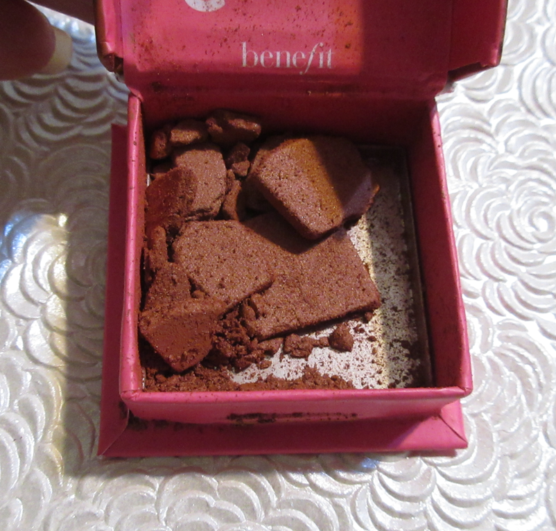
Patrick Ta Major Sculpt Contour Brush

It’s a bit ironic that in my post about “Synthetic Brushes I Bought in 2021,” I mentioned that despite liking some of the ones I bought, I didn’t plan on getting any additional ones, yet for the Sephora Spring Sale, I couldn’t help myself and got it after enjoying the Patrick Ta Blush Brush so much. This one is the perfect softness, head shape, and the bristles are packed at the right density to accomplish a fantastic sculpt that isn’t too sheer or too sharp. It’s the right balance of showing the product while also being nicely blended.

I love this brush so much for use with both my powder and cream bronzers and contours, that I was able to skip getting the Sonia G Lotus Base brush when that one was no longer tied to the full set. Being satisfied with a brush so much that I feel I can skip getting a similar Japanese version is a huge deal and shows just how highly I value this one from Patrick Ta.

Even though the Sonia G Mini Base is still my preference for cream bronzing and contouring, if the cream product is too sheer or too close to my skin tone and needs to be applied at maximum pigmentation, the Patrick Ta brush is my top choice. It’s also my favorite for powder formulas that need building up.

One/Size Cheek Clapper 3D Blush Trio Palette in Freaky Peach

I love this product so much! This is an all blush trio palette in three different finishes, but even though I can only use the shimmer one as a highlighter, I’m not counting it as a face palette. As a blush product, I was supposed to be limited on how many I buy this year, and I was also not supposed to purchase anything from new brands. This is my first ever One/Size purchase and it’s so great that I can’t regret it.

The peachy-coral cream blush, Rump Shake, is a very interesting texture. The closest I can compare it to in terms of formula is the LYS cream blushes. This reminds me more of a silicone balm than a traditional creamy emollient formula. It’s is very pigmented, blends easily on the cheeks no matter what type of tool I used to apply it with, it leaves a healthy sheen but it’s not dewy or sticky on the skin. Freaky is the name of the matte blush and it looks far too light for me in the pan, but One/Size face color powders deepen on the skin. So, it’s actually a medium toned shade of peach that is pigmented, yet buildable. I only need one dip in the pan though if I want to layer it on top of Rump Shake. I should also mention that tougher bristles can lead to a lot of kickup in the pan, so I use my softer natural hair brushes with the powder blush, and that also helps me to not overapply. I can’t emphasize enough that the cream and powder are quite pigmented, and me being able to use them both individually despite there being just one trio lighter than this one is proof of that. Whiplash is the shimmery golden peach blush topper/highlighter in this trio. It’s too shimmery for my taste as a blush topper, so I use it exclusively on top of my cheekbones. It’s a beautiful color, but unlike the other two products which give me zero issues with longevity, this one doesn’t want to stick to my skin for more than four hours. It lasts a few hours longer if I use it with a dewier foundation or wetter type of cream product, but six hours is around the time that the shine of the shimmer particles dulls down. So, for days I need my highlighter to last, I reach for something else. Considering I still have two other faultless products in this trio and the third is still usable, I’m very happy with this purchase and I do recommend giving this a try. For a long time, I was really tempted to buy additional shades, but I like the fact that each of these colors are distinctly different. Most of the other Cheek Clapper options are intended for monochromatic looks, and while I can still see the value in that, I feel like I’m getting more bang for my buck if I have different colors over different formulas. The cream blush isn’t the type I’d be afraid to wear in summer because it’s a little stiffer (as opposed to being super emollient) and the effect on my cheek isn’t that far from a matte look, which makes it not that much different of an effect as the powder blush. So, if I had the Rich Betch trio where the cream and powder look nearly identical, I would feel like I got a duplicate product. This is the only reason, other than my low-buy, that I haven’t purchased the two other Cheek Clappers that held my interest.

Tarte Sea Power Flex Concealer (Mini) in 53S Deep Sand

I bought this when Tina (The Fancy Face) raved about it in several of her YouTube videos. Even though concealers are allowed to be purchased in my low-buy, I didn’t want to take the chance of wasting a product if I didn’t like it, so I just bought the mini. That turned out to be a good decision because I hate this product. The shape of my tear troughs is such that products that are too creamy don’t stay put in the lines of my under eyes, so the concealer moves, creases, or does both even when set into place with powder. Because I have almost the opposite issue with Tarte’s Shape Tape, I didn’t expect their Power Flex to be a creamy intensely creasing product on me. The finish of it at least looks pretty and hydrated, but the negatives outweigh the positives.

The biggest issue I have with this product is that it offers medium buildable coverage, but I cannot get the maximum full opacity I need. The shade match is perfect, but my dark circles are still visible underneath even when I use 3 times the amount of my normal concealers. The Power Sea Flex is marketed as being full coverage, but the fact that it isn’t is reason enough to be unwearable for me. Unfortunately, I can’t even use it in other areas of my face because it doesn’t do a good enough job concealing my hyperpigmentation and scars.

This situation is very specific to me because many people don’t have the intensity of skin discoloration as I do, nor the amount of lines. So, those who have youthful and moderately blemished skin could find themselves loving this product.

Ellis Brooklyn Scent Diary Fragrance Discovery Set – It has been ages since I purchased anything perfume related! I’m unofficially on a no-buy with fragrances, but I can’t regret getting this since I rarely buy full-sizes anymore. I also hadn’t done a perfume post since 2015, so I decided to make one dedicated to this and other perfume samples that can be found HERE.

Sol de Janeiro Beija Flor Elasti-Cream with Collagen and Squalane (Travel Size)

After experiencing the terribly smelling Bom Dia Bright cream that the brand previously released (mine smelled like potent olives instead of plums), I was too skeptical to purchase a full size of the Beija Flor even though the product claims sounded fantastic. The smell of this is at least pleasant, but a bit strong. It’s not surprising that parfum is listed as the third ingredient. I don’t know how to describe the scent, but it has been hyped up a lot by people on social media saying it smells like Baccarat Rouge 540. I’ve never smelled that fragrance myself, so I cannot confirm or deny if this is true.

The texture of this is very thick, yet it doesn’t feel as moisturizing as my other skincare products. It’s at least occlusive, so I like that it prevents my skin from drying out further. I haven’t noticed any other benefits when used on my body, like the advertised skin firming and cell turnover, but I still intend to use this up. I prefer the moisturization level of the brand’s Coco Cabana Cream, so perhaps I can apply that first and this new one after to seal it in. I believe I left my Coco Cabana in Germany, so unfortunately I cannot test out that combination anytime soon.

Farmacy 10% Waterless Vitamin C Serum

I was pretty shocked when I found this serum for such a low price on Mercari literally days after it launched at Sephora. Then again, this is one of those products that were sent to quite a lot of people in exchange for a review, so someone was bound to not want theirs.
I’m on a skincare low-buy, but I’ve been on the hunt for a good Vitamin C serum with a stable formula that will last longer than six months after opening. I believe that this has an airless pump mechanism and there are two holes under the bottle that support my theory. If it is indeed an airless pump, combined with the waterless formula, I anticipated that this could limit the issue I have of Vitamin C serums oxidizing and losing their efficacy before I can finish them.

The consistency of this is very runny and feels greasy initially, but this is also an oil-free formula. The brand says that propanediol ingredient is the reason it feels this way, but it does dry down on the skin after a few minutes and is no longer greasy, but I am left with a tiny bit of residue on the face. If my skin is especially dry, I don’t feel anything at all. Ultimately, this doesn’t matter since I put a moisturizer and other products on top afterwards anyway.

When I apply it to my skin, it instantly has a warming sensation. The first time I used it, my face was approaching almost burning level, but that only lasted a few minutes. It has never been hot like that again, and just continues to have a mild to moderate amount of warmth in the first minute that I apply it.
General skincare advice for Vitamin C usage and other acids is to start small, like around 5% depending on what the active ingredient is, and gradually increasing it over time as needed. I hadn’t used a potent version of Vitamin C in a while, but it was still in my routine enough that I didn’t expect to get a burning sensation from just 10% of L-ascorbic acid. So, just as a reminder, this could potentially be too strong for someone new to using Vitamin C or with sensitive skin, and consider how often you may be using other acids in your routine as well.

This serum with its additional ingredients are intended to brighten and even the skin, combat dark spots and hyperpigmentation, and keep it hydrated. I use this in cycles, so it’s hard to tell how much this serum alone is contributing. The two other products I rotate through have been giving me slight gradual improvements over time and adding this one to that cycle has not given a noticeable boost above the norm. So, there are three possibilities I can think of:

  • The serum is as effective as my current products, not better or worse.
  • The serum isn’t contributing at all and the benefits to my skin are from the other products I’m using.
  • The serum could be more effective, but I don’t use it consistently enough.

I’m going to play the long game on this one and just continue to use it the way I have been and if I run out of the product and I notice its absence, I will consider repurchasing it at that time. However, based on past experience, I just don’t think Vitamin C is that effective for me. I get better results from AHA’s like the Farmacy Honeymoon Glow AHA Resurfacing Night Serum. Even that hasn’t rid me completely of my hyperpigmentation, but it noticeably faded those areas and the smile line that gives me trouble isn’t quite as deep as before. I’ve been relying on AHAs and BHAs well over a year, and in a cycle, so it’s not a fast process. I had improvements right away within the first week, two weeks, and then month, but after that achieving anything further has been a very slow process as adhering to a consistent skincare routine has never been my strong suit.

Lastly, as shown in the photo at the top, this product “leaks” in the sense that it always has the tiniest of droplets around the pump when I open it, even if I wipe it down along with the cap after using it. The droplets are so minimal in size that it doesn’t bother me much and I don’t consider the amount enough to feel like I’m losing product. However, I’ve seen some photos online of other people having a more significant leaking problem than me. I always keep mine stored upright, so perhaps this is why I don’t have as much of an issue as others do. I recommend avoiding putting this in a bag, flat in a drawer, and don’t take this traveling.

Dior Backstage Glow Face Palette in 002 Glitz

I really should not have bought this, breaking my highlighter no-buy aside, because I heard these highlighters would be sparkly and I don’t like visible glitter specks in my highlighters. So, I can’t explain why I was so determined to buy it.

This was yet another Mercari purchase. I make it a point not to review products I’ve purchased from a third-party if I purchased them too long from the launch date to be assured of its authenticity, but I also wanted to show what I purchased in April for low-buy purposes. So, I guess take this particular section with a grain of salt. I do believe this is the real quad, especially with that typical Dior scent these have. Below is how the shades look on me.

The highlighter named Peach is the only one without glitter that I would call a true shimmer shade, but unfortunately it’s too light for me. Because Bronze is closest to my skin tone, the glitter isn’t as obvious as the others. I didn’t have any issues with wear time or fading, but this palette isn’t for me and I may eventually declutter it.

Florasis Floral Engraving Odey Makeup Palette (The Encounter)

I forgot this wasn’t even the Florasis palette I wanted (the Floral Engraving Phoenix). I was just so excited to be able to grab a completely unused and untouched one of their stunning looking palettes at a reduced cost off of Mercari. You know a brand is doing well when people want to make dupes, but I was still surprised to come across one such dupe on Amazon. In any case, I am happy with the results of this palette but I wish the blue shade wasn’t in this because it contains PET (plastic glitter) which isn’t safe to use in the eye area. I also don’t think anyone wants to see glass listed as an ingredient in their makeup.

The “glass” probably refers to “glass microspheres” which are apparently so tiny that they aren’t dangerous. However, there is still PET, so I have chosen not to use or even swatch that blue shade. Also, I can only guess that the numbers start from left to right and top to bottom. Not all countries have writing in that direction, but I assume this is the same as English.

Florasis is a Chinese brand, so I can’t help but compare them to Zeesea. This palette is made of cardboard, but Florasis typically has very luxurious packaging, similar to Zeesea. However, Zeesea doesn’t currently have eye shadow palettes with as intricate of pan embossings as the ones from Florasis. This price point of Florasis products are also much higher.

The website states that this palette is mutli-functional and the formula of the shadows certainly contributes to that. It’s listed as a powder formula, but they feel like a matte lipstick to the touch; like a stiff cream essentially. Applying with a brush was tricky because it wants to stick and dry to the bristles.

So far, I’ve stuck to my rate of two eyeshadow palettes per month so I adhered to my low-buy with this purchase (even though I said I wouldn’t buy from brands that are new to me this year). In addition, some of these eye shadows can be used for contouring, blush, and highlight, so it counts as a face palette too.

I haven’t touched this palette since I completed my initial wear tests. I could not even remember how I did the eye looks above because it was so long ago. Considering I never reach for this, the versatility aspect still didn’t make this a good purchase for me, but I just couldn’t let go of the idea of trying out at least one Florasis palette. My curiosity has been satisfied.

Terra Moons Cosmetics Chameleons in Terrestrial and Spring Equinox Multichromes in Galactic Blossom and Vela Supernova

If you’ve used Terra Moons chameleons and multichromes before, these work the way you’d expect. All three are super sparkly looking with large glitter particle size and the colors are intense. The formula is smooth to the touch, but when applied to the eye without a tacky base or being applied with a brush that has been sprayed to wet it, it can get messy. So, I do recommend something like the Nyx Glitter Primer to keep them applied precisely and minimize fall out.

Terrestrial was a pre-order item that didn’t begin shipping until May. I used my points saved from their reward program in order to essentially have the shipping paid and part of the item. BadtoTheBrow noticed it was similar to Bloodline, and I am obsessed with how Bloodline looks in photos and on everyone else, but the base color doesn’t show through on my eyes. So, rather than buying a second Bloodline to check if it was a fluke, I wanted to try the one from Terra Moons in the hopes it would be more of what I wanted from Clionadh’s multichrome.

Unfortunately, Bloodline and Terrestrial basically are the same shade. I can bring out a little more of a pink look if I pair it with another pink shadow around it and I can always pat a red multichrome on top to manually create the red-toned look I want, but I wish it was naturally the way it looks in swatches on me and didn’t require extra effort on my part. I didn’t bother to show comparison swatches between the two because the swatches looking slightly different on my arm doesn’t show the issue of them looking identical on my eyes. And for whatever reason, Terrestrial’s shifts are easier to detect on my camera than Bloodline, so comparing eye swatches wouldn’t be a fair representation for Bloodline either.

Galactic Blossom and Vela Supernova were pre-orders that were supposed to begin shipping in June, but I got lucky and had mine arrive in the middle of May. According to my Low-Buy rules, I’ve pledged to only purchase a few single indie eyeshadows per collection, so this was definitely allowed. My only regret is that I didn’t buy these two with my order of Terrestrial in order to save on shipping costs and time.

Photos showed Galactic Blossom as a strong pink-gold, and in some cases, shifting into literally a rainbow. I’d never seen a multichrome shift to so many colors, so I absolutely had to get it. Unfortunately, on my eyes it looks mainly yellow, and on camera it looks limey yellow-green with some pink. It’s not what I wanted, but I do like how it looks in person. On my arm, at sharp angles I can see that rainbow towards the edges, so it’s not false advertising. It really can shift that way, but it doesn’t look like that on my eyes and I want others to be aware of that possibility that it’s not going to look the same on everyone and how it looks depends largely on the curvature of the eyes and lighting.

As for Vela Supernova, the colors are what I expected, but ironically, I like it the least of the three. It’s not as unique of a purple shade as I anticipated. I admittedly can’t think of multichrome dupes myself (Temptalia says Roseline, Cerise, and Mosaic) but the shade of purple looks like what I have as some of my purple shadows without the shifting ability.

I don’t get fading, dullness, or any other longevity issues with these multichromes. Terra Moons really stepped up in their multichrome offerings to the point that I think they’ve tied with Devinah for the #2 spot of best indie multichromes (from North America at least). Clionadh is still holding that #1 spot in my eyes.

PAT McGRATH LABS x Bridgerton 2 Blushing Delights Blush + Highlighter Palette and PAT McGRATH LABS x Bridgerton 2 SatinAllure Lipstick in NÉGLIGÉE – The dedicated post to these products are HERE. Technically the Blushing Delights Palette is a face palette, and therefor allowed in my no-buy. The lipstick makes 5 out of 5 in my goal to end the year without purchasing anymore lip products.

Billie Eilish Eilish Eau de Parfum Travel Spray – The review for this is in the same post HERE as the Brooklyn Ellis perfumes. This was part of my Ulta points redemption, so I did not pay anything out of pocket.

MAC Wild Cherry Glow Play Blush Color Peaches ‘N’ Dreams and MAC Mini Macstack Mascara – These two were also part of my Ulta point redemption order and have already been reviewed HERE. I said I wasn’t going to get another Glow Play blush and I resisted for about a month or two, but my interest in peach blushes (especially in my favorite formula) got me again! As for the mascara, which I am on a year long no-buy for, I at least feel better that it wasn’t a full size purchase and that I’ve stuck to the mascara no-buy pretty well so far. However, I want to continue to stick to it and not purchase another in 2022.

Neutrogena Ultra Sheer Face Serum SPF 60+

Left are the active ingredients of the discontinued Neutrogena Ultra Sheer versus the active serum ingredients on the right.

This is the only Ulta point redemption item I have left to review! I did have one other purchase in my order, but they kept sending me the wrong shade so that product was returned. In any case, I was the biggest fan for 7-8 years of the Ultra Sheer Liquid SPF 70 Sunscreen until it was discontinued. The fact that this is supposed to have 60 SPF protection while also being in a thin formula intrigued me. I planned to either wear it alone or wear it to help boost the effectiveness of my current sunscreen, the Round Lab Moisturizing Sun Cream SPF 50++.
I don’t think double-sunning (I just made up that term…can we please make “double-sunning” a thing?) is that bad of an idea, because in one of Dr. Dray’s videos, she said the Round Lab is fantastic for a variety of reasons, but she views it more as a moisturizer that happens to have a very good sunscreen in it due to it not being waterproof (and therefore not as reliable in occasions where one will be sweaty). This serum isn’t waterproof either, but I feel like I’m doubling up, in theory, by having both this serum and moisturizer/sunscreen with high spf. This serum leaves no cast on me and although it’s slightly greasy looking as I start to apply it, that look doesn’t remain when it’s fully rubbed in. I do have dry skin though. This serum isn’t a fluid consistency like my previous holy grail sunscreen, but it’s very lightweight and easy to rub in, unlike the Ultra Sheer Dry-Touch that I despise. It’s like a good middle ground between the two.

I’m on a skincare low-buy, but sunscreen is an exception since it’s vital that I have a good one. The kind of acids I’ve been using make my skin more sensitive to the sun, in addition to living in Florida with an extremely high UV index the majority of the time. It’s imperative that I keep my skin protected.

I haven’t had any issues with pilling while wearing this serum, plus the Round Lab Sun Cream, plus makeup, so I’m happy with this product. I don’t know if it will be completely necessary for me to continue repurchasing it in the future if I find a waterproof sunscreen that I end up liking, but we will just have to see!

Nars High Profile Cheek Palette – This was a limited-edition holiday release in 2021 that I intended to purchase, but so many reviewers commented on how similar the blushes looked to each other. So, when I found one on Mercari that was barely more expensive than a single full size Nars blush, I decided it was worth getting at that point. By the time I bought it, I had already finished my Rediscovering Nars Blushes post, but I had to admit I was curious to try this gel powder formula to see if it would give me an additional finish from Nars that I could like besides their mattes. The review is HERE and as a palette with a highlighter along with the blushes, I think I’m going to allow myself to count this as being allowed in my low-buy.

SUQQU Melting Powder Blush in 07 YOIURUSHI – This and all my Suqqu purchases have been reviewed HERE. Suqqu was definitely not on my list of exemptions to the blush low-buy, but I was curious how this new formula stacked up to the usual powder formula.

MAC Surrounded by Stars Extra Dimension Skinfinish Palette – The review can be found HERE. MAC’s Magnificent Moon Collection is supposed to be in celebration of Ramadan and was released worldwide first before coming to the US. I purchased mine from Selfridges since it was there first, I was waiting for something to add to my cart to get the Suqqu blush, and I had free shipping via the annual global shipping program I signed up for with Selfridges. Since it’s a split highlighter and blush quad, it’s allowed in my low-buy.

CLIONADH HAUL – I decided that I would do a dedicated post to this haul, found HERE, but as a Thursday bonus instead of my usual Monday postings. I’ve mentioned endlessly how much I love Clionadh eye shadows and multichromes, so there isn’t much to say about the formulas and it’s just a matter of showing them off and possibly doing comparisons to other indie brand shadows.

FUDE JAPAN HAUL and CD JAPAN HAUL – I believe the brushes I purchased in April have already been reviewed HERE, with the exception of the Hakuhodo brushes which are still being tested.

That’s all for today! If you’d like to see previous posts in the low-buy series, as well as sneak peeks for the upcoming ones, I created a dedicated page to it HERE. If you’d like to see more content from me, be sure to click follow via email or to return back every Monday at 11:30 am EST! Thank you for reading!

-Lili

Celebrity Makeup Reviewed: Rose Inc, Rare Beauty, Haus Labs, etc.

I have no issues with influencer and makeup artist brands, but something about celebrity brands tend to be a turn off for me. With a makeup artist, the passion for makeup is obvious because they made it their career. With beauty influencers, they tend to have enough content on social media for people to be able to tell what their skill level/expertise is when it comes to beauty, as well as being able to see a pattern in their makeup preferences and whether or not it will align with the viewers. Regarding celebrities, I seldom know anything about why they decided to get into the makeup industry until they actually have their own collaborations or start their own brands. The situation with Iggy Azalea and Doja Cat who did hardly anything to promote their collabs with BH Cosmetics, despite Doja Cat at least being known for enjoying makeup, demonstrates how much of a cash grab celebrity involved makeup products can be. This doesn’t mean those brands will forever have mediocre products attributed to their names, like the case of Haus Labs with their terrible run on Amazon, but seemingly successful rebrand at Sephora. So, today I am analyzing a few products I got in 2021 and the first half of 2022 to see if my opinion on celebrity makeup brands and collabs will remain the same by the end of this review.

Rare Beauty

Rare Beauty Magnetic Spirit Eyeshadow Palette

I got this palette as a present from one of my friends. I was always drawn to the color story and had this on my list of things to eventually get, but after buying the MAC Tempting Fate Palette and Flower Beauty Jungle Lights palette, I felt those had too similar of shades for me to purchase this one. So, I skipped getting it, but I’m happy to have it now.

Because this and Jungle Lights are especially similar, I would recommend looking at that post for additional eye looks.

I really wish there were some mattes in this palette, but because the four center shades are satins, those can be used as mattes. The pink base in Ablaze doesn’t show as well on my skin tone, so I essentially use it as a topper shadow. The satins don’t crease, but Ablaze and Passion sometimes settle in the lines of my eyes. I personally prefer more sparkle in my lid shades, so as much as I like this palette and the colors within it, I actually recommend to those who have a similar eyeshadow style as me to get the Flower Beauty Jungle Lights Palette instead. Jungle Lights has less impressive packaging, but the tones in it are more flattering, give more pigment and sparkle intensity, and blend easier so that I can even custom mix shades. The formula of the Rare Beauty eye shadows are more traditional, so it’s not as versatile as the palette from Flower Beauty. It’s ironic that I recommend replacing one celeb item with another as Flower Beauty is also a celebrity brand, but founded by Drew Barrymore. Since Jungle Lights came out first, and several years ago, I wonder if Selena’s creative team was aware of that color story and chose to ignore the fact that they were creating something similar.

Overall, Rare Beauty is an exception to my viewpoint on celebrity makeup. I have enjoyed the liquid blushes in the past and have heard wonderful things about the other products in the line. I have no opinions about Selena Gomez personally, so that was never a selling point for me, and yet the brand’s marketing and product quality have left me with a very positive impression. Rare Beauty and Fenty Beauty have done things right and have set the bar for other celebrity brands.

Since I mentioned Flower Beauty already, I should probably explain that I like movies Drew Barrymore has been in, but that has never made me interested in her brand. The only products I own from the brand is the Jungle Lights palette, because it has been so hyped up, along with Blush Bomb Color Drops (aka the Glossier Cloud Paint dupes). I also bought one other item a long time ago, which I think was a powder blush. Whatever it was, I just remember that the powder quality was chalky and the shade was unflattering on my skin, so I returned it.

Rare Beauty Positive Light Liquid Luminizer Highlighters (Samples) in Transcend and Flaunt

As beautiful as liquid highlighters are, I rarely reach for them, which is why these were never on my list to try unless they got released in mini sets like Rare Beauty has done for the blushes and lip products in the past. I’m happy that I was able to try them because these have been hyped up a lot. What I really like about the formula is that these blend in nicely with my Smashbox Precise Highlighting Brush. I have time to blend it in before it dries fully. It captures that wet gleaming skin look that I love. It’s a bit more metallic than I usually go for, but it’s stunning to look at and I do occasionally like a blingy highlight.

I probably would not have chosen these two shades for myself, but they turned out to be great! Transcend is a rose gold shade, and I usually don’t like the look of pink toned highlighters on me, so I built up my blush in order to hopefully get the highlight to look more natural on me. I think that tactic worked! When it came time to try on Flaunt, I toned down the blush to the level I would normally wear it so I could see the true color of how this “bronze gold” shade would look on me. I think it also looks nice, though it would have been perfect if it was slightly darker. Also, I have to acknowledge that Flaunt doesn’t look quite as smooth because I applied too much and continued to try and blend it out after it had already started to dry. So it looks a little messier than when I tried on Transcend, but that’s user error and not a flaw of the highlighter.

As curious as I am to explore more of the highlighter shades, I’m sticking to my original resolve that I should not purchase makeup I’m not going to use up unless it’s for sale as a mini. It’s nice though!

For those interested in the blushes, I reviewed Joy and Love here.

Rose Inc

Rose Inc Blush Divine Cream Blush (Refill plus Samples) in Foxglove, Anemone, Azalea, and Dahlia

I initially wanted this as soon as it launched, but I saw reviews that this formula was a bit sticky, which is a feature of cream blushes I usually can’t stand. However, on Black Friday when Rose Inc had all products discounted on top of a $10 off promo code and free shipping, there was no way I could pass it up.

Had I known that I would actually like the formula and that this Foxglove shade would actually work on my skin tone, I would have purchased the version of it that came in an actual compact. I have empty magnetic palettes I could put it in, but for now, I’m content with the plastic clamshell and box to limit air exposure for the cream.

The other reviews I’ve seen were right about this having a sticky texture, but that issue is resolved with a little powder on top of it. In the powder set photo above, I used one that was too dark and covered up too much of the blush, but normally this does the trick. The only unfortunate aspect is that setting with powder loses the flattering dewy sheen that this blush naturally provides, so I would probably continue to wear it without being set for photos, but if I planned to be in public and concerned about accidentally touching my face, I would then set it with powder. It lasts all day and while I wouldn’t personally recommend it at full price considering the myriad of lower priced cream options, I do think this is nice and worth checking out on sale.

I should also note that between using a brush, sponge, and fingers, my preferred method is to use my fingers because I have a lot of control that way. Using a slightly damp sponge is also a great option for packing on the color and blending seamlessly. I don’t recommend using a brush though because that sticky texture coats the bristles and causes them to bunch up, which impedes on being able to get a nice blend on the skin.

This product can also be used on the lips, but I don’t like how it looks or feels on mine, so I use it exclusively on my cheeks. Foxglove is described as a warm terracotta, but it looks coral on my cheeks.

Since I’ve continued to be curious about the blushes, but they aren’t worth full price for me, I’m very happy to have this sample card to try. I’m particularly happy that I’ve been able to satisfy my curiosity about whether Anemone was the type of coral I could pull off or if it would be too light for me. It is indeed too light for me as I have to build it up to an unreasonable amount for it to show. I’m glad I chose Foxglove over Anemone when I was deciding which shade to get. I didn’t expect to like Azalea because it looked like a deep almost magenta pink and is described as a berry, but when used sparingly, Azalea just takes on a nice medium pink tone. It doesn’t look like the type of shade I identify as a berry color. As for Dahlia, which is described as a deep berry, it looks more like a deep red on my skin. If I use the same amount of Dahlia as I do of Azalea, it’s hard to tell a difference on camera, so I had to build up the color way past the amount I would normally use for the Dahlia photo below. I don’t like how Dahlia looks when built up, but I can attest to it being quite pretty when applied in a light layer.

Photo taken from Sephora’s website.

I find it fascinating that in the professional swatch photo, the biggest variation for how the shades look on the skin are on the deeper and paler arms. The swatches look so similar on the tan arm.
I believe the descriptions of the colors are represented most accurately on the darkest arm, so anyone lighter than that model should be prepared for the blushes to look a little different. Since I fall somewhere between the dark and medium/tan toned arm, I guess it makes sense that the blushes don’t quite match their descriptions on me. I ended up scraping out both sample cards of the blushes and putting the shades in small jars in order to continue using them!

I know Rosie Huntington-Whiteley is a model and I liked her in the Transformers movies, but that wasn’t enough to make me interested in her line. What caught my attention was the blush because I am a blush addict. I’ve heard nothing but great things about the other products she launched with, so I planned to continue to try more if there was anything that matched my makeup preferences and came in the kind of packaging that appealed to me. This post would have gone up in June, but then I surprised myself by purchasing the cream bronzer which I liked so much that I bought yet another item from the brand during their Friends and Family sale!

Rose Inc Solar Infusion Moisturizing Cream Bronzer in Seychelles (Returned) and Capri

I purchased Seychelles based on photos making it look far warmer and deeper than it actually is. Considering I had been successful with choosing the second to last shade of the Charlotte Tilbury Cream bronzers and Nars Laguna Cream bronzers, I thought maybe the third time would be the charm for the one from Rose Inc. That turned out to be a mistake. It’s too light for me, combined with being such a cool-tone leaning neutral, that it looks grey on me!
The same day that I purchased Seychelles, I saw the true color of the bronzer in this review and immediately realized that it was not going to work for me. I contacted Rose Inc to try and switch the shade in my order, but the customer service rep said it wasn’t possible to alter orders and that I could return it and get my correct shade instead. So, I did just that. The return process was easy and the two times I exchanged emails with customer service, I got responses back quickly and the reps were professional yet friendly. So, that’s another plus in my book for Rose Inc.

I never had Capri and Seychelles at the same time, so I don’t have photos of them next to each other, but I do have photos of them in comparison to those other cream bronzers I mentioned.

The photos of the Seychelles bronzer are worn on top of the Estee Lauder Hydra Futurist Foundation. The Capri bronzer demonstration photo on the left is on top of the Rose Inc Serum Foundation, and the one on the right is on top of the Charlotte Tilbury Airbrush Flawless Foundation (sample).

In three of the four different shade representations, Seychelles looked warm. It’s the main photo that shows how cool toned it is, but I thought maybe that was a difference in the lighting.

In any case, Capri was definitely the best color option for me. It has some reddish warmth to it that prevents it from looking like a contour. Although this is a good shade for me, it’s the darkest bronzer in their line, which I don’t think goes far enough on the spectrum. Charlotte and Nars have deeper options, and while Rose Inc is still “new,” I believe they should have an even darker option, especially since there are three shades darker than mine in the foundation, yet it’s doubtful Capri will work for those who wear those shades since I still have to build it up for it to work for me.

You can tell I really like a product when I’m extra passionate about the shade options because this is something I want everyone to be able to experience. The formula is very unique in that it looks emollient like a grease product in the container and doesn’t have the typical thick consistency of a cream, but it goes on the skin so smoothly like a medium coverage tint product. I expected a sticky feeling because of the consistency of the cream blush, but this bronzer actually dries down! It’s described as a cream to powder formula, but the finish doesn’t look powdery and still remains skin-like even when it’s fully dry. I like this so much! $36 is pricey, but I had a 15% off coupon and Rose Inc still periodically offers deals. Even if I paid full price, I think I would have felt this was still worth buying, so I do recommend it.

Rose Inc Skin Enhance Luminous Tinted Serum Foundation in 110

I made a spur of the moment decision to purchase the foundation for 25% off during the Friends and Family sale. I also added a free sample card of concealers to my order, which is how I was able to swatch and demonstrate what LX140, my closest match, looks like on me. I’m glad I was able to test it out because it’s thicker and tackier than I want in a concealer and the neutral shade looks off in the areas of my discoloration where I usually try to cover up. So, it would have been a bad purchase for me, despite the fact that I can build it up to full coverage, which is what I want most in a concealer. LX140 is described as a neutral, and as seen in the swatch next to my go-to KVD concealer in the swatches above, it’s the right depth, but I do need golden warmth for it to match the undertone of the rest of my face. LX130, which would be too light for my style, is a warm golden shade, but the next shade up with that undertone is LX170 which is definitely too dark for me. Also, it creases on me like crazy if I don’t set it with powder. Even still, the lines under my eyes get emphasized more than I’m comfortable with after about an hour or two of wear. So, the concealer really isn’t for me.

The serum foundation is a product that solidified for me that Rose Inc was a brand I should take seriously. I almost always avoid low coverage products because they are either the wrong depth or the wrong undertone, enough to look terrible on me despite the fact that lower coverage products are supposed to accommodate several different shades per color option. I also don’t like them because they don’t do enough to cover my hyperpigmentation, and I prefer buying a medium to full coverage foundation that I can choose to wear sparingly to easily achieve the same effect, whereas it’s harder to build up something sheer. So, what possessed me to spend the $40 discounted price on something I normally hate? My positive experiences with other Rose Inc products was a contributing factor, in addition to the hype of people raving about it and saying it’s a dupe to the $65 Chanel Les Beiges Water-Fresh Complexion Touch. Angelica Nyqvist might be the most responsible with her description of it as, “Your skin looks luminous and fresh like you just applied skincare and for some reason your skincare made you look flawless.”

Like the Chanel, it works best if it’s squirted out on the back of the hand or onto a mixing palette and “crush” the pigment into the rest of the serum to mix the two together. I’ve been using my Sonia G Fusion brushes with this to work the product into my skin by using one pump at a time for a total of 2-3 pumps for my entire face. The foundation feels cooling when I initially apply it and it feels as hydrating as it looks. I have worn it without primer and loved the results. I’ve also worn it with the Benefit Porefessional Lite primer and my sunscreen and those three products played well together. I was concerned that too many moisturizing products on my face might cause an issue with transfer or looking too dewy, but it still dried down. In the Capri bronzer section where I’m wearing the headband, there are visible sweat beads on my forehead because the air-conditioner broke that day and it was 85 F degrees in the house while I was taking photos. In that picture, plus the last three blush demonstration photos, I was not wearing any powder on my face. In the photo below, I barely set my forehead, but it’s a more accurate representation of what this foundation looks like in normal circumstances when I’m not boiling. Even while sweaty though, I was impressed with how long wearing it is and that there was low transfer. I have dry skin, so that could be a factor for how well the foundation holds up.

No-makeup makeup look using the Rose Inc Tinted Serum Foundation in 110, a sample of the Softlight Luminous Hydrating Concealer in LX140 under my eyes and on the discoloration on either side of my chin, Anemone and Dahlia blushes mixed on the cheeks, and the Solar Infusion Moisturizing Cream Bronzer in Capri. I applied the barest layer of powder to my forehead area.

It really does look like I’m just having the best skincare day. It’s as if my hyperpigmentation faded, or I got a facial and graduated to drinking eight glasses of spa water a day. Sometimes, when I don’t feel like putting on a full face, I’ve worn this foundation without even concealer, just to look slightly more put together while on video chat with my boyfriend. I’m so impressed with this and while I’ve rediscovered my love of no-makeup makeup looks, I will definitely be using this a lot in my down time. For blog purposes, however, I prefer to use my other foundations in order to not distract from the products I’m showing off if my discoloration is peeking through. I’m also working on using up my tube of Estee Lauder’s Futurist Hydra Foundation. In fact, I recently tried using 2 pumps of the Rose Inc Foundation as a primer underneath one pump of the EL Futurist Hydra for extra coverage. I immediately set it with powder since it was a hot day and I looked instantly too dewy for my liking, but that combination plus the powder was pretty!

Part of the Rose Inc identity is “Clean” beauty, and that’s a topic that isn’t important to me. I don’t mind if they want to advertise being clean as long as the formula is stable, effective, and won’t expire on me too quickly. They also care about sustainability with their packaging and like to include skincare positive ingredients. Those last two are a nice bonus for me, so I thought it was something I should mention.

Victoria Beckham Beauty

Victoria Beckham Beauty Cheeky Posh: Cream Blush Stick in Miniskirt

I really like the shade of this blush, but this purchase was also made for the gorgeous, weighty tortoiseshell packaging. Miniskirt is incredibly similar to Fenty Beauty’s Rose Latte, which is why I kept talking myself out of getting this since I already own several similar shades, but when I saw it available on Mercari for a great price and having only been swatched once, I bought it.

The best way to use this is to swipe the stick directly onto the cheeks and blend it out with the fingers. This formula looks pigmented, but when I start to work it into my cheeks it blends away to nothing and I have to use a ridiculous amount of product to build it back up when I use any other method. It blends away with a sponge if I try it on my cheeks. Getting the blush off the back of my hand and onto my face loses half the product. Trying to swipe it directly onto the sponge or the bristles of the brush also keeps half the product from going onto my cheeks. Sometimes swiping a cream stick product directly on the skin can remove the product underneath, but this one doesn’t do that, which is why using it that way ended up being the best application method for me.

This blush transfers, but it’s minimized if I set it with powder. I like this and will continue to use it, but the luxury packaging and experience is the biggest selling point. Prior to owning this, I really wanted the shade Rollerskate as well, but I’m content to just having one now. However, it did re-spark my interest in the brand’s Matte Bronzing Brick.

Victoria Beckham has cultivated her image for so long as a fashion, style, and classy icon that it seems perfectly natural that her brand took on that same image and became associated with quality and luxury. I was definitely sold on the packaging, but I was still skeptical on the quality front. I’m happy to know that at least this product is good, even though I prefer blushes with more pigmentation. It’s just a matter of whether that quality is worth the price, which I don’t think it is without also factoring in that luxury packaging.

Haus Labs (via Amazon and Sephora)

I was glad to hear that Haus Labs was rebranding through Sephora because I haven’t had the best experience with them while they were Amazon exclusives. I felt that the quality of the products that I reviewed here was nothing special, which was a let down considering the brand’s prices are on the high side of mid-tier. I have since learned that the final Amazon collection, Italian Glam/Casa Gaga, has better quality makeup and packaging than the previous ones. However, Haus Labs raised the prices to account for that improvement and Amazon’s handling of these items is atrocious. The highlighter was off the mesh when I opened the compact. The only surprising part was that it broke off in one solid piece considering the unicarton was dented inside the unpadded poly mailer it came in that’s supposed to be used to ship clothes, not a breakable item. Either the delivery driver dropped it or it was mishandled in the warehouse. It’s at least a good thing that all Haus Labs products come in a thin protective bubble pouch no matter if they end up being shipped in a cardboard box, bubble mailer, or poly mailer.

Weeks later, when I ordered the Spritz blush, they sent me one that someone else had returned to Amazon and already used! The sticker around the unicarton that has to be torn in order to lift the flap was already ripped open. There was a layer of product around the gold rim and the imprint was slightly worn down where it says “Gaga” on the blush compared to “Casa.” Even though I’ve purchased pre-owned makeup before, I think anyone would be displeased if they paid for a new item and received a used one instead. The upside to the mistakes is that they accidentally included the Bellini blush in my box (yes, the products smaller than the highlighter even came in a box). I would never have ordered Bellini because I didn’t think it would show up on me, but it does and it’s pretty.

The left photo shows the thin protective bubble pouch, along with the poly mailer bag they chose to deliver the highlighter in, rather than using a box, or at least a fully padded bubble mailer. The right photo shows the sticker that covers the unicarton flap and easily indicates whether or not the product has been opened. Perhaps these kind of mistakes are the result of Amazon overworking and underpaying their employees.

So, for anyone still ordering Haus Labs products through Amazon, be prepared for the possibility of there being issues. These items are eligible for being returned for a refund, but I hate returning things, and I felt bad already for having returned the newly relaunched highlighter to Sephora. I’ll discuss more on that later.

Haus Labs Casa Gaga Tutti Gel-Powder Blushes in Amarone, Spritz, and Bellini

I have three of the four blushes in the line. These are a baked gel-powder formula made in Italy. They are rich in color, but very thin, so they still need to be built up a bit on my cheeks. I also need to dip back in the compact repeatedly because the blush is not easy to pick up with a brush unless it’s made of sturdy bristles. I’ve used this with my Chikuhdo FO-2, which is dense with a wide surface area that allows me to get more product onto my face than a traditionally shaped blush brush. I also have used the Smashbox Precise Blush Brush because the medium-heavy packed synthetic bristles can easily get through that compressed layer. I certainly have had no success using my grey squirrel brushes with them, and am only successful with Saikoho if the brush is medium density and up. Sokoho and Sokoho-mix brushes work decently depending on how tightly it is bundled. So, I recommend using dense brushes in either synthetic or a durable type of natural bristles.

Amarone applied in 3-4 layers with the Sonia G Cheek Pro.

Spritz applied in three layers with the Hakuhodo x Hello Kitty Slide Face Brush L Round & Flat.

Bellini applied in five layers with the Smashbox Precise Blush Brush.

These blushes have a satin finish and a long wear time with or without foundation. I don’t usually have an issue though with powder blushes fading on me before I’m ready to remove my makeup. As for the shades, I like the tone of red in Amarone and the peachy brown of Bellini the most. Spritz, which I was initially attracted to the most, is quite bright on the skin if built up too much. It’s actually very close in color to Pat Mcgrath’s Electric Bloom.

These blushes are intended to be used on the lips as well, but it looks horrendous if you have any spots that need exfoliating. The fact that it’s a powder doesn’t help dry lips look any better. What I tried to do for the pictures below is to apply balm to my lips, pat the blush on the lips with my finger, wipe my finger on a towel, and then pat more blush on until I get the desired amount of color. I only attempted this for blog testing purposes and will not be bothering to use the Casa Gaga blushes in this way. It doesn’t have lasting power and was completely gone after a meal. Amarone is kind of pretty, but Bellini just reminded me of how the Rose Inc Foxglove blush looked on my lips. I did not try out Spritz because I will never put a stranger’s used product on my lips, no matter how much I spray it down with alcohol. That’s where I draw the line.

I like the blushes a lot, but because I’m so satisfied with these, I don’t think I’d be interested in buying the ones that are bound to be released in the future via Sephora.

Haus Labs By Lady Gaga Bio-Radiant Gel-Powder Highlighter in Fire Opal

This highlighter is the only product I bought from the brand’s relaunch collection at Sephora. Considering all the previous Haus Labs products I purchased were between 50-70% off, I can’t help but be a little turned off by their pricing. I understand that their high price could actually be worth it now, due to shelving space at Sephora, the “Clean Beauty” formulas (which is an aspect I honestly care nothing about), and the upgraded packaging. The latter is the one that I can get behind the most, but with a price point that is competing with the likes of Natasha Denona, Charlotte Tilbury, Hourglass, etc. my expectations were high.

Gel-powder formulas are my favorite and I absolutely loved the new Haus Labs packaging in its shiny shifting opalescent color. I also thought the tone of orange was stunning and out of all the swatches on the website, I thought that the Fire Opal shade was prettiest on every skin tone. So, I expected this shade to be a slam dunk, but it’s sparkly! Broken record here, but I hate sparkly highlighters. It has the wet effect look at certain angles that I love, but what’s the point of a highlighter looking like natural gleaming skin if it’s going to be paired with very obvious glittery looking particles? It also just looks yellow on me, like Fenty’s Trophy Wife, instead of golden orange. I barely get any base color and had to use my hog bristle brush to dig deeper into the powder to get a bit of that fiery coral orange, but it wasn’t strong enough to overpower the yellow shimmer. I even attempted to mix it with PML’s Electric Bloom to mimic the base color of Fire Opal, but it wasn’t successful.

I decided to return this because of how expensive it is for something I’d never use again, and I already own the very similar looking (on the skin) Clionadh Tropico highlighter. In addition, I was on a losing streak of every new product being wrong for me in some way. I couldn’t keep absorbing the cost, so Fire Opal not working out for me was the last straw.

I attempted two wear tests for the sake of the review, and both times I had issues with the highlighter staying on my face for longer than six hours. So, this product was a complete fail for me.

Haus Labs Casa Gaga Tutti Gel-Powder Highlighter in Luce Del Sol

After the disaster that was the newest range of highlighters from the brand at Sephora, I grew curious as to whether the one from Amazon would be better for me. I had originally heard rave reviews about Luce del Sol and couldn’t remember hearing anyone say it was glittery, but the price always stopped me from getting it. Once the price was dropped, my interest returned. I had tried and enjoyed the blushes by then and considering they shared the same formula, I was willing to give it a shot.

I certainly like this highlighter more than Fire Opal! It’s slightly lighter than I go for, but I just have to make sure I blend it in properly. It has that wet look when it hits the light that I like. It still has a slight sparkle to it, and emphasizes texture a little bit, but nowhere near as much as the other formula! Depending on the brush I use, this can sometimes look like the shimmer is spaced out too far apart for my liking, but then I just spray my face and apply another light layer of highlighter on top to meld it into my skin. Essentially, the dewier my skin is, the more I like it on me. The shine dulls a tiny bit towards the end of the night, but it’s still very present all day. I like it, but the listed price is still too high. Around $30 is more reasonable.

The blushes have a list price of $32 each at 3.5 grams and the highlighter is $42 for 12 grams of product.

As much as I like the blushes and don’t mind having small ones because I’ll never use up a typical full size blush, the price still needs to be adjusted if there’s that little product. $25 would still be pricey to me, but more reasonable for what the customer gets. To be fair, it’s about the equivalent ppg to the Huda Beauty GloWish blushes.

I’m happy that I didn’t pay full price for the Haus Labs at Amazon products. The Casa Gaga ones specifically helped improve my perception of the brand, but I cannot ignore the quality of their older launches. After my experience with the highlighter from the rebrand, I’ve lost interest in trying anything else from them.

BH Cosmetics

Iggy Azalea x BH Cosmetics Sponge

This purchase was discounted to $3 and I bought it purely to meet a free shipping minimum on BH Cosmetics’ website. This was before the announcement that the brand was filing for Chapter 11 Bankruptcy and that Revolution Beauty would be acquiring the brand. I like a few of Iggy Azaela’s songs but that wasn’t enough to make me interested in anything from this 90’s throwback collection (and apparently a ton of people felt the same way). This launch was a flop, but I can attest to the sponge actually being a great purchase. It’s super soft and works just as well as the original Beautyblender for a fraction of the cost. It’s also an incredible deal that this sponge also comes with a case, considering most cases cost more than what I paid for this duo. I’m glad that it has the flat side and pointy side like the Real Techniques Sponges (but less firm). The only downside is that I have a harder than usual time keeping this free of makeup stains, but considering the swirl pattern on this sponge, it looks naturally splotchy anyway.
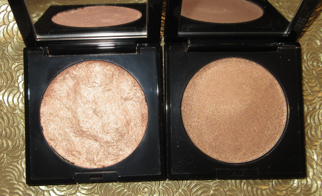
Doja Cat x BH Cosmetics Flora Blush Trio in Rose

I believe this collection did slightly better than the Iggy Azealea one, and it had a round 2 release, although I’m not sure if that was already agreed upon contractually or if the first did well enough to create round 2 afterwards. I personally suspect it was in the contract. In any case, there were three blush trios in the launch. I bought two, but gave one away. I chose to keep this palette because of that reddish-brown blush with the golden shimmer, which is the type of color I love. The formula is extremely thin though on these blushes, so I have to build up this shade using a dense flat top brush or one of my goat hair workhorse brushes like the Sonia G Cheek Pro. It’s quite pretty though, despite being immensely subtle on me. The darker of the two pink blushes isn’t my favorite tone, but it at least shows on my skin and is slightly more opaque, though it still requires building. As for the lightest blush in the trio, I didn’t bother taking a photo wearing it considering it’s practically white in my arm swatch and definitely only suited for pale to light skin tones. It does have some shimmer to it, but it does not work as a highlighter for me. Overall, I’m not very impressed with the quality of these blushes. I have better from within BH’s own brand, not that they were ever my favorite to begin with, so I can’t recommend these, no matter how low the price is.

I thought that this post would help me decide whether I should be more open minded to makeup associated with celebrities, but even though I had a good experience with some of these, I can think of so many celebrity lines I happily skipped. If anything, I think I did a good job of picking and choosing which ones to try, which is more of a reflection on knowing my own tastes and less about the celebrity brands. So, in the end, not much changed my viewpoint except that I have a slightly higher opinion of Rare Beauty and Victoria Beckham Beauty. The biggest change was my opinion of Rose Inc earning my respect and successfully making me want to try a few more items from the brand if they expand their shade range of current and future products. If even one product I tried after the blush was a dud, I would have lost interest again in Rose Inc, so it’s only because they put so much thought and innovation into their products that I now see the brand in such a great light. I cannot say that this is the norm for celebrity involved makeup.

That’s everything for this post, but after I finished my final draft I came across a video on YouTube by Mina Le who discussed this topic of the over saturation of celebrity brands. I’m always getting recommended videos by Mina, but this is the first one I’ve watched. I find the sections on the environmental impact, power of celebrity, and downfall sections to be particularly interesting.

-Lili