War of the Rose Blushes

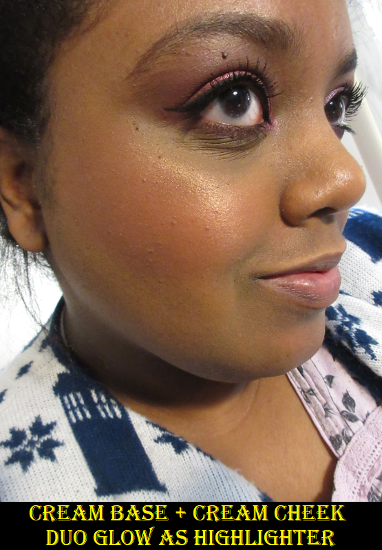
I noticed how many of the newer blushes in my collection had ‘Rose’ in the name, and thought it would be cute to make a play on “War of the Roses” as the title of this post. It was intended to be a lighthearted review, but I admittedly went on a rant in the BareMinerals section. If you’re strictly interested on a discussion of the product and not about issues with the beauty industry as a whole, I suggest skipping that portion of this post.

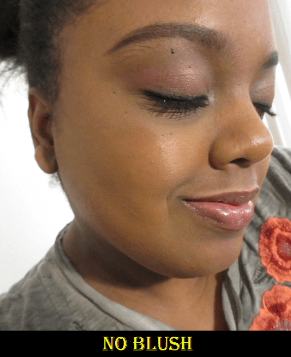
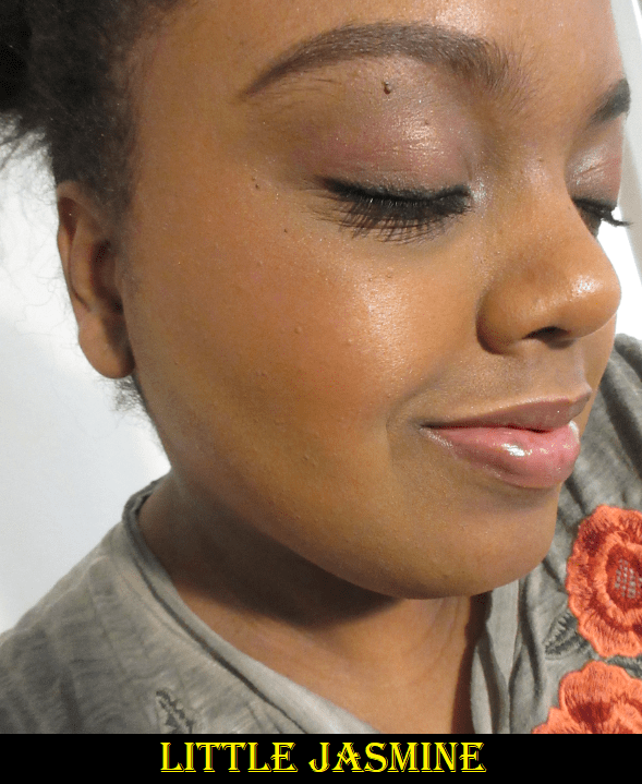
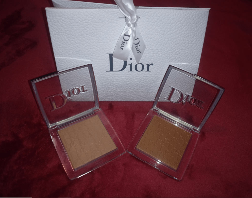
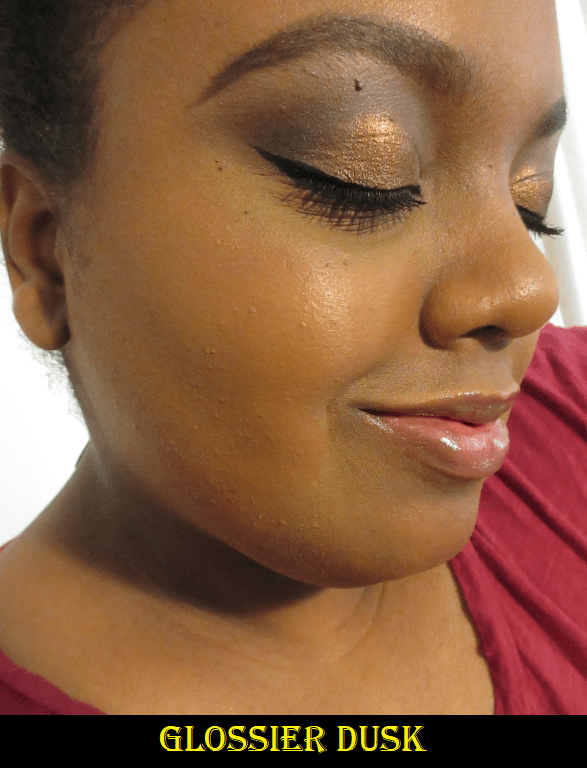
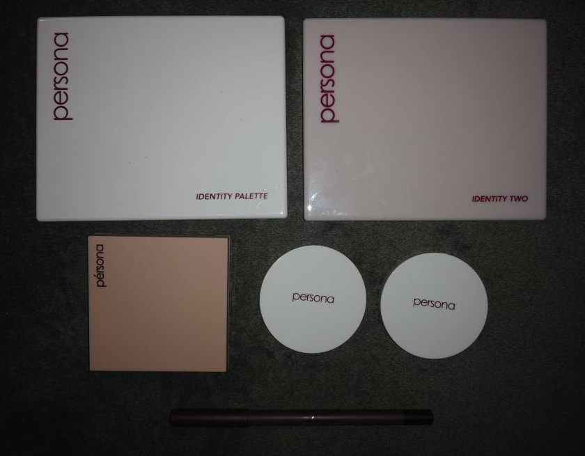
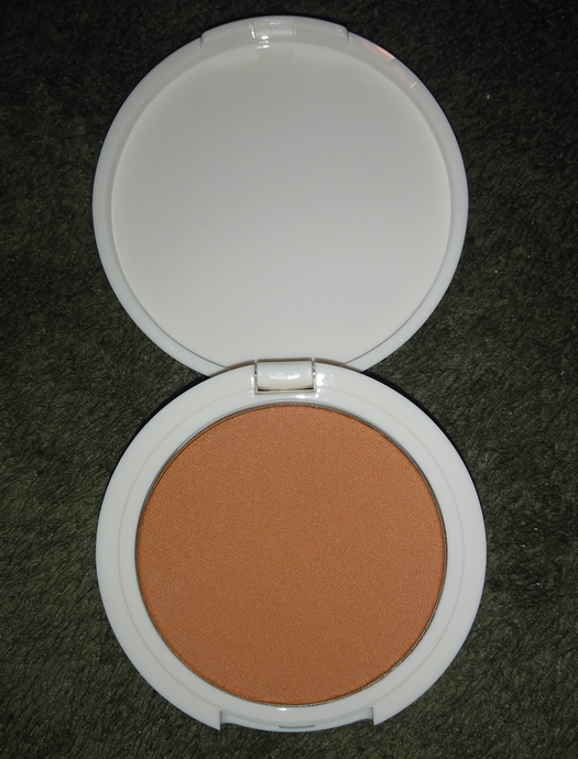
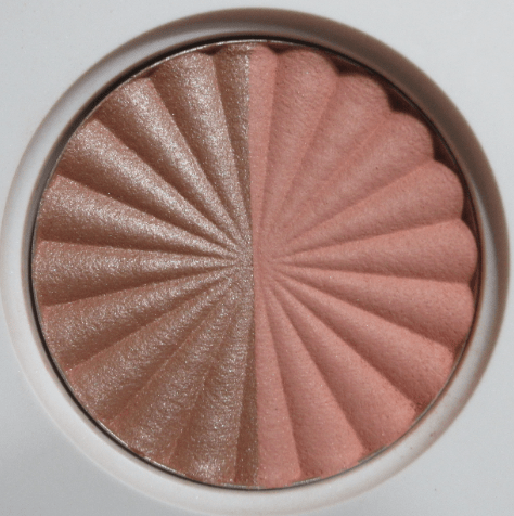
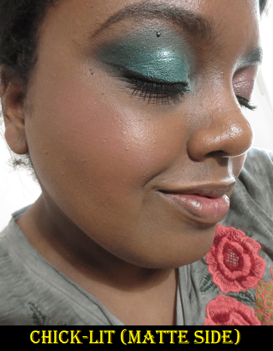
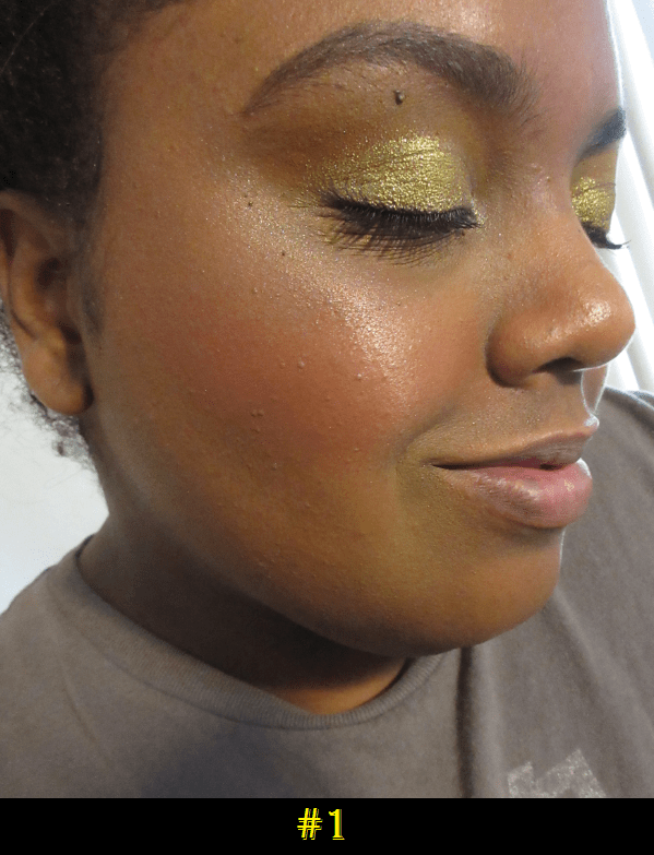
BareMinerals Gen Nude Blonzer in Kiss of Rose

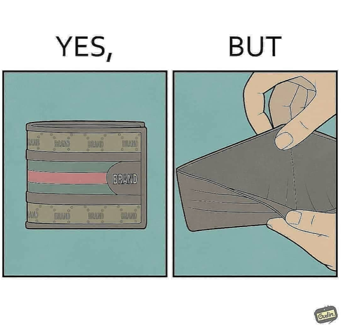
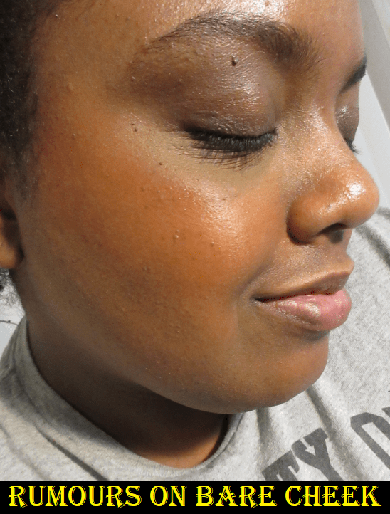
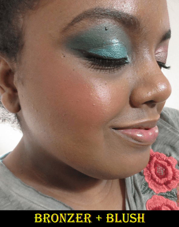
At least with Ofra’s Blushzer, they gave us a split pan of blush on one side and bronzer on the other, but the concept of the “Blonzer: blush and bronzer in one” is a gimmick to me, and similar to the way Becca tried to market their zero pigment foundation. These Blonzers are just blushes in a combination of bronze and rosy toned hues that add warmth to the blush areas of the face. Even Kiss of Copper, the most bronze-like of the three, still just looks like a warm blush shade. I would look ridiculous if I tried to use this on my forehead or jawline where I sometimes apply bronzer. In fact, BareMinerals recommends applying this in the “W” area of the face. I was familiar with the C and 3 patterns, but I hadn’t heard of this technique until I watched this video.

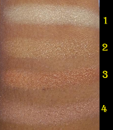
Photo taken from Sephora’s Website.

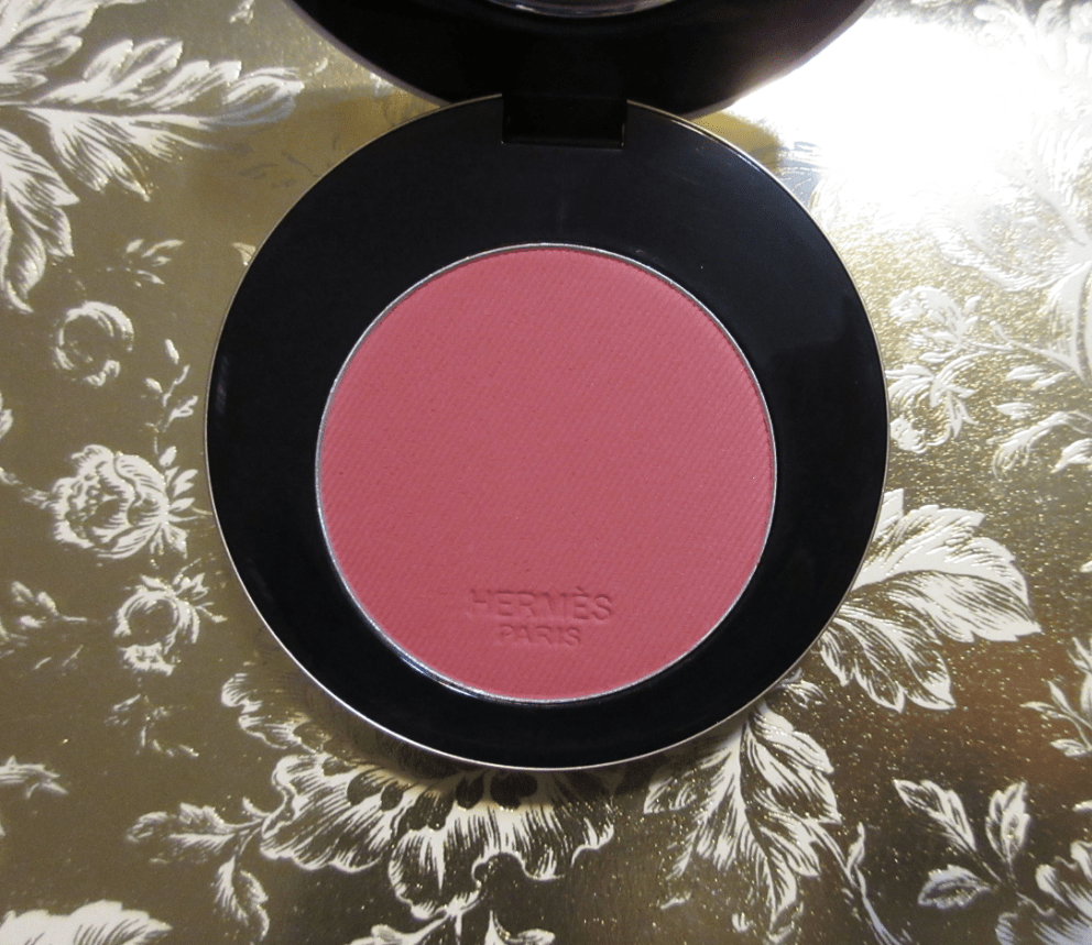
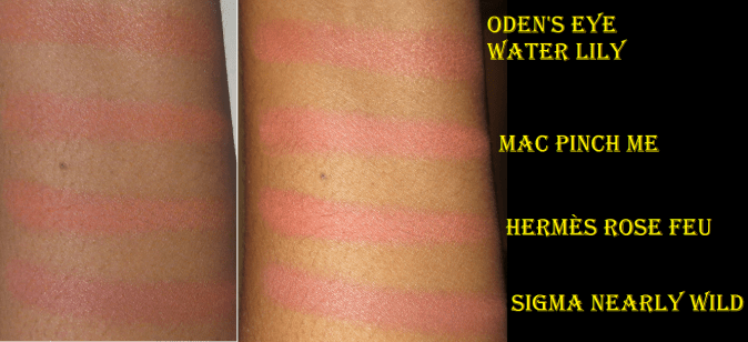
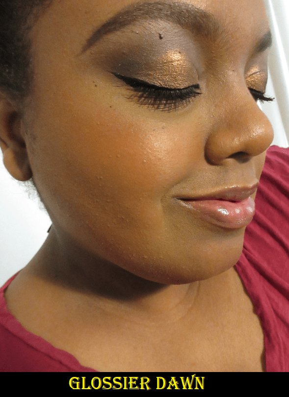
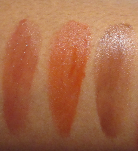
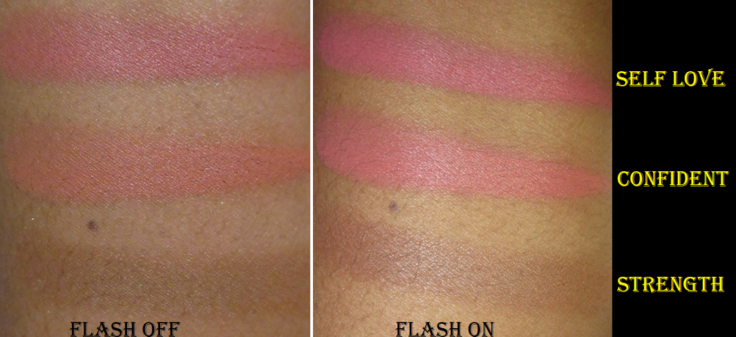
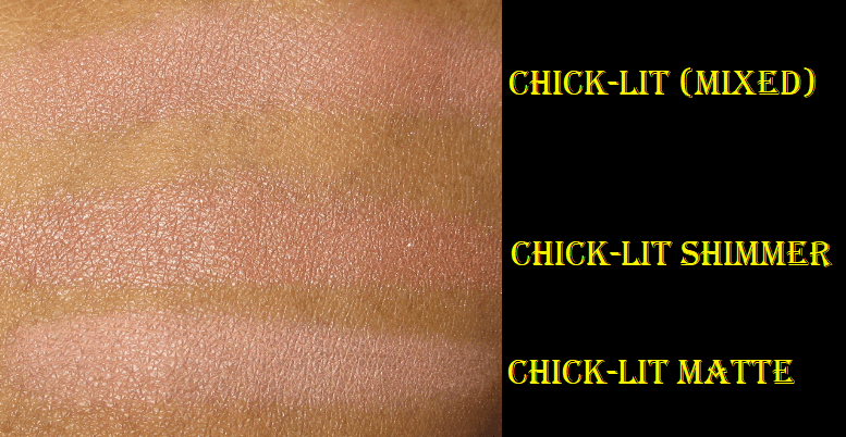
Issues with marketing aside, something about the imprint and shades of these Blonzers infatuated me. I made myself wait until the Sephora VIB sale in order to get Kiss of Rose, the darkest shade. There are only three in total and Kiss of Rose is right on the line of being barely deep enough to work on me. If it was the tiniest bit lighter, it wouldn’t show up on my skin. Although it’s no longer showing as a “Top Dupe” on Temptalia’s blog, I have to give credit for where I learned that the Kiss of Rose shade was extremely similar to Charlotte Tilbury’s Walk of No Shame blusher. Kiss of Rose is practically a slightly more shimmery version of it.

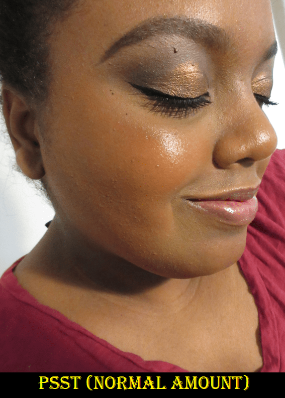
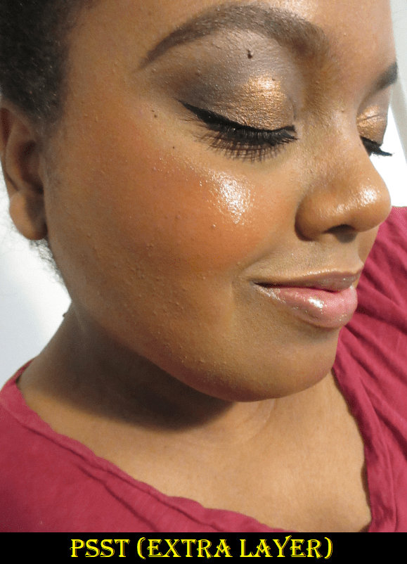
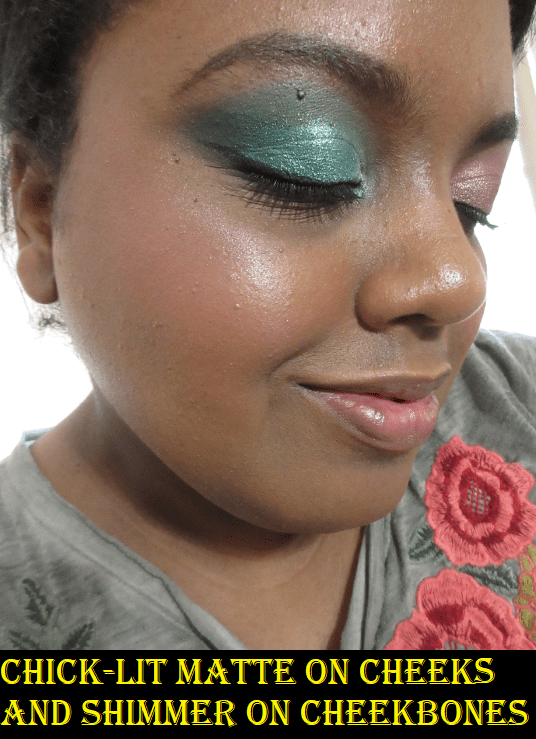
This fact almost stopped me from purchasing the blonzer because I want to avoid adding dupes to my collection. However, I never reach for Walk of No Shame because trying to use solely the dark ring of that blush (the highlighting center part lightens the blush too much when mixed in) was such a hassle. I thought that shade was beautiful, so the idea that I could have that without the ring is what caused me to buy it and I have no regrets! I am so happy with this purchase. I love the shine on my face from this blonzer. It looks so flattering, and although it doesn’t take the place of a bronzer for me, I’m happy to continue using it in the “W” formation.

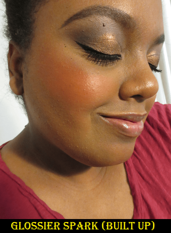
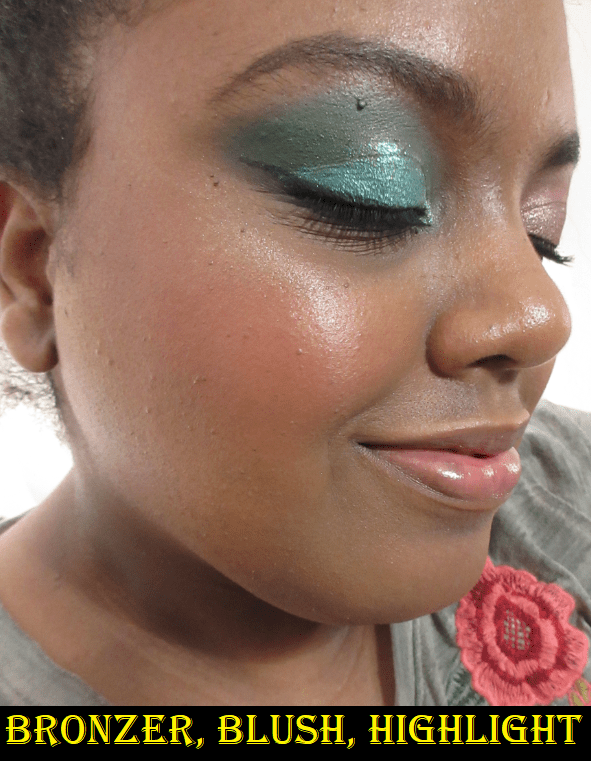
Also, when I wear this, I tend to skip using highlighter. This blonzer lasts at least 8 hours on me, which is usually as long as I test makeup for. I recommend this, even at full price, but I hope BareMinerals expands the range. It’s silly to include “bronze” in the name and call this the equivalent of “deep” when it’s not. For two months, Sephora had Kiss of Rose listed as being suitable for deep skin tones, even though BareMinerals hadn’t specified that.
“Deep” from the Western/Euro-centric perspective is not the same as “Deep” on the spectrum of all human skin tone possibilities between the lightest and darkest. For example, on PUR Cosmetics’ chart of their 100 foundation shade range, I am most likely DG4 in the Dark category. I believe Kiss of Rose would appear ashy, icy, and more like a highlighter on someone in the actual Deep range, even starting at DPG1. This admittedly does irk me when the last shade in a paltry range is automatically called deep, just because it’s the darkest one they have. I wonder how many people bought Kiss of Rose thinking it would suit them because of Sephora’s misleading description, only to find out it’s too light for them. And how many of them are like me and kept it just because they hate returning things?

I’m sorry for the rant, but it gets very tiresome. Testing out beauty products is my passion and hobby of mine. I love it. When brands aren’t being inclusive, it limits what you can use for your hobby. If you take race and skin tones out of it and think about any other hobby, like painting, imagine if you went to a store and saw they were selling the most beautiful paints in all kinds of gorgeous finishes. You buy the paints and take it home but the paints won’t stick to your particular canvas. It’s repelled. It doesn’t show at all or the paints that do stick look dull and lifeless on your canvas. The store tells you, “Sorry, we only make paints for these specific types of canvas boards. Maybe one day we’ll make one for yours.” And you see all the beautiful artwork everyone else can create, but not you. Imagine flowers that won’t grow in your garden but will for your neighbors or pans that won’t heat the food you try to cook in it. I see the comment far too often on social media, “If they don’t make it for you, just don’t buy from them,” and that misses the point entirely. It ignores the pain of how frequently you’re limited in something you’re passionate about. How bad it feels when you see others have the world at their fingertips and you have to make do with less, and they don’t care that it isn’t equal. I wish more people had the compassion to understand this concept. We’re all part of the beauty community and when a new launch is hyped up, we want to be able to take part in that. It’s so disheartening when you then realize you can’t be part of it because they didn’t make a product you can use. Great for my wallet, but not great in feeling part of the community.
If I don’t have a perfect match, I feel comforted if someone deeper than me at least has an option. Kiss of Rose is beautiful and it works, but I can’t pretend it doesn’t bother me that I’m where it ends because this is actually a great product!
I think I’m especially bothered because at the time that I started working on the draft for this post, 6 out of my last 10 purchases wouldn’t work on anyone darker than me. There have also been several items I wanted to buy, but they weren’t even deep enough for me either. Is this not 2021? Anyway, I’m putting my objective hat back on!

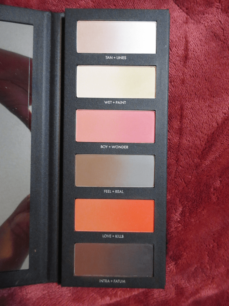
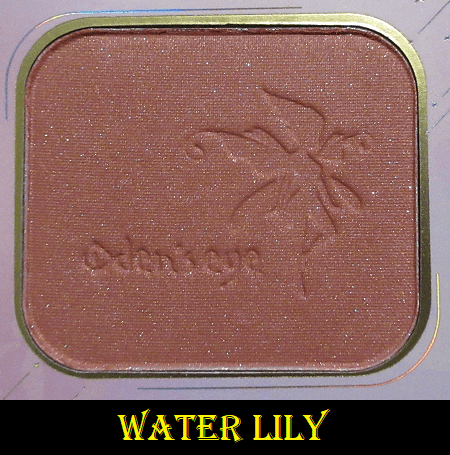
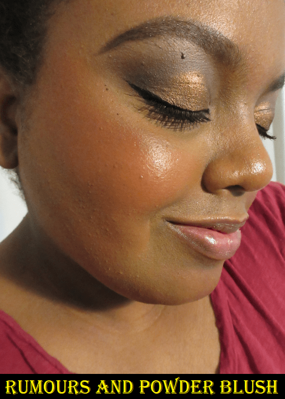
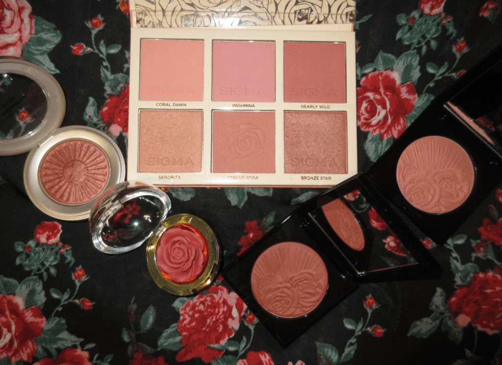
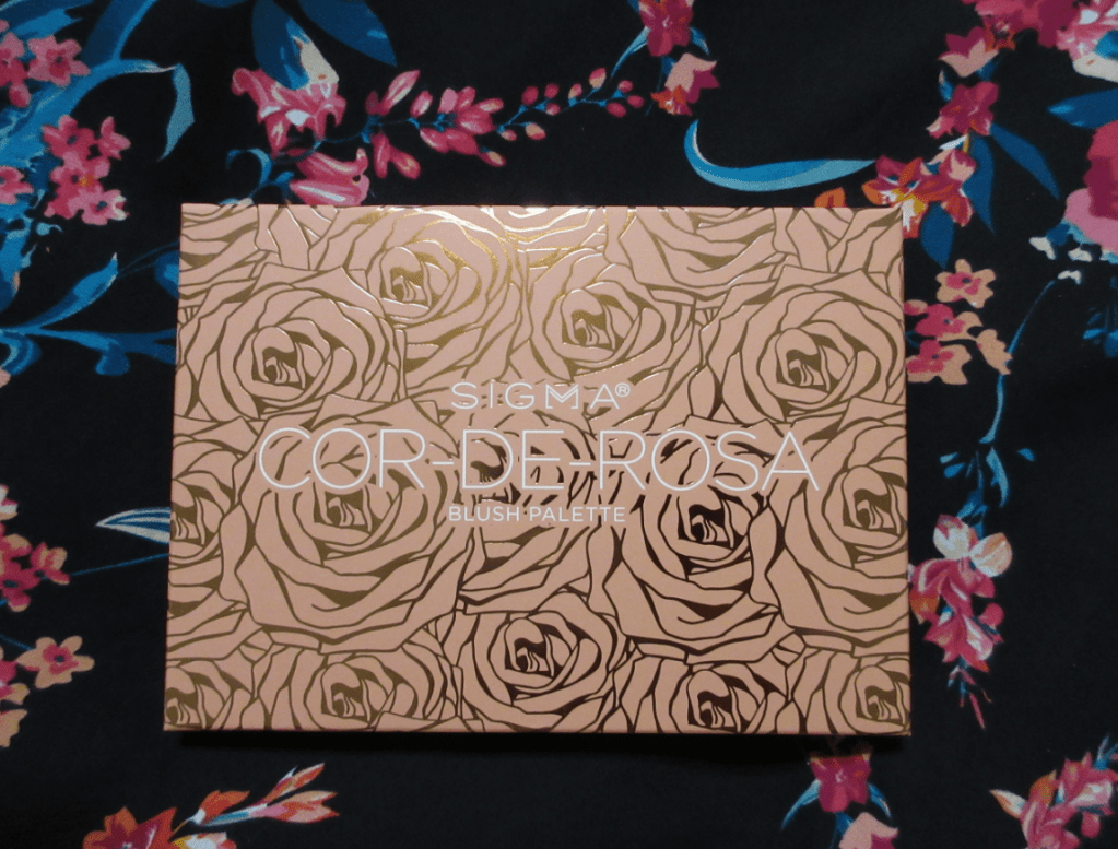
Sigma Cor-de-Rosa Blush Palette

This is a very medium-tone selection of shades, so those with a lighter skin tone will have to be careful not to overapply, especially as the blushes are pigmented. Those deeper than MAC’s NC/NW 50 might not get much use out of these shades, other than Nearly Wild and perhaps Bronze Star.
I like that the matte blushes give good color payoff because I prefer to use my natural hair brushes on powder products, but if I use them on a sheer blush, it can take so long to build up, if at all. So, I’m glad I don’t have that issue.

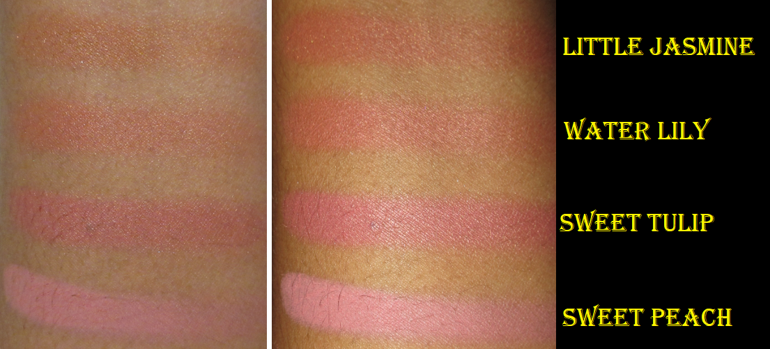
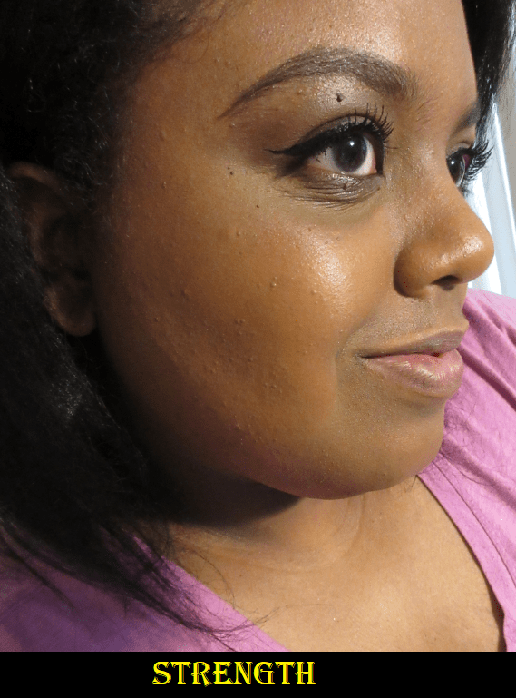
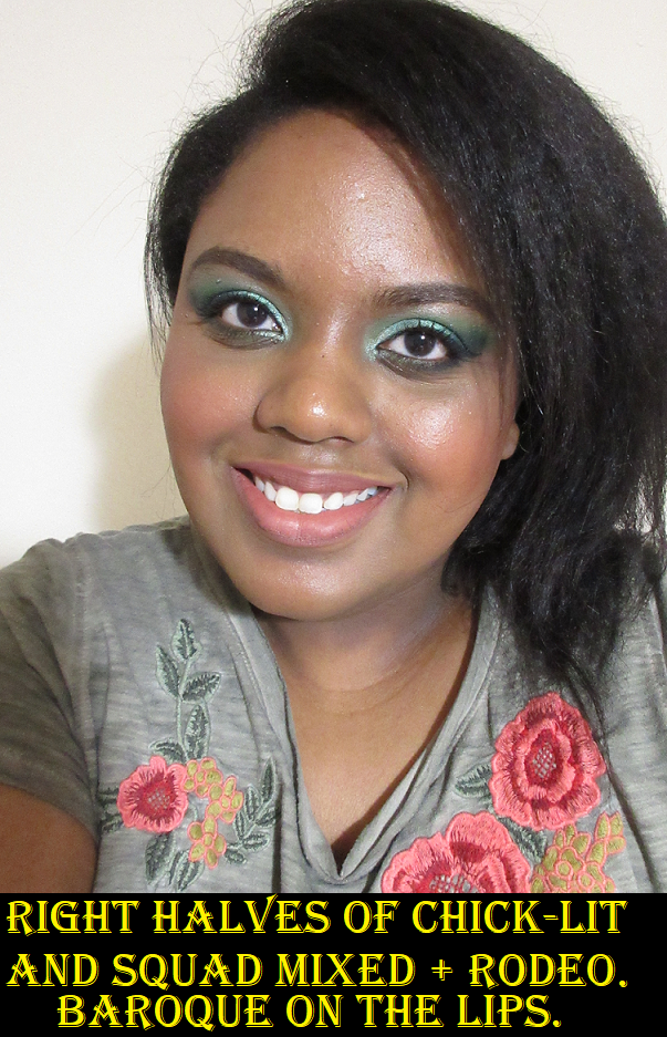
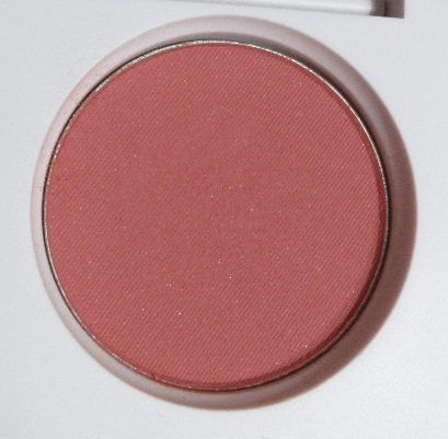
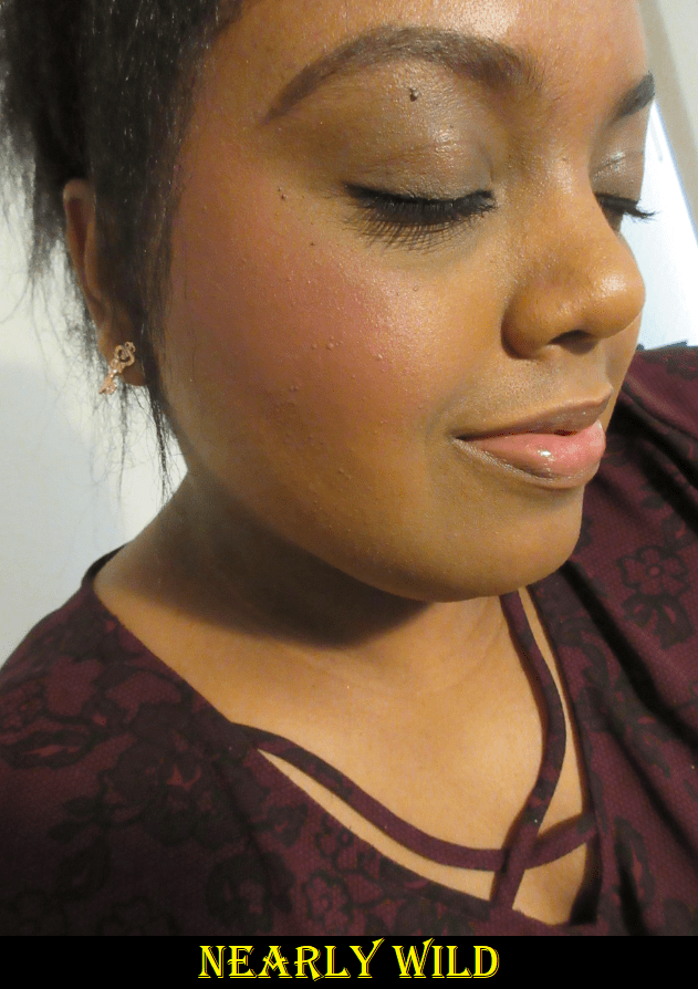
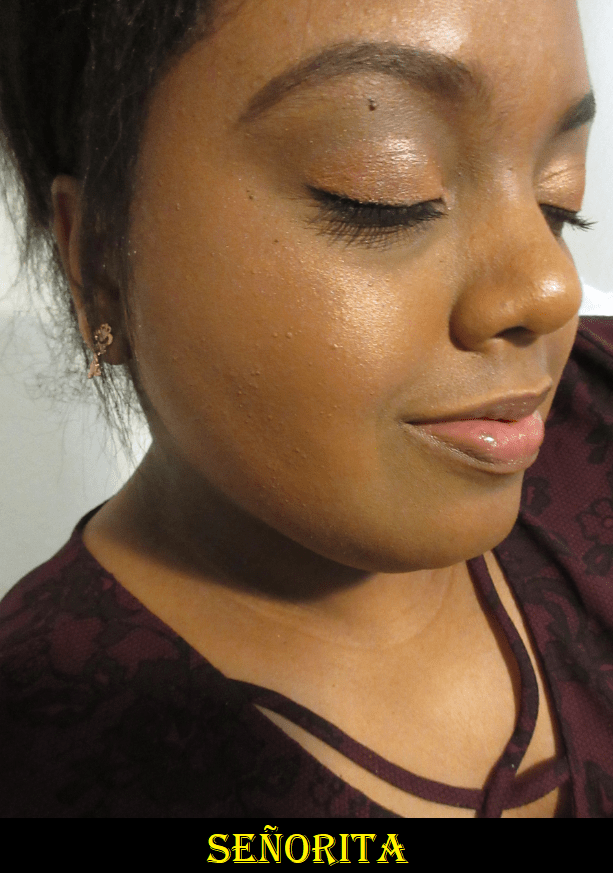
Cor-de-Rosa is the namesake of the palette and also my favorite shade out of the six! I thought my favorite color would be Nearly Wild, but it’s a close second. The peachy-brown tones within Cor-de-Rosa is more of my preference over the deep rose of Nearly Wild. They’re both very pretty, but I like when there’s a little brown. Señorita is a tad light for me to use as a blush on its own, but it makes a stunning blush topper! I mentioned that Cor-de-Rosa was my favorite blush color, but when it comes to what actually looks the most beautiful on my skin, I think it’s Bronze Star. Bronze Star is just a hair darker than MAC’s Extra Dimension Blush in Hushed Tone, which is one of my favorite blush shades in general.

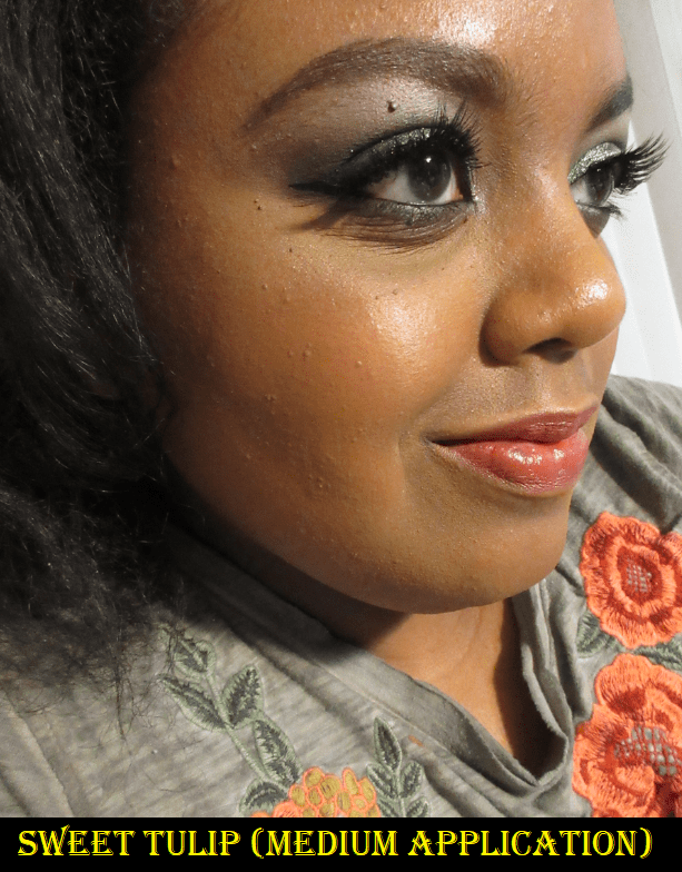
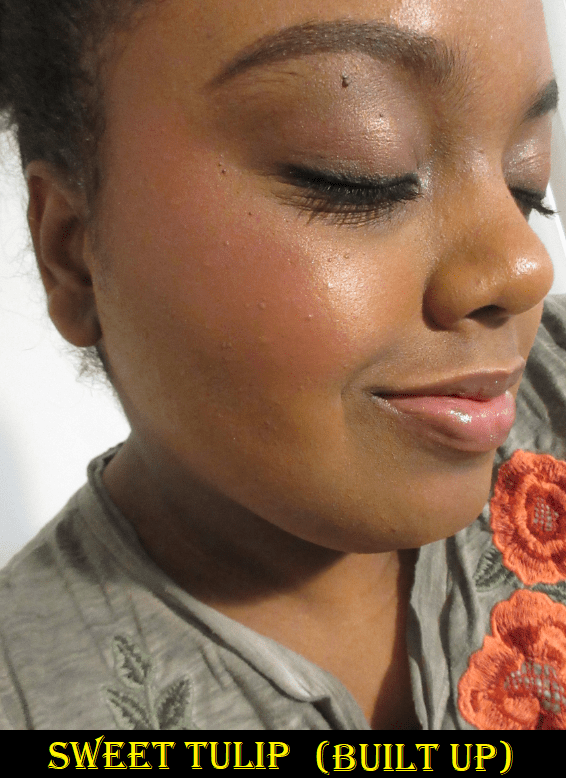
The matte blushes in this palette are decent, though they don’t feel as soft as I’d like. They’re a bit on the powdery side and look dry on my skin the way Clinique Cheek Pop blushes look on me. However, the shimmer formula is fantastic! This depends on the brush I use though, as can be seen in the differences between my two Bronze Star photos. Some of my brushes just pick up the shimmer and therefore don’t add much color to my cheeks. If I were to give them grades, the mattes would all get B- but the shimmers get A’s! Unless, of course, I pick the wrong blush brush. Then I’d rate the shimmers B- as well.

I expected Coral Dawn and Pashmina to be too light for me, and they are, but they weren’t as far off as I anticipated, especially if I take the time to really blend them into my skin. If they were a shade or two darker, I would have been able to use them too, but 4ish out of 6 is a better ratio than I’m used to having! I can still wear the lighter shades in the blush palette if I layer them on top of one of the deeper blushes.

This palette retails for $49 but I didn’t realize Sigma had sales and deals so frequently. I could have gotten this for $40 (shipping fee included) if I had waited just two weeks after the launch. Although I like this palette, I don’t know how often I’ll use it. Unlike eyeshadows where I never reach for singles and always prefer a palette, I typically grab singles when it comes to blushes. And although the quality is decent and the tones are nice, I literally have 1 and a half drawers of blushes, so I’m not sure if this is something I want to keep if it’s just going to take up room and won’t be used. It survived my recent blush declutter, but it may not last through another. I’ll just have to keep using this for the time being to see if my enjoyment of it dwindles or grows.

Winky Lux Cheeky Rose Cream Blush in Crown

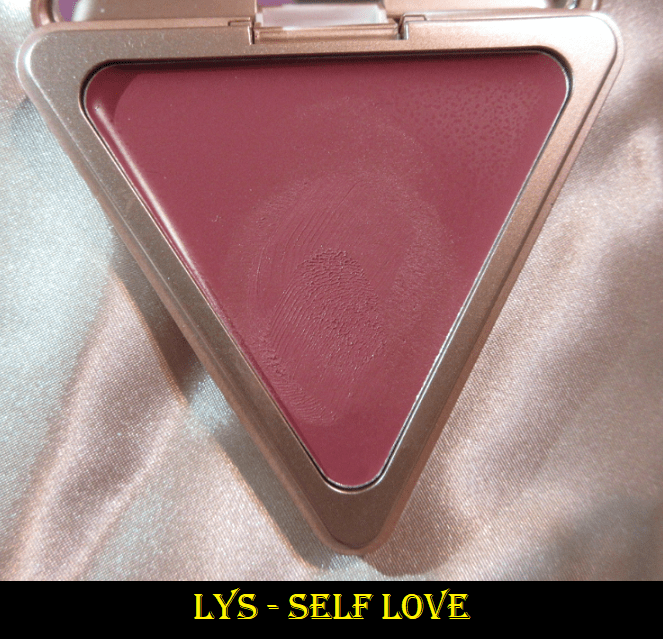
How red this looks in the globe packaging is not how deep it looks on the skin. It’s a medium toned warm pink that closely resembles Fenty’s Strawberry Drip. Lys’ Self Love came first to mind, but Self Love leans more mauve and is more pigmented. Strawberry Drip is a touch lighter and less pigmented than Crown. Also, and this is likely due to the consistency needed to maintain the rose shape through multiple uses, the texture of this blush feels like a dry oil. It’s a cream product, but it doesn’t feel creamy or waxy or balmy to the touch. It feels oily and dry at the same time, though it does blend very well into the skin.

This blush is recommended to be applied with the fingers or a brush. I prefer using my fingers with wetter textures, so it makes sense that I prefer to use a brush instead. I’ve only used Crown a few times. If I wear it without powder on top, it eventually dries down on its own. However, it noticeably begins to fade around 5 hours, but will still cling on by my 8 hour testing minimum. If I set with powder, the powder diminishes the color, but the shade it becomes is the color it stays for the full 8 hours. So, to ensure it stays on, I pack on the blush to its maximum level of payoff before setting it with powder.

There are five shades in total on the Winky Lux website and four of those are available at Ulta. They are listed at $20, but I got mine on sale for $13. I’m glad I have a product that is more than just cute and can actually be used, but it’s middle of the road in terms of quality. I’m not excited by or disappointed when I use this. To anyone who wants this purely for looks, I’d say at least it isn’t bad. Otherwise, the LYS blushes and Glossier Cloud paints rank higher on my recommendation list.

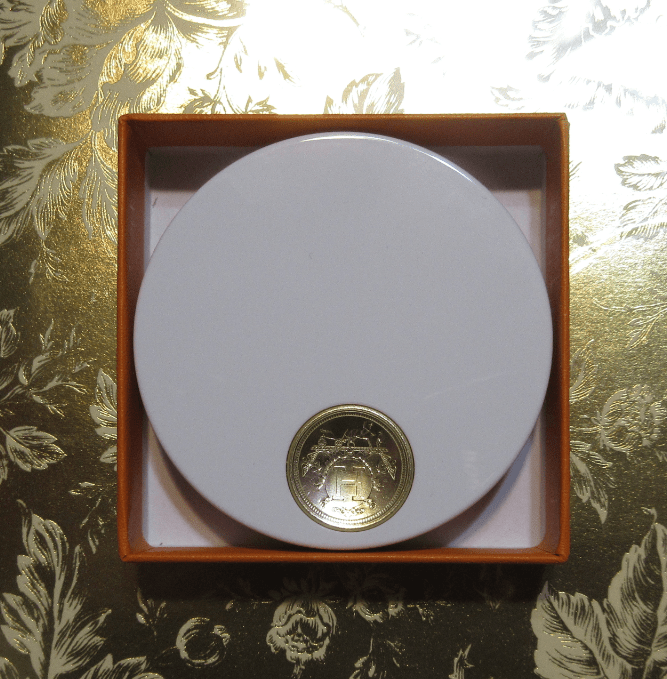
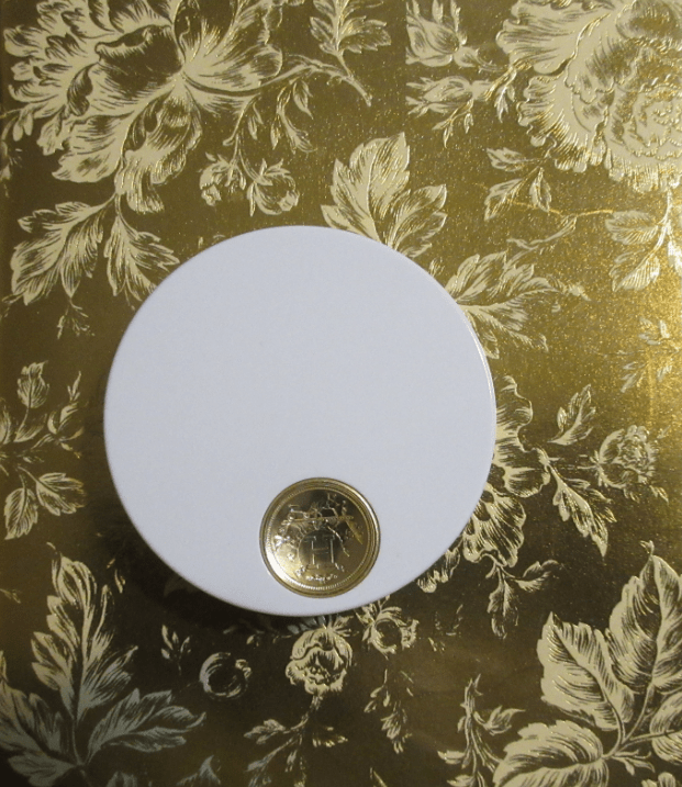
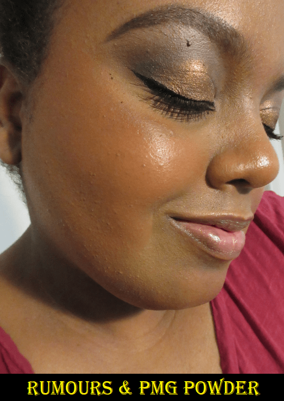
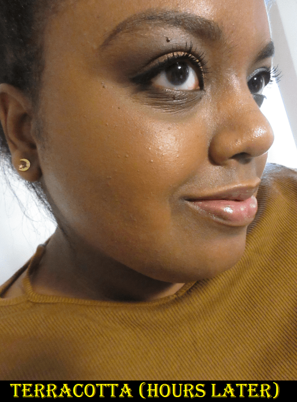
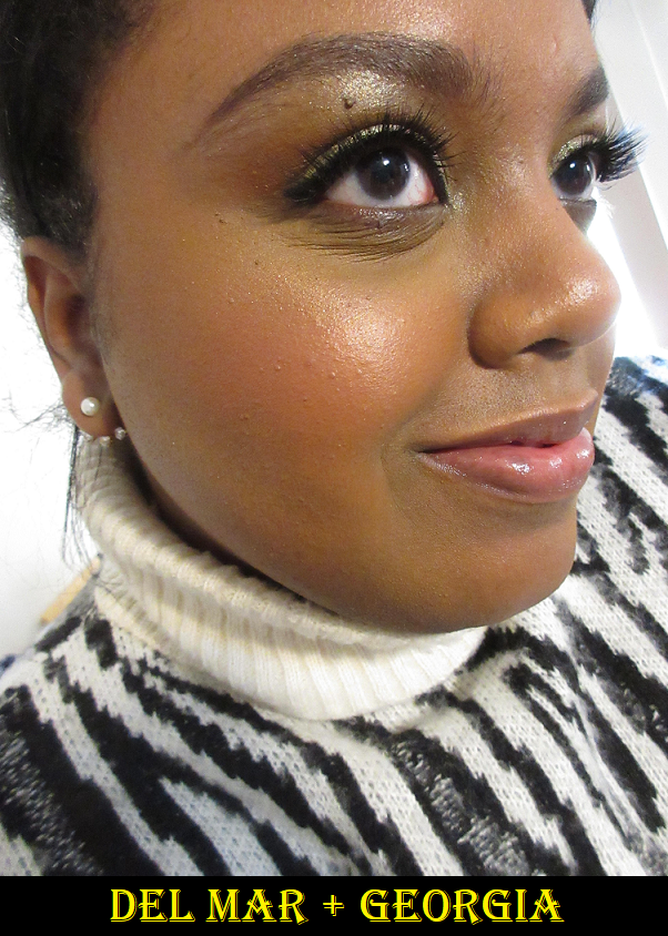
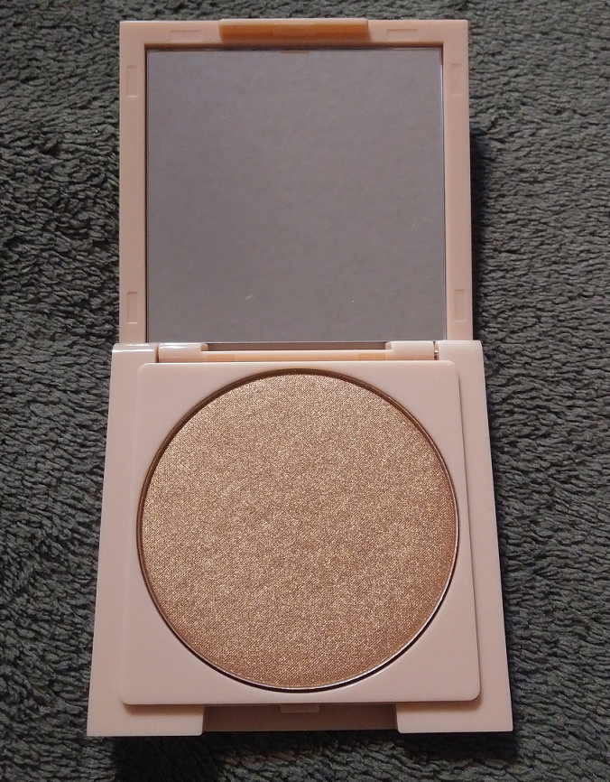
Pat Mcgrath Labs Skin Fetish: Divine Powder Blush in Nude Venus and Paradise Venus

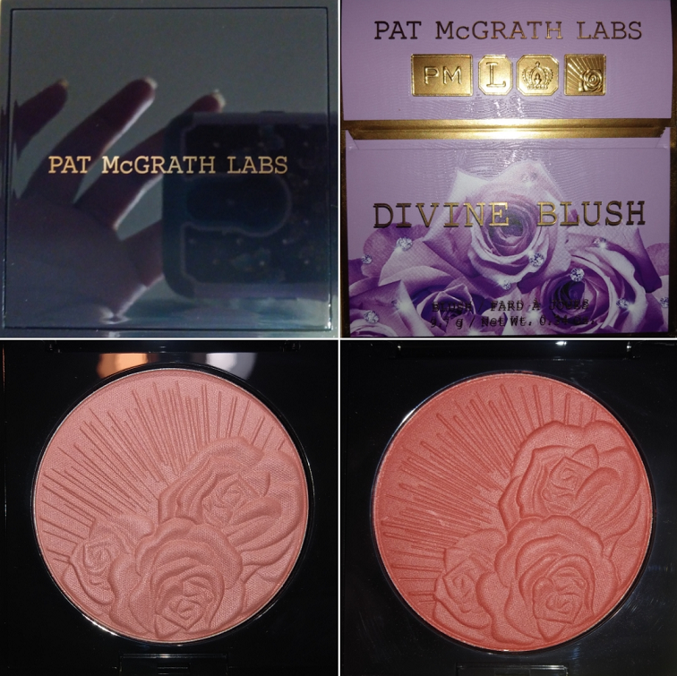
At the beginning of the post shows what the pans look like outside and inside. The inside photo is more accurate to the shade. The photo above was taken at night, so my lights made it look a bit lighter and slightly more cool toned. The photo below is a clearer version of an indoor photo and was taken in the daytime.

These blushes officially launched at Sephora on May 28th, and normally I take a few weeks of trying something before I review it, but I thought it would fit well with today’s theme due to the rose imprint. Designs in powders are my weakness, but surprisingly that aspect had zero effect on me! As I mentioned in my Hindash review, my blush collection feels complete. I wasn’t interested in this launch until I saw non-promotional images from real customers. The gorgeous tones looked much better in their pictures than the official Pat Mcgrath photos (with the insanely built up swatches). My favorite blush colors are medium toned warm pinks, warm pinkish brown, and reddish brown shades, so Paradise Venus was easily my first choice. I had some points and gift cards to use, so I allowed myself to choose one other shade. Desert Orchid looked so beautiful, but it was just a hint of color on Alicia (Kinkysweat), so I knew it would be too light for me. This was later confirmed when I watched Tina (TheFancyFace) try it on, and you could only see a hint of shimmer and nothing else. For shade reference, I am about 1-2 shades darker than her, depending on the time of year.
Electric Bloom was another shade that caught my eye as it looked so vibrant, almost neon, in the pan. However, the swatches and how it looks on the skin seemed a lot like the KVD Everlasting Blush in Poppy. I asked Tatianna (Tatianna Anesa) in her comment section how they compare, and she said they are very similar. Side note, did you know the KVD Blushes with the rose compacts are refillable? I saw that Sephora recently released the singles on their website. Then I checked the back of my compact and noticed the small hole near the top. I’m guessing that was the intent all along and goes with the brand’s initiative to create less waste. Nice job, Kara Veritas Decora! I still think their second attempt to make the K-V-D initials work is silly, but I give them kudos.
I almost never use Poppy or MAC’s Loudspeaker or News Flash, so I skipped getting Electric Bloom as I probably would not use it that much either.

*UPDATE June 24th, 2021 – I bought Electric Bloom and the closest shades I have to it are Fenty’s Strawberry Drip and MAC’s Heat Index, but they aren’t super close.

I’m not the biggest fan of berry blushes, but Lovestruck appeared to be more of a raspberry pink than a deep berry, so perhaps during a good sale I might get it. While I was trying to figure out the best shade for me, I noticed Sephora secretly made Nude Venus available early for about 12 hours. Again, based on how it looked on Alicia, I thought perhaps it might be just rich enough and pigmented enough to show on me.

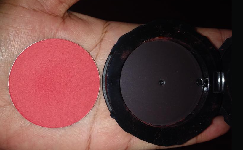
Luckily, that turned out to be the case! At about three layers, Nude Venus shows up well enough to appear on camera. It’s faint but still visible.
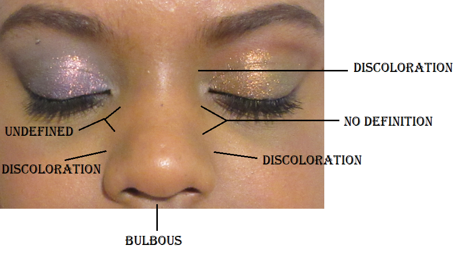
I’m not the biggest fan of how these blushes look on my bare skin. They have a harder time lasting on my cheek, as though the blush needs something to grip onto besides moisturizer. Nude Venus specifically pulls a little ashy over the areas of my face with dark discoloration, so I have to at least cover those areas with concealer if I want to wear this shade without foundation on minimal makeup days.

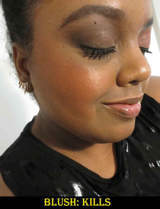
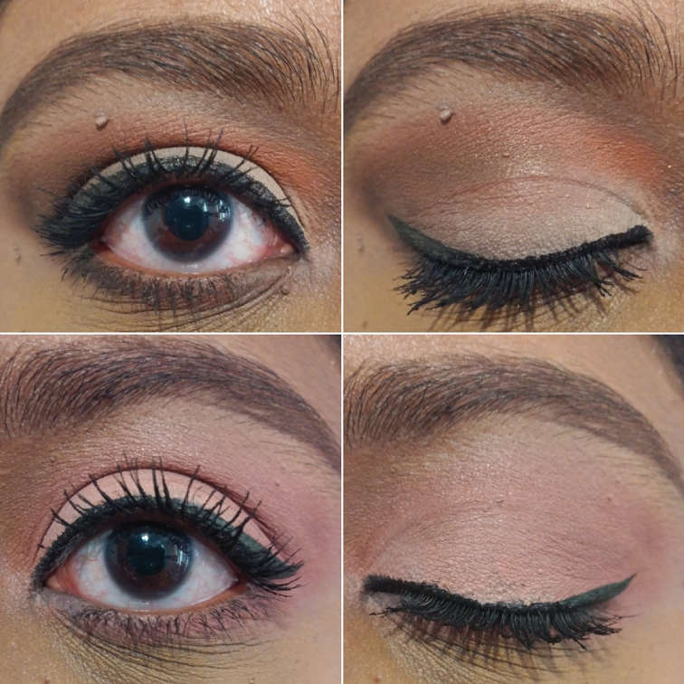
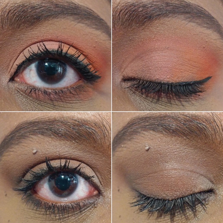
However, over foundation it goes on smoothly and is a more noticeable flush of color. Pat Mcgrath mentioned that these blushes look beautiful with a deeper shade towards the back and a lighter or brighter color in the front. I do enjoy pairing this with Paradise Venus. I almost bought Desert Orchid to combine with that one instead, but I think both Venus shades are perfect together. In the photos that I’m wearing yellow, I have the Bobbi Brown Face Base Priming Moisturizer as my primer and the Nars Soft Matte foundation. In the photos that I’m wearing black with pink polka dots, I have the same foundation with the Milk Makeup Hydro Grip Primer. I’m not wearing any bronzer or contour products, as I didn’t want those products to be mistaken for Paradise Venus.

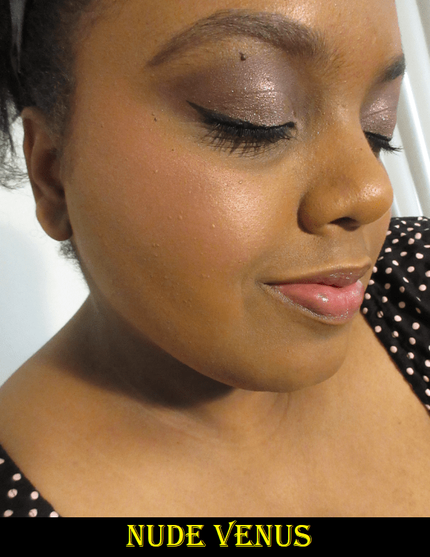
Nude Venus is described as peachy-pink with golden pearl. Sometimes shimmer can improve the look of a blush, but I don’t feel like the pearl in this shade adds enough glow to make it any more special than the satin finish of Paradise Venus. If Nude Venus was demi-matte, I think it would have looked just as pretty. I mention this because I felt compelled to have one shimmer and one demi-matte blush from the collection, and while the shimmer formula is of course more glowy than the demi-matte sheen provides, it’s still far more subtle than other shimmer blushes I own. The shimmer doesn’t count against it though. It’s beautiful shade with a flattering finish.

Regarding Paradise Venus, I can get the level of pigment I want from just one dip in the pan. I still have an issue of fading when it comes to bare skin (only the lightest layer will cling on), but as I mentioned before, the lasting power is phenomenal over foundation. I usually apply the blushes first before setting with powder. Powdering afterwards can tone down the blush, so I apply the lightest layer, if any at all. For the sake of the review, I also tested these over a powder set base. I find that I need to use more blush that way, but the end result is still nice.
So far, I have only applied the blushes using the Sonia G Cheek Pro, which I noticed picks up more of the shimmer in Nude Venus, and the Bisyodo B-C-01 Highlight / Cheek Brush. They’re both goat hair and I always do layers of just one tap. I don’t swirl my brushes in the pan, as these are soft powders and prone to a lot of kickup if you don’t do a gentle tap. Here are some tips from Mother herself regarding the application process!

I can’t emphasize enough that these are highly pigmented (but not over pigmented like the Shocking shade from Wayne Goss’ Vivid Azalea duo), and while that is fantastic news for me because it means I can wear a shade like Nude Venus, those with a lighter skin tone will need to be especially careful when applying the deeper half of the range. Using a setting powder or the leftover foundation on your brush or sponge can help with overapplying.

One of the things I wanted to know most before purchasing was if there were any shade dupes. According to my YouTube history, I literally watched 53 videos involving these blushes and yet I’ve seen very few comparisons. From my own collection, I was unsuccessful at finding a dupe for Nude Venus. The closest is Lunar Beauty’s Stargaze, though it is a matte blush. Lunar Beauty’s Soleil looks somewhat close as well, but in person it has a very strong golden shimmer that gives a different effect than Nude Venus on the skin. As for Paradise Venus, I found that MAC’s Burnt Pepper is the most similar color to it that I own.

I’m happy to have the Pat Mcgrath blushes, but I wonder if some of the hype is driving my excitement for them. Although I don’t think anyone would be disappointed by these blushes, there isn’t a pressing need to rush out and get them like I did. If I didn’t have the points and gift cards, I would have waited for a sale because I already have blushes of comparable quality in my collection. I appreciate that for a high end brand, these are still a few dollars less than Hourglass, Charlotte Tilbury, and Natasha Denona charge for their blushes. I certainly prefer this soft smooth formula over Natasha’s and I prefer the pigment in these over Charlotte’s. If you’re on a low-buy and wondering if it’s worth getting, I’m here to say they aren’t reinventing the wheel. They’re wonderful and top tier, but not so amazing that you’re missing out by not getting them, provided you already have blushes you love. If you don’t mind splurging on something nice, these are a great option to consider.
In addition, the average blush is between 4-6 grams. These blushes are 9 grams and because they’re so pigmented, they would take even longer to use up. That is yet another difference between the Divine Blushes and other high end and luxury ones on the market.

Who Won The Rose Blush War?

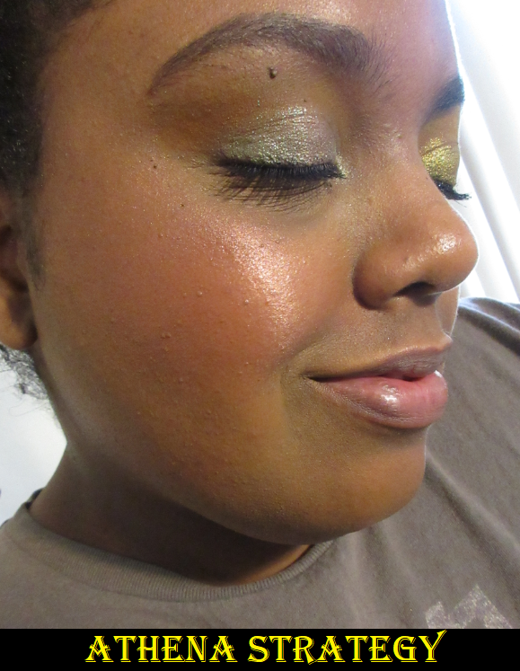
Out of all the products reviewed today, the BareMinerals Blonzer is my favorite and the one I have continued to use the most. I was still occasionally reaching for Nearly Wild and Pashmina from Sigma, but that came to a halt once my blushes from PML (I’m going to get out of the habit of writing PMG) arrived.

BareMinerals won the spoils of war, Pat Mcgrath Labs still profited, Sigma survived the battle, and Winky Lux retreated to return another day.

The final thing I wanted to mention is that this post reminds me a lot of why I started making videos and blogging in the first place. In 2014-2017, I had the hardest time finding photos and videos of people with my skin tone trying out products. My nearest standalone Sephora is 50 miles away, my nearest Ulta is in the next town over and both Ulta and my Sephora-JCP don’t carry the products in store that I want to buy. I rely on seeing the product on others to judge if a shade will work for me when I order online, and I wanted to be a resource for others in cases like these where there are barely any options to view.
The only person in the tan and deeper category I’ve seen try the BareMinerals Blonzer is Karen Harris and other than the haul video, I can’t remember which video she actually tried it in, so I can’t link it. For the Winky Lux blushes there are small sections between two of Tina’s videos here and here and from Peachy D, but those are the only ones. For the Sigma palette, it’s once again just Karen. There’s no shortage of Pat Mcgrath videos, but everything else I reviewed is quite limited on the tan and deeper spectrum, so this is extra motivation to keep posting and fill a void.

That’s all for today! I hope you’ll return again next week. Thank you for reading!

-Lili

Hindash Beautopsy Palette Review

The idea of having a product that I can customize my shade of powder, blush, bronzer, contour, eyeshadow, etc. all in one palette appeals to the wannabe minimalist in me. I call myself a wannabe because I enjoy having a large beauty collection while simultaneously being overwhelmed by the amount I possess. This is why I love the concept of face palettes, but it’s very uncommon for me to find one where the majority of the makeup in it suits my preferences and needs. I’m curious to see if I will continue to like this palette after prolonged use and continuously mixing shades, but so far I am impressed! There’s pretty much no kickup and if I get a lighter imprint on a deep shade, or vice versa, I can sweep it away with a brush and it’s good as new! Perhaps this is possible because I combine shades by tapping into each color I want; I don’t swirl in one and then swirl my brush into the other.

A palette like this can seem intimidating, and I was initially unsure if I would buy it for that reason. Some aspects were as tricky as I expected and some parts were easier than I thought, almost intuitive. For instance, using Beautopsy for blush is pretty straightforward. Boy, Wonder, Love, and Kills are four easy options for that. Overall, while I wouldn’t go as far as to say beginners wouldn’t like this, I think it would be most enjoyed and utilized by those with an intermediate skill level and above.

Brightening and Setting Powder

For setting under my eyes, I use the leftmost sides of Tan and Feel and rightmost side of Paint with my usual Real Techniques Setting Brush to create a pale yellow-brown. I was shocked when I realized it actually had a blurring effect and made my under-eyes look smoother! Certain concealers of mine don’t play well with powders, but so far the blurring has been a consistent feature to setting under my eyes with the light shades in the palette! The photo below shows what it did to my Tarte Shape Tape and Pat Mcgrath combo (which was not originally set with powder at all). The lines under my eyes are still there, but less pronounced.

If I want to brighten my under eyes, and not just match my skin tone, I can use pretty much any of the four lightest shades without them looking stark because they blend with the concealer. Additionally, there isn’t much difference between them when applied to my skin. On a lighter skin tone, they are distinct enough, but on me they’re all essentially white with the tiniest differences in tone. That being said, they somehow don’t look ashy on me like other pale shades tend to do, but I still try to use the combinations I think make the most sense based on their color descriptions: Lines as a pure white, Tan as a soft tan, Wet as a beige shade, and Paint as a pale yellow.

While I could probably set my whole face with a mixture of Feel and Paint, I wouldn’t want to use a small brush for that task, and I have dry skin anyway, so I don’t always set my full face.
Also, I can technically use this palette to brighten the high points of my face, but I love my shimmery highlighters and I would never be satisfied with using these matte powders to highlight anywhere other than the eye area. So, in a traveling situation, I would probably bring along a separate setting powder, plus my Kaja Play Bento Sculpting Trio for the subtle shimmer highlighter and to have extra variety. The Kaja Bento in Mochamallow was previously the only all-in-one face product I had where I loved and could use every color in it. Beautopsy now joins the ranks of the best suited face palettes in my collection.

Brow Powder and Eyeliner

I’ve spoken before about how any dark eyeshadow can be used as eyeliner and for filling in the brows, so it didn’t surprise me how well Fatum worked for that purpose. I used the darkest part of Fatum as the liner. If I want to wear just a liner and no eyeshadow, this isn’t black enough for my preference. However, when I’m trying to deepen up eyeshadow looks, Fatum is dark enough for that, and quite lovely. Hindash mentioned that you can use Fix+ to transform any of these powders into liners, but I haven’t tried that.
I like to use dark shades, but not black, to fill in my brows. The middle where Intra + Fatum meet is a shade that works for defining the eye, but was too warm of a brown for my liking. So, I switched to using the center of Fatum where it still has a little of the chocolate brown shade but is also dark enough to use in my brows. I messed up a little spot in the front and didn’t notice it in person, but of course the camera picked it up. I was a bit impatient, which is why my brow isn’t perfect, but it also brings up the point that brow pencils are so much faster for me. I know I wouldn’t use this again in my brows, purely for the time factor, but I’m glad I have the option.

For those who prefer a cool-toned dark brown or soft black for their brows, Fatum mixed with Real could probably do the trick. Real + Feel might look nice on blondes and maybe Feel and Love or Feel and Intra for those with red hair, but don’t quote me on that!

Blushes

For blush, my favorite shades to use on their own are Wonder, which gives me a light but bright pink flush, and Love, which is a reddish-orange. Kills is a bit too deep for my preference to use alone, but I could always use it if I mix it with something lighter. Boy is a wearable peachy-pink for those with a lighter skin tone than mine. It shows on my skin, but I don’t think it’s as flattering on me as Wonder. If I want to give myself a peachy or coral look, I think of creating a different kind of orange with a little pink. So, I dip my brush mainly into Paint and Love with one extra tap of Wonder and buff it into my cheeks. If I want it a little less bright, I add some of the brown from Feel. I try not to mix more than two colors together because it tends not to look as nice on the skin, but this particular combo of 3-4 still works for me.
I’ve enjoyed using my Sonia G Cheek Pro and Wayne Goss The Artist Brush – Large to apply blush, as they aren’t too big for these pan sizes.

The head sizes of my brushes compared to the size of the pans. It’s not a coincidence that my smallest face brushes were all made in Japan.

There are so many combination possibilities! I experimented with some on my arm to give more examples. I put them on my bare arm, but the blend would look much nicer on the face with primer and foundation under them.

Contour and Bronzer

To contour my nose, I can use Feel on its own, but I prefer the look of Feel and Real together to create a proper shadow. I can use pretty much any small brush, but I’ve been liking the Scott Barnes Eye Winger #63 because the unique shape automatically creates a symmetrical line if I contour between the bridge of my nose and my brows. Most of the time I skip contouring my nose, but when I do, I like to keep it as subtle as possible and just add shadow where I need it. For instance, sometimes all I do is add contour powder on either side of the bridge of my nose, just in the middle where there’s no definition. In order to do that though, I definitely cannot use a warm/red toned contour powder, which is often what is available on the dark-deep end of contour shades. I need something cool yet not too dark, which has always been a challenge for me to find.

To contour the rest of my face, I tap my brush into the center where Feel and Real meet. I can use something with a flat top like the Chikuhodo Z-3, but I also prefer a brush with a tapered tip like the Wayne Goss Air Brush, Wayne Goss Artist Large, and Chikuhodo KZ-05.
For bronzer, I use the leftmost sides of Intra and Feel. Sometimes I use just Intra. I’ve tried different brushes, but the Chikuhodo FO-2 is my favorite to bronze with this palette. Since I only use the leftmost sides of the powders for bronzing, I dip the right half of my brush into the powders (without getting anything on the left side), I can apply with that half of the brush and blend out with the half that didn’t get any product on it.
It was a little funny to me when I discovered that the Beautopsy palette wasn’t created with bronzer as much in mind, since Hindash likes to use cream products for that purpose, yet I was able to find a bronzer combination that worked so well for me!

I’ve tested this palette over matte and dewy foundations. When I use them on matte foundations or bare skin, the blend of these powders on the face looks so good! On dewy products, it’s almost as if these don’t want to stick to the skin. It takes longer to blend and the end results looks okay, but not nearly as nice as it looks over a matte one.

Eyeshadows

I believe Beautopsy is foremost a palette for the eyes, and ironically, this is the one aspect that having only mattes as options isn’t entirely satisfactory to me. It has been quite a few years since I’ve created all matte eyeshadow looks on a regular basis. When doing an all matte look, there is no room to hide, nothing to cover up any mistakes or distract from poor blending the way shimmers can. It is a craft that looks so simple but requires immense skill to perfect. Plus, I just love putting a shimmer on my lids, so if I was on a trip, I would have to bring at least a small magnetic palette of shimmer eyeshadow singles with me.
As much as I admire sultry smoky eyes, I mainly prefer to do colorful eyeshadow looks, or at least to have a neutral crease with a bright color on my lids. This is another reason I would want a supplemental palette.
This also doesn’t give intense payoff right away, and this makes perfect sense for Hindash. As a makeup artist, he would want a product that builds up and blends well. When I say that this doesn’t fully line up to how I like to do my eye makeup, it’s not me saying the palette is bad. It’s just obviously suited for those with a different eyeshadow style than mine. In addition, the buildable nature that I don’t like as eyeshadows is what makes them so fantastic as face powders. Plus, the slow build issue I get is only when I try to use a regular eyeshadow primer underneath. If I use a complexion product as a base, I have no qualms with how long it takes, but more on that in a moment.
Regarding the texture of the shadows, these remind me a bit of Viseart. However, Viseart shadows give a little more pigment per brush stroke, but the Beautopsy powders feel a little silkier. Zea Mays is the second ingredient in the Beautopsy palette, and it does have that cornstarch feeling to the touch, which could account for the added silkiness over Viseart’s shadows.

Preferences aside, my biggest challenge was finding the right base for these powders as eyeshadows. I absolutely hated using the Gerard Cosmetics Clean Canvas. I had to keep making alterations because it wasn’t blending the way I wanted and it took so incredibly long to get it in a state that I thought was presentable. I had to start over again several times. I didn’t have much luck with my tried and true MAC Paint Pot either because it was as though the shadows didn’t want to build on the eye and at one point I switched to my finger to try and pack it on. Usually I only have to do that with shimmers. I got better results when using the Urban Decay primer potion, but surprisingly the best results I’ve had were when I used concealers and foundations as bases! I discovered this first when I used the Tarte Shape Tape and then again when I used the Pat Mcgrath concealer, although that one creased badly when I left it unset for too long. I’ve been using the MAC Foundation Stick as an eyeshadow primer, so I wasn’t as surprised to see that the shadows blended well over it. However, out of all the bases I tried, the best results I’ve had were with the Dermablend Flawless Creator Foundation Drops. Those drops are basically a foundation and concealer hybrid. So, if you have this palette and you’re struggling to use these over eye primers, I recommend using a complexion product as primer instead. This discovery changed my opinion of these as eyeshadows for the better and I’ve enjoyed using them so much more!

One issue I still haven’t resolved is that the shades in the top half of the palette disappear off my eye by the 5-6 hour point. It happened regardless of the base I used. The bottom half of greys, black, browns, and reds lasted 9-10 hours before I ended the wear test. Perhaps this is caused by a difference in how the lighter shades are formulated/the amount of pigment in them. That’s my best guess, although the shadows have the same ingredient list, excluding Love, which is listed separately.

I usually go into details about how I create a look and which shades I used in the eyeshadow portion of my reviews, but I mixed so many things that I lost track.

Looks 1 and 2 are both over the Gerard Cosmetics Clean Canvas.

This look is over the Pat Mcgrath Concealer. It was my attempt to recreate what I was trying to do in Look #1. The shimmer in the bottom half of the photo is Sun Scorched from Terra Moons Cosmetics.

The peach-pink-orange-red ombre look is over the MAC Foundation Stick. The look below it is over a MAC Paint Pot.

The grey look is over the Urban Decay primer potion. The shimmer on the lid in the bottom half of the photo is Helix Nebula from Terra Moons Cosmetics.

I used the Dermablend Flawless Creator Foundation Drops as the base. This shimmer on the lid is called Kamakura #10 from the Viseart Coy palette that I bought as a single shade. This green look was photographed many hours after I first applied it.

I have used eyeshadows as blushes and blushes as eyeshadows in the past. This palette is the first time I’ve ever preferred the secondary usage over the intended one. I was so surprised at how seamlessly these powders worked together as face products. These were not my first choice for eyeshadows until I found the right base, and now I very much like them too. They are of great quality and I foresee myself continuing to use the last 6 shades as the framework for my shimmer lid shadows.

Overall, the formula of these powders are truly special to be able to be as versatile as they are. In Hindash’s launch video, he said it took a couple of years to create this gradient palette. I tend to roll my eyes whenever influencers say that, but in this case I believe him. I can clearly see the labor of love that went into the Beautopsy Palette. I also say this from the perspective of someone who admittedly didn’t know who Hindash was until the release of this palette. I did a little research for the purpose of this review. I respect Hindash’s artistry and the way he and/or his team has been supporting smaller and larger creators equally, even liking my photo of his palette on Instagram. There still isn’t a parasocial relationship there, so I can say from a fully unbiased perspective that this is a great product and I do recommend it. It’s become for me more than just a cool and innovative release. For the past 6 weeks I’ve had it, I’ve used it for at least one purpose every single time I’ve put on my makeup, whether it was to add depth to an eyeshadow look, do a quick nose contour, to set a cream blush, etc. I store most of my makeup in drawers, but I’ve been keeping it in my train case which holds products I use the most often or am trying to pan, because I want the easy access.
Whether the cost is worth it though depends on how often one would utilize something like this for the eyes, face, or both. There are several times I’ve owned something of fantastic quality, but for whatever reason it remained unused. So, that is something that has to be factored into the decision to purchase. I’m glad it worked out for me.

Does this palette interest you? Let me know what you think!

-Lili

Indie Brand Spotlight: Oden’s Eye Review

As a lover of mythology, and of course makeup, I’ve been drawn to this company from the moment I heard about it. When the Swedish brand first established themselves, they stated, “Oden’s Eye is inspired by ancient Nordic mythology, and our products and collections will also be built around this theme.” Their initial collections were very light and whimsical with eyeshadow palettes that reflected a too-light color story for my taste. I was so happy to see the release of the Norn’s Collection in their most beautiful palette artwork to date and color stories that have a better range of light, medium, and deep tones. I decided this was the time to place my first order. And second. And third. Then they released Mystery Boxes. I intended for this post to come out in March, but each new order required that I push this back to do further testing, reviewing, and rewriting. Now, it’s finally complete!

Before I get to the few products I bought out of the Norn’s Collection, I will start with their older products in my possession.

Oden’s Eye Blushes

Alva Flower Blushers in Sweet Tulip, Water Lily, and Little Jasmine

Oden’s Eye currently has three shimmer shades in the Alva Flower Blusher series. Most of the visible glitter specks is on that top layer and they disappears after a few uses. What remains is more of a satin finish with a natural looking sheen. However, the more I try to build up the color, the more radiant and reflective it becomes from the actual shimmer building up on my cheek. So for me, it’s best to stop at a medium amount of blush as building to the maximum payoff results in it looking lighter than before! For example, the shimmer in Sweet Tulip is a bit silvery and looks icier when I’ve packed it on.

I purchased Sweet Tulip first because it’s the deepest blush out of the original six and I wasn’t certain if that shade would even be dark enough to show on my cheeks. Sweet Peach is the darkest of the mattes, but I couldn’t tell if it was more on the mauve or cool toned side. If a shade is a little too light for me, I can sometimes pull it off if it’s mauve, but the cooler it is the less I like it. It was hard to tell the difference between the shades on their website versus Instagram.

Have I mentioned I have a very bad habit of doing 1-3 am shopping? The majority of my excessive spending happens during that time while I think I’m still capable of making rational spending decisions. Then, after I fall back asleep and wake up later, I realize that it wasn’t the smartest thing to do. This is how I ended up making a third order and then a fourth when they released Easter mystery boxes with free shipping. I purchased the 25 Euro box and was still able to use a discount code on top of that, but more on the mystery boxes later.

I love these blushes so much! In the Sweet Tulip photo on the left, I do have the tiniest amount of highlighter on my cheekbone, but I could have almost skipped it because I love the gentle glowy sheen that the shimmer in this blush provides. It’s long lasting, pigmented, and the tone is quite flattering! The blending is so quick that I can finish applying color to both cheeks in under a minute! I see the potential for this to be in my top favorite blush formulas. The Little Jasmine shade shocked me that it still showed on my skin tone despite how much brown there is to that shade. It’s my second favorite of the four, and maybe even tied with Sweet Tulip. Little Jasmine is the warmest one I bought and the shimmer shows more golden when built up. Water Lily is darker, yet it took a ridiculous amount of building up to make it visible on my skin. I don’t think it is an issue of the color match or hard pan. I can see the powder getting picked up on the different brushes I’ve tried. I believe there’s just less pigment in the formula of this specific shade. The blushes are good for 36 months after opening, but my Water Lily package was the only one with an actual expiration date printed on it (November 21st 2022). Because I have 18 months instead of 36, I wonder if the Water Lily shade is already performing differently. Regardless of the reason, I appreciate that there’s an actual date on that one so I know not to keep it around as long as the others.

Alva Fruit Blusher in Sweet Peach

There are three matte blushes in the Alva Fruit Blusher line but I purchased only one of them. The Sweet Peach shade looks much more mauve than peach on me. I was pleased to see it show up, but it looks a little ashy. I think this shade is a bit too light for my skin tone. This is the darkest of the Fruit Blushes, so the other two shades in the matte formula would not work for me either. I can at least say the matte formula is nice and if the brand releases dark colors, I would be interested in trying them.

Small Mystery Box

Oden’s Eye released a small (25 euro) and large (55 euro) mystery box in celebration of Easter and the company’s anniversary. Affiliate/Influencer codes worked on the deal, so I was able to get my small box for 22.50 euros with free shipping. The Norn’s collection was excluded, but nearly everything else was a possibility. I anticipated I would get a palette, lip product, and brush. I only hoped the shades would work for me and that I would not get a product I already own, so I was happy that all expectations were met. The brush that came with my order will be discussed in the brush section.

Solmåne Highlighter Palette

Ljus (light in Swedish) is a pale gold and has the smooth shimmer formula I like, but it’s too icy looking on me. Stjärna (star) is a beautiful iridescent shade that looks white in the pan but is blue with a tinge of purple. These two would make beautiful inner corner eyeshadow highlight shades. Sol (sun) and Måne (moon) remind me of the Kaleidos Space Age Highlighters, but with sparser glitter particles, which is not a feature I like in highlighters. I could use them as eyeshadow toppers, but I don’t know if this palette will survive an end of the year declutter. I’m still happy I received it because my curiosity about the formula would have led me to buy it eventually anyway.

Alva Matte Lip Stain in Ripe Papaya

The first thing I noticed about this lip stain was the strong but pleasant fruit candy smell. Then I realized the formula was not the typical watery texture of a stain that I was used to. The consistency is more similar to a liquid lipstick. I can get nearly opaque results with one layer, but I need a little more to cover the dark patches on my lips. One time I made the mistake of applying too many coats, which turned the smell from nice and fruity to an unpleasant cherry cough syrup smell. On the bright side, I discovered it layers up well. It’s definitely matte and makes my lips look and feel uncomfortably dry. I cannot wear this by itself, but it looks amazing under a thick shiny gloss. In matte form, it’s transfer-proof but comes off with an oil based remover or just some oil. If it’s under a gloss, it will last on the lips if left alone, but it’s easy to transfer at that point. Considering how much I loved the color but needed a more hydrating formula, I wonder if I would prefer Oden Eye’s Cream Lip Stain formula. One day, I will find out!

Oden’s Eye Brushes

Double-Ended Highlighter Brush

This brush is made of synthetic bristles. The fluffier end is very floppy and loosely packed, but it makes a fairly nice blush brush. The stiffer and tighter packed end is slightly angled. I can use it on its widest side to brush the highlighter in small sections of my cheekbone. With this one, the bristles can rub harshly when I do that. A smooth and soft application occurs when I turn the brush to the side and use one long sweep with the tips of the bristles to spread highlighter across my cheekbones. I don’t foresee myself continuing to use the stiff side, but I will probably use the soft side for blush every now and then.

Eyeshadow Blending Brush

This brush was a surprise addition to one of my earlier orders. I’m not sure if there was a deal going on at the time, if it was a mistake or intentionally gifted for free, but I appreciate having it all the same. The bristles are synthetic and balance softness with medium-packed tightness so that I can get a decent blend with this brush in a light to medium application. The bristles are too long to get a really intense blend. It also becomes looser packed with continued use.

Norn’s Series

Norn’s Eyeshadow Palette

This palette’s eyeshadows are a wild mixture of different textures, finishes, and levels of opacity. Swatching each shade was like unraveling a mystery; I got quite a few surprises! I instinctively switched between using my brushes of various shapes and fibers and density versus my fingers, when to use a glitter glue, when to spray it, etc. to create the looks I wanted. Although it was fun and not too time consuming to discover the ins and outs of this palette, this is technically not beginner-friendly. The very fact of having a palette with so many different textures lends to the challenge. I think it would be easy for anyone to create a pretty look because the mattes are pigmented while still being super blendable and the shimmers make an impact (by mainstream standards) without extra effort. In that sense it’s beginner-friendly, but maximizing the full potential of this palette takes intermediate level and above. There were certainly times I had to restart an eye look or do swatches on my arm to test how some of the shades paired with each other, since the effects were sometimes unexpected.

There are four mattes in this palette. Dazed is a cool grey. I was impressed with the level of pigmentation and how a shade like this didn’t look patchy or ashy on me. I think it’s because there is a little green to the tone of that shade which goes well on my warm yellow-toned skin. Mist is a cool light purple. This is another shade that would usually appear a little ashy or patchy on me, but I have zero issues with this one! Pragmatism is a medium brown that deepens up the more it is applied. I prefer to use it in the crease to create depth there, but it’s not quite enough for my tastes to deepen the outer corner. Outsider is a gorgeous peacock blue or ocean blue or medium blue leaning teal. I’m not sure what the best name for this shade is, but I don’t think the description from Oden’s Eye as a, “retro green” is that much better.
Sometimes mattes swatch beautifully, but don’t perform as well on the eyes. I’m happy to report that these mattes do both!

Pink Chameleon is a multichrome! The brand only describes this as having a pink, yellow, and green shift, but I swear it also looks a bit more orange or red or peachy depending on the light and angle. On my finger, this multichrome had clear and obvious shifts. On my eye, this color looked very different depending on which shades I put it next to or on top of. For instance, sometimes it would only pull peachy-pink or yellow-gold, or yellow-pink. In rare occasions I could see pink-green. The green element being the least visible on my skin and especially on camera. I had to do a lot of experimenting with Pink Chameleon to figure out which combos would give me the effect I wanted.

There’s another shade called Green Chameleon in this palette. The website has this listed as an, “Olive green chameleon eyeshadow, multichrome shift,” without describing what what the other colors are. Honestly, I don’t see any shift. The texture of Pink Chameleon is that slick recognizable multichrome texture like Clionadh’s Jewelled formula, Devinah’s Aurorae Flares, the shade called Fake from the Juvia’s Place Wahala 2 palette, etc. Green Chameleon feels like the other four diamond shimmers in the bottom row of the Norn’s palette. The two best ways I’ve been able to detect multichromes is to swatch them on the palm of my hand and rotate my hand around, or to apply them to my fingers and hold them vertically and raise my fingers up and down so that it moves closer then further from the light. All I can see is it going from an olive green to a slightly lighter olive green or a greenish yellow. Its not a difference anyone will notice if you put this on your eyes. It’s still a pretty shade, but I don’t count it as a multichrome or duochrome.

There are two easily recognizable satin shades in this palette, or as Oden’s eye says, “metallic eyeshadows that look like satin.” Metallic shades are different from my perspective, so I’ll just refer to them as satins. One is Realism, a gorgeous medium-dark brown. Realism has visible copper reflects, but I prefer to have more of a contrast in my eyeshadow looks. I don’t mind doing a neutral eye from time to time, but if I’m going neutral I want a bit more sparkle. So, what I love to do is combine this shade with pretty much any of the more sparkly shades in this palette. There are so many options to choose from that are so pretty. The outcomes are different enough that I wanted to demonstrate several of them.

The other satin is a “red velvet” shade called Passion. Although pretty, I don’t think this particular tone of red goes that well with any of the other colorful shades. Even though reds and purples or reds and oranges are usually a match made in heaven, I find that this shade clashes with anything other than the neutrals or surprisingly the Pink Chameleon shadow.

Amber Palace looks marbled in the pan and I’m happy to report that it’s not an over-spray and the pattern doesn’t disappear once you’ve used it a few times. This “sparkling diamond shimmer shadow” is a mixture of gold and silver that runs throughout the entire pan. I consider this a topper shadow because the amber orange-brown base matches my skin tone so much that I just see the sparkle. It doesn’t look like there’s a base at all until I swatch it on my palm.

There are five other diamond shimmers listed in this palette. In fact, all the sparkly-glittery shadows in this palette are referred to as diamond shimmers. The first is Optimism, which looks similar in swatches to Amber Palace except the base color is purple. It’s another shade I consider a topper because the base is so sheer. I prefer to use this shade with cooler toned looks and Amber Palace for warmer ones. Next is Hallucination, a blue-green shade that’s like a medium toned turquoise with pink and purple shimmer. The texture of this shade is wetter than the others and doesn’t feel as well bound to the sparkles as the others. It feels like it was intended to be a shimmer version of a cream to powder formula. It leaves a residue behind on the finger, the way cream products do, and takes a bit of smoothing to give it less of a chunky appearance. The color is beautiful but I’m not a fan of this particular formula. It reminds me of the texture my homemade eyeshadows feel like when I use slightly too much liquid binder. Self is a stunning purple with teal, silver, and perhaps green sparkles. It’s very much my kind of eyeshadow shade. Glamour is an orange and gold shadow that reminds me of the pressed glitter shade I wanted from the Juvia’s Place Nubian Glow palette (but depotted and thew away). I’m so glad to have this version as a regular non-pressed-glitter shadow! The eyeshadow palettes from Oden’s Eye’s previous collections had some pressed glitters in them but there are none in the Norn’s Collection.
Lasly, Charming is like a blue-purple duochrome with teal, purple, and pink shimmer.

Then there are two other textures that stand out. Obsessed, the “violet with pink and purple diamond shimmers,” feels is like a cream to powder shadow. It feels wetter than the two satin shades in this palette, but not as full on creamy as the cream shadow shades Natasha Denona has in the Metropolis palette. Obsessed takes several dips with a brush to get an opaque layer on the eye. It’s slightly easier with a finger, but the product sticks a bit more to the finger than the eye, so it tugs on my skin more than I’d like. Colourful Black felt like Obsessed in the beginning, but after a week it felt a lot more dry, like a typical shimmer eyeshadow. This goes on the skin very easily with a brush, so there’s no need to use a finger to apply it. It’s very pigmented straight out of the gate, but it can be blended to appear in a lighter and sheerer layer. According to Oden’s Eye, this shade, “…contains all colors of shimmers. Different usage will create different effects.” It makes for an excellent deepening shade, liner, and base. Although I can see the sparkles in the pan, the effect is satin-like with more sheen than a matte but without seeing the glitter particles. Usually all I require for black shadows is for them to be dark enough and blendable. This is one of the few times I can say I actually like the shade for its color and not just about its depth.

In Look #8 I forgot to mention that Colourful Black was also applied all over the lid before Charming was added on top. This is what caused the stronger blue tone to the shade.

URD Mini Eyeshadow Palette

This palette is gorgeous but all the minis, in my opinion, are overpriced compared to the larger palette prices. You get 6 shades for $21 versus 16 for $36. $3.50 per shadow compared to $2.25 per shadow. For that reason, I had to decide between the Urd palette and Skuld palette. As much as my eyes were drawn to the colorful nature of the all shimmer Skuld palette, I knew I could get a complete look with Urd and that green was irresistible!

This has the same great shadow quality as the Norn’s palette and it was so easy to create a look. I used the same shades for both of the eyes, but the change in technique and color placement made them look surprisingly more different than I expected! The Luxury shade on the lid is gorgeous! It’s mostly green with yellow gold reflects of diamond shimmer. Luxury has a black base which I noticed darkened the crease shade on the eye that I used the MAC Foundation Stick as a primer (look #2). In Look #1, I used a MAC Paint Pot and this did not happen. I also used the Nyx Glitter Primer on both lids.

Memory is definitely a bright “light gray-green matte” but just as it was the case with the shade Dazed, it’s somehow not too stark for me. That green tinge works! Oden’s Eye describes Nostalgia as a “matte grey olive green,” and those grey tones come out on the eye to create more of a khaki green tone. I wish it was a little less grey, but it goes well with the other shades in the palette.

Gloden Year & Time are the split pan shadows. I believe ‘gloden’ was a printing error because the website description says, “Golden year: Silver metallic color, the golden year is just a silver memory in the past” and “Time: Colorful shift of multiple colors against a semi-transparent base.” Golden Year is much smoother and the shimmer particles are much closer together than the shade Time. Time is a chunky flaky topper formula that I can clearly see as gold toned in person, but my camera only picks up a silvery hue.

Lastly, Past is a dark coffee brown matte. It’s a perfect addition to add a bit of smokiness to the look. This color story was well thought out and even though I think $15 would have been a fairer price (more than the $2.25 but less than $3.50 per shadow), I’m happy I bought this.

Norn’s Silk Scarf in Pink and Purple

There were pink, purple, and blue versions of this scarf available and Oden’s Eye was adding one for free to any Norn’s Collection order above 50 euros. At the time I bought them, they were on sale for 50% off.

I just purchased these because of the design. The print is so pretty to me and I wanted another item that had it, even though I have zero use for scarves and I never wear them.

Also, I could have sworn there was nothing written about the scarf being “artificial silk” until I made my last order because I remember being surprised at the low cost and wondered why silk would be used by a cruelty-free brand, but perhaps I just missed it.

Additional Information

All of the powder products have a slight powdery talc-like smell. In 2014, I owned a Coastal Scents palette that smelled incredibly chalky. Nothing I’ve purchased since then has ever been that bad, but I try to keep track of that kind of thing and share that information with others.

When ordering from the website, the default prices are listed in euros, but they have a tab at the top where you can change the currency. Although Oden’s Eye is based in Sweden, their products are made and shipped from China. My favorite independently owned brands to support are the ones who make their own formulas like Lethal Cosmetics, Terra Moons, Devinah, Clionadh, (or on the larger side Ofra and Colourpop), etc. For some reason, I was under the impression that these were created-in house, so I was a little disappointed. However, I know this is the norm. Juvia’s Place and Kaleidos palettes are made in China. Even indie brands whose products are formulated in the US don’t necessarily make them themselves. A separate cosmetics lab is usually responsible. With this thought in mind, it bothers me a little less. It’s also pretty neat that some products in their line are still handmade, like the Amber Palace shade within the Norn’s palette and the Norn’s Mesmerizer Highlighters. Oden’s Eye posted a fascinating video showing the Highlighter process on Instagram that can be viewed here.

I’m not sure what the shipping fees are for other countries, but I paid six euros (a bit over $7 USD) the first two times I ordered. They do offer free shipping over 50 euros. My initial order shipped within 24 hours but took exactly 3 weeks to arrive. Oden’s Eye emailed that my package would be delayed due to Chinese Lunar New Year and then there was a delay at customs. They ship through DHL and transfer to USPS and state that 7-14 business days is typical. My second order took 17 days (14 business days). The transition between DHL to USPS is where it was held up quite a bit. The third order only took 8 days of the 8-12 business days if you choose the upgraded USPS first class option for eight euros. Two extra euros for the package to arrive 2 weeks before regular mail is quite a good deal. The Mystery Box took 13 days.

I appreciate that for a small brand, they still make an effort to try and feature a variety of skin tones in their promotional photos and their Instagram. Of course I wish there were more swatches on deeper skin and in a variety of lighting settings, as well as clear pictures of what the products look like on the face, but they put in more effort than some other brands I’ve seen. The Fancy Face has received PR from them, so I recommend viewing her channel for extra swatches with her take on this collection. At the time I started working on this post, she was the only WOC on Youtube with a review of Oden’s Eye beyond reviewing a single palette, and her video was made after I had already placed all three orders. In fact, at the time I started my first draft of this post, she just had this video available with sneak peeks of the review to come. I wish I had this video as a resource before placing my order, but I’m still happy with the items I chose. Sometimes I get lucky and my guesses work out. Tina is close to my skin tone, but a little lighter than me. There’s one other youtube channel I found by someone a little darker than me with several more Oden’s eye products, which can be found here. For anyone wanting to see swatches on a tan skin tone can click here, and for pale to medium skin tones there are a plethora of options to choose from on Youtube like from Amy Loves Makeup, Morgan Turner, and Angelica Nyqvist.

Lastly, about the palettes, the eyeshadow pans are smaller than the standard 26mm. There is slightly more than 1 gram of product per pan, which is what I always like to see. I do wish the pans were slightly larger because most of these shades apply better with a finger and I have limited space to rub and pick up the shadow on the pads of my fingers.

That’s all for today! I hope this was helpful if you were considering placing an order with Oden’s Eye. If you do, don’t forget to use an affiliate code for an additional 10% off! FANCYFACE, MORGANTURNER, AMYLOVES, and ANGESCHKA are a few of them.

-Lili

A Little Luxury: My First Hermès Beauty and Dior Backstage Purchases

I’m as much addicted to getting a good deal as I am to collecting blushes, so when I was able to get Rose Feu (the only shade I wanted from the Rose Hermès line) just ten days after the product launched, and for significantly less money via Mercari, it felt like I had reached the pinnacle of my blush obsession. This is the first, and most likely last, time I will ever exceed my $40 maximum for a single blush. I also know I will likely never get a deal as good as this one on a luxury makeup product again.

This special circumstance of obtaining a product that would normally be out of my reach has made new blush launches less exciting to me. For once, I finally feel like my collection is complete. That being said, I still have a plethora of blushes from my collection (and newer ones I purchased just before this one) that I have not reviewed yet on my blog, so the blush content will continue along with eyeshadows, face palettes, and other makeup I love.

Hermès Rose Hermès Silky Blush Powder in Rose Feu

The powder is soft to the touch and there is very little kickup when I dip my brush into the compact. The amount of blush I pick up with one tap of my brush is all I need per cheek. This blush gives good color payoff without sacrificing how well it blends into the skin, but I cannot confirm if all the other shades within the line are as pigmented.

I have quite an unreasonable amount of blushes, so I was surprised how difficult it was to find a color dupe for Rose Feu. It is described on the Hermès website as a, “purple hibiscus, fiery, intense, illuminated with a hint of carmine.” I see a slight plum tinge when I look directly at the pan, but it is a rosy terracotta hue on my skin. Perhaps the fiery claim comes from that.
I’m glad it’s somewhat unique to my collection because that makes it more special. However, when it comes to the formula and performance, Hourglass Ambient Lighting Blushes and many of the blushes from MAC are just as good as this one. Rose Feu matches, but doesn’t surpass, the quality of my absolute favorites despite the vast price differences.

Rose Feu on the cheeks and in the crease of the eye.

How it looks on bare skin differs from when it’s applied over foundation. While dry, it takes on the rosy-terracotta I mentioned. The closest match I found was MAC’s Pinch Me, which is slightly more coral than Rose Feu. The Nearly Wild blush from the new Sigma Cor-de-Rosa Blush palette is close as well, but slightly too pink. Another somewhat similar shade, but in a shimmer formula, is Water Lily from Oden’s Eye.

Swatches over bare skin with flash off (left) and flash on (right).

As demonstrated in the photo below of the swatches over foundation, the most similar shades I have are CoverFX’s Spiced Cinnamon and MAC’s Burnt Pepper, depending on the light. The more Rose Feu is built up over foundation and blended in, the more red it becomes.

Swatches on top of foundation with flash off (left) and flash on (right).

I think this blush is beautiful and performs well, but you’re paying for the name and aesthetic on this one. I can’t even include the feel of the compact in what you’re paying for, only the design of it because a common complaint among luxury lovers is that the compact is plastic instead of metal, or at least that the component isn’t comparatively as weighty as the Hermès lipsticks. I’m so used to plastic packaging from brands whose blushes I love, such as Nabla, MAC, Lys, and Hourglass, that it felt on par with what I’m used to having. Patrick Ta’s packaging is probably the only blush compact I have that feels more expensive than the one from Hermès. It feels light for a luxury product, but certainly not cheap. I do admit, I would have been very unhappy if I paid full price (plus tax) for this blush because at that price point I expect Pat Mcgrath level of packaging.
As much as I like this blush, I recommend skipping it for those who want it purely for the quality. There are so many brands that charge less money for the same great performance.

According to this Youtuber, the refill pans that Hermès is selling for $48 will not stick in an empty magnetic palette. Naturally, one would think that a great way to have the blush, but save money by not purchasing the packaging, would be to get a refill and pop it in a magnetic palette. A magnetic sticker that can be attached on the back of the pan would be required to get it to work for that purpose.

Dior Backstage Face and Body Powder No-Powder in 4N and 5N

The photo on the left was taken with my camera and shows the more neutral tones to these shades. The photo on the right was taken with my cell phone. The photo below, taken using my camera with flash on, is the most accurate depiction of what the powders look like.

I mentioned my luck with the Hermès blush. Ironically, I had a chance to save money on the Dior Backstage Powder, but I purchased the wrong shade during the Sephora VIB sale and the one I needed wasn’t restocked before the sale ended. I was impatient to get the right color, so I purchased it at full price from the Dior website.

In the initial reviews I saw for this product, the recommendation was to get a shade lighter than your Dior foundation match. This made sense because Dior described this as being a product intended to “warm the complexion,” in addition to setting makeup. To have that “sun-kissed effect” they advertised, the shades would need to run slightly darker. In my particular case, I should not have gone lighter. 4N was nice and did give the promised “luminous matte finish” without looking glittery, or even that shimmery. However, it was a touch too light to use all over my face. It worked great as an under-eye brightener, but I didn’t want a $40 powder I could only use under my eyes. I returned that shade to Sephora and purchased 5N directly from Dior’s website. I was impressed by the presentation when it arrived. The gift bag is cute and I like that Dior gives free samples and offers free shipping.

In terms of what the powder can do, it does set the face without looking powdery. I can pack on multiple layers and it doesn’t ever looked textured, cakey, or dry. I also really like the sheen it leaves on my skin. However, because it still contains micro shimmer, it doesn’t remove shine from the face. It may mattify the oils a little, but areas will still have a sheen, so I’m not sure how much those with oily skin will like this powder. It also doesn’t blur* or extend the wear of my makeup. I don’t consider it a must-have product, but I liked the way it made my skin look, which is why I still wanted to have it in my collection.

*May 18th, 2021 UPDATE: I cannot see a blurring effect when I apply this powder over foundation, which attests to the quality of the foundations I use most often. However, when I applied the Dior powder over my skin on a minimal makeup day when I skipped using foundation, I was able to see the blurring properties. So, I have to amend my statement and say that it does blur, but the results range from minimal to very noticeable depending on what other products are paired with it.

I’ve also seen the recommendations to get a deeper shade to use as an actual bronzer. I’m intrigued by that idea, but considering my difficulty getting a shade for my face, I fear I would have trouble figuring out how dark of a powder I would need to get a product like this to show. Plus, I suspect the outcome would be similar to the effect and performance of my Nabla Skin Bronzing powder in Profile. In fact, my first thought when I tried the Dior powder all over my face was that it’s exactly how I imagine a Nabla Skin Glazing Setting Powder would be like.

This also brings me to the point where I have to give Dior praise for these powders running so deep. It’s not a common thing to see. I just wish they offered more than neutral powders and included some warmer options as well. That being said, in the product photos, some shades look a bit red toned. 5N would have been perfect if it was a little more golden, but I’m happy with the shade match. It’s close enough to my skin tone that you can’t see a difference in photos between when I’m using it and when I don’t have it on. I’m wearing it in the Hermès cheek swatch photo, but the luminous look to my skin is from the Uoma Beauty Foundation, Charlotte Tilbury Hollywood Flawless Filter, and a Jaclyn Hill highlighter. Although this powder doesn’t break the bank as much as the Hermès blush, I don’t know if I fully recommend it either. It all depends on whether it’s worth $40 to have a nice sheen that will never look powdery, with minimal additional benefits.

Lastly, I try to remember to mention whenever products have fragrance in them. The blush has a floral perfume-like scent and the powder has a soapy perfume-like scent. I can smell them when I first apply them, but it doesn’t linger on the skin.

That’s all for today! Much love!
-Lili

Glossier Cloud Paints vs Colourpop Serum Blushes

As of right now, the Cloud Paints, Cheek Dews, and Rare Beauty Soft Pinch Liquid Blushes (in the mini size I reviewed last year) are the only liquid blushes in my collection. I’ve heard great things about the Flower Beauty Blush Bomb Color Drops and Chantecaille Cheek Gelee Blushes, so when the Flower Beauty Drops went on sale a few days ago, I bought one. However, I am going on record to say I will not purchase anymore liquid blushes in 2021. Liquids and creams don’t last as long as powder products. I have so many cream blushes I enjoy and want to get a lot of use out of, so I shouldn’t add to that challenge by loading up on anymore liquid formulas either.

Glossier Cloud Paint Cream Blushes

These cost $18 each or $30 for a set of two, plus 10% off your first order on their website. The free shipping minimum (at least for the US) is $30. I have three of the eight shades: Beam, Spark, and Storm. In my order, I also received a sample card of the shades Dusk and Dawn. I bought the shade Beam as a peachy mixer to lighten Spark and Storm if I wanted, but after seeing the sample of the “brownish nude” Dusk, I wish I bought that as a mixer instead. I only had enough product in the samples to do one arm swatch and apply a small amount to my cheek. Dusk is lighter than my skin tone, and brown, so it just blended into my skin. There was only a hint of color to my cheek (in person) which surprised me that I could see anything at all for such a light shade. Dawn is described as a “sunny coral” that comes off more as an orange. It’s very pretty, though I’m not crazy about how orange blushes look on me, despite how many of them I’ve purchased over the years in an effort to find one I love. Beam gives a faint flush and looks prettier on camera than in person. It’s just a matter of it being too light, but that was intentional on my part. Just like with Dusk, I’m surprised it showed up at all.

Glossier’s makeup has a reputation of being low coverage and intended for people with amazing skin already: smooth, poreless, scarless, even skin tone, etc., so I was pleasantly surprised by the amount of pigment I got from these Cloud Paints. Spark is one of their newer shades and described as, “a bright poppy.” As with oranges, I’m a little particular when it comes to red blushes, but I do tend to like them more. I think it’s quite a pretty shade on me when I use a very small amount to create a slight flush of red.

Storm is a dark warm rose and the shade I was looking forward to the most. The consistency is a little different from Beam and Spark. It feels almost gel-like and less opaque, but I think that’s what allows this color to work for a very wide range of skin tones. It makes it easier for someone lighter than me to wear without over-applying and someone darker than me to be able to build it up.

I’m very happy with Storm and Spark. The other three shades in the line that I haven’t seen in person are Puff (light cool pink), Haze (deep fuschia), and Eve (rich mulberry). Based on what I’ve seen online, Haze and Eve are definitely dark skin friendly. The model shots on Glossier’s site are better than many other brands’ photos when it comes to depicting how the blushes would actually look on different skin tones.

Any method to apply these will look nice, but I prefer to use my fingers. I feel I have the most control over where the color goes and how it blends. I can really press it into my skin with my fingers. It looks beautiful on bare skin and over foundation. I like that they aren’t super dewy and set on their own without powder. I like the finish. I like that they are long-wearing (though I have dry skin and most makeup lasts on me). They have a period after opening of 18 months.

I can’t think of anything else to say about these except that I really like them and I absolutely recommend them!

Colourpop Cheek Dew Serum Blushes

These cost $7 each, but Colourpop offers a deal that 2 or more gets the price reduced to $6 each. I was able to use a discount code in my order but the percent off only applied to the other items in my cart and it didn’t stack with the serum blush deal. The free shipping minimum is $30 for US customers or $60 internationally. I have three of the nine available shades.

When I saw product swatches for this, I thought these were going to be terrible in terms of getting the color to stay on the cheeks and not move around. I believe my assessment was correct. These are certainly no dupes to the Glossier Cloud paints.

From left to right: Psst, Rumours, Beyond

Upon initial application, some spots will be stronger in color while other sections have patches that look like clear gel is on my cheeks. If I try to use tapping motions to blend the color evenly, it sheers out tremendously and I have to apply more. When I finally have enough product for the color to show, my cheeks are far dewier and glossier than I want. It doesn’t look natural, which is the point of having a product of this type. With so many layers, it takes hours to set, but it won’t completely dry down if it isn’t powdered.
Those with pale to medium skin tones may not have as much trouble with the darker shades because the end result of blending will likely still be pigmented to show on the skin in the amount that isn’t enough to show on me. Whoever can get away with using less product will have significantly less time to wait before it dries down to a non-sticky finish.

Rumours, “a vivid red orange,” is the shade with the most even coverage that doesn’t require nearly as much product as the other two. Beyond, “a muted deep rose,” is one of the darkest shades, but there’s less pigment in it than Rumours. Psst is “a warm mid-tone rose” that definitely shows up on my cheeks at first, but is so sheer that I have to apply so much for it to show. Not all mid-tone shades work for me, so I didn’t expect too much from Psst, but Rumours and Beyond are certainly dark enough that there shouldn’t be such an issue getting them to show. Rumours is like a sheerer Glossier Spark and Beyond is like a patchier sheerer version of Glossier’s Storm. I have found some ways for these to work, and I will discuss them here for anyone who still wants to buy these and try them out.

A “normal amount” for using Psst is two layers with my fingers. I will not get enough coverage if I use another application method. My pictures here don’t even showcase the extent of the glossiness on my skin. I’ve gone from being an all matte lover to loving natural/satin finishes to liking a little bit of dew. These are far too much for me, but these may be for you if you love the sheer glossy look. In order to tone down the gloss to the level that I’m comfortable with, I have to apply a powder on top of it. As seen above, doing this does diminish some of the already low pigment. When I applied the tiniest bit of powder over Psst, it was over a third heavy blush layer, which is pretty much the maximum color payoff I can achieve. It just doesn’t build up more than that.

I didn’t bother showing what a normal amount of Beyond looks like because it just looks like clear gloss due to the brown tinge matching too well to my skin tone. The built up photo had three heavy layers and I struggled the most to get this shade to not look so patchy. It’s surprisingly even more sheer than Psst and it looks way worse with a sponge and brush as opposed to using my fingers. It looks dramatically subtler after a light layer of powder. This is the kind of shade I would only use as a dewy base. In the last trio of photos, I applied the Oden’s Eye Sweet Tulip blush, which has a satin finish, over the top of it. I liked the end result despite the fact that the powder blush went on less intensely than it normally would over just primer and foundation.

Rumours has the most even coverage of the three. I could almost get away with one heavy layer with my fingers, but I used two light layers of product to avoid patchiness. This is the only shade I’d feel comfortable wearing with just powder on top and not layering with a powder blush over it. However, I still wanted to see how it would look with a matte blush on top. I chose Ofra’s Blushzer in Squad and even with it being matte and having a blur powder on top as well, my cheek still looks dewy. So, for anyone who wants to give a matte blush a more dewy finish, applying one of these serum blushes can do that. However, some powders will tone down the glow more than others.

Rumours still does not look great with a brush, but it’s the only one that looks acceptable with a sponge. I still think the finger application looks better.
Whenever I get a new blush, I always test it on bare skin first. In my “bare cheek” photo, I’m wearing a little concealer under my eyes and a little around my mouth, but I have no other product on my face. This is what Rumours looks like with a single light layer when it can actually dry own. Anything heavier than a light layer turns it just as glossy as it looks in the other photos. This shade is the only one that will show up with a thin layer. At first I thought it looked okay, but after seeing a comment (not directed at me) about how this blush looks like smeared ketchup, I couldn’t unsee it. Rumours does look a bit like ketchup on bare skin.

While I was successful in finding a way to make these work by either setting them with powder or using them as a base for powder blush, I don’t see a scenario when I would actually ever use these again. If I want a glowy blush, I’ll use one of my many shimmery blushes. If I want a cream base, I already have one in my Natasha Denona Bloom palette. I also have face gloss products such as the Danessa Myricks Dew Balm and Pat Mcgrath’s clear highlighting balm I could use as bases or to add shine to the cheeks too.

I was able to get three Cheek Dews for the price of a Cloud Paint, but I believe a single Cloud Paint is a better purchase. While the dew level is a preference thing, the way the color moves around while trying to blend and has gaps where my skin shows though is why I don’t think this is a good product and can’t recommend it. I’m not encouraging anyone to get this, but if you do, at least it won’t break the bank to throw one into your cart if you’re already making a Colourpop order. I can’t fault anyone for being curious about them, like I was, and maybe others will have more success than me.

Thank you for reading.

-Lili

LYS Beauty and Melt Cosmetics

One item I’m discussing today is a bronzer, but the rest are cream blushes. Cream, liquid, and balm blushes have become extremely popular this year and while I have held off on getting some (and even returned one from Tower 28), these were too tempting to resist.

Lys Beauty

This is the first Black-Owned “Clean” beauty brand at Sephora. I watched a fantastic interview with the brand owner where she describes the type of products she wanted to make, why she chose certain ingredients, and the overall uplifting message behind the brand: Love YourSelf. Clean Beauty products tend to be on the expensive side, so it’s amazing to see how relatively affordable the products are.

Lys Beauty No Limits Matte Bronzer in Strength $18

Niacinamide is a popular skincare ingredient, but this is the first time I’ve ever seen it in a makeup product. The brand uses it in the primer, bronzer, and setting powder. Every product within the LYS line has some skin benefiting ingredients added to them.

Strength is the 4th darkest shade. I ran into the issue of this particular color looking very subtle on me, yet the Worthy shade appears as though it would be far too deep, so I settled for this one. I also chose to show what the pan looks like with and without flash because the flash-off photo is more accurate to how it looks in person, but the flash-on photo better demonstrates the depth of color when actually applied to the skin.

I like that it’s a neutral tone. Product picks up easily on my brushes, but I have to spend a lot of time getting it to show. When it does, it can be uneven at times. It’s not patchy in the sense that there are gaps with no color, but in order to get a solid section, some spots are deeper that others and sometimes looks unblended despite how long I spent on that area. I’ve used multiple brushes and techniques, but it’s still a time consuming process to get it to look nice on me. For this reason, I think the bronzer is okay but I wouldn’t recommend anyone rush out to buy it.

The blushes, however, I highly recommend! There’s a reason they’ve been going in and out of stock on Sephora’s website for nearly two months! The formula is incredible!

Lys Beauty Higher Standard Satin Matte Cream Blush in Self Love and Confidence $16

I’ve tried so many cream formulas lately and this easily surpasses them all. They’re easy to use, smooth, blendable, natural looking, pigmented but not overly pigmented. One could still build up the color or sheer it down. They’re long lasting on me. They dry down so I’m not left with a sticky, greasy, or creamy feeling when I touch my cheek. I don’t have to warm them up first to use them. They’re my perfect cream blush formula!

There are six shades in total. One lighter, two brighter, and one deeper than the shades I own. Because these are mid-toned, I can use a very heavy hand with them and not worry about overapplying and looking crazy. On the left sides of the photos are my preferred level of product for in-person blush. The right side shows what it looks like built up to near maximum opacity to make it easier to see on camera.

There’s a slight difference between Self Love and Confidence when on the skin, though they look nearly identical with a light application. Confident has a warmer undertone and is a touch lighter than Self Love, which is more on the rosey mauve side. Self Love leans a little cool, but not so cool as to look unflattering on me.

I’ve only heard good things from others who have purchased these blushes. The one concern I’ve seen from those who haven’t seen them in person is whether a brush would fit in the compact because of the triangular shape (which I love). LYS accounts for the shape by making it bigger than the average blush. Below are photos to compare the sizes. I could fit the entire Fenty blush in the center. It’s bigger than the cream blush portions in the ND Bloom palette and Patrick Ta duo. For anyone concerned about using up the last bits of product, which honestly that would take a very long time get to, a cosmetic spatula would be helpful in scraping out what is in the corners and spreading it into the center of the pan. It’s not just that the LYS pans are wider. They contain 6.5 g of product for $16 compared to 4.5 gram for $22 from Melt, 4.5g for $20 from Tower 28, and 3 grams for $20 from Fenty. Even the Rare Beauty Stay Vulnerable Cream Blush is 5g for $21.

With the LYS blush, I’ve tried this using my fingers, a brush, and a sponge. They’re all nice methods, but my favorite is using a brush, and particularly the Sonia G Mini Base brush from the Keyaki set. I can spread the color on my cheeks, but I like stippling it on the most.

Melt Cosmetics

Melt is most known for their eyeshadow stacks and palettes, but I only own blushes from them, if you count the Digital Dust Duo Blushes as actual blushes and not highlighters.

Melt Cream Blushlight in Daydreamer and Polished

The cream version of Blushlights comes in eight shades, though only six are available at Sephora. Sephora doesn’t carry Daydreamer or Cali Dream. There’s also a powder version of Blushlights but only Lynx and Sundown exist in both formulas. Cali Dream and Honey Thief are also available in powder versions but in the matte blush formula. Daydreamer is a, “rich cinnamon with pink pearl.” It’s the darkest shade in the collection and the others aren’t as easy to see on those with dark to deep skintones, so I was surprised to see it not available at Sephora, despite having arm swatch photos on the website with all eight shades together. I thought perhaps Melt didn’t create enough to give a stock of them to Sephora or that Melt intended for that shade to be a website exclusive. However, when I was scrolling through Melt’s Instagram, I saw a comment where they said Sephora “is taking” certain shades. This reveals that Sephora intentionally chose not to take the deepest shade, which would have made this range a little more inclusive. At least it would be more inclusive as blushes. Melt encourages those with medium to deep skintones to use the shimmer shades as highlighters.

I saw several people inquiring as to why Daydreamer wouldn’t be coming to Sephora (even though the full range is at Camera Ready Cosmetics) and requesting swatches on deeper skin tones.

The only explanation I can think of is that perhaps Sephora didn’t want it because they have a few colors like it available already. It’s close to Fenty’s Rose Latte, which makes it also similar to Tower 28’s Power Hour based on a video I watched comparing Tower 28 and Fenty blushes, both of which Sephora has. Among my collection, it’s also similar to Glossier’s Cloud Paint in Storm. What makes Daydreamer stand out is the fact that it’s darker and it has those specks of shimmer.

In addition to Daydreamer, I also bought Polished, a shade that’s “grapefruit…with a warm golden pearl.” I can get the color to show in person if I stipple on a heavy application of the blush. However, I prefer to wear both colors together with Daydreamer more towards the back and Polished towards the front on the apples of the cheeks. I have tried mixing the two shades together equally, but Daydreamer is such a darker color that it doesn’t look any differently.

For me to get as close to what Polished looks like, but with enough pigment to show up more easily, I have to use a mixing ratio of 3 parts Polished to 1 part Daydreamer. However, mixing is more time consuming (and messier) than applying to separate areas, so I just prefer to do that.

These blushes have a very noticeable vanilla-like scent, but the smell doesn’t linger for too long on the cheeks. I like the product’s creamy texture and the way it looks on the skin. At some angles, I like the glowing effect this blush has, but it’s at the cost of having very spread out random glitter particles, which I’ve mentioned ad nauseam is not a preference of mine. For those who don’t like shimmer, Honey Thief, Sandy Cheeks, and Cali Dream are the three shades without it.

This formula doesn’t dry down. If it doesn’t get set with a powder, it will remain emollient to the touch. When I have set this with powder, it felt dry for a short time and then eventually the cream and natural oils broke through that layer and felt creamy again. The only success I’ve had for setting it was to apply a little powder blush on top and then set it with translucent powder as well. This does, however, defeat the purpose of having that particular shade of blush and it essentially functions as a cream base in this way. I don’t mind using these blushes unset for photos, but I wouldn’t try to wear one in public where it could transfer onto my hand or mask.

The Blushlights are described as being intended for eyes, cheeks, and lips, but on the card that came with my order it specifically lists only Lynx, Sundown, and Sandy Cheeks as being usable around the eyes. On the back of my actual blush box it just says, “apply on face as desired,” but on Melt’s website in the “about” tab you can click on each individual cream Blushlight to see which ones they say to use on cheeks and lips versus the ones that have all three areas listed.

Polished shows a bit on the lips, but I can see all my discolored spots through it. I think Daydreamer looks nicer on me. My upper lip is darker than my bottom lip and is very hard to cover, which demonstrates the lack of opacity and pigmentation. My main issue is that I don’t enjoy the slippery feeling on my lips and I can smell the vanilla much stronger when it’s under my nostrils as opposed to the sides of my face. Also, although the texture the creamy, my lips feel even drier than before I put them on (and yes my lips are in a poor state in this photo). Sorry! I know it’s not the cutest thing to look at.

The “Both” photo has Daydreamer on the lips with Polished in the center.

I have also used these blushes with a brush, fingers, and a sponge. I don’t have a preferred method of application between a brush and my fingers, but I dislike the look with a sponge. It starts off depositing a lot of color, but by the time I finish blending it evenly, it becomes sheer to the point of looking like a tint. If the undertone of a blush doesn’t suit my skin tone, it makes a tint (where you can see my skin through the blush) that much more unflattering in my eyes. My goal for blush is to look naturally flushed and while a tint can sometimes do that, the wet sponge makes the shimmery sheen turn more metallic looking, which is a dead giveaway.

That’s everything I could think of to mention! Thank you for reading!

-Lili

*UPDATE and DISCLOSURE: On September 18th, 2021 I joined the LYS Beauty “Confidence Crew.” At the time this review was posted on April 5th 2021, I was not affiliated with the brand in any way and all products were purchased by me. This means there were also no affiliate links in the initial blog post. Other than adding this update, I have not altered my review above in any way and it remains my true and honest opinion of the products.

I do have an affiliate link now if you would like to shop the LYS Beauty website here
By clicking that link, I am eligible for a small commission from your purchase. I also have an affiliated discount code LYSUNBOXLILI for 20% off an order, but it is only good until October 18th, 2021. I’m not sure how long I will be part of the program but I thought it was important to post here as well and not just the new posts going forward.

-Lili

INDIE BRAND SPOTLIGHT: Persona Cosmetics Review

I’d like to begin this post by noting the Georgia Blush, Del Mar Highlighter, and 24Hr Eyeliner were gifted to me by Persona Cosmetics for the purpose of customer satisfaction and not for blog/reviewing purposes. I will go more into detail on that in the Terracotta Blush section.

Prior to January 5th, I only had the eyeshadow palettes. The Identity Two palette specifically had become the closest thing I had to an everyday palette. I loved it so much that I bought the older one, the original Identity Palette afterwards to see how they compared. Ulta briefly listed it for half price and I figured if it had the same formula as the Identity Two, I did not want to miss out, even though the color story isn’t my usual go-to.

Persona Identity Palette

I’m not sure if the formula was changed or updated when Persona updated the packaging of this palette from cardboard to plastic, but I do find these shadows to be a tiny bit on the drier side. The shadows still perform nicely despite being slightly less pigmented (excluding Fearless). I was also surprised to see how grey Maverick looked on me considering how brown it looks in the pan. The overall color story is a little more cool-toned than I expected, but I like having some of these shades anyway. Ironically, I still have to mix Humble and Charming together to highlight under my brows (to avoid looking ashy) like I do with Kind and Loyal. Goddess is a brighter alternative I wanted alongside Resilient. Goal Digger is the more traditional gold shade I wanted alongside Unique. Audacious is the kind of shade I love to have in the crease, so I’m very happy to have that one. It leans more orange than than the shade Passionate which leans more pink. One of the things I really wanted from the Identity Two palette, after using the pink leaning white shade called Honest, was a white leaning gold. When I saw Sassy, I was hopeful this might be it, but it’s more of a silver shade. If Persona ever makes an Identity Three, I hope that pale gold will be in there, though I can still use Goal Digger for the purpose I envisioned.

Persona Identity Two Palette

I raved in-depth about this palette in my 2020 Eyeshadow Tag. If I had to declare a favorite premade eyeshadow palette from 2020, it would definitely be this one. It was one of my favorite palettes to pair with my beloved Clionadh Cosmetics multichromes. Everything I mentioned about the formula of this being creamy, pigmented, blendable, being worth the full retail price, something I can take traveling (which I have by now) and being versatile enough to create simple or complex looks and go neutral or colorful holds true. What I forgot to mention is that Limitless makes an excellent powder eyeliner.

I have additional looks with the Identity Two Palette in the 2020 Eyeshadow Tag post.

Now that I’ve compared both, I can say that the Identity Palette is great, but the Identity Two is the version that suits my preferences specifically: creamier, slightly more colorful, more pigmented, and warmer. If an Identity Three palette is ever released, I will probably purchase it on launch day. The palette would most likely still be neutral, as the owner and brand’s overall aesthetic favors everyday/natural glam.

Persona Superblush in Terracotta

Terracotta is the newest addition to the Super Blush range. As I went completely bananas for blushes last year, I naturally had my eye on them for a very long time. It was difficult to find anyone with a deep complexion wearing Georgia or Carmel via Instagram, Youtube, Persona’s website, or Ulta’s site. There was only one woman I could find, who was darker than me, and I could hardly see the colors on her cheek so I thought perhaps these shades just weren’t meant for me. When Terracotta was released, I had an even harder time trying to figure out if this shade would work for me or not, especially as even the color in the pan looks vastly different depending on the lighting. I watched one of Sona’s videos (owner of Persona) and it looked pretty light on her, but she mentioned that this blush gets much deeper the more it is layered. The website also listed Terracotta specifically as being suitable for medium to dark skin tones. My foundation shade among inclusive ranges like Make Up For Ever, Nars, Fenty, etc tends to be in the beginnings of the dark category and often called medium-dark, sometimes even the tail end of the tan category. So, I figured this should give a subtle color to my cheeks at the very least. Considering how often MAC’s paler shades surprisingly worked for me, I decided to give it a try and purchased the Georgia and Terracotta duo (with the intent to give Georgia to a friend for Christmas).

Unfortunately, Terracotta doesn’t work on me. At the time, I felt duped by the ‘suitable for dark skin tones’ label considering the shade isn’t just faint, it disappears entirely. It’s too close to my skin tone. I have four heavy layers of blush in the photo above, though it looks like nothing. I tried to leave a comment on their website to warn other shoppers about the description inaccuracy, but my comment was never made public. So, I wanted to at least warn those who followed me on Instagram about it. I had no idea Persona Cosmetics would see my post (or I expected it would be ignored by them if they did come across it). Their response was beyond anything I expected. Not only did they change the description from “medium to dark” to “medium to tanned skin tones,” which was the best case scenario outcome I could have hoped for, they also refunded the amount I paid specifically for Terracotta, sent me Georgia (since I had already given mine to my friend) because they were confident that shade could work for me, and sent the eyeliner and highlighter as extra surprises. It became very clear to me that customer feedback is important to them and they didn’t glaze over the situation like plenty of other brands would. It restored my confidence in the brand. It was especially poignant considering a short week later, Hourglass tried to pull the wool over everyone’s eyes with their release of the Ambient Lighting Palette Volume II, promoting it with a photo where the model and palette looked edited to appear deeper. The shades in the trio palette were repromoted ones (two of which I have) and that darkest shade which is considered a bronzer is what I literally use as a highlighter. The response from Hourglass was to simply remove the photo from Instagram and ignore the problem entirely. The different responses between these two companies are night and day, and I have even more respect for Persona Cosmetics when the situations are compared. This is the reason I felt it was important to share this story. If I’ve had a customer service issue in the past that was rectified, I would normally delete my original post since it was resolved. This time I kept my post on Instagram and am talking about it here because I think it’s really important to show the growth and integrity that was shown to me by Persona’s response, and also to present this as an example for how brands should handle things.

The last point I wanted to make is that I’ve tried to use Terracotta many times on my cheeks (and it actually makes a decent under eye setting powder). There was one time that I had it on and a slight tinge of color actually showed on my cheek by the end of the night. I don’t remember what foundation I was using at the time, but it led me to believe that if this shade is applied on foundation that oxidizes or will allow my natural oils to come through, it could potentially show on my skin. I have since tried to recreate that same scenario and have been unable to get the color to show visibly enough on camera (hence the hours later photo in the gallery above). So, I still stand with the fact that this won’t work on someone with my same skin tone. In the best case scenario situation it’s barely a whisper of color.

Persona Superblush in Georgia

Persona was correct. This shade does work for me! Honestly, I was pretty shocked considering my friend who I gave my original one to said it’s perfect for her and she is much lighter than me (though still in the caramel family). It gives a very light flush of pink as if I’ve been out in the cold. If I really layer it on, it’s the type of shade that I think of when anime characters blush, which is super cute!

Persona Del Mar Cali Glow Highlighter

As seen in the Georgia section, the Del Mar Highlighter is perfect for me! It’s close enough to my skin tone to blend in very well, it can be as subtle or as shimmery as I want, and there are no chunky glitter particles! Although I am wearing the Charlotte Tilbury Hollywood Flawless Filter under my foundation on the high points of my cheek, this highlighter looks just as great without it. I need to use it a bit longer to see how often I reach for it, but it could potentially knock Nabla’s Skin Glazing in Amnesia from the top spot on my list of favorite highlighters!

Persona 24HR Waterproof Eyeliner in Black

I’m going through this pencil very quickly as I feel like I lose a lot of product when I try to get the tip sharp enough with my Nars sharpener, which I need to sharpen every 1-2 uses. This formula is very creamy and easily glides across the skin. That softness does make it difficult to sharpen as I previously tried to use it with the sharpener that came with my MILK Makeup Gel Eyeliner, but that did nothing but instantly break off the tip. I like that when this dries it becomes smudge-proof and when I use it at an angle I can make lines in varying thicknesses. I can make a very precise thin line across my lid, but creating a sharp tail has proven immensely difficult due to that blunt tip. So, I just draw a line as well as I can and then use concealer to clean up the outer corner. The fact that this stays so well in the waterline makes this pencil worth it to me and I’m curious to see how long this pencil will last at the rate I currently use it. For the precision issue, I usually have to use a brush with my MILK eyeliner pencil, so the fact that this is nearly as black and budge-proof as that, while still being easy to remove with Bioderma (and the creaminess makes it easier to spread with a brush), makes the potential for me continuing to like and use this very high. I’m glad I have it, but I honestly wouldn’t recommend it in this current form. If Persona comes out with a retractable/twist up version, I’d buy it in a heartbeat.

That’s everything! I will continue to keep my eye on new products from this brand as I am more excited about them than ever. They recently launched lipliners and colored balms, but I’m on a lip product no buy. I’ll keep my eye out for the next new release from them!

Thank you for reading!

-Lili

Ofra Cosmetics Review

Ofra is a small Florida based company best known for their highlighters and liquid lipsticks. I wasn’t aware of the brand until four years ago when Ofra had their first collaboration with Youtuber Nikkietutorials. Since then, they’ve continued to partner with influencers: Nikkie, Kathleenlights, Samantha March, Jen Luvs, and more. I imagine Ofra is doing very well considering their products are available at Ulta. Then again, Ulta recently announced they’ll be carrying Jaclyn Cosmetics despite Jaclyn only having one successful launch after the disastrous lipstick release. That combined with Ulta selling KVD despite the brand struggling for the last two years and taking on Hourglass at their lowest dip in popularity has me questioning what it takes to be stocked at Ulta.

In any case, after my most recent order of the Blushzer, regular blush, liquid lipstick, and brush, I decided I had enough products from the brand to do a full review!

Glow Goals Highlighter (Nikkietutorials Collab)

I have this in Ofra’s older (but not oldest) packaging. It’s a bit difficult to see on camera, but this champagne colored highlighter has a light pink tinge that shows that shade in swatches but isn’t as detectable on my face. I tend to not favor pink highlighters, so I’m glad this looks essentially gold on my skin. This highlighter is a little softer pressed and even though I used the Wayne Goss Air Brush to apply Glow Goals and Rodeo Drive in my photos, the brush picked up way more product with this one and I was left with a far more blinding strip of color. Of course, it makes sense that Glow Goals would be extremely striking considering how much Nikkie loves her highlighters. On occasion, I like an intense highlight, as long as it isn’t glittery. This is definitely one of the most blinding shimmer highlighters I have in my collection and I love the fact that the particles are so fine. Because of the $35 price tag, it’s easy to want to compare this to Becca. The consistency and texture of the powders are different, but the result is similar. If someone wants a more intense version of Becca’s Shimmering Skin Perfectors, I recommend trying this one.

Rodeo Drive Highlighter

This is a warmer champagne/gold shade. I like that I have a bit more control with this product and can use a light amount for an everyday look or build it up to be much more intense. The amount seen in the photo above was created using one dip into the pan, which is the perfect amount for my usual tastes. Ofra considers this a “universally flattering shade,” and I honestly think this is as close to one as any brand can really get. It would be those on the lightest and darkest ends of the color spectrum who may not like how this looks on them.
The result I get when using this shade reminds me even more of the effect Becca highlighters can give. One of the benefits Ofra offers over Becca is that the current packaging is magnetic with moveable pans, so I don’t have to keep these highlighters in their bulky packaging. I can put them in my custom magnetic face palette. Other benefits are that they sell refills (which uses less plastic for repeat buyers) and also mini sizes for those of us who never hit pan on powder products anyway, or would just rather spend $18 for less product.

Chick-Lit Blush Duo (Samantha March Collab)

I saw some photos of this blush online that made it look darker than it really is, so I began to wonder if perhaps this is one of those light blushes that could still work for me (like MAC’s Melba and Mocha). Unfortunately, this was not the case. I think this would look better on anyone at least two shades or more lighter than me. I liked the way it looked when I mixed this shade with the right side of the Squad Blushzer, pictured below. This was basically useless in my collection, so I’m glad to know I can keep Chick-lit as a mixer shade.
I found it interesting that the shimmer half of Chick-lit has a darker base color in it than the matte/satin side, but combining the two leads to some icy looking results that I’m not into. It reminds me of the Clinique Pop Blushes, but I like the quality of this one better. Mixing them both also leads to me picking up too much product in the pan, which is quite easy to do as these blushes and blush duos from the brand creates quite a bit of kickup. The large packaging suddenly makes sense to keep the powders contained within the compact so it doesn’t waste product, but as I have a hard time panning anything, I don’t mind losing product.

Ride or Die Blushzer in Squad

While there are other products from Ofra that I’ve been curious about for well over a year (e.g. the Bali highlighter, beauty sponge, and liner), this duo drew me in to the point that I could only resist for about a week after it first launched!

As deep as these halves look, they don’t give intense pigment upon the first application once it’s blended. One pass of the blush, for example, sheers out to a soft medium pink flush. And for this bronzer to show enough to add warmth to my face, I have to really layer it on. This means that someone a few shades darker than me could wear this, but also those much lighter than me could as well.

I mentioned that this blush is sheerer than it looks upon initial application. While it’s great to have a blendable blush, I think it’s mainly due to the fact that this doesn’t stick to my skin very well. I’ve tried it over bare skin, different primers, and different foundations. The result is that this starts to noticeably fade around 3-4 hours and is gone around the 6 hour mark. I rarely have issues with blushes fading on me, so I thought it was a bit strange. However, if I use a setting spray, it does lock this product into place. Out of all the blush products I’m reviewing today, I’m the happiest with this one because I love the shade.

B-29 Coral Crush Pressed Blush

I have mixed feelings about this blush due to this specific color. I like that this is deep enough to show on me, but the particular tone isn’t my favorite. Like the Squad Blushzer, this shade has a bit of kickup. It has a little easier time sticking to my cheeks, but it will fade in five hours unless I use a setting spray.
Coral Crush is smaller than Ofra’s newer blush releases. This was $15 for 4g as opposed to $29 for 10g.

#22 Blush Brush

This is a blush brush in name, but the item description says this is a highlighting brush. I find it’s far too big to highlight with, especially considering how intense Ofra’s highlighters can get. I wouldn’t want an even bigger stripe of this on my cheekbones. The pointed tip makes it suited for the split pan products as a typical blush or bronzer brush might be too big.

This isn’t that soft of a brush and it’s a bit scratchy. The bristles have the look and feel of a low grade goat brush, but it’s actually synthetic. I was a bit surprised because I’m used to synthetic brushes feeling softer than this. Also, it sheds quite a lot. While it’s normal for a natural hair brush that’s been hand bundled to lose a few hairs, I’ve only had a synthetic brush shedding issue from my lower quality ELF brushes, so I was once again surprised considering the price of this brush. At least I got it free with my $35+ purchase.

The washing process can free the remaining straggler hairs from natural bristle brushes, so I hoped that washing this brush would do that as well. Unfortunately, washing this brush only increased the shedding and letting it air dry caused the brush to puff out and become too rounded to be useful. So, I recommend using the aloe vera method or a brush guard after washing to maintain its shape (and I have since done that with this brush to reshapen it). Ofra makes some nice products, but this brush just isn’t one of them.

I’d recommend the ELF Pro/Studio line (with the black handles), EcoTools, or Real Techniques over this one. They’re less expensive, synthetic, and softer. For synthetic bristle brushes at a higher price point, I recommend some of Tarte’s brushes and Scott Barnes. I used to use It Cosmetics for Ulta brushes, but my less expensive brushes are comparable in quality. Also, I enjoyed Smashbox’s original line of brushes (which was mostly natural hair) and while their line is completely synthetic now, I’ve heard great things about the new ones. I haven’t tried them myself yet though.

Long Lasting Liquid Lipstick in Baroque

I’ve mentioned in a previous post that I have no intention of purchasing lip products this year (with the exception of balms), but this was on sale for $8 and would let me reach the free shipping minimum, so I decided to buy this so I could test out the formula. This shade is described as a nude pink with gold flecks. I haven’t seen any shimmer in this at all and despite looking warm toned in the tube, it’s not as brown or warm on my lips as I’d hoped. I don’t mind that it’s a light shade, but the undertone isn’t my style, even when I’ve paired it with other shades of lip liners.

I still did a few wear tests on it. This formula is very comfortable on the lips. Some liquid lipsticks show a discolored patch if you try to touch it up, but this one doesn’t do that. It isn’t completely transfer-proof (it left a faint imprint on my glass when I was drinking tea), but I had great results from the time I put it on until the time I ate. Without retouching after eating, the lipstick is susceptible to transferring a lot more, but I don’t expect any lip product to last past eating. I give this kudos for only really disappearing in the center-most part of my lips.

While it doesn’t feel drying, at around the eight hour point it starts to look drier than it feels, so that’s when I’d remove what’s left and replace it with a balm. I’ve also tried this with a Tower 28 gloss on top, and while the lipgloss doesn’t displace the color underneath, once you eat, it makes the lipstick especially easy to remove to the point that reapplication is definitely necessary.

In the future, if I want to buy liquid lipsticks, I would definitely consider this brand, but hopefully I’d be better at choosing a shade. I also think Ofra’s reputation for having fantastic highlighters is well deserved. Those two types of products are my recommendations.

That’s all I have for today! Thank you for reading!

-Lili

Natasha Denona Collection Review

I forgot to include my Natasha Denona cheek products in my initial photo, but this post will cover everything I own from the brand!

Bloom Blush and Glow Palette

I use the Glow Cream Base as a subtle wet looking highlighter. I also mix it with the dark red Cream Blush to create a medium pink shade, since I don’t like the tone of the blush on its own. Because of the texture and how quickly it sets/stops being as blendable on the skin, I apply a layer of the Cream Base first to my cheek, then I add one tap of the blush on top and swirl it around with my finger until the adequate amount is laid down. I wipe the excess blush off my finger before continuing to blend until I’m satisfied with the look. I’ve tried the Glow Extreme several times but the sparkle level is too glittery for my taste. On the flip side, the Duo Glow is stunning! I imagine this could be a blush on some people but it is a stunning duochromatic highlighter. Being able to utilize so much of a face palette is uncommon for me, so I’m very happy I bought this. Also, I’ve had this for ten months and the creams haven’t dried out. This palette is meant to last 18 months, so that’s also a pleasant surprise!

Blush Duo

I bought this from a Boxycharm subscriber. The main blush shade is called Golden Coral and is described as a, “champagne peach shimmer and warm pink with slight champagne sheen.” This is not to be confused with the Duo Glow shade in the Bloom palette which is a combination of a, “vibrant coral with golden champagne.” The TouTou shade is meant to blend out the edges. On my skin tone, it’s too stark and just makes the edges look ashy. When I look forward, Golden Coral is a bit too bubblegum pink, and when I turn my face to the light it looks like I applied highlighter all over my cheek instead of a glowy blush. I think if I had a different shade, I would still not be a fan of the way it looks on my skin or its satin texture. MAC and Nabla are the two brands I trust to make a shimmer blush I will like. I haven’t had quite as much luck with shimmer blushes from other brands.

I think I will be decluttering this one from my collection since I doubt I will use it again. It looks pretty in the photo, but in person there’s just something about this color that I don’t care for. Despite the warmth from the gold shimmer, the base color of the blush itself is too cool toned for my liking.

The Mini Lila Palette

I purchased this palette when it was on sale and being discontinued about two and a half years ago. I haven’t noticed any changes in the quality because these shades were always very pigmented, but not the easiest to blend. Although Poison Berry (the dark red-toned purple) and Raisin (warm reddish-brown purple) are pretty colors, they look nearly interchangeable on the eye and I have plenty of shades like them. I wanted this palette for the Blue Dahlia shade, which was more unique in my collection when I originally bought it, but I have many duochrome blue-purples in my collection now, such as Nocturnal from Clionadh and Fierce from Sydney Grace. Linen is pretty, but I typically only use that kind of shade to highlight the inner corner of the eye and under the brow arch. Flint is only good for highlighting under my brow (though it barely shows) and blending out the edges of Poison Berry and Raisin.

I’ve tried to use this many times and to love it, but I think it’s best if I declutter it to allow other palettes I’m more excited by to get my attention.

My Revised Lila Palette

The Lila palette is an older one from Natasha Denona’s brand, but I purchased mine from Beautylish in November 2019. Some of these shades from the original palette are so beautiful, but I felt it wasn’t purple enough, which is why I rearranged this palette using six additional purples from the 28 Purple-Blue palette: Calypso Blue, Nina’s Orchid, Aubergine, Electric Violet, Smoky Plum, and Maroon. I am much happier with the results! The colors are mainly midtones and darker shades, so I don’t have anything to give a true pop of brightness in this one, but I tend to just use whatever highlighter I have for inner corner and brow arch highlights anyway.

As a purple lover, if I didn’t have the ability to add more purples to this palette, I honestly think I would have been more disappointed with this purchase and felt it wasn’t worth buying, even though I got it during one Beautylish’s infrequent sales. I still don’t use this palette as much as I should, but it’s aesthetically pleasing to me and I get joy from knowing it’s there in my collection.

The Mini Gold Palette

I purchased this shortly after it was released, which is rare for me to buy anything at full price. However, the color story was calling to me so strongly that I didn’t have the self control to wait for a sale. Lodge hardly shows on my eyes, but I love all the other shades! Dark Sepia is a much needed deepening up shade, even though I typically reserve that task for mattes. I found that it looks great in the outer corner but I can also use it in the crease with Bia on top to give that grungy olive green depth that I need if I want it to look like more than just a soft wash of green. I originally didn’t like the flaky texture of D’OR, but now that I’ve worked with many different glittery shadows for the past year, my experience makes using this shade much easier now. I thought the green would be my favorite shade, but D’or really elevates the eye looks I create with this palette. Antheia is a beautiful duochrome olive-brown with gold and green shimmer. That shadow’s tone doesn’t pop as much on my eyelid as I think it would on someone else, but it’s still pretty and I prefer how it looks as an inner corner highlight.

If I ranked my Natasha Denona palettes in their non-revised forms, this would be tied with the Bronze palette for second place. It’s also a favorite palette in my eyeshadow collection overall.

My Revised Gold Palette

This is another palette that is older, but I purchased it late in 2019. Although I liked the blue shades, I wanted to have all my blues in the 28 Purple-Blue Palette instead. I kept 8 of the original shades and added 4 from Lila (Magnolia, Layla, Helio, Cyclone) and 3 from the Purple-Blue (Rosewood, Golden Rose, and Oxide). This palette holds one of the most amazing nearly-glowing greenish gold shades called Lime Chrome. It’s possibly my favorite eyeshadow color from Natasha Denona! It’s hard to justify the price when I got this palette for a few specific shades, but I can at least attest to the shimmer quality being amazing! The mattes weren’t very well suited for me.

When it comes to doing eye looks, my version of the Gold palette is better for simpler eye looks if used alone or as a companion palette. If I wore Brass one day and Oro the next, I doubt anyone would notice I was wearing a more yellow-toned gold shade that day. Or if I wore Brass one day and Alchemist the next, I don’t think anyone would wonder if the eyeshadow suddenly became less glittery than the previous day. So, really, the differences in gold shades is for the wearer’s knowledge and benefit. Although I don’t mind repetitive golds, there were quite a few light shades that were going to look pretty much the same on my eyes, so that’s why I removed most of those.

For the eye looks, I added Python, Sparks, and Aria back, although I had to use the very pale Anastasia Beverly Hills primer in order for Aria to show at all on my eyes. The last two eye looks were created using the pink shades in my revised palette, which were not part of the original Gold palette, but I included them in this section anyway.

My Revised 28 Purple-Blue Palette

This is the oldest ND palette in my collection, as I received it from my 2018 Lucky Bag. These have under performed for a while now, but I am not ready to put them on the shelf of retired makeup products kept purely for collector purposes. Although this palette has been rearranged, the majority of the shadows are still here. I mainly removed the purple shades to spruce up the Lila palette. This one currently holds all the colors I like the least or would seldom use in my ND collection, which are mainly cool tone shades. Some of the yellows and golds are beautiful, but I wanted to minimize the amount of similarly toned shadows in the other palettes, which is how those ended up here. 19 are from the original palette, 2 are from Lila (Juneau and Per Se), and 7 are from Gold (Cava, Sandstone, Sparks,Aria, Teak, Aurora, Python).

The Metropolis Palette

I love the greens and blues, plus I enjoy enjoy orange shades, so this palette has a lot to offer me. On a lighter skin tone, the subtle nuances and differences in texture and undertone is enough to keep this palette from being repetitive, but I acknowledge a lot of these colors look similar on me. My favorite shimmer from Metropolis is Orium, a duochromatic “coral with light greenish reflects,” which goes well with everything in this palette. That being said, I still haven’t used Metropolis as much as I wanted. I know the shades are arranged in a way that can be complimentary if used in adjacent quads or by rows and columns, but I am unused to these color combinations, so I tend to not know what to do and I reach for something else instead. I was happy to discover that the pans in Metropolis are the same size as the medium 15-pan $65 palettes, so I decided to swap some of my least use shades and replace them with Suntan, Magma, High Degree, Alloy, Gloaming, and Bliss from the Bronze palette. Then I organized them in a way that makes it easier for me to visualize how to pair the colors together on my eyes!

Metropolis launched in September 2019, but I’ve only had this palette for 13 months. I can happily say that the cream shadows have not dried out, although Symbol did feel less creamy than Enigma from the very start. They’re all still blendable and such a pleasure to use. This palette is labelled to be good for 2 years after opening, which is fantastic.

I already reviewed this palette, mini Lila, and mini Gold in my 2020 Eyeshadow Tag post, which included eyeshadow looks, so I wanted to expand on that by creating new looks using different shades for this one.

This is my favorite Natasha Denona palette and a favorite in my collection overall!

The Bronze Palette

This is the newest addition to my collection. I kept telling myself I didn’t need this and that the color story is repetitive, but I caved and bought it. When I looked at this next to Metropolis and saw all the neutral browns and oranges, I was reminded even more how much I didn’t need this palette. It’s so pretty though! Bliss is an amazing dark pink shadow with gold and green sparkle. Deep Dive has the cream to powder formula that’s present in the Metropolis palette which works well to smoke out any look or add a unique twist to any shadow that’s patted on top of it. Gloaming is a stunning, “burnt umber with a light bronze reflect.” Magma is the perfect crease shade for all these bronze and orange tones. The shadow quality is fantastic. They are all pigmented, even if most of the lighter mattes are the same depth as my natural lid shade and they just blend into my skin and become hard to see. The other shadows more than make up for it. Even Rhodium, my least favorite shade because it doesn’t have enough sparkle to stand out on my eye, looks amazing when paired with the more sparkly shades in this palette. What helps differentiate this palette from Metropolis is the fact that the similar orange shades lean more on the pink and brown side of bronze. The oranges in Metropolis lean more yellow and gold. Although I removed the most fun six shades and put them in Metropolis, I’m happy to say that what I have leftover in my revised Bronze palette still looks pretty and I can see myself reaching for it to use True Copper, True Bronze, Sundown, Deep Dive, and possibly even Rhodium again.

I left Bronze as a workable and still cohesive palette, unlike my revised 28 pan Blue-Purple one filled with shades I wouldn’t miss. Although I wanted to put Deep Dive in my Metropolis palette, I needed to keep it here as my main deepening up shade.

COMPARISONS

When it comes to specific categories like inner corner shades, browns, golds, bronzes, and blues, Natasha Denona’s shades are without question very similar. At the same time, I thought a lot of shades were more similar than they ended up being. For example, in my mind I thought Bia and Lethal were similar because they’re both light greens. However, Bia is on the grassy pastel side and Lethal is a more grungy yellow-green. I also thought about the fact that Golden Rose is a duochrome pink shadow with gold shimmer, and the same can be said of Bliss. In swatching them, I realized Bliss is more of a coral than a true pink. So, Natasha Denona’s use of different undertones and levels of glitter really helps shades that would ordinarily be similar look quite different when swatched.

That’s everything! I’ve been wanting to do a post like this for a long time, so I’m happy it’s complete now. Thank you for taking the time to visit my blog!

-Lili

PUR x Barbie and Kiko Milano 2020 Holiday Collections

It’s a bit late to post about last year’s holiday items, but as these products are still available and on sale, I really wanted to post my thoughts on them.

Pur x Barbie Palette

I received this palette as a birthday gift. Until this point, I hadn’t tried anything from PUR, but I heard mixed reviews about their eyeshadow formula. I was pleasantly surprised how much I enjoyed using this palette! The shadows have a decent amount of pigment, are smooth, and blendable. I am very happy that the orange mattes are distinctly different on my eyes and although the orange shimmers are similar, Trendsetter is actually a duochrome that shifts from the lighter orange in Dream House to a slightly darker red-orange. I’m not sure if I should even call them “shimmers” because they have a semi-flaky texture that reminds me of metallic foiled shadows. I don’t know if I’m a fan of the textured look when applied dry on the eye or even with my finger. In order to get them to look the smoothest, I apply them with a wet brush, which changes the texture, but then it becomes sheered out. That’s when I apply an additional layer on top using my finger. The wet shadow underneath meshes with the dry powder applied on top to keep it smooth yet have that extra layer of pigment. All of the “shimmers” are like this, excluding Icon which is more of a satin formula. The foiled shadows also leave a ton of glitter particle fallout as the day progresses. I recommend using something like a glitter glue/primer to help with adherence.

The shade Barbie Style is medium pink and Timeless is medium red. Although I can tell the difference when I use them separately, because they’re the same depth, I find them to be too similar to use together in an eye look. Motivate and Innovator are both dark brown shades, but I prefer to use Motivate for warmer looks and Innovator if I’m going for something cool-toned.

This palette is great for anyone who wants to dabble a bit into color eyeshadows. The shadows are colorful yet soft with enough neutral shades to keep the looks grounded. Although I love shimmers, I can see myself using this palette mainly for the matte shades.

Pur x Barbie Confident Glow Signature Illuminating Highlighter

Seeing the eyeshadow palette in person made me curious about the highlighter, so I bought it afterwards. I don’t believe it’s available at Ulta anymore, but at the time of writing this, PUR still has it for sale on their website. The formula of this highlighter is very soft and I was happy to see that whether I used exclusively the gold shade, the pink, or both swirled together they basically look the same on the skin. Since I tend not to like the look of pink highlighters on me, I was worried about keeping the shades separated when I apply them, but Pink Taffy has gold shimmer in it which keeps it looking warm toned and not much different from the Bubbly shade. The base color isn’t very strong in either shade, so it blends into my skin nicely.

All the Barbie highlighter swatches are over Kiko Milano’s blush in Candy Cane and Make Up For Ever Velvet Matte Foundation in Macao.

When I apply a heavy amount side by side to my cheekbone (as shown above), there is a minimal difference between them. It’s even less noticeable when I use my usual amount. Since I didn’t purchase this with the intention of having two different highlighters in one, I’m happy that they are similar so I can just swipe my brush in the pan and not have to worry about the shades mixing.

Pur x Barbie Gloss in Boss Gloss

I received this as a free gift with purchase from Ulta. I had the option to choose between this shade or the lighter one called Girl Gloss. Boss Gloss has about as much pigment as a standard Fenty Gloss Bomb, plus noticeable glitter particles. The predominant glitter color is a hot pink/magenta that has an almost metallic affect on the lips. It’s a bit sticky, so I wouldn’t normally wear the amount that it takes to look a bit metallic (double layer). I’m happy to have this, especially at the low cost of $0.

Kiko Milano Holiday Gems Highlighter Palette

I really wanted this, even though I could clearly see in photos that the texture looked glittery. I was so happy when I got it in person and saw that after touching the powder, it looked like more of a wet sheen, rather than sparkly! That’s not to say it isn’t glittery, because it is, but it’s not at the level that would prevent me from wanting to use it (excluding the golden brown shade).

These highlighter swatches were all over the Kiko Milano Unexpected Paradise Aspirational Mauve blush. Kiko didn’t give them names, but they are numbered instead. Highlighter #2 was so subtle in my initial photo that I retook the picture. Although I applied a generous amount, the base color is so close to my skin tone that you can’t see it and all that shows are the sparkles.

As is common with highlighters on me, they look similar, especially on camera. However, there is a faint enough difference that I can say I like shade #1 and shade #3. #1 is my typical highlight color. #3 in person has a warm sheen that compliments my skin tone. #4 is okay, but I find it to be a touch ashy.

Kiko Milano Holiday Gems Plush Suede Blush in 02 Candy Cane

I’m happy to report this blush had no detectable scent! It’s supposed to smell like vanilla, according to Kiko’s website, but I don’t smell anything from the powder. Unlike the Unexpected Paradise blush, which is on the texturally softer side with some kickup, this blush has very little kickup. I wouldn’t say it’s hard-pressed, as I can pick up the product easily enough with any brush regardless of the bristle type, but it’s on the medium side and harder than my other Kiko blushes. Although this shade is a much brighter pink than I’d typically go for, I didn’t think the other two shades would show up on my skin tone (though it’s difficult to tell via online photos which is the only way I have access to these products) and the pretty packaging was a major factor in me purchasing this. I did get this on sale, which happened very quickly after being released on Ulta’s site.

After a little while, this blends into the natural oils of my skin and looks better than the initial application. For that reason, I definitely like it. Even when it first goes on it reminds me of winter wind-kissed cheeks!

Kiko Milano Wonder Woman Starlight Blush in 03 Athena Strategy

I have mixed feelings about this blush. In warmer lighting, this blush looks extremely metallic. I like the color, but it’s as though I put a metallic eyeshadow on my cheek. In brighter and slightly cool lighting, it looks more like a shimmery eyeshadow instead, but in a somewhat nicer way. Regardless of the light, this does emphasize texture and accentuates my pores, which is normally not a problem for me. For those looking out for fragrance, this has a pleasant fruity scent. I don’t smell it once it has been on my cheek for a bit, but the smell lingers in my blush brush.

I don’t see myself using this again, but I wanted it for the Wonder Woman theme anyway. This is the only Wonder Woman collection I’ve seen within my price range (*cough* House of Sillage *cough*) that excited me. So, I’m holding onto it for collector purposes.

Kiko Milano Unexpected Paradise Blush in 03 Aspirational Mauve

This blush smells a bit like coconuts and sunscreen or tanning oil. The smell is very artificial but it fades quickly on the cheek. There are three shades in total. I thought MAC was the only brand that could make mauve and plum blush shades I like on me, but after wearing this one, I’m beginning to accept that perhaps mauve is a generally nice color for me! Although it’s the darkest shade they had, it gives me a flush of color that I can’t overdo, even if I really pack this on. However, this will probably not work on someone more than a few shades darker than I am.

Here are all the blushes swatched together with flash off and on.

That’s everything! It was fun to try PUR and Kiko Milano for the first time. I don’t think any of these products will end up being holy grail status, but I’m happy to have and enjoy them.

Thank you for reading!

-Lili