


I forgot to include my Natasha Denona cheek products in my initial photo, but this post will cover everything I own from the brand!
Bloom Blush and Glow Palette


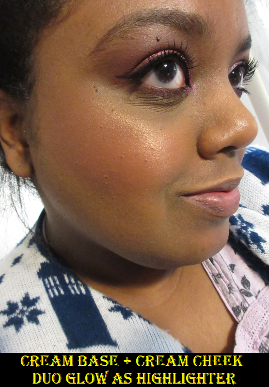
I use the Glow Cream Base as a subtle wet looking highlighter. I also mix it with the dark red Cream Blush to create a medium pink shade, since I don’t like the tone of the blush on its own. Because of the texture and how quickly it sets/stops being as blendable on the skin, I apply a layer of the Cream Base first to my cheek, then I add one tap of the blush on top and swirl it around with my finger until the adequate amount is laid down. I wipe the excess blush off my finger before continuing to blend until I’m satisfied with the look. I’ve tried the Glow Extreme several times but the sparkle level is too glittery for my taste. On the flip side, the Duo Glow is stunning! I imagine this could be a blush on some people but it is a stunning duochromatic highlighter. Being able to utilize so much of a face palette is uncommon for me, so I’m very happy I bought this. Also, I’ve had this for ten months and the creams haven’t dried out. This palette is meant to last 18 months, so that’s also a pleasant surprise!
Blush Duo

I bought this from a Boxycharm subscriber. The main blush shade is called Golden Coral and is described as a, “champagne peach shimmer and warm pink with slight champagne sheen.” This is not to be confused with the Duo Glow shade in the Bloom palette which is a combination of a, “vibrant coral with golden champagne.” The TouTou shade is meant to blend out the edges. On my skin tone, it’s too stark and just makes the edges look ashy. When I look forward, Golden Coral is a bit too bubblegum pink, and when I turn my face to the light it looks like I applied highlighter all over my cheek instead of a glowy blush. I think if I had a different shade, I would still not be a fan of the way it looks on my skin or its satin texture. MAC and Nabla are the two brands I trust to make a shimmer blush I will like. I haven’t had quite as much luck with shimmer blushes from other brands.


I think I will be decluttering this one from my collection since I doubt I will use it again. It looks pretty in the photo, but in person there’s just something about this color that I don’t care for. Despite the warmth from the gold shimmer, the base color of the blush itself is too cool toned for my liking.
The Mini Lila Palette

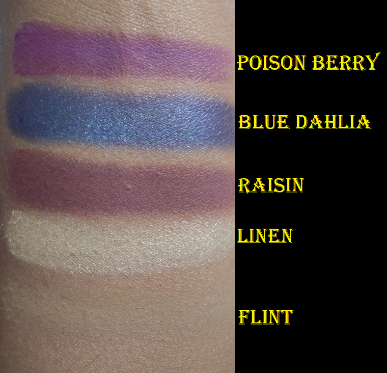
I purchased this palette when it was on sale and being discontinued about two and a half years ago. I haven’t noticed any changes in the quality because these shades were always very pigmented, but not the easiest to blend. Although Poison Berry (the dark red-toned purple) and Raisin (warm reddish-brown purple) are pretty colors, they look nearly interchangeable on the eye and I have plenty of shades like them. I wanted this palette for the Blue Dahlia shade, which was more unique in my collection when I originally bought it, but I have many duochrome blue-purples in my collection now, such as Nocturnal from Clionadh and Fierce from Sydney Grace. Linen is pretty, but I typically only use that kind of shade to highlight the inner corner of the eye and under the brow arch. Flint is only good for highlighting under my brow (though it barely shows) and blending out the edges of Poison Berry and Raisin.

I’ve tried to use this many times and to love it, but I think it’s best if I declutter it to allow other palettes I’m more excited by to get my attention.
My Revised Lila Palette


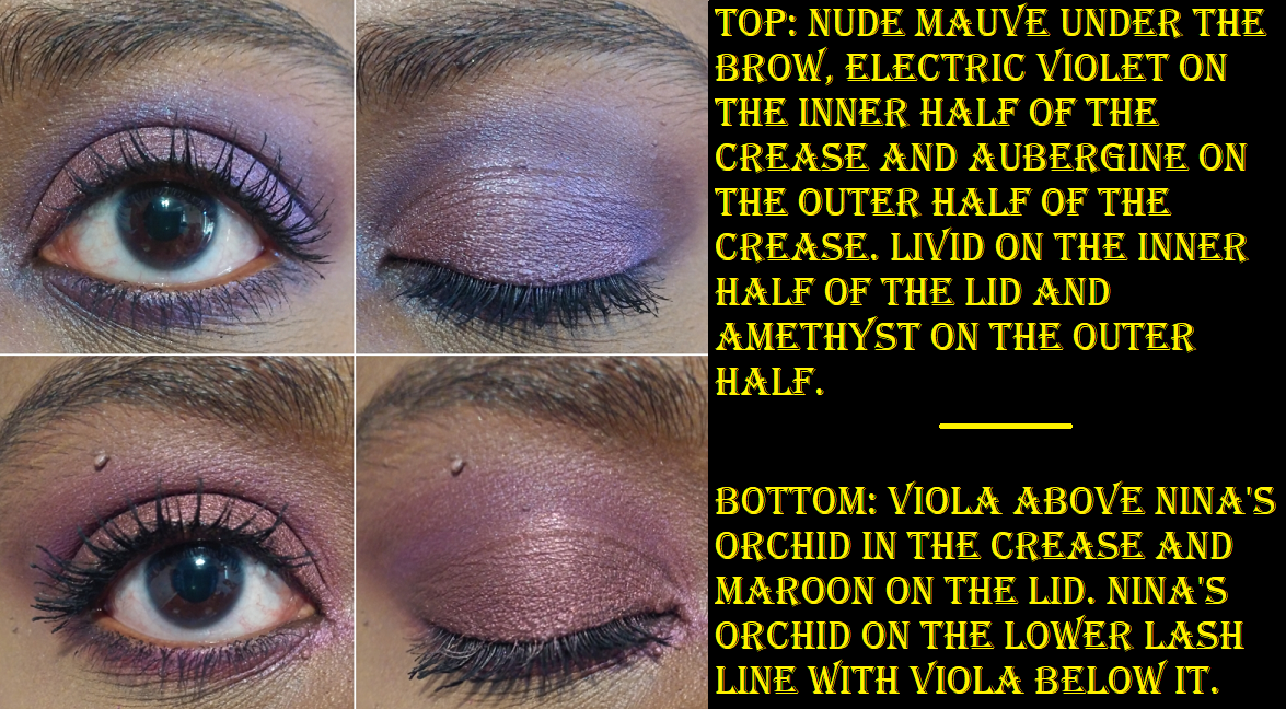
The Lila palette is an older one from Natasha Denona’s brand, but I purchased mine from Beautylish in November 2019. Some of these shades from the original palette are so beautiful, but I felt it wasn’t purple enough, which is why I rearranged this palette using six additional purples from the 28 Purple-Blue palette: Calypso Blue, Nina’s Orchid, Aubergine, Electric Violet, Smoky Plum, and Maroon. I am much happier with the results! The colors are mainly midtones and darker shades, so I don’t have anything to give a true pop of brightness in this one, but I tend to just use whatever highlighter I have for inner corner and brow arch highlights anyway.
As a purple lover, if I didn’t have the ability to add more purples to this palette, I honestly think I would have been more disappointed with this purchase and felt it wasn’t worth buying, even though I got it during one Beautylish’s infrequent sales. I still don’t use this palette as much as I should, but it’s aesthetically pleasing to me and I get joy from knowing it’s there in my collection.

The Mini Gold Palette

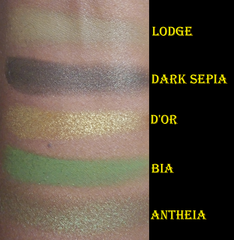
I purchased this shortly after it was released, which is rare for me to buy anything at full price. However, the color story was calling to me so strongly that I didn’t have the self control to wait for a sale. Lodge hardly shows on my eyes, but I love all the other shades! Dark Sepia is a much needed deepening up shade, even though I typically reserve that task for mattes. I found that it looks great in the outer corner but I can also use it in the crease with Bia on top to give that grungy olive green depth that I need if I want it to look like more than just a soft wash of green. I originally didn’t like the flaky texture of D’OR, but now that I’ve worked with many different glittery shadows for the past year, my experience makes using this shade much easier now. I thought the green would be my favorite shade, but D’or really elevates the eye looks I create with this palette. Antheia is a beautiful duochrome olive-brown with gold and green shimmer. That shadow’s tone doesn’t pop as much on my eyelid as I think it would on someone else, but it’s still pretty and I prefer how it looks as an inner corner highlight.

If I ranked my Natasha Denona palettes in their non-revised forms, this would be tied with the Bronze palette for second place. It’s also a favorite palette in my eyeshadow collection overall.
My Revised Gold Palette
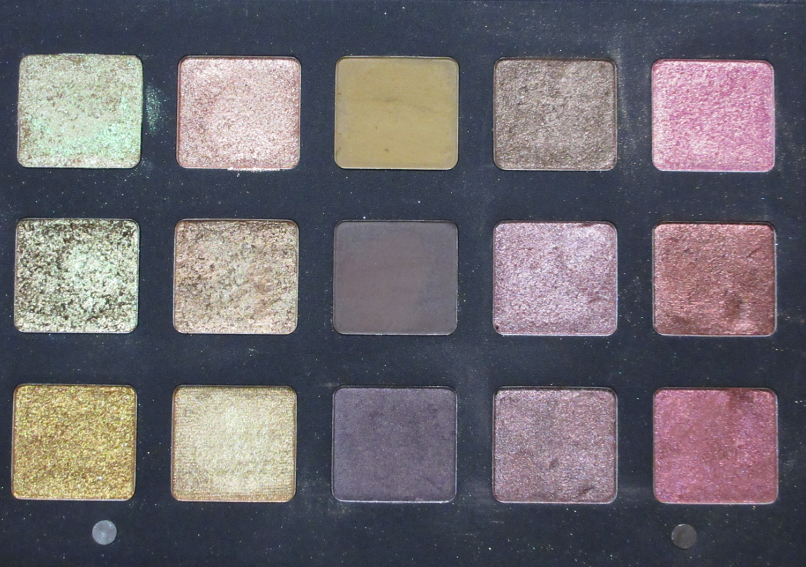


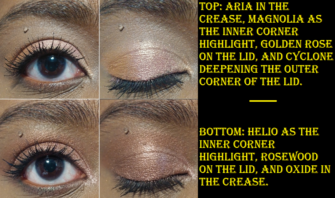
This is another palette that is older, but I purchased it late in 2019. Although I liked the blue shades, I wanted to have all my blues in the 28 Purple-Blue Palette instead. I kept 8 of the original shades and added 4 from Lila (Magnolia, Layla, Helio, Cyclone) and 3 from the Purple-Blue (Rosewood, Golden Rose, and Oxide). This palette holds one of the most amazing nearly-glowing greenish gold shades called Lime Chrome. It’s possibly my favorite eyeshadow color from Natasha Denona! It’s hard to justify the price when I got this palette for a few specific shades, but I can at least attest to the shimmer quality being amazing! The mattes weren’t very well suited for me.
When it comes to doing eye looks, my version of the Gold palette is better for simpler eye looks if used alone or as a companion palette. If I wore Brass one day and Oro the next, I doubt anyone would notice I was wearing a more yellow-toned gold shade that day. Or if I wore Brass one day and Alchemist the next, I don’t think anyone would wonder if the eyeshadow suddenly became less glittery than the previous day. So, really, the differences in gold shades is for the wearer’s knowledge and benefit. Although I don’t mind repetitive golds, there were quite a few light shades that were going to look pretty much the same on my eyes, so that’s why I removed most of those.

For the eye looks, I added Python, Sparks, and Aria back, although I had to use the very pale Anastasia Beverly Hills primer in order for Aria to show at all on my eyes. The last two eye looks were created using the pink shades in my revised palette, which were not part of the original Gold palette, but I included them in this section anyway.


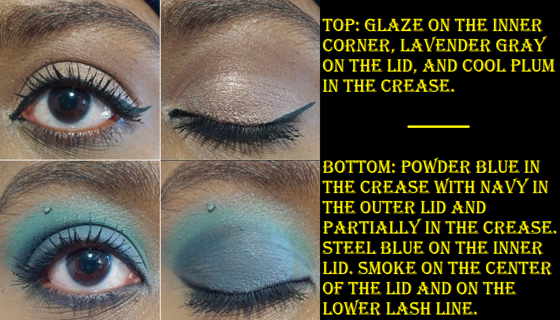
My Revised 28 Purple-Blue Palette


This is the oldest ND palette in my collection, as I received it from my 2018 Lucky Bag. These have under performed for a while now, but I am not ready to put them on the shelf of retired makeup products kept purely for collector purposes. Although this palette has been rearranged, the majority of the shadows are still here. I mainly removed the purple shades to spruce up the Lila palette. This one currently holds all the colors I like the least or would seldom use in my ND collection, which are mainly cool tone shades. Some of the yellows and golds are beautiful, but I wanted to minimize the amount of similarly toned shadows in the other palettes, which is how those ended up here. 19 are from the original palette, 2 are from Lila (Juneau and Per Se), and 7 are from Gold (Cava, Sandstone, Sparks,Aria, Teak, Aurora, Python).
The Metropolis Palette


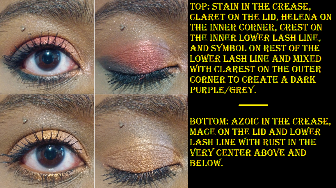
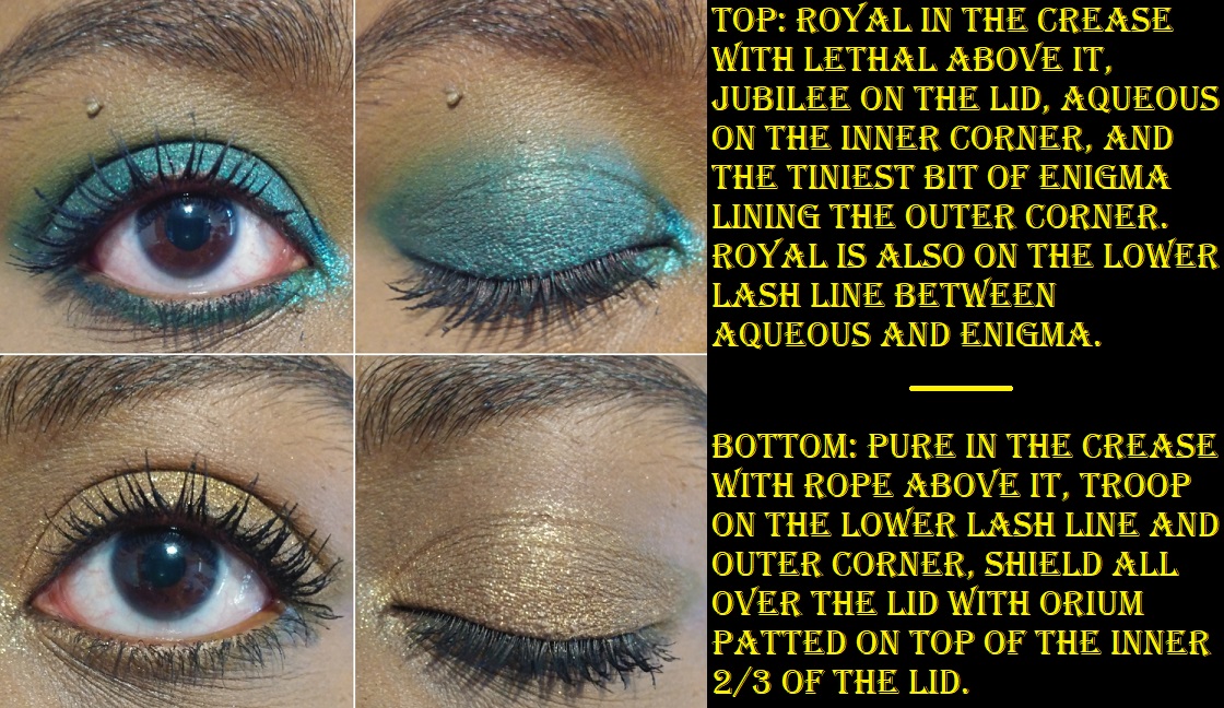
I love the greens and blues, plus I enjoy enjoy orange shades, so this palette has a lot to offer me. On a lighter skin tone, the subtle nuances and differences in texture and undertone is enough to keep this palette from being repetitive, but I acknowledge a lot of these colors look similar on me. My favorite shimmer from Metropolis is Orium, a duochromatic “coral with light greenish reflects,” which goes well with everything in this palette. That being said, I still haven’t used Metropolis as much as I wanted. I know the shades are arranged in a way that can be complimentary if used in adjacent quads or by rows and columns, but I am unused to these color combinations, so I tend to not know what to do and I reach for something else instead. I was happy to discover that the pans in Metropolis are the same size as the medium 15-pan $65 palettes, so I decided to swap some of my least use shades and replace them with Suntan, Magma, High Degree, Alloy, Gloaming, and Bliss from the Bronze palette. Then I organized them in a way that makes it easier for me to visualize how to pair the colors together on my eyes!

Metropolis launched in September 2019, but I’ve only had this palette for 13 months. I can happily say that the cream shadows have not dried out, although Symbol did feel less creamy than Enigma from the very start. They’re all still blendable and such a pleasure to use. This palette is labelled to be good for 2 years after opening, which is fantastic.
I already reviewed this palette, mini Lila, and mini Gold in my 2020 Eyeshadow Tag post, which included eyeshadow looks, so I wanted to expand on that by creating new looks using different shades for this one.
This is my favorite Natasha Denona palette and a favorite in my collection overall!
The Bronze Palette


This is the newest addition to my collection. I kept telling myself I didn’t need this and that the color story is repetitive, but I caved and bought it. When I looked at this next to Metropolis and saw all the neutral browns and oranges, I was reminded even more how much I didn’t need this palette. It’s so pretty though! Bliss is an amazing dark pink shadow with gold and green sparkle. Deep Dive has the cream to powder formula that’s present in the Metropolis palette which works well to smoke out any look or add a unique twist to any shadow that’s patted on top of it. Gloaming is a stunning, “burnt umber with a light bronze reflect.” Magma is the perfect crease shade for all these bronze and orange tones. The shadow quality is fantastic. They are all pigmented, even if most of the lighter mattes are the same depth as my natural lid shade and they just blend into my skin and become hard to see. The other shadows more than make up for it. Even Rhodium, my least favorite shade because it doesn’t have enough sparkle to stand out on my eye, looks amazing when paired with the more sparkly shades in this palette. What helps differentiate this palette from Metropolis is the fact that the similar orange shades lean more on the pink and brown side of bronze. The oranges in Metropolis lean more yellow and gold. Although I removed the most fun six shades and put them in Metropolis, I’m happy to say that what I have leftover in my revised Bronze palette still looks pretty and I can see myself reaching for it to use True Copper, True Bronze, Sundown, Deep Dive, and possibly even Rhodium again.

I left Bronze as a workable and still cohesive palette, unlike my revised 28 pan Blue-Purple one filled with shades I wouldn’t miss. Although I wanted to put Deep Dive in my Metropolis palette, I needed to keep it here as my main deepening up shade.


COMPARISONS


When it comes to specific categories like inner corner shades, browns, golds, bronzes, and blues, Natasha Denona’s shades are without question very similar. At the same time, I thought a lot of shades were more similar than they ended up being. For example, in my mind I thought Bia and Lethal were similar because they’re both light greens. However, Bia is on the grassy pastel side and Lethal is a more grungy yellow-green. I also thought about the fact that Golden Rose is a duochrome pink shadow with gold shimmer, and the same can be said of Bliss. In swatching them, I realized Bliss is more of a coral than a true pink. So, Natasha Denona’s use of different undertones and levels of glitter really helps shades that would ordinarily be similar look quite different when swatched.
That’s everything! I’ve been wanting to do a post like this for a long time, so I’m happy it’s complete now. Thank you for taking the time to visit my blog!
-Lili ❤

Love your revised Lila palette! I can’t believe how repetitive the metropolis palette looks.
LikeLike
Thank you! ❤ And yes, it shocked me too. I know that by looking at it head on I could see a lot of orange and brown, but the way it's spaced out between the blues and greens, it really tricks the eye into thinking they're more different than they are. When I originally swatched them in a past post, I swatched them in their order in the palette, so I thought it was definitely more helpful to do it from lightest to darkest this time. Even though I love the palette, it was a reminder to myself to pay more attention to things like that in the future. Have a great night!
LikeLike
Revised Metropolis and Revised Bronze are so pretty!
LikeLike
Thank you! ❤
LikeLike
Love this! Such a great review. I haven’t tried her products so just looking into whats nice before i buy! Glad I came across your blog. I have followed you and can’t wait to see your next post! xxx
LikeLiked by 1 person
Thank you so much! I followed back and looked at some of your posts. You’re very talented!
LikeLiked by 1 person
Thank you! Xx
LikeLiked by 1 person
Pingback: Natasha Denona Palette Ranking – Lili's Beauty Blog