INDIE BRAND SPOTLIGHT: Persona Cosmetics Review

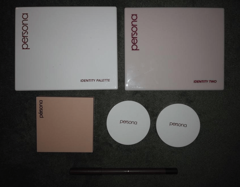
I’d like to begin this post by noting the Georgia Blush, Del Mar Highlighter, and 24Hr Eyeliner were gifted to me by Persona Cosmetics for the purpose of customer satisfaction and not for blog/reviewing purposes. I will go more into detail on that in the Terracotta Blush section.

Prior to January 5th, I only had the eyeshadow palettes. The Identity Two palette specifically had become the closest thing I had to an everyday palette. I loved it so much that I bought the older one, the original Identity Palette afterwards to see how they compared. Ulta briefly listed it for half price and I figured if it had the same formula as the Identity Two, I did not want to miss out, even though the color story isn’t my usual go-to.

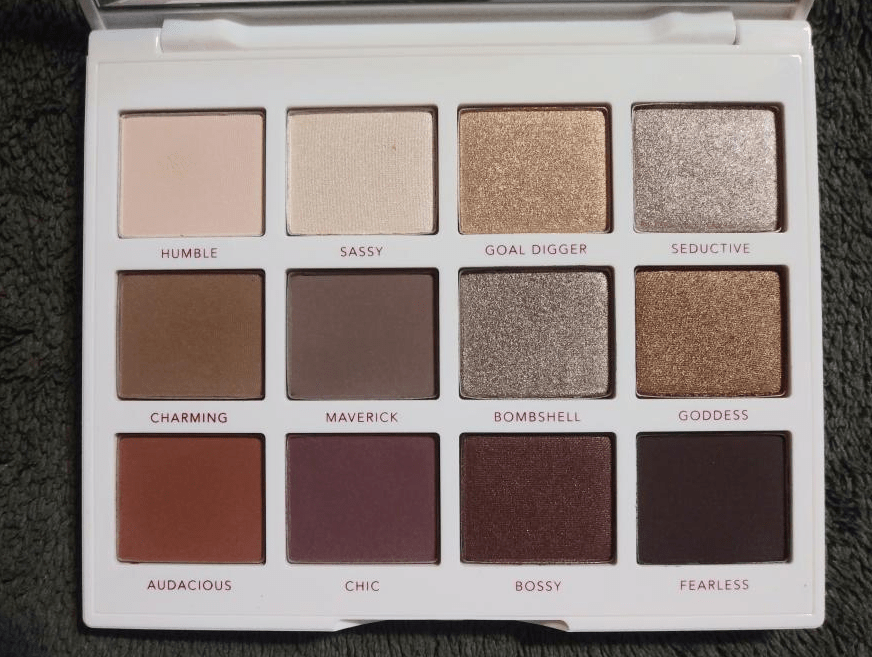
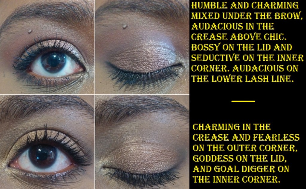
Persona Identity Palette

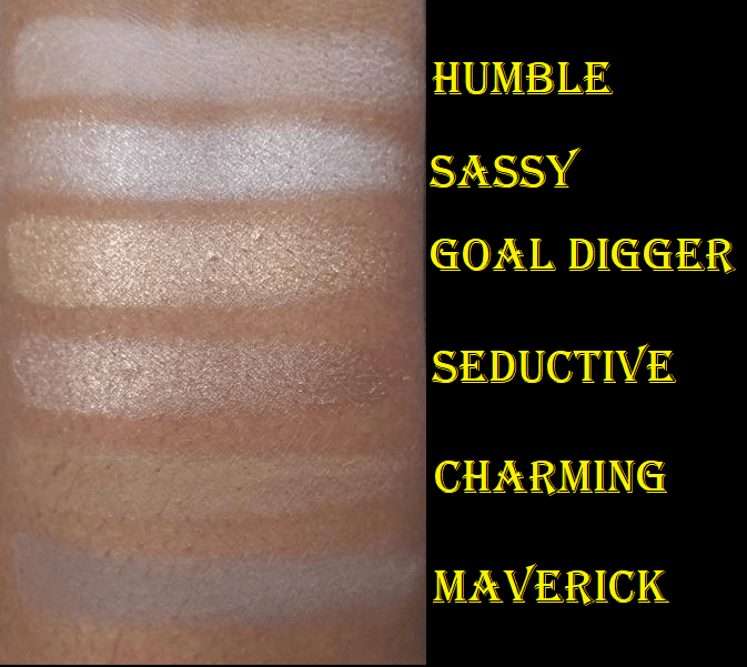
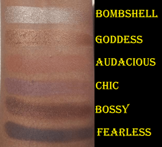
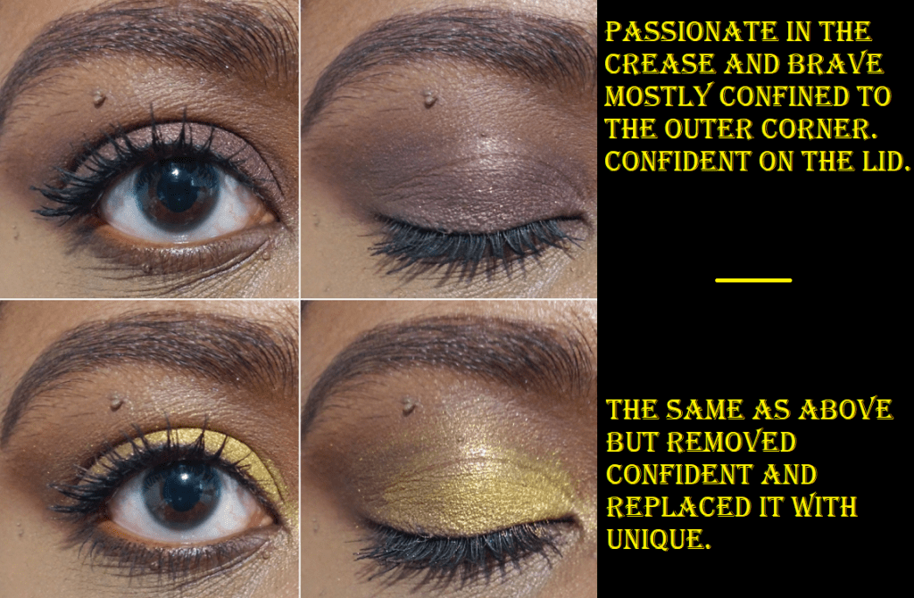
I’m not sure if the formula was changed or updated when Persona updated the packaging of this palette from cardboard to plastic, but I do find these shadows to be a tiny bit on the drier side. The shadows still perform nicely despite being slightly less pigmented (excluding Fearless). I was also surprised to see how grey Maverick looked on me considering how brown it looks in the pan. The overall color story is a little more cool-toned than I expected, but I like having some of these shades anyway. Ironically, I still have to mix Humble and Charming together to highlight under my brows (to avoid looking ashy) like I do with Kind and Loyal. Goddess is a brighter alternative I wanted alongside Resilient. Goal Digger is the more traditional gold shade I wanted alongside Unique. Audacious is the kind of shade I love to have in the crease, so I’m very happy to have that one. It leans more orange than than the shade Passionate which leans more pink. One of the things I really wanted from the Identity Two palette, after using the pink leaning white shade called Honest, was a white leaning gold. When I saw Sassy, I was hopeful this might be it, but it’s more of a silver shade. If Persona ever makes an Identity Three, I hope that pale gold will be in there, though I can still use Goal Digger for the purpose I envisioned.

Persona Identity Two Palette

I raved in-depth about this palette in my 2020 Eyeshadow Tag. If I had to declare a favorite premade eyeshadow palette from 2020, it would definitely be this one. It was one of my favorite palettes to pair with my beloved Clionadh Cosmetics multichromes. Everything I mentioned about the formula of this being creamy, pigmented, blendable, being worth the full retail price, something I can take traveling (which I have by now) and being versatile enough to create simple or complex looks and go neutral or colorful holds true. What I forgot to mention is that Limitless makes an excellent powder eyeliner.

I have additional looks with the Identity Two Palette in the 2020 Eyeshadow Tag post.

Now that I’ve compared both, I can say that the Identity Palette is great, but the Identity Two is the version that suits my preferences specifically: creamier, slightly more colorful, more pigmented, and warmer. If an Identity Three palette is ever released, I will probably purchase it on launch day. The palette would most likely still be neutral, as the owner and brand’s overall aesthetic favors everyday/natural glam.

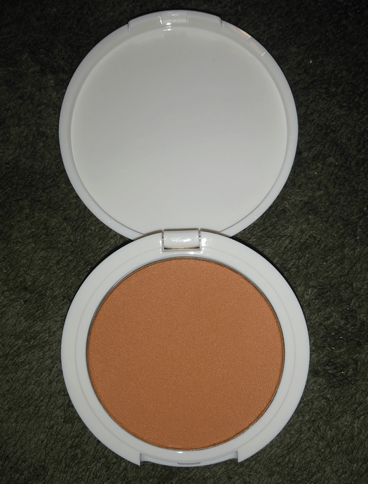
Persona Superblush in Terracotta

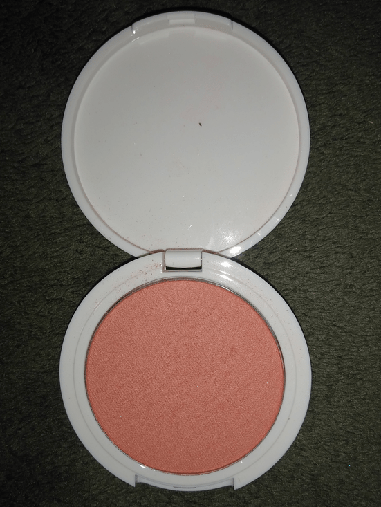
Terracotta is the newest addition to the Super Blush range. As I went completely bananas for blushes last year, I naturally had my eye on them for a very long time. It was difficult to find anyone with a deep complexion wearing Georgia or Carmel via Instagram, Youtube, Persona’s website, or Ulta’s site. There was only one woman I could find, who was darker than me, and I could hardly see the colors on her cheek so I thought perhaps these shades just weren’t meant for me. When Terracotta was released, I had an even harder time trying to figure out if this shade would work for me or not, especially as even the color in the pan looks vastly different depending on the lighting. I watched one of Sona’s videos (owner of Persona) and it looked pretty light on her, but she mentioned that this blush gets much deeper the more it is layered. The website also listed Terracotta specifically as being suitable for medium to dark skin tones. My foundation shade among inclusive ranges like Make Up For Ever, Nars, Fenty, etc tends to be in the beginnings of the dark category and often called medium-dark, sometimes even the tail end of the tan category. So, I figured this should give a subtle color to my cheeks at the very least. Considering how often MAC’s paler shades surprisingly worked for me, I decided to give it a try and purchased the Georgia and Terracotta duo (with the intent to give Georgia to a friend for Christmas).

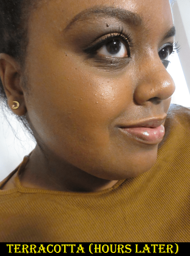
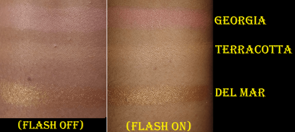
Unfortunately, Terracotta doesn’t work on me. At the time, I felt duped by the ‘suitable for dark skin tones’ label considering the shade isn’t just faint, it disappears entirely. It’s too close to my skin tone. I have four heavy layers of blush in the photo above, though it looks like nothing. I tried to leave a comment on their website to warn other shoppers about the description inaccuracy, but my comment was never made public. So, I wanted to at least warn those who followed me on Instagram about it. I had no idea Persona Cosmetics would see my post (or I expected it would be ignored by them if they did come across it). Their response was beyond anything I expected. Not only did they change the description from “medium to dark” to “medium to tanned skin tones,” which was the best case scenario outcome I could have hoped for, they also refunded the amount I paid specifically for Terracotta, sent me Georgia (since I had already given mine to my friend) because they were confident that shade could work for me, and sent the eyeliner and highlighter as extra surprises. It became very clear to me that customer feedback is important to them and they didn’t glaze over the situation like plenty of other brands would. It restored my confidence in the brand. It was especially poignant considering a short week later, Hourglass tried to pull the wool over everyone’s eyes with their release of the Ambient Lighting Palette Volume II, promoting it with a photo where the model and palette looked edited to appear deeper. The shades in the trio palette were repromoted ones (two of which I have) and that darkest shade which is considered a bronzer is what I literally use as a highlighter. The response from Hourglass was to simply remove the photo from Instagram and ignore the problem entirely. The different responses between these two companies are night and day, and I have even more respect for Persona Cosmetics when the situations are compared. This is the reason I felt it was important to share this story. If I’ve had a customer service issue in the past that was rectified, I would normally delete my original post since it was resolved. This time I kept my post on Instagram and am talking about it here because I think it’s really important to show the growth and integrity that was shown to me by Persona’s response, and also to present this as an example for how brands should handle things.

The last point I wanted to make is that I’ve tried to use Terracotta many times on my cheeks (and it actually makes a decent under eye setting powder). There was one time that I had it on and a slight tinge of color actually showed on my cheek by the end of the night. I don’t remember what foundation I was using at the time, but it led me to believe that if this shade is applied on foundation that oxidizes or will allow my natural oils to come through, it could potentially show on my skin. I have since tried to recreate that same scenario and have been unable to get the color to show visibly enough on camera (hence the hours later photo in the gallery above). So, I still stand with the fact that this won’t work on someone with my same skin tone. In the best case scenario situation it’s barely a whisper of color.

Persona Superblush in Georgia

Persona was correct. This shade does work for me! Honestly, I was pretty shocked considering my friend who I gave my original one to said it’s perfect for her and she is much lighter than me (though still in the caramel family). It gives a very light flush of pink as if I’ve been out in the cold. If I really layer it on, it’s the type of shade that I think of when anime characters blush, which is super cute!

Persona Del Mar Cali Glow Highlighter

As seen in the Georgia section, the Del Mar Highlighter is perfect for me! It’s close enough to my skin tone to blend in very well, it can be as subtle or as shimmery as I want, and there are no chunky glitter particles! Although I am wearing the Charlotte Tilbury Hollywood Flawless Filter under my foundation on the high points of my cheek, this highlighter looks just as great without it. I need to use it a bit longer to see how often I reach for it, but it could potentially knock Nabla’s Skin Glazing in Amnesia from the top spot on my list of favorite highlighters!

Persona 24HR Waterproof Eyeliner in Black

I’m going through this pencil very quickly as I feel like I lose a lot of product when I try to get the tip sharp enough with my Nars sharpener, which I need to sharpen every 1-2 uses. This formula is very creamy and easily glides across the skin. That softness does make it difficult to sharpen as I previously tried to use it with the sharpener that came with my MILK Makeup Gel Eyeliner, but that did nothing but instantly break off the tip. I like that when this dries it becomes smudge-proof and when I use it at an angle I can make lines in varying thicknesses. I can make a very precise thin line across my lid, but creating a sharp tail has proven immensely difficult due to that blunt tip. So, I just draw a line as well as I can and then use concealer to clean up the outer corner. The fact that this stays so well in the waterline makes this pencil worth it to me and I’m curious to see how long this pencil will last at the rate I currently use it. For the precision issue, I usually have to use a brush with my MILK eyeliner pencil, so the fact that this is nearly as black and budge-proof as that, while still being easy to remove with Bioderma (and the creaminess makes it easier to spread with a brush), makes the potential for me continuing to like and use this very high. I’m glad I have it, but I honestly wouldn’t recommend it in this current form. If Persona comes out with a retractable/twist up version, I’d buy it in a heartbeat.

That’s everything! I will continue to keep my eye on new products from this brand as I am more excited about them than ever. They recently launched lipliners and colored balms, but I’m on a lip product no buy. I’ll keep my eye out for the next new release from them!

Thank you for reading!

-Lili

The Eyeshadow Tag 2020

This tag was started by Samantha March and Allie Glines on youtube. As a way to continue analyzing and enjoying my collection, I thought I could try this as a blog post! There are so many palettes I haven’t featured here, so I set the rule for myself to not have any repeats for each category. I will include arm swatches and examples of eye looks for most of these answers.

Newest Palette

*Right half was taken with flash on.

Nabla Cutie Palette in Wild Berry This is just one of the three newest cutie palettes released. After several beauty gurus called this, “Nabla’s best eyeshadow formulation yet,” I decided to try the palette. As I’ve only had this palette for a week, I think I need a bit more time to decide how I feel. For now, I have mixed feelings. The matte shades swatch beautifully and smoothly. I like Blackberry and Botanic Juice a lot, but Venom is a bit tricky to work with as it moves a bit, making it look patchy when it shouldn’t. All of these shadows (especially the foils) have a lot of slip to them. It’s not as heavy to the touch as dimethicone, which leads me to believe one or more lighter weight silicones must be the reason for the texture and glide. I will have to do an extended wear test to see if Venom continues to move around (and I will update here in the future). My primers tend to be on the emollient side, so I may need to set the lid with powder first or use a drier base primer.

Incense is close to my lid color, so it only shows up on my skin if I’m using a white or very light base underneath, and even then, it is subtle. Bucolic Baby is a flattering pink on me because of its peach undertone and Alchemy 2.0 makes for a pretty shadow topper. For such sparkly shades, I was happy to see that there was hardly any glitter fallout.

Oldest Palette

Smashbox and Santigold Santigolden Eyeshadow Collage in Earth As We Know it – I had to redo this section three different times as I kept forgetting about the different palettes I have stored away on the too-sentimental-to-toss-out-but-too-old-to-use shelf in my closet. I purchased this, the Hello Kitty 40th Anniversary Pop-Up Party Eyeshadow Palette, and the Too Faced Semi-Sweet Palette in December 2014 when they were all on sale, so I don’t recall which one I was in possession of first. However, I believe the Santigolden palette is the older release. I thought the shades were beautiful, but I didn’t know how to wear this color combination, so I didn’t use this palette that often. I remember getting it at $13, so I was just happy to keep it for the gorgeous packaging and because I listened to Santigold’s music around that time as well. Just for fun, I’ll include photos of the other palettes as well. I would give an example of eyeshadow looks if these palettes weren’t so old. The missing Hello Kitty shade was where I removed the entire pan about a year after using it when I saw strange silvery dots in that shade. It’s most likely from the pigment not being mixed thoroughly enough, but I didn’t want to take any chances of it being something else and potentially spreading it to the other shades. Also, I depotted some of these shadows in the HK Palette, so a lot of them are not in the right spot.

Most Expensive Palette

Pat McGrath Mothership III Subversive – Although I have palettes with a higher retail price (such as the Natasha Denona Purple-Blue palette), this is the most expensive one I’ve paid for outright. The mattes are nice but not special enough for the price tag. I do like the shimmers, but the last four “special shades” on the right side of the palette are the ones hyped up, and for good reason. They are stunning! I do believe indie brands make better duochromes and multichromes for less money, but part of the appeal of PMG palettes are for the luxurious heavy packaging and for the experience. In my opinion, this palette is worth $75 maximum for the eyeshadow quality (marked up of course). It’s up to the customer to decide how much more the packaging and experience is worth.

Most Affordable

ELF Bite Size Eyeshadow Mini Palettes in Hot Jalapeño, Acai You, and Truffles – Does a quad count as a palette? If so, these are my least expensive palettes at $3 each. There isn’t a ton of product in each pan, so that contributes to the low price, but the quality is fairly good. My favorite one is Hot Jalapeño which performs very well. The gold and light green shimmers are pigmented and bright. The lighter green matte is decent and the darker green is good.

Acai You takes a lot more effort. The dark blue matte is patchy. The light blue matte isn’t very pigmented and needs a lighter base to pop on my skintone. The shimmer is okay but doesn’t pop as much without a glitter glue or being applied wet. The darker satin shade needs even more help to make an impact.

Truffles is a nice soft neutral palette for me. The mattes take some building up, but I like the defined yet soft and blendable look I can achieve with this. The lightest matte shade is too close to my skintone to show up, though. The shimmer in the palette packs just enough punch on its own without glitter glue or being wet.

A strange thing I noticed is that these shadows don’t apply as well when I use the ELF Putty Primer. Something with a little more slip, like the MAC paint pot, makes these more enjoyable to use. So, if you have a high quality eyeshadow primer already, these are certainly worth a try.

Everyday Palette

PERSONA Identity Two I rarely use the same palette twice in a row, but the closest thing I have to an everyday palette is this one, which is one of the newer additions to my collection. Overall, these shadows are so smooth, buttery, pigmented, and blends easily. Honest would be the perfect brow bone highlight shade if it had gold shimmer instead of pink. This does limit how often I’ll use it, but it works well in circumstances when I’m using the other shades in the red-purple family. Kind is a light cream shade with just enough warmth to prevent it from looking stark on my skin. Loyal is a light brown that doesn’t show easily on my eyes, so I use it to blend out the black eyeshadow if I’ve gone too heavy-handed with it. Limitless is an extremely pigmented onyx black, so a tiny amount goes a long way. Brave is a medium brown but deepens up a lot on a wet eyeshadow base. Even though it’s the second darkest shade, it’s still easy to blend out without needing to use Loyal. Independent is not a typical gunmetal shade as it has some blue tones to it. It would add a unique twist on a cool-toned smokey eye. Passionate looks like a dark peachy red in the pan, and an orange in swatches, but it’s described on Ulta’s website as a light maroon. Whatever color it is… I love this shade! I’ve been a lot more interested in peaches and pinks lately, so I got this palette at the perfect time. Unique is a brilliant gold. I wanted to do an eye look pairing the green with it, but I imagine a lot of people featuring this palette would have already done that color combination. Then again, I was unable to find anyone on youtube with my skintone or darker using this palette. And because eyeshadows look differently depending on your complexion, I could have done it without feeling repetitive. Both Unique and Emerald remind me of the quality of Coloured Raine eyeshadows, which is paying this palette a big compliment as Coloured Raine makes one of my favorite formulas. Confident is a little disappointing, as it just looks dark on my lid and doesn’t show the pretty purple tones very well on me. I haven’t used that shade as often as the others, so perhaps I could try to use a white base next time or to see if wetting my brush will somehow bring out the purple in it. I’m not certain how well the white base would work though because I think this shade (along with perhaps Driven) already has a black base in the formulation. Empowered is the type of reddish shade I don’t use that often, but it is a nice compliment to some of the other shades in this palette. Resilient is possibly my favorite Bronze eyeshadow, or at least ranked among my top three Bronzes.

I could easily take this palette traveling and feel satisfied with the selection available to me because I can do something colorful or neutral, complex, or basic. This is one of the few palettes I believe are worth the full retail price, but if you can get it for a reduced price like I did, that would make it even more of a win!

Colorful Palette

The Coloured Raine Vivid Brights Palette is easily the most colorful one in my collection. The reason the photo looks like that is because I immediately depotted it to put in my gigantic CR magnetic palette with my other CR eyeshadows. I have only used a few shades prior to this post because this is actually a step out of my comfort zone because of how intensely bright they are. I like colorful shadows, but I don’t have the confidence yet to use them regularly. For my eye looks I used a white base on the lid so the lightest colors (such as that yellow) would pop more. Crushin’ is a gorgeous neon peach, but it gave me a little trouble sticking to my lid over the Colourpop white concealer I used. Otherwise, I had no other issues with patchiness. One other thing to note is that Drip Drop darkens up noticeably over a primer. It is common for mattes to darken on the outer edges if a base is too wet, but in the case of Drip Drop, the entire shade darkens.

Smallest Palette

ND Mini Palettes in Lila and Gold This would be ELF again, but I chose this to avoid repeating an answer. I love the shades, but the quality of mini Lila deterred me from getting the full-size Lila palette because I didn’t think it would be worth it if it performed the same as the mini. The mini is okay, but nowhere near as fantastic as the larger version! Blue Dahlia is also the only shade from this palette that is somewhat unique in my collection. The mini gold is very good, though. I have no regrets purchasing that, and it ultimately gave me assurance that I’d like the full-size Gold palette too. One day, I’ll have to do a dedicated Natasha Denona post with updates and swatches all in one place. That won’t be anytime soon though. I have some older photos I took from when I originally bought these palettes to do a review, but never got around to it. I will include them here. As much as I recommend Mini Gold, you can see that both of these minis include brown shades that barely show on my skin without putting flash on. This seems to be the running theme among the majority of palettes in this post. To have a single shade that doesn’t show up out of such a small palette really limits things. The color story is already tricky to make looks using each exclusively without pairing other outside palettes with them, so the additional looks I created were inspired by Natasha Denona’s promotional images.

Largest Palette

BH Cosmetics Zodiac Palettes in the Original, Love, and Crystal – These aren’t too thick or wide, but they are tall. There’s a lot of wasted space, but the palette design was part of the reason I bought the original one. I’m always surprised by BH Cosmetics powder products, including their eyeshadows. I always expect them to be patchy or powdery with a talc smell (because of the price) but they are pretty decent products and the Zodiac line is particularly good. I recommend the original, and perhaps the Love Signs if you like the color story, but the Crystal one is just a gimmick. The swirls just make those shadows extra icy/silvery, which isn’t the most flattering on me. I feel that the 1st Zodiac palette is the most pigmented and overall best quality. The Love palette shimmers are a bit sheerer, but the matte quality is pretty much the same. The look I created reminded me so much of what I can create with the ND Metropolis palette, so that’s a bit of a compliment to that palette. The Crystal palette is okay but not as good as the previous two. I don’t recommend it unless you can get it for a decent discount.

Technically, my largest palette is the KVD Mi Vida Loca Remix Palette, but I have that one stored away due to age. In my experience, KVD’s shadows change in performance fairly quickly. I suspect it might be due to their particular vegan formula. Anyway, these are looks from the Zodiac Palettes.

Most Memorable Palette

MAC Archie’s Girls Spoiled Rich (Veronica) Palette – This is the oldest palette release in my collection (Spring 2013) but it was not in my possession until November 2015. I didn’t start getting seriously into makeup until early 2014, and I was quite upset when I first learned that there was an Archie makeup collection that I had missed out on. I’ve been reading Archie Comics since the 4th grade and still read them on and off. Archie Comics are something I’ve discussed numerous times with my loved ones. They made a small impact on my life and there will always be a soft spot in my heart for the nostalgic wholesome classic digests.

In one of the facebook beauty groups I’m in, a friend was at her local CCO and saw a few palettes available and remembered that I had previously discussed missing out on the collection. This was before I knew about Mercari and I wasn’t an ebay shopper back then, so for her to let me know about it and offer to buy it for me (I reimbursed her) was so awesome! The joy of not having to deal with FOMO anymore and the excitement of finally having my hands on it was very memorable. I still feel that excitement again whenever I look at the palette. The shadows are so old that I never applied them to my eyes, but I wanted to have them as a makeup lover and Archie fan.

Worth the Hype

Natasha Denona Metropolis Palette – I was dying to say the Clionadh Stained Glass Collection, but this is about premade palettes. I already did a mini review of this in my Lucky Bag post, but I love the shadows with the cream-hybrid formula, the shimmers, and the greens and blues. There are some shades that are so similar that I feel I don’t need them, even though the finishes are different, but overall, this is a fantastic palette that I’m so happy to have! The only downside is I’m used to having a dark brown to deepen things up. The darkest brown in the palette is barely dark enough to add depth to my eyes. So, this presents a bit of a challenge to switch up how I would normally do things. I have to put more thought into the look I’m going for, which can be fun as long as I’m not in a rush.

Not Worth the Hype

Tati Textured Neutrals Vol 1 – I’ve discussed this palette and posted swatches already in my review and since then, I haven’t reached for this except to refresh my memory on what this is like. I still love the four shades in the palette that I depotted for traveling (the palette itself isn’t travel friendly due to the incredibly heavy mirror), but I’m debating finding this palette a home with someone else who would use it more. Even if I ignore my main gripe of several colors blending too much with my skin, the reasons this palette isn’t worth the hype is because the entire Poet column looks terrible on me, there’s a row of unsafe glitters, and the sequin shadows are essentially a duplicate matte row. This is still a good quality palette, but because I would only use 9 out of 24 shadows for their intended purpose, this was the only palette I could think of to place here. I do own palettes that I genuinely don’t like, but they were never hyped up to begin with, which is why I couldn’t choose those instead.

While trying to decide if this palette was worth keeping, I looked through my collection for some dupes to the shades I would use.

Here are the photos of me playing around with the shadows late at night (I was in a rush and didn’t bother trying to make them look that great).

Colourpop’s Onyx looks identical to Metallic Memory on the lid, except that the Onyx side has a lot has less sparkle. For the gunmetal look, I actually want more sparkle, so I think I would actually miss having this shade in my collection. This is the same situation where I found nothing that came too close to Metallic Story (everything was light orange with gold or pink with gold, as opposed to medium orange with gold). The closest dupes were brighter, shinier, and/or smoother in texture, yet I still wouldn’t want to give it up. *As I was about to upload this review, I remembered Black Metal from my PMG Mothership III palette, so I included a comparison and I still don’t want to give up the shade from Tati’s palette!

Matte Memory didn’t have an exact match, but after seeing how black that Kaleidos shade was, I didn’t bother continuing to look. That one can be replaced. The same goes for Matte Story, which can be easily replaced by two beautiful Viseart oranges.

The Matte versions of Soothe, Aura, and Ritual, along with Metallic Soothe and Aura are not unique shades. I have plenty of similar enough looking shadows to replace them, which I already knew before buying the palette, but does the quality of those shadows surpass the dupes? To quote Marie Kondo… this just doesn’t bring me joy. I will probably depot Metallic Memory and Metallic Story, then rehome the rest of the palette.

Favorite Palette from a Favorite Brand

The Coloured Raine Power PaletteMy favorite brands don’t make eyeshadow palettes with color stories that appeal to me (hence relying on depotting or resorting to purchasing their single shadows), or their eyeshadow quality is lacking. It would make sense that a brand who I have the most eyeshadow palettes from should be the answer to this question, but I don’t have brand loyalty to them. So, this palette I chose is my best answer. The matte quality isn’t quite the same as their other mattes, but they’re still good. The shimmers are fantastic, and the white duo-chrome shade is unique and gorgeous. I was also happy to get this for at least 40% off during a sale.

Most Used Palette

Jacyln Hill x Morphe Palette from 2017 (with the updated packaging that was released three months after the initial release) – For all of 2018, this palette had my love for three shades in particular: Beam, Silk Crème, and Chip. I mix Beam and Silk Crème to create my favorite brow highlight and Chip is my favorite crease shade. There are times when I’ve literally just used Chip with some liner and mascara and felt confident with that alone. In 2019, I barely used makeup. After doing this tag, I have rediscovered my love of this palette! There are shades that didn’t interest me before, that have suddenly caught my attention! This palette also has nice transitions, deepening shades, and a few pops of color for the lid, or something neutral. It’s a very well curated palette that works for the majority of skintones and I had no idea I’d enjoy it so much when I bought it! There was a time this used to be my everyday palette, and it might reclaim that title from my Persona Two Palette.

I’m not a fan of Jacyln Hill, so I was ultimately persuaded to buy this based on the glowing review from JenLuvsReviews. Ironically, her updated review (on the palette changes Morphe made) is what stopped me from repurchasing this. As mentioned, this palette is from 2017, and right as I was debating whether or not to buy a newer one, it was revealed that what’s available in stores isn’t the original formula. So, I will continue to enjoy this palette while it’s still good. And my goodness is it good! With the exception of Roxanne, which gave me a lot of trouble swatching but applied nicely on the eye, and Creamsicle, which isn’t as vibrant as it looks in the pan,  these still work just as great as when I bought them.

That’s all for now! Thank you for reading! Stay safe!

-Lili