I’m as much addicted to getting a good deal as I am to collecting blushes, so when I was able to get Rose Feu (the only shade I wanted from the Rose Hermès line) just ten days after the product launched, and for significantly less money via Mercari, it felt like I had reached the pinnacle of my blush obsession. This is the first, and most likely last, time I will ever exceed my $40 maximum for a single blush. I also know I will likely never get a deal as good as this one on a luxury makeup product again.
This special circumstance of obtaining a product that would normally be out of my reach has made new blush launches less exciting to me. For once, I finally feel like my collection is complete. That being said, I still have a plethora of blushes from my collection (and newer ones I purchased just before this one) that I have not reviewed yet on my blog, so the blush content will continue along with eyeshadows, face palettes, and other makeup I love.
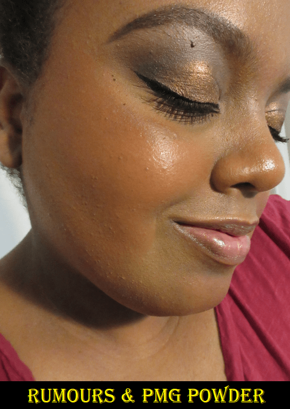
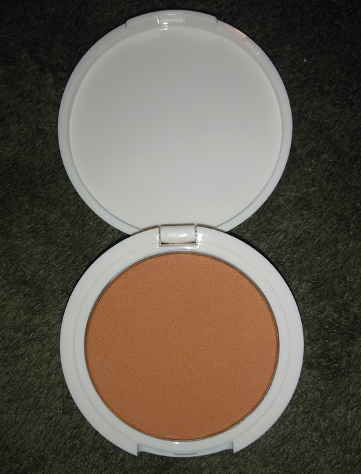
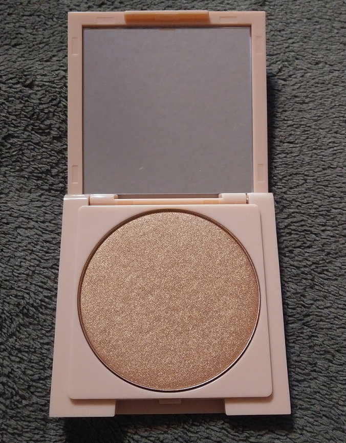
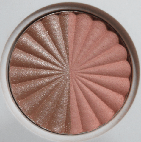
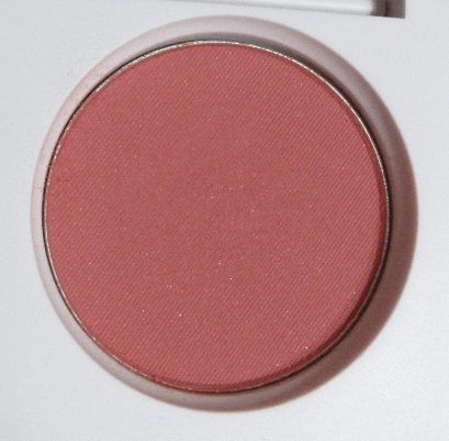
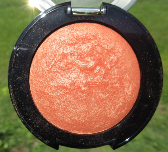
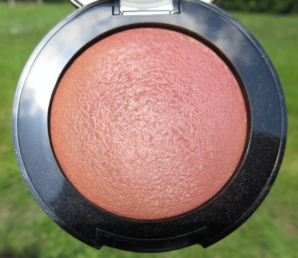
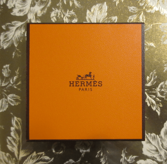
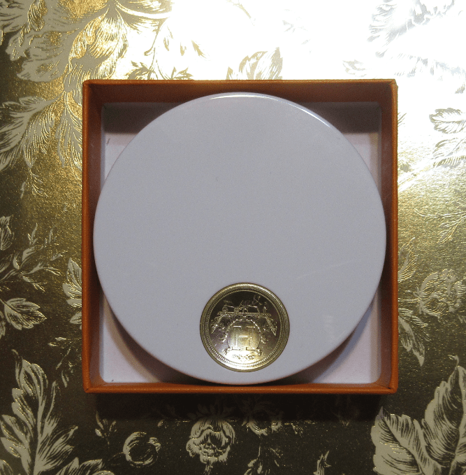
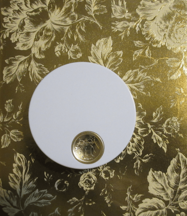
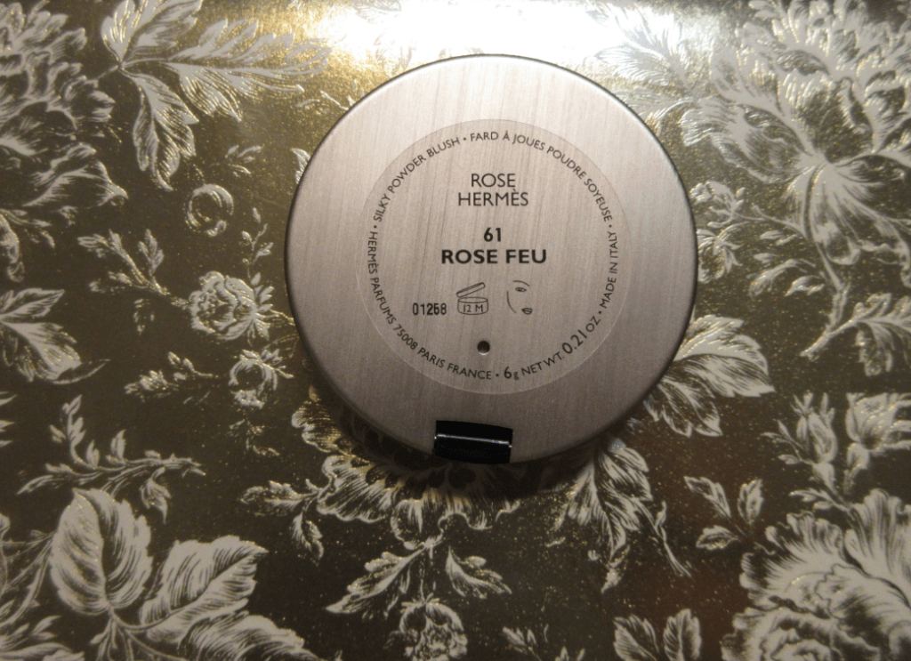
Hermès Rose Hermès Silky Blush Powder in Rose Feu

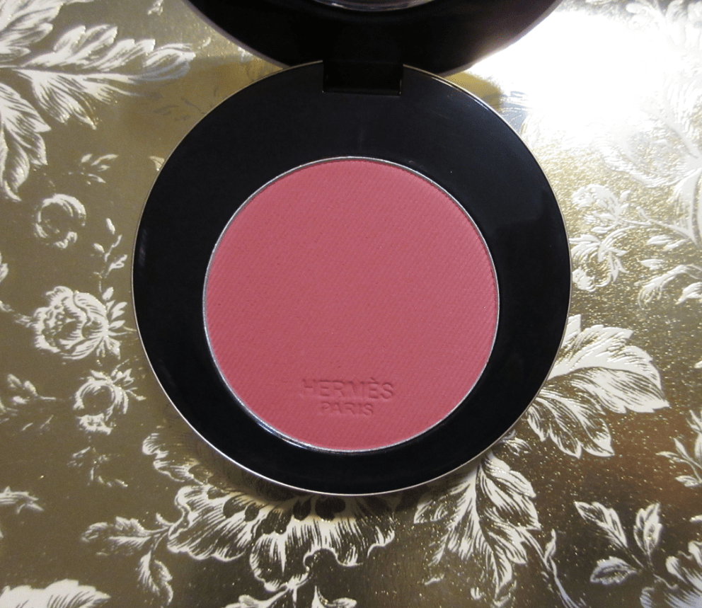
The powder is soft to the touch and there is very little kickup when I dip my brush into the compact. The amount of blush I pick up with one tap of my brush is all I need per cheek. This blush gives good color payoff without sacrificing how well it blends into the skin, but I cannot confirm if all the other shades within the line are as pigmented.

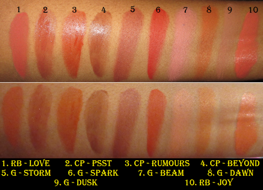
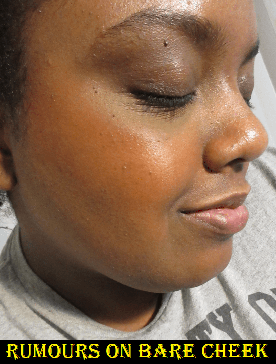
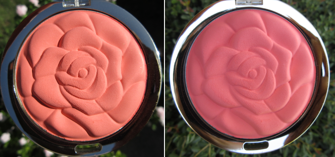
I have quite an unreasonable amount of blushes, so I was surprised how difficult it was to find a color dupe for Rose Feu. It is described on the Hermès website as a, “purple hibiscus, fiery, intense, illuminated with a hint of carmine.” I see a slight plum tinge when I look directly at the pan, but it is a rosy terracotta hue on my skin. Perhaps the fiery claim comes from that.
I’m glad it’s somewhat unique to my collection because that makes it more special. However, when it comes to the formula and performance, Hourglass Ambient Lighting Blushes and many of the blushes from MAC are just as good as this one. Rose Feu matches, but doesn’t surpass, the quality of my absolute favorites despite the vast price differences.


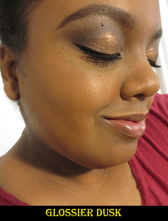
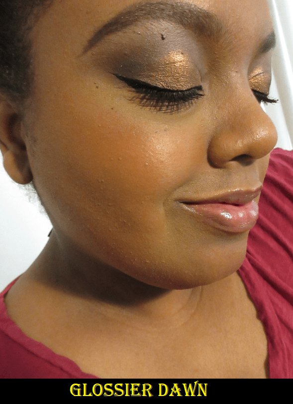
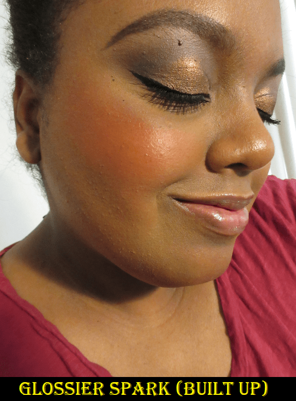
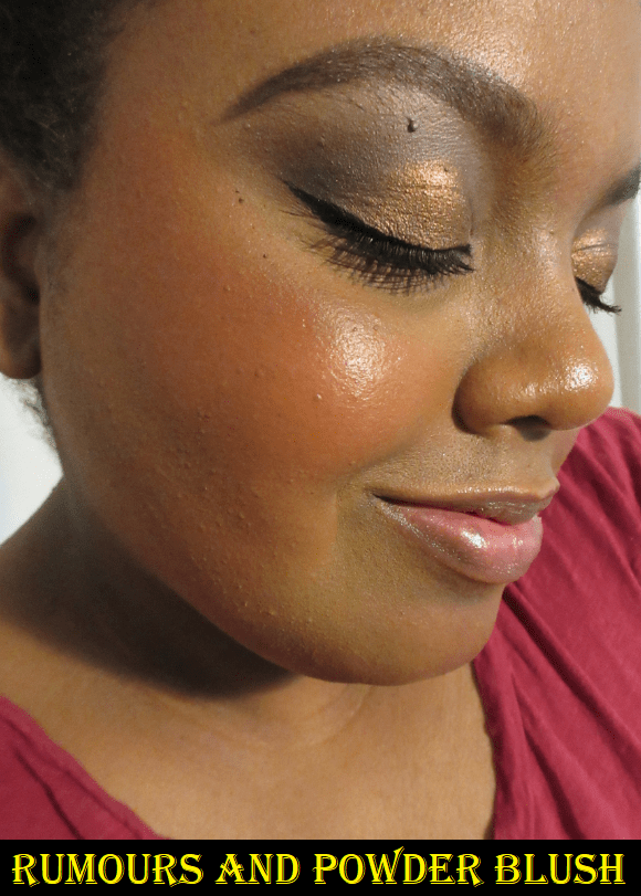
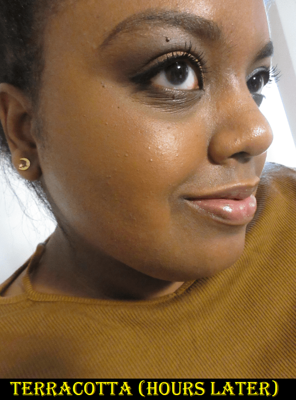
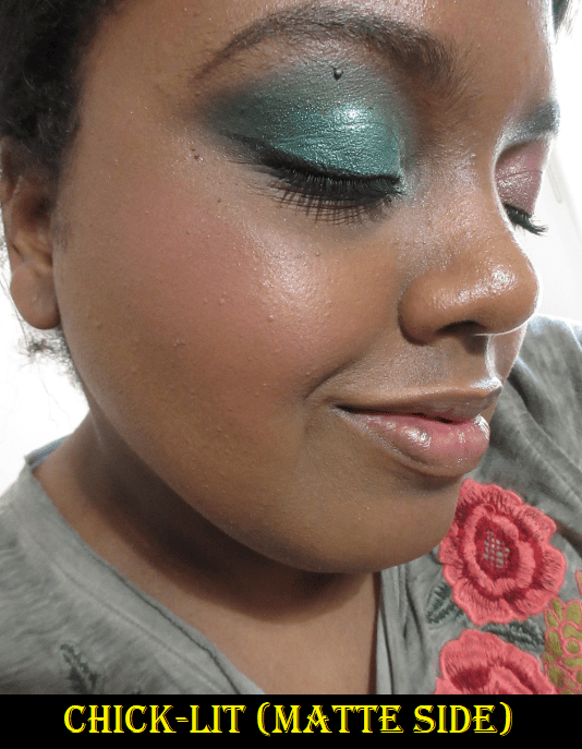
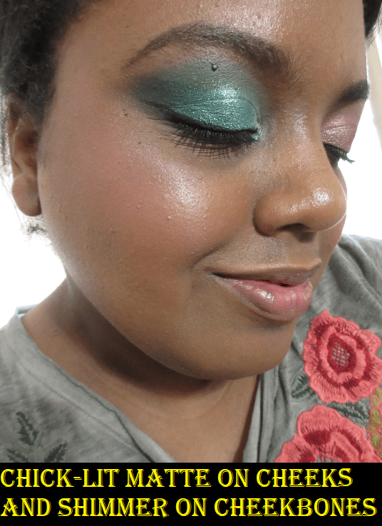
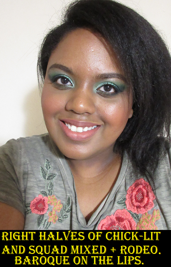
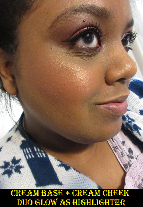
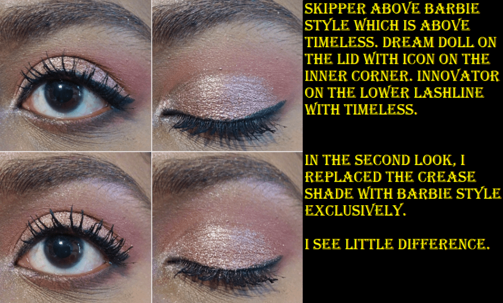
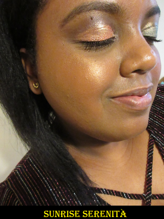
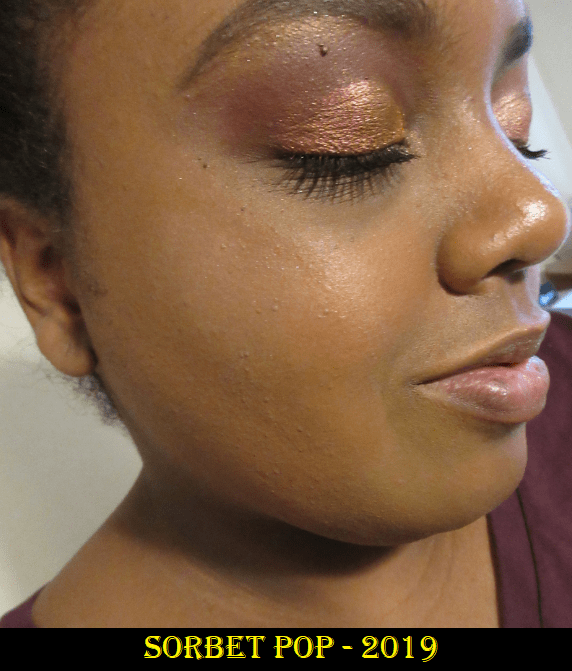
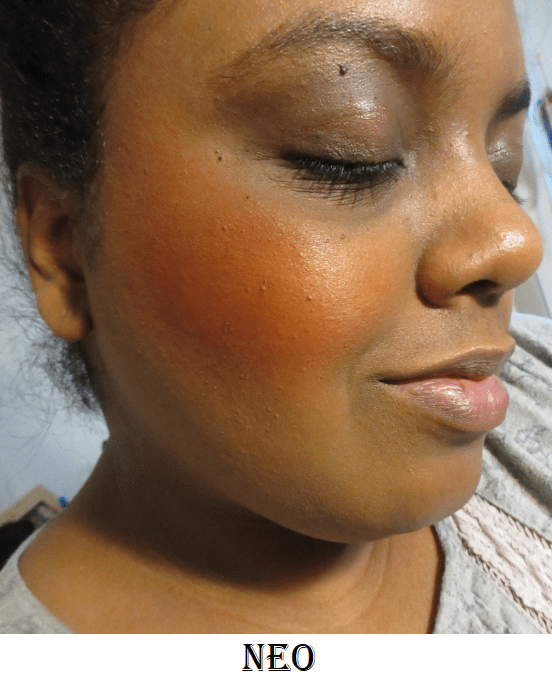
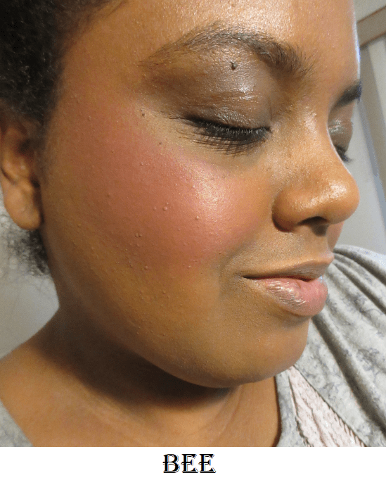
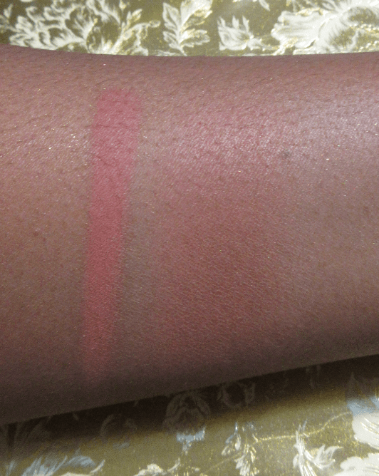
Rose Feu on the cheeks and in the crease of the eye.
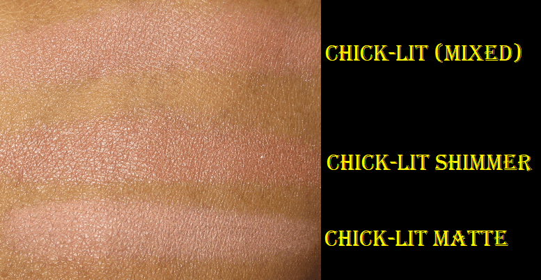
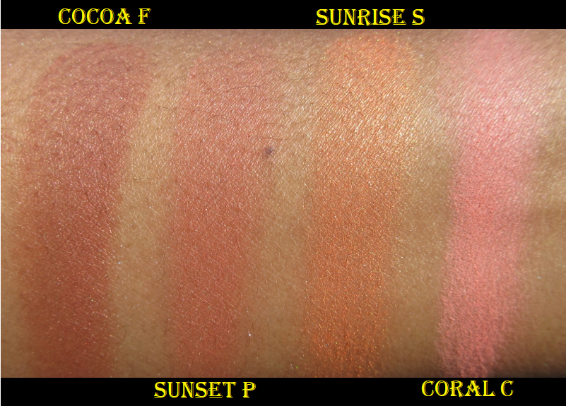
How it looks on bare skin differs from when it’s applied over foundation. While dry, it takes on the rosy-terracotta I mentioned. The closest match I found was MAC’s Pinch Me, which is slightly more coral than Rose Feu. The Nearly Wild blush from the new Sigma Cor-de-Rosa Blush palette is close as well, but slightly too pink. Another somewhat similar shade, but in a shimmer formula, is Water Lily from Oden’s Eye.
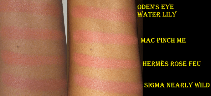
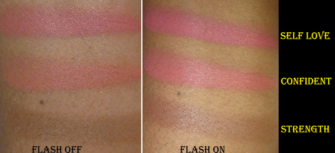
Swatches over bare skin with flash off (left) and flash on (right).
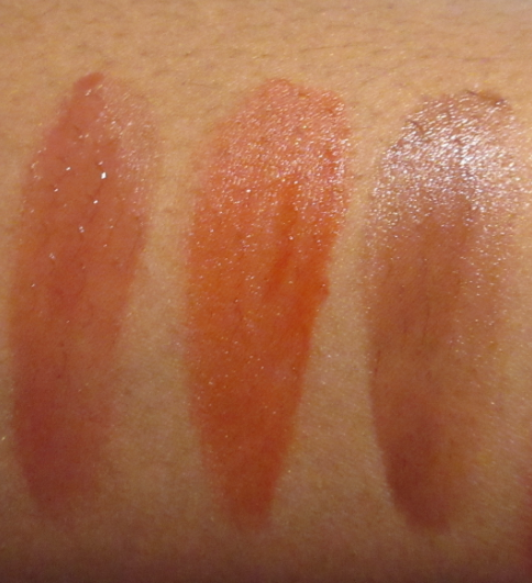
As demonstrated in the photo below of the swatches over foundation, the most similar shades I have are CoverFX’s Spiced Cinnamon and MAC’s Burnt Pepper, depending on the light. The more Rose Feu is built up over foundation and blended in, the more red it becomes.

Swatches on top of foundation with flash off (left) and flash on (right).
I think this blush is beautiful and performs well, but you’re paying for the name and aesthetic on this one. I can’t even include the feel of the compact in what you’re paying for, only the design of it because a common complaint among luxury lovers is that the compact is plastic instead of metal, or at least that the component isn’t comparatively as weighty as the Hermès lipsticks. I’m so used to plastic packaging from brands whose blushes I love, such as Nabla, MAC, Lys, and Hourglass, that it felt on par with what I’m used to having. Patrick Ta’s packaging is probably the only blush compact I have that feels more expensive than the one from Hermès. It feels light for a luxury product, but certainly not cheap. I do admit, I would have been very unhappy if I paid full price (plus tax) for this blush because at that price point I expect Pat Mcgrath level of packaging.
As much as I like this blush, I recommend skipping it for those who want it purely for the quality. There are so many brands that charge less money for the same great performance.
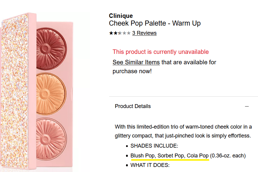
According to this Youtuber, the refill pans that Hermès is selling for $48 will not stick in an empty magnetic palette. Naturally, one would think that a great way to have the blush, but save money by not purchasing the packaging, would be to get a refill and pop it in a magnetic palette. A magnetic sticker that can be attached on the back of the pan would be required to get it to work for that purpose.
Dior Backstage Face and Body Powder No-Powder in 4N and 5N

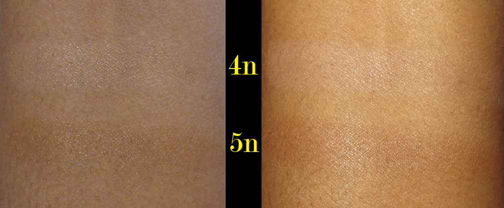
The photo on the left was taken with my camera and shows the more neutral tones to these shades. The photo on the right was taken with my cell phone. The photo below, taken using my camera with flash on, is the most accurate depiction of what the powders look like.
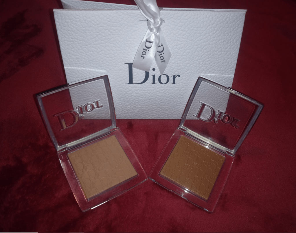
I mentioned my luck with the Hermès blush. Ironically, I had a chance to save money on the Dior Backstage Powder, but I purchased the wrong shade during the Sephora VIB sale and the one I needed wasn’t restocked before the sale ended. I was impatient to get the right color, so I purchased it at full price from the Dior website.

In the initial reviews I saw for this product, the recommendation was to get a shade lighter than your Dior foundation match. This made sense because Dior described this as being a product intended to “warm the complexion,” in addition to setting makeup. To have that “sun-kissed effect” they advertised, the shades would need to run slightly darker. In my particular case, I should not have gone lighter. 4N was nice and did give the promised “luminous matte finish” without looking glittery, or even that shimmery. However, it was a touch too light to use all over my face. It worked great as an under-eye brightener, but I didn’t want a $40 powder I could only use under my eyes. I returned that shade to Sephora and purchased 5N directly from Dior’s website. I was impressed by the presentation when it arrived. The gift bag is cute and I like that Dior gives free samples and offers free shipping.
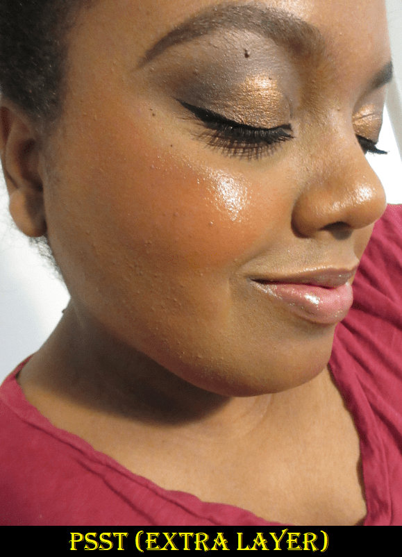
In terms of what the powder can do, it does set the face without looking powdery. I can pack on multiple layers and it doesn’t ever looked textured, cakey, or dry. I also really like the sheen it leaves on my skin. However, because it still contains micro shimmer, it doesn’t remove shine from the face. It may mattify the oils a little, but areas will still have a sheen, so I’m not sure how much those with oily skin will like this powder. It also doesn’t blur* or extend the wear of my makeup. I don’t consider it a must-have product, but I liked the way it made my skin look, which is why I still wanted to have it in my collection.
*May 18th, 2021 UPDATE: I cannot see a blurring effect when I apply this powder over foundation, which attests to the quality of the foundations I use most often. However, when I applied the Dior powder over my skin on a minimal makeup day when I skipped using foundation, I was able to see the blurring properties. So, I have to amend my statement and say that it does blur, but the results range from minimal to very noticeable depending on what other products are paired with it.
I’ve also seen the recommendations to get a deeper shade to use as an actual bronzer. I’m intrigued by that idea, but considering my difficulty getting a shade for my face, I fear I would have trouble figuring out how dark of a powder I would need to get a product like this to show. Plus, I suspect the outcome would be similar to the effect and performance of my Nabla Skin Bronzing powder in Profile. In fact, my first thought when I tried the Dior powder all over my face was that it’s exactly how I imagine a Nabla Skin Glazing Setting Powder would be like.
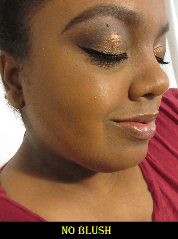
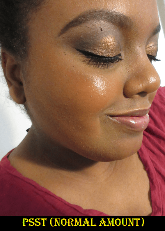
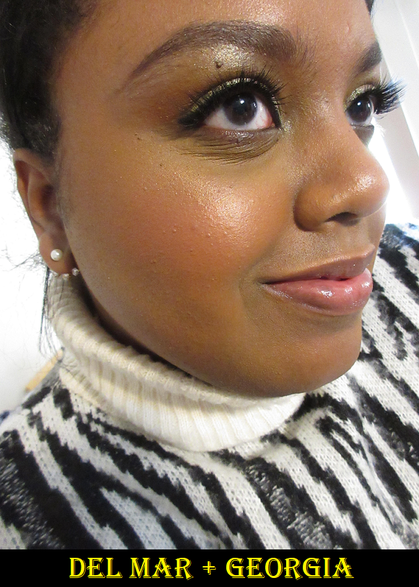
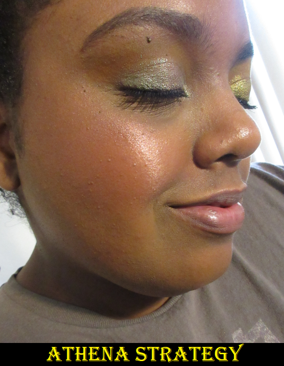
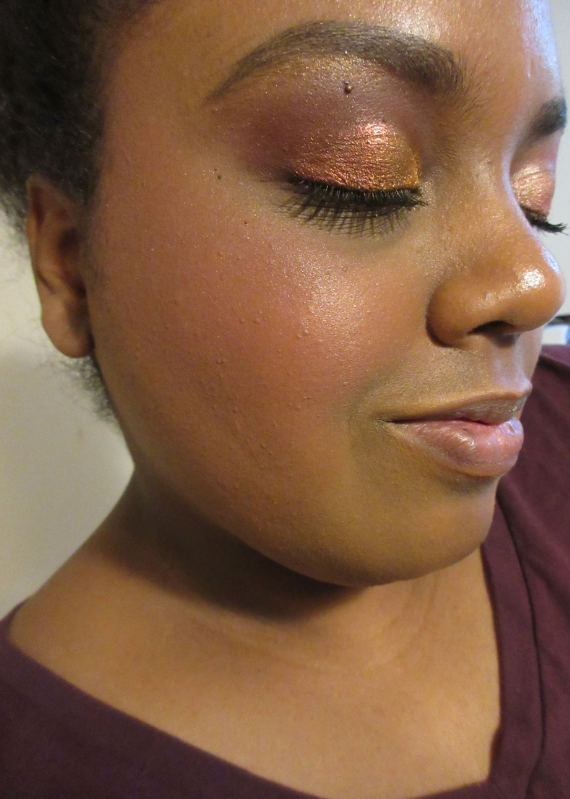
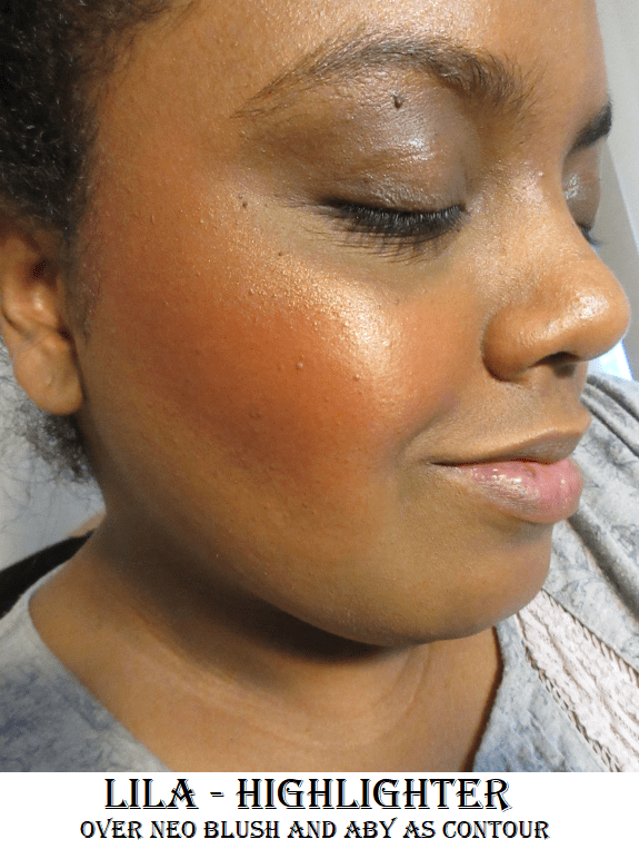
This also brings me to the point where I have to give Dior praise for these powders running so deep. It’s not a common thing to see. I just wish they offered more than neutral powders and included some warmer options as well. That being said, in the product photos, some shades look a bit red toned. 5N would have been perfect if it was a little more golden, but I’m happy with the shade match. It’s close enough to my skin tone that you can’t see a difference in photos between when I’m using it and when I don’t have it on. I’m wearing it in the Hermès cheek swatch photo, but the luminous look to my skin is from the Uoma Beauty Foundation, Charlotte Tilbury Hollywood Flawless Filter, and a Jaclyn Hill highlighter. Although this powder doesn’t break the bank as much as the Hermès blush, I don’t know if I fully recommend it either. It all depends on whether it’s worth $40 to have a nice sheen that will never look powdery, with minimal additional benefits.
Lastly, I try to remember to mention whenever products have fragrance in them. The blush has a floral perfume-like scent and the powder has a soapy perfume-like scent. I can smell them when I first apply them, but it doesn’t linger on the skin.
That’s all for today! Much love!
-Lili ❤