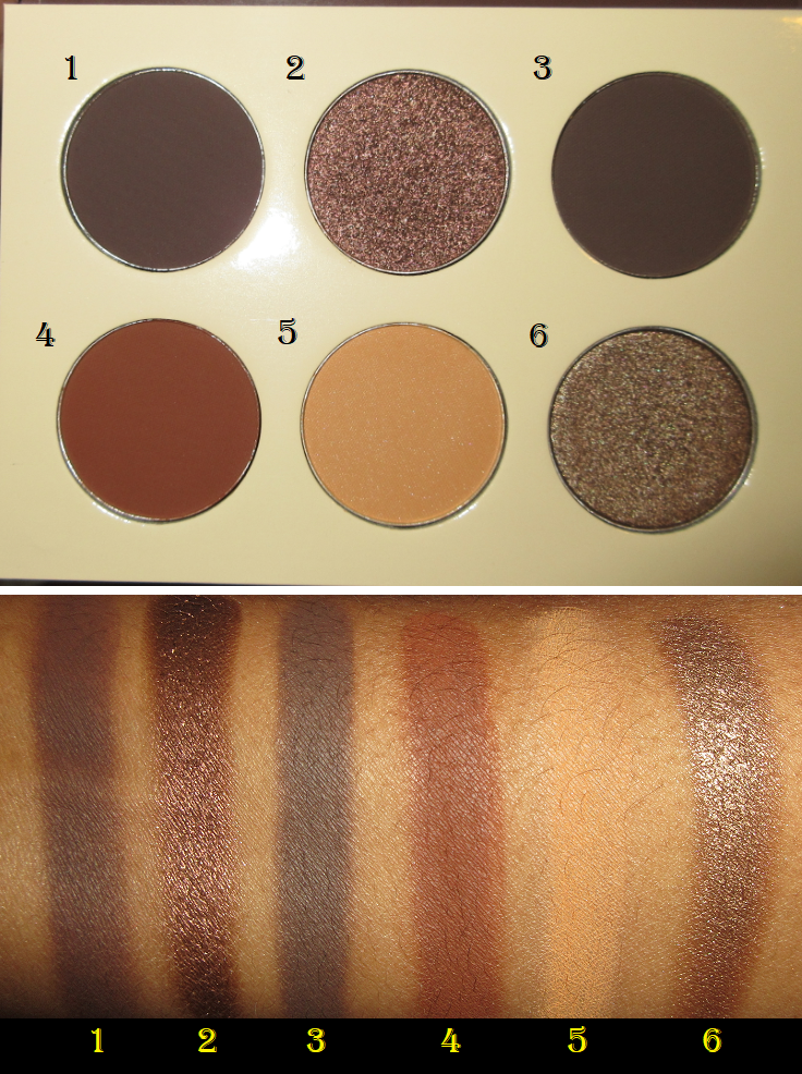
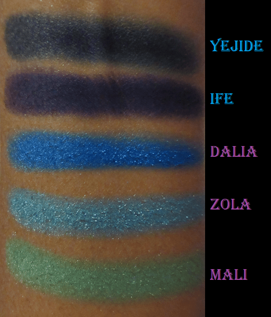
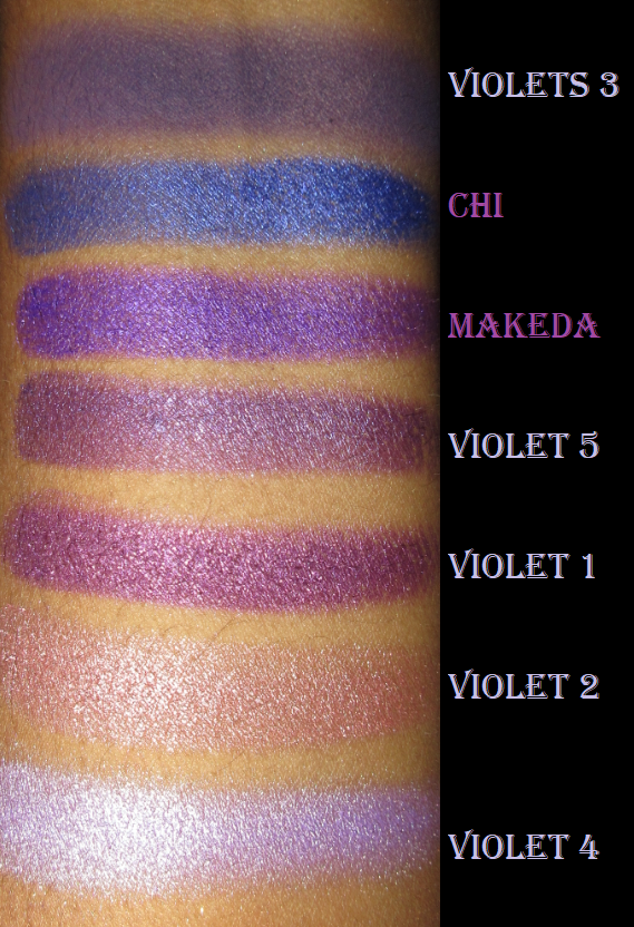
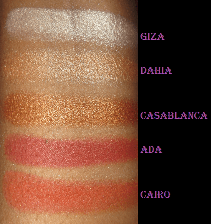
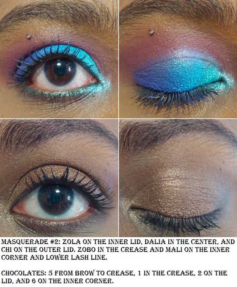
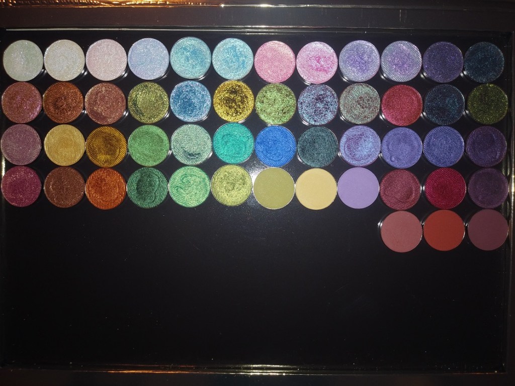
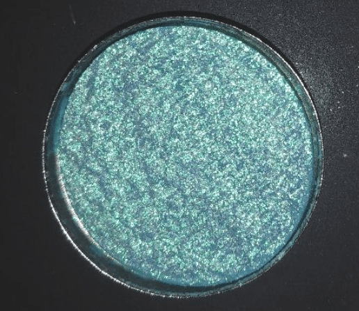
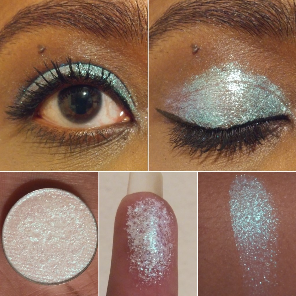
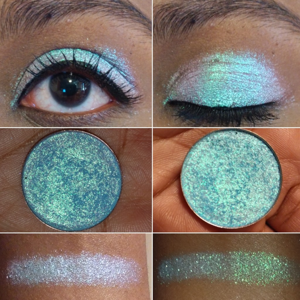
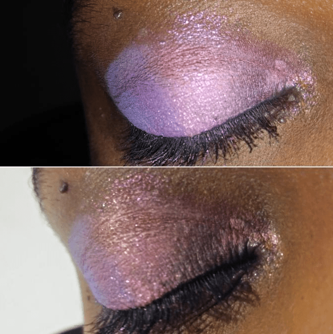
I’ve been a Juvia’s Place customer for three years now, but it wasn’t until 2019-2020 that I actually started using what I purchased. Most of my experience with the brand is through their eyeshadow palettes. The quality is great but the color stories always threw me for a loop. I never knew how to pair colors together in a way that I felt was cohesive and made sense. Depotting the shadows helped because it was easier to have access to other complementary shades. Now, I’m actually getting use out of them!
Lip Products
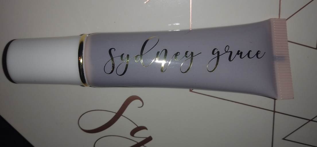
I’ve heard amazing things about Juvia’s lipsticks and lip liners that were released this year. I’m not very adventurous when it comes to lip products, so I had no intention of possessing any, but due to an error on Ulta’s part, I wound up with a mini Lip Duo.
Wahala Mini Lip Duo
A strange but unimportant thing I noticed is that the lip gloss in the set came with a plastic shrink band but the liquid lipstick did not. I don’t know if it’s just mine that was like that or if all of them are supposed to be that way.
Shakara is a gorgeous color, but right on the cusp of being too pale for my preference. Using a lip liner is enough to make Shakara wearable for me, but my favorite combination is pairing it with a lipliner and gloss. Petty Betty isn’t the kind of pink I normally gravitate towards, but it pairs well with Shakara and is still nice on its own.
Juvia’s Place Eyeshadows
I used to have the Saharan palette, but I gave it to my sister. I even gave my unused/unswatched Tribe palette to her because I was uninspired by the color story after seeing it in person. It wasn’t until I watched LonDen Makeup Artistry’s video that I suddenly felt the urge to give it a chance and repurchased it. I’m so glad I did!
The only eyeshadow palette I haven’t depotted yet is The Chocolates, but I intend to soon.
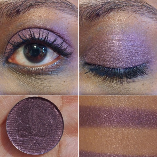
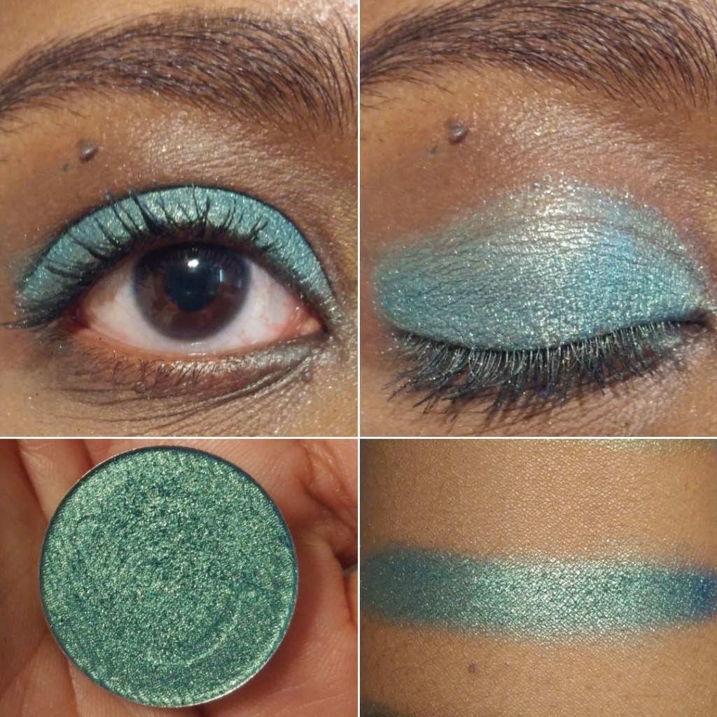
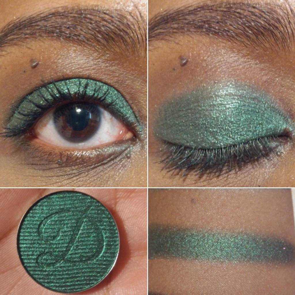
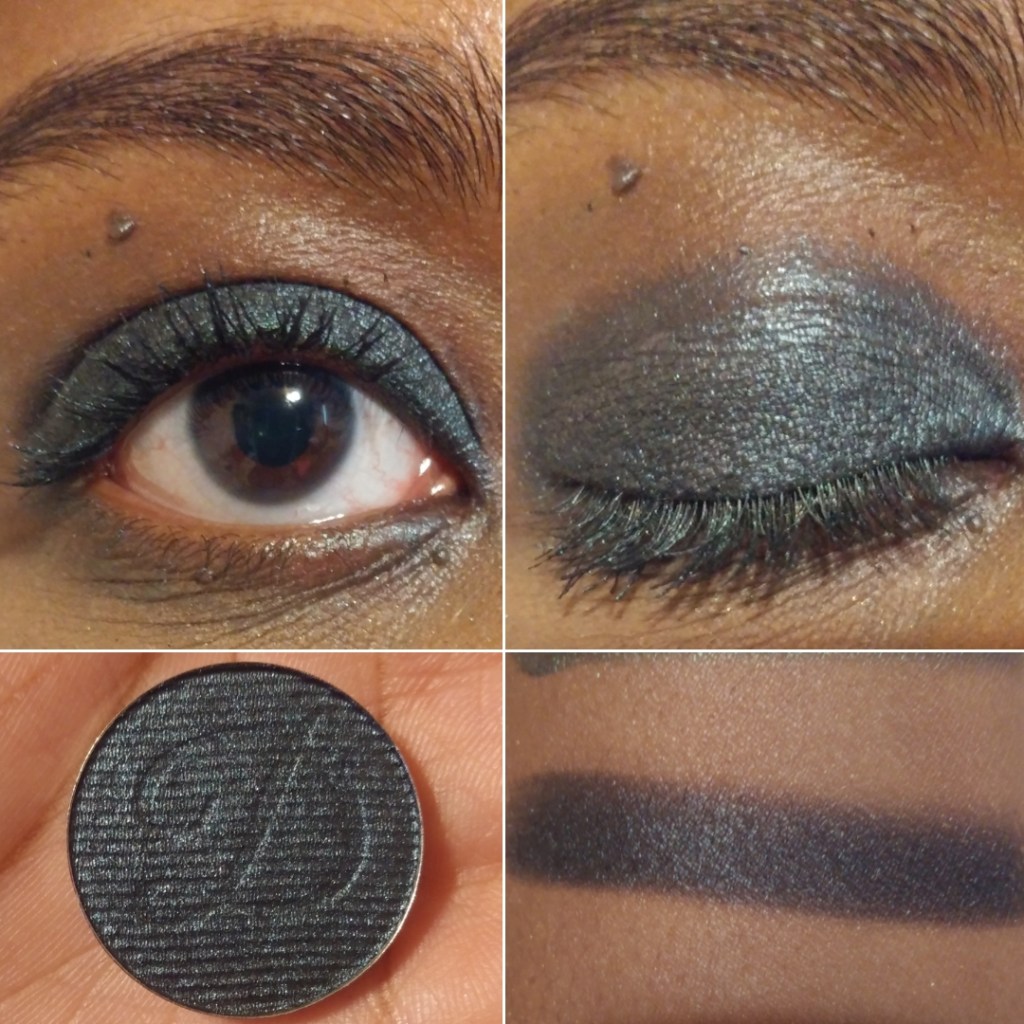
Juvia’s Place currently has 11 mini six pan palettes. Other than the Mariposa collab, the minis don’t have shade names. Whenever I’m referencing them, I refer to them from left to right by row. I’m missing shade number 6 from the Violets palette. It broke when I was depotting it and I wasn’t interested in that color enough to try and salvage it.
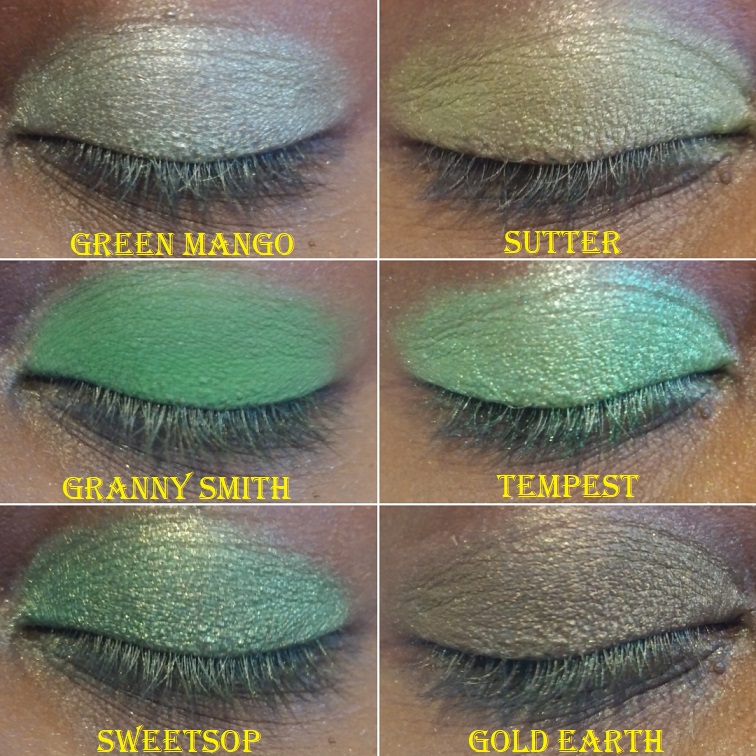
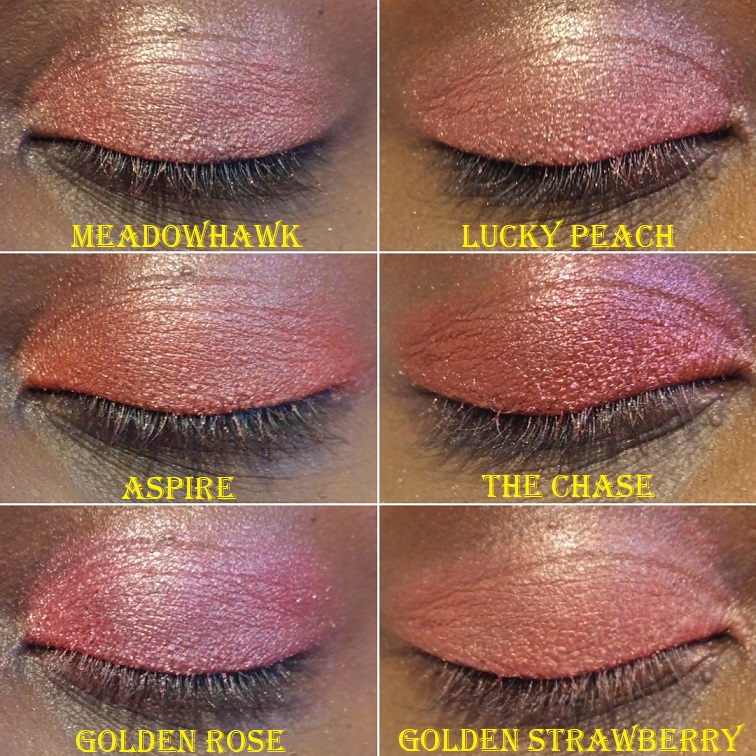
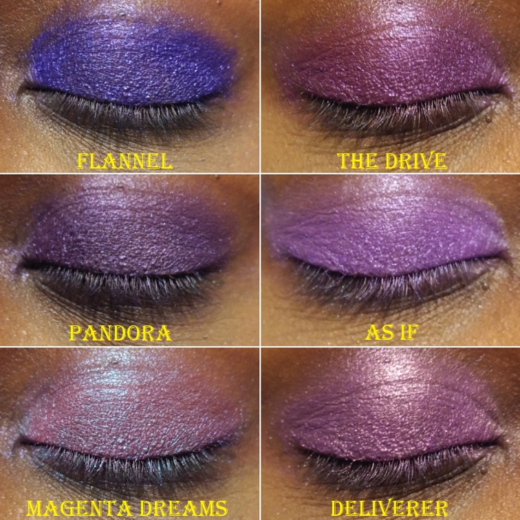
The shade names in green are from the Tribe palette, which has been discontinued. Blue is for the Magic palette, Purple for Masquerade, and lilac purple for the Violets.
What I like most about Juvia’s Place eyeshadows is the level of pigmentation. I never have to worry about shades not showing up on me. They also last a long time without fading. The mattes and shimmers are equally easy to work with. There are frequent 30-40% off sales on their website, and even periodically at Ulta, so you can always snag their products at a discount. So far, Wahala and Wahala 2 are the exceptions to the discounts. They’re already a great price. The only reason I haven’t purchased them is, once again, due to the color stories. Another deterrent is that Juvia’s Place has been putting a lot of pressed glitters in their palettes this year, which I try to avoid.
Blushes
When I said Vivid Azalea from Wayne Goss was the most pigmented blush I’ve ever come across, I completely forgot about my Juvia’s Place Blush palettes. When I saw these in person, I realized right away that they were not going to work for me. Both palettes have the most unique blush shades I’ve seen, which is a great thing in terms of bringing something different to the makeup world. However, this does make them less wearable to the average consumer, as only a few of these will look natural and on someone and not everyone is into wearing avant-garde blush looks for the remaining shades that are too bright, light, dark, or too different of a tone to give a natural flush.
The Saharan Blush Palette Volume 1
When I realized these blushes were a bit too out there for me, I utilized the palette by scraping some of the powder out and combining them with other brands’ blushes to create custom blush shades for myself. I intended to get more use out of these by using them as eyeshadows and depotting them into my magnetic palette with Juvia’s Place shadows, but I typically break every pressed matte shade from Juvia. That’s the only reason I haven’t done so already. I can always press them back, but I’ve contemplated whether it’s worth the hassle.
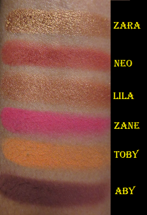
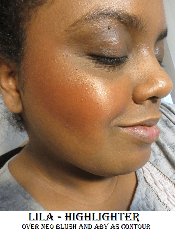
Abywas clearly far too dark for me, so the best use I’ve found for that shade was as a contouring-blush. I used a fluffy blending eyeshadow brush to slowly and lightly build the color into the hollows of my cheeks.
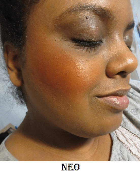
Neo is the most “natural” shade for me in this palette, though I’ve struggled to use a light enough hand to apply that shade in a way that I would feel comfortable wearing it. In the second photo above, I applied with a light hand but it was still incredibly pigmented. In the third photo, I used a Makeup Eraser cloth to remove some of the color in order to tone it down a bit.
Lila and Zara look very similar in the pan, but Lila has much smaller shimmer particles, so it looks less glowy and a little more subtle.
Zane was the most difficult to apply to the cheek without looking patchy. I kept over applying in the process of trying to get it to look smooth.
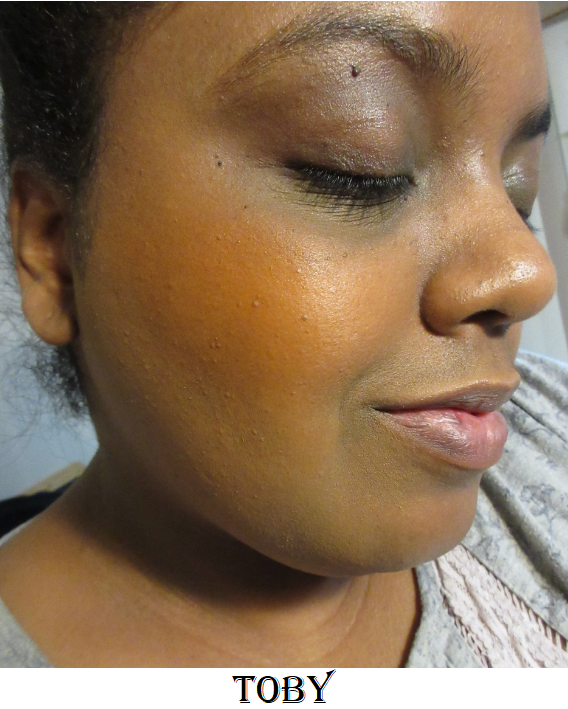
Toby was the easiest to apply evenly. However, I’m not a fan of this color blush on me.
The Saharan Blush Palette Volume 2
I bought the Saharan 1 on August 2019, and even though those shades were not what I expected, I still bought the Saharan 2 in December 2019 because I was hopeful that this palette would suit me better. In some ways it does, because I prefer a blush that’s too light over a blush that’s too dark on me. However, these are cooler-toned blushes. Warmer tones look better on me. There’s also the issue of Yara being invisible on my skin.
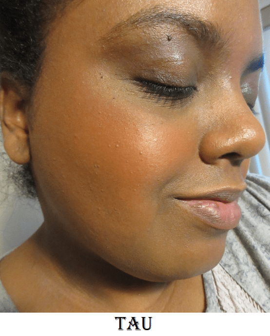
Tau is the most natural-looking blush of the bunch on me. I tried to apply a subtle amount like I did with all the other blushes, but I could have built up this shade more heavily. It’s very unique for orange, as orange is typically warm, but this one is muted as though it has a cool pinkish undertone to it.
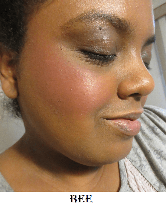
I was happiest with the way Bee and Sola looked on me, as I prefer to wear standard blush colors on my cheeks. I expect a shade like Bee to be too light for me, but because it is so pigmented, it definitely shows on my skin tone and without a grey cast! Unlike Zara and Lila from the previous palette, which I would never use as blush or blush toppers (just highlighter), Sola works as a highlighter, blush, and blush topper. The only potential issue is that it takes some blending when using Sola as a blush because the shimmer doesn’t spread evenly. It’s as if the shimmer is still moveable on the skin but the base pigment stays in place.
I’ve used these blushes as eyeshadows. The mattes are heavily pigmented for blushes, but they need a little building up on the eyes for full pigmentation. This does make for easy blending though. The shimmers in this formula are a slightly thinner version of the regular eyeshadow shimmer formula. They don’t require glitter glue or wetting them, but those methods can be used to intensify them. In the eye looks below, I only used MAC Paint Pot.
Juvia’s Place consistently has great quality products at affordable prices. I do recommend giving them a try!
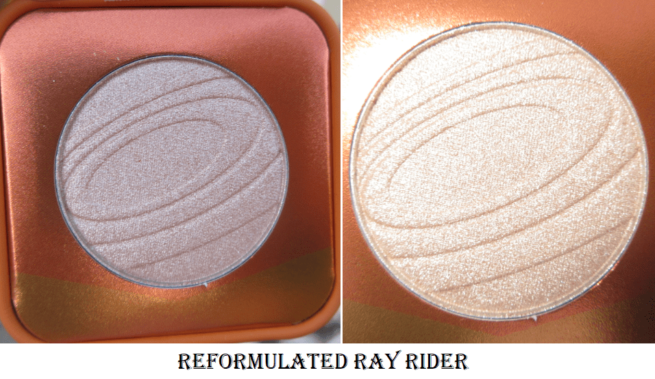
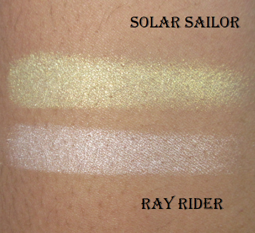
The Space Age line of highlighters from Kaleidos is known for having non-traditional shifty duo-chromatic shades like blue, bright red, green, etc. They even recently released a multichrome highlighter. As much fun as it would be to have colors like that in my collection, I’m not bold enough to rock shades like those regularly enough to get my money’s worth out of them. Instead, I chose to buy the two most traditional types of highlight colors: Solar Sailor, “a sleek and radiant satin gold,” and Ray Rider, “a velvety champagne sheen with a trace of peach.” Ray Rider was repromoted/reformulated during the launch of the Make Your Escape Collection. Although I don’t have the original shade to compare, according to Angelica Nyqvist, the new one is slightly lighter and smoother with a more translucent base. This change happened in June. As of November 2020, Ray Rider’s packaging was updated. However, it is not listed on the website as being a different from the original, unlike the shade Mars Melter which was reformulated with new packaging and is being sold as “Mars Melter” and “Mars Melter Original.”
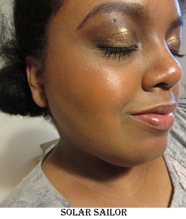
The swatches are on bare skin. In the Solar Sailor photo I applied it under the brow arch and on the center of the lid. In both photos I have the highlighters on the cheekbones applied on top of a mixture of Love and Joy blushes from Rare Beauty.
These highlighters look glittery, which I usually despise, but because they blend a bit into the skin, they become a little more wearable. I used the tiniest amount of highlighter in these pictures, so a regular application would look much more intense! Ray Rider’s particles are a bit smaller, which I like more, but I prefer the actual shade of Solar Sailor on me. Because they are right on that line of glitter level that I like, I doubt I will wear them regularly, but they won’t be completely neglected in my collection.
The Futurism Eyeshadow Palettes
Futurism I: Sci-Fi Green
This was my first Kaleidos palette, but I purchased it from a third-party. I know I’m fortunate to have such low shipping fees as a US consumer, but having to pay for shipping still bugs me. I only wanted to try one palette to see if the eyeshadow formula was worth the hype and didn’t want to spend $8 in shipping to find out. The other three palettes, however, were purchased directly from Kaleidos.
Swatches over a light layer of MAC Paint Pot.
I do think these palettes are worth the hype. That black shade is incredibly rich and dark. Sometimes yellow shadows don’t stay true to color on my eyes, but I don’t have that issue with Radioactive. The shimmers have a wonderful slip to them and the mattes are pigmented and blendable. My only complaint is that although you can see the shade differences in the swatch, my forearm is lighter than my eyelids. On my dark lids, the two matte greens look almost the same. Glamora appears more yellow than green on my eyes, which makes it harder to distinguish from Nuclear.
Futurism II: Cyber Bronze
Swatches over a light layer of MAC Paint Pot.
I’d have to double-check my single shadows collection, but I do believe plasma is the best silver eyeshadow I own (though I don’t have that many silvers in my collection). It is shockingly brilliant and intense without even being applied wet or on glitter glue. Droid is my favorite shade out of all the palettes to use from the brow to the crease. Y2K and Carbon look a bit more subtle on my eyes because they’re closer to my natural crease and lid shades. I can still see them in person, but they aren’t as distinct on my camera. Quantum is an uncommon shade among my collection and I was pleasantly surprised how much I liked it. Infared looks intense in swatches but for some reason, that shade of red doesn’t have the same vibrancy on my eyes. If you like shades like Infared, I highly recommend Salvatore, Blazed, or Homicide from Devinah Cosmetics. In my opinion, theirs are the best.
Futurism III: Astro-Pink
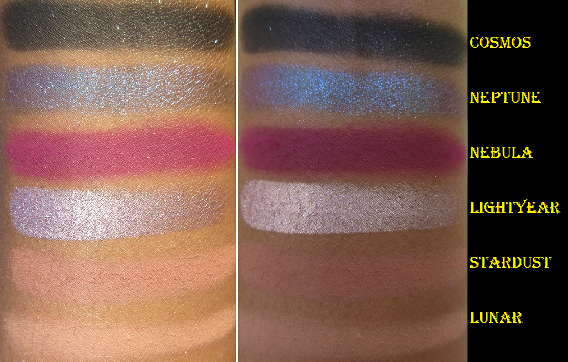
Swatches over a light layer of MAC Paint Pot.
This is my favorite of the four palettes I purchased! That blue-to-purple duochrome shade, Neptune, is gorgeous! The fuchsia shade, Nebula, isn’t a unique color but it is so incredibly smooth, pigmented, and easy to blend. It’s possibly the best-formulated version of that shade I have. Lightyear is just as brilliant as plasma, but with a light pinkish purple tone to it. It just looks silver on my eyes though. Cosmos is one of those sequin shades that usually drive me nuts (matte with a dash of glitter…just pick one shadow type!) but the glitter is so sparce that it’s mostly matte and I can use it as though it’s a plain matte, which is why I like it. And that shade is so pigmented and buttery smooth that I can easily use it as a powder liner. I’m not as impressed with Stardust and Lunar, purely because they don’t show up enough on my eyes, but they do give a rose-toned tinge under the brow and crease that pleases me to see in person, even if I know no one else will notice.
One interesting thing I noticed with the shimmers is that Nyx Glitter Primer, my tried and true product to enhance the impact of shadows on my eyes, doesn’t make much of a difference in terms of bringing out the pigments and sparkle. I still use it on the duochrome shades, but on the regular shimmers, in order to intensify the look, I dampen the brush with some MAC Fix+ spray. And even after that, I pack more shadow on top with my finger.
Futurism VI: Lunar Lavender
Swatches over a light layer of MAC Paint Pot.
I don’t enjoy being critical. I love gushing about good makeup, but I have to talk about issues that arise while using them. This palette gave me flashbacks to the Nomad Cosmetics Harajuku Tokyo palette that was a nightmare to use.
The top photo shows the patchy issues with MAC Paint Pot when trying to blend. The bottom two photos show how they look better on top of the Nars eye primer but despite that one being a wetter base, it still didn’t stick properly to the eyes and were blending away.
Unlike that formula, which worked better with a wet white base, I find these mattes work better on a dry white base. Because these shadows have more pigment than the Nomad Tokyo mattes, they are still usable and visible on the lids. This formula isn’t as bad as that one, but I don’t have the patience to try and make them work with continued use in the future. Even the two duochromes, though they work the same as the other Kaleidos duochromes, reminded me of the Nomad duochromes in terms of how they feel to the touch. But there’s no comparison in terms of performance and overall look. Kaleidos still wins on that front.
My improved eye looks using this palette when combined with a little of the Anastasia Beverly Hills eye primer.
Here are additional eye looks using shades from any of the 4 palettes.
Futurism V and VI are part of the new Fresh Fantasy collection, so I don’t know if there has been a tweak in the formula. As beautiful as the duochromes are, I cannot recommend anyone spend $24 to get just those two shades. $6-$8 CAD duochromes from Clionadh Cosmetics are still more intense, sparkly, and shifty than these.
I have since decided to depot these and put them all together (excluding the Lunar Lavender mattes) in one large custom magnetic palette. I know I wouldn’t get as much use out of them if I kept them all in their separate smaller palettes.
For anyone interested in ordering from Kaleidos, I recommend checking out the bundle section on their website. That’s how I was able to get any three palettes I wanted (excluding the limited edition Futurism IV) for $59 instead of $72. There is free shipping at $70, so I only needed to add one more item to my cart. There are also affiliate codes that can be found from different YouTubers, but the codes don’t work on the bundle.
Also, you can expect a long wait once your order is placed. I completed my order on September 9th and it arrived October 13th. 24 of those days were in transit as it was shipped directly from their factory/manufacturer in China. It roughly took a week to travel from Shanghai to LA, a week to clear customs, and another week from Compton to my address.
I believe I covered everything. If you have any questions, feel free to leave a comment. Thank you for reading!
I placed my very first order with Sydney Grace in November 2019, but the majority of my collection was purchased during their annual Christmas in July sale. The deals were so good, I couldn’t pass them up!
Along with the eyeshadows, I will also discuss one of their blushes and their empty magnetic palette. Overall, Sydney Grace makes beautiful high-quality products. I believe they are worth the prices as is, but if you’re looking for the best deals, they happen on Black Friday and in July. You can also find affiliate codes on many different Youtubers’ videos for 15% off year-round.
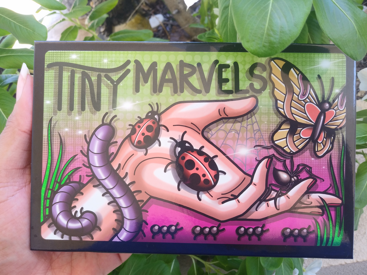
Tiny Marvels Palette by Mel Thompson
The quality of the shadows in this palette is the same you can expect from Sydney Grace’s singles. Every shade has a high level of pigmentation. The mattes feel soft and perform like Viseart shadows on the eyes, making them easy to blend, but with the added bonus of swatching well too. Some important things to note are that Scarab is called Red Chameleon as a single, but the other 14 shades are exclusive to this palette. Flutterby seems to be more fragile than the other shadows because it was the only shade that came with a piece cracked off in my palette, and I saw a few others on social media where that was the only broken shadow as well. Pressing it back with liquid works to an extent, but I recently learned in an interview on Behind the Beauty that the binders Sydney Grace uses in their matte shadows are powder only (no liquids)*. So this makes their mattes perfect for the dry-press fixing method.
*July 4th, 2021 UPDATE: I was browsing the website and noticed the ingredients of the mattes I saw had fractionated coconut oil listed, which is a liquid. I don’t know if this is the sole exception to their original statement or if the addition of liquids is a new formula change.
Lastly, Jewel Bee is the only shadow in the palette that I feel underperforms. It looks great on those with lighter skin tones, but there isn’t enough depth in the shade to make an impact on me. It admittedly still works slightly better than pastel purples from most other brands.
*October 1st, 2021 UPDATE – I felt compelled to update this post to say that although I didn’t know Mel Thompson personally, she will be missed dearly. As a subscriber of hers on YouTube, it hurt my heart to learn of her passing and I can only imagine how much worse it has been for her friends and family. I treasured those few moments I had communicating with her via Instagram and the comment section of her YouTube page. It means even more to me now. May she rest in peace.
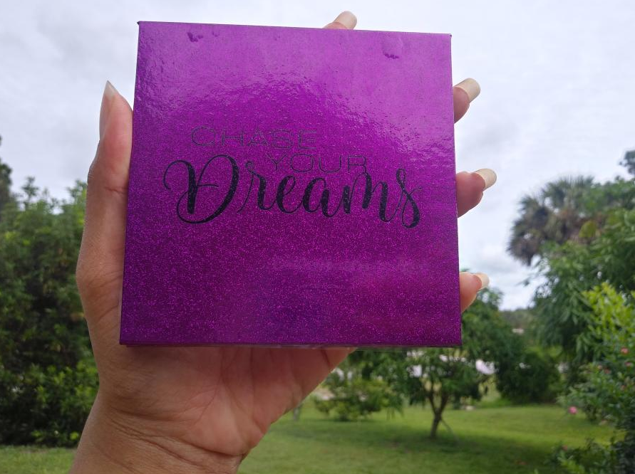
Chase Your Dreams 9 Pan Palette
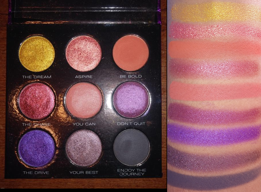
This is a great smoky eye or companion palette. The color story isn’t exactly what I expected after seeing photos online versus what it looks like in person, but it is still fairly versatile. The two red/pink and two orange shades are a bit redundant to me, so I foresee myself depotting this into my larger custom palette. The only reason I haven’t yet is because I like the purple glitter print packaging so much.
Eye Swatches: Palettes, Bundle Exclusives, and Individual Shadows
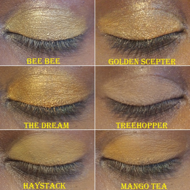
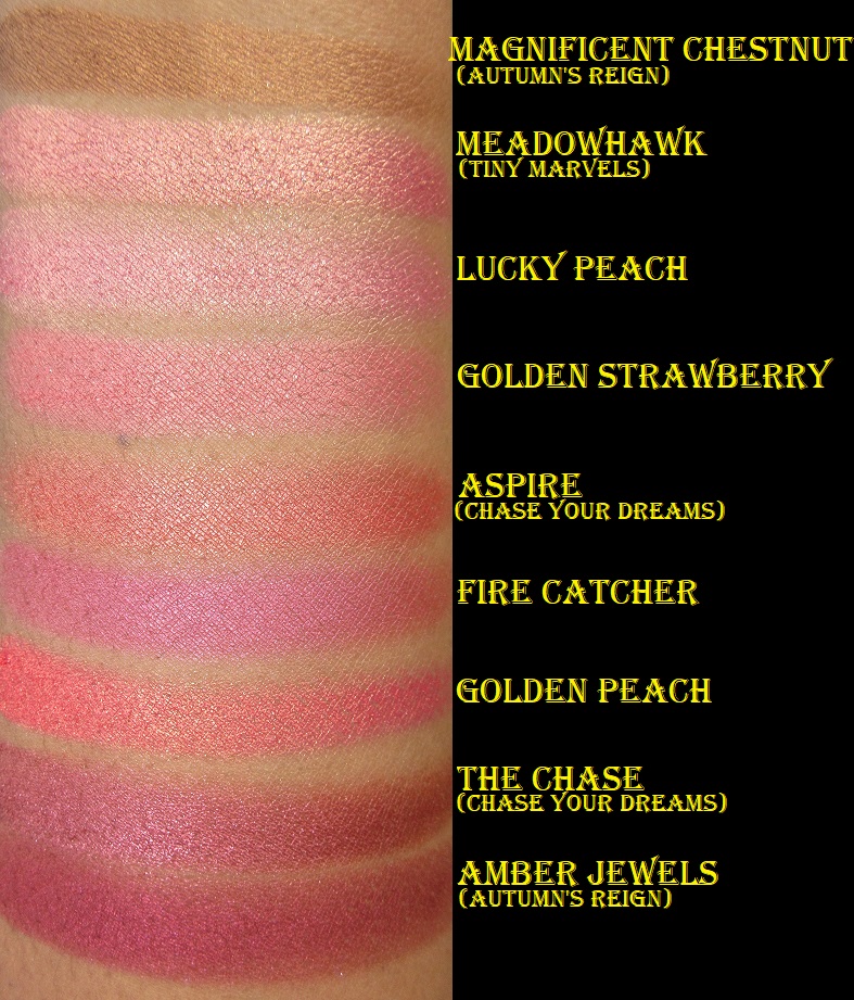
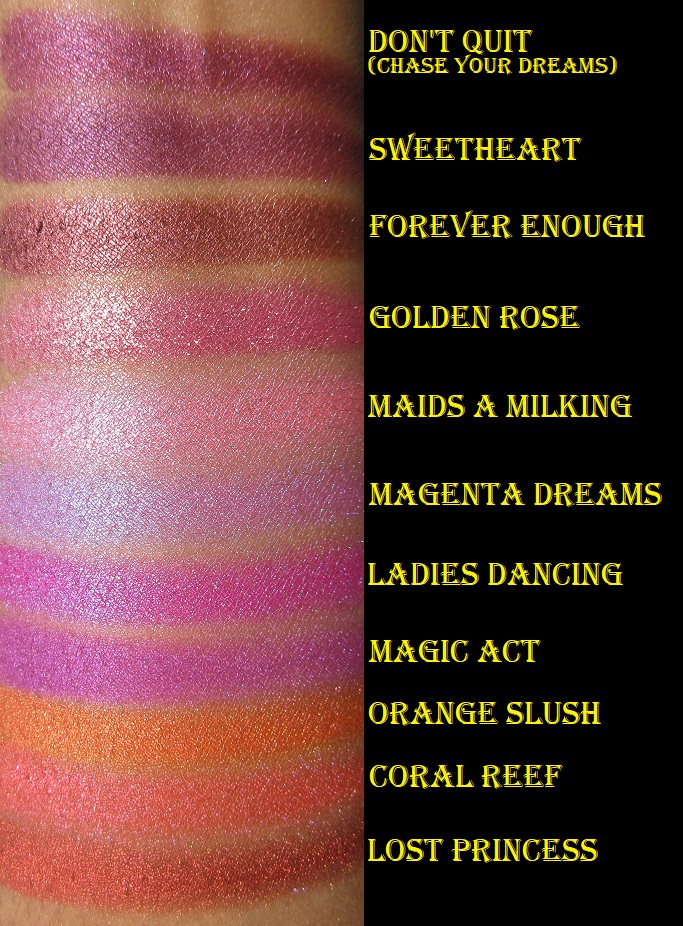
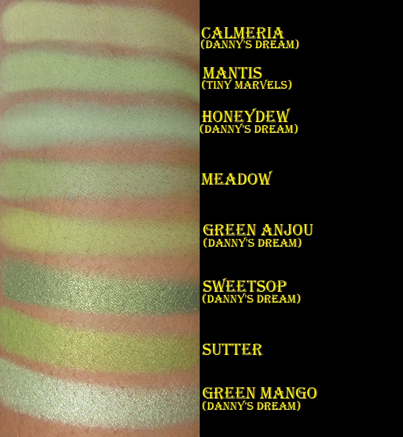
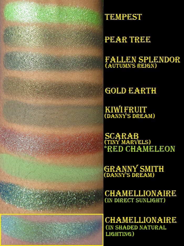
All the eyeshadows come from the Danny’s Dream Bundle, Autumn’s Reign Bundle, Chase Your Dreams Palette, Tiny Marvels Palette, and all the individual shades I own. In the arm swatch portion that I’m including later in the post, I have it noted which shades are part of a collection.
I used MAC Paint Pot in Groundwork for all of the eye swatches (excluding Beauregarde and Chamellionaire which are over Nyx Glitter Glue). If I used a primer with a white base, perhaps certain shades would look less similar. In my opinion, Sydney Grace is the most consistent brand I know in terms of eyeshadow quality. So, when it comes to choosing which eyeshadow to purchase, it’s more about the particular color and less about performance. However, I will note that Queen of the North and Lemon Cream were a little patchy on me. I don’t plan to keep them in my collection after this review.
This brand makes arguably the best green eyeshadows (though nothing tops Forbidden from Coloured Raine). Among this batch of shadows are Chamellionaire and Beauregarde, two out of the three pressed multichromes Sydney Grace currently offers.
Compared to Devinah, Clionadh, Terra Moons, and other brands’ multichromes, I honestly like these the least. All multichromes show their black bases/look darker in too much direct sunlight or with flash on. These are beautiful in the right lighting but are the most finicky to capture in photos and the least forgiving in the Florida sunlight. These were the first multichromes I ever owned and the difficulty of use made me better appreciate the formulas of the other brands’ multichromes I tried later on. The texture of these are a bit strange. I don’t know how to describe it. They don’t pick up very well on a brush and they look terrible over bare skin or regular eyeshadow bases I’ve tried. Applying them with my finger on top of Nyx glitter glue is the only way I’ve found to successfully show off their beauty.
I have to admit, I bought certain eyeshadows purely for their names! I know it’s silly, but there were enough shades I wanted that were named after the 12 Days of Christmas song that I decided to get all the ones available on the website: Pear Tree, Turtle Doves, French Hens, Geese a Laying, Maids a Milking, Ladies Dancing, Lords a Leaping, and Pipers Piping. I have no idea if Calling Birds, Five Gold Rings, Swans A Swimming, or Drummers Drumming are discontinued shades in Sydney Grace’s collection (or Feather River Body as they were formerly called) or if they were just never made.
In addition to powder multichromes, Sydney Grace also has cream shadows and cream multichromes. Though I don’t like the pressed multichromes, I can vouch for the cream formula being much nicer to work with. However, I’d still prefer to use a Clionadh pressed multichrome over the cream and pressed ones I’ve tried from Sydney Grace.
When I bought the Alexandrite cream multichrome, it came in a 10 ml tube for $25. The period after opening (open-jar symbol) was only six months. Since that time, the brand has released smaller 5 ml tubes for $15 and they say it has a longer shelf life. Shelf life and period after opening are different terms, so I don’t know if they mean to say that the p-a-o date is longer. It’s great to know that they can stay in inventory and be unsold for longer without any fear of it expiring or drying out before you get a chance to purchase them, but I would be curious to know if it still lasts 6 months before it goes bad after you first open it. In any case, this is quite competitive pricing for Natasha Denona’s new Chromium liquid eyeshadows at 2.5 ml for $28 and the same 6 month p-a-o.
It took me so long to do this post that, unfortunately, I have no good photos of Alexandrite. The blurry picture in the bottom right corner in the eye swatch gallery above is what it looked like while the shadow was still good. I only have that photo from my former cell phone with terrible quality megapixels and lighting. Hopefully, you can see that it was smoother while it was still good. My tube of Alexandrite lasted 9 months before it started to have an odd fish oil smell so I stopped using it (excluding this one time for this review). So, on the bright side, it does last a little longer than 6 months after you open it. The other two eye swatches of Alexandrite show what it looks like after 11 months. That’s why it looks strange and scaly. And yes, now that I finally finished this post I have thrown it away. I wanted to at least show that in this instance, regardless of your skin tone, the shade will look pretty much the same on everyone.
Official Swatch Picture From the Sydney Grace Website.
Arm Swatches: Palettes, Bundles, and Individually Sold Shadows
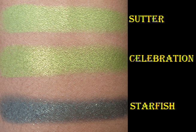
I tried to group these swatches together by color but Celebration and Starfish are not with the other greens because I had already decluttered these two shades (and remembered to rescue them just before making this post). The base color in Starfish was too dark for my liking. As for Celebration, I like it as much as Sutter (and actually think it looks more flattering on me) but I thought they were too similar to keep both. Also, back in January when I only had 30 SG eyeshadows, I asked 8 of my guy friends which purple and green shades they liked the most. Although their responses might be different if they saw my entire collection now, the shades that got 4 or 5 out of 8 possible votes were Totally Worth It, As If, Flannel, Evergreen, Thrilled, and Sutter. Between Sutter and Celebrate, Celebrate only received 1 vote. That’s why I chose to declutter that one, but I have now returned it to my collection!
Eyeshadow Looks
Thinking of You Blush
I didn’t have the self control to take a photo of this blush before swatching it. It’s such a pretty, soft, pigmented, and blendable blush. If I wasn’t already swimming in blushes I would be tempted to try more shades from the brand. This reminds me of MAC’s powder matte formula, which I love, but this only costs $9 as opposed to MAC’s $17 pro pan-only blushes. MAC has had at least four blush sales this year at 30-40% off, so I have been able to get some as low as $10.20.
All blushes in the “Deep” category on the brand’s website are currently sold out. Sydney Grace is still a small company, so it takes them a while to restock items. Due to COVID-19, there are also delays in pigment manufacturing and just a shortage of certain pigments in general.
Sydney Grace Large Custom Palette
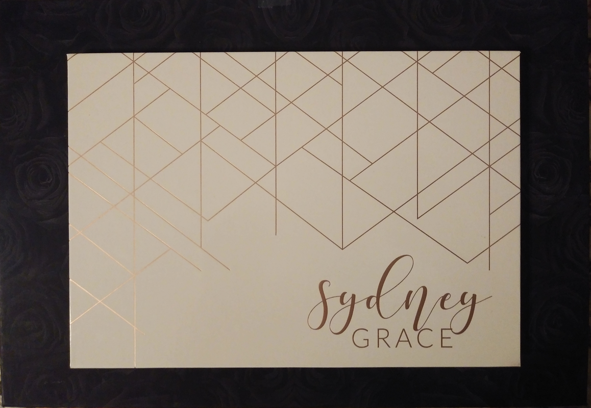
I have this Large 40-48 pan Sydney Grace empty magnetic palette on top of my 96 pan Coloured Raine palette for comparison purposes. It has a mirror inside and the outer design has light-reflective rose gold lettering. The same print is sold in 9 pan and 12 pan palette sizes. Since I have too many SG shadows to fit in a palette of this size, it’s currently holding my non-Stained Glass Clionadh eyeshadows. I’ve had no issues with it so far.
Favorite Shadows
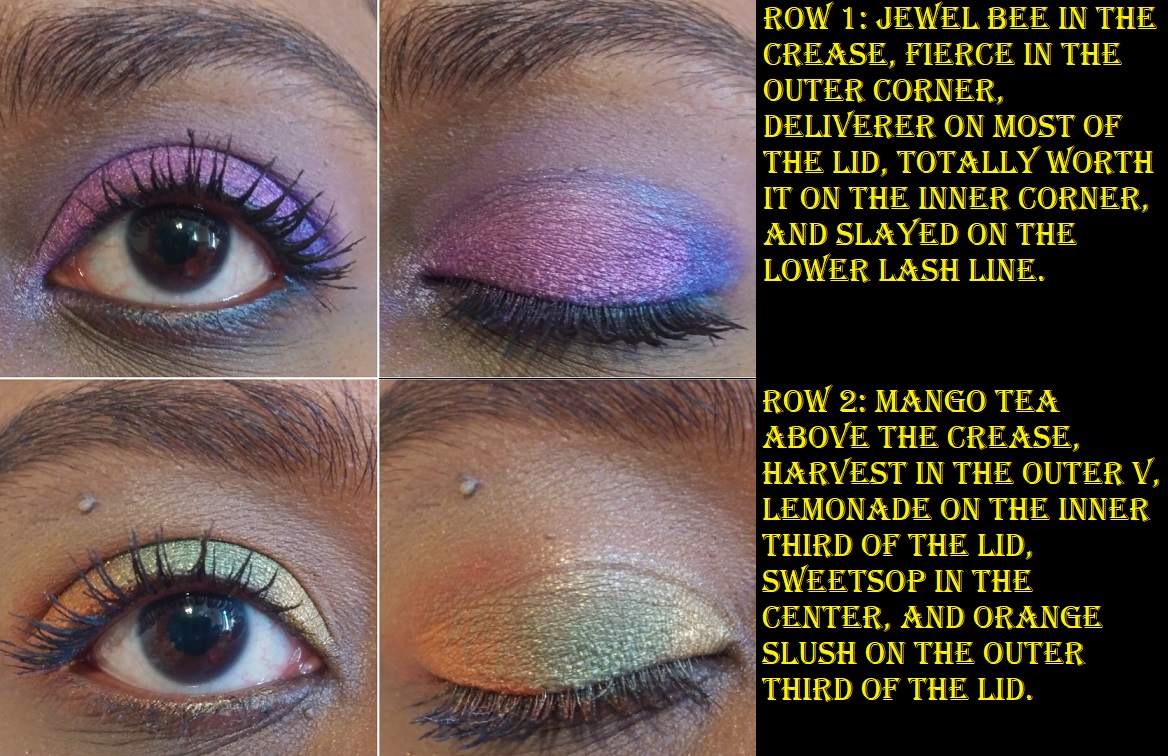
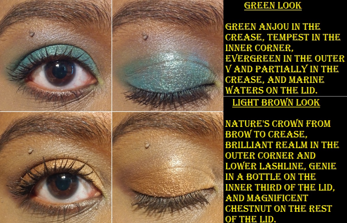
I mentioned at the end of the arm swatch segment which shades were the favorites among my guy friends, but my favorite Sydney Grace shadows are a combination of shades that I think look most flattering on me, as well as shades that are just flat out gorgeous and/or unique to my eyeshadow collection.
Geese A Laying – “A medium matte yellow bright matte”
*The Dream – Warm Gold
Mango Tea – “Yellow with an orange undertone”
The Greatest Gift – “Light pink with a green shift”
*Mantis – Deepened pastel green
*Granny Smith – Vibrant grass green
*Sweetsop – Medium green with gold shimmer
The Shallows – “Green with a blue shift”
Evergreen – “Medium green”
Thrilled – “Dark matte teal”
Fierce – “Medium blue with purple undertone”
JB – “Royal blue”
*Supreme Harvest – Dark terracotta
*Be Bold – Vibrant terracotta-orange
Lords A Leaping – “Deep red brown matte”
*Bug-A-Boo – Matte maroon
Magnificent Chestnut – warm metallic golden brown
Golden Rose – “Medium pink with a gold shift”
Maids A Milking – “Bubblegum pink with a strong blue shift”
Forever Enough – “Medium burgundy red with a satin finish”
Orange Slush – “Vibrant Orange with a metallic finish”
Golden Peach – “Deep peach with a golden shift”
Lost Princess – “Red with an orange undertone”
*Amber Jewels – Metallic Cranberry Red
*Don’t Quit – Metallic Burgundy
Flannel – “Bright medium purple”
*The Drive – Warm purple
Magenta Dreams – “Magenta with a blue shift”
Deliverer – “Vibrant violet with a red undertone”
Celebrate – “Yellow Green”
The final important note is that if you’re interested in purchasing from Sydney Grace and are trying to find specific shades via the search bar, just note that it’s extremely inconsistent. For example, if you type “Deliverer” you will get that shadow as the only result. If you type “Orange Slush” exactly as the shadow is called, you will find it on page 4 of the search results.
Devinah is one of my favorite indie brands. As a favorite, you can expect their products to be pigmented and beautiful like all the other shadows I love. What helps set them apart is that their price point for duochromes and multichromes are on the less expensive end. Their shadows are also a unique texture, unlike any other brand’s shadows I’ve experienced. Some of the mattes give some resistance when you try to rub your finger in the pan, yet they apply so smoothly to the skin. Some shimmers give resistance too, some are smooth, a few are dry, and some feel like a putty without moving around like a putty. The closest similarity would be to a Colourpop Supershock shadow, but without as much of the dimethicone/silicone feel to them. Devinah’s feel “heavier.” It’s hard for me to explain. The textural element is important to note because when I purchased the XPLODERS Collection, the Everlasting Gobstopper shade shrunk.
As you can see, it was unbroken and still in a perfect circle, just loose and sliding around in the pan. When I contacted them asking how this happened, they explained that the formula enables these shadows to be pressed back into place without breaking. They still offered a replacement or store credit, even though mine technically didn’t break, so their customer service is definitely top-notch!
It took very little effort to be able to press the shadow back together, and it looked like nothing had ever happened to it! I’ve been able to do this with Clionadh shimmers when I accidentally dropped them, and other soft shimmer shadows, but Devinah’s shadow is the only one I’ve been able to press back and have it look brand new using my fingers alone! Again, I think this goes back to the near putty-like texture.
As for Devinah’s multichromes, like the shades in the Butterfly collection, they feel closer to a traditional shimmer eyeshadow (still with some slip) in terms of texture. I apply the inner corner of shimmer shades with a brush, but I use my finger everywhere else on the lid. This is why texture has become an important element for me, since it adds to my enjoyment while using them, and why I felt it was important to delve into this much detail about it.
I use MAC Paint Pot for Matte shadows and Nyx Glitter Glue for the glittery/sparkly shadows. The more satin/metallic shades that shine without use of glitter have enough slip that I don’t think a primer is even necessary, but I still use MAC Paint Pot with them anyway.
SUGAR DROPS COLLECTION
The Sugar Drops are semi-transparent shifting glitter eyeshadows. Devinah recommends using a glitter glue to help the shadows adhere. They make great topper and highlighting shades and are recommended to try over white and black bases.
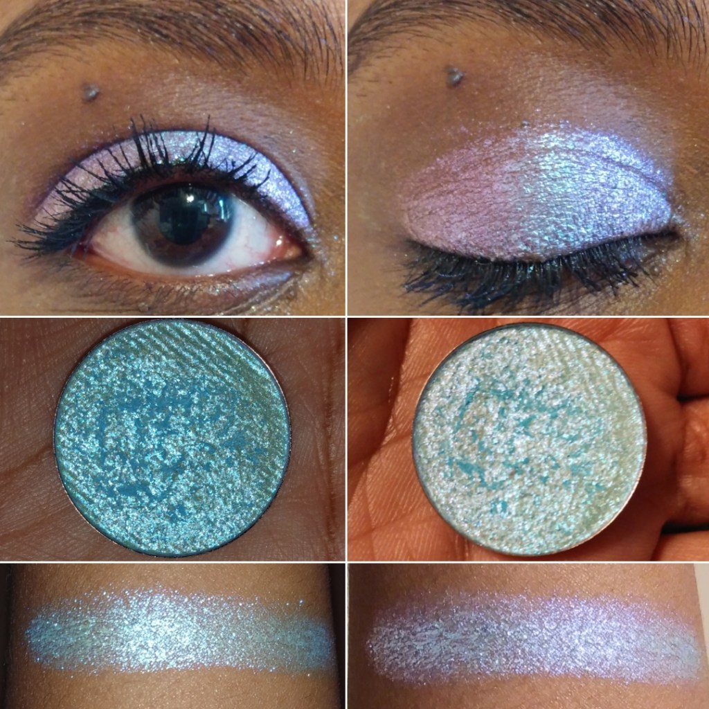
Cake Bomb – This shade shifts green and blue. On me it looks like seafoam green to powder blue.
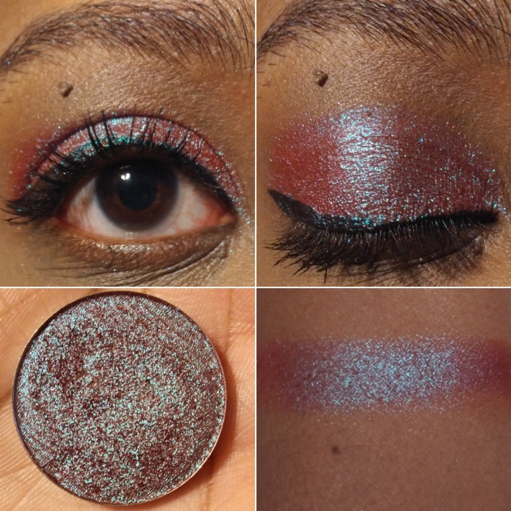
Soda Swamp – This looks like a peachy pink to pinky-purple shift, but I mainly just see the peach-pink. I didn’t like the way this looked over white and black bases. Though the black base made the sparkles stand out more, it turned cooler-toned, which isn’t as flattering on me. Over the white base, I couldn’t see the shift anymore.
Puffles -This looks like a pink-blue-green shift. Of the three, this is the one I like most because it makes the biggest impact.
XPLODERS COLLECTION
This is the only Devinah Collection I have in its entirety. I bought them all because I couldn’t decide between the shades! The brand recommends using a glitter glue with this one too. They remind me of the sugar drops but with more of a base color.
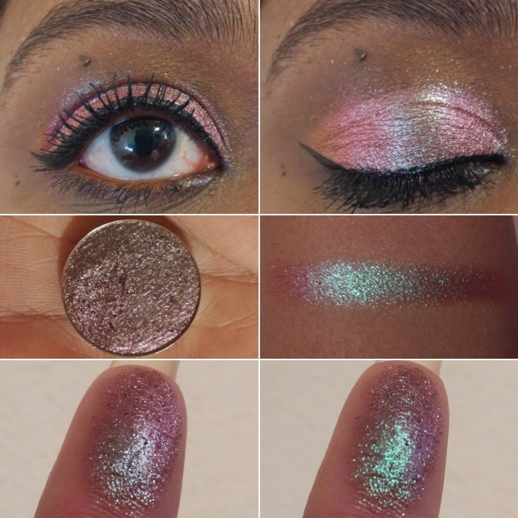
Everlasting Gobstopper – I can see purple-pink, a goldish green, and light blue. Blue is the dominating shade though in most types of lighting. I love how easy it is to see the shifts in this, though I wouldn’t wear a shade like this on it’s own.
Nerds – This has a blue-green-gold look, but on my eyelids the greenish gold is all I see. I don’t see blue, even though that’s the main color in the pan.
Swudge – This shade is blue-green with a purple shift, though strangely on my eyes the purple is more prevalent. This one I would feal comfortable wearing alone.
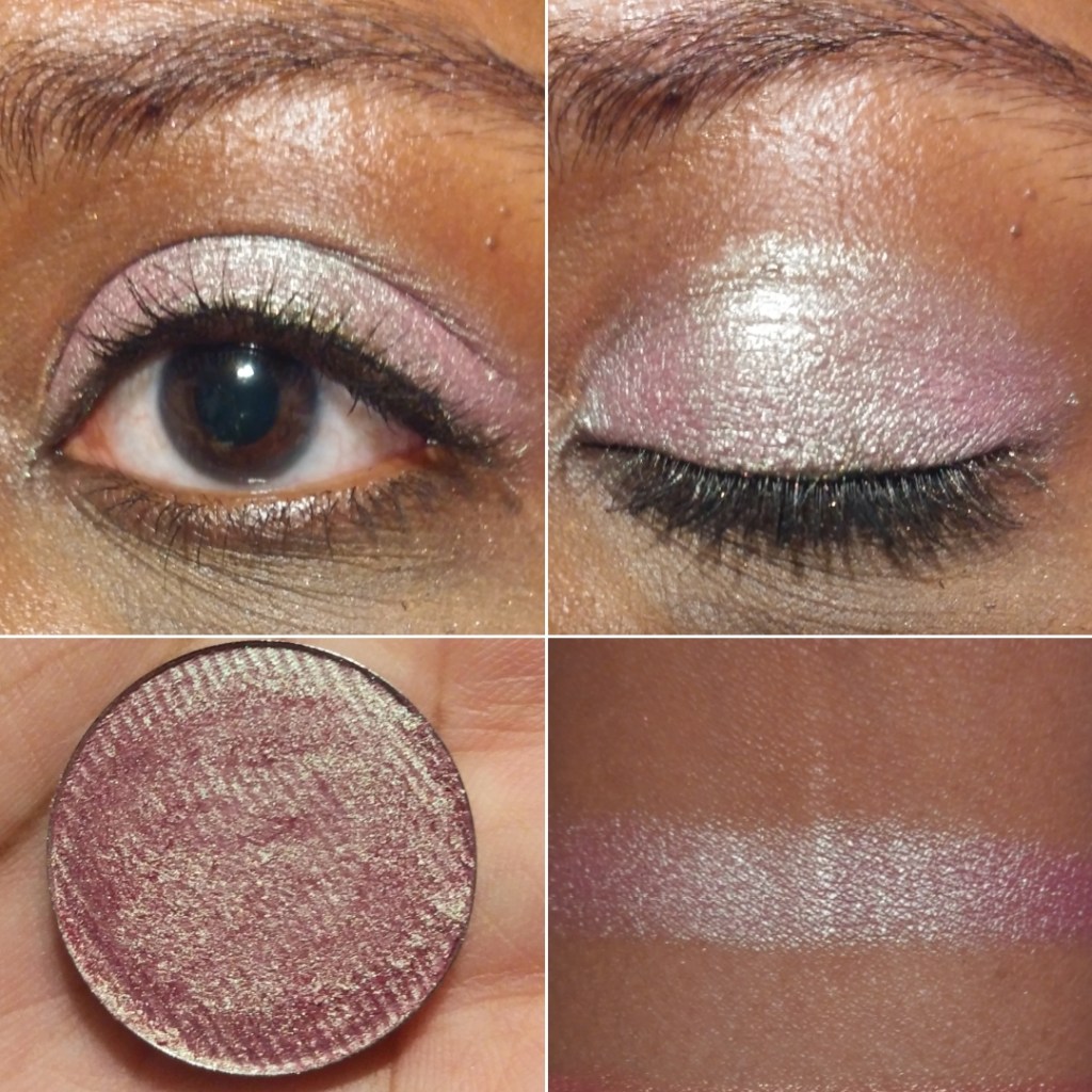
Pixy Stix – This is a pink to gold shift, but there’s no visible pink on my eyelids when glitter glue is used. Over a white base, the pale pink tones show and it looks similar to the shade Gelicide. Over a black base, it turns a darker gold.
Kazookles – This has a pink to purple shift, but on my eyelids it looks like there’s a bit of a gold shift as well.
Marshmallow Pillows – This is a pink to purple to blue shift. The blue and purple pop more on my eyelids, which makes this my favorite of the XPLODERS.
Runts – This shade is a lilac to purple with pink glitter, though the purple is so light that I can barely see it in person (and not in photos).
NEWEST MULTICHROMES
I bought two of the three new eyeshadows as part of the galaxy dust shifters collection. With these shadows, they recommend using glitter glue and trying them out over white or black bases.
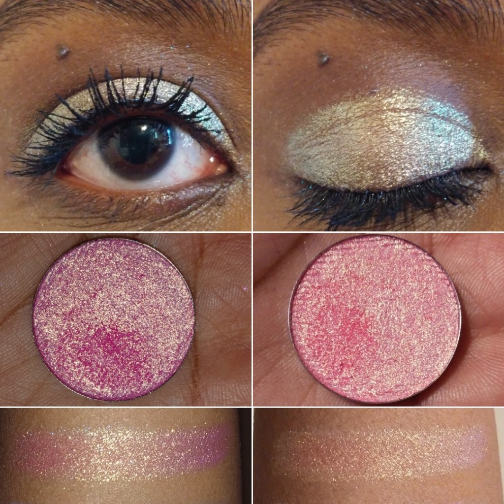
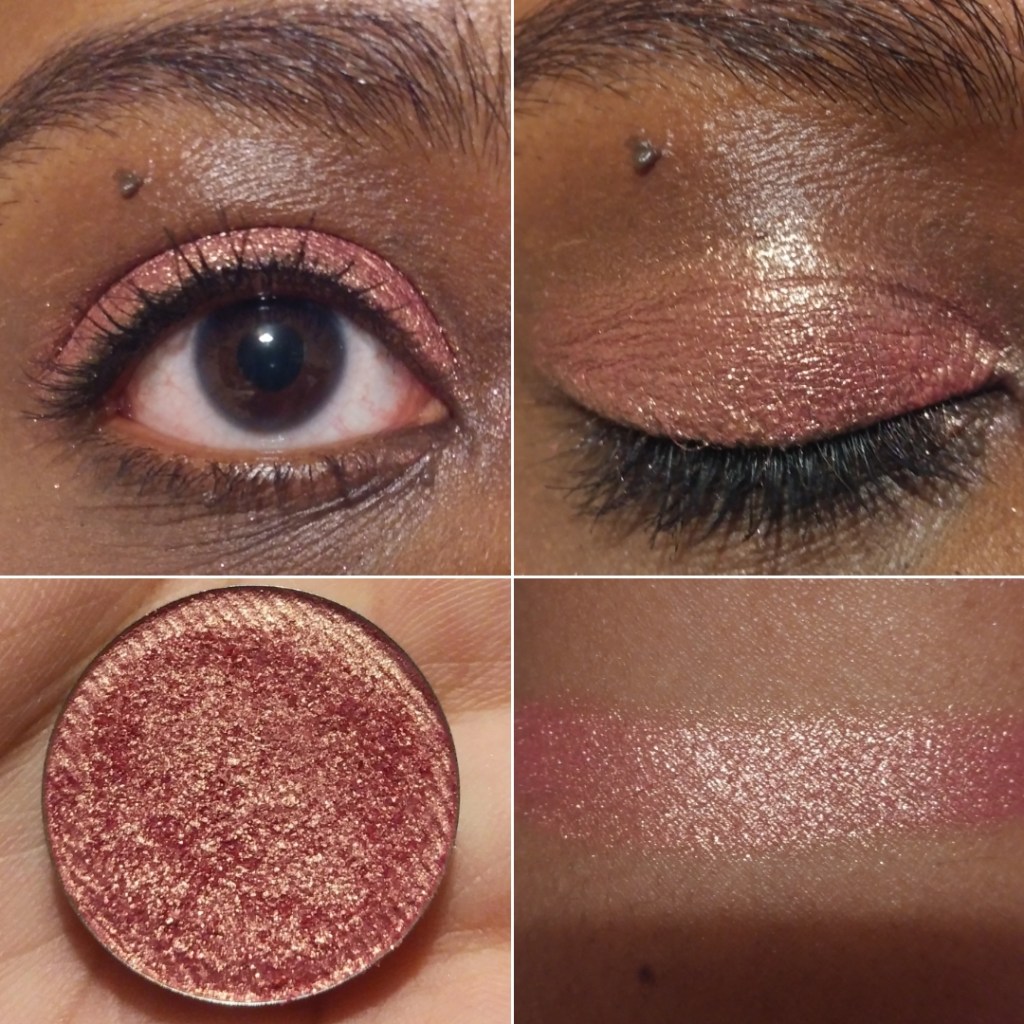
Tucana – I would call this a rose gold shade, even though it shifts from golden peach to pink. Or maybe it’s rose gold to pink. I’m really not great at describing shades.
Centaurus – I describe this as a shift from yellow gold to a more orange-gold.
GALAXY DUST SHIFTERS COLLECTION
Whereas the Sugar Drops and XPLODERS are more on the iridescent side, the Galaxy Shifters have a lot more pigment to them. They remind me of Clionadh’s glitter and hybrid multichromes from the Stained Glass collection.
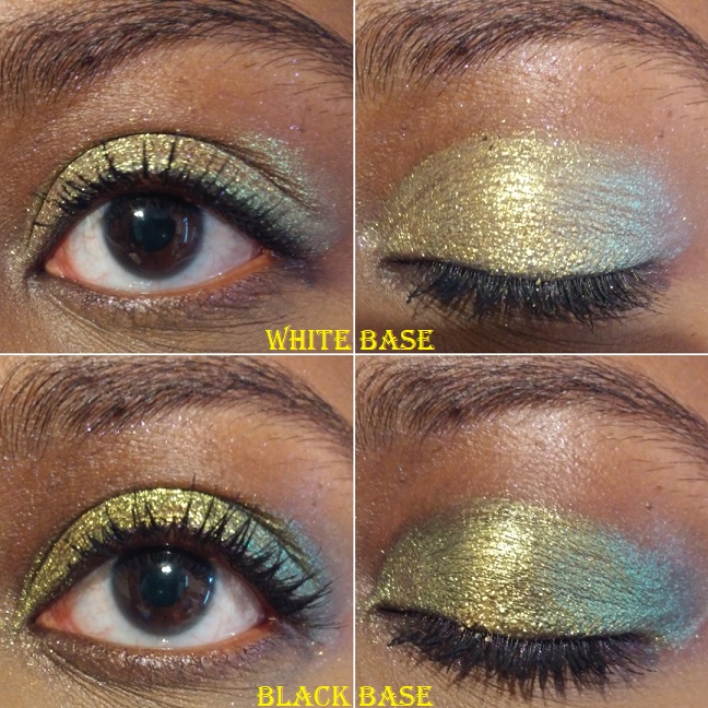
Celesta – This shade is like a vintage gold to olive. There isn’t a significant difference when used over a white base, as it just makes the shade lighter. Over a black base, it makes the green a little more apparent.
Skyla – This is like a fuchsia to purple with blue reflects.
Asteria – This one is a pretty cranberry to mint.
CANDY CAKES COLLECTION
The Candy Cakes shadows remind me of the Galaxy Dust Shifters, but without a shift. They’re like very pigmented duochromes. If there is a shift, perhaps I can’t see it because the shifting color is too close to the dominant one.
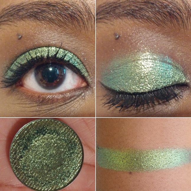
Rainbow Blossom – I really like this shade. It’s a beautiful fern green and gold.
Confetti Kisses – This is not my type of shade, but I was so curious about it that I had to get it. It’s like a bright sky blue with pink and purple shimmer.
Sweetie Sunbeam – I think this shade has a rosy base color but is mainly a coppery gold.
BUTTERFLY KALEIDOSCOPE COLLECTION
The Butterfly Multichromes have the most pigment and strongest shifts. These are the closest shadow comparisons to Clionadh’s Jeweled Multichromes, but without the black base.
Morphinae – The cool purple to blue shift is strong, but on the outer edges you can faintly see warmer purple too. A white base tones down the shade. I expected a huge impact when using a black base, but I didn’t get that. It did turn this shade smokier and intensified it slightly, but still nowhere near Clionadh or Sydney Grace’s multichrome level. That being said, not everyone wants that level of intensity. Some makeup lovers aren’t into deeper smoky colors and will possibly like these better. I love the ones with black bases, but I admittedly don’t always go for that look either.
Parthenos – The more obvious shift goes from a lighter green to a darker green, but the outer edges have a little aqua blue or cyan.
MULTICHROME MADNESS COLLECTION
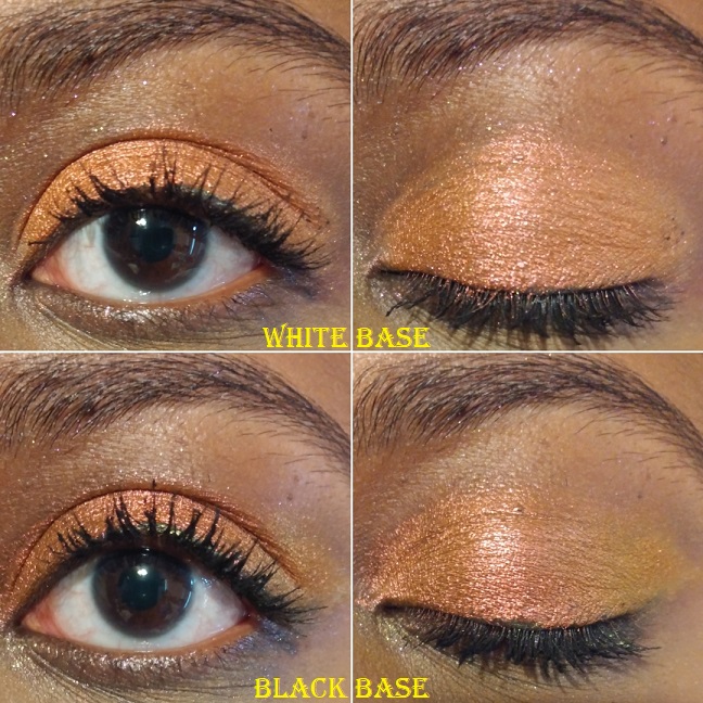
Nacarat – This shade has a subtle shift from darker to lighter orange. I was surprised to discover this grouped in with the multichromes, since it’s so difficult to see any shift at all. I was also surprised to see both white and black bases dulled the intensity of the orange, though the black base showed the lighter orange shift better in the outer corner. Though it doesn’t show as much on camera, over the white and black bases, I also noticed a slightly pink tinge to the shade as well.
Pavonine – When I think of common duochrome and multichrome shades, this one comes to mind as a dark berry/burgundy with green-blue shimmer. Even though this isn’t a unique shade, I don’t have that many in my collection, so I decided to buy it anyway.
UNBUNDLED MULTICHROMES/DUOCHROMES
Gelicide – This shade was a lot lighter than I expected. It’s like a light baby pink with champagne shimmer. Strangely enough, I like it and think it would make for a great inner corner or inner third lid shade.
Empress – This shade reminds me of Sunbeam Sweetie, which I will compare later in this post. I love this one so much! Most pinks I encounter are cool-toned, which isn’t as flattering on my complexion. However, this one is deeper and warmer, so I love the way it looks.
Charmed – This type of purple duochrome (with the light to medium blue shimmer) is a very popular eyeshadow shade, but it tends to be on the sheerer side. I’m glad I bought this one because it is the most pigmented purple of this kind I own.
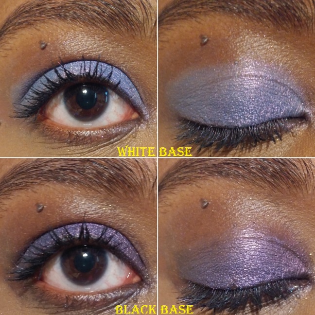
Vicious – This eyeshadow is looks purple in the pan, but has a cool blue tone to it on the eyes. When I wore this in a video chat, it looked completely blue on camera. Over a white base, this shade looks relatively similar to what it looks like on a clear base, but the blue is slightly brighter and less silvery. Over a black base, this makes the purple dominate. This is probably my least favorite eyeshadow in my Devinah collection, with the exception of the shade it turns over the black base. That kind of purple is what I was hoping it would be from the beginning.
SOMEWHERE OVER THE RAINBOW SET
This collection was inspired by the Wizard of Oz. I love that so many of Devinah’s shade names are inspired by different things, for example, the types of butterflies in the Butterfly Kaleidoscope collection, the Willy Wonka theme of the XPLODERS, Salvatore from the Vampire Diaries. The owner (DeAndra) mentioned in an instagram post that she likes horror and murder mystery genres. With shade names like Homicide, Criminal, and Devious, it is very apparent. I’ve also seen Egyptian inspirations, the show Sparticus, etc.
Upon first impression, I despised these two shades because of the fallout. These were among my first the few Devinah purchases, when I had gotten accustomed to their regular shimmer and metallic formulas where using an eyeshadow primer wasn’t a necessity. I had used them over bare skin and then MAC paint pot and they looked so dull. Once I used them over a glitter glue, my opinion completely changed. Glitter fallout was no longer an issue and they looked a lot more opaque and impactful. I highly recommend using a glitter glue with the shadows in this Somewhere Over The Rainbow formula.
Are you a good witch – This is a sparkly dark purple with pink glitter.
I’ll be tender, I’ll be gentle – This shade is a deep teal with aqua glitter. It reminds me of the Lapis Lazuli shade I love from Pat Mcgrath.
PRESSED SHIMMERS
I don’t have much to say about the shadows in this formula, beyond what I mentioned in the introductory paragraphs. They perform well, have longevity, can work without a primer but I like them with my MAC Paint Pot (not as much with glitter glue though). Some of these are shimmers but some have more of a metallic feel with some slip. It’s as though each shade has its own tweaked formula to maximize its effectiveness and beauty.
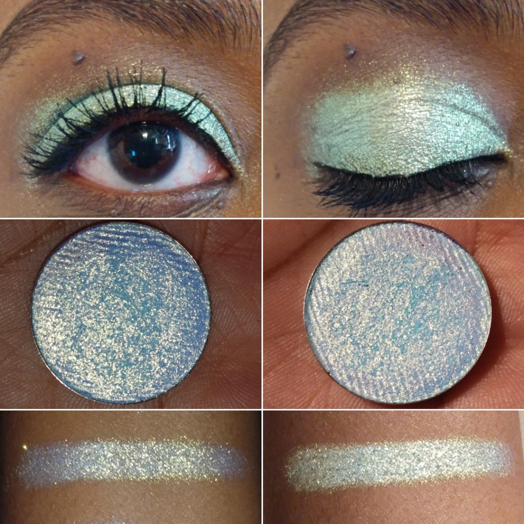
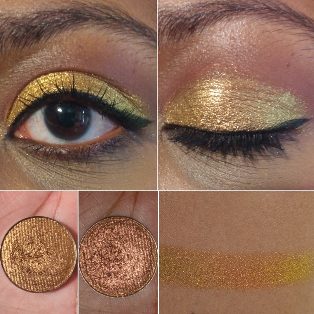
Sphinx – I like this very pretty bright yellow shade.
Nefertiti – I don’t have any shade in my collection quite like this one It’s very metallic and the shadow even feels wet. I would describe the color as a yellow-orange brass.
Cleopatra – I think of tangerines when I see this color.
Ambrosia – I honestly bought this shade purely because of the name. I have this weird infatuation with the term. I think because I love mythology (Greek especially) and ambrosia was the food of the gods. I’m happy I actually like the way this caramel-bronzy shade looks on my eyes.
Paramour – This is another one of my favorite Devinah eyeshadows. I would describe it as a festive crimson shade that can be built up to look a little deeper.
Salvatore – This looks to be a true red shimmer.
Starlet – This shade is a dark slightly red toned purple, like a wine color.
Purple Kush – This shade is a dark blue toned purple.
Avalon – Is this blue? Is this purple? Another blurple?
Lurican – Purples are my favorite eyeshadow color and greens are my second favorite. I really like this green shade with gold shimmer. It’s similar to Rainbow Blossom without the intense glittery sparkles.
Ferly – This shade is the reason I didn’t buy Clionadh’s Lineage multichrome, as it reminds me so much of it based on swatches. It’s a very pretty almost minty green with gold shimmer. This is another favorite of mine.
Chimerical – I’d describe this as a mossy green with brighter green shimmer.
Alew – This is a blue-ish green shade with gold (and maybe even a little silver) shimmer. It reminds me of a slightly more green version of Hydra from Sydney Grace.
Odium – This color reminds me of Coloured Raine’s Forbidden shade (my favorite eyeshadow of all time). Coloured Raine’s single shadows are being discontinued, so I’m glad I have this as a close replacement.
Briseis – Talk about bright! This shade is so vibrantly ocean blue! Or Turquoise? I don’t know but this blows Coloured Raine’s Malibu shade out of the water!
Midnight – In pictures this looks mostly black with a slight greenish blue tinge. In person, the blue (or deep/darkened teal) is easier to see.
Hydra – Again with the insane vibrancy! I don’t have anything close to this shade in my collection. I would call this an Egyptian Blue shade.
PRESSED MATTES
Toska – I like this shade of yellow but it takes a lot of building up to look opaque on the lid.
Passion – I love this rusty orange. It was one of the first shades I bought from Devinah.
Runa – This is a more pigmented terracotta version of Passion.
Kaia – This is more of a pastel purple that isn’t the worst I’ve tried, but I don’t like this one as much. It might work better over a white base, but I haven’t tried that yet. And at least I can get it to look opaque.
Courtney – This is a very popular shade among Devinah customers. I can see how this type of grungy yellow-green would be liked on others, but it’s just okay for me.
Desma – This rich reddish brown is so nice! It’s rare that I wear just mattes on my eyes or even one-and-done eyeshadow looks, but I would feel comfortable wearing this on its own. It’s my favorite of the mattes I have.
Here is a gallery of some comparison swatches to each other from Devinah and examples of other eye looks.
I would normally post more complicated eyeshadow examples, but Devinah’s shades are so unique and special on their own that in my everyday routine I just put a neutral shade in the crease, add a darker eyeshadow in the outer corner for smokiness, and let each shade shine on the lid on alone. This is why I decided to do the 50+ eye swatches rather than posting just hand swatches. Each eye swatch is already a look I would do.
Additional Information
As I mentioned earlier, Devinah’s prices are quite reasonable for what you’re getting. This is also the case when coupled with promo codes. When you initially sign up for their emails, you’ll get a code for 25% off. There are also influencer codes that can be found in different Youtubers’ video descriptions for 20% off. Also, after every purchase, I usually get an email with a coupon offering 25-30% off if I place another order within 7 days. The codes should work on everything except the Butterfly Multichrome shadows.
I’ve only been a customer with Devinah since they relocated/reopened in Oregon, so I’m not certain if they have regular sales throughout the year. I haven’t witnessed one yet, but the promo codes are a great deal as is. Shipping isn’t free and they recommend purchasing the $3.80 insurance as a USPS order upgrade to protect against loss, theft, or damage.
One of the other things I like about Devinah is that they’re interactive on Instagram and supportive of other indie brands, even liking posts that don’t have their own products in them. They recognize there’s room for everyone in the beauty industry. When you have a good product, it speaks for itself and people will notice.
Overall, I really like Devinah’s shadows and recommend them to anyone who has been thinking of trying out this brand. The glittery eyeshadows are a little more difficult to work with than Clionadh’s formula when dealing with fallout. The Xploders and Sugar Drops are particularly messy. I think this is because they are a little less emollient. However, this is the tradeoff because the shadows don’t settle into the lines of my eyelids as much as Clionadh’s can. Speaking of which, I still have a Clionadh Cosmetics post in the works. I just keep debating with myself whether to post it soon or just wait until I have everything I ordered (which would take a few more months).
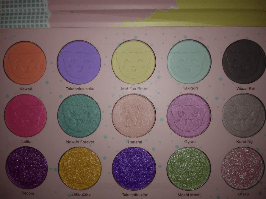
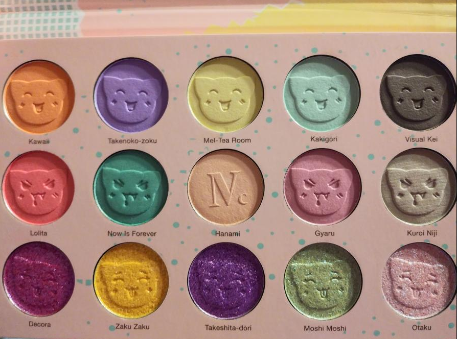
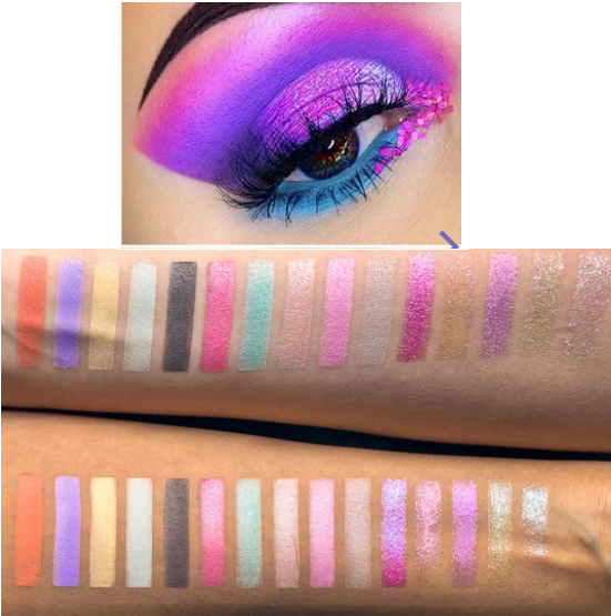
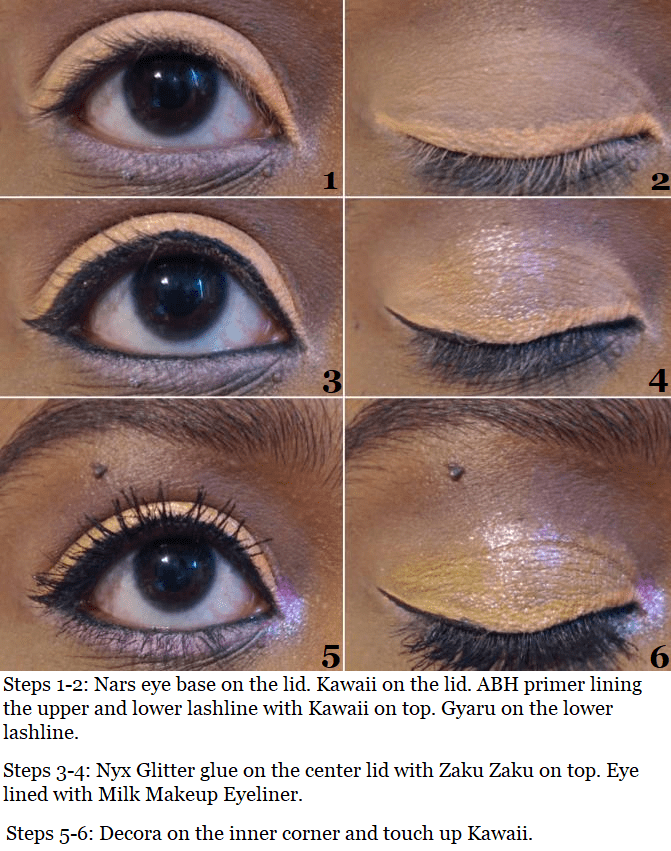
I’m starting this post with a description of the palette to set the tone of what I was expecting: “Nomad x Tokyo Harajuku Intense Eyeshadow Palette. This poppy pastel palette of fun combines 10 high-pigmented eyeshadows and 5 unique multi-chrome toppers for a sheer prismatic color effect. 15 kawaii shades inspired by the wild creativity of the trendy Tokyo youth. Infused with Camellia Japonica Oil to make skin soft and silky smooth. Cruelty-free & vegan.”
Nomad’s website features Instagram looks from people who have used the palette. Someone please teach me this sorcery of how you get that purple and that blue on the eye compared to the swatches that Nomad themselves posted. Below are my own swatches which I don’t think are that far off from Nomad’s. So, the color intensity from my palette matches up to what I was supposed to get. Yet the site description and photos give the impression that the palette is much more vibrant than it really is.
Perhaps this is considered “intense” because it’s not a neutral color story. Maybe it’s “highly pigmented” for an eyeshadow palette as opposed to the color payoff it should have if it was a pigment palette. There are many times I’ve seen a photo on Instagram with a list of multiple branded eyeshadows used in a single look, yet one brand will repost the photo and make it seem like the whole thing was created using just their eyeshadows. So, it’s possible this person used more than the Harajuku palette on the eyes and that would explain the color differences. Or they used highly pigmented bases/paints underneath. It’s also possible someone used editing tools to turn up the color saturation and tweak the brightness, intensity, etc. I’m not saying it’s impossible to be talented enough to produce that kind of look from this palette. I just have no idea how to naturally do that regardless of what base I used. I tried seven different ones, which I will discuss further into this post.
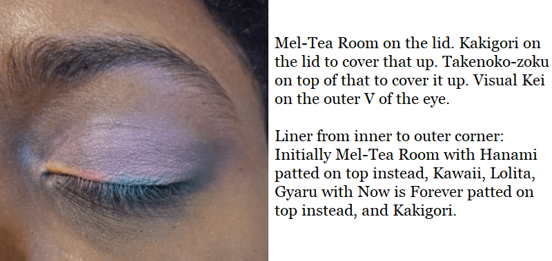
This was the outcome of my first use of this palette, which I quickly realized has a learning curve.
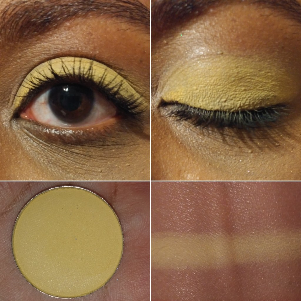
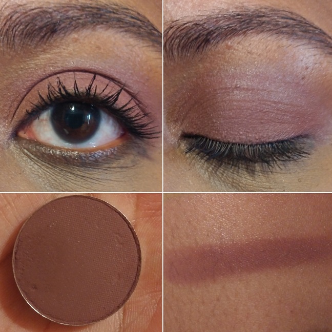
These eyeshadows swatch beautifully! They feel smooth and glide across the skin nice and evenly. I swatched them on my MAC Paint Pot in Groundwork, yet when I used the same base on my eyes, they wouldn’t stick and kept dusting away. The reason I was able to pack three different colors on top of each other on my lid was because the previous two blew away and just left me with white powder on the lids. Patting motions produce decent results with some of these eyeshadows, but I have been unable to actually blend any shade besides that dark grey called Visual Kei.
Pastel shades can be quite tricky to use, particularly on darker skintones. While it’s true that I tend to avoid pastels because they’re time consuming to use if the formula isn’t suited for me, the pastels from Lethal Cosmetics and Makeup Geek show that they can be made to work for everyone.
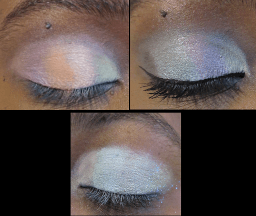
What I learned from my failed attempts is that it’s not enough to just have a creamy base (MAC paint pot) or a white base that is dry (Anastasia Beverly Hills eyeshadow primer), so I switched to the Nars Smudgeproof Eyeshadow base which is whitish-clear and emollient. Making this switch provided better results.
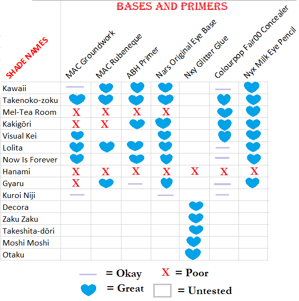
I still wasn’t satisfied though, so I continued to test things until I came to the realization that the Nyx Jumbo Eye Pencil in Milk is the best base that I have. I was able to get every shadow to perform decently from the top two rows of the palette, excluding the two shades which I couldn’t get to work with any base: Hanami and Kuroi Niji. And the satin finish in Now is Forever is what helps me distinguish between that shade and Kakigori, even though they look different in the pan.
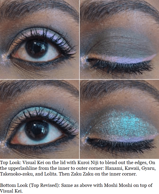
These are the results of my testing, which I hope better explains what I was trying to say. The difference between the lilac line and blue hearts is that some of the bases had the color show up but the shadows faded quickly. And even though the Nyx Jumbo Eye Pencil worked the best of all, there’s still a learning curve to using this too.
Shadows do crease on me, but if I use too much of the Nyx pencil on my eyes the creasing becomes deeper and more noticeable. Using too much also prevents it from drying down, but too little and the shadows won’t stick. A few hours after I did that eyeshadow look, which had a little too much of the Nyx pencil, I accidentally rubbed my eye and a thick patch of eyeshadow left a streak across my hand. I’ve had shadows come off a little but not to this degree. So, it’s important to find the right balance.
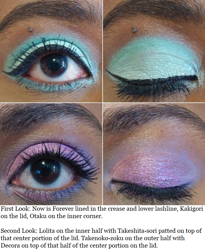
As for the “multi-chromes,” the five sparkly shades on the bottom row have multi-colored shimmery specks but when I think of a multi-chrome, I expect a color shift. Perhaps it just doesn’t show as well on my skintone, but to my own eyes these are duochromes at most. That doesn’t take away from the fact that these really are beautiful and are the stars of this palette. They stick fairly well on their own, but Nyx Glitter Glue ensures that there’s minimal glitter fallout. They definitely stay in place, even when rubbed.
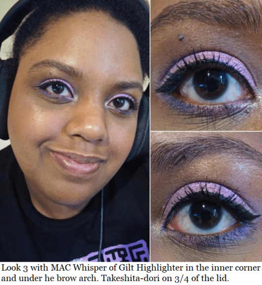
The base in Decora is the most pigmented, and therefore is the darkest one, especially with its darker purple glitter. That’s why I often pair it with Takenoko-zoku over Lolita or Gyaru when one of those two are on the other half of my eyes. Takeshita-dori looks darker in the pan, but the light purple glitter makes it appear lighter than Decora. The vibrant yellow in Zaku Zaku doesn’t translate to the eye and appears more of a peachy pink, which is why I pair it most often with Kawaii. Moshi Moshi looks mostly green with blue glitter. Otaku looks pink in the pan, but it just looks blue on me.
FINAL THOUGHTS
Now that I know the trick to making this palette work for me, I can foresee myself continuing to use it. Liking 9 out of 15 shades is a decent ratio for a premade palette. However, I can’t recommend this despite loving the packaging, the concept, the texture of the shadows, and the results with specific shades. The formula is too finicky. And although it didn’t work as well for me, I thought it was still worthwhile to post about for anyone wanting to see this on a dark skintone. If you have a lighter complexion or a more advanced skillset than I do, you may enjoy this palette more than I did.
My first Coloured Raine purchase was in November 2017. For two years, their eyeshadow formula was in a league of its own at the top. I even preferred it over my expensive Viseart, Natasha Denona, and Pat Mcgrath shadows! This year, I took a deeper dive into other indie brands’ makeup. Although I no longer know which brand can claim the #1 spot in my collection, Coloured Raine is still tied at the top. Their gorgeous forest green shade, Forbidden, is my all-time favorite eyeshadow (not counting duochromes or multichromes). I purchased nearly all their eyeshadows, and I even have a few duplicates, because I love them so much! However, rather than trying to complete my collection, this post motivated me to pull a Marie Kondo on all my single/depotted shadows and just keep the ones I love.
Because the quality of Coloured Raine shadows are so consistent across the board, there isn’t much to say about them except that they’re highly pigmented and blendable with the smoothest creamy texture. This is the case among all types: mattes, shimmers, metallics, etc.
I will make note of any shades that stand out for negative or especially positive reasons. I will also be discussing more than just eyeshadows. This review will include comments on a few blush/highlighter duos, sponges, and empty magnetic palettes.
THE EYESHADOWS
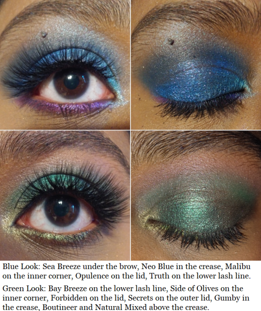
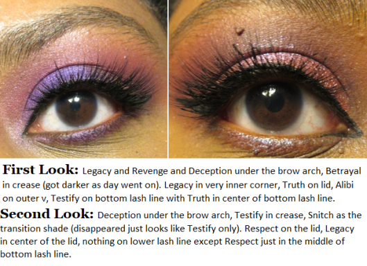
There was a time when I purchased Coloured Raine shadows to make quads as Christmas gifts. Your Majesty (which I somehow had three backups in my collection) and Malibu from this set of swatches were among them. I should note that I did take Super Star out of my collection since it was so similar to Rosé. I parted with Nightingale as it is too common of a color. Paradise Isle looks like a more sparkly version of Unexpected, yet I couldn’t part with either shade. I was also surprised to discover the Blue Magic shade I’ve purchased for others, I didn’t have in my own collection. I kept seeing Opulence and assumed it was Blue Magic. In the pan, Opulence has a purple tinge that doesn’t translate to the eye, as the purple disappears once it’s rubbed onto the skin. Since I’m just left with bright blue on my skin, I wonder if I’m still missing out by not having the Blue Magic shade. It looks like it might just be a darker version. If I get it in the future, I will update this post as usual. I also have to comment that Legacy is such a cool shade! It’s whitish-pink in the pan but pinkish purple on the eye, making it a nice topper shade. As with other iridescent shades, I wouldn’t use this on its own, except for the inner corner or as an interesting brow highlight.
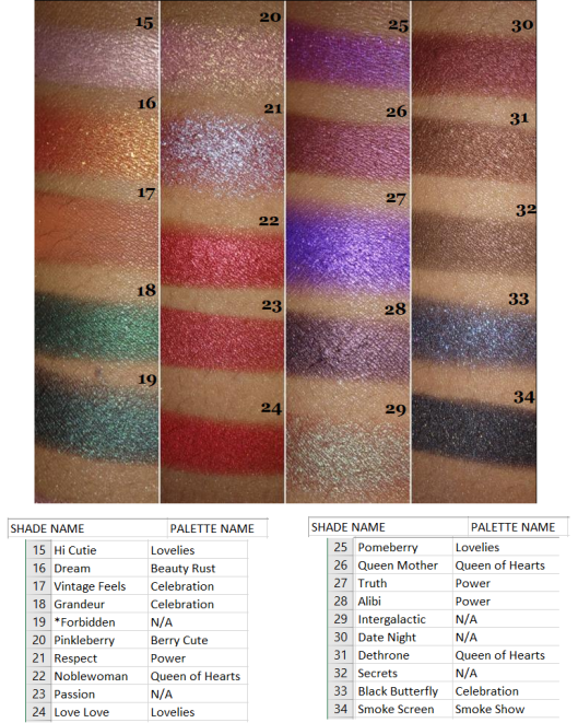
I have enough dark greens, so I removed Grandeur from my collection. Noblewoman won over Passion. And even though Smoke Screen was the only black shade with gold shimmer in my collection, I rarely use any form of black other than matte, so I took that out as well. I would like to reiterate that this had nothing to do with an issue of the formula. I was so tempted to keep them all, but I needed room to add Safari Raine and the upcoming Juicy Boost collection. I could have used another empty magnetic palette (I have so many) but I don’t think I need over 100 eyeshadows from any single brand.
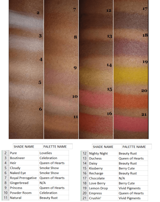
I got rid of all the white shades in this set. I’ve never had use for a white eyeshadow, and I prefer using highlighters to highlight under the brow or to use a cream shade to blend out shadows. Choosing between the dark brown shades was surprisingly difficult, so I only removed Chocolate since it looks like the kind of brown I have the most repeated in my collection.
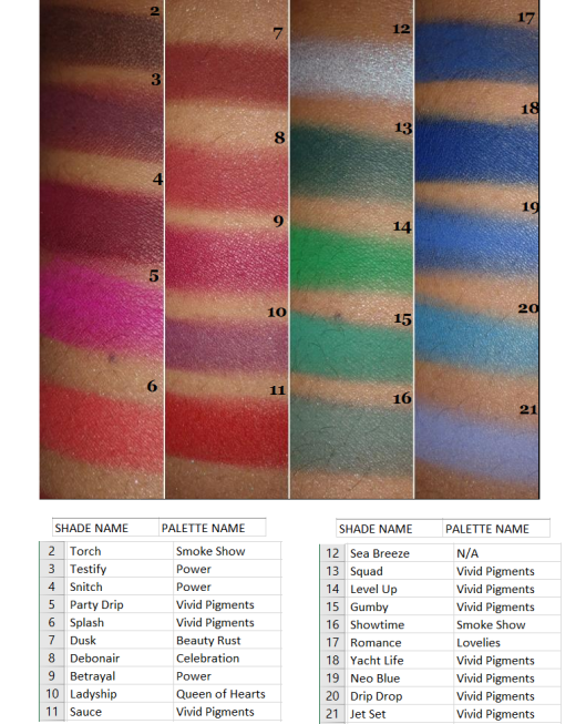
I got rid of Snitch and Torch for the same reason as Chocolate in the previous round of swatches. I noticed that the palette with the most shades I decided not to keep was from Smoke Show. Prior to getting the Safari Raine palette during the last restock, Smoke Show was the last palette I added to my collection as it had the least appealing color story for me. The shade I wanted most, Showtime, I didn’t keep either as it couldn’t compete with those stunning Vivid green pigments.
Side Note: I’ve always wondered if Coloured Raine is the reason Colourpop had to discontinue selling their Smoke Show palette and rename it Blowing Smoke. Coloured Raine’s palette came first and the name is trademarked. Even though the color story between the palettes is different, I believe one of the stipulations of a trademark breech is if it would cause confusion. Since they both have ‘Colour’ in their names, to have the same palette name on top of that seems like sufficient grounds to me!
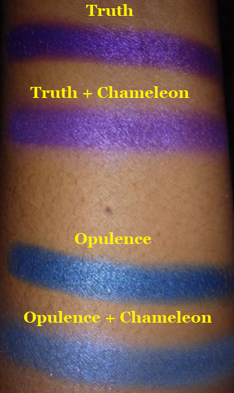
I purchased the shade Chameleon with my Safari Raine order, so I’m including it here as well. It’s a purple iridescent shade that I don’t think looks that nice on its own. When used as just an inner corner highlight, it had an interesting darker purple glow, but it’s not the texture or pigmentation that I’m looking for. The swatches for this shade I intentionally built up to see what’s the maximum pigmentation I could get when certain spots refused to deposit color, and I was still not happy with the results. I would rather reach for an iridescent from other brands over this one. It’s one of the few shades in their entire collection that I wouldn’t recommend. The one application I’ve found to be somewhat useful for this is adding a lighter pearly finish when topped on other shades. I recommend just skipping this one.
The Celebration palette had the second most eyeshadows I decided not to keep, having decluttered 5 out of 13, which is still a decent amount to have kept. Raise a Glass, Flammable, and Misty Nights were removed. As a purple eyeshadow lover, I would love having a lot more purple shimmers from Coloured Raine. The Power palette definitely satisfied some of my purple eyeshadow needs, but I will always want more, even though I have plenty of purples from other brands. Here is a comparison of CR’s Power Palette to CP’s As You Like It palette.
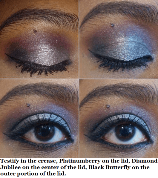
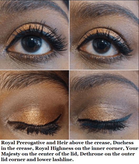
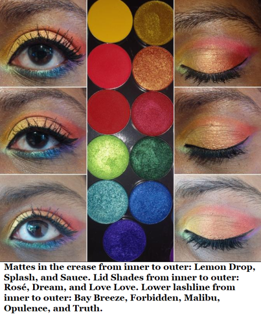
And here are some eyeshadow looks!
SAFARI RAINE
CR had one final restock of this palette, so I have it in my collection now! They’re also selling the shades individually, which is appealing since I planned to depot the shadows anyway. However, at $6.99 each, that would cost $62.91 to get them all when the palette is just $29. I have no issues with Coloured Raine charging them at their standard eyeshadow price. I just made the most cost-effective decision and I’m glad they kept the original Palette price instead of raising it due to the hype that Jackie Aina played a part in restarting.
Although I’ve only had time to use this twice, I would say that the quality is on par with the other shadows. The only shade I had a little trouble getting to show on my skin was Congo Basin (even after trying with the ABH primer which I use to make shadows really stand out). Even to the touch, it felt a little grittier than the others. It reminded me of the texture of the Snitch from the Power palette that I didn’t like. Purples of that shade do tend to have that texture, but I’ve never had a green eyeshadow feel like this. Regardless, I did manage to get it to show a little.
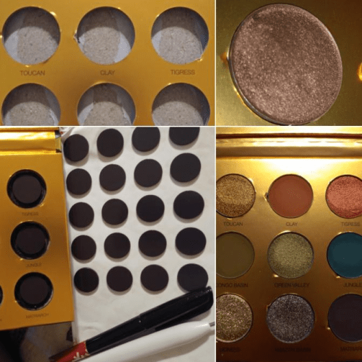
Because the palettes were so sought after, I felt bad about completely getting rid of mine after depotting it. So, I turned it into a magnetic palette. I removed the shadows from the palette, colored the wells with black marker (I didn’t want to wait for black paint to dry) just to make it look more aesthetically pleasing. You can cut around the magnet to fit the size of the wells (keeping the sticker on the back) and place the pan inside to make sure the magnet isn’t too thick. Although I had thinner magnets and magnetic sheets, I wanted to use up my thicker ones, so I used them anyway. It made the pans stick out from the top a little, but the lid still closes, which is most important. I stuck all the magnets in the wells and that’s it! When depotting, I always clean off the glue (this time using Parian spirits) and place a sticker label on the bottom so I can remember the shade name and palette it came from.
The Blush/Highlighter Duos
I have 2 out of the 4 Blush and Highlight Duos from the Power Collection. I didn’t buy the one called Prove My Loyalty because it has an icy white highlighter best suited for pale-light skin tones and a dark red matte best suited for dark-deep skintones. Anyone can wear any makeup they want, but the pairing of those two was…an interesting choice in my opinion. I’m not sure how many people can find use for both of those together. I also didn’t purchase My Day One because both the highlighter and blush looked like they might be too dark for me.
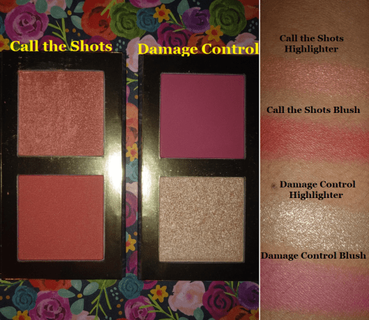
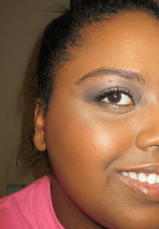
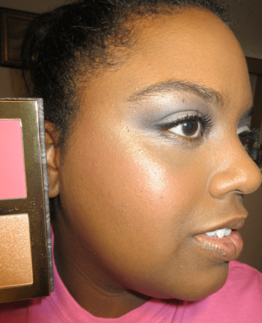
I purchased Damage Control first. Here are some old photos with it.
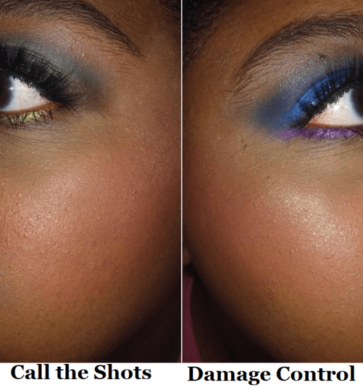
I like the blush portion. It’s very pigmented, so it requires a light hand or very fluffy brush with it. The highlight shade is beautiful, but too glittery for my taste. I prefer finer shimmer particles in my highlighters.
The other duo I purchased is named Call The Shots. The blush has a little more warmth to it, which suits me a bit better, although the color difference between this blush and the previous one isn’t that obvious when I use a sheer application. This highlighter has more of that shimmer finish I prefer, but I typically don’t reach for this shade. I love golds. Lately, I have been more interested in blush toppers, which this color is great for, meaning it won’t go to waste. I just know I won’t use it as often as I should.
These duos are fine, but don’t really ‘wow’ me. Although I don’t think $25 is too much considering what you’re getting, if you can snag them for 50% off (as they’ve been on sale multiple times) then I’d be more likely to say they’re worth checking out at that discounted price.
THE SPONGES
I don’t know why I keep buying sponges when I’m 90% more likely to use a brush to apply my foundation and concealer. If I don’t use a brush, I use the Blendiful from Tati Beauty because I can get my products on and blended in half the time.
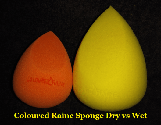
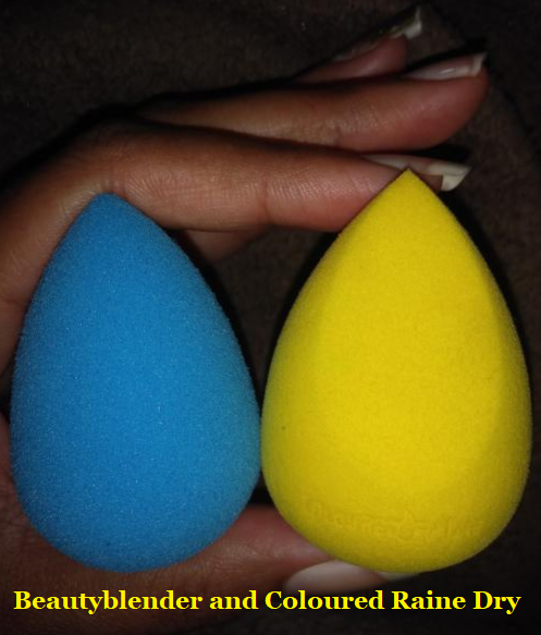
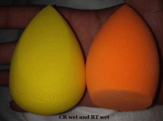
In any case, the only traditional beauty sponges I have used so far are from Beautyblender, Real Techniques, and Coloured Raine. The Real Techniques sponge is nice, but the one from Coloured Raine easily surpasses it. I cannot decide which I like more, though, between BB and CR because they both are better at different things.
Softest: When it comes to the softest sponge, Beautyblender wins. The Coloured Raine sponge feels a bit dense when dry but softens up after it is damp. It swells to the largest size among the three sponges. The Real Techniques sponge is a lot harder and remains a bit hard even after being wet.
Precision: The pointy tip of the CR sponge fits perfectly in the crevices around my eyes when applying concealer. It easily wins, followed by the RT flat edge and finally the BB which has no flat edge and the tip is still a bit rounded, which impacts the precision. That being said, I don’t often use a sponge with my concealer, as I want the most coverage under my eyes and a sponge does sheer things a bit. So, this benefit isn’t the most useful in my everyday life. However, when I was on vacation last year and wanted to bring minimal brushes and wanted a backup sponge, I took the CR sponge instead of a BB.
Smoothest Foundation Application: A nice blended look can be achieved with all the sponges, but the BB does it the fastest, followed by the CR one.
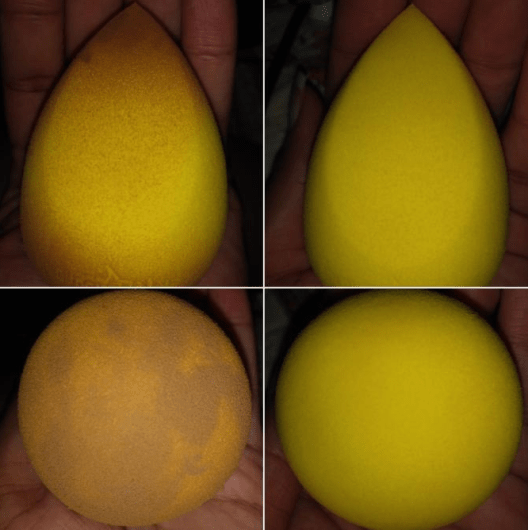
Easiest to Clean: The BB and RT sponges take about the same time. They work well with the Beautyblender solid soap. The CR sponge is the hardest to clean and doesn’t work as well with the BB Solid. I have better results when I use my regular makeup removing face wash on it. It’s possible that I perceive it as being more difficult to clean because I’m using the yellow one, which is probably easier to see stains. I won’t know until I start using my orange (or green if I can find that one) CR sponge in the future.
Most Durable: The CR sponge definitely lasts the longest and hasn’t torn on me yet. My RT sponges start to get tears in them after the first 3-5 uses thanks to my long nails when I’m washing them. My BB sponges tear on me between 1-3 uses. I don’t know if there has been any changes to the beautyblender because the first two I ever had years ago had to be thrown out before it ever tore. But now my beautyblenders don’t last as long.
Prices: RT = $5-$6. CR = $6. BB = $20.
Side note: BB sells silicone (or silicone-like) cases to put sponges in to let dry and keep away from dust and other particles. You can find adorable dupes for 50-75% cheaper on sites like Amazon and Ebay. I have the official one along with the dupes and although the official one is thicker/sturdier with more breathable holes, there isn’t that much of a difference. My kitty ones get the job done and they even have ridges on the bottom that lets them stand upright, unlike the official one.
EMPTY MAGNETIC PALETTES
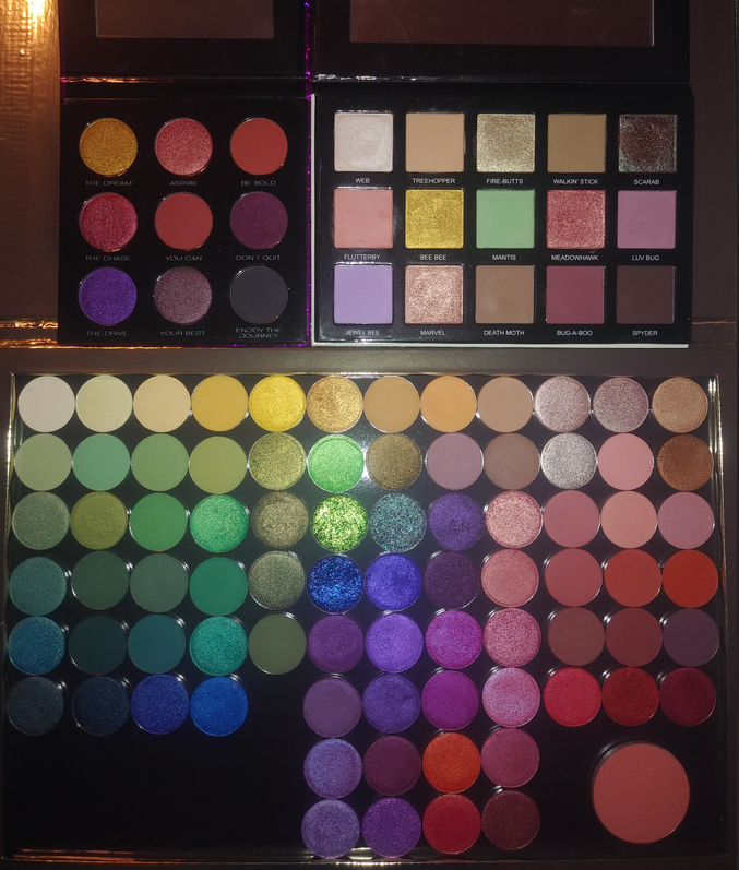
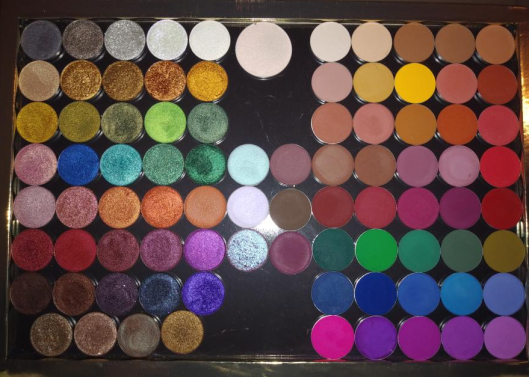
I have the Book of Shades (which holds 72 standard size eyeshadows), four of the 96 pan Power palettes, and one purple 96 pan palette. The collector in me still wants the pink one I don’t have.
On my previous trip, I made use of one large z-palette, but I missed having an even wider variety. That’s why I bought the Book of Shades. I wanted it for times I plan to travel for longer than a week.
The Book of Shades fits comfortably at the bottom of my makeup train case and is a safer way to house my shadows than carrying multiple palettes separately. It’s heavy but that’s the tradeoff for being so sturdy and keeping the eyeshadows secure.
There are 3 pages (each page holding 25 pans) and each page has removable plastic sheets that you can write the shade names on with a dry erase/washable marker. Or perhaps in permanent marker if you don’t intend to swap them out. I’m not sure. I don’t have a need for the sheets since my shadows are all labeled on the bottoms of the pans, but it’s a nice addition. There’s also a mirror on the other side of the cover.
I’ve talked about the 96 pan palettes multiple times on my blog. I can’t take it traveling, but I prefer having these over the book of shades because of the freedom of being able to place any sized eyeshadow pan I want in them, it holds more shadows, and I can see everything at once. It’s harder for me to figure out what shades I want to use when I have to flip back and forth between pages. That’s why I also prefer this over the smaller sized flat empty magnetic palettes. The last photo is what my palette looks like now.
That’s all I have for today’s post! I tried to keep it short after my massive Japanese brush review. Although I enjoy making large comprehensive posts (for ease of keeping everything in one place), it means they end up being incredibly long. That’s why I decided to wait until I could at least include Safari Raine in the review, though not long enough to wait for the Juicy Boost collection. At the time that I’m writing this, we haven’t seen anything yet besides the outer packaging.
JULY 19th, 2020 UPDATE: Towards the end of the post I have an update section with 24 additional eyeshadows, some of which have come from the new After Dark collection.
Note: I can’t post a review at this time without first mentioning that I hope everyone reading this is and remains safe during the COVID-19 pandemic. This year has been especially difficult with what is going on throughout the globe, in addition to having yet another surgery. The beauty world has been a comforting distraction for me these past few months and I hope that my blog posts are also a welcome distraction. Now, onto the review!
These are the shades I currently possess. There are twelve more eyeshadows I intend to purchase, after international shipping prices return to normal, which I believe would fully round out my collection.
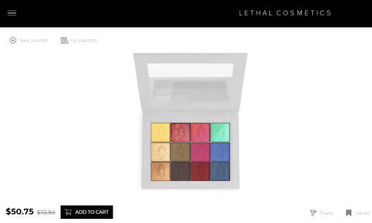
Lethal’s website has a fun palette designing tool that helps to put a color story together. There were so many shades I wanted that didn’t go together, so I wish we weren’t limited to 12 spaces maximum (as my intention was always to put them in a larger magnetic palette), but it’s still helpful when getting started. Plus, the palette builder allows you to put the 12 shadows in a bundle to be discounted. You can see tons of combinations others have made following the #lethalbyop on Instagram. I found their examples to be quite inspiring. Here are some of my own.
PRICES, SHIPPING, AND CUSTOMER SERVICE
The eyeshadows are $6 each, which is great considering the normal cost of single shadows, but I do recommend using the palette designer to bundle for the best prices.
It usually comes out to be $58-$59 if you include one of their magnetic palettes, though you can bundle without one as seen in the screenshot above. The smaller Orbital palette holds 9 shadows and also gives a discounted price after putting it together.
Lethal Cosmetics is based in Germany, but shipping under normal circumstances takes about a week. Standard shipping used to be $7 or free on orders of $80 and up. Currently, due to the pandemic, it is $24 or free with orders at or above $150.
I love getting a good discount, so I spent hours looking for promo/affiliate/influencer codes, but I have been unsuccessful. By signing up for emails, you can get notified about sales (and the occasional code). I was able to find Jolina10 from Jolina Mennen who collaborated with Lethal Cosmetics to create their first (non-customizable) eyeshadow palette. However, the code does not work on everything, like Jolina’s own palette. Also, when the palette was first released, I heard that the Pieper Perfumery had 30% off, but even with Chrome’s help translating their site to English, it was hard to navigate.
My Duolingo lessons didn’t prepare me enough to understand the site either.
I have interacted with Lethal Cosmetics’ customer service a few times and the representatives I’ve spoken with have been so polite and friendly. They also have a great social media presence with the way they interact with customers regardless of their follow-count. This is not always the case, even regarding Indie brands, so I felt it was important to note and applaud good customer service whenever I come across it.
SWATCHES
I normally use eyeshadow primer when taking pictures for this blog, but I did not for any of these arm or eye swatches. However, for my different eyeshadow look examples, I used a MAC Paint Pot in Groundwork, ABH eyeshadow primer for the pastel look specifically, and Nyx Glitter Primer in any area requiring the metallic/shimmer eyeshadows.
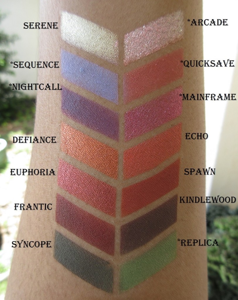
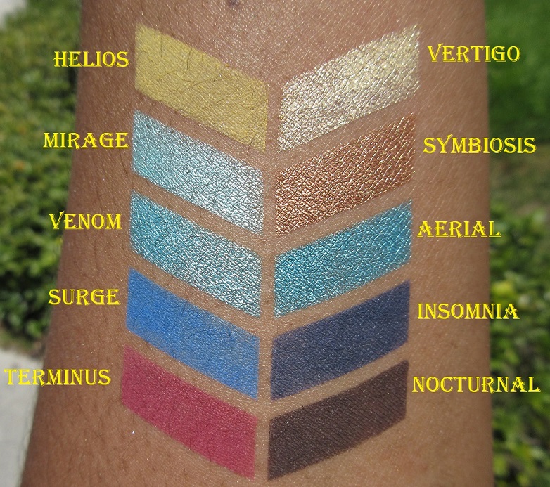
For the mostpart, the color you expect from the website is what you get. However, I had quite a few surprises
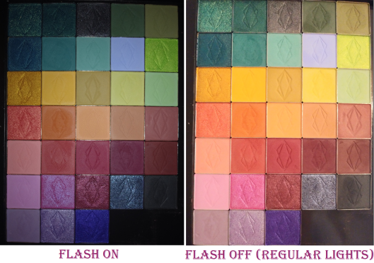
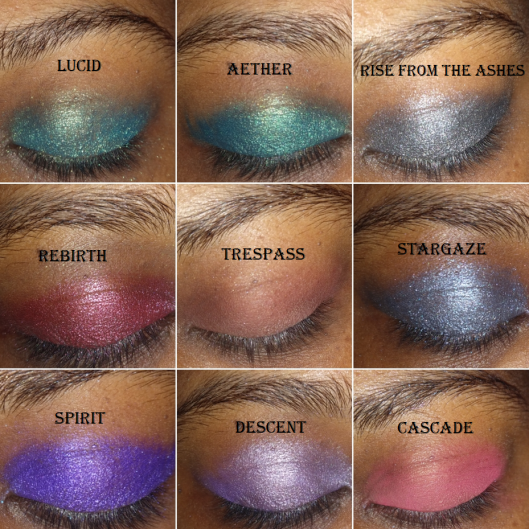
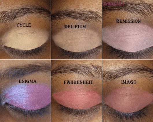
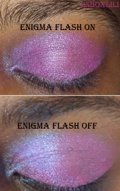
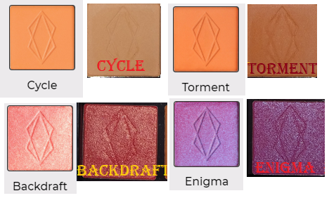
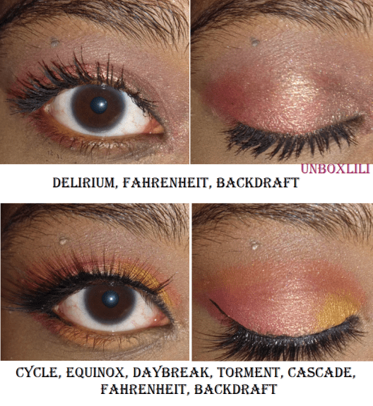
The orange shades look vastly different in the pan than what appears online, but when actually used on the eye, they do reflect the color presented on the website. Backdraft is way darker in person than on the website. It’s not the light peachy-pink I was expecting, though it is described as being “fiery.” Also, it says fuchsia in the description of Enigma on the website, but it looked so blue from the glitter shift that I was expecting a cooler blue-purple shade. Several more of the shades were slightly different than I expected, so I would recommend paying close attention to the descriptions on the site. Some, but not all, of the photos from the website include swatches. I wish they had light, medium, and dark arm swatches for all of them. Overall though, when you compare the shadows in my first picture with flash on, it shows more accurately what they look like in person (excluding enigma which looks more accurate with flash off in this case). The flash off side looks closer to what is on the website (again excluding Enigma which is the reverse).
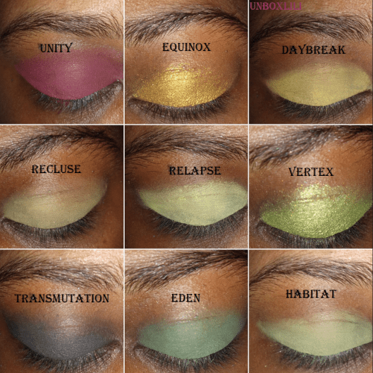
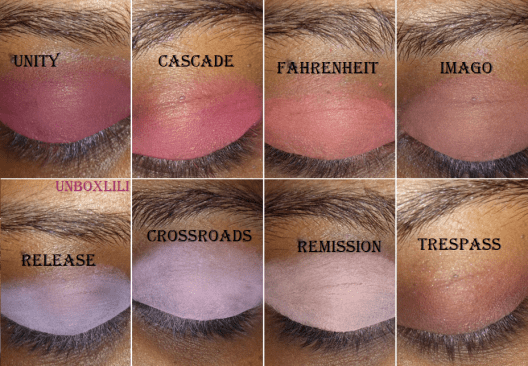
Another thing I noticed was how similar some of the shades look on my skintone. So, I put them together to have an easier time seeing the similarities and differences.
The similarities are less apparent once they’ve been built-up, such as Relapse and Habitat. Habitat builds up to a medium green. Crossroads and Release look alike because of the shared purple tone, with Crossroads being a cool pinkish purple compared to Release’s lavender shade.
PERFORMANCE
The darker and red-based mattes look opaque on my lids with minimal effort. The lighter and pastel shades take more time to build up, but they do build beautifully, especially when I use a light base such as the ABH primer underneath. The mattes blend so well, and though some take extra time, the unique shades make it worth the effort. I tried comparing them to other eyeshadows in my collection and could only find a few that were similar.
As for the metallic/shimmers, some shades worked well regardless of the tool used, but for the most part, I’ve been unable to get the maximum color payoff using just a brush. So, my favorite application method is to lay the color on first with the brush and then apply another layer with my finger. They all apply so smoothly and pigmented to my eye when using my finger that I don’t feel the need to wet my brush when I use them.
Here are some of the looks I’ve done:
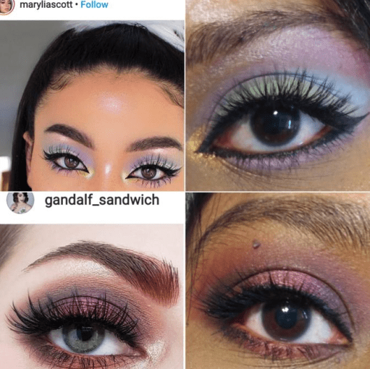
I also got the last two look ideas from Instagram:
There isn’t much more to say about these eyeshadows except that I enjoy the formula. I have some shadows, like Natasha Denona, where I can mix two shades on top of each other to create a new shade. I haven’t found that to really be the case for the Lethal Cosmetics shadows (or at least not easily), which is useful when I want to do a more complicated look involving more than four shades and want them to stay true to color. You definitely don’t have to worry about these shadows looking muddy on the eyes. The fact that they are different from the other shades in my collection and unique enough to inspire me makes these eyeshadows worth it to me. And as I mentioned earlier, I intend to get a few more!
JULY 19th, 2020 UPDATE
This is what my collection currently looks like with the new additions. The names with * in front of them in the swatch photos are brand new shades from the After Dark Collection.
Thank you for reading my first in an ongoing Indie spotlight series! I’m not sure when the next one will be since it takes me so much time to test them out. The new brands I’ve tried this year are Sydney Grace, Devinah Cosmetics, Clionadh Cosmetics, Give me Glow, Makeup Geek, Menagerie Cosmetics, etc. I’ve been posting a lot of eyeshadows lately so I might do a different topic for my next post.