

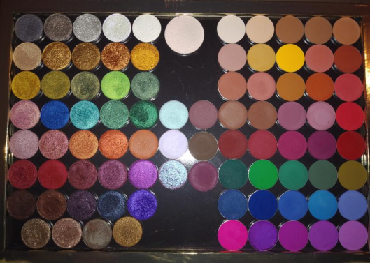
My first Coloured Raine purchase was in November 2017. For two years, their eyeshadow formula was in a league of its own at the top. I even preferred it over my expensive Viseart, Natasha Denona, and Pat Mcgrath shadows! This year, I took a deeper dive into other indie brands’ makeup. Although I no longer know which brand can claim the #1 spot in my collection, Coloured Raine is still tied at the top. Their gorgeous forest green shade, Forbidden, is my all-time favorite eyeshadow (not counting duochromes or multichromes). I purchased nearly all their eyeshadows, and I even have a few duplicates, because I love them so much! However, rather than trying to complete my collection, this post motivated me to pull a Marie Kondo on all my single/depotted shadows and just keep the ones I love.
Because the quality of Coloured Raine shadows are so consistent across the board, there isn’t much to say about them except that they’re highly pigmented and blendable with the smoothest creamy texture. This is the case among all types: mattes, shimmers, metallics, etc.
I will make note of any shades that stand out for negative or especially positive reasons. I will also be discussing more than just eyeshadows. This review will include comments on a few blush/highlighter duos, sponges, and empty magnetic palettes.
THE EYESHADOWS

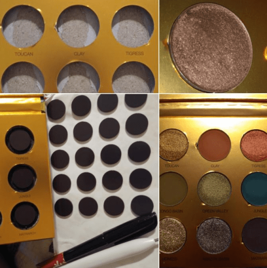
There was a time when I purchased Coloured Raine shadows to make quads as Christmas gifts. Your Majesty (which I somehow had three backups in my collection) and Malibu from this set of swatches were among them. I should note that I did take Super Star out of my collection since it was so similar to Rosé. I parted with Nightingale as it is too common of a color. Paradise Isle looks like a more sparkly version of Unexpected, yet I couldn’t part with either shade. I was also surprised to discover the Blue Magic shade I’ve purchased for others, I didn’t have in my own collection. I kept seeing Opulence and assumed it was Blue Magic. In the pan, Opulence has a purple tinge that doesn’t translate to the eye, as the purple disappears once it’s rubbed onto the skin. Since I’m just left with bright blue on my skin, I wonder if I’m still missing out by not having the Blue Magic shade. It looks like it might just be a darker version. If I get it in the future, I will update this post as usual.
I also have to comment that Legacy is such a cool shade! It’s whitish-pink in the pan but pinkish purple on the eye, making it a nice topper shade. As with other iridescent shades, I wouldn’t use this on its own, except for the inner corner or as an interesting brow highlight.
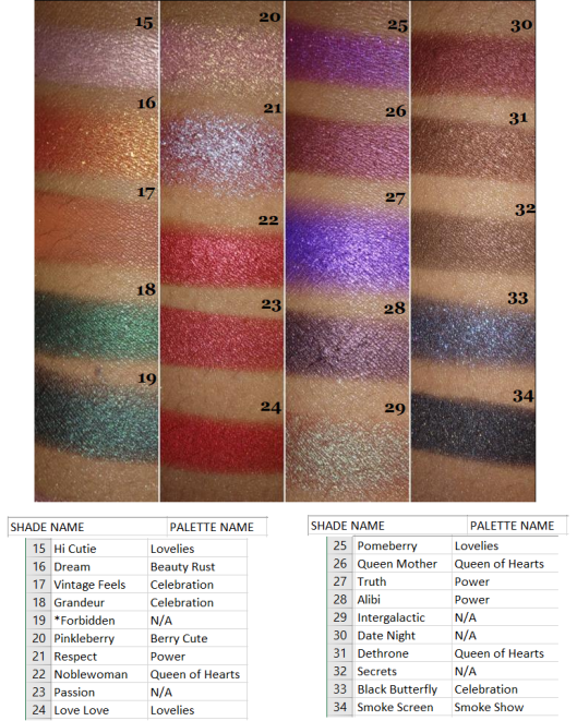
I have enough dark greens, so I removed Grandeur from my collection. Noblewoman won over Passion. And even though Smoke Screen was the only black shade with gold shimmer in my collection, I rarely use any form of black other than matte, so I took that out as well. I would like to reiterate that this had nothing to do with an issue of the formula. I was so tempted to keep them all, but I needed room to add Safari Raine and the upcoming Juicy Boost collection. I could have used another empty magnetic palette (I have so many) but I don’t think I need over 100 eyeshadows from any single brand.
I got rid of all the white shades in this set. I’ve never had use for a white eyeshadow, and I prefer using highlighters to highlight under the brow or to use a cream shade to blend out shadows. Choosing between the dark brown shades was surprisingly difficult, so I only removed Chocolate since it looks like the kind of brown I have the most repeated in my collection.
I got rid of Snitch and Torch for the same reason as Chocolate in the previous round of swatches. I noticed that the palette with the most shades I decided not to keep was from Smoke Show. Prior to getting the Safari Raine palette during the last restock, Smoke Show was the last palette I added to my collection as it had the least appealing color story for me. The shade I wanted most, Showtime, I didn’t keep either as it couldn’t compete with those stunning Vivid green pigments.
Side Note: I’ve always wondered if Coloured Raine is the reason Colourpop had to discontinue selling their Smoke Show palette and rename it Blowing Smoke. Coloured Raine’s palette came first and the name is trademarked. Even though the color story between the palettes is different, I believe one of the stipulations of a trademark breech is if it would cause confusion. Since they both have ‘Colour’ in their names, to have the same palette name on top of that seems like sufficient grounds to me!

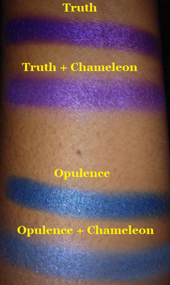
I purchased the shade Chameleon with my Safari Raine order, so I’m including it here as well. It’s a purple iridescent shade that I don’t think looks that nice on its own. When used as just an inner corner highlight, it had an interesting darker purple glow, but it’s not the texture or pigmentation that I’m looking for. The swatches for this shade I intentionally built up to see what’s the maximum pigmentation I could get when certain spots refused to deposit color, and I was still not happy with the results. I would rather reach for an iridescent from other brands over this one. It’s one of the few shades in their entire collection that I wouldn’t recommend. The one application I’ve found to be somewhat useful for this is adding a lighter pearly finish when topped on other shades. I recommend just skipping this one.

The Celebration palette had the second most eyeshadows I decided not to keep, having decluttered 5 out of 13, which is still a decent amount to have kept. Raise a Glass, Flammable, and Misty Nights were removed. As a purple eyeshadow lover, I would love having a lot more purple shimmers from Coloured Raine. The Power palette definitely satisfied some of my purple eyeshadow needs, but I will always want more, even though I have plenty of purples from other brands. Here is a comparison of CR’s Power Palette to CP’s As You Like It palette.

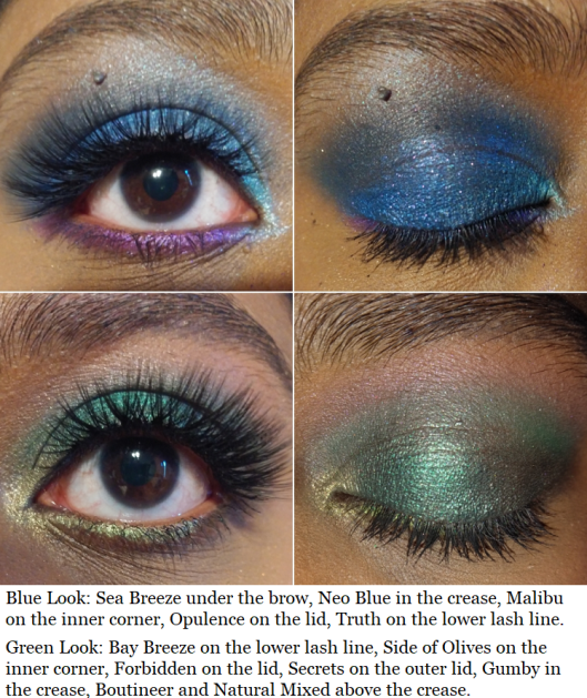
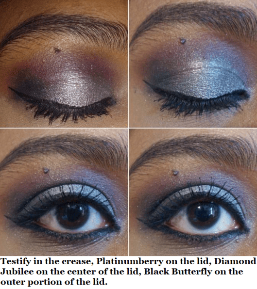
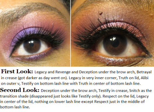
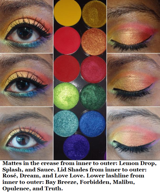
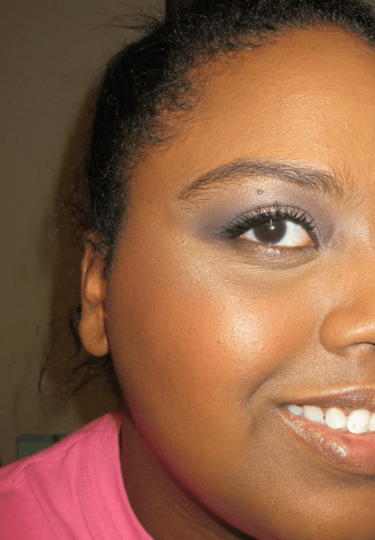
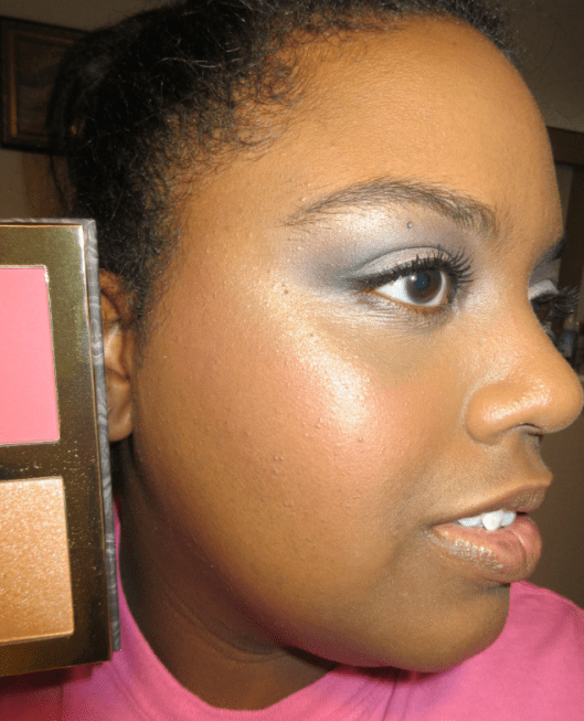
And here are some eyeshadow looks!


SAFARI RAINE

CR had one final restock of this palette, so I have it in my collection now! They’re also selling the shades individually, which is appealing since I planned to depot the shadows anyway. However, at $6.99 each, that would cost $62.91 to get them all when the palette is just $29. I have no issues with Coloured Raine charging them at their standard eyeshadow price. I just made the most cost-effective decision and I’m glad they kept the original Palette price instead of raising it due to the hype that Jackie Aina played a part in restarting.

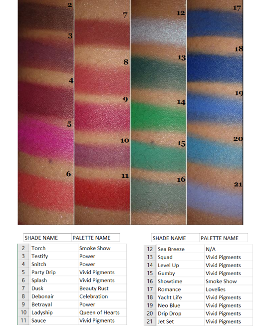
Although I’ve only had time to use this twice, I would say that the quality is on par with the other shadows. The only shade I had a little trouble getting to show on my skin was Congo Basin (even after trying with the ABH primer which I use to make shadows really stand out). Even to the touch, it felt a little grittier than the others. It reminded me of the texture of the Snitch from the Power palette that I didn’t like. Purples of that shade do tend to have that texture, but I’ve never had a green eyeshadow feel like this. Regardless, I did manage to get it to show a little.

Because the palettes were so sought after, I felt bad about completely getting rid of mine after depotting it. So, I turned it into a magnetic palette. I removed the shadows from the palette, colored the wells with black marker (I didn’t want to wait for black paint to dry) just to make it look more aesthetically pleasing. You can cut around the magnet to fit the size of the wells (keeping the sticker on the back) and place the pan inside to make sure the magnet isn’t too thick. Although I had thinner magnets and magnetic sheets, I wanted to use up my thicker ones, so I used them anyway. It made the pans stick out from the top a little, but the lid still closes, which is most important. I stuck all the magnets in the wells and that’s it! When depotting, I always clean off the glue (this time using Parian spirits) and place a sticker label on the bottom so I can remember the shade name and palette it came from.
The Blush/Highlighter Duos
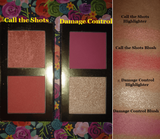
I have 2 out of the 4 Blush and Highlight Duos from the Power Collection. I didn’t buy the one called Prove My Loyalty because it has an icy white highlighter best suited for pale-light skin tones and a dark red matte best suited for dark-deep skintones. Anyone can wear any makeup they want, but the pairing of those two was…an interesting choice in my opinion. I’m not sure how many people can find use for both of those together. I also didn’t purchase My Day One because both the highlighter and blush looked like they might be too dark for me.
I purchased Damage Control first. Here are some old photos with it.
I like the blush portion. It’s very pigmented, so it requires a light hand or very fluffy brush with it. The highlight shade is beautiful, but too glittery for my taste. I prefer finer shimmer particles in my highlighters.
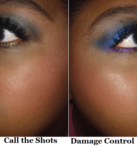
The other duo I purchased is named Call The Shots. The blush has a little more warmth to it, which suits me a bit better, although the color difference between this blush and the previous one isn’t that obvious when I use a sheer application. This highlighter has more of that shimmer finish I prefer, but I typically don’t reach for this shade. I love golds. Lately, I have been more interested in blush toppers, which this color is great for, meaning it won’t go to waste. I just know I won’t use it as often as I should.
These duos are fine, but don’t really ‘wow’ me. Although I don’t think $25 is too much considering what you’re getting, if you can snag them for 50% off (as they’ve been on sale multiple times) then I’d be more likely to say they’re worth checking out at that discounted price.
THE SPONGES

I don’t know why I keep buying sponges when I’m 90% more likely to use a brush to apply my foundation and concealer. If I don’t use a brush, I use the Blendiful from Tati Beauty because I can get my products on and blended in half the time.
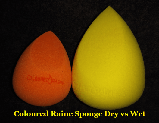
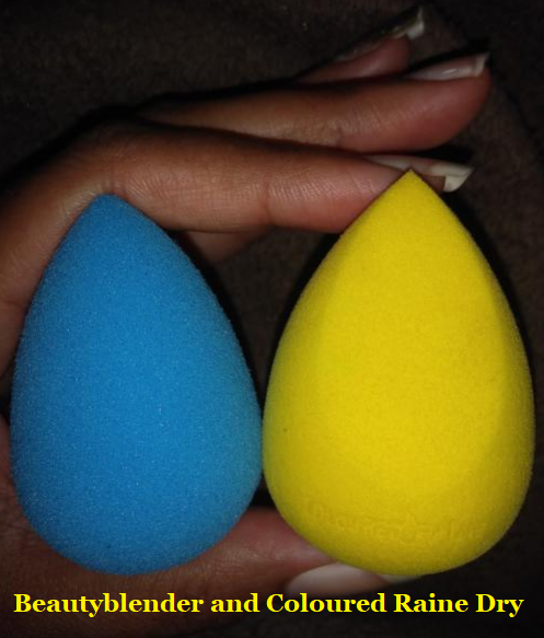
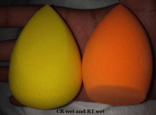
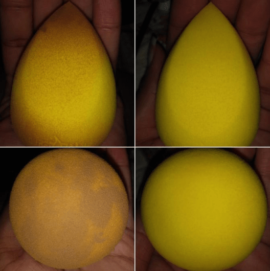
In any case, the only traditional beauty sponges I have used so far are from Beautyblender, Real Techniques, and Coloured Raine. The Real Techniques sponge is nice, but the one from Coloured Raine easily surpasses it. I cannot decide which I like more, though, between BB and CR because they both are better at different things.
Softest: When it comes to the softest sponge, Beautyblender wins. The Coloured Raine sponge feels a bit dense when dry but softens up after it is damp. It swells to the largest size among the three sponges. The Real Techniques sponge is a lot harder and remains a bit hard even after being wet.
Precision: The pointy tip of the CR sponge fits perfectly in the crevices around my eyes when applying concealer. It easily wins, followed by the RT flat edge and finally the BB which has no flat edge and the tip is still a bit rounded, which impacts the precision. That being said, I don’t often use a sponge with my concealer, as I want the most coverage under my eyes and a sponge does sheer things a bit. So, this benefit isn’t the most useful in my everyday life. However, when I was on vacation last year and wanted to bring minimal brushes and wanted a backup sponge, I took the CR sponge instead of a BB.
Smoothest Foundation Application: A nice blended look can be achieved with all the sponges, but the BB does it the fastest, followed by the CR one.
Easiest to Clean: The BB and RT sponges take about the same time. They work well with the Beautyblender solid soap. The CR sponge is the hardest to clean and doesn’t work as well with the BB Solid. I have better results when I use my regular makeup removing face wash on it. It’s possible that I perceive it as being more difficult to clean because I’m using the yellow one, which is probably easier to see stains. I won’t know until I start using my orange (or green if I can find that one) CR sponge in the future.
Most Durable: The CR sponge definitely lasts the longest and hasn’t torn on me yet. My RT sponges start to get tears in them after the first 3-5 uses thanks to my long nails when I’m washing them. My BB sponges tear on me between 1-3 uses. I don’t know if there has been any changes to the beautyblender because the first two I ever had years ago had to be thrown out before it ever tore. But now my beautyblenders don’t last as long.
Prices: RT = $5-$6. CR = $6. BB = $20.
Side note: BB sells silicone (or silicone-like) cases to put sponges in to let dry and keep away from dust and other particles. You can find adorable dupes for 50-75% cheaper on sites like Amazon and Ebay. I have the official one along with the dupes and although the official one is thicker/sturdier with more breathable holes, there isn’t that much of a difference. My kitty ones get the job done and they even have ridges on the bottom that lets them stand upright, unlike the official one.

EMPTY MAGNETIC PALETTES

I have the Book of Shades (which holds 72 standard size eyeshadows), four of the 96 pan Power palettes, and one purple 96 pan palette. The collector in me still wants the pink one I don’t have.

On my previous trip, I made use of one large z-palette, but I missed having an even wider variety. That’s why I bought the Book of Shades. I wanted it for times I plan to travel for longer than a week.

The Book of Shades fits comfortably at the bottom of my makeup train case and is a safer way to house my shadows than carrying multiple palettes separately. It’s heavy but that’s the tradeoff for being so sturdy and keeping the eyeshadows secure.
There are 3 pages (each page holding 25 pans) and each page has removable plastic sheets that you can write the shade names on with a dry erase/washable marker. Or perhaps in permanent marker if you don’t intend to swap them out. I’m not sure. I don’t have a need for the sheets since my shadows are all labeled on the bottoms of the pans, but it’s a nice addition. There’s also a mirror on the other side of the cover.

I’ve talked about the 96 pan palettes multiple times on my blog. I can’t take it traveling, but I prefer having these over the book of shades because of the freedom of being able to place any sized eyeshadow pan I want in them, it holds more shadows, and I can see everything at once. It’s harder for me to figure out what shades I want to use when I have to flip back and forth between pages. That’s why I also prefer this over the smaller sized flat empty magnetic palettes. The last photo is what my palette looks like now.
That’s all I have for today’s post! I tried to keep it short after my massive Japanese brush review. Although I enjoy making large comprehensive posts (for ease of keeping everything in one place), it means they end up being incredibly long. That’s why I decided to wait until I could at least include Safari Raine in the review, though not long enough to wait for the Juicy Boost collection. At the time that I’m writing this, we haven’t seen anything yet besides the outer packaging.
Thank you for reading!
– Lili ❤
