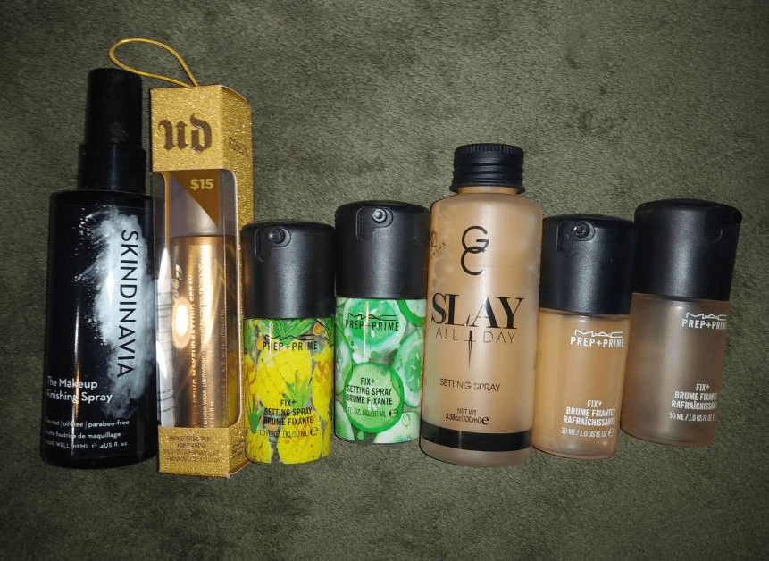
Danessa Myricks Beauty and Mented Cosmetics are brands I’ve been curious about over the past year and I decided to try a few things from each of them! This is also the first time in a long while since I’ve purchased something other than eyeshadows from Coloured Raine!
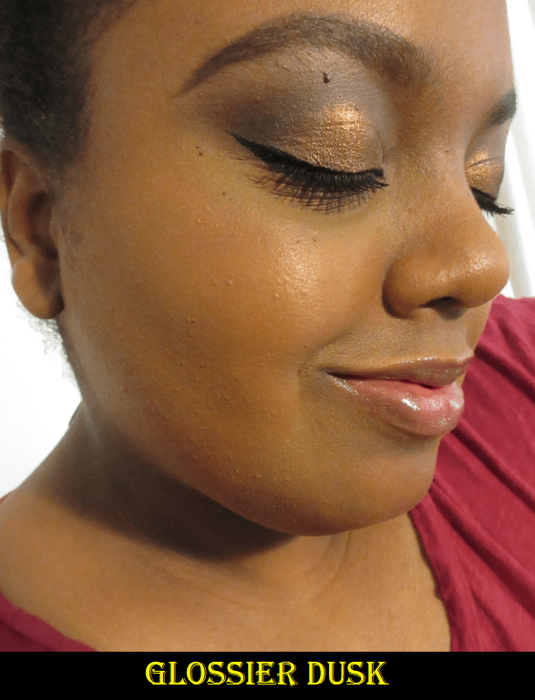
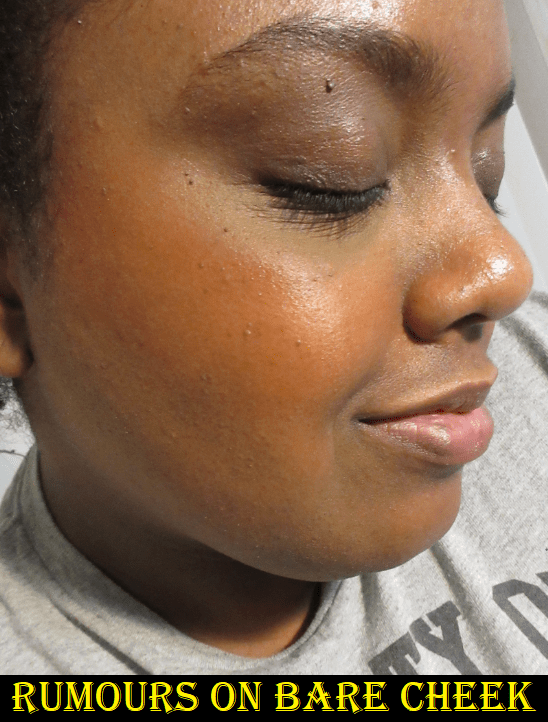
Danessa Myricks Balm Contour in Deep 1
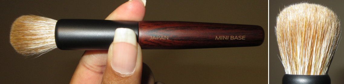
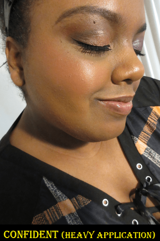
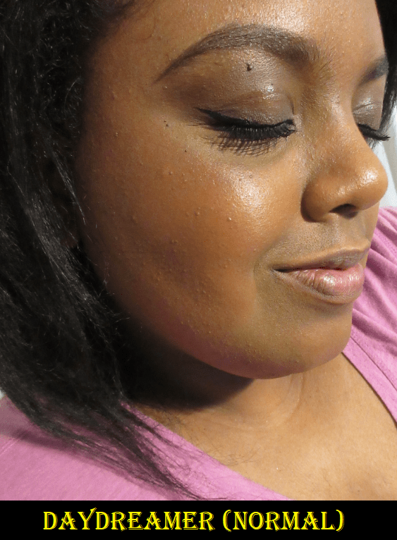
Danessa Myricks is a makeup artist and her products are intended for use in a professional setting. By that I mean there is a learning curve to these products. They aren’t beginner friendly. I absolutely did not like this product until the sixth or seventh time I used it. The issue is that I just needed to find the right tool; in my case it was the Sonia G Mini Base brush from the Keyaki Set. I didn’t like the results when I used my fingers, a dense contour brush, a dense concealer brush, a Beautyblender, and the Tati Blendiful. A heavier application gives a more intense sculpted look, but I prefer the controlled yet natural looking blend which a medium density brush can provide.
When it comes to this shade match, I was surprised how orange it was considering most contour products are cool toned to create a shadow. If I want to use a warm color to contour with, I prefer to have one that is more shades darker than my skin tone. However, if I exchanged or purchased Deep 2 instead, then I believe it would be too similar to cream contours I already have in my collection. So, I’m glad I chose Deep 1, but I wish it wasn’t as warm so I could use it on all areas of my face. I don’t mind using warm contours on my forehead and cheek bones but I hate them on my jaw and nose.
I also tried the underpainting technique (applying a heavy layer of dimension creating products to the skin first and applying a light layer of foundation on top to shape the face in a less detectable way) but I think I need a darker shade if I want to continue using it in that way. Deep 1 is a touch too subtle on me with underpainting, but perhaps I just need more practice.
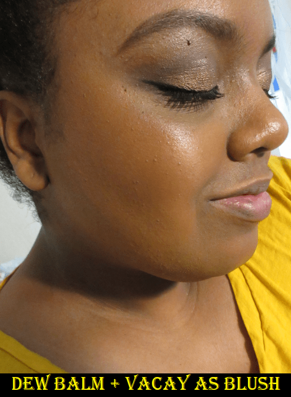
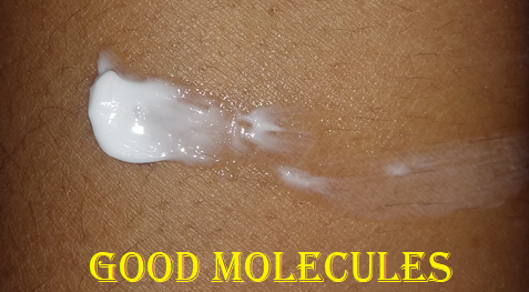
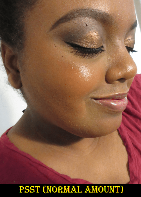
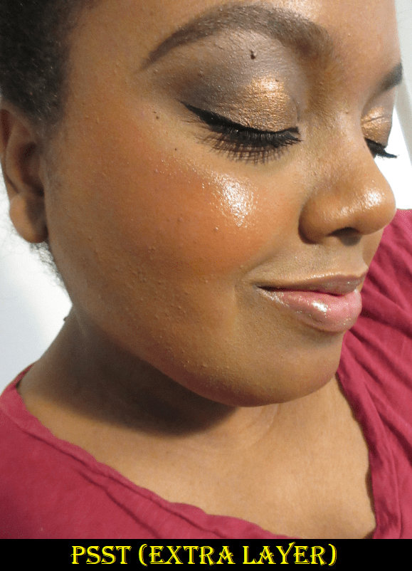
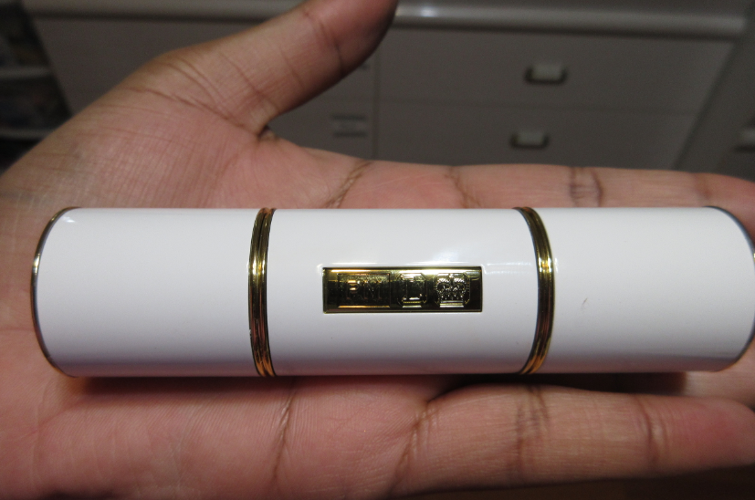
Danessa Myricks Dew Wet Balm in Clear
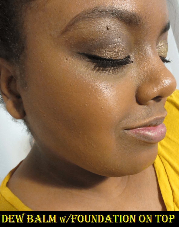
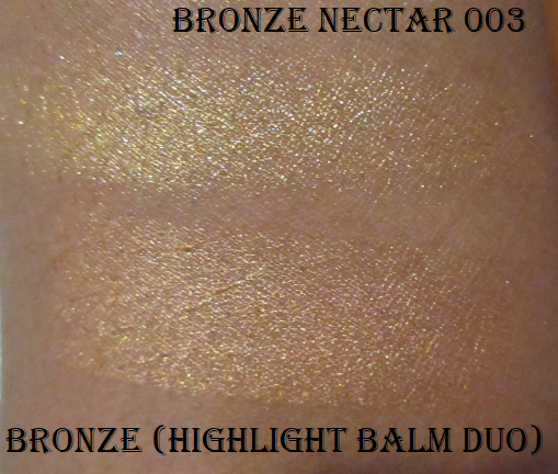
There are four other shades of these balms, but they contain shimmer. Based on website photos, I was concerned the shimmer/glitter particles might be too large for my liking, so I thought getting the clear one would be a safer bet. This reminds me of a stickier version of the clear balm in Pat Mcgrath’s Highlighter + Balm Duo. With my hair down, loose strands have stuck to my face while wearing this. Although this product is intended to be worn alone or with makeup, it looks too much like I have Vaseline or lip gloss on my cheekbones if I’m bare faced, so I prefer to use it with makeup.
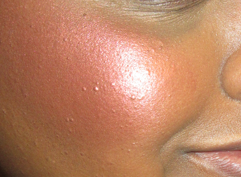
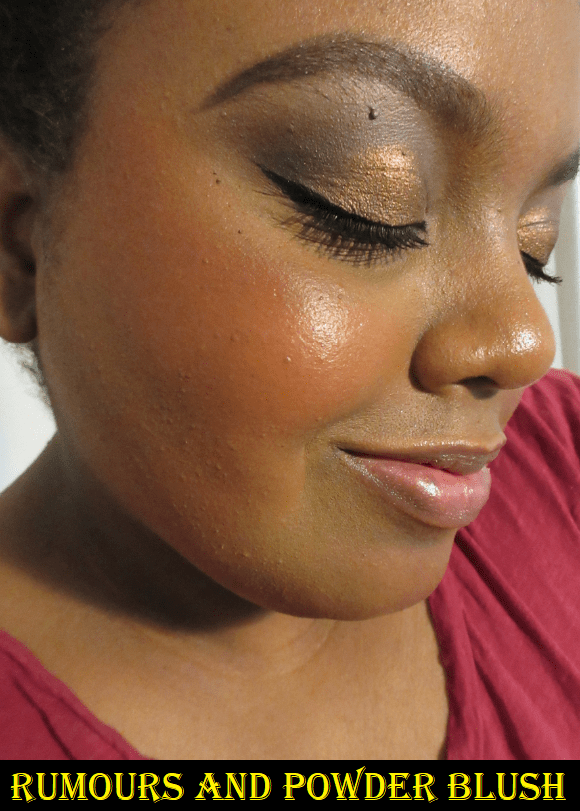
This product, like many highlighting balms, disturbs my makeup underneath. Thankfully, the shine is still visible under foundation. I figured out that I like this product when I’ve applied it to my cheekbones, then I take whatever foundation is left on my brush or sponge and apply it over the top of the Dew Balm. It still gives me shine without the Vaseline look or sticky texture. I can leave it like that or use the Dew Balm as a wet base to apply a highlighter on top of it for a very intense shine. I have an example of what it looks like as a base for a powder highlighter in the Mented Bronzer section.
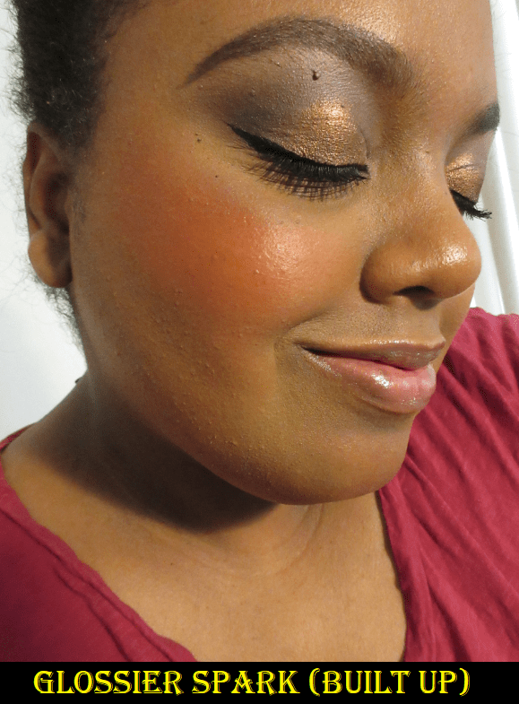
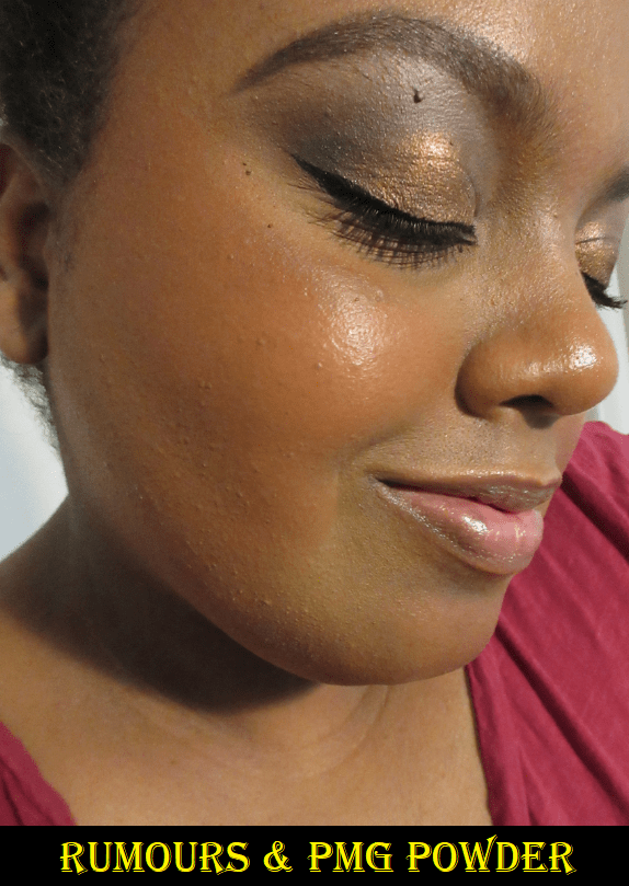
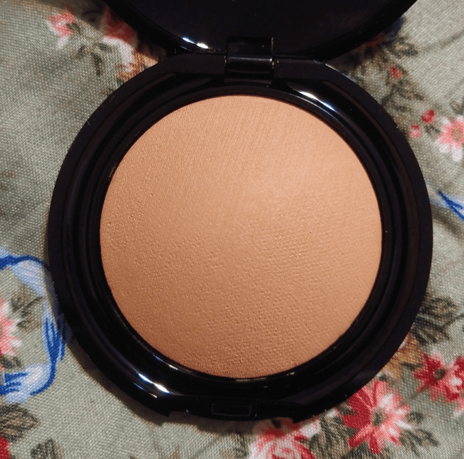
Mented Cosmetics Bronzer in Vacay
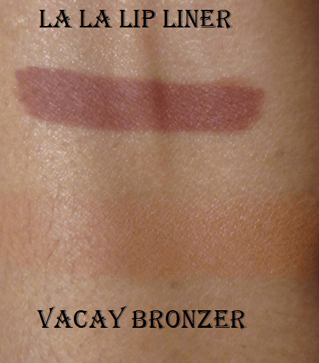
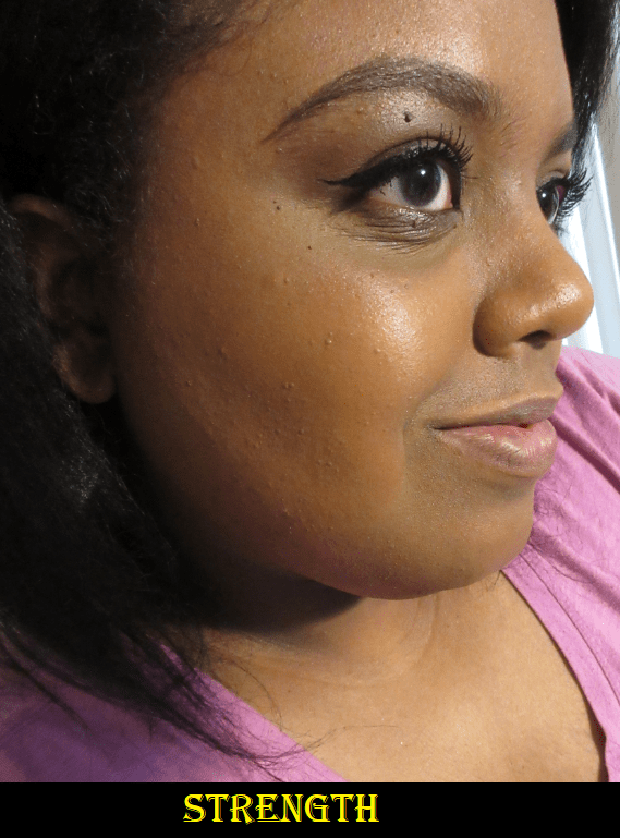
Mented has four shades of bronzer. I suspected Vacay, intended for medium/tan skin tones, would be only a shade or two darker than me while Yacht Life, intended for deep skin tones, would be darker than I wanted and too similar to Fenty’s Mocha Mami, which I already own. Vacay turned out to be as light as I thought. If I really pack it on, it does work as a subtle bronzer. The undertone of the powder is a bit on the pinkish terracotta side, so in many photos featured here today, I’m actually wearing it as a blush. I believe Vacay is actually lighter than Mented’s Clay Too Much blush.
This formula is so smooth and reminds me of the Airbrush Bronzer from Charlotte Tilbury, but at a fraction of the cost. I am extremely tempted to buy Yacht Life and assuage my curiosity as to whether I would like it better than Vacay (and to find out how similar it really is to Mocha Mami), but I have to remind myself that I have enough bronzers as it is. It has been difficult to talk myself out of it and I’ve had it in my cart via Ulta about to check out at least three times by now. If I didn’t already have the Charlotte Tilbury bronzer, which is still the smoothest one I own, I would have absolutely purchased the other shade from Mented.
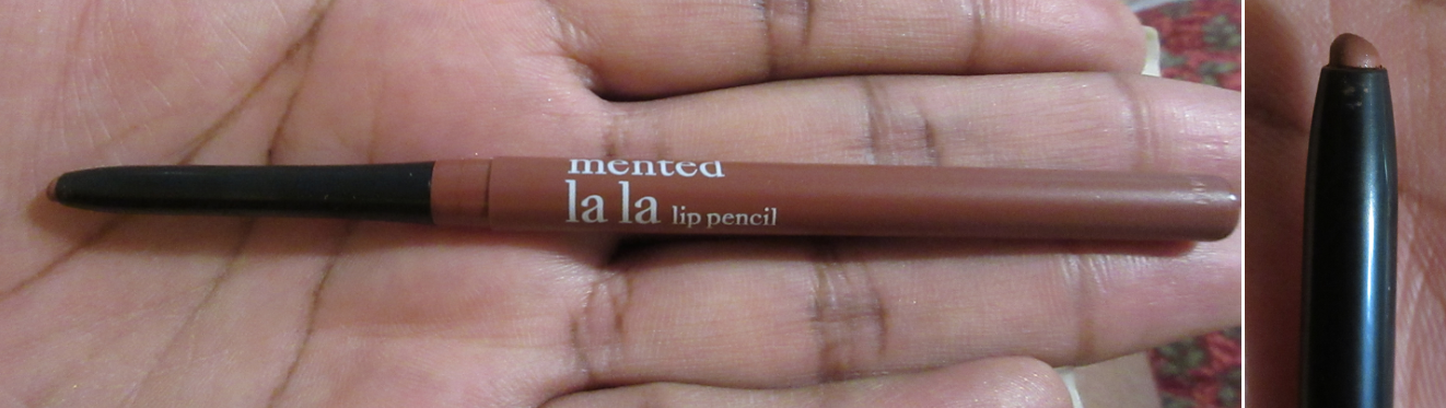
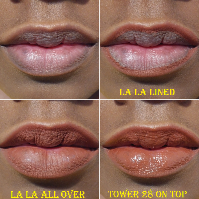
Mented Cosmetics Lip Liner in La La
I forgot my lip product no-buy when I purchased this, but I’m secretly happy to have it. I like that it’s retractable and I was able to get this for $9. It’s the kind of shade I love using all over my lips. It isn’t too drying and doesn’t look as bad as it could over my non-exfoliated lips, which is nice. It stays in place. The Tower 28 lip gloss contains oils, so I was surprised to see how well it lasted with that gloss on top, as long as I didn’t eat or drink anything.
Propa Beauty lipsticks impressed me with their brown-skin friendly versions of lighter shades with wearable pinks and oranges. Mented’s range impressed me with their nude lip shades. If I wasn’t on a lip product no-buy, I would be looking further into Nude La La, Dope Taupe, Foxy Brown, and Mented #5. I watched a Q & A session with one of the brand owners and she was explaining how Mented wanted to create nudes that weren’t just brown. Shades that matched, for instance, the darker pigmented brownish purple of my natural top lip. I always tried to get shades to match the pink in my bottom lip, but after seeing that interview, I became so intrigued by the idea of matching the brownish purple part instead. I intend to do my best in sticking with my no-buy and will perhaps try another Mented lip product in the beginning of 2022.
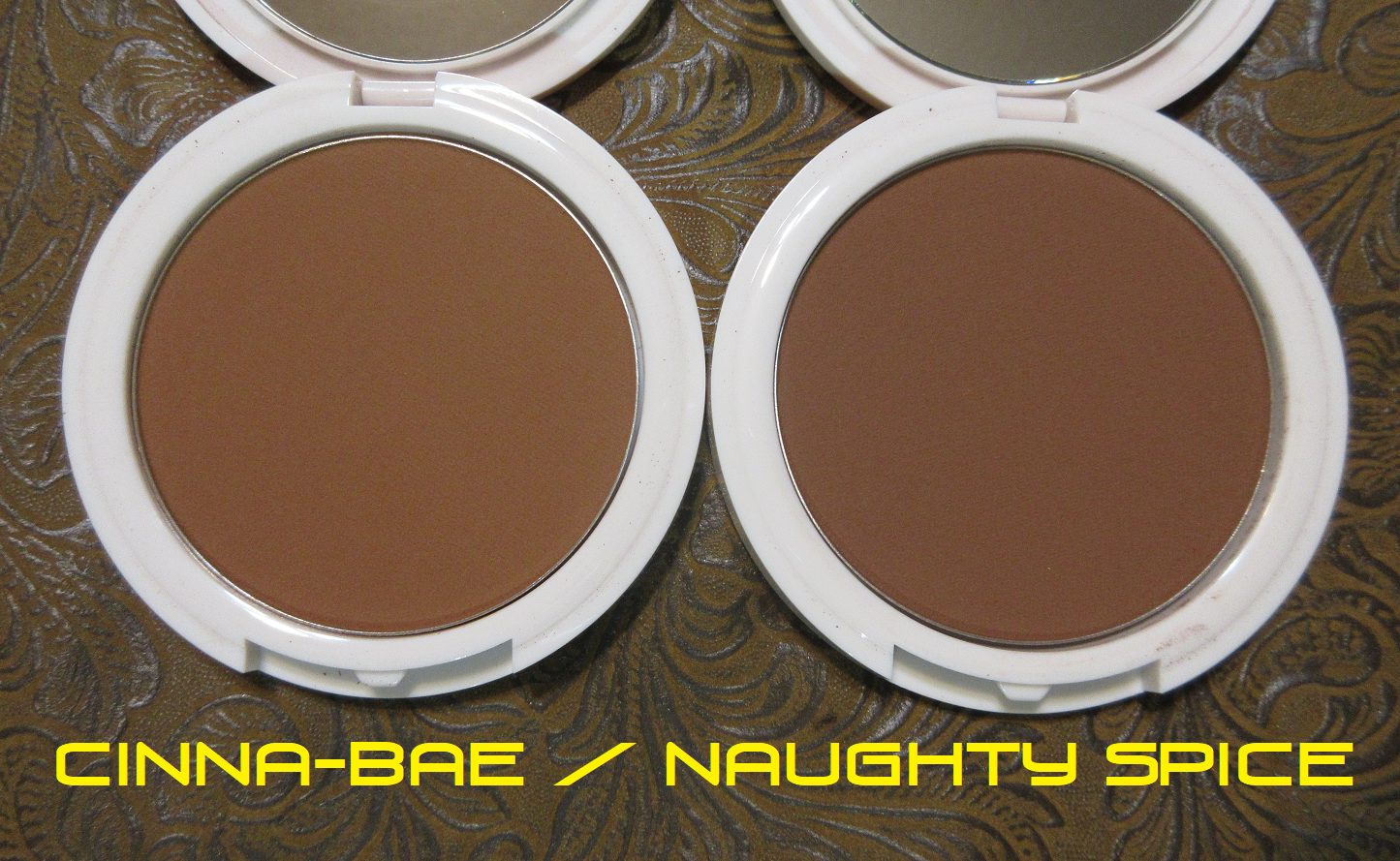
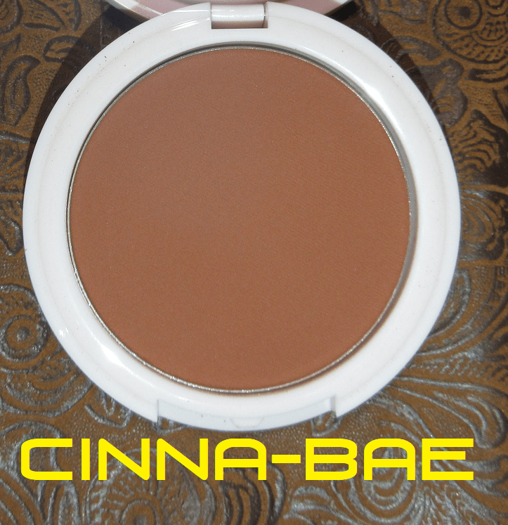
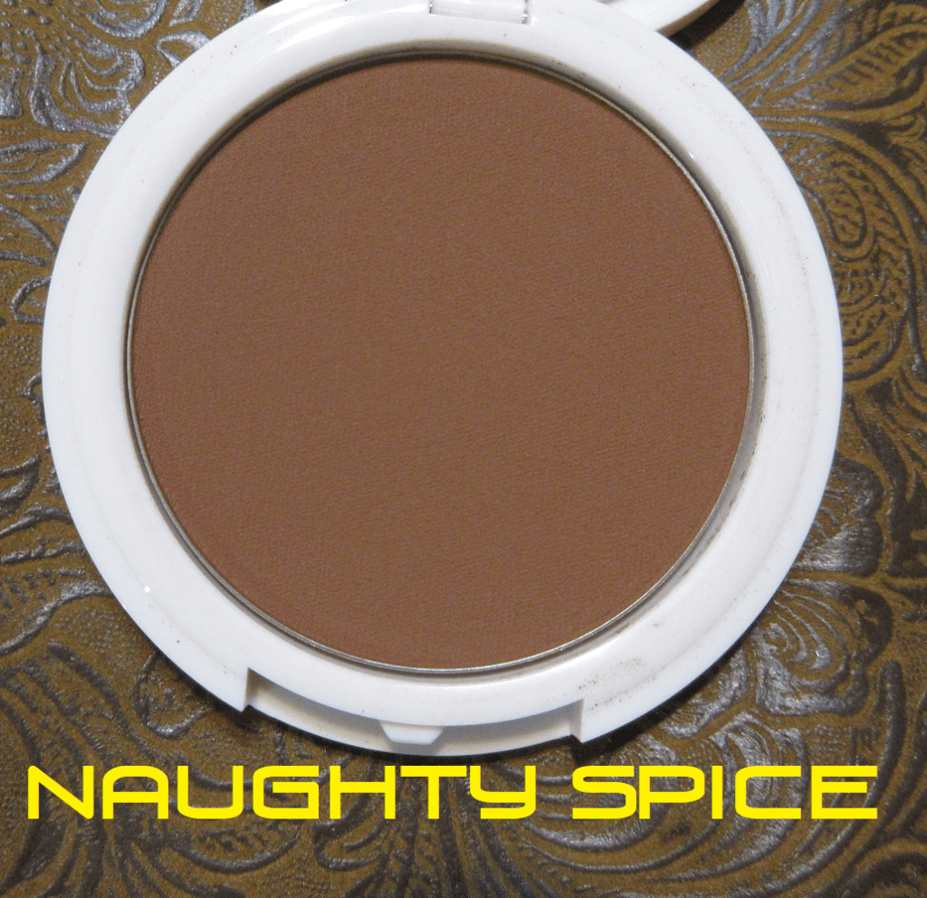
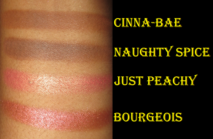
Coloured Raine Bronzers in Cinna-Bae and Naughty Spice
These bronzers look very similar on the skin, but Cinna-Bae is on the warm side and Naughty Spice is more neutral.
Between the two, Cinna-Bae is absolutely better suited for me. It’s the right tone and depth. Coloured Raine did a fantastic job with their product photos to help me decide that this was the best shade for me. I still purchased Naughty Spice in case I was wrong. I also wasn’t sure how pigmented they’d be, so I thought having a darker version as well couldn’t hurt. I am able to build up Naughty Spice and use it as a Bronzing-Contour. In the photo above, I applied somewhere between a light to medium amount of Naughty Spice. I used a medium amount of Cinna-Bae. It’s nice to know I can still use both though. Also, these are labeled as bronzers but on Coloured Raine’s Instagram they say these can be used as setting powders and contours as well.
The bronzers are smooth and blend well, so it’s tempting to get additional shades to try the other uses, but I refrained. I would say this formula reminds me of Fenty’s Sun Stalk’r Instant Warmth Bronzers. It doesn’t beat out my top 3, but I think it’s still very good quality.
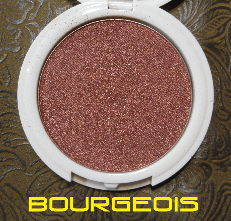
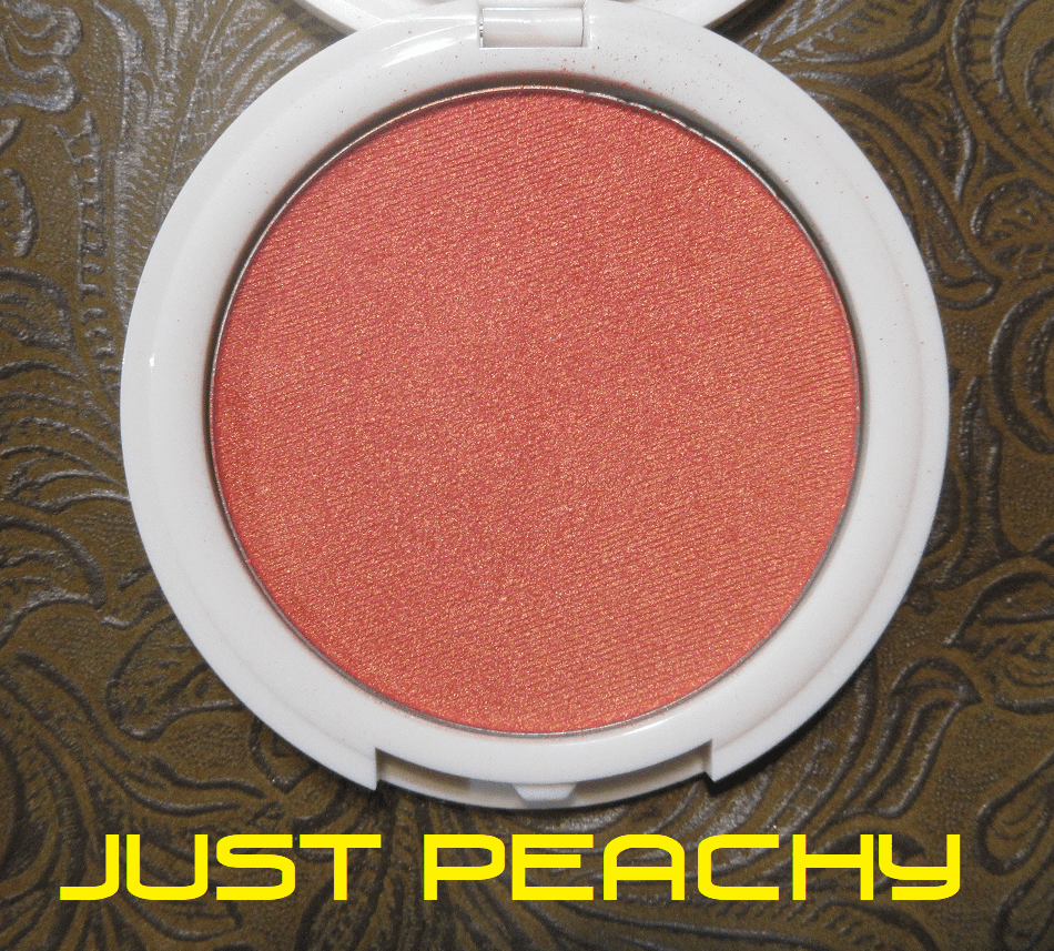
Coloured Raine Focal Point GlowLighters in Bourgeois and Just Peachy
In my Kiko Milano review, I mentioned that there are only a few brands I trust to make a shimmery blush that I like, and unfortunately Coloured Raine is not one of them. On the individual product pages it says the Focal Point Glowlighters can be used as blush, so I thought these would be like the Nabla Skin Glazing formula that are highlighters but also come in blush tones like Adults Only and Lola that make them suitable for blush too. At the very least, I thought they might be similar to MAC’s Extra Dimension Blushes which are very shimmery but still flattering. I was wrong.
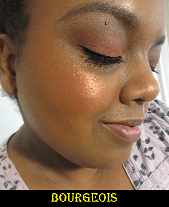
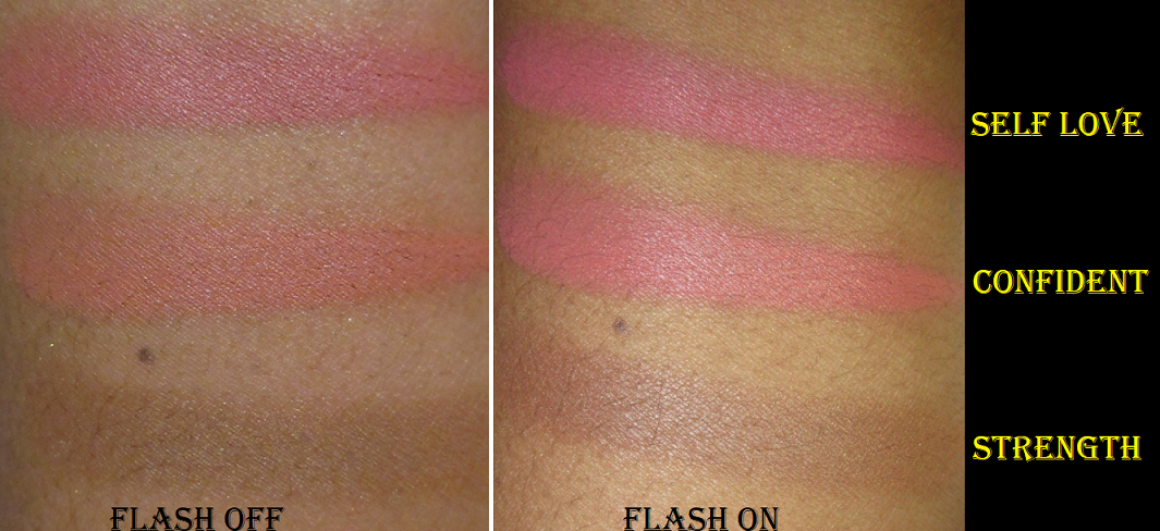
I own two of the Coloured Raine x Power Blush and Highlighter Duos, and while I thought the highlighters were too glittery for my taste, I thought the matte blushes were decent. If Just Peachy and Bourgeois were a matte formula, I know I would enjoy them because the tones are so pretty, but in this formula they are unbelievably metallic! I’ve been struggling with my camera lately and with flash off, it could not begin to show just how metallic looking they are in person when the light hits them, nor the intensity of the shades. If I try to use the lightest amount of Just Peachy, my cheeks look slightly peach from straight on, but when I tilt my head and a little light hits my cheek, all I see is a blinding gold. As pretty as the color itself is, I don’t want a gold blush. If I apply enough product to get the peachy tone to show at all angles, then it looks like I tried to use a metallic eyeshadow for blush. It’s the same case with Bourgeois. The burgundy base color is overshadowed by the intense hot orange shimmer.
Both blushes without flash.
Bourgeois with Flash On.
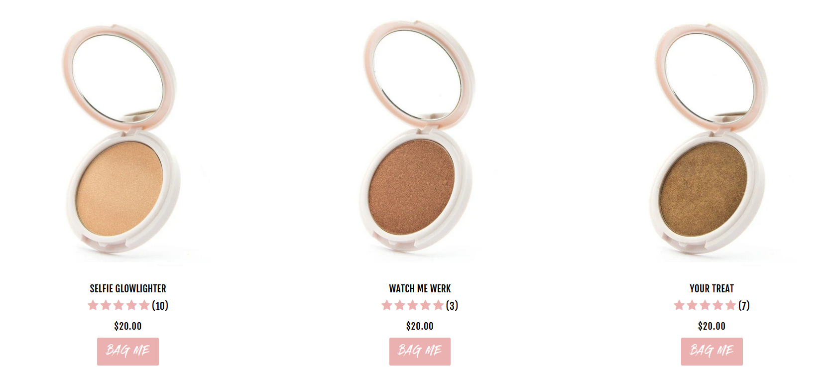
As blushes or blush toppers, these are unwearable for me. It comes down to the reflectivity of the shimmer. The Focal Point Glowlighters also come in traditional highlighter shades of golds and bronzes. This formula is much better suited for highlighting purposes. For those who like highlighters at this level of intensity, getting one of their standard shades (pictured below from their website) would be my recommendation.
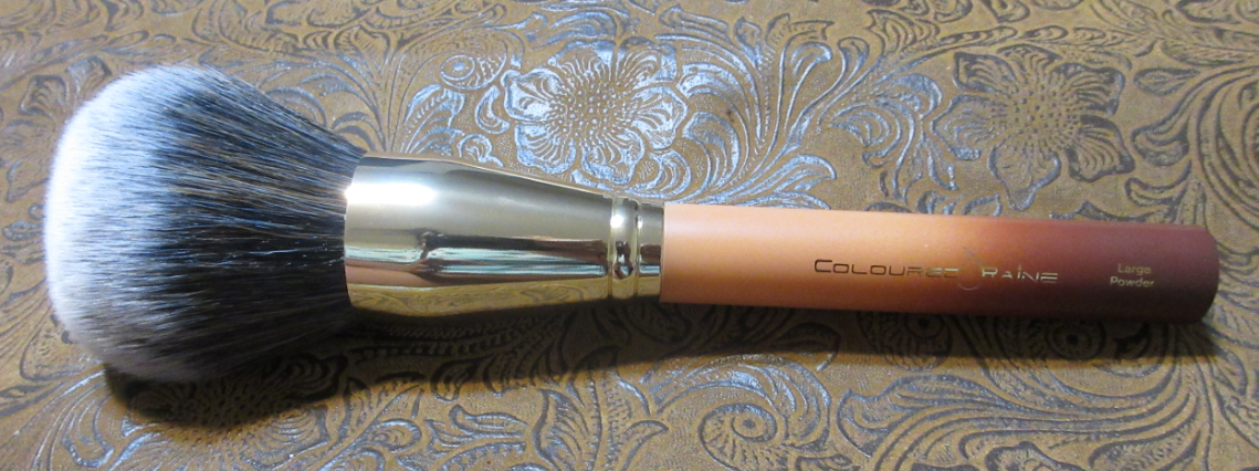
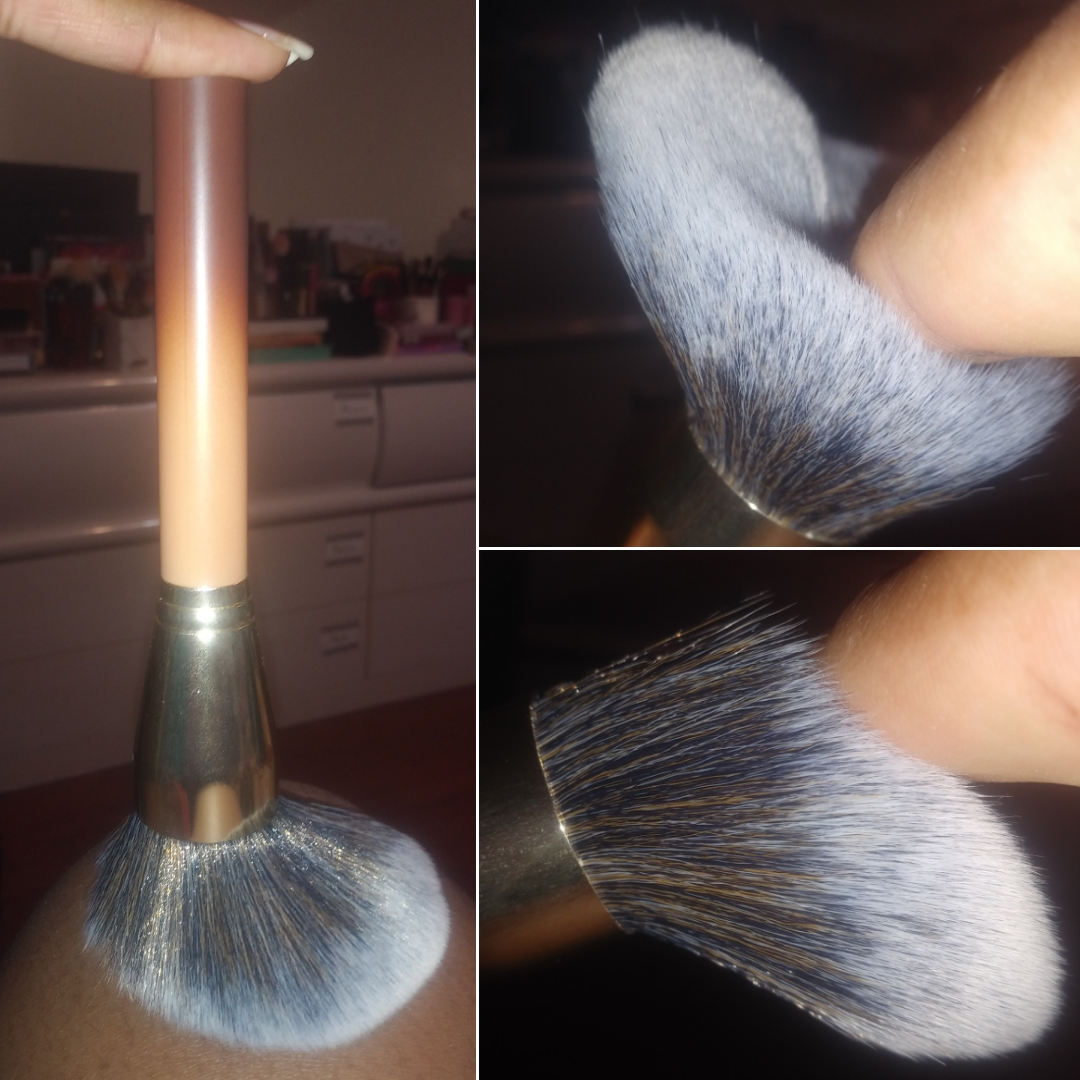
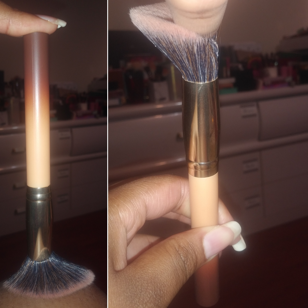
Coloured Raine Large Powder Brush
This brush is the biggest in my entire collection and also the heaviest. I think this brush is weighted because the ferrule is very heavy in a way that isn’t proportional to the heaviness of the ferrule of the Angled brush. I’ve only had one other makeup brush that was weighted in order to create a better balance for how the brush should be held and applied to the face, to intuitively allow the user to apply the right pressure with the brush. I’m not sure if the ferrule weight of the Large Powder brush was chosen for this reason, or if it was purely to allow this brush to be able to stand upright on a flat surface with ease.
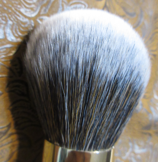
As mentioned before, the flat bottom of the handles let these brushes stand upright. The handles are plastic. The bristles are synthetic. The coffee color gradient of the handles are as pretty in photos are they are in person. The fibers are soft, but as wide as the bristles are splayed, they are not densely packed. They are long and floppy and bend dramatically with light pressure from a single finger.
I don’t mind the floppiness from the Powder Brush because the volume of the brush combined with the placement where I grip the brush (towards the base of the ferrule) allows me to sweep a light dusting of powder all over my face quickly without the bristles bending enough to impede the application. It’s a pretty good brush considering the $13 price.
Coloured Raine Angled Blush Brush
This brush technically cost $5 instead of $10 because I purchased it in the $21 bundle price with one of the bronzers. I expected this brush to work well with the bronzers since they were grouped together, but I despise this brush. I admittedly don’t favor angled brushes, but some like the Chikuhodo FO-4 are exceptions. On top of that, these bristles are not dense enough. They don’t give me enough pressure to blend. The floppiness of the brush impedes my ability to use the product. I can still use this brush with a lightly pigmented blush that wouldn’t require much blending but I recommend skipping this one. A better alternative is the Real Techniques Sculpting Brush which goes for around $15 individually, but Target has a set of three brushes and a holder for $20. The set includes the Real Techniques setting brush which I own two of and have been using almost exclusively for years to set my under eye concealer with powder. And full disclosure, the Target link is not affiliated and I make zero money from sharing it.
Final Thoughts
I’ve been curious about other Danessa Myricks products, like the Twin Flames multichromes, Color Fixes, and Vision Flushes. All the reviews I’ve seen, combined with my own experience, leads me to believe I can create beautiful looks with DM’s makeup if I’m willing to invest time into learning how best to use them. I foresee myself continuing to explore more from the brand in the latter half of 2021.
As for Mented, I’m definitely excited to try more from them in the future, especially since they’ve been made available at Ulta. It was tough for me to skip out on the blushes, but I haven’t seen enough videos and photos online to be able to tell which shades, if any, are my style. If new shades get released, I’ll be all over them!
I’m always interested in the new things Coloured Raine comes out with. In a “Behind the Beauty” episode a while back, the owner hinted at a Queen of Hearts 2 palette coming out, so I am still looking forward to that and more from the brand.
That’s everything! Thank you so much for spending your time with me today! I already had that impromptu Saturday review, but I wanted to keep the Monday schedule consistent and still make this post available today.
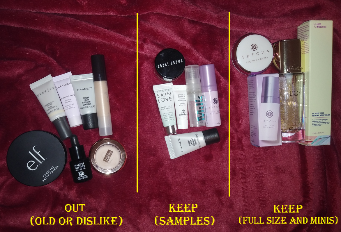
Excluded from this Declutter post will be all lip balms, lip treatments, and my own custom and handmade lip products I’ve made. Also excluded are a few limited edition lip products I have hidden away that I’m keeping for the packaging. The Declutter portion is primarily to give swatches of old products before I toss them, so that section will be more about arm swatching and less about the reviews. Products that are still good will be lip swatched, but first, let’s start with the products that excite me the most: new Propa Beauty Lipsticks!
*This is the reason I’m deviating from my normal Monday scheduling. Propa Beauty is having a sale and I didn’t want anyone who keeps up with my blog to miss it! This review and declutter was 99% completed anyway, so I decided go ahead with this surprise Saturday post! Credit to Brit Clarke on Youtube for writing about it on her community tab. Her code is BRITCHES15, but I have other codes listed further below as well, and affiliate codes do stack on top of the current sale! A non-affiliated link to the Propa Beauty website is here. And just in case it needs to be said, I have no affiliation with Propa Beauty. I have not been paid to review them, nor received PR. I just think their lipsticks are fantastic and lip products normally don’t excite me, so that’s a testament to the brand.
My first review of Propa Beauty can be found here. The brand’s satin lip formula has been highly praised. They were created to be brown-skin friendly in the undertones, while still offering shades for everyone. The lipsticks appear much darker in normal lighting than they actually appear on the lips. How they look with flash on in photos is a more accurate depiction of the shades.
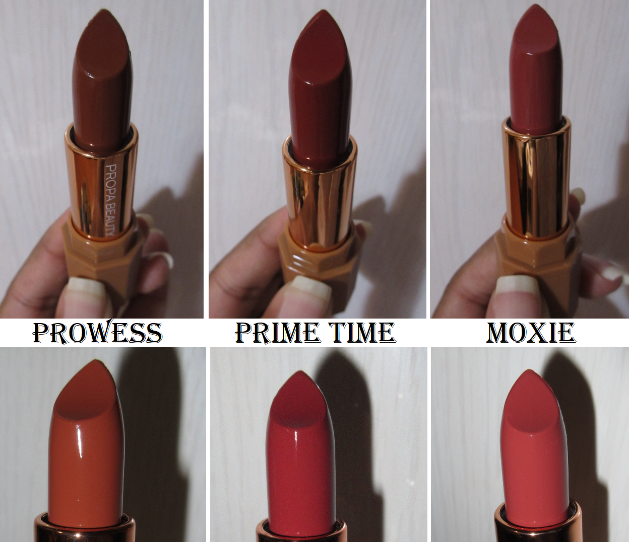
I love all the new shades I picked out, as well as the “old” ones. They are so comfortable and can go from sheer to fully opaque depending on how many layers are added. Moxie is a pink-toned Mauve. It’s a little lighter than I usually go for, but it’s a nice addition to my collection. Prowess looks a lot more pink-orange brown in person, though my camera just picks up the terracotta tones to it. Prime Time is probably my favorite red in a long time. It’s a bright rosy red that looks like it has a touch of orange in some photos, is more red in some photos, and more of a deep pink in others. Of the three, Prime Time looks the best on me on camera, but I think Prowess looks the best in person. However, I don’t think I can chose a favorite among them. There are plenty of discount codes available and domestic shipping is free for purchases over $25 ($45 for international). I highly recommend them, but if you live in a warm climate like I do, please be aware that this formula is soft and they may get hot while in transit. I recommend not immediately opening them or wearing them upon delivery, as the lipstick bullet could be too warm at that point and move or break from the pressure of being used. Some people recommend putting them in the fridge or freezer to re-solidify, but I haven’t tried that myself. I just let the products sit in a cool area for at least an hour. One more thing to note is these have some staining power. I didn’t have the swatches on my arm for long but after quite a bit of rubbing with a makeup remover it still left some outlines that only came off with more vigorous rubbing.
When deciding the shades that were best for me, I found it helpful to see how it was on a variety of skintones and over different colored bare lips, so I will link some of the videos I watched below.
Pale/Fair: Original andNewfrom Amy Loves Makeup code AMYLOVES Light-Medium: Original and New from Angelica Nyqvist code ANGESCHKA Medium-Tan: Original and New from Kelsee Briana Jai code KBJ15 Tan: Original and New from Karen Harris code KHMAKEUP15 Tan-Medium Deep: Original and New from The Fancy Face code FANCYFACE Deep: Original and New from Oheema code OHEEMA
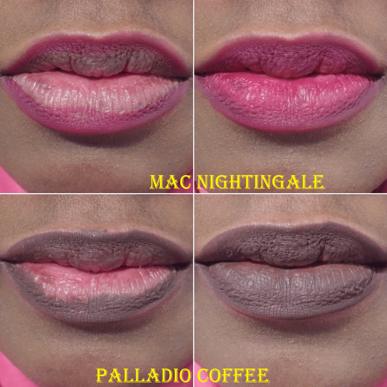
Lip Linersand Lip Crayons
On my lips, the Tarte Tartiest Lip Crayon in Latergram looks similar to the Wayne Goss The Essential Lip Pencil in Mauve. These are colors that don’t look the best all over my lips on their own, but I like to use them to cover the darker pigmented parts on my lower lip, almost like spot concealing. While my lips are in their typical dry and unmoisturized state, these pencils don’t glide on the skin easily. In the case of Latergram, it’s because this sample has dried out a little from when I first got it. For the Wayne Goss, it’s because it has more of a waxy (rather than creamy) texture, which gets caught on every raised/partially peeled dry patch. When working with a surface that will have friction, creamier formulas are better. The MAC Lip Pencil in Nightingale is another wood pencil. I had an easier time applying it to my lips than the Wayne Goss, but the Wayne Goss was less patchy and more pigmented. I don’t know if that’s just because the MAC pencil is older or if that particular shade performs differently to other MAC pencils. I’m keeping it for a little longer because it was a gift. I’m also keeping the Wayne Goss pencil, but I tossed the Tarte one as there wasn’t much left anyway in the deluxe sample I had.
I don’t know how I got the Colourpop Lippie Pencil in Starship. I can’t locate it in my Colourpop order history, so I’m wondering if it was a free gift with purchase. I also have no clue how long I’ve had this because I found it still in the box, but in a lip drawer I never check. I could have gotten it six months ago or up to two years ago. I thought it was a twist up pencil based on the color, but it’s the kind that needs a pencil sharpener. It was the first time I ever saw a wood pencil that wasn’t black or brown. The texture of the product, how it glides and spreads all feel nice, but this shade of pink is too light for my taste, so I decluttered it.
I love the tone of pink in this Mented Lip Pencil in La La! It’s complimentary to both the darker and lighter parts of my lips. It’s a retractable pencil, which is my favorite form of lip liner. If you try to take it off before the end of the day, it will require some oil because this will not come off with water alone! The same can be said of the Nyx Retractable Lip Liner in Nude Pink and Dark Red. These are very easy to use, creamy, pigmented, and budge-proof. The Nyx liners are described as long lasting on the Ulta website, but the Mented pencils are cited as being waterproof. I’ve always liked the Nyx Pencils, though they don’t offer as many shades that compliment my skin tone as the Mented. However, they are $5 compared to $12. So, I recommend the Nyx for a great budget-friendly option, but I do prefer the Mented because of the tones of shades. When it comes to matte formulas, these are my top 2 favorites of all the lip liners I’ve ever tried.
I bought this particular Palladio Waterproof Lip Liner in Coffee nearly two years ago from Amazon. However, the first one I ever bought was years earlier when the brand was still available at Ulta. The smell and consistency are unchanged, but because it’s currently the oldest lip liner in my collection, I will need to replace it soon. I believe this was closer to $4 when I first bought it at Ulta, and my thoughts when using it was that it “just works.” I didn’t think it was particularly special beyond the fact that it’s dark, waterproof, and doesn’t skip when I line my lips. A shade like this would only ever be used by me to outline, so I don’t need it to do anything else beyond that. The price on Amazon is $6.99, so I’m not sure if I will repurchase this again, try to find a warmer or neutral dark brown like the shade Bare from Mented appears to be, or see if Cocoa from Nyx is more to my liking. I do like to just have one dark brown liner in my collection as that’s all I need.
This mini of the Bite Beauty Lip Crayon in Glace came from the Play by Sephora Isle of Beauty boxes (July 2019) that they sold outright in December 2019, which is when I bought it. I love the satin formula, which isn’t surprising considering it’s from Bite Beauty. The color is a touch too light for me to wear all over my lips, but I like spot concealing my lips with it. Unlike the Nars Satin Lip Pencil in Rikugien, which is similarly creamy but much more emollient, I don’t have to worry about the color moving around as much. The color of the Nars pencil always shifts around and moves back off the pigmented parts I try to cover, but it was the perfect camouflaging shade for photos, which is why I used it for so many years. In fact, I’ve been replacing these in my collection every 2 years, but I’ve only paid for it one time. This particular pencil and shade from Nars tends to be available as free gifts with purchases or point perks.
Unfortunately for me, I discovered that my newest replacement of my full size Nars pencil (still about a year and a half old) was not the same shade of Rikugien I was used to. The replacement is even more sheer and the shine is more reflective in the light, which works to still cover the pigment spots through light, not opacity. When looking at the actual pencils, I see visible shimmer on the tip of the new one and the shade is isn’t as pink as it used to be. It appears that the minis and/or full sizes of Rikugien were reformulated. I don’t like the newer one and if the full-size is the same, I wouldn’t be interested in repurchasing this anymore. It’s for the best because Nars might be discontinuing the Satin Lip formula altogether. I saw them in the “Last Chance” section of their website, which rather than discontinuing the product, could just mean they’re trying to get rid of their old stock and intend to release new batches or repackaged/reformulated batches in the future.
My old pencil from Nars smells waxy now, so I’m getting rid of it. My newer pencil smells like mineral oil, so I’m also getting rid of it. I’m glad I have the Bite Beauty Glace shade as a satin lip concealing alternative, but I’m going to have to toss it soon as well. Because I have lip liners that do the job, I won’t be replacing it.
Lipsticks
I am of course keeping all six of my Propa Beauty Lipsticks in the shades Limitless, Victress, Her Magic, Prowess, Moxie, and Prime Time. Because I have these, I’m finally ready to get rid of my expired Bite Beauty lipsticks that I had been keeping for nostalgic reasons. What I have remaining is from the original Luminous Creme Lipstick collection in Shiraz which was the first nude-pink lip that I felt was perfect for me from the shade to the formula. From the Amuse Bouche collection I have Jam, which was sent to me from a friend. It was the first item I ever had available to me before being released to the public. Lastly, I have Kale which I just kept because I never had a lipstick in a shade like that before. I wasn’t confident enough to wear it publicly or share photos online, but it was my one “fun” shade. I decluttered the rest of my Bite Beauty lipsticks long ago, but those three were the most sentimental. Now, I’ve let them go. They were so old, but somehow still smelled nice. Kudos to Bite Beauty for making more “natural” and “food-grade” products that preserve so well.
I’ve also let go of the Anastasia Beverly Hills Lip Palette Vol. 1, which I’m fairly certain is the only lip palette the brand ever produced. Despite how useful this kind of product would be to makeup artists, it wasn’t well received by the masses and ended up on the shelves of TJMaxx, where makeup goes to die. I bought it at the height of my makeup experimentation days. I intended to teach myself how to mix unique custom shades and see the changes to undertone by blues and yellows on pinks, purples, and reds. Despite my initial excitement, I only used it once. The downside to mixing custom shades was that I was wasting tin pans putting only a few drops worth of lipsticks into them. If I was supposed to make a custom color each time I used the palette, instead of mixing it and setting it aside to use again, there would be no way I’d remember the combination of shades I used, nor the proportions. If there was a well that contained 4 empty spots to hold custom shades, I think that would have improved things. The palette came with a dual ended brush with a lip brush on one end and a cosmetic spatula on the other. It also came with a metal mixing palette. Mine smells very strongly of crayons so I won’t even be swatching these, just throwing them out. Because this launch didn’t do well, I was surprised to see Makeup by Mario come out with a lip palette too and I foresee it not selling well either.
The Urban Decay Vice Lipstick in (Sheer) Plaid was one of my favorite reds. It was the combination I liked of giving good color payoff without being too opaque, for making an impact but not as boldly as a more pigmented matte version would. The Urban Decay Sheer Revolution Lipstick in Sheer Ladyflower was discontinued, but I held onto it so I could try to find a replacement shade from a different brand. Both products are too old to wear, and as much as I liked them, they weren’t worth replacing at full price. I only bought these while Urban Decay was having issues selling them, so they were discounted to like $9. I think Urban Decay has great formulas, but anyone could find as good (or even better) lipsticks for less.
The MAC Matte Lipstick in Chili is new to my collection and was a free gift with purchase from Ulta. The color is stunning, but very bold. I don’t think this particular shade looks as nice on me as Limitless or Prime Time from Propa beauty do, but perhaps in the future I could find a blush or eyeshadow look that will compliment this lipstick shade. It’s also nice to have a MAC lipstick I can actually wear. All other MAC lipsticks I’ve bought have been as gifts or for collecting limited edition bullet lipsticks.
Sephora Frosted Kisses Lipstories Set
I forgot to change what I was wearing before taking lip swatches. Teal and mint color clothing makes my skin look red/orange on my camera for some reason.
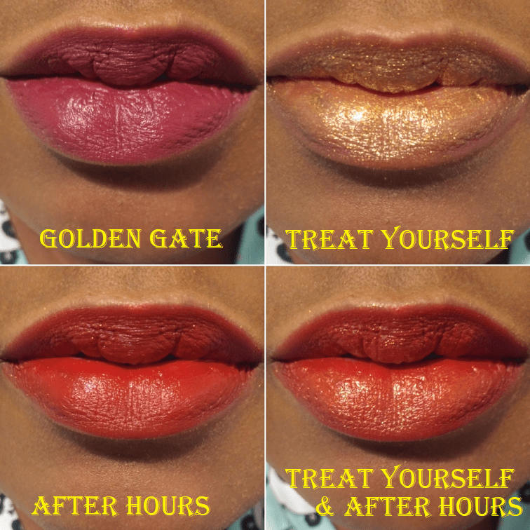
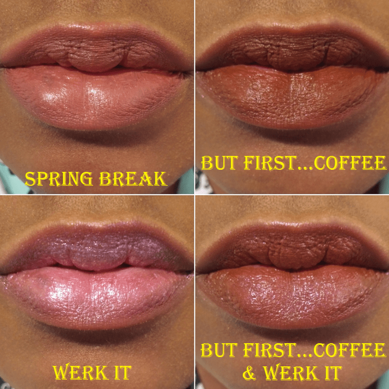
This set contains the shades 36 Spring Break, 31 Golden Gate, 71 Treat Yourself, 23 After Hours, 69 Werk It, and 58 But First…Coffee. My first ever Lipstories Lipstick was Yum Yum, which is part of their satin formula. It’s another example of keeping a lipstick that’s too old in order to find a color dupe in the future. Her Magic from Propa Beauty is even closer to the kind of shade I wanted, so I’m now able to let Yum Yum go.
Other than Yum Yum, which I did get a few uses out of, the lipsticks in this set remained unopened since I bought them in December 2019! I’m finally trying these shades out for the first time, which means it’s also my first experience with the matte and metal versions of the lip stories. The only reason I’m not fond of the metals is purely how they look on my lips. I’m a bit picky when it comes to glitter in gloss, and I definitely don’t like the look of it as lipstick. I decided to keep Treat Yourself because of how beautiful it looks as a topper shade. I’m not keeping Werk It, because there isn’t as much color to that shade and it doesn’t show as well as a topper either. After Hours, Golden Gate, and But First…Coffee are the matte shades, and despite being called “matte” they all have a sheen to them, which I like. I decided to keep the latter two because they’re more unique in my collection. As gorgeous as After Hours is with Treat Yourself, I don’t want to keep a red shade I know I wouldn’t use on its own. It’s the kind of red I used to be drawn to, but now I prefer ones that lean a little brown, as I think it’s more flattering on me. Spring Break is a satin that’s a bit more sheer than the others and I haven’t made up my mind about the color, so I’m keeping it for now.
Overall, I recommend checking out the Sephora Lip Stories because the packaging is cute, the formulas are great, and they retail for the low price of only $9 each! Plus, I’ve seen them go on sale fairly often. My holiday set was $14 for 6, plus it stacked for an additional 20% off!
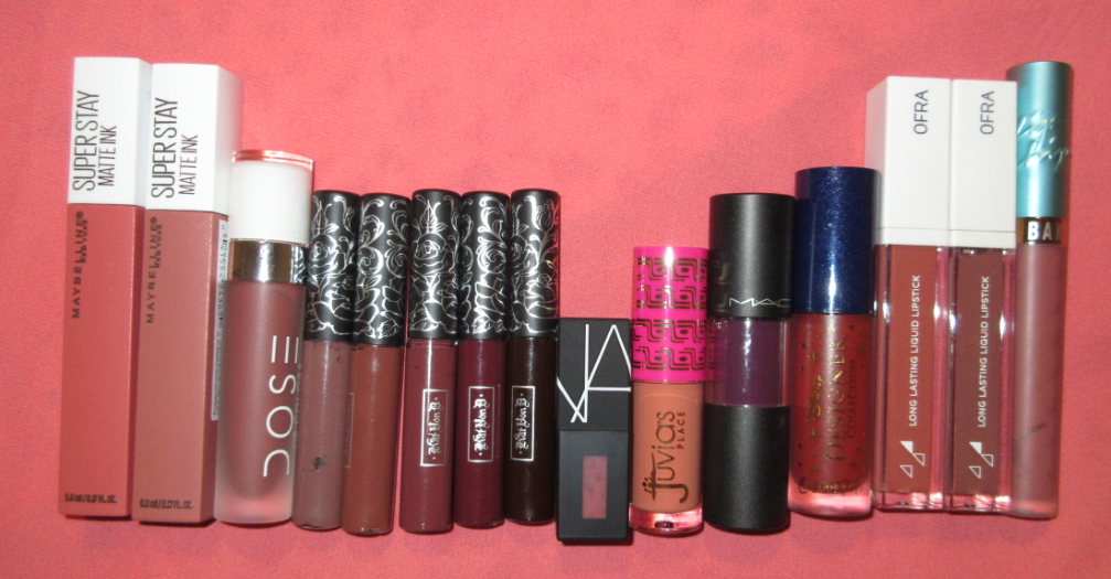
Liquid Lipsticks and Lip Stains
I remember liking the formula of the Maybelline Super Stay Matte Ink in Seductress and Self-Starter because they did not budge. It used to drive me nuts getting lipstick on my teeth or transferring onto other things, which liquid lipsticks generally help avoid. The downside is that I didn’t like these shades on me. Occasionally I used Seductress to cover the darker pigmented spots on my lips, but that was it. I did not get enough use out of these and they are very old by now.
For a time, the Dose of Colors Matte Liquid Lipstick in Mondaze was my favorite liquid lipstick. It was mostly transfer resistant but still pretty comfortable on the lips. I purchased mine from Ulta, but they are no longer available there and this is also too old now.
The Kat Von D (KVD) Everlasting Liquid Lipstick Minis in Sanctuary, Hawkwind, Madrid, Exorcism, and Damned were part of a set many years ago, along with a black shade I got rid of already. Even though these have been too old to use, I kept them around in order to remember which shades I liked or to find color dupes. Sanctuary was the kind of shade I never thought I would like, but I thought it was so pretty on me. Hawkwind and Madrid were also my favorites, though I mostly used Sanctuary. The KVD formula was less drying to my lips than some of the other liquid lipsticks I tried in the past, however, it wasn’t the most comfortable and sometimes I used a balm underneath, which affected the ability to be transfer-proof. I still liked Sanctuary and Hawkwind enough that I considered buying the full size many times, however, I knew I wouldn’t use it enough to be worth. I couldn’t even finish up the minis before they went bad!
The Nars Powermatte Lip Pigment in American Woman was either a deluxe sample or 100 point perk redemption from Sephora. I didn’t like the color, so I never used it.
My thoughts on the Juvia’s Place Wahala Mini Liquid Lipstick in Shakara hasn’t changed from my review in December. It’s a pretty color, but I only like it with a lip liner and gloss on top. Because I don’t feel comfortable wearing this kind of shade on its own, I admittedly haven’t used it again since that review. I think I’ll keep it anyway.
The MAC Perpetual Holiday Versicolour Stain was a gift from one of my best friends (along with the MAC Lip Liner mentioned earlier). There was a time when I was very into purple lip products, but they didn’t survive past declutters. There was also a time I was interested in lip stains, and this one from MAC is on the better end of formulas I’ve tried, but not enough for a repurchase. I like having at least one dark reddish purple in my collection, so I’m happy to have it while it’s still good.
I think this may have been the first time I opened the Colourpop Lux Liquid Lip in Prince Naveen. The color is pretty, but I only bought this as part of a set with a Tiana Blush because I wanted the box it came in. I can’t say how I feel about the formula because the smell was too offputting to try, like rotting broccoli. I can’t find record of when I purchased this anywhere, but the collection launched October 2019, so perhaps this did go bad and doesn’t normally smell like this.
It wasn’t too long ago that I reviewed the Ofra Long Lasting Liquid Lipstick in Baroque, but the shade Refine is new to my collection. The Refine shade is part of the Jen Luvs collaboration with Ofra, which I always wanted to support, but I didn’t want to pay for shipping. The Ofra formula is very comfortable on the lips, but the top layer is not transfer-proof; the topmost layer leaves an imprint. However, to actually take the lipstick completely off without lingering residue, an oil-based product is required. Refine was intended to be a mixing shade to make lipsticks more neutral. As a mixer, it does change the color in a way that improves it, but never enough to make a shade I’ve deemed unwearable to become wearable. The change isn’t dramatic enough, so perhaps I should have chosen the darker mixing shade from the collab instead. I like that you can make touch ups and layer without leaving any discoloration. It’s a good formula, but I can’t find a shade to suit me.
Beauty Bakerie Lip Whip Liquid Matte Lipstick in Syruptitious is still good considering I forgot I had this in my collection and it was still in the box in the back of a lipstick drawer. The Beauty Bakerie formula is another that requires an oil remover. I love how this particular shade looks when wet, but the color it dries to is not my taste. Just like with Ofra, I wish I could find a shade to suit me, but for $20 each, it can stay a mystery. I don’t wear liquid lipsticks enough to justify the price except when there is a sale, which I believe is how I got Syruptitious.
Lip Glosses, Toppers, and Oils
I really should toss my older Fenty Gloss Bombs, but I don’t have the heart to do it yet. The older minis are 13 months old but the full size is 19 months. I still want to get more use out of them. I specifically tried to use up the Full Size Fenty Glow, but as I discovered, there is way more product in the gloss bombs than a typical lip gloss. Despite how much I’ve used it, the tube is probably still half full. After I toss Fenty Glow, I will likely use Taffy Tease more often for that pink tinge. Because I have Ruby Milk, I will have an easier time getting rid of Cheeky. I don’t have a good brown gloss replacement for Hot Chocolit, which is why I’ve held onto that still as well. I’m still keeping Cake Shake, even though I doubt I will wear it again due to the more visible glitter specks. I reviewed the Fenty Cream Gloss Bomb in Honey Waffles already too, and even though I didn’t like how this shade looked on me, I’m not decluttering it and I still want to find a combination (pairing it with something else) that will allow me to find a nice use for it. I don’t like the cream formula as much as the regular gloss because it’s thicker, the color is patchy, and it has a 9 month suggested amount of use as opposed to the 12 months from the original formula.
The Tower 28 lip glosses are 0.13 oz/ 3.9 mL. According to a google search, 3 mL tubes are the industry standard, but not at the mid through luxury tiers. I have the ShineOn Milky Lip Jelly Gloss in Cashew, and while I’ve only been using it semi-consistently for four and a half months, I’m halfway through with it, which has never happened to me before! I’m glad I’ll be able to use up a full size lip product, but that’s what caused me to wonder if I was doing very well or if there isn’t as much product as it appears. While I was able to find some glosses like Pat Mcgrath, Buxom, and Too Faced between 0.14 and 0.15 oz, the Fenty Gloss Bomb for $5 more has over twice the amount of product at 0.3 oz/ 9 mL. The only one I found smaller than the Tower 28 at mid-range is the 3.1 mL MAC lipglasses.
In my initial review for this, I wasn’t a fan of the texture and the dripping sensation from the mix of the “sticky” substance with the oil contained in the gloss. However, when I go to use this product I swirl the bottom and then swirl at the top before I pull it out, and the resulting consistency became almost a non-issue. Perhaps my tube wasn’t mixed properly, though it still wears the same way throughout the day (not feeling sticking until the oil layer fades), but it’s a more tolerable feeling now. I no longer have the feathering issue, but I also I don’t try to build up the color anymore either. Over time, I’ve actually grown to like this gloss for moisturization/occlusive benefits. As for the actual look and shine to my lips, I still prefer the Gloss Bombs.
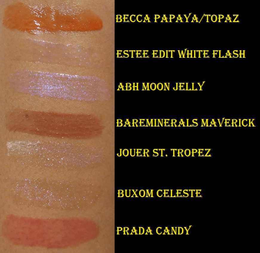
I have zero clue when or where I bought the Becca Beach Tint Lip Shimmer Souffle in Papaya/Topaz. I remember leaving it untouched in the box because I was debating whether or not to keep it, gift it, or sell it. It was still in the box when I made the decision to declutter it in my 2016 Lip Product Declutter. So, imagine my surprise when five years later I found this in that lippie drawer I never check! This product has been discontinued for years, but I was curious enough about it to at least swatch it on my hand. I really wish I could have used it while it was still good, but this reinforces the idea to myself why I need to seriously cut back on lip products and why I’m on this lip product no-buy for 2021. The same goes for the Jouer Skinny Dip Long-Wear Lip Topper in St. Tropez that was a past Beautylish Lucky Bag item. I never used the Jouer topper because I planned to sell or gift it, but ended up doing neither. I am decluttering this too because of how old it is.
The Estee Edit Flash Photo Gloss in 01 White Flash was also in the lost drawer and I also never wore it. I think I used a Sephora promo code to get it. I thought the concept was brilliant having a product that could keep teeth looking white while wearing a warm toned lipstick, but I have no clue if it worked or just gave the lips a cool toned tinge. Since the Estee Edit brand was terminated in 2016 or 2017, I didn’t have the guts to test it on my lips considering its potential age.
Because it wasn’t written on the mini size tube, I had no idea the Buxom Full-On Lip Polish in Celeste was a plumping gloss until I put it on. The burn was immediate and so intense that I instantly took it off. I had just finished fifteen lip swatches prior to trying it out, so my lips were probably extra sensitive. The gloss is very pretty, but I decided not to keep this because I’m happy with the size of my lips and my lip skin is sensitive enough as is, so I don’t want to subject it to unnecessary things.
I think the mini Anastasia Beverly Hills Lip Gloss in Moon Jelly was a free gift with purchase or promo code redemption. I believe I could have gotten this sometime in 2019, but I’m not sure. It felt minty and very cooling, but I think that sensation was intensified because I applied it right after removing the Buxom plumping gloss. When I tried this a second time, it felt faintly minty but not nearly as much. The shade is like a prettier version of the Sephora Werk It Lip Story.
The BareMinerals Marvelous Moxie Lipgloss in Maverick is one I used to love and use quite often! At some point I lost it and eventually forgot about it. Of course, I found it years later in that wormhole of a drawer. I switched my acrylic 36 slot lipstick holder for a smaller one, so that must have been how certain lip products ended up in the backs of multiple acrylic drawers. This is a beautiful gloss, but not enough for me to repurchase. I think this might have been a minty gloss too, but it has been so long since I used it, that I don’t remember. It’s too old to keep and even too old for me to want to lip swatch.
I didn’t remember having the Prada Candy Lip Gloss because I stuck it in the Drawer of Doom the moment it arrived. It was part of an Ulta free gift with purchase set from October 2019 that included a deluxe mini of the perfume. I don’t believe this is available for purchase anywhere, and only pops up in gift sets, which is a shame because the shade is very pretty and the gloss feels nice on the lips. It has a strong fruity and slightly floral scent that I surprisingly like! I’m definitely keeping this for now.
The Charlotte Tilbury Jewel Lip Gloss in Rose Jewel was part of a mini set that was my 2020 Birthday Gift from Sephora. I only started using it recently and I really like how it looks and feels on my lips! I’ve rarely thought high end lip products were worth buying for the formula, just the packaging, but the shine level rivals that of the Fenty Gloss Bombs! However, the full size is $32 versus the $19 from Fenty, so I’m okay with enjoying this sample while I have it but not purchasing a full size in the future.
The Colourpop Lux Lip Oil in Local Time smells like licorice or anise. I wasn’t sure if all of the Lip Oils smelled like this or if it was just this particular one, but I saw some comments around reddit and other sites where people mention that some people can smell the licorice smell but others don’t. There’s barely any color to this, but I bought it as a lip treatment anyway. It feels nice on the lips and makes them look juicy and hydrated. The consistency feels like a less slippery/goopy version of the Juvia’s Place Nubian Glow Lip Balms, but also less oily than the Tower 28 Lip Jelly. It gives my lips a little bit of the prune look like the one from Juvia’s Place, but not to the full extent. Despite the scent, I’m keeping this in my collection. I will probably use more of it when I finish my tube of the Tower 28.
My opinion of the PUR x Barbie Gloss in Boss Gloss hasn’t changed since my review. I prefer the Fenty Gloss Bombs over this because of PUR’s pink metallic looking glitter, but the two are quite similar. This has a nice fruity scent and I will happily keep it in my collection. In the reverse, since reviewing the Juvia’s Place Wahala Mini Lip Gloss in Petty Betty, I like it a bit less. I still think it’s pretty on its own, but only in a very light layer. If too much is applied, it looks extra milky and cool toned. The main reason I liked and kept it was to keep Shakara wearable, but I haven’t even worn them together again since the review. I haven’t tried this on top of other lip products either. I’m tempted to declutter it, but I won’t as long as I still have Shakara in my possession.
Lastly for the lip glosses, I bought the Pat Mcgrath Labs Mini Lust Gloss Trio in Sunset Seduction that contained the shades Love Potion, Sunset Rose, and Flesh 6, but I set Love Potion aside to give away. Once again, I forgot about my lip product No-Buy and purchased it during the April VIB sale, which brought the price below $10. Just like with the Charlotte Tilbury, I thought it probably wouldn’t live up to the hype, but I was wrong! Now, I understand why people like it. It feels lightweight on the skin but has such a shine to it. The tone of Flesh 6 is so beautiful. This is the prettiest shade of gloss I’ve ever had. I love it! I love how shiny it is without large particles of glitter. I love the level of pigmentation where it’s still sheer but has just enough color to be distinctive on the lips in that warm medium-rose shade. If I didn’t have so many lip glosses already, I would want to purchase the full size. Perhaps during a sale in 2022, after half of my remaining collection will likely be decluttered, I will buy it. It’s the lack of glitter that puts it over the top for me! Sunset Rose looked more cool toned on my lips than I thought, despite this being described as a warm shade. Perhaps it is the shimmer and how light it is that is effecting how it looks on me. I will still keep this anyway, along with Flesh 6.
Last Minute Add-Ons
As much as I try to gather everything together for declutters, I always seem to misplace something. I forgot to check my traincase for lip products, so these are the ones that were in there, in addition to the Oden’s Eye Alva Matte Lip Stain in Ripe Papaya that was part of my mystery box that came as I was finishing this post. My Oden’s Eye review was supposed to be up before this one, but I posted this early. It will include more details on Ripe Papaya, but from my first impression, this formula is not comfortable on the lips. It looks and feels drying, but it looks amazing under a gloss. It doesn’t budge or transfer. I needed oil to remove it. Also, my first thought when I applied Ripe Papaya is how similar it looked to Propa Beauty’s shade in Limitless. This is essentially a matte version of it. They call this a “lip stain” but it’s not the watery formula lipstains are known for having. These are definitely liquid lipsticks.
Oden’s Eye has the Alva Cream Lip Stain version as well. They look stunning on the website, and appear to be more of the lip stain consistency I was expecting, so I will likely try one in the future.
Two mini lippies were from the Best of Rare Beauty Lip and Cheek Set that I reviewed here. The Lip Souffle Matte Lip Cream in Transform has gotten no use since that post. The Gratitude Dewy Lip Balm in Support has been used a few more times since that point, but I thought I would have finished it by now. I was so ecstatic about it in my original review, but as soon as I got my Propa Beauty lipsticks and Tower 28 Cashew gloss, I reached for those over the balm. It’s still the best tinted balm I’ve ever had and I will still keep and use this up. I’m also keeping Transform, but I doubt I will even use up that mini before it goes bad, just purely based on the infrequency that I wear such bold red lips. The Colourpop lip products were from the Sailor Moon Daylight Kit I reviewed here. I bought it mainly for collector purposes, so I didn’t expect to get much use out of the Ultra Blotted Lip in Usagi. If I kept the Ultra Glossy Lip in Moon Tiara out of the box, I would probably use it more because it’s a pretty gloss that feels nice, smells nice, and adds a nice warm gleam on top of other lip products.
Declutter Results
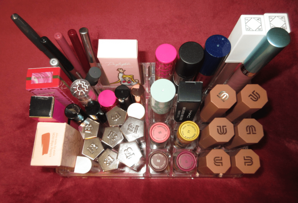
I kept 44 lip products and decluttered 31 (I found more to declutter after this post). It had been so long since I was able to hold all the lip products, excluding lip balms, that I own in the topmost visible container and not need the extra drawers! This is very exciting for me!
The Declutter Pile
Of the remaining 44, 12 will need to be tossed before the year ends due to age, Prince Naveen is only being kept as a collector item and will be moved to my retired collectables shelf, and 4 might not stay in my collection because I’m not crazy about how they look on me. So, I’m expecting to have my collection drop below 30 by 2022.
This is my third post about Japanese brushes, but the first two were combined into part one, which can be viewed here. Unlike my past posts, this one includes brands that are not strictly from Kumano. I’d also like to note that now that I’m familiar with the different sales and discounts offered among the retailers, I didn’t pay full price for any of these brushes from VisageUSA or CDJapan. Even though I think they’re priced fairly for their rarity of bristles and the craftsmanship, I still recommend signing up for those sites’ email lists to be notified of sale events and promo codes to get the most for your money!
As a reminder, when I have “width” listed in the brush specifications, I’m referring to the widest part of the brush when laid flat.
With costs of materials ever increasing and supply of certain hair types being harder to acquire, brush prices also increase. So, the prices I’ve listed might not reflect what is current, though I will do my best to keep them updated.
*DISCLOSURE: All products in this post were purchased by me with my own money and prior to me being part of any affiliate program.Unhighlighted links in bold blue font (Example) are non-affiliate links that will not generate commission. The vast majority of links on this blog are traditional non-affiliate ones. Links marked in bold black font with a light blue background (Example) are affiliate links. Affiliate links allow me to get a commission if purchases are made directly using my links. The price of the product is not affected by these links, and anyone who uses them would be supporting this blog. Whether you click to shop through them or not, I appreciate you visiting and I hope you find the information I’ve provided helpful!
Chikuhodo
Chikuhodo FO-4 Cheek/Highlight Brush
Full Length: 145mm / 5.7 in
Hair Length: 35mm / 1.4 in
Hair Width: *35mm / 1.4 in
Bristle Type: Silver Fox
Handle: Maple Wood
Ferrule: Aluminum
Certain brush styles, like angled cheek brushes, are shaped in a way that doesn’t suit how I like to apply my face products. However, the width, thickness, and density of this brush allows me to easily and quickly sweep the perfect amount of blush onto my cheeks. The soft bristles make this such a joy to use that I don’t mind the fact that I have to change how I typically apply blush and bronzer. The way the bristles splay is in a smaller area than the FO-3 Cheek, so it can feel like you’re getting a smaller brush for the same price. However, I get the added ability to use this with bronzer, which I wouldn’t use with the FO-3. I know many people that like to use a large fluffy blush with their bronzers, but I prefer something small and precise with light to medium density so I can build up the color to the intensity I desire.
This performs exactly the way I expected. It’s a soft brush between light and medium density. I would only use this with eyeshadows I know are easy to blend or with pigments I want deposited as a light wash of color. Since it’s a squirrel hair brush, the bristles are too soft for serious blending, but the slightly pointed tip helps to blend edges better than it would with a more rounded top.
This brush, part of the Takumi series, feels like I’m applying blush with a bunny tail! It’s so soft and springy! It’s also larger than I expected, considering the price, which was a nice surprise! It’s fully round, which makes this excellent for buffing. Although goat hair is the better of the animal hairs to use with harder pressed powder products, I don’t like to use this one for that. This works amazingly with regular pressed products and picks up a ton of powder from baked blushes. I love it so much that I even bought a second one as a backup brush. It knocked my Koyudo Pine Squirrel brush back out of my top three favorite blush brushes!
This is very small, but at least I knew that prior to purchasing. It’s slightly smaller in width to the KZ-04 and much shorter in height. The pinched ferrule creates more pressure in the center of the bristles and lighter pressure on the outer rim, which makes this great for concentrating color precisely to a given area. This helps to create an airbrushed look. This is also a workhorse type of brush I use for blushes that are harder to blend on the skin or harder pressed in the pan. I can still get a very light airy look with this brush, but I prefer to use it in tougher circumstances since it can do what many other brushes in my collection cannot. As time went on, this brush also became part of my top 3 favorite blush brushes and rank either #1 or #2 for me.
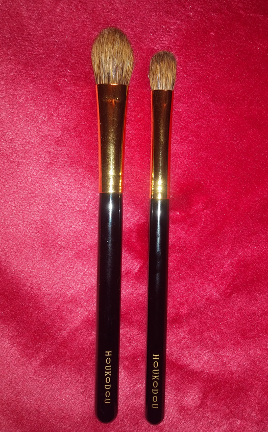
Sonia G Keyaki Brush Set
This limited edition brush set is special because of the Japanese Keyaki wood, which is “prized for its durability and beautiful grain” and has been used to build temples, shrines, and altars. It’s not common for an entire house to be made of that wood, but it’s more popular in smaller forms like countertops and lacquerware. I had been debating getting another Jumbo Blender and Mini Booster, plus I wanted the Flat Definer, so I reasoned that getting a set like this made sense for me. There’s no denying that these brushes are tiny (all 5 fit easily in the palm of my hand) but they aren’t so small as to make me question if this purchase was worth it.
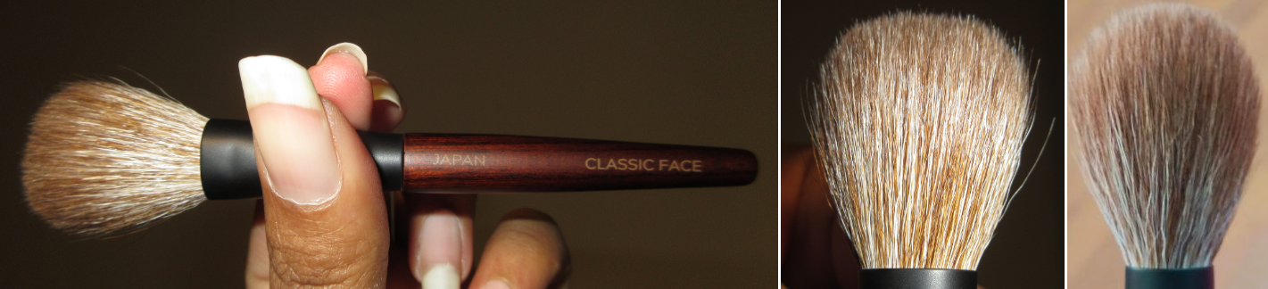
Classic Face Brush
Full Length: 128mm / 5 in
Hair Length: 33mm / 1.3 in
Hair Width: *30mm / 1.2 in
Bristle Type: White and Dyed Saikoho Goat
The bristles are loosely packed and will give a sheer finish. It’s meant to be an all over face powder brush when traveling, but for everyday use, the head width is about the size of a small blush brush, so I use it as one sometimes. This brush is best suited for picking up loose or very lightly pressed powders.
Mini Base Brush
Full Length: 123mm / 4.8 in
Hair Length: 23mm / 0.9 in
Hair Width: *19mm / 0.7 in
Bristle Type: White Sokoho Goat and Synthetic Hair Mix
This is intended for applying foundation. The addition of synthetic fibers makes it especially suited for liquids and creams. The bristles are soft but I can feel a slight drag/resistance when I’m gliding this over my skin using a liquid. I have a big face, so I thought it would take an extraordinarily long time to use this all over, but it only takes an extra minute or two because of how well it blends. Besides foundation, I’ve used this as a large concealer brush to quickly cover a bigger area, though a little imprecisely. It works with all cream blushes, but with the Lys Cream Blush it’s a match made in heaven! With most other creams I rub the product in, but with the Lys, I actually stipple the product on and it looks so incredibly natural! This brush is also great with cream bronzer, cream contour, and even with cream highlighter (though it covers a wider area so I put the highlighter first before the blush). If I took this on a trip, I would still want to bring my Blendiful because that product gives me a blended base so quickly, but I would use this for all other cream products.
I’m normally not interested in angled brushes, but I would love to buy an angled brush or fan brush with this exact density and bristle combination for sharper contouring and bronzing. I also wanted a larger version, so I bought the Smashbox Cream Cheek Brush. I was surprised to find out it wasn’t that much larger than the Mini Base. The Smashbox brush isn’t as densely packed and has more of a domed top, so I have to swirl my brush around to coat all the tips in product. The Sonia G Mini Base applies more product to the cheek. The Smashbox bristles actually picked the product back off my face the way a damp Beautyblender can soak up excess cream and liquid off the skin. For my preferences, the Sonia G is superior because it gives me the maximum color payoff which I can blend down. The Smashbox brush is better for applying lightly as first and building up.
Jumbo Blender Brush
Full Length: 125mm / 4.9 in
Hair Length: 12mm / 0.5 in
Hair Width: *12mm / 0.5 in
Bristle Type: White Saikoho Goat
I’ve already reviewed the Jumbo blender so I’ll keep this brief. Despite the smaller handle, I don’t notice any differences between the full size and this one because the brush heads are the same size. These bristles are undyed whereas the original has dyed goat hair, but I don’t notice a difference in the feel of them either. You’re just better able to use cream and liquid eyeshadows with this one.
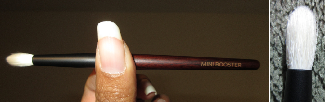
Mini Booster Brush
Full Length: 129mm / 5.1 in
Hair Length: 14mm / 0.55 in
Hair Width: *8mm / 0.3 in
Bristle Type: White Saikoho Goat
Once again, I reviewed this previously and notice no difference in performance between the Keyaki version and original version despite the shorter handle and undyed bristles. The brush heads are the same size. If you have hooded eyes, small lid space, or like precision brushes, I highly recommend getting some form of this brush!
Flat Definer Brush
Full Length: 123mm / 4.8 in
Hair Length: 8mm / 0.3 in
Hair Width: *7mm / 0.27 in
Bristle Type: White Saikoho Goat
This brush is available with a larger handle in the original line, but I do not own it. It’s great for applying shadows to my lower lash line, lining the eyelid, and applying shadow to anywhere small like the inner corner and highlighting the brow.
Koyudo Brushes
I mentioned in my “Updated Fude Post” that I was unable to get Kolinsky brushes from CDJapan. Somehow, one month later, I was able to process the order! Koyudo has discontinued many of their brushes and the ones still available will have a price increase, so I bought these at the perfect time. In fact, I bought the last available BP031 from CDJapan.
Koyudo BP027 Large Eye Shadow Brush
Full Length: 142mm / 5.6 in
Hair Length: 17mm / 0.6 in
Hair Width: *14mm / 0.5 in
Bristle Type: Kolinsky
Koyudo BP031 Medium Eyeshadow
Full Length: 140mm / 5.5 in
Hair Length: 15mm / 0.6 in
Hair Width: *10mm / 0.4 in
Bristle Type: Kolinsky
These two brushes perform the same way, they’re just different sizes. I was under the impression that these would be very soft, but I didn’t realize that it was “very soft” comparatively speaking to weasel and sable hair. These are firm brushes, but not scratchy. They’re stiff, but still have some give as to make them more comfortable to use than other brushes of a similar nature and purpose. What I like about these is the immediate color payoff deposited to my eyes. These are fantastic for cut crease work and creating defined lines, even with the large shadow brush because it is wide but nearly as thin as the medium brush. I also like using these to pack multichromes onto the lid because the bristles can handle being patted onto a layer of glitter glue/primer that I use to keep the shimmer on my eyes.
These brushes are not restricted to just eyeshadows, as the bristle type is fantastic to use with highlighter or creams and liquids like applying concealers and contours and cleaning up edges, but I have only used them for the purpose of applying powder eyeshadow. These would be great with liquid shadows as well.
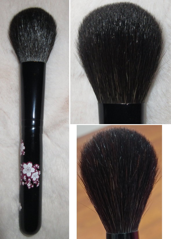
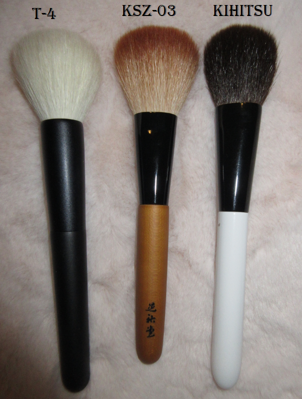
Koyudo Kakishibuzome Series KSZ-03 Cheek Brush
What makes this brush special and the meaning behind the name is that “Kakishibuzome” is the technique used to dye the tips of the bristles. Kakishibu dye is created from the oxidation of two or more year old fermented unripe persimmons. It supposedly has antibacterial properties from the dye and the color will naturally fade with continued washing of the bristles over time. According to FudeJapan, the handles are made of “mizume-zakura” (cherry blossom wood).
Full Length: 155mm / 6.1 in
Hair Length: 45mm / 1.8 in
Hair Width: *38mm / 1.5 in
Bristle Type: Sokoho Goat (Beautylish), Saikoho Goat (CD Japan and Fude Japan)
Handle: Cherry Blossom Wood
This is one of those brushes I prefer for the aesthetic over function. The bristles just feel a bit fragile to me. It’s light to medium density. It’s sturdy enough, thanks to the pinched ferrule, but with the amount of pressure I use with my blush, the tips of the bristles don’t all move in a uniform direction. It has a wide splay, but I’m not used to a sweeping style of brush at this size to only be great for blending in one direction. At this size, I can usually buff a little in a circular motion or at least back and forth. I can only get even blending using my normal style if I use light pressure, which would require me to switch up my application techniques, but I would rather just keep this to display. I’ve used this brush for a few months and washed it twice. Despite feeling fragile, it’s still holding up perfectly fine with hardly any shedding. I’m not saying this is a bad brush or not worth the price. It just isn’t as suited to my style as I hoped.
Also, Beautylish has this listed as Sokoho hair but CD Japan and Fude Beauty list it as Saikoho. I’m not sure if it’s just a typo on the part of Beautylish or if Beautylish was given a lower grade batch. There are a few brushes I’ve seen from Beautylish by now that have different hair type (for example the Koyudo y-8 made of tanuki versus squirrel), so I do believe Beautylish sometimes gets their own versions of brushes. The prices among the websites are still fairly similar.
UPDATE: October 30th 2024 – It has been over three years since I wrote this this review, and I have no idea at what point Beautylish finally changed their website to list this brush as saikoho hair instead of sokoho. I just wanted to clarify that at least by now this has been corrected.
Koyudo Yoshiki Series Yoshiki-005 Lip & Eyeliner Brush S
Full Length: 130mm / 5.1 in
Hair Length: 8mm / 0.31 in
Hair Width: *4mm / 0.16 in
Bristle Type: Saikoho Goat (Beautylish and Fude Beauty)
Handle: Wood
At the time of purchase, this brush was also listed as Sokoho on the Beautylish website, but the last time I checked it was updated to Saikoho. Interestingly, CDJapan just has this listed as “Goat” but describes it as a high quality goat. Usually retailers would want to highlight if their product is Saikoho. To my knowledge, “Goat” is used to describe Sokoho at best, but it tends to be lower grades. The brush isn’t clean in the photo above (sorry! I misplaced my original photos when I had to get my laptop repaired). I rinsed it (but didn’t wash with soap) prior to using it, but the bristles look the same as when I first got this brush. You can see the tip doesn’t come to an insanely fine point the way it appears on some retailer websites. It’s much too thick for me to use as a lip brush, but it’s perfect for what I really wanted: to gently apply shadow to my inner corner and lower lash line, as well as smoking out darker shadows and liners.
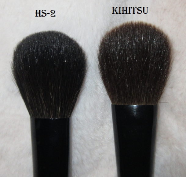
I purchased the Kihitsu Brushes from a seller on Mercari. My curiosity was piqued because the ferrule and handles looked identical to Koyudo’s BP series. Finding information on this brand was difficult, but it’s my understanding Kihitsu brushes are in fact manufactured by Koyudo. This line of Kihitsu is also called the BP series, but I have no idea what the names of these particular brushes are called.
Kihitsu Brush (Cheek? BP018?)
Full Length:*160mm / 6.3 in
Hair Length:*36mm / 1.4 in
Hair Width:*33mm / 1.3 in
Bristle Type: Squirrel (exact type unknown)
Kihitsu Brush (Eye? BP028 but not a pine squirrel version?)
Full Length: *140mm / 5.5 in
Hair Length: *14mm / 0.5 in
Hair Width: *10mm / 0.4 in
Bristle Type: Squirrel (exact type unknown)
The condition of these brushes are questionable. I’ve seen some hairs on the edges that look snapped off on the larger brush and it feels unusually thin as though it lost quite a bit of hair. I still use these brushes occasionally and I enjoy their softness, but for these reasons, I can’t comment on the quality of what these brushes would have been like if they were brand new and not pre-owned. I can only guess that if I think the quality is decent in this state, the new ones are probably amazing. In the case of the BP018, the Koyudo version was not dense at all, so perhaps that part is the same. I cannot find a retailer than sells Kihitsu to the US. In fact, it’s difficult to find any information about them at all. The only way I’ve seen to obtain brushes like these is through a personal shopper, like buying through Fude Japan’s website, or buying pre-owned like I did.
Muragishi Sangyo
All I know about this brand is what CDJapan states, “MURAGISHI SANGYO is a makeup brush producer with 90 years of history. MURAGISHI’s makeup brushes are created using the traditional techniques of artisans from Kumano and completed with a touch of Kyoto culture.” I was unable to find much else besides their Instagram page.
HS-2 Hana Sakura Blush Brush
Full Length: 145mm / 5.7 in
Hair Length: 35mm / 1.4 in
Hair Width: *30mm / 1.2 in
Bristle Type: Gray Squirrel and Sokoho Goat Mix
This is from the Hana Sakura Series. I love this brush! I purchased it in August of 2020, and for several weeks straight I exclusively used this for my blush and bronzer. Even though this is a sweeping style brush, I can use my regular buffing techniques with it. This is one of the main brushes that changed my opinion about the practicality of small blush brushes to the point where I almost favor them! I am admittedly pretty rough with this brush and have used this on some of my harder pressed powders like the Nabla Skin Glazing and Skin Bronzing line. I should treat it gentler because it still has some squirrel in it, but it is holding up very well. The Cherry Blossom design and mix of luxurious hair makes this brush well worth the price and is both effective as a brush and beautiful to display. It is one of my favorite brushes in my entire collection and I’ve purchased these to give as gifts before.
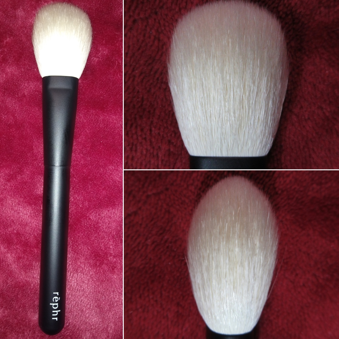
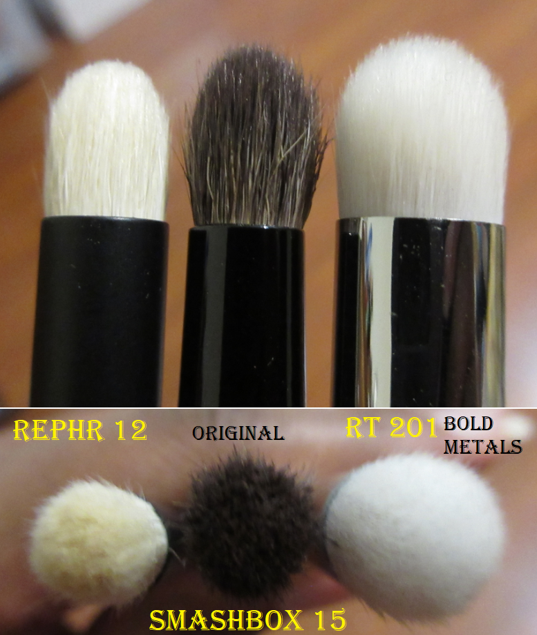
Rephr is a brand that I was a bit hesitant to purchase from at first. Part of what makes Kumanofude so special are the artisans who have learned the brushmaking techniques that have been passed on for generations. The founders of Rephr don’t have that same experience. It is a relatively new company and although they produce their brushes in Kumano and have hired artisans of their own, the company itself doesn’t have a long-standing history to aid in their credibility. In August, I decided to get two brushes from their concept store in order to test the quality. The concept store is where they put the brushes on sale for half off*, with the condition of getting feedback about the brushes. That feedback is supposed to be used in order to tailor and tweak future brushes to meet the demands of the customers and create brushes that the majority of people want most. I expected to get an email asking for feedback, as I couldn’t find where I was supposed to input that information on the site, but I never received a message after buying them in August 2020.
*As of March 2021, Rephr has reintroduced the concept store (with the feedback section linked in the account). Also, the concept store brushes are not automatically 50% off anymore.
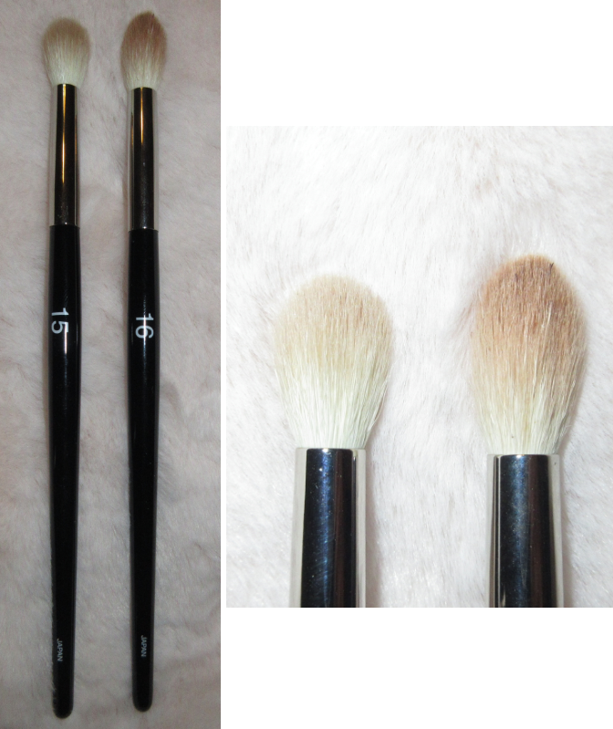
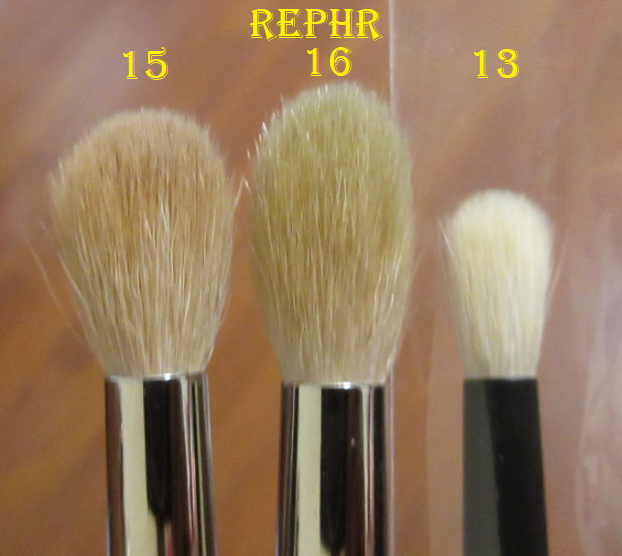
Rephr 15
Full Length: *171mm / 6.7 in
Hair Length: *17mm / 0.7 in
Hair Width: *12mm / 0.47 in
Bristle Type: Goat
Rephr 16
Full Length: *175mm / 6.9 in
Hair Length: *20mm / 0.8 in
Hair Width: *12mm / 0.47 in
Bristle Type: Goat
Regarding the goat hair quality, it is only on the FAQ page that Rephr explains that each brush is a mix of Sokoho and Saikoho goat hair. The brushes intended to deposit more pigment lean more on the side of Sokoho and the brushes they want to be airier and give a sheerer application have more of the Saikhoho hair.
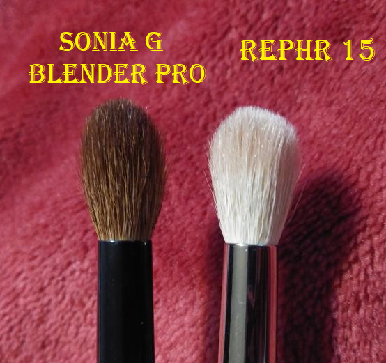
I honestly didn’t like these brushes at first. They were listed as “large” but I wasn’t expecting them to be this big for blending brushes, and I wish Rephr posted the brush stats at the time I purchased them. I tend to prefer a fluffy brush to blow out one shade in the crease, like the #15, but the tapered tip of the #16 is great for blending out a harsh edge. I would have liked them even more if they were a bit denser and sturdier so I could apply more pressure when blending. I know that many people love Rephr brushes, and while it’s a good introduction to Fude at a lower price via the concept store, I have brushes I like better and I recommend skipping the introduction and jumping straight into Sonia G for both traditional and innovative versatile styles. I still use the #15 and #16, but they’re never my first choice. I prefer the Sonia G Blender Pro to the nearly identical brush head size of the #15.
In addition, while the concept store prices make the brushes more affordable, their regular prices are not automatically cheaper. For example, Rephr’s number 23 brush for $24 is similar in size to the $14 Saikoho goat hair Koyudo Yoshiki Series Yoshiki-005 Lip & Eyeliner Brush. Rephr’s $28 #20 fan brush is pricier than the Wayne Goss #15 fan brush for $25. All the eye brushes are the same $24 regardless of how large or how tiny the brushes are, which makes it feel like it’s absolutely not worth buying a smaller brush. I’m guessing that by charging more for a small brush (leaving it to be overpriced) it offsets the cost of the larger brushes (presumably underpriced). The Sonia G Blender Pro is $10 more expensive than the #15. If the #15 was really meant to be, for example $4-10 more expensive, I would easily say the Blender Pro is more worth the money. Even with the larger brushes being underpriced, I feel like the quality somewhat matches, so it still doesn’t feel like a savings at $24. In Rephr’s own words, the cost difference is “minimal,” between the goat hair grades they use, so the bristle quality isn’t a factor. Other brushmakers charge lower prices for smaller brushes because they use less materials to make them. I prefer that model and wish Rephr gave each eye brush its own unique price.
**I completed this post in March 2021, but when Rephr reintroduced the concept store and started a point program, then scrapped it in favor of offering an outright automatic coupon of 40% off the customers’ next orders, I decided to give the brand a second try and purchased three more brushes. I also pushed back the release of this post so that I would have adequate time to test them out fairly. On the website, I was pleased to see they added better photos of the brushes and closeups of the brush heads from multiple angles, plus videos, in addition to at least listing the hair lengths of each brush.
Upon receiving my new order, it seemed to me that the bristles felt a little nicer. I was also surprised by how much tighter packed the bristles felt. Then I realized that these brushes were all matte black as opposed to the previous brushes I had with shiny metal ferrules and glossy black handles. This made me curious, so I watched a few videos on youtube to discover that some of my same brushes existed in both the matte and shiny handle forms and although I could not find an explanation, I suspect this is to differentiate between Rephr’s brushes in the concept store (that they get feedback on) from the brushes in their regular store that are usually listed at full price. I don’t know if these three brushes happen to be more of the “type 3” Saikoho hair or if the quality of the concept brushes are a tad lower than the regular store brushes. All I know is that these three brushes are more of the Fude quality I’m used to, which has caused my opinion of Rephr to improve. However, at full price they’re still more expensive than some of the prestigious brands I use, so I don’t know what the make of the situation. I would love to love them, but whether their brushes are worth buying depends on the situation. I know most brands factor future discounts/sale events into their pricing, so maybe this is why Rephr’s brushes are not that affordable at full price. It has to be working for them because businesses will do whatever works best for their company. If it doesn’t work, they’ll change it. As a consumer, I enjoy researching what else is on the market so I can feel confident that I got the best price that’s worth the money.
Rephr 05
Full Length: *170mm / 6.7 in
Hair Length: 38mm / 1.5 in
Hair Width: *30mm / 1.2 in
Bristle Type: Goat
This brush is ideal for sweeping, but I can easily use circular motions to swirl on the product. It works surprisingly well for that considering its oval shape and pinched ferrule. After washing it for the first time, I discovered that this brush blooms to a dramatically different shape, though I noticed it while it was half dried and was able to return it to the shape I wanted by putting a brush guard on it. The belly of the brush is still puffed out more than before, making this brush less oval and more of a round shape on the top. This explains how I was able to use circular motions so easily with a paddle shaped brush.
I thought using the brush on its toes would be great to chisel on bronzer and/or contour, but the tips come to a taper, so it doesn’t distribute as much pigment per swipe as it would if it had a flatter top. I can still use the brush on its side to apply bronzer, but I prefer to just use this as a blush brush. It picks up a decent amount of blush and distributes a soft, but not too sheer, wash of color to the cheeks. It also works to dust on a light layer of powder all over the face. For $34, I have no regrets getting this. I don’t want to keep harping on Rephr’s prices but rather than spending $57 for the #5, I would say the Chikuhodo T-4 for $52 is so worth it. It has more bristles and is softer and similar in size, though the brush head shape is fully round. The T-4 is in my top favorite blush brushes and is such a joy to use. Rephr’s #5 is nice, and I would definitely recommend it at the price I paid, but I wouldn’t recommend it if it was priced above $45 when I can list several other brushes I prefer for blush that’s under $57. I’m still curious about brush #24 from Rephr, but I’ve never caught that one in stock.
Rephr 12
Full Length: *145mm / 5.7 in
Hair Length: 11mm / 0.4 in
Hair Width: *7mm / 0.3 in
Bristle Type: Goat
This brush reminded me of a smaller version of a Real Techniques brush I used to love for crease work. That brush could apply and blend almost at the same time, but with continued use it eventually lost some of its shape and became less effective at blending. Because the Rephr 12 is smaller than that one and has a pointed tip, I can use it like a regular pencil brush to apply shadow below my lower lash line with precision despite how wide it looks. I also turn it slightly to the side to use the side of the bristles to blend out the edges of shadows. It also does what the #13 can do in terms of being great for precise crease work, and more precise than my Real Techniques brush was capable of doing. So far, I’m impressed with this brush and will continue to use it. This is the only brush I’ve tried from Rephr that I think is actually worth purchasing at full price.
Rephr 13
Full Length: *152mm / 6 in
Hair Length: 13mm / 0.5 in
Hair Width: *7mm / 0.3 in
Bristle Type: Goat
This brush is a hair smaller than the Sonia G Mini Booster. I have photos comparing the shape of this to several other similar brushes at the end of this post. This is the kind of shape that is my favorite for doing any precise crease work and deepening the outer corner of the eye by building up and blending out. The brush is dense enough to blend stubborn shadows, yet still soft enough to avoid tugging the skin in the process. While I do like this brush and find it useful, the Sonia G Mini Booster can do the same while being even softer on the eye. For this reason, I consider this more of a backup brush, useful but not my first choice. The Sonia G brush is $26 and has never gone on sale. Since this is regularly $24, if you don’t have the one from Sonia G and can get this on sale, it may be worth purchasing.
After both orders, I’ve come to believe that Rephr would not be getting this much hype without the concept store/deep discounts. Customers get decent to nice quality handmade uncut brushes from Kumano, but the sale price is the only reason I’d recommend looking into Rephr. The customer feedback aspect is where Rephr has potential. If their future releases are innovative shapes and styles of brushes, I think that would really make them a company to keep your eye on. On their “About us” page, they mentioned expanding to “products related to makeup, skincare & home,” which would also help them to really stand out as a company. I know that would certainly excite me! My experience with them is mixed, but I’m still keeping tabs on their future releases.
Tsubokawa Mouhitsu
Koyomo Nadeshiko Pearl Pink Shadow Brush
Tsubokawa Mohitsu is the actual brush manufacturer. I’m going to splice together what CDJapan has to say about this particular brush and the line overall because there is extra information depending on which page of the site you’re reading:
“Haku-ototsuho Yomo is hair from around the shoulder area of goats, which has a moderate firmness. The highest-quality hair for brushes, known as “Koyomo,” is hair that has been taken from goats living in the Yangtze region of China, in the 1970s or before, and is precious due to its rarity. Brushes using “Koyomo” confirmed as being from this period, are coated in cuticles up to the hair tip and have delicate tips, which means that they feel smooth on the skin and have no friction. The brushes also last a long time, becoming more adapted the more they are used, and as make-up brushes they are unparalleled.”
The fact that “Koyomo” is continually used in quotation marks on the website leads me to believe that this is somewhat of an umbrella term, especially when it just has goat next to it on the distributor page (shown in the screenshot below). The main takeaway of Koyomo is that it’s intended to signify the source of the hair (specific goats from a specific region and period of time). The term alone does not distinguish the grade. A Koyomo version of Saikoho is supposed to be better than Saikoho from a goat today. Sokoho grade Koyomo is said to be stronger and softer than modern Sokoho hair, and so on. So, if you have an opportunity to get a Hakuototsuho Koyomo brush or a modern Saikoho hair brush, you can expect the modern Saikoho brush to be softer because it’s still a higher grade.
Also, “highest quality” could mean strength of the bristle relative to its softness and doesn’t always mean it will be the softest brush, like the way Kolinsky is highly prized but they don’t all feel the same. I mention this because I made this assumption and I wouldn’t want someone to be disappointed with what they get. Even though this brush is technically a lower grade than most of my other natural hair brushes, it’s surprisingly soft considering the firmness of the bristles. On the softness scale it’s perhaps on par with modern Sokoho. All of the pink series are made of Hakuototsuho Koyomo, but the company also produces higher grade Koyomo in their Tsuki and Hana lines. However, those are naturally more expensive.
I don’t mind using small brushes, but because this is so tiny it gets lost in the sea of my brushes. However, I continually seek this out because the bristles are so resilient and densely packed, yet small enough to use with hooded eyes that I absolutely love using this brush to blend the outer corners of my eyeshadow. I didn’t think it was worth buying at first, but after the first few uses I started to appreciate it a lot more and it’s one of my favorite brushes now.
Uyeda Bisyodo is an OEM like Koyudo, Chikuhodo, and Hakuhodo but I don’t know which brands they create brushes for. While the other 3 OEMs I’m familiar with are located in Kumano, Bisyodo is based in Osaka. I’ve always been curious about this brand, but after The Fancy Face on Youtube raved about them, I couldn’t resist them any longer! I love the feel of whatever conditioning or treating agent they use on the bristles. I can’t definitively say which Fude company is my third favorite, but this one is definitely in the running for that spot!
BISYODO alba Series Powder Brush
Full Length: 180mm / 7.1 in
Hair Length: 50mm / 2 in
Hair Width: *38mm / 1.5 in
Bristle Type: Saikoho Goat
Handle: Wood
Ferrule: Aluminum
I love the way this gently glides across my skin. The size and shape allows me to quickly and evenly apply a light dusting of power all over my face. I believe it is the softest goat brush in my collection, more than the Chikuhodo T-4, Koyudo Saikoho Powder Brush, and Sonia G Cheek Pro. I don’t use powder all over my face as much anymore, but whenever I do with this brush, it is an absolute pleasure to use. I was surprised to discover such mixed reviews about this brush and the Alba series as a whole. I don’t know if i just got lucky or others received some defective ones, but the quality of mine is phenomenal. It’s a great tool with a beautiful wood handle that appears to have some kind of coating to make it feel like it’s ceramic. The aluminum ferrule isn’t pinched, but it has an oval shape, yet the width and splay of the bristles allow me to both sweep the powder and buff in a circular motion if I want.
Most of my points with CDJapan were going to expire, but I waited for the Valentine’s Day coupon before making this purchase. This also makes it one of the three newest brushes to my collection. Besides loving Saikoho goat hair, the biggest lure of this brush to me is the beautiful polished African Rose Wood handle (from a legume tree) with the brass ferrule plated in 24KG. I was able to get the last one before it went on backorder. The bristles are so soft that it doesn’t even feel natural to me. It reminds me of my softest, silkiest, smoothest synthetic brushes. The way it’s shaped, especially with a very pinched ferrule, makes this brush a definitely intended for sweeping applications of blush or turned on the side to use with bronzers and contours. It’s lighter at the top and a bit more dense in the middle, but I still find it to be a floppy brush. It has such a wide splay area that adds to my statement about it working best as a sweeping cheek brush.
This brush is pretty, but I honestly just bought it to reach the free shipping minimum with CDJapan. This was part of my Valentine’s day order in 2021, and since then it became my number one favorite highlighter brush! I love the size of the tip and that point allows me to precisely place highlighter in a quantity that rare overdoes it. I can softly blend it out as well. The head is very similar to the Hakuhodo B5521, so essentially I have a duplicate of an amazing brush for a fraction of the cost. The Hakuhodo brush is $63 today but in Dec 2014 it used to be $35. While the squirrel-goat mix makes the Hakuhodo brush softer, I would say someone is much better off buying the Bisyodo brush instead at the current pricing. As soft as the Hakuhodo brush is, I like this brush better because of the resilience of the bristle for blending in highlighter formulas that might need a little help in getting them to look smooth on the face!
The handle of this brush doesn’t have the same coated finish as the African Rose Wood or Alba brush line. The bristles are most important to me, so I don’t mind. I love that I can get Saikoho goat at this price.
*At the time that I bought this brush, it was listed as Saikoho Goat. At the time I am updating, it is now listed as Sokoho Goat. I’m not sure if this is to correct an original mistake or if certain batches are made of different types of goat hair depending on what is available. Perhaps there was a shortage of Saikoho or rather than increasing the price of this brush for this shape, they decided to switch to Sokoho from now on. I’m not certain which one is the case, but after learning that another Bisyodo brush had been mislabeled on CDJapan (in 2022), it is quite possible that the brush was incorrectly listed as Saikoho. I am also inclined to believe this after I purchased a second one of these and the quality was quite similar to the one I bought at the time that it was supposed to be Saikoho. So, I do believe it was always supposed to be listed as Sokoho. In any case, this is a great reminder to always check the seller’s descriptions and the descriptions at other retail websites for the most up-to-date information about each brush before purchasing.
Houkodou is another Kumanofude company. Although they have been in business since 1900, I don’t know much about them other than what I’ve read here. I’ve been waiting for years for my go-to Fude brands to have an affordable Canadian Squirrel brush for sale to try. I grew tired of waiting, which is why I finally bought this brush from CDJapan. The two brushes are labeled GS-1 and GS-2 but these are different from the identically named brushes from Eihodo that are also available from CDJapan. Also, I could have sworn I read that these were gold plated, but I cannot find that information any longer. It’s possible the gold plated ones were a limited edition release or they used to be but no longer are. I think mine are beautiful regardless.
Houkodou Brilliant Gold Series Flat Eye Shadow Brush G-S1
Full Length: 148mm / 5.8 in
Hair Length: 20mm / 0.78 in
Hair Width: *15mm / 0.6 in
Bristle Type: Canadian Squirrel
This brush brings out the best in the eyeshadows I use with it. Whenever I’m doing a blown out look, this blends my shadows so well! It’s a positive experience every time! The bristles are nearly as soft as grey squirrel, yet they deposit significantly more color with one dip onto the eyes. This brush reignited my curiosity and interest in Canadian Squirrel so much that I had to buy the G-S2 later on as well.
Houkodou Brilliant Gold Series Flat Eye Shadow Brush G-S2
Full Length: 148mm / 5.8 in
Hair Length: 14mm / 0.55 in
Hair Width: *10mm / 0.4 in
Bristle Type: Canadian Squirrel
This was another Valentine’s day purchase. It’s significantly smaller than the G-S1, but it allows me to do more detailed work. If you like the G-S1, I see no reason why someone would not like this as well.
I have tried my best to post consistently every week for a year, and in order to do that, I have to work on posts in advance and have them scheduled and ready to go each Monday. In doing so, I sometimes run into issues where I say I’m not going to buy something but end up getting it by the time that post is due. Or I just need one more item to review, but the shipment was delayed and I have to postpone it. Sometimes I’m further ahead and sometimes I’m further behind than anticipated. In this case, I forgot to swatch some of these primers and take close up photos before decluttering.
Below is what the collection looked like at the start of 2020, though I couldn’t find one of my MAC Paint Pots at the time and took the photo anyway. I also have the deluxe sample of the Tatcha liquid primer in the photo and forgot to include the larger Mini Size that I also have. Lastly, the MAC NC45 Foundation Stick I skipped reviewing in my foundation declutter will be included here as an eye base.
EYE PRIMERS
There are only a few categories of makeup that I use up enough that I have to replace them. Eye primers are one of them, though it’s rare to go through an entire tube or jar before the textural changes (drying up or oil separating) force me to replace them. When I do run out of products, I tend to replace them with something new, but this is one category that I have made repurchases of my favorites.
Also, my tube of Nars Smudge Proof Eyeshadow Base is not pictured above because it has the same rubberized packaging as other Nars Products and it became so sticky and gross to look at that I didn’t want to show it. I threw it out, but the tube was pretty much empty anyway. I like that it was clear-white (though they have tinted versions) and it did the job well enough, but I have others I like more and for a lower price.
MAC NC45 Foundation Stick
I got the idea to use this as an eyeshadow primer when I was looking into the Make Up by Mario Master Eye Prep and Set in Deep. The ingredients between the two products are so similar but I knew I could get the Stick from MAC for significantly cheaper. This was Mario’s most universally liked product from his initial launch, so I was curious. Is it possible he intended for it to be similar to the MAC stick? Personally, I think so considering his Master Metal Manipulator liquid may as well be Mehron Mixing Liquid.
I don’t have the Mario one to compare with, but this MAC stick works beautifully! I find that if I leave it unset, I can get a very pigmented application of product right away, but it takes a bit longer to blend. Because it’s easier, I just prefer to lightly set it with powder first and then I have no issues with blending. I’ve used concealer before as an eye base and I was never really a fan of that, so I’m surprised this works. The Paint Pot is creamier and more opaque than the foundation stick. However, the foundation stick doesn’t need to be fully opaque considering the shadows will cover the skin there anyway. If I just want to cover the pigmentation spots on my eyes with a liner and mascara, I can layer the stick enough to give me the coverage to do it. It’s important to note that this does not crease until too much product is packed on the eyelid. While it’s usually cheaper to purchase an eyeshadow primer, if anyone has their perfect foundation match in MAC, it would save you from having to buy two separate products!
MAC Paint Pot in Groundwork, Layin’ Low, and Rubenesque
In the last year or two, Groundwork became my favorite eyeshadow base. It deposits enough color to easily conceal my hyperpigmentation without altering the tone of the eyeshadow that gets applied on top. One of the issues I had with concealers as primers, for example, is I felt it altered the shade color. I recall there being one time that the Groundwork color made the eyeshadow darker, but I can’t remember which eyeshadow formula it was. I believe it was a pastel shade. That’s why, to be safe, I figured I should probably go with the Layin’ Low shade next. However, I’ve only used it a few times because I’m trying to use up the rest of Groundwork first. Rubenesque is a beautiful shimmery shade that does brighten up shadows applied on top of it and it’s such a beautiful shimmer shade on its own that I prefer to just use it as an inner corner eye brightener or like a cream shadow. As beautiful as this color is, I’ve had it far too long. By the end of 2021, I will only have Layin’ Low, unless I cave on my primer no-buy and order some of the new limited edition Paint Pot colors MAC released this year.
Gerard Cosmetics Clean Canvas in White and Cocoa
This primer is really hyped among some of the “smaller” creators in the beauty community. I bought the White shade as a replacement for my Nyx Milk Jumbo Stick and ABH primer. At the same time, I purchased Cocoa because I wanted to get a shade closer to my skin tone and in case I wanted to mix it with White to create a custom color. Cocoa is such a close match to my skintone that I’ve actually used it as concealer and it works amazingly well for that purpose! I prefer how it looks without powder though under the eyes. As a concealer, it isn’t full coverage, but it conceals enough that I could see myself continuing to use it that way.
As an eye primer, these are quite nice as well. The ultimate test was using the white shade with my notoriously troublesome Nomad Cosmetics Toyko palette. It couldn’t make the palest shades work, nor did it make me like the shades I originally struggled with, but this primer helped them perform the best of all the ones I tried. I could actually blend the shadows and layer them with each other! That really impressed me. I need to use these bases with more eyeshadow formulas though because it seems that although I can blend the shadows easily and it can make more subdued shadows pop, this also has the reverse effect and can actually dull some of my shadows. I believe this happens when drier eyeshadow formulas are used on top of this base because this product isn’t very tacky or emollient, so there’s less for the shadow to stick to. I will need to continue testing this out. So far though, this seems like the type of primer that will be amazing with some formulas, but not all of them.
Anastasia Beverly Hills Deluxe Sample Eye Primer
I love how bright the shadows look with this on. It definitely helps eyeshadows that are harder to see on darker skin tones to pop and also with pastels. For an every day kind of primer, I wish this came in other shades because I look crazy if I leave any area where this is applied without putting an eyeshadow on top of it. Meaning, applying this isn’t just cancelling discoloration on my lids. It’s very much a shade to cut the crease with. A little goes a long way. The absolute tiniest amount is needed to cover the eyelid and crease. Also, unlike regular primers where I can seamlessly join shades where it is and isn’t primed, there is a clear demarcation between where the primer stops and my bare eyelid begins. Even if I try to blend the edges to the thinnest layer, it still shows a major difference. That’s why this is better for lining and cutting the crease. Also, I wish this primer didn’t emphasize the texture of my eyelids and make them look so dry. While some shadows stick to this just fine, certain eyeshadow formulas have a harder time adhering to this as a base. So, for this reason I both like and dislike this product. When I finish using up this sample, I will not be purchasing it.
Urban Decay Primer Potion
This specific tube was part of a gift set from a friend and is only five months old, but the first eyeshadow primer I ever bought was the Urban Decay Primer Potion. I used it for quite a while until discovering the Too Faced primer, which I felt worked a little better for me. In using this tube again, I see why I liked it but certain eyeshadow formulas don’t work as well with this one, whereas I rarely have to worry about an incompatibility between primer and shadow when I use the MAC Paint Pot. I still intend to use this tube until it’s completely done. Despite being in such a large tube, I feel like I’ve used up a significant amount already. One very important thing to remember when using this, if you have a darker skin tone, is that this doesn’t dry completely clear. It has a beige tinge that will effect how the eyeshadow looks on top of it if it isn’t spread in a thin even layer. If there are any areas when applying that is thicker than the rest, be sure to blend that part out or else color deposited on that spot will show up lighter than the rest of the eye.
Nyx Glitter Primer
Too Faced Glitter Glue Eye Shadow Primer is highly praised. I’ve only used samples of it, but I think the Nyx Glitter Primer is an amazing and affordable alternative that works just as well. It is a must-have when it comes to using flakier shimmers and multichromes. Of course, anyone who has visited my blog before knows my stance on glitter and that I have not used this with loose glitters. I apologize if that’s something you were hoping to know. I suppose this would be great to use with loose glitters considering that’s the intended purpose of this primer. This primer dries clear and since it’s incredibly sticky, I do not recommend using natural hair brushes with this. Honestly, I have used some of my Sonia G brushes with it, and while my brushes are still fine, it does risk the bristles being stiff and breaking off. I have noticed a slight prickly feeling with my Builder Three Brush that wasn’t there when I got it, which is probably due to a snapped bristle. This is why I don’t condone it, even though I’m guilty of doing it myself. Synthetic is safer, or allow the glue to dry down to a slightly tacky consistency and finger pat a light layer of shimmer onto the lid with the finger first before using a brush after (that way less wet primer gets on the bristles).
Nyx Pigment Primer
My tube is very old and partially dried out, so I won’t be using this on my eyes to test further, even though I only used it a few times. The reason I bought it is because I was using Nyx’s Loose pigments and wanted something that would work well with them. I also thought this would be nice to use with my pressed pigment shadows. I honestly did not see any special results when using this, which is why I quickly returned to my usual go-to primers instead.
Nyx Proof It Waterproof Eyeshadow Base
The waterproof claims are legit! I put a Viseart shadow on top of this primer, ran it under a faucet, and when I rubbed the swatch with my finger it stayed put! It basically takes an extreme amount of rubbing with a cloth to get it to start wearing down, but it removes fairly easily with my Bioderma Micellar water. When you place a shadow on top of this, it goes on very pigmented and true to color! Despite being so stuck into place where I can literally feel when my brush drags across this primer, I can still get a decent enough blend. I tried this against the UD Primer Potion with the Club Nebula palette, and I was surprised that I liked the Nyx side better! Although the UD side was more emollient, that didn’t make it easier to blend. Also, the lightly tacky base caused the shadow to show better because the colors deepened up slightly, whereas the Nyx primer could get good color payoff without changing the shade.
Nyx Jumbo Eye Pencil in Milk and Black Bean
I still don’t know what these pencils are really intended for. Nyx describes them as an eyeshadow and eyeliner all in one. The first of these pencils I ever purchased was Cottage Cheese because it was a little darker than the Milk shade and I thought it would go better in my waterline the way I’d seen Beauty Gurus use Milk. I thought it was the shimmer in the product that made it look awful on me, so I purchased Milk next. I realized it was too bright of a white and my eyes looked very unnatural with it on. Plus, the pencil was way too large to apply directly to my water line. I used a thin pencil brush, which was more precise, but the formula never dried down and wouldn’t stay put on my eyes. I started using Milk as an eyeshadow base instead to brighten up eyeshadows or help pastels show better on me, but the fact that it wouldn’t set on my lids became problematic with certain eyeshadow formulas. I somehow convinced myself it would be a great idea to purchase Black Bean as a dark base for multichromes. While I did prefer it to the other shades, I just did not like the consistency and finish of the product. So, I threw them away. I wish I remembered to take shots of them swatched before I tossed them.
Too Faced Shadow Insurance
I’ve owned many sample sizes and full size tubes of this primer, in addition to the discontinued Lemon Drop shade. The consistency and performance reminds me of a slightly less emollient Urban Decay primer potion. The fact that I kept getting these in gift sets is why I originally stopped purchasing the one from Urban Decay. This was my eye primer of choice until I started using the MAC Paint Pots. I don’t have a swatch of this because the tube was nearly empty, so I threw it out after taking the primer group photo.
Face Primers
I previously owned one color correcting primer from Make Up For Ever. I used it almost exclusively under my eyes. It was very sheer, but it gave that extra bit of help to conceal my dark under eye circles. I liked it, but not enough to repurchase it once it was too old to use.
Make Up For Ever Ultra HD Skin Booster SerumDeluxe Sample
Although it has serum in the name, it’s marketed as a skin prep for makeup. It has hyaluronic acid to hydrate the skin and it does say to use this before a primer. I have used it on its own and there’s no difference between this and a moisturizer as a primer. When combined with another primer on top, I don’t see any added benefits either. This primer is very similar in texture to the Too Faced Hangover, but the one thing I didn’t like about the Too Faced one is how quickly the coconut scent turns and hence why it isn’t shown in my initial stash photo.
Sisley Paris Double Tenseur Sample
This gel primer has the consistency of a serum. It is nice and lightweight. I’m happy I received this sample in my Beautylish order because I’ve always been curious as to why the full size bottle costs $200. After using this three times so far, I still don’t know why it’s so expensive. There are many positive skincare ingredients in this product that are supposed to tone, firm, and lift the skin after four weeks of use. I’ll never be able to see results like that from a sample, if it even works at all. I’d like to think that skincare benefits aside, I would notice my makeup lasting longer or looking smoother or something special. My makeup always looked nice with it on, but I haven’t seen anything extraordinary.
Milk Hydro Grip Primer Deluxe Sample
I despised this primer initially because the first few pumps were incredibly sticky. Everything was harder to blend on top. Perhaps this was just due to the sample bottle because the rest of the time I’ve used it, I no longer had that problem and began to enjoy it more with every use. This adds a slight dewy finish that is a little noticeable even with a matte foundation, but not enough to make it truly glowy. I believe this does extend the wear of my makeup, as products do seem to grip more to the primer and appear more full coverage on the skin. This deluxe sample that I have is almost finished and I’ve debated whether to buy the mini, but I don’t believe I will. I still have plenty of other primers to go through and between the Tatcha and Milk, I still prefer the Tatcha. I will keep this until I use it up.
Guerlain L’Or 24K Gold Radiance Concentrate Base / Hydrating Primer
This is the most expensive primer I own in the full size. When I visibly watched Tati Westbrook’s skin lift in a video when she wore this, I was sold. Well, I at least waited until a VIB sale from Sephora and then I purchased it. In the beginning, I really did think this was essentially contouring my face wherever I put it. I honestly don’t know if it was a placebo effect or not. I continued to see results until I started gaining weight. Naturally, I blamed my weight gain for why the product no longer worked. I told myself, “There’s too much skin to snatch!” Perhaps it just lost its efficacy as it had been around the year mark that I questioned if it was still working. The product description does claim to have hydrating and tightening effects. Perhaps the alcohol in the primer made my skin feel tighter and I imagined my skin looked tighter too. I don’t know. I’d like to think what I saw was accurate over the course of that year that I regularly used it. At the same time, I remember how confident I felt when I used it, and that fact already made this product worth the price tag. The texture is similar to the YSL Touche Eclat Blur Face Primer in that it feels like a gel and also comes in a version with flecks of gold. I had the YSL as a mini and I remember liking the Guerlain much better because of the firming element and how the Guerlain sunk into my skin better. These brands say the gold flakes add luminosity but that element is just a gimmick and an excuse to bump up the price. There is no evidence that gold as an ingredient helps the skin and whenever I get some of the flakes on my face, it looks accidental and not intentional. It’s the kind that someone would walk up to you and say, “Hey you have a speck of something on your face!” It does have a knack of showing up in photos too. There are many times in the past that I had to retake pictures because it looked like I had some glitter fallout on my face and it didn’t look cute. The other thing I didn’t like about this is that it contains fragrance. The perfume smell is okay and fades quickly, but I wish it wasn’t present at all. My bottle smells even more strongly of perfume, which is an indication that mine is too old. Even though I’m no longer using it, I’m keeping it on my vanity because it’s admittedly so pretty with the glass bottle and gold elements.
As a primer for makeup, this worked well with every product I’ve ever put on top of it. I rarely wore makeup longer than 8 hours, so I can at least say everything I wore over it lasted at least to this point. The texture left on the skin didn’t make for the smoothest application process though, but it always looked nice in the end. I can’t say for sure whether it’s worth the price, as that comes down to the individual’s needs and if someone would get the same results I did.
Bobbi Brown Vitamin Enriched Face Base Deluxe Sample
I’ve heard this primer raved about almost as much as the Tatcha Silk Canvas. While it does help my skin to feel moisturized, I don’t see any additional benefits in terms of wearing it under my makeup. To be fair, the product description only promises it, “hydrates, softens, and cushions skin…and fends off environmental damage.” I also didn’t realize, until I checked Sephora’s website, that this product is recommended for normal, combo, and oily skin. Perhaps I’m failing to see what makes this special because my skin type is dry-normal (leaning more dry), but my personal experience with this product is that it’s just okay. I would never spend over $30 for the full size, yet this retails for $62 at 1.7 oz/ 50 mL.
Tarte Timeless Smoothing Primer
This is another Tati Westbrook recommendation, although, by the time Tarte sold this in the mini size it was said by Tati that the formula was already different. I tended to love 75-80% of her recommendations, so I had high expectations that this primer failed to live up to. For one, it didn’t do anything for my makeup. It gave me the same results I would have had if I applied foundation to my bare face. I don’t like the texture of it either. It’s difficult to smooth onto my skin (warming it up by rubbing it in my hands doesn’t help) and will pill up if I have too many moisturizing ingredients on my face. I didn’t like it with my initial first uses and now that I’ve had this for a long time and tried it again recently, my opinion hasn’t changed. I’m not keeping this. This has a little bit of a lemon scent.
ELF Poreless Putty Primer
In my ELFreview, I mentioned that I liked using this in the smoother areas of my face and that I would continue to use it. Honestly, I haven’t. I’ve been working on finishing my MILK Hydro Grip Primer and Tatcha ones (which look nice no matter where I put them), so I haven’t had the desire or chance to use this much. I still stick to my belief that this is a decent primer. I do feel it helps my makeup stay put longer, but it doesn’t have the added benefits of making my skin look smoother or looking nice over fine lines, so it’s not on my list of favorites.
Tatcha Silk Canvas Mini in Original and Liquid forms
Deluxe Sample of 5g versus the 10g Mini
What I love about the liquid form is that it has all the benefits I loved from the Hourglass Veil Mineral Primer but without the white cast. This one is a white liquid as well, but it melts fully into the skin to leave no trace of white behind. My foundation and blush looks so much smoother when I apply them over this primer. The Silk Canvas in the jar form performs the same way, but it takes a little more effort to smooth it and absorb into my skin. I’ve continued to use this up, but I put it exclusively under my eyes to add extra hydration and help my concealer look a bit smoother. Also, this had a light non-overpowering lemon scent that I can smell when I hold it up to my nose, but it doesn’t linger once it’s on my skin.
Cover FX Illuminating Primer Base Deluxe Sample
I have no idea how long ago I got this sample because I believe this is a discontinued product. This looks shiny when I first put it on my skin but as I rub it in, the shine disappears and I’m left with a barely detectable shine that disappears when foundation is put on top of it. Since it’s probably old and doesn’t work well enough anyway, I’m tossing it.
MAC Strobe Cream Deluxe Mini in Pinklite
I have this sample in the original shade. Although I’ve never been a fan of pink highlighters, the pink isn’t very strong on my skin. This is the kind of product I’d wear on no-makeup days to just add a bit of luminosity to my face. As a primer, it has more of a shine than the CoverFx primer I mentioned earlier, but it dulls down quite a bit with foundation over it. This is unlike the Charlotte Tilbury Hollywood Flawless Filter which I can wear under foundation and still have a glow to my skin. This product can also be used as a liquid highlighter, not just as a primer, so adding it back on top of my skin looks nice and works too. It doesn’t disturb my liquid foundation too much, but I did try it once over powder and it definitely lifted my foundation off that time. I’m tossing this tube but I have another more recent sample. I may or may not continue to use this because my skin does look very smooth with this as a primer, but I don’t think I like this enough to buy a full size bottle. I’m happy with the Charlotte Tilbury Hollywood Flawless Filter as my glowy base primer and liquid highlighter.
Becca Backlight Priming Filter Base Deluxe Sample
While this does give a mild glow to the skin, it emphasizes texture a bit when used on its own. When under foundation, the glow is even more minimal and by the end of the day, my skin actually looked dry. I got this in either a subscription box or mini set. While mine is currently too old and should be thrown away, I used it on two other occasions when it was still new and I wasn’t impressed. I held onto it so I could give it another chance in the future, but time didn’t change my mind.
Becca Skin Love Brighten and Blur Primer
The texture of this primer is what I imagine a liquid version of the Tarte Timeless Smoothing Primer would be like, but better. I didn’t notice any blurring or brightening, but it made a smooth base for my foundation to glide on top of it. I was expecting at least a glow, considering the “brightening” claim, but my skin just looked matte. I’m not impressed with how my skin looks until I put other glowy products on top of it. It still doesn’t look its best until a few hours later when a little oil begins to show. I will continue to use up this sample, but I don’t think it does enough to make me want the full size. Unfortunately, Becca Cosmetics will shut down in September 2021, so I’d rather not get used to their primer anyway.
Laura Mercier Pure Canvas Blurring Primer
This primer is more liquid-like than the Becca Skin Love, but when it’s rubbed into the skin, this reminds me even more of the Tarte primer than the Becca! It starts to pill on itself the more it’s rubbed into the skin, so I’m careful with how much rubbing I do to get the product to stay on my face. This primer is mattifying. Other than that, I don’t see any special results when I use this, blurring or otherwise. I don’t want to let this go to waste, but I’m also unwilling to keep using it, so it’s being decluttered.
Smashbox Original Photo Finish Primer
This reminds me of the Too Faced Primed and Poreless Pure (discontinued). It’s a standard silicone primer. There are plenty like this on the market and if your skin works well with silicone primers, this is pretty much guaranteed to work too. I purchased a mini of this once but between subscription boxes and free gift with purchases, I’ve never had to buy another of these again. In fact, I tend to save these minis and samples for one of my best friends who loves this primer. This was a holy grail pairing with the Make Up For Ever Ultra HD foundation I used to use. This always kept my foundation in place and while it’s one of those dependable products that are great to have, I prefer to use primers with additional benefits. I gave this unopened tube to my friend, so I don’t have photos of what it looks like swatched but there isn’t much to see anyway. It’s clear and goes onto the skin perfectly clear as well.
Good Molecules Silicone-free Priming MoisturizerTravel Size
Although I have dry skin, I cannot have too heavy or too many moisturizers on my face or else I will start to get pimples. This product definitely moisturizes my skin and isn’t totally lightweight, but it isn’t a thick cream either. It’s basically right in the middle and enough that I wouldn’t apply an additional moisturizer to my skin if I was going to use this. I would apply this to my bare skin (plus sunscreen) before putting my makeup on. Besides the Bobbi Brown Base, the only other skincare-like primer I’ve used before is the Embryolisse Lait-Creme Concentre, which was much thicker than this. The Good Molecules primer is very smoothing and hydrating. The skin looks moisturized without adding dewiness. Although this has a silicone alternative, I don’t believe this helps extend the wear of my makeup the way a typical primer would, so I recommend using a setting powder or setting spray with this if you need your makeup to last a full day.
End Results
I intended to have a section for primer foil samples, but I have no idea where I put them, as they’re not in my usual sample spots. In any case, these photos show how the declutter ended.
Although I kept the Layin’ Low and Groundwork Paint Pots (and got rid of Rubenesque), I estimate that I will have used up the entire jar of Groundwork in a month or two. My Urban Decay primer also feels like it’s half empty and the ABH sample is almost finished as well. So, I’ll have even fewer by the end of this year.
Because it’s so easy to get a free sample or mini of primers, I don’t foresee myself getting a new full size one anytime soon. It will still take a while to get through the samples I’m keeping (though the Sisley and Milk only have a few uses left), and I’m holding onto the L’Or because of the bottle. So, realistically, I expect to run out of primers by the end of the year and I will likely buy another travel size/mini Tatcha liquid silk canvas to use in addition to the samples I feel will likely accumulate again.
Primers aren’t super exciting, but I hope this has managed to be a useful post!
As of right now, the Cloud Paints, Cheek Dews, and Rare Beauty Soft Pinch Liquid Blushes (in the mini size I reviewed last year) are the only liquid blushes in my collection. I’ve heard great things about the Flower Beauty Blush Bomb Color Drops and Chantecaille Cheek Gelee Blushes, so when the Flower Beauty Drops went on sale a few days ago, I bought one. However, I am going on record to say I will not purchase anymore liquid blushes in 2021. Liquids and creams don’t last as long as powder products. I have so many cream blushes I enjoy and want to get a lot of use out of, so I shouldn’t add to that challenge by loading up on anymore liquid formulas either.
Glossier Cloud PaintCream Blushes
These cost $18 each or $30 for a set of two, plus 10% off your first order on their website. The free shipping minimum (at least for the US) is $30. I have three of the eight shades: Beam, Spark, and Storm. In my order, I also received a sample card of the shades Dusk and Dawn. I bought the shade Beam as a peachy mixer to lighten Spark and Storm if I wanted, but after seeing the sample of the “brownish nude” Dusk, I wish I bought that as a mixer instead. I only had enough product in the samples to do one arm swatch and apply a small amount to my cheek. Dusk is lighter than my skin tone, and brown, so it just blended into my skin. There was only a hint of color to my cheek (in person) which surprised me that I could see anything at all for such a light shade. Dawn is described as a “sunny coral” that comes off more as an orange. It’s very pretty, though I’m not crazy about how orange blushes look on me, despite how many of them I’ve purchased over the years in an effort to find one I love. Beam gives a faint flush and looks prettier on camera than in person. It’s just a matter of it being too light, but that was intentional on my part. Just like with Dusk, I’m surprised it showed up at all.
Glossier’s makeup has a reputation of being low coverage and intended for people with amazing skin already: smooth, poreless, scarless, even skin tone, etc., so I was pleasantly surprised by the amount of pigment I got from these Cloud Paints. Spark is one of their newer shades and described as, “a bright poppy.” As with oranges, I’m a little particular when it comes to red blushes, but I do tend to like them more. I think it’s quite a pretty shade on me when I use a very small amount to create a slight flush of red.
Storm is a dark warm rose and the shade I was looking forward to the most. The consistency is a little different from Beam and Spark. It feels almost gel-like and less opaque, but I think that’s what allows this color to work for a very wide range of skin tones. It makes it easier for someone lighter than me to wear without over-applying and someone darker than me to be able to build it up.
I’m very happy with Storm and Spark. The other three shades in the line that I haven’t seen in person are Puff (light cool pink), Haze (deep fuschia), and Eve (rich mulberry). Based on what I’ve seen online, Haze and Eve are definitely dark skin friendly. The model shots on Glossier’s site are better than many other brands’ photos when it comes to depicting how the blushes would actually look on different skin tones.
Any method to apply these will look nice, but I prefer to use my fingers. I feel I have the most control over where the color goes and how it blends. I can really press it into my skin with my fingers. It looks beautiful on bare skin and over foundation. I like that they aren’t super dewy and set on their own without powder. I like the finish. I like that they are long-wearing (though I have dry skin and most makeup lasts on me). They have a period after opening of 18 months.
I can’t think of anything else to say about these except that I really like them and I absolutely recommend them!
Colourpop Cheek Dew Serum Blushes
These cost $7 each, but Colourpop offers a deal that 2 or more gets the price reduced to $6 each. I was able to use a discount code in my order but the percent off only applied to the other items in my cart and it didn’t stack with the serum blush deal. The free shipping minimum is $30 for US customers or $60 internationally. I have three of the nine available shades.
When I saw product swatches for this, I thought these were going to be terrible in terms of getting the color to stay on the cheeks and not move around. I believe my assessment was correct. These are certainly no dupes to the Glossier Cloud paints.
From left to right: Psst, Rumours, Beyond
Upon initial application, some spots will be stronger in color while other sections have patches that look like clear gel is on my cheeks. If I try to use tapping motions to blend the color evenly, it sheers out tremendously and I have to apply more. When I finally have enough product for the color to show, my cheeks are far dewier and glossier than I want. It doesn’t look natural, which is the point of having a product of this type. With so many layers, it takes hours to set, but it won’t completely dry down if it isn’t powdered. Those with pale to medium skin tones may not have as much trouble with the darker shades because the end result of blending will likely still be pigmented to show on the skin in the amount that isn’t enough to show on me. Whoever can get away with using less product will have significantly less time to wait before it dries down to a non-sticky finish.
Rumours, “a vivid red orange,” is the shade with the most even coverage that doesn’t require nearly as much product as the other two. Beyond, “a muted deep rose,” is one of the darkest shades, but there’s less pigment in it than Rumours. Psst is “a warm mid-tone rose” that definitely shows up on my cheeks at first, but is so sheer that I have to apply so much for it to show. Not all mid-tone shades work for me, so I didn’t expect too much from Psst, but Rumours and Beyond are certainly dark enough that there shouldn’t be such an issue getting them to show. Rumours is like a sheerer Glossier Spark and Beyond is like a patchier sheerer version of Glossier’s Storm. I have found some ways for these to work, and I will discuss them here for anyone who still wants to buy these and try them out.
A “normal amount” for using Psst is two layers with my fingers. I will not get enough coverage if I use another application method. My pictures here don’t even showcase the extent of the glossiness on my skin. I’ve gone from being an all matte lover to loving natural/satin finishes to liking a little bit of dew. These are far too much for me, but these may be for you if you love the sheer glossy look. In order to tone down the gloss to the level that I’m comfortable with, I have to apply a powder on top of it. As seen above, doing this does diminish some of the already low pigment. When I applied the tiniest bit of powder over Psst, it was over a third heavy blush layer, which is pretty much the maximum color payoff I can achieve. It just doesn’t build up more than that.
I didn’t bother showing what a normal amount of Beyond looks like because it just looks like clear gloss due to the brown tinge matching too well to my skin tone. The built up photo had three heavy layers and I struggled the most to get this shade to not look so patchy. It’s surprisingly even more sheer than Psst and it looks way worse with a sponge and brush as opposed to using my fingers. It looks dramatically subtler after a light layer of powder. This is the kind of shade I would only use as a dewy base. In the last trio of photos, I applied the Oden’s Eye Sweet Tulip blush, which has a satin finish, over the top of it. I liked the end result despite the fact that the powder blush went on less intensely than it normally would over just primer and foundation.
Rumours has the most even coverage of the three. I could almost get away with one heavy layer with my fingers, but I used two light layers of product to avoid patchiness. This is the only shade I’d feel comfortable wearing with just powder on top and not layering with a powder blush over it. However, I still wanted to see how it would look with a matte blush on top. I chose Ofra’s Blushzer in Squad and even with it being matte and having a blur powder on top as well, my cheek still looks dewy. So, for anyone who wants to give a matte blush a more dewy finish, applying one of these serum blushes can do that. However, some powders will tone down the glow more than others.
Rumours still does not look great with a brush, but it’s the only one that looks acceptable with a sponge. I still think the finger application looks better. Whenever I get a new blush, I always test it on bare skin first. In my “bare cheek” photo, I’m wearing a little concealer under my eyes and a little around my mouth, but I have no other product on my face. This is what Rumours looks like with a single light layer when it can actually dry own. Anything heavier than a light layer turns it just as glossy as it looks in the other photos. This shade is the only one that will show up with a thin layer. At first I thought it looked okay, but after seeing a comment (not directed at me) about how this blush looks like smeared ketchup, I couldn’t unsee it. Rumours does look a bit like ketchup on bare skin.
While I was successful in finding a way to make these work by either setting them with powder or using them as a base for powder blush, I don’t see a scenario when I would actually ever use these again. If I want a glowy blush, I’ll use one of my many shimmery blushes. If I want a cream base, I already have one in my Natasha Denona Bloom palette. I also have face gloss products such as the Danessa Myricks Dew Balm and Pat Mcgrath’s clear highlighting balm I could use as bases or to add shine to the cheeks too.
I was able to get three Cheek Dews for the price of a Cloud Paint, but I believe a single Cloud Paint is a better purchase. While the dew level is a preference thing, the way the color moves around while trying to blend and has gaps where my skin shows though is why I don’t think this is a good product and can’t recommend it. I’m not encouraging anyone to get this, but if you do, at least it won’t break the bank to throw one into your cart if you’re already making a Colourpop order. I can’t fault anyone for being curious about them, like I was, and maybe others will have more success than me.
One item I’m discussing today is a bronzer, but the rest are cream blushes. Cream, liquid, and balm blushes have become extremely popular this year and while I have held off on getting some (and even returned one from Tower 28), these were too tempting to resist.
Lys Beauty
This is the first Black-Owned “Clean” beauty brand at Sephora. I watched a fantastic interview with the brand owner where she describes the type of products she wanted to make, why she chose certain ingredients, and the overall uplifting message behind the brand: Love YourSelf. Clean Beauty products tend to be on the expensive side, so it’s amazing to see how relatively affordable the products are.
Lys Beauty No Limits Matte Bronzer in Strength $18
Niacinamide is a popular skincare ingredient, but this is the first time I’ve ever seen it in a makeup product. The brand uses it in the primer, bronzer, and setting powder. Every product within the LYS line has some skin benefiting ingredients added to them.
Strength is the 4th darkest shade. I ran into the issue of this particular color looking very subtle on me, yet the Worthy shade appears as though it would be far too deep, so I settled for this one. I also chose to show what the pan looks like with and without flash because the flash-off photo is more accurate to how it looks in person, but the flash-on photo better demonstrates the depth of color when actually applied to the skin.
I like that it’s a neutral tone. Product picks up easily on my brushes, but I have to spend a lot of time getting it to show. When it does, it can be uneven at times. It’s not patchy in the sense that there are gaps with no color, but in order to get a solid section, some spots are deeper that others and sometimes looks unblended despite how long I spent on that area. I’ve used multiple brushes and techniques, but it’s still a time consuming process to get it to look nice on me. For this reason, I think the bronzer is okay but I wouldn’t recommend anyone rush out to buy it.
The blushes, however, I highly recommend! There’s a reason they’ve been going in and out of stock on Sephora’s website for nearly two months! The formula is incredible!
Lys Beauty Higher Standard Satin MatteCream Blush in Self Love and Confidence $16
I’ve tried so many cream formulas lately and this easily surpasses them all. They’re easy to use, smooth, blendable, natural looking, pigmented but not overly pigmented. One could still build up the color or sheer it down. They’re long lasting on me. They dry down so I’m not left with a sticky, greasy, or creamy feeling when I touch my cheek. I don’t have to warm them up first to use them. They’re my perfect cream blush formula!
There are six shades in total. One lighter, two brighter, and one deeper than the shades I own. Because these are mid-toned, I can use a very heavy hand with them and not worry about overapplying and looking crazy. On the left sides of the photos are my preferred level of product for in-person blush. The right side shows what it looks like built up to near maximum opacity to make it easier to see on camera.
There’s a slight difference between Self Love and Confidence when on the skin, though they look nearly identical with a light application. Confident has a warmer undertone and is a touch lighter than Self Love, which is more on the rosey mauve side. Self Love leans a little cool, but not so cool as to look unflattering on me.
I’ve only heard good things from others who have purchased these blushes. The one concern I’ve seen from those who haven’t seen them in person is whether a brush would fit in the compact because of the triangular shape (which I love). LYS accounts for the shape by making it bigger than the average blush. Below are photos to compare the sizes. I could fit the entire Fenty blush in the center. It’s bigger than the cream blush portions in the ND Bloom palette and Patrick Ta duo. For anyone concerned about using up the last bits of product, which honestly that would take a very long time get to, a cosmetic spatula would be helpful in scraping out what is in the corners and spreading it into the center of the pan. It’s not just that the LYS pans are wider. They contain 6.5 g of product for $16 compared to 4.5 gram for $22 from Melt, 4.5g for $20 from Tower 28, and 3 grams for $20 from Fenty. Even the Rare Beauty Stay Vulnerable Cream Blush is 5g for $21.
With the LYS blush, I’ve tried this using my fingers, a brush, and a sponge. They’re all nice methods, but my favorite is using a brush, and particularly the Sonia G Mini Base brush from the Keyaki set. I can spread the color on my cheeks, but I like stippling it on the most.
Melt Cosmetics
Melt is most known for their eyeshadow stacks and palettes, but I only own blushes from them, if you count the Digital Dust Duo Blushes as actual blushes and not highlighters.
Melt Cream Blushlight in Daydreamer and Polished
The cream version of Blushlights comes in eight shades, though only six are available at Sephora. Sephora doesn’t carry Daydreameror Cali Dream. There’s also a powder version of Blushlights but only Lynx and Sundown exist in both formulas. Cali Dream and Honey Thief are also available in powder versions but in the matte blush formula. Daydreamer is a, “rich cinnamon with pink pearl.” It’s the darkest shade in the collection and the others aren’t as easy to see on those with dark to deep skintones, so I was surprised to see it not available at Sephora, despite having arm swatch photos on the website with all eight shades together. I thought perhaps Melt didn’t create enough to give a stock of them to Sephora or that Melt intended for that shade to be a website exclusive. However, when I was scrolling through Melt’s Instagram, I saw a comment where they said Sephora “is taking” certain shades. This reveals that Sephora intentionally chose not to take the deepest shade, which would have made this range a little more inclusive. At least it would be more inclusive as blushes. Melt encourages those with medium to deep skintones to use the shimmer shades as highlighters.
I saw several people inquiring as to why Daydreamer wouldn’t be coming to Sephora (even though the full range is at Camera Ready Cosmetics) and requesting swatches on deeper skin tones.
The only explanation I can think of is that perhaps Sephora didn’t want it because they have a few colors like it available already. It’s close to Fenty’s Rose Latte, which makes it also similar to Tower 28’s Power Hour based on a video I watched comparing Tower 28 and Fenty blushes, both of which Sephora has. Among my collection, it’s also similar to Glossier’s Cloud Paint in Storm. What makes Daydreamer stand out is the fact that it’s darker and it has those specks of shimmer.
In addition to Daydreamer, I also bought Polished, a shade that’s “grapefruit…with a warm golden pearl.” I can get the color to show in person if I stipple on a heavy application of the blush. However, I prefer to wear both colors together with Daydreamer more towards the back and Polished towards the front on the apples of the cheeks. I have tried mixing the two shades together equally, but Daydreamer is such a darker color that it doesn’t look any differently.
For me to get as close to what Polished looks like, but with enough pigment to show up more easily, I have to use a mixing ratio of 3 parts Polished to 1 part Daydreamer. However, mixing is more time consuming (and messier) than applying to separate areas, so I just prefer to do that.
These blushes have a very noticeable vanilla-like scent, but the smell doesn’t linger for too long on the cheeks. I like the product’s creamy texture and the way it looks on the skin. At some angles, I like the glowing effect this blush has, but it’s at the cost of having very spread out random glitter particles, which I’ve mentioned ad nauseam is not a preference of mine. For those who don’t like shimmer, Honey Thief, Sandy Cheeks, and Cali Dream are the three shades without it.
This formula doesn’t dry down. If it doesn’t get set with a powder, it will remain emollient to the touch. When I have set this with powder, it felt dry for a short time and then eventually the cream and natural oils broke through that layer and felt creamy again. The only success I’ve had for setting it was to apply a little powder blush on top and then set it with translucent powder as well. This does, however, defeat the purpose of having that particular shade of blush and it essentially functions as a cream base in this way. I don’t mind using these blushes unset for photos, but I wouldn’t try to wear one in public where it could transfer onto my hand or mask.
The Blushlights are described as being intended for eyes, cheeks, and lips, but on the card that came with my order it specifically lists only Lynx, Sundown, and Sandy Cheeks as being usable around the eyes. On the back of my actual blush box it just says, “apply on face as desired,” but on Melt’s website in the “about” tab you can click on each individual cream Blushlight to see which ones they say to use on cheeks and lips versus the ones that have all three areas listed.
Polished shows a bit on the lips, but I can see all my discolored spots through it. I think Daydreamer looks nicer on me. My upper lip is darker than my bottom lip and is very hard to cover, which demonstrates the lack of opacity and pigmentation. My main issue is that I don’t enjoy the slippery feeling on my lips and I can smell the vanilla much stronger when it’s under my nostrils as opposed to the sides of my face. Also, although the texture the creamy, my lips feel even drier than before I put them on (and yes my lips are in a poor state in this photo). Sorry! I know it’s not the cutest thing to look at.
The “Both” photo has Daydreamer on the lips with Polished in the center.
I have also used these blushes with a brush, fingers, and a sponge. I don’t have a preferred method of application between a brush and my fingers, but I dislike the look with a sponge. It starts off depositing a lot of color, but by the time I finish blending it evenly, it becomes sheer to the point of looking like a tint. If the undertone of a blush doesn’t suit my skin tone, it makes a tint (where you can see my skin through the blush) that much more unflattering in my eyes. My goal for blush is to look naturally flushed and while a tint can sometimes do that, the wet sponge makes the shimmery sheen turn more metallic looking, which is a dead giveaway.
That’s everything I could think of to mention! Thank you for reading!
-Lili ❤
*UPDATE and DISCLOSURE: On September 18th, 2021 I joined the LYS Beauty “Confidence Crew.” At the time this review was posted on April 5th 2021, I was not affiliated with the brand in any way and all products were purchased by me. This means there were also no affiliate links in the initial blog post. Other than adding this update, I have not altered my review above in any way and it remains my true and honest opinion of the products.
I do have an affiliate link now if you would like to shop the LYS Beauty website here By clicking that link, I am eligible for a small commission from your purchase. I also have an affiliated discount code LYSUNBOXLILIfor 20% off an order, but it is only good until October 18th, 2021. I’m not sure how long I will be part of the program but I thought it was important to post here as well and not just the new posts going forward.
Unlike some of the other Indie brands I’ve discussed before, I didn’t feel like I had enough to say about JD Glow or Terra Moons for standalone posts, so I combined them both here today.
Terra Moons Cosmetics
The majority of my Terra Moons mattes are from the Neon Mattes Collection, in which I have 9 of the 14. Neverland is a discontinued traditional neon green shade from the original formula. It isn’t as smooth as the ones available now, but I’m happy I was able to get the last one. It’s very exciting to see these unique tones of neons though. These shadows are thin and powdery, so most of these will not look opaque without being carefully packed on. Shades like Land on the Stars, Jupiter and I, and 4th Dimension are glowy neons. You can see this in TerraMoons’ Instagram post before the launch.
The rest in my collection I’d consider more of vibrant shades on my skin tone. I treat them similarly to the Vivid Pigments from Coloured Raine, so I either have them in the crease or as inner corner accent shades. As these TerraMoons neon mattes are actually the only neon shades I own, I only have experience with these and cannot rank or compare them to others on the market. I can say that I’m happy with these and I don’t feel the need to try any from other brands. They aren’t beginner friendly. I feel as though I’m still learning how best to use them. They aren’t a necessity for me, as I don’t do super artistic editorial looks, so they’re just a fun cool addition to my collection to occasionally use. Also, Lunar or Later is a pastel matte and not part of the neons. It was sent to me by mistake instead of Lunar Haze in my order. Terra Moons’ customer service is great and sent me Lunar Haze right away without any issues and they let me keep Lunar or Later.
This next section of swatches are a mix of a shimmer, duochromes, and a multichrome. I was unable to find Candy Apple, Sweet Like Honey, Take Me To Terra, and Sagittarius on the website. I bought those in the same order with Neverland (June 2020), so, perhaps these have been discontinued as well. Crushed Velvet is described as, a “wine brown duochrome,” but the dark pink shimmer doesn’t stand out very much and the base color is a bit muted, so I view this as more of a satin eyeshadow. Bailar is one of their newer shades. It was introduced in the El Barrio palette, but it’s also available for sale individually. It’s a beautiful duochrome coral and gold and that combo always attracts me. Martian is a greenish toned gold shade, the kind of shade I also often buy, but after playing with my Natasha Denona mini gold palette more lately, Martian isn’t as much of a standout shade as I thought. On the other hand, Hot Spiced Cider is a much more interesting version of Martian as it has a stronger green tone that makes it more duochromatic. It’s not the most unique shade on the market, as I’m certain I have shades like this in my collection, but the formula is great. I recommend this if you don’t own a shade similar to it. Mint Frosting has an interesting tone of green with gold shimmer that looks warm in the swatch, but has some blue tones to it that can be seen better when applied onto my eyes. X-ray is a blue and purple topper shade. The texture is a bit flaky, so I had a little trouble getting it to stick in my inner corners, especially since I had to really press it to make that white powder blend into my skin the way many iridescent shades do. Grapetini is a pretty purple. It’s not as exciting compared to the others but I wanted it anyway and the formula is nice.
UFO is always on Pre-Order. It’s described as having, “a bright purple base that shifts red, gold and peach.” I just see purple and pink. This shade isn’t very shifty to me, but it is definitely beautiful and I like the level of shine it has. Moon Tide is also a Pre-Order shade with, “an indigo violet base that shifts light blue, lavender and pink with hints of silver.” This one definitely shows all of that. It’s my favorite shadow from Terra Moons. When it comes to duochromes and multichromes, it’s not a secret that I favor Devinah and Clionadh, but Moon Tide is one of those shades that if you want to make a purchase from Terra Moons, I highly recommend trying this one. Clionadh released a new Vibrant mulitchrome called Regal that I believe might be similar to Moon Tide, but I haven’t purchased that shade to see for myself. UFO and Moon Tide are both part of the Cosmic Chameleons collection, which are multichromes with colored bases, not black bases like the Extreme Multichrome line.
Alter Ego is one of the extreme multichromes. It’s mainly purple with a blue, magenta, orange, and gold shift. It reminds me of Rosette from Clionadh, though not as sparkly of a finish. In the photo below, Alter Ego is on the left and Rosette is on the right.
Considering the number of shades I’ve seen disappear from the website in the last twelve months since I placed my first order, I definitely recommend that anyone who wants some Terra Moons shadows should try to get them while they’re available! I was able to get most products on sale and use an influencer promo code to get them at a discounted price. Waiting is a gamble, but sometimes it pays off. For example, the neons being discontinued in order to come back in a reformulated version. I will say though that shipping is pretty expensive considering it’s only a few dollars cheaper than some of the international shipping fees I’ve paid to get shadows from other countries. It does bug me a bit, considering I live less than two hours away from where Terra Moons ships their shadows, but it’s a nice consolation to be able to support a Florida business.
JD GlowCosmetics
The JD Glow shadows are stunning and I would have been way more excited if I hadn’t been expecting their Galaxy shadows to be like the Clionadh Stained Glass shadows that so many people compare them to. The shades are described as having, “duochrome and triochrome effects,” but they’re more along the lines of intensely sparkly shimmer and duochrome shadows. Because I expected JDGlow’s multichromes to be with all the other shadows on their site, I thought the Galaxy shadows must be the multichromes I saw on Instagram. I later discovered that what I really wanted was under the “Special Edition” section.
Their website is basic, yet not user friendly. I hope this is something they work on soon. This is why I was unable to get the See Weed shade I’d been wanting from them for so long. I also wish they restocked more often, as I’m reluctant to place orders knowing that some of the things I want aren’t available (and would therefore require a second order) while the shipping is not free.
Limelight is from the Metallion line, Martini is a Shimmer, and the remaining four are Galaxy shadows, though Starluster was no longer on the website when I last checked. Despite them being beautiful, and the Makeup Goblin inside me wanting more, I can’t say that there is currently anything else from JD Glow’s offerings that I don’t already have in a similar quality or with a better shift. Especially as most of the shadows I wanted aren’t available anymore. For anyone who doesn’t have shades like theirs, it’s worth trying, even if it’s to compare between all the amazing Indie brands out there.
I tried my best to keep my powder and spray collection to a minimum after 2018 because I know I never run through these categories of products and, to my knowledge, setting powders are one of the cheapest (if not the cheapest) makeup products to produce. The huge markup makes me reluctant to spend a lot on them. Some powders are more finely milled than others or I need one that won’t leave a cast on my skin or in photos, or one that isn’t too drying, so this is where the slight nuances in formulas can get me to spend more or keep trying to find one that I love enough to call a holy grail product.
All Over/Setting/Finishing Powders
Some powders I’ve used in the past have been the Make Up For Ever HD Setting Powder, MAC Translucent Setting Powder, Ben Nye Banana Powder, Besame French Vanilla Brightening Powder, etc. There haven’t been any setting powders (other than getting a better shade) I liked enough to repurchase. I don’t set my entire face with powder anymore (unless I need to wear foundation for an extended period of time), so I’ve been trying my hardest to just use what I have.
NARS Light Reflecting Pressed Setting Powder in Sunstone
This powder was my favorite of 2019. I was so happy to finally have a version (previously owned the loose version in their translucent white shade) that didn’t leave a cast on the skin or give Flashback. At the time I bought it, they didn’t have the loose version yet at Ulta. Sometimes I wish I waited to get the loose form in order to avoid the hardpressed-looking spot/film that appears onto the surface shortly after the initial use. At the same time, I didn’t want to deal with powder floating everywhere for once, as can happen with loose powders depending on the sieve.
The Sunstone shade is a great match for my skin tone in both depth and warmth. It never occurred to me, until I read Nikki’s post, that this powder can look noticeably orange on different skin tones, so I thought it was important to mention. I’ve linked her blog for anyone who wishes to see this powder swatched on her. I recommend taking a look as she posts great content!
I could have built up the color in my swatches but I wanted to show the kind of coverage one or two swipes with my finger can give. In most cases, that amount is enough to show visibly on my arm. In the case of the Sunstone shade, it’s such a close match to me that it’s harder to see. As for the original shade, I don’t have it blended in the swatch but when I used a light layer on my face, it remained translucent and also photographed well.
I’ve been holding onto the original (I stopped using it years ago) but I will toss it now, as it is quite old. I’ve only had Sunstone for a year and a half, so I’m keeping it. Plus, I still really enjoy it!
Beauty Bakerie Face Flour Baking Powder in Yellow (Cassava)
Beauty Bakerie has a lot more colors available now than when I purchased this. I prefer yellow, peach, orange, and brown powders over white or pink. In this case, there isn’t a strong enough yellow base, so it still comes off as practically white on my skin tone. I really wanted to love this powder because it was hyped up and I like supporting not only small brands but especially black-owned ones. I gave it several tries but this is just too drying for my under eyes, the place I need powder the most. So, it’s leaving my collection.
MAC Sunny Side Mineralize Skinfinish (Discontinued)
This is one of those products that I probably should not still be using, due to its age, but I like it and I’m unwilling to let it go just yet. For color correcting my under eyes, I tend to use just the three lightest colors to give myself a brightening effect. If my concealer is a bit too bright and I want to tone it down a bit, then I use either all four shades or just the darker powder on its own. Since this has been discontinued for a long time, I won’t spend anymore time describing it. However, if the other Mineralize Skinfinish powders work like this one, perhaps I should explore the line at some point in the future.
Chantecaille Perfect Blur Finishing Powder
I bought this at 30% off during the anniversary/birthday sale and it’s still the most expensive powder I own. While this does have a slight blurring effect, the overall finish isn’t anything spectacular. It doesn’t give my skin a more natural finish or a glow nor brightness. This one just mattifies me. It doesn’t give me anything else to warrant even the discounted price. I will give some additional credit that despite being pale in swatches, this does not leave a cast on my skin (though if I use too much it can lighten it). While I can make use of the blurring on days when my foundation and concealer are on the sheerer side, if I just conceal my imperfections then I don’t need to worry about blurring. Perhaps there are additional benefits I cannot see on my particular skin tone. There are rumors that Chantecaille is working on a darker version of this powder, which is admittedly intriguing to me. I want to see the full magic everyone gets so enthralled by when it comes to this powder! If a significantly deeper shade becomes available, I might sell this one on Mercari and use that money to go towards the newer one.
There is of course the charitable aspect. The Chantecaille family/brand are strong supporters of animal welfare and humanitarian work. A certain portion of the sale of this powder was donated to support “land conservation and women’s empowerment in the Amazon.”
Koh Gen Do Maifanshi Brightening Moisture Powder
I could have put this powder in the future highlighter declutter post because I use it for that purpose. The reason I did not is because my other luminous face powders have fine, yet more visible shimmer in them, such as the Guerlain Meteorites and Hourglass Finishing Powders. The shimmer in this is almost imperceptible but still gives a brightening effect. I wish they created a deeper version and I was a little disappointed to learn that rather than make a darker shade, they recently created a pink version instead. With this one, I have to either use a very light application or blend it in very well if I want to avoid the white cast it leaves on my skin tone. Using a normal amount doesn’t just brighten, it completely lightens the look of my skin. Even though I can only use it as a highlighter/brightener, I’m unwilling to declutter this one.
I don’t like this. I’ve only tried it once but it was so drying and not translucent on me. This will be given away.
Fenty Beauty Pro Filt’r Instant Retouch Setting Powder Deluxe Sample in Honey
When this powder was first released, I had a hard time deciding between Honey and Hazelnut. I even went in-store, but still couldn’t decide. I was able to get this sample as a free gift with purchase. The actual powder looks darker than some of my other yellow toned powders, but it looks very light in the swatch. I’m glad I didn’t buy this because it doesn’t do anything for me. It doesn’t make anything look worse but it doesn’t increase the longevity of my makeup or keep my concealers from creasing. Whenever I’ve used this powder, I always felt the need to add more product before setting it with something else. Fenty Foundations don’t pair well with my skin, so it doesn’t surprise me that the powder doesn’t work for me either. From my observation, those with combo or oily skin tend to really love Fenty complexion products (which are always too dry for me). I’ll be giving this away.
Laura Mercier Translucent Loose Setting PowderDeluxe Sample in Translucent and Honey
I received Translucent and Honey as free gift with purchase samples. I’ve had several samples of the Translucent shade over the years, so I decided not to open this one and I will be finding a new home for it. I can say that the shade did look nice under my eyes but I had the issue of flashback with it, so I never bought the full size until the shade Medium Deep was released. At the time, Medium Deep was a bit too dark for me but it’s a great color match now. However, I’ve had that shade for a few years now and I moved it out of my collection rather than completely getting rid of it. When I got the Honey shade, I was worried it would be too light, but I like how it looks. Both Honey and Medium Deep don’t give me issues with a cast or Flashback. Even though the powders are distinctly different shades, I can’t tell which is which when I use them on my face. I will continue to use the Honey shade, but I will not be purchasing the full size, purely because I like the Charlotte Tilbury powder better.
Charlotte Tilbury Airbrush Flawless Filter Setting PowderDeluxe Sample in 03 Dark (now called 03 Tan)
When I received this sample from Sephora, I was a bit shocked to see that a powder this light was called “Dark.” I didn’t have any hope for it, but it has become my new favorite setting powder in my collection! It’s smooth. It has minimal kick up. It works nicely with all my concealers. I love the fact that Charlotte sells this in a mini size because it’s debatable whether I could even finish a small one before the 30 month period-after-opening date, considering how little I use. When I run out of this one and the Laura Mercier sample, I may purchase the mini in the slightly warmer version called “04 Deep.” When deep was released, “03 Dark” was renamed “03 Tan.” Miss Sydz on Youtube has a video showing them both together and how similar they look.
Below is a picture showing what the powders look like over a layer of concealer. The Charlotte Tilbury and Chantecaille were truest to color. The rest look similar except the Koh Gen Do, which dramatically lightened it.
Pat Mcgrath Labs Sublime Perfection Blurring Under-Eye Setting Powder in Deep
I completed my declutter and had this scheduled and ready to post, but when Pat Mcgrath had a Valentine’s Day sale I decided to purchase this powder. That’s why it’s not included in my original photo. Because it’s so new, I admittedly don’t have much experience with it. It’s an ultra fine powder that is silkier than the Charlotte Tilbury Airbrush Flawless Filter. Here is how PMG compares in color to CT:
Charlotte Tilbury’s 03 Dark aka 03 Tan is slightly warmer than Pat Mcgrath’s Deep, despite how they look in their compacts. Although I purchased this specifically to use with the brand’s concealer, this has worked fantastically to set my other concealers as well, and not just for setting my under eyes. The only downside is that it can emphasize fine lines a little bit and it can look a little dry. This powder may be perfect on someone with a different skin type, but as someone with dry skin, I have to find a balance with the amount of skin prep and moisture I use if I want to apply this powder on top. Also, I have to use this with my same skin tone concealers and not with my lightening/brightening concealers because the powder has a brightening effect and with my lighter concealers it’s overkill. I’m very surprised PMG chose to call this one their “deep” shade and to have this be the darkest one available. This powder isn’t going to be deep enough for everyone.
This is the updated collection summary:
Setting/Finishing Sprays
When it comes to setting sprays, I use them even less than powders. I usually don’t wear makeup long enough in the day for me to need something to lock it in place or prolong the wear time. Since I powder less, I have less use for MAC Fix+ or the Morphe Continuous Setting Mist (not featured or reviewed here today) as a product to add life back to the face after using powder. My spray finishers are being utilized mainly to just dampen my eyeshadow brushes. The reason I have even this many sprays left in my collection is because of the various scents. Even though I try my best to avoid fragrances in skincare and makeup, when it comes to setting sprays it’s something that I’m drawn to and I don’t know why! It’s a bit of an impulse which I can sometimes resist until it’s in a product I enjoy like Fix+ and All Nighter.
Skindinavia Makeup Finishing Spray
I’ve had this in the back of my drawer since my 2018 Lucky Bag, but I only used it a few times in that amount of time. Skindinavia, “in an exclusive partnership” made Urban Decay’s setting sprays, so one could save $4 getting a bottle of this and feel confident that if you like the Urban Decay sprays, you’d likely enjoy this. I am a fan, but I have such little use for setting sprays that it doesn’t make sense for me to ever purchase a full-size bottle. I’ve kept it this long simply because I forgot about it, but I’m throwing this out.
Urban Decay Honey Scented All Nighter Spray
I love honey as a food, a theme, and a scent. However, I bought this at the end of 2019 and hadn’t even opened it until this February! I’ve used travel sizes of the All Nighter in the past, so I knew I’d like this for extending the wear of my makeup. I just haven’t had a need for it in the little over a year that I’ve owned it. It think it’s still okay to use, considering it’s been shelved this whole time, but it has a 6 month period-after-opening, so I will be throwing out whatever I don’t use before the year is over. Also, this smells vaguely of honey. I would have assumed it was a generic fragrance, and not intended to actually smell like something, if they hadn’t specifically labeled this as “Honey Scented.”
MAC Fix+ in Pineapple, Cucumber, and Coconut
A few holidays ago I bought several Fix+ sets that had mini trios of Coconut, Rose, and Lavender scented sprays. The Coconut mini (bottle with the mostly clearer liquid) is my last one. I love these tiny bottles because they have a fine nozzle and I’ve been able to reuse them with other facial mists that don’t have a good sprayer. The Cucumber one smells alright, but I prefer to reserve that one to spray my eyeshadow brushes. The Coconut and Pineapple smell fantastic, so I use those for my face to give myself a dewier appearance from the glycerin inside it. This is good for 24 months, and I’ve had mine for 18 months, so these will also be gone before the year is over. I intend to replace it when I run out.
Gerard Cosmetics Slay All Day Setting Spray in Dreamsicle
This spray smells amazing! In the 17 months that I’ve had this, I’ve never actually used it to set my makeup until I began working on this post. I used to use this like a facial spray and mood booster, even though that’s not what this is. This is a full on setting spray with alcohol as the second ingredient. I really shouldn’t use it like skincare, especially considering my stance on trying to minimize the number of fragrance products I use, but I have a childhood attachment to concept of creamsicles and dreamsicles. I purchased this bottle as soon as it was on sale. I thought it was strange that it didn’t come with a spray nozzle, but I didn’t mind because I had empty mini MAC Fix+ bottles I could use as the sprayer and they work wonderfully for that purpose. There is no PAO symbol or expiration date on my bottle, so I’m not certain how long this is supposed to be good for, but based on other sprays on the market I can only assume it’s at least 24 months. After I declutter this bottle, I will not be repurchasing this purely because of the added fragrance. The Fix+ scents aren’t very strong, but I imagine the fact that this is so much stronger than Fix+ has to mean there’s more fragrance in it, and that increases the risk of skin sensitization.
As an actual setting spray, this has a form of glycol in the ingredients which would explain why my face looked so dewy after loading this on. I have a blush which fades quickly on its own, so I wore that one during my 8+ hour wear test and it kept the blush on my face all day! The areas of my face where I used the Pat Mcgrath concealer didn’t fare as well, but that concealer is very finicky on me regardless.
My goal for this year is to end it with only Fix+ and perhaps one small bottle of a traditional setting spray.
That’s all for now! Thank you for taking a look. I hope you visit my blog again!
Today, I’ll be reviewing the Club Nebula palette and showing the reformulated Mars Melter Highlighter.
The reason I’ll just be showing, but not reviewing, the highlighter is because mine was shattered. My usual method of repressing shimmer products is to use a little 91% isopropyl alcohol. While I don’t believe the integrity of the two eyeshadows from the palette were effected, I believe not dry-pressing the highlighter might have compromised the performance. The highlighters in this line are glittery, but they lay on the skin in a way that is right on the edge of my comfort zone. When I do a finger swatch, the highlight looks exactly the way I expect, but when I use a brush to apply this to my cheekbones, the way it picks up the product causes the shimmer particles to be too spread out and uneven. It looks like a glittery mess. Wet-pressing also caused it to shrink so flat. I imagine this highlighter wasn’t meant to be condensed/compressed in such a way. Because I think it would have performed better in its regular state, I feel I can’t properly review it. I could perhaps still find use for it as an eyeshadow topper, but I will not be using this as a highlighter.
If it was just the two shadows in the palette that were broken, I would have left it alone, since the breakage was contained within the pans and I could salvage those. However, the highlighter being broken as well bugged me considering the $10 shipping fee (increased from their previous $8 charge) and the 25 days it took to arrive after it departed Shanghai. For anyone wondering about Kaleidos’ customer service, I received a reply within 24 hours. I was offered a reshipment or to receive a partial or full refund depending on which item(s) I decided not to replace. I hadn’t heard the best things about their customer service, so I was happy that my experience with them was actually pleasant and was resolved quickly. Although I wanted a pristine palette, I felt too guilty at the idea of getting a whole extra palette knowing there were people who still couldn’t get their hands on Club Nebula, even after the restock. After my wet-press mistake, I could have benefited from a new Mars Melter highlighter, but considering my usual view on glittery highlighters anyway, I thought it best to just opt out of the replacements for both.
The packaging was so elaborate and beautiful that I wanted to show how it came to me (the box was wrapped in an air pillow/cushion/pad/pouch roll for extra protection). I usually want smaller packaging for storage reasons, but for something this beautiful I would love to have it displayed after I complete my declutter series and hopefully have spare surface area.
The special custom shipper that is included with the order of this palette comes in the large and small size. I believe mine is the large, the one intended for the set with a deck of cards. The padding for the Space Age Highlighter (plus divider layer of foam and extra tissue paper) caused the highlighter to sit too high for the box and the lid had to be forced down and secured with tape in order to close. The magnets alone weren’t strong enough to keep the lid closed with the excess padding inside.
I think it was an accidental oversight on the part of whoever packed my order, as I suspect the added pressure to force the box to close (forcefully enough to cause the dents in the front corners of the box) is what caused the breakage. Anyway, just a heads up to anyone ordering this palette with an additional item! Let’s proceed to the review!
Kaleidos Club Nebula Palette x Angelica Nyqvist
The swatches above were taken indoors with no flash on bare skin.
I’m very impressed with the quality of the packaging and the designs. It is stunning! I’m incredibly pleased with the smoothness and richness of the matte shades and how deep they go. After being disappointed by the Lunar Lavender mattes and questioning if Kaleidos’ quality was taking a dip, I was relieved to see the mattes in Club Nebula are fantastic. Because I love duochromes and multichromes, buying this palette should have been a no-brainer, but for some reason I wasn’t 100% sold on the color story. Honestly, I purchased this to avoid FOMO (fear of missing out). It was made very clear that this palette was limited edition. I preferred to have it and not use it, rather than skip it and regret it later. I am subscribed to Angelica and I’ve grown to really like and respect her. Of course I felt the tug and impulse to support her collab, but I don’t believe that factored into the FOMO because I know I already support her in other ways by watching her vids, allowing the ads on her videos to play in full, shopping through some of her affiliated links and codes, etc. One thing Angelica said in her launch video did play a factor in my decision to buy the palette. She said to give this color story a try and step outside our comfort zones. I felt that trying to dupe a palette like this wouldn’t be the same. I wanted to see for myself if I could be inspired by something that wasn’t entirely my style. Plus, I figured this many multichromes and duochromes in a palette for $45 was a steal! While I’m thrilled to have Nova and Nebula, and I think Firefly is quite pretty in certain angles, I was a bit let down by the other three.
The swatches above were taken outdoors with no flash on bare skin.
I appreciate the dark mattes, but pale shimmers tend to go unused in my collection. You’re My Only Hope is described as a lavender with a pale blue shift. The purple is so ridiculously hard to see on my skin tone regardless of indoor and outdoor lighting. I had a similar issue with the Lightyear shade from The Futurism III: Astro-Pink palette. Celestial is another one that I absolutely could not see any shift in while inside, no matter if I was under warm or cool light nor the angle in which I held my arm. So, I was surprised to see this one is considered a multichrome, “a radiant hot pink multichrome with decadent fuchsia and golden shifts.” The only way I could see a shift was while I was outside. If I want to wear a shade like this, but with a stronger shift, I’d rather reach for Blaze from Clionadh Cosmetics. Astro is another disappointing multichrome in the sense that the shift between royal blue, teal, and violet are too close in tone and it’s almost a lighter version of Neptune from the Futurism 3: Astro-Pink palette. The upside to this color is that it’s at least very pretty. I can still use it like a statement shimmer even without the shift. I can see the lighter and darker blue particles in the pan but that shift to violet does not show on my lids unless I’m outside.
Firefly has a beautiful mint green and fuchsia duochromatic sheen that is visible in person but harder to capture on camera. I’m at least happy that it’s noticeable at the right angles, unlike the previous three shades I mentioned. Nova is gorgeous! I would have expected this to be the multichrome because of how well it shows up, but this is, “a glistening amethyst blue sparkling duochrome topper with a warm violet shift.” Nebula is my favorite color in the palette, as “a rose-gold red sparkling duochrome with a molten copper shift.” It’s very unique to my collection. The closest shade I have to it is Clionadh’s Torch if Nebula had a darker red tone to it. Surprisingly, I actually prefer Nebula. In one of the looks posted below, you can see that in some lighting Nebula can look nearly as light as Samus. Speaking of Samus, that peachy orange is gorgeous! I have a hard time liking the way it looks when paired with other shades, so I actually prefer to just use this color solo blown out on my eye with some mascara and/or liner and leave it like that.
I mentioned how well the mattes blend, but I am particularly impressed with the four lightest ones because those type of shades are notoriously difficult to show on my skin tone. None of the mattes were patchy. They gave me zero issues when used over the MAC NC45 Foundation Stick as an eye primer, Gerard Cosmetics Clean Canvas, MAC Paint Pot, and Nyx Proof It primer. Naaru in particular is the kind of shade that never looks good on me because there usually isn’t enough pigment and it looks like an ashy gray instead. This shade actually looks on me the way it does in the pan, and for once it looks nice! I also like to blend the edges of darker shadows with Naaru. Gravity is easily the best performing matte lime/chartreuse eyeshadow I own! I have nothing negative to say about Queen of Blades, Void, Cylon, Rockhopper, and Red Giant. They’re top notch! For the shimmers, I apply them wet or on top of Nyx Glitter Primer because as beautiful as they are, they need a little help to really pop on my eyes. I always want more pigmentation than topper shades provide, so those two methods help me achieve more of the look I want. It also helps to lay down a shadow underneath the topper shade first.
I mentioned in my Lethal Cosmetics Velvet Dusk palette review that I only recommend getting the palette if you like the colors as is and aren’t getting them for the multichrome aspect since they’re more like shiftless shimmers or duochromes at best. The shifts were weak in those. I’m going to say the same thing for the Club Nebula palette. Firefly, You’re My Only Hope, Astro, and Celestial have weaker shifts than even the Velvet Dusk shades. They may as well be regular shimmers, though the amount of sparkle in them still puts them above some mainstream brands’ shimmers. Nova and Nebula are true duochromes though. So, if someone doesn’t mind having topper shades or weak shifting shadows or if the duochrome and multichrome aspect isn’t a factor at all, I would easily recommend purchasing this palette. Angelica mentioned there may still be one final restock coming in the future, but beyond one probably depends on how high the demand is. *After my post today I saw in a pinned comment on Angie’s latest video that the restock is in May. **As of April 1st it was announced that the restock was moved up to April 14th.
As much as I wasn’t enthralled by the color story initially (despite being a lover of greens, purples, and oranges), the more I’ve used this palette, the happier I’ve become with my decision to buy it. As one can see from the amount of example looks I showed, I kept reaching for this palette and wanted to try different styles and shadow combos. I’m up to fourteen by now (though not all made the cut for this post)! I love when I can look at a palette and feel inspired to play.
I posted several reviews of Pat Mcgrath’s eyeshadows, but today I wanted to showcase some of the other makeup items I own from the brand.
Pat Mcgrath Skin Fetish: Sublime Skin Highlighting Trio
I’ve had this trio for about a year, but I forgot to include it in my last PMG brand review. It’s not something I use very often because it includes two iridescent highlighters, which I do not wear outside of the home. Even though it’s not my style, I’m still happy to have it in the event that I want to add a surprise twist to my makeup look.
Iridescent Pink 003 has a strong red shift on my cheek, which looks surprisingly beautiful. I’ve found that when I mix that shade with Bronze Nectar 003, it turns into a peachier shade, which is even more wearable and looks great on my cheekbones.
Bronze Nectar on its own is is a traditional highlighter shade, but that doesn’t make it boring. It’s still a very pretty color. I thought I would like Fine Gold 003 more than Iridescent Pink, but the strong yellow shift doesn’t look as great on my skin as I had hoped. It’s still fairly nice, but just my least favorite of the three.
Pat Mcgrath Skin Fetish: Highlighter + Balm Duo
During PMG’s winter sale, I was able to get this for $29 on Black Friday (with an added promo code). The packaging is beautiful, but please note that if you buy this, it’s possible the highlighter portion may come broken/detached from the base and stuck into the cap.
I’ve had dual ended products before, so I knew to be careful not to twist when opening. This is a product/shipping defect and not user error. When I wrote to PMG about it, they sent me a replacement with the comment that, “Just keep in mind this can happen again, as sometimes with the temperature change this will occur.” I was still hoping to get one intact, but the replacement duo arrived exactly the same way where it was stuck in the cap. On the bright side, I was able to get both out in a solid piece by gently moving one with the tips of my fingers, and the other by smacking the flat side of the cap. Since I doubt I will use up even one of these, I gave the other to my sister. Pushing it back into the base has held well so far.
There are three shades available. The one I have is just called Bronze and it’s a slightly darker color than the Bronze Nectar shade from the highlighting trio. I like that the shimmer is also smoother because when it comes to highlighters, the finer the particles the better!
Although the Balm side can be worn on its own to give a dewy look, I prefer to use it on bare skin because it can remove foundation or concealer underneath it. Perhaps it only removes matte foundations because I don’t recall it removing my Nars Sheer Glow, but it has with the Nars Soft Matte Foundation and MUFE Matte Velvet Skin. For this reason, if I’m going to use the Balm over foundation, I either use the Bronze side on top of that or a different powder highlighter as an intensifier.
Both the Balm and Shimmer sides require a little heating up in order to glide better across the skin. A second or two of rubbing with the finger is enough for the balm, but the Bronze stick requires more warmth. So, I either rub for 5-10 seconds before applying the stick directly to my cheek or I apply some to the back of my hand and try to warm it up there before applying it to my cheek with my finger.
Pat Mcgrath FetishEyes MascaraMini
I only opened this mascara a month ago, but I think I had it sitting unused in my drawer for too long. It has a noticeable scent that I cannot tell if it’s perfume or has gone bad. The formula is also on the drier side, but I don’t know if that’s also an age issue. In good faith, I cannot say that my experience with this mascara is accurate to what is normally in a good tube. Two coats of this gives decent length but I think anyone can find better for cheaper. I do like the applicator and how it keeps lashes nice and separated.
Pat Mcgrath Dark Star MascaraMini
I also opened this mascara a month ago, but I purchased it four months ago, so this analysis should be accurate. It smells like a mascara should. The formula is a bit wet. Two coats gives the same length as the FetishEyes mascara with additional volume, but two coats is where it tends to clump up. I don’t know if this is due to the difference in formula or because the applicator is an hourglass shape instead. I usually have great luck with hourglass mascara wands. Even if this was clump-free, it didn’t impress me enough to think the full size is worth buying without a deep discount.
Mask Majorness 001
I have better protection masks, but when I saw this on the PMG website, I had to buy it! It’s a 50/50 cotton polyester blend mask with that pretty Divine Rose pattern and adjustable ear loops. It pokes out strangely at the sides when I wear it alone, and it doesn’t look any worse when I wear it on top of a disposable mask.
Pat Mcgrath is one of those brands that I’m always interested in, but the prices keep me from trying everything I want. I could bet money that by the time this post is up and ready to go, there will be something else I want from the brand.
That’s all for this week! Thank you for taking the time to read!
Also, on a personal note, I completed the doses of the COVID-19 Vaccine last month. I hope everyone remains safe during this still very dangerous time in our lives. Much love!