Rituel de Fille Nectar Balms and More

*APRIL 23, 2021 UPDATE AT THE END OF THIS POST!

In addition to the Nectar balms, I will briefly discuss the other items I bought in custom sample packs that Rituel de Fille offers on their site. What I like most about the samples, besides getting to try 5 products for $15, is that they email a code for $10 off your next full-size purchase. It isn’t restricted to the shades you specifically sample.

Before we get into the review, I also want to note that the Nectar Balms, Inner Glow Crème Pigments, and Rare Light Crème Luminizers contain lanolin. It is an amazing ingredient, but I’ve had strong reactions to products with lanolin in the past (so much that I had to stop using the original formulations of the Bite Beauty Agave lip mask and glosses, Jack Black lip balms, etc). Before I try on new lip products, I usually check the ingredient list. Because these are made for cheek and eye use as well, I didn’t think to view the ingredients beforehand. Ironically, the RdF lip-specific products I sampled do not contain lanolin, but most of the cheek ones do. Luckily for me, I haven’t had any reactions beyond slight tingling while wearing the products and skin tenderness when I rub my cheek while removing my makeup at night. So either my skin reacts less strongly to lanolin now, the concentration of lanolin used is lower than I’ve experienced in past products, or the grade of lanolin makes a difference. It’s possible I may experience stronger reactions with continued use over time, as has happened to me in the past, and if that ends up being the case, I will make note of it in this post in the future. I won’t take the chance using them on my eyelids though, so I apologize if you came looking for eye swatches of the nectar balms as well. If you have a lanolin sensitivity too, please be careful when using the aforementioned products. And of course, if you’re Vegan you wouldn’t like this brand as many products contain both lanolin and carmine.

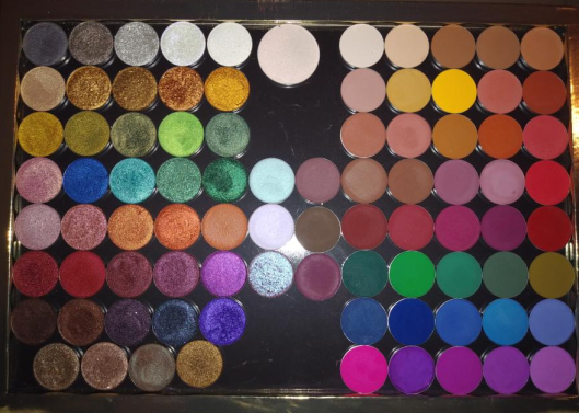
Color Nectar Pigment Balms

The balms and samples came in reusable ziplock pouches. My guess is that this is an added measure to ensure they will not dry out! My cream formula compact came in a box though, so perhaps this is something new they’re doing?

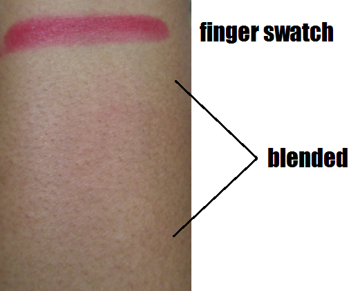
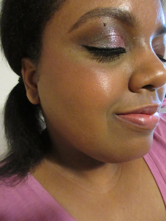
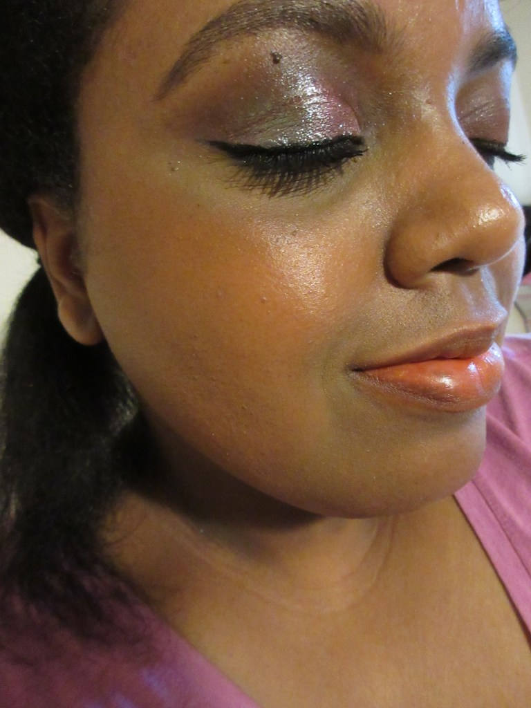
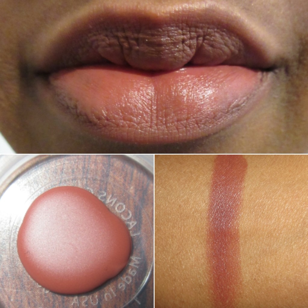
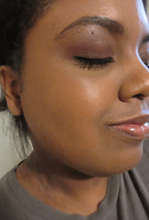
Bee Sting – Bee Sting is a surprisingly very pigmented rose-pink. In fact, I think this is more pigmented than even the darkest shade I bought! Because the nectar balms are intended to be sheer, I was worried it wouldn’t show up on me, but it does! It builds very well on top of itself without looking textured as it melts into the skin. This is also the first time I’ve ever been able to wear the lightest shade in a blush/lip collection and have it work for me, while still looking light on lighter skintones. This formulation is the traveling pants of makeup! Is that reference too old?

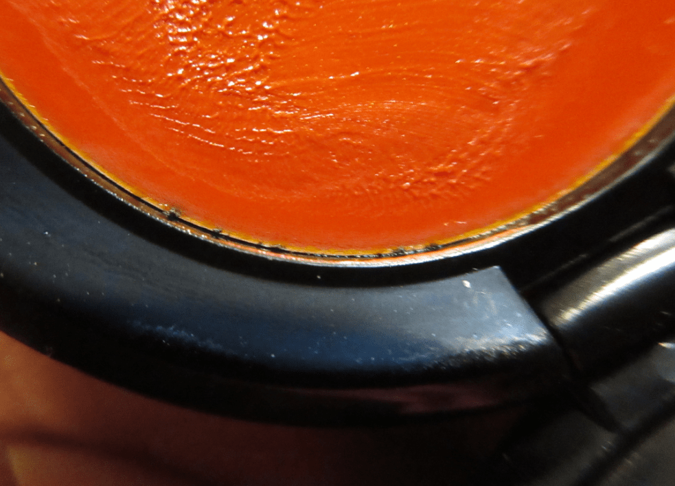
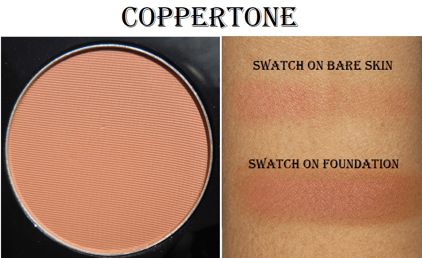
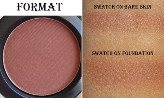
Also, with flash on, the pan color looks way lighter than it does in normal lighting. That’s what kept throwing me off about Bee Sting in photos online. They all look darker in the pan than they will be on the skin, so the pan color isn’t a good indication as to which shades will be better matches.

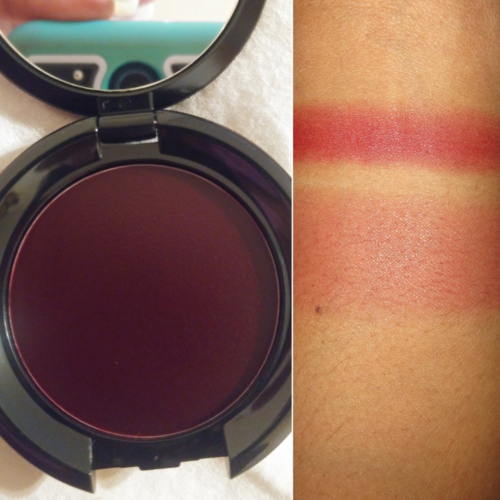
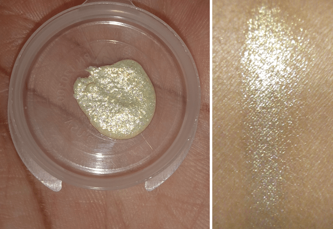
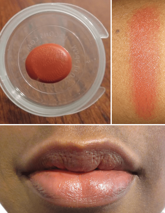
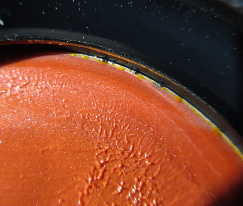
Snapdragon – This shade looks so red in the pan, but it has a lot of yellow to this orange shade. RdF describes this as “kumquat,” which does mimic the yellow-orange tone of the fruit. This one takes the longest of the three to build up in color, perhaps due to the yellow tone of the blush blending in too much with the yellow undertone of my complexion. I think it looks decent as a blush, but I prefer this as a lippie. In order to wear it in the way I like, I started using a lipliner to cover the pigmented spots on my lip and then I pat Snapdragon on top. Doing this gives me the I-just-ate-a-popsicle effect that I like, which was very on-trend last year (and still popular overseas).

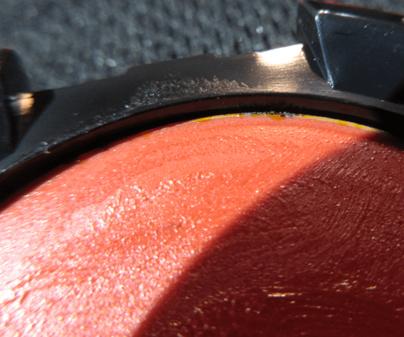
Glasswing – This grape shade can be built up very dark, though nowhere near as dark as it looks in the pan. So for the cheek photo, I built up Glasswing only to the pigmentation level I would realistically wear.

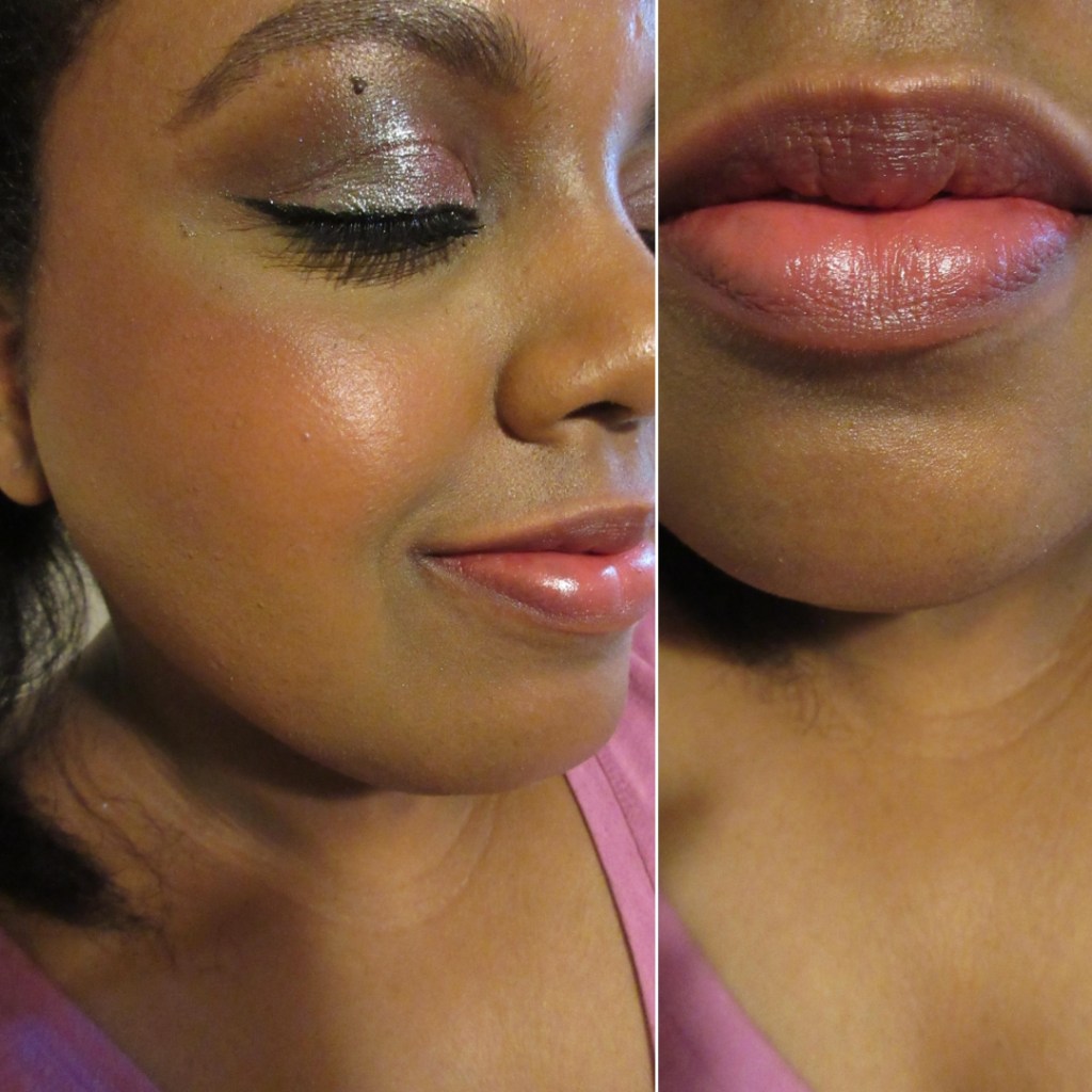
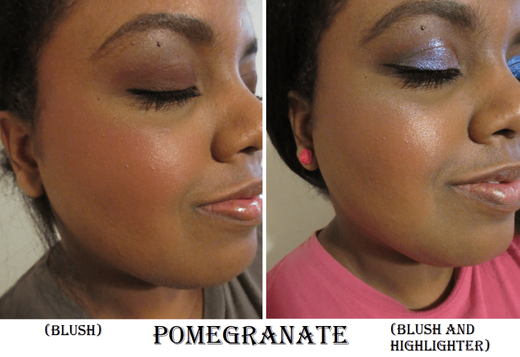
Here are the three cheek swatches side by side: Bee Sting, Snapdragon, and Glasswing.

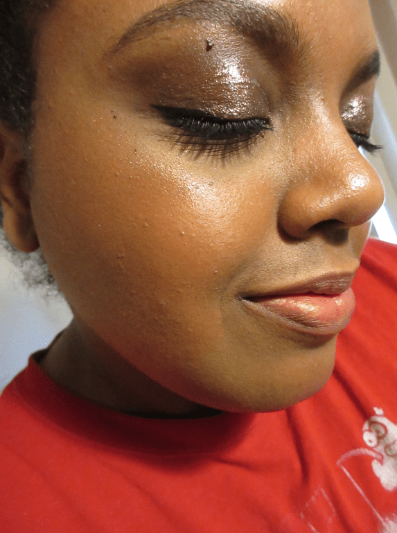
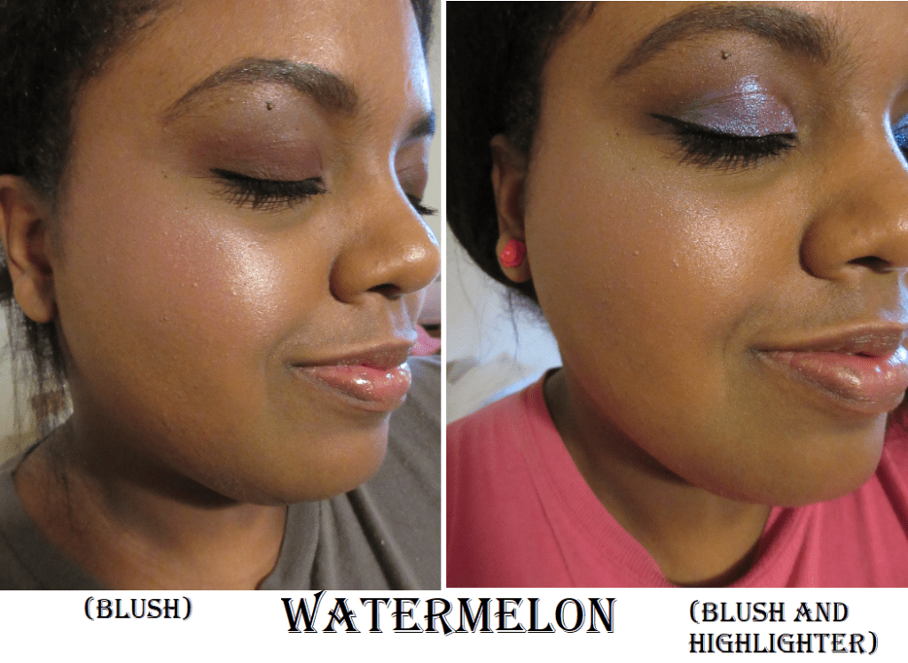
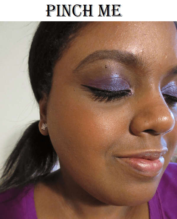
There was a limited edition shade I missed, called Ladybug, which is a “raspberry punch pink.” I thought mixing Bee Sting and Glasswing would give me a similar enough effect, though, without the exact magenta-fuchsia tones Ladybug possesses. Here are how the two look combined, which is my most preferred look using the nectar balms. It’s the best of both worlds: bright but still has some depth to it. Glasswing is applied in a heavier concentration towards the back with Bee Sting added to the apples of my cheeks. On the lips, I have Glasswing everywhere with Bee Sting applied more to the center (and to cover my darker pigmented spots on my bottom lip).

I really love the shades of these Nectar balms. And the jelly texture is so fun and unique feeling! It’s a little embarrassing to admit, but after applying them to my lips, I instinctively want to lick my fingers as if it’s real fruit jelly/jam. They have a light sweet smell to them too, so for a split second, I forget it’s not food! These feel comfortable on the lips and slightly moisturizing (though not as much as regular balms) since they still somewhat dry down to the touch.

I like that these don’t lift up my foundation. They don’t feel completely set on the cheek, but they are dry enough that they won’t leave a heavy or sticky feeling. Your hair won’t stick to your cheek on a windy day (though I should note I rarely wear my hair down anyway)!

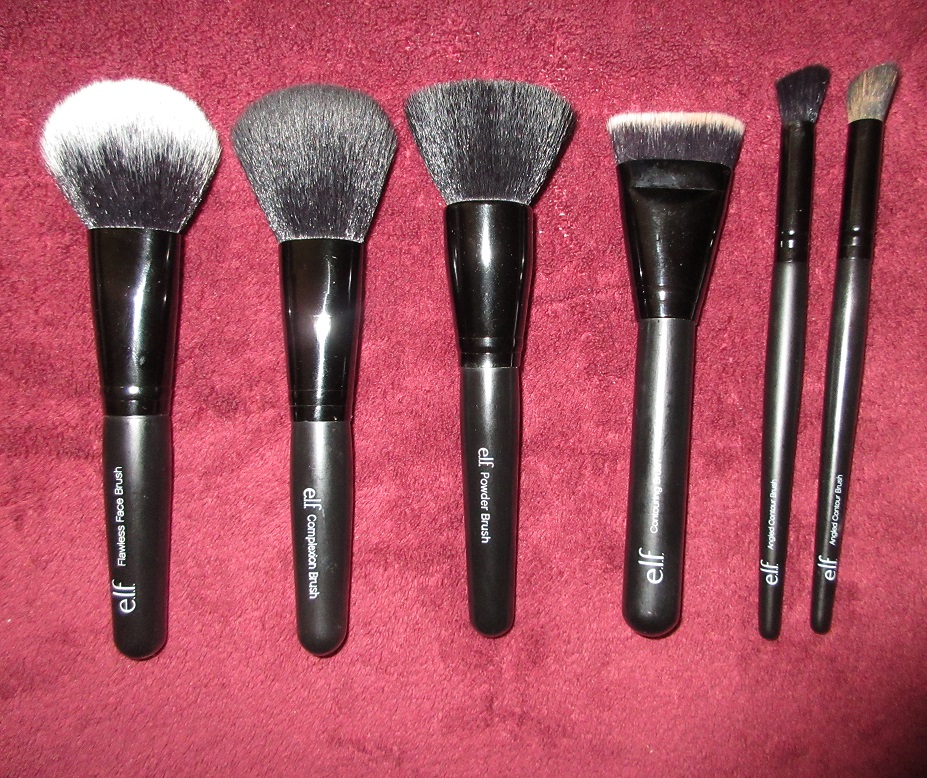
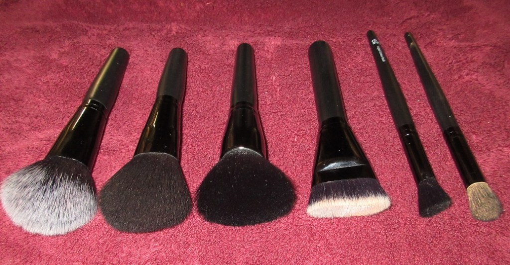
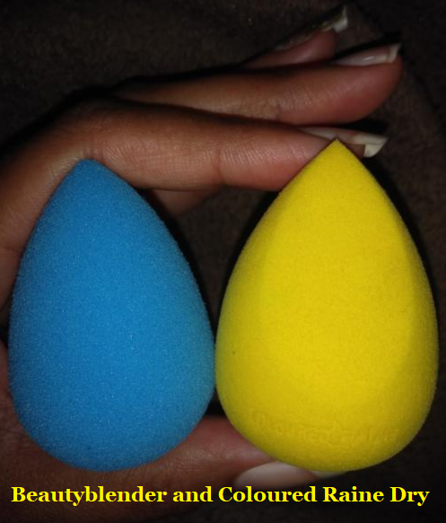
I’ve tried using the Nectar Balms with a synthetic brush, which leaves behind a heavier look, almost like it sits on the skin more than the other application methods. These look stunning when applied with a sponge! It deposits a lot of color quickly onto the cheeks but the blend is so natural looking. My preferred method is still using my fingertips to apply, as the size of the blushes are so small (slightly smaller than the Fenty Cream Blushes) that my brushes are too big for the pans. Plus, I feel I get the most precision with my fingers than even the pointy end of my sponge provides. I also don’t feel comfortable with the idea of continuously tapping a wet sponge directly onto the product. Though perhaps I could use it the same way as some of my other cream blushes and scoop out the product onto the back of my hand with a metal spatula. That way I can limit the introduction of moisture to the blush.

Ritual de Fille products have a reputation of being long-lasting, but that doesn’t seem to be the case with my thirsty skin, unless I set it with a powder. Sometimes I use the Nectar balms as a base shade and apply some of the sheerer powder blushes from my collection on top.

If you’re not sensitive to lanolin and not vegan, I recommend trying these!

Inner Glow Crème Pigments

Lust – This color is described as the “richest of rose shades” and is meant to be used anywhere on the face (mainly eyes, lips, and cheeks). The texture reminds me of a creamy lipstick. They call this a “dewy matte,” as there’s no shimmer in it, yet it stays looking creamy on the skin. This doesn’t dry down completely; it’s enough to not be sticky, but it can still transfer. Other products from the line don’t dry down completely either, but this particular shade fades fast on me. I think the color is stunning though! If I did not already have Fenty’s Cream Blush in Rosè Latte, I would have been tempted to buy the full-size.

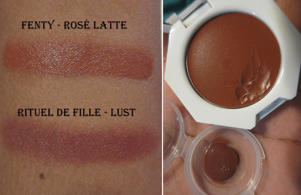
Rose Latte is lighter, but they’re both deep rosy brown shades. If I’m going for that kind of look, they’re similar enough that I would be happy with either one and I don’t feel the need to have both.

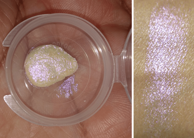
Delirium – I ordered this in the full size immediately upon trying it out (which was also before I realized it contained lanolin). I don’t have a blush shade quite like it. It is so much prettier in person than I can capture in a photograph. This is the kind of shade I wanted Snapdragon from the nectar balms to be. It’s also the tone of orange I’ve been wanting in a powder form. It’s a coral-nectarine with golden highlights. The shimmer is very subtle though, as I don’t see any when I put it on.

In addition to being blendable and buildable, the Inner Glow Creme pigments were formulated to mix well with the Forbidden Lipsticks, Enchanted Lip Sheers, and Ash and Ember Eye Soots.

Rare Light Crème Luminizer

I wanted to try Stellaris the most, but they ran out of samples. I was informed that that shade is being discontinued, so if you love it you should grab it in the full-size while you can!

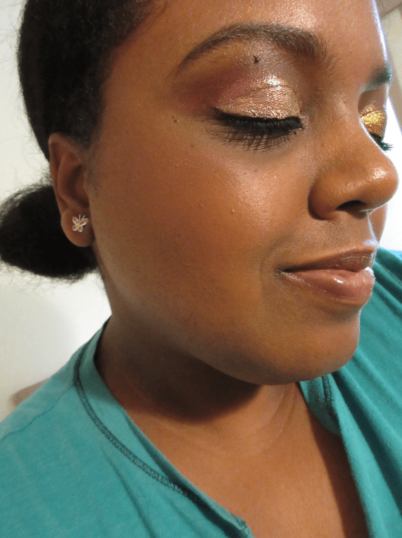
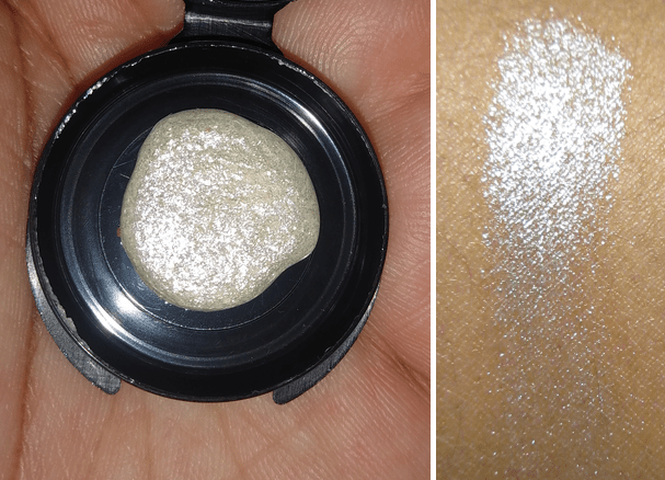
Anthelion – This shade is a “gold nude…that shifts with a subtle red-orange highlight.” This formula is right up my alley in terms of a cream highlighter. The shade match is great; the shimmer is more refined and tighter packed.

The only downside is that a little bit of wax can show on my cheek if I apply too much in one spot (rubbing it in doesn’t do much by this point). If it wasn’t for the lanolin, I still would have bought the full size of this shade.

Metemorphic Highlighters

I was very interested in the newest shade called The Chimera, but it sold out long before my first order and has not restocked yet. In a way, I’m glad that happened because these highlighters, although beautiful, are out of my comfort zone with the glitter level. It also still has the issue of being visibly waxy if overapplied (and it is very easy to over apply if you want the sparkles to be closer to each other).

The High Priestess – This lilac shade is especially pretty when paired with a brighter pink blush underneath. Also, this shade on the lips is stunning! It almost glowed when I paired it on top of MAC’s Versicolour Lip Stain in the shade Perpetual Holiday.

In this picture, I’m using High Priestess on the cheekbones and on the lips. Glasswing is my blush. The Sorcerer is the inner corner highlight. I also have to mention I used Clionadh Cosmetics’ Crown Glass on the inner 2/3 and Gothic on the outer third.

The Siren – This shade is described as “blush-gold with a sunlit shift.” It’s the most natural-looking highlight of the bunch for those who want sparkle without the wild shades.

In this picture, I’m wearing Siren on the cheekbones and have the tiniest amount under the brows. I also have Delirium on the lips and a mixture of Delirium with Snapdragon as my blush. For anyone wondering, I’m wearing hazel contacts since I like how orange brings out the green in the contacts. I think it gives a more unconventional look to match the vibe of this unconventional brand.

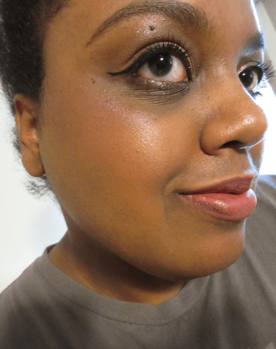
The Siren also looks pretty patted on the center of the lips. I forgot to do it in the photo above, but this is what it looks like on top of Delirium.

Delirium is supposed to have gold tones to it already, so the two are a natural pairing.

The Sorcerer – This silver shade was an added free sample that was included in my order. It came attached to a card, which I misplaced. So for the cheek swatches, I patted it on top of Anthelion as I mistook it for the Alchemist Highlight Intensifier. But I found the card and confirmed it is indeed the shade The Sorcerer. Silver isn’t as flattering on me as gold, but I was impressed with how much it gleamed. The left photo in the gallery shows off the highlighter in the typical spot where I stand to take pictures. You can see the waxiness further back on the cheekbone. It also looks a bit patchy due to it being iridescent without a base color, combined with the lighting. The gallery photo on the right shows how the highlighter looks when I’m closer to the light in order to show how much more blinding it gets.

Forbidden Lipstick

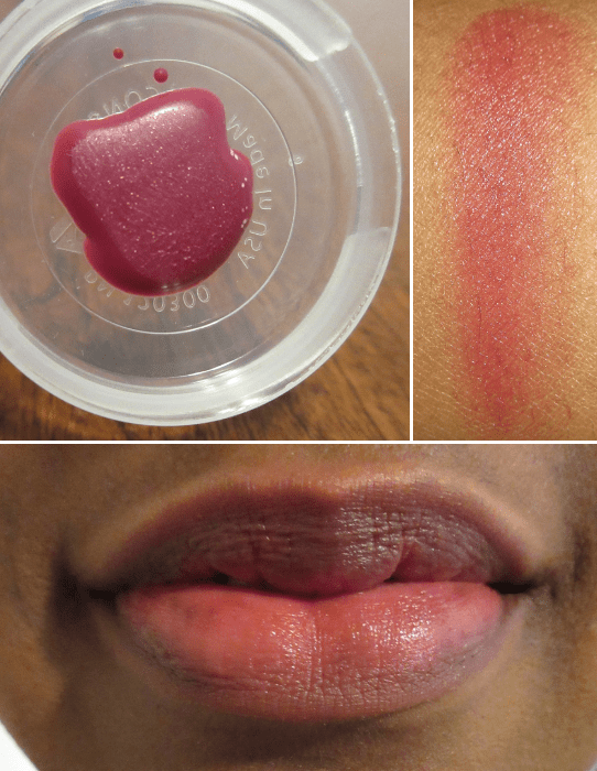
Carnal – This medium-dark rosy brown lippie doesn’t look like there’s much color, but that’s because it’s such a close match to my natural lip color, or rather, “my lips but better.” My darker pigmented spots are still a bit visible towards the edges, but Carnel covers it up more than Snapdragon and Glasswing nectar balms. I haven’t purchased any traditional lipsticks this year because I don’t wear them enough, but if I did, this would be the one to get. Carnel still doesn’t get as deep as it looks on Rituel de Fille’s website, even when I add additional layers. It can be layered to nearly full opacity but it’s still not enough to hide the darkest parts entirely.

Enchanted Lip Sheer

Rue – This “electric pink” shade does look bright, but still somewhat natural in person. I can see the glitter on the product but not on my lips. The regular lipsticks can be worn in a sheer fashion, so I’m not sure how necessary it is to buy an intentionally sheer lipstick from RdF, except perhaps to layer on top of a more pigmented shade. I was curious to see what it would look like anyway, and at least these have more pigment to them than other brands’ sheer lipsticks I’ve used in the past.

Bittersweet – This “dusty papaya” shade is very interesting. I like it; in this case, I think a more pigmented version would look strange on me. If I was going to purchase a lip product, I would still prefer the Forbidden lipstick formula over the Enchanted lip sheers.

Celestial Sphere Eye Soot

Rituel de Fille has Ash and Ember Eye soots which are a cream/powder mix, but I haven’t tried those. The Celestial Eye Soots have a gelée formulation. They also contain waxes and oils which are an extremely bad combination on my eyelids.

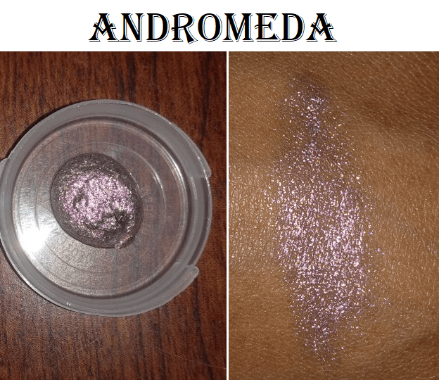
Andromeda – This shade is so stunning! It is a “shimmering oil slick shift, transforming from red to gold with slight glimpses of blue in a black gelée base.” I was very impressed with how shiny and beautiful the sparkles are. It doesn’t make for the best swatches, however, because there isn’t a base color. They are intended to be sparkly and transparent, which let’s you see how spread out the glitter is, making this better as a topper shade. I tried this on its own and when my eyes are open it looks beautiful but with my eyelid closed it looks terrible.

I have textured/lined eyelids that emollient products like to settle into. This, combined with how widely dispersed the sparkles are, makes the shadow look extra patchy. This was the most pigmented I could build up the color. I could also see semi-white waxy patches on the lid immediately upon putting it on. At the 5 hour mark, it faded and looked even worse. I think my eyelids are naturally oily, so the formulation does not work for me. Also, the other products have a pleasant smell, but the eye soots have a slight fish oil smell to them. At least, both of these samples do.

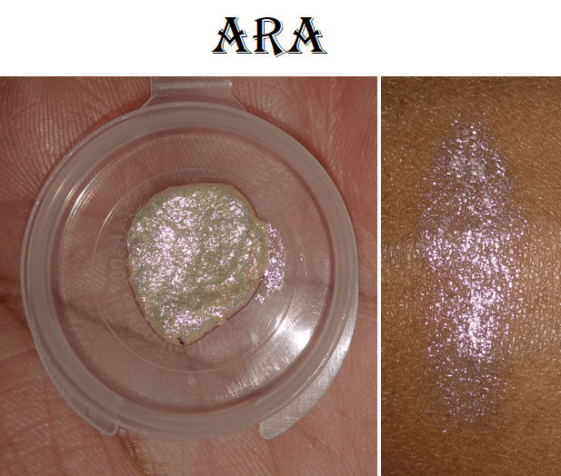
Ara – Everything said about Andromeda is the same as Ara but in a different shade. It’s described as, “an iridescent red-rose with a vibrant gold shift—with the subtlest hints of teal.” Because I knew my lids were too oily I applied Ara to my bare lid and patted a matte shadow on top to set it, but that severely dimmed the sparkle.

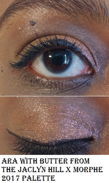
My next thought was to use a glitter glue with Ara. This produced better results, but it still doesn’t set (and product came off when I accidentally touched my eyelid) and continued to look more patchy the longer I wore it.

I also tried applying Devinah Cosmetics’ matte shadow called Kaia to my bare eyelid. Then I patted Andromeda on top, which completely removed the matte shadow and I was left with a bare looking lid again wherever I placed the product. This also resulted in patchiness as I wore it (the photos are taken directly after applying).

I didn’t give up when I had issues with the Nomad Harajuku palette, so I continued trying to find the best way to use this. I thought about how multichromes tend to be a little oily and maybe that would mix better with the eye soot, so I put Devinah’s Morphenae on the lid with Andromeda on top. It ended up making Morphenae disappear just like the matte shadow.

Lastly, and what turned out to be the best way I’ve found, is to apply this on top of a shimmer formula. In the last row of the next photo shows what Andromeda looks like on top of Devinah’s Charmed shadow.

The shimmer formula still helped Andromeda to set a little (but it remained easily transferable), lasted the longest without fading, and overall just looked the best out of the previous attempts at using the celestial soots. It’s still visibly patchy looking though. Out of everything I tried, this is the only product I absolutely cannot recommend. Besides, even if the quality was amazing, $38 for a single shadow is outrageous. The only justification is the price per gram. At $38 for 3.8 grams, it’s basically on par with Natasha Denona’s eyeshadows at $27 for 2.5 grams. In my opinion, Natasha’s formula isn’t even worth that price, so RdF’s definitely isn’t either. To each their own, I guess.

Moon Drops, The Ordering Process, and Final Thoughts

One of the more fascinating aspects of this brand is that they have a very ethereal/celestial/New Age editorial aesthetic. Their Instagram page exemplifies this, as well as the product names and descriptions on their website.

I recommend signing up for their emails because not only do they thankfully not spam you on a regular basis, they let you know when their next Moon Drop is coming. “Moon Drops” is what they call their release day. It falls once a month at 12:00 pm PST on the day of the full moon. Releases could be anything from new products, new shades, gifts with purchases, sales, etc. So far, the Moon Drops I’ve seen has been a limited edition shade and early access to a sale. I will definitely keep my eye out on more in the future.

My ordering experience has been great so far, though when I get the notice that my order has shipped, they actually don’t get it to USPS until 5 or so days later. I’m unsure if this is the normal practice or due to the pandemic slowing everything down.
I’ve also spoken with customer service twice. Once was because they let me know a sample shade was out of stock and let me choose something else. The other time was to get a new discount code when mine didn’t work. Both times, the responses back to me were incredibly fast (under 30 minutes). And the people I spoke to were very friendly.

Overall, despite some of the products being complete misses for my style, other products I absolutely love! I really enjoy the overall branding and philosophy. They make you feel like you’re part of something mysterious and exclusive as a customer, yet still approachable in their vibe and versatility of their products. I simultaneously feel like certain products are too advanced for me, while others are simple and user friendly.

I highly praise them for having sample packs. Their return policy (according to their site) is that only regularly priced items lightly used items can be returned. The initial shipping fee will be deducted from the refund (even if you qualified for free shipping) and you have to pay to ship the item back yourself. So, for example, if you bought a nectar balm for $24, you might only refunded $18-$19. And if it costs around $6 to return it to them… you’re really only getting back $12. So, the sample packs help to avoid making returns or being stuck with something you don’t love. This brand really excites and inspires me, so I look forward to keeping an eye on what they’re doing (and will purchase again if there’s no lanolin)!

Thank you for reading!

-Lili

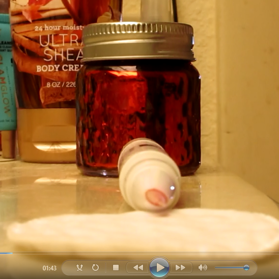
04/23/2021 UPDATE: 1 of my 4 full size blushes (Snapdragon) grew mold in the edges of the pan. This occurred despite the fact that after posting this review, I never used the full size blushes again (only the samples). They remained closed and in the large Rituel de Fille ziplock pouch. There is a period after opening (open jar symbol) of 12 months. I bought the blushes 8 months ago. Rituel de Fille is a brand that embraces natural ingredients and things that don’t preserve very well, so if you are thinking of purchasing from the brand, please keep in mind that the products may not last very long. I expect a short shelf life for cream and liquid products, but this is the first cream/balm product I’ve ever had that grew mold, let alone in under a year.

I also mentioned in my original review that I would update if my lanolin sensitivity increased, and yes it has. This is the main reason I tested the samples a few more times before I quit using the RdF products altogether.

ELF Cosmetics Bite Size Face Duos and More

2014 was the year my obsession with makeup really started, but my history with E.L.F. began in 2011 at the latest. My Aunt bought me one of their Smoky Eye books that had a step-by-step diagram of how to achieve a smokey eye. I don’t believe I used it that often but compared to the chalky eyeshadows I’d been experiencing at the time, I thought it was amazing. This was the period when I was still using sponge tip applicators and I’d never heard of actually blending eyeshadows!  

Elf Cosmetics, and myself, have come a long way since then. They managed to produce some nice quality products at very affordable prices long before Colourpop. Despite having incredible Japanese brushes of the highest quality, I still use some of my ELF brushes that have lasted me years!

But I’ll try to keep this post on the short side for once. I have 4 out of the 8 Bite-Size Face Duos, the newest additions to their line of minis. I also recently purchased another Bite-Size eyeshadow quad, making my total of those 4 out of 8 as well.

At the cost of $3, they’re definitely worth checking out. I recently did a massive MAC blush and highlighter post, so the quality of these duos don’t blow me away when compared to MAC’s formula. However, the color combinations are pretty; they’re lightweight but still decently pigmented, and they blend into the skin nicely without being patchy. I can’t ask for more at this price point. An odd bonus point for me is that I’ll finally have the satisfaction of hitting pan on a blush because the pans are thin and I could definitely get through one eventually.

I will be posting cheek swatches, but because some of the shades are so light, I wanted to show what my bare cheek looks like with just foundation for comparison purposes. I’m wearing the Shiseido Synchro Skin Self-Refreshing foundation with SPF in 440 Amber. In the grey shirt, I have the original ELF poreless primer. In the pink shirt, I’m using the MILK Hydro Grip primer.

Watermelon – This shade is too light for me, and it’s emphasized by the white/silver shimmer in the blush. It looks matte based on website photos, but it’s far from it. I was also disappointed by the highlighter shade, which is a beautiful salmon color in the pan but just comes off icy on my cheeks. I don’t see myself reaching for this one anymore, or even repurposing the blush because of the shimmer. Even though it doesn’t work for me, it would look beautiful on someone of a lighter complexion (especially neutral to pink undertone).

Guava – This is the only matte blush out of the four duos I have. It’s just dark enough for me to be able to wear this, but I think the buildable nature also helps me to pull it off. It looks brighter and more coral in the pan, but that doesn’t translate to my cheeks. In swatches, it looks very similar to Watermelon, but thankfully without the frosty shimmer.

The highlighter in this duo is the most flattering of the four for my complexion. The Guava duo is one I will keep using.

Pomegranate – This is the one duo made for darker complexions. On the day I wore the pink shirt, I wanted to show how sheer the blush could be applied, because I knew it was pigmented enough that I could actually overdo it. In the grey shirt, I used a denser brush for stronger impact with just a few swipes.

Even though this one is better suited for my skintone, it still comes off a little darker than I prefer. So, I’ll continue to use this with either a very light application or by combining it with a lighter blush nearer to/on the apples of my cheeks.

Coconut – This shade is a little harder to blend than the others, but the formula feels slightly creamier and less powdery (satin finish). I believe this shade was actually intended to be more of a bronzer shade for light-medium skin tones, rather than a blush for tan, dark, or deep complexions, but I decided to try it as a blush anyway. It reminds me a bit of the Format shade from MAC. I like this one, but I’d love it if it had a slightly reddish tone. I’ve worn this shade the most so far, but since I already own a similar shade that I like better (Format), if I continue to use it, I would use it as a blush topper over blushes with some red in it. For example, I’ve worn it with MAC’s Burnt Pepper shade to tone it down a bit, and it looked pretty nice once I was able to blend it in properly, which took a while. I haven’t decided if it’s really worth it trying to use up or not. TBD.

For some reason, the highlighter formula in this duo is different from the others. The glitter is much chunkier, and I’ve never liked sparkly highlighters. It’s a shame because gold is my most loved shade of highlighter among any brand. I was really looking forward to this one until I saw the texture in person.

Berry Bad – In my pictures wearing a grey shirt, I wore the lightest and darkest shades in this palette. The lightest one doesn’t show up on me. It’s a buildable shade but still not opaque enough. The second shade is a more metallic formula compared to the rosy shimmer in the third pan. When I put the two next to each other on my lids in the photo below, I could barely see a difference in person, let alone on camera. And the combination of textures when I applied both shades with a wet brush looked odd and did not blend together seamlessly, so I reapplied the rosy third shade with my finger all over the lid to get that original dull dry texture back. Then I applied the metallic shade wet to the lower lash line so I could still show it in this look, although dampening that shade made it look reddish copper instead of orange copper. In my crease, I have the darkest shade. Basically, the last two in the quad are the most pigmented, but still look very light.

For now, I like it enough to keep using the last three shades. It’s still better than the Acai palette, but not as good as the Jalapeño or Truffle. I’ve discussed the other three mini palettes in this post if you’re interested in seeing more about them.

ELF’s Instant Lift Brow Pencil was in my favorite products from 2019 post, and I still love it and have continued to use it consistently since then. I recently bought the Ultra Precise Brow Pencil with my ELF website order because Ulta only sells the 4 lightest shades.

The Instant Lift Brow is 0.006 oz. Not only is the Ultra Precise Brow Pencil much smaller in packaging size, it actually contains a third of the product at 0.002 oz. What I love about the Instant Lift is how creamy it is, though that also means it only stays put as long as you don’t accidentally rub your brows. The Ultra Precise Brow is a bit stiffer, as is necessary to maintain the precision, but it’s not as stiff as all the other brow pencils I’ve used. It’s also not quite as easy to remove.

Both shades are in Dark Brown. The Instant Lift is $2 whereas the Ultra Precise is $5. Despite the Ultra Brow being more expensive for less product, I never go through my brow products before having to toss them, so I think I will continue purchasing the Ultra Brow in the future because I really enjoy how sharp I can make my brows look! That being said, I still love the Instant Lift and will continue to use it up until it’s finished or it’s time to throw it out.

The original Poreless Putty Primer has been touted as the dupe for Tatcha’s Silk Canvas primer, but I can tell the difference. The ELF primer is more emollient and actually easier to blend into the skin than the Tatcha primer. On the smooth areas of my face, they perform similarly. However, my favorite place to put the Tatcha primer is under my eyes, because I noticed it helps my Tarte Shape Tape to look a little less dry and minimizes the look of creases under my eyes. They’re still obviously there, but when I tried to ELF primer under my eyes, within hours they drew attention to them in the worst way. It made the concealer slide away in some spots and gather up in the creases instead. It basically looked worse than if I’d used no primer at all with Shape Tape. I can still recommend this primer (and I will still use it) on the rest of my face, as it worked nicely everywhere except the under eyes.

I think the original is a great option, but I absolutely hate the Luminous Putty Primer. At the time I bought it, I didn’t realize the luminosity was due to shimmer particles; that it would leave visible glitter specks randomly dotted all over my face, even under the foundation, and look like I had glitter fallout from eyeshadow before even doing my eye makeup.

The Putty Eye Primer that I own is in the shade Sand. These eye primers are often compared to the MAC paint pots. It does feel similar straight from the eyeshadow pot, but as it’s applied to the eyes and dries down, it takes on a very stiff texture that is similar to the feel of the ABH eye primer. MAC paint pots stay a little more creamy on the skin.

I enjoyed the Putty Eye primer for about four months until my eyeshadows were no longer sticking to my lids as well when I used this product. The formula became drier over time and a week after I started writing this, I checked again and it’s even drier than before. I no longer have the original box to confirm, but I believe it has a 6 month or less period after opening suggestion. Some products perform well for much longer than the PAO number, but this one didn’t. There are youtubers I admire who like this product (though the videos were first impressions while the pots were still fresh), but I don’t think it’s worth getting when there are other brands who make affordable eye primers too which last longer.

Lastly, I have the Deep Chestnut shade of the 16HR and Hydrating Camo concealers, yet they look like different shades. The original camo concealer has an olive undertone, but the hydrating version is lighter with a very yellow undertone. This difference in color was also noted by Samantha March who wears a very different shade than me, yet still encountered this issue. When you look at the consistency of both concealers, the hydrating one does look more fluid and has a creamier feel under my eyes when it’s freshly applied. After it sets, it continues to look dewy but it feels just as dry as the original. This doesn’t seem to be the case for everyone, but it is for me. I was hoping at least one of them could be an inexpensive replacement for my Tarte Shape Tape, but I can’t find a color to suit me.

In addition, these concealers also have the problem of not lasting as long. Granted, they lasted longer than the PAO date, but still quicker than any other concealer I’ve purchased. The 16HR Camo concealer has spots where the color is starting to separate in the tube. The Hydrating Camo concealer, which I’ve had an even shorter time, is definitely separating. I only used it perhaps five times in the seven months I’ve owned it, so I can’t even say it’s due to overexposure of oxygen from opening and closing the tube. Even if they did last longer, I don’t like the formula of the hydrating one anyway. I do prefer the original, but the shades and undertones in the range are a bit strange to me. I will be tossing them both out, but I at least showed swatches in the gallery further up in the post, even though I didn’t demonstrate them under my eyes.

That concludes this post! I hope it has been helpful. Thank you for reading!

-Lili

MAC Cosmetics Blushes, Highlighters, and Powders

My MAC products are scattered throughout my collection, so I didn’t realize how many different items I had until I started looking. I initially wanted to review everything from MAC that I own (much more than what is pictured above) but the post was getting absurdly lengthy. So, I will likely do a second MAC post in the future.

BLUSHES

MAC has five different finishes of powder blushes: matte, sheertone, sheertone shimmer, satin, and frost. They are sold in compacts for $25 or the Pro refill pans for $17. Some Pro refill shades are only available in the refill form (like Ambering Rose) and some blushes are only available as compacts (like Format). They also have Extra dimension, Mineralize, and Glowplay (bouncy) blush formulas. I only own two Extra Dimension blushes and then the rest are Powder blushes.

MAC is an artist brand that works with professional makeup artists. Pros who meet the necessary requirements get a discount on products. Because of this, I thought the items in MAC’s Pro line such as makeup refills, empty palettes with custom inserts, etc. were exclusive to MUAs, but anyone can buy them. I’ll discuss inserts, palettes, and refills more in-depth after the blush section is completed.

*IMPORTANT NOTE: All the individual product shots of the blushes and swatches were taken outside in natural lighting. I could hold the blush pans and my arm at whichever angle I needed to get the sun to hit it directly, without casting any shadows. However, I was unable to do that with my own face. The weather is also an issue as it’s either too cloudy and raining (we’re in hurricane season) or it’s too sunny and I start to sweat profusely in just minutes of being outside. Florida summers are brutal!
Because I took my face pictures indoors, sometimes my skin tone looks lighter or darker due to the lighting. However, I kept the photos that show the blush as closely to how it actually appears in person. This wasn’t as much of an issue with the matte shades but the shimmery ones, which reflect differently in the light, were trickier. This is why I made this post so picture heavy to be as helpful as possible; it’s not easy to figure out which blushes will work best based on the photos on MAC’s website.

BLUSH BRUSHES USED: I only used squirrel and goat blush brushes for my cheek swatches. Each brush was wiped clean between uses and only used for a maximum of two blushes to ensure there was no shade mixing.

FOUNDATION AND PRIMER USED: I’m wearing Nars Sheer Glow foundation in Macao as well as MILK’s Hydro Grip primer in every photo for consistency. The finish of this glowy foundation, plus the hydrating primer, accounts for the dewy shine in the photos with even the matte blushes. I considered using a matte foundation but the Nars one is my best current shade match. I expect the matte blushes to stay matte on a matte foundation, but I thought it would be interesting to see how much a dewy foundation might affect mattes.

I’m not wearing any contour, bronzer, or setting powders either in order to show the blushes on their own.

Melba is described as a matte soft coral-peach. This blush highlights the reason I wanted to do this post. Based on the shade in the pan, I would never expect a shade this light to be in any way flattering on my skin tone. There’s enough peachiness to keep it from appearing ashy on my skin tone the way other blush shades that are too light would look. Although this is extremely subtle on camera, it’s more noticeable in person as a natural-looking slightly pink flush. Melba isn’t as pigmented as some of the other matte blushes, so it takes quite a lot of building up in order to be seen on my skin tone, but I find the effort is worth it.

About two months ago, MAC had a deal to choose 7 products (out of a gigantic selection) for $63. This was why I decided to give this shade a try. I don’t know why I like this shade so much, as I prefer blushes that make a little more of an impact, but I’m glad I have it.

Prism is a muted pinkish-brown matte. It looks a little more mauve on bare skin, but over my warm foundation, the pink in the shade is more visible. I’ve had this sitting in my collection for a while, expecting to give it away because I didn’t think it would work on me. After seeing some swatches on others and noticing how many times a blush I thought was too light ended up working for me, I decided to give it a try. It’s a nice subtle buildable blush.

Coppertone is a matte peach brown and another shade I’d assume wouldn’t work for me due to the color in the pan. Just like the previous blush, this leaves a very subtle flush as the brown blends into my foundation but the peachiness pokes through just enough to look natural and beautiful. The pigmentation level makes it easier to build up than the other more natural blushes. Melba and Prism are intended for light to medium skintones, whereas Coppertone is probably best for medium and up. I spoke with a MAC representative via live chat who said “Our blushes have a small amount of grey in them to ensure they work for a variety of skin undertones and saturation.” I was always under the impression that white or grey additions to blushes is what makes them ashy, but I’m just the messenger! I don’t know how MAC does it, but their range is phenomenal.

Desert Rose is described as a matte soft reddish-burgundy. This blush is even more pigmented than the others, so I wanted to show how sheer it could be applied. It looks quite cool-toned in the pan, but it warms up when applied over my foundation. I like this shade more than I expected.

Burnt Pepper is a matte warm rich terracotta. I enjoy this shade with a light application (a little lighter than pictured here). It’s a flattering tone but when built up too much I look like I have a sunburn. I believe I used the Chikuhodo Z-1 brush for this picture, but less dense brushes like the Z-8 and FO-3 are perfect for this blush. They deposit the exact amount of color I want. I do think a sunburnt look can actually be cute, as long as the rest of my makeup is on the minimal or neutral side so I can avoid looking clownish.

When searching for blushes best suited for dark skintones, Raizin was the most suggested shade I saw. It is a golden reddish-brown matte and very pigmented. I dipped my brush into the pan once and this is the amount of color that was deposited onto my cheek. With just one application!

This blush is better suited for someone of a darker complexion than me, but I think it still looks nice as long as I apply it with the lightest hand and a brush that’s not very dense. I used Chikuhodo’s KZ-04 which doesn’t get much airier than that, yet it still deposited quite a bit of product! I will continue to use this blush in the future by applying a sheer layer and then adding a lighter and/or brighter shade just on the apples of my cheeks.

Gingerly is described as a sheertone capri bronze. I have no idea what that means, but in any case, it is another very natural looking blush on me. Although there is a slight difference between this shade and Coppertone, I wouldn’t be able to identify which was which when applied to my cheeks. They’re both matte brown shades that blend into my skin, so if I had to choose between the two, I would pick Coppertone purely because of the pigmentation level. Since Gingerly is the sheerer shade, it takes longer to build to the same pigmentation level as Coppertone. It’s pretty, but because I have so many brown blushes that suit me better, this one wasn’t worth me buying. Those with NC/NW 45 and lighter complexions likely enjoy this blush more than me.

Pinch Me is a sheertone rosy-coral. It’s the most “me” kind of shade as I’m always looking for blushes in this tone. I didn’t buy this shade sooner because I assumed it would be a touch too light. Again, I was tricked by the pan color. It’s also quite pigmented for a sheertone formula.

Sunbasque is a “gilded peach with pearl” sheertone shimmer. To me, it’s the shimmer version of Coppertone. While writing this review, I was frequently mixing up their names because the tones are so similar. You can mostly see the sheen as the base color is faint on my skin. Now that I have Peachtwist and Format, I don’t see myself reaching for this anymore.

I have Kelsey Brianna Jai to thank for giving Peachtwist a try, because the way it looked on MAC’s website, I didn’t think it would be dark enough for me. It’s another sheertone shimmer blush and described as a light peach with gold pearl. As I mentioned before, I prefer this shade over Sunbasque because it’s slightly darker and I think the gold pearl in Peachtwist compliments my yellow undertone a bit more. This is easily one of my top favorite MAC blushes.

Ambering Rose is a muted rose sheertone shimmer. It’s currently only available as a pro refill and not in compact form. It’s darker than Peachtwist, though it still has that gold pearl. Between the two, I still prefer Peachtwist because I tend to like lighter and brighter blushes over darker ones, but if I use a light application with Ambering Rose, I can see myself continuing to use this.

Style is a coral-peach with gold pearl and a frost finish. I consider this shade the shimmer version of Melba. Although it also works as a beautiful highlighter or blush topper, I’ve never worn this alone as just blush in public. It’s definitely not made for my skin tone, but I’m drawn to it anyway.

Format is described as a pinkish brown, but I can see golden pearl on my cheeks from this frost finish blush. This blush is only available in the compact form. It reminds me a lot of the Coconut shade in the ELF Bite-Size Face Duos recently released (which I intend to review next month). I would consider this to be a much darker shimmery version of Coppertone.

Modern Mandarin is a satin blush only available as a pro refill. It looks light orange in the pan and is described as a red-orange shade, but it looks so pink! I’m not opposed to the shade, but out of the nineteen blushes in this post, I find it to be among the least flattering on me. This is also the only MAC blush that gives me trouble picking up powder on my brush. The scrape marks are visible on the pan where I’ve tried to clear off some of the top in case there was hardpan, but it didn’t help. It continually gets hardpan as it feels like the formula of this particular satin shade is wetter/creamier than the others. I don’t have an issue swatching this blush with my finger, but for some reason, it’s harder with a brush (even when switching to a dense synthetic one).

I want to love it and keep using it myself, but I can’t recommend it due to the formula issue.

Fleur Power is a soft bright pinkish-coral satin finish. It’s a pretty shade and very pigmented! It looks and performs more like a matte than a satin. It also deepens up a lot when applied over foundation. I made sure to give adequate time for the foundation to set before I put Fleur Power on top (in case it was too wet and therefore causing it to darken so much), but it did not change the result. It deepens the more it’s rubbed into the skin.

It’s the kind of shade that will work on a wide spectrum of skin tones, and works for me, but it’s not particularly exciting. This kind of color is commonplace, though perhaps not usually in a dark-skin friendly formula. Between this and Pinch Me, which has similar tones, I prefer Pinch Me; though it doesn’t change the fact that I still think Fleur Power is pretty and I’m happy to have it in my collection.

Loudspeaker is described as a bright orange coral satin blush, but it’s definitely a reddish orange color. This blush was formerly named ‘Devil,’ which was among the most recommended shades for darker skin tones. I’ve been looking for the perfect orange that everyone says looks so beautiful on deeper skin, but I’m starting to think whether it’s a lighter or darker orange, orange shades just aren’t a good match for me. So far, I haven’t liked the results of oranges from MAC, Fenty, Natasha Denona, etc. The only one I’ve liked is Benefit’s Majorette Blush (of course discontinued now) which was on the coral-orange side.

I only used one or two swipes to get this level of pigmentation on my cheeks. I can see the shimmer particles in the pan, though it just looks matte on my skin. I would say this blush is intended for NC/NW 50 and above, but really it’s for anyone who wants to make a statement. I consider this and News Flash to be useful on the more editorial/artistic side and less every day wear (except on deep skin tones).

News Flash! comes up as a matte in the search bar, but is referred to as a “red-orange with pearl.” I can’t see any shimmer in the pan or swatches, so the matte description is more accurate. I double-checked to ensure I read the website correctly, as I think the Loudspeaker and News Flash descriptions are reversed. News Flash seems more orange-coral to me with Loudspeaker being red-orange with visible shimmer specks in the pan.

I don’t believe this blush was ever sold in the regular size blush pans. It’s the size of a MAC eyeshadow at 26mm, but it sure does pack a punch! What you see on my cheek is what a single dip in the blush with my Koyudo Somell Garden Blueberry Brush can produce! This shade is so bright that it’s almost neon. I predict I’ll only use this blush on rare occasions, as it’s still a bit much for my tastes.

Cheeky Bits is a mid-tone pinky coral in the Extra Dimension finish. I was surprised to see it’s less shimmery than the other sheertone shimmer and frost finish blushes, but perhaps I’m meant to use it on a wet brush for more impact (which I don’t want anyway). Regardless, it’s a beautiful shade and reminds me of a more user-friendly Modern Mandarin.

Hushed Tone is described as a neutralized pink peach. It’s like a peachy bronze with just a hint of pink that I absolutely love! It doesn’t make as much of an impact in terms of color, so this is great for a more natural day. What makes it special to me is the gorgeous sheen that it has in person.

Hushed Tone is extremely close to Peachtwist. I find it difficult to properly describe how the shades look similar but the effect is so different. Hushed Tone has more base pigment color whereas Peachtwist has a stronger sheen. The way the glitter reflects is a little different. Hushed Tone’s powder looks like a more refined shimmer and Peachtwist gives a stronger highlighted effect, though I would still call it shimmery, not glittery. For someone with a lighter complexion than mine, the color differences between the two will stand out more. As the shades look similar enough on me, if I had to choose one, it would come down to a preference of sheen. It isn’t subtle for either blush but Hushed Tone is a little more natural-looking because of those finer particles. However, I could not part with either one.

Matte blushes were always my preference, but I’m tempted to try more of the Extra Dimension blushes because I really love how refined the shimmer in this formula is. What stops me (besides having nineteen MAC blushes already) is that this doesn’t appear to be in a pan. If it’s like the Extra Dimension highlighters, then it’s attached to a plastic mesh, and after having so many mesh products fall out, break, or arrive broken on me, I’m trying to avoid buying those kinds of products as much as possible.

BLUSH SIDE BY SIDE COMPARISONS

For an additional resource that helped me decide which blushes I wanted to buy, I recommend The Fancy Face’s MAC Blushes Video .

From what I can tell, Melba is pinker, Gingerly is a little more orange, Prism has more brown, and Coppertone is redder. But Gingerly, Coppertone, and Prism look virtually identical on my cheeks.

Hushed Tone, in terms of color, is a mixture of Sunbasque and Peachtwist though leaning more heavily on the Peachtwist side.

The Sheertone Shimmers are from lightest to darkest: Sunbasque, Peachtwist, and Ambering Rose. The differences are barely detectable while looking at the pans (particularly between Peachtwist and Ambering Rose), but on the cheeks, it goes from too light, then perfect, to too dark.

Fleur Power and Pinch Me are quick and easy to use because they are suited for me, but Desert Rose, Burnt Pepper, Raizin, News Flash, and Loudspeaker all require a light hand.

Even though some of the blushes I own are better suited for the lighter or darker ends of the spectrum, it’s amazing how many I am still able to pull off, and that’s a testament to MAC’s formulas. They really spent time over the years curating the best selection. There are some discontinued blush shades I wish they still offered, but with how many blushes look similar on my cheeks, I know I don’t actually need more.

INSERTS

The top 12-well in the picture is the larger insert for creams, gels, lipsticks, etc. Below that is the 24-well smaller insert. Lastly is a two-blush insert inside my MAC double-sided palette. Each side holds three blush inserts for a maximum of six blushes per side. I have one double-sided palette that currently holds MAC blushes. The other I turned into a regular magnetic palette to hold other brands’ products by placing magnetic sheets inside. Some people don’t know this, so I think it’s very important to state that MAC refill products only stick properly to MAC palettes because the refills all have magnets attached to the bottoms of them.

Magnetic palettes (like Z palettes) have a magnet sheet on the bottom that tin eyeshadow pans can stick to. MAC palettes have a metal sheet within the plastic that the magnets attached to the eyeshadow or blush can stick to. I can confirm that my single MAC eyeshadow refill stayed put in a regular magnetic palette if I had it squashed by other tin pan eyeshadows on all sides, but it would otherwise slide and fall on its own.

Also, the refills do stick to the MAC palettes on their own, but the inserts feel a lot more secure, as I believe the inserts have metal in them as well.

Highlighting Palettes

This is the Get it Glowin’ Hyper Real Glow Palette. This trio contains the highlighter shades Gold Coasting, Get It Glowin’, and Rosy Cheer. They are a bit on the golden side. MAC sells a pale pastel version (Get Lit), peach version (Shimmy Peach), and pink version (Flash + Awe). I currently own the latter and will include a photo, but I don’t have swatches as I intend to give this away or sell it.

Although the golds in the Get it Glowin’ palette look distinctly different in swatches, I can’t tell the difference on my cheeks. In fact, spoiler alert, I can’t tell the difference among any of the gold highlighters in terms of the color. It just comes down to how smoothly they apply, how intense they can get, and how sparkly or fine the glitter particles are. Within this palette, I did notice the actual Get it Glowin’ shade was more subtle than the others, despite it being the iciest one that should have stood out the most against my skin tone. Out of the three shades, Rosy Cheer seemed the smoothest and most flattering on me.

Extra Dimension Skinfinishes

I first owned Whisper of Gilt in the limited-edition snowflake imprint that was a holiday release a few years ago, and now in the regular packaging. I loved the shade but was so worried about ruining the shape that I hardly used it. Now that I have the “less exciting” imprint after including it in my 7 items deal, I will start using this one.

Unlike the highlighting trio, which didn’t appear that much more intensified when applied to wet skin, the formula of this shade allows it to be built up a lot more. But I’ve never been interested in rocking a blinding highlight, so I’ll continue to use it dry the way I normally do. I would describe the shade as a light gold, but MAC says it’s a, “light soft white with shimmery sheen.”

I don’t think it looks the best on me on camera, but I love how it looks in person and will keep wearing it whenever I won’t be taking pictures.

I used the tiniest amount of La Leyenda because I didn’t want to ruin the rose. I mostly collect MAC highlighters for the limited-edition packaging. There are so many other highlighters that I love, that I don’t feel like MAC’s formula is so amazing that it needs to be used, except perhaps Whisper of Gilt, which is the standout for me. I don’t have much to say about La Leyenda other than it is fine as a highlighter but stunning for packaging, presentation, and representing Selena.

MAC had a gorgeous holiday eyeshadow called Stylishly Merry (version 2, not the original purple one) that I missed out on getting. So, when they released the Snowflushed highlighter the following year, it was the closest dupe I could find. It has a beautiful coral pink to gold shift in the pan but it is unfortunately too glittery for my taste as a highlighter. I wore it as a lid shade in the same photo, and the color shift doesn’t translate on my cheeks or eyes, so that’s a little disappointing. However, it still makes me happy to own for collector purposes.

Mineralized Skinfinishes

Gold Deposit is a golden-bronze shade I wanted for so long, but when I finally bought it, I only used it a few times because I found it to be too much for me.

When testing it out again for this post, I’ve realized that I can get a more subtle application when I use my Kumano-fude brushes. It still makes quite the impact, but it’s toned down enough for me to feel more comfortable wearing it in public.

The best use for Sunny Side I have found is as a color-correcting setting powder under my eyes. As I’ve gotten down to the last bits of my Tarte Shape Tape concealer, it hasn’t been covering my dark circles as well. This powder is perfect for brightening up and covering up darker patches. I’m not sure how well I captured it in the photo, but it’s a very noticeable difference in person.

Also, although it is in the normal Mineralize Skinfinish packaging, this particular shade was limited edition.

Limited Edition Powders

The Archie’s Girls Collection Flatter Me Pearlmatte Face Powder and MAC x Chris Chang Prep + Prime Transparent Finishing Powder are both items I purchased purely for packaging. In fact, I even bought a second Chris Chang compact (each compact is unique in pattern) so I could remove the actual product inside and put one of my DIY blushes or highlighters inside. That way, I could keep one in nearly pristine condition (the original translucent powder was too stark on me), and the other I’d be able to use without worrying about damaging it.

FINAL THOUGHTS

I will list my favorite blushes and highlighters from this post, but this list is purely subjective because it comes down to my own personal preferences. The quality of MAC’s permanent collection is of very good quality and I would confidently recommend them to anyone. It’s just about finding which ones suit your needs best. Although there are plenty of shades I enjoy in my collection, my list will include the blushes and highlighters that if they disappeared today I would repurchase immediately.

BLUSHES: Hushed Tone, Coppertone, Peachtwist, Burnt Pepper, Pinch Me, and Format. I would be tempted to, but probably not immediately repurchase Melba, Desert Rose, Fleur Power, and Cheeky Bits. The blush Style is so beautiful that I would probably repurchase it for blush topper/ highlighter purposes.

HIGHLIGHTERS: Whisper of Gilt and Gold Deposit.

That’s all for today! Thank you for reading!

-Lili

INDIE BRAND SPOTLIGHT: Coloured Raine Review

My first Coloured Raine purchase was in November 2017. For two years, their eyeshadow formula was in a league of its own at the top. I even preferred it over my expensive Viseart, Natasha Denona, and Pat Mcgrath shadows! This year, I took a deeper dive into other indie brands’ makeup. Although I no longer know which brand can claim the #1 spot in my collection, Coloured Raine is still tied at the top. Their gorgeous forest green shade, Forbidden, is my all-time favorite eyeshadow (not counting duochromes or multichromes). I purchased nearly all their eyeshadows, and I even have a few duplicates, because I love them so much! However, rather than trying to complete my collection, this post motivated me to pull a Marie Kondo on all my single/depotted shadows and just keep the ones I love.

Because the quality of Coloured Raine shadows are so consistent across the board, there isn’t much to say about them except that they’re highly pigmented and blendable with the smoothest creamy texture. This is the case among all types: mattes, shimmers, metallics, etc.

I will make note of any shades that stand out for negative or especially positive reasons. I will also be discussing more than just eyeshadows. This review will include comments on a few blush/highlighter duos, sponges, and empty magnetic palettes.

THE EYESHADOWS

There was a time when I purchased Coloured Raine shadows to make quads as Christmas gifts. Your Majesty (which I somehow had three backups in my collection) and Malibu from this set of swatches were among them. I should note that I did take Super Star out of my collection since it was so similar to Rosé. I parted with Nightingale as it is too common of a color. Paradise Isle looks like a more sparkly version of Unexpected, yet I couldn’t part with either shade. I was also surprised to discover the Blue Magic shade I’ve purchased for others, I didn’t have in my own collection. I kept seeing Opulence and assumed it was Blue Magic. In the pan, Opulence has a purple tinge that doesn’t translate to the eye, as the purple disappears once it’s rubbed onto the skin. Since I’m just left with bright blue on my skin, I wonder if I’m still missing out by not having the Blue Magic shade. It looks like it might just be a darker version. If I get it in the future, I will update this post as usual.
I also have to comment that Legacy is such a cool shade! It’s whitish-pink in the pan but pinkish purple on the eye, making it a nice topper shade. As with other iridescent shades, I wouldn’t use this on its own, except for the inner corner or as an interesting brow highlight.  

I have enough dark greens, so I removed Grandeur from my collection. Noblewoman won over Passion. And even though Smoke Screen was the only black shade with gold shimmer in my collection, I rarely use any form of black other than matte, so I took that out as well. I would like to reiterate that this had nothing to do with an issue of the formula. I was so tempted to keep them all, but I needed room to add Safari Raine and the upcoming Juicy Boost collection. I could have used another empty magnetic palette (I have so many) but I don’t think I need over 100 eyeshadows from any single brand.

I got rid of all the white shades in this set. I’ve never had use for a white eyeshadow, and I prefer using highlighters to highlight under the brow or to use a cream shade to blend out shadows. Choosing between the dark brown shades was surprisingly difficult, so I only removed Chocolate since it looks like the kind of brown I have the most repeated in my collection.

I got rid of Snitch and Torch for the same reason as Chocolate in the previous round of swatches. I noticed that the palette with the most shades I decided not to keep was from Smoke Show. Prior to getting the Safari Raine palette during the last restock, Smoke Show was the last palette I added to my collection as it had the least appealing color story for me. The shade I wanted most, Showtime, I didn’t keep either as it couldn’t compete with those stunning Vivid green pigments.

Side Note: I’ve always wondered if Coloured Raine is the reason Colourpop had to discontinue selling their Smoke Show palette and rename it Blowing Smoke. Coloured Raine’s palette came first and the name is trademarked. Even though the color story between the palettes is different, I believe one of the stipulations of a trademark breech is if it would cause confusion. Since they both have ‘Colour’ in their names, to have the same palette name on top of that seems like sufficient grounds to me! 

I purchased the shade Chameleon with my Safari Raine order, so I’m including it here as well. It’s a purple iridescent shade that I don’t think looks that nice on its own. When used as just an inner corner highlight, it had an interesting darker purple glow, but it’s not the texture or pigmentation that I’m looking for. The swatches for this shade I intentionally built up to see what’s the maximum pigmentation I could get when certain spots refused to deposit color, and I was still not happy with the results. I would rather reach for an iridescent from other brands over this one. It’s one of the few shades in their entire collection that I wouldn’t recommend. The one application I’ve found to be somewhat useful for this is adding a lighter pearly finish when topped on other shades. I recommend just skipping this one.

The Celebration palette had the second most eyeshadows I decided not to keep, having decluttered 5 out of 13, which is still a decent amount to have kept. Raise a Glass, Flammable, and Misty Nights were removed. As a purple eyeshadow lover, I would love having a lot more purple shimmers from Coloured Raine. The Power palette definitely satisfied some of my purple eyeshadow needs, but I will always want more, even though I have plenty of purples from other brands. Here is a comparison of CR’s Power Palette to CP’s As You Like It palette.

And here are some eyeshadow looks!

SAFARI RAINE

CR had one final restock of this palette, so I have it in my collection now! They’re also selling the shades individually, which is appealing since I planned to depot the shadows anyway. However, at $6.99 each, that would cost $62.91 to get them all when the palette is just $29. I have no issues with Coloured Raine charging them at their standard eyeshadow price. I just made the most cost-effective decision and I’m glad they kept the original Palette price instead of raising it due to the hype that Jackie Aina played a part in restarting.

Although I’ve only had time to use this twice, I would say that the quality is on par with the other shadows. The only shade I had a little trouble getting to show on my skin was Congo Basin (even after trying with the ABH primer which I use to make shadows really stand out). Even to the touch, it felt a little grittier than the others. It reminded me of the texture of the Snitch from the Power palette that I didn’t like. Purples of that shade do tend to have that texture, but I’ve never had a green eyeshadow feel like this. Regardless, I did manage to get it to show a little.

Because the palettes were so sought after, I felt bad about completely getting rid of mine after depotting it. So, I turned it into a magnetic palette. I removed the shadows from the palette, colored the wells with black marker (I didn’t want to wait for black paint to dry) just to make it look more aesthetically pleasing. You can cut around the magnet to fit the size of the wells (keeping the sticker on the back) and place the pan inside to make sure the magnet isn’t too thick. Although I had thinner magnets and magnetic sheets, I wanted to use up my thicker ones, so I used them anyway. It made the pans stick out from the top a little, but the lid still closes, which is most important. I stuck all the magnets in the wells and that’s it! When depotting, I always clean off the glue (this time using Parian spirits) and place a sticker label on the bottom so I can remember the shade name and palette it came from.

The Blush/Highlighter Duos

I have 2 out of the 4 Blush and Highlight Duos from the Power Collection. I didn’t buy the one called Prove My Loyalty because it has an icy white highlighter best suited for pale-light skin tones and a dark red matte best suited for dark-deep skintones. Anyone can wear any makeup they want, but the pairing of those two was…an interesting choice in my opinion. I’m not sure how many people can find use for both of those together. I also didn’t purchase My Day One because both the highlighter and blush looked like they might be too dark for me.

I purchased Damage Control first. Here are some old photos with it.

I like the blush portion. It’s very pigmented, so it requires a light hand or very fluffy brush with it. The highlight shade is beautiful, but too glittery for my taste. I prefer finer shimmer particles in my highlighters.  

The other duo I purchased is named Call The Shots. The blush has a little more warmth to it, which suits me a bit better, although the color difference between this blush and the previous one isn’t that obvious when I use a sheer application. This highlighter has more of that shimmer finish I prefer, but I typically don’t reach for this shade. I love golds. Lately, I have been more interested in blush toppers, which this color is great for, meaning it won’t go to waste. I just know I won’t use it as often as I should.

These duos are fine, but don’t really ‘wow’ me. Although I don’t think $25 is too much considering what you’re getting, if you can snag them for 50% off (as they’ve been on sale multiple times) then I’d be more likely to say they’re worth checking out at that discounted price. 

THE SPONGES

I don’t know why I keep buying sponges when I’m 90% more likely to use a brush to apply my foundation and concealer. If I don’t use a brush, I use the Blendiful from Tati Beauty because I can get my products on and blended in half the time.

In any case, the only traditional beauty sponges I have used so far are from Beautyblender, Real Techniques, and Coloured Raine. The Real Techniques sponge is nice, but the one from Coloured Raine easily surpasses it. I cannot decide which I like more, though, between BB and CR because they both are better at different things.

Softest: When it comes to the softest sponge, Beautyblender wins. The Coloured Raine sponge feels a bit dense when dry but softens up after it is damp. It swells to the largest size among the three sponges. The Real Techniques sponge is a lot harder and remains a bit hard even after being wet.  

Precision: The pointy tip of the CR sponge fits perfectly in the crevices around my eyes when applying concealer. It easily wins, followed by the RT flat edge and finally the BB which has no flat edge and the tip is still a bit rounded, which impacts the precision. That being said, I don’t often use a sponge with my concealer, as I want the most coverage under my eyes and a sponge does sheer things a bit. So, this benefit isn’t the most useful in my everyday life. However, when I was on vacation last year and wanted to bring minimal brushes and wanted a backup sponge, I took the CR sponge instead of a BB.

Smoothest Foundation Application: A nice blended look can be achieved with all the sponges, but the BB does it the fastest, followed by the CR one.

Easiest to Clean: The BB and RT sponges take about the same time. They work well with the Beautyblender solid soap. The CR sponge is the hardest to clean and doesn’t work as well with the BB Solid. I have better results when I use my regular makeup removing face wash on it. It’s possible that I perceive it as being more difficult to clean because I’m using the yellow one, which is probably easier to see stains. I won’t know until I start using my orange (or green if I can find that one) CR sponge in the future.

Most Durable: The CR sponge definitely lasts the longest and hasn’t torn on me yet. My RT sponges start to get tears in them after the first 3-5 uses thanks to my long nails when I’m washing them. My BB sponges tear on me between 1-3 uses. I don’t know if there has been any changes to the beautyblender because the first two I ever had years ago had to be thrown out before it ever tore. But now my beautyblenders don’t last as long.

Prices: RT = $5-$6. CR = $6. BB = $20.

Side note: BB sells silicone (or silicone-like) cases to put sponges in to let dry and keep away from dust and other particles. You can find adorable dupes for 50-75% cheaper on sites like Amazon and Ebay. I have the official one along with the dupes and although the official one is thicker/sturdier with more breathable holes, there isn’t that much of a difference. My kitty ones get the job done and they even have ridges on the bottom that lets them stand upright, unlike the official one.

EMPTY MAGNETIC PALETTES

I have the Book of Shades (which holds 72 standard size eyeshadows), four of the 96 pan Power palettes, and one purple 96 pan palette. The collector in me still wants the pink one I don’t have.

On my previous trip, I made use of one large z-palette, but I missed having an even wider variety. That’s why I bought the Book of Shades. I wanted it for times I plan to travel for longer than a week.

The Book of Shades fits comfortably at the bottom of my makeup train case and is a safer way to house my shadows than carrying multiple palettes separately. It’s heavy but that’s the tradeoff for being so sturdy and keeping the eyeshadows secure.

There are 3 pages (each page holding 25 pans) and each page has removable plastic sheets that you can write the shade names on with a dry erase/washable marker. Or perhaps in permanent marker if you don’t intend to swap them out. I’m not sure. I don’t have a need for the sheets since my shadows are all labeled on the bottoms of the pans, but it’s a nice addition. There’s also a mirror on the other side of the cover.

I’ve talked about the 96 pan palettes multiple times on my blog. I can’t take it traveling, but I prefer having these over the book of shades because of the freedom of being able to place any sized eyeshadow pan I want in them, it holds more shadows, and I can see everything at once. It’s harder for me to figure out what shades I want to use when I have to flip back and forth between pages. That’s why I also prefer this over the smaller sized flat empty magnetic palettes. The last photo is what my palette looks like now.

That’s all I have for today’s post! I tried to keep it short after my massive Japanese brush review. Although I enjoy making large comprehensive posts (for ease of keeping everything in one place), it means they end up being incredibly long. That’s why I decided to wait until I could at least include Safari Raine in the review, though not long enough to wait for the Juicy Boost collection. At the time that I’m writing this, we haven’t seen anything yet besides the outer packaging.

Thank you for reading!

– Lili

Arrow, a New Beauty Brand

birstufYou may have heard of Birchbox’s first cosmetics line called LOC (Love of Color) which launched in 2015. They partnered with Tati the GlamLifeGuru in their initial release of lip crayons and eyeshadow sticks. This year, Birchbox created their second brand called Arrow, which has nothing to do with the CW Television show or DC comics.

arrowmemeWhat makes this one so special is that all the products in the line are vegan, paraben-free, cruelty-free, and gluten-free.

I purchased the starter kit as soon as it was available on the Birchbox website. Everyone received a $10 off promo code from their December Birchbox and I had 100 points on my account. That means I received this kit plus the mystery pack for only $16!

 ARROW BOOST Color Enhancing Lip Balm

lip1Price: $14

In my early high school years, I was obsessed with mark Glossblossom Ripening Lip Tint. A clear gloss came out of the tube but turned pink on contact with the lips. The ARROW balm brings me the same joy but is prettier and has much better ingredients. To quote the product page, “Formulated to adjust to your unique pH, it enhances each wearer’s natural lip color to create the perfect, just-for-you hue. Nourishing ingredients like mango seed butter hydrate and protect lips, and the lightweight, subtle formulation allows it to go wherever you do…”

I put this on and went about my day, which involved eating, drinking, and licking my lips (the lippie isn’t flavored). The actual balm wore away after a few hours but the color stayed put for the rest of the night! And since my lips weren’t dried out, I didn’t feel the need to reapply. I was very impressed by the performance of this balm and it has become a new favorite! It brings out the natural pink in my lips!

drylip

ARROW REVIVE Cooling Cheek Tint

cheek3Price: $18

This line caters to people on the go, and this is why the creators decided to put this cheek stain in a clickable pen with a brush. The concept is smart but the packaging…

Pros: The actual cheek stain is fantastic quality. It glides over the skin, is buildable, and long lasting. The formula isn’t sticky. It comes in two colors: Pink Punch and Berry Flush. The one I bought is Berry Flush. It can be used under the ARROW lip balm for a bolder lip shade. It does feel comfortably cool on the skin. When it comes to the actual stain, I love it!

Cons: On the first day I used this, I only clicked until a tiny dot was visible on the brush.

noclickclickThat tiny dot grew to the size of a nickel which is way more product than necessary. Part of my Instagram photo (pictured above where I listed the price) shows how much came out from holding it upside down for just a few seconds. I chalked it up to first time use, wiped the tip of the brush until it was clean, then put it in my blush drawer.

The next day I opened the cap to find this.

insideAgain, I thought it was a fluke and wiped the top but I noticed it continued to pump out gel without any clicks at all. I put it on the counter in the upright position and it continued to come out. That’s when I realized there must be a problem with the inner mechanism of my product. I don’t know if it happens to be just my pen, or if all the cheek tints are like this.

I continued wiping until the pen went a solid ten minutes without leaking. That’s when I tried my last test. Whereas my other pen products only require 2-3 clicks, this one needs at least 6 before it starts to drip. And it drips at a snail’s pace. The drip is far too slow to be practical. So then it takes an additional 3 or more to get a tiny dot. By that point, the same overflow issue happened again. I took a five minute video to show the progression of the leak. Some stills are below.

zoom1zoom2zoom3zoom4zoom5This is a very big issue for someone on-the-go to deal with a cap full of blush stain. Where should they put the excess product? That style of brush is good for packing on color, which isn’t what most would want to do with a stain. So the packaging is a fail but the actual gel was worth saving for me. So I took one of my sample jars and clicked out all the remaining product.

fullstainI don’t know how long my little jar will last me before it potentially dries out but if I kept it in the pen, I wouldn’t use it anyway. Now, it’s exclusively a lip brush!

endARROW PROTECT Aluminum-Free Deodorant

deo2 Price: $9

Finding the right deodorant is a very individual experience. Some sweat more than others. Some produce stronger odors. Unfortunately, I require heavy duty deodorant. So when I say that I went two hours with solid protection but needed to reapply after 3-4 hours, that happens to be my personal experience with it.

Less subjective comments about this deodorant is that it looks clear in the tube and applies clear as well under the arms. It’s made without alcohol and aluminum. It does have a fragrance which reminds me of an Arnold Palmer beverage, which I love. The actual notes are pink grapefruit, mint leaf, ginger flower, and sea spray.

I should also note that it’s the same size as the $8 travel size of LAVANILA. I like the scent of the ARROW deodorant better, although the actual performance is nearly identical.

deoARROW Makeup Bag

bagPrice: $12

My bag smelled like a mix of chemicals and gasoline. I’m accustomed to Ipsy’s bags occasionally smelling like this, so I immediately put it in a corner to air out. It should take several days before the smell dissipates. I believe it comprises of a vinyl water-resistant material. One could easily find a larger, cuter, and cheaper makeup pouch but the water-resistance is what this bag really has going for it.

There are additional products coming to the Arrow line. The one I’m most excited about is the facial mist, since I’m looking for something which can replace my beloved Aloe Water Mist from The Skin House. Overall, I am still happy with my purchase. The Arrow lip balm is a sample choice option for February’s Birchbox, so you could potentially try it for yourself if you’re a Birchbox subscriber!

❤ Lili

Note: The link provided is a referral link, not an affiliate link. This is not a sponsored review.

Beautylish Lucky Bag 2016

BL1WHAT IS IT?

Beautylish is an online retailer which I use to purchase from overseas brands like Wayne Goss and Chikuhodo. They have an annual grab bag where you spend a specified amount of money and receive full size items worth an even greater retail value. This year, the bags were $80 ($75 plus $5 shipping) with the promise of at least $150 worth of products. Canadians had an extra duties fee, making their total $95.

If you hadn’t heard about these bags, I would not be surprised. It never made the front page of their website. On Dec 22nd, Beautylish’s email subscribers were sent a link to sign up for early access. I am subscribed under two different emails, and ironically it was the account I did not sign up on which was sent the purchase page link. I was informed by a few other beauty lovers that they did not receive the email either.

IS IT WORTH IT?

$80 is a lot of money to spend blindly on beauty products. It may not work with the buyer’s complexion or skin type. They could get products they don’t use or products they already own. I keep a list of items I’m saving money to purchase. So I had to decide whether or not I would be happier just buying a Viseart palette outright, or two $40 items I’m guaranteed to enjoy. I compared the Lucky Bags from 2015 and instead of a random sampling, last year’s participants had to choose between a Natural, Bold, or Makeup Artist themed bag. With the exception of the MUA bag (the first to be sold out), I was not impressed with what I saw. However, Beautylish is a company that strives to make their customers happy and I was willing to bet the 2016 edition would be much better.

gambleWHAT DID YOU GET?

BL1bBenjabelle Tulip Brush Tree

bl3bbl3cbl3Price: $24.95

Last year, I bought myself a brush tree dupe from Walmart and since then I’d been considering getting a second one. Now, I don’t have to and it’s such a cute shape! Drying brushes flat on their side is good but I find that hanging them upside down works best.bl3d

Charlotte Tilbury LTE Luxury Palette in Fallen Angel

bl8bl8b2Price: $65

I’ve been itching to try Charlotte Tilbury products but the price deterred me. I’m always looking for deals and CT is a brand I only see at full price. The other Luxury Palettes are $52, but because this one has limited edition shades and packaging, it’s even pricier. I only received my bag two days ago, so I would like to play with these shadows longer before I make a judgment but I really like them. The colors are beautiful but I would have to pair them with another palette if I wanted to create a look that really pops.

bl8cCTeyesb

The lightest color is under the brow and on the inner corner. The lid is a mixture of both lighter colors. The brown shade is in the crease and I added a touch of black on the outer corner.

CTeyescI love this shimmery neutral look!

Kevyn Aucoin The Creamy Glow in Patrice

bl6bl6bPrice: $26

A huge percentage of buyers received either a KA blush or bronzer. I don’t wear bronzer so I feel lucky that I got a blush. Patrice appears to be the only shade in the collection that I could pull off, so I was relieved to see that one in my bag. I am a fan of the KA brand so this was another hit for me. The way it blends reminds me of the Make Up For Ever HD blushes, but I do think I prefer MUFE’s over this one. It is still nice though.

bl6cIt Cosmetics Universal Brow Pencil

bl7bl7bPrice: $24

Again, I was glad to see this over the mascara option because I have a box full of unopened mascaras but I only own one brow product. This twist-up pencil is supposed to work for everyone. It is a cool toned shade that creates a shadow under the hair which makes the brows appear filled without adding additional color. At least that’s been the result for me.bl7cI consider myself a brow beginner so this product is actually perfect for me. I wasn’t as precise as I could have been when testing this out, but it takes a lot of effort to overdo it haha. I can see myself using this for everyday looks!

Becca Ever-Matte Poreless Priming Perfector

bl5Price: $36

I’ll reserve this primer as something to gift a friend. I have heard great things about this product for those with combination/oily skin. Because mine is dry, I can achieve and keep a matte face quite easily. Testing this out myself would be a waste so I’m keeping this unopened.

Bioderma Sébium H2O

BL2Price: $6.95

This is a stock photo from the beautylish website. The one I received is bubble-wrapped and I’m keeping it that way for a friend who could use this. I love Bioderma and already have 1.25 liters worth of the Sensibio version, so it would be a waste for me to try out this one.

WHAT COULD YOU HAVE GOTTEN?

Based on what I have seen on Instagram #luckybag2016 I’ve compiled this list. It is not 100% comprehensive as I’m sure I missed a few.

Bioderma: Sensibio and Sebium

It Cosmetics: Universal brow, Mascara, Pores no More

Becca: Backlight Primer, Ever-Matte, The One Perfecting Brush, Undereye concealer, Shimmering Skin Perfectors (Pressed, Poured, Liquid), Ombre Eyes Palette

Kevyn Aucoin: Blush, Bronzer, Eye Pigment

Charlotte Tilbury: Eyeshadow Palettes, Lip Pouch, Filmstar (Bronze & Glow and Killer Cheekbones), Charlotte Tilbury x Norman Parkinson Items

Benjabelle: Brush Tree

Beautylish Gift Cards: $20

Wayne Goss: 05 Brush, Brow Set

Chikuhodo: Sakura Set (VERY FEW)

Natasha Denona: Eyeshadow Palettes

TooFaced: Eyeshadow Palettes (Natural Eyes, Sugar Pop, Chocolate Bar, Boudoir Eyes)

Viseart: All Eyeshadow Palettes

rms: lip2cheek, eyeshadow

Glamglow: cleansers and treatments

Nudestix: (something in a case)

By Terry: Gold Baume de Rose Parure

Bliss: Lean Machine (VERY FEW), hand cream, spray, cleansing milk, 15-minute facial, cooling gel

Sugarpill: False Lashes

Jeffrey Star: Lip Scrubs, Velour Liquid Lipsticks

Korres: Lip Butter, Black Pine cream, Sleeping Facial

Anastasia Beverly Hills: Self Made Palette

FINAL THOUGHTS?

blgbsmallerBeautylish sent out prestigiously branded, high quality items. Many of them are best sellers! The total retail price of my bag is $182.90 but it is only as valuable as the products I can actually use. Since my favorite items would have cost $140, the $60 savings is something I am extremely happy with! That being said, I’m not sure if I will take the gamble in 2017. The number of items I saw on Instagram which I already have made me feel like it was pure luck I got products I’ve never owned. If I had a guarantee that my account profile photo would ensure that I don’t get complexion products too light for me or bronzers I couldn’t use, then I would sign up in a heartbeat!

But let’s be real…the lure of potentially getting another fantastic bag will make me participate again next year. 🙂

❤ Lili