
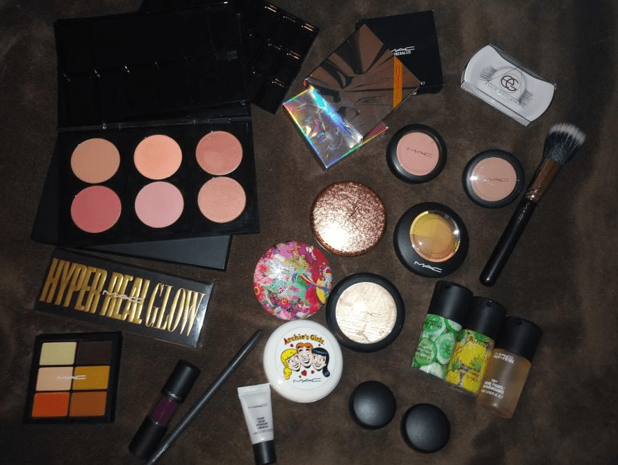
My MAC products are scattered throughout my collection, so I didn’t realize how many different items I had until I started looking. I initially wanted to review everything from MAC that I own (much more than what is pictured above) but the post was getting absurdly lengthy. So, I will likely do a second MAC post in the future.
BLUSHES

MAC has five different finishes of powder blushes: matte, sheertone, sheertone shimmer, satin, and frost. They are sold in compacts for $25 or the Pro refill pans for $17. Some Pro refill shades are only available in the refill form (like Ambering Rose) and some blushes are only available as compacts (like Format). They also have Extra dimension, Mineralize, and Glowplay (bouncy) blush formulas. I only own two Extra Dimension blushes and then the rest are Powder blushes.
MAC is an artist brand that works with professional makeup artists. Pros who meet the necessary requirements get a discount on products. Because of this, I thought the items in MAC’s Pro line such as makeup refills, empty palettes with custom inserts, etc. were exclusive to MUAs, but anyone can buy them. I’ll discuss inserts, palettes, and refills more in-depth after the blush section is completed.
*IMPORTANT NOTE: All the individual product shots of the blushes and swatches were taken outside in natural lighting. I could hold the blush pans and my arm at whichever angle I needed to get the sun to hit it directly, without casting any shadows. However, I was unable to do that with my own face. The weather is also an issue as it’s either too cloudy and raining (we’re in hurricane season) or it’s too sunny and I start to sweat profusely in just minutes of being outside. Florida summers are brutal!
Because I took my face pictures indoors, sometimes my skin tone looks lighter or darker due to the lighting. However, I kept the photos that show the blush as closely to how it actually appears in person. This wasn’t as much of an issue with the matte shades but the shimmery ones, which reflect differently in the light, were trickier. This is why I made this post so picture heavy to be as helpful as possible; it’s not easy to figure out which blushes will work best based on the photos on MAC’s website.
BLUSH BRUSHES USED: I only used squirrel and goat blush brushes for my cheek swatches. Each brush was wiped clean between uses and only used for a maximum of two blushes to ensure there was no shade mixing.
FOUNDATION AND PRIMER USED: I’m wearing Nars Sheer Glow foundation in Macao as well as MILK’s Hydro Grip primer in every photo for consistency. The finish of this glowy foundation, plus the hydrating primer, accounts for the dewy shine in the photos with even the matte blushes. I considered using a matte foundation but the Nars one is my best current shade match. I expect the matte blushes to stay matte on a matte foundation, but I thought it would be interesting to see how much a dewy foundation might affect mattes.
I’m not wearing any contour, bronzer, or setting powders either in order to show the blushes on their own.


Melba is described as a matte soft coral-peach. This blush highlights the reason I wanted to do this post. Based on the shade in the pan, I would never expect a shade this light to be in any way flattering on my skin tone. There’s enough peachiness to keep it from appearing ashy on my skin tone the way other blush shades that are too light would look. Although this is extremely subtle on camera, it’s more noticeable in person as a natural-looking slightly pink flush. Melba isn’t as pigmented as some of the other matte blushes, so it takes quite a lot of building up in order to be seen on my skin tone, but I find the effort is worth it.
About two months ago, MAC had a deal to choose 7 products (out of a gigantic selection) for $63. This was why I decided to give this shade a try. I don’t know why I like this shade so much, as I prefer blushes that make a little more of an impact, but I’m glad I have it.
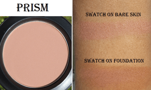
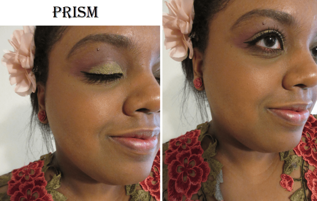
Prism is a muted pinkish-brown matte. It looks a little more mauve on bare skin, but over my warm foundation, the pink in the shade is more visible. I’ve had this sitting in my collection for a while, expecting to give it away because I didn’t think it would work on me. After seeing some swatches on others and noticing how many times a blush I thought was too light ended up working for me, I decided to give it a try. It’s a nice subtle buildable blush.
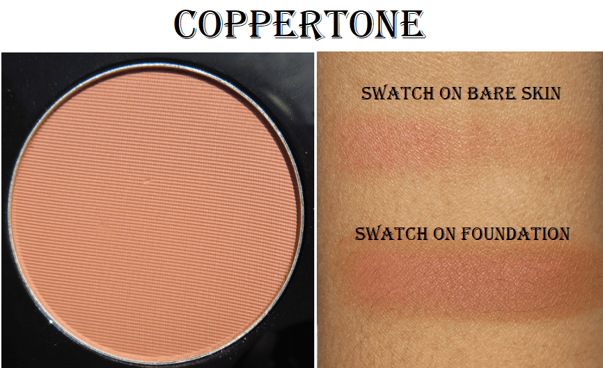

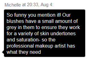
Coppertone is a matte peach brown and another shade I’d assume wouldn’t work for me due to the color in the pan. Just like the previous blush, this leaves a very subtle flush as the brown blends into my foundation but the peachiness pokes through just enough to look natural and beautiful. The pigmentation level makes it easier to build up than the other more natural blushes. Melba and Prism are intended for light to medium skintones, whereas Coppertone is probably best for medium and up. I spoke with a MAC representative via live chat who said “Our blushes have a small amount of grey in them to ensure they work for a variety of skin undertones and saturation.” I was always under the impression that white or grey additions to blushes is what makes them ashy, but I’m just the messenger! I don’t know how MAC does it, but their range is phenomenal.
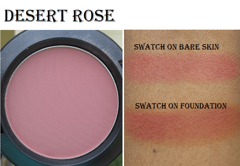
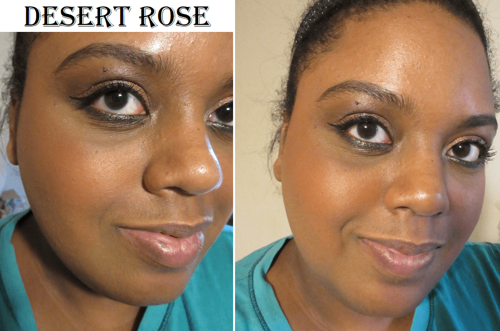
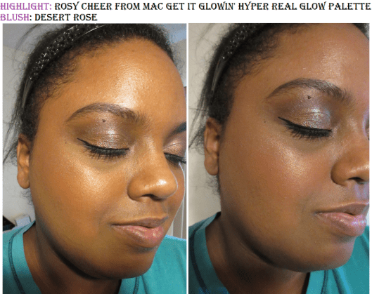
Desert Rose is described as a matte soft reddish-burgundy. This blush is even more pigmented than the others, so I wanted to show how sheer it could be applied. It looks quite cool-toned in the pan, but it warms up when applied over my foundation. I like this shade more than I expected.


Burnt Pepper is a matte warm rich terracotta. I enjoy this shade with a light application (a little lighter than pictured here). It’s a flattering tone but when built up too much I look like I have a sunburn. I believe I used the Chikuhodo Z-1 brush for this picture, but less dense brushes like the Z-8 and FO-3 are perfect for this blush. They deposit the exact amount of color I want. I do think a sunburnt look can actually be cute, as long as the rest of my makeup is on the minimal or neutral side so I can avoid looking clownish.


When searching for blushes best suited for dark skintones, Raizin was the most suggested shade I saw. It is a golden reddish-brown matte and very pigmented. I dipped my brush into the pan once and this is the amount of color that was deposited onto my cheek. With just one application!
This blush is better suited for someone of a darker complexion than me, but I think it still looks nice as long as I apply it with the lightest hand and a brush that’s not very dense. I used Chikuhodo’s KZ-04 which doesn’t get much airier than that, yet it still deposited quite a bit of product! I will continue to use this blush in the future by applying a sheer layer and then adding a lighter and/or brighter shade just on the apples of my cheeks.


Gingerly is described as a sheertone capri bronze. I have no idea what that means, but in any case, it is another very natural looking blush on me. Although there is a slight difference between this shade and Coppertone, I wouldn’t be able to identify which was which when applied to my cheeks. They’re both matte brown shades that blend into my skin, so if I had to choose between the two, I would pick Coppertone purely because of the pigmentation level. Since Gingerly is the sheerer shade, it takes longer to build to the same pigmentation level as Coppertone. It’s pretty, but because I have so many brown blushes that suit me better, this one wasn’t worth me buying. Those with NC/NW 45 and lighter complexions likely enjoy this blush more than me.

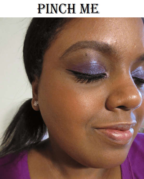
Pinch Me is a sheertone rosy-coral. It’s the most “me” kind of shade as I’m always looking for blushes in this tone. I didn’t buy this shade sooner because I assumed it would be a touch too light. Again, I was tricked by the pan color. It’s also quite pigmented for a sheertone formula.


Sunbasque is a “gilded peach with pearl” sheertone shimmer. To me, it’s the shimmer version of Coppertone. While writing this review, I was frequently mixing up their names because the tones are so similar. You can mostly see the sheen as the base color is faint on my skin. Now that I have Peachtwist and Format, I don’t see myself reaching for this anymore.


I have Kelsey Brianna Jai to thank for giving Peachtwist a try, because the way it looked on MAC’s website, I didn’t think it would be dark enough for me. It’s another sheertone shimmer blush and described as a light peach with gold pearl. As I mentioned before, I prefer this shade over Sunbasque because it’s slightly darker and I think the gold pearl in Peachtwist compliments my yellow undertone a bit more. This is easily one of my top favorite MAC blushes.


Ambering Rose is a muted rose sheertone shimmer. It’s currently only available as a pro refill and not in compact form. It’s darker than Peachtwist, though it still has that gold pearl. Between the two, I still prefer Peachtwist because I tend to like lighter and brighter blushes over darker ones, but if I use a light application with Ambering Rose, I can see myself continuing to use this.


Style is a coral-peach with gold pearl and a frost finish. I consider this shade the shimmer version of Melba. Although it also works as a beautiful highlighter or blush topper, I’ve never worn this alone as just blush in public. It’s definitely not made for my skin tone, but I’m drawn to it anyway.
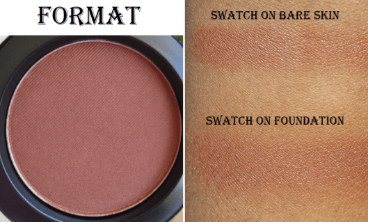
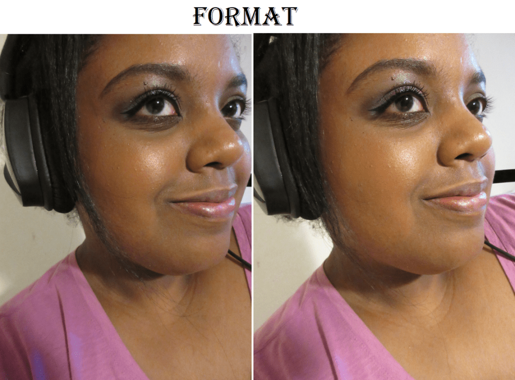
Format is described as a pinkish brown, but I can see golden pearl on my cheeks from this frost finish blush. This blush is only available in the compact form. It reminds me a lot of the Coconut shade in the ELF Bite-Size Face Duos recently released (which I intend to review next month). I would consider this to be a much darker shimmery version of Coppertone.


Modern Mandarin is a satin blush only available as a pro refill. It looks light orange in the pan and is described as a red-orange shade, but it looks so pink! I’m not opposed to the shade, but out of the nineteen blushes in this post, I find it to be among the least flattering on me. This is also the only MAC blush that gives me trouble picking up powder on my brush. The scrape marks are visible on the pan where I’ve tried to clear off some of the top in case there was hardpan, but it didn’t help. It continually gets hardpan as it feels like the formula of this particular satin shade is wetter/creamier than the others. I don’t have an issue swatching this blush with my finger, but for some reason, it’s harder with a brush (even when switching to a dense synthetic one).
I want to love it and keep using it myself, but I can’t recommend it due to the formula issue.

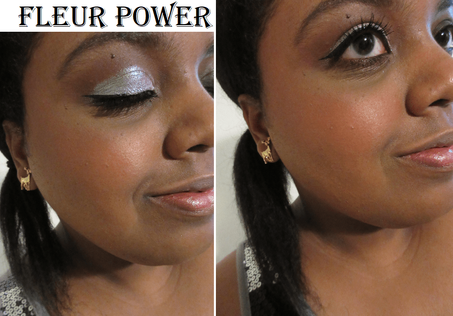
Fleur Power is a soft bright pinkish-coral satin finish. It’s a pretty shade and very pigmented! It looks and performs more like a matte than a satin. It also deepens up a lot when applied over foundation. I made sure to give adequate time for the foundation to set before I put Fleur Power on top (in case it was too wet and therefore causing it to darken so much), but it did not change the result. It deepens the more it’s rubbed into the skin.
It’s the kind of shade that will work on a wide spectrum of skin tones, and works for me, but it’s not particularly exciting. This kind of color is commonplace, though perhaps not usually in a dark-skin friendly formula. Between this and Pinch Me, which has similar tones, I prefer Pinch Me; though it doesn’t change the fact that I still think Fleur Power is pretty and I’m happy to have it in my collection.


Loudspeaker is described as a bright orange coral satin blush, but it’s definitely a reddish orange color. This blush was formerly named ‘Devil,’ which was among the most recommended shades for darker skin tones. I’ve been looking for the perfect orange that everyone says looks so beautiful on deeper skin, but I’m starting to think whether it’s a lighter or darker orange, orange shades just aren’t a good match for me. So far, I haven’t liked the results of oranges from MAC, Fenty, Natasha Denona, etc. The only one I’ve liked is Benefit’s Majorette Blush (of course discontinued now) which was on the coral-orange side.
I only used one or two swipes to get this level of pigmentation on my cheeks. I can see the shimmer particles in the pan, though it just looks matte on my skin. I would say this blush is intended for NC/NW 50 and above, but really it’s for anyone who wants to make a statement. I consider this and News Flash to be useful on the more editorial/artistic side and less every day wear (except on deep skin tones).

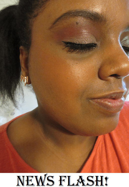
News Flash! comes up as a matte in the search bar, but is referred to as a “red-orange with pearl.” I can’t see any shimmer in the pan or swatches, so the matte description is more accurate. I double-checked to ensure I read the website correctly, as I think the Loudspeaker and News Flash descriptions are reversed. News Flash seems more orange-coral to me with Loudspeaker being red-orange with visible shimmer specks in the pan.
I don’t believe this blush was ever sold in the regular size blush pans. It’s the size of a MAC eyeshadow at 26mm, but it sure does pack a punch! What you see on my cheek is what a single dip in the blush with my Koyudo Somell Garden Blueberry Brush can produce! This shade is so bright that it’s almost neon. I predict I’ll only use this blush on rare occasions, as it’s still a bit much for my tastes.


Cheeky Bits is a mid-tone pinky coral in the Extra Dimension finish. I was surprised to see it’s less shimmery than the other sheertone shimmer and frost finish blushes, but perhaps I’m meant to use it on a wet brush for more impact (which I don’t want anyway). Regardless, it’s a beautiful shade and reminds me of a more user-friendly Modern Mandarin.
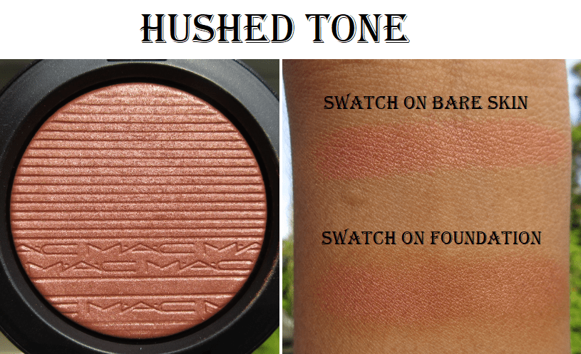

Hushed Tone is described as a neutralized pink peach. It’s like a peachy bronze with just a hint of pink that I absolutely love! It doesn’t make as much of an impact in terms of color, so this is great for a more natural day. What makes it special to me is the gorgeous sheen that it has in person.
Hushed Tone is extremely close to Peachtwist. I find it difficult to properly describe how the shades look similar but the effect is so different. Hushed Tone has more base pigment color whereas Peachtwist has a stronger sheen. The way the glitter reflects is a little different. Hushed Tone’s powder looks like a more refined shimmer and Peachtwist gives a stronger highlighted effect, though I would still call it shimmery, not glittery. For someone with a lighter complexion than mine, the color differences between the two will stand out more. As the shades look similar enough on me, if I had to choose one, it would come down to a preference of sheen. It isn’t subtle for either blush but Hushed Tone is a little more natural-looking because of those finer particles. However, I could not part with either one.
Matte blushes were always my preference, but I’m tempted to try more of the Extra Dimension blushes because I really love how refined the shimmer in this formula is. What stops me (besides having nineteen MAC blushes already) is that this doesn’t appear to be in a pan. If it’s like the Extra Dimension highlighters, then it’s attached to a plastic mesh, and after having so many mesh products fall out, break, or arrive broken on me, I’m trying to avoid buying those kinds of products as much as possible.
BLUSH SIDE BY SIDE COMPARISONS
For an additional resource that helped me decide which blushes I wanted to buy, I recommend The Fancy Face’s MAC Blushes Video .

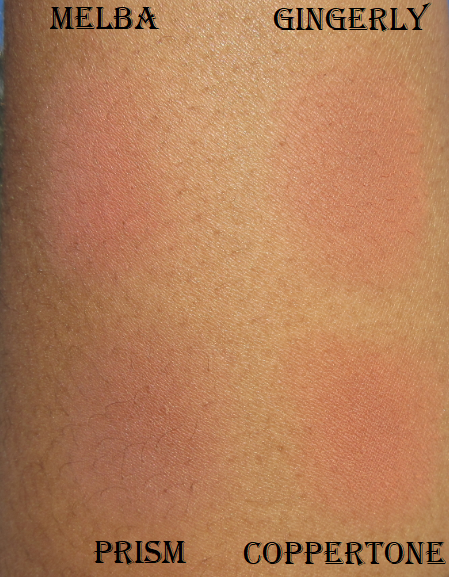

From what I can tell, Melba is pinker, Gingerly is a little more orange, Prism has more brown, and Coppertone is redder. But Gingerly, Coppertone, and Prism look virtually identical on my cheeks.
Hushed Tone, in terms of color, is a mixture of Sunbasque and Peachtwist though leaning more heavily on the Peachtwist side.
The Sheertone Shimmers are from lightest to darkest: Sunbasque, Peachtwist, and Ambering Rose. The differences are barely detectable while looking at the pans (particularly between Peachtwist and Ambering Rose), but on the cheeks, it goes from too light, then perfect, to too dark.
Fleur Power and Pinch Me are quick and easy to use because they are suited for me, but Desert Rose, Burnt Pepper, Raizin, News Flash, and Loudspeaker all require a light hand.
Even though some of the blushes I own are better suited for the lighter or darker ends of the spectrum, it’s amazing how many I am still able to pull off, and that’s a testament to MAC’s formulas. They really spent time over the years curating the best selection. There are some discontinued blush shades I wish they still offered, but with how many blushes look similar on my cheeks, I know I don’t actually need more.
INSERTS

The top 12-well in the picture is the larger insert for creams, gels, lipsticks, etc. Below that is the 24-well smaller insert. Lastly is a two-blush insert inside my MAC double-sided palette. Each side holds three blush inserts for a maximum of six blushes per side. I have one double-sided palette that currently holds MAC blushes. The other I turned into a regular magnetic palette to hold other brands’ products by placing magnetic sheets inside. Some people don’t know this, so I think it’s very important to state that MAC refill products only stick properly to MAC palettes because the refills all have magnets attached to the bottoms of them.
Magnetic palettes (like Z palettes) have a magnet sheet on the bottom that tin eyeshadow pans can stick to. MAC palettes have a metal sheet within the plastic that the magnets attached to the eyeshadow or blush can stick to. I can confirm that my single MAC eyeshadow refill stayed put in a regular magnetic palette if I had it squashed by other tin pan eyeshadows on all sides, but it would otherwise slide and fall on its own.
Also, the refills do stick to the MAC palettes on their own, but the inserts feel a lot more secure, as I believe the inserts have metal in them as well.
Highlighting Palettes


This is the Get it Glowin’ Hyper Real Glow Palette. This trio contains the highlighter shades Gold Coasting, Get It Glowin’, and Rosy Cheer. They are a bit on the golden side. MAC sells a pale pastel version (Get Lit), peach version (Shimmy Peach), and pink version (Flash + Awe). I currently own the latter and will include a photo, but I don’t have swatches as I intend to give this away or sell it.

Although the golds in the Get it Glowin’ palette look distinctly different in swatches, I can’t tell the difference on my cheeks. In fact, spoiler alert, I can’t tell the difference among any of the gold highlighters in terms of the color. It just comes down to how smoothly they apply, how intense they can get, and how sparkly or fine the glitter particles are. Within this palette, I did notice the actual Get it Glowin’ shade was more subtle than the others, despite it being the iciest one that should have stood out the most against my skin tone. Out of the three shades, Rosy Cheer seemed the smoothest and most flattering on me.


Extra Dimension Skinfinishes

I first owned Whisper of Gilt in the limited-edition snowflake imprint that was a holiday release a few years ago, and now in the regular packaging. I loved the shade but was so worried about ruining the shape that I hardly used it. Now that I have the “less exciting” imprint after including it in my 7 items deal, I will start using this one.

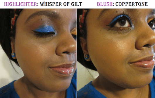
Unlike the highlighting trio, which didn’t appear that much more intensified when applied to wet skin, the formula of this shade allows it to be built up a lot more. But I’ve never been interested in rocking a blinding highlight, so I’ll continue to use it dry the way I normally do. I would describe the shade as a light gold, but MAC says it’s a, “light soft white with shimmery sheen.”
I don’t think it looks the best on me on camera, but I love how it looks in person and will keep wearing it whenever I won’t be taking pictures.
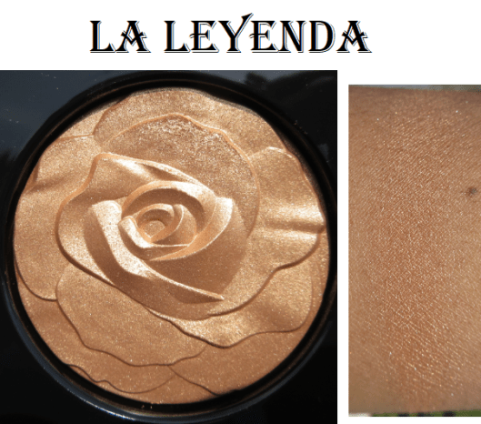

I used the tiniest amount of La Leyenda because I didn’t want to ruin the rose. I mostly collect MAC highlighters for the limited-edition packaging. There are so many other highlighters that I love, that I don’t feel like MAC’s formula is so amazing that it needs to be used, except perhaps Whisper of Gilt, which is the standout for me. I don’t have much to say about La Leyenda other than it is fine as a highlighter but stunning for packaging, presentation, and representing Selena.
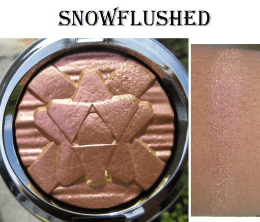

MAC had a gorgeous holiday eyeshadow called Stylishly Merry (version 2, not the original purple one) that I missed out on getting. So, when they released the Snowflushed highlighter the following year, it was the closest dupe I could find. It has a beautiful coral pink to gold shift in the pan but it is unfortunately too glittery for my taste as a highlighter. I wore it as a lid shade in the same photo, and the color shift doesn’t translate on my cheeks or eyes, so that’s a little disappointing. However, it still makes me happy to own for collector purposes.
Mineralized Skinfinishes

Gold Deposit is a golden-bronze shade I wanted for so long, but when I finally bought it, I only used it a few times because I found it to be too much for me.

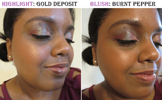
When testing it out again for this post, I’ve realized that I can get a more subtle application when I use my Kumano-fude brushes. It still makes quite the impact, but it’s toned down enough for me to feel more comfortable wearing it in public.
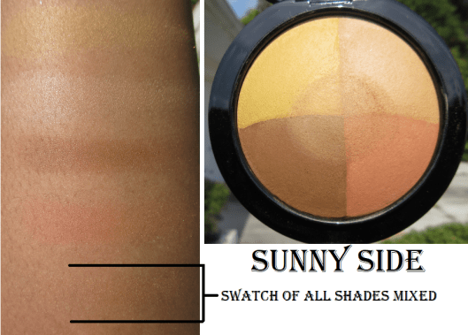

The best use for Sunny Side I have found is as a color-correcting setting powder under my eyes. As I’ve gotten down to the last bits of my Tarte Shape Tape concealer, it hasn’t been covering my dark circles as well. This powder is perfect for brightening up and covering up darker patches. I’m not sure how well I captured it in the photo, but it’s a very noticeable difference in person.
Also, although it is in the normal Mineralize Skinfinish packaging, this particular shade was limited edition.
Limited Edition Powders

The Archie’s Girls Collection Flatter Me Pearlmatte Face Powder and MAC x Chris Chang Prep + Prime Transparent Finishing Powder are both items I purchased purely for packaging. In fact, I even bought a second Chris Chang compact (each compact is unique in pattern) so I could remove the actual product inside and put one of my DIY blushes or highlighters inside. That way, I could keep one in nearly pristine condition (the original translucent powder was too stark on me), and the other I’d be able to use without worrying about damaging it.
FINAL THOUGHTS
I will list my favorite blushes and highlighters from this post, but this list is purely subjective because it comes down to my own personal preferences. The quality of MAC’s permanent collection is of very good quality and I would confidently recommend them to anyone. It’s just about finding which ones suit your needs best. Although there are plenty of shades I enjoy in my collection, my list will include the blushes and highlighters that if they disappeared today I would repurchase immediately.
BLUSHES: Hushed Tone, Coppertone, Peachtwist, Burnt Pepper, Pinch Me, and Format. I would be tempted to, but probably not immediately repurchase Melba, Desert Rose, Fleur Power, and Cheeky Bits. The blush Style is so beautiful that I would probably repurchase it for blush topper/ highlighter purposes.
HIGHLIGHTERS: Whisper of Gilt and Gold Deposit.
That’s all for today! Thank you for reading!
-Lili ❤
