I like to group multiple products in a single post if I feel they are relevant to each other in some way, but there are times when this caused me to delay on publishing. For example, my Battle of the Milky Toners post was supposed to be about toners in general, featuring four milky toners and three “regular” ones. However, I kept hearing about other milky toners that were popular, so I would buy them, wait a month or more for it to arrive from YesStyle, then test it extensively before hearing about another hyped up toner, and repeat the cycle. This is how I ended up making a milky toner post specifically, with 11 compared, and it took over one year to complete!
It’s summer! Now is the perfect time to chat about bronzers. So, I thought it would be nice to have a bonus post each week in the month of July, guaranteeing that I won’t have to delay reviewing these any further because of a last minute addition, wanting to replace or add extra photos, etc.
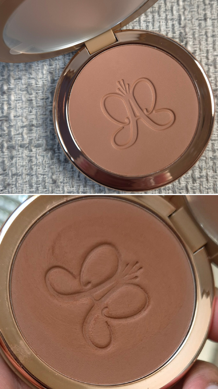
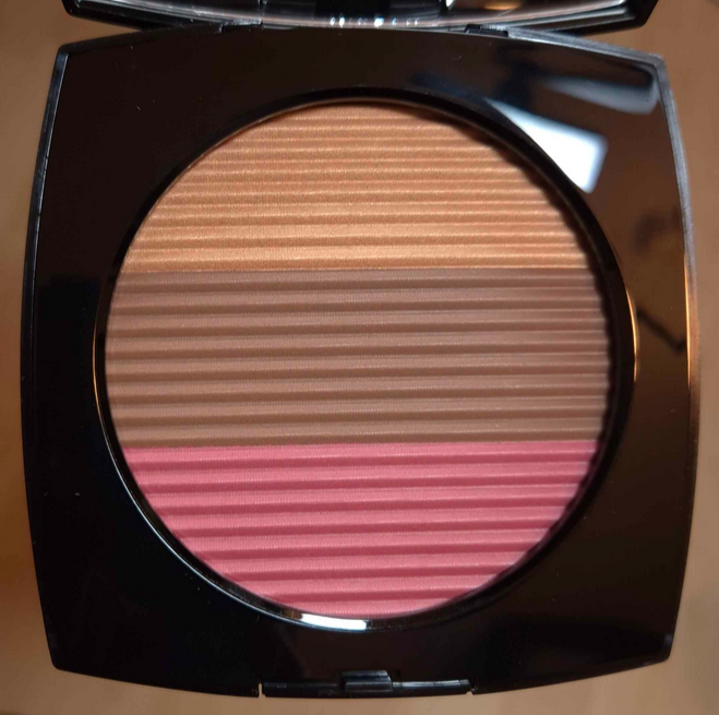
This packaging is beautiful! It’s weighty, has a mirror, and is a magnetic closure type. I love the rose gold details in the logo and around the pan. I first noticed ABH stepping up their packaging with their mascaras, and now this one.* The packaging upgrade has to factor into the price.
Although I don’t own a bronzer from their first line, I know that it has the same weight of 10 grams/0.35 oz and cost $28, versus this new one at $38.
*UPDATE: October 9, 2025 – I didn’t realize the brand’s Glow Seeker Highlighter is in similar packaging as the bronzer, but weighs slightly more!
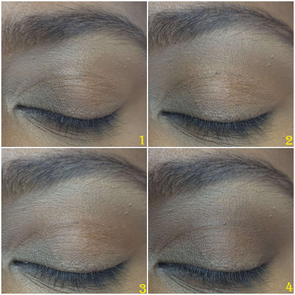
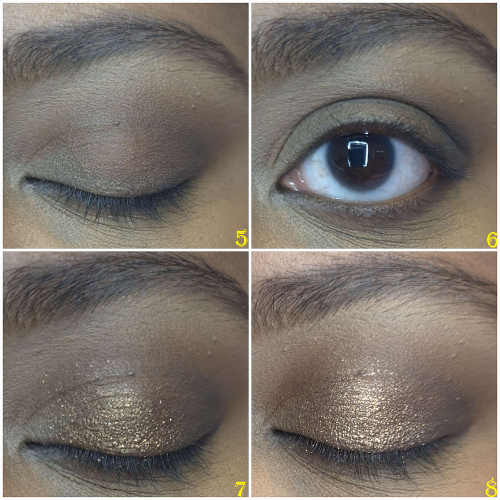
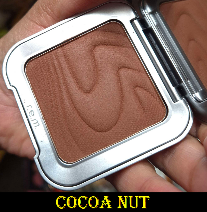
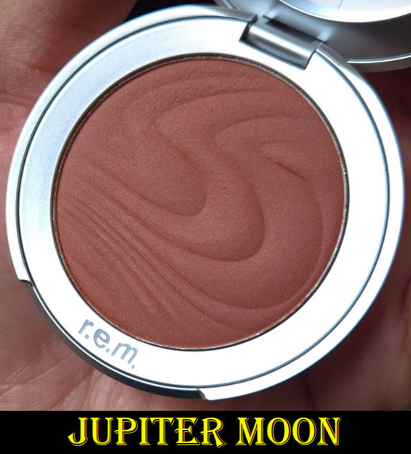
Beach Bum Bronze
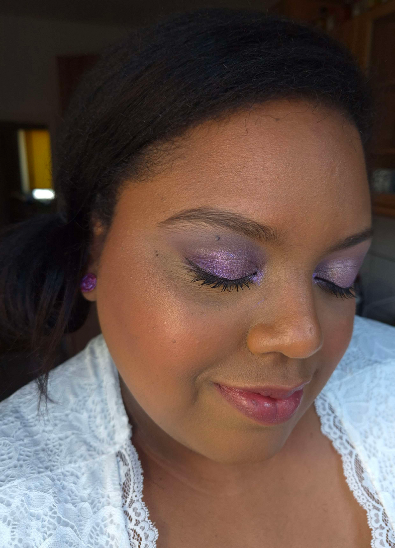
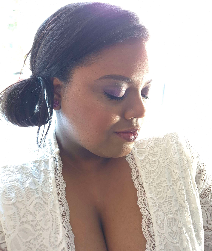
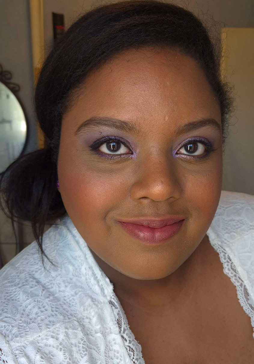
I have to address the color options because it is very important for anyone to know when buying these. This range of bronzers is not intended to be cool-toned, but they might still appear ashy.
In the photos above, the picture with the untouched surface is color accurate in looking a bit dusty, cool, and as though it should be too light for my skin. Once I rubbed it, the true color showed as darker and warmer. I don’t know what causes the surface to appear different in color; perhaps because of whatever blurring properties are in this. Sometimes when a product has too much mica (especially paired with silica) or other ingredients that create a luminous or pearly sheen, it can look ashy/gray on someone even if the base color is dark. For example, the last three shades of ABH’s bronzers look a bit dusty in swatches by Angela Denise, despite her having a similar skin tone to mine. My skin’s hue is more saturated than hers, which I can only guess is why they wear differently on the both of us. Regardless of the cause, this problem has contributed to a lot of disappointment and backlash online, such as this scathing review from Robert Welsh. Examples of other products that had this problem are the original launch of Fenty Cheeks Suede Powder Blushes and the darkest shade of RMS Beauty ReDimension Hydra Bronzer. This differs from when a brand puts too much white in the formula of their product, which goes unnoticed for those with lighter skin, but is super ashy on dark skin. An example of that is YSL’s initial launch of shades in the Make Me Blush Liquid Blushes line.
So many people were thrilled to see photos of bronzers looking so cool toned that they should be labeled contours. Others were appalled. I would have completely skipped this release if not for the brand’s founder stating in Trendmood1’s comment section that the range was actually warm and she faulted Sephora’s photography (even though these were the same photos used by other retailers and they look the same as what’s on the official Anastasia Beverly Hills website).
Anastasia was correct in saying the bronzers look ashy in the photos, but some of those photos appear to be correct in showing how the bronzers look in the pan. It’s more useful for customers to know how they look on real skin. Where they went wrong is that too many of the models look sculpted instead of bronzed, so it doesn’t seem to accurately portray the color it should be on the skin. Then again, there are some people who this bronzer will look that gray on.
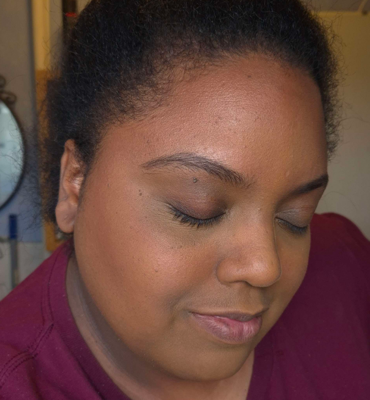
My original guess was that the makeup artist for the models didn’t use the bronzer alone in the photo shoot, and paired them with the brand’s Smooth Blur Contour Sticks. Perhaps too much of the contour was used, or the photos could have just been manipulated in post. This is the grey area where the brand’s photos can be interpreted as misleading. I’m happy with how Beach Bum Bronze looks on me, but I can understand why some people would feel let down, while others will be pleasantly surprised by the amount of warmth.
The thought crossed my mind that maybe it’s just my shade that is warm, but hanbeauty101 on YouTube bought the two lightest colors (Sun-kissed Dreams and Warm Sand Vibes) and was disappointed to see that neither were cool toned. In a contrasting reaction, Angelica Nyqvist happily confirmed that the shade just before mine called Tropical Tan is neutral-learning warm and golden.
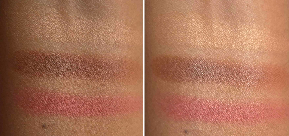
When it comes to choosing a shade, I like that this one functions the way it should, by being warmer than my natural skin tone and only a little darker. I have many bronzers that are deep enough to be brontours, so having a subtle color is more desirable for me at this time. Beach Bum Bronze looks neutral-leaning-warm compared to the amount of orange in the shade Terracotta, which is my best match among Anastasia’s cream bronzer line.
Because Beach Bum Bronze is so similar to the color of the darkest section of my Hermès bronzer in the color Sienne, I can’t help but compare them. The ABH bronzer is the tiniest bit deeper with a little more red. Even though the powder is incredibly silky to the touch, I could see how much smoother the Hermès bronzer was when swatching the shades, and how it distributed the color evenly without skipping. To clarify, the Hermès’ bronzer is very soft to the touch, but doesn’t feel the same as Anastasia’s. It’s just the colors that are similar. If I mix in the the lighter two shades within the Sienne trio, the color turns more golden-orange.
The way the texture of the Smooth Blur Bronzer looks when rubbed reminds me of the ELF Halo Glow Pressed Powder, which is less than half the price of the bronzer from ABH. So, this kind of smooth and silky texture is achievable for drugstore brands too. The ELF powder doesn’t use Zea Mays (corn starch) like ABH, but it does have Aluminum Starch Octenylsuccinate.
E.l.f. Halo Glow Pressed Powder
Even though this cannot beat the #1 bronzer in my collection, the Smooth Blur Bronzer has still impressed me immensely with the texture, the blurring capability, how easily it blends and builds, and the finish. However, this can stick in one place and be harder to blend when applied on top of a dewy base. The only time I had a problem blending this bronzer was on a day when I was testing out a new foundation and skincare combo (one that I won’t be repeating). So, this formula may not be suited for someone who likes to use dewy foundations or moisturizing/emollient skincare. Someone with oily skin might still be able to enjoy this bronzer if a layer of powder is applied to the bronzer areas first before adding this on top.
Another difference between this bronzer and my Hermès is that the Plein Air Healthy Glow Mineral Powder blends perfectly with every brush I’ve used. The ABH Smooth Blur looks good with most I’ve tried, but light to medium density ones give more of the airbrushed look. A denser brush combined with the level of pigment in this range can be a bit overkill, and even if I try to blend it out, the end result isn’t as clean as I would want. Essentially, this bronzer doesn’t look great if overblended. Trying to build it up is better.
I’ve had no longevity issues, but this is usually the case with me.
This is a shimmer-less product with many potentially drying ingredients in the formula such as corn starch and kaolin clay, but it still has a natural looking sheen from the mica and silica. Even though this sticks too much on a wet base, I have no issues blending cream blushes on top of it. Those dry ingredients are why I think people with oily skin could still like this. I was worried I might have a problem with it, as someone with a dry skin type, but it hasn’t felt drying on my face. I use hydrating skincare, but my face is still usually dry to the touch. This is why the dew problem isn’t a big one for me, I know which brushes will work well with this, and the color is quite good.
Under my usual conditions, this bronzer works so well for me that I would place is somewhere within my top 15. However, I’m still hesitant to recommend it because of the number of potential issues I’ve detailed in this review. No product performs the same universally, but this has a bit too many outliers. I recommend that anyone interested in getting this should see it in-store if possible.
I hope you’ve found this post to be helpful. Thank you for reading, and be sure to click follow if you’d like to be notified of my next review, including the next bonus post!
I visited the US in April and was reunited with the rest of my makeup collection, along with all the things I shipped there during 2024. Those products consisted of Japanese brushes that I didn’t want to pay extra customs fees for, reward point and gift card redemptions only applicable to US sites, products only sold within the US, etc. I had older makeup I still wanted to bring back to Germany, but I needed to decide which of the newer ones were worth coming along too. That’s how the idea for this post began! However, some of the makeup I brought back will be discussed in other posts, and I added some of my newer makeup purchases to this review instead.
Rare Beauty Soft Pinch Matte Bouncy Blush in Worth
It was difficult to photograph this color accurately because it looks darker in the pan than it actually is. I own the liquid version of Worth, and have reviewed it before, but I left it in the US. Since the liquid is sheer, I wasn’t surprised that I also needed to pack on a lot of this cream-to-powder version to get it to show up on camera.
I’ve been into subtle and/or nude blushes lately, so I expected to love this. I tried pairing it with so many different things expecting that perhaps my foundation shade mattered or that the undertone was clashing, that the color of my eyeshadow looks could be throwing it off, etc. I just wasn’t enjoying wearing it. The answer I settled on as to why that was the case is that it’s matte. I knew it would be from the name, but I’ve used shimmer-free creamy and bouncy type of blushes before that still had a natural emollient gleam to them from just being a cream product. Examples of this are the MAC Glow Play Blushes and Armani Neo Nude Color Melting Balms. Even within the Rare Beauty Soft Pinch Liquid Blush line that comes in dewy or matte finishes, the matte one still has some life to it. So, I wasn’t expecting this blush to have zero shine, especially from a product that has Synthetic Fluorphlogopite as the first ingredient.
The longevity is fine. The blush blends into and becomes one with the skin. For the best results, I use my densest synthetic brushes with it.
I borrowed the photo above from my Charlotte Tilbury x Genshin Impact post where I reviewed the Airbrush Flawless Setting Spray. By the time I started using that spray, I already knew that my issue with the Rare Beauty Blush was the fact that it’s matte. However, I was still taken aback when I saw with my own eyes how much of a difference some extra shine truly makes. I love how this blush looks when I use Charlotte’s spray over it. So this product changed from a miss to a hit for me!
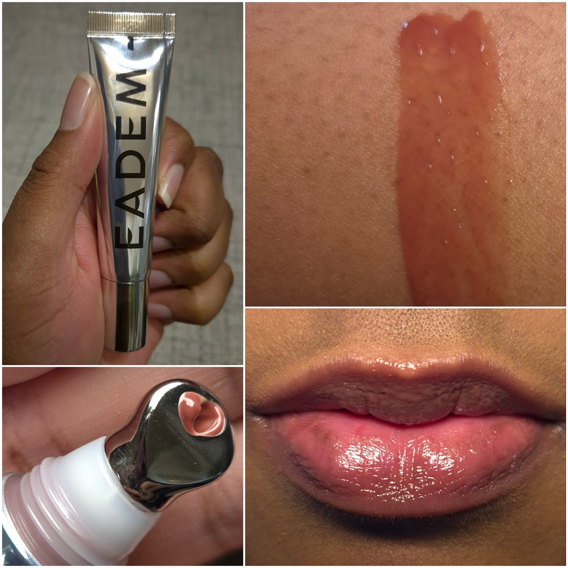
Eadem Le Chouchou Exfoliating + Softening Peptide Lip Balm in Fig Sauce
I mentioned in my Project Pan that there are only 5 brands I’m purchasing from in the lip category this year. One exception was this balm because I would have bought it ages ago if it was sold in Europe. I could only find one website that would ship it to me, but then I would have had to pay at least double the price. The tradeoff for having to wait a long time to get it from USA’s Sephora was that I could buy it on sale and with a gift card.
I have to talk about the metal applicator because it feels amazing applying this lip balm! I don’t like when products have a cooling ingredient that makes my lips feel cold for 30 minutes to 2 hours depending on the brand. Instead, I only get that wonderfully cold sensation during the application process and then I can go about my day. This really adds to the experience, so much so that I’ve even put other products on my lips and then used this applicator to spread it out! Perhaps one day I’ll buy some empty tubes off the websites I’ve found by typing, “metal applicator cosmetic tube” into Google and transfer some other glosses into them.
This is a very nourishing product and lives up to its reputation as a lip treatment. It fills the lines and smooths over the lips. It’s thick, but not goopy in a gel or oil way. It has more of a creamy-waxy feel. It adheres fairly well to the lips, which helps it to last longer before needing to be touched up or reapplied. I still consider this a little sticky, but it’s not to Ami Cole levels. It has decent color payoff, enough for me to understand someone wanting to buy multiple shades, but I wouldn’t want to buy more than one extra.
The results I get are similar to Ami Cole glosses, which is to say my lips feel softer and more hydrated the next day, but this does not completely remove all of my chapped skin. I can always spot a few areas on my lips that are still chapped the next day. So, this hasn’t claimed a spot in my top five, but I still like it a lot.
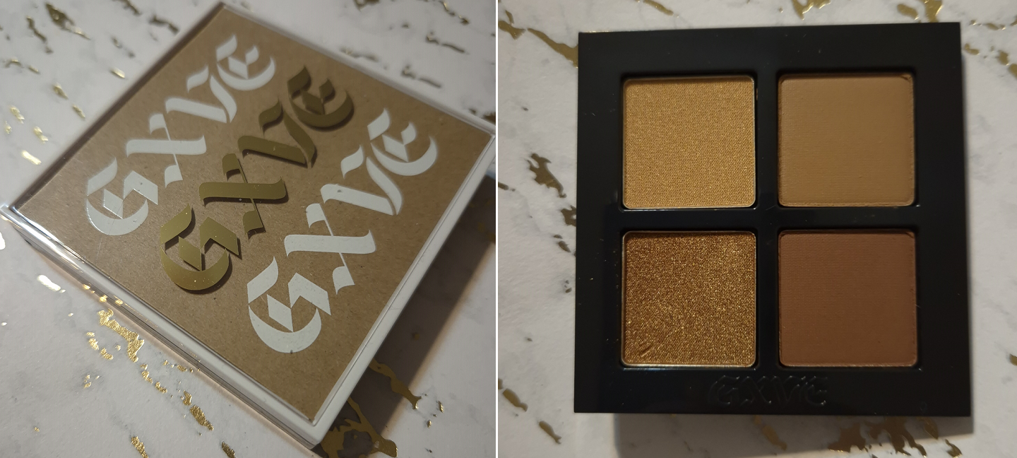
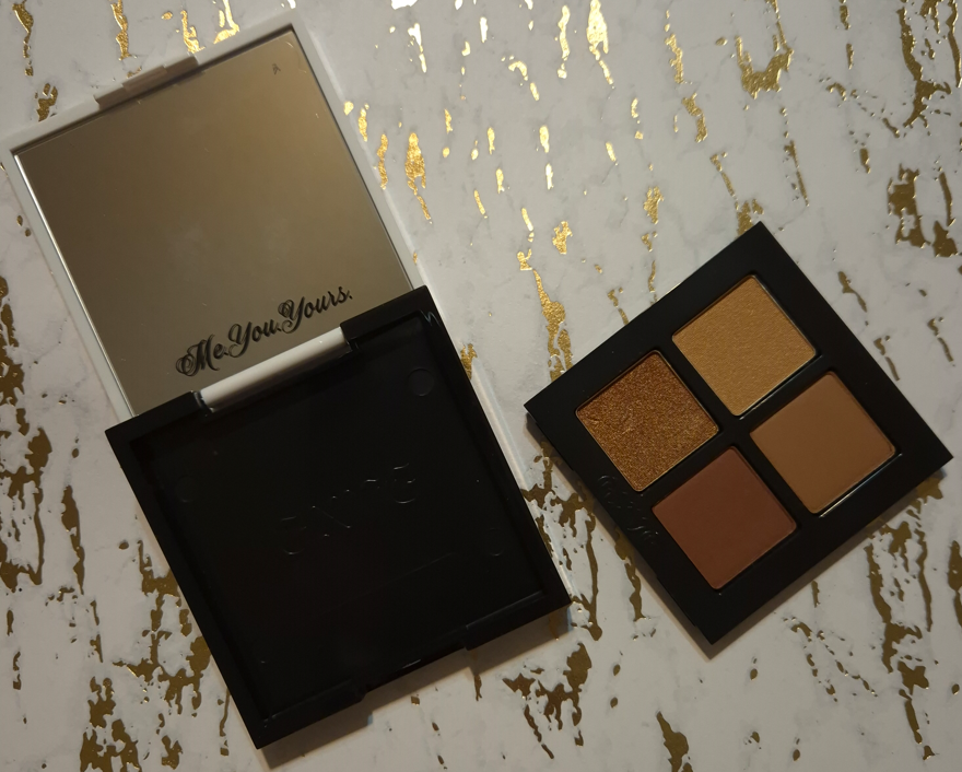
Gxve Beauty Eye See in Color in Rich Girl
This was the only quad from the brand that I found appealing, but my immediate issue is that I don’t get enough depth from the darkest brown in this palette. While it theoretically shouldn’t be a problem to grab a dark eyeshadow from any other brand, I know I will subconsciously not reach for this palette since it is technically incomplete for me.
The completed look is pretty, but I couldn’t bring myself to choose this to pack in my suitcase over my many other options.
If the eyeshadow formula was superb, I would have considered taking this with me anyway. My issue is that the shimmers are a bit lackluster. There is still beauty in a lower impact shimmer if the intended eye look is supposed to be sophisticated or demure. I think the quality is fairly good, though it could have benefited from being a bit creamier. The mattes were fine. My brush picked up a lot of product, but with how soft they look on my eyes, I think someone would be surprised to know how much I tried to build up these eyeshadows. They are drier shadows that appear to be finely milled, but something about the formula just doesn’t feel modern.
This palette is long-lasting on me. It doesn’t take long to get a blended look. However, this isn’t for me. I do appreciate that the holder of the pans is easy to remove, so I could technically keep the compact or turn it into an empty magnetic palette if I inserted a magnetic sticker sheet. I could also technically add metal sticker pans to the bottom of the eyeshadow holder to pop it into a larger empty magnetic palette. Removeable packaging is always interesting to me.
In any case, this quad wasn’t a flop, but it also wasn’t good enough to keep around.
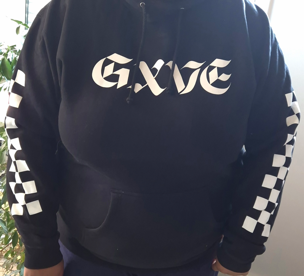
As a random side note, the Gxve Beauty website used to sell merch as well. I ordered one of the Signature Hoodies during a 50% off sale (just like I did with the palette). It has fleece lining on the inside, so I’m excited to wear it come winter. The website says products are now exclusively at Sephora and things are so frequently for 50% off that I really don’t know how the brand will continue to stay afloat.
I don’t know where these are being sold now. If they are discontinued, I’m glad I was able to snag one as a piece of makeup history.
Glossier Cloud Paint Bronzer in Coast
I liked the Glossier Solar Paints, but wished to have a version without shimmer. The Cloud Paint formula is one of my favorites for cream blushes, so to have a matte Cloud Paint in a bronze color seemed like it would be an instant win.
I picked Coast because it is the second darkest option and has a golden tone, which I wanted. The darkest color, Drift, looked like it would be too red for me despite being labeled by the brand as a deep neutral bronze. Coast is just too subtle for my skin tone right now. While I was in Florida, I didn’t do a good job of reapplying sunscreen. My skin had a slightly redder tone and was darker, so the bronzer really isn’t visible in photos as it was already so subtle in person. I have a photo below, but I apologize for the lighting being very off. I couldn’t get a clearer picture during the trip and my skin looks even redder in the photo than it was in real life (plus I was wearing the Beekman 1802 skin tint that’s red).
I don’t mind having a subtle bronzer, but my biggest issue wasn’t the color. I felt it just didn’t blend seamlessly enough into my skin. While it’s true that I didn’t bring my holy grail synthetic bronzer/contour brush with me, I came to realize that the watercolor kind of finish that’s beautiful and natural in a blush isn’t what I want in a bronzer. So, I left this behind. What a shame!
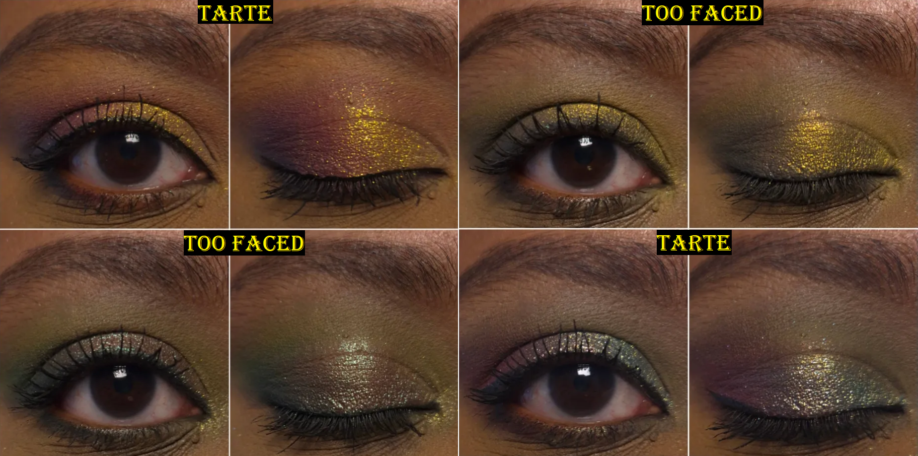
Tarte Tartelette Tubing Mascara vs Too Faced Ribbon Wrapped Lash Tubing Mascara
Back in 2014, during my short lived time making YouTube videos (all listed as private now), I kicked off my Mascara Showdown Series with a battle between Tarte’s Lights Camera Lashes and Too Faced Better Than Sex Mascaras.
I determined that Tarte was the winner because of the length, but the mascara I actually repurchased the most was from Too Faced. I don’t know if it’s because I ended up preferring the balance between length and volume or if I was just able to get the Too Faced mascara on sale more frequently. I eventually stopped buying the one from Too Faced because I started to get clumping and flaking issues that I never had before. I don’t know if the formula changed or there was a switch in manufacturers, but I moved on from that mascara.
The KVD Full Sleeve Long + Defined Tubing mascara made me interested in tubing mascaras again. I had a deluxe sample of the one from Tarte, so when Too Faced released theirs I thought why not…let’s do another showdown between these brands over a decade later!
I never curl my lashes, so sometimes the mascaras look better or worse depending on how my eyelashes are naturally shaped that day. I’ve used the Tarte mascara five times and I can say that even if it had amazing results, what puts me off from it is how long it takes to dry. If I try to layer up even more product, then it takes even longer. I can touch my lashes thirty minutes later and it still doesn’t feel fully set. This is a big problem when I’m trying to photograph multiple eye looks in a day and in the process of removing my eyeshadow with a Makeup Eraser cloth and Bioderma, my eyelashes clump together, the color smears, and the stickiness makes it difficult to remove the rest. Part of the benefits of tubing mascara is the ease in which one can remove it with warm water. I can remove them with micellar water as well, so I’m not surprised that some of the Tarte mascara comes off. The annoying part is the weird middle ground where some of it comes off and smudges while the rest still clings on with a tight grip. It makes it so that I am forced to fully remove it every time when I want to do a new eye look, whereas with other tubing mascaras and even regular mascaras, it’ll come partly off and I can easily reapply more mascara because they didn’t turn my lashes spidery and hard. This is a makeup reviewer problem, but having to wait so long for it to fully dry is an issue overall. One time I made the mistake of applying this mascara not far enough in advance of watching a heartfelt scene in a show. The side with the Tarta mascara was a mess and got in my eyes. The side with Too Faced did not.
I didn’t like the Too Faced Ribbon mascara when I first tried it, but every time after that (at least 15 times so far), I have enjoyed it. Just like the showdown from many years ago, I found that Tarte’s mascara was better at lengthening, whereas Too Faced’s mascara was better with building volume while still giving nice length. It can start to clump if I build this up a lot, so I have to be careful about finding the balance between satisfaction and knowing when to stop.
I like the one from Too Faced, but I think I still prefer my tubing mascara from KVD. It gives better length than Tarte and if I’m patient enough I can build up the volume to similar results as Too Faced, though it can also start to form clumps if I take things too far.
The Tarte mascara is a miss. The Too Faced mascara is a hit.
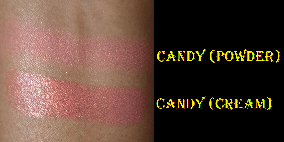
Dior Backstage Rosy Glow Blush in 077 Candy
I reviewed the cream blush stick version of Candy already, and updated the original post, but this still feels like a good place to talk about the powder blush since it’s a miss for me.
This new powder formula is definitely an improvement on the original formulation and first reformulation, in terms of being more pigmented and less hard-pressed. I also think this square packaging is cuter and easier to use with larger cheek brushes. The reason it’s a miss for me is purely due to the color. I loved the addition of shimmer in the Bronzed Glow shade from version 2 of these blushes, but the base color of Candy being so light means that it unfortunately does the same thing as Nars Orgasm on me. I can see the pink shade at one angle, but when it hits the light, the gold reflect is nearly all I can see. So, it appears as if I tried to use a highlighter as blush! This kind of shimmer is not that refined either, which makes it unsuitable for my preference as even a blushlighter or blush topper.
The saving grace for me is that I can add the Candy blush stick on top to help the shimmer become one with the skin, plus boost the appearance of the pink color.
I’m happy using the Candy shade of Glow Stick on its own, but going forward, I will never wear the powder version of Candy by itself. Based on my continued enjoyment of the previous powder blush reformulation, and acknowledgement that the new one has improvements, I still recommend the powder blush. I just can’t recommend Candy or Toffee to anyone close to my skin tone because of that highlighter effect. Bronzed Glow still gives me hope that Dior can nail a shimmery blush in this new formula in the future if the base color is darker.
That’s everything I have for this week. Thank you for visiting and reading!
The bronzer should be available in the US by June. The pressed powder is already available worldwide.
The luxury beauty community was up in arms about Givenchy reformulating their loose setting powder because it left a sheen on the skin (which emphasized texture and wasn’t as blurring). From what I’ve heard, it sounds like the loose powders intended for fair to medium skin tones contained a lot more Synthetic Fluorphlogopite, but mine called Popeline Mimosa seemed to only have shiny particles in the darkest square, which is practically the only section of the container I use. I put tape over the lighter squares, and only have a few holes open for the orange color. It bothered me that I could essentially use only 1/4 of the product, and I prefer using pressed powders over loose ones. When I heard about the brand’s new pressed version that is supposed to be more similar to the original formulation, I was interested.
I’m not sure if the original pressed powders were ever available in the US, but the deepest shade in that line was called 06 – Flanelle Épicée and is still available via the retailer Flaconi. In the current version, the deepest is called 06 Organza Ambré and I was willing to give this powder a try considering the original bright pink corner was replaced with what I thought was a peach color. It turned out to be closer to salmon.
The brand also resolved the issue of the brush-holding flap lifting upwards and covering the mirror, because it now flips to the side.
I’ll discuss the powder more a bit later, but I’d like to first talk about the Bronzer because it’s the product I actually bought first. I enjoyed the silkiness of it and ability to customize it so much that I had hope that the pressed powder could be even more useful to me than the loose one.
DISCLOSURE: All products in this post were purchased by me with my own money.Unhighlighted links in bold blue font (Example) are normal non-affiliate links. Links marked in bold black font with a light blue background (Example) are affiliate links. Affiliate links allow me to get a commission if purchases are made on the website after being redirected there. The price of the product is not affected by these links, and anyone who uses them would be supporting this blog. Sorry for this interruption, but an explanation about affiliate links are required by the FTC whenever they are used. The only affiliate links in this post are for brushes through CDJapan, not Givenchy. And for anyone else wondering, I usually reserve non-link font colors like (Orange) for updates, (Red) for subject titles, and (Purple) for product titles.
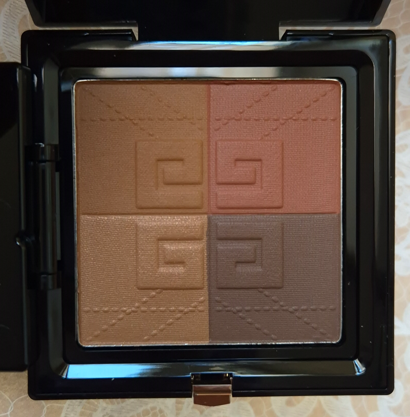
Givenchy Prisme Libre Bronzing and Sculpting Powder in 003 Organza Bronzé
Organza Bronze is currently the darkest of the Bronzer Powders available. It works for me, but I think this really doesn’t go deep enough, and I’m hoping they will expand the range. It has been out for a few weeks already in Europe, but I heard it will come to the US by June.
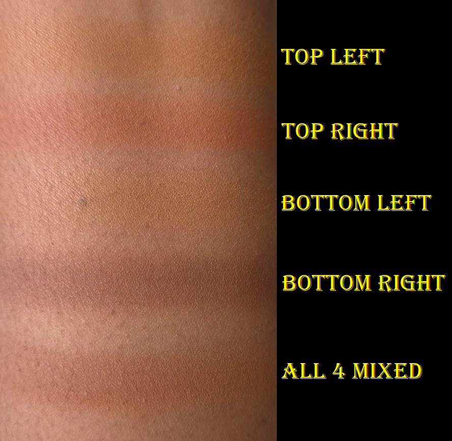
The four colors are supposed to allow one to, “add tan, warmth, modeling, and brightening.” In the top left corner is supposed to be the bronzer shade, which is basically my skin tone. I can’t use this as a bronzer unless I mix it with the darkest block. Then, it does add subtle bronzing. I’m glad this is such a blendable product that layers and builds well because I have tried other “customizable” powders in the past that formed uneven mixtures that didn’t look seamless on the skin. This product really is customizable.
In the bottom left corner is the brightening square. I have tried using this as a highlighter before, and it adds a super subtle sheen, but isn’t enough for me to replace using an actual highlighter in my routine. As a glow enhancer to turn this soft matte product into a radiant bronzer, this doesn’t do a whole lot either. It makes it less matte, but I don’t think there’s enough oomph to satisfy a true shimmer-bronzer lover. What this does is literally lighten the color of whatever mixture I try to create. So, if I go overboard on the darkest color, adding this will lighten it up, but so will the bronzer shade.
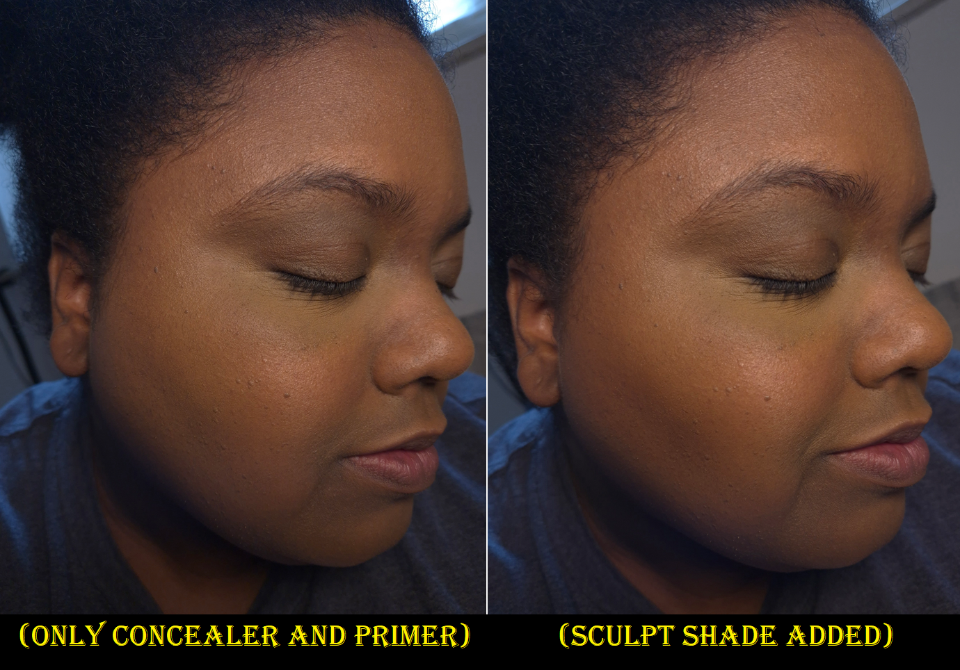
In the bottom right corner is the modeling or sculpting block. It is the darkest section of the pan and is a cool-leaning neutral shade. It works perfectly as subtle contour in the sense that it isn’t overly gray. This color choice aids in the ability for it to mix with the other shades without going muddy. This isn’t guaranteed to be the case with Mousseline Bronzée or Popeline Bronzée though.
In the top right corner is the warmth-adder. If I want my bronzer to be less subtle, then I must rely more heavily on the darker quarter. That dark powder has just enough coolness that mixing it with the lighter browns combine into a neutral shade. If I’m feeling like having a little extra warmth, I can easily add this burnt red color to the mix. However, it works quite beautifully as a blush, which I first discovered when watching Brie Moore use it that way in her YouTube video.
How I’ve been using this the most has been to contour with the darkest shade, then mix all the browns together for a subtle bronze, and finally using the red color as blush. This tailored approach is much better suited for me than swirling all four colors together. The combined color is a bit too light for me anyway. This means that the nice and soft synthetic brush Givenchy includes in here has very little purpose for me. The shape makes it very cumbersome to try and isolate one of the four shades alone. It can be done, and I’ve used it in the darkest square to contour under my cheekbone, but I’d much rather stick to my Face 11 brush from the brand called Number Eight. The candle tapered shape is ideal for dipping into a small section, but dispersing the product in a wider area. Small cheek brushes also work, like the HSC-2 Hana Sakura Brush for those that want an even subtler application or the Chikuhodo FO-2 that will give a stronger application and still fits in each square despite being a flat top brush with a decent amount of surface area.
I think this is a great product. The powders are super refined, blendable, soft, layer well, and last all day without fading. They’re not splotchy, they’re multi-purpose (I’ve even seen someone use them as eyeshadows), and I think the black packaging with the bronze details makes it look luxe even though it’s so lightweight. Only time can tell whether I will continue to find the customization element necessary or if I will go back to using my individual makeup favorites. The one major negative for me is simply the fragrance in here. This bronzer is so heavily perfumed and even though it’s not a bad smell, it’s stronger than I want in a makeup product and I can still smell it briefly while it’s on my face. I hope the scent will dissipate within the package over time.
Givenchy Prisme Libre Pressed Powder in 06 Organza Ambré
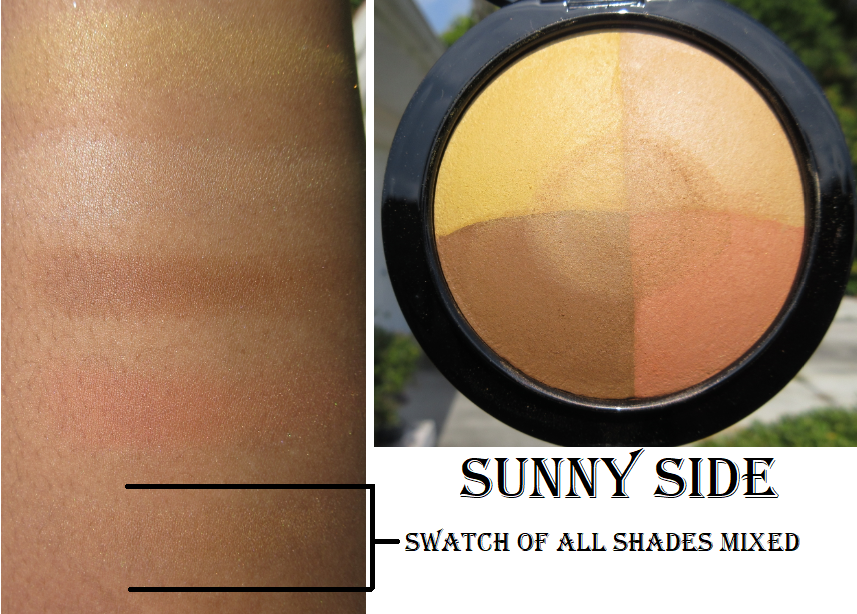
The first thing I thought when I saw the four colors for this shade of pressed powder is how it reminded me of my MAC Mineralize Skinfinish in Sunny Side that was a limited edition product first released in 2016. The photo below is from my review from 2020.
I contemplated bringing Sunny Side back to Germany with me after seeing it again in person in the US, but considering this is 9 years old, it has no functional use except for nostalgia and collecting purposes. It can remain where it is on my “retired products” shelf for things I loved but will not use on my face.
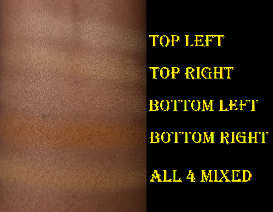
Unlike Popeline Mimosa that was too light for me to use all 4 shades together, I am able to wear the four shades combined from Organza Ambré (at least under my eyes).
The salmon color in the bottom left of the compact doesn’t look strong in swatches, but it can clash a bit with my undertone if I accidentally use too much of it. Givenchy included that color to, “correct and conceal shadows.” I played around with different combinations blended onto my arm to see which ones had the highest likelihood of suiting me. In that process, and then confirming it under my eyes, I discovered that combining the yellow in the top left with the deep caramel brown on the bottom right looked the best for brightening. According to the brand, the yellow is intended to, “correct blue tones,” while the brown, “unifies the skintone.” The combination of the yellow, brown, and a bit of that orange (reminds me of the Crayola shade Macaroni and Cheese) is semi color-correcting. However, the orange, which the brand says is supposed to, “boost the skin’s radiance,” isn’t deep enough to be successful using it on its own on top of my Givenchy concealer. Combining the orange and salmon though works. My favorite combination is simply the yellow and brown together.
I’m quite satisfied with this powder, paired with the Prisme Libre concealer, but it doesn’t do as nice of a job on top of some of my other concealers (for instance the KVD Good Apple). Also, the only difference I can see between this powder and the reformulated loose one is the lack of sheen. It looks nice and blurs a little, but it doesn’t have noticeable extra blurring or anything special enough for me to see what all the hype was about. I’m honestly not even sure if this reformulated, but fully matte, powder is as close to the original as some people have been saying it is, considering how similar it is to the mini I own.
This isn’t the kind of powder I want to put all over my face because it’s too mattifying for my dry skin. However, I did it for the sake of this review. Even though combining the four shades works under my eyes, it’s still too light for my whole face. It doesn’t look drying on the majority of my face, but it’s unflattering in areas that are my most dry and have the most fine lines. It’s mainly around my mouth that the powder actually emphasizes texture.
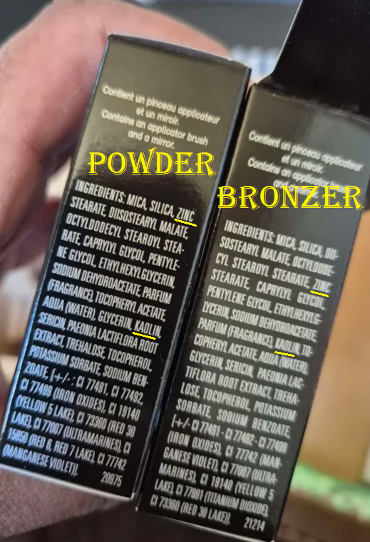
It’s interesting that I like the bronzer so much, but not the powder, considering they are practically the same formula. The only notable differences is that Zinc Stearate is higher up the list for the pressed powder and Kaolin is higher on the list in the bronzer.
The reason the bronzer doesn’t look too drying is specifically due to the areas I use it, which is the perimeter of the face and cheeks. If I tried to use the bronzer all over my face, and especially around the mouth, I would probably dislike it too.
So, this continues to be a powder that I only use under my eyes to set concealer and pretty much only with the Givenchy concealer. Though I got this for 20% off, I wish my curiosity hadn’t gotten the better of me and that I skipped buying this powder entirely. I like the Guerlain Parure Gold Powder more than this! That one felt drier, but at least it didn’t look dry.
Since the bronzer and pressed powder have nearly identical ingredients, I feel validated in assuming that if I liked the bronzer formula then I should like the pressed powder too. My mistake was not taking placement into consideration.
That’s all for today! Thank you for reading. I hope you’ll join me again for next week’s post!
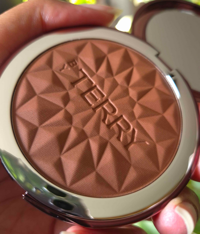
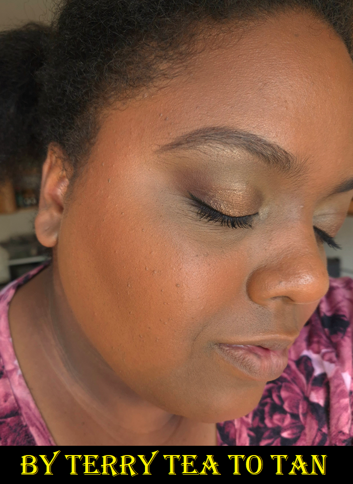
Anyone who read my post containing the LH Cosmetics Bronzer will recognize why I was attracted to this bronzer. This type of embossing is my kryptonite! It was already in my possession before I realized why I felt so compelled to own it. Plus, the packaging was stunning! I never tried By Terry products before (excluding lip product samples), so that was an extra incentive to buy this. I was lucky enough to catch a sale not too long after launch and could purchase it for 44 Euros via the retailer Niche Beauty.
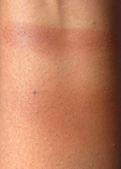
The color 4 Deep Bronze is a red toned bronzer that is quite a few shades darker than my skin tone, but it blends into my skin quite well, especially since I use my sheerer brushes with it. I have a bit more red in my skin right now after getting more time in the sun this summer, but this shade of bronzer might be too red for me by the time it’s spring. We shall see.
This bronzer is super soft to the touch and feels somewhat buttery for a powder (though not quite to the level of the Westman Atelier Butter Bronzer. I’m impressed with the quality, as it is very refined. I’m happy to know the high price tag wasn’t just for the pretty packaging. The finish isn’t flat matte. It has the tiniest bit of sheen that gives a healthy-skin type of appearance, but I wouldn’t call it luminous.
There are two reasons it makes my top 15, but not my top 10. The first is because this is heavily fragranced. The smell reminds me of Irish Spring bar soap. It’s not an offensive smell and it doesn’t linger on the skin after it’s applied, but I’d rather not have that wafting in the air every time I go to use it. The second reason is just the color. I wish there was a golden orange-yellow-brown color available and not just deep red-brown. It has a great formula, but if it’s not a color I love then there isn’t much reason to use it over everything else I own and prefer. To a luxury lover, I would recommend giving this a try, provided one can find a good shade match.
Because I like the formula of this product, I was tempted to get the Starlight Glow CC Highlighter, but I heard it has visible shimmer particles, so I skipped it.
2024 Bronzer Collection Ranking
This list does not include every bronzer I’ve ever tried or owned. I did not include bronzers from face palettes, unless the brand sells the item individually as well. Not included in this ranking, despite my owning them or having owned them in the past, are the Huda Tantour, Glossier Cloud Paint Bronzer, and Benefit Hoola. Huda’s and Glossier’s are unranked because they were shipped to the US (so I haven’t used them yet). I did not include Benefit’s bronzer because it has been so long since I used it that I don’t think I can accurately compare them to the others. Plus, I need a shade from Benefit that’s between Caramel and Toasted. That’s why I never repurchased it.
The names in bold lettering were added to the ongoing ranking list in 2024. Last year’s Bronzer Ranking/Declutter and 2023 Bronzer Review Mega Post can be found HERE and HERE.
Hermès Plein Air H Trio Healthy Glow Mineral Powder
Charlotte Tilbury Beautiful Skin Sun-Kissed Glow Bronzer (cream)
Charlotte Tilbury Airbrush Bronzer (powder)
Kosas The Sun Show Bronzer (old version/discontinued)
Victoria Beckham Matte Bronzing Brick
Rare Beauty Warm Wishes Effortless Bronzer Stick
Glowish by Huda Beauty Bronzer (discontinued)
Anastasia Beverly Hills Cream Cream Bronzer
Hatice Schmidt Labs Bronzer
Colourpop Super Shock Bronzer
Gucci Bronzing Powder
Dior Forever Natural Bronzer
Vieve Modern Bronzer Duo
Westman Atelier Butter Powder Bronzer
By Terry Tea to Tan Sun Powder
Armani Luminous Silk Bronzing Powder
Mented Bronzer
Nars Laguna Talc-Free Bronzing Powders
Hourglass Ambient Lighting Bronzer
Pat Mcgrath Divine Powder Bronzers
MAC Sunstruck Bronzer (Matte)
Covergirl Trublend Bronzer
Nars Laguna Cream Bronzer
Nabla Skin Bronzing
Nars Powder Bronzer (old version/discontinued)
Armani Luminous Silk Bronzer Drops
Rose Inc Cream Bronzer
Glossier Solar Paint (might be discontinued in favor of the Cloud Paint Bronzers)
Danessa Myricks Power Bronzer
MAC Sunstruck Bronzer (Radiant)
Melt Contour/Bronzer Stack
Jaclyn Hill Sun Bathe Pressed Bronzers (discontinued)
Kosas The Sun Show Bronzer (Current Version)
Kaleidos Contour Trio
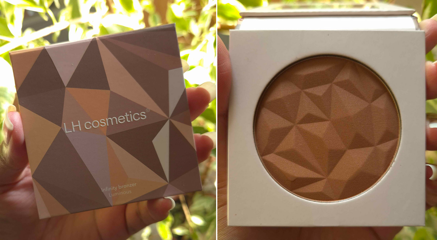
LH Cosmetics Infinty Bronzer
I Heart Revolution Tasty Coffee Bronzer
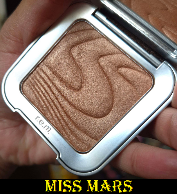
r.e.m. Hypernova Bronzer
Fenty Sunstlk’r Instant Warmth Bronzer
The Makeup by Mario Perfector
Coloured Raine Powder Bronzers
Makeup Revolution Glow Splendour
Milk Makeup Matte Bronzer Stick
I still get the desire to use everything in my top 30. However, the bronzers I use the most are the ones I still have with me within the top 11.
That’s everything! Thanks for reading this final post for 2024. I hope you’ll return in 2025. Happy New Year!
The retailer Purish was having a birthday sale in July. I didn’t know anything about the Berlin based company until this year when I realized I could get some harder to find indie products on their website. Along with some Danessa Myricks products I plan to review at some point in the future, I bought items from Nabla and LH Cosmetics that I’ve been eying for a long time while in the US, but didn’t want to deal with the shipping costs. I’ll be discussing them in the order that I tried them, rather than grouping by brand. I hope you’ll find these reviews interesting and helpful!
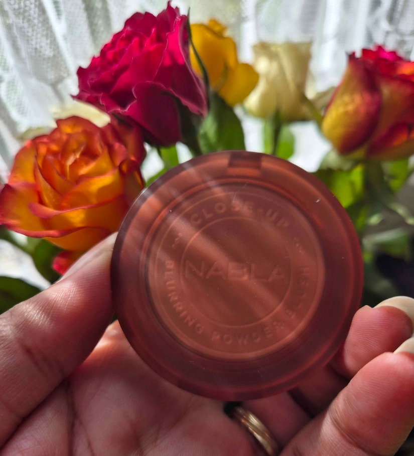
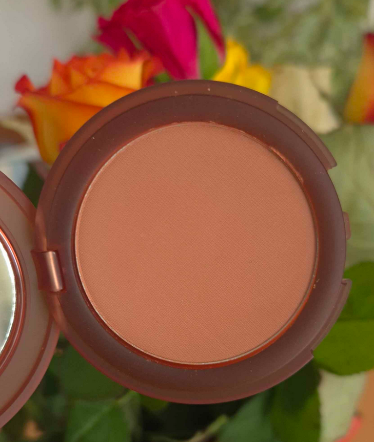
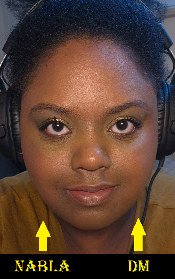
Nabla Close-Up Blurring Blush in Satisfaction
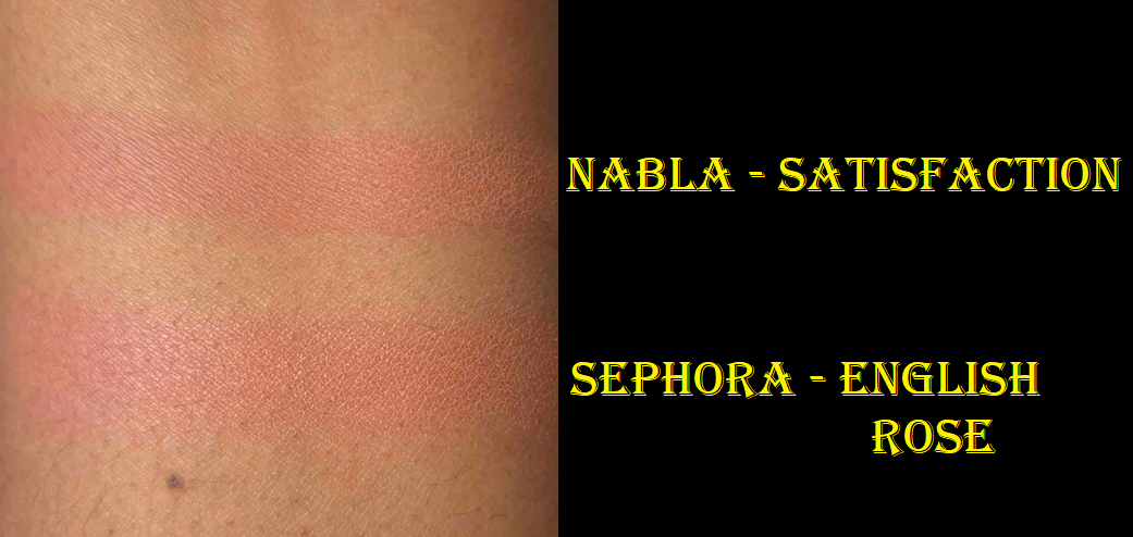
I love Nabla’s Skin Glazing blushes and have long wished for a shade extension. So, even though these new blushes are a matte formula, I felt compelled to try at least one of them. The shade I chose can be iffy as to whether it will work for me or not. The color reminded me of Too Faced’s Cloud Blurring Blush in Velvet Crush, Tarte’s Amazonian Clay Blush in Exposed, and Sephora’s Duo Matte Blush in English Rose. It might even be similar to MAC’s Gingerly, but I would need to see it again to know for sure. In any case, some of the above work for me all the time or just in winter, so I took the chance. The only one I have with me to compare in swatches is Sephora’s English Rose. I intentionally mixed the two split pan colors together to get as close to Nabla’s Satisfaction as possible. English Rose can look completely different if I use more of the pink within the duo.
If I just use Satisfaction on my bare cheeks, it’s a little ashy looking, especially because it’s a matte formula and I have dry skin. However, when it blends into my foundation, the color warms up further and looks just as I hoped. I like vibrant poppy blushes, but sometimes I like having just a flush of pink. Sometimes, I want light pink cheeks like an anime character. It all depends on my mood! In order to get as much payoff as it looks in the photo below, I had to really pack it on my cheeks. A normal amount is very subtle.
I have no blending issues or longevity issues with this. The part I dislike is actually the smell. It smells like a mix between chalk and chemicals, though not as strongly as the MAC Bronzer issue when those launched last year. I used to smell it only when I first opened the compact and then it would dissipate in the air. I noticed a similar thing with the LH palette that’s being reviewed next. What a strange coincidence! By now though, after many months, I only get a slight whiff of the chemical smell if I put it right up to my nose.
I like the color of this blush, but I have to admit that after comparing it to the Sephora duo, I like Sephora’s more. The Nabla blush is supposed to be blurring, but I don’t find that to be the case. Sephora’s is a soft matte, which is a more flattering finish for my skin type as well. Plus, with English Rose, I can tailor the color to be similar to Satisfaction or more vibrant if I’m in the mood for more of a punch. The times I don’t feel like mixing is when I’m most likely to use this. I don’t foresee myself buying additional shades.
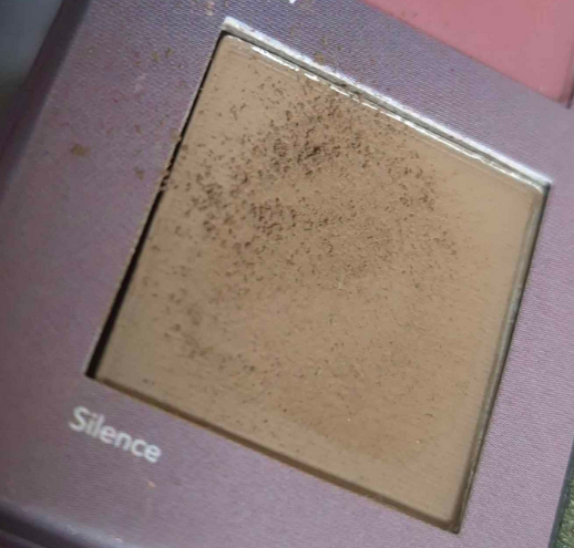
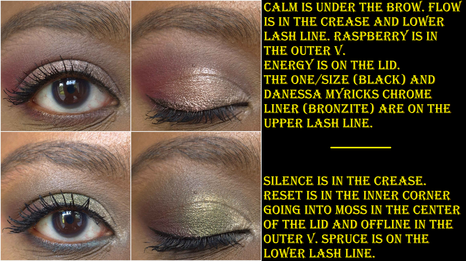
LH Cosmetics Reload Palette
There are elements that I really like about this palette, but I’ll start with the issues first. I love how Flow and Silence look in the pan, but if you keep blending those shades back and forth, they turn much darker. Flow becomes a dark purple and Silence turns dark grey. I even used it as an outer corner deepening/smoking shade in the fourth eye look below. It doesn’t matter whether I use primer or not, it stays the pan color when first placed and patted on (which is how I could get them to look alright in swatches), but the moment I blend, Silence turns grey. It’s not an issue of dirty brushes either. I literally tried it with a brand new brush. Considering I already have Offline to deepen eye looks, and I don’t really have much in the way of mid tone mattes since Flow and Silence don’t count, I’m unable to create the kind of looks I intended without reaching for other palettes. The eyeshadows are still pretty, but more dramatic than anticipated.
Thankfully, I have no issues with the colors of the other mattes. I was also able to use three different bases for the eyeshadows and the performance didn’t change. The shadows are pigmented and require a bit more time to blend than I’ve been used to lately, but the final result is worth the effort. At least, that’s what I thought in the beginning, but I’ve only used this palette one or two more times after my initial rounds of testing were completed.
The shimmers are on the thicker side, but I suspect it’s for adherence purposes. I don’t feel the need to apply them damp to increase intensity on the lids, nor to keep them together. I don’t have any fallout issues with these. I also like that there is a warm toned option with Reset and an option to go with the pinks with Energy. The shimmers pick up easily on a brush, spread and blend nicely, and they don’t have enough slip to them to cause creasing on me.
The color story allows one to take the color scheme in different directions: monochrome pink look, neutral, neutral plus one color, blue-green, warm or cool, etc. It’s just a shame that the variety is lessened by Silence and Flow. I would have loved to put a true olive green in the crease, have Moss on the lid, and deepen it with Offline. I’m not disappointed by the performance, only let down by the shades because this could have been a palette I reached for quite a bit due to the convenience of having colors I love all in one palette. Because I have to pair it with something else, the reality is that I use it less than I’d like.
I also need to mention that these have a bit of a chalky smell. This palette is not cheap (even though I bought it at half price) and the eyeshadows are made in Italy, so I don’t think this was cheap to produce. However, that’s what I associate with this type of smell. I only smell it when I first open the palette and the kickup flies through the air. So, it’s not a big problem, but an aspect I don’t like. Especially when I think about Huda Beauty 9-pan palettes that are a similar size, and cost 29 Euros at full price, compared to the Reload palette that’s 49 Euros at full price. The formulas are completely different, but I like quite a few of Huda’s Obsessions palettes and if both brands had a palette comprising of similar colors, I would choose Huda’s.
Nabla Cupid’s Arrow Longwear Full Colour Stylo in Arrow #12 Khaki and Arrow #13 Mauve
These weren’t on my radar until I saw Angelica Nyqvist using them more frequently in her videos during the summer. Since they were on sale and I realized the colors I wanted would compliment what I was missing from the LH Reload palette, I figured I may as well try them.
For starters, the experience is slightly different depending on whether or not an eyeshadow primer was used underneath everything or not. What is the same for both is that liquid eyeshadow goes on top of the Nabla stylos well when used as an eyeshadow base. When this product is used as an eyeliner, it holds onto the skin very well. It’s budge-resistant and water-resistant. When I first apply it, I try to keep my eyelids closed to allow it to set and try to avoid creasing. It only takes a minute to set on an un-primed eye. In one instance on a primed eye when I had to scratch around my lashes, I placed my thumb near the lid to hold it steady and got transfer on finger. Essentially, the more emollient a primer is, the longer it takes to set. In this instance, it was closer to 10 minutes.
On a primed eye, Khaki essentially looked the same, but Mauve was warmer and leaned pink (as opposed to no base where it looks cooler toned purple-mauve. I can draw the stylos on smoothly to apply them without needing primer, but if I want to blend the edges or smooth it out with a finger, it takes too much product off and I can see my skin discoloration underneath. On a primed eye, it’s easier to draw smoothly, but blending the edge also removes the primer with it and I can see bald patches left behind. So, it’s best if I draw product on, but use a lighter powder to blend out the edges.
On a non-primed eye, applying the Nabla Stylo and adding another powder eyeshadow on top doesn’t result in as much creasing, but over a primed eye it settles in my deepest eye crease. The bottom line is that I prefer to use this product as a creamy easy-to-glide-on eyeliner, and perhaps as an eyeshadow base in areas that I don’t have lines yet, such as the mobile lid. To use this as a standalone eyeshadow is too finicky for me. It’s easier to use a powder or more traditional form of cream and liquid shadows.
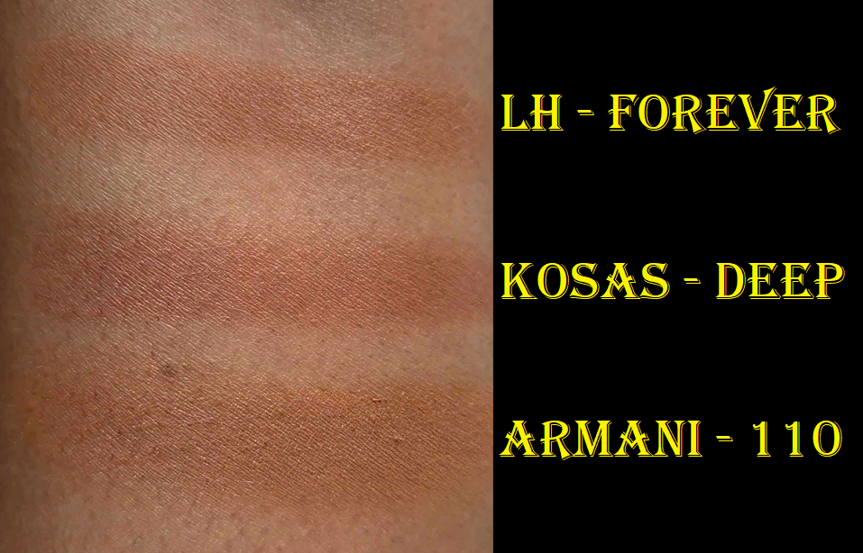
LH Infinity Bronzer in Forever
This purchase was made specifically because of Kackie Reviews Beauty. She took my curiosity and tripled it with her gushing about how great it is in multiple videos. With only four options available, I chose the darkest one. The shade Forever has enough depth for me, but will not work on someone with a rich skintone. It’s debatable how well it would suit someone within the deep category. My other concern was whether or not the color would be too warm of an orange, but I was compelled. The stars had aligned and now seemed like the time to get it.
It’s a bit silly, but I will admit that there was something visually drawing me in too. There was some reason I couldn’t stop wanting this product from the moment it launched. It wasn’t until I finally bought it that it clicked. The pattern in the pan is similar to the limited edition version of Becca Shimmering Skin Perfectors! In my review, I talked about how I experienced regrets for over a year because Champagne Gold was discontinued, and how I immediately bought it when it popped up on the Hautelook/Nordstrom Rack website.
I don’t think I ever made that review comparing and discussing the situation between Lunar Beauty’s Moon Prism highlighter and the Makeup Revolution highlighter packaging debacle, but this crystal pattern I’m apparently obsessed with is on the outside of both compacts and I bought those back then despite never using the highlighters inside! And now, I believe I have solved the question why my inner makeup goblin couldn’t let the LH bronzer clear out of my mind. I think that experience of FOMO from the Becca days has continued, and now when I see makeup with that pattern I feel like I am missing out if I don’t get it. I’m finally aware of the psychology behind it, so I hope I’ll be better equipped to not let that be a factor in the future! As I’ve got the product now, let’s chat about it!
This bronzer feels very smooth to the touch. It isn’t as buttery as the Westman Atelier one, nor as creamy clay-like as the Glowish bronzer. The closest comparison I have is to the Kaleidos Symphony Contour Trios, which in turn feels like a lighter pressed version of the Hourglass Ambient Lighting powders. The LH bronzer has medium-buildable pigmentation and lasts all day.
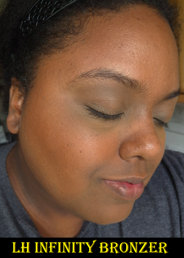
Whether I get a smooth and diffused application or an uneven concentration depends entirely on my brushes. Because the surface of the bronzer has mounds and divots from the pan design, if the brush I choose doesn’t pick up an even layer (or I don’t swirl or sweep it around to coat it evenly), it will stick to my skin unevenly when I apply it and require me to spend a bit of time buffing. I tested a lot of new brushes with this bronzer specifically, so I was able to see that the density of the brush doesn’t matter as much as the even coating. I can use a dense brush for a strong yet blended look, or a fluffier brush to look seamless with the skin. In the photo below, I built up the bronzer so it would be more obvious on camera. It can also be built up to look smoother than I depicted, as I hadn’t learned the brush trick at the time I took the photo.
Because of how warm the color is, it’s harder to be able to tell I’m wearing bronzer, as it blends into my warm colored blushes (as seen in the right photo above).
Even when I use my best bronzer brush with this though, and even though I can get it to look smoother, it’s still doesn’t look as seamless as some of my other bronzer favorites.
This photo was taken a month later in the peak of summer, so I’m a little darker. The bronzer color matches better after having gotten some sun, and I used my best brush with it. A tiny bit of foundation, concealer, and the bronzer are all that’s on my face.
This is described as a luminous bronzer, but it doesn’t have much of a glow. I consider it slightly more radiant than a soft matte bronzer. There aren’t traditional shimmer particles that I can see, just sheen from the mica. It has even less of a sheen than some of my semi-glowy favorites.
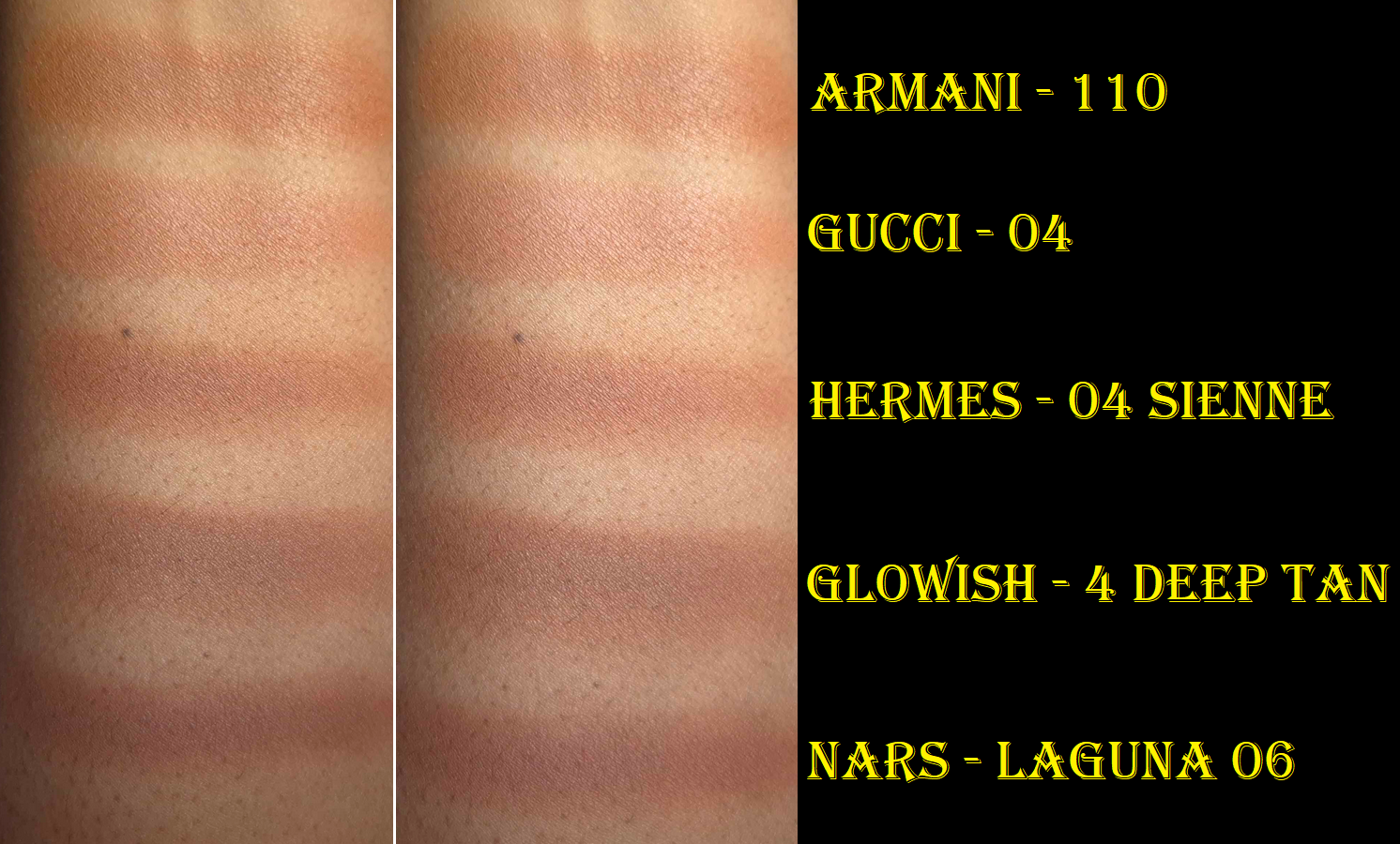
To show the undertone compared to other orange bronzers, I have swatches of Kosas, a true luminous bronzer, and Armani’s Luminous Silk Bronzing Powder that has some shimmer particles as well as the mica-like sheen. “Forever” is the darkest option from LH, but Kosas and Armani both have a deeper option in their lines. Just something interesting to note.
I like this bronzer, particularly at the discounted price I paid. However, there are tons of bronzers I like. I estimate this would rank no higher than top 30’s or 40’s among my collection. It’s good, but didn’t quite live up to the hype for me. The sheeny finish isn’t strong enough on my face for me.
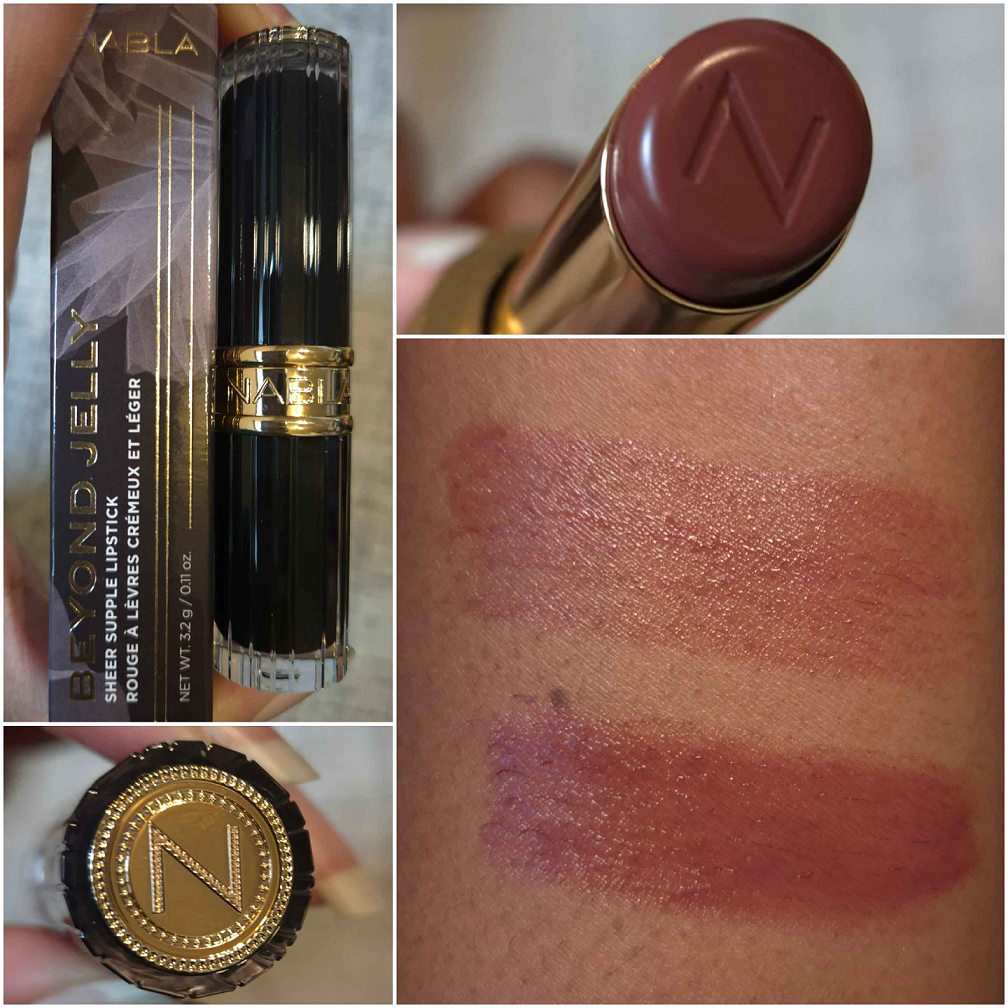
Nabla Beyond Jelly Lipstick in Ardor
Among the YouTubers I watch that review Nabla products, this particular formula has always been highly rated. So, getting it at half price was more than enough of a reason for me to buy it!
The lipstick component has a beautiful design with clear elements and black and gold touches that makes me think of timeless elegance. In the hand though, it feels like acrylic plastic, which I haven’t decided if I like or not. The fragrance used is an incredibly strong combination of fruit and florals. It’s pleasant, but also distracting. In the beginning, I didn’t like the fact that I could still smell it on my lips for hours after applying it. Thankfully, the smell goes away over time and is no longer an issue.
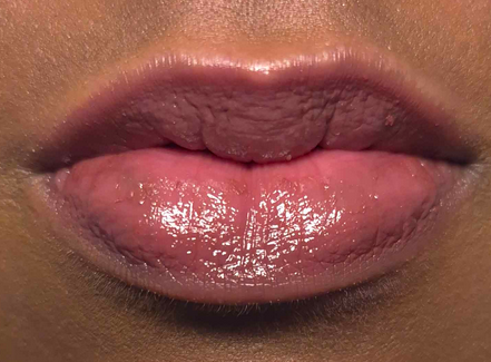
Its formula reminds me of the YSL Candy Glazes and Fenty Gloss Bomb Stix. It has a comfortable gel-like consistency that feels moisturizing on the lips and has sheer color that can be built up to medium coverage. Of the three lipsticks I mentioned, the one from Nabla feels the stickiest. It can last through a meal (depending on what someone eats), but it definitely needs a touchup after a second meal. When my lips are in a drier state prior to putting this on, within a few hours (even if I don’t eat) my lips will absorb some of the moisture it provides and I will have to reapply, despite still feeling the presence of the sticky layer on my lips. This has a few ingredients that my lips like, and my lips feel softer even after the lipstick has been removed, and that softness lasts until the next morning. So, this formula is hydrating and moisturizing, but I have balmy lip color products that are more nourishing. The reason I love this product though is for the color and how the jelly texture smooths out any dry or peeled looking skin on my lips. The retail price is 23 Euros, but I’ve seen it for 16-18 Euros on multiple websites for at least half a year. So, it’s a product I’d recommend to anyone who wants a less expensive option for a jelly or melty type of lipstick. In fact, of all the products I’ve reviewed in this post, this one is my favorite.
Nabla Skin Realist Tinted Balm in Shade 6 Dark
I had only seen three reviews for this product since 2021, and it was enough to make me want it, yet not enough to want to buy it without a discount. My reasons for that were the lack of reviews available and I felt very uncertain about the shade options. At the beginning of the post, I mentioned buying all these products during the Birthday Sale, but this one is from the Purish Black Friday sale when it was half off. Considering we’re in winter and I’m at my driest, now seemed like the perfect time to finally try it out!
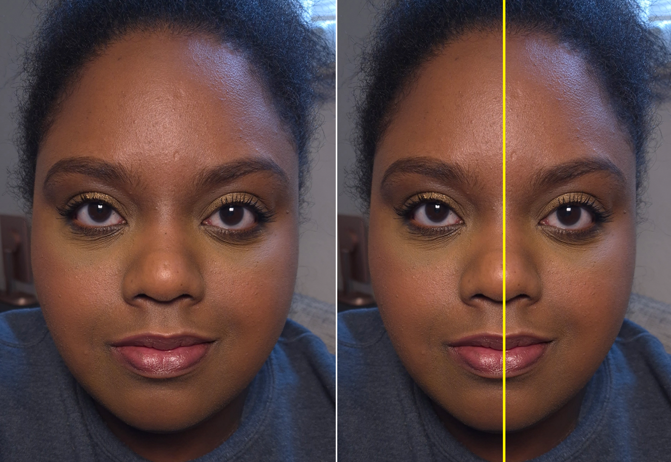
In the photo above, I have the skin tint on in the left side of the yellow line and the Dior Powder no Powder on the right side with no foundation underneath. For me, I barely see a difference. This “tinted balm” only looks better compared to my bare face, so it doesn’t get any accolades for that. The name of the product implies that it will offer low coverage, but in the world of the Fenty Eaze Drops, Danessa Myricks Serum Foundation, and even Lisa Eldridge Skin Tint, the ones I buy usually have more coverage than I expect. This isn’t a deal-breaker though, considering it has similar coverage to the Givenchy Prisme Libre Skin-Caring Glow Foundation and I made that one work. My issue is that it fails to deliver on the radiance in multiple ways.
Another look of the Tinted Balm. In this photo, I’m not wearing a highlighter, but I do have on a satin blush.
The Skin Realist isn’t matte, but it doesn’t give me nearly enough glow, even though I leave it unpowdered. This contains hyaluronic acid, which essentially does nothing for me in this region of Germany that isn’t that humid. The only time I get this to look to the glow level I want is if I fully prep my skin beforehand and use a ton of this balm. Then, it looks closer to a natural finish foundation, but it still takes six hours before my skin starts producing oil and looking luminous. Unfortunately, by that point it also starts to look like “end of the night” makeup, even on days when I’ve done nothing strenuous. If I actually do laborious housework or go for a long enough walk to start sweating, it makes everything on my face start to fade and break apart. This really isn’t a longwear product. When I try to counter this by using a setting spray, I lose the benefits of prepping my skin and the most I can get is a soft matte look again. I feel this product requires too much effort for a skin tint (and especially one that touts being a makeup-skincare hybrid product).
On the Nabla side in the picture above, I used at least double the amount of product as the Danessa Myricks Yummy Skin Serum Foundation side. Danessa’s product looks more skin-like while still offering more coverage (which is easier to see by looking at both sides of my mouth). Considering I actually have more hyperpigmentation on the “DM” side, Nabla’s should look better, but to me it does not.
I was relieved to discover that this had low transfer despite the “balm” name. It fully dried down on my skin. However, this product just isn’t suited to my preferences in a complexion product. I have several low coverage foundations and skin tints that give me a prettier finish on the skin, fully set, and have better lasting power. I wouldn’t call this bad; it just couldn’t compete with what I already own.
I didn’t have the most success with these newest additions to my collection from Nabla, but I continue to recommend the brand’s Skin Glazing line, lip products, and their face brushes are pretty nice despite being synthetic.
It’s that time of year again! The holiday makeup launches have started rolling out and this is the first of them that I’ve purchased! Let’s get right into the review, and I’ll save my overall thoughts, suggestions, and discuss my ordering experience towards the end.
*DISCLOSURE: Non-highlighted links in bold blue font (Example) are standard non-affiliate links. Links marked in bold black font with a light blue background (Example) are affiliate links. Affiliate links allow me to get a commission if purchases are made directly using my link. The only affiliate links in this post are brush related. I have no ties to Hourglass. All products were purchased by me and my opinions are my own.
I am including some demonstration photos. In the photos with the black shirt, I’m wearing the Huda Beauty Easy Blur Foundation in shade 440 G Cinnamon. I used Eternal Light to set the concealer under my eyes. In the photos with the dark gray shirt, I’m wearing the Hourglass Ambient Soft Glow Foundation in Shade 14. In these pictures, I’m wearing Eternal Light all over the face, so the pictures with the blush (and no highlighter added) still look a bit highlighted due to the use of that finishing powder. I’ve gotten a little darker this summer, so I wanted to show how the products look on different foundations and with lighting coming in from different times of the day.
GILDED STROBE LIGHT – Hooray! Hurrah! Finally, the right highlighter color for me from Hourglass! I had said that Divine Strobe Light from the Tiger palette was “perfect,” but I don’t wear that depth of highlighter anymore, and prefer for it to basically be a shimmery version of my skin tone. Prismatic Strobe Light from the Volume III trio was too dark, so I’ve been hoping for the brand to release something in-between. I’m so glad that day is finally here! That being said, this strobe line is beautifully reflective, but it enhances texture more than I’d like. The powder is ultra smooth with fine shimmer, but the shine effect can be a bit much for me if I’m not careful and over apply. However, I’m still happy to have this. I have ways to tone down highlighters and I could always just use it to bump up the intensity of other highlighters if I want.
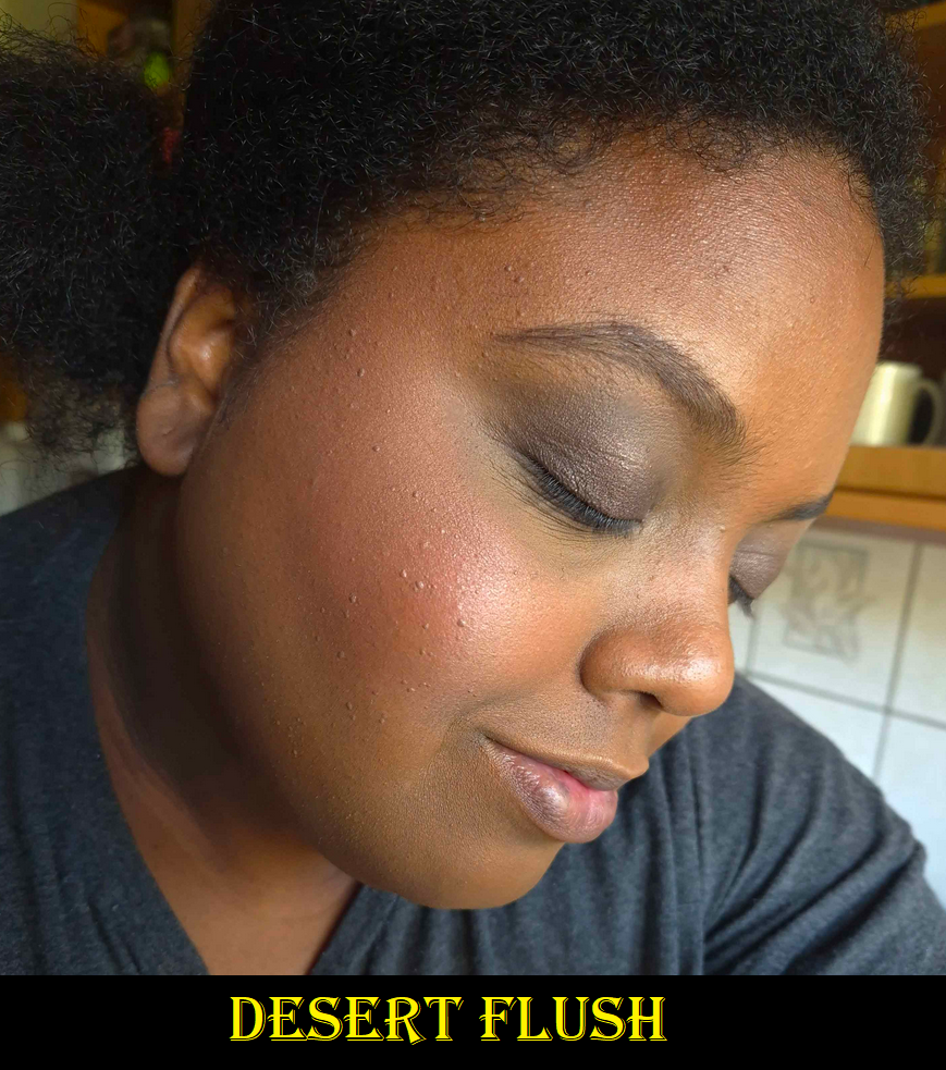
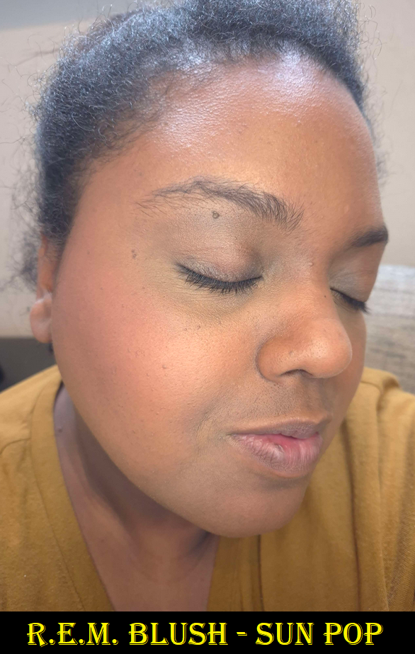
DESERT FLUSH – A dark medium muted option! Hurray! Thank goodness this blush is one solid color combining “deep beige” with “peach”, because this is already on the cusp of what should be included in this palette in terms of depth (not in terms of color because a peach was absolutely needed in the line). It’s a buildable shade that shows up on me, but I have to use my dense brushes to pack on the color so I can wear it on its own. One such brush is the Sonia G Cheek Pro. In winter-spring, this color should be easier to wear. In any case, I find this shade useful to tone down or pair with Red 0. I am sometimes in the mood for a light blush, but this is pushing the limits of what I’d feel comfortable wearing in public by itself. I foresee myself combining this with other blushes from other brands.
ETERNAL LIGHT – I’m going to repeat what I said about Eternal Light from a previous review. This finishing powder is a golden brown color that matches my face perfectly! It gives a subtle luminous sheen, but also has a few flecks of gold glitter throughout. The difference this time, in the Lotus Palette, is that the larger gold specks seem to be way smaller than they are in the Volume III trio palette. In the past, the specks forced me to use it as either a mixer shade with bronzer or as a barely there highlighter. I’m thrilled I can actually use this shade as a setting powder now! I don’t know if it’s just my palette, or if all Eternal Light shades are now made with more refined shimmer.
As mentioned earlier, I set the concealer under my eyes with Eternal Light in the photos with the black lace shirt, and used it all over my face in the photos with the dark grey shirt. The matte blushes can look a bit flat on my dry skin, but using the finishing powder all over imparts some glow and makes them look more flattering.
RADIANT ROSE STROBE LIGHT – I normally don’t like pink highlighters, but this is actually pretty! It pairs so beautifully with the Red 0 blush. When used sparingly, this looks a bit gold too (or at least golden copper). I had to actually build up the color in my face demo photo for the rose tone to be clearly visible, which of course increased the emphasis on texture. Contrary to how it appears in my photos below, the reflectivity of this shade isn’t as strong as Gilded Strobe Light when used in smaller amounts. I like that part about it.
I used all the shades from the palette on my eyes in this photo above.
RED 0 – I’m honestly shocked that this shade is in this palette because Red 0 is such a special color for Hourglass. It’s their “exclusive pigment replacement for carmine.” They’d been working on the formulation of this color for years, first introducing it in their lipsticks. I would have expected them to pull the same stunt as Butterfly and put it in Dragon, but they didn’t. I give major kudos for that.
The description calls this a brick red, but I don’t agree. It’s a deep reddish/pink or deep rose. How it appears on my skin can be affected by my undertone, but it doesn’t look brick red in color when eyeballing it in the palette either. This shade is ultra pigmented, and I have to use a light hand and airy brushes to wear it subtly, the way I prefer. For example, with the Chikuhodo REN-7. I also want to note, regarding the color, that this is quite similar to a lot of blushes I’ve gotten recently (Chanel’s Deep Rose from the trio and Guerlain’s Deep Nude), but the tone is the slightest bit different. It makes me like it that tiniest bit more.
Of all the shades in this palette, I think this has the most potential to be added to the permanent blush line. If they do, I’d recommend swatching it in stores because it wouldn’t surprise me if they alter it to make it less pigmented, so that it’s easier for a wider range of people to be able to wear it. It’s already intense on me if I use even an airy goat brush and apply two light layers instead of a single one with squirrel or fox.
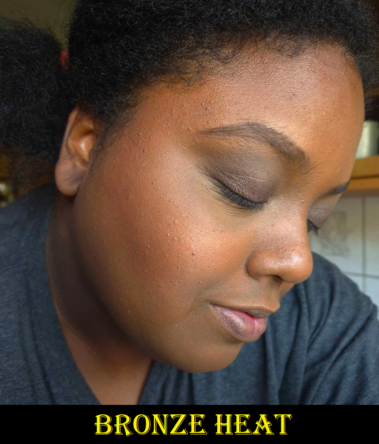
BRONZE HEAT – This is the darkest bronzer created by Hourglass thus far. It’s slightly darker than the Transcendent Light finishing powder, but it’s more of an undertone difference than depth difference. Transcendent Light looks deep brown – pink on me. Bronze Heat is neutral brown with a splash of red. Even though I prefer yellow/golden bronzers, I think Bronze Heat still looks good. I’ve gotten some sun this summer though, so the tones in my face have some red to it right now, which is probably helping it to match. I’m curious to see if I’ll still like it when I’m back to my normal skin tone. Solar Bronze, though lighter, is still my favorite bronzer from Hourglass so far. I’d love a deeper version though. In general, I’d still love to see a truly rich bronzer option, but the tweak to this year’s color is enough that people I follow that are a little darker than me that couldn’t wear last year’s bronzer have reported being able to use this year’s. So, even a small change made a difference. I can’t discredit that.
In these photos though, I had to pack on the product to get it to show. My favorite brush to use with these Ambient Lighting Edit Palettes, ever since I got it, is the Eihodo No. 153 which I used in the left picture. For the right picture, I switched to the much more dense Chikuhodo FO-2. They both fit so well into the size of these relatively small face powders.
Overall, I’ve noticed no differences in quality between the powders in these palettes and the ones in the past. The matte ones can look a bit too matte, which is when pairing them with the finishing powder helps. They’re all so smooth with the benefits that come from being a baked powder. I have no longevity issues. These continue to be lovely powder products! The consistent performance of these products year to year is how I’m able to confidently post this review after having used it for barely more than a week, instead of my longer testing process.
COMPARISONS
I don’t have access to my full Hourglass collection, so I could only compare things to my Tiger-Butterfly custom hybrid palette, the Snake palette (in Leopard packaging), and Lotus (in Dragon packaging). This year’s deep blushes are finally distinctly different from each other, and previous years. The highlighters and bronzers are super similar though, with just slight undertone differences.
The list of all my previous Hourglass reviews and rants (especially the Holiday palettes), can be found HERE.
HOW DID HOURGLASS DO THIS YEAR?
Before I can begin to answer this question, I wanted to point out some things I mentioned wanting over the years to see how Hourglass answered or ignored feedback from plenty of customers that shared the same thoughts as me.
2021 I hoped for less repeat shades, I believed there should be 3 palettes per year with one of those clearly designated as suitable for tan to deep skin tones (or darker, or for there to be at least a deeper extension of the permanent bronzer range). I also wanted more accurate representation of the shades in promotional images. 2022 I wanted a true bronzer for dark skin tones and not a translucent powder than could be used as bronzer. I didn’t mind if the brand released a mini or repeat of At Night in the deeper palette. I mentioned being willing to spend $100+ instead of $85 to make every shade in the palette customizable. I mentioned that it would be nice if they used their “miscelare technique” to mix two medium or darker colorful shades in a series of blushes instead of pale beige bases with a single color. 2023 I wanted a deeper bronzer option (since so far the depths are similar and the undertone is just changed), a dedicated true Deep/Rich palette option (even if it’s too much for someone like me), and some dark brown blush color options (less pinks and corals with the occasional orange). I hoped they would continue with palette cover customization, though choosing individual shades is still the ultimate dream. I also wished for a rabbit and/or panda cover art which would tie-in with the brand’s collaboration with the Nonhuman Rights Project.
So what did we get in 2024?
We got almost no repeat shades!
We have 3 palette options again with better designated colors per category (fair/light, light/medium, and tan-deep). Not being able to choose all 6 shades is okay if presets will continue to be good (ex: not having deep blushes in the fair palette like they did with Butterfly).
The brand decently represented the accuracy of shades in their website photos.
Hourglass gave us another dedicated deep bronzer, though it’s barely darker than Transcendent Light, and mostly another tone change.
They opted out of using the miscelare process, ensuring that every tan-deep palette will work the same for everyone instead of some people, who would normally be able to wear the shade, being unable to because their swirl had too much of the lighter color.
Hourglass gave everyone a peach and/or nude option. Everyone seems to love that. The Evil Eye colors had the typical Hourglass pinks and were too similar to each other in one palette. The Dragon and Lotus palettes were better at having distinctly different shades.
What are my hopes for 2025?
I would love if the brand would continue with adding more nude blush options (especially a deep skin friendly one with some brown along the lines of Chanel’s Brun Roussi Lumiere, MAC’s Coppertone, Format, and Burnt Pepper). All the reviews and comments I saw were positive regarding having less vibrant options. The only semi-negative part was Desert Flush not being deep enough to use alone for those with deeper skin tones, so ensuring they are at least dark medium in depth would be great.
I am still looking for Hourglass to make an ultra deep bronzer in at least the permanent collection, if not the Ambient Edit Palettes. I’m not that much darker right now, yet the bronzers are close to being too subtle on me, so this still isn’t dark enough for a ton of people.
I’d still be fine with Hourglass making At Night a repeat in the palette or for them to release a mini. Better yet, I would love the two colors within At Night to be mixed into one solid color and with an increase in pigmentation. That would be fantastic!
I would still love a rabbit and panda themed cover art.
That’s it! I really don’t have any major criticisms or requests. I think this is the best the brand has done so far. Back in 2021, I was worried that listening to customers was just performative and that we wouldn’t continue to see much work towards inclusion. I’m happy to say that someone over there seems to be putting in effort regarding this topic. It’s not even about wokeness. It makes financial sense to create products for customers when the demand is clearly there.
LOGISTICS
This was the first year I had to order my palette outside of the US. I’m happy to say it went smoothly. It cost €90 (VAT included). Influencer promo codes were able to be applied to the order. Shipping was free, but I added €5 for expedited shipping. I wanted to buy a gift box and gift bag in Dragon print, but they kept getting taken out of my cart on the payment page, so I assume they aren’t offered outside of the US. My package was delayed a few days, but that was due to the weather conditions in Germany at the time and not the fault of Hourglass.
If Hourglass continues with this upward trajectory, I will likely purchase next year’s iteration of holiday palettes too. Now that I have to spend even more than usual for these palettes, it’s that much more important for the brand to nail the colors and also offer shades different enough from previous launches.
That’s everything! Thank you for reading! Be sure to click the follow button if you’d love to be updated whenever a new post from me drops!
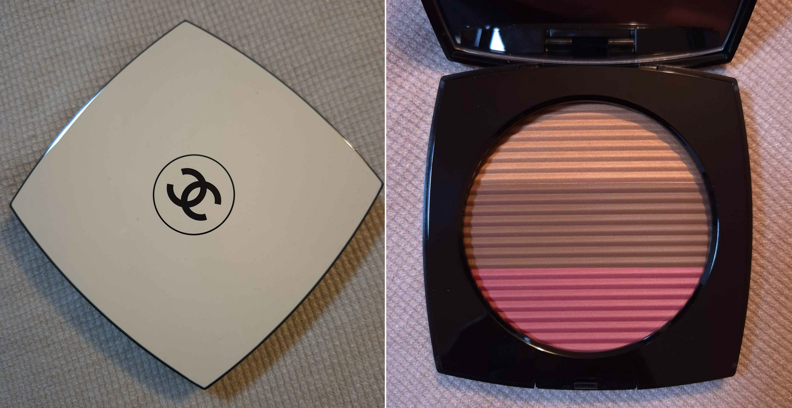
The compact photo above is better at showing the depth level, but the compact photo below is more accurate to the undertones.
I have more than enough makeup for one person, even though I currently only have access to about a quarter of my collection. For that reason, I tried my hardest to not be tempted into buying this Chanel product. I love their blushes, but I don’t use them enough. I have heard fantastic things about their highlighters, but most are too light for me (and the one I bought wasn’t as refined as I expected). I don’t own any bronzers from the brand, so that would be a new experience.
I watched a video from French for a Day to talk myself down from Chanel products in general, but even she seemed excited for the trio. It was ultimately the assurance that this would work on my skin tone from watching the video from I Am Jamila that kept me interested in this product. In addition, so many people I follow on YouTube and Instagram continued to rave about it even beyond the initial release, indicating that it’s not just temporary hype. The final nudge I needed was a small discount from the retailer Parfümerie Pieper, and I was sold!
Chanel Les Beiges Poudre Belle Mine Ensoleilleé in Deep Rose Gold
The blush is nice. It’s not difficult to nail a blush formula though, so I expected it would be good. It’s not my favorite tone of pink, but it’s pretty. For those that have the Guerlain Terracotta blush in Deep Nude, this is basically the same color.
The bronzer is also pretty good. If you’ve seen my ranking of bronzers that I purchased in 2023 exclusively, I would say it performs as well as MAC’s Sunstruck bronzers, Pat Mcgrath’s Divine Powder bronzers, and perhaps even Nars Laguna Talc-Free Bronzing Powders. This means that it’s among bronzers I like a lot, but not quite enough to make the top 10. I didn’t watch French for a Day’s actual review of the trios until I finished my first draft of this post, and in her opinion the powders are average quality for Chanel. That doesn’t make them bad, just not the best that the brand is capable of producing. I felt strangely reassured when hearing this because it matched my feelings, after using this product for a while, that perhaps this being called “phenomenal” is an over-exaggeration.
I had mixed feelings about the highlighter initially. I love a subtle highlighter, but this is too subtle for me to want to use alone. It’s along the same vein of the Guerlain Météorites, but even less shimmery. I built it up as much as I could in the photos above. What made me start to like this highlighter is that it offers something I don’t have in my collection, which is the ability to turn the bronzer and/or blush into a glowy one without changing the color or making it overly shimmery. It lightens the color, but not by much. I have a few products that I mix with others to achieve this effect, but they are pigmented products that will alter the final color by adding more of a brown tone, warmth or make it cooler toned, etc. This one is sheer enough to transform other products too. In practical usage, I don’t know how often I would pair this with other products besides the ones in this compact, but the option is there.
In the previous photos, I was wearing the Lisa Eldridge Foundation which is a little dark and leans orange on me. In the photo with the blue shirt above, I’m wearing a combination of the Givenchy and Armani foundations, which are a better match (and it’s also a slightly sunnier day, so this is why I look a bit lighter). As for the Chanel products, I wore the amount I normally would, rather than building it up for photos, like the previous ones. The sheerer application of blush with the highlighter on top accounts for the depth differences in the photos.
I have no issues with fading or longevity with this product. These aren’t the smoothest powders I’ve used, but they blend pretty well, especially with a fox or saikoho goat brush. I also have some smaller sized brushes that can fit well in the compact, so it isn’t too much of a hassle having all three colors that close together. A tip I learned for getting into the blush easier is to turn the compact 180 degrees so that it’s the top stripe and the highlighter is on the bottom instead. Then I can dip the angled part of my brush into the blush and can see what I’m doing from top to bottom rather than trying to avoid the brush getting into the bronzer while having the back of the brush hitting the edge of the compact.
Sometimes luxury products look pretty, but don’t feel luxurious. This does feel like a luxury product in the hand, and because the retailer I purchased from included a few Chanel samples, just like the official Chanel website does, I still had the luxury experience.
Having three products in one feels like the pricing is appropriate, especially for a brand like Chanel. I posed the question in the title as to whether this was worth me buying. Considering the discounted price I paid, I think it technically was. However, from a personal standpoint looking at all the makeup I own and factoring in how often I’ll use this palette, perhaps it wasn’t. Time will tell, but for now, I am happy I made this purchase.
DISCLOSURE: I posted several links, including the retailer, but they are normal links, not affiliate links. I paid for these myself and these opinions are my own. At this time, I have no personal or professional connections to the companies or influencers mentioned.
Thank you for reading! I hope it has been helpful.
I thought of this title because most products take me a long time to decide how I feel about them. Whether my initial impression is good or bad, I always get the feeling that the results could be better if I test them under various conditions and with different techniques. So, that’s why it takes me quite a while to solidify my thoughts. However, with the two makeup items I’ll be featuring today, my thoughts haven’t changed from that first use and onward!
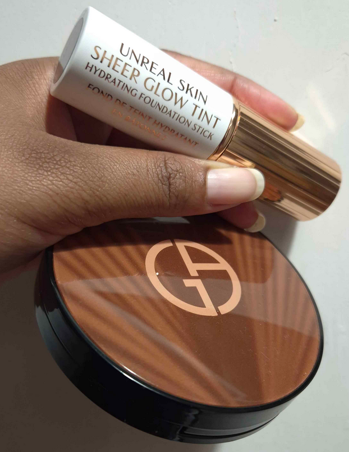
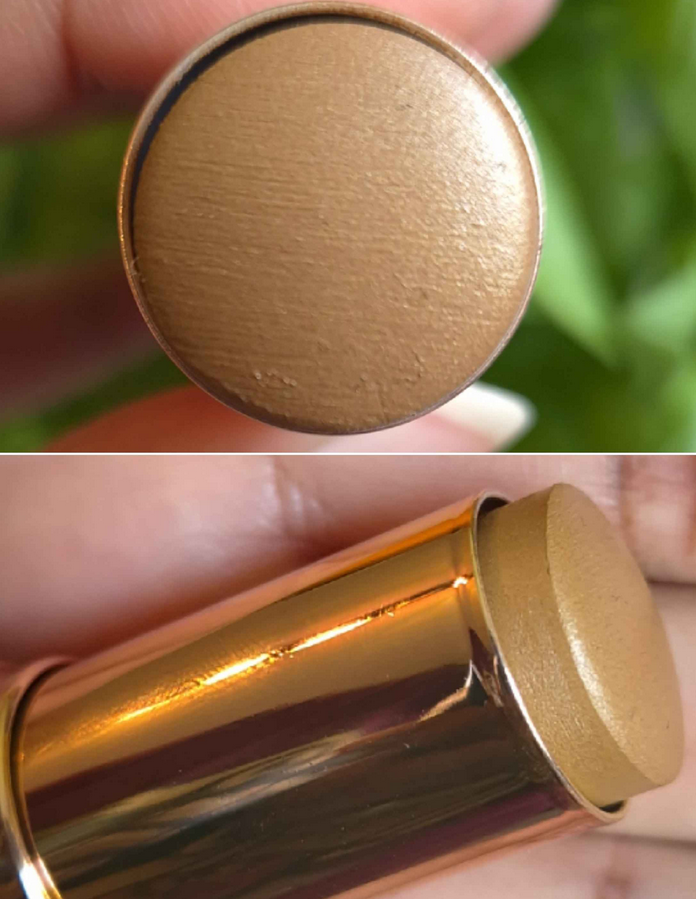
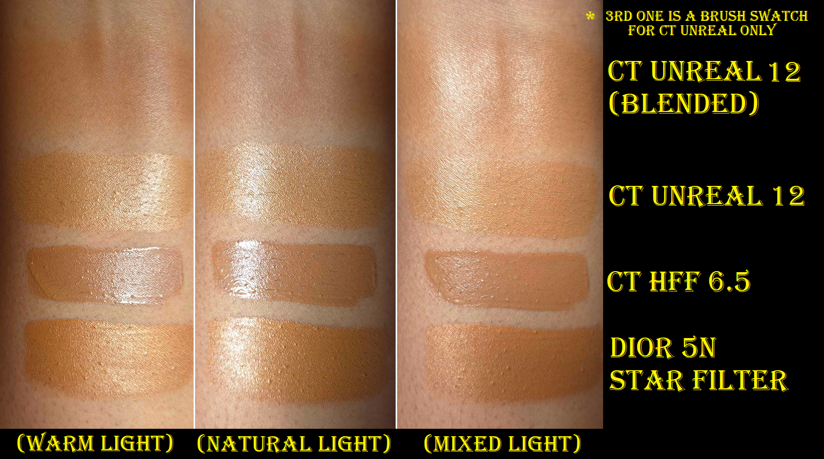
Charlotte Tilbury Unreal Skin Sheer Glow Tint Hydrating Foundation Stick in 12 Tan
First of all, what a mouthful of a name! Charlotte Tilbury certainly likes her over-the-top names and product descriptions on her website, but I’m not complaining. It’s funny to me.
I’m going to start off by saying that I do not use this product as a foundation. I’m an avid beauty YouTube watcher and saw a ton of reviews for this before it became available at Sephora’s Deutschland website (and on sale, hurrah!), so I saw how greasy looking this was on anyone who put it all over the face prior to powdering. Regardless of the reviewers’ opinions, I thought the glow looked beautiful on everyone, which is why I wanted to buy this…as a highlighter.
It’s important to explain that while I lived in Florida, I had dry/normal skin. Now that I’m living in Germany, with much less humidity (so drier air) and colder temperatures for the majority of the year, my dry skin issues exacerbated to the point where my natural finish foundations and slightly dewy ones look matte on me. Some of my products would turn glowier as the day went on while in Florida, thanks to sodium hyaluronate/hyaluronic acid, but moisture never broke through during German winter, no matter how long I wore them. The only foundation I have with me currently that makes my skin look glowy, but still takes several hours to happen, is the N°1 de Chanel Revitalizing Foundation. My desire was to find a product that would give me glow at the very beginning, so I could enjoy my Chanel foundation more and start using my other foundations again.
That’s where this Charlotte Tilbury product comes to play. I’ve been using powder highlighters to try and get a glassy wet-skin looking glow. It’s a decent solution now that we’re in summer, but it’s not as effective when my skin is extra dry in winter (plus fall and spring really). I’ve always hated cream highlighters because they tend to be too emollient and remain dewy feeling on the skin, as well as disturbing my makeup underneath. Liquid highlighters I’ve used don’t disturb things as much and most dry down fully, but they also tend to look super shimmery or metallic, which can look too obvious/stark on a minimal makeup day. I am so happy to say the Unreal Skin is the product I’ve been waiting for all this time!
It wasn’t too long ago that I reviewed Dior’s Forever Glow Star Filter, with the comparison to the Charlotte Tilbury Hollywood Flawless Filter. Dior’s product was the closest I’d ever come to perfection, but the drawback was having to use specific techniques to make it work because it’s technically darker than my skin tone and the next available shade up is too light. So, despite thinking I could stop looking for a glow product, I took one more chance by getting the Unreal Skin Tint.
I am typically within the 12 to 13 shade range of Charlotte Tilbury complexion products, depending on the line, as well as the time of year. I had a difficult time deciding whether to get shade 12, 12.5, or 13 in the foundation stick, but decided upon the lightest of the three since it’s a sheer and therefore flexible coverage product that I wanted to highlight with anyway. 12.5 could have possibly worked too, but I think I made the right call choosing 12. When I did a swatch with my finger and rubbed it in, the darker base color became visible. The lighter sheen and that base combine to form a better shade match for me than all the liquid highlighters I own. It never looks that dark when I put it on my skin because I use a brush to blend it in, which doesn’t completely remove the reflective layer. The difference can be seen in the top swatch of the third column of the photo below. I reapplied that swatch with my brush instead of my finger.
My reasons for preferring this product over the Hollywood Flawless Filter is that the color suits me better, the amount that I use is self-setting and dries down with almost no transfer, it looks more skin-like even though it’s a shinier and a more reflective product. It feels lightweight on my skin, so that I completely forget it’s there on minimal makeup days. Neither product disturbs my makeup underneath, but I’m impressed by the fact that I don’t have to warm up the product on the back of my hand first, nor rub the stick onto my brush bristles before applying it to my face. I can just drag the stick directly onto my skin and then blend it out with my brush without ruining even my KVD Good Apple Concealer, which notoriously doesn’t play well with a lot of my products.
The left photo has no bronzer, no highlighter, and just a thin layer of the Chanel foundation. The right photo has the Armani Bronzer on and the Charlotte Tilbury stick as highlighter on the cheekbones and above the brow.There’s also the tiniest bit on the cupid’s bow, chin, and nose.
The Unreal Skin looks a bit more pearly in photos than in person, but it’s also more detectable without blush. I used a combination of a Glow Play blush and Powder blush from MAC in the photo below and then it took on a more natural appearance, despite having applied the CT stick to such a large area on my cheeks (mainly for demonstration purposes). If I was going to use this product while skipping blush, I would have applied it more precisely to a smaller zone. I wanted to be able to show that even if it’s in a larger section of the cheek, using a powder product of any type on top will tone down the glow.
This is the completed makeup look. These last photos were taken a bit later when the sun wasn’t shining as brightly through the window, so I look a bit darker overall and warmer in color with the addition of blushes and bronzer built up. Plus, I usually skip wearing my Dior Powder-No-Powder for review pictures because Shade 5 warms up and slightly darkens on me too (I don’t have Shade 4 with me), but I wanted to depict what I interpret as a minimal makeup look and show how finishing powder differs from the CT glow on me.
I have to add that because of my dry skin, the type of skincare I use, and the small amount of the stick I end up applying, this product dries down enough that I don’t need to powder it. For those that use dewy primers, dewy foundations, have oily skin, or end up with thick skincare products that sit on top of the skin instead of fully sinking in, the results could be very different. Those that live in humid climates may also need to set it, which would diminish most of that shine.
Purely for testing purposes, I confirmed that using the Unreal Stick as a skin tint is too shiny for me. As a primer, putting a natural finish foundation on top (may as well be matte on me) tones down some of the shine. However, it’s still too much for my liking. Adding some face powder to strategic areas gave me the appearance of a natural finish foundation, but I still prefer how it looks when I just use this product as highlighter. Using it as primer makes the end result feel heavier on my skin and is just enough extra emollience to make the foundation transfer more heavily than usual, as my husband can attest to after I greeted him on the testing day!
The amount of glow in the completed look photo (in the neon tank top) might be too much for some, but I absolutely love it because I don’t get any shinier throughout the day. There was a heatwave and it was 87°F /31°C at the time I took those photos, but that didn’t effect the performance at all. The Chanel foundation does its thing and will make other spots more glowy, but I don’t get oily looking or greasy when I apply the amount that I do. This isn’t the type of product I think anyone would enjoy the look of when built up, unless it gets powdered after.
Technically, the Unreal Stick emphasizes texture, but it’s nearly negligible, especially for how glowy the product is overall. It’s not much of a problem for me because the areas I apply the product to aren’t wrinkly spots, though I do have some bumps and moles. I’m only mentioning this because it may be more of an issue for someone trying to use this product as intended, as foundation. In my case, I avoid applying it to my forehead, since the bumps there become more noticeable if it’s not powdered down (as seen in the maroon shirt photos). I’m happy with this product because it still emphasizes less than many other highlighters I’ve used, and even less than the Dior Forever Glow Star Filter.
So, now, I can genuinely say that I’m finished looking for a skin-glow-aiding product. In the event that I notice any changes over time, such as the stick drying out in the tube or the product expiring before its 12 month period-after-opening, I will update this post.
The final aspect I wanted to mention is that the component isn’t weighty, but it’s not cheap feeling to me either. I heard some complaints about the packaging not being luxurious enough, but I see Charlotte Tilbury as a high-end brand and not completely in the luxury sphere. I think the packaging is pretty. I also think the component comes apart based on the rattling sound it makes when it’s not fully twisted down. I wouldn’t be surprised if there becomes a refill option in the future. Quite a lot of Charlotte Tilbury products are refillable.
Armani Luminous Silk Bronzing Powder in 110
This product has been out for a while now, but I really thought 110 would be too close to my skin tone and that 120 looked too much like a contour color, based on photos I’ve seen online. I still think 110 isn’t that far off from my skin tone in terms of depth, but the undertone makes it to stand out more. More specifically, on my bare skin it stands out a lot. On top of foundation, especially mine that are a little darker and more golden-orange, the color appears subtler. This bronzer can be intensified by building up a few layers though. I’m also glad it shows up significantly more than the Armani Luminous Silk Glow Liquid Bronzer Drops in 110 ever did!
No bronzer in the left photo compared to a normal bronzer application in the right photo. A heavier bronzer application can be seen in the Charlotte Tilbury section further up.
The section I used a few times, seen in the photo below, doesn’t look as sparkly compared to the untouched areas in the pan. I began to wonder if the shimmer ran all the way through the product or in smaller amounts the further down one goes. It looked like the sparkle was solely on the outermost layer, but after a few additional uses, I started to see shimmer again. So, even though the very prominent gold specks can be partly rubbed away in the pan, it will return. What’s most important to me is that this powder imparts a sheen, which I love my bronzers to have. I’m not a fan of obvious shimmer particles in places other than my eyes. However, like those “sequin” eyeshadows that are matte formulas with random shimmer specks that get flicked off the skin when blended in, some of the gold particles in this bronzer don’t stick to the face. If I’m not in a bright setting, the shimmer that does linger around isn’t that noticeable. So, I’m accepting of this, but I know in the back of my head it will remain a point against this bronzer compared to others in my collection that I love. This type of issue is why I ended up not keeping Yacht Life from Mented (matte with golden shimmer) over Vacay (warm tone pink leaning soft matte bronzer). Armani’s bronzer having a sheen, which Mented’s does not, is the saving grace.
I like the smoothness of the powder, how easy it blends in, the sheen-like appearance on the skin. It adheres well and doesn’t fade all day. I even applied this to my forehead while I was sweating and I was worried that my brush would create hard-pan on the surface or that it would look textured on my skin, but it applied normally. The powder is easy to pick up, even with my delicate squirrel hair brushes. I just lightly tap into the compact and can get plenty of product on the bristles. If I’m wearing a foundation that requires me to to build up this bronzer to get it to show, then I switch to a larger saikoho goat hair brush to pick up even more product, but it doesn’t necessarily need to be a dense brush.
The compact is pretty on the outside and has a big heavy mirror housed under the lid which makes the packaging feel weighty overall. It certainly exudes luxury to me. For size reference, it’s about two millimeters smaller in circumference than the Charlotte Tilbury Beautiful Skin Sun-Kissed Glow Cream Bronzer packaging.
The only drawbacks about this bronzer for me are the gold particles and the color. I wish it had slightly less of an orange tone, because it looks even warmer on my complexion once it’s actually on my face. That’s all. Otherwise, I have no complaints about the formula. It’s far too soon to rank it with my other bronzers, but what I can say is the consistency feels like a mix between a soft matte, like the Hermes, and the almost clay-like appearance of the Glowish and Hatice Schmidt Labs bronzers. I don’t consider this a holy grail product, but I like it and I feel like it was a good purchase. I should preface though that I did not pay the full 52 Euros for it. I got it on sale for 37 Euros, thanks to an “Armani Cosmetics Promotion [for] Europe” via Selfridges.
I hope these reviews have been helpful. Thank you for reading!
The photo above demonstrates some of the various stages that I was testing different makeup products and practicing techniques in the weeks prior to the wedding. The very first example is what I would consider my typical amount of makeup, versus the last photo where I put in way more effort with a ton of extra steps that were necessary to create the look I envisioned for myself.
In Part 1, I explained which strategies I chose and showed the specific makeup products used. In Part 2, I’m going into greater detail listing the actual order of the steps I took. That includes all the details about the eyeshadows that I left out of the previous wedding post. I will also include photos of alternative wedding/special occasion looks in both the cold winter theme, classic looks, and a few colorful ones now that we’re in spring.
The makeup artists were upfront about either not being available on the day of the wedding or not having their own products to match me. I was a bit nervous about having to do it on my own, considering I’m just a makeup enthusiast, but many loved ones reassured me that I knew my own face better than anyone else and they were confident I could pull it off. I hope that this post will be inspiring to anyone else in a similar situation where you have an important event coming up and aren’t sure where to start or would just like to see extra ideas.
My Wedding Makeup Step-By-Step
First, I applied skincare (and this would normally include sunscreen though I skipped it), allowing ample time for everything to absorb in the skin before moving onto applying primer(s).
I then applied color correctors to the spots I have discoloration, put on the liquid contour for my nose and under the cheeks, and added liquid blush. I left them only halfway blended since the foundation would go over everything anyway as part of the underpainting technique.
I made a mixture of foundation shades and applied it to the outer perimeter of my face. The lighter foundation color, I applied to the central zone of my face.
The eye primer came next before I filled in my brows with my brow pencil of choice.
I applied my skin tone shade of concealer to my under eyes and areas of discoloration. I applied a combination of my skin tone shade and a lighter color to my under eye area again, the bridge of my nose, center of my forehead, and chin. I use the lighter concealer color alone to highlight under my eyebrows.
After setting those concealer areas with powder, I did a first round of setting spray to lock those in.
In the photo series above, I saved my eye makeup for last, but I switched the order on the day of the wedding to do the eye makeup next in case I had a mishap with eyeliner, if mascara got on the lids, etc.
1. First, I applied Viseart’s Illusion shade from the Peridot quad under my brows on top of where I laid down the lighter concealer shade.
2. Then I applied Melt’s Rubbish shade from the Rust palette in the space under the Viseart shadow, but above the crease.
3. Next was Melt’s Rust shade from the same palette tightly in the crease, not going past the previous shade.
4. I lightly added Log from Natasha Denona’s Gold Palette, building up the outer corner and moving halfway inward. I chose this placement because of my particular eye shape.
5. I then built up the depth and smokey factor in the outer v area using Xtreme Black from Pat McGrath’s Mothership III: Subversive palette.
6. I smudged the Urban Decay 24/7 Glide on Pencil along the outer quarter of the lower lash line before using Deep Shade (actual name) from the same PML palette on the rest of the lower lash line.
7. I smoothed on the Nyx Glitter Primer to the empty space on my lids and applied Bronzed Mink from PML’s Bronze Bliss palette to the outer half of the lid, taking care to not cover up the dark shadows in the outer corner.
8. I added Divine Dahlia from PML’s Interstellar Icon Quad on top of Bronze Mink to tone down the warmth of that shade.
9. The next step was picking up Nude Moon from Bronze Bliss on my brush, spraying it with MAC Fix+ and applying it to the inner half of the lids.
10. I placed Skinshow Fever from Mothership III: Subversive in the inner corner, under the brow arch, and the inner third of the lower lash line for highlighting purposes.
11. For extra sparkle, I added Lunar Luxury damp from Bronze Bliss to the inner corner. I applied the waterproof eyeliner to my upper lash line, along with two coats of waterproof mascara to my upper lashes, but only one coat on my lower lashes. Had I used the Clionadh multichrome, I would have placed a small dot that was eyeliner width to the center of the upper lash line.
Going back to my base, I applied powder contour under the cheeks and along my jawline. I applied a cooler toned contour to my nose, and on top of the other contoured spots.
I applied bronzer along my forehead and slightly above the contour under my cheeks.
I used my face powder and the Beautyblender Puff to clean up a small section of my sculpting work without going too far in. Just about one inch inward from my ear.
I applied my intense highlighter to the tops of my cheekbones.
I applied the mixture of powder blushes to my cheeks.
I applied my more subtle highlighters to the top of my cheekbones again, bridge of my nose, above the brows, and any remaining product on the brush to my forehead and chin.
I used my blurring finishing powder in any areas that needed extra blending/blurring.
I lined my lips with the lip liner of choice, filled it in with liquid lipstick, and added a lighter lip product to the center of my lips. During trial sessions, I even added highlighter, but didn’t end up doing it on the wedding day.
I put the leftovers of foundation from my brush and applied it to the spots on my neck that would be seen.
I applied highlighter to my collarbones and shoulders.
Lastly, I finished up with a generous amount of setting spray to my face. Had I remembered, I would have sprayed my neck and the spots I applied body highlighter.
And that’s everything! It’s a lot of steps, but worth the time and effort for one of the most important days of my life!
Just as unexpected problems can arise on important days, unfortunately, nearly every day that I set aside free time has been a dark day. I’ve done my best to play around with artificial light, take photos during the brightest part of the day for natural light, and do some color adjusting with the photos, but I’m dealing with cloudy days constantly over here. Times like these, I miss Florida haha.
Recreation of my Wedding Makeup/Neutral Glam: Used all the products I still have on hand. Photo Setup: (1) In front of an open window on a cloudy day. (2) In a room with warm light and a second cell phone’s flashlight was lit behind the camera. (3) In front of an open window with warm white bulbs overhead.
Here are the additional looks!
Frost Queen: Milky Hydro Grip Primer and Armani Luminous Silk Hydrating Primer, Armani Luminous Silk Foundation in 10, Hourglass Cosmetics Vanish Airbrush Concealer in Maple and Umber, Chantecaille Perfect Blur Powder in Med/Deep, r.e.m. Beauty Hypernova Satin Matte Bronzer in Cocoa-Nut, REM Beauty Highlighter Topper in Miss Mars, Hindash Beautopsy Palette (nose contour), Armani Neo Nude Melting Color Balm in 60 Warm Plum and Hourglass Ambient Light Blush in At Night, ELF Instant Lift Brow Pencil in Deep Brown, Stila Stay All Day Waterproof Liner, KVD Full Sleeve Mascara, Juvia’s Place Lip Liner in Brownie, Lisa Eldridge True Velvet Lip Color in Sorcery, Colourpop Hocus Pocus 2 So Glassy Lip in Boys Will Love Me, the eyeshadow shade Memory (Metallic) from the Tati Beauty Textured Neutrals Volume 1 palette, and shades Nowhere, Christmas Eve, and Snowflake from the Oden’s Eye Christmas Eve Palette. Photo Setup: In front of an open window with a warm white bulb overhead on a partly sunny day, but near sundown.
Playful Pinks: Milk Hydro Grip Primer, Nars Light Reflecting Foundation in MD3.3 Caracas, KVD Good Apple Concealers, Huda Faux Filter Corrector in Mango, Nars Soft Matte Advanced Perfecting Powder in High Tide, GloWish Soft Radiance Bronzing Powder in 04 Deep Tan, Dior Backstage Powder No Powder, Hindash Beautopsy Palette (nose contour), Dior Rosy Glow Blush in 012 Rosewood and Nabla Skin Glazing in Lola, Pat Mcgrath Labs Skin Fetish: Ultra Glow Highlighter in Divine Rose, Suqqu Treatment Wrapping Lip in 05, Coloured Raine Lip Liner in Decadent, Benefit Precisely, My Brow Pencil in 05, KVD Full Sleeve Mascara, Stila Stay All Day Liquid Eyeliner, MAC Fix+, Melt’s eyeshadows from the Gemini II Palette with shades Bela, Sweetheart, Gemalas, and LX Queen, and the Rust palette with shade Antique. Devinah Cosmetics Eyeshadows in shades Empress, Pixy Stix, and Gelicide. Pat Mcgrath Labs’ eyeshadows from the Mothership III: Subversive palette in VR Pink and from the Celestial Nirvana 5 pan Palette in Nude Allure in the shades Mercurial Rose and Coral Kiss. Photo Setup: In front of an open window on a less cloudy day, but during late afternoon hours and a warm white bulb overhead.
Chocolate-Gold Glam: Milk Hydro Grip Primer, Armani Luminous Silk Hydrating Primer, Hourglass Ambient Soft Glow Foundation in 13.5 and 14, L’Oréal Infallible Full Wear Waterproof Concealer in 415 Honey, Huda Beauty Easy Bake Loose Baking & Setting Powder in Blondie, Gxve Beauty Check My Glow Multi-Dimensional Illuminating Highlighter in Karat Country, Anastasia Beverly Hills Cream Bronzer in Terracotta, Dior Powder No Powder, Chanel Blush Lumiere Illuminating Blush Powder in Brun Roussi, ELF Instant Lift Brow Pencil in Deep Brown, MAC Macstack Mascara, One/Size Waterproof Liquid Eyeliner Pen, Palladio Waterproof Lip Pencil in Coffee, and Kaleidos Cloud Lab Lip Clay in Sienna. Hindash Beautopsy Palette (nose contour and no contouring anywhere else). Viseart’s Illusion shade from the Peridot Quad, Deep Shade (actual name) and Gigabyte from Pat Mcgrath Labs Mothership III: Subversive, Clionadh Cometics’ shade Lux, and Devinah Cosmetics’ shade Ambrosia. Photo Setup: In front of an open window on a less cloudy day with a warm white bulb overhead.
Flower Garden: Haus Labs by Lady Gaga Triclone Skin Tech Foundation in 425 Medium Deep Neutral, Tatcha the Liquid Silk Canvas Fenty We’re Even Concealer in 410 W and 385W, Givenchy Prisme Libre Powder in 5 Popeline Mimosa, Dior Powder No Powder, Hindash Beautopsy Palette (nose contour), Victoria Beckham Matte Bronzing Brick 05 (regular contour), Gucci Bronzer in 04, MAC Glow Play Blush in Peaches N Dreams, Sephora Blush Duo in 02 Peach Blossom, Tom Ford Shade and Illuminate Highlighting Duo in Tanlight, Benefit Precisely, My Brow Pencil in 05, L’Oreal Telescopic Lift Macara, Stila Stay All Day Waterproof Liquid Eyeliner, Danessa Myricks Infinite Chrome Micropencil Eyeliners in Jade, Amethyst, and Lemon Quartz. Devinah Matte Eyeshadows in Courtney and Meraki, Clionadh Cosmetics Stained Glass Shadows in Mural, Patina, Quest, Noble, and Spire. Coloured Raine Lip Liner in Pine and Suqqu Sheer Matte Lipstick in 112. Photo Setup: In front of an open window with the sun poking out randomly on and off from behind the mostly cloudy sky, and a warm white bulb overhead.
Spring Purples: Milk Hydro Grip Primer, Glossier Futuredew, Lisa Eldridge Seamless Skin Foundation in 27, KVD Good Apple Concealers, ELF Camo Color Corrector in Orange, Charlotte Tilbury Airbrush Flawless Finish in 2 and 3, Hermès Plein Air H Trio Healthy Glow Mineral Powder, Dior Backstage Powder No Powder, Hindash Beautopsy Palette (contour), ColourPop Pressed Powder Blush in Potted and Gucci Cheeks & Eyes Powder Luminous Matte in 06 Warm Berry, Hourglass Metallic Strobe Powder in Infinite Strobe Light, Lisa Eldridge Enhance and Define Lip Pencil in Sorcery and Lisa Eldridge Luxuriously Lucent Lip Colour in Painterly, Benefit Precisely, My Brow Pencil in 05, KVD Full Sleeve Mascara, Stila Stay All Day Liquid Eyeliner, Melt’s eyeshadows from the She’s In Parties Palette with shades Total Immortal and Last Caress. Clionadh Cosmetics Multichromes in shades UV and Tracery. Sydney Grace Eyeshadows in Dear Reader, Flannel, and Sovereign Reign. Photo Setup: (1) In front of a window on a partly sunny day. (2) Same as the first, but from the opposite direction. (3) In front of an open window on partly sunny day and a warm white bulb overhead.
That’s all for today! Thank you for stopping by! I hope you’ll click to follow or bookmark this page to come visit again!
Also, I seem to be having an issue with WordPress. For some reason, images have a hard time loading for those viewing my blog within Germany. The customer service advisors were unhelpful and the only way that even I was able to get around loading issues was to use a VPN. If you live in the US or most other countries, it should be working fine. The issue, as far as I’m aware, is a DE issue for some reason.
Since the brand’s highlighter is one of my favorite products, I was excited to see the release of their new blushes and bronzers in similar packaging with the same pattern and soft looking texture. I won’t harp on the highlighter because I reviewed it in-depth in my Best Highlighters Showcased post just a few months ago, but I wanted to at least show it again in different lighting.
Although the texture isn’t exactly the same as the new products, because it’s a shimmer that feels slightly emollient to the touch, the others are a soft matte that feel like they still have a bit of slip to them.
r.e.m. Hypernova Bronzer in Cocoa-Nut
This is the fifth shade option out of six bronzer colors. Cocoa-Nut is described as, “very deep with warm undertones.” Warmth can mean it has anything between a yellow, orange, or red undertone. In this case, it’s red and a bit warmer than looks natural on me. I can still pull off this shade if I use it sparingly, but the color does impact my enjoyment of this bronzer. It’s possible the 4th shade called Solar Storm described as, “tan with warm undertones,” might work better for me, or just as easily could be too light.
I purchased this from Selfridges because, at the time, Sephora DE only carried the four lighter shades.
I recommend using an airy brush with this because it’s quite pigmented. It blends well, but it doesn’t have the best sticking power (which shortens how long it lasts throughout the day). Although I love the soft texture and it has a natural looking finish, I prefer bronzers with a little more of a satin sheen to them. I’ve also been spoiled to own so many bronzers that have an even more effortless blend.
r.e.m. Hypernova Blushes in Jupiter Moon and Sun Pop
The blushes perform identically to the bronzers, though they have slightly less pigment. For that reason, although they are nice, I’m even less impressed. The blushes eventually become one with the skin, melting into my foundation, which looks pretty while it lasts, but it does fade as the day goes on. I love the Jupiter Moon shade because it’s in the family of reddish brown blushes, which I can pull off as long as it isn’t too red. I can list some that I still love more in terms of finish and performance such as Benefit’s Terra and Pat Mcgrath’s Paradise Venus. It’s still nice and I plan to continue using it on and off. In this case, I recommend using a medium density brush like the Sonia G Cheek Pro so that it has enough blending power while remaining buildable if you have a lighter skintone. The shade Sun Pop, however, looks ashier on my skin and even looks more powdery in the swatch. I think it has to do with the vibrancy of the pigment as it’s akin to neon/fluorescent oranges/corals. All the promo images I saw in the beginning show this shade as looking orange, but in person it’s clear to see it’s coral. To be fair though, I had a hard time capturing the color accurately on camera because it does tend to pull orange in photos.
Just like the bronzers, I’m intrigued to see if there are more out of the eight options I’d prefer on myself. However, my blush collection is too large to justify buying more and at full price. Ironically, these I bought via Sephora DE because none were available at Selfridges on launch day.
I don’t usually include so many photos of the same products, but I was unsatisfied with how the pictures turned out. Every day I attempted to take pictures was a cloudy day. So, they were either too dark or too washed out with the lights I tried to use to compensate. Below are the newest ones and most color-accurate.
You can click on any image to enlarge them.
That’s all I have for today. Thank you for reading!