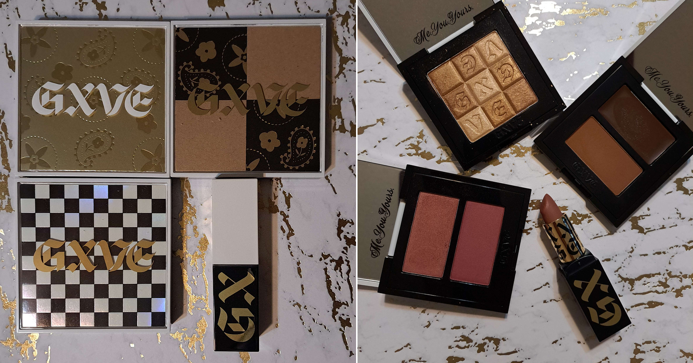
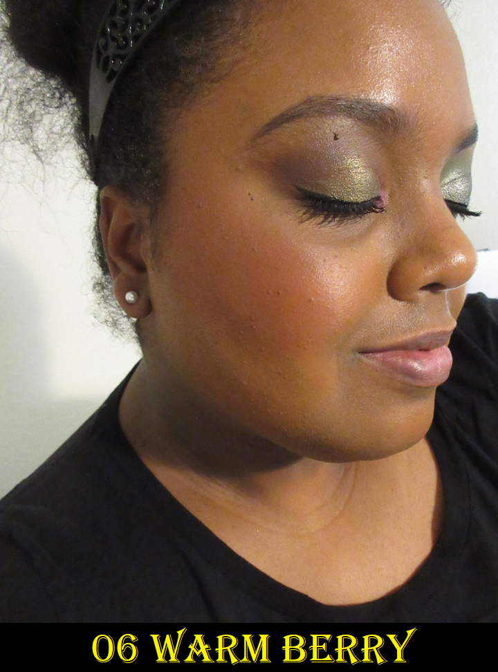
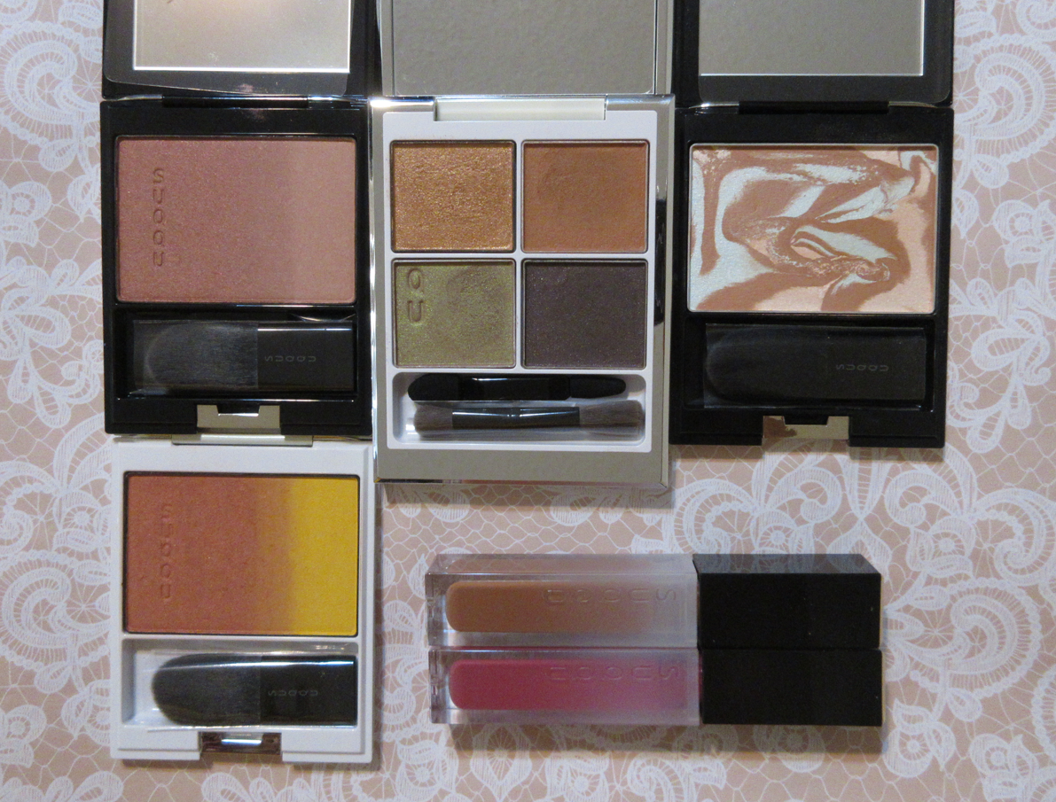
Gxve Beauty by Gwen Stefani had 50% off all products for Black Friday, so it felt like the perfect time to try the makeup. This is a “first impression” style review, since my order arrived shortly before my trip, and I was only able to wear everything 1-2 times. I liked them all and planned to bring them with me to Germany, but due to baggage weight limits I had to leave everything except the highlighter behind. However, the impression left on me by these products were strong enough that I feel I can still review them.
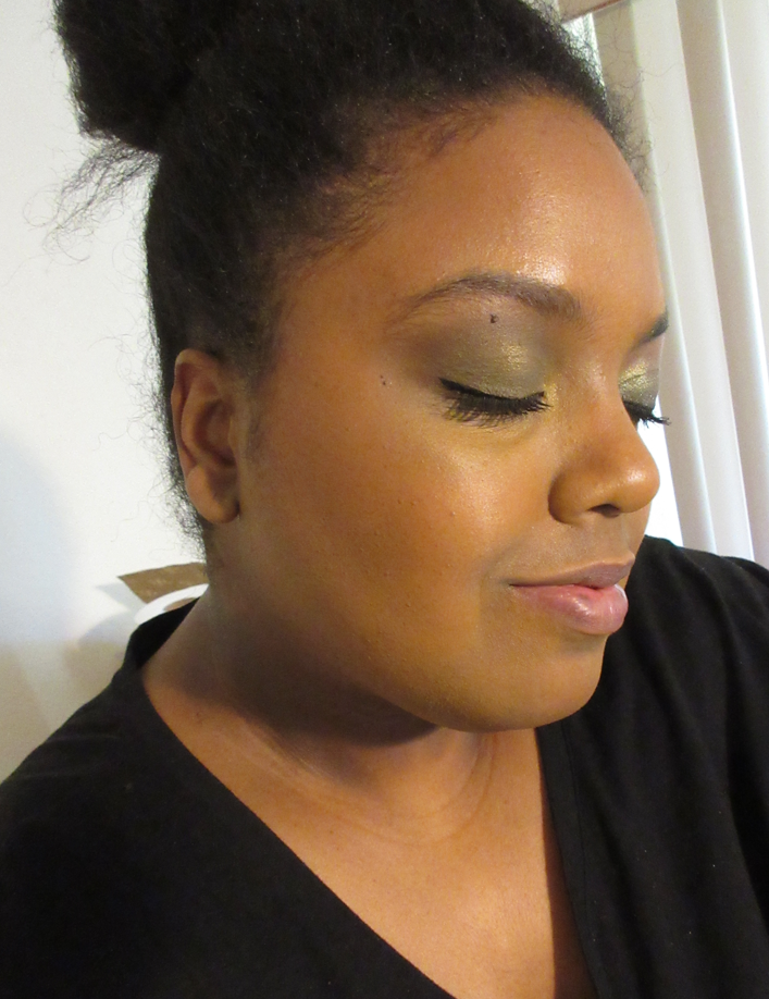
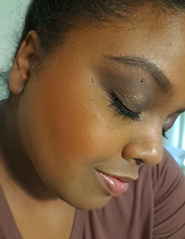
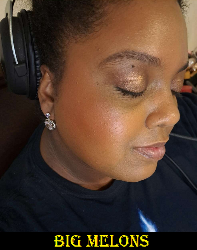
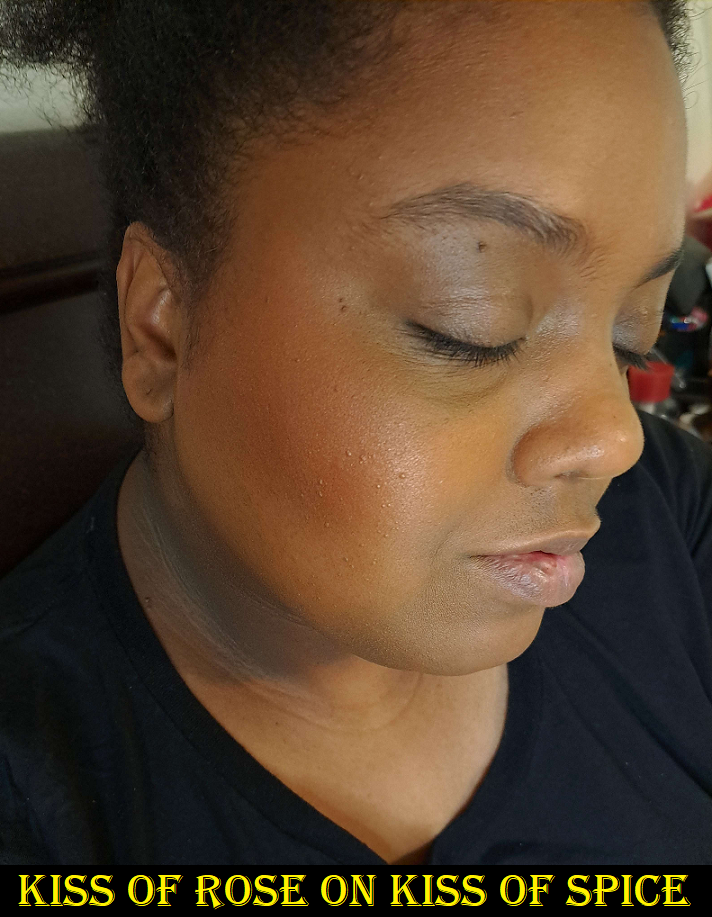
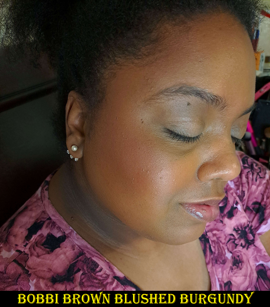
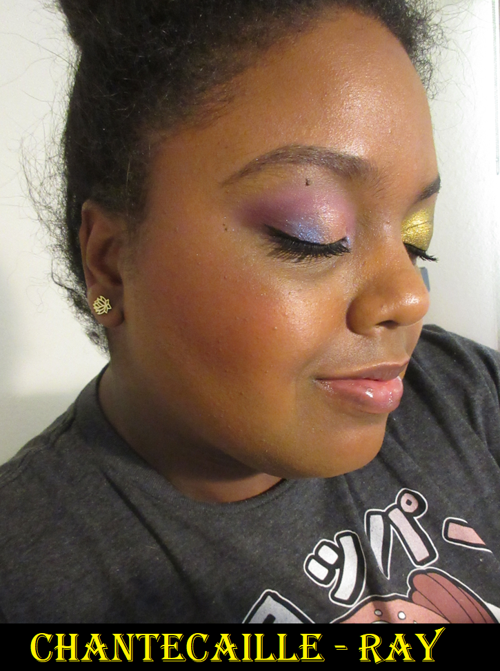
In the photo above, I’m wearing the highlighter (all colors swirled together), the bronzer and contour, both shades in the blush compact, and the matte lipstick.
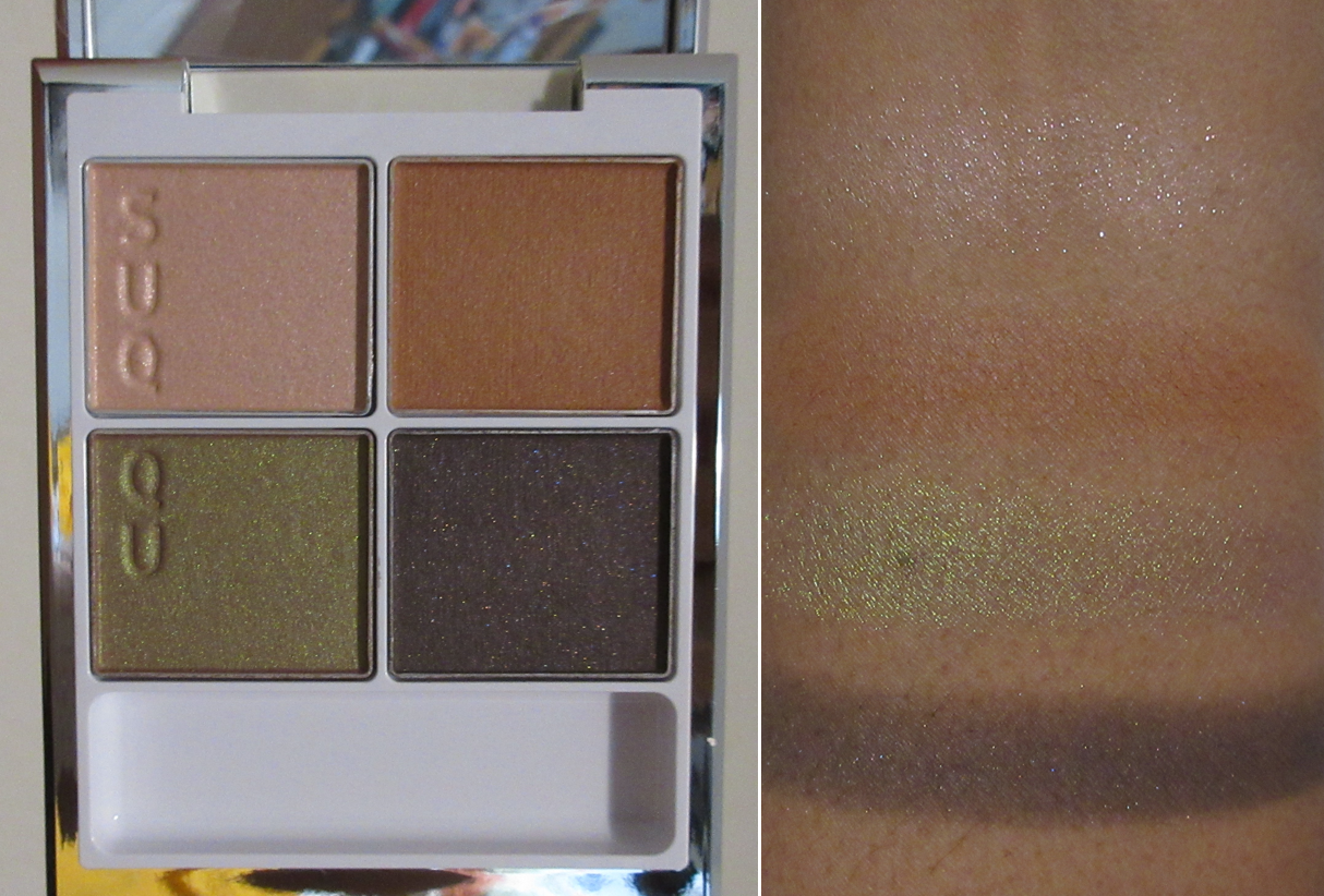
Pick It Up Cream Contour & Talc-Free Powder Bronzer Duo in Heat Wave
The cream contour blends decently into the skin and sets without remaining balmy. However, due to the shine from it being a cream product, I prefer to set it with a powder of some kind. It looks intense when it’s first placed onto the skin, but sheers out without being patchy as it’s worked onto the face. The shade I chose was still a bit too deep for me, so I had to be extra precise in the placement of it, and it was too unnatural to look nice in my jaw area.
The powder bronzer was extremely warm in color, along the lines of Pat Mcgrath’s bronzer in the shade Burnished Honey. It’s quite pigmented and doesn’t cling to more dewy spots on the face, nor did it deepen up from moisture. It has a similar looking finish and performance to PML’s bronzer as well. I tend to prefer a slight sheen in my bronzer, even more than what’s considered soft matte, but I still liked this one.
The longevity is good on both products. My bigger critique is that there isn’t a plastic flap to help prevent powder bronzer kickup from ending up in the cream contour. This issue didn’t happen to me yet, but I can see it being a problem with repeated use or if someone accidentally drops the compact and some of the powder breaks and goes everywhere.
If I’d been able to get this for half price again and have it arrive in time, I would have been tempted to get the shade Super Hot intended for tan skin tones and hoped it wouldn’t be too light. But in thinking it over, I still prefer powder contours over all the cream ones I’ve ever tried because for some reason they tend to not be matte. When creating a shadow on my face, I need that to be matte and not shiny, which powders give me. As for bronzers, I have plenty that rank higher, so this is ultimately why I decided that I’ll just continue to use this one when I eventually return to the US and make do with the color I’ve got.
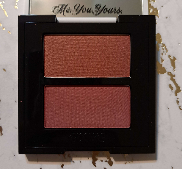
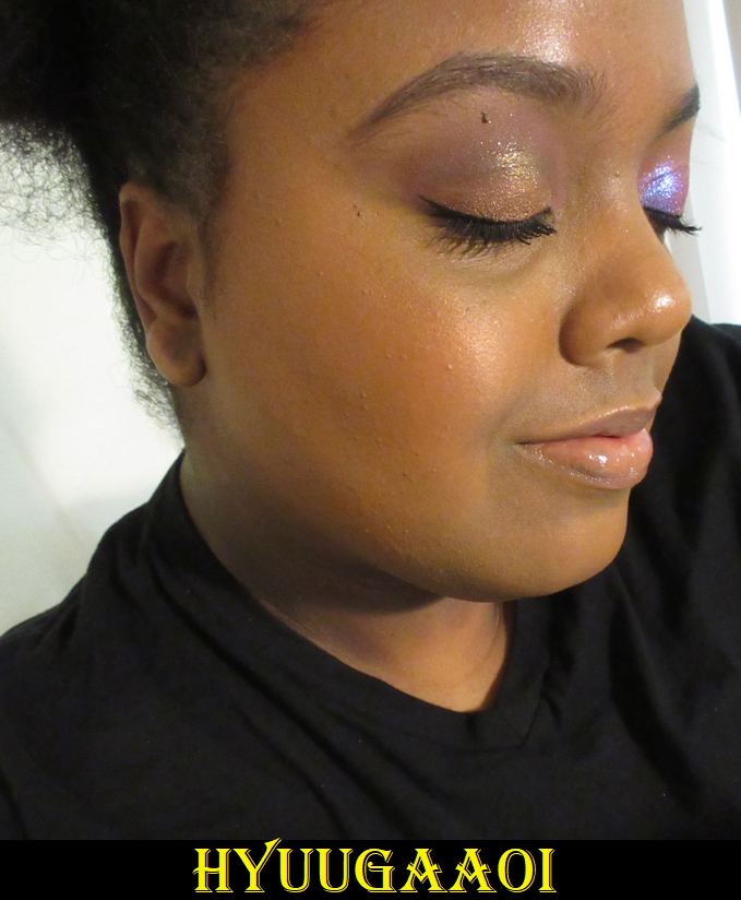
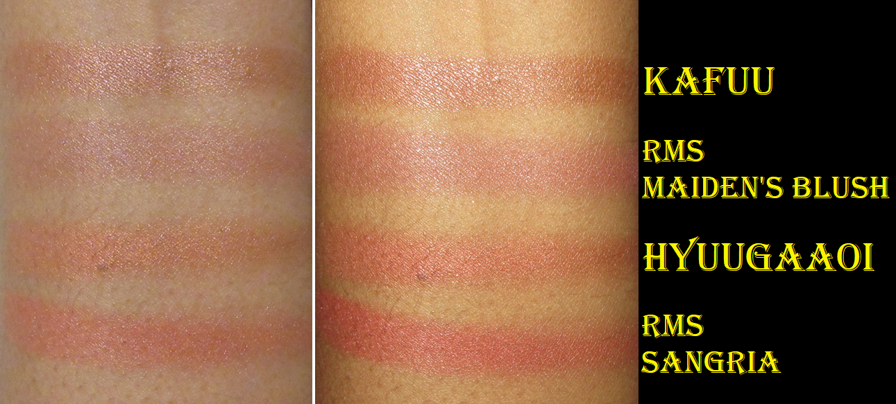
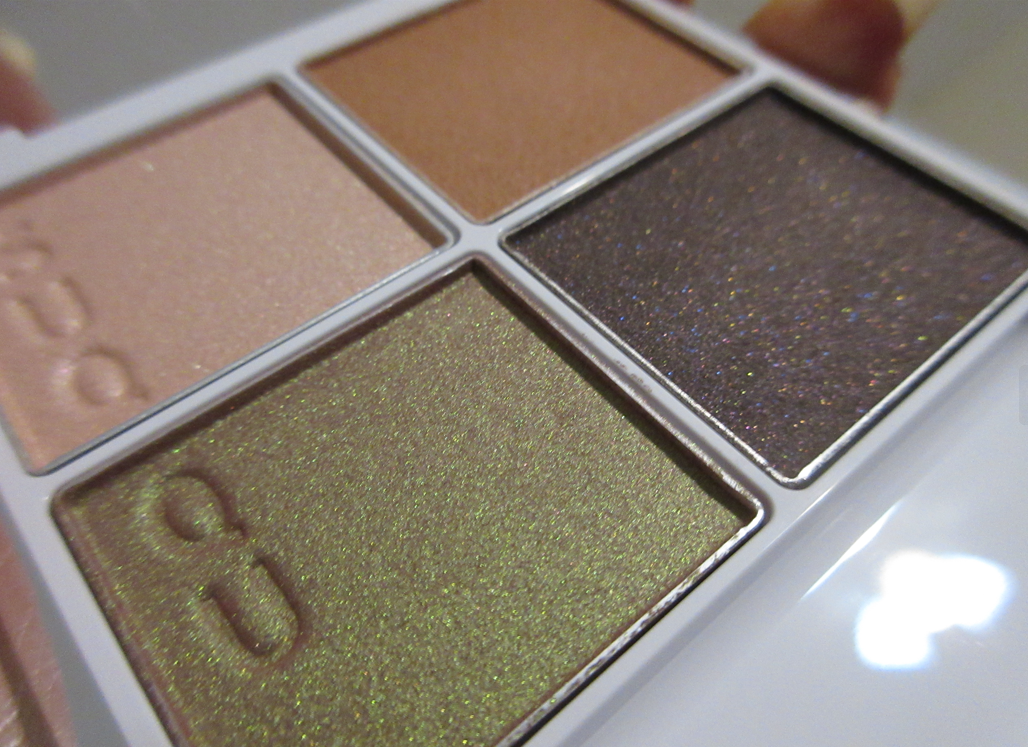
Feelin’ Cheeky Clean Amplifying Talc-Free Blush Duo in Crush On You
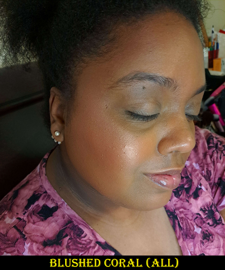
According to the brand, “Each blush duo includes 2 shades: a Sheer Satin shade to add luminosity and dimension and a Natural Radiant shade to pump up the vibrancy.” I would have thought they’d be the other way around, but the shimmery blush is apparently the satin. It doesn’t give enough color payoff for me to wear on its own. The radiant shade, although not flat matte, is a bit darker than the satin and doesn’t pop enough for my taste, which is why I ended up putting the satin on top of the radiant one both times since they look better together on me. It becomes a combination of blendable and buildable color paired with the oomph and brightness I prefer in a blush. The satin isn’t as luminous as a true shimmer blush, so perhaps the description of it makes sense. The color lasted on my cheeks all day without fading.
I would have loved to get another duo, but the brand’s photos only show the coral shade (Lasting Love) on a model with light skin and the peachy-beige (Stars Aligned) demonstrated on a light/medium model, so I couldn’t tell if any other colors I liked would work for my skin tone. It would have been even more of a risk to blindly buy considering the radiant shade intended to “pump up the vibrancy” needed to be built up a little despite being the deepest duo.
The only reason I left this one behind is because I filled nearly an entire large Relavel case (16.5 x 5.5 x 12 inches) with blushes. I already was bringing so many with me, some which even had sentimental value, that I couldn’t justify this one. Especially since this type of color is a darker version of what I love and have too many shades of in my collection and in finishes I prefer even more. I would still like to get additional shades of these blushes one day though.
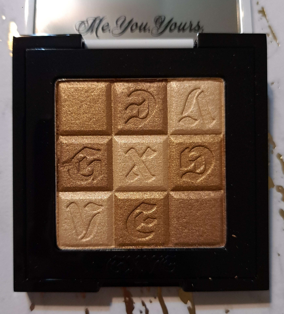
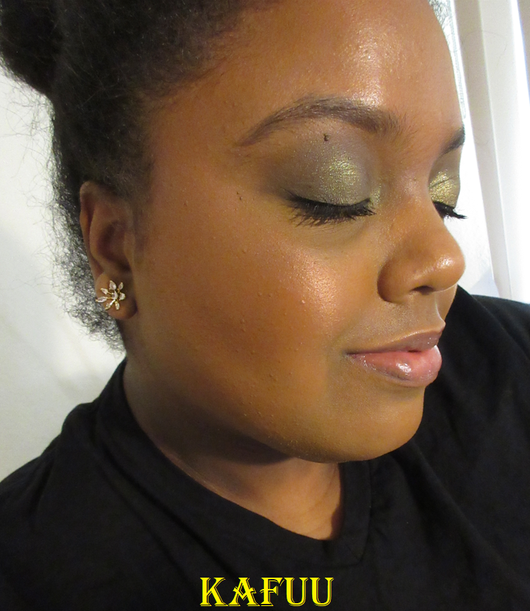
Check My Glow Multi-dimensional Illuminating Talc-Free Highlighter in Karat Country
I can’t recall if I smelled fragrance in the contour/bronzer duo, but there is definitely perfume in the blush duo and this highlighter. It smells so strongly of baby powder, but mixed with some florals. The smell doesn’t linger on the face, but it’s a little unnerving to be applying so much scented makeup, especially when using more than one Gxve Beauty product at a time. I try to limit the amount of perfumed products I use out of fear of increasing my chances of developing skin sensitization, plus scented products can often give me a headache. I’m glad the ones from Gxve haven’t done that to me, but I felt it’s important to mention.
This is the one product in this post I kept with me, which shows just how much I love it. How light or dark my skin is can fluctuate throughout the year, so the idea that I can tailor my highlighter color to suit me is a great advantage. The shimmer quality is smooth. It’s one of the least texture enhancing highlighters I’ve used in proportion to the intensity level of the shine and reflectivity. I haven’t done a highlighter ranking post yet, but this has to be in my top 10. I mentioned that I used everything in this post at least 1-2 times prior to my trip. Since arriving at my destination, I have continued to use this one every time I put on makeup. I can apply it sparingly with an airy brush for a more subtle look, but achieving medium to medium-high intensity is easy. I don’t consider this a blinding highlighter, but choosing one of the brand’s lighter shades would give me that effect if I wanted that. Medium level of radiance is the most I like, so this is very much perfect for me.
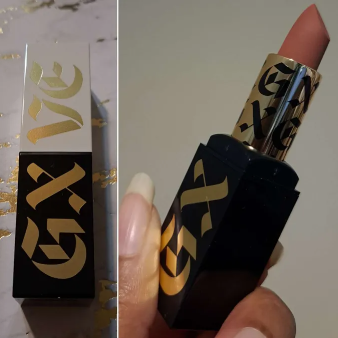
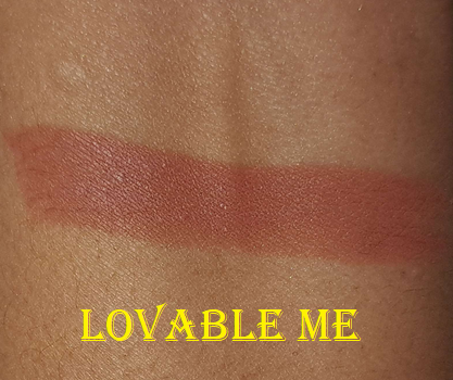
Original Me Clean High-Performance Matte Lipstick in Lovable Me
Well, this certainly takes me back! I haven’t worn a lip product associated with Gwen Stefani since the collab with Urban Decay in early 2016! It was the only item I bought from that collection, and it was more for collector purposes because I loved the packaging.
The Gxve brand packaging is quite cool, especially with the brand lettering under the twist up portion of the component that can be seen when the cap is removed. Lovable Me is a really pretty color that I can almost wear without a lip liner (liner-free demonstration is at the top of the page).
Considering it’s a matte lipstick, I was surprised that the formula had a slight creaminess to it that made it easy to glide onto the lips and was comfortable to wear. It lasted through two meals before needing to be touched up. My lips were drier than when I started at the end of the night, like pretty much every colored lip product I wear, but it’s one of the most comfortable mattes I’ve worn. It looked nice even on my semi-chapped lips. This lipstick unsurprisingly contains fragrance, but it smells more like vanilla than the other products from Gxve Beauty.
Overall, I think this brand has pretty good products. I’m certainly interested in seeing what else they will make in the future, although I don’t believe they ship outside of the US. So, unfortunately, this might be my one and only brand review unless they expand globally.
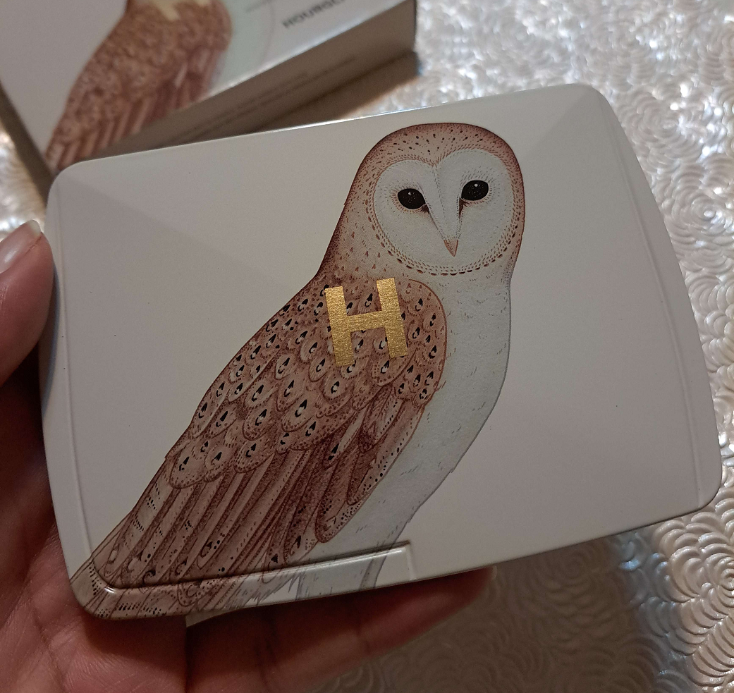
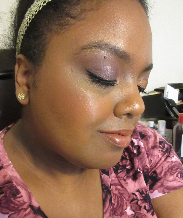
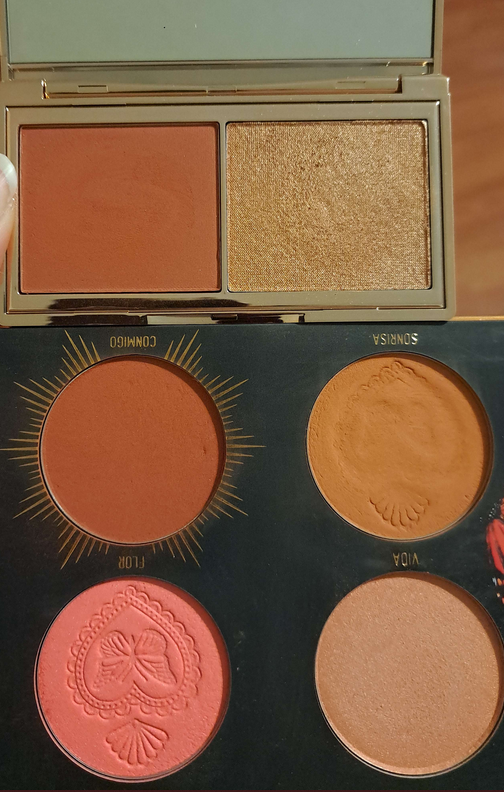
The photo above shows my current collection of Hourglass Ambient finishing powders, blushes, bronzers, and highlighters. Some products have been depotted and rearranged, so they’re not all in their original states (the Universe Unlocked and Tiger palettes).
My palette from Hourglass has the website exclusive Owl design on the cover, but I chose the powders inside that were assigned by default to the Leopard palette. It’s called “Color Palette 2” on the official website. As I mentioned in my review of this year’s Snake palette (not to be confused with the leopard component I chose for it), it was so difficult to skip out on the beautiful owl and when I found a 20% off code, I ended up choosing this. Well, the Palette 2 option was the only one in stock at the time, so I technically had no choice. The reason the default Leopard palette insides were still in stock is because it’s the palette with only 1 new shade and a bunch of re-released ones. It’s a great thing that I only had one of the 6 powders currently in my collection, but that’s also because most of the shades don’t work for me as intended. However, I’ve happily discovered that this is a great mixing/companion palette and for that reason I decided to review it as well. In addition, I’ve added even more comparison swatches than I did in my post from a few weeks ago!
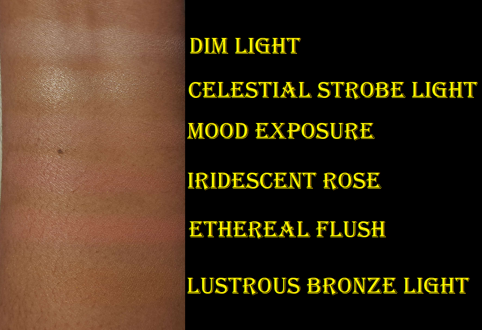
Dim Light (finishing powder) – This is a permanent shade that I surprisingly never owned among the long list of too-light-for-me Ambient powders from Hourglass that I get stuck with from the edit palettes. Of course, no one is surprised to hear I can’t use this as a finishing powder on my skin tone.
Some of the deeper finishing powders from the brand have visible shimmer, making them something I wouldn’t want to put under my eyes. I couldn’t see any shimmer particles in Dim Light though, so I have used it as a brightening powder under my eyes. My concealer was a little darker than the rest of my face when I was taking the face pictures above, so this is when I put Dim Light over it and I think it helped brighten it. So, this powder isn’t a complete miss for me.
Celestial Strobe Light (strobe powder/highlighter) – This strobe powder was introduced last year in the Butterfly palette. Because of the level of warmth and transparency in this color, I could actually almost pull this off! I was tempted to depot it from the Butterfly palette before I sold it, so I’m actually not bothered to own it again. When I use Lustrous Bronze Light as a highlighter and add a tiny bit of this on top to amp it up, it’s a pretty combination that works! It’s still unavoidably pearly-looking (nearly frosty), but not to the level of being unflattering.
Mood Exposure (blush) – This is a permanent blush that I never owned. I always wondered if I’d be able to pull it off if I bought one that contained enough of the plummy vein coloring. I’ve learned that at the best of times it shows on my cheeks as a subtle nude color, but doesn’t always resemble a blush. Sometimes too much of the sheen shows on my cheeks and then it looks like a face powder instead of blush. However, adding a little of Ethereal Flush on top is a gorgeous combination. So, I’m actually happy to have this one as a mixer blush! Mystic Flush from the Snake palette is quite vibrant, so having this to mix with that one as well is quite nice. This isn’t a color I’d have ever bought on its own or as a single (assuming I couldn’t use it), but having it come with this palette turned into a happy and useful surprise.
Iridescent Rose (strobe blush) – This is blush first appeared in last year’s Tiger palette. I still have it in my collection, so this is the true repeat for me to have in my Leopard/Owl palette. It’s still a nice blush topper that I prefer over the other deep strobe highlighter/blush powders Hourglass has released in Tiger and Snake, but I don’t want to keep both. So, it’s very likely I will end up selling it in a custom depotted palette at some point this year. I don’t think I ever reviewed the Sculpture Edit Quad, but that one contains Mood Flush which I might replace it with instead.
Ethereal Flush (blush) – This blush is perfect to wear on its own. It reminds me of Coral Flush from the Universe Unlocked palette, but even more flattering on my skin tone. It’s also the only new product within the Leopard palette. Granted, “new” is relative considering it’s yet another pink toned blush, even though Hourglass describes it as a “soft peach.” It’s not hugely different from the others they’ve released.
Lustrous Bronze Light (bronzer) – This bronzer was released in last year’s Elephant palette. I can use it as a low-shine highlighter. The tone would have made a good finishing powder for me if it didn’t have the occasional visible shimmer particle and if the sheen was weaker. I’m fine with using it as a very subtle highlighter though.
So even though Snake and my custom version of Tiger are better suited for me, I’m really happy to have Leopard/Owl to compliment those. And sure enough, by the time I started working on this post weeks ago until the time I’ve decided to publish this, I ended up removing Iridescent Rose and replacing it with Mood Flush. Mood Flush is basically a deeper version of Mood Exposure and I love the subtle color on my cheeks, but I never thought to reach for that one because it was in a quad with 3 nearly unusable products. Now that I’ve put it in the Owl palette, I think I’ll get a lot more use out of it finally. And, now that my duplicate blush is in that Sculpture Quad instead, I may eventually sell it.
As you can see, Mood Flush got a bit banged up in the process. The Sculpture Quad being a plastic component and with stronger glue made it tricky to depot without melting it too badly. I could have depotted the blush perfectly if I increased the heat and didn’t care about trying to salvage the packaging. What I love about the current Hourglass tin components is that depotting the powders is so much easier without ruining the packaging (not even the sticker on the bottom) or the product itself.
Brushes, makeup that was returned, products decluttered or given away, and a MAC highlighter are not pictured.
Welcome back to this series! I reviewed everything in separate posts from last year’s August purchases, so it made sense to skip that. As I began to work on September’s I realized I reviewed most things as well, except the unreviewed items were tied to pending posts I was currently working on. Since I at least purchased additional shades I knew I could show here, I decided to proceed with showing the September items, in addition to October’s!
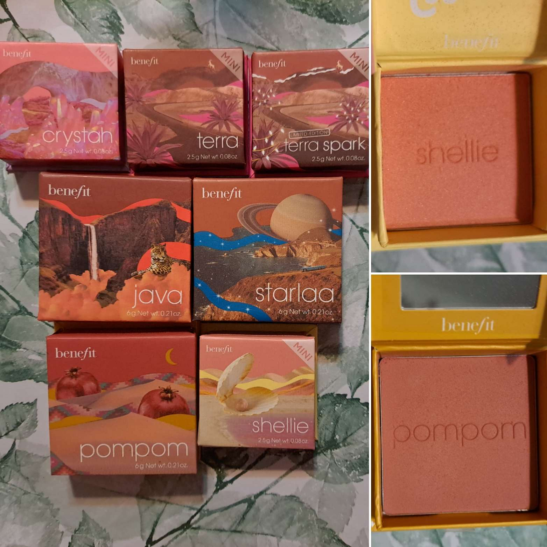
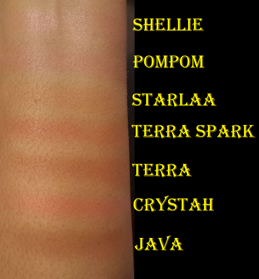
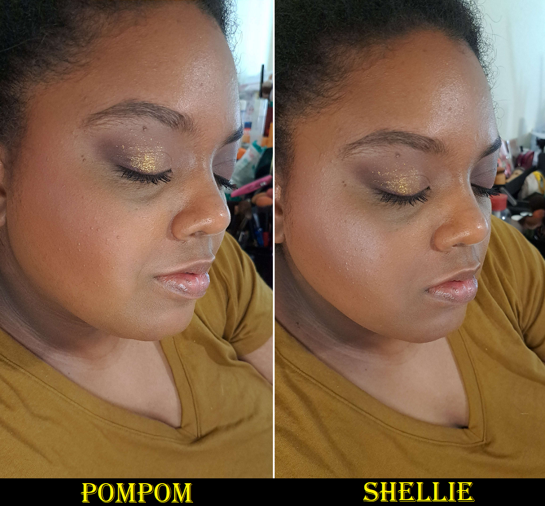
Benefit Cosmetics Wanderful World Blush in Starlaa (and later PomPom and Shellie) – This specific shade was delayed for four months after the release of all of Benefit’s other blushes. However, I waited until I got my hands on it to do my brand blush review, which can be found HERE. In addition to those four (five technically if you count Terra Spark) from last year, this year I purchased PomPom and Shellie out of curiosity as to how light I could go with the blush colors. Well, I learned that Shellie is my limit. That one doesn’t work, but Pom Pom is nice and subtle.
Another photo of Shellie
I like applying Starlaa and then adding PomPom to the apples of my cheeks. As a solo color, Terra is still my favorite of them all, but I continue to be pleased with this line and overall collection of blushes.
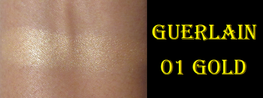
Guerlain Quad -I reviewed this along with many other luxury palettes HERE. Since that review, I’ve used it occasionally, but not enough to justify purchasing any additional ones. Honestly, I would still consider it at a reduced price if every shade in that compact was perfect for me. Chances of that happening are low. I thought for sure I would buy the upcoming Holiday quad, but that one doesn’t contain the baked shades, so I’m skipping it.
Artist Couture Love Sprung 3 and Quickie Palette – I reviewed both of these HERE. The Quickie palette has only been used once or twice since reviewing it. On the other hand, the Love Sprung 3 palette was such a good match for me that I finally had the nerve to declutter Love Sprung 2. The pink/purple blush is pretty, but I never reached for it. The highlighter in version 3 is better for my skin tone than version 2, and the deep peach blush in Love Sprung 2 is basically duped in 3. This shade was also similar to CoverFX Warm Honey, but slightly deeper and shows up on me better, so I was able to let the CoverFX go too considering it’s so old in my collection now.
Clionadh Haul – Stained Glass Shade Expansion (Queen’s Banquet, Quest, Oriel, Reign, Auric) and the previously released single shadow (Chalice) can be found shown HERE. However, I’m still planning to make several more Clionadh posts surrounding the expansion, doing additional comparisons, and showing the shades in full eye looks. It’s just such a daunting task!
Beautylish Haul – Wayne Goss The Radiance Boosting Face Palette (Deep Copper) + Brush 13 Bundle. I actually decluttered this because it got strange bumps on it after only two uses, which I’ve seen happen to other products after at least a year of use, so never this quickly. Beautylish handled it well when I emailed and said they think it’s due to oils on the skin effecting the surface of the powder? But they refunded me. The review for Brush 13 is coming in Fude 6.
CDJapan Haul – Koyudo BP019 Blush Brush (supposed to be outlet but not listed that way), [Outlet] Koyudo Powder Brush Black Handle, [Outlet] Koyudo Blush Brush Black Flat Handle, and MS-4 Mai Sakura Eyeshadow Brush. These brushes are also coming to Fude 6 and 7.
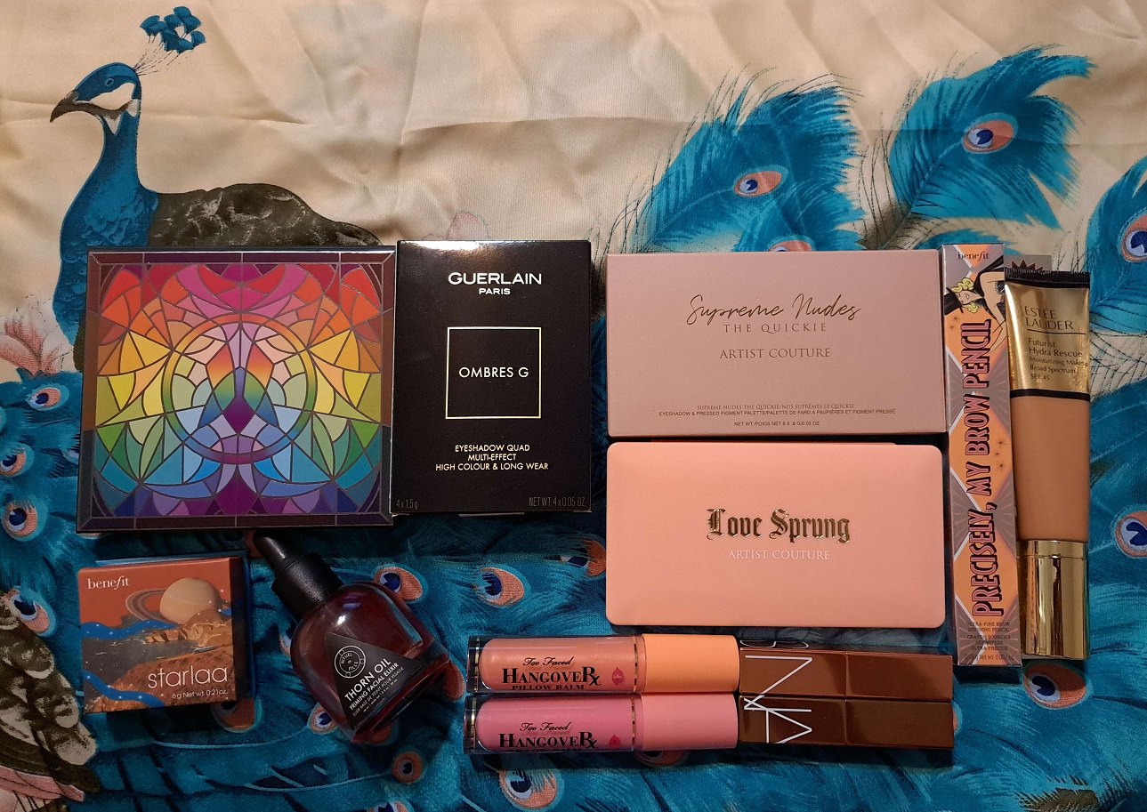
Ulta 21 Days of Beauty Haul – Benefit Cosmetics Precisely, My Brow Pencil Waterproof Eyebrow Definer in Shade 5, NARS Afterglow Lip Balms in Laguna and Torrid, Estee Lauder Futurist Hydra Rescue Moisturizing Foundation SPF 45 in 5W2, Too Faced Hangover Pillow Balm Ultra-Hydrating Lip Treatment in Watermelon and Mango (way more added in 2o23), and the Rituel de Fille Thorn Oil Priming Facial Elixir.
The Benefit brow product is a repurchase that I’ve discussed in various reviews, but isn’t exciting enough to showcase. The Estee Lauder foundation is in a new shade, but the formula has been reviewed HERE.
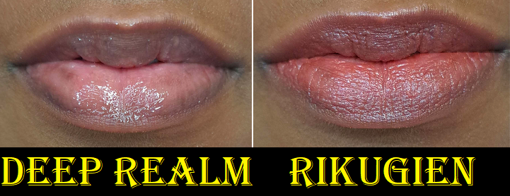
The Thorn oil was in a skincare post HERE. As for the lip products, those are tied to pending upcoming lip product posts. However, since I’m unsure which of these will come first, I’ll go ahead and review them here, along with the additional lip products I bought the following month as well: Too Faced Pillow Balm Pop Rich & Creamy Mini Lip Trio, Nars Afterglow Lip Shine Gloss in Deep Realm, and Nars Satin Lip Pencil in Rikugien.
The first thing I notice when putting on the Too Faced Hangover Pillow Balm is that it gives a minty-cool sensation on the lips. This contains menthol, so I’m not sure if it was added solely for cooling effect or if the brand wanted plumping action from it as well. What Too Faced touts as the lip plumping ingredient is sodium hyaluronate. Despite having more than one ingredient of this type, I don’t see any difference in the size of my lips beyond the trick of the eye that glossy products can provide. I bought the two full size lippies without even knowing they were supposed to do anything beyond conditioning the lips, so I’m fine with that. The only issue is that ingredients like menthol, cinnamon, and capsaicin irritate the skin, which can aggravate my lip issues. As far as I can tell, menthol and the flavoring and coloring agents are the only ones I spotted from the list that can dry out my lips. These are counterbalanced by the other ingredients in here that my lips love such as petrolatum and shea butter. Sunflower seed oil is another one, but instead Too Faced put “Helianthus Annuus (Sunflower) Seedcake” which is apparently, “residue from the expression of oil,” so I’m not sure how that stacks up to the oil. Mineral oil also tends to be great, but the brand uses hydrogenated polyisobutene, a synthetic mineral oil alternative instead, which can be effective for me if paired with the right other ingredients. This also contains mango seed oil, which is a slightly above average lip conditioner for me too. What this boils down to is the fact that I love the feeling of this product on my lips. It feels moisturizing, and though my lips don’t change in size, I can see where the lines of my lips get plumped up and smoothed out from the added hydration. A protective barrier is formed on the surface to lock that hydration in place and keep it there longer, but that means having to deal with everything sticking to my lips. Too thick of an application can also lead to the dreaded “white ring” around the mouth. Also, this isn’t the kind of lip product I can ignore when eating because of its thick texture, so I purposely try to wipe it off and then reapply once I’ve finished the meal.
Regarding the colors, Watermelon gives me the tiniest pink tinge to my lips, but it’s not my favorite tone. I don’t see any shimmer in Watermelon, but Mango has micro gold shimmer. Mango and Cocoa Kiss are way too light and give a unflattering milky look to my lips, so I definitely don’t wear them in public and mostly just enjoy them for their scents. Watermelon smells like a delicious Watermelon Jolly Rancher candy, whereas Mango smells so faintly that I’m not sure I would have been able to figure it out based on the smell alone. It’s vaguely fruity with a tinge of mango. Cocoa Kiss does smell like slightly artificial hot chocolate. I still enjoy that smell though.
Vanilla Kiss looks beautiful for those who don’t mind obviously shimmery lips. It doesn’t smell like vanilla to me, just a slight sugary scent. Strawberry Kiss, which smells like strawberry bubble-gum or those old school strawberry candies in the strawberry print wrapper, is the most opaque and deepest color of the ones I own. I forgot that the milky aspect of the other shades, and only being able to wear it privately or as an overnight treatment, is why I stopped using them for quite a while. However, now that I remember how good they are, I will want to continue using them. The brand released a new mini trio for the holidays this year and I suspect that even though I don’t need it, I will be unable to resist if it goes on sale. There’s a holiday wine shade that looks like a gorgeous version of Strawberry Kiss without the shimmer.
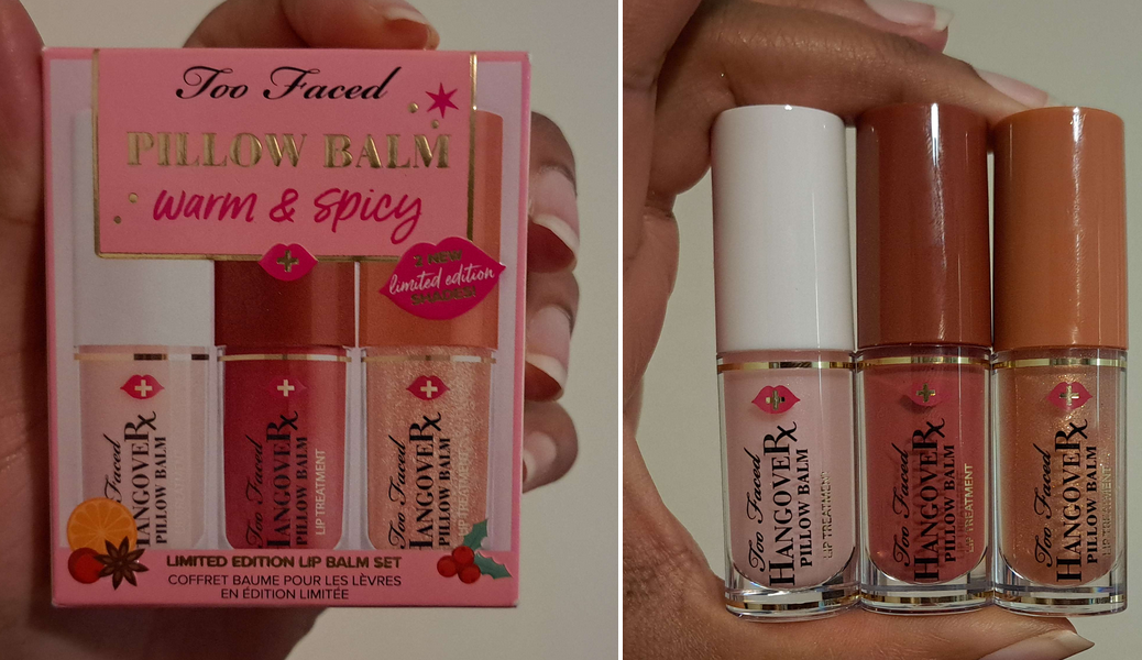
*BONUS PHOTOS: I ended up getting a discount and buying this year’s Too Faced Warm & Spicy: Pillow Balm Lip Balm Trio Set. I plan to gift the original one away, but I have swatches of the other two.
Holiday Wine smells like a cherry and strawberry forward sangria and Spiced Cider does have that spiced cinnamon scent! Also, even though Spiced Cider looks like a different color in the tube, on the lips and in swatches it looks no different than Vanilla, which is to say that it just looks like a beautiful shimmery colorless gloss.
With the Nars Afterglow Lip Balms, they feel nice and moisturizing on the lips, but I don’t get as much hydration from them as some of my other top favorite lip products. There are emollient ingredients in there, but not the ones that my lips in particular benefit from the most. They’re just okay, like hydrogenated polyisobutene and squalane, which aren’t enough to counter the effects of the dryness I get from the coloring agents. So, I wear these balms for the subtle tinge of color to my lips that’s pretty and flattering colors for me, at least in these two shades. They feel comfortable to wear, but by the end of the day with reapplications, I know my lips will somehow end up slightly dryer than at the start. So, these aren’t something I use daily. I might use them for a few days back to back, but then I’ll have to switch to a truly nourishing lip product instead.
The lip gloss is pretty, but the color doesn’t show as well on me. I chose this shade because it looked like a wearable warm color, but mostly because it was in the clearance section on the Nars website. It’s a bit funny to me that the lip gloss contains more of the ingredients my lips like. It has the hydrogenated polyisobutene, but also shea butter replaces the squalane, and sunflower seed oil is present, though nearly at the bottom of the list. As a thick glossy product, it seals in the moisture better than the balms, but the end result in terms of moisture is the same. When the layer wears down, my lips look drier than when I first put it on. As a gloss though, without any additional expectations for it, it looks nice.
The Satin Lip pencil was reviewed in this declutter post HERE, and in that post I voiced my concern over my favorite shade being different and it appearing to be discontinued. However, I was surprised to see it eventually return to the website last year (still in the last chance section). I bought it and was happy that it was the same original formula I fell for the first time. Regarding it being discontinued or not, all I can say is that another year later, it’s still in the last chance section! Nars recently launched the Powermatte High-Intensity Lip Pencil, so I wonder if they finally will let the Satin Lip Pencils go or if they plan to reformulate and/or redesign the line.
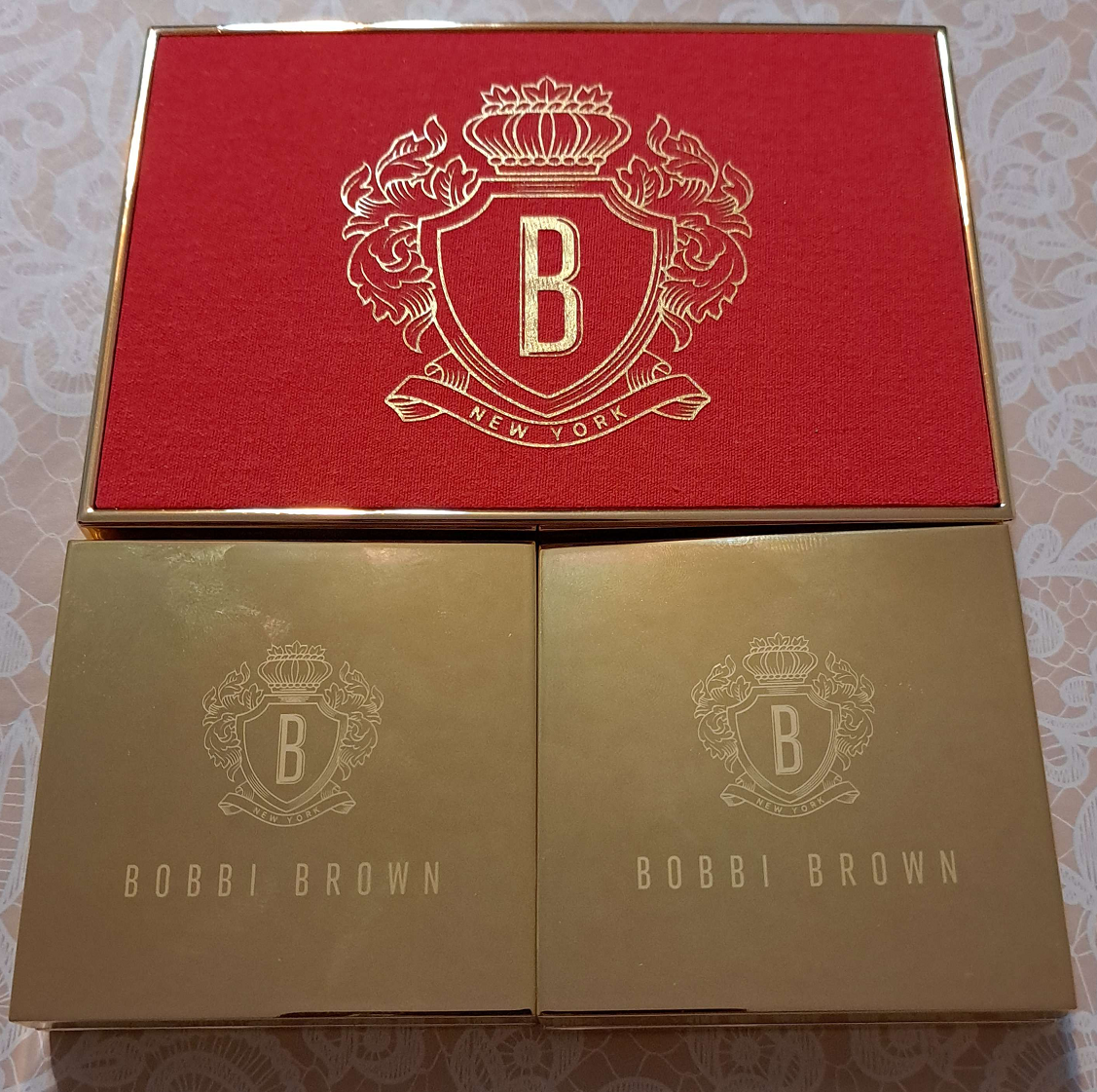
Luxury/High-End Purchases from October ’22: Bobbi Brown Luxe Eye & Face Palette in Copper Glow and Bobbi Brown Jadestone Palette, Dior Backstage Khaki Neutrals and Dior Écrin Couture Iconic Eye Makeup Palette, as well as the Pat Mcgrath Labs Celestial Nirvana Eye Shadow Palette in Bronze Bliss
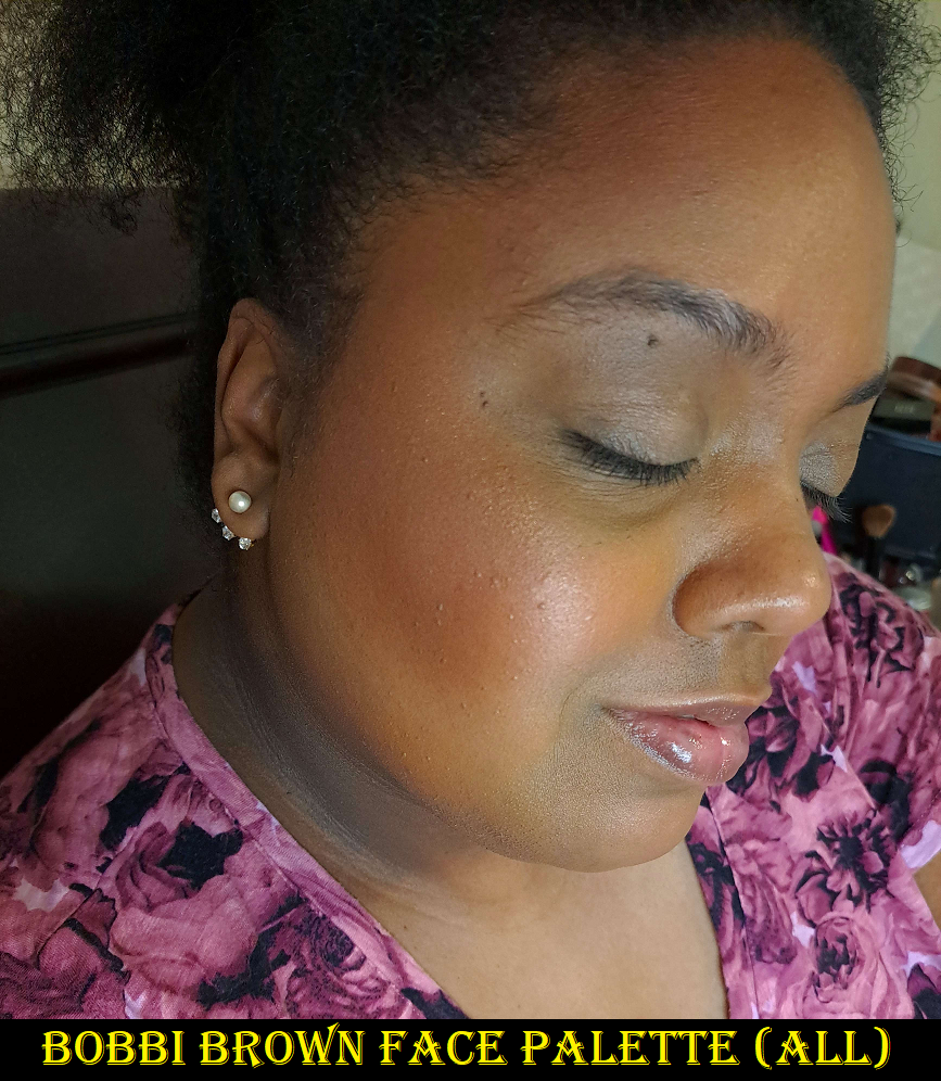
I reviewed all five of those HERE. The only one I regret buying is the Bobbi Brown Face Palette just because I bought a face trio earlier this year (not to be confused with the new holiday trio that contains 2 of the 3 same shades) that I get more use out of, plus it contains the same highlighter that is in that palette. As for the others, I am still always testing new eyeshadows, so I don’t have the time to use them as much as I want.
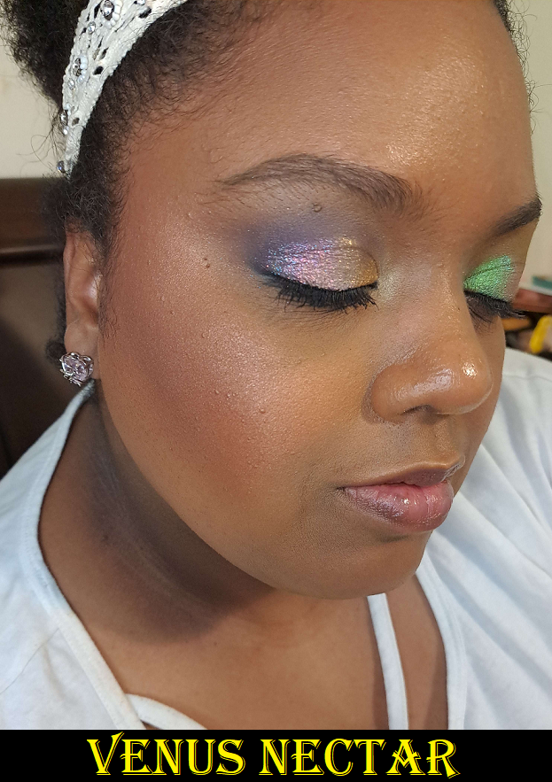
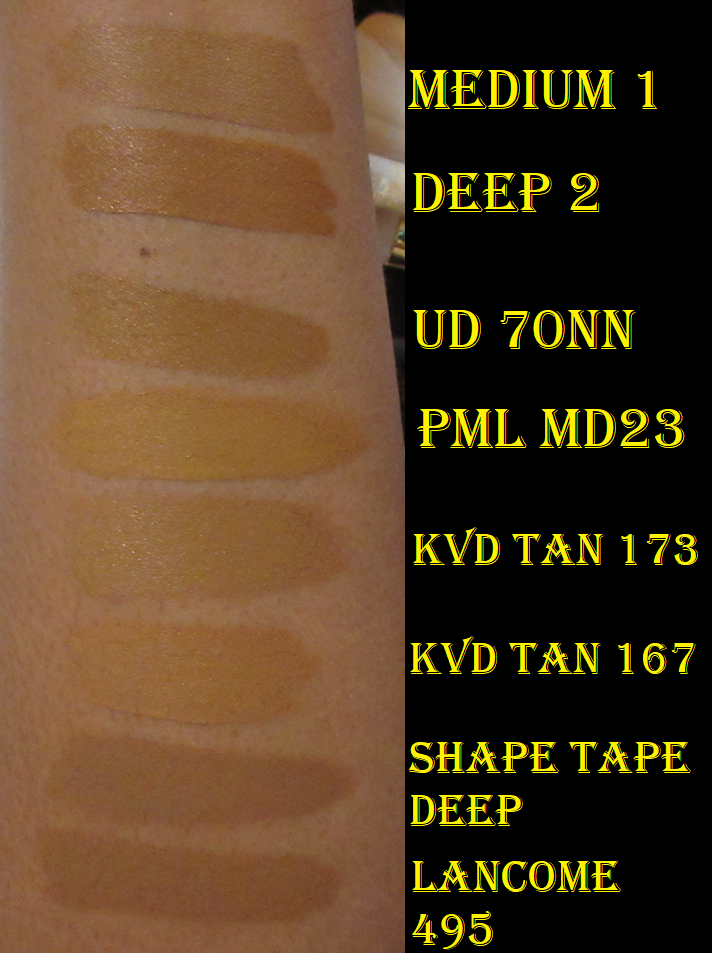
Pat Mcgrath Spur of the Moment Purchases: Skin Fetish: Divine Glow Highlighter in Venus Nectar, Pat Mcgrath Labs X Bridgerton Skin Fetish Sublime Highlighter in Incandescent Gold, and Pat Mcgrath Labs Skin Fetish Sublime Perfection Concealer in Shade MD23.
I showcased both highlighters HERE, though I didn’t show Venus Nectar on my face, so I’m including that at least in this post. As for the concealer, I reviewed the formula of shades MD22 and MD24 HERE, but I don’t think I updated with a swatch of MD23 once I got it. Essentially, I finally got my hands on that sold out shade and it was the perfect depth level, but the tone was still too olive and looked strange compared to the tone of my foundations, so I essentially gave up on using the PML concealers anymore. I don’t have MD22 or MD24 to compare next to it anymore, but I have a photo of MD23 compared to other concealers when I had intended (but changed my mind) to do an Ami Cole concealer post.
Fenty Beauty Double Cheek’d Up: Freestyle Cream Blush Duo – I reviewed it HERE and honestly haven’t picked it up a single time since reviewing. When the cream blush line was expanded this year, I picked up two new shades, but realized that even though I enjoy them for their colors, I prefer a product that sets to a fully dry touch. So, I don’t plan on reviewing anymore blushes from Fenty in the future, unless they release powder versions.
LYS Beauty Higher Standard 3-Piece Cream Blush Set – I reviewed it HERE and have only used it a few times after the review. It isn’t a matter of me losing interest. It’s still in my top 2 among traditional cream formulas. I’m just preferring to use powder blushes a lot more these days. I still very much recommend LYS blushes.
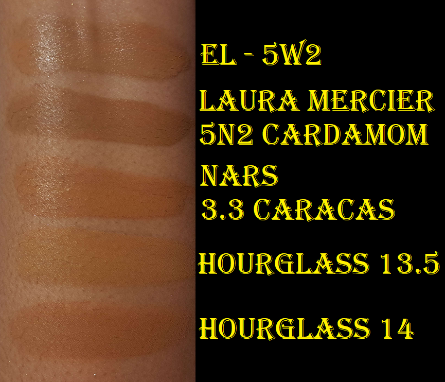
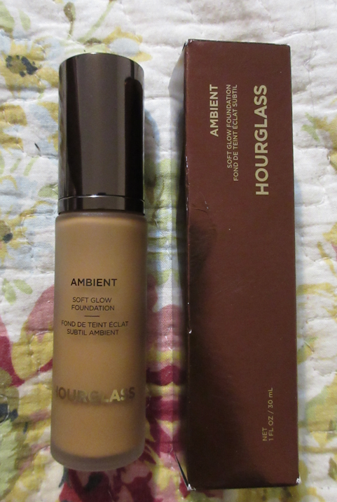
Hourglass Ambient Soft Glow Foundation in 13.5 and 14
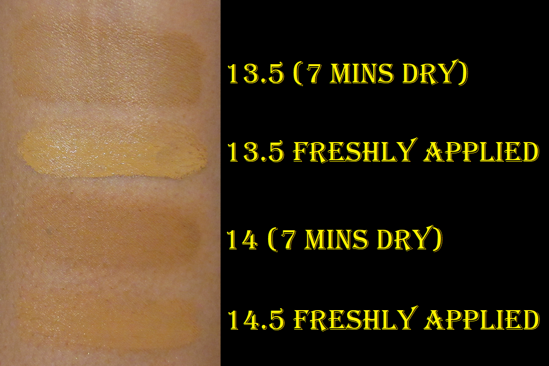
I was initially saving this review for a foundation ranking/declutter post I started working on at the beginning of the year, but never finished. I purchased Shade 13.5 which was slightly too light, but I could pull it off as long as I used bronzer with it. I bought Shade 14 at the end of November, and that was closer to my skintone, but slightly too dark. I can get a good match by mixing the two, but I have to be careful because the color darkens once it’s dry. So, I can’t just mix to my correct shade while wet. I have to mix to get my correct dry-down color.
This foundation is thick, though not heavy. It doesn’t drip at all when squirted out of the pump. I get high-medium coverage from the foundation. When they say “soft glow” they really do mean that the glow level is low. It’s a natural finish foundation, but on my dry skin, it looks horrible for most of the day unless I either prep my skin well (with at least facial oil) or wait until my natural oils come through, which doesn’t end up happening until the late afternoon, if at all. Even when I use Rituel de Fille Thorn Oil, I don’t like how my skin looks until an hour or so later. Then, I find the finish to be quite beautiful. I like this foundation enough that I’ve been keeping it in rotation since buying it, but not quite enough that I’d repurchase it once I use it up, even if Hourglass was to make shade 13.75 or something. I have foundations I like equally (albeit a different finish) that are still expensive, but a better deal.
It sets completely and doesn’t transfer, so I don’t set it with setting powder or spray. I still use a finishing powder with it at times and in specific areas.
Hourglass Foundation Shade 13.5 with Gucci Bronzer Shade 5 (Taken with Camera)
Hourglass Foundation Shades 13.5 and 14 mixed (Taken with Cell Phone)
I posted on the home page that, unfortunately, my main camera broke and I had to switch to using my cell phone for blog photos. That has come with its own benefits and challenges. My main camera had higher megapixels, but I’ve been using additional light sources and trying to improve my light quality to compensate for my cell phone, so it’s debatable which one is better when I had different struggles with both. Anyway, I just wanted to explain why the two look so different, besides the foundation color. I still have a ton of photos taken with my former main camera, but not enough to complete the posts without needing to add additional pictures with my cell phone.
Oden’s Eye Merry Christmas and Christmas Eve Holiday Palettes – I reviewed these HERE but did not include any solo eye looks. I figured today would be a good time to share some. As I mentioned in my post, I always reach for these as companion palettes. Out of the eleven Oden’s Eye palettes I own, I would say the Merry Christmas one is my 2nd favorite. The Christmas Eve palette would be 4th place. I hope the brand decides to re-release them for those who missed out.
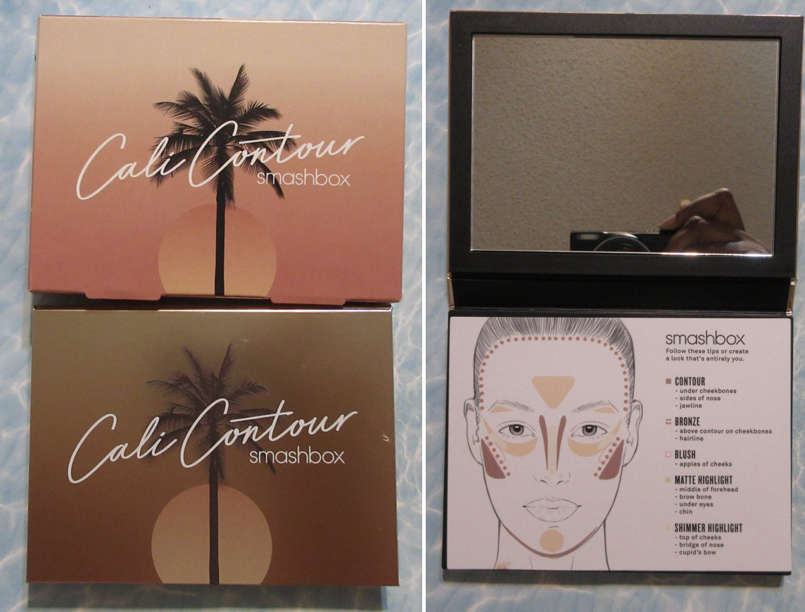
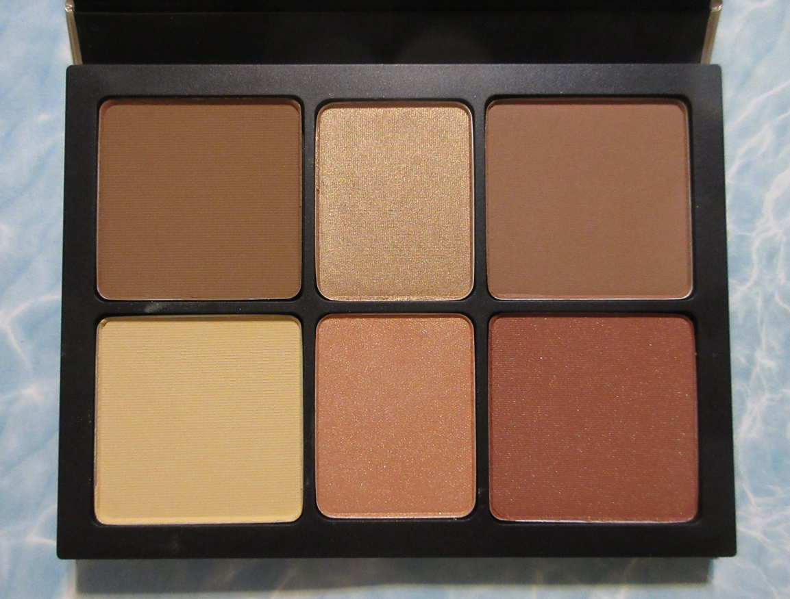
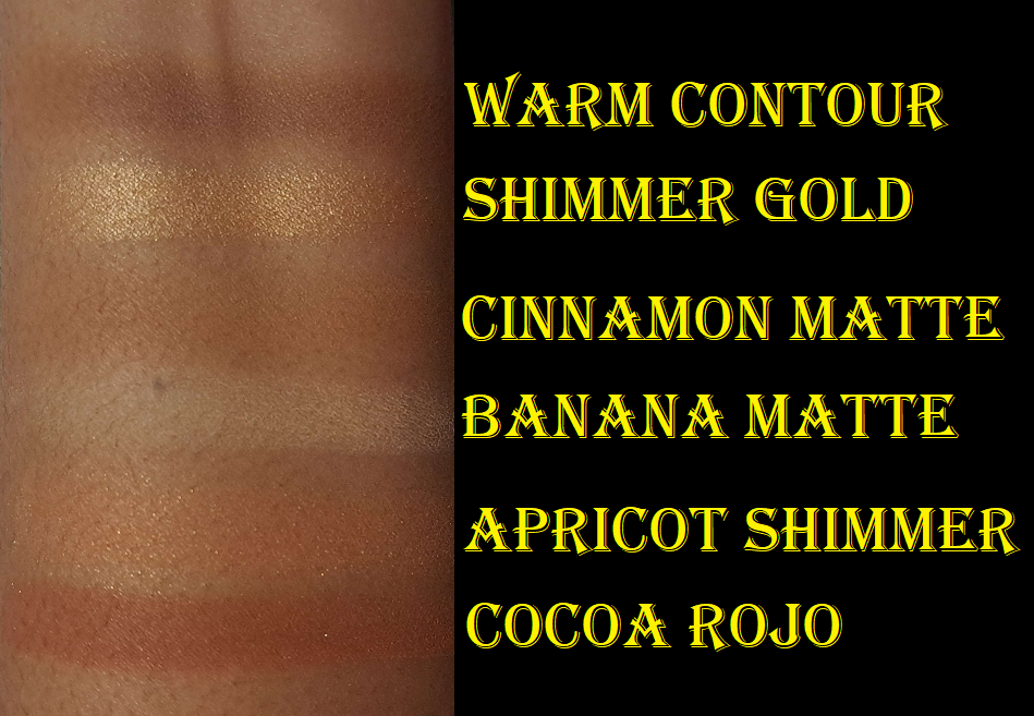
Smashbox Cali Contour Palette in Medium/Dark
It took the full year for me to make up my mind about this palette because there was always something I didn’t like about it when I tried to use more than one product at a time. Then it would take me a few weeks to a few months to want to try it again.
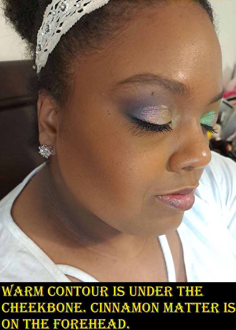
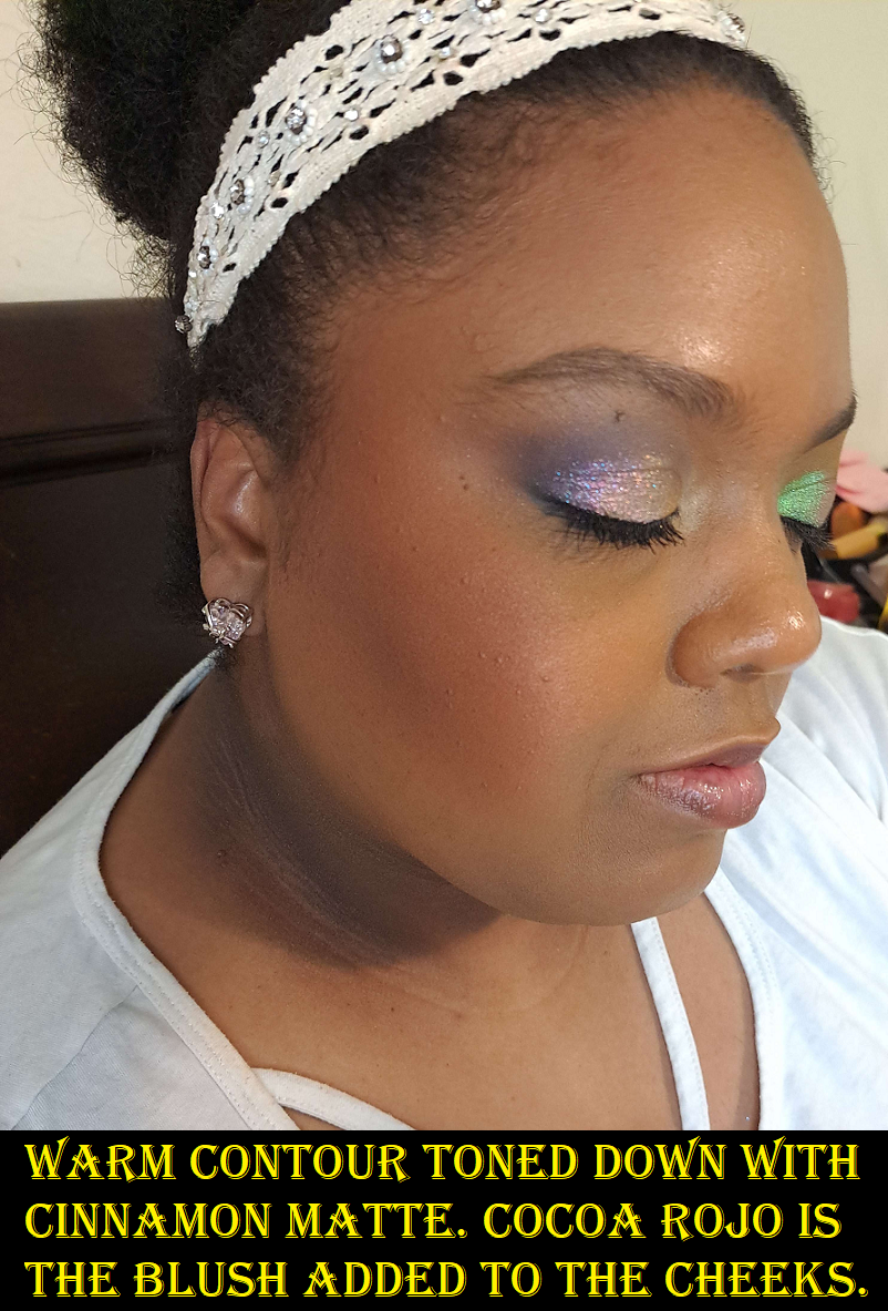
It’s very easy to overdo it with the contour (as seen below) and because it’s so pigmented, I can make it look blended, but it doesn’t sheer out enough. So, it’s best to start slowly and try and build up the color that way. Cinnamon Matte isn’t dark enough to bronze me (though I’m still not sure what purpose it’s actually supposed to serve), but I use it to tone down Warm Contour within reason.
Cocoa Rojo is a beautiful color, but for some reason I don’t like the finish of it on my skin. There’s subtle shimmer in this and I’m in my glowy cheek era, so I should like this. I’m just not sure it’s this type of shimmer that I like in a cheek product where it shows particles and the glow doesn’t come from a sheen.
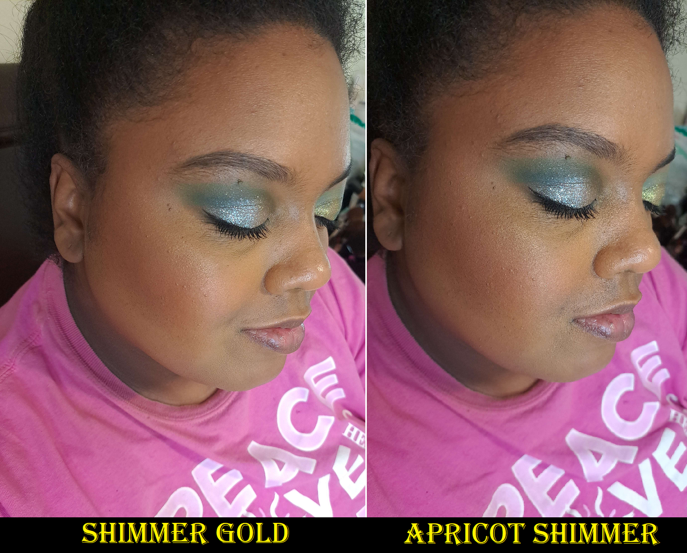
These highlighters are subtle, which is also right up my alley. However, the shimmer isn’t as refined as I like. For some reason they just don’t excite me.
On paper, I should love this face palette, but I don’t. I like it enough to want to keep it, but I know I’m not going to reach for it when there are so many blushes, bronzers, and highlighters I use that actually cause an excited flutter within me when I put them on. Since I don’t have a ton of contour products, that’s the one thing from here that still has some appeal and I’m considering depotting it from the palette. However, I do have contour products that are working just fine for me, so I might not bother.
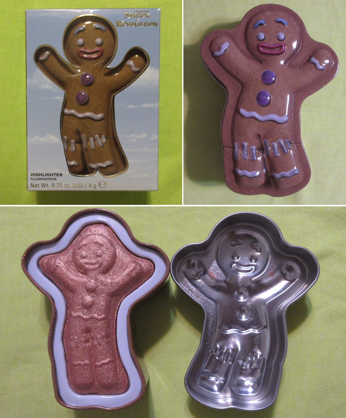
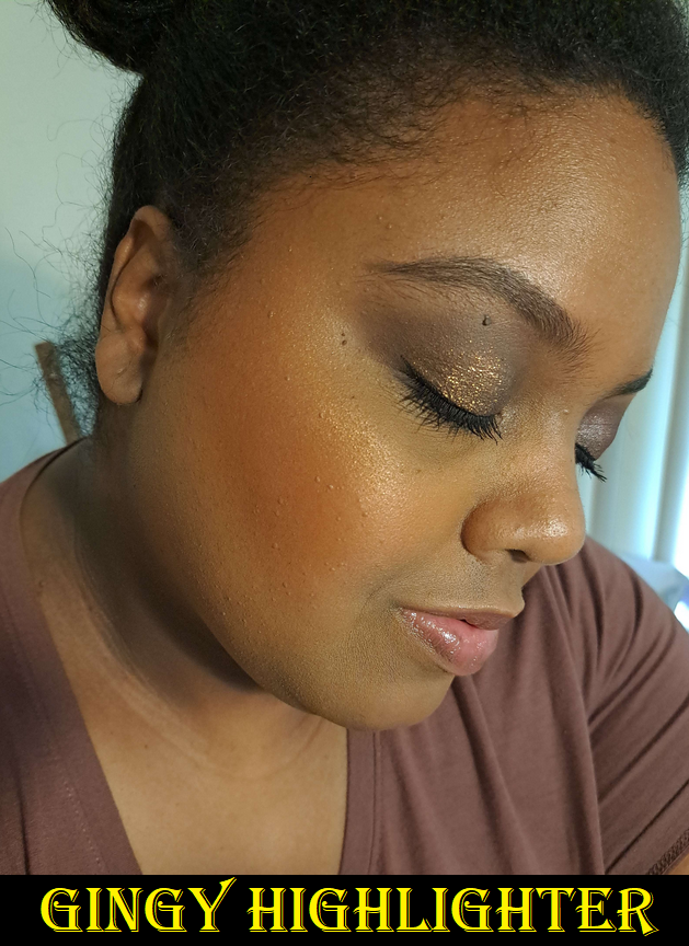
Revolution Shrek Gingy Highlighter and GOT Iron Throne Sponge Set
I bought the highlighter purely for nostalgia. I love Gingy! The Shrek series (really just 1 and 2) was my favorite series after the Mummy Series (again 1 and 2) for a very long time! I think Rush Hour 1 and 2 (okay apparently I only like the first two of trilogies) surpassed the Shrek series by now, but I still love those movies and Gingy is still my favorite. However, for review purposes I have worn it a handful of times. When I’m using my winter foundations, the highlighter is too deep of a bronze for me. In the photo above where I’m not quite at my typical summer shade but a little darker than I have been in a while, it seems to work well enough when used sparingly. In complete direct light, my camera can pick up the texture to the shimmer particles, but looks smoother at most other angles in the light. In fact, it’s smoother than I expected from a Revolution Beauty product. I’m a bit impressed! I don’t intend to use it anymore though since I want to keep it for nostalgia purposes, but it’s good enough that I could. Also, this used to have a strong gingerbread scent, but that faded in the year that I’ve had this.
How cool is this sponge and holder set! Plus, it was so inexpensive at $6 considering Beautyblender’s sponge stands/holders/cases are in the $10 range not including the sponge. The brand had a sale and I ended up buying another set to give to my friend at the even lower price of $4! As a Game of Thrones mega fan, I had to have this for the stand alone. It’s not only a functional holder, but also a nice spot to set the sponge to air dry after being cleaned. The sponge was just like any other inexpensive sponge I’ve tried. It blended my foundation in just as well while feeling a little firmer than the original Beautyblender, but not as firm as the Rephr sponge or Danessa Myricks ones. The Revolution Beauty sponge was also firmer than the Real Techniques Miracle Complexion sponge. It would be nice if it was a little softer when wet, but it still works great, especially for the cost. There are two big drawbacks for me, which is that if the sponge sits out for even as little as a few hours, I can’t wash it fully clean with any of my soaps. There will still be foundation stains after multiple re-washings. The other downside is that for whatever reason this sponge takes exceptionally long to dry. It had me concerned about the increased risk of something growing inside considering how long it stays wet for. So, after a few uses I decided not to bother with it. I’m happy enough with the stand. I know there have been quite the issues financially with this brand and their sub-brands and co-brands, but I hope they’re able to continue making gems. I haven’t had the best luck with everything of theirs I’ve tried, but they’ve got their occasional hits.
CDJapan Chikuhodo ZE-3 Blush Brush – This review is coming to Fude 6.
Sonia G Smooth Buffer Brush – This review is coming to Fude 7.
Viseart Petit Pro Palette London Étoile – I reviewed this HERE along with several other Viseart palettes. I created some pretty looks with it, but once the “new” feeling wore off, I didn’t use it again. I love olive shadows, but I have so many other olives that have more sparkle and wow-factor to them, which is why I always remembered to use those and forgot about the one from this palette.
Lunar Beauty 2022 Advent Calendar, Love Me Strawberry Lip Oil, and Dreamy Lip Gloss – I’m going to come right out and say I’ve chosen to not review these products at this time. I have always felt conflicted about whether to review Lunar Beauty or not because I’m always going back and forth about how I feel about the brand’s owner Manny Gutierrez (Manny MUA). The personality he portrays in his videos isn’t the style I enjoy watching in reviews, but it’s his past constant involvement in drama with other problematic influencers that bothered me. I do own the first Moonspell palette (purchased discounted from a third party and never used as it’s just for packaging), a Moon Prism highlighter I bought purely for packaging (also purchased from a third party and never used) and originally planned to compare it to the controversial dupe highlighter from Makeup Revolution, the first Moon Prism blush palette that I purchased when Lunar Beauty products were sold at Sephora, and the Large Powder Brush from his website (even gifted two of them). Manny had stayed away from the drama for a few years and his Fool Coverage podcast with Laura Lee started to change my opinion of him. That’s why I purchased the Advent Calendar and lip products last year and decided that I felt comfortable enough to finally put full energy into the Lunar Beauty post I’d been working on here and there for literally years. Then, as I started with the product photos and testing in 2023, I kept hearing about more and more problematic influencers that he was starting to show his public support for again and that bad taste in my mouth returned. Unlike certain people whose products I refuse to buy or speak about on my blog any longer (JS, JC, JH, etc.), I don’t know if I’m going to give a hard ban to Lunar Beauty products in terms of never speaking about them again. I at least finished reviewing the last Jaclyn Cosmetics products I owned before stating I was done with the brand. With Lunar Beauty, if I’m wearing those products in a post, I might mention it’s what I’m using, but I don’t see myself ever working on that brand review post again, and I personally will no longer purchase anymore products from them. The last thing I bought was a year ago anyway.
Beauty Bay Dark Fantasy Palette
I showcased this in a Swatchfest post, but hadn’t actually reviewed it at the time. These colors are stunning and right up my alley. I have loved the looks I’ve created with it. Regarding the quality, this doesn’t give me that many issues when I’m using a primer. Eye primers are a staple product for most beauty lovers, but I do personally know people in my life who are makeup dabblers and don’t always use primer. So, it’s for their sake that I feel the need to express that I had such a hard time using this palette without a primer. The lighter mattes are fine, but the darker ones are so pigmented with good adherence that they just don’t want to budge unless there’s a primer underneath. I can’t stress enough that primer is important! Also, I highly recommend working from lightest to darkest when building up layers.
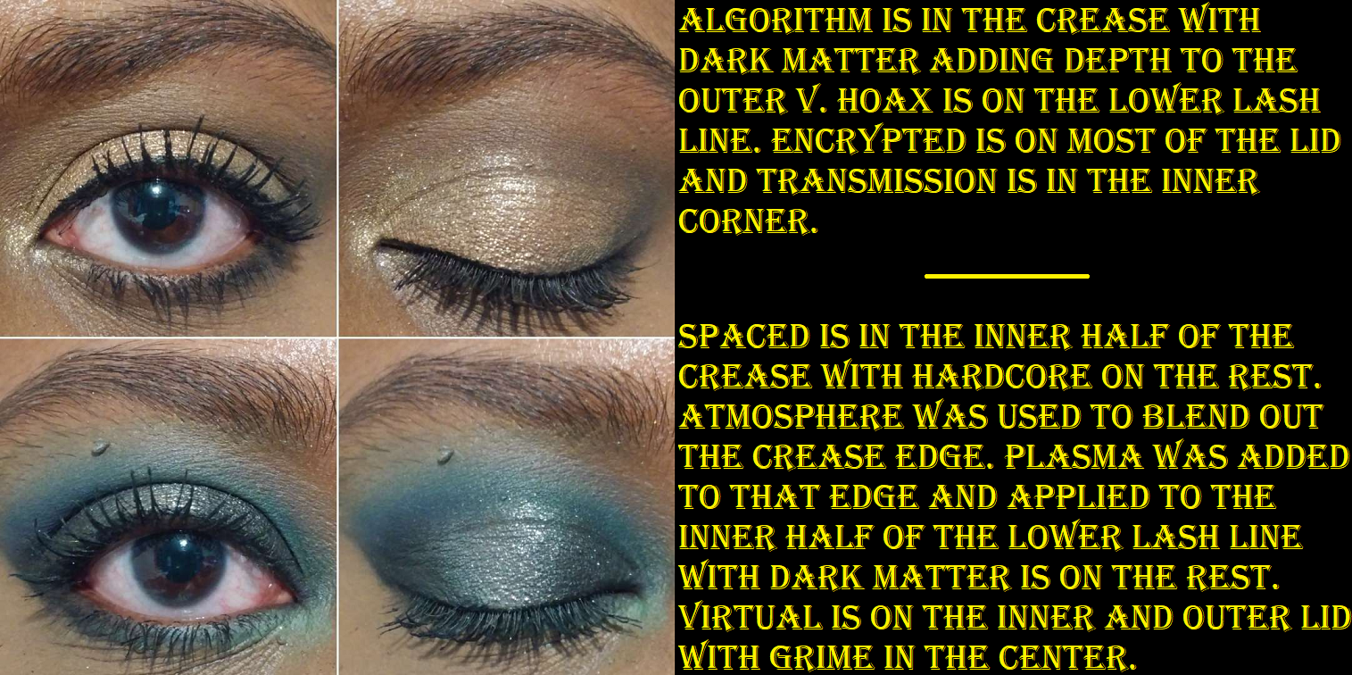
With primer, these mattes still weren’t as easy to blend as the majority of the eyeshadow palettes I use (also at double the cost or more), but with the staple Japanese eyeshadow brushes I’ve used hundreds of times, it was still better than I expected. It’s nice to see Beauty Bay eyeshadow quality has a positive reputation for a reason. Not necessarily as being the greatest on the market, but certainly great for the price (along the lines of BH Cosmetics, Colourpop, and ELF). It didn’t take that much longer blending as to prevent me from wanting to use this palette again. The first time was rough, but every time after was easy enough. I like how much color payoff I get from those mattes. For instance, shades like Plasma are usually treated like a pastel shade and are too thin or too white based and don’t look that great on my eyes, but this one was great! Hoax is a color that really doesn’t show on my eyes due to my skin tone and Algorithm is a slightly more golden tone version of my skin so it barely shows either, but I still like to use it as a starting shade in the crease. Atmosphere is the one that’s too thin and doesn’t show well enough on me and the other shades are too strong in pigment and overpowers it when I try to use it to blend the edges of the shadows, but it still semi works for that purpose. I just have to spend a little extra time on it. Beauty ends up looking way more purple on my eyes instead of burgundy or maroon, but it’s at least still a pretty color.
I have zero issues with the shimmers. I sometimes get a little fallout, but dampening the brush helps. The shimmers aren’t as refined as some of my more expensive eyeshadows either, but I like their sparkle level and they look pretty regardless. I want intensity and opacity from my shimmers, and that’s what these give me. I didn’t have any patchy or creasing issues either, so overall I do like this palette! I’m glad I was able to give the Beauty Bay eyeshadows a try. Because it’s not the easiest to get my hands on, I don’t know how many more I’ll get in the future. Plus, I’m usually not drawn to their color stories. However, if another one attracts my attention, I might get it.
MAC Indulgent Glow Rosé Limited-Edition face kit in Sparkling Wine – I reviewed this HERE and in comparison to other MAC highlighters I got around the same time. It’s super pretty, but I ran into that issue where I am so reluctant to actually use my makeup with cute embossing on it. I have no regrets buying it though.
Charlotte Tilbury Hypnotising Pop Shot eyeshadow in Cosmic Rocks – I reviewed it HERE along with the shade Sunlit Diamond that they sent me on accident with a different order. Just as I expected, these have become cute decor. I haven’t reached for them more than once or twice after completing the review. I just don’t use single eyeshadows if they’re in individual compacts. I only reach for the ones in my larger custom magnetic palettes.
Hourglass Unlocked Butterfly Palette – I got this from FeelUnique/Sephora UK for $46 purely to get the two blushes in that palette. I depotted two shades from my other Hourglass palettes that were unusable on my skintone, adhered them to the Butterfly palette’s now missing blush spots, and sold it as a custom palette on Mercari. Minus the fees, I made $32 back, so this was probably the best deal I got that year. I did not get so lucky on the deals this year, but that’s a story for another time. I talked about the process of depotting and showed the photos of the palette HERE.
Bioderma Sensibio H2O – This was just a repurchase. I decided to look through my purchase history and essentially since November 2015 I’ve bought 8 of the 500ml bottles, 2 of the 250ml bottles, and 2 travel size 100ml bottles. In the beginning, I was able to get heavy discounts on multi-packs, but the prices have jumped up quite a lot. So, I try to get them individually whenever I see them on sale, even if I need to accumulate backups since they will always be used up. In fact, I’m halfway through my last bottle and will need to find a new place to order it from when I go back to Germany so I won’t need to bring a big bottle over with me. This is one of those products that as long as they keep making it and don’t change the formula, I’ll be buying it for life.
Fenty Beauty Sun Stalk’R Face + Eye Bronzer & Highlighter Palette – I reviewed this HERE and though it’s still in my collection, I am considering decluttering it. I just have a ton of bronzers by now that I prefer and don’t need to resort to mixing to get the tones I like.
One/size Cheek Clapper in Phat @$$ – I reviewed it HERE. As it often happens, because my blush collection is so large, I don’t have the chance to use this as often as I would like to. It’s still one of my favorites, along with the other shade from the line called Freaky Peach. I still easily recommend this trio, even at full price.
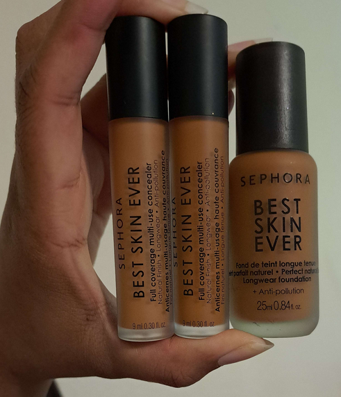
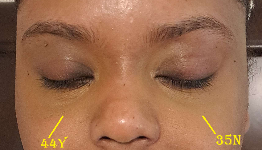
Sephora Collection VIB Sale Items: Soft Matte Perfection Blush Duo in 01 Sweet Pea, Best Skin Ever Liquid Foundation in 44 Y, Best Skin Ever Full Coverage Multi-Use Concealer in 35N and 44Y
The blush duo in three shades (two additional I bought later on) are reviewed HERE. As for the foundation and concealers, the shade matches are why I decided not to review them. I wasn’t blown away by the finishes and just didn’t feel inspired to keep using any of them.
Sephora’s Best Skin Ever line was really hyped up, but it was just fine. I didn’t like how the concealers wore throughout the day. The finish of the foundation was fine and the color match wasn’t too terribly dark if used lightly, but all of these smelled so heavily of chemicals after owning them for a year. For the record though, I didn’t open the concealers until around three months prior to posting this and they smelled just as bad as the foundation, like spray paint or nail polish. So, even without air exposure, the shelf life isn’t great on these. I threw them out before I could take a picture including them in the big October month photo.
Rare Beauty Positive Light Liquid Luminizer Highlight in Flaunt – I reviewed this already as a sample HERE, but I bought the full size a year ago during the VIB sale. I also have swatches and comparisons to the powder version of this shade HERE.
Kayali Eden Juicy Apple – I don’t normally review my perfume purchases, but I did so in a big Kayali post HERE. I have admittedly barely used this perfume because I’m always using Yum Pistachio or Lovefest instead, but at least I just got this in a small size so it’s not quite as wasteful. Plus, I got it on sale. As nice as it is, I decided to give it to my sister because of how deep my obsession for the other scents run. This was my first Kayali purchase, but since it’s only a year old, I haven’t attached any sentimental value to it.
HUDA BEAUTY GloWish Cheeky Vegan Soft Glow Powder Blush in Sassy Saffron – I showed swatches of it HERE in comparison to the previous shades I bought. However, I don’t have any face pictures with it on because it just doesn’t show up on my cheeks. For that reason, I haven’t used this particular shade. The formula and finish wasn’t special enough either for me to prioritize it. I still like how Berry Juicy looks, and I wore it perhaps two more times in the past year.
Tom Ford Highlighter Duo in Tanlight – I reviewed it HERE. I still use it quite often and it’s one of my favorite highlighters in my collection. In fact, it’s such a great shade match for me that I don’t feel the necessity to purchase anymore highlighters from the brand unless they have another shade that’s similar to the mixture of the two colors in some form of special packaging. While I still have mixed feelings about the price and I’m not sure if I would universally recommend it to everyone, it was worth it personally to me.
Oh dear Lord, we’ve finally reached the end!
This was a monster of a post, even though so many of the products had already been reviewed elsewhere! We’re so close to completing the series but November and December 2022 had even more purchases than October! And considering what I know is coming for the rest of this year in my personal life, I think we’ll have to complete this series sometime next year!
I’m getting into a really exciting chapter of my personal life, which I will be sharing with everyone in December or January. Thank you to those who are choosing to be along for the ride!
*DISCLOSURE:Other than the free sample that came with my order, the Charlotte Tilbury product reviewed in this post was purchased by me with my own money. Non-highlighted links in bold blue font (Example) are standard non-affiliate links. Links marked in bold black font with a light blue background (Example) are affiliate links. Affiliate links allow me to get a commission if purchases are made directly using my link. There is currently only one affiliate link in this post and it’s for a brush.
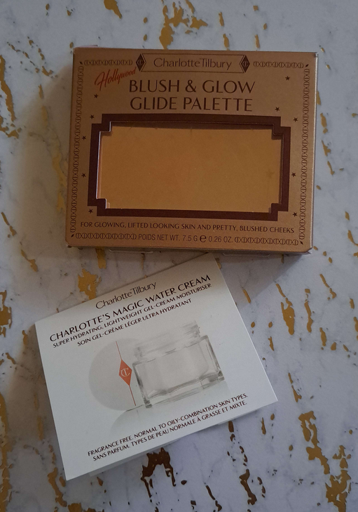
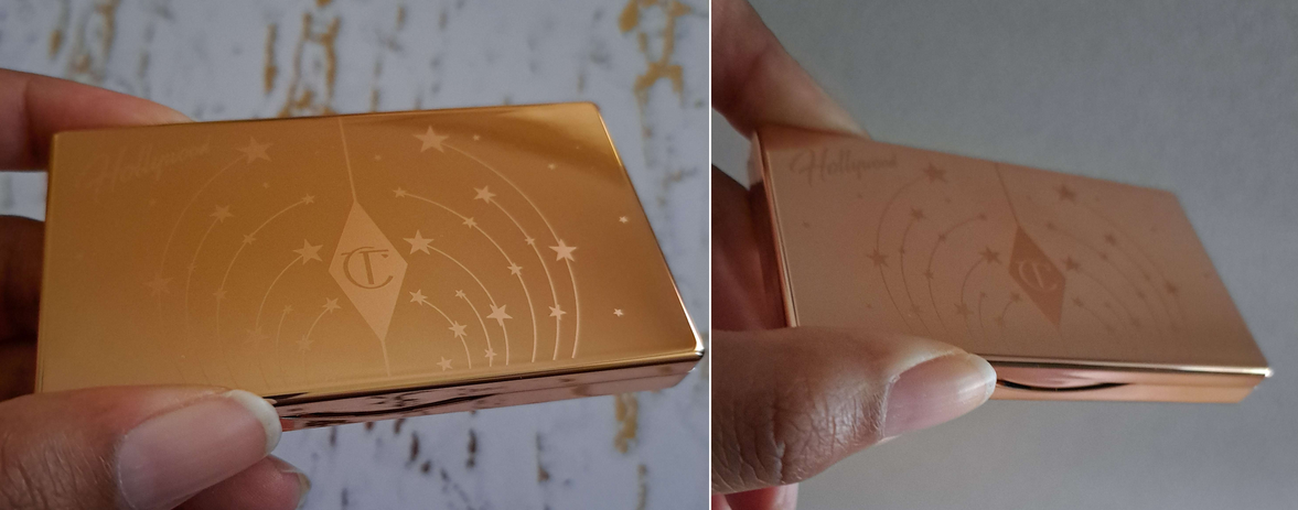
Charlotte Tilbury released some nice gift sets and new items for the holidays this year, but I was only interested in this one. I also received a sample of the Magic Water Cream with my order, so I’ll discuss that at the end of this post.
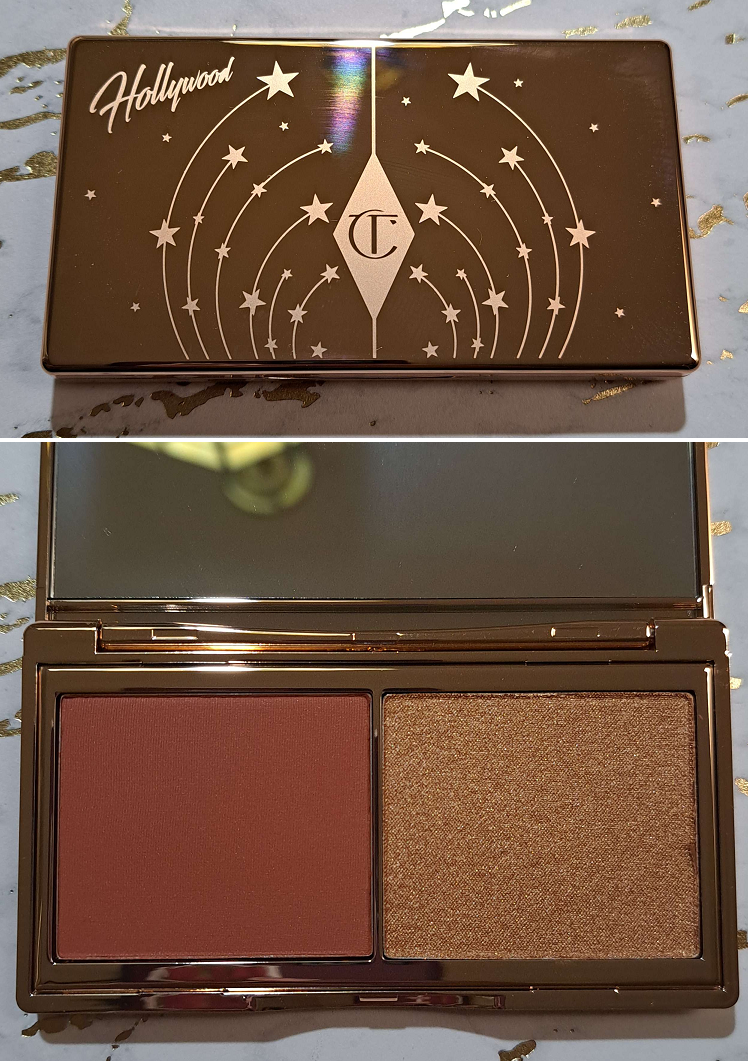
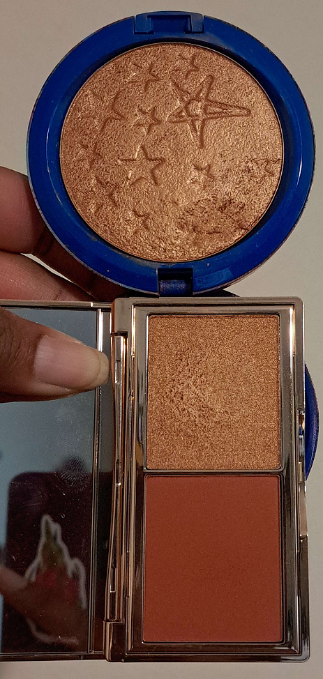
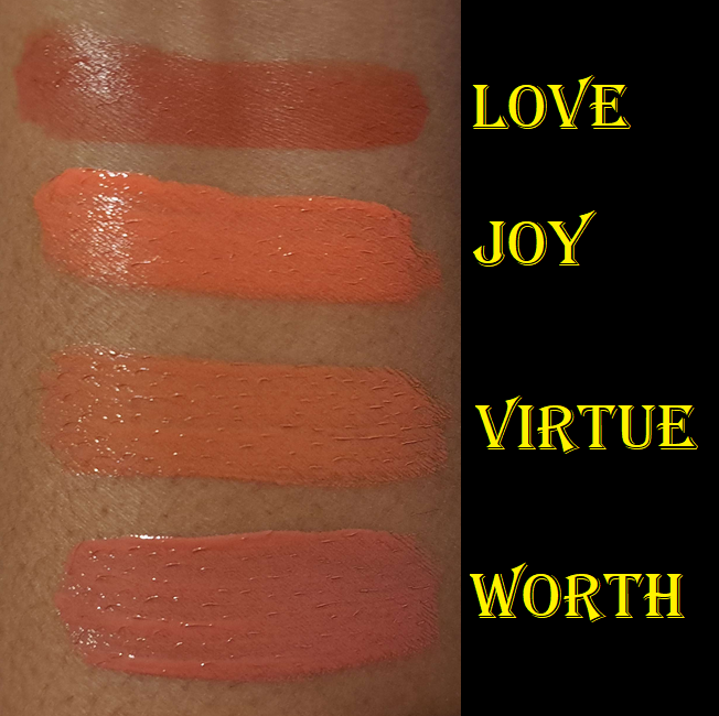
This mini duo comes in two different shade variations. The Tan to Deep version that I purchased has a blush listed as a Rich Terracotta and a highlighter as a Golden Sunset. Because of the “Glide” part of the name, I wondered if the highlighter has the same formula as the Glow Glide Face Architect highlighters. Comparing the shimmer level and how it shines when light hits it, it certainly does look the same on the skin. To the touch, it feels the tiniest bit wet, whereas both of my full-size Glow Glides feel even more wet/gel-like. However, since they have the same ingredients listed on the website in the exact same order and they look the same on the skin, it’s safe to assume it’s the same formula.
That brings me to the interesting similarity I discovered between the highlighter in this duo and the Sunset Glow shade. Technically, Charlotte Tilbury only lists these as “blusher” and “highlighter” without formal names. There is one image on the website that lists “Rich Terracotta Blush” and “Golden Sunset Highlighter,” but those could be descriptions of the colors and not actual shade names. I have stared long and hard at the two of these side by side and watched the way they shine in the light at various angles. My final verdict is that there is the most minute of differences in the new highlighter having the tiniest bit more apparent of a copper base which is offset by the tiniest bit more of a golden reflect from slightly more of the shimmer, making them basically the same shade.
The description of the new highlighter in the product details as a golden sunset powder may as well be an admission of being Sunset Glow, since that shade is also described by the brand as a warm golden copper. In looking closely at the other duo for Light to Medium skin tones, the highlighter in that duo is described as a pearlescent pinkpowder and looks a lot like Pillow Talk Glow, which the brand says is a “neutral-pearly pink.” If they’re not those exact shades, they’re at most the tiniest bit tweaked. So, if you own the Pillow Talk or Sunset Glow shade of Hollywood Glow Glide Face Architect Highlighter, you might want to reconsider whether it’s worth the price to buy one of these. At least with the Tan to Deep version, there’s the benefit of Sunset Glow being (in the US) a Charlotte Tilbury website exclusive, so this is one way someone who prefers to shop at Sephora can get their hands on this shade. Plus, I don’t believe the brand ever had a blush in this color. However, Pillow Talk in any form can be found everywhere, and I’m not confident that the pink blush within the Light to Medium duo is unique to the brand either. It reminds me of a blush in last year’s Pillow Talk Beautifying Face Palette in the version for fair to medium complexions, just based on online photos.
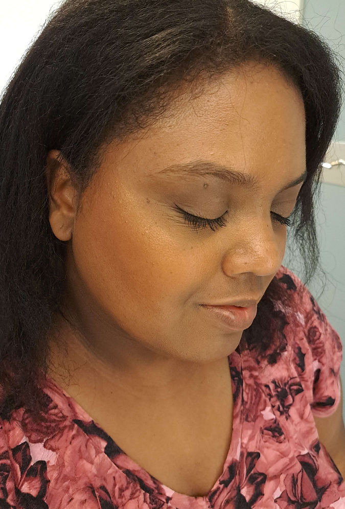
This photo was taken in a hotel bathroom while on a trip. It was at the end of the day and although the makeup looked visible in person, I needed to refresh them both by adding a small amount more of the highlighter in particular so that it would show on camera in the limited lighting. I also did not blend the highlighter so it would be even more obvious in photos. I’m pleased with the longevity of both.
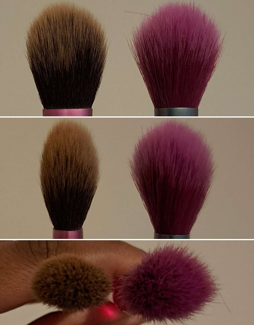
I try to test products out for longer, but considering my experience with the brand’s other blushes and highlighters, half of my usual trial days were enough to solidify my thoughts. The blush is extremely pigmented for such a thin powder! It picks up easily on a brush and looks intimidating when it first touches the cheeks, but the formula is finely milled and blends easily over dry or set skin. With this kind of base, I prefer to use a light-applying airy brush like the Sonia G Soft Cheek. Using that brush over a dewy base takes a lot more effort to blend, but I can still get it to smooth out and look even and not patchy. Using the Sonia G Cheek Pro adds even more product at once, but the combination of how dense it is packed and the hair type makes it more suited for buffing, so this works perfectly for applying the blush even on a dewy base. I had heard that this blush is prone to sticking if the face hasn’t been set, and I could see that a little bit for myself, but it wasn’t a problem when using high quality brushes like my Sonia G ones. So, perhaps that should be taken into consideration.
The highlighter being the Glow Glide formula I’m used to, I use my favorite Bisyodo CH-HC highlighter brush, other candle-flame shaped brushes, or fan brushes to start off light and be able to build up the intensity. Even though the shimmer content and particle size appears to be the same, the reflect intensity of the Glow Glides are stronger than Charlotte Tilbury’s Pillow Talk Multi Glow formula as seen in my swatch earlier in this post. It’s also unsurprisingly more intense than the shimmer ring within the Cheek Chic blushes, so that’s something to consider for those who like the most subtle and least texture-emphasizing of the brand’s highlighters. Both the Glow Glides and Pillow Talk Multi Glow are holy grail highlighters for me.
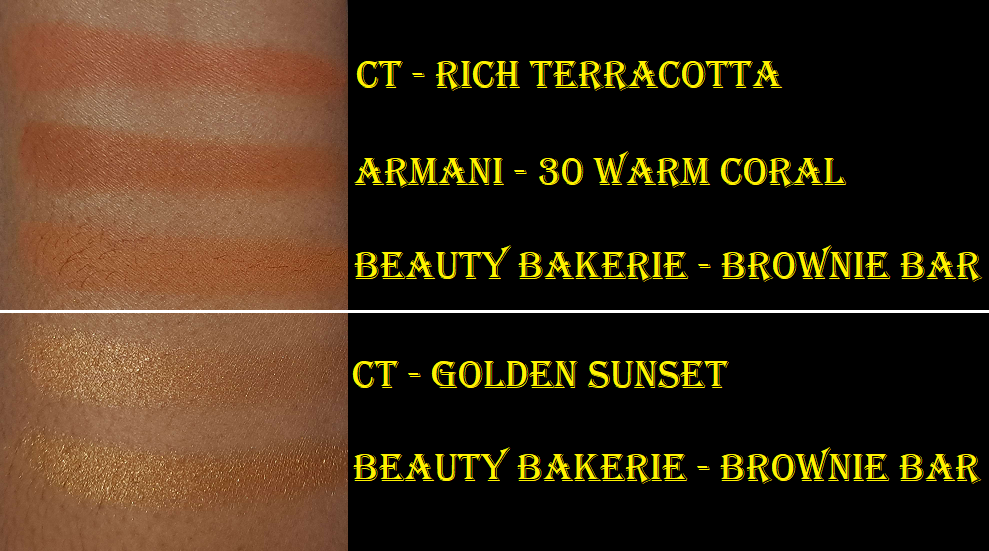
Regarding color comparisons outside of the brand, I felt confident that even among my orange/terracotta blushes this one would be pretty unique. However, I discovered some that are similar enough, such as the Melt Blushes from the Monarca palette or Armani’s Neo Nude Color Melting Balm (though that’s a cream formula instead of powder). And then the Beauty Bakerie Brownie Bar contains a blush and highlighter, plus contour, for $18 that looks quite similar, though I think the Charlotte Tilbury highlighter has more refined shimmer and an even smoother blush. Melt’s Conmigo blush is practically identical and is closer to the Charlotte Tilbury quality, but the powder itself isn’t as lightweight. The refinement or mill of Charlotte Tilbury’s blush is like the brand’s own matte powder bronzer and matte face powder, which makes sense. So, those who find them to be top tier powders will be pleased with the quality of this one, though this has more pigment.
Even though dupes can be found, $29 for this duo is a great price coming from the brand. Considering the brand’s individual blushes are typically in the $40 range and highlighters in the $45 range, getting both in a more realistic amount of product and for less money is great! This would have been even more worth it to me if I didn’t already own the Sunset Glow highlighter. However, I still don’t regret it. My Melt blush in Conmigo is starting to get hardpan and is a bit older of a product, so I have been debating whether or not to declutter it. I feel good about having what is essentially an even better replacement.
Charlotte Tilbury Magic Water Cream (sample)
I always felt that the Charlotte Tilbury Magic Cream felt luxurious, but was too thick for my liking. I’ve had a deluxe size sample of it before and compared to the Bobbi Brown Vitamin Enriched Face base, I liked the Bobbi Brown slightly more. In fact, I got rid of my original Magic Cream deluxe sample in favor of using the Bobbi Brown one.
I can say that I absolutely like this Magic Water Cream version way more than the original and Bobbi Brown’s product. It’s apparently a gel-cream hybrid, which explains why it’s still thicker than the gel moisturizers I’m familiar with, but it doesn’t take much effort for it to fully sink into the skin. Despite what its starting consistency looks like, it thins out when rubbed and doesn’t feel heavy on the skin. The two times I tried it, it kept my skin adequately hydrated all day. There are some longer term claims on the website that I can’t verify such as the “100-hour hydration” or “skin texture appears smoother after 4 weeks,” but I enjoyed using it. If I received it as a gift, I’d be happy. However, I’m not even sure if I’d be willing to pay half price for it considering how much I love other gel and water based moisturizers, such as the Round Lab Birch Juice Moisturizing Cream, Saturday Skin Waterfall Glacier Water Cream, Innisfree Dewy Glow Jelly Cream (but this Jeju Cherry Blossom one has strong fragrance), and even the Laneige Water Bank Blue Hyaluronic Gel Moisturizer is pretty good, though I’d rate that one below the Magic Water Cream. So, considering all the nice alternatives, I just don’t see myself purchasing it from Charlotte Tilbury, but it’s nice to know that it’s at least a good product. I should also note that the Magic Water Cream is supposed to be for normal to oily skin types, whereas I have dry skin, so I’m not the intended target for this product. Considering that, it’s even more impressive that I like it as much as I do.
That concludes everything for today! Thank you for reading!
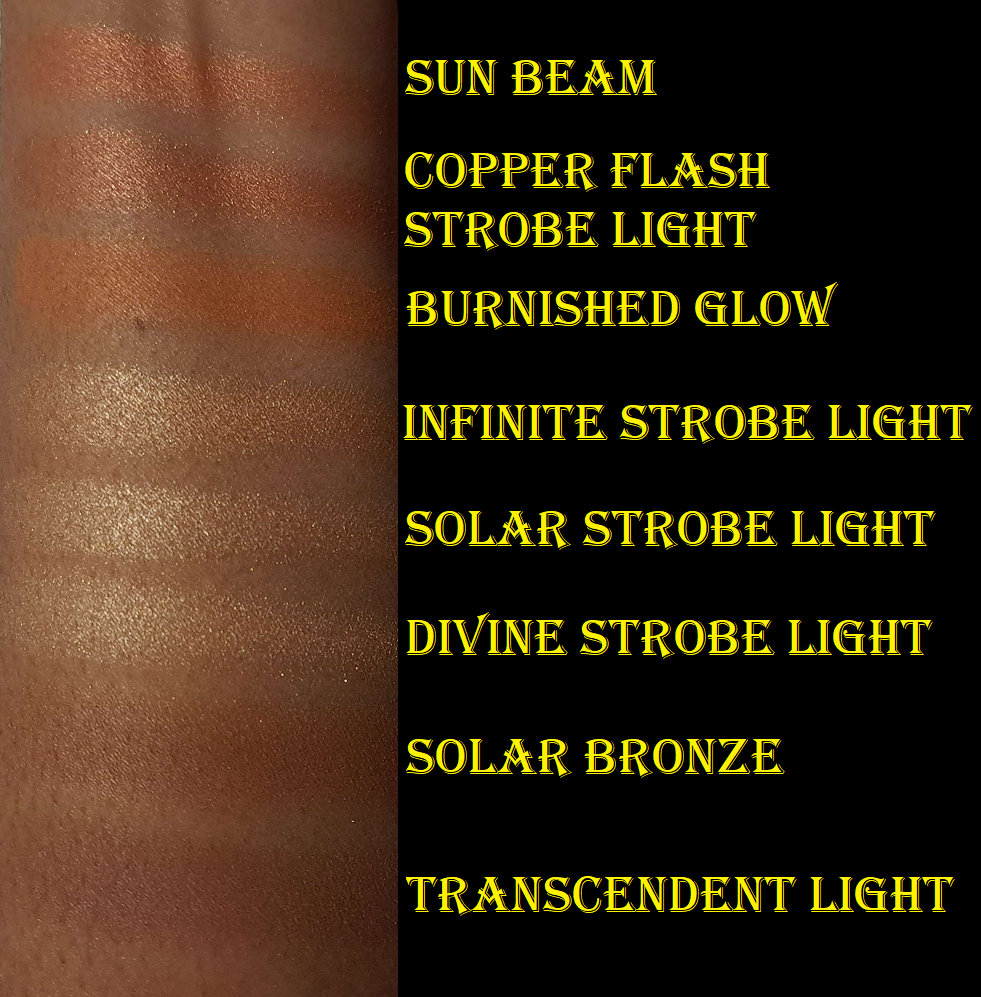
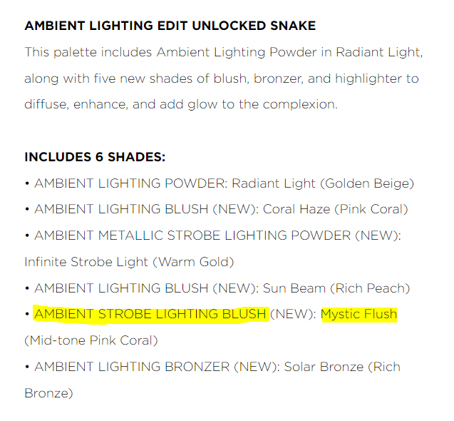
My palette from Hourglass has the Leopard design on the cover, but I chose the powders inside that were assigned by default to the Snake palette. It’s called “Color Palette 3” on the official website. Even though the chances were high that I could have gotten a better deal than 10% off if I purchased the palette elsewhere, I desperately wanted the Leopard packaging and could only get this customized version if I bought it directly from the brand. It was certainly a tough call between the Leopard or the website exclusive Owl packaging!
I’ve been reviewing these holiday palettes from Hourglass for a while now. My review of last year’s palette can be found HERE and the year prior to that can be found HERE.
I also have the two blushes from last year’s Butterfly palette that are currently in my Tiger palette. I did quite the makeup transplanting project, as detailed HERE.
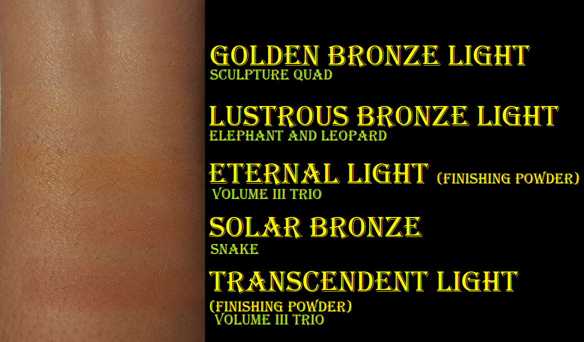
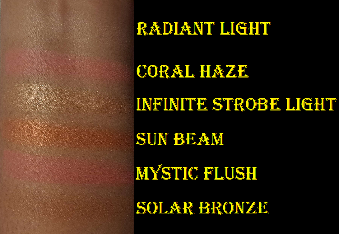
Radiant Light (finishing powder) – This is a permanent shade of powder from the brand, and I have it several times over in my collection. To summarize, it’s a light golden-beige that doesn’t lighten my foundation, but I also don’t notice any difference at all when I wear this besides mattifying the skin and depositing the occasional visible shimmer particles. I prefer to use other finishing powders that accomplish something I need like blurring, smoothing, or adding a healthy glow. This option could have been worse. They could have chosen some of their much lighter finishing powders instead. At the same time, it could also have been better. One of my usual criticisms of Hourglass is their inability to commit to creating a face palette fully geared towards deep skin tones. Last year’s Elephant palette was clearly intended for those medium to tan, yet they still made Tiger spread a wider range of medium, tan, and dark at the expense of some of those shades not showing up on someone that much darker than me. Eternal Light is a darker option that has yet to be released in a travel size or edit palette form. However, since Radiant Light is technically the only repromoted shade in the Snake palette and I own both of the brand’s darker finishing powders in the Volume III trio form, I’m not going to hold it against them. They love their repeats and we’ve come to expect it. In addition, I think this palette is intended for tan to medium-deep complexions. From that perspective, having Radiant Light instead of Eternal Light makes more sense. I’ll elaborate more in the section with my final thoughts.
Solar Bronze (bronzer) – Even though I can use Transcendent Light as a bronzer, I have been long awaiting Hourglass making a true bronzer that will work for those with dark skin. I somewhat got my wish, but there isn’t much of a depth difference between that finishing powder and this bronzer. The main difference is the tone. Solar Bronze looks cool-toned in the palette next to such warm shades, but it’s definitely warmer in swatches and on my face. It’s subtle on my skin tone, but it can be built up a little. I am honestly thrilled with this shade. It’s such a good balance of being warm, without leaning too orange or red. As much as I love it, I know there are others darker than me who are disappointed that Transcendent Light wasn’t deep enough for them last year and this year’s bronzer option won’t work either. Although Hourglass dropped the ball in that regard, I have to acknowledge that they made three new bronzer shades this year with one in each palette. Their bronzers tend to be very warm, so I’ve heard some people are pleased that the bronzer in the Jellyfish palette is closer to neutral for those with light skin tones. That’s something that has been missing from the brand, so they focused on filling a void, but on the different end of the spectrum. And considering they didn’t put a bronzer in Butterfly last year, I give them credit for improving on that front.
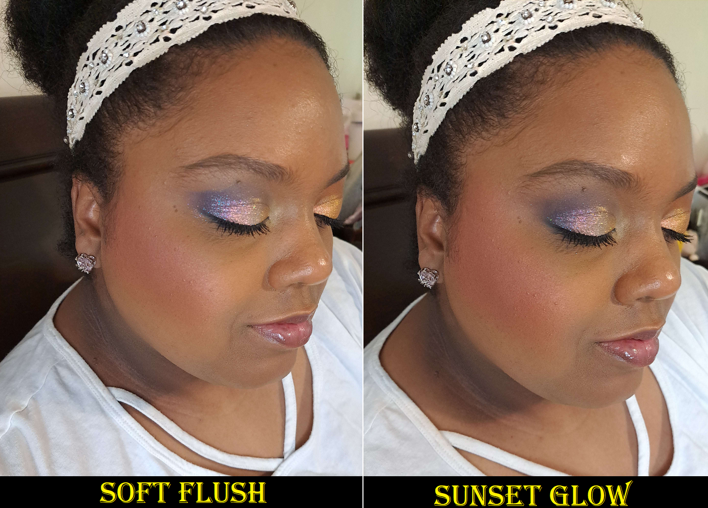
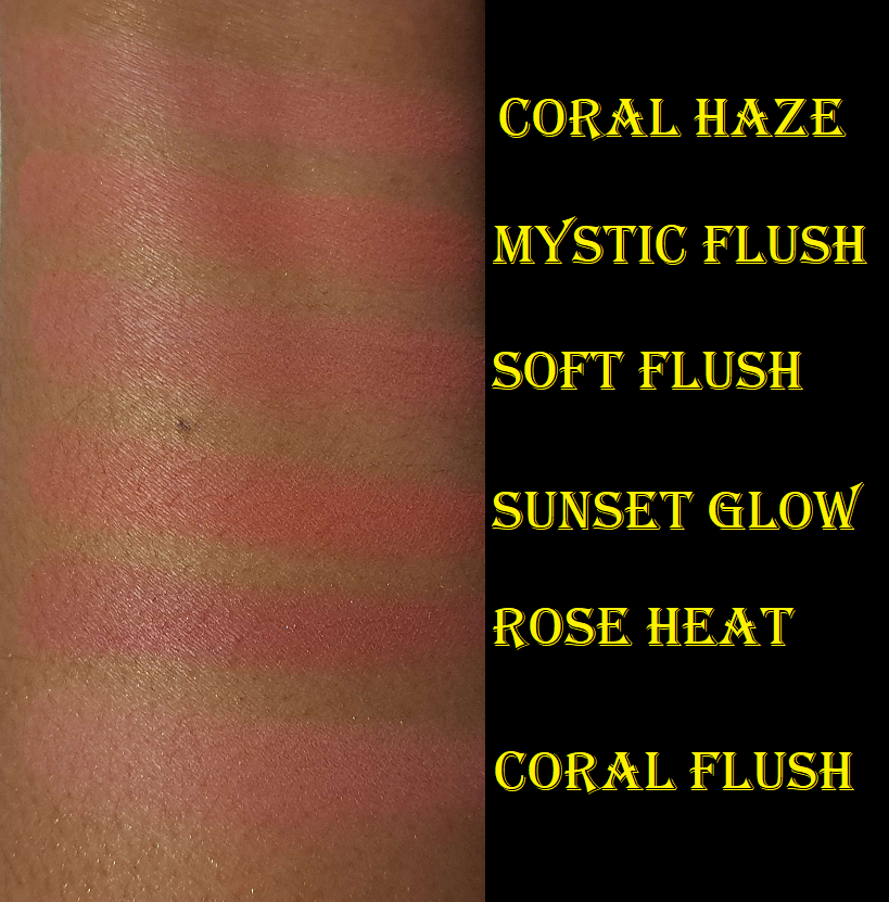
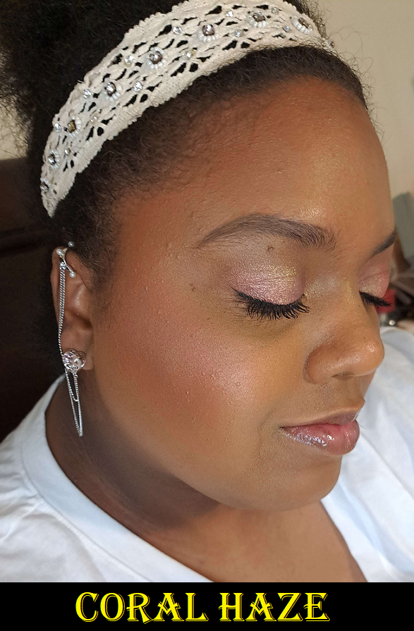
Coral Haze (blush) – This blush is less pigmented than Mystic Flush, but I’m not sure if that just happens to be because my blush tile has barely any of the darker swirl of color in it. Since it’s buildable, I can still get visible color on my cheeks (though it doesn’t show as well in my photo as it does in person). It’s cool toned, so it’s not my favorite kind of blush color, however, I do like it more than I expected. Whenever I start off with this color, I end up just throwing Mystic Flush and even sometimes Sun Beam on top. I like the combination of the blushes together on my cheeks.
It’s similar to Soft Flush from the Butterfly palette, but slightly lighter and cooler. However, on my cheeks, it would be hard to spot the difference.
Sun Beam (blush) – In my review last year I wrote, “How fun would it be if Hourglass used their miscelare technique to mix two medium or darker colorful shades in a series of blushes instead of pale beige bases with a single color?” Looks like I got my wish again! Coral Haze is technically an example of that, along with Sun Beam no matter how close the swirled colors are in depth and tone. I love this color a lot more than Burnished Glow, which was too orange for my style to use alone. The texture of Sun Beam reminds me of the Copper Flash Strobe highlighter, even though this one is supposed to be a blush. It’s less reflective and more to my liking than Copper Flash Strobe, but it looks super metallic in my photos. I struggled to capture a photo that was bright enough to show the blush tone of Sun Beam and was unable to avoid the light directed at the cheeks from looking as reflective as a highlighter. This blush looks so much tamer and softer when I apply it to my bare skin, but for some reason, on my face with foundation, it looks more textured than usual. This happened on top of the Hourglass Ambient Glow Foundation (I’m wearing in today’s photos) and the Rose Inc Luminous Serum Foundation. Neither of these foundations are wet to the touch, and powdering doesn’t change things anyway. Based on the names, one could suspect the luminous foundations could be impacting the look of Sun Beam, but the foundations are more of a natural finish rather than glowy or dewy. With Sun Beam being closer to the strobe formula rather than the shimmer formula, I think it’s just a matter of it not being as flattering on texture and it looks better when used sparingly.
One more thing of note is that Hourglass lists Sun Beam and Coral Haze as normal Ambient Lighting Blushes, but for some reason Mystic Flush is listed as an Ambient Strobe Lighting Blush on their website. I’m guessing this was listed incorrectly and that Sun Beam is the actual strobe blush.
Mystic Flush (blush) – I love this color! It’s a warm pink, though not as warm as Sunset Glow from the Butterfly palette, and slightly more vibrant. It gives the exact type of pop I like from a blush, without being too loud of a color. I certainly can’t tell Sunset Glow apart from Mystic Flush if they’re applied normally on my face, but Mystic Flush is a bit more pigmented while being just as easy to blend. These two Snake blushes are so similar to the Butterfly palette blushes that I think it would feel to some people like having repeated shades. Of the four though, this is my favorite by a small margin. From Hourglass as a whole, At Night is my top favorite blush from the brand. There is still currently no mini or edit version of At Night, so I’m a bit surprised they chose to put two similar depth of pink blush shades in one palette instead. However, I will always give credit when the brand attempts to make something new rather than resorting to repeats. Considering I couldn’t decide which of the two Butterfly palette blushes I like more, I can understand others potentially having the same dilemma deciding between the Snake palette blushes regardless of how similar they are.
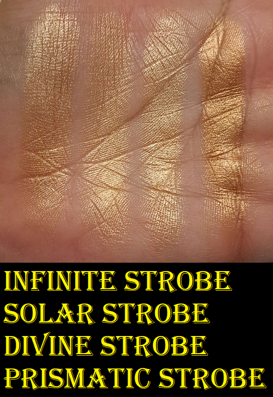
Infinite Strobe Light (strobe powder) – This is the darkest highlighter we’ve had in an Ambient Edit palette, but not by much. The true difference between them are their tones with Infinite Strobe Light being a golden color, Solar Strobe being yellow-gold, and Divine Strobe being a champagne shade. That makes Infinite Strobe Light the best highlighter color out of the edit palettes for me thus far, so they get some credit for the improvement. I am still waiting for the brand to make my perfect color though. There’s a big jump between Infinite Strobe Light and the deepest option available from the brand’s permanent highlighters, Prismatic Strobe Light. I don’t think it would be unreasonable to ask for a middle ground color, but until that day comes, I’ll be making use of Infinite Strobe Light.
I consider the highlighter to have medium-high impact. It’s not ultra reflective, but I don’t like highlighters to have stronger intensity than this one, so I’m happy with it and I can always tone it down with the right brush and if I apply the strobe powder first before the blush.
Overall Thoughts
The Snake palette is probably as perfect of a single face palette as I will ever get from Hourglass. I got the warm bronzer I wanted, a usable finishing powder, two flattering and visible blushes, a more flattering version for me of last year’s copper blush/highlighter, and a darker highlighter than last year’s. I think they did a fantastic job making this palette suit me. Essentially, the issues I had with the Tiger palette that kept me from being able to actually love that one were addressed and applied to the Snake palette. It’s quite funny that my depotting efforts to improve upon the Tiger palette made it look similar to what Snake has by default.
This year’s palettes are a lot more clearly defined between Jellyfish being best for fair to light-medium skin tones, Leopard being intended for those in the medium range, and Snake being best suited for tan to medium-dark. I applaud this distinction, but that also means those with skin darker than mine have been left out again. They get my praise for finally making a great palette for me, but it shouldn’t stop at just me. Hourglass made the highest amount of new shades this year, but they chose to do it so close to what is already available and not as much effort went into filling the much larger voids in the range. For example, the highlighters and their gigantic jump from Infinite Strobe Light to Prismatic Strobe Light. The difference between Radiant Light finishing powder and Eternal Light is also enormous.
What does the brand focus on instead? Five of the six blushes in my comparison swatches look so similar that suddenly it’s clear why none of the new colors from the past three years have made it into the brand’s permanent collections. They can get away with nearly identical shades in an Ambient Edit palette, but I doubt even the most die-hard Hourglass fans would buy and keep all of those blushes if they were sold individually.
If the brand wants to stick to pink and coral tones (with the occasional orange) because that’s their aesthetic, so be it. If they aren’t set on those, I would love to see some dark brown leaning blushes too. Something along the lines of Chanel’s Brun Roussi Lumiere or MAC’s Coppertone or even Format. A terracotta like MAC’s Burnt Pepper would also be beautiful.
I really think Hourglass did better in a lot of areas, but my advice to the brand is to fill in the huge gaps of what’s missing in the range, not the minuscule gaps. Even if the palette would be too dark for me, I would love to see an Ambient edit palette for actual deep/rich skin tones. Tiger and Snake aren’t dark enough to fit into that category, so it would have to be several shades darker than those.
Of course, finding a way to make the palettes truly customizable to the point of choosing each individual shade would be the ultimate dream, but it will be great if they at least keep the new tradition of being able to select which pre-set colors go into which packaging. My recommendation for Hourglass, if they want me to be forced to get one no matter what, would be to put an adorable panda on next year’s palette. Also, considering the rabbit/bunny is symbolic of the brand, it would make complete sense to have a rabbit cover, like the Riverine rabbit or some other endangered bunny or hare that would tie-in with the brand’s collaboration with the Nonhuman Rights Project.
Anyway, I eagerly await what next year will bring for Hourglass. I’d love to see other beautiful designs beyond the animal theme, but if they make a Panda, I am so done for! They’ll have my money again.
That’s all for today! Thank you for reading!
-Lili ❤
Edit: Currently there’s code UNLOCKEDVIP20 for 20% off the Hourglass website including these palettes. Credit to TheBeautySteal on Instagram.
These are some of my newest purchases. I wanted to include them in my previous luxury post, but I didn’t want to rush through the testing process. So, I essentially split them into smaller parts. With the holidays approaching and my interest in luxury makeup still at an all time high, I’m sure there will be more to come.
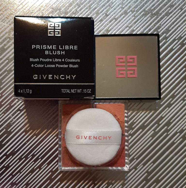
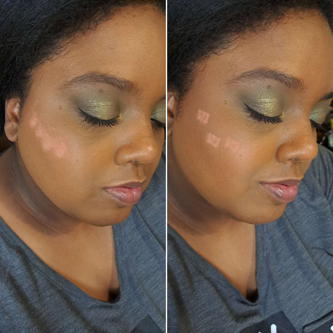
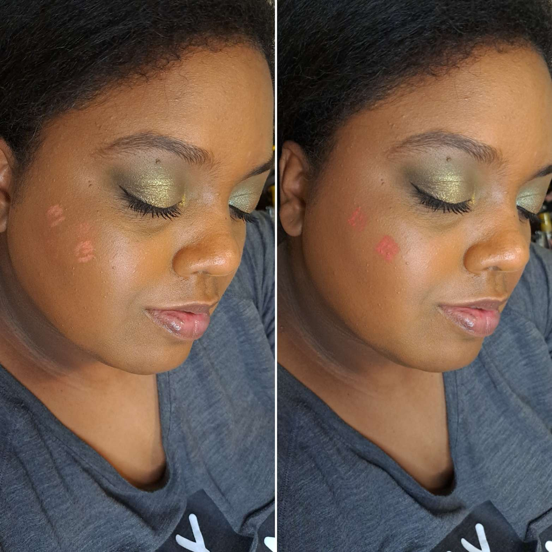
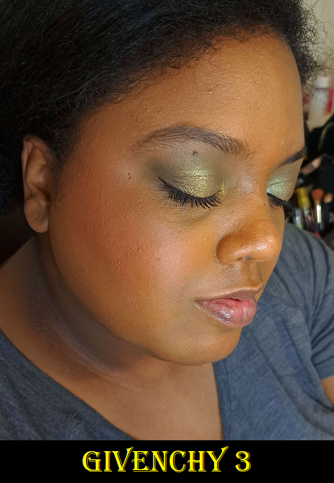
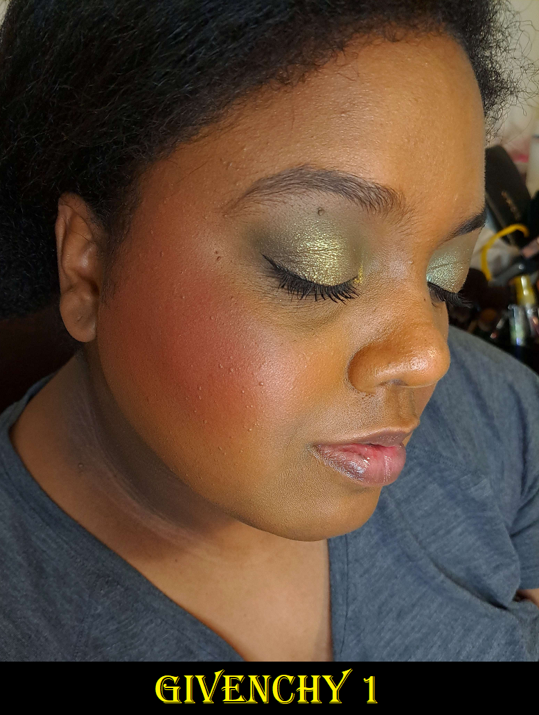
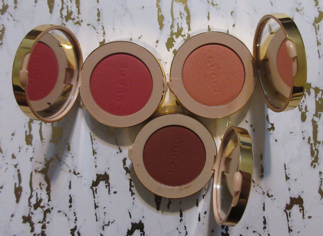
Givenchy Prisme Libre Loose Powder Blush in 6 Flanelle Rubis
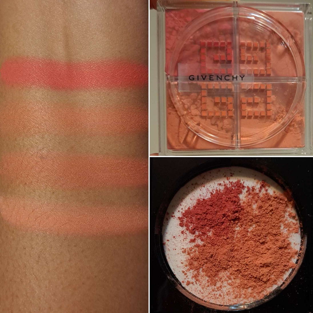
In the order of the swatches clockwise: 4, 2, 3, 1
In the order of the swatches clockwise: 4, 2, 3, 1
If I didn’t have experience with the Prisme Libre Setting/Finishing powder, I would never have gotten this because I would have assumed it would be too messy, but the tape method (controlling how many holes are open) works wonders. I still don’t see the benefit of having four different shades of face powder, but it’s quite enticing to have four blush options in one with the ability to custom mix shades. Suddenly the $43 price seems like a bargain if two or more of the four colors are appealing.
I purchased the deepest option from Givenchy, but I expected the two lightest ones not to work. I was pleasantly surprised that despite being so light on my skin, the color shows through as I blend them in, perhaps becoming one with my foundation in deepening the shade. I still have to build them up a bit, and the lightest one remains subtle, but the second-lightest is easier to see after just a couple of layers. The third darkest in depth just takes one well blended layer to be seen and is my favorite out of all of them. It’s like a dark coral-peach. The darkest looks quite beautiful if applied in a sheer layer as a flush of color, but this is the only one of the four that is stubborn to use. I don’t consider the need to build up a blush to be an issue, unless it adds a significant amount of time to my makeup routine. Additionally, needing to spend more time to blend because it grips wherever it first touches the skin, like this red one, is what I consider a flaw. I can get it to look smooth if I spend enough time buffing it, but I don’t like how much effort it takes. It even hinders my ability to enjoy using this blush with all the sifter holes open because I can literally see where the red powder looks patchy on my cheek and isn’t blending as easily with the other shades. So, to avoid all the extra work, I keep that one completely blocked. So, the ways I’ve been using this blush is with the third darkest shade by itself or the three blendable colors together. Also, none of these fade on me. They last on my cheeks all day.
It’s my preference right now to wear shimmery (but not metallic) blushes or ones with a sheen. This blush is a bit more matte than I’d like, but it’s at least not flat matte, which is why I still like it. The quality of the powder is nice, but when it comes to blushes, there are a ton that I love. A lot of brands, including ones from the drugstore, can make a fantastic blush. So, the quality isn’t a good enough reason for me to add to my collection anymore. Being a good performer is a given, but now I also require pretty packaging and colors that fill me with excitement the moment I see them on my cheeks. I think the black lid with the mirror on top and pink Givenchy logo looks very nice. The shades are complimentary to my skin tone as well, so I’m happy to have it, but my other blushes are so good that this would still fall into the middle of the pack if I had to rank my collection. The custom mixing feature is what helps keep this worth the price and not regret buying it.
Lastly, I just wanted to add that the blushes are heavily perfumed and even stronger than my face powder. I don’t know if this is just a discrepancy between the full-size face powders or the newly produced mini face powders. I also can’t confirm if all the mini powders are like that or if it just happens to be mine. Fortunately, despite how strong it is when I initially apply the blush to my cheeks, I can’t smell it once I’m finished blending it in. Also, this blush container is the same size as the mini of the powder.
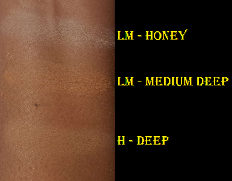
Hourglass Veil Translucent Setting Powder – Talc Free in Translucent Deep
I feel quite lucky to have gotten this for less than full price when Sephora accidentally listed this and the other new shade on the website for $36 instead of $49. I prefer Hourglass’ finishing powders, but as far as setting powders go, I am still very happy with this.
As someone with dry skin who doesn’t use the same amount of powder as I see a lot of other people use on social media, I’m not a good resource for face powder recommendations for anyone who needs oil control to be tested. What I can say is that this powder succeeds in not making my dry skin look drier. I’m able to use this under my eyes without it darkening anything, like some powders do. It’s super finely milled. It’s smooth and blends right into the skin to mattify without looking powdery. The finish just looks like skin, it’s so natural looking.
This reminds me of the Laura Mercier Powder, but even more lightweight. I preferred Laura Mercier’s Medium-Deep version over their original translucent shade, but I used it knowing it would make me look slightly darker. This shade Deep from Hourglass is exactly the kind of color I wanted from Laura Mercier, but couldn’t get. It’s got the yellow tone, like Laura Mercier’s Honey, but it’s a better depth for me.
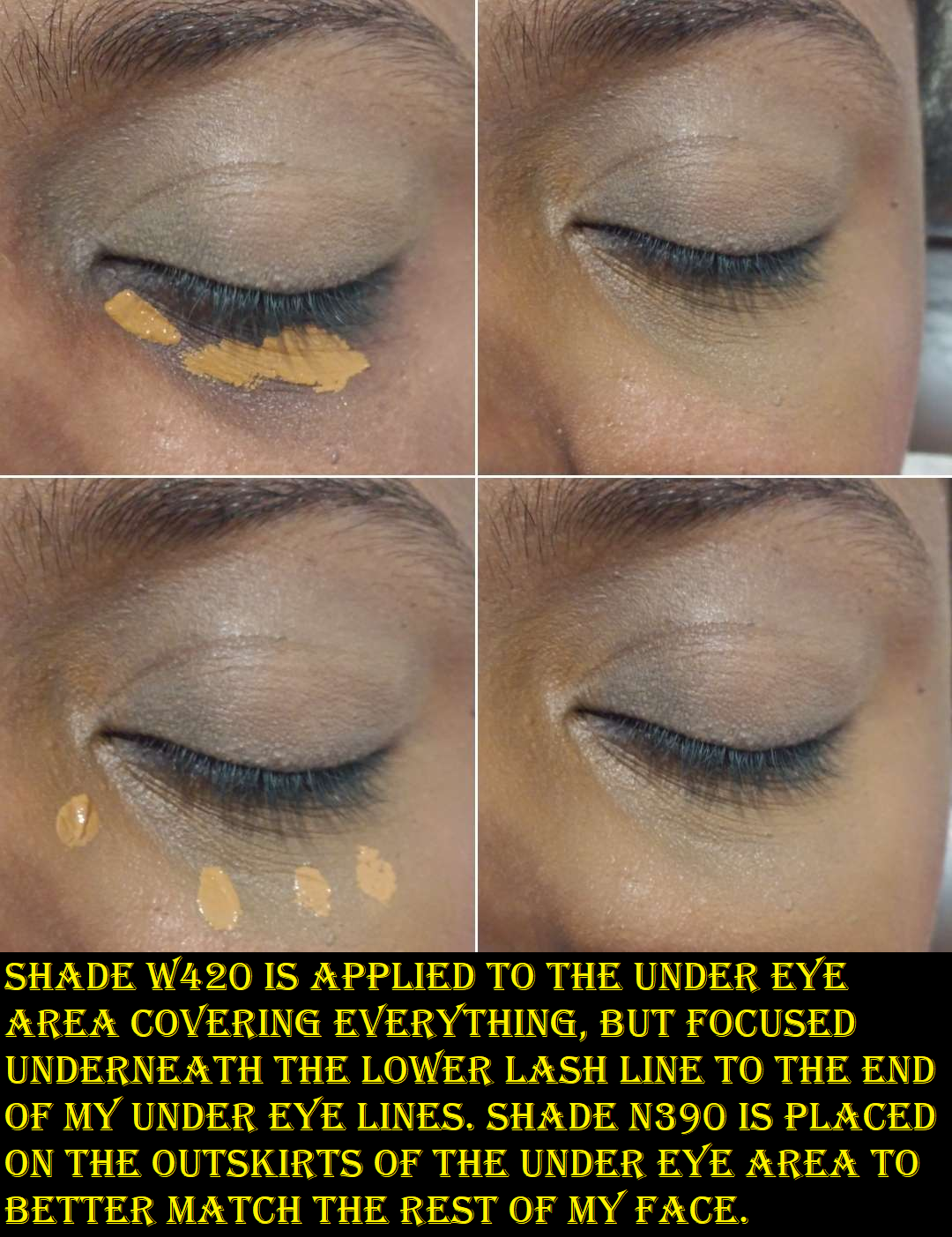
With that in mind, I think this one from Hourglass should have been called Medium-Deep, and hopefully they will release a fourth version that’s darker. Even though these powders are “translucent” they are still capable of leaving a cast if they are too far off from the wearer’s skintone. I’m not sure how well this will work on someone with a Deep-Dark skin tone several shades darker than mine. I’m a little more hawk-eyed when it comes to what Hourglass does, because of their past shenanigans, but I give them props for expanding even this far. Their Deep is darker than Pat Mcgrath’s Deep that I really didn’t like anywhere besides my under eyes (just as the product name suggested).
I attempted to do a flashback test, but my current cell phone camera with flash just makes everything washed out. I couldn’t see a cast when I took a picture using my old cell phone camera with flash on, so I’m going to say that it passes, but I don’t know how it’ll be with flash photography from a professional camera.
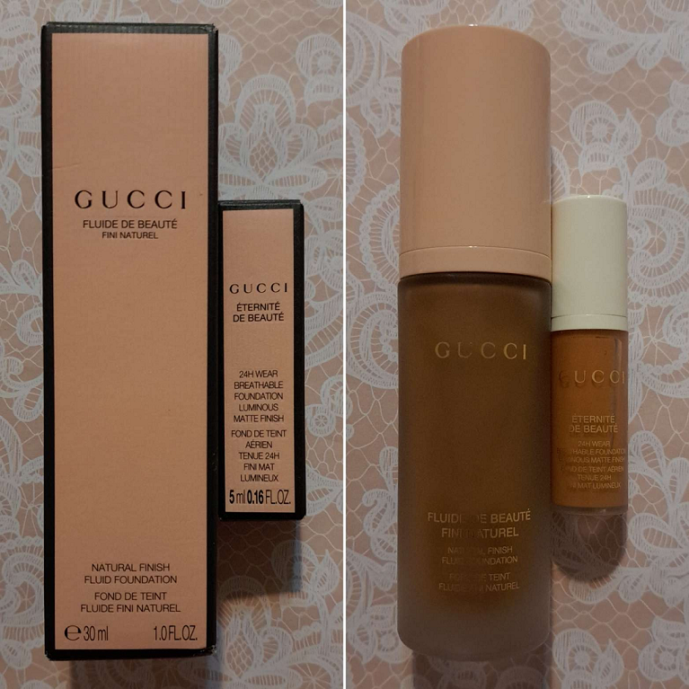
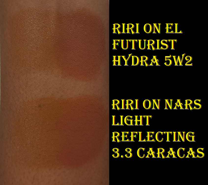
Gucci Eternite de Beaute Foundation in 410N (deluxe sample)
I have to start off stating the obvious that it’s quite strange that the shade I purchased in the original Gucci foundation has a smaller number and is listed as being in the medium category, yet the sample I got from Sephora of the new foundation is a higher number and described as medium-deep, yet it’s lighter than the original. Selfridges had this on sale for $27 in January 2023, and I assumed the price was low because it just wasn’t selling well and was going to be discontinued to make room for the new line. However, the original arrived looking quite separated in the bottle and I can’t help but wonder if the formula went off and the color darkened considerably, and if this could be why it was marked down so low to get rid of it quickly. The first time I wore the original it transferred beyond anything I’d ever seen before. I could literally swipe it off my face and leave a completely bald spot without a drop of foundation lingering, like wiping food off one’s chin. I had no idea if mine was like this because it had turned, or if the original was supposed to perform this way. That’s why I never reviewed it, along with the fact that it was way too dark for me.
This new foundation is much nicer and is surprisingly close to my correct shade! I’d estimate it’s just one shade darker. At some point I’ll be caught in a position that I’ll forgot to reapply sunscreen, and this color will be spot on. Demonstrations of me wearing it are in the Givenchy and Chanel blush sections of this post. It’s described as, “luminous matte,” but I consider it a semi-matte or natural finish at most. I have foundations that make me look a lot more luminous, as seen in other pictures I’ve taken throughout this blog. The only time I get shiny is because of the Florida heat. Then, it just takes me dabbing away the moisture to look matte again. My natural oils coming through after many hours of wear only leads to the tiniest bit of glow, but still not to the level of my actual radiant type of foundations. I get nearly full coverage with two pumps and it’s possible to build up to full, but it can look a little mask-like because it’s not a 100% shade match for me, so I prefer a less is more approach with this foundation. This is also not the kind of foundation I would set with powder, considering my skin type. It has a self setting quality to it anyway so that if I touch my face, I don’t see any foundation on my finger. This foundation feels a bit dry unless I wear moisturizing products with it, such as facial oil.
Overall, it looks pretty in the full-coverage and matte way. Since those aren’t my preference anymore, I can’t say for sure whether that impacts my memory of liking the Nars Soft Matte foundation way more than the one from Gucci since I wore them at different points in time. So, I guess take it with a grain of salt when I say I recommend the Nars, which is $20 lower in price, over the Gucci foundations. I just know that I won’t be buying the full size of the new one and the old one will be decluttered.
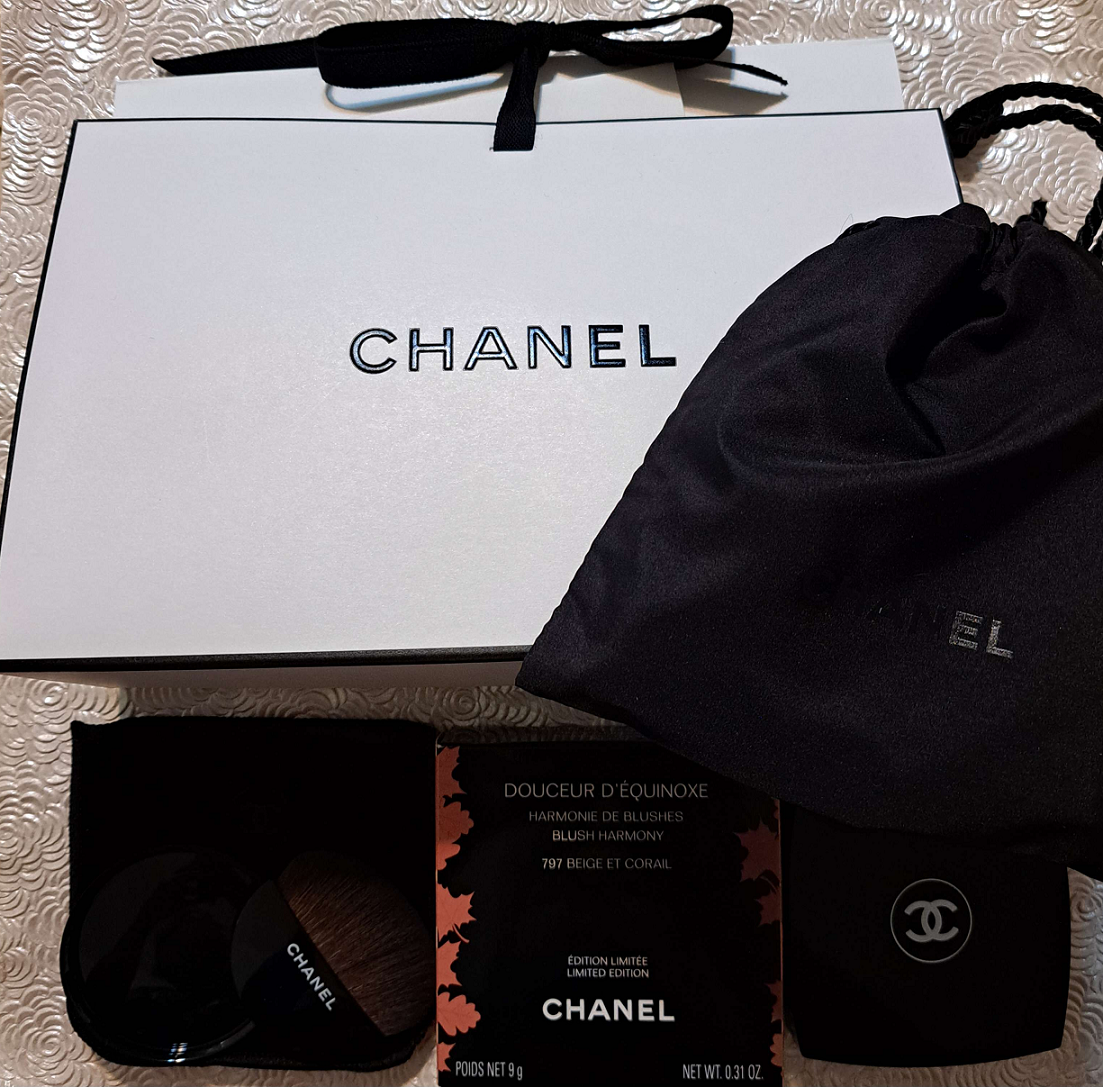
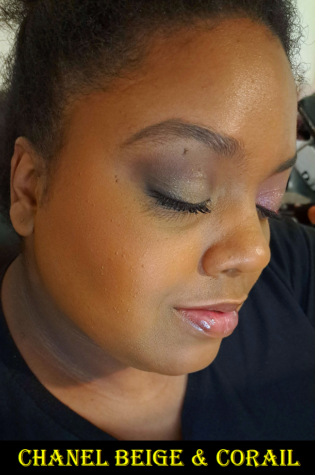
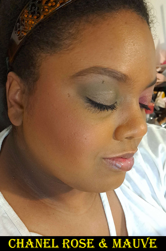
Chanel Excel Blush / Chanel Douceur D’Équinoxe Blush Harmony in 797 Beige & Corail and 798 Beige Rose & Mauve
I spent hours agonizing over which of the two blush shades to purchase. Rose et Mauve was the more unique color offering from Chanel, but I knew a shade like Beige et Corail would be used way more often by me (provided it showed up). I tried to apply the lesson I learned from my post called Blushes So Good I Needed Another…or So I Thought. When it comes to buying more than one blush, whichever shade I love most is the one I’m going to use 9 times out of 10. So, I decided to go with Beige et Corail. After watching many videos and seeing a photo of Rose et Mauve on someone with a dark skintone, I started wanting that other shade even more. Ultimately, when it came back in stock on Chanel’s website, I took my chance and bought it before it sold out again.
On the left is the blush and bronzer. On the right and below the blushes are worn on a face without bronzer in order to show them distinctly.
The Beige and Corail shade takes a lot of product to show up on me. Using my Sonia G Smooth Buffer brush, I have to swirl my brush in the compact (trying to focus pressure more on the outsides where the orange part is the most exposed) five times and apply that amount to the face in three layers in order to get the opacity I want. I can definitely see it in person, but the shade matches my foundation color too closely in photos. I’ve made so many attempts, but I cannot get any better than the two pictures I posted here. In photos, it just looks too much like a bronzer. However, how it looks in person is much more important to me, so on that front I’m happy with it. I can wear it all day with no fading. It has tiny micro shimmer that keeps it from looking flat matte. It’s just so pretty on the skin, so I’m glad I bought it. Also, considering how much swirling into the compact I need to do, I’m surprised to see how much of the leaf detail is still visible on the surface. They’re starting to wear down in some places, but I probably still have a ways to go before it’s gone, and those that don’t need to build up this blush as much will have it last even longer.
Rose and Mauve takes a single layer of three swirls into the compact to get a visible flush of color on my cheeks. I like that it’s more pigmented. It’s still a bit darker of a blush than my usual tastes, but I focus on picking up product mainly in the double C’s so that there’s more pink than plum on my cheeks. I think this is why I ended up surprisingly liking this blush. I like the look even more when I apply this lightly and add Beige Coral on top. Essentially the combination gives a pinkier rosier flush. It’s similar to the combination I created when I mixed Fenty’s RiRi and Big Melons together, which is yet another mauve and orange-coral mashup. I tried taking a picture of them mixed, but it just looks like a slightly lighter application of Rose and Mauve in the photos.
I can’t believe I’m saying this, but I’m happy I bought them both!
That’s everything for today! Thank you for reading!
Today’s post is a slight twist on my series. Generally how it goes is that at one point I purchased a blush and loved it so much that I needed to get the same one in another shade! The first part can be found HERE as well as the second one HERE. However, I’m not so sure buying the additional shades was a good idea for each of these new cases.
Fenty Beauty by Rihanna
Fenty Cheeks Out Freestyle Cream Blush in Big Melons and RiRi
My first time reviewing Fenty’s cream blushes was actually in Part 1 of this series. These don’t have any extra special traits like an atypical cream texture, being transfer-proof, or being super blendable. However, I appreciate its dependable formula that’s pigmented yet buildable, and even easier to blend after it has been warmed up. It lasts all day. It doesn’t disturb my makeup underneath it. It’s not patchy. It mixes well with other cream blushes. My first two haven’t changed in texture, smell, or performance in over three years since I’ve had them even though they’re only marked to be good for 12 months after opening. Admittedly, my tendency to scrape out product instead of dipping directly into it might have played a part in minimizing exposure to things. The other reason I loved these blushes is the shade variety, having my favorite tone of red-brown in blushes and also having a coral option, my other top favorite blush color.
My absolute favorite cream blush formulas (not counting putty or bouncy) are from LYS and One/Size. This is because I prefer having products that look creamy and skin-like but set down or have minimal transfer. The fact that these remain creamy feeling (though not sticky) on the cheeks and will leave color on my finger if I touch my cheek, is one of the drawbacks that keep me from using them on a more regular basis. Yet, for some reason, when Fenty released five new shades, I couldn’t resist getting a mauve and coral-orange to see if they would be new favorite colors as well.
In trying out the new shades, I discovered that as pretty as Big Melons looks, I still prefer Strawberry Drip a little more. I don’t always like pink corals, but I’ve realized that I tend to prefer them over orange corals. I’m still content enough to keep it. As for RiRi, I discovered that what foundation I’m wearing plays a huge role in whether or not I’ll like the color on my skin. When I wear it on top of a yellow toned foundation, such as Estee Lauder’s Hydra Futurist Foundation in 5W2, more of the purple tone stands out within this mauve color. It has an almost bruise-like look on my cheeks. When I wear it on top of a more golden/orange foundation, as is the case with the Nars Light Reflecting Foundation in 3.3 Caracas, RiRi looks like a deep pink, which I find to be a lot more flattering. Nars lists that foundation color as neutral, but their version of neutral for the medium-deep shades is more like a balance between yellow and red, hence orange.
My apologies for the first set of photos being a bit too warm/dark. One of my usual lights wasn’t on and I didn’t realize it made such a difference. When I retook the photos the next day, I didn’t realize those new ones had a slight green tinge (they look good on my cell phone screen but not on my laptop screen). So, I decided not to use those. Instead, this second batch of photos is my attempt to digitally correct the original ones.
I also noticed that when I mix RiRi and Big Melons together, it becomes a pretty pink shade. So, while I don’t think RiRi or Big Melons look as pretty on their own as Rose Latte or Strawberry Drip on their own, I’m very satisfied with the color the two turn into when combined.
I should also mention that I didn’t forget about the Fenty Double Cheek’d Up: Freestyle Cream Blush Duo, but I haven’t used it again after reviewing it. Those shades being less pigmented and more emollient made the formula just tricky enough to deter me from using it again. If I still don’t use it in the next three months, I’m going to be tempted to depot at least Peony Droppa and put Big Melons in there. That way, I’d have a reason to keep that gorgeous compact.
Glossier
Glossier Cloud Paint in Soar
In my previous review of the Cloud Paints, I included swatches and cheek photos of Dusk, Dawn, Beam, Spark, and Storm. When Soar was released, I thought about how my old Cloud Paints are getting past their time and that I should consider which ones I wanted to repurchase. I decided to get Dusk and Storm as bundle deals from Glossier’s website, along with Soar. Dusk was intended to be my replacement mixing shade, since I always felt it would have been better to mix with than Beam. As for choosing between Storm and Spark, it was a difficult decision, but it came down to me liking the deep rose color more than a straightforward red.
Soar turned out to be brighter than I expected, but just like Storm (previously the newest color before Soar and Wisp), it’s sheerer than the original launch shades. Even though it’s sheerer, I still sometimes mix Dusk into Soar to tone down the vividness, but using fully synthetic bristle brushes instead of my fusion ones or my fingers help me to not go overboard.
Soar applied as lightly as possible while still showing the color (left) and Soar applied heavier, but mixed with Dusk (right).
I used to go back and forth trying to decide which ones I liked more between the Glossier formula or Rare Beauty. I think my answer is solidly Rare Beauty because it’s more opaque in color while still being blendable. It’s far less common nowadays for me to do No-makeup makeup looks, which these are perfect for, so I don’t get much use out of the Cloud Paints compared to the Soft Pinch Liquid Blushes. Since I now know which one is my top liquid blush, I probably shouldn’t have purchased anymore Cloud Paints. However, they’re so pretty that I can’t really regret it.
Rare Beauty
Rare Beauty Soft Pinch Liquid Blush in Virtue and Worth
I’ve been craving more natural blush tones from Rare Beauty, so I thought for certain the two new shades would be an absolute hit with me. I was in another position where Joy and Love needed to be replaced and I had to decide if it was better to repurchase my old favorites or take a chance on the new ones. I didn’t want four full-size products considering I used Joy and Love quite a lot and still couldn’t even finish them up despite being minis. I’m sure they’re nearly empty, but recently they finally showed signs of being too old. So, I don’t want to put them on my face anymore.
Virtue was a risk whether the peachy-nude would show up on my skin tone. It does, but it’s definitely subtle. It’s still a little too beige in color to really suit me, so I don’t think I’ll be reaching for this very often except to mix with other brands’ liquid blushes. Worth was the shade I was banking on liking the most. I typically mixed Joy and Love together, and I thought Worth would look like a combination of the two, but it’s not. Worth is more neutral as opposed to the warm pink I get when mixing the others. I still think it’s a pretty shade, but it’s not as complimentary on my skin tone by comparison. I’ve mixed Virtue and Worth together before, but I prefer using Worth by itself instead.
Both of these new shades appear to be less pigmented. I use way more product with the new shades, and it’s not because they’re lighter colors. It shows up with the usual amount, but I add more because I have to build up the opacity.
I really should have stuck to my favorites and purchased a full size of Joy and Love instead of the new ones. In addition, months later I grew curious about Juvia’s Place blushes and purchased shades similar enough in my collection to replace them. The formulas aren’t the same, but the colors are pretty enough to satisfy me. The Rare Beauty ones are very pigmented, but much easier to use than the even more super pigmented Juvia’s Place liquid blushes. But, since I have those, I really shouldn’t replace Joy and Love at this point. Plus, I’ve been experimenting with combining Virtue and Worth with JP’s blushes and it has yielded some pretty results. So, I’m making these work, but in reality the best option would have been to not purchase any JP ones at all, nor the new Rare Beauty ones, and just repurchase my favorite two.
BareMinerals
BareMinerals Gen Nude Blonzer in Kiss of Spice and Kiss of Copper
Kiss of Rose is one of my holy grail blushes, so it was only natural I grew impatient wanting for a shade extension and eventually bought Kiss of Copper. Ironically, it was shortly after that when Kiss of Spice and Kiss of Mauve were announced. I didn’t think either of the new ones would work for me until I saw customer photos of Kiss of Spice looking way darker than the website photos. And strangely enough, after a few uses, mine darkened in the compact!
Left = Official Product Photo, Middle = After One Use, Right = After Three Uses
Mine is way darker than the website photos! I’ve seen pictures online where some people’s Kiss of Spice blonzers are near enough to the brand’s depiction, while others have compacts nearly as dark as mine. So, it seems like which Kiss of Spice one gets isn’t consistent. I didn’t have that problem with the other two shades I own. This color issue isn’t due to my skin tone because it still looks darker than the brand pictures on my palm in direct light, and it’s even darker when turned away from the light.
In any case, I was actually happy it was deep enough to work as a bronzer on me. I anticipated prior to receiving it that I might have to use it as a highlighter instead, but it’s too dark for that. As a blush, it also looks too dark and unflattering. So, I just use it as a bronzer, but unfortunately it tends to look patchy when used that way.
The more I thought about it, the more I wondered if the “patchiness” is merely another issue of the light hitting it and causing some parts to reflect lighter than other spots, hence making it look uneven in color and appear to be missing color in spots where the lighter gold is blending too well with my skin tone. Considering a person is typically in various types of lights throughout the day, it’s not good to have a product that looks unpredictably terrible in some situations, while not in others. I’ve been able to “cover up” the patchiest parts when paired with the other blushes. Perhaps it’s because they reflect differently. I’m not sure. All I know is that I’ve found a use for Kiss of Spice that I like, but I should have skipped that one. As for Kiss of Copper, it’s pretty, but I will reach for Kiss of Rose much more often since it was my favorite of the three original shades anyway. So, once I found my holy grail blush shade and formula, it didn’t make sense to try and find another given the size of my collection.
L’Oreal
L’Oreal 24H Fresh Wear Soft Matte Blush in Daring Rosewood and Fearless Coral
When I saw that L’Oreal released four Infallible blushes, I knew I instantly wanted these two shades. Fearless Coral sold out, but I did get my hands on Daring Rosewood first. I put it on and was so excited because the color looked exactly how I wanted. I looked at it initially and didn’t view myself again. When Fearless Coral became available, I put Daring Rosewood on again to make sure I liked the finish and the blend, so I felt confident ordering it. It wasn’t until I was removing my makeup at the end of the night that I wasn’t as happy with how my blush looked. It was so much darker and less pink. I thought perhaps it just reacted with something else new I was wearing, but it’s every time. Unfortunately, these blushes do darken up on my skin within ten minutes. In the case of Daring Rosewood, it goes from muted neutral pinky brown to mainly brown. With Fearless Coral, it deepens and looks more fuchsia in color. It made me think of those PH adjusting products, but the ingredients list Red Lake 28 instead of Red Lake 27. I can’t remember the other blush I owned that also was Red Lake 28 that I mistook for the PH adjusting type too. I’m not a fan of this level of brightness, but if I apply it lightly, it can look pretty.
Because Daring Rosewood is a tame color on me, I don’t have to worry about how much I apply or the fact that there’s a lot of kickup. As for Fearless Coral, even with one dip into the pan, my instinct is to panic because it looks so intense on my cheeks. I always have to remind myself to trust the process and just keep blending because it does blend out.
Longevity isn’t an issue with these. I like that they’re not the kind of mattes that make my skin look dry. My issue with them is still what happens very quickly after they sit on my skin and I only have myself to blame for not paying attention after the initial application. On the bright side, applying Daring Rosewood to my cheeks and then Fearless Coral on the apples gives me a pink that certainly shows up, but isn’t as intense overall by it being in a smaller area with a more neutral color around it. Sometimes I’m perfectly content to grab two blushes at a time to mix, but I will end up using it less often overall.
Bobbi Brown
Bobbi Brown Sculpted GlowFace Palette in Deep and Bobbi Brown Brightening Blush in Blushed Burgundy and Blushed Coral
I previewed Blushed Burgundyhere, and really liked it, but I have to admit that the Sculpted Face Glow palette in Deep has a highlighter and blush in similar tones and depth to Blushed Burgundy. Plus, the highlighter is a repeat in my collection.
I don’t completely regret getting the face palette because that bronzer is so pretty on the skin, but Blushed Burgundy makes it feel nearly pointless to have. Between the two red shades, I like the slightly brighter tone on the skin that Blushed Burgundy has over the palette’s Spiced Terracotta. Plus the gold from the blush compact is shimmery without as much of the glitter specks that are in Copper Glow. Hopefully Bobbi Brown will release baked bronzers as singles so no one else has to buy a trio just to get it.
So, I’m happy with Blushed Burgundy, which I purchased first, but I’m less happy with the face trio. At least the packaging is pretty! Plus, Spiced Terracotta is still a color I don’t mind wearing, especially if I apply something brighter on the apples of the cheek with it.
I had forgotten how intense this builds, so it was my mistake overapplying the bronzer in the left photo, as well as the Blushed Burgundy demonstrations.
This final photo of Blushed Coral was added to the post on August 23rd. I managed to get a better representation of the blush (not wearing bronzer with it or the shimmery strips).
As for Blushed Coral, I bought it on sale and rightly assumed it would show up on me. Unfortunately, I couldn’t capture the true color on camera while worn on my face (just the swatch) because no matter what I tried, I could not get a clear picture without direct light, but the shimmer contained in Blushed Coral reflects strongly and does the disappearing act that happens in blushes like Nars Orgasm and plenty of other pinks with gold shimmer. The two above are the best I could get. Also, the shimmer strips in the compact are too light for me to use for highlighter purposes, but I knew that ahead of time. I only wanted to be able to use the coral color, which looks quite vivid and intense in person. I actually have to be careful not to go overboard.
So, the lesson here that I am continually trying to remember, is that if I already have a blush color I love, seeing more colors that I like, will never be able to compete. This concept, of a blush being so good I needed another, works in situations where the original was exciting and pretty, but had me wishing there were colors in the line that were even more tailored to my tastes.
To clear up any confusion for those visiting this blog for the first time, I started a project in 2022 to review everything I bought per month in one gigantic post. It was supposed to be part of my low-buy series, but I bought too many things, so it was impossible to keep up with considering I do more in-depth reviews and not first impressions. I haven’t given up on the project though, despite it being a year late.
Tarte Maracuja Juicy Glow in Golden Glow
Tarte has had major hits with their Maracuja line in recent years. I bought this product with the highest of hopes, but this just doesn’t work for me. The base color of Golden Glow is perfect, but the shimmer particles reflect such a pale color. I don’t think buying Bronze Glow, the darkest one available, would change this issue.
The second problem I have is that this lifts up my concealers underneath, particularly the more lightweight liquid ones like KVD Good Apple. I have to do this song and dance with adding concealer or foundation back over the bald spots in layers to cover up what gets removed, and it needs to be covered because the darkness under my eyes extends to that spot and can be seen through it. I’ve tried using my fingers, brushes, a sponge, different brush bristle types, various brush head shapes, picking up product directly from the tube and not swiping it on, warming it up first, etc. Nothing works other than layering product on top, and even that doesn’t look the best.
The final straw is the fact that this product stays creamy. It “sets” but transfers easily even if powdered. It can at least stay on my cheeks for a long time if I don’t touch my face, but the shine always dulls down. As many times as I’ve tried to get it to work for me it just doesn’t. It’s an absolute fail and now that I’ve finally completed this review, it’s going out of my collection. I usually love the same highlighters as Angelica Nyqvist, but I guess our different skin tones and skin types had a huge effect in getting a different experience in this instance.
Jaclyn Cosmetics Sun Bathe Pressed Bronzer inBuns Out and Bare Babe
*Note: Several days before this was scheduled to post, I found out that apparently Jaclyn is closing her two brands. Ignoring what she claims are her reasons, whether this is actually due to avoiding legal issues between herself and the jewelry brands whose designs she was “inspired” by or the public’s knowledge that identical lounge items were pre-existing on websites like Aliexpress and Alibaba prior to her own launches is unknown. As for the fate of Jaclyn Cosmetics, that’s entirely up to the actual owners to decide). I will not be editing or altering what I originally wrote in the review portion, but I wanted to at least address the fact that I know she’s closing her brands and it changes nothing about what I’ve written below.
This is going to be the last product from Jaclyn Cosmetics that gets reviewed on my blog. I’ve discussed my feelings about Jaclyn’s mishaps from the early days already when reviewing the Bronze & Blushing Duo, and explained why I didn’t cut off the brand entirely once they got into Ulta and proved they could make decent products when they weren’t cutting corners. However, to find out through the Forma brand’s financial troubles and court documents (which are available to the public) that Jaclyn was no more than a “collaborator” with zero stakes in the company was it for me. The woman just never stops lying! After making my decision, it certainly didn’t help that Jaclyn realigned herself with problematic Influencers and refuses to own up to anything, including doubling down on the revisionist history of “lipstick-gate.” This, and Jaclyn’s remorseless indirect role in the closing shop of All Things Koze left me feeling absolutely disgusted with her. I’ve never been a Jaclyn hater, but after so much new information came to light, I’m no longer neutral towards her and will not be purchasing anything else from the brand. Conveniently, this bronzer is the last item of hers I’ve yet to review and also the last thing I bought from the brand since a year ago.
So, to those actually wondering whether these bronzers are good or not, they actually are. It made top ten of my powder formulas, specifically, in my most recent Bronzer Ranking post from a few months ago. However, if I included bronzers purchased from this year too, it would have dropped quite a few places lower, and especially if cream rankings are factored in.
What I like is that it’s a soft nearly-silky powder that I can pick up the perfect amount with my brushes and get little to no kickup. It’s pigmented. It has all-day wear. It’s matte, but leaves a skin-like finish. The reason I don’t rate it even higher is because it’s not on the level of baked gelee ones with their sheen. Among the traditional powders, I also find that Mented and Charlotte Tilbury’s bronzers are even easier to blend. Those facts don’t take away from how nicely these bronzers perform and that there are more shade options in Jaclyn’s line than either of those.
When I use one shade alone, it looks great. However, any time I try to mix both Jaclyn colors together, it doesn’t look as nice as I want because this is the type of bronzer that sticks to the skin first and then can be buffed out to a smoother more even appearance. When two different colors stick in different places, it can lead to that more uneven look unless I put a lot more blending effort into it. So, it’s better if I just end up using Buns Out (the more orange toned bronzer) by itself or Bare Babe (the neutral/red leaning one) by itself. Between the two colors, I prefer Buns Out. The new talc-free Nars bronzers are an example of a formula that I can blend two shades beautifully together. Plus, Nars now has nearly the same amount of shades as Jaclyn (9 versus 10). It’s $8 more expensive, but there are options for minis which are naturally a lower price. Ulta occasionally has Jaclyn Cosmetics items on sale for 30-50% off, so if there was ever a time to buy it, it would be during one of those sales.
The brand tries to sell the idea of their products being high end or luxury quality at more affordable prices (and by affordable they mean mid-tier range). The luxury part is subjective, so I’m not going to say anything about that. However, their $32 pricing puts it on par with brands like Fenty, Makeup by Mario, Too Faced, and Tarte. I do find the Jaclyn bronzer performance to be better than those, so kudos to them. The bottom line is that the bronzers are good, but there are plenty that are still better, though for a higher price among the powder formulas in most cases.
Two things that could make or break these bronzers for some people are the fragrance and packaging. This thing is heavily scented! I’ve heard it’s supposed to smell like “toffee,” but mine smell like coffee. It’s the type of makeup that I can actually still smell on my face for a while after putting it on. It’s not a bad smell, but I would definitely prefer if it wasn’t there because of how strong it is and me not being that much of a coffee fan.
The packaging, especially compared to the pan size, is bulky. I know there have been a ton of complaints about the raised “J” on the lid which prevents it from being stackable on top. I keep most of my single bronzers in acrylic compact organizers, so that isn’t as much of a problem for me. I just don’t like the overall size of it being wider and thicker than everything else. Then again, it has a fully wide mirror inside (one that I don’t use), which could be considered worth the bigger packaging size for some people.
I like this bronzer enough to keep Buns Out, but I’m going to declutter Bare Babe. However, I don’t know how much use I’ll even still get out of this considering how much I’m really loving my current top 10.
M·A·C X STRANGER THINGS Powder Blush in He Likes It Cold
I ended up reviewing this in a MAC round-up post HERE, but I forgot about that. So, not only did I take another photo wearing it within the past few months, I also found an older photo with it on as well (and built up). It’s limited edition and was gone from all retailers, but last month it briefly made its return to the Goodbyes/Last Chance section on MAC’s US website. Perhaps it could still be found in stores with discounted makeup, such as T.J.Maxx or CCS/CCO’s.
rms beauty “Re” Dimension Hydra Powder Blush in Sangria (and in the future Maiden’s Blush)
For some very strange reason I haven’t figured out, I did not like this blush for a long time! I tried it 4-5 times within the first five months before giving up on it. It’s only when Sephora put the blushes on sale for $22 at the end of June ’23 that I decided to give Sangria, the only shade I had at the time, one more try. And it was beautiful! I don’t know if it just took time for me to get past the top layer, or I was using different brushes, or my skin being less dry now due to the products I’m using caused an improvement in how it appears on my skin. Whatever the reason, it now looks much better on me.
It looks like it will be extra shimmery in the pan, but it’s like a combination of both shimmer and sheen to create that glow on the skin. Sangria is particularly pigmented, but I consider this a buildable formula and enjoy using my goat hair brushes to buff it into the skin. Maiden’s Blush, however, is either too brown or not pigmented enough in base color to show up on me. It’s similar to Suqqu’s Kafuu blush, but at least that one shows in person. However, the sheerness of this color works to my benefit in now having the perfect blush topper to layer over a matte blush that I want to turn into a shimmery one without effecting the color. It works amazingly for that and without a metallic looking reflect either. The radiance is softer and not texture enhancing on me. It also has good longevity as long as I don’t touch my cheeks too much.
I like that the compacts are refillable. It’s a little bulky in terms of thickness, but it’s smaller in width than most of my other blushes, plus it does include a mirror.
As much as I like this blush now, it’s not to the extreme that I hear others talk about them as though they’re the best shimmery blushes on the market. The original/discontinued Oden’s Eye, MAC Extra Dimension, BareMinerals Blonzer, and Nabla Skin Glazing blushes all top it (though it reminds me the most of Nabla’s texture and finish). I need more time to compare them, but I might like this more than the Gucci Luminous Matte blushes, which are also over-hyped. They’re good, but not “holy grail” type of good to me.
VALENTINO BEAUTY Eye2Cheek Blush & Eye Color in 05 and 07 (and in the future 112 Copper Twilight)
I’ve had the opposite experience of the Rms blushes with these from Valentino. I liked them initially, and the blushes were super creamy feeling for a powder. They were still that way by the time the limited edition shades were released around the holidays last year. But when I used 05 and 07 again between the 6-8 months time frame of having it, I noticed the texture felt a bit different. Then I started using them again more recently and confirmed it’s definitely more dry than it was in the beginning, which makes it harder to blend in an even layer with some parts wetter than others. It’s not a matter of it being dried out. It’s still soft to the touch, but it’s drier than before. I can’t even use my goat hair brushes with them anymore because the pigment gets picked up by the hair and now clings to it so strongly that I struggle getting it off the brush hair and onto my cheeks. So, I’ve switched to using synthetic bristles, but it’s still a bit of effort to work in. They look great on the cheeks and have a very natural look on the skin, but it went from being top tier performance for blendability, finish, and ease of use to being good. I’m satisfied with that, but I have to acknowledge the decline exists.
These blushes were $39 via Selfridges and $48 at US retailers, however the price has gone up now to $52 in the US and I haven’t seen them return to Selfridges after being on sale recently for $26. I don’t know if that means they’re being discontinued there or just purely out of stock. The blushes are supposed to be good for up to 24 months after being opened, but I would not be surprised if it continues to decline over time. With these being so expensive, I thought it was important to note this possibility. As it stands, I still like them, but I can’t recommend them at full price. Not when I love my Suqqu Melting Powder blushes and Armani Neo Nude Color Balms even more.
The brush that comes with the compact works surprisingly well, but because it’s so tiny to hold in my large fingers, I don’t enjoy using it. The red and gold plastic standard packaging looks pretty and lux to me, but it feels incredibly cheap when held because it’s so lightweight. The Suqqu ones are pretty light too, but they succeeded in making it look sleek and chic despite how compact in size the compact is. The Valentino pan size being small, and the rounded top being large because it has to hold the brush, makes it feel unnecessarily big. But, I guess the theme today is that compacts with mirrors are going to be thicker than I want (likely to prevent breakage). Then again, the Suqqu ones have mirrors too. The Valentino black and gold limited edition compacts with the pointed stud looking “V” logo looks way more fancy to me, enough to forgive the light plastic. I love it! I wish the black/gold packaging was the standard one instead.
As for the CopperTwilight shade, I can only use it as a highlighter, which I don’t mind. It looks smooth and beautiful, but my skin just absorbs it. It’s always gone after several hours wearing it. The other blushes fade, but not at that rate. It might be because I pack so much on my cheeks, unlike the highlighter which I usually apply in as thin of a layer as possible. So, I only wear this in photos and not for going on long outings.
Suqqu AW22 Collection – The items I bought from this collection were reviewed HERE. My favorite one is the 132 Momijigari Pure Color Blush. Suqqu does blushes extremely well, so it’s not surprising. On the other hand, I haven’t used the eyeshadow quads enough to say those were worth me buying, but if I haven’t used them enough in a year, the answer is probably no. It’s not a matter of quality, but eyeshadow preferences.
Colourpop Super Shock Bronzer in Dream Vacay and Paradise City – I first reviewed these bronzers in my Catching Up With Colourpop Halloween post, and I stand by my review. They are fantastic and made it into my top 3 bronzer formulas and top 10 overall in my Bronzer Ranking post. If I wasn’t concentrating on Charlotte Tilbury’s Cream Bronzer as an unofficial project pan item, I’d have probably finished Dream Vacay by now. As it stands, I hit pan on that shade, my first time ever hitting pan on a product!
11 months of use compared to 12 months of use.
However, towards the end of July, I started to have a hard time getting the product to get off my brush bristles and onto my face instead. This happens with my synthetic brushes and beloved Sonia G Mini Base. It’s like I’m picking up more of the emollient agent and less of the pigment. I’m not sure how else to describe seeing the shine, but lack of color on my skin (including the deeper shade) unless I spend quite a long time dipping back repeatedly into the container. This problem started at nearly the one year mark, which in my books is an acceptable amount of time to have a cream product work well. At only $9, this is something I can easily replace and would be willing to on a yearly basis. However, I will not do that while I still have my top cream bronzer, the one from Charlotte Tilbury, still going strong.
Good Molecules Yerba Mate Wake Up Eye Gel– I assume I bought this to reach a free shipping minimum at Ulta, combined with my curiosity for the Good Molecules brand. In the past year, I’ve used it less than a handful of times. About a month prior to completing this post, I considered starting a consistent testing period, but after using it a few more times I decided I would rather test other under-eye products instead. The Yerba Eye Gel is supposed to “fight oxidative damage.” According to symptoms listed on Google, I don’t think I have that. It’s also supposed to be soothing for puffy eyes, whereas I have the opposite issue with eye hollows. While I could certainly use the brightening and radiance effect that supposedly comes from the antioxidants and polyphenols from the yerba mate extract, I would rather try products specifically listed to target dark under eye circles, boost collagen production, or deal with my specific biggest issues for extended testing instead. So, I can’t give this one a proper review.
Real Techniques Enchanted Brushes and Sculpt Contour Brush
I’m not sure how the handle design relates to fairies or magic. My first thought upon seeing those tips specifically is that they look like the mini twist bulbs that I’ve only ever seen on ceramic Christmas Trees.
Real Techniques is capable of making sturdy, highly functional brushes, as well as some duds. Unfortunately for me, this is more of a novelty product than a high quality one. The bristles are quite plastic feeling and the only one that’s dense instead of floppy or airy is the concealer brush. This was a limited edition set, so I don’t have to worry about anyone getting this when there are better brushes available instead.
The Foundation brush isn’t flimsy, per say, but it bends deeply. I can also see visible brush strokes on my face when I use it, so I have to go back over the area a few times to smooth it out.
Instead of using it for foundation, it works better as a slanted liquid and cream blush brush, but only if I don’t care about precision due to the large splay, and the fact that it really sheers out my cheek products. I have to use almost double the amount to get my normal amount of coverage in the case of liquids.
My favorite use for this is with cream-to-powder and baked gelee blush formulas, since the bristles easily pick up so much of the powder product at once, and I can complete my task quicker than if I’d used another brush. The issues I have with it for foundation purposes aren’t a problem with these type of blushes.
The contour brush gets the job done, but it folds easily under pressure, so I have to use firm but short strokes to keep the bristles together when trying to blend cream and liquid products. This brush would have been better if the bristles were shorter and bound more tightly, to allow for stronger buffing power. As it stands, I prefer using this with powder blushes since it doesn’t come to a sharp enough angle for my taste for contouring and bronzing. As a blush brush, it’s like having a knockoff version of the Sonia G Lotus Face Detail brush as a last resort backup.
I’ve had the original setting brush, the newer (full aluminum no rubber) version, and now this one. The original has been my holy grail for setting under my eyes for so many years now, and even the new handle version, but this is one is horrendous. The splay is so much wider, looser, and haphazardly bundled which makes it visibly asymmetrical.
The setting powder applies to a wider area than I prefer, and feels pokey getting in various crevices, so this brush is more suited for me as a dusting brush to sweep away fallout. It’s useful for someone who does the baking technique, which I don’t. The best purpose I’ve found for it is as a highlighter brush, but it’s not as pleasant to use as my favorites. Essentially, it’s another last resort brush, but as a poor imitation of itself.
As seen in the photo, the ferrule got detached from the base during the very first wash. I was holding it in the spot where the ferrule meets the brush head and was squeezing the water out of the bristles and apparently squeezed and tugged too roughly. I didn’t bother to glue it back down because this entire brush set is just going to be set up in a corner looking debatably pretty in my “Cup of Alternative Brushes” reserved for the time I have no clean brushes to use, but deep down I know I will never actually get to them because I’d rather go wash my favorites than have to use the subpar ones.
Funny enough, this is actually the best brush in the set and I would actually use it if it didn’t stand out like a sore thumb by itself. I’d rather keep the set together on display than to use it. In any case, this brush is dense and spreads my Givenchy concealer very well and applies concealer and eyeshadow primer evenly. It does a nice job creating an even layer of cream shadows and decently packs on powder eyeshadows. It’s like a stiffer, but fully synthetic version of the Sonia G Jumbo Concealer brush. I don’t know if Real Techniques has a brush like this in the permanent line, but they should. It’s a good one.
I apologize to the Real Techniques fans for not sugar coating my thoughts on this set. The higher my expectations, the more disappointed I am when it doesn’t live up to it. I know the brand is capable of making better brushes, and in fact, I have plans to review the other brushes I’ve purchased since getting this set. Spoiler alert: I like some of those a lot more! That future review is where the Sculpt Contour Brush will be instead of here. However, I don’t know when exactly that will happen (weeks or months). I’m working on so many different posts all at once. So, be sure to click follow to be emailed whenever I publish something new!
Edit: I finished that Real Techniques post and the link is in blue above.
Smashbox Brush Haul: Blurring Concealer, Precise Cheek, Blurring Foundation, and Full Coverage Foundation
This is my second time reviewing the current line of Smashbox brushes. In 2021, I said I didn’t think I would purchase anymore unless they released a new style. I actually do believe I’ve gotten all the ones that appeal to me this time, and will therefore have nothing left to buy unless they release new shapes.
I’d like to address the fact that even though all four brushes were purchased at the same time from the official Smashbox website, the Precision Cheek has a brighter red handle than the rest. The only other time I’d seen a brighter red was a decade ago before Smashbox revamped the brush line to go fully synthetic. It was their brushes sold in the cheaper travel sets with plastic handles that were brighter red, though not even to this almost neon red level.
I remembered my previous customer service interaction with Smashbox in 2015 when I asked them what type of natural hair they used in their original brushes. Back then, they were transparent with me and still had the information, even though it was about discontinued items. So, I thought it was worth a try to contact their customer service again, regardless of the fact that I bought these a year ago and the bright red could have been a temporary thing. The initial rep didn’t have the information, but gave me their global Consumer Care email. After writing to them, I got a response informing me that my email was received, and less than two hours later I got the official answer. “We would like to confirm that our brush collection was being transitioned to the bright red handle, including the Precision Blush Brush. However, not all brushes were fully transitioned, therefore there is currently a mix of dark red and bright red handles.”
I wrote to them a week prior to this post, expecting it would take that long to get a reply of any kind, so I’m glad Smashbox reps could give me at least more information than I had before, and so quickly too. The “was” and “were” makes it sound as though they were in the process of switching to the bright red at least a year ago when I bought them, but for whatever reason stopped. And apparently if anyone purchases online today, it’s still unknown which color handle they’ll get.
This brush is on the lighter side of medium density, but it doesn’t splay as wide as I feared, so I can still use it precisely. The bristles are instead flexible, and supposed to create a diffused blurred look that way. To be honest, I don’t notice very much diffusing to the point of looking airbrushed like it’s supposed to do (probably due to using such full coverage concealers), but that’s a good thing for me. I prefer to use a small but concentrated amount of concealer to fully cover my areas of skin discoloration. This disperses the product evenly. It also works well for adding primer and cream eyeshadow. I recommend this brush, but only on sale purely because it’s not hard to find brushes that perform exactly like this. For instance, my old Amazon brush set (no longer available via that seller) I’ve had since 2015 came with a similarly shaped brush that ended up being worth less than $1 each. The difference being the Smashbox bristles are a little softer/plush feeling, but not as big of a softness difference as one might expect.
At the $17 price I paid for this Smashbox one, it doesn’t seem worth it by comparison. However, you never really know what quality synthetic hair you’re getting when you order generic sets online. Even the one I bought had a stronger gold tone ferrule in person and didn’t have any logos on the handles, unlike the photo. I only kept 2 or 3 of them and gave the rest away. The one I actively still use from this set, I only use with eye primer because the Sonia G Jumbo Concealer is just the best of all that I have, even if some of the other concealer brushes I own still get the job done well. In my early beauty hunting days, I purchased several bargain brushes that ended up being unusable. So, something can be said about the security of knowing when you purchase from a long standing brand, there’s a much higher chance for the quality to be there. Even the RT Deluxe Crease Brush performs the same as the Smashbox one, but it’s much more dense and I use it for stickier products like the Smashbox x Becca Under Eye Brightener. The bottom line is this Smashbox brush is good, but there are plenty of alternatives for less. I still don’t mind having it for the half off price that I paid. And at least I haven’t had to deal with the aluminum parts detaching like I do with my generic ones and the RT ones too.
This brush has a very interesting shape that appears from the front like a normal domed head, but it comes to a flat angled point on both sides from the middle to tip. If I use this with bronzer or a sculpting blush, I can put the product on one of those edges and it will fit into the cheek hollows giving me the crisp, but not too sharp, edge that I want.
Although one doesn’t need to use this brush exclusively with cream and liquid products, my natural hair cheek brushes are my favorite type to buy out of everything in the Fude world. So, there’s no way I would choose this or any synthetic one over my natural ones. The only time I use this brush with powder blush is if the powder blush formula is firmly pressed or very sheer and I don’t want to spend time trying to build it up. There aren’t many of those types of blushes in my collection that need something stronger than goat, so that doesn’t happen very often. With cream and liquid blushes, again, I like this for the precision factor and the denseness preventing the product from being sheered out too much. However, since I also have a lot more fusion goat/synthetic mix brushes now, I don’t get much use out of this brush, but I’m glad I have it for those uncommon situations when it’s needed.
This head shape used to be a lot more unique. I have some like it among my fude, but I’m unaware of any dupes among the synthetic brush brands, so this might still be a brush worth looking into for the synthetic bristle lovers. Especially if Smashbox is running another of their promotions for 50% off brushes.
Since I’m reviewing two different foundation brushes from the same line, it makes more sense to me to compare them so someone can decide which of the two they prefer. For starters though, I have to admit my preference for synthetic brushes are the soft plush dense ones, so these are naturally the Smashbox brushes most worth the purchase in my eyes. The Blurring Foundation brush is less dense of the two, with more give under pressure, but the splay is just enough necessary to produce a diffused look. Unlike the Blurring Concealer brush, I can actually see the diffusing effect in this one. It should be noted that most of my foundations are medium buildable coverage. The perk of using the Blurring Foundation brush is that it gives me a streak-free, very natural skin-like finish at the cost of losing a small amount of coverage. I like the end result for everyday use, but not in situations where I’m taking photos and would want more coverage. This also makes a nice cream and liquid blush brush, which I mostly use this for now instead of foundation.
The Full Coverage Foundation brush does allow one to keep the maximum coverage a foundation will allow. I’ve always been impressed with the light/buildble coverage I get from the Rose Inc Tinted Serum Foundation, but now I realize it’s because I always use it with dense brushes like this one. When I used it with the Blurring Foundation brush, I got the advertised sheer/light coverage instead. This brush is better suited for when I’m taking my blogging photos. I can quickly cover my face with product in a streak-free application. However, how quickly blending goes depends on how thin or thick the foundation is. For instance, it’s a breeze with my Nars Light Reflecting Foundation and I can use 1 small pump per side of my face and it’ll look close to full coverage. On the other hand, the Hourglass Ambient Soft Glow Foundation is thicker and trying to use less product to avoid a mask-like look takes much more time to blend because it’s not as easy to spread all over the face. So how much someone enjoys this brush could partly depend on the thickness or emollience of the foundation paired with it. I have used the shorter end to apply cream bronzer and it works, but is just too large to give the precision I like. I have also used it with cream blush and it works beautifully. The short side is too densely packed to blend comfortably, but picking up product on the slanted portion allows me to pounce it on my cheeks with ease. However, I mostly just stick to using this brush with foundation.
I’m still partial to my Blendiful, Sonia G Mini Base, and Tarte the Buffer brush, but these two from Smashbox come right after those. Once again, Smashbox proves why it’s one of my go-to brands for factory-made/non-handmade brushes. I can’t speak to the longevity of the newer line, but my oldest Smashbox ones from nearly ten years ago are still going strong. No loose ferrules, no shedding, and they’ve kept their shape all this time.
For additional opinions on Smashbox brushes, I will link to Nikki’s blog, which started the ball rolling on me giving Smashbox’s “new” brushes a chance in the first place.
CDJapan Eihodo Outlet Haul – The three brushes I bought that month were reviewed in my 5th Fude Update post.
That’s all for today! There will be no August monthly purchases since I showed everything that month in separate reviews, and the same can be mostly said for September, so I’m combining September and October in what will be a massive update post! I hope I’ll be able to complete that before the end of October. It makes me happy to be heading for the completion of this series! Thank you for reading!
I’m a little surprised by how many luxury products have tempted me this year. Then again, brands have been expanding their ranges, so I have products available to me now that I didn’t before.
Today’s post will be centered around some of the most exciting luxury makeup items that are newly part of my collection.
Dior Rosy Glow Blush in 012 Rosewood and 020 Mahogany
Dior reformulated their Backstage blushes, if they can even still be considered part of the “Backstage” line, since they removed that part of the official product name. I’ve seen photos on Instagram showing that the older formulation of Pink and Coral are darker than the new ones. I didn’t realize the old Coral could possibly work for me until it was already removed from every website. I even clicked lists I found online that supposedly had the older ones, but the links redirected to either the main page or to the new ones instead. So, the only way I could get the original coral was via third party sources. Since it’s not from an authorized retailer, there’s no way to know if it’s authentic, but I suspect it is compared to photos I’ve seen on Temptalia’s blog, for example. However, I’m only showing swatches and what it looks like demonstrated on my cheeks instead of factoring it into my official review. Today’s focus is on Rosewood and Mahogany that I purchased from Sephora and Selfridges respectively.
Rosewood is not only my favorite shade of the 4 additions to the range, it’s one of my favorite colors in my whole collection. I love how it looks on me! It’s not glowy due to shimmer. It just has a healthy sheen to it. It’s long lasting on my cheeks. In fact, I have to scrub vigorously at the end of the night because it nearly stains my skin. This might also be due to how much I have to use because Rosewood is such a subtle shade on me. I have to build it up a lot, but because it’s so blendable, it doesn’t take long to do it. My preference is using a goat hair brush with it because the powder is firmly pressed and that hair type picks it up easier.
I watched a fair amount of videos on these blushes, and a few people said these were patchy. However, the only one I’ve visibly seen on camera look patchy on others is the same one I have the issue with: Mahogany. There’s a separation between the Red 27 dye and the deeply rich brown color. My squirrel hair brushes can’t pick up the blush well enough, nor my silver fox, but I can use my squirrel/goat mix ones with this. However, even when I do try to patiently use a squirrel brush and blend as sheer of a layer as possible while attempting to build it up, I will eventually start to get more brown than reddish-pink. The random build up of brown in places does not look good on my cheeks. The photos I selected below are the best looking ones of Mahogany on my skin. It’s a balance of showing it as sheer as possible for the color to still get captured by my camera.
There are some videos on YouTube showing how Mahogany looks applied as a normal blush, for example this one by Beauty and the Frizz, or this one by Julie P. And an example of using it with some foundation patted over the top is by The Hooded Lid.
I’ve applied this over a powder-set base, an unset base, tried brushes with different hair types and synthetic fibers, and various brush shapes, but none of the changes made a difference. It still looks patchy on me and the tone of brown just doesn’t look flattering on my cheeks, potentially due to my undertone. The way that I can continue to use this, and really like it, is as a sculpting blush. I apply it to areas I would normally bronze, making sure to apply it lightly, before adding Rosewood to the main cheek area. I’ve really enjoyed this combination!
My love of Rosewood makes me even more tempted to try Cherry and Berry. I feel certain Berry would perform on me the way Mahogany does, plus I’m super picky about berry blushes. Cherry is gorgeous, but it reminds me of a brighter version of Rosewood from what I’ve seen on other people, and I have several vibrant shades like it in my collection such as Pat Mcgrath’s Electric Bloom, Colourpop x Hello Kitty Aloha Honey, Nars Exhibit A, MAC’s Loudspeaker or Frankly Scarlet, Patrick Ta’s She’s Vibrant, etc. Most of these I barely use, so it doesn’t make sense to buy it, even if I think the color is a beautiful one.
Based on my experience, I recommend them. However, it comes with the warning that there may be a press or formulation issue based on the inconsistencies being reported about patchiness regardless of the shade, and only for some people but not others.
Gucci Luminous Matte Blush De Beauté in 09 Intense Plum
I’ve had mixed feelings about these blushes for a while now, as I mentioned in my review of the Armani Luminous Silk Glow Blushes and my comparison of those to these. So many people rave about them, but I feel no joy when I put them on. The closest I get to liking the color is with Warm Berry, but that shade is exceptionally pigmented. I have to be really light-handed or it looks overdone fast. Intense Plum also has a lot of pigment, but I take a small amount and really work it into my cheeks to make it look a little more natural. I still prefer the tone of Warm Berry, but the depth of the shade makes it harder to look as sheer as Intense Plum can.
I went back and forth deciding if Bright Coral would show up on me and whether it was worth the risk to buy. It’s very faint, and more visible in person, but I’m never satisfied using it alone unless I mix it with one or both of the other shades. In fact, I tend to apply this on top of the others to help tone them down. I’ll need to do a declutter eventually, and I haven’t decided if I’ll be keeping this one or potentially even removing two of them from my collection.
The formula is silky to the touch and goes on the skin smoothly with a soft satin sheen. It’s super quick to blend onto the cheeks if you like a bold look, but because of the pigmentation level of the deeper shades in the range, I have to be careful how much product I pick up and I do need to blend it out a bit. So, to get it as sheer looking on my cheeks as I want, it takes a little longer in my specific case. But the formula itself is quite blendable and long lasting on the skin. For some reason though, I’m just not as impressed with the end result on my cheeks as I feel I should be considering the price. I’m far more interested in keeping that beautiful packaging, which looks much cuter in person than the online photos. I take back every bad thing I’ve said about it being a clip art star pattern. It’s more luxurious than I expected.
Guerlain Terracotta Luminizer Highlighter Powder in 01 Gold
Considering this comes in only two shades and this is labeled 01, I was a little concerned that it wouldn’t work for me, but it does! This contains, “Gemtone: Adapts to skin’s true tone for a natural finish,” according to the description on Sephora’s website. I have no idea how I could prove or disprove that claim, but I thought I’d mention it for those who aren’t anywhere near my skintone and might worry if this will be too dark or too light. This highlighter is very subtle and only really pops when applied on a dewier surface. This should be my type of highlighter, and I really expected this to be holy grail status, but I’m just not impressed enough considering the price. I hoped this would be my replacement for the 2015 Guerlain Meteorites I was obsessed with and used periodically for 6+ years until I decided it’s too old and put it in semi-retirement. However, the finish of it being less glowy than my Charlotte Tilbury highlighters while not being any more refined in terms of sparkle or particle size either, led me to not be as excited when I use it. I feel this way especially since it is on the lighter side for me and not a perfect undertone match. It’s good, but not fantastic. Even if this did come in the perfect color for me, there’s no guarantee it would raise my opinion of the formula considering PML’s Divine Rose highlighter is not a perfect match either, but I love how that one looks on me!
The packaging is pretty, but I’m not as excited by it as I expected either. When it comes to luxury makeup, the makeup at its best quality is usually still comparable to products from other brands, but the packaging helps make it worth that higher price. Because I think it’s nice but not amazing on the makeup and packaging fronts, this wasn’t worth buying. It’s strange to say I’m the most disappointed by this product out of the bunch in this review, but it’s because I had the highest of expectations for it only to be let down that it’s not at least as pretty on me as my old meteorites. My one tangible complaint that’s less about preferences is that as subtle as it looks in the beginning, the shine dulls down as the day progresses. So, I try to over-apply hoping it’ll last longer.
I honestly would have returned this if my time limit hadn’t run out. I ordered it during the VIB sale while away overseas and by the time I could actually see it in person, it took too long for me to make up my mind about it. I can at least take comfort in having gotten it on sale. I still think it’s a good product, but for the right person.
Chantecaille Sunbeam Cheek & Eye Shade in Ray
As it currently stands, this is the only product from Chantecaille that I love. The second best is the Blur Powder, which I like, but none of the rest of the Chantecaille products I’ve owned worked out. I was thrilled that the brand released such a deep highlighter, though they tried very hard to emphasize and market this as an eyeshadow. It looks a lot deeper on others, but when I use this on my eyes, I put it in the typical highlighter spots and not usually all over the lid, the way I have it in the photo below.
Besides the eyes, I’ve also seen those with light skin tones find use for this as a shimmery blush or even as a bronzer.
The shimmer size is small and it’s a gel-powder formula, which I tend to love. Ray is another subtle highlighter that looks more intense on dewy skin. At certain times of the year, this can be a bit dark for me because of that base color, especially if I build it up. However, I’m perfectly happy with how it looks when I use a small amount and buff it in a bit because I also have to watch out for the shimmer particles that are on the lighter side for me. That’s why the combination of both kind of balances out (the deep base with the light shimmer).
It’s a bit ironic that the Guerlain highlighter looks better on me in photos than the Chantecaille highlighter photos, but I promise it’s another story in person.
In the swatch photo, I included the golden stripe from Charlotte Tilbury’s Dream Light Pillow Talk Multi Glow Highlighter (3rd out of the 4 shades), because that’s an example of my perfect “natural” highlighting color in depth and tone. Guerlain’s is gold, whereas Charlotte’s is golden, and Chantecaille’s is reddish bronze with a yellow-champagne shimmer. The shade Ray, when sheered out, looks closer to Charlotte’s than Guerlain’s does, which is why I think the color suits me better than Guerlain’s.
Also, please don’t ask why I continue to buy highlighters if I already have a fantastic formula and my perfect shade via Charlotte Tilbury.
The packaging doesn’t exude luxury, but it’s fun! I love the bright neon green. I love that I can spot it immediately in my collection. I like the unique imprint on the powder (although it reminds me a bit of something not-so-pretty) and the small compact size is great. I had points on my account at SpaceNK, plus there was a sale, so I bought this for significantly less than the retail price. Considering all this, plus the color and performance, I’m way happier with this than the Guerlain highlighter. I have to admit though, that the full price would never have been worth it to me. Unless the packaging is plated with gold, $50 is my limit for highlighters.
Tom Ford Highlighter Collection: Shade and Illuminate Highlighting Duo in Tanlight, Soleil Sheer Highlighting Duo in Reflects Gilt, and Skin Illuminating Powder Duo in Flicker
I purchased Tanlight from Nordstrom when it came out, Reflects Gilt from Beautylish during a sale, and Flicker from Mercari because it had already been discontinued. I saw a video where someone compared the Flicker shades to Tanlight and I didn’t even know it existed prior to that. Unfortunately, Flicker fell out off the plastic mesh/grid, so I smushed the pieces back in. Then it fell back out again and I glued them in. I don’t officially consider it part of this review and only included it for color comparison purposes in case anyone was wondering whether to get Tanlight if they already have Flicker. The top highlighters in both compacts are extremely similar, but Flicker has a stronger yellow tone. I think I like it by itself more than Tanlight’s lighter shade by itself, but the color of both highlighters in the Tanlight compact mixed together creates my perfect highlighter color. The advantage to the Flicker compact is that I could technically use the deeper shade as a glowy bronzer, but it’s so deep and sculpting that I have to be careful not to overdo it when I try to use it that way. Flicker is also so deep that mixing both together forms a color too dark to highlight with.
I’ve noticed no difference in the formula between either of the three products. They’re all very smooth on the skin, all impactful and reflective, all long lasting, and all gel-powder formulas. The new Shade and Illuminate duo compacts have the “TF” initials on the lid, but that’s about the only difference I’ve noticed in the packaging as well.
I don’t know if it’s just because the sparkles are easier to see with the lighter highlighters in the duos, but I could swear the lighter ones all have more shimmer in them than the darker ones.
As I mentioned before, Tanlight mixed is the best for me, followed by Flicker’s top shade, Tanlight’s bottom shade, Tanlight’s top shade, and Reflects Gilt’s bottom shade. Reflects Gilt is a bit too light for my preference, with the exception of the darker one which I’ve started to use exclusively when I open that compact.
The retail prices of these duos are the same as the individual highlighters from Chantecaille. This would normally never be worth full price (I did get Tanlight at a minor discount), but it’s technically two products in one. This complicates things. Unlike a blush that someone can wear in a multitude of shades and have them all look beautiful, there is only a small range of colors that I feel I can pull off when it comes to highlighters. However, it’s because Tanlight produces perfection and I can tailor how much I use of either one in the event that my face gets lighter or darker throughout the year, that’s what makes this worth it for me. As for Flicker and Reflects Gilt and only really wanting one shade within each duo, the deep discounts that I got them for makes me not have any regrets buying them, although I’m not sure if I’ll keep Reflects Gilt in my collection forever. I don’t really have a purpose for keeping it when Tanlight is just a better fit for me overall. The packaging is quite pretty though, so I almost want to keep it just for that.
Givenchy Prisme Libre Skin-Caring 24H Hydrating Radiant Correcting Creamy Concealer in N390 and W420
This is a medium/buildable coverage concealer, instead of the complete full coverage ones that I normally stick to. What drew me to it was the hydrated look and the natural finish that wasn’t too radiant for my preference and wasn’t too creamy. Creamy concealers tend to crease on me beyond what I find an acceptable amount. This grips to my skin quite well and although it’s not as long lasting as my Tarte Shape Tape or KVD Good Apple, if I pair it with the right powder and use the right amount, it can get me through a short day’s wear with me feeling satisfied with how it looks at the end. If a concealer lasts 8 or more hours on me without being significantly faded or flat out gone, it’s a winner in my books.
Because it’s not full-coverage, I can’t wear my actual skintone shade over my dark circles because it shows underneath as a deep grey tinge. So, I have to utilize the under-painting technique in using a shade that’s deep enough to keep my dark circles and areas of skin discoloration from appearing grey when I apply the concealer. Then, to get it to match the rest of my face, I use my regular concealer color around the perimeter and blend them together. Because the combination isn’t a perfect undertone match, it still looks slightly off if I’m trying to have a minimal makeup day and skip foundation, but it looks perfectly natural on days I put foundation on. There are way more neutral shades in this line than warm tones, but I was determined to find a way to make it work for me.
Also, I’ve tried mixing this concealer with my other full coverage ones and the formulas just don’t mesh well. It fades faster or creases in a more obvious way. One time I tried using the Becca Under Eye Brightening Corrector with it, and that combo works well if Becca is kept away from the lines under my eyes. Lately, I’ve been enjoying using it over top of the Milk Hydro Grip Eye Primer (that I use for concealer and not eyeshadows), because it helps it last a little longer even if I don’t use the Givenchy powder with it.
Initially, one of the bigger issues I had was figuring out the right amount of product to use. This was resolved once I bought that second shade and didn’t have to try and pack on a ton of product to get the coverage I needed. The second issue was that I could not wear this concealer without setting it, and once I set it, I lost all the hydration and radiance it provided. The end result to the look of my under eyes was no different than Tarte’s Shape Tape, but with lower coverage. So, I experimented with different powders and ultimately decided I should use this concealer with the brand’s own powder. Doing this gives it a natural-matte appearance, but at least it doesn’t look as dry as other powders. I’m a lot more pleased with this combination.
As much as I like this concealer, and have gotten used to the idea of needing two shades for most of my favorites anyway, the price and the coverage is why I think I will stick to repurchasing my Tarte and KVD concealers after the Givenchy ones are finished. I can snag my holy grails for 30-50% off at certain times of the year, but with Givenchy, I can get 20% off at the most. Needing to use a special powder with this adds to the full cost of having this concealer, so it’s a good product that is just too expensive for me to continue with. I will enjoy it in the meantime while I’ve got it.
Givenchy Prisme Libre Loose Setting and Finishing Powder (Mini) in 5 Popeline Mimosa
As these swatches reveal, shade 5 turned out to be lighter than I anticipated. Givenchy has one version that’s darker, but I didn’t want the dark pink color in there and 6 Flanelle Epicée didn’t come in a mini size. Since the website model that matches me the closest was wearing Popeline Mimosa, I thought it would be a slam dunk, but perhaps 6 would be better for me to be able to use all four colors mixed. Trying all four together with this powder makes my under eyes look too stark white. In any case, I have been making do by putting tape over the holes for the lightest two and partially over most of the orange so that I can have only a slight brightening effect for my under eyes. I use this powder exclusively for the concealer areas since I don’t need to set my whole face, considering my dry skin. For the sake of science, I tried my combination of 1 part brown powder and 1/3 part orange powder all over my face. It seems to have a small blurring effect. I thought I noticed that under my eyes, but it was nice to test it on a larger area and confirm it. The brown powder is also supposed to be the radiant one, so perhaps that’s why it is mattifying, but not dry looking. By “radiant” I assume they mean a tiny colorless sheen because I don’t see any shimmer whatsoever, though it does contain Synthetic Fluorphlogopite (synthetic mica).
Since I’m only using this powder for a small area, and I have others I use with other concealers, the mini is going to last me quite a while.
I never use the puffs that come with my products, but I tried this one out. Part of the problem is that the powder comes out in clumps and when I press the puff into the powder (which I pour into the cap) and try to tap around to mix it, the colors don’t mix evenly. I can see all the spots where the lighter powders touched my face. So, I just prefer to use a brush instead. I pat, swish, and mix them in the cap with the brush before using it. Even just using the brown and orange requires proper blending of the powder together on the brush. A bit of product gets wasted this way since so much comes out from all those holes, plus mixing them up in a way that partly disperses some in the air. At least it takes a bit of time for the average person to go through a powder anyway. I still haven’t used up a single one, even in mini sizes. I think that’s why I don’t really understand the appeal to having all these colored powders in one container. I don’t know why there isn’t a mechanism for opening and closing each of the sieves without me needing to put tape over them myself, unless this is something only in the full size jars? I don’t know why someone would need two color correcting options (Popeline Mimosa seems more like three). Shade 5 is listed as suiting those with “medium to deep skintones,” so when I use up all of the brown color, I’ll either try to give this to someone with a medium (or perhaps tan) skin tone who can use those lighter shades, or put it on Mercari. I don’t believe I’d repurchase this unless they decide to sell the brown color individually because I do like the finish of the powder and the blurring properties. However, loose powders are already a nuisance without factoring in being able to use 1/4 of the product in this container. I only really need this until I finish using the Givenchy concealers.
We’ve reached the end of this review!
Thank you for reading! I hope this has been helpful!
Summer is nearly over, at least in the beauty world. I believe Suqqu’s Fall Collection (or Pre-Fall) is coming to Selfridges on July 27th. So, I wanted to hurry and finish this post in case anyone is interested in getting the limited edition items while they still can!
Suqqu Pre-Summer 2023 Pure Color Blush in 138 HYUUGAAOI and 139 KAFUU
I watched several videos to help me decide which of the two Pre-Summer options I should get. Of course, I ended up with both, but my initial hunch was correct. 138 Hyuugaaoi is a copper-orangish red which appears as more of a blush tone on me than 139 Kafuu’s bronze-brownish pink. I do like them both though.
I was reluctant to purchase Hyuugaaoi out of fear it would be too similar to 132 Momijigari from last year’s fall collection, but they are definitely not the same. In fact, it’s a bit in reverse that Hyuugaaoi has a shimmery blush with a matte yellow strip, whereas Momijigari has a deeper, more vibrant and matte red blush with a shimmery yellow strip.
In the photo demonstrations that will come later, I used a mixture of the first and second strips as highlighters to show the way it looks on the face as intended. However, I normally ignore the highlighter parts of all the Pure Color Blushes because they’re too light for me unless I mix some of the blush shade in with it to add depth.
Above are the blush portions alone to show how similar they look. Below are two different attempts to take pictures of these blushes, but they’re a lot harder to see on my camera due to how reflective they are. I like them both, but Hyuugaaoi is more of my style.
Also, I couldn’t help but think about the Rms blushes when taking photos of these. The ones from Suqqu are surprisingly more shimmery and have nearly as much reflection strength as my more subtle highlighters. They’re not too shimmery for my taste, but I also try not to build up the color to the maximum level, which would increase the amount of reflective particles that come along with it.
These have more in common with the BareMinerals Blonzers, which are holy grail blushes in my collection. The shade Hyuugaaoi is like if Kiss of Copper and Kiss of Rose were mixed together. The BareMinerals Blonzers are actually more reflective, but have a more pigmented base and the original three are smoother as well. So, not only do I like them even more on my skin than the ones from Suqqu, they also show up easier on camera no matter the lighting situation.
As is the case with all my Suqqu blushes, I don’t have any longevity issues. I recommend these, though I still prefer the Melting Powder Blush formula and the matte Pure Color blushes over them. The upcoming fall release has shades more along the lines of Kafuu coming up, so I don’t plan on getting any of them. I have enough brown blushes now. I don’t plan on buying anything from the Anniversary Collection coming in September either.
Suqqu Summer 2023 Pure Color Blush in 140 IROMADOI
I knew this would never work for me as a blush, but I was so excited at the prospect of this potentially being like the limited edition Melting Powder Highlighter that was released without having another shade option available. It looked peachy in the photos and videos I saw a day or two before purchasing, by people who had it in PR or took photos of them in-store in Japan, but it looks chalky beige on my finger, let alone my skin tone. It didn’t matter if I rubbed the entire surface or just into just the darkest parts of the swirls. It always came out the exact same pale color.
The texture was also nowhere near like the highlighter. It was far too light for me to use as a highlighter, so this is actually already out of my collection. However, I wanted the gorgeous iridescent packaging, so I popped the pan out and swapped it for the standard packaging instead. That’s why blush 138 and 140 are not in their correct compacts in the first photo at the top of this review. I was able to at least keep the packaging and still have the makeup inside be usable. That’s one of the things I love about Suqqu. The glue remained tacky enough to be able to do this.
Suqqu Signature Colour Eyes Eyeshadow in 125 Hikarimai
The duochrome in the bottom left of the compact is the main reason I wanted this palette. It looked different from duochromes in my collection, I also wanted the packaging, and I didn’t mind having that dark shade as well. The eye looks on everyone I saw long after the launch is what made me decide to pick it up weeks later. Unfortunately the top left topper shade does hardly anything for me. It took ages to build up that shade in the inner corner of my eye, even after wetting the brush. It’s meant more for scattered effect looks. I depotted that and swapped it for a different Suqqu shadow (as seen once again in the group product photo in the beginning). The tan brown is pretty much my eyelid color. I can use it to blend out the darker shades and set my eye primer, but that’s about it. The dark color doesn’t stick well to my eyes. When I used it solo on my lids, I kept getting a bald spot where it just refused to stay looking opaque. It’s just a bit too sheer. It’s hard to use it in the outer corner as well because it fades away when I blend too much. The green duochrome is more subtle than I’d like, but it’s pretty. It’s still the star of the show. Overall though, this color story just isn’t meant for someone of my skin tone. In at least swapping out the pale shimmer pink, I’m able to create looks I like more. And I know not to use the dark shade except in the outer corner and when I don’t mind it fading. Which means I’m likely only going to use it to take quick photos or solely reach for this quad for the green shade.
Bonus: Suqqu Treatment Wrapping Lip Gloss in 02 Caramel Beige and 05 Candy Pink
The Summer 2023 Collection has two different shades of lip wrapping glosses that were released: a pearlescent pink and pearlescent blue that were intended to mimic the look of white and black pearls. I believe those might have been too cool toned to look good on me considering the warmth of my skin’s undertone, so I skipped getting them. However, I can still give my thoughts on the formula because I have two of them from the permanent range.
I first purchased 05, and loved it! My lips feel moisturized when I use it and I love the color when it’s built up. I have the issue that if I wear this for too many days in a row, my lips will start to dry out. This is still better than some products that cause my lips to peel before the day is even over. It’s just a problem I have with the majority of lip products containing color, but this speaks to the nourishing aspect of this product that it takes a few days before I need to switch to a Sara Happ balm, Avene Lip Cream, even just basic Vaseline, etc.
I wanted shade 02, and had to wait for it to be restocked, so that I could have a neutral shade that I wouldn’t feel was necessary to build up. And, in fact, it looks a little too light and milky on my pigmented lips to wear this particular shade alone if I’m trying to build up to a visible color. It looks nearly clear if I wear it in a normal layer, which means I can wear it that way with any makeup look without it clashing. It also looks good when paired with a lip liner.
I’m a big fan of this formula now and I was really loving the Lisa Eldridge Gloss Embrace Lip Glosses until this one quickly dethroned it as a treatment, though not necessarily as a gloss. Suqqu’s shine level with these glosses isn’t Fenty or Pat Mcgrath level or anywhere as much as a lip oil, but it’s a decent amount, even if a little understated.
This, in my opinion, is somewhere right in the middle between not being thin and watery, but also not being too thick or gloopy. It has just enough sticking power necessary to grip onto the lips and form a layer that lasts fairly well and there are sometimes even remnants of it after eating. I still reapply, but I can still feel the moisture even after the glossy layer comes off.
This is a bit pricey, but I would consider repurchasing it if it came in a clear version in the future. Then again, the Ami Colé Lip Treatment Oils agree even more with my lips (I can use it repeatedly without the chapping issue), so I may just stick with that instead.