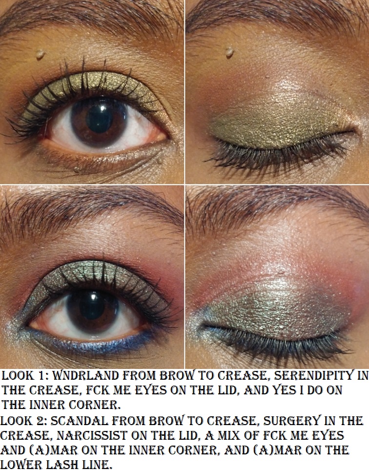
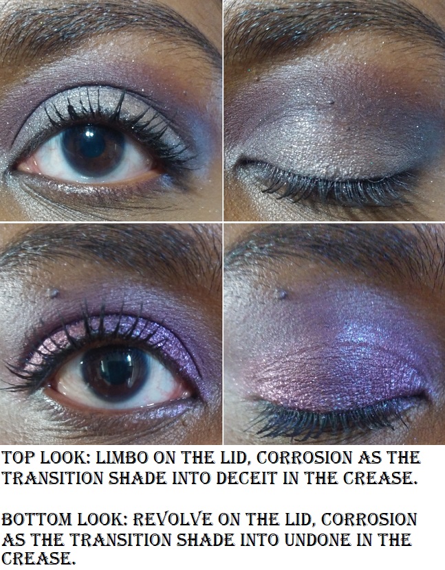
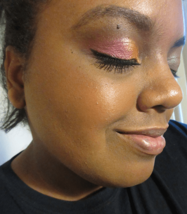
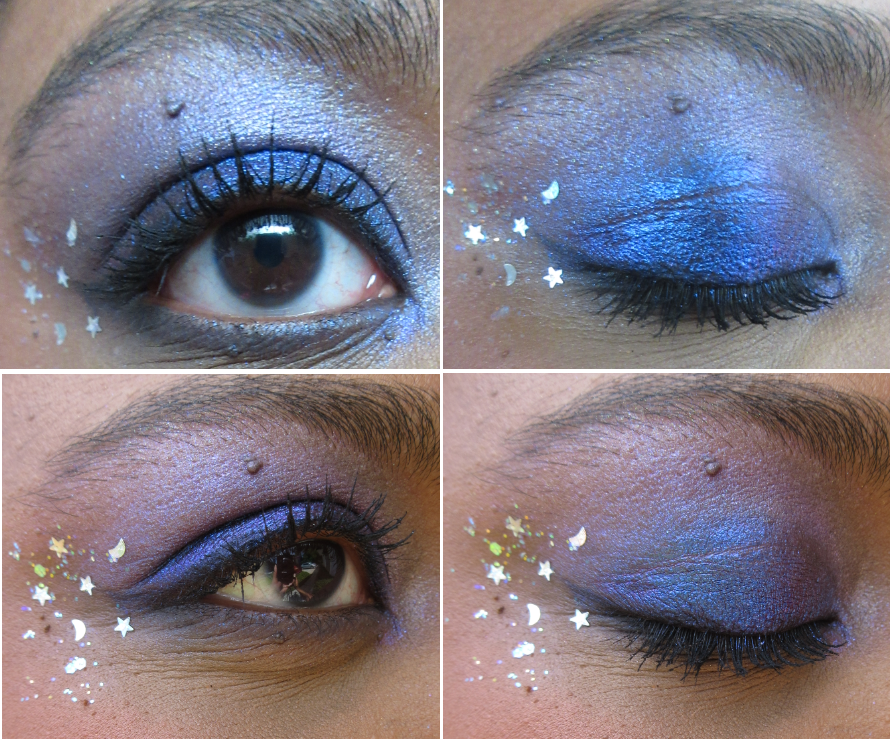
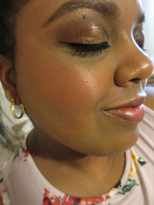
Today’s review is about redemption! My first experiences with Milani and Clinique blushes were not very good, but I decided to give them another chance. With one brand it was worth the risk, but not so much with the other.
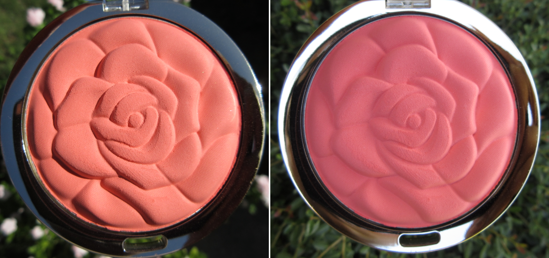
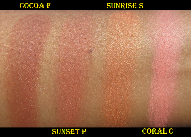
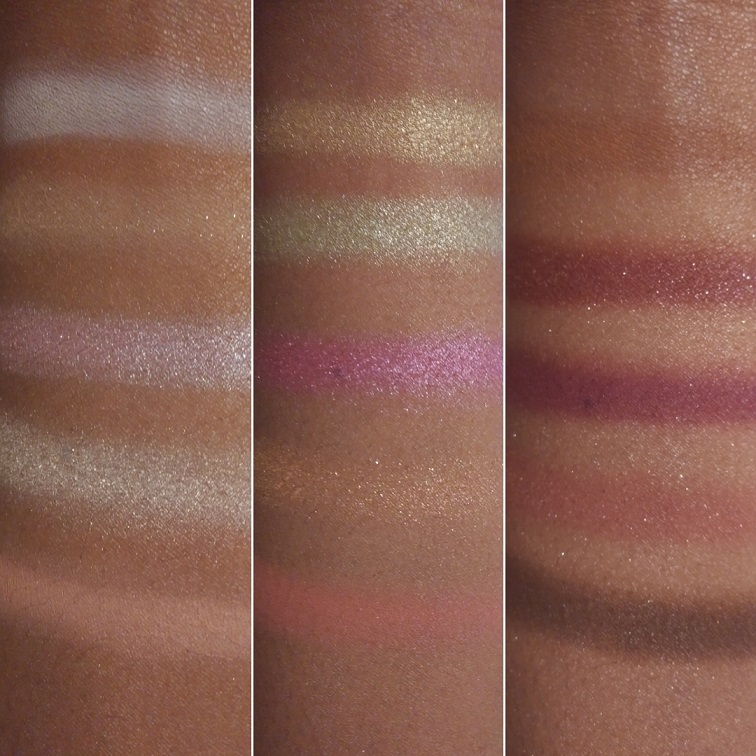
Milani Rose Powder Blush in Coral Cove
Coral Cove in varying amounts of sunlight.
This was the first Milani blush I purchased, and it was almost my last. This brand is so hyped up when it comes to blushes. I’ve never heard a single criticism about them, so while I was in the midst of making my original MAC blush post, I decided to give Coral Cove a try to compare. This blush is shockingly chalky and gives a low color payout. I can build it up on my cheeks, but it’s not just a matter of the shade not being pigmented enough. I really dislike this formula. The rose imprint and the color are nice, but I will never reach for this again.
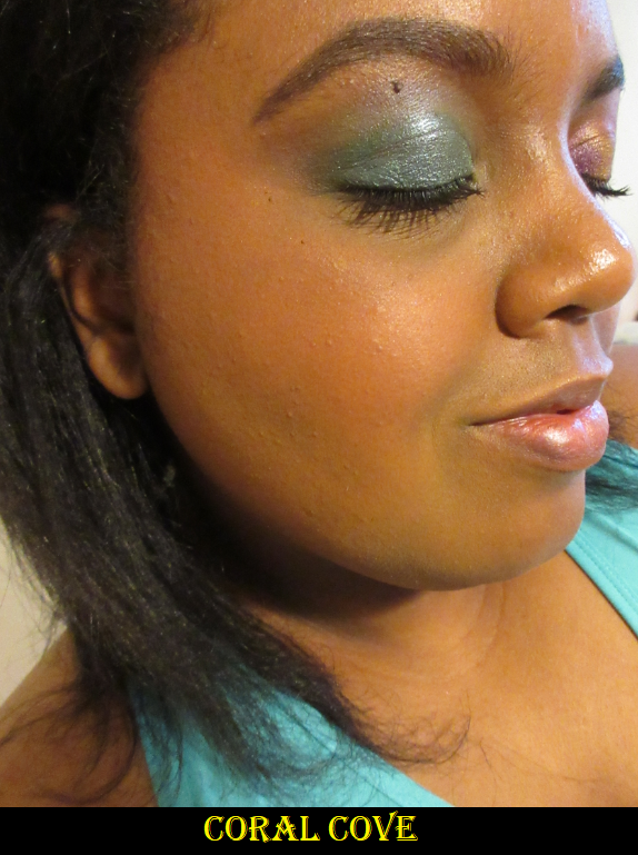
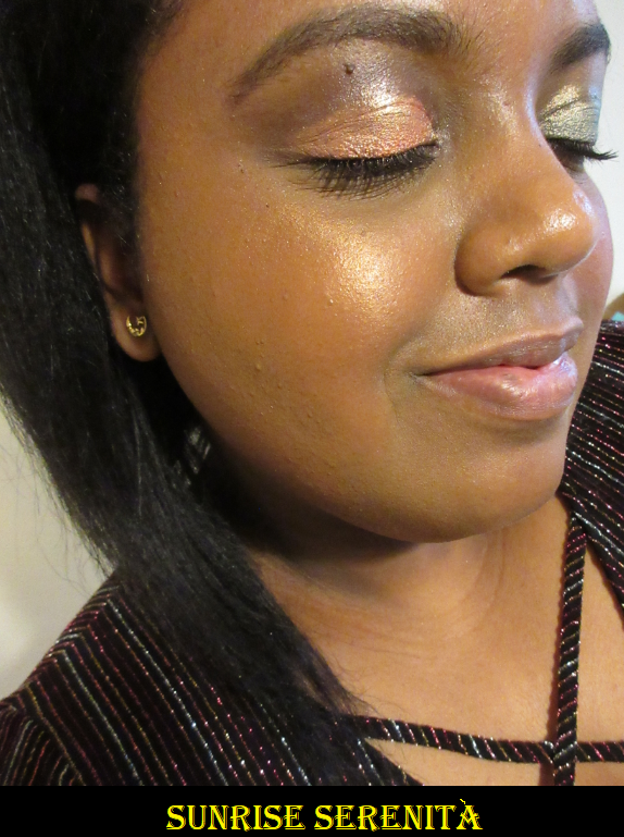
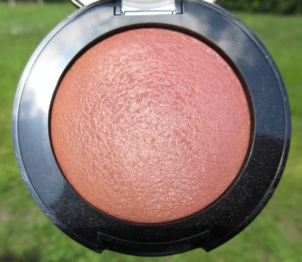
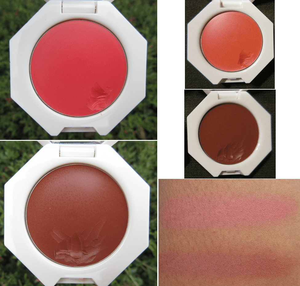
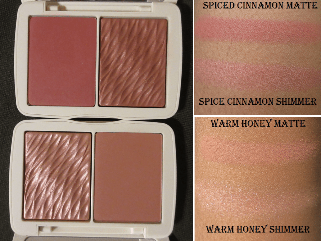
Milani Sunrise Serenità
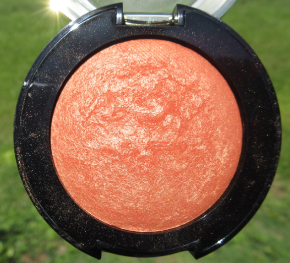
This shade and Cocoa Felicita are the newest additions to Milani’s line of baked blushes. They are the reason I decided to give the brand another try. I figured it was possible that when everyone raved about their blush formula, they might have been talking about the baked ones. I can say that I do enjoy these. They are much better than the rose powder blushes.
This particular shade works more as a highlighter or blush topper on me.
Milani Cocoa Felicità
In Yours Colourfully’s review video, she mentions that the blushes in the original packaging (with gold bottoms) were made in Italy. I expected to see the two new ones with this packaging (black bottoms) but the Sunset Passione shade that I’ll discuss after isn’t a new shade but was sent to me in the new packaging and was made in the US too. So, perhaps the original packaging is being phased out and all of the newly produced baked blushes are being made in the US now. I’m mentioning this because although I like these blushes, they have an insane amount of kickup! I don’t know if these are meant to be like this or if there was a formula change. On all three blushes, the powder you see around the edges were like that when I opened the package. The blushes weren’t even used yet when I took the pictures. And once I did start using them with my goat hair blush brush, a ton of powder came up with it. It has the most kickup I’ve seen from a blush or any other baked/pressed powder! When I switched to a synthetic brush, it lessened the amount of powder picked up, but there was still a moderate amount of kickup.
This shade works the best for me as a blush. I really like it! It’s not as dark as I expected from looking at it in the pan, but it’s the darkest shade in the line. I would like to see other deeper toned blushes from Milani in the future.
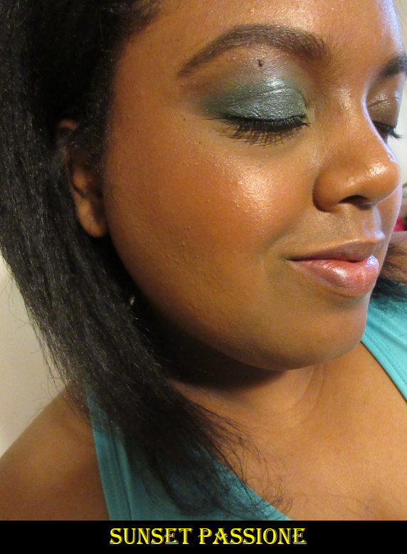
Milani Sunset Passione
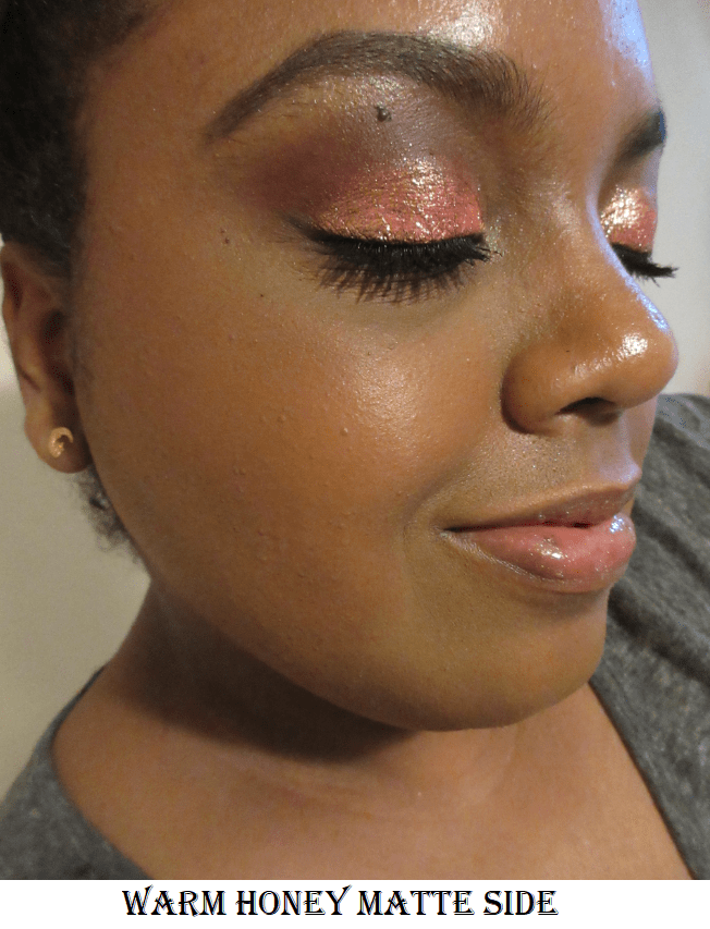
This shade is very similar to Cocoa Felicita, but a little lighter and a little more rosy toned.
It’s a little harder to see on camera. In person, it still looks subtle on my cheeks with the exception of the obvious shimmer.
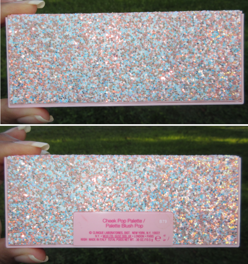
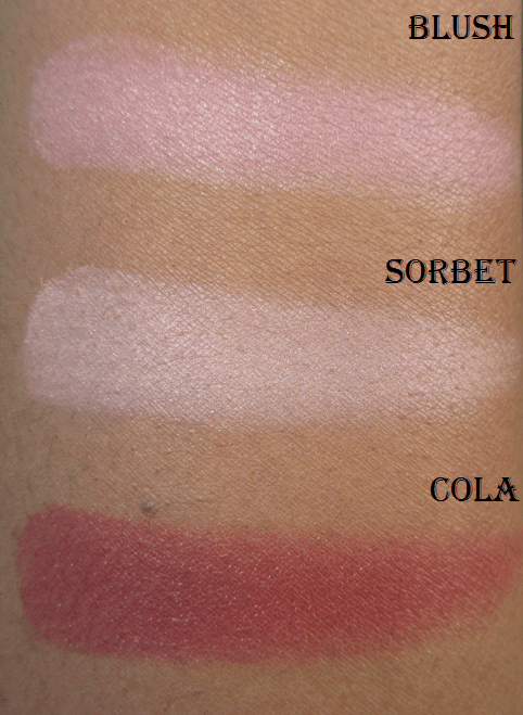
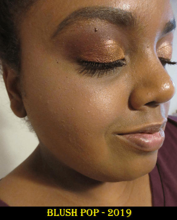
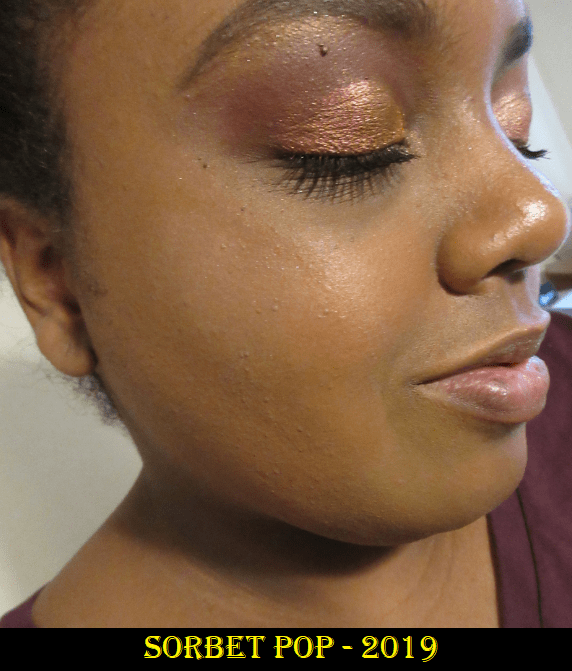
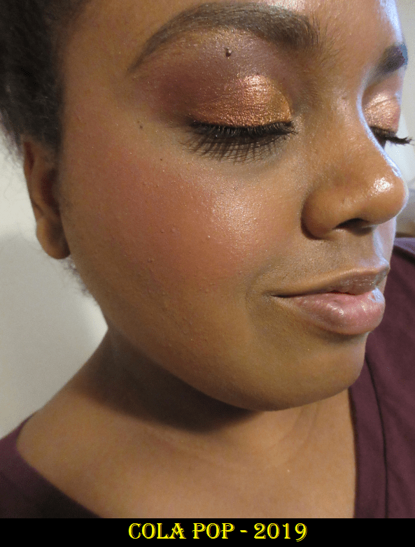
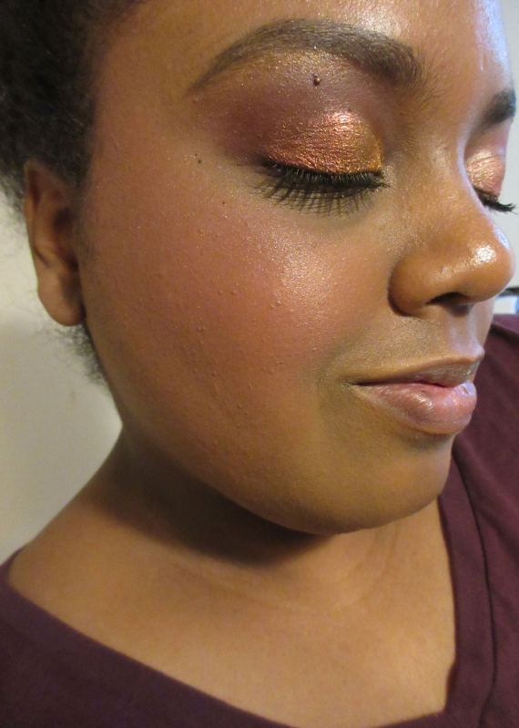
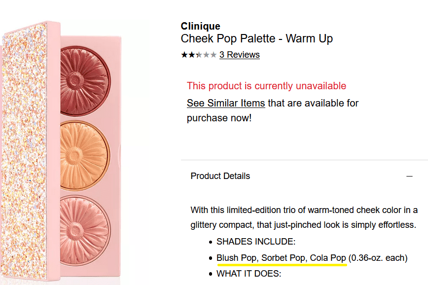
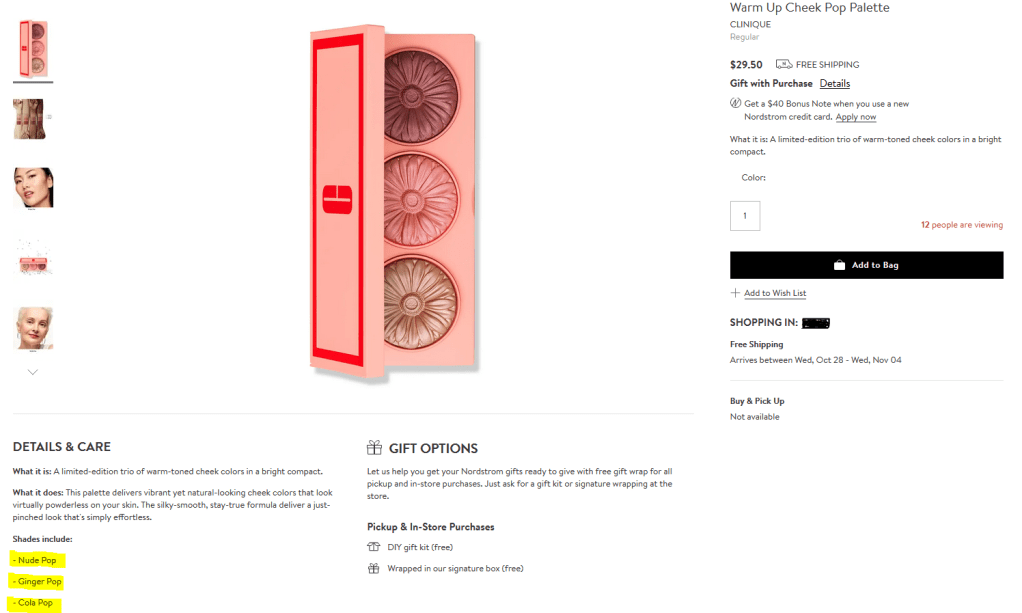
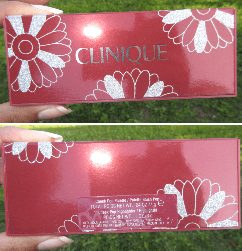
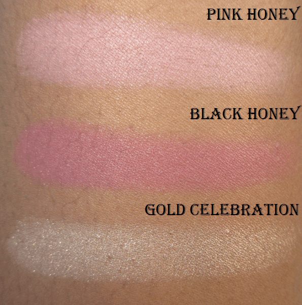
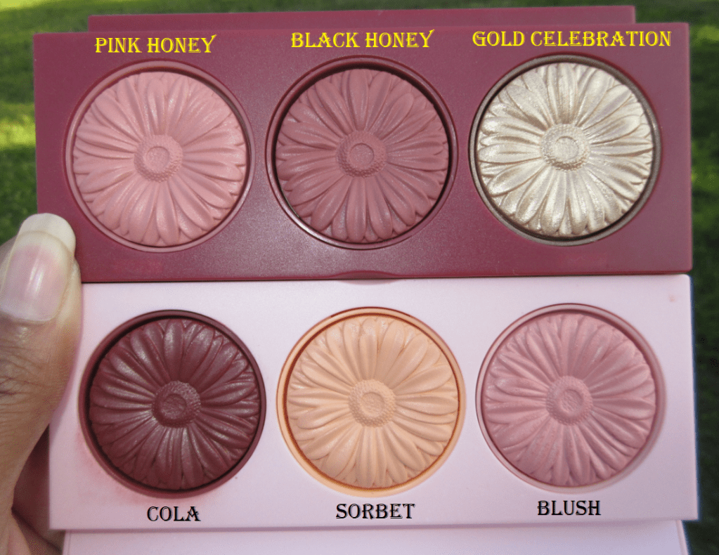
CliniqueWarm Up Cheek Pop Palette 2019
I bought this holiday palette last year and barely used it. The shades Blush and Sorbet were limited edition, but Cola Pop is a permanent single blush in Clinique’s Cheek Pop Blush line. The reason I wanted this item was to try out Cola Pop and for the ability to mix the shades for additional color combinations, but I just didn’t like how any of them looked on me.
All 3 shades mixed together.
They brought back this palette with the same name but the only shade from the original is Cola. The two lighter blushes are different.
Clinique Holiday Cheek Pop Palette 2020
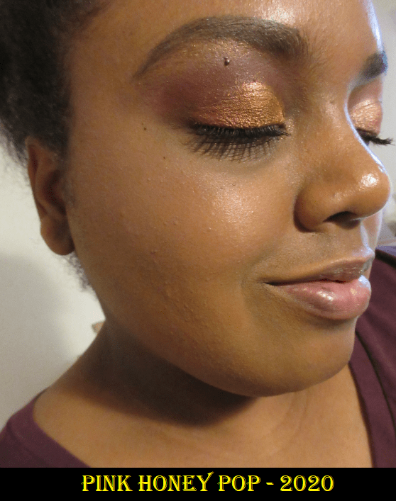
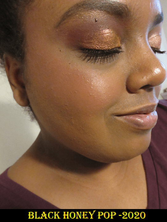
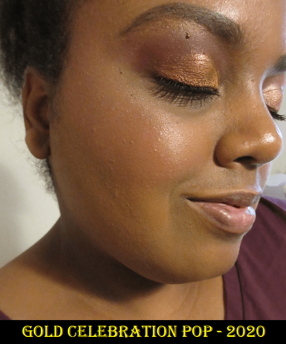
I told myself not to buy this year’s palette but my curiosity got the better of me. I knew the Black Honey shade would show up on me, based on another video from Yours Colourfully, and I really wanted the highlighter. I purchased this during Sephora’s Friends and Family sale, so the price was a great value. I like that this formula is more matte. The blushes from last year were more satin than matte. The packaging also feels sturdier and better quality, as this includes a mirror in the lid, unlike the one from last year. I like the highlighter, but unfortunately, I still don’t like how these blush shades look on me either.
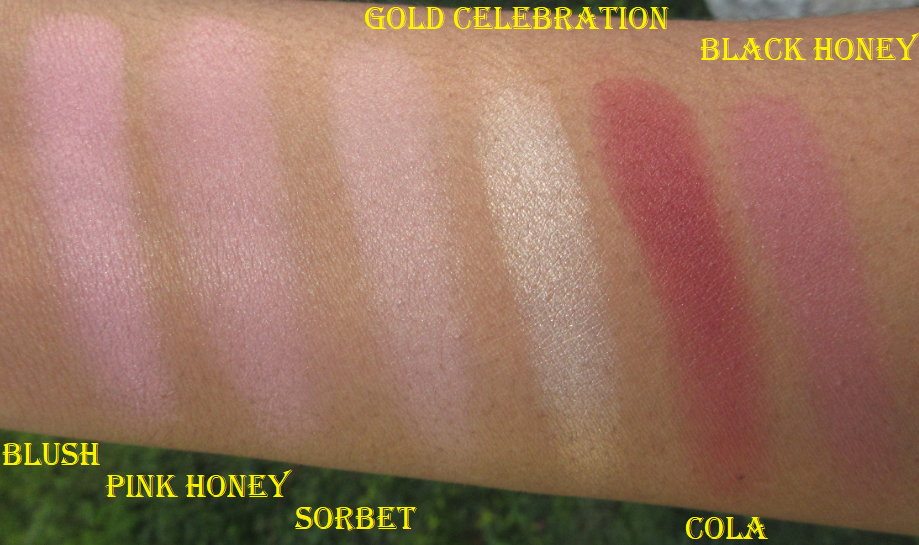
The Gold Celebration shade is used as highlighter over a different blush (I forgot which blush I used).
I think I can officially say the Clinique blush formula just isn’t for me. They aren’t bad blushes at all, and if you like them already, these palettes are a fantastic deal. It comes down to a matter of preference for me and how they look on my skin in person.
Clinique Comparisons
Overall, my second chance blush experiment was a success because it helped me fine tune what my preferences are. I’m glad I could finally try Milani’s blushes in a formula that I can recommend. Although Cocoa Felicita is the only shade that I will use as a true standalone blush, at $7.99 each (I used a first time customer discount code so it was even less) these didn’t break the bank. Do I still recommend waiting for MAC to have another 30-40% blush sale and purchase from them instead? Honestly, yes. But this is a decent alternative for those who don’t want to wait.
I’m a big fan of Lethal Cosmetics for their quality products, fantastic customer service, fast worldwide shipping, and the importance they place on diversity and inclusion. My initial interest in the brand was for their eyeshadows. At the time of writing this, I own 72 out of their 90 individual shades released so far, and I reviewed most of them earlier this year.
Even though I’m trying to limit the number of face products I buy, I couldn’t resist ordering from Lethal on launch day. I purchased the Solstice palette, another highlighter, blush, bronzer, and the Lethal Cosmetics x Jolina Mennen eyeshadow palette. The same morning I began working on this post, the brand announced their new Velvet Dusk Collection and details about a Black Friday sale, so I delayed posting until those items arrived as well.
Face Powders
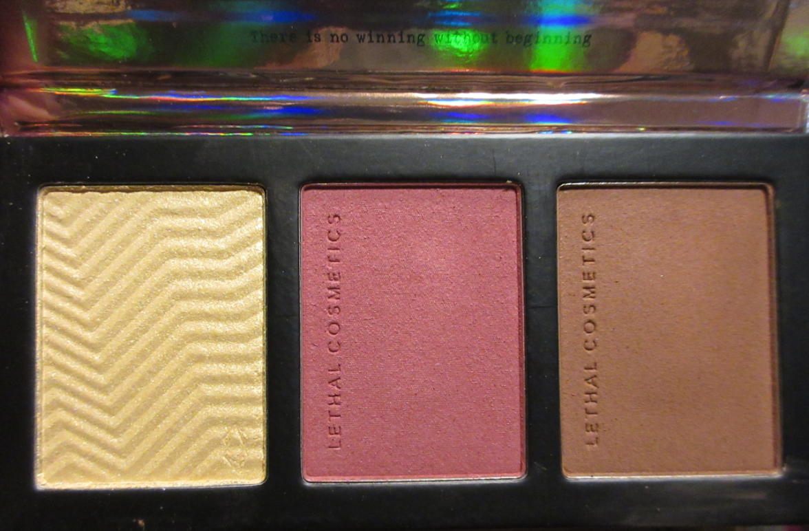
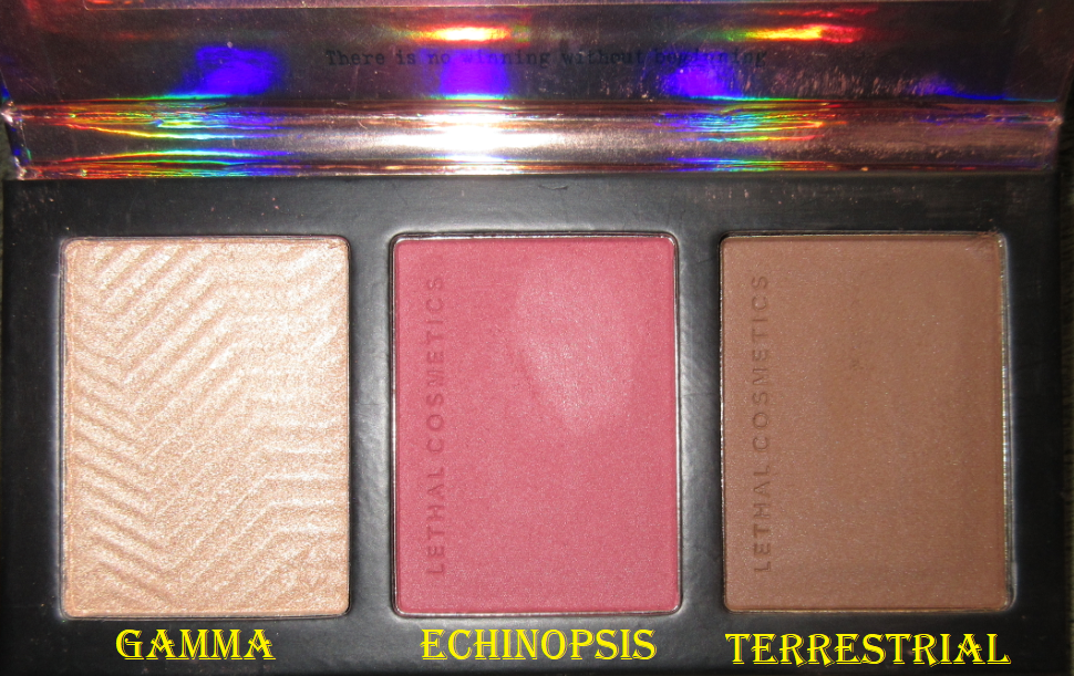
The Solstice Palette
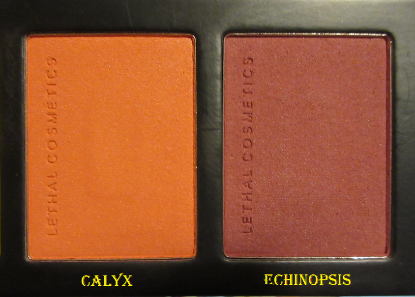
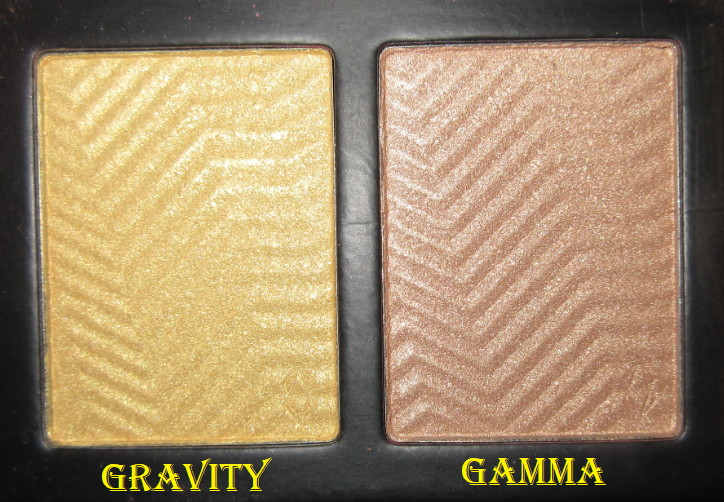
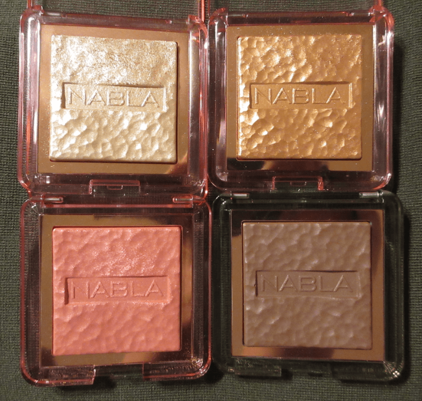
This is one of the four premade palettes on Lethal’s website. It was created for those with dark tan/olive to deep skin tones. Lethal Cosmetics has six individual highlighters that have been available long before the bronzers and blushes, but the highlighters in the premade palettes are exclusive to those palettes. The exclusive shade from Solstice is called Gravity and it has a strong yellow base. The blush included is called Echinopsis and the bronzer is Caldera.
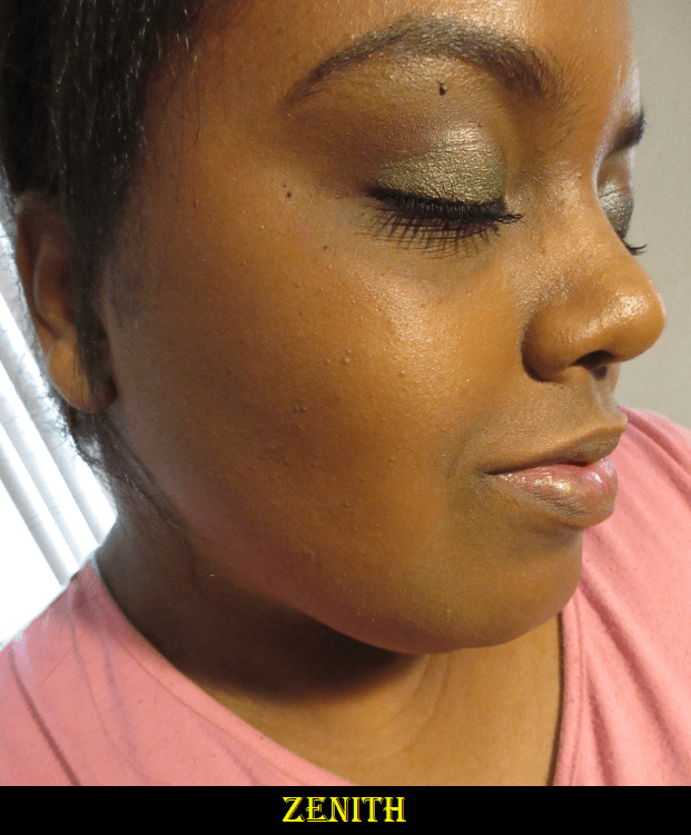
Although Lethal doesn’t have designated contour powders, within the bronzer line are three shades with cool undertones that I consider contouring-bronzers. I picked up one of them called Zenith.
Until Zenith, I had no real contour powder that I liked enough to wear regularly. The best one I have is actually a Colourpop eyeshadow called Cloud Nine. Because Caldera is warmer and I prefer to use bronzer around my forehead, while Zenith is cool-toned and I prefer that for cheek and jaw contouring, I have found uses for both powders in my collection. I actually replaced the Gravity highlighter with Zenith in my trio palette when I was on a brief trip for my birthday. The palette is magnetic with holes in the back and the pans are not glued in, so that makes it easy to mix and match face products.
Terrestrial is the newest addition to my face powders that I purchased with the launch of the Velvet Dusk Collection. I wanted to see if I could get a cool-toned contouring bronzer that was closer to my skin tone for times I might be in a rush and don’t want to have to be careful about how much I apply. Between Terrestrial and Zenith, I think Terrestrial is better for me.
I’m experimenting with daylight bulbs so the newest photo additions look different in terms of my skin tone for this reason. I’m trying to find a balance between being bright enough versus washing colors out.
I like these powders, but I should note that these are not beginner-friendly in the sense that using the wrong brushes can make these harder and more time consuming to blend. I found this to be the case for the bronzers and blushes, but not the highlighters. Also, when it comes to bronzers, I still prefer the Kosas Sun Show Moisturizing Bronzer and the Charlotte Tilbury Airbrush matte bronzers because of how they look on the skin and how they blend regardless of the tool. It should be noted that those two bronzers are 2-4 times more expensive than the ones from Lethal.
The texture and consistency of Lethal’s powder products remind me of MAC’s Satin blush formula but they are definitely matte and they perform like MAC’s brighter blush shades, such as Loudspeaker and Frankly Scarlet. What I mean by this is that wherever you first apply with the most pressure is where the powder mostly sticks. They’re still blendable, but using too small of a brush can concentrate the product in too small of an area that is time-consuming to smooth out. If the initial placement covers the entire area you want, it makes the blending process easy. This is why I recommend using a fluffy brush with these powders in order to disperse the product lightly and evenly.
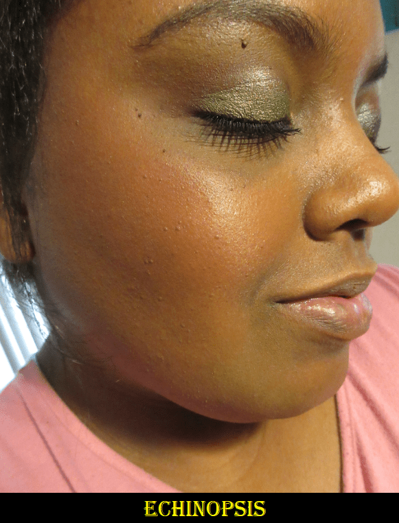
Calyx was more orange than I expected. Echinopsis is more of a berry color, and darker, but it can be worn in a sheer layer as demonstrated in the photo above (a heavier application is in the Terrestrial section). Between the two, I think Echinopsis looks better on me.
As I mentioned before, Gravity has a strong yellow base, so I prefer to wear it only on days when my blush is on the more neutral, natural, and sheer side. This way, the highlighter doesn’t have to compete for attention, so to speak. If I use less, Gravity doesn’t look as strikingly yellow, but it’s still very apparent in person.
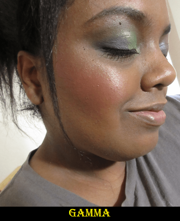
Gamma is an “elegant bronze with warm gold highlights.” It is everything I want in a highlighter! It can be subtle and look more shiny than glittery, but it can also be built up more intensely. I think it’s a better shade match for me as well.
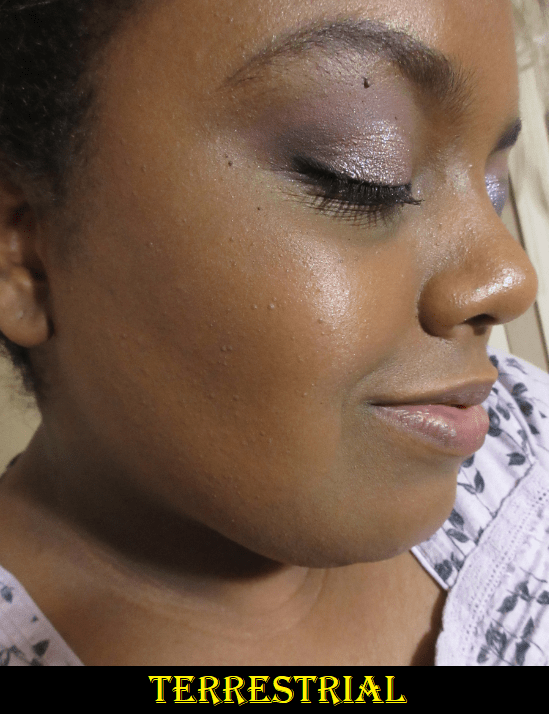
Both highlighters are over Echinopsis and Terrestrial.
Gamma, Echinopsis, and Terrestrial is my new favorite trio palette pairing! I have a magnetic palette with depotted face products that I’ve taken on trips before, but this is the first time I’ve ever had a highlighter, blush, and bronzer/contour from the same brand that actually works for me and is kept in an aesthetically pleasing palette that looks like it was premade! Although I could pack a trio of Nabla Skin Glazing Products, I find carrying one palette to be easier with less chance of an accident than a stack of 3 compacts.
Eye Palettes
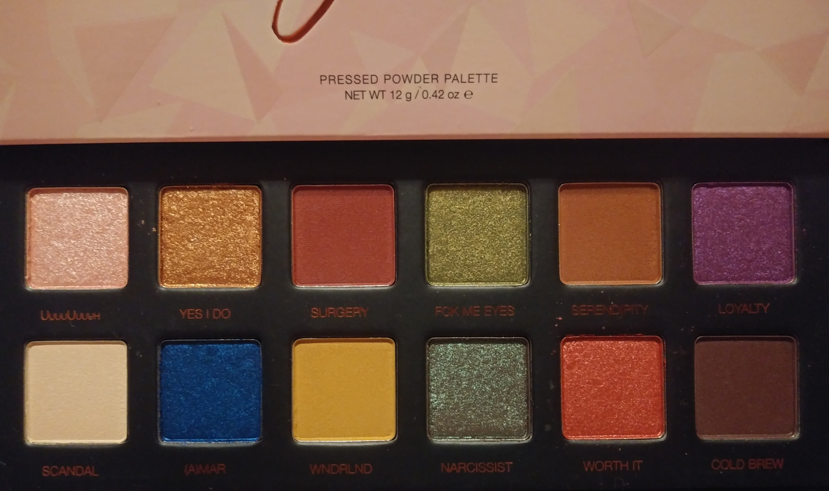
Lethal Cosmetics x Jolina Palette
I love the fact that these shimmer shades make beautiful new colors when mixed together. For example, Fck Me Eyes and (A)mar create a pretty turquoise blue. Loyalty is a red-based purple but when combined with (A)mar is makes a nice deep cool purple. For a white shade, Scandal is not stark on my skin tone and I can actually use it in the crease. This is probably the only white shade in my entire eyeshadow collection that I like! The only color in the palette I dislike is Cold Brew, and that’s because it’s the same color as my hyperpigmentation. When I use it, it looks to me like I missed a spot or that the eyeshadow faded, but it’s just the color of the shadow.
Overall, I find the quality of this palette to be consistent with Lethal’s single eyeshadows. With the exception of a few shades, there are close enough similarities to other Lethal singles that I don’t think this palette is a necessity for anyone with a large enough collection of their shadows. If your collection is on the smaller side, this is a great way to get a variety of neutrals with vibrant pops of color at a more affordable price. The pans in this palette are smaller than the individual shades, but I have still yet to hit pan on any eyeshadow in my collection, even with mini palettes.
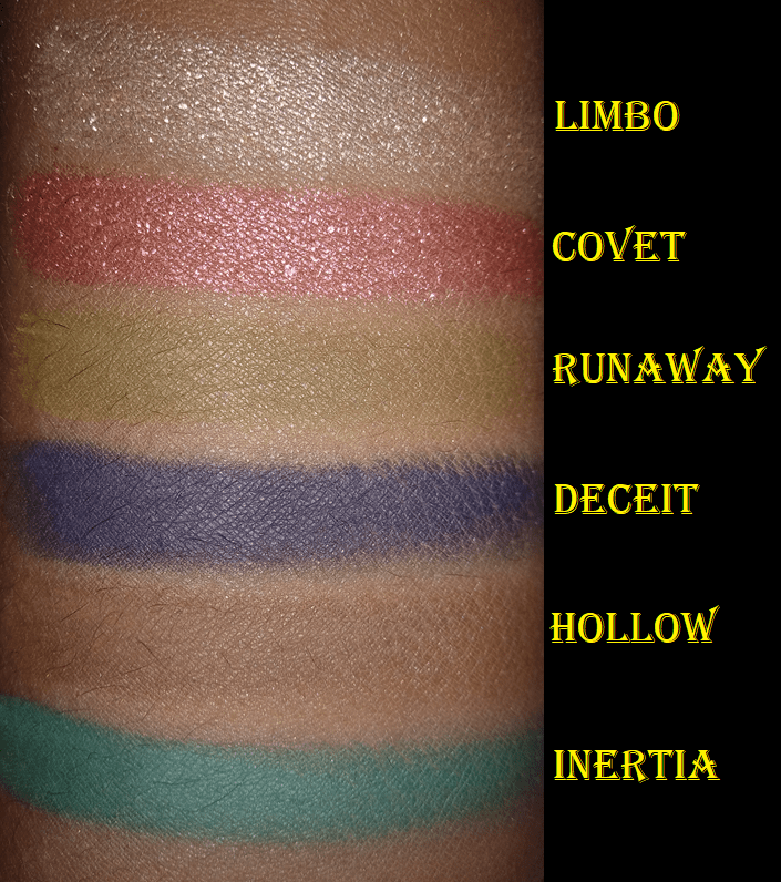
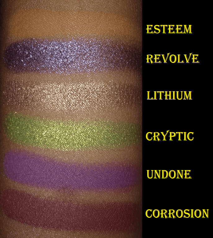
Velvet Dusk Eyeshadow Palette
These pans are also available for purchase individually, which is why I counted them as part of Lethal’s 90 current shadows. What made the Velvet Dusk collection especially exciting is that for the first time, Lethal introduced two “triochrome” eyeshadows.
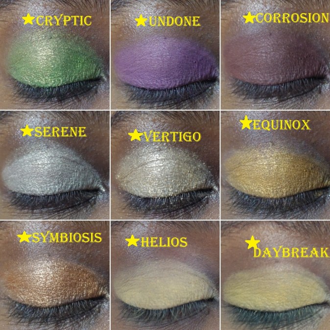
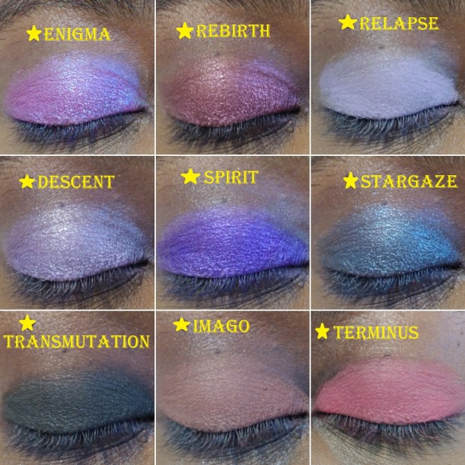
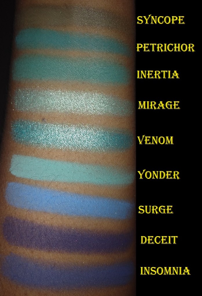
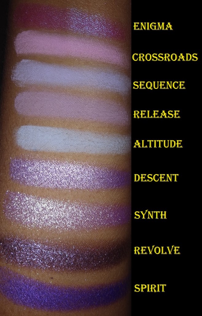
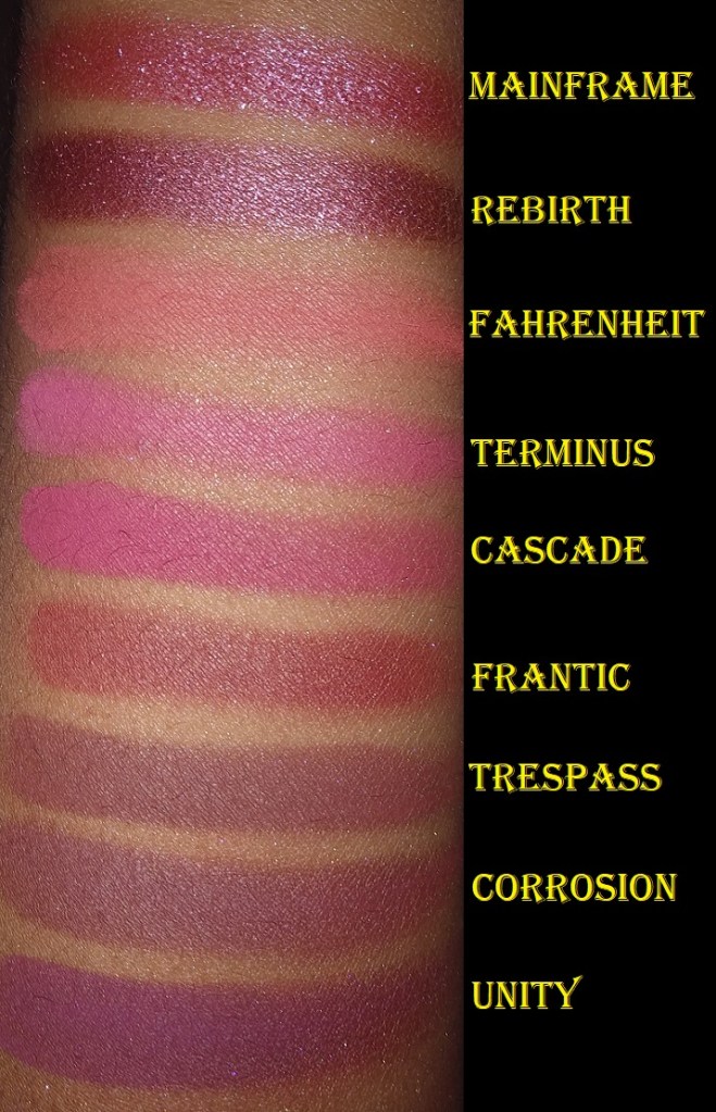
Lethal has had duochromes for a while, such as Aerial, Stargaze, and Mainframe. Apart from certain shades like Enigma and Lucid, I don’t consider a lot of them to be true duochromes because they don’t make as much of an impact as the duochromes from other brands. I’m also more impressed when a duochrome is one base color that either shifts to another shade or the glitter color very different, as opposed to a base color with plain gold or silver shimmer particles.
Keeping this in mind prevented me from expecting much from the triochromes, so they weren’t the selling point for me for this palette. I just loved the overall color story. It’s rare that I like even half of the shades in a palette. With this one, I was drawn to 10 of the 12!
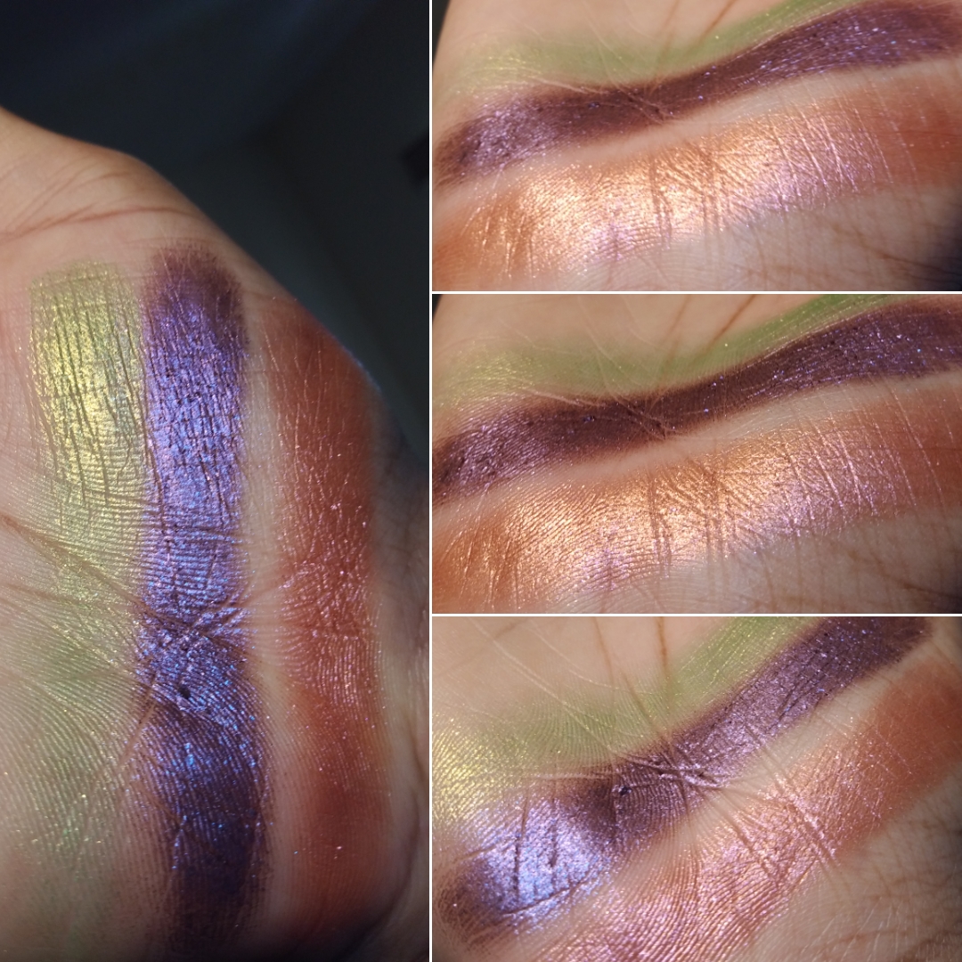
As for the triochromes Revolve and Covet, they do have a shift but they aren’t easy to see. With Clionadh, you can see a change on the fingertips, the pan, the eyelid, and/or arm swatch. Revolve is a shade I can slightly see on the finger in very specific angles but Covet is extremely difficult. I cannot see a change on either of them in arm swatches. I can faintly see a shift on the lid while wearing Revolve if I’m in the proper light. However, the only time I could capture anything from Covet was on my palm. I included a photo below, but to see a 3-second video clip you can click here. I was unable to figure out how to change the video dimensions to be smaller and embed it to a reasonable height and width on this page.
There’s something that seems a little different about the formula of the Velvet Dusk shades (and even the ones from the Afterdark palette), but I can’t put my finger on what it is or how to explain it. They’re still pigmented like the others and long-wearing. Corrosion and Deceit took a bit of work to blend. Deceit specifically is a bit patchy but the sparse areas can be patched up if extra shadow is added on top and not manipulated too much. All of the shadows in this palette stuck to my arm fine in swatches, but these absolutely need a primer in order to stick properly to my eyes. There isn’t anything wrong with needing a primer, but my other Lethal shadows from the older collections still look great without it.
I’ve found that the mattes work better over MAC Paint Pot and the shimmers work better on the Urban Decay primer potion or a non-dry base, even though Lethal recommends a dry base for all of them.
This palette is another great mix of pops of color with neutrals, just with a grungy twist. It isn’t perfect, but I would still recommend this to anyone who likes the color story. I don’t recommend this to someone specifically wanting it for the duochromes and multichromes. For those kind of shadows with more impact, I suggest Clionadh, Devinah, and Terra Moons. Even JD Glow’s Galaxy Shadows have more sparkle and shine.
Additional Single Shadows
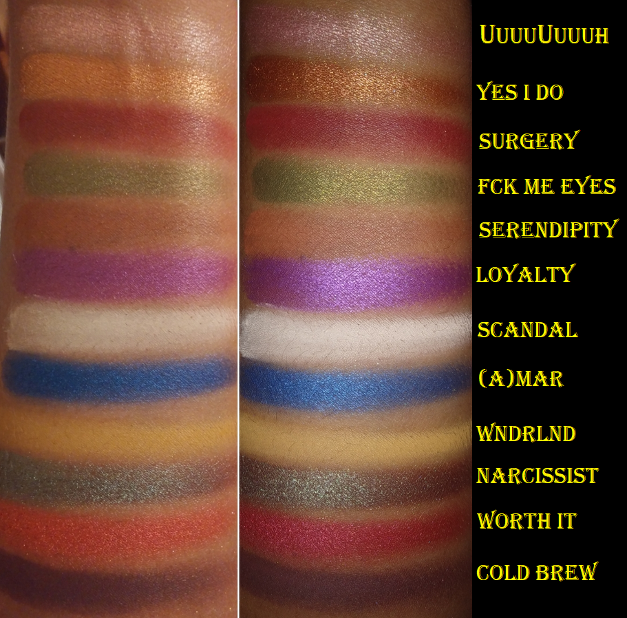
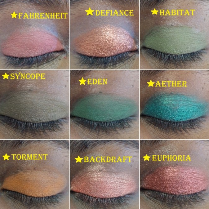
Besides the new Velvet Dusk Palette eyeshadows, I added Synth, Ephemeral, and Frequency to my collection. I kept updating my previous Lethal Cosmetics post with either arm swatches or eye swatches each time I got a new order. It looked a bit messy, so for the sake of consistency, I redid all 72 eye swatches here! I felt it was important to show how they look on my eyelids because what I expect from the pans isn’t always what I get on my lids.
I also redid all the arm swatches because I wanted to have similar shades from lightest to darkest next to each other for comparison purposes.
The only shadows I don’t have yet, plus the remaining face powders I’m curious about are in the photo below.
Light colors of eyeshadow are my least favorite, and I don’t need so many medium-toned browns, so that is why these haven’t made it to my collection. Due to the cost of shipping, I don’t intend on making another purchase just for two more face powders, so those won’t be reviewed unless another new release catches my eye from them in 2021. I’m also planning a low-buy for 2021, so perhaps I will skip them entirely.
That’s everything! Thank you for reading! If there are any swatch comparisons you’d like to see from Lethal or any of the products in my posts, just let me know!
I’ve been a Juvia’s Place customer for three years now, but it wasn’t until 2019-2020 that I actually started using what I purchased. Most of my experience with the brand is through their eyeshadow palettes. The quality is great but the color stories always threw me for a loop. I never knew how to pair colors together in a way that I felt was cohesive and made sense. Depotting the shadows helped because it was easier to have access to other complementary shades. Now, I’m actually getting use out of them!
Lip Products
I’ve heard amazing things about Juvia’s lipsticks and lip liners that were released this year. I’m not very adventurous when it comes to lip products, so I had no intention of possessing any, but due to an error on Ulta’s part, I wound up with a mini Lip Duo.
Wahala Mini Lip Duo
A strange but unimportant thing I noticed is that the lip gloss in the set came with a plastic shrink band but the liquid lipstick did not. I don’t know if it’s just mine that was like that or if all of them are supposed to be that way.
Shakara is a gorgeous color, but right on the cusp of being too pale for my preference. Using a lip liner is enough to make Shakara wearable for me, but my favorite combination is pairing it with a lipliner and gloss. Petty Betty isn’t the kind of pink I normally gravitate towards, but it pairs well with Shakara and is still nice on its own.
Juvia’s Place Eyeshadows
I used to have the Saharan palette, but I gave it to my sister. I even gave my unused/unswatched Tribe palette to her because I was uninspired by the color story after seeing it in person. It wasn’t until I watched LonDen Makeup Artistry’s video that I suddenly felt the urge to give it a chance and repurchased it. I’m so glad I did!
The only eyeshadow palette I haven’t depotted yet is The Chocolates, but I intend to soon.
Juvia’s Place currently has 11 mini six pan palettes. Other than the Mariposa collab, the minis don’t have shade names. Whenever I’m referencing them, I refer to them from left to right by row. I’m missing shade number 6 from the Violets palette. It broke when I was depotting it and I wasn’t interested in that color enough to try and salvage it.
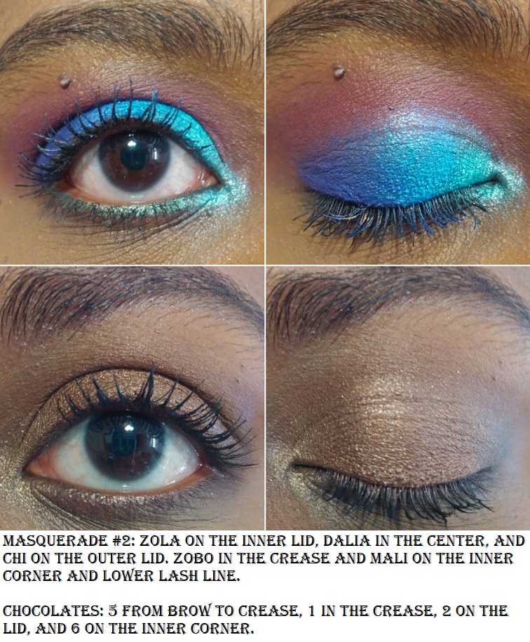
The shade names in green are from the Tribe palette, which has been discontinued. Blue is for the Magic palette, Purple for Masquerade, and lilac purple for the Violets.
What I like most about Juvia’s Place eyeshadows is the level of pigmentation. I never have to worry about shades not showing up on me. They also last a long time without fading. The mattes and shimmers are equally easy to work with. There are frequent 30-40% off sales on their website, and even periodically at Ulta, so you can always snag their products at a discount. So far, Wahala and Wahala 2 are the exceptions to the discounts. They’re already a great price. The only reason I haven’t purchased them is, once again, due to the color stories. Another deterrent is that Juvia’s Place has been putting a lot of pressed glitters in their palettes this year, which I try to avoid.
Blushes
When I said Vivid Azalea from Wayne Goss was the most pigmented blush I’ve ever come across, I completely forgot about my Juvia’s Place Blush palettes. When I saw these in person, I realized right away that they were not going to work for me. Both palettes have the most unique blush shades I’ve seen, which is a great thing in terms of bringing something different to the makeup world. However, this does make them less wearable to the average consumer, as only a few of these will look natural and on someone and not everyone is into wearing avant-garde blush looks for the remaining shades that are too bright, light, dark, or too different of a tone to give a natural flush.
The Saharan Blush Palette Volume 1
When I realized these blushes were a bit too out there for me, I utilized the palette by scraping some of the powder out and combining them with other brands’ blushes to create custom blush shades for myself. I intended to get more use out of these by using them as eyeshadows and depotting them into my magnetic palette with Juvia’s Place shadows, but I typically break every pressed matte shade from Juvia. That’s the only reason I haven’t done so already. I can always press them back, but I’ve contemplated whether it’s worth the hassle.
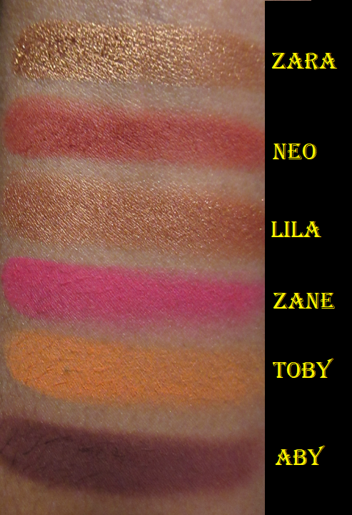
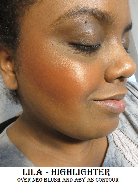
Abywas clearly far too dark for me, so the best use I’ve found for that shade was as a contouring-blush. I used a fluffy blending eyeshadow brush to slowly and lightly build the color into the hollows of my cheeks.
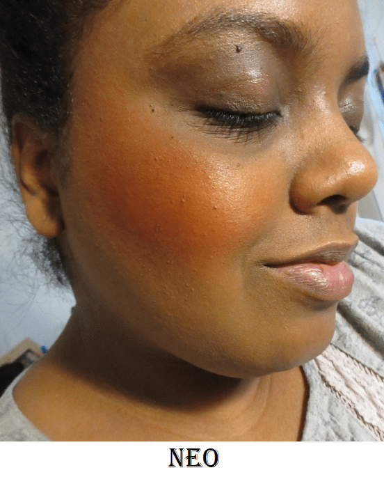
Neo is the most “natural” shade for me in this palette, though I’ve struggled to use a light enough hand to apply that shade in a way that I would feel comfortable wearing it. In the second photo above, I applied with a light hand but it was still incredibly pigmented. In the third photo, I used a Makeup Eraser cloth to remove some of the color in order to tone it down a bit.
Lila and Zara look very similar in the pan, but Lila has much smaller shimmer particles, so it looks less glowy and a little more subtle.
Zane was the most difficult to apply to the cheek without looking patchy. I kept over applying in the process of trying to get it to look smooth.
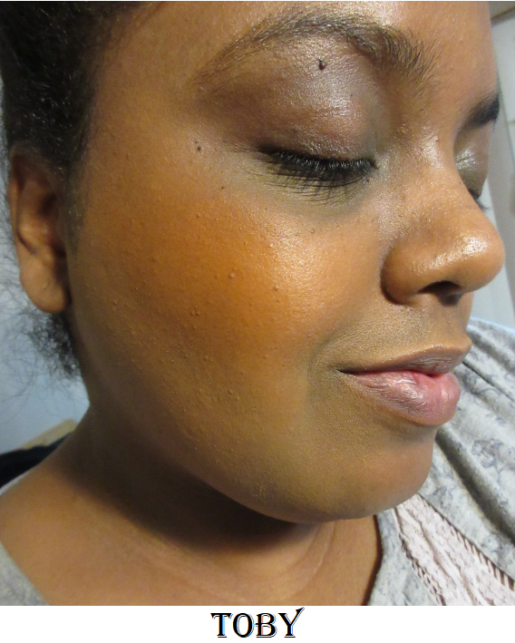
Toby was the easiest to apply evenly. However, I’m not a fan of this color blush on me.
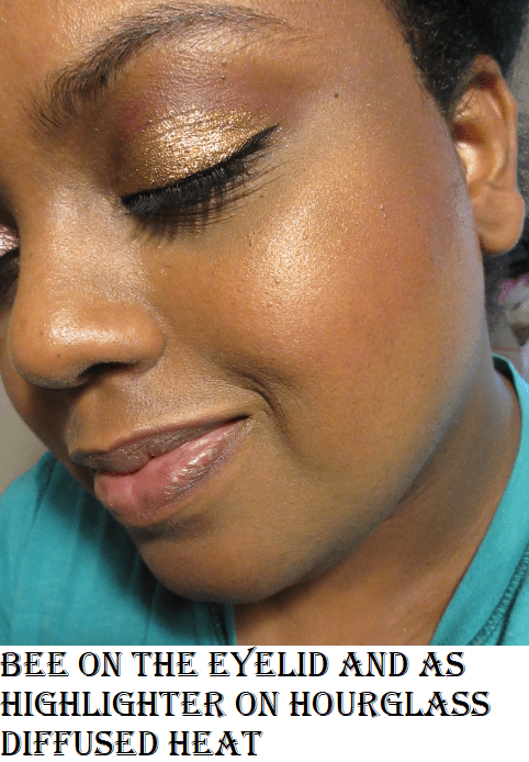
The Saharan Blush Palette Volume 2
I bought the Saharan 1 on August 2019, and even though those shades were not what I expected, I still bought the Saharan 2 in December 2019 because I was hopeful that this palette would suit me better. In some ways it does, because I prefer a blush that’s too light over a blush that’s too dark on me. However, these are cooler-toned blushes. Warmer tones look better on me. There’s also the issue of Yara being invisible on my skin.
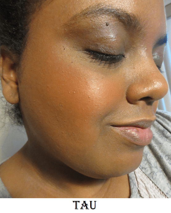
Tau is the most natural-looking blush of the bunch on me. I tried to apply a subtle amount like I did with all the other blushes, but I could have built up this shade more heavily. It’s very unique for orange, as orange is typically warm, but this one is muted as though it has a cool pinkish undertone to it.
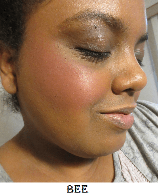
I was happiest with the way Bee and Sola looked on me, as I prefer to wear standard blush colors on my cheeks. I expect a shade like Bee to be too light for me, but because it is so pigmented, it definitely shows on my skin tone and without a grey cast! Unlike Zara and Lila from the previous palette, which I would never use as blush or blush toppers (just highlighter), Sola works as a highlighter, blush, and blush topper. The only potential issue is that it takes some blending when using Sola as a blush because the shimmer doesn’t spread evenly. It’s as if the shimmer is still moveable on the skin but the base pigment stays in place.
I’ve used these blushes as eyeshadows. The mattes are heavily pigmented for blushes, but they need a little building up on the eyes for full pigmentation. This does make for easy blending though. The shimmers in this formula are a slightly thinner version of the regular eyeshadow shimmer formula. They don’t require glitter glue or wetting them, but those methods can be used to intensify them. In the eye looks below, I only used MAC Paint Pot.
Juvia’s Place consistently has great quality products at affordable prices. I do recommend giving them a try!
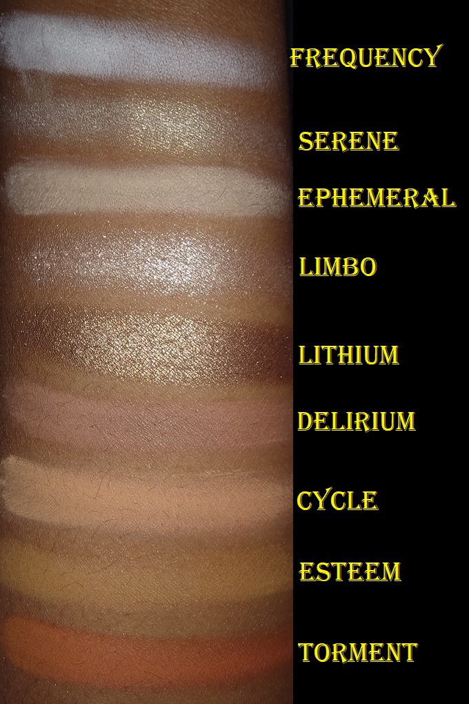
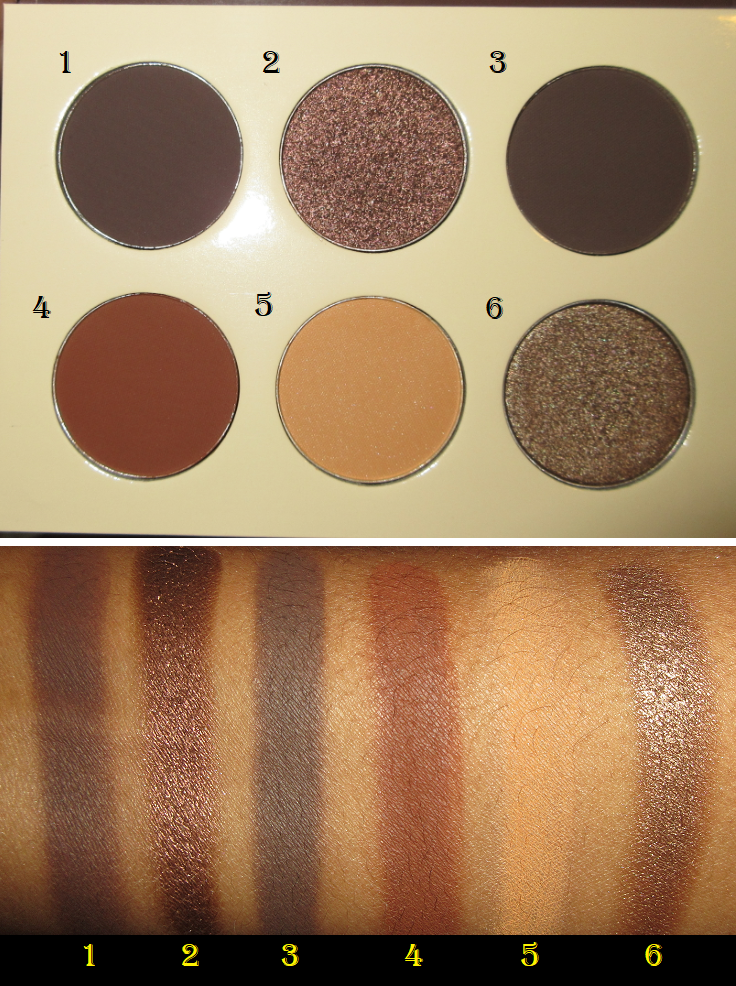
This is a continuation of my initial post where I reviewed 19 MAC blushes. Since that time, I have bought several more (because I am insane) and wanted to share them here. In my previous MAC post, I purchased the shades I thought would suit me best, but this post has the blush colors I knew in advance I’d be taking a risk on.
Powder Blushes
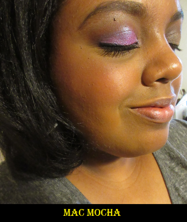
Mocha is a “Soft Plum-Pink” matte. It’s not far off in color from Melba, but I have an easier time getting this to show on my skin tone. Although I can wear it, I think this shade was intended for those with light to medium-tan complexions. I was a bit surprised, considering products named Mocha tend to be very dark-skin friendly, but I’m glad I can still wear it and I like how it looks.
Mocha built up heavily on my cheek.
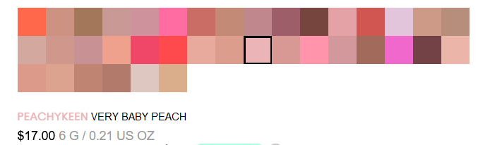
Peachykeen is a “very baby peach” sheertone shimmer blush. This is the kind of shade for someone who likes Peachtwist but wishes it had more of a pink tone. Although it looks very pigmented in the swatch, building up this shade leaves me with a lot of shimmer and a little bit of a pink tint that is easier to see in person than on camera. The base color would likely appear more strongly on someone with a lighter skin tone.
Peachykeen applied heavily on my cheek.
Breath of Plum is a “light plum” sheertone blush. Though it’s a sheertone matte, it can be applied heavier for more color payoff.
The left photo shows Breath of Plum applied with the normal amount I would use. The right photo shows what it looks like with a heavier application.
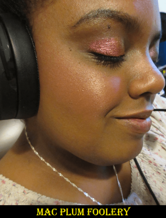
Plum Foolery is a “faintly plum” sheertone shimmer formula blush only available in the Pro Refill pans. Just as it was with Peachykeen, when I apply this shade heavily, the shimmer is what shows up more than the base color. Though it doesn’t come across as well on camera, in person, a heavy application looks very intense.
Heavy Applications of MAC’s Plum Foolery
Sweet As Cocoa is a “chocolate brown with gold pearl,” sheertone shimmer blush only available in the Pro Refill pans. It closely resembles the frost shade called Format, but Sweet as Cocoa has a little more red to it.
The normal amount of blush I would use of Sweet as Cocoa on my cheek.
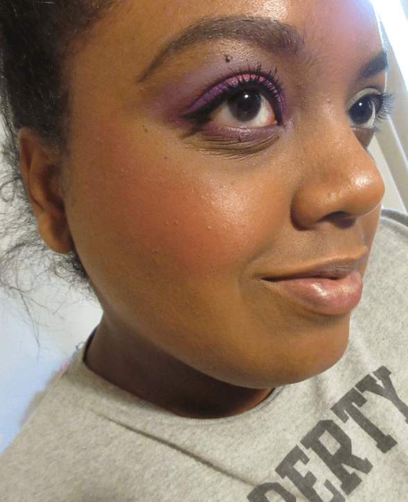
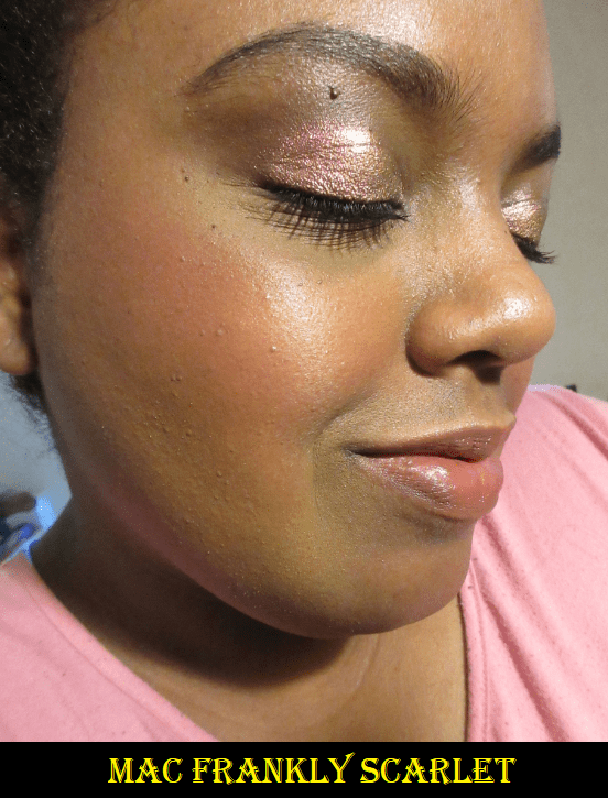
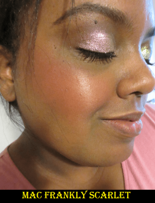
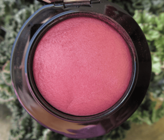
Frankly Scarlet is a “vivid rose-red” matte shade and was a last minute addition to this post.
On the left is one single blush application of Frankly Scarlet. In the photo on the right I used a second dip into the pan. This was still done with a light hand and using the soft, non-densely packed Chikuhodo FO-4.
This truly is a rosy color. I wanted to show how sheer an intense shade like this could be applied onto the cheeks. The texture of this blush is unlike most of the others within the matte powder formula. It wants to stay on the cheek in the spot wherever you first apply it, so I recommend using a large fluffy brush in order to disperse the product in a wider, more evenly blended way. As I’ve gotten older, I’ve started to prefer smaller and more precise blush brushes, but a smaller brush takes a lot more time and effort to get the same amount of color across the entire cheek. Plus, a larger brush requires less dips into the pan (1-2) whereas my smaller brushes take 3-4; and with each dip into the pan it risks applying too much in a single area.
Extra Dimension Blushes
Sweets For My Sweet is a “mid tone yellow pink.” When I first bought Cheeky Bits, which is described as a “mid tone pinky coral,” I thought it would be the perfect kind of shade I love. When it didn’t look the way I hoped, I decided to give Sweets For My Sweet a try considering the similarities in color. I do like this one more.
A slightly heavier than normal application of Sweets For My Sweet.
Faux Sure is described as a “warm pinky mauve,” but I consider it to be a dark copper shade. It’s very similar to Hushed Tone, which was previously my #1 favorite blush shade from MAC, but I believe this one suits me even better. Within the Extra Dimension Blush line is a brown blush shade that I believe goes even deeper than this (you never know for sure with MAC’s product photos) called Hard to Get.
A heavy application of Faux Sure on the cheek.
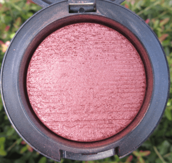
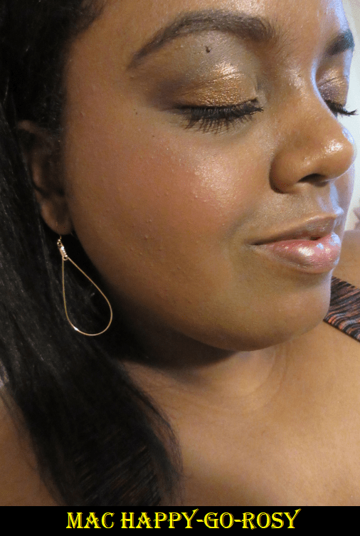
Mineralize Blushes
Gentle is a “raspberry with gold pearl.” MAC’s Powder formula blushes appear darker on the cheeks than it looks in the pan, but I find that the Mineralize formula blushes do the opposite. There are light and plum toned blushes from MAC that I believe work for me, but something about this particular shade seems too cool and almost ashy on my skin.
Happy-Go-Rosy is a “midtone rosy pink,” that looks incredibly vibrant in the pan, but doesn’t appear that way on my cheek. It still brightens my face a little bit, but I’m not happy with how it looks on me. I think it could be stunning on someone else.
Like Me, Love Me is a “bright orange coral,” that I wanted desperately to like. However, it comes off a little ashy on me as well. Mineral powder products tend to look this way on me, but I had hoped things would be different among MAC’s line.
Love Thing is a “dirty burgundy with gold pearl.” This is definitely suitable for darker skin tones, so it looks the nicest on me among the four shades in this formula that I tried. I still wasn’t sure how I felt about it at first, but the more I use it the more it has been growing on me. However, I’m still not a fan of how any of the mineralize blushes sit on my skin.
Comparisons
Even when I find similar shades, if I love the colors, I want to keep them all! This is how I’ve ended up with 31 MAC Blushes before I had the strength to give my sister a few of them. I even have another blush on the way (the shade Peaches) as my free birthday gift from MAC! I was going to postpone this post until I received it, but I’m pretty sure that shade will be too light for me, so I will either give it to a friend or sell it. As of November 21st, everything except pro palettes and inserts are 30% off on MAC’s site for customers at a certain tier level within their reward program. Now would be a great time to get something if you’re interested!
Final Thoughts
Although part of me still wants to try MAC’s Glowplay blushes, I know that I have far more than I need already. I also purchased a lot of cream blushes this year, which don’t have a long shelf life, so I should put getting anything else on hold.
The Powder blushes and Extra Dimension Blushes are still my favorites. I have normal to dry skin (mostly leaning on the dry side), which may play a part in why I don’t care for the formula of the Mineralize blushes. Even the one flattering shade, Love Thing, looks a little more textured and dry on my cheeks in person.
Out of the 12 shades discussed today, Faux Sure and Frankly Scarlet are my favorites, followed closely by Peachykeen. As much as I like the majority of this round of blushes, Faux Sure and Frankly Scarlet are the only ones I’d repurchase immediately if they were gone from my collection.
I hope that these MAC posts have been helpful. The way that MAC shows their blushes is very confusing for determining which colors would work for me. There are so many shades I thought would be too dark or too light based on the pictures and descriptions, but they looked so different in person.
MAC’s color chart on their website.
My hope, for those who don’t have easy access to a MAC store, is that you won’t have to purchase a ton of shades to find the right color for you!
Thank you for reading! Since this is my last post before the Thanksgiving and Black Friday sales hit, I’d like to wish everyone a Happy Holiday!
It’s my birthday! Because this has been the year of blush for me, I thought a high-end blush post would be fitting for today.
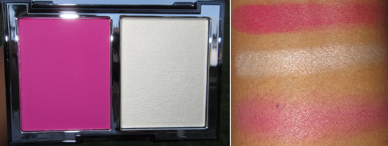
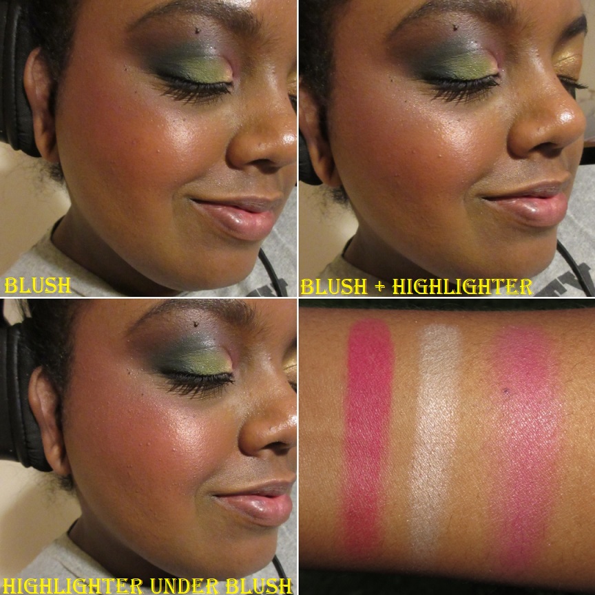
Wayne Goss Weightless Veil Blush Palette in Vivid Azalea
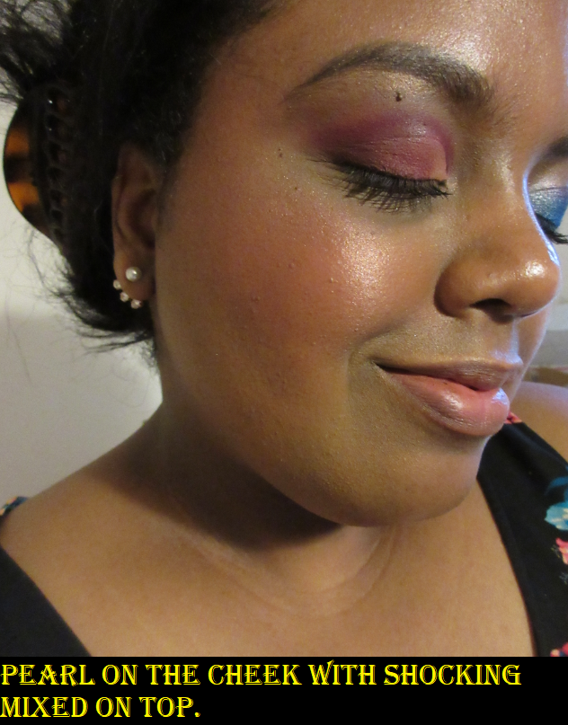
Wayne Goss released four blush duos, but this one was the most unique to my collection, so I chose this over Bright Poppy. The magenta shade is called “Shocking” and the white gold highlighter is called “Pearl.” In Wayne’s announcement video, he mentions that customers can utilize these duos in the traditional way, or even apply the highlighter directly onto the cheeks and blend the blush over it to create a unique shimmery blush shade.
I loved the way the highlighter-under-blush technique looked on other people in videos I’ve seen, but I think I prefer to just use them the traditional way. The highlighter formula is fantastic. The blush is pigmented. I cannot emphasize this enough. It is the most pigmented blush I have ever come across. I can use my softest squirrel brush to do one gentle tap into the blush and the minor amount of powder on my brush is still enough to be overkill. Just one dab! In order to get the pigmentation level you see in this photo, I had to do one single dip into the pan and then dab it once on the back of my hand before applying what was left on the brush to my face. Then I spent a fair amount of time blending. I can’t believe I’m saying this, but apparently there is such a thing as too much pigmentation, and my goodness this the prime example of that! Here is a photo from Instagram of what a single tap in the pan produces, even after plenty of blending.
This shade of blush can be splotchy if the brush isn’t coated evenly in that first dip, so even though you don’t want much on the brush, I advise still trying to pick up enough to cover all the bristles and then do a few extra dabs onto the back of your hand or a napkin to take some of the excess product off.
The blush duo costs $45. You’re getting a monster 19 grams of product, but I could use this blush regularly for the next five years and not even put a dent in it considering I use a maximum of one dab per use. Looking at this per gram, the duo is a decent price, but considering the cost only, this is more expensive than the $38 Natasha Denona Blush Duos, $38 CoverFx Monochromatic Duos, $30 ABH Blush Trio, etc. I personally would have been happy to see this priced around $35 for even half the amount of product. I can’t say it’s worth $45, or at least not this particular blush in the line. I bought this during the Beautylish Gift Card event, which is the main reason I’ve decided to keep it anyway. It’s still an interesting product and I especially like the highlighter.
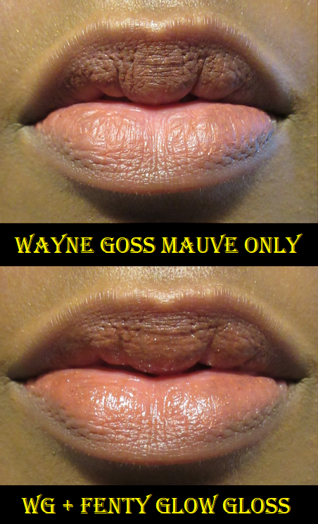
I have one other item from Wayne’s line, but this is a blush post so I won’t go too much in-depth about it. It is a lip pencil in the shade Mauve. The price was $14, which I think is fair for what you get.
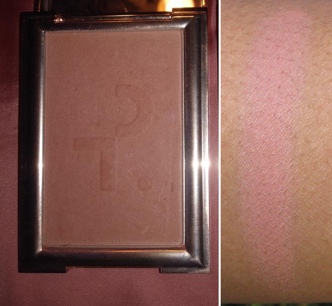
Patrick Ta Monochrome Moment Velvet Blush in She’s Seductive (mauve plum)
I saw plenty of reviews before buying this blush, so I knew ahead of time that this range was on the softer side and not super pigmented. This is the darkest blush in the line and as you can see in the swatch, it’s lighter than my skin tone, but I still like the way it looks. Something about the tone of it is very flattering to me. For the price though, I don’t know that I’d necessarily recommend it considering how many other nice buildable blushes there are of equal or better quality, yet for better prices.
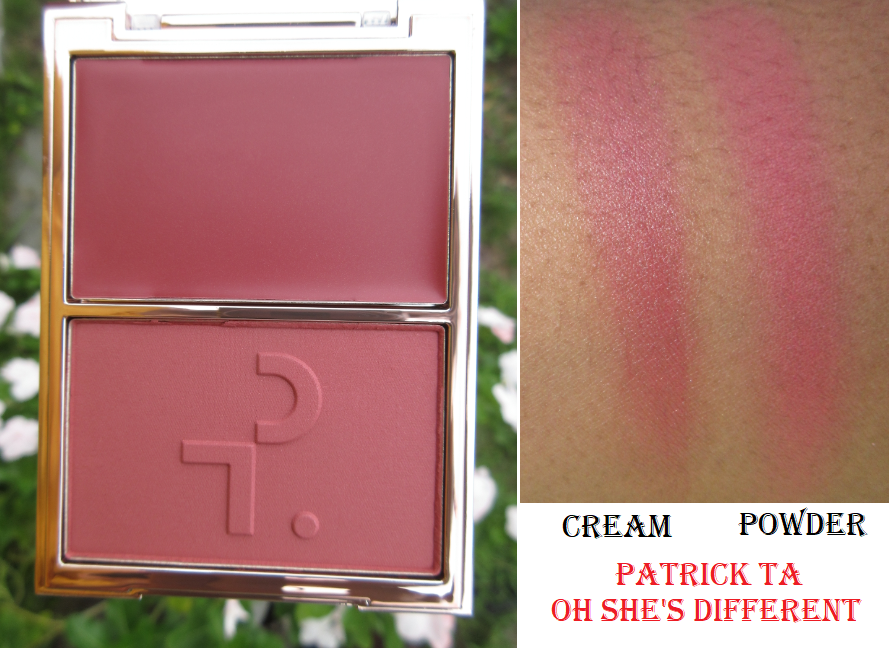
Patrick Ta Major Beauty Headlines – Double-Take Crème & Powder Blush in Oh She’s Different (rich plum)
Similarly to the Wayne Goss Blush, I’ve heard that Patrick Ta says this blush can be worn the traditional way with the cream below and the powder on top, or his advised way of having the powder underneath and the cream on top to maintain the natural skin-like dewiness.
Perhaps I’m not using these in the correct proportions, but I don’t see much of a difference between using the powder on top or the cream on top. If anything, I still prefer having the powder on top because I feel I get more coverage that way. I feel comfortable using the powder alone, but the cream portion is even less pigmented than the Fenty cream blushes, so it takes a bit of building up. However, both are decent products. I like them, but if I ranked all my blushes, this would probably fall somewhere in the middle.
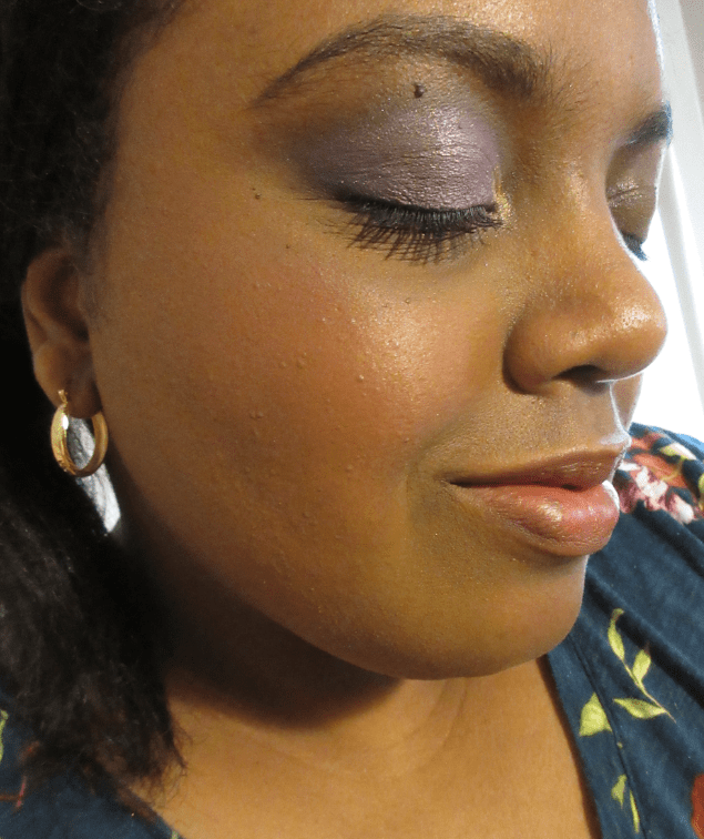
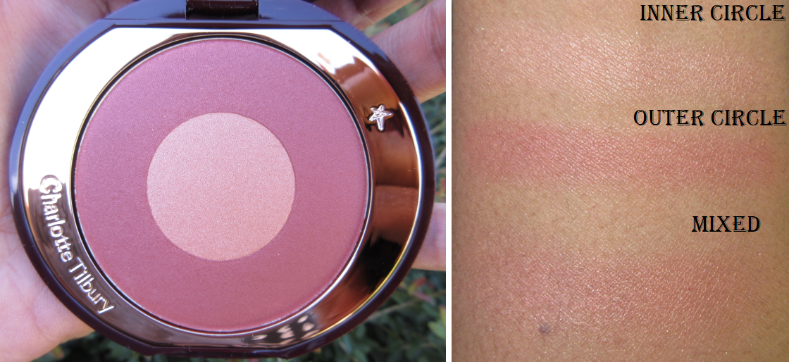
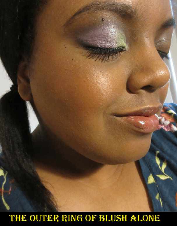
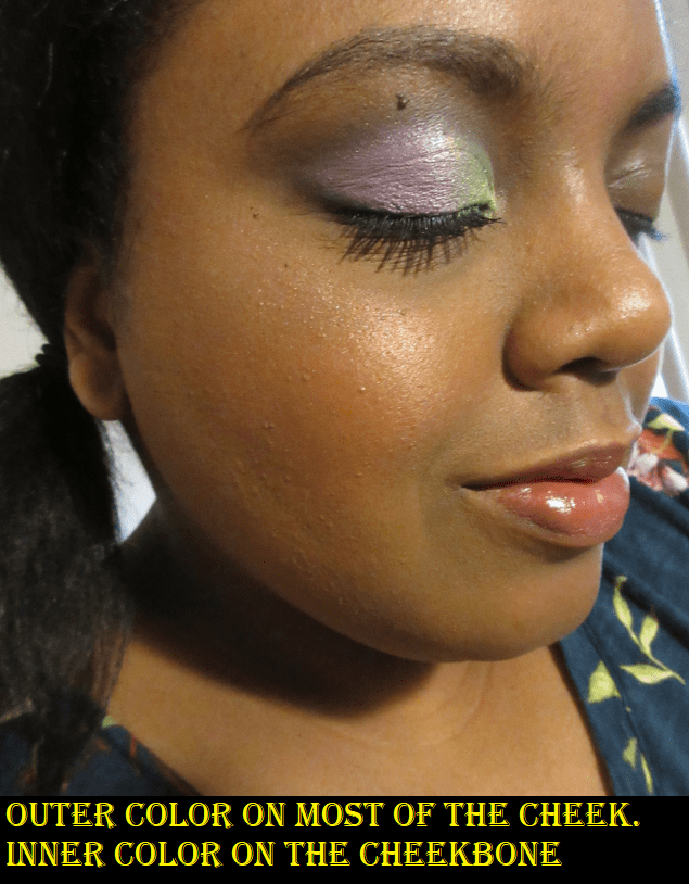
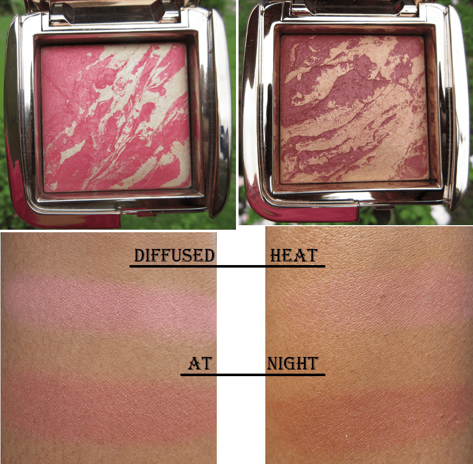
Charlotte Tilbury Cheek to Chic Blush in Walk of No Shame
I’ve heard of these swish-and-pop blushes before, but what enticed me to try one now, and in this particular shade, was the number of Youtubers saying how much more inclusive this shade was in the line. I was initially excited when I had it in person but was surprised when I swatched it and did not get the level of pigmentation I was expecting.
The outer “berry” ring is quite light on me, which I don’t mind, but mixing it with the inner “champagne” ring on my cheek lightens it up even more to the point of being a whisper of color with a whole lot of shine.
Both rings have shimmer, so that is unavoidable, but the champagne one is intentionally more shimmery. I’m glad I have it because it works as a subtle highlighter similar to the subtlety of Hourglass Ambient Powders and Guerlain Meteorites. As a blush product though, I only like using the outer ring, which presents a challenge as only my smallest blush brushes can pick up the color without touching much of the middle. This blush is also harder pressed which adds to the difficulty. I’ve come to the conclusion that I like this blush, but I would have loved it if it was more pigmented. A few times I’ve actually used a mixture of both colors with the At Night blush from Hourglass on top to add more color without as much extra shimmer.
That’s all for today! Thank you so much for reading, liking, and/or commenting. It helps to keep me motivated to post consistently. I do this because I enjoy it, but it feels especially good to see the stats and know that my words are being seen.
I already posted about the Fenty Sun Stalk’r Bronzer here and the Cream Blushes here, but these are additional photos of those products. Mocha Mami is in the first picture alone and in the second photo is a lightly applied mixture of Strawberry Drip and Rose Latte along with Mocha Mami. I’m a fan of all three products.
Today, I will be focusing on the other Fenty Products in my collection!
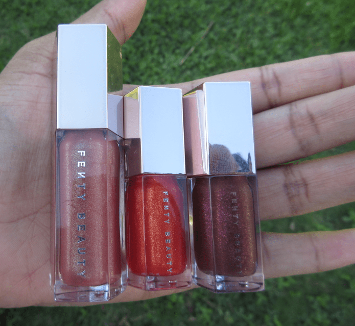
Fenty Glow – (shimmering rose nude) I have this shade in the full size. During the initial launch, the gloss bombs were, and I believe still are, very hyped up. Fenty Glow is specifically marketed as a universally flattering shade. I do love the way it looks on me! The gloss bombs are thick without being goopy. It’s the kind of formula that clings to the lips and will last longer than thinner gloss formulas. If your hair gets in your face, it will stick to the gloss, but when I open and close my mouth, I don’t get that sensation of my lips getting stuck the way some sticky glosses can. The sparkles in this are nice and fine. All three of my gloss bombs have a sweet fruity scent.
Cheeky – (shimmering bright red-orange) I have this in the mini size from the mini gloss bomb set that was released for Holiday 2019. I wanted Cheeky and Hot Chocolit the most, so I gifted the other three shades. Cheeky is available in the full size exclusively on the Fenty website.
Hot Chocolit – (shimmering rich brown) I expected to love this shade the most, but it’s my least favorite of the three. I tend to only wear it on top of another lip product that is too light of a shade in order to deepen it up. Hot Chocolit has bright red glitter, which is pretty in the tube, but I don’t like it on my lips. Also, the glitter particles in Cheeky and Hot Chocolit are larger and more noticeable on the lips, which is not my preference.
I wish there was a bit more color pigment to Cheeky and Hot Chocolit. I was tempted to get this year’s mini set, but because the shade differences are so subtle on my lips, I don’t think it’s worth getting more when the current ones I have will suffice. Tower 28 glosses have now reached the hype of the gloss bombs, so I’m more likely to try those in the future than get the new gloss bomb mini set. The gloss bombs are still my favorite glosses in my collection and my overall favorite Fenty Beauty product.
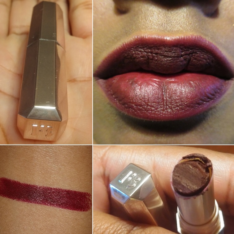
Griselda – (bold burgundy) I have this Mattemoiselle Plush Matte Lipstick in a trial size. It had the Fenty logo on the bullet, but I cut off part of it to be used in some DIY lip projects of mine. It’s such a beautiful color, and although mine is getting old and the consistency isn’t quite the same, I remember enjoying how smooth it was and thinking that if I wore lipsticks more often, this is one of the shades I would get for some gorgeous vampy looks. I tend to prefer this kind of purple with a red tone over more blue toned purple shades.
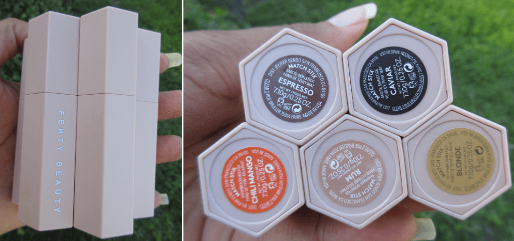
Match Stix Matte Contour and Shimmer Skinsticks
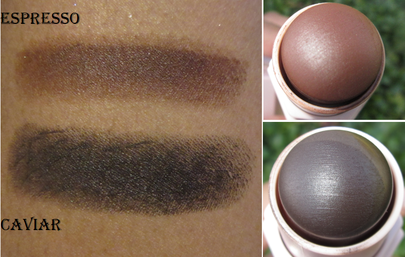
Espresso – (contour for medium deep skin tones, cool undertone) This was my favorite contour product in 2019. It’s creamy and blends out nicely. Even though it’s described as cool, it pulls a little warm on my nose which is why I only used this for contouring other areas of my face.
Caviar – (contour for deep skin tones, cool undertone) this is one of the two deeper shades that were introduced to the line in 2020. I bought this because I wanted something cooler-toned, but I underestimated how rich of a color it is. Contour products are ideally only a few shades darker, so this one is too intense on my complexion. It’s not that I can’t wear it at all, but it takes a lot of extra time to sheer and blend it out so it won’t look too harsh on me.
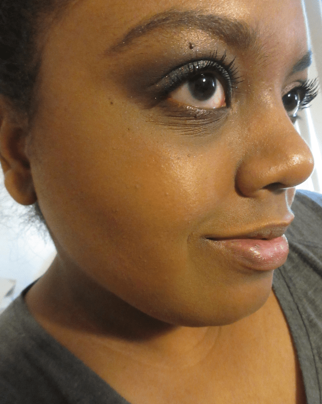
In the photo on the left, I’m wearing Espresso. I’m wearing Caviar in the middle picture and in the last one I have the two shades blended together. I still like this product, but love the Uoma Beauty Double Take Sculpt + Strobe Duo Stick even more. #3 Bronze Venus is a better shade match for me and the formula is creamier, which makes it easier to blend. Bronze Venus is neutral-warm for a contour but it’s deep enough to still have a chiseling effect, even without having enough grey to create an actual shadow effect.
With the contour sticks, I typically draw a line and blend it out with a dense synthetic brush or the mini Tati Blendiful. Occasionally, I blend with a damp sponge, which leads to gorgeous results but I’ve never gotten into the habit of using a sponge consistently.
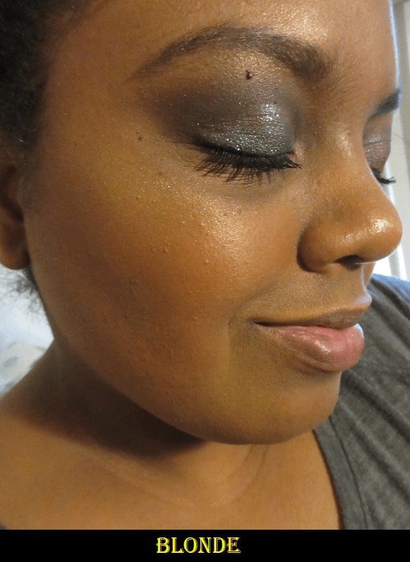
Blonde – (glimmering gold) I’ve only used this twice and never in public. I like some strong yellow-based highlighters, like Becca’s Champagne Gold, but this one I feel stands out in an unflattering way on my skin tone. It also has very noticeable glitter up close.
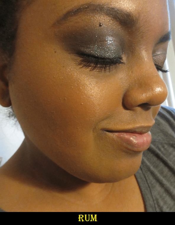
Rum – (gilded bronze) This is my favorite of the three because it blends in well with my skin tone and is a traditional highlighter shade. Because it matches so well, the glitter is less noticeable. It just has the appearance of a shimmery sheen. Unlike the contour sticks, I prefer to apply the shimmer sticks to my face by rubbing some of the product onto my fingers and dabbing it onto my skin. I think it looks more seamless when I use a sponge, but I dab the product onto my cheeks first with my finger, just to place it, and then blend with the sponge. When I rubbed the sticks directly onto the sponge and then blended it onto my face, I felt that I ended up with a thicker area of highlighter than I normally would have. I was also unsuccessful in being able to completely remove the stain from Chili Mango off my sponge.
Chili Mango – (sun-kissed orange sheen) I bought this during my search for the best traditional orange shade of blush. I don’t really like how it looks as a blush on me (more sheen than base color), but I do like it as a highlighter.
I have to admit that although these are three very distinct shades, the differences aren’t as pronounced on the cheeks. I always knew this was the case logically, but as I’ve taken a closer look at all the highlighters in my collection (especially Becca Shimmering Skin Perfectors which I have plans to blog about in December), it has finally begun to sink in that most highlighters will look the same. Variety is extremely limited in terms of color and being able to identify what brand or shade a highlighter is by the way it looks on the face.
Killawatt Freestyle Highlighters
Trophy Wife – (3D hyper-metallic gold) Sometimes I want things because they are pretty, even though I know full well the product isn’t something I would actually like to use. This highlighter is the perfect example of that because it is the epitome of glittery. It’s an intensely more sparkly version of the Blonde Match Stix.
I wouldn’t wear this as a highlighter, but it makes for a beautiful eyeshadow.
I wear it dry over Nyx Glitter primer and the glitter remains textured but highly reflective. If I use a damp brush, Trophy Wife turns a lighter and brighter yellow but smooths out and looks more metallic. I wore it dry on one eye and wet on the other, and was surprised to discover the difference was immediately recognizable in a video chat. It looked like I used two different yellow eyeshadows. Even my boyfriend (who I was in the chat with) noticed!
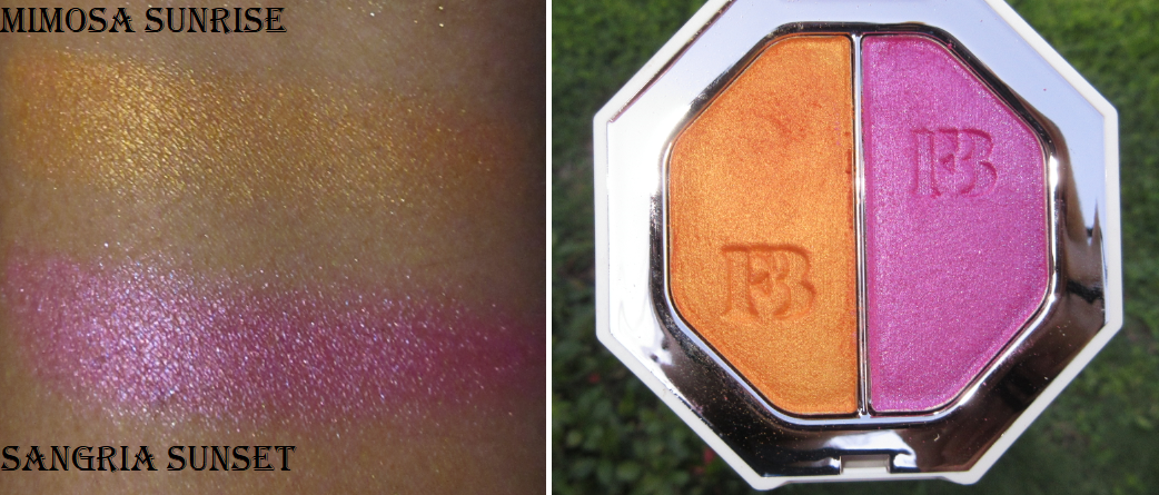
Mimosa Sunrise (metallic tangerine) / Sangria Sunset (metallic magenta) – This is from the Foil version of the Killawatt Freestyle Highlighters. It’s not glittery the way Trophy Wife is; it has more of a satin texture. I bought this for the orange shade when I was looking for that perfect orange blush.
I think they’re pretty, but I don’t like them on my cheeks. They’re too dark for highlighters but I can use them as eyeshadows and they are stunning together! They’re actually not the most opaque. They give a wash of color but I can see my skin underneath unless I build up a few layers. To use them as eyeshadow, I recommend dampening the brush. Since this is specifically in the Foil line, the name suggests that using the wet brush to foil it is expected of the product.
Snap Shadows Mix & Match Eyeshadow Palettes
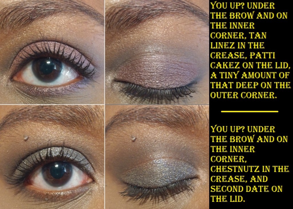
6 Smoky – I love the concept of these palettes with their convenient packaging, but the eyeshadows are lacking for me. The pigmentation level is okay, but the tones are so soft and subdued, which is just not my preference. The difference between Tan Lines and Chestnutz is so minimal on the eye that I don’t recommend bothering to use both at the same time. Also, despite these having warm sounding names, those two shades are way cooler toned grey instead of brown. Patti Cakez was less purple than I wanted and had more of a brown maroon tone. The mattes overall are okay and blend fine, but if I use glitter glue to get the shimmer shades to show up a little better on the lid or try to foil it, it changes the ability for That Deep to build on top of the shadows. To avoid this, I apply That Deep first but if I accidentally cover too much with the lid shade, it’s very difficult to build That Deep back up. The other mattes have the same issue, but since I only use them in the crease, I’m less likely to get my lid shade on them. Second Date is the only shadow that exceeded my expectations. It’s like a sequin shade done right. It feels dry like a matte but there’s so much glitter in it that it looks like an actual shimmer shade on the lid without any sparse areas. The downside to this shadow, at least for some people, is that it’s made with the plastic-type of glitter (Polyethylene terephthalate) and not synthetic fluorphlogopite or other plastic alternative glitters.
Swatches were applied over Nyx Glitter Primer.
8 Pastel Frost – In bare skin swatches, the shimmers are lackluster, and using MAC Paint Pot does nothing to improve the way they look. I used glitter primer to get them to show their maximum potential in these swatches.
Swatches were applied over Nyx Glitter Primer.
Using the two blues next to each other looks like the same shade, except that Durty Denim is more reflective/sparkly. I have some eyeshadow looks coming up which demonstrates this issue. Lei’d Up and Mula-La also look too similar on the eyes, as well as Ice Cream Kisses and Lady Pimp. If these colors weren’t so soft, perhaps this wouldn’t be as much of a problem. Another thing that bothers me about the shimmers is that although I enjoy eyeshadows with dimethicone or other silicone derived ingredients which give it some slip, since I have to use glitter glue, the two products combined actually become too slippery. If I manipulate the shadow too much, it moves and I end up having to apply layer upon layer of eyeshadow to make it opaque. I even tried this over the Anastasia Beverly Hills primer, which typically works very well to make pastel shades show up better. This works with a very thin layer and just patting it on instead of blending (plus you have to apply it wet). However, I learned that applying too much ABH primer just makes these Fenty shadows turn even lighter and harder to see.
Being softer colors isn’t inherently bad, but it drives me nuts that unlike other brands of eyeshadows, trying to intensify them via glitter primer and wetting my brush only has a minor impact. It’s only slightly more improved. I also don’t like the fact that trying to make the shimmers pop prevents me from being able to easily go over those shades again with mattes.
I’ve heard that the new palette additions 9 and 10 are a bit better quality, though they still have shades too close to each other. When you only have 6 eyeshadows in your palette, you don’t want interchangeable shades. It’s not just me that doesn’t like the Fenty Snap Shadows. I tried selling both these palettes at a combined $25 price with free shipping included. I had this deal for 4-6 months and no one wanted it, even at 50% off. It’s one of the only makeup products I’ve been unable to sell on Mercari, even in used condition and even during the pandemic. Softer colors are not my preference, but even that aside, I don’t believe these palettes are worth $25 each. I recommend the $3 ELF quads over Fenty Snap Shadows.
Additional Notes
Fenty launched with foundations, but I don’t own any. According to Sephora’s shade matching Color IQ system, 420 is my shade. However, it was slightly too dark and too orange on me when I tried it in-store. 400 and 410 were still too orange or red, despite them being listed as my undertone. 390 was my closest match, but the matte formula was too drying on my skin. I was very excited when Fenty released their hydrating formula, but when I tried the shades in store again, I ran into a similar shade matching issue and for some reason 390 was more on the pink side than the matte formula. The hydrating foundation still wasn’t hydrating enough and emphasized texture on my face, so I gave up trying.
Although I didn’t have success with the foundation, the product this brand has been highly praised for and made a huge impact on the cosmetics industry, I’m glad I’ve been able to find other products from Fenty that I love. Even when certain products aren’t made for me, I’m always excited to hear about the new launches from this brand.
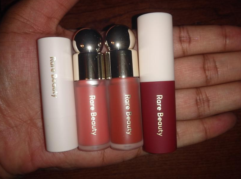
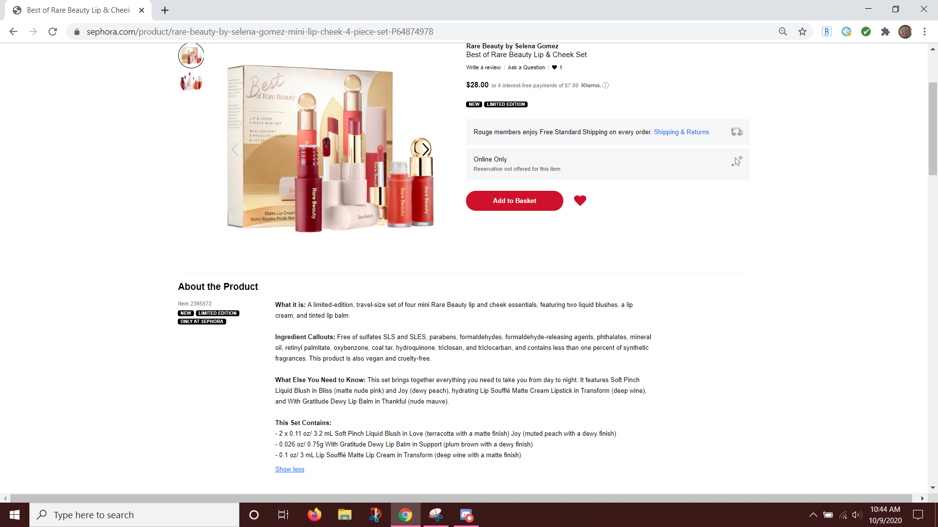
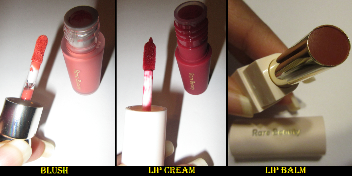
When Rare Beauty first launched, I couldn’t decide between Joy and Love blush shades and I didn’t want to have so many cream and liquid products all being opened at once. So, I held off buying them and I’m glad I did because this 4 piece set is perfect for me! At these sizes, I don’t feel as guilty about how often I’d get the chance to use them. Plus they’re in the shades I wanted, so I didn’t have to choose one over the other!
When the holiday sets launched, I noticed a discrepancy in the descriptions on Sephora’s website.
In the “What Else You Need to Know” section, one blush is listed as Bliss, but in the “This Set Contains” portion, the blush is listed as Love. Those are two very different shades and was the determining factor for whether I was going to make my purchase or not. When I checked the official Rare Beauty website, that particular set only had Bliss and Joy listed, yet it was clear to see in the product photos that neither blush was light enough to be the Bliss shade. I figured since Rare Beauty was most likely to have the answer, I contacted their customer service phone number and the person I spoke with was very surprised by this. She thanked me profusely for letting them know, took my information, and said she would get back to me with the correct shades as soon as possible. True to her word, I did get an email a few hours later letting me know the blush shades were indeed Joy and Love. She gave me a free shipping code as a thank you, but I purchased the set via Sephora since I already get free shipping and had a Friends and Family sale code to use.
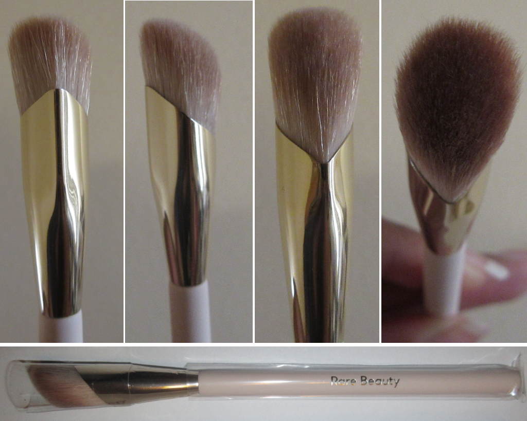
During that sale, I also purchased the Liquid Touch Concealer Brush, which I will talk about now before we move to the set.
The bristles are soft and densely packed. The unique shape and design of the brush allow me to really get into the contours of my face. Although synthetic bristles aren’t supposed to absorb product, I still find myself using more concealer than usual, but the trade-off is worth it considering how quickly I finish applying and blending. When the brush is freshly washed, it glides effortlessly under my eyes and in the corners between my eyes and nose.
After a few uses when there is a little more product buildup on the brush, it doesn’t glide as smoothly, so I switch to a tapping motion to apply my concealer, which works just as well! I thought that because the head size is very large for a concealer brush that it would be too big to apply product precisely, but the head and ferrule shape causes it to squish into the contours of my face. The large surface area also ensures the application process goes quickly. At the $12 discounted sale price, I am quite happy with this purchase! I’ve only washed the brush twice so far, so I don’t have any news to report on the longevity of the brush. Perhaps in a year I will update this post if there is anything to report about how it has held up so far, considering this is now my new favorite concealer brush and I foresee myself using it at least 4 times a week.
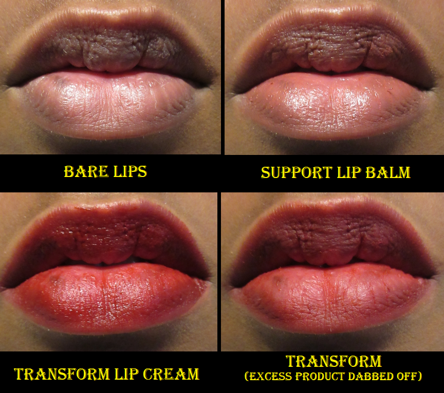
Joy on the cheeks and Support on the lips.
Joy is one of the four dewy blushes currently in the line. In the swatch photo, I had Joy on my arm for about five minutes and it remained wet looking. Essentially, the more product that’s packed on, the dewier it will look. Realistically, you wouldn’t apply that much product in one spot onto the cheeks. So, it ends up more matte than one would expect.
Something about this shade appeals to me so much! Despite being such a bright coral shade, I was surprised to see how wearable it is when used sparingly. These liquid blushes are extremely pigmented. A single drop could be the difference between looking flushed and looking clownish.
Both blushes are long-wearing (I stopped testing after 8 hours). Neither moved my foundation underneath. I could still blend them out after leaving them untouched on my cheek for a minute, though I would recommend working one cheek at a time. They do set to the point of being dry to the touch and no product transferred onto my finger or when I pressed a napkin to my face. Using my finger is my preferred application method, but using a brush or sponge works just as well to create a non-streaky perfectly blended look. A brush will give the most color payoff though, not that it’s necessary considering the amount of pigment these already have.
Love on the cheeks and Support on the lips.
The shade Love is also very beautiful and is one of the four blushes in the matte formula. You can tell Love and Joy are completely different shades in swatches, but once blended on the cheeks, Joy just looks like a lighter and slightly brighter version of Love. This is the case in both photos and in person and it might have to do with being warm-toned shades on my warm tone complexion.
In the left photo, I was slightly closer to my light source than the photo on the right, which accounts for the skin tone differences. Thankfully, the photo on the right is still consistent with the other two blush photos above.
I thought it would be fun to see how Joy and Love look together. In an effort to apply the same amount of product, I used 4 dots instead of my usual 3, which was blush overkill. So, I used what was left of my foundation on my Blendiful and patted that on top of the blushes to tone it down a little. I really liked the end result! It created a nice in-between shade that looked fully matte.
Support is surprisingly pigmented for a “balm.” It’s almost enough to fully cover the dark pigmented patches on my lower lip! It’s more like a sheer lipstick, as the first thought that came to my mind was how similar it felt to Urban Decay’s Vice sheer lipsticks. It’s comfortable on the lips, and although super creamy, it’s not emollient enough to give me that true balm feeling. Regardless of what it is by definition, I love it and will continue to use it! It’s so natural looking on me, which is definitely my preference with lip colors! There is only about half an inch of product in this mini, so when I run out, I might actually buy the full size. It has been a long time since I’ve been excited by a lip product, but this one managed to impress me!
Edit: I forgot to mention this has a scent, but I can’t pinpoint what it smells like. It’s not the same as the lip cream. It’s a mix of sweet and floral. I don’t smell it once the product is on my lips but I don’t know if the fragrance is stronger in the full size.
The lip cream is indeed creamy and comfortable to wear. Although Transform is supposed to be a matte shade, it stays dewy looking if too much product is applied. And if you want it to be more opaque, multiple layers are required. After removing the excess product, it still doesn’t dry down to the point of being transfer-proof. It will remain creamy and transferable on the lips. The flat paddle applicator was also too difficult for me to get to the inner corners of my mouth precisely, so I had to switch to a lip pencil brush. If you like lip creams, you will probably like this product. However, I’m extremely picky about red lippies and although it’s a pretty color, I don’t like it on myself. So, I will not get use out of this product. Even if this was a more natural shade, the balm texture is more of my preference than the lip cream. This has a scent that reminds me of cocoa butter.
Overall, I’m very happy with this purchase! It’s exciting to find a set where all 4 shades are wearable on me and to love 3 of the 4 products. This brand has exceeded my expectations, and I’m looking forward to seeing what else they have in store for us!
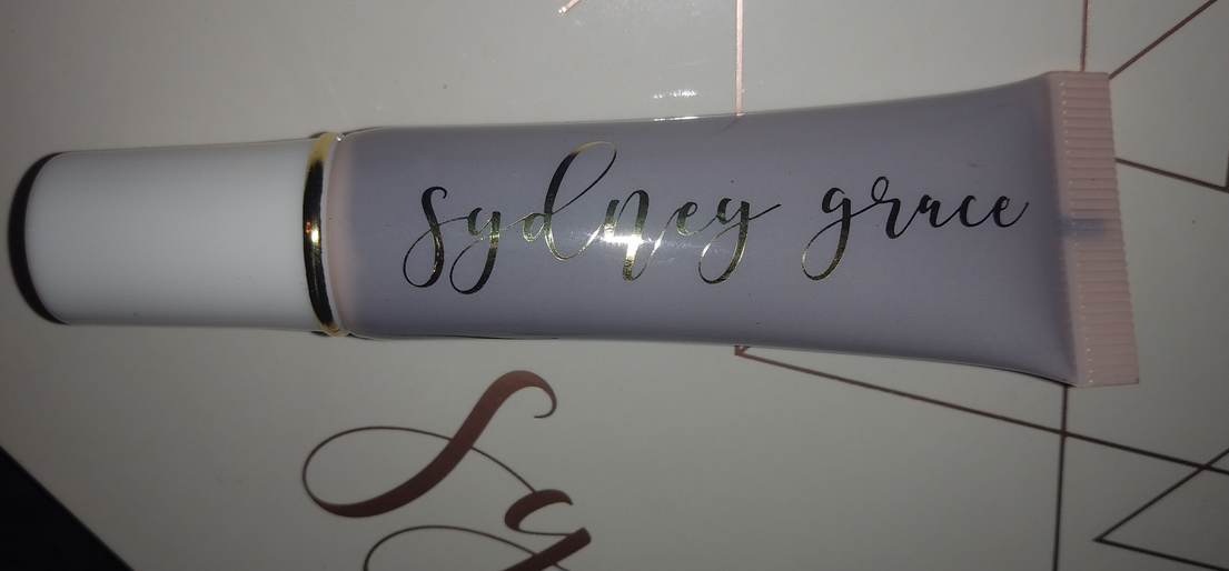
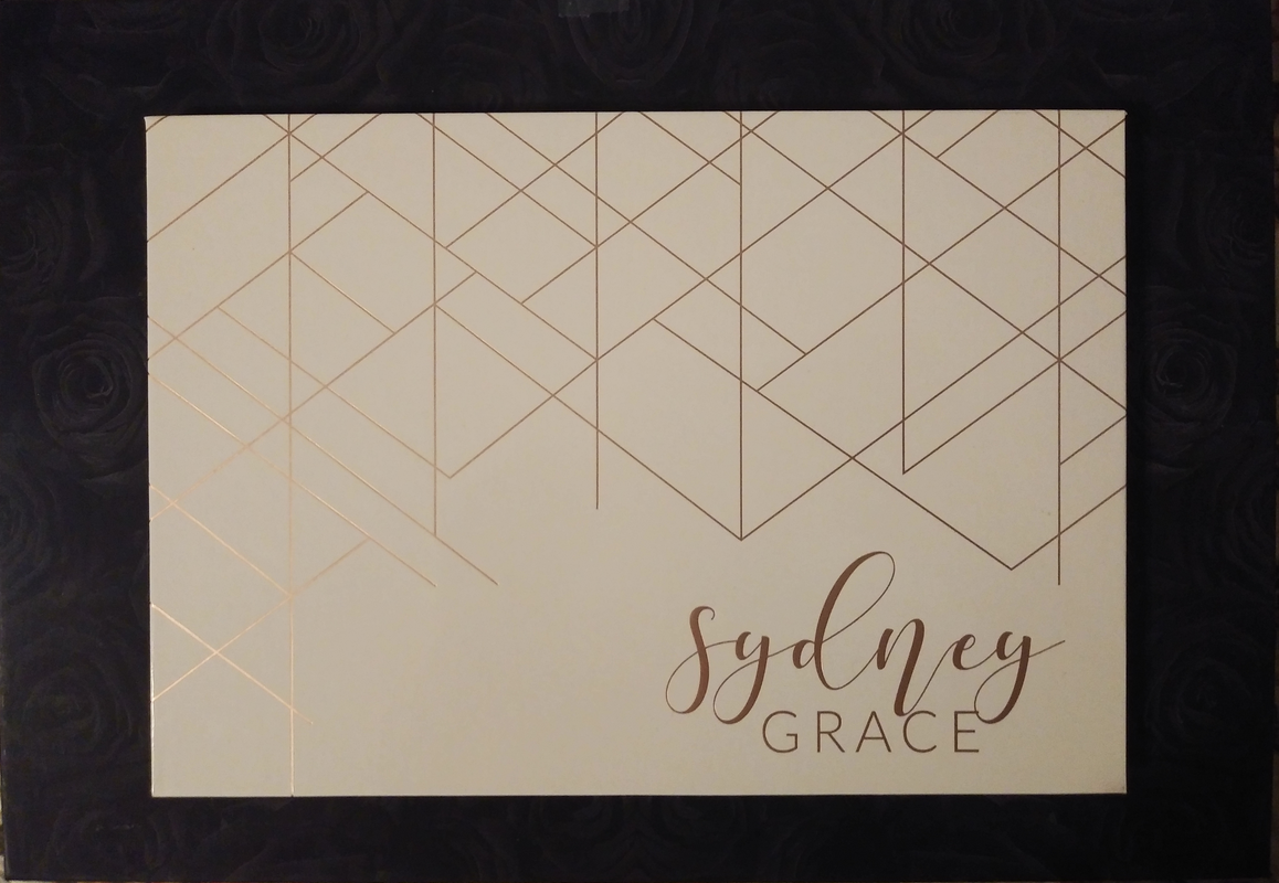
I placed my very first order with Sydney Grace in November 2019, but the majority of my collection was purchased during their annual Christmas in July sale. The deals were so good, I couldn’t pass them up!
Along with the eyeshadows, I will also discuss one of their blushes and their empty magnetic palette. Overall, Sydney Grace makes beautiful high-quality products. I believe they are worth the prices as is, but if you’re looking for the best deals, they happen on Black Friday and in July. You can also find affiliate codes on many different Youtubers’ videos for 15% off year-round.
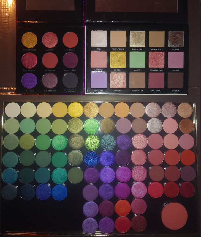
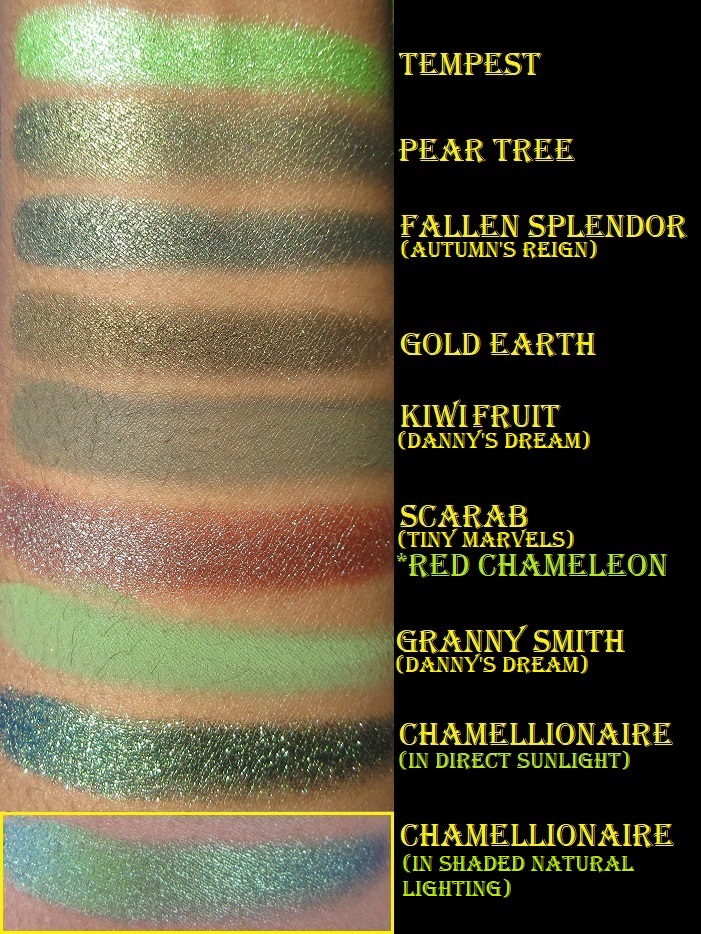
Tiny Marvels Palette by Mel Thompson
The quality of the shadows in this palette is the same you can expect from Sydney Grace’s singles. Every shade has a high level of pigmentation. The mattes feel soft and perform like Viseart shadows on the eyes, making them easy to blend, but with the added bonus of swatching well too. Some important things to note are that Scarab is called Red Chameleon as a single, but the other 14 shades are exclusive to this palette. Flutterby seems to be more fragile than the other shadows because it was the only shade that came with a piece cracked off in my palette, and I saw a few others on social media where that was the only broken shadow as well. Pressing it back with liquid works to an extent, but I recently learned in an interview on Behind the Beauty that the binders Sydney Grace uses in their matte shadows are powder only (no liquids)*. So this makes their mattes perfect for the dry-press fixing method.
*July 4th, 2021 UPDATE: I was browsing the website and noticed the ingredients of the mattes I saw had fractionated coconut oil listed, which is a liquid. I don’t know if this is the sole exception to their original statement or if the addition of liquids is a new formula change.
Lastly, Jewel Bee is the only shadow in the palette that I feel underperforms. It looks great on those with lighter skin tones, but there isn’t enough depth in the shade to make an impact on me. It admittedly still works slightly better than pastel purples from most other brands.
*October 1st, 2021 UPDATE – I felt compelled to update this post to say that although I didn’t know Mel Thompson personally, she will be missed dearly. As a subscriber of hers on YouTube, it hurt my heart to learn of her passing and I can only imagine how much worse it has been for her friends and family. I treasured those few moments I had communicating with her via Instagram and the comment section of her YouTube page. It means even more to me now. May she rest in peace.
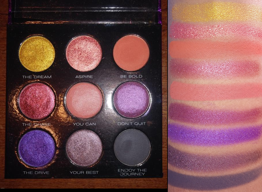
Chase Your Dreams 9 Pan Palette
This is a great smoky eye or companion palette. The color story isn’t exactly what I expected after seeing photos online versus what it looks like in person, but it is still fairly versatile. The two red/pink and two orange shades are a bit redundant to me, so I foresee myself depotting this into my larger custom palette. The only reason I haven’t yet is because I like the purple glitter print packaging so much.
Eye Swatches: Palettes, Bundle Exclusives, and Individual Shadows
All the eyeshadows come from the Danny’s Dream Bundle, Autumn’s Reign Bundle, Chase Your Dreams Palette, Tiny Marvels Palette, and all the individual shades I own. In the arm swatch portion that I’m including later in the post, I have it noted which shades are part of a collection.
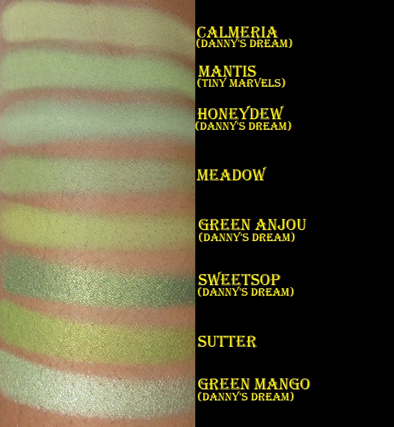
I used MAC Paint Pot in Groundwork for all of the eye swatches (excluding Beauregarde and Chamellionaire which are over Nyx Glitter Glue). If I used a primer with a white base, perhaps certain shades would look less similar. In my opinion, Sydney Grace is the most consistent brand I know in terms of eyeshadow quality. So, when it comes to choosing which eyeshadow to purchase, it’s more about the particular color and less about performance. However, I will note that Queen of the North and Lemon Cream were a little patchy on me. I don’t plan to keep them in my collection after this review.
This brand makes arguably the best green eyeshadows (though nothing tops Forbidden from Coloured Raine). Among this batch of shadows are Chamellionaire and Beauregarde, two out of the three pressed multichromes Sydney Grace currently offers.
Compared to Devinah, Clionadh, Terra Moons, and other brands’ multichromes, I honestly like these the least. All multichromes show their black bases/look darker in too much direct sunlight or with flash on. These are beautiful in the right lighting but are the most finicky to capture in photos and the least forgiving in the Florida sunlight. These were the first multichromes I ever owned and the difficulty of use made me better appreciate the formulas of the other brands’ multichromes I tried later on. The texture of these are a bit strange. I don’t know how to describe it. They don’t pick up very well on a brush and they look terrible over bare skin or regular eyeshadow bases I’ve tried. Applying them with my finger on top of Nyx glitter glue is the only way I’ve found to successfully show off their beauty.
I have to admit, I bought certain eyeshadows purely for their names! I know it’s silly, but there were enough shades I wanted that were named after the 12 Days of Christmas song that I decided to get all the ones available on the website: Pear Tree, Turtle Doves, French Hens, Geese a Laying, Maids a Milking, Ladies Dancing, Lords a Leaping, and Pipers Piping. I have no idea if Calling Birds, Five Gold Rings, Swans A Swimming, or Drummers Drumming are discontinued shades in Sydney Grace’s collection (or Feather River Body as they were formerly called) or if they were just never made.
In addition to powder multichromes, Sydney Grace also has cream shadows and cream multichromes. Though I don’t like the pressed multichromes, I can vouch for the cream formula being much nicer to work with. However, I’d still prefer to use a Clionadh pressed multichrome over the cream and pressed ones I’ve tried from Sydney Grace.
When I bought the Alexandrite cream multichrome, it came in a 10 ml tube for $25. The period after opening (open-jar symbol) was only six months. Since that time, the brand has released smaller 5 ml tubes for $15 and they say it has a longer shelf life. Shelf life and period after opening are different terms, so I don’t know if they mean to say that the p-a-o date is longer. It’s great to know that they can stay in inventory and be unsold for longer without any fear of it expiring or drying out before you get a chance to purchase them, but I would be curious to know if it still lasts 6 months before it goes bad after you first open it. In any case, this is quite competitive pricing for Natasha Denona’s new Chromium liquid eyeshadows at 2.5 ml for $28 and the same 6 month p-a-o.
It took me so long to do this post that, unfortunately, I have no good photos of Alexandrite. The blurry picture in the bottom right corner in the eye swatch gallery above is what it looked like while the shadow was still good. I only have that photo from my former cell phone with terrible quality megapixels and lighting. Hopefully, you can see that it was smoother while it was still good. My tube of Alexandrite lasted 9 months before it started to have an odd fish oil smell so I stopped using it (excluding this one time for this review). So, on the bright side, it does last a little longer than 6 months after you open it. The other two eye swatches of Alexandrite show what it looks like after 11 months. That’s why it looks strange and scaly. And yes, now that I finally finished this post I have thrown it away. I wanted to at least show that in this instance, regardless of your skin tone, the shade will look pretty much the same on everyone.
Official Swatch Picture From the Sydney Grace Website.
Arm Swatches: Palettes, Bundles, and Individually Sold Shadows
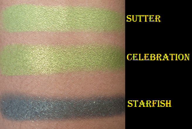
I tried to group these swatches together by color but Celebration and Starfish are not with the other greens because I had already decluttered these two shades (and remembered to rescue them just before making this post). The base color in Starfish was too dark for my liking. As for Celebration, I like it as much as Sutter (and actually think it looks more flattering on me) but I thought they were too similar to keep both. Also, back in January when I only had 30 SG eyeshadows, I asked 8 of my guy friends which purple and green shades they liked the most. Although their responses might be different if they saw my entire collection now, the shades that got 4 or 5 out of 8 possible votes were Totally Worth It, As If, Flannel, Evergreen, Thrilled, and Sutter. Between Sutter and Celebrate, Celebrate only received 1 vote. That’s why I chose to declutter that one, but I have now returned it to my collection!
Eyeshadow Looks
Thinking of You Blush
I didn’t have the self control to take a photo of this blush before swatching it. It’s such a pretty, soft, pigmented, and blendable blush. If I wasn’t already swimming in blushes I would be tempted to try more shades from the brand. This reminds me of MAC’s powder matte formula, which I love, but this only costs $9 as opposed to MAC’s $17 pro pan-only blushes. MAC has had at least four blush sales this year at 30-40% off, so I have been able to get some as low as $10.20.
All blushes in the “Deep” category on the brand’s website are currently sold out. Sydney Grace is still a small company, so it takes them a while to restock items. Due to COVID-19, there are also delays in pigment manufacturing and just a shortage of certain pigments in general.
Sydney Grace Large Custom Palette
I have this Large 40-48 pan Sydney Grace empty magnetic palette on top of my 96 pan Coloured Raine palette for comparison purposes. It has a mirror inside and the outer design has light-reflective rose gold lettering. The same print is sold in 9 pan and 12 pan palette sizes. Since I have too many SG shadows to fit in a palette of this size, it’s currently holding my non-Stained Glass Clionadh eyeshadows. I’ve had no issues with it so far.
Favorite Shadows
I mentioned at the end of the arm swatch segment which shades were the favorites among my guy friends, but my favorite Sydney Grace shadows are a combination of shades that I think look most flattering on me, as well as shades that are just flat out gorgeous and/or unique to my eyeshadow collection.
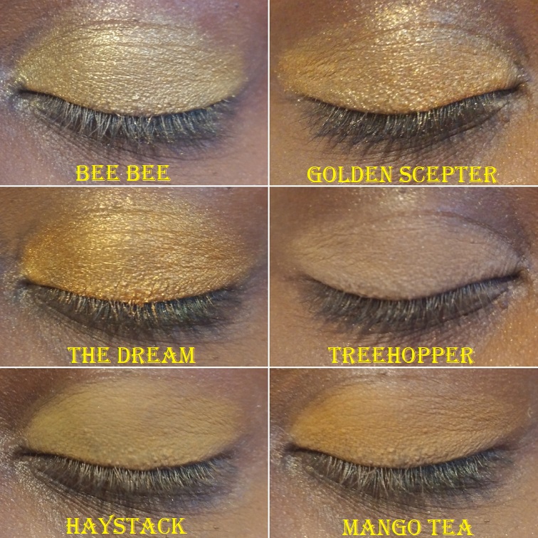
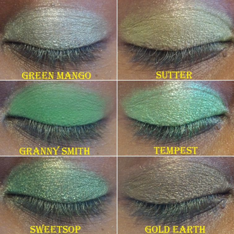
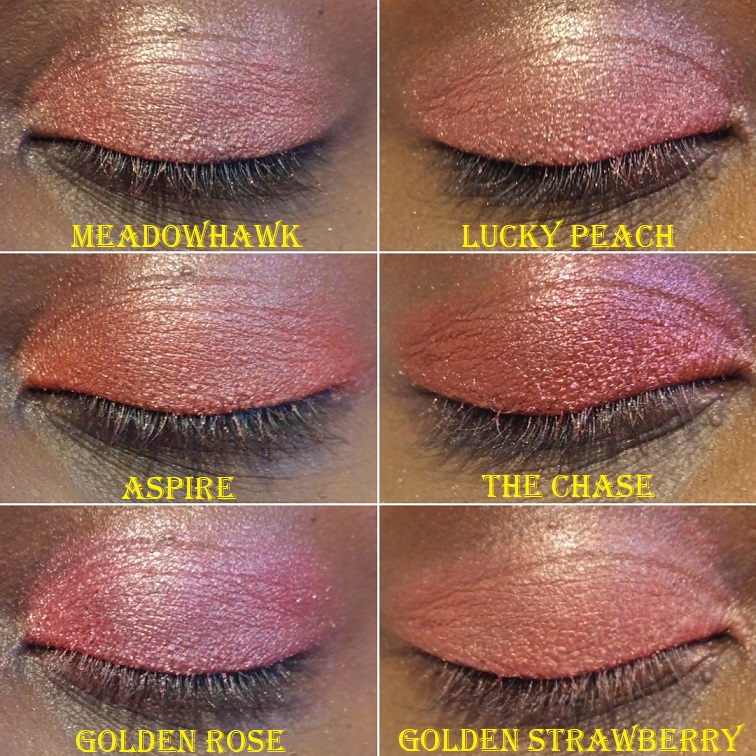
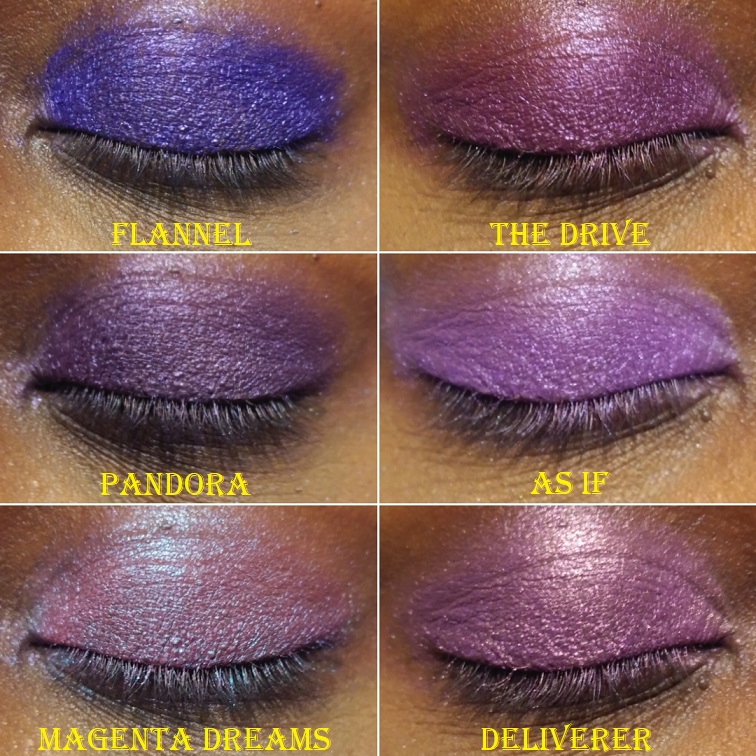
Geese A Laying – “A medium matte yellow bright matte”
*The Dream – Warm Gold
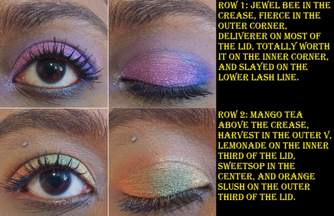
Mango Tea – “Yellow with an orange undertone”
The Greatest Gift – “Light pink with a green shift”
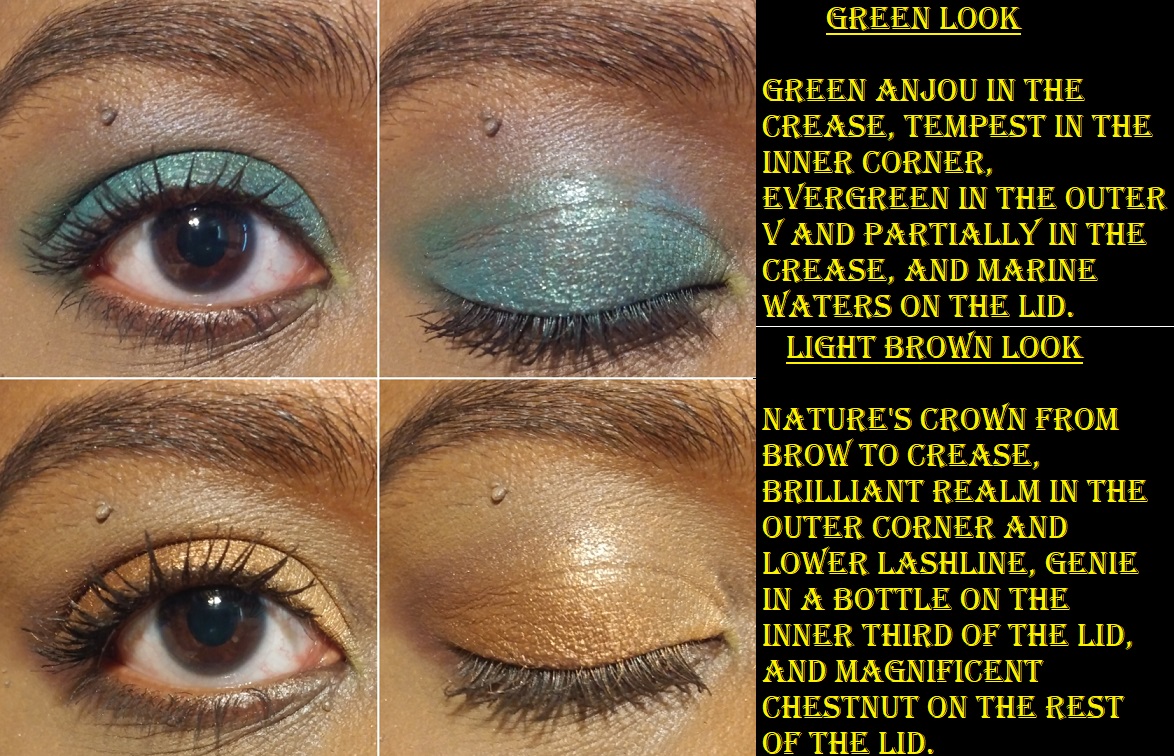
*Mantis – Deepened pastel green
*Granny Smith – Vibrant grass green
*Sweetsop – Medium green with gold shimmer
The Shallows – “Green with a blue shift”
Evergreen – “Medium green”
Thrilled – “Dark matte teal”
Fierce – “Medium blue with purple undertone”
JB – “Royal blue”
*Supreme Harvest – Dark terracotta
*Be Bold – Vibrant terracotta-orange
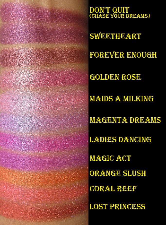
Lords A Leaping – “Deep red brown matte”
*Bug-A-Boo – Matte maroon
Magnificent Chestnut – warm metallic golden brown
Golden Rose – “Medium pink with a gold shift”
Maids A Milking – “Bubblegum pink with a strong blue shift”
Forever Enough – “Medium burgundy red with a satin finish”
Orange Slush – “Vibrant Orange with a metallic finish”
Golden Peach – “Deep peach with a golden shift”
Lost Princess – “Red with an orange undertone”
*Amber Jewels – Metallic Cranberry Red
*Don’t Quit – Metallic Burgundy
Flannel – “Bright medium purple”
*The Drive – Warm purple
Magenta Dreams – “Magenta with a blue shift”
Deliverer – “Vibrant violet with a red undertone”
Celebrate – “Yellow Green”
The final important note is that if you’re interested in purchasing from Sydney Grace and are trying to find specific shades via the search bar, just note that it’s extremely inconsistent. For example, if you type “Deliverer” you will get that shadow as the only result. If you type “Orange Slush” exactly as the shadow is called, you will find it on page 4 of the search results.
Since the end of 2019 until the time of me starting to work on this post, the collections from Colourpop haven’t been dark-skin friendly (or at least the items I’ve wanted haven’t been). Today, I’ll be discussing the bits and pieces from different collections I have purchased that work for me, to an extent.
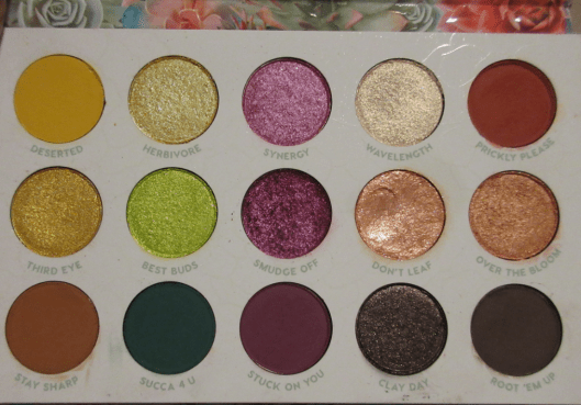
GARDEN VARIETYCOLLECTION
Garden Variety Palette
The design of this collection is so beautiful! Colourpop really excels at that. The succulents and lettering on the cover of the eyeshadow palette (and even the carton) are raised! I love the packaging and don’t see myself ever getting rid of it, even though I am not a fan of the shadows inside.
The color story is what I expected from the product photos. However, I made the mistake of not recognizing Herbivore, Over the Bloom, Succa 4 U, and Clay Day are a sequin formula, which I despise. It’s unfortunate because I love the base matte color of those shades. I just cannot stand the random “pearl” glitter specks embedded in the shadows.
The shade “Don’t Leaf” is a supershock formula. This was my first time experiencing a supershock shadow in a palette, so that was fun! This particular shade doesn’t make much of an impact on my lids though.
Although I knew the palette would lean on the light color spectrum, I figured I would be able to use them anyway due to Colourpop’s usual pigmentation level. However, these are not as pigmented as I’m used to and I find the shimmer quality to be lackluster compared to my other Colourpop shadows, even the oldest ones. The mattes are better, but they don’t deepen up the look as much as I need in my eyeshadow looks.
From my disappointment, inspiration struck! I decided to swap out most of the shades in this palette for similar, yet better performing Colourpop shadows. I am much happier with the selection I chose!
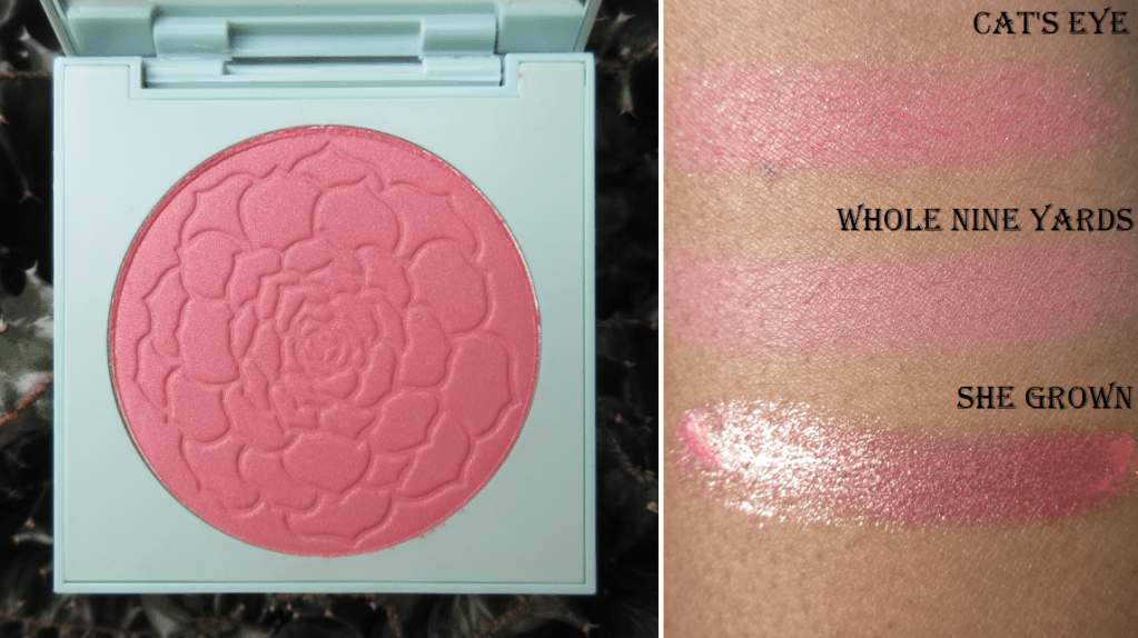
Whole Nine Yards Blush
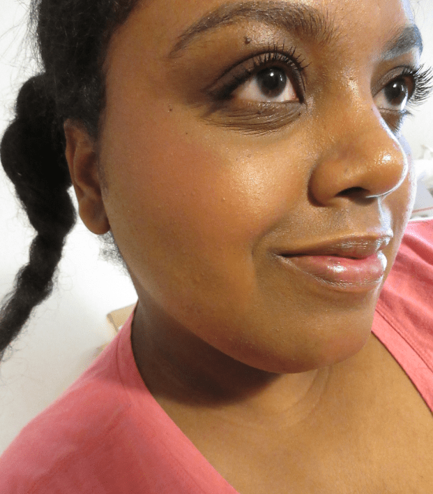
I purchased the darkest shade of the four blushes in the Garden Variety palette. It looks extremely subtle on camera, but it shows enough in person that I can use it. I appreciate that despite being so light, it doesn’t have a grey tone or leave a cast on me. I do wish this was matte. It’s a “warm pinky terracotta with gold pearl,” and the gold specks are larger than I’d like in a blush. I prefer smaller refined pearl pigments like the kind in MAC blushes, but I’m glad Colourpop chose gold rather than silver glitter for this blush. Also, Whole Nine Yards is similar to a sequin eyeshadow in the sense that it is primarily matte when applied to the skin, as most of the glitter gets brushed away when blended. So, it isn’t enough to make me stop using it. It just isn’t going to be the first blush I reach for. Plus, I like being able to see the beautiful flower imprint in the powder. That kind of thing gets me every time!
Whole Nine Yards on the cheek with no highlighter, bronzer, or contour. Just the blush over Nars Sheer Glow.
She Grown Pink Jelly Much Eyeshadow
This “warm peachy pink with a gold shift” eyeshadow is stunning! On the innermost part of my arm, which is lighter than my eyelid, you can see the pink tones a lot better. In direct sunlight, it looks even darker pink than in swatches, but on my eye, the peach and gold overtake the look. I still love the way it looks. It takes a little finesse to smooth out the shadow in a nice even layer of product, but the effect is worth it.
The left column shows what it looks like upon initial application. The right column shows how it looks 8 hours later.
I noticed it first started to break apart around the six hour mark, so I would only use this if I was making a quick trip out or didn’t plan to stay long at an event. Of all the products mentioned today, I’ve used this the least, so I don’t know if there are tricks to make it last longer. I will continue experimenting to find out, but I’m happy with this item as it is.
There are three other Jelly Much shades in this collection, but She Grown was the most unique to me.
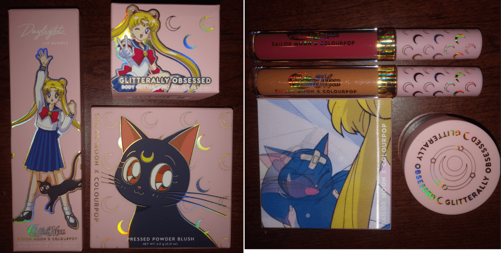
SAILOR MOONCOLLECTION
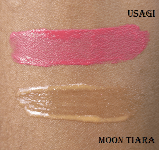
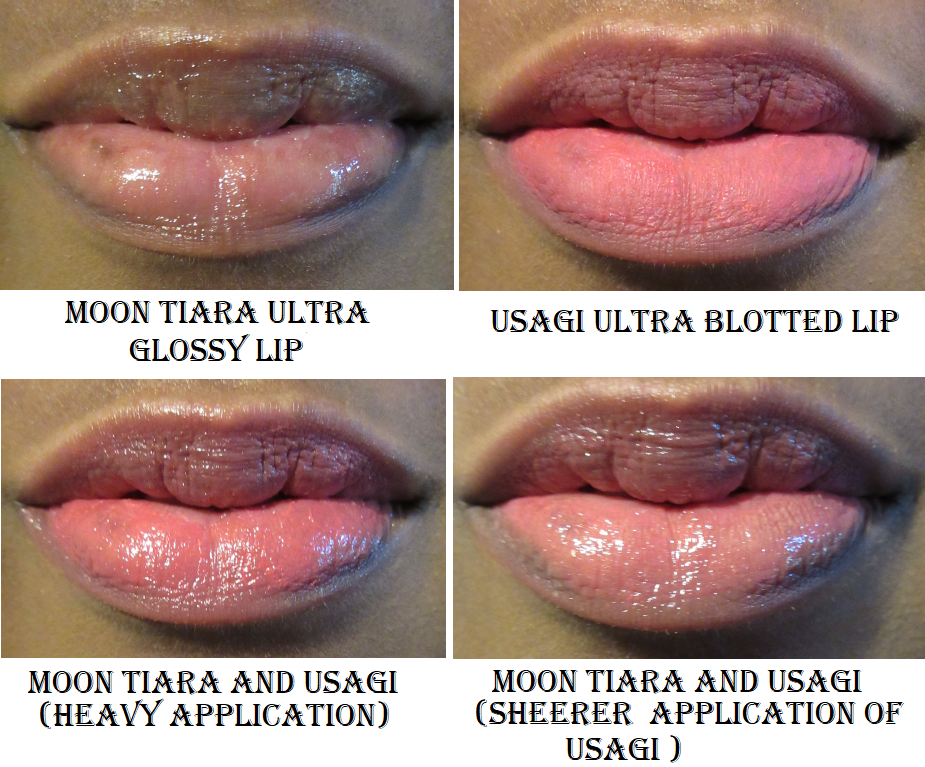
Moon Tiara Ultra Glossy Lip
I purchased the Daylight kit, which included Moon Tiara and Usagi. The Moonlight kit has cooler-toned versions of these shades. Moon Tiara is described as a “Yellow Orange with Gold and Pink Pinpoints.” I was worried this would look milky, but thankfully it does not. I still wouldn’t wear this on its own, but I enjoy how it looks over more pigmented lippies.
The formula is a bit sticky and has a pleasant sweet smell. The brush tip applicator was so stiff that I thought it was a solid bit of plastic until I used it enough times for the bristles to loosen up. I don’t mind that it’s not a doe foot, now that the brush tip is more flexible.
Usagi Ultra Blotted Lip
The designs on these lip products are so pretty! I rarely buy lip products because I’m mostly a balm or gloss kind of chica, but I couldn’t skip out on this packaging! Unlike the gloss, this has a doe-foot applicator. Usagi is a mid-tone pink, and I honestly didn’t expect to like this. I’m very picky about lip colors and this is almost too bright of a shade, but it’s right on the cusp. I could wear this on its own without feeling insecure, however, I prefer the way it looks with Moon Tiara on top.
This is my first experience with the Ultra Blotted Lip formula. It is intentionally sheer. To my knowledge, it was originally marketed with the popsicle lip trend in mind. Now, their selling point is that it’s a “buildable diffused matte.” Even though it dries matte, it feels comfortable on the lips.
It’s an interesting formula that I do like. One thing I learned is that if I accidentally touch my lip while it’s half dry, trying to cover the bald spot back causes an oddly noticeable demarcation between the newly covered spot and the surrounding area that overlapped with additional product. What you see in the image above of the blotted lip alone is the best I could do to cover the naturally darker spot on my lower lip. I have extremely dry lips that are difficult to care for without a consistent lip care routine. This blotted lip formula isn’t something I would use on its own if I haven’t created a completely smooth canvas that day. That’s why I like pairing it with the gloss because the shine distracts the eye from noticing color inconsistencies and hyperpigmentation.
Moon Prism Power Glitter Gel
This is pretty. This is also a jar of evil. I’ve complained in the past about my dislike of glitter, but using glittery eye shadows and highlighters this year made me start to like them a little more. However, using this product three times now reminded me why I used to HATE glitter. When I think it’s all off my face, I find more.
I bought this with the intent of using exclusively the larger crescent moon and star shapes. I thought I would be able to separate them from the jar easily. My assumption proved incorrect. This would be fine if I could successfully remove the glitter from my face without finding little specks everywhere for the rest of the day and even the next, despite multiple face scrubbings and showers.
In the photo below, I kept the glitter to the outer corner of my eye. I didn’t want to take a chance putting it anywhere closer to my eyeball since I am a contact lens wearer and the glitters are not eye-safe. By the time I finished taking pictures, the glitter somehow moved to the inner corner of my eye, my cheek, my chin, etc. I will continue to use this in the future, but on very special occasions or special eye looks. This is just my personal issue. This isn’t a bad product. If you like glitter, you will probably enjoy this.
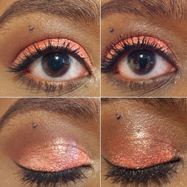
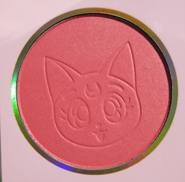
Cat’s Eye Blush
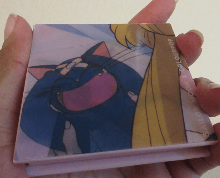
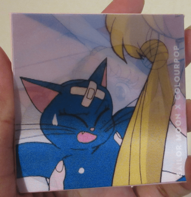
Right away, I have to talk about how cool the packaging design for this blush is! I don’t recall what this type of image effect is called, but it shows three different images when you turn it at different angles. It’s so fun! And the imprint of Luna in the powder is ridiculously cute! I bought both shades, but From the Moon looked too light for me, so I sold it. It’s unfortunate because that shade was matte and I generally prefer a matte blush. Cat’s Eye is a, “pearlized rosey pink with silver pinpoints.” The color is warm, which I like, but the silver glitter isn’t as flattering. I don’t mind because I just wanted this for collector purposes anyway. I have enough blushes that I won’t miss using this if it’s strictly for display only.
Cat’s Eye on the cheek.
MULAN
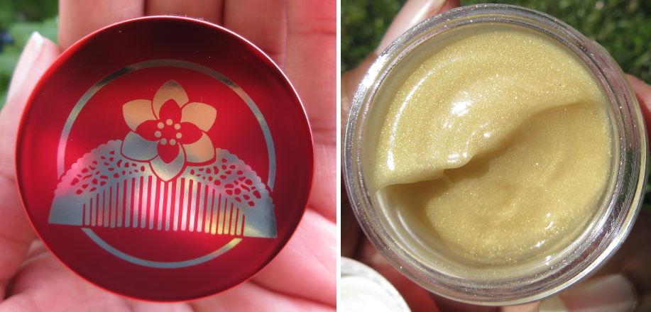
Gold Lip Mask
The multicolored pattern on the jar is a reflection of the shirt I was wearing when I took the photo. It’s actually a beautiful mirrored gold shade. The mask itself looks pretty in the jar and goes on the lips clear with fine gold sparkles. It does not have a scent. Even though the consistency is thicker than the Moon Tiara gloss, it’s less sticky and feels lighter on the lips. I use this like I would any other balm by wearing it alone.
Jasmine Face Milk
I was initially annoyed that I couldn’t get the lip mask without buying it in the set with this, but I’m glad I finally tried the face milk formula! It’s lightweight and feels hydrating on the skin. The jasmine scent is mild, which I’m glad about. I don’t enjoy heavily scented skincare. I liked this product so much that I bought a different full-size face milk!
CUSTOM PALETTE AND FINAL THOUGHTS
Aside from my Kathleen Lights x Colourpop So Jaded palette and the Garden Variety palettes which are currently holding eyeshadows in the color stories of my choosing, I put all my depotted and single Colourpop shadows in one gigantic magnetic palette. The depotted palettes are: Semi-Precious, Element of Surprise, All I See Is Magic, It’s My Pleasure, Lilac You A lot, Blowin’ Smoke, Blue Moon, Just My Luck, and Uh-huh Honey. The unused shades from the So Jaded and Garden Variety palettes are here as well.
My reimagined So Jaded palette.
I respect Colourpop for staying with the trends and for their business savvy, marketing, and ingenuity. However, my last few purchases have been purely for packaging. I want to keep my collection manageable and buy things I will actually use. Colourpop has made it a bit easy to stay away while they aren’t making things brown-skin friendly. However, I am actively going to try and limit my purchases from them, as I’ve never been blown away by Colourpop’s quality. It’s okay or good most of the time, but I have too many products from other brands of excellent quality to want to settle for just “okay.”
2020 has been the year of blushes for me. I’m not sure why, but my blush obsession has surpassed even my eyeshadow obsession! That being said, I always buy one blush to start with from a brand, even if they have multiple colors I want. If I end up loving the formula, I still tend to stick with that single shade (or buy a better-suited shade to use instead). However, these are the exceptions to that rule; the blushes I loved so much that I felt compelled to buy another!
I will be excluding MAC, NYX, and Rituel de Fille from this list, as I’ve discussed them in posts before and we know I didn’t stop at just two with those brands!
HOURGLASS AMBIENT LIGHTING BLUSHES
Swatches in different lighting
These are the blushes that inspired this post! Hourglass is notorious for having a stunning powder formula but making shades suited primarily for pale to medium skin tones. Diffused Heat was the first one I bought. It takes a lot of building up to show on my cheeks but despite how many layers I have to add, it still doesn’t look powdery! The poppy color gives a healthy youthful flush that I love. It imparts a subtle glow without looking shimmery or glittery due to the finely milled powder Hourglass is famous for.
A heavy application of Diffused Heat on the cheeks
Since their initial blush launch in 2014, medium tone pinks have been the darkest shades Hourglass has been willing to make. Besides being uninclusive in their powder range, the other issue with making multiple medium tone blushes is that they end up looking too similar on the cheeks. Below is an example of their six darkest blushes using Temptalia’s swatch comparison feature. It should be noted that Vibrant Flush and Mood Flush are only available in limited edition quads/palettes with other products too light for my skin tone. So, to even have access to these blushes, I would’ve had to pay $60-$80. Vivid Flush was the limited edition 2019 Lunar New Year shade that was sold individually but is no longer available.
After buying my first Hourglass blush, I only had to wait six months for a shade different enough from Diffused Heat to be worth purchasing. At Night is described as a brick red. The dark maroon marbling gives the impression that it will be a deep shade, but when mixed with the lighter base powder, it turns it into a warm medium to medium-dark pink. I love this shade, perhaps even more than Diffused Heat because I don’t have to work as hard to get the color to show.
A heavy application of At Night on the cheeks
At Night Again
To see how the original Hourglass blushes look on someone with a complexion closer to mine, I recommend this video by The Fancy Face.
10/11/2020 Update: I purchased Radiant Magenta thinking that if Diffused Heat worked on me then this shade would as well. I was mistaken. Despite the gold shimmer, this shade appears too cool-toned on my cheeks and is too light for me. I don’t like the way it looks, so that was unfortunately a bad purchase. At least I got it at a reduced price.
This brand has a decent range of complexion products, so it’s very strange to me that for the past six years I’ve seen customers implore Hourglass to make deeper blushes, bronzers, face powders, and highlighters. The demand is so high, yet Hourglass ignores it. After the release of At Night, I was hopeful that the brand would finally fulfill the barrage of requests for a light version and dark version of their holiday face palettes this year. Instead, they repromoted old products and paired them with “new” powders that look like the old ones, just half a shade darker. I give most brands who promised to be more inclusive in the future some leeway because of COVID-19. However, Hourglass has had over five years to make it happen. It’s disappointing because I like the brand. I like their products. I wish more people were able to use them.
FENTY CHEEKS OUT FREESTYLE CREAM BLUSHES
The leftcolumn shows how they look in natural lighting.
My Fenty blushes are like deeper cream versions of my Hourglass blushes! I bought Strawberry Drip during the initial product launch and loved it, then immediately purchased two additional blushes. I don’t like to return things, but Daiquiri Dip was too bold of a red shade. I’ve kept plenty of items I don’t care for, but if there’s something I know I will literally never use again, that’s when I will make a return. Thankfully, I loved Rosé Latte and kept that as my second shade. There are several more colors that appeal to me from the line, but cream products don’t last as long, so I stopped at these two.
Strawberry Drip is described as a “soft coral pink” but is a bright intimidating looking shade to me, so I was surprised how much I liked this one!
Rosé Latte is described as a “soft bronzed nude,” which doesn’t look very special in the pan. On the skin, you can see the subtle red tone that gives this shade it’s oomph.
Because the formula isn’t as pigmented, but still buildable, a wider range of people can use these shades. Though they can be built up, I prefer to wear them on natural makeup days. These mostly set, and although they aren’t transfer-proof, I can still rub my finger over my cheek without it turning patchy. It also doesn’t disturb my foundation using the two methods I have tried: scooping out some product onto the back of my hand and warming it up with my finger before applying with my fingers or a sponge.
This was taken earlier in the year.I’m wearing Rose Latte towards the back of the cheek and Strawberry Drip on the apples of the cheek towards the front. This is my preferred combo.
KVD VEGAN BEAUTY EVERLASTING BLUSH
My goodness, I haven’t discussed any KVD products since the Mi Vida Loca Remix Palette from 2015! Controversies aside, I wasn’t interested in anything from “Kindness Vegan Discovery (Doing Good) Vegan Beauty” until the blush release in January 2020. I have to address the name change. Did they really need to put Vegan in there twice?
This is an actual banner used in the past by KVD Vegan Beauty. I just added the Meme-ish caption.
I bought Snapdragon at full price shortly after the product launch. At this time, everything else from KVD was going on sale, but I couldn’t resist that rose packaging. I intended to get another blush when I thought it would inevitably go on sale too, but as of September 21st, it still hasn’t. Excluding the new eye primer that was released a month or so ago, the blush is the one item that hasn’t gone on sale yet. What I also find interesting is that these blushes are the only items in the brand that isn’t available at Ulta. Even the new primer is available there.
*DEC 26th, 2020 UPDATE: The blushes are finally available at Ulta!
*MARCH 2021 UPDATE: KVD now stands for Kara Veritas Decors (latin for Value, Truth, and Beauty) in the latest “brand reinvention.” They are to be known as KVD Tattoo Inspired Vegan Beauty.
As you may know, LVMH (Louis Vuitton Moët Hennessy) is the parent brand of the beauty retailer Sephora. They also own Kendo Holdings, which owns KVD Vegan Beauty. It makes sense that KVD products would be exclusively sold at Sephora and their own website. Ulta Beauty, Sephora’s competitor, now carries KVD products. This is highly unusual. The only other LMVH brand allowed to be sold at Ulta, to my knowledge, is Benefit Cosmetics. Many speculate that this addition to Ulta is because KVD is struggling with their sales and they hope working with Ulta will change that. Because of Sephora’s marketing structure and trying to maintain a high pricepoint as to not devalue their products, things only go up to a certain percentage on sale before they offload everything else to TJMaxx (where makeup goes to die). Because Ulta carries drugstore items, as well as prestige, they can offer products at prices Sephora is unwilling to sell for. So, to have the blushes kept from Ulta leads me to believe that it’s the top-selling KVD item and probably the only real money maker the brand currently has. They’ve revealed a new holiday palette that I think is beautiful, so perhaps they can turn things around. Anyway, back to the blushes.
KVD was always known for making a statement, so I expected these blushes to be pigmented, but dang! I have to use a light hand with Snapdragon, but especially with Poppy. Poppy creates a lot of kick-up in the pan. The Everlasting Blush formula is very smooth and of good quality. It just comes down to deciding which shade one prefers.
I included comparisons to Lolita because it is so similar to Snapdragon. Lolita eyeshadow/blush was released in 2017. I bought it back then, returned it when I discovered a long hair/fiber embedded in the powder, and then didn’t repurchase it until 2020. The difference between Lolita and Snapdragon is that Snapdragon is slightly darker and redder. Snapdragon is also a smoother powder. Even though I bought this is 2020, Sephora has had issues in the past of keeping products in the sale section for much longer than they should. I remember when Sephora added some KVD eyeshadow trios I hadn’t seen before. The pigmentation was awful, so I did my research and found out that not only were the trios supposed to be discontinued, they were originally released 4 years prior. I have no way of knowing if the Lolita shade I have is from a new batch or the first restock after it became permanent. KVD’s vegan eyeshadow formula tends to worsen in performance quicker than other brands of eyeshadows I have, and since Lolita is technically also considered an eyeshadow, it’s possible that it doesn’t feel as soft in comparison or as easy to blend because of its potential age. However, my hypothesis is just that the Everlasting blushes have a better formula.
MELT DIGITAL DUST DUO BLUSHES
Melt Cosmetics recently released their Royal Blush collection. There are three duos in total. I started with buying Queen Bee with the intent of using both shades strictly as highlighters. MAC taught me how to love brown blushes, but the left side called Queen is a warm bronze that doesn’t have enough depth or richness of brown I’d consider flattering as a blush. It’s perfect as a highlighter though. The same can be said of the lighter honey gold shade on the right side called Bee. It reminds me of the Topaz shade from Becca Cosmetics, and although yellow-toned blushes are very popular this year, I don’t like the way it looks on me as a blush alone. I prefer it as a highlighter or blush topper.
After seeing some swatches online, I thought Buzz Kill might still work for me despite looking light in the pan. Though it does look darker and more pigmented in swatches, on my cheeks I get much more of the golden shimmer than the pink pigment, making this not really a blush for me either. Here are swatch comparisons to other light pink blushes with gold shimmer I have in my collection.
Different lighting and over Nars Sheer Glow Foundation in Macao.
The Kill side has bigger glitter specks than any of the three other shades and would only work as a highlighter for me. I wouldn’t even try to use it as a blush topper.
The shade I didn’t buy is called Raw Honey. The Raw side is a mauve bronze. The Honey side is a pink beige. I didn’t think those would work as blush or highlights for me, so I skipped it.
The first digital dust formula I heard about from Melt were highlighters, and these all have that highlighter quality to them. I wonder if Melt marketed these as blushes because the “Glass Skin” trend made products that use glitter/shimmer for shine instead of creating a wet sheen, traditional highlighters, and blinding highlighters drop in popularity. However, blushes have remained popular, if not risen in popularity. I don’t think this is an instance of trying to release unconventional blush shades to be different. Although I can see this being trendy on Instagram, and the packaging/imprint/design is aesthetically pleasing, I don’t know how many people would consider these staple blushes in their collection. I do like the Queen Bee duo, though, as highlighters and eyeshadows. I will continue to use it. Buzz Kill is an example of loving a blush so much I had to get another…but the other didn’t work for me.
COVER FX MONOCHROMATIC BLUSH DUOS
These blushes were initially released in April 2019, but I didn’t buy my first one until that August during Ulta’s 21 Days of Beauty sale when it was half off. I bought Spiced Cinnamon and loved it, but didn’t get Warm Honey until this year’s 21 days of beauty at half price again.
I can see why these duos were so hyped last year! The mattes aren’t quite as smooth as KVD’s everlasting blushes, but they are less powdery and very pigmented! The shimmers in the duo remind me of a less glittery version of Melt’s Digital Dust blush formula. For Spiced Cinnamon, I typically use the matte side alone or mix the two halves together. As I mentioned before, it is very pigmented and just two swirls of my brush in the powder are enough for me.
For Warm Honey, although the matte half is pigmented, the shade is closer to my skin tone so it takes a few more layers of building up to get it to show on me. It’s great for days when I want a more neutral looking flush of color. The shimmer side doesn’t have enough pigmentation for me to use on its own and I don’t like the way it looks as a highlighter.
I love the mattes from both duos. The shimmer sides, although nice quality, are not in my preferred shades. The mattes are comparable to MAC, but MAC blushes range from $25-$30. If you like both shades in Cover FX’s duos, then the $39 price is more reasonable since you’re getting two products in one. If you only like one side, I recommend waiting for a sale. I should note that I’m unsure if these duos are being discontinued. Sephora had them on sale for $19 before removing them from their site. It’s possible the brand as a whole is being removed from Sephora (since all Cover FX items have been on sale there for a while) and that these blushes will continue being available at Ulta.
NABLA SKIN GLAZING AND SKIN BRONZING
I mentioned in my 2019 favorites how much I loved the Nabla Skin Glazing Highlighters. I bought Amnesia and followed that up with Lucent Jungle, which is a bit too dark for me, but I kept it anyway. In 2020, Nabla released two blushes which were still given the same Skin Glazing name and packaging. The shades Adults Only and Truth were part of their original launch, but the blushes released this year are called Lola and Independence. I purchased Lola, which Nabla refers to as a “watermelon with amber and peachy reflects” shade of blush. It looked and sounded so beautiful that I had to get it. It’s on the lighter side of blushes, but it still works for me. I really like the way it looks and am happy I bought it. As with the other Nabla products in this formula, these are harder pressed than regular powders. If you like using natural brushes like I do, then I suggest a goat hair brush, although my squirrel-goat mix HS-2 Hana Sakura Blush Brush does the job well. I’m not sure if this will cause some long term damage to the bristles though, so just be careful!
My curiosity got the better of me, and even though I don’t need more bronzers, I picked up the darkest shade called Profile. The packaging on the Skin Bronzing is a slightly different color to distinguish from the two product types. The product swatches of Profile looked so dark that I contemplated getting the lighter shade called Revenge. However, in-person, Profile was nowhere near as dark as I expected. It works for me but I’m not sure how well it would work on someone even a few shades darker. Since this is a blush post, I’m saving a more in-depth review of the bronzer for the bronzer post I have scheduled next week.
Picture using Nabla’s Profile Bronzer, Lola Blush, and Amnesia Highlighter.
This concludes the post! I was debating adding the monochromatic Patrick Ta blush and the Headliner Blush to this review, but they didn’t fit the theme. Although I have two Patrick Ta blushes, I only stuck to one shade from each formula. So, I may save those for the future in a dedicated post or another themed post. I’ve been so inspired this Summer and Fall that I have plenty of reviews planned. It’s just a matter of having the time for this hobby of mine!