This is an update to my post from September 2020 where I’ll be showing my newest shades of blushes I’ve already reviewed before and loved so much that I wasn’t content with having just one shade. I needed more!
KVD Everlasting Blush in Peony and Foxglove
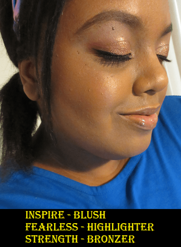
I already talked about how much I liked the shades Poppy and Snapdragon in Part 1 to this post, so I surprised myself that I actually bought two more. I always suspected Foxglove could work for me and Peony looked borderline like I might be able to pull it off during winter or early spring when I’m usually at my lightest. I was shocked that they ended up looking as nice as they do! Those two shades were clearly not intended for someone with dark skin but they have enough pigmentation to make it show and not look ashy!


Peony is cool toned, but this kind of pink still somehow looks nice on me. After about 3-4 layers, it doesn’t show any stronger on my skin tone, but I like how it looks with even just 2-3 layers. Foxglove doesn’t show as strongly in the photo above, but that’s because it’s a more toned down dusty rose type of pink and I prefer not to build it up beyond two layers. While I would say I consider a very pigmented blush to show on me in 1-2 layers, the fact that these are so pale in the pans and swatches, but still show this much on me speaks volumes.
Of the four blushes, I think Foxglove is my new favorite.
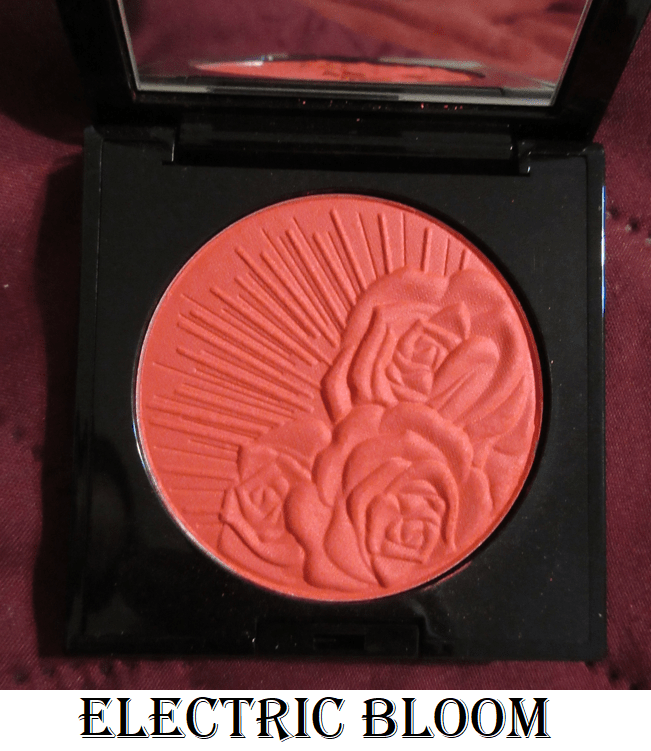
Pat Mcgrath Labs Skin Fetish: Divine Powder Blush in Electric Bloom
I purchased this perhaps a month after the initial blush launch. I wanted so many shades from the collection that I told myself I was only allowed to have one more, so I went ahead and made it this vibrant coral shade. It’s the kind of color that is debatable whether I can pull it off or not, but always calls to me. If I had just waited a little longer, I would have seen that it was listed as a dupe for Colourpop’s Aloha Honey blush shade on Temptalia’s blog and therefore I didn’t need the almost identical blush color. To be fair, I haven’t used the Colourpop blush enough to say how it compares in terms of quality because I always reach for Electric Bloom over Aloha Honey.
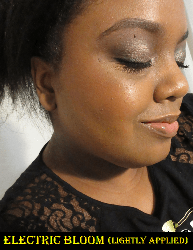

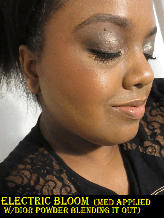
Paradise Venus is still my favorite shade of the three I have from Pat Mcgrath.
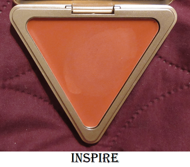
LYS Beauty High Standard Clean Cream Blush in Inspire
I hope anyone who reads my blog regularly isn’t tired of me going on about how much I love this cream blush formula, but I feel it deserves to be gushed over. I always had plans to eventually get this beautiful coral-orange shade, but I wanted to wait until I made more progress in my overall cream blush collection. However, I had some store credit built up via the Ambassador program with the brand, so I decided to go ahead and cross that off my wish list! Half of this blush was paid for via credit and the other half was paid for out of my own pocket. For full details about my affiliation with LYS, please see my About Me page and scroll to the near bottom.
Inspire performs just as well as the others. I cannot decide which of the three is my favorite because I keep changing my mind every time I use a different shade!
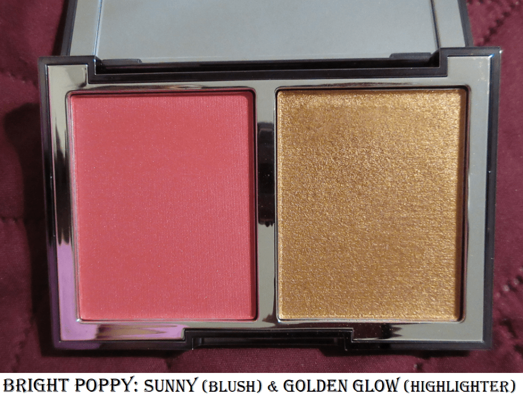
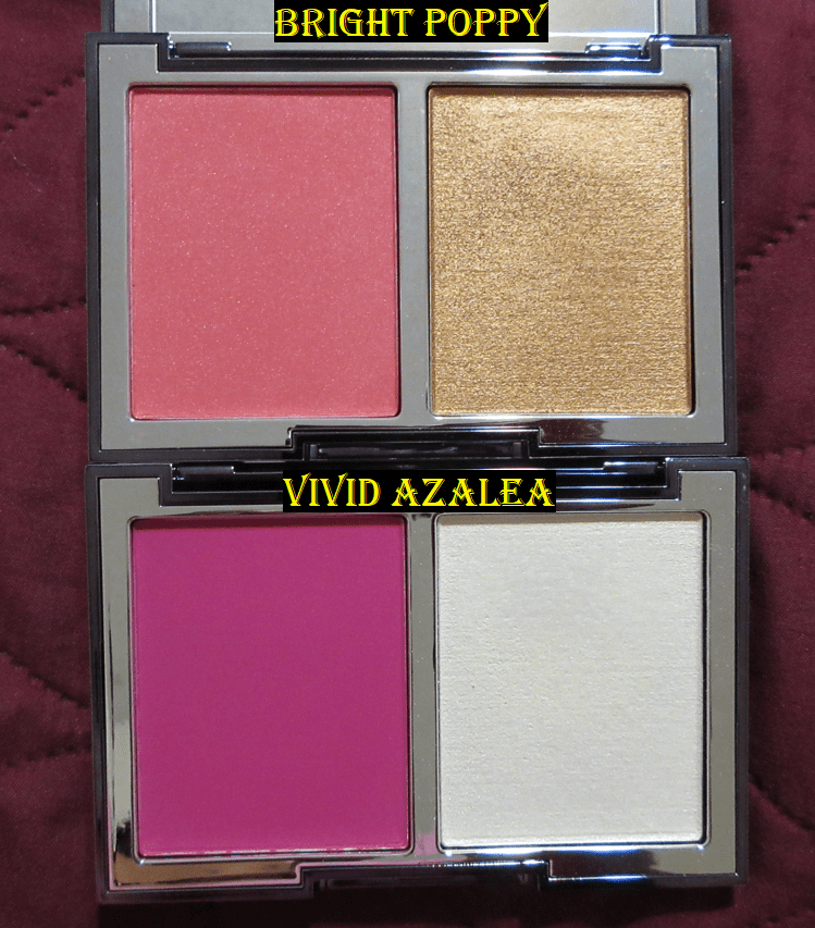
Wayne Goss The Weightless Veil Blush Palette in Bright Poppy (Sunny and Golden Glow)
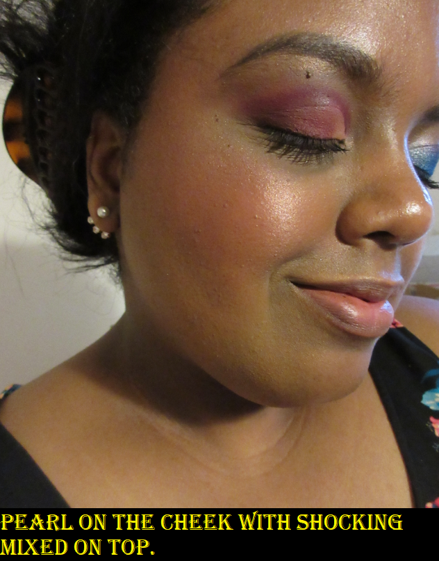
Unlike the other blushes I’ve listed, which are among my top favorites, I decided to try Bright Poppy because the colors are better suited for me than Vivid Azalea and I wanted an answer as to whether the blush shade would be insanely pigmented in this duo too. Sunny is not quite at the unbelievable pigment level of Shocking, but if I tap once into the blush with my Smashbox Buildable Cheek Brush, it’s enough to thoroughly cover my cheek. An additional half layer is the maximum amount I would want to use. Otherwise, my option would be to tone it back down using a finishing powder on top.
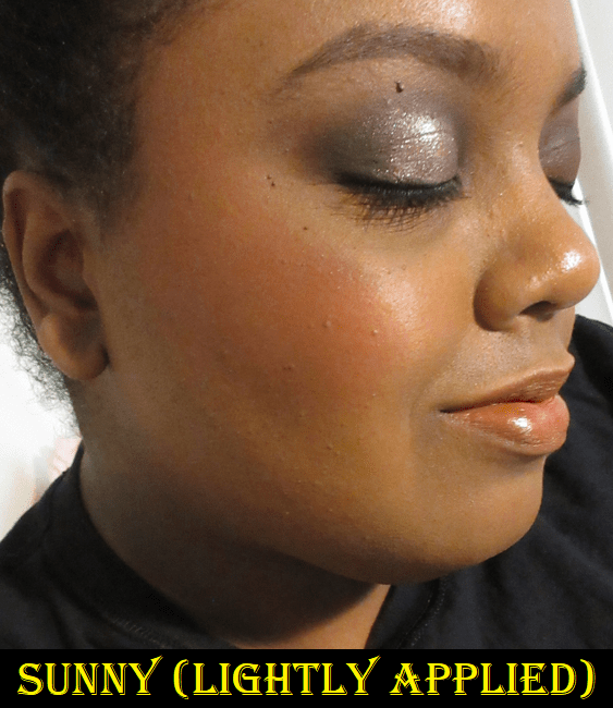
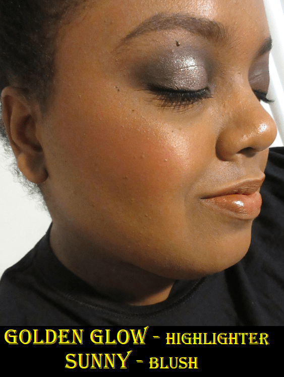
Sunny is pretty on the cheeks. Golden Glow is a nice highlighter formula that is very complimentary to my skin tone. I prefer to apply my blush and highlighter separately, but Wayne suggests that anyone who likes shimmery blush formulas could apply the highlighter to the entire cheek and then blend the blush on top of it. This technique worked for me with Vivid Azalea because the combination of the two shades turned the blush into a lighter color. I tried this with Bright Poppy and did not like it at all because the shimmer color and blush color don’t match. This means the particles in the highlighter stand out a lot more and I don’t like how contrasting it is. Whether I applied the highlighter to the bottom or the highlighter on top, the end result was the same.
Colourpop Super Shock Cheek in Matte, Satin, and Pearlized finishes.
Colourpop’s Super Shock Cheek line includes both blushes and highlighters, so I decided as a bonus to review all the ones I own here since I’m a huge fan of them. They have the benefit of looking and applying to the skin like creams, but without feeling heavy, sticky, or greasy on the skin like some cream blushes on the market can do.


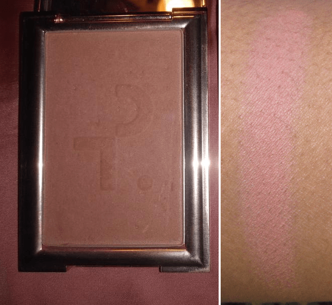
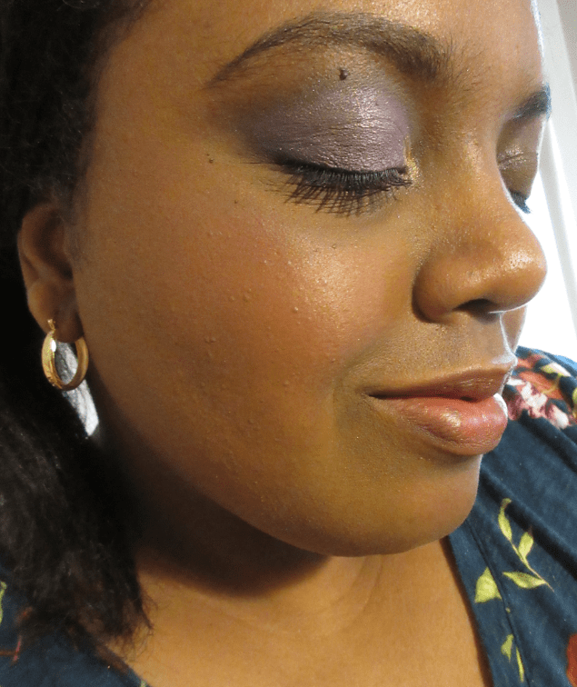
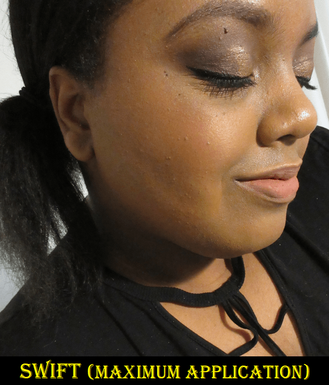
In the Matte finish we have Over Dramatic, a “mid-tone pinky nude,” and Swift, a “rich deep warm brown” shade. Both are very close in color and practically look the same on my cheeks. Calling Swift a deep and rich shade is quite the exaggeration on Colourpop’s part. I have to build them up a lot in order for them to show in photos, but I bought these specific colors so I could have some brown leaning blushes, which aren’t as prevalent in my collection. Swift is from the Make It Black Collection when the brand partnered with Pull Up For Change. It’s a bit stiffer in consistency than Over Dramatic and because Swift is more of an orange-brown than pink-brown, it blends in with my skin a lot more. It’s on the borderline of blending in too much, considering it’s such a nude shade for me already. For that reason, I do prefer Over Dramatic because of my personal preferences.

I just have one Satin finish Super Shock Cheek and it’s in the shade Georgette which is described as a “bright apricot with a warm sheen.”

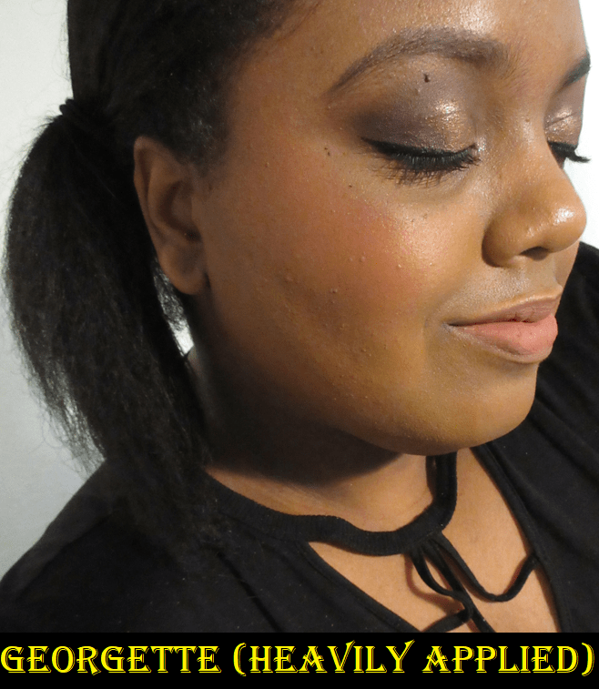
Georgette has the right amount of brightness that isn’t obnoxious. Also, I’ve always struggled to find orange tones of blush that look flattering on my skin tone. I tend to like the ones that lean more red or pink. This apricot shade is more on the yellow side, but I like it. So now, I think it’s just true oranges at the 50/50 split between yellow and red that I don’t enjoy as much. My quest to figure it out continues!
I have five shades in the Pearlized finish, starting with the two that came in the 2020 Lunar New Year set called the Lucky You Super Shock Cheek Duo.
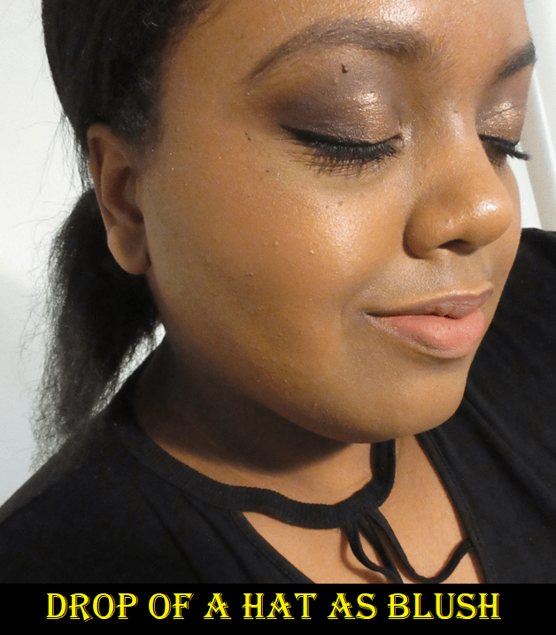

I kept these unused for so long because of the pretty pattern in the Super Shocks. When I finally used them, I was a little disappointed that Drop of a Hat was too sheer to work as a blush for me. It’s better if I consider it a pink highlighter or blush topper. Goody Two Shu is pretty but a little sparkly, so I decided it wasn’t worth continuing to ruin the embossing. I just keep these as collector items now.
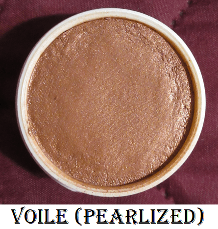

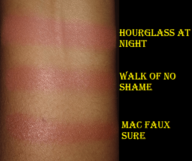
Voile is another Super Shock I stopped using. I kept trying to use it because the shade reminded me of Benefit’s Kiss of Rose and Charlotte Tilbury’s Walk of No Shame, which are both shimmery blushes I find to be beautiful. However, the shimmer level of Voile in person and the way the “copper sheen” sparkles on my cheeks is too much for me. It’s far more sparkly in person than it appears in the photo. I’ve realized that I prefer Colourpop’s matte and satin finishes for the blush shades. The only pearlized blush I enjoy is Cheerio and that’s because it seems to be a pearl-satin hybrid! Cheerio is a repromoted shade, which I bought from the Wine & Only Collection. The back label on my blush has “Pearlized” printed on it, but on Colourpop’s website it’s listed as a satin and it doesn’t have as many sparkles as the others in that formula. Or, perhaps I can’t see them if most of the sparkles match the color of the blush. What I see are some silver flecks.


I have to use a very small amount of Cheerio because it’s a deep shade. It’s easy to overapply and my specific blush arrived partly shriveled (which I pressed back into the pan). So, it’s a little drier than it should be and not as easy to spread evenly on my cheeks, but I can still make it work. Colourpop did send me a replacement, but I realized I preferred the cream blush from Natasha Denona’s Bloom Cheek palette a lot more, and that color is similar to this one, so I gave the replacement to my sister.
Lastly, we have my absolute favorite Colourpop Super Shock Cheek. It’s a “peachy gold” shade that I use for highlighting called Parasol.


It looks extra sparkly in the photo above because I used it over the Georgette blush which also has a sheen, but this highlighter is very smooth and wet looking. It blends into my skin very well and is the kind of tone I like for highlighting. I’ve used it quite a bit, even though it doesn’t look like it in the photo from the top down angle, but it actually has a dip in the center.
This concludes the post! I tried to keep it short since all of these (minus Colourpop) have been reviewed on this blog before.
Are there any blushes you have been loving at the moment? The blush and highlighter categories are the reason I haven’t been able to post Best of 2020 and Best of 2021 posts. I was constantly trying new products, loving the majority of them, and not able to use what I consider my favorites consistently enough to rank some over others. This year, I’m committed to getting a lot more use out of my older products. There are still plenty I haven’t even reviewed yet! I hope you’ll return to see the progress on that! Thank you for reading!
-Lili ❤


