Blushes So Good I Needed Another…part 2

This is an update to my post from September 2020 where I’ll be showing my newest shades of blushes I’ve already reviewed before and loved so much that I wasn’t content with having just one shade. I needed more!

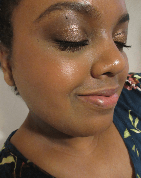
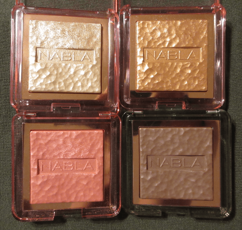
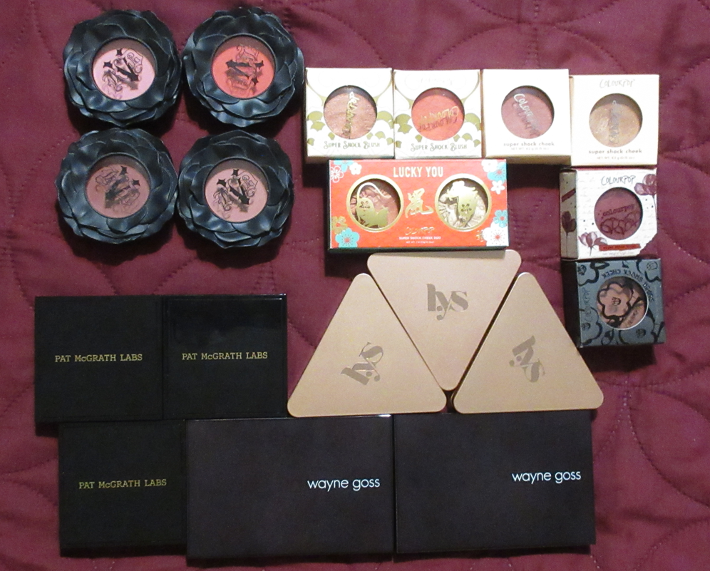
KVD Everlasting Blush in Peony and Foxglove

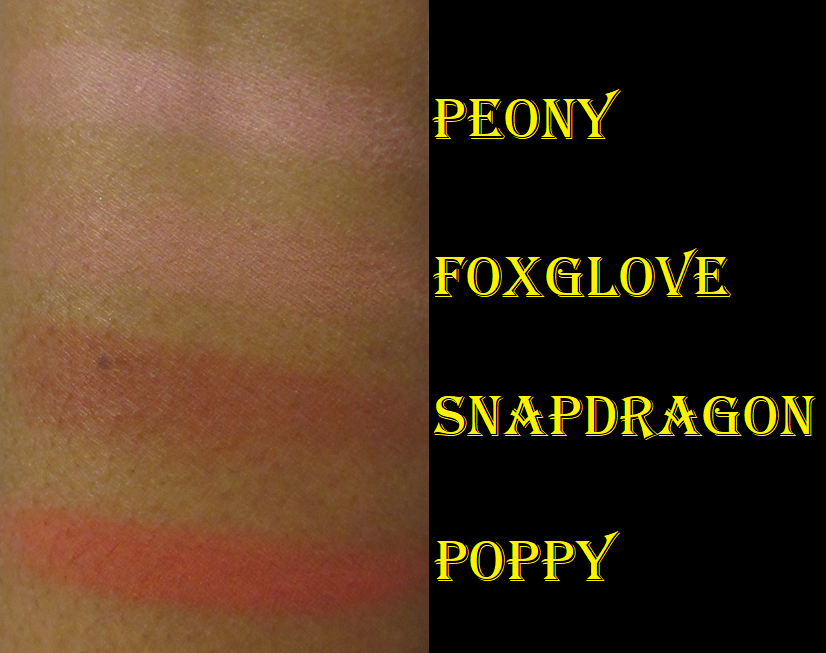
I already talked about how much I liked the shades Poppy and Snapdragon in Part 1 to this post, so I surprised myself that I actually bought two more. I always suspected Foxglove could work for me and Peony looked borderline like I might be able to pull it off during winter or early spring when I’m usually at my lightest. I was shocked that they ended up looking as nice as they do! Those two shades were clearly not intended for someone with dark skin but they have enough pigmentation to make it show and not look ashy!

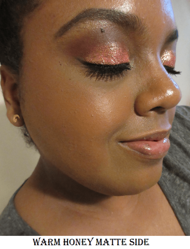
Peony is cool toned, but this kind of pink still somehow looks nice on me. After about 3-4 layers, it doesn’t show any stronger on my skin tone, but I like how it looks with even just 2-3 layers. Foxglove doesn’t show as strongly in the photo above, but that’s because it’s a more toned down dusty rose type of pink and I prefer not to build it up beyond two layers. While I would say I consider a very pigmented blush to show on me in 1-2 layers, the fact that these are so pale in the pans and swatches, but still show this much on me speaks volumes.

Of the four blushes, I think Foxglove is my new favorite.

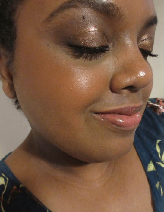
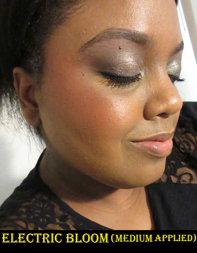
Pat Mcgrath Labs Skin Fetish: Divine Powder Blush in Electric Bloom

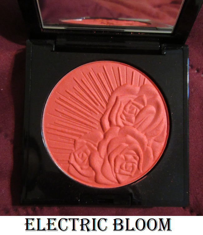
I purchased this perhaps a month after the initial blush launch. I wanted so many shades from the collection that I told myself I was only allowed to have one more, so I went ahead and made it this vibrant coral shade. It’s the kind of color that is debatable whether I can pull it off or not, but always calls to me. If I had just waited a little longer, I would have seen that it was listed as a dupe for Colourpop’s Aloha Honey blush shade on Temptalia’s blog and therefore I didn’t need the almost identical blush color. To be fair, I haven’t used the Colourpop blush enough to say how it compares in terms of quality because I always reach for Electric Bloom over Aloha Honey.

Paradise Venus is still my favorite shade of the three I have from Pat Mcgrath.

LYS Beauty High Standard Clean Cream Blush in Inspire

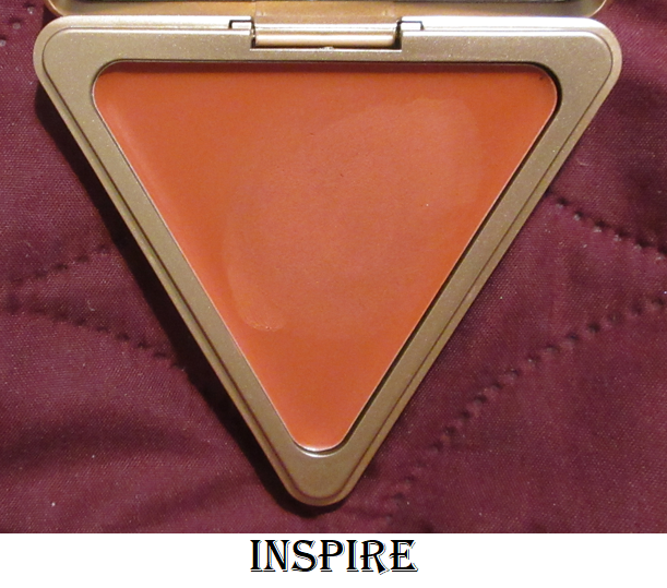
I hope anyone who reads my blog regularly isn’t tired of me going on about how much I love this cream blush formula, but I feel it deserves to be gushed over. I always had plans to eventually get this beautiful coral-orange shade, but I wanted to wait until I made more progress in my overall cream blush collection. However, I had some store credit built up via the Ambassador program with the brand, so I decided to go ahead and cross that off my wish list! Half of this blush was paid for via credit and the other half was paid for out of my own pocket. For full details about my affiliation with LYS, please see my About Me page and scroll to the near bottom.

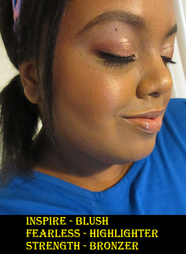
Inspire performs just as well as the others. I cannot decide which of the three is my favorite because I keep changing my mind every time I use a different shade!

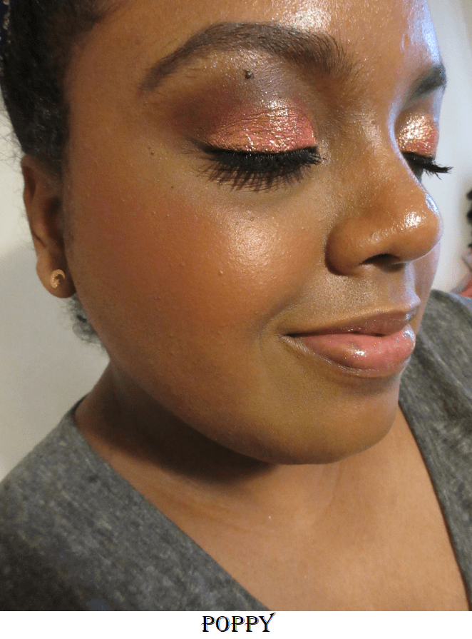
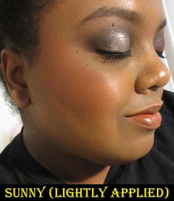
Wayne Goss The Weightless Veil Blush Palette in Bright Poppy (Sunny and Golden Glow)

Unlike the other blushes I’ve listed, which are among my top favorites, I decided to try Bright Poppy because the colors are better suited for me than Vivid Azalea and I wanted an answer as to whether the blush shade would be insanely pigmented in this duo too. Sunny is not quite at the unbelievable pigment level of Shocking, but if I tap once into the blush with my Smashbox Buildable Cheek Brush, it’s enough to thoroughly cover my cheek. An additional half layer is the maximum amount I would want to use. Otherwise, my option would be to tone it back down using a finishing powder on top.

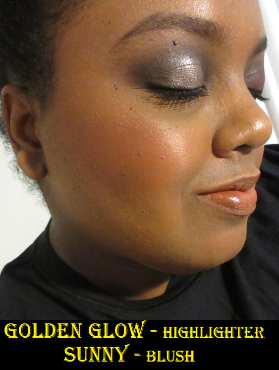
Sunny is pretty on the cheeks. Golden Glow is a nice highlighter formula that is very complimentary to my skin tone. I prefer to apply my blush and highlighter separately, but Wayne suggests that anyone who likes shimmery blush formulas could apply the highlighter to the entire cheek and then blend the blush on top of it. This technique worked for me with Vivid Azalea because the combination of the two shades turned the blush into a lighter color. I tried this with Bright Poppy and did not like it at all because the shimmer color and blush color don’t match. This means the particles in the highlighter stand out a lot more and I don’t like how contrasting it is. Whether I applied the highlighter to the bottom or the highlighter on top, the end result was the same.

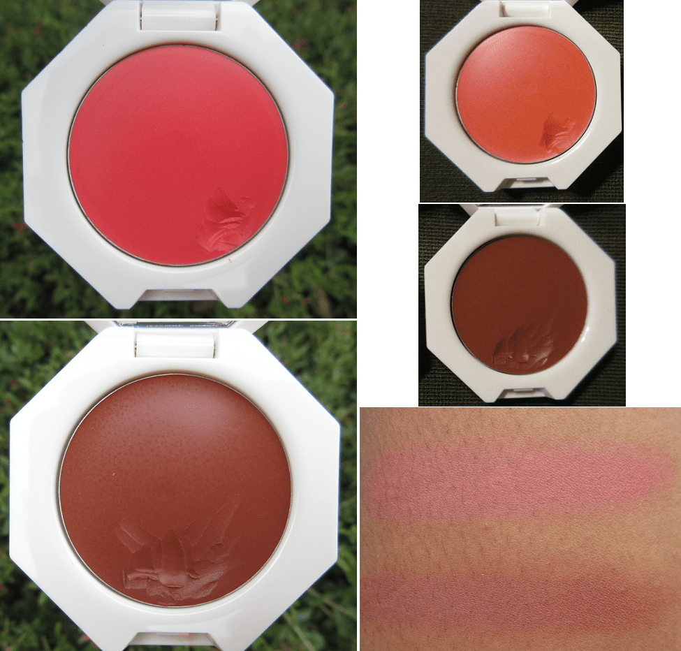
Colourpop Super Shock Cheek in Matte, Satin, and Pearlized finishes.

Colourpop’s Super Shock Cheek line includes both blushes and highlighters, so I decided as a bonus to review all the ones I own here since I’m a huge fan of them. They have the benefit of looking and applying to the skin like creams, but without feeling heavy, sticky, or greasy on the skin like some cream blushes on the market can do.

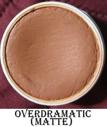
In the Matte finish we have Over Dramatic, a “mid-tone pinky nude,” and Swift, a “rich deep warm brown” shade. Both are very close in color and practically look the same on my cheeks. Calling Swift a deep and rich shade is quite the exaggeration on Colourpop’s part. I have to build them up a lot in order for them to show in photos, but I bought these specific colors so I could have some brown leaning blushes, which aren’t as prevalent in my collection. Swift is from the Make It Black Collection when the brand partnered with Pull Up For Change. It’s a bit stiffer in consistency than Over Dramatic and because Swift is more of an orange-brown than pink-brown, it blends in with my skin a lot more. It’s on the borderline of blending in too much, considering it’s such a nude shade for me already. For that reason, I do prefer Over Dramatic because of my personal preferences.

I just have one Satin finish Super Shock Cheek and it’s in the shade Georgette which is described as a “bright apricot with a warm sheen.”

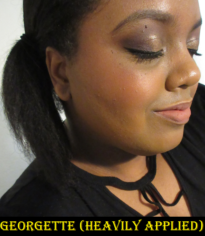
Georgette has the right amount of brightness that isn’t obnoxious. Also, I’ve always struggled to find orange tones of blush that look flattering on my skin tone. I tend to like the ones that lean more red or pink. This apricot shade is more on the yellow side, but I like it. So now, I think it’s just true oranges at the 50/50 split between yellow and red that I don’t enjoy as much. My quest to figure it out continues!

I have five shades in the Pearlized finish, starting with the two that came in the 2020 Lunar New Year set called the Lucky You Super Shock Cheek Duo.

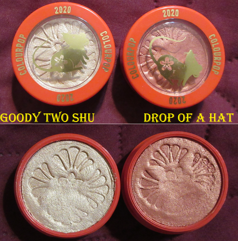
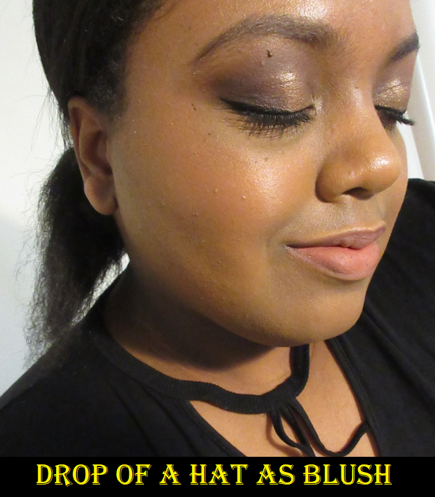
I kept these unused for so long because of the pretty pattern in the Super Shocks. When I finally used them, I was a little disappointed that Drop of a Hat was too sheer to work as a blush for me. It’s better if I consider it a pink highlighter or blush topper. Goody Two Shu is pretty but a little sparkly, so I decided it wasn’t worth continuing to ruin the embossing. I just keep these as collector items now.

Voile is another Super Shock I stopped using. I kept trying to use it because the shade reminded me of Benefit’s Kiss of Rose and Charlotte Tilbury’s Walk of No Shame, which are both shimmery blushes I find to be beautiful. However, the shimmer level of Voile in person and the way the “copper sheen” sparkles on my cheeks is too much for me. It’s far more sparkly in person than it appears in the photo. I’ve realized that I prefer Colourpop’s matte and satin finishes for the blush shades. The only pearlized blush I enjoy is Cheerio and that’s because it seems to be a pearl-satin hybrid! Cheerio is a repromoted shade, which I bought from the Wine & Only Collection. The back label on my blush has “Pearlized” printed on it, but on Colourpop’s website it’s listed as a satin and it doesn’t have as many sparkles as the others in that formula. Or, perhaps I can’t see them if most of the sparkles match the color of the blush. What I see are some silver flecks.

I have to use a very small amount of Cheerio because it’s a deep shade. It’s easy to overapply and my specific blush arrived partly shriveled (which I pressed back into the pan). So, it’s a little drier than it should be and not as easy to spread evenly on my cheeks, but I can still make it work. Colourpop did send me a replacement, but I realized I preferred the cream blush from Natasha Denona’s Bloom Cheek palette a lot more, and that color is similar to this one, so I gave the replacement to my sister.

Lastly, we have my absolute favorite Colourpop Super Shock Cheek. It’s a “peachy gold” shade that I use for highlighting called Parasol.

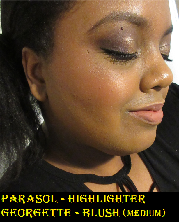
It looks extra sparkly in the photo above because I used it over the Georgette blush which also has a sheen, but this highlighter is very smooth and wet looking. It blends into my skin very well and is the kind of tone I like for highlighting. I’ve used it quite a bit, even though it doesn’t look like it in the photo from the top down angle, but it actually has a dip in the center.

This concludes the post! I tried to keep it short since all of these (minus Colourpop) have been reviewed on this blog before.

Are there any blushes you have been loving at the moment? The blush and highlighter categories are the reason I haven’t been able to post Best of 2020 and Best of 2021 posts. I was constantly trying new products, loving the majority of them, and not able to use what I consider my favorites consistently enough to rank some over others. This year, I’m committed to getting a lot more use out of my older products. There are still plenty I haven’t even reviewed yet! I hope you’ll return to see the progress on that! Thank you for reading!

-Lili

Blushes So Good I Needed Another

2020 has been the year of blushes for me. I’m not sure why, but my blush obsession has surpassed even my eyeshadow obsession! That being said, I always buy one blush to start with from a brand, even if they have multiple colors I want. If I end up loving the formula, I still tend to stick with that single shade (or buy a better-suited shade to use instead). However, these are the exceptions to that rule; the blushes I loved so much that I felt compelled to buy another!

I will be excluding MAC, NYX, and Rituel de Fille from this list, as I’ve discussed them in posts before and we know I didn’t stop at just two with those brands!

HOURGLASS AMBIENT LIGHTING BLUSHES

Swatches in different lighting

These are the blushes that inspired this post! Hourglass is notorious for having a stunning powder formula but making shades suited primarily for pale to medium skin tones. Diffused Heat was the first one I bought. It takes a lot of building up to show on my cheeks but despite how many layers I have to add, it still doesn’t look powdery! The poppy color gives a healthy youthful flush that I love. It imparts a subtle glow without looking shimmery or glittery due to the finely milled powder Hourglass is famous for.

A heavy application of Diffused Heat on the cheeks

Since their initial blush launch in 2014, medium tone pinks have been the darkest shades Hourglass has been willing to make. Besides being uninclusive in their powder range, the other issue with making multiple medium tone blushes is that they end up looking too similar on the cheeks. Below is an example of their six darkest blushes using Temptalia’s swatch comparison feature. It should be noted that Vibrant Flush and Mood Flush are only available in limited edition quads/palettes with other products too light for my skin tone. So, to even have access to these blushes, I would’ve had to pay $60-$80. Vivid Flush was the limited edition 2019 Lunar New Year shade that was sold individually but is no longer available.

Photo Credit: Temptalia

After buying my first Hourglass blush, I only had to wait six months for a shade different enough from Diffused Heat to be worth purchasing.
At Night is described as a brick red. The dark maroon marbling gives the impression that it will be a deep shade, but when mixed with the lighter base powder, it turns it into a warm medium to medium-dark pink. I love this shade, perhaps even more than Diffused Heat because I don’t have to work as hard to get the color to show.

A heavy application of At Night on the cheeks
At Night Again

To see how the original Hourglass blushes look on someone with a complexion closer to mine, I recommend this video by The Fancy Face.

10/11/2020 Update: I purchased Radiant Magenta thinking that if Diffused Heat worked on me then this shade would as well. I was mistaken. Despite the gold shimmer, this shade appears too cool-toned on my cheeks and is too light for me. I don’t like the way it looks, so that was unfortunately a bad purchase. At least I got it at a reduced price.

This brand has a decent range of complexion products, so it’s very strange to me that for the past six years I’ve seen customers implore Hourglass to make deeper blushes, bronzers, face powders, and highlighters. The demand is so high, yet Hourglass ignores it. After the release of At Night, I was hopeful that the brand would finally fulfill the barrage of requests for a light version and dark version of their holiday face palettes this year. Instead, they repromoted old products and paired them with “new” powders that look like the old ones, just half a shade darker. I give most brands who promised to be more inclusive in the future some leeway because of COVID-19. However, Hourglass has had over five years to make it happen. It’s disappointing because I like the brand. I like their products. I wish more people were able to use them.

FENTY CHEEKS OUT FREESTYLE CREAM BLUSHES

The left column shows how they look in natural lighting.

My Fenty blushes are like deeper cream versions of my Hourglass blushes! I bought Strawberry Drip during the initial product launch and loved it, then immediately purchased two additional blushes. I don’t like to return things, but Daiquiri Dip was too bold of a red shade. I’ve kept plenty of items I don’t care for, but if there’s something I know I will literally never use again, that’s when I will make a return. Thankfully, I loved Rosé Latte and kept that as my second shade. There are several more colors that appeal to me from the line, but cream products don’t last as long, so I stopped at these two.

Strawberry Drip is described as a “soft coral pink” but is a bright intimidating looking shade to me, so I was surprised how much I liked this one!

Rosé Latte is described as a “soft bronzed nude,” which doesn’t look very special in the pan. On the skin, you can see the subtle red tone that gives this shade it’s oomph.

Because the formula isn’t as pigmented, but still buildable, a wider range of people can use these shades. Though they can be built up, I prefer to wear them on natural makeup days. These mostly set, and although they aren’t transfer-proof, I can still rub my finger over my cheek without it turning patchy. It also doesn’t disturb my foundation using the two methods I have tried: scooping out some product onto the back of my hand and warming it up with my finger before applying with my fingers or a sponge.

This was taken earlier in the year. I’m wearing Rose Latte towards the back of the cheek and Strawberry Drip on the apples of the cheek towards the front. This is my preferred combo.

KVD VEGAN BEAUTY EVERLASTING BLUSH

My goodness, I haven’t discussed any KVD products since the Mi Vida Loca Remix Palette from 2015! Controversies aside, I wasn’t interested in anything from “Kindness Vegan Discovery (Doing Good) Vegan Beauty” until the blush release in January 2020.
I have to address the name change. Did they really need to put Vegan in there twice?

This is an actual banner used in the past by KVD Vegan Beauty. I just added the Meme-ish caption.

I bought Snapdragon at full price shortly after the product launch. At this time, everything else from KVD was going on sale, but I couldn’t resist that rose packaging. I intended to get another blush when I thought it would inevitably go on sale too, but as of September 21st, it still hasn’t. Excluding the new eye primer that was released a month or so ago, the blush is the one item that hasn’t gone on sale yet. What I also find interesting is that these blushes are the only items in the brand that isn’t available at Ulta. Even the new primer is available there.

*DEC 26th, 2020 UPDATE: The blushes are finally available at Ulta!

*MARCH 2021 UPDATE: KVD now stands for Kara Veritas Decors (latin for Value, Truth, and Beauty) in the latest “brand reinvention.” They are to be known as KVD Tattoo Inspired Vegan Beauty.

As you may know, LVMH (Louis Vuitton Moët Hennessy) is the parent brand of the beauty retailer Sephora. They also own Kendo Holdings, which owns KVD Vegan Beauty. It makes sense that KVD products would be exclusively sold at Sephora and their own website. Ulta Beauty, Sephora’s competitor, now carries KVD products. This is highly unusual. The only other LMVH brand allowed to be sold at Ulta, to my knowledge, is Benefit Cosmetics. Many speculate that this addition to Ulta is because KVD is struggling with their sales and they hope working with Ulta will change that. Because of Sephora’s marketing structure and trying to maintain a high pricepoint as to not devalue their products, things only go up to a certain percentage on sale before they offload everything else to TJMaxx (where makeup goes to die). Because Ulta carries drugstore items, as well as prestige, they can offer products at prices Sephora is unwilling to sell for. So, to have the blushes kept from Ulta leads me to believe that it’s the top-selling KVD item and probably the only real money maker the brand currently has. They’ve revealed a new holiday palette that I think is beautiful, so perhaps they can turn things around. Anyway, back to the blushes.

KVD was always known for making a statement, so I expected these blushes to be pigmented, but dang! I have to use a light hand with Snapdragon, but especially with Poppy. Poppy creates a lot of kick-up in the pan. The Everlasting Blush formula is very smooth and of good quality. It just comes down to deciding which shade one prefers.

I included comparisons to Lolita because it is so similar to Snapdragon. Lolita eyeshadow/blush was released in 2017. I bought it back then, returned it when I discovered a long hair/fiber embedded in the powder, and then didn’t repurchase it until 2020. The difference between Lolita and Snapdragon is that Snapdragon is slightly darker and redder. Snapdragon is also a smoother powder. Even though I bought this is 2020, Sephora has had issues in the past of keeping products in the sale section for much longer than they should. I remember when Sephora added some KVD eyeshadow trios I hadn’t seen before. The pigmentation was awful, so I did my research and found out that not only were the trios supposed to be discontinued, they were originally released 4 years prior. I have no way of knowing if the Lolita shade I have is from a new batch or the first restock after it became permanent. KVD’s vegan eyeshadow formula tends to worsen in performance quicker than other brands of eyeshadows I have, and since Lolita is technically also considered an eyeshadow, it’s possible that it doesn’t feel as soft in comparison or as easy to blend because of its potential age. However, my hypothesis is just that the Everlasting blushes have a better formula.

MELT DIGITAL DUST DUO BLUSHES

Melt Cosmetics recently released their Royal Blush collection. There are three duos in total. I started with buying Queen Bee with the intent of using both shades strictly as highlighters. MAC taught me how to love brown blushes, but the left side called Queen is a warm bronze that doesn’t have enough depth or richness of brown I’d consider flattering as a blush. It’s perfect as a highlighter though. The same can be said of the lighter honey gold shade on the right side called Bee. It reminds me of the Topaz shade from Becca Cosmetics, and although yellow-toned blushes are very popular this year, I don’t like the way it looks on me as a blush alone. I prefer it as a highlighter or blush topper.

After seeing some swatches online, I thought Buzz Kill might still work for me despite looking light in the pan. Though it does look darker and more pigmented in swatches, on my cheeks I get much more of the golden shimmer than the pink pigment, making this not really a blush for me either. Here are swatch comparisons to other light pink blushes with gold shimmer I have in my collection.

Different lighting and over Nars Sheer Glow Foundation in Macao.


The Kill side has bigger glitter specks than any of the three other shades and would only work as a highlighter for me. I wouldn’t even try to use it as a blush topper.

The shade I didn’t buy is called Raw Honey. The Raw side is a mauve bronze. The Honey side is a pink beige. I didn’t think those would work as blush or highlights for me, so I skipped it.

The first digital dust formula I heard about from Melt were highlighters, and these all have that highlighter quality to them. I wonder if Melt marketed these as blushes because the “Glass Skin” trend made products that use glitter/shimmer for shine instead of creating a wet sheen, traditional highlighters, and blinding highlighters drop in popularity. However, blushes have remained popular, if not risen in popularity. I don’t think this is an instance of trying to release unconventional blush shades to be different. Although I can see this being trendy on Instagram, and the packaging/imprint/design is aesthetically pleasing, I don’t know how many people would consider these staple blushes in their collection. I do like the Queen Bee duo, though, as highlighters and eyeshadows. I will continue to use it. Buzz Kill is an example of loving a blush so much I had to get another…but the other didn’t work for me.

COVER FX MONOCHROMATIC BLUSH DUOS

These blushes were initially released in April 2019, but I didn’t buy my first one until that August during Ulta’s 21 Days of Beauty sale when it was half off. I bought Spiced Cinnamon and loved it, but didn’t get Warm Honey until this year’s 21 days of beauty at half price again.

I can see why these duos were so hyped last year! The mattes aren’t quite as smooth as KVD’s everlasting blushes, but they are less powdery and very pigmented! The shimmers in the duo remind me of a less glittery version of Melt’s Digital Dust blush formula.
For Spiced Cinnamon, I typically use the matte side alone or mix the two halves together. As I mentioned before, it is very pigmented and just two swirls of my brush in the powder are enough for me.

For Warm Honey, although the matte half is pigmented, the shade is closer to my skin tone so it takes a few more layers of building up to get it to show on me. It’s great for days when I want a more neutral looking flush of color. The shimmer side doesn’t have enough pigmentation for me to use on its own and I don’t like the way it looks as a highlighter.

I love the mattes from both duos. The shimmer sides, although nice quality, are not in my preferred shades. The mattes are comparable to MAC, but MAC blushes range from $25-$30. If you like both shades in Cover FX’s duos, then the $39 price is more reasonable since you’re getting two products in one. If you only like one side, I recommend waiting for a sale. I should note that I’m unsure if these duos are being discontinued. Sephora had them on sale for $19 before removing them from their site. It’s possible the brand as a whole is being removed from Sephora (since all Cover FX items have been on sale there for a while) and that these blushes will continue being available at Ulta.

NABLA SKIN GLAZING AND SKIN BRONZING

I mentioned in my 2019 favorites how much I loved the Nabla Skin Glazing Highlighters. I bought Amnesia and followed that up with Lucent Jungle, which is a bit too dark for me, but I kept it anyway. In 2020, Nabla released two blushes which were still given the same Skin Glazing name and packaging. The shades Adults Only and Truth were part of their original launch, but the blushes released this year are called Lola and Independence. I purchased Lola, which Nabla refers to as a “watermelon with amber and peachy reflects” shade of blush. It looked and sounded so beautiful that I had to get it. It’s on the lighter side of blushes, but it still works for me. I really like the way it looks and am happy I bought it. As with the other Nabla products in this formula, these are harder pressed than regular powders. If you like using natural brushes like I do, then I suggest a goat hair brush, although my squirrel-goat mix HS-2 Hana Sakura Blush Brush does the job well. I’m not sure if this will cause some long term damage to the bristles though, so just be careful!

My curiosity got the better of me, and even though I don’t need more bronzers, I picked up the darkest shade called Profile. The packaging on the Skin Bronzing is a slightly different color to distinguish from the two product types. The product swatches of Profile looked so dark that I contemplated getting the lighter shade called Revenge. However, in-person, Profile was nowhere near as dark as I expected. It works for me but I’m not sure how well it would work on someone even a few shades darker. Since this is a blush post, I’m saving a more in-depth review of the bronzer for the bronzer post I have scheduled next week.

Picture using Nabla’s Profile Bronzer, Lola Blush, and Amnesia Highlighter.

This concludes the post! I was debating adding the monochromatic Patrick Ta blush and the Headliner Blush to this review, but they didn’t fit the theme. Although I have two Patrick Ta blushes, I only stuck to one shade from each formula. So, I may save those for the future in a dedicated post or another themed post. I’ve been so inspired this Summer and Fall that I have plenty of reviews planned. It’s just a matter of having the time for this hobby of mine!

Thank you for reading!

-Lili