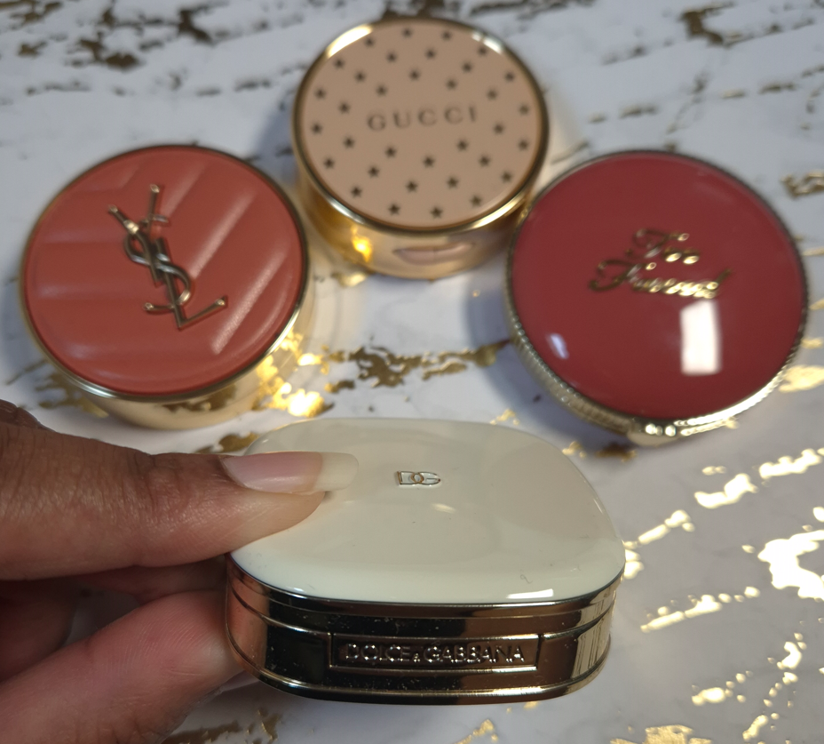
I wasn’t always a fan of Charlotte Tilbury makeup. In fact, I didn’t like the first two items I got from them (the Bar of Gold Highlighter and Fallen Angel Eyeshadow Palette). So, it took a long time before I was willing to buy additional products from them.
In the year that I became interested in the brand again, their top five makeup products were the Airbrush Flawless Filter Powders, the Beauty Wands, Matte Revolution Lipsticks, Cheek to Chic Blushes, and still that Bar of Gold Highlighter. Between 2016 until now, I have tried all of these iconic products except the wands. I have long been tempted to satisfy my curiosity, but the shade ranges were a lot more limited in the past, plus I rarely use liquid forms of blushes, highlighters, etc.
The reason I own them now is because two of them were part of a bundle deal last summer and the other two were free gifts with purchase!
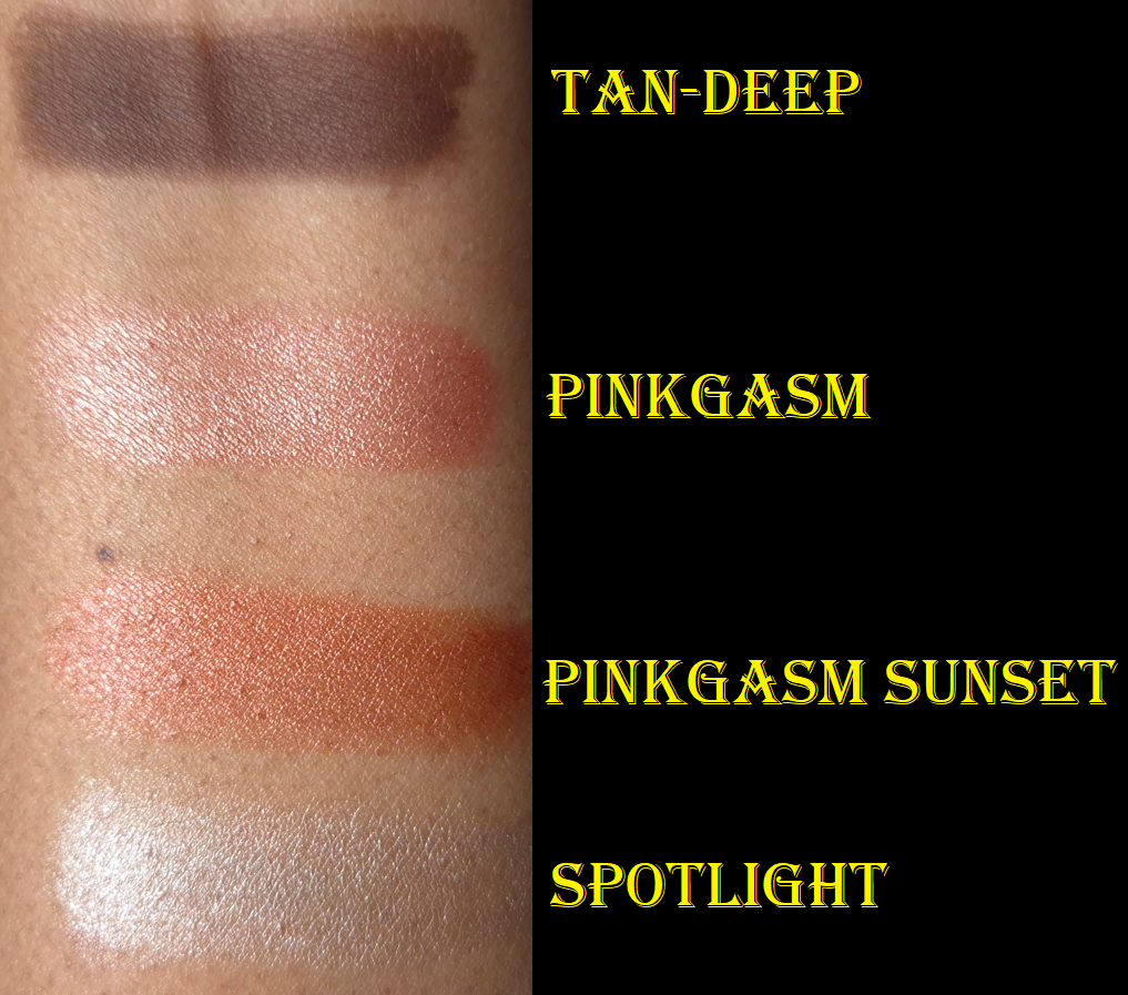
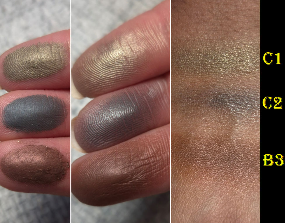
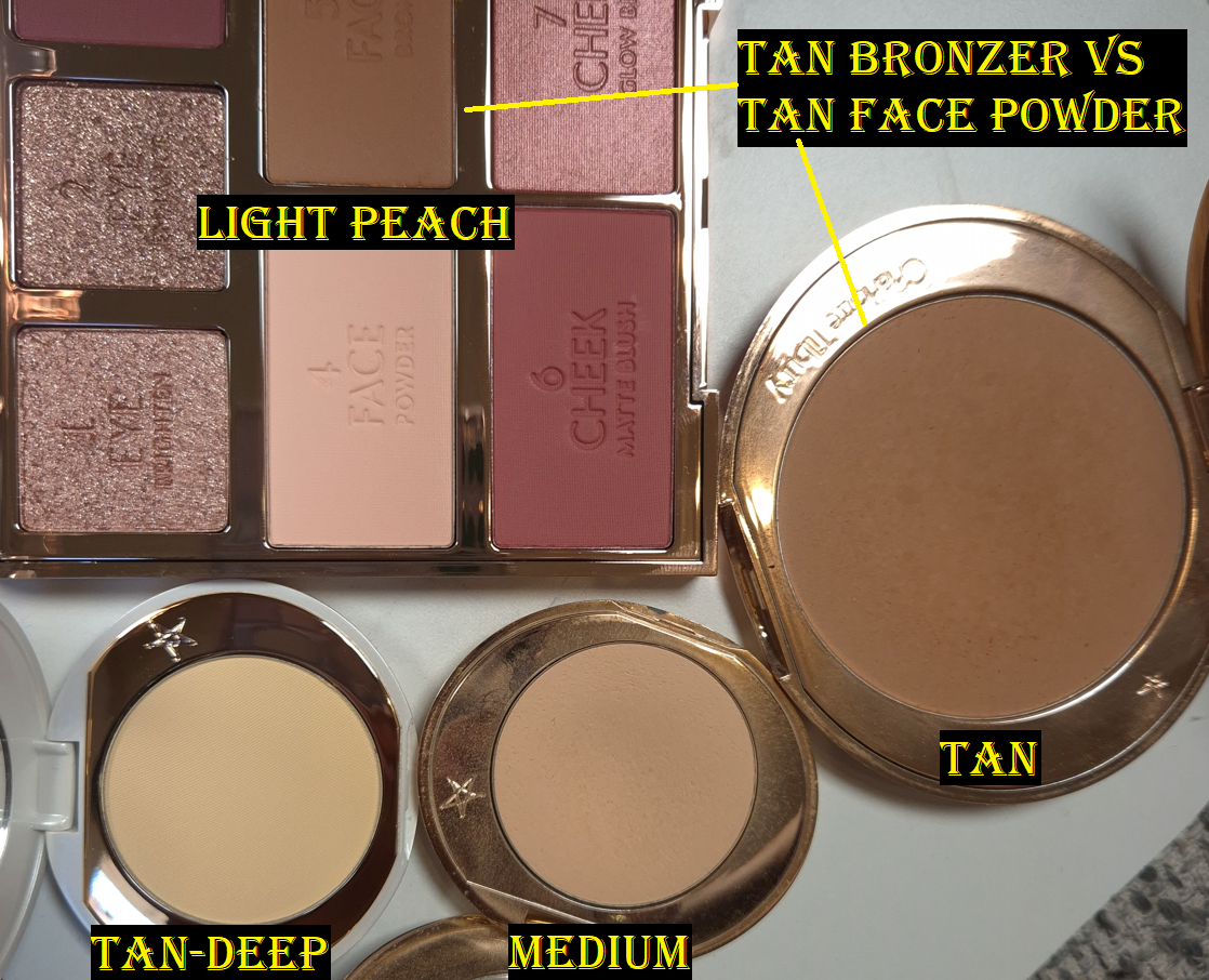
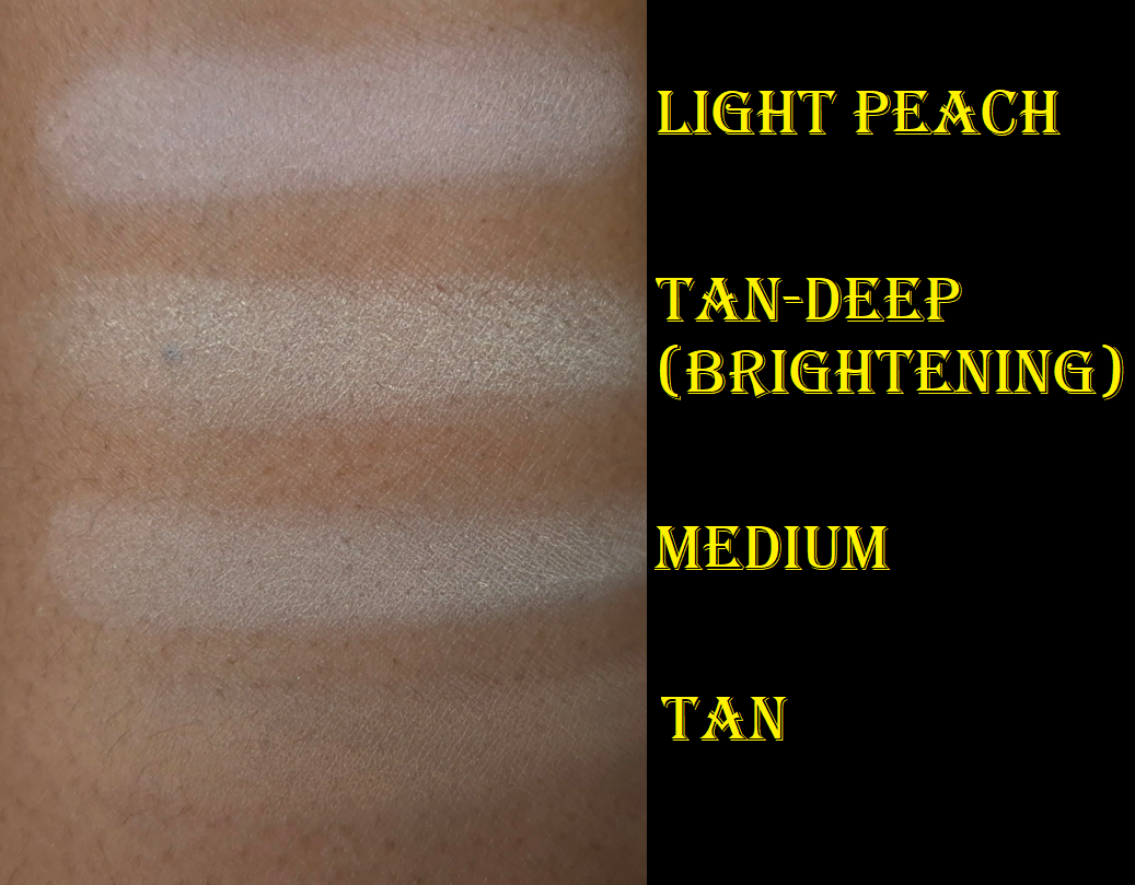
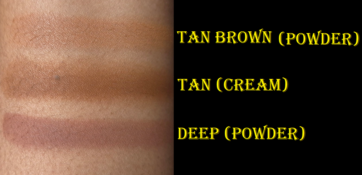
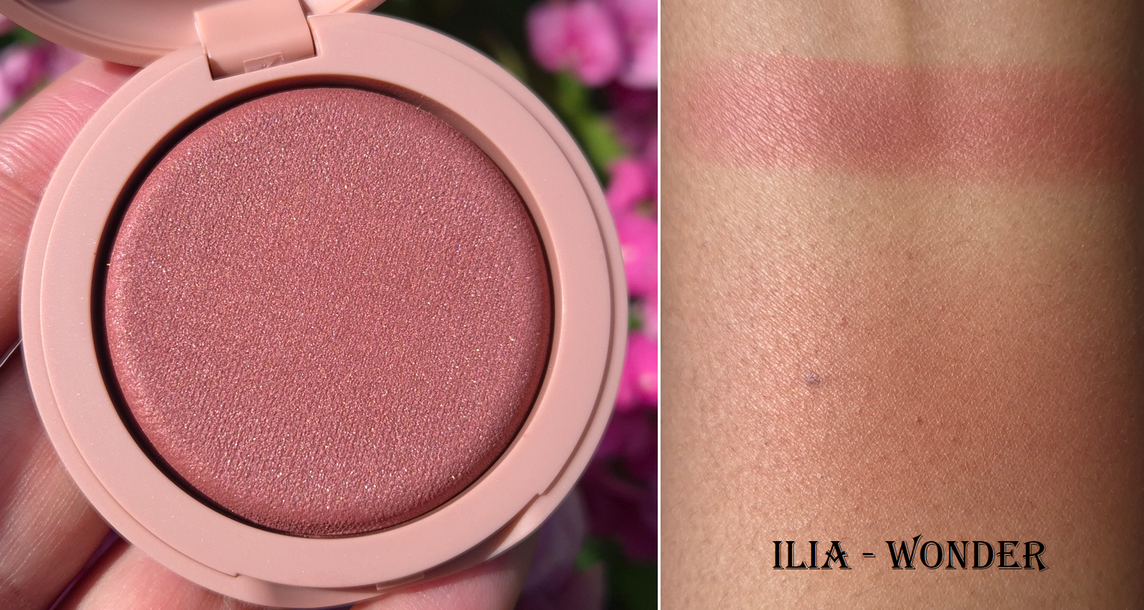
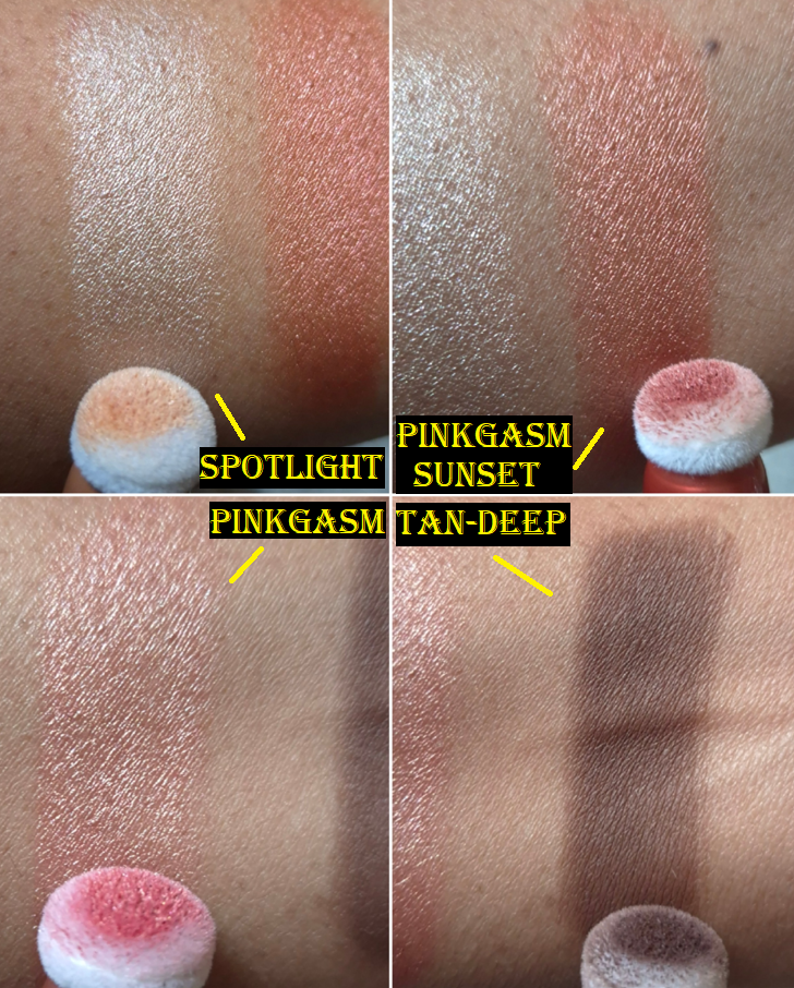
The first thing I noticed is that the lighter shades in the range (Spotlight and Pinkgasm) appear even lighter on my skin than how it looks coming out of the tube. The darker shades (Pinkgasm Sunset and Tan-Deep) look as expected. The photo below demonstrates how much darker the light shades are on the puff compared to my arm swatch.
The Contour Wands
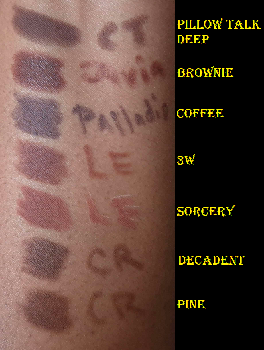
Charlotte Tilbury Contour Wand in Tan-Deep
I waited ages for the brand to release shades darker than the original Medium-Deep, but someone decided it was a good idea to make Tan and Tan-Deep warm toned, as seen in a YouTube Short by Tammi Clarke. I didn’t want a liquid bronzer and the undertone of Tan seemed too red to look like anything but a bronzer on me. That’s why I picked Tan-Deep in the hopes that even if it was too warm to create a shadowy affect, I could still create the illusion of depth based on the amount of shades darker it is from my skin color. Having another Brontour in my collection isn’t so bad.
Well, I wish my plan was more successful in practice. With my skills, it’s a bit difficult to spread such a small amount of product evenly everywhere and have it look natural with such a big jump between this shade and my skin tone. If this was the type of blendable formula that sheers out while it’s being applied, it would look a lot better. However, that’s the kind of trait that’s easier to find in cream form. The advantage of liquid contours is how well they set down and how incredibly long-lasting they are on the skin. So, I don’t expect the Contour Wand to perform that way. It’s just unfortunate that I don’t have a closer shade match from the line, so that I can get the same results from this product as other customers will. For others, the amount of time you have to blend before it dries is likely good enough. The spread-ability is also less likely to be an issue for someone who has their correct shade. The pigment level could still be too high for the type of person who prefers subtle and skin-like complexion products, but maybe the natural girlies prefer to just skip contouring anyway! The Charlotte Tilbury brand isn’t known for championing barely-there type of makeup.
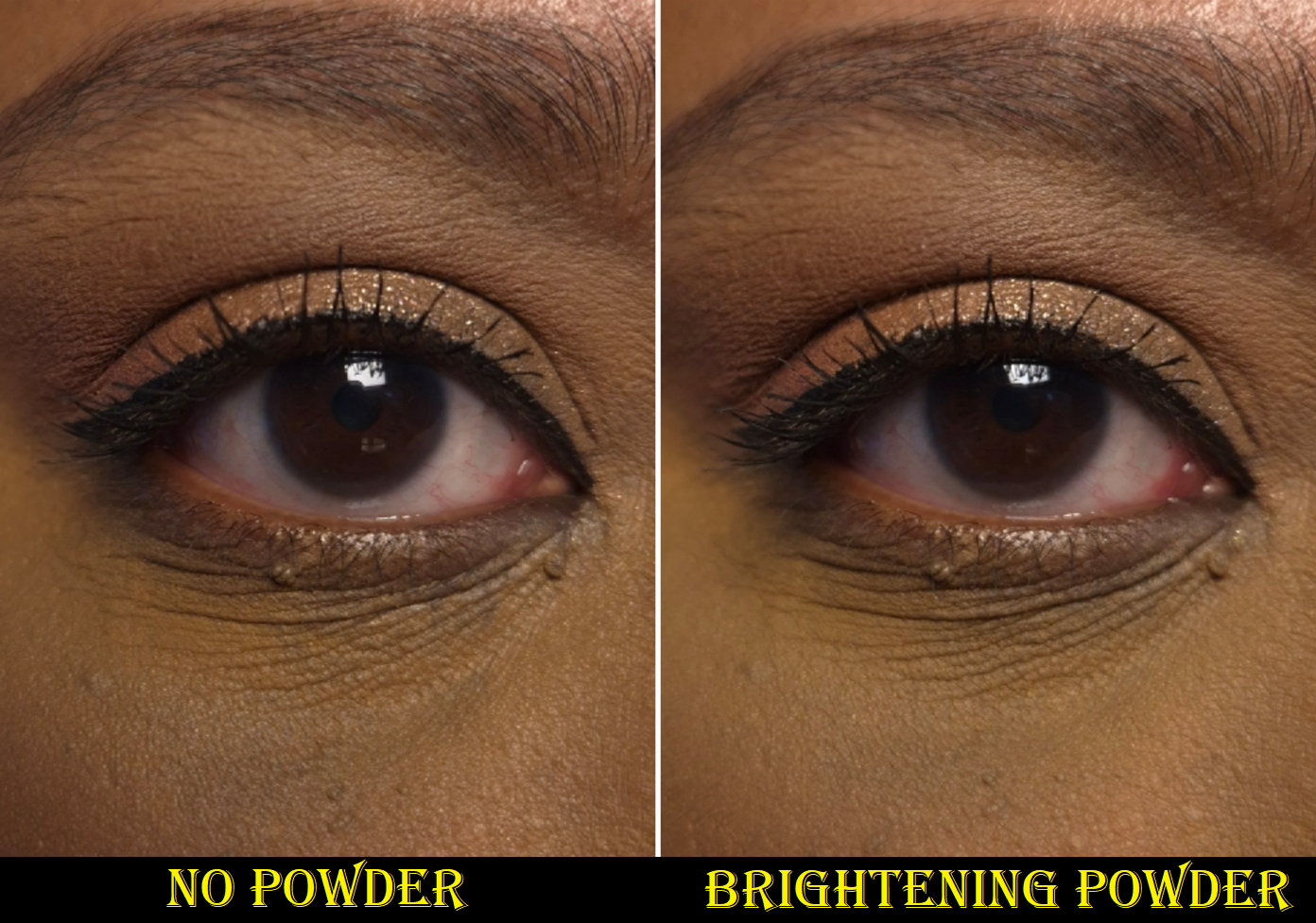
Of course, there are still tricks to better merge this into my foundation. I can apply leftover foundation between the edges. I can also use a blurring or brightening finishing powder to tone down the color and also clean up the edges. Plus, once blush is on top, the slight splotches aren’t as noticeable.

If I actually wanted a liquid bronzer, I could buy the Tan shade of Contour Wand. However, I feel pretty confident I would still prefer to use Charlotte Tilbury’s Beautiful Skin Sunkissed Glow Bronzer, which continues to remain the top cream bronzer in my collection. I highly recommend it, though there aren’t many shades to choose from. If I had to pick, I would also select the Airbrush Bronzer over the Contour Wand.
The Beauty Light Wands
Charlotte Tilbury Easy Highlight Blush in Pinkgasm Sunset and Charlotte Tilbury High Blush in Pinkgasm

I’m not sure what the distinction is supposed to be between the “high blush” and “highlight blush” considering both are shimmery. Pinkgasm looks shinier and brighter than Pinkgasm Sunset, but it’s probably just due to it being a lighter color.
I have a much easier time blending these in than the Contour Wands, but that’s because I don’t have to be as careful with the application. In the beginning, I struggled to figure out how much product to let out during the twist process before toggling the arrow back to the “off” position. I would sometimes let out an excess amount of product, which is the only time I’d be in danger of applying too much as I dotted it directly to my cheeks. However, that’s something I got used to with time.
My tube of Pinkgasm Sunset isn’t leaking to the point where it fills the cap, but despite me keeping it permanently in the “off” position, there is still always product in the sponge tip. My other tubes haven’t had that issue.
I love the color and the glow from these blushes, but it’s definitely not a natural appearance. It borders the line between looking shimmery and looking metallic. It also doesn’t fully sink into my skin. Bold makeup wearers may not mind, but this could be a drawback to others.
If I’m creating a dramatic and full coverage kind of look, these blushes don’t seem out of place.
In most situations, these blushes fully dry down on my face. Once it sets, it doesn’t budge all day. However, if I’m wearing extra moisturizing skincare in combination with a dewier foundation, the blushes get a slight tacky feeling. I rarely powder my entire face, so it’s possible that could be a simple solution for when this happens, or to use a setting spray. I wasn’t home when I noticed this, so I just made sure not to press my cheek against anyone!
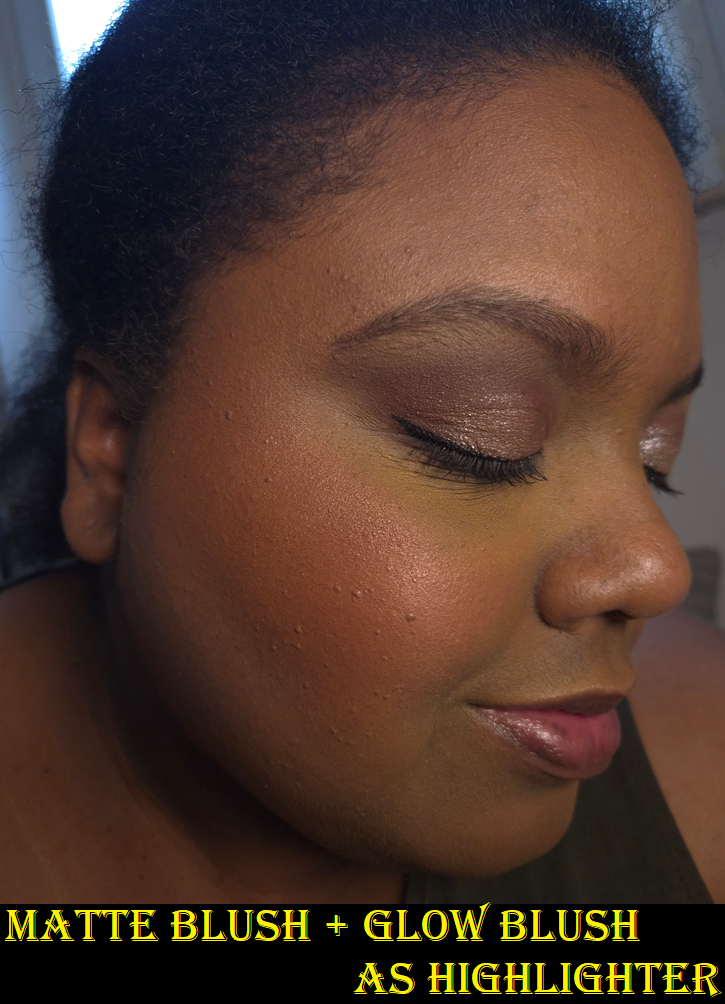
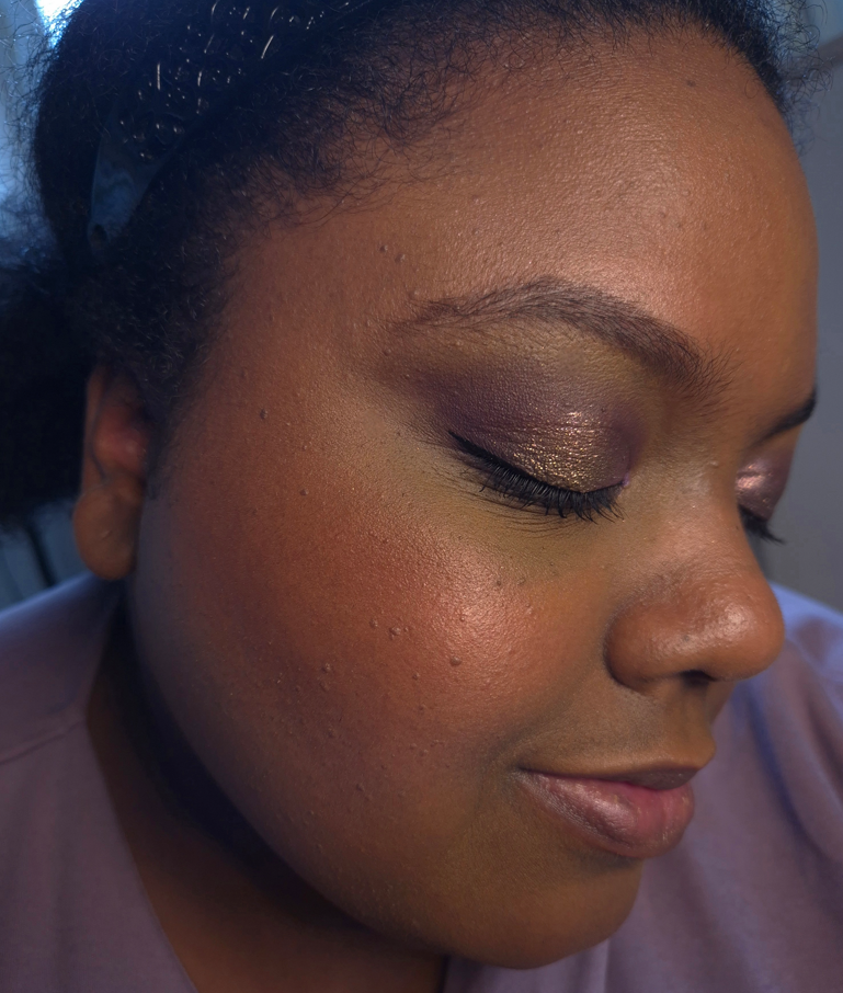
My favorite way to use these shades is to apply Pinkgasm Sunset on most of my cheek area and concentrate Pinkgasm on the apples and top of my cheekbones in place of highlighter. Texture is enhanced a little, but I won’t be fooling anyone into thinking my shiny cheeks are natural anyway!
I can somewhat get away with wearing Pinkgasm by itself on my cheeks, as seen in the photo lower down, but I think it looks best when paired with Pinkgasm Sunset.
Between the Blush Wands and Blush Sticks, I prefer the look of the Blush Wands on my cheeks and how they set down fully. Due purely to the shade options, I might even prefer the Blush Wand over the Cheek to Chic Blushes. However, my top blush format from Charlotte Tilbury are their powder blushes that end up in limited edition products, but are not yet available as singles.
Charlotte Tilbury Easy Highlighter in Spotlight

There isn’t much to say regarding the highlighter. There are times that I could swear the product seamlessly blended into the liquid blush and didn’t look so stark, but I was not able to capture those moments on camera. Perhaps it had to do with the lighting I was under.
Trying to use Spotlight very sparingly, and keeping it strategically placed, is a little challenging. Pinkgasm is bright enough that I don’t even feel the need to apply a true highlighter on top after. There is also the advantage that if I apply Pinkgasm in too wide of an area, it looks as if I intentionally blended it into my blush like a blush topper. Unfortunately, if I apply too much of Spotlight, I need to cover it up or start over.
Essentially, this is more of a preference note and not a critique of the formula. It is pretty much the same as the blushes, so those that like the blushes will probably enjoy the highlighters as well, provided it’s a suitable color for the individual.
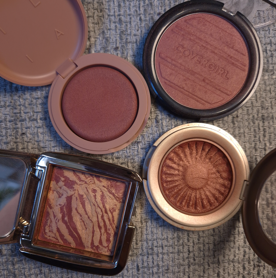
By now, it wouldn’t surprise anyone to know that I prefer the brand’s powder highlighters, specifically, the Hollywood Glow Glide Face Architect Highlighter and the Pillow Talk Multi-Glow Highlighter. For ease of use of a liquid and for a subtler glow, I even prefer the Hollywood Flawless Filter. I also use the Unreal Skin Sheer Glow Tint Hydrating Foundation Stick as a highlighter. I’d choose all of these options over the Beauty Light Wand Highlighters.
These Beauty Wands didn’t turn me into a liquid makeup lover, but it’s nice to see the hype wasn’t unwarranted. I think out of everything, I’m the most likely to use the Blush Wands every now and then. To be fair, the contour and highlighter aren’t the right shades, so there isn’t as much chance of me getting use out of them.
If I had to choose my favorite liquid contour, it might be Charlotte’s (because I have tried less than a handful). My favorite liquid blushes are by Rare Beauty and Glossier, but I feel like the Huda Beauty Blush Filters have some shimmery shades that are better than the Blush Wands. I don’t have a favorite liquid highlighter, but it might be the Dior Forever Glow Star Filter.
So, even though I’m not a liquid lover, the Beauty Wands still wouldn’t be at the top of my list. They’re decent products, but just not for me.
Lip Products

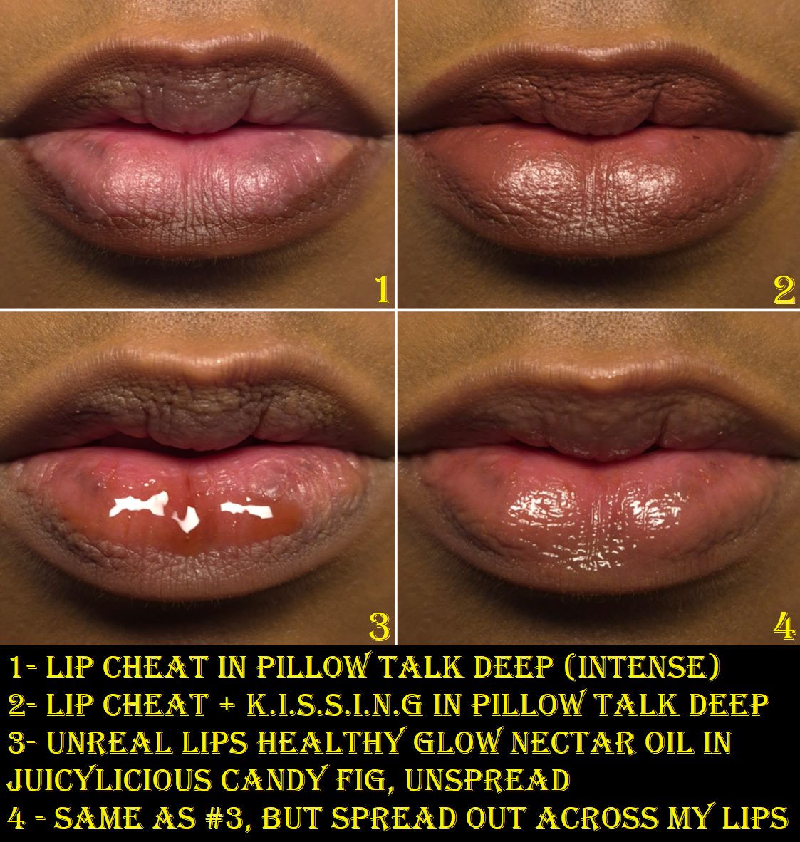
Charlotte Tilbury Unreal Lips Healthy Glow Nectar Oil in Juicylicious Candy Fig
This feels like a gloss and oil hybrid, rather than a traditional lip oil. It has a non-runny consistency that isn’t too thick or too thin either. It grips the lips quite well and doesn’t come off my lips completely even after a meal. Of course, I still need to reapply it at least 1 or 2 times in the day, but I’m impressed with its adherence level.
In terms of how nourishing it is for me, it doesn’t improve the condition of my lips as much as my favorite lip-caring products, but it at least doesn’t make them worse. It’s essentially the kind of product I grab to just keep my lips moisturized in the moment, to have the glossy shine, and perhaps for the slight twinge of reddish-purple and brown color. If I want to actually combat any chapped spots, rather than just camouflaging and soothing them, I need to use something else.
This has a nice sweet fig scent. The applicator is a great shape to help spread a semi-thick product like this evenly. I can feel a bit of tack when I wear the Nectar Oil, but I don’t consider it to be noticeably sticky until it starts to wear off.
The Nectar Oils were released around the same time as the Dior Lip Glow Butters. I haven’t used the Dior ones consistently enough to have my thoughts formed on them, but I like them both. Considering the price difference, I should like the Dior significantly more, but they’re about even for me. Dior’s is €44 at full price for 10ml and Charlotte’s is €26 for 14ml. Dior’s has a cool-minty feeling in the beginning. Charlotte’s has more color payoff, depending on the shade.
They both come in plastic tubes and have identically shaped applicators. In fact, I can even swap the caps on both of them, even though they are different lengths.
I will review the Dior product at some point in the future and revisit these comparisons.
I like the Charlotte Tilbury Nectar Oil, but it’s not a game-changer.
Charlotte Tilbury K.I.S.S.I.N.G (mini) in Pillow Talk Deep (Intense) and Charlotte Tilbury Lip Cheat (mini) in Pillow Talk Deep
I bought these as part of a set called Mini Pillow Talk Lip Kit in Pillow Talk Deep.
“Intense” and “Deep” are used interchangeably and are listed as either one depending on the website. With just a few swipes of the lipstick, I can completely cover the darker pigmented spots on my lips.
I like the color, but it’s a hair darker than I hoped. Perhaps I would like the color of Pillow Talk Medium more on myself, but that shade is in a different formula (Matte Revolution).
This K.I.S.S..I.N.G Lipstick is a comfortable satin formula that leaves some initial imprints on glasses and whatever it touches at the start of the day, but I’m still left with quite a bit of color that clings well to the lips even after most of the sheen is gone. This needs to be touched up after meals, but if I’m just drinking, I can go 3-4 hours before getting the sensation of needing to apply more to get back the moisturized feeling (and not because of the color being gone/faded). If only drinking, six hours is around as much as the color lingers before I consider it pretty much gone. There are some remnants on a napkin when I wipe my lips, but what’s left is the equivalent of a light tint barely darker than my natural lip color.
This doesn’t contain parfum, but it has Ethyl Vanillin which is used as a flavoring agent and fragrance. When I lick my lips, I don’t taste vanilla. When I smell the bullet, I can faintly detect something, but it may just be that my small mini isn’t as strongly scented as the full-size.
I have used this lipstick on my best conditioned days (after 24-48 hours of my best balms and glosses) as well as less than ideal days. This lipstick works great on the best days, but that sensation of needing to reapply is unsurprisingly stronger during the times when my lips are quite dry from the start. So, on those days I typically wear the lipstick for half of the day before switching to something more nourishing. That’s the best way I can wear this lipstick for multiple days in a row.
So, overall, I like this lipstick and the formula. I would consider buying more in the future, but I’m not interested in other shades at the moment.
The Lip Cheat is a creamy liner that glides over the skin easily, and there is enough time to soften and the edges before it locks into place, but not a whole lot. The longevity is quite good, as it has lasted through meals (except if I wipe my mouth too much with a napkin), and it remains on my lips even after my lipstick is gone.
The brand claims the formula is waterproof, smudge-proof, and transfer-proof. It certainly is long-lasting, but I tested that even after having it on for 10 minutes, I could still partly wipe it away with water. So, I’d call it water-resistant instead. I can also wipe it away with a dry makeup eraser. This doesn’t smudge on me once it’s set, and it’s transfer-resistant on my dry bare skin. However, if I’m wearing a moisturizing formula of lipstick or more emollient product such as a lip gloss or lip oil on top, it is definitely coming off if it makes contact with the surface of something.
That being said, this is still one of the better lip liners in my collection.
I like this particular color, though it’s darker than what I usually wear. Still, it fills a void.
I like the Lip Cheat enough that I would be willing to buy more. However, since I hardly use lip liners, I just don’t have a need for additional shades at this time.
So that is everything I have for you today! Thank you for reading!
-Lili ❤