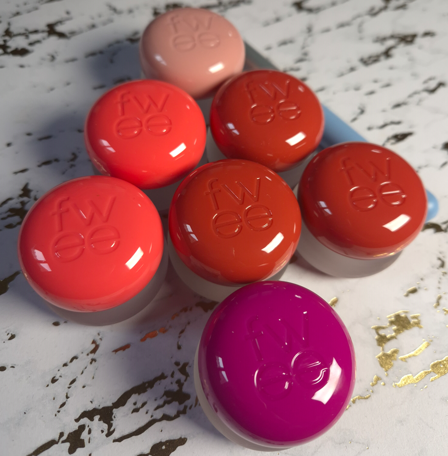
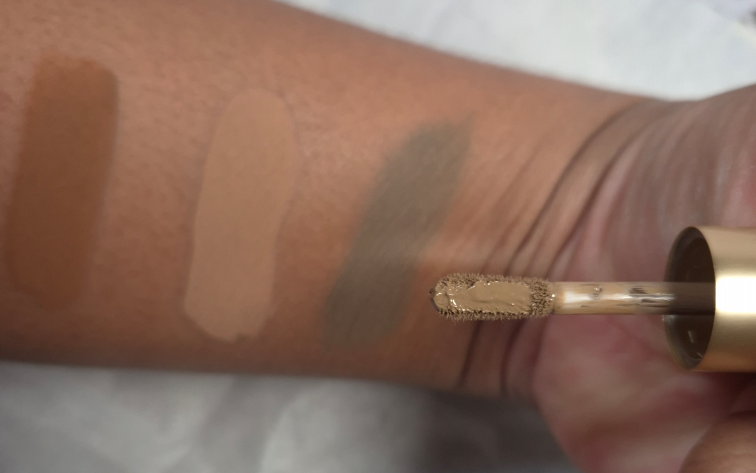
I know I’m late to the game on these. Although I don’t have a TikTok account, these pudding pots have become so successful that I’ve been seeing them talked about everywhere in 2025 in particular. For the past few years, I’ve done my best to stop buying cream and liquid cheek products due to their quicker expiry time than powders. This was my reason for not buying the Pudding Pots, but when I saw Fwee’s products become available through German retailers like Douglas and Flaconi, the FOMO grew too strong for me to take! I started with one, then ordered three more, and now I have forced myself to stop at 7 out of the 35 total!
I’ve included photos of what the colors look like in their frosted glass pots, but it doesn’t help. So many of them look identical to each other or look much deeper than how they appear on my skin. I watched so many swatch videos and scrolled through so many photos, yet I still ended up with shades that were unexpected. So, if anyone reading this has access to these in person to be able to try them out, I highly recommend doing that.
These colorful Pudding Pots don’t just look like desserts. They have a fruity/candy-like smell too. But don’t eat them! Haha.
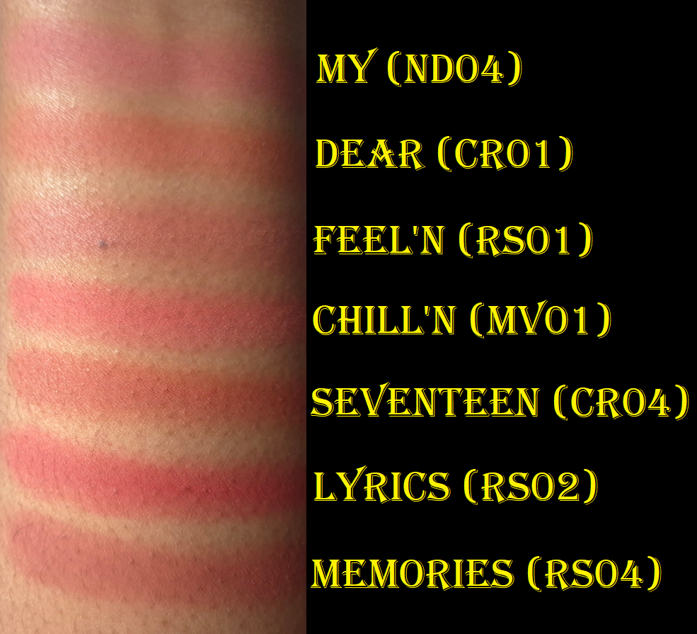
BLUSHES
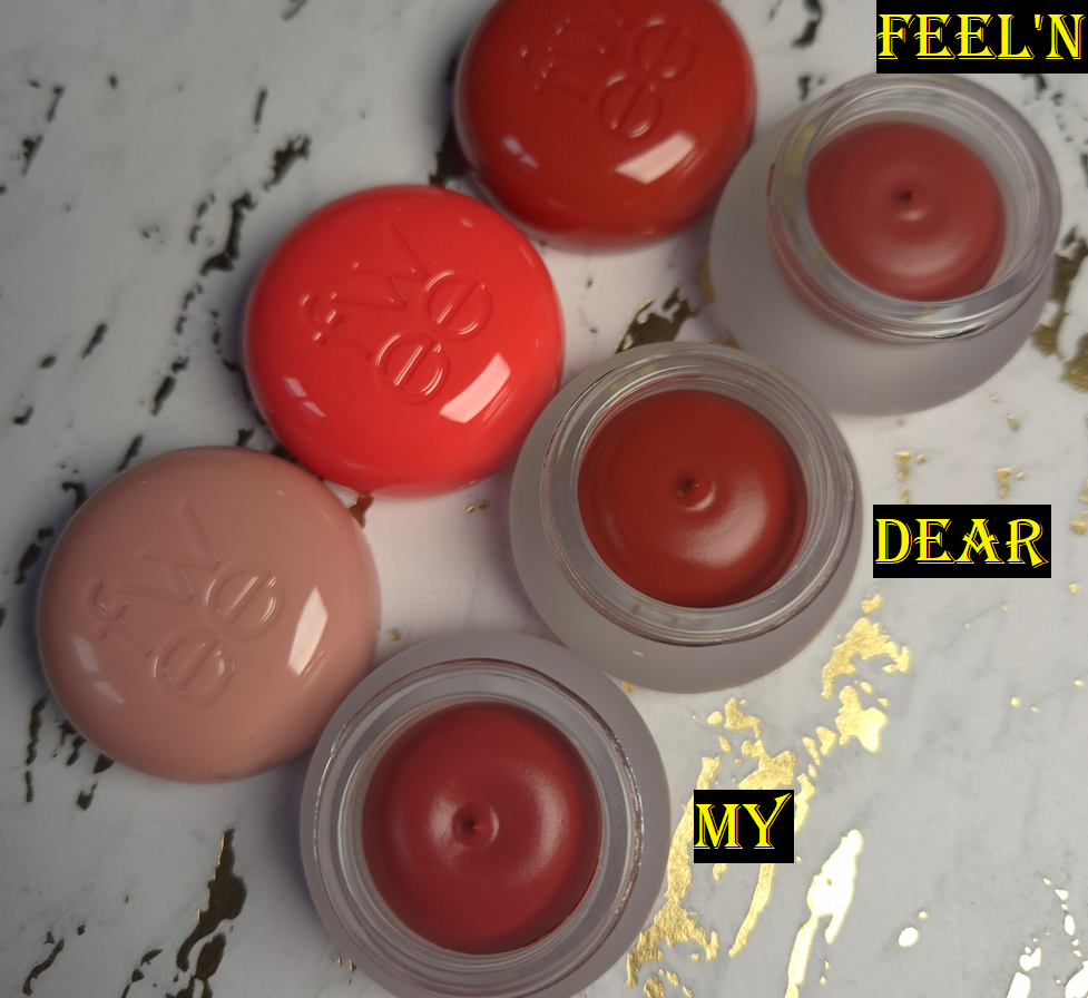
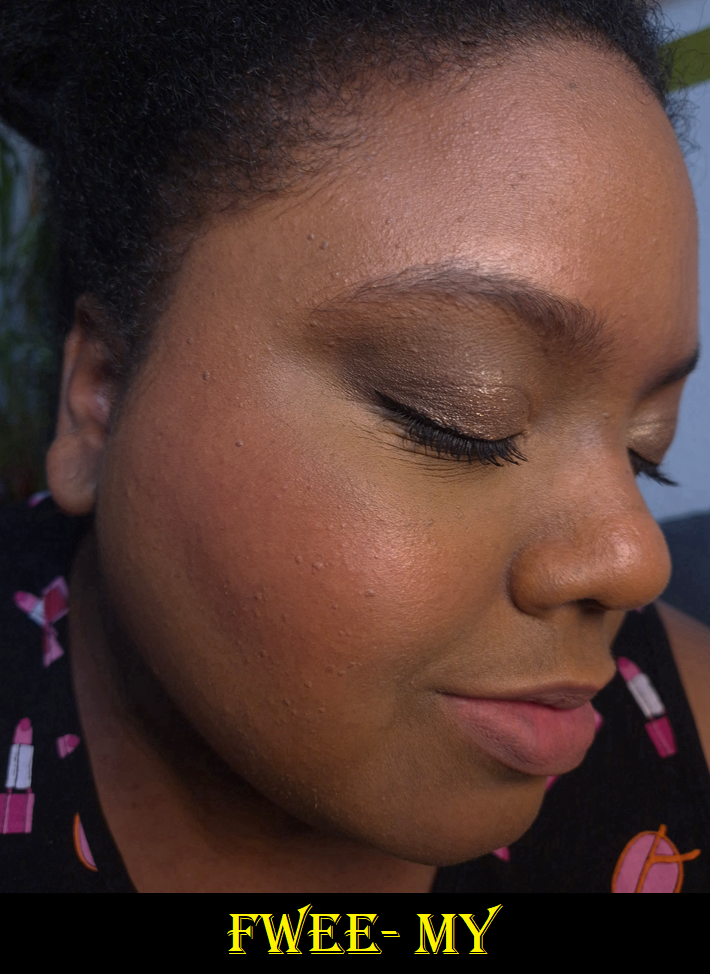
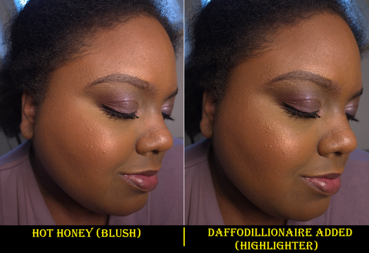
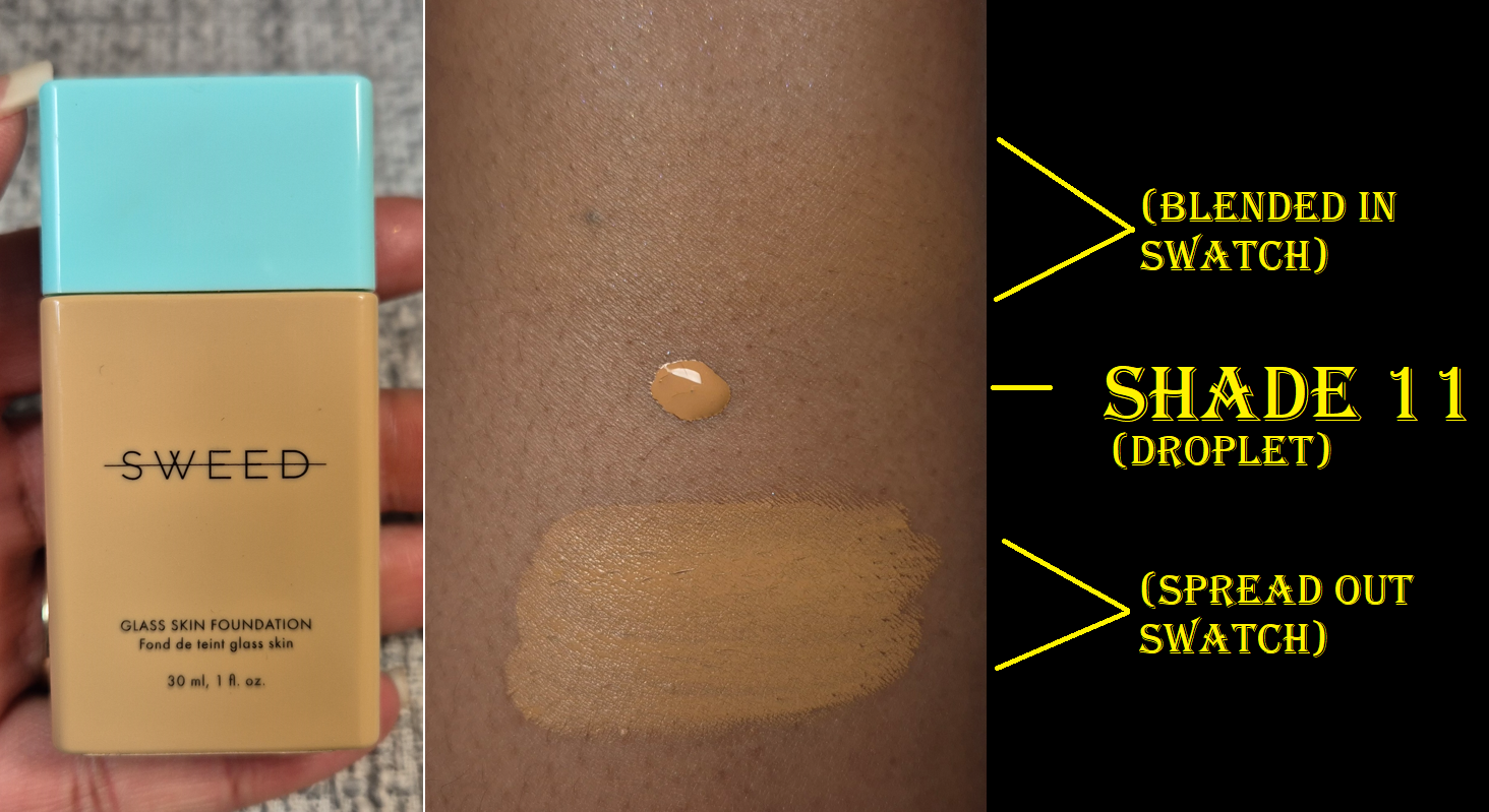
Shade Name: My ND04 Undertone: Warm Description: Natural Nude Coral Category: Just Me Moment
This has been touted as a “universal” shade. It can be built up enough to show on my skin, but I will probably use this exclusively on the apples of my cheeks going forward. It’s a little lighter of a color than I’m used to wearing on its own, but I still like it. It’s also much lighter on my lips than I would normally wear.
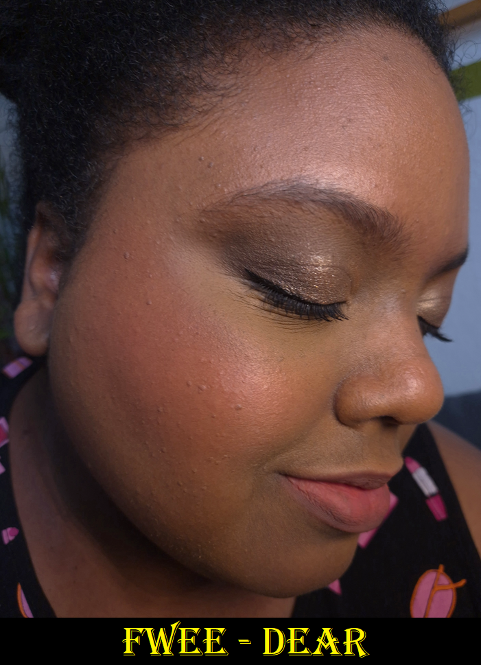
Dear is a little more pigmented and even warmer of a color than My, so I think it suits my skintone quite well for a relatively light shade, but I still wouldn’t wear this on my lips.
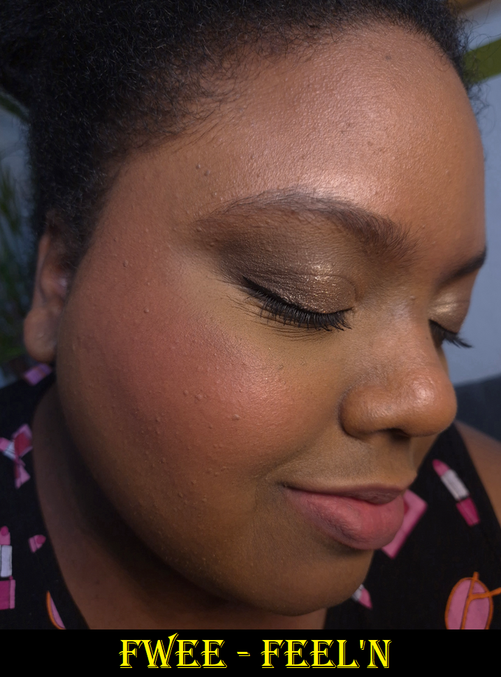
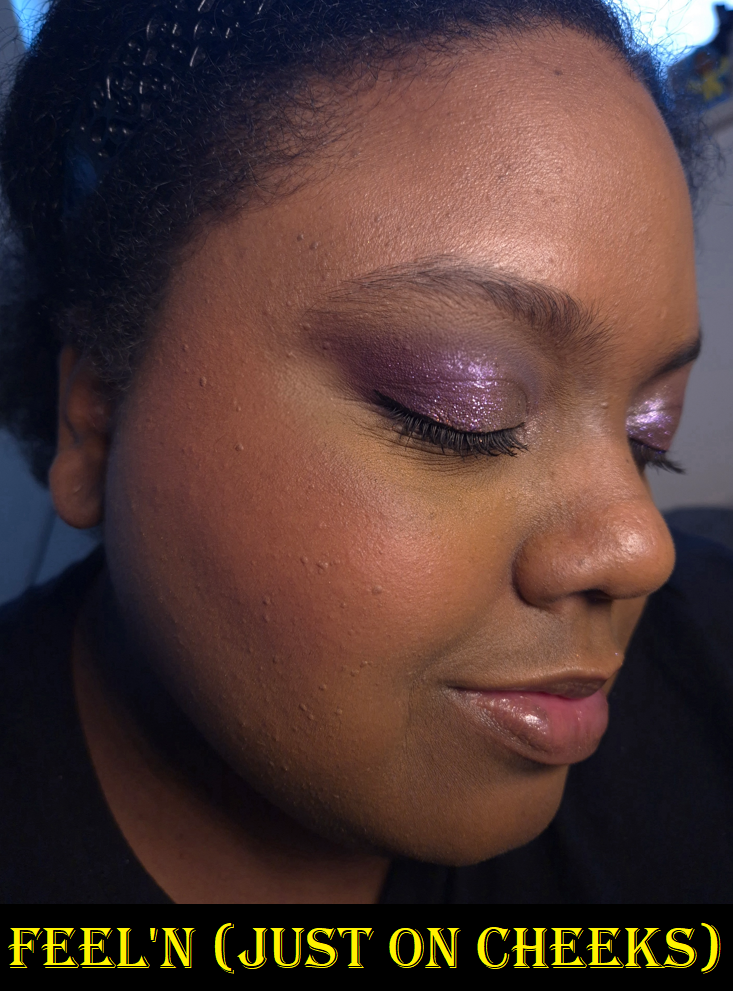
Shade Name: Feel’n RS01 Undertone: Warm Description: Rose Coral Category: Faded Moment
This is supposed to have a warm undertone, but it looks cool toned on me in person. It’s at least the most cool of the seven I own. It’s pretty, but I like it a bit less than the others.
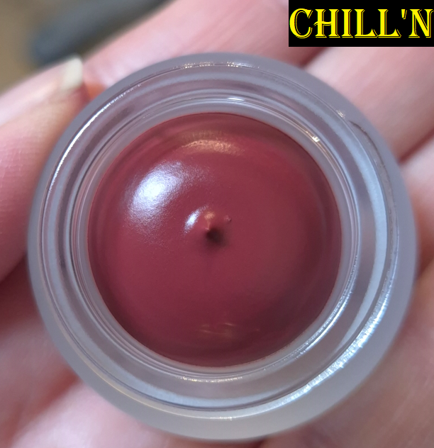
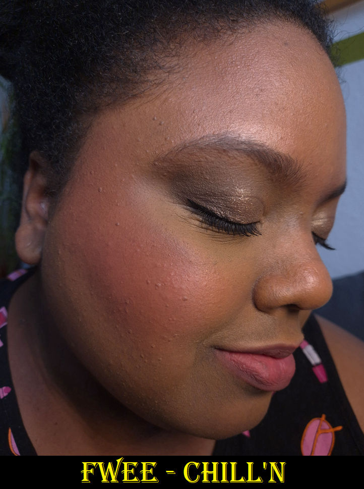
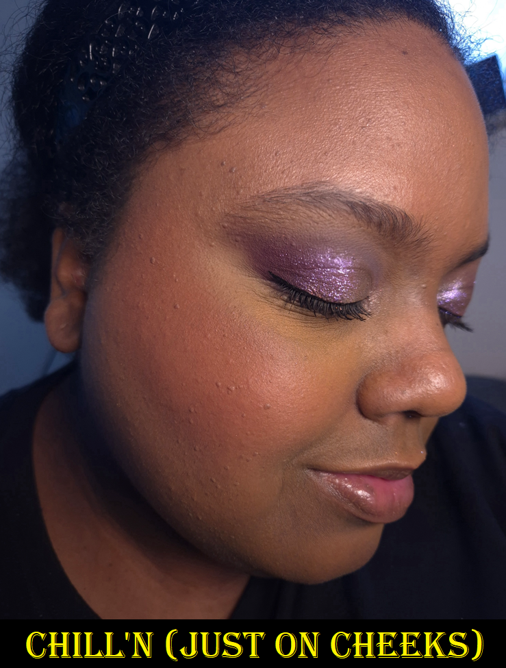
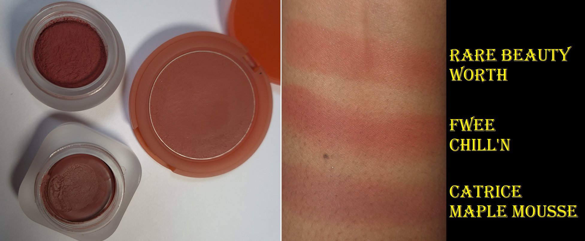
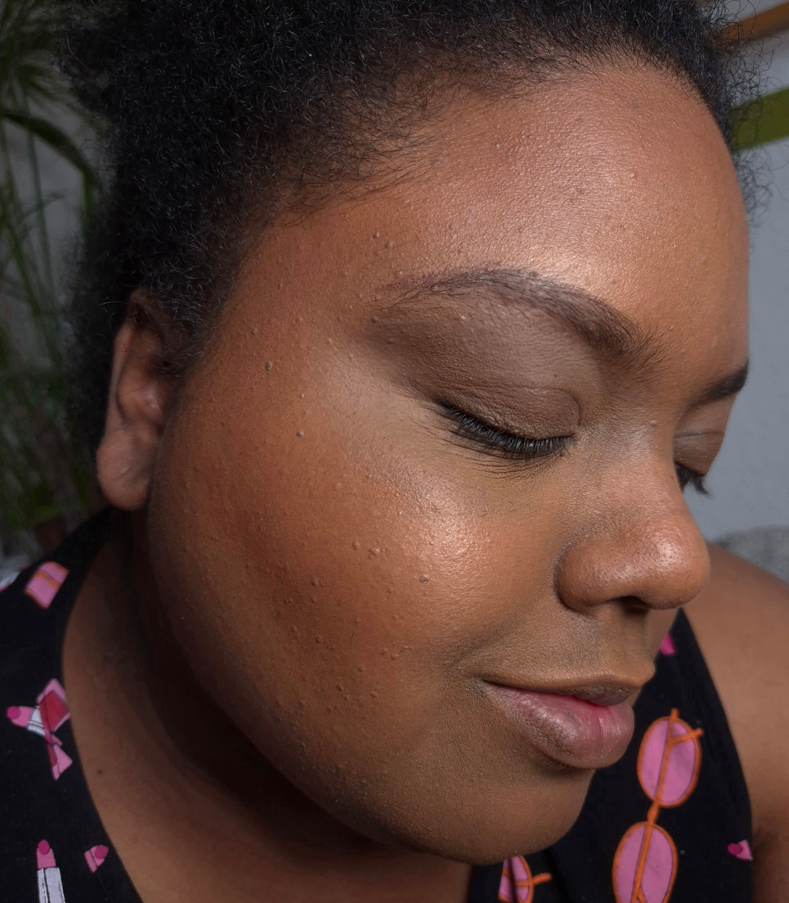
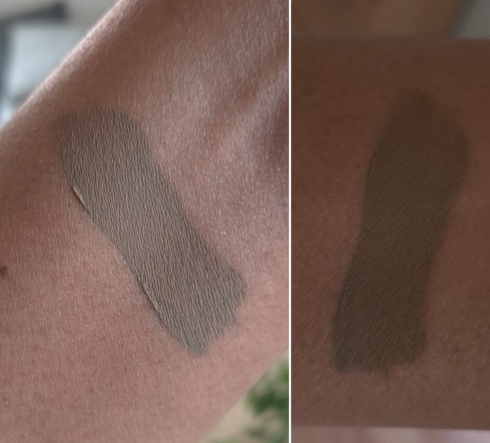
Shade Name: Chill’n MV01 Undertone: Warm Description: Cooled Down Greyish Brown Category: Cold-Hearted Moment
I thought this would look way more cool-toned on me based on the description, although it is technically listed as being suited for those with a warm undertone. I can clearly see purple tones in the pot, but for some reason it’s bright pink on my skin. This is probably the biggest twist in expectations vs reality out of the seven I own. I like it more than Feel’n, but it still ranks lower on the list.
To me, this is like a darker version of Dear. I prefer this shade, but I try to apply a thin layer (less than pictured) so that it’s a bare flush of brightness since it’s a more poppy color than I expected.
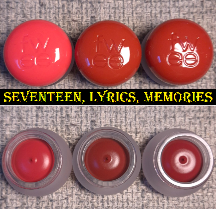
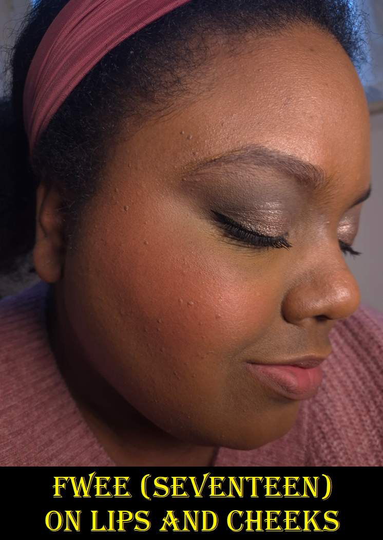
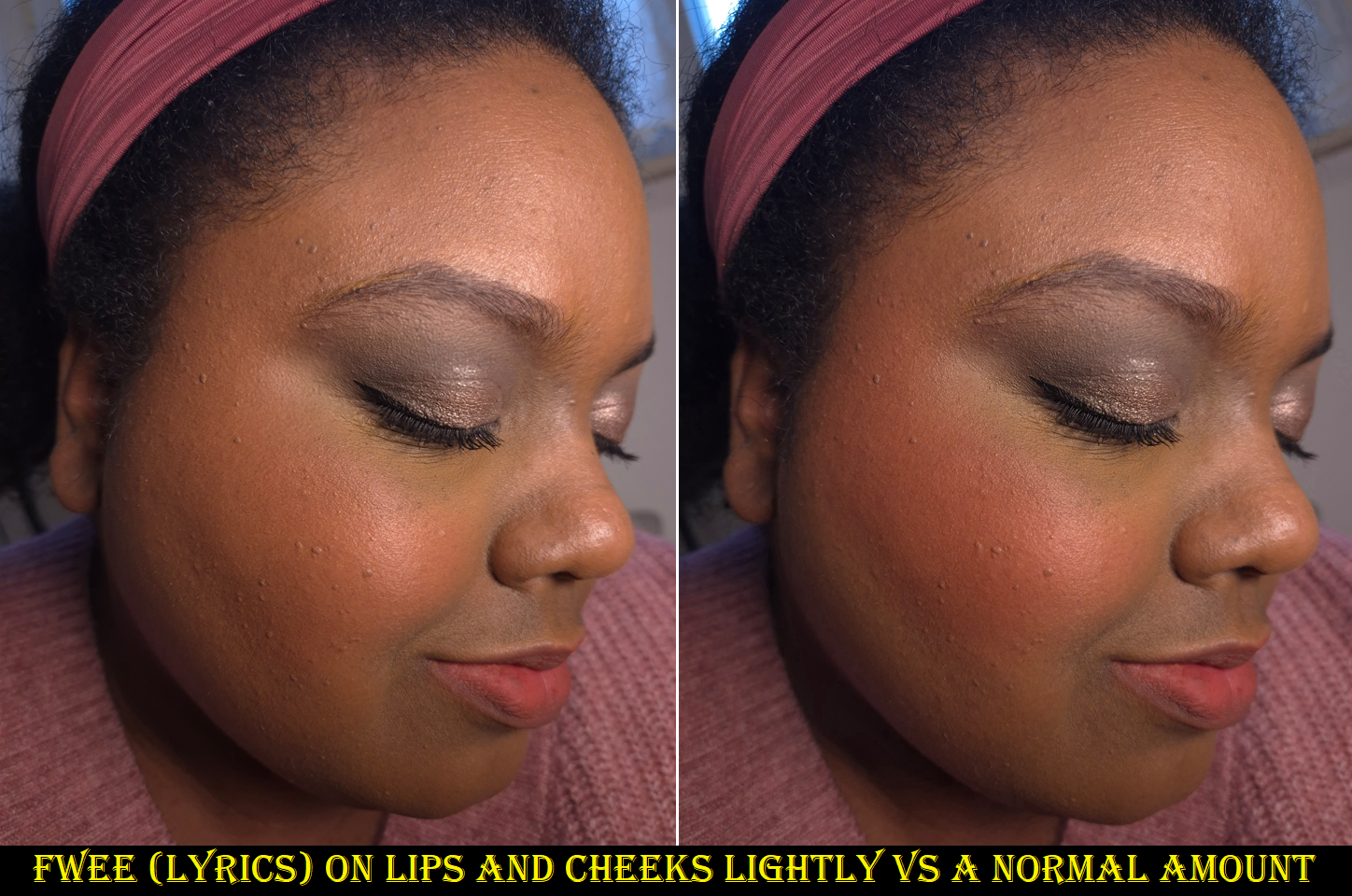
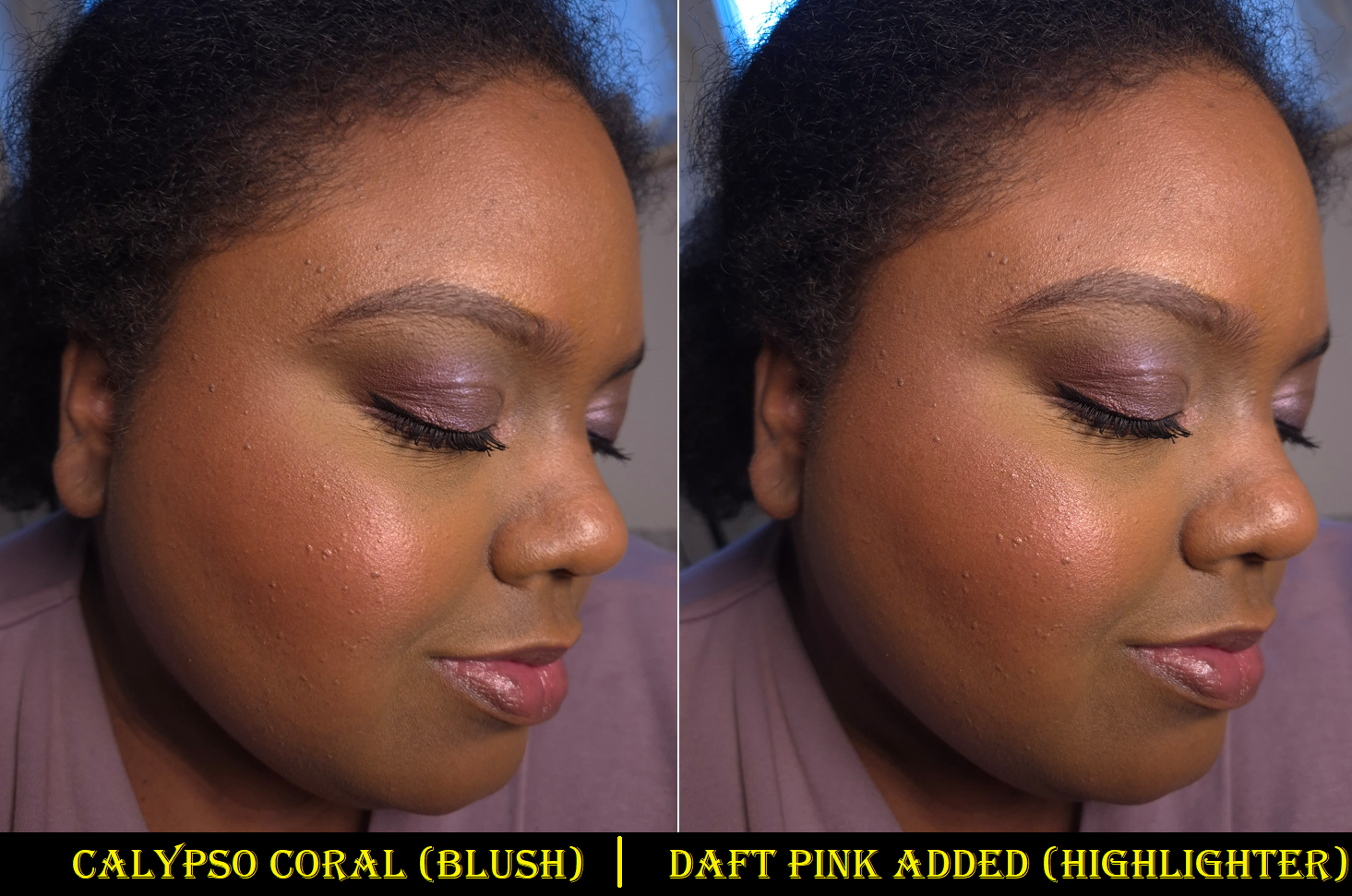
Shade Name: Lyrics RS02 Undertone: Warm Description: Brown Coral Rose Category: Faded Moment
This is the warmest shade of the bunch, and most easy to see on my skin, so I thought I would like this the most. However, it’s a bit too warm. I prefer Memories.
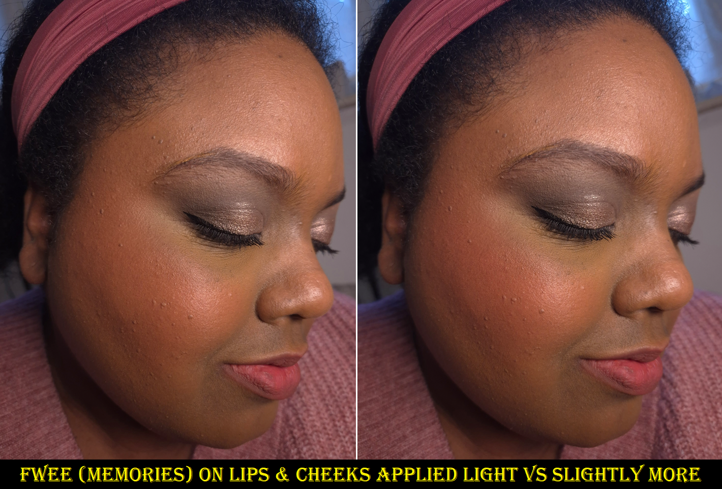
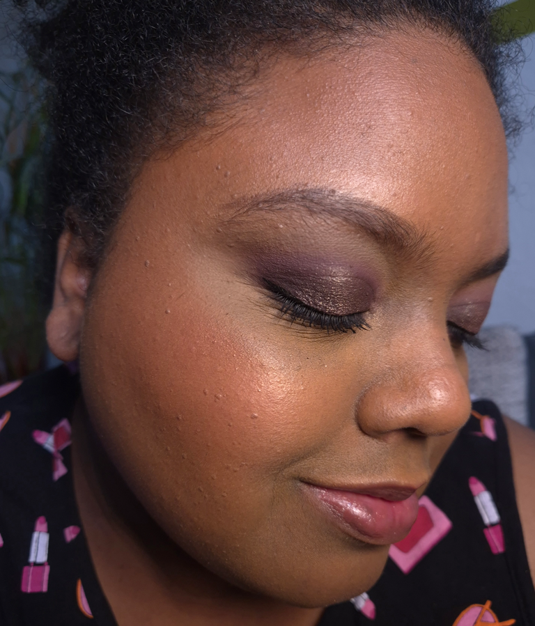
Shade Name: Memories RS04 Undertone: Warm Description: Marsala Rose Category: Faded Moment
This is the one shade I end up using most often. It’s a little less warm-red and more of a pink-red.
EXPERIENCE
The consistency of this product is like a bouncy mousse. It has a dimethicone-heavy formula, but that is what gives it its slip-like texture with a matte look. The blurred blush and lip trend that has long been popular across Asia is reaching similar heights in the west due to so many US and European brands now coming out with their own versions. There are so many options to choose from worldwide!
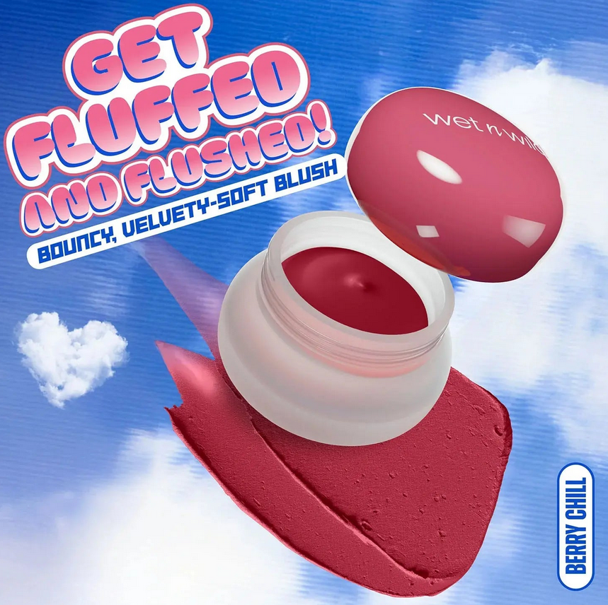
Wet n Wild isn’t fooling anyone with their Mother Fluffer Pudding Blush. It’s a dupe too!
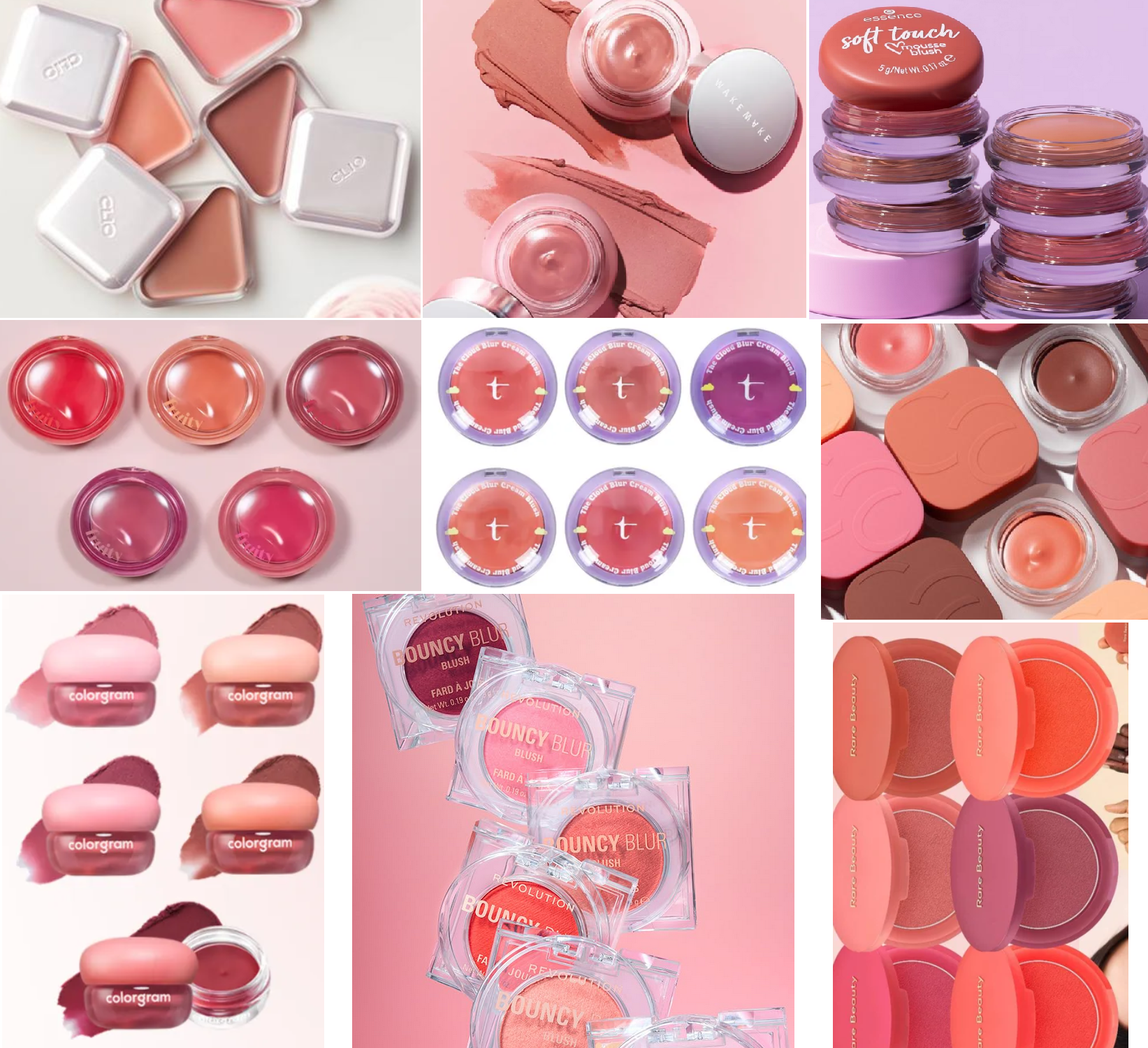
I only really have two blushes that are comparable to Fwee’s Pudding Pots. The first is the Catrice Velvet Pudding Blurring Blush which indeed feels like a creamy pudding and does not have much bounce. The second is the Rare Beauty Soft Pinch Matte Bouncy Blush which has the slip feeling and bounce without the mousse texture that is so easy to be picked up. Rare Beauty’s is more compact in the pan.
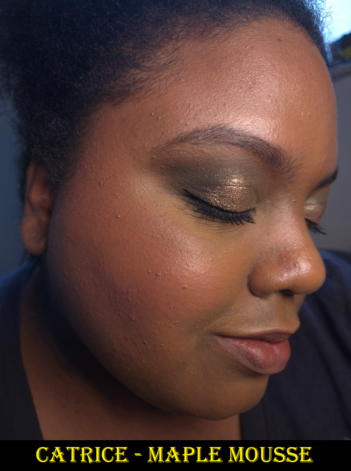
I mentioned in my review that I like the Rare Beauty blush only after applying a hydrating spray on top, which gives it some glow. I thought I wouldn’t mind how matte Fwee’s blushes look if I could use the same technique, but it doesn’t transform it, and I have to be careful not to touch my face too soon afterwards because the sprays (e.g. from Pat Mcgrath and Charlotte Tilbury) make the blush susceptible to lifting off before it dries again. For my skin type and preference for nude blush tones, I actually like Catrice’s product the most! As long as my skin is adequately prepped, the blush doesn’t look flat on me. There are currently only five shades in the line, but the one I own in 040 Maple Mousse is dark-skin friendly. Just like Fwee’s Pudding Pots, the Catrice Pudding Blushes are scented (though they smell like white chocolate rather than fruity/candy). They are less expensive too, but I believe Fwee’s formula consists of slightly more expensive ingredients. Since my main concern is how it looks and performs, that isn’t enough to change my mind about Catrice’s blush being my favorite of the three.
The Fwee Pudding Pot spreads easily enough, it’s non-drying, and a minimal amount doesn’t look cakey. I don’t have issues with longevity when I apply this on top of foundation, but if I’m going for a minimal makeup look, my skin just eats this blush up. I have to apply a heavier amount than I want in order to counteract the fading so that I end up still having visible blush at the end of the day.
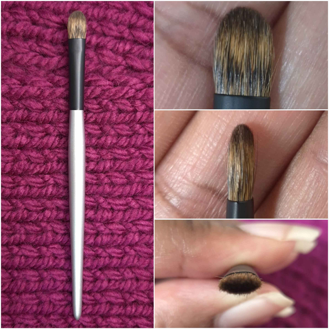
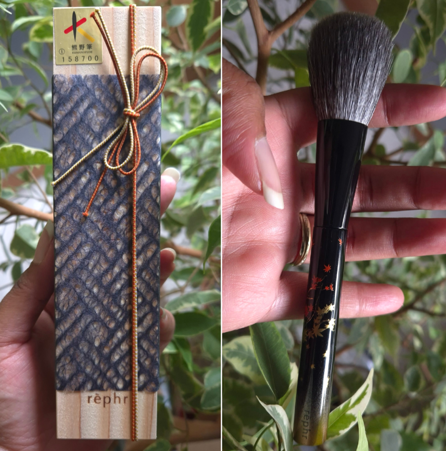
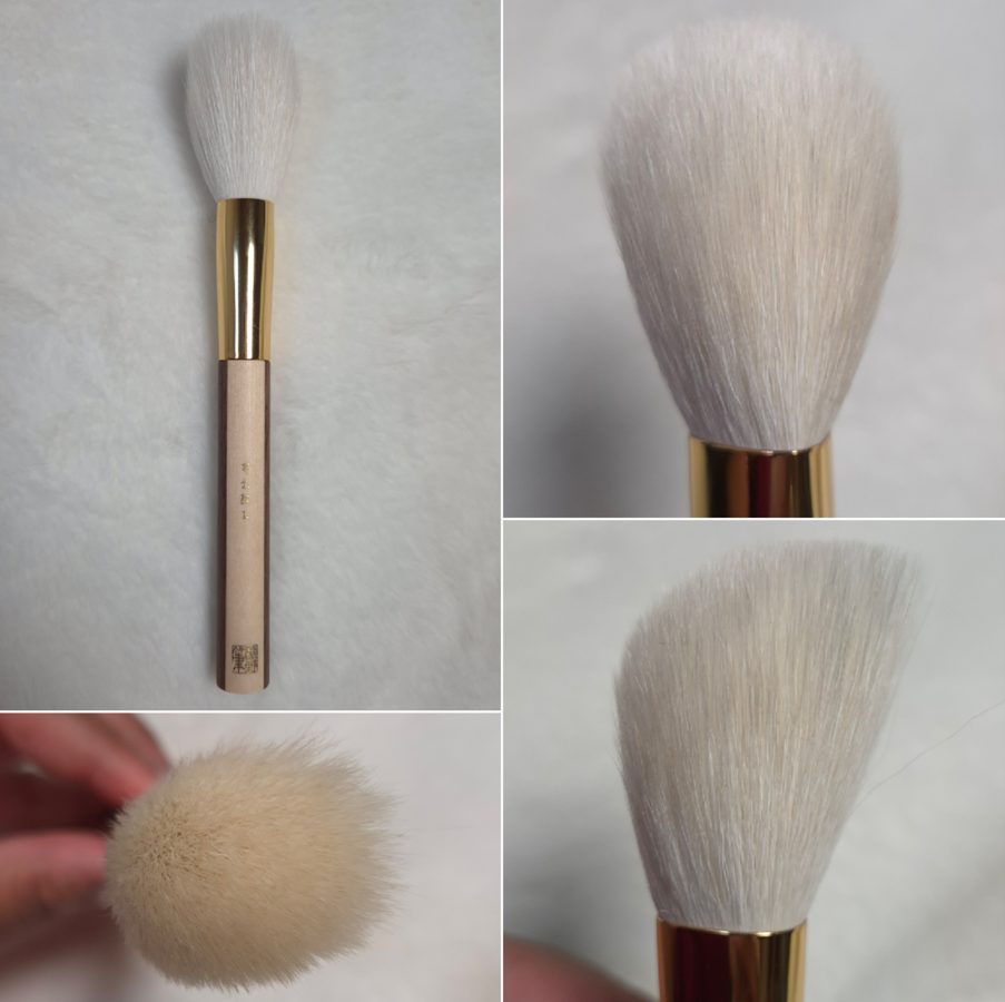
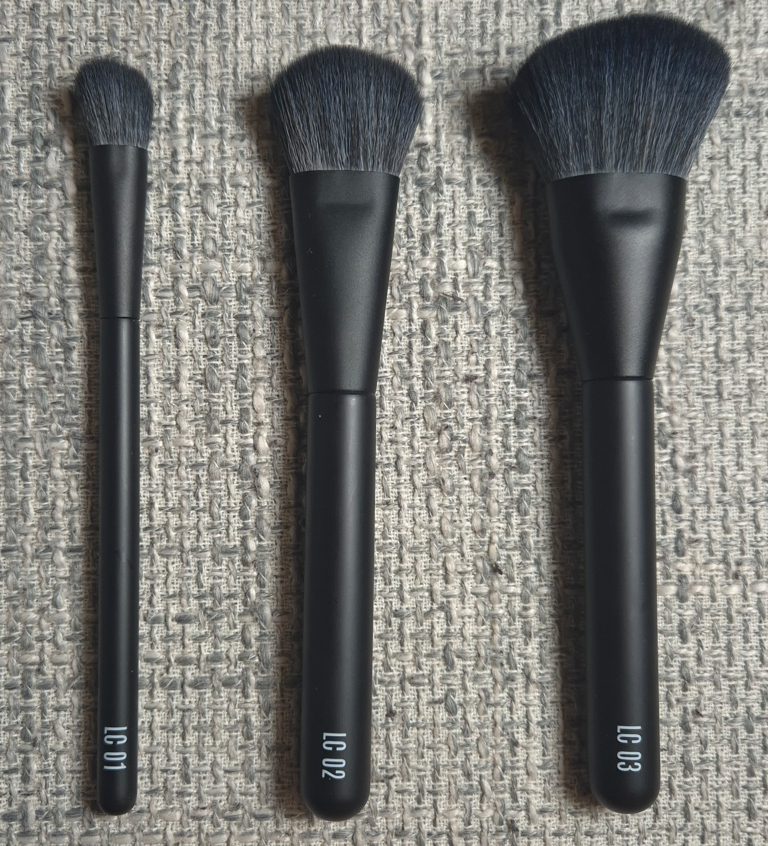
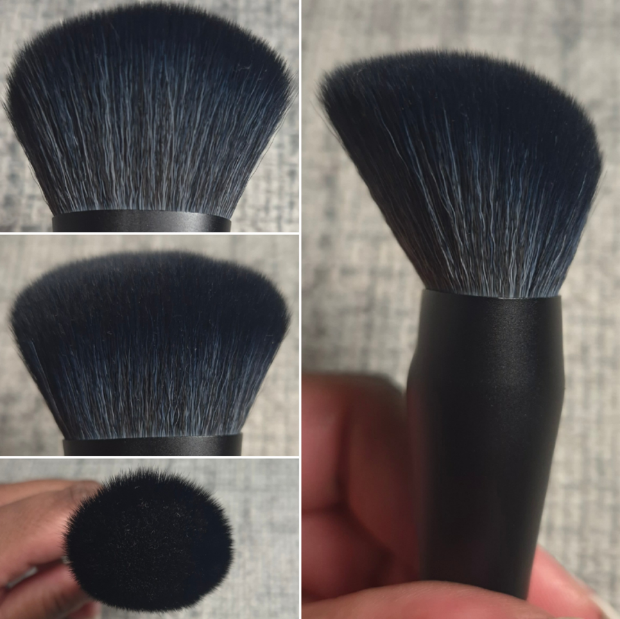
For the best blended results, I make a single tap into the pot with my Rephr LC02 brush and blend the product onto the back of my hand, warming it up, before applying it to my cheeks. I might have to build up additional layers if it’s one of the lighter shades, but this way ensures I don’t overapply.
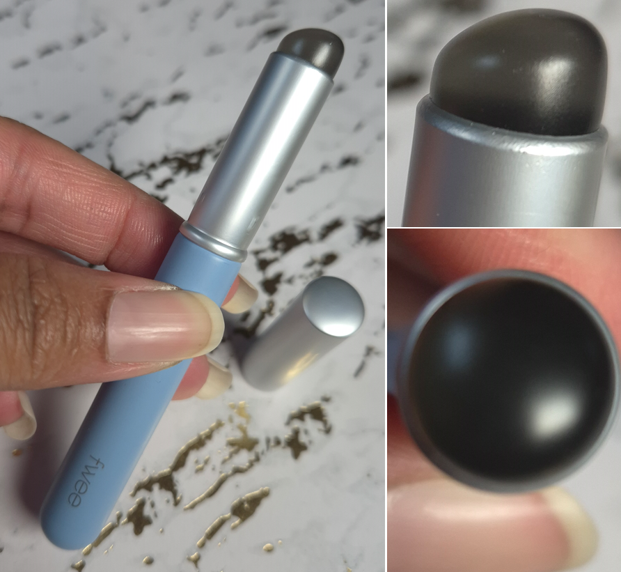
I bought the Fwee Fingerlike Silicone Lip Brush when I realized my brush and fingers won’t be able to get product out of the small opening that easily as it gets used up over time. I can apply a few dots onto my cheeks with the lip brush as well, but I still run the risk of applying too much, and this kind of formula doesn’t diffuse as easily as a powder product. So, I use this tool mostly to apply product onto my lips (which is great thanks to the slanted curve of the soft silicone tip) or onto the back of my hand.
At YesStyle, there are mini sizes of the silicone tip lip brush as well as a full size brush with a bristle type of tip.
Back to the discussion of the Pudding Pots, I haven’t liked any of these as standalone lip products. The colors are too saturated for my taste, yet they look strange if I use a minimal amount because the two spots of darker pigment on my lower lip are obvious to see underneath. The way the color grips around dry patches on my lips is also unflattering. So, I don’t enjoy how they look unless my lips are already in a good state. They are not transfer-proof, but they last fairly well before I need to touch up my lips. Another fortunate thing is that even though I expected this formula to dry out my lips, it doesn’t seem to. It’s comfortable to wear for the mostpart, but it still doesn’t look flattering enough to me even if it’s not drawing out my lip’s moisture. It’s possible that I could like this paired with other lip products for an ombré effect or after I’ve filled in my lips with lip liner, but I haven’t been inspired to try either technique. I prefer to just consider this strictly a blush.
Overall, I think the Pudding Pots are a fun and youthful product. I resisted buying them for so long, and I wish I had the willpower to have been able to keep resisting them simply because I’m not interested in the matte look. I couldn’t turn them into a glowier looking product, the way I did with the Rare Beauty Bouncy Blushes, so that’s unfortunate for me. I think I look better when my skin has some shine to it. For everyone else that loves the blurred matte trend, I can understand why Fwee’s product is so popular. They are reasonably priced and come in so many shades (perhaps even too many). The formula isn’t difficult to work with as long as the product is either warmed up or built up in small layers.
So, I understand why people like these, but I still think they’re a little overhyped. The best aspects about these Pudding Pots are the shade options, fun texture, and packaging which technically other brands could have as well. When it comes to the performance, it isn’t as unique.
I hope that these photos have been helpful. Thanks for reading! Other reviews I recommend are from Tina Tanaka Harris (for video quality showing every shade), Itskrystle (for in-depth information and testing), and Corizus (someone else similar to my skintone).
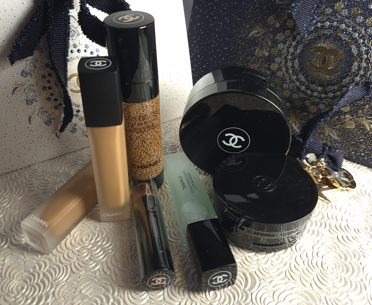
This is Part 1 of my deep dive into some of the latest Chanel makeup releases from their permanent lines. Part 2 will be dedicated to Chanel’s foundations.
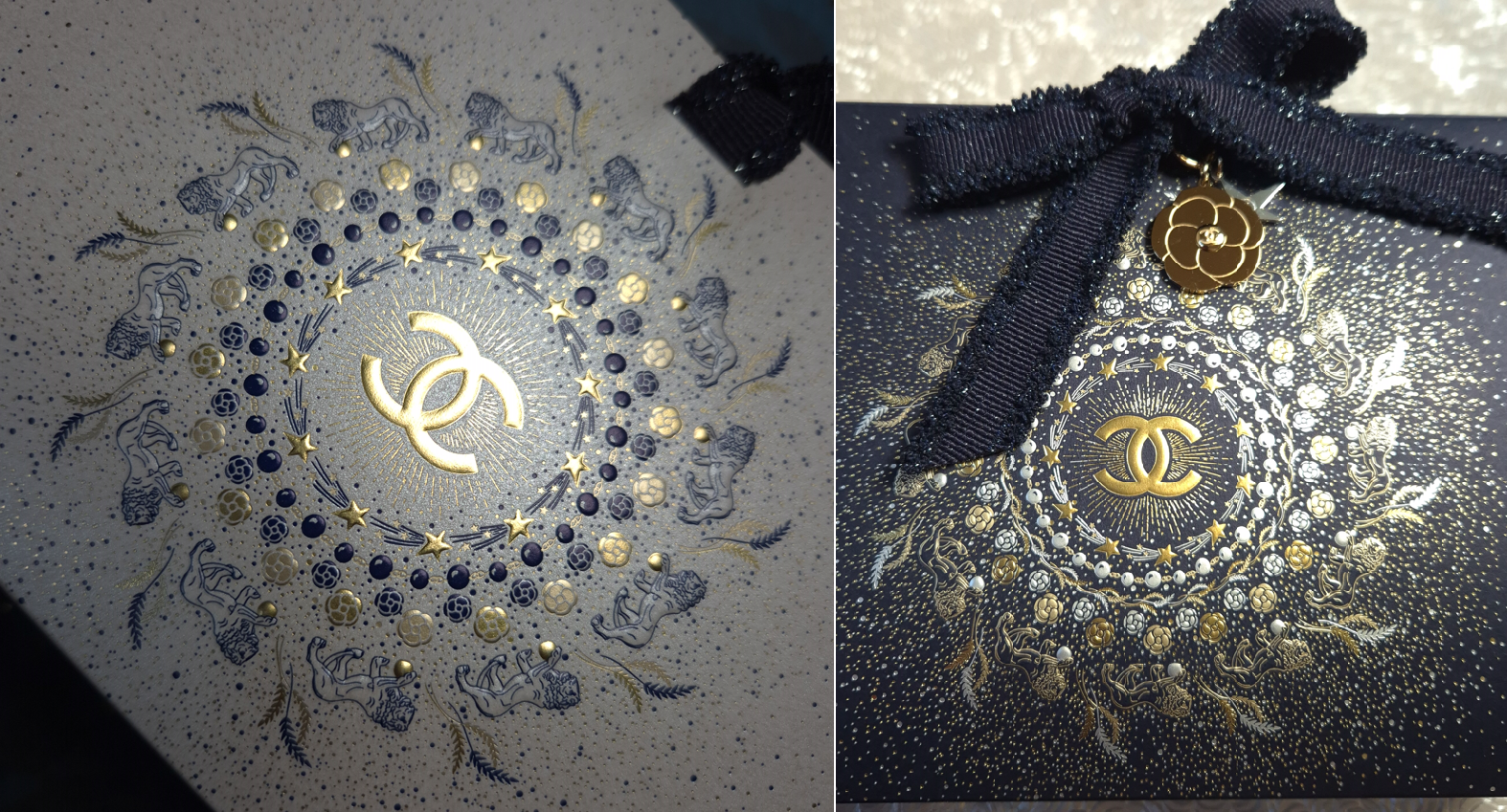
For the holidays, but starting in October 2025, Chanel gave customers the option of choosing special holiday gift packaging instead of their classic white with black-trim bags and boxes. The options were a smaller white bag, a larger deep blue bag, and then I’m not sure how many box varieties there were. The ribbons were dark blue with some glitter specks and the pattern design had a mix of gold, silver, and blue coloring. They were absolutely stunning!
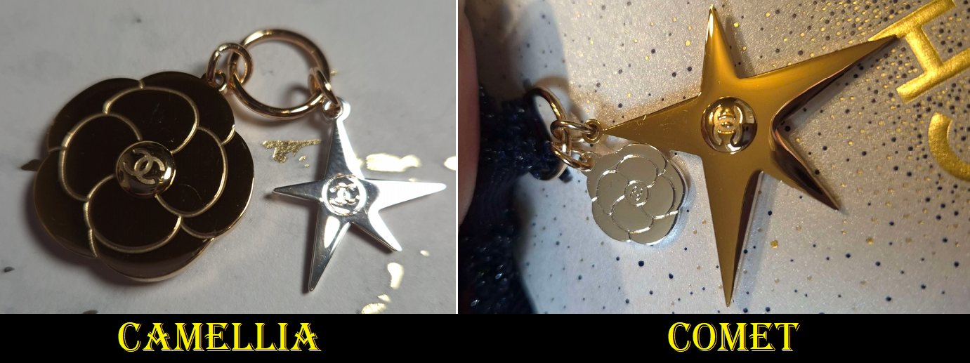
When opting for the holiday packaging, customers could only choose whether they would get the large gold camellia flower charm with a smaller silver comet/star or the large gold comet with the smaller silver camellia. Over the course of the winter season, I ended up getting both.
If you’re already familiar with me (and this blog), you know I love scoring a great deal. I’ve discussed how in Germany, there are several legitimate online retailers that sell newly launched Chanel makeup at a discount from 15-30%. So, for those wondering why I ended up ordering directly from Chanel’s website, it is because I wanted my better shade match in their foundations and unfortunately here my shade is exclusive to Chanel.
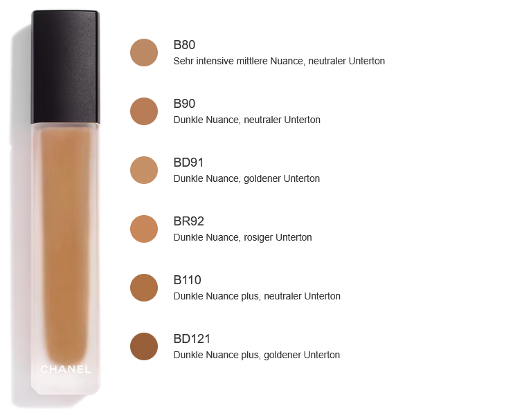
As for the concealers, although the website doesn’t have the “exclusive” marker posted next to any of the shades, I could not find any retailer in Germany that sold darker than B40. All of the retail websites had six shades available at most. Chanel has two actual color correctors that were released with these concealers called Peach and Amber. If a retailer had one, it was only Peach. So, I didn’t have the option of buying any of these anywhere else, except directly through Chanel.
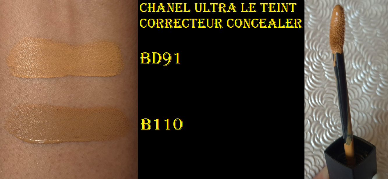
Chanel Ultra Le Teint Le Correcteur Concealer (Ultrawear All-Day Comfort Flawless Finish Concealer) in BD91 and B110
This concealer launched in Europe in September 2025, but I didn’t realize (until I saw the flood of videos in January 2026) that it hadn’t come to the US until this year. I bought mine in October last year, so I’ve had plenty of time to test this product.
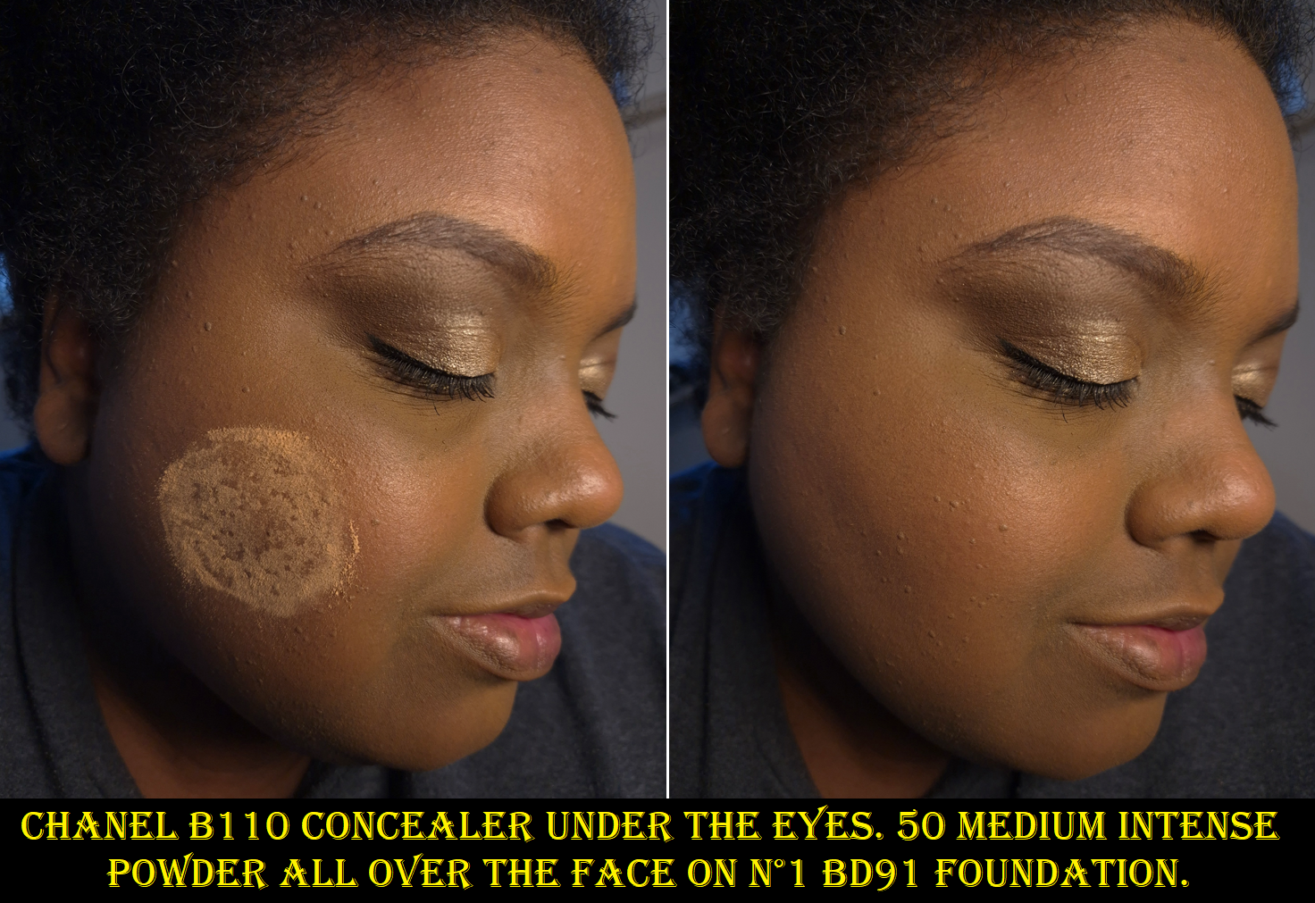
There is currently no BD101, which I assume would have been my closest shade. BD121 has always been a little dark for me and too warm. I figured having some orange color correcting effects from BD121 wouldn’t be so bad, but having a concealer that’s too dark is a problem. So, I chose BD91 as the next best option with a golden undertone. I also wanted to see just how neutral B110 would be, and to figure out how deep it is (compared to my estimate of BD121), so I made the decision to get that shade as well.
This concealer became the instant holy grails and number 1 concealers of Charlotte Holdcroft, Han Beauty 101, and French For a Day, so I thought surely I would like it too!
Chanel BD91 Concealer and 40 Medium PlusPowder
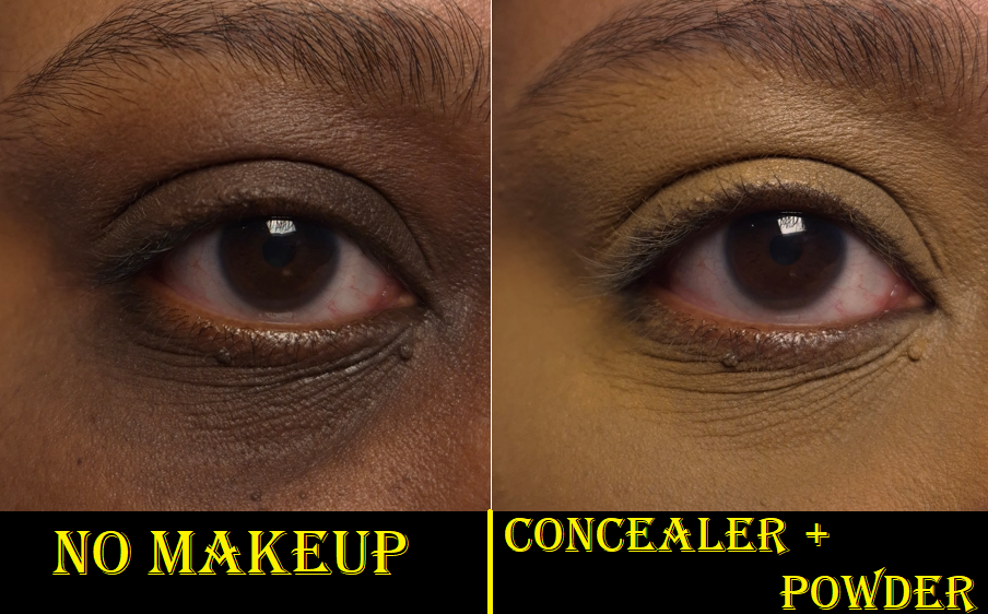
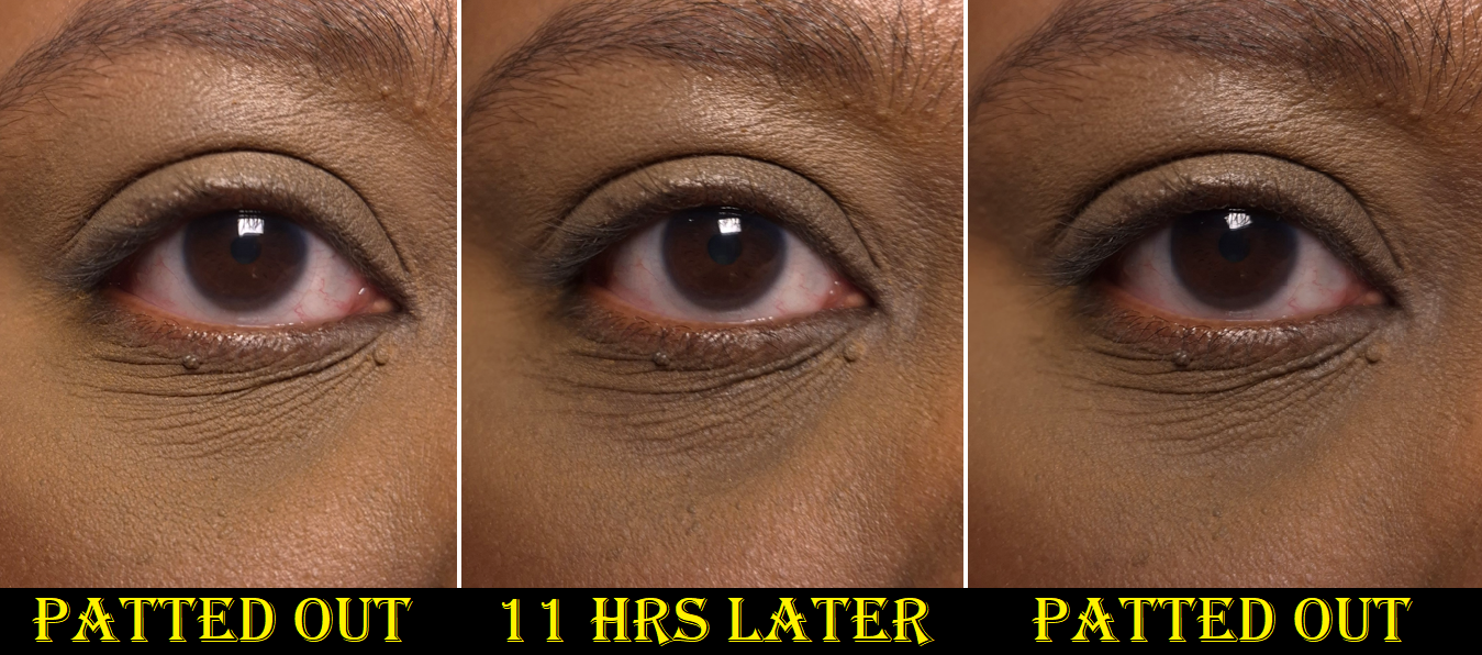
Every time I put on this perfume-free concealer, I have high hopes. My undereyes look so much smoother than any other concealer thus far has been able to achieve, and the coverage is great! When I pair it with the brand’s Universal Libre Powder, it looks like a match made in heaven! Unfortunately for me, it just doesn’t have the longevity I need.
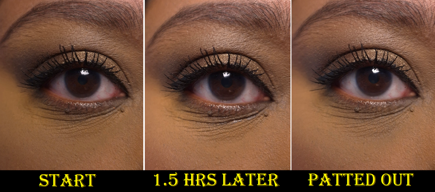
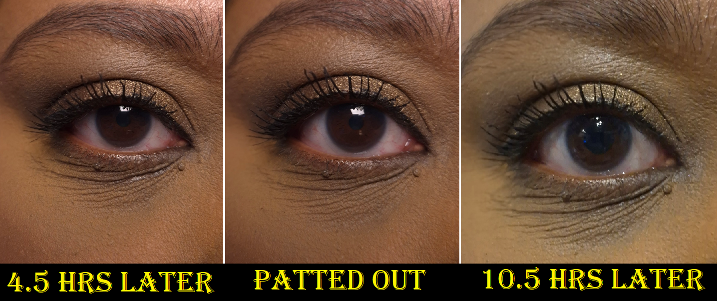
Six hours is the longest it can go before I see my dark circles underneath what remains of the concealer. In the worst circumstances, my natural oils fill the creases and breaks it down within fifteen minutes if I haven’t powdered it enough. In other circumstances with powders heavier than Chanel’s (such as my go-to Charlotte Tilbury or even the Huda Easy Bake Powder), the concealer gradually fades to the point that I can see my under eye darkness again within three or so hours.
Technically, if I continually touch up my under eyes (for example smoothing out the creases with the remnants of what is left on my concealer brush and then powdering it with the remnants of what is on my setting brush), it can look “passably” faded between 8-10 hours before it’s not salvageable anymore. However, I consider that very unrealistic. I don’t like to babysit my makeup.
I’ve tried pairing it with the Milk Hydro Grip Eye Primer (which I also use with my KVD Good Apple Concealer), tried using less concealer and less powder, using more concealer and more powder (better outcome), waiting a minute for it to settle before setting it with powder, setting the concealer with powder immediately after applying it (better outcome also), doing alternate layers of concealer > powder > more concealer > and more powder, and mixing it with a few other concealers. I’ve tried using setting spray, drying my undereyes, keeping my undereyes moisturized. Nothing I do can get me more than six hours of nice wear time.
I don’t usually show all day wear tests because I cannot figure out how to get consistent lighting. The last photo though is especially off because I forgot to turn on my usual lights.
If I had to guess what’s affecting how the concealer wears, I would say it’s probably the combination of my natural oils breaking the concealer down (it’s supposed to be waterproof not oil-proof) and the hydrating skincare ingredients, such as glycerin and sodium hyaluronate, that my skin soaks up. Maybe there’s an ingredient that causes an increase in my oil production, since my undereye skin is usually not oily on a consecutive basis, yet it tends to be oily each time I wear this concealer. Maybe the consistency is too creamy and the concealer cannot stay put in the lines of my eyes. The Ultra Le Teint Le Correcteur has film formers that are meant to flex with movement and increase the concealer’s adhesion to the skin, which I am prone to believe considering how easily the concealer smooths back into place with a brush instead of coming off even more after being disturbed on the skin. Perhaps it’s too creamy, since those kind of concealers have never worked for me (e.g. Nars Radiant Creamy Concealer and the Creamy version of Tarte Shape Tape).
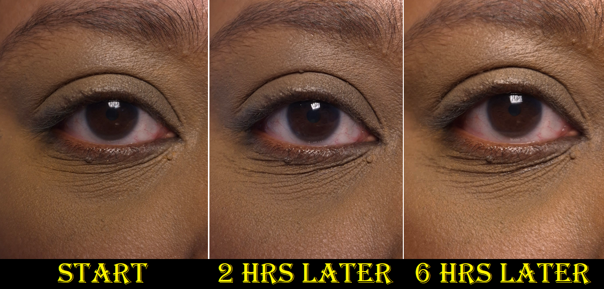
Recently, I decided to try using the Les Beiges Water-Fresh Complexion Touch as an undereye primer for this concealer (since it’s supposed to be usable as a concealer too). This combination gave me six hours of wear before needing to be seriously touched up. However, if I use too much of the Complexion Touch or not enough Ultra Le Teint Le Correcteur and powder on top, it gives worse results. Essentially, finding the right balance time and again is difficult.
I love how this concealer looks in its best state, to the point that I am still using it. However, I just wear it on days I know I will not be leaving the house and when I’m less likely to have visitors.
BD91 is a tad more yellow with not enough warmth to be a perfect shade match for me, but I never wear B110. It turns out that shade is still too dark and the neutral undertone looks even more unnatural on me. So, I at least confirmed for myself that B110 is not a shade option for me. I need to stick with the golden tones. Photos of this are in the powder section.
Based on my experience, I can’t really recommend this product. I don’t mind having to use a second product to prime my eye area, but to still need to do touch ups throughout the day is bothersome. I’m willing to buy expensive makeup if it’s going to make my life easier; this one did not. I acknowledge that other people have not had the same problems with it that I do. If it was able to last at least 8 hours without needing a touch up, I’d have been over the moon about this concealer. Unfortunately, it just didn’t work out and I’ve gone above and beyond already in testing various methods.
Since this released and until February, the only reviewer I found who had a similar experience to me has been Sofia Sees Beauty. Ironically, she likes the Prada concealer more (though she doesn’t recommend that either) and in the majority of the Chanel vs Prada videos I watched, everyone preferred Chanel’s concealer. So, there seems to be certain skin types that this product just doesn’t work for.
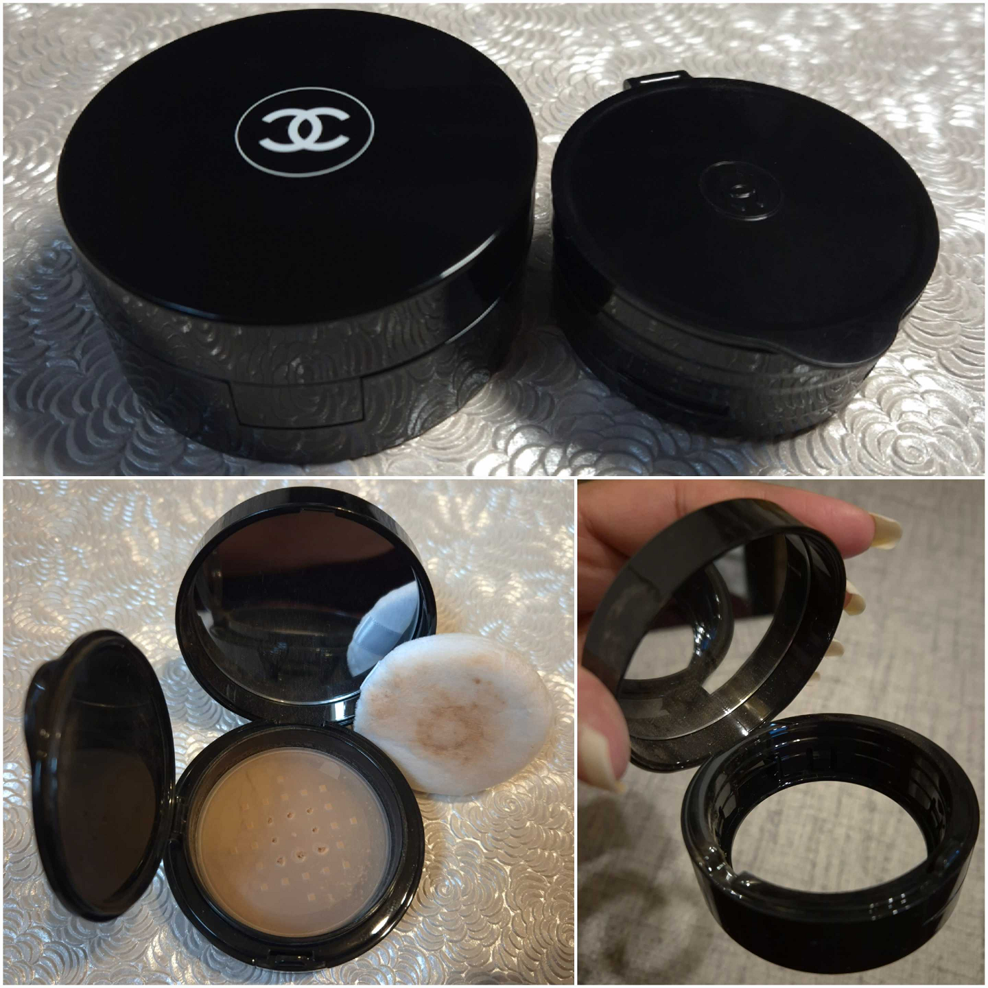
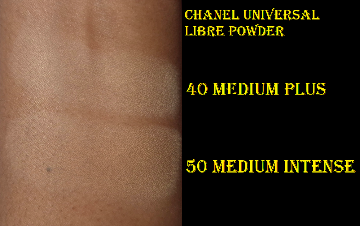
Chanel Universal Libre Powder (On-the-Go Format) in 40 Medium Plus and 50 Medium Intense
Based on the ingredient lists I can see on Chanel’s website, the main differences between the original format of this powder and the refillable “to-go version” is that the standard contains silica instead of cellulose, plus the additional ingredients towards the bottom which are sodium lauroyl glutamate, lysine, and magnesium chloride.
Since I consider the powders to be pretty much the same, and the two products are similarly priced at the discount websites, I opted for the newer packaging. There is a huge difference in the amount of product though, considering the non-refillable jar contains 1 oz (30 grams) of product, but the refillable packaging contains 0.21 oz (6 grams). I’ve only ever used up one powder, so it’s not a concern to me, but that could be a factor for others. I also heard that the jar packaging is super messy to handle. I have always kept the stickers over the holes of my loose powders and punctured just a few so that I have way more control over how much comes out. I’m not sure if even that tactic would be enough. I find that the refill packaging is still messy if I don’t use my typical methods.
I hate having powder float everywhere, so I only punctured the 8 innermost holes in the sticker. I knock the base to tip the powder contents out onto the lid of the refill. I use what’s needed. I pick up the excess powder back up with my brush to clean off the lid. If there’s still too much powder left, then I use the powder puff that’s included (in both the full to-go packaging and the solo refills) to wipe off the rest. Then I place the puff back over the sticker and holes, and close everything up! The reason I clear the lid each time is so that the top of the puff will remain looking clean.
I have both the full packaging and a separate refill. The first shade I bought (50 Medium Intense) looks light in the swatches below, but it deepens up a little on my skin. I can wear it on my face, but not under my eyes. Also, the closure part of the refill lid is so easy to open that I worried if I stored it anywhere other than flat on a shelf that I’d have a massive mess to clean up. So, I put it back in the unicarton on my shelf and I waited for a good sale to get the complete packaging in the shade 40 Medium Plus. That one is perfect for my undereyes!
As far as I’m aware, this powder is meant to lightly mattify and be translucent, rather than offering coverage like a powder foundation. So, I was surprised to discover that the shades 70, 91, 121, and 152 exist. I haven’t found a single retailer in Germany that sells anything darker than 50. The darker shades are only on the Chanel website.
I’m glad that all the hype about this powder being dry-skin friendly is true. It is a super finely milled and thin powder. It doesn’t work as well with my concealers that require stronger powders to lock them in, but I bought this specifically to pair with Chanel’s concealer. Although I still have problems with the wear time of the concealer, the Chanel powder has given me the best results with it. I find it to be slightly blurring and this is the most lightweight loose powder I own that can successfully give me a soft matte finish without making my face look drier. That’s why I don’t think this will work well for people with oily skin. If I use the bare minimum of skincare with most of my foundations, this powder will keep me matte for most of the day, but when my products give me dewy skin and I use the Chanel Powder, I become shiny again within four hours. I imagine that length of time would be increased for someone who doesn’t have dry skin like mine.
I like Chanel’s powder more than the uber expensive Guerlain Parure Gold Powder because I can’t smell any fragrance (even though this does have parfum listed in the ingredients).
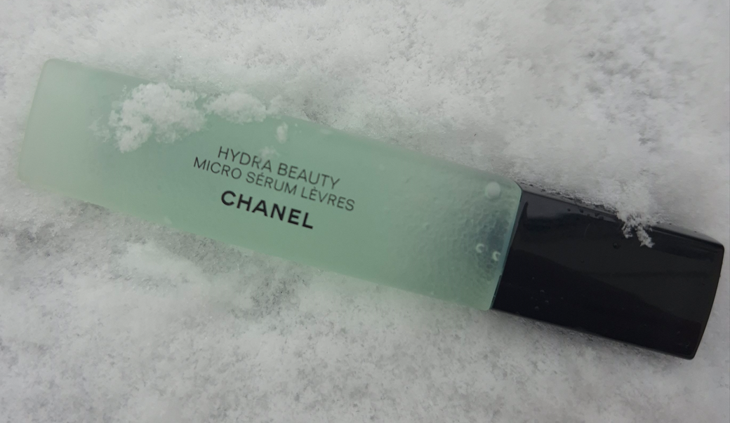
Chanel Hydra Beauty Micro Sérum
I didn’t know about this product’s existence until Kackie Reviews Beauty talked about it in one of her videos. The way she described it was so fascinating that I bought it the very next day! The retail price is €56 ($60) but I got mine from Parfümerie Pieper for €39.
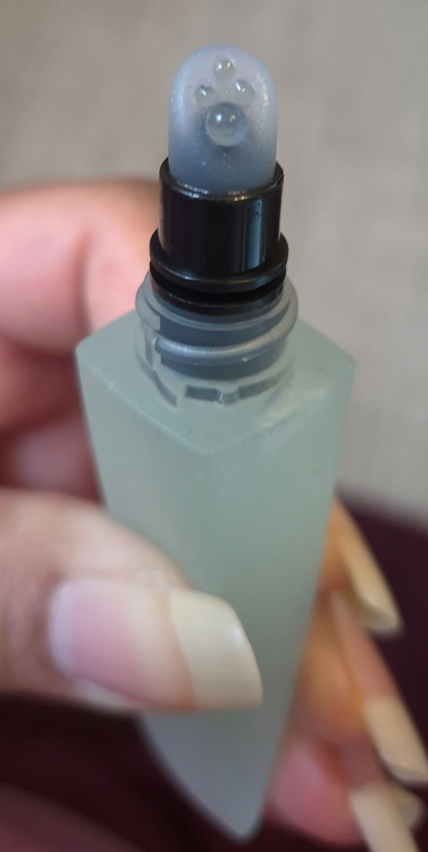
I usually take product descriptions with a grain of salt, but Chanel’s is pretty on point with what I have experienced. According to them: “The Micro Sérum Lèvres is a dual-phase formula consisting of an aqueous base with hyaluronic acid and White Camellia Extract, which have a moisturizing, plumping, and soothing effect, and an oily phase with White Camellia OFA (Oleofractioned Active) micro-droplets which melt into skin and lock in hydration.” Furthermore, “this lightweight and water-fresh serum immediately absorbs and forms a thin protective layer on lips, keeping them hydrated for up to 24 hours** and leaving them perfectly prepped for makeup.”
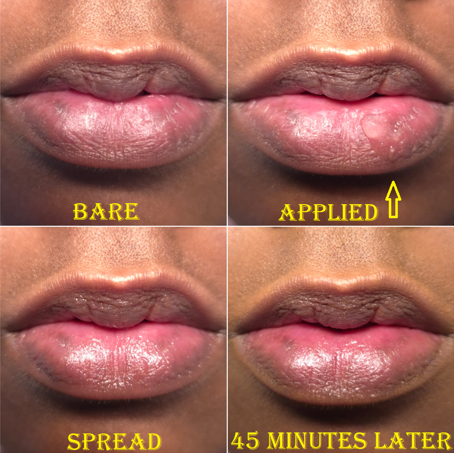
This serum “plumps” in the sense that it fills in lip lines, and its shine gives an appearance of fullness, but this is not a lip plumper that would cause the lips to be enlarged. Chanel doesn’t call this a lip plumper, but many customers would assume it could double as one by stating that this has “plumping effects.” This is the only aspect of the website description that is questionable.
After applying the Hydra Beauty Micro Serum, I’m left with a somewhat shiny finish on my lips, which have the tiniest bit of grip. I can wear this alone as a gloss or balm, but the occlusive gel layer is so lightweight that I need to reapply it at least once or twice throughout the day, especially since it’s easily removed while eating. When I rub my lips together, it feels truly unlike any other lip product I’ve used. Also, this is not fragrance-free, since it has a slight fruit-candy type of scent.
What makes this a useful product to me is how quickly it seeps in to smooth and hydrate my lips, combined with its priming abilities. I have spent a long time seeking products that nourish and condition my lips. All of my favorites are thick and/or sticky, oily, and basically don’t have the kind of consistency that I can use to continue improving the condition of my lips (or prevent my lips from drying further) while wearing other products on top. Products like the Ami Colé Lip Treatment Oil, Clarins Lip Comfort Oil, and Eadem Le Chouchou Peptide Lip Balm are better at improving the condition of my lips over the course of a full day, but this Chanel product is what I’ve been using when I want my lips to look better fast, and wiping those other products off my lips would leave too much residue behind. That occlusive layer is what makes my favorites and so long-lasting, while also preventing me from using them as lip prep products. This is where the Chanel serum fills a void in my collection.
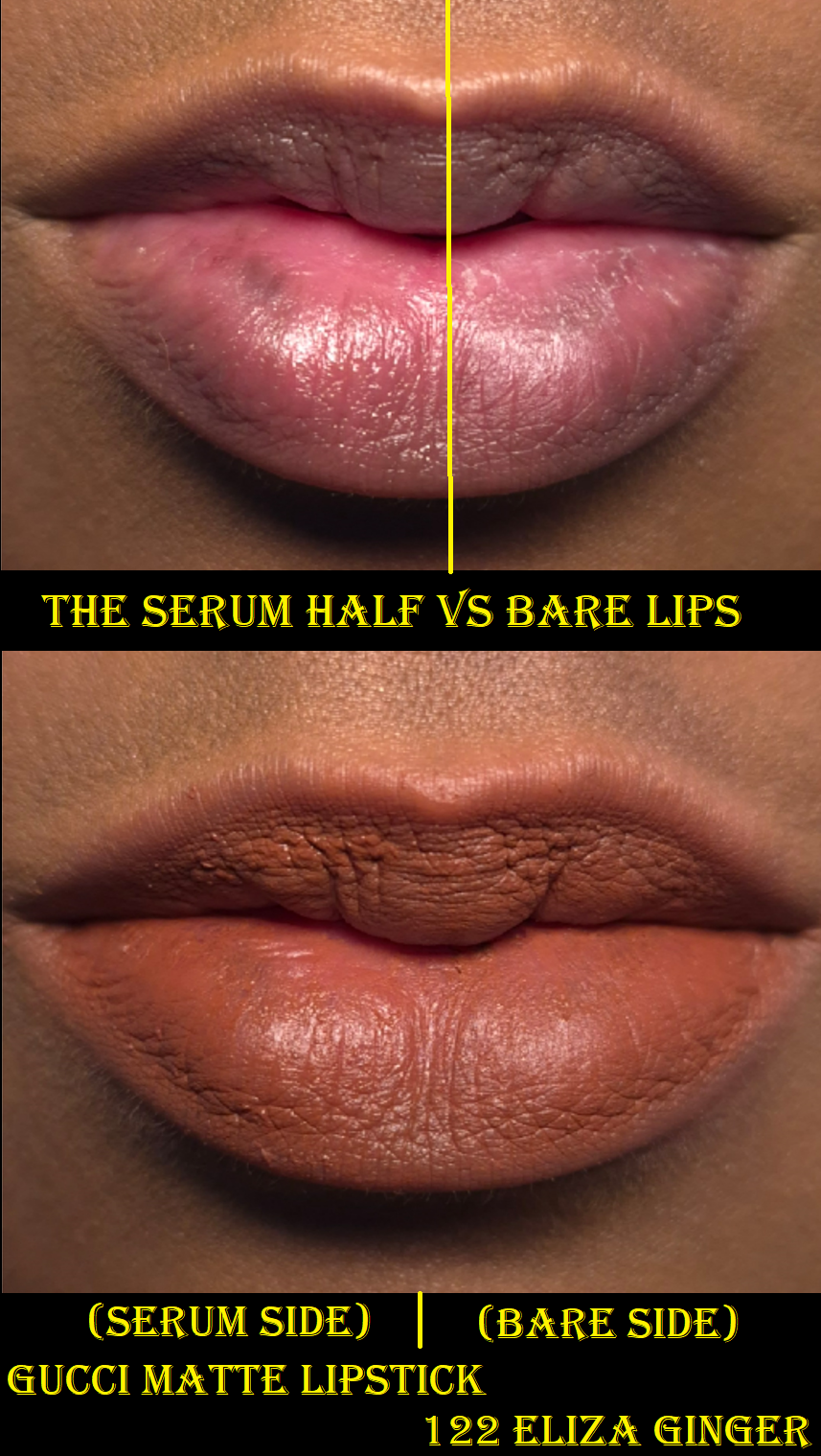
The reason I wear lip glosses and balms so much isn’t just out of enjoyment of low maintenance products. It’s also out of necessity. Although this lip serum can make matte lipsticks look satin, I’ll take that over not being able to wear my lipsticks that often due to my chronic dry lips issue.
So, this isn’t deeply nourishing to me. It’s a quick fix. According to the statistics Chanel provided, “After 4 weeks of use, lips look 49%* more plump and 70%* smoother. Natural lip colour appears 62%*** more vibrant.”
I have not used this product daily for 4 weeks straight, so I cannot comment on how true that sounds or not. Based on at least one week of consistent use, I don’t think the ingredients are enough for my lips to be nourished long-term. This serum has come in handy so many times as a lip primer since I bought it in September. I have only ever used a couple of actual lip primers, so I can’t say for sure how much better this is from other lip preps out there. Since I’m not interested in spending even more money trying to test other products like this, I will stick with what I know. Should I ever use up this product, I hope that I’ll be able to get another on sale again!
This lip serum is useful to be able to wear less comfortable lipstick formulas. However, if I stick to only buying balms that condition and deposit a nice amount of color, I wouldn’t need the Chanel Hydra Micro Serum as much. If I downsize my lip collection each year, there may reach a point that it will no longer be necessary to have a product like this around. That day isn’t today though, and I am happy I’ve got it!
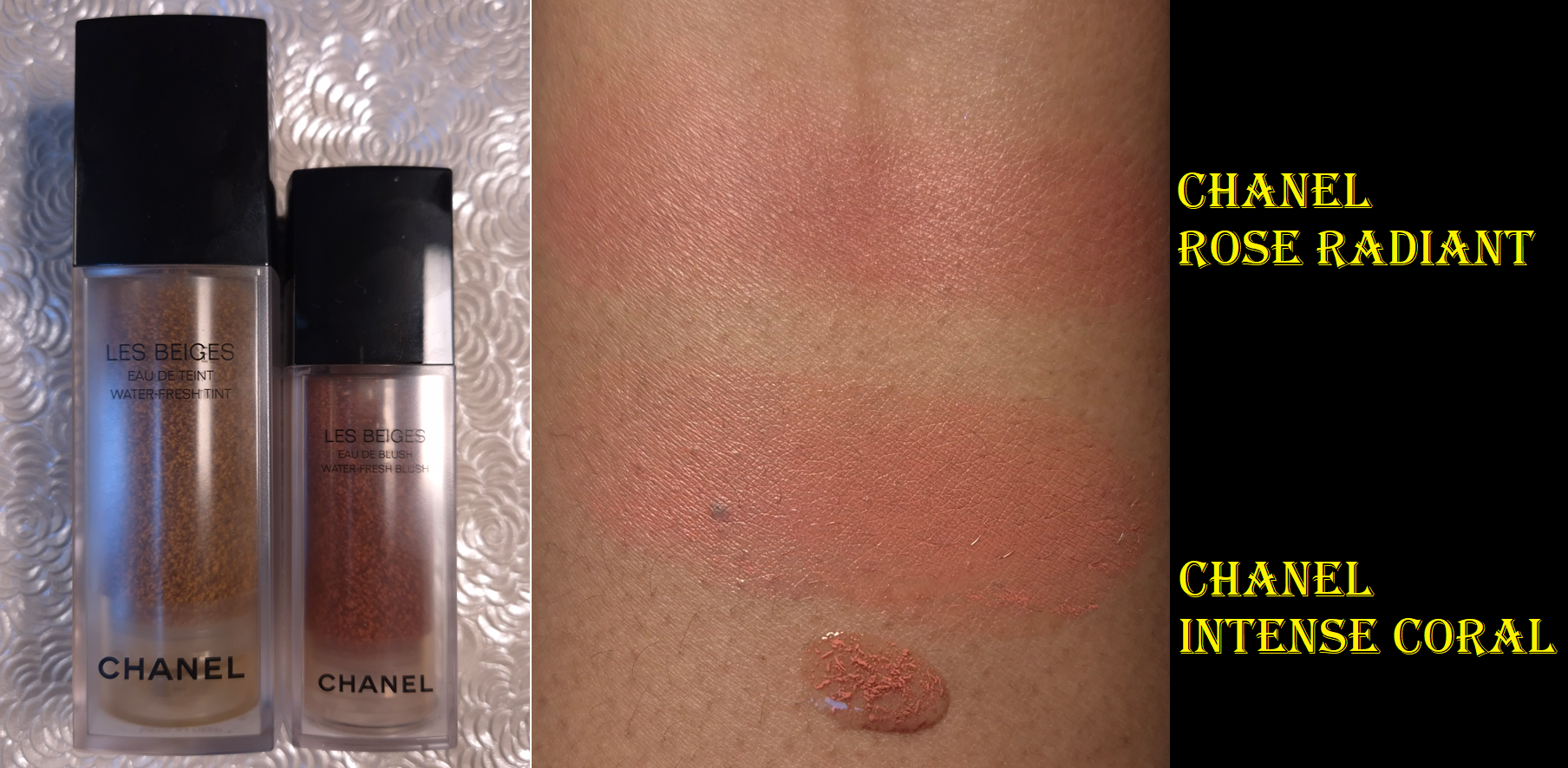
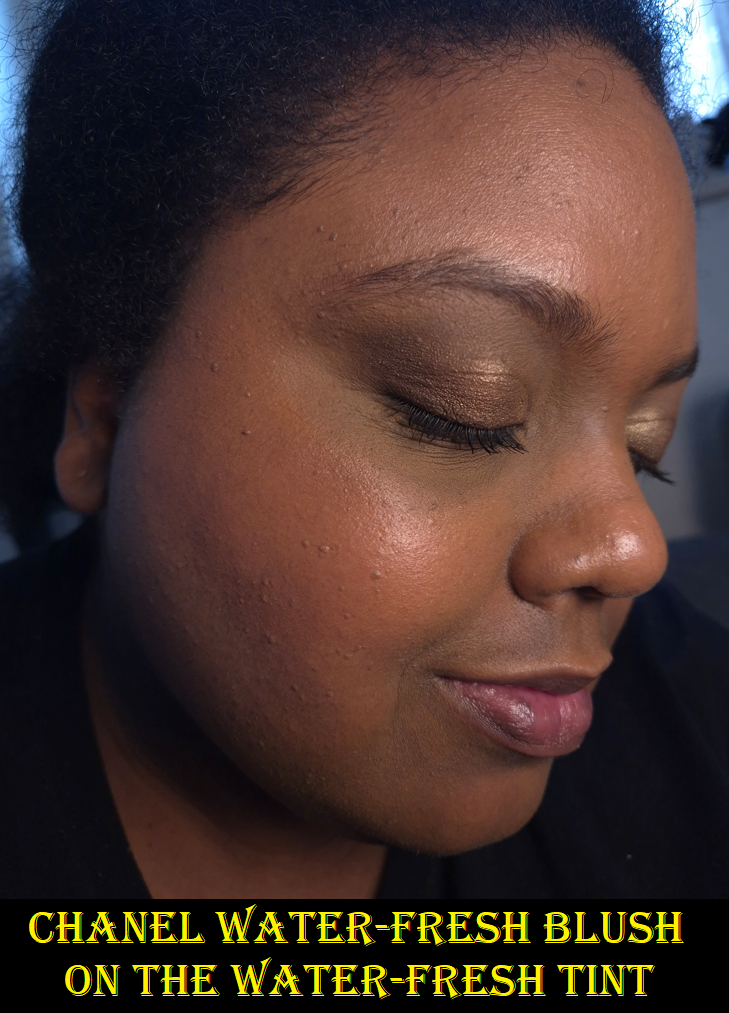
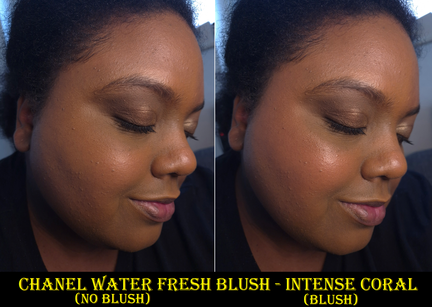
Chanel Les Beiges Water-Fresh Blush in Intense Coral
I’ve been avoiding buying liquid and cream blushes for over three years, so I had no plans to buy the Chanel Blush until I watched Alicia Archer’s video.
Admittedly, my first choice for the color would have been Deep Bronze, but it’s a Chanel exclusive shade. So, I went with my second favorite option and ordered Intense Coral from Flaconi at a discount. Intense Coral shows up on me and can be built up in more obvious layers, but it might not look that great on someone with a skintone several shades darker than mine.
Intense Coral reminded me of the Joues Contraste Intense Cream-to-Powder Blush in the shade Radiant Rose, but Radiant Rose is the tiniest bit darker with a little more warmth.
The watery gel-like consistency and the fragrance are the same as the Water-Fresh Tint. The blush has half the amount of product, but it isn’t half the price of the tint ($72 vs $56). The price per ounce or milliliters for the blush is even more expensive here, considering it’s €67 for the tint and €55 for the blush.
I like the hydrated feel of the blush on my skin and that it dries down. One pump is enough to give a beautiful flush to both cheeks. Although I can blend it well with fingers, I prefer the control I get with a brush application by pumping the blush into the back of my hand and coating the brush bristles evenly before alternating pouncing the product onto both cheeks.
When I wear this on my bare skin, even on top of skincare, this has terrible longevity. The blush is significantly faded within a few hours. At a minimum, if I wear my typical skin prep products and the Chanel Water Fresh Tint underneath the blush, it can last most of the day with an acceptable amount of fading. However, it is still susceptible to being easily removed by liquids. On one of the testing days, my watery eyes caused the skin tint and blush tint to disappear where the droplets rolled down my cheek. Adding a primer to the prep steps is enough to combat the water-soluble issue and prevent the blush from fading.
When I wear the Water Fresh Blush on top of my Chanel N1 Foundation, I have no longevity issues at all. I figure that’s because it provides an even stronger barrier between my skin and the blush. So, although this product is appealing to makeup minimalists and those that want the most lightweight layers of product with the most skin-like finishes, this blush has to be used in specific ways to get it to last. I’d also like to note that due to lighting, the blush is easier to see in person than in my photos.
I like the blush color, the dewy looking finish, the seamless blend, and how easy it is to use despite being a liquid form. Usually liquid blushes are the most troublesome for me to work with. The €36 I paid for this was a fair price for Chanel makeup. I like this product a lot, but I don’t think it will become a favorite purely because I am a powder blush fan. I wanted to be able to wear this all day on bare skin and have it still be long-lasting. I haven’t tested this idea yet, but if adding a face primer to my cheeks is enough to fix the longevity problem without needing to wear a tint/foundation too, this could make me use this blush more often. I’d be able to wear it on low-makeup days as planned.
That ends this post! I hope it has been helpful. Please keep an eye out for Part 2 if you enjoyed this!
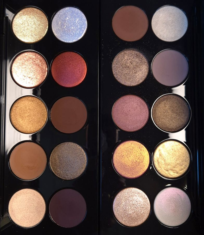
In May 2025, there was a sale on Pat Mcgrath’s website that applied to bundles. So, I was able to get two Mothership Palettes for €73 each. Both of these palettes have been available for several years, so I can’t explain why I suddenly wanted them, but I did.
Because these palettes are “old” in terms of release date (2018 for Bronze Seduction and 2019 for Divine Rose), I feared the Motherships purchased in 2025 wouldn’t have the same formulas as the original launches. I cannot say whether the Moonlit and Sunlit Seduction Palettes were simply free of the four “special shades” in the right section of those palettes or if all of the later eyeshadow formulas were tweaked. I just know that Petalmorphosis has very different shimmers compared to what is in Motherships 1-9. Considering the additional formula differences among the brand’s 5-pan and holiday palettes, I wasn’t sure if PML quit working with the same lab entirely.
Thankfully, the quality of my new palettes match that of my Mothership 3. Even though there are no more “special shades” in Motherships 10-12, the special shades continue to be produced in the palettes that always had them. It’s great to confirm that the mattes are still pigmented and easy to blend. They layer well with each other. The shimmers are opaque and very impactful. The duochromes and iridescent shades are a bit flaky and can be messy, but they still have that “wow” factor!
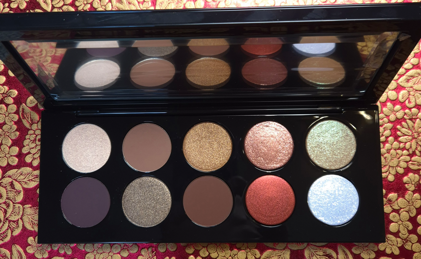
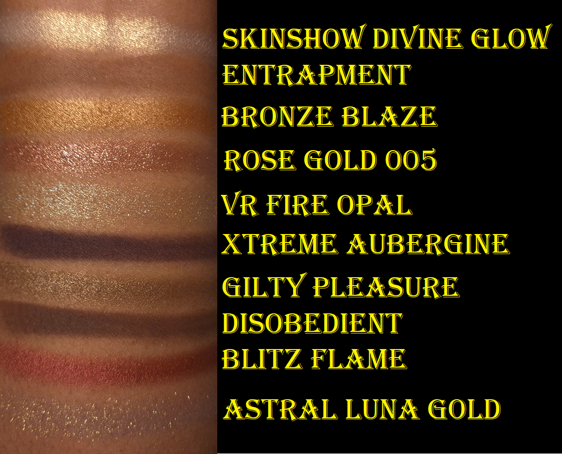
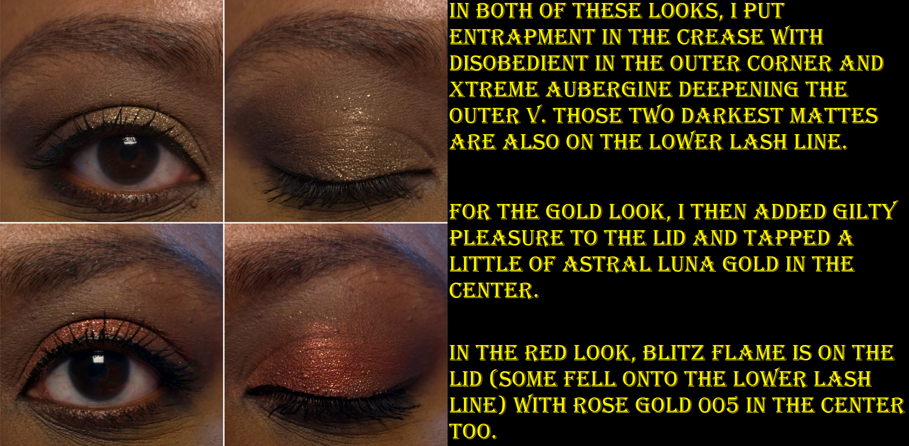
Mothership V: Bronze Seduction
There really isn’t much to say in terms of a review. These are the high quality eyeshadows I know and love from the brand. They’re soft and powdery without excessive kickup. They’re blendable, layer well, and the shimmers are intense enough that I don’t feel the need to dampen my brush to apply them. They don’t crease and they’re overall wonderful to work with!
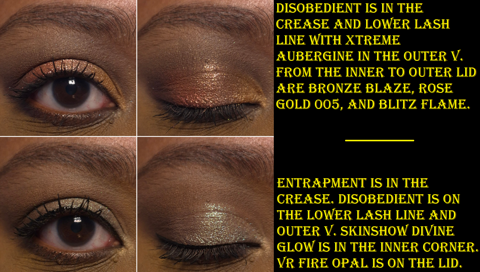
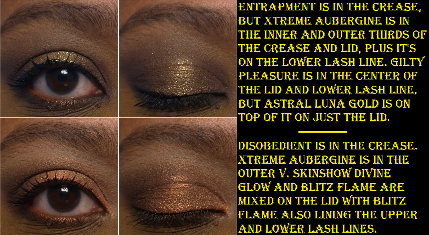
Xtreme Aubergine is the only one that requires a little extra time to blend because it can stick and be patchy. It’s so pigmented that it can be easy to go overboard. So, I use something small and pointed like the Sonia G Crease One for outer corner work. I build it up carefully and slowly, which prevents me from having issues.
I rarely use red eyeshadows, so that was a big reason I wasn’t interested in this palette in the past. Then, it dawned on me that if I exclude Blitz Flame, this is basically a brown neutral palette. I was in my colorful phase in 2018, but now I appreciate neutrals again, and find this palette to be super appealing.
After buying Bronze Seduction, I used it on and off for a few months, but then it took a backseat to other new launches (and even the YSL Over Brun Quad and Natasha Denona Mini Gold). Normally, I would take that as an indication that I shouldn’t have made this purchase since I don’t use it enough. This time, I can’t regret it because of how beautiful the colors are and the knowledge that it’s available to me whenever I do have the urge to use it. Considering everything going on with the brand right now, I appreciate the nostalgia of having a palette that reminds me of a time when PML was in its prime.
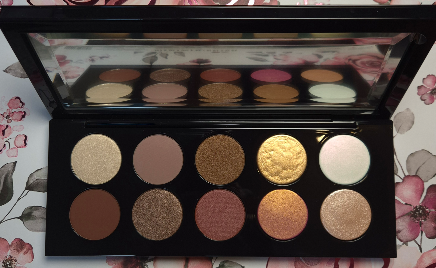
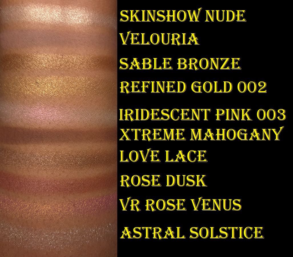
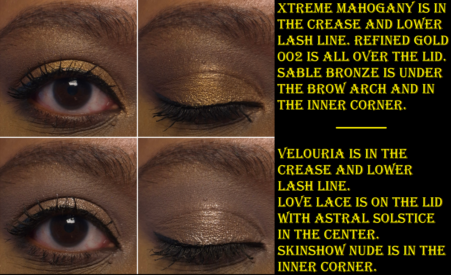
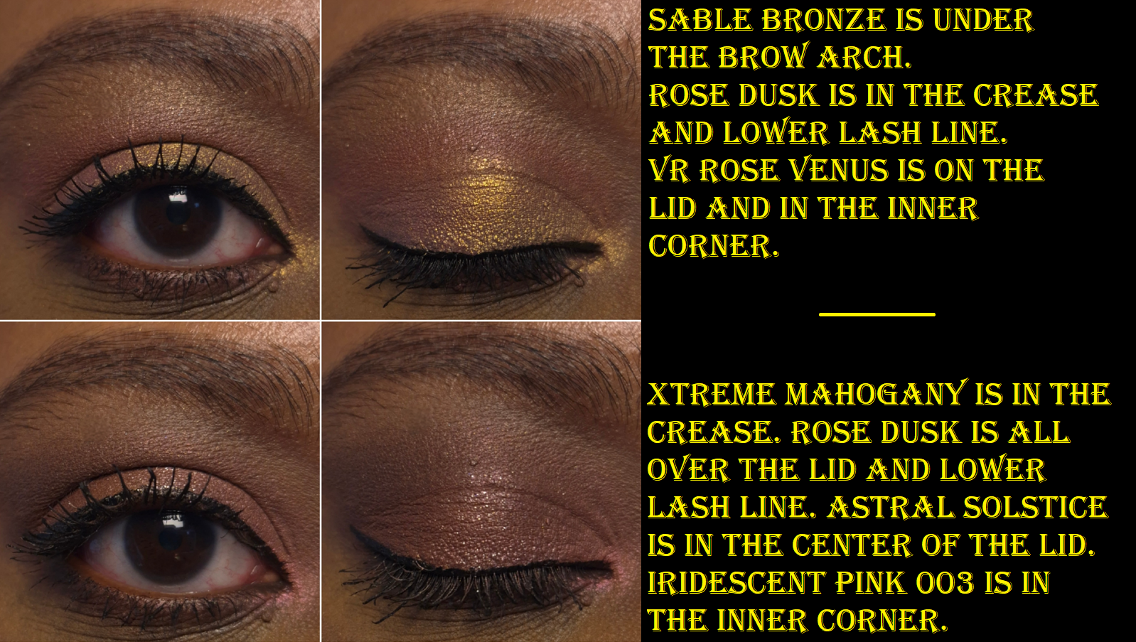
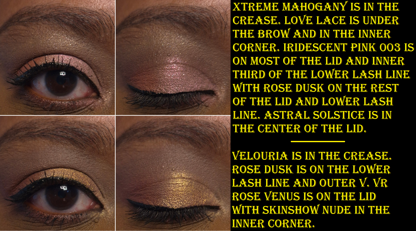
Mothership VII: Divine Rose
Getting me to want a palette with light eyeshadows and a low contrast color story was a hard sell, especially during my phase when I was sick of pinks, but PML managed to do it in the end. The best shade I have in this palette to create depth with is Xtreme Mahogany, and it’s not quite enough to satisfy me. However, there are plenty of dark colors across the other Mothership Palettes that I can pull from. I still liked all the looks I created for this post, but I’ve needed to reach outside of this palette for all the looks I’ve recreated since then.
Divine Rose performed just as well as Bronze Seduction and gave me no performance issues. I really wanted the YSL Quad in 825 Burning Desire, but after seeing Han Beauty 101’s comparison swatches, I decided there were too many shades in common. YSL, Victoria Beckham Beauty, and Prada make my favorite luxury eyeshadows, so the fact that Divine Rose was good enough to keep me from buying Burning Desire says a lot. Still, I honestly haven’t used this palette very much after the testing phase ended. I have to be in a very specific mood when I want to wear these type of colors, but that’s precisely why having Divine Rose is a good thing. The Tarte Tartelette Juicy Amazonian Clay Eyeshadow Palette was supposed to be my ultimate pink palette and get me to stop buying more. So far, Divine Rose has been the one to curb my appetite.
2025/2026 UPDATED RANKING FROM FAVORITE TO LEAST FAVORITE:
1. Mothership III – Subversive
2. Celestial Nirvana (5 pan) – Bronze Bliss
3. Luxe Quad – Interstellar Icon
4. Mothership VIII – Divine Rose II
5.Mothership V – Bronze Seduction
6.Mothership XII – Petalmorphosis
7. Celestial Nirvana (5 pan) – Nude Allure
8. Mothership IX – Huetopian Dream
9. Mothership VII – Divine Rose
10. Bijoux Brilliance (5 pan) – Bronze Ecstasy
11. Pat Mcgrath Labs x Star Wars Eye (5 pan) – The Golden One
12. Mega MTHRSHP Celestial Divinity
13. Pat Mcgrath x Star Wars MTHRSHP Galactic Gold
14. Bijoux Brilliance (5 pan) – Lunar Nightshade
15. MTHRSHP Subversive La Vie En Rose
16. Mini Eye Ecstasy: Subversive
17. Pat Mcgrath Labs x Star Wars (5 pan) – Divine Droid
18. Blitz Astral Quad – Nocturnal Nirvana
19. Pat Mcgrath x Star Wars MTHRSHP Dark Galaxy
20. MTHRSHP Rose Decadence
21. MegaMTHRSHP Celestial Nirvana
22. MTHRSHP Velvet Liaison
I can’t end this post without mentioning the Chapter 11 Bankruptcy filing of Pat Mcgrath Labs. Considering this is my number one favorite mainstream brand, it saddens me to see them in this position. At the same time, PML has been too focused on trying to follow the trends of what sells (overuse of pinks and neutrals particularly after the success of Divine Rose I) rather than fostering innovation. There are many other reasons that contributed to customers being unhappy and unwilling to spend as much money on the products that have been released in the past three to five years.
I am still holding out hope that they can make a comeback. It has long been suspected that Pat Mcgrath has had much less creative control in the last years, and the success of the Louis Vuitton makeup line shows that people are still interested in her vision. If she can take back the reigns in the Creative Director position, and the business end of things gets sorted, there could still be hope! PML still has so much potential!
That’s all for now. I’m going to treasure my Motherships even more now!
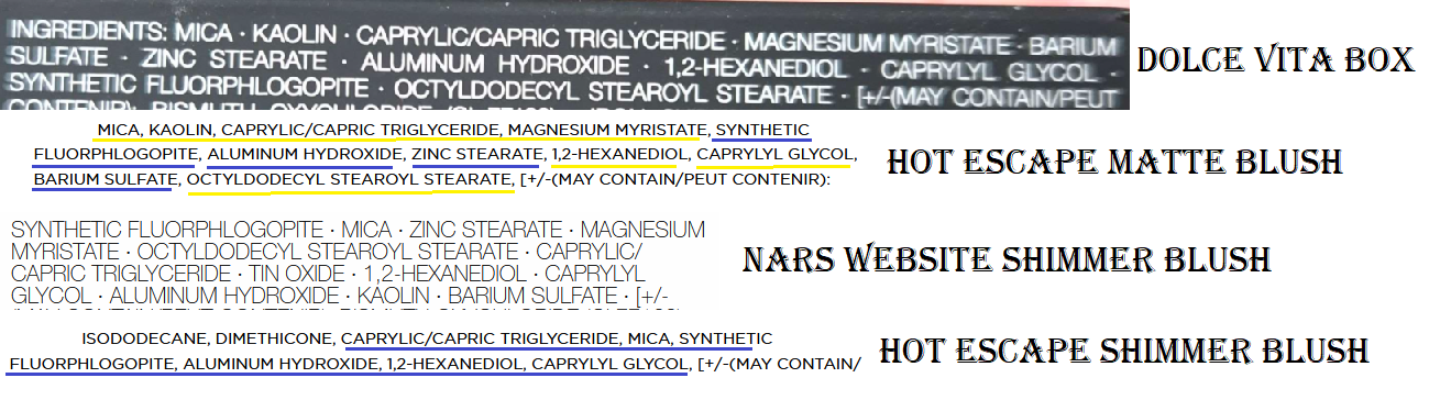
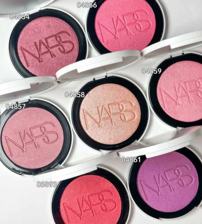
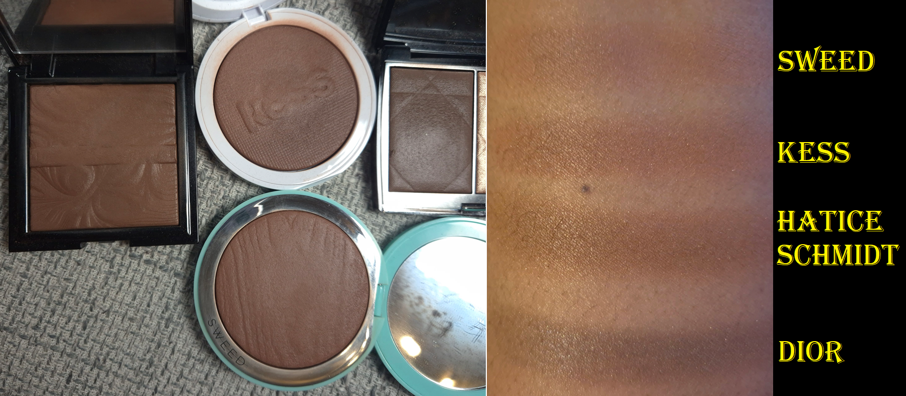
By now, many brands have been moving towards being talc-free due to upcoming changes in EU Regulations, but Nars was among the first by reformulating their bronzers in 2023 and the blushes in 2024. What baffles me is that the formulas of their products are not consistent across the board.
As I mentioned in my review of the Hot Escapes Palette, the highlighters in there share the same names as the highlighters in the Light Reflecting Luminizing Powders range, but the ingredients don’t match up, nor even all of the colors. This has been a growing annoyance for a lot of customers hoping to repurchase their favorite shades, only to discover that they are not identical. For example, my reformulated bronzer in 06 is darker than the even newer 06 bronzer from the Hot Escapes Palette. My older Dolce Vita blush is similar, but not identical to the newer one either. It’s also confusing to buy a product expecting a certain finish and texture, only to end up with something different. The highlighters are a prime example of that.
In an effort to finally put my curiosity to rest, I bought a Light Reflecting Luminizing Powder to compare with what is in the Hot Escapes Palette. I also purchased three blushes in the new formula to compare to the older one.
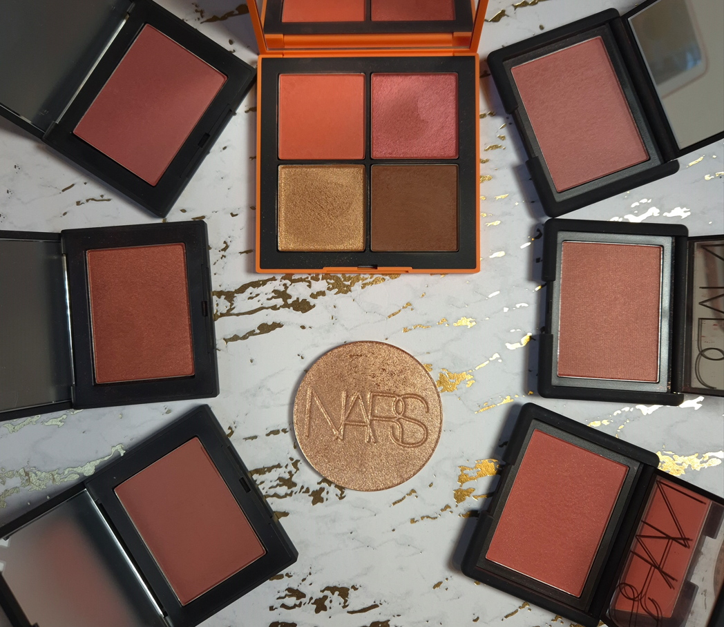
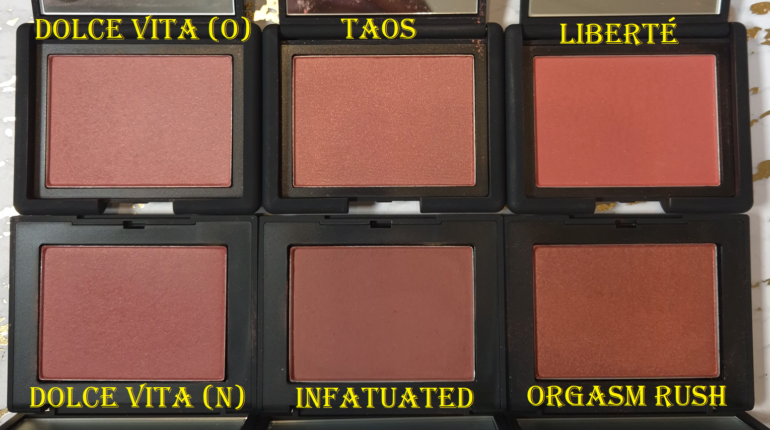
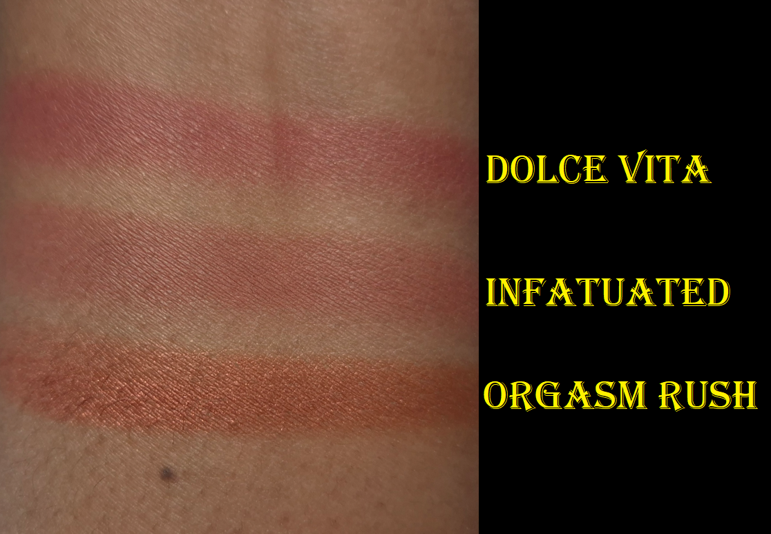
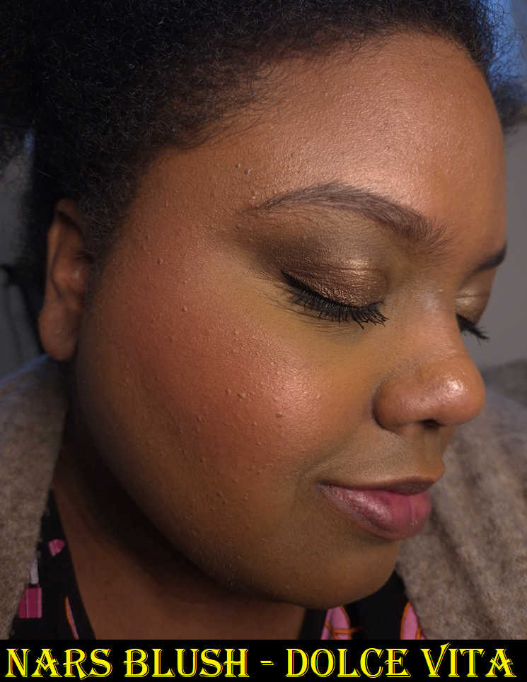
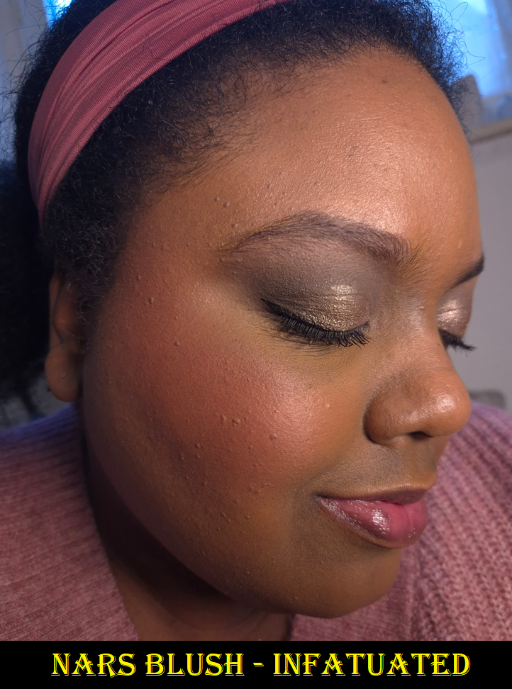
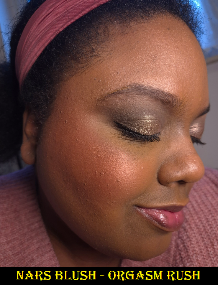
Nars Powder Blushes in Dolce Vita, Infatuated, and Orgasm Rush
A change that Nars made, that I can definitely support, is that these blushes are refillable. Less packaging being produced is better for the environment, but of course I like the ability to just purchase a pan of blush for a cheaper price and be able to stick it in an empty magnetic palette. Unfortunately, Nars hasn’t improved that option since the launch. At the time that I’m writing this in 2026, there are still only 5 shades available as refills. None of those are dark-skin friendly.
The cost of refills from the Nars are €29 each, but I have been able to get the full products from Flaconi for €19 each. So, I don’t have much incentive to buy refills or purchase directly from Nars anyway.
My history with Nars blushes has been long and unstable. To sum up the gist of my Rediscovering Nars Blushes post: I tend to like them, but I rarely love them. They almost always play second fiddle to my MAC blushes.
The matte blush from Hot Escape shares the same ingredients as the current matte single blushes, but the order is shuffled around. The shimmer blush from Hot Escape contains no kaolin, but the current shimmery singles have some (and definitely less than the mattes).
One of the biggest reasons I didn’t like some of Nars’ past blushes is because they looked a little dry on me. So, I thought if the current line of powder blushes use less kaolin, that could have explained why I prefer the blush singles over the older ones, but it’s still the second ingredient in the matte formula. Now, I’m unsure what is responsible for the reformulated blushes looking better on me.
Dolce Vita is described as a “matte dusty rose” and Infatuated as a “matte deep plumberry” but I can see faint shimmer within the surface of the blush pan of Dolce Vita. I cannot see that shimmer in swatches, but there’s a slight glow on my cheeks in the photo below. Both of these blush shades look much softer on my cheeks than the previous Nars blushes. They’re pigmented, but they build color slower than their predecessors. I’ve always given credit to Nars when they’ve launched dark-skin friendly shades. However, they tended to be very intense in pigment and/or bold in color. For someone like me who prefers subtle natural flushes of color and the occasional pop, the lack of nude options is why I often turned to MAC instead.
Although I love the shades Taos and Liberte in the old formula, I didn’t wear them that often because of the issues of being easy to overapply and looking drier on my cheeks than I like. The reformulated blushes don’t have these issues.
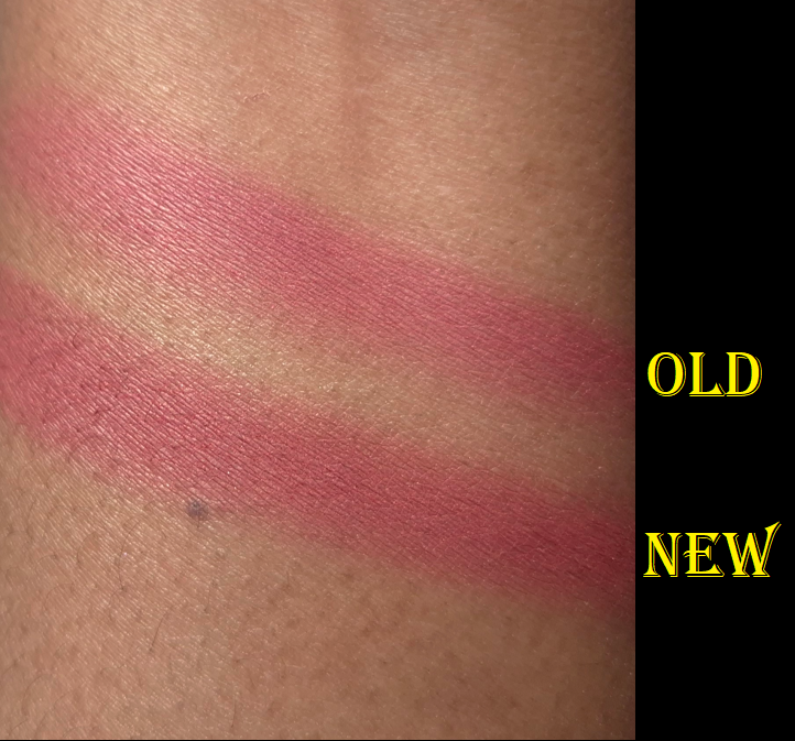
I like my new version of Orgasm Rush better than Night Swim because it’s slightly more buildable and blendable. They don’t seem hugely different in terms of texture (perhaps Orgasm Rush is the slightest bit silkier), yet the small changes made all the difference to me.
The only time Nars used to put this much shimmer in a blush was in their baked gelee formula, so I was surprised to see the shimmer level of Night Swim, and see shades like Orgasm Rush in the permanent blush line. I never ended up reviewing the Nars Orgasm Four Play Blush Quad, but I had the shade Orgasm Rush already from there in the baked gelee formula. Unfortunately, I cannot compare that one with the current talc-free version I own because I left it in the US.
I really like how these single blushes look on me, and I am more likely to reach for these over any others from Nars. That being said, there are still plenty of blushes I like even more from other brands. So, I will only buy additional shades in the future if they are truly breathtaking colors that I can’t resist.
Of course, in true Nars fashion, these relatively new and reformulated blushes aren’t enough. According to @VoceMagazine on Instagram, Nars will be releasing Light Reflecting Luminizing Blushes in seven shades in April or May. I’m guessing these will also be refillable since they share the same compact design as the Light Reflecting Luminizing Powders range.
The link to Voce’s swatch video can be found HERE.
If anyone is wondering, I don’t intend to buy these upcoming blushes.
HIGHLIGHTER
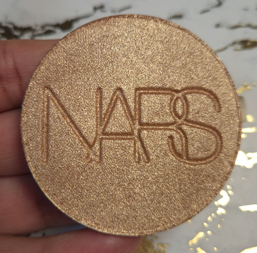
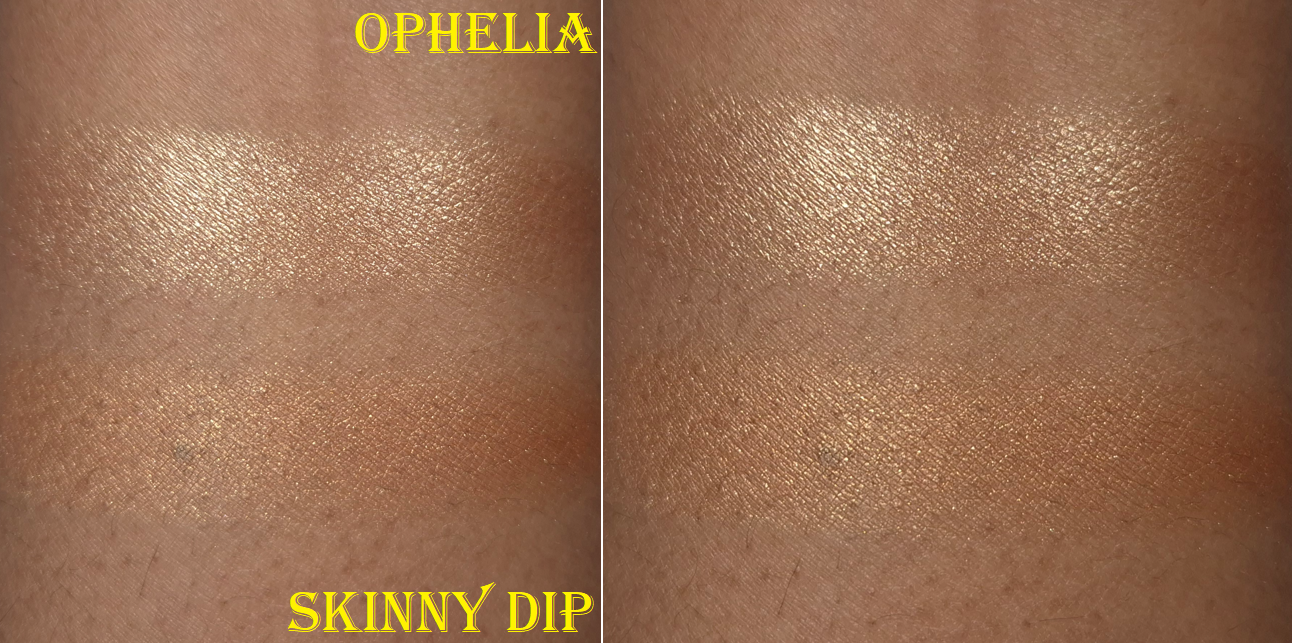
In October 2025, I purchased the refill of the Light Reflecting Luminizing Powder in the shade Ophelia for €19 from Flaconi. I already figured this would not become a favorite of mine based on the review from NikkifromHR, as we have similar highlighter preferences. However, I couldn’t rid myself of the need to buy it in order to personally see how it differed from the Hot Escape highlighter. These kind of decisions based on intense curiosity is something I’m trying to get better about in 2026!
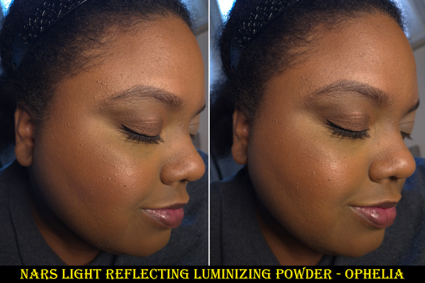
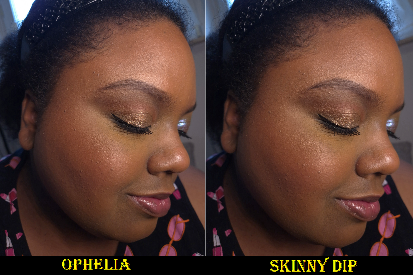
As expected, this did not become a favorite. If I use enough highlighter to get easily visible shine, it’s more metallic looking than I typically go for and the individual shimmer particles are easy to spot when you click the photo to see the enlarged version. It’s smoother than I expected and it’s pretty when looking at it from afar, but it’s still not really to my taste. It’s more important to me to have products that look great in person over ones that look better in photos.
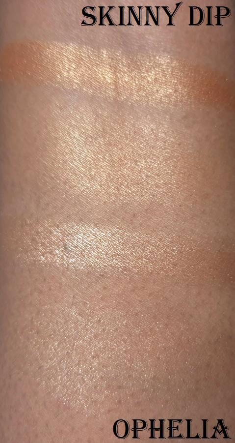
The smallest amount of Ophelia is comparable in luminosity to a light(ish) application of Skinny Dip from the Hot Escape III Palette. Skinny Dip blends into my skin more because it’s darker, but I also find the shimmer particles to be less reflective in a good way. It’s all a matter of preference though and someone else could still love the Light Reflecting formula.
The photos above and below are some examples in different lighting, plus unblended vs blended swatches.
I prefer Skinny Dip, but even that isn’t my favorite. I’ve created many posts featuring highlighters that I prefer even more. Additional ones not included on that list are the Prada Light Glowing Highlighter Powder as my current number one and the Hindash Gradient Highlighter. I love the effect of the Prada one so much that I could be swayed into never buying another highlighter again if not for it being so heavily scented! In any case, I’ll be reaching for Skinny Dip instead of Ophelia if I ever want to create a “Full Face of Nars Products” type of look.
One final thing to note about the Light Reflecting Luminizers is that the refills have plastic mesh backing, so the product is not housed in a pan. I could try to attach a metal sticker to the bottom, but I just store mine within the original refill packaging and not an empty magnetic palette.
That’s all for today. I hope you enjoyed reading and visiting this blog!
I’ve had these products for several months, so I decided I may as well combine them into one review!
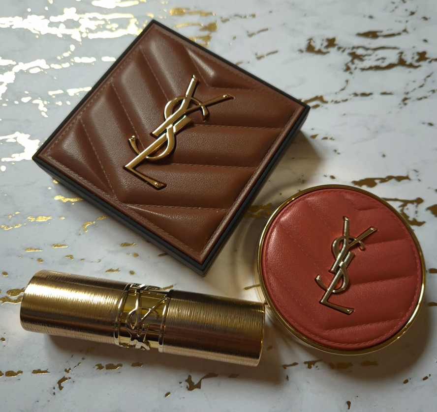
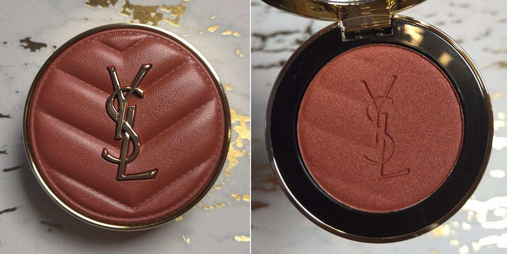
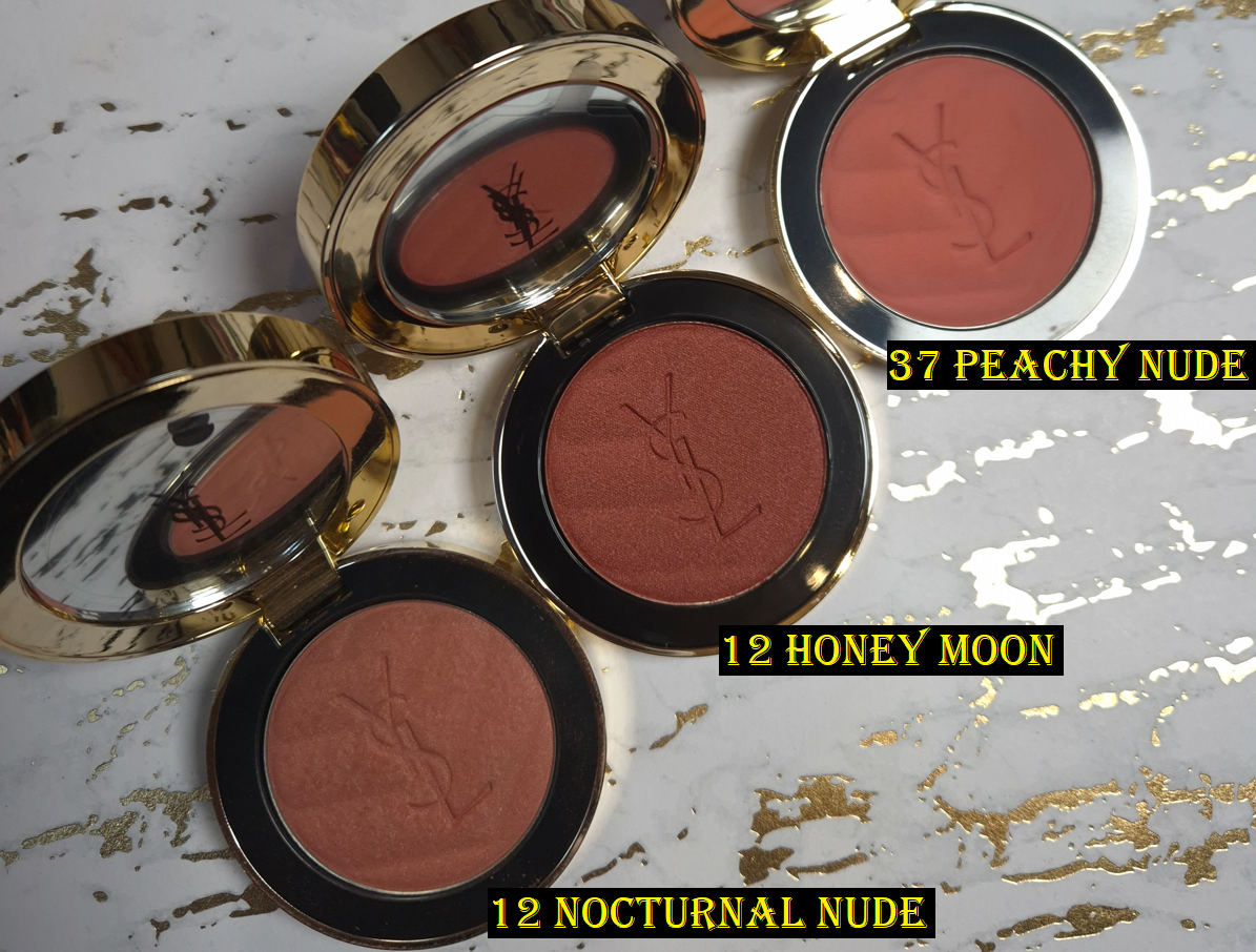
Yves Saint Laurent Make Me Blush Bold Blurring Powder Blush in 12 Honey Moon
YSL started off the year releasing three additional shades to their powder blush line. I first reviewed Peachy Nude, Restless Rosé, and Nocturnal Nude HERE. Then, I discussed Rose Haze and Spicy Berry HERE. My versions of Nude Lavalliere and Berry Bang came from the brand’s first face palette in Golden Oasis HERE.
Although I have plenty of the brand’s blushes already, I have an especially hard time resisting the ones in their shimmer finish. So, I purchased this while at a slight discount via Flaconi. There are technically only shimmer/satin and matte finishes listed in the Make Me Blush Bold Blurring Blush line, but among the shimmers there are a few as sheer as highlighters such as 69 Lavender Lust and another of the three new ones called 10 Stardust Love.
Before we move onto the review, I feel it’s necessary to point out that YSL has already released a number 12 blush, but it’s called Nocturnal Nude. I assumed the duplicate number was a typo or simply an oversight, seeing as how there are at least 18 shades in the range, plus a few in the liquid formula as well. It’s not unbelievable that there could be a mixup. However, Nocturnal Nude was one of the blushes that did not get released at every retailer. In fact, I’m not even sure if it ever launched in the US. I had heard people living in the US had to get theirs from Selfridges in the UK. As for Germany, the only two places I can confirm had Nocturnal Nude was Flaconi and the YSL-Deutschland website. Nocturnal Nude was removed from Flaconi’s website and it has been listed as out of stock at YSL for at least six months. So, it seems as if that blush has been discontinued. It’s still a strange choice to reuse the number, even though Honey Moon is basically an amped up version of the shade in terms of depth, shimmer, and pigmentation levels.
I’m pleased with this new addition, but I hope YSL will consider making a deep brown-pink nude shade someday, since we already have three that lean orange.
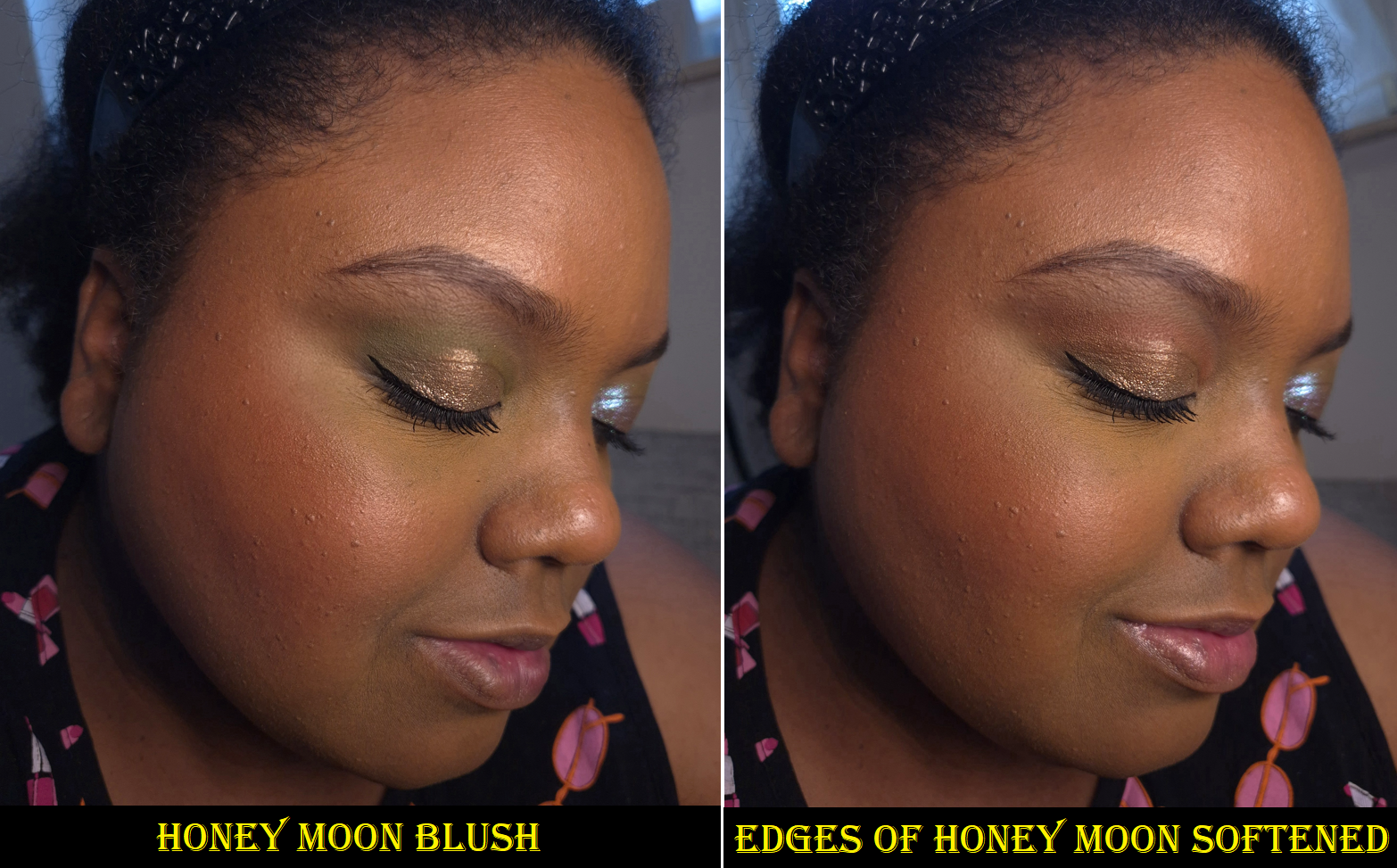
In the second photo, I changed my eyeshadow crease shade and added the YSL Loveshine on my lips.
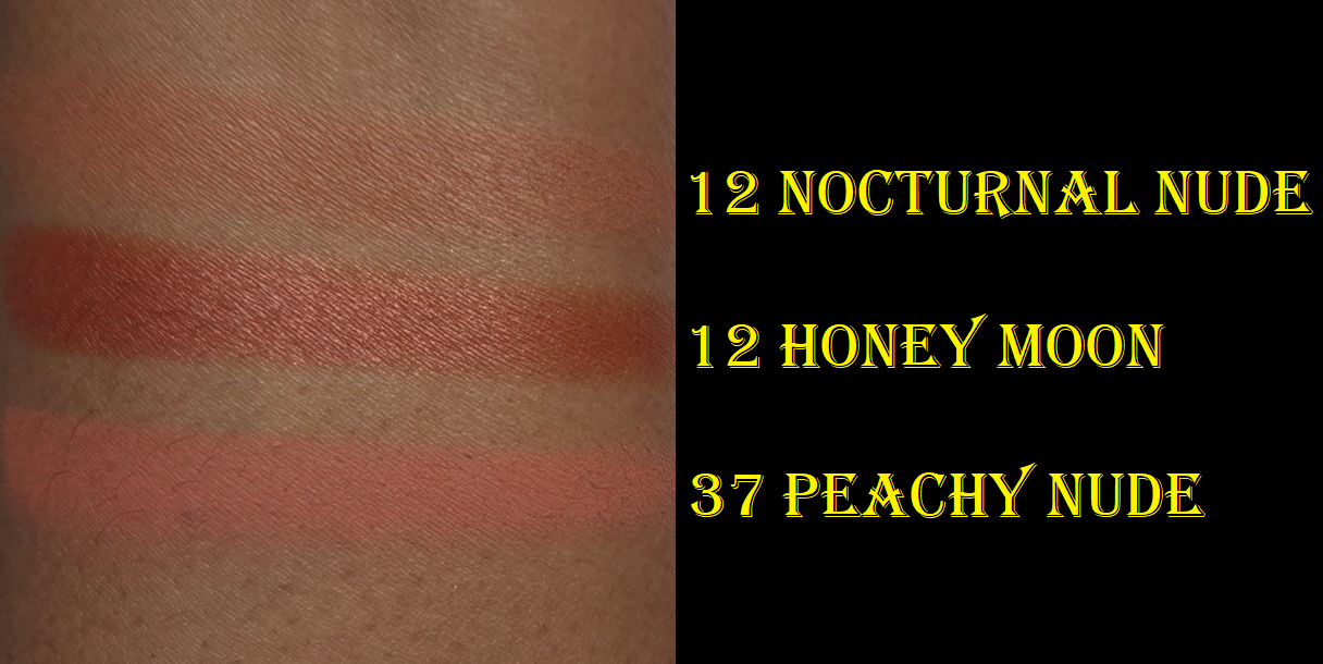
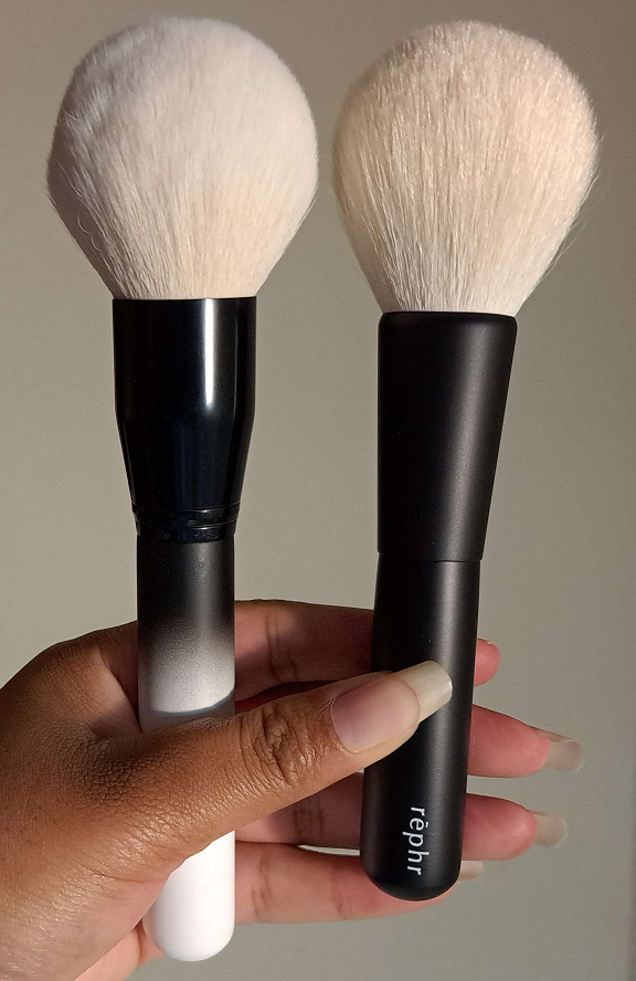
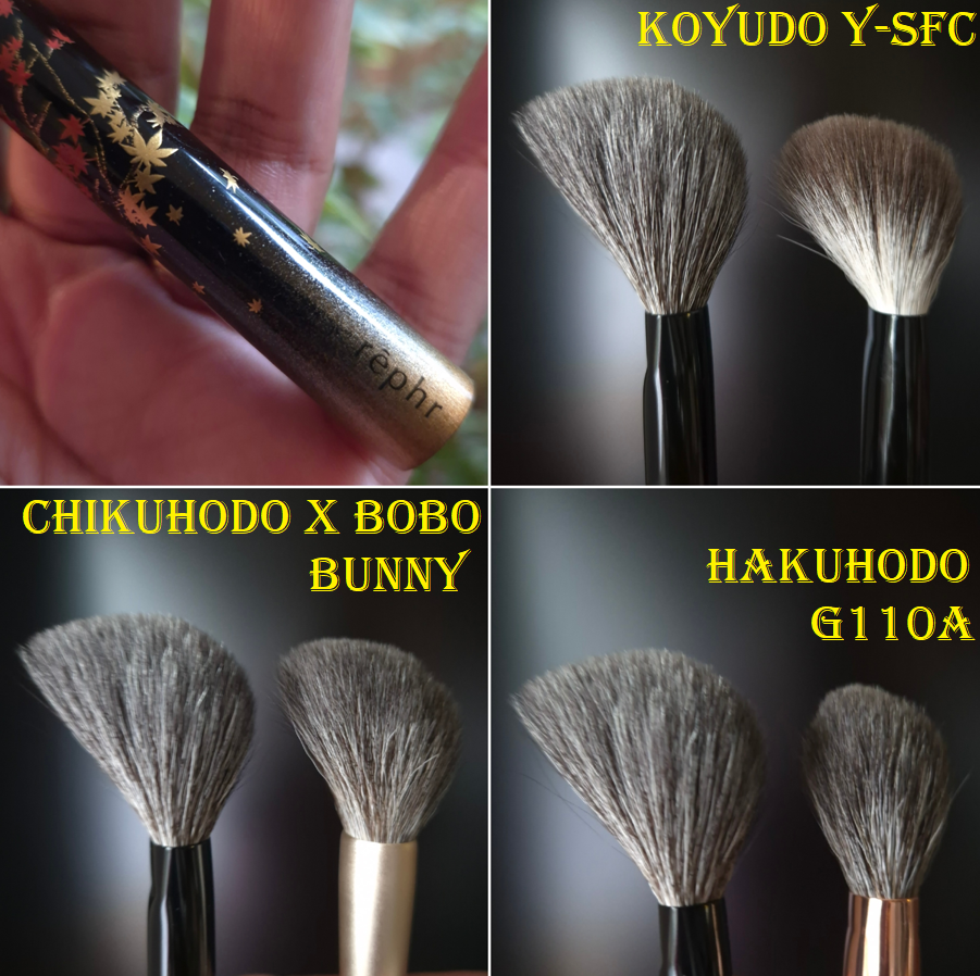
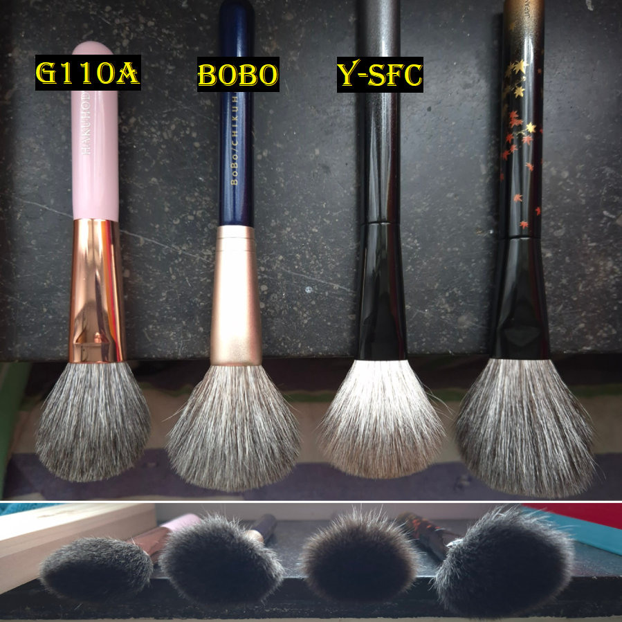
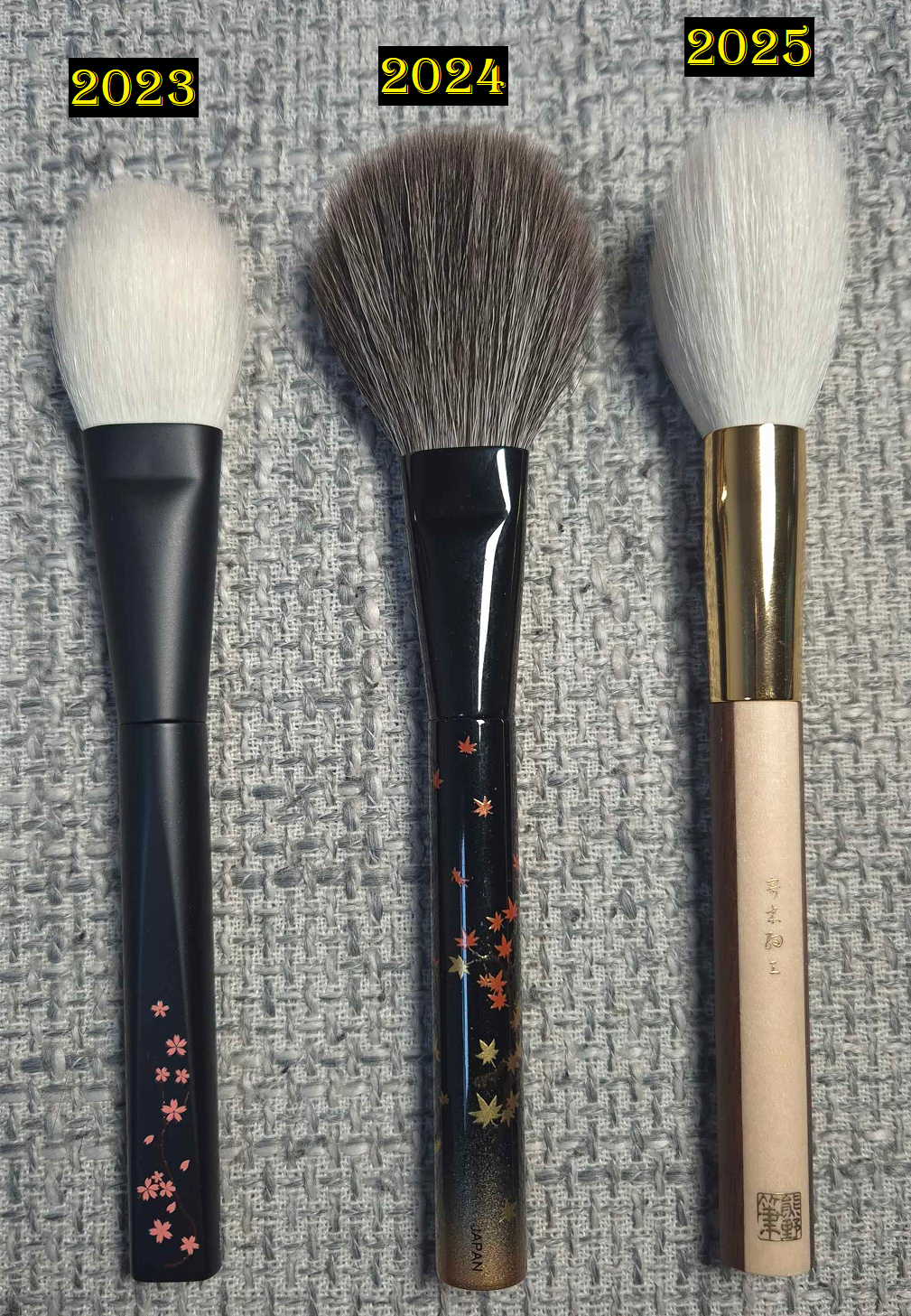
The majority of the blushes in this line are pigmented, but the lighter shades are unsurprisingly easier to control. Honey Moon isn’t as intensely pigmented as Spicy Berry (which could appear patchy in specific circumstances), but I still need to apply it lightly. Unlike many blushes that just need an wispy brush to build up the product slowly, the consistency of the blush powder is on the thicker side. To ensure the best application, I use brushes that have both an airy and medium dense section of the brush (for instance 3D styles or angled brushes). This way, it can pick up and apply a small amount of product from the looser side, but the other part of the brush has decent buffing power. My rephr Kōyō brush has always been perfect for that, but I can even use the Hakuhodo G6440 if I only do a single tap into the blush surface before buffing the color all over. Using a loose brush to apply with and switching to a buffing brush to blend it in works too.
Of the blushes I own, Spicy Berry and Nocturnal Nude are definitely satins because they have a sheen, but the shimmer particles aren’t as easy to see after being blended in. Restless Rosé has more obvious shimmer, as does Honey Moon. As long as I keep my blush layer of Honey Moon sheer, and especially if I use a blurring and/or finishing powder on top, texture isn’t as emphasized. So, I don’t mind this shade being so shimmery.
Other than being mindful about which brush is used, I don’t have any other issues with Honey Moon. It has good longevity and no added parfum. It just comes down to preferences whether someone will like this or not.
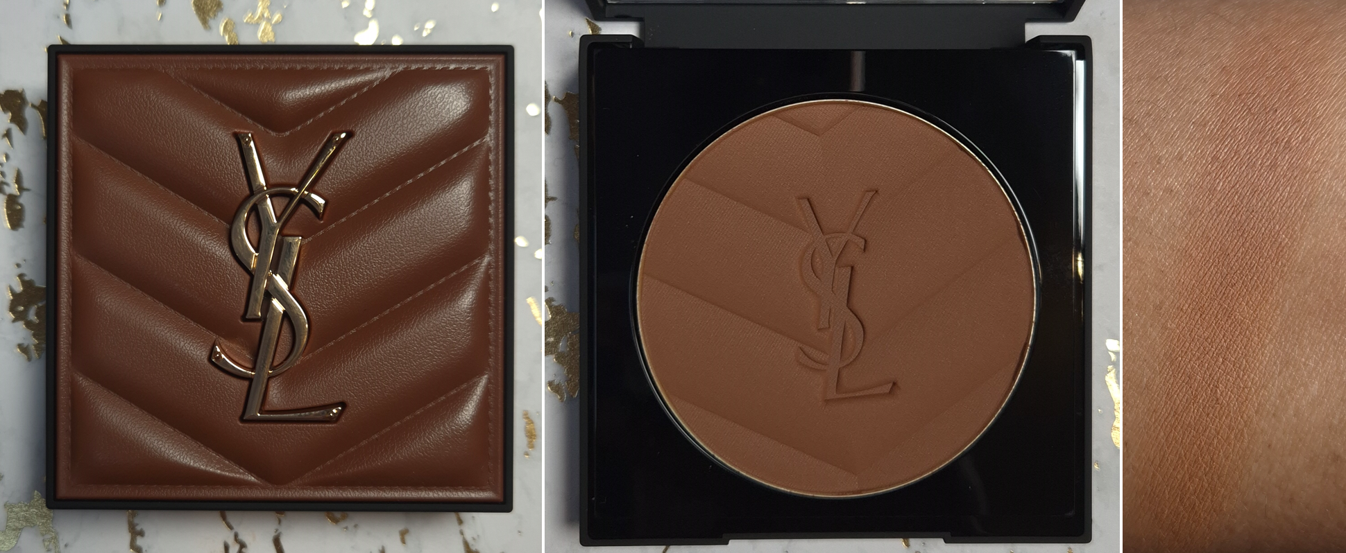
Yves Saint Laurent All Hours Hyper Bronze in #5
After getting the Golden Oasis palette with its blushes and highlighters, I couldn’t let go of the feeling that if I bought the bronzer, that would be the last face powder product from YSL that I cared to test out. Curiosity finally got the better of me and I caved.
Based on the countless reviews I saw, I knew the current darkest shade was my only option. #5 in the pan looks like it will be quite dark, but packing on the product still results in a fairly sheer application. It having a very thin consistency aids in its buildable nature. I was relieved to see the hype surrounding this bronzer wasn’t exaggerated. The matte airbrush finish is akin to the Victoria Beckham Beauty and Charlotte Tilbury bronzers, though YSL’s is slightly drier looking than them on my face. It also leans red, but thankfully isn’t overly red to the point that I wouldn’t want to use it. Still, I’d prefer if the brand had a shade extension with a deep golden option. I heard someone say that YSL’s pressed powder range goes even deeper than the bronzers, so I once considered using that as a bronzer, but I decided not to try that out of fear that the color could be even more sheer.
Bronzer vs Completed Look
I’ve had no longevity issues with the product. It’s blendable and doesn’t require any special brushes. If I want to maintain that sheer quality, I use my airy brushes. If I want maximum color payoff, like in the photo above on the left, I use a denser brush. It being sheer makes it prone to being easily covered up by a bold blush or toned down too much by my finishing powders, so I have to keep that in mind.
I don’t believe I’ve posted a new bronzer ranking for 2025, but based on my list from 2024, I would possibly rank this above Vieve as a new #13.
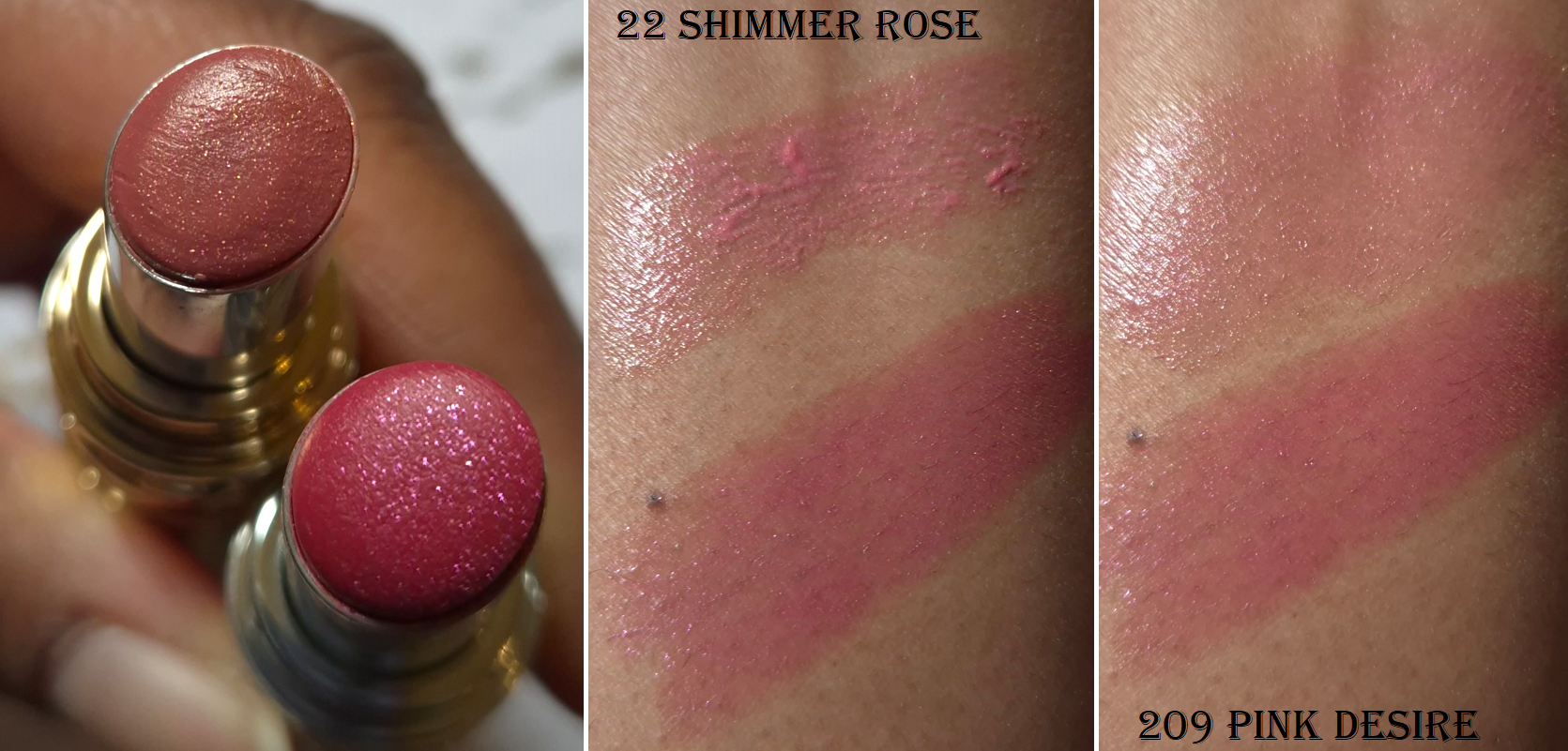
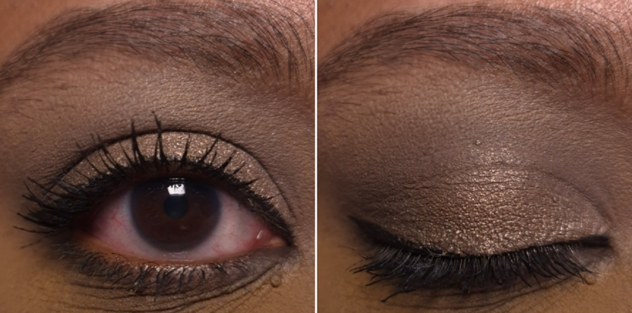
Yves Saint Laurent Loveshine Candy Glaze Holiday Collection in 22 Shimmer Rose (Medium Pearlescent Pink).
I like the YSL Candy Glazes, but I made a mistake in assuming the 2025 limited edition shimmer lippie would be the same formula as the shimmer one from 2024, which is actually a Loveshine Lipstick. That 2024 Holiday Loveshine has a wonderful emollient yet balmy consistency, but the shade of pink is quite bold and bright on me. I was too overly excited about this more natural looking color to check which line it was actually from.
The way Shimmer Rose looks in the tube in the leftmost photo is a bit too warm, but my reason for posting it was just to show how much smaller the shimmer particles look compared to Pink Desire.
I found it interesting that Shimmer Rose is even stickier than the permanent Candy Glazes and it still isn’t as natural looking on me because the shade looks even more cool toned compared to my warm undertone. Although it turns more bubble-gum pink than I wanted, I consider Shimmer Rose to be more wearable on me than Pink Desire. Besides the photo below, I’m also wearing it in the photo on the right side in the blush section.
As seen in the arm and lip swatches, there are chunkier pieces that come onto the lips when first applied, but they can be smoothed out nicely and evenly. My other Candy Glazes don’t swatch like this, but rubbing my lips together a few times makes it a non-issue.
I don’t feel any graininess from the shimmer, this has a light fruity scent, and the stickiness extends the time that I have a moisture barrier gripping my lips. Even if I wipe my lips with a wet paper towel, the sticky residue persists, so oil is the easiest way to remove it completely.
I can, and have, used this a few times in the center of my lips to boost the gloss level of other lip products. However, I still don’t use this enough to be able to say this was a good purchase for me. It honestly wasn’t, but at least the packaging is beautiful!
I will do my best to be better informed when this year’s limited edition lip products launch towards the end of the year. Then again, I’m supposed to be on a lip product no-buy, so maybe I should avoid it altogether!
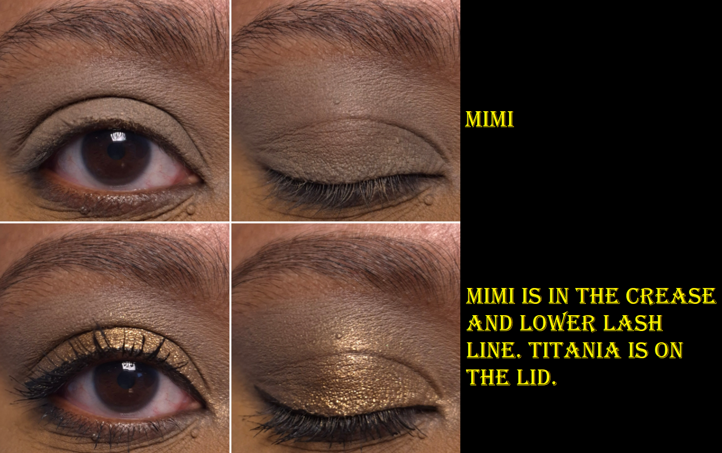
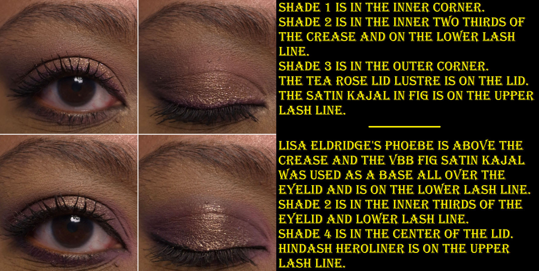
I’m a huge fan of the Liquid Silk product as an eyeshadow primer. It has enough coverage to conceal the discoloration around my eyes, but the shade Phoebe doesn’t alter the colors of the eyeshadows I put on top all that much. As standalone eyeshadows, they look smoothing and non-drying on the lids. I have enough time to blend out the edges before it fully sets and it mixes well with other shades. It doesn’t crease, doesn’t fade, and stays put very well in my deepest eye wrinkle/crease.
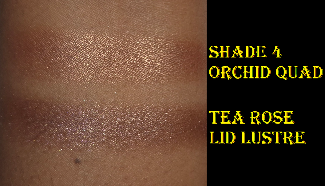
I was so excited to buy Mimi because I figured it would go very well with neutral and green eyeshadows that are my go-to kind of looks lately. However, I did not expect it to look so brownish-grey with a slight tinge of green. The weirdest part though is that my cell phone camera makes the swatch look way more green than it is in person. It was driving me absolutely crazy! The eye swatches were accurate, but every arm swatch looked so green! I can’t explain how my phone could capture the color on the applicator correctly, but not the swatch within the same photo!
After trying to photograph Mimi in different lighting conditions, the two below are the best I could get. The one on the left is closest to how the color looks on my eyes. The one on the right (where I blocked out light from shining on the swatch directly) is closest to how it’s supposed to look on my arm.
How it looks on the eyes is the most important part to show, which is at least accurate.
Even though Mimi looks different than what I expected and wanted, it’s such an unusual shade of brown that I actually like it!
At this point in time, I now have the shades Mimi, Phoebe (my second tube of it), and Gaia. As interesting as I find some of the other colors, I don’t use liquid eyeshadows enough to justify adding more. The only reason I used up Phoebe is because it has been my main primer of choice throughout 2025.
In my initial review, I added an update about the stopper problem and how I started to struggle with reaching the product within 3-6 months of use before I removed the stopper entirely. I was correct in guessing that I had finished half of Phoebe within the first six months, and I used up the remainder in another six months. I was worried Phoebe would dry out quicker after removing the stopper, so I was careful to not leave the cap off for too long between uses. It was only in the final two months that the product got noticeably drier. So, I will repeat this strategy if the issue reoccurs with my other Liquid Silks. Gaia is my oldest one, but I still haven’t used up that much of it.
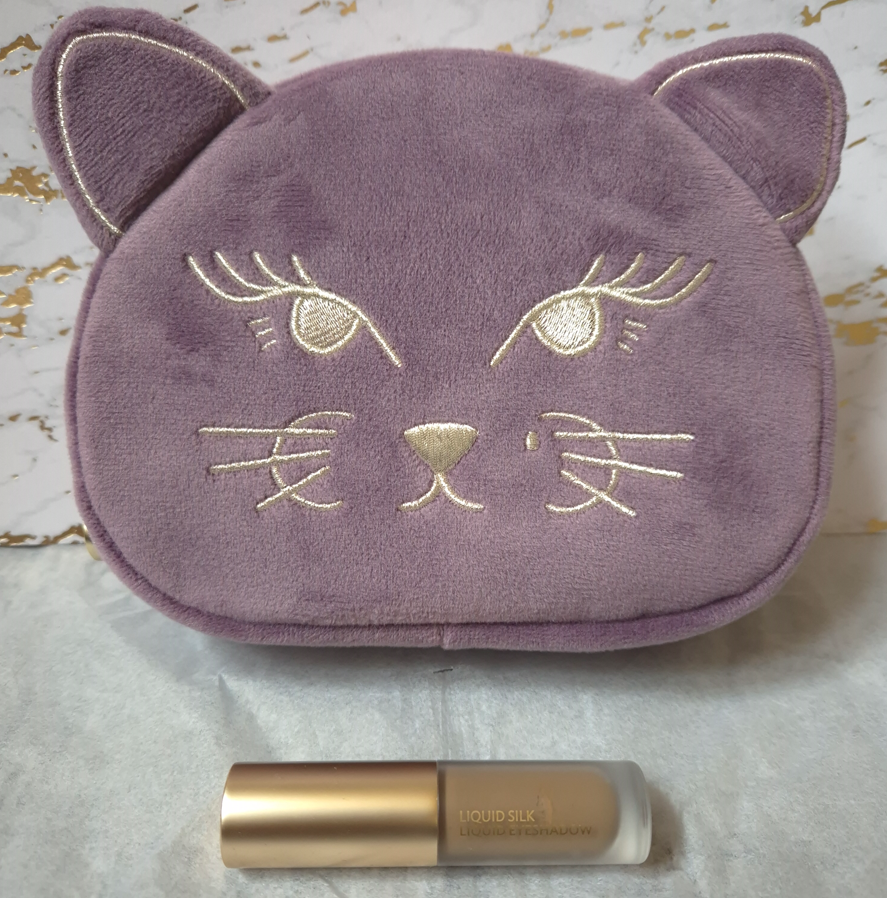
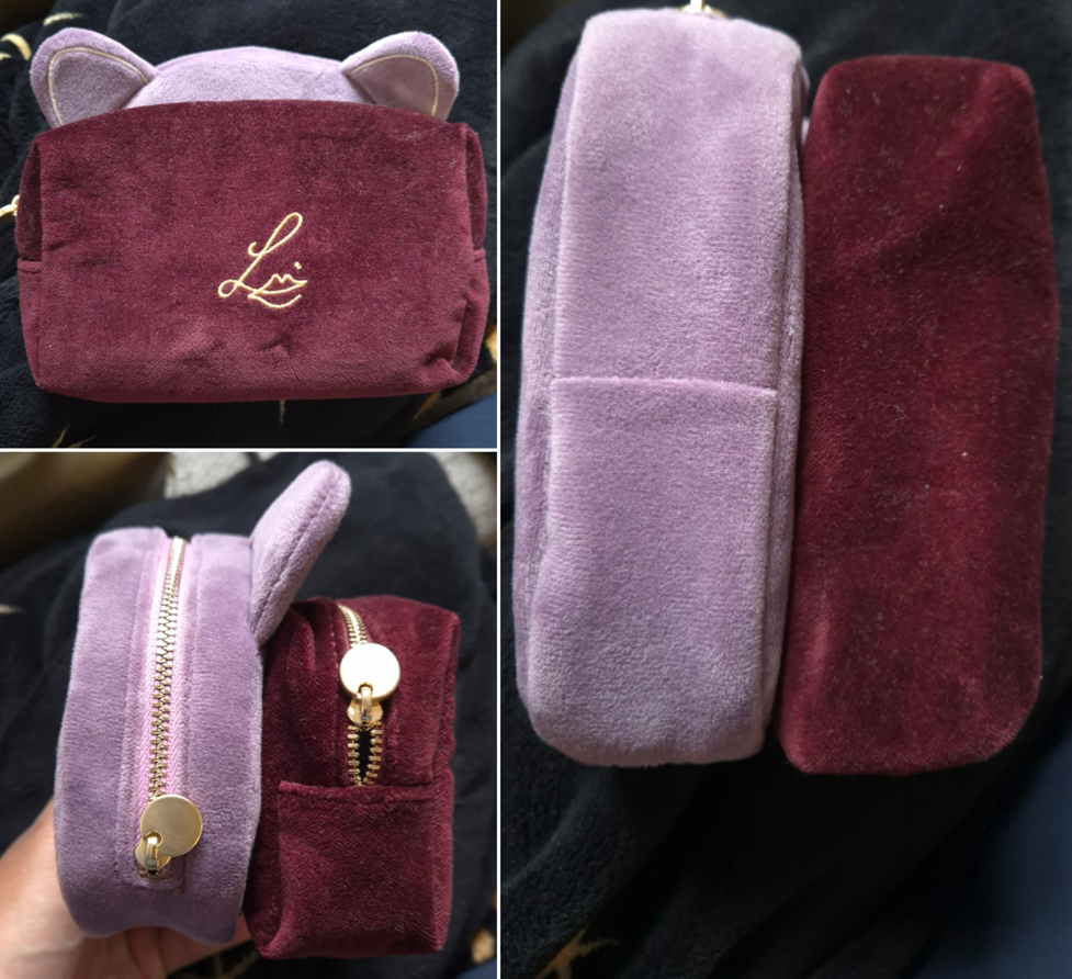
As for the Betty Kitten Pouch, it’s just as soft as Lisa Eldridge’s other velvet pouches, and it’s nice to have the taller shape. I couldn’t resist!
The Betty Pouch is free with orders over $125 (or €108), but I purchased it outright for €35.
Anyway, that was my quick review/update! I hope this has been helpful!
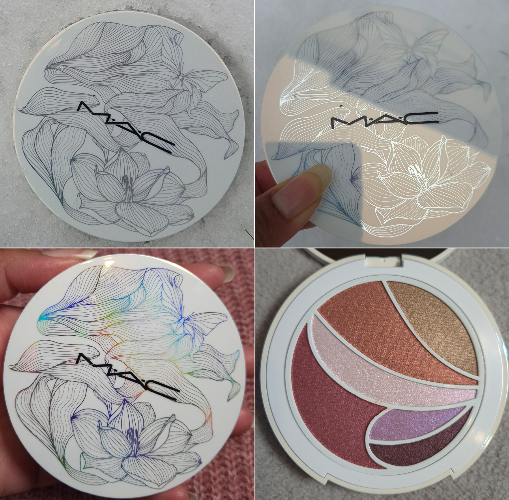
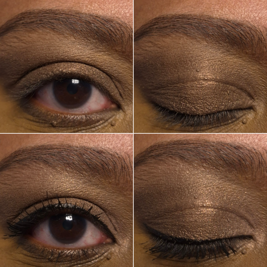
If you’re already familiar with my blog and my interests, you’ll know right away that I wanted this palette for the packaging. I love how the design appears to be a simple, yet pretty, black and white drawing until it is turned at different angles in the light, revealing all the colors of the rainbow.
MAC’s face and cheek products have always been among my favorites in my makeup collection, but I tend to be unimpressed by their eyeshadows. The last palette I tried from MAC was the Lunar Luck Made My Fortune Eyeshadow Palette from 2022. Since then, the brand has reformulated their eyeshadows. I hear they perform better than before, but I was unwilling to take that chance until now.
Technically, the latest single eyeshadow I’ve tried from MAC has been their Jelly Shine Eyeshadow, but it’s a new formula for them. So, I couldn’t use that as a gauge for whether or not I’d enjoy their standard eyeshadows.
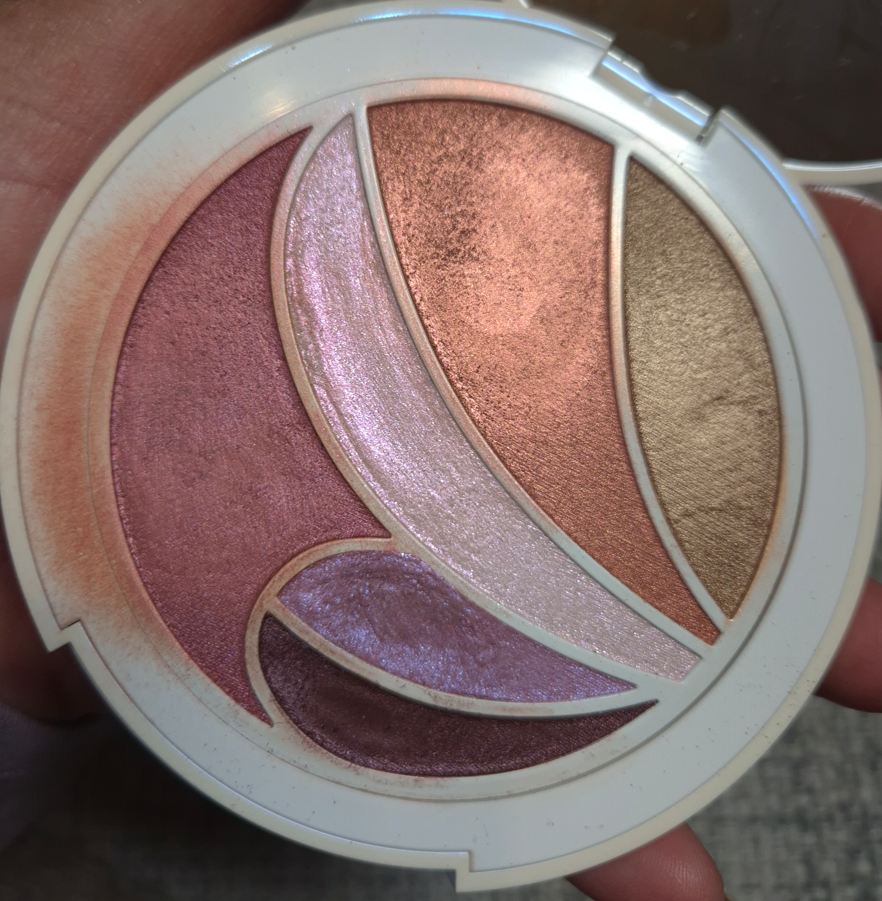
Frankly, I can’t consider this palette an example of what MAC’s primary eyeshadow formula is like either because these are so different from anything I’ve previously experienced from them! To start with, these don’t feel like traditional powder eyeshadows. They all have a very slick and smooth feel to the touch that’s prevalent in dimethicone-heavy formulas. Daft Pink, Lavender Lemonade, and Cherry Sangria in particular are more pliable as if they’re slightly stiffer Colourpop Super Shocks. Lavender Lemonade is the closest to having a Super Shock consistency because it’s the one that’s easy to push and move around. On the box, it’s written that the ingredients for Cherry Sangria and Daffodillionaire are supposed to be the same, and that Daft Pink, Hot Honey, Lavender Lemonade and Calypso Coral are the same. Considering the fact that I find Daffodillionaire, Hot Honey, and Calypso Coral to be the firmer ones instead, I cannot fathom why the slippery, yet more solidly pressed, eyeshadow is in the same category as the looser goopier one. The photo below shows how messy this gets after just one day.
I have to thank Nikki for pointing out that other than Synthetic Fluorphlogopite, this palette and MAC’s Shadeshift Chrome Eyeshadow formula seem to be the same.
What I found from checking a few ingredient lists on MAC’s website (which tend to be incomplete), is that the formula with the second-most ingredients in common to these are the Jelly Shine eyeshadows with 6 out of 13 shared. However, the Jelly Shine are still much more similar to MAC’s standard shimmer/metallic formula than the ones in the Metamorphosis Palette with around 12 out of 17 in common.
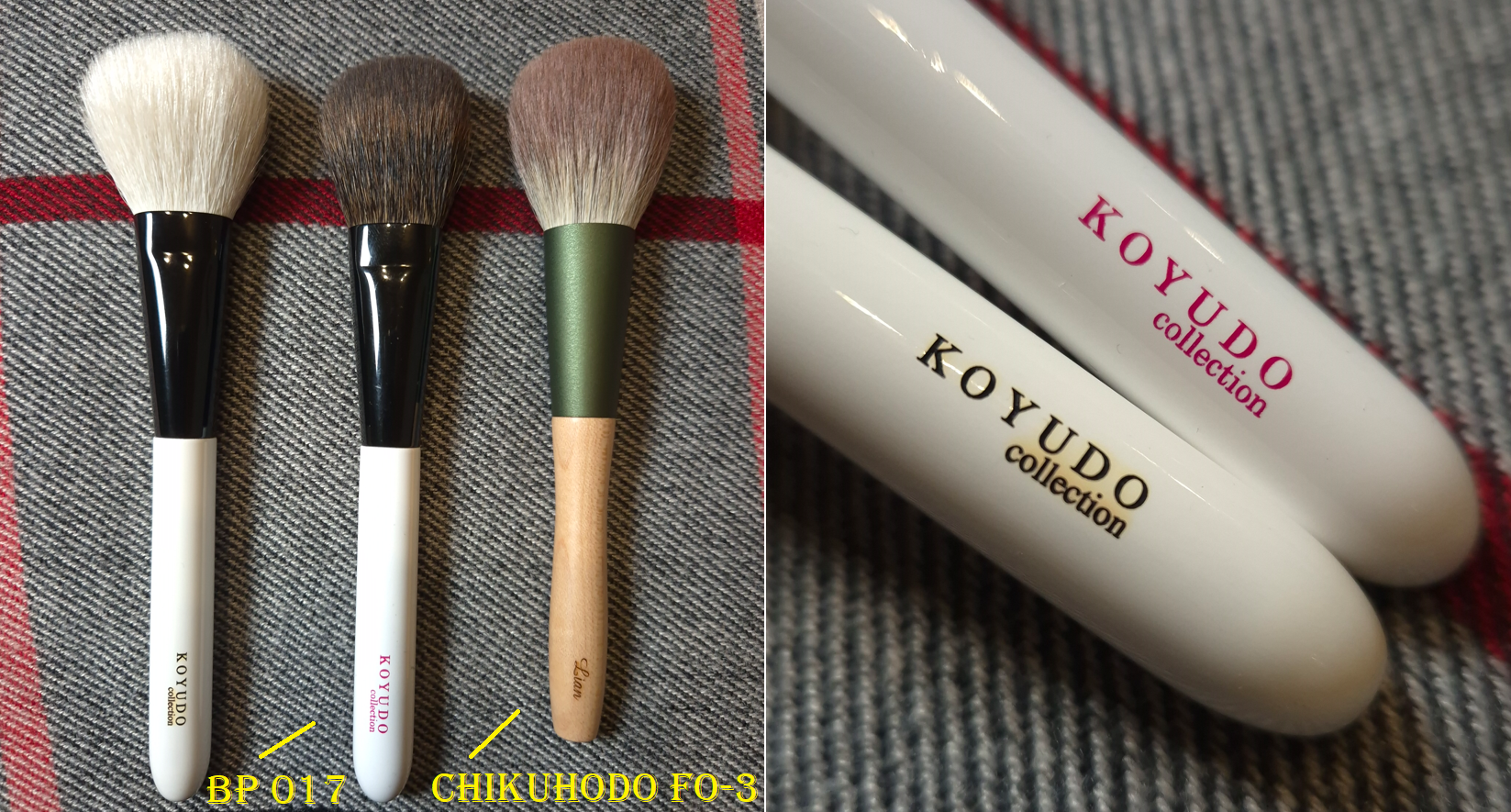
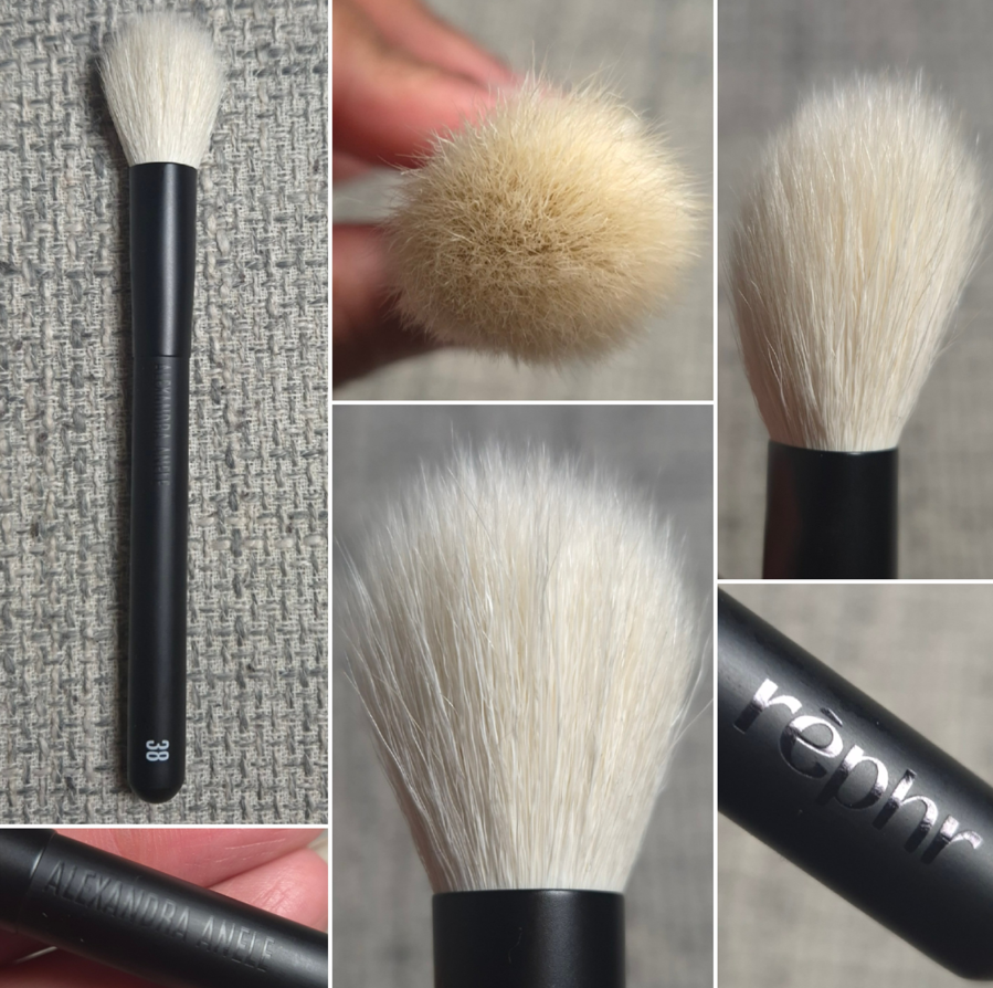
These eyeshadows are pigmented, but they blend out in such a way that I get some translucency and can see my skin underneath. I can build them up to be opaque if I want, but it takes a lot more effort with a brush. This formula is much more suited to finger-application. Since none of these are matte, I instinctively want to apply them to my eyes with my fingers anyway. The problem is that the smallest petal-shaped pans are more difficult to get into. Plus, the blush type of shades (Hot Honey and Cherry Sangria) can look a bit patchy in the first layers with a brush, so the issue is exacerbated if I try to apply those to my cheeks with my fingers. The Singe Beauty FO-3 and Rephr LC02 are small cheek brushes, but I still have to be careful about accidentally picking up some of the neighboring eyeshadows.
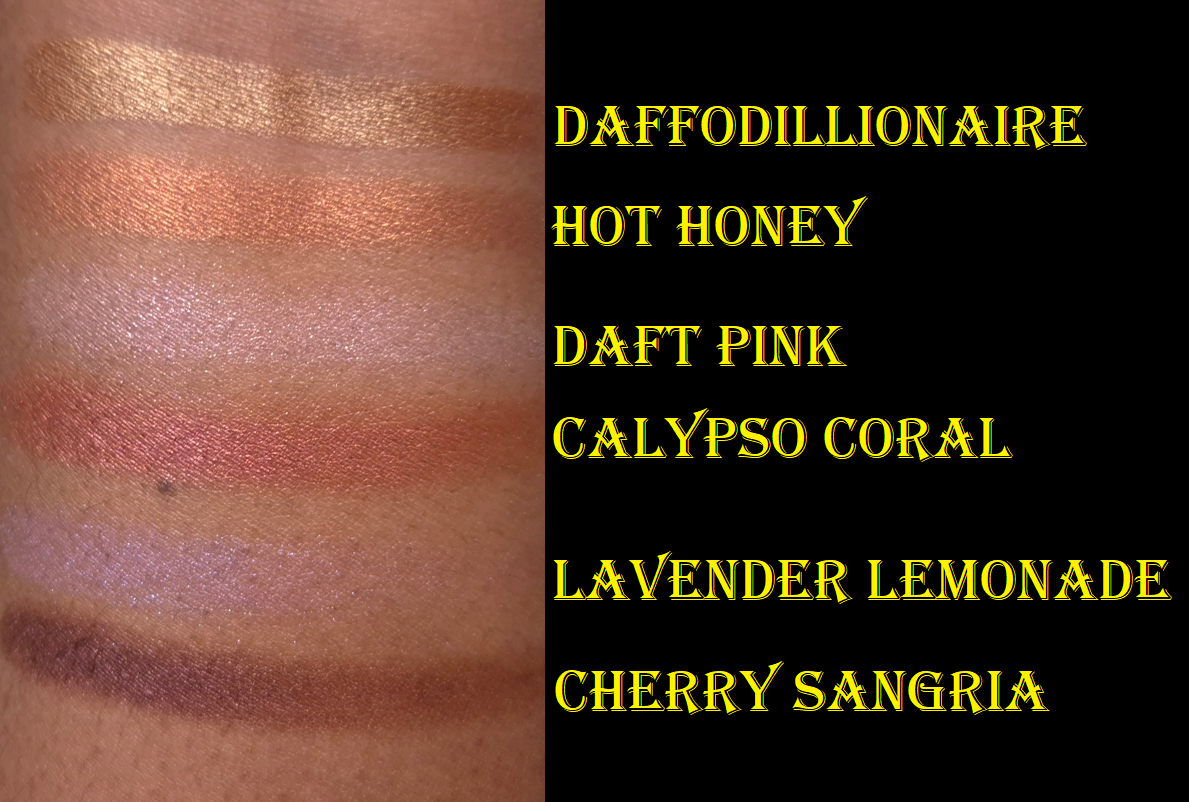
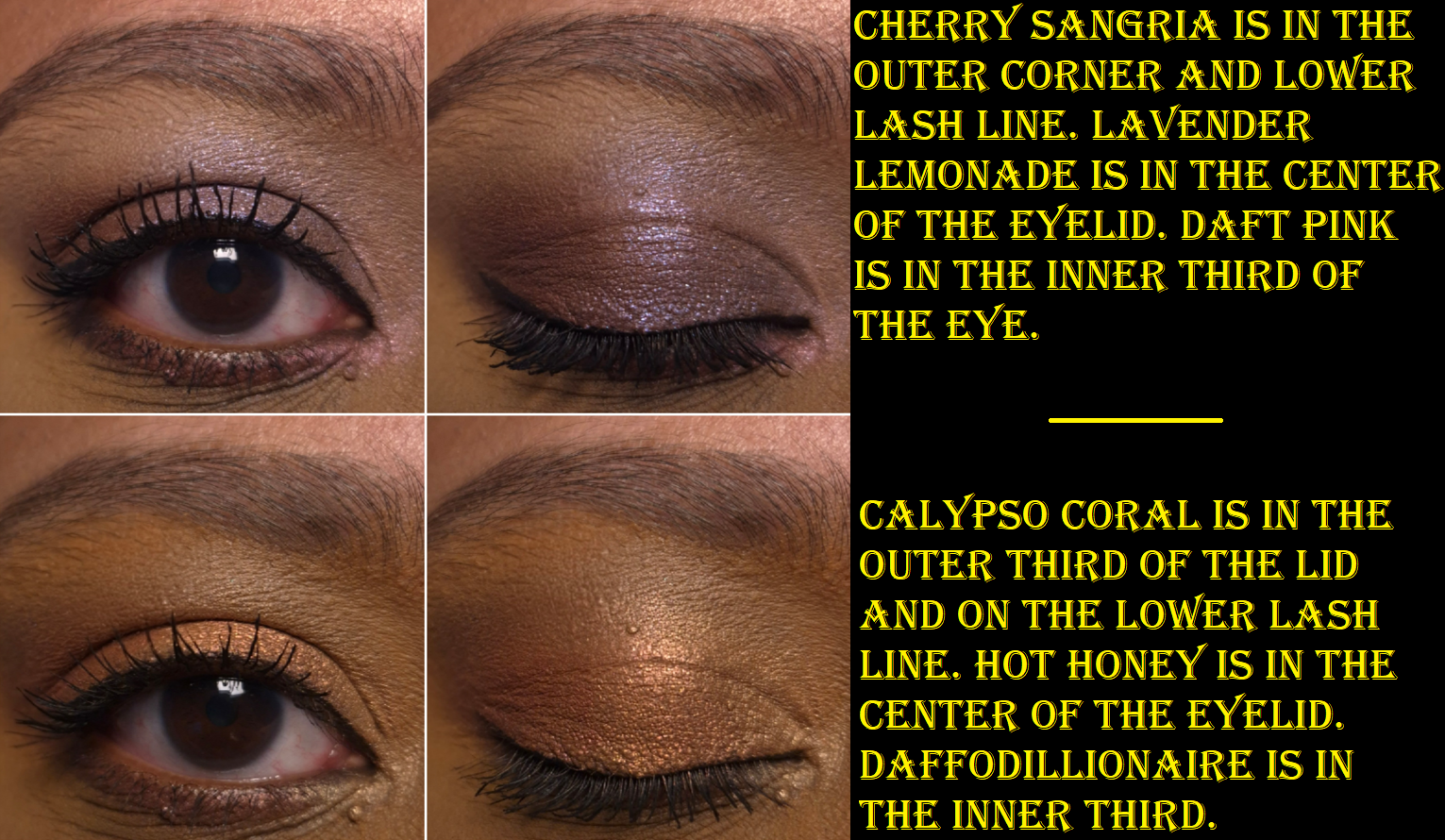
Daffodillionaire is my kind of highlighter shade, so I was pleased to know it suits me on my face and eyes. Even though these are buildable formulas that can be sheered out, I imagine this would be too dark for those with lighter skin and too warm for those with a cool undertone. On my eyes, it’s just light enough to add brightness. On my face, it draws more attention to texture, but the lack of shimmer makes it still fairly smooth looking for a highlighter.
Hot Honey is easy to see on my eyes, but the color tone doesn’t stand out as vividly on my cheeks. I like this though, because too many orange blushes are bold and unnatural looking on me. That being said, I still prefer a flush of pink, so I either skip using this shade as blush altogether or I mix it with Calypso Coral.
Daft Pink is an iridescent type of pink, along with being more topper-like than the other shades. It takes more effort to build it up on my eyes, and especially as a highlighter on my cheeks. This shade looks quite pretty paired with Calypso Coral, but if I add enough layers to see the color and have the shine from it stand out more than the amount Calypso Coral already has, then I start to notice a slightly frosty white cast on my skin.
Calypso Coral has a sheer quality to it that requires multiple layers, but over-applying this dark color will result in it looking too intense and metallic as well. So, finding that balance every time for blush usage can be a challenge. I have a similar problem with it showing up on my eyes, and though wetting my brush serves to make it easier to deposit the product, it doesn’t do much intensifying. When I accidentally covered some of Calypso Coral with Hot Honey on my eyes, it was very difficult to get that red tone back, as there is a maximum to how many layers can be built on each other. A wet brush helped, but not a lot.
Lavender Lemonade is the other topper-style shade, but it has more pigment than Daft Pink. Because it’s a light purple with blue-purple shimmer, I find it to be the most interesting pan of product in the palette. This and Cherry Sangria are the only ones I’d use exclusively as eyeshadows, and not face products, which is probably why MAC chose to put them in the smaller pans. I could see this being a cool highlighter for someone who likes more adventurous or avant garde type of looks. The official MAC website has some intriguing spring-inspired editorial looks that I might want to recreate when it’s actually spring time, but not right now.
I like Cherry Sangria as a deepening shade for the outer corner in eye looks. It’s easier for me to use my finger with this as an eyeshadow, but when I’ve tried to wear it as eyeliner, it took too many passes over the lash lines with a dry liner brush. So, I go in right away with a damp brush to save time.
Wearing Hot Honey and Calypso Coral on my cheeks makes me think about how I really should start using my MAC Extra Dimension Blushes again. The Extra Dimension ones give more color payoff quicker, and have a similar amount of shine. However, the Metamorphosis shades have a subtler look overall because the consistency is creamier and blends better into my foundation. The reflect isn’t a natural-looking glow, but it looks better blended into my skin. The Metamorphosis pigment level reminds me a bit of MAC’s discontinued Sheertone Shimmer Blush formula, but those had a more obvious powder look even if the shades themselves were more muted and less opaque.
I get at least six hours of wear time for the Metamorphosis products on my cheeks and eyes before the fading starts. It holds up better on my eyes if I use an eyeshadow primer, but I just accept that my makeup is going to look more muted before the day is over. Also, at some point in the day, the product will be missing from the inner part of my crease line.
So, this doesn’t have the best longevity. The shades still need to be built up on me. I have to use specific brushes or dig my fingers in the pans, and it’s inevitable that I will dirty the outer rim and the edges that divide the shades. Despite these inconveniences, I’m happy with this product!
Typically, I don’t find spring collections to be appealing because light shades, especially pastels, are difficult for me to pull off. Springs shades also tend to be in cool or neutral tones, similar to the kind of spring looks I did in my Wedding Makeup post. However, there were enough warm shades in the Metamorphosis Palette, and deeper colors, to make me feel like this is actually suited to me. I thought for sure that the face and eye aspect would be a gimmick, but this really is quite versatile. I don’t think it’s going to be great for everyone, but maybe others will appreciate that it’s a little different from what is typically released for spring.
I had an unredeemed birthday discount code from Douglas (in January), so I figured it would be a nice gift to myself. I know for sure that I’m only going to reach for this palette in the winter to spring set of months, but I’ve never regretted getting the first set of Oden’s Eye holiday palettes that I now only really use in the month of December. That’s still more attention than I give plenty of other palettes in my makeup collection!
I hope this review has been helpful! Thank you for reading!
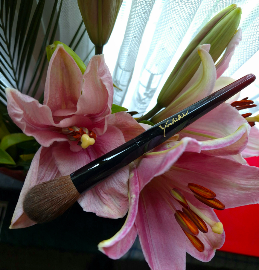
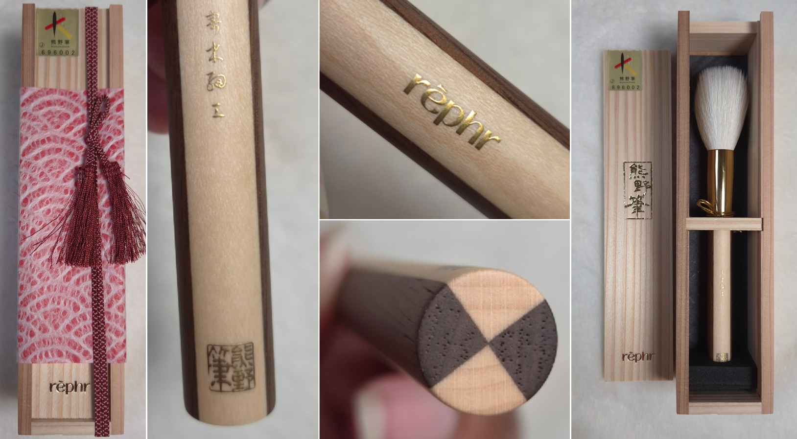
Welcome, lovers of Japanese makeup brushes! If this is your first time visiting, I’d like you to know that I have a page with every Fude post linked, as well as a description of the topics discussed in those posts and a list of which brushes are in which posts. If this is not your first time here, welcome back!
Regarding my measurements, “hair width” is measured from the widest part, regardless of the overall brush shape. I don’t measure thickness. Anything with an asterisk indicates that I had to measure that one myself as those numbers were not listed on the website. All figures listed in inches are converted estimates.
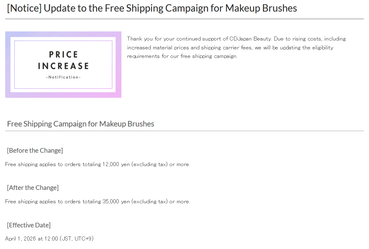
With costs of materials ever increasing and supply of certain hair types being harder to acquire, brush prices also increase. So, the prices I’ve listed might not reflect what is current, though I will do my best to keep them updated.
*DISCLOSURE: Non-highlighted links in bold blue font (Example) are standard non-affiliate links. Links marked in bold black font with a light blue background (Example) are affiliate links. Affiliate links allow me to get a commission if purchases are made directly using my link. Whether you click to shop through them or not, I appreciate you visiting and I hope you find the information I’ve provided to be helpful!
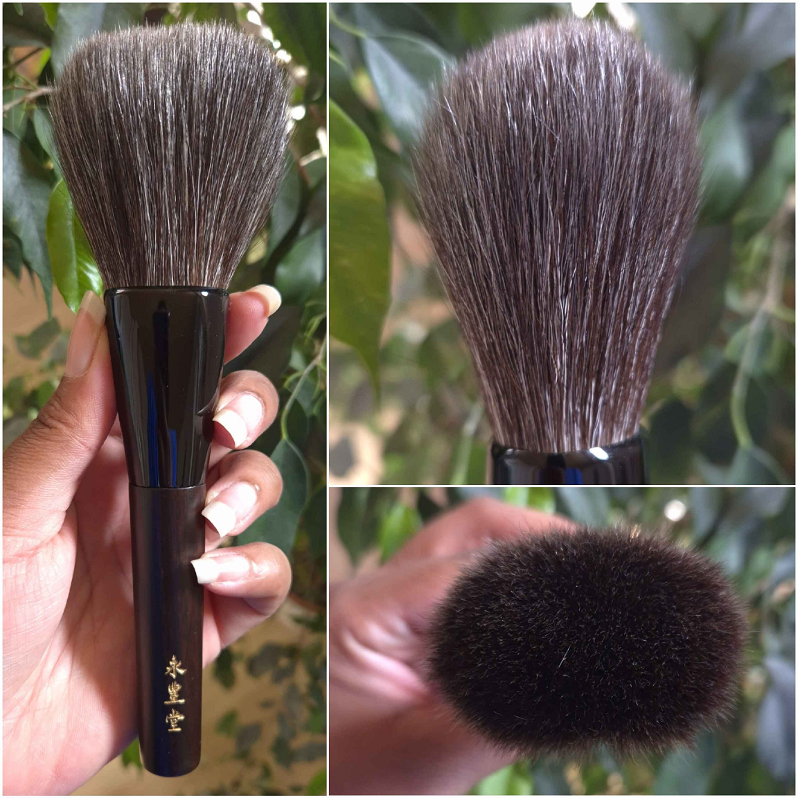
BISYODO
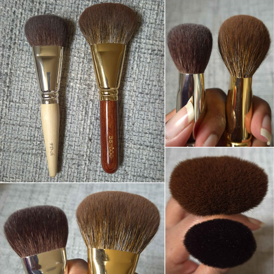
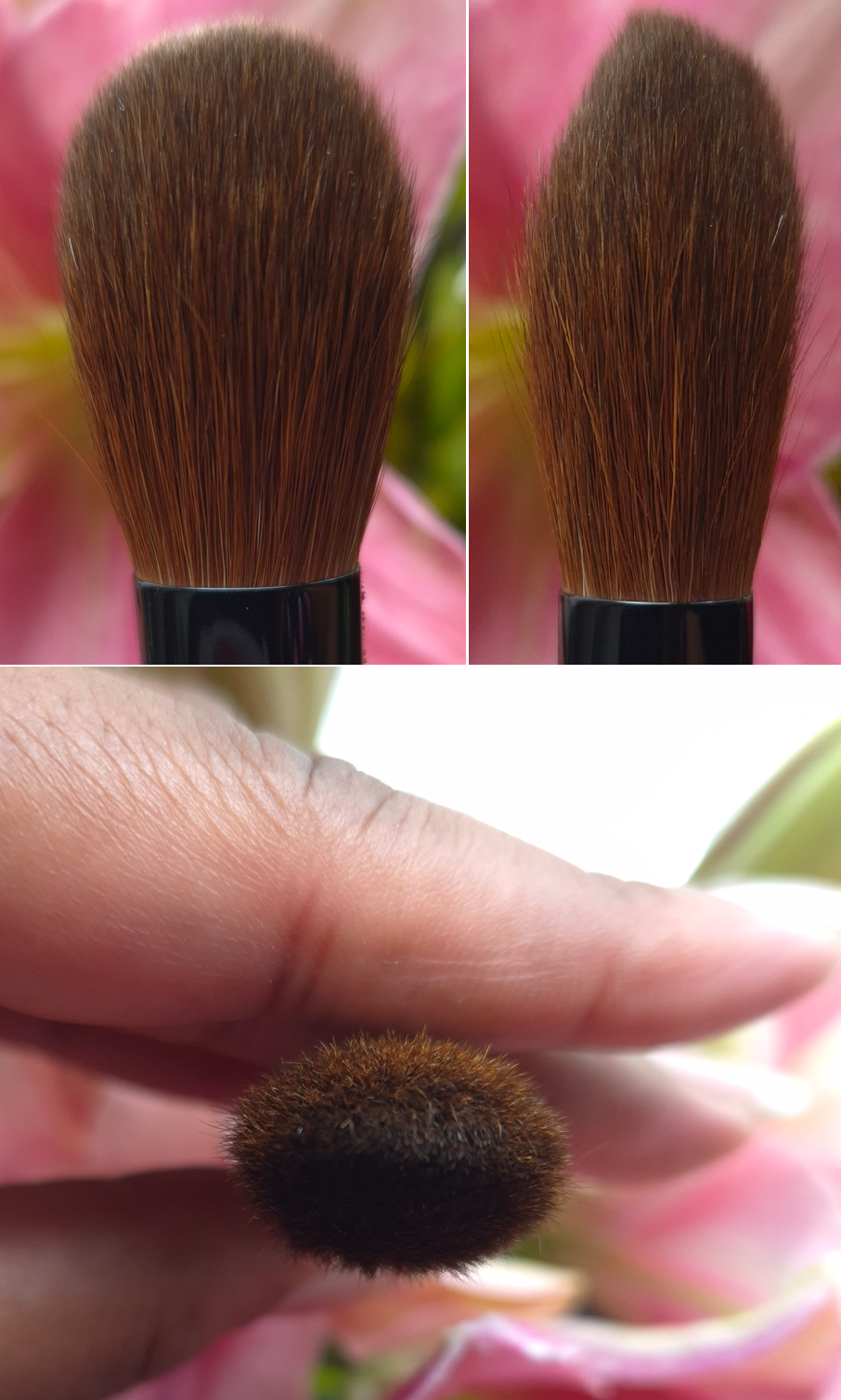
Bisyodo CH-FD Foundation Brush (Round Flat)
Full Length: 160mm / 6.3 in
Hair Length: 30mm / 1.18 in
Hair Width: *45mm / 1.77 in
Bristle Type: Sokoho
I don’t own the entire Cheri line, but I’ve been impressed with the brushes I’ve used because the hair feels significantly softer than the Sokoho from other brands. This brush is quite densely packed and doesn’t feel scratchy. It’s intended for foundation, but most of my synthetic brushes do a better job of spreading the liquid across my face. I prefer to use this brush on hard-pressed powders to pick up product with more ease, along with sheer powders and cream blushes that I want to build up quicker. Some of the products I enjoy using this brush with are the Dior Powder No Powder and Chanel Joues Contraste Intense Cream-To-Powder Blushes.
Because it’s quite wide, I’m usually able to dip one half of the brush into a pan and apply that, then apply a different product with the remaining clean half of the brush. It saves time being able to use two things without needing to clean my brush in-between.
This is a little too thick for contour work, but it’s flatter and more tightly bundled than my holy grail bronzer brush (Bisyodo B-F-05 Perfect Fit Brush). So, it’s convenient to fit it into smaller spaces, such as the stripes of the Chanel Les Beiges Healthy Glow Sun-Kissed Powder (blush, highlighter, bronzer trio) and split-pan of Chanel Jardin Imaginaire Blush and Highlighter Duo.
I feel that the Cheri line doesn’t get as much hype because of the plain handles and Sokoho label, and unfortunately it will no longer be carried by CDJapan. I’m not sure if Bisyodo will discontinue the series altogether. I’ve been using this brush on and off since June 2024, and I regret not posting about it earlier. The price and its usefulness to me makes it a brush that stands out in my collection.
I paid 5000 YEN for it, and it is/was available HERE.
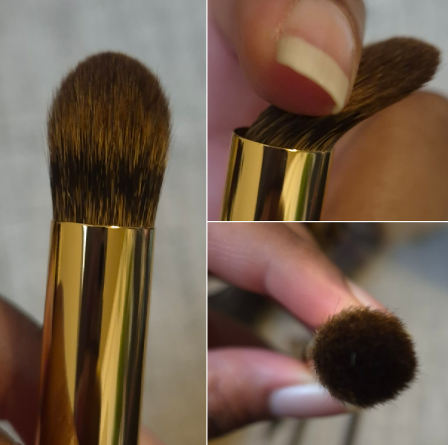
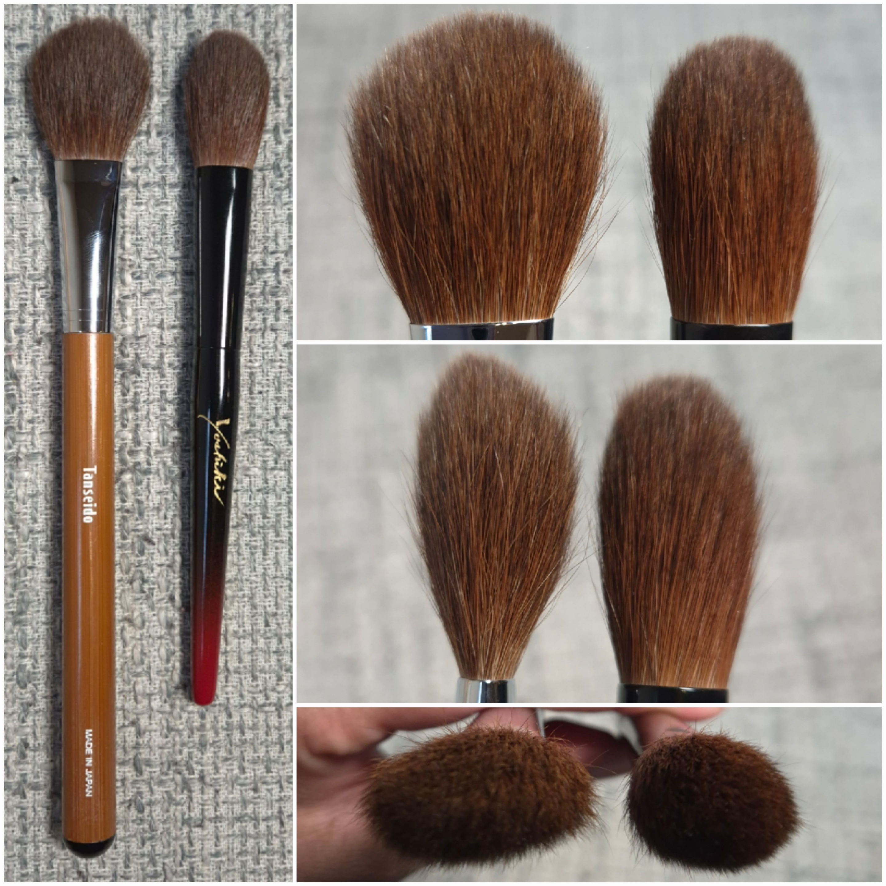
Bisyodo B-ES-01 Eyeshadow Brush
Full Length: 147mm / 5.79 in
Hair Length: 20mm / 0.79 in
Hair Width: *15mm / 0.6 in
Bristle Type: Pine Squirrel
This is another fantastic brush! The hairs are soft and comfortable to use on the eyes and the head is so large that I can cover my eye area with a single eyeshadow so quick and with a lot of product at once. It is quite the time saver! I was a bit bothered by the huge gap between the hair and ferrule (demonstrated in the photo above), but others within the Fude Community on Instagram informed me that theirs are like that too. It might be allowing the flexible pine squirrel hairs to have less restricted movement, considering how easily it glides back and forth when I do windshield wiper motions. The way it moves, the hair type, and length of the hair ensures that I can build eyeshadow quickly and easily without overdoing it. It’s quite special!
Most of my eyeshadows looks are created using at least five shades and require brushes geared towards precision. I basically only use this brush with an all-over single matte eyeshadow, and when I put the lightest matte shade in my crease and/or from the brow to crease. So, this particular brush is quite specialized, but it’s a joy to use whenever I reach for it.
I’ve attempted to use this brush in other ways, such as with highlighter or nose contour, but I haven’t like the outcome. So, it remains a brush for just the eyes for me.
I bought mine during Black Friday in 2024, but it is currently listed for 8800 YEN and is available HERE. To be honest, as much as I love having this brush, I wouldn’t have been happy to pay the current price for it due to the limited uses I have for it. For someone who creates a lot of single-eyeshadow looks though, this could be a different story entirely.
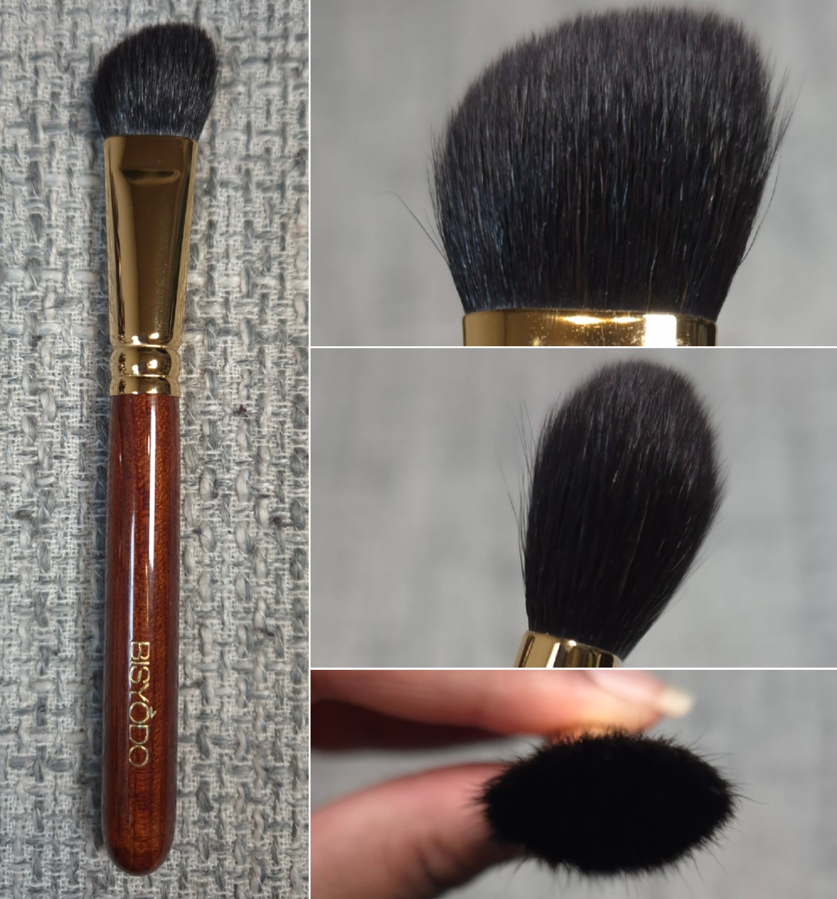
Bisyodo B-ES-03 Eyeshadow Brush
Full Length: 148mm / 5.82 in
Hair Length: 21mm / 0.83 in
Hair Width: *21mm / 0.83 in
Bristle Type: Saikoho
Opposite to my experience with the previous brush, I find this to be too big to use on my eyes and I don’t enjoy it there. That’s not a disappointment for me because I always intended to use this for nose contour and highlighting purposes. It turns out that it’s still a bit too big for the tiny area in which I like to apply contour. However, it does make a wonderful highlighting brush that I can sweep across the top of my cheekbones.
I’m surprised to see this brush listed as Saikoho because it feels like the Eihodo WP PC-1 Puff Makie Goldfish Powder Brush, which is Sokoho. My guess is that under the dye process, the hair feels a little rougher than I would expect. It’s still acceptably soft, though I can occasionally feel a prick from one of the hairs in the brush.
Even though a different brush is my holy grail one for highlighting purposes, this brush has still been useful in smoothing out thicker highlighter formulas and picking up harder pressed ones. When I test new highlighters, I always use the holy grail first, and if that brush doesn’t work well with it, I switch to this one as another good test. If this brush also doesn’t make it look better, I can then confirm it’s the formula and not my brushes. One such example is the ABH Glow Seeker Highlighter that needs to be blended in really well in order for me to like it. This brush is what I use with that one.
At the time that I am posting this, it costs 6000 YEN and is available HERE.
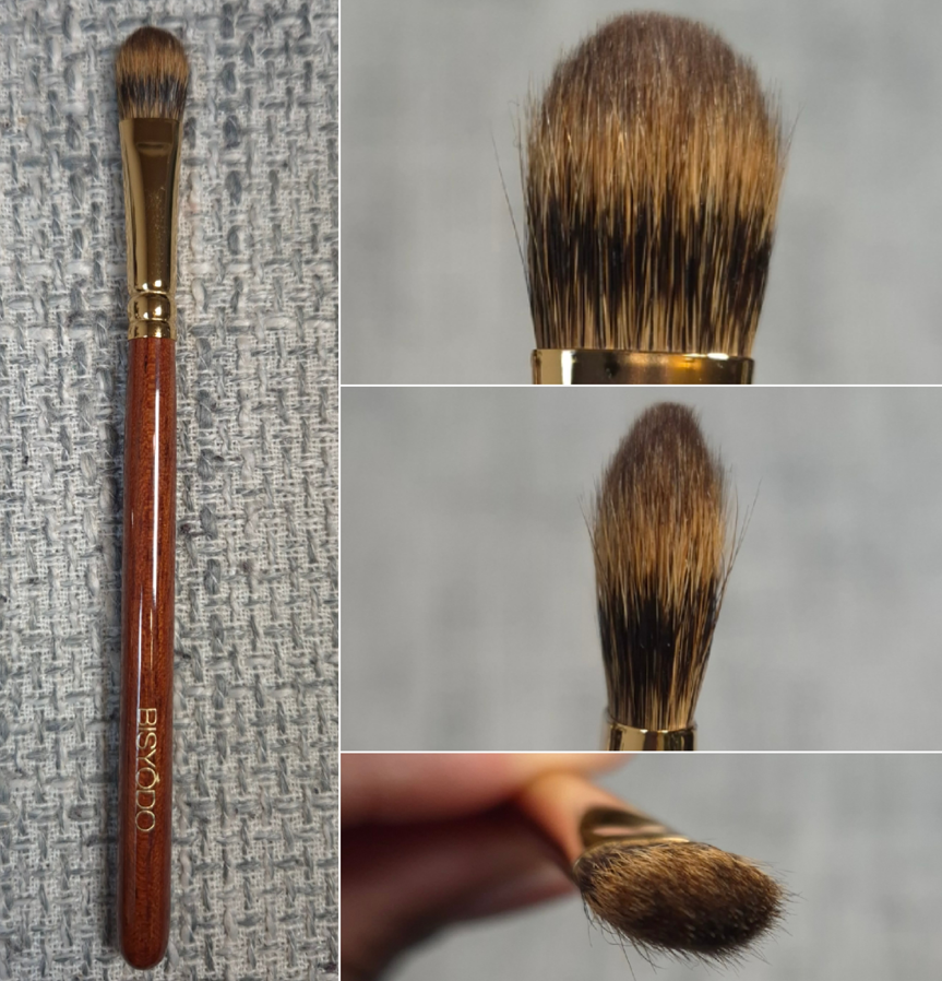
Bisyodo B-ES-05 Eyeshadow Brush
Full Length: 148mm / 5.82 in
Hair Length: 16mm / 0.63 in
Hair Width: *14mm / 0.55 in
Bristle Type: Pine Squirrel and Kolinsky
This brush isn’t that much thicker than my usual packing brushes, but the longer hair adds more surface area in which I can quickly apply product to my eye area if I pick up eyeshadow along the length of the hairs instead of the tips. It still feels soft from the pine squirrel, but the kolinsky adds structure while still being flexible. It feels a little firmer and thicker than my other semi large pure pine squirrel eyeshadow brushes, such as the Mizuho MB120 or discontinued Koyudo Pine Squirrel one, without sacrificing on softness. I am glad that I can tell a difference between this brush and those, as this one applies a stronger layer of color instead of the soft and buildable route. It was still not a necessity, but I’m glad to have bought it anyway. I have largely stopped using my pure kolinsky brushes because they’re not soft enough for my eye area that’s gradually growing more sensitive over time.
As of December 2025, this brush costs 6500 YEN and can be purchased HERE.
CHIKUHODO
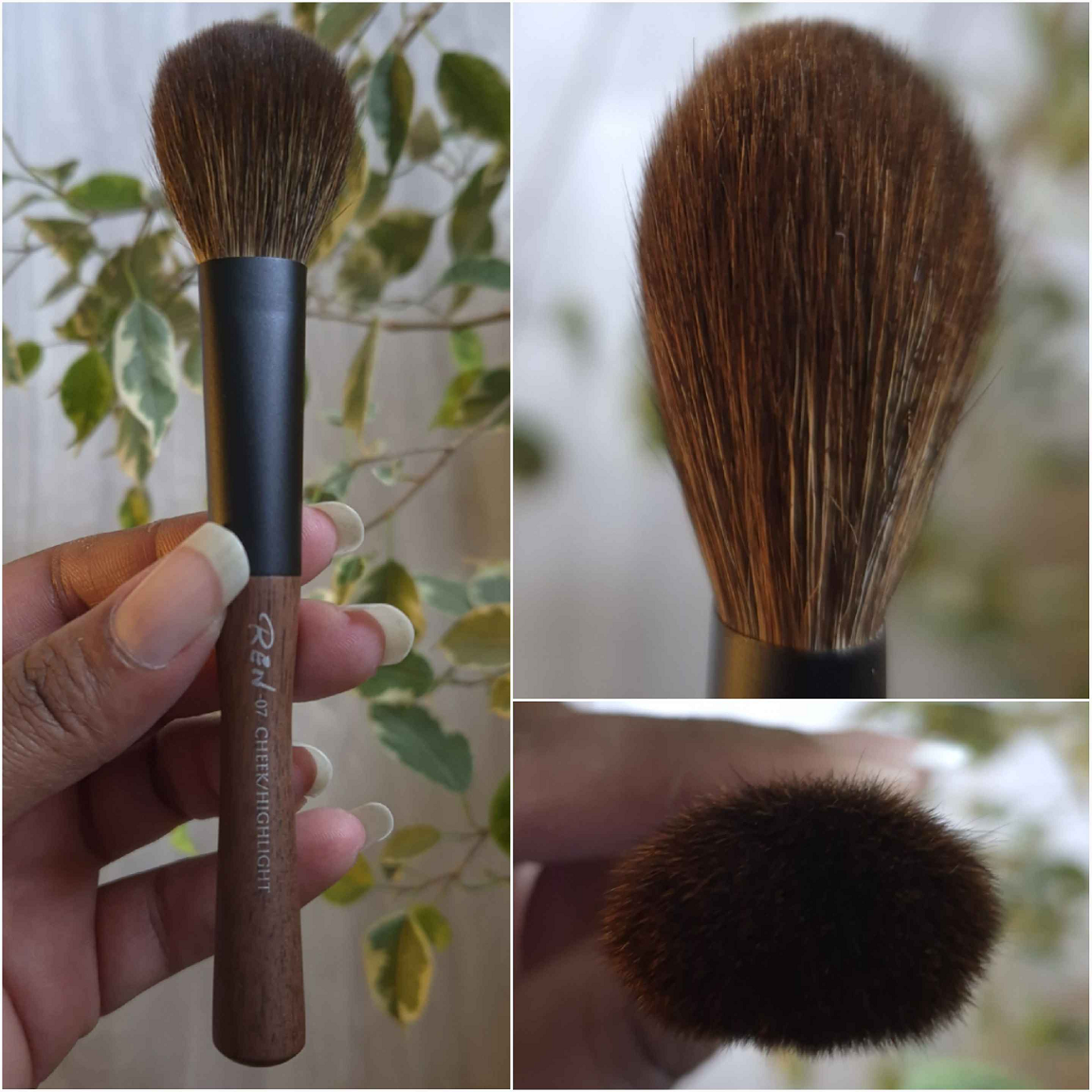
Chikuhodo REN-7 Blush, Highlight Brush
Full Length: 149mm / 5.87 in
Hair Length: 34mm / 1.34 in
Hair Width: *25mm / 0.98 in
Bristle Type: Red Fox and Gray Squirrel
The REN Series is quite expensive, so this is the only one in my collection. I love Bisyodo’s hybrid Fox and Saikoho mix, so I wondered if Chikuhodo’s would be similar and even softer since it has gray squirrel in place of the goat. It did turn out to be much silkier and softer, but it feels more delicate to me, so I try not to be very rough with it. This isn’t dense. The front and back of the brush splay quite a lot, and the center follows the direction of the moment. So, there’s hardly any pressure applied from the brush to the skin. There’s some blending power coming from the fox hair, but this brush is suited for light applications of powders.
I thought this might still be too big for highlighting, but since this doesn’t pick up a large amount and it deposits product so lightly, it works great with more refined and delicate highlighters. This can’t pick up stiff pressed luminizers though and can’t blend out more intense highlighters either, so this isn’t a universally good brush to use for that task.
If I want a light blush application, this brush is definitely good for that. It can just be a bit time consuming if the blush I’m using is already on the sheerer side.
I can also use this for applying a very even amount of bronzer, but the size makes it take longer than I have the patience for around my large face. This brush can technically also be used to sweep off powder from under the eyes or powder from baking.
Overall, this brush feels nice, and it’s good for the type of person that prefers to wear only a light amount of powder products or maintain control over how much powder they want to build up. I’ve been able to find uses for this brush, but it’s not essential for me. For these same blush and bronzer tasks, I’ve preferred to use the Rephr Koyo brush from 2024. The best purpose for this brush is to use it with refined and soft highlighters (like Prada’s or D&G’s), but all of my other highlighter brushes work perfectly well with those too.
A long time ago, there was a note in the bio of Eihodo’s Instagram page stating that they are a “distributor of Chikuhodo brushes,” at least from the Japanese translation. In one of their posts, there is a sign on the window of their shop that states, “Produce by Eihodo, Made by Chikuhodo.” As of the time I’ve published this review, they have further clarified that “All our Hiroshima Kumano brushes are made by Chikuhodo.” So, there is no more guesswork when it comes to the relationship between the two businesses. It now makes sense why there are similar brushes between Chikuhodo and Eihodo.
The only thing I still wonder about are the outlet brushes on CDJapan’s website. They usually only have outlet brush events listed under Koyudo’s or Eihodo’s names. For the Eihodo events, are so many brushes I see that don’t look like Chikuhodo’s typical handles, head shapes, and there are other varieties of squirrel hair used outside of Chikuhodo’s typical gray and Kazan (pine for example). If Eihodo is a distributor, I’m guessing that doesn’t necessarily mean that they only sell Chikuhodo-made brushes. Perhaps the other outlet brushes were created by other artisans and/or manufacturers.
Chikuhodo has some brands they make brushes for listed on their website, but not all. Strangely, they don’t list Eihodo as one of them.
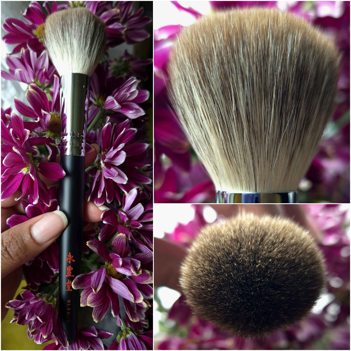
Eihodo BL30-2 Blush Brush Round (BL Series Long handle)
Full Length: 185mm / 7.3 in
Hair Length: 35mm / 1.34 in
Hair Width: 17mm / 0.67 in
Bristle Type: Silver Fox
This brush is surprisingly delicate. It feels dense purely from how many hairs are packed into this brush. When I rub my fingers through it, there’s a lot of splay, movement, and separation without being floppy. A lot of powder can be picked up due to the large surface area, but the bundling will allow for an airy finish and some light buffing. I just have to tap some of the excess off onto my microfiber cloth before applying.
The brush blooms quite a lot after its first wash and I did lose a bit of hair in the beginning few months. That larger surface size and splay makes it bigger than I prefer for blush use. Those that enjoy applying bronzer with large (but not huge) round brushes will probably like this. I like larger brushes if it’s a more rectangular wedge kind of shape, so this is still too much for me due to the size.
In my view, this is a medium-large face powder brush. It works great for that purpose and for light buffing all over the face. It’s a good brush, but the shedding in the beginning deterred me a lot from wanting to use this brush. Even though it’s fine by now, I still tend to avoid reaching for it as often as I should. Hopefully, no one else will have this issue.
I paid 11000 YEN and it’s available HERE. The reason I bought this brush is because I was interested in the Chikuhodo RR-C5 Blush Brush (which is the same price), but I wanted a longer handle. I cannot confirm if they have the same brush head size, but they appear to be based on photos I’ve seen.
EIHODO Big Powder Brush Gray Squirrel with EIHODO Logo
Full Length: 175mm / 6.89 in
Hair Length: 55mm / 2.16 in
Hair Width: 22mm / 0.86 in
Bristle Type: Gray Squirrel
This was advertised as having 15 year old hair, and everyone talks about how older natural hairs are softer than the current supply in circulation. So, I was curious if this brush would actually feel different from more modern gray squirrel brushes. I can honestly say I don’t feel much of a difference. Maybe it’s a tiny bit softer. Maybe I’m imagining it. At the end of the day, this is an airy, soft, fluffy brush with a sturdy handle and ferrule. The head shape isn’t unique, but the brushmakers were generous with the amount of hair that was packed in this one brush. It performs similarly to other gray squirrel powder brushes, which is that it’s going to give a light dusting of powder, and I tend to use it in large sweeping motions across my face.
The retail price is quite good considering the amount of hairs and the construction of the brush. I originally shipped my first one to the US. Five months later, it was on sale for 50% off! So, I bought a second one to have shipped directly to me in Germany.
The full price is 20,000 YEN and it was available HERE. It’s listed as “Sold Out” from CDJapan, and considering the large discounts I saw during two different sales, I don’t think this will be restocked. It’s my guess that this didn’t sell well because of the simple handle design. A lot of fude collectors have this style of brush in their collections, even if the hair in this one might be better.
EIHODO Powder Brush Gray Squirrel and Goat Saikoho Ebony Handle
Full Length: *190mm / 7.48 in
Hair Length: 60mm / 2.36 in
Hair Width: *60mm / 2.36 in
Bristle Type: Gray Squirrel and Goat Saikoho
I could never afford Chikuhodo’s most expensive brush, the coveted Chikuhodo P-8, but I thought perhaps a massive brush like this one might satisfy that desire for it. Although this isn’t a pure gray squirrel brush, it has hair that is nearly as long (63mm vs 60mm), plus the handle is also ebony with a shiny black ferrule that gives a similar vibe. The brush feels very sturdy in the hand and the head shape is similar until it has been washed. Then, the P-8 head becomes much rounder and appears to have a lot more hair in it.
This brush feels fantastic! I feel like I’m using a luxury product every time, which ironically and irrationally makes me use it less for fear of damaging it. Due to the size, I have no purpose for this brush other than to sweep loose or lightly pressed powders all over my face. It being so large makes the process go by ridiculously fast. In fact, it’s almost disappointing how fast I finish powdering my face because of how pleasantly soft it is on my skin. So, when I do choose to use this brush, I end up running it across my face for longer than necessary, just to keep feeling it!
This brush is quite expensive, and although it is a joy to have, anyone with a big gray squirrel brush already isn’t really missing out. Sure, this kind of size isn’t so common, but I recommend this brush for collectors and those that like luxury products.
I bought this on sale for 24,500 YEN instead of 35000 YEN and it’s available HERE.
Eihodo [Outlet] No.399 Blush Brush
Full Length: 162mm / 6.38in
Hair Length: 38mm / 1.5 in
Hair Width: 16mm / 0.63 in
Bristle Type: Gray Squirrel and Goat Sokoho
The main reason I bought this brush is because I thought the price was good and I tend to love this shape of blush brush. I have at least six outlet brushes that look like this, plus the Muragishi Sangyo MS-2, the (original) Chikuhodo KZ-3, and Houkodou N-F1. I even compared it already to the Eihodo Cheek Brush + Cap that was in the Fude Collection Part 8.
I still consider this to be a soft brush, from the gray squirrel, though with a little more friction on my skin from the Sokoho compared to how a pure squirrel brush feels.
I prefer to use this strictly with blushes, though it can also be used to apply bronzer as well. It’s a nice mix of wispiness, but enough goat to allow for a little buffing power too.
I paid 4350 YEN for it and it was available HERE. These kind of brushes, with this shape, all tend to perform similarly. So, anyone who has liked outlet brushes like this in the past will probably continue to like them. I know what to expect by now when I buy one, and I don’t intend to get more. I have enough backups!
Eihodo [Outlet] No.400 Blush, Highlighting Brush
Full Length: 145mm / 5.7 in
Hair Length: 38mm / 1.5 in
Hair Width: 11mm / 0.43 in
Bristle Type: Gray Squirrel
I bought this hoping it could be a dupe/backup for the Wayne Goss Air Brush. It turns out this is a little wider and with a little longer of hair. This makes it bigger than I would like for sweeping powder away from my under eye area. It’s also much flatter than the type of sweeping blush brushes I’m used to. It’s not that good for buffing. If I have a loosely pressed blush or one that is sheer enough that I only need to focus on building up layers and not buffing anything away, then this is useful to me. Even though I can use this for highlighting, it sweeps so lightly that I can’t use it with any of my highlighters that are on the thicker side. Thinner luminizers are better. So, although I like the feel of this brush, it’s either too big for my needs or not thick enough. I have a brush holder that houses brushes for testing (combined with my go-to everyday brushes). This has probably been in there for six to eight months, and I’ve had this brush since May 2024, yet I’ve only used it probably three times outside of my normal testing range.
I paid 5080 YEN for it, which isn’t so bad consider it’s a gray squirrel brush, but still more than I want for a brush I don’t intend to use anymore.
Eihodo [Outlet] No.406 Eyeshadow Brush
Full Length: 141mm / 5.55 in
Hair Length: 10mm / 0.39 in
Hair Width: 3mm / 0.12 in
Bristle Type: Canadian Squirrel
Most of the outlet Canadian Squirrel eye brushes that end up in the hands of CDJapan have the shortest of handles (one example is in the photo below from Fude Collection Part 4). I try to avoid buying eye brushes shorter than 135mm in full length, so when I read the details stating this one surpassed that, I had to get it!
Example of the Typical Canadian Squirrel Outlet Brush
This brush works similarly to my pine squirrel eye brushes, but it’s just a softer and more delicate version. These bristles are surprisingly resilient, but still requires gentler handling than my pine ones. It picks up a good amount of product considering how small it is. I have no issues using it with mattes and less tightly packed shimmers. In terms of how much color it deposits, it’s in the middle. I have to dip into the eyeshadow pan a few times to build up the amount of color I want, but I wouldn’t consider it to be suited for sheer washes either. Part of that need to build up more is just due to its smaller head size. I’m glad to have the longer handle than previous outlet brushes, but I honestly didn’t need to make this purchase.
I bought it at the discounted price of 2290 and it was available HERE.
I love Pom shaped brushes, and this brush feels softer than some other squirrel and goat mix brushes I’ve used from other brands. So, I am very happy with this brush! It was one of my most used blush brushes in 2025. I even mentioned it in my Singe Beauty Blushes and Brush review.
This is great for buffing and picking up all types of powder. It feels densely packed in the bottom half, but gets airier towards the tips. This is better suited to achieve a full-on type of blush look, but there is still a bit of diffusing that goes on. Depending on the blush used, I sometimes still have to dip my brush into the blush a second time to build up an additional layer.
I have to mention that this brush shed quite a bit in the beginning. If I had to put a number to it, I would estimate it took two or three washings and having used it at least 15 times before the shedding became a lot less frequent. My brush is thankfully still full and puffy, but I know that’s something that can be a bit annoying to deal with.
I bought this brush during Fude Bobo’s Black Friday sale in 2024 for around 19,000 YEN, which still felt like a splurge considering the medium head size. As of December 2025, the brush is over 26,000 YEN. As much as I love it, I honestly cannot recommend it for that price.
Hakuhodo 2025 Gradation Sakura Limited Edition
Full Length: *160mm / 6.3 in
Hair Length: *40mm / 1.57 in
Hair Width: *30mm / 1.18 in
Bristle Type: Goat and Synthetic
I try to avoid buying synthetic or synthetic mix brushes from Hakuhodo and many other fude companies, but this handle was too pretty! The pink to white ombre handle has fine gold shimmer throughout, and I like the pale pink sakura flowers and petals. €50 for it didn’t seem so bad. With shipping and fees, I ended up spending €90 in total. I’m not as happy about that, but it is what it is I guess.
This brush is surprisingly soft. “Goat” isn’t very specific, but whatever part of the goat it comes from, it at least feels softer than typical sokoho. Perhaps it’s a high-grade sokoho mixed with synthetic fibers. It’s denser in the center and there isn’t as much splay, just from the outer hairs at the widest point of the brush.
Despite how soft it feels to the touch with my fingers, it can feel the tiniest bit scratchy on my face if I have to build up too many layers. My skin has gotten more sensitive over time, so this may not be a problem for others.
The way this brush is shaped makes it perform similarly to the original old school Real Techniques Blush Brush. The longer tips in the center pick up the most product, but it’s not that wide of an area, so I consider this a building and buffing style of cheek brush. I pick up product from the side if I want to grab more blush at one time and then use a sweeping motion to apply it. Turning it onto the side is when I run the risk of it feeling rough on my cheeks. If I stick to just using the center and a circular motion, it doesn’t happen, but I usually don’t have the patience for that.
I used this brush quite often with the Fara Homidi Bronzer because it looked similar in shape to that brand’s own brush. It does the job fine with bronzer. I’ve also tested this with cream and cream to powder formulas because this is a synthetic-hybrid brush. I didn’t like using it with those formulas because I couldn’t pick up and deposit product as easily as I do with flat top and angled brushes. I couldn’t blend out liquids well enough either (it just smeared it), so this ended up being a brush I only use with powders. I don’t really like that fact.
This brush is neat to have as a collector’s item, but it wasn’t worth me buying for functional purposes. What is way more enjoyable to use is the Hakuhodo 2023 Valentine’s Day Brush which has the same goat/synthetic mix and extremely similar head shape. I reviewed it in Fude Collection Part 6 and even compared it to the Real Techniques brush as well. The difference is that the Valentine’s Day brush wasn’t scratchy, though it might have had a little bit more synthetic hairs in the brush.
KOYUDO
Before we get into the reviews of some of the additional Koyudo brushes I’ve purchased, I’d like to take a moment to discuss the quality distinctions I’ve noticed. I have a mostly positive impression of the company, but it is also the brand whose brushes I have returned or sold the most, as rare as it is for me to do. Their premium bristles are usually good quality, but their Sokoho has been the roughest of all brands, so I stopped buying those fairly early on. Then, even their Saikoho didn’t feel quite as soft compared to their older brushes, as well as the stock coming from other brands. Some of the brushes I bought during that time started having more shedding issues. I nearly stopped buying their Saikoho too, until the end of 2024 when they launched the Yoshiki Tenpyo Series and Yoshiki Red Series because that’s when they started using the “high grade” labels to show a difference within the various goat categories! Since then, I’ve finally been able to count on the “high grade Saikoho” being the level of Saikoho that I expect. This also means that I am generally uninterested in buying other forms of Koyudo’s goat brushes.
I am happy to report that I’ve had no issues with the other hair types in Koyudo’s brushes. In fact, I have come to love their “blue fox” in particular, but I will review one of those brushes in the future.
Koyudo Red Squirrel Yoshiki Cheek Brush
Full Length: *168mm / 6.6 in
Hair Length: *35mm / 1.38 in
Hair Width: *20mm / 0.79 in
Bristle Type: Red Squirrel
This was a limited edition brush that I believe may have been exclusive to Fude Bobo’s website. It is the second non-mixed red squirrel in my collection. The first was the Tanseido Bamboo Series AQ17TAKE Small Cheek Brush that I reviewed in the Fude Collection Part 8. In that post, I talked about how I really wanted a thicker version to use with blushes. Although the Koyudo brush is rounder in shape, it’s unfortunately still a little smaller than I hoped. Both brushes cost around the same price.
Like the Tanseido brush, this brush can diffuse highly pigmented products in small targeted areas and is ideal for someone who doesn’t want heavy makeup. It’s extremely soft, but somehow feels less fragile than my Tanseido one. So, I’m definitely happy about that. Even when I hold the brush very high up the ferrule, I feel so little pressure on my cheeks. It’s a dream for those with sensitive skin!
I wanted to use this brush with blushes, but I have so few that need as sheer of an application as this gives. I don’t mind building up a blush, but I like when the process is quick. For someone with perhaps pale skin who likes a whisper of color on their cheeks, this tool would most likely be very loved. For me, this is more useful with a select number of powder bronzers I own that are technically a bit too dark. With bronzers that are the right depth, I prefer using larger brushes, but having this kind of precision for my darker bronzers is quite handy. I basically just pass the brush over my skin in a few sweeps to blend the product in, but not really buff. Quick and easy! Since I’ve spent most of 2025 using my best bronzers, I haven’t had that much need for this brush. It’s still nice to have.
Due to this brush’s shape, I think it’s most intuitive to want to use this with highlighters. However, the inability to get enough blending power from the brush means that I only enjoy using it with my highlighters that are thin, easy to pick up onto the bristles, and are powdery/easily dispersed. Since so many of my favorites are baked gelee, and can be hard-pressed, that is another limit on how often I can use this brush.
This brush once cost 18,000 YEN, but it is no longer available. It’s clear to me that this brush was a better investment than my Tanseido one because I’m less afraid to use it and I use it for more tasks. Though I don’t have as many occasions when I need this, I’m still glad to have it.
Koyudo Yoshiki Year of The Dragon Red Squirrel and Saibikoho Goat Kabuki Brush
Full Length: 78.5mm / 3.09 in
Hair Length: 40mm / 1.57 in
Hair Width: *45mm / 1.77 in
Bristle Type: Red Squirrel and Saibikoho Goat
I decided to show photos of this brush, but I do not intend to use it. I’m very sorry to disappoint, but it’s too precious to me! This is one of the softest brushes I’ve ever felt (red squirrel and blue fox being at the top). I have admittedly just rubbed it on my face and petted it with my fingers. The hairs are delicate, but they don’t feel fragile, and yet I still refuse to apply my loose powders with it. I’m strange. I know.
Compared to my pure red squirrel brush, I can feel the tiniest bit of drag that the Saibikoho adds. My only experience with Saibikoho is from one of rephr’s holiday brushes, the Saibikoho Cheek Brush which I chose not to ever use with makeup too and have only shown photos of it on Instagram (which I linked). I hinted at my hesitation to consider it a pure Saibikoho brush in my Fude Collection Part 6 post, due to the wording used in rephr’s descriptions. Since then, I have compared how some of my softest brushes feel by hair type. Red Squirrel and Kazan are my softest brushes
Additional photos and a video can be found on my Instagram.
This brush was listed as 50,000 YEN, but I got a fantastic deal on it, and it was available HERE. Due to the high discount it was listed at before eventually selling out, I can only assume it will not be restocked. However, the Blue Fox version of this brush is still available at the time that I’m posting this review.
Koyudo fu-pa01 CB MCFPBT Foundation Brush [Outlet]
Full Length: 105mm / 4.13 in
Hair Length: 26mm / 1.02 in
Hair Width: 32mm / 1.26 in
Bristle Type: MCFPBT Synthetic
I bought this brush because the fu-pa style is a classic from Koyudo, and I’m always curious about the famous ones, but so many other small classic styles of brushes from Koyudo are made with coarser fibers. So, I figured I could give at least this one a try.
The synthetic bristles are fantastically soft. It wasn’t until six months after purchasing it that I learned about microcystalline fibers as a more advanced type of synthetic compared to PBT, PTT, etc. This brush is great for creating a smooth and even application of foundation on my skin. It’s super densely packed, so I expected most of the liquid to stay closer to the tips. However, foundation goes so far down the bristles from a single use, as pictured below.
It’s a pet peeve for me to see a white brush get this dirty-looking after one time. There was just no way I could keep this in rotation.
According to the description on CDJapan’s website, “It is possible to apply more natural make-up as the surface with crystal structure and gaps adsorb powder and liquid at an equal level, and evenly places make-up products on the skin.” So, the benefits are similar to using a dry beautyblender. The liquid sinking into the brush contributes to the thinner and more natural looking layer of foundation that gets blended onto the skin, but it leaves my brush looking like this. I just can’t do it!
I have used this brush with cream bronzers and contours, but I prefer the results I get with the Sonia G Mini Base. This does a decent job with cream and liquid blushes since I have more area to work with. Although I can use this with powders, it deposits quite a bit and I have to buff it away. I don’t really want this much of a dense application, even if it’s suited well to buffing. So, the best use I’ve found for this are the liquid and cream blushes, but I personally just prefer not to use this brush and keep it around as a collectible item. I like the look of small brushes, but they end up being less comfortable for me to use because I have large hands. So, this is another reason why I’ve been fairly quick to give up on this brush. I ended up loving Bisyodo’s MCF foundation brush (with longer handles), so it’s safe to say that fu-pa brushes aren’t for me. I will review the Bisyodo one in the future.
I bought it on sale for 2000 YEN, though it was originally priced at 4140 YEN, and it’s available HERE.
Koyudo Saikoho Cheek Brush White [Outlet]
Full Length: 166mm / 6.53 in
Hair Length: 38mm / 1.5 in
Hair Width: *38mm / 1.5 in
Bristle Type: Saikoho
I’m always surprised when I see brushes that look like they are from the discontinued BP line show up on CDJapan’s website. This was listed as an outlet brush because of the logo, but I’m not sure what is supposed to be wrong with it. Was the yellow part not supposed to be there? Was it supposed to be pink too?
There isn’t anything unique about the shape of this brush. I just wanted it for the nostalgia of resembling the BP brushes, since I don’t have that many in my collection. In fact, the shape reminds me of the Koyudo KSZ-03 Cheek Brush that I sold. It’s just with undyed Saikoho hair.
This brush is a bit dense with minimal splay. It’s definitely not for those who want sheer or light applications of blush and/or bronzer. Unlike the KSZ-03, I don’t have a problem using this in both circular or sweeping motions. This brush is soft, but not the softest Saikoho I’ve used. If I buff for too long, it can still irritate my skin. Thankfully, that doesn’t happen very often. I tend to pick up blushes along the side of the brush and pounce it on my cheeks for a bit, and that’s enough for my blushes to be fully blended in. With bronzers, I tend to just sweep them across the perimeter of my face. Depending on the pigment level of my bronzer, that may or might not require additional blending.
I have used this with all-over face powder once or twice, but I’ve only done that when in a pinch because it’s a little heavier of powdering than I usually go for.
I lost a few fairs within the first five uses, but it stopped shedding after that.
I only paid 1800 YEN for this brush, which was an incredible deal! The retail price is 4000 YEN and it used to be available HERE.
I’ve mentioned in the past how I’m very picky when it comes to gray squirrel eyeshadow brushes. I rarely want a wash of color on my lids, so I tend to prefer the ones that are dense and don’t splay out too much. This brush reminded me of my most used squirrel eye brush, the Muragishi Sangyo MS-4, so I wanted this as a backup brush. It turns out this one is thinner and slightly shorter, but I get very similar results.
In fact, this is so similar that I debated with myself for over a month whether or not I wanted to buy a backup of the MS-4 while I still could (I did end up buying the backup anyway). CDJapan put out a notice pictured below, and I’m not sure if they mean they will no longer carry the brand or if the Muragishi Sangyo business is closing down. I think it may just be the former.
Anyway, Koyudo’s Gray Squirrel quality proves to be great once again. I can pack on a nice amount of product with this brush, even shimmers. The tips coming to a point makes the edges crisper when applying a lid shade. It feels comfortable in the crease and corners of my eyes. Essentially, I use this brush when I don’t need as much blending power as I get from my Sonia G eye brushes. I’m very pleased with this purchase!
I don’t believe I’ve talked about my ordering experience from rephr within the US versus EU, however, it’s virtually the same. My packages are well wrapped, shipping is free on orders over €35 (standard shipping costs €12), and the items typically arrive within 3-5 days.
Rephr 22
Full Length: *178mm / 7.0 in
Hair Length: 48mm / 1.89 in
Hair Width: *52mm / 2.04 in
Bristle Type: natural
In 2023, I owned nearly all the brushes Rephr made. The 22 and 25 were the biggest, and therefore most expensive. I bought them during Black Friday of that year to essentially complete my collection. In addition, this brush is said to be the closest dupe for the original Tom Ford Bronzer brush that was made of goat before they switched to synthetic-only brushes. That Tom Ford brush was always on my bucket list to buy, so this was my best way of fulfilling that wish.
I get some shedding from this brush, but in an acceptable and ordinary amount.
Rephr has always been vague about the grade of goat used in their brushes, so I cannot confirm for sure, but the 22 feels like it has the highest portion of saikoho in their whole range. Since they gradually make changes to the brushes in the concept store, I can’t guarantee that all Brush 22s are like this, but mine feels top notch.* I have zero complaints with how it feels on my skin, for a goat brush.
*At the time that I’m writing this, the website does not have this brush in stock and there is a notice stating, “This product is currently going through a re-design…”
The 22 feels dense from being packed with so much hair, but it doesn’t apply as heavily as I would have assumed from looking at it. If I just lightly tap it into a pan of bronzer, I can get a light-medium application of powder. I keep this in a brush guard so it doesn’t become too airy and lose its shape after being washed. This means that I continue to get a large diffused application of bronzer on my face without it covering too wide of an area.
I have tried using this brush with face powders, but it applies more heavily than I tend to like (and heavier than the 25). It’s also way too big for blush. So, I consider the 22 a bronzer brush exclusively.
I very much like this brush, but I like my large grey squirrel brushes that can accomplish the same task while still being softer. I also have big fox brushes that give the same results, but with less drag/friction across my skin. The Bisyodo B-F-05 Perfect Fit Brush, Sonia G Jumbo Bronzer Brush, and the Chikuhodo FO-9 have that somewhat wedge-shape, but aren’t as thick, which makes them easier to control and apply precisely. The full price ($110) of the 22 is within the same price range as the Bisyodo and Chikuhodo, so I would recommend those instead. However, I paid $53 for this brush, which is practically a steal. As long as the 22 is under $80, I can recommend this brush to anyone looking for a goat hair brush specifically. It’s still significantly fuller than the Sonia G Jumbo Bronzer Brush, but I feel it needs to cost less than that one to make up for for the fact that I still prefer bronzer brushes that are a tad smaller than this one. Those that love big brushes might want the rephr 22 instead!
Rephr 25
Full Length: *180mm / 7.09 in
Hair Length: 58mm / 2.28 in
Hair Width: *45mm / 1.77 in
Bristle Type: natural
The biggest round brush I own (regardless of hair/fiber type) is the Lunar Beauty LBF-1 Large Powder Brush. I don’t like to feature that brand, but the reality is that I love the feel of that brush, but my negative opinion of the owner has made me use it less often. The Rephr 25 is the closest brush I have to that size, and although I have mixed feelings about rephr, it’s not towards the people who work there (just the lack of transparency regarding the hairs and how the brush specifications are listed or neglected to be listed). So, I at least don’t have to deal with feelings of guilt when I use the Rephr brush.
The 25 is the company’s flagship brush, and as I mentioned earlier, the 22 brush is softer than this one. However, my version of the 25 still seems to have a larger portion of high grade goat hair than the smaller face brushes in the line. It’s still quite soft, however, not soft enough for me to want to use this brush over my traditionally-shaped large squirrel and fox powder brushes. This gives me a light application of powder, but with my dry and increasingly sensitive skin, other hair types let me apply an even sheerer amount of face powder. I still love and use plenty of goat hair brushes, just rarely with finishing or setting powders. The “least soft” brushes I’ll use for all-over face powder is saikoho goat mixed with either squirrel or fox. So, the reason I don’t intend to use the 25 as much after completing this review isn’t due to any flaws in the brush. I’d feel the same about all other goat brushes.
I have tried using this brush with bronzers and blush. In the case of bronzer, I like the lighter application than a typical bronzer brush gives, but I don’t like that the feeling of the bristles running across my skin is so noticeable. I don’t like how large it is for blush either.
At the full price of $130, I feel everyone is better off getting a nice squirrel or fox brush instead. I paid $63 for it though, so it was quite a great deal. However, since I don’t intend to use it anymore, I can’t say that it was worth it to me. For those that don’t have sensitive skin though, a brush like this at a discounted price could be great to have.
Rephr 33
Full Length: *152mm / 5.6 in
Hair Length: *18mm / 0.71 in
Hair Width: *14mm / 0.55 in
Bristle Type: natural
This brush isn’t suited as well to my eye shape, but I bought it specifically to do nose contour and it works great for that purpose. The way the hair comes to a point, and the way it is tapered allows me to apply the contour precisely along the bridge, but I can also use the flatter parts to tap onto the wider portions of my nose as well. This brush doesn’t pick up too much product, which is another reason why the end result looks so natural.
I have other brushes that I can use for nose contouring, but this is one of the few that does the best job. I have used it quite often, and at least often enough to feel I’ve gotten my money’s worth already.
I’ve tried using this brush with concealer and did not like the results. It works fine to apply eyeshadow primer to my upper eye area and lids, but it’s so good for nose contouring that I’ve decided to reserve it just for that.
Rephr 38
Full Length: *161mm / 6.3 in
Hair Length: *33mm / 1.3 in
Hair Width: *23mm / 0.9 in
Bristle Type: natural and synthetic
This is the permanent version of the Rephr x Alexandra Anele brush. I didn’t buy the original because I did not like the scraggly look to it, which reminded me of stippling brushes and I never like stippling brushes. By the time I decided I wanted to give it a try anyway, it was sold out in Europe. I assumed if the brush sold well enough, it would eventually return. Hence, how I have this one now!
I am happy to report that this brush works quite well with all mediums of highlighters, though I use it most often with powders. This brush can pick up quite a bit of product considering its small size, but the staggered hairs diffuse very well (also surprising considering the dense feeling it has in the belly portion of the brush head). I’m careful using this with my softer and lighter pressed luminizers because I don’t want to waste product, and not out of fear of overapplying. This brush is also great for applying blush toppers and when I want to add a lighter color blush to the apples of my cheek (essentially for precision applications). It can also be used for bronzer and contour, but I prefer to use larger bronzer brushes. If I’m going for a more sculpted look, then I don’t mind using the 38 under my cheekbones specifically.
I like this brush quite a lot, and I recommend it, but candle-flame shaped highlighter brushes are still my favorites. The 38 is like a cross between paw-shaped and Koyudo’s 3D one, which are pretty much my next favorite of shapes. This blend of synthetic and goat has a good amount of softness and it does not feel scratchy, but I get more enjoyment from the softer plusher hair of highlighter brushes I’ve added to my collection within the past year (and still need to review in the future). I’ve used this brush a decent amount of times while it’s been in rotation, though I wouldn’t consider it a go-to brush just yet. I’m essentially glad to have it in my arsenal, even though it hasn’t replaced any of my favorites. This brush is intended to be multi-functional, and it succeeds at that.
I would like to point out though that the shape of the brush seen in photos on rephr’s site is how it looks prior to being washed for the first time. It blooms a fair amount, as seen in my own photos, but it’s not technically “Shodō style,” unlike the brand new Rephr x Andreea Ali 2609 Brush that I decided to pass on. I think the 38 being far less stipple-shaped than the Shodō 05 is why I like the 38 a lot more, and also a reason I decided to skip out on the Andreea Ali brush. It didn’t help that the brand hasn’t disclosed what fiber type the 2609 is.
Rephr Kōyō Brush (Holiday 2024)
Full Length: *163mm / 6.4 in
Hair Length: *44mm / 1.73 in
Hair Width: *40mm / 1.57 in
Bristle Type: Squirrel and Saikoho Goat
This brush reigns supreme as the best brush Rephr has ever made! For starters, it’s the 3D shape that I love. It has a fully lacquered maki-e handle that looks even better than their 2023 brush. The squirrel (I’m guessing gray) and Saikoho mix is plush and soft with the perfect amount of airiness to get a well diffused result. This was my go-to blush brush throughout all of 2025 for when I wanted a light application of a pigmented blush (and it’s my second most used blush brush overall). I have some products that a single tap into the pan with other brushes still led to applying too much, and that’s when this brush could succeed where even my beloved Chikuhodo x Bobo Moon Rabbit Design brush could not!
I can use this with highlighter (using the tips) and bronzer, but it shines the most as a blush brush. The quality is superb. I have zero criticisms about this brush. It’s the best of my 3D cheek brushes and has held up well over the past year. I try not to be too rough with it, but I don’t feel like I need to be that dainty with it either.
The €99 it cost was absolutely worth the price, and I consider it a deal actually. So, if they ever bring this back, I highly recommend it.
After Rephr released the now discontinued Brush 30, which looks identical post-wash to Koyudo’s Saikoho Powder Brush that is part of the also discontinued “Koyudo Special 3 Piece Set,” I started to wonder if Koyudo is one of Rephr’s manufacturers. The Kōyō Brush certainly added fuel to my theory because of its shape and how the hairs feel. Koyudo is also one of the few brands who put their specialty brushes in wooden boxes (Paulownia vs perhaps Sugi type of Cedar). I felt even more convinced when I saw Krassypetrova post a Koyudo brush that had the special yosegi-zaiku technique fusing multiple types of wood together. That brush, along with Rephr’s holiday 2025 Yosegi Brush, are the only ones I’d ever seen like that. Perhaps this is all coincidence, but I’m just sharing my hunch!
Rephr Yosegi Brush (Holiday 2025)
Full Length: *162mm / 6.4 in
Hair Length: *42mm / 1.65 in
Hair Width: *40mm / 1.57 in
Bristle Type: goat?
The handle is made using the Yosegi-zaiku technique, that in this case fuses maple and walnut wood together. The ferrule is plated with 24k gold and was, “pressed three times to achieve the brush’s unique triangular shape,” that is apparently called a Sankaku Ferrule. The logos on the brush were made through Maki-e techniques as well. Overall, Rephr clearly requested so much time and effort to be put into the details of this brush. These techniques and luxury elements make this brush special, and yet they chose to not list what type of bristles this brush has anywhere on their website and none of the Influencers mentioned it in their videos either.
Because of how much I loved the previous holiday brush, I felt it was officially safe to buy another one. All of them have elements that make them uncommon or even rare to find, especially at the prices they sell them at.
I reasoned that even if their newest holiday brush turned out to be fully synthetic, the other elements would still make it a reasonably priced brush for me at €89.
The bristles, in my opinion, do have a very synthetic feel to them. The perimeter of the brush, particularly the tallest fibers at the front that form the most pointed section, feel the most slick like the texture of older synthetic types. Even the way those “hairs” bend don’t look or feel natural. Maybe those hairs just happen to be treated in some way. The center portion of the brush feels like a mix of synthetic and goat. I contacted rephr’s customer service inquiring as to what type of fibers are used in this brush and was told simply “goat.” I have long complained about transparency issues regarding the fill of their brushes, so I don’t know whether to take their word for it that it’s goat and not question whether there is also synthetic fibers in this brush too. Although I have my own thoughts, I chose to list this brush as goat, like they said.
Regarding the performance of the brush, the results are actually similar to the Kōyō brush, although the means of getting there are different. I can load up the Yosegi brush with a lot of powder, but it doesn’t release and deposit as much of it back onto the face at one time. It takes a lot more swipes back and forth to get it all out, meaning that it’s the perfect brush for someone wanting to build up product carefully, while also not needing to make repeated dips into the pan. At least, it is this way with blush and bronzer. If I try to use the front tips for applying highlighter, I definitely have to pick up product repeatedly. Lovers of subtle highlighters will most likely enjoy this too. I’m a little too impatient, so I stick to using this for just blushes and bronzers. This brush is big enough to be considered a medium-size face powder brush or a large cheek brush, but it’s the right size for my face and doesn’t feel like too much.
This has the kind of bounce on the skin as if using a puffy bunny’s tail to apply makeup, and it’s mostly soft, but it has a little more drag on the skin than the Kōyō brush. Every now and then, I feel the occasional poke, which I can only assume is from one or two snapped hair tips. I have only lost a couple of hairs in the month that I used this brush, so I wouldn’t say there is a shedding problem. I may just need to be slightly gentler when I use this, although I intuitively buff with this brush (unlike Kōyō) because it has the better structure and shape for that task.
Although the Yosegi Brush is completely functional, I think the next time I wash it, I will end up storing it as a collectible rather than using it further. I’m glad I bought this, but I get a lot more use out of the Kōyō Brush instead and would prefer to just continue using that one.
In the future, I would like to continue buying Rephr’s holiday brushes specifically. However, I want the company to be fully transparent and list what fibers, bristles, or hairs they use. I think it’s only fair to be up front with people about what they’re buying.
Rephr Shodō 05
Full Length: *161mm / 6.33 in
Hair Length: *33mm / 1.3 in
Hair Width: *30mm / 1.18 in
Bristle Type: goat?
Rephr’s Shodō eyeshadow brushes have been a big hit with their fans. I liked the 38, which I figured was close enough to being a Shodō brush, so I decided to go ahead and buy this one which is technically their first one for the face.
In the beginning, I loved this brush. I was so glad to have found another hit from Rephr. The way the uneven bristles diffuse product and leave behind a finish that looks more blended than airbushed is the reason I finally understood the appeal. Visually, the brush is ugly to me, but the results have been great.
Unfortunately, I treated this brush like a normal goat brush, which is apparently too rough. For starters, I had to contact rephr again to find out what type of bristle it had because it was not listed on the website and no one else I watch talked about it either. “Goat” is such a loose term because it could be courser hair from the abdomen of the goat or the softer neck hair. That’s why specifics of Hakutotsuho, Ototsuho, Tankoho, Sokoho, Saikoho, and Saibikoho can be so helpful. I know rephr tends to say they use a combination of Sokoho and Saikoho, so I assumed I could use it like any other of their “goat” brushes. And that is what has led to so much snapping of these brush tips! I did not have as much of a shedding problem with this brush as I did with finding short broken off pieces on my face afterwards. It didn’t start happening (or at least I didn’t notice) until after about a month of testing this brush. I’ve been using this in a buffing motion, but perhaps those staggered stipple-looking tips are more prone to breakage. The brush’s greatest strength is also its weakness. So, I have had to switch my techniques and use much lighter pressure to sweep on product and not try to blend things out. I’m admittedly a bit less satisfied with the results and enjoy it a bit less. It’s still a good brush, but I’m less interested in trying other Shodō brushes in the future, which is a shame considering this is the direction they seem to be going in and I would not be surprised to see a lot more in the future.
The size of this brush reminds me of the 05, while the slanted back is like a bigger 38, and the overall width is almost like a baby version of the 24. I like it the most for bronzer applications, even more than with blush. I have also used it with face powders, but I like my big fluffy brushes more that have softer hair and zero issues giving me a light sheer dusting of product anyway.
REPHR LC COLLECTION
I am pleased that Rephr has been forthcoming about the fact that these LC Brushes are made in China instead of Japan and that they are fully synthetic. Unlike many other Japanese Fude companies who tend to price their synthetic brushes nearly as expensive as their goat ones, the concept store prices for the LC Collection are in line with some of my favorite synthetic brushes from Sigma, Smashbox, Patrick Ta, Tarte, etc. As long as the prices are reasonable, I don’t mind buying the occasional synthetic brush. I have plenty of them already, so it takes a lot to get me to be interested in some, and Rephr’s have been hyped up so much that I finally caved.
I only review Japanese brushes in my Fude section though, but this was still the best section for me to put these, and they are actually fantastic brushes, so I will just keep my thoughts brief.
LC 01
After reining supreme for almost five years, I didn’t think any brush would top my Sonia G Jumbo Concealer Brush, but it has! I even bought a backup of this one. I get the same ability to pack on a lot of product (for getting full coverage), but the product doesn’t stay within the brush as much, and it works even better with spreading eye primers across my eyelids. This is also very soft and gentle to use around my eyes and the angle shape allows me to more easily get into folds and crevices. I used to use my Jumbo Concealer specifically for applying concealer and would always switch to my flat top brushes for eye primers, but I do both with this single brush!
LC 02
I’ve heard so many people praise the BK Beauty 112 Small Angled Face Brush for cream and liquid blushes, but I haven’t bought it. This brush looked similar to me, so I chose this one instead. It really is fantastic for this purpose, but it matches the greatness of plenty of other synthetic cheek brushes in my collection. So, I’m glad to have this brush, but it wasn’t as much of a game-changer as the LC 01.
LC 03
This is pretty much a bigger version of the LC 02, and I have been loving it with my liquid foundations. This performs how I wanted the Sonia G Jumbo Base to be like. It’s larger, denser, and more plush feeling than the Sigma F47 Multitasker Brush that I enjoy with my foundations. The LC 03 is better at smoothing over the contours of my face than the Smashbox Full Coverage Foundation brush that I also love.
I was enamored by the Bisyodo S-517 Liquid Foundation Brush (and bought a second one for cream bronzer specifically), but got this Rephr LC 03 not long afterwards. I have to admit that the Rephr brush took a little bit of that shine away from the Bisyodo brush, and the large size makes it even more convenient to apply my foundation quickly, but I still used these two the most in the latter half of 2025. I get the most coverage from the Bisyodo brush, making it better on “bad” skin days, but I reach for the rephr brush if I want a thinner foundation layer that is better pressed into my skin for a covered yet less detectable look. Only time will tell which one will become my official favorite foundation brush.
I did not buy a backup for this reason though, as I have a lot of foundation brushes that are fantastic.
The construction of all three brushes are very sturdy. The dyed bristle color looks beautiful, and they are nice to hold in the hand. All of the brush heads are dense, which is what I like to see in synthetic brushes.
Although I consistently have mixed feelings about Rephr, I always give credit where credit is due. Their best brush creations are the Kōyō Brush, the LC Collection (01, 02, and 03), and the 38. They have others that are good, but these are the ones that set them apart from competitors and the ones I don’t hesitate to recommend.
EU SHIPPINGOF FUDE BRUSHES
In previous Fude Collection posts, I’ve discussed what it has been like to order brushes from Japan to the US via CDJapan, Fude Beauty, Fude Japan, and Fude Bobo. Once I moved to Germany, I continued to have some of my brushes shipped to the US so I would not have to deal with VAT, customs fees, etc. However, with everything going on in the world, I cannot visit the US as often as I used to. This means that I had to start shipping from Japan to Germany instead. Now that I have this knowledge, I can share it so that others living within the EU can know which websites are the best to order from.
Unfortunately, I cannot say anything about Fude Beauty because I still haven’t ordered anything from them to ship to Germany. Them packaging these expensive brushes in envelopes with no fragile signs and me getting a damaged brush has made it so that I try to avoid buying anything from them at all costs. I don’t want to risk having to deal with damaged goods again (though customer service did a good job to resolve things).
I have ordered from Fude Japan once, and the website does not collect VAT. I bought a brush that cost €50.95 and paid an additional €19.95 for shipping. Then I got hit with the EUR 20.95 fees from DHL. So, I paid almost the cost of the brush in shipping and fees alone. If I was in the US (before the tariff situation), I would not have this issue. However, I purchased less often from Toshiya anyway, after discovering Fude Bobo’s website also gives snacks or small cute gifts, in addition to usually have some kind of discount available.
This is why I prefer to only buy brushes through CDJapan, Fude Bobo, and Beautylish.
CDJapan’s ordering process is at least upfront. Shipping fees are waived on orders where the item total is over 12,000 YEN (around €65).* VAT can be paid in advance, which is 19% for Germany. Most of my orders are a simple matter of paying the item cost plus VAT with no additional fees. I often wait until there is a promo code available before making my CDJapan purchases. Plus, I earn points on my order which can be used to take some money off in the future.
*Things will change starting April 1, 2026! For now, shipping is free on orders over 12,000 YEN. In April, it will be free on orders over 35,000 YEN (around €190 or $226). I have posted their notice below.
If my subtotal is over €150 from any non-EU based company, then unfortunately, I will need to pay the VAT, EUSt, customs, etc. through my shipping carrier. This means I can’t pay it to CDJapan in advance. One such example is when my order subtotal was barely above €150, so I knew I’d have to pay at least €28.50 for the uncollected VAT. The amount owed in fees ended up being €40.33. So, CDJapan was my favorite place to make orders under €150. For the record, I don’t have a favorite place to buy brushes above that price-point, as I am subject to those fees everywhere (as far as I’m aware).
My other favorite place to make orders is through Fude Bobo. As I mentioned in the Fude Japan paragraph, Fude Bobo usually has some form of discount available, and customers get a small item or snack as a gift with purchase. The downside is that there’s no reward program and no free shipping under 70,000 YEN ($447 or €376). So, the promo code often ends up just partly covering the shipping cost. On the plus side, I have been very fortunate regarding getting very low fees if my order gets hit with any from DHL through Fude Bobo.
When I do the math, CDJapan usually ends up being the slightly more price effective way to make my brush purchases. For example, lately, Bisyodo brushes have been excluded from discounts and sales via Fude Bobo’s website. So, I only get Bisyodo from CDJapan. Fude Bobo has Hakuhodo brushes (which CDJapan does not carry), but Hakuhodo is too expensive for me to afford now anyway. So, I usually just buy things from Fude Bobo that I can’t get through CDJapan. I am a CDJapan affiliate, but my favorites are based on which place can save me the most money. CDJapan’s reward program and free shipping minimum, combined with their monthly or bi-monthly discount promo codes, makes them objectively the best option for shipping Fude to Germany. Or, at least until April. After that, Fude Bobo may become the more affordable option in certain instances. I won’t know for sure until my next purchases after April.
I also want to take this time to say thank you to everyone who uses my affiliate links or used them in the past. It helps so much regarding my ability to buy and review brushes. ❤ Although I cannot see anyone’s names, it is fascinating to read the list of the brushes that were purchased and learn which ones are the favorites.
The benefit to buying brushes from Beautylish is that they collect the standard amount of VAT. The cost of the brushes usually qualifies me for free expedited shipping. They have a reward program. They have sales, but rarely on the brushes I actually like. They tend to have a much smaller variety of Japanese brushes available, so I stick to buying just Wayne Goss and Sonia G brushes from Beautylish. Wayne Goss’ UK website has a higher free shipping minimum, but shipping is only €5. So, if I’m making a small order of Wayne Goss brushes, I prefer to use the official website instead. The brushes are still packed well and arrive within several days to a week.
I hope this information has been helpful. Thank you for reading. I’ve already begun working on a draft for Part 10, but I anticipate it won’t be out for several months. Be sure to check back here or click follow to be notified by email whenever I have a new post!
I’ve been working on a Victoria Beckham Beauty brand review (coming in March or April), but today’s post is a quick demonstration of the new Orchid palette in action, along with swatches.
For a more detailed and thorough review, please keep an eye out for that upcoming VB Beauty post.
Victoria Beckham Beauty Eye Wardrobe in Orchid
I imagine the Satin Kajal Liner in the shade Orchid would pair very well with this palette, but Fig is the type of color I would wear more often, so I bought that instead.
I have swatches for those curious how similar or not the shimmer eyeshadow from the Orchid Palette is compared to the Tea Rose Lid Lustre. Tea Rose has more purple compared to Shade 4, which is more of a Rose Gold.
I may as well share swatches of all the kajals I own, but the review for them will be in that upcoming post.
I’ve talked about the brand’s shipping in the past, which has always been fast. This time was ridiculously quick! I placed my order on Tuesday, just one hour after the V-Suite email came in, and my parcel arrived at 9 am the next day! That’s just 25 hours! Because it arrived so fast and I just got hit with a cold today, I wanted to get these pictures and post them as fast as possible while I still have energy. Otherwise, I probably would not have been able to post this for a long time.
So, that’s everything for today! I just wanted to take the time to thank the person who used my referral link from my previous VBB post. In addition to them getting 20% off, I was able to get this order of the refill and two kajals discounted for 20% off too! So, thank you very much!
*UPDATE FEBRUARY 23, 2026: Another person used my referral link and I was notified by the brand that if someone uses a drop-shipping method to do so, it will lead to your own account being terminated. I do not recommend that anyone participate in their program considering the risks it puts your own account because of someone else’s actions. I will discuss this more in my upcoming brand review.
Thank you to everyone else who visits/follows this blog. I’m honored that you take the time to read my posts and I hope they continue to be helpful!
I heard great things about all of the products I purchased from Sweed Beauty, but it’s hard to know what is truly a “bestseller” considering the brand put nearly every product they make on their bestsellers page! It’s pretty much just their full range of false lashes and their makeup brushes that are excluded.
Everyday Sunshine, Allfeisty, and Kackie Reviews Beauty are the only influencers I follow that talk about the brand, but none of them are anywhere close to my skin tone. Since it was extremely difficult for me to find anyone darker than tan using Sweed products, I figured sharing my photos and thoughts on the products could be helpful. And for those living in Germany, I’ve found Sweed products on Niche-Beauty, Douglas, and Flaconi retail sites.
Side Note: I linked videos for each creator, but Kackie’s is just a lip product. I could have sworn she has talked about the mascara, foundation, and blush before. She’s the one I attribute to making me the most interested in the Glass Skin Foundation in particular, and she’s the reason I kept being curious about Sweed, but I can’t find the videos on her page. Now, I feel like I’m gaslighting myself and could be confusing Sweed with Thrive, whose products have a similar color scheme.
Working my way from the makeup I like the least to the ones I like most, let’s begin with the foundation.
Glass Skin Foundation in 11 Deep W
This shade is described as having a warm red undertone, but it looks quite yellow. Even though I always try to grab a yellow or golden foundation, the strength of that yellow is too much for me. It doesn’t help that it’s too light for me as well.
In the straight-on face photo, the half of my face without foundation looks a little redder because I had just scrubbed off makeup that I was previously wearing.
I feared shade 12 Deep N/W would be too neutral despite being described as having neutral to warm yellow undertones. Frankly, I’m not convinced that any of the shades would work for me. Between the model photos (in which 11 is too light and 12 is too dark and red), the computer generated-looking arm swatches that all appear ashy on the darker arm, the liquid swatches that even 12 looks too light, and the real swatches on the hand that is ironically missing shades 11 and 12, I had no way of knowing which one to go by. Shade 11 had the greater discounted price between 11 and 12, so I let that be my guide.
The shade match being wrong isn’t the only reason it looks mask-like. Despite the thin and watery consistency of the foundation, it doesn’t spread as wide and easily as I expected. I had to put more on to cover my whole face. Perhaps I could get it to apply thinner and more evenly if I used a beautyblender, but I couldn’t bring myself to try additional steps since I think having the wrong shade would leave me dissatisfied no matter what. This is called the “Glass Skin” foundation, but the finish appears satin-like to me instead of wet, shiny, or truly glassy. It’s supposed to be suited for every skin type, but I disagree.
One positive aspect is that this dries down on my dry skin without requiring powder and there is very little transfer. Overall though, I don’t plan to use this foundation ever again and I wouldn’t purchase another shade if there was an expansion. I didn’t know it at the time, but apparently customers can send photos of themselves in daylight to the brand’s email address info@sweedbeauty.com or Instagram DMs for advice with shade matching. Hopefully this will help.
The Bronzing Powder in Tan
Fans of baked gelee products will probably enjoy the texture and performance of this bronzer as much as I do. It instantly reminded me of the contour shade from Dior’s Contour & Glow Duo in 200 Diorama, Nabla’s Skin Bronzing, the Hatice Schmidt Bronzer, and from Kess. All of these products were made in Italy as well.
This is a skin-like bronzer with subtle luminosity. It’s buildable, to the point that I can at least see it on myself in person, but I cannot get it to show easily in photos. I’ve tried on three different occasions to photograph myself wearing it, and the best one is below.
Tan is the darkest of the two colors that Sweed offers and I have used so much product trying to build up that shade, that I can faintly see a dip in the pan after only a few months of sporadic use. It looks more used than the other bronzers in the photo above despite it actually containing the most amount of product at 10 grams.
The Tan shade has a little bit of a red undertone, but it looks neutral on me most of the time until I build it up as intensely as it can get.
I have no issues with blending or fading. It’s a great product. I love bronzers that have this kind of formula, but an airbrushed and blurred type of finish can outrank them. With the exception of the Nabla Skin Bronzing product (which is significantly less expensive but also harder pressed), €35 is about the standard price for a baked gelee or gel-powder hybrid type of bronzer. However, €50 is usually the starting price for the type of powder bronzer that actually blurs and is finely milled enough for me to call it the best of the best in my collection (Hermes, Charlotte Tilbury, Victoria Beckham, and so on). Even the most bronzer-obsessed person might be unwilling to spend that kind of money, so the hybrid formulas present an alternative option that still tends to be fantastic quality.
Sweed’s bronzer is $45 in the US and €45 at full price in Germany. I find that to be a little high, but I guess it can still be justified. I must admit that due to the preferred undertone and depth of the Hatice Schmidt bronzer, I prefer it over the Sweed one, and it’s conveniently €10 lower in price for 8.5 grams. Although I can recommend this as a good product, I have to acknowledge that better prices and more shade options for similar formulas of bronzer exist.
Air Blush Cream in Fancy Face
This blush has faint gold shimmer throughout, which gives the barest hint of luminosity to the cheeks. The surface of the blush feels a little creamy to the touch, but it feels completely dry on my face, as if I applied a pure powder product. It fully sets on my skin, and how long-lasting it is depends on whether or not I used specific skincare or foundation that left my skin feeling dewy. If so, then the blush starts to fade as quickly as 5-6 hours. Otherwise, on a drier base, the blush lasts a minimum of 8 hours.
Fancy Face is the darkest shade they have at the time that I’m writing this. I like to apply this blush subtly, so it doesn’t look very intense on me in the photos I take. However, it still isn’t that dark in my arm swatch. This shade is buildable, and might still work on someone within the deep skin category, but it could be ashy on someone with a rich skin tone.
Although the Sweed Blush is firmer in the pan than the Rare Beauty Soft Pinch Matte Bouncy Blush, both leave a similar finish on the skin. It’s that blurry dimethicone-matte type of look that’s become increasingly popular over the years, especially in the K-Beauty realm.
The edge that Sweed has over Rare Beauty is that tiniest bit more glow. However, it’s not radiant enough for me to be satisfied. It still looks more matte than I like, so I have to use a hydrating spray with both. Rare Beauty’s blushes are more pigmented, but apply just as smoothly. They are longer lasting and their range has more dark-skin friendly options at the price of €28 for 6.4 grams of product as opposed to Sweed’s €34 for 5 grams. The US prices are $27 vs $35. So, even if Sweed expands the range, I don’t think I’ll buy anymore. It’s not due to a lack of quality and is purely about my preferences.
Cloud Mascara in Black
This is a bit difficult to review because I know that mascara formulas can change over time. Within a few weeks or months it can become drier and harder to use. In some cases it can start off too wet, but drying over time makes it work better. They can clump more or flake more. Essentially, how I feel about a mascara in the beginning can differ within a month or two, but I only used the Cloud Mascara for about two to three weeks prior to beginning to use the brand’s eyelash serum. The photos above were taken prior to using any lash serum and it was probably my third time wearing the mascara.
In the beginning, I thought this mascara worked fine, but I didn’t love it. It took me a while to realize that I couldn’t get as far trying to build up a very heavy first coat like I do with the majority of my favorite mascaras. Waiting for it to fully dry before adding a second coat sometimes led to it being unevenly built up, spidery, and sometimes I’d get a few clumps.
What works best for me is to build up the first layer of one set of eyelashes, repeat the process on the other eye, and by the time I’m finished I can add a second layer to my first eye before it has time to fully dry down. The end result is much more to my satisfaction and can be viewed in my Isamaya Core 1.0 Palette post, which I used the Cloud Mascara exclusively in all of the eyeshadow looks. I had been using the lash serum between 3-4 weeks when I took the pictures, but I didn’t observe any improvement from the lash serum that early. So, I feel like it’s still a good representation of the mascara’s best results on me without additional help.
This is the type of mascara that’s on the wet side, but not too wet. Since mascaras are recommended to be tossed out every 3-6 months (whether I do so or not), I only judge one by its performance up to that 3 month mark because additional changes could just be the start of it going bad. I can say that I have noticed zero differences in formula consistency within those three months.
I don’t get clumping (when I use my specific technique) and I haven’t spotted any flaking. One of the things I especially like is that my lashes don’t feel stiff after I apply the mascara. If I get an itch, I can rub my lashes with the side of my finger or nail and my lashes are still fairly soft. Many other mascaras give me a tugging sensation at the root of my lashes when I do the same thing.
The brand advertises this to be both a volumizing and lengthening mascara that keeps lashes separated and fan-like. I agree that it’s very good at separation and it adds decent volume, but my current favorites give me more length.
After completing the full round of lash serum, I definitely like how the mascara looks even more.
However, I feel like I shouldn’t factor that into my review of the mascara. Based on how it looked prior to the lash serum’s effects being visible, I can’t say that this mascara was worth €28 for me, even though it contains Panthenol (Vitamin B5) which, “improves elasticity and helps reduce breakage.” I got this mascara on sale for €21 (a little over $24), but I’m still uncertain if I will repurchase it or not. I don’t know how much of an effect the panthenol may or may not have had an impact on my lashes not breaking off. My gut tells me this mascara is overhyped. I like it, but I feel much stronger about my other mascara favorites.
If I end up changing my mind on this, I’ll update this post.
Eyelash Growth Serum – 3ml size
I owned the other Sweed products since September 2025, but I bought this serum at the end of October. Since it’s supposed to take at least 4-6 weeks for results, I decided to push back the release date for this review until I had tested it thoroughly.
I have been afraid of lash serums since the GrandeLash lawsuit when I learned about prostaglandin analogs, ingredients that are in the majority of eyelish serums and are listed under a ton of different names. I was too scared of the potential iris and eye skin darkening, eye irritation, and other side effects, to ever use one. The fact that Sweed’s serum does not contain any prostaglandin analogs is the only reason I was willing to give it a try.
Before we get into the review, I wanted to point out that the directions on the box just say, “Apply directly with a single stroke to the base of the upper eyelash.” I felt like there had to be more to it, so I watched videos of people applying it, and some put it so close to the lash line that some of it got onto their actual eyelashes. The instructions on the website stated, “Apply with the product’s applicator, using one stroke on your eyelid just above your upper lash line. Apply by starting from the outer to inner corner of the upper lash line.”
I believe the guidelines I should be most inclined to follow is on the official Sweed website. So, that is what I did after the third week, because it took me that long to look it up. I had just been following the information on the box.
At the 4 week mark, it appeared as if my eyelashes that fell were a little longer than usual, but I couldn’t see much difference on my eyes overall. By 6 weeks, I definitely noticed fullness of my lash line. My eyelashes didn’t look longer, but they weren’t as sparse, even in my problem section of my inner lashes. By 8 weeks, I realized my lashes were a lot more curled up, which is why I hadn’t noticed they were longer than before. After 10 weeks, it became clear to me that the outer half of my lashes were fuller than ever and looked slightly longer than the years when my natural eyelash growth was at its peak. However, from 8 weeks and on, I accepted the fact that my natural lashes aren’t dark enough and are too curled to look long while bare. When I close one eye and look sideways, I can see how long my eyelashes are, but looking straightforward, the effects of the lash serum can’t be seen until I put on mascara.
I still wish to have more fullness in the inner lash region, but I am pleased with the improvement. Part of the difficulty for my inner lash region is the fact that I frequently rub my eyes, especially before bedtime which is when I apply the serum. I’m not sure where I heard or read the information to apply it at night. The directions on the website merely state to use this once a day without a specific time. Anyway, when I rub my eyes, I basically remove whatever lingering bit of serum hadn’t yet absorbed in my inner corners.
These are the results, with and without mascara, at the 8 week mark.
Although my eyelashes didn’t get crazy long, I can see how many more lashes stand above my crease line with mascara on compared to before. I don’t lose my eyelashes as frequently either.
The directions state to use the serum daily for 4-6 weeks, and then switch to using it 2-3 times a week for maintenance. After the initial six weeks, I continued to use it more or less on a daily basis until after the 8th week. Then, I lowered the usage to every other day or two. As for my bottom eyelashes, I have not noticed a difference, but I didn’t expect any considering I did not apply the lash serum there and the serum is not recommended for that.
The photos above are not the best representation of my mascara favorites since I had them for far too long and the last bits of mascara left in the tubes are partly dried up. However, I think my lashes still looked great!
I managed my expectations and got enough results to be happy with this product. My issue trying to regain the fullness I used to have was resolved. This product is supposed to last 3 months* and my eyelashes will return to normal if I halt using it for one month.
*I’ve been using this at a rate of around 2 months daily and 1 month every few days, yet my tube hasn’t run out. So perhaps the estimate of 3 months is if someone used it daily during that whole time or perhaps the 3 months is a minimum of how long it’ll take before the serum runs out.
This is not a cheap product. It’s sold for $55 in the US or €49 in Germany for 3ml. The 5ml tube is frequently out of stock and costs €70. I bought my 3ml at a discounted price via Flaconi for €33. At that price, I do like it enough to repurchase it considering it’s as much as a high end mascara and it makes all my mascaras look even better. A regular eyelash primer might give me even longer lashes, but it wouldn’t solve my fullness/sparse lash issues. So, I will most likely continue to make repurchases at the lower price.
I highly recommend watching Abbey Yung’s video for those curious about the serum’s ingredients, understanding how it works differently to traditional lash serums, and seeing her own results.
Overall, I have a positive impression of Sweed’s products. Their makeup is very high quality, but some of the products don’t match my specific preferences, and the shade range is a bit lacking. So, I will continue to keep an eye on this brand’s new launches and I’ll potentially purchase from them again in the future.
I hope this post has been helpful to you! Thanks for stopping by and reading!