Luxury Makeup Reviews

I’m a little surprised by how many luxury products have tempted me this year. Then again, brands have been expanding their ranges, so I have products available to me now that I didn’t before.

Today’s post will be centered around some of the most exciting luxury makeup items that are newly part of my collection.

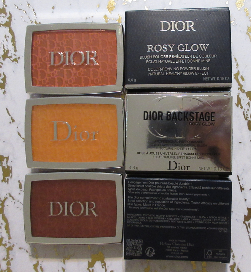
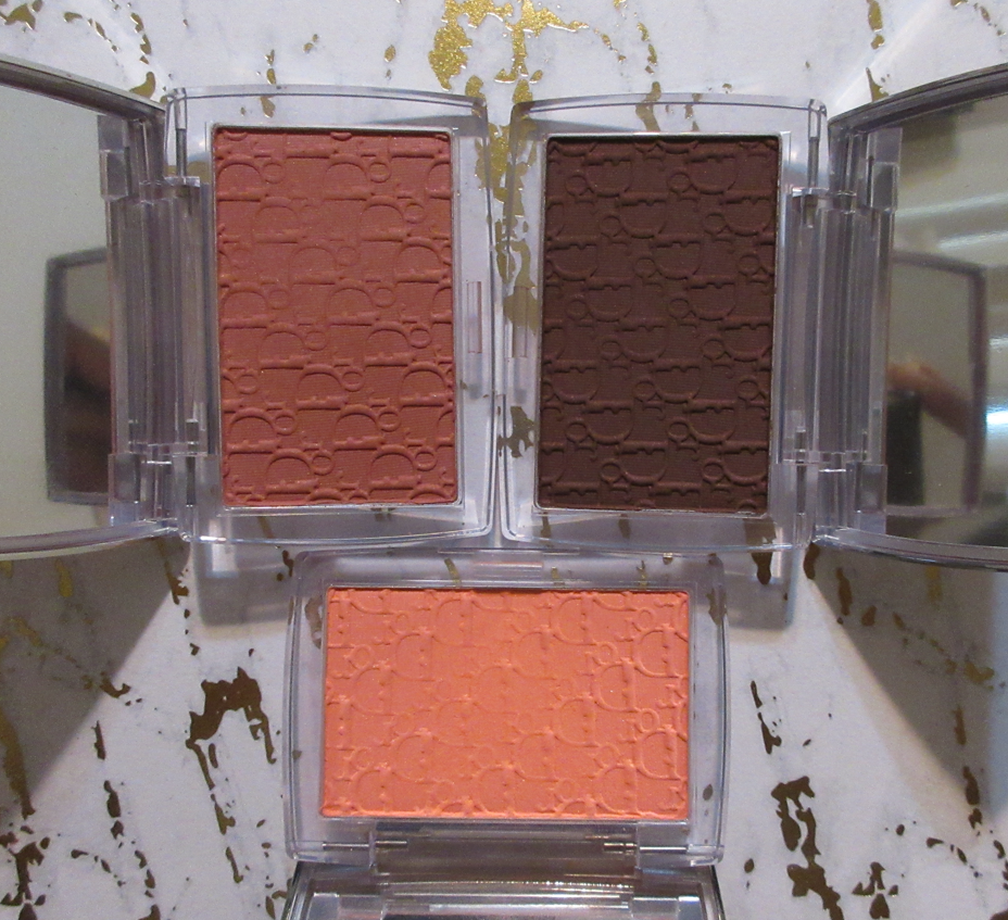
Dior Rosy Glow Blush in 012 Rosewood and 020 Mahogany

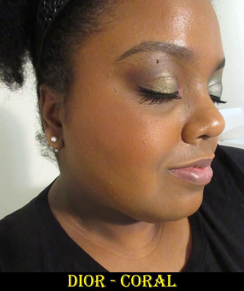
Dior reformulated their Backstage blushes, if they can even still be considered part of the “Backstage” line, since they removed that part of the official product name. I’ve seen photos on Instagram showing that the older formulation of Pink and Coral are darker than the new ones. I didn’t realize the old Coral could possibly work for me until it was already removed from every website. I even clicked lists I found online that supposedly had the older ones, but the links redirected to either the main page or to the new ones instead. So, the only way I could get the original coral was via third party sources. Since it’s not from an authorized retailer, there’s no way to know if it’s authentic, but I suspect it is compared to photos I’ve seen on Temptalia’s blog, for example. However, I’m only showing swatches and what it looks like demonstrated on my cheeks instead of factoring it into my official review. Today’s focus is on Rosewood and Mahogany that I purchased from Sephora and Selfridges respectively.

Rosewood is not only my favorite shade of the 4 additions to the range, it’s one of my favorite colors in my whole collection. I love how it looks on me! It’s not glowy due to shimmer. It just has a healthy sheen to it. It’s long lasting on my cheeks. In fact, I have to scrub vigorously at the end of the night because it nearly stains my skin. This might also be due to how much I have to use because Rosewood is such a subtle shade on me. I have to build it up a lot, but because it’s so blendable, it doesn’t take long to do it. My preference is using a goat hair brush with it because the powder is firmly pressed and that hair type picks it up easier.

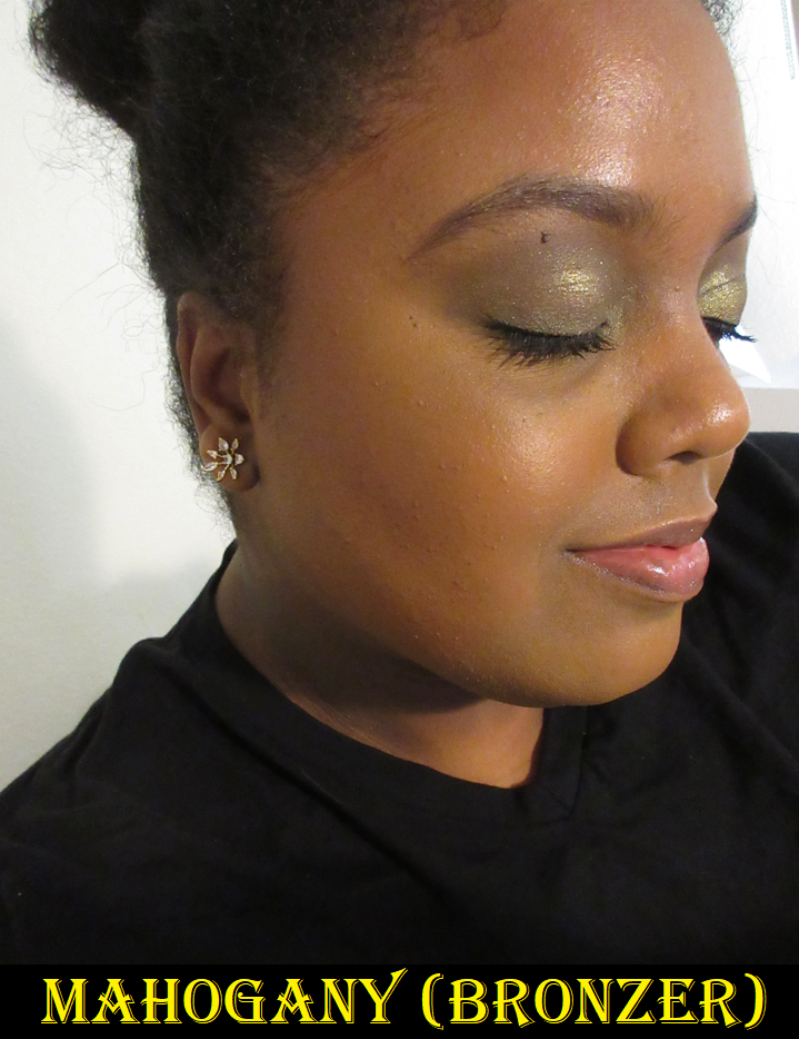
I watched a fair amount of videos on these blushes, and a few people said these were patchy. However, the only one I’ve visibly seen on camera look patchy on others is the same one I have the issue with: Mahogany. There’s a separation between the Red 27 dye and the deeply rich brown color. My squirrel hair brushes can’t pick up the blush well enough, nor my silver fox, but I can use my squirrel/goat mix ones with this. However, even when I do try to patiently use a squirrel brush and blend as sheer of a layer as possible while attempting to build it up, I will eventually start to get more brown than reddish-pink. The random build up of brown in places does not look good on my cheeks. The photos I selected below are the best looking ones of Mahogany on my skin. It’s a balance of showing it as sheer as possible for the color to still get captured by my camera.

There are some videos on YouTube showing how Mahogany looks applied as a normal blush, for example this one by Beauty and the Frizz, or this one by Julie P. And an example of using it with some foundation patted over the top is by The Hooded Lid.

I’ve applied this over a powder-set base, an unset base, tried brushes with different hair types and synthetic fibers, and various brush shapes, but none of the changes made a difference. It still looks patchy on me and the tone of brown just doesn’t look flattering on my cheeks, potentially due to my undertone.
The way that I can continue to use this, and really like it, is as a sculpting blush. I apply it to areas I would normally bronze, making sure to apply it lightly, before adding Rosewood to the main cheek area. I’ve really enjoyed this combination!

My love of Rosewood makes me even more tempted to try Cherry and Berry. I feel certain Berry would perform on me the way Mahogany does, plus I’m super picky about berry blushes. Cherry is gorgeous, but it reminds me of a brighter version of Rosewood from what I’ve seen on other people, and I have several vibrant shades like it in my collection such as Pat Mcgrath’s Electric Bloom, Colourpop x Hello Kitty Aloha Honey, Nars Exhibit A, MAC’s Loudspeaker or Frankly Scarlet, Patrick Ta’s She’s Vibrant, etc. Most of these I barely use, so it doesn’t make sense to buy it, even if I think the color is a beautiful one.

Based on my experience, I recommend them. However, it comes with the warning that there may be a press or formulation issue based on the inconsistencies being reported about patchiness regardless of the shade, and only for some people but not others.

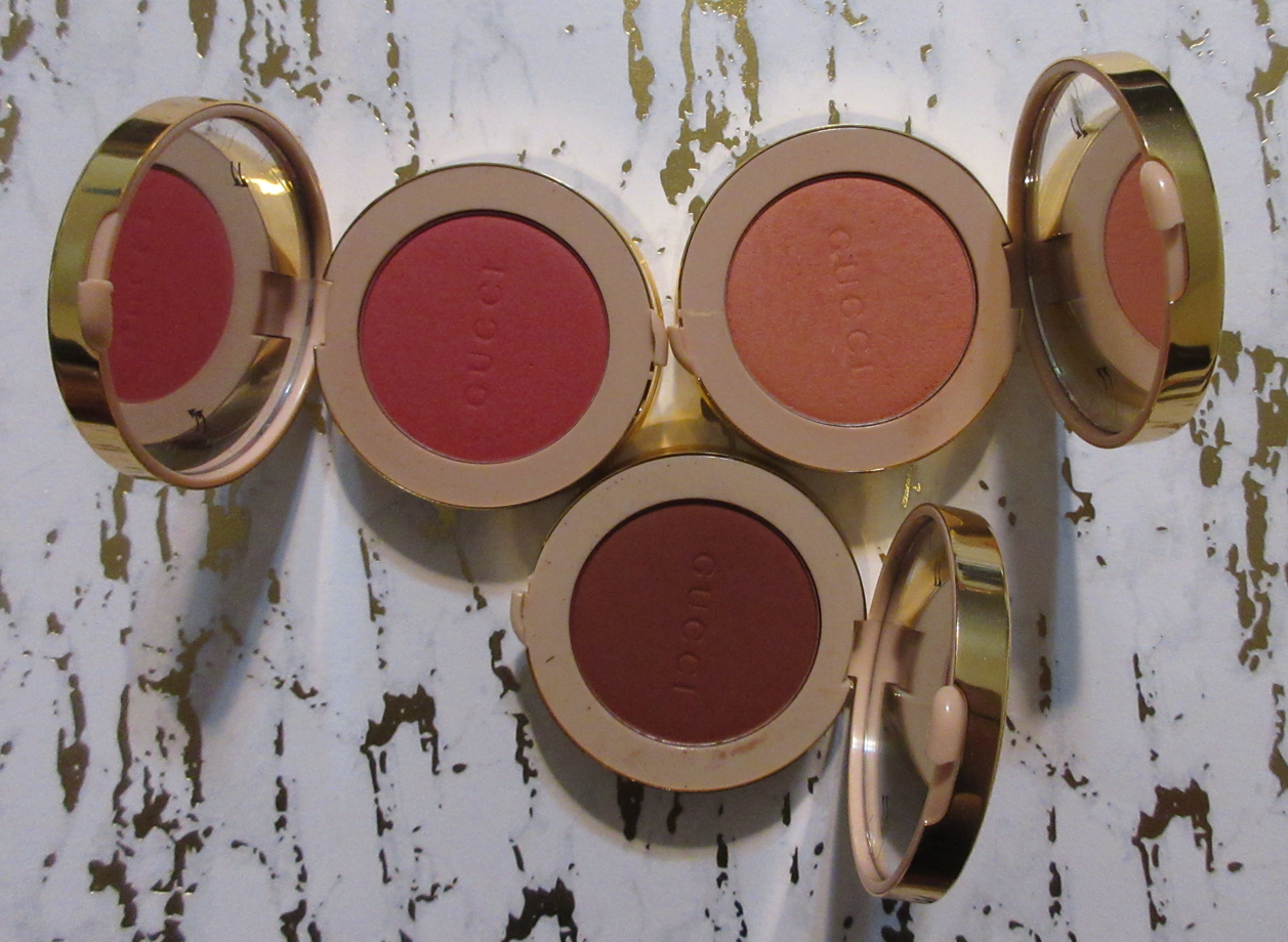
Gucci Luminous Matte Blush De Beauté in 09 Intense Plum

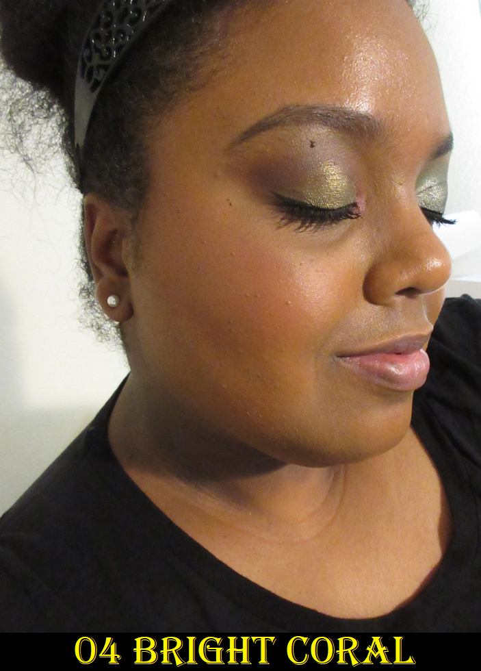
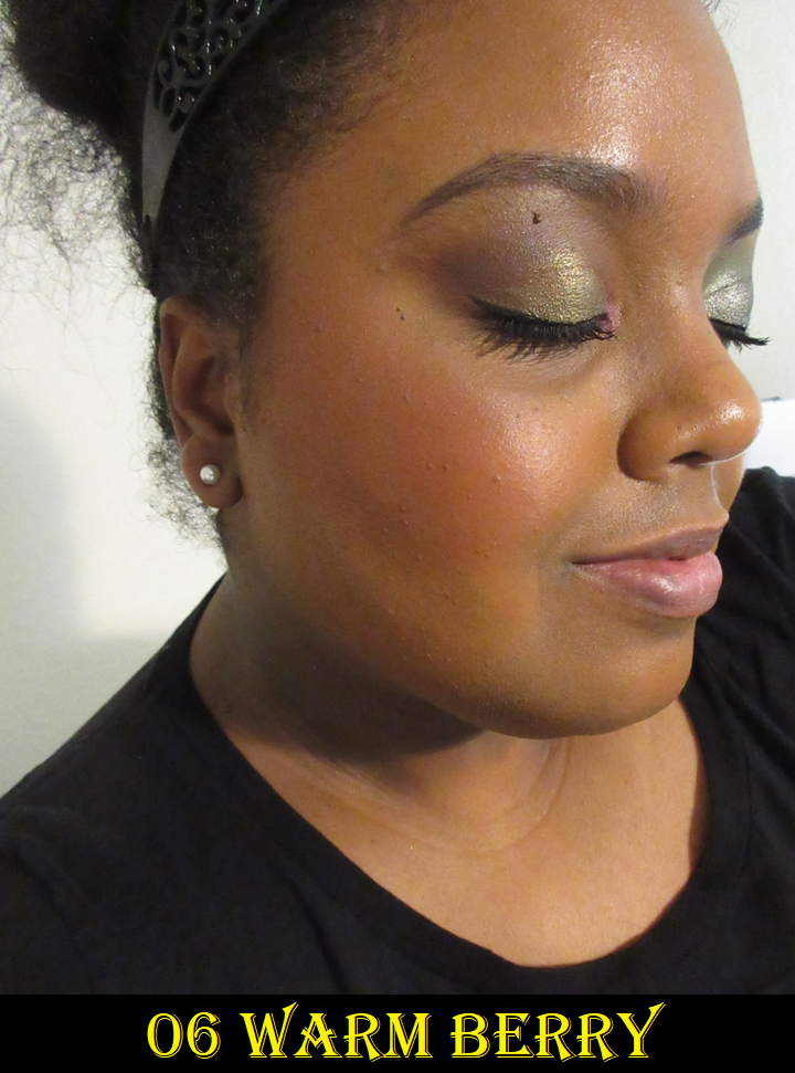
I’ve had mixed feelings about these blushes for a while now, as I mentioned in my review of the Armani Luminous Silk Glow Blushes and my comparison of those to these. So many people rave about them, but I feel no joy when I put them on. The closest I get to liking the color is with Warm Berry, but that shade is exceptionally pigmented. I have to be really light-handed or it looks overdone fast. Intense Plum also has a lot of pigment, but I take a small amount and really work it into my cheeks to make it look a little more natural. I still prefer the tone of Warm Berry, but the depth of the shade makes it harder to look as sheer as Intense Plum can.

I went back and forth deciding if Bright Coral would show up on me and whether it was worth the risk to buy. It’s very faint, and more visible in person, but I’m never satisfied using it alone unless I mix it with one or both of the other shades. In fact, I tend to apply this on top of the others to help tone them down. I’ll need to do a declutter eventually, and I haven’t decided if I’ll be keeping this one or potentially even removing two of them from my collection.

The formula is silky to the touch and goes on the skin smoothly with a soft satin sheen. It’s super quick to blend onto the cheeks if you like a bold look, but because of the pigmentation level of the deeper shades in the range, I have to be careful how much product I pick up and I do need to blend it out a bit. So, to get it as sheer looking on my cheeks as I want, it takes a little longer in my specific case. But the formula itself is quite blendable and long lasting on the skin. For some reason though, I’m just not as impressed with the end result on my cheeks as I feel I should be considering the price. I’m far more interested in keeping that beautiful packaging, which looks much cuter in person than the online photos. I take back every bad thing I’ve said about it being a clip art star pattern. It’s more luxurious than I expected.

Guerlain Terracotta Luminizer Highlighter Powder in 01 Gold

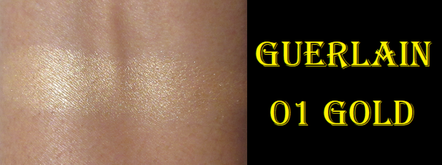
Considering this comes in only two shades and this is labeled 01, I was a little concerned that it wouldn’t work for me, but it does! This contains, “Gemtone: Adapts to skin’s true tone for a natural finish,” according to the description on Sephora’s website. I have no idea how I could prove or disprove that claim, but I thought I’d mention it for those who aren’t anywhere near my skintone and might worry if this will be too dark or too light.
This highlighter is very subtle and only really pops when applied on a dewier surface. This should be my type of highlighter, and I really expected this to be holy grail status, but I’m just not impressed enough considering the price. I hoped this would be my replacement for the 2015 Guerlain Meteorites I was obsessed with and used periodically for 6+ years until I decided it’s too old and put it in semi-retirement. However, the finish of it being less glowy than my Charlotte Tilbury highlighters while not being any more refined in terms of sparkle or particle size either, led me to not be as excited when I use it. I feel this way especially since it is on the lighter side for me and not a perfect undertone match. It’s good, but not fantastic. Even if this did come in the perfect color for me, there’s no guarantee it would raise my opinion of the formula considering PML’s Divine Rose highlighter is not a perfect match either, but I love how that one looks on me!

The packaging is pretty, but I’m not as excited by it as I expected either. When it comes to luxury makeup, the makeup at its best quality is usually still comparable to products from other brands, but the packaging helps make it worth that higher price. Because I think it’s nice but not amazing on the makeup and packaging fronts, this wasn’t worth buying. It’s strange to say I’m the most disappointed by this product out of the bunch in this review, but it’s because I had the highest of expectations for it only to be let down that it’s not at least as pretty on me as my old meteorites. My one tangible complaint that’s less about preferences is that as subtle as it looks in the beginning, the shine dulls down as the day progresses. So, I try to over-apply hoping it’ll last longer.

I honestly would have returned this if my time limit hadn’t run out. I ordered it during the VIB sale while away overseas and by the time I could actually see it in person, it took too long for me to make up my mind about it. I can at least take comfort in having gotten it on sale. I still think it’s a good product, but for the right person.

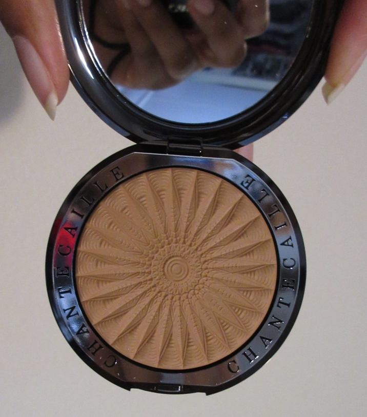
Chantecaille Sunbeam Cheek & Eye Shade in Ray

As it currently stands, this is the only product from Chantecaille that I love. The second best is the Blur Powder, which I like, but none of the rest of the Chantecaille products I’ve owned worked out.
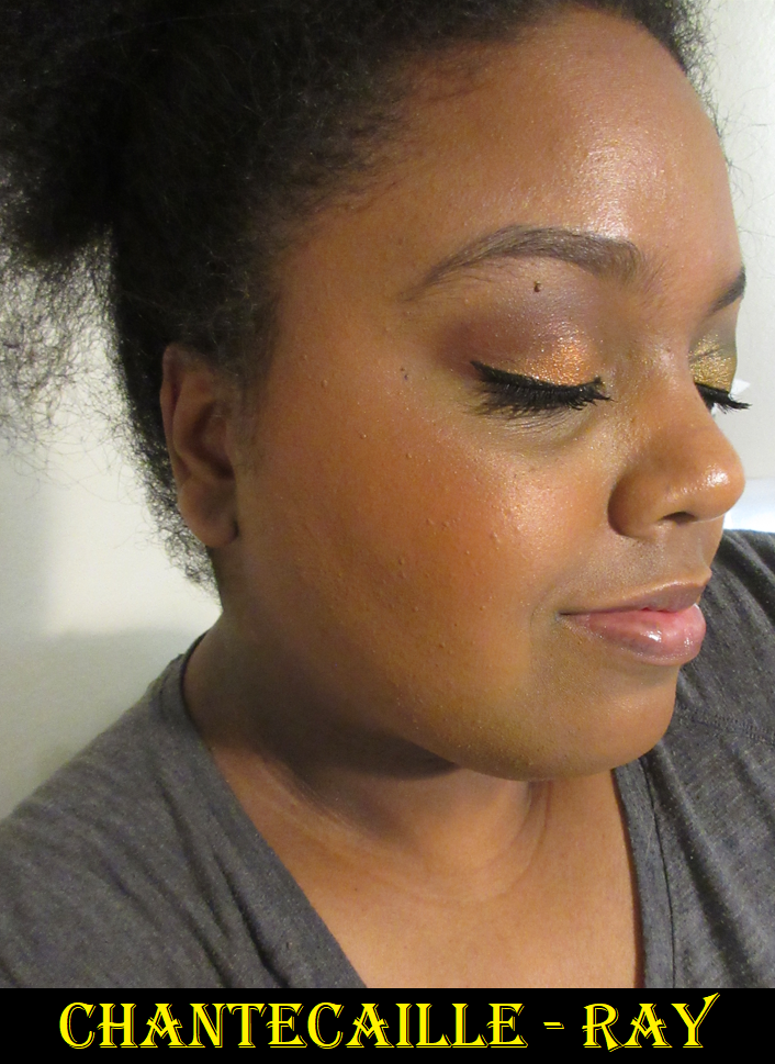
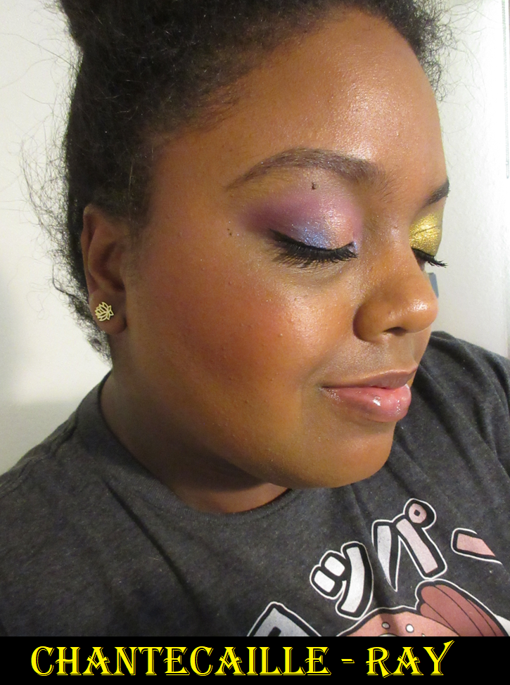
I was thrilled that the brand released such a deep highlighter, though they tried very hard to emphasize and market this as an eyeshadow. It looks a lot deeper on others, but when I use this on my eyes, I put it in the typical highlighter spots and not usually all over the lid, the way I have it in the photo below.

Besides the eyes, I’ve also seen those with light skin tones find use for this as a shimmery blush or even as a bronzer.

The shimmer size is small and it’s a gel-powder formula, which I tend to love. Ray is another subtle highlighter that looks more intense on dewy skin. At certain times of the year, this can be a bit dark for me because of that base color, especially if I build it up. However, I’m perfectly happy with how it looks when I use a small amount and buff it in a bit because I also have to watch out for the shimmer particles that are on the lighter side for me. That’s why the combination of both kind of balances out (the deep base with the light shimmer).

It’s a bit ironic that the Guerlain highlighter looks better on me in photos than the Chantecaille highlighter photos, but I promise it’s another story in person.

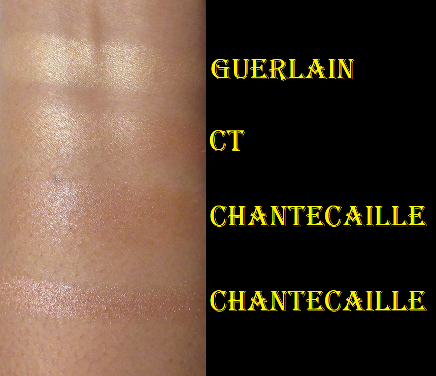
In the swatch photo, I included the golden stripe from Charlotte Tilbury’s Dream Light Pillow Talk Multi Glow Highlighter (3rd out of the 4 shades), because that’s an example of my perfect “natural” highlighting color in depth and tone. Guerlain’s is gold, whereas Charlotte’s is golden, and Chantecaille’s is reddish bronze with a yellow-champagne shimmer. The shade Ray, when sheered out, looks closer to Charlotte’s than Guerlain’s does, which is why I think the color suits me better than Guerlain’s.

Also, please don’t ask why I continue to buy highlighters if I already have a fantastic formula and my perfect shade via Charlotte Tilbury.

The packaging doesn’t exude luxury, but it’s fun! I love the bright neon green. I love that I can spot it immediately in my collection. I like the unique imprint on the powder (although it reminds me a bit of something not-so-pretty) and the small compact size is great. I had points on my account at SpaceNK, plus there was a sale, so I bought this for significantly less than the retail price. Considering all this, plus the color and performance, I’m way happier with this than the Guerlain highlighter. I have to admit though, that the full price would never have been worth it to me. Unless the packaging is plated with gold, $50 is my limit for highlighters.

Tom Ford Highlighter Collection: Shade and Illuminate Highlighting Duo in Tanlight, Soleil Sheer Highlighting Duo in Reflects Gilt, and Skin Illuminating Powder Duo in Flicker

I purchased Tanlight from Nordstrom when it came out, Reflects Gilt from Beautylish during a sale, and Flicker from Mercari because it had already been discontinued. I saw a video where someone compared the Flicker shades to Tanlight and I didn’t even know it existed prior to that. Unfortunately, Flicker fell out off the plastic mesh/grid, so I smushed the pieces back in. Then it fell back out again and I glued them in. I don’t officially consider it part of this review and only included it for color comparison purposes in case anyone was wondering whether to get Tanlight if they already have Flicker. The top highlighters in both compacts are extremely similar, but Flicker has a stronger yellow tone. I think I like it by itself more than Tanlight’s lighter shade by itself, but the color of both highlighters in the Tanlight compact mixed together creates my perfect highlighter color. The advantage to the Flicker compact is that I could technically use the deeper shade as a glowy bronzer, but it’s so deep and sculpting that I have to be careful not to overdo it when I try to use it that way. Flicker is also so deep that mixing both together forms a color too dark to highlight with.

I’ve noticed no difference in the formula between either of the three products. They’re all very smooth on the skin, all impactful and reflective, all long lasting, and all gel-powder formulas. The new Shade and Illuminate duo compacts have the “TF” initials on the lid, but that’s about the only difference I’ve noticed in the packaging as well.

I don’t know if it’s just because the sparkles are easier to see with the lighter highlighters in the duos, but I could swear the lighter ones all have more shimmer in them than the darker ones.

As I mentioned before, Tanlight mixed is the best for me, followed by Flicker’s top shade, Tanlight’s bottom shade, Tanlight’s top shade, and Reflects Gilt’s bottom shade.
Reflects Gilt is a bit too light for my preference, with the exception of the darker one which I’ve started to use exclusively when I open that compact.

The retail prices of these duos are the same as the individual highlighters from Chantecaille. This would normally never be worth full price (I did get Tanlight at a minor discount), but it’s technically two products in one. This complicates things. Unlike a blush that someone can wear in a multitude of shades and have them all look beautiful, there is only a small range of colors that I feel I can pull off when it comes to highlighters. However, it’s because Tanlight produces perfection and I can tailor how much I use of either one in the event that my face gets lighter or darker throughout the year, that’s what makes this worth it for me. As for Flicker and Reflects Gilt and only really wanting one shade within each duo, the deep discounts that I got them for makes me not have any regrets buying them, although I’m not sure if I’ll keep Reflects Gilt in my collection forever. I don’t really have a purpose for keeping it when Tanlight is just a better fit for me overall. The packaging is quite pretty though, so I almost want to keep it just for that.

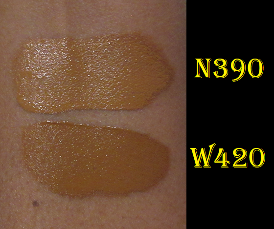
Givenchy Prisme Libre Skin-Caring 24H Hydrating Radiant Correcting Creamy Concealer in N390 and W420

This is a medium/buildable coverage concealer, instead of the complete full coverage ones that I normally stick to. What drew me to it was the hydrated look and the natural finish that wasn’t too radiant for my preference and wasn’t too creamy. Creamy concealers tend to crease on me beyond what I find an acceptable amount. This grips to my skin quite well and although it’s not as long lasting as my Tarte Shape Tape or KVD Good Apple, if I pair it with the right powder and use the right amount, it can get me through a short day’s wear with me feeling satisfied with how it looks at the end. If a concealer lasts 8 or more hours on me without being significantly faded or flat out gone, it’s a winner in my books.

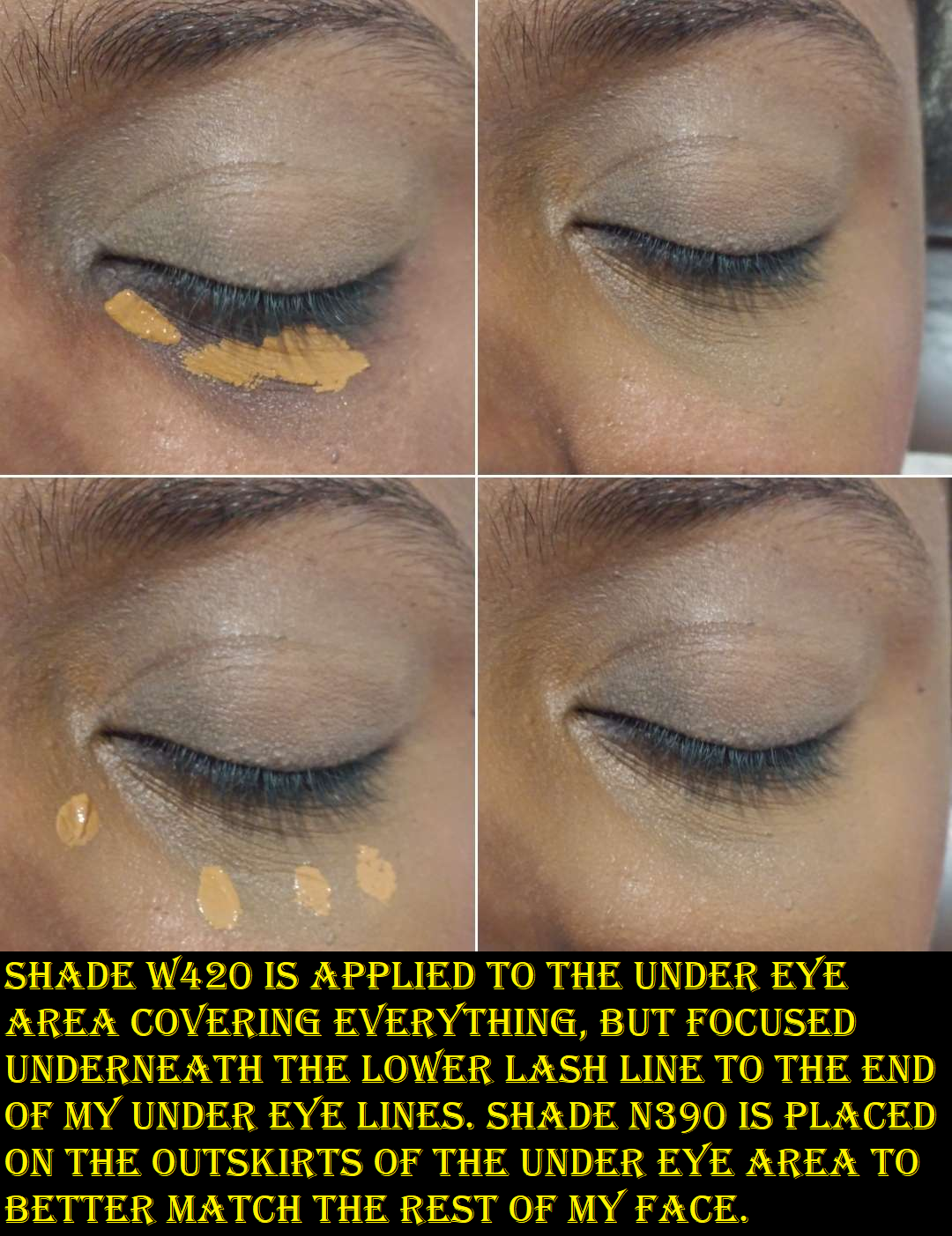
Because it’s not full-coverage, I can’t wear my actual skintone shade over my dark circles because it shows underneath as a deep grey tinge. So, I have to utilize the under-painting technique in using a shade that’s deep enough to keep my dark circles and areas of skin discoloration from appearing grey when I apply the concealer. Then, to get it to match the rest of my face, I use my regular concealer color around the perimeter and blend them together. Because the combination isn’t a perfect undertone match, it still looks slightly off if I’m trying to have a minimal makeup day and skip foundation, but it looks perfectly natural on days I put foundation on. There are way more neutral shades in this line than warm tones, but I was determined to find a way to make it work for me.

Also, I’ve tried mixing this concealer with my other full coverage ones and the formulas just don’t mesh well. It fades faster or creases in a more obvious way. One time I tried using the Becca Under Eye Brightening Corrector with it, and that combo works well if Becca is kept away from the lines under my eyes. Lately, I’ve been enjoying using it over top of the Milk Hydro Grip Eye Primer (that I use for concealer and not eyeshadows), because it helps it last a little longer even if I don’t use the Givenchy powder with it.

Initially, one of the bigger issues I had was figuring out the right amount of product to use. This was resolved once I bought that second shade and didn’t have to try and pack on a ton of product to get the coverage I needed. The second issue was that I could not wear this concealer without setting it, and once I set it, I lost all the hydration and radiance it provided. The end result to the look of my under eyes was no different than Tarte’s Shape Tape, but with lower coverage. So, I experimented with different powders and ultimately decided I should use this concealer with the brand’s own powder. Doing this gives it a natural-matte appearance, but at least it doesn’t look as dry as other powders. I’m a lot more pleased with this combination.

As much as I like this concealer, and have gotten used to the idea of needing two shades for most of my favorites anyway, the price and the coverage is why I think I will stick to repurchasing my Tarte and KVD concealers after the Givenchy ones are finished. I can snag my holy grails for 30-50% off at certain times of the year, but with Givenchy, I can get 20% off at the most. Needing to use a special powder with this adds to the full cost of having this concealer, so it’s a good product that is just too expensive for me to continue with. I will enjoy it in the meantime while I’ve got it.

Givenchy Prisme Libre Loose Setting and Finishing Powder (Mini) in 5 Popeline Mimosa

As these swatches reveal, shade 5 turned out to be lighter than I anticipated. Givenchy has one version that’s darker, but I didn’t want the dark pink color in there and 6 Flanelle Epicée didn’t come in a mini size. Since the website model that matches me the closest was wearing Popeline Mimosa, I thought it would be a slam dunk, but perhaps 6 would be better for me to be able to use all four colors mixed. Trying all four together with this powder makes my under eyes look too stark white. In any case, I have been making do by putting tape over the holes for the lightest two and partially over most of the orange so that I can have only a slight brightening effect for my under eyes. I use this powder exclusively for the concealer areas since I don’t need to set my whole face, considering my dry skin. For the sake of science, I tried my combination of 1 part brown powder and 1/3 part orange powder all over my face. It seems to have a small blurring effect. I thought I noticed that under my eyes, but it was nice to test it on a larger area and confirm it. The brown powder is also supposed to be the radiant one, so perhaps that’s why it is mattifying, but not dry looking. By “radiant” I assume they mean a tiny colorless sheen because I don’t see any shimmer whatsoever, though it does contain Synthetic Fluorphlogopite (synthetic mica).

Since I’m only using this powder for a small area, and I have others I use with other concealers, the mini is going to last me quite a while.

I never use the puffs that come with my products, but I tried this one out. Part of the problem is that the powder comes out in clumps and when I press the puff into the powder (which I pour into the cap) and try to tap around to mix it, the colors don’t mix evenly. I can see all the spots where the lighter powders touched my face. So, I just prefer to use a brush instead. I pat, swish, and mix them in the cap with the brush before using it. Even just using the brown and orange requires proper blending of the powder together on the brush. A bit of product gets wasted this way since so much comes out from all those holes, plus mixing them up in a way that partly disperses some in the air. At least it takes a bit of time for the average person to go through a powder anyway. I still haven’t used up a single one, even in mini sizes.
I think that’s why I don’t really understand the appeal to having all these colored powders in one container. I don’t know why there isn’t a mechanism for opening and closing each of the sieves without me needing to put tape over them myself, unless this is something only in the full size jars? I don’t know why someone would need two color correcting options (Popeline Mimosa seems more like three). Shade 5 is listed as suiting those with “medium to deep skintones,” so when I use up all of the brown color, I’ll either try to give this to someone with a medium (or perhaps tan) skin tone who can use those lighter shades, or put it on Mercari. I don’t believe I’d repurchase this unless they decide to sell the brown color individually because I do like the finish of the powder and the blurring properties. However, loose powders are already a nuisance without factoring in being able to use 1/4 of the product in this container. I only really need this until I finish using the Givenchy concealers.

We’ve reached the end of this review!

Thank you for reading! I hope this has been helpful!

-Lili

Sydney Grace Palettes, Cream Eyeshadows, and Singles Haul

I’m posting at a slightly earlier time than usual because in one hour, Sydney Grace’s annual week-long Christmas in July event will begin! Everything in this haul was purchased last Black Friday, but that was because I skipped last year’s Christmas in July sale. The discounts look even better this year, so I wanted to show some of the unreviewed products from the brand that I haven’t featured yet in case anyone is interested in seeing them. My initial Sydney Grace review with a ton of eyeshadows can be found here, as well as the Temptalia collab here.

This event is typically the one time of year I make a purchase. I checked that everything in this post is still available, with the exception of the Sweet Indulgence Palette that launched during the previous sale and was on clearance by the time Black Friday rolled around. This year’s launches will be the Love’s Journey palette, Heaven on Earth palette, and Raspberry Kiss palette. If I decide to shop the sale, it will most likely be Day 2 where all palettes (including Love’s Journey, but I don’t think Heaven on Earth or Raspberry Kiss), cream shadows, and more are 40% off.

Tropicolor by The Fancy Face Eye Shadow Palette

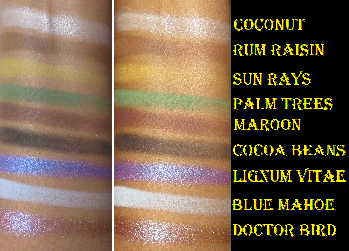
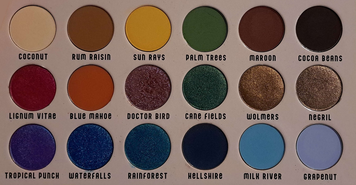
Tina is one of my favorite YouTubers, so I wanted to support her collab like I did when she worked with Oden’s Eye, but this palette is very blue heavy and I’m still in a weird like/dislike relationship with blue eyeshadow. For this reason, even though I’ve had the palette since November 2022, I didn’t start using it until June 2023. Whenever I opened it up, my eyes were instantly directed to those blues and I’d get the urge to use a different palette instead. Since I knew the Christmas in July sale was coming up though, I decided to just push through and start playing. I initially felt like I had no idea how to use these colors together, besides monochrome color schemes, but every time after that was easy! My favorite shades in this palette are surprisingly the warm neutrals and unsurprisingly Doctor Bird and Lignum Vitae.

This palette has all the features I love about Sydney Grace eyeshadows. The mattes are pigmented and apply opaquely while still being very blendable. The satins are smooth and opaque as well. The binding in the shimmers are such that they adhere to the lid without getting a bunch of fallout specks everywhere. They don’t require me to wet my brush. They are pigmented with medium shimmer reflectivity, and opaque. They apply smoothly to the lid without leaning on a bunch of slip ingredients (the “cones”) to make it easy to spread. I love the tactile feeling of dimethicone in products, but the higher the percentage of it and the other -cones, the easier they are to crease on me. These eyeshadows work well on me with all my typical primers: Gerard Cosmetics Clean Canvas, Coloured Raine Paint Base, MAC Paint Pot, and Urban Decay Primer Potion. However, I have to be careful not to have an excess of the Paint Pot on my lids or else the shadows will move out of the crease. Too much wetness from an eye base will mess with the longevity.

Some other things to know is that Doctor Bird is a bit flaky, but not enough to cause shimmer fallout on the eyes once it’s finished being smoothed onto the lid. I still don’t need to apply this shade damp. The reason the texture is like this is because it’s a chromatic shadow and Sydney Grace’s pressed multichrome formula is the flakiest of the brands I’ve tried. So, it makes sense that this shade would have a bit of that texture. Waterfalls is chunkier than the others, but again, it’s just a tactile thing and doesn’t effect performance.

Cocoa Beans is a deep rich brown that is more on the buildable side than the other mattes, specifically for being able to control the depth it provides. I’m actually quite impressed!

In my swatches, it’s admittedly hard to see the tone difference between Waterfalls and Rainforest, so I included the photo below.

Besides the blues, the only other aspect of the palette that isn’t my preference is Cane Fields being such a blue leaning green. I love yellow leaning, straightforward greens, and even bluish greens if they’re deep enough. However, I understand that because of all the blues in the palette it makes sense to want to have greens that’ll merge the cool shades with the warmer ones.

If you’re like me and love most of the color story, but are a little put off by the arrangement, remember that these pans are removable. I rearranged mine by booting the blues to the bottom row and now I feel a lot more excited when I open the palette! I could also just put these in my giant palette with my other depotted Sydney Grace eyeshadow singles or switch out some of the shades for other Sydney Grace singles, but rearranging them was enough of a change for me. Now, I’m able to see the beauty of it.
I put the shade names on label stickers on the bottom of the pans, so I can always put them back in their proper places.

Sweet Indulgence 9 Pan Palette

This palette released around the same time as Colourpop’s Ticket to Dreamland. I decided that between the two, I’d rather have Sydney Grace’s formula, so I was glad I eventually got my hands on this since that palette was discontinued by Colourpop as well.

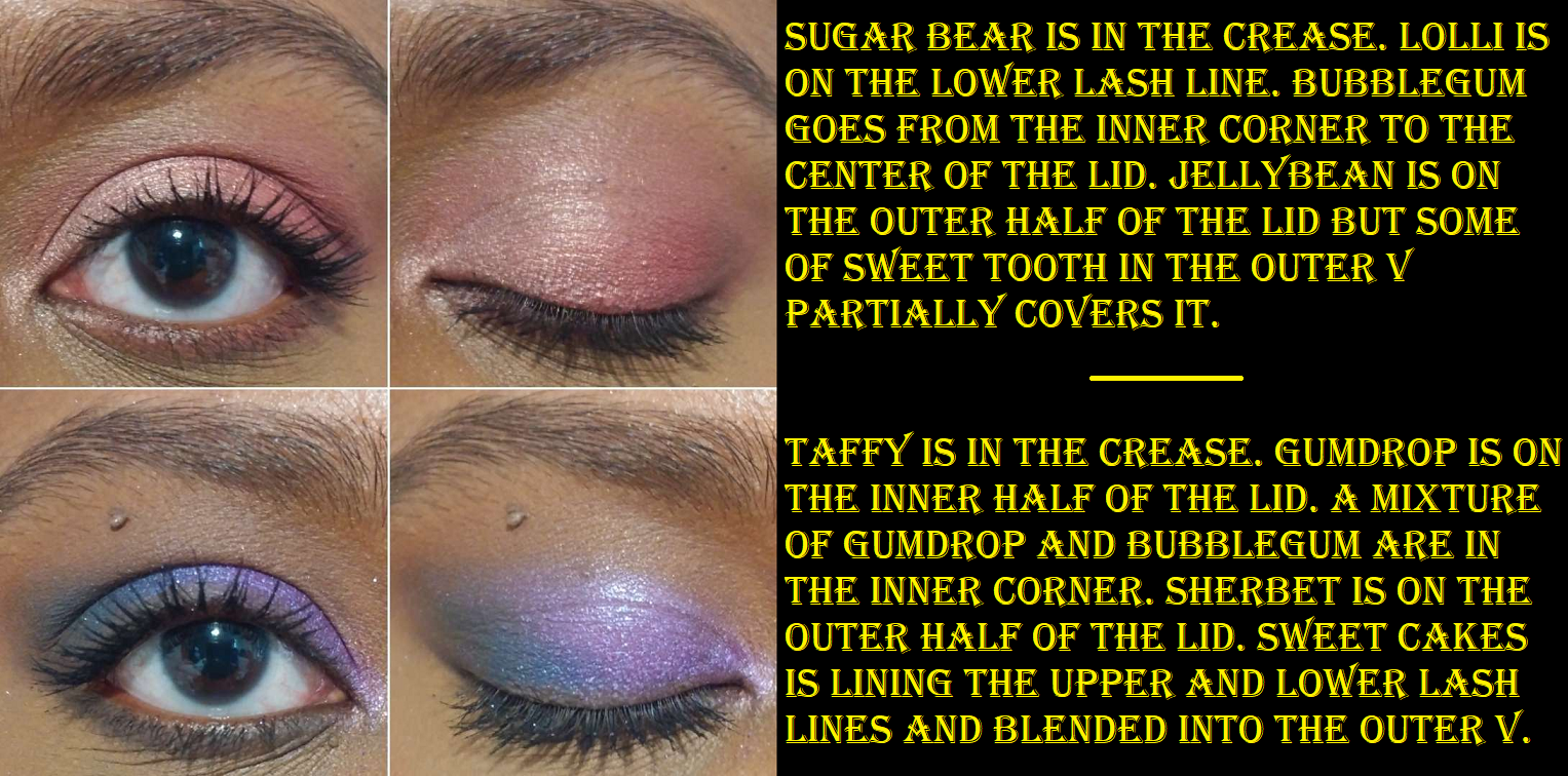
I have to be in a very particular mood to want to wear pinks, and these in here are pretty! Gumdrop is quite the attention grabber, but definitely not a unique shade, and Sherbet is objectively a beautiful tone, but I don’t want to use it with any of the shades in this palette. I like Sweet Cakes, but I don’t need a second deepening shade with Sweet Tooth in there, so I replaced those shades with Deliverer (purple), Lost Princess (red-orange), and Turtledoves (champagne). Now, it has a candy and creamsicle vibe going on!

Even though this palette is discontinued, there are tons of single shadows still available from Sydney Grace that are similar enough to create a dupe version.

Individual Eyeshadows in Be the Sunshine, Herky Bird, and Rustic

The label on my eyeshadow pan says, “Be My Sunshine,” but the website name is “Be the Sunshine.” In my order confirmation email, the item has both names.

I didn’t intend to purchase coordinating eyeshadow singles. At the time, I just wanted eyeshadows that weren’t repeats in my collection and could feed more of my green obsession. It was a happy accident! I love these shadows together and they perform exactly as I’d expect from this brand. There’s nothing else really to say other than Rustic is a satin/shimmer and the other two are pressed pigment shimmers. So, I’m able to use Rustic almost like a matte and it doesn’t crease on me.

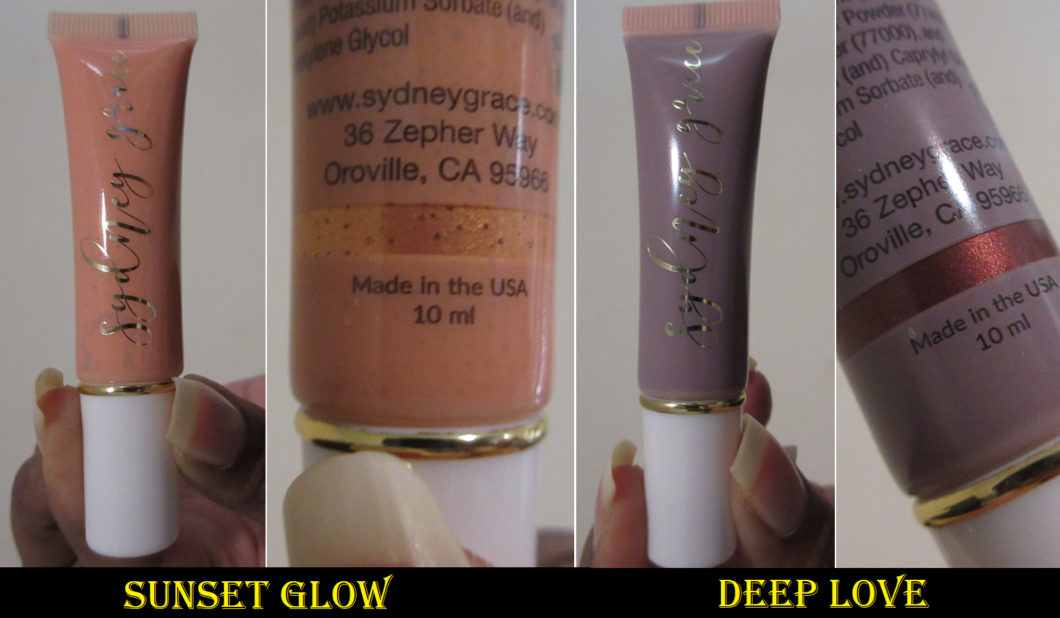
Cream Shadows in Sunset Glow and Deep Love

I previously only used Sydney Grace’s multichrome cream shadow. Once the texture got worse, over time, I really didn’t like it. So, I didn’t dive further into the line. However, for the multichromes specifically, they changed the tube size a few years ago and increased the shelf life. Since I’ve heard nothing but great things about the cream shadows overall, I decided to give them another try.

How I use them is to pour some out onto the back of my hand and take a flat concealer brush to spread them onto my lids with more precision than, say, my fingers. If I’m using both colors, I try to let the first dry before adding the second. I also try not to blink too much if using one as an all-over-lid shade so that it doesn’t get bald spots or patches while drying. If it does lose opacity in a spot, the brand recommends rubbing them. I have found it easy to just add a little back on to the spot in question. These layer nicely and I don’t get any cracking of the eyeshadow and mine don’t add extra texture. They blend well into each other and still look great on top of powder eyeshadow. I can even add powder shadows back on top without it looking strange.

In addition to lid shades, these work nicely as liners. These are fairly lightweight, even more than the Melt Gel Liners. They’re not waterproof, but they hold on very well and don’t fade on me. The shine dulls down a little towards the end of the day, but they have quite a long wear time. If I didn’t love the ease of using powder shadows so much, I would absolutely purchase additional colors from Sydney Grace. So, I recommend them to cream eyeshadow lovers.

That’s everything for today! I hope it has been helpful!

-Lili

Suqqu Pre-Summer and Summer ’23 Review

Summer is nearly over, at least in the beauty world. I believe Suqqu’s Fall Collection (or Pre-Fall) is coming to Selfridges on July 27th. So, I wanted to hurry and finish this post in case anyone is interested in getting the limited edition items while they still can!

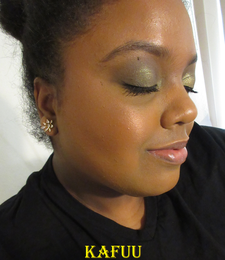
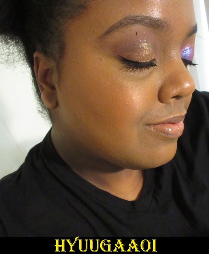
Suqqu Pre-Summer 2023 Pure Color Blush in 138 HYUUGAAOI and 139 KAFUU

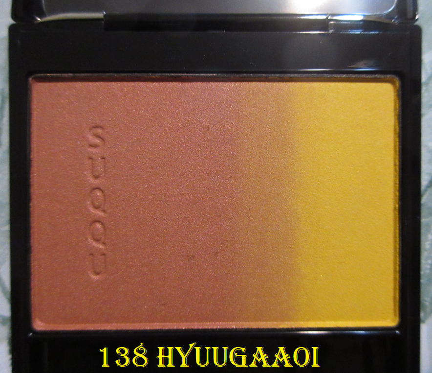
I watched several videos to help me decide which of the two Pre-Summer options I should get. Of course, I ended up with both, but my initial hunch was correct. 138 Hyuugaaoi is a copper-orangish red which appears as more of a blush tone on me than 139 Kafuu’s bronze-brownish pink. I do like them both though.

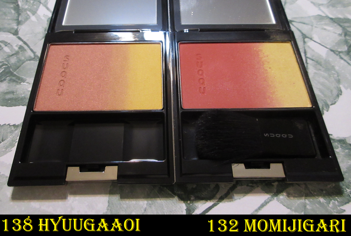
I was reluctant to purchase Hyuugaaoi out of fear it would be too similar to 132 Momijigari from last year’s fall collection, but they are definitely not the same. In fact, it’s a bit in reverse that Hyuugaaoi has a shimmery blush with a matte yellow strip, whereas Momijigari has a deeper, more vibrant and matte red blush with a shimmery yellow strip.

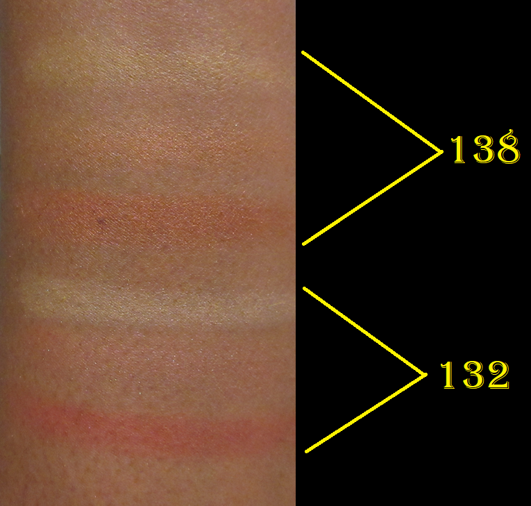
In the photo demonstrations that will come later, I used a mixture of the first and second strips as highlighters to show the way it looks on the face as intended. However, I normally ignore the highlighter parts of all the Pure Color Blushes because they’re too light for me unless I mix some of the blush shade in with it to add depth.

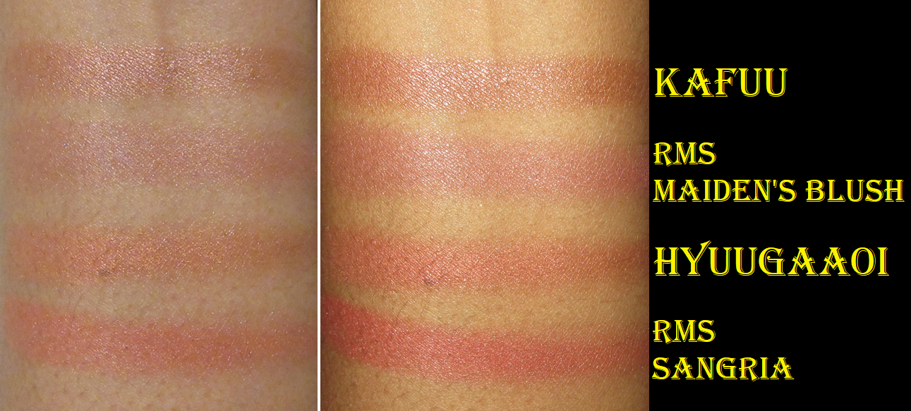
Above are the blush portions alone to show how similar they look.
Below are two different attempts to take pictures of these blushes, but they’re a lot harder to see on my camera due to how reflective they are. I like them both, but Hyuugaaoi is more of my style.

Also, I couldn’t help but think about the Rms blushes when taking photos of these. The ones from Suqqu are surprisingly more shimmery and have nearly as much reflection strength as my more subtle highlighters. They’re not too shimmery for my taste, but I also try not to build up the color to the maximum level, which would increase the amount of reflective particles that come along with it.

These have more in common with the BareMinerals Blonzers, which are holy grail blushes in my collection. The shade Hyuugaaoi is like if Kiss of Copper and Kiss of Rose were mixed together. The BareMinerals Blonzers are actually more reflective, but have a more pigmented base and the original three are smoother as well. So, not only do I like them even more on my skin than the ones from Suqqu, they also show up easier on camera no matter the lighting situation.

As is the case with all my Suqqu blushes, I don’t have any longevity issues. I recommend these, though I still prefer the Melting Powder Blush formula and the matte Pure Color blushes over them. The upcoming fall release has shades more along the lines of Kafuu coming up, so I don’t plan on getting any of them. I have enough brown blushes now. I don’t plan on buying anything from the Anniversary Collection coming in September either.

Suqqu Summer 2023 Pure Color Blush in 140 IROMADOI

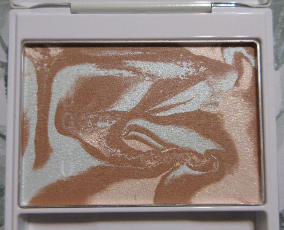
I knew this would never work for me as a blush, but I was so excited at the prospect of this potentially being like the limited edition Melting Powder Highlighter that was released without having another shade option available. It looked peachy in the photos and videos I saw a day or two before purchasing, by people who had it in PR or took photos of them in-store in Japan, but it looks chalky beige on my finger, let alone my skin tone. It didn’t matter if I rubbed the entire surface or just into just the darkest parts of the swirls. It always came out the exact same pale color.

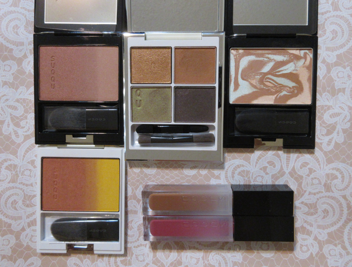
The texture was also nowhere near like the highlighter. It was far too light for me to use as a highlighter, so this is actually already out of my collection. However, I wanted the gorgeous iridescent packaging, so I popped the pan out and swapped it for the standard packaging instead. That’s why blush 138 and 140 are not in their correct compacts in the first photo at the top of this review. I was able to at least keep the packaging and still have the makeup inside be usable. That’s one of the things I love about Suqqu. The glue remained tacky enough to be able to do this.

Suqqu Signature Colour Eyes Eyeshadow in 125 Hikarimai

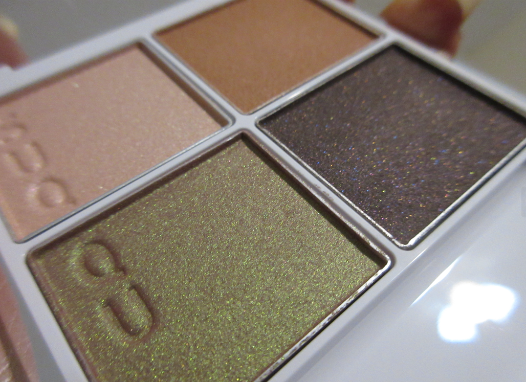
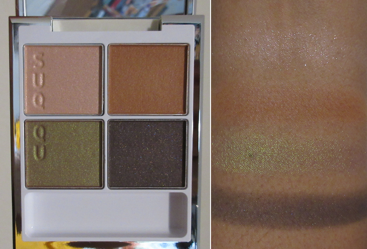
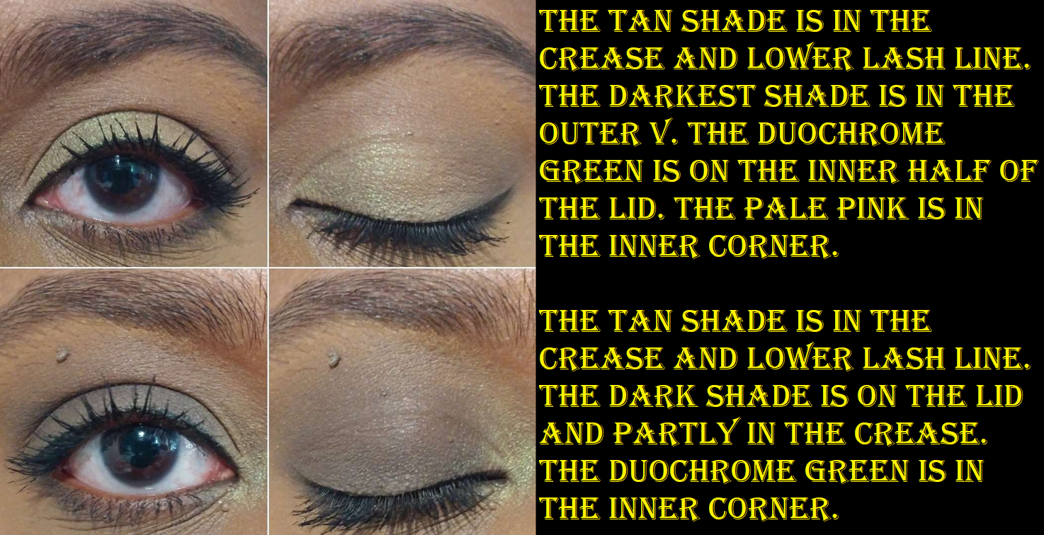
The duochrome in the bottom left of the compact is the main reason I wanted this palette. It looked different from duochromes in my collection, I also wanted the packaging, and I didn’t mind having that dark shade as well. The eye looks on everyone I saw long after the launch is what made me decide to pick it up weeks later. Unfortunately the top left topper shade does hardly anything for me. It took ages to build up that shade in the inner corner of my eye, even after wetting the brush. It’s meant more for scattered effect looks. I depotted that and swapped it for a different Suqqu shadow (as seen once again in the group product photo in the beginning). The tan brown is pretty much my eyelid color. I can use it to blend out the darker shades and set my eye primer, but that’s about it. The dark color doesn’t stick well to my eyes. When I used it solo on my lids, I kept getting a bald spot where it just refused to stay looking opaque. It’s just a bit too sheer. It’s hard to use it in the outer corner as well because it fades away when I blend too much. The green duochrome is more subtle than I’d like, but it’s pretty. It’s still the star of the show. Overall though, this color story just isn’t meant for someone of my skin tone. In at least swapping out the pale shimmer pink, I’m able to create looks I like more. And I know not to use the dark shade except in the outer corner and when I don’t mind it fading. Which means I’m likely only going to use it to take quick photos or solely reach for this quad for the green shade.

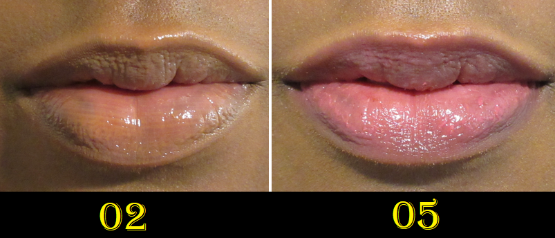
Bonus: Suqqu Treatment Wrapping Lip Gloss in 02 Caramel Beige and 05 Candy Pink

The Summer 2023 Collection has two different shades of lip wrapping glosses that were released: a pearlescent pink and pearlescent blue that were intended to mimic the look of white and black pearls. I believe those might have been too cool toned to look good on me considering the warmth of my skin’s undertone, so I skipped getting them. However, I can still give my thoughts on the formula because I have two of them from the permanent range.

I first purchased 05, and loved it! My lips feel moisturized when I use it and I love the color when it’s built up. I have the issue that if I wear this for too many days in a row, my lips will start to dry out. This is still better than some products that cause my lips to peel before the day is even over. It’s just a problem I have with the majority of lip products containing color, but this speaks to the nourishing aspect of this product that it takes a few days before I need to switch to a Sara Happ balm, Avene Lip Cream, even just basic Vaseline, etc.

I wanted shade 02, and had to wait for it to be restocked, so that I could have a neutral shade that I wouldn’t feel was necessary to build up. And, in fact, it looks a little too light and milky on my pigmented lips to wear this particular shade alone if I’m trying to build up to a visible color. It looks nearly clear if I wear it in a normal layer, which means I can wear it that way with any makeup look without it clashing. It also looks good when paired with a lip liner.

I’m a big fan of this formula now and I was really loving the Lisa Eldridge Gloss Embrace Lip Glosses until this one quickly dethroned it as a treatment, though not necessarily as a gloss. Suqqu’s shine level with these glosses isn’t Fenty or Pat Mcgrath level or anywhere as much as a lip oil, but it’s a decent amount, even if a little understated.

This, in my opinion, is somewhere right in the middle between not being thin and watery, but also not being too thick or gloopy. It has just enough sticking power necessary to grip onto the lips and form a layer that lasts fairly well and there are sometimes even remnants of it after eating. I still reapply, but I can still feel the moisture even after the glossy layer comes off.

This is a bit pricey, but I would consider repurchasing it if it came in a clear version in the future. Then again, the Ami Colé Lip Treatment Oils agree even more with my lips (I can use it repeatedly without the chapping issue), so I may just stick with that instead.

That’s all for today! Thank you for stopping by!

-Lili

Viseart Coy Palette and Blush Duo Reviews

I intend to make this a quick review of the two latest additions to my Viseart collection. I bought the blush duo during last year’s After-Christmas sale via Beautylish, but I’ve only had the mini Coy palette for two weeks.

Viseart Petites Shimmers Palette in Coy

I’ve wanted the full-size Coy since 2019, but because it consists of all shimmers and in pastel and light duochromatic shades that I wouldn’t wear often, I knew this would be a purely supplemental palette for me.
Two years ago, I purchased my favorite individual eye shadows from Coy, Murasaki and Kamakura, as a compromise for being unable to justify spending $80 for a palette I would always feel like I had to pair with another palette in order to use it.
So, I was thrilled when the brand finally released it in the Petites form!

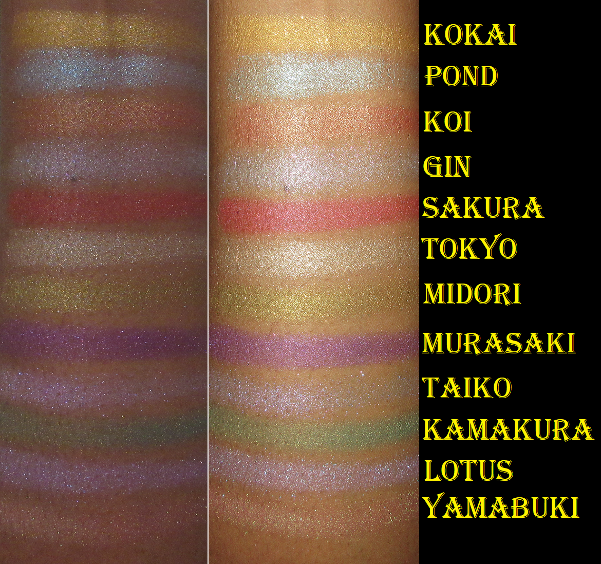
I’ve reviewed Viseart’s shimmers in the past, and the list of their links can be found here, but these are a bit different because of how they’re thinner and more sheer. They have more pigment than toppers, but they seem to have been created for adding a veil of color over other shades. They can be built up to appear more opaque by spraying them and packing them on, which I tend to do since I’m not as into the watercolor eyeshadow look.

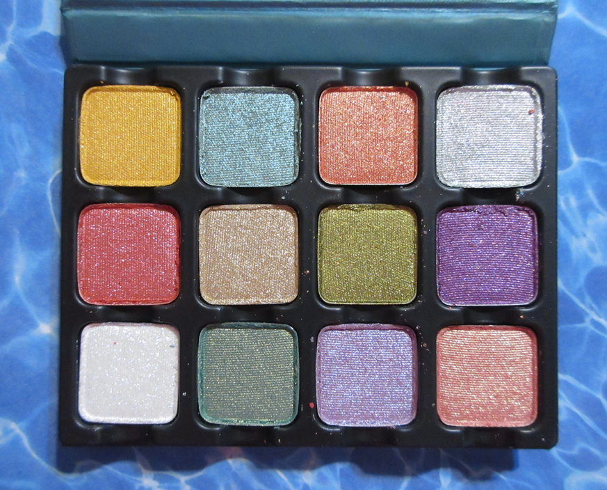
Viseart’s shimmers are famously intended for soft looks with their satin textures, muted colors, and low-sparkle level. So, whenever they deviate from that, my interest is piqued. These are still quite soft, with some shades tamer than others, but there’s extra glimmer to Pond (like an aqua blue mixed with seafoam green), Gin (duochrome cool silver-purple), Taiko (iridescent purple), Lotus (lavender with slight blue-purple shimmer), and Yamabuki (duochrome coral base with gold-green shimmer).

As I mentioned before, I already owned Murasaki (medium-dark purple with lighter purple shimmer) and Kamakura (medium green base with yellow/gold shimmer) as singles, but the other favorites I always wanted were Yamabuki, Midori (light yellow-green), and Lotus. Unfortunately for me, the base color on my eyes hardly shows in Yamabuki and all that can really be seen is the shimmery goldish green tinge. I wish it looked more like the color in the pan on my lids, so that was a disappointment. It’s essentially yet another highlighting type of shadow for me, as if Gin, Tokyo (light tan-beige), Taiko, and technically Midori and Lotus, weren’t enough. Midori has a stronger yellow tinge to it than green, which I wish was the reverse, but it’s still pretty. Lotus is the one that was exactly as I expected, which made me happy. However, it’s a shade I own plenty of in my collection, so I’m glad I didn’t buy it as a single. In fact, it was a good thing I didn’t buy any of the rest as singles because I think I’ll be reaching for these even less than I thought. I’m thrilled to finally have them all in a more affordable form, but if I’m being honest with myself, they don’t suit my particular eyeshadow style. That being said, I have no intentions of decluttering this palette anytime soon.

Regarding longevity, I’ve had no issues with these lasting other than the tiniest bit of creasing over MAC Paint Pot, but no issues over the Gerard Cosmetics Clean Canvas or Coloured Raine Paint Base primers.

The quality of this palette is good, so I do recommend it, but only for those that like toned down textures of eyeshadows and lightly colored shimmers that are bright in tone but don’t really “pop.” Those that like thin watercolor effect shimmers and like that they’re on the sheer side.

I did all these eye looks very quickly and wasn’t going for precision. Also, since the Isamaya Industrial 2.0 Collection just released, it’s only natural for it to be on my mind. The palette in that collection has some shades that remind me of these. This might be a tamer and easier to use alternative for those that don’t want to spend so much on that one. They are definitely not dupes, but I get spring vibes from both of them, which is ironic since they have seemingly opposite themes. One is a mix of mythology and nature, especially water themed, with “crystalline” finishes, while the other revolves around manufacturing and is a, “softer, subtler take on heavy metal.” To be fair, metals are a natural element too.

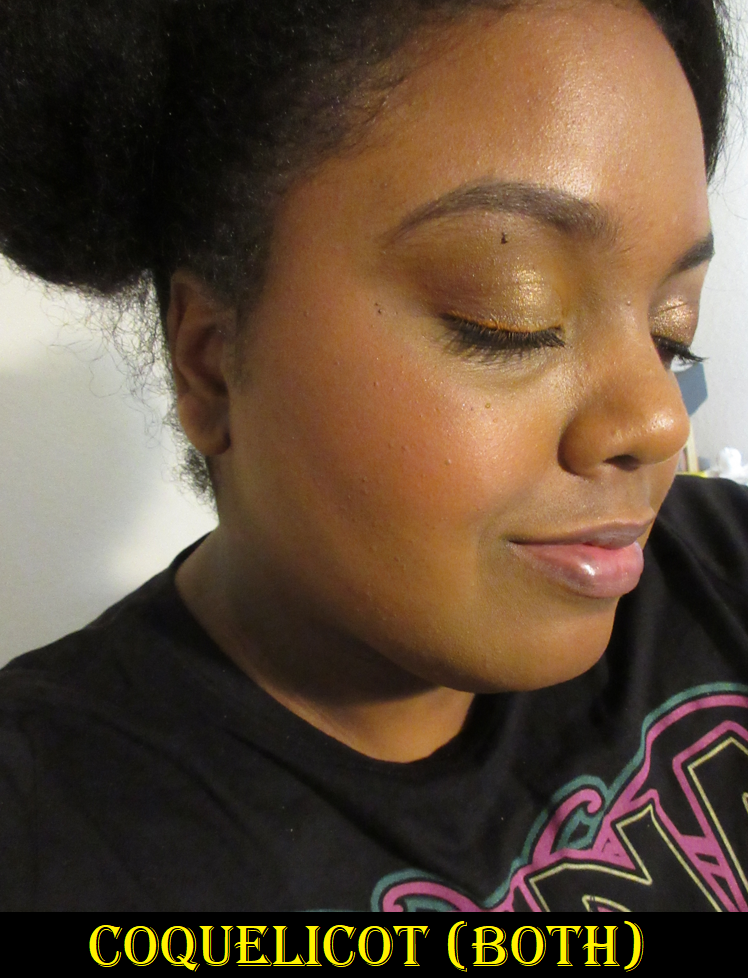
Viseart Blush Duo in Coquelicot

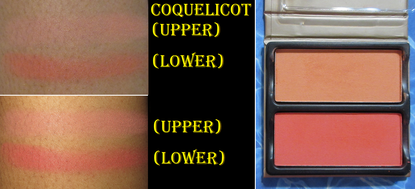
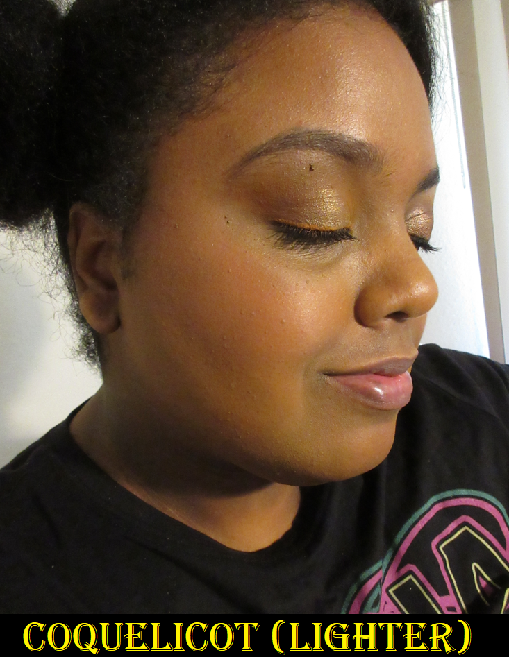
I like duos because of the ability to have essentially three shades in one: the first color, second color, and the third shade that results in combining them both. I’ve used this product less times than one would expect, considering I’ve owned it for over half a year. This is because of my preferences in blush finishes, shades, and texture. Plain matte blushes, the ones with no sheen whatsoever, have been the least favored type for me for at least a year now. I like soft matte, demi or semi mattes, and satins, but purely matte is a harder sell. However, it’s certainly not impossible for me to like them. Tarte and MAC are brands that come to mind that make mattes that aren’t flat. Thankfully, this one from Viseart doesn’t look flat, but also doesn’t look flattering either until it settles and combines with the oils in my skin. Knowing this, I try to help it along by prepping my dry skin with hydrating skincare before putting on my makeup, or at least applying a facial oil to my cheek area prior to adding foundation and then blush. This was the case in the demonstration photos with me wearing the blushes.

The texture of the powder is dry to the touch, but it at least doesn’t make my skin look drier, even without the extra skin prep. This makes it more successful than the reformulated Sephora Colorful Blushes I reviewed a few weeks ago. Since we’re on the topic of duos, if you’re looking for a fantastic quality blush duo in a soft matte finish, I highly recommend the Sephora ones discussed in that post too!

The blush shades from Viseart are colorful ones with no natural skin-flush colors in the line. Coquelicot has pretty colors. I don’t think I could have chosen a duo that suited my preference better than this one out of the six choices available, but I always end up mixing both shades together. When I wear the lightest one alone, I can built it up, but it’s a little more faint than I like. I instantly pine for something with more of a pop. Ironically, when I wear the darker one alone, it’s so pigmented, vibrant, and intense that I always feel like it’s too much and that I have to mix it with something else to tone it down. I used a light hand with it in my photo example below, though. In order to pick up less product, it makes sense to switch to my squirrel hair brushes, but most of those that I own are fully round and/or much bigger than those rectangular pans. It’s a little annoying searching through my limited options fitting that criteria for a brush shape that fits nicely and coats the bristles evenly without needing to dip into the blush multiple times or getting some of the lighter shade mixed in too.

While the perfect pairing is having these two together, I lose some of the benefits of having a blush duo when a single medium toned peachy-coral shade would suffice too. This is of course a “me” problem since plenty of other people can get enjoyment out of wearing each one by itself. I am happy though that Viseart’s blushes don’t contain the white base that can make a shade like the lighter one appear ashy on those with melanin-rich skin. It’s pigmented enough that I can still use it, though I have to spend a little time building it up. The second color takes time blending and applying slowly, as to not overdo it, which I easily can.

These blend decently and last all day without fading. I’ve grown to like them a little more than when I first got them, and part of that had to do with using the skin hydration trick and always wearing them mixed. At the non-sale $30 price for two blushes, I think it’s fair. I’ve paid that price for single blushes. It’s not my favorite formula, but I like it enough that it made me interested in the concept of Viseart’s new Fleurette Face Palettes. The option of combining a quad and blush duo in one magnetic/customizable package for $40 is a pretty great deal. The one I have my eye on for the blushes though, Bisous, looks quite similar to Coquelicot. When I contacted Beautylish customer service to ask if they are the same, the rep couldn’t confirm, but acknowledged they look similar enough that they might look the same on the skin even if they were technically different shades. Perhaps I should have contacted Viseart instead, but I need all the help I can get to remember I’m supposed to be on a low-buy and this answer gives me enough reason to pass on getting it.

So that’s everything for today! Thank you for reading!

-Lili

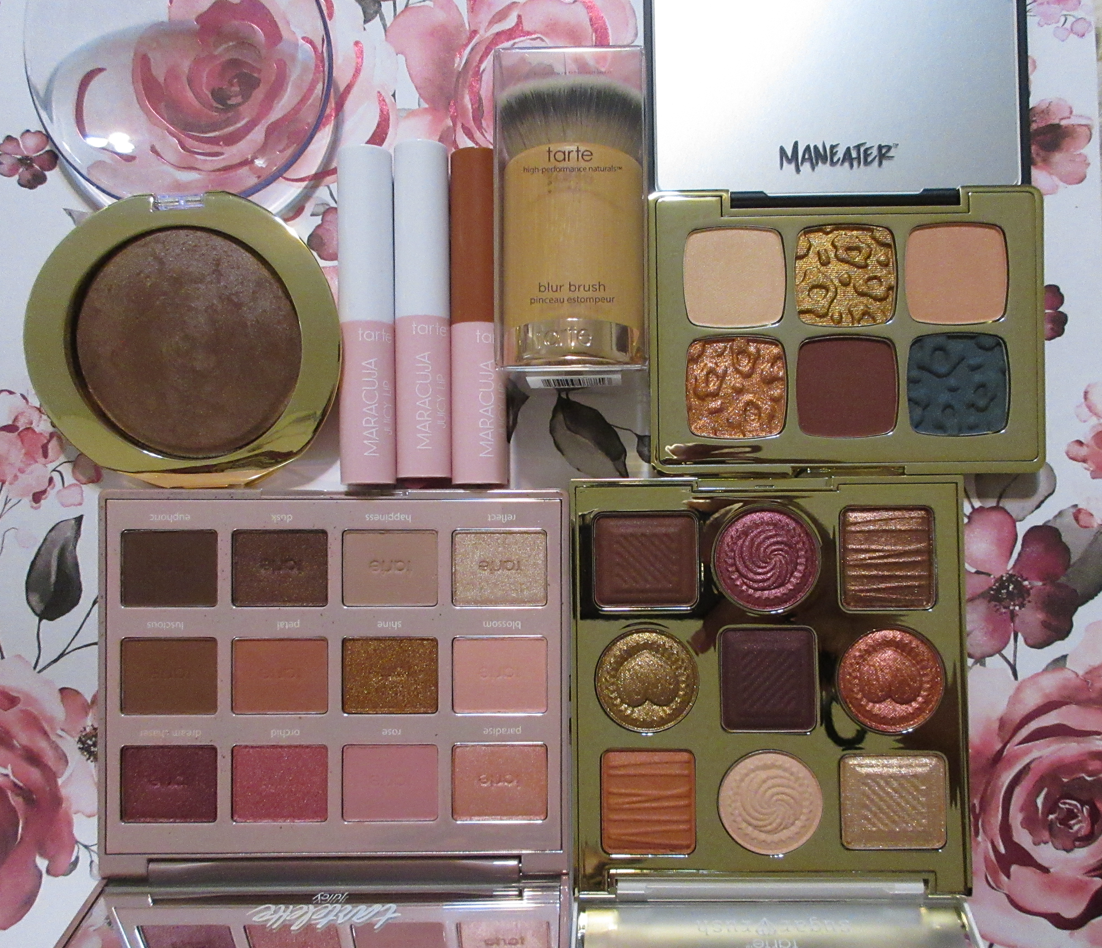
Testing More From Tarte Cosmetics Part 2

Tarte is one of those brands that I’m interested in purchasing from, but I’m almost never willing to buy their products at full-price. And, frankly, one doesn’t need to because they have quite a few sales at 30% off or more throughout the year. Between my Black Friday purchases from last year, and the “Choose 4 for 50% off” deal from April, I have enough products to do part 2 of my original dedicated Tarte post.

Sweet Tarte Cravings Eyeshadow Palette

Considering how pretty the outer packaging is and how adorable the chocolate shaped eyeshadows are on the inside, it’s amazing that I was able to hold off on getting this palette until it was discounted. It’s so cute and has some fun textures and finishes.

These perform as well as any other Tarte palette, but it’s quite interesting how foiled and wet all five shimmers are. Tarte shimmers tend to be creamy, but these are much wetter to the touch than I expected, while still clearly being a powder product and not an actual cream. As for the mattes, or at least Truffle and Drizzle, they’re the standard buttery feeling mattes I’ve come to expect from the brand. Semi-Sweet and Ganache are semi-matte considering they have dark colored micro shimmer in there that I didn’t notice until about the fifth time I used the palette. They just look matte on my eyes. The texture of those is also a little drier than I’m used to.

Raspberry Swirl and other medium toned magenta shades tend to look red on my eyes instead of purple, and Semi-Sweet just looked brown instead of plum. So, I was a bit disappointed that I’m not getting the purple shades I wanted. It’s basically entirely a warm neutral palette for me. However, it’s pretty and good quality, so I’m happy with the palette. I get a little creasing from the shimmers, particularly in the inner portion of my eyes, but it’s acceptable for all-day wear.

Maneater Catitude Eyeshadow Palette

I was interested in the Maneater After Dark palette, but it’s quite large, and I tend to pass on those nowadays. This Maneater Catitude palette has the green and some neutrals I was interested in, so I bought it hoping it could be a more curated version of Maneater After Dark.

The mattes don’t feel like the others I’ve had from Tarte. Rather than creamy, they instead have a silky-slip feel to them. They are still pigmented and buildable, but not quite as easy to blend as the Amazonian Clay matte formula. Attraction, Smitten, and Infatuation are adequate quality. Instincts has the tendency to be patchy and is more time consuming to blend than the other mattes.
The shimmers Sizzle and Spicy are foiled type of eyeshadows too, and smooth, though not wet like the ones in the Sweet Tarte Cravings palette.

I’ve liked the looks I have made with this palette, and I like the sparkle level in the shimmers, but because of the nearly flaky texture, I still spray my brush when I apply them because I feel they need a little help with adhesion. Doing that does lead to noticeable, but not terrible, creasing.

This palette is pretty good for the price, and even better at a discount, but it was most useful just to satisfy my curiosity. The quality wasn’t special enough to really be worth buying when I get more enjoyment out of my Dior Backstage Khaki Neutrals palette and Bobbi Brown Jadestone palette, even though those are twice the price.

Tartelette Juicy Amazonian Clay Palette

This was one of my Black Friday purchases, and getting the deal is the only way I’d have bought this palette because I have random moods when I want to rock pink eyeshadows, but they are few and far between. I really like the Amazonian Clay eyeshadow formula, as I discovered after getting the Tartiest Pro 2 Palette, so the quality didn’t disappoint. The mattes are creamy and blendable. The shimmers are shiny and smooth, though I like to help them along by applying them damp. I sometimes get issues with the shadows disappearing from the inner corner of my eyes from rubbing that spot, but otherwise, they usually have good longevity.

These are great for soft, girly, romantic looks and for neutral lovers. I knew this prior to purchasing. I just wanted more depth from Dream Chaser and Dusk. It’s the same issue as the Sweet Tarte palette’s magenta color pulling red instead. Dusk, on my eyes, isn’t the rich brown I expected. It’s more of a medium golden-bronze color. Euphoric is the only option for me to deepen up a look to the level I like. So, this isn’t perfect, but I like it. I might have regretted buying it at full price, but the 50% off made it palatable.

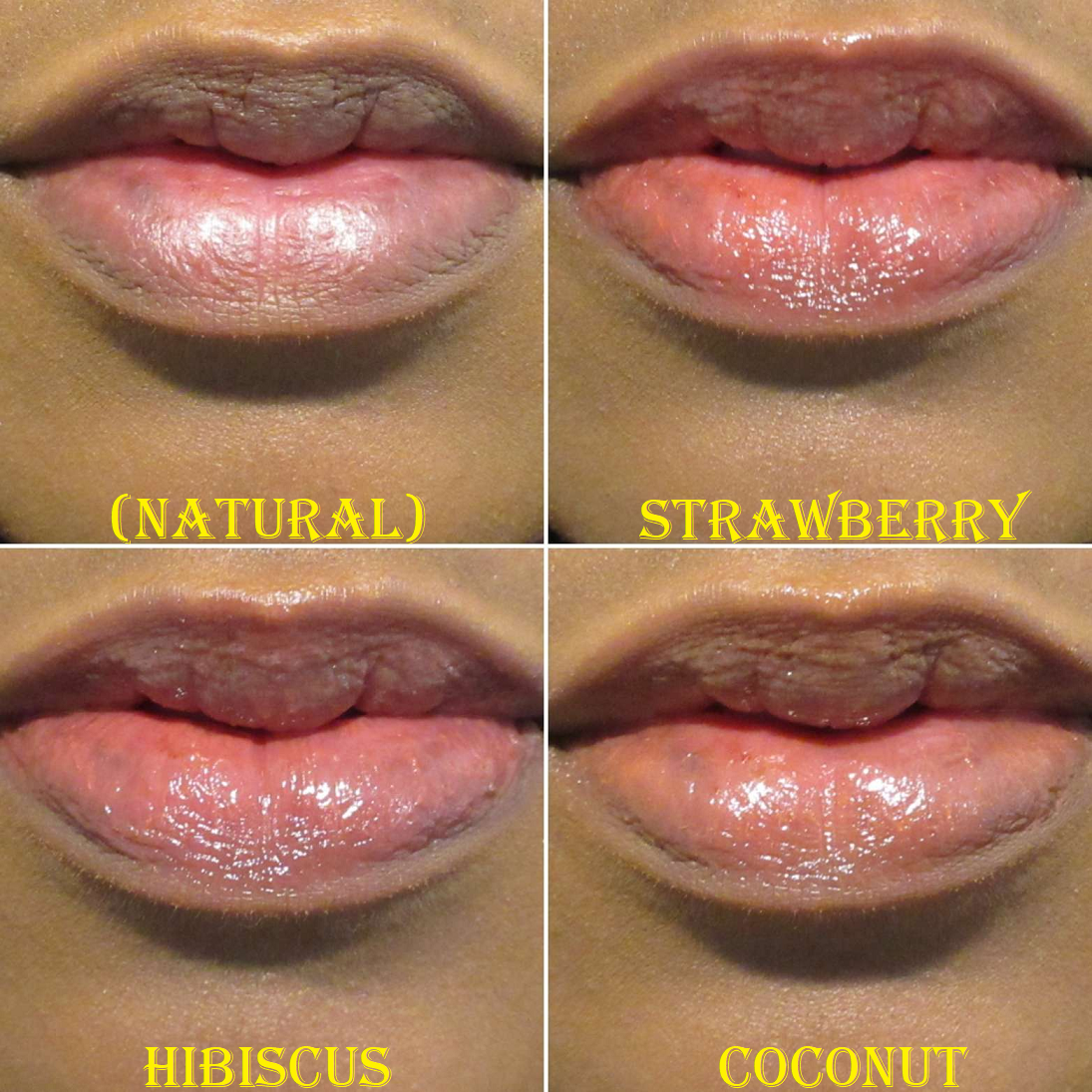
Maracuja Juicy Lip Balm (Travel Size) in Strawberry, Hibiscus, and Coconut

This balm comes in a plumping version as well, but I tend to avoid those types unless they’re very hyped up and described as a minty plumping product, since I like having a cooling sensation on my lips on occasion.

I think these give a decent amount of color payoff, but they do need to be applied thickly for it to show. The issue is that the formula feels almost too soft for the tube packaging. I think a doe foot applicator or some other type that could smooth out the color would have been better. The balm, when glided across the lips, comes off in thicker chunks of color. It looks terrible unless one rubs the lips together, which spreads the color evenly at the expensive of that action sheering it out.

To get the color to show in photos, I end up using my finger to spread it, add a second layer, then spread it with my finger again. Strawberry has more pigment than Coconut and Hibiscus, or at least Strawberry shows up more strongly over my natural lip color. The amount required to see my lips visibly tinted is a lot, so I started to just use them for nourishing lip purposes instead of a color product.

While it feels moisturizing and soft in the beginning of the day, eventually by the end (with retouches throughout the day since it doesn’t last after food), my lips dry out slightly. This happens to me with nearly every balm with color added to it. I just have excessively dry lips and so many things can exacerbate it. The upside and why I still use this from time to time is because a lot of other lip products dry my lips much earlier in the day. With this one from Tarte, if I just remove it by the evening time and switch to something more nourishing early in the night, I won’t have any of the negative consequences. I get to keep enjoying the slightly tinted and beautifully glossy look it gives.

To clarify, when I use the term “tinted” in this context, I mean visibly seeing a different hue on my lips instead of my natural lip color. I don’t mean tinted from a lip stain.

As I mentioned before, the texture is a bit strange to put in stick packaging since it’s such a soft melty consistency. It instantly made me think of the Makeup by Mario Plumping Lip Serums and MAC Glow Play Lip Balms. The difference is that the Tarte balm is thick, glossy, and creamy, whereas Makeup by Mario’s is thin, shiny, and oily. MAC’s is also wet and “oily” for lack of a better term. One more thing about the Tarte balm that others might not like is that it has some stickiness to it, but not enough to bother me.

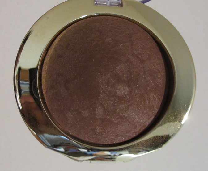
Shape Tape Glow Bronzer in Deep Bronze

I bought this expecting to use it as a highlighter because Deep Bronze looks lighter and more golden in the product photos than it is in reality. I did not expect it to be so dark!

This means that I can use it as intended. Good job, Tarte! I’ve noticed the brand’s efforts to have more shade options for their products. There’s still some room to grow, after all, only two shades is still going to exclude a lot of people from being able to use them. Plus the brand still doesn’t have a traditional bronzer in a wearable shade for those with deep skin. However, I acknowledge the increased efforts as of late. That being said, I wish they’d be more transparent about what this product actually is and does, because it’s pretty much a contour.

The name Shape Tape implies that it’s a sculpting product, but the line started with concealers. Sure, technically it can lift the face if a brighter shade is used, but I believe most people are like me in viewing Shape Tape as a product to conceal unwanted things on the face, not as a highlighting and contouring product. There was a Shape Tape foundation, after all, which doesn’t fit the sculpting idea either.
Although these “Glow Bronzers” are part of the Shape Tape line, they’re described on the website as, “radiant baked bronzing powders for a luminous glow.” So, I didn’t question it being anything more than a glowy bronzer. I was pleased when it turned out to be darker than I thought, but confused by how grey toned it looked in the compact. I own some products that look warmer in the light, but even in the light this has to be at a very specific angle to see a warmer tinge.

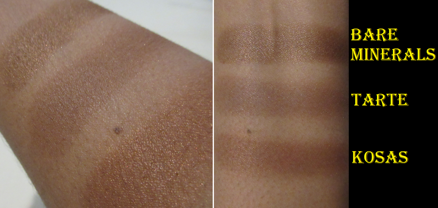
It’s only the box packaging that has writing on it stating that this product is a, “natural matte” and “cool toned powder.” Radiant and luminous, as described on the website, is definitely not the same thing as natural matte! In addition, the fact that it’s cool toned means it is very likely to have a contouring effect if it’s too many shades darker than someone’s natural skin tone, as is the case for me. There are people who specifically prefer cool toned bronzers, but the advertising gives no indication that this is what we’d be getting. Plus, most of the images of the product itself looks super shimmery, meanwhile only some of the model photos have it looking semi-matte. So, buyers please be aware that Deep Bronze is a sculpting bronzer or contour with a slight sheen. It’s not shimmery or glittery whatsoever. Below is an example of the shimmer level of the BareMinerals Blonzer (Kiss of Spice) and Kosas Sun Show Bronzer (Paradise) look like compared to the one from Tarte.

If I apply this lightly, I can see some of the red tones come through, but it always appears patchy. No matter what brush I use, or whether my base has been powder set or not, I end up needing to go back over the area with foundation, concealer, or to cover up the uneven spots with blush. If I use a normal amount of product, it looks more even, but it also creates a stronger contoured effect. So, what I tend to do more often is apply it like a contour and add a bronzer from another brand over the top of it. I’ve found a way to make it work and look pretty in my own eyes, but I don’t see myself reaching for this again. It’s just too much effort when I have a contour from Kaleidos that I like or the custom powder combination I can make from Hindash’s Beautopsy palette.

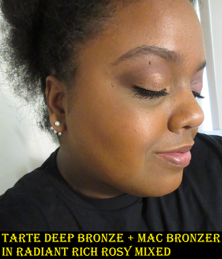
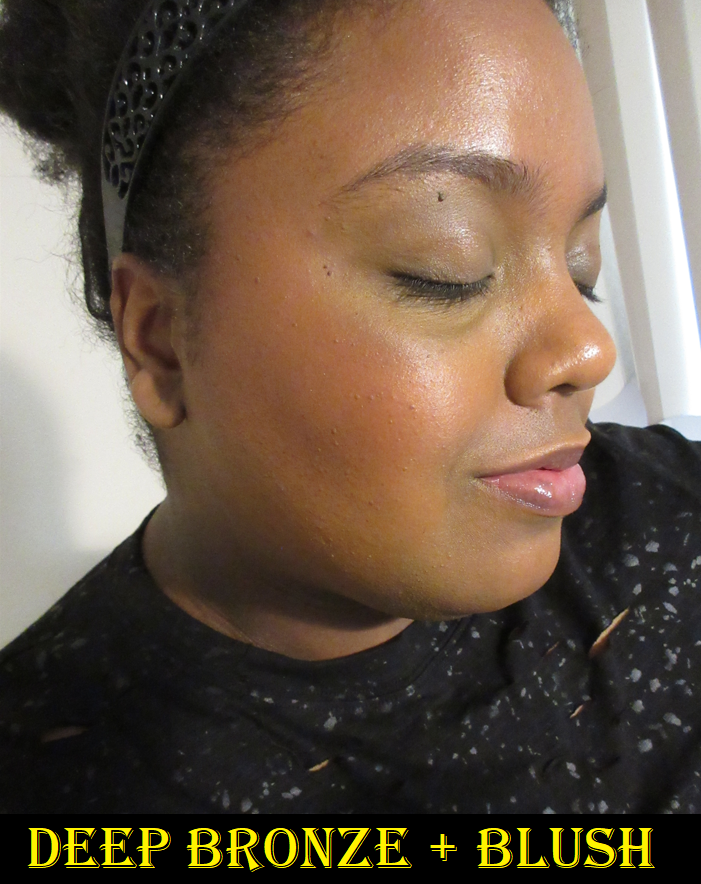
In the demonstration photos below, the sheer application looks quite grey, but grey/brown/red in the thicker layer. I didn’t realize until afterwards that my attempts to apply it, see it’s too patchy, remove it, try it again, and repeat the cycle with different brushes led to the final result looking darker/cooler. I believe it’s due to there not being enough time between my fourth or so re-application of foundation not being 100% dry before adding the sheer layer for the final time. I must have been feeling a little impatient by the fourth time since I wanted to demonstrate this product in the best possible light, knowing my words about it would be negative.

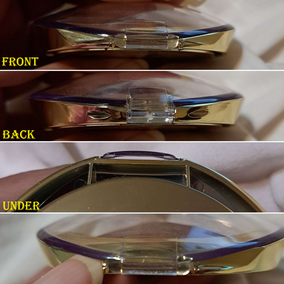
Another thing I can’t ignore is the closure of the packaging. Some genius thought it was a good idea to make the space to lift the lid practically flush with the bottom of the compact. A compact that already has holes on the bottom, making it awkward to place the fingers to grip. I have to literally stick my nail in the tiny space and hold my other nail in the side gap to pull it open. I rarely have trouble with packaging enough to need to mention it in a review, but this one is quite annoying.

These are examples of the space usually between the lid opening and bottom of the compacts. One of the easier ways to open the one from Tarte, if you have long nails, is gripping both sides of the gold portion and lifting both sides of the plastic lid with the other hand.

Expectations for a luminous bronzer aside, I recommend the evenly priced Huda Beauty GloWish Soft Radiance Bronzing Powder instead. It has a prettier sheen and blends right into the skin. Longevity isn’t an issue for either of these two produdcts. The GloWish comes in more shades, plus some of the colors are available in mini sizes too.

Blur Brush

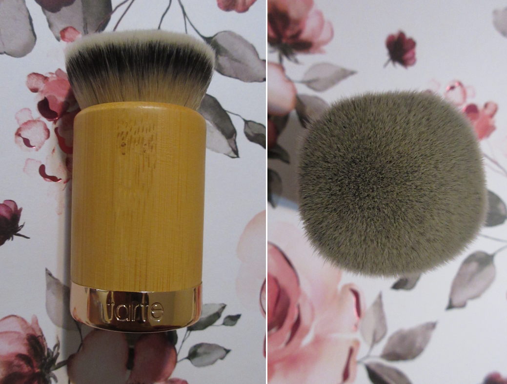
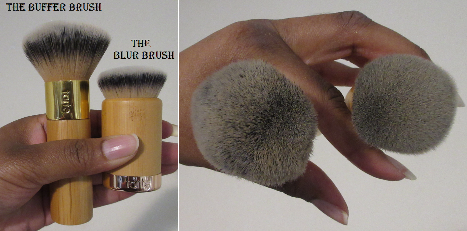
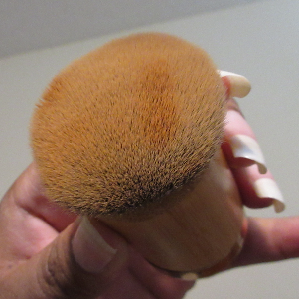
I selected the Blur Brush because I’ve always wondered how it compares to The Buffer brush, a long time holy grail synthetic fiber foundation brush. They both have a ton of bristles packed together. I always thought The Buffer was dense, but the Blur Brush is on another level! It feels especially tighter packed because it has much shorter bristles. The Buffer brush has longer fibers, so there’s a little more room to bend and splay, so there’s more flexibility while buffing it. The Blur Brush is so dense that it takes more force to move the product across the face. The wide surface area keeps it moving quite evenly though, and the foundation remains mostly on the tips and doesn’t go far down the bristles, which means less product gets lost during the application. Because of that tightness, it’s also more intuitive to swipe the foundation as opposed to trying to buff it in.

I should also note that I’ve only used these brushes with liquid foundations. I haven’t used them with creams or powders. In theory, I think the blur brush might pick up and disperse too much powder if it’s a setting or finishing one. However, one might like it for maximizing the coverage of a powder foundation. Also, I can imagine a stiff cream product with this stiff brush might be uncomfortable. However, I don’t know for sure since I only ever intend to use this with liquids.

Because the excess foundation remains on the skin and doesn’t go further into the brush, it can look like product is sitting on top of the face if too much is accidentally pumped out. For that reason, the Buffer Brush is more helpful for me to use because it takes the excess off the face and also helps push the remaining product further into the skin for a more natural look. The Blur Brush is still quite useful, but it takes second place to The Buffer for me and my foundation needs.

Two other things I noticed is that wherever the brush touches the foundation first will leave the biggest pool of product on the brush. I can blend some of it out of the pool and onto the face, but that initial part is the only place foundation gathers, besides the tips. The other thing is that this feature of how tightly packed the fibers are makes it both harder and easier to clean. At least I don’t need to worry about opening the brush and soaping up what’s deeper, but it’s hard to get the product out of the places it did stick.

So far, I’m still pleased with my decision to give this brush a try.

That is everything for this post! Thank you for reading!

-Lili

Sephora Collection Blushes Are Hidden Gems, But Not All of Them

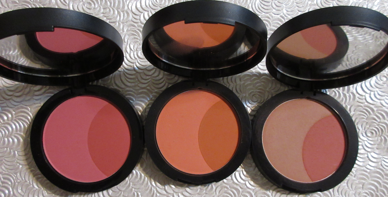
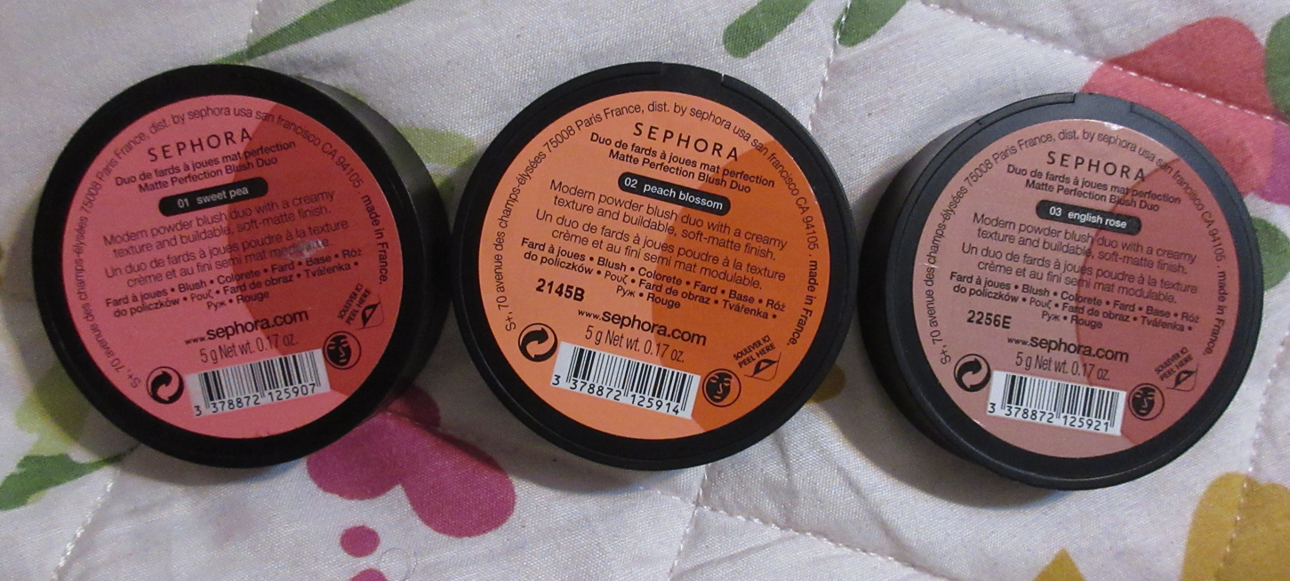
Sephora Collection Soft Matte Perfection Blush Duos in 01 Sweet Pea, o2 Peach Blossom, and 03 English Rose

These are the blushes from the Sephora Collection that I consider top tier. It’s unfortunate that they seem to be either discontinuing them or having difficulty with sourcing and keeping them in stock. All of the lighter shades disappear off the website for months at a time before returning, and then a different shade disappears in its place, so I don’t know how long these will continue to be around. And when I say disappear, I don’t mean listed as “out of stock.” Currently, Sweet Pea is the only one of the three I own that’s on the website, and that shade had been missing for six months prior. A few months ago, it was only English Rose of the three, and a few months before that it was only Peach Blossom. October 2022 was the last time I saw all six blushes on the website at the same time.
In addition to supply issues, it might also be the case that since so many brands are switching to being talc-free, these might get reformulated in the future.

It’s very unusual for me to wear the lightest shades in a blush range (only Mesauda comes to mind), but that’s because these are highly pigmented blushes! They also start at about a medium depth, which is the main reason these colors don’t look ashy on my cheeks.
I prefer using these with my natural hair brushes with light to medium packed bristles. That ensures that the blushes don’t look too intense on my cheeks between the pigment level and colorful right halves of the compacts, but because they also contain slightly muted colors in the left halves, I don’t need to use the sheerest or airiest of brushes to apply them with either.

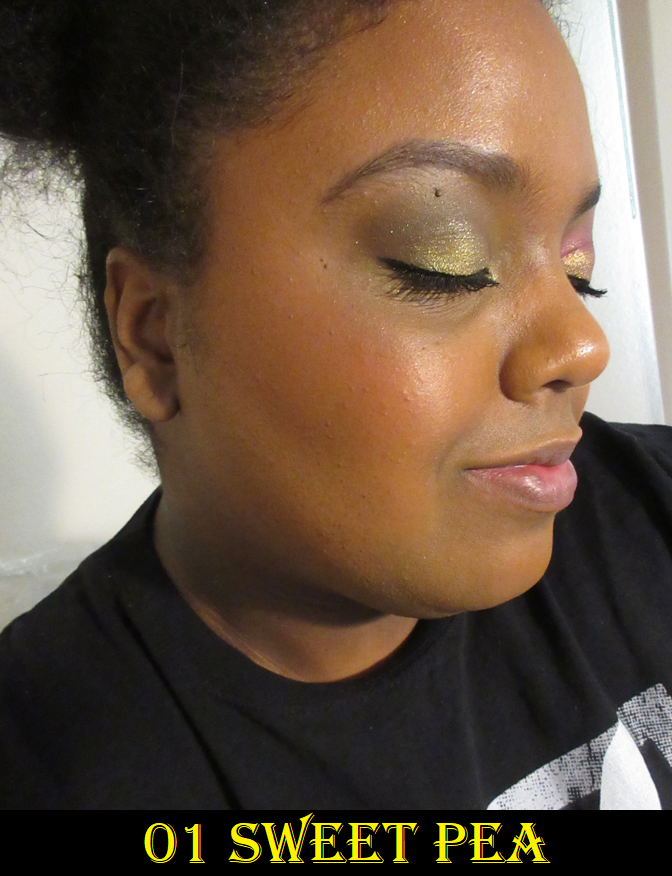
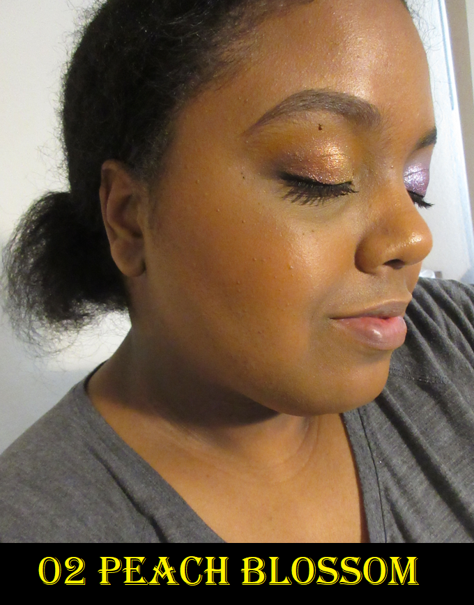
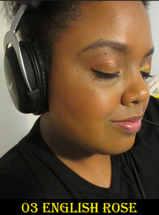
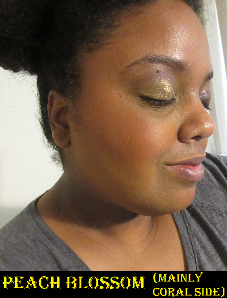
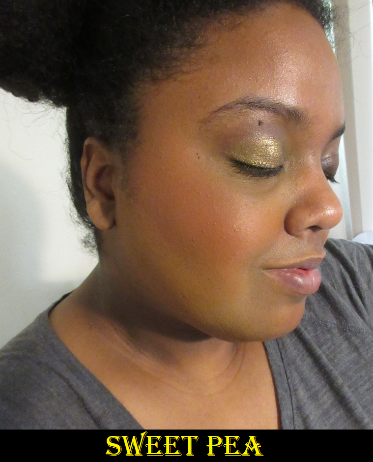
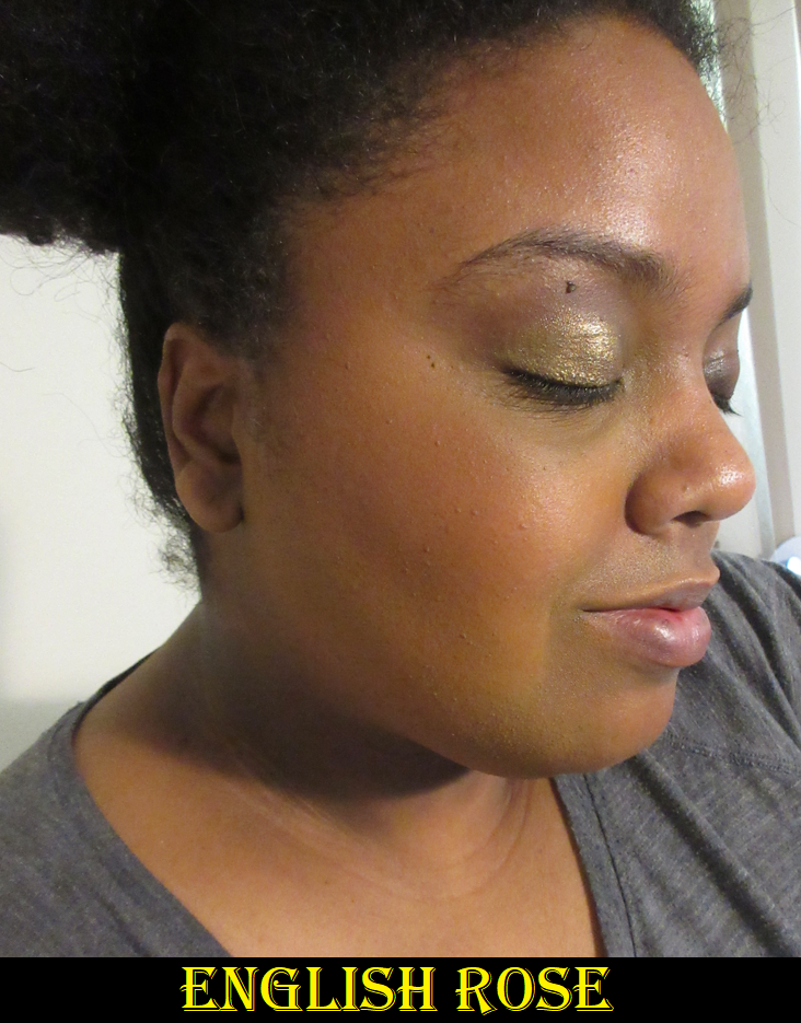
In this gallery of three photos, I’m wearing the blushes in the mixtures I normally would, though I didn’t have a choice with Sweet Pea because I was wearing the re-pressed/fixed version. The photo of English Rose is almost primarily the Rose color in the compact.
In the upcoming four photos below, Sweet Pea is worn the way I would normally combine the shades. I also demonstrate the two different Peach Blossom looks, plus how English Rose looks if I use more beige to soften the rose.

Even though the duo blushes are matte, they don’t look powdery or flat. Sephora nailed the description of these having, “a creamy, buildable texture and a soft matte finish.” I love the fact that I get two different shades I can wear separately, or I can customize the blush by using a mix of both. For instance, with Peach Blossom, I can easily wear one or the other. With English Rose, I mainly use the pink portion, but I add a little of the beige half to keep it looking more muted, soft, natural, and diffused.

These blend superbly and are long-lasting on the cheeks, in addition to being quite affordable for a product at Sephora. These are in my top favorite matte powder blush formulas and I can’t recommend them enough. My first one, Sweet Pea, arrived broken and even though I did a horrible job pressing it back (and both shades turned into one), it looked so pretty on my skin that I bought the other two shades. And then, when I saw Sweet Pea finally available on the website again, I purchased it so I could have the dual color option and have the blush look in better condition. I would not have done that if it wasn’t so good!

Sephora often puts their own collection on sale for 30% off, so that would be an even better time to try them out if you’re interested. I would just be careful to check the ingredients because if it’s talc-free, that means it’s not the same formula and I can’t guarantee the performance will be the same.

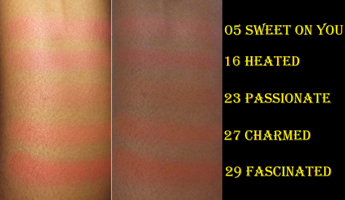
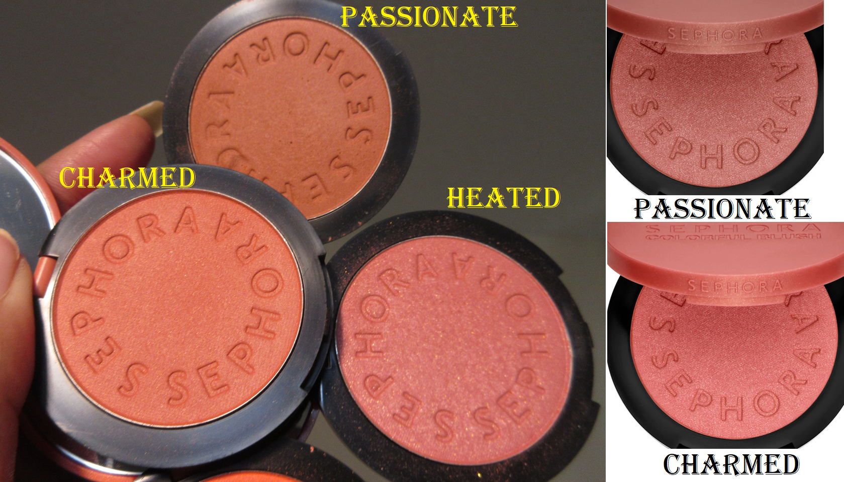
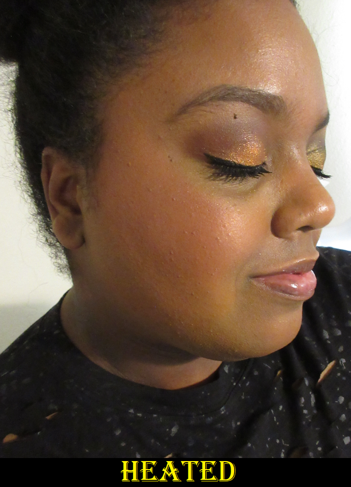
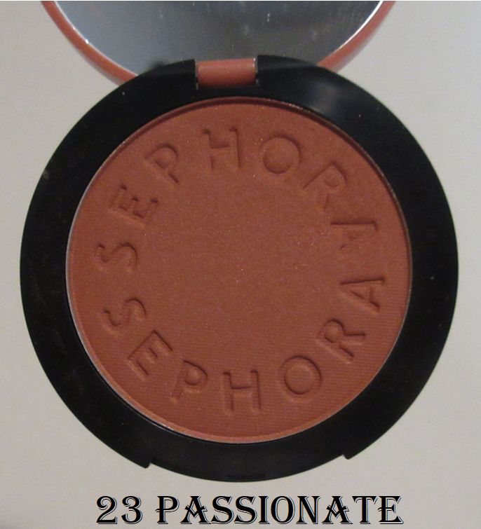
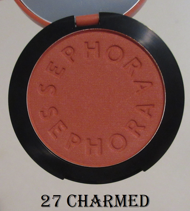
Sephora Collection Colorful Blushes in 05 Sweet on You, 16 Heated, 23 Passionate, 27 Charmed, and 29 Fascinated

These were initially released first across Europe, so I was able to get three of these while I was in Germany. They only had about five available to choose from, so those first ones weren’t my first choice in shades, but I was still interested in them. I wasn’t impressed by how they looked, but I thought it might be the case of the colors making me feel that way, so I purchased two more on sale when I returned home. That didn’t end up changing anything. In fact, it just served to solidify my confusion.

The only blush of the five that’s labeled matte is Sweet on You (which I could swear sometimes I find a little shimmer in it too and it has a visible sheen on my cheeks). The other four are all listed as shimmers, but Heated is the only one that’s easily identifiable as shimmery. Charmed and Fascinated have barely visible specks in the pan, but Passionate is like playing Where’s Waldo to find any shimmer. I’ve seen maybe one or two glimmer particles as I’ve gotten past the topmost layer of the blush. There’s probably like 1% of it in the whole thing. What Sephora’s photos show versus what it looks like in the pan in person are so very different.

I wonder if others who own Passionate, Charmed, and Fascinated have much less sparkle in theirs too, or if this is evidence that the batches weren’t mixed properly and everyone is getting various shimmer levels of their shimmer blushes. It can’t be a situation of location since I ordered some from Germany and some from the US. I would have thought they were mislabeled as shimmers if the brand photos didn’t show they were clearly supposed to contain the same amount of shimmer in them as Heated. What a strange circumstance.

These blushes appear decent on camera, but in person, they look so dry unless I properly prep my skin. I was confused because they feel like the same softness to the touch as the Sephora blush duos I love so much, but they don’t look that great on my skin if I’m using a natural or matte leaning foundation. The blushes look much better after giving them enough time to settle into my foundation, and especially if I’m wearing thorn oil as primer.

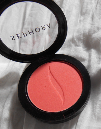
The brand reformulated and/or repackaged the Sephora Collection Colorful Blushes line at least twice, so these new ones I own are the third version to my knowledge. My original one from 2014 had less pigment, but I recall it looking and feeling better than these on my skin.
It has long since been decluttered, so I can’t double-check. The only reason I have a picture of it (Orange Pop) is because it was reviewed on this blog in one of my oldest posts. I didn’t purchase any of the second line of repackaged and/or reformulated blushes.

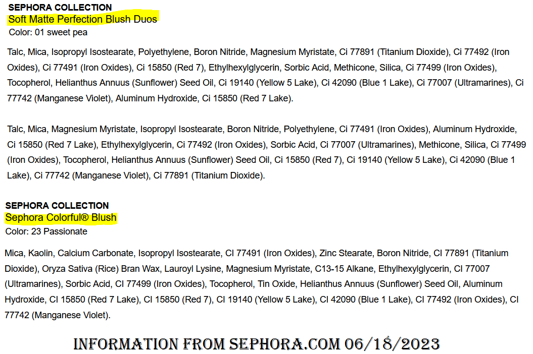
When I checked the ingredients, I was shocked to see Kaolin listed second, since I’m used to seeing it much lower down on face powder ingredient lists. This could be why the blush looks drying on my already dry skin. It could also explain why I prefer the duos over these because their formulas are so different.

For those with oily or combination skin, these blushes may give a totally different experience.

In the demonstration photos, I paired the Nars Light Reflecting Advanced Skincare Foundation in Caracas (natural finish) with Rituel de Fille Thorn Oil.

These are long lasting with medium-to high levels of pigment and they blend in an adequate amount of time. My skin type issues aside, these blushes are fine. To me, they’re the worst of the Sephora ones I’ve tried and among the lower ranked of my blush collection, but I wouldn’t go as far as to call them bad. Most brands don’t make “bad” blushes in these modern times. Plus, I know that if I make my skin a bit dewier, the blushes will look pretty on my cheeks. It’s an easy remedy. That being said, I still can’t recommend them. If I had a smaller blush collection, I would probably keep them. However, I’m pretty sure I will declutter them by the end of this year.

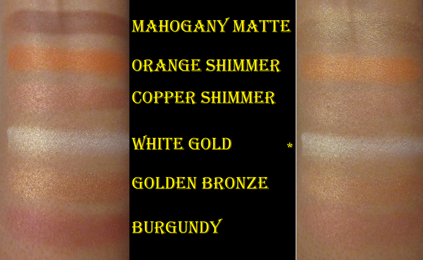
Sephora Collection Spice Market Contour Powder & Blush Palette

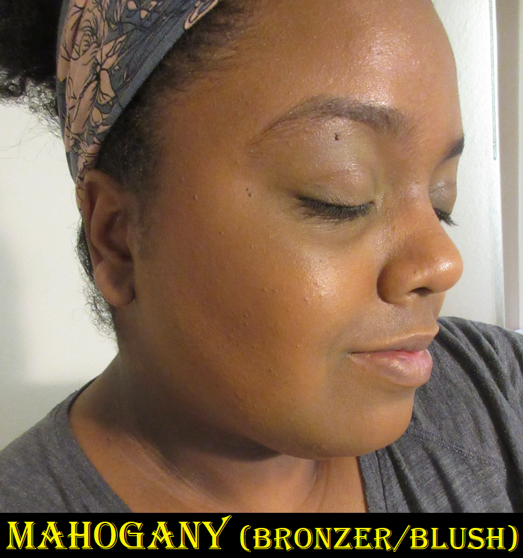
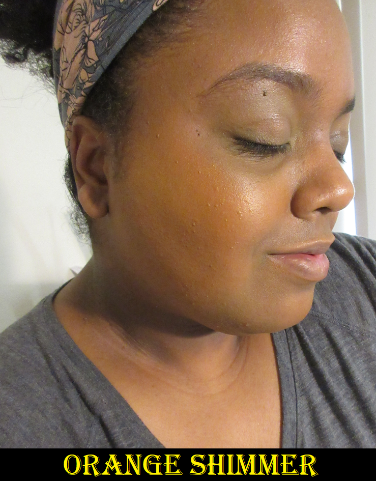
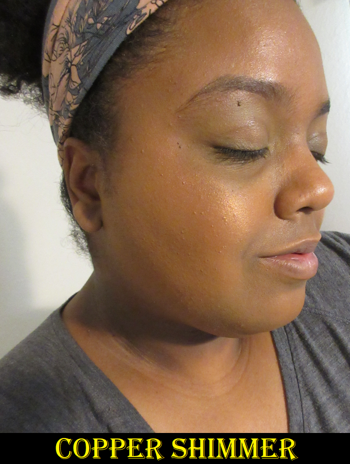
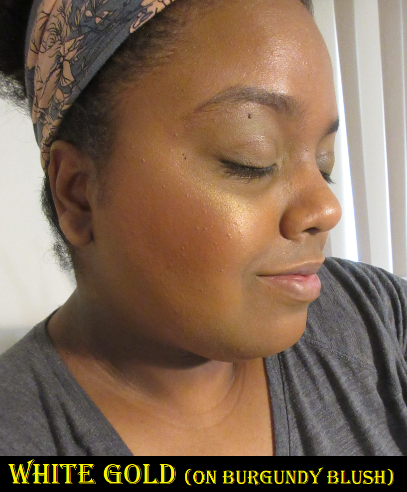
In the swatches on the right side above, I showed what these look like with the color White Gold on top of them because Sephora describes that as a “transformer shade.” I interpreted that to mean they’d become more glowy, and technically it makes them more reflective, but it mostly makes them lighter. This could be helpful to those with lighter skin tones in being able to wear them, or for someone who just wants to tone down the vibrancy. However, I don’t recommend anyone apply White Gold on top of Mahogany. The other four could look like they formed brand new shades because these shimmer blushes need some kind of emollience to actually combine, which is why they work well together. When paired with a matte, they just lay on top instead of actually mixing. That’s why when I use Mahogany as bronzer, if I put one of the other blushes on my cheeks, the spot where the blush touches the bronzer basically covers it up instead of blending together properly.

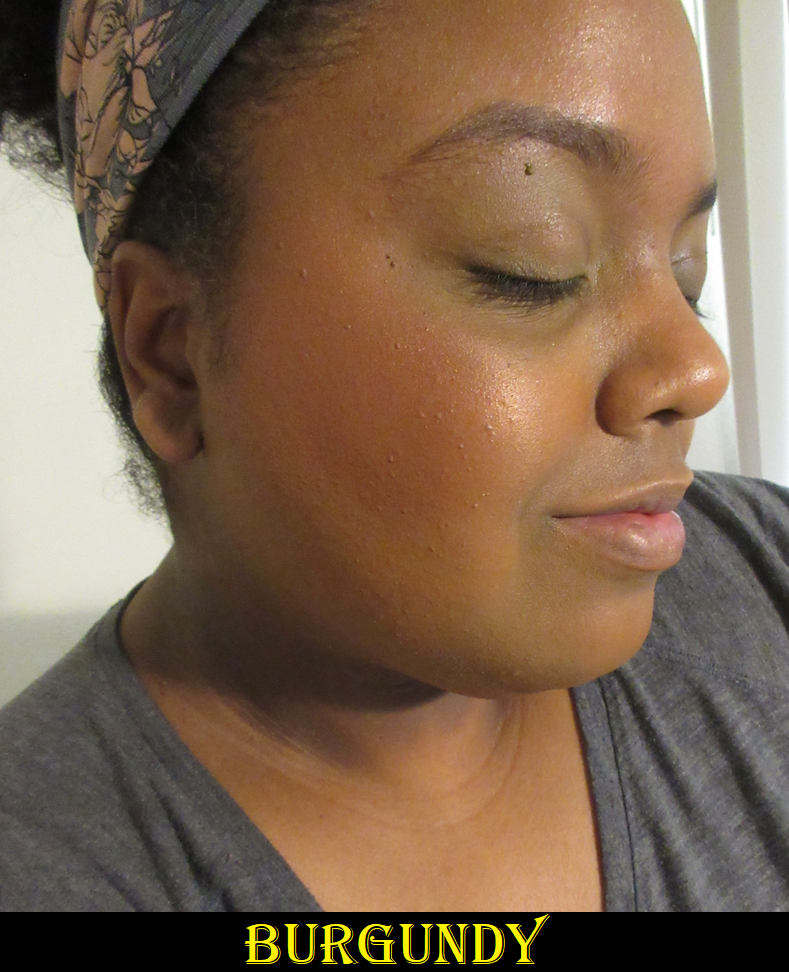
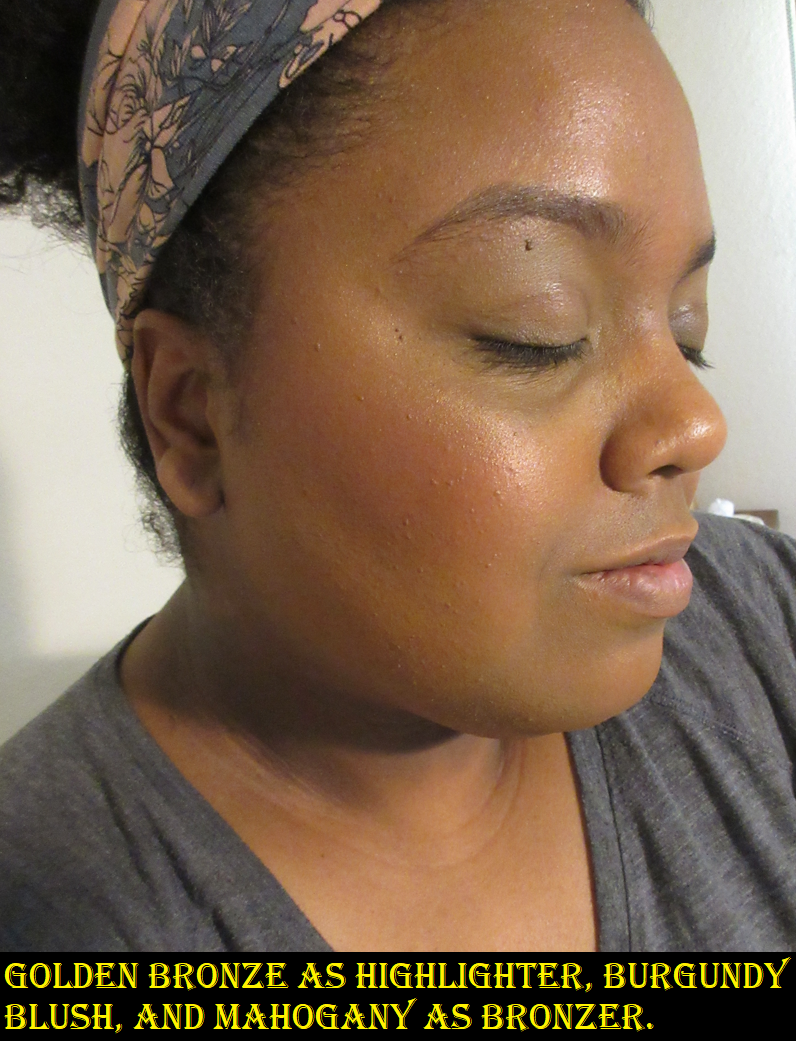
The transforming aspect, plus having a contour, blush, and highlighter to match my skintone were the reasons I bought this palette. However, I don’t like the tone of Orange Shimmer on me when used by itself and the transformed version is too light. Copper Shimmer has a similar effect as Nars Orgasm blush with the difficulty seeing the pink color because of the gold reflecting so brightly that it looks like I’m just wearing highlighter all over my cheeks. It’s at least more flattering on me than Orgasm, but less so than Orgasm X. White Gold is too intense for my taste as a highlighter, but Golden Bronze is perfect. So, I’m just left with one usable contour/bronzer in Mahogany, one usable highlighter in Golden Bronze, and one pretty blush in Burgundy. Burgundy is a little deep, and I built it up in the photos, but it looks much better on me if I apply it in a lighter layer. Also, I do like how Burgundy and Copper Shimmer look mixed together, as well as Burgundy and Orange Shimmer. So, technically, the other blushes can still have some use.

I ended up with less choices and combinations with the face palette than I anticipated, but 4 out of 6 usable products isn’t so bad (especially if I get creative with the blush mixtures). The reason I don’t reach for this very much is because, once again, I’m not as pleased with the formula. The shimmers take longer than I feel they should to get an even application across the cheeks, so trying to combine them into one seamless color takes extra effort. The outcome is pretty, though the shimmer type is a little more metallic than I’d prefer with Copper Shimmer. The metallic nature isn’t as intense in Orange Shimmer if applied sheerly, and the shimmer in Burgundy doesn’t have a strong reflect. However, the high reflect is inescapable with White Gold and Copper Shimmer.
Mahogany as a matte is also not as smooth as I want for a bronzer or contour powder that needs to be very blendable in order to be believable as naturally shaping my face. It’s possible that powdering my foundation first before applying Mahogany could make it blend better, but I rarely powder my whole face because of my skin type. Overall, these powders don’t spread as easily, which keeps them from ranking as high. However, I find this palette more useful and like it more than the Sephora Collection Colorful Blushes because of their finishes. They’re a little more work, but I like the effect in the end. I’m keeping it at least until it’s time to move.

The only Sephora product that I recommend nearly as much as the blush duos is the Microsmooth Multi-Tasking Baked Face Palette. I reviewed the one in Captivate here before, so I don’t need to go too much in detail, but it’s a fantastic formula at an awesome price. I much prefer the bronzer in that palette over Mahogany in the Spice Market palette. The difference in quality is pretty significant as well.

Now that I know not all Sephora Collection blushes are created equal, I won’t be giving the blanket statement anymore that “Sephora blushes are great.” However, I very excitedly advocate for their baked products and the blush duos in their current formulas.

That’s all for today. Thank you for reading!

-Lili

DISCLOSURE: I purchased all these products myself. All links in this post are normal non-affiliated links.

Makeup by Mario, ABH, Colourpop, and other June 2022 Purchases Reviewed

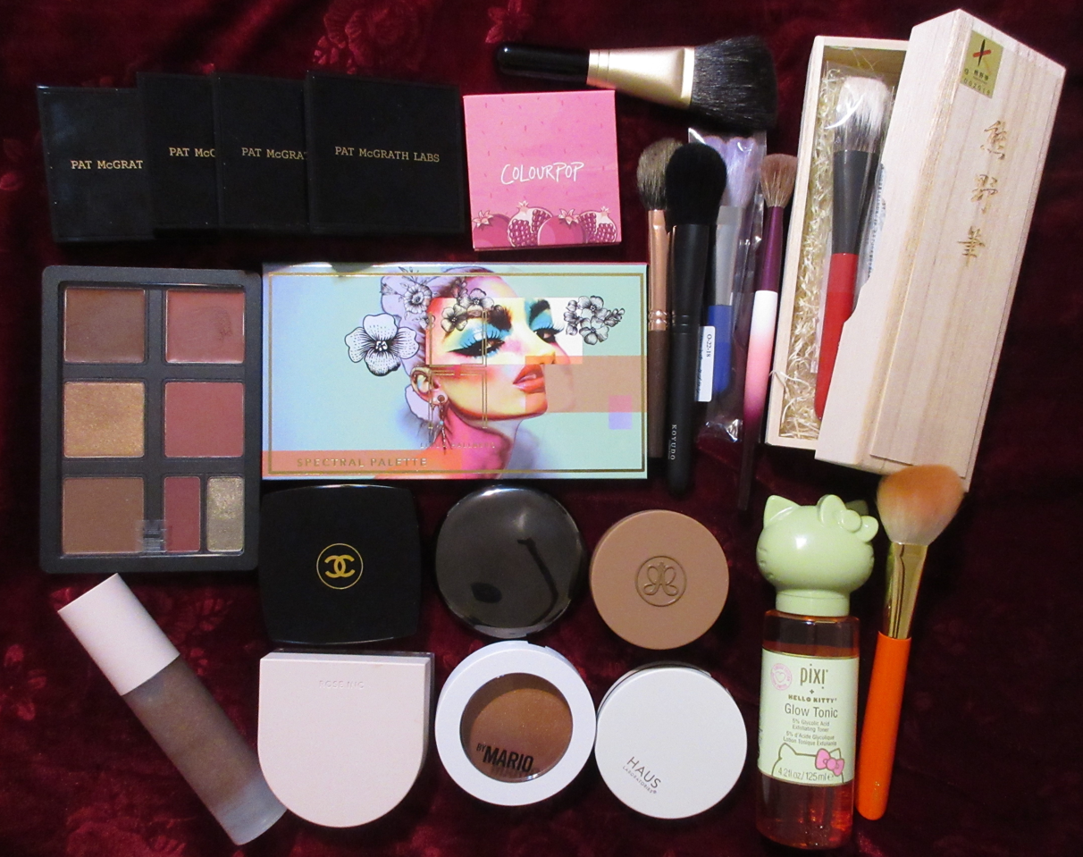
Once again, this post is a year late! It’s no longer relevant in terms of keeping up with last year’s low-buy, but I still intend to review the products that haven’t been discussed on this blog. I’m also including updates and links to the products I already reviewed.

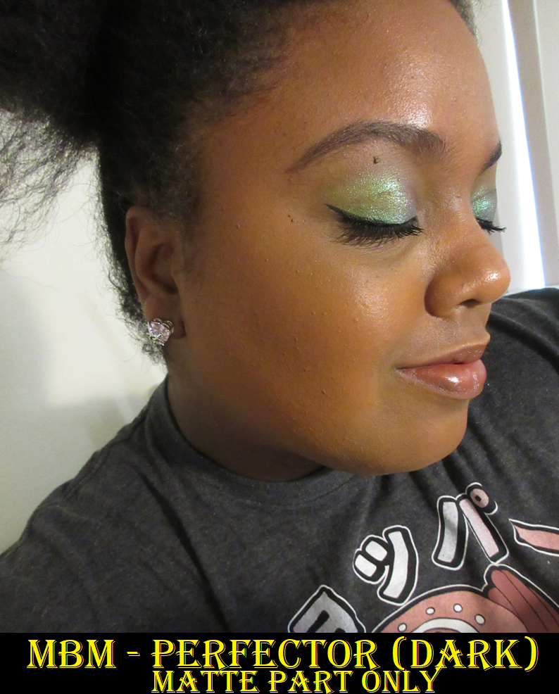
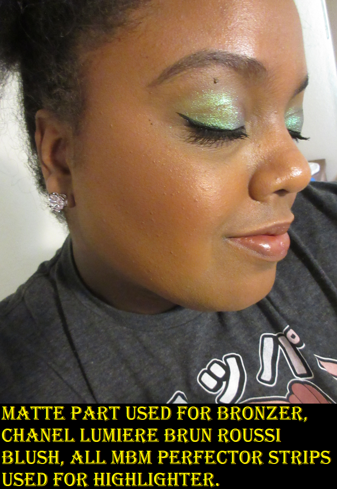
Makeup by Mario Soft Sculpt Perfector in Dark

In May 2022, Mario released an Enhancer and Perfector. The Enhancer is essentially a tinted bronzer balm, and since I have several bronzers that are very subtle on me, I don’t feel I need something like that. Plus, I tend to dislike true balmy face products. The Perfector was marketed as a glowy setting powder, highlighter, and bronzer in one. Because of the multipurpose nature, I could only resist it for a few weeks before I caved and ordered it.

I find that the setting powder portion is too light and powdery looking to use alone on my skin. It’s also inconvenient having to use a small brush to try and pick up what’s supposed to be an all-over-the-face setting powder without getting some of the highlighter on the brush too. That accidental shimmer is why I wouldn’t want to set my under-eye concealer with it either, though it has a sheen to it anyway, even without the highlighter particles mixed in.

I’m also not the biggest fan of the way the highlighter looks by itself, as there isn’t much of a base color, but it’s borderline glittery. I discovered that mixing the setting powder and highlighter together balances those two issues out to create a pretty highlighting shade. Sometimes I even mix all three strips to form my cheekbone highlighter that has a sheen, less sparkles, and some color to it. This combination looks decent, but “decent” would put it at nearly the bottom of a highlighter collection ranking list if I made one. I just prefer much finer shimmer particles in my face products.

The best aspect of this Perfector is the matte bronzer. I tend to use that portion in the pan by itself, or to mix it with the setting powder (avoiding the shimmer highlight center strip) so I can give my face a more natural looking bronze glow. Over the past year, I’ve probably gotten less than 15 uses out of this product. The majority of those uses were for the bronzer alone. The quality of it is honestly the equivalent of the best of drugstore. By this I mean that it works well and looks great on camera, but there aren’t any extra bells and whistles. It’s not as airbrushed as the Charlotte Tilbury bronzer, as blendable as the Hermes, as soft to the touch as Huda’s Glowish bronzer, or have a pretty sheen on its own like the original Kosas ones. Still, it’s good enough that it’s not at the back of the drawer and still gets the occasional use.

I may not be using this Perfector as fully intended, but I can use it as a tailored highlighter, bronzer with a sheen, or plain matte bronzer. That’s a unique combination for me to have in one single compact. I could have done without purchasing it, and it’s not going to survive a declutter if I need to condense my collection for moving purposes. However, I don’t regret buying it. I’ve been able to make this work, but I don’t know if I necessarily recommend it unless someone really loves a glittery highlighter. One that will look much more textured and sparkly than the last face photo in this section where I demonstrated how it looks mixed/toned down.

Photos taken one year apart.

Rose Inc Cream Bronzer in Seychelles (Returned) and Capri

I ordered Seychelles during one of my bronzer purchasing sprees, but since that shade did not work out for me and it didn’t arrive until the first week of June (which is when I ordered Capri) I thought it would be better for me to list this as a June purchase. I had already been working on a Celebrity Makeup Brand post for months prior to the purchase, so my review for these bronzers and shade comparisons ended up there. Considering how long I’ve had it, I can update by saying it dried out way quicker than the expected period after opening. I would estimate it took somewhere between 6-8 months to happen. This had the makings of being in my top ten bronzers for the fantastic blendability, skin-like finish, it wearing well all day, and being pretty much sweat-proof and non-transferring. It’s still technically usable, but such a struggle to pick up that I don’t bother with it anymore. Considering the price, I can’t recommend it anymore if it requires needing to be replaced twice a year.

Rose Inc Skin Enhance Luminous Skin Tint Serum Foundation in 110

Of course, I also added this product to the review linked above dealing with Celebrity Makeup Brands. For those who like low coverage, lightweight formulas, and products that look dewy but dries down, I highly recommend checking out this one if you can get a close enough shade match. I ended up purchasing shade 100 instead (and selling 110) when I realized the depth was nearly the same, but 100’s undertone was better for me, even though a model with far lighter skin than mine is wearing it on the Rose Inc website.

Hakuhodo S110 Brush This brush is reviewed in my Fude 5 post.

Haus Labs By Lady Gaga Bio-Radiant Gel-Powder Highlighter in Fire Opal

This review wound up in that same Celebrity Brands post. I returned the product to Sephora. The only other Haus Labs product I’ve purchased from Sephora was the blush in Pomelo Peach. It didn’t look that pretty on me, so I gave it to a friend. I just don’t think this brand is meant for me.

Pat Mcgrath Duo Blushes and Divine Glow Highlighter in Divine Rose II, Cosmic Coral, Paradise Glow, and Bronze Mirage

My review for these can be found HERE. Of the three split pan blush duos, the one I use the most is Cosmic Coral, but I use a mix of Paradise Venus and Desert Orchid from the holiday Divine Blush and Glow Cheek Palette way more frequently than Cosmic Coral (and instead of the Paradise Glow Duo). As for the highlighter, I also eventually added Venus Nectar to my collection, but I barely use that shade or even Bronze Mirage. The Ultra Glow highlighter (Divine Rose) still reigns supreme.

MOB BEAUTY Custom 4-Pan Palette: highlighter, bronzer, blush, two eyeshadows

I did not have the happiest outcome with my attempts to make custom palettes out of products from the brand, but the review can be found HERE.

Chantecaille Perfect Blur Finishing Powder in Medium/Dark

In my powder declutter post from March 2021, I mentioned that I would sell my Chantecaille powder in order to help pay for a darker version if one came out. I did sell mine, but it took until June 2022 for me to get my hands on it for two reasons.

  • I hated the Flower Power packaging that the Med/Dark shade initially launched in and the standard silver packaging version wasn’t released until three to six months later.
  • I wanted to purchase this for a deeper discount than Chantecaille’s annual 30% off sale because my Dior Powder No-Powder was already doing more than my version of the Chantecaille powder (Light/Med) ever did. I did not want to spend above Dior Backstage prices for something that might not work as well, just to satisfy my curiosity.

Thanks to a sale at SpaceNK, and a promo code on top of that, I was able to purchase this darker shade for $33! Unfortunately, the darker color didn’t improve things enough to make this a powder I use very often. I can see the blurring effect, but it’s still not as good as the Dior Powder-No Powder (at least prior to Dior’s reformulation). The one benefit is that this doesn’t deposit a lot of color, so I can wear it anywhere on my face at any time. The Dior Powder-No-Powder has enough pigment that I have to switch between 4N and 5N at different times of the year, and there are even points when I’m too light for 5N and it deepens up on my face too much, versus when I’m too dark and get a slightly ashy sheen from 4N. There are pros and cons to the levels of translucency of powders.

I went on a little rant and also divulged history between myself and Chantecaille at the end of this New Makeup Releases post, for those interested.

Chanel Blush Lumière in Brun Roussi

I purchased this blush in swatched-only condition from Mercari. As much as I love it, I still never would have paid full price for it, so I’m glad I was able to get a deal. The color is beautiful! It’s a rich reddish-brown with slight golden shimmer. It’s a baked product (I think baked gelee), so I use my goat brushes and dense natural hair shapes to pick up the product. It blends seamlessly into the skin. I really enjoy the “standard” Chanel baked blush I have, but I love this formula even more because of how smooth it looks on the cheeks. I have zero complaints about the longevity, pigmentation, etc. My only issue is the retail price difference for the same type of packaging, but it’s technically a better deal at $47 for 4g versus $70 for 14g. At least, it was $70 when it launched, which was prior to the recent price hikes and this would likely be priced at $90 today. It’s still double the price for three times the product, but I still think it’s only worth that to the luxury lovers/collectors and not for the formula. However, it was so worth it to me for the discounted price!

Photos taken January 2023 vs June 2023 with different foundations worn (I believe the Rituel d Fille thorn oil made the difference in dewy skin levels as well).

I don’t use this blush as often as I wish, purely because I have such a large collection with many other blushes I love. In fact, I’ve been wearing the BareMinerals Blonzer in Kiss of Rose the most out of my glowy blushes for several months now, and it’s quite similar to Brun Roussi. The difference is Brun Roussi is darker and a satin-shimmer versus a shimmer-metallic.

The second closest dupe I have is the shade Piazza from Vieve, but Piazza has a matte (but not flat matte) finish. I hope these swatches have been helpful since Brun Roussi was limited edition and not available anymore, including unfortunately, some of those MAC comparisons.

LH Cosmetics Spectral Palette

I think the shipping cost will always play a factor in whether or not I make a purchase. I’ve wanted to try LH Cosmetics products when they were still going by Linda Halberg Cosmetics, but their prices as a new-to-me brand combined with their high shipping fees always kept me from making purchases, even during their sales. So, the only products I own from them thus far are from Mercari. That includes this palette, plus two quads someone depotted and left behind the colors I still wanted. Because of the states of those quads, I didn’t review them on this blog, and I’ve only used them less than a handful of times in the three years I’ve owned them.

Now that I know what to expect, it’s still the shipping cost that keeps me from exploring more. I can get cheaper shipping if I buy the brand’s products via Beauty Bay, but I’ve had one horrible delivery and customer service experience with Beauty Bay out of two orders, so I’m still wary about having things shipped over to the US by them.

Regarding the Spectral palette, the “shimmer” formula feels thin, soft, and smooth like satins, and reminds me a bit of the shimmer-satin formula of some of the shades from the Melt She’s in Parties palette. Without any help, they build up to a super thin yet opaque layer. However, they easily wipe away and don’t stay on my eyes unless I dampen my brush to apply them or use a glitter glue. This seems to be intentional based on the description of this palette being meant to, “give you a soft touch of color to a natural makeup look or create vibrant eye-catching looks.” By being so thin, it allows people who don’t want a lot of pigment to create soft eye looks despite how colorful they are. These shimmers have trouble sticking to my eyes with eye primers I tried them with a year ago, but because these shadows can be used wet or dry, it’s a bit expected that those like me who want full opacity can just spray the shimmers and they work exactly how I want. The glitters stick better to the eyes, but need help to avoid fallout. Abstract is a duochrome, which helps to compliment all the shades in this palette, and I have very little trouble using it. Illusion is not my type of shade as I prefer warmer shimmers for highlighting specific sections around the eyes, and it just doesn’t look right in the inner corner of my eyes, so I use it as a topper shadow for extra sparkle. Preferences aside, this shade gave me major fallout and it’s very gritty to the touch, unlike all the other shadows in the palette. So, those are additional reasons I try to avoid using this shade and really don’t like it.

I’m a big fan of the “muted” nature of Eerie, Phantom, and Unknown because they give me a pastel affect without the ashy white cast that makes the majority of true pastel shadows look awful on my eyes. Occult, Phantom, and Unknown are easy to build up and blend easily with each other. Eerie takes more packing on than the others, but using the right primer can help. All the shadows performed well with the MAC Paint Pot, excluding Eerie (which took more effort and the final result was just okay), but I had an easier time using that shadow over my Coloured Raine Eye Base. These all perform well (minus the fallout issue with Illusion and to some degree Abstract) on my Gerard Clean Canvas eye base.

My eye looks using this palette tend to be similar even though there is a variety of colors within it, so I view this as a supplemental palette. This is the kind of whimsical color story I want to reach for during Spring, so I expect I won’t get much use out of it again until next year.

Anastasia Beverly Hills Cream Bronzer in Terracotta

My original review for this is here, though I mentioned that I thought all my blending issues might be solved if I had a better shade for me. Eventually, ABH added three more to the line: Warm Tan, Terracotta, and Deep Tan. Terracotta and Deep Tan are similar depths and listed as being suited for tan to deep skin tones with the former having “warm red undertones” and the latter with “neutral” undertones. At the time, I owned a lot of deep bronzers that leaned neutral or cool and were so deep that they looked like contours on me. So, I chose Terracotta to guarantee I’d have something warm, even though red leaning bronzers aren’t my preference as much currently.

I find it quite interesting that it pulls a little olive on my skin, but the moment I pair it with blush, I think the tone looks perfect for me. I like the color and because the depth is right, I barely have to do any blending. This eliminates the issue I had with the other color in trying to build up the product slowly but it getting patchy as parts of it were setting at different times. Most of the time I use the Patrick Ta Contour Brush with it, which makes things all the faster. It even made it into my top 10 out of around 35 ranked.

Colourpop Pressed Powder Blush in Toffee Cake

I love this tone of blush, but it’s highly pigmented and I have to use the lightest hand to get a restrained flush of color to my cheeks. There’s a little bit of gold shimmer in it that I didn’t appreciate as much when I initially bought it, but I like it a bit more now.

This was a limited edition blush, but Colourpop’s new permanent range of blushes includes the color “Icing on Top,” which appears in website photos to look similar.

Longevity is rarely an issue with Colourpop. This lasts all day. It’s not the smoothest or most effortless to apply blush in my collection, but Colourpop blushes are quite good for the price. I still don’t know that I would have purchased it again if I could rewind time, but I still use it on occasion.

Pixi x Hello Kitty Glow Tonic

This is is such a classic product. I tried a sample of it once a long time ago and didn’t notice it having any effect on my skin other than making it have a slight tingle. When I saw this adorable packaging for the product, I thought it would be a good opportunity to test it for an extended period of time to see if the brightening results would be apparent this time. Worst case scenario, I could reuse this bottle. It has a stopper inside, but it’s removable.

I still haven’t seen any benefits. The hero ingredient is the glycolic acid. My skin responds quite well to AHA’s, but my favorite products pair glycolic acid with lactic acid at the very least, plus at a minimum of 7% concentration. While I admittedly haven’t used it consistently or very much over the past year, it might just be the case that it’s too weak for me at this point in my skincare journey. There’s also the issue of it smelling nice, but in addition to some natural sources like hexylene glycol, it also contains fragrance and dyes which I prefer to be absent in my skincare. There’s no alcohol in the Glow Tonic, and it doesn’t feel drying like some toners of the past that used primarily witch hazel instead of just a splash of it, in addition to Pixi adding skin conditioning ingredients (aloe leaf juice, glycerin, urea, etc.). So, I can’t attest to this product’s effectiveness, but it might be a decent starter for someone not used to AHAs who wants to get into it. Of course, one would have to be okay with having fragrance in their skincare. It’s a light herbal scent that isn’t offensive to the nose at least.
If fragrance isn’t okay, I recommend for someone to consider from The Ordinary their Glycolic Acid 7% Exfoliating Toning Solution. It has no dyes, alcohol, or fragrance and contains similar beneficial ingredients I liked in the Glow Tonic, though it’s 7% instead of 5%, so proceed with caution.

CDJapan Haul – All of these have finally been reviewed in my Fude Collection 5 update post.

That’s everything! Of course, all the previous monthly check-ins can be found HERE. Thank you for reading!

-Lili

*DISCLOSURE: To those who chose to use my affiliate link to shop from CDJapan, thank you so much! The commission from that was used to pay for a portion of one of the brushes in the Fude 5 post. Otherwise, all other products discussed today were purchased by me with my own money. Links appearing like this (Example) are standard links. Links appearing like this (Example) are affiliate links. There are no affiliate links in the body of this post.

Armani Beauty Luminous Silk Blushes, Foundation, and More

I’ll just start off by saying a review for the Luminous Silk Glow Liquid Bronzer in 110 is coming in my 2023 Bronzer review post. For those who are around my skin tone and hoping to know if shade 110 is going to work for you or not, I wouldn’t recommend it for anyone who wears darker than Armani’s foundation shade 10 or 11. The bronzer in 110 is the same depth as the foundation in 10 and only shows up on me because of the slightly warmer undertone compared to mine. As seen in the photo above with the bottles, it’s a warmer color rather than being darker than the foundation. This is especially important considering this product sheers out a lot when blended, so I have to essentially pack it on for it to still show by the time I’m finished applying blush and highlighter. Though I’m saving the full review for another post, I am wearing the bronzer in the blush demonstration photos. In those photos, I’m the slightest bit darker, so it’s taking on a slightly grey color from being too light.* The photo below of the bronzer was from three and a half weeks ago.

*UPDATE: July 6, 2023 – It did not continue to be grey in certain places on my skin, so I realized I might have been forgetting to shake the bottle thoroughly enough before each use. The grey might have been from the sunscreen in this.

The second purpose for the drops is supposed to be as a luminizer like the Charlotte Tilbury Hollywood Flawless Filter or those old school CoverFX drops or the Auric Glow Lust that can be added to foundation for a glowy look or even to deepen up one that might be too light. I haven’t begun testing it in those ways yet, but I will. This is the other reason I’m withholding the review because it’s incomplete at this time.

For those interested in the Neo Nude Color Melting Balms, I have reviews for them here and here.

Armani Luminous Silk Glow Blushes in 30 Offbeat, 60 Mystery, and 61 Desire

The Neo Nude Colour Melting Balm Blushes are different shades from the corresponding numbers for the Luminous Silk Glow Blushes. They are in the same color family, but there are no overlaps from what I can tell.

There seems to be no consensus regarding whether or not these blushes are special enough to warrant the price, especially in terms of price per grams. In comparison videos that I watched between these blushes and the Gucci ones when I was still debating which brand to buy, it was a 50/50 split between those who say the Gucci ones are better versus the Armani Luminous Silk Blushes. I didn’t think either one would be worth buying over the multitude of blushes I already own, but my curiosity won out, even in spite of the fact that the Armani powder blushes looked very patchy on camera in so many of the videos I watched, regardless of the fact that those reviewing them were observing a different experience in person. I know this can be the case depending on the type of shimmer included in a powder product and the way it reflects in the light, so I was willing to still buy it in the hopes that I would love using it in situations outside of being photographed. What ended up happening is that my camera captures it just fine, but perhaps the nuances between the various shades is hard to see.

I had low expectations when my blushes arrived, but I literally squealed with delight the first few times I tried these blushes because of how diffused and blurred they look on my cheeks. It’s a buildable formula, but shades 60 Mystery and 61 Desire are deep enough that I get the amount of color I want with barely any effort. Shade 30 Offbeat on me takes more time and layers to build up, but I like that the color deepens from apricot to a coral-orange hue when it gets blended and mixed into my foundation. It stays true to color, but harder to see, if I apply it on my bare skin on minimal makeup days.

The Gucci blushes swatch better and take almost no time to blend either, but I prefer the Armani because of the airier finish on the skin. The Gucci ones are silkier to the touch and go on the skin smoothly with a soft satin sheen, but they have a little more substance to them, though I wouldn’t go as far as to say they’re “heavy.” So, it’s not a difference of quality, but of preferences. The way it looks on my cheeks can be replicated by other blushes in my collection, albeit taking slightly longer to blend and not having the same texture/consistency, but they have the same look to them in the end. It’s a matter of the Gucci’s performance and experience (especially the cute and weighty packaging) being better, but the final look being dupable by MAC or Nars, for example. However, that’s not the case for me with the Armani ones. The longevity is the same for all of them though. They last all day without a bit of fading on my dry skin.

My only gripe is the lack of “glow” in the Armani Luminous Silk Glow Blushes. They all contain tiny shimmer particles, but the only one that looks radiant on the skin is shade 50 Euphoric, which is too light for me (and similar to the Nars Orgasm blush). The way that color looked on others in their videos was stunning. I would love for the brand to expand the range in creating at least one deep shimmer option. Since I don’t have access to shade 50, I can’t say how well it would perform as a blush topper layered over one of the other colors. A color like Euphoric could potentially work as a highlighter on dark skin tones, but I have enough golden-pink highlighters in top tier formulas (PML Divine Rose, Melt Genesis, etc) and am not willing to get it just for that.

One more thing I’d like to note before moving onto the next section is that I don’t think it’s necessary to purchase both shade 60 and 61. They look so similar on the cheeks with the main difference being that 61 is slightly brighter with a little more deep pink added. 60 is so pretty, but I think 61 looks more flattering on my skin tone. However, I like them both so much that I don’t have the heart to let go of 60. If it was possible to try them both prior to purchasing (61 is only available on the official Armani Beauty website in the US at the time I’m writing this, though I bought mine via Selfridges), I would have only went home with 61.

Armani Luminous Silk Foundation Customizable Set: Foundation in Shade 10, mini Luminous Silk Hydrating Primer, and mini Eyes to Kill Mascara

This is the link to the product page. It’s a normal non-affiliated link that I wanted to share since it’s easy to overlook it on the Sephora website. I wouldn’t want anyone to accidentally click the 0.6 oz mini foundation, priced at $45, and mistake it for the set for the same price that includes the 1.0 oz full size foundation plus two minis. The website incorrectly lists the foundation size as 4.45 oz in the set details, but it’s the standard one ounce/30 ml bottle).

And speaking of minis, I was able to get a deluxe foundation sample of shade 11 when I ordered the additional blush from the Armani Beauty website when they had 25% off. In swatches, it’s clear to see why shade 11 is described as deep olive versus shade 10 being deep golden, though I could have done a better job trying to shake/mix the shade 11 tube prior to taking pictures.

I get slightly more than medium coverage from the foundation with two pumps, but despite it being advertised as “medium buildable,” if I go over two pumps, the extra coverage makes it look borderline cakey. Plus, it’s not a lightweight formula. I am aware of it on my face throughout the day, especially if I didn’t prep my skin well enough. And despite the “glow” part of the name, it gives me more of a semi-matte finish, or natural at best if I prep my skin prior to makeup (like with the Rituel de Fille Thorn Oil) or use the Luminous Silk Glow Primer sample that came with this kit. Even though I have dry skin, my skin will eventually look glowy at some point in the day either from sweating in the Florida heat or my natural oils coming through. However, without heavy skin prep or primer, my face will look nearly matte for 6-8 hours. With some help, the foundation will have a natural finish from the start, but will still take at least 4 hours to go beyond that, but I never reach a “luminous” level. Adding a hydration spray or skincare mist does help it along.

I like this foundation, but it’s not one that I’ll use all the time since my preference is something with more dew or glow than this provides. I expect that the foundation would appear even more matte if I ever powdered my face while wearing it, which I have not, except to set my concealer.

Another thing to note about the hydrating primer is that I cannot see any sparkles with my naked eye. I only found out they were in there when I took a macro photo.
This primer feels nice on my skin and makes the foundation finish look slightly more hydrated, but I haven’t noticed anything else like increased wear time (not that I need more than 8-11 hours usually) and it’s not the level of luminosity that would make me purchase a full size. Maybe a travel size at best since I’m more impressed with how it feels on my skin than how it looks, but I wouldn’t get it while I have so many open primers.

The Armani Eyes to Kill mascara is one I’ve used as a sample many years ago and loved, but never bought the full size because I had always heard one of the L’Oreal (parent company of Armani Beauty) mascaras was supposed to have a nearly identical formula (I think the Telescopic one), and I told myself I should just get that one instead if I missed it enough. I think it’s a pretty mascara and doesn’t give me issues of flaking, clumping, etc. I get decent length, but I’m at the point where I like a bit more volume than I did in the past, plus a little extra length than this gives me with 2+ coats. So, I have several mascaras by now that I prefer.

That brings us to the end of this review! After purchasing so many Armani products, my interest in the brand has certainly grown. However, I don’t foresee myself getting additional older products from their current lines. I’m looking forward to discovering new releases if there’s anything else that will be a unique addition to my collection.

Thank you for you for checking out this blog post!

-Lili

MAC Limited Edition Lipsticks in the Last Chance Section

UPDATE: I hadn’t realized MAC started a “sale on sale” deal today. Use code LOVERSEXTRA20 for an additional savings off the Last Chance/Goodbyes/Sale Section on the US website. The code is non-affiliated and the link is non-affiliated as well. I just wanted to be sure to mention this in time. The sale ends June 13th, 2023 and it’s supposed to be for those who have signed up to MAC’s reward program. So, be sure to log in so the code will work.

This is technically a swatchfest bonus post, but I don’t believe I can complete this coming Monday’s official post. So, I hope this replacement will suffice. I mainly wanted to show photos, swatches, and lip looks as fast as possible since these lipsticks are selling out fast. Only a few are still available on the MAC-US website, but perhaps those in other parts of the world still have access to some of them and that this post will still be helpful.

MAC x Whitney Houston in Nippy’s Moody Nude (Cremesheen)

MAC x Black Panther Wakanda Forever in Story of Home (Amplified)

MAC New Year Shine in Lookin’ Like Wealth (Matte)

Of the three shades, the Whitney Houston one is the only one I like as-is. It’s the lip color I wish I naturally had. There’s a little bit of a brown tone to it, but it’s still a muted pink (which is my preference). The Black Panther lipstick is a little cooler toned. A little greige on me. I still like the lip color, but paired with a lip liner, as shown below. I used the Juvia’s Place Lip Liner in Brownie for the demonstration.

As for Lookin’ Like Wealth, it’s a gorgeous color, but it’s a brighter shade of rose than I would want. In order to tone it down, it pairs beautifully with Nippy’s Moody Nude applied to the center of the lips on the top and bottom. Plus, I like the added shine.

So that’s everything! For those curious, I purchased additional items from the sale. The M·A·C Stack Mascara has been one of my newest mascara obsessions since it came out. Even at the reduced price of $18 and $19, I would probably still be better off sticking to my Essence mascaras or continuing to use up the remainder of the mascaras in my makeup stash. However, I couldn’t resist getting backups in the limited edition packaging of the Lunar New Year collection and Richard Quinn collab. I considered getting more pieces from the Richard Quinn line, such as taking a chance on the highlighter even though it looks far too light or the mint color eyeliner, but I decided against it. There are also the limited edition bottles of Fix+ that I would have considered getting if I didn’t already have plenty (and in scents other than Cherry Blossom, Lavender, or Rose). Fix+ scents I loved so far have been cucumber, coconut, pineapple, and watermelon. I even prefer the unscented Fix+ over the floral ones.

The sale section is filled with limited edition products, but be careful about some of the collections that were originally launched long ago! It’s not just semi-new products in there. Still, I recommend taking a peek at what’s available!

Thank you for viewing!

-Lili

DISCLOSURE: I purchased these products with my own money and am not affiliated with MAC in any way.

Nars, Tom Ford, Alamar, and other May ’22 Purchases Reviewed

It’s officially one year since this monthly haul/low-buy series post should have been published. There are products I bought that should have been reviewed by now and are still relevant in my makeup collection. So, continuing with the series on and off as much as I can is something I wish to do. That brings us to our discussion for today! The photo above shows the products I bought this time last year that I will dive into, and add links to the reviews I did manage to post already.

Tom Ford Eyeshadow Quad in African Violet

I bought this from the Cosmetic Company Store website (Estee Lauder Brand Outlet), and the other Tom Ford quads I own were purchased from people who said they also bought it from a CCO. Of course, I have no way of verifying the validity of that, but I think they are legitimate based on how they look compared to the one I purchased last May.

I was planning to do a dedicated Tom Ford post, but scrapped the idea because I’m no longer enamored by the brand. The eyeshadow quality is nice, and in some cases extremely nice, but I would never say they’re worth full price. I remember a time when they used to be $80, but now they’re up to at least $90. I can’t even bring myself to pay the lower Selfridges price despite their quality being admittedly better than Guerlain’s and I’ve spent more on a Guerlain quad than these at under $40 each. But, it’s actually not the price that is the problem as much as the lack of shades. At least with a Pat Mcgrath product, which has formulas I like, I can pay a similar price and have many more color options with it.

The African Violet palette specifically appealed to me because it’s one of the most colorful available from Tom Ford. However, it’s not as smooth, shiny, or blendable as the Wet/Dry formula everyone raves about. The eyeshadows are long lasting, have decent color payoff, and don’t give me trouble with fallout or kickup, but there’s absolutely nothing special about them beyond their performance being good. I can name a ton of brands with well performing eyeshadows in palettes that cost less than half the price with at least double the shade options.

The other quads I own are Photosynthesex and Honeymoon (one shade in Honeymoon fell out and off the plastic grid, so I pressed it back into a spare eyeshadow pan and turned that empty well into a custom magnetic one so that I could continuously swap out any other brand’s eyeshadow that fits).

The quality of Photosynthesex is about the same as African Violet, but it contains a beautiful duochrome and I like the color story way more, so I get more use out of it. Honeymoon is the famed Wet/Dry formula which surpasses the others. It’s more special because of the shiny finish, the minimal effort needed to blend, the refined shimmer that don’t cause issues of creasing, and being flattering on textured eye areas. However, I still feel it’s worth half the retail price at the most. I understand the brand name and luxury packaging bumps up the price, but the sturdy yet basic plastic packaging doesn’t feel as special anymore considering the fun limited edition compact colors they release every so often. I believe the eyeshadows are a pricier formula than some others out there (even within the Estee Lauder owned brands), but I feel the markup is still too high. This is why I don’t foresee myself purchasing any additional Tom Ford quads unless I get it for a price that reflects what I think it’s worth and is in the preferred wet/dry finish. I’ve heard rave reviews about the newer cream formula, but I have not tried those. It’s typically the older quads that end up at the CCS/CCOs.

In addition, Tom Ford quads are incredibly repetitive in color stories and often contain similar shades that don’t look distinctly different enough on dark skin within the same quartet, let alone among the whole line. They’re also extremely neutral leaning. Give me some Wet/Dry greens and skip the brow bone shades, and they might just get another eyeshadow purchase out of me!

So, essentially what it comes down to is me thinking the eyeshadow quality from Tom Ford is good at the lowest and wonderful at best. I have no judgements to those who are fans of the quads. I get the appeal, even though I’m not their target customer. When it comes to luxury, everyone has their own ideas of what makes a product worth it to them versus something else. For me, having some Tom Ford highlighters was worth the splurge instead. I’ll have to review those at some point!

Haus Labs Casa Gaga Blush in Amarone – This was the first of the many blushes I ended up buying from the original Haus Labs collection before they rebranded away from Amazon. A review for it can be found HERE.

Charlotte Tilbury Pillow Talk Highlighter in Dream Light, Push Up Lashes mini mascara, and Beautiful Skin Sun-Kissed Glow Bronzer in 3 Tan – These items, plus newer releases from Charlotte Tilbury, have been reviewed HERE.

Nars Laguna Cream Bronzer in Laguna 04

I’ve discussed this product a bit in my other cream bronzer reviews, but I’ll pretend like I haven’t. Essentially, this bronzer is quite emollient, blends nicely, has a strong but pleasant beachy scent, and has the benefit of not forming a weird top layer after repeated use. The downside for me is purely the color. I don’t mind a red toned bronzer as long as it isn’t too red. This has the misfortune of being a little more red on my face than I want, plus being a deeper shade that will probably work better in the summer, but is a bit dark for me now. For those who don’t mind the cons that I listed, I do think it’s a nice quality cream bronzer, but it’s admittedly not in my top favorites. I prefer the Charlotte Tilbury one (even though it’s more expensive) and the one from Anastasia Beverly Hills.

Nars Bronzer Powder in Punta Cana

The photo below was taken in the time frame when I was at my lightest for the year, so this bronzer looks a bit deep in the picture, but normally this is a subtle, but not too subtle bronzer match for me. The depth and undertone (mix of red leaning base color plus gold shimmer) combines to a shade I like. However, despite the shimmer particles being barely noticeable in the pan, they reflect powerfully under daylight lights to the point where all you see is shine and it doesn’t even look like I’m wearing bronzer. For the longest time, I thought this shade was too light for me because of where I normally sit when I apply it and view myself in the mirror. I kept trying it every few months and when I could suddenly see it, I assumed it was because I was in my winter shade. It wasn’t until I happened to look in a different position and angle during one of the wear tests that I figured out what was happening. Once I made this discovery and could properly see how it looked on my skin in various situations, I started to enjoy this bronzer a lot more.
It’s ironic that now that I like it, it’s no longer available!

Nars discontinued their shimmery and matte Bronzing Powder lines in favor of the new, for 2023, Laguna Talc-Free Bronzing Powder. I purchased shades 5 and 6 of the new one recently and have yet to review them on this blog. I can say from a first impression standpoint that I slightly prefer the new ones. The original that I have looks quite pretty on the skin, but it wasn’t seamless blending. It stuck to the skin in places sometimes, but just the tiniest bit. I’m really nitpicking at this point because it’s still easy to blend, just not perfect. I still consider it a good bronzer. Oddly enough, I have more building up to do with the new bronzers because they’re slightly less pigmented. However, they haven’t stuck yet, are smoother gliding across the skin, and an airbrush effect can be achieved with them. It’s not as airbrushed as the Charlotte Tilbury powder one, but enough to at least make me think of it.

For those who already own the older bronzers, I don’t feel it’s worth getting the new ones if you’re satisfied with what you have, and especially if you already have the matte version. It’s not different enough from the previous formula, unless you’re the type of person trying to avoid talc in products. Since the new line contains no shimmers from what I can see, I’m going to continue using Punta Cana when I want a glowy bronzer. It was the darkest in the shimmer range and the base color is similar to Laguna 6, but the shimmer makes it appear a little lighter. That difference makes me feel like it still has a place in my collection. For those who don’t have a shade in the older range, this new one might have an option. Nars now offers minis in 5 of the 9 colors, so that helps in terms of being able to try one without breaking the bank.

Oh, and if you’re my shade twin, I recommend going with Laguna 06. I prefer mixing 05 and 06 together for the perfect color, but I can’t use Laguna 05 by itself because it’s practically my winter skin tone.

Sigma Beauty Bronzer in Deep and Highlighter in Golden Hour

I’ve tried the bronzer so many times and I really do not like it. It’s so hard to blend, and try to fix after it goes on patchy, and it ends up looking like a contour if I blend it in too much because it goes too deep. It looks gorgeously warm when unblended, but it seems like there’s some grey in the base color. It’s still workable, but other than forcing myself to keep using it on top of various foundations (it looks better on top of matte ones) and switching to different brushes, I just don’t want to use it again. In fact, I had to rescue it from the declutter pile when I forgot I was supposed to keep it until I had time to post this review.

As for the highlighter, I was much more pleased with that one. I like the depth and tone of the gold. I like the smooth look to it on the skin. It’s shimmery, but not overly so. It looks even better on top of dewy skin. It’s not in my top favorites considering I do have others that supersede the shine level/reflectivity, smoothness, and refinement of particle size. However, I still use it from time to time and think it’s a fairly nice product. I don’t recommend paying full price for it though. I think I got mine for 25% or 30% off and that’s about the maximum I would pay.

BPerfect Polar Vortex Highlighter in 32F

I haven’t reviewed this elsewhere, but I am unable to do so here either because Beauty Bay shipped this product in a box without bubble wrap or padding of any kind. The only shipping protection was literally one piece of paper, as seen in the photo below the demolished baked highlighter (two if the invoice paper counts). Every bit of it was covered in highlighter from the single open flap of the unicarton to the outside of the compact and all inside the box, above the plastic mirror protector, etc. I tried to re-press it into a spare empty highlighter pan from my DIY days, but because I used a liquid and didn’t dry-press it, it changed the texture completely. When I tried out the broken highlighter prior to pressing it back, it was insanely glittery (which is not my preference). The pressed version still has very visible particles on my face and is texture enhancing, even when I apply it on top of dewy skin to help melt it better onto the top of my cheekbones. So, I don’t feel it would be fair to consider this a review in this altered form, and it’s not something I want to keep anyway.

Suqqu Melting Powder Highlighter in 101 Kagerou (Limited Edition) and Melting Powder Blush in 06 Yuubae.
My review for these two can be found HERE. I’ve purchased several more items from Suqqu and had I known I would enjoy them so much, the Suqqu blushes would have been on my exceptions list for last year’s low-buy. I did manage to stop myself from purchasing every blush shade I wanted, so that counts for something, haha.

Urban Decay Mini Naked Your Way Eyeshadow Palette in Foxy

Once more, my strange aversion to using long rectangular shaped eyeshadow pans is in full effect with this palette. I’ve been able to create a few beautiful looks, but I stopped reaching for it shortly after the excitement of it being new wore off. I was drawn in by the greens, but these are lighter than I typically go for and cooler toned. I prefer the mini gold from Natasha Denona, Dior Backstage Khaki Neutrals, and ABH Nouveau palettes because they have some deeper options as well. Funky Town provides some depth, but I can’t get too dramatic with it on my skin tone.

The quality of these shades is a bit different for Urban Decay since adopting a vegan formula. I didn’t have issues blending the mattes, but they feel a little stiffer and are not as creamy to the touch. I guess all that really matters is how they perform, which is satisfactory enough for me. Foxy tends to disappear off my eyes though. If I want it to show up, I have to build it up a ton. Get Down is closer to a satin, whereas Hot Stuff and Disco are the true shimmers. The shimmers are impactful enough for me to use without feeling the need to wet my brush, but I get a lot of fallout under my eyes with Disco, so I tend to just dampen all of them. I sometimes even use glitter glue because I also have trouble periodically with the shimmers lasting on my eyes in the inner corner (my trouble spot because I tend to rub my eyes there). The shimmers are dryer than I recall from Urban Decay’s formula, and this probably adds to the issue with the inner corner, but it’s more important to me that the shimmers don’t crease on my eyes. So, I’m satisfied with them.

Overall, this is a nice palette. It’s not the most enjoyable experience in terms of textures, but the performance is there. It’s a small travel-friendly size, which I like. For the way I like to do makeup, I get about three different looks from this palette, which I find is a decent amount for so few shades.
I think this should really be in the $27 range, so I recommend waiting for a sale to try it out (I got mine discounted having purchased it from someone who got it in PR). Unlike all my other rectangular pan Urban Decay palettes that I declutter due to lack of use, I’m actually going to keep this one.

Viseart Haul: Viseart Grande Pro 1x, Petits Fours in Peridot, and Bijouxette ÉTENDU Palettes – These items and more from the brand have been reviewed already HERE.

Violet Voss Olive You and Wild Dahlia Palette

I purchased these two from a Boxycharm sale and did absolutely nothing with them for a full year. Since I own so many palettes in the Olive You Forever color story, I’m going to give it to my sister and not even swatch it so it can stay in new-ish condition. So, I don’t have a review for that one.

As for Wild Dahlia, so much time passed that I didn’t realize until I was doing swatches that it contained a beautiful duochrome! This palette offers quite an interesting shade selection. The mattes blend easily, are pigmented, and smooth. The shimmers are buttery, yet not the kind that causes an issue with creasing. I am so impressed! I do own one other mini Violet Voss palette that I depotted in the hopes that it would make me use the shadows more (and it had the opposite effect), so now I’m remembering how nice the quality was and I feel I’ve really been missing out on this experience!

The shimmers are decently impactful on their own, and applying them damp increases it slightly, but not enough to feel like it makes much difference. I also like that I had no issues with fallout either. I can easily recommend this one! The quality is fantastic. The shimmers are shinier in the Urban Decay Foxy palette, but I prefer the colors and tones of the shimmers in Wild Dahlia, plus the softness, blend, and color options of the mattes in this one too.

Melt Cosmetics Haul: Amor y Mariposas Pressed Pigment Palette, Monarca Blush Palette, and Gel Liners in Colibri and Estrella. My review for these items can be found HERE, and since I got such an amazing deal on it, I have no regrets! Even though I don’t use these a ton, I still very much love them.

Benefit Cosmetics Wanderful World Silky-Soft Powder Blush in Crystah, Terra, and Java
Crystah and Terra are in the shimmer formula and Java is the matte formula. I did not purchase anything in the satin formula because I was waiting for the delayed shade, Starlaa, to be released. I planned to review these blushes right away, but I had no idea it would take four months for that one to come out! In any case, I’ve been wanting mid-tone and deeper blush options from Benefit for so long that I just went overboard without thinking it through. My Beauty Resolutions were completely forgotten, or perhaps ignored, for this release. The review of them and even more shades can be found HERE.

Benefit Cosmetics Pore MINImizer Squad Primer Set

Aside from the fantastic price this was listed at via Asos, part of my motivation for buying this set was that I finished up a mini sample of the Hydrate primer and loved it enough to want another, but not a full-size, in addition to being curious about the Lite primer after Angelica Nyqvist raved about it so often, and I had no other setting sprays left in my collection.

I recall trying the original POREfessional primer many years ago, and liking the way it felt on my skin, but it left a cast that lightened the look of my foundation. I was nervous the Lite version would do the same, but it did not. The texture is very strange. It feels dry and chalky when it comes out, though it’s in a form soft enough to be rubbed in completely and smoothly. It’s less gel-like than typical silicone primers. It blurs my skin when I put it on, but with foundation on top of it, I don’t see the blurring effects anymore. Also, if rubbed into the skin excessively, it can pill up.
I don’t consider myself as having that great of an issue with the size of my pores, so I only really require that my primer help my foundation look smooth on top of it and perhaps increase the longevity. I think my makeup looks nice initially when I put it on, but I don’t think it helps past midday. Sephora lists this as being, “Best for Oily, Combo, Normal Skin,” so it’s not surprising that it’s not the best fit for me.

The Hydrate primer, as I mentioned already, is one that I loved. The color and consistency actually reminds me of the Glamglow Thirstymud Hydrating Mask. It feels soothing on my skin because of that added hydration. It’s easy to apply. I don’t know if it extends the wear of my makeup, but so far there haven’t been any foundations I’ve worn with it that I disliked. This one is actually best for, “Dry, Combo, Normal Skin,” and although I don’t notice any blurring at any point, I think it improves the finish of my foundation.

The Super Setter I’ve only used a few times. It has a nice sprayer. Most of it sprays lightly and evenly, but with every spritz I can feel some spots that are heavier, yet when I check the mirror there are never any visible droplets on my skin. This is great news because I’ve had that issue with a few setting sprays in the past. This spray doesn’t make my skin feel tight, nor cooling, or change the look of my makeup in any way. I honestly don’t notice any effect it’s having on my face, even with longevity. So, I won’t be repurchasing it.

Alamar Cosmetics

The two Disney collab products are sold out and discontinued. I strongly regret not posting this in time or in a separate review. I just could not make up my mind about them and kept forgetting the details of my wear tests when I kept trying them with several months gap between uses over the past year. The other highlighter is still available on the website.

Alamar Cosmetics x Disney Encanto Collection Blush and Highlighter in Hermosa Rosa and Flex Alert

The Encanto Blush is in the brand’s Colorete Powder Blush formula. Hermosa Rosa is a stunning shade. On bare skin it has issues with longevity. There was one instance that I applied a sheer layer and it faded within 20 minutes. I then built up the color heavily and it continued to fade, but I was left with a reasonable amount of blush on my cheeks by the end of the day. Over foundation, this isn’t as much of a problem, but I still need to put at least a medium amount of blush for it to last. Trying to keep it looking sheer doesn’t work for me. Aside from that, it’s so smooth looking on the skin and even in color and opacity. It blends well. I like this blush so much that I’ve considered purchasing more from the brand numerous times, but they’re all in palettes and I’m not drawn to the shades available. However, I continue to check the brand website a few times a year to see if they have additional shades I might like as much as this one.

The Encanto Highlighter is in the Sun Soaked Highlighter formula. This is the trickiest one for me to pinpoint how I feel about it because it depends on the time of year. When I’m at my darkest, this highlighter looks terrible on me because the color looks more stark against my skin and each individual particle is that much more apparent on my skin tone which makes it look excessively shimmery. When I’m lighter, I put my blush a bit higher on my cheekbones so the highlighter, when going on top of it, looks more natural. The pink tones with the gold shift match well over the coral color. It’s still borderline glittery looking, but it somehow just works. At least, it works on top of the Hermosa Rosa blush. I haven’t liked how it looks on top of other blushes. Color aside, it looks fairly smooth and lasts all day. And even though there is a lot of shimmer, it’s at about medium intensity because it doesn’t have the strongest reflect. I would recommend this only to someone who doesn’t mind a shimmery highlight while also not expecting it to be blinding.

Alamar Cosmetics Sun Soaked Highlighter in La Playa

I love a gold highlighter, but this one looks extra yellow next to certain blushes, so I’m not sure if this is the best color for me, even though it’s the right depth. This is one of those wet look type of highlighters and it’s less shimmery than Flex Alert, which I like. It has a semi-wet feel to it with some slip, similar to the Charlotte Tilbury Glow Glide Face Architect Highlighter formula, except that sometimes that smooth buttery texture adheres too strongly to one spot in a patch/clump. I have to go over it repeatedly to try and smooth it out when it happens. Essentially, this applies better with a more resilient bristle brush. It needs to be strong enough to move the product around evenly as it goes on the skin since it’s harder to blend out once it’s stuck. But once that initial layer is down, the highlighter can be built up stronger and more intensely. I included two photos above to show how it can be applied lightly on a natural finish foundation and a pink toned blush, or built up intensely especially on top of dewy foundation and an orange blush.

Despite how long I’ve had this highlighter, my praise of it goes up or down depending on the circumstances. On paper, this should be my ideal highlighter because of the way it looks like it melted into my skin (when having a shimmer clump isn’t an issue), it being more glowy than glittery, and it being a medium gold. However, because the formula isn’t perfect, it’s not on the list of my favorite highlighters. However, it’s still nice and I do like it…70% of the time.

Oden’s Eye Solmåne II Collection: Sunlight Love Blushers in W102 Peach Gleam, W103 Sienne Lustre and B103 Orange Sunny as well as the Gel Liner Pencils in 002 Orange and 012 Golden Brown.
The review for all of my Oden’s eye purchases can be found HERE. Liners were not allowed in my low-buy, but I was curious, did not own these colors, and wanted to hit the free shipping minimum which would have nearly cost the same amount. The blushes from Oden’s Eye are still in my top favorites, but I don’t use them as often as I anticipated because I have so many other favorite blushes that I need to spread the love among. Plus, I’m still using the original Oden’s Eye blushes, so when I want to reach for one, I split the choices between the new ones and old ones.

Colourpop x Winnie the Pooh Super Shock Cheeks in 100 Aker Wood and Mind Over Matter – They were reviewed HERE.

Sonia G Master Face Brush – This brush was reviewed in Fude 4. I saved $20 on it because of credit carried over from the Beautylish Gift Card sale. It would have been worth it despite my low-buy if I ended up loving the brush, but it was just okay.

CDJapan, Fude Japan, and Hakuhodo USA Haul: This month was the last time I could get Hakuhodo brushes before the price increase (up to 30% in most cases), so I placed Fude Japan and Hakuhodo USA orders for that. From CDJapan, I bought Eihodo outlet brushes, the Chikuhodo PS-2, and Mizuho brushes MB123 and MB125. The Mizuho brushes and Hakuhodo ones can be found in Fude 5. The rest are in Fude 4.

Coloured Raine Haul: Botanical Eyeshadow Palette, Cream Blushes in Copper Rose, Stiletto Rose, and Spicy and Eyeshadow Base in Wheat – These were reviewed HERE.

The Alamar products were the last ones that needed reviewing for the month of May from 2022! I hope this has been helpful and especially from a different perspective all this time later after hype for the products have died down. Thank you for reading!

-Lili